Transcripts
1. Introduction to the Blending Course: Hi there. Welcome to this course on blending colors in brush calligraphy. My name is Elissa, and I'm a hands lettering artist. You may recognize me from the account lists is letters on instagram or YouTube where I creates colorful hands lettering arts. In today's course, we're gonna be talking about how to blend with water based brush pen. I'm going to be using combo dual brush pens, but this would work theoretically, for any water based brush friends. There are a ton of different ways to blend using these fresh tons. I'm gonna be showing you one technique in particular that I have found to be super helpful , beautiful blends. It will be using the colorless lender, which, unlike the other brush pens you might buy in the same set, doesn't have any pigment in it. It only has water in it. Tom Bo colorless blenders have a clear cap and are n 00 You can see that my colorless blender has been used quite a bit because the end is quite afraid and stained from other pigments. In each of the different lessons in this course, I'm going to be showing you different applications of how to use colorless blender. Make sure you stick around until the end, where I'll be making my own unique piece of artwork to show you how you can apply each of the techniques and tools that I'm going to be teaching you throughout the course. Although it would be somewhat helpful if you already have experience lettering with a brush pen, you need not have any experience with color blending. So this course is perfect for beginner blender all the way up to very experienced hand lettering. Artists who are looking toe learn a new way of London colors. By the end of the course, you will be equipped with the tools to expertly create different types of color blends in your own hand lettering art as a final project for the course. I would love it if you could create your own piece of artwork. Using the tools and techniques that you learn today, I'm super excited to get started, and I hope you are, too. So get out some colorful brush pens, a piece or two of really smooth paper like this HP premium £32 paper or marker paper, which will keep the brush pens from fraying and a smooth plastic surface to use as a blending palette. With those materials and hand, you're ready, so let's go.
2. Basic Technique with One Hue: The ultimate goal of this course is to empower you to create smooth, beautiful blends in your hands. Lettering aren't but before we get to writing words and letters, let's start off with just doing some simple lines so that we can create a great against using the colorless splendor. I'm starting off with my Tom bow for 51 which is a very light, almost pastel blue color. And on top of it, I'm going to be coloring with my Tom Bow 403 which is a nice teal color. So I'm gonna be creating a radiant from dark to light, darkest at the top. First, I'll draw some of that for 03 at the top of that line. Then I'm going to take my color palettes or, in this case, a piece of plastic that I salvaged before it made its way to the trash. I just scribble a little bit of the teal brush pen onto the plastic, and then I take my colorless blender and, um, kind of run it through that color. So I pick up a little bit of it, and then I'm just going to blend it in so it's darkest where there's more pigment at the top and then slowly is the pigment gets used up. It's going to get lighter and lighter and lighter until finally, when we get to the very end of the line, there's going to be barely any of that teal pigment left. So it's going to create an extremely smooth, radiant using the colorless blender. I'm able to create lighter values of the same Hugh that teal you than if I were to just use the brush pen alone and make sure that you clean off the colorless blender when you're done . So none of the pigment is left. Now that we've covered the basic techniques, let's look a little bit more closely at how we can make an even bigger radiant from very, very dark. Two very light. First, I've drawn a line with my tumble 0 to 91 which is a nice bluish green color. Then I'm going to use to different dark green colors to create this radiant. So 3 79 is the really, really dark one of you at the top, and then 407 is the one I'm scribbling onto the plastic right now and picking up on my colorless blender. So using the same technique where I use less and less pigment as I go down the line, I'm able to create a really nice Grady int from very dark, very light. Here's another example of blending with just one. Hugh. I've seen a lot of hand lettering. Artists use a light gray as a base color, so that's what I'm doing here. And then I'm taking a reddish pink color and using the exact same technique where I first color with the brush pen on the letter at the top and then pick up some of the pigment on my colorless blender so that it is very dark at the top and get increasingly lighter towards the bottom. The benefit of using a neutral gray as a base is that you can color over it with pretty much any color and not worry about changing the overall hue of that color. If I were to use a light blue as a base and then color over it with yellow, for example, it would make it look like a green color. On the other hand, though, the gray does tend to mute whatever colors you put over it. So keep in mind that if you use this technique, your colors won't look as vivid. Let's head to the next lesson, where we add some more colors to the mix.
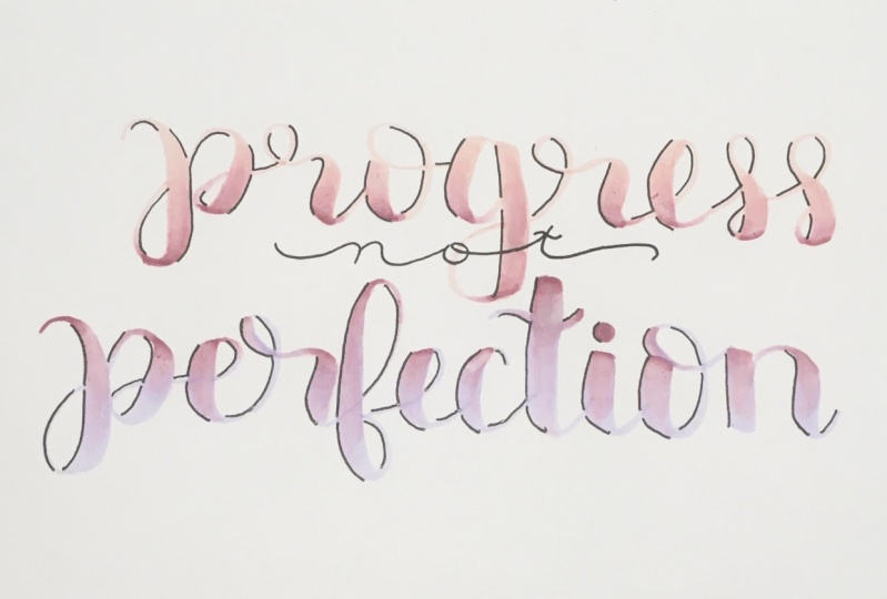
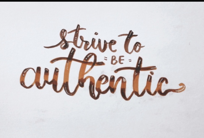
3. More than One Color: so using the technique we learned in the first lesson, you would be able to create this nice Grady int here in the word birth or in the word listen what you see at the bottom. But what if you wanted to create ingredient that is not just monochromatic or one Hugh, but rather has more than one color in it. Say, for example, that I want to do a radiant from a pinkish purple that has a dark value to a light. Lavender will use the brush pen that has the lighter value in this case, lavender as the base. So when you're actually writing the letters or words, you would be using the lavender to write those letters. Then you'll go in with your darker value. This time I'm using Tumbles 6 65 which is a slightly pinker purple. I will scribble it on my palette or piece of plastic, and I'm coloring in at the top where it's going to be darkest. And then I'll use the same technique where I pick up some of the pigment with my colorless blender from my piece of plastic, and I apply it to the letter or in this case the line, um, so it becomes lighter and lighter until it is nearly gone towards the bottom. And if you really want to have that lavender be visible at the bottom, you don't need to drag the color all the way down and up close. You can see how smooth that transition is, from the darker purple to the lavender. The downside of using this technique, where your coloring with one brush pen on top of another color is that you might run the risk of de saturating that darker color or making it a little bit different than the color that year. Going for one thing that all sometimes dio is a very lightly pencil in the letters first, and then I'll draw half of the letter in one color and then the other half of the letter in whatever other color. I'm trying to blend into it so you can see how in this version that I'm doing that purple of the top. It appears to be much closer to the pink side of the spectrum, which, you know, I might want that in a piece of art. Um, because I'm very particular about color and I know a lot of artists are, so this makes it so that I can really get the colors that I want. It's just a trickier technique, because you're not going to be able to draw letters kind of in one stroke, which it is harder. But it's doable, and it creates a really nice effect. Just make sure your pencil markings air very very lights, and you'll be able to erase them later. I think it will be helpful to contrast this technique with the colorless blender with a more traditional blending technique where I only use the two purple brush pens toe blend into one another. So that's what I'm doing right here. I've sped it up quite a bit, but basically what I'm doing is just going over and over and over the area where the two colors meet, feathering it out so that the colors blend nicely together and well. You'll notice after it's dried a bit, is even though it's not as dark as it was when it was wet. It's still quite dark, and it has a totally different look, then the version that I use the colorless blender with in this next example, I'll show you how we can use the same technique, but apply it to a letter. The blends that I'm creating is green at the top, Teoh yellow at the bottom, and I'll show you how I would make this blend. In the letter H. I'm using this letter in particular because it has two different heights. It has the a center line, which is the long line that goes up very high. And then it has the X height, which is where the inverted you part of the H is. I like to color with the dark color both on the a center line of the top, which I'm doing now, as well as on the top of the inverted you, or at the where the X height is. I find that watching this footage back of this type of blending is very satisfying, like I don't know if you feel the same way, but almost a SMR just relaxing when I'm blending within the letter. It's a little bit different than just blending in the line, because I have to make sure that I follow the curvature off the letter. It's just a little bit trickier. The reason I keep going over and over and over some of the same areas is to avoid a streaky effect. This is probably more common if your brush pen is frayed like minus because I've used it so many times, it does kind of make these lines of color. So I find that if I go back over it over and over, it gets rid of those lines and makes it a much smoother look. And here's how it looks after it's dried.
4. Top and Bottom of the Letter: In this lesson, I'll be covering how to create a blend with one color on the top and bottom of the letter, gradually fading into a different color in the middle of the letter. First example, use is going to be a very settled radiant with light, yellowish green as a base. And then I'm going to use the combo to 43 which is a minty pastel green on the top and bottom. I have found that with pastel colors, it's best to load up the colorless blender with the pigment as much as possible so that it shows up on the paper because the minty green color that I'm using it so light the top and bottom of the letter are not going to be much darker than the middle. But it's going to create a change in the Q so that the middle of the letter looks more yellowish, and then the top and bottom look more true green. For this next example, I'll use the same yellowish green color as a base, and then I'm going to do a much darker green, using Tom Bow 407 on the top and bottom just so you can see how we can create a blend from dark to light to dark. I load up my colorless blender with a lot of pigment and then go back and forth between the top and bottom of the light green line. And that way the pigment is nice, even on both sides. Let's check out a slight variation of this in the next lesson.
5. Combining Several Colors: One effect that I love to create with my letters is to have one color on the top and another color on the bottom like you see here in the word dare. So let's explore how to do this together. I'm gonna pick a couple different colors than what you saw in that piece of artwork. So I'm going to use my Tom bow for 51 as my base color. That's that very light likes sky blue color, and then I'm going to do a blend with a yellowish green and a slightly darker blue color. Blue is Tom Bow number 4 52 so it's just a little bit darker than the 4 51 So once I color in with both of those colors on the ends of the line to get, it makes it saturated. I kick up some of the pigment of one of the colors with my colorless blender and used the same technique to blend that color out, and I'm speeding up the video here just to make it go by a little bit quicker. My hand does not, in fact, move that quickly, and I'll do the same for the blue on the top. I love how this looks just like this, and you can feel free to leave it like that. But something else you can do is actually blend the colors of blue and green into each other, even more so that there's no area of lighter value in the middle of the line. It's pretty much even value or even darkness throughout the entire line, which you'll see once it's fully blended. It's a really nice, seamless blend. I only find that blue and green are tough colors to blend together unless I'm using my colorless blender in this way. Now I want to take these blends a step further and make a bigger contrast, using Tom both for 43 which is a slightly darker blue, and then Tom Bo six, so six to really dark in it at the end. So we're going to go for a more dramatically fact where it goes from really, really dark blue into much lighter green. So I'm just going in with that dark blue first and then at the very, very edge I'm going to color with Tom Bo. Six. So six that dark purple color I don't actually have a blue color that is that dark. So I'm just using the purple color because they're close enough. And if I color back over it with my blue, it ends up looking like a blue color. So then I'm just taking my colorless blender here and dragging down that dark blue, and I could theoretically just leave it like that. It looks kind of nice, but I ended up going back over it with the 4 52 that lighter blue, and now I'm using my colorless blender. Teoh, bring down that 4 52 color. I just liked how that looked, and you can see how it goes from really dark at the top, too much lighter at the bottom. To contrast that, I'm going to show you what this would look like if I did not use my colorless blender. And I just used my markers and lead to them in a more traditional way, where I'm going over them again and again, trying to get those colors to blend seamlessly together. And when the pigment is still wet or when the ink is still wet. It's much darker, but here you concede stride a bit. The paper got a little bit chewed up by me going over it again and again with, um, brush friends. But you can see that it's still much darker. Um, I would say it's a more saturated look. They're just very different looks. But I like both of them, and it just depends what look you're going for. Let's take a look at how we can apply this to a rainbow blend inside of a word. I'm going to use the Tom Bow and 95 gray as a base for the word. And then I'm going to be strategically using both the brush pens and the colorless blender on top of the gray to create blends that have a specific looks that I'm going for. For example, I already know that the pink and turquoise colors that I'm going to be using our little bit darker than the rest of the colors. So I'm going to use my colorless blender primarily for those two colors, and that will give me a lighter value, which will help the rainbow blend look more balanced throughout for the yellow and light green. I decided to use the actual brush pens themselves to color over the gray because I wanted them to be more saturated, and I didn't want the gray to make him look too muted. And I went back over a little bit of the yellow with some of the green that I picked up on my colorless blender. I spent this up to about six times the normal rate, but I think you can still see that I'm going back and forth between using my actual color brush pens and using my colorless blender. I keep wiping it off. Teoh, make sure that I get all the pigment off so that it's clean before I go to my next color. That's really important, and here's how it looks.
6. Creating and Mixing Colors: this lesson will be centered around creating colors that you don't already own by using the colorless blender. The simplest way of doing this is by coloring with one color on a piece of paper until it gets lighter and lighter. This is a perfect technique for me because I don't currently own a pastel yellow, so I can create a pastel yellow just by using my colorless blender. You can also combine two colors together by scribbling each one on your lending pallets and then taking your colorless blender and mixing them together. Using this style of blending isn't an exact science. You're not going to know what color you created until you actually color it on the paper. So it's best to use a piece of scrap paper first to know what color you've made. This is a great technique to use if you're somebody who likes to be surprised by your art. But it's not a very good technique to use if you want to color in on area with uniform color, because once you go back to your blending pallets with your colorless blender, it's very tricky to make the exact same color that you made before. You can also choose to blend two different colors together on the blending pallets and get a slightly less blended look by just swiping the same area of the colorless blender. Just once through each color and you'll see, creates a really cool effect where you see a little bit of the blue showing through a little bit of the people showing through. And it does, given overall effect of a purple color. But it's not totally uniformed throughout. If you want to take this type of blending one step further, what you can do is you can rotate the brush nib of the colorless blender so that the pigment is on adjacent areas of the brush nip, so it's not overlapping. You see, I have blue on one area and then pink on the other area, and then when I color on the paper or when I make my letter, I can slightly rotate theme brush pen in my hand, and then it creates this really cool effect. I don't know exactly what you would call this snow like hombre, but it's just really fun. It doesn't give a very blended look overall like it's not very clean But you can go back over it with the colorless blender to kind of blend things out a little bit. And then what I like to dio is do some outlining and shadows, so it gives it a more polished look.
7. Project: Now it's time to take what we've learned and apply it to a piece of lettering. Artwork. Here's my color palette. Sit back, relax and watch me create a piece of art. So here's the finished piece. I'm really happy with how it turned out. I just love these colors. And Hey, guess what? You can create something just like this, too, now that you have the tools to use the colorless blender to create these radiance. So, as a final project for the course, I challenge you to take a word or phrase It could be your name or anything else and pick one or two of the techniques that we learned during this course and make a piece of artwork . I can't wait to see the awesome things you guys create. So don't forget to post your projects on the project. Ford, for this course
 Lyssas Letters, Hand Lettering Artist