Transcripts
1. Welcome: ever seen one of those elegant, soothing brush lettering videos on social media and thought, I wish I could do that. Well, you've come to the right place. My name is Elissa, and I am the lettering enthusiast and artist Behind Listens letters. I have a passion for brush, calligraphy and watercolor painting, and I get excited about sharing what I've learned about art and creativity with others. Through my skill share classes and videos on YouTube and Instagram in this class, I'm going to show you just how easy and fun it is. Toe learn to brush letter. You will learn all of the essentials for creating beautiful brush lettering arts. Each lesson is jam packed with demonstrations and examples to guide you as you learn how to create basic strokes with a brush pen and how to combine these strokes toe elegantly. Write letters and words and hey, if you're not thrilled with your normal handwriting, that's not an issue. The great news is that with a little practice, anyone can create gorgeous fresh lettering. Fresh lettering, also known as brush calligraphy or modern calligraphy, is perfect for addressing envelopes, creating greeting cards for birthdays and holidays, making artwork to post on social media or to give as a gift to a loved one, writing motivational and inspirational quotes to hang on your wall or for calligraphy. For special events like weddings. No experience is required for this class. You can be a complete beginner, and by the end of the class you will be equipped with the knowledge to create gorgeous letters with a brush pen. However, this class is designed for everyone, even individuals who have been hands lettering for a while and would like to brush up on the basics or learn a few new letter styles. This class will give you a strong foundation, will explore how to hold a brush pin, what paper to use with each type of brush pen, how to create the basic strokes for calligraphy, how to write the letters of the alphabet and how to put letters together into words. I have provided free principle, practice worksheets and guidelines to help you in this class, which you confined in the course description. Under the about tab as well as in the resource is section under the projects and resource is tab. As a final project, you will be lettering a word or phrase using the skills you've gained throughout the course . I'm super excited to start this journey of brush lettering with you. I'll see you in class.
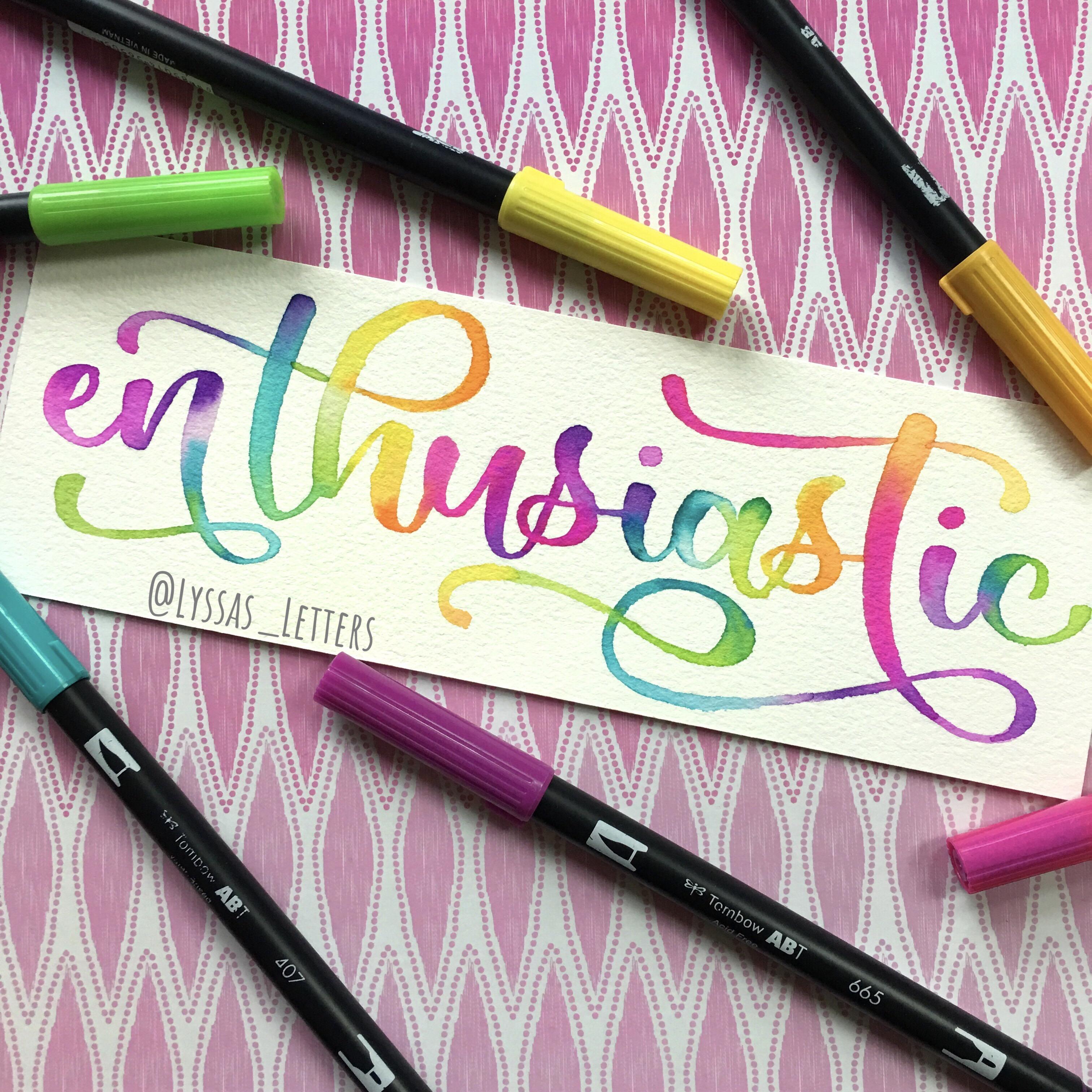
2. What Is Brush Lettering?: What exactly is this magical satisfying art we call brush lettering? At first glance, it could be easy to confuse brush lettering with cursive. Although both cursive and brush lettering do use the scripts alphabet, or at least brush lettering often uses scripts. There are a couple of key differences between cursive and brush lettering. First, if we do instant playback, You can see that when you write in cursive, you don't lift your pen in-between letters. On the other hand, rush lettering, artists will often lift the tip of the pen off the paper after each stroke. Lifting the pen isn't necessary, but it is a common practice because it allows artists to readjust the pen in their hand so that they can have more control over the next stroke. Also, we lift the pen in brushed lettering because the beginning of one stroke isn't necessarily where the last stroke ended. For example, here, the letter a starts at a different point than were the previous letter ended. Even though everything looks connected and seamless in the final product. But we'll get into this in more detail later. Another major difference between persuasive and brush lettering is the thickness of the lines. Cursive typically uses something called monoline lettering. Monoline refers to a type of hand lettering that has only one line thickness throughout. Brushed lettering, however, has line variability. Sometimes the strokes or lines are thick, sometimes they're thin. And sometimes a single stroke goes from thick to thin. Or the other way around. When your brush lettering, you get to be in control of how thick you want a stroke to V by applying more or less pressure with the pen on the paper. It is this change in pressure that is precisely what makes brush lettering so ridiculously satisfying. Faux calligraphy, which is another type of hands lettering, mimics the look of brush calligraphy by thickening some strokes and keeping others thin. It is created using monoline and you can fill in the spaces to trick the viewer into thinking it was made with a brush pen. I mentioned faux calligraphy here because it is easy to confuse it with brush lettering, but they are not the same thing. In this class, we won't be covering how to do faux calligraphy, although you'll most likely be able to figure it out intuitively once you learn the basics of brush lettering, the major factor that differentiates brush lettering from other forms of hand lettering is that brush slaughtering is made using the holy grail of all Penn's, the brush pens. What makes the tip or nib a brush pen unique is its flexibility and taper design. This is in contrast to find liners and bullet tip pens, which have stiff tips and can only make one line thickness. Brush tips are also different from chiseled tips, which can be found on one end of alcohol markers and frequently on highlighters. They're rigid and can only easily make two different line thicknesses, which can be a cool effect for certain types of hand lettering. But it doesn't allow for the line variability needed for brush lettering. Now let's take a closer look at what makes these brush pens so special.
3. Brush Pens: each brand and type of brush pen is unique, and if you're like me, you will love exploring how it feels to write with each different type. I find it helpful to break up fresh pens into four distinct categories. Large brush pens, medium small and brush pens with bristle tips. The larger brush pens are characterized by longer, wider brush Nibs, and this group includes Tom Bo dual brush pens, artist's loft to a brush, pens and equal line brush pens, to name a few. In the lessons that follow, you'll see me using Tom Bo dual brush pens, which are my favorite brush friends because of the color selection and their ease of use. Tom Baduel Brush pens are great for making bold letters and for blending colors, which will briefly touch on later in the course for the small brush pens, you'll see me using Tom Bo food. No suitcase, which come with two different tips. Ah, hard tip and a soft tip. The heart tip gives you greater control over the thin strokes, but they lack the fluidity that you get with a more flexible tip. The soft tip allows for slightly thicker down strokes, but it can be more difficult to make smooth up strokes. I'll also be using pen Tell signed Touch Brush pens in the class, which married the best qualities of both the hard and soft tip. Tom Bo Food No Suk A Fresh funds Small brush pens are great for lettering, long quotes or for writing small text in a lettering composition. For less important words, there are practice sheets available for this class for large and small brush pens. If you only have a medium sized fresh pin like a Faber Castell Pitt artist, Fresh pun, you can try it out on both sets of practice sheets to see which line thickness you prefer. The fourth group of brush pens are those with bristle tips. Essentially, they're typist like a paint brush with individual bristles, and they have water based ink inside bristle tip Brush pens are often marketed as riel brush pens, probably because of their similarities to paint brushes. The bristle tips are great for making cool textures, and they allow for a lot of contrast between thick and thin lines. However, there super difficult to control and work best with a loose style of lettering. Typically, I only use thes brush pens for blending colors or painting illustrations on watercolor paper. Now let's take a look at the best type of paper to use with each type of brush pen.
4. Paper: with all of the different types of paper available, it may seem confusing as to which paper to use for brush lettering, but no worries in this lesson I'll share with you. My preference is for the different types of paper that you can use with each fresh pen. Based on my experience, we have a couple of goals when selecting paper. First, we want to prevent the more delicate felt and nylon tips from fraying so that we can continue to use them. Another goal is to ensure that we're using an appropriate paper for the consistency of the pen ink. Some brush pens have Super Juicy Inc that requires a thicker or more textured paper that can absorb it, whereas other brush pens are a bit drier and do best on smoother paper For the demonstrations in this class, I'm mostly using HP premium £32 paper. HP is the brand of printer paper, and £32 means that it is relatively thick compared to most printer paper. I would strongly advise you to not use regular printer paper with brush pens. HP premium paper is good for lettering because it is incredibly smooth and relatively absorbent. It is great for use with small brush pens and okay for Tom Baduel brush pens. Although it absorbs the moisture of the ink so quickly that it can cost friction on the brush tip and make it Frey, I would not use bristle tip brush friends or juicier brush Friends like equal lines are Karen markers on this type of paper, though the paper just can't hold the ink for making finished pieces of lettering artwork with fresh pens that have fragile brush Nibs, I'd recommend using marker paper or smooth Bristol Board Strad. More marker paper is quite thick, but not pure. White. Bristol board is thicker than marker paper and could probably tolerate more moisture. Canceled Marker paper is my favorite to use with Tom Bo dual brush pens. It is very smooth and gentle on the brush tips, and the ink takes a little bit of time to dry, which is great for blending. Canceled marker paper is thin, which could be viewed as a downside. However, I use this quality to my benefit by placing rough drafts underneath it. When I'm making a final piece of lettering artwork because it is thin, I can easily see dark ink through it. The paper is also very absorbent for brush pens with Juicy Inc and Bristle tip brush pens. The best options are watercolor paper or mixed media paper. I've had good experiences with cancer and mixed media paper. My two favorite types of watercolor paper are arches, Cold Press and our Tessa 100% cotton expert. Watercolor paper Watercolor paper is quite expensive, so I reserve it for my more elaborate pieces of lettering. Artwork notes that cold press watercolor paper is very textured and will quickly destroy delicate brush tips. So use brush pens like Tom Baduel brush pens sparingly on it.
5. Downstrokes & Upstrokes: There is really only one major rules to follow in brushed fluttering. And it is that downstrokes are thick and up strokes are thin whenever you move the pen towards your body. So away from the top of the page and towards the bottom of the page, you're making what's called a downstroke. When you move the pen away from you in the direction towards the top of the page, you're making what's called an upstroke. The downstroke and the upstroke are your first two basic strokes of brush calligraphy. And they are the foundation for all of the other strokes that we're going to learn today. In this lesson, we'll explore how to make your downstrokes thicker than your app's strokes. To get that classic calligraphy look. Make sure you have a piece of paper handy. Preferably one that you've printed, the downstrokes and up strokes worksheet on, which is in the small brush pen PDF file available in the course resources. Now, how we grip the pen is crucial. You'll want to hold the pen at an angle rather than perpendicular to the page. When we hold the pen at an angle, we can press down hard on the brush tip to make nice wide downstrokes without damaging the brush tip. If we hold the pen perpendicular to the page, we can't make very thick downstrokes. The last pressure you apply with the pen on the paper, the thinner the stroke. For downstrokes. I like to use a moderate amount of pressure because I like my downstrokes to be nice and thick. Notice so far down the barrel of the brush pen in my hand does. I don't hold the pen super close to the tip so that I can get the pen to be at a proper angle to the paper. Different people hold the brush pen at different points along the barrel. And it doesn't really matter all that much. Find what feels most comfortable for you. You'll probably notice that you have more control over the pen. Hold it closer to the tip than further away. But again, don't hold it too close to the tip or you won't be able to keep the pen of an angle. Thick and thin are relative terms. You'll notice that when I write with a small brush pen, my thick downstrokes are much thinner than my downstrokes when I was using the large brush PAN. So let's start practicing. I suggest taking out whatever brush pen you have on hand. And we'll first experiment with downstrokes. Feel what it's like to apply firm pressure on the paper. Take your time. Fresh lettering can be slow and meditative. Practice as many times as you need. In brushed lettering. Not all of our downstrokes are straight lines on the worksheet provided trace over the different curves. There are curved lines and an S-shaped curve for you to practice. Now with the same pen will have a go at some strokes. You may notice that creating thinner lines take some getting used to still holding the pen at an angle. Applied less pressure to the paper than you did when you were making downstrokes. No need to worry about making perfect lines. That comes with practice. This is your opportunity to get a feel for using the brush button. Be careful not to push too hard when making your app's strokes. Very little pressure is needed for up strokes. This worksheet gives you the opportunity to explore different types of curves in addition to straight lines. Tracing over these curves. Be mindful that you're up strokes stay nice and thin. If you have both a large and a small brush pen, I encourage you to play around with both of them. At this stage, you'll find that the large brush pen can make nice thick downstrokes and that you have quite a bit of flexibility in terms of health thin or thick, you can make your up strokes. Consistency is key, are obstructs should all be about the same thickness. With more practice, the easier this will become. Feel free to use the blank lined paper provided for this class to practice your basic downstrokes and upstroke as much as you need. Creating the contrast between the thick and thin strokes was not easy for me at first, and I felt like a fish out of water. The more I tested out the brush pens, the easier it became for me to control the line thickness. I would encourage you to pause the video after this lesson. And between any other lessons. If you feel as though you need more time to get comfortable with the strokes. Remember, with brush cluttering, the ultimate goal is to make your downstrokes thicker than your app's strokes. It might seem tricky right now. But you got this. Keep at it. And in time, you'll find that it becomes second nature. In the lessons that follow will cover the other basic strokes and then learn how to put them together to make letters. Let's go.
6. Anatomy of Letters: So remember how I previously mentioned that we lift the brush pen after each stroke in brush lettering? Well, in the lessons that follow will be covering what those basic strokes are. Each letter is comprised of one or more of these basic strokes, and it will quickly become apparent that once you have learned the basic strokes, you can make any letter simply by putting different strokes together. But first, let's quickly break down the different parts of letters to help orient us. We have the baseline, which is the bottom of most letters. The top of small, lower case letters like X and A is called the X Height. The apex of a taller, lower case letter like B is called the A center height, and the lowest points of a lower case letter like G is called the D Sender. Height. Cap Heights is the top of capital letters, and it can be the same as the A center height, but it doesn't have to be throughout. The remainder of this class will be using these lines as guidelines as we learn the basic strokes. Now let's get to it
7. Basic Strokes: Ascenders & Descenders: we'll start off our journey through the basic strokes with letters that have a sender loops . Creating the A center loop is simple. You begin with a thin upstroke and then follow it with a thick down stroke without lifting your pen in between. Use the space on the practice sheet to recreate the A center loop as many times as you need , Remember to start with the upstroke and then turn in the opposite direction and make a thick down stroke. Some letters within a center loop have a little extra upstroke at the end, so let's practice that thin upstroke, thick down stroke and then thin upstroke. Have some fun making a few of these a center loops. To get a feel for it, you can see that the lower case Letter B includes a center loop shape. Let's fill in the A center loop on this. Be to see how it fits into the lever. Noticed how I take my time with it. Hands. Lettering is a much slower process than normal handwriting. For each of the letters on the sheet, I've included three different versions of the A center loop. The 1st 1 has a straight down stroke. The second has a curved down stroke, and the third has a thinner loop. Exploring different styles can help you become more familiar with using the brush pen, and it can help you find which style feels best for you. No need to fill in the rest of the letter B at this point, right now is the time to build your confidence With this one stroke, the letters H and K have the exact same a center loop shape at the B. Take some time to fill in each of the variations of the A center Luke. For both of these letters, feel what it's like to hold the pen at an angle so that you can make nice, thick down strokes. Taking a look at the letter D You can see the A center loop in this letter ends with the extra upstroke you wear that the a center loop in the letter D is not the first stroke of the letter, and yet we can still create the stroke on its own. That's because the strokes within each letter act independently from one another, even though they do appear to connect to each other. We'll be covering how to make the other types of strokes needed for these letters in future lessons, the letter F is a bit more complicated. For now, let's just practice the upstroke and down stroke and will cover how to make the whole letter in another lesson. Lastly, we have the letter L, which is the simplest of all the letters with a center loops. All that is is just a upstroke down stroke and upstroke. So at this point, you've got this letter in the bag. Once I filled in the other strokes within the letters on this page, it becomes very clear how the a center loop stroke plays a part in each of these letters. Next stroke will discuss is the D Sender loop, which is present, and letters like G and J. The stroke is super simple, and it consists of a thick down stroke followed by a thin upstroke. You can think of it as an upside down version of the A sender loop. Explore how to make this stroke as many times as you need. Notice how smooth the transition is from thick to thin. All you need to do is just lessen the pressure a little bit when you transition from the down stroke to the upstroke. Although I usually lift my pen after making the D sender loop occasionally, I will follow through with the upstroke of a D sender loop to connect it to the next letter thes air two of the ways that I follow through with the upstroke. This second version has a fun little curve. I've included four different variations of the D sender loop. The 1st 1 has a straight down stroke. The second has an s shaped down stroke. The 3rd 1 has a curved down stroke just like the C shaped curve and the fork. One has a smaller loop. Just a note about these practice sheets. It is not necessary for your lines to be perfectly on top of mine. In fact, I find it very difficult to perfectly trace my own lines. The more freedom you feel while using the brush pen, the better. And if you don't absolutely love one or two strokes that you make, that's perfectly OK. There are so many more opportunities to practice now getting back on the topic of our letters. The letter J is nothing. Mauritz interested. You send her loose with a little dot on top. Simple. The letter P can be written in a couple of ways. The D center stroke of the letter P ISS, sometimes written with a loop like the other letters on this page. And then the upstroke from the D Center loop leads into the next stroke, the P. Usually, though, I write the letter P with just a straight line. As the D sender, you can practice both versions and see which you prefer. For the letter lie on your practice sheets. I've included the same four different styles for the D center loop. As I included for the letter G have a go at all four of these styles. Lastly, we have the letter Z, which has a slightly modified D sender loop that begins with an upstroke or more of a horizontal strip. And there you have it. I filled in the rest of the letter so you can see how the D center loops fit in. Now let's see what strokes are up next
8. Underturn & Overturn: I'll be demonstrating the next basic stroke, the under turn using large brush pens. The under turn consists of a thick down stroke and a thin upstroke going from left to right . For some letters, the upstroke may not reach all the way to the X height, and for some letters it might. Let's get a feel for both ways of writing it. It could be fund. Add a little s shaped curve to the upstroke, which I've included as an example on this practice sheet. Try it out and see how it feels on its own. And then we'll experiment with this version in our letters. Take however much time you need to explore the under turn stroke. Now let's see how the under turn fits into letters. The letter A has an under turn as its second stroke. The letter E could be considered an under turn with a little loop at the beginning. Let's go ahead and fill that out. There's no need to lift the pen in the middle of the stroke, since it could be made in one continuous movement. I am free to go back over any strokes you've made with the tip of the brush nib to fill out certain areas. Next, we have the letter I, which is simply an under turned with the little dots. The D center stroke of the letter Q includes an under turn as well. The down stroke is long, and then there's a little extra upstroke at the end. Our hasn't under turn as its final stroke, and T is just like the letter I. It is made with one under turn, and instead of a dot, it has a crossbar. You is made up of two under turns simple. Often I will flick my pen at the end of the upstroke, mostly because I find this flicking motion really satisfying. Try it out and see if you like it. The letters V and W are both made up entirely of under turns, and the final under turn is a small one. W. Has three under turns total. Why starts off with an under turn and ends with a D sender loop. We know both of these strokes, so let's fill in the entire letter. Feel free toe. Lift your pen between the under turn and the D center loop. You may find that it gives you more control over the pen and voila! We've made our way through all of the under turn letters. So remember the version I showed you earlier with the upstroke that has an S shaped curve? Go back to the letters you and why, And see if you can rewrite the under turns using this stylized under turn. I'll demonstrate this type of under turn using my pink brush pen. All I do is curved the upstroke a little bit in the other direction. It can be really fun to play around with the curvature of your strokes, and the more comfortable you become with using the brush pen, the more you'll be able to figure out what style of letters do you prefer. Now let's check out the overturn stroke, which is basically the opposite of the under turn. We've got a thin upstroke, followed by a thick down stroke, making an arch shaped. Some letters include was called a compound curve, which is an overturned with an extra upstroke at the end, upstroke down, stroke and up stroke without lifting your pen. Often in my letters, I will write the down stroke of the compound curves so that it is Con Cave like this. We'll get to try out this style in our letters on this practice sheet, Some letters have an overturn that has a little upstroke going backwards, so it makes a circular shape. Letter B is an example of this. The second stroke has this little circular shape, as we practiced previously. Be starts off within a center Luke. And now we can add in the overturn notice how I lifted my pen between the two strokes. The letter H includes a compound curve, upstroke down, stroke and upstroke. So let's fill that in. And let's also have a go at this stylized version with a calm cave downstream. Like many letters, K can be written in different ways, and one of the ways is by making an overturn similar to the one in the letter B. It starts off with an a center loop, which you can fill in first, and then we have the overturn. I like to make the final down stroke thin because I think it looks best that way. The more you play around with letters, the more you'll find your own style. And speaking of style, the letter M is really easy to add style, too. It is comprised of two overturns. The 2nd 1 is a compound curve, and it begins with a thick down stroke. You can choose to make thes two humps of the letter M the same height, or you can make them different heights, which I've done here. I've included two different versions of the letter M so you can get a feel for making these two different overturns. Just like the letter h. The Letter N has a compound curve as its second stroke and starts with a simple down stroke , which I have filled in first. And then we can have a go at both styles of this compound curve. Next up, we have P, which has the same circular shape as the Letter B for its second stroke here. I've made the D sender stroke without a loop. It's just a simple down stroke. Then, for the overturn, I start the upstroke down at the bottom of the D sender and come all the way up to the X Heights. Another fun way to write the letter P is to add a little loop at the end of the second stroke the upstroke continues and circles around to make a fun little loop. And here's how the letter P would look. If you used a D sender loop, you don't necessarily need to even lift your pen between strokes. It can be made in one continuous motion. The letter X is super simple. It's just a compound curve with a little upstroke in the middle. The final letter on this practice sheet for overturns is the Letter Z, which starts with an overturn and then has a D sender loop. This is a great opportunity to practice putting these two strokes together and guess what? You may not have noticed, but you were able to fill in all of the strokes in every letter on this practice sheet because you're familiar with every stroke that's on it. Now we only have one more basic stroke toe learn, so let's check it out
9. Ovals: ovals are present in several letters and are super fun to write. There's more than one way to make the oval, and the first way is to start at the top and make the down stroke and then the upstroke. This is how I make the oval in the letter O. But I use a slightly different method with the other letters that contain an oval for letters like A and E. I start the oval shape on the right side and Macon upstroke first the same way most people probably right. The lower case A in their normal handwriting, both ovals with the same which ever way you make it in this lesson will be exploring four different oval shapes and our letters. But there are infinite possible variations of the oval. My hope is that this lesson provides you with some inspiration for different styles, and then you can experiment on your own. The first oval shape is the same style as what we created on the first row. Second oval shape has a curved upstroke going up from the baseline. This third variation is a wide oval that is slightly slanted. This final shape is an italicized oval. I find it easiest to draw strokes at a slant like this by turning the paper so that the down strokes are perpendicular to my body. You'll notice that the stems that are attached to the ovals also vary from one column to the next to match the style of the ovals. For example, in the second column, the under turn in the A has an upstroke that is an s shaped curve. The A sender loop of the D has the same fancy upstroke in the third column. The stems of the letters a G and Q all start exactly where the oval ended below the X height. The transition between the oval and the stem is smooth, so you can even write the entire letter without lifting your pen for the italicized letters . The stems are all the same slant as the oval. All right. Now let's shift gears a little bit and talk about the letter. O oh is often written with a little loop leading into the exit stroke. You could make the loop whatever size you want. You can even start the first down stroke below the X height and then cross the loop over the first down stroke, which is one of my favorite ways to make Theo. Now it's time to put all the strokes together. Let's go.
10. Lowercase Script Letters: Now let's put all of these strokes together. In the lower case script. Alphabet A is an oval plus and under turn, an alternative way to write the letter A, which is often seen in print fonts, is to use an s shaped stem. It has a little extra upstroke before the under turn, as we've seen before, B is an a center loop, plus an overturn. Another option is to eliminate the loop on the A center stem. Making it just a down stroke see is like an incomplete oval shape. Super simple. The letter D is an oval plus an a sender loop or Justus We did with the letter B. We can use just a simple down struck for the ace. Understand? No need to include the loop just as we practiced before. The letter E has a small loop, followed by an under turn. The letter F has an a center loop with an extra upstroke. At the end. You can even add a little loop that crosses the down stroke to give the letter some extra style. Alternatively, you could always write the letter F the same way you would write it in a print fund without the a center loop and with a small crossbar. G isn't oval plus a D center loop. I also see people frequently using this fun print version of the letter G, which I typically rights by first making an oval with a little extra horizontal stroke at the beginning, followed by a backwards oval underneath it. This type of G is super fun, but a little tricky, especially if you're like me and you don't use it that frequently. H is an a center loop, plus a compound curve. You can also eliminate the loop, as you do with any of the A sender letters. I is a simple under turn with a dots, and Jay is a D center loop with the dots Que begins with an a center loop, followed by an overturn with an optional loop, and it ends with an under turn. Que is another letter that you can write without loops. You could make a down stroke as the A sender stem, and then you could make another down stroke, followed by an under turn. The letter L can be written as an a center loop, or you can omit the loop and just make the down stroke. This style of L is an under turned stroke. M is a down stroke than an overturn than a compound curve here. I've made the heights of each stroke the same and is a down stroke than a compound curve, as we've seen before, the letter O is an oval with an optional loot. P consists of the down stroke plus an overturn. And remember, you can always do a D sender loop if you'd like. Que Isn't Oval plus an under turn? It's also possible to write Q as an oval plus a down stroke and then an upstroke like this . There are several ways to write the letter R. The first version begins with an upstroke, followed by a down stroke and ends with an under turn. A really fun option is to add a loop to the are. So I begin with the upstroke, and then I loop around and make this horizontal stroke and finally, the under turn. You can also choose to make the horizontal stroke of the Argo upwards rather than downwards . I love to write the letter R in a style that is similar to the print version of the letter , beginning with a down stroke and ending with a compound curve. It's essentially the same strokes of the letter n, so make sure you make it clear that it is in our and not an end. Likewise, there are a ton of different ways to write the letter s, and I'll show you four different versions here. This first version begins with an entry stroke. Then there is an s shaped down stroke which loops around at the bottom. You can also make an s with a down stroke that is straight or only slightly curved, like you see here. And the loop at the bottom is always optional. Here I'm writing. It s in a print font, beginning with an upstroke. This last style has lots of loops, and you can make it without lifting your pen. The letter T is an under turn with a crossbar. You is two under turns. The letter V can be written as two under turns as we've seen before. Or you can write it as a down stroke plus an upstroke making a sharp transition at the bottom of the letter. W is typically written as three under turns the letter X is a compound curve with a diagonal line crossing it in the center. Why is an under turn plus a D center? Loop Z is an overturn, then a D sender loop. Alternatively, you could write Z in a print style with a horizontal stroke, then a down stroke and finally ah, horizontal stroke at the bottom.
11. Connecting Letters: Now that we're familiar with the strokes that make up letters, let's check out how we can connect our letters to make words, to learn how to connect letters. Let's start up with a really simple letter, the letter I, which is just a simple under turn. So we've got this down, stroke that stick and I'm stop stroke that's thin here. I've written two eyes that are next to one another, but they're not connected yet. Connecting them is super simple. All you have to do is just extend the final upstroke or the exit stroke of the letter so that it's touching theater adjacent letter like this. So they're connected that I to that I will show you what this looks like if I'm going to write it continuously. So we've got a letter. I like that and I continue the upstroke until the point where we want the next down stroke to begin. So I know that my down stroke for the next I needs to begin right around here. I can make you see they appear to be connected. Let's try this out with a couple of more complicated letters. So here I've written the letters B and a Remember that B is an a center loop plus an overturn and A is an oval plus an under turn to connect these two letters. We do the exact same thing that we did with the letter. I we create an exit stroke coming out of the letter B. That attach is to the letter A. So here, when I can do is I can create a little UPS troop that comes out of the letter B here, and attach is somewhere to the letter K, so we'll show you what that looks like. If I write them together, we've got our the centre loop. Don't overturn. Now I'm gonna lift my pen, create an upstroke, and then this is where I'm going to create my oval. And I know that the Oval needs to touch this upstroke here, so I'm going to write it that way. There we go. You gotta be connected to an A Now what if I want to write these letters a little bit further apart? So the spacing between the two letters is a little bit larger. All I have to do is just create an upstroke that goes a little bit further out like this. And I'm just going to extend the upstroke like that and then create my mobile and you can see it. They still appear to be connected. The great thing is most letters and with this kind of shape, an upstroke right around the baseline so that we can make this upstroke go up on Lee a little bit. But what about if you have a letter like, Oh, where you either have this exit stroke coming out like that for? We've got a loop coming out like that. How do we connect up to the letter next to it? While same thing, we just want to extend this exit stroke. So that touches the adjacent letter. For example, if I were to connect and oh to the letter T, it would look like this, but the letter o r. Ovals. So we just make the exit struck there. Send creator Under turned for the letter T exactly where that stroke ended. Oh, connected to T. What if we're going to connects the letter 02 a. G. Well, we want to make sure that this stroke ends at a point where it's going to connect to the G . So if I do something like this, my G oval is going to be below that and they will be connected. So I have to make sure that this stroke here ends at a point where it can connect to the next letter thingy. So it'll look like this. And then we create the stroke right here like that. And then I can create my oval with the G just like that. Now let's take a look at how we can apply this to some words. But first, a note about letter spacing within a word. It is typically very important that the space between the end of one letter and the beginning of the next letter stays constant throughout. It doesn't matter whether your letters are close together or spaced apart. It just matters that the spacing with in the word stays even from one letter to the next. So let's write the word art together, which is a little tricky because of the letter R, which begins with an upstroke. When a letter begins with an upstroke, you turn the exit stroke of the preceding letter into the entrance stroke of that letter. So here the upstroke. From the end of the letter, A becomes the first stroke of the letter R. And the same goes for the letters S and X, which both begin with up strokes. Now we can connect the under turn of the letter R to the letter t the way I shows you previously let's take a look at the word awe. Under turn of the A is connected to the first under turn of the W. I start the down stroke off the W just slightly to the right of where the under turn of the A ended. And by doing this, the strokes touch one another. I also wanted to show you that I could make a loop on the letter W to make it easier to connect its exit stroke to the next letter. This loop allows me to make the exit stroke of the W as low as I want, so I can easily connected to the E. Next. Let's have some fun writing the word lovely. Notice how I start the oval of the oh, a little bit off to the right to make space for the loop of the O, which I had planned to make in advance. When your brush lettering, you make a lot of little decisions, like whether you want to include a loop or not on a letter, and it is important to plan ahead so that your spacing looks even and balanced at the beginning of a word. You can always choose to add a little entry stroke, which is basically just a small upstroke or a small under turn. I like how the entry stroke looks on this word. Pay attention now to how I let her the word gorgeous connecting an 02 and our convey a bit awkward. And I don't have any specific rules to give you about how to make this connection work. When I connect and oh, to the letter R. I just make sure that the R is easy to read by making the entry stroke as long and as vertical as possible. But you do whatever you think looks best. Also notice how I don't connect the second G to the E, and it still looks like it's one word as long as the spacing between the letters and the font stay consistent. You don't need to connect every single letter to the ones next to it. Here, I've made a little flourish coming off of the D center loop of the G, which is Superfund. Just a quick note about guidelines. They're meant to guide you and can be helpful when you were practicing. But you don't have to use them in my own artwork. I rarely use guidelines, but do it feels most comfortable for you. If you want to get more practice connecting letters to one another, you can consider writing the alphabet. In one continuous string of letters, I found this exercise to be helpful and really fun.
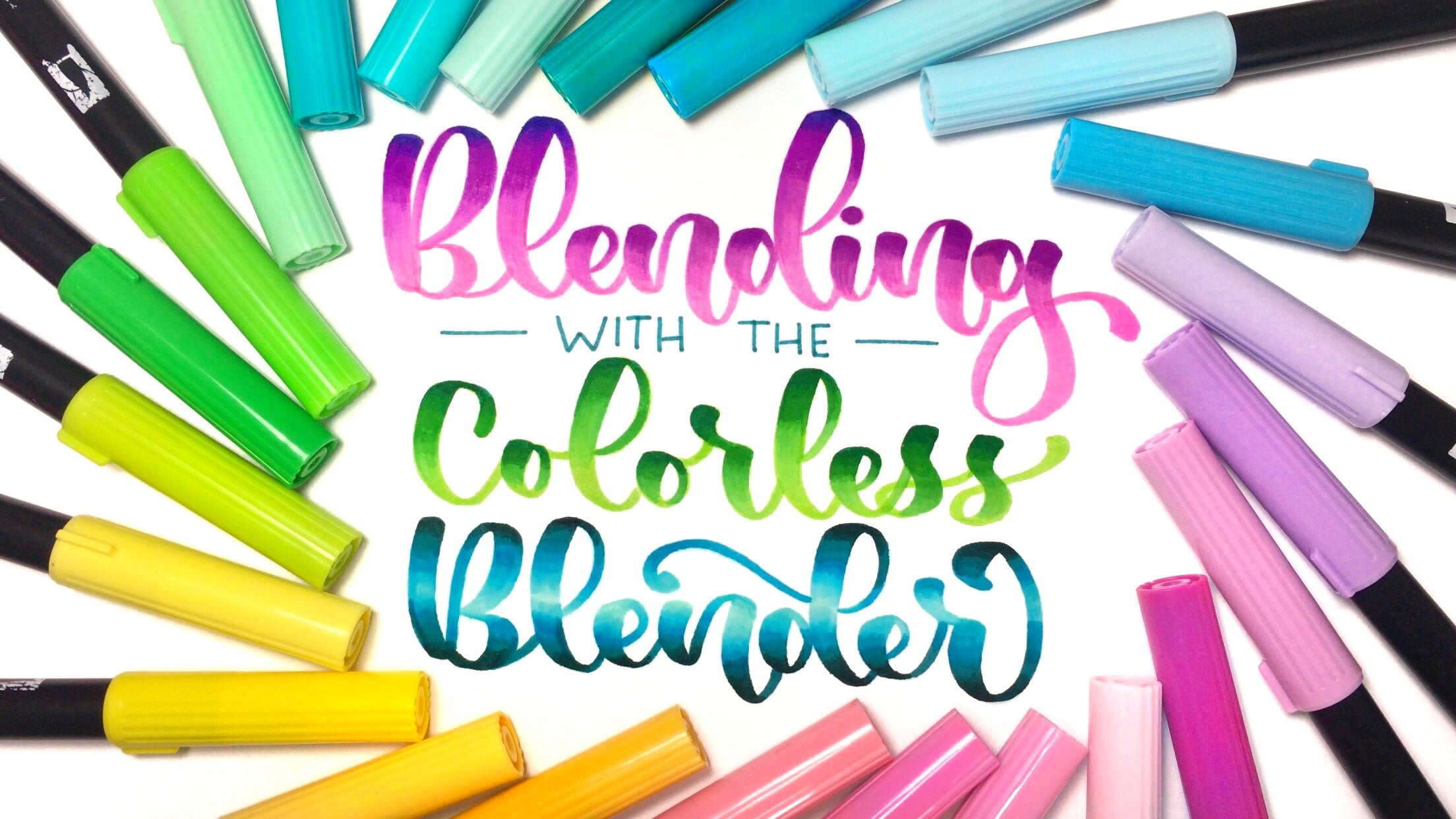
12. Introduction to Blending Colors: one of my favorite parts of brush lettering is lending colors. If you're like me and you have tons of different color brush pens than it's great toe, learn a really easy technique like the one I'm about to show you. All you'll need for this lesson is a piece of plastic. You can use anything for this, Um, this here, this piece of plastic is just something that I took off of a box that we were just gonna throw away. It was the front cover box, and I sell that shit and I use it a lot. You can just wipe it right off with some water, and it's nice and clean. So, um, good to always up cycle things. You'll also need some different colored fresh pens. It's good to have some dark colors and some lighter colors, and you'll see why. Soon I have my Tom Baduel brush pens here, as well as some pen tell, colorful signed touch fresh friends. And, of course, we're going to need some paper. The blending technique that I'll be teaching you right now is called the Ombre Effect, where you have one color blending into another color. I start off I on my piece of plastic here, scribbling a little bit of the darker color. So this here is Tom Bo. Six. So six. It's a dark purple. I'm just gonna scribble it like this onto the plastic just a little bit. Then I'm going to take a lighter color. So let's go with Tom Bo 6 23 The lighter purple and what you do is you just swipe it through once or twice to get some of that dark color on the tip. We basically just right with this fresh pen on the paper, and we have picked up some of the ink on this pen, so that's going to be what we'll see first, and then it will fade away. That darker color will fade away as we use it on the paper. If you have a little bit of extra color from the darker color still on your brush pin, that's OK, you can just wipe it off. So here's my little scrap piece of paper. Just go ahead and wipe off the darker color until it's completely gone. Just like that. Now, where this gets really fun is when you use two completely different colors. So let's say I put down my dark purple color on the plastic. Make sure you don't tell her on the table. And then now I'm going to take Tom Bow to 91 which is a minty green color. A very light color will swipe it Prue, and then you'll be able to see how that turns out. It's gonna start off nice and cheerful, and one thing you can do if you want to speed up the process of it fading more quickly. You can wipe off a little bit of that color on another piece of paper like that, and it'll fade more quickly into the green, super fun and super easy. And then I'm just gonna wipe off all the excess purple from this fresh pen. You can use this technique with any water based brush pens, so let's see how it works out with these pen tell signed touch fresh pens First, I'm going Teoh, right with Tom Bo Brush pen 6 65 Very beautiful fuchsia color and again, I'm just scribbling it on the plastic, and then I'm going to select the tip of this pen, tell brush pen through some of that purple. Get it on the pen and then we'll go ahead and do the exact same thing. Write a word onto the paper. Look how beautiful Tom Brady is. I love it, and then you can see there's still a little bit of the color left within. It eventually fades. Now let's do the same with my magenta Chantelle brush pen, and I'm going Teoh, slide it through the stark purple color that have already put on here from the Tombaugh brush has that lovely dark purple mixing with the magenta dark will eventually fade off like it's doing here. There are aton of different ways to blend colors using brush pens, and in this lesson, we've only barely scratched the surface in my rainbow lettering class. Here on skill share, I share a bunch of really fun and super simple blending techniques that I know you will love. So make sure you check out that class after this one, and in the meantime, you can have lots of fun using the hombre blending technique
13. Flourishes : One fun way to spice up your brush lettering is to add flourishes. Flourishes are embellishments that can stand alone or that can be attached to letters. They can be very simple or quite ornate depending on the style you want to portray. Typically, they are made up of simple loops, curves, and spirals. I'm not going to go into too much detail about the different types of flourishes and how to create them in this lesson. But I want to equip you with the tools to create a few basic flourishes that anyone can do. One super simple flourish is to extend the downstroke of a letter underneath a word and make a small loop. You can see that I've taken the down stroke of the letter R, and instead of connecting it to the letter I, I bring the stroke down below the baseline. Then I make a small loop by crossing over the downstroke with the pen. Another fun flourish is to extend the, a center loop of a letter with a small S-shaped curve, like you see me do here on this H. You can always create a little curved exit stroke at the end of the word as well. And then here I'm extending the ascender loop of the letter F and looping it around and then crossing it over the downstroke of the letter. Another really fun flourish that looks super impressive is to make a big flourish underneath occurred. And what we'll do is we'll extend that there and then create a spiral. But let me show you how I do this. Close up. Okay, so again, we're gonna be doing this flourish here. And a good way to do any flourish is to practice the shape in the air before you actually write it down with a pen. So you can see we first extends the downstroke or the H downlink that Dani come around and loop over it and extended all the way and then come back and look over here. And then create a I roll out eventually loops over there. So I'll show you that here. We come down with the H and there's not much space there, but we loop over there. And we bring this line Year and create our iro. If you're interested in learning how to take your flourishing to the next level, check out my class called flourishing made simple. It is perfect for beginners who have never made flourishes before, as well as artists who are looking to brush up on and strengthen their flourishing skills. We go in depth into how to build up unique flourish shapes from a set of basic shapes. And we explore how and where to incorporate flourishes into a word. The class is filled with fun and lots of color. So don't forget to check out flourishing made simple once you're done with this brush lettering Basics class. Now let's head into the next lesson where we'll get started with the uppercase alphabet. Let's go.
14. Uppercase Letters A-L: capital letters convey a bit tricky, and I noticed that a lot of people just completely leave them out of their lettering, probably because they find them difficult. So we're going to break down how to make capital letters in this lesson. So let's go through each letter one by one, starting with a. The first option for A is to write it like you, right, The lower case letter A. Another option is to make this shape of a print A like this. And there are a lot of different ways that you can do that. You start with an upstroke and then make a down stroke. It's like an overturn. Then you've got this crossbar. One way we can incorporate the crossbar. It is by starting with our upstroke, making a down stroke and then extending that so comes around and then loops like that. Another way to do it is to make our upstroke and then down stroke and then just make us separate Prosper, not with an uppercase letter. There are a lot of ways to make it really fancy. You can add a little flourishes. So, for example, with the letter a Aiken start off making little down stroke here, then make my upstroke, then make my down stroke the last story to write a letter. A that I'm going to show you start off with a down Stroup like this. And then we come over here and make another down stroke like that. And then we've got for Crossfire. One variation of that is to make this down stroke here, come around and turn that into the crossbar. And then we can come over here and make are other down stroke. Another option for that is to extend this down, stroke up and make a little loop flourish, and then bring it down into that down stroke solo show you that Here, we could make this down stroke here, bring it around, make a little loop, flourish and then I come around. You know, we've got a little prosper. You could even flourish this again around here. So if you wanted Teoh, make this loop flourish, who and then you could even flourish again like that moving on to the letter B. We can make a down stroke. That and then we can make a stroke that comes around here, Some people to connect the B to the next letter will create a little here. Another option to make the B is too right are down stroke. And then from this down stroke and then maker two main down strokes with the B and same thing here I can loop around the letter C is super simple. Basically, we're just making a C shape, but larger like this. The cool thing about the capital letter C is that they're few different flourishes You can add to it, for example, you can start a flourish out to the left side of the letter is this and then make that C shape. You can also flourish, going to the rights impregnable. I could make my C shaped like this and then I can extend this, making a little loop for a minute, extended out like that Super fun. Now let's move on to the letter D. You can make this downs troop like that. Sometimes I like to make that little curve around like that, and then you can bring another down stroke over here. One way I like to flourish. This is to make a little spiral that you have to and then to connect it to the next letter I would make like that. Actually, don't like how this turned out. Looks a little bit like a piece. I'm going to do it again, get this down, stroke like that and then spoil around. And then the second way to make the letter D is to make a down stroke than an upstroke, and then the down stroke and again we can make the loop to connect it to the next leather letter E green. It looks like the backwards three when it's written as a capital letter. So we've got this shape here one way that you can flourish. This is like creating a little loop at the beginning. So we play a little down stroke here, look around and then create our the shape. Sometimes I will write in each shape, using that print shaped like that where you have a down stroke on, then three horizontal strokes. One way is to make a down stroke, and then you could make a little fancy prosper here. That's then make another little fancy cross bar at the bottom. You want to onto the letter s? The letter F in a print font is just a down stroke with two horizontal strokes. Like not So we're gonna be writing it in a script. Phones way would start with the down stroke that you can make any little fancy flourishes out here that you want to. And then we've got a cross burned hands Post bar. If you want Teoh, make a little teeny little down stroke like that, you can add anything fancy to this that you would like. So for example, one thing that I like to dio when making my F is to flourish this bring an upstart here, make a loop around, then make my crossbar connecting it all in one stroke thanks to you that now. So better down Strope coming up in, looping around, then making the crossbar and then not right here. Super fun. So for the letter G, if you want to write it in a print font, you would write, It helps troop followed by a down stroke, almost like you're making an oval. Can you stop there after this little upstroke and then I think a little horizontal stroke. You're gonna be writing it in a script font. You could make it just like you would write lower case letter G, but just larger. This is start up with this oval shape and then create a D center loot shape like that. You can flourish this as well by extending this to the left. So you would start off here with this little flourish, then make your overall and then come around and make the D sender stroke. Basically, the way that I typically make the letter h is I make a down stroke on one side, down stroke on the other side, and then across far. That's the basic shape. And this is how I would write it in a print, bumped if I were going going to be writing it in a fancy script, fonts I might do something like this might make the down stroke come back up, make my crossbar cheap, going up, loop around, make another down stone Super fun. You can also do something like this where you make a down stroke that then you make another down stroke. And just like we did with the A, we would bring this up and loop it around like another option is to make a little entry, stroke or little entry to flourish into this down stroke of the age. So something like that and then you can even make a little flourish coming off of the end of the H over fear. You can do whatever you want. You can make a flourish coming up with this end of the H here, Capital letters could be super fun. So the letter I I also right in several different styles. The basic shape is a down stroke like this with 22 horizontal strokes. If you're going to be writing a person, I there are a couple different ways you can do it. So one is to make a horizontal throat like that which loops around, becomes a down stroke and the new loop it to the left and it becomes another horizontal stroke. Another way to write the letter I is to do just a simple down stroke like that. And then to make two s shaped horizontal strokes like that. Another way to write the letter I is to start off with a little entry stroke and then make a down stroke that comes up. So you've got this little entry stroke here, and then you, but a down stroke that comes up like that. So for the letter, J would write it in Prince Down strove in an upstroke with a horizontal strip like that. And if I'm going to write this in script, it's very similar to an eye so you can make this little entry stroke, then make a down stroke and cross it over. So you make your country stroke like this, make it downs folk and then cross it over. Another way to write a J is to make a little loop here before you make the dome strip. So you make a little interest through the loop around and then make your down stroke. Let's move on to the letter K, which in print would look like this. You've got a down stroke and then two more down strips like that. Super simple. If we're going to be writing it in script, we can do it a few different lease. So when we we could write the letter K Capital letter pain script is too. Bring the down stroke like this and through and make okay that you don't have to make the loop quite that big. I'll show you a little bit smaller. That's and you can, of course, make any entry stroke into this town. Strokes. You could make a little interest rate like this. You can even make a little loop from the entry stroke into the down stroke. So, for example, a group like that. So this version has couple of loose the top of the letter l is one of my absolute favorites to write. So for writing in a print fund, it would just be a simple down stroke with horizontal start like that. And you can also write it with a an s shaped horizontal. Stroup, you can also make a little entry stroke into that first down stroke like this. And then I would again this'll it'll fancy horizontal stroke. But the way that I like to write the letter l is to make a loop here. You couldn't loop this around like a and then you could choose to just make that stroke like that again. Or you could make another loop down here. So it is two loops and this is how I tend to write my capital letter l
15. Uppercase Letters M-Z: now onto the letter M. There are two main ways that you can write the letter M. One of them is to write it the same way that we right lower case letter on script So we would do our down stroke and then are too overturns. This one would usually become a compound curve because when we think that little stroke there, So to make a little bit more fancy, we can add a little loop or an entry stroke at the beginning, said Euro showing with loop just like that. I mean, if we want to do just a simple entry stroke, look with this and the next way to write the letter, I would do and upstroke like this followed by a down stroke than another upstroke and then can to flourish stock. Something that I see people do quite frequently is dear cups true sounds. You're upstroke and then you flourish that so you bring up stroke and then come around and then flourish it like that and then you can just letter and is exactly the same as the capital letter. So we can either right at the same way we would write the lower case letter were we not are down stroke followed by a compound curve. Similarly, we can make a loop or an entry stroke like that. The other way to write the letter and is to begin with an upstroke so we can do ups through , down, through, and then another ups, and you could make this as fancy as you want. So, just like with the letter and you can flourish at the top of this upstroke floor, it gloriously fun. Or you can Flores down below the downs fruit among monstro top stroke, he thought through the capital. Oh, you can either begin with a loop for end with. So, for example, if you want to begin with a loop, you would start out here and make an upstroke than Lupu rooms like that. If you want to end with a loop, make an oval and then looping around like that. Capital Letter P is very similar to how we write the letter B or the Letter D, where we have a couple different ways to write. So one way we're doing the print versions to make a down stroke and then make this shape like that, and if I were to make this more and look like more script, I would make maybe a little bit of an s shaped curve down stroke. And then you come around like that, you can even Nichols little blue coming out of it. Another way to write the letter P is to start the second stroke where you ended the first stroke. So we would take our down stroke and then immediately upstroke like that again, you could go coming out of this. That letter Q can be written with an oval and then a little found stroke like that. That would be the print version. Often I see people writing a script version, just making an oval like this and then making kind of a fancy strong like that. Some people make it like the number two. So it's kind of like the number two where you have thing country stroke with that and come round, come out like that capital. Other are is really fun, Just like with the letter p weaken, Do these two different styles one where you start the second stroke at the top and the second style where you start the second circuit. The bottom so show you the first style down, stroke like that. And then we start the next rope here, that shape and then you got a down stroke. So if we were going to be writing this a little bit more fancy, we might make as shaper found stroke. Maybe full are stuff like that. And then we would come around here and then make another fancy stuff. If we're going to be doing it the other way where the second stroke begins when the first stroke ended, way would make an upstroke here and then come around. Make that two. You can also add loops to this so you can add a loot right year without looks like around here and no like that. Or you can look at the beginning of this down stroke or make this a regular and three stroke going into this. So here I'll see you with public life. So let's get to the Capital letter s, which you can just write as a simple S c with an upstroke. And then you can even loop around if you want to. Ah, fun way that I like to write it, especially if I'm writing in a print bombs is to make this she like this. And if you want to, you can make a loop. Coming out of this first stroke will show you that here you would make this shape. Yes. And then you can make a little flourish not appear like that. Another way to write the S is to begin this shape here with a loop. So you would bring up ups through that s shaped curve here and then out like that, Or you can make the smooth even bigger and come all the way around. So you take your upstroke here, group arounds come out, loop around again, just like that letter T you're writing it in this pot would just be a regular down stroke like that with a horizontal strip. And if you want to make it a little bit fancy, you can start with the horizontal stroke and then loop around to make the down stroke. So, for example, I would make a little escapes our dental strong like that looping around and then you can also just make a regular down stroke like that, and then make a little s shaped horizontal through that's not attached to it letter you. I would pretty much just right in the same way. I would write the lower case letter you two under turns. There are a few things you can dio. One of them is to make a little entry stroke like this before you start your first down stroke. Another fun way to make the century stroke is to have it come up in a bomb, your down stroke. And that way you're writing it all in one stroke without without lifting a pen. It's literally that you can and you can even make a little flourish before hands down like that, and then up and then around like that, make my under turn. From then, it's another under super fun. Last I'm gonna show you is with at the beginning before you make your downstairs, come around and make your down stroke under trips. Come in. Typically, I write the letter B by simply making a down stroke close enough, but you could also add loops to it. For example, if you wanted to make a little entry screwed, do loop around before you do the first downstream, or you could lose the upstroke. So for example, I can make sounds, food, and then this ground like that make a little flourish. Or I could also loop it going in the opposite direction like that. The letter w I can make it the same way that I would make on lower case letter W so I would make under turned under turn and maybe make a little exit stroke. There may be, and you can also make a fancy making get the same shape as this envy with sharper transitions so you can meet down stroke ox troops. Sounds true. Upstroke and I can also make this a little bit sincere by adding an entry stroke. And I could even flourish out like I did with C. So the letter X typically write it the same way that I rate the lower case letter axe, making my compound curves, then in up through letter. Why also I typically would write it how I would write the lower case letter. Why? Just a bigger version So I might make it going from my cap. I all the way down to the base line like that. I can also make a loop going into that first downstream. It's like this or I can make a loop going into this piece and for people like this and you can always make any type of entry stroke going into this first stroke. Super simple. I really like to do something fancy like this where I would make a little flourish. Another option with why is to simply make it like you would make a print lies Do you drink down, strengthen ups and then another faster and we're at the letter Z letter Z can be written in the sea, where that you would write the law case literacy. So one way is to make this three. She's and you can make a little loop into that to make a first just like that. Or you can make a print shape Z to make it a little bit more fancy. You could make an s shaped horizontal stroke like that, followed by your down stroke and then loop around to make another horizontal stripes around like that stand I would often see people make across are there to make sure people know that it is easy
16. Practicing & Playing (& Goodbye): when you hear the word practice, what thoughts does your mind immediately conjure up? I can imagine that the idea of practicing a skill like brush lettering consumed, tedious, dull or overwhelming, filled with hours of repetitive drills and tracing letters I prefer to think of practicing this art form as playing from the very beginning of my own journey. Learning how to brush letter. I felt super motivated to practice every single day because I viewed lettering as an opportunity to play with colors and quotes. Let's take a look at my own lettering practice. Starting from the day I purchased my first Tom Bow and artist's loft dual brush pens. Notice how I wrote quotes that were meaningful to me, and I incorporated illustrative elements, flourishes and vibrant colors. I never once practiced drills. Instead, I practiced letter shapes and connecting letters while creating art that felt inspiring to me. I constantly wanted to be practicing and playing with my new pens. I knew that my letters weren't going to be perfect right away and that my drawing skills could use improvement. But I was in the zone while making these pieces of art. It was my opportunity to share visually. When I was feeling internally, I would encourage you to combine brush lettering with your own passions and interests. For example, I enjoy writing short quotes and poetry, so brush lettering was an avenue for me to write. But maybe writing is not your thing. So think about what you do love. Whatever your interest are, you can weave it into your lettering, and then practice is no longer a chore. It's something you look forward, Teoh. And hey, if you're someone who thrives when doing repetitive drills than go for it, make lettering fun. So what are some specific tools that I would recommend to help bring you? Inspiration? I have found this calligraphy project book by artist Ashleigh Gardner, to be particularly helpful for practicing letter shapes and words and short phrases. This book is filled with colorful wreaths and fund backgrounds, and all you have to do is fill in the space with your lettering practice. I have found this book to be such a helpful resource for practicing that I have two copies . Another excellent resource is Pinterest. In my own Pinterest accounts, you confined several boards filled with examples of brush lettering artwork for myself and from artists I admire. My INSTAGRAM page is another place you can check out for inspiration. You can easily access my Pinterest account or instagram feed. If you're using skill share on the desktop by scrolling down in the about section of this class and then clicking on see full profile. This will lead you to my skill share profile where I have links to my social media accounts . Find the pieces of artwork that capture I and consider incorporating elements from those pieces of artwork into your own practice. Avoid copying, but you can certainly emulate an artist spots or color palettes. As you practiced the art of brush lettering. Feel free to take a lot of risks and know that you're going to make mistakes. After all, we all have to start somewhere, and you can start off your journey with practicing and playing. By creating the final project for this course, select a word or phrase that feels meaningful for you and using the skills you've learned in this class brush letter. The word in whatever colors or style you want feel free to add flourishes, hombre blending or any other embellishments you like you can even write your word or phrase on the lined paper for large or small brush pens provided for this class. Once you're done lettering your word or phrase. Make sure you upload photos of your work to the Project Gallery, which will find under the projects and resource is tab on the skill share website. You can post several images in your project, so upload any pictures of your practice with the materials from this class that you like. I can't wait to see what you create. Thanks so much for sharing this hour with me and exploring your creative side. When you're ready to level up your lettering skills, check out one of my other courses here on skill share. And don't forget to follow me here on skill share so you could be notified when I upload new classes. Thanks again for joining me, and I'll see you in the next class
 Lyssas Letters, Hand Lettering Artist