Transcripts
1. Welcome!: What if learning how to flourish your hand lettering didn't have to be so hard. I don't think it has to be. And that is precisely why I made this class. My name is Alyssa. I am the enthusiastic artists behind Lewis's letters. And I get super excited to share what I've learned about art and creativity with others through my skill, share classes and videos on YouTube and Instagram. In this class on flourishing, I'm going to show you just how easy and fun it is to learn to make flourishes and to add them to your lettering and calligraphy. You will learn all of the essentials for creating beautiful, well-balanced flourishes that you can use when creating greeting cards for birthdays and holidays, when making artwork to post on social media, or to give as a gift to a loved one, or for calligraphy for weddings and other special events. In each of the lessons that follow will be breaking down what exactly makes up a flourish and how and where do we add flourishes to a word? I'll share my own personal Do's and Don'ts for flourishing. And I'll demonstrate flourishing on tons of sample words in every lesson. There is something for everyone in this class. You can be a complete beginner and we'll learn the fundamentals of flourishing step-by-step. However, individuals at any level, even those who have years of experience with hand lettering and calligraphy, we'll be able to take something away from this class. You certainly won't want to miss out on the free principal packet of more than 35 worksheets that are provided as a resource for this class. You'll have access to all of the flourishes I teach you in the class. The sample words I demonstrate, plus a whole bunch of bonus flourishes and words. As a final projects, you'll be flourishing a word or name of your choice using the skills you've gained throughout the course. I'm super excited to start this journey of flourishing with you. I'll see you in class.
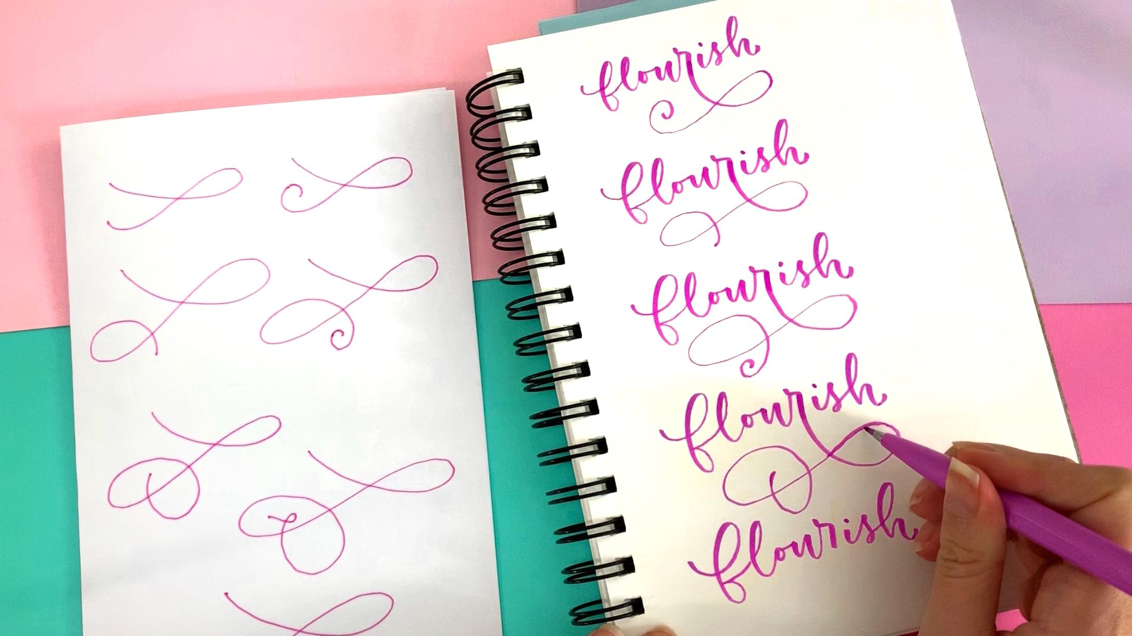
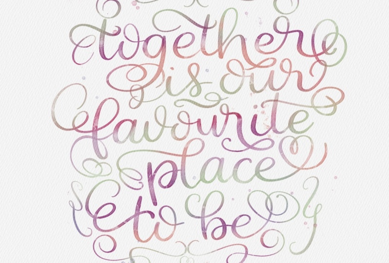
2. What are flourishes?: So this is a class about flourishing. But what exactly are flourishes? The most basic definition of a flourish is an embellishment of the text. Without the flourish, you could still read the word and the flourishes and ornament that adds to the word or lettering layout. Flourishes come in all shapes and sizes. And there are a lot of different flourishing styles. This is the flourish. This is a flourish. This is a flourish. And this is a flourish. Although flourishes can differ a lot, and their level of complexity and their configuration, flourishes are made up of the same set of building blocks, which I'll be referring to as basic shapes. The basic shapes that make up flourishes, r, c shaped curves.'s and shaped curves, loops, spirals. And what I like to call a bounce, which is when the flourish changes direction. In this class, we'll be exploring how to make our own flourishes by putting together these basic shapes.
3. Supplies: So you're all ready to
start learning how to add gorgeous flourishes
to your lettering. But what supplies should
you have on hand? I know it's tempting to want
to start practicing right away with a brush pen or nib pen that you would
use for calligraphy. My recommendation though, if you're completely
new to flourishing, is to use a writing
utensil with a hard tip. So you'll have more control. A good option in addition to a pencil might be a
bullet point marker. The best brush pen to start
off with when practicing flourishing is the hard
tip Tombow Fudenosuke. Later on in this class, as you become more comfortable
with creating flourishes, there will be
opportunities to practice using brush pens with
a softer brush tip. Now, I'm guessing
you're thinking of printing the worksheets that are available with this class, since they're kind of
like one big cheat sheet. But where are those
darn worksheets? Well, you'll need to
have skillshare open in an Internet
browser, not the app. And you'll see that when you
click on the Projects and Resources tab under the video, there's a little area on the
right labeled resources. Click the link that starts
with flourishing made simple. And the PDF file with all of the worksheets should
automatically download. Awesome. Now, if you're using a pencil or pen with ink that
isn't too juicy, you should probably
be fine with printing the worksheets just on
regular copy paper. However, if you're using a
brush pen or any type of pen or marker that might
bleed through thinner paper. I would recommend printing the worksheets on
thicker printer paper. The company, HP, makes a
premium 32 pound paper, meaning that it is
relatively thick and heavy. And it also happens
to be very smooth, which is gentle on marker tips. So that would be
my recommendation. But hey, if you're anything like me and you want to
reuse the worksheets, just prints them on
whatever paper you want and use some tracing paper. Let's take a closer look at the worksheets you'll be
downloading for this class. They're organized so that
you can follow along with the video lessons and trace the flourishes that
you see me making. I won't be referencing the
worksheets in every lesson. So I would suggest pausing
the video between lessons and making sure you're caught
up with tracing all of the flourishes that we've
covered in the previous lesson. Notes that for the worksheets
that have examples of flourishes that go along with
specific groups of letters, such as a sender letters. There are two copies, one for brush pens and
one for mono line, which means it would be good for a pencil or a bullet tip pen. And so you can use
these worksheets regardless of what writing
utensil you're using. Also sprinkled throughout
the packet of worksheets, there are bonus words and flourishes I do not cover
in the video lessons. So now is the time
to pause the video, gather your supplies
for the class, and print out the worksheets. Once you've done that,
you'll be ready to go. And I'll see you in
the next lesson.
4. Flourishing Do's and Don'ts: There are so many different styles of flourishing that it is kind of difficult to create a set of rules by which you have to abide when flourishing. Sometimes breaking the rules leads to gorgeous and unique flourishes. However, there are some general guidelines that I would recommend following when creating flourishes. So let's dive into my version of the do's and don'ts of flourishing. First, avoid flourishes that make it difficult to read the text. In this example, the flourishes could be mistaken for letters because they're the same size and have the same thickness as the smaller letters. The same goes for the flourish in the second example here. It could be easy to confuse this flourished for an E or an O. To fix this problem, you can distinguish flourishes from the text by creating some distance between them. Here I've added some space after this spiral and before this loop, so they no longer look like part of the word. In the second example, I have offset the flourish so that it is no longer on the same baseline as the letters. So just to recap, make sure your flourishes do not look like letters. Instead, use distance or height to differentiate your flourishes from the text. The next guideline is to avoid asymmetry when Flourishing a word. Here, I've made a large flourish on the bottom right corner of the word, but it feels very unbalanced because there's just empty space all around the rest of the word. The same goes for the second example here. To remedy this issue, we can use additional flourishes to create symmetry across the word. The composition looks more balanced when I've added a flourish on the opposite corner that has a similar shape to the first flourish. I also added these smaller flourishes to fill out more of the space. Another great solution is to make flourishes larger or smaller, to fill up the appropriate amount of space. In this example, I've expanded the flourish so that it underlines the entire word and it looks much more pleasing to the eye. So to review guideline number two, make sure there is symmetry across the word. Guideline number three is pretty obvious just by looking at the examples. Try to keep the amount of negative space or whitespace within the flourishes, even throughout. And avoid clumping together of loops. Here, this flourish has a large empty space and then an area where there is very little empty space. The second example here makes me laugh because of how teeny I made the flourishes. Clearly this is an exaggerated version of what not to do. It gets the point across. Avoid flourishes that are so busy, they look clumped. We can improve the flourishes in this example by evenly distributing the curves in the flourishes and balancing out the negative whitespace. And here I've eliminated the little clumps and have replaced the flourishes above the word with a flourish that looks more closely matched to the style of the bottom flourish. Guideline number four has to do with a wavy lines crossover one another in a flourish. We don't want more than two lines to cross at the same point because it just looks too busy. Here we have a point where three lines crossover one another. And we have the same situation at this 0.1. Easy way to avoid these busy areas of too many lines crossing at 1 is to make the flourish larger and be conscious of where you're crossing your lines. The fifth guideline is to make the line weights or thickness of the flourishes less than the line weight of the letters. Here, the word almost feels like the less important part of the composition. Because the flourishes or so much thicker than the letters, instead, draw the reader's attention to the word by using a thicker line weight for the letters and making thinner lines for the flourishes. And if I've done here, guideline number six is to avoid making intricate flourishes between letters. This is one that made me laugh when I made it. Just a little bit tricky to read with all those loops between the UE and the, our. Guideline number seven is to avoid using straight lines as flourishes unless you're doing it for stylistic purposes like this one here. I think it looks kinda cool with this almost straight line as an underlying For the Word. But in general, flourishes shouldn't be straight lines. They look best when there's a little bit of curvature to them. My eighth and final guideline is to avoid little kinks in your flourishes like this. It's really easy to fix this though. Basically just make a smoother curve between these two loops. And same thing for this flourish here, there's too many kinks. There are lots of other, quote unquote rules that other calligraphy artists share regarding flourishing. But these eight guidelines that I've outlined in this lesson have proven to be the most effective for helping me create eye-catching fancy flourishes while keeping the text easy to read. So just to recap, one, make sure you're flourishes cannot be mistaken as letters. To make symmetry across the words you are flourishing. Three, keep the negative space even throughout and avoid clumping. For do not cross more than two lines at 1.5 uses thicker line weight for the letters than the flourishes. Six, avoid flourishing between letters. Seven. Avoid using straights lines in your flourishes. And eight. Try not to make kinks in your flourishes.
5. Building a Flourish: Now that we've talked about what to avoid when flourishing, let's talk a little bit about how we can put these basic shapes together to create any type of flourish. Just as a refresher, your basic shapes that make up a flourish, r, a c shaped curves, and S shaped curve, a spiral, a loop, and a bounce. One of the resources available in the projects and resources tab for this class is a worksheets on the basic shapes. If you've never flourished before, I would definitely encourage you to print out this worksheet or it's uploaded into procreate on your iPad Pro, and to work on tracing over the shapes. If you feel like you need extra practice with this, feel free to print out multiple copies of this particular worksheet and trace it over as many times as you need in this lesson. And the one that follows, I'm going to be showing you how to build up several different flourishes. But keep in mind that there are an infinite number of ways that you can combine these basic shapes to make flourishes. These are just a few. We're going to start off with a c shaped curve like this. To add on to this, if you want, you could add a little spiral at the end, which would look like this. Okay? So those are two super simple flourishes right there. Let's say we want to add onto this flourish. Instead of putting a spiral, we want to have it come around and then cross over here. It would look like this. We make a C-shaped curve like this and then change direction. And that then have it cross over like that. And in most flourishes at any point where it ends, you can add a little spiral. So if we wanted to do that for this slump, we would make our C-shaped curve, change direction, crossover and make a little spiral there. Okay? But what if we didn't wanna make a spiral there? And we wanted to continue on with this. What we could do is we could change direction here and then cross it over this line here. So it would look like this. We start off with our C-shaped curve and change direction. We cross it over here, change direction again. And then it crosses over there. And we make what I like to refer to as a pretzel shape. Now from here, we can continue on and we can cross it over this line here. So I'll make my C-shaped curve the change direction and cross it over a change direction again and cross it over this line. And this line. But if I want to do that, and I didn't want to cross over this line here. What I could do is I could take this here and cross it back over right here. So I'll show you what that would look like. Maker, C-shaped curve and change direction. We cross it over here, change direction again, cross it through here. And then I change direction one more time and cross it through like that. So we're starting to make a little spiral here. And if I wanted to continue with this, I can make a little loop here and cross it over right there. I'll show you that will make a C-shaped curve and change direction. Cross it over here, change short-run again. Cross through here, change direction again and cross it through. And then cross it over. One last time. I'll show you one last option in this little family of flourishes. Let's say we wanted to continue with this flourish here. So what I could do is I could take the end of the flourish here, change direction one more time and cross it over right there. We've got our C-shaped curve, change direction, cross it over here. Change direction again, cross it over both of these. Change direction one last time and cross it over just like that. Now let's see how this would look in a word. To demonstrate how to use these flourishes in a word. I'm going to be adding them on to the letter G in the word gift. Let's start off with this really simple C-shaped flourish here. So all I have to do is just added on to this loop here. Like that, and that makes a lovely flourish underneath the word. Now, we can do the same thing with us, flourish and add a little spiral to the end. So again, I'm going to make my C-shaped curve here and just add a little spiral. Now let's make this one here. So what we're gonna do is we'll add our C-shaped curve and then change direction and make a loop. Just a very simple loop. Just like habit. Let's skip this one for now. All we would do this, add a little spiral onto here. And let's go on to this pretzel shape fun. So I would make a C-shaped curve and change direction than crossover, change direction again and loop through. Some making my C-shaped curve can change direction and make a loop. And I'll change direction one more time and loop through. Beautiful. Adding on to that, we're going to move on to this slung, where we continue on with this and cross it over one more time. So I can start off here. The C shape curve, change direction and Luke and change direction again and Crossover. Both this scope and that stroke. Now let's try out this one here. It's little spiral at the end. So I'm going to make my c shaped curve here, change direction and move it through here. And then cross over, and then cross over one more time. Very beautiful. You wanna make sure that you continue with the curvature of the stroke. So in this one here, there's a little bit of a T infinite. Just because I'm demonstrating it in this way. But normally, I would continue with the stroke to make the flourish. And I would want to make sure it looks nice and smooth. Okay, so let's take a look at how I would make this slide here coming off of the G. So I'm going to make sure I'm coming smoothly out of this stroke here. See shape, and then change direction and loop it through. Change direction again in crossover. Change direction again, crossover here. Now making a loop. From there we go. We've got such a beautiful flourish. And lastly we have the S1 here. So make our c shape can change direction. And the current loop change direction again. Crossover, change direction one last time and cross it over there roughly. So this example should give you a little bit of an idea of how to build up flourishes. Let's take a look at a couple more really fun examples.
6. Building Flourishes - Examples 2, 3: In this lesson, we'll examine two more examples of building up flourishes using the basic shapes. My intention is to show you how you can put together the basic shapes to make novel flourishes. I encourage you to take some time on your own at some point to experiment with designing flourish shapes, just as we're doing in this lesson. So for this next example, we're going to start off with a c shaped curve, followed by an S-shaped curve. The C-shaped curve is on its side facing upward and it goes straight into the S-shaped curve. Now, we could add a little spiral onto the end of that like this. Now let's see how it looks. If instead of ending in a spiral, we cross over this part of the flourish, making another loop. And we can add a little spiral onto the end of this shape to if we want. Now, let's cross the flourish over here, making a little pretzel shape. So we have a loop and a pretzel shape. And now to mix things up, I'm going to add a small loop inside the pretzel shape. Notice how the flourish looks a bit odd or incomplete like this. But when I add an S-shaped curve onto the end of the loop, it looks like a finished flourish. So let's see how these flourishes look in a word. I'll be flourishing off of the bottom of the letter R in the word flourish. These flourishes are included for you to trace in the packet of worksheets that are available for this class. So feel free to follow along with me by tracing the flourishes on the worksheet. The worksheets for this lesson are labeled building a flourish and their examples 23. I would also encourage you to pause the video and anytime rewind as necessary to rewatch sections or change the playback speed 2.5 times the normal speed if you need to watch it more slowly. For this third example, I'll be demonstrating how to add S shaped curves one after another to make fancy loops. We'll start off with two S shaped curves. And when we go from the first one straight into the second one, you should end up with a loop. It looks like we're making an infinity symbol that is open on one side. We can add onto that first shape by making another S-shaped curve. So now we have a second loop. And now I just keep adding S shaped curves on to this to make a really fun loop design. And if we want, we can make a little spiral at the bottom of it. You can add as many loops to this design as you want. For example, here, I'm making seven loops with a spiral at the bottom. And you may notice that I'm making the loops different sizes, which I think gives it a nice added dimension. Now let's see how we might add these flourish shapes to the word flourish. My favorite way to use these fancy loops is as underlines for a word or phrase. Notice how all I'm doing is making an S-shaped curve on its side. And then coming back around, looping through and then making another S-shaped curve. So now that we have a general idea of how to put the basic shapes together, let's dive in to how to flourish above a word using some common flourish shapes. Let's go.
7. Where to put a flourish: All right, so by this point you can easily identify what a flourish looks like. But how do you know where to put it? Well, it turns out we have a lot of freedom with where flourishes can go. They can go above a word, below a word, or to the sides of a word to make things easier for you. I broken down the rest of the class into sections. We'll first cover the various ways to flourish above a word, then the sides of a word, and finally, the lowered. Here's a quick tip before we dive into the nitty-gritty. When in doubt, if you aren't sure what letters to flourish off of looks for letters with loops. For example, this L has a loop and we can add a flourish to the loop in a few different ways. This P also has a loop and I can turn it into a flourish as well. Letters like L that have large loops above the baseline are called a sender letters. And the loop is called an ascender loop. And letters like p at descend below the baseline have what are called descender loops. And it'll be helpful for you to know that there's a whole family of letters with a ascender loops. Specifically, those letters are d, b, k, f, l, and h weight. Those seem kinda random. How can you remember that? Well, one way to identify these letters is by knowing that they're taller than your lowercase vowels, like a and E. But what didn't even catch your way to remember these letters? Like a mnemonic. Oh, how about this? Flourishing is no big deal if you know how to flourish loops. Yeah, I like that. Flourishing is no big deal when you know how to flourish loops. Got it. So now that we're familiar with this family of letters, you know, ones with a ascender loops. Let's head into the next lesson where we'll take a look at how we can add flourishes to them. Let's go.
8. Above a Word: Ascenders: The first way that we're going to talk about flourishing above a word is with letters that have a sender stems like the letter D. So let's go through some different options. And just like we've done in the past, we're going to be building up our flourishes from very simple to more complicated. Let's take a look at this one here. So to make this first flourished coming off the letter D, I'm actually going to start with the flourish part of the D. So we're gonna start out here to the left of the oval part of the D will start out here. We're going to go up and then back down. And that's going to be our S shaped curve, part of the flourish. We're not going to lift our pen when we're making them flourish And when we're making the loop. But for right now I'm lifting the pen just to show you how the different shapes of the flourish go together. So once we make this S-shaped curve, we continue with it and make the ascender loop of the d like that. So you can see how it looks like this. A center loop of the d is extended out by using this flourish. Now I'll show you how I would do it more quickly. So again, I start out here to the left. I start down and I go up and down making an S-shaped curve, bring it around and back down. It's already, we start out here. We go up, then down, bring it around, and make our a sender stem of the D. So let's see how we can use this flourish in three different words. One word is going to have a D at the end. One word is going to have a D in the middle. So we have our asunder letter in the middle. And one word is the d at the beginning. So in the word, word we have our D at the end. So what I'm going to do is make this part of the flourish that's extending out from the loop. Pretty big. If I want to, I can make the flourish starting from here. And I'm going to come around, make my loop, and then extended out all the ways that they're just like up. So now let's see how we can fit this flourish into the word order. My D is in the center of the word. So to make my loop a little bit bigger, so it takes up all this space over here. And then I'm going to make the extension of the flourish a little bit less long than how I made it for the first word. So I can make it look like that if I wanted to. And I could play around with the height of the ascender loop here and the height of this part of a flourish. So I could make them even so they both come up too about this line if I want to, and I'll show you that. So I could do something like that. So pretty. And then if we're using this flourish at the beginning of the word, I would probably want to make the loop of the D bigger than this extension part of the flourish. So I might do something like this. So that's quite a large flourish. Or it could make it nice and small like that. Or I could do something in between. So the next thing we can do is we can add a little spiral onto the end of this and it will become this. So I'll show you that here somewhere looking at this Flores here. And I'm going to start off with the floss every go. Very fun. So the next step we can take is looping through here. So we just continue that. And we get this one here. Now let's see how we might add this flourish to our words. So with the d at the end of the word, I might wanna make this part of the flourish a little bit larger to take up the space here. So I'll make a smaller loop here. And maybe a little bit of a larger loop there. And the word order I might make, both loops are about the same size. I really like how it looks like that. Let's see how I might use this flourish and the word daring, which begins with the a sender. I might choose to make the loop very small, like that, or maybe like that. So it's a little bit closer to the oval of the d. So you can see how I've used the exact same flourish here, but me that look very different depending on the word that it's part of. And if we want to add on even further to that, we can loop this through here like that and make a little pretzel. And here's what that looks like, a little bit bigger. So we make a loop, and then we cross that over to make a pencil. To make this pretzel flourish that I just showed you, you have two options. You can either start off by making the a center loop of the d and then adding the flourish onto it. Or you can start off by making a flourish out here and then bringing it around to make the ascender loop of the D. First, I'm going to show you the first way I mentioned, which is adding on to the a center loop after you've already made it. So we're going to start right here as there were continuing on with the loop. I'm going to bring it out like this and make my S shape curve just like that. Now I'm going to cross it over here. So we've made our first loop that's going to come up here. That's going to change direction and crossover here. Now we have our little pretzel shape. Let me show you what that looks like a little bit more quickly. So again, we start here, will come out, will change direction. We loop through. We change direction again and the crossover one more time making our pretzel shape. Now I'm gonna do it really quick. When you're practicing. You can definitely start off practicing slow, just like I did. Get the feel for the motions of how the flourish is going to work. And then you can progressively work your way up to get quicker and quicker so that the flourish look smoother like it does here. Now the second way to make the flourish is the complete opposite of what we just did. We start out here, just a point, random point, whatever you choose are going to come up and to the right. And they're going to change direction like that. So it's like we're making a little c shaped curve here. We're going to continue it and then bring it up and cross it over. First part of the flourish there. And that is going to continue and come through. So crossover that second part and now we're going to make are a center loop. You should end up with something like this. So let's go ahead and do this more quickly. So we'll start off here. We go. Change direction, back up, crossover and then make a sender. And then one more time very quickly so that the flourish comes out more smooth. And there we go. So how might I use this pretzel flourish in our three words here, I can make my pretzel fairly large and take up all of this space. So I might do something like that or maybe that here. I might choose to make this loop a little bit thicker and the pretzel shape a little bit smaller. And we like that. Or if I want to bring into flourishes down closer to the letters, I would do something like this is like that. Now with a word that starts with an a sender, I'm less likely to extend the flourish out a lot over here, unless it's part of a larger lettering composition with several words for a long quote. Because then I may need to fill up the space with a flourish. Or if I'm just doing the Word on its own, I might not choose to do that. If we wanted to make a teeny little flourish like that, could be kind of cute. Maybe something like this. So again, we can see how I've adapted the flourish so that it can fit the specific word that were flourishing.
9. Above a Word: Ascenders 2: Now let's start thinking about how we can build that flourish off of the a center loop a little bit differently. So for example, instead of coming off of the loop and making an S-shaped curve like that, we can make the loop come around with a c shaped curve and I'll show you what that looks like. So we come around and make a C-shaped curve is like that. And you can make it spiral in a little bit if you want to. Now let's see how we can build upon this flourish shader. So if we want to take this flourished and cross it over, we're just continuing the direction of the flourished. It would be something like that. And here's what that would look like. So we come around and it's almost like we're making a little spiral that stops here after it crosses over the downstroke of the descender stem of the D. Let's take a look at how that looks in a word. I'm going to start off the flourish. Here, come around, and then make the ascender loop. And there you go. Now we can take this flourish even a step further. And instead of just crossing over this downstroke of the ascenders stem of the D, We can also cross over this part of the ascender loop here. So it would be like that. We would just continue with a flourish. So here's what that would look like. So we have our ascender, Luke comes around and it crosses over both of those strokes. Baking an S-shaped curve will show you how I make out in this word. Better S-shape curve looks around and loops again. And there we have it. Another option would be to take this flourish that we have here and add a little bounce in it before it crosses over this downstroke here. So it would look like this. So comes down and then it bounces back up. So I'll show you how I would write that on this d here. The way I'm going to do is I'm going to start off writing it as though I were making this flourish. So I'm going to start here, bring it around and make the loop. Then we can take this here and make that little bounce.
10. Above a Word: Other Ascenders : Now of course, these are not the only options for flourishing and a sender stem, nor is d The only a sender letter. There are a bunch of them and I have them listed here, b, f, h, k, and l. So let's take a look at some ways we can make variations of these flourishes here on some of these other ascender letters. And also take a look at how we can put these new flourishes into words. Now let's start off with the letter P. So for example, we can do something like this with the letter B. So we have that same s-shaped flourish bleeding into the ascender loop here. Now, what if we have a word like Brave, which starts with a b? If we want to use just the letter B to flourish above the word, we're going to want to make most of the florist happen in this space here. So what we can do is use one of the flourishes we've already looked at, which is this one here. And we can just add onto that flourish by extending it out further. And then maybe making some loops or whatever else we want. So let's take a look at how that would work in the word brave. And I'm going to start off my flourish here. So I'll loop around a few times like that. And I'm not fully satisfied with the size of this flourished, so I can go even bigger. There we go. That takes up the space nicely. Let's use another example with the letter F. I'm going to write the word freedom and see how we can flourish on the letter F in a few different ways. Notice how I wrote out the word freedom when I'm preparing some make my flourishes. I know that there's the possibility of flourishing above the letter f. So I leave out the loop on the F and I do the same thing for the letter D. I didn't write in the loop here because I'm thinking maybe I could add Anna flourish on it. When we get to the sections on flourishing below the letters, we're going to be doing something similar. We will leave off some of the connections between letters so that we can turn some of the strokes into flourishes. Now, let's take a look at the letter F and see what we can do. I think it'd be fun to show you guys a little variation on this flourish here. So instead of just doing a little bounce here, we can actually turn this into a little loop. So I'll show you what that looks like using the letter F. We make our loop like this. We come back over and then we loop like that. It's a little bit messy because I did it so slowly. And Clarissa's tend to look better when you do them quickly. So I'm gonna do it again and show you what it looks like more quickly. Very nice. Now let's take a look how we can add on more flourishes to the end of this large here. So we can add on more loops, have spiral, anything we want when we try first, just making a little loop. How fun is that? And let's try another one. I really like that one. So you can have a lot of fun with this. Here's a really elegant way we can add onto the end of this flourish. We're continuing with this stroke here. We can make a little loop like that. So we change direction and made a thin loop. And then we can actually make a circle around that. So starting from here, we're going to bring it around that part of the flourish, like that. And it's almost like we're making a circle kind of parallel around it. Then once we get to about here, we're going to change direction and bring it through like that. So it's kinda like a fancy pretzel. Now I'm gonna do it again, this time trying to make it a little bit more balanced. So it's more over in this area. And love VAT, so beautiful. And then if we wanted to, we could add on to the D, pick a flourish there. And I'll show you one that I haven't shown you yet. But it's also basically just adding on to the same flourish. So we're creating this shape here and we're adding onto it. So what I'm gonna do is unwilling to again make that Lou come around. And then instead of just doing something out here, I'm going to change direction here and then bring it the row like that. I think that's beautiful. So let's do that again a little bit more quickly. We make our ascender loop would come around. I'm just going to loop through that flourish because I wanted to take up that space. So again, we change direction out here and brought it through. How lovely is that? Something that's really neat you can do when you have two ascenders that are close to one another like this and a word is you can connect them using flourishes. I'll show you an example here. So what I can do is I can make the loop of the f come around. And then we'll extend this flourished out. And on the d's will also have a loop that, and that will extend out. And we can connect it, thinking a little loop here. And make a little loop like that. So I'll show you what that looks like when a sonata written so messy. You can see how we've connected the loop of the F to the loop of the D, using a little loop in the middle. Super fun. And I love doing things like this. Let's take a look at one last example for a ascenders with the word heel, which has 200 letters in it. We've got H and L. Let's see how we can play around with the flourishes on each of these two letters and see if we can create balanced flourishes. With my flourishes, I know that I will want to fill up this space here. And I can either do that by using a flourish coming off of the L or a flourish coming off of the h. Let's try first using a flourish coming off of the h. So I can move around and then loop back through like that. And then I don't even need to do anything at all to the AL here. Or I could add a loop like that. And you can see the word looks nice and balanced. Now, let's see what happens if we use the L to make a flourish in this space. I can make it very simple. So we'll come up here and loop around. Men, just make that basic S-shaped curve. And that would be enough. And then if I want to, I can make a loop coming off the H. There we go. Nice and balanced. If I want to make this a little bit fancier, I can loop around here and then make another loop like that. And then I'll add other loop. And maybe I can even bring that down there. And that looks nice. Another fun flourish that we haven't talked about coming from a sender letters like this would be to bring it up and then make a bounce rather than making a loop. So I can go down like that and then stock and then come back up. It's almost like you're making the top of a heart shape. And then coming out of it, I made just an S-shaped curve. And I can do something similar where I add a little loop in the middle of that. I'll bring it up here, move around, just make a little tiny loop, and then make an S shaped curve coming out. And to finish it off, I add a little loop on the L.
11. Above a Word: w & v: There are a few other letters which do not have a sender loops, but which still lend themselves very well to being flourished above a word. We'll start off looking at the letters w angry. Then we'll take a look at the crossbar of the letter t. And finally, we'll look at capital letters. The letters V and W typically end in a small Under turn, which is this stroke here. Basically it consists of a small downstroke and a small upstroke. If we're going to be flourishing the w or the V, we basically just get rid of that stroke altogether and flourish coming off of this upstroke here. So for example, with the letter v, I'm going to get rid of that stroke. And then I'm going to extend this upstroke here and turn it into a flourish. Now let's look at a few different options that we can do for flourishes for these two letters. The simplest option would just be to extend this upstroke up and make a little c shaped curve going in this direction. In fact, if we want to add to this basic C-shaped curve, we could make a little spiral here. Or we can cross this through there and make a loop. Here. I'll bring it up, change direction and loop. And just as we've seen before, we can turn this into a pretzel shape, changing direction here and crossing over that stroke there. So I'll show you how that would look altogether. I extend this stroke of loop. Then I changed direction and loop through once again, creating a pretzel shape. I can also choose to come out of this loop instead of going upwards making a c shape, I can go up and back down, making an S-shaped curve, will do that. Here we go. And then we make our shaped curve like that. And then just as we saw with the ascenders, we can create any type of flourish coming off of this extension here. So we can make another little loop there. We could make a little pretzel shape coming off of it. Whatever we want. Something cool about lettering on both the letters v and w, is that you can change the direction that the flourishes going in. So here I have the loop in this direction, but I could also make the loop go in this direction. So the first way we looked at the lips started off and I was going up and to the right. But this way, I went up and to the left and made a counterclockwise loop. So let's explore some different options for flourishing by making a loop going off in that direction. Here I've made the loop come out in a c shaped curve. Let's see if we can make it come out in an S-shaped curve. Like that. We can also turn this shape into a pretzel shape by continuing with the flourish and crossing it over this stroke here. So we can go up and go counterclockwise this time, cross it over, making a loop. Then and change direction and cross it through one more time. So they got a little bit more quickly now, like that. And we can choose to do whatever we want to. This extension part of this flourish, we can make a little pretzel shape. We can make a spiral. So let's explore some of those options. So I'm going to come and to the left this time and make a loop. And then take another loop, change direction and cross it through. So there we've got our first loop and then our little pencil shape. So little bit more quickly this time. Sliced up. And, and let's try out one last fun one. So we go up and look through like that. So I'll do this one again. More slowly. Came up and to the left, and then my counterclockwise loop. And then I crossed over and I change direction and crossed over here and came through here and then crossed over here and then came back through like that. So do it one more time, more quickly. Fun is that now that we have several options for flourishing of Z or a W, because these would all work for the second stroke of the letter w. Let's see how we can put a few of these into some words. So here we have three words or letters that were going to be flourishing are placed in different parts of the word. So here, the letter w is at the beginning of the word. Here, does v is in the middle of the wind. In here the W is at the end of the word. Let's choose a flourish that might go nicely in the word wonder. I want to fill up this space here. With a flourish coming off of the W. Or I could even choose to fill up the entire space if I didn't want to do a flourish off of the D. So a really good option might be to use this flourish break here. So let's try that one out. So this one comes up and goes to the left and then makes an S-shaped curve like that. Let's see how we can fit nicely into this word. I'm going to erase this part of the upstroke so I can make it it nicely with my flourish. And if I want to take up the entire space with my flourish, I can do something quite large. So I think that what takes up the space very nicely. I could also make the flourish smaller and then make a loop on the D. So we'll try it out. And loved thoughts. And then we'll make a loop T Here. And Now the word looks pretty balanced. So you may notice that the word Lafley has simple letters that we could use to flourish above the word. We have this L here, this L here, and then we have this v. So we have these two ascender letters and r v. I could choose to flourish only one of them or none of them. It looks fine just like this. But what if I wanted to flourish All of them? Let's take a look at something super cool that I can do. So I'm gonna start off with this L here and make a loop coming out of it like that. And then I see that the natural trajectory of this stroke would be to come out of it going up and then back down like that. And I like how that looks. So what I can do is I can actually connect this to a flourish coming out of my letter v. By doing something like this, I can bring it around and make a loop like that. And then change direction. And for us it through. So we're making a pretzel shape. The parable actually end up attaching to my letter v is met super cool and love how those flourishes Connect. And then to make the composition look balanced, I can also do a flourish on this L here. And I'm thinking I might do something like that. So let's see how that looks. If I do it a little bit more neatly. So I'll make my loop here first and I'm gonna come up, around and down, down. I'll change that. And it's still a little bit. All right, that looks kinda cool. And now let's add my flourish on to this first bell. Leslie. So to refine this, I might want to change the shapes of some of the flourishes. I think I like that overall shape a little bit further. Let's go a little bit more simple for the word aloud. Let's just flourish the WWW and help out. We use this flourish here. So it comes up into the right, flips around and comes out of it with an S-shaped curve up into the right length. And make an S-shaped curve. I highly encourage you to play around with flourishes on words, the way that I've just done. It'll give you a lot of really great practice being very creative with flourishes and finding new ways to fit things together. It's a lot of fun.
12. T Crossbar: Now let's talk about flourishing above the letter T using this crossbar or horizontal stroke. T is one of the most common letters in the English language. And you'll therefore probably have a lot of opportunities to flourish off of it. The most simple flourishes that you can do using the crossbar are an S-shaped flourish. So you can start on this side, come from here and go down and down. Or you can come from this side and go down, up, down with a word like positive, which has one t and doesn't have any a sender letters taking up the space above the x-height. We can easily use this crossbar of the T to fill up the entire space above the word with a flourish. For example, I can do just a very simple S-shaped flourish like that above the word. Almost all flourishes that you will see coming off of the crossbar of the T are built off this basic S-shaped curve. So let's, with some different ways that we can build flourishes off of the shape. Essentially, we are going to be adding on to either decide of the flourish or this side of the flourish. For example, on this side, if I wanted to, I could extend this by changing direction here and making a little C-shaped curve coming off of it like that. I could continue that even further and loop it through like this. And I could make it so that, that loop and on the dot of the eye, which is pretty neat. Another simple way to add onto this cross bar would be to add different kinds of loops. So I could do something really fun like that. I could make them even smaller than that. And I can do the same thing on the other side as well. I could do something fun like that. Little tiny loop. Another simple loop that I think looks really great on the crossbar of the T. If we're adding onto this flourish here, is to make it come down to loop through and then come out of it with an S-shaped curve like that. So I'll show you that in our word positive. So we start up here, we come down and then up, and then come back down and then and then come out of it with an S-shaped curve. So I'll do that a little bit more quickly. So comes out meter. So we start up. Down, up, down, loop and make an shaped curve like that. How beautiful the.com out and it's super simple. Let's play around with flourishing the crossbar of the letter t. In several other words. Here we have the word supports, which ends in the letter T. And if I want to make the flourish nice and balanced on the top of the word. I want to fill up this space with the flourish. So I can, if I want to do a simple S-shaped curve to do that. So I'll start up here and go down, up, down like that. Which looks nice. I can continue with that by going down, down and then curling around like that. Or I could even bring this further and loop it through. So we go down and loop through with hats. And then of course, adding onto that, we can make any of the flourishing shapes that we've learned so far in this class. So I can make a pretzel shape if I, once. I could've, instead of coming out of this in this direction, I could oh, like that. Socially you got up to one and then I make an S-shaped curve coming out of it like that. If we're looking at the word motivation, we notice that it has two T's. So we count if we want to just do two separate crossbars. And that's where I've made simple S-shaped flourishes on both of them. Or we can make one pass bar that connects both of these T's together. I can do that by making one as shaped curve like that. Or I can make it a little bit fancier by connecting them with a loop in between. And I'll show you how to do that here. So we'll start up and go down and back up. Now I'm going to change direction and come down. Soon will go towards the left and down. Then I'm gonna make a loop. Now we continue with that loop and it's going to go through the other T. So I'll show you that more quickly. Down, up current around the loop and go through the other T. Now really fast. How fun is that? Can we love that? How about the word attention, which has three T's, two of which are adjacent to one another on the word. Typically when two T's are next to one another in a word, I will use one crossbar because it's easier and it looks lovely like that. Here I've made a simple S-shaped curve. And for this other t here, I can make an S-shaped curve oriented in the same direction. So starting up, then going down, up, down like that. Or I can make a more complicated flourish by adding on a little shape out here. Let's say we'll do a pretzel shape just for fun. So let's start out here. And I'll go down and down. And I'm going to cross it through. So I'm gonna make a loop. Then I'll continue with it, change direction and pass it through. Some more quickly. It will be starting up here. It goes down, up, down, cross it through. If the letter t happens to be next to, for close to a letter that has an ascender loop. For example, here we have a T next to an H. We can use the crossbar of the T to create what's called a ligature, or connecting the crossbar of the T to the h. So I'll show you an example here. I'll start out here and make a little S-shaped curve crossing my tea. So I went up and then back down and then up. Now I can continue with this stroke. Bring it and around and connect it to my H. Like that some more quickly so it comes out a little bit more smooth. I would start down. I'd go up, down and around, creating a center loop of the H off of the flourish. And then here I'll just make a simple S-shaped curve on this tea.
13. Above a Word: Exit Stroke: Another fun way to flourish above a word is to take the exit stroke of the final letter of the word and turn it into a flourish. For example, on the word joy. We can take the exit stroke of the y and bring it above the word and turn that into a farce. Maybe we could do something like this. Let's take a look at a few common examples and I'm going to use the letter a will just assume that this a happens to be at the end of a word. And we're going to see different ways we can bring a flourish up above the word. So for example, one simple way is to make a C-shaped curve like that. And if we're trying out that flourishing or worse, joy and might look something like this. We could even take the flourish and make it come all the way around here. So the dot of the j is connected to the Florence. How fun is that? If we want to expand upon this flourish, we can take it and move it around by crossing it over this upstroke here. So let's see what that would look like. Nice. And if we put it into our word joy, it would look like this. Another great option would be instead of coming out of this loop using a C-shaped curve, we could come out using an S shaped curve. So say you about delight. We make our loop. And then it ends in an S shaped curve. And we loop. Can come around my fat. You're going to fall down to expand upon this flourish here. We can continue and cross it over this upstroke here. So what that would look like is this, you come up MOOC around and then across it over that upstroke. And here's how it would look in the word joy. Super fine. We can continue this. Burning it through and crossing it over to this stroke here. So, so you that we make a loop crossover and bring it through Singer. Now let's see what that looks like in the word join. Aloof, S-shaped curve, and forget thrill. Beautiful. We can even take this flourish a step further by continuing it. Bringing it above the stroke here so that we crossover leakiness. And then looping it back in there. For looping back in here. Let's try it the first way to we come up, we loop around, make our S-shaped curve come through, Bring it up and loop it like that. I'm gonna do it a little bit more quickly so that it comes out a little bit looser and you can see what the flourish looks like that where I'll walk you through this 11 more time. We bring it bob using a C-shaped curve, and we loop around using an S-shaped curve. Then we bring it over this upstroke here, crossing it over the crossover, organic crossover again. And then we change direction and cross it over one more time. So let's make this flourish over the word joy. That's pretty. Or remember how I said we could cross it over any other part of the flourish that people click. Yes. Let's backtrack a little bit and add on to this flourish here. So instead of bringing this flourish around, and then third here, what we can do is we can bring this flourish over here and then come back through into there. And if you wanted, you could even make a little loop here. And then an S-shaped curve. So let me just draw that a little bit neater down here. So we have our loop, S-shaped curve. We come back over and another loop and then come out with a little S shaped curve, my cat. Let's take a look at a couple other ways of flourishing above a word. From the exit stroke of the word, this particular flourished differs from the ones that we've been looking at because it starts with an S shaped curve rather than a C-shaped curve that comes around. So let's see how we can make this. I'm going to start here. I'll bring it up. And then I'm going to come back down now and then go back up. So we make this S-shaped curve. And more quickly it looks like this. Down, up like that. So here's our word, joy. If I wanna do that flourish, I would bring it like this. I'm back around like that, making our S-shaped curve. And of course we can always add a little spiral here if we want it. Just like that. Another way to add onto this is by looping it through here. So we can do something like that. So here's what that would look like. I come up, back down, and then I change directions and make an S shaped curve just like that. So we go up, down, change direction, are looping through and then bring it back up. And now in the word joy, that would look like this, down and loop through beautiful Tad on even further to this flourish. And this is the last one we're going to look at. Instead of stopping the S-shaped curve here, we can actually continue it and cross it over this upstroke. I'll show you what that looks like. So we're going to start off with our S-shaped curve. Come around, go down and then back up and change direction and loop through. And then cross over one more time. Like that. Here's what that looks like a little bit more quickly. Beautiful. So in our word, joy, here's what that would look like. You'd come up, down, up. And then we loop through both like that. Lovely.
14. Side of a Word: In this lesson, we're going to briefly cover flourishing through the side of a word. The easiest way to make flourishes on either side of a word, or to use the entry stroke and exit stroke. Let's take a look at a few ways to flourish the entry and exit strokes. We could make simple C-shaped strokes like this. We could add spirals. And remember to make sure they can't be confused for letters. We could add long C-shaped curves or S-shaped curve. So the flourishes take up a lot of horizontal space. Or we could make one or more loops on one or both sides of the word. Capital letters give us a lot of opportunities to flourish. And that could be a whole class in and of itself. So for now, let's look at how we can flourish to the left side of a capital letter such that the flourish is to the left side of the word. For example, here on the letter a, I can add a small C-shaped curve, a loop, a pretzel shape, or more than one loop interlocking letter B. I can add a loop to the end of the downstroke here. And I can even connect that loop to the top of the letter. Notice how I can add a loop or a small flourish to the left of these capital letters quite easily. And for letters like F, I can even connect to my flourishes, to the horizontal crossbars. On the letter F, we have two different horizontal strokes. And you can flourish off with either one of them, like I've done here. Some capital letters, like the letter M, have more than one place where you can flourish To the left. For example, I can flourish coming off of the bottom of the leftmost stroke, like I've done with the other letters I've shown you. Or I can flourish off of the top of the letter. The flourishes coming off of capital letters can often be quite ornate. And because they are smaller than the letter itself, they are less likely to be mistaken for a letter. So have fun flourishing to the side of capital letters. Now let's head into the next lesson where we'll talk about how to flourish underneath the word. Let's go.
15. Below a Word: Descender Loop: We'll start out for a journey of flourishing underneath a word by talking about de-center letters. Here I've included a list of letters that are descenders, which have strokes that go below the baseline. It's really easy and fun to make flourishes off of these letters. So let's take a look at some examples. We're going to take a look at how we can flourish the letter G in the word grateful underneath the word. Let's look at how we can build up flourishes on the descender stem of the letter cheese. So typically when you write the letter g, you would make this city-center loop. If it's not going to be flourished, this upstroke comes through and connects it to the next letter, whatever that may be. But let's say we do want to add a little flash. One possibility is simply to extend this upstroke and make little c shaped curve coming out. And we can always add on a little spiral here, we'd like. So let's take a look at how I might make this flourish in the word grateful. So I might do something like that. And if I wanted to make it into a spiral, I would do this. Adding onto this flourish here. We could cross this over and into this part of the loop like that. So I'll show you what that looks like. This like that. And now let's see how that looks in our word. Grateful. And make my loop and bring it around. And then I cross it over. And we don't have to stop there. In fact, we could ring, stroke all the way through and cross over, bolster this downstroke and this upstroke here. So it would look something like this. Make my loops. And then I cross over and make an S-shaped curve. So if I'm doing that more quickly so that it looks a little bit more. You know, that last messy, it would look like this. Very fancy and very beautiful. And here's how that would look in our word. Maybe I would do something like that. So extend out this part a little bit because we want most of the flourish to be balanced on learning the Word. And might also do it like this. Very small. Another option would be to make an S-shaped flourish as we come out of the loop like this. So you can see we have that S shape there. Now adding this flourish to the word, grateful, we can do something like this. So you can see how I can be pretty liberal with this S-shaped curve and bringing it out pretty far. Like it's underlining the word. You've probably guessed that you can create flourishes off of this extension here. But before we look at different ways to do that, I just want to talk about one fun flourish that I like to do, where I make this S-shaped curve and then come back around with another S-shaped curve that goes like that. See you bring it through here making an infinity symbol. So I'll show you what like S-shaped curve, S shaped curve like that. And let's try this out and our word, grateful. Very nice. Now let's see how we can add on to the right side of the flourish here. One way we could do it is just simply to make a spiral. Another way is to make this cross over here. So we create a little loop. So let's try that loop in the word, grateful. We could do something like that. I like the idea of making a large loop underneath this word because it is a fairly long word and you wanted to make sure you take up enough space. But if you were to flourish over here or you were to balance it with other flourishes. You could choose to make a very small loop like, like this, like that. Adding onto this flourish here, with the loop, we can choose to make a little C-shaped curves, cross it over. And they were making that little pretzel shape to balance out the flourish underneath the word. I might do something like this. By making the flourish nice and large like this. It takes up a lot of space underneath the word and feels nice and balanced. Now I'm going to show you one of my absolute for it flourishes to make. And it's an extension of this one here. And we are going to make a loop, but then we're going to turn it into an S-shaped curve. Let me show you how it works. So we've got our descender stem here. And then we loop through and create an S-shaped curve. And then we come up and make a loop here. And then make an S-shaped curve coming out of it. I think it's just such a beautiful flourish. Let me do it more quickly so it's not so messy. This particular flourish is great for underlining words. So we'll see how it works out in the word. Grateful. I think that looks beautiful. But I'm gonna try it again and see if I can fill up this space a little bit more evenly. And I think I'd like that. I might want to make the loop even smaller. Think I kinda like that version.
16. Below a Word: Descenders: For this last group of flourishes, I'm going to be switching to the letter Y, but it's the exact same type of de-center stem with a loop as the letter G are going to be flourishing the word party because it's a descender loop, poverty than here. So for these flourishes, we're gonna be talking about how to flourish without first crossing over this first descender stem. So instead of making this loop here, we can make a loop out here. And that can be a flourish just like that. And let's see how I might make this on the word party. I could do something like that. A variation of this would be, instead of making just a regular C-shaped curve coming out of the loop, we can make an S shaped curve. So show you what that might look like. Something like that. I love using this particular flourish. And you can, and this part of the flourish out as far as you want. So watch how I do it in the word Parti. So I made this loop here, and then they made this S-shaped curve. And I extended it pretty far out. You could even choose to make a little spiral here at the end if you wanted. Q. Now, I want to add onto this particular flourish here, because you can do something really cool with it, which is bring this around and then cross it back over. This downstroke. Something like that, is to make this fit into the word Party. We could extend this part of the flourish out because we want to fill up this space here. So maybe I could do something like that. And you could do that or like that. By varying the shapes of each loop within the flourish, we changed the look and size of the flourish overall. Another cute little flourish is to make a little loop like this. And then cross over the downstroke. And you could come out of it using a C-shaped curve, or you can come out of it using an S-shaped curve. Either one would work. If I were to use this flourished in the word party. I might keep it nice and small because it's not really a flourish that I can extend that much horizontally. So I might do something like this or like that. P happens to be another descender letter. So we can actually add flourish onto the end of the letter p and balance out the word. I can make loop if I want. And here I've made a loop with a little S-shaped curve coming out of it. I could even make a loop in the other direction. Like that. I could make a loop extended out and then make a larger flourish. There are so many possibilities with flourishing with these de-center letters. Now, let's head into the next lesson where we'll look at a few fun ways to flourish underneath words using letters that are not descenders.
17. Below a Word: Underturn & Compound Curve: Now, what if you want to make flourishes underneath a word, but you don't have a descender letter. Lets use the letters R and D as examples. So we're just going to focus on the letters R and D and see how we can create some flourishes underneath the word using these two letters, we can extend the letter R down and then just make a little C U shaped curve. Plus like that very simple flourish. If we want to add on to that, we could add a loop. So just a simple loop like that is another option. Now let's see what happens if we add an S-shaped curve after we make the loop. So we come down loop and then make an S-shaped curve like that. That's a very common flourish that you'll see underneath words. And you can make that loop very small if you'd like. Or you can make it much larger. So we're going to be adding onto the same flourish shape will start off with a loop like this. And then I'll just come around and make another loop just like that. So that's another fun possibility to flourish underneath a word. And we can continue with that by making the loop, another loop and then crossing through air. And you can continue without as much as you want and you can make a spiral like that. You could keep spiraling in. And if you want to, Another option that I really like is to loop around and then make another loop like that, which you've seen me do before. And if their space to bounce it out by making flourishes on this side of the word, you can always extend this downstroke over here and just make the flourish coming from the R over here, for example. Something like that. And of course we can do the same thing with this downstroke on the letter D here. Just keep in mind, we don't wanna make the loop two big over here, unless it's going to be balanced on this side of the word. So for example, if I did something like this, that would not be balanced. But if we do choose to make it a smaller loop, we have a lot of options. We can make a little loop here and then make a pretty big flourish underneath the rest of the word. We can also do the same thing that we did with the letter R, which is make a loop like that. So we're underlining the word with this pretty flourish. And we can make our shape like this. Notice that if I flourish off of the D, the adjacent letter doesn't have much space for me to make a flourish off a bit. So it would be a little bit awkward if I were to flourish off of the R. So instead, I would want to connect the R2 that D. And just let this flourish. Take up the space. Now, this would technically apply for any letter that ends in something called an undertaking, which is a downstroke, followed by an upstroke. So what we can do is instead of connecting this to the letter next to it, we would extend the downstroke downwards and Floris often this movie something like that. It would also apply to letters that end compound curve, which is an upstroke followed by a downstream, and then an upstroke. So again, instead of connecting it to the letter next to it, we would extend this downstroke downwards and flourish underneath the word. You can see that the letter n ends in a compound curve here with this downstroke leading into an upstroke, which would then connect it to the adjacent letter. What we can do to flourish underneath the end is to get rid of this upstroke here so that it's no longer connected to the letter next to it. And we would extend this downstroke down below the word and then make a flourish. I'll show you a very simple example. We would just extend this down, stork down, and then just make a little flourish. Do you could theoretically do any flourish coming off of this, for example, I can make a little loop that I can make a loop plus I'ma S-shaped curve like that or any other type of flourish. So here's a list of mothers that end in an undetermined or in a compound curve. So I'm gonna just go through some of these letters and quickly show you some really fun flourishes that we haven't already seen yet. So coming off of the bottom of the letter D, I've gotten rid of the upstroke. But what I can do is extend the found stroke and then make a little pretzel shape. Let's take a look at a different option on the letter H. So again, I get rid of the upstroke and I'm going to extend the downstroke. And then this time I'm going to do a loop. And then the little spiral up the end with the letter K. I'll extend, downstroke down. We go loop and then make another loop, and then cross it through making a little pretzel shape with the letter m. Let's do something really fun. So I'll extend down. Then once we've come down here, I'm going to make a small loop. So will change direction and then cross it over like this. Once we've done that, I'm going to come around and make a circle around it. And then the cross that through. So let me do this a little bit more quickly. Eat, come down, small loop around it, and then cross it through like that. How about let's do something with the letter N, where we make a loop. And then another loop. And the more cross that back through the first one and love that. So these are just some different ideas for flourishes that you can do off of these letters that end in an undertone and a compound curve included in your packet of worksheets is a handout where I've included these flourishes as well as several others that you can use to flourish underneath a word. I suggest you go through all of those flourishes and trace them to get a little bit of practice on your own. Now I wanted to use the letter B as another example to show you how to flourish underneath the words. The letter b is not a common letter that people will use to flourish underneath. But I wanted to use it as an example because flourishing is meant to be creative. I love when artists use unique flourishes on unexpected letters. So let's just see how we can make some flourishes coming off of this final stroke of the letter B. Often when I write the letter b, I'll make a little loop like this coming out of it to connect it to the next letter. Let's say though, that instead of connecting the b to the next letter, we extend this loop out. Like this. I make that loop. And then I extend it out here. We can then flourish off of this. One example would be to make a nice little S shaped curve. And you can see how nicely that fits into this word. So I can make the loop here, then make an S-shaped curve. And then I can cross it over and making another loop over here. And I'll show you that. After I make this loop, I could also make two S shaped curves. Loop as shaped curve and S-shaped curve. I really like that because I feel like that was really nice and balanced with the descender loop of my letter Y. And I can also make all sorts of different loop shapes over in this area. For example, that
18. Creating Flourishes Below: "Horizon": Let's use the word horizon as an example to see how we can use several flourishes underneath one word. When I'm designing flourishes, I often like to use a pencil and I write out the letters at, let's just make the letters spaced out nice. And even. Now, what I'm going to do is identify the places where I can flourish underneath the word. So right now we're not going to be worrying about above the word. We're just going to be looking at below the word. So the areas that I see and that can be flourished R, the bottom of this h here, the h typically has a compound curve like this. So what we would do to flourish it is eliminates the upstroke part of the compound curves and make flourishes underneath here. We can also flourish here, the beginning of the arm, or hear the end of the arm. We theoretically flourish underneath the eye here, but I like to avoid flourishing the bottom of the letter i. We can definitely flourish This D sender of the Z. We can flourish this part of the N, which again is a compound curve. And we can make that come under the word as well. So those are the main areas that I see that can be flourished underneath the Word. And I'm going to just keep this here like that and rewrite my word and pencil underneath. So you will have this as a reference. Now the men letters are spaced out how I want them, I can start to brainstorm where I want my flourishes to go and how we want them to look. So I'm seeing now that the z would be the perfect place to start my flourishes, even flourishing from the Z. I'm definitely not going to want to make a flourish on the eye. So we've eliminated that as an option. And I'm seeing that the R is a little bit too close unless I want to make very tight flourishes. And I'm going to avoid flourishing the R here. So my other option would be to just carry this over here and make a flourish coming off of the z like that. Or to flourish off the bottom of the H here, which I think is what I wanna do. And we're going to have to take up some of this space here. I think I want to flourish my h by coming down here, making a loop and then a little S shaped curve that takes up the space very nicely. So I'm just going to kind of sketch that inherent with my pencil, trying to make it, even trying to make it the shapes, but I want to make it OK. And then I'm looking over here at the Z and I'm seeing, I kinda want to change the shape of it. It's not quite so circular. So what I'll do is I'll extend it out a little bit that way. And then if I make that shape, is there. It better matches the shape here. And I like the idea of extending this back out over here a little bit like that. So they're not interlocking with one another, but they're very close to one another. And then I can eyeball what shape I like for this flourish. And a nice. And then we have this empty space over here. And the end seems like the perfect letter to use. To fill up that space. I typically don't like to flourish my ends like that. Because then it makes it harder to read as an n, looks like a Y, looks like a line. So instead, I'm going to bring the m down like this and make a loop. Like I did that the H there and make that shape peak. I like that. But it's not fitting. All that great is the how here is quite large and this is quite small. So I think what I'm gonna do is kinda given the model a little bit. So I keep this small and I'm gonna make the one on the h smaller so it better matches the size of the n. Flourish. There we go. So now they're much more even. And then what I can do is I can change the flourish on the z so that it fills up the space appropriately. And let's see. What I can do is shift over the flourish. So it's more over this way. Like that. I kinda like that better. Definitely missed that better. So then we're going to connect the rest of our letters that were not flourishing. And I think I'm ready to go over it in ink. Now, for this part, you can choose to use a brush pen, which is what I'm going to do. Or you can choose to use a bullet tip marker or any other fine liner that you have or you can leave it in tensile. It doesn't really matter. And I think I also want to add just a little loop on the H here. Just click we're writing and scripts and I like how that looks. So we'll show you how I would ink in this word will start off training out the letters. Because this is a pretty simple flourish. I'm just gonna go ahead and do it now. But a lot of times when I'm inking in words, I'll actually skip a flourish and just go and do all the weather's first. For now we'll do the flourish though. Knucklehead can do the rest of my letters. And I'm just going to practice this flourish a few times to get the feel for it before I go over it with the ink. And there you have it. That's my process for designing flourishes underneath a word.
19. Creating Flourishes: "Together": Let's take a look at the word together, which is slightly longer. Here. I bring out in pencil the letters, but I've left out the areas that can be flourished. So for example, here we can flourish the crossbar of the T. So I left that out. We can flourish the bottom of the t here. So I've left that out. We can flourish the stem of the G, this bottom part of the t here, as well as the crossbar, the ascender loop of the H, The End of the H here, the beginning or the end of the r. And we could also add a loop to this R. So right now I've just kind of written the skeleton, the bare bones of the letters. And I'm gonna start off with something super simple with this one. Let's make something that's really symmetrical. So I wanted to make a flourish that's right about here, and a flourish that's right about here. And the easiest way to do that is to make little S shaped curves. So if we want to make an S-shaped curve on the top like this, all we have to do is make the crossbar of the T Connect to the flourishing of the H. So here I've just drawn in the loop, the ascender loop of the h. And then I'm just making an S-shaped crossbar of the T there. And then on the bottom here, I can use this G and make an S-shaped curve coming out of it. So it looks nice and symmetrical way of this S-shaped curve here and this S-shaped curve where we have this loop here and this loop here. And then all we need to do is just connect to the rest of the letters together. And if I want to, I can also make a little fancy crossbar on this team. I don't think that will distract at all. So then I'm going to disconnect the rest of my letters together. C, e connects the T. We're not gonna be able to flourish here or here. That should be good. So all we have left to do is to just go over this with our brush pen. Notice how when I was trying to make this flourished for the G, It didn't go exactly over where I had planned to put the flourish because I was letting my wrist and my RMB nice and loose. That will happen sometimes and it's okay with me. So now to make this flourish here, because this flourished went a little bit further down than I was hoping. I'm going to actually try to make this one a little bit higher. Absolute matches doesn't have to be perfect. And we go. And then I'll extend the stem of the T there so it's a little higher up. Then let's us add on little S shaped cross bar of this t. And there we go. Once the ink is dry, I can erase the pencil markings and you'll be able to see how nice and lovely these flourishes look. For my second design, I wanted to do something a little bit more complicated, but keep it nice and symmetrical. So I love the idea of flourishing off of the G and off of this H, a center loop here. And maybe doing something with this and this here. We can maybe take this S-shaped curve coming out of the G and the S-shaped curve coming out of this T crossbar flourish here and make something a little bit more fancy. So I have again, written out my letters just lightly in pencil. Let's see what we can do. I'm gonna make this loop of the H here, turn it into the crossbar of the T. And then I'm thinking I wanna make something here, maybe some loops. And then again, I'm going to make my de-center loop of this g. And then I'm thinking I want to make some loops coming out of there. Let's work on the bottom first. So I wanted to be an S-shaped curve. So I want this to come up. Notice how sketchy I'm being with my lines and not trying to make them perfect at this point. So it's going to come up and then back down so that we can make a nice shape in here. And let's see what do I want to do? Let's, let's have it come around like this. They'll make an oval shape there. Maybe have it come change direction, come back through. That's kinda nice. And then let's see here, I'm gonna take up a little bit more space over here. I wanted to stay nice and balanced and we do have to make sure we keep enough room over here for the crossbar of the T. So maybe I'll again make some S-shaped curve over here. Let's see, let's have it come around and crossover there. And we don't want it to interfere with this T here. And maybe, maybe it will change your action again and cross back through something like that. And we wouldn't be able to flourish the bottom of either t. So we'll just go ahead and connect those. And I don't wanna do anything on the side of the letters are the site of the word. So we'll keep that empty. Why not? A little bit more fancy up here. So we'll make this part a little bit smaller here. And then I actually want this to come all the way through here like that and then come back up like that. So if you can follow this shape here, we've got a loop here and it comes up and changes direction, crosses over here and then crosses over one more time. And then changes direction and crosses through there. A nice little fancy pretzel with an external thing there. And then I've got room for my crossbar of the T there. And like that. And then here we can make this a little bit more fancy too. And I don't want them to be exactly the same. So why don't I do something, why don't I do something like this? And you make a little spiral here. Let's kinda nice. I could even add a little loop on the inside of here. I wanted to. You could bring this in through there and then make a little loop like that. It's kinda fun. I like doing things like that. And then what I'm gonna do is just kind of balanced it out using my pencil. So that makes the shapes that I'm going for some, I think are the most aesthetically pleasing. Alright, so now that I have a shape that I like, I'm going to go over the pencil with my brush pen. Before that though, I want to erase it just a little bit so it's a little bit lighter and will be easier to erase after I put down the ink. All right, so to trace over this, I'm going to do just the letters first and not the flourish as yet. So I'm going to maybe make a little bit of a stem there just so I can get the right spacing between the G and the E. And I'm going to leave out the rest of the stem of the G. Same thing here with the H. So you can see how I started just about right here, almost at the peak of the h and made that downstroke. And this is going to finish out my letters. All right, the easiest flourish and is this crossbar here. So I like to start with the easiest first. I'm gonna do is the bottom first. And we'll stop there and then actually turn this page. So it's a little bit easier to do. This part of the flourish. Turn out perfect, but no biggie that happens. You can always go over the areas a little bit with your brush pen and thick and the lines if you want. You don't have to. And now let's go ahead and do the flourish on the top. And we go. So for this last version of the word together, that will be designing together right now I think I want to continue with this same theme, symmetry using the flourish from the de-center loop of the G and the flourish from the eighth center loop of the H and the crossbar of the T. So I'm just gonna go ahead and draw those loops right now. I want to keep it somewhat simple. So what I'm thinking we can do is make the same kind of shape where the crossbar of the T comes here, changes direction and then comes through like that. And then we can do the exact same thing on the G. So it would loop through like that, change direction and then come through like that. So we have a beautiful symmetry here of that same shape. And then we can just go ahead and connect these letters that we are not flourishing. And then maybe you make another little fancy crossbar clean like to do that. And I'll go ahead and use my brush pen to fill in the word. Notice again how I skipped over the descender of the G, So I can do it later. And I'm gonna go ahead and make this flourish here. Sometimes it's helpful to practice it in the air a few times. First, we'll go ahead and do this one here. It's lovely. So I've gone ahead and made several other versions of the word together using different flourishes. And in the next lesson we're gonna go through three more versions of the word together that I had flourished and we'll be tracing over them to get some more practice with flourishing.
20. Flourishing with Brush Pens!: All right, Now we've gotten to the juicy part of the class, flourishing with brush pens. What makes brush pens unique is they're flexible,
tapered tip. You can press down hard
and make very thick lines. Or you can use very
little pressure and make thinner lines. We can use this variability in line thickness to our advantage
when making flourishes. And we'll get to that
in just a minute. But first, let's
talk about these small hard tip Tombow
Fudenosuke brush pens. Maybe you remember
that I mentioned them at the very
beginning of the class. If you're using a brush
pen with a harder tip, like these food and OS gaze, especially one that has
been worn down a bit, then you may be able to create hairline or thin flourishes. What does this mean? Well, the thickness
of the flourishes are going to be
consistent throughout. You won't have any parts of
the flourishes that are any thicker than any other
part of the flourish. It sounds nice, right? I mean, it's simpler when you don't have to
think about what part of the flourish should be thicker and which parts
should be thinner, plus very little pressure is needed to make
hairline flourishes. Here's a tip. If I'm making this
style of flourishes, it can actually be
easier not to have any guidelines for
me to trace over. I can plan out the flourish in the air above the paper and then practice it in one or two times before putting pen to paper. Using this technique, I can make my flourishes very quickly
and without lifting my pen, which is pretty neat. In fact, I move my entire
arm to make the flourish. However, if you're like
me and you like to plan out exactly where you
want every little detail. Then making flourishes quickly
and loosely like this, may not be your cup of tea. In this example, I have all of the flourishes
mapped out in pencil, and I move my hand
a bit more slowly. Using this method, I find
myself lifting my hand more often and making
some wobbly strokes. Since I'm making
an effort to keep my flourishes close to
the pencil markings. I sometimes may move my entire arm when
making the flourishes, but I often only move my wrist. And notice how I wrote out
all of the letters first and then came in with a hard tip food and ofs
k for the flourishes. That's my usual way of
flourishing with brush pens, inking both letters first before I start on
the flourishes. Okay, So let's shift gears and discuss flourishes where we vary the thickness
of our strokes. Brush nibs are awesome because they allow us to
make fixed strokes, thin strokes, and to
vary from thick to thin. This is how I make
most of my flourishes. You can use any type
of brush pen for this, even ones with harder tips. But let's first take a look at pens with more flexible tips. I'll demonstrate here with
us to below brush pen. In brush lettering,
it is typical to make downstrokes thick, meaning when the pen
is coming towards your body or down from
the top of the paper, towards the bottom of the paper. Conversely, upstrokes are thin. Here's what that looks
like in practice. When I move the pen up,
the line is thinner. And when I move the pen down, I make a thicker stroke. When we make flourishes, the rules are not
so cut and dry. That is why the technique
for making flourishes with a brush pen is a little
difference than brush lettering. Let's take a closer
look at what I mean. Here. I am making two crossbars
for the letter T. For this first crossbar, I'm holding the brush pen in the same way I would if
I were brush lettering. The second version, I hold
the pen a little differently. And you can see that the
part of the crossbar that is thickest differs from those of the first crossbar
I made just now. For this crossbar
of the letter T, I have made the
stroke thickest where it is oriented horizontally. Notice how for this
crossbar, however. The thickest parts are where the strokes are
oriented vertically. Both of these crossbars are perfectly awesome to
use in your lettering. There's no right or wrong. Here you can see me making a crossbar that is
thick horizontally. And here the crossbars thickest
for the vertical strokes. I like both. What exactly am I doing to change where the
stroke is thickest? I mentioned that I'm holding
the pen differently. More specifically, I
change both my grip on the pen and where the pen
is in relation to my hand. When I want to make a
thick horizontal stroke, as in the simple flourish on the descender loop of the letter Y you
see me making here. I hold the pen such that
my hand is closer to the bottom of the page
compared to the pen. This makes the brush tip of the pen tilt towards
the top of the page. The end of the pen tilt towards
the bottom of the page. When I apply a good amount
of pressure to the pen, the line is thickest when
the pen moves horizontally. Here's how that
looks when I make a flourish off of
an ascender loop. Notice how in this example, where I'm writing the
word calligraphy, I grip my pen so that the tip of the pen tilt to the left while
I'm writing the letters. Then when I begin to flourish coming off of the
descender loop of the G, I changed my grip and the tip of the pen tilt towards
the top of the paper. And the flourish
is the thickest it horizontally. Here's a tip. When you're inking
in a flourish, rotate the paper so
that you can easily make your flourish thickest
in the areas you want. Or so that the curvature
of the flourish matches the way your
hands naturally rotates. If you're making flourishes
slowly and with precision, it can become
really difficult to make the flourish without
rotating the paper. For example, I was recording this piece to use as a
video for social media, and therefore kept the
paper in the same place. For this very large flourish. It took several extra strokes
to make the flourish. I'm going to speed this
footage up a little bit because it took me
a while to make. I ended up lifting
my pen several times just for
this one flourish. I decided to just go ahead and rotate the page for
this final flourish. And it was a lot easier. Here's an example where
instead of rotating the paper, I rotated my entire arm so that my hand was above the
pen to make the flourish. That's also an option. Another tip I would
give is to lift the pen while you're inking in the flourish if you
feel you need to. Okay, I know this is
kind of like cheating. But although it's super satisfying to watch
someone create a complicated flourish all in one go without
lifting their pen. It may not be practical for you to make
flourishes this way. I personally spend a lot of time and energy designing
compositions. So I cannot afford to
ink and a flourish only to have it be half an inch
off from where I had planned. I feel like it's
okay to lift my pen. In this composition, I made the flourishes
quickly and loosely. You can probably guess that
I made this design back in February because I wasn't too concerned with making
the flourishes, quote unquote, perfect. I felt free to use my entire arm in broad
sweeping movements. Notice how for most of the
flourishes in this piece, I'm holding the pen in the same way I would if I
were making the letters. The flourishes are a little
bit thicker when I'm making a downstroke and a little bit thinner when my hand
is moving upward. So how do you decide which part of the
flourish to make thick? Again, there are no
rules other than to stay consistent
within one composition. Sometimes you may wish to keep the pen grip the same as
when you are lettering, so that downstrokes are thickest and upstrokes
are thinner. Your hand may already have
some muscle memory to press down harder when it
is moving towards you. If you've been brush
lettering for awhile. From member to avoid making your flourishes thicker
than your letters. One way I will sometimes
make flourishes with brush pens is to make almost
all of the flourish thin, but then make the
very last curve of the flourish a
little bit thicker, regardless of which
direction it is facing. Make sure you do this for all of the flourishes within
one lettering layout, just like I'm doing here, you only make the terminal
end of the flourish thick. Some calligraphy artists
recommend that you avoid crossing two thick
lines over one another. Obviously, I don't always adhere to this guideline myself, but it is worthwhile
to visit this topic. Briefly touch on how to avoid
crossing two thick lines. Remember how I showed
you how to make a thick crossbar on
the letter t earlier. Well, what if you
want the crossbar to be thickest horizontally, but still be thin when it encounters the stem
of the letter. You can make two
separate C-shaped curves that begins thin, growth thicker,
and then end thin. You just apply a little more
pressure to the pen midway through and then lighten up the pressure just before
you finish the stroke. Feel free to touch up
the edges to ensure that the crossbar looks like
one connected S-curve. The same applies when
you make a flourish off of an ascender or
descender loop, at the point where
the flourish crosses the descender stem
and the letter Y. I keep the flourish thin to avoid crossing two thick lines. Again, this is merely a guideline and you
don't have to follow it. But let's see how I
make the flourish on the letter Y without
crossing two thick lines. I often make the letter first and then add the
flourish separately. This particular flourish takes just a simple C curve
that begins thin, becomes thicker, and ends thin. You may find it helpful
to pencil in where you want the flourish to
be before adding ink. Here's a close-up views
so you can see how I gently release
pressure from the pen. In the next lesson
of this class, I'll walk you through
flourishing a word in real-time. So you'll get some practice. You're ready. Let's go.
21. Practice with Brush Pens: This practice sheet that's available as one of the printable resources for this class. Let's go through each different version of the word together. Together. You can leather and flourish. Along with me. Feel free to pause the video at any time that you need and greed play any sections that you need to watch. Again, I'm going to start off just by lettering, is by making the letters and not making the flourishes. This is a typical way of flourishing for me, where flourishes after soil go through. I'll make the skeleton for all of the letters. And then I'll go back and do the bigger flourishes later. Sometimes I'll start with the easiest flourish burst. This one looks easiest to me. So I'm going to start it over here because I think that I can easily do that, but I could also start here and come out that way. I'm gonna do it starting out here. Okay, and then let's move on to slump. I'm going to just practice it a few times above the flourish without putting my pen down. Just to get a feel for it. Now let's do the same here. And I'm going to stop there and then rotate the paper so that I can more easily. And it's flourish, it's easier to make flourishes when they're coming towards you like this. And then I can rotate the paper back. We'll go ahead and do this file. Stop there. That's just something that I like to do so that my flourishes can stay nice and clean. But you can continue her freed light. Moving on to a second version here, I'm going to do the exact same thing. So I'm just going to quickly go through and just Trace over the skeleton of the letters without doing the flourishes. I'm going actually leave this stem for later. Okay, cool. So let's go back and do this flourish here. See this clash I could fight actually be easiest if I start to the right and go like that. So that's what I'm gonna try to do. And actually going to lift up my pen there. And then let's try it. Rotating the paper. It might make it a little bit easier to read notes. And then this time here I'm going to do in two different strokes. Even though it looks like it's one flourish. You can make this part of the flourish here and then lift your pen if you'd like, and make this part of the flash. So that's what I'm going to do. Hosting asked over here. Religion icon. And then I can aid in the phi prime here and then make this part as a downstream to make it nice and thick. To can always use this second version to try it again if you'd like. Let's move on to the sun ears. Rgamma. I'm just tracing over the letters. And I will leave out the stems so I can add the Flemish later. You don't have to theory, you need to go as quickly as I am. Take your time for sure. And you're just going to go ahead and do this one because it's a little length. Ok? So now I see that the easiest flourish, at least easiest flourish in my opinion. Crossbar, if the team is gonna go ahead and quickly do that. Let's go ahead and do this one here. I'm just going to practice. It tells us this blue here. Could start here, can come out. Or I could start here. And go that way. It doesn't matter. And we'll see what happens if I start here. And it's totally okay again, to stop your furnished in the middle and then just continue to kind of reset your hand position if you'd like. And then lastly, we'll do this flourish here. Alright.
22. Standalone Flourishes: Underline: In your lettering compositions, you can always use something called a standalone flourish, which is essentially a flourish that is not directly connected to the letters of a word, but it cannot be adjacent to word underneath the word. And it adds to the overall composition. For example, if I were to add a standalone flourish here to these two words, it could be something like this or something like that. So essentially, a standalone flourish can take the same principles that we use for any of the other flourishes that we've learned previously in this class and make a flourish that's not connected to any of the letters. The most basic way to use a standalone flourish is as an underline for a word. To make a stand alone flourish that serves as an underlying. You can use any combination of spirals or loops. They're OR C-shaped curves and S-shaped curves. So let's just show some very simple examples of this. The first one would be your general S-shaped curve. That's a flourish and it's not connected to the words and it's acting as an underlying. Another standalone flourish that you can use as an underlying is one where you make an S-shaped curve like this and then bring it up around loop, and then make another S-shaped curve coming out of it. This is pretty messy, so I'm gonna do it again quickly so you can see what it looks like. Like super pretty again, it's just a nice fancy underlying. Let's take a close look at this stand-alone flourish here. It's made in three different parts, and I've made each part of different color. When I redraw it, I'm only going to be using my black so you can see what it would look like if you were to make it in just one color. We're going to start by making this longer, larger part of the flourish. And it's very simple. We start off with an S-shaped curve and then loop it around. And that's it. So it's gonna be an S-shaped curve. And then I just loop around like that. Now, you may notice that the second, third shapes are exactly the same. They're both an S-shaped curve will loop. The only difference is that there are smaller. So we'll make the second one here. And it starts on the diagonal and below where the first one started. And then the loop doesn't come out quite as far. And it's going to cross over into this loop. And we'll do it slowly. S-shaped curve, trying to stay parallel to the first one. Once I get to about here and start to come around. That's and then again, I wanted to stay somewhat parallel to the first one. And then I come out like that. And if I were doing it quicker, it would be a lot lighter, not quite as thick as this. All right, and let's do this last one here. Some are going to start on that same diagonal line. Here. We're going to make another little S shaped curve. We get to about here. I'm gonna make a little sun over hospital room or time. Just like that. Super fun and not that difficult. It's just one shape that we make 300 times. Here's another fun little and flourish you can try. If I start at the right top here, I make it a little S shaped curve, change direction, and then cross over here, making a loop. And I come back and make a small loop. And then make a smaller loop, and then make a even smaller loop. And then kinda let it flick Abbott. And each of these loops crosses over the original S-shaped curve, start off on the rates, make an S-shaped curve. And then looping around is like our little loop. Super fun. Now, let's take a look at this beautiful standalone flourish here. It's made out of two parts. And even though it looks really fancy, it's actually quite simple and we've made all of these components before throughout this class. It starts off with the top curve. That's a simple S-shaped curve starting from the right, I'm going to come over and just make a simple S-shaped curve like that. So we go down first and then come back up and then back down. Okay, the next one is going to start off the exact same way we make an S-shaped curve right underneath this one, very close and parallel to it. So you can see we start off here to the right and we make this S-shaped curve. And before we get to the end of this first S-shaped curve, we start to loop around. We changed direction and then make a loop. Then we cross it over both the bottom and the top S-shaped curve, come up, change direction, and then cross it over both of them again and then loop through. So we'll go through that slowly. We make our S-shaped curve right underneath the top one and parallel to it. Bring it around. And then we change direction. We bring it up. We cross it over both lines. And then change direction. And then cross it over both lines again. And then loop through one last time. Really fun. I'm gonna do it quickly so you can see what it would look like at a normal speeds and shaped curve. Something like that. A super-duper, simple and also elegant standalone flourish is to make three parallel S shaped curves like this. And I'll walk you through a lot. So we start off with our top S-shaped curve. I'm going to start on the right side. And we're just going to go down, up, down, up, down, like that. Now for the next one, we're going to start a little bit further. So a little bit to the left, it's going to be parallel to the top. And we're going to stop before we get to the end of the first one. Just like that. And then for this bottom one here, we're going to make it even shorter. So we'll start a little bit in and then end before we get to the end of this one. And you can, if you want, kind of make a little curl at the end. I'll show you what I mean. Kind of like that superfund. Let's look at another example of using a standalone flourish that plays off of the shapes of flourishes that are attached to letters. For example, we can flourish the entry stroke and the stroke of this word like that. And take this exit stroke of the, the that. And we can fit a flourish in this space very nicely. We can start over here, come around and make whatever shape we want in here. Let's say I'll make kind of a pret, silly shapes. So come around like that. And then here changed direction and is parallel to that, and parallel to that. How lovely. And then we can bring this up here. And maybe let's bring it through. And then through one more time. How beautiful is fat and super simple? All we did was just follow the curvature of the flourishes we already had attached to our word.
23. Standalone Flourishes: Around A Word: Another common way of using standalone flourishes is to make them part of lettering composition like this, where they're taking up space and acting as embellishments for the text. For example, here you can see I've added a whole bunch of standalone flourishes around the word mistakes, fancy and fun. And they all have the same shape of a spiral attached to an S-shaped curve. Altogether. It helps balance out the letter and composition. And it's simple and fun. So we can do the same thing around these words here, just by adding some spirals. And it doesn't have to be perfect. So that right there was a really fun way to make a little lettering composition really quickly using some stand-alone flourishes that all have the same general shape. This S-shaped curve with a little spiral at the end. Here's another fun lettering layout for the same quote that we looked at previously. And in this piece, I've used a couple of standalone flourishes and that go in conjunction with flourishes that are attached to letters. For example, this flourish here fills out the space. But because it crosses over this flourish from the word, you almost can't tell that it's a stand-alone flourish. So it becomes part of this little flourish colony together, making a nice shape that fills out the space within the composition. We have the same thing down here, where this flourish is a standalone flourish that crosses over the flourish coming off of the k. And we see how nicely these fit together. In fact, this curve here is parallel to this curve here, and it makes a nice shape and ties things altogether. So that's another great way to use standalone flourishes Is to use them in conjunction with flourishes that are attached to letters. Now let's say we wanna add a standalone flourish that connects to a flourish me off of the descender. I'll show you what I means. So let's take the letter y. I've already made this undertone here. And I'm going to do a flourish off the descender loop of the y. It's going to be something just very simple for now. So we'll just come around and then make an S-shaped curve coming out with it. One thing that you can do that's super simple, but also really nice and elegant, is to make a parallel S-shaped curve right underneath this S-shaped curve here. And it would look something like this. And it's an elegant. And it makes it a little bit more fancy. Now let's see, we want to add a loop onto this little tail here of the flourish. So what we can do is when we go another way here. And then I'm going to loop around to make an S-shaped curve and then loop one more time through. Now what we can do is use a similar flourish to this and follow this loop shape. And I'll show you what that would look like for this one, I'm going to start inside the loop of the y. And then I'm going to just follow it parallel to the S-shaped curve. And then somewhere around here, I'm going to cross over into the loop and then cross it over here and then bring it down. Okay? So we'll start right here. Make it parallel to that. And we're gonna start to come up, cross it over, and then make a, and then cross it over there and then make a loop like that. Beautiful. And I'll go and why and black, just so you can see what it would look like. Now let's revisit this flourish and see how we can use it in conjunction with flourishes that are attached to letters of a word. And what's great is we can use it both above and below a word. So let's take a look. I've written out the word worthy and I've left out the crossbar of the T Because I know I want to flourish it. So let's start off actually with the bottom. And I've made a flourish on the y, one that we've learned. And I'm actually going to take this flourish and extend upon it using this shaped and only three of these. So we see that it already has this S-shaped curve here. So I'm just going to hang around and must be start-start. And should I start here? And we're going to start here. This is the pilots. So we're going to go down and then down and we're going to end it before it gets to this line here. So we'll start here again. And that, I'll do one more underneath that. So we'll start here will actually cross through the Y will more time and then stopped before we get to this point here. Is small curve. Beautiful. We might want to even make it out like that. So if we wanted to do the same thing on the top, I would probably want to keep my S-shaped curve parallel to the ones I already have done here so you can go and make it feel more cohesive. So this time, my bottom one is going to be the biggest, and then they're going to get progressively smaller as we go up. So let's see this token to start out here. And we come around like that and try to keep it somewhat parallel to that. And then I'm going to start maybe somewhere about here. And again, not go all the way out. Will go down. And then up. And then for the last one I'm going to start even further in and make it even shorter. And that super pretty and super fun. Looking at this word, I'm seeing that there's kind of a big empty area here and it doesn't feel super balanced to me. I don't think that I necessarily need to add any more to it, but I want to see what would happen if I added a little flourish onto the W here, just going to try that out. So I think if I bring this up here like that and make a little S-shaped curve at the end. That might look nice. And I kinda like that. I think that kind of balances it out because we have these type of loop flourishes here. So to add a loop over here, kind of creates some symmetry. Let's look another great example of how to use a standalone flourish underneath a word that loops into a flourish coming off of a letter. So here I'm going to use the word, Word and I'm going to flourish coming off of the R. So we're going to do a loop, make an S-shaped curve, come around making other loops, and then an S-shaped curve. Pretty simple. It comes down, make a loop, another loop. And then an S-shaped like that. So if we wanted to make a standalone flourish that fits into that, we can do it quite easily if we start within this loop. And then you can S-shaped curve, follows parallel to that. And then we can come around and make a little loop that also crosses into there. And then bring it around. So show you what that looks like. Equals little S shaped curve parallel to that one. And we bring this up and look like that. So we'll try that one more time. Alright, written out my letters here, and notice how I've left off any areas that can be flourished just in case I wanted to add more flourishes to at later. So I'm going to bring this down and make a loop here. And then make another loop. I'm going to finish it off like that. Now we're going to come in. This loop here, starts about here. Another S-shaped curve underneath it. We're going to bring it up and through this loop here. And then down. Love wave. Let's say that I wanted to do something similar on the top of the word Here. I can flourish off of the ascender loop of this D and make the exact same shape coming off of it. So we can bring that around like that. And then if we want to, we can add another standalone flourish. So we would start here and it would come down and up. And then it would loop over and then come back through. So start here. It will come down and back up, then loop over, and then come back through like that. And really beautiful. And then we have a somewhat balanced word. And then what I'm gonna do is just connect the areas that I did not flourish. So we didn't flourish here. I'm gonna connect w to the o. And we didn't flourish off of this part of the r, But we could make a little extension here to fill in some of that space. We also didn't flourish off with this D, but we, and actually we could flourish on the entry stroke and the exit stroke of the word. So by want to, I can do something like this. And then do something similar. Coming off of this, D think I'm just gonna do a simple S-shaped curve. I think that word turned out quite beautiful.
24. Project & Thank you: Congratulations, you've made it to the end of the course. We thank you so much for taking this journey with me today. If you enjoyed the class, please leave feedback by reviewing the class on the Skill Share website. And feel free to share this class with friends or loved ones that you think would also enjoy it. Now that you've made it through all of the lessons, it's time to complete the class project. Choose a word for name, and use the techniques we've covered in the course to design flourishes around the word or name. Then post your finished product under the projects and resources tab, there's a button that says Create Project. When you click on that button, it will bring up a screen where you can upload images. Please also share pictures of any other practice you've done while going through the worksheets. By sharing your progress with others, you encourage others to try it out for themselves. Let's work together to inspire more people to be creative. If you haven't already, make sure you check out my other classes here on skill share. And if you have any recommendations for other class topics that you would like to see, feel free to reach out to me via email or send me a private message on Instagram. Again, thank you so much for joining me on this creative journey today. I'll see you in my next class.
 Lyssas Letters, Hand Lettering Artist