Transcripts
1. Intro: Combining text and illustration
in unique designs is an important skill to have as an illustrator and a great way to elevate your drawing skills. My name is Claire. I'm an illustrator
and lettering artist. I create brand illustrations, greeting card designs,
chalkboard menus, and more. Creating designs
with lots of text is the best way to improve your composition skills
as an illustrator. It will teach you so much
about planning your design, developing your
unique point of view, and it is a fantastic way to practice your
lettering skills, too. I'll share my process for creating menu designs
that I create for clients and show you how useful Procreate can
be in this process. I'll also give you some tips
on choosing the right fonts, creating eye catching
compositions, making an authentic
chalkboard look, and more. We'll create a chalkboard menu with some of your favorite
drinks or dishes, which I'll make and procreate. Feel free to follow
along with the menu that I'll make or come up with
your own signature menu. Make sure to download
the procreate brushes in the projects and resources, as we'll be using
this on the way. Designing a menu is a
great way to learn how to use lettering and illustration
together in a composition. Learning about balance, hierarchy and more
in design is a skill that will come in
handy in a variety of projects. Let's get started.
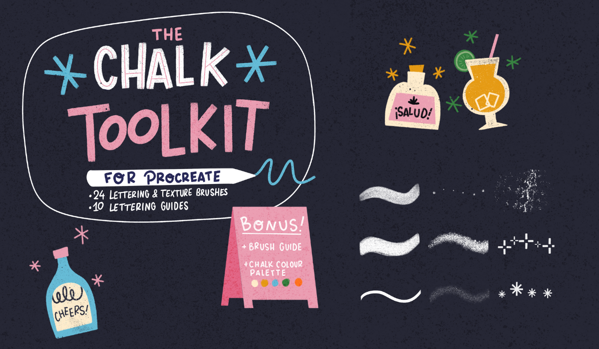
2. Canvas: So the first thing that we'll
download is the brush set. So click on that and download. This is actually a
zip fel we'll open that and you'll see the folder. So on the left side,
you'll see this is actually the brushes,
but as a template. So if you're not
working on the iPad or you want to practice by hand, you can actually print these. But for now, we're
just going to open the brush set and import
those into Procreate. And I will take you to
wherever you were before. So now we're Inpro Create, and we're going to
create our Canvas. So click on the plus
sign plus again. And we want to make sure that our file size is big enough. And if you would like to
print your chalkboard, eventually, then we need to make sure that the size
is sufficient. So I would usually go for
3,500 pixels minimum, and then buy 5,000,
more or less. And we also need to make sure that if we
want to print it, we're using the
CMIK color profile so that we have the
correct colors. If you just want to use a
digital file, then RGB is fine. But I'm going to select CMYK, and now we're done. So now that we have our canvas. You can see in the brushes, our set with all
the brushes there. The first three are
actually template brushes, and I'll show you how
to use these later. And then there's a
sketch brush and a chalk brush and
two texture ones, and we're going to
use these soon. So the first thing
that we'll do is change our background
color to black. And now we want to
create a kind of chalkboard background for this, and we'll use a texture
brush for that. So select the biggest
texture brush, and we'll use white. And on our first layer, turn the obacity down a bit. We're just going to fill our
canvas with this texture. And this is going to
look very white now, but we're going to tone
it down in a second. So now we can use the
eraser to tone this down a bit and always use the same texture brush
or chalk brush for this so that you maintain a
bit of that texture as well. And if you can't find your
same brush right away, you can just hold
your pencil for a second on the eraser icon, and you'll see a message saying
erase with current brush so you can quickly select the same brush that
you were painting. All right. So now our
background is ready. And the last thing that we'll do here is turn on
our drawing guide. I found that quite useful
when making composition, so we're gonna turn
that on and turn it to white and make it
a bit bigger, as well.
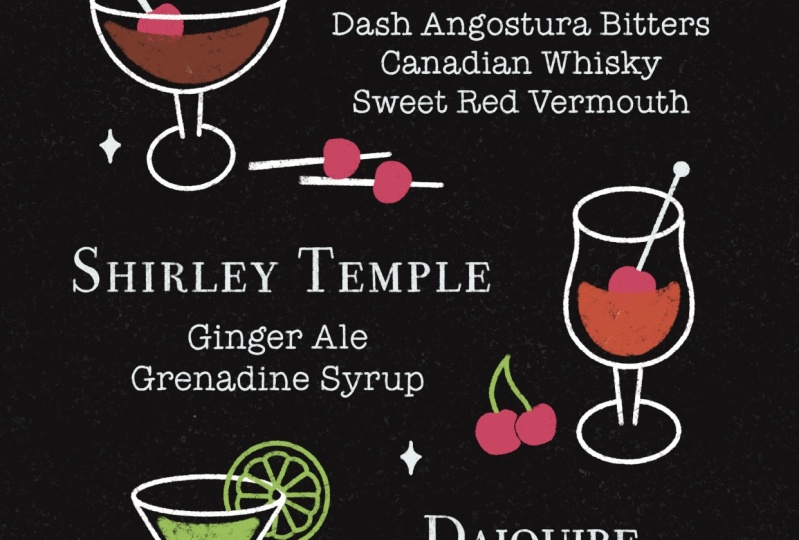
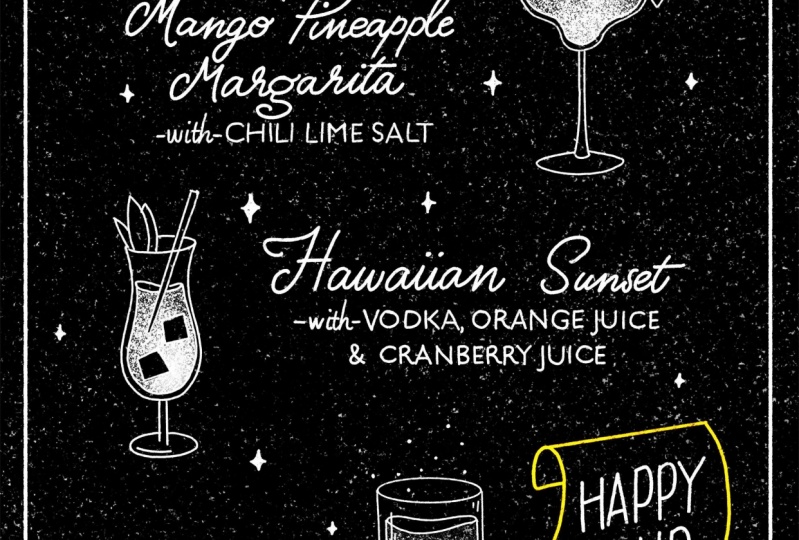
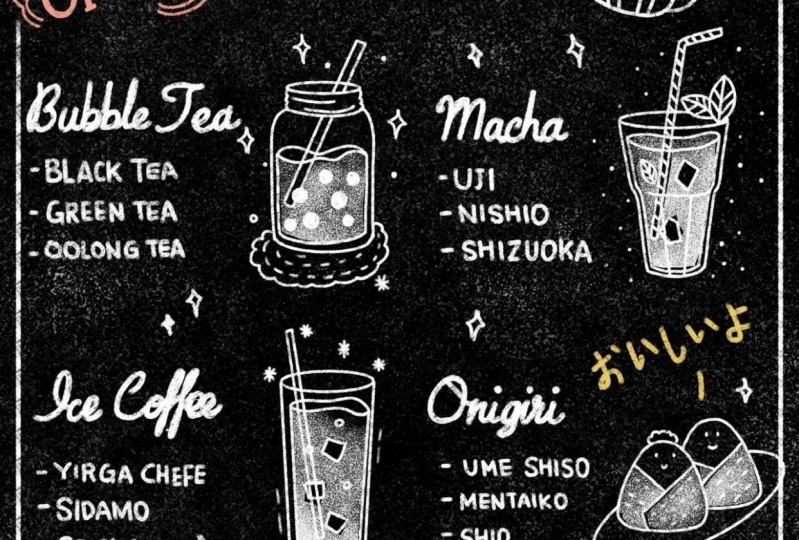
3. Compositions: I really like to
take inspiration from old advertisements,
packaging, for example. I've added all types of things, not just menus, as you can see, and I've added some elements for your cocktail menu that you
can use as inspiration. But I would like to
focus specifically here as well on composition. That's why I've added these
advertisements, for example, because they usually have
quite interesting compositions because basically menus can
have a lot of text on them, and it can get
quite overwhelming. So for now, we want
to get rid of, like, most of that text
and just focus on a couple of elements and how
they're built up in a page. So I'm actually going to pick
one image as an example. This advertisement. So I would actually
like to show you how this image is actually
made up of blocks. So when you look at this image, it's basically divided into separate blocks to make it easy to read and to
understand for the viewer. So we start with the
title, subtitle, and then we have our
separate elements that have titles and body text
with illustration. And you can see that's kind
of part of one cohesive item, and it's easier to guide our eye to the right text
and illustration that way. In the PDF, I explain a
little bit more about how you can basically start with an image and use
this as a reference, create these blocks, and then use that in your
own composition. So at this point, think about what kind of menu
you would like to create. I'm going to create
a cocktail menu, but feel free to
pick anything else. And also have a think about what kind of items you would like
to see on your menu. I would suggest picking
anywhere 1-5 items. Don't pick more
than that because it's going to be
quite complicated. And ideally we'd like to add
some illustrations as well. So keep in mind that we need
some space for that as well. So now I'm going to pick one image that I'm going
to base my composition on. I quite like this one. I like how this is divided
in three elements. I would like to pick
three elements as well and add illustrations
on the side. So I would suggest
to use one image as a reference or create a moo board with several
elements if you like.
4. Sketching: So now we're in Procreate, and we're going to put
our reference image from PinterSt next to
our procreate file so we can use that
as a reference. So I'm going to swipe up and swipe Pintrest and put it
next to our procreate file. I'm putting it on the right
side because I'm left handed, but feel free to put
it on the other side, of course, making
it a bit smaller. So now we want to
use that image as a reference and create blocks in our own
canvas that's going to be the guide for
our composition. So we're going to
create a new layer and then go to layer options
and turn on drawing assist. What this will do is
we'll be able to only draw lines based on our
drawing guide underneath. So for us, this is going
to be straight lines, which is perfect to be
able to create our blocks. And then I want to use a contrasting color because later on
we'll use white. So our guide needs to be
visible underneath that. So I'm going to use this
light blue turquoise color, and now we're ready to
start drawing our blocks. So we're going to
start with our title. That's not part of our image, but we're going to
put that on top. That's going to be the
title of our menu. And then we're going to
start on the blocks of our three separate elements.
So that's the first one. And the first block at the illustration
goes on the right side. So that's that separate piece. And then our title. And the illustration
has a short recipe, but I don't want to add that. I prefer maybe adding a
short description, maybe. So we'll leave some space for
that underneath the title. And then the second element. And then the illustration. This one's on the left
side. And our title. And then the third item, I'm actually going to go a bit smaller with this one
because I'd like to add an extra element at the
bottom right corner, and I'll show you some
options for that later. But so for now, we're just going to
leave that there. And then the illustration
on the right side, a bit smaller maybe and a title. So at this point, if you
want to move stuff around, just use the selection
tool, rectangle, and move stuff around if you want to make it
smaller or bigger and put it in the frame however you want to because this is just going to be a guide
for ourselves. So now we're going to think
about the text that we want to add and make
notes in our guide. So at this point, we don't need pinterest anymore, so you
can swipe it to the right. And for this layer, make sure to turn off
drawing assist at this point and select
another contrasting color, so our notes will be visible. We're going to pick
a bright orange. So we'll add our
items separately here and we're going to
start with the title. So this could be
something like bar menu, for example, or
signature cocktails, if it's a cocktail menu. If you want to do
something more personal, maybe you could
add your own name. And then I just picked a couple
of my favorite cocktails. Those are going to be my items. The descriptions, they're
not actually a recipe, but they're showing
what the drink is. So with vodka, with
cranberry juice, with bourbon, so just a
small description there, just to kind of pique
people's interest there. So now we're going
to have a look at the illustrations that
we would like to add. If you don't know exactly yet what you want
to do, don't worry. You can make some notes here, maybe get an idea of what
you would like to add. Then at this last part, I don't know what I
want to add here yet, but we have some space to maybe put something like happy hour. I'll show you options
for that later as well. Leave a question mark.
We'll see what we do there. Now that we have all our notes, we are ready to move on to
the next stage to add text. So before we move on, make sure that you
created the blocks for your composition
and make notes for yourself where the text and
menu items are going to go and feel free to upload this to the project gallery as
well at this stage.
5. Adding Letters: Fonts: Before I show you how to
use fonts in Procreate, I want to give you
a quick overview of the funds that we can use. Changing the font can alter the look and
feel of a design, so we can use this
to our advantage. Fonts are divided into
several categories. The first font is a Sensa font, and this is really neutral. It's really modern and clear. This is really easy
to combine with other letters that are
much more expressive and versatile and it
also works really well in a long body of text because it's
really easy to read. The next one is a serapont
and this one you can recognize by the little tales
at the end of the letters. This one is a bit
more traditional. It can be quite elegant as well, and then you have the script, and this one is based
on handwriting, and it can range from
something really elegant to really playful
and casual, personal. And everything else
is decorative fonts. These don't really fit
into any other category. They have a lot of personality. Again, really good for
titles, really expressive. So keep these styles in mind
when you're thinking of your titles and your subtitles and how they work together. They can really set the
tone for your menu. Either way, when you're
picking your fonts, keep in mind that your text
should always come first, so it should be legible and there should be a contrast
between different types, and there should
always be a balance. So we're going to
start with just choosing two different
fonts that will combine. So now we're ready
to add our text. So go to the wrench tool, add, and then add text. So the first thing you do is with the keypad,
fill in the text. I'm going to start with
the title bar menu. And now we can edit our text and see all
the options that we have. So if you double tap on the
word or your whole text, you'll immediately
make these changes. So let's have a look
at the font options. I'm going to pick a SensEaFont for my title because I want to keep that quite
neutral and add some more personality in
the other font later. So now you have a
couple of options here, like text alignment. You can put your text on all
caps and change the size. You can play around with the kerning and the
tracking of your text. But the tracking, you can
adjust the same space between all the characters
and the kerning adjust only the spacing
between individual characters. So you can either select a word or your whole text
or only two letters, for example, and
adjust the spacing. Now we're going to
add our menu items. So for that, fill
in the text first. And I'm going to tap on the
word, select everything. I would like to pick a
script font for this because I would really
like this to be the focus. So now again, we can
adjust the size. And because this is
quite a long title, I'm thinking to put it on two
lines actually to break it up a bit and not spread it
across the whole canvas. Because you have two lines here, you can play around
with the leading and this will change the
space between the lines. You can also have a
look at the baseline, which will change where
the text in your box is. Because I want the
exact same style in the other menu items, I'm just going to
duplicate that layer, put them into the right place, and change the text afterwards. And now we have our menu items. We can have a look at making small adjustments
to our script font with kerning and tracking to see if we can actually
connect those letters, make them seem a
bit more natural because this is based
on handwriting. So we wanted to kind of
connect a little bit. This. Because the descriptions are going to look different, I'm just going to add text again and change
the font of this. I'm actually going to use
the same font as the title, just to connect the
two a bit and again, to keep this more neutral and put the focus on
the title instead. I am going to change
the first word though, just to make it a bit
more interesting. M. And I want that style to be the same
in all descriptions, so I'm just going to
duplicate that again, put it in the right place,
and change the text. Now that we have all our text, I would like it to
be a little bit more organized in my layers. I'm going to swipe right on all my text and then
click on group. Now it will be much easier
to hide our layer and see where we want to place things and see how it looks
without the guide as well. Hide that layer and have a look, make small adjustments here. Now we have all of our text and I would like to show you how to give this a bit more of a chalkboard feel add
some texture to this. For that, we want
to storize our text because we cannot
make changes to it if it's in a text layer. So duplicate your group. We'll keep that other group as a backup if you
want to change your text and then merge all
of your layers together. This way, you'll
rasterize your layer. We're going to use
the texture brush, either the small or the big one, see whatever works for you, and we're going to erase
on top of our layer. This way, we're adding a
little bit of texture and it will blend in quite nicely with the
background as well. So now we have all of our text. The next lesson is
actually optional, and I want to show you just
a couple more ways you can add some personal touches
to this and use lettering. If you're happy with this, skip the next lesson and move straight on to adding
Illustrations.
6. Adding Letters: Lettering: If you want to make your text a little more personal
and interesting, I'm going to show you
another option here. So we're going to incorporate the chalk brushes and
use lettering for this. We're going to use the
medium chalk brush for this. And as you can see, especially
if you change the size, you can see there's a
lot of texture in there. First thing that
we'll do is turn down the opacity of our font layer because we're going to
use this as a guide. And then on a new layer
with our chock brush, we're going to
trace our letters. So just follow the
lines of the letters. If you want to, you can make
some small changes here, maybe add some curves, add some flourishes,
especially with a script font. There's a lot of small
adjustments you can make here. Another thing you can
do with a script font is actually connect
the letters properly. With a font, it's not
always that efficient. It doesn't work, but the advantage of drawing
your letters this way is that you can add these personal touches to
it and make it your own. So make sure every
now and then to hide your font layer and have a look at your text and see
if you're happy with this. And this is the final result. And if you want to take
that a step even further, I'm going to give
you a third option which includes lettering. So if you go to the brush set and select the first
lettering brush, you'll see the whole
alphabet, basically. And if you want to practice a
bit of your hand lettering, then just use a sketch brush or chalk brush and just
trace these letters. So if you want to,
you can actually use these as caps for your
menu items, for example. And if you want,
you can use this and make your whole menu from
scratch by just lettering. So I gave you a whole bunch of options,
experiment, practice, see which one feels most
comfortable for you, and pick one to create
your whole menu with. So in the next lesson, we're going to have a look
at Illustration. So make sure that
all your text is done and in the right place. A
7. Illustrations: So now we're going to add our illustrations in the
empty blocks in our guide. So we'll create a
new layer for this. And I'm going to show you one of the template brushes that
we can use for this. This is the food
and drinks brush. So we're going to
select the glasses that we want to put in our menu. We're going to cut and
paste them into our guides, and then we're
going to trace them with a chalk brush afterwards. The first class
that I'm going to pick is a margarita glass. We're going to use the
selection tool and then and now to put
this in a new layer, use three fingers
and swipe down, and then you can either
cut and paste or duplicate to get our
glass into a new layer. And we're going to
select our second glass. Again, three fingers
down, cut and paste. And then the third glass
is an old fashioned glass. So now we don't need
that layer anymore, and we're going to have to
blow these glasses up a bit. So let's turn our guide
back on and place the glasses inside the boxes so we can see where
everything goes. And let's see what
the design looks like without the guides and see if we need to make any changes. The drinks might
feel a little out of play so we can play
around with that. Okay, so now we can also
add our last element. Here we can see
there's a couple of elements you can use
for a cocktail design. This can even be a title. But I want to add
this extra element like a happy hour type of thing. So I'm going to select that and kind of paste it
onto a new layer. And now we don't need
that brush anymore. So I'm going to put that in
the corner and see how it looks with the rest
of the design. So now that we've
added everything, we can merge all of these items. And before we go any further with tracing
the illustrations, have a look at your composition, review and make any changes by selecting and
moving stuff around. A good way to not look at the text so much
and really think about the space instead is we go to Canvas and
flip horizontally. This way, you're
much more focused on the actual space and the empty space between
all of our elements. So at this stage, make any
adjustments that you need to before you start
with any tracing. So now we're going to
trace our illustrations, create a new layer and the
template brush underneath, you can turn down the opacity if it makes it easier
to draw on top. We're going to select
our chalk brush and make sure that you select
a similar size to what you use for the text so that
you have a cohesive line. Feel free at this
stage to also put your own unique spin
on the illustrations. While you're tracing,
you could maybe add your own unique
garnishes and make sure that the illustrations actually match your
item on the menu. So if you want to create a perfect oval at the
top of this glass, you can use quick
shape for this. So just draw the oval and then hold your
pencil for a second. And there you go. You have your quick shape. You can edit the
shape and then change the size and width
of your shape. So because most of our work
consists of just lines, it would be nice to
actually create a bit of contrast and add some
texture into our glasses. So we're going to use
the selection tool. And in our layer, we're just going to
select the liquid, the drink basically
in the glass. And then we select our
small texture brush. And now we're just drawing
inside our selected area. We're going to do the same
thing with this glass. But this time, I want to
exclude those ice cubes. So just going to select
our drink again. And then click Remove and
then select those ice cubes, remove again for the next one. And use the texture brush again. And we're going
to do exactly the same with our last
glass, as well. So now we have all
our illustrations, and the last thing
that we're going to trace is our last
element at the bottom. And for this, I would
like to actually use some color because
it is a chalkboard, so most things are on white, but we can add some color here. And color can be
really functional. We can use that to attract attention to one
part of our menu. So I'm going to
pick this yellow. Yellow really stands
out on black. So that's a really contrasting, interesting color to use. And we're just going to trace our element on our
illustration layer. And for that top part, just to make a straight
line, hold your pencil. And I'm going to use white
for the text inside. So now we don't need our
template layer anymore, so you can throw that
away if you're happy. And now we have most
of our elements. So before we move forward, make sure that you
select items from the template brushes and review your composition
at that stage. Think about where
everything's going to go, make final changes, and then trace your
illustrations and your last elements and add some color at this
stage, if you want.
8. Details: So in the last lesson, we already added some color to our happy hour element
in the corner, and I would like to actually
use a bit more color, maybe closer to the title, maybe a line underneath, just so we can add a
bit more emphasis on that and kind of guide
the viewer's eye to that. So I'm going to select that yellow again and
use the chalk brush and maybe put like a wavy
line or something underneath. And I'm going to do this
by hand just to give it this really hand
illustrated feel. So for the next thing
that we're going to do, let's create a new layer and
turn on drawing assist again because we're going
to look at creating a border around that menu
to tie everything together. So we're just going
to use drawing assist to create
those straight lines. You can also add a different
type of line here, maybe some waves
or some spirals, some dots, whatever you prefer, whatever the style
of your menu is. And I'm just adding
these dots at the corners just to add a bit more to add something a
bit more interesting. So the last thing
we'll do is turn off drawing assist because we
don't need that anymore. And we're going to add a few more smaller
elements to be able to tie the illustrations a bit more to the text and make
it a bit more cohesive. So turn off the
drawing guide as well. We don't need that
anymore. And so these little elements can be like circles or little stars or something that kind of gives you a bit more of that
elegant cocktail feel to the glasses in
the template brush, I also added a couple of these really small details
to give you some ideas here. So we're just
filling up a bit of that empty space and making sure that everything kind of comes together
at this point. So it looks like we are
finished with our design. So I hope you can use
all the techniques and tips that I gave you
for your own project. And don't forget
that in procreate, you have loads of options
to share your work. Don't forget to share
everything that you've made in the project
gallery. Good luck.
9. Final Thoughts: I'm really looking forward to
seeing what you've created. Before you leave, please upload your sketches,
your final pieces, whatever you've made to the
student project section, even if your illustration
isn't finished. Thank you for taking this class. I really hope that
you enjoyed it, and I hope that
this helped you to practice making
interesting compositions. This is a skill
that will come in handy in lots of
future projects. Don't forget to
leave me a review, and I would also love to
hear what else you would like to learn or any
questions that you have. You can leave those
in the review section and then the discussion tab. If you want to
stay up to date on new classes, procreate brushes, drawing tips, and
more, subscribe to my newsletter below.
See you soon.
 Claire Makes Things, Illustrator | Lettering Artist