Transcripts
1. Intro: Creating chalk designs
both by hand and in Procreate has taught me so much about the
world of illustration. I've learned about composition, textures and using
brushes in a way that make my work feel more
authentic and dynamic. And today, I want to share
those secrets with you. In this class, I'll show you
step by step how to create a chalk design in Procreate, complete with
textured lettering, shading tricks and tips to make your piece
really stand out. You'll learn how to
get that authentic, chalky look in your
digital illustrations and how to mix illustration
with lettering. Chalk art has such an
interesting history. It started as a
functional art form, and it was used in classrooms, public spaces,
restaurants, and more. And over time, it evolved
into this creative medium, and it is still really
popular because there's something nostalgic about it and it really captivates people. Chalk art, whether it's in a handmade form or digital form, is everywhere, from greeting
cards to prints to signage. I created many chalkboard designs over the years for bakeries, restaurants and
shops, all by hand, but using Procreate has made
this process even easier. Chalk lettering and illustration are incredibly versatile. The techniques that
you'll pick up here will improve your lettering,
illustration, texture, and your brushwork. I'm also going to show
you how you can tweak brushes in Procreate to
match your own style. I know this looks like a
long class. Don't worry. You can pick and choose the
lessons that interest you. First, we're going to dive
into chalk art in general, and then I'm going to
show you how you can use Procreate brushes
for this technique. After that, we'll apply
everything that we've learned to a chalk
design of our own, combining lettering and
illustration together. If you're looking
for quick tips, skip ahead to the four-minute breakdown in which we'll talk all things chalk art and illustration that you
need in Procreate. If you have a bit of experience
in Procreate and you're looking for something a bit
more fast-paced, jump ahead. There, we're making
our second design at a bit of a faster pace. This isn't a class for
complete Procreate beginners. I'm not going to go
over all of the basics, so a little bit of
experience would be helpful. If you're looking for a
slower-paced class, I actually have another
class here on chalk lettering in Procreate that
is a little bit slower, and we're going to go over
all the steps and the basics. By the end of this
class, you'll have a professional
looking chalk design in Procreate that is ready for printing, as a greeting
card, or just for fun. So grab your iPad and
let's get started.
2. Chalk Art : Chalkboard art is such
an interesting art form as it used to serve
a specific purpose. Blackboards or chalkboards, they were used in classrooms,
public spaces, restaurants, and more, simply because they were
low maintenance, cost-efficient, and reusable. And then later on,
especially in restaurants, for example, they started to
be used sort of creatively. So instead of just using
them for signage and menus, they were used for
illustrations and visuals, basically to
captivate customers. And in the last decade or so, there's been this renewed
interest in chalkboard art, also in a digital form, just because of this unique
appeal that it has. It has still, such
an effect on people, and it works so well, both in handmade form and
in a digital form, as well. So creating chalkboard
designs also in Procreate has such a significant value
for designers and hobbyists. There are a couple
of reasons why. So many businesses,
they still use chalkboard design menus and signs for promotional graphics, menus, in handmade form, like actual chalk or paint, it's really affordable
and easy to use. And as a digital version, it can be printed and look really good on signage
and graphics as well. Over the years, I've done
a lot of chalk designs in person by hand for
different businesses. I use Procreate as a way to
set up my designs and create mock-ups
so that it could show clients what the real
result would look like. Chalk lettering naturally draws attention with its textured, high contrast look, making it a really good choice for
eye-catching designs. So especially from far away, the dark background and the bright colors
or white on top, it just really draws you in and doesn't necessarily just
have to be white on black. You can play with colors
just using any kind of dark background and
light lettering or illustrations on top. Chalk art evokes a sense of craftsmanship
and authenticity. Even in a digital form, it is usually still made with
a lot of personal touches, and it makes it perfect
for any kind of vintage or artisanal
branding or signage. That's why, over the years, making chalk designs has been so successful
for restaurants, cafes, bakeries, shops because they also want
this handcrafted appeal. Chalk art is also a highly
adaptable art style, and it is used across
various industries. So if you think about weddings, for example, it's really
popular there as well, and it can be used in many different formats
from signage to menus, product packaging, social
media graphics, and more. While traditional
chalk lettering, chalk art, is still widely used, the digital chalk lettering
is also really popular, and it just allows
for more flexibility, especially because
doing things by hand can just get quite messy. Just having the flexibility
of using layers, making adjustments quickly,
and using different textures, in Procreate or Photoshop
is just really helpful. But even in digital
chalk lettering, you can still add
that personal touch and that artisanal feel. So it just really
makes it a great art style to use in a
digital format as well. Learning how to use and
create chalk designs, it teaches you so
much about lettering, composition, and use of color. And because you're working from not light to dark,
but the opposite way, you're working kind of in a different way and
taking away the unnecessary in your designs is a really important
skill to have. And for me, at least,
it has improved my digital illustration
skills so much. So in this class, I'm
going to show you how to create chalk designs
in Procreate, and we're going to
keep it quite simple. But I'm going to focus
on the composition and basically getting those textures right and recreating
that handmade feel.
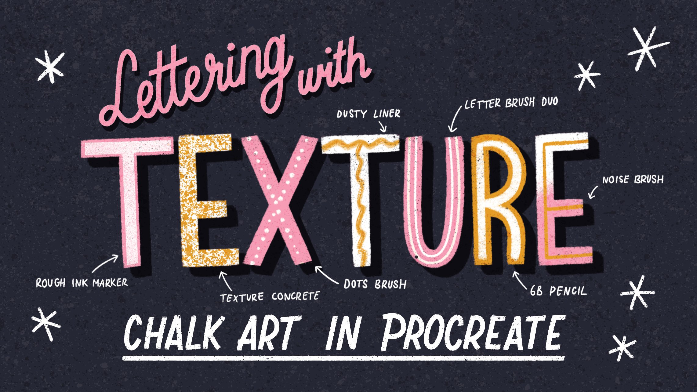
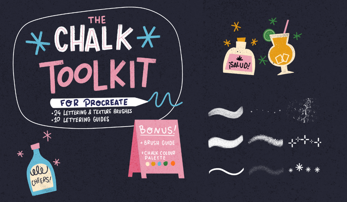
3. Brush Tips: Chalk Toolkit: I want to give you
some recommendations for brushes in procreate, specifically for chalk designs. Oh, and by the way,
every now and then, you're gonna see a reflection
of me in the canvas, just because, as it turns out, a black canvas is
really reflective. So, hi, this is me! :) Firstly, I want to talk about some chalk brushes that I created for procreate
that I like to use. And then in the next lesson, I'm going to show you some
default procreate brushes that work well for
chalk designs as well. The brushes I created are
divided in different parts. You've got fill brushes, liners, textures, stamp
brushes, and templates. They also serve a
different purpose, and I like to use them to build up my designs
step by step. So firstly, I added a classic sketch brush that I use for actually
any kind of design. The next two brushes,
the monoline and the studio pen, are simple, smooth brushes that I use for filling in shapes
and basic lines, especially when
layering your design with lots of textures
like in a chalk design, for example, it can get
overwhelming quite quickly. Instead of adding lots of
textures to all these layers, sometimes I just like to use these smooth brushes
to fill in shapes and then later on
add the textures on top using clipping masks
and blending modes. Next up, these brushes are basically two
different textures, and then I created
different versions of them. You've got the rough ink fill, the rough ink marker, and the rough ink liner. This is the same texture, but for different purposes. The liner and the fill, I would use more for illustration
and filling in shapes. Then the marker, I
really like to use for lettering because
the ends are flat, which is really great for block letters and
also for script. Next up, I've added a couple of liners with different textures. These are based on textures that I would use when creating
chalk designs by hand. I wouldn't just use chalk, but instead use crayons, lots of acrylic, for example, Posca markers as well. These liners are based on
those type of textures. You certainly don't
have to use all of these liners in the same design. I would actually suggest
just picking one or two that you prefer using the most and
then sticking to that one. As you can see, these
liners have tapered ends, so sharper ends at
the end of your line. If you want to make
changes to that, you can go into the brush and then go to the
Apple Pencil setting. The one thing you
can change to this is the size in the pressure tab. If you want less movement in
the pressure of your line, you can bring that size
percentage down or maybe all the way to zero and
that way you would have a more monoline brush, the width wouldn't change. The next two brushes,
these two liners, these are based on,
as I mentioned, the acrylic markers
that I would use for actual handmade
chalk designs, and these are helpful
for doing lots of text. Let's say if you're making
a menu design, for example, you don't want to add
lots of text that needs to be legible with lots and
lots of different texture. So you want slightly smoother letters and texture that you can see from
further away as well. Next up, this letter brush duo. This one is helpful for
making monoline letters, letters that have
consistently the same width, and then this dot brush you
can use for creating frames, for example, or just
decoration around your design. A next up really important,
these texture brushes. These are useful for shading, for example, they're
quite dense textures, perfect for using in
clipping masks or basically shading or filling
in shapes on a small size. And next up these three
textures have the feel of the texture you would have on an entire chalkboard
in the background. I would use that maybe in the
background on a design or maybe on the entire canvas
on top using blending modes. These three stamp
brushes are helpful for using around your lettering, for example, to fill
up the space or around your illustrations and they help you set the tone
for your design as well. These two stamps,
these chalkboard templates we've
used in my 'fun with puns' classes to show
you how you can add lettering to a small
sandwich board, essentially. But I would actually
also use these as little mockups for
sketches that I would make for clients if
I was going to, let's say, create chalk designs in person
and I would need sketches, but they're also fun
to use in designs to give you another
option for chalk design. These two templates,
they contain some inspiration that
you can use to fill up your designs and also give you some script lettering
inspiration that you can use. Lastly, this collection of templates are useful for
when you're doing lettering, you can use these templates to basically start your
lettering designs with. Let's say I wanted
to use this template and place my wording,
my letters inside of it, I would start in the middle
and then work outwards. This way, you're making sure that your letters
are evenly spaced. That's quite helpful
to start with that. And remember that if you're
using these and you want to change it up or have
even more options, you can flip your templates and then you've got even
more layouts to work with. We're not going to use all of these brushes just a selection. Again, you don't
need these tools. They're just helpful. But I'll also show you other
procreate brushes that mimic the same chalk texture that
we're after that you can make changes to and that you can also use to create
our design with.
4. Brush Tips: Procreate: I'm going to show
you a couple of default brushes in
procreate that are helpful, and I'll also show
you how you can adjust some of these
brushes yourself. So firstly, in the
sketching tab, the 6B pencil, this is one of my favorites. It's really helpful
for sketching, and it actually has
a nice texture to it that you'll see
when you zoom in. And as you can see, I created a second version that
is a bit bigger, so you'll be able to see
that texture much better. And that kind of looks to me
like a chalk marker, kind of. So this is perfect. Let me show you how you can
make changes to this brush. Instead of tapping this brush and making changes
to the original, swipe to the left and then duplicate to make a new version. We're just going to
change two things about this and keep
it really simple. The thing that will make
the biggest difference to a liner brush like
this is going to the properties tab and then changing the maximum
size of your brush. Then immediately you can see
the texture a lot better. Basically, this gives you
a lot more flexibility to change the size of this
brush in your slider. Then next up, let's go to stroke properties
and then go to Jitter. With Jitter, you're
pulling apart that shape and then you can see a lot clearer this
texture that we're creating. That's the only change
that we're making. Here you can see
you've got a bit of texture that
you created simply by changing the size and
the jitter properties. If you're happy with this
brush, let's change the name. And then also create
a new reset point. This saves your changes
of this brush so that let's say you wanted to make other changes to
this brush later on, you can always go back to the original reset point, to the changes that
you've made up until now. Let's go to the next brush. Let's go to the inking tab
and then go to Tinder box. I like this brush because
it is a little bit tapered, so basically the
pressure changes the width of your
brush slightly. This brush also has a
nice texture to it. In the same tab, another great brush to use
is the dry ink brush, and I've already
made some changes or different versions of this as well because it's so helpful. And I like the texture
inside of this brush that emulates a chalk
texture as well. Remember that also
with these brushes, you can duplicate
them and make changes to them by adjusting the size and the
jitter properties or any other if you
want to experiment. But I would definitely
suggest just making a duplicate
so that you're keeping the original settings of the default brush separate. Next up, the entire
charcoal tab, you've got different
dusty textures there and grainy textures. These are all quite
helpful for chalk designs. Then in materials, you
can find the noise brush. This one might look a
little different for you because I made a couple of versions in
different sizes of this one, but it has a nice
consistent grain to it. Basically this is
helpful for shading and creating texture on top of your entire truck
design, which I really like. And lastly, in the organic tab, the reed brush is a nice
liner brush as well. It has a nice rough
texture to it, which is perfect for liners
and lettering as well. I would suggest just having
a look around procreate and experimenting
with these brushes and seeing which
ones you like best. Remember that you can
make changes to them and to keep them closer, you can pin them
to your favorites tab and what I like to
do when I've made lots of changes to specific brushes and I might want to use them for specific purpose or projects
in this case, chalk designs, I'll make a new
tab and then save all my new brushes in
this specific tab. That way you can
keep all the brushes you want to use together, but also you can keep your own versions separate from the default
brushes in procreate. It just keeps things a
bit more organized. So just add your brushes by
swiping them to your new tab. So in the next few lessons, we're going to work
on our chalk designs. I'm going to use a selection of brushes from my chalk toolkit, but feel free to use whatever
brushes you want to use.
5. Design I: Sketch: When making this
lettering design, I'm not going to cover all
the basics in procreate so make sure that you
have a little bit of basic knowledge
of how things work. If you want to slow
down this video, you can do that by using the speed button in
the menu bar as well. We're going to start
with a big canvas. Make sure to get the
color palette that we're using from the
Projects and Resources tab. We're going to use this
color palette to start with. I'm also going to set up a
drawing guide right away. And then the first thing we're going to do is
make a thumbnail sketch of our design on a small scale. It's going to be a rough
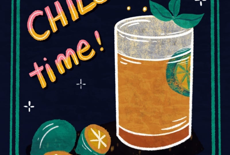
sketch of our idea. We're going to start with a short quote and an illustration. We're going to make
a cocktail design. I really like creating
cocktail designs. This could work really well for, let's say, a cocktail bar, but also a greeting
card design or a cute invitation for
a birthday party, for example, but feel
free to start with your own inspiration and then follow along
with this process. We're going to start with
a thumbnail sketch to just get a rough sketch of our layout or composition
that we want to work on. If you're starting with your own inspiration
from scratch, it's really important
to start with your thumbnail sketch and get everything out on paper first. We're going to create a frame and then pick,
from our short quote, our most important
words and place those diagonally in the
middle of our design. Then our illustration
of our martini glass can go on the side.
Time to shake it up. This quote is, I
guess, is it a pun? I don't really know
if it's a pun, but basically 'shake it up'. Yeah, it is actually a pun. You're shaking
cocktails, but it's also a party shaking
it up, it works well. And remember, if you want to start with a different
composition or maybe have just a little bit more support with this diagonal sketching, you can use a template
like this one, for example, to make things
a little bit easier. We're going to, because
this is a simple design, just go straight into
creating our final design. But if you don't feel
quite ready yet, you can make a more refined
sketch on top of this, maybe even do a color sketch. But I'm basically just going
to blow this sketch up to the size of our canvas
and then we're going to make our final design on top. We're going to start with
our truck background so that we get into the mindset of using the bright
colors on top. I'm using the first
tone, but on the left. You see the slightly
lighter dark tones. We're using the
slightly lighter ones and I fill up a new layer
with our background. I'm changing the
drawing guide to white so we can actually see
our drawing guide. And then we're changing
our sketch to white. You can invert it as well. Put it on top of our chalk layer and then blow it up to
the size of your canvas.
6. Design I: Lettering: We're going to start
with our lettering because that's the most
prominent part of our design. And I'm just organizing these layers before
we get started. And then we're going
to add a new layer underneath our sketch layer. We're going to use
this rough ink marker that has these
slightly flat ends, and those are perfect for creating block
letters like this. For example, creating the S to make sure that those
curves are a bit smoother, you can turn up the stabilization
in the pressure and smoothing settings to make those curves a
little bit easier. And for the other letters here, I'm just creating straight
lines and then holding down the Apple Pencil to
create straight lines. Because we start with
such a rough sketch, you don't have to follow
the exact sketch, make sure that you follow
the same baseline and capline so that your
letters are easy to read. Lettering can definitely be very playful and it can have
lots of quirks as well. It doesn't have to be
perfect as long as you can read it, read
it from a distance, and anytime you do these little quirks
or I guess mistakes, just make sure that you
do those consistently. Repeat those little quirks that you're adding
to your lettering. For our next word, perhaps we can try a script just to change it
up a little bit. Again, for that, turning up the stabilization is really helpful to create
smoother curves. It makes script lettering
a lot easier to do. You can see that
those flat ends on our letters aren't perfect. So what we can do to sharpen those edges
a little bit is use the eraser and always make
sure that especially when you're using texture brushes to erase with the same brush. For that, tap on the
eraser and then hold it to use the same
brush as an eraser. To sharpen those edges,
you can also use the brush and just fill up that space a little bit
to create sharper edges. For now, these are just the
bare bones of our lettering. But basically, what we
want to do is start with the main pieces of our illustration to see if everything works
well together, and then later on we'll add details to this shading
and more texture. In the next lesson,
we're going to work on our illustration bit
and then afterwards, we'll add all our details.
7. Design I: Illustration: Now that the majority of
our lettering is done, we're going to create
our martini glass first. And we're going to stick
to a similar texture, so we're going to use
the rough ink texture, the fill or the liner
version of that brush. So pick something similar
to your lettering here. I'm just creating the bones, the sketch of our martini glass, and I'm trying to
make it symmetrical by creating that
line in the middle. By the way, remember
that in the Chalk toolkit, there is a martini
glass stamp brush that you can use as
a reference as well. You can just use that
as your sketch too. To fill up this glass
with the same texture, I'm not just doing a
regular color fill. I am selecting the
inside of this glass. You can use the
free hand option or automatic as well and then
with the rough ink fill, I'm filling in that space. In that way, you've
got a consistent texture in your entire piece. Because this
is a textured brush, you might need to
use the threshold when you're filling up
your shapes with color, or you might just want to color it in a little bit more
just so that you don't see those lines because it doesn't always fill up
that shape perfectly. Then we're going to
create the filling of that glass on a new layer. Everything is on separate layers so that we can make changes later and change the color
if we want to, for example. I changed the shape of my glass here slightly. I erased a little bit of the top to make it a
little bit flatter. Lastly, we need to add a line on top of the fill of our glass. Next up, we're
going to draw this shaker, which is behind
the martini glass. Because it has such
straight shapes, I'm just creating the
straight shapes and then holding down the pencil and then it will create
a quick shape for you. I remember that the
menu that shows up at the top allows you to also move those nodes of the corners of your shape independently
if you need to as well. I'm going to fill our shapes
with color the same way. I'm just using the
automatic selection. Because this shaker
is in the background, we don't want to add
too much detail, but keeping everything
quite simple. I'm simply erasing
to create lines, and that's basically all
that we're doing to this. And the basics of our martini glass and
our shaker are done. We're going to again add
details to this later. But for now, we're just
going from lettering to illustration and then basically filling up our entire
design from there. Let's use the rough ink marker to create the rest
of our letters. Feel free to change it up here by changing the style of your lettering. I just really like using
these block letters, especially on a smaller scale because they're easy to
read from a distance, and I think they're
quite playful and fun. But you can certainly
try something like script lettering
here as well. We're also, again, just sharpening those edges
with the eraser here. Next up, we're going to create the frame around our design. For that, I'm going
to use the duo brush. I usually use this
for lettering, but I just want to show
you how you can use this as a way to add a
frame to your design. That just really helps to tie everything together as well. I'm just trying to find the
right size around 84, 85%. I'm drawing a straight line almost all the way from
the top to the bottom. Remember that you can hold your Apple pencil down to
create straight lines. If you then hold
down one finger, you can create straight
lines at 15% angle. You can also actually make perfectly horizontal or
vertical lines that way. Now we've got one side done and we're simply going
to duplicate that and flip horizontally and then we've got two sides
of our frame done. You can use snapping
and magnetics to put your layer in place, but it's actually, I find it a bit easier without
in this case. Then we're just adding
the bottom line as well and then we're done. You can still move things
around a little bit to make sure that everything
fits well in our frame. Don't scale things
up and down too much because that changes the
resolution of your design, but slight changes
are still possible. The bare bones of our
design are basically done. So in the next lesson,
we're going to add details and brighten up this
lettering a little bit, too.
8. Design I: Details : Let's start with adding some more color
to our main lettering. You can either use
a clipping mask on top or select your lettering. And then in a new layer
on top, add your texture. This way,
only your lettering is selected and you're only coloring inside of
your lettering. We're going to use the texture
grain for that and then just fill up the
bottom half with that texture. You get this kind
a grainy gradient using that ochre color for that. This immediately makes
our design a bit more balanced by simply bringing back the color in
multiple places. Now you can see we've
re-used our pink in different spots and
then our ochre as well. We're also going to add an inline to our
lettering on top. For that, we're going to turn our gradient layer
into a clipping mask. That way we can add another
clipping mask on top. Basically, you can add
multiple clipping masks to a layer and that helps to keep everything separate and makes it easier if you want
to make changes. An inline is basically
just a line in our letters and that breaks
up that shape as well, makes it a bit lighter. For the S, to create smooth
curves, and for our script too, turn up the stabilization a bit. For this, again, we're
just holding down the Apple pencil to
create straight lines. Here you can see how much our gradient and then our inline has made a difference
to our letters. This looks way more fun already. Lastly, to this lettering, we're also going to
add some shading. Even though we have a
dark background already, the advantage of this
digital chalk board is that we can add
some darker tones too. We're going to duplicate
our main pink layer, and then the bottom layer, let's turn that to Alpha lock and then we can
change the color. We're using the darker
tone of our background. This is just slightly darker. It's actually almost black,
and then fill that layer. Now we just move it slightly, you're creating just
a bit more depth by adding this
shadow underneath. It's really subtle, but it really does make
such a difference. We're going to do the same
thing with our illustration by adding shading at the bottom. We've got some space there and it's also just a nice way to add a bit more depth there. And then we're filling up the shape
with our texture. We've added our shading
and now we're going to add some highlights to really
create even more contrast. Because we've used beige for a lot of our lightest colors, now adding white for
those highlights is really going to stand out. I'm going to lower
the opacity of this slightly just because it's
in the background, and it still has a kind of reflective effect on
that glossy shaker. And we're also adding
that to our drink. Then we're going to add
some details to our glass. I really like to
add some bubbles or stars or something
to this glass, even though it's
not a bubbly drink, it just adds to the festive
tone of the cocktail. Because this is quite
a small detail, I'm using the chalk marker because this has a
little bit less texture, so it's just a bit easier
to read smaller lines. I'm also going to add a
cocktail pick in our glass, which is a nice way to add some more detail to this
too and some color. I'm going to add a bunch
of olives to this. It's just a way to add some more, just a different
color to this design. And of course,
this cocktail pick needs to be inside of our glass, so I actually forgot to add
the line of our glass on top. So I'm just redrawing that. And then we need to make sure that
cocktail pick is actually inside of the liquid
of our glass. You can use a mask for this
or just on a new layer, add some pink and then
bring down that opacity. This way, it looks a
bit more realistic, the cocktail pick is actually
inside of the glass. Next, we're going to add some more filler elements to our design because we've
got some empty space, and this is just my
favorite thing to do, to add all these little
festive stars. As you can see,
all the color that we're using is very intentional. We haven't reused the blue yet. Those little filler
elements could be blue, for example, or maybe green is something
that we could reuse. Think about what works
best for your design. It just really adds to the
tone of your work as well. Something like a little
star is perfect for this, little bubbles or
dots work as well. You can use stamp brushes, but you can also just
do this by hand. Lastly, we're going
to add some texture because we haven't
really added any texture to our chalk background yet. What you could do is
add a layer mask to your background as an
example and then use the paper texture,
concrete texture to add an overall rougher feel
to your background. But what I like to
do is actually use a blending mode layer on
top of the entire design. I'm using the concrete
texture and then adding an entire layer in black on
top of the entire design. As you can see, when we change
the size of this brush, you're just changing
the shape but not the texture itself so that
texture stays consistent. Once you fill that entire layer, go to your blending mode and try and see what blending
mode works best. I like to use overlay. It actually just enhances the colors on your design a
bit more in that texture, and then bring down the
opacity a little bit to just adjust the intensity
of your texture. Even if let's say you only used smooth brushes
in your design, just adding that
blending mode on top allows you to add texture
on top of everything. That's it. This is
the final result.
9. Share Your Work!: When I finish a design, I like to just step away
for a moment and come back with a fresh
perspective to see if anything is off or anything
needs to be changed. And then in the Canvas menu, you can flip horizontal
and vertical just to have a final
look. That way, you're not focused on
reading the lettering, but simply on the
shapes themselves. That helps to just
see if there's any inconsistencies or anything that
you're not happy with. And then final final
detail, of course, add your signature somewhere in your design, and that's it. Don't forget to
share your results in the student projects. I would love to see what
you've created so far, whether it's a final piece or just an experimentation
with brushes in procreate, a sketch, whatever you have. If you have any
recommendations for procreate brushes that are
useful for chalk designs, please share them in your
student project as well. In the next few lessons, I'm going to give you
a few more tips and we're going to create
another design as well.
10. Chalk Tips: I want to give you four tips about just what we've done up until now that are helpful to keep in mind for
creating chalk art, but also for just lettering, composition and texture
techniques in general. So if you, let's say, wanted
to end the class here, then here are the four most important things
to keep in mind. Firstly, create
contrast using colors. The best thing about
creating chalk designs is the vibrant colors and
the contrast that you're creating of the light
on a dark background. So play with brighter tones, not just white that
you can put on top of your darker
chalk background. And remember that
you can also create depth by adding, for example, a darker tone to your
background to create shadows behind your lettering
and your illustrations like we've done in
our first design. Secondly, use
banners and guides. Use any tools that you have in Procreate to create
your composition. The most important part
of any design really is your composition because it influences basically
everything else, especially with the
simplicity of a chalk design. If your lettering is not quite spaced well
or not balanced, it's going to affect
everything else. Make sure that you're using the drawing
guide in Procreate, you're using, for
example, the templates to space your design evenly, whether it's lettering
or illustration. If you're including a lot of text in your design,
when you're making, for example, a
menu chalk design, make sure to turn on
the drawing guide. That way, you can use the guide as a baseline for your letters. When it comes to textures, don't make things perfect. The beauty of
chalkboards is that they have this
rough handmade look to them and you can
maintain that feeling in a digital design by just not
making things so perfect. If you do tend to create smooth and perfect lines, for example, you can use textures to roughen them up slightly
by maybe erasing them afterwards with
using masks and erasing the smoothness of
your lines and your shapes. Remember that you
can also just use separate layers on top
of your design and play with certain
blending modes to also achieve the chalk tone
on top of your design. I would say also don't mix too many different brushes
and textures in one design. You don't want to overcrowd it, stick to no more than one
or two different types of textures in one design. And lastly, keep it simple. With any analog chalk designs, you wouldn't be able to add all these different layers and different colors
on top of each other. A chalkboard is all about
displaying information clearly. You don't want to
be using too many different layers and shading. You can add details, but just don't overdo it. Then as I said, just
pick a couple of different brushes per
design and stick to those. At the end of the day, all these different brushes and textures, they serve as a tool to add
to the tone of your design. But the illustrations and your lettering is the
most important part. In the next lesson, we're going to add a second design to our
chalk collection and basically just take
everything that we've learned and repeat the process. This is optional, but I find that just
doing this a second time cements the design process a little bit more in your brain. Making the second
design is just a bit more relaxing. You've
already done it once. I'm going to give
you a couple of more directions and a couple
more tips, but not much. Feel free to mute the video. If you want to take some artistic freedom,
make some changes, change up the colors
if you want to, you can even pick
another quote to start with and basically
just have fun with it.
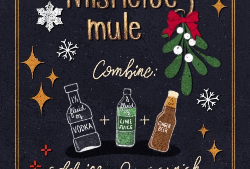
11. Design II: So I made this little collection of chalk designs in
this cocktail theme, and we're going to make this
second design together. We're going to use the
same color palette, the same brushes. So we're going to follow
exactly the same process as we did in design number one. I will give you a few
tips along the way, but I'll try to shut up
as much as possible. So feel free to just mute
this video and follow along either with this quote that I'm going to use or you can
use your own inspiration. And I'm just grouping
our first design, and then we're going to
work on the same canvas. And we'll start with a sketch. Instead of blowing up this thumbnail sketch to
the size of our canvas, you can also use it in
a reference window, you have it on the side,
you have it separately. We'll just save this
sketch to our files. Then in Canvas, you can turn on reference and then
import your image. We're going to reuse
one thing though. We're going to duplicate
our frame and then direct that to the top because we're going to use exactly the same
frame in a different color. Then you can just
go ahead and lock your other layers so that you don't accidentally make
changes to your other design. Then we're just going to
copy the main composition so we can start with
our final design. So let's start
with our lettering from the biggest letters
to the smallest, and after that, we'll
create our glass. And when you finish all
the parts of your design, let's add a texture on top
using the blending modes. And, of course, don't forget
to add your signature. And that's it. This
is our final design. Don't forget to add this to
your student project as well. I would love to see
what you created.
12. Final Bits: I Congrats on finishing my class. This means you've learned
a lot about chuck art, textures, brushes, and more. You applied all of
this knowledge to your own chuck
designs that I really hope you'll share in the
student project gallery. If you only had time
during this class to pick a theme or
experiment with brushes, create a sketch, add it to your student
project regardless. I know how much
time it can take to sit down for a longer
class like this, so just know that your sketches, your ideas are just as
valuable as a final result. Before you leave, don't forget to leave me
a review below. This really helps me to create more classes on skill
share in the future. You want to keep
practicing your skills, I added the third
design to YouTube just so that people who are not on skill share can
also follow along. I added links to this in the notes in the menu bar and
in the description below. If you're feeling inspired and
you want to keep creating, I have another class
on chalk lettering, which is a little bit
of a slower pace and another on finding your style
with textures in procreate. And lastly, one on short
and sweet lettering. And these classes in particular, make for good additions
to these lessons as well. Leslie, if you want
to stay up to date on new proque brushes or
classes that I create, subscribe to my newsletter. Thank you so much for
taking this class, and I'll see you
in the next one.