Transcripts
1. Introduction: Hi, I'm Lisa, and I want to welcome you to class. Let's paint sunsets. Colorful, dramatic sunsets capture our attention and our imaginations. They're beautiful, their romantic, but most of all, they're fleeting, right? We know sooner get our art supplies out and it's gone. Well in this class, we're going to take a look at some quick and easy ways that we can capture the beauty of a sunset in our nature journals. Before the colors fade to black.
2. Observing Sunsets for Inspiration: All right, We're going to go through some slides here really quickly. What I want you to get from this is it's really important whether you're an artist, a nature journal, or whatever reason you're here watching this class about painting sunsets. What you need to do first is observe. You should spend more time paying attention and looking and observing and noticing and hunting for patterns than you do actually putting pen to paper or a paint brush to paper. All right, so I've got several different sentence for us to look at here. As we go through them. If you notice, I've put a white line through the pictures at the horizon line so that we can actually study what happened as the sun goes down. And these photographs were all taken at different times in the sunset. Some of them have the sun's still visible in the sky. Some of them, the sun has dropped behind the horizon. What I, what I noticed as I was looking through these pictures to prepare this class is that we're talking, these are the colors in the rainbow. Roy G, Biv. We all know that, right? Red, orange, yellow, green, blue, indigo, and violet. It's the same colors, which makes perfect sense because it's the same sky that they're appearing in. There are just different levels of moisture. The sun is bouncing off of. Rain droplets, cloud cover, dust, pollution, whatever's in the sky, and it creates these colors. So I want you to pay attention. Sometimes they're in the Roy G Biv order, with green being not present most of the time. But if you look at Rainbows, the green is not real visible in the rainbows either. So that's not a real big difference. But the colors radiate out from wherever the point of studying contact is. And I do want you to notice as we're going through these pictures too, that the colors on most of them are kind of grayed out. Because we're looking through water vapor. It's bouncing off of clouds and dust and smog and pollution and what have you. So we're going to talk, as we get into the class, we're going to talk about setting up your palette cheat sheet for capturing these sunset colors. And I'm just going to say that in some of these pictures, these these are not my photos. These are these are photos that I'm using from different sites that allow photo-sharing. Some of the ones with the super brilliant colors in them, I suspect are probably Photoshop pictures. Not that it's impossible to see that type of sunset, but it's not real common. So with that in mind, let's move on to the next section and we'll look at how we go about setting up a color palette and a color palette cheat sheet for you.
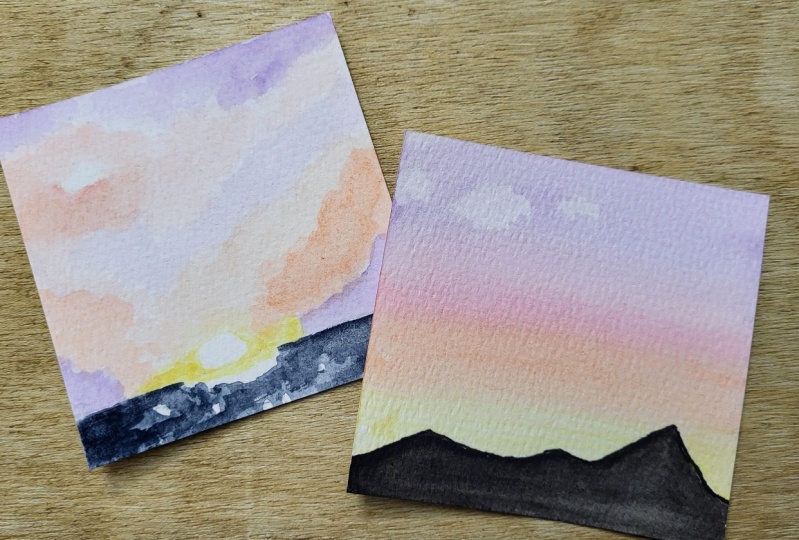
3. Supplies: Okay, let's go over supplies really quickly. You're going to need some watercolor paper or mixed media paper actually works really well too. And that's what I normally have when I'm out in the field nature journaling and it's probably what you're using to. But for today, I've got Canson watercolor to a 140 pound paper, so it can take a fair amount of water. I've got a 4.5 by six inch sheet here. We're going to work small because that is the key to working fast when you're trying to capture a sunset out in the field and your nature journal. So the watercolor paper, this is what we're shooting for so that you see what we have when we're talking size. This is the 4.5 by six inch sheet and I've got to sunsets painted on here. This is what we're going to work on today. So besides the paper, you also need a couple of watercolor brushes. And again, out in the field, I used water brushes. You don't have one handy right now. They work just as well. So today I happen to be working in industry or so we're using regular brushes. And I've got a number eight round and a number 12 flat. The flat ones are going to be your best friend when you're working with these sunsets. And then most sunsets that you see that the things that are between you and the sunset are going to kinda be in silhouette. So that's what we're gonna do. And today we're going to make it simple and just do silhouette. So I'm going to use a black marker. And I've got a Tombow double tip here, it's got a sharpened and a brush tip. You can also just use black paint. I'm your watercolor set, and that's our next item that we need. I've got a small 12 half pan set. This is what I carry with me. I'm in the field when I'm working. And we're going to premix colors, we'll get into that more in just a minute. But that's why you need for this project. So gather up your supplies and we'll get started.
4. Create Your Palette: All right, after looking at all of the slides that we just went through, I noticed that the colors were pretty much similar and all of them, sometimes they're a little more saturated, sometimes a little less, but basically the same colors. And what I see is that they're all slightly grayed down versions of whatever color it happens to be. And that's because we have so much smog and whatever else, dust floating around in the atmosphere that it's agreeing the colors down a little bit. So what I did was make myself a cheat sheet. And you can see I've got sunset palette written up here. I've created all the colors that I see in all the different sunsets. And then if you'll look a little closer, I've got notes by them. This is made from a warm yellow and the yellow ocher mixed together. That's the grade Daniela that I see. And what I suggest is that after you go through this and you understand a little bit better, make yourself a sunset palette cheat sheet. Simply because it'll make things even that much quicker when you're trying to catch a sunset on the fly, if you know what colors you need to mix together to get the colors that we're going to play with. All right, so let's move on to actually working on some of our students at projects.
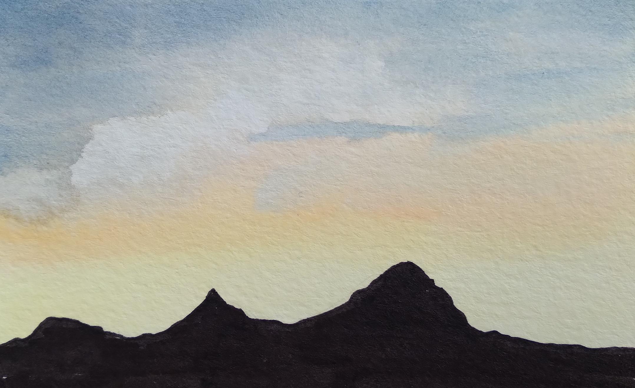
5. Project 1 Mountain Sunset: All right, We're going to start with this top one here first. So I've got my paper divided into two we're gonna do to. The first thing I'm going to do is kind of give myself a little pencil line for my horizon, which in this particular case is some very short. Well, I wouldn't call them mountains exactly. It's more hills and anything. And you can probably barely see that. I don't want that to be super prominent. I just want to give myself an outline of where how far my sunset colors need to go down because we're going to paint them the easy way in a long time. Anything that we decide to, if we're going to go over the mountain pencil line, because we're gonna go back over it with black when we're all set up here. So first thing I'm going to do, we're going to use the wet and wet technique for this. So I'm going to take my big round brush and I'm going to wet the whole area of the sky here. And if this is not sopping, dripping wet, just wet enough that if you you can see that if you turn it, you can see that the page has a slick look to it. And again, I'm going down over the mountains because I want to make sure I get into all of the little valleys here. So we're going to start. First, we're going to switch to our flat brush. And we're going to pick up some of the brightest yellow that we've mixed in advance. And I'm just going to sweep it across all the way down in, get all down in these little valleys on. I pick up a little more pigment here. And we're gonna go a little farther up. And we think we need to notice that we've got all our valleys covered. And you have to move rather wistfully with this because we don't want our water to dry and where we want our page. So now we're going to go ahead and pick up the next color, which is an orange. And again, these colors have been grayed down just a little bit. Because that's the colors we actually see. And the point of this is to blend all the colors together so you don't even really need to do much brush washing in between. Now we're going to go pick up a little bit of though slightly darker, reddish orange and blend that in. And if we look at our example, it's not exactly even all the way across the top, so you don't necessarily want straight lines of color anywhere. This should be a nice blended thing that we're doing. And now we're going to go up to our final color, which is kind of a grayed out, very dark blue, purple. Sweep that across the top. Again, it doesn't have to be very even it shouldn't be straight lines. You may need to add a little water to blend it out. Actually going to bring that down a little bit further because we've got a little bit of cloud cover going on here. And that's honestly, we talked about that. That's the reason that we can see sunsets and rainbows. It's because we have a little bit of cloud cover up in the sky or rain droplets or whatever. All right. Now while that's still damp, I'm going to just tear off a little piece of paper towel here that I'm using to wipe my brush on. And I'm going to just dab and pick out a few little cloud areas here. Turn the paper, don't make it too obvious. You don't want the shapes to remain all the same. And then I'm looking at this and I'm seeing, I don't think that my sky is quite dark enough here, so I'm going to pick up a little more pigment and darken that just a little bit. Across the top. There we go. Because this is a sunset obviously. So some of our own, this guy farthest away from that setting sun is going to be just a little bit darker. All right, so that's that one. All we've got left to do with this one now is to give it a few minutes to dry so we can come back in with our marker. So we'll move on while we're waiting on that, we'll move on to working on the next one.
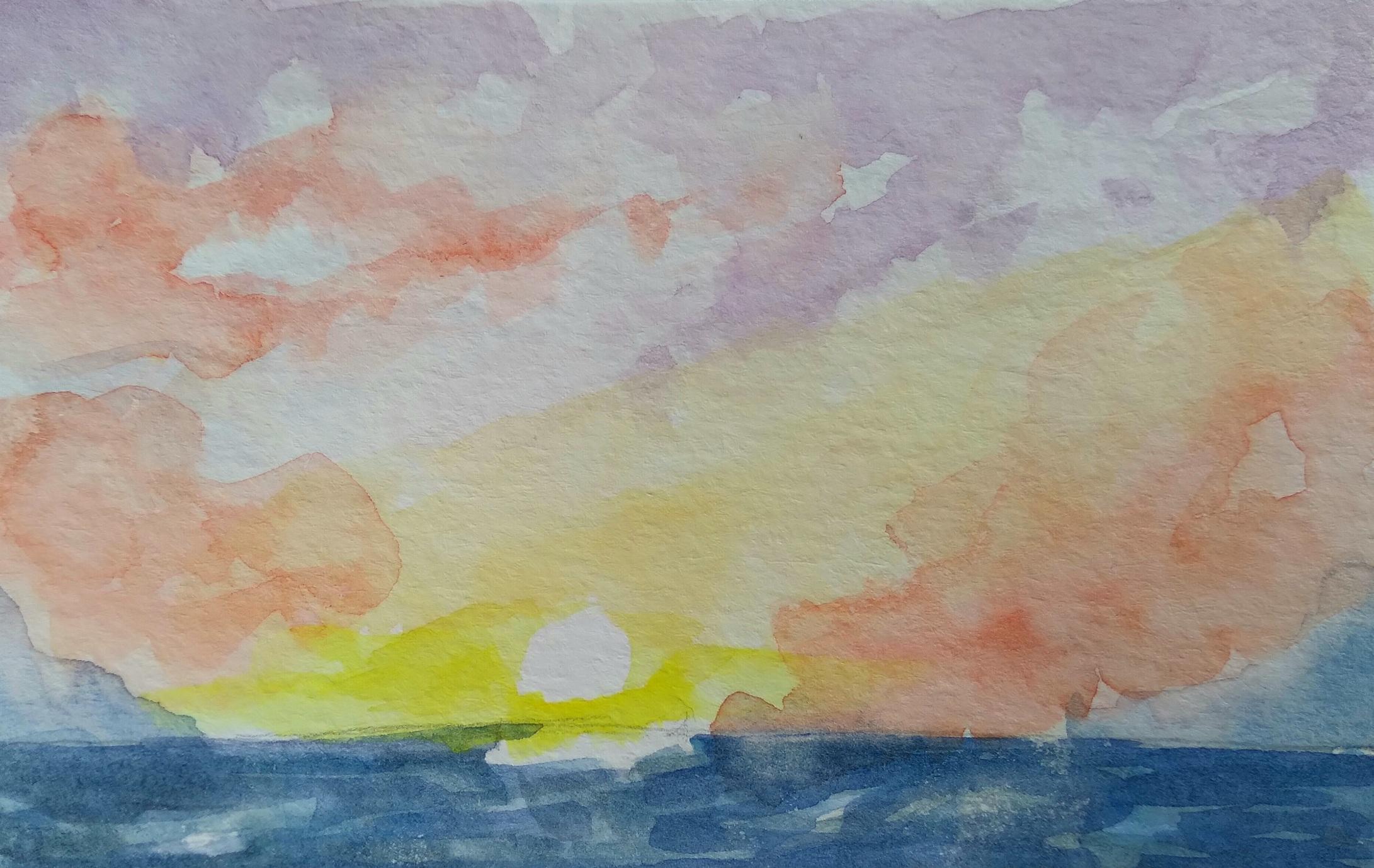
6. Project 2 Ocean Sunset: All right, so we're going to move on to this one at the bottom. The first one we're working on here, we did a wet on wet technique so that we've got a nice blend, blended lines. For this one, we're going to use the wet on dry watercolor technique. Because sometimes you see a sky that has much more detail in it. It's not as soft. It's got jaggedy clouds up there and we want to be able to capture that as well. So I'm going to start off the same way that I did with the first one. This one is an ocean scene and we've got the sun setting over the beach or over the water here. So I'm just going to draw myself a straight ish horizon line here where the sun is going down. And then I'm just going to put a couple of marks here to remind myself to leave that blank because the sun in this one is just setting over the horizon. You can still see the actual ascendant. It's very, very bright. So I'm going to leave white paper for that highlight. Alright, so let's get started here and we're going to start right around the sun with this super bright yellow. And again, whoops, sorry, got some blue mixed in with my yellow. That's not good. All right. We don't want a green sunset. Okay, so we've got all this beautiful, bright yellow. I'm a little too intense or no. Pull some of that out. And again, I've got a mostly dry brush here so I can control a little better with a more of a color is. Okay. Now we're going to move on. If we look in the corners, we've got a little bit of purple. And it's almost a circular thing here that we can as the sun's here in the middle and the darker areas are away. Just like if you were painting an apple or any other round shape, right? It's darkest around the corner. Now I'm going to come back in and I'm going to start blending my sky colors in just above the sun. It's more of a mixed Yolo. And it's coming, going off in a diagonal. Because we do have some cloud cover in the sky much more than in the other one. It wasn't that was them more clear night sky. And as I go up, I'm going to continue to add some of the orange. And even though there's a lot of cloud cover, it's still slightly blended. Alright. Let that dry a little bit. Because the point of not using the wet on wet is we don't want them to be super blended. So I'm going to skip back down here to the water. Being careful not to mix in with the sun colors. Won't turn it all green. And we don't want that to happen either. In a touch of black because I go and blending. And I'm going to leave a few spaces here and there because the moon or the sun is going down, There's still a little bit of wave action going on. You can still see some light. But notice that you have to make the watercolor different. Slightly darker, slightly bluer than a sky corners here you won't be able to tell where your horizon line is. Ok. So now I'm going to come back in with this, a more red version of this orange because that's what we talked about. Those are the colors that are in same colors and rainbow are in the sky as we see it. And you can see we've got a much harsher line here because we've got these diagonally linear clouds happening on both sides. And it's cool if you blend it just a little bit with what's web, that's kind of natural level, make a little darker spot. And then I'm gonna go up here and capture this little clouded area. I might add a little bit magenta in here. Because as this guy goes up higher, it's a little more of a cool color. Anything that gets too harsh, you can always come back in with your little paper towel bit and pick it out just a little bit. You can also, before it's completely dry, this line looks a little too harsh. You can come back in with your paintbrush and kinda stumble around a little bit and then we'll take some of that harshness out. Alright, now then the upper part of the sky in this one is more of a soft purple. So we're gonna, we're gonna get that going and we still have the diagonal thing going on with this diagonal clouds. You can see how fast this moves. You can do this as long as you've got your supplies out and ready to go, you can easily do this before the sun sets on what you're working on now. Okay, and I'm gonna go back in. And again, I'm going to pick out some, some diagonal and look and clouds here. And you have to do this pretty quickly after you put the paint down or you're not going to be able to do much lifting. And I'm taken this clean wet brush and clean up this edge just a little bit too. Not really looking for a Brown scot plus 1. Okay. And we'll let both of those dry and then we can come back in with some more detail work.
7. Finishing Touches: Okay, our mountain scape is dry and we can go back in now. And I'm taking the, the bullet tip end of my Tombow here. And I'm want to kind of follow the outline that we drew before to the horizon. And you can see on down into the watercolor paint that because we're using marker. It's not a big deal. It'll go right over this, give myself a little bit of room here. And I'm going to speed this up because you don't really need to watch me Kohler. Okay. Here's the cool thing about doing the wet on dry technique. It's easy to go back and add in more details. You just have to use slightly drier paint of if you use too much water, you'll, you'll just lift the layer underneath. So I'm going back in with a little bit darker blue for the water. Just because I thought it needed an extra punch. And this time I can go all the way up to the horizon line because I'm not worried about it mixin with that yellow and making grain. Okay. Happy with the yellow that's around the sun pretty much I am going to see if I can round up a little bit. And then I'm going to go back in with a slightly darker, a shade of orange are the reddish orange and that's mixed in here. Make it a little bit more dramatic. And a little pink. To that same mix, all of the magenta and get a little more drama going on up here as well. Remember, we've got this diagonal cloud's going on up here in this particular sky. And I am going to go in with a slightly drier brush. Soften this up a little bit. And you can see what that gives you so much more of a layered look, gives you a little more depth to your sky when you do this and you go back in with layers and glazing over previous layers. All right. And now that's making the lavender up in the corner look a little wimpy. So we're going to add to that a little bit as well. Especially up in the corners here. When we're farther away from that setting sun. Again, we're giving it just a little depth as we go. And I don't want it to look harsh and cartoony. So I'm going to go back in with a dry brush and pick some of it back up. All right. And now for more stormy, much more cloudy sunset than the first one. Very different looks. And we've done that in just a matter of a couple of minutes.
8. Final Thoughts: Okay. How easy was that? In a matter of five minutes apiece. We captured two completely different looking sunsets up here. We've got a mountain sunset that we did with the wet on wet technique and exceed the colors are blended. It looks very calm and serene. And then down here we've got an ocean sunset with a lot more cloud cover. It's a little more stormy looking, a little more intense colors, a little less blended. Both of them work done. I mean, we did each one in about five minutes, give or take. So you can easily use these techniques to capture these small little sunsets and sunrises in your nature journals without having to sacrifice the color. Just remember the techniques of make your palette ahead of time. Make yourself a little cheat sheet so you don't have to stop and think about the colors that you need to mix in advance. You've got your cheat sheet with you in your field bag or with your art supplies where the your, your journaling from home or out in the field doesn't make any difference. Have that cheat sheet ready. Have these techniques, practice, practice, practice these little these little minis as often as you can. All of the photos that we went through in a little slideshow. I've I'm included in the resources section. So make sure you take a look at those. Those are good for practice. Practice with online photographs because I know we don't often see sunlight. So it says like that in real life and we want to be ready to capture and when we do see them. Okay, so if you need a little help with color mixing, make sure to check out my color theory. Getting the color you want when you want it class that's available here on Skillshare. And find me as wandering leaves studio. I have a website and you can also find me as wandering leaf studio on YouTube where I have more quick tutorials and fun stuff for you. Thanks so much for watching happy nature journaling will see you next time.
 Lisa Duncan, Nature Journaler/artist