Transcripts
1. Introduction: Hi, I'm Lisa. Welcome to how to sketch and paint white on a sheet of white paper. As I'm teaching Nature Journaling. I get asked all the time when I'm teaching the winter part of Nature Journaling. How do I pay white snow on my white paper? It's a conundrum, isn't it? But I'm gonna talk to you today about how easy it is to do. We have to learn to see things with our eyes rather than seeing the picture that we have of something that's kind of stuck in our brain as an image. So let's dig in. Join me, won't you, as we learn to render white on a white piece of paper.
2. When is White Not Actually White?: One is white, not actually white. When the snow not actually white. What about this piece of paper? When is white not actually white? You know, our brains store information in a simple way as possible. For survival instincts so that we can remember where we can find food, things like that. Our brains only store the information that we need in the moment. So as nature journalists, as artists, we need to learn to see like an artist. And what that means is looking beyond the simple image that our brains stores and looking deeply, observing closely what's actually in front of us. And we, we've already decided this is a white piece of paper, right? But if I fold it, you can clearly see that this is a folded piece of paper. How can we see that this paper is folded? Our brain tells us this is a clean white sheet of paper. But if you look closely, if I obscure my face with this, look what happens as we turn the paper. Are you seeing all white? How can you see where that creases in the paper? You're seeing three different things. You're seeing. Value. The differences between the shadows and the highlights. You're seeing in the shadows. You're seeing depth of tone. You're seeing colors in the reflective or highlight areas. You're seeing different colors being reflected onto that white piece of paper. Okay, so let's take each one of those elements and let's drill down a little bit and look at how we can learn to observe those more closely so that we're better able to sketch and paint white elements in our nature journals on white paper.
3. Value: Shadows and Reflections or Highlights: Alright, let's start with value. Value means the highlights, the mid tones, the dark tones, and everything in between that's value. So going back to our white piece of paper, depending on how we hold it. I've got over here on this side, I have natural light coming in from the window. And I've got a little bit of artificial light coming from above. So that's why we have these different values in this piece of paper from try to catch it right here. What we see is this part because I've got it angled towards the sunlight that's coming in. It's a little bit darker. It still looks white, but it's more of a gray tone. It hey, go to the paint aisle at the hardware store. You're trying to pick a paint, you want white. You pick up a white chip. And there's 20 different kinds of white out there. White with a little touch of blue, white with little touch of green. There's all different shades of white. And that's value. So if we flip this back up here, you can see now we've got, I've got at such an angle that this, this is a midtone here and the dark spot is here. So much darker. This shadow that this, this part of the papers throwing is so much darker, still a white piece of paper doesn't quite look the same, does it? And over here on this edge of the paper, you can clearly see the highlight. So we have three tones here. We've got the highlight, we have a shadow, and we have a midtone. And that's how you use value to depict. White on white. You're going to use different tones as you go along. Okay, let's just talk for a minute about shadows on white. Think about a snowy day. A day whether there is, it's mid day, there's some deep shadows around things that the shadows that maybe your house throws. Or if you're out, you're sketching trees for the day. The shadows of the trees. They have color. It's not black and white and gray. Generally the shot in the shadow areas, especially on a white surface, you're going to see shades of blues and purples. So you're going to get a much more realistic sketch. If you're using colored pencils, watercolors, whatever you have that you're adding color with, you're going to see a much more realistic result. If you make sure and add a little bit of blue or dark purple in their shadow areas. Conversely, if you have a reflective space, the son is sitting directly onto the highlight part of the snow. Anything in the vicinity that might be reflecting a color, maybe during a sunrise or a sunset. You might even see some peaks and peaches, some yellows. Perhaps a street lamp reflecting onto the surface of the snow is going to give more of an amber glow. You get the point. These are all instances when white is not actually white. All right, so let's move on to the next phase and we'll take a look at how we actually go about depicting this. First as a pencil sketch and then using watercolors.
4. How to See Value: So when you're out in the field working in your Nature journal, how do you see the value that the darks, the lights and the mid tones? Training yourself to see these differences in value is part of learning to see like an artist. Or a couple of ways you can do this. Pretty much. Everybody now has their phone on them at all times, even when you go hiking, signal or not, you pretty much have your phone with you. Every phone camera has settings for the phone. You can go into the phone and switch it to a black and white photo. Actually, most of the time it says gray scale because it's not really black and white. It's everything in between, right? That's what we're talking about. So you can whether you take a photograph or not, if you switch your your phone camera to a grayscale setting, you can look at it and you can clearly see the darks and lights, right? That's what, that's one way to do it. Another way to do it is through a red filter. If you can find a piece of red cellophane and hold it up, that's a great thing to carry with you in your Nature Journaling bag because the red filters out everything. And all you see are darks, men tons and lights then. And then a third and much less technical way, something that you don't have to remember to carry with you is squinting and how you squint at the Christmas tree when your kid to make the lights kinda goes story. If you squint when you're looking at anything, whether it's outdoors and nature, anything else, if you squint, it kind of reduces it to darks and lights because you're letting less light come into your pupil. Alright, so with that said, let's move on to our projects. We're gonna do a couple of projects. We're gonna do the same photograph. We're gonna do it once in black and white with graphite pencil, and then we're going to do it a second time with watercolor so you can see how you can do it both ways with white on white, on white. Alright, let's get started.
5. White on White Still Life: Alright, the first thing I'm gonna do is show you what I have set up here for us to draw. This said remember this white piece of paper that we folded earlier. So this is a white piece of paper with a white ping pong ball. And let's take a look at this real quick and look at how we're going to sketch this. You can clearly see the fold in the paper. And why can we see that? Because it's much darker up here at the top, the way the light is hitting, much more white down around here, underneath. And then we have the white ping-pong ball that clearly has a little highlight right there with a couple of lesser highlights and a nice deep dark shadow. So that's what we're going to sketch today. We're going to sketch and then we're going to paint it a white ping-pong ball on a white piece of paper so that we can clearly see how you render white on white.
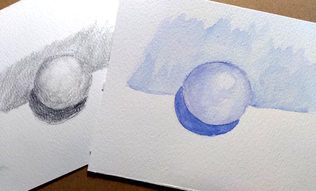
6. Project Part One: Pencil Sketch: Alright, let's get busy on our white ping-pong ball on my piece of paper here. The reference photo is in the reference area for you to work on the same photo. Alright, so I have started with a light pencil sketch of the outlines. And I'm looking at the fed on, I'm seeing that the darkest part. And that's where I'm choosing to start. It doesn't really matter whether you start with the darkest part, the lightest or the mid tones. I just tend to think it's easier for myself to start with the darks first and then I kind of take my cues for the mid tones in the highlights off of that darkest spot. The darkest spot in a still life like this is always going to be the cast shadow directly underneath the object when the light is coming from above like this. Now this is probably not the very best paper for doing this. I've got a little piece of watercolor paper and it's got a rough surface, but you're still gonna get the idea here. Actually may mean blend this out just a little bit with my blending is Tom pair. Alright, so that's our dark area. And then I'm going to take everything above the line is darker than the ping pong ball itself. But it's not super dark because we're still talking. This is a piece of white paper. And again, this is, this is a quick little sketch just to show you how you go about rendering. White on white. All right, and again, I'm going to blend that out a little bit just so you can see it a little bit better. And if you look at your photograph, it is just a little bit darker. Right down near the bottom where the crease in the paper is simply because there's not quite as much light reaching that area of the paper. Now, our ping pong ball is really standing out now, isn't it? So we've got the next lightest area is down near the bottom of the ping pong ball. And with round objects, it really helps. If you follow the curvature with your strokes, it helps build the illusion that this is a round object. And we can see over on the left-hand side of the ping pong ball. It's a little bit darker than the background. So we're going to darken that spot just a little bit. But it's still much lighter than that cash shadow at the bottom. And up here at the top. Because of where the light is coming into, little bit darker here at the top as well. And we're just going to kind of continue to follow that curve. And you see I have the brightest light spot. I've got a little circle drawn there to remind me that I don't want to colour in that spot at all. So I'm just going to use my blending stump here. And I'm going to use it to draw these lighter areas. I just move and that graphite around. I'm actually going to take this as a kneaded eraser. If you're going to work in pencil and needed any racers and awesome thing to have. You actually shape it anyway you want. And it's a little sticky so I can just lift out my pencil mark there where I wanted to keep that highlight. And there you have a quick sketch, a quick sketch of the white ping pong ball on the white piece of paper. And just simple as that. And sometimes, you know, if, if you are an artist and you want to do a more finished drawing, it's a great idea to do a small quick Black and White graphite sketch before you go to your canvas or your fish piece of paper so that you can really dig down and get those values right. Okay, let's move on to doing this very same picture in color.
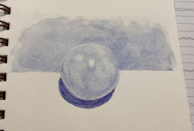
7. Project Part Two: Watercolor Sketch: Okay, we're going to do the very same project where we've still got the white ping pong ball on the white piece of paper. We're going to get watercolors this time. And I've gotten a very light outline and hold it up here so you can see it. I made it a little bit lighter on this one because of the watercolors. So we're going to use the idea of making the shadowy areas appear a little more blue or purple to do it in color. And I've got I'm going again, I'm going to start with the darker areas. I'm going to continue to follow the shapes with my brushstrokes as much as I can. And I'm going to try to make this fairly dark to start out with. But you know, with watercolors, we can let them dry and come back and add more layers if we need to. Alright, so there's our dark shadow area. And I'm going to switch to a slightly bigger brush here. And we're gonna go back up to the background This time I'm going to add a fair amount of water because I want this background to be lighter than the deepest, darkest shadow. And I'm gonna do the same thing that we already did once with the pencil. Just going to drag that out. And you can see this is a little bit more, little bit more blue, a little bit less purple. Because the the shadows, the highlights will pick up more or less color and can appear a little bit differently depending on where exactly the lightest hitting. Alright, and we said that it's just a little bit darker down here. Where the creases that we're gonna darken that just a little bit, but we're gonna fade that out. We don't want it to actually be a wine. We're working with watercolors. And you want it to be more of a gradation. Okay, so now we're going to go back into the ping-pong ball itself. And we're gonna do it exactly the way we did it with the pencil. That's a little too dark, isn't it? Going to lighten that up and just you might want to leave a little bit of a white line around the bottom edge here because that the shadow area is still kind of wet. And we said it's a little bit darker around this top edge, a little bit darker than them all. And again, be careful because that pain is still wet. Following the contours of your ball here. To sell though, 3d effect a little more. And we're going to remember that our highlight is right here. So we're going to add a fair amount of water. And we're going to continue to pull this around, leaving that highlight there in the middle. And remember that we have to slightly lighter highlights there as well. And this is exactly how you would go about doing landscape in the snow. Or, you know, there are a lot of other things that are not exactly white, but they, they read as white. When we're out in nature, waterfalls or a biggie. In. If you look in the reference photos and in my portfolio, you'll see that I've done a waterfall for you. I'll give you those reference pictures as well if you'd like to try and play around with that a little bit. Waterfalls tend to me. One of those things, waterfalls, creeks, any body of water. Water's not white but it is clear. And so we tend to not know how to put that on paper. Now when you're standing at the foot of a waterfall, you tend to want to paint what you hear. You hear the rushing water, the splashing, and you see that all of the activity going on in the waterfall and somehow you want to put them on paper. But because the water is clear, generally the best way to capture waterfall is to not paint it. You're going to paint everything around it. Instead. Alright, so there is our white ping pong ball on a white piece of paper done in watercolor.
8. Tips and Final Thoughts: I hope you enjoyed that. I have one last little tip for you. If you're out in the field. And I tend to work in pencil and then do a little more of the color at home. But to remind myself that I want to make sure and get all of the values studies done. I often will put a little scale at the top of my page. Starting with, I've only got 44 shades, the darkest dark, the why did it paper and a couple in between to remind myself that I want to make sure and get all the dark, dark sin. Otherwise, a sketch can look flat if you don't have dark darks. Why did the paper and something in between. So that enables me to do a better color version of it because I've already worked out where the darks and the lights are. And I've done the same thing with the waterfall photograph right here you can see I have this scale at that top, darkest darks to lightest lights. And you can see clearly that the waterfall itself is the lightest part of the picture. The why did the paper in some spots and doing the value study in advance with the pencil helps me to create a better colored photograph or picture when I'm done. You have the reference area besides the photograph of the ping pong ball given you photograph so that you can play around into your own versions of the snowy scene in the waterfall as well. Don't forget to post your your work in the project area. Can't wait to see what you guys do. And I hope you'll give it a try. If you want more. Tips and tricks and information on Nature Journaling mixture to visit my website, wandering leaves studio.com. And I have a YouTube channel as well where I do little short versions of nature journaling tips and tricks. It's also wandering leave studio. Alright. Can't wait to see your projects. Thank you for watching. Look for you on the discussion board.
 Lisa Duncan, Nature Journaler/artist