Transcripts
1. Introduction: Autumn is a stunning season. It's as if nature
decides to paint itself with the bright
and beautiful colors. From y print ellos to brilliant oranges
to splendid dreads. For an artist, this
perfect color design from mother nature is
a privilege to paint. Hello, I'm so Greta, watercolor, artist and teacher. Today, I'm gonna
teach you how to paint a beautiful autumn forest. First, we're going to start by perfecting
the color palette and learn a few techniques on how to paint
trees and foliage. Then we will begin the
class project with a simple sketch followed by
painting the background, foreground, trees and leaves. Class is perfect for an intermediate and
advanced level artist. And if you are a
beginner, do not worry, I will be here guiding you step-by-step throughout
the process. Are you ready to paint? Then without further
delay, let's get started.
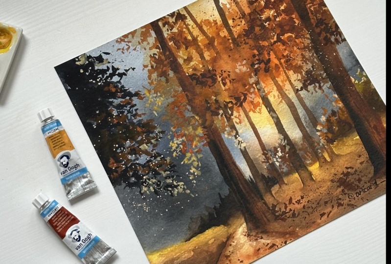
2. Art Supplies: Let's discuss at supplies. I have used Fabriano 100%, gotten 300 GSM papers. I buy them in roles and cut them up into the
sizes that I want. If you don't have
Fabriano, it's okay. You can use any paper, but make sure it is 100%
cotton and 300 GSM. I have used only three brushes, and all three are
from Zillow brush. This is hockey brush,
the large one. I usually use this
for initial washes. This is silver black
velvet number 14 brush. It's a round brush. I use this to paint a little bit bigger subjects like backgrounds and whatnot. And this is silver black
velvet number six brush, the smaller brush. I use this to paint smaller
details like leaves in this landscape.
Coming two colors. I have used the two
brands of colors, white knights and Sennelier, but I have a different
video about color palette. We're going to jump into
that in the next video.
3. Color Palette & A Few Tips: Let's discuss the color palette as well as a few
tips in this video. There are total of six colors, and I'm going to start
from light to dark. Last one is Naples yellow. And this is from the
brands and earlier. Kola is golden deep from
the brand White Nights. Next is Sennelier orange. And of course it's from the
brand called Sennelier. This is French vermilion, red color from the
brand Sennelier. And next is burnt sienna
from White Nights. And the last color
that is the dark color is pines gray from the
brand White Nights. Let's watch all
these colors now. If you don't have these colors, I'm going to also give
you the alternatives on what colors you
can use instead. This is Naples yellow, and do not use primary yellow. If you don't have it, you can
use Indian yellow instead. And this is cold and D, It's very light orange color. You can mix a bit of white
to the orange if you don't have golden D.
And this is orange. And I think everybody
has this color. This is a French
vermilion, red color. I hope you guys have
this color as well. This is burnt sienna. You can use any of the Brown shared if you don't
have burnt sienna. Final color is pines gray. If you don't have Payne's gray, you can use black color as well. Name all these colors now
so I don't get confused. So these colors I have used
in certain combinations, from dark to light color. And in some places you can
see from light to dark, as well as transition from dark, Payne's gray to
light Naples yellow. And here you can see the orange colors and
burnt sienna over it, Naples yellow as well. And some places even a mix of burnt sienna
and pines gray. It looks complicated. It is not there is only
two types of mixes here, from light to dark. Naples yellow, two pints, gray and pines, gray
to Naples yellow. So I'm going to make a mixed, two mixes here, just
for your reference. Pad with Naples yellow, and then finish
it off with pines gray using all the colors
together, light to dark. This is mostly the color
combination that you see when you paint the
village. On my right. Let's discuss the
color combination. You see on my left, pines gray to Naples, yellow. We used three colors to
paint the foliage on my left binds green,
orange, and Naples. Yellow from dark
color to light color. These are the color
combinations that you see on this entire
of the landscape. Let's discuss on how
to paint these trees. Absorb those trees. They are not painted
with just one color. There are two colors here, burnt sienna and pines gray. I want to show the light as well as the
shadow under trees as well. So I have used burnt sienna for the light part and
for the shadow. I have used pines gray. Slightly blend them together. Do not let the burnt sienna get mixed up with the pines gray or else you will
lose the light part. Aesthetic purposes,
I'm painting a stem, but in the Main Landscape
There is no stems. Also, I hope you guys
understood how to show light and shadow on a tree. I'm going to teach you how to
paint the foliage in order. That's what you see
most in this landscape. With light to dark. But I'm going to
skip Naples yellow, and go directly to golden deep. Start by painting
a blob of color. Slowly, give it sharp edges on all directions
using a smaller brush. Pick the next two dark color, orange and just paint on it. Do not let the golden deep, you know, get mixed
up into the orange. And later I'm taking burnt sienna and I'm
adding it in the middle. Bit of Payne's gray as well. So I'm gonna use golden deep. Again. I'm going to drag
the paint into a thin line and just put the dots around it so that thin
line is the branch. And those dots are the leaves. We want to show the light
falling on the leaves. You have to use Naples yellow. And if you want to
be in shadow part, you can use any dark color, burnt sienna or pines gray. At the bottom. I'm painting Naples yellow or golden deep to show
the light color. And at the top, the leaves are in shadow, so I'm using finds gray
and burnt sienna mix. This is how I have painted the
village in this landscape. So practice this before you move on to the
main landscape. So I hope you guys are clear on the techniques as well as the colors to use
in this landscape. If yes, then let's jump into the class project
in the next video.
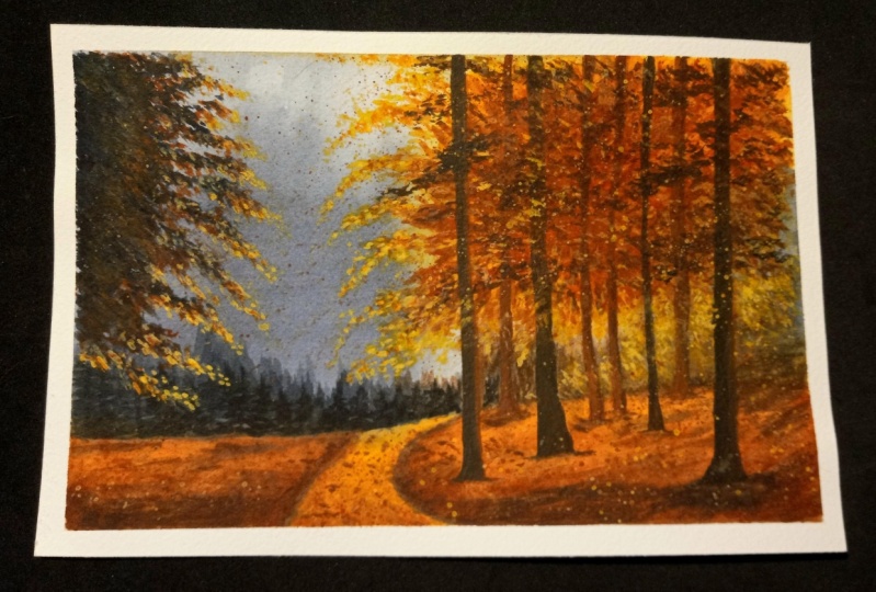
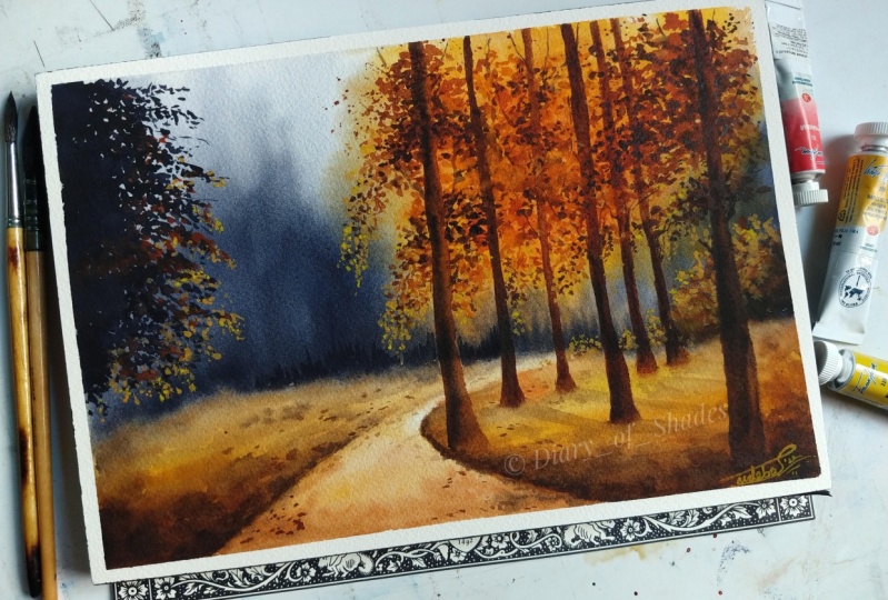
4. Class Project - Background Part 1 : Start the class project
with the sketch, and there is no
complicated sketch here just to foreground. Make the sketch a bit uneven. So it looks natural. Had to sketch a few times to get the perspective of
the road right. At the end, I managed
to make it look decent. Getting the perspective right is always a challenge for me. That's why many of my landscapes
do not have a sketch. I just paint directly. I know even when
you paint directly, you have to get the perspective. But somehow I, I paint
without a sketch. Anyway, that's all
about the sketching. In today's class project. We're gonna get
started by wetting the paper and I'm
using my hockey brush. Read the whole of the paper. When wetting the paper, we read too much or too little. My advice is to wet the
paper until it looks glossy and you can see the
reflection and then stop. It should not be dripping
water though, just glossy. Now let's quickly start
painting the background and I'm using my silver black
velvet number 14 brush. And I'm going to use
Payne's gray to paint the background tissue with you. We're going to need it to blend. Add pines gray. And you can see I'm
adding it in values. That means in the
not in the middle, just towards my left, I'm adding a lot of pines gray, and a little bit more on my
right as well at the corner. And remaining I'm
just going to be blending with the rest of the
paper using a damp brush. As you can see, the pines gray should be dark in not in
the middle towards my left, like I said before. So I'm taking some more of the color because it's
looking rather dull. If you observe my brushstrokes, you can see I'm not
letting the paint have hard edges at the end. So always make themselves by
blending with a damp brush. It should be dark and my
right corner as well. So I'm going to add a little bit of Payne's
gray here as well. By this time your
paper will be drying. So we're going to have to walk faster to paint the foreground. So for the foreground, I'm going to start
with Naples, yellow. Later, I'm going to
add golden deep color. And eventually I'm
going to darken it using red as well
as burnt sienna. That is it for the foreground. Now I'm gonna add just a
light layer of Naples, yellow for the road
in the middle. Just very light. We're going
to work on that later. I'm going to keep
this for drying. And I'm going to
also see you guys in the next video where
we're going to paint part two of the
background that is painting orange
color and Naples, yellow and orange mix, just like we have
painted the pines gray. It's gonna be very
interesting this landscape. So, yeah, see you guys
in the next video.
5. Class Project - Background Part 2 : Step is to make sure the first layer of background
is completely dried up. Second step is to gently
re-wet the paper. I'm using my hockey brush. And as you can see, I'm not putting any pressure
on the paper with my brush. I'm applying the
water very gently. Just like in previous video. We have wet the paper till
you can see the reflection. So here also it is the same. Don't let the water drip and don't let the water
be too dry either. You just have to see
the glossy reflection. Matter how careful you are, there will always be mistakes. As you can see, a
little bit of paint is dripping away from foreground
into the background. But that's okay
because I was planning to paint with orange
and yellow over there. So happy accident. And now I have taken
golden deep and I'm adding that paint
in-between pines gray, quickly. Adding Sennelier,
orange as well. The more different shades
of colors you see, the more depth you can
bring to your landscape. And of course, I'm
going to now quickly remove the extra water from my brush using a tissue paper. And I'm going to soften the edges of this orange
and golden deep color. We're going to have to
work faster here because the paper is drying up. Now I'm going to take mix of burnt sienna and
a bit of orange. And I'm going to
add a few trees. Not just you don't have to paint a detailed tree her in-between foreground
and the background. So it gives nice contrast
color at the end. Now at the same trees in between foreground and background
using Payne's gray now, observe how much
water is on my brush. Actually it's nothing. There is no water on my brush. It's very, you know, almost damp but it's not dry. This is not dry brush technique. So don't let the paint from your brush or else you cannot paint these trees that
we are painting now. You can manage with a dry brush, but I would say keep the damp
brush with lots of paint. I'm going to take
the red color and burnt sienna and add a few
details on the foreground. These look like loose, but we are not painting
them in detail. Same goes on the other
side of the road as well. I'm gonna take my silver
black velvet number six, brush the smaller one. And I'm going to mix
burnt sienna, orange. And I get this really
beautiful autumn brown color. You can see it right
here on my paper. Now, let's add some depth
to this background. So I'm not going to
be adding any detail. The leaves, just a few random brushstrokes
that we have done in tips, video, color palette and tips. So far my paper is not
dripping wet here. It's not dry either. Somewhere, is damp and it is not letting the color spread
into the Payne's gray area. So I'm thankful for that. And I'm going to take my
larger brush and I'm going to blend some of these leaves to give that soft effect
in the background. On me, surprised if
you don't see the list that we had just painted
with the smaller brush. This landscape is all about
adding layers after layers. So I hope you guys loving
this experimental landscape. And I just love that
it's in colorful, bright autumn colors, etc. Challenge to use lots of colors. And also lots of colors brings lot of depth in the
landscape as well. So I'm gonna see you guys in the next video where we're
going to paint the trees.
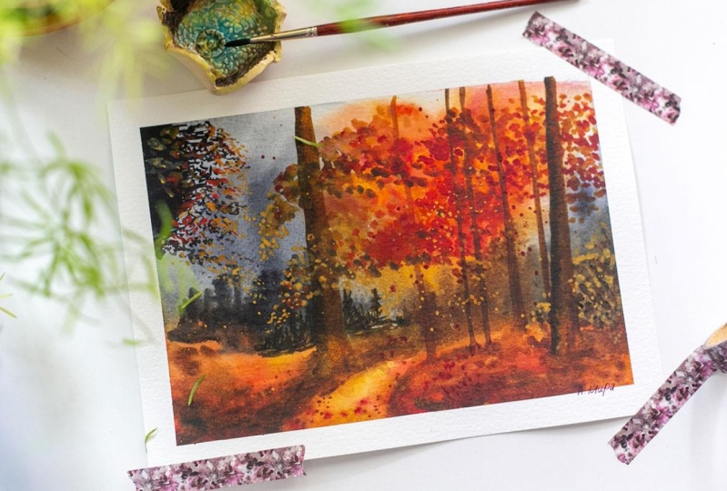
6. Class Project - Trees Part 1: The background is tried. And in this video, we're going to
paint a few trees. And this is my reference
for this class project. But you can see the
trees here are very dull and I have only used one
color that is pines gray. So instead I'm gonna
be using two colors, as well as I'm going
to try to paint a few more trees in the
background because there are only three in my reference and it looks rather
dull and plane. You guys remember
how we have painted a tree in our color
palette and tips video? We're going to follow
the same method here. I'm going to use burnt sienna
as well as pines gray. Now, let's get started on
painting these trees faster. I'm gonna be using
the burnt sienna to really bring the natural and realistic effect
in a landscape, you have to make some
very tiny changes. E.g. the position of these trees on the foreground
is quite different. One is in the front and
one is in the back. I guess you didn't notice it
until I told you just now. So when you look
at the landscapes, you won't notice these
differentials very quickly. But when you look at this landscape after
it is completed, you will note that these
changes, these small, tiny changes are what makes the landscape look
very realistic. I'm going to blend the
edges of these trees into the foreground
using a damp brush. I want to achieve
that thick forest. Look for this class project, but I'm not going to be spending hours and hours to paint
several of the leaves. So I have found an easy method, which we have discussed
briefly in tips video. So painting the leaves using
just your brush strokes. So also, another important thing while you are going for this method is using a lot of colors
and a lot of layering with those colors to give
that realistic look. While painting
leaves in this way, take care to not paint
just orange blobs. Remember to paint, you know, to drag the paint and make it look like leaves by
drawing sharp edges. What happens? You
can check out that last when it
collagenase that I've made at the top of the video on how that
should look like. Also, while you're
painting in this method, you should be your own judge and you should
know when to stop. My tip and advice is to, you know, from time-to-time
stop painting. Step back and look
at your painting. If you think it needs some more of the
leaves at the edges, you can go and paint
them very quickly. But if your intuition says no, please stop right there. Oh, that kind of intuition
takes a bit of practice, so it's okay if you don't
get it right the first time. After all, this is
my third attempt and I think I am getting
a hang of it. I think there's a lot
of paint in the middle. So I'm going to just remove
it using a tissue paper. Now, without wasting any time. I'm gonna be using Naples
yellow and golden deep to paint some light colored leaves at the bottom of the paper, just about the foreground. This is where the
light is falling, so the leaves should
be in light color. Now, I'm going to work
a bit on the road. First, I'm gonna be adding
a golden deep color. Later, I'm going
to mix it up with a bit of burnt sienna that is already there on my palette. As I go up, I'm going to
be adding Naples yellow. As you can see, at
the top of the road. Between foreground
and the background, the role should be
in light color. As we come down to the edge of the paper,
it should be darker. And while I'm at it, I'm going to be adding
a few random leaves with a French vermilion. I'm in red color and
burnt sienna as well. So far, I have taken a step back and was thinking
about the leaves. I think they are good for now. And I'm going to splatter
some burnt sienna on it. And in the next video, we're going to paint the
second round of trees, the trees on the foreground. So see you there.
7. Class Project - Trees Part 2: In this video, we're
going to paint those two big trees
on the foreground. Which is very exciting because that's what makes
the whole landscape, you know, come together. And I'm going to paint
those trees in a way that we have discussed in color
palette and tips video, starting with burnt sienna and later adding the dark
color pines gray. Have to paint these
two large trees very carefully because these are the main trees that we see when we look at
the landscaping hole. That is also why I'm paying special attention with
light and shadows. The light here is burnt sienna. I'm going to add the
shadow color now, that is pines gray. The first layer that
we have painted with burnt sienna is still wet. That's why it is easier for me to blend the pines grain to it. So don't let the bones
and our dry work faster. As you can see, I've just
removed the extra water from my brush using a tissue and I'm blending the colors together. Now I'm going to blend tree with the foreground
using a damp brush. We're going to repeat
the same process with the other
tree here as well. Start with burnt sienna. While the tree is still wet. Add binds gray, which
is the shadow color. And later blend the tree
into the foreground. I have taken a little bit of golden deep mixed with
the burnt sienna, which was already on my palette. And I'm going to start
adding the leaves. As we go towards my left. The loop should look
very light in color. So I'm going to
use Naples yellow. You're going to have
to work on this again after this round is dried up. Because if you add Naples
yellow now it's gonna, it's gonna just blend with the burnt sienna we
have just painted. I'm going to work on
that later again. I'll let start adding
the leaves using burnt sienna here at
the top of the paper. These leaves should look a
little bit darker in color. So that's why I'm using
burnt sienna here. I'm going to darken
it even more by adding a little
bit of pines gray. I'm going to splatter some pain. Now. For this, I'm going
to use tissue so that the extra paint will
not fall anywhere else other than the
place that I want it to. Now is the time to
add the light colors. I'm taking Naples yellow, and I'm going to add it at the place where I
told you before that. I told you that I
was waiting for it to dry and now it has dried. The light shade here
in the middle as well. But I'm going to first
start with golden deep. Later, I'm gonna end with
Naples yellow color. This is the place where
the light falls and it makes sense to
add lighter shade. Also, it looks so
beautiful in contracts with the dark pines
gray in the background. Now we're going to paint
another round of leaves using burnt sienna and
a mix of burnt sienna, Payne's gray later, Naples
yellow for this tree as well. The bigger one. Not forget to splatter
whenever you think is necessary and also don't forget
to use the tissue paper. Think I'm done painting
the leaves here. If anything, I'm
going to again look back and I'm going to add a
few details if necessary. In the next video,
we're going to paint the leaves in
pines gray color, the dark color later we're
going to bring it into light using our Naples
yellow and orange colors. So I'm gonna see you there.
8. Class Project - Trees Part 3: This part is interesting
because we're going to paint dark leaves
to light leaves. So first I'm gonna
be using pines gray, and I'm going to paint a
lot of mileage and later I'm going to add
light colors into it. The same way that we
have painted leaves in previous video using burnt
sienna and orange colors. We're gonna do the same here
with the same brush strokes, but we're going to
use binds grid. And also whenever you
paint village like this, you have to use a smaller brush. I will keep this skewed
thumbnail sketch of mine here so you can
see what I'm painting. When you are painting flowers
and leaves like this, It's important that
you get the shape right for beginners and for even advanced or
intermediate artists who are trying out these forest
landscapes for the first time, please use a reference
picture so you have an idea on what shape
the leaves will fall. Now we're going to start
adding the light colors. I'm going to take
French vermilion fast, the red color, extra width, a little bit of orange. Add the light color
into the pines. Gray defines grade still wet, and that's exactly
how we want it. I'm going to add a few more
leaves using Payne's gray. We're going to take that
orange and red mixture of color and we're
going to add it here, mostly at the edges. Welcome to my favorite part, adding the lightest
color, Naples, yellow. And now this is what makes the landscape look
so, so magical. I had Naples yellow to the
tip of the pines gray. And just make sure you
highlight that light color. We're almost done
with the landscape. That is only just
one video remaining. So in the next video,
you guys do type. We're going to paint the
details. So see you there.
9. Class Project - Final Details: This video we're going
to see if we can accentuate the beauty that
we have already created. E.g. the leaves that we have painted before has a
dried-up very light. And this happens in watercolor. So I want to add
one more layer of dark color using burnt sienna
and a bit of pints gray. If you asked me details
are very important. You can completely
change a landscape by simply adding or
removing a few things. In my experience, I have
added 3D effects to a landscape and that
completely changed the perspective while
adding details. So when you go for 3D, it's important to
paint the shadows. And you paint the shadows while you go for detailing at
the end of the video. After you think you have
completed the landscape, just make sure to sit with
it for a few minutes and see if you can add any
more noticeable things. It could simply mean a few shadows and a few
leaves, in this case. Make the background
the place where the the pines gray part and
the foreground touches. I'm going to add
a few dark trees that will really
increase the contrast. And a few shadows, random shadows on my left
side off the foreground. And a few leaves here on my
right side of the foreground, and a few leaves on the road. And this is very important. It creates such randomness
in the landscape. Remove the tape when you
are done and when the paper is dry it and I think I'm going to cut off most of
this paper using my ruler because I don't like this extra white strip of
the paper just on two, on both sides of the landscape. In the next video, we're going to
discuss a little bit about what we can do
with all the tips and techniques we have learned
in this landscape and how we can apply to other
landscape as well. So I hope you enjoyed painting this class
project with me. Thank you so much for joining. Don't miss the next video.
10. Final Thoughts: We have successfully
completed our atom landscape. In this class, we have learned how to bring the landscape to live by painting in layers. Also, we have
learned how to bring light and shadow into
a tree or into layers. So those are the main
elements in this landscape. With these techniques, you can also paint a forest landscape, the green forest landscape. Just replace this orange
color with green colors. But make sure you use
different shades of green. Can also paint a
winter landscape using the same techniques that we
have learned in this class. Use monochrome colors
are limited palette. When you're going
for a winter scape. You guys take these tips
and techniques that we have learned in this class and level up your watercolor skills. I also hope you guys had fun painting this magical
autumn forest with me. I'll be waiting to see all your beautiful creations under the project section below. So much for watching, I'm gonna see you
in my next class.
 Sukrutha Jagirdhar, Watercolor Artist I Creative Entrepreneur