Transcripts
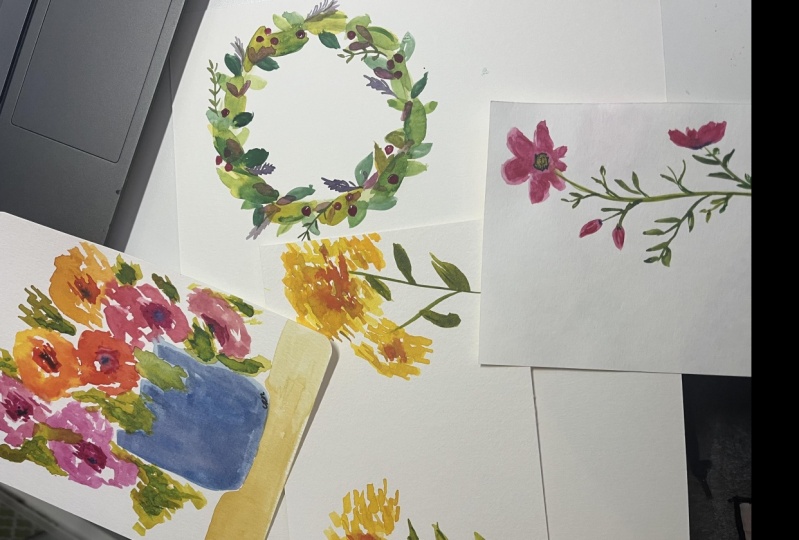
1. Intro: Let's paint floral
greeting cards. Step into a world of vibrant blossoms and
artistic inspiration. In this creative journey
that combines the art of painting with the
heartfelt gesture of sending greeting cards. This is perfect for beginners
and seasoned artists alike. This class encourages you to connect with your
inner creativity while spreading joy and love through your own
hand painted cards. We're going to paint about a dozen different
greeting cards, including some holiday cards. And these are all
watercolory florals, but you can use acrylic
watercolor or wash. I'm going to keep
the supplies very simple so that you can do
these in a few minutes. That's the idea. It's a card. I'll show you my favorite
Strathmore watercolor cards to use and give you
the link to buy them. Or you could make your own
out of watercolor paper. Either way, your loved ones
and friends are going to love getting cards that you with your artwork
on them in the mail. These sweet little
florals are so special because this becomes
your original artwork, you're going to sign
it, it's so fun. Hi, I'm Suzanne Allard and
my passion is creating art that exhibits joy and encouraging others to express
their creative spirit, which I believe
lives in all of us. I didn't start paint
till I was about 52 and I've learned just about everything I know
online in classes like this. I now license my
art for products, sell originals and prints and various products on my website as well as teaching online. In fact, I now have about 40,000 online students
across the world. I love reading your notes about how you're discovering
your creative self. In this floral greeting class, we're going to use flower
images that I've taken. For the most part, I include all the inspiration images as well as the photos of
these finished cards. In the downloads, I will show you how I use
these photos and simplify what I'm seeing
to make a card that is pretty fresh and
not overworked. Your creations will serve as the canvas for personalized
greeting cards. Basically, you'll
write sentiments, whether it's for birthday anniversary or special occasion. And through heartfelt messages that encompany your artwork. Let's paint floral
greeting cards. It's more than just
a painting class. It's an opportunity to create meaningful handcrafted
gifts that convey your emotions and
brighten someone's day. Join me on this
artistic voyage and let your creativity
bloom and be shared.
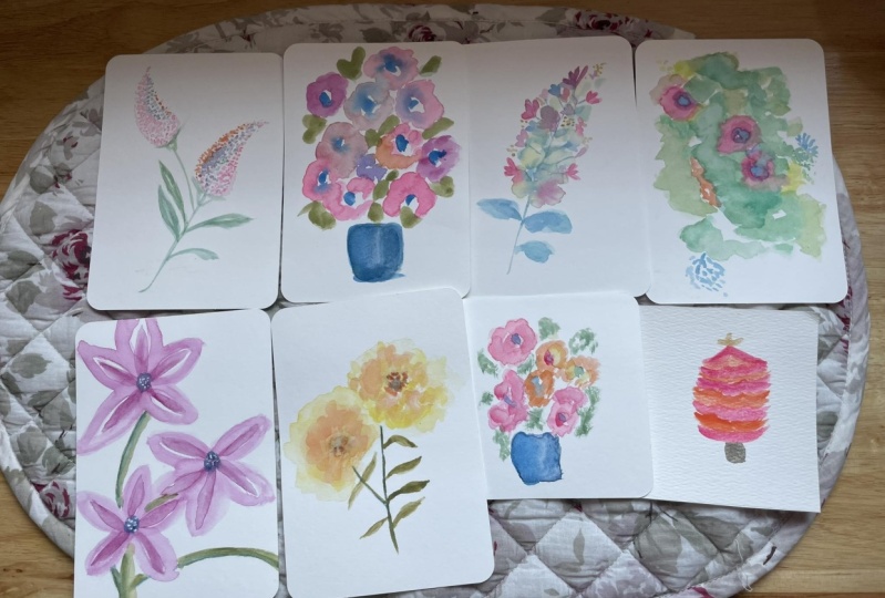
2. Our project: Okay, let's talk about
this class project. Although it really is like 12 or 13 class projects
because we do so many cards. We're, I'm going to show
you the watercolor cards that I buy or you could use watercolor
paper and make your own. I like these though because
they come with envelopes. We are going to
paint many florals. About ten florals and about
three or four holiday cards. And I'm going to
show you, start to finish what paints I use, how I keep it really simple. The whole idea of these is that you could have five
or 10 minutes, just grab a few
tubes of something. One, brush your card and maybe a photo reference or maybe just your imagination and make a quick
card for somebody. At this point, I have so many cards that I
use for all occasions. I don't even buy cards anymore. That's what our project
is going to be, making beautiful greeting cards that you can share
with your loved ones.
3. Supplies: All right, let's talk about the supplies for this
reading card class. I wanted to keep this simple. The whole idea is it's a card, you just have a couple brushes. Maybe two or three colors. Or just really quick
so that you could maybe paint one when you just have a few minutes,
five or 10 minutes. Or maybe in the evenings. I like to sit in front when
I watch TV with my husband, get out my paints and do them, then we're just
going to focus on these being relatively
quick, all right? The most important thing,
obviously, is the card. I buy, these Strathmore
watercolor cards. The Strathomore is a good brand and I've tried different ones. I like these. I bought 100 pack, which you can see, I mean, I've had these probably
two or three years. I still have a lot of them left. I think I bought like a 30 pack. And then anyway, it's grown. They do come in a
ten pack though. You don't need to spend
this much or get this many. There also is I just found on Amazon and I'll
put links to both of these in the supply list. Strathmore watercolor postcards. They're a little smaller,
they're four by six, but they come with envelopes
and they're a little bit cheaper at this filming. There are 15 of them for $7 Here is the ten pack
was eight something. But what's nice about these is a card you paint on the front and then
you can write inside. But a postcard, if
you just want to do a painting and write something on the back, that's great too. The postcards do come with
envelopes, which is nice. Those are a couple
options for you. The envelopes are nice quality, I didn't want ads
don't know cheap. This is actual 140 pound
cold press watercolor paper. It makes a difference
when you're painting. Now, you can also cut your own watercolor
paper and make cards. That's a fantastic idea. You don't need to buy the cards. The problem with that
is the envelopes, these are the right size, but you can get creative. All right. Let's see. I do think there I was
looking for the size. It's almost five by seven. Yeah, they do five by 6.78, I guess, so that it
fits in this envelope. But what I like about that size is whoever you send these to, can frame them in a
five by seven frame. It's like a frameable card, which is a nice little treat. Maybe it's their
Christmas peasant. We're going to paint
cards like this, a variety of florals
on the front of these. I'm going to throw in some
holiday cards as well, because, you know, that's always a fun time to paint cards. That's the paper part of it. For brushes, I used a variety of smallish brushes just
because the cards are small. But you could get by with, I've got a flat here, this is a size 12. But you could do really a six past to 12
if you've got one, then around I've got a six. You don't really need all
these. I've got four. A couple of four. Is there two? I would say for the details. If you have a good four or two, then you'll get that point. What am I trying to say? The bristles come to
a point so you can get some really good
quality details. I would just say that's
important if you're doing the finer work really
you could get by just say these two if they're in good shape
with the point there, then let's see, Pat, I used mostly water
color in this class, but you can use acrylic. You just water it down if
that's what you've got. Use it. You can use gas. You can use a gas. For this style, you're going
to be using more water. I would say. Whatever paint you use, don't get the cheapest. You don't have to get
the most expensive. But get a good
student grade paint so that you are pleased
with the colors, with the pigment and
what's happening to it. Same with brushes. You
don't have to get the most expensive. I like I think actually all
three of these brands are a really nice mid cost brand. You've got Princeton here, this is the Princeton velvet
touch, These burgundy ones. This black one is the
**** Blick brand. I've got links to all this
on my website at Suzanne, El.com I have Amazon links and then black
supply list links. Then the other brand that
I like that's mid range, price wise, and
perfectly adequate is this Windsor
and Newton Cotton. If you have bought the line of brushes that I designed,
they look like this. You can certainly
use these because I use them in the class as well. Okay. Now, same thing. Just don't get the cheapest. You don't have to get
the most expensive. But I, I would say on the more expensive side are the Daniel Smith and the
Windsor Newton watercolors. Then there's the Seneli, which is maybe a little
bit cheaper but fantastic. Then a great options, a student price is this Windsor
Newton cotton and brand, they come in these little tubes. Really cute. I like that you could literally take
four or five cards, a couple of brushes, three or four colors of this and a little piece of palette
paper or a little dish, since it's water color and go paint somewhere,
that's all you need. I love that they're little
and it's just very portable. Now I tell you in
the supply list, don't worry about
when people say, well, what color was that? Don't get hung up
on color names. Just grab a nice yellow, a mid yellow, meaning not
too lemon and not too gold. Although you could try
those and see what happens. This is an olive green, but I often make green
really vibrant one. This is a turquoise, is
an orange, pal, orange. And this is a quinacrodonedjust, some magentas, a yellow blue. I've got the indigo too, that's important. A dark blue. You could use ultramarine blue
too, which is not as dark. But it'll do the trick. I just like the tones
that indigo gets, I guess I would say there are a couple colors that
I use regularly. One is Opera Pink. You can see this one's a guache. It's almost empty, but it
comes in water color as well. Or if you've got your acrylic, then you can use fluorescent. That's essentially what it is. Indigo is another
nice one to have. It's also called paints Gray, sometimes turquoise,
some turquoise. All right, that's paint
we've talked about paper, make sure you have
something for water. I did in a couple of these, some gold pens, I think
mostly the holiday ones, but my favorite gold pens
are the Pilot gold marker, again links to this
on my website, and this Pentel,
sunburst, metallic, medium gel, they just
perform consistently. And I've tried so
many gold pens, I think that's all that I use in the class and I encourage you to experiment with
your own supplies. You can try ink, you could, using some other supplies that you have to create texture. You could use colored
pencil to create texture. I might use this indigo colored
pencil on some of them. But just the idea is to
do quick little sketches, be playful and lose. These are all loose.
All of these. I'm looking over here
because I've got these two here that we're going to do. What's fun about working
with watercolor, whether you're
using watercolor or you're watering your
gas or your acrylic, is that you get those bleed, those fun things that happen. That's where the paper comes in. If you don't have
decent quality paper, the paint just
doesn't move as well. I want you to have
that experience. All right, let's get started. I forgot to talk to you
about palettes in the class, I use mostly a ceramic
flower palette that sadly broke
because I was in Michigan and it broke and
I didn't pack it properly. Anyway, that's on
my list to replace, But the plastic ones work
great. I use this as well. I've put some acrylic
in here which is a no, I can get it out, but
it's much harder to. I tend to use the water color because you just rinse
it out and you're done. And I tend to use the
palette paper for acrylic, but you can see I used it
for the water color here. And when I say water color, I'm including gash in that, as long as it's the regular gas, not the acyl, which is a
combination really of acrylic. G is an opaque watercolor. Think of water color and gash in one category, I
know it's confusing. And then acrylic and acyl
gash in another category, meaning those cannot be
reconstituted with water. Once they're dry, they're dry. This right here, I'm going
to have to peel it out. These that are watercolor, I will rinse and you
can use them again. That's what's fun
about. I'll keep, if I use something like
this to paint cards, there's not much paint on here, but you'd be surprised
there's quite a bit. And I can reconstitute
this and use it. This one looks like it was
water color to possibly, it's easier to use
this palette with a water soluble paint that you can reconstitute
after it's dry. All right. I also
use kitchen plates. If I'm not using acrylic paint, then it's going to be easy
to wash something out. I've used a glass cutting board. Gosh, the things that
I've used as a palette, I've settled on
the palette paper because it's just so nice to either if you're going to re use these colors
or just toss it. All right, let's go play
and make some cards.
4. Butterfly Bush: One of my favorite flowers
is the butterfly bush. And we're going to
do one of those. I've got a picture for
you also that I took, but we'll have this
guy right here. And then this is
the one I painted. This is the idea came up here with a stem
just to about there, a little more than
halfway up the mys, and I also put a
bit of stem there. Then I had these too
in the the buds here, and then these leaves bled into that, which
was really pretty. I did come back in with
a second layer and did some highlights in
here to brighten things up. Let's get to it. I'm just going to grab a
darkish green blend over here. Something with blues and greens. All right, let's take our card. Turn it this way to make sure
I've got the right side. Yeah, I'm not going to go far at all because
this is a long flower. I went more than halfway. I told you that is easy to do. I'm just going to dab
that up. Not a big deal. It'll get covered dabbing. I've got a round brush here, but I'll show you how you
could use a flat one as well, just by using the corner of it. I'm I have in my paper here a variety of leftovers,
just bits of paint. So I'm just going to grab a little bit of all
of that and start. I think I'll make this
one curve this way. I'm just going to do
that to give me a path. Maybe I'll even throw some
yellow in this one orange. Get a little opera. Because why not
look at this bug? These are really
random at this point. You could try to cluster them the way they're
clustered here, but I'm just doing random. You could mix up dark and light, and we'll come in after a while and put a
few greens in there, but we'll let dry. You don't have to make it
perfectly symmetrical. You probably want to
try not to do that. All right, I'm going
to grab a little green and some hints of stems, stems don't usually show
all the way through. Just touching down a little bit. While I've got the green, I can do these small leaves here and I can do these
buds that come out, then I can do little
dabs on those. Those are going to tend to be, again, you don't need
to be realistic, but those are more green. But sometimes I make them greenish and sometimes
I put color in them. You never know. Maybe
one starting to bloom, grab my flat. Or I could use the large
round and start the leaves, the larger leaves pressing down, you can leave Show you this gap in there that suggests the mid line of the
leaf is a fun way to do it. That would you just leave
that in there or you can put it in on the
second layer with a line. It's just fun to play with
different ways to do that. I'll put a little more
yellow in this leaf. I think I'm just going to do
three leaves on this one. Maybe hit that with some
green down here at the base. Feeling like I want a little bit of lime green
in the flower itself, which can be leaves bleeding. Bits of a bits of
stems bleeding into the buds just adds some fun interest. I probably let that
dry so that the next layer you can see I did a
whole lot of them here. I can put a few more
actually toward the outside, that's too red water that
down I probably here mower is going by because
we're in Michigan renting a house that is
close to a golf course. It's been noisy. I'm just going to
put that in there. So I took it in a
red direction here. Anyway, that's treaty. Maybe I'll put some
of that over here. These little guys can bleed
like as much or as little as you want if you're
touching them to each other. Obviously they're
going to bleed more. If you're not, then they won't. All right. Let's let that dry.
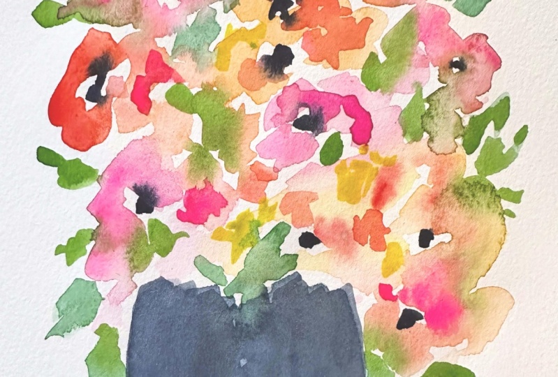
5. Five Minute Bouquet: Okay, let's do a
five minute bouquet. I'm going to call it that,
even though with me talking, it'll probably take longer. Have your watercolor
success kit handy, which is a favorite towel. Clean water, just a few
colors and palette paper. I have some colors
going on this, even though it's
getting quite mucky, it'll do most importantly, loose and playful spirit. Okay, I'm going to start. This is the painting
we're looking at doing. Just took a few minutes. I might not talk a
lot in this one, but I'll explain it after just
because I'm going to show you that we're working quickly
to start with the vase. Don't have to put
it in the center. That's personal preference. I like off center things. Probably because I'm off center, I'm just going to
sketch it loosely. I intentionally don't want it overdone and we're
perfectly shaped. Then I'm going to come in
with some pinks, oranges, different varieties
of water and lose, I don't even want to say round because it might not be
marks florally tight marks. I'm grab blank in between the
orange, yellow and pinks. Come down here a
little bit and play. Let's see s grab some more
of this pink up here. I'm very loosely, got
too much water there. I'm going top some up
with my paper towel. Remember that your
brush is like a sponge. I actually like
the shape of that. I'm not going to add
or flower there. I think I'm going to switch now to first I'm going to
just suggest again, too much water where the centers of these
you can see where they are in that shape. Now I'm going to
switch to some greens, again, being very loose, not even thinking about
traditional leaf shapes. Because if you put color
like this in a vase, the eye will know that
it's floral and leaves. You don't need to spell it out, it'll register as
flowers and leaves. You don't have to be, just
capture the color now. Depending on how
much bleeding you want into your flowers, you can touch more or
less of them here. I'm just going to make some
stuff going up like this and just adding a bit, touching down, really, you could do this with
a round brush too. I've just been playing
more with water color and a flat brush just
to see what happens. I'm going to come back in to the centers of these with a little bit more
intense pigment. Just to suggest the center some yellow over here. Remembering that as
intense as it seems now, when they definitely fade, this one, I decided to make
this flower the focal point. And then a little
bit of bright here. Again, it's a five minute
thing. It's not a. Master painting, it's supposed to be like a quick sketch
for a greeting card. We don't want to
get too hung up, but I'm coming back in and making sure it's
as intense as I want because knowing that
it's going to fade D, this is either the
Quinacrodone red or I have a Windsor and Rose
matter, darker pinks. Then I can use my pencil again for flattening out the card. It's funny, as you
do this, you'll go, oh, that's my favorite flower.
And then something shifts. That one is now or doesn't
even have to be the flower. It can be just a bit
like I really like this, so I'm not touching it. I think I want the tiniest bit of darker in the center of that. So I'm just going to get
a tiny bit of indigo. Put it in there,
may be in here too. I can put some in there, but I'm being careful not
to do too much just using the corner because it just playing with how much I
want that center to bleed. I can also come in, I
like to come in and just sketch in a little
bit personal preference, darkness in the face just to make it show
up a little better. Oh, that's really cute. I did a little
table on this one. Just sketched it in. I'm not sure if I want to do that on this one because
it came out lower. But if I wanted to,
what I'd probably do is maybe wait till it dried.
I wouldn't have to. I could also just not touch the wet parts and I could come in and do it across like that, but I just like the way it is. That's the thing
about staying open, especially with water color. Every single painting you
do will be different. You really want to stay
open and flexible. One more petal there, maybe now I'm reminding
myself that this will all fade when it's dry
and I like things bright. So I'm going to come
in one more time with some of my pigments. Hit some yellow there. Wash off my brush. Got a little more, my opera. Hit the center here. Maybe there a focal
point on this one. You, you could pick this flower and add a
little bit of yellow. We could do that. Or you could say, this is
a greeting card. I don't need to worry
about a focal point. Right thing. You'll do what I do, which
is you paint one and like, oh, I'm not going to
send that one to anyone. I like it too much. You'll
start or it'll be like, well, this is for a
really special person. I want a center that
flower, that one there. I want something in that one. Maybe a bit more of a
center in this one. Yeah, I'm done playing without the talking
and instruction. It literally set a timer for
5 minutes, maybe 7 minutes. That's what I did with this one. Now what I did, I want to show you on this one. I came back in after it was dry. And do you see those little
dabs there of water color? You can tell that it's
like a layer over it. I came in afterwards. You can do that. Actually, this is dry enough to show you. Let's say that I wanted
to be just maybe a little more lime green there. I could come in with
some lime green. Just do some dabs in there. That's what that is,
like a layered effect. And it's really pretty, I think. Especially if it does dry, more faded than you wanted, then you can come in and
hit some spots like that. I love what lime green
does to composition. I tend to do that. But I also like what indigo
does when I have down here. Maybe I want this
leaf a little darker. Maybe I want this
one a little darker. Just a, so you can get some
more contrast in some spots. Okay, That is the
five minute, okay?
6. Oak Leaf Hydrangea: Okay, in this module we're going to do an
oak leaf hydranga, which I think is one
of the prettiest, more complex flowers
because of the little seed, the little buds, the leaves. I've taken a picture
of this one for you. This was the sample
that I painted with capturing
those little bits. Now we're going to paint a card. I've got my same
water color colors with my ceramic palette. I've also included for
you the same sample. You can print it out and have it next to you or have the
photo out next to you. Or just find I think I love painting from
the actual flower. I just realized that some of this at the
bottom is cut off, but most of the flower that
I paint is at the top. Anyway, back to
the real flowers. You can use your imagination. You'll see the specimen. You can see the specimen of the hydrangaI have it's
later in the fall. It's not super fresh as
it was to begin with, but you use your imagination
and make it look like just bloomed hydrang here. I'm basically putting in a
bit of background that's going to be for those
little clusters of buds. And I did that first so
that it could start drying. This is of course after
making just one single stem. I'm using a flat brush
here, a larger one, and just I made some leaves
and then dabbing in some of that indigo mixed with green for some other
small leaves there. I like the way they
bleed into each other. I'm making these background
almost like blocking in, but making them lighter and
then just touching the brush down to get that sense of
leaves or the background, those clusters of buds. Remember when
you're doing these, when you're done with
it, it doesn't matter if someone can tell what
kind of flower that was. If someone asked you that, just say it's an
imagination flower. Don't worry about
trying to make it look exactly like that. What I'm doing, I'm trying to capture the colors, the feel, the texture, really
the happiness that florals make me feel. I'm starting to dab
in some flowers here in different shades of pink, a little darker, some
a little lighter. And then I'm looking at my
reference and the ones on the side are blooms
that are to the side. Only see their profile, if you will, to
differing degrees. And then the ones in front
might be facing us more. I do think of them as faces. They're facing, you
were there to the side, or sometimes they're
facing away. We're working with watery, Whether you're using watercolor
or guash or acrylic, we're making that watery look. We want that bleeding
into each other here. I'm just adding to
those bottom leaves. I like to go into leaves
and add a bit of dark, maybe a little bit
different tone. I just the variety. I'm just now I'm back
on the cluster of flowers and thinking about where do I want getting it to dry
a little bit. I'm fanning. A hair dryer works great too. The whole process of drying
and when to add what is pretty is a great thing
to experiment with. The longer you let this dry, the less whatever
you add will bleed. That's just the best
way to think about it. If you want it all really blended and watery
and not much definition, then add colors when
everything is wet. If you want a little
bit, if you want, say, those centers, I wanted
that to dry a little bit, so they didn't just
disappear into the flower. Another thing I like, do
you see me doing here, is taking a really watered
down bit of color and putting in what will seem
like flowers behind, if they're real watery. It just gives the illusion
that behind the bouquet, or maybe they're the flowers that are at the back of it
that we don't see as well. We just have a hint of
the color or a shape. It fills it out to
have those bits of faded or very light
elements there. I'm liking the shape of this and thinking about
adding those bits. And I want to add, I
think they're seeds. I was going to say,
I don't think each of those becomes a flower. Maybe they do. I think
they're too small. Yeah, I think there must
be a little seed buds. I've some of initial background
areas that we put in, let those dry now, I can come in to get
a greenish brown. You're going to mix
a little green, a little red, little yellow. Just vary, you want to be loose, some are more yellow. As I'm looking at
the actual hydranga, I'm seeing that where the light is hitting
them, they're brighter. The ones that are in the
back are more dull in color. I just think it adds
a great texture and maybe without competing with the flowers themselves visually. Now, I'm just looking
for, are there any opportunities to
put some stems in? I do try to do the
stems quickly. One stroke if I can, just so that they
are nice and clean. And then I love like, you see how that lower one
is bleeding right into the into that flower. They just give your
floral dimension. It's funny, isn't it? You had a few stems and
it's almost organizes it how I would put it, it's almost like the Brangos. Oh, I know what
we're looking at. I fanned a little
more just to get, again, a little bit more
control over some of the bleed. Now I'm coming in with the
opera pink and a bit of red. Just doing some dabbing. You can see how on
that first flower that's really that was more wet. That pink is pretty much gone all the way
into that flower. But the flower on the right, the dabs stayed there,
they didn't bleed. That's because that flower is more dry. That's what's fun. I think you get
the variation just by how much water did you
use in the first place? How much time has each element needed to dry based on how
much water you used? Sometimes I just come
in like this and look for where does something
need something. I'm not even thinking
at this point necessarily about
this is a flower, it should have leaves,
it should have petals. I'm just thinking about balance, overall balance of it and color. Where does it need something? I might think I want a leafy
element here or there, but I'm working to make
the pigment a little bit more intense so
that when it dries, it's not completely faded. I love that bleed. I love how that one flower, the bits, did not blend. It's just such a nice contrast. I think I was feeling
like there's just not much going on in there. But it needs to dry. We're going to let this dry and then come back and
add a few more. Okay, We're dry now. I want to fill in that
her do something there. I'm just seeing if it's
going to bleed too much because I want to make
some dots in there, but I don't want them just
fading into nothingness. I love pattern. Any chance I can to just do
texture or pattern. I like to do that really. At any point this is done, this is just fun to play. I've decided to just go ahead and add some definition there. Some nice green for a leaf. It turned out really
pretty, All right. Hope you enjoyed the
oak leaf hydranga and that you send it
to someone you love.
7. Peony: All right, this flower, it's an imagination flower, but it could be a pony, I guess. It could be a carnation. It could be a lot of things. I just like playing with
the shape and the color. This is something
that you can do. You can just take from your
memory the spirit of a flower and a particular
type of flower and not get hung up on does it
look like this or that? Just going to start
with some pinks. Well actually I'm
going to start with a stem and this dude, like this one is come up
here maybe a little darker. Well, I did it again. I told you it's so hard to remember not to
come up too far, no big deal come off here. Then really loose. I think the knees brushes is
the number 12 flat shader. The bottom layers are going
to make a little more watery and then as it dries. This is really just touching
down, being playful. You can put a center like that or you can
have the center buried. Just try not to make it
perfectly symmetrical. You can come down like this. I'm stabbing into the pink. We will be doing
another layer on this. That one's good enough for that. This one I can have touching
or I can direct it away. You can have really faded, like the out and some water. You can do things like have the faded petals in the
background if you like. And that's going to be
our first pass at it. And we'll throw in some leaves, maybe some bleed
there with the green. Make these leaves bright
green and also with a bit of dark there. Let me show you
something. Did you see how I started
that leaf from above? That makes it darker up here
because that's the pigment. There's just a choice
to think about that. It's going to be darker now. You can always take your pigment and pop in there to
darken at the base. But I just wanted to
show you that where you start will be the most
pigment in ten with water color because
as you move out it will be less user
fun to play with. I like the way that's
bleeding there, so I'm going to throw
a little more in there and we'll let it dry. Okay. I wanted to show you. I just use the hair dryer
a little bit to get it somewhat dry and just how you can take this in
between dry stage and drop in some more
pigment in the center. And it'll run but not
completely bleed. You can still get a
suggestion of a petal. I thought we'd experiment
with this one and do that rather than letting it completely
dry and adding another few jobs like we
did like I did there. I'm going to take the
red, pretty intense red. And I'm getting some bleed but not a lot. That's how you can play with control water colors. This one I think I'm going to close up and not put yellow in there over worked there. And this one I'm going to play with putting some
yellow in the center. It just opened up that way. I think it'd be pretty. Yeah, I like that. Then maybe I'll come
through here with a bit of orange. That's good. A big drop of water
Just went there. I was washing my
brush too vigorously. So it's done. I'm going to just
sign it and we have another card Chrysanthemum
Imagination flower. I'll show you how the
bleed is coming out, but you can see
that those petals are still moving outward.
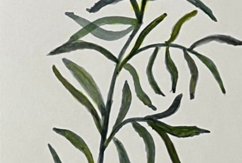
8. Meditative Leaf Card: This sweet. Sometimes it's just really nice to do a meditative
leaf painting. This is something, well,
I was going to say, best done without overthinking, But that's probably
true of all painting, but this one, particularly
because it's easy, it's just practice to get the
paint to do what you want. It does help to have good paint, good brush and good paper. We're going to do this card. My favorite brush
for this kind of finer work is a very thin brush, thin round, this is a
Windsor Newton cotton. Number two does not have
to be Windsor Newton. But I would get a
decent grade brush. Number two works really well
because when you press down, you can get these leaves. I chose to do this
in indigo blue, then I added just a touch of green at some points
for variation. The great thing about
this is you can do this all in one color,
monochrome like this. Or you can do it in
a variety of colors. And you can choose
any color you want. Because leaves can be
anything you want. You can just go with your mood. Indigo is one of my
favorite colors, but maybe we'll take this one more in this sap
green direction. You could also do
reds and pinks. Maybe we'll change
it out. Who knows? We'll see what happens.
First thing we're going to do is our. I like to work with
the card open, just makes it lay flatter. I just usually
sweep up this way, probably because
I'm right handed. But do whatever feels
natural to you. Well, I was talking to
you and I had the green in my brush. It's all good. I'm just going to bring
some branches off. I am trying to keep
these branches thin. You can see that one
got a little bit fat. What I might do is actually
turn that into a leaf, because if I push down
too much, they get fat. Let's just go ahead and do that. Let's see, go on
another branch here. I like to make them meander. I don't like things going
on in the same direction. I might just go back and
forth from the green to the blue to the indigo. Then I just start
making my leaves. I got some water
in my, not enough. It looks like you see those
dry edges there that happen. Sometimes I like
that I leave that. Because if you look
at real leaves, not every leaf is perfect. Not every leaf has
a perfect edge. I don't want them
all doing that. If that happens too much, I can go in and
fix it like that. I can also put
water on my brush. Just fill it more. The thing
with a thin brush like this, just to know is that it
can't hold as much water. Right? It makes sense because it doesn't have as much
as many bristles. It will need to be filled
with water more often, you can more water
and less pigment. You can take more
pigment variety then as far as the actual leaf. I'm touching down at the branch, lightly pushing down so that the brush flattens out and makes that bigger part
and then I'm lifting back up. You may want to practice
if you've never done this on just a regular sheet of watercolor paper,
before you do it, make your card, just, it's a great exercise. And brush control. You can bring your leaves
over one another, they can touch, they can
bleed into each other. That's part of the beauty
of water color and gah, you'll notice that I usually start the leaf
at the branch, but. May want to experiment
with doing it differently, starting at the outside. Especially like
here, I'd have to turn my paper around so I
can do it the other way. Just mixing more
to go with water, always going back and
getting more here. I'll start at the other end to, if you don't like the look where the brush lifts
off there like that. Then you can, like
I said, fix it. Or you just move your brush more slowly.
Like I'll show you here. Just give time for the
paper to absorb the water. If it's an effect you like, then go a little faster. Now, I've just added
some more green and a little bit of yellow
just to take this in a different direction back to my indigo. Put some in the center there
and make it bleed more. Just play when I'm making these
leaves meander like this. For some reason I
think of a ballet, just a graceful, like
a ballerinas arms. I'm going to turn this, I'm thinking of that. I'm also thinking of a
feeling like a Zen garden. Just very relaxed, soothing leaves that go
in different directions. Now I'm really
letting the pigment, I've been putting a lot less, I'm putting a lot more water
and a lot less pigment. And just getting some
really faded leaves, which can be really
pretty when they dry. Now I'm going to
switch, just to show you that you don't necessarily
have to have a number two. Here is a number six round. I get wet. In some ways
you have more control because you'll still
have that tip and you press down and lift up. It's the same idea as I
always say, experiment. Now you'll notice
when I lift up, there's going to be a bit
of pigment you can choose. Do you want that at the,
you know, do you care? Do you want it only at the base end or do you
want it at the tip? Here, it's at the tip and
here it's at the base. You can go back and forth.
All of this gives you that nice variety that
actual leaves have. I'm going back over
this because it was a little too faded for me. I can be done here,
it is what it is, and I leave it as is. I could come back in
and do a little bit of accentuating of the stem, maybe darkening it and thickening it a little
bit at the base. Another fun thing to do is, let's say I'll do this one. When your leaves are wet, you
can put a dab of pigment at the base and it'll
start bleeding outward. If you ever do
something that you say, well that's just too much, Take your paper towel and gently dab. You'll soak up some
of that pigment and it can also create
a nice textured effect. Let's see if any of my
others are wet still. I'll just show you that
bleeding. Put some here. Of course, this works with
guash to regular actually. Ah, will do this, it will bleed watercolor paper, maybe not, as well as watercolor paper or watercolor
paint or regular gash. Okay. Then we have
a lovely card.
9. Stock Floral: Okay, this may be the easiest, quickest floral
you've ever painted. We'll see this is in
the spirit of stalks, those beautiful flowers that you see in wedding
bouquets a lot. But it could also be,
it could be a lose, even a snap dragon. The idea is loose. What we're going to do is start with the lines that go up there, then we're going to dab with
a large brush, the green. And then come in with a
flat brush on the floors. Card here colors what I've got here Only using a
couple, I think three. The sap or olive green. I've got a little indigo
dabbed in there to darken the opera pink. And then a little
bit of the orange, we'll just see how
this n comes out. One thing I'll say about
stems is it always seems like you've got to see
how high up this came out. Start your stems lower and finish like about two
thirds up the card, because your tendency will be to take the stem up and then you're sticking your
flowers up here. And that's something you just
learned by trial and error. We're going to make our stems, since we want to try to get
the flowers right about here, we're really only going to
make our stems here and short. I'm just taking a round
brush for that and a greenish whatever
stems can be any color, it can be purple. But we're going to loosely
take some lines up here, maybe four or five,
something like that. We're not necessarily matching
these stems to flowers. That's just a
suggestion of a stem. Then I'm coming in with
this big acrylic brush. But I would say big you could even if you have
a big round that'll work. Trying to think what you could try if you don't have a brush. Maybe take a sponge and a and just come in here
really loosely like this. I'm just taking some
different shades of creamy. I want to make one
stem a little taller just to come out of there. Can have something up here. And then I'm just going
to grab a little. Linda go and pop that in a
few places for some dark. Okay. I promise to be the
quickest bouquet ever. So let me hold to that now. I'm taking some pink with the smaller bright
brush and loosely I'm, I'm just grabbing
different pinks. See maybe something here. I'll take this one
more. That way this one came out really red. So I'm going to dab that. I just went too heavy on my pink. But it'll dry like
we've talked about. It'll dry less intense. And then here might be a bud, a suggestion of a
couple of buds. I could grab a little
orange, toss it in here, always remembering
that even though it's intense now
it settles down. I just want to loosen those up because they look too linear. Well, maybe a little
more down here. That's it. We stop. I do like the way
this is flowing. But if you wanted to do that, you could do that too
and bring some down. But what did that
take? I don't know, 3 minutes. You have
a pretty card. It's just loose. It's the
stems dabbing in leaves. And remembering that the
eye will see the stem, the green and the color
and think flowers, it doesn't need to look. You don't need to have it be a representational
looking flower. It will register a little
handful of flowers. Of course, you could
play with colors. I didn't use the turquoise, but I just haven't been
wanting to on these. But I love the way look at the
bleeding that's happening. You can just do these over and over and over as it's drying. You can watch like sometimes I take a bit of yellow
and I dab it. Same thing with the opera
pink to increase intensity. It's just a fun thing to do. You can also, like we've
done on some of the others, make a little tendril. Let's see what if we made more of an
indigo tendril on these. Just watering it down. But if we came here
with some lose tendril, sometimes plants have
those, this interesting, all kinds of things
to play with. It's fun to watch how
it dries, isn't it? Like the yellow went into that little tendril
and then I feel like I'm going to put some green in that because that
tendril got too big for me. Okay. My letter dry.
10. Cosmos: Cosmos is one of my
favorite flowers. It's just so delicate and sweet and comes in
different colors. We're going to paint
a Cosmos card. I'm going to put these
two photos that I took in the class documents. You don't show up
great on the ipad, on the on the camera, but I'll put them
in class reference and you'll have
them to refer to. These are a couple of
ones I was playing with. You know, I liked how this
was kind of behind here, so I was playing with that idea. I think for this card
I'll just do a single, maybe something like this with a little bit, a
little bit larger. Okay. So I'm going to play with
this larger brush that is Cota watercolor brush number
ten that I recently got. And it's nice and fat, but any brush you have
that has the thicker, it'll help you push
the pain around. If it's thinner, you
can still work with it. We're going to have to probably maybe put it on its side to try to get those fatter marks. But you could try a
flat brush as well. All right, for the bloom, I'm going to grab my opera pink, maybe just a little bit of red to just change
it up a little bit, even the touch of blue to get some purple in
there on the brush. And plenty of water on my brush. Actually, what I
want to start with, the stem, that brush all loaded. I was just thinking I
got ahead of myself. I want to start with the
stem and I'm going to get a little bit of green, a little bit of yellow
like the other ones, maybe a little bit of indigo. I'm just thinking
if it's coming up, I'm going to add these
cosmos leaves are just really delicate
in the photo. Just little bits going
every which way. That makes them
really fun to paint because you're just doing
these little sprigs that don't have to be have any specific harm
or reason term, or direction or anything. They go every which way. You want to use the tip
of your brush to get those finer lines and you don't have to connect
it to the stem. Let's see, I'm going
to put my flower here. Probably put a bud over here, but we can come back to that. I want to get the
flower in there before this end of the stem
dries too much. I'm going to leave a little
circle to put some yellow. And then I'm just
going to really softly touch this brush around, looking maybe at this one. The petals are shorter on this
side to see if I get into that green before it dries
and I can push it away. I think it was this one. Yeah. Just see how
that petal is curved. Just make them irregular. Not too fussy.
Let's try this one. It's a bit darker in the center. Come in with a little
bit of the indigo. But I'm going to let this dry a little while we finish
up the other parts. Because if I put the
indigo in there now, it's just going to
bleed immediately out. And I want to try getting it really concentrated
in like it is there. Can you see that? Okay,
well that's drying. Let's move on to maybe a bud. Maybe I'll put the
butt on this side. My butt. I'm going to put
a little more red in it. Pink and red. I can
put two in there. Why not? I like to let
the stone bleed into it. I want a little more yellow
in some of these leaves, so I can just drop
it in wherever I want it. We do. We have room for a
sideways flower over here, as long as I don't take it
too far to the edge and make my flower look strangely. Right now it's in the center. I can play with it here. It doesn't have to be
exactly in the center, but if we did
everything over here, it would maybe be a little too. But if I just make it a
little one like that, drop a little more pink into it. Yeah, that's pretty. Maybe I'll just bring my
down just down a bit more. I'm just dabbing. You're being you're just really
delicate with. I'm gonna go ahead and
sign, win some green. How are we doing
on this? I think I could probably get away with a little bit of purple
color in the center there. Maybe it won't bleed too much because the card is buckling a little
bit, which is normal. A lot of this pigments going to the outside, but that's okay. That's part of the
fun of water color. I like the way that looks. I'm go ahead and often I'll let it dry at this point
before I put in any center, I probably will let
it dry and come back. But I'm watching how that's
bleeding. I wonder if I can. Oh, that's cool. Look at that. Funny that really, I
thought I could keep it. This is the fun of watercolor. I thought I could keep
it from moving too much. And there it goes. Well,
it's so interesting. But it is more than I wanted. I'm just going to, part of
me really wants to leave it, but it is going to
take over the flower. I'm going to come back in, so pretty All right. I'm going to pull more pink
in there went our purple. Well, now you'll
get to see Kata, something that will turn
out to be a happy accident. I'm just pulling a little bit of that color from those edges. Now, I am going to let it dry. I'm going to let it dry
and then we'll come back and do that darker
center in the yellow. I should have left it
with the purple that was really pretty and let it dry and then come in
with the yellow. But it's fun to play. No harm done. I might just put something right here to get it not to buckle
anymore while it dries. Okay, We'll be back soon. Okay. You can always
use a hair dryer. By the way, just when
you use your hair dryer, don't do it close
because you'll blow the the water around
and change the paint. Just keep it at a distance that's dry. We'll
finish that up. In the meantime, I
want to show you a couple of others
that I had done for when clients
buy an original, I like to send a
hand painted cards. These are going out today, actually, with two paintings. I just love how everyone
is going to be different. I love that whole process. I just wanted to show you those. Let's go ahead and Dab, let's go back to that purple. Maybe a bit of yellow
on the inside of that. I don't I don't want
to give up on trying that bit of purple, just a matter of letting
those layers dry. But if I keep the purple
out of the center, then I can, and I don't touch it with the yellow because I do not want to mix purple and yellow. I'll get brown, so I'm
going to try not to touch. It's bleeding a little,
but that's really cool. Okay, We are leaving that alone. This one you could decide if
it's facing the other way, which I've decided it is, then I wouldn't put
a center in it. But you could also say
that it's this way. And you could have
a center in it. But to me, the way it came out, it looks like it's
facing the outside. We are done. You can
see how this can take 5 minutes once
you practice with them and make yourself doing really fast and
have fun with it.
11. Loose Floral Card: Okay. Well, I, I thought it was recording the making
of this card, but apparently I wasn't. So it's still wet, but we're going to
make another one. This is a loose floral. The whole idea here is to be
just super playful and lose, and move quickly,
and not overthink. I might be quiet sometimes, but I'll explain it all if I am when it's done because I just
don't want to overthink. The first part is
going to be the green. I've got a couple greens
going, the sap green. And actually a yellow.
Got a piece of palette paper here,
just a few colors. The opera rose. Another pinky rose. Or maybe this is Quinacrodone
pink, I can't remember. An orange. And then the indigo. For the loose green parts, I'm going to use acrylic brush. You can use a big
watercolor brush too, but just something big that doesn't let you
get too precise. Okay. Being very loose and
just pushing color around, not overthinking and adding
water to keep it loose. I do try to be
conscious to not put an exact square on my page. I want it to be a
little more natural. So you could go this
way or you could go this way and even spill
into the back of your cart. That would be pretty, right? Let's try that. That's pretty. Okay. I've got some
yellowy greens. Some darker greens. Let me just throw a little bit
of indigo in there. I'm just touching it. That'll
just darken up the greens. If your paper starts
buckling like this, what I'll do is grab a
brush like this allows me, sometimes it'll
stay, but if not, I can just hold it there. I don't want it
to be in your way though. I'll do it this way. The water moving to
whatever shape is fine. It's just that if
it's really buckled then it all goes to the outside. Sometimes I like to adjust
that by doing this. That's a personal preference. All, I'm going to
stop there with that. Then I could stay with
my same big brush, but I think I'm going to go to a bit smaller flat
shader or bright, which is the square shape. This is a 12, it's still big. And just grab some of
this rose and pink and go back and forth and make loose floral shapes
here and there. I'm just just being
as loose as I can. This is supposed to be, if I weren't talking, this
could be done in 5 minutes. And that's the idea to just get on where that Rose, you don't really have to hurry. It's interesting feeling,
It's not like you're rushing, but moving quickly
to keep it light. And I'm going to
grab some orange. Throw it in there just for some variety maybe come up here. What you do want
to watch, because you're green and your oranges
and pinks can tend to mix, you might get some
muddier colors. Let me just show you this
is probably going to dry. Interesting. So I'm not going
to do anything but let's just say I thought that
was turning to mud. I can take my brush and just
absorb it and erase it. Let's say that I didn't want
all this green pooling here. I can pick it up. The
brush acts like a sponge. I can even bring some over here. Now, I'm going to bring in
some more of this really bright yellow with the green to make like that limey color. Just a nice highlight,
different spots. Maybe do something here. So this isn't hanging
out there like that. Just loose and playful. I'm watching, looking. Okay. Now I need the brush. Let's see, this brush. Which flower do I want to be My vocal point and I'm
going to do this one. What I'll do is I'll take
some of that opera and come back to the center. And just make that one pop more. Because the water
color is moving outward, it will dissipate. But I can keep feeding
the figment this way. I'm just giving that one
a little more pink food. This one as I'm, I don't want that much
darkness right there. I just absorb some. I like the way this is going. I think I'm going
to do a little bit of dark in the centers. It's a process of watching and letting it dry to decide when it's where
you want it to be. Keep in mind, they always
dry. More faded looking. You want to go overly bright and like this one,
that's almost dry. Now you can see that
this is the one I chose as a focal point and I thought I was really
brightening it. Now it doesn't look
quite as bright. Just keep that in
mind to exaggerate, I might bring a little bit
of yellow up into this one. You just dab it in,
see what it does. That's the fun of
water color and, but it's more orange in there. This is buckling
here a little bit. So I'm just going
to press there, which makes this come
down a little bit. I think it might like some
yellowy green dots here. It's starting to dry there, so they're not blending in. That creates a layered effect and I just like how it looks. Personal preference, I'm letting it dry a little before
I put the centers in, because if I put these
indigo centers in now, it's really going to bleed
into the whole flower. I just want a little
more time to pass. Let's see, where else do I
want some yellow up here? This yellow is so intense that I'm water it down a little bit, make more of a lime cream, just really I like it. So that's the whole idea of this particular
type of thing, is soft, we get a little
more indigo in my palette. The mystery of water
color is such fun, you can't control it as
much as maybe some others. But you can control it maybe
more than you think like. Okay, let me show you here. This is getting brown. There's nothing wrong
with some brown. If you look at, okay, there's some brown, but I just want a little
more green there. I just soaked up that
brown in green and it'll blend nicely as it dries. You can see what that
yellow did there. All right, I'm going to
try some of the end to go. Now, in the centers, that
color can be really intense. I want to make sure I don't
get it too intense again, if it goes too far, I
can absorb some of it. It's harder with the end
because it is so dark. But it usually ends
up being really pretty the way it spreads out. Yeah, pretty. I love that water color bleed. You could do something
like the suggestion of smaller leaves here,
going off the page. You could even do
a suggestion if you like of like
some sort of stem. Or you can just leave it like it was just I love the
play of the color. You can take, just
do how you have like say a sweet pea and
it has wandry things. Those can be fun to add. Just giving you some
different ideas. Yeah. When you do this
a few times and you just let yourself get
loose and don't overthink, then you can knock one of
these out in 5 minutes. When it's dry, it looks
something like this. And you can even
come back as it's drying or after it's dry
and add more if you like, or you can just leave it as is. Just remember that the
intensity will dial down like this one could have maybe another
wash of some green. Here, let me just show
you how you can do that. Even though it's dry,
it's mostly dry. Who wouldn't like getting a
card like this? Hand painted? You can just come
in and especially because it's not completely dry, I'm going to throw a
yellow in there to mix in. It's mostly dry, but that
can be a nice effect to just come in fully like that. I could do the same
thing with the flower. If I want to bring a little
more upper pink in here, I could even come in and make some layered
suggestions of petals. I can do that over
here at the orange. Maybe I want a little bit of darker thinking about contrast, trying to keep it below. This is a card, not a, not a painting
that's going to be, although that's why I like
these five x seven cars to see your friends and
family that receive them, can frame them and may
very well do that. But you don't want to get attached to that when
you're creating it. Strike fear in your heart and
shut down your creativity. Just keep it loose and playful. Let's look how
this one's drying. I just love the way that go. See how it bleeds
into here and turns into lets see if I can point like a purple
there and there. Now, if I had wanted these centers to be smaller
and not bleed as much, I just would have waited
a little bit longer. But look at that
yumminess right there, the way that it fled in around
that pink and orange, huh? All right. That's a
loose floral card.
12. Yellow Zinnia: All right, let's
do a open Zenia. There's different ways to do, obviously different flowers. This is what I did with it. I added a baby one next
to it. Let's gather. Using the same colors
you'd be using. The yellow, whipple, orange
quite a bit, and then greens. I made a splash here. We'll see what happens. I've got my card. I've got the right side, the non linen texture side. We've got our flower
brushes, water, paper towel. Okay. I love just sitting
down even with these few supplies for
a few minutes and you can paint four or five
of the same flower, because you're sending
them to different people, you can get a rhythm on
just one particular flower. I think I'm going
to grab a little bit more of a four just
because that stem, the stem is narrow but
it's not super narrow. Grab variation of greeny
brownie something. I want to make this stem
a little less straight. I don't really like how
this was so straight. A more natural looking, something like that,
maybe like that. Careful being mindful of not getting this is
actually a bit high. It's okay because we can, I'll show you how you can, before it dries, erase
the water color. We'll bring it down that way, our bigger bloom can be here. The shape of these tends to be like a half circle, loosely. If you look at it this
way, it's like that. That's all I'm thinking
about is I'm dabbing and I'm going to start with light. I've got on my paper here enough different things
that I can grab some water, a bit of orange if I want. Just so that it's not I'm going to say out of
the tube, Yellow. But yellow has been
so messed with that, it's definitely past the
out of the tube Yellow. But I'm getting more water on
my brush and just starting some marks in that shape. I was talking about a dome shape with a bit more orange
toward the center. These flowers are
going to be in layers. We're not going to
get at all the way we want it In this first pass, try to, even though zanias are, I was going to say try not
to make it very symmetrical. Anis definitely tend to be quite comp and just to
make it more natural, I dropped this off a little bit. You do see that there's a petal that is going off
this wayward way. Then I'll come over here to this little one and
do the same thing. You can have surprising
little pigment on your brush and it'll
show up when it's dry. I like to do that
in the background. Sometimes these really
pale bits that you'd say, I don't see anything, you
probably don't see anything. I barely see anything. But when it dries, we'll see a little. Then the leaves, I'm just
making these a little more leaf shapying
quickly off so that, you know, get into too
much thinking about them. This is going to be dry on the pale side and
then we'll come in with some layers if we want. You might like it this way. Make a little more of my
lime green that I like. I do like taking a bit of
darker color at the base. I might come in with a
little blue and darken this stem a little now. So. The dark goes right into the base of the leaf.
While it's wet, maybe I've switched to the round now just for a
little more precision, it could put a little a
yellow in these leaves, maybe some more of
this olive green. I need more water in my green
can use a dropper or spray. I just happen to have this here just to dark knees here at the base of waiting
for the flower to dry. Maybe I'll do another leaf. Go back to my flat, I think I can come, some
of this is pretty wet, but let's see if we
can come in with a layers a little
bit more yellow. I'm really just dabbing and maybe a little more orange in this one. That's
too much orange. It's amazing, isn't it? A little bit of paint. It takes to pigment to create
something in water color. Just kind of going back and
forth between these two, staying loose and playful, maybe make this
focal 0.1 a little larger then as it dries and we might have to
wait for it to dry completely. We'll see if we can get. I made these little dots
to suggest the center. It looks like there's
some dry places where I can get
some of those in. You can go with a brown color
like there's on the flower or I did a greenish
brown just for now. Just to show you. I'm
going to where it's mostly dry just because if I dab
in the wet, it's too wet. It'll be okay in a little while. But see, it just disappears. We'll let that dry and
then come back and put those centers in and see what else we want to do to this one. But it's very sweet and
since I have this color, I might as well sign
and we'll let it dry. Let's see what we want to do, if there's anything
we want to intensify. All right, since
this is all dry, let's take a look and see
where we want to add. This is, again,
personal preference. Add a little bit of color, add some more dots. You can see I came
back in on this one and just added some bits
on the stem and leaves. I like that layered look, but you might sometimes the bleeds the way
they are just lovely. You pick and choose
where you want to add. I'm just going to add some
pops of some yellow here to just a little variation on this side and maybe a
bit more orgin here. This one really is quite faded, so I want to bring that
one to life a little more. Just adds a little
bit of interest. Then maybe I'll do
a little more in the pick up some green here
that's on my palette paper. Interesting greens forming from all the different
colors I have on here. I'll just put a little
bit of that in there. Maybe a make that lime
green I like a little bit. I take my brush dark blue, I could put a little bit of blue in this stem just to darken and give a little more contrast. Again, personal preference,
you do want some contrast. How you get there is up to you, but you want a sense of even
just little bits like this. I'm going to bring in some of
these darker blues greens. And put them in the center here. Just some of these dots. That's just a touch up, okay, that zia is done.
13. Amaryllis: For this card, I played with some Amaryllis ideas because
I did some point sets, but I just think they're not as interesting as an amaryllis. And I also like the
leaves of Amaryllis. This one I combined the
amrellis or point set, and then they're more
point set of leaves. Then this one I played with more of this look and then I
threw a stem in that one. But I think I like
them without the stem. Let's see how it turns out. In the I'm going to put, this is just a Amaryllis
reference photo. I'll put it downloads
For this one. Again, the larger brush
is nice. The round brush. Get a card. I'll
use the number ten. Again, I am using really
only about, let's see, the pink, pink, red shades and then a little bit of
the indigo to make that purple for the center
is what I did here. Then I thought we
could come in and do some little yellow white
marks to indicate the St. I don't know that
I would draw this. Just simplify it by making
a few dots in the middle. But let's start with the flower. Get our card. I
don't know that you can see that image
because I think it comes through dark
on the camera. But let me see if I can
brighten it for you. All right. Well, you can look at it. You could print it out or look at it on the device of your own. I was just thinking, do I want to center
it or not center it? I think it'd be more
interesting to have it large. And going off the page, just in my mind and just
to sketch it out, I think I'll have the center here go off and then maybe
like Georgia Otf South. Just fill up the page I started with on
the outside parts. See, there's these
outside strokes that are a lighter
pink is what I did. And then I came through
with the darker. Let's do a mixture
of pink and red. But watered down quite a bit. We'll see, Once we put it on, then what I did is I just went
down and out I left a gap. And I'm not trying to make all these petal shapes
the same because look, are larger, some are smaller. I'm going pretty quickly
so that I don't get too, that's the solution
to being too fussy. If it's not as fat as I want
in one place I can go back. I try not to, just if
you do too much of that, it impacts that fresh
look of the painting. It starts looking
a bit overworked. I do end out, because that gives
me a nice point at the end of each petal, but you don't have to do that if you are more
comfortable coming in, but try it going out. I came in then with some red, red, and more
intense, less watery. I came in and finished
in the center, so that I got that bit of
I made that too straight. I like to make
straight lines and natural things and just
finish in the center. Some will bleed and
some have the space. And I like that variation. Then I made a bit of purple. Depends on let me
show you this one. The first bit of purple
I made bled out to here. They all acted a
little differently because they are all
different levels of dryness. If we want it to
not bleed too much, we would just wait a little bit, let some drying happen, you can experiment with it, but again, that took no time. I'm going to let it dry a little bit so that I have more
time in the center, and I am feeling like
I want some green. I may end up regretting it. But it's a card. You can always send
it to your mom. She'll love it no matter what. We're another family member who would just be thrilled
no matter what it is. If you have people
who wouldn't be thrilled, don't send it. Because that anything you
make, I think is wonderful. I'm looking for
this great shade. Too much, too bright, too green to add a
little more red to it. All right. Somewhere in there. I think I'm going
to come this way. Amarilla stems are thick, I'm just going to
come straight down. Their leaves are
thick and straight to, they just come up like that. I could try to take a
leaf going over this way. If I do that, I'm going to fold it carefully because
I want to take the leaf off the end and
it'll be easier for me. Stay. Let's see. Use my clips. Okay. A little extra help there is. I think this is, I'm keeping
an eye on that center. I think it's the level
of dry that I wanted, so let me watch out
the green and go back in and do that purply
pink in the center. And I just made like a little
irregular center shape. I didn't us too much about
it being perfectly round. And I'm going to come up, maybe I'll put some
gold in that leaf. I had it out anyway. And thinking about where that leaf would go,
I'm going to have it. This is tricky, right? This
is where I use my extra, a brush like this
to hold it down. It's better than my fingers, but I want it to come and curve. I'm just going to do a quit line and go right up to the flower. It's dry there, but if it's not, you can just stop
right at the flower. The way I do this
is just in my mind, I just take the
brush and go to see if I've got the close
enough line or the leaf. I like that going
off there like that. It makes me want to do another one or maybe just make
this one thicker. Don't you love how
you can create? I was going to say
anything you want, but sometimes we don't
have the skill yet. That creative gap that
artists talk about, where in other creatives where you know what
you want to create, you just can't get it there. We all have that as we
improve our skills. I put a little
gold back in there and yeah, why not
do another one? I was just thinking this will be a bit darker but
also with some gold in it. Didn't have I could
leave it like that. Didn't have enough paint
to get one stroke. Okay. I feel like I'm
performing surgery here. Very carefully
handling the card so I don't lock it up
while we're filming. Okay, that helps. I've really been enjoying
these little gold clips. I found them on Amazon
and I think they are in my Amazon supply list. If not, I'll add them.
This is getting pretty. Yeah, I like that. While that dries, let's play with these and see
what centers we like. This is where a white comes in handy if you're
using water colors. They often don't
come with a white. Because water color, you achieve white
and water color by just using the white
paper behind it. But you've got a little bit
of white acrylic or white, or maybe you have some
white water color. Sometimes it comes with
it. Then I'm going to make just a really pale yellow. Let's throw on some
gold. Since it's there, when that yellow is too
bright, I want more white. Let's tone it down a
bit with some purple. It's a too bright, put
some orange in there. I know I don't need to fuss
this much for a color, for a few little
dots, but why not? It's fun. I don't want to
brush that big for these, these are little things
and they're shaped. I'm just going to make like a
little Ab shape like those. You could put them
in the center. We could put them off center. I think if we did
that with that one, let's try drawing in some of the stems because I think
if they're off center, it's going to look strange
without the lines. Then this one, I'm just
going to go around the center like this. Then we can see which one we like for drawing on this one. I look at these lines stems, they're coming up curvy. Let's see how that works. I always make sure my pen is actually writing before. Yeah. You know, these ink pens. So I'm just going to bring
these out and attach them. We'll see, It might
look good, might not. I like them, but I don't think I want
them going in one direction. I think it'd be prettier
if we did here, let's get another sample. If we did them going
out like this, picking different lengths
in different directions, maybe one really sticks out and now let's pick
the dots on them. I think that's going
to be the winner. You could just, actually, I'm going to leave some so we
can see what it looks like. Just coloring in the gold. Do the whole thing
with the gold pen. Could either do it that way or see these gold pens have
different shades of gold. I did a Youtube but on all the
gold pens that I've tried, well, at that time, and there are so
many shades of gold, there's greenish golds, and coppery golds, and
yellowy golds. Ooh, I like the gold. Okay, that is the winner. So back to this card. You're not dry. All right. I guess I have to
pause and come back. That's so pretty
though, isn't it? Yeah, I actually kind of
think it's interesting to do the mixture of the
gold and the paint, but when this is dry, I'll
come back and finish that up.
14. Holiday Wreath: All right, let's
do a few holiday, a couple of holiday cards. One of my favorite things
to do that's easy. Remember these are
greeting cards. I want to make them quick
and approachable to you. So that you could
have 5 minutes, 10 minutes and do one. We're going to do a wreath,
a very simple wreath. I've got my same
water colors here. I've also got some wash here. You could use acrylic. It could just be used interchangeably. We've got our card
folded the correct way, which is with that
watercolor texture on the outside and
looks like a linen. It's not going to
really matter too much, I just think this looks
nicer. Got it open. First thing we're going
to do, I'm going to get a rather large ish brush. You could use a four round or six round or a filbert which is shaped like
this, makes nice leaves. We'll probably use
that for leaves, but I'll use this
just to trace around. Just grab a drinking glass
and just helps you center it. I don't want a perfect circle, but for this one I do want, not like right there another
one we could do that. I think it'd be
fun to do a wreath that's half off the page. But for this one
right in the center, I'm just going to grab a
tiny bit of green, greenish. I'm really just sketching and
I'm not going to do a line because I don't want to show through if I have
some pale areas, dabbing down a few areas to
give myself a suggestion of a circle because I don't really want it to
look perfectly circular. We will use two brushes to do two different
kinds of styles. Well, more than two, but
just to have a little fun with leaf shapes and grab
a piece of pallet paper, you have to do that leaf
shapes and flower shapes, that way we'll have
a good writing. Okay, starting with the Filbert. This is a size seven filbert, but you could use a four or six. I think I want to
add some indigo here just so I can get some of those darker values
in the leaves. Okay, I'm just going to do, my first layer is really
going to be watery. I'm trying to keep it playful. The leaves looks like this. Just playful, Going
in one direction. You can have them go in
different directions, but at least get your rhythm
and flow of the wreath. I'm doing a mixture of these dabs and then these
more outline leaves. I just try to be loose so that it doesn't come
across too fussy. You can make a fussy
wreath too, if you like. Get that green going Again, this is just our
background softness. Maybe there's a little variety. I'm going to extend
away from that, another layer going out. Still watery but
with some variation. Some things that are just
maybe out here a bit, things that are a little bit, we don't know what they are, they just add interest. It could be a leaf,
some greenery. And I'm varying yellow,
my darks and my lights. I just like a variety. Let's see how there's
some blue in there. So I'm going to bring
some of that in and just touch it in
while this is still wet. Just gives me a
little bit of some. Always remembering, especially
water color it less pigmented then it
is when it's wet. I'm just making sure some
bits that are highlighted. Actually, I was thinking, what else do I want to
do before it dries? But I like where it's going now. If your card starts
buckling up, which it can, you can do this and just hold it there
for a little while. Maybe not till it dries, but you may have something. Let's see if this fits. Just
barely fits to hold it. While this, it doesn't
really have to. If it's buckling too much, all of the water
and pigment will go to the outside of the wreath. Maybe not the result
that you wanted. I'm watching it dry and I have an opportunity to
just do some little bits. Maybe I'll switch to a
smaller brush here now and do some little bitty things that could be
coming out of here. You might even be, we're going
to do red berries on this, but we can still keep
it really simple. And maybe do some
leaves that are, well, they could be purplish. Let's see what we think of that. Reddish. I think a light
purple would be pretty. Let's see, a little
testing card. Yeah, I think that's pretty. I could just do some
leaves that will blend a little bit here and there. I take that out because I wanted to sneak in here a little bit. It's, you know, optional. You can really, I
mean, a wreath, you can really take
anywhere you want. You can have little like
ferni things coming off with. Let's, I love indigo. I'm obsessed with indigo. Let's make some indigo,
little tiny ferns, maybe they're pine bits. We can also come on the inside. This is my number three round, really good for finer details. Maybe something up here too. Okay. I think that
is a place where I want to stop and let it dry. That's all I would do.
And then come back. Well, actually you
could leave it as is. You could come back
in and we will, we'll come back in
and add some berries which we could do with paint. Or we could do it
with a paint marker like I did on this wreath. Want to just show you
a little painter. We could also write a word in the middle
of it with a pen. I like sometimes
write the word joy. We'll let that dry and then we'll decide what we
want to do with it. Okay, it's dry like we thought, the colors have definitely not as bright as they
were when they're wet. But we can either
go in and layer or they're pretty. I'm
not that concerned. A card, what we can do is add some brightness
with little details. One of my favorite
brights is Opera Pink, which is really basically
a fluorescent in the water color wash
types of paint. They seem to call it
Opera pink instead of Opera red instead
of fluorescent. But it really looks
pretty darn close. It's dry. We can just come
in here wherever we want. And I'm using the
three round again, different sized little berries. I can make some of
them just a touch of green to change the shade of some of them so
they're not all uniform. If I want, as long as
you're varying the water, they'll dry in
different intensities, which is pretty too. Let's put a few more of
those here and there. Different size, different shade if you have just a bit of green. Get a tone down version, you can get some variety, some that are really
bright though maybe just a third
spot over here. I do think in terms
of odd numbers, when I add elements three to 57, that thing I'm trying to, these are getting a
little too lined up, so I'm going to put some
help there a little bit. My card is stiff actually.
I'll just open it back up. But once it dries, of course
we can put a book on it. Or when we stick it
in the envelope, the envelope itself
will take care of that. Now this is where it's fun. Like I said, you can stop now. But we're here to play. So
we can take a gold pen. These are my two favorite
gold detail pens. I have links to them on supply on my website with
all matter links, but for finer work. The pentel, sunburst
metallic medium, then for a little bit thicker, the pilot gold marker. I've tested so many pens over the years and
these are my Go two for just performing
in the shade of gold. Believe it or not, there
are different shades of gold. But you know what? Before I do that, I'm thinking I want to
add a little bit of indigo details on some
of the stems and leaves. Just a little something. Another fun thing to do is just to
come out here and do outlines of leaves like this. Maybe a branch, let's see, we could do a branch up here, but you can do the
little cards, you know, in the evening in
front of the TV. Because look, we just
need a tiny bit of paint. It's a small surface. You can even get a large book to put it on your
lap as your table. I have one of those
lap desks that I like to use for
painting in the evening. Of course, it has paint all
over it, but that's okay. You can also make a
little ferny thing, but I don't want to fill this
so much that it's crammed. Same thing. You can do
that with the cold. You can come. It's
a holiday card, so a little bit of bling is fun. Come through and do
some ing on leaves. You could even do
berries with this. What I've done too
is when the red, you can come back in and
do a little bit of cold, that you can outline
some of the shapes. You can draw a leaf right in shape that looks like a leaf. But wasn't you basically
put it in there, that's fun thing to do too. You can also just
come out like these. I'm just going to put lots of stuff in this so that you
see all possibilities. But you can do, Sir, squash, really anything your
imagination wants to do. Now in the center, you could play with all kinds of lettering or
leave it as it is. But just to show you,
here's some gold joy. This was indigo in then. This is just using some of
the color with a paint brush. We'll do another wreath and I'll save the
ink for that one. For this one, I'm just
going to use the gold pen. Let me warm up my hand since it's going to be in the card, just I'm not making it fancy. It worked sometimes. If I write faster it's better. But all that you really matters is that
it's in the middle. And then we have this
sweet little card with a little bit of gold. And those dots will
dry nice and bright. And if I want them even brighter than I'd
do another layer. But how fun is that for somebody to
get that card from you? So much fun that you
had putting into it. And of course, you can sign it. They know that you
didn't buy it. All right, have fun.
15. Holiday Tree 1: Let's paint a holiday tree. I know I said I was going
to do another wreath, but then I got to thinking and playing with other designs. And I wanted to do a tree. And then maybe a pointa that I've been playing
with a design. These trees are so
fun and so easy. Then I started playing with
different decorations. But then of course,
different colors. Tree doesn't have to be green. I did the trees first and
then when they dried, I came through and played
with different ideas. This one is metallic pen, but we'll go through these
and I'll show you how I did them all after we
paint our first tree. Let's get our card. I've got the same colors I've been using in my cleaned out
water color palette, my palette paper view. I've got a turquoise, an olive green and indigo. This is a Quinacdonedd is fine, that's the opera pink. And I have already mixed a
couple of those two into here. This is an orange, may or
may not use it in a yellow. Now for the tree, it does help to have a larger round brush. I made these trees
with the number six, but it's easier if you have something larger. This is a ten. I just played with the design until I got it really simple. It's something we
could do quickly. We're going to, as a guide, take a watered greenish
color and just come down the middle where you want to start your tree
and where you want to end it. This is handmade, we don't need it to be
perfectly straight. Bring down here to the trunk and we'll just make the trunk a little fatter, but
we'll add to that. Then I start with a variety
of shades like you saw here. You can do turquoises, you can do anything you want. The thing to remember that I had to practice several
times is you're starting small and then you want your branches to go out
larger. Just go slow. I do use a lot of pigment because I want
mine nice and bright. And I know that the color
fades when it dries. I'm, it's going to look
maybe too intense. Um, as I put it down. And then I'm going to just do some indigoes and go back and forth on these different greens. Okay, So I'm going to
basically put the brush down and then go out Stop for the first
one which is short, put it down the same spot
and go out and let it be. The cool thing about this is you end up seeing
the brush strokes, then I change color a little bit so that you see
something different. I put it down and
go out a little further down and out
a little further. You can take these
sweeping like a here that more or they have
to come down obviously. Or they can just
stack. Maybe I'll throw on a little
bit of turquoise just to get some variety. I do try to do it
in one stroke just because it keeps it from
looking overworked. But sometimes I don't get
the placement I want, or in that case the color, because I put too
much turquoise. And I'm going to come over here. I know though that
this will fade. Of course, I can always
go in with a second coat. Now I'm going to go
to the darker indigo. Put it down the middle, Bring it out, Put it
down, bring it out. I know from experience
that where I pushed, the pano is just going
to be too faded, so I'm going to drop in a bit of color just by dabbing
with my brush like that. Again, this will
work if you're using this good watercolor paper or
any good watercolor paper, it will work whether you use watercolor gas acrylic paint. Okay. Just making sure
I want a little change. Maybe I'll add just
a tad of orange, which is just the tiniest bit is going to subdue that green. Go down, it'll give me a
little bit of a color change. And just remembering
to go a little bit longer on each stroke about trees are not
perfectly symmetrical. This may be my last one, but maybe I'll fit
another one in below it. I just like how
the brush leaves, that scratchiness
at the bottom of each clump of branches. This last one, I'll go dark, dark. I can leave it there. I can take it further out. Okay. And then I like to just make the trunk a little bit different colors. I'm just going to add
a bit of red down here or you can add orange. It'll basically turn it brown. You can make it. I'm just going to bring it
down a little bit and then what I like is
you'll see when it dries, it goes up into there and bleeds that little tree
turned out pretty well. It will fade, but we can always go through
with the second coat. I'll show you one that I just
did that way you can see that the a second set of branches on top because it was a
little more faded. But look how look at that natural bleeding from
the trunk into the tree. That's so pretty. That's drying because
I just did that. This is the one we just did. So pretty. Pretty. All right. Let's make a pink and orange, pinks and reds one
as are drying. That just took what,
not even 5 minutes. And then you get
to decorate them. How fun is that? Okay,
cleaning my brush. Now I'm going to pick up the
orange, red, yellow family. Not straight out of
the tube though. I'm going to mix a little bit of my pink with some red because
that opera pink is intense. I'm going to do the same
thing with my guiding line. Just noting where my trunk
is is a little thicker. Please. This is just
one idea for a design. This guy is a limit.
Do anything you want. Stopping here and going
out a bit of fuzz there, maybe then going in
an orange direction. I want to make these
colors more intense. Because fading, that's
really intense. I think that's going
to be too intense. Whenever that happens to
try not to waste the pain, I try to get as much of it
back into the well as I can. I could even go over here
and mix so that I have made a third color. All right. That's going
to be less intense. I'm really not pressing down
too hard on this brush. Let's see here, go
back to the opera. Pink. I want more of it, looks like a finger. So I'm just going
to join it up more, drop, a little more
pink in there. If I know at the outset
that it's going to fade, I can go ahead and
drop some color. And before you know
it drives too much, just depends on what you
want. Let's grab some yellow. Make a pale orange. This will just be
a sunshiny tree. Floral colors, how's that? So pretty colso thought you could do an
ombre tree, right? You could start
with one color and just shift to another color, where now maybe just
back to a reddish. My colors are intense, but you could also do
just a really soft one. Let's do an orange. I'm just keeping an
eye on the edge of that card so that my tree doesn't have to
be perfectly centered. So that I'm going to about the same distance back to the opera pink
mixed in with the orange. Oh, I want more than that. If you notice that the colors
are coming across too pale, it might be that you're pressing down too much on the brush. I'm seeing the
trunk a little bit there while it's still wet. I'm just going to go through and put a little more color in. That just means that
when I made the trunk, I didn't water down my pain as much as I did
in the previous one. We also, these
colors are lighter. It's going to be really
intense, isn't it? Now, Mucked it up
with going back in because I'm getting too
much water here. All right. It's good that you see
how how to fix things. I've just mopped up some of the water with
a paper towel and now I'm putting the color back
in the way I want it. Just a little bit more
color here. There we go. So I'm going to pull up some of the pink down here in the trunk because I could
leave it that way, but I just want to
have a little green and have it be a little different color that
absorbs up into the tree. Okay. That's a nice
fat colorful tree. Oh, look at, you see the
yellow bleeding into the pink. So yummy in there too. All right. So let's see how
our first tree we did is
16. Holiday Tree 2: It's almost dry. I don't yeah, I like the fact that I put
more color in to begin with and so it's plenty intense enough and that
nice bleed from the trunk. These colors bleeding into
each other naturally. Pretty and a combination
of a natural look with the water color and then our addition
of intense color. Now, decorating, there's
so many options. This is where you
can just doodle. You can get your gold pen
and you can draw outline. I think I did that here first. I did some gold circles. Get my gold pen collection here. I've got fat ones, thin ones with the circles. I used the pilot gold marker and just made the circles
and colored them in. And then I outlined the flowers
with this gold sunburst. And I'll put both of
these in the supply list. On this one I just
drew branches, really leaf branches
on top This one I used the opera pink to come in and make just
different shapes. I just was playing to see This reminds me of like a
folk art flower right there. You could do the mixed
like this or you could do all folk art or you could do a little loose ones like this. Now they did them
in pink and then I came back through
with the yellow. You have to let the
first layer dry. In this case, there
were three layers. The tree, the flowers,
and then the centers. Same here, I did the opposite. This time I did the
same type of flower, just facing different ways. Then I came in with the
opera pink as a center. This one I just really loved
all the bleeding in it. And look at that trunk. I didn't, I didn't
know anything to that. This one I came in with
some gold at the top. And then the lining is pen
here, right along here. And then also some
turquoise flower and that is Opera pink plunked in the middle
layer on that star. But you could see
how you could do endless combinations with these. I just want to dry this off so we can start decorating you. The other thing I was
playing with, this is fun. I had most of us have a
whole punch hanging around. Right. I took an old,
just watercolor painting. Actually squash maybe acrylic, but it's watercolory
looking watercolor paper that I was using for collage and then I took my whole punch. Now this is a little
too symmetrical for me. That makes a little bit
too perfect circle. But I did like the
variation in color. I just went around
and let's see, what do I have to get another
pink? I cut these out. You could glue these on as little ornaments. Be fun, right? Dodge, or medium, or
medium of any kind. Artist, medium. You'd use a
glue stick for that matter. While for me a little too round, they do have a natural, nice water color
variation in their color. I think it could be
pretty. That's one idea. Then if you've got some
variety of supplies, you could use colored
pencil, paint, marker, gold paint pen, or you could just
stick with paint and come through
with another color. The only part that's not dry is this little branch over here. But I'm thinking that
it might be nice to do maybe a gold garland
that comes down, then maybe just
some, get a scrap. That's how I come up with ideas. I was thinking of a simple
ornament shape that was not round, you know, those ornaments or shape
like this maybe do some of those smaller and with
an intense color. Actually, if I just
touch my brush down those ones too big, let's switch to a smaller one. Sees basically
it's a leaf shape. I think I'd rather draw with
a brush like this, Get more. We could do gold
ribbon garland and then the hanging off of it. Let's try it. So let's see here. I'm going to come just, it's buckling a
little bit because, you know, it's wet
and it hasn't dry. But like I said, you can just wait till it is dry
to the touch and then put, put a paper towel on
it and then a book. I think it works better if the paper towel is
on the reverse side. If it's dry of the touch
you want to flatten it, you would turn it this way on a surface that's
really flat and clean, then actually you don't
need the paper towel because it's already wet. We're not going to dampen it
and just put a book on it. The envelope that
it goes in will of course help flatten
it too. All right. Now let's try these. I might try the opera pink
straight out and just see, since we have the green
in the background, it's going to reduce
the intensity of it. So I might not need to, Usually I tone down opera pink, but we're painting
on green anyway, which is naturally
going to tone it down. I'm just randomly putting these turn out to be too symmetrical as
I evenly space these. Oh my gosh, we need be when we're over here. Maybe something over here. Okay. That looks pretty balanced. I think I want to sign this one in the green
so that it's not, if I did it in the opera, I would be a little too calling attention to itself when this dries. If you wanted, you
could go back. Let's see if I did
that on these. Did I do any others with you could go back in with a little
bit of metallic gold. I think on top of these
little ornaments. I think that'd be pretty. Let's see how our
red one is doing. Look at those colors. Oh my gosh, you are so pretty. This was the first one
I did where I really pushed the pigment as I did it, and I really am happy
with it, honestly. It doesn't really need
decoration, does it? Who might be fun? I was just thinking
of a bit of gold that blended in, it's dry though. We could have dropped
some gold ink or something in there
before it dried, but we could play with some. Now this is liquid gold ink
or you could use a pen. This gives you a little bit more of like painting as there's metallic gold
paint you don't need. This is just acrylic ink. Let's see, let's see if I just dab some men in between
some of these layers. I don't want to hide
that pretty bleed, I just want to, This
one's so showy already. I might as well embrace that
and add some more bling. Oh, that's kind of interesting. Have to see when it dries. We could have also done, or
we could still, do you know, a little gold circles and let's see why not do
a gold flower up here. I might as well sign in gold. I do like this liquid gold in almost every paint
brand has metallic gold. All right, those are holiday trees, a couple
of these are dry. So I can show you. Before we stop this module, I'll show you. You could take and just
do a little bit of if you wanted the dry, when
they're all dry. A little metallic gold. That's pretty alright, have fun.
17. Outro: Yeah, I hope you enjoy
the grieving card class. It's so fun and
approachable to make these and then when your family, like my mom still
loves getting these, Even if I just do some simple
leaves, it's so sweet. I hope you enjoy the cards and send out your joy and
love to the world. I just wanted to remind
you that at my website, at Suzannel.com I have an e mail newsletter
you can sign up for. I do essays on the
creative life. Sometimes I do reviews of some Youtube videos
that I've done. There's just a lot of
resources on there. Anyway, that's at my website. Remember supply links are
on my website as well. I do have a Youtube
channel also I wanted you to know
about if you wanted to just continue to learn I
do paint and chats and I'll get a new
type of sketchbook or supply and test it
out and talk about it. Sometimes I'll
just paint Anyway, I hope you join me there and I really want you to keep
creating no matter what, because it's good for your soul. That's good for you, and
that's good for the world. Let's just keep creating. Even though we may
sometimes feel discouraged or not
where we want to be, I promise if you just keep at it and just keep practicing. And even if some days all you can do is make
shapes and colors. In fact, you can make a really pretty card
with just taking some of the colors and make a watercolor splotches of different colors and then
maybe doodle on them. You can do all kinds of things when you're feeling
maybe less inspired, which happens to all of us. Anyway, thanks for joining me and I hope to see
in the next class.
 Suzanne Allard, Landscape, Floral, Abstract Painting Teacher