Transcripts
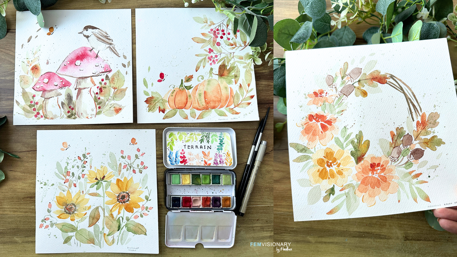
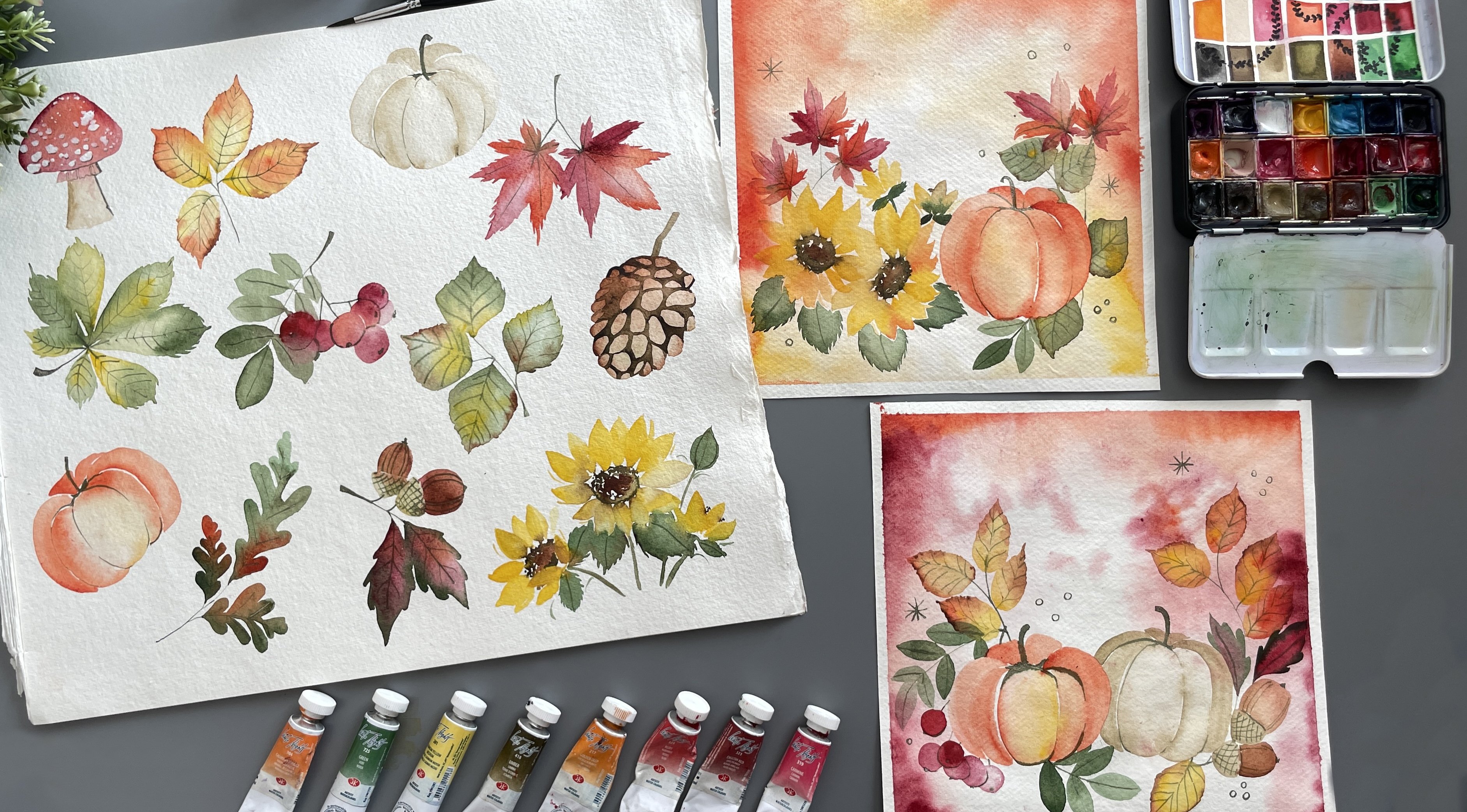
1. Welcome to Autumn Florals: What if you could spend just 15 to 20 minutes
painting something that you'd actually
want to frame and put up in your
home this autumn? Hi, everyone, and welcome. I'm Madhu from fear, and I am so excited
to have you join me for this fun autumn
watercolor class. In this class, we're
going to create four bign friendly
autumn paintings. We'll start with a quick look
at materials you'll need, followed by a few simple
practice exercises so you can get comfortable with
the techniques and colors before we start painting, and then we jump
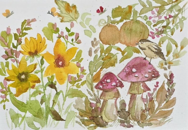
into the projects. We'll be painting beautiful
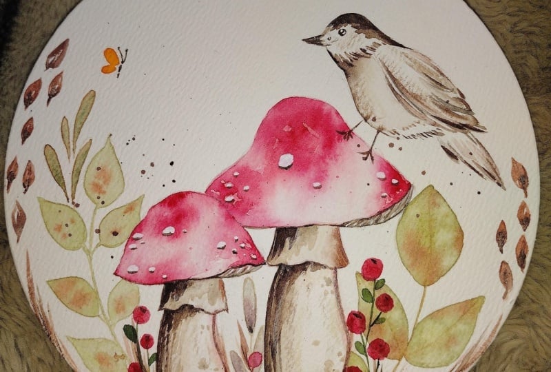
sunflowers, cozy pumpkins, adorable mushrooms and
cute little birds, along with gorgeous
autumn marigolds. Each painting takes
about 15 to 20 minutes. So these are perfect
little projects to fit into your day. As we move through the class, the paintings will get a little bit more detailed and exciting, so you can build your
skill as you go. So grab your watercolors,
your brushes, and let's create some
beautiful autumn art for your home.
Let's get started.
2. Materials: Let's start with the materials you would need for this class. I'm taking square sheet papers for our projects and a
couple of practice sheets. This is 21 centimeters
by 21 centimeters, watercolor cold press sheets. You will also need
watercolor paints, and I'm using the Art
Philosophy Terrain Set, which is perfect for our team. They have a beautiful
set of greens, reds, orange,
purples, and yellows. I will show you how to
mix these colors in case you have any issues
and also increase our range of colors that
we will be using for the projects from browns to
different shades of greens. Additionally, we'll
also need our brushes, and we're going to
keep it simple and use two brushes
for our paintings. These are from
silver black velvet, a size four and a size two. And this can be perfect for us to create everything
that we need. Along with our brushes, paints and papers,
which is the basic, we will also need a couple of other materials that
will be really useful, a black micron pen for
small little details. You can keep a bowl of water or two if you don't want to
get up multiple times. We will also need some white
acrylic paint or gouache. We have covered most of the
main materials required. Also year buds will be useful. And once you have
everything ready, let's get started with
our color mixing.
3. Color mixing: How about we now dive into
our color mixing chart? This is going to be
so useful to keep in handy for our projects. I love mixing colors
and I love creating new colors that maybe
aren't easily available. So we're going to start
off with forest green. This is a mix of erleum blue, Indian yellow, and
a dab of crimson. If you have the terrain set, it is already part of the set. But if you don't
mix it together. So I'm taking a little
bit of serleium blue, taking a little bit of yellow. And just a dab, small little dab of orange. And that should give you a
nice vintage forest green. You might have to
twiqure mix this a bit, maybe add a little bit of
blue if you feel like it's going lighter or a little bit of yellow, if it goes darker. Play around with it a little bit till you get the exact shade. For your convenience, I
have added this sheet of color mixing to
the about section and the project section. So you can have a look in
either place to access it. The next color
we'll be using for our projects is crimson. The shade might
slightly vary depending on the brand you're
using, but that's okay. We have orange next. And Indian yellow, a
warm yellow color. I decided to use a palette like Terrain just
because it's easier for anyone who's
a big ner to just buy the palette and
follow along the class. But if you don't, as I said, we're mixing in our colors. Now, we're going to take a
little bit of erleium blue. And then we're going to
mix in a little bit of yellow and crimson
to get raw umber. Now, to get burnt umber, our mixes are changing a bit. We're adding more of orange
and lesser of the blue. And you can see how
it becomes more rich. A Finally, mixing one of the
most common colors, Van **** brown, which
is cerulean blue, Indian yellow, orange,
and a dab of crimson. Very interesting mix, and if you have it ready
in your palette, you can use it as it is. As I mentioned, I'm mixing
some of the colors that I feel we would need
for our projects. And now that we have all
these beautiful colors and we're equipped, we can start with our
practice exercises before moving on
to our projects. In the discussion below, let me know which is your
favorite color to mix. I'd love to hear your thoughts. I personally love forest green. I think it's such
a beautiful color, whether it is for autumn or
if I'm painting florals. It's such a
interesting color that I love mixing it and
even keeping it ready.
4. Watercolor Basics: Now before beginning our practice exercises
for our projects, I wanted to start with something
really, really simple. This is just basic brush
exercises that you can use to get a little bit more
comfortable with your brush. This is for people who are just starting off
and you're very new, and you just want to
have some tips and tricks to make sure that you
get some nice thin lines, understand transparency
and other information. So I'm taking a little bit of
green and adding in water, and you can see how
light the mix is. As you add in more green, the color becomes
deeper and brighter. And finally, when you take
it directly from the pan, it's going to be really opaque. This is one of the basic
things about watercolors, and if you can understand that, painting gets a lot more easier. I wanted to share this
little tip for everyone who is completely new to the
medium and just starting off. Now, along with
this, let's get into some simple exercises
that's just going to really help you create a beautiful project at the end. Going to take a
little bit of paint, and we're going to work
on some thin lines. To get a really nice thin line, what we want to do is make
sure that our brush is perpendicular to the paper
as we drag it across. You can see when it's
slightly angled, the line becomes thicker. So just practice a bit, especially when we're
doing our stems. It's going to be really helpful. Another trick is just pressing your brush so
that it flattens out. And you can see how
thin that line became. And now you can do
the same effect, take a little bit of paint. And use that to draw your line, and you can see how much
thinner the line got by just pressing down and flattening your brush between your fingers. Have a look at this again
so you understand it. Now, the next thing
we're getting into is some very simple leaf exercise. You can see how I'm gently
dragging my brush onto the paper and gently
lifting it up to get a very nice thin line. Let's practice this a
couple of more times till we get really comfortable
with this technique. Remember, just press down, drag your brush, and
gently lift it up. Practice moving your
brush more to the left. And some to the right, so you get really comfortable
with this technique. Once you've practiced,
let's move on to some project exercises.
5. Sunflowers, Rosehip berries and Butterflies Practice: Let's dive into some
practice exercises before we begin
with this painting. We're going to start
with our berries. With berries, it's all about placement and how you
connect your stems together. So let's take a little red, and I'm just adding in
some dabs of berries. They don't have to be perfect, and you can see
how I've just kind of place them all around. Now, using my forest green, I'm connecting the
berries and notice how I'm connecting them
to a center point, maybe a little
curve on the stem. We can add in some simple
leaves. That are rounded. Let's practice a
little bit more, add in a blue at the
tip of the berries. Simple and easy. We can now
move on to some butterflies. I'm adding in a bigger oval and a small oval for the wings. Then you can use green or if
you want to use your pen, we're going to add the body, two little dots for the antennas and
connect them together. Now we can move on
to our sunflower. For the sunflower,
I'm actually going to be mixing my Van **** brown, blue, orange, red, combined together because we want the center of the
sunflower to be really dark. Next, we're going
to add little dots for the center of the sunflower
with this van **** brown. I'm going to make this
pretty big about 1 ". We can add orange for the
remaining of the center. And then we can move
into our petals. So I'm taking yellow and just adding our
petals one at a time. Go all around the center. We're going to let this
rest before we add in more details. Let's
try another one. This time, we're going to change around the position
of the sunflower, instead having it
right in the middle, we're going to focus on maybe a three fourth view where the flow is turned around a bit. Adding in little dots of van
**** brown in the form of a oval, adding in orange. And then we can take our yellow. And we're going to
start by adding in some long petals at the back. And as we move to the front, we're going to
make them shorter. This naturally looks like there is that the flour is not
straight, it's slightly turned. I let's try another sunflower. This one is going
to be a side view. So we start with the petal, and these are the front petals
that are going to be seen. Once you have the four petals, we're going to add
a couple of smaller petals in the back. Like, we can see them
peeking through. Go over this a couple of times. You get a little bit more comfortable
with this technique, and we can use andyk
Brown just gently tapping in between the petals. Now, while everything is dried, you can see how the
colors muted up. So I'm taking more van
**** brown just going over the center of the sunflower, as well as around the middle. Now we can take in some green, add in some leaves, and then add in a stem
that connects all of these cute flowers together. More leaves And
I'm switching in, adding a little bit
of brown to the mix so we get a dual colour leaf. It's the exact same technique
we use for our practice, but I've just moved
my brush downwards. You can drop in a
little bit of red or orange for the autumn effect. If you'd like, maybe go ahead
with a little bit of yellow and add some quick outlines for the petals that are
much lighter in color. And there you go. We can add in some splatters by gently tapping our brush to complete
this practice. Now that we've covered some
of the practice exercises, we can move onto our
project. Are you ready?
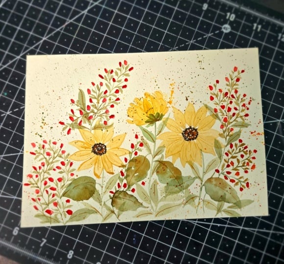
6. Painting 1 - Dancing Sunflowers: Are you ready to begin with our first project sunflowers,
berries, and butterflies? I love how this
piece turned out. There's so much of flow
and fun energy to it. And there's a lot of
movement from the leaves, the berries, and it makes the
whole thing just playful. We start out by
drawing out a circle. I just sometimes do
this as a reference, so I know how big my
sunflowers are going to be. Maybe we can add in an oval so a three fourth
view sunflower. And we're just playing
around with this. Once we have that ready, let's start with
our Vandyke brown, mix in this beautiful color, and we can start by adding
little dots to our circle. Next, we're going
to take in orange and add a little bit of
orange to the center, leaving a little space in the
middle like we practiced. I'm just going over
this step by step, so in case you missed anything in the practice
exercises over here, you're going to be able to catch up or go through it again. Now we're going to
take in yellow, our Indian yellow, and paint
our petals one at a time. A little bit of that brow
leads through each petal, which makes it look
more interesting. And this is also such
a watercolor effect where the colors just
blend into each other. And we want to take that
part into our artwork. So I've been moving homes and
being the artist that I am, I want to paint everything. And I can't wait
to show you guys pictures once it's done, because I am
painting everything, whether it's tissue boxes, it's vase, it's the wall. As an artist, I want
to paint everything, and I've been using
acrylic paint since watercolor
doesn't work for that. It's been interesting
shifting mediums because I miss what
watercolors can do, this beautiful blend of colors. Just naturally just with the amount of water you
can create so much, which you can't do with acrylic, if I add water to acrylic, it completely destroys it, and so you are stuck in using this very opaque
medium and you need to mix in white to do
what water does. It still looks different because it doesn't give
you that softness. It gives you more of
a shift in color. And that's when while I was
going through my acrylic, I realized how much more
I love watercolors. Just this beautiful
blend of colors, the softness, the flow. This is one medium that
allows you to do that. And every time I
try something else, it makes me remember how much
more I love watercolors. I'll be talking a little
bit about what I've been planning to do while
we're doing our painting, just sharing a little bit about my life as we continue
with our paintings. And yeah, so we've added in
different type of sunflowers. I'm adding in a
nice thin stem and then adding in my leaves,
like we practiced. And remember, I'm not
washing my brush every time I pick up a new
color in this process. I actually want the
colors to blend in. So while the brush still has
a little bit of the yellow, I take in my green
and add it in. This saves a lot of the waiting process or
washing process. So my paints are still wet
when they're on the paper, and I add in the second color. I'm using a muddy brush in
a way for this process. But the colors I've chosen, which is yellow and green complement each other
and that's why it works. If I was doing the same thing
with a blue and orange, which could create
a very muddy brown, then I would wash my brush. But in this, since the colors
are very complimentary, they work well with each other. They are shades of
each other. It doesn't need to be that difficult. You can just literally pick
up colors and mix them along. You can see how I've made
the leaves bend and fall. And I think that's also what's interesting because
it makes the plant, the flower just
have a little bit more of movement instead
of just being flat, like, it's just, you know, you took a picture
and just, like, froze with its hands up. This feels more
natural, you know, where the leaves are
falling. It's waving. It's not so perfect. Some leaves are in front, some leaves are smaller, bigger. And that variation makes
it look more natural. So I'm adding in
little yellow to some of the leaves because I
feel like it looks better, and I wanted to add more of the yellow instead of just
having them very green. And once we have that,
we're happy with it. We can let it dry before
we move on to our next. I'm just making sure that the center of our
flour dried up. And if it is dry, we can
complete the center. Actually, let's just
wait for a bit. Let's move on to our berries. I think we can always come
back to the sunflower centers. Now, I'm going to take red
for my Rosehip berries, and I'm adding in my little dabs of paint like we practiced. I'm going to create
clusters of these berries. So we're going to
have one cluster, two cluster, three clusters, separate them out,
and it doesn't need to have a fixed placement. You can see how I'm doing that. Let's add another cluster
on the other side. A few more, and
we're good to go. Now I know for sure that the center of my
sunflowers are dried. I'm going to mix in
my van **** brown and just complete that so we have the flowers ready and we can move on to the
rest of the painting. Right now, the flowers look
a little bit incomplete, so it's very important
to do this step taking a little bit of yellow, and if you want to outline
some of the petals, you can, especially if you want to highlight
some of the petals. What I'm also going to
do with the yellow is maybe add in a couple
of more petals to make the sunflowers a little
bit more full and a little bit along the tips of the bottom petals to make it look like
they folded upwards. You can see how that
looks a little bit more like it's more natural. Now we can move on
to connecting all of our berries using a thin
line like we practiced. Let's connect the berries
to a center point, and maybe we can
extend it a little bit further to add
in some leaves. What I wanted to talk about in this is when I add in my
stem for the berries, I don't make them straight. You can see how I curved it and that creates movement
in the painting. Having that stem flow into the painting and you
can see how I moved it upwards and to the side. I'm going to do this
for all of the berries, and that's going to make our
painting a little bit more playful and that's what we're
going for in this artwork. Add in some berries and
we also are adding in leaves, small rounded leaves. Let's connect another one. Following the same steps. Using blue, we're going to add the little dots for the
top of the berries. So we have a lot of empty space. I think it's time to
add in some leaves, long leaves through
the painting, and I'm using a very soft green. So I've added a lot
of water mixed in, so it's not too bright and bold. I don't want it to take away from our sunflower,
from our berries. It's just the more
of background. And you can place them along the piece in areas that you feel look a little
bit more empty. Next, we're going to
add an othin line to our leaves for the sun floor, the veins of the leaf. I think we're almost
done with our painting. We can add in some splatters with green gently
tapping your brush. And then we can add
in red butterflies, or if you want to use
a different colour, you can go ahead and do that. Just to complete the
painting a little bit more. I think this is such
a nice painting to frame around the house, especially for autumn because it's so perfect for the season. I And in just a short sitting, we have completed this
very pretty painting. So much of color, so
beautiful, so fun. And I hope you tried
this out and share it with me in the project step. I can't wait to see it. And I can't wait to
see you paint all of the other paintings
from this class. I
7. Pumpkin Leaves Practice: Ready to dive into some
practice projects, let's head right in. For this one, we are
going to do our pumpkins. And I think when we
get into our painting, you can figure out
the pumpkin part. I'll go into details when
we go into the project. But let's focus on
pumpkin leaves because they're very curious, very
interestingly shaped. So I've broken it down
so you can understand it and be able to create
some incredible results. So we start with
an almond shape, and then we have two
little side petals and two smaller
petals right on top. The angles of these
petals keep changing, so you have 45 degrees and then a 90 degrees to
your center petal. Or sorry, centre shape. This is not a flow. And then
you can add in a little bit of different colors
if you want to add in an orange or a burnt umber, and you're just going to add in little spokes to your leaf. I'm going to do this
a couple of times, so don't worry if you
don't get it immediately, but I'm sure you're
going to figure it out. Stick with it. So let's draw this out
so you understand. So we start with a central shape and then at a 45 degree angle, we add in two shapes and then two smaller
ones at 90 degrees. Add in couple of
spokes for them. And this is an easy
breakdown of the leaf. Now, let's practice another one. Start with the main shape, the two shapes at 45 degrees, and then the smaller
shapes at 90. While the paint is still wet, we're going to add wet on wet, dropping in orange to
add in some spokes. You can use even green. So it doesn't look like you're
just adding in outlines. Maybe switch to yellow. And that way, you have
a mixed colored leaf. Next, we can move on to a couple of more in case
we are having a side view, where the leaf is bent
over, very simple. We have a main shape and then
a little 45 degree shape. You can see how I did that. Or if you're getting
a smaller leaf, you can see how I've
done it on both sides. Using, again, orange or yellow to add in
the little spokes. Drawing it out here
for your reference.
8. Painting 2 - Autumn Pumpkins: Perfect. Are you ready to
start with our project, get your paper ready? And we're going to start
right in with our pumpkins. We're going to have two pumpkins that are going to be the
main focus of the painting, some berries, some leaves
to bring it all together. So I'm taking orange. I'm adding water to the mix, adding maybe a little
bit of yellow, if you want to get it a
little warmer and brighter. And I'm starting
with an oval shape. You can add a little
bit more orange because I feel like
it became very light. Add more orange to the bottom and a little
bit to one side. While everything is still wet, dropping in some green at the
top towards the left side. Now we're going to do a
second pumpkin section. This one is a little bit
more of a semicircle, adding more of the orange at the bottom, like we did before. Another smaller one
and you can see how the height of this
became shorter. We're going to follow the
same thing for the left side. While everything is wet, Aden just drops off green. And finally, we're going
to add in one more orange to finish
off the pumpkin. We want to make the bottom of the pumpkin darker
for the shadow. Now, right next to
our big main pumpkin, we're going to add
a smaller one. This one, I'm adding the center over very close
to the previous one, they underlap adding orange
the bottom and we're going to follow the same
steps of adding the side half semicircle, and then a smaller
semicircle attached to that. A drop in a little bit of green, just little dots, and you
can see when they dry up, they're going to blend through. I felt like the center of my
second pumpkin was so light, so I'm just going
ahead and adding a little bit more orange
so it brightens up. I can do the same thing if you feel like any of the
sections became too light. Sometimes when I add water, I feel like I add so much
of water that the color is so soft and light that
you can't even see it. And then I go ahead
and add more. It's never a bad thing to have a light watercolor because
you can always build on it versus having something really dark that you cannot fix. Now, using green, I'm adding the little stem,
the little curl. And then we can add
in some leaves. Remember how we did the leaves? Let's start with a nice leaf
right next to the pumpkin, following the same
shapes that we went to a main shape, 45 degree, and then a 90 degree, adding in different
colours for our autumn, for the spokes of the leaf. And For the smaller pumpkin, instead of doing the main leaf, maybe we can do some
side or smaller leaves, something that's turned
around because it's not enough space to do
a full big leaf. We can add in another
leaf on the side, just really filling
up the space. After this, we're
going to move on to other elements for our painting. But you can see how I
frame the painting. They're more all of the elements are towards the right bottom. The left side top is
going to remain empty. A Just check if your painting is dried. And I just want to go ahead with the pumpkins and just
add a little bit of an outline for the smaller pumpkin because
I feel like the gap, the white gap kind
of blend it through, and it happens in case you didn't keep a space
very natural, but a very quick fix is
to just go ahead and add in a little bit of orange
and add the little outline. To this painting,
we're going to add in some hawthorn berries. So I'm taking a year bud, like I mentioned in
the material section, and I'm just going
to dip it in red. Then I'm going to just dab it to get lots of berries perfectly
shaped in a circle. This is such an easy hack to
get really pretty berries, and we want to cluster them unlike some of the
other berries. We're bringing them
very close together. Just creating a nice cluster. Some of them
overlapping, separated. Let's do another set of
berries a little bit on top and trying to fill up the
right side of our painting. Next, we can mix in burnt umber for the stems and connect everything together. So what's interesting
is where I live. We don't really have autumn. So there are no pumpkins. There are no orange leaves, and I do wish I lived in
a place that had that. I think it would be
so beautiful to see the entire place turn colors. And I've tried visiting, but I don't think
I've actually had a chance to see autumn. It is definitely on
my bucket list for next year to visit and
or even this year, to visit and actually
see autumn leaves. So something when
I paint makes me so happy because it makes me feel like I'm part of that
life or part of that world, even though I've
not experienced it. And sometimes I think
that's what art is. It makes you kind of step away from what
you're used to or what you see and can paint something that is so different.
I love that. I love that when I
paint winter and snow, I don't actually experience winter and snow because I live in a very hot country and
we don't have winter. We just have summer,
all ranges of summer, it is a desert, so there
is no tropical flowers. And every time I paint, it makes me happier
because I'm bringing a little bit of
color into my world. So painting for me
is just so special. I think along with that
comes in the peace, the excitement, the happiness. Paintings like this
make me so happy. I think if you can just
embrace what brings you joy, you're more likely
to paint more often, to try to create, to learn, to just have fun
and to trust the process, creating something beautiful for your home or your
friends, or your family. Now, I've added in the berries. You can see how I
connected them all together like a spider web. Then I added in some
space for leaves. The leaves for hawthorn berries are just long and we're
just going to follow along And we want to have both
sides of the leaf connected, so it forms a V shape. You can drop in a little bit of orange into the leaf to show
that it's just fading along. Let's continue this step. And I did want to say, if you live in a place where
you do experience autumn and you do see these
beautiful golden leaves, I would love to see them. So if you want to share it
on the discussion post, you can add in a picture.
I'd love to see them. I think it would just
really make my day. So if you've seen it
or you've traveled to place or you've
ever experienced it, I'd love to see pictures. I think it would, it
would be so nice. So let's continue along. We're going to add
in the leaves. We're going to complete
this entire section. I've added in a
little bit of orange. You can see how those colours
are just blending through. You can add in some umber for
a brown tinge to the art. Continuing to add more leaves. I feel like there's
never enough leaves when it comes to painting, and this is where I struggle. I'm like, when do I stop? Because I feel like I can add more and more and more leaves. What I try to do is focus on a specific section and if I can fill up the section,
I just move on. Otherwise, I feel like
my entire painting would just be leaves
because they're so pretty and they're so colorful
and they're so interesting and you create
movement with them. O. We're done with our painting. We can add in a couple of little things which I love doing, which is adding in some
splatters with green, gently tapping your brush, gives it a nice prey of color. We can add in some butterflies. I Now for the final step, we're going to add
in some veins to the center of especially
the bigger leaves, which are the pumpkin leaves because I feel
like they need them. If you want to add it for
all the other ones, you can And just like that, we've
completed our painting. Barely took half
an hour, I think, much lesser if you don't include the project
practice exercises. Quick, short paintings that are so pretty and
definitely framable. A
9. Cranberries Practice: This is one of my favorite
projects, paintings. And I love the bird. I
love so many things. So we're going to
dive into a couple of practice exercises
before we get started. The first thing is cranberries, and we're going to use a bird, so helpful for circles. And we're just adding in
dots of red in a line. Next, we can take our green, and we're just going to or
Vandyke brown or burnt umber. I think burnt umber
works better, and we're just going to connect
everything to this line. Next, we're going to add in
some green circular leaves. And just like that, we
have our cranberries. I wanted to go over this
so you can practice it a bit and also get comfortable
using your bids. Just a simple practice, just to warm you up
before we get started. We're going to paint the bird
on the painting directly. So that's going to
be very interesting. Are you ready to get started?
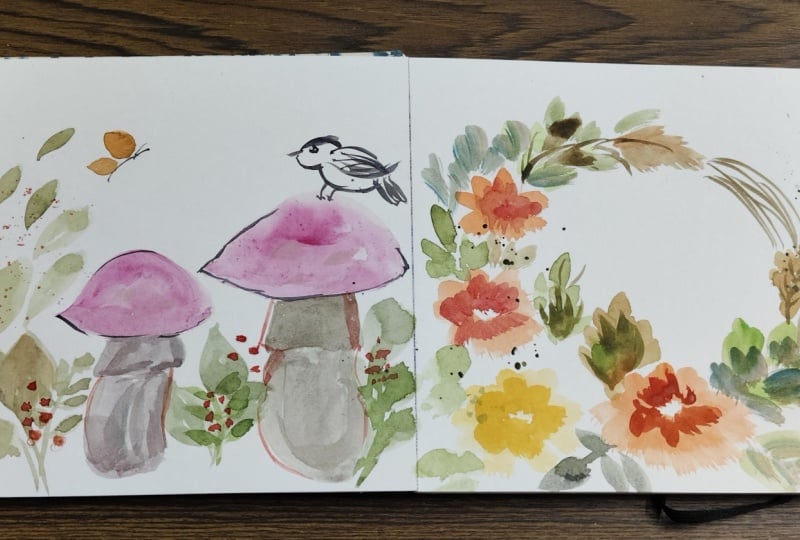
10. Painting 3 - Birds on Mushrooms: Let's dive into a very
interesting painting with birds, mushrooms, and so much more. So I'm going to start off
with drawing our mushrooms. We're just going to
have two of them, and I want them to be the
center of our painting. For the mushroom, we're
doing a semicircle for the mushroom cap and
the mushroom stock. Thin lines. Let's
do another one that is smaller in size and
shorter in height. Just a general idea,
so we're good. When we go into our painting, we know what we're looking
at and what we're painting. Next, let's draw out our bird. I'm going to add in the
reference of how to draw the bird in the project tab, so you can have a look at it. So you have that as a reference. Once you get the
shape of the bird, it's easy to paint it. We start with two circles, one smaller circle for the head, and one bigger
circle for the body. Feel free to erase this, get more comfortable until you
get the perfect dimension. What I realized
in my first drive was the bird looked truly big, so I wanted to make
it slightly smaller. Next, we're going to erase out the two areas where the
two circles connect. And add a simple curved line almost in the form of a walnut, I would say, the
shape has that look. Not a perfect walnut. And then we can add
in the beak just with a pointed V on either side. Then we add in the
wing by adding a simple V shape and the tail feather by
elongated V shape. For the feet, straight
lines, and that's it. Super simple. I've added in the
reference image of step by step in
the project tab. Erase out any
unnecessary lines and then we're going to add in a
simple circle for the eyes. Once we have everything ready and we're happy
with the reference, we can move on to painting. I'm starting off
with some leaves along the sides
of our mushrooms, a thin line and then
adding in leaves. I'm making these leaves a
little bit more rounded, they're not just pointed. They have a little
bit of a shape. Maybe I don't know what shape
I would describe this as. It's very hard to label shapes. I always say look at my painting,
look at what I'm doing. It's just going to help a little bit better than trying to follow along these different
descriptions. I'm adding more of these
through the painting. A We can add in some longer leaves as well. So we're mixing it up. And you can see how I've added
different colours, using the wet on wet technique, not necessarily
changing my brush, but just picking up
different paints. I usually change or wash my brush only when I'm
picking up a lighter color. So if I'm going to
take a yellow and my brush is already
loaded up with brown, it doesn't work because the
yellow won't even be seen. So that's when I wash my brush, but if it's going to be
a color that's darker. So I have yellow in
my brush and I'm picking up dark
brown, that's fine. It takes a little
bit of practice, and as you get comfortable, this will become second nature for you to know
when this happens. But in the beginning,
you might have to actually consciously
make that decision of when to wash your
brush and when to just use color on top of it. Adding more leaves,
dropping in more paint, in this case, I
decided to start with my backdrop instead of starting
off with the mushrooms. I I Now that we have all
these beautiful leaves, we can move on to our mushroom. So I'm taking in our brown. Adding a little bit of shading, especially to the left side. You can add a little bit of van **** brown so that
it doesn't look flat. The color has some
texture to it, and then using the brown
to add in an outline. You can add a little
bit of orange as well. The more you can mix in
colors, the better it looks. Because in nature, if
you see a mushroom, it's not going to
just be one color. It reflects a lot around it, and it's going to be more
shaded and in the you know, so it's not just
going to look white. Following the same step
for the next one as well. A So a painting at this point looks a little bit incomplete because
there's so much to do. Naturally, we have a
couple of more steps. So we're going to
take our red for the mushroom cap and paint it. We're going to have more of
the red from the top and the bottom while keeping the
center slightly watten down, so it doesn't need to
be as bright or dark. If you feel like the red
looks a little soft, you can add in more
colour directly from the pan like we discussed in
the transparency exercise. That brightens up the color. I'm going to use a little
bit of brown below the cap. So we're going to
continue adding in our red mushroom caps for
the second one as well, adding water, blending it out, While we were in this process, our mushroom stems would
have already dried up. We can go ahead and add a
little bit more detail. A couple of quick lines. Just to give it a little
bit more texture because it's not as smooth in nature, so we want to give a little
bit more of detail to it. So as I was telling you guys, the move has been
very interesting. Over time, I've collected so many paintings from all
the different classes. And what I love is
they're all in sets. So every class, I end up
doing five pieces, minimum, or sometimes it's ten or
30 for my challenges. And I like that I can
put them together. In my home, I can
place them together, and it doesn't look very off. It doesn't look like I am putting random
paintings together. And that's when I realized
I actually like working in sets of five because it
just comes together. It's beautiful to frame. It's also nice to look at. And while you're
in that process, you get more comfortable
with the whole painting. So I managed to get all
my 30 days challenge, put them together, some of my previous work from
cherry blossoms, put those into together. Yeah, it's been
really, really fun. Okay, so going to our bird, I took a little bit
of the burnt umber, and I'm just going ahead
and painting the body, very soft wash,
and then the head. Once we have that,
we can go ahead and just paint parts
like the tail, keeping a little white space. And you can see it's
almost like lines because I want to make it look
like there are feathers. A longer line for the wing, and then some quicker
thin lines to show that there's a lot of different wing feathers,
and it's folded in. After painting the beak, we're going to wait for a bit, make sure that the bird is dry, and then we're going to
go in with another layer. The more layers you can add in the more realistic it looks, and more it looks like you've added thought
into your painting. So I'm going ahead with
a dark brown and just adding that little brown
to the top of the head, some quick lines for the wings, so you get shades of brown. A few more for the
tail feathers. And maybe we can gently
outline the body, as well as add in
the little feet. I'm going to go ahead and paint the area around the
eyes just a circle. And after some time, we can
paint the eyes themselves, but let's do them step by step. I Okay, amazing. I love how this has turned out. We're going to add
in more leaves, and we're going to
let everything dry before we move on
to the next step. Now we're going to add
in a couple of leaves, individual like
they're flying in the air to create some
movement into our painting. We're almost done with
the base of our painting. We're going to just add in some outlines for the mushrooms. We still need to
add in the spots, add in the berries,
couple of little details, but it's all coming together. We have our beautiful colors. Now, our leaves are more muted and so we'll add in the berries after
we finish the dots. I'm using white acrylic paint, and you can use
different brush so your watercolor brush
does not get damaged. I'm just adding in dabs of acrylic for the spots
of the mushrooms. And switching to the bird. Let's take our black pen, and we're going to add in
the eyes for the bird. Time to take up our ear buds, and we're going to add in the little berries along the
bottom of the mushrooms. Once we have that, we
can add in the stems, the leaves, and
connect everything. Using the same red, let's add in a little bit more texture for the stock of the mushroom. Now we can take red and add in some splatters
to our paint. We have a couple of more
steps to finish it up. To bring it all together,
we're going to add in an shadow for the spots we added to the mushrooms they just look like
white patches. So you can mix in umber. And then we're just going
to add in a little bit of shadow for each of
those little dots, and you can see how
they look a lot more realistic and they give it a little bit more
of a three d effect. A a We can add a cute
little butterfly. I chose yellow because I
wanted a color that would pop because I feel like everything else is
more red and green. And we just going to add a little white dot for
the eyes of the bird. And just like that, we're
done with our painting. I can't wait for the next one. It's my favorite,
and I think it's a little bit more intermediate, but it's so beautiful and
definitely worth the results.
11. Oak leaves and Marigolds Practice: So this is the final
project practice of our entire class. And one of the most
interesting ones, it would take you a couple
of times to figure it out. But I really wanted to tackle these beautiful marigolds
as part of our class. So we're going to start off with some simple practice exercises, and then we'll move
on to the marigolds. The first thing
we're going to do is basic leaves if you're trying to do a mix
shade of leaves, which is cut with
a nice thin stem. And then we're going
to just press down our brush and add in a leaf. Continue adding in leaves. And while it's all still wet, we're gonna drop
in another color. You can add raw umber, burnt umber, orange to
give it the autumn effect. Quick and easy and looks so fun. We're now moving on
to some fig leaves. For fig leaves, you need
to follow along the shape. We're doing little curves, and you can see how it
becomes smaller at the top. We can make it bigger in the middle
and then smaller again. I have the reference
image for this drawing in the project description
tab Project upload tab. I specifically added in. If you have any questions, do ask me in the discussion part. But I wanted to give
you a little bit of a rough drawing because
sometimes in the video, it doesn't show as clearly. Now what I'm doing
is I'm tracing out the same exact shape
with my green. And once I have it outlined, I can paint inside. You can switch around colours
for the autumn color wheel, maybe adding in some orange, switching over to
different shades of brown. You can see how
beautiful that looks. We're going to practice this
a little bit just to get more comfortable because when
we go into our painting, we want these leaves
to look beautiful, stand out, and just
add to our painting. Now, if you want to
paint a smaller leaf, a baby leaf, what
we're doing is just reducing the number of waves. And there you go. You have a small baby
leaf. Very simple. Practices a couple of more times before moving on
to the Mary girls. I I for the marigold, I want you to pay
attention step by step because we're adding in layers and layers
for this flower. I have the drawing
on the side and the reference image is
in the project stab, and you can see how
we have smaller, I would say W shapes
for the petals. And then as it gets bigger
in the third layer, they're much more
bigger in size. So the petals bloom. So we're going to start
off and you can add a little bit of water so
the color is very light. And we're starting off with
our first set of petals. I'm following the V shape, just moving around my brush and trying to create the effect. Let's use a blow
dryer and blow dry the entire piece so
that it's dry when we go onto the next layer and we don't have mixing of colors. So once it's dry, we're
going to move on to the second layer and then
finally the last layer if you're moving
towards the center. Just have a look. If you're finding this a little difficult, repeat it a couple of times. Watch the video a couple of
times so you understand. This is a little bit more
of a complicated flower, and if you have a little
bit of perfectionism, it can be really
scary to dive into. But I trust that you
guys will figure it out, and I'm so proud of
you guys for even painting all these
different elements that we've dove into, and this is going to
be your next step up. So you can see how I added
in a little bit more orange, and this layer is a little bit darker than
the previous layer. And I'm following the same
steps of adding in my petals. I'm also outlining a couple of the previous petals
because they're very light that you need that little outline
for them to pop. Once again, we're
going to allow this to dry before moving on
to the last layer, the one that's right in
the center of the flour. I This time around, I'm taking orange
directly from the pan. So it's very dark. I'm outlining our
previous layer of petals. You don't have to
outline all of them, but just a few will look really nice and
very interesting. Next, we're going to do the
center by just flicking our brush just to get some
thin lines in the middle. You can even add in
little dots as well. A couple of lines. And you can see how this comes together. It's just so pretty. You can add more outlines
for the flowers if you feel like it just looks
a little transparent. Now we can move on to two different options
of the same marigold. We have a three fourth view
just by slightly shifting around our placements and a half view where you can
see it from the side. So following the similar steps, but what we're going to
do is just change around the length of the
various elements. The reference image is
in the project tabs. You can go ahead and
have a look at it. So you better understand
it before we begin. Keep in mind that
these two need to be a little bit smaller
than the main flour. So how do we start off? Exactly like the previous time, we're going to add
in our orange, mix in with a little bit more of water so it's soft and light. And we start off
with our petals. We're making these petals long. I'm just doing them in
the form of a semicircle. When I move upwards, I'm making them shorter. You can see how
that entire thing looks like an oval shape. For the side view flowers, we're following the same thing. We're making the whole
flour a little smaller. Now we're going to let it dry. You can allow it
to dry naturally, or if you want to use a
head dryer or a blow dryer, you can do that to just
dry up your painting. And once it's completely dry, we're going to go on
to the next set of petals with a darker orange. A Now, taking in a darker orange, let's add in our
another set of petals. And we're actually placing them on top of the previous layer. I just wanted to check the
color before starting. Something that I'm trying
to do is making sure that this set of petals are shorter
than the previous ones. So you can see the previous
layer that we painted. And on top, instead of going
all over the whole thing, I'm just doing the
sides and leaving it. For the smaller flow,
exactly the same technique, making it shorter than
the previous layer. Now, again, we're
going to dry it up and we're going to move on
to our final layer. This is going to
be our deep orange and the center of the flour. Perfect. Now with this
very deep orange. Let's start by
adding little lines, little dots like we did before. And you can see how
the flower looks like. It's kind of turned, it's not perfectly straight. Same thing for the small flour. I'm just going to repeat the same thing and you can see again how it looks smaller, and it looks like it's
kind of slightly turned. It's not just a straight
front view flour. Using the same orange, you can add in some outlines for the petals to bring
it all together. And just like that, you have
these beautiful marigolds practice them a couple of times till you get really comfortable with it and
you find it so easy. We're adding in the stem and some leaves and
bringing it all together. So while I've been moving, it's actually been really
tricky in terms of figuring out what colors to use
around my house, and I wanted to color
coordinate everything. And that doesn't
really work because my art is very colorful. So it's been interesting kind of bringing
together my paintings, seeing how I can place them
so they really stand out, or seeing if I want
to color, like, make them all the same color in one room and then
change them around. It's just been a
very interesting process because usually I paint and I might display it in my house or my room and
just keep it around. But this time, I'm thinking
of it as interior design of keeping it as part of the home and decorating
it around it. It's not just an afterthought. It's not something that I've
painted and I'm adding on. I have painted it, and now I'm making my decor suit the
house. If that makes sense. I realized through
that process that art is so important
in our lives, and I feel like I
almost took it for granted because I can
paint and I paint, and I have so many of
my artwork around me. I almost took it for granted. During this process, I
realized how beautiful a room can feel when
you add in your art. So a little bit of a rant. Now we can go on to
our final project. Are you ready? I think
this is my favorite. It is going to be
really interesting. It is intermediate, but
I know you can do it, and I cannot wait to
see your results.
12. Painting 4 - Marigolds: I left the best project
to the end because this is so pretty and
it is really fun. It's going to look
beautiful once we finish. And so I wanted to
make sure that we have enough skills before
we get to this. So we're taking in our colors. We're going to do
basically a wreath, so you can draw a circle so you know where
everything goes. And we're going
to start off with our basic marigolds
like we practiced. Now, marigolds can come in beautiful colors of
orange and yellow. And so I'm choosing yellow. I'll do a couple of them
and then some orange. Starting off with our very
translucent layer the last set of petals and then working
inwards like we practiced. Just take your time, build
your layers one at a time. You don't have to
speed up this process. Just trust and enjoy. Now, instead of waiting
for this to dry, we're going to move on
to the next flower. We'll do a couple of them, so then we can just
work simultaneously. I feel like this is kind
of like a dance where you paint one section,
paint the next, let it rest, and then
keep going back and forth and creating your
painting layer by layer. This time, I'm using orange, so we have a slight shift
in tone and colour. Okay. Now that we have two big paintings. We're going to do some
that are side view, something that is three fourth, just different type
of flower angles. So here I'm doing the
oval shape that we had again gone into in
our practice session. I'm making the bottom longer. And then on top,
I'm just going to add petals that are
much shorter in length. So this time, as I was
talking about my moving, it's been kind of fun organizing my things and actually
looking at my art supplies. I realized that
there are a lot of paints that I
haven't even opened. They're brand new for the box. I bought it at some point
of time, got excited. And I think as an artist, or if you love hobby, you just end up
collecting so much. So I have so many
watercolor supplies, different supplies that
I haven't even opened. I haven't tried out. I haven't even taking them
out for packaging. And now that I have moved, I'm actually seeing these
boxes, and I'm like, Oh, I had no idea I bought this, and I had stuffed
it in a corner, hidden away, and never saw them. And now I'm opening it up, and I'm so excited to see the different color tubes that I had that I have I
didn't even remember. I even found a set of brushes
that I forgot that I had bought because I took it and kept it in a different
room and forgot about it. So it's been kind of fun. It's almost like a shopping
spree where I'm waking up and I'm opening a box and there's new things that
I didn't remember I had, and it's like a
surprise every time. So fun. Now, what we're
doing is we mixed in green. You can use green just as it is. And we're adding a
little circle oval shape below our buds. Basically, this is kind of like your bulb with the
stem, with the leaves. And you can see how that
is coming together. Now, generally, I don't like to have my stem connecting
all the way. So keeping that in mind, we're just going to
add leaves instead. As you know, we're
waiting for the layers to dry before we move
on to our flowers. So let's add in leaves
in between our painting. So fun to add in leaves. You guys now know the trick to make sure that your
leaves look really pretty. We can move around our leaves so they're not just in one line, some of them kind
of falling down. Adding even more leaves
from the bottom. Maybe this one we can add
a little bit of orange so you have the autumn
colors coming through. I think this class has
been one of my favorite. I've done a couple of
different autumn classes, but this one really stood out. It's the flowers I
think that I added in because usually it's just pumpkins and
I stick to that. But I think this one
came out better. It looks like it's something that can
be framed, for sure. And it really, I feel works well with this autumn with the softness and the
beautiful greens. We're going to use
a little orange at the tips of the leaves
so it blends through. Looking at your leaves, just add in more sections as
and when required. And then we're going to
get back into our flowers, work on our second layer, and then the final layer
right in the middle. I'm going to tap the flour,
just make sure it's dried. And if it's dried, we're going
to just add in our orange. Remember, this set of
petals are going to be shorter and brighter. So we're adding more
orange the mix. So the colors stand out more. Adding in our petals for
the remaining flowers. We also have to add in our
petals for the yellow flowers. And follow the same steps
that we did before, making sure that we keep the bottom section or the layers that we're
doing right now shorter so you can see the previous petal layers
and stacking it all. Okay, great. Now, let's get back into some more elements
that we're going to add. I wanted to add in some acorns because I think it really
matches the painting. For acons, I'm going to
take van **** brown, and with andyk Brown, I'm going to add a little
U shape for the acon. We're going to have
a couple of these acons around our painting. Add a little oval above
for the acorn head. I feel like the color
became a little light, so you can darken it
up if you feel like. And let's add a
few more of these. Next, we're going to add in
checks at the acon head, as you can see, for all of them. I think I'm going to speed
this along a little bit so that you don't have to see me paint each acorn
one at a time. Acorns done. Next step, we're going to add
in some leaves. Oak leaves. We've done this
in our practice session, so we're going to do our little
wave and then from there, add a mix of colors
for our leaves. While I was painting this,
I kind of realized that I wanted to keep the
top part open. So instead of
connecting everything, I'm just going to
leave it as it is, and maybe just add in some wood bark or wood stems texture instead
of having elements. So our painting is going to have more elements concentrated
towards the bottom, and I think that's
going to look better. Again, have fun with
it, try it out. You know the elements
right now so you can play around with
the placements to create the results you like and for the painting you like. Now that we're done with that, I'm just going to
check our painting, check the flowers, see they're dried and we're going to
add in the last layer. This one is concentrated in the middle and it's
going to layer up so that we can
complete our flowers. Our painting is coming alive. With the same
brush, some colors. We're going to just
outline some of the petals like we did before. The colors just look
so interesting. I don't think we
even have to do. We could leave our
painting this way, and I think we'd be so happy. But just to complete it, we'll add in a couple
of more details. Perfect. Let's skip ahead. We're going to add in
brown lines for the wood. You can see how I've done this. We can tap our paints and
add in some splatters. If you want to add
some circles, stars, little butterflies that we learned in our previous classes, you can go ahead and
add all those details. And I like this is
such a great piece. If you want to write a
quote in the middle, you can it's very versatile. I would even keep it in front of the room or the
house as a welcome. Such a perfect symbol of autumn.
 Femvisionary / Madhu S, Watercolor Artist and Instructor