Transcripts
1. Introduction to the Watercolor Class: When it comes to watercolor, it's always been so beautiful,
alluring and satisfying. The medium has its own
beautiful characteristics of being so unpredictable and
free of all boundaries. The run and make the movie. They know that they are free. They're beautiful marks on the people have their
own stories to say. Hi everyone, My name is Shiba. I am a hobby artist instead in an art content
pre-dates YouTube. I've been painting in watercolor
nearly for eight years, but didn't realize
how the time past. The love for my
watercolor painting has always been a motivation. The watercolor journey was
so relaxing and satisfying. Today I'm here and I welcome you to join my beautiful
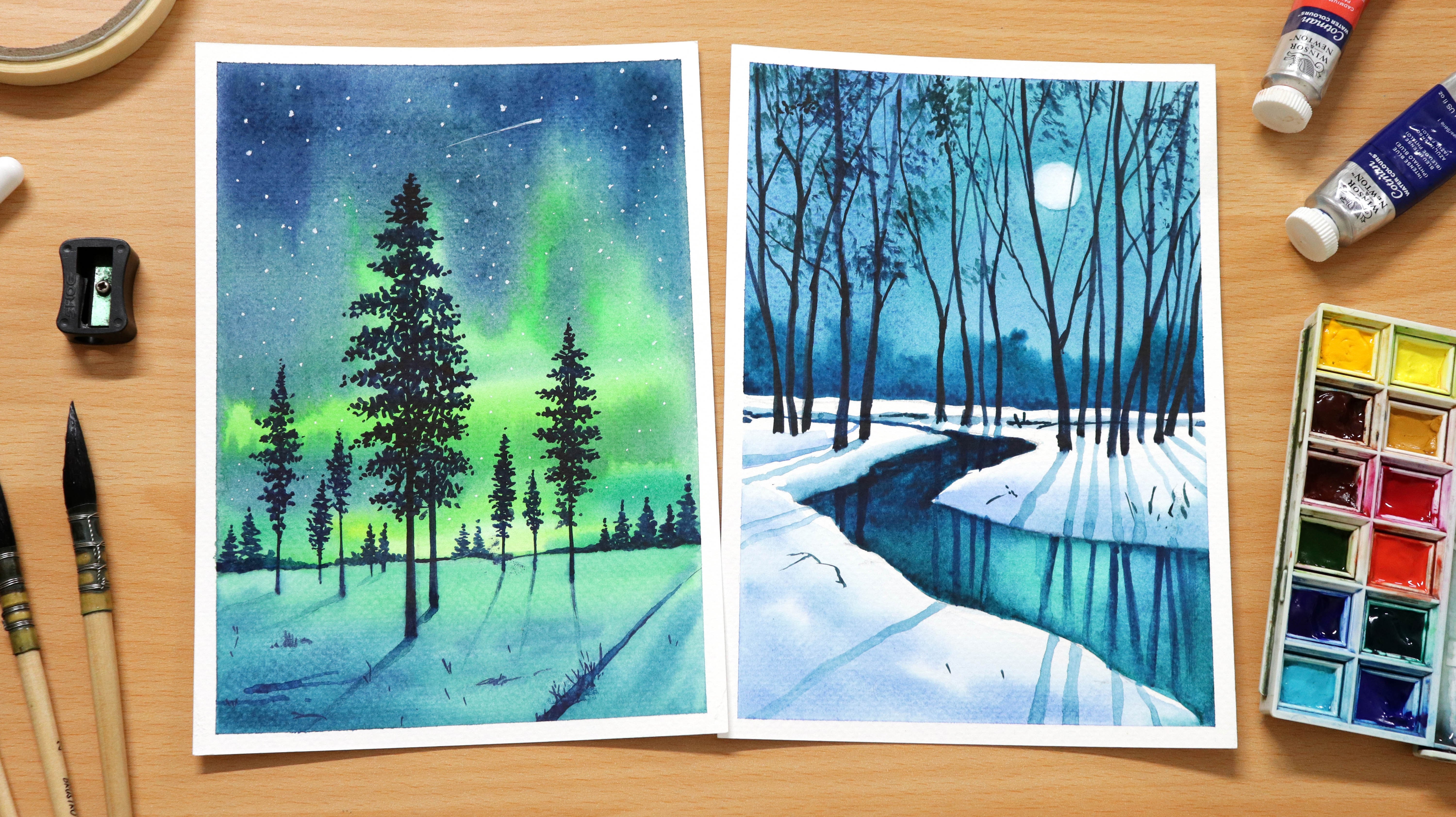
painting class. In today's class,
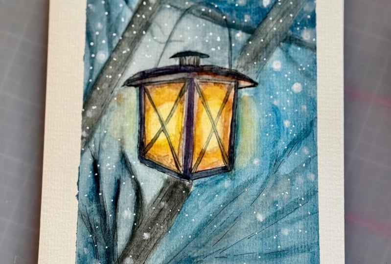
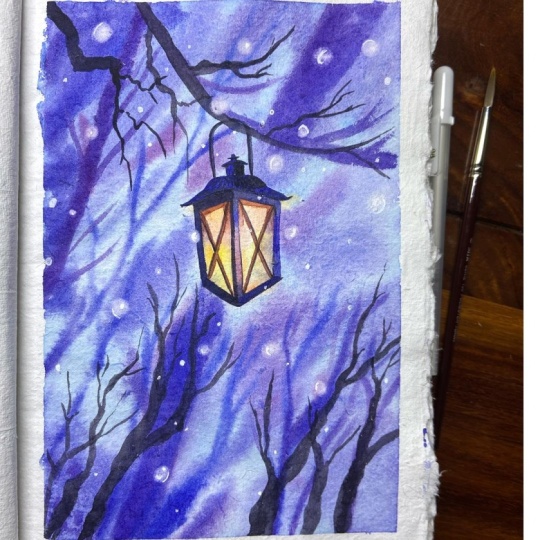
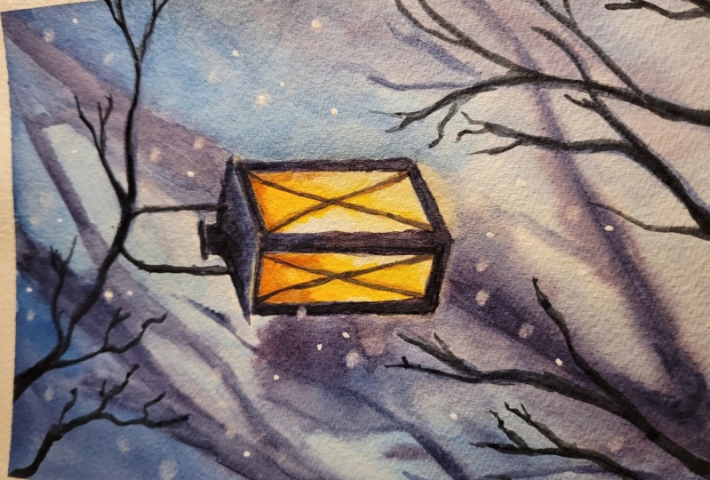
we will be painting a beautiful winter
lamp surrounded by beautiful snowy using simple
techniques, affordability. I will be painting this step-by-step and I hope
you'll understand it. Italy. For better results. You should always watch a painting at first
for few minutes, memorize it, and then
perform. For painting. I've used very simple
art supply which you can easily arrange without
hitting hard on your pocket. My main focus is to get more results using
simple art credits, which everyone usually
have with them. It's all about giving us start to your
watercolor journey. Friends. Let's get started.
2. Materials Required for Painting: Hello everyone, Welcome back. So in this part we
will be discussing what are the materials
required to draw this beautiful painting of hinterland for the
people I'm using a E5, say school pressed people
from Fabriano artistic. It is a 100% cotton people
and 300 GSM in width. Now this is a good people which I usually use for my practice. As it is 100% cotton paper, they remain wet for a
longer period of time, which helps you and gives you more time to work
on the details. Alerts which I'm using is from insulin Newton Cotman series, Liza student grade watercolor, which you can easily get
from any local Art Shop. I'm also using two
jars of water, one to clean my brush and
other one as a mixing medium. For draining the
sketch, I'm using a symbol pencil and
a kneaded eraser. Regarding the brushes, I'm
using two types of brushes. One other mop brushes
with number 0 and food. The other consists of one
round brush number 121, rigger brush number Ford. These are all brushes
are from the brands and I alert soft
Aqua raffle CVs. These brushes are
good to start in case you don't have the same
brushes, no problem. You can use an
interest cheesy half. I'm also using a half-inch masking tape to tape
down my painting. This avoids buckling of people after
application of water. To remove any extra
paint and water, I use a cotton cloth. If you don't have
the cotton glute, you can use paper towel,
audit tissue people. They would work
scene. We'll be using a hairdryer to dry me painting
at times when required. I hope you have
understood what are the materials required
for this painting? Suggests grab it and join me and I see you
in the next part.
3. Part 1 - Sketching and Working on First Layer of Watercolor Painting: Hi guys. Welcome back to the
first part of the video. In this part I will be drawing the basic sketch
of the painting, as well as I will cover the first layer of our
watercolor painting. Before starting the video, I will be applying the masking
tape all around the paper. So this masking tape
helps the people to hold it firmly
throughout the painting. And it also avoids
buckling of the paper. The best fit to apply
the masking tape is to hold the masking
tape from twins. This will help your
masking tape to be straightened to its
maximum length. And then you can easily
put onto the paper, which will help you to get
a clear application of it. France, we have covered the application of
the masking tape. Let's move on to the colors. Before starting the colors, I will draw the basic sketch
using a simple pencil. Here I'm using a to-be pencil. If you don't have
the same pencil, you can use HB pencil as well. Try to keep your
sketch as light as possible because it created
in dense onto the people. It becomes very hard
to erase the sketch. If you make any errors. If you find a drained
sketch a little heart, then you can take the
help of this skill. Where does a green artist, I would not suggest
because this will make you more dependent as it grew. And as you draw more sketches, you can see I've drawn the
outer sketch off the lamp. So once we have done this
second set of lines, but before doing that, we will remove some of the extra lines using
a kneaded PDSA. This will also help
removing the confusion of actual lanes that we
have drawn for the lamp. Once we have a drawn the
basic frame of the lamp. Now we will add a
second set of lines, just as supporting
lines to the lamp, which will help the lamb to get its volume and also give
our lamp or 3D effect. For the cap, I'm using US
simple triangular ship, which is little
wider in the middle with a small cylinder
shipped at the top. Let's quickly draw the
side roads and the Lord, which can exceed
lamb to the branch. Once we have completed the
basic sketch of the lamp, we will draw the tree trunks
which are at the back, and also the branch
that holds the lamp. The trunk of the
tree. I'm drawing some irregular lines at
the back of the Lamb. Let's draw a little branch
which holds the lamb. Friends. We have completed
drawing this sketch now it's time to make it light
using the kneaded eraser. I'm doing this only to
remove any extra lead. Other ways when we will be
applying water or pins, that extra lead would mix with him and would create
little dark areas. This technique is quite easy. You just need a kneaded eraser. You can mold it into
a required sheep and then press it onto the paper
to pick any extra lit. This help you to remove
any extra gradients, as well as it even keep
the colors very fresh because the lead
is already removed and it will not get
mixed up with the beans. Now I'm moving on to the colors. I'm starting with
a drop-off water. Now I'm playing this water
in this way in order to show you the amount
of water that I will be applying
onto the people. Here I'm using a 300 GSM paper, which is a 100% cotton paper. We will apply water in
good quantities so that the paper remains wet for
a longer period of time. The technique that I will
be using is a wet-on-wet technique for the maximum
part of my video. And some of the
areas where I want some sharp lines and
some more detail areas, I will be using a
wet-on-dry technique. Once we have completed applying the water
throughout the people, we will leave the
people for someday. And then again, we will apply
a second layer of photo. This will help the people to absorb the water in a good way. And in sufficient quantity, which will help the people to remain wet for a
longer period of time. I would suggest you do
use two layers of photo. Let's paint now. For the brush I'm using a 0 number mop brush, which is from senile
or soft Aqua. The color which I'm
using is cadmium yellow. As we know that we're
drawing the lamps. So we will be applying
the colors a little away from the center as to
shoot a source of light. And the source of light
should be kept white because it's The ultimate
are glowing point that you can achieve
from a particular light. And as we will move Avy and we will be
adding a little bit of cadmium red mixed
with cadmium yellow. And then we will apply, as you can see on the screen. While applying the colors, you might find that your colors are flowing here and there. Don't get panic. Just use
your brush to control it. But even if you are
unable to control it, then we will be solving it in our next layer
of watercolors. Motto of we're
doing a watercolor. This beautiful spread will
add beauty to the painting. If you find your colors are less saturated and then you can go back and use more of the cadmium yellow because
the paper is still wet. At some portion. We will also use a little
more saturated version of cadmium yellow mixed
with cadmium red. To add a little redness. Let's add a little
red tone under the gap of the Lamb to
show some darker areas. Let's add a little orange
at the base of the lamp. So before adding a
darker tone to the lamp, we will be using
this orange because once we will add a
darker tone to the lamb, this orange will get
mixed up with that, and we give a beautiful brown, which will give cents off a beautiful brown
rots of the lamp. Now moving on to the background. For the background,
I'm using intense blue mixed with a little bit of ultramarine blue
and crimson red. The main colors are intense
blue mixed with crimson red. And I've added a very litter bit of ultramarine blue to it. We will be applying
the same color throughout the white area, which is at the background. At some of the portion. I'm also adding a little bit of water to add a very dilute layer and to make the
people are more red. Because we will be adding a little more number of layers
as the paper is still wet. Don't run your brush
again and again onto the paper and not overdo it because it will
destroy the fiber of the people and the result
would not come that good. Let's add a little bit of more crimson with intense blue
to get a darker tone. We will apply at the back to
draw the trunk of the tree. You can see that the
paper is still wet and the color which we are applying
becomes little feathery. This is very good to show bouquet effect in your painting, but this is possible only
if your paper is still wet. While applying this tune. We will try to cover it
fast and we will apply this tone on all the
areas we had rewarded. So I will be continuously
applying the colors. It's not only that we will be applying this color to draw
the trunk of the tree. Also the areas which we
won't dock in our painting. Let's apply the mixture of intense blue mixed
with crimson red, the corners, and also the
area that surrounds the lamp. Now, we will use this mixture as a supporting layer in order to pop out the lamp out
of the painting. I'm applying all this layer
when the paper is still wet. This is the reason I'm
getting a feathery effect. Let's add a little
bit of more crimson to the intense blue and
then we will apply. You will find that this color
tends to look a little red. It's only because we
have added crimson, red mode and intense blue less. France. We have completed
drawing the background. Same to add some more details. Now we will move on to more saturated layers and adding more definition
to our painting. You can see the mixture
which I'm using right now, is a mixture of intense blue
mixed with crimson red. This time the saturation
as well as the thickness, is little more than the
previous one because. We will be drawing
some tree trunks. We will make them
little darker in color. We will apply this color
when the paper is still wet. Once we will apply this layer, you will find that the color is not flowing here and there. It's because the beeper is not dark wet and
at the same time, the color which we are
applying is quite thick. Let's draw some more branches. We will add the same
color at the corners as well because we want the
focus at the center. Let's complete painting
the tree trunk. We will also draw some more
tree trunks here and there. We'll add some branches, basically via adding
some drama at the background so that
the main subject, which is our land,
comes in focus. The only thing which
you have to keep in mind is that if you want to achieve the same
feathery effect which you are seeing
on the screen, then you have to perform all these activities when
the paper is still wet. Let's draw some
more branches using the same mixture of crimson
red mixed with intense blue. You can draw as
much as you want in order to make your painting
look more attractive, but not overdo it. Otherwise, if we're
not looked at real, you can always go back and forth if you want to make
any adjustment. In this case, I feel that the corners are should
have a little more colors. This is the reason I'm applying little more colors at the
corners of the people. Let's add some darker
tones at the top. Converts. For this, I'm using
the mic shut off crimson, red mixed whip, and dense blue. We will use the same color which is in bins blue
mixed with crimson red to add details
to the tree trunks. And also we will drop some tree trunks and the
left using the same color. Let's draw some more
trees on the left using the same Musharraf in dense
blue mixed with crimson red. You can see that this tree is looking a little bit darker. It's because the amount
of color which we have taken is in good quantity. To draw the branches,
I'm using the same brush and the mixture is in dense
blue mixed with crimson red. If you feel like
changing the brush, you can do in order to
achieve a very thin lines. But in my case, i e feel that my brush is quite
thin at the tip. So I can use the same brush to draw the very thin branches. You can see how
beautifully we have drawn the first layer. We have add all the
required details at some of the push
and I'm going back and adding the details
if I have missed, such as the branches. You can always experiment
with your painting. It's not that you have
to copy the same thing. If a field like adding some
mood branches you can do. And at the same time if you feel the placement or
should be different, such as the tree trunks
which are at the back there should be pleased
in some different style. You can even do that
motivates your painting. You're always free
to experiment. If you have completed
the first layer, I hope you have
enjoyed this session. It's time to dry the painting. Before we move on
to our second part. I hope you've enjoyed. If you have any questions
related to any step, you can ask me in the
comments section. If you have missed anything, you can just go back
and re-watch it again. And don't forget to
share your work in progress painting images
in the project gallery. I would love to watch those. Thank you so much.
4. Part 2 - Working on Details adding Second layer of Watercolor and Final Thoughts: Hello friends. Thank
you so much for joining the second part
of the spending session. In this part, we
will be covering the second layer of watercolor
painting of a lamb. Starting by using a round brush, which is from
son-in-law, soft Aqua. And the brush number
is twill color, which I am using
a scene which has intense blue mixed
with crimson red. I'm starting my painting by
drying the frame of the lamp. For this, I will be
adding a darker tone, often dense blue mixed
with crimson red. Color to water ratio
will be 50, 50%. Otherwise the color
would become very dark and the blue layers of would
not be that transparent. While drawing the
frame tried to be very sloped the way you will make mistakes and
it will become very hard to recover those mistake
at this point of pain. I will be drained only
half of the frame. For the remaining
half, I believe, using mode of crimson to give
a little reddish effect. Let's apply the tune
of crimson red. You can see that this color is looking a little bit.
While it didn't color. It's only because the amount of concentrators more
than the intense blue. For the base of the lamp, I'm using the same color, which is in dense blue
mixed with crimson red. This time, I will be
using in dense blue mode. At this point of time, I
find that the layer is looking a little
bit less saturated. So this is the reason I'm using another layer of crimson red. When the colors are still wet. You can see how beautifully
the color is flowing, adding a darker tone to it. For the base of the lamp, I'm using intense blue
mixed with crimson red. But this time the amount
of intense blue is more. This is the reason the
beasts would look a little bit blue rather than
looking reddish in color. If you find that your lines
are not looking that street, you can go back and redraw
it until you are satisfied. Moving onto the head
of the Lamb for this, I'm using the same
color which is invents blue mixed
with crimson red. Trying this and we will
try to draw it slow. And we'll try to keep
a little space in between in order to show
that reflection of the lamp. You can see how slow
I'm working because I don't want to make any
mistake at this point of time. In doing this, we will try to maintain the co sheep as well. If you find it hard to draw, then consider using
a thin brush. It will help you out on this. Vf completed drawing the gap. It seemed to add a
little design to it. For this, I'm making
it a little wider in the middle and also adding a
small cylinder shape to it. Now I'm adding a second
layer of color at the base of the lamp because I want the color to look
a little darker. For this, I'm using
the same color which is in dense blue
mixed it concentrate. Now let's work on the
glass of the lamb. The color which I'm
using as cadmium red mixed with crimson
red and intense blue. Parabola played this at the upper portion of the
lamp where there is shadow. Add some of the portion. I will also take the
help of water to blend the layers well
with the previous layer. Now we will apply this layer only add some of the portions. We will not do it other ways the previous layer
would get disturb. You can see on the screen
that I'm taking the help off water to mix this color tune
with the previous layer. If I feel at some other
portion that the color is less and we will
again apply the color. At this point of time, I feel that the amount
of color which I've applied as the first
layer was quite less. So I'm adjusting it again. For the dark brown tone. I'm using cadmium red mixed with crimson
red and intense blue. I'm also adding a
little bit of cadmium yellow at the base of the lamp to increase
its saturation. Let's quickly clean
up brush and then we will drag this layer
using a hairdryer. Our layer is totally dry. Now it's time to apply
the next turn off color, but before that, we
will clean up palate. Friends. Our palette is
quite ready for the colors. Now I'm mixing cadmium
red mixed with crimson red and applying onto
the glass of the lamp. This stone will give the
lamp a little warm effect. Once we're done with this, we will again dry it
using a hairdryer. Now it's time to add a
second layer to our lamb. For this, the color
which I'm using is crimson red mixed
with intense blue. But this time we will also add a little bit of
burnt sienna to it, which is the brown,
because we want the colors little darker
than the previous one. So this is the
reason we will also add a little bit
of burnt sienna. You can see that the skull
is quite dark and it is very much clues to the
blackboard. This is not black. And please avoid using
the black better. You use Bush in blue or
intense blue mixed with the burnt sienna that will
give you a very good black. You can see on the
screen I'm using the same color tone to draw
the handle of the lamb. We will use the scaler on all the areas where
there is shadow. You can see how easily
we applying the colors on all the areas which
are in the shadow, the same color we will apply on the total frame of the lamp, which is in the shadow. You can see on the
screen I'm using the same color in order to
draw one side of the frame. Probably I'm doing
this to show as well as give the
lamp or 3D effect. We will not do this
on all the areas. Otherwise, the landlord
not looked at 3D, and it will look just like
a silhouette painting, adding some small
adjustments and details. So before we move
on to the lamp. For the rods or the lamp, I'm using the cadmium red mixed with the already-existing
Ms. Sheared off crimson red, and in dense blue. You can see on the screen that the rod has already been drawn. At this point of time, my camera just stopped and
be white was not recorded. I hope you can draw
this cross very easily using the
machine off cadmium red mixed with crimson
red and intense blue by the quantity of
cadmium red is little more. Once you are done with this, then we will move on
to our next mixture. For this, I'm using intense
blue mixed with burnt sienna, will also add a little
bit of crimson red. You can see that this glaze
very much glues to the black. We will use this color to
draw the tree branches. And all those tree trunks
and branches which are in focus and which
are close to us. While drawing the
branches foo will try to draw them irregular in cheap because branches of
the tree or not that street. So they tends to
have our IV design. We will try to join the CMB. While painting the branches, you can keep one
simple technique in mind that the branches, the dense to have a wider
area close to the trunk. And as they will move
away from the tree trunk, they becomes thinner
and thinner. Let's add some branches at the bottom while
drawing the branches, keep them irregular in shape and this will add beauty
to the painting. If you want some
more thinner lines, you can definitely take the
help of linear brushes. You have completed painting
the branches of the tree. Now it's time to add
a little dark tone to the iron rods of the lamp. For this, I'm using
the same mixture, which is burnt sienna
mixed with intense blue. At this point of being a part of adding some more branches. But after that, I
moved this heart because our overdoing this
author destroys the painting. Let's dry the layer
using a hairdryer. You have completed
drawing the lyrics, it's time to add some snow. For this, we will be adding water onto the paper at first. And then using a brush, we will rub the
surface of the people. At this point of
time, you will find that the color has become loose, which you can easily
pick it up using our tissue paper on
a cotton gloves. Let's quickly draw
some more snot using the same technique. First of all, we will wet the areas and then
we will pick up the extra paint using a cotton
cloth or tissue people. Once you master this technique, you can add two or
three drops of water where you're adding
only one troppo photo. And then use the same cotton
cloth or the tissue people to pick the water at the
same particular time. I've drawn a good
number of snowballs. Now it's time to add some
smaller snowballs for this, I'm using a white gel pen. Now, this champion
is quite good. It can help you to add some
very small Snowball Earth, which is not that possible
to achieve using a brush. If you don't have
a white gel pen, you can use any other white pen. You can use Posca
marker as well. You can use a WIP. Now. Now all these
options would work. Friends, we have completed drawing this beautiful
winter lamb. The only thing which is left is to remove the masking tape. I hope you have
enjoyed the painting. If you have any query, you can write in the
comments section below. If you have missed anything, you can just go back,
re-watch it again. If you are unable to understand, then you can definitely ask
me on the comment section. You can DM me on Instagram. Don't forget to
share your work in progress or vertical
a immediates as well as your finished watercolor immediates in the
predicts section, I would love to watch those. If you want to join
me on Instagram, you can find me with the
name Shabaab has an art. I usually post most of my
watercolor paintings there. I hope you will enjoy
watching those tool. Till then take care Steve list, and I hope to see you in my next watercolor painting
classes. Thank you so much.
 Shiba Basan, Art influencer and Content Creator