Transcripts
1. Intro: Viewing Art and design
through the lense of contrast has completely
changed my perspective on it. Because once you see it,
contrast is everywhere. In painting, Graphic Design, fashion photography, movie
scenes, drawings, posters. Maybe you've already noticed, but pretty much every
visual that looks interesting has some
sort of contrast in it. Whether it's contrast of color, size, shape, subject,
or something else. But in any good
artwork or design, there needs to be an
interesting difference between visual elements, or ideally a good combination
of different contrasts. Hi, I'm Duplo, I'm an
experienced artist and designer, and I use contrast a lot. In my opinion, it is the most underrated Art
and design principle. No, seriously, everybody talks about color, shape, composition. But what about contrast? Contrast is the
technique of using opposing elements next to each other in order to
create tension. Tell a story, add meaning, or in general, create
more visual interest. And there are ten main ways
in which you can do this. For me, just thinking about contrasts and how
to combine them. Let's me see so many
opportunities that I can bypass creativity and
inspiration all together, which I find quite useful because I don't have
that every day. So in this course, I will help you understand
contrast on a deeper level. I will teach you how
contrast works, wider, so useful and what it can
do to viewers of your work. Then I will show you the
ten main types of contrast. So you have a large toolkit
from which you can choose. Then we will look at some
great pieces of Art and design and analyze how
they use contrast. And after that, I'll give you a few personal tips of mine. How you can apply
contrast to your work. Because with
well-chosen contrasts, you are pretty much
guaranteed to have a great composition that
attracts attention. No matter if you're painting a picture, creating a poster, making a website, or simply thinking about what you
should take a photo of. Contrast is a universal tool to excel at visual arts that you can master rather
quickly if you become aware of it and
learn a few basics. So yeah, that's what
this course is about. Whether you're an artist or
designer, doesn't matter. I do both. It works for both. So you can definitely
done something. We're gonna go real easy, real slow so you understand
everything about contrast. In the end, we will create
a simple artwork where you can apply what
you've learned and combine different contrasts. You can do this with any
drawing or design software, or even traditionally,
if you like, any medium with which
you can create visuals. Because we're going
to prove that just an understanding
of contrast is already enough to make simple colors and
shapes look amazing. So here's everything
you need to know about the forgotten Art and
design principle. Contrast
2. Contrast Explained: Why use contrast? Alright? First of all, without contrast, you can see anything. This is the first
reason to use contrast. There must be some difference in something for you to
notice it in first place. Like this texts on the screen. It's black and you can see it because the
background is white. If it were white or
very close to white. Well, good luck reading it. Just like this dot
that's been there the whole time and
you haven't even noticed it because
it doesn't have enough contrast against
the white background. Okay, this black and
white thing is probably the most simple form of contrast and we will explore many more. But it's a really
good example because black-and-white trade
a so-called duality, which is the basis for contrast. Duality is everywhere. It helps us compare
and categorize things. And it makes us notice that they exist in
the first place. Without light. That
wouldn't be dark. Without live. There
wouldn't be death. Without cold, there wouldn't
be volume and without work, there wouldn't be vocation. Be honest. You enjoy a boron
both in the desert. Probably not so much. Okay, stupid example, but there has to be
some sort of duality, a difference for us to enjoy
things and to notice them. Contrast is this exact principle applied to Art and Design. Now, the reason why contrast is such a
powerful tool and Art and Design is because our
human brain loves duality. Even though not everything in
nature might be a duality, brain really likes to
see things as such, because that way it's easier
to compare and judge them. So duality helps us simplify and understand
the world quicker. Most movies, there
are pretty much only the good guys
and the bad guys. Just as in politics. Even though that's not
exactly how the world works. But well, we as
artists and designers, obviously want to speak
to humans with our work. And therefore using strong
duality is to create contrast is an excellent way
to grab their attention. Artists and designers notice, and they use all sorts of
dualities to create Contrast. Be at visual, compositional
or contextual dualities. We're going to talk
about all of them later. But for creating contrast, you take two elements of a duality and put them
in juxtaposition, which means basically they are different and close
to each other. The intensity of contrast
is determined by one, how far apart these elements are on the spectrum
of their duality, and to how close to
each other they are in the composition. Confused. Here's a simple example. The contrast between
these two dots is not so much right now, but it can be increased by one, moving them further apart on
the black white spectrum, which means we make
one more black and the other one more wide. And two, we can make it even stronger by bringing
them closer together. This is how you can
generally increase or lower the strength
of a contrast. It gets a bit more complex
with other types of contrast. But this is basically how adverse look at
this work by Banksy. There was a contextual
duality between the small innocent girl
and the pig soldier. They are put very close to
each other to trade Contrast. And Banksy further intensifies it by reversing their roles. As you can see, the girl
is searching the soldier, which is quite unusual. This is a more sophisticated
example for contrast, but still it is exactly
what we've talked about at duality with two opposing elements
put close to each other to create
visual interest. Alright? So contrast is one of the best ways to make
something interesting. It can be used to tell a story, to add meaning to an adverb, to create more drama, intensify the mood, make a
design more bold and clear, directly eyes of a viewer
and create excitement. This happens because
the human brain is attracted to dualities and
likes to compare things, especially what they are quite different and close
to each other. Nice. And where should
you use contrast? Naturally, you want the most important aspects
and Art and Design, like the main
subject or the focus point to be highlighted
and to stand out. Like the call-to-action
buttons on a website. The main character's
face in a scene, or the important
text on a poster. And this is pretty much always done using some
sort of contrast. Alright? Gentle know the
basis of contrast, but it's still a
very abstract term. So what can you actually
do to create contrast? And which kinds of dualities are useful in Art and Design. Ladies and gentlemen,
let me introduce you to the ten main types
of visual contrast
3. 1. Color Contrast: Let's start with a big one. Color Contrast is probably
the most important, the most common and the most
versatile form of contrast. That is because
there are actually three subtypes of
contrast within color. Due to the fact that color is
composed of three factors, value, hue and saturation. And each of them can be used to create contrast in
a different way. So we have value contrast, hue Contrast, and
saturation Contrast. Let's start with value contrast. Values simply
describes the darkness or brightness of a color. So the most extreme example for a value contrast is
black and white. When you have both very dark and bright elements
in a composition, you have lots of contrast, especially when they are
put close to each other. Value contrast is one of the most important things
in Art and Design. I'm going to be
completely honest, while the other types
of contrast are mostly optional and just nice
to improve your work. A lack of value, contrast
is pretty much always bad. No matter if it's a website
or drawing or whatever, if all the elements are
quite similar in value, it's just really boring
and hard to look at. The only exception
might be calming and harmonious patterns
like this one. But they are not
really interesting. Just nice to have on your
curtains or something. Value alone can make
a visual great. Black and white movies
are still watchable, even though they
pretty much only have value contrast and
it's nothing else. You know, what's the best
way to authentically introduce a value
contrast to your work, correct, by using
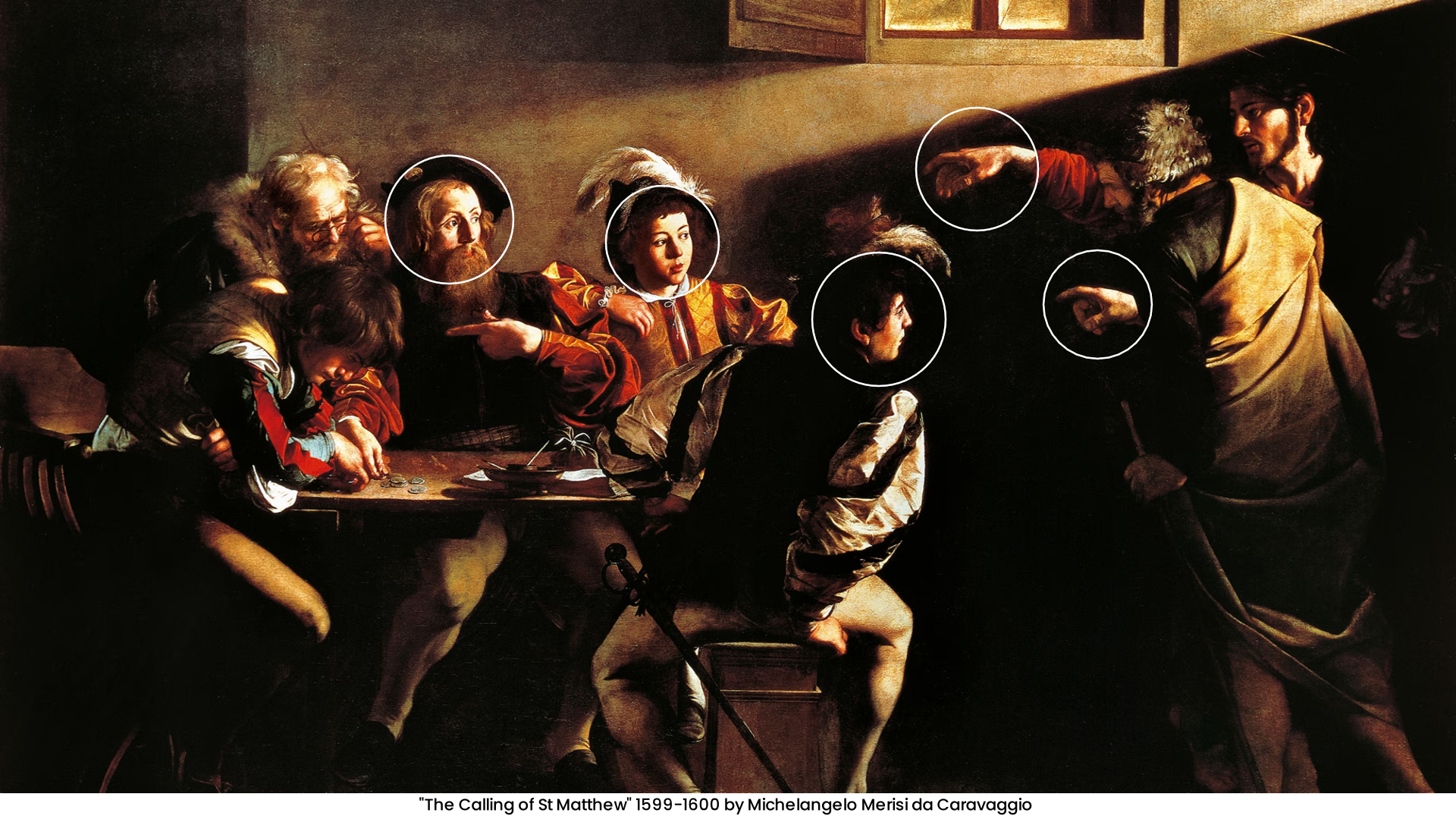
light and shadow. Here's an image from
an artist who many call the master of
light and shadow. This scene painted by Michelangelo Medici
like Caravaggio, is an excellent example
for how light and shadow can produce super
cool value Contrast. I love this piece. It looks really intense already
at first glance because the values range from completely black to very bright. The image is mostly dark and shadows are all
over the place. But the important parts
that Caravaggio wants the viewer to look at
up bright and visible. The phases of the characters, part of their clothing and
their hands are struck by a light beam that
comes from the top-right. This light beam points in the same direction
as the characters, hence, which gives the
scene a clear direction. Everything is pointing at this
dude who's sitting there. So composition, subject, and value work
hand in hand here, and they support each
other beautifully. But also interesting is that the contrast of the
phases and hence is intensified because they're all surrounded by darkness. This hand, this hand, this face, this face, this face. All these focus points
stand out so much because there is a clear
edge between light and dark, as I've told you in
the last lesson. So yeah, this is already
a super cool example for contrast and there
are many more to come. Mastering value
contrast and using it consciously to highlight
certain parts of an image or design is awesome and you should
definitely do it. Okay, moving on, we
got Hugh contrast. Hue describes the type of color. So blue, green, red,
yellow, etcetera. That's hue. Hue contrast is created by putting different shoes
next to each other. This works with any hue, but just like with value, you can make it more intense by using hues that are further
apart from each other. For which it makes sense to
look at the color wheel. The color wheel shows you
how issues are arranged and you can use it to find out which
combinations of hues, but create the best contrast. Generally, the further
apart two hues are on the color wheel. The big other contrast
between them, you probably know
complimentary colors, red, green, blue and orange, yellow and purple and so on. These complimentary colors have a lot of contrast between them, which makes them an
excellent tool to create tension in an
artwork or design. But remember that you
don't have to use these complimentary colors
to create a hue contrast. Contrast exists on a spectrum, so you can use whatever
hues and combine them. But the further away they are from each other on
the color wheel, the more contrast you
will get, basically. So you can play with
that and decide how much contrast you
want between your hues. This is a photo of
some leaves in autumn. There is nothing that special
or interesting about it, but it simply looks
nice and pleasing because it has a very
intense hue contrast. We got this warm orange leaves against the
light blue background. Or, you know what? Let's look at a website. Gum road users, a
typical black and white contrast to make text readable. So value contrast, but also a hue contrast
of purple and yellow, which creates a lot
of tension too. So, yeah, using different shoes is another excellent
way to trade Contrast. To make an artwork or design
more interesting to look at. That last building block
of color that you can use to create contrast
is saturation. Saturation describes
how intense or colors, or in other words, how
much of a color you have. Low saturation means
a color is mixed with lots of gray,
are only gray. And high saturation makes a color superintendence
and increases its effects. Now, the reason
why you should use saturation contrast is because usually it's not
the best idea to make everything in a
visual supersaturated. When all the colors
in your visual or their in their purest form, they become hard
on the eye away. Oversaturated image is
one of the best ways to spot a total beginner
artists from my experience. And I definitely used
to be one of them. But now I really enjoyed using saturation contrasts
to highlight certain parts of an image. Like these orange flowers
here, for example, that immediately stand
out because they are the only really saturated
parts of the picture. Or this person sitting
on the big rock. Making one part of an image more saturated
than the others is an easy and efficient way to direct the viewer's
eye to that part. Also, very clear example on websites that are
white, gray, and black. And then you've got this
one supersaturated button that they want you to click on. I mean, you just have
to look at it, right? So these are the three types of color Contrast that you can use. Of course, there is way
more to using colors than just creating some sort
of contrast between them. If you want to know
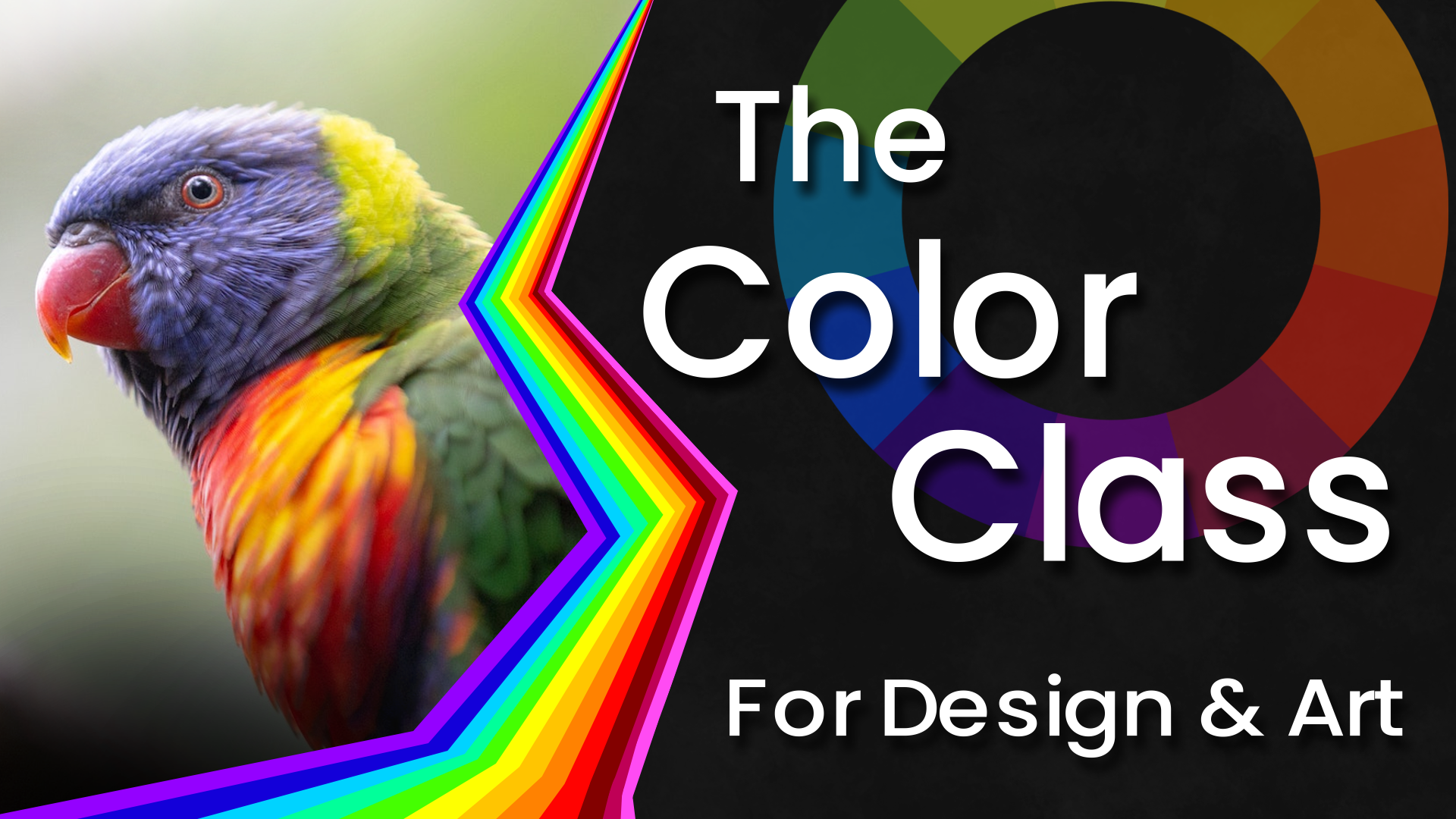
everything about color, I recommend you check
out my color class, which is a 90-minute course, where I explain in-depth how
to generally use colors, what they do, and
how to combine them. Just like this course, It's
for both Art and Design. So I think it's really useful. I'll have it linked down
in the description. But let's go back to contrast. The best designs and artworks combine these different
color contrasts. So that next time you create
an artwork or design, think about which parts
you want to stand out and which types of color Contrast would be fitting
to highlight them. Many value contrast,
if you want your visual to be dramatic and tense. Many contrasting hues. If you wanted to
feel rich and alive. And saturation contrast
if you wanted to be more balanced and a
focused composition, alright, color is awesome. I think I don't have
to tell you that. But of course it's
not everything. So let's see what
other ways there are two create Contrast
4. 2. Shape Contrast: Shape and form contrast. Alright? Just like color, shapes and forms are
everywhere and Art and Design. And they were an excellent
tool to create contrast and make a visual
interesting. What do I mean? Well, first of all, there are different types
of geometric shapes. Triangles, squares,
rectangles, circles, ovals, and so on. And just like colors, these shapes have
different meanings. Circles and ovals
generally look comforting, harmonious, and
protective because they are round and complete. So that's what a picture with
many circles looks like. Harmonious and comforting. Squares and rectangles look
very stable and solid. So they represent a
trust, authority, rationality and practicality, which is why they
are used very often. And design, triangles look pointy and as soon as they're
a little bit stretched out, they look like an arrow, which is why they
stand for movement, tension, direction,
or even aggression. So pictures that
consists of lots of triangles look very dynamic. And then there are
organic shapes that are kind of a mix of
these other types. And their meanings
and effects depend on which geometric shapes
are dominant in them. That's shape, for example, looks very aggressive
and dynamic because it consists
of pointy triangles. And this shape right here looks soft and comforting
because it's round, like circles and ovals. This is actually reliable information
because there have been many surveys where people were asked how they
feel about shapes. So you can use it. Alright? As you can see, shapes have very
different meanings, which means that you can combine
them to create contrast. This becomes very clear
if you take an image or design that consists
of one type of shape, and then you add
another one like this circle and this
image here, for example. It just immediately
stands out because, well, it's a totally
different shape. And you can use that
to efficiently direct the attention of viewers to a
certain part of your image. Different shapes
create contrast. Okay? But you can also play
with the effects of different shapes to create
more meaningful contrasts. An object with round shapes that is surrounded by pointing triangles kinda looks like it's being attacked
by these triangles, which you can use to intensify a contextual contrast that
you have in an image. Make the thing that's
supposed to look defensive and
friendly, more round, and make the thing
that's supposed to look aggressive more Angela, this is a very classic and cruel trick to
create contrast, so you should definitely
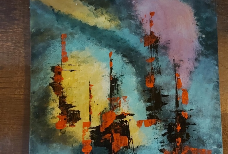
try that out. Here's an abstract
artwork that I made where I put
very simple shapes. But I find it somewhat
satisfying to look at because of the contrast between
the spikes and the ovals. The spikes go wild and dynamically point
in all directions. While the ovals are
completely unbothered by that and look calm and
stable. I don't know. I made this like four years
ago in a few minutes, but simple contrasts can
go along way it seems. Here's an example from
an actual painting, very weak at this Cathedral
with its triangular turrets. And to tell us, they
really stand out against the more natural rounded shapes of these bushes and trees. Plus it's even combined with a value contrast to
make it pop even more. The artist has
intentionally made the sky behind this very dark
cathedral brighter. But yeah, shapes are another really useful
way to create contrast. Especially in design like
web or poster design, you often have very simple geometric shapes that
you've worked with. So I recommend throwing
in a contrast here and there by varying the form
and shape of your elements.
5. 3. Line Contrast: Contrast offline. Now this is a more simple one, but one that people really
like to forget about. Imagine a line Art
with lots of detail in the background and the
foreground without color. It's really hard to
look at and you cannot tell which elements are
supposed to be the focus point. If all the lines are the same, using lines of different
thickness is such an easy fix for this because it's a super simple way
to create contrast. Thicker lines are just more
visible than finalize that. So it is. You can use that to improve your line Art or
character sketches and add a subtle sense of
priority and focus to them. Make the important lines, the ones that make
up the big shapes, for example, thicker than the lines that you'd
use to create detail. This is very important because
otherwise it looks weird. Also when you draw something in that style and you
use lots of lines, make the lines in the background thinner and the ones in
the foreground thicker. In general, using lines in a smart way is a really good
way to create contrast. When there are many
organic shapes, but one straight line. Our eyes naturally
follow that line. Additionally, it makes
for great contrast if you combine straight
lines with bent lines. In this painting by
Claude Monet for example, we have many horizontal lines
in the detail of the water. But the bridge above
it is slightly curved, which makes it
clearly stand out. Even though it actually has the same color as a
lot of the detail. You can imagine how much less
visible the bridge would be if it was not bent
but straight instead. So that's a really nice example. Or you can do this
the other way round. If you've got an image
or design with many, many round and dynamic lines, and then you've got this one straight line that goes across. Great way to create
tension if you asked me. So, yeah, you can also use
different sizes and forms of lines to create contrast and
to direct the viewer's eye
6. 4. Detail & Density Contrast: Then we got contrast
of detail and Density. This is one of the classic ways to direct attention in Art. In pretty much any painting, you have the parts that are more detailed than the ones
that are less detailed. Not off do you have
artworks that are completely even in their
distribution of detail? Because, well, it
doesn't look that good. Usually when there are areas in a visual that have
more going on in them, they look very different
from areas that are less detailed or less dense. So you naturally have
contrast between different levels of
detail and Density. Now, I know what
you're thinking. You always look at the
parts with more detail, right? Well, not necessarily. But let's first look at a classic example
for a painting that has clear focus due to
it's contrast of detail. I think you've seen this before. The Last Supper by
Leonardo Da Vinci makes use of heavy contrast in detail and Density to direct the viewer's eye to the table by the characters are sitting. There is just not much going on in the foreground and
in the background. As you can see, they're
both mostly flat, but we have this
intense horizontal line of detail that goes across the table and makes the image field very
stable and balanced. This is a great
arrangement of Density and emptiness if we analyze
the composition. So it always helps if you
think about which parts of your image you want to
be the most detailed. However, as I've said, you don't always look at
the parts with most detail. If there is generally
a lot of detail in just one part of a
picture that's flat. There is actually
more focused on that flat part because
it stands out. Remember that Contrast
always goes both ways. You can of course, also
make everything detailed. Like this abstract
artwork that looks like a chaotic pattern or this
painting of a battle. But that way It's less focused
and it has no direction. It's more like a
picture puzzle over the viewer can discover the
interesting parts themselves, which is also a possibility. Imagine a website where
texts and images are everywhere and you can't really tell where you're
supposed to look. I personally wouldn't stay on that website for too
long to be honest. So contrast of detail
and Density is an important tool that you
can use to direct attention, create balance and focus, and improve your Art and Design
7. 5. Texture Contrast: Moving on, we've got
contrast of texture. This is kinda similar to
contrast of detail and Density, but it's still something else. You can add a lot of texture to one part of an image and
none to the other parts. And then that's pretty much a contrast of
detail and Density. But you can also simply trait contrast by giving two areas, different textures that only
slightly very in detail. That's contrast of texture. It's somewhat of a combination
of contrast of shapes, contrast of detail,
and contrast of light. Because, well, that's what
textures are made of. You know, texture is
might vary shapes, they contain the thickness of the lines or the density
of the repetition. So you can create
contrast by giving different areas,
different textures. Like for stone,
breaks would leaves, ground, grass, geometric shapes, other types of stone and so on. There are tons of possibilities for having a beautiful texture, and therefore tons of possibilities to put them
in contrast to each other. Let's have a look at an example. This photo looks very exciting, not only because of the
rich complimentary colors, but also because of the diverse textures
that the subjects have. We have wild waves
with lots of fault, which almost looks like a net. And hereby the form
hits the beach, it gets even denser. So it's again a
different texture. Then we have the flat and
almost textualists surface of the sand and the rough
texture of the stone. And this part, well,
the water flows back over the sand is
also a unit texture. So we have like five
different textures in this photo like this, this, this, this, this. And that makes it
interesting to look at even though the subject
is very simplistic. I mean, it's just a wave
hitting the beach basically. This is an example
for how you can spot excellent subjects
for photography or references for your Art. Look for places where different
textures meet each other. Alright? There is also the possibility
to use contrast of texture in your method
instead of the subject. Sounds a bit complex. But here's what I mean. Look at this painting
by Vincent van Gogh. He varies the
brushstrokes and create different textures that separate
the parts of the image. Here in the field, for example, the strokes are
horizontal and dense, while in the sky they are more
diagonal and a bit larger. Been golf adds a contrast of texture with his
method of painting to intensify the already
strong contrast of color between the
sky and the field. So that's pretty cool. And in other ways you can
implement contrast of texture. In representative arts like
painting and photography, contrast of texture
often comes naturally. You know, you have a cat
standing on the floor and well, they just have
different textures. So usually you don't have
to consciously use it. In design. However, contrast of texture is highly underrated. So many websites and posters
nowadays are just flat with only shapes and pure colors because they want to
look clean and modern. And that's why it often seems
like designers are almost afraid of texture.
But here's the thing. You can still achieve a clean and modern look by just adding a
little bit of texture. This makes decides a lot
more interesting to look at. A combination of
different patterns. For example, in the
background of a website is a great way to stand out
nowadays. That's a pro tip. Textures don't have to be
bold and spammy all the time. You can just add light textures to give your work
a bit more detail, life, and contrast,
which makes it more interesting and often
more professional. Contrast of texture
is a flexible tool and it's very powerful
if you use it right?
8. 6. Size Contrast: Contrast of size. This is a big one,
no pun intended. But contrast of sizes, very, very popular in both
Art and Design. Basically, you can create
a contrast between elements by giving them
vastly different sizes. Like a big circle amongst smaller ones are a small
circle among bigger ones. If one element has a different
size than all the others. That's just what
you look at first. This type of contrast technically comes from
other types of contrast, like contrast of
detail and Density. If I take this element copied a few times and to make
one of the copies very small than that small copy becomes the focus
point of the image. However, this is not just because it's smaller
than the other ones, but by making it smaller, I just gave the elements or higher density and more detail, which makes it appear very different to the other elements. And therefore, that's
what you look at first. So yeah, I just wanted to
add that to be more correct. But it really helps
to think of size as one type of contrast because
it's very effective, very common and
very interesting. A classic example would be a gigantic rock and
a small person, a big animal tracing
a small one, or a huge picture, and a small call to action
button on our website. Contrast of size is
quick and obvious. Efficient way to attract
attention to different things. Size Contrast also
works both ways. That means things that are
very small can stand out, but also things
that are very big. Ten stand out. Or what's
also interesting, you can put two
opposing elements. Want big and what
small next to each other so that there is a
balanced tension between them. Like in this image where there is no focus on big or small, but both attracts attention
to them in the same way, which makes it feel
very balanced. Contrast of sizes are type of contrast that gives
you many options. And it's truly both
experimenting with
9. 7. Direction Contrast: Okay, contrast of direction. This one is underrated and
often forgotten about. So pay attention. We humans are very good
at recognizing patterns, and therefore we see when something stands out
and breaks the pattern. This often happens by
contrast of direction. If all lines point at the same or roughly the
same direction, you immediately see when there is one that goes in
another direction. Breaking patterns like this
is a great way to give significance and to attract attention to
something or someone. Contrast of direction
is a bit more subtle. For example, when you see a vertical skyline behind
a source of water, it often looks pleasing. And that can be at
least partially credited to contrast
of direction. You gotta calm horizontal
body of water, maybe some chunks of land. And then you've got these
huge buildings that go in a totally different
direction than the water. So when you draw something like a tall and vertical
cliff building or tree, it really helps to
intensify the tallness. If you add a horizontal element, the ground, water or
even horizontal clouds. If you instead at other
vertical elements, you are pretty much
creating a pattern. The image looks more harmonious
and has less tension. And the tall main subject
doesn't look as tall anymore. Take a moment to
think about that. The more horizontal
elements there are around a vertical element that
taller and more interesting, the vertical element appears same thing if it's
the other way around, are also worth diagonals. This is how contrast
of direction works. So make use of that. Make other parts
of the image going at different direction
that the main subject, if you want it to stand out. Now, there's also
the possibility to use contrast of direction to create a pattern like this abstract
artwork right here. All the lines go in totally
different directions. So there is no focus point
and this composition. But the general layer of
contrast that's created by all these different
directions makes the whole thing look very
chaotic and also interesting. The more directions are, are, the more dynamic
a picture fields. Look at the difference
between a forest that has only straight trees and
forest with wild trees, branches and branches that go in all sorts of
different directions. They just have a
totally different vibe. Contrast of direction is a very useful compositional tool that you can use to either highlight something and
make it stand out or to give an image a more
dynamic wipe altogether. So yeah, that's
contrast of direction
10. 8. Space Contrast: Then we got contrast of space. No, not this type of space. The other one that's just empty. Alright? Because empty space can
also be used to highlight certain parts of an image or
design, especially design. This right here is probably the best example to
show you what I mean. One dot stands out not because it has a different
color, texture, or size or shape, but simply because it has more space
around it that the others. Now, using empty space
or negative space, how it's often called is a
big topic in Art and Design. And you can do way more stuff with it than
just create contrast. Generally, using the space
in your artworks and design sufficiently is
incredibly important. A lack of empty space can
result in a level of Density and chaos that can be
tiring on the viewers eyes. And a lot of empty space can result in an interesting
composition. But it can also make
a visual seem lonely, uninteresting, or even lazy. Use empty space to separate visual elements and
give them hierarchy. For example, texts on
posters and websites. When you have texts
all over the place or not enough space between
different blocks of text, it gets hard to read and
uninteresting to look at. If you could space, for example, to separate the big title
and the small text, they both seem to
have more importance and the composition is
much more balanced. Or an Art, if you have a dramatic scene with
characters doing something, you don't necessarily
want so much going on in the background
right behind them. Detailed scenes that
are supposed to stand out very often surrounded
by empty space. Now, this can be interpreted as a contrast of
detail and Density, which it is in some sense. But space Contrast is a more
specific version of it. So you should definitely
try to remember that. And you should use it because
you don't want to overwhelm the viewers of your
Art and Design with too much going on. Apply contrast of space to
make your compositions more easy on the eye and to highlight
what's really important.
11. 9. Type/Font Contrast: And as number nine, we got contrast of type or
font referring to birds. And let us InDesign, especially it's very practical
to use different fonts, different sizes of the fonts, different shapes of
the fonts, etcetera. To create interests. Do not forget about this. Contrast of font is
usually connected to the meaning of the verts that
these fonts are applied to. Two different birds on a page have two different meanings, which can be amplified by giving them vastly
different fonts. When you make a
poster or a website, thinking about
which type of font might be fitting
for which parts of texts can be a great way to
bring it to the next level. This is where you can
combine a contrast of font with other
types of contrast. If you look at a list
of different fonts, you'll notice that they are made of different types of lights. For example, some fonts
have straight lines, some fonts have
more rounded lines, are thick lines and thin lines. Some are made up of shapes. Some have more empty space
in them than others. And of course, you can give different fonts,
different colors. So conscious of funds
should not be treated like, well, this text is very
different from the other text, but you have to actively think about other types of contrast as well when working with fonts and creating
contrast between them. Because you don't want that many different contrasts
between two verts. I mean, look at this. It looks really
unstructured, unrelated, and just two different
contrasts of font generally works best when you have
only one or two types of contrast between them. Often that's contrast of line. One font has thicker letters
and the other, for example, and conscious of sites, you make one bigger
than the other. For instance, when
you work with fonts, like when making a
poster or a website, keep them mostly
in the same style. If you don't want a huge
contrast between them, it often works best when you
have one or two main fonts. And you just highlight
some words or sentences by making
them thicker, more spaced out, or giving
them a different color. Type is a big design
topic on its own. But it's already
helps if you just create a little bit
of contrast between words and sentences based on their importance
and their meaning. This makes them a lot
more interesting to read
12. 10. Conceptual Contrast: Last but not least, the final type of contrast
that I want to show you is conceptual or
contextual contrast. This is contrast in
its purest form. No specific visual
elements like color, shape, line, or size. Conceptual Contrast simply means opposing subjects or concepts. So this is stuff like
sunshine and rain, young and old, rich and poor,
aggressive and passive. Any duality that you can
think of can be shown in an artwork by putting its
elements in juxtaposition. This is what we call
conceptual Contrast. It might not be something
that gets immediately noticed like a strong color
Contrast or shape Contrast. But it's still very interesting because once people find
conceptual Contrast, they get very analytical
or even confused. Thinks that are
contradicting each other, or that should not be in
the same place by nature, grab our attention because our brain tries to make
sense of the situation. Like technology in a jungle, lemons and flowers combined. Or this Banksy graffiti of the girls searching
for Soldier, which I've shown you earlier, a sad clown, the subject
of this painting can also be interpreted
as a conceptual Contrast. So this is basically everything that's contradictory
and creates tension, but doesn't belong to any of the purely visual contrasts
that we've covered before. You don't necessarily need contrasting visual elements
like line and shape, but having different
subjects and putting them in juxtaposition
is also possible. Now, here's the important thing about this type of contrast. Conceptual Contrast
is in many cases, the thing that you start with, the idea of your artwork. And then you can
use other types of contrast to ameliorate it. For example, you have a conceptual Contrast
like right here, a forest transitioning
into a city. It makes sense to
add other types of contrast to intensify it. Like in this case,
the artist uses warm colors for the forest
and cold colors for the city. So we have a complimentary
color contrast as well. However, this is a prodrug. The color Contrast is
not just edit randomly, but there is a natural
reason for it to exist. As you can see, the artist has added this
fire right here to authentically combine
the conceptual Contrast with a hue contrast. So to conclude, conceptual Contrast is
contrast between things. In order to make
interesting Art, you often have to find interesting combinations
of well things. This creates
conceptual Contrast, which can then be
amplified by adding other types of visual
contrasts like color, shape, line size, direction. All the things
we've talked about. Alright, these other
ten Types of Contrast that every artist and
designer should know about?
13. Contrast Analysis: Ladies and gentlemen, VR now in the contrast Analysis section, which means we will look
at a few pieces of Art and Design and see which types
of contrast they use. We are doing this because I think it's essential to show you that contrast really is
everywhere in Art and Design. Even if the artists
didn't consciously think about it and
use a reference, a random idea, or
just their intuition to make the artwork. At the end of the day, it's
still mostly contrast that makes an artwork interesting
and pleasing to look at. Same goes for design, but designers usually integrate contrast more actively and
consciously than artist. But yeah, I've
picked a few visuals from different fields
of Art and Design to show you how professionals use
the ten Types of Contrast. These examples will
help you understand how contrast can be used and
how many options there are. And hopefully it will get you
into this contrast mindset. So let's see what we got. First of all, and abstract
artwork painted by Franz Marc. I would guess the first
thing you notice about it is that it's very intense. It's abstract. And there is technically
not a lot going on, but there is a lot going on. We basically only have
two foxes as subjects. But there are so many
other shapes, lines, and colors that the image
fields very dynamic. And like there's a
lot more happening. This is simply due to the generally high contrast
at this picture has. We have contrast of color, very saturated red
foxes and green plants, which has a complimentary
color pair. Additionally, we have
a variety of values, many black lines and shapes, and some bright yellow
and white areas that are very close to them. So we also have
value contrast here. Next up, the lines
and shapes follow no clear direction and they look very chaotic and dynamic. So there is a general overlay of contrast of direction
in this artwork, which is responsible for its intense appearance that stretches to all
parts of the image. The only thing that
you could call a focus point is probably the face of the fox here and maybe the face
of the folks there. That is because the faces, unlike the rest of the artwork, actually have some
level of detail. You can see the eyes
painted with small dots. The nose, these
Harris Andy years, we have Contrast of detail. But also if you look closely, contrast of shape
as some parts of the foxes like the face
at the tail around. So we have a piece that looks very intense
and dynamic due to the generally
high contrast in Hughes values and direction. The only real subjects
and focus points, the foxes are visible
because they have different shapes
and a higher level of detail where their faces are. That's a lot of contrast
for one painting. But many people like
this and abstract arts, because high contrast is
pretty much the only way to make literal lines and
shapes exciting to look at. Alright, moving
on, let's look at something that's very different. High contrast between
these two artworks. No, I'm sorry. I found this wallpaper on the
Internet and I think it has really nice composition and a cool set of various contrasts. It's definitely more calm
and focused this time. We have one clear subject, this person sitting under the tree fishing in
the air, I guess. Now, how does this
person stand out? Well, first of all, I would say contrast of size. It's a big rocket. They're sitting on a vast
empty space behind them. Additionally, the person
along with a tree have different colors than the
background and the cliffs. Also, they have a lot
of tension between them due to the complimentary
colors, red and green. So your eyes are
pulled to what is focus area that has higher
contrast in and of itself. Now, the rock also
looks interesting because of its value transition
from dark to bright, but also the detailed texture
that is very different from both the texture of the sky and the
texture of the tree. Last but not least, my favorite
type of consciousness and this wallpaper is a
contrast of light. See the whole bowl
paper is drawn in a very organic and
natural style. We got all these different
textures and shapes. But then we got
this one clean line that goes straight down. The fishing rod with a straight
line is in my opinion as super cool element of contrast that has been
implemented beautifully. So a picture with
not a lot going on, just some dude sitting
on a rock fishing. But we got contrast of size Contrast a few
contrast of value, contrast of texture
and contrast offline, the composition and subject of this wallpaper are definitely
worth analyzing two. But as you can see, contrast
alone is a huge part of it. Alright, here's the next piece, movie poster from
the movie Jaws. This is definitely intended
to quickly grab attention. First and foremost, we see
a big conceptual Contrast between a hungry shark
and a swimming woman. This conceptual Contrast is intensified with a
contrast of sites. You see this shark is
unrealistically large to make it up here in even
greater threat to the woman. But also, this is very interesting because a
contrast of direction. The woman is
casualty swimming to the right and a sharp
goes straight up with its nose
already pointing at the woman ready to disrupt
her line of movement. This poster shows the
moment before disaster, whether to subjects are very
close to each other and have super high contrast
between them in terms of concept, size, and direction. Aside from that, we
got a big red text with movie title that stands out because it has a vastly different color
than the rest of the poster. And there is other texts
with a contrasting font. The titles font is big, bold red it Angela. While this subtitles
font is small, rounded, black, and
a bit more elegant, a set of interesting contrasts that apply to the subjects, as well as the text, make this movie
poster very visible, attention grabbing and intense. And I would say this is
pretty much exactly what you want when you advertise
a terrifying movie. Okay, Next up here
is another painting. I think it's perfect to show you how contrast plays a role, even an odd works
that are not supposed to be super outstanding
and signaling, but simply a little
bit interesting. This is a scene painted
by Edgar Degas. And there are many pupils, so there is a lot going on. These girls do have some
value contrast with their generally dark hair
and the white dresses. So they are, I guess, interesting to look at. But what stands out is this
elderly gentleman right here. First of all, because, well, he's an old man and the rest of the characters
are young girls. So that's a conceptual Contrast. But there is also
contrast of space. The girls are all pretty
close to each other, but the man is
separated from the rest because he has a lot
of space around him, which shows that he is not
directly part of the group. The man does not
have much contrast. Aside from that, he's great and desaturated just like most of the other parts of the image. So if he were directly
amongst the dancers, it would probably take you
sometime to notice him. He isn't supposed to
stand out like crazy. But just to be a
different element that evokes interests like, Whoa, what is he doing there? If you look at the composition, you can spot another
type of contrast. And that is contrast
of detail and Density. Like in most compositions, the heads of the
characters are pretty much all on this horizontal line, which makes it the area
that you look at first. This contrast of detail is very important in most artworks
because without it, it would simply appear
too cramped and unfocused or too boring if
there is no detail at all. So yeah, this artwork manages to be interesting to look at. Not because of striking
colors and shapes, but because of the subjects. A clever use of contrast
of concept, space, and detail make this
painting very appealing. Last but not least,
let's look at a website. Good websites are an excellent
place to learn how to play with the viewers eye
and how to direct attention. So right here we have a classic example for
a website that uses lots of contrast
to highlight it's different texts and
call-to-action buttons. You see it's very dark with white text and some colored
bits that really stand out. So contrast of value and hue in general is the
biggest thing here. Like on most websites. As you scroll down, you'll see that they always
highlight things that you can click on are important
titles with color, while the rest is
mostly black and white. Right here is even a switch for black and white
are reversed, which is kinda cool. Also, they generally play with very different sizes of
their texts to create a clear hierarchy between
the attention grabbing titles and the
actual information. And additionally, you can see
important bits of content, like text or images being highlighted by putting a
lot of space around them. So most websites are
definitely not as sophisticated and their use
of contrast as artworks are. The rule of thumb is to just make everything
visible by having enough contrast and to highlight the important parts with a
different type of contrast. Here you can see that the general contrast
is black and white, so everything is visible. But they also put a
little bit of color wherever they want
some extra attention. Okay, that was our
contrast Analysis. You should now have a pretty
good idea of how contrast can be used and how many
different options you have. As you've seen, contrast plays a big role in every field
of Art entity sign. So I encourage you to go out there and actually look
for Contrast yourself. If you find something
like a website or an artwork that
looks really cool, why not try to spot the types
of contrast that contains. This has helped me understand
a lot more about Contrast. And I really liked doing that by looking at other people's work through the lense of contrast, you pretty much always find some objective reasons
for why it looks good. It looks good. Of course, this is excellent training for your understanding
of Art and Design. Alright, let's now move on to the next
lesson where I give you my personal tips and
tactics for using Contrast
14. Tips for using Contrast: Okay, Here are five more
tips for using Contrast. I think they are really useful, so take notes and
write them down, or at least listen carefully. And let's jump right into it. The first tip I have a you
is look for differences in your work that you could
highlight using Contrast. Whenever you have a
duality of things, a conceptual Contrast and
your work ask yourself, would it make sense to
highlight this even more using another
type of contrast? Very often, that's
worth it even if you just make very small
contrast adjustments. Like making flowers in a great mountain
see more saturated. Making the features of an
attacking entity more angular, or making the title
of a text bigger. You now know many
types of contrast, so make use of them in your work no matter
what you're doing. Increasing the contrast
between visual elements is often one of the
easiest improvements to an artwork or design. And it doesn't matter if it's just contrast at the details. They are really important to just make sure
that the details don't overpower the
main subjects and that there is still focus
on what's important. So always look in your work where there
is a difference and how you could highlight it even more using some
sort of contrast. The second tip I have
for you is always make texts visible and readable. This also applies to
the main subject of, let's say, an artwork. It always needs to have
enough contrast we visible. But regarding text, people really like to
forget about this, which is quite unfortunate. There are two ways
in which you can fail to make your text readable. One, you don't have
enough color contrast and the texts and the background
kind of blend together. I see this way too
often and it really annoys me because it's
such an easy fix. After this course, you
are probably not one of the people who are likely
to make this mistake. I mean, I've stated so many times how
important contrast is. But if you're someone who
likes to play with color, when, for example, making
a poster or website. And you're not sure
which kinds of colors to use enough contrast. I have a tuple, you use one of the Contrast
Checker websites. There's quite a few of them, so you can just search for contrast website or
Contrast Checker, and you will find one that
works on this website, for example, you can change the colors of both the
texts and the background. You have a little
preview here and it tells you how it
likes your Contrast. I have to say that
the judgment of the website is not
always on point. But the good thing
is you can just see for yourself whether
you like it or not, and to try out
different combinations of texts that background. So this is really useful for selecting
colors for posters, websites, and making
sure that they work. The other way in
which you can fail to make your texts readable is when there's too much contrast and the background
behind the text. I mean, look at this
and intense pattern. Enter text on top of it. That's not very nice to read. This error often occurs in
thumbnails for people smash a text on a high contrast image and just expect it to work. What I recommend to work around this is just adding a little bit of black or white underneath the text using a
brush or something. This makes it stand
out more from the background and it
makes it way more visible. Or you can simply move
the text to a part of the image where there
is just less detail. Text is very important. And whenever there
is something that looks like a text and
a visual presentation, you automatically
try to read it. And if you can't, it's
pretty uncomfortable. So always make sure
that your text is visible and readable
in any situation. Number three, play with
progressions and transitions. Contrast doesn't always have
to happen in an instant. Progressions and transitions are an excellent way
to tell a story, to highlight something, and
to have a clear direction in your Art and Design without
making it too bold. When you have a transition
and sizes, for instance, that's contrast to it's not as striking and
attention grabbing as big and small pots next
to each other directly. But it's still interesting
to look at because you still have different
elements of a duality. You can do this with
value, hue, saturation, size, detail, or even concept. Look at this painting by add
an ester or is when you, where we have a super cool conceptual
Contrast transition. They end tonight connected
by these beautiful flowers. And having transitions
and progressions within textures and shapes is a really good way to
add an extra level of detail to your
designs or artworks. Progressions are an
excellent way to highlight the differences without
making them too striking. So why not use them? Number four, don't
overuse color Contrast. People really like
saturated colors and black and white dualities. And in general, I support that. I'm an artist and
designer and I really like to use color, like really. But you have to remember the
other types of contrast. When you have a strong contrast
of line concept and size, you don't necessarily have to add even more color
Contrast to it. Low saturation and low color Contrast is a design tool
that has effects to, as you can see in this image. It makes picture as more
Coleman gives the viewer the opportunity to look at
the other types of contrast. Use colors but don't overuse color Contrast,
especially hue contrast. Complimentary colors
are, needs to have an artwork or a logo or stuff. But using them for texts. This we're just don't. You've gotta be careful
with complimentary colors because they can start
to bite each other when they're used in text or when they are used
by an equal amount. They work best when one color
is dominating the other. So keep that in mind when using complimentary colors and
don't overuse color Contrast. Remember that there
are many other ways to make something stand out, so make use of them. Last but not least, use contrast of contrast. I haven't even
mentioned this yet, but a type of contrast
does not have to apply to all
parts of an image. Some areas can be high contrast and some areas low contrast. You know that contrast
attracts attention, but that doesn't have
to be your whole image. It can also just be a certain
part of your image that has a lot of value contrast
within it, for example. Or maybe you have a
website where everything is nice and smooth
and then boom, big contrast that strikes you. Contrast is a tool. It can be used to make a whole
artwork more interesting, or it can just appear
in special places are moments where you
want extra attention. Use contrast, where you want
interest and play with it. The ten Types of
Contrast allow for so many options when
combining them that it's actually quite
easy to come up with something
unexpected and original. Combine different
contrasts and get creative with where
does use them. And you can bring your Art
and Design to the next level.
15. Class Project: Alright, now let's
actually make something. I highly recommend
you participate in this little class project because it's really
quite simple. If you're watching this course, I'm sure you have
the opportunity to create Art and
one way or another. Even if you're designer, it's still very helpful
if you do this. I want you to create an
artwork not too detailed, that consists of
shapes and colors and contains at least four
types of contrast. So any medium with which you can make shapes
and colors is fine. Take a piece of paper, open a drawing or design
software, whatever. I'm going to use Krita, which is a completely free and pretty awesome drawing
software, for instance. Now, think of a very
simple scene with one main subject that you could represent with
colors and shapes. So this could be like a tree on some rocks occurred on a sofa, a bowl of fruit or something. If you like, you can use
a reference like a photo. Then think about the types of contrast that you
want to highlight your main subject
and which types of contrast you generally want to make your picture
more interesting. Remember, it doesn't have to be super fancy and sophisticated. We just want to use contrast
to make simple colors and shapes look satisfying
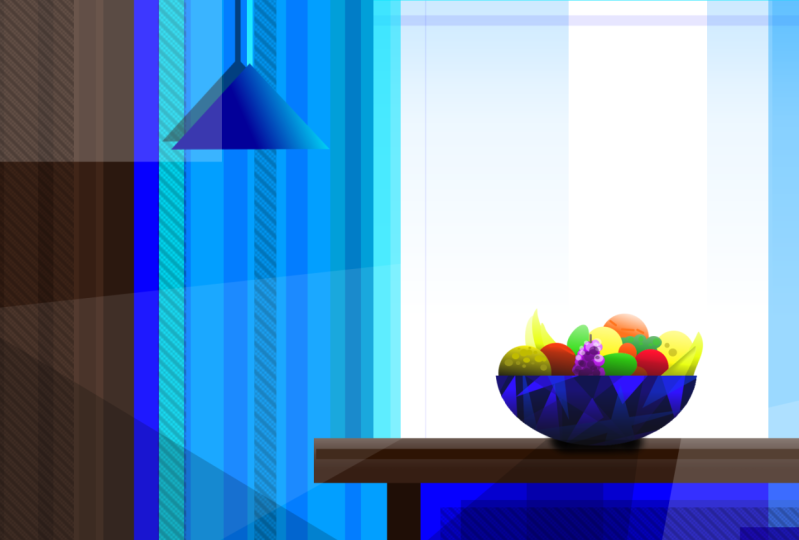
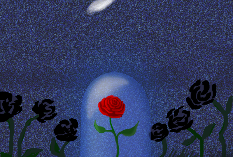
and interesting. In my case, I'm going to
make a scene in a room with a bowl of fruit standing
on a table by a window. And I want this bowl of fruit
to be the focus point of the image and to look
different from the rest. So I'm literally just spamming shapes and colors that
somewhat represent a room. And I just completely focused on composition and contrast. Usually, I'm always
for using references, paying attention to detail, getting all the perspectives,
right and so on. But in this case,
screw all of that. Don't worry about it. And only focus on
composition and Contrast. Simple colors and
shapes put together. So we have something with
an interesting focus point. Also, I recommend you
don't spend too much time on this because we want to
work on that contrast vision. This feeling for how you want to make
something stand out. Doing this at least once is excellent
practice to get into this contrast mindset and
to develop a vision for it. So you can later use it on
more detailed work of yours. Okay, Here's my example. I made the scene which is basically well shapes
filled with colors. But I think it's still
looks cool because we have lots of contrast. The thing that stands out is obviously this bulb
with fruit right here. That is because first of all, we have different colors here. The rest of the picture
is mostly blue. And then we got these
warm colors on the fruit. So they really stand out. They also stand
out because there is a contrast of detail. The bowl and the fruit up by far the most dense and detailed
part of the scene. Then what else do we have? Contrast off shape. If you look closely, there is not a single
round shape and the room, except right here, the
bowl and the fruit. Finally, the fourth type
of contrast that enhances our focus point is a bit tricky, but contrast of space, right? The bull does not have any
other stuff close to it, but it's surrounded by the empty space of
the window behind it. Before I forget, there was
a small extra contrast, which is contrast of texture. Some of these shadows
and shapes are covered with a simple texture, just to give it a
bit more detail and to make it more
interesting to look at. Okay, this is what I made. It's really
simplistic, so there's no excuse for you to
not make anything here. As I've said, pick
a simple subject, your favorite medium, and at least four types of contrast. And her phone. If you'd like, you can share
it when you're finished. I'm looking forward to seeing some interesting
combinations of contrast
16. Outro: Alright, that's basically what I have to say about Contrast. I'm gonna give you a quick
summary of this course here to conclude everything
we've talked about. Contrast is in many cases, the thing that makes Art
entities in interesting. The human brain
last dualities in seeing very different
elements put together. The more different
is elements are, and the closer they are
to each other, generally, the more contrast
there is between them, that visual elements
that you can vary to create contrast. Our colors, including
value, hue, and saturation, shapes, lines, the
sizes of elements, the amount of detail and
Density in a composition. Textures, the directions
in which elements face, the amount of space that
elements have around them. Types of fonts and concepts, which means things
that are presented in argent design can also
be different by nature, like young and old, nature and technology, etcetera. By consciously choosing
from these types of contrast and combining
them creatively. You can give your artworks
and designs more meaning, make them more exciting, tell better stories, and generally attract
more attention. I've given you tons of examples, I've shown you
many great pieces. Contrast is used well. I hope they can
help you view Art and design through a
different lens now. And I hope that you
are able to apply what you've learned to
improve your own work. Because at least
for me personally, contrast is really useful. I often make up for a lack of
creativity and always have new ideas for Art and design just by thinking about
combining contrasts, this is the best thing about it. The next time you see an
artwork that you really like. Look at the lines,
look at the colors, look of a subjects. And you will certainly find a clever combination
of simple contrast. So, thank you so much
for taking my course. Tell me what you think about the topic or what
I could improve. So makes sure that
you leave a review. It very grateful to see yours. You can also share
this course with colleagues and
friends who need it. Or you can check out
my other courses like this one about
using color theory. Have a good day and I hope
you learned something
 Duplo, Designer, Artist