Transcripts
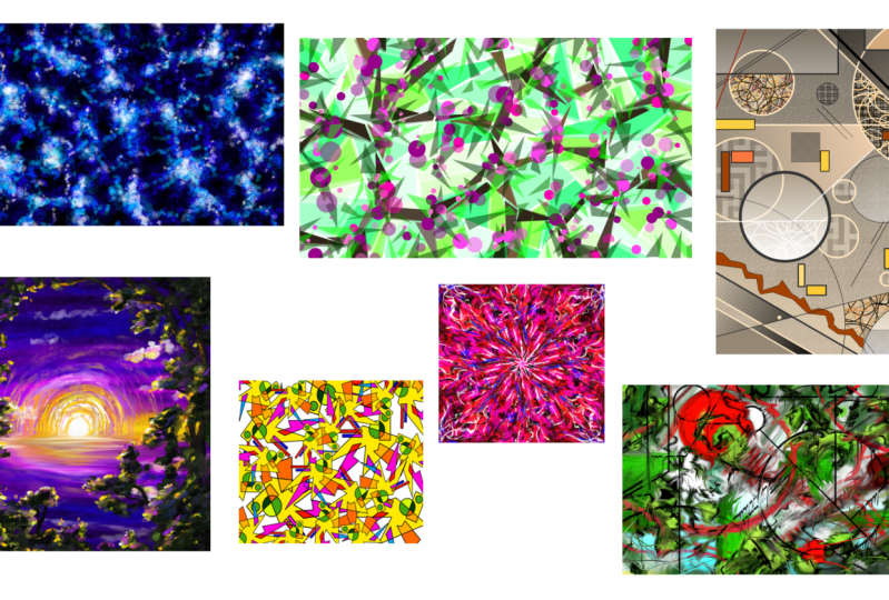
1. Welcome!: Hi, Do you enjoy abstract art, but you're always lacking ideas. And once you start, you lose motivation after just
about 2 minutes. Well, then let's put
an end to this with the abstract art
with critter course. Here I will show you seven
unique and fun ways to create awesome patterns
and compositions with this free software. I'll be your instructor Duplo. I'm an experienced artist
and designer from Germany, and I've been using Creta for many years now. It's
a pretty good one. Amongst all the things
that I've worked on, I've always had a special
fascination with abstract art. I mean, how is it
even possible that we can enjoy simple lines
and shape so much? Like, right here, there isn't anything
interesting happening, but I guess somehow it works. Well, turns out
understanding why we enjoy abstract art is actually the key to being
able to create it. In this course, I will
not only show you functions and tools to
make these artworks, but I'll also explain the underlying art and design
principles because they are literally the only
thing that separates abstract art from what happens when a toddler discovers
how to use a brush. Every artwork highlights
different tools and principles. This course will be
anything but boring. Why should you participate? Well, first of all,
it's fun and relaxing, to make art without the pressure of having to make
it look realistic. Plus, you will learn
very important art and design principles
regarding color, shape, contrast,
and composition. And the finished
artworks are not only pretty, but
actually useful. You can put them on gift cards, use them as backgrounds,
or even print patterns. But the best thing is,
you'll be able to replicate what you've learned to make near infinite iterations of it. So you will never run out of ideas for patterns
and artworks again. For this course, you will
need the free software Creta, which is an absolutely
amazing program. If you want to
know how it works, I recommend you first check
out my Creta basics course. But I'll explain
the important tools and functions along the way. A drawing tablet is
advantageous, but not necessary. As this is abstract art, you won't have to draw
any precise lines. You can lean back and let the colors and
shapes do the work. I'm super excited to share
my knowledge and experience, so I'd love to see
how it works for you.
2. First things first...: All right, right.
Before we start, let me show you a few things
that you should know. First of all, if you don't
know this right here is critter completely free
drawing and painting software, which you can download
on critter.org. There should be a link to
it in the description. Can click on your image, type in a resolution, and then click on create and there you have the basic
interface of creter. Once again, if you have
absolutely zero idea, what any of this
means, first check out my creter basics course, and
then return to this one. But it's actually pretty simple. You have your tools
here, the colors here, there are the layers,
and there are the different brushes
that you can use here. You can som in and
out by scrolling, you can hold down the
scrolling wheel and move your mouse around to
move this thing around. There are also tools
for this down here, and you can also som
in and out there. Very nice. Now, for
our abstract artworks, we're using mostly very
simple tools here, like the brushes,
the shape tools, selection tools,
transformation tools, and gradients and all that. However, if you want to make
your artwork as a pattern, then you can activate wraparound mode by clicking
on this icon up here. There, as you can see, when
you now draw or paint, then it infinitely
repeats your action, and you can draw over the edge to make a very
nice repeating pattern. Okay. When you're
done with your image, your artwork, you
can click on file and save your image
as whatever you like. You can choose your
file type here. Usually, we'll go
with PNG or JPEG. But you can also save it as something like
a photoshop file. As you can see, there
are many options here. In the end, you
will have seven of these image files and you can upload them to the website
to share them with me. All right. Now, when
everything is clear, move on to the next lesson so we can make our first artwork. Let's go. Okay.
3. Artwork: Texture Brushes: Okay. Ladies and gentlemen, welcome to the practical
part of the course. I hope you have Creta opened up right now because that's
everything you need. So without further ado, let's click on new image
to make a new image. Set the size to 1920 by 1080, the standard HD resolution, and we're going to leave
everything else as it is. No adjustments here,
a new document, and then click on Create. W, here we have a fresh canvas that we will fill with
beautiful abstract art. Very nice. For this
very first artwork, we're going to make a
clean and smooth pattern using different layers of texture brushes based on a monochromatic color scheme
and a value contrast. If you don't know what that is, no problem, just follow me. The first thing that
we're going to do is selecting the
fill bucket tool, this one right here. Then let's pick black as our main color on
the color picker. Then just click on the canvas
to fill it with black. This is already the
basis for our artwork. As you can see, it's
going to be pretty dark. Then make a new
layer by clicking on the plus icon on the layer
docker. Boom, here we go. Now onto the main
action of our artwork. First, select a different
color than black, so we can check out
some different brushes. Let's select a big
texture brush. In crater in the brush docker, you can find many
different brushes that allow you to apply
paint in a different way. We have erasers, paint
brushes, drawing brushes, and especially
texture brushes that produce these very interesting and original looking patterns. I want you to find
one that you like, and you can test these
brushes by just making a few brush strokes here
and then just pressing delete to delete everything
on your current layer. Feel free to take
your time here, pause the course, and search for a brush that
you really like. The only important thing
is that it should produce an interesting organic shape and is not just some of
the standard brushes. Small tip, you're going to find the more interesting
brushes more at the bottom of
the brush docker. I'm going to go with
this brush right here, which is a very smooth
water color brush. Then let's select some dark saturated blue from
the color picker. Honestly, you can also
choose a different hue than blue like red or green or
yellow, which should also work. But I think blue would
be very fitting here. So let's make a very
smooth baseline texture with big brustro just like this. Don't try to paint anything like an object or a
transition or something. But try to apply your paint everywhere on the canvas evenly. Also very important,
try to consistently leave out some dark spots
everywhere on the canvas. The whole texture looks like a very rough net or something. Also consistently
vary the pressure of your brush strokes. You have a very smooth texture, and you get darker and brighter spots that
flow into each other, which makes the whole
thing look interesting. Okay. All right. Once the whole canvas looks smooth and consistent and
there are no big outliers. It's time to scale down
your brush a little bit, stick with the same
brush and take a slightly brighter version of your color like a bit
brighter blue in my case. But still relatively dark. Let's apply a new layer
of paint to the canvas, and these new brush strokes
should be especially frequent on the brighter areas of the stuff that
you've already painted. Try to intensify the
net of brush strokes. As we're doing that, you can
see we're already getting a bit more contrast and you can see what's going on better. Make sure you start with very light pressure on your drawing tablet
and then as you go, make it a little
bit more intense. Very nice. I really like this brush and the
texture that it produces. All right. Once you have a
nice consistent net like this, it's time to make another layer and pick another texture brush. We have a little bit
more variation in here, and it's more
interesting to look at. Also, now is the time to pick
the chroma of your color, which is the color at its maximum intensity without any darkness or brightness
or gray mixed into it. Whatever color you
have selected, the chroma of it is always at the bottom right corner
of the color picker. So I'm going with this brush, which you can of co also do, or you find a brush in your
own. However you like. Set your brush to a size
of about 60 to 80 pixels. It's approximately like this. We want to get a bit more detail with this layer
of brush strokes. Then we just paint over the
bright areas once again. But be careful, you don't
want to draw any lines here. Just make very, very short brush strokes to get a
little bit of texture. Just very short lines or dots of varying pressure to create little spots of detail
on top of your net. Once again, the most
important thing here is that the whole
thing is consistent. There are no structural outliers or significantly darker or brighter spots in
any specific part of the image. Very good. Just do it the way
I'm doing it and try to create a similar
looking texture, even if you have a different texture brush or a
different color. The structure of your image should be something like this. Regarding the pace, I would try to paint relatively
quickly here and just intuitively go over all the bright parts
to intensify them. Once you've covered
the whole image and it looks consistent. Once again, it's
time to scale down your brush to be
approximately half the size it was before. Then let's add even more
detail to our net by drawing smaller bras strokes with the same brush
that we've just used. Once again, quick, short
brush strokes that spread over the whole canvas
consistently up here, especially in the bright parts and go in different directions. That's everything you
have to mind here. It's really quite simple. This time, I'm also
painting a little bit over the dark parts to intensify the net and
make it more dense. All right. Very nice. Now, let's shift the
hue a little bit. I'm shifting it
toward light blue, so we can add some more
brush strokes on top of the light parts and give the whole thing a
bit more contrast. Same size of the brush and
same style once again. We're just adding more contrast here to make it
more interesting. Okay, now it's time to make a new layer to pick a new
texture brush once again. This time, I'm going with a big and smooth one that
has an interesting texture, this one, and I'm
picking very light blue. And then I'm painting
a smooth layer of texture on top of the
bright parts once again, just to give it a
bit more detail. Nice and now comes the
special part of a painting. Make your brush very
small and pig white. Then with your new
texture brush, paint some bright spots on top of all the
already bright parts. Make the spots very dense at the notes of your
net, just like that. As your brush is smaller now, it also takes you longer
for this layer of paint, at least if you
want to do it good. But really make
sure that this is consistent on the whole
canvas. Take your time. The theme of this image is a balance between
chaos and pattern, which is always a very good
combination for abstract art. We have an irregular texture and we have differently
sized brush strokes, different brushes, and all that. But all of this is still evenly distributed
over the whole canvas. We're making this very easy by just working layer by layer and making each of the layers consistent and a
little bit different. That's a very efficient
method to create awesome abstract art works with these simple
texture brushes. Now, I'm intensifying
the pattern and making it a little
bit more dense by switching back and forth between the three texture brushes that I've used and between
different versions of blue. As we are working with only
one type of color here, which is a monochromatic
color scheme, and it's blue in my case, we have a very clear mood and a focus on the values
and the shapes. In the end, it makes sense
to add a very detailed layer of small white brush
strokes or dots like here. We have lots of contrast
between dark and bright, which makes the whole
thing pleasing to look at. So that's one way to make
abstract artworks in crater, and it's a really versatile
way, as you can see. You can just use a
different color. You can use different
texture brushes. You can make the net a little
bit more or less dense. If you do that, just remember the principles that
I've told you here. Work in different layers, make every layer consistent, have a color scheme, and make sure that there's at least
a little bit of contrast. So you can see something. With that being said, let's save this image and move on to
the next abstract artwork. That one is going to be something completely
different. Okay.
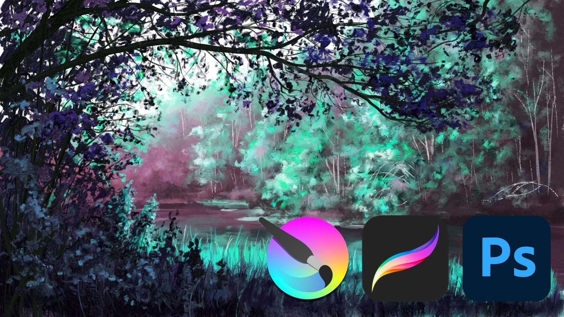
4. Artwork: Selections: Welcome to the lesson
about artwork number two. I hope you enjoyed
the first one. Now it's time to explore a completely different way
to create abstract art. Create a new image by
the same dimensions, 1925 1080 and click on create. We're going to make a geometric representational
abstract artwork using selection tools and based on a hue and shape
contrast. Let's go. First of all, select the
polygonal selection tool. This one right here. We're going to use it a
lot for this artwork, and then simply start selecting a few shapes that are close to each
other, just like this. This is going to be the clean geometric base line
texture of our artwork. In case your selection gets replaced when you try
to make a new one, go to the tool options, which is a docker that
you can activate, and there you can click on
AD at the selection mode, and then you can make
many shapes just like me and make them
go over the edge. I would recommend that
you make these shapes approximately the
same size as me. If you make the
shapes way bigger, then this part of the process will take you shorter obviously. But the pattern will not
be as detailed in the end, which might not look as good. If you make the
shapes very small, then it will be very detailed, but it might take
you a few hours to finish this layer if
you do it consistently. So, try to find a
nice balance here. First, don't do anything
with these shapes. Just select them and create
a homogeneous pattern. With homogeneous, I mean, it should have the same level of detail on the whole canvas. No outstanding parts
where the shapes are significantly
smaller or bigger. Always try to som out once
in a while to keep track of the whole image and notice if some of the shapes
don't really fit in. You should create a
few different shapes here, not just the same one. I'm using many triangles
here because triangles are very simple and
practical and they fit here. But I'm always trying to throw in something
else once in a while, just to have a little
bit more variation. The important thing is
that the shapes always have approximately the
same spacing between them. It looks smooth in the end. All right. And that's
what you have to do. Just fill the whole layer with this pattern of selections. You will find that it's quite easy to get into
a good flow here. Take your time and
enjoy the process. If you do it well, it will
look very nice in the end. Now it's time to select
the fill bucket tool and select green
as our main color. I'm going to go with a
very light green here. That is a bit more
on the blue side. And then I'm clicking on approximately every fifth shape on the whole canvas
consistently. Then make the green a little bit brighter and do the
same thing again. Also, approximately
every fifth shape. We want to make a
pattern here with approximately four or five different types of light green. Just select different greens, click on the shapes and
try to make it consistent. Once you filled every shape with a different type of green is time to unselect by
pressing control shift A, and there we go. This is pretty much already
an abstract artwork. But let's make it a
bit more detailed. Create a new layer
on top of this one and switch back to the
polygonal selection tool. Then let's select
another layer of shapes that have a little
bit of space between them. But don't worry, we're not going to fill the whole
layer with these. But make the shapes connect
in a way that makes them look like long branches that go
in different directions. Group them together
approximately like this. Again, the more dense
you make this pattern, the longer it will take
you to complete it. Let's try to create a rough
net with these branches, similar to our first artwork. And once you've covered
the whole thing, and you have a consistent
pattern that is not more or less dense in
any part of the image, then it's time to fill all of these shapes with slightly
different versions of brown. I'm going to start
with very dark brown here and once again, try to fill about every
fourth or fifth shape here. Then let's make it a
little bit brighter and a little bit less saturated
and also fill about every fourth shape and then move on to the
next version of brown. Once you're done and you have filled every shape with brown, it looks like a very nice abstract representation
of branches, and it's already pleasing
to look at because we have a small variation of color everywhere and the human
eye just loves patterns. Also, there is a little bit
of value contrast between the dark brown and the light
green background, also nice. But in order to make
it actually exciting, we need some other
types of contrast. That is some shape
and hue contrast, which means make a new layer and take the elliptical
selection tool, and then add a layer of small circles in small groups
on top of these branches. You can make them
perfect circles by holding down shift
while dragging them. But you can also just go to the tool options while
having this tool selected and click on this
lock icon to fix the ratio. Then you also always
have a perfect circle, which is really practical for
this part of the process. We want to have a
good variety of different sizes for the circles. They look like a bunch
of berries in the end. Once again, try to
find this balance between variety and consistency, which means placing the berries randomly and giving
them random sizes, but trying to do so on the
whole layer consistently. Don't make them too
dense because we still want to see some
of the nice background that we've made. All right. Then once you've covered
the whole layer, it's time to fill these berries with the fill bucket tool. In order to make them stand out, we're going to give them
the complimentary color of light green, which is this pink. But before you fill every berry, once again, we want to give them a bit of variation in the color. Make your pink a
bit brighter, a, a bit more or less saturated and have a few different types
of pink for your berries. Also spread out consistently
over the whole canvas. Now it's starting to look
really nice because we have a huge contrast
in terms of color because pink and light
green are complimentary, and also in terms
of shape because we have super angular branches
and a background texture, and then these round berries
that clearly stand out. Okay, cool. Now, in order to
complete the image, let's make a new
layer and once again, apply a few selections. This time, let's
only make triangles, and let's make them spread
out in a circular way, a bit like a star shape and put them on top of the big
nodes on the branches. Basically put these triangles in small groups and
make them point out. They look like leaves growing
out of these branches. I think making abstract
artworks using these different layers
of selections is quite interesting
because you first have this very boring part of
selecting the shapes. But then once you have a whole
layer of shape selected, you can take the
fill bucket tool and just click on every shape,
which is very quick. Then you can pretty much see the result of your hard work because you had
selected every shape, and now you see a new layer
of detail manifesting. I think that's pretty cool. Once you have your new
layer of selections ready and you've covered the
whole image consistently, set the opacity of
your layer to 50%. We have a bit of transparency. Then you guessed it using
the fill bucket tool. Let's fill these leaves with a few different
types of green. So, some brighter, more
or less saturated. You can actually use
a bit of contrast between your types of green
here as they are transparent, they won't look too different
from each other anyways. All right. Once it's done and
we've filled every shape, let's press Control Shift A
to unselect and look at this. Come on. That's a nice
pattern, isn't it? Very simple process, but a little bit of patience
and contrast, make it work. Now, if you want, you can save your image and
be done with it, but I'm actually
going to experiment a little bit by
transforming my layers. For example, I'm going to the berry layer, right
click duplicate, and then I'm using the transformation tool to rotate this layer a little bit. It looks like we have
even more berries. I'm also setting the opacity of this layer to 50% to
not make it too bold. You can do this for the
other layers as well, copy paste or duplicate and then use the
transformation tool to rotate them and make the whole thing a bit
more detailed and blurry. You can experiment with different types of
transparency here, and for example, make many leaves but make
them very light. All right. I would say that's it for this artwork
looks pretty good. We have a smooth pattern of shapes that go in
different directions, and then a huge contrast
with these berries that stand out through a
hue and shape contrast. So layering different
selections and using very simple design principles is a really efficient way
to make abstract art. In the next lesson, let's
explore another one.
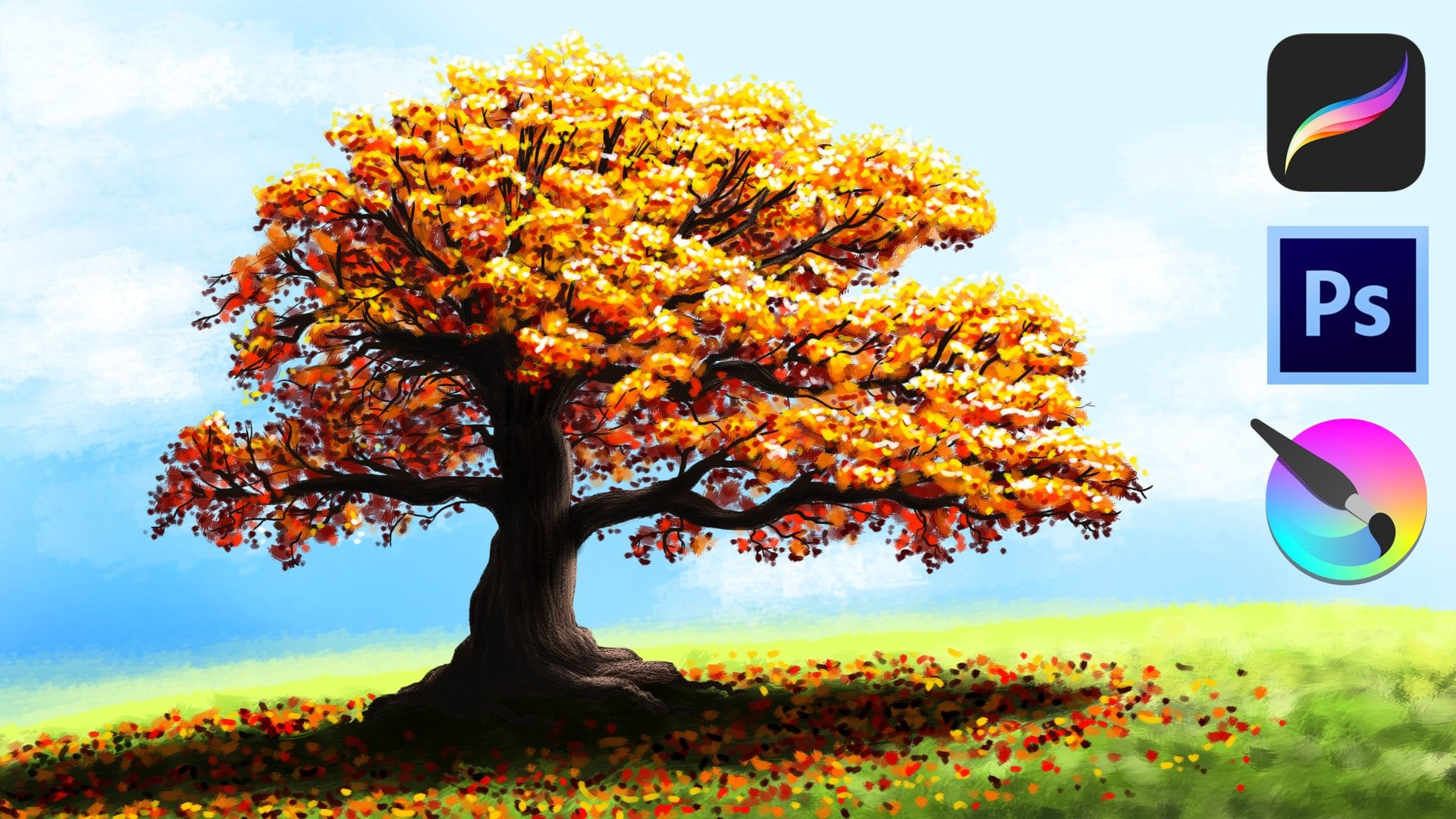
5. Artwork: Shape Tools: All right, right. Welcome
to artwork number three. Now we're going to make
something very abstract, literally just lines and shapes. So let's go, create a new image, and let's make it
vertical this time. So we have something different. Thousand 500 by 2000 or
something like that. Okay, then what's the
theme of our image? A completely abstract composition
based on shape tools, fill patterns, and gradients based on an analogous
color scheme. Technically, very simple, but
perfect for abstract art. So let's see what
we can do in Creta. First, select the
fill bucket tool and then some version of
very light brown. We have a base line color. Then this gradient tool, make the brown a little bit darker so it's more like gray, and then pull your gradient
from the top to the bottom. We have a nice color
transition just like this. Now, let's use shape tools
to start the composition. Whatever shape tool
you have selected, like this elliptical
shape tool right here, the edge of it always looks like the brush that
you have selected, and it also reacts to
the size and the color. That's something to keep in mind when using
your shape tools. You can always adjust
them however you like. Right here, let's just
make a new layer and add a few light thin circles. And then using the same color, a few straight lines
using the line tool. If you hold down shift
while using the line tool, you can only choose from very
few pre selected angles, which makes it very easy to create perfectly parallel lines. All right. Let's switch color to get a bit of contrast here. For this abstract artwork, I don't really have
any instructions regarding the composition, but I want you to just try
out these different tools and the different options for the shape tool and try to
make it look pleasing to you. But you can of course
use my image and my process as inspiration for
what you want to do here. First of all, I'm
just varying the size and the shapes a little
bit and trying to find some balance
in this picture by adding different lines,
rectangles and circles. I feel like a few small
rectangles would be a nice contrast to the big
shapes that are already there. Now, let's add some texture. For that, you can go
to the tool options of any shape tool crater and set it to be filled
with a pattern. You can then choose
from a variety of patterns up here on
this pattern symbol. And there are quite a few
interesting options here. For example, this
dot pattern would be fitting for our geometric
composition, I think. I'm adding a few rectangles with these dots in the middle. Then I'm using the
polygonal shape tool to create a more organic
shape for contrast. This one is really going
to stand out at the end. And then I'm filling it with some orange using the
fill bucker tool. For that, I have to set the
fill mode to contingous area. So everything of the same
color is being selected, which is the inside
of this weird shape. If you fill a contingoc area, there are always a few options
regarding the threshold, much of which color is being
filled and how much it spas and you can grow it or use the feather thing
to make the edges. I would recommend you just try out these different options
and see what you like. For this artwork, really
try to create many, many different shapes and use
an analogous color scheme, which means you only use hues that are next to each
other on the color wheel. So only red, orange,
yellow, and brown. As we're using many
different tools that create different
shapes and patterns, it would be a little bit
too much to also have different colors here like colors that have
contrast between them. So we pretty much
only want to stay in this analogous color range and provide visual interest
through the different shapes, and we're experimenting
with that. One of the main points of us creating this
abstract art work is pretty much just getting you very comfortable with
these shape tools, which are very, very
important if you want to make abstract
art long term. One thing that I
really like doing is using this contingous
area selection tool, the one that looks
like a magic stick to select an area inside a shape and then using the gradient tool to make a gradient
in that shape. That's a really nice way to
create some more detail. I am also experimenting a lot with different
fill patterns, but I'm trying to
still only select the ones that have this
very geometric style. I don't want any organic
textures like bark or rocks, for which there are many
options in critter. You always have to
mind the style of your artwork and keep it
relatively consistent. That's also a very
important principle that you should
not forget about. You can of co also experiment
a bit with different layers and create shapes underneath the ones that you
have already created. What's also funny is
selecting an area and then spamming shapes inside it
with different colors. I'm doing right here with the elliptical selection
tool inside the circle. If you don't want to choose
any pattern from crater, you can also just make
your own patterns. Or you mix both right here, I'm spamming many circles, and then I'm adding a pattern underneath the area. Also cool. When you add shapes in crater, you can also go to the tool
options and make it so they're already filled with a for brown color or a pattern. So I'm doing that right now, and I'm adding a few
small colorful shapes to have a bit of contrast and something
interesting to look at. This abstract artwork obviously
is completely abstract. But I believe you
can still achieve something by trying to keep
the composition in mind. If you want to make it dense, then make it dense. If you want to make it
directional and have round shapes on one side and angular shapes on the other
side, then you can do that. Or if you want to fill every
single shape in this image with an abstract pattern,
you can also do that. But, honestly, I
believe that having a healthy balance between round shapes and angular shapes, big shapes and small shapes, flat surfaces and patterns
and gradients all over the canvas is one of the safest ways to make it look interesting because you have, let's say, consistent
chaos on the whole image, and the viewer has something
to look at in every part. And yeah, for this
abstract artwork, I encourage you to go a
lot with your feeling. If you feel like
there is something missing in one
part of the image, then just add it a small circle, a line, a gradient, a texture. I've shown you how
to use these tools, so just put them together, practice using them and create a simple composition by
layering them all together. The only thing that
you really have to mind is use analogous colors. Please know blue or
green or purple here. Different shapes and
different shape tools means lots of stuff going on, and there is lots of
contrast already. So if you add even
more different colors that have lots of
tension between them, it just becomes too much. Use simple analogous
colors and you have the freedom to add pretty much whatever shapes
and textures you like. All right. Now I
think my picture has a really good balance. It has different patterns, different shapes
and it showcases all these different tools that allow you to create
easy abstract art. More options to make
these artworks of course to only use
shapes of one type, and then you can use more
different colors like only circles and you add gradients of complimentary
colors inside them, or you use many chaotic lines and make the whole
picture very dense, or you make an angular
puzzle picture where you just mix different
fill patterns together. You see these shape
tools and pattern and gradient tools are
very versatile. You don't really have
to do much to create an awesome abstract artwork that's interesting to look at.
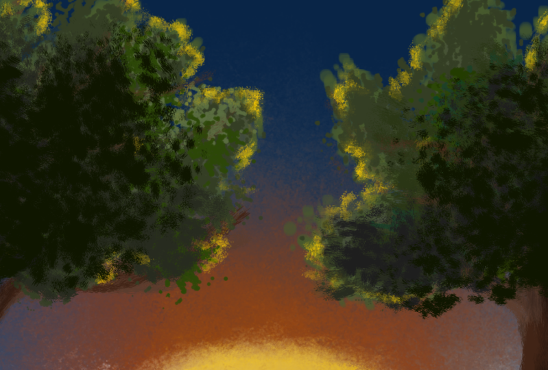
6. Artwork: RGBA Brushes: All right. Ladies and gentlemen, welcome to artwork number four, which is certainly our
most interesting and probably most complex
abstract artwork here. In fact, it's not even
completely abstract, but it goes more
in the direction of expressionism
and impressionism. But don't worry. It certainly
won't be realistic. I made sure the process
is still easy to follow. I hope you don't shy
away from this one. First of all, make a new image
by the size 2000 by 2000. We have a big square. Okay. Nice. Onto the special part of our image,
because right here, we are going to need the
RGBA and RGBA wet brushes. These are super cool brushes
that I'm using all the time, which unfortunately are
not in creer by default. As you can see, as
I'm searching here, there are only the
standard brushes and there is no RGBA category. So you need to download them. There is a link to
my brush bundles in the description that I want
you to click on right now. Download these
brushes, save them somewhere and then
click on settings, manage Resource
libraries, where you have a nice overview of
your brush bundles and you can import new ones. You can just click on
Import and then search for a brush bundle file that you've downloaded
like this one. Click on pen, and then it
should appear right here. These are my brush
bundles that I had deactivated for this course, but now I'm going to
activate all of them again. Then they should appear down
here in the brush stocker. The most important
thing is that you have these RGBA and RGBA wet brushes. If you click on
the RGBA category, then you should have
these brushes here. Get it done so we can get
started with the artwork. The theme of our artwork is a central expressionist
composition with huge value texture and direction contrast based on a double complementary
color scheme and created using
the RGBA brushes. As you can see, these
RGBA brushes produce very unique and very traditional looking
textures digitally, which is the main reason why I absolutely love using them. Let's start by selecting
dark saturated purple. This brush criteria, which
is really traditional, And then let's make
a baseline texture with horizontal bru strokes. And yeah, for these
RGBA brushes, it's actually important that you mind the direction
in which you paint. As you can see, you
can clearly trace that because it looks
like thick oil paint. So if you accidentally add
a vertical brutal here, then you can clearly see that and it kind of
ruins the texture. Smooth horizontal lines
are the way to go here. Nice. Now, let's choose the complimentary color of
this dark blue purple tone, which is yellow, and add a few smooth horizontal lines of that yellow in the middle. It looks something
like this. Then let's add a bit more variation
by adding clean, blue, horizontal brush
strokes at the top. You'll find that it's
quite simple to make very smooth color transitions
using this RGBA brush. Let's continue with this
pink right here and let's cover especially the
edges of our yellow spot. But let's make a smooth
color transition where the pink gets less
frequent at the top. Let's add a few
very dark purple, blue brush strokes at the top. And now you can probably already tell that this
is going to be a sunset. Let's paint the sun using this brush right here and white. Then in the very
middle of the picture, which is where there
should be lots of yellow. Let's make this
round, very small. As you can see, with this brush, you can very smoothly
pull the paint around and create these very traditional thick looking brush strokes. Let's move our brush around the dot with white
in a circular way, so we can create this
circle of sunlight. Apply very low pressure on your drawing tablet to
make it look very smooth. Vary the size of your brush
to create different levels of detail and use a few
different versions of yellow white and pink. Nice. On the very
outside of the thing, I'm using very thin brush chokes to make them fade
into the background. So very light pressure here. Also, don't worry about
the bottom part too much. Make it fade into the top part of the sky where we've
already painted, and we're going to take care
of the bottom part later. We're using a very lazy trick. Once your sun looks
nice and smooth, it has different
colors like this and smoothly fades into the sky, it's time to use this RGBA brush and paint a few white
clouds in the sky. Also very smoothly. Okay. Once you're done and you've painted
not too many clouds, let's scale down the brush,
make it a bit smaller, and then add a few
small reflections of yellow and pink
underneath these clouds. So it looks like the
sunlight reflects on them. Just a little bit.
Okay. Okay, cool. Now let's use the las trick to take care of the bottom part. Take the rectangular
selection tool and select the whole top part of your image until the
middle of the sun. Just like this. Then press control C to copy this and
control V to paste it. Then we have this
again on a new layer, and we can use the
transformation tool to pull the top part down. Then it looks like
we have a reflection of the whole thing in the
water. Just like that. Perfect. Now I'm
going to paint over the sun a little bit to
make it more smooth. Then let's click on this transparency icon next
to our new layer right here, so we can only draw and
paint on this layer. Then I'm selecting
this brush which produces very blurry
brush strokes, and I'm selecting just white. Then let's go over the
bottom part with this brush, very lightly with very low pressure on the
drawing tablet. For that, I'm actually rotating the canvas because that's
the angle at which can paint the best
straight lines because we need straight
horizontal lines in order to make this
look like the sea. You can do the same
by pressing four or six to rotate the canvas. Press five to set it back
to normal once you're done. But first, make sure that
everything is very blurry and very smooth with light
brush strokes with this brush. Beautiful. Now at the bottom, there is actually
a bit more space, so I'm adding more of
a color transition with a very dark color here. And now you can see we have a very interesting
composition already with a clear focus
point in the middle and a contrast of texture between
the smooth texture of the sea and the
more rough texture of the sky and the sunlight. And we also have a contrast
of direction between the lines of the half circle sun and the completely
horizontal sea texture. I'm going to improve
this image just a little bit with a few
different brush strokes. For example, I'm adding
more white lines to the sun to give it
a bit more intensity, and I'm also painting a few very thin
horizontal lines on the water where the sun is to increase the
contrast of direction. Okay. Okay, now our sunset
looks really nice. Even though it's not super realistic and has very
expressionist colors, and we've just used very rough brush strokes
to create it. But I feel like
this image is not complete yet because
on the sides, it's a little bit empty and
there is not much happening. Let's use a common compositional
tactic to enhance it. That is making the focus
points stand out even more by framing it with
a neutral element. Something like rocks, plants or even completely
abstract things. Right here, let's add
a few dark trees and bushes that reflect a little
bit of that sunlight. Make a layer pick this RGBA
brush and then select black. Let's make a few thick
rounded branches on the side that
frame our sunset. Let's add a few
brighter brush strokes to give them highlights
and make them more dense. Then let's create a few
smaller branches that grow out of the bigger ones and are a little bit more wild. Obviously, none of these
branches cover the sun, but they should go all around
the sides of our image. Okay, now, I feel like these branches are a
little bit too light because they point away from the light source and are
therefore very dark. So I'm pressing control you to open up this color
editing window, and I'm decreasing the
value of the layer. And now we have
even more contrast with the background,
which is very useful. And it's time to
add the foliage, for which I'm going to
use this RGBA brush, which makes these very thick
brush strokes, and yeah, just add a few
chaotic round bundles of foliage over these branches. I think if we use brush strokes that are as rough as these, it still counts as being
somewhat abstract. All right. Once it looks
something like this, let's make the green brighter, the brush smaller and add a few highlights on the
outside of these shapes. In order to determine where
to place your highlights, I recommend looking at
where the light source is, which is, I would say
quite obvious here. So, just a few green brush strokes for the first
level of highlights. Then let's switch back
to the brush with which we had painted
the sun because now we want to add a few more
intense yellow reflections on these leaves. This will give you this
more expressionist look. Make precise brush strokes with a relatively small brush on the edges of the foliage
that point toward the sun. You can see my brush strokes
are actually quite chaotic because I'm just letting the colors and the texture
of the brush do the work. Okay, now it's gotten
a bit too bright, so I'm adding a little bit
more dark green. Okay. Then let's go back to yellow and paint some bright
highlights with very thin lines on the
sides of the branches that you can see through
the foliage. Very simple. Just look at where the sun is, and it's quite obvious where you should
paint these lines. Okay, now it looks really nice. I'm adding just a
few more layers of small strokes to give
it a bit more detail. Then let's add a few completely white
brush strokes on the very outside to represent the intense reflections
from the sun. Literally just a few dots. Then I'm actually mixing
in a little bit of purple everywhere to represent
the reflections from the sky and from the sea. You can add more layers of these colors that we've
used using this brush to make your foliage more or less detailed or give it
more or less contrast. The important thing is
that the highlights point toward the sun. We have all of these
colors represented, and the sun is being framed by the way that the
foliage grows around it. And this makes the
sunset really stand out, even though we have
technically added more detail and more
things to look at here. But because everything surrounds the sun and points toward it and it stands out through all these different types of contrasts like value direction, and texture, we have no problem, and everything is clear. If we sum in on the foliage, it's very rough, very
chaotic brush strokes. This is still an
abstract art work. But because we have
varying textures, varying directions in which our brush strokes go
and varying colors, we have a composition with different elements that's
really nice to look at. We have a double
complementary color scheme with green and pink and blue and yellow that gives it a very rich
and complete look, then we have a
value contrast with the very dark plans on the sides and the white spot
in the middle. And then we have
three main textures that separate our image
into different parts. We have the sun with the rough circular
texture around it, then we have the
smooth horizontal C and the completely
chaotic foliage. That was a more
complex image and an example for how
you can create different things using
very simple brustrokes and very intense contrasts. I promise the next
artwork will be a lot more simple.
Let's check it out.
7. Artwork: Copy/Paste Objects: All right. Ladies and gentlemen, welcome to artwork number five. After we've exhausted our
creative capabilities in the last artwork, let's return back to
the basics and make something very simple to actually stick with the
theme of this course. Let's click our new
image and make something a little bit offset
like 2000 by 1,600. We have a little bit of
variation in the sizes of our canvases. Here we go. Now, the theme of our image is a comic style pattern that's
geometric and chaotic, very intense and
colorful and mainly created by copying
and pasting objects. We don't have to do that
much work and can just focus on making a nice
composition. Let's go. First of all, we have to
create our base line object for which we are going to
use very simple shape tools, and we will fill these
shapes with colors. First of all, select this
very clean brush here, so we have a consistent
size in our lines. Then make the size of
the brush quite small, like about seven to
ten pixels at most. Then use the polygon tool to make a very simple
angular shape. Something like this, not
too big and not too small. Then let's add a few more shapes that overlap with this one. We have smaller
individual shapes inside and outside
our base line shape. Use different shape tools here, like the elliptical shape
tool to create circles or the rectangular shape tool
to make well rectangles. Right here, the important
thing is that you're mindful of the
overlapping areas. The let's say density of your lines should be
quite consistent. You don't want any
parts where there are significantly more
smaller shapes that all overlap than in others. We just want a clean
geometric thing with overlapping shapes. I know it seems quite simple, but it's actually
important that you try to make the
density consistent, and that's actually not so easy. In the end, your shape should
look something like this. Then we can fill it with colors using the
fill bucket tool. Set it to fill with foreground color and
adjust the threshold, so you can cleanly
fill these shapes without any transition area between the color
and the outline. Regarding the colors,
let's only use super saturated ones and ones from all parts
of the color wheel. I know I praise
color schemes a lot, and this is not a color scheme. But when you have a very
simple geometric shape like this and you just want to create
something completely abstract that doesn't look
like anything in real life, then you can actually make
very colorful pictures, which is what we're
trying to do here. Our image will be very
intense in terms of color, but due to the simple
geometric flat shapes, it won't be too overwhelming and actually represent
a unique style. Okay, I'd say that's
a solid basis. Now it's time to copy
and paste our object by pressing control C to copy it
and control V to paste it. Then we have it on a new layer, and we can use this
transformation tool to transform this layer. For example, we can
rotate our object, we can move it
around by dragging it and put it in a
different place. And we can also
scale it up or down, make it bigger or smaller by
dragging the corners of it. Let's just put this
one right here. Okay, so let's paste this
object a couple of times. Your new object will always appear where the
original one is, and then you can use the transformation tool
to move it around, scale it up and
down, or rotate it. And that way, let's create a simple like comic style pattern. Now, I know this looks
and sounds very, very simple and
technically, it is. But there are still a
few things that you should mind in order to
actually learn from this. Number one, of
course, once again, this is a pattern, so try
to make it consistent. There should be a
consistent density of detail on the whole layer. Then also very important, have a good variety
of rotations. If you have the same object
over and over again, but you just rotated by
ten degrees every time, then the pattern looks
a little bit weird. You really want this
object to go in totally different directions on the whole picture
and consistently. It actually looks very
chaotic and interesting. Yeah, this is actually
a bit tricky to do if you're not an experienced
pattern designer. Here's a small tip of mine
that you can use to ensure you have both consistency and
variety on the whole picture. This is useful
every time you have a pattern with
repeating objects. Look at just one small part of your object and compare it with the other
ones of its kind. For example, let's look at
the light blue spike here. This one stands out, so it's easy to recognize
it in the whole picture. Try to look at all the
light blue spikes at once. Now, if you notice a
place where there are less light blue spikes or you don't recognize one in
one corner of the image, then you should probably
paste another object there. Just look at one small shape and try to recognize it
in the whole picture, and you have a very
efficient method to create consistency. Regarding variety, I
would do the same thing. Look at one small object
like this light blue spike and recognize how it's rotated
in all parts of the image. If there are two
light blue spikes next to each other that
point in the same direction, then you should probably
rotate one of these objects, and that's it. Same
thing with size. I'm just varying the
size of this object, a little bit like I don't want any super small or super
big ones of these objects, but just a little bit of
variation in the size. If you notice that
in one part of the picture, there are multiple, very big blue spikes, then you should probably scale down some
of these objects. The thing is, you
can decide yourself, how much density you want
to have in your image, and how much
variation you want to have in the sizes
of your objects, whether you want a mixture of very big objects and
very small objects, or if you want to keep
them a little bit more close together
like I'm doing it here. But no matter what you do, you always have to ensure
you have both consistency and variety by applying the technique that
I've just shown you. Look at a small individual
part of the picture, try to recognize a pattern and then decide if you need
to change something. Now this thing is
pretty consistent. I'm happy with the density, and we have a good variety of different sizes
and rotations. Now I'm going to merge all my layers together
by pressing control. There are many layers by now. Then you can choose if you want to change something
about this picture. For example, adding something
in the background like another color or selecting some of these areas and
filling them with a pattern. But honestly, I think a pattern would be a little
bit too much here. I'm going to stick with
these clean shapes. I also really like this
light blue background, but I think white is still a little bit better.
But that's just me. You can change
something about this picture as long as you have consistency and variety to make this very basic
pattern look pleasing. That's it. Very simple artwork. I hope you enjoyed
this one and then when you're ready,
move on to the next.
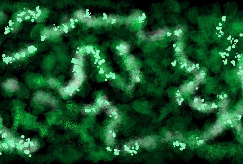
8. Artwork: Snowflake Patterns: Artwork number six, our
second to last one. Now let's move on to
something that's actually a genius trick to easily create pleasing
patterns in crea. I'm very grateful that
this tool exists, so Shoots to creta. All right. Without further
ado, let's create a square image 2000 by 2000. Straightaway, let's select
the secret weapon for abstract patterns ret
the Multi brush tool. Just select this tool,
paint a little bit, and see what happens.
Isn't that beautiful? This tool takes your brush and multiplies it around
a central point. So you can easily create
beautiful snowflake patterns, even if you just
scribble around. You literally have to do nothing to make something
that looks nice here. But of course, for this artwork, we are going to
make it even better by applying a few
extra techniques. Otherwise, it would be a
little bit too simple. For this artwork, let's already activate wraparound
mode up here, so we have a repeating
pattern. All right. First of all, you should know
that you can change things about this pattern by
going to the tool options. For example, you can change
the amount of brushes like the number by which your brush is being
multiplied here, which is very useful to know. And you can change the type of the multiplication to symmetry. You have a point symmetry instead of a snow flack pattern, which is actually
a different thing. Okay, what's the
theme of our artwork? We are going to make a detailed repeating
snowflake pattern that has lots of texture, a value contrast,
a line contrast, and is made using, well, the multi brush tool. So let's do it. Go to the tool options of your multi brush tool
and make sure you set it to snowflake and
about nine brush strokes. In order to get a good
base line texture here, make sure you have wraparound
mode activated and then pick this RGBA brush that we've used for our
fourth artwork before. Sorry, I just really
like this brush. If you absolutely want, you
can also use another brush, but I definitely recommend you use one of these RGBA brushes. For this artwork,
I'm selecting red and I'm moving my brush
in a circular way. As you can see,
crater lags a little bit behind and it
takes the program a little bit to load the texture because this brush
is quite complex, it has a very detailed shape. So, it takes Creter a
little bit to calculate it, but it definitely works out. We just want to cover
the whole thing with these thick dark red oil
paint brush strokes. Very nice. Now, let's make this brush a little bit
smaller and a bit brighter, so we can add more detail here. But actually, I'm just adding a red daughter in the middle, and then I'm working
with a darker color. The goal here is to make
it look a bit like a rose, but still abstract, obviously. Feel free to
experiment a bit with different sizes of
your brush strokes and different tones of red. Now, this looks pretty nice, and I'm sure you can produce
something that looks quite similar quickly.
But you don't have to. You can also take
your time. But I find it that with this
multi brush tool. I often end up with things
that I like very fast. Once you have a rough
flower shape like this, let's switch the
mode to symmetry. We have a bit of contrast
in the direction. Also, let's change up the brush to get a
different texture. First, let's move around the brush strokes
counterclockwise, so we have a little bit of
consistency on this layer. Then let's add a few
darker brush strokes. Then let's spice
it up with pink. I'm switching brush
and making my brush strokes way
smaller in the middle. That way, we have
a bit more detail. Also, let's add a
separate flower texture to this dark part that
is also being repeated. But just a little bit, so we have still a contrast
between two flowers, one being and one brighter. Now, let's add our
line contrast on top with very thin white
brush strokes. Try painting them
very dynamically, so they look flowy and smooth and start on the inside and
then pull the brush outward. I think the best way to make these really nice
snowflake patterns. Also nice is, of course, adding a value contrast with to make the pattern
even more detailed. Yeah, that's pretty good. You can switch back and forth
between black and white to create very thin details. Honestly, right
here, I don't even have any precise
instructions anymore. You can just stop at a point
where you like your pattern. Personally, I feel like a little bit of blue
would look nice, especially on that
second flower, which you can see in wrap around mode, that is a bit darker. Then I'm adding a bit
more contrast in detail with thin black and white lines. Honestly, when making patterns with this snowflake artwork, you don't have to follow
that many design principles. Keep it nice and simple, add a little bit of detail
with thin brush strokes, and you're mostly good to go. But if you make
it very detailed, a color scheme is definitely
not the wrong choice. So you don't overwhelm
the viewer with different colors and
different lines and shapes. Both contrasts would
be a bit too much. Right here, we just have a
simple analogous color scheme ranging from red to blue with a bit of pink and
purple in the middle. The main contrast
is the one between the thick and thin lines and
obviously black and white. Nice. Also, I feel like this is a good point to talk about when to stop when making
an abstract art work. Because, honestly, it's
quite tricky when you don't have anything
realistic to depict, when you just know
when it's finished. In completely abstract art where you just have
lines and shapes, you can just always add
more because why not? And to be totally honest, you can pretty much only
go with your feeling here. So you just have to practice practice practice and make many, many abstract artworks
in order to develop a feeling for when you
have to stop with them, which is one very good
reason to know how to make simple abstract
artworks because then you can get a lot of volume and make many many artworks without spending too much time on them. Get the art and design
concepts right, use interesting contrasts and use the techniques
that I've shown you. So, finish this artwork, and then in the last one, let's explore how to mix multiple techniques
together. See you there.
9. Artwork: Combining Styles: Ladies and gentlemen,
it is already time for the last abstract
artwork of this course. I hope you enjoyed it so far. Let's make a new image
with four K resolution, so we can make it
a worthy finish. But you can, of
course, also choose ten ATP if your PC
is not so fast. All right, what's the
theme of our artwork? A freestyle composition
using all kinds of tools, a split complementary
color scheme, and filters and layer styles. So all kinds of stuff. Let's do it step by step. I'm going to start
like I often do by just scribbling with a
brush that I really like, and I find interesting in
that particular moment. So I'm just going
to add a few of these round organic objects with this very
interesting ink brush. And yeah, you can pretty much choose whatever
brush you like here. Just add a few basic lines that you feel like look
somewhat interesting. And also, I'm just going
to say this straight away, you don't have to worry about
the style of your lines, like whether the textures fit together when you use
different brushes or something because we are going
to apply filters and layer styles to make the
whole image consistent. Just look at the colors
and the shapes that you're producing and don't worry too much about the
textures of the brushes. They are mostly irrelevant here. Right now, you have
lots of freedom here. I'm going to add a few colorful shapes on
the layer below. And then I'm pressing
control you to colorize them and make
them fit together better. I would say make everything
that you've added so far green and the next layer
of brush strokes red. Other than that, you can
add whatever you want, shapes, lines, textured
brush strokes. But try to use the
same colors as me. So you have at least a color
scheme that you can rely on. A color scheme is one of the safest ways to ensure
that something looks good, even if the shapes
are totally chaotic. So, right here, after adding
these big red circles, I'm adding a little bit
of green to make it look like plants are growing
in these black shapes. That's just a spontaneous
idea that I had. And I really like this style. So I'm going to
add a few more of these black chaotic lines
that produce organic shapes. And then I'm adding a bit
more green behind them. At this stage, just
go with your feeling, use the same colors as me and
use very different brushes. So you have interesting
textures and shapes. And right here, this
is supposed to be a completely
abstract composition and not a consistent pattern. So you don't have to add the same things in
the whole canvas, like we've done it with
a few works before. For example, you can just add more green things on
one side of the canvas, right here, I have more green on the right than on the left. I'm adding a few completely unique red circles that are not anything like symmetric or consistent on the whole
picture or something. Literally just what I think
would make a nice balance here and what I feel like
would be pleasing to look at. I know right now it's not
super pleasing because we have total chaos
with the styles. We have these clean
geometric shapes and these organic textures
of the brat strokes, and they don't
really fit together, but that does not
matter right now. We will take care
of that later on when we apply filters
and layer styles. So right now, just have fun with your image and add
whatever you like, as long as it's green
or red or black, which is unneutral color. What I always like doing for
these types of compositions, where I have different styles
is dragging paint by using these texture
manipulation brushes like this RGBA brush right here. If you paint very
smoothly with this brush, then you can drag paint over the canvas and make
it very smooth, which I really
like in this case. Okay, once you like
your composition, let's do something a
little bit different. I'm copying and
pasting my top layer, moving it just very slightly with the
transformation tool, and then I'm lowering
the opacity. So everything looks
very blurry right now. Then let's merge all
the layers together, except the background
layer, which is locked, and then let's apply
a filter so we can make the whole thing a bit
consistent once again. Let's go with the
oil paint filter. Rush size three, very
smooth and click on, and then it loads a
little bit because Creta tries to apply this filter well and to all
parts of the image. We got to be a bit patient
here to see the result. Nice. Now we have the
oil paint filter, and if you press undo and redo, you can see the difference. Before, we had a lot of different styles and textures and now they are all a little bit closer together
and the image is more consistent because
the oil paint filter has made it more smooth. Now, let's complete the split
complementary color scheme by making a new layer underneath this one and adding a small light blue gradient in the background in just
one part of the image. Okay, cool. Now, let's go back to our main layer
and apply a layer style. Layer styles are very
interesting methods to make layers up
here a certain way. You can, for example,
make it glow inside or outside or add a drop shadow like I'm doing it right here. You have many settings
for what you can do. You can change the distance that the shadow has from the layer. You can change the opacity, how much it spreads and
all kinds of stuff. Quick recap what
we've done so far. We've created a wild
composition with lots of different styles and textures and shapes and lines. Then we've brought
all of that stuff closer together by
applying a filter, so everything looks more
similar and then a layer style. Now we have a quite
consistent picture that follows our color scheme, and we can keep working on it, and we have actually lots of freedom, what
we want to do now. As we have a quite interesting
baseline composition. Let's use these paint
dragging brushes. I don't really know
how to call them, but these white ones right here. Because with these brushes, you're not adding any new paint, but you're manipulating the
paint that's already there, which is perfect for our use. As we have a very blurry image, let's make it even
more blurry by dragging the paint
with these brushes. I especially like
this one with which I'm painting very
dynamically right now. At this point, as we have merged different styles together and
the picture is consistent. Once again, we actually
have to comply. Everything that you add
also has to be consistent. So when we scribble
with these brushes, we have to scribble
on the whole canvas. That's our insurance
to make it look good. All right, now our picture is very blurry and very smooth. It looks okay because we have a split complementary
color scheme, a bit of black on the
white background, which is a value contrast, and we have a variety
of colors and shapes. As you can see, this whole
thing looks really organic. There are no more clean
geometric shapes, but everything flows
around. You know what? Clean geometric shapes would actually be a nice
contrast to that. This is an opportunity
that we cannot miss. Let's combine the style
that we have right now with a few clean
geometric shapes. Let's make a new layer and add just a few black
lines and circles. Really just thin black outlines. We don't want any fill with pattern or fill with foreground color or something like that, because we already have
a dense composition and just want to add a little
bit of shape contrast. But you could also call
this style contrast. Also sounds cool. But I hope that you know
what I mean by that. We have this one style
that's consistent and very smooth with these
organic colors and shapes, and that's certainly a style. You can save your image at this point and
be done with it. But because we already have quite a few artworks
with one defined style, I thought for the last one, let's combine
multiple styles and make a new layer with
clean geometric shapes. Very simple, very thin lines, but still we can produce lots of interesting
contrast by doing that. This is actually how many
abstract artists work. They have one thing, one
style, they make a painting, and then they totally
change it up by adding black paint on the left half of it or by adding a new layer of shapes
or something like that. It's the same thing in
traditional and digital art. You can always combine
different styles to make something interesting
when you're not happy with what
you've already made. But be careful when
you already have different styles and
different layers where different
things are happening, then I would say
using a color scheme is almost a must
because that's one of the safest ways to make
sure different things look good together when
they follow a color scheme. Using different styles
is always risky. I know it has lots of
potential and you can create very beautiful things with it and be super creative, but it can also lead to too
much going on in your image, and this can lead to confusion. If you combine different styles and different
methods of creation, then at least use
a color scheme. You know what's
also a nice trick importing one method of creation from one style
to the other one. Like right here, I'm using this paint dragging
brush that I've extensively used before to now manipulate these
geometric shapes. I'm always starting on a black line and then
pulling my brush down to make it look like paint is dripping down the canvas. That's a pretty cool effect, try it out and make it
consistent on the whole thing. Make the paint drip
down on the left side, on the right side,
at the bottom, at the top and in the middle. Consistency is, as you've
probably realized by now, one of the safest insurances
to make an artwork pleasing when you
have this combination of variety and consistency. Different things going
on on the whole canvas, like a variety of shapes
and colors and all that. But still they all
follow the same theme. I know all of this
sounds really abstract, but come on. This
is an abstract art. I'm just trying to
explain somewhat what I'm thinking when
making these artworks, and I hope that you can
learn something from that. So in this picture, I've shown you a few different
ideas for how you can combine different styles
in one abstract artwork. I hope you enjoyed this one. In the next lesson,
let's look at our artworks and review them. So we can recapture everything
that we've learned, and I'm going to show
you how you can make more abstract artworks
using the techniques that I've presented you
with. Let's go.
10. Recap & Analysis: That's it for the practical
part of the course. It wasn't too hard, was it. Anyways, I hope you enjoyed it, and you have participated. I thought it was pretty fun
to make these artworks. Now let's review them. I'm going to do a
little recap of every artwork and summarize
what you should have learned, especially let's talk
about how to make more versions of these artworks using the same techniques. B this course is not meant to just give
you seven artworks, but give you the
tools to create as many as you like. So, let's go. Let's start with the
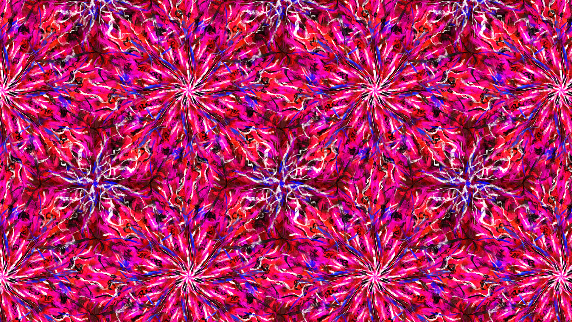
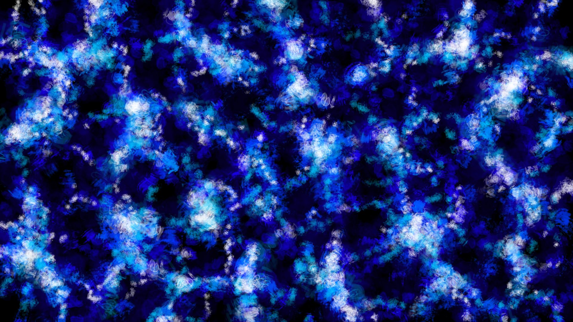
first artwork that I've called deep sea because we
have this very dark blue, and that's just what it
looks like in my opinion. We have created this one by
basically just scribbling with different texture brushes and working with
different layers. And as there are countless
texture brushes in crater, especially if you
take into account all the brush
bundles that you can download, you can make many, many different looking
versions of this artwork by literally just doing
the same thing that we've done in the course. Starting with a dark color
and big brush strokes to define the composition and the type of pattern
that we have. And then making the
brut strokes a bit smaller and lighter for
every layer that you ad, and of course, make
every layer consistent, so we have a smooth pattern. You can use a different color. You can use different brushes. You can use a different density, and you can even do
stuff like mixing in a complimentary color on one layer or
something like that. But as you can see,
just one color and a simple value contrast, bright and dark already
works very well. By just using very simple design principles
and texture brushes, you can already create many
different awesome patterns. That's what this one
is supposed to show you. Artwork number two. Right here, we've used
Crea's selection tools to create clean
geometric shapes. In terms of surface
and composition, this one looks very different
to our first artwork. But the process was actually quite similar,
if you've noticed that. We first add our
baseline texture, and then we just add
more layers that all have slightly different
patterns and density, and we make every layer
consistent on its own. The branches are consistent, the leaves are
consistent, the berries are consistent, always
the same thing. We just have to make sure that all the layers fit together by using the principles
of art and design. The first artwork, this was quite simple as we've just made the layers brighter
and brighter to have a value
contrast at the end. But here we actually have different types of contrast
for different layers. For example, a small
value contrast on the branch layer,
as you can see, it's a bit darker, the
berry layer stands out especially because here we
have two types of contrast. First of all, of course,
a huge contrast with pink being the complementary
color to the slight green. Then we also have
a shape contrast because here it's the only layer where we have
circle round shapes and on all the other layers, they are very angular. That's what we did
here. And you can make countless more versions of it by using different
types of contrast, different colors or different
methods of creation. As you can see, this process
works the same way with selections or texture brushes or also other
methods of creation. Like, for example, shape tools with which we have made
our third artwork. But this one obviously did
not follow that same process, but it's something different. I'm going to be totally honest. This was mainly a demonstration of different functions
and tools in crater, like the gradient tool, the patterns, all these
different shape tools that you can change in the tool options and
stuff like that. You can of course apply the process of the
first two artworks, working with different
consistent layers to the tools that
you have seen here. So you could have also made a berry layer with
these shape tools, or you could have made one of the layers have
patterns consistently, or you make all the
shapes on one layer, have a gradient on them, and then the next layer, you make consistent
textura strokes. You see, there is
an infinite amount of possibilities that
you have already. But this artwork shows you
that it's also fine to work completely chaotically and just do what you feel like. This is abstract art
at the end of the day. The composition can also
be completely authentic and up to you without any principles or
recognizable patterns. But one important
thing here was that when you have very chaotic textures and shapes
and all that, don't add chaotic colors. As you can see, we have just a very simple
analogous color scheme, just warm colors and
not too saturated. So what you can
take away from this is you have lots of freedom in one aspect of your
artwork if you tune it down in others and be a
bit more conservative there. So, right here, we
have all kinds of shapes and textures
and patterns, but very simple and
very calm colors. So it's not too overwhelming. And in this course,
we've also made an artwork where it's exactly
the other way around. Maybe you know which one it is. But first, let's move
on to the next one. The purple sunset. Oh, we definitely
a strong contender for being my favorite
one from this course. Maybe you absolutely hate it
because it's not completely abstract and you feel
betrayed, and that's fine. But I still felt like throwing this artwork in
here because it's a perfect demonstration of these different contrasts and especially the RGBA brushes. These things are super
useful for abstract art. So the first thing
you can take away from this artwork
is that there are RGBA brushes in creer that are
super cool. So here we go. But I would say it's mostly about the composition and tying together different parts of an image by using art
and design principles. So here we don't
necessarily have different layers that are
just over each other, but we have separate
parts of the image, like the foliage on the
outside, the sun on the inside, the sea, the sky, and all these elements are
unique in some way. For example, the sea
is very smooth and horizontal because we've used the special brush to
make it that way. The foliage is very chaotic and the brush
strokes go in all sorts of directions because
we've scribbled around with a
different RGBA brush, and the sunset is very circular and points
toward the middle, because that's how
we painted it. Here we have lots of
different textures, especially, and we have
lots of different colors. But we still have focus and unity because we
did a few things. One, we used a double complimentary or
tetratic color scheme to tie together the colors. There is harmony, even though we have lots of
different colors, and the different
textures in the image don't just randomly
appear in random parts, but they are clearly separated. We have the smooth sea in just the bottom
part of the image, then the rough circular
sunset in the middle and at the top and the chaotic
foliage around it on the side. Additionally, of course, we have a huge value contrast
between the white sun in the middle and the
very dark foliage on the outside that surrounds
and points toward the sun. It's a very simple and
itchy composition. I know. But I think that's the best way to teach
these principles. You don't always have to make a super deep and
original composition with abstract symbols
and meanings. You can also just make a sunset and make
it stand out with different types of contrast and apply a few different textures to different parts of the image, and it somehow looks pleasing, even though you use very
rough brut strokes. What do we have then?
Our copy paste image. I called it throwing a
stone at the church. That's the only
thing I could think of here because it looks like these colorful church windows where they
are shattered. Yeah, this was definitely a very simple artwork
in terms of effort. Because I wanted to
show that when you have efficient objects like this and you copy paste them
in a smart way, then you can very quickly
make pleasing patterns. The options here should
be quite obvious. Just make different objects that have different
colors and shapes, copy paste them and
see what happens. I've talked about
the tactics that we can use to make it look
good in the lesson, so I'm not going to repeat that. But the interesting thing
is that this artwork uses the same principle
as our third artwork, just the other way around. That's the principle
of when you have a lot going on in one
aspect of your image, tune it down in others. In our third artwork, we had lots of shapes and
textures and patterns, but very few colors. Right here, we have
the total opposite. We have wild, bright saturated colors that don't
even follow a color scheme, but the colors are clean. There are no patterns
and transitions, just colorful shapes,
and that's it. You can try mixing in a few patterns or gradients
in these types of artworks. But yeah, it's pretty difficult to make it work when you already have so many different colors. Better stick to the basics. Either use a color scheme or if you want to use many
different chaotic colors, then tune down your
image in another aspect. Okay. All right. Next up, we have this snowflake roasting, which I also have as a pattern here because
it perfectly repeats, this one is basically just
about this multi brush tool, which is super versatile, and it's super easy to make nice artworks with it by just
using different brushes. But what you should learn here
is you should still apply the simple art and design
principles like value contrast, line contrast, shape contrast, all these different things, and we've used a
couple of them here. Especially value contrast
with black and white, and we've used a nice
analogous color scheme, color scheme, of course,
also always good. You should know that by now. And yeah, basically, I just hope you feel
inspired to make many of these snowflake patterns now because it's very quick. You can just experiment with different amounts
of bras strokes and switch back
and forth between snowflake and point
symmetry. So here we go. This is a very simple
one. And the last one, we have the yawning garden, our artwork where we have
combined different styles. And I hope you
understood how we did that because it was a long
lesson where I talked a lot. But yeah, basically, we just did different chaotic things and made an authentic composition. Then we made it all
consistent once again by applying a simple filter
and a layer style. Everything has roughly
the same look once again. Then we scribbled around on the whole layer consistently to make it a bit more smooth, and then we added another layer with these geometric shapes, also consistently,
and then we dragged the paint off this layer
around to once again, give it a more unique look. That was a combination of many different tools
and functions of creer. Using the tactics
that I've shown you, we've made it look
somewhat consistent while maintaining a unique composition with
different styles. Once again, because we have lots of texture and lots of
different shapes here. We use a split complementary
color scheme to create color harmony and not make the whole thing
too overwhelming. So, here we go. That's pretty much all I have to say about
these artworks. At the end of the day,
they are abstract, so you don't have to
interpret too much into them. I just hope that I could
communicate some of these art and design
principles to you and give you a little insight into
what an artist and designer thinks when
making abstract art. Thank you so much for listening and potentially participating.
11. Outro: All right. That's the end of our little abstract art
course. I hope you enjoyed it. I hope that you understand what this course was
supposed to give you an understanding that when you know a few
basic principles, you can get super creative with simple tools and functions in
a free software like Creta. We got seven
practical examples to show how different
your artworks can be. Nice. Now you can
go out there and make lots of abstract artworks. However, before you leave, let me add one more thing. This is really important
to understand. Abstract art doesn't have any fixed rules because
at the end of the day, it's art, and we don't
want to restrict art. That's never a good idea. I know in this course, I've
talked a lot about rules and principles and things that you should
and shouldn't do, but at the end of the day, you can also just go out
there and make whatever you like without adhering to any
art or design principles. It's fine. These principles from color theory,
contrast theory, and this composition of stuff
that we've talked about are pretty much just there to help you as an extra option. They are like a safe bet and an insurance that your work
looks pleasing to others. If you just make two
consistent layers of shapes or brush strokes and you use a little value contrast
and a color scheme, you pretty much already have
something that looks nice. You can, of course, expand
that and do a little bit more by using different principles and different tools
that I've shown you. But if you don't do
that and it still works out, then
that's also fine. The problem is just when
I see many beginners or even more experienced
artists try to make abstract art and they only
go with their feeling. This often just
doesn't work out, or it looks very weird. Even more often, you don't
even know what to do, and you have to wait for the magic spark of
inspiration or whatever. Using art and design
principles and the step by step processes that I've shown you is just way more
reliable than that. I didn't go too much into
detail about color theory and contrast theory and stuff like that because those
are big topics, and I teach separate
courses on that. If you want to dive deeper on these topics, then
check them out. I think they're
really interesting. But still in this course, you've gotten a nice overview of how to apply
these principles to abstract art and how to use simple functions in
Creta to create it. Thank you so much
for participating. Leave a review and
tell me how you like the course or if I
forgot something. I'd be very thankful
for that because I'm always looking for
things that I can improve. With that being said,
I hope you have a good day and
have fun creating.
 Duplo, Designer, Artist