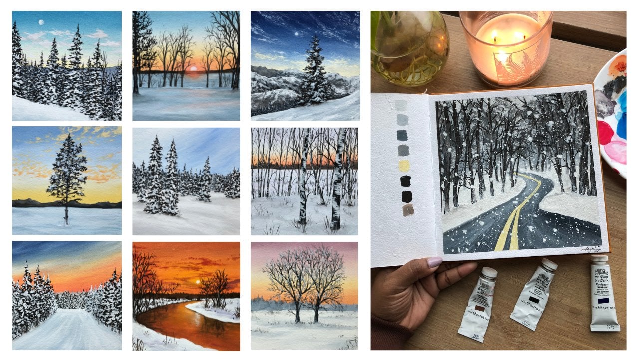
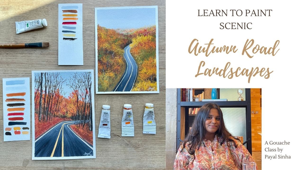
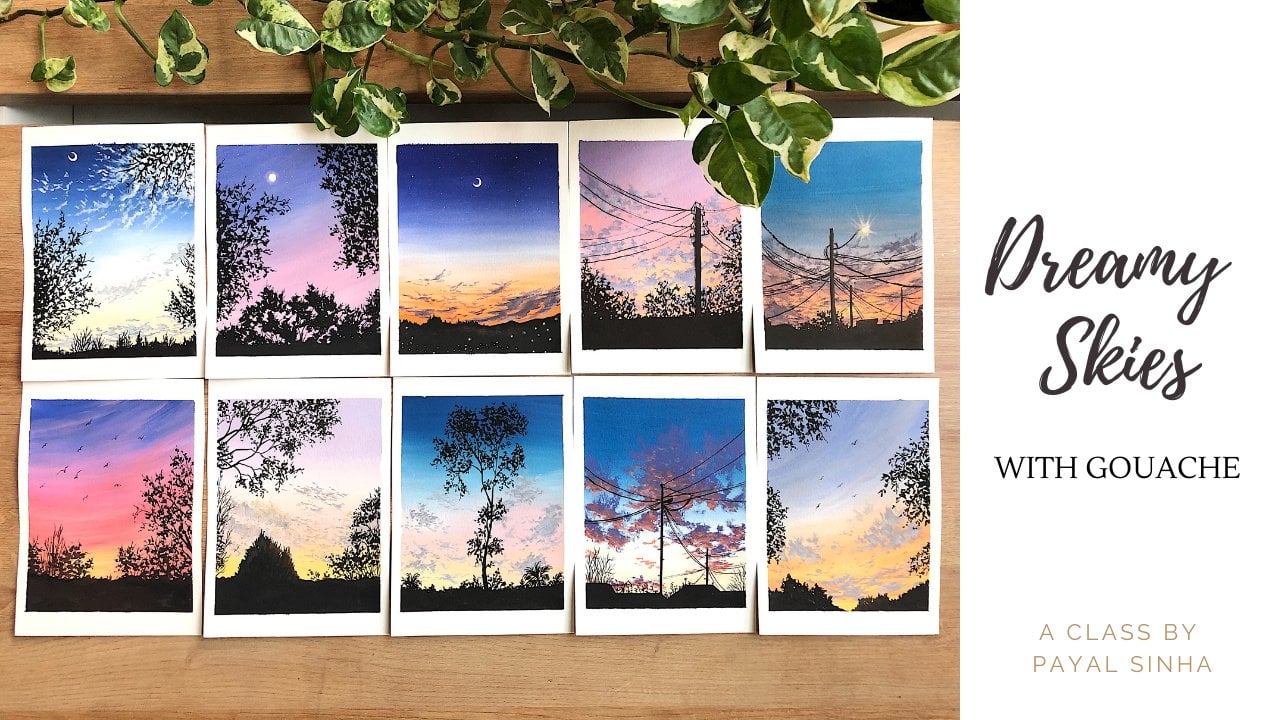
Transcripts
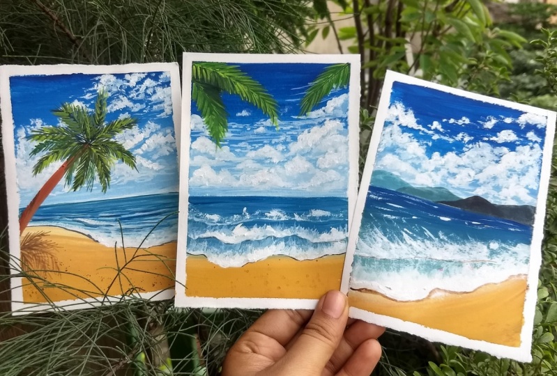
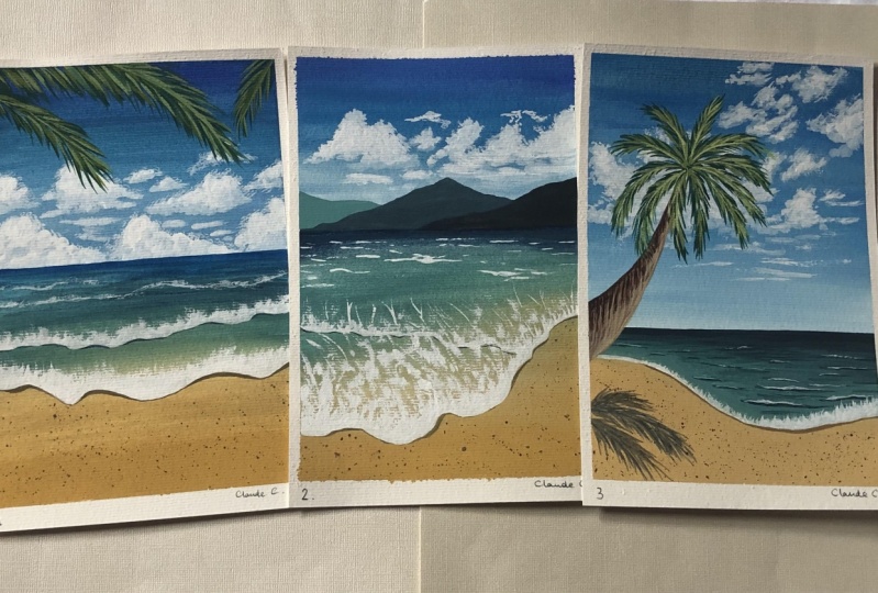
1. Welcome to my Class! :)): Today, we all Mr. times when we could call it the beach, deeper feed and water. What's the beautiful clouds pass by and listen to the families Russell against the wind. If you're someone who's been missing beaches as much as I am, then this class is just for you. Hello everyone. My name is bile. I am an artist and instructor based out of foreign, originally from India. And welcome to my first Skillshare class. You can find more about me and what I do in the About Me section of Skillshare. The medium of choice for this class is going to be guage. It is a medium between acrylic and watercolors with beautiful properties to offer. If you are someone who has no prior knowledge and it's still a beginner at this medium. You can come in and join me in this class and learn so much more from here. We're going to be discussing about all the supplies that we need in detail. So the brushes, that type of people that we use, everything will be covered. We'll then move on to learning for basic wash techniques. So we learn consistency, blending, layering and the dry brush technique that is going to help you understand medium better. We'll then move on to learn three elements. That is, we'll learn how to be in the Cloud. We'll learn how to paint the waves and add these beautiful form detailed store it, will then move on to learn palm tree. So we'll learn the entire palm tree in detail. And then using this knowledge of the techniques and the elements, we learn how to paint three beautiful, bright and blue landscape Polaroids. So these Polaroids and these artworks are going to satisfy your need to be at the beach. Everything in this class is explained in real time. So you can follow me step-by-step and learn how to paint these paintings. So without further ado, let's move on to the first class.
2. Gouache Overview: Before we dive into the class, I thought of giving a quick introduction about the medium, squashes and opaque medium, often referred to as opaque watercolors as well. It is a water-based medium, and once it dries, it leaves a beautiful matte finish. It shows properties of relics in a way that it can be beautifully layered. And properties of watercolors as it can be thin down to the watercolor consistency as well, to get a lighter tone of the color, instead of adding more water like we do with watercolors, we add white. Adding more water will make the consistency tenor, and it will appear more like watercolors. Since we add white to get lighter tones, always keep extra tools of white with you because white seems to get over a lot quicker. I have two big tubes of titanium white from Brewster. As I mentioned earlier that Gorgias a median between acrylic and watercolor. It is important to us to understand the consistency for the layering. That is important because the guage can be reactivated with water and we don't want to disturb the base layer while we are working in layers in guage, not adding enough water will make the blending difficult. And adding too much water will make it act like watercolors and it will lose its obesity. One advantage of working with gouache is that it dries quickly, which gives us enough time to go over in multiple layers in small period of time. Another advantage, of course, is that you can always cover up your mistakes by going over it with another layer. So if you don't like something, can always change it either by blending it or adding another layer of it. Quash gives us an opportunity to work in both ways, from dark to light and light to dark as well. And that is why a lot of artists and illustrators love using quash in their projects. And this was a small overview of the medium wash. In the following lessons, we will discuss the different techniques in meetings which will give you a better understanding about the medium.
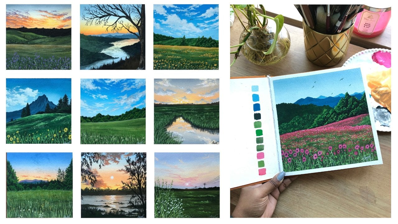
3. Materials Needed!: Let us discuss all the supplies that we will need for today's class. First, for the quash, I'm using two different brands here. So I'm using bruce, those titanium white. I'm using titanium white because it's a really bright white with Thai obesity and tinting strength. So this makes our clouds look very vibrant and even the waves look very vibrant and it's good for color mixing. Next, I'm using the Winsor and Newtons, yellow ocher and burnt umber. Now a combination of these two colors will be used to make the trunk of a bomb trees and also the sand beaches. And we have these two colors with hue. Next, we have sap green. Now sap green we're using, going to be using for the palm trees leaves. Obviously. Next we have lemon yellow. So the lemon yellow is very important because a combination and a mixture between the lemon yellow and Prussian blue is going to give you a taco Scala, which I will show you exactly how far though. And so make sure you have Prussian blue, lemon yellow with you, a primate in glue and lamp black. So these are the few colors that you need. You can use any brand that is available with you doesn't have to be the same. Grande. Next, I'm using watercolor paper by Strathmore. This is a 300 GSM, 100 percent cotton paper. You can use your 300 GSM, 25 percent cotton paper as well, because gosh is functional and are also offices, it doesn't have to be a 100 percent cotton. Next for the brushes, I'm using a combination of flat filbert and round brushes. So I have the sizes 810 and 14 if I'm not wrong. So these are the flat brushes that I have. So you can use any flat brush that you have with you. Next, make sure you have a filbert brush. Filbert brushes are the ones that have rounded edge, but they look like a fat flat brush. So make sure that you have a filbert brush with you, and that is for creating the clouds. Next, I have two different detailing crashes. One is a size two round brush and a size one liner brush. This is just to add the extra details on our painting. Next, I want to show you guys about the mixing palette. So this is one of the mixing by that I've used are ready for the class. So this is a ceramic mixing palette. You need two jars of water, one for clean water supply and one for cleaning out your brushes. Also make sure you have a cloth with you or even tissues to wipe off your brush and the excess water that is there on it. Next, you need a masking tape and a board on which you will tape down your paper. So I'm using a wooden cardboard board and pencil and eraser. So these are the few basic things that you need. Next. I also want to show you guys about the swatches of the colors. So just quickly washed all the colors that you know what colors we're using. Although I have written zinc weight here, but we're using titanium white also makes sure however, makes them gotten the little turquoise color and all the other colors that I've watched here and show you for though when we're doing the projects as well. Next, last thing is to have a skin with q. And that is, it.
4. Basic Gouache Techniques.: Let us learn a few basic wash techniques that we will need in our project. I'm going to teach you four techniques that there's consistency, blending, leering, and the dry brush technique. Let us learn consistency first. So consistency is the ratio between the paint and the water. So for the first swatch, I'm going to directly take my paintbrush, mix it with the paint just to make it even and swatch it. In this time the color is in its darkest form. Okay, next, I'm going to be adding a little bit of water to the same mixture. Now when I add a little bit of water to wet, the paint becomes a lot looser and a little bit lighter because of the water that that is there in it. So when I swatch it, you can see that it is a lot lighter as compared to the first watch. Next, I'm going to add a little bit more water to the same mixture. And I'm going to swatch it again. And this time the color will be a little lighter than the one we watched before. And I'm going to repeat the process a couple of times. And each time I add more water to it, it becomes lighter. Now, with cosh, when we add more water to our paint, it becomes lighter and it becomes like watercolors. And that is the best part about this mediums when he can use it both ways. You can use it as what the kalos and you can also layer it like you do it with acrylic. So I'm going to do the same process a couple of times. And as you can see, the color keeps getting lighter with each time I add more water to it. And this talks about the consistency. More the water that you add, lighter, the color is going to be like you can see here. The darkest color is on the left stop where there was no water and the lightest color is in the dried bottom where the concentration of the water was more. Let us now talk about blending. Blending. There are two different types. One is the direct color blending and one is blending with white, like the name suggests, and direct color blending. We are going to be blending two colors directly using just water. And in blending with wide will be using the same two colors by adding white in-between to blend them together. Now these two techniques have a very different outcome, even though we're using the same colors. And I'm just going to show you exactly how. So at the top and data color blending, I have laid out Prussian blue at the top, and I'm going to put lemon yellow at the bottom. Now, I've loved this dinner whitespace in between because I'm going to move the lemon yellow upward and bring the Persian blue downward. And these two will blend to form a turquoise color in between. So as you know, when primary colors blend, you get secondary colors. So likewise here, when I'm blending lemon yellow and Prussian blue, I'm getting like a taco is already an emerald green color in between. So if I were to mix any other two primary colors, I would get a secondary color. And this is what happens when you blend two colors directly. Now, I've just used water to blend everything here. So I have moved the lemon yellow upwards and the Prussian blue downwards. And when I just blend them together, I get this middle color, that is the green color. Moving to the blending with white, I'm similarly going to lead the two colors, the lemon yellow at the bottom, leaving that white band in between. I'm going to put Prussian blue at the top. Now, I've left us whitespace, and this is because I want to add white in between and then blend the white to the yellow and the white to the Prussian blue, which will cause like a seamless blend between these two colors. And why we use white is because it will avoid the little green color in-between. So whenever you are going to be blending, you know, any, any, any projects basically if you ever want to avoid getting the middle color. So you know, we in the sky, just for an example, in the sky we have yellow and we have blue, but we do not have green. So just to avoid that little green mixture, you can use white and blend them together. As you can see how the color is mostly blending from lemon yellow to the Prussian blue and it does not creating any green mixture. So this is what is blending with white and the direct color blending. Let us talk about layering as the name suggests, layering is the process where you live one set of wash over the other. With quash. You have to be a little careful when it comes to layering. That is because we want to go from the thinnest consistency of the paint to the more opaque ones. If we lay down more opaque paints at the bottom, there are chances that when we laid it with another set of paint like the more opaque and thick or beans, there are chances that it might get reactivated because guage is a medium where, you know, you can lead a using wash, but you can always lift and reactivate the bait. So I'm going to show you how that works. I'm going to show you bought the ones in which in the first part I have added more water. So the consistency is a lot thinner in this bond. And the second one that I'm going to show you is with a lot thicker brush and blue. So I haven't added water in this way. It's really thick and opaque. So as you can see, you can also match the consistency with I mean, the consistency that I've used here with the consistency swatches that we did above. So you can see the right one is a lot darker as compared to the left one. So we're just going to wait for it to dry and we're going to layer it. And I'll show you how a new layer it with a more opaque color. It changes everything. So now it's dry. So I'm just taking white and I'm going to go over and create like different shapes just to show you. Now since gouache is an opaque medium, you can see how I have amazingly layered this white on top of a blue background, right? And you can't see the blue that is beneath it. And this majorly happened because this left one, the consistency is a lot thinner. Where if you can see I'm doing the same process and the right one. But since the base layer is a lot thicker, paints are getting reactivated and getting lifted with my weight. And that is why you can see the blue strokes are the blue under my white as well. So you have to go from the tunnel consistency. Do that thicker consistency when you're working with quash and you're going to have a lot of layers in your guage. So you always have to make sure that your first base layer is a lot thinner. And as you move ahead, as you move ahead in your painting, you're adding thicker layers or where the thinner ones. Let us talk about the last technique and that is the dry brush technique. As the name suggests, your brush is supposed to be drive in. You're making this, the strokes using this technique. And because of the texture of your paper, it's going to create these little broken effect. And it's going to cause like a like a dry brush moving over a rough surface, that kind of a look. So in the dry brush technique is supposed to get rid off and above all your excess water on your paint and you're going to use the, the thickest consistency of your beans, just lifted on your brush and just rub it on your paper. Now if you're using a watercolor paper is going to have some texture, especially the cold pressed ones. And because of this texture, when you move a dry brush over it that do you know that is facing upwards of your paper is going to have the paint and the ones that are more towards the bottom there lake. The lower depression that you have in your paper that is not going to have the pains. And this way you can create these little reflux. And this one is really helpful for painting our waves and even for adding a little bit of texture to our clouds and that descent, now we have done all the four techniques that we might need foot up for the class.
5. Elements Part 1 (Clouds & Waves): Let us discuss how to paint clouds, waves and palm trees. These clouds, waves and boundaries are the elements that I'm going to teach you is not only useful for AP class projects, but it's also going to be useful for you to paint things outside this class, after this class from your own reference photos. So I'm going to be teaching you all the basics. So first for the clouds, I want to make a nice bright sky along with fluffy clouds. So that's the kind of look that I'm going for it, that's the kind of idea that I have in mind. So I've taken my primary blue on my palette and I've taken titanium white. Like I mentioned in the materials part, you need titanium white because it's the lightest, brightest white and a lot more opaque as compared to any other wide. So half titanium white and bright blue on your ballot. And now I'm just going to add a little bit of water to my bright blue and I'm going to evenly create like a rectangular for the base. So remember in my techniques class how I showed you that having the base layer to be a lot thinner, inconsistency is going to be beneficial when you're layering. So that is exactly what you're going to do. You're going to be adding enough water to make your beans quite loose so that you can still see the back or like the paper, the base of the paper. And you're just going to create a rectangular evenly using your flat brush. While my base layer dries, I quickly wanted to show you the shape of the cloud. When we look at the sky, the clouds, they come in endless shapes and forms. Usually the shape of the clouds, especially when you're thinking about a fluffy cloud. So let us say they're all clustered together, okay, they are in one random little shape. But when you look at the clouds carefully, the edges, they are not sharp circles or they're not very rounded. They have scattered parts of the clouds in the sky as well. So when you're painting clouds, you have to keep in mind that you're including this part of the clouds as well. So you're not only making them in circular shapes, but you're also scattering and cleaning up the edges and making them a lot smoother and blending with the sky and also adding tiny little clouds around it. So I've taken my filbert brush and I've loaded it up with that rhenium white. And I'm going to go ahead and mark the shape of my cloud like I showed you on the left side. So when you are marking the shape of the cloud, make sure that you're moving in this circular motion. And don't worry about the shape, you can. And in any shape it doesn't have to look exactly like this. You can also use a reference picture if you're going to be painting from a reference picture and if you want more ideas on how to place your cloud, cloud shapes, since this is a bright sky clouds, we're not having a lot of darker shadows to this. And especially when you're painting with quash, the first latest is always a lot lighter and the base layer kind of shows up. So like you can see, we are going to be using this for our benefit and using this base layer that is showing as the shadows as well. So now what I'm going to do is I'm going to take my round brush and I'm going to clean up the edges. So like I said, clouds are not going to be in this definite circular shape, right? They're going to be scattered around, they're going to be moving. So using my round brush, I'm going over this shape again in this circular motion itself. And I'm cleaning out the edges and scattering all the clouds, trying to make dynein clouds around it. Now one more thing that you can do here is making your brush quite dry and then sliding over the part just to create these are, you know, very definite scattered clouds. Also one thing you have to keep in mind at this point, you shouldn't be adding a lot of water to your paint. All right, make sure that you're using the titanium white digitally from tube. And just if you want to make it a little bit fluid, just add a tiny bit of water, but not a lot. So that is really important. Next thing that we're going to do is to decide where the light is coming from. So like I said, we are going to be using the blue that is showing through and the blue that we're showing through our first layer to our benefit. And you're going to be using that as the shadow. So I'm assuming that my light is coming from the top right corner. So I'm going to be highlighting that part of the Cloud with the same titanium white. So now when we walk in there, especially with the new white, it becomes a lot, lot more opaque. So as you can see, blues days, and when I go over with titanium white again, that area gets highlighted right? So now this is going to give you a Jolie fluffy cloud look. So this is just a rough example. If you want to practice this a couple of times, you can go ahead and do that because it's going to be really useful for you, not only for this project, but like I said, for your future projects as well. Don't forget to add those tiny scattered clouds as well in the sky like I mentioned. And that is it. This is just a little tiny part of how to paint clouds. Let us now learn how to paint fiefs for waves. I wanted to show you how I created this beautiful deal column. You should even go making a turquoise color. You use Prussian blue and lemon yellow. But to make this beautiful teal color, you need to use your primary blue and mix it with a little bit of lemon yellow and you get this beautiful teal color. I will just watched the primary blue and lemon yellow for your reference here. For painting the waves, as you can see above, I will need to go in like a gradient. So I'm going to go from primary blue to teal. And then at the bottom for the sun part, I'm going to use yellow ocher mixed with a lot of white. So the first base layer that I'm going to do is going to be of primary blue. And like I said, the mission of primary blue and lemon yellow to get that beautiful teal color. So the base layer that I'm drawing has a lot of water. This is just for my understanding to see what goes where. And I'm just going to blend the teal and the primary blue to gather. Next, I'm going to go over this layer once this is dry. So I have used the primary blue at the top and transitioning from primary blue, I'm going to be having the teal color at the bottom. Next, using a mixture of yellow, ocher and white to create this beautiful sand color, I'm going to start blending it from the bottom and move it applauds. The idea here is to blend these two colors together to have a smooth transition between them. Now, remember how I taught you in the color blending part where I said you can either do direct color blending or you can blend it with white. Over here, they're doing a direct color blending and I'm blending the teal color with the sand color. Now, I feel that my wave part or my beach potion lacks depth. And that is by I'm going ahead and adding a little bit of detail stored. One thing that I really like to do is to hold my flat brush vertically, upward at 90 degree angle and then create these lines to create like these thin lines actually, this way when you are blending the colors together, they look like there's a lot of depth because the beans kind of push aside from one another and it cleaves steps. And now it gives us certain illusion that there are some ways that are moving in this portion. Once this layer has dried vacant, go ahead and paint the form of our waves. When you're in the sun, the waves crash and create this beautiful form. And that is exactly what we are going to paint here. You're going to do that by using your round brush and you're going to load it up with some titanium white and create the shape of the wave that has crashed at the beach. So now this does not have to be a definite shape. It can be very random. It can also be following the line where the teal and the sand color blend together, but it's completely your choice. You can also use a reference picture for this. Next thing that we're going to do, once you have this thick border line, you're going to be using the dry brush technique to make sure that your brush does not have water in it. It's completely dry and it's loaded with thick paint. The paint should not have water as well. And you're just going to drag it upwards. Now, it doesn't always have to be dragged, uploads. It can be dragged in immune detection depending on which way the waves have crashed. I want to show you the top view of the waves. And that is why I'm just showing you how the bees have crashed and I'm pushing it upwards. Okay, So now, once, like I mentioned, you remember before when we did the first layer, the white always turns out light. Even if it's titanium white, it becomes light after drying. So you have to do it a couple of times to make it completely opaque. That is exactly what I am doing now. I'm going over with it again, just to make it a lot more darker and keep dragging it upwards to create this dry brush look, which will give you eventually the look of your waves. I wanted to add two different waves here. So there are two waves that are crashing and creating the form one after the other and have done the same process with the other one as well. I also went ahead and added these tiny waves that are still forming in my ocean. And you can do this ready randomly. Like I said, there is no particular order in which all of this happens. They have completely your wish, how you want it to be, or how you're looking at it in the picture. And you're just going to add these tiny details as well. So these are the waves that are still forming and they're getting highlighted. To finish off the waves will have to add the shadows. For the shadows, I'm using the yellow ocher color directly, and I've added a lot of water to it just to make it nice and flowing. I'm going go good and putting it directly below the starting point of my foam. Usually we have to keep in mind which direction the light falls from and which direction the shadow is being caused. This you can easily understand from a reference pictures, but I'm not giving that a lot of importance. And that is it. This is how you paint your weaves, the form and the beaches duplex as the dry brush technique, the upward motion of it a couple of times so that you are perfect with it. Let's move on to how to paint punk cheese.
6. Elements Part 2 (Palm Trees): Let us learn how to paint palm trees and quickly going to show you a rough sketch of what the structure looks like. So you start off with the trunk, which is thicker at the base, and as we move upwards, it becomes narrow. Then we have these leaves or the crown of your palm tree leaves which flare out in different directions. So basically it kind of also resembles a star shape. You can have as many leaves as you seeing a reference picture or as you want. The individual leaves or the leaflets that are from these each, each of the leaves, they come out in the direction of the curve. So what I'm trying to say that if you're a curve or the leaf IS curve towards the left side, you are, individual leaves are going to be towards the left side as well. It will make a lot more sense when I will paint ensure you. But yeah, let's just quickly paint one to understand it better. So I'm using a mixture of sap, green and black. So I'm going to start off with the darkest color for the base. So if Nixon sap green and black, and I will just watched in the right side, show you what the color exactly looks like. And with this color, we are going to outline each of these leaves that I have sketched out. And I'm going to be making the individual Leaflets as well. So like I was saying, now in this part, my leaf is pointing towards the right side, so it's going towards the right side. So if you pay attention to how I've made the leaf lead, you can see how it is also curving in the same direction. One, another thing that you have to keep in mind is when you're starting off at the center, arrive at the point where it starts out. You have ticker leaves, are the leaves that are longer. And as you come towards the tip of your palm leaf, it becomes a lot smaller and 10 now. So I've also shown the direction in which your leaves curve. So yeah, you have to keep a few things in mind. Like I said, make longer leaves at the starting point and as you come towards the tip, they become a lot tunnel. And 2, so that's it. Have fun with that. That's the most important part. So because palm trees bending boundary, that's all about working in layers. And it's also about having fun with it. So just go over it, try to make it look natural. Walk on your strokes of your individual leaflet. And I'm sure the palm leaves that you paint a great turnout, beautiful. The structure flat boundary resembles a star a lot. If you pay closer attention, you can see there is one stock, that's what Kelly avoids. Then you have few four or three or four on the left side and three or four on the right side. So it kinda gives you that whole crowned star look. And so you have to keep in mind when you're going up straight, your strokes are going to be flared out in the left and right direction. When you're in the right side, they're going to flesh it out in the right direction. And many are in the left side, they want to flare out in the left direction. So the direction in which you put the leaves that individually flats is going to determine the shape of your boundary and how beautiful they turn out. For the next layer of my palm tree, I'm going to go ahead and add the lemon yellow sap, green and white to the same mixture and get a nice light green color. And I'm going to go over the strokes that I've already made again with this neocolonial. You don't have to completely cover your previous strokes, but go ahead and add this new layer into your painting. I'm also going to be increasing the speed heard a little bit. So if you think I'm going too fast, you can always decrease the speed by two times and will be on the same base. Let us now begin the trunk using my burnt umber. I'm going to lay to the left side of the trunk and adding white to the same mixture of leader down on the right side. I'm then going to cover the entire trunk in these two colors and then try to blend them together. I'm also making these horizontal lines which will depict and give us the texture that you see on your palm trees drunk. Let us now add more details to our leaves. For this layer, I've added more lemon yellow. And why did the same green mixture to get a nice bright green column? And this time I'm going to be focusing more attention towards the mean stem or the basic shape that we drew first. And a few of the leaflet, like I said, do not cover all the leaflets that you've painted before with your new color because we want to show the depth in your leaves, right? So just make your main stem and add a few little stroke on the left and right sides just to provide the highlight for your buck tree. Let us now go ahead and add the final highlight to a tree. For this color, I'm using a lot more lemon yellow and fight the same green mixture just to get this nice light lemon yellow, greenish color. And you're going to be using this color to add the highlights, focusing more on the mean leaf shape that we drew earlier. And a few individually flats. You can see the swatches of color that I've used on the right side for making the leaves are going to be using a combination of sap, green, lemon, yellow, and invite for the lighter colors and for the darkest color you're going to use a combination of sap green and black. So the more lemon, yellow and white you add to your green are the sap green color. The lighter and yellowish green the color becomes. So I've just gone ahead with this lightest green color and added the final highlights to my boundaries leaf. For the finer details of our palm trees, we are going to be adding the darker shadows to our trees. For the darker shadows, I'm using sap green and I'm going to go ahead and add it to the left and right sides just to show the darker parts of my leaflets. For the finer details of my trunk, I have gone ahead with a mixture of bond on Bob, black and white for the right side, just to provide it with a little bit of highlights and a mixture of burnt umber black for the left side. So this is going to be showing the darker part of my trees. And I will also be making those horizontal lines to provide the texture for my trees. The best thing about working with, gosh, is that if you ever think you've made a mistake, you can always fix things with a bit of water and with another layer. Like over here I did not like how the right side of my tree look. So I went over with yellow ocher color and just blend it out with darker brown color that I lead towards the left side. And that is it. This is how we paint the clouds, the waves, and the bomb trees. Now your boundaries can be in different directions. This is not just the only direction in which you paint boundaries. You can have some covering towards the right side. You might have some going towards the left side. Now that completely depends on the reference picture that you have and how you want things to be. And let us move on now to our first class project. See you there.
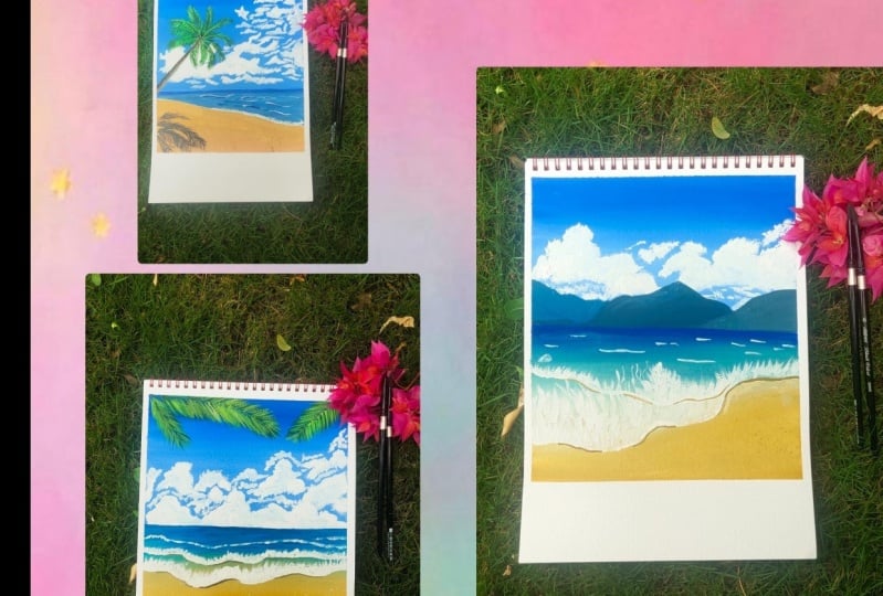
7. Polaroid 1 (Part 1) - Creating the clouds: Let us start with the first project. So I've taped down my paper on all four sides and left and in space at the bottom, just to give my paper the Polaroid look. You can leave the space at the bottom depending on the size of the paper that you're using. Using my scale, I'm going to mark the horizon line, so leave the water but to be slightly bigger area as compared to the sky part and draw the line. Now I'm going to take my deep and place it below the sky part, the sky region. This is just to ensure that the pain doesn't go beyond this line. You can either choose to be careful, but I chose to tape it down so that the paint doesn't go beyond. So I've taken Prussian blue, primarily blue, lemon yellow sap green, and titanium white on my palette. So these are the five major colors that we'll be using for the sky and the boundaries that we are going to paint today. Here are the swatches of color. So the Prussian blue, primary blue, lemon yellow, sap green and zinc white. We're not using zinc white, but rather we're using titanium white. Now for this guy, I want to make a gradient wash with Go, which goes from the darker blue color to the lighter blue color. Now, like I mentioned, to make your gradient sky or just to get a lighter tone of a color, you're going to be adding white instead of water, right? So now to get a lighter blue color, I'm going to be adding white to the mixture to get a lighter tone. And I'm going to start blending it with the darker color that I laid off. So you can take a Prussian blue, add white to it. A little bit of white will give you a slightly lighter tone. And the more white you add, the more lighter it gets. So as you can see, I'm going from the lighter blue color to be at the bottom, just near the horizon line. And as I move upwards, I'm going to be having the darker blue color. And for the blending process you're going to be using water. So if you think that your brushes drying out or you're you're having these rough line strokes while blending and you can just add a little bit of water. And that is going to make your blending process a lot easy. Once this latest completely dried, we're going to go ahead and add the clouds. So using my filbert brush, I'm going to load it with some titanium white, add a little bit of water to it to make it nice and creamy and start adding the clouds. Now the process is very similar to the one I taught you in the Elements sections. We are going to be falling just those exact steps as well. To understand the placements of the cloud, you can follow me along or you can also look at the reference picture that I have added to the resources section. So you can download the reference picture from there so that you get an idea of how to place the Cloud and where to place them as well. So to place the clouds, we are going to go ahead and this circular motion. And we're just going to add the shape of the clouds. So this just gives us a clear idea of what goes, where and how the clouds look, and how the shape of the clouds look. Once this layer has dried, we are going to go ahead with our size two round brush and I'm going to be cleaning out the edges. Now, like I said, the process is very similar to the one I taught you in the elements section of on how to paint clouds. And you're going to go ahead and tap your brush around the edges of the shape of the clouds that we've made. And they're going to clean out the edges just to give it a more scattered look. Now the process of how you're going to tap is very random. There is no order in which it's supposed to go. So just go around the edge. Sometimes in circular motion, sometimes you're just tapping some languages, dragging your brush, and you're just going to clean up the edges. I am increasing the speed of the video whenever the process as repetitive, but you can always decrease it by clicking on the three dots and slowing it down by 0.5 times. Okay. Once you're done cleaning out the edges, It's time for us to add the highlights to our clouds. So using a darker version on audit tick awash in data off the titanium white, we're going to go ahead and start adding the highlights to the clouds, assuming that the light directly falls on our clouds from the right corner. So just go ahead and add the highlights. And also don't forget to add those little tiny clouds that are floating around in the sky as well. Okay. Once everything is dry, we're going to go ahead and be the deep and look how beautifully clean the edges on.
8. Part 2 - Adding Waves & Foam Details: Let us now pinned are what apart. So for the color of the water, I'm going to go ahead with primary blue. And I'm adding a bit of lemon yellow, do it to get this nice turquoise color. Now the amount of yellow you add to your mixture will determine how Greenish the sheet looks, right? So you can also use a mixture of the Prussian blue and lemon yellow to get your turquoise color. But for this one, I chose to add it with primary blue. Here's the swatch of how the color looks. So it's really bright and like a bright turquoise color. Right. Now. Also, don't forget to add in a little bit of your yellow ocher colonial valid because we'll need that for painting the sand. So let us now add this turquoise color to our painting. So take your brush, add in some water. I'm using my size 10 flat brush and I'm going to go ahead and add water and load my brush with this turquoise color and spread it on the ground park. Now near the horizon part, the water is darker, right? So for the darker parts of my, I'm going to go ahead and add Prussian blue just to show the darker parts of the ocean and just blend this turquoise color and blue color together. Whenever you see that two brushes drying out, don't forget to add just a drop of water to make the blending process a lot easier. As you come to the bottom to make the sand, you are going to be using a mixture of the yellow ocher color mixed with white. So when you add white to your color, the color becomes lighter tone rate. So when you see that I've added white, the color has gotten a lot lighter. I'll be using this light color, right? Neil? The turquoise color that I've already laid in academia for the lower, I'm going to increase the color by adding more of the yellow or copied to the mixture. So this way the yellow circle will get darker as it comes closer to the bottom of my painting. And while it is very close to the dog boy Scholar, it is going to be a lot lighter. So this process is again, very similar to the beefs bar that I taught you in the elements glass. So just follow along the similar steps that we painted earlier and just blend everything out seamlessly. I've gone ahead and added another layer of paint over the first layer that I've been dead because it got a lot lighter. So you can do that too. If you think your paint has dried out to be a lighter color, It's always good to go ahead with two quotes if you think that the color is light. And this time it gives you a lot of opportunities to add for the word texture to your painting. As you can see your while, I'm dragging my brush, I'm also making sure that my brush is vertically 90 degrees to the people. And this way I can add texture for the wings, which means that I can add the darker parts of the ocean and blend everything out to add more texture to the water while the paper is still wet, I'm going to go ahead and loaded with Prussian blue to add texture and darker parts of the ocean, which is neoliberalism. And the stoke when tacos or the teal color for the lycopods. As we move further down and paint brush, you're going to be holding vertically 90 degree to the people and create these thin strokes. And that will add a lot of texture and depth to your painting. Let us now go ahead and be in the form part of our waves. So we're going to be following all the steps that we learned in the elements part where I taught you how to paint the waves. So I've loaded my size two round brush with some titanium white, and I'm going to go ahead and mark the shape of my VIF. Now you can do this by using a benzene as well just to mark the lines if you're not comfortable. I've done this free hand. You can always look at the reference picture just to get an idea as well. There is no particular order in which is supposed to do this. Once you've gotten the sheep and the lake, the line, the thin line of your waves ready? You go, you're going to go ahead and you're going to take in this line by adding more paint on your brush. And once you've done that, you'll be making those upward dry brush strokes to depict the form part of your waves. If you picked up excess paint on your brush, you can always rub it against the tape part of your painting just to get rid of the excess speed by your making their dry brush stroke. So start moving your brush upwards in the dry brush part of the techniques class that I taught you. And use this technique to create the form part of our ways. Now the process is fairly that potato, if you are going to be doing this for all the waves that we have created. So we'll be creating another layer after this point as well, and we'll be repeating the same process there as well. I've also gone ahead and added the shadow part of my Vi's using a mixture of the yellow ocher and black. So adding a little bit of black, nearly mix the color a lot darker. So now you're going to be adding the shadow in a way that wherever the curve is going inwards, that Bart is going to be the part where the shadow of your weaves lives. As you can see how I have made the shadows, you can follow the same step as well, or you can refer to the reference picture as well. Okay. I've gone ahead and create a second set of movies, right about the first one using the same steps that we did for the first one. And I'm also going to be adding these little textures beyond this as well, just to show the forming waves in the ocean. To add more texture to the sound, I'm going to splatter some darker tone of yellow ocher. This yellow ocher is mixed with black and hence that is why the current looks like that. So using that mixture, I'm going to tap it against another brush. And this way we are going to be adding a little bit more texture to ascend.
9. Part 3 - Painting Palm Leaves: Once we're done with that, we are going to be adding the bomb leaves. Now this time we are not painting the entire palm tree, but rather we are painting just a few leaves coming from the left corner and the left sides as well. So for the first color, like I mentioned in the palm tree bark of the class where we learn how to be in that, you're going to be using a mixture of the sap green and black to get a dark green color. And using my size two round brush, I'm going to go ahead and create these strokes from the top. Now this just shows that there is a palm tree right in the corner. It's outside the frame of the painting that we're building in. And a few of the leaves have lake are visible from the corner of our beam days. So that is what we are trying to show here. It ends up being dying. So just make a line and being these individually Leaflets as well. And it can also refer to the reference picture. And see how the reference picture looks. Understand this better, and just follow me along. Next time using a mixture of the sap green and lemon yellow, a lighter part of the denen going to go over the same leaf like we did before in the palm tree lesson. So this process is ferried, updated. We are going to be repeating this a couple of times until we add in the highlighted parts of our palm trees and it looks nice and thick. Each time you create a new type of clean, Don't forget to add the lemon yellow, the green, and the white together to get a lighter green color. This way, each time you move up, your color is going to be one shade lighter, but we'll also stay in the same color scheme as well. So you're going to be going over the same leaf maybe three to four times until and unless you get the highlighted parts like I mentioned before. So you're going to be having the darkest green color than a normal green color, then a lighter green color, then a lighter green color and the lightest green color. So maybe four or five times as good idea to do this. And once you're done with that, your palm tree is ready. See how beautiful and juicy and thick our palm tree looks. So that is why it is important to work in layers and create the depth in your band leaves. Adding the details to A-bomb cheats is the final step. Once you're done with the final layer for the bomb leaves, we're done with that painting as well. Once everything dries carefully, peel the tape away from the paper, this way are not going to be taking off any paper along with you. And look how beautifully clean the edges are. I love this format of bean thing, Polaroid paintings. And I've done a lot more which you can find on my Instagram as well. So, yeah, I love how the first project has turned out. And doesn't it look beautiful? I'll show you a closer look of how everything looks. And the clouds, the waves and the palm leaves just looks so beautiful together. Let us move on to our second project, which is also another fun and easy painting.
10. Polaroid 2 (Part 1) - Painting Clouds & Mountains: Let us start with the second painting, soft data, my paper on all four sides, leaving that in space at the bottom. On my ballad, I have Prussian blue, primary blue, lemon yellow, fight, yellow, ocher and black. Here. Other swatches of the colors that I'm using. So these colors are wedded identical to the ones that we used in the previous class project as well. I'm quickly going to take my scale and mark the horizon line. Keeping in mind, the space below the horizon line should be slightly more as compared to the third, to the space above it. I'm going to go ahead and make three subsequent mountains. These mountains or hills are one after the other. The left one being the one that is farthest away from the observer, and the rightmost one being the closest to the observer. I'm also going to go ahead and mark where the waves crashed the beach. Keeping in mind that the left side or the leftmost area of the wave is going to be closer to the observer. So the EDI is more, whereas the rightmost side that I've drawn is going to be more further away from the observer. And that is why the area that side is lesser. And I've also drawn another set of lines or another set of waves. So I'm going to start off by making the sky just like we did before. We're going to make a gradient sky. So I've added pushing blue, a little bit of water and white to it to get this paste do not even have pasted bird like a light dope Prussian blue color. And I'm going to go ahead and put it on the top part of my paper and I'm going to slowly bring it down. As we move down, I'm going to keep adding white to my paint and blending the colors together. So there I get a nice gradient wash from the lighter color, that is the light to blue color being at the bottom to the darker blue color being at the top. So we're just going for a gradient sky. Wherever you feel that your brush is drying, don't forget to add a little bit of water to make the blending process easier. Don't worry if you go inside the lines of the mountains, that is not a problem because we are going to let it with the colors of the mountains. And that is the best part about quash that we can always layer it. Once the background has dried, it's time for us to add the clouds. I'm using my filbert brush. I've loaded it up with some titanium white. I've added a little bit of water to make it nice and creamy. And I'm going to go in this circular motion to get the shape of the clouds, correct. I've also attached the reference picture in the resources part from which have taken inspiration from for this painting. So you can download that image to get a better idea of how the clouds are placed. But this cloud or not exactly a copy of what is in the reference image. This is something that I've done on my own as well. So you can follow me along or you can also look at the reference picture. But the main idea here is to just get the shape of our clouds correct first, before we go ahead and add for them more details to it. Like we learned before, we're going to clean out the edges. So using my size two round brush, I'm going to go ahead in this circular motion itself, trying to clean out these circular edges that are bad. So make sure that they're uneven because when you look at the clouds in the sky, they're not in the perfect shape, right? We are just having irregular shapes of the clouds. And that is why we need to clean out are very smooth circular edges. To just go in this random order. You're going to be going in a circular motion itself, but you're going to be moving your brush here and there to create these digital, you know, irregular shapes in your clouds. I'm going to be increasing the speed by two times. But if you think I'm going too fast, you can always decrease the speed by changing it in the settings of the video. Once this dries, we're going to go ahead and add the highlights. So the process of creating the clouds is creating the shape of the clouds, then cleaning out the edges. Then adding the highlights. So you're going to be assuming width side the sunlight directly falls on your cloud. So I'm just assuming it's coming from somewhere in the right corner or like somebody from the top. So the top part of my clouds are really highlighted and white. And that is why we need to go ahead with another layer of the titanium white so that it's nice and opaque and bright. And it shines and ensures that the light falls directly on that part of the Cloud. So you're just going to use your same size two round brush and add the highlights in your sky. Don't forget to create those tiny little clouds here and they're flowing around next to your bigger clouds as well. Now once everything dries, we're going to go ahead and add the mountains. So for the mountains that is further away from the observer, they're going to use a mixture of Prussian blue, lemon, yellow, and white. So we get this really nice and opaque turquoise color. And I'm going to apply it on the leftmost mountain if that makes it easier to understand. And I'm going to completely cover the area of the mountains that we sketched earlier in this particular color and wait for it to completely dry. Once the leftmost mountain is completely dry, I'm going to add a little bit of black to the same mixture. And also I'm going to add a little bit of Prussian blue to get this nice dark navy blue color. And I'm going to be applying this particular color in the center mountain. So this mountain is not really far away from the observer, but not very close to the observed as well. So it's somewhere in the middle. So I'm using this color and I'm going to cover that particular area that we sketched, the second mountain or the center mountain. And I'm going to cover the entire area with this color and wait for it to completely dry before I move ahead to paint the rightmost mountain or the mountain that is closer to the absorber. If you cannot find the marks of sketch that you made earlier, you can always catch it again or you can just wing it like I do most of the times. So I just follow along the shape that I think I drew and just change things if they are necessary. Now once this layer has completely dried about it, a little bit more of Prussian blue and a little bit more of black to the same mixture. And I'm going to use this color to completely cover the area of the right most mountain. And this the mountain that is closer to the observer and that is light. This mountain is a lot darker as compared to the mountain that is usually far away from the observer as well.
11. Part 2 - Painting Waves & Beach: Once the Ada above the horizon line is completely dried, we're going to go ahead and paint the ocean. So for the ocean, we are going to be using Prussian blue to depict the deepest part of the ocean and the IDA that is near the horizon line. So I've just taken Prussian blue. I added a little bit of water to it to make it nice and creamy and flowy and blending. And I'm going to go ahead and just blend it out in the area. And the transition of the color is actually going to be from Prussian blue to the turquoise color that I will make by adding a little bit of lemon yellow to the same Prussian blue mixture. So when we add Prussian blue and lemon yellow, and when we mix these two colors together, we get a nice turquoise color, right? So what you can also say, we get like a nice person, green color. So we're just going to add lemon yellow to it. So the more lemon yellow you add, the light dark and light more dark parts the color looks. So I've blended that dark turquoise color force or the person green color that we made. And then I've added a little bit of white to it just to get a nice opaque and lighter tone of the same color. And I'm going to blend it with the same Prussian blue and the pushing green color that we made. So the transition is actually going to be from Prussian blue to the dark turquoise color to the light turquoise color, then it will transition to the color of the sand. That's the idea over here. Makes sure that when you're blending this, you're blending it in the slant way, right? Because remember how I sketched and showed you earlier that the, are the waves that in a way that the leftmost part of the waves are closer to you, while the rightmost are a lot more further away from the observer. So we're going to be blending it in this land motion, right? So at the bottom, I've just taken yellow ocher and I've blended it in the lowermost part of my paper. And then I've taken some white and I'm blending it in the white. So I have to blend the white, the yellow ocher, and the turquoise color together. Now, we have to be a little bit careful when we're doing this part of the blending because we don't want to get a really muddy color in between. We want a transition that is there or that part where the water in the sand, you know, more just together like or not like modes together, but you can see the sand through the Watteau. So for that, you need to be careful with the blending and that is where the blending with white technique plays an important role. So remember how when we do a direct color blending, we get the middle color and when we blend with white, we don't get the middle color. And that is why we're using white here to blend the yellow ocher and the decoy is blue together. So when you blend it with white, you don't get the middle muddy color, but rather a smooth transition from the turquoise blue to the yellow ocher. So if you think that your colors are getting lighter, you can go ahead and add another layer of it and just blend everything out. And this whole process is about blending. So you have to be patient. Have fun. If you think your brushes drying, don't forget to add a little bit of water to make learning process easier. But just make sure that they're not adding too much water to your mixture. Otherwise, it will start behaving like watercolors and we don't want that. I took my time with the blending of the yellow ocher and the turquoise blue color together because I wanted the transition to be extremely smooth and did not look streaking. One more thing you have to keep in mind here it is. You remember the sketch that we made for the waves. So we want the two are like the lighter color or the part where the ocean blends and mixes with the sand. While blending, we want the lighter parts to be near the waves. And that is why you can see I've blended in a way that the waves that are closer to the observer, I still light while I had darker parts of the yellow ocher on the right side. And you have to blend in a way that the lighter parts just mod and fit into the sketch that you create it. So just keep that in mind when you're blending. Take your time with the blending. There is no rush. The whole idea here is to have fun with the blending. So take your time. If you think you've made a mistake, you can always rewrite your paint and blend everything together. So guage is really fun that way, right? You can always fix things that you don't like by rebate in your paint. So yeah, just have fun. Once everything dry is going to go ahead and pay in the form part of our waves. So the process of painting the form is basically very devastating for the ones that we learned earlier. And we're just going to follow those steps. Make sure that you're following the lines that you sketched. If you cannot see the lines that you've sketched for your wheels, you can always redraw it. And that will help you to understand where the waves are. And you're just going to outline it using your white color and your smallest size brush. So if you have size tools, I veto. Anything you can just outline with it. One thing to keep in mind is that the waves that are in the left side or the way that start and fallen a left side, I want to be a lot thicker because like I said, they are closer to the observer. While when we transition and slowly move towards the right side, we're going to apply less pressure on our brush and make sure that the lines that we make are a lot less tunnel as compared to the left side. So you can see here, I've been DID and meet deadlines in such a way that the left part, the left half looks really thick, right? And the right part of the wave is usually 10. So this gives us an illusion that you are standing at the beach and, and you're standing in such a way that the beach is like in a slant. It's not completely straight, it's landing on the other side. And you can see the left part of the waves are closer to you, while the right part of the waves are like just moving on to the endless distance that we have. Now to make the waves, again, to make the foam actually, you're going to go ahead and just our dry paint. So this is the dry brush technique. Just dig the paint and pull, push it upwards, right? The remainder form and you're going to push it upwards. Make sure that you don't have any water content in your brush. Otherwise we won't get the dry brush look and which will eventually lead Do not having the dry I mean the forming for me look, it looks GG it look really like normal strokes. So we want everything. We want our brush to be dry. This process might take some time to make because the brush keeps trying and it doesn't seem that comfortable to be into it. So we have to keep loading our brush again and again. So this is going to take some time, but be patient with that because the end result looks so beautiful and it's what everything. One other thing to keep in mind is the direction of your vive. So since my wave is coming from the left side, the form is going to appear that way as well. So I'm going to drag my brush in a way that gives an illusion that the form and the wave is coming from the left side. So drag your brush according to that. You're making the form makes sure that you keep this thing in mind that the leftmost wave is closer or the left girls past part of the wave is closer while the right side is further away from the observer. So as you can see, the left more, most part of the waves has a lot of form that you can visibly see in detail. While the right side one is. You can see all the forms together because they're really far away, right? You cannot see the exact details of it. So keep that in mind when you're making the form. You can also see me grabbing my brush against the side of the deep or the tape on the tape because I want to get rid of the excess paint that I pick up some time. So you can also do that or just wipe it on it to show slightly to get rid of any excess water. We are going to be adding a little bit more details to our beliefs by loading up some white being done our size 0 brush. And you're just going to make these thin lines between the form that we have made using a dry brush technique. This just makes chars that we have the continuity in our wave since this part of the wave is a lot closer to the observer, which means the observer can see a lot more details in the weaves. And that is why we have to just make these little lines. They don't have to be perfect. There have to be in the same order that I have made. You can just make these lines just connecting a few of the forms to get though. And that is it. This is the detail. Once you're done with this, you're going to go ahead and add the second set of waves that we had. And we can go ahead and make that following the same method that we did for the first one as well. The only difference would be that it would be a little bit more smaller as compared to the first wave. So using the same method, you're going to go ahead and make the second set of leaves as well. I wanted my second wave to be just like a direct continuation of the first one as well. And that is what I went ahead and did. So. And the same dry brush technique to make the foam part of my v this well, I'm also going to be adding a few movies that are a lot further away from the observer and they're still forming in the ocean. So you're going to go ahead and load your brush with some white paint. And they're going to be randomly placing them in this little strokes that are closer to the horizon line. And as you move a little bit more further closer to the observer, we are going to make them a lot thicker and a lot more detailed. So this is completely random. There is no order in which this happens. It's completely random when you're just going to do it as you like, just make sure that the area or the lines that you mean that are closer to the Horizon line, a lot smaller as compared to the ones that you make closer to the observer has, you can see that I've done here, the one closer to the horizon line, Millard schoolers are a lot smaller and they're just broken down. There's no continuous lines they have. I just stopped and lift my brush from the people simultaneously so it creates this broken line. Look. So let's go ahead and do that and add the final form details if you wish to. Once you're happy with how your weaves loci are going to go ahead and add the shadow part of your viz. For back, I've added a little bit of black to my yellow ocher mixture to get this doting brown color. And I'm going to use the Scholar to add the shadows. So the shadows are going to be in the part where it curves inwards pride, and also make sure that it is towards the right side more. So as you can see the left side, I'm just making it a tenon known as compared to the right side. So the right side is going to have a thicker shadow as compared to the left one. So just keep that in mind and make the shadows according to that. And yeah, that's it. This is when you come towards the rightmost part of the leaf, you can just go ahead and outline the whole thing. Because the whole thing costs a little bit of a shadow that you can't see the details of. Don't forget to add the lighter shadows to your second wave as well. Even though it is still on the water and they still, uh, we've below it, you can still see the shadows that is that we've discussed sting. So don't forget to add that as well. Once you're happy with the shadow part of your waves, you're going to do the last part of our being paying. And that is to add this plateaus, to add details to our Sun. So load up your brush with the same dirty brown mixture and dab it against another brush to splatter some brown color on your sand. And that is it. Once you're done with that, that is the end of our painting. You're going to be Lawford tape away from the paper so that you don't peel off some extra paper along with it. And that is it. Look how clean and beautiful the edges are and how beautiful the beam Deng looks. I love how this has turned out. And here's a closer look of our painting just so that you can see the details in your VBS, the Cloud, the mountains all together. And all of it is done not so beautiful. Now, let us move on to the third and final class project.
12. Polaroid 3 (Part 1) - Painting the Sky & Clouds: Let us start with the third and final project. For this class. I'm using the same colors. That is Prussian blue, primary blue, lemon yellow, sap clean, titanium white, yellow ocher and lamp black. For the colors are going to remain the same. You're not going to be using any extra colors. And I've taken all these colors out on my palette, dip down on tape, down my paper on all four sides, leaving that in spades at the bottom for the Polaroid look. Now I'm going to take my scale and draw the horizon line. This time I'm giving more of the space of my people for the Skype bot as compared to my ocean or the area below the horizon line. So make sure that you are drawing the line according to that. And now we're quickly going to create a sketch of the wave that is crashing on the shore. So you're going to start from slightly below the horizon line and you are going to come down increasing the space. Because you want it to look like a slant, like it's at an angle. You're viewing it at an angle, you're not viewing it straight. And then from the left side I'm going to quickly sketch a palm tree as well. You don't have to worry about making the boundary look exactly like how you want to do. This is just a rough sketch for us to understand and try and place our elements properly. So don't worry if it doesn't turn out perfect. We're just doing this to get a rough idea of our sketch. And next at the bottom, also sketching these lines to try and show you how the shadow of the tree would look if the light is falling from, let's say the left side or from the top side, right? So now we're going to quickly start with the gradient wash. So for the gradient we have a mixture of the Prussian blue and primary blue. And I'm going to mix these two colors together. And I'm going to make the gradient wash, starting with this darker color at the top. I have not added white to this mixture initially because I wanted the, wanted the color to be slightly darker as compared to the previous project. So I'm going to start off with this column, and as I move down, I'll be adding white and blending all of this together. The lighter tones of the same color and blend everything seamlessly out. Like I said before, if you think your brushes trying or you're being too thick, Don't forget to add a little bit of water to make the blending process easier. So as you move slightly down, you're going to be adding a little bit of white to the mixture to get a light dough. And you're going to be blending the sky to create a beautiful gradient. Once the base layer has completely dried, using my filbert brush, we're going to be adding the clouds. So for the clouds, I'm loading up my brush with some titanium white. And in a little bit of forethought just enough to make my brush wet, make sure that you're not adding so much water otherwise, color is not going to stand out completely on your base wash. So make sure that your consistency of the paint is quite smooth. And you're going to load your brush with the paint and start going into circular motion. So the first thing that you do while painting the clouds as we've done before, is to paint the basic shape of your Cloud, right? So now for this, the reference picture that I have used is there in the resources section. So you can always download the image from there and understand the picture that were being done on your own. And then you can just follow me along. So the idea over here, and the one that is there in the reference picture is that this cloud is slightly bigger, which means that this cloud is quite closer to the observer. While as I move towards the right side, I will be decreasing the size of size of the cloud slightly. So this will show that the clouds that are next to this one are slightly more further away from the observer. So that is why I'm going to be decreasing the size of your clouds. So just go ahead. Using the circular motion. You're going to be creating these little shapes of the clouds at the bottom. I like to make these little online strokes. If that makes sense, I like to keep it slightly flag. It should be more rounded at the top and a little bit flatter at the bottom. It just gives me more space to make it look fluffy. And don't forget to add these tiny clouds floating around your main cloud as well. And one more trick to make your edges really nice and smooth is to load up the brush and create that dry brush effect that we learned earlier. So you load your brush and just swipe against the sheep that you are creating. This way when you lift up, lift up the brush, it will create that dry brush stroke and it looks really nice and smooth. So you can do that as well. Experiment with your clouds. Of the old idea is to learn an experiment things on your own. Like when I tell you, even then. You should try and experiment them in your own ways that these things stay uniquely yours, right? So I'm just going to be, I think the clouds now and yeah, have fun. A shape of the cloud. It's time for me to clean out the edges. So using my size two round brush, I'm going to load it up with some titanium white and start dabbing it on the edges. I want the edges to be nice and smooth. I want them to be irregular as well, so that it looks like it has blended slightly with this guy. And they're not just random objects in the air. It should look that it has a purpose. Like, I don't know why it shows that it's a bogus, but I just wanted to look a certain way. Then we're going to nicely go ahead and clean out all the edges, make it smoother with this guy. And the top part, I'm going to move it upwards. So I'm trying to make sure that the clouds are moving upward. And this way when you clean up the edges, it gives them a sense of direction as well. So just go ahead and clean up the edges using your smaller sized brush. Don't worry about the highlighted parts just right away. Just go ahead and clean out all the edges that we pad. If you want to add a few little tiny clouds in the sky, you think they are missing, then you can always go ahead and add them as well. And this is going to be a second step when you've been thinking a lot. And the last and final step is to go ahead and add the highlights to the clouds that I have made. So I'm quickly going to go ahead and add a few more highlighted bots in my Cloud. So I'm assuming again that the light is falling from the top, or maybe not from the top, but from the left side of my painting left corner. So I'm going to go ahead and add the highlight in a way that it looks like it's from the left side. So make sure that you go ahead and add the highlight. Now you can always assume for the highlights to win any deduction that you want. The reference picture showed that it was on the left side. So I went ahead and add a DAG. You can always change the side from which the light falls according to what you want to do. And yeah, it's your painting and it is everything that you want to do, right? I've also gone ahead and added these little tiny clouds. I love adding these little flow does around the mean clouds because it just makes it look very pretty altogether.
13. Part 2 - Painting Waves: And now that I'm done with the Skype bot, it's time for me to paint the ocean part. So for the darker parts of the ocean, have taken Prussian blue and I've added a little bit of lemon yellow to it. I'll be adding more Prussian blue to get a nice dark and turquoise color. So you can always vary the darkness of your color, especially that turquoise color depending on how much crushing blow you add. So the more Prussian blue you add, the darker blue or the color is going to be obviously. And if you add more lemon yellow, It's going to be more towards the deed or the green side. So you can obviously be the color of the taco, is it you're using, and I'm using this little dark mixture of Persian blue and lemon yellow for the darker parts of my ocean. And I'm going to quickly spread it all over the horizon line. So it's just right below the horizon line. I'm going to have this darker part of the ocean. It's basically the same thing that we have done before. So you'll be varying from Dhaka parts of the ocean. So you'd have the Prussian blue, the dark ocean blue at the very end, near the horizon line. And as we move further closer, we are going to be adding a little bit of lemon, yellow and white, trying to get a lighter tone of the color and blending it with the darker color. And I think I'm for the closer we are going to be having the mixture of yellow, ocher and white blending in with the turquoise color. So the process is just fairly similar to the other paintings as well. It's just that in each painting we have slightly changed the subject and slightly changed the elements and how they are being placed. But the process remains the same. Now when you're painting this portion, make sure that you remember that the line that we sketched. So that two wave is going to determine, tell where is your ocean part. And right below that we have that the sketch is going to be your of beach. So you're going to be painting it according to that. So you're just going to blend everything out, make sure everything looks good enough. This process might take a little bit of time because it's repetitive. You want to get the colors right. You want to blend everything properly. So take your time with the blending. Just make sure that you are happy with how your bending is turning out. And you can always follow me and see what I am doing here and how I'm blending things together while the paper is still wet. I've also gone ahead and added the darker blue column in the lighter blue part. So as you can see, this just gives the ocean a little bit of depth, a little bit of shadows as well. So yeah, and I always go ahead and blend it with a little bit of water so that it looks blended rather than just the dark, darker colors depending on the lighter colors. So you can always use water to blend it and if you don't like it, you can always change it. Now I'm using a mixture of the yellow ocher and white for the sad part. So I mix these two colors together and I'm going to go ahead and paint the sand part and also blend the sun part with the ocean part so that it's nice and smooth transition between the ocean and the beach. Also for the darker parts of my sand, I'm just going to add a little bit more of the yellow ocher color. So the more yellow ocher color you add, the darker color is going to be obviously, and when you add white to it, you're going to be light like we have launched since the beginning. So yeah. I want to cover the beach portion and slightly blended. And I'll show you there's another trick. If you don't want to blend the whole thing together, you can just create the beach part first and just go over the line of the way that you've already made. And then you will be cleaning out your brush completely. So just clean up all the pain that you have on your brush, everything, and load up some clean water and slowly go ahead and blend it with your wet brush. So when you do this, since gouache is a medium that can be really wet and blended, this way. The color will just seamlessly blend together. You don't have to blend the whole thing, especially in a bleach part where you don't have and don't actually need the entire blending because the beaches really further away from the observer. And that is why you can just blend it with water. Now I'm going to go ahead and add some waves, some details to my ocean. So I've loaded up the blue color, darker, dawn of the ocean blue and the lemon yellow mixture. Or you can also use your primary blue mixed with a little bit of crushing blow. And you're going to go ahead and just make these little lines. So these are just going to depict the waves that you see in the ocean or lake, the movements in your water. So yeah, make sure that you're keeping in mind that the right side is more closer to the observer, the lines are going to appear slightly bigger. And as you move towards the left side, since the ADA is less as well, you're going to be having a level lines. So these are just a few things to keep in mind and just make those little lines. Also, another thing you should. Do is that when you are in the darker parts of the ocean, use a darker blue color, but as you come a little bit lower, a little bit closer to the beach area, to the way that it's crashing the shore. You want to make sure that you're adding a lighter blue color because we don't want the blue to be completely dark and standing old would be like w camera so you can always turn it down slightly. But yeah, just make sure that you're doing that. Next. We're just going to be adding the details to RVs. So 40 is you can just load up your brush with some titanium white and go ahead and outline the wave that we have sketched. Or you're just going to go over the line again and just make sure that you have made the wave. And also remember that the wave on the right side is closer to the observer. So the white form is going to appear thicker and more detail as compared to the ones that is to the left side. We are going to be adding these little phone details to our waves as well. But make sure that you're not adding a lot of details to the form here because the wave is little further away from the observer. So we don't want to add a lot of details. And this also shows that this wave has actually crashed at the beach, but even going back. So it's a way of pulling backwards into the ocean. And that is why the form Bart is not a lot. So you're just going to go ahead and pull your brush slightly upwards, creating these dry brush strokes for the form area. They're not going to be adding a lot of them. Like I said, it's just a little bit. We're also going to go ahead and add these little highlights to our ocean as well. And these are highlighted. Some of them are also going to depict the waves that are still forming and they're going to be crashing on our shore very quickly. So you're going to be making the ones that are slightly closer to the first wave, a little bit bigger and thicker as compared to the ones that are far away. And you are going to be making them smaller. And yeah, that is it. This is what you have to do for the waves are going to make these lines. You have the horizon and the thicker, bigger ones near the first wave. You're also going to be adding a little bit of shadow right under the ones that are closer and they're going to crash on the beach zone. So we're going to add a little bit of darker blue colors or to stake your blue color, the primary blue when the person glue mixture. And I'm going to just add the highlights right below it. And you're also going to be adding the shadow. So I've taken my yellow ocher color and I'm just going to quickly the shadows to my v of that is already on the beach. So whenever the wave is going inwards, make sure that you're adding thicker and darker shadows as compared to the reinfect is outputs.
14. Part 3 - Painting the basic Structure of Palm Tree: Let us move on to pain the palm tree. So for the palm tree, I'm using the color burnt umber and I've taken that on my palate. So make sure that you take burnt umber. And we're going to be using this color for making the trunk or off our palm tree. So I've just loaded my brush with some burnt umber on my size two brush, and I'm going to go ahead and start filling in the brown color, the dark brown color in the trunk that we sketched. If you cannot see the sketch properly, you can always go ahead and sketch it again. And just so that you know how the shape was when you sketch it earlier. And you're just going to cover this entire area of the trunk with the burnt umber color. Next, I've added a little bit of white and same bond, amber color, and I've put it on the part which is below. So let's just assume that this slant line that we have painted has two parts. We have the darker part, which is going to have the Docker bond amber color. And the lighter part which is on the right side, which is going to have the light or the burnt umber and the white color. So we're just going to blend both of these colors together. Next, I'm going to outline the leaves, the bomb leaves. So I'm going to go ahead with a mixture of the sap green and the black together to get this beautiful dark green color. So he was a swatch of color so that you know how dark the green color that we're going for. So if the darker you wanted to be, the more black you add, and if you think that it's too dark, you add sap green to it, just so that the color becomes a little bit lighter. Do not add white, you're just adding sap green and black together. And using this mixture and using my size two round brush, I'm just going to go ahead and make these lines, the outline of the main stock of our bomb leaves. And I'm just going to go ahead over the sketch again. If you cannot see your sketch that you did earlier, who ahead and sketch it again, or you can just always be winging it. It's completely up to you and how you want it to be. But yeah, just go ahead and make the main stop using this color. You can also look at the reference image to get a clear idea of how to place the bomb stocks just in case. So make sure that you visit the resources section. So like we learned earlier about the palm leaves and how we painted the individual leaflets and how the strokes are going to be. We are going to be following the same step and using the same color, that is the dark green color, we are going to go ahead and add the individual leaflets to each of these palm leaves, stems or stocks that we have painted. So we're gonna go ahead and make these individually flat using the stroke that we learned, all your palm elements section of the class. And just cover the entire, all of the stocks that we have had you using the same stroke. So the only thing that you have to keep in mind the direction in which your leaflets flow. So they are going to be in the direction of the main stocks. We have the curve in towards the left side or the right side. You're going to be making the individual leaflets in that curve and direction as well. So as you can see here, since my leaflet is curving downwards and it has a little bit of a left curve toward the individual leaflets on the left side are curved that way. And the other one is going to be in the opposite side. So this way it looks like it has flared out. So the other one that I make, it is still following the curve, but it is more towards the right side, so it's flaring out towards the right side. I have increased the speed by two times in the next section of the video because the process is fairly representative. But if you think it's going too fast, you can always decrease the speed by clicking on the three dots and changing the settings and slowing down the speed at which I'm doing this. So yeah, the idea is to just cover all the stocks using the same method of creating the leaflets.
15. Part 4 - Adding Details to the Palm Tree: Now once we're done with creating all the leaflets, it's time to add a lighter color on the leaves so that we just get a nice depth into our leaves. So I've added a little bit of lemon yellow sap green and white to the same mixture. You can integrate any other mix for this. You can just go over in the same mix as well. And I'm going to get this lighter shade of green. So we just don't want to go light, extremely light altogether. In the first step itself, you're going to be doing this in layers. So maybe three layers or four layers of leaves to get perfect details. So here's a swatch of the color that I have painted. So this is going to be extremely nice. It's not going to be completely light, but yeah, it's definitely lighter than our first color that that was extremely dark. It was just the base or the shadow, extreme shadows or farm families. So and I using this color, following the same method, I will be sketching to stock again and making a few of these individually leaflets. Now you don't make sure that you're not completely covering your previous strokes. We want, we want the darker leaves to be still shown, right? Because these leaves are dark, because of the shadow. They're not like Doc in general, if it was in late, it will appear to be light, but because of the shadows is it appears to be darker. So because of that, we want to not completely covered the previous layer that we did. We wanted some of them to be seen. So you're just going to go ahead and make the same strokes. Make sure you're just not covering everything. Good to go. Once that layer dries, we're going with the third left. So in this layer again, I've added a little bit of lemon, yellow, and white to the mixture. This time, I want my color to be more towards the yellow side and I want it to be more happy, more to have like a yellow undertone to it. So about it. Lemon yellow to make it more lemony and light cream. So yeah, now again, following the same step, you make the stalk and you start making our individual leaflets again. So this is what I am doing. This time again, makes sure that you're making lesser Leaflets as compared to before. So we're just going to be, it's kind of like adding highlights on your base layer. So you're not going to be adding this on all your lease, just few of them. And this time you want to make sure that when you are adding the lighter color, you are adding this lighter color on all your stocks. So you're not going to be only doing some of them. You're going to be doing all of them. And you start from one particular point, that is from where we sketched it, right. So you're just going to follow that step and yeah, just cover and make a few of the strokes with the scholar is to add depth to your palm leaves. Once we're done with that and that layer has dried, this is going to be our final layer. So in this F again added a little bit more of lemon, yellow, and white to this. This is going to be the main highlighted portion of our families. So you don't have to go over all of them this time. You're just going to slightly keep in mind where is the area where the light falls and you're just going to highlight the main stocks as well. So I'm going over and highlighting the stocks first and then adding a few individual leaflets, tears to add a few highlights. So I'm not gonna do it on all of them, just some of them and very little maybe like one or 23 or four, like probably. So that completely depends on you. Just make sure you're not doing all of them together. And it just highlighting the stock importantly. So that's the most important part. We just want to highlight the stocks. This just gives us an illusion that the leaf is bent, right? So our families don't exactly, it's not flat, it has this bend. So adding this highlight on the stock gives us that illusion when you look at the tree that it has this bend or, and it's like a 3D object. So yeah. Now once we are done with the portion of the crown portion of our palm tree, just going to go ahead and fix the trunk part to add a little bit more detail. I'm going ahead with the bond amber color and blending it with the light or the color that was with with a mixture of burnt umber and white. And I'm just blending all of this together. And then I'm going to go ahead and make these horizontal line. But since this line is at a curve like our trees land, we are going to be making that at an angle just to add the little details to our cheese like we learned in how to be in the bomb cheese element part of the class. So you're just going to be following the steps to add the details. So in this one, I've added a little bit of black to my burnt amber color to get this darker brown color. And I'm going ahead and making these lines at a slant just to add a little bit of texture and details to the trunk. I've added a little bit of black to my burnt umber to get this dark brown color. And I'm adding it on the docker bought off my trunk. And for the lighter details, the highlighted part of my triangle, I'm going to go ahead and add a little bit of white to the bond, amber to get this light brown color. And I'm making the same vertical lines to add the details. And now for making the shadow of the leaves, I'm using a mixture of black and white to get this beautiful gray color. And I'm going to go ahead and make the leaves. Now, we don't have to exactly follow the way the crown looks. We just have to depict some of the leaves being shown us the shadow. So I'm sunlight that is falling from the left corner is going to be casting the shadow on the beach bar. So we're just going to go ahead and make a few bomb leaves flaring out since it is in the corner. You don't have to depict exactly like the bomb leave that palm tree that we just did. But we're just going to be making a few palm leaves. For the last and final part, we're just going to take some burnt umber on our brush and we're going to tap it against another brush to create the texture on her son. So we're just going to splatter some of paint on the sand part to give it a nice beautiful sand look. And that is it. This is the end of our bean things. So adding this black dot is the last part. And that is it after your splatters have dried, we're just going to quickly go ahead and build the deep off. Make sure that you're building a deep against the paper, like away from the BBA so that you don't build an x any extra particles with you. If you're using a good brand of people, that generally doesn't happen, but in case you're not sure, you just have to be a little bit extra keyframe. And yeah, does it look how beautifully clean the edges are? This painting is probably my most favorite among all three of them. I think it has turned out beautiful. The clouds, the waves, the boundaries, the shadow, the beat. Everything is just perfect about this painting. And this is how it looks up close.
16. Conclusion! See you!: And we did it guys. We've reached the end of the class. I had so much fun teaching these three beautiful beach landscapes to you from my first Skillshare class. The idea was to bring these bright and vibrant landscapes to you since we cannot go and Troy them in person. But we can definitely always enjoyed by bending them, right? If you still haven't been to the along with me, don't worry, you can always break down the class and part based on the availability that you have. And learn each technique and each element that is start in depth so that you can not only learn them for these class projects, but for a lot of your other future projects as well. So I've tried to cover each technique, the clouds, the waves, and depths that you can paint outside these class projects as well. If you want to know more about me and my art journey, to follow me on my Instagram page at the simply aesthetic. And this is where most of the art fun happens. I would love to hear your views about this class. So don't forget to leave a comment in the review section. Do let me know what you think and how you would think I did for my first Skillshare class. If you paint these projects, don't forget to tag me on Instagram at the simply aesthetic, I would love to see your class projects. And if you have any questions, you can always reach out to me here, or email or on Instagram. I'll see you in the next class. Bye bye.
 Payal Sinha, TheSimplyAesthetic- Artist & Educator