Transcripts
1. Class Introduction: Hi everyone. I'm Christa with
Krista vineyard artistry. I am super excited that
you have joined me today so that we can
learn how to paint some spring paintings
with acrylic paints. I will teach you some
basic techniques and we will practice together on my step-by-step instructions to show you that
everyone can paint. I do not have an art degree. I am not classically
trained in the art. I started painting
as a hobby to try and keep my sanity when all
of my kids were babies. I completed my first painting
about ten years ago. And I must say, I absolutely hated it. I hit it in my closet because I thought the clouds
looked like the devil. But I fell in love with the process and I
kept practicing. I didn't quit. And along the way I
learned how to break down paintings into
easy beginner, step-by-step instructions. You will come away from
my class with a piece of art that you will feel proud
to hang on your walls. In this series of courses, we will paint some
spring tulips, colorful abstract sunflower
just in time for summer. So let's jump right in with a list of
supplies that you will need to get started on your first painting,
the spring tulips. I'll see you in the studio.
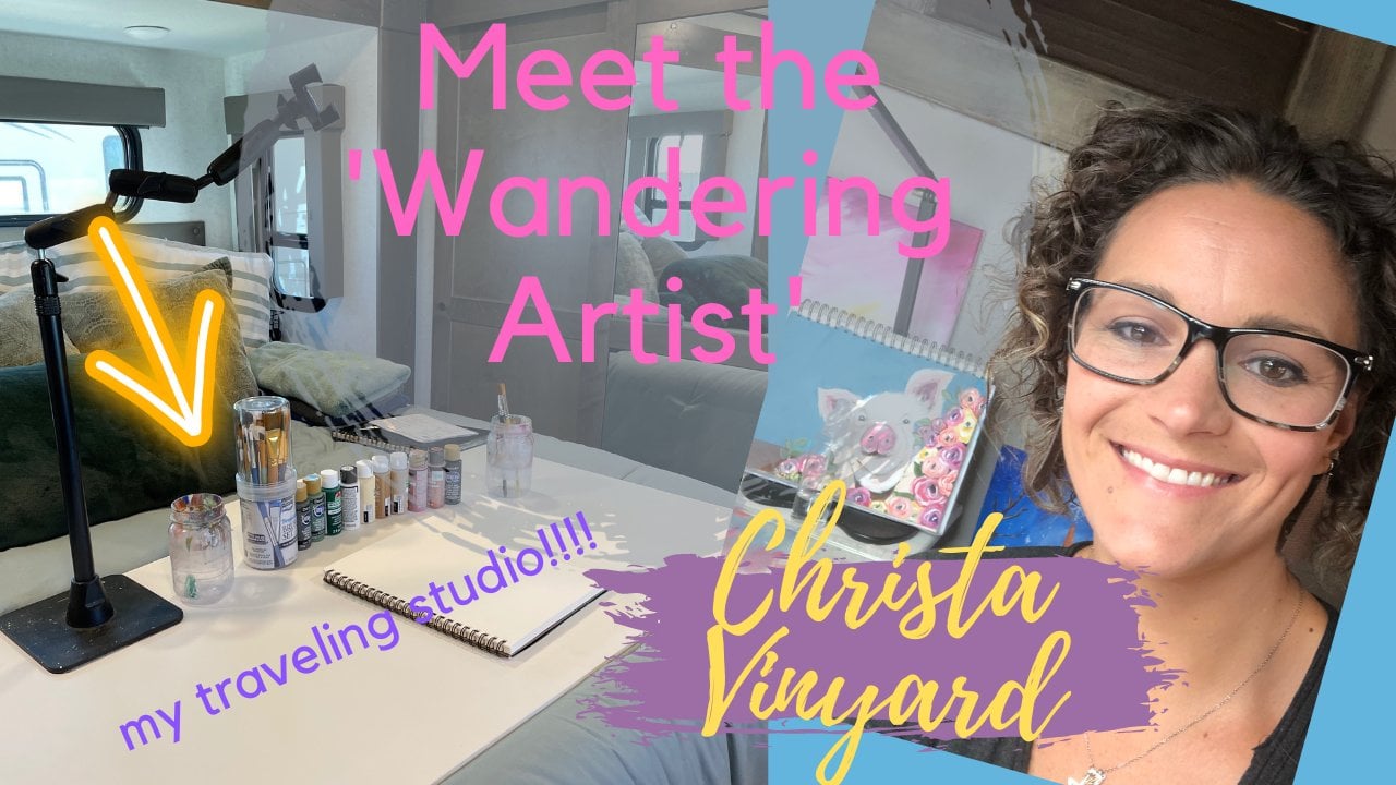
2. Spring Tulips Supplies: You guys ready? Let's talk about the
supplies you're going to need to paint this spring. Tulips painting. First, let's start
with the basics. You're going to need
a jar of water. You're going to need something
to put in mixed paint on. I keep it super
affordable and just use these paper plates from the
dollar store or Walmart. And when it gets to yucky, I just toss it and
go get me a new one. Easy-peasy. You're going to
need some basic brushes. This is a number
one on, I'm sorry. This is a one-inch flat brush. This came in a variety
pack from Walmart, very easy to find. This is a number
eight round brush. It's kind of thick, but it has a nice
point at the end. I actually ordered
this one online, but you can find these anywhere. I like to keep some
sketch paper on hand. This is just regular copy paper. I will just practice
my flowers on here are my brushstrokes on
here before I actually try them on my painting just to make sure I have the
right technique down. So we'll go over some of
those practice techniques to ask for what you're
going to paint on. I am going to be painting
on watercolor paper sheets. These are nice for me because
I teach a lot of paintings. So I can just store these
in a tub somewhere. And they don't take up a lot of space and
they don't curl. They stay nice and flat. The moisture in the water and the paint doesn't
make them ripple. So it works well. This is actually
watercolor paper. You can use the acrylic paper. They have oil and acrylic paper. They have a bunch of
different brands. Just make sure that it's
a good heavy paper. This one is £140 paper, and I also found
this one at Walmart. You can also paint
on canvas board, which I actually might
do for this painting just because I have my
background already done. These boards are flat, they're really
affordable and that my kids paint on these
when they want to paint, can be stored easily, but they can also be framed if you choose to
frame your work. You can also just
keep it simple of a command strips on here and
just stick it to your walls. Easy-peasy. You will need
paper towel for your brushes. Of course. I like to keep a pen or pencil handy just in case I need
to sketch something out. Let's talk about paints
for our background, we're going to use
a dark navy blue. This is called navy blue, black. I'm a dark teal
and a dark green. I will have all of these
listed out for you with their brand and
code or color-code. So you have them
each specific paint so that you can know exactly
which paints I'm using. You don't have to
use these colors. If you want to
throw in a purple, that would be fantastic. If you want to use pinks or all black and
maybe black and gray, that would be great too. This is just what I'm gonna do, but you can be creative and
do whatever you want to do. Your painting, not
mine. For the flowers, I'm going to use a dark magenta, a bright pink, a
dark wine color, and a cream color only
because I used white on my test painting
and I feel like the white was just too bright, so I'm gonna keep it
simple and soft and use a cream color for the greenery. And we're going to use
the same green color, a brighter green color, a gold Cohen for highlights. And then I'm gonna
pull some more of this cream color in for
even further highlights. Here are all of the colors
that we're going to use. Spring tulips painting. Don't forget to put
water in your job. I do that all the time. I think that's it.
Let's get started.
3. Practice Painting Flowers: Hi. I'm out of breath. I guess. All set up here so that we can change our camera angle
and look down here on my paper so that we can practice some of our flower
petal techniques that we're gonna use
for these paintings. Let's just jump right in. We are up and running. I apologize for the
road noise outside. Write out this window right
here is a very busy street. So hopefully it's not too distracting for you,
but I do apologize. We're going to practice
our tulips first. So I got dark magenta,
bright pink, cream. And where you're going to use our round brush, dip
it in the water. They have any excess water
off on your paper towel. And I'm just going to move
that up here and we're going to practice painting
some tulips. I'm going to go into my white first and then my light pink. Your brush is going
to look like this. Kind of all marbled
looking tulips are like a long
tall parentheses. You just go make one a little
taller than the other. This one is a closed tulip. This is the center of the tulip. Take the brighter magenta again, come out into the outside to go back into
your cream and just do the outside petals. The outer edge of
the outside petals. That is a closed to him. We're gonna let that dry and
add a little more layer so it's a little easier to see. Let's try that again
in a darker magenta. We're gonna start
with some white. I have dark magenta and white. We're going to go this way. A little more white to this appear. The middle of the
tulip is a little lighter than the outer two limb. Go back into the magenta and remake your outer to live here. Rinse off my brush a little, go back into my cream color and just give it some
highlights on the edge of the tulip. I want to let that dry. Now I'm going to go back
into the dark magenta and put some dark
magenta on this Tula. I'm just feathering
in some color here. I don't want to get any in the middle because the inside of the tulip is a lighter color, pink on the outside
of it to him. I'm going into the lighter
magenta and I'm going to add some into
this dark to limb. The nice thing about painting
is really just layers. And at first, you won't like it, it won't look good to your eye, but the more you just
keep adding layers, the more depth it has. No, there is such thing
as going too far. So you just need to
know when to quit. Going to go into my cream again. And I'm going to
mix a little bit of my cream with my light pink. Just so I get a nice
bright light pink. I'm going to just tap in
some highlights up here. I liked that two lips, so we're gonna leave
that one alone. We're gonna work on
this one over here now. Just re-establishing the outer
boundaries of the petals. So let's try to do a tulip that is open or a little
more open than these. So we're gonna go and make
that light pink again. Add some cream to your, to your light pink. Can you see what I'm
doing here? I'm adding my cream to my light
pink over here. Just to give me a little
bit to work with. We're gonna make the, I'm gonna turn my
pages a little bit. We're gonna make
the center petal. The center petal is closed. And don't worry, we're going
to paint over a lot of this. See what I mean by it's just
a long parentheses shape, it's just a long parentheses
and brushstroke. When you're up here in
you're making your tip. You don't apply much
pressure to the brush, but as you move down, the pressure gets bigger
and bigger and bigger in your stroke gets
wider and wider. I'll show you in dark magenta. This, I'm just barely touching. And then as I go down, I apply more pressure.
Then I come back up. Then just light pressure, apply more pressure,
more pressure, and then I come back up. You just keep doing that until you have a
nice bulb shape. Now we're gonna
do an open tulip. Of course I'm gonna have to paint over that,
but that's okay. We're just gonna
go a little open. This one's a little
bigger because he's a little bit more open. You know, you could
even go further. Let's make him a
little brighter pink. Making another petal
on the outside here. That's a big open tulip
Project Challenge that you can have for this
tutorial is just a practice. And post pictures of your practice petals that you've been creating in
any kind of color. You can practice with completely closed buds or buds that are opening where
they have multiple layers. So I challenge you to do that, post them to our
community board, and let's see your progress as you work on these this week. Alright, that's easy to lips. But worthy.
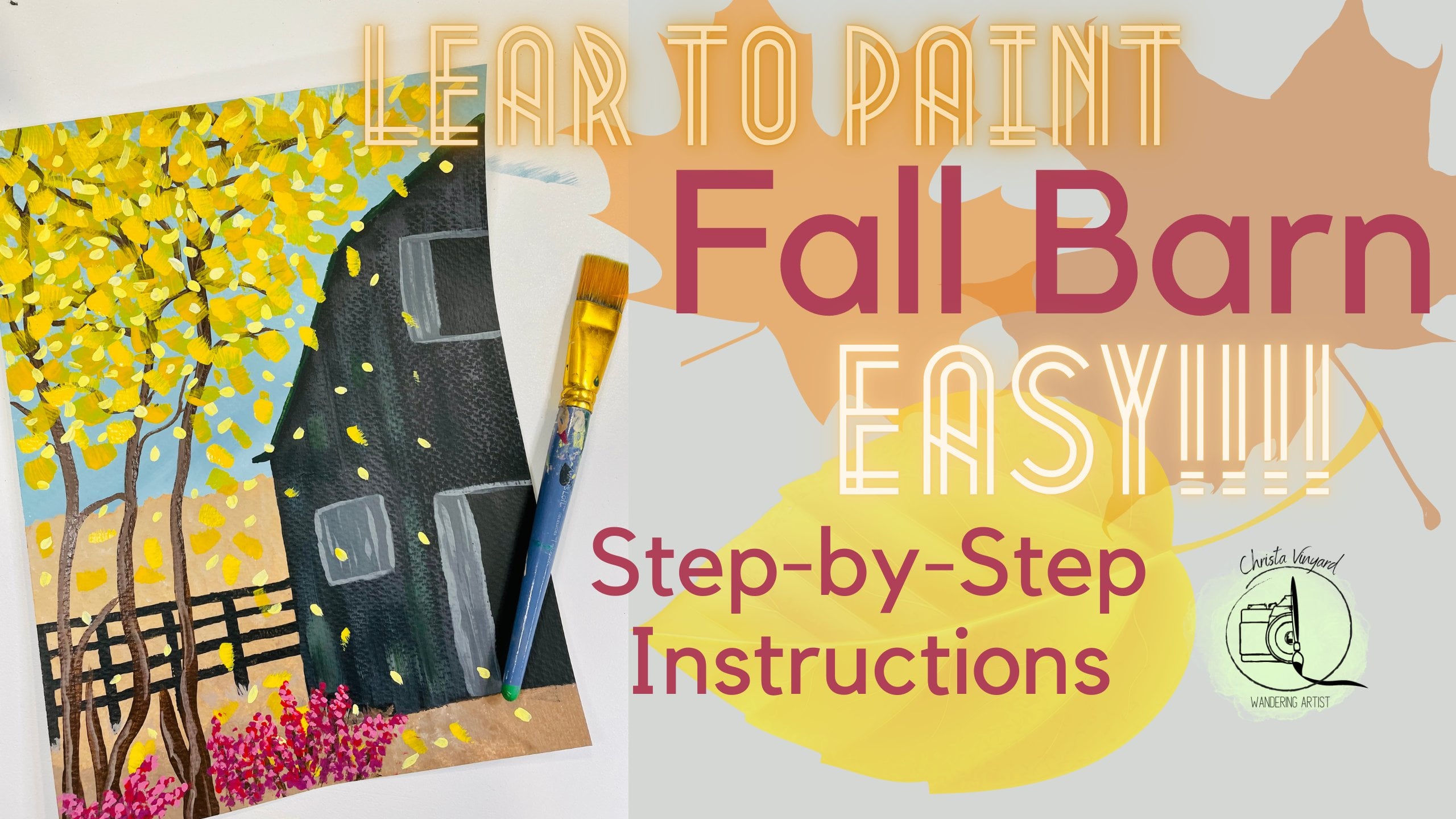
4. Tulip Background: We're gonna start
with blue, navy blue. About a quarter size of paint. Maybe even less if you're
painting on this paper. The dark green, dark
blue, the teal. Tiny bit of black. My
hands are super shaky. Sorry. That's always a good sign. That's when you know
your real painter. I am going to dip my paint
in the blue and the green. See how I just got a little
bit on the corner there. We're just going to go on the paper in a fast
crisscross motion. So you're gonna be
painting like this. Crisscross. Just go back and forth and you're not wanting
to mix the paint completely. You just want those
splotches of color. It doesn't have to be
mixed completely in. Your first layer
is going to look a little opaque and that's okay. Opaque means you can still see some of
the paper behind it. That's okay for now.
Cover your entire page or your entire canvas. I'm going to dip a little
bit of my brush and my black and come over here on this corner and darken
that corner a little bit. Again, I'm just using real
quick flicks of my brush, just a little flicker. I'm making sure that all of the paint off my brush before I overload
it with more paint. Going back in with
a little bit of the black coming over
here on the corner. Dark enough that
top a little bit, smashing that paint
onto the canvas. I'm going to go back
into the blue and green. See how I did that. One corner is blue and
one corner is green. I'm gonna come back
here in the center. I feel like my brush is
getting a little dry, so I'm gonna add a
little bit of water, brushing off the excess and then going back in with
the blue and green, maybe even a tad bit of teal. See how I did there to
have a tiny bit of teal. Blue and green, dark
blue and dark green. Water made a huge difference. The water just helps
the paint just kinda move around a little easier. It doesn't get so
sticky on your canvas. Do you see how you can still see some brushstrokes in there? That's okay because this
is just our first layer. So we're just going to let that dry and we're gonna
keep moving down. And as we move down, we're gonna be adding more green to the bottom
part because this is where our greenery is
going to be for our tulips. The tulips are gonna
be up in here, the blooms of them. And then down here is gonna be all just a bunch of greenery. We're going to start adding
more green and less blue. The blue helps the add
a little more water. The blue helps it look
like it's in a shadow. Which if you look at
shadows and paintings, It's usually a blue, It's not necessarily a black. It's a really dark blue, sometimes brown depending on what the tone of
the painting is. We're just going to keep
adding more blue, green. And it's just gonna get a little greener and greener
as we get down. Remembering to add a
little bit of that black on the corners just
to give it some depth. It'll look like those are
the further away shadows. Looks like I need more pain. Let me put a little more
paint on my paper palette. Here we go. You can always add more paint, but it's really hard to put
the paint back in the tube. So I always start with a little bit and I
can add more as I go. Remember this is
just a background. And you may be
thinking, Oh my gosh, this looks terrible
when you have to just trust the process
and just keep going. Because remember, most of this is going to be
covered by flowers, so it doesn't have to look especially beautiful right now. You can just keep
going until you get to a point to where you
feel like you are confident in your painting. I'm going to add a little
bit of teal up here just to give this a
little more depth. Adding a little bit more
green just because I feel like I made that
a little too blue. That's a wonderful thing about
painting and being sloppy. Being a sloppy artist, you can just change
it as you go. I want to darken up
my corners again. I feel like is a good
background for our painting. All right, so we're
going to let that dry and then we'll come back and hit it
with the two lips.
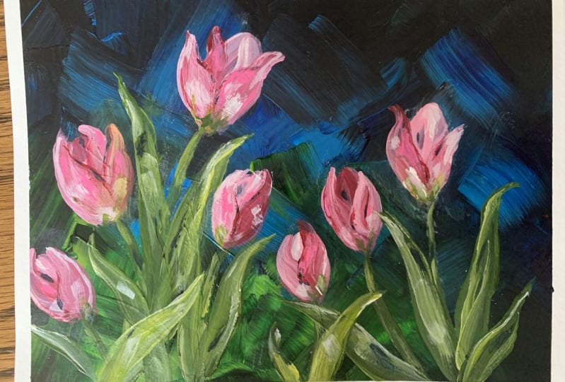
5. Painting Tulip Flowers: I have my background finished. And I think what I'm going to do is you can have a choice. You can put your tulips
at different heights. Going across the page. You can have two
loops cascading down. I think I'm going to do them
cascading down maybe like with one kind of just
reaching out this way. I think if I have
them cascading down, it would be more
visually attractive. So let's just get some
paint on our page, on our paper plate pellet
board. Just get started. We're going to use here
is this round brush. I'm going to start pink and
my cream mixed it together. This was the light pink,
this is the purging pink. Alright. Now if I make this one too tall, It's going to look weird,
cascading down so fast. So maybe about, let's see, 1 third, two-thirds, and maybe just slightly
above two-thirds. We're going to make
the first pedal go off the page a little bit, off the canvas a little bit. Now remember this is
only the first layer. We're going to add more to that so it can have more
depth and more color. Here in a little bit
on our second layer. This one's going to
be more closed-up. I'm deciding if I want one here. I think I do. Maybe one that's a little more open. Again, we're just
doing the first layer. Let's see. I think I kind of want
them to come down, maybe come up a little bit. I want them to go with this way. I want them to
start to lean over. We're just going to
be leaning over now. All right. Let's put some down here in the dark. One can go down here. I just added. Brandy wine to my
brush. Brandy Wine. Make it a little bit of a
darker to appear like that. I might do that again. We're going to add a little
bit of white because that's the inside bulb is going
to be a little more open. Probably going to add
one more right here, and that'll be the last of our do we need this to
go this way again? Maybe one more. Well,
let me think here. You know what? I think we're going to just
keep it the way it is. Less is more. Wash my brush. And then
we're gonna go and put our second layer on our
first petals that we did. This one was a
brighter pink is so we had some cream and
some peak in here. Gonna just some more
details to this guy. Just adding, just cream to get the shape of
the petal in here. Remember to add a
little more of them. Just paint to the bottom. Have to rinse out your
brush every time, which is to have it
I have, I guess. I'm going to add a
little bit of our bright magenta to my brush. I think I need a little
more on my palette. Bright magenta. I'm going to bring that guy up a
little bit down here. I like that sushi
pink in the middle. So we're gonna keep in touch of the brighter pink right here. We can tell it that
isn't a flower petal. Someone's laughing in
the studio next door. It's funny. Adding
just a little bit of white to the outside
of this pedal. Kind of feathering it in
there just to give it a little more interest. This is the lighter
color one again. We're just going to put
more of that pink color on my brush and just
follow what I didn't. Where you can tell that the layers of paint or making the paint brighter
and less opaque. You can't see as much of the black background in
the middle, which is good. Now what I don't like is
this petal right here, this pedal needs to come more. What to do? I'm gonna keep what I
have on my brush here. And we're going to go into the little bit of the
darker magenta and mix it with some of that Persian pink and give this flower
some details. I need to lighten up
the middle on this one. Going up. We'll give it some highlights. This one, you do a
little more details. Refresh my palette and I
got to put some more pink, pink work on this one. Notice I'm working
from the top-down. Because if I worked down here, I might accidentally put my hand in it and that
would be very sad. Right off the bat. I know I
need to go in and lighten up this guy right
here in the middle. I'm going to re-establish that pedal on top. Put some highlights around
the back of this guy. This petal. Give this guy some details. Sometimes I forget I'm
recording and I stop talking. Now we're going to work
on the darker magenta. I'm sorry, in the Brandy Wine. Over here. Tulips have this petal. It goes like this. When it's all closed uptight. How it looks. The same way. This one has a little brighter highlight right
there in the center. I'm going to white on this one, just to be on top. Little more Brandy
Wine on this one. Need to change that shape
right there and you had to go highlights. This one is bright
pink again in this was just a title like that, how it's turning darker
color down here. This one has a pedal on the
outside that's gonna go. My hands are getting tired. I'm starting to shake. Now let's work on this last one. Next step is let's
work on our greenery.
6. Tulip Greenery: We're back. Now you're going to work on our greenery for the
stems and the leaves. The stems and leaves, Han tulips are really
pretty standard and easy. They are. Let me move this out of the way. Practice. We did a practice session
on the leaves of tulips. I'm just pouring out my greens. I have my dark green, my Kelly green, gold. That's probably all
I'm going to need. And we're still going
to use our round brush, trusty round brush. Alright, so the
stems on a tulip, well, let me just paint
it to it real quick. What we'll do another
one, crooked one. Alright, so the tulip has
stems that just come down. And if it's leaning over, it usually has a stem that
comes down like this. Train. This was a tulip stem. The real long and bendy overlap each other because
the urban dying. Now on our painting we'll
get that a little better, but that's kinda, kinda
has a little cup. Then it just, whichever
one you want to be on top. You add highlights to.
The leaves are very long. Curly, kind of gets
thick and thin. They all have this point
to them right here. Let's see, maybe this
one a little bit. I'll show you that you can just overlap whichever one you want to be on top and you
just go in and repaint. Then let's do one over here. This one to be on top. You can just add however many
leaves you want. That is basically
how we're gonna do our greenery for our tulips. Down here is gonna be all
leaves and greenery and stems. You need to decide
where the stem is going to hit the bud in front of it and where
it's going to end. So I see the stem going kind of like pretty much
down into that one. Then just getting
lost it down here. This one, when it's
pointing this way, the stem is going to come out and it'll get
lost down here. This one is a short guy, so he's just probably going to be like my sounds guys
leaning this way. So his team is gonna
come out. This way. I can go down the page. This stem will go
just straight down. This one will go this way. You know what? You can always change these two if you don't like
the way you made them. This guy is leaning, so
he's gonna go this way. It's kind of leaning, kind of picture him kind of
going a little S. This guy's gonna do
kind of an opposite. I'm getting brighter. I'm using my brighter
greens as I go this way. Now what I want to
do is go back and put the little cups on the end, on the bottoms of
the two of them are there and they're connected. Really just align. I mean, it's kind of follows the shape of the
belly of the flower. We just want them to have
just kind of grounds them, I guess is what
I'm trying to say. Now we're going to add
some, some leaves. I envisioned seeing a leaf just poking out here
just a little bit. Then maybe one floating
out right here. Big one right here. This is just first
layer of several. Want to think about covering up the most of this
back here though. Close to that one. Let me give this some little bit of
brighter highlights up here. I think there needs to
be one right in here. I don't want it to
curve this way. I want this guy to be on top. It's going to add. Definitely needs to
start right here. A little bit of my, my gold. Just to give this guy a
little bit of brightness. Let's decide what's
going to happen here. I think I just want one
forward leaf to come out. And Corinne this way, I'm just adding
some highlights to my stems because
as they're drying, they're getting
darker and darker. I'm adding some green, maybe even some of my little bit of gold. I like that, but we'll
see how it goes. Come on this stem. I'm just adding some
shorter foreground leaves. Just to cover the
bottom of the painting. Just adding some
highlights with my kind of taking turns between
the Golden, the cream. This one a little taller, changed this one right here. That I'm going to stop because I feel like I'm starting to
overwork it a little bit. This is when you know,
you need to stop. Here's you're done painting. I can't wait to see
what yours looks like. Hope you enjoyed it.
7. Sunflower Background: Let's talk about the supplies and the paints that
we're going to use for this sunflower painting. For our background, we're going
to use a navy blue again. I'll set them this way
so you can see him. Brighter blue. This one is called
sapphire blue. Probably a little bit
of this dark teal. That'll be for our background. And then when we get to the
details of the background, we'll add a little
bit of greens. And this will also be used in the sunflower seeds as well. For the petals will
use kings gold, a little bit of Barry wine. We might use this Pueblo orange. I'm not sure yet.
Animal probably use this antique parchment for our white because I
like to use cream for whites instead
of bright white. Sometimes it's a
little too much. So those are our fees. The grid, you're going to
need your water, of course. We will use our
one-inch flat brush. Are eight inch around and we may need are two inch
round the small one. Not sure about that yet. Here I am with my paper. And if you wanted to paint this on Canvas, please feel free. All right, so let's
just get started. There's my dark blue.
Can you guys see that? Yeah, you can. Okay. Dark blue, about a nickel size. We can always add more
lighter blue, turquoise. What we're gonna do is dip our paintbrush and all
three of these colors. I have the blue and
the light blue here, and the turquoise here. And we're just going
to get a smear look over from here up. Probably. Let's try to make it from here up
because all this is gonna be sunflower anyways. We might even just go ahead
and paint the whole thing. That might just be the
easiest way to go here. Okay, so let's just get started. I'm just going to use my trusty crisscross pattern that I like to do
here for backgrounds and to make it fast. My studio is downtown
in a little town in Texas and right by the
train station. That's okay. Minor things we can do with it. See how I'm not blending. I'm just letting the sky
look marbled and abstract. Some texture, some light, some lighter colors without specifically meaning to put
them in specific places. That'll come in handy
here in a little bit. I'm just going to go ahead
and do the whole thing. That way it's uniform. You can tell that my painting
style is not realistic. I like to just be kind of
messy with my painting. I feel like if I am
super restricted, then I get stressed out and
I don't enjoy it as much. So that's what painting is supposed to be something
you enjoy doing. If you're being for me, if I'm being too technical
with my paintings, then I tend to get frustrated
with myself and I, I feel like I'm not good at it. And I know I'm not the
best painter in the world. I wouldn't even call
myself a good painter, but I enjoy doing it and
I enjoy teaching it. And that's really
you can ask for. I guess that's the point
and just injured strips. It's a stress reliever for me. Okay, so we're going to let
this dry and then we're gonna go ahead and map
out our sunflower. And then we will work
on the sky, blast.
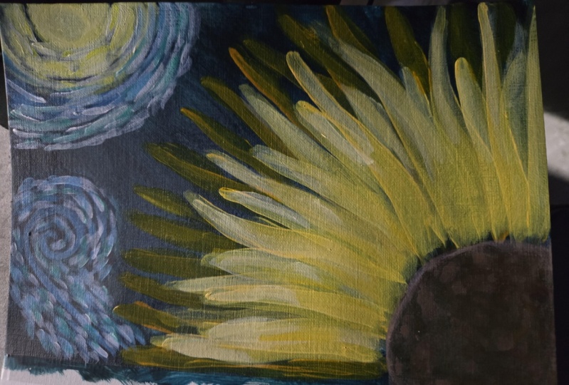
8. Sunflower Pedals: It is almost dry. I have a little
bit up here that's still blue, but that's okay. Right down here is where I
needed to be dry the most. So I have this little jar in my hands and this
is just just open. It doesn't really
matter. All I'm using it for is the shape of this lid. I'm gonna come down here
in the corner and put my lid the corner here
because I think I'm gonna have my sunflower come
out this way of the corner. I thought about putting
it in the middle, which you could do because
that's how we practiced it. But I think I'm gonna
have it be on the corner. Do it right here. I think we're going
to go on the corner and we're gonna make tall, maybe not quite that
tall, tall petals. Then a little bit of abstract, kinda like a starry
night sky and going on up here in the top corner. All right, so I'm just
going to use my pencil and trace my circle. What do we think? I think I'm going to
come over just a tad. Here we go. That's better. Now I'm not going
to worry about that because I'm just going
to paint over it. I need to just remember
that this one, Here's my circle here. Alright? So what we're gonna
do next is we're going to create our first
layer of our petals. So I'm going to
use my kings gold. We're going to put
just a touch of the Mulberry wine
in there to create this reddish brown color. Now, that one right there, that might even be too much red, we'll find out if it's
too much, guess what? We can just add gold. I think that's
actually pretty good. It'll dry a little bit darker
than what I intended it to. So that's okay. Alright, so what I'm gonna do is have a lot of
paint on my brush. I'm going to make some
long skinny curly petals. Remember what we talked
about in our lessons, we're going to press down
as we get to our circle. And also what I'm
gonna do so I don't lose that line for my circle is just no, that's not a good idea. You're going to get my brown that I forgot to
tell you we're going to use. Just paint my circle
real quickly. Just so I don't lose it. My hands are shaky,
even painting all day. All right. So there we go. You'll notice that I'm moving my paper as I go
around the circle. So I'm careful to get
the right angles because sometimes those angles can turn out to be a
little lopsided. I'm going to add a little
curl this way to that one. I think they're starting to
look a little too uniform. What I want to make sure is happening is that my arc isn't getting too
long over here. So what I might do is just put, put a little dot. Let's see. Long, pin, long. Okay, so we're gonna
put a little dot here, little dot here, so that they stay about the same length and height so they don't get
too long on one side. I can tell I was getting
too long right here, It's starting to
look a little laggy. We're going to just
put that one there. Then turn my page, put that one there,
and then just fill in. I like how this is coming up. I see it coming up
a lot right here. Try to keep that in with
my painting and maybe even brighten my bright area
to be right around here. Homework, I didn't
meet my circle. So let's go back and do that. Just so it's color
matches when we're done. Now what we're gonna do is add more kings gold to that color. I'm going to add
our second glare. Now remember, we
took our pin and we made sure that each
one was about the same. So we're gonna do
the same thing, but we're going to come in
a little bit because you want these to be a
little bit shorter, not too short because then
that will look really weird. You just want it to be
about an inch shorter. About where these are, is where our new
petals are going to be. All the way around. So let's do, let's put a guide, little dot as a guide. Right here. Right
here, right here. Right here, right here. Okay. See, look, I'm starting
to get longer, so I need to come back too long again. Good thing I had those
dots in there to guide me. Now what I'm going to do
is add a little bit of my own to my gold and make another third
layer, petals. These are getting closer. Now, I might start
thinking Nick thickening, thickening them up a little bit. The traditional way we learned. It's funny how we practice so to make our sunflower
a certain way. But I just decided to get creative and do it
completely different. The good thing is this is
your painting and you can change yours if you don't
like mine offset like this. You can change it and do
whatever you want to do. All right, now what I'm gonna
do is add some highlights. And I think I'm going to start
highlighting just these. What I'm gonna do
is I'm gonna have my abstract Starry Night and the bright part is going
to be right here, so it's gonna be
shining down this way. So this area right here
needs to be my whitest area. We'll do that one last. So we're going to go back
into my darker oranges and just start highlighting
these back here. Just on the tips. Just so they're not just
a single solid color and just give them a little
more depth and interests. And I literally just
putting one stripe of color down each petal. Then we'll do the same
thing to the gold. Will just add a little
bit of white to that regular kings gold. And do the same thing
back here to these, there are probably still
a little bit wet even. Alright. Now we're gonna
take almost really bright white into our last
highlights on these petals. Not white but cream. We're
going to start here. Switch to my little round brush. My number two. Just had
some fine line details. Does seem to be able to get
with that little round brush. I'm gonna come down here
and just feather in some darker orange to give us some depth that will
look great once we add our this is from
this color up here. I'm just starting
from the circle and I'm moving my brush out, picking it up as I get
further into the petal, just sort of look like a fade. Noticing that I have
nothing right here. Going to blend that
in just a tad. Alright. Now we're gonna do
the center and I forgot to tell you we're going
to use chocolate brown for this. I'm actually
already have some. We're going to add
a little bit of our brown to our gold over here, and we're just going
to make a light brown. Remember I told you
we were going to use that line as a guide. Kinda lost it, but I can
still tell where it is. Now. I'm going to take all brown
and just kinda come in here. I want it to be a little
darker down in here. Blend that in. I think I'm gonna take some
black and make this even darker in the center. Just a little bit. When
you're dealing with black, it takes literally
a tiny, tiny bit. I'm just, I'm really
just dabbing. I'm not even making any
kind of brushstroke. I'm just dabbing the
colors in right here. Leaving it a little
model looking to take my smaller
round brush and go in with this brown and just make little teeny-tiny
little dots around the edge. Because you can see the little. You don't want
them in a pattern. And you don't want
them to go too far into the Petals either. You just teeny-tiny little seeds you can see around the edge. I'm going to just bring a
few of them in here too. I'm going to take some black
and do the same thing. Just a few little areas. All right. I'm super satisfied with that. I'm going to leave that alone. Now we're gonna let this dry
for just a few minutes and we'll work on our
starry night sky.
9. Sunflower Sky: For our starry night
sky, Here's a color. We're gonna use the Brandy,
Wine, the king's gold, the cream, the dark turquoise, and the brighter blue. This is actually
called sapphire. This one is called
Deep Sea blue. So I'm gonna take some gold and some white and
mix it right here. I'm going to kind of
go off the page here. We just want it to be swirls. I'm gonna switch to
my smaller brush. I'm gonna make some swirls. If you've ever seen The
Starry Night painting, you'll know that it's just swirls of color. I'm going to add a
little bit of blue to my green right there. Now, I'm going to swirl. Swirl right here. Let's just, let's just draw the
line real quick. I'm just thinking I'm
gonna lay it out. I'm going to go like this. I'll do that. Then we can just just follow a pattern and it
won't look good right away. After you add lots
of highlights. Really cool. That was a light blue. And now I'm gonna go
back in with just white. You want it to be brighter in the center than it
is anywhere else. Mixing a little bit
of my brand new one in with my light blue, I'm going to get a purply color. I'm also dipping it
in the turquoise, just because I want it to
be a marbled blend here. There's turquoise, it goes white to light
blue to dark blue. And now I'm adding a
layer of turquoise, introducing the purple by
having that purple on my brush. And now I just go
into street purple. Let's do some purple
around this sun. Remove whatever it is. Then let's just go. Let's just do another
little light blue. Swirl down here this way. Just a small one. Dip your paint in the blue
and just follow the dots. Then go into the white. I'm bringing the white. Then go into the
turquoise leaves and then the purple. I think we're done guys. Alright, so that's our
starry night painting. This will look great
hanging in anybody's wall. I hope you guys
enjoyed the classes.
 Christa Davis, I can teach you that ANYone can paint!