Transcripts
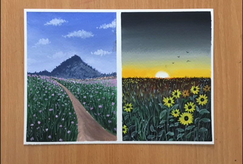
1. Introduction: Are you someone like me who sees a flower field and immediately feel like dancing around it. There are always flowers for those who want to see them. As an artist, I'm always intrigued with nature's beauty and try to capture it mainly as a source of inspiration for painting. Hello everyone. I am Mayuri a passionate artist from India. You can find me on Instagram artrinkets underscore. So I welcome you to this therapeutic class. on painting with flower meadows with the amazing and versatile medium, which is, oh my gouache, such a forgiving and a vibrant one. Yes, we will be painting with the gouache medium and I will be guiding you to paint two beautiful flower meadows with it. Even if you are a beginner, do not worry. I got you covered with all the basics needed. If you are afraid to start off with the painting because of the complexity and various details do not be, as it is as easy as 123. Seriously, you will learn to paint a beautiful meadow in three steps, which is blending, blocking, and layering. So let's get this fun. Gouache session started.
2. Art supplies: So let's get started with the art supplies that we need for this class. I'll be using MAC nanny on DLP, which is 100 Boesen cellulose. This paper is 220 GSM, So it is suitable for multiple layers and blending. Since this sheet side in a three sizes, I got them into A5. A6 asks for my need is the size of the paper that I'm painting on will be 21 by 1570 me did I delete list? Those are the best for gosh. Since sow discord press, it does have a texture by took an old school for the texture you'd like. So coming on to brushes, I will be using, for instance, heritage site off for o flag brushes ready important for this class. So this is a three-quarters in Java brush. I'll be using this brush to cover up the larger portions like the sky. So aligned next to even need a phi standard on brush, a distant loci, if you have these two brushes that we covered until now. Size three round brush. And the size 3 by 0 round brush. So for the class, I will be using the masterclass and gosh beans, my White Nights you. These gosh beans are super vibrant and the texture is so buttery smooth. I must say these are my new favorite. One amazing thing about this set is that that is one extra white dog. And this set, since white is used most in Gosh paintings, this has chances to end up soon. We've been need a mixing palette or a dish, or literally anything that can resist being like ceramic or glass. Up and say for a minute, sketches. Any hard board that can provide stability to your people. Some tissues or Gorton clock, a glass container photo. And finally, our masking tape.
3. Gouache Techniques: So first we will look at the blending technique. So I'm placing this madder lake red on one side. Actually, I was supposed to do it from top to bottom, but never mind, I will show the blending from side-to-side instead. Now after cleaning my brush, I will place the second color on the other side. Since my being precious snap, it will blend both the colors on its own. You need to only go back and forth across the beam. The techniques are similar to that of watercolor. So you can refer to the previous class for DDT techniques. I'm again placing the same gallows opposite to each other. So I'm using white quash to blend these colors. You can go top to bottom or bottom to top depending on which color you want over it. Honestly speaking, this is against my normal motion of blending because usually this side-to-side, top-to-bottom manual, This brush is really amazing. I end up doing such things, sorry. So I'm just blocking in blob of paint. So the consistency of the beans is also very important because gosh is mostly attributed to take an opaque consistency. Soft border. You can see that it is almost like watercolor. For the next block, I will be using Payne's directly from the doubt. So you can see it is ready. Take. More darker than the one which we have seen underdog. Also, dry brush strokes can be seen at the edges. Let me show it to you separately. Because this technique is really important to add extra depth in your painting. I'd better stop now. Oh my gosh, look at those color differences. Seriously. Gosh, medium is really a magical one. So that's splatter some beans. This is my absolute favorite technique. Take a good consistency of beams in your brush and just tap your brush with the help of your finger or with the help of another brush straight out from the top and placing it over people. Consistency is important. In terms of loading S1. I'm adding some portal to show mirroring in tin cans of 70. So it can be clearly seen that it does not as vibrant as the one that is below. Another important aspect that you should make sure that the pins or the layer underneath is dry. Otherwise, you would end up deactivating the beans. However, the drying time is very fast. You need to be carefully to prevent us from appearing. Also, you can see a layer underneath also creates a dual texture ordered in the back-end. So it is not drawn to paint with thin consistency because it's still some value to the paintings. So it actually depends on the type of paintings you are doing. Like in case of sky, it is okay to do a light wash of the color. Adding some splatters for fun. Also, adding more than just a single color to this flat dose, add some new to the painting. So forth. We have seen blending with water. That is a clean, damp brush. Next we saw blending with white gosh. Then the consistency of beans and how the values differ. Splattering technique, dry brush strokes. So this is done top to bottom or vice versa. So thin consistency is suitable for light washes. Plateaus are usually helpful to resemble a nice more flowers or birds. Or the dry brush strokes usually adds texture to the fetus. So we will be painting mainly in thick consistency because it is best.
4. Elements Techniques: For the Phillies and we will be using this blocking technique for the trees. You have to create a broader base and then they bring in. Also you can use light pressure at the top and eventually increase the pressure at the bottom. Create branches and different angles and lengths, just forgot branches from different directions. Creating numerous branches gives a fulfilling view. Also, the branches should be in proportion to the tree branch. Create the basis of the branches ticker so that it looks proportionate with the rest. Also, another important element in any painting is birds. So do not be afraid to just press and lift your brush in various ways of use these et cetera. Also modes that will be fine either way should be smaller and they should be flying in different directions because nature is random. For the leaves pressed the belly of your brush and lift off by creating the stems. You can start off with this top first and then press your brush for the leaves in different directions. Also paint leaves in different sizes because mature ones will be bigger than the ones that are immature. Can also correct that the above the leaves later for the grasses just create thin strokes or lines in different directions and never in a single one. So once phyto, or at the top will be the smallest or in the form of small lines. And the ones that are at the bottom will be the guest. You can also create small, small dots to dissemble grasslands from faraway places. For clouds, just dab your brush in different directions and motions. That the boredom will be in the form of small dots, whereas the ones at the top will be the largest. For the sunflowers, just press the tip of your brush and lift off the beans. Are the small flowers can be done in 50 for patents or just likes more dots. The same perspective will apply for the flowers. You can check the previous class where I have explained in detail about perspective. For any of the painting to achieve a realistic look, layering is very important tool for darker or lighter layer. And I'm also adding some bite or a lighter shade highlights, give it a more vibrant look. Last is adding shadows to decrease depending on the direction of sunlight.
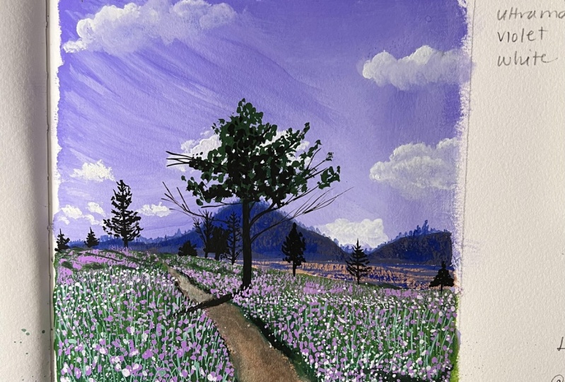
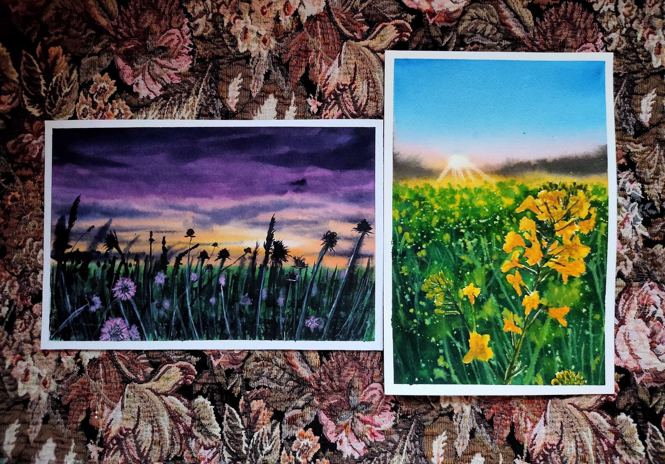
5. Wildflowers Meadow- Sketch: So we will start with the sloping line forced him trying to bifurcate of v for the line. So the line part at the bottom is broader, whereas there'll be four diminish towards the top. I am separating this middle part. This would be a region which is at least that far of a distance. So a small mountain and dBs with a bigger one attached to it. And that's it.
6. The Sky: Called the sky. We will need some good amount of white. And mixing it well. Make sure will give us a go. Make sure you mix well as and when needed, but a good consistency. So start with the topmost region, like mine. Make sure you're filling all this offered. I'm adding right. And blending it directly on top of the mountain. The mountain top most other side will be the darkest. Some darker strokes from the sides. Since cautious of forgiving medium, we can add just a dawns. Like maybe it just to a much darker. So I'm lightening the part to give character to the painting. I'm creating. A.gov makes up the scene and decides in the form of some strokes. I'm able to blend on this because mappings are still wet. Dry it up. You can use water or more beans for blending. I am not going for a blended, but rather snob bending some small clouds with wide gosh. Just use some dabbing motion for the clouds and blend it with the brand ground. I am making some of them. Would the leftovers in my brush. And we are done with us.
7. Field and Mountain Blocking: I'm black. And it will give us a mountain range. Just a little bit off it would do this and mix them. The alternative for the shoot is adding just the ligand for dark black to this mix. Whenever you add black to mix, be careful to use only under cover this way and the part below the mountain range. With this, I am not making the dry brush strokes. I'm using green dip using data. Add black to the boardroom part. Since I have not clean my brush, I still have left on my brush. Blend all of this. We are not using right, because it would result in a line. And that is not what we are looking for. Denser look. Doing some dry brush strokes.
8. Layering the Mountain: I'm adding some blue to the previous mountain mix. Add a tiny bit of black to this mix to create a darker blue shade. Taking some more blue because this angered up being too much doc. So start with the outline of the mountain. When there are little pins left on your brush, do some dry brush strokes over you. Add some white to this mix. For a toy. This will create a textured and add depth to the mountain. Whenever you are creating layers for the details, make sure that you are not hiding underneath layers completely. Adding a small mountain range. Now with a pointed tip of your brush, add some small lines which will assemble. Please do this for the entire mountain range. For this mountain range, I'm not adding new on top of the line. Outline. Just pull out any leftover on your brush. I'm scratching the sides of my brush to obtain this dry brush strokes baton. Some small lines here to cover the entire mountain drink. Odyssey. Nick mountain is ready.
9. Grass: If you're already thick enough, a few outward strokes from showing that the grasses completely opposite direction. This is how you're supposed to cover. Okay. Once again, I can see spaces. Definitely. But I strokes. Deactivating, I'm going to start with mixing. Why would the bike? So getting back to the grasses, I'm adding to the green using the same strokes we are going to live. I'm adding more every day for the grasses. Painting small line strokes or tissue. But just adding fuel gases. And we are done.
10. Flowers and buds: As with different sizes, this one just being outside. Dr. Following similar steps. Mixing. Hi. Okay. Adding some more white to this mix from the mountain range? Some dogs? Yeah. Yeah.
11. Final elements and details: Mixing green. So start with a 10 times as needed. Now for workout branches and different directions and sizes. Some four branches with your brush, dry brush strokes. And I just would look different. Some background with black. You can do anytime you want. I'm doing, I'm just adding some edge to it. Okay? Adding some black eyes. You create. Adding some dry brush strokes with black. Step 3 with black. Some dry brush strokes with some highlights. One last time, some dry strokes. And we are done. So remove the masking techniques.
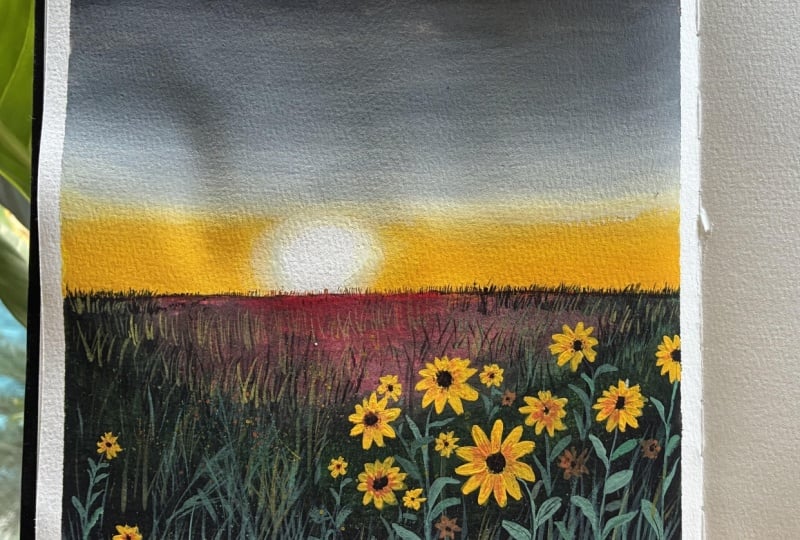
12. Flash Lit Sunflowers- The Sky and Blending: So let's start the project by pacing masking. Masking is secure enough. Let's draw a horizon line. So that's the only sketch we require. I'm taking a tiny danger of yellow light here. I'm placing some excess onto the palette. So start off with this color just about the horizon line. You can also try any shades of orange or red here, drawing us to dissemble the sun's shape. So I like to use white quash for the sun to create. I'm using back-off this trash because I don't have a palette knife. Make sure you're painting with consistency. Eventually as we move down to this mixture, smoothen out. I'm adding some black died because I'm not happy with this. So as you move down, eventually, more space than four, I ended up taking so lifting some of the agrees on the yellow and adding the yellow again. Try to blend. Mode transition will be difficult. If you have left the sun's white, like this. Right? Okay. Just again and again. Okay. All right.
13. Field Block in: I'm using, but you can use any darker shades of green. I'm painting. Also. Do some other places. I'm using the same brush to blend the red with the green. So this gives me mu we are looking for. Okay. Even if you're not using the most recent shouldn't be there.
14. Sunflowers, Grasses and Layering: Some sort of goes around basis or the basis of sunflower. I pick consistency of lemon yellow. I am placing just around the base. So just I'm painting the stems are basis for all of the sunflowers and different editions. Keeping the perspectives in mind. I've shared insights about perspectives and my buddy in this class. So check it out if you want to learn about it more. Guest at the bottom. Adding to this green mix our grasses. Since gosh, dries NACA then water does. The layers will be typically when they are dry. So this is what I was talking about. Now you can see the grasses are clearly visible. So painting some small grasses and other bush like the deeds with black here. Did not. Okay. Those good things. Yeah. Section I'm smart. Hello. Wow. Painting. Back to this audience. Okay.
15. Leaves and Layering: So I'm adding some green mix smell and form a lighter shade of green for the value of the brush to obtain the shape of the nice and extended. Apply more pressure for the leaves and a lesser pressure for the stocks. Yeah. So I'm creating a line with the fresh green and adding one small sunflower. Keeping in mind the proportions of the leaves, it should be some work. I'm adding a second on top of these leaves. Also to not paint the second layer on top of the first layer, but rather themed around it so that the fourth layer is also visible. I am painting the leaves of the second law in different directions from the forced. This will add more depth to the painting, giving it a denser look. Painting a second year for the grass like structures as well. Some work covered painting on top of it. We have looked at the stems or leaves, some flowers. Adding some black foreshadows. Be very gentle on this one. For the shadows on these structures so that it really give more character to the leaves. Okay? If you are happy with your painting until this step, stop You are right now. Because next I will be adding some white highlights.
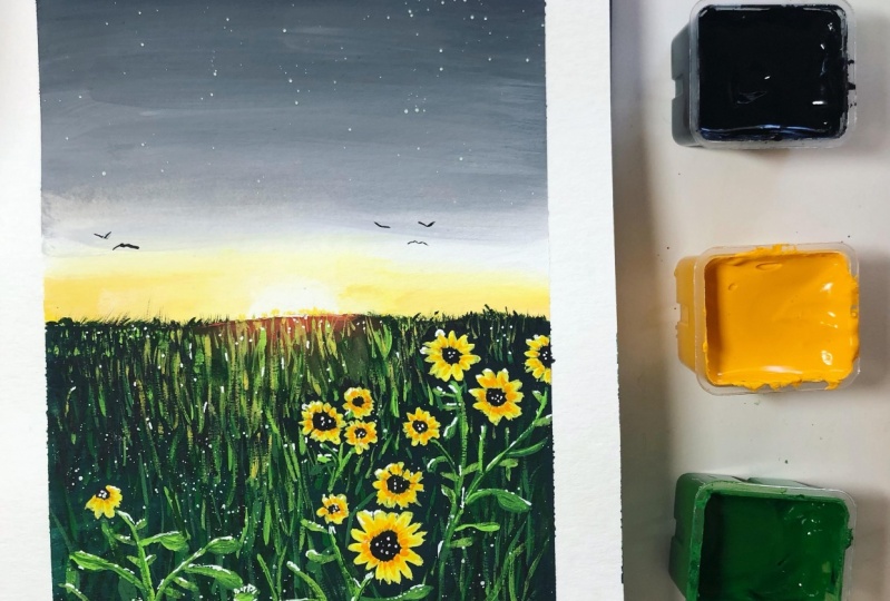
16. Highlights for striking flashlight: So I'm using my size three by 0 brush because highlights are the most important. I'm adding white highlights you on because the painting is suggestive of a flashlight notice coming through and striking all of the leaves and the sunflowers. Also that the studies in the widest painting is so my drink, in spite of being at the sunset stage, we're going to look at your code. Now that you have to find a section, the scale. And then scale. I just wanted to point out. Now it's time to go back to those action steps in this lecture. So there's no scale for this class. Some tiny dogs. Hi. Even if you have skipped this step of highlighting, a few of those highlight, I would definitely recommend. Even if you offer them again, create a magic in European, do a few of those highlights with fresh greens. So I felt like shaping flowers with some black, dark, incomplete without boats masking. The final painting. I hope you liked it and enjoy the process. But at the end you will be the happiest looking at what masterpiece you create.
17. Conclusion: I hope you liked watching this class. If you found this class informative, please leave a review because it would be helpful as well as a great source of motivation for me. What these paintings are from the same reference photo that can you see what difference it creates when drying a second time with different techniques? Do not be afraid of failures and also do not hesitate to try the painting once again, because it is definitely going to be different than what you tried only if your die out the projects do uploaded to the project section. I like this building as well because some of the elements are beautiful in it as well. Let us different in the flower meadow seals because of using different tonal values of the same color as well as different colors. Thank you for joining and see you in the next class.
 Mayuri, ARTrinkets I Watercolor & Gouache Artist