Transcripts
1. Introduction: Hello, Welcome to the heat like Vanguard variants with me, China Jordan. I will be your instructor throughout the process of showing you how you can paint exactly like the mass itself. Don't worry, this class is being a friendly and just remember, Vanguard style is quite forgiving if you make a mistake. No one on though is. On this journey. You're going to learn firsthand about the way in which I've got an experience with practical techniques yourself. You might have most of the equipment at home already, but if not, you can look online and try to find a ready-made piece. Get all, go to your local art supply shop and get them that. In this course, you'll see how bone got created. Starry Night using layers. Experience how we apply the brush, what sort of colors in my views and house construct recomposition. My approach to teaching is quite simple. I worked smoothly even words that only people in the industry knows. But instead, I will teach you in plain English. I don't believe that painting to be exclusive. I believe it should be accessible to everyone and it's our job as teachers to help you feel like you're part of a community. The video is sped up just so you don't get bored and we're not sat there in silence together. So feel free to pause the video and go at your own pace. This artwork should take around an hour and a half to two hours. So enjoy that process and take its time. Your hair because you want to do something creative. So really make the most of it. Finally, if you do finish your painting and want some feedback or just want to share what you've created with the world and please share your artwork with me. I absolutely love seeing what people make. No love to see yours to enjoy the class and have been a painting by Van Gogh.
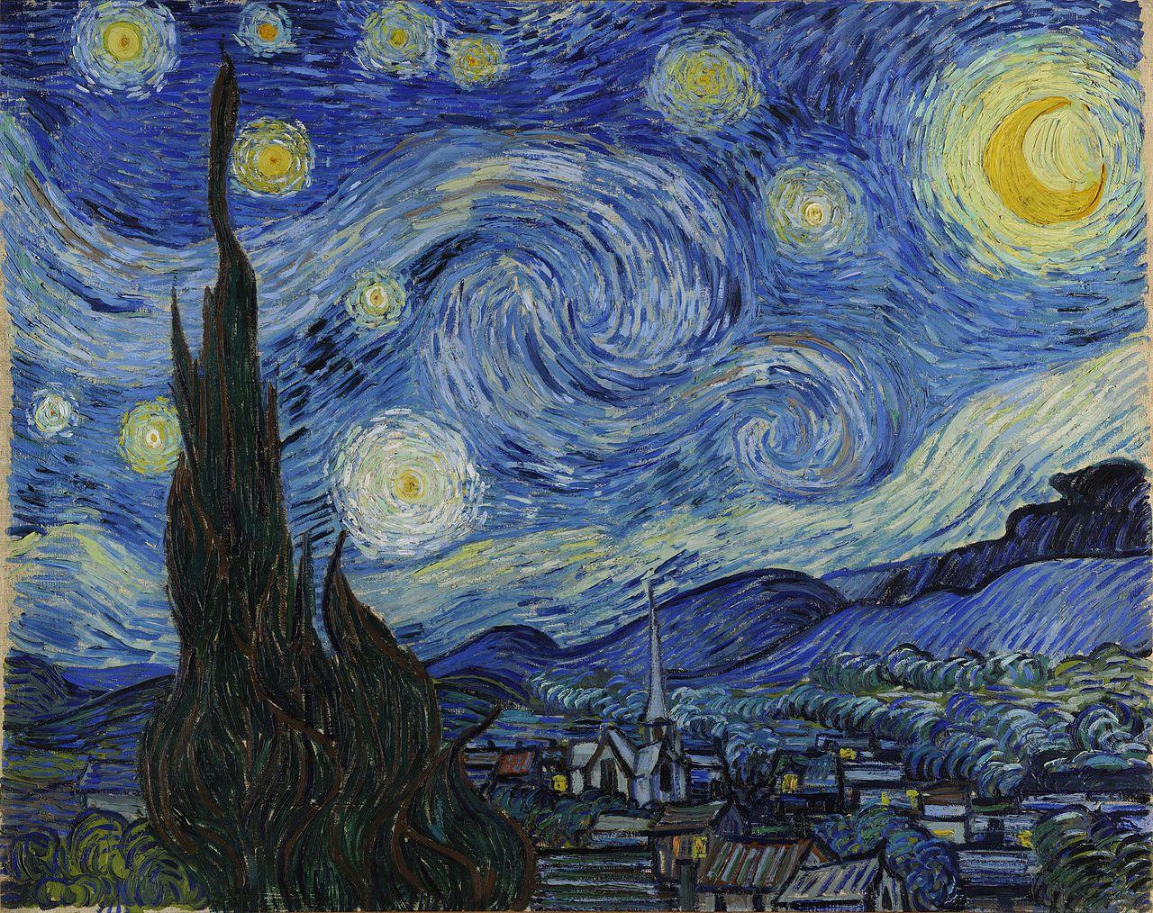
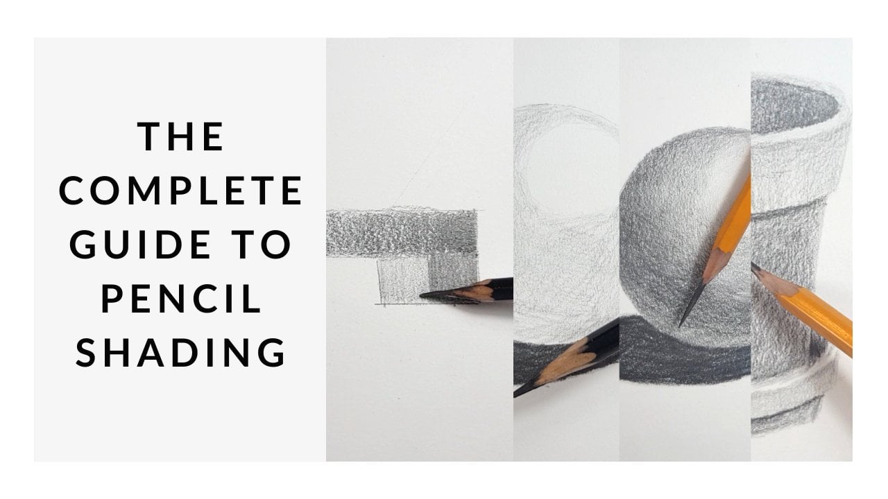
2. Equipment: So before we begin our story night painting, we need to make sure we've got all the equipment. Surprisingly, you don't need that much. So here in front of me, I have the painting kit and I'll go through everything, so see what you've got at home. And if there's anything else you need, either find yourself painting kit or just pops in and shop and see if you can just top up the kit. So let's have a look inside and see what we've got. So first of all, we have a reference picture. It's a bit easier to use a photograph rather than staring from the screen. And it helps with identifying colors. Also, maybe you don't want to stare at the screen the whole time. So make sure you have your reference picture printed. And if it comes with the kit and FAD, that's all you need for that. So a reference pictures start is a really good thing to have whenever you're doing any sort of painting. We have ourselves a pencil. So everybody has a pencil at home. You probably don't need to buy one of these, but make sure you have one handy. And I wouldn't worry too much about a rubber because we are going to paint over things. So just make sure the minimum you have for this is just a lovely little pencil. Next, we will need a paint palette. So most kids will come with a disposable or a plastic one. Both of them are fine. This one is made from recycled card and I will recycle it straight away. So don't worry, I'm still trying to be responsible. But if you do have a plastic one, just make sure you clean it straight after because that means you can reuse it to its full potential after our painting class. So a paper or plastic palette somewhere where we can mix colors safely and we're not going to make a mess. Let's look at the colors. So we have the essentials, black and white. Now, a lot of paintings don't actually use these colors, but for someone like Van Gough, he definitely does. So we make sure we have black and white in there to push things darker and to push things lighter. Next, we have two different types of blue. So we've got royal blue, nearly ultra marine, and then we have a sky blue. If you look at a starry night, there's lots of different types of blues in here. So I'm really going to play around with this combination quite well. Finally, a yellow. So yellow is, well, it helps us to make green, it's in the stars. So we're going to make sure that we're using enough yellow to make it nice and bright and show that the lovely story, no. So these are our five colors. If you do have a painting kid at home, and you probably have these already. But it doesn't matter exactly what blues you have. Just try and get a couple worst-case scenario. You mix royal blue or ultramarine blue with some y and you should get something similar to this. So there are five colors that we're going to use. Next, let's look at our paint brushes. So these are really, really good. We need a bigger one for larger surfaces just to cover the canvas from white as soon as possible. And we need a smaller one to get all those little dashes. So it's really good if you have to paint brushes because that's really going to help you to get that effect that Vincent Van Gough has. So the size of this is a three-quarter inch and then the size of this one is a one-quarter inch. They don't have to be exact. Maybe you have bigger, maybe up smaller. These are just the ones that come in this box. So hopefully you could find something similar to that. If you guess any art shop, they will have the sizes and the hair is just a synthetic hair. And then finally, we have our canvas. So the size of this is 25 centimeters by centimeters. Nothing special about it except is prime. So that means it's got a white layer underneath and that's going to help it absorbed the paint and make sure it's not going to leak through the artwork. These little things are called widgets. So the widgets, you usually shoving the corner to make sure the canvas is as tight as possible. And with something like this, something that's small, it doesn't matter too much. But I'd say pop them in just for a bit of fun because they are quite satisfying to put in. So, yeah, give me go. Super-helpful for larger campuses. But at least, you know what their therefore, because often we get these little bags and we're like, well, why, what do we do with them? So the, the super-helpful to tighten the canvas. You can hear it's like a drum. Okay. So that's our equipment. Spend some time getting everything ready, and then we can begin the painting.
3. What's A Widget?: Let me just show you how to put these inside the canvas so you can see we have a flat edge and then we have an angular edge here. So when we look at the corner of the canvas, you can see two different holes. So one of them is slightly lower, at one of them is slightly higher. And that means we need to start by putting the widget, this little wooden thing into the Boston that so your slanted angles should be facing into the middle. So we should slide that in like Gap. Might be a little bit tight on some of them. And that means that your canvas is nice and tight anyway, so you'll slide that into that. And then you'll grab another one. And you'll slide that in the gap on the top there. So that is what you do for all corners. And the NAACP, she just give it a little bit more tension in the Canvas. And it just makes the drum a little tighter. So once you've done that, you don't have to either. But once you've done that, we can then begin at the drawing.
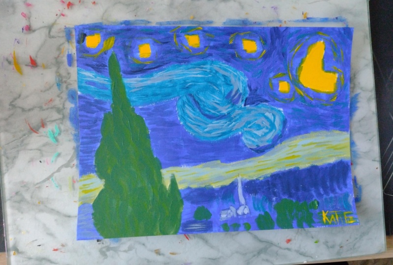
4. The Outline: Let's begin the outline. So grab your pencil, whether it is so little on or as big on, it doesn't really map to we don't need a specific grade of pencil. All I ask is that you don't push too hard when you're drawing because if we push too hot, it's going to be a little bit more challenging to blend in with the background. So in this stage we're just going to do the outline. So first of all, let's think about that lovely motion in this guy's a bit of a loop coming round hits. And I'm going to start by thinking about the beginning. So where's the top of that swoosh? The technical term for the story, not the swish. So what we wanna do is think about what is the gap between the top of the canvas and where that begins. And then I want to think about with that we'll stop. So papa little line there. And very lightly. I just want to think about that motion. So it's a bit like a wave is a wave in the sky. And then from the balsam, that's going to curve as well. And it's a little bit vague. And his, I think about this wave that all I've drawn a thing that's just gonna make things a little bit easier. And then we're going to think about the pulsive wave. And then that's going to come out with a top wave as well. Let me go. So it's almost like an S shape or if you're musical, bass clef or clef untrue. Okay, so from there, we can then go into what looks like rolling clouds or maybe it's the background of rolling hills. I'm just going to put that on there and then this is going down and angle. It's going to make sure that this is just folding down towards the bottom corner there. I'll leave a little gap for that tree. And then there's a tiny hill going up there. So we've got the lovely motion in the sky. Then we've got the style of this rolling hill, rolling clouds. And then whilst way here, Let's pop that tree. So the tree comes from the Boston, and it's really old Ganesh. So I really want you to accentuate the curves on the tree, the curves in nature. And then just think about whether there's these little peaks. Okay, so we've got branches coming off but different thicknesses. So let's get a little bit Sure, Right, But then hello, This is almost like a flame. So if you've ever drawn into flame as a child, maybe that'll help you to draw this. And then we don't need to put any detail in that because we'll do everything with the paint. So we've got the tree now. So let's take a step forward little bit more so we can see the dog, Blue Hills that are definitely in the foreground. So let's go. One of them starting from the left. And then there's a little bit of a layer. And then over here leave a little gap from the rolling cloud. Just so we make sure we have it in there. And then we've got two lumps. So again, they're an angle coming up them. And then we have another little section. Very interesting landscape actually, the more you look at it, the more you think, where is this? Either Let's take a step down and then we can get that. Perfect. Okay, and this is going to stop kind of in the middle of this section because we have a bit of a church in that. So leave a little gap of them and then move back to the right-hand side. So take a step down. And this is going to be where the bush is also. Just do it a bit of a wavy line going on down there. And then I think maybe the final bit we'll add this church. So it will start off with a thin upside down triangles. So the point is right in the sky. And then a little straight line to stop that. Now I'm going to make the church 3D. So if you do struggle drawing 3D, do watch this step. If you don't, just go ahead and do whatever you want. First of all, let's just do two straight lines going down underneath that upside-down triangle. So once you've got that, you're then going to draw an angular line, which is coming off there. And we're going to draw a flat line going towards the left. So this is creating the edge of a roof. And then we can just join that up them. Now on the right-hand side. Again, it's like an upside down triangle. So you want this to be a V-shape. Once you've done your V, the straight line down. And then when you get to this other corner, straight line down. And then when you get to that corner, straight line down, that now these two lines, the lines on the left, they have to be a little bit longer than the one on the right because it's a bit of perspective here so we can join those up. But then for the back one that wants to be a little bit of an angle. So once we've got that, we've got most of the church. So now we just need to add the little area here. So Festival, we're going to print a line up to the top left. And then we're going to have a little section just coming off that. And then we're going to join that roof back down to this corner here. After that. Another upside down V. This is just the left-hand side edge of that church. And then we're going to do straight line. And John, that now this has a bit of a bush in front of it. So I'm just going to have a wiggly line there. And then just inside, I'm going to draw a dose or just a bit of a rectangle inside that section. And then let's just finish it off with a flatline coming left. So it's just coming left of that little point. We've got an angular line coming down, so that's pointing towards the top right. And then a flat line parallel with this roof, and then finally a straight line coming down. So hopefully that was easy enough for you to transfer onto the paper. And I would say at this stage, that's all we really need. And if you want to, you can put some of the stars. And now, actually maybe that's a good idea. Let's just very, very lightly, let's put in a couple of the stars because, because it's yellow, it's going to be even more difficult to paint overs. I want this to be the faintest pencil that you've done. And then we could just pop in a couple of little circles just to give us if placement. Okay. So it doesn't have to be exact with the amount of stars. This is your starry night. Maybe you just want a couple, maybe you want more. But for me, this is all I need. I don't need to overthrow the beginning because it's going to get a little bit more complicated and we're going to build it in layers as well so we could end up hiding too much. So don't worry about any motoring. We've got the important features. So let's crack on now to the base layer of paint.
5. Base Layer: So to start, you can either paint straight from the gels or you could pull a little bit of paint in your palette. It's completely up to you. I think for me, I'm going to use the palette to mix the colors. It's just to make sure that I have enough space. And that way it just separates the pure colors from the mixed colors. So it's up to you, whatever you decide the base, we're only going to use pure colors, so that makes life a little bit easier for us. We might mix a little bit of green and black inside the tree. But mostly we're going to use PO colors. So let's start with the light blue. So I'm just going to pop that to one side. And I want to start with my bigger brush. The idea of painting is to always work from big to small. So this is a big brush. We're working on a big area, and at the end we'll switch to a small brush working on a small area. So using your light blue, you want to dip paint in there just so it covers the tip. Rarely. You don't need to push the brush really hot. We're just going to use it to gently stroke on the paper. There is a tendency to be quite aggressive with our brushes, but there's really no need. And what we're gonna do is apply a fairly thin layer because you don't really know how long it will take the paints to dry. So for this sort of painting, painting, for this though of painting, if we apply a thin layer, it's going to dry quicker and that's exactly what we want. We want layers to dry quake so that when we come back to them, we can work in it much easier. There's a lot of definition between the strokes than this one. So a base layer will just help to create a nice, easy base groundwork for a painting. So hopefully you can see that I'm just gently put it on there. And I can still see the color is quite a thin paint, which is great. It means the layers will build up quite easily. And I want to leave that now just to make sure it dries quite quick. So the important thing if you do go from paper to paint pot is to clean your brush. So make sure you've got your voltage or handy. And you just want to jab it a little bit and that's going to open up all the bristles and hopefully push the paint away. So dab inside there. Then you want to grab an old rag, wheel kitchen towel and just squeeze the excess off. So the more voices we have in the paint, thinner it becomes. So we want to keep it as pure as possible. So make sure you got a dry brush and then we'll open up. This blue is so again, little dip in the end. We don't want to overdo it. And then we're just going to go into the sky. So do try to avoid the stalls because painting yellow on top of blue is very difficult. So you just want to go around it and it can be quite loose with it. You know, it doesn't have to be perfect that if you find that quite mindful, being really, really precise and by all means you can be. But if you're a bit messy, I like me, then this might be a more realistic approach. So when it did back into the paint, It's just these little dips with the end of my brush. I think it was painted over a style that as we're talking about Vienna mass, then I just make star disappears. Sorry. You can see my pain is never traveling further than a third of the way up the brush. Still I'm still applying it really thin. And then don't forget the sky underneath. Tries to avoid the stars and don't, don't do it. I didn't make a star disappear because it was not paying attention. So where the dark blue meets the library, just make sure that it's definitely covered in paint so there's no real white gaps. I guess we can use the same color in the ground. So I'm just going to leave this rolling cloud and I'm going to leave the tree. We're going to paint those different colors so we can make it very thin. Base layer on everything else. The same process. Thin amount of pain. And that should mean that it is still see your pencil. So try not to make it too thick because if it disappears, you'll have to draw a GAN. And we've spent a nice amount of time getting that right. You just want to be able to faintly see. Is that most work smart, not hard. And definitely one. I was going to say for adult working hard, but I definitely want to work in smart finding the easier route for the same effect. Yeah, just the left side. So we've got both of those though, mounds and blew that. Okay. So we've finished with our dark blue and up so we can wash the brush a little little dab into the lab and then scrape off the excess. Squeeze that drive. Okay, So that means then that the rolling clouds, we've got the styles, and then we have the tree. So let's stick with the pure color and we'll go through yellow. I'm going to stay with a big brush and just makes life a bit easier. We can overlap that so it doesn't matter if it goes into the blue, it makes it really nice. Green actually get. So there's all stars. It looks a little bit abstract at the moment and little bit childish. But don't worry, this is our base layers or there's no problems with that whatsoever. Now for these two, we do have a bit of a green going on. So I will bring my palette in there. And I'm just going to pull some of that yellow paint like so. And I'm going to pull a little bit of the blue, dark blue. And then a little bit of the light blue. So I'm able to make a few different greens with this. Now, the rolling clouds is more of a softer greens. I'm going to use yellow and blue. And then the tree is adult green. So I'm going to use the royal blue and the yellow, like paint brushes already yellow. So that means I'm going to pick up some and make two little patches. So on that One that and then I'm just gonna pick up a little bit of the light blue in this one. So that makes it really nice, vibrant blue. We don't want to squeeze the excess of my brush and just rotate around. Push the brush in and clean up brush. Doesn't matter too much if you mix the blues, but I'm just a little bit of a perfectionist. Clean that give it a squeeze. And then let's pick up that navy blue as well. You can see what two very different types of green. So the more blue I put it in the dark or it becomes. So I'm going to use this color, this dark green. And I'm going to put that in the tree. Actually quite like there's a bit of texture ago and only for push my brush a little bit harder texture as a couple of branches. So I'm not going to blend that software's and blending this. I'm just going to leave that as quite nice. Then with the Lewis agree. I remind you Jason, little bit of white. So yeah, I'm just going to clean up, brush, squeeze the excess. Let's pour a little bit of white on them. There were just a little touch of what might make it a little bit bluer, actually. Minty. This color. Yeah, good. So I'm just going to pop that on that into the rolling clouds, official name for it. And again, don't worry too much if that overlaps on your other layers. Okay, so we've got the base colors now on our painting. In gray. You might want to spend a little bit of time just waiting for it to dry, maybe five minutes or so. Grab yourself a cup of tea. And then we'll come back and we're going to start adding more detail and more colors. And we're going to switch to our smaller brush. So give it a couple of minutes to dry and then we're gonna move on to the next layer.
6. The First Dashes: So hopefully you base layer has dried. Now is the time to start to introduce those textures at Vanguard famously used. So we're going to use up mixing palette quite a lot here. And I want to make sure that I have all of the colors. So I've got black, white, two different blues, and a yellow. It might be a good idea just to keep a pool of green there. You can just make it when you need it. Now we're going to use our small brush, which is the one-quarter inch brush. It could be a little bit big and it doesn't matter too much. But what we really want to focus on in this part is the technique of how we hold up brush. So let me just move this to one side for 1 second. If I use my brush as if I was, you know, gently stroking the full end of the paint, then that's going to create a really wide sort of area. If I'm dragging it along the edge, is thinner, but it's still quite thick. So what I really want to do is tilt my brush upwards so that it will create these thin lines. And I'll show you exactly what I mean by that. So let me just pick up a little bit of the dog blue that. Now just do a little test patch. So if I'm going for a flat brush, It's going to be quite a wide sort of gesture. If I tilt my brush to the side. Spinner. Still not quite that. If I'm using that paintbrush really perpendicular to the canvas and you can see such a different texture. So what we wanna do then is we want to apply that last angle that we have so the paintbrush being perpendicular to the canvas. And we want to work our way through the painting. Now as we move along, just think about the shapes. Think about the directions of the brush strokes. So around this sun, for example, they'll go around like a clock. And you have some areas will be darker than others. Try not to make it so uniform. So we wanted to be as random and loose as possible. The only thing I really want you to consider is, do we have any darker patches? Do we have any lighter patches? So this area just here, maybe I want to mix some black and some blue just to get a bit more dynamic, really heighten that contrast. So spend your time now really work around the canvas. And you can add lots of layers. You can either do one layer of the blue or you can work on it when it's a little bit wet this state. So this is our second layer is I'm going to create quite a thick layer. And then when this dries, I'm going to go back to it and see where I might need to amend the colors a little bit. Let me tell you a few things about my uncle. He never actually went to art school. By Gough, lived, lived in France. And it wasn't until he dies. And well after he died that he became famous because he never sold any artwork when he was alive. Which sounds ridiculous because he's one of the most expensive autism, one of the best selling office and about generation now. So the fact that he never made any money as analysis when he was alive is so sad because yeah, he really is such a talent. He's not his biggest fan. I prefer different style, but I can really appreciate his uniqueness. And he did, he pioneered a way in to show a different side of realism. Realism mean to you, does it mean expression of feeling? Does it mean a high accuracy on artwork? Does it mean hyper realism? Or doesn't mean something that you've experienced and you allow your feelings and your emotions to create the artwork. So there's lots of different ways that you can think about it. But find Gulf really helped pave the way for them. I think for that really is, is a genius then you had a really hard life. You know, most people know that he talked his ear off. And they, for anybody to get to that stage is really quite sad. So yeah, things would have been different if he was alive in our era and really glad he had OT to help him through because I do think I'm just waffling on by the way, but I do think is incredibly powerful, especially when your dog times, especially through COVID. I know a lot of people have taken up a new skill. So has been saving grace for many people. So the fat buy golf hat that is really quite powerful. Anyway, back to the painting. So you can see I'm really starting to build those layers up in America only really working in the blue for now because I don't have to wash my brush in between. And I can keep adding different layers, different colors. So just trying to keep my brush perpendicular. I think that's the tricky thing because often we can get tempted to really push down on it. But you don't really achieve much if you push your brush really, really hot. Try and make these little taffy Stamps. Dot, dot. If any of you haven't muted me up. Thank you. When you saw him yourself talking to yourself, it is quite challenging. Stay quiet. My introduced the time, but a white that was really nice color actually.
7. Dashes Continued: I think I'm going to leave it at that stage now just to allow it to dry and then I'm going to re-approach this laser on. But for now, I'm going to move down into the light blue swirly bit. Now we have a few yellows in here, which is great. It means it separates a little bit from the sky just above. And we've got a lot of pale colors as well. We do have some dark tones, so Waltz, my brush is still quite dark. I'm just going to dash away at the outline. So still keeping it very expressive. Getting that gesture underneath that Van Gough was very, very, very, very famous. Full. Then from the Docker base, I can then work on top with the lighter layers. Ok, so I'm just going to grab some of that myth that I had earlier and reintroduce bit more blue, but more than likely. Yeah, that's good. Good color. So I don't want to put too much green in it, so I'm just going to pop a few areas in. And then the rest of it, we should be aiming for blue. So I'm just going to the pure light blue there. And when we're doing these database is quite nice to keep the color that you just had because it would just mix with the pain and just make it a little bit more painterly. So yeah, don't wash your brush too much on this. Because as you can see, is very, is very strong mix of different textures, different colors are looking a little bit flat stone. So I want to pick up some dark blue and just start to think about where it's a bit dark. So here we've got a patch coming up with that. And then it swirls around here and it's coming out the bottom. So the most of areas of focus on the less fly becomes what our eyes really like to see. And this is the same for drawing as well as we really love high contrast. So we really love light next to Doug. And what's happening in this well, is we have different layers. We've got some light layers, we got some dark layers. And that just helps. It helps to give it a movement. And it just helps to make it look a bit more interesting as well. Okay, so then the final bit I'm going to do for this second layer in that, it's just introduce a little bit above what. So I'm gonna go what? And the sky blue. Right? Rep that in. And again try and find the lighter areas in the swell. And then they try and get it behind that tree as well. That'll do for now. We're going to move down almost section. And let's do the sky, that dark sky underneath this I get, I'm not going to clean the brush, just going to blend in with that dark blue, still adding the movement, the direction of the brush strokes. So some areas of little less detail than others, which means there's less color in that. So this patch, for example, on the left, definitely has less definition. There's lots of little lines in there. Behind the tree. Nice dark patch Karen, into this well the test Dick, right, step down another layer. So we've got this lovely rolling cloud. And again, I'm just going to use that white. Now it's a lot of pale blues and greens in that city can use that green that we used earlier. So always recycling know paints. Again, make sure the direction of the paint is accurate to the picture. Every now and again, just mixing up that color, introducing a bit more blue as it goes down because its lightest at the top. And then it becomes really blue at the bottom. So don't forget that little section on the left. And then finally the boats and we can introduce that's the dark blue as well. Just in a few areas. And maybe you can pick it up into the sky slightly. Now this guy, sorry, into the cloud. Okay. And actually make green. Here's a piece. Want to turn them more blue? Okay. So moved down a bit more and we're moving into the DACA hills. So instead of wasting the page, just going to scrape it off in the corner. And it's quite dog in this area. So I really want to get that black and navy. Now black is really strong, so just be mindful about how much you put in the asset. First of all, it's got quite a thick outlines. I'm just going to go around yellow and then, and then QCD has these like sushi, that's like as if we're writing the letter C, But they're a little bit flatter. Someone stood on the left is C. So when you've got the dope is and just then put the pure dark bullet, pure navy blue. Pop those in the gaps there. And it might just be a little bit of the likely ride the end is just going to bring that contrast. So we've got jock at one side and then light on the other. So then behind that we have that next Hills again. Okay, edge. But the steeples or China's paint over your steeple and get the job site on those hills. I'm just flicking out some of the darker sections. And then as we move across, introduce some of that blue color and then, and a tiny bit of white for this. Really think about the movement of this hill. Well, so let's take a step forward now and we're going to look at this part of the hill. So this is quite bright. Which means we can use mainly navy blue. But we should probably outline yet let's do the outline just like Van. If anyone is Dutch, you can definitely say that. As we say in English, Van Gogh and golf. Yeah, let's get that motion. Right. So we've got a little bit on the left-hand side. So let's fill that in as well. Say methods that are going to strong outline and then 20 bit greener on this side. So to pop in a tiny bit of yellow. Yeah, make sure you go with going with the flow of the painting to the right. Let's go down quite quickly.
8. Final Dashes: Okay, so let's move forward onto the little bashes. Start. What a lot of green going on in his so might be good just to make sure you have some green permanently. And all I'm gonna do these curves again. So these are a bit more of an actual C-shape. And you can see there's a couple of yellow bits underneath. It kind of flattens out at the end there. So again, just building on those layers, maybe are a little bit of blue in there. We'll go over that again. Just two. Define the edges by Lisa will take a little step forward. And this time we've got black underneath. So that means that we've got half of the code being quite blunt. So you're going to do Hall for the C-shape. And if that black enough, but this is stuff, isn't it? Okay. And then we wanna do is you want to continue that other half? So I'm dipping my brush the corner with the blue and then going in the reverse direction. So I went upwards with the dog and now downwards with the light. Again, this is just a base. And then in-between, we do have quite a few Kelly bits. Say you just throw them in that regard. We do have a little bit of the bush continuing it round the back so we have that light blue. You can just pop some little almost kills that looks like that's traveling it backwards. And then we've just got a few straight lines going on next to the church. And as you go a few straight lines near the front as well. So just to clean the brush, you can pop a few flat lines everywhere in that. Now we've got a couple of angular lines given on here is a base that, and what we could do is we can paint the church, the big church. And we're going to come forward because we might end up painting over it slightly. And that's great because that's going to show that the church is in the background. So what we wanna do, just going to scrape the joke in itself. I'm just going to pick up some of that blue and palpate a tiny bit of white just to lift the color of this this lightly. And I don't want to do is paint it in. So we've got that top it. And then think about what is lighter. So this face is license around the dough, and then it's a slightly different color for this edge and the roof. So always paint in the direction of the building. And then finally we've got a slightly more blue version and go down here. And when it dries, we can add in the details. I'll do for now. Let's bit splotchy, but that's fine. And kept. So let's move forward and a lot of different roofs. So I'm going to do, is do quantitative sections of straight lines. And then later on I'm going to go over that in an outline and I'm going to pop a greenish brush in there. And were present during squash circles only. Straight lines. Do every few roofs. Actually, the US lunches are right in the foreground. Color, which is going to get what was entropies. Unsure. Sometimes all it does become a math lessons. And I never know the technical terms. There are a couple of shapes on the slanted edge, flatline, slanted edge. Okay. So they're a bit abstract, but when that dries, it's going to allow me to add a dark outline to really define what's going on. And you know, if you find it a bit difficult to start at the Bhushan, there are a few straight lines. Gave it either you mentioned enjoy this event to worry about what you lines, uh, doing, and also spend your time in it. I probably got a different pace to you. So it doesn't mean that you're wrong or you're bad, just means that we're very different office. And you know, I've been doing this a very long time. So I will be a little bit quicker. Maybe you don't know, you could be much quicker than me. And it's totally possible. I do have students that are very quick and I'm just adding a bit of color to this edge to the baby other in that too. And when that dries, I'll come back to that with some dark bits. So a final there on the second layer, really largely unnoticed to fund a bit, but, uh, do some unstyled and do some on the tree. So we'll start with a tree. C does brush, is quite dark and we're going to make that green, so the blue and the yellow. And then I want to introduce the blacks and sort of really dark, dark gray. And then for this one is slightly longer strokes. So really feel their sounds a little bit cheesy, but really feel the rhythm of the plan and think about where things are curving. Think about the folds. We're just using the same color at the moment. So it's done to build on that layer. Yeah, don't be afraid. Strokes to kind of go over other ones. It's absolutely fun. Really covered up right to the end of all those branches. So really dark trees are really don't want to see any of that green underneath. And whether it takes you a couple of layers to let it dry this as fun as well. I think I'm going to stop that at this stage. She says she adds a little bit more. And then I'm going to let that dry and come back to it. So the next section for the stars, I would clean up brush actually because the cells are much lighter. And if we have any dog, black or blue and a brush, then the more effect held Starbucks. So I'm going to be a lot of white in these styles, a lot of white and yellow, maybe a little bit of pale green and blue. So just going to mix a little bit of white and yellow. And I'm going to go round in a circle. Same technique. Carrying around dash in a way. And this one is just going to expand a little bit. On top of that balloon is going to look a little bit translucent and that's great. Exactly what we want. So as random as possible, maybe like a few strays out into the sky. And then just move around all your stuff. So you might want to look at the picture and think, okay, well, which ones are more yellow, which ones and more blue. And you can adapt it that way. So I'm just seeing which ones might have more of a yellow undertone and just use that same paint. And then I will come back to that and introduce more of the police. Most of them will have this yellow guy to be fair. This one in particular is very light, so I'm going to add more white to it. You can do it a little bit more. Why? Okay, Cool, right. Give us a couple of minutes, just let it try, let it set a little bit. And then we can go over the final touches. So we've done a really good job so far. We've got everything on there. We've got loads of colors, lows of things going on. And what we wanna do now is really define the edges. Find that dlp is push them into the painting. And that's going to look really, really dynamic. And already it's looking very much in the style of buying golf. So I'll Starry Night is looking great. Graphic based. Get, grab a cup of tea. And then we'll crack on with a final layer.
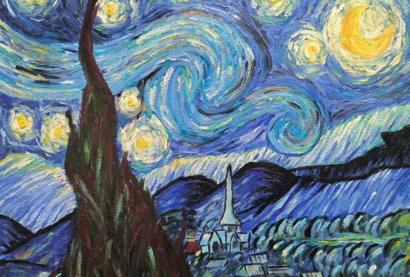
9. The Bush: Hopefully you're painting has dried a little bit now. So now is the time to really refine the work. So we're going to look at all the different sections. And let's start in the top left and work our way down. So the top-left is a little bit darker than everywhere else. So that means I want to make sure that I'm keeping the light bits at bay. I'll add a couple of pure black. Not too much, but just a little bit of pure black. And just see where that travels along too. So that does have quite a while that just going to thinking about this color actually think about where those dark black, as you can see, a couple of flex in here as a tiny bit darkness of them and not too much. And you see a little bit of black pop that in. Okay. So the majority of this section is just blue. So what we wanna do on the left-hand side is just make sure I'm covering that with enough blue there. You can see the more layers I start to add. More interesting it becomes. So I'm not leaving that much of the background. The background was there just to make sure we don't have any white poking through. So just take your time and these sections skew thinking about what the color is. Anything? Well, is there anything a bit more interesting about it? You know, do I slap a little bit of that lighter blue in them? Say slab police, they please be a little bit more delicate than slapping a painting. And each time I'm just putting a little bit of paint on my brush and not been too much. I'm giving it the space of the time it needs to dry because if I put loads I put loads of paint on there. She didn't take forever to dry and nobody wants to waive their painting. Trust me, on the most impatient doesn't keep working our way around there. You can see in this section is much lighter, so they keep adding that light blue. Might just make that blue little bit lighter briefly, just so I can add a few different strokes. So the minute, so kind of 11 shade. Well, I mean it's not, but this way you just really solidifies what's meant to be lighter was meant to be darker. So the dog a bit. So I'll just add a couple of large gestures, money. When I'm looking up at my reference picture, I was like really sad. I'm not really helping move into what makes my navy blue with white just get different type of blue. So again, the aim and this one is to get rid of most of that background. Remember that a light blue. It will show through. That's the beauty of it is it will show through. We just don't need all of it. And make sure you have some of those. So flex, just push back in. Also just helps show the shape that we've done as well. Gives it some form of outline structure, which is not for its due. Afraid to share his models is a quick please that mind is that a couple of dashes of pure what is naturally going to mix with the colors underneath her. Wherever the yellow. What does that probability? Yellow and then scrape often fear that color. So just a thought, Oh, section of the sky then the same method, keep moving it down.
10. Final Layer: So let's continue. Down here is some lighter blues in the loss of the layers. Say, well in this case it tiny bit of flack creeping into that. Let's get a bit more than a white so that y is hopefully going to mix with the greens underneath. So there's not going to look like pure white is actually going to just be a little bit more dynamic than that. And if you find it is a bit too solid, then just add a bit of color and hopefully that will to soften it a little bit. I'm quite pleased with that. So just continue. Roman bridges here. And that y, remember, is quite thin, so is picking up some of that color. We did just to get some of that coming through there as well, just build on that in a second. Okay, introduced such a yellow. Start putting some of that yellow and make sure the top of it is good not to like D'Arcy. That makes sense from the texture of the canvas. Okay, then I'm just going to introduce fit more of that blue scale-up. We're really coming through. Love, this color combination. Green that, and then that's just introduce a little bit of the Navy just to get that nice and dynamic, a high contrast or keep going on about. So still what yellow and blue on my brush. So I'm just going to do some of those C shapes down here. It's little bit like so. I did too many. Maybe I'll pop a few lines there, like next to jog so it's good as an S. And then maybe clean up pressure in there, right? Good. So let's go back into this section in there. So actually this back, but I'm quite pleased with how it's turned out. So I'm not going to pay too much into that. But if you need to do, spend a bit of time in that section to get it so that you're happy. Brown. Quite content with that. So I'm going to move down 11 layer one foreground, if that could be an official measurement. Okay, So this slightly lighter towards the edge of the canvas and then it becomes bit more blue. Docker. We traveled down the slope. See if you can notice that from the picture, this hill is very blue, sir. When he uses much pure blues possible. Down here. Good, please with us. Okay, cool. So let's start introduced some darker outlines around this section. Going to use a lot of black and a lot of dark blue. So it's trying to just kill off the darkest of changes a lot on the just give you a tiny bit of color. So let's start with this outline. Just want to define that. Good. And then go along this bushy bit. Or something quite sinister about saying the bush. Okay, Good. For, you know, half sees in the bar. So these rolling bushes, the jock, not the bottoms out, a couple of light flex in that. But we also got my dark paint and I'll just continue on that so that the edge of the church, I want to use my paintbrush as thin as possible, so I'm just going to have my paintbrush Surely straight up and we should have hopefully been doing that all the way through. But sometimes when you get lost in it, it can just kind of he just kinda forget there is. This is a brief reminder now, just to get everyone back in the habit of thinking right, thin lines, keeping that brush perpendicular to the canvas. And hopefully you'll get some really lovely features coming from this really delicate, really thin on that. And you might need to, if you think it is too fat because loads of paint on your brush, just give it a squeeze and squeeze out all of that pain and then reapply reapply some of that paint on here. And then we just want to get the outline of the building as well. So that drawing that we did earlier, putting that back in, if you need to receive the shape with your your handout, you'll print out or check out the extra downloads for just redrawing that shape because it is, it is quite key to the drawing. So this is one of the main features, or pop that back in that. And then we can go over a lot of these houses. So again, this will be on the handouts, the downloads. You think about how we can make these houses look 3D. Hey, sir, loads of houses in this section, Here's the lows, rooves, which means that just rectangles. Likely. Some of them have slanted edges, which is fun. Some of them, judge. You can just make it up as well if you want. Okay. There's another I'll just pop some smaller houses in the background. So if we have perspective, that means buildings in the background are going to be smaller. Same way to draw them. But because they're smaller, it just helps us to understand foreground and background. So just pop a few of those in. And then with the rest of that black, you're going to pop in a couple of those curly brushes, flat Cs. And then it just want to add a bit of color back to them. So this is a grace and grace financially. Nice light gray just to put on top of their different familiar the colors, That's great. Maybe add some yellow and they get more of a cosine 1. So just filling in those houses. Similar we've got different pens on the top of the roof. And what's going on here. So if you straight lines going on and then don't forget the doors. Just with the dark paint and a pop on. Some of the draws speculate more like in a little village. Okay, Nice. I'm actually going to add a light blue on the shirt just so we can stand out a bit more because it is surrounded by dogs. I thought I'd pop bit more paint on there. She just turned out a little bit more whilst I've got the the light bit. And just go over some of those Kelly brushes and see how just adding some light on the top really helps define curvature within the shapes. Pop a couple of the green as well. Make sure the curve that's really going to help that. And then there's a couple of lipids on the back there. Cool. Okay. So let's get a few files in here. So I'm just going to use the yellow and I'm just going to poke on a couple of areas of yellow. Just to show that this enlightened his town is alive. It might want to add a bit of white, make it different version of yellow. Okay, Good. All right. So an entity that actually waltz among the yellow, just going to do another layer around the stars. So a bit of white and a bit of yellow. Just to add another layer, just so we have done with everything else. Because it's styles, it definitely join up and said lots of layers around other ones as well. Like it would become pure white in this one. Gets it just an older stars.
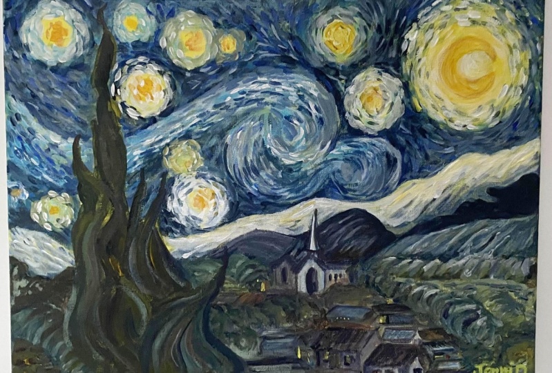
11. Finishing Touches: Guess let's move back into the tree. So we'll get that job green again. Okay, Let's pop that on there. So exactly the same as we did before. We're following the shapes of the tree. And this is a really nice actually if you do these long strokes because it's just going to show what's underneath and what's on top. So hopefully it's going to be really layered. And you still see tiny glimpses of what's underneath. Which was that lovely green that we started with. Make sure you've got enough. Hey, make sure you've got some really nice round sections here. So in the trial, actually pushing down, that was a slightly harder. So these strokes are tiny bit wider than the ones in the sky. Yeah, just get those all over. Okay, cool. I happy. Largely ribosome green left on my brush. Let's maybe just a little bit in this last section. Just going to use up because you can't have too many layers on this. I think there's lots going on, so we'll just use all of it in a nice, nice, nice. Okay. I think the last thing I want to do is just go around some of these stars just with a little bit of glare. Because not all of them are yellow. And I'm just going to add tiny bit of blue around the rest of them. Well around some of them, not all of them. You've got a bit of money again. Okay. All right. So there we have it. Now, if you're a real artist, you will sign the bottom right-hand side corner. So I'm going to do that in what? I have a little signature, which is just my initials, just to make sure nobody confuses it with with the original. So see J Very out actually with this brush, bigger than that. And I want it but does the job. Let's see J. Perfect. So there we have it all plate-like than golf masterpiece. So thank you so much for joining me in getting to the end of your painting. I hope you really, really pleased with yourself because you really should be grab afraid, stick it on your wall and I can't wait to see your next painting. So do share with me what you did. And I would happily give you a bit of feedback poll, just celebrate your achievement. So thank you so much and have a wonderful rest of your day.
 China Jordan, Art Teacher