Transcripts
1. Welcome to the Class!: One significant
challenge we artist always face is the
process of finding an ideal reference
image and skillfully translating it into a
captivating painting. Even though painting from
real life is really exciting, there are times when you simply cannot paint the
scene from real life. Maybe the lightest
quickly fading, the weather's changing, is subject is moving
and that is bad. Reference images can help. Using reference image. You can paint in your own data. Hello everyone. I'm geethu, a
Skillshare teacher, Silverbrush educator, and an
ambassador for White Nights. And see that I'm
stationary in India. I've been teaching online for more than three years now and have conducted several in-person workshops and various cities. For almost all of my paintings, I have used reference images because they give me
the inspiration to find the right composition Perspective and lead me to the final details
in the painting. Welcome to this class on
Learning to Paint from Reference Images and building
your own watercolour style. After completing both my 100 Day Project
classes in Skillshare, one thing that many of my students told me
that they struggled with was to paint from
reference images on their own. Although this class has cater to painting with watercolors, I'm sure that many of the
concepts and principles can be translated to other mediums
such as acrylics and gouache. In this class, you'll learn
how and where to find reference images and how to
choose a reference image. I will teach you how to
decide the focal point, determine the
composition, create the tonal and final sketches to analyse your
composition in detail. Choose your colour palette, as well as tell
you the secret to building your own style
with watercolours, tips for great
colour combinations, creating linear and
aerial perspectives, and the odds of capturing the Focal Point in your paintings. By the end of this class, you'll have developed the skills and the confidence to embark on your own watercolor
adventures using the thousands of images that you might have saved already, you'll possess the
knowledge to find inspiration from those
reference images. Compose captivating artwork,
and bring your visions to life with vibrant colors
and mesmerizing techniques, no matter your skill level, this class welcomes artists
from all backgrounds who are eager to learn and embrace the Art of painting
from reference images. If you are a beginner, then
this class is gonna be super helpful for
you because you learn all the aspects
of breaking down a reference image with the
example of a class project. If you are an intermediate or an advanced artist who just
happened to drop by here, then I'm sure that you will find some interesting concepts in this class which will help you
to improve your paintings. Let's embark on this
exciting journey together and discover the beauty that awaits in your
very own watercolor style. Enroll now and let
your imagination soar
2. Class Project: Hey everyone, thank you
for joining this class. I'm truly excited to have each
and every one of you here before we delve into the gap to eating
topics of this class, let me explain about the Class Project and how
I've structured this class. Throughout this class, I will guide you through the
process of how to use reference image and demonstrate the different approaches that we discussed in this class
by following along, I'm sure that you'll be able to class the concepts quickly. Furthermore, I have Rabbet, step-by-step watercolor
painting process using the same reference image that we using to discuss the
concepts in this class. This was a, as a valuable
demonstration showcasing how we can effectively apply the principles and techniques
that we have discussed. Welcome to paint along
with me, or if you prefer, there are seven copyright
free images attached and the resources section from
the esteemed sores Unsplash. These images will help
you to explore and experiment putting into practice the principles that we have
discussed in this class. Hi, I'm genuinely
eager to see all of the paintings that you try out
from using the references. So don't forget to upload your projects to the resources section here in Skillshare. Remember, this class is
not just about learning, but about embracing
your creativity, finding your own
unique artistic voice, as well as sharing your beautiful creations with the community of fellow artist. So if you're ready to unlock
your boundless potential, Let's move on to the
concepts of this glass
3. Where to Find Reference Images: Now that you here
ready to develop your skills on painting
from a reference, we obviously need to know where we can find those
reference images. If you are someone who
does travel a lot and it's equipped with a good
camera or smartphone. You can capture
different scenes from various places and use
them as a reference. But unfortunately,
many of us may not be privileged enough
to move around a lot. Hence, the search for reference images before
we sit down to Paint, you may have heard of Pinterest, but while Pinterest is an
ideal source of inspiration, the pictures available
in Pinterest may not be copyright free as they could have been pinned by
anyone from any website. If you're creating paintings for yourself and never
intend to cellular Art or post to social media than
it is completely alright to use the reference images from Pinterest for your
practice sessions. I have used Pinterest reference
images for my paintings only when I'm completely sure
of the source of the same. And if I see that it
mentions a source is not copyright free
and I want to use it. I contacted the honor and seek permission
to use the same. Whenever it comes
to the topic of copyright free images
and licensing, it seems very
intimidating and scary, but there are plenty
of resources in the Internet to help you with
finding the right images. I'm not a copyright
lawyer or a legal person. Before you decide on
taking from a website, just be absolutely sure
that you're free to use their images and content
with or without credit. For most websites,
you'll be able to find this information in their
terms and conditions. The resources I'll be sharing
here are the ones which I'm absolutely sure other websites that offer copyright
free images, which means they
are free to use and require no credit to
be given to the other or the original
photograph for most of the time when we're looking
for photographs to Paint, we have some topic
or keyword in mind, and this is enough to find
some really cool images. Some of these websites include Unsplash, pixabay, and Pexels. Unsplash as my personal
thing you read from these three and they have
high-quality images for every keyword that I
have literally search for from expert
photograph as I mostly use the iOS app on my iPhone to scroll to the images and
find the pictures I want. But the desktop version is
really cool and hosts are more flexible way of searching through the thousands
of images at ease. You can simply enter
in a keyword or multiple keywords such
as winter landscape, and instantly find all images that match those
keywords that you ended. If you like a particular
image and click through it. You will also find images
that are related to the same as you scroll
to the bottom of it. But the best part I like about
Unsplash is the ability to save any images that individual private
collections of my own, which means that I
don't have to download each image straightaway to my phone and save
it for later use. As you can see, over the years, I have created a huge list
of collections of folders. Then I can easily
refer to when I'm desperately in need for a big chunk related
to a specific theme. This has also been my
workflow for several months now where I collate
images of different teams indented for my
Instagram paintings are Skillshare classes and save them into individual collections
during my free time. And get back to it when I'm
ready to shoot a class. And being the same,
all of the images from Unsplash are
absolutely free to use except for the purpose
of selling the image itself on your own
platform or elsewhere. The other website I have
started using recently, although I was aware of it
from before, is Pixabay. It has millions and millions of images in different formats. Mobile interface of pixabay
is not that great to use, which is probably why I
haven't used it much before. But it is a great website to get the closest possible images
to general Google search. I have individual collections of folders in Pixabay as well. The third great
website is Pexels, which is another great source
for copyright free images. You can obviously find
more such websites by using a simple Google search. But make sure you always check the terms
and conditions of the website before you use any images from
that site to find. Another question I always
get is whether the images in Google search can
be used by there are images which
are copyright free. All the search results
may not be free, and hence it is not ideal to use for those from
the search directly. However, there is
an option to get free license photographs
from Google. You can simply search for your desired keyword
in Google Images. And then you can go to tools
underneath the search bar and sought by usage rights and commercial and
other licenses. These images have non
Creative Commons licenses and can be either from sites
that are free of charge, like Unsplash, pixabay, etc. or commercial sites that
require a payment for accessing the images like
I stock, Adobe Stock, etc. even then here you shouldn't be using
the pictures directly because it could be
from a paid websites such as I stock or Adobe Stock. The biggest advantage that I find with Google
Images search through this way is to find images
correlated over from Unsplash, Pixabay, Pexels, and all the other websites
that I know a copyright free, which saves me time from individually searching
in these websites. However, I still
prefer to save images to my collections in
Unsplash pixabay. Another option for you to
get reference images to Paint and post in
social media is to find images from photographs who have shared the same in
their social media channels, such as Instagram or Facebook. But make sure you seek
their permission to use the same and use it solely for the purpose of painting and practice sessions or make them aware of your intentions with the painting that you do
with that photograph. As long as you have
the owner's approval, you are free to do
anything with it. Some photographers may
actually love the fact that you choose their picture
to Paint and harness, lease odd-odd their
permission and would agree to it
being posted in your social media
channels so that they get some exposure
through you as well. Now that you know where to
get reference images from, let us move to the next
lesson where we will learn how to choose
a reference image
4. Choosing a Reference Image: Let us see how we can choose one from the thousands
of images available. While you may have
a topic in mind, it is quite difficult to narrow one image down from the
huge number of choices. But here are some pointers that you should look in a
reference picture, some focal point of interest. The reference photo
that you choose should have some objects
of interest in it, and which tends to capture
the attention of the viewer. If not, when you painted the
painting will look wrong, just like the images. Good-quality photo
or resolution. Whilst this is not an
important criteria to choose your reference images, it is helpful to have a good-quality photograph
from where you can deduce the tonal values
and objects from within. It will help you in deciding the colours and the
composition of the painting. And impressive tonal
value structure. The tonal value is one of the most important
factors in a painting. And as ultimately what catches the light and shadow
in a painting, look for images that have an impressive or strong
tonal value scale, a good color harmony. Ideally, we want to be
looking at pictures with a stunning color
harmony featuring a good contrast between
colors are, for example, two complimentary
colors together, or a gum sunset with
analogous colors, the overall lighting
of the image. It is better to avoid
Images that has a lot of exposure and too bright or underexposed areas where the dark colors appear
as black all around. A good tip is to look at the shadow areas and see if you can still see
the details there, the arrangement of
objects in the picture. Try to avoid images
with a lot of objects or images
that are cluttered with several things that
might eventually take the attention away from your
focal point in the painting. Obviously, there are
exceptions to these criteria. As you as an artist might want to capture
something specifically. And all of these do not apply to that reference teammates
that you have chosen. Keep in mind that these are for general purposes
only and should be considered as a guiding
point in your search for a good reference image that will attract the viewer once
you've painted it. But the Class Project
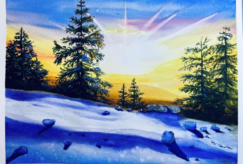
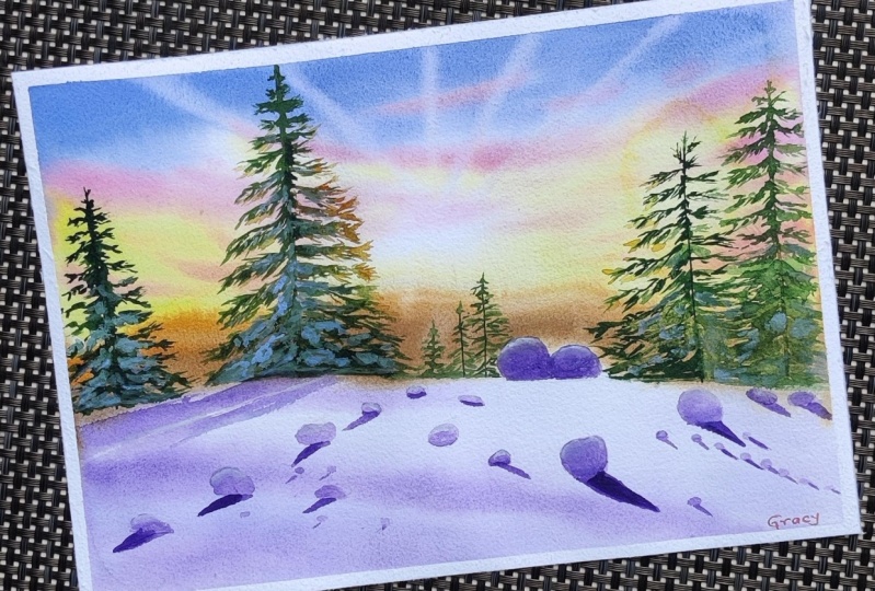
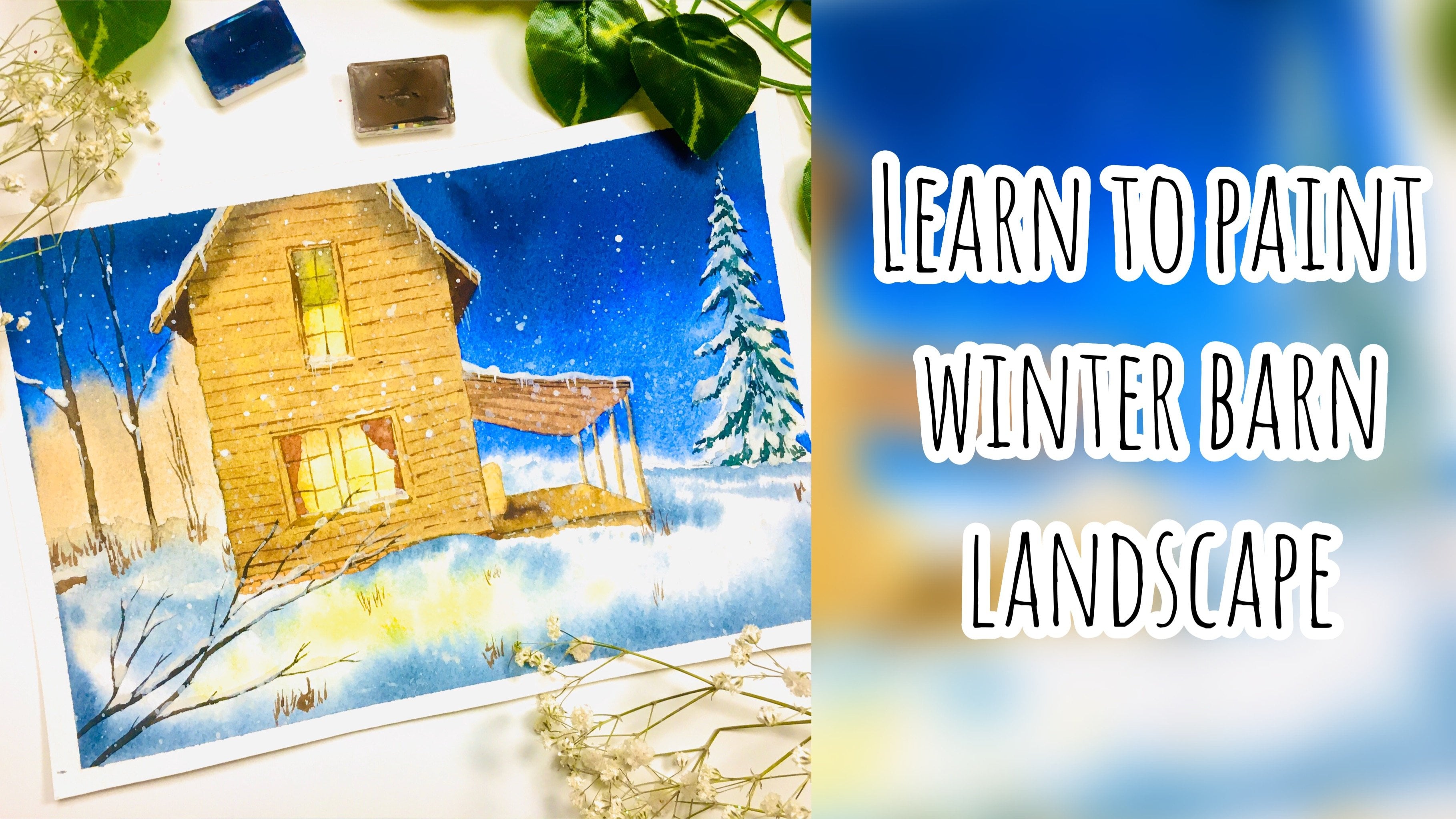
of this class, after careful consideration, I have chosen this
reference image. It is quite simple and does not involve a lot of elements
which will make it easier for me to explain the process as we progress
in the lessons forward, I'll show you the process of how to approach this reference image for painting in connection
with the principles discussed. Now that we have the
reference image, let us move on to
the next lesson, where we will learn how
to decide the focal point
5. Deciding the Focal Point: Alright, so we're
going to talk about deciding the focal
point in our painting. Focal point is the
part of the painting that the viewers eye is drawn to instinctively or something
that which creates the attention of everyone as
they look at your painting, it is a key point
in your painting. It could be a large
tree in the corner or the sun's rays as it sets behind the mountains
at the horizon. Sometimes it may even be the
shadows in your painting. Thus, it is crucial to have a focal point
in your painting. It has a huge impact on how the viewer appreciates
your painting. Tells a lot about what you as an artist wanted to convey to
them through that painting. Sometimes the
reference themselves capture this focal point for you using the blurred
background effect or what is known as the
narrow depth of field. Usually these
pictures are taken by the photographer with a focal
point already set in place, and hence the rest
of the background appears blurred out or out-of-focus as compared to the object that is
the focal point. Here are some pictures where I have painted from
references where the focal point was
already chosen for me and was clearly evidenced in the reference photographs or other reference images
tried to choose objects which are easier to capture the viewer's
attention to in the painting, and also emotionally connects
with you as an artist. I know that this sounds like a pro level or a professional
way of painting. And you might find
it difficult to even connect with the reference. And that is odd, right? Honestly speaking, I
still got to get myself to attach myself to all
the paintings that I do. And sometimes we paint
only for practice, and it feels silly to be connected to every
painting that we do. This is completely
normal and you don't have to be stressed
about it for good point. Objects in our painting can be something that
is large enough for the viewer to notice quickly or instinctively without you asking them to look at that place, look for areas of interests
in your reference image. There are some general things which our eyes are
always attracted to, such as human figures
in the painting, contrasting shapes and sizes, a mountain pathway, a
crossroad junction exit door. All of these things demand
a lot of attention, and hence we can easily
pinpoint these from the reference image and
choose it as our focal point. These are the elements that have a high visual weight
than other subjects. As a beginner, you can
start with one focal point, and then as you
advance as an artist, you can add more
focal points in them. Now to decide the focal point
in this reference picture, let us have a closer
look at this picture. You can see there are some
trees towards the left, adrenal, somewhere
in the middle, some towards the right, some subtle
background, mountains, the sun in the middle, and lots of snow in the background. So I think that this tree
makes a good focal point, especially because it's right in front of the sun and it's kind of gluing on one side and the other side
has some shadows. And you can have a
lot of objects around it such that it points
towards that focal point. Obviously, we may have to move some things around to
fix the composition, but that we will discuss
in the next lesson. So here in this reference, I have chosen this tree
as my focal point. You obviously can do
something else as your focal point and changes
according to your freewill. Remember there is
no strict rule, all dependent upon your
artistic perception. So feel free to
choose anything you like and modify this
reference as you like. I have this reference uploaded in the resources section
here in Skillshare. Another best way to choose the focal point in your
image is to find the objects that followed rules
of composition and use that to attract
the viewer's eyes. So determining the
composition in our painting is what we will
look at in the next lesson.
6. Determining the Composition: This lesson we will go through some essential
Composition methods, tips and tricks for
watercolor painting, which will enhance the flow and structure of your paintings. Even if we're painting from a reference or
still-life composition, it is a first step
to the B2C process. It involves the
overall arrangement of all the elements
in your painting. Aesthetically please the viewer when looking at your painting. Thus, it is very
important for you to have the Focal Point objects in the right place in
your paintings. So that you invite
the viewers eyes to this focal point before it wanders around the
rest of the painting. And at the same time, taking into consideration
the balance, color, and contrast in your paintings, one simple method of
fixing the composition in your painting is using
the rule of Ted's. This method is a much
simplified model of the golden ratio method, which I will skip discussing
here because it's quite complicated to explain it briefly without going
into the math of it. The rule of thirds
say is that if you divide a composition
into thirds, both horizontally
and vertically. And then you use the
intersection point of these four lines to place your focal point
in the painting, then it becomes aseptically and visually pleasing for
the viewer these areas, but particularly draws the
attention of the viewer. However, it is generally
recommended to not feel all of the
foal focal points as it may look cluttered. Once you have identified the focal point
in your painting, you can easily
shifted position to the right or left and up or down to coincide with this intersection point
of the line of Ted's. If you look at these paintings, you can see how I have changed the horizon line to be along
the one by third position, so that the composition is more visually pleasing to the eyes. Here are some simple
tips you can keep in mind while fixing
your composition. You don't have to paint every element in the reference image. You can remove or add
objects as you please. Do not think of the
reference as something which you need to replicate
exactly as it is. Use it as a source of
inspiration or guidance, and then change things
accordingly to your freewill. Remove objects from places
that are overcrowded and add objects to places
which look otherwise empty. If you feel that there
are too many elements on one part of the reference, you can easily move that to the other side where it
will look less cluttered. But at the same time, keeping your focal point
and rule of thirds in mind, you can add points of detail. Additional figures are
trees in your painting. Even if they're not there
in the reference image, they just need to
be placed there with a specific purpose. You can also use multiple
reference images and combine objects from them together in one single painting. The only thing you
have to keep in mind here is proportions. For example, if you're
bringing in a tree from another image to a painting
which already has a mountain. Then remember to give the
proportions correctly and place the tree
such that it does not look bigger than the
mountain or place it in a position that makes a proportion correct
in your painting, with focus on the overall
perspective of the same, you can try out different
thumbnail sketches to determine the best composition for your painting from the reference image that
you have chosen. I used to do this
earlier for many of my paintings, but over time, I have gained the confidence to approach the picture
directly and change the elements
then and there from my head without
using a sketch, thumbnail sketches
can be thought of like a small plan
for your painting. We use it and think of different ideas to
approach your reference. For example, how to place your elements to change
the reference from landscape to portrait
format if it isn't the landscape mode
and vice versa. This planning process can
also help you to decide where you Focal Point
elements are going to be to create the most impact. Here is how you can
capture the focal point or emphasize it a bit more using the structure
of your composition, use other elements, such as our road hedges are clouds
to point D or Focal Point. Use leading lines that direct the viewer's eyes
to the Focal Point. Make it bigger in structure compared to the other
elements in the painting. We will discuss emphasizing the Focal Point more
with your colors in a future lesson when we discuss about the color
palette for your paintings. So let's decide the composition of the reference
that we have chosen. I've made some boxes on
a piece of paper here, and I've split it into the three-part for following the rule of thirds, of course. So along the vertical and
along the horizontal line, just split it into three. Just a rough estimate would
do You don't need to use a ruler and measure things out. Just do it with free hand. And sometimes the
measurements may not be exactly equal or appropriate, but that's absolutely fine. It just needs a rough
estimate, that's it. So here in this reference
image you can see that the horizon
line is somewhere closer to the halfway point
and then goes down below, showing that there's a
slope in that foreground. We can keep the
slope, of course, because things doesn't
have to be like perfectly oriented here in this case because we're
depicting this loop. But if for example, your painting and ocean and you're having
the further point, horizon point of the ocean. Don't make it such that
the design is tilted. That needs to be
straight for aesthetics, of course, here, the midway
point is, of course here But let's not make it
start at the midway point, but you can start
somewhere below. And then let's take it towards the below point of
the one-third line. This is because if it was
a straight line that it's good to have it like straight
along the one-third point. But here to depict the slope, it's better to have it like
somewhat landed a bit. So starting there, maybe
it can go to that point. So that slope is going to look better if it
oriented that way. I have to keep reminding
you that this is just my artistic perception. You are afraid to change
anything the way you want it. Now, then we have lots of objects in the
foreground, of course. But let's not focus on that. We decided that are Focal Point was going to be this tree. That tree in a reference images approximately
somewhere here, which is closer to
the middle space. But we don't want to put it in the middle of space because we wanted to follow the
rules of composition. Not exactly follow,
but to make it more pleasing to the viewers eyes and give that focal
point of pushed. It is better to put it at a place closer to
the one by three. So along the one method, this vertical position is right where I want
to place that tree. So my tree is going to be there. So that's where the
tree is going to be. I'm just not sketching properly. I'm just roughly
marking the position. So I'm just when working out how the tree is going
to be two there, that's where my tree
is going to be. Now, let's decide how we can
enhance this focal point. Obviously, enhancing
the Focal Point means that making the focal point the center of attraction
of your painting. When the viewer looks
at your painting, they should be able to
see the focal point first and all the
objects that lead to it. More depth on how to enhance your focal point is discussed
in a future lesson. So let's just try to decide
the composition for now. And when you watch that lesson, all of this will make sense. Obviously first we have
some background mountains there which we can leave as a day as you don't
need to change that, but don't make it too high. So let's just capture some
background mountains there. That's it, that's there
in the background. Then we have some tree
here on the left, which I'm going to reduce
the size because I don't want it to be of the same
height as my focal point. So considerably reducing
the size of it. And that tree goes there. And we can have some trees
on the right side as well. Which again, I'm
going to be reducing the size of it that it doesn't match the height of
my Foucault boundary. Okay? So there is another tree and another tree here as
well. Okay, shouldn't. Maybe we can make this
longer and there. So that's the simple
sketch as it is. But obviously there are
some foreground elements. But what can you do to make those foreground
elements such that it makes the focal
point, the focus. I know it sounds
a bit confusing, but let me show it to you. So you see that there are some snowballs or
snow what do you say? I think snowballs the
right term isn't it? Snowballs in the foreground? And you can use those snowballs
to point you focal point. Let's see how so for example, if I were to simply draw a line, this line is just
an imaginary line. Okay, that's what
I'm drawing it very likely it's not
part of the Sketch. And you can place some snowballs on that one
there so that its shadow. Oh, first of all, when we
discussing the shadow, obviously you need to check
where the light sources, so here the light source is kind of in the middle
and that's fine because it's not
the focal point or I think it's will get
delivered in the middle. Another reason why
I'm leaving it in the middle is because when
you leave it in the middle, the shadows are all going
to converge outward, which makes the
painting interesting, of course, here,
that the sun here, which will make
the right side of our tree let left-side to
be off darker shadows. So here we have our
whole grand snowballs, which is going to cast
a shadow like that. Following along this line,
along towards the sun, which also makes it such that it's pointing
towards the street. Can you see that? It just makes it interesting? That's all, but you don't
have to do all of that. Don't make it too perfect. So we'll have some
random ones along and try and please
someone wants. So here we have a bigger one, which again is going to
have a shadow like that. Then let's please along
another one along this line. Again, we're just going to
have I'll get this one. Shadow is gonna be
slightly outward because that's by the
sun is for this one. But then you can still see that when you make the
whole of the painting, you'll see that the focus of attention goes to
this tree because it appears as though these backgrounds elements are all pointing towards the street, as mentioned earlier, we'll
discuss in a future lesson how you can make the Focal
Point stand out a bit more. Let's just to finish
off by adding lot more smaller
rocks and elements. Okay. So did I say rocks? I mean snowballs. So just a lot more of
them and that's it. Okay. So just make sure that all
of them, not all of them, but most of them are
pointing towards the tree, which makes it look better. Here, that is our
rough pencil sketch for this reference image. I know that for such a
simple reference image, we're going through
a whole lot of process and trying to
make it difficult. You might think that way, but this is kind of
like the process that goes before you
start a painting. And let me tell you when you
do this process for a long, long time and do a
lot of painting, all of these things
are just going to come naturally to
you in your head. And you can skip all of these processes like
creating the initial scared, creating this Dolan studies, which we'll discuss in the
next lesson of course. And all of this is going to be like embedded in your
head as soon as you see the picture and
you're just going to approach it
straightaway now that you know the rule of
thirds and the steps to get a better composition
in your paintings. Let us have a look
at the tonal studies for our reference image.
7. Creating the Tonal Sketch: Alright, at this point, you might be feeling
overwhelmed with the fact that there is literally too many things to consider before approaching
a reference image. But my intention
here is to tell you the best practices and
steps that you can go through for Learning to
Paint from a reference with ease at the beginning stage
of our painting journey. This might seem like a lot, but it's something that always becomes easier as you
advanced as an artist. All the practice works
that you do gives the experience for you
to skip several of these steps as they
become second nature to you during the tonal study
before you approached the painting directly is a
good practice to determine and understand the
different color values associated with your
subject in your painting, the tone of any object is a way of assessing the light
and dark areas on it. Every object has a tonal
value with a tree, mountain, or even the sky
with some random clouds. In fact, this is
something that I have been telling my
students whenever I teach that the colors that you using your paintings
are not important. As long as you get
the tones correct for each element that you
put in your painting. If we don't get the tonal
structure in our painting, then it will never look
good as it lacks clarity. The tones are the basic
fundamental thing in any picture of painting. Depicts the light and shadow
features on the object. Before you start
with the painting, it is good practice to
add some tonal values to the thumbnail sketch
that you have decided from your
composition studies. If, of course you have not made any thumbnail sketch for
fixing your composition, then this is the point where
you really need to make one to determine the tonal
structure in your paintings. One simple and
easy method that I used to determine the tones
of different elements in my reference image is to use
a filter and change it to monochromatic mode so that I only see black,
White, and grays. And it becomes easy to assess
the tone of each subject. I often do this by editing
the picture in my default iPhone photo editor and choosing the mono
filter out of it, which then changes
dot reference image into a monochromatic mode, which will easily show me where the darkest and lightest
parts of my image are. So create a small tonal value
study sketch for each of your references that
you know the value of the color that you need to add when you start painting. Here are some things to keep
in mind about tonal values. Tonal value is how light or dark something is on a
scale of black and white. White is the lightest value and black is the darkest value. So any objects in your
reference that appears black in the monochromatic mood needs to be painted with
the darkest tone, while the lightest
areas that appear white or light gray
with lighter tone. Here's a tonal scale with
values ranging from one to eat. Ages the darkest, while one is the lightest tone
in the reference, you will notice that most of the tones are in-between these, but understanding the value of each color helps to
identify the highlights, midtones, and shadows
more correctly. It is really important
to think of the values first before you approach
with the colours. Because no matter
what colors you use, the right tones,
always mapped out. So let us go ahead and
create the tonal sketch for this so that we know what the values are on
different places. So here I have converted this image into the
monochromatic scale, as you can see, which
clearly shows us that blacks and whites and all the light
and the darkest areas. This is the simplest method to use when you want to
do the Donald studies. Just use a simple app
in your phone and change it to the
monochromatic and wood. And you can approach. So here I've made
a little box here on the paper where
we can go ahead and do the Tonal Sketch and find out where the lightest and
the darkest areas are. Just as we've made the sketch. We can go ahead. That's the one my portfolio. And that's where my tree was. And there's a small tree here. And do small trees there. And frogs here. You don't have to do
these sketches perfectly. It's just a rough estimate
of how you want to do it. You can also totally
skip this when you have the
monochromatic reference right in front a few biggest the values are right
there as you can see it. But it just helps out when
you market with your pencil because it helps you to visualize it when
you're painting. So here, as you can see, you've got so many
the darkest areas are probably the shadows
and the areas on the trees. So you can see that the areas on the trees are kind
of the darkest, but even then in middle there
are some lightest areas. Let me show that Duke loosely. So here, there are
some midtones here, which is the snow on the trees. Mid tones here Alright, then of course, the background mountains
here it is very dark, but we'll discuss in
a future lesson how you can make the backgrounds
in further away. You can skip the
darker value for now, but it's still going to be in somewhat darker tone because it depicts them further
off mountains. So here then obviously
we have the students, but can you observe and see that it's in a
different color tone altogether because
the part where the sun's area is
lighting onto the stone. And here it's somewhat
has a highlight and then gets darker and darker eventually towards the right
side getting the darkest. This is why I said, if you make it into the
monochromatic scale, you can see all of
these differences. For example, if you go
back to the other big, the sudden change is
not that evident here, but in a black and white skill, you can clearly see what is the darkest and what is the medulla and where
are the highlights? Here? On the right side, it's going to be darker, getting lighter and lighter
towards the front here. So that goes the same
for all of the rocks. So I'm not going to
market perfectly, but you can go ahead
and sketch in. Another clear thing that
you need to note is this is where the light ptosis
acting on this rock here. So the light is hitting on
the backside of the rock, which makes this whole
side to be darker. Just the light
source is going to be just a highlights is
going to be rounded. Host of that snowball
is going to be darker. I apologize if I've been
synced to own for this, I know it's a snowball, but it just keeps coming
out of my mouth. And then we've got some
darker highlights here, but it's still not as
dark as the shadow. So you can see that
it's come what, in the scale of about
maybe around six or seven, but not a nine or ten, which is what you can
clearly see here. So we've got some colors here. And then along the shadows. Now the shadows, if you
observe it's even more darker. So this darker areas
that you've just done is probably
like seven or 80, which makes this a five or six. You can see how you can
study that's tonal value and see where your colour don't
go in that tonal value range. Okay? So if I'm taking
the shadow here, this needs to be even darker
than the edge that I made. Can you see now that
the darkest point? So you can keep repeating that here, That's the shadow up. And that goes and needs to
be much, much, much darker. Alright? So we've got three here. I'm not completing the tree, just adding it random
at the moment. Right? Didn't we see more rocks? Snowballs? Okay. All right. You can see now will
obviously add in a lot more when we're doing
the painting in real again. Then we had a lot of them here. All of those shadows
needs to be darker. The shadow of the tree, which is again somewhat darker. But can you see now how you've made the
tonal value range? Alright, even for the sky, it needs to have like a
medium tone if you look and the lightest part
is where the sun is right here and
the sun's rays. So those areas are
going to be lighter. The other areas are going
to be somewhat darker. So this, if this is the
lightest lighter value, the mountains need
to be more darker, but then lighter than the tree. So this is how you can evaluate what the tonal value ranges. So study the picture in
the monochromatic scale, which is the best, best method to
approach a painting, even if the reference
photographs have crisp edges
for each object. There are several rules to
keep in mind while approaching watercolor paintings and implementing tonal
value structure. One of which is
aerial perspective, which we will discuss
in a future lesson
8. Making the Final Sketch: Now that you have finalized
your Tonal Sketch, you can get ready to
transfer the rough sketch or the placements of various
objects onto the paper. You're going to be painting on. Different artists have
different rules and preferences when it comes to making the sketch on the paper. Some prefer to sketch out
everything in detail, every object, every
contour, every line. Some also prefer to have lighter shading done for
shadows on the final sketch. On the other hand,
there are others would not sketch at all. They just approached
the whole painting without a sketch on
the paper directly. They might have already made
the composition sketch and the tonal value studies and are confident enough to start painting on the beeper directly. Years of practice might also allow them to skip the
composition sketch, tonal value study in who? I think I'm somewhere
in-between. I prefer to do some sketches
when it comes to objects that have a definite
shapes such as a building, a house, or car. Whereas I skipped the
non-important things like trees, Brushes are clouds. I also sometimes do
a rough sketch on the paper to mark the
position of the horizon line, a mountain, a stream
or river, etc. but in general, I prefer to do most of my strokes
with the paintbrush. You as an artist, need to find out what you're more
comfortable with. Finding the answers to these
questions might help you decide your approach to
the sketching process. If you answer a yes for
any of the question, that means you can skip that part of the sketch
in your process, are you able to visualize
the position of different elements
in your paintings on the paper without a sketch, such as the horizon line, mountains, stream or river, are you comfortable in creating
easy shapes like trees, bushes, background mountains, exedra directly with
European brush. Can you paint the shadows
of different objects directly onto the paper
if there was no Sketch, are you comfortable to
create objects with definite shape such
as a building, house or car directly
with Europeans. Apart from these, additionally, you might have to make a sketch if there is something that you need to mask out in your
painting and use masking fluid. Even if you find out that you're a person that prefers know, Sketch adult, you might have to sketch the areas that
you need to mask out. But then again, there are
exceptions to these as well. For example, the slotted
form in this painting, I used masking fluid
but then sketch it out. So let us transfer
the sketch that we made on to our final
piece of paper. The paper that I'm using here is Saunders Waterford 300 GSM, hundred percent cotton
cold press paper, which is what I normally use
for my watercolor paintings. You're free to
choose any kind of paper that you want or have. But make sure that it is
100% cotton cold press with minimum thickness of 300 GSM because that's what's ideal for
watercolor paintings. Also, I have another video
dedicated in this class for the Art supplies that I'm using right before
the painting process, you can refer to that for more additional supplies
that I'm using. So to transfer the sketch, let us have a look at the one by third position in our
paper, which is this. And this. As I said, rough estimates
are enough, okay? So those are the one
by third position. So now we need to make sure that we
marked the horizon line, which was kind of
like halfway down, right below the middle point, towards below the one mark. So that's around
starting there and going to go down sloping
towards the right. Below the one by third mark, just like we sketched. So that's a horizon line. Now, one by third along the
horizontal line at thing. That seems appropriate.
Yes, it does. So that's one. And the
other one was right there. So far where to market
towards the bottom. Just proximately there. Now, our tree. Here when you're
sketching the tree, obviously you maybe
you can mark most of the things with
the brush itself. Like I said, I prefer to
do when I'm sketching, I only mark the
positions of the objects are other things
that I'd like to do with, with my brush itself. So here what I'm gonna
do is I'm going to just sketch out the important
area of the tree, which is kind of the
trunk in the middle and maybe just give some
surface around. So I'm looking at the sketch
when I'm trying to make It doesn't need to be perfect. It's just a rough
thing for me to follow when I'm doing the
painting process. You can do this, give this, and do this with
your brush itself. So you can just draw the
tree trunk and be done. That's it. Like I said, you'd
decide what are the things that you
need in your painting? Okay, that's it. That's how my tree
is going to be, which is the focal point. Now to mark the
position of the others. Not going to have
a lot of height. Like I said, I'll
make it right there. And then I don't think I'm going to sketch in a lot
of detail for this. Again, just roughly marking the position then towards
the right side as well. So again, this is
a very tall tree. This these ones are not
going to be that tall. Another one next to it. Okay. Don't want to create a lot of
Sketch and ruin that thing. I think I'm just going
to leave it with the trunk and just
marking the position. So that's it. Now, if we look
at the snowballs, didn't we say that we will try to place them on a line so fast. Let's go ahead and
add the snowballs. They're all there
are some background smaller trees which I just
noticed, but that's okay. You don't you can
just add it later on. You get closer. There. Some smaller ones. Now for the larger snowballs. Lot of in those regions. Now along here. So this is the imaginary
line I proposed. So if I place one of my snowball there,
another one there. And then let's see, we have another imaginary
line along this line. And I'll make the
biggest one there. Another one there,
another one there. And of course some unknown
smaller ones here. And there can have more towards the light, you know, like I mean, some lines towards the right
and add more there. Okay. So I think we're good
to go with the sketch. There you go. You can clearly see it. But like I said, again, it depends on how much
you want to Sketch. You can totally
approached this directly with your beans and without
doing any sketch adult, but just by Jess reference to the Tonal Sketch
that you made or even written the reference
image that you've made. But obviously that's
an advanced stage where you clearly know how you've been tick
is going to be, which is what we're trying
to learn in this class, isn't it? So here you go. Every part of the
painting process gets better with
practice and you will eventually learn the quickest and easiest ways to
approach the painting. Now, let us move on to the fund. An interesting part of
the painting process, choosing the colors
for our painting
9. Choosing Your Colour Palette: Alright, now that you
know the composition of the reference image
tonal value studies, and it's ready with
the pencil sketch. Let us get to the exciting part, which is choosing the colors. This is the part where
most people get stuck. And the question I
have always got from my students about how to
choose the right colors. Do replicate the colours
exactly as an reference. Should you change
it to a whole new perspective where the factors, there is no rule for this. As I mentioned while
explaining the tonal sketches, the colors you choose
for the paintings do not matter as long as you
get the tones right. Most of the times
when you're painting, you are a the
following a tutorial or following the instructions of a teacher highly influences
your color choices as well. Because it has already chosen, already picked out by
the teacher for you. And you may have a favorite Watercolour
instructor or teacher whom you look up to. And hence you probably
end up having most of the colors or shades
Day suggested are used. And this is exactly what some of my students are
often struggling with, but just something
that I struggled with as well when I started
as a beginner. This is mainly because the teacher can teach
you the skills, the techniques, and the step-by-step process
of painting something. But at the end of the day, when it comes to you actually sitting down to paint
something on your own, your mind goes blank and you can decide the
colors you want to use. This is very common, and I would say that it is
highly because they were influenced by my color
choices up until that point. For example, most
of the brand of watercolors out there
has paints gray, pigment composition of
each of them as different. And some are more cool,
some more grayish, some warm, and some more
tending towards black. Just because I like paints
gray from a sudden RAN, doesn't mean that it is the best one that suits your style. Hence, that wouldn't be the ideal pathway for you to Build Your Own
Watercolour palette. However, I wouldn't go
into too much detail about this topic as it is too broad for the scope
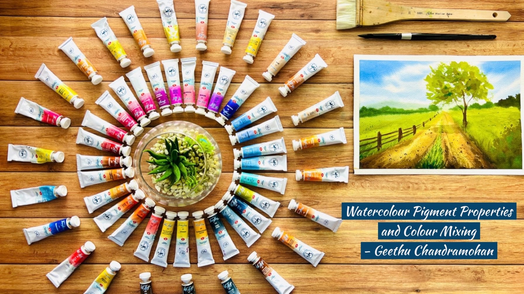
of this glass. I do have a class on watercolor, pigment properties,
color mixing, and setting up your own palette. And that class covers building your palette from
scratch extensively. So you can refer to
it if you would like to get an insight on
this topic as well. Having said that, there's a lot of pressure
on these days to be knowledgeable on watercolor pigments
and color palettes. But I will definitely
point out some of the important points regarding choosing Your Colour
Palette here, it is always best to start with a minimal palette consisting
of the primaries, so that you start mixing
colors from them. And color mixing becomes
second nature to you. You can have multiple versions
of the primary colors. For example, warm and cool version or bag and
transplant version. For example, a
transparent yellow, which serves as warm
and transparent yellow. Lemon yellow as a cool yellow. Cadmium yellow for an
opaque yellow exedra. Once you have started
using this palette, you will eventually
figure out the colors that you want to keep
and gravity towards. These are known as
convenience colors. For example, you
might always make a particular kind of green with Taylor blue and
transparent yellow. Any observed that certain
hookers green from a particular brand is almost similar to the shade
that you keep mixing, then you can add
it to your palette so that the mixing process
becomes easy for you. You can also add other colors to your Palette which are
difficult to mix otherwise. Just cobalt, turquoise tailored green, dioxazine, violet, etc. if you think you will need
them in your paintings, gradually, you'll see your
Palette buildup on its own. I'm going to be using
this palette here in the class which I've set up after lots of experimentation over several weeks and months. But don't worry because I won't be using all
of these colors. We just need a few colors
to be in this painting. Of course, the colour palette is going to be very limited. I just mentioned that I'm going to be using this one which has all of the necessary
colors that I mostly use. All the colors that are will
be using for this painting will be mentioned right before the painting
session starts. You can have a look
at that to see what other colors
that you will need. Alright, let us assume you have buildup your
watercolor palette, or you already have one that you have been using for
quite some time. And we have that sketch in front of us waiting
to be painted. Most of the times we have
this preconceived notion that you need to be
in the reference using the exact same colors, or that you need to match the colors as in the
reference picture. But let me tell you something. You as an artist is free to choose the colors
that you want to use. You can actually totally
change the color scheme off the reference and have
your unique touch to it. Of course, I know it is
easier said than done. It's hard to sit and
decide the colors. This is why in the next lesson, I'll tell you the
biggest secret to building your own style
with watercolours.
10. How to Build Your Style With Watercolours: Alright, in this lesson, I'll tell you my little
secret to building up your own watercolour
style and how you can watch yourself naturally evolve as an artist with a
unique style if your own, you might have seen a lot of
professional artists with a unique style and the color choices that they
make and admired them. Some artist may have a
set number of colors which they gravitate towards
and using every painting. While some artists might choose to experiment with
hundreds of colors, you might even
recognize the work of some artists just by looking at their color
choices in the painting. And this may be something
that you're looking to build in your own style. While this is totally doable, you need to remember
the fact that each of those artists arrived at that particular style or uniqueness with a
lot of practice. And possibly by trial
and error sessions, it is highly unlikely that they chose a set of
colors overnight and decided that this is
going to be my palette and this is where I'll be
using for all my paintings. But here is something
that you can start with straightaway and will aid in
building that unique style. If you take a reference picture and have a good look at it, I mean, good, really look at it. Keep in mind that
the composition that you have decided from that particular reference image and observe the colours
of each element. The sky, the trees, buildings, mountains, or whatever elements
are there in your image. Once you think you have somehow analyzed the colour
scheme of the reference, the next step would
involve you are using some kind of
app or editor on your phone to turn the reference image into
monochromatic grayscale mode. If you have the edited version from the Donald studies saved, you could use that to now use this grayscale
image to Paint. The good thing about this
process is that in not influenced by the colours in
the reference completely, the shade to use from your
analysis of the image. But you won't be
flexing your muscles to make that exact shade of
colors as in the reference. Sometimes you will end up using totally different colors from the reference image as well. But you will find that it
turned out for the good. Also. You will notice that
your brain seems to be working more
clearly this way. Because if you were looking
at the reference image, you will probably sit there
wondering what shade of pink to use for that subtle
being barred in the sky, or which orange or yellow to
use for the sunset areas. When you just have
different gray tones for the entire sky, you will see yourselves
approaching the image more clearly with more
freedom and choosing colors from your ballot in a
manner that you would like to see the sky turn out to be once you're done
with the painting, compare your painting with the reference and see
how it has done out. If you're unhappy
with the result, you can read all this process
again, but this time, you will know clearly
what colors to avoid or what are the
mistakes that you did with the first going one step ahead on this
process would be to not do the colour analysis on
the reference image at all. And to approach the same directly from the
monochromatic mode, you will notice that you get a lot more freedom
and you start to experiment with more color
schemes and combinations. And you slowly
develop a pattern or a set of colors that you keep
using for sudden elements. You obviously will have a general idea about
the time of the day, the colours of the main elements or the color scheme
and the actual image. Because unless you got a monochromatic image
from somewhere, you must have used
this first image to edit it into a grayscale. And although you can try
hard not to look at it, your brain will be looking at every minute detail
in that few seconds. Because it knows you're not
going to give a time later. But even then, this process
is something that will go a long way and helped to identify that Colour
style unique to you. So this is it. This is how you can easily develop your style from scratch.
11. Tips for Great Colour Combination: In this lesson, I will tell you some general tips and things that you can keep in mind while approaching a painting feed from a grayscale reference which we discussed in the
previous lesson, or a colored image
so that you can create more aesthetically
pleasing paintings. Remember, do not put
a lot of pressure on yourselves trying to
implement every single one of these steps are thinking of these checkbox of things that
you need to be looking at. These are just some simplified
ideas and tricks that will add some additional
visual aesthetics DO painting. However, the whole process of painting should be more lean towards the experimentation
and having FUN side, rather than you being worried
about the outcome of it, try not to mix more than
three colors together. Chances are that each
of the colors you mix as composed of multiple
individual pigments. And you may actually be mixing five or six colors
in the process, he might create muddy
or jockey mixtures, although it is very much
enjoyable to experiment with choosing colors of your own based on individual preferences. There awesome color
schemes which you can adapt known as harmonious
color schemes, based on using two
or more colors, depending on the position and distance of the colors
on the color wheel, you could go for one
of the color schemes discussed to get a more
pleasing appearance. Do painting. Analogous
color scheme uses three or more colors that sit next to each other
on the color wheel. For example, using
reds, oranges, and yellows for us
answer painting would be an analogous
color scheme as these are three colours are each other on
the color wheel, monochromatic color scheme
is probably the easiest way. You use just one color and its range of different tones
to paint the whole painting. This is probably
easiest for us to do once we have the
Tonal Sketch done. This is also one of the best way to learn a subject thoroughly, as well as to learn values
as you don't have to worry about colors and their
relationships between each other. Adult, complimentary
color scheme uses colors that are opposite to each other in the color wheel. I feel that among all
the other color schemes, this one is more
visually pleasing as it creates the
right balance of colors and you're beating every
color on the color wheel, be it warm or cool, will have its
complimentary color on the opposite side
and opposite bias. For example, red
on the warmer side has the complimentary color
green on the cooler side. Blue on the cooler side has complimentary color orange
on the warmer side. This creates the right harmony and balance in your painting, and thus is my ideal choice. Triadic color scheme
uses three colors that are evenly spaced
around the color wheel. There will be one dominant color followed by two more colors, which are colors evenly spaced from the dominant one
in the color wheel. These to serve as mild
accents in the painting. Triadic colors
literally stand out on a painting and make a vibrant
and lively colour palette. Just because it has evenly
spaced on the color wheel, irrespective of which
colors that you'd used. When you look at this
reference image, you're going to be
confused a lot as to what the colors that
you need to choose Art, mainly because you can
see there's a lot of colors and so many
colors blended together and your brain
is going to be confused as to how you can match
those exact shades. Which is why I said this
is the best option. Because now you're limited to a black and white image and your brain is free to choose
the colors that you want. So here you can
see that there are some subtle blues and yellows. So just remember these sheets. You don't need to use those
exact shade or match it. But obviously if your
intention is to paint exactly as in the reference
image and replicate the same, then you're welcome to go
ahead and try that out. But for me, like I
said, as an artist, I like to create that
uniqueness to my painting. That is to make sure that I
used the colors that I have in my color palette and make this painting more
attractive in a, in a geethu kind of way. So you need to figure out
your way on your own. For the painting session, I'll be showing you how I use my colors to paint
this painting. You're welcome to do
the same as mine, but it would be ideal if you can decide
the colors on your own and James some things Your Own which will make
it unique to your own. So moving on to this monochromatic
scale and love the way that I've got some
darker shades in the sky and some subtle
lighter tones here. So obviously towards the dub, I think I'll go with
the blue tones itself, but it won't be the zigzag blue that we have in this guy here. Then towards the sun region, obviously I want some
highlights here. That is the lightest
part in this case, we'll, we'll keep it
as white of the paper. I'd like to add some yellow
tones in the background. And then for the mountains, I think I'll go with subtle dark brown
or orange-ish kind, which makes it closer to
the warmer scale here, because towards the bottom, I'm going to be using
a lot of cooler tones then for the tree, probably go with some
subtle darker tones, but also tried to put in some
olive green tones in there, just give it a little
hint of greenish tones. And for the foreground, I'm going to be using
the colours that is opposite to my highlights area. For the highlights, it will do. I'm going to be using
some subtle yellow tones, which means that
the opposite color, that is the shadow colors here, are going to be wireless. Here for me mostly it's going
to be bluish violet tones, which is what is going to go into the shadows and
the snowy regions. Here, I'm using a
complimentary color scheme. You can also go for
other color schemes, of course, but I believe
that for this painting, the complementary color scheme matches the best because it balances out the warm
and the cooler tones
12. Creating Perspective - Linear: Creating visual perspective in our paintings is of
utmost importance because otherwise are
a paintings would be flat and lacked the
three-dimensional look. Adding Perspective
gives a deeper look that is depth to your painting. Even though you're painting
it on a flat surface. Hi, know that for some people, Perspective sounds
complicated or boring, but it is actually quite simple once you get
your head around it, it is a matter of visualizing every element in perspective
before you paint it. There are two types of
Perspective, linear and aerial. I covered this in very detail
in my cityscapes class, but I'll run up the basics here. The three main components of Linear Perspective or
the parallel lines, horizon line, and
the vanishing point. By using just these
three elements, it is possible for us to arrange the elements in the
painting in such a way that it resembles the way the human eyes see
the scene in real. The guiding principle for
this technique is that objects that are closer to the viewer appear to be larger, whereas objects that are further away appear
to be smaller. To accomplish this, we can place a horizontal line across
the surface of the picture, which is known as
the horizon line. Vanishing point is the point on the horizon line where
the parallel lines, also known as orthogonals, converge as they
recede and meet. One-point perspective
contains one managing point along the horizon line. This type of perspective
can easily be used to portray things
such as railroads, hallways, or room interiors. Two-point perspective, also referred to as
angular perspective, than they install vanishing
points on the horizon line. This is often used to
show something like the corner of a
building on a street. One side of the building will
vanish towards the left, while the other side will
vanish towards the right, creating two separate
vanishing points. Have a look at these images
and see how the horizon line vanishing points and
parallel lines are arranged. We just have to remember
to capture these in our paintings to
give the illusion of depth to the viewer. Perspective comes into play
in every bending the digging, imagine there will always be something that is
related to Perspective, which you have to capture
it in your paintings. For example, here you might
think that there is nothing. It is just a simple image, but something here on this painting that
follows the Perspective. That is the shadows here
on these snowballs. The sun here is
right in the middle, which we kept the same. So don't bother about the
tree and everything dried. Now we're going to
look at the shadows. The sudden here is here, and every object you see is actually following
the Linear Perspective. Their shadows are going
to be such that it's converging away from the sun or diverging towards the sun. If you look at the shadows, they are such that they're
following the rules of perspective and
going towards the sun. Do you see that? Okay, now, let me
explain another thing. If you look at the
shadow of this one, this is slightly bend towards that side
and you're thinking, why does it fall
towards that side? Because if you draw
straight lines coming towards this side, That's because if
you look at this, there is a surface change. The surface change means
that it's got a step down. So the Perspective
line has changed, which created a bend
in that shadow. Okay, let's not get into
too much detail there. That's just for advanced
Perspective class someday. But just understand that it's because of the
step change there. But as you can see here, what you need to
note is that most of the things here are
in perspective, that is linear perspective. The other type of perspective is aerial or atmospheric
perspective, which we will discuss
in the next lesson.
13. Creating Perspective - Aerial: Now that you have learned
what is linear perspective, let us have a look
at atmospheric perspective in a painting. Or if you're painting
from a picture, the horizon line is the
furthest point from the viewer. Going further away
from the horizon line, be towards the top or
towards the bottom. You're getting closer
to the viewers eyes. Keep this in mind when trying to implement aerial perspective, like Linear
Perspective, at most, free Perspective or
aerial perspective also creates the illusion of depth on a two-dimensional surface. But instead of using horizon
lines and managing points, at most three Perspective primarily uses
color and details. There are three ways
to capture this. The first one is to use
blurred and sharp edges. The colors become
weaker in proportion to their distance from the
person who is looking at them. In other words, objects
that are further away have blurry edges and
appear lighter in color. The objects dot closer
to the viewer are more sharp and detailed with
clear contour lines. Secondly, tonal value
can be portrayed in such a way as to create
atmospheric perspective. Objects further away
can be painted with a more lighter tone
and those that are closer to the viewer
in a darker tone. This comes from the fact that the viewer can see the objects closer to them with more
clarity and vibrancy. Where does the objects
further away are foggy and muted
to the naked eye? The third method is to
use a combination of warm and cool colors
to depict the signal. In general, cool
colors recede in the painting while warm colors
appear to come forward. Using this rule, the
objects further away, it could be painted
using a cooler sheets and that in the foreground
with warmer shades. Exceptions to this, for example, a sunset scene by the sun and
the sky are at the horizon, which would be in
bright yellow tones, which then makes the
foreground to have cooler shades as
shadows come into play. You don't have to incorporate
all these three methods into one painting to do big
the atmospheric perspective. Sometimes it has
even impossible to have all these three
methods to be put together. For example, the sunset scene, you could apply the tonal value and blurry edges principle. But it would be much
better for the painting if the colours are the horizon
where vibrant and saturated, unlike muted, lighter for
creating the Aerial effect. Now to capture the
aerial perspective, you can use some
of the suggestions I have mentioned
using your colors. Most of which is better
to be in some of these objects in wet on wet and make the foreground
stand out and the background recede away. But keep in mind that
our focal point is the tree which is kind
of towards the horizon, not exactly to what
the horizon in detail in the background
as you can see it, because the background
here is the mountains, which you can use
wet-on-wet method. And all of these are the foreground with the
Focal Point being the tree. Now that you know
how to effectively depict Perspective
in a painting, let us see how we can
capture the Focal Point
14. Capturing the Focal Point: I have been painting
from reference images as it is for a long time. And slowly I realized the importance of focal
point in my paintings. Focal point and the
main thing is that area of the picture that
attracts the viewer's eyes. It plays with the
viewer's curiosity and mental concentration. Every painting ideally needs to have a focal point
which commands the viewer's attention
and makes them want to know more about the
artists thoughts on it. When I was a beginner, I used to paint all
of the scene as it is from the reference
without any focus. But eventually, I
learned that I need to direct the viewer's eyes to
one part of the painting. Especially when painting
landscapes, cityscapes. Creating a focal point in your painting is one
of the best ways to create a composition that will keep them interested
about your subject. For example, if you're
painting a landscape with a mountain road leading to a house on the left and
some trees to the right. You need to decide which
is your focal point. Is it the mountain, the
trees, or the house? There are several ways to create focal point in your painting. Here are some of them. Use lines to lead the
viewer to the focal point. Make the focal point the darkest and lightest
part of the painting. Make the focal area lighter than its surroundings,
if possible. Since the eye is
attracted to light. Alternatively, if the
scene is mostly bright, make the focal point much darker than the
rest of the areas. For example, if you're
painting the ocean or the sea and the waves in the
ocean or your focal point. You don't on the sky
so that it does not detract the viewer's
attention from the ocean. On the other hand, if
the sky is your focus, then tone down the ocean area. Use highly saturated color in contrast to a
neutral background. Adding one or two points
of saturated color again, make your focal point pop out from the rest
of the painting. For example, you can paint monochromatic scene
with a neutral gray, but then add the
focal point with a bright saturated color, which will immediately pull the attention of the
viewer to the scene. Try to paint the warmest and
coolest colors together. Having a high contrast between
the warm and cool colors will bring attention towards
that area of the painting. Lastly, you can use light contrast to
highlight the focal point. Human eyes are drawn
to bright things. Placing the focal point in the brighter zones
is a great way to ensure your viewer will see it as the most important
part of the scene. You can use strong
light contrast to emphasize your focus point and hide distracting elements by hiding them in the darkest
areas of your painting. Of course, it is not possible to use all of these
methods together, but you can choose the best
out of these methods to create an emphasis on your
focal point in the painting.
15. How to Build Your Style With Techniques: Now that you're equipped with everything you need
to know to paint using a reference image and creating your own
composition out of it. Let me tell you some
interesting tips to create your own style with
watercolours techniques. Several artists prefer
several methods to paint with watercolors. You can instantly see it
reflect on their artwork. Here are some common techniques
or methods that you can experiment with to find your
own line and wash technique. This technique is mostly
used by urban sketches, where they make the most of the sketch with
a pencil or a pen, and then add drops
of washed beans or Colour desert areas to
enhance the painting. Wet on wet single
layer approach. The approach that
I usually love. How I usually paint
the whole background in a single wet on wet layer. And then add the
foreground elements where the wet on dry method, wet on wet multiple layers. This method achieves more
realism in your paintings as each layer you add rings in more color and detail
to your paintings. Wet on dry approach. This approach is where you do paint every objects on its own separately and the objects in the painting are disconnected
from each other. This method is also
mostly used by artists when they are
painting in sketchbooks, are doing quick urban sketches. Mixed approach. This involves
mixture of both the wet on wet and wet
on dry techniques, and mostly involves color
bleeding into different areas, creating a unique look
to the paintings. There are several types of
mixed approach and discussing all of them is definitely outside the scope of this class. You could experiment with all the different
techniques and adapt one which you feel more comfortable with
and attracted to. Practice with that technique
until you naturally find more interesting shortcuts and approaches that
suit your liking.
16. Painting Process Part I: Alright, now that we know
all the principles of how to approach painting from
a reference image. Let us go ahead and paint this. So I've already mentioned
all the colors that I'll be using for this painting at
the beginning of this lesson. And I'll be following
my go-to style of painting which is
wet on wet mostly. So I have this board and the paper where I will
be applying water to both sides of the paper so that I can paint
wet on wet easily. Free to choose your
own style of painting. Go ahead and experiment with
different techniques and different methods to find out your unique style that
suits you the most. You can go ahead and use the taping method where you Dave the paper onto your
board or surface. I love to paint the hair, there is no edges. And also I use this
method because I apply water to both
sides of my paper, which eliminates the need for any masking tape
while I'm painting. Now, I'm going to do
the painting Process. I've kept the video in real
time so that you can follow along if you are going to be using my same style of painting. So feel free to
paint along with me. Or if you're using
your own technique, you can use this
as a reference on how to approach certain elements and then painted
in your own way. So I'll be applying
water to the backside of my paper first so that I can stick it firmly onto this board. I lose my large flat
brush for this purpose and apply water to the
backside of the paper. Once I have applied water to the backside now
I'll flip it along the other side and use that water to stick this paper onto the
board that I'm using. So this is An acrylic surface which makes it easier
for it to stick on. If it was a wooden surface, then it would absorb the water and the whole thing
would dry out quickly, which is why I use an
actual except just use any plastic board or
known absorbance surface. That's it. And then I'm
applying water along the front side and
then pressing along the edges so that the water makes the paper to
stick onto the board. See that it's now stuck on a wall I have to do is met
the front side as well, which will make my be bursty wet longer for the wet
on wet application. Like I said, you're
free to choose any style of painting
so you can go ahead and date the edges and just use the normal
watering method that is normal Upload abrogation
of water for your paintings
17. Painting Process Part II: Now let's go ahead and
paint our focal point. It's very important, isn't it? So I'm going to be starting with a nice brown and gold color. We're going to be using
a nice lot of colors. So let's start with
a nice golden color. So I'm going to use this
color that we used for the mountains here and mix it
along with the Indian gold. I'm going to start with
that. That's speaking, is this region here is kind
of like raw and exiting, dry it next to the sun region,
we will make it darker. But let's go with this first. Then I'll pick up
the dark paint. I think the dark beans
going to go over the dog as well because that's
the blue region. But as you approached the words, the sunny side, you do need
to capture the colours. Oh, no. Let's go with a nice greenish
brown color that we already have here. Start adding. I'm just following along the simple pencil sketch
that I had added. So that'll give me the shape of the tree that I
want to achieve. But then I painted like
a whole blob here, like I've done with my sketch. I'll just try and make little shapes of the
leaves and everything. Okay? And it's completely random with my brush just using
the tip of my brush. I'm trying to do like ease of strokes, digging back. Nice. Now, as we approach
to the sunny side, here is, as you can see, we're going to work the sun, so we need to bring
in brighter colors. For that, I go back
to my golden mixture. I'm going to be in
that With Gold. See, it gets golden on that side, right thing. We can put some subtle golden sheets on
that side as well. So we're going to
be using a blend of these two colors here. That is the green brown mixture and the golden color there. If you don't want to keep
switching between your brush, you can go ahead and paint
on the left side first, then find the right side. So I think I'm gonna
be doing that. I've been told the
left side first, which makes it easier for me. I've completely
avoided the midst in my painting because I
don't want to get into it. I chose not to include it. You're free to include it
if you want. Of course Okay, Then my dad died. Now let me get to
the other side. Of course, getting to the
other side means I have to keep adding yellow for the
Indian gold sheet, of course. Alright, the trees looking still incomplete
because we haven't added the golden shade
that needs to go. What's the right side? I think that's good enough. Just want to pick up
this darker color. I love the way it's done
out, but I need to know, bring in some lighter areas
and basically the snow. So what I'm taking right now is a little bit of olive green. For a little touch of green. I'm working more on this
because this is my focal point. But the olive green is for the purpose of some
highlights towards the left side, which is kind of
like why the sun is reflecting at backside. So let me explain that. I know you might
be thinking that this is on the
left sides of why. It's because the sun is kind of reflecting on the
backside of the tree. It's not really on
the right side. The whole sun is shining, so you need to have some
branches of the trees are the leaves which has
highlights on that side, but it just like kind of behind. You only see some parts
of it, which is fine. I'm putting berries or dilemma
around of those green, of the olive green on that side. Now, let's go with
further darker shadows. Here. I pick up my Payne's
gray in that green mixture. And just going to put
it at random, please. Alright, now let's
get to adding the no. Just some large blobs of snow. But make sure to wash
your brush each time because I'm picking
a green back, which we do not want, right? Alright, I loved the
way it's turned out. Now, remember about the shining
part that I talked about. So you can add some subtle once to the edges
of the left side. So this is the one where
it's shining from behind. Okay? Alright, that's it. So we've made the focal
point and as you can see, it's really in focus, right, compared to this one
which is now less bright when we add these trees as well in less focus to ban
all, it'll make more sense. Okay, so let's go ahead and mix that green
brown color again. Alright, making a
watery mixture of that. Oh, go ahead and been
that right side. So this tray is kind of like
a very dry kind of tree, but make it still
subtle and lighter. So it has to go
behind the snowball. Now for the other one
on the right side So we can blend a lot together at the bottom because it's
quite dense. Are there. Now. Add in some darker shades. Alright, let me pick up some Indian gold now
because I need to add some towards the
left side for the sun. Just a little amongst
towards the left side. Okay. I think that should speed it. Now let's get back to adding
snow for the right one. When we my lavender. I think that should be it. I'll what I'll do in
order to make the squared lighter is I'm
going to use my glute. You can use a cloth or
a tissue or whatever and go ahead and absorb some of that pigment from what you've
kept on and absorb it. So that area becomes
lighter and this becomes the focus and
the darker region. Just make sure it doesn't have your glute or whatever you're using doesn't have any
texture like in mind of God, that texture on mine. Like this texture. Okay. Yeah. I like it now. It's
very light and this is like kind of darker. Let's go ahead and add in those smaller ones
that we talked about. And another one right there. Alright, I think
we're done with that. Let's finish off by
painting the snowballs. So that's gonna be quite easy. We're going to be using our wireless and
maintain on them. I think I'll start with
the one on the left side. But remember the direction. So I've painted the whole of it at the bottom part
is not completely dry, which makes it easy for
us to do any wet on wet or wet on dry on its own area. Here, made that side darker. And it needs to be darker towards that
side and the bottom. Okay. Now remember this one. What I said, it should is
to be as dark as that, that should be the shadow. But obviously, you can
go ahead and lighten up You can see how it looks. Use the don't need to be
closer to the background. Let me lighten
that up even more. Now that you've
added the snowballs, Let's go ahead and
add in the shadows. So for that, I pick up
the darkest violet. But I think I'm going to mix in a little bit of cobalt blue just to make it not
that too much violet. Okay. Then let's see the
shadows of this one. P is going to be
in this direction. Remember, the darkest. So the shadows. Now, let's add in the shadow
of our main tree. We just go to be
somewhere along here. And I'm just going to soften
out the inches effect. Okay? Because it's such
a large object. So I wonder shadow to be going disconnected again thing. Go ahead and add some shadow
elements there as well. Then soften it out. Alright, I'm gonna finish off with some subtle White dunes. So here I take my white
and I'm just gonna go head on some of my stones and give
some highlights. I will spread that
out in a moment. I believe that it's
absolutely essential that we capture some highlight. And then a bit at the bottom
for the reflected shadow. Now let's blend it all up. Land. Highlight. There. Now you can see how the effect
of the Sun is here. If you want, you can have some subtle lavender
mixed doors. Lavender and white. Don't on the foreground
on our Focal Point tree. Just to bring it out, but remember to mix lavender
into the white, okay. So that'll brighten up the
lavender if it's kind of faded and dying of gifts like a well don't
structure to your snowy regions. We don't need to work
on the other areas, of course, because
that's not the focus. So we have finally
completed the painting. And can you know,
when you look at it, clearly see that the focus in
your painting is this tree, because the other
parts are faded. The snowballs are all kind of like pointing towards
this tree right here. So that's it. See, that's how you can create a really good focal
point in your painting. I hope you enjoyed this
painting session if you were following along and all the steps that we
discussed in-between
18. Thank You!: A huge thank you to everyone
who has joined this class. I hope you enjoyed the painting
session if you've painted along or all the concepts
discussed in this class. And I hope that you were
able to translate it into your own painting from whichever reference
that you have chosen. So this was the reference
that we painted in this class from
the reference image, which if you've followed
along, you know, obviously. And I showed you how we
capture the Focal Point and how we made all the elements Point to the Focal Point, as well as the
different color choices and everything that is there to translate
reference into a painting. I would be most grateful
if you can upload your Class Projects that is whichever reference you chose and the painting that
you did along with it, do the Project section
here in Skillshare. It would also be
better if you can capture the Tonal Sketch,
the Final Sketch, and your composition sketch and upload that as well
because it will help other artists to visualize and see what was
your thought process when you were trying to approach that reference or don't
feel pressurized, it's absolutely fine if
you just wanted to capture the reference and just the painting into the
Project section here. Once again, thank you
for joining this class, and I'll see you
in my next class. Bye bye.
 Geethu Chandramohan, Colourfulmystique - Top Teacher, Artist