Transcripts
1. About the Class - Welcome!: Building a steady Creative
Habit ensures that you open your inner creative soul and prolongs your
emotional well-being. Hi everyone. I will
keep it under Mohan, an aerospace engineer, and
a watercolor instructor. I teach online, take
in-person workshops. And it's mostly
known as caliph or mystique in all social
media platforms. I'm Ambassador to White
Nights watercolors, and it's also as in
the brush educator. It is my creative passion to inspire people to paint and find joy in little thing
such as spilling off the masking tape at
the end of a painting. In this class, I will
take you through 100 days of painting landscapes, which will help you to build a consistent painting habit
and at the same time, discovering your
creative potential. Over the years, thousands of students have joined
my classes to nurture their creative minds and pursue their
artistic passion. My previous projects
was rated as one of the best final
classes in 2021 by Skillshare and also as the most watched class in India
by several news articles. I truly believe in creating and building an artist
mindset through a consistent painting
factors and developing your painting skills through modern
watercolor techniques. On each project,
I will explain in detail how to apply the
watercolor strokes and give you in-depth understanding
about why I have used a specific technique to capture the mood
of the landscape. The step-by-step
instructions of each project focuses on the why
rather than the wind. To help you master complex concepts such
as ETL perspective. With diving into each
of the class projects, you will get important insights into the model techniques
with watercolors, the fundamentals of composition, and learn to paint a
beautiful landscapes in your own creative style. We will start this large, right from the basics so
that you can join along without any
prior experience or knowledge with watercolors, all you need is the desire to create and passion for learning. Take you through the most essential
watercolor techniques, materials you need
to get started choosing the right paper
and size for this project. Mixing alternate
colors and turning your landscape into
a stunning reality. Join me for the next
hundred days and done in creative passion into your
artistic career in style. See you in the class.
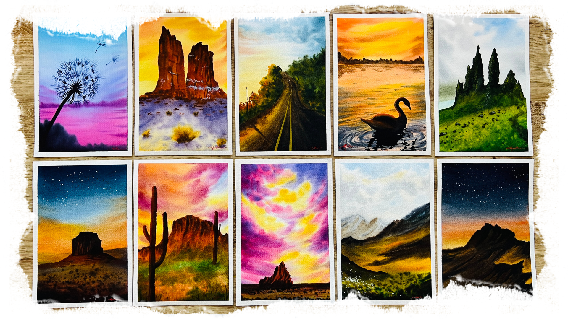
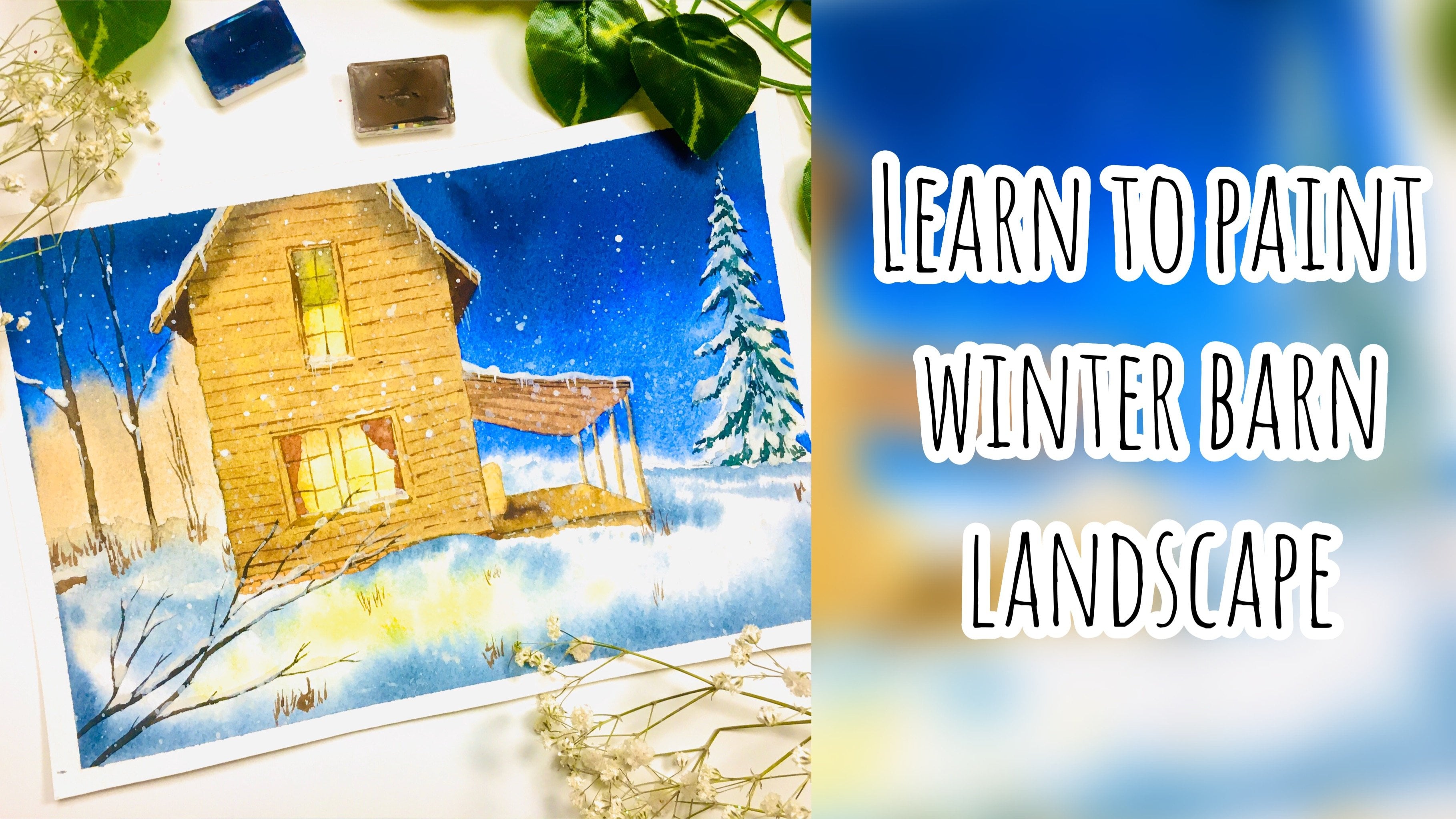
2. Class Overview: Hello, hello. First of all, thank you
for joining the class. Now, I would like to give
a brief structure of the class so that you know what to expect in
the coming days. Here are some of
the paintings that we would be doing in this class. And unlike the
last 100 projects, we do not have a
topic for each week, but rather the entire subject of the class is
painting landscapes. And the most big irony is
that these landscapes, we're going to be painting
in portrait mode. So rather than landscapes, which are usually in this mode, we are going to be painting
in the portrait mode. So the entire project, all the paintings
are going to be in an A5 size sheet in direction, even though there is
no specific topic for all the 100 days, because it's gotta be
beautiful landscapes. We will have a week-by-week
structure wherein Europeans six paintings a
week followed by a break day. And during the break day, I'll be sharing a
reference image via the Skillshare email. And I will also upload it to the Resources section here under the Projects tab on Skillshare so that
you can refer to it. And beyond yourself, you
can upload the same to the project section
as well along with your other projects
from the class. This class is all about enjoying the process
and consistency. Hence, I would
request you to not worry about the end result. Focus on developing
your own painting style rather than following along the step-by-step instructions, sometimes you may
find that the paper dries out too quickly or you do not get the indented
brushstrokes are your paper has
too much water, but I request you to abundantly enjoy the process and just
go with the flow of it. Try to develop your own
creative style by trying to understand why each
stroke has been made. By understanding the composition and perspective of the painting, then create your
own version of it. Hence, a suggestion for
you would be to watch the project videos
once before you start and then follow
along the second time. This way, you know
what is coming next. And you would also be aware of the mistakes that
I have committed while painting and also knew how I have
rectified the same. I have not edited out any of
the rectifying or correcting the painting mistakes
that I have made because that is also part
of the painting process. And you need to
understand that as well. Be sure to listen to the
tips and tricks that I mentioned in-between
about color theory, color mixes, Auden
colors that you can use as these may be helpful in
developing your own style. I have a suggestion for you, if you're an ultimate
beginner to watercolors, just go ahead and watch my
ultimate guide to watercolors class where I
explained in detail all the watercolor
techniques out there. I will also be briefly
explaining the major techniques used in this class so that you can brush up your
knowledge on the same. Also, if you're going to
be painting along with a basic palette or just
the primary colors. Then I suggest you
have a quick look at the color theory portion of my watercolor pigment
properties glass. That's going to be 100 projects, but that doesn't mean
that you have to paint all of them right away. Your day one could
be any date so that you built that consistently eating habit and develop your own creative style
from the paintings. And lastly, if you
feel that there is something that you
do not understand, cannot get the painting
right or need my help. Ask away, ask for
support does leave a question in the discussion
section here in Skillshare, and I'll be happy to help you.
3. Art Supplies: Welcome to 100 days of paradise. Let us have a look
at the materials that we need for this class. Firstly, watercolor paper. I recommend using 100% cotton, 300 GSM cold pressed paper in A5 size for the class
projects like this, Arches pad that I'm using. I've got the A4 size into
two for the class projects. You may also use a sketchbook or paint in different
sizes to your liking, I would highly recommend
using a sketchbook that has 100% cotton and 300 GSM paper. Watercolor paints. I'll be using my curated
watercolor palettes consisting of colors
from various brands, such as White Nights, Sennelier, Daniel Smith, Schmidt, gay,
and Winsor, and Newton. Throughout the class, I will be mostly using round brushes, mainly Kolinsky sable brushes, black velvet brushes
or Rennaissance, pure red sable hair brushes, mainly in sizes 84.2. I will be using these for most
of my background strokes, silk series and the
thick brushes for some refined strokes
and details. Black velvet liner brush but thin long fluid lines for
grass textures and branches. Ateliers, squirrel blend, mop brush for some larger
background strokes, a daily or hockey brush for the quick application
of water onto my paper. All the brushes I use are from the brands they
will rush limited. In general, I would highly recommend having a
large flat brush, a medium-size brush, and a liner brush for
the class projects. Also keep two jars of water, one for cleaning off
paint from your brushes, and the other for fresh
clean water for painting. White wash paint for highlights, stars and some flowers. For watercolor palette
for mixing your paints, metallic plastic or
any to your liking. Pencil, eraser and ruler
for your rough sketches. A cloth or a tissue to absorb extra moisture
from your brushes. Masking tape if you prefer
to have clean edges. And lastly, any kind of board
for taping your paper onto, for lifting your boat to
your painting convenience. I will be discussing
the exact colors in my palette in
the next lesson.
4. My Colour Palette: Here are the colors that are in my curated
watercolor palette. Naples yellow, lemon yellow, cadmium yellow light
Indian yellow, indian gold, cadmium
orange, scarlet, Alizarin, crimson,
quinacridone, violet rose, transparent orange,
ultramarine blue, cerulean blue, bright blue. Green blue, indigo, cobalt blue. Taylor turquoise, aqua green. Cobalt turquoise, yellow
green, sap green, dark green, olive green, perylene green, cobalt green, horizon blue, yellow
ocher, lavender, wireless, perylene
violet, raw sienna, burnt sienna,
transplant and drown. Payne's gray, not black
and amethyst generate. This a is my curated
watercolor palette that I use for most landscapes, ocean painting, cityscapes
and everything. You don't need all
of these colors. Hence, I have shortened out the list to a very
small color palette, which would be useful
for you if you're going to follow along
this 100 projects. These colors are
mainly Indian yellow, transparent orange, or
any kind of orange. In fact, bilaterals, which is
basically the B19 pigment. So any rules, pillow blue or
bright blue, cobalt blue, you can also switch to
ultramarine blue instead, olive green for good
foliage colors. A dark green to mix more
of your foliage colors. Colors such as yellow ocher, raw sienna, burnt sienna, and transparent brown for mixing your earthy sheets and for more natural
looking landscapes. Additionally, lavender,
Payne's gray, cadmium orange, Naples
yellow and yellow, green. So I know that many
of you may not have the most colors that I've
used in this project loss. I have made a cheat
sheet for you, which is basically
some quick color mixes for you to reference
as n by nu need. So if I am using a
color and you feel that you want to be
in the landscape with the same color that I have used, then you can refer
to this cheat sheet. Otherwise, go with the flow of it and use your
own color palette. The colors swatch sheet, along with this helpful
color mixing cheat sheet, have been uploaded into the resources section
in Skillshare. You can find this
under the projects and resources tab
under this class. However, I encourage you
to use the watercolor set, a color palette that
you prefer using to give your paintings your
own personal touch.
5. Techniques: Let us have a look at the major techniques
that we will be needing for
this 100 projects. I explain all of
these techniques extensively in my class, Ultimate Guide to watercolors. If you haven't watched that
class and would like to get a detailed explanation on
all of these techniques, then you could
refer to that one. The first technique
that we are going to go through is wet on wet. So as the name suggests, it simply implies that we're applying wet paint on wet paper. So in order for the
paper to be wet, we need to apply
water onto my paper. So I'm going to achieve that by simply dipping my brush in water and applying that
water onto my paper. You could use a larger
size brush to apply water and cover a
large surface area. Now that I have applied
water onto that area, I'm going to take some paint, some colors, and apply
that onto the paper. So you can see that as
soon as I apply the paint, my paint spreads away. And this is basically known
as the wet on wet technique. The wet on wet technique
creates a lot of soft edges. You could either do
a whole wash using the soft edge technique and go for blending
multiple colors as well. The next technique
is wet on dry. And again, as the name suggests, it simply means that
we're going to apply wet paint onto the dry paper. So the Thai people
could be two-fold. It could be dry surface, but there's already paint or it could be an empty
surface like this one. I'll show on this empty surface and as soon as this dries out, if we apply the
paint on the top, then that is also a
wet on dry method. So I'll simply take
up a green color and applying that onto my paper. You can see that it's
wet on dry technique. Then the next technique
is dry on wet. This means that the paper is wet and the paint that
we apply is dry. Let us see what that effect is. So I am applying water onto my paper just so that
my surface becomes wet. Now That's my surface is wet. I'm going to make sure and
dry my brush on my glue so that I remove all
the excess moisture and water content from my brush. Then I will be using
dry paint on the top. Here I am picking up paint
from this Taylor blue well, and making sure that
my paint is dry. So since I had dried my brush and it has very little
water on my brush, this paint is almost dry. And as I apply it onto my paper, you can see that
it does not spread as well as it did
with the wet on wet. So this is good
for making waves, as well as creating
soft background. Foliage. And trees are objects that are
in the background. The next technique that
I would like to discuss is the wet on wet splattering. So it means you're
going to splatter paint on top of a wet surface. So in order to create
a wet surface, I am going to apply
some paint on the top. I'm going to load
up my brush with Indian yellow and apply this
wet paint onto my paper. My brush is wet as it
has a lot of water. And I'm applying this
wet paint onto my paper. As you can see from the fluid
consistency of the paint, my paper is wet and while it is wet and before it dries out, if you pick up some paint and
splatter it onto the top, it becomes wet on
wet splattering. Here, you can slot it
in different methods. You can either hold your
brush in one hand and tap it so that you drop your
paint onto that surface. And as you can see, as soon as the paint drops
onto that surface, it spreads out and creates a unique texture that
is not achievable. If you were to just
use your brush and touch the tip of your
brush as you can see, as soon as I touch
the tip of my brush, it creates bigger splatters rather than the smaller
ones that we require. You could also do wet
on dry splatters, which would be just to simply splatter wet paint
onto a dry surface. It wouldn't spread, but
would create smaller dots. That is again unachievable if you were to touch
the tip of your brush. The next is dry brush technique. This means that
your brush is dry. It has also known as dry on dry. So this means that
both your paper and your brush should be dry. In order to create this
dry brush technique, let us pick up some
paint and make sure that all of it
is completely dry. So my paper is dry
and I'm taking all of the excess water from my brush
using my cloth or tissue. And I'm loading my
brush with paint here. As I load my brush
with Dr. mean, you can see the hairs of
my brush are almost dry. And using that on my paper. Creates these random lines
and texture on the paper. This happens mainly due to
the texture of your paper. So this is why I recommend using a cold pressed or
rough surface paper. What happens with the
dry brush technique is that when you
apply the paint, the paint just
happens to settle on the top most surface
of the people rather than go into the
grooves of the paper. So this creates a beautiful unique texture that is ideal for painting mountains and different
kinds of rocky texture. And the last technique
that I want to explain about a
softening the edges. So let us say e.g. that
we create an object. I have made a sphere here
and I want to soften the edges because
often the edges make sure that you get rid of all
the paint from your brush. Wash off the paint, and then go around the
surface and patching it so that the paint would
flow and create a softer edge. So I'm going to go
around the whole of my stroke using just water. So make sure to remove
the excess water from your brush each time so
that as you go around, the pain that you pick up does not affect the rest
of your strokes. As you can see, I've created that whole sphere
into a softer one. If you're completely
new to watercolors, practice these
techniques at least once before you jump into
the class projects. Now, another important
concept that I'd like to go through
is perspective. Perspective can be of two types, linear perspective and
aerial perspective. The more you implement these in the composition
of your paintings, you're painting is
going to look more natural and beautiful. So linear perspective is basically the
one-point perspective, two-point perspective and so on, that you put into your
sketches to make sure it looks pleasing to the eyes
and looks more natural. It will. Perspective is something
that you implement with your paints to give the effect
of depth in your painting. With regards to ETL perspective, you would be in the
objects that are closer to the viewer with a darker shade and that are far away from the viewer
with a lighter shade. Also, as the objects come
closer towards the viewer, they become less softer
and harder at the edges. The easiest way to explain this is using a mountain range. I've just wet this paper. If you are going to
paint some mountains, the first layer of mountains being far away would be softer. And as you can see,
because of my wet paper, my paints spreads and
gives me a softer edge. Now the second layer
of mountains would be somewhat darker and
yet softer again, because it's still far off, but darker than
the previous one. Now I've dried it the surface. So as I come closer
towards the viewer, how mountains are
gonna get less softer and more darker with
more details showing up. So e.g. we'll have the
next mountain with a more brighter green and start to have some smaller
texture showing up. Here again, I have
died at the same. And as I come more close
towards the viewer, we start to see more
of the details. So we'll create more
shapes into our mountain. Last and final mountain range
would be the more detailed, more harder and more darker one, as it is the most closest
one to the viewer. Hence, in this small
painting here, you can see a toe
perspective in play. So basically, as you come closer towards the viewer,
the details increases. The hardness of your
stroke increases, as well as the darkness
of your color increases. Towards the back, as you go further away from the
viewer and the horizon, the details are lesser. So that's lesser details. Softer edges, lighter shades. More tips and tricks regarding
ETL perspective will be discussed in the class projects as and when we
progress with them. Now that you've had
a quick look at the most essential
watercolor techniques. Let us have a look at taping down the paper
onto your board.
6. Taping the Paper: As we're going to have
this project for 100 days, which is quite a
long period of time. I'd like to demonstrate how I taped my paper onto the board. Just because I have got
a lot of requests from my previous students that they would like to
know how I do it, mainly because
their pain seems to seep out off the masking tape. The masking tape that I
use is one that I bought from Amazon and doesn't
have a particular brand. I just usually just search
for artists masking tape. However, if you'd like to prefer for brand name that
I would refer to, then I would recommend
empty washi tape. One thing that I have
usually observed is that if the paint is
seeping out of the paper, It's either because we
didn't take the masking tape correctly or because
the paper is not right. So I thought that
I'll demonstrate how I stick my paper
onto my board. I usually leave around 0.5 centimeter on
all of the edges. Once I have covered
all the four edges, I make sure to use a ruler and remove any air
gaps in-between. The main reason is
that especially if you using a hairdryer, then there is high chances that your paper is going to
rip off due to that heat. So in order to avoid that, it's best to go around and stick it firmly
onto your paper. Also, there are slight air gaps which cannot be seen
with the naked eye. And these are what leads to the paint to seep
out of your teeth. So what I usually use is I
use a ruler such as this one, and press along the tape
on all the four edges. If you look closely
as I press along, you'll see the air
gap moving outwards, and that is how I push it
outwards off the paper. So observe closely e.g. on this side, you could see the air gap moving all the way underneath my rule. I repeat the process
for all the four sides, which ensures that I get
rid of all of the air gaps. Make sure to do it along
the edges as well. Because that is the areas
that paint mostly seep in because you've got to tape
crossing over at that point. So now that our paper is
taped and ready on the board, Let's go ahead and paint
our first-class project.
7. Day 1 - Dandelion: Welcome to day one. So we are going to start with
the hundred day project. This is the painting that
we are going to be today. And the colors we need are, right, blue or yellow, blue, wireless, queen, violet, rose, or a pink shade,
and Payne's gray. So there's no pencil sketch. We're gonna get at it directly. So here is my flat flush. I am going to dip this in water and apply an even coat
of water onto my paper. To apply an even coat of water, make sure that you're
using even strokes. So if you were to do and apply water like this
and it's going to accumulate what are
unevenly from the paper and form large pools are blobs of
water which we do not want. One best thing to do to avoid any pools of water forming
on your paper would be to keep something
underneath the paper so that it gives an angle and gravity would act on
it and all the water would flow down without
accumulating on any, any part of the paper. So here I am going to use the state and keep
it underneath. Then you can see now I've got an angle which would help
the water to flow down. So I am going to apply
water and you can see that my water flows down and also
I'm using even strokes. So in order to check the consistency of the
water on your paper, it's best to look
under the light and you can observe
a sheet of water. Can you see that sheet of water? There's no large pools, there's no water
that's flowing around. So that's the
consistency that we want when we are
applying the water. This is a very
important process. Also, another suggestion is if you're not using
100% cotton paper, make sure that you apply
the water multiple times so that your paper withstand all the flat washes
that we're going to do, that is all the wet on wet strokes that
we're going to do. Another suggestion is to
apply the water onto paper. Weight for two to 3 min
for that water to sink in. And as soon as it starts to
dry, re-apply the water. This way, your paper is
going to stay wet for a little more longer
duration of time. Mainly because first layer of water that you apply has gone into the fibers
of the paper. And then the second layer
that you apply stays on the top and gives it a bit more time before
it starts to get dry. I know that this is
probably a lengthy process in waiting around
for 2 min at all. But it's what you
have to do if you're not using 100% cotton paper. I have applied and
even coat of water. Now, I'm going to use
my silver velvet size eight brush to paint the
sky and the background. We're going to start
with my bright blue, bright blue or yellow blue. It's mainly Taylor Blue. I call it bright blue because it's from the brand
White Nights. And the name is bright blue. In that brand. It is basically just PD 15
kilo blue in other brands. Or you could check for
the pigment number BB 15 in the brand
that you're using. So you could see the consistency of the
paint that I'm using. Always check my palette to see the consistency
of the paint. That is a very important thing to note because it will really help you to understand
what kind of paint I'm putting onto my paper. So this is inky consistency. Or if it's too much diluted, you can see the consistency
that's too diluted. And if it's too concentrated or in a creamy consistency,
that would be this. See that that is a
creamy consistency. And if I want it to
be too concentrated, our pickup directly from my bell without putting
it onto my palate. You can see, see that's
more stronger than this. So now at the moment, I want it to be a
milky consistency. So see, that's the
milky consistency of the paint that I'm
going to use. Okay. So let us start with our sky. So I'm going to
apply onto my sky a straight line From the top. So that's the bright blue sea. And the angle is going to help the paint to
flow down as well. So if there's any excess
water on your brush, make sure that you absorb
it using a cloth or tissue. So I always have this cloth
in my left hand so that I can control the amount of water that's
there on my brush. Here. I start at the top. I'm applying my fright blue to the bottom and
I keep going down. And as I go down, you can see that my paint is getting lighter and I let it get light. Now. Now that we're going
to use is pilot again. So that's very, very dark. So I'm going to dilute it and turn it into
a milky consistency. To see that is milky
consistency of the paint. And I'm going to apply that. I'll apply that somewhere
around the middle. And then now I'll go upwards so that my wireless is going
to mix with the blue. A bit more blue
because can you see that little gap of
white foam in there? That's because there's
water here at the top of my paper that is on
the tape and that's flowing down the blue
themed once more and bring it down for awhile it so now you can
see that violet is mixed beautifully with the blue. Let me just absorb
that extra water here. It flows down again. All right. So a bit more blue. And going downwards. This is basically a flat wash, but a gradient wash because we're creating a gradient
between two different colors. Maybe I can take a
bit more violet. So now we've created a gradient, now is the tricky part. We are going to create
some more strokes. So I've taken my wireless
and I'm just going to apply some streaks
of lines like that. So my paper is still wet,
observed that closely. And this streaks of violent
I apply onto my paper. It done with violet for now, we'll go with our next color, which is going to be, think. This is quinacridone, violet rose from the brand
White Nights, or basically B19 pigment. And this B19 pigment is what I'm going to
apply towards the bottom. Then I will apply
starting the bottom. Let's see. I'm applying at the bottom
and I will go upward. So the pink from the
bottom towards the top. You can see your pain
spreading in different ways. And always remember
that when you're painting with the
wet-on-wet technique, your painting is not going to
be similar to mine because it's the water that dictates the flow of the
pigment on the paper. And you just let it flow, let it do its job. Don't think that it's not
exactly the same as mine. For why is it
acting differently? Okay. It all depends upon the environmental
conditions to tube sitting, to paint, all of those factors. So taking my pink and I'm just adding these streaks
declines here at the bottom. Maybe I'll just flatten it out and now go towards the top. And now is the moment that
I'm gonna ask exit lines. Okay. So observe the pavement. It's very light. And I'm going to add streaks on the top here, center. And that it's in streaks. Okay? So now what I'm gonna do is I'm going to take
a little bit of pink, mix it up with my wife. So you see, I have created
a nice purple shade. And this bubble sheet I am
going to apply somewhere here. So remember, my
paper is still wet. So this purple shade, I want to drop in the
center and draw a line. So this would act like the
distant mountain or something. Okay. You can probably
create some shapes. I'm taking a little bit
more being applied at the bottom right below that mountain thing
that we painted. Okay. Because I want
that area to be pinkish and giving it a nice flat wash. And maybe a bit more pink violet because that thing
is flowing down to probably remove my tape. So you need to
understand and look at UP front of the
other things that are happening right now. I just noted that my paint was flowing now because
of the angle. And you can see that the
mountain area that I painted has all blended
into the background. So I don't want it to blend into the background and
I don't want it to flow. So I removed at angles. So now I'll apply
that onto my paper. Now that's going to
stay where it is. Okay. Yeah. That'll stay where it is. So just take that
and what I'm going to basically add some lines. Again. Use the tip of your brush
and some simple lines. And remember, my
paper is still wet. So these kind of things
are very important. So that's the
reason why I always recommend 100% cotton paper. Okay? So another important thing
to note is that it's alright if your paper has
dried out, okay, don't panic. It happens if this is
your first painting and you're using the wet on wet technique for
the first time. So now we've got the first
part of our background pretty, I want to add in a little bit of blurriness
to the picture. So what I am basically going to do is I'm going to
take up my violet. Ok, so now you see the consistency of the
data that I'm using. It's very, very dark and I
want it to be more darker. So what I'm going do is I'm going to pick up a
little bit more Payne's gray, and I'm going to mix
it up with my credit. Can you see how dark that
is and is not black? But it's a mixture of
violet and Payne's gray. And it's almost equivalent
to black but not like yet. So that's what I'm
going to apply. First, I need to drain off the excess water from my brush. And I'm going to add
that to my paper. My paper is probably a
little bit more wet. It's okay if it's not
wet and if it's dry. But we trying to make that
blood background effects. So this is the reason why I'm applying onto my
wet paper itself. I'm just going to create
a background effect. So all that pink we applied at the bottom was just the first layer
of background. Now, take this and I
think that's good enough. And I'm just going
to leave it at that. You can see it's not black. It's a mixture of wireless
and beans kidney. So if you look at it closely, you'll be able to observe that it's not that flag on the paper. So it gives a
uniformity on paper. In reality, if you
look at us and the paintings are sensitive
photographs, the anode, they are supposed to be
reflecting the color of the sky or little tone of that sky should always be
there in that silhouette. This is the reason why
we put that violet, because it's dark, but it's got that little tone
reflecting off. So if you look at closely, I mean, I don't know if you
can see this in the camera, but if you look
at it in reality, you'd be able to see that it's got that violet tone,
it's not black. And that's very important
that we capture that. So that's the
background layer done. So now we have to wait for
this to completely dry. If not using a hairdryer, yes, you have to wait. I have a hairdryer which
I'm going to use to dry this off quickly so that
I can continue on recording. Alright, here, I've
completely dried maybe birth. You can see that the background
is now fixed and you can see the soft edges of the gray. And while it mixed
it we created. Alright, so now we are going to add the dangling in front. So for that, now we'll go with the same color tone that I discussed with you
that you have to get. So that would be
the mixture of the gray and the wireless again. So let's mix that up again. So here's the violet, and now we are going for
the wet on dry method, which means that we
are going to have a very creamy
consistency of the beam. So mixing up my violet with
Payne's gray, Let's move on. Let S Payne's gray. It's equivalent to
black but not black. So when someone
looks at it closely, there'll be able
to see the violet. You can see the
creamy consistency of the paint that I'm using. And we are going to start
right here at the corner. And I've switched to
my size six brush at the moment because I want my lines to be a
little bit thinner. You can just go with the same
brush that you're using. If you have only one, it
doesn't really matter. And starting at this color, I'm going to use the
length of my hair, of the brush and go create. You can see it's almost equivalent to black,
but it's not black. Okay? So that's an ion created. Now we'll create the center
portion of the downlink. So basically, I'm just
going to add these lines. They can be thick and
need not be thin. You can observe that I am
picking up paint each time. This is because I want
it to be darker here at the center. So we've taken that. Now I'm going to add some lines. Something like that
toward seen here. Alright, so now we've
created the heart. What else can we do? I
think that's good enough. Now, we'll go ahead and start
with the dungeon itself. So for that, we
need to switch to a liner brush or a
small detail brush, which has a pointed tip. That's very important. So here I am going
to be switching to my size one black
velvet script series, also known as our liner brush. It's known as a liner brush because if you observe the head, it's long and a line. I'll show you after
dipping this inverter. So I've just wet this and the line now that three
units long lines. So we're going to use that. Now at the moment, I am going to dilute my paint a little and I'm going to pick
up more of my wireless. Want make sure
that your pilot is seen and you can observe
the consistency. Does a lot of water,
it's diluted and I'm picking up more water,
diluting my mixture. That diluted mixture is
what we're going to add. And we're going to have lots of lines and lots of things
for the next 10 min. This is probably going to be the difficult part
of this painting because it's just
uniform strokes, uniform as in it's quite
tough to keep doing this. So observe closely. First, I'm going
to create lines. See those lines from the center. So basically try
and add those lines from these external
things that we did. Can you see that? Like that? Adding those. All right, so I added some nice lines now. So now here's the
difficult part. We're going to have to
create those down feathers. Okay? So don't stress about it. Let me show you too closely. What I'm basically doing is
hold your brush Turkey, okay, and just let it go
and do this again. So this is one thing
that I want to tell you. It's a watercolor paintings. It doesn't have to be perfect. I mean, that's my choice. The way I like to do my
watercolor paintings, I don't like it to
look too perfect. I like to have that watercolor Rea element in my paintings. So that's the reason why
I go for that method. So basically, when you're going to add those lines
with your liner, it's going to create a slight dark spot at the
point where you're thinking, that's absolutely fine because when you observe these
aniline feathers, you see that they have it too. So this is why the liner brush is perfect for this purpose. So make sure that you
do your strokes upwards that is going away from
the flowery patch. Because when you do those
lines, let me show you here. So if you do a line
and you liftoff, the point where you left off
is going to be the thinnest. Like if you go up what I see, that's gonna be the thinnest. The point where you start is always going to be
the darkest point. So this is the reason
why if you go upwards, your lines are gonna be thinner
towards the upward part. And that's what we want. So here I'm heading towards the top. I said, this is probably
the difficult part. I know I said this
is going to be easy, but this is easy considering the other
things that we have to add, you all you need is a smallest size brush.
We'll be able to do it. Tried to have all
of those things starting from a point like here, this one, see that one again. And see that it's
not dark black. It's y, which is
exactly what we want. And let them cross
over onto each other. Okay, So we've added
towards the end, so we need to add more of it. That I'm going to
add more lines, but this time smaller lines and line them up and add more. Okay. Let me show that
to you once more. Okay? So what I basically did is here, I am going to add another line. And you can see I ended that
line there, right there. There and add the end of my
next next further apart. And they're now that's
right in the center. So we're going to
repeat this. Okay. See, I was not getting
an angle on my hand. And I did this one
in the other way. And you can see that none
of the ends appointed because I'm supposed to do with this way, but did it this way. So that's the mistake
that we should be doing. Okay. Let's keep doing. Okay. Where else? I see a lot of gaps and I'm just going to fill
in those gaps. That's what I'm basically
just doing, okay? And you can also add these
lines towards the center. All right? Now
another thing to note is that we want it to be like an a round shapes
and all will go and refine the shape
to create a round. Okay, So I see that we're lacking some elements
here for the round. Fill that up. And greens for the
ones that I mean, again, now that's
a bit round right? Now for the dantrolene, we'll add some darker spots at certain places in the center. F picked up and in dark
consistency of the paint and just start adding it to the center points
of certain ones. You can see that and obviously some of them
are going to be falling. So we'll finish off with
some that's flying off. One thing that, and let's
create the database. Okay? Playing ones out of the paper, I'm just add one last one. Right? That's good enough. Isn't it? Just add one matrix Q. Okay, So we're done. So this is the first, isn't it looking so beautiful? So there's one last
thing that I want to do, which is basically
the sign up painting. So this is something
that I started recently. So sign your painting, That's one important thing
that I started to do. So let's do that now. Sign your paintings with
some kind of vibrant color. Here I'm using cadmium red. And cadmium red is
in a fake color, will come on top
of a darker color. So that's the reason why
I'm using cadmium red here. I want to do it right
here in the corner. It doesn't have to be big. You created this. You should
be proud of your creations. And that's why I'm
signing my painting. There. It's there in the corner. Nobody needs to see
it, but somebody comes and looks at it closer,
there'll be able to see it. Alright, so let's remove the tape here. Asd finished painting.
I hope you like it.
8. Day 2 - Riverside Grass: Welcome to day two. This is the painting that
we are going to do today. And the colors we need, a bright blue or blue, Indian yellow or
transparent yellow, indigo, Payne's gray, Orange, and
burnt umber or transparent. So let us start again. No pencil sketch. We're just going to write ahead and go and
attend our painting. So I've got my paper here
taped onto the board. I'm going to keep this
underneath so that my water would flow down
when I'm applying the water. Here is my flat brush, the atelier hockey one. I am going to apply water
to the whole of my paper. So using even strokes, I'm covering the entire
surface of my beaver. And like I said, I'm gonna be doing it multiple times so that the water
on the paper is even. And also it holds on for a longer duration of time
giving me enough time to work on the wet,
on wet technique. And this is a really
important process. Okay. All right. So let's get to it. Just applying the water evenly. Okay. So I've applied the
water multiple times now we are going to paint on paper. So I'm going to use my scooter
blend quill brush today. It doesn't matter. Like I said, I'm just using different
brushes so that I can reuse. That's it. So we are going to
start from the top. And like yesterday
we're going to start with our
bright blue or blue. Basically, just a very lighter
tone of the hero blue, which I already have on my
palette from yesterday, which is why I
didn't clean it up. So they're thinking that up. And I would apply a flat wash from the
top towards the bottom. As I move towards the bottom, you can see that it's
getting lighter and lighter where it's almost
negligible towards the bottom. Then Scholar at the top. Every time you pick
up tens color, make sure that you touch at the top and not at the bottom. Okay, I want to remember that your watercolors
tend to try out one shade lighter than
what you see on the paper. So it's called like
to go a bit darker. Such why? I'm going a bit darker
towards the top and then lightening up
towards the bottom. I'll wash that off for my brush. Wash it off nicely because the next color that we're
going to take is very important and crucial and shouldn't mix with
the blue at all. So, there you go. I am going to pick up my
yellow Indian yellow. In fact, that SPY E15, it is known as Indian
yellow transparent yellow Indian League
in different brands. So we'll make sure that
you're just using a night nice and dry,
transparent yellow. You don't need the same
exactly I know that I'm using. So we're going to
paint the yellow. We are going to look
at perspective. And our paintings of
perspective means that I'm trying to put elements
the way they are, like far of elements, far off and closer
elements closer to us. And also, considering the composition in
watercolor paintings, it is best to place your horizon line around one by three or two by
third of the paper. So here I am going to make
it into the bottom half. That is the two by thirds from the top or one by
third from the bottom. It's best because that's what, you know, makes your painting look beautiful, more beautiful. If you look at
yesterday's painting, I had kept that in mind, but I forgot to tell you that. I didn't put my mountain
in the exact middle. When you put it in
the exact middle, it's good for photographs, but when it comes to composition,
watercolor paintings, it's better to stick to the one by third or two by third rule. A bit of yellow and I will apply that yellow
from the right side. Can you see him just
wiping right across again? Now, let me wash my brush, clear all the paint
because I'm just going to pull off more of my yellow. Worse the left. A bit towards the top, but taking care that
it does not mix with my blue to create a
nice green shade. Very careful about that. So carefully. So I can see that my paper at the bottom
has started to dry. But that's alright
because we have an angle, you can just go ahead and apply some of the water at the bottom. This water is not going
to disturb any bar to the top most area because we have this underneath and it's
just going to flow down. So again, just making
these streaks of lines, can you see a bit
of streak of lines? Now we'll go with
that next sheet. For the next shade, I am taking my indigo paint, a bit of nice and
beautiful indigo shade. And we are going to apply
that indigo at the base. So they're applying that
integral at the base. So now when you were touching that integral works the yellow, it might turn slightly greenish, but we'll fix that. Okay, no worry. We'll make sure that you absorb all the extra water
on your brush and see the consistency of the paint is cleaning, not watery, milky. This paint. Now I'll apply the dense paint. The bottom so you can see
it's darker at the bottom. That's the reason why I'm
applying this dense paint. And then as I go
towards the top, I start from the left
and also from the right. And at the same time this leaving a little bit
of white at the middle. So I think that's
enough with indigo. I'm going to go back to my blue, yellow, blue, yellow blue. But this time again, the yellow-blue that we have
to take a supposed to be in a very creamy consistency. Now that we will
apply at the top of the Indigo and pull
it outwards so that, that area is going to be like
a blend of the blue indigo. Okay, so it's got a slightly
mix up here to form a green. That's absolutely fine. And here at the center where
we left white, we'll add four of the blue, but leave like a lighter shade of blue there so that there's
some white sticking out. Okay, That should be good. We have that in picture. Now let's go ahead and
add in a horizon line. So for adding the horizon line, I am going to get
my Payne's gray. So here's my Payne's gray. Again, make sure that it is
in a nice creamy consistency. I think it's consistency between the creamy milky stage, alright. Dabbing off extra water because I think this area
might have started to dry, so I'm not supposed to
add any more water there. Then around here, I
will add my background. So I'm just going to
add some mountain, just like we did yesterday. And I think for this process, I need to take out my tape from underneath because otherwise
it's going to flow so fast. Definitely just draw a line. Now I think I need more
dense pigment here. I'm thinking more of my Payne's gray and adding
that to the base. Now we'll add kind of
like pushy effect. It's basically just a hill or something there
in the background. And because our
paper is too wet, it's going to blend. And let me tell you something. If your paper has dried
out and it's not blending, it's absolutely fine
commodity first time. Or maybe your paper
is not dried, so it's absolutely fine. You don't need to panic
or get upset about that. Okay. All right. So I've
created that bend. Now I'm going to
take a little bit of Payne's gray and indigo
and my blue mixture. I'm going to go and apply. You need more of my indigo and start applying
towards the beach. You can see my paper
has started to dry, so I'm getting these dark
lines are harsh lines. Make sure it alright. Alright. So we've created
a nice background. So I don't know if
my paper is dry, but I'm going to try and create some effects
in the background. And if it's not dry, it's going to blend out and it's gonna be a
little bit softer. So here I'll take
my Payne's gray. Payne's gray, I'm taking a
dense amount of Payne's gray. Diluted probably a little bit. So this is a creamy
consistency. Now. And we're going to add some
foliage onto the bottom. So that would be blended OKC, that area is fine, so it's giving me nice
and soft edge to it, but I'm not sure when I go up
whether it be soft or not, maybe not because I think
this is already dry. I should have applied water. It's even my Arches
paper is trying out. Plus it's so hot. It's summer. I'm actually sweating. I can turn on the fan or anything because that would
add a background noise. So I'm literally sweating. So let's just go ahead
and make sure that you use pointed tip of your brush. Okay. Yeah. It's not soft. It's dried up. Okay. That's fine. So I've used Payne's gray here, but I think I have to
use other colors as well so that it looks
more beautiful. We have warm tones, we have cooler tones, but towards the sky, Let's add. So I guess what I'm
gonna do is I'm going to pick up a little bit
of my orange, shade. Orange. This orange here. Sorry for turning my paper, but you can see in
this angle here much better towards the sunlit area. So this region here, we've got the light
from the sun, so that's supposed
to glow or add the glue onto our foliage here. That's why I've added
a bit of orange and add the little fun texture. Just basically just using
the tip of my brush and creating these strokes. Make sure that it's tapered
towards the bottom. Towards the top, right. So we've added that. And now I think we can go ahead and take
our Payne's gray. Continue that to the bottom. And I'll take a little
bit of brown now. We can leave that
extremely orange. We need to add the darker parts. So now I'm taking my brown
and I will add on the belt. So when you look
at it from afar, you will see the glow
spread less darker spots. For extreme dark parts, you can take the Payne's
gray and fill it up. Okay. So let's do the same
for the others. I'm going to fill up for this, I think for this painting we don't have to wait
for it to dry because my paper is already dried up and started to do the
mistake that I always do. Touch somewhere in
my paper to get paint on my hand and then
I touched the paper. This is something that
I always get doing. Seat careful. If you followed my
hundred projects, you know, the is mistakes
that I kept doing. And you can see that I
still haven't learned. For this one, maybe let's add a bit of wind flowing this way. So most of our fun, nice, Let's make it
facing this way. That's facing that way. Need to add more. And I guess we'll take
more of our Payne's gray, start adding the
lines that was too watery and I can see how
that's spread on the paper. First one I'll do is
I'll probably create these branch like structure
so that I can add. Okay, so I'll have fun. It's gonna be binned. And maybe another one here. So that again Moscow
that mistake. That's okay. Then, then at the bottom
we'll just add some drops. So we're just going to go
with these upward stroke. Remember what I said yesterday? If you do the upward
stroke, when you lift off, your n is going to taper
out and be centered, okay? Oh, yes, That's good. Now I start with my brown
shade and go and start with this fun random strokes. Maybe towards this side. Little to watch that. Don't pick up some lag. Maybe I'll give it
a bit of a glow. So taking a bit of what I just
added a teeny-tiny amount. Now let's get back
to adding more. Take my Payne's gray. It's basically, I'm not
doing any pointed edges. What I am doing is
I'm using my brush. I'm pressing down and
doing these strokes. So these are bigger.
I'm doing them smaller. So just like this, like that. Now when you do that in a
uniform manner, you get these. That's basically what I'm doing. So I'm using a
mixture of the brown and the gray together so that they come
together on the paper. I don't want to resolve to just using the black
like I always see, it's not entirely block. You've got to have
the reflection of the colors in your painting
or of the sun-centered. Basically, this guy will add smaller ones at the bottom. Right. I think that stand
out good, isn't it? So maybe now we can finish off by using a liner brush and adding some
pointed thin ones. Hits my liner. I'm going to take Payne's gray and a bit of brown as well. So I'm going to mix that
together so that it falls like a color like Scipio. I will use that. If you can see I'm getting
thinner lines now. And some of them, I'll try
to make them like leaves. So what I'll do is go
all the way and then press it a bit and
create something. So let me show that
to you closely. So this is what I just created. And then you can
just extend that so that now it looks like
a leaf or something. These are just optional.
You don't need to do it. The more you finish with these and you're
basically done. No. I'm just going to add
a little bit of brown to these ones because I
feel that it's too black. But it's got a far off
from the sunset ones, so it's absolutely
sensitive area that's where it's
absolutely fine. Somewhere. We can add these
thin lines sticking out. Okay. Alright, I think
we're good to go now. So what we'll do is we'll
wait for this whole thing to dry out and then we
can remove the tape. So honestly, this one was
quicker than yesterday. Yesterday's was more easier because it just had the
dandelion and the background was really softer and assist
in blue gradient for this one was a little
bit tough because we had to add in the water
and everything. So this is the reason why
I get this for day two. So now I've got to
wait for this to dry. Alright, so I've
quickly dried it up before we peel off the tape is something
that we need to do. Remember, it's
designed or painting. So here I am going
to assign mind. Okay. All right. Just the corner. My name. That's it. Don't forget to do it on yours. Because I believe that even though you've
followed my tutorial, it is something
that you created. And you should be proud of. Just remember the ethics as to not sell or teach the same
on some other platform. But obviously I know
that you all know that. So let us remove the tape. Now, that fact corner, isn't it? So I hope you like this. This is the finished
painting for today and thank you
for joining me.
9. Day 3 - Colourful Sky Mountain: Welcome to day three. So this is the painting that
we're going to do today. The colors we need, our Indian yellow or
transparent yellow, orange, green, violet, rose, or being wireless, burnt sienna, yellow ocher and transparent
brown or band number. So let us start with
today's painting. So as you show, I am going to start by applying even coat of
water onto my paper. My paper is already
to the city can see the tape underneath, which is going to help
my water to flow down. Using my flat brush. I am applying an even coat of water all the way to the bottom. Right. So I'm gonna keep applying little longer
because I don't want the disaster to happen like it happened yesterday
where my paper has dried out and had to
reapply towards the bottom. So I'll just give it
multiple coats today. So you do the same as well. If you paper has started to dry. And like I said, are ways There's no need to panic if your paper
is starting to dry out. Dry heat. Let's keep going. Alright, so here I have applied
and even go to Florida. So today I'm going
to use my sides, a natural hair brush. And we are going
to be in the sky. For painting the sky, we're going to mix a
bit of colors today. So first of all, I am going
to take my Indian yellow. So here's my Indian yellow. I'll take it towards
the right side of my palette because you can see there's a lot of blues here. So Indian yellow and
a bit of orange. So admixed that orange
into my Indian yellow. And that gives me kind
of like a golden shade. I could use the Indian
gold here on my palette. But this Indian gold that I have disperses a lot and
spreads out a lot, which is why I'm mixing it up. You have the color directly. You can use that as well, but it's good to use by mixing your colors
because you get a variety of shades and sometimes also the components
separate out getting, giving a beautiful
texture DOB things. So that's yellow and
orange together. And we are going to start we'll start
somewhere in the center. So this is different
than the ones that we did in the day one
and day two basically because we're going to go for not a gradient and not
flat strokes OR gate, which means we're going to
do with different strokes. I am just going to quickly
apply the water once more because I think that
while I was talking too much, probably it's tried out. So this is the reason
why I say that. You got to do ah, re-apply the water you can
weight it on and apply. Okay. I'm seeing this had I know it looks like
a plate, isn't it? When my paper as bent, but it's absolutely fine. It was trading up when it dries because we've taped
it around the edges, it's definitely going
to straighten up. So orange and yellow. And we're going to start. So I'm going to
place it somewhere here around the center. And just going to go, forgot. I need to take this out. I want it flat on the woo. And just using my brush
and giving these drugs. Observe all of
these things again, where I'm holding the brush and how I'm making my strokes. These things are definitely
going to help you. So I'm holding my brush
them around in middle, which gives a little bit of control and not control stroke. So it's like in the medium, if I hold it far away, that's not at all controlled. If I hold it closer, those are controlled strokes. I'm holding it in the middle, which means that it's halfway between controlled
or not controlled. So somewhere there and
always my brush is loose. I tend to hold it
not very firmly, give freedom to move around. I'm basically just moving my
brush in different strokes, Okay, So we'll do
that here as well. Just move it around. You can see there's not a
lot of water on your paper. On my paper. So there shouldn't
be a lot of water. And here again,
I'll do the same. And now from the
right here towards the bottom and
extend some lines, maybe we'll do some here. Okay, I think we're good to
go with the yellow tone. Now, let's go ahead and
move to what next color. You can see it's more of yellow but a little bit
of orange that gives, gives it like a golden shade. This is what we
wanted to achieve. Next color that I'm gonna
use is my queen while at rose or pink sheet BB 19. Okay, So while it makes sure that you absorb
extra water, always. Okay. Let's go. So going back onto
my paper and from the top, we will go and do the
same with our strokes. And now I'm going to apply
in the regions in-between. I know that this looks
tough but don't worry. Your strokes doesn't have to
be exactly the same as mine. This is wet on wet. So let your pain floor, let your brush do the magic, let the watercolor do the magic. You just go with the
flow and just apply. Since there is water on your brush and also
on your paper, your paint is just
going to spread out. And like I'm saying, let it spread out
and do the job. All you need to do is just
go along with your brush. I'm applying so it's
all wet on wet. And I'm not using
a lot of water, that is why it stays
somewhere there. But as you can see, these form
hairs and they spread out. Now as I come
towards the bottom, I'm starting to make lines here, just like we did
with the yellow. We'll start adding lines. They're starting
to add nine here. Okay? We'll add some on top of
the yellow region as well. Okay? So when you add on top
of the yellow region, it turns into a bright
reddish orange shade, mixing with the yellow. Picking up more of my thing. Let's keep going. Okay. And now we can just
go ahead and apply. You could also mean this in
a lot of different ways. The most important
part is to understand the process and do it
in your own style. So don't don't think that you have to get it
exactly the same as mine. Please don't do that mistake and please don't think that way. The next color I am taking
is a bit of violet here. Today is my violet. And then we're going to apply that violet here
towards the top. And then that alone
okay. To the corner. Probably. I'll add that on
top of my pink as well, which we'll mix it
up and create a nice, gorgeous purple shade. But don't make it go on
top of the yellow because yellow and violet are
complimentary colors, so we'll create a brown shade. So careful of that. So just use your white it in the white areas away
from the yellow kill? Maybe towards the
bottom as well. Okay. Yeah. Towards the
bottom. Why not? But towards the
bottom, I guess we are going to paint foliage, so I'll just lighten that up. Okay. Just need a subtle
violet shade there. Okay, so let's have a look. Maybe a bit to move
things and being here. Okay. I think let's stop at that. So I don't want to do anymore and put
pressure on you all. So that is kind of
the background. But today's painting
is going to be slightly different, hand tricky. So what we've got to
do now is to wait for this whole thing to dry out because there are some
little things to do. So I am going to use my
hairdryer and write this up. Alright, so the paper is dry. And here's the tricky thing
about today's painting. We are going to do it in layers. We're going to add one
more layer on top of this. So I know that many of you may be panicking
at this moment, but not to worry, because if we throw in a dream, you start another or
you just skip it, or whichever you prefer. Just nothing to
panic. Just relax. So what I am going to do
is this is why you need a brush or use the larger size
brush that you have an observed closely
what I am going to do. And if you've used a hairdryer, make sure that it's not hot. Beverage should not be hard. Because if it is hotter than the water that you're going
to apply is going to dry off. Immediately and not
allow us to work on it. Okay. So we can
reapply the water like hundreds of times and move it around because
this is water. This is what the color and
the water that you apply is going to activate the
pigments and move it out. But we just want it to move
it on just one stroke. That's it. So here I have my flat brush
loaded with water. What I am going to do is, let's do that board, okay, let's delete it and hold it. So I'm going to hold it
in my hand right here. And I have my brush. When I go on the top, can you see there's that line. And before that line can
form and ruin my painting, I go around at the
bottom and just cool and wet it
again, re with it. So do this process as
quick as possible. Okay. So I did not do in my pigment. Maybe one more stroke again go. Okay. But not more than that. Alright, so can you see the paper is now wet and we are going
to add a second layer. For adding the second layer. Let's quickly work. There's not too much
for the second layer. I'm going to take a bit of
violet that's too watery. I don't want it to be
milky consistency. I want it to be
creamy consistency. So There's my well-lit beam. I'll absorb all the extra water and we will add it on the top. And now you can see it gets
added to the topmost layer. And our painting will look
beautiful in the end, because it's in layers like
you start at the top of busily to file it. Maybe a bit of why the
two. Okay, so what I'm going to take a little
bit of my pink shade, mix it up into that violet so that it creates
a purple shade. Can see the bubble sheet here on my palette, this publishing, and we're going to apply okay, there on the top, we'll apply the purple shade. As you can see, I'm using
the side of the brush. Don't paint like
this using the top. Try and use the
side of your brush always when you're trying
to create a Strokes. And maybe some streaks and some lines. Maybe some here
towards the side. You can see it's creating drown when I touch
it on the top. So I'll take more pink
and try and blend alone. We don't want too much color. Okay. Just lighter bit. Okay. So can you see how
it's turned out now? So if it's not blend properly, just give it a nice blend with your plush and
no pigment in it. Okay, so now we're
done with the sky. So can you see how
beautiful it is? At first it was different, but when you add a
second layer on the top, it's again different, isn't it? So this was a trick
to this painting. Don't buddy, that it's
not the same as mine. You just need to have all
of these colors in the sky. It doesn't matter that
your yellow bit is here. And maybe you got your violet
here and you're pink here. Not to worry, okay, not to worry at all. That's one thing that I want
to teach in this class, that no painting and
be exactly similar. So even if you're trying
to paint exactly the same as mine, It's impossible. There's definitely gonna
be different changes, different ways it is
because it's wet on wet. So now that we're done
with the second layer, how about we go and
paint the background? But painting the background, we are going to use brown again. So here's my ground. Okay, That's my brown
paint, my burnt umber. I'm just mixing it here
at the end of my palette. Obviously since I'm
trying my paper, this means that our strokes
are going to be wet on, wet at the end. So I'm just going to hold my
paper and give it an angle. Because now whatever I'm adding, I don't
want it to flow up. Also make sure that your paint consistency
is very important. This is because I think I haven't mentioned
it before in this class, but I do explain it in my ultimate guide to
watercolors class. If you've taken that, you must have heard me
say that a lot of times, which is the water
on your brush, should not be more than
the water on your paper. And this is for the
wet on wet technique. That is, when you're painting with the wet
on wet technique, the water on your
brush should not be more than the
water on your paper. And this is the trick to get that perfect consistency of
the wet on wet technique. This is the reason why you
will see me that my brush occasionally and removing
that extra water that comes down to experience. And you know, when you've
means a lot, you understand. So when I'm thinking up, like if I pick up a lot of
water and e.g. see this? When I have loaded up my brush with this
consistency of the paint, I know that my paper doesn't
have that much water. So I know that this is just
going to create loops. So for this reason, whenever I pick up
a lot of water, I make sure to dab it and
remove that extra water. When you remove
that extra water, then the consistency is
right. This is the reason. Now here, see the
creamy consistency of the paint that I'm using. And probably by the
time I've been talking, this might have been
tried, but it's alright. Okay. So this is the line that I'm
going to make a nine here. It's still somewhat
dry so I can't afford to take this mixture. I need to take that
dry mixture so you can see there's a little
soft edge happening. That's good. So my bending and I
draw a straight line, that is going to
be a horizon line. Anyways, I think it's
been a little because I'm looking at it sideways
probably. Let me correct. That is correct now. Yes, I believe so. So that is our horizon line. Just a teeny tiny horizon
line at the bottom. Now, we'll go with
more better colors. So I'm going to take my burnt
sienna and blend it along. So we had burnt umber at first. Then I'm adding my band
sienna on the top. Then I'll go with my yellow
ocher towards the bottom, I think, to my yellow ocher and
probably mixing a little bit. Okay. So I've added my
yellow and you can see it's like a transition of yellow to brown, too dark brown. We will add a bit
more dark brown. Now I'm taking my
bunt sienna again, I want to go over the
dog and start adding. This is the reason
why I said don't put Doc while it
towards the bottom because we had to add this
to work the top again. No. Take more brown and give it a nice mixture
of brown to words. Make sure to look at the consistency of the brown
paint that you're taking. If you need it to
perfectly blend together. What's the bottom? Now I'm just going
to take my end Stan, Stan, see the consistency. So this is more
thicker and creamy. Very dense. And using that dense brown, I am just going to touch
my brush at random places. So this will be like
bushes and brushy edges. And some lines. Maybe we'll do some at
the bottom as well. That maybe you can mix up a little bit of Payne's
gray if you want. That's basically dense pigment. You can see, I'm picking
up Ben stands pigment. If you using your
paint in pants, what you can do is just drop in a little bit of water
onto your band. Wait a few seconds so
that the paint dissolves or your watercolor activates a bit more so that they can
pick up more pigment. Okay. So that's kind of like the bottom. Do you
think we're done? No, no, no, no. We've got something more to add onto up in the mountain to add. Let me just eat. My paper is dry here. It's not. So I'm just going
to dry my painting. Okay. So have almost dried it up. So now I'm going to
take my band CNR. Okay, so here's my benzene. Now, using my fancy and now I'm going to make the
silhouette of a mountain. So just rocky mountain. We will add darker colors
on the top later on. So they're just making some
mountain no pencil sketch. Do it freely. Experiment with
your brushstrokes. So now we're inside
the mountain. No rush. I mean, no pencil marks. Just brush again. And that's where
the mountain is. I know it looks pretty
bad at the moment. Don't worry. We
are not done yet. So how about we switched to a smaller size brush right now? Like a fool. And I am going to be
taking my brown right now. So here's my brown in a
nice creamy consistency. Now we're going to create
edges on our mountain. Again. We'll start at the base
obviously so that it doesn't look weird. How it looks weird. And stop the weird part of it. Okay, now we'll go and
pad in the shadows. What I'm basically doing is
I'll show it to you closely. Okay. We're just going to add
a few shadows and lines. So some of the areas are
going to be in brown. Again. Can you see
how that stroke already made that
mountain look gorgeous? I don't know if it's a mountain, maybe it's at Rocky Mountain. What am I making? It's just gorgeous, isn't it? Okay. So some upward strokes
at the bottom. And to blend it along, you can fake a little
bit more brown blended create cell like that. Give it makes nice mix there. And maybe some what
strokes which it could be cross or the 10s
rock at the bottom. Anything just
shouldn't be visible. And this is the
reason why I said, if we drop in these
random brown spots, we wouldn't be able to distinguish between the
bottom of the mountain. But we know one thing, the mountain is closer
than the horizon because can you see the
horizon is kind of like they're in a mountain, comes to around below
that. So that's big. Is the mountains closer
than the horizon? So I'm just going to
drop in some more paint. You can see my paper is
dry because I tried it. But if we just going to drop
these random dots and lines, the air, so now we're done. I'm just going to
quickly try this up so that we can
remove the tape. Right here. Our painting is now
completely dry. So the last step to do
is to sign the painting. So here, when I just quickly
sign my painting here at the end, and that's it. Let us remove the tape. So here is the
finished painting. I hope you like it. And thank you for
joining me today.
10. Day 4 - Living by the Yellow Fields: Welcome to day four. And this is the painting that
we're going to do today. So the colors we need, our Indigo, burnt
sienna, yellow, ocher, burnt umber, or
transparent brown, olive green, a dark green,
and cadmium yellow. So if you don't have
cadmium yellow, you can also use
an opaque colors such as squash beans or
even your acrylic paint. And if that is also not there, just go with white
flowers because I'm sure you might be
having whitewash paint. Alright, Let us start. We're going to work on the
wet, on wet technique. You know, by now, that is my favorite. So here I have
loaded my brush with water and I'm going to apply
it directly onto my paper. For the class projects
in this class, I am going to try to
avoid pencil sketch as much as possible because I want to discover
more with the brush. But there might be
classes are projects where something has to be drawn so that it gets its shape. Then we'll go ahead
with the pencil sketch. For this one, let's just directly dive into
the painting part. Here, I am applying the
water onto my paper. Make sure that you apply
the water nice and evenly. And like I said before, giving an angle to the deeper helps the water to flow down and avoids forming a large pools
in the middle or anywhere. Also from my last experience, I think I should go ahead and wipe the extra water forming at this top region here
because that could flow down and ruin a painting
or create blooms. Okay, So just to this
top, if I wipe it off, then that's clear of the water flowing down from that area. So here is the water. Okay. So I think I can show you the sheen of
water on the paper. Can you see there's
a bend always? And your paper might also Baku, but that's absolutely fine
because it's going to straighten up after you've
tried the painting. So one thing to remember is that remove the tape only
after just completely dry. Otherwise it's not going to go back to its original shape. Tape is what pulls it
apart and keeps its shape. So remember that
when you're peeling off the masking tape at the
end of the class project. Alright, so let's get started. I'm going to use my squirrel
blend quill brush today. And we are going to start
with a nice indigo shade. So indigo, they're beautiful
indigo on my palette. And you can see the consistency of the paint that I am mixing. So it should be around
milky consistency. If it's lacking water, you can add a little bit more water and load your brush
with the feet. And we'd stopped. So here I'm going
to stop right at the top and observed the angle. My paper has got that angle, which means I'm going
to let my paint flow. Okay? So let that flow and when to leave some
gaps and applied again. So just going to let
that slow in and join my so what I did was just run my brush along so that the paint flows down
and joins along. The angle that we have on our paper is going
to aid in that. So just go to realize about being towards the top
because I wanted to talk far to be a bit darker and maybe a bit
of dark paint here. And remember the
point that I said that your painting is not going to look exactly similar to mine, mainly because it's wet on wet. So it's your
pigment, your paper, the angle on your paper at all that is going to
dictate the movement. We only want the
colors to flow freely and create these random
gorgeous shifts. So let your paper and the
pigment to do the magic here. Now, I'm going to just paint along in a
single line again. So I got a little line here because you see this
pointed thing on the brush. I actually spread it on the paper while I was
painting like that. And that's created a mock. Can't do anything about it at the moment. So
I'm just going to Okay, so now I'm taking a little bit
more darker indigo CDP. Going to add it to
the top, left side. The top here, maybe here. I think that's a bit too
much for that region. So I've washed off
all the paint on my brush and just spread it out. That's the effect. Remember also that whole thing is going to dry out
one shade lighter because watercolors tends to
dry out one shade lighter. Think I should do
something about this. I should bend is downwards. This acts accidentally
happened yesterday. So it's okay. Then. Alright, so now we've got
to paint the bottom part. So for painting the
bottom part here, taking a bit greed
and this green, I want to place
it at the bottom. Applying the green evenly. The bottom, dark pigment green. So this time you can see I'm not mixing it up on the Padlet, which means I want
dense pigment. Alright, so I'm taking
the pigment directly. It's hard loaded on my brush and I apply
it onto my paper, not mixing it up on the fact, but my paper's wet so it's good, just going to blend
along smoothly. Want it to be more dense, more pigment, especially
towards the bottom. Ring that debt. To watch the bottom. Okay. Green. And this is dark green. So remember, if you don't
have such a doctrine, you can mix it with black. That is the green that you have, mix it with black or even
indigo or darker blue. Now I've switched to
a smaller size brush, which is basically by side 61. What we are going to
do is we are going to add some beautiful colors
on the top for the flowers. You've already seen
the Father painting, so you know what the
outcome is supposed to be. So let's see how
we make that up. So I am going to be
using cadmium yellow. Cadmium yellow is
an opaque color, which means that because
if it's obesity, it's going to appear on
top of darker shades. Alright, so here's
my cadmium yellow. I know that many of you
may not have this color, the cadmium yellow exactly. And I know what you could
do instead of that. If you have Cosby,
you can use that. And you can also even try
actor lakes on the top. Because all of these
are water-based media, they are going to work
absolutely fine on the paper, especially for the strokes
that we want to do. So go for a thick
paint which is opaque. When I say opaque, it means
that it's not transparent, just like the Indian yellow
or transparent yellow. So we're going to
use the cadmium yellow and we are going
to apply it at the top. So can you see I'm
applying the cadmium yellow at the top. I added a line. Now we're going to repeat, but the startup don't
make it as a whole line, but rather try
adding it in drops. And remember, my
paper is still wet. So this is the wet on wet techniques to
working its way through. So remember to pick up
dense pigment each time, which is absolutely essential. So when you do this method, you will see that
there are patches of green in between which will act like it's the flowery
spots in between, right? So keep picking
up dense pigment. And as you come
towards the bottom, we are going to spread
out a bit more. We start to spread out and our flowers start
to pop up, right? So that's what we
want to achieve. We start making it
in different places. And this brings out the flowers. It's going to spread and
it's going to create that lush soft edge to our paintings that
it's absolutely fine. For now. We'll just resort to adding a lot of these as you
come towards the bottom, makes sure that you spread it out so that more of
the green is seen. So can you see how
it's turning out to be gaining that perspective
for the flowers. So picking up more yellow, I just washed my brush because it was getting a lot of
green from the paper. So I washed it off and picked
up my yellow pigment again. These tiny things that I do, they are really important
in understanding how. You can create these
effects in your painting. Okay, so that's why I go ahead and mentioned every little
step that I am doing. I think that's that. I'm
going to leave it as that because I don't want
it to flow down anymore. I'll place my paper
on the board, back on the board, I mean back on the table. And now we're going to add
something in the background. Adding that something
in the background. Let's go ahead with a
nice olive green shade. Because my paper is
starting to dry. I'm picking up my olive
green but in a very, very creamy consistency because otherwise
it's not going to, otherwise it's going to create blooms which we want to prevent. So here, start somewhere here. I'm going to add that. So this olive green, we create a nice soft edge because of the consistency of
the paint that I am music. Just creating some bushy shapes here and not heading at the top because it's the reason we
need to add the house, right. So let's go ahead and do that. So what the house is also
going to be a little bit softer because I want that
to be in the background. So I've already
mentioned before, if you want something
to go backwards, that is to look as though
it's further away. Make it softer. If it looks hard, then you lose the perspective. So this is basically known
as aerial perspective, where you're implementing
things like that. Okay. So let's see. Where did we want the
house to house here. And I'm taking burnt
sienna now, so I already, I forgot to mention that
pays back to the house. This side. Should go all the way down. This as well. I'm going to pick
up a little bit of yellow ocher at first, so that we start with
the front of the house. Okay, so here's the house region and then we'll add the
dark areas later on. Okay. Can you see
how soft it is? So that's that house. Now we'll add that to
all of those things. You can see how bad
that stand out. I would probably
do something too. Correct that let's deal
with it at the end. Let's draw the house right now. So that's the line of the house. Now, maybe I want to add
some horizontal lines, but towards the top, from the bottom, towards
the top like that. Can you see that the top part
is a little bit lighter, but I think we need to focus
on where the light is from. So let's assume that the
light is from this site here. So that means that the area under this part of the roof is
going to be darker. So make that a little darker. We need to add more later on. But for now, let's
deal with that. And that's the end of the house. Okay. So add a little bit of burnt sienna towards the bottom like that and then we'll fill
it up with a dark color. Okay. Now I'll go with my dark color, which is going to be my
transplant ground or burnt umber. And using that will paint. So we'll do that from the
bottom towards the top. Remember, it doesn't have to be uniform at the bottom
because we need to keep that edge where it's
the flowery part, right? So they're aching you
brown and go upwards. Alright, so now that's
got like a nice edge. Let's paint inside part here, which is under shadow. And here as well, which is again under shadow. Okay, so now I can see how it's popped out to be a nice
little house, isn't it? So we're going to do
another thing now let's add in the shadow line there. That's called the
nice shadow line. Then maybe we'll add
some wooden bank lines. Can find some small lines. I've added Oh, that's
looking pretty, isn't it? K. Now we'll refine some of
the things a bit more. So here I'm taking
my round shape and color and I'm adding lines on the top like that
towards the top. So just lines. Okay. I think that's good. Now, let's go back to filling olive green closer
to the top of the house. So here I've taken a
bit more olive green. Remember, dense pigment,
I'll also remove all the excess water because your paper that fusion is probably
started to dry out? Yes, it's dried out. I'm not going to
add a lot in there. Maybe towards the end here, and a little right
behind the house. Now we need to give that to the foliage next to
the olive green. So here I'm mixing my olive green with a
little bit of brown. And we'll apply that
at random depth. That's very, very
important in paintings. So I'll take a little bit of
green mix that in as well. But can you see the consistency? As soon as I mixed up
the green, it's creamy, so I've got to remove
the excess water. Brown, olive green. So here I've made it darker. And just adding in between, can you see just added
some random texture. A bit more darker green. So taking my dark gray now
and adding to the base. Okay. Yeah, That's good. Isn't it? So dark green there. So I'm happy with the
way it has turned out. Maybe will give us
slightly lighter tone to our house so
that it's lighter. So I think I'll take
a little bit of that. Can be more yellow to
lighten up my stroke. So I'll mix that with a
little bit of my brown. No, that's not going to work. It's a bad color. Okay. How about yellow ocher shade? Yellow ocher is OP
would actually do work. Yellow ocher. And
a bit of yellow. Yeah, that's perfect. And here, as I said, this is the light, so this side needs
to be lighter. So that's why I
am applying this. Can you see just a
stroke of light there? Okay, so we've got a
nice stroke of light. Now, let's do one final step before we wait for this
complete thing to drive. That final step would be
to add some splatters. Want to hide out this entire
region because I don't want my status to go
anywhere outside. Which color of the flower. So yellow. So make sure that
the paint is a bit diluted so that you
can flatten it out. So observed my brush. It's a little watery, also not too much water. And I'm loading it up with dense pigment of
the cadmium yellow. And then I would flatten it. So can you see the
little spatters? But I need it to be bigger. So the splatters
makes it come alive. Because can you see it
just point to one place? It's so much different from
when we touch the paper, because when we
touched the people, we can't touch it
as tiny as this. Okay, So this is the reason
why splatters are so useful, and obviously it's going
to ruin your table. But it's fun, isn't it? But make sure to hide out. All the ATO is a gift. Gifts. We don't want
us happens to be on our sky or the house, right? Even then, I can see
a spot of yellow. Can you see that one there? Maybe let me drive. Don't think that it's gone. Now we'll add a little
bit of bigger ones. So we've got the
smaller ones in. So I'm going to take
up my yellow again. At this point, I think my
paper is really dried out, so I'm just picking
up tents pigment and just adding to the
meters on the top. You can see they turn
out to be ones because we can't make them smaller when we're dealing
with the splatters. All right. So I think we're probably done with
the background. Now, let's wait for
this whole thing to try so that we can finish it up. Okay? Alright, so here might be, but it's completely
dried up now we can see how it's almost
flattened out. Alright, so we'll go ahead and add in the foreground elements, which are going to
be some flowers. Mainly because the exact aerial perspective
that I talked about. So all of these are now softer. So we need to create some
hard elements to depict the flowers that are
closer to the viewer, which is somewhere here. So go ahead and take
that cadmium yellow. And I'm just going to basically
add some drops again. Can you see that? So use
the tip of your brush and add some nice
props like that. And they should all be
towards the bottom. I think that's good.
I see that now. It's closer. But aren't they looking like it's
on the top region? So we need to add
some stems to them. So here I'm taking
my cadmium yellow. What we'll do is mix up
a little bit of green to it so that it turns into
a bright green color. But poor gardening
yellows that it's opaque. Or you can use quash
paint at this point. Always remembers that. And here's another. So I know that I forgot
to turn that in at first. So if you don't have
cadmium yellow and you are not able to paint this or if you don't
have cosh pain at all. But I'm pretty sure that you
have white quash painting, which is absolutely
essential for the paintings are,
that are coming. So you can use white
gouache instead. Maybe mix it up with
a little bit of yellow, watercolor
yellow itself. And you might be able to create light yellow bars
are if you want, you can go for
white yellow field. Why does it have to
be yellow flowers? So think out-of-the-box and try your own methods to
find out what you want. Okay, So I wanna get my liner brush here
is my liner brush. And using my liner brush, I want to take up that paint. What I'm going to
basically do is just, oh, that's still yellow so I think I'll mix it up
with a bit more pain. Okay. Yeah. And I'm just going to add some stems to each
of our flowers. Just a line like that towards
the bottom joining it. Can you see that? Show that to you closely? Like that. It's
not even visible. But then when you look, you're painting from closer, you are going to see it
and people are going to make sense of what those are. It's going to have
software flaws, hard looking flaws because
of the aerial perspective. And it has a lot of
effect in our paintings. Just to fit hole here. And lastly, we'll finish off the flowerpot by adding
some glassy texture. So remember upward strokes this time because we want it
to be thinner at the end. When we were doing
the philosophy where bringing out the stem. So it could have been
the stem from the floss. So it's okay to have
thicker edge at the top. But when we're doing
these glassy texture, you need to be going upwards. Yeah, I think that's
enough. Let's finish off. I'm going to add a little
bit of birds as well. Because I don't like
this line here. It'd be brittle because
of the bad scratch that I did on my paper. So I'm going to add
in a few birds. And for that, I take
my beans green. So I've switched to my smaller size two brush and I want to
add in some birds. Let me show you how
we add the birds. If you've followed
along 100 projects, you know how to add the birds, but let me show that
to you once again. So this is my scrap paper. And it's basically but flying in different
directions because they don't always flow in the
same direction, fly in the same direction. So we usually, we used to
do birds like that, right? So that's basically using the tip of your brush,
something like that. And then towards the top, lifted off that it's thinner. That's the thinner
wings of the bird. Now this shape is, but the bird is flying that way. But if we can add more shapes and more ways where
the bird can fly, then that makes a lot
more sense, right? So maybe the inverted V. And
that would be like that. Like that. Towards the left, towards the bottom,
towards the right. Then maybe another way to do it would be to touch the tip
of your brush like that, make us more line
and then like that. Okay. So those are different ways
that the birds can fly. And we gonna do that. So I'm going to add lots of birds here because
I really want to get rid of that line is
still not going to go, but at least it doesn't look bad because it's allowed
to attend this guy now. So maybe our attention, we go to those line
to those birds. Line of birds. Yeah, not bad. So we're done now. What we need to do is wait for this whole thing to try so
that we can remove the tape. So don't forget to
sign your paintings. So here is my signature. Overdrive. Now that we've done, let us peel off the tape. All right, so here is
the finished painting. Can you see the software skies, the soft for the house, the light, everything that we
focused on the background, and then the flowers
in the foreground. All of this we painted today. I hope you like it. And thank you for
joining me today.
11. Day 5 - Night Rocky Mountain: Welcome to day five. And this is the painting that
we're going to do today. So the colors we need
today are indigo, orange, Indian
yellow, burnt sienna, transparent brown,
or burnt umber. And Payne's gray. Right? Let us start. We are going to apply
water onto paper as usual. So here I am going
to apply water onto my paper evenly
across all the areas. So instead of putting
my tape underneath, I have held the board in
my hand, giving an angle. Here. Keep supplying evenly. Remember to apply
multiple times. If you need the paper to stay wet for a longer
duration of time. Let us start today also, the first color that
we are going to use is basically indigo. I am going to take a nice and making mixture
of my indigo paint. I need that angle. I'm going to put that
tape back underneath. Alright, so here is
my indigo mixture. Observe the milky
consistency of my paint. I am going to apply to words the right side and the
whole of the top side. As I come downwards, I am decreasing my color is and I'm not picking
up any more color, but just going and making
these random strokes. Now we start to add more color. Here I'm picking up paint indigo now I'll take that to the top. Decreasing that
towards the bottom. I need a bit more
towards the more indigo. Then towards the dark, like I'm doing right now. And bring it slowly downwards and decrease
the color tone. You can see there are some
gaps of white. Let that be. Now that we're done with LIGO, let's go ahead and
start with orange. So here I'm picking
up my orange. I need to mix it
up on the palate. So there's my orange
in the palette, and I'm going to apply that
right below the integral. Applying my orange. Slightly take it upwards, but this time, careful. I've already tested
these colors together. So orange would just create
a slightly yellowish, brownish color, not green. I tested it with
Payne's gray as well. So that's why it's alright
to mix with orange. Add these lines towards
the right side. See how beautiful and
gorgeous it's turning out. It's just going to create some brown shade with the
indigo, which is fine. So let p, and there's my orange. Now that I'm done
with the orange, I'll go with my next shade, which is basically
my Indian yellow. So I'm going to load up my
brush with my Indian yellow. Whoops, that was scared me. That's my indie game. There's my Indian yellow. And going with that
Indian yellow, right underneath my orange. Take it up in the
middle as well. So once you go over the orange, make sure to wash your
brush in a little bit so that you wash off
those extra pins. And then here, I'm digging. Yellow shades somewhere. But remember to not touch your yellow along
the blue color. Because that could
create green sheets, which we did not want, right? So keep going. More yellow. So take the yellow all
the way to the bottom. And you can see how the
orange spreads out nicely. We'll add a little
bit more orange. So I'm taking my orange and I'm going to add
streaks of lines. Okay. Like that on
the right side. More pigment and streaks. What's the right side? Because I'd like to have a bit more orange and
this guy, okay. All right, so now that
we've added the background, Let's go ahead and create
the soft foreground as well, which is gonna be
closer to this region. So the clothes for graft, what are we gonna do with
the clothes foreground? That's going to be basically a little bit of the Queen,
Rose Queen bilaterals. Okay? So when you apply the queen while it draws or pink
shade on top of yellow, it turns out, can you rent? And that's what we want. At the moment. Some red shade. So nine that on the top. At the bottom. I know this
looks really vibrant, bright, but you all know how
it's turned out in the end. And we move slowly upwards. Now towards the top, I need some brown. I'm picking up
towards the bottom. I mean, so I'm picking up my burnt umber and applying
towards the bottom. The underlying grid we give that WE Read effect
to our landscape, tends pigment to work the best. You can also use a bit of
Payne's gray to make it darker. See that's making it more dark. Payne's gray. And the whole thing at
the bottom is dark. This is not the water area, so make sure to not
draw it as lines. Again. Just random. Bring in more while it has already was thinking of picking up violet shade and that's why I came
out of my mind. So brown shade. Now pick up a bit of violet. And we're going to
add that at the top. So that's the magic here. When you apply some
violet on the top, it mixes with the orange and
forms like a great tool. So instead of taking your
Payne's gray itself, use this. Okay. So that's why lead
to meet you do remove extra water
because I'm going upward and the water has flowed down and water amount on
my paper has decreased. So I want to create my horizon
one by third of the paper, which is going to
be around here. So there is my horizon and I want my horizon
to be softer. So going on the wet,
on wet technique, again, just some
lines like that. Now I'll blend that in. Just taking my light violet.
That's what I'm doing. Let's see the light
violet shade. So now we cover that area up to uncover
all the length of it. And now they get a bit diluted. I want it to be
very light towards decide not to stalkers. It was on the right
side. Can you see? It was very light paint
that I applied to this left side because I
want it to be lighter. Alright, we've made the base. I think it's due closer
to the halfway point. Should have been around here. Okay, it's alright. So more violet. Now I'm going to create
another dark spot in between. So that was the first
layer of the mountain. Now another set of
mountain or line. All right, now I am going to pick up some brown paint and
add some splatters. So for that, I'll switch
to my size six brush. So there's my brown
pigment is pigment with a lot of water so
that it's flat and make sure to hide the
top part like that. So this is, uh, Scott paper
that I have been showing you, some nice splatters all
the way at the bottom. Can you see how the splatter
adds a beauty queen? Alright, so we've got the nice lattice thing that's
sit for the background. We can wait for the
whole thing to try so that we can add
in the foreground. Alright, so my painting
has now completely dried. Let's go ahead and add
in the foreground. Adding in the
foreground mountain, I am going to be using
the paint in my palette. This is basically just
transformed round of burnt umber itself. And that's a little bit
of Payne's gray here. So I know that your ballot
may not be the same as mine. But let me tell you, don't worry about what
colors I'm mixing. That is not what is important. It's important as a process. So here I want to take a
burnt sienna here, again, a little bit of burnt sienna, and I'm going to mix it
up here on my palette, which means I'm mixing it
up with my transplant. So keep a note of that. If you want my Bettina and mixing it up
with my transparent. And this is what we're
going to use to make our mountain or the rocky part. So that is basically
using a brush. Again, I'm going
to create some xi. So filling it up in dilute. This side. This side. Their hand. There it goes. So once you've completed that, can you see the hash
line it's formed. So we need to soften that
out. And how do we do that? So wash your brush
off all the pigment and we're going to
run a brush along the edge of your stroke so that your paint runs down and
blend with the bottom part. You're going to probably do that a little bit all the
way to the bottom. And you can no longer see the distinguishing line.
Probably under there. And you can see some. If you look closely at my
sheet of paper, can you see it's got these
dry patches in-between, but that means I just didn't continue the whole
thing all the way down. Okay. So this is the mountain added. Now we need to add
the dark rocks. Do it, right? So here, playing with my dark brown now, which is my transplant, we can also use burnt umber. And that is what
we use on the dog. Running that lines. What's the right side as well? And obviously at the bottom. Just creating some small lines, again using the tip of my brush. And you can see because
it's a larger brush, I'm getting larger lines. Okay? Absolutely fine. Alright. Now I have to soften
those edges that I created. So basically here I'm just using my brush and softening
those regions. When you soften, your
paint pulls down and brings out the beauty. Let me show that to you closely. See, when you look under light, you can see where I
have applied the paint. Can you see that an adult so the water area so the water
area is ending right here. But when it when it dries out, it's going to look even. And also the paint
here doesn't have a harsh light because
it spread into this region of the water. And that's how you
achieve a soft technique. Okay, so let's go with a little
bit of Payne's gray now, start on the top to
make that dark region and apply a dark green towards the right side is the one
that I tend to be darker. Alright. How does it look now? Isn't it good? Looking good. All right, So now we'll finish off with some
splatters in the sky. For the splatters in the sky, I'm going to use my whitewash, which is basically from
Winsor and Newton. It's permanent white sheet is what we'll use
for the splatters. This ball here is what I
use for my gouache paint. You want to be seen in
the materials section, so I'm sure you knew it. I'm switching to my size
six brush for this lattice. These are wet on dry splatters. Remember these names because
it's very important when it comes to painting and understanding what I
am doing on my paper. Here, picking up the paint
with a lot of water. And obviously we need to mask out the bottom region there. And usually my splatters
are like this. I hold my brush like that
and then tap on my brush. You can use to brush method, whichever way you prefer. Just going to add these
random splatters to this guy. I don't want a lot of
it just a little bit. I think that should do see just on the indigo
part with rest of it, I had most out with my paper. I see a little extra
brown here looking odd, so I'm just going
to spread that out. So always look at your painting and
observe what's missing. Try and add components
as you deem fit. I didn't want that line to
be just at the end here. I wanted to have a batch of
brown towards the right side. So that's why I have added just like we added
the right side there. Okay. That's because all
of the yellow is here, which means that the
light is from this side, which means the doc, that part
is towards the right side. And let me just spread it out. Okay, That's looking much better now I always look
at your painting and see if there are
ways that you can improve and adjust your work. Okay, so since we're done, let's go ahead and try this out. Alright, here it is
completely dry now. So let us go ahead
and remove the tape. Oh, and I forgot to
sign the painting, so let's go ahead and sign it. I should have done that
before removing the T, right? So P is just going to quickly
sign here at the bottom. So here is the finished
painting for today. I hope you like it. And thank
you for joining me today.
12. Day 6 - Lighthouse at Sunset: Welcome to day six, and this is the painting that
we're going to do today. So the colors that we
need, our raw sienna, orange transplant and brown
of burnt umber, burnt sienna, Payne's gray, yellow ochre, Indian yellow, and cobalt blue. Alright, let us start. So here also, no pencil sketch. Let us try to sketch out
all of those elements. Out a pencil sketch, just using our brush. Alright, so I am going to
apply water onto my paper now. So here's my flat brush and picking up an even coat
of water and applying that. Applying and even coat
of water onto the paper, making sure that
my paper is wet. Really wet so that I can be in freely using the
wet on wet technique. Always remember no a
large pools of blobs of water and observe
the angle on my paper. My tape is already underneath so that extra water
will flow down. So here, keep applying. Make sure that you
apply multiple times. E If you want your paper to stay wet for a longer
duration of time. Right? So we'll start with a
nice raw sienna sheet. So here's my raw sienna, mixing it up on the
palette nicely. And that is what we are
going to paint with. So we'll start right
at the bottom today. So painting all the way from the bottom towards the top side. So use your paint and go
upwards towards the top. Using raw sienna, possibly all the way to the top. Let's top it on there. So I'm hoping that top part. So let's fill up
the other regions, especially at the bottom there. So I filled that region
up with raw sienna. Now we'll go with the next
shade that is a bit of orange. So pick up the orange nicely and mix up a milky
consistency of the paint. And we're going to apply
that into our sky. Into some of the areas. We will add the orange in
these streaks offline format. Like that. Some
streaks of light. So possibly a bit more
here towards the left. Some streaks of lines, maybe a little here towards the
right side at the top. The center portion
was all raw sienna. And I think now is the
point where I want to remove the day that we
flatten out the paper. Okay. And that's my orange. And add those lines. One smaller so that
they do look like the line itself
because the other one had slowed down
because of the angle. Alright, now we'll take a
little bit of the yellow paint. The base here is raw sienna, and we're going to add these various other sheets on the dog. So a bit of yellow. And at that for the sunset
region, a little bit. You can see because the
raw sienna is there. We have masked out the white region of the sky.
That's what we've done. A bit of yellow
towards the bottom. Now, what about the
top or the top? We're gonna go with a
subtle amount of blue. So here's my blue. Okay, my cobalt blue,
this is cobalt blue. Remember that a subtle amount of cobalt blue
observes a mixture. It's very diluted. You can clearly
see how you did it is and very less
pigment and more water. And that is what we are
going to apply at the top. So cobalt blue mixture. And we apply that at the top. So lots of water
because we want our blue to come down in
to the raw sienna. And the orange. Raw sienna would not mixed
with the blue for many greens. So that is a nice blue
added to the top. Now we need to add
in the clouds. So how do we do that? So
for adding in the Cloud, we are going to mix, agree? Agree. This time is going to
be made of orange. And what do you think we're
going to add to it for basically the same
blue that we added, the cobalt blue
that we just added. If you mix it to your orange, you create a brownish gray or blue that will
make it more grayish. So the reason why we do this mixture is
because on your paper, you already have, you
already have orange. And if you create your grid
using those two shades, you are going to create a
uniformity in your painting without introducing any more
additional colors. Okay. All right. That is the gray shade. See, I'm taking more blue
this time because you can see that it tends to be more grayish
when you have more blue. So a little bit of
orange and more blue. And now using this, we are going to paint
the clouds at the top. It onto the paper. It's absolutely fine
because you already have the blue sheet there. Okay. It's alright to go on top
of the orange as well, because you mix this using
both of those colors. This is the exact reason why we are mixing up this color
in the first place. So leave some shades of
blue here and there. Go ahead, create those clouds. Blue because I'm going
into the orange area. And as soon as I go
into the orange area, it gives that glow
for my clouds. So this is the reason
why I wanted to use this color in
the first place, this mixture of color. So let's keep adding and you can see my brush
movement I'm just using, using the whole length
of my brush and adding these random strokes also stop where you've
reached the yellow. Don't go into the yellow because yellow and blue is going
to definitely make green. So avoid those
kinds of mistakes. Observe the paper carefully to understand where you're
placing your colors. Okay? So this is my yellow region and I'm
not going on top of it. There. Keep mixing, keep adding maybe
a little more gray color. Blue. Now, brown, some more blue. Because I added orange, it turned into mood
brownie shades of blue. And as soon as I take more
blue, it becomes darker. And this Taco Mix I am going
to add to the top because my clouds need to have that debt and adding one shade darker. Now I'm going to go with
a slightly lighter shade. My shade is lighter. I'm not picking up any
more pigment actually, I'm putting off the
pigment onto my palette. And using that supporting heel, add streaks of lines like that. Like that. Streaks of lines, right? Do you see that
strict suppliants? So on top of the
yellow attached. So can you see this
hint of green now? Because it's got that
hint of that yellow. So we should stop right there. Don't add that greenish tone
I didn't pick up from here. I picked up from the rest of the little things that
you need to take care of. So we're done with that. Now let's go ahead and
create our background. So I'm switching to my
size six brush now. And we're going to
create a background. Again, a background
that's going to be slightly on wet,
on wet itself. So here I am picking up
my transplant drawn. There is my transparent
brown then stands pigment. And we start the base somewhere
around here at the base. And as you can see, how paper is still wet. So we still painting on
the wet, on wet method. And I go and add these
different shapes. Alright, we get these
different shapes and it's brown, not black. Because of the exact
reason that during sunset you still need
to focus on the colors. So now I'm picking up a
little bit of burnt sienna. I will add that on the top. Gives a lighter touch to it, will add more darker
colors, don't worry. Okay. So now a bit more burnt
sienna adding to the base. Not a lot. So you can see I'm going with lighter
shades at random places, filling up with some light like the sheets and some hint of that raw sienna at the
background as well, and leaving it as it is. Now, we'll pick up the
dark brown again and add in the shadow from the
top of the burnt sienna. Again, leave the
areas where you had that patch of the raw sienna. So here there's a batch which
I'm leaving it as it is. There's another here,
there's another here. So just carefully keep a note of those regions and
don't apply paint there. So towards the top is where I want my dense ligament to be. Can you see they're making
it as dense pigment and creating the
edge of my foliage. And maybe a bit at the bottom. So see. So now we need
to add in next features. So I'm going to shift to
my size two brush now, which is even smaller because I want to add in the details. So for adding in details, we go with crown again. So that's a nice little brown. And using that, I am going
to clean your palm trees. Palm trees basically.
But softer. That's why we use the
have not dried my papers. So if it's tried up,
it's absolutely fine. And if it's not right, then you just go
ahead and keep using the exact same method. So these palm trees would be softer because if your
paper is still wet, of course, just adding
the shape of a palm tree. Can you see this added and
that is as soft as it can be. Maybe add another here are
just a part of a tree. And maybe another one here, and another one there. Okay. So these are softer
trees observed that makes sure that too closely so that you can
see the softness of it. Can you see how soft they are? And it's really soft
edges and not hard. That's because I
haven't dried my paper. But you can use a bit of gray if you
want Payne's gray to get some dark edges but
not on all the places. Again, they're so added. Those soft, fine trees. Maybe now we'll add some polls. So that's another
bone, another poll. And I am going to create
the lines, again, all of that just with my brush and creating
that soft edge. Okay. Then another tower thing here. It's all far off. That's why it's smaller. I think now we can move on
to our main element, which is going to
be the lighthouse. So for that, I'm switching
back to my size six, which is slightly bigger brush. Make sure that you use the correct consistency
of the water always. So here I'm going to start with my yellow ocher and
using my yellow ocher. So I'm going to place
that somewhere here. And I'm going to start observe closely and remember to look at the water
consistency on your brush. Remember the theory
that I've told yesterday that the water on your brush should be lesser than the water that's
there on your paper. So this part has
already started to dry, which means I'm supposed to
be using very dry paint. And you can see we
just why I'm picking up paint directly
from my palette here. Make that a slightly
tangled need to create the structural
part of the lighthouse. So I have to bend my paper because I feel
more comfortable doing that. Lines like that. So my hand goes better that way. Okay. Okay. So that is a bit thin. So I'll go a bit more outward. Yes. The same for this one. So if you asked
me why we painted those trees at
first, I don't know. I just did that at first. Maybe we can reinforce
that again on the top. But these are small, small lessons that
we learn, right? Other trees are fine, they're still there actually. I know why I've been
to the tree first now because then my people
would have started to dry so quickly
and I would've been able to do the lighthouse. I mean, I wouldn't be able to do the trees as soft they are. If I had done it
at the beginning, sonata tissue, Where's
the light is going to be? The light is mostly
at the backside, which means that this side
should be a bit more darker. So maybe we'll pick
up a little bit of brown and start
adding on the top. I'll just add to one side, assuming that the light has
got a slight angle to it. So you can see how
soft my strokes are. Okay. Just add it to this side here. So if you followed along
the hundred day project, we've already done the
lighthouse and if you haven't, you know what I'm
doing right now, I'm adding lights and shadows. I'm adding the shadow to
this side here so that it assumes that there is a bit of light towards the right side. So if you want, you can go ahead and
soften out the edges. If it's forming any hairs, just go along the side a bit. Now, the shadow for
the tough part. So we've added a nice
shadow at the top. And now we'll go ahead and add in the dome part
of the lighthouse. That's always important, right? So here I go back to
taking my brown paint. Okay, well, we're going
to add dome part here. Oh, like a small house
structure inside. Maybe a door and slide to the top. So this is basically to
enhance your brush techniques. Okay. And then maybe like a
pole towards the top. Yeah, That's good, isn't it? So now we'll take
some more brown and we're going to add the base. A bit more color. And
also a bit more shadow. Okay. Alright, added the shadow. I'm going to mix it up with my yellow ocher so
that it's even. Alright, so we've added that lighthouse and make
sure that you closely, can you see how software it is? One of its after, just a little harsh
here, I guess. It's fine because towards the top might be brackets
dotted or dry, but it's absolutely fine. And no for this tree. Yeah. What else? Maybe just make those plans
here bit more pointed. Just adding some
trumps. No, see that? Okay. Okay. I did some more lines
and I think we're good to go. Maybe we'll add in some
windows for the lighthouse. So just taking up
dense brown pigment again and added one window, another one there, and
another one there. They're all softer. And can you see how
it's already looking like a lighthouse
in the background, but it's blurred view. Okay, so now we've
got to wait for this whole thing to try so
that we can add in the birds. Alright, so the painting has
now completely dried up. Let's go ahead and
add in the birds. For adding in the birds. Now, I'm going to
get Payne's gray. Then Spain screen. You go. And we'll add it into the sky. So this time we're going
to add some larger birds, just like we did the other. But the other time
it was smaller, so now it's a bit larger. Okay. Not too much large, just a tad larger. So adding the wings first. Okay. So that's too watery paint. Let me go to that. Okay. That's the wing thirst. Then maybe a little
head in between. And then the body. The other wing. That's the body of the bird. To the wing, I am
just going to make these smaller marks towards the bottom so that it
looks like the feather. Let me show you
that too closely. Can you see it's got that small maybe a few
more larger ones itself. So that one I just did
be kind of shape and then I had sent a bar
and then the body. Okay. All right. Thing. That's good
enough, isn't it? Maybe should we add some
smaller ones further off? If this side? We add some smaller ones. Yeah, that's good. So these are smaller ones. Or I just had another idea. How about we add some
smaller ones here at the end and
then they turn out to be bigger towards the side. Okay. That's bigger, bigger than
the one that's already there. So it's like these
birds are flying off towards this side there. How does that look?
Just added a body. We need to add body to the bigger birds
because you actually can see the wings this size then that means that they
need to have a body, but for the smaller ones, the body is not that
clearly visible. Now that we've done
it, a sign painter. Right? So let us
remove our tape now. Here is the finished picture. I hope you like it.
13. Day 7 - The Hilly Landscape: Welcome to day seven. And this is the painting that
we're going to do today. So the colors we need, a bright blue or yellow, blue, indigo, Payne's gray, and a dark green, sap green, olive green, cadmium yellow, and a bit of burnt sienna. All right, So, uh, let us start with
basically start with applying and even coat of
water onto the paper again. Here I will use my
large flat brush and apply an even coat of water onto the
whole of the paper. For maintaining the angle. I'm just going to
pick up my paper, the board, and then
apply the water. Okay. Make sure to apply
the water evenly. And of course, multiple times, especially if you're not
using 100% cotton paper, can not repeat this enough. Right? So let us start. So I am going to start
with bright colors, such as bright blue
or yellow blue. So a very nice amount of
light blue or yellow, blue. And to that, I am going to
mix in my indigo paint. Indigo would be dense
blue and that would make my full color such vibrant and
dark and dense blue color. They're more of my halo blue. We get that. If you
have Prussian blue, in fact, you can
use that as well. I do have Prussian blue, but I'm just trying to limit myself and
stick to this ballot. Okay? Alright, I think that's good. Let me make that
consistency into a nice creamy or
milky consistency. I think while I was
mixing my paper have slightly dried
out at the top. So I'm just going
to go around with my brush one more time. Let's think I'll go
horizontally this time. Alright, so now let's
start this color. And we're going to start, so we're going to
start applying it right towards the top region. You see how dense
pigment that is. We will apply that
dense pigment. I think it's good
to have that angle, even though I'm not having
any flattened out strokes, the angle would have to create those gorgeous clouds and
need a lot of whitespace. So observe my brush stroke. It is landed. My brush is landed and
I'm holding it somewhere here such that I get my strokes. I think that's enough. For the top part. I shouldn't have mixed this
much painted such a wastage. Maybe I'll use it
somewhere else. Then next I'm going to
take my bright blue. The thing you need to clear
that up because I had touched my indigo on top of the
bright blue, so it's darker. Now That's good to
know, That's like that. So that's bright blue, just bright blue or the
blue as you knew it. And now that I will apply so you can see
it's one shade lighter. And going and using
that color now, I washed off my brush, remove all the paint, my brush, and I'm just going to pull down my bright blue itself
so that it's lighter. Can you see that? Okay. This is what I talked about. You see the paint is spreading. So that's good. That's happening
because of the angle. Maybe I'll take a little
bit more of my indigo, mix it into that color, and give dense pigment
here at the top. The main reason why we mixed up the dark indigo was to get that dark depths at the top and
just some areas in between. Right. So now we have
the doc too loud, maybe little towards this side. But now going to take the blue, the bright blue again
and padding little here, but you can see it's a
very, very subtle tone. I want that subtle tone. Paint spread. Get that subtle dawn. Then go forward a little bit of Payne's gray and you can see
how light my mixture is. I have not taken
a lot of pigment, just a teeny tiny
amount of that pigment. Okay. Let me add more water. I need a milky
consistency of my paint. And now that is what I will add. So that is like the
depth of the clouds. So adding a little bit
amount of Payne's gray, giving a nice depths
for the clouds. The debt as in the
shadow of the clouds. That's what I'm talking about. Okay. Maybe little dark
regions as well. Then now we go towards
adding our mountains. So it's very important in
this painting that we did not make it look like a huge block of
clean at the bottom, we need to implement
different kinds of green to give that effect of
the different mountains. Okay, so that's what we're
going to try to do an OK. So first of all, we are going
to take a dark green color. This is my dark green. Let me clear that
up because it's got some cadmium
yellow on top of it. So there's my dark green. Okay, so we start
with the dark green. So there's the
dark clean. I want to make this even
more darker now. So I'm just going to take a
little bit of Payne's gray and dark now can you
see how dark that is? But to that, maybe I'll add
a little amount of my brown. It doesn't create much effect because it's already to drown. So that's the green shade. And I'm still going to keep that angle on my
paper because I want my mountain things to flow down rather than
go up towards the sky. And this is where we
create the softness that it gives the fog
effect of that. On the top. There, we start applying. When I climbed towards the top. So this is where I have applied my mixture of
Payne's gray and green. Again, maybe a little more
Payne's green to that mixture. I guess. Yeah, that's much better. Now, I'll go with
proper green again, the same green that I was using, but no, Payne's gray. Now adding that to the base. So at this moment, I think I want to
go and soften out, the edges, soften out as in to remove those hairs
that has mean for me. But leave little at
the softening out part because this is the mountain where we want to give
the effect of the Cloud. And because of the
effect of the Cloud, we want to pick that
the cloud is Sloan. Going on top of
the mountain will add teeny tiny amount between some part of the
mountain scene at the top region there. So that implies that the Cloud is now on top of the
mountain. Remember this? There was another exercise
in the hundred day project. I mean, if you've
followed along so sorry. If I'm saying is
too much and you haven't follow along
the 100 projects. Really sorry about that. But I just wanted to remind the students of art
one of the projects where we added clouds on
top of a mountain by applying water to the
whole of the painting. So this is now another method
to paint such clouds begin. Can you see now this green
stroke that we added? Isn't it looking as though now the mountain has those clouds
floating on top of it. Okay. So now let's get to the bottom. So for that, now, I'll go with my olive green. I think I'll mix it here on
the right side of my palette. Olive green. I also need sap green. So just different
kinds of green. If you only have one green, you can just mix it up with
yellow to one green is obviously dark greens I
have from White Nights. So we can take the screen
now and I am going to add that green and create
a mountain shape. Maybe a bit of olive green now. They're only green. And adding. Then go for some dark
green towards the bottom. So I've picked up my dark green. And so it's just adding these
different greens again. And now here towards
the side we'll add some pine tree shapes. Okay. But obviously with the
wet on wet itself, my paper is still
wet so I am going on applying onto my wet paper, just creating some shapes. See applied that dark depth. Just blending that alone created a nice background effect thing. What we can do now
is pick up the olive green and fill
up the bottom part. The bottom part, we had foreground mountain
because it's closer to us. But for now, just pull it up. Remember to take
the green and fat. Now, if you're mountains go on, you can pick up
your olive green. Again, just fad on the top. So if that also doesn't work, another method would be to
take a bit of cadmium yellow, or I think you can take even in yellow because it's just
going to lighten up. But I think I am going to
use my cadmium yellow here. Just going to drop in bits at random places so that it looks different
mountain maybe also, it looks like a bit of yellow
flowers in the mountain. Another mountain
there at the back. Can you see how the
different it's creating? You can go ahead and pick up the mixture of the
Payne's gray and clean that you've been using
and added towards that. More of that green
that you create. Pine tree effect because
your paper is fired, it might have no corn. So now I've added that debt and dark at
the sum of the bottom, then a bit of green. I'm just adding patches
of green color. Okay, so now let's go ahead and paint that foreground part. So for painting that
foreground part, I believe that we are going to take a little
bit of that green. Then maybe we'll mix it
up with burnt sienna. Mixed with burnt sienna so
that it's slightly brownish. And that is what we
will apply here. Okay. Maybe a little bit of olive
green for the extreme bottom. And then you can take
more green hideout. Bring out that background. Then, now at the base to
give effect of grass. Again. Remember upward strokes. Just a bit. I've just soften that
edge that it doesn't look like perfectly,
perfectly aligned. Alright, so now that doesn't look like a huge
blob of green light. We've added various
greens to landscape. Now what we need to do is make
sure that we try this up. Alright, so here
everything is now dry. You can see how it's looking as a whole stash of
green on our paper, but other than a mountain as
the background with some of the clouds seeping in
the depth of the clouds, that is a shadow off the clouds and further of trees there. And now we'll leave with a full draft for dealing
with the foreground. I am going to take
my size six brush and we are going to start
with the green itself. So that's the green. Obviously I need to mix it up on my palette because
otherwise it'll be too dense pigment and start green. Now, we are going to add
like grassy texture. I think it's better to do
that with a liner brush. So I'm going to switch
to my liner brush. So here is my liner brush. And using that, I want to
apply this green, Okay? So just in different directions. I'm being close by
some further off. I'm making the larger ones
towards the right side. Towards the left side, I'll try to make it smaller. Water covering up the bottom. Okay. So they filled up the
bottom part nicely. Maybe we'll add a slide, part of a land again. Here at the right side. I think I'll switch to
back to my smallest size. Brush. This one. Green again. And just add like wishy shape. Very teeny tiny here
towards the edge. Using the tip of my brush. Just creating some
random strokes. Some larger ones as well. Okay. I think that's enough. I don't want to
ruin this anymore. So it's looking nice, isn't it? So now all we have
to do is wait for this edge too dry so that
we can remove the tape. That was quick, isn't it? By the toughest part,
was here to achieve that different layers of
the green without actually making it look like one
large portion of green and also achieving this uniformity, but the clouds is
quite difficult. So this is why I put off this
from the first few days. Okay. Alright, so since it's dry, let us go ahead and remove that. So there you go. And again, I have forgotten
to sign my painting. So let me do that now. Taking my cadmium red and what assigned
here at the bottom. Right. That is the finished painting. I hope you like it.
14. Day 8 - The Lush Mountain Valley: Welcome to Day E. At this beautiful painting is what we are
going to do today. So the colors we need, our raw sienna or yellow ocher, cobalt blue, Payne's gray, transparent brown or
band amber, Indian gold, olive green, dark green, and some white
gouache, of course. Alright, let us start. So as usual, we
are going to start by applying an even coat
of water onto our paper. So I'm just going to go to my board to aid the flow of
water towards the bottom. And here's my gosh. I'm going to apply
the water evenly. Sure to do it multiple times. Alright, so now that I
have applied the water, let us go ahead and start
applying our colors. So I'm going to take
my size eight brush. And we are going to start with a very subtle tone of
raw sienna at first. So see here on my palette, It's very, very subtle,
almost negligible. You can see this is we're
creating the light effect to give a nice contrast to the shadow areas
that we will apply. So Around here, leave
a little gap at the top and observe the
consistency is very light. It's almost negligible. The raw sienna that
I have picked up, that is what I'm going
to apply on the paper. So after leaving a slight
gap, just applying. So can you see
it's almost light, It's not even seen. That's what you can
do. You can also use yellow ocher instead. Instead of the raw
sienna if you want, you can use yellow ocher. So here's my yellow ocher. Show that as well. So the yellow ocher, just applying onto my sky. Very, very subtle. Some lighter tones. Adding this yellow
tone wherever you see clouds with
extreme whiteness implies that you give
the best contrast because yellow is
the warmest on, I mean, it is born in contrast to the shadow colors
that we're going to apply. So that is the reason
why you can apply a very subtle tune of raw
sienna or yellow ocher, but don't apply very concentrated
or harsh tone of it. Okay, so there we have our CNR, or yellow ocher applied
into the sky region. Now we'll go ahead and
apply some more colors. So I'm going to start
with cobalt blue. So again, very subtle
done of cobalt blue. The reason why we're taking
subtle tones today is because our sky is going
to be like really dry. So it needs to be harsh, shining white or have
a lot of reflection. Satisfy a very subtle tone of cobalt blue and apply
that at the top. There. Again. That subtle tone of
cobalt blue at the top, bring it all the way closer to the yellow ocher
or the raw sienna. More than somewhere
here in the middle. Okay. Now we'll go with the Cloud, that is the shadow
of the clouds. The clouds are basically white, but we are adding the shadows so that it looks like clouds. That is Payne's gray. And here I'll mix the paints on my palette
here on the right side. You can see that is
also very, very subtle. We don't want darker tones
here today on the sky. I mean, just adding some tones
at random places will be, we'll add some extra heel. A lot of color. So just taking a
little bit of it a bit more as you come
towards the bottom, lighten up your stroke. And all of those colors applied right below the raw sienna
or the yellow overtones. So now we've set up on the sky and you
see how subtle that is. So along with the foreground
when it comes on the top, this is going to look amazing. Right? So like I said, we are going to do the
wet on wet itself now. So let's go ahead and start. So starting with the wet on wet, now we're going to take
Payne's gray again, but this time dense color. So that's why I'm
going back to mixing here on my palette where
I've got the dense, dense pigment and I definitely need a lot
of dense pigment. So here I am mixing up a very creamy
consistency of the beam. And also I'm making
sure that I get rid of extra water from my brush
by dabbing along my glute. And we're going to start adding the margin
on the right side. Alright? Starting
somewhere here, again, always follow the rule of composition one by third. And that point is right
here on my paper. Not won by third. I will start applying my stroke. So you can see
because I have taken very dry or dense pigment,
it wouldn't spread a lot. It spreads a lot when there's a lot of water on your people. So when there's not a lot
of water on your paper, slightly softer but still stay at the point where
you've applied your stroke. So now, because
it's dense pigment, Let's go ahead and apply it. Can you see how
harsh my paint is? We started with Payne's gray. Let's move on to drown. So here, dense brown pigment. Very dense brown. Make sure that it is nice
and creamy consistency. And now we start with the brown on the top of
the Payne's gray. Make some random
peaks in-between. See, there's a little
peak off the ground. Now we keep adding. And I'm going to pick a
little bit of my Indian gold, again, a dense pigment. I'm taking it directly from
our palette and not actually mixing it on my palette itself. And let's start adding that onto the top alongside the Brown, can you see it's mixing
with brown to form like a dark brown color
and orange brown. I'll go back, do the brown shade and add anymore. Now I'll add in the
form of some lines. A bit of, we're going
to add multiple colors. Okay? So now back to Brown here. I want some dark areas there. Some dark areas in that region. I'm washing my brush each time because I just don't
want to ruin my palette. Now I've picked up the
Indian gold again, and now we apply
that in-between. Okay, So now I'm going
to take a bit more of my Indian gold and actually go and apply
it towards this side. So let's join that here. At line the Indian gold. Then that bit of
olive green now. And add that olive green to the base of that
Indian gold shade. And the words right side. Bringing that olive green. Again. I think now I'm gonna take
like a watery mixture, see the water here in my way. And just filling up with that watery mixture
of my olive green. Let's go ahead and fill the entire bottom part so
that region stays wet. Okay. Let's get back to Indian gold. Fill it up towards the top
so you can see my strokes, I applied quickly before
my previous strokes. Try. You can see here there's
a dry edge there. Can you see that? But when I apply my next stroke immediately right next
to it, try edge is gone. So this is how I maintain the consistency or the
flow of my paints. Taking brown now and
there will apply the brown along the edge
of that Indian gold. Okay. Just adding some lines in
the shape of mountains. So these are like
the rocky part on the mountain which
we wanted to pick. Okay. So we're not done yet. We need to actually fill
up the left region. Can you see how we've
got yellow edge to it? Let's get back with our brown and maybe make a beak
like a mountain. And take your brown paint again
and start adding strokes. Towards the bottom, joining
on top that yellow. So see, now it's
a mix of yellow. But then you've got that. Mountain areas at adult will add more mountains and we'll
add the foreground as well. But for now, this is how it is. And you can see the softness
of this mountain here. Now, I want to create some
white spots on the mountain, probably to depict either the
light spot on the rocks or some snow effects so forth that I am going to switch
to my smaller size brush, which is basically my size four. And we're going to
use some white paint. My white paint. Take the nice consistency
of the white paint, again in a creamy consistency. Sure. That the paint we use is creamy and very, very
concentrated amount. Now this you're going to apply slightly on top
of the mountains, just in some areas
like dry brush stroke. So make sure that your
brush has like dry pigment. And we're just rushing it on
to the top of the mountain. Can you see how that's got like a white brushed area seen due
to some of the other areas. Now I've applied the white, now I need to spread it evenly. So I've washed my brush
and dry it off completely. And now let's move
our brush across on the top so that it's
very subtle and light. It's just a very subtle
tone at the top. So I think now that
wave done that part, maybe we'll fill
up the bottom part with our dense pigment. So I'm taking green right now. So let's go with our dark green and start adding on top
of the olive green shade. And y bottom part of
the paper is still wet. So this is the reason why I
am applying my green shade. Just applying in random strokes doesn't have to be continuous. Right? Some more here. More towards the right side. We're approaching
towards the greenery closer to the viewer, as well as triad of grass. So we'll try to make it
a try the green part. Now we need to go ahead
and add some brown. Here. I'll pick up my brown and
I'm going to mix it up with my so there's my brown and brown now that mixed up like a
dark greenish brown. And we're going to
add that on the top. Instead. You could also just add brown on the top radically because their screen on your
palette just mix up, okay? Brown. Just drop your brand
randomly at different places. Now, we'll add some
splatters as usual. Towards the bottom with brown. Here, I'm going to take my paint again and make sure
that your mask. The dark region and just below
that yellow orange sheet, which is basically the
Indian gold shade. At the bottom, we
start adding status. So see how the splatters
spreads out on the paper. Keep adding the
beautiful splatters. And apply some morphine, some brown paint
towards the bottom, on top of the green. So it's basically just a
lot of splatters here at the bottom so you can see how
the bottom part looks like. Now, let's think that's
enough for the background. So we completely dry this
out so that we can add in more foreground elements and also something else
in the background, which actually you have, okay? Okay, So here the whole paper
is now completely dried. So what should we go first? Should we go ahead and do the background or
the foreground? Let's go with the background first and then we'll move
on to the foreground. So what I'm gonna do
is I'm going to add some further mountains
behind this mountain again. So that would be more
mountains behind. But this time we're going to use very light pink and also
achieved that softness. So let me show you how to
achieve that softness, Okay, Make sure you
clean your brush nicely. You need a very clean, clear brush and then load
your brush with water. My brush is loaded with water and don't touch
any of the other areas. If you're worried that you might touch any of
the other areas, you can mask it off with
another piece of paper. And then on top of the existing clouds and
holding your brush like this, like almost parallel to
the surface of the paper. And you're going to roll
your brush on the paper. Okay? So basically just rolling
your brush on the paper. Don't pull off, don't
apply the paint. When you roll in this manner. You dislike dropping
off water on the top, but also not pulling
off any paint. If you reapply the water, then you're going to pull off
paint from different areas, which we do not want
at the moment here. We just now rolling a brush on the paper,
wet brush. Okay. Did you see that? Do you like that technique? Now we'll draw the
mountain on the top. So let me show you
under the light. Which angle works. None
of these angle works. Maybe can you see the wet? Can you see where
the area is wet? I can see it. There it is. So that area is wet. You just rolled your
brush instead of running across with your paint
with your water. Now that area is wet, this is another technique. Is this something that
you've seen before? Okay, so now we gotta
do the background. I'm painting the background. I'm going to pick up my, but this time because
it's in the background, followed the aerial perspective. That means to use light paint. So here I'm mixing up a gray, which is a very light, not as dark as this one. Light gray pink. I'm going to apply here at the back to paint the mountains. Okay. So can you see because we find that water is soft but it's wet. Okay? Now we create some beautiful, gorgeous mountain peaks
in the background. And you can apply
pain into that. Can you see the soft edges and make sure that you pull off the edges are
not using a lot of paint. You can clearly see that. And I'm just bringing down
my paint all the way to where my other mountain ends. And again, when you reach the other mountain because you don't want your
paint to flow out. Maybe just cool with
the rolling method. Again. Roll your
brush like that on the paper so that you apply the water without
pulling off much paint. So you can see how the water
spread in the mountain. And you can use that
to your advantage. Just soft enough. Speaking up a little
bit of Payne's gray mixing it here on my
palette right side. And we'll create
the mountain peaks. Now, that looks very
odd, hate about. And so we need to add
more dimension to it, which basically we're going
to do with a little bit of brown and do the same bit of strokes that we tried
to do on this mountain. So just create some
mountain effects like that, but use a light brown shade. Remember, for the
peaks, you can add. Okay, so now that looks like an amazing background
mountain, isn't it? So if it spreads out too much
as you can see, mine does. Okay. You can just go along soft
and out with your brush. I tap this often
in multiple times. Let me see. Soften that out. You make sure that you look closely
how it looks. So I want to soften that out. I have a dry brush. I just tried it on my Darwin. And here I run alone. So that mountain is there. I need to refine the
shape a bit more. So I'm taking my abdominal guarding my mountain shape
in the background there. So now you see that
mountain in the background. A bit of more
Payne's gray and my in-between where it's too light. So now we've got the softer
mountains in the background. So how do you find
that take Luke? Now that we've done
with the background, we'll add the foreground here. For that. They gained by
dense brown paint, black on my palette. And it's going to be here. But not all the way
down because we are already on the front
part of that hill. So basically from
around here and just create she calls
him around there. Then I'm going to fill it up. Not just with a single color, make sure that you go
and add multiple colors. So this olive green, mixing it up with my problem, right where my stroke endings. So the base quality has
an olive green there, but we'll go with
more on the top. Then brown again. So that's a mixture of
brown, olive green, maybe back to olive green again, because at the bottom
it's clean so we need to bring that
transition downwards. Now the div applied the paint, can you see the
harsh edge there? So now we need to
clear that harsh edge. So I've washed my gosh
cleared of all the pigments. Now I'm going to just use my
softening technique to just soften the edge and join
it on to the bottom part. Same here so that it
looks in a single line. Can you see how I've soften
that edge and joined? You can take a bit more pigment and give that soft transition, that soft transition, the air. So we'll see that closely where the paint
and the water Oh, this was the younger
that I should have used. Anyways, can you see the wet paint areas
have commented here, but when you look
at it straight, can you see that it's soft, the angle and everything is just soft and just joined
together perfectly. Okay. So what do you think about that? Now, I want to add some
beautiful white flowers there. So I'm gonna do is
I'm going to use my smallest brush because I
want those laws to be tiny. So understand the reason why those laws are
supposed to be tiny. Because this is a heel. This flowers are like teeny tiny drops on
top of the hill. So they need to be
really, really small. Again, very important part. So I am going to take my white paint and using
my smallest size brush. Loading up my brush
with white paint. And we'll do the splatters. Obviously, to do the splatters, I have to mask out the areas where I don't
want the splatters to be. I just want the splatters
to be in this corner here. So I'm asking all dressed
up the areas again. And see just in
the corner there, It's a nice white laws. And using a smaller
brush ensures that we get small, small drops. See that little drops of heaven. So now we've got the flowers. So these are the closest port. So maybe towards the
closest point we add some large class. So take your brush and drop
in just one or two lines, dots so that they
are actually larger than the ones that we
did with the splatters. All right, so I think
we're basically done. This is a beautiful
mountain landscape. So all we got to do is now
completely dry this up. Alright? So since our painting
is completely dry, that assign a painting, I did not get it today. So now that you've signed the painting, let us go ahead and
remove the tape. There you go. That is the finished painting. I hope you like it and thank
you for joining me today.
15. Day 9 - The Road at Twilight: Welcome to day nine. And this is the painting that
we're going to do today. The colors we need to do, our cobalt blue,
indigo, burnt sienna, Indian gold, olive green, dark green, transparent
brown, or burnt umber. Payne's gray, yellow,
ocher, cadmium yellow. Alright, let us start. So I was actually
having a huge debate in my head whether we should have a pencil sketch for
this one of my board. And I thought that I didn't want to put you all
into so much trouble. So just a very little
quick pencil sketch. So that is the one by third
of the paper from the top. So let's say we have our planned
or a foliage from there. And so the road is
somewhere there. We only mark down the road. Rest of it is going to be okay Just, just
because they are, what does the app structure that has a sheep
a definite shape? Again. So let's assume that the door
is going and having a bend. And then comes out here. And the same on the right side. Alright, and the foliage behind. So that's the only
pencil sketch. Let me show that to you closely. So there you go. Observe closely the shape of it. Alright, so now that we've done, let us go ahead and apply water to the whole of
the paper again, right? We're going to work with the
wet-on-wet technique itself. So we will apply water to
the whole of our paper, evenly following even strokes. So here I'm starting with
my size eight brush, and I wanna take my cobalt
blue and applied at the top. So starting from the top, they're applying my cobalt blue. You can see how diluted
of thing it is. Taking a bit more, although not concentrated, you can see the watery mixture. And we're going to apply from the top in a straight
line, at the top. Few go straight lines. And we want to come down. And as you come
down, make sure that it's lighter. Can you
see it's lighter? Then we'll go with another
color towards the top. So here now we're going
to take Indian gold. So that's the golden shade for the golden hour
of the sunset. And we are going to
start somewhere there. We need a bit more color. We're going to start
somewhere there. I don't mind it going
on top of the road, but now we're gonna go upwards. That makes sure to not
touch the blue a lot. Again, just on the left side. Because when you mix that Indian Gould with
the blue shade, it will create greens. So starting from the base
again and going upwards, more Indian Googled, I
guess towards this region. We can take a bit more and actually light bit more
downwards on the road. Also. You'll see why later on. So the Indian gold, nice colors of the sunset. Right? So now that
we've added that, the next thing to do is
to add in the clouds. For adding in the clouds here, I am going to take my indigo, but mixing a little
bit of Payne's gray just here at
the corner here. Okay, so that is like
a bluish black color. Mixing that up nicely, but also make sure that there is very little
water in your brush. So here I'm dabbing off all the extra water
from my brush. And we'll start with the clouds. Adding the clouds on the top. Just random strokes. Maybe a little bit more watery because I see that
it's not spreading enough. So I'll always remember
not to go over that point because that point
is going to load our green. Okay. So just adding some
nice cloudy effect, you can add towards
the top as well. I'm using the side of my brush and creating radius strokes. More of the blue, a bit of the black towards the right for the
debt and the darker clouds. Then as I come towards
the right side, I am going to take my
paint and gradually just add these lines. So make sure that when you
lift, when you reach here, you lift off your hands
so that it doesn't touch the yellow to make
any green colors. There, almost there. Now we'll take
some burnt sienna. So here is my burnt sienna. And we'll start adding some cloudy forms along with
the burnt sienna as well. Just a teeny tiny amount and add that into the sky in the
form of lines at the bottom. And the burnt sienna. You can actually join it
along with the blue so that it creates a nice
Payne's gray kind of color. A gray tone. That
is what is going to make out of the
mix, but not a lot. You can see how clearly
and how lightly I am painting lines. More of my indigo
for my right side. Okay, I think that's enough for the sky region. We're
done with the sky. Now let's go ahead and
start painting the foliage. So shall we start on right
side or the left side? I guess we'll start
on the right side. On the right side, we're
going to have dark foliage. So here I am picking
up my green, and this is a mixture
of green and round. Basically this transparent brown here on my palette and green. So why is the right
side dark on? The right side is
darker because that's where the shadow is and this is where the light is so low on the foliage is going
to happen right here. Okay. So here I've mixed
up that dark shade, and this is the line
of the horizon. So remember I said,
we're going to touch on one by third for the foliage. That foliage is
going to be here. So just going to
create some foliage. So I'm using the tip of
my brush and touching along like that and creating
the shapes. See that. Okay. So the dark, dense color towards
the right side. And it's going to be down here. And then here is
where the foliage give it such a nice shape. Will take a little bit
of olive green as well, because we want it to be a
mixture of different sheets. Some olive green
at random places. It shouldn't be just a
whole mass of chlorine. Always, again, when
you're painting foliage, makes sure that it
has different shades of green. That, okay. So more green, more brown. And that is what we add here. So now can you see it a mixture
of green and dark green? Olive green, the dark
green, the seam. Bring it around here. Around more. We'll pick up some
of the olive green again, added dark green. We want this region to
reflect the light from here. Then we'll add a bit of
the Indian gold as well. Just a teeny tiny amount. In the bottom area here. We'll mix it up with
the other colors so that it looks lighter. So first, let's just add
in Gingold that region. So that is the edge of the road. So I've added the golden shade. Now we'll go ahead and add in our other colors that
it is on the top. And still it has end of lightness to it because of the Indian
gold that we applied. So there's my green. And there's my brown
mixing that together. And I will apply it
right along the edge. Right along the edge. So taking green again
towards the base. So now you can see
how that's created a nice foliage effect. Let's quickly go
to the left side. So the left side is a
bit closer here to us. So it's alright if your
paper has dried out. So that's the reason
why I painted the right side first because
these have to be softer. Now, taking my Indian gold, I start and I apply the foliage. First. Here it needs to have
that glowing yellow shade. So using just the tip of my brush and some strokes
by pressing down my brush, we create a softer color
and the blue there. But here you can see
how soft we get. First in just a bit
towards the top. Now that you've done that, let's go back to
adding olive green. Olive green on top
of the Indian gold. Right here at the edge. The olive green or the greenish tone. Now, getting to the dark green as we
approach the bottom side, Protein, the bottom
side and this side. So think of why we are
applying our colors like this. So this side here is
away from the sunlight. That is, it's this side
of the bushy area, so it's supposed to be darker. So that's why we are applying our college
students in that way. No, follow along the road. But don't make it look
like a straight line. Gardeners can apply
some towards the top. Just teeny-tiny bit. And let's take
more here as well. Okay. It see how it's done. Go back to taking my olive green and add it along the
edge of fraud first. Then pick up my green. I want it to be more darker. So basically mixing
it up with my brown. Now here because
it's closer to us, make sure to create shapes. So I'm just creating
some upward strokes to depict the grassy texture. Okay. All right, so now
that we've done that, I think we should go
ahead and paint the road. For painting the road first, I'm going to take a
bit of burnt sienna and give an edge to my road. They're just closer here
and make sure that it goes tapers out towards the top. More burnt sienna
papers out to the top. So that was the
edge of the road. Now we need to add a little
bit of glow to the root. So adding that blue, we'll take the
Indian gold itself. And first of all, we'll go
ahead and go alongside that. There's the glue so
that glue is applied. You can see that I tried to paint my strokes right
before this one dries. So I've just applied
the Indian gold and before that dries, I have to get my brown in there. Okay. So can I get to my
brown tried close to it before it dries out and that
will mix it up together. Can you see what obviously
we have to soften it up? But first, let's keep going and add our colors
to the whole, okay, so here it's brown.
Jumped the road. And that's the edge of the road on this side. So let's fill up the road first. Make sure that you make it softer by filling it up
before your strokes dry out. So they're not all I've covered it up before
it has dried out. But you see it's
looking so uneven. Now, let's blend it out. From there. We're
going to blend out my down into the golden area. Okay. Brown. And also can you see a clear cut
separation between the three areas and that ground? So I'm going to
soften that edge now just by going along with my brush and just using more
green towards the edge. Okay, so see now that
it is also soften up. Now, we need to bring
out what do you see more shadow
was at depth into. Okay, So we've depicted
the light on the road, but where are the shadows? The shadows. Now we'll
start with means creating. This area of the rod
needs to be darker. So this side of the road
is darker because it's the furthest point from the sunlit area here
in this corner. And make sure that you put your strokes towards
the top. Like that. Again from this edge
towards the top, let it go, float to the top and follow along the shape of the
road here as well. Once you reach there, let us stop and we
take more brown and we'll continue
some more brown. And we continue
because we don't want that golden part on the road to be all the
way until the middle. Okay. Just so this
here is the middle. So we'll let that go out. And no, so we blend
it along brown. The darker tones here
towards the right. Remember that if it's not dark
enough, you can use black. If you paint scree is
not this dark enough. Okay. All right. So now we've got that, please. Now all we got to do is
add in some shadows. So what am I talking about? I'm talking about the
shadows of this bush here. So that is understand
why first, so the light, as we said, this is a sunlit area and the light is coming from this side, right? So when you have
nitrogen this side, this bush here is going to
cast a shadow onto the road. So that is what we need to beat. Okay, we're going to paint
that with our brown, but a mixture of brown and burnt sienna because we want it to
be a slightly lighter brown. So I'm taking my dark tone, mixing it up with
my burnt sienna. So can you see the kind of
problem that I've mixed here? And this brown. We are going to use
that and create a nice shadow like that. Make your shadow join
your foliage, again. Showing you foliage and
follow along the sheet. So you have a large bulb here, which means that large
worksheet cool air in. Also make sure that your foliage goes
tapering towards the top, mainly because to
follow the perspective, more darker towards the
inside parts of it. Here, towards the inside where the shadow is
actually joining. Your shadow can be darker. Also, remember,
there should not be that clear separation between
the shadow and the object. So let's apply and then
that in together so that it doesn't look like
there's a separation there. So I don't want it to
have any different look. So riding around on the top. Okay. So now that we've added that, in order to make it
look like the shadow. I am going to add a
pole here. A pole. So I've picked up
my brown paint and a poll right behind the
first layer of pushes. There is something
like a pole there. So now we need to
add the shadow of that fall that will make
it look where's the pole? The pole, and let
it go like that. So we draw a line starting here, so make sure that
you follow along. So where does that poll? That poll is not
actually here, right? It's supposed to be here, the base of that
hole, somewhere here. So from there is very
fast that shadow, which means it's going to
be somewhere like that. Okay, there. Now we've added the
shadow of that pool. So you can see how
dark my shadow was. So I'll just add more
depth to the base of it. Now. That looks like
the shadow, right? So we got to work on it a bit more when I take my
dark green here, but in a very
creamy consistency, see the consistency of the
paint that I'm taking. I am going to apply
that dark tone here at the edge because I want
it to be darker towards the edge there and be more depth and darkness here. Okay? Remember to go along the top
of your objects one more time if it seems to fade out because of the
wet paper. Okay. Alright. I think we probably good. I'm going to take a little
bit of my Indian gold again and try and add
smaller structures here. Because these are
the closest point. I think that should do. Now, all we got to do is
wait for this to dry. We can add in a center
part on the road, okay? Alright, so now that we
have dried up paper, the next thing is to add in the center
portion of the room. So the center portion
of the road for that, let us mix up a
nice yellow color. So here is my cadmium yellow. Okay, for those of you who
don't have cadmium yellow, I've already told
you you can use your gouache acrylics or
even your white paint. White is also sufficient. Your line doesn't
have to be yellow. If you have your white paint, mix it up with orange or yellow, and you'll be able to get a nice yellowish color but opaque. Then I will take my yellow ocher and I'm going to mix it up
with my cadmium yellow. So horde of my yellow ocher, mixing it up with my
cadmium yellow and can you see it turns
out into a color much similar to the
cadmium yellow deep from Sennelier or
a deeper yellow. If you have the
cadmium yellow deep from scenario, you can use that. So here is that mixture. Now, you got to
mix it up nicely. Now that is what we have to
do with your brush itself. Okay? So basically, let's see. So you see where
this thing ends. That is going to be the
starting point. Not there. Maybe a little bit more
towards the left side of that is going to be the starting
point of the first-line. So I am sure I'm
going to ruin this. Actually, it's very scary. So what I'll do is I'll draw a thin line
first and then we can make it thinner,
thicker at the end. So that thin line goes
straight up onto there. Then because of the
bulge under reward, needs to bend out. And then bend all the
way towards the top. It can be as light
as it needs to be. Now, I'm happy with that one. Now we'll add another
one parallel to that. So I'm just going to
start somewhere here. Starting somewhere there and
can come all the way there. So that is the center
line of the road. And now we can thicken
it dark cookie. So just using my thick
paint, thickening it up. I'm deleting my board
because that's what I'm comfortable with when
I'm doing such lines again. And another one here, right? So that's the center
line of the road. Now, I want to build that
bottled in the road. So how do we make that
bulge in the road? So that bulge in the road implies that there's more
light falling on it. So I'll take a little
bit of my same mixture. And I am going to apply it right where that bulge is,
somewhere there. But you see it doesn't
make any sense. So we'd have to soften it out and blend it
into the background. So just use your water and weekly blend that in
to the background. Another method to do that
would be to apply a bit of water and then
add those color. Now that apps often it out, It's a bit wet. So there I am
applying the stroke. Let me run that again. A bit of light there. Okay, So that shows
more of the band. But we're not done yet. We need to add a little bit of brown towards this side to
depict the bend a bit more. Right? Now I'm going to
soften out that clown. Alright, so that it is, now you can see it looks a
bit more like not a bend, but I shouldn't be
saying it's the bend. It's not the band actually, it's actually the
dip in the road. So this road goes climbing
upwards, isn't it? But there's got a dip there. So that's what we've
drawn here right now. So since we're done, let us go ahead and
sign up painting. The air. Will quickly drive
this up and remove the tape. Alright, so it's completely dry. Let us remove the tape. Here is the finished picture. I hope you like it and thank
you for joining me today.
16. Day 10 - Northern Lights with a Twist: Welcome to day ten. So this is the painting that
we are going to do today. The colors that we need
are indigo, olive green, Indian yellow, Payne's gray, and obviously some
white wash paint. Alright, let us start. So baked off some fun
techniques today. But of course wet on wet as you, we are going to
apply our whole of the paper with water absorbed. Also that I have not used
an angle for my paper. Although I'm applying
the water evenly. I don't want all of
my water to flow down to D. That is important
thing to note. Keep applying the water. I am applying evenly, but I don't want that water to flow down
and dry off from the top. Okay. So this is the
reason why I have placed my paper flat on the board. Okay. I mean on the table. But I will obviously apply multiple times to make sure
that my paper stays wet. Again, very important
in today's class. So keep applying multiple times. All right, that
should do, right. And today I'm going to use
my size 30 quill brush. So this is just a large brush. You can just use any large
size brush you have like a size 12 or a size
40 into a size ten. Okay. So size-wise or any large brush that should suffice, That's all we need. So let us start and we are
going to start with indigo. So make sure you take a nice and creamy
consistency of indigo, very dark, very concentrated amount of paint, not diluted. So I'm going to have to go over my indigo multiple times to
get that depths in the color. Observe. I'm going
a lot over it. There. Keep going. And also, I want my paint to be in a
nice creamy consistency, so I've added little
bit more water. Okay. Not too much watery but just concentrated enough that
I can apply onto my paper. Getting that looks good enough. And now I'm going to place
it on my paper at the top, right at the top where I have
applied my indigo again. And then I'm just gonna go
and create different lines. Maybe some along here, just dropped in differentiates. Now let's wash that off from a brush and we are going to
take some different color. So which color should be? How about we go for
some olive green. Okay, so now nice amount
of olive green color and I will apply that olive green
right here in between. So dropping all of
those colors and you can see how watery mixture
is very important. With olive green, I am going
to take a bit yellow now. So my Indian yellow here. And adding that and mixing
a little bit of green now, maybe a bit of indigo
there at the bottom. And now, now that we've
painted until here, and you can see there's a
lot of water on the mixture. So we're just going
to play around today. I know we've done this technique in the
hundred day project, but we're just gonna do
it for 100 day as well. Again, for those of you who
haven't taken the last class, this is gonna be a fun method. Can you see how the water and the pigment is moving around? We've got to add more stuff so you can see some
white gaps here. So I'm going to drop my
olive green color there, a bit of olive green there. Then to give more depth, we can take more of our
indigo and added in the regions in-between
there, indigo, indigo there. And they should be darker. So going for more indigo
and now just adding to the top and let that flow in and let it flow all the way
towards the bottom. And that's absolutely fine. This is just a background, so we'll let it work
it up on its own. So just dwelling around and let the water do
the magic, let it flow. So if there's any extra water
accumulating at the bottom, you can go ahead and wipe
it off with your shoe. Just like I've done here. Wiping it off with my glue. And you can see
those hairs forming. So we created a nice effect where it creates those
hairs on the top. So that's a nice
background, isn't it? Now we'll switch back to a normal size eight brush
and we'll add debt. Okay? So here and take my indigo
and I'm going to apply it died at the top and add
more darker colors. So that's indigo at
the top region here. Because I want that
region to be darker and maybe a little
spot of indigo there. But since I've added the color, now I need to twirl
it a bit more so that it just blends nicely. And you can go around with your brush and move
it around as well. So that ecologist blend along. Alright. This area here is
lacking a bit of color. I had some indigo there. And then I'll just
move my board. This is the reason why I suggested that you
put it in the board. So extra water. Let's 5 ft off. That's the extra water. Now, want to take some Indian yellow and I'm going to apply
that yellow sheet on the top so that yellow shade
is again going to mix with the existing color and create a green itself
because it's indigo, so it's going to
mix out and form. But you can see it's got
a great dense green now. I'm still building my papers so that the paint can flow down. And more indigo for the ages. At that flow down. Wash my brush, glia, my paint, and just going
to add these streaks. Okay, this is why
we want the paint to be in the form of streaks. So that's why we've let
the water do the magic and let the paint flow
freely, flow down. Otherwise, we never
get this kind of sky when we are just trying
to mix on our own. You don't get these heads when we're trying to
mix it on our own. So we just drop the edge. I had touched my glute. Right. Now, that's the
background where you can see clearly the light,
the northern lights. Okay. So now we're going to add
some more color on the top. Okay? What we're going to do is we're going to take some
white paint now. And you can see my
beamed is watery, or write a little
teeny-tiny amount of white and add that on the top as well. Some the right side. Pick up a bit more. Some good. I'd say, I know it looks weird,
weird, weird, right? So we quickly have to
blend that along as well. So tilt your paper, let your white floor and also lettuce mix along with
the green and indigo. Let it do the magic, let it do the mixing. So we just have to move
our brush as well, just let some of it
flows on its own. And if it doesn't, you can
add a, if it looks odd, add more olive green
or indigo at the top. So do this according
to your free will. You're scared to add the
white and it looks better, much better without
the white on yours. You can skip this process, but I'm just adding
so that I get a teeny tiny amount of
light into the sky. If you ask me, why didn't we leave the
white of the paper? Because that's too wide. That's not going
to blend with the green to form a white
color like this. So here I'm taking a bit
of yellows and now if I apply my yellow at the top, that's going to
blend out as well. So more colors can you see? Just creates that magical effect because of the white
that we added. Taking a bit more indigo. So you can see now instead
of the tape underneath, I'm using my paper, my hand to hold the paper
at an angle because the API is going to just give me a small angle and I
want a bigger angle. So that's why I'm
holding my paper. So just blending alone can
see how much I've ended. And each time I blend, I have to wash my brush
because the brush gets hold of the white paint and
you can let it go upwards. Okay. Keep lending. Hello. Yeah, that's much better. You see there's that light tint. I blend it along. The bottom bar has
that has as well. So that's for the sky. So I'll we'd done
with the background. So let's go ahead
and start adding some nice background mountains. And I meant done
with the background, I'm done with the
background sky. So now we're going to add
some background mountains, and I'm going to do that
without white paint. So switch to my size four brush, which is a smaller,
medium-sized brush. Okay. And let's add the
background mountains. For adding the background
mountains, basically, I am just taking my white
paint and as you know, we're using the wet on
wet technique again. So just going over and creating these mountain
shapes in the background. You see the mountain
shape in the background. Use our white paint
for this purpose. Leave a little bit
in the center. Then again, Let's create
nice mountain shapes. That's nice mountain shapes. And take more of the white
band, bring it down. You can see me washing my
brush off when my brush has taken hold of a lot of the
green from the paper back. So see, it's got a lot of
green and there's no white. Then I wash my brush, remove that green, and
pick up my white again. This is the process that I do. Observe this huge gap in
the middle that I've left. So we're not done yet. So we'll go with
Payne's gray now to taking a bit of Payne's gray, we're going to add some
details on these mountains, but since there's already
white lab here is gray. So that's the magic
of it because there's already white at
first, which we added. This is going to appear as gay. Just pad snow-capped mountains. And some lines
with Payne's gray. See some nice lines. More gray now. Because I'm just adding
so I'm just choosing this direction for my
lines on the mountain. You can go with a
different option if you want. More paint. And this side probably had in this side and both the sides maybe a bit darker as
I approach the bottom. So this way, when you add
the white on the top, and because you have already
the green on that surface, it is going to act as
though the green of the sky is being reflected off the ice from the mountains. So the white surface that
we added is the IC part and green underneath is not
gonna give a perfect white. So this is going to
be useful for us because then it is the white of the eye is reflecting
the light from the sky. Don't you think that's
a really good process? And also because of
aerial perspective, we are implementing the
softer edges as well. So we've taken care of
all of those things, as well as creating some
amazing mountain backdrops. So now once you've done, you can go ahead with a bit more darker color and apply on the top so that you
get different shades of this lack of new mountains. You want, you can take
a bit more white. I think I'll add a bit more
white because my right side, it should be a bit darker. So here we're wiping. Careful not to mix black
or gray horn the play that you're holding
your white paint. Yeah, that's looking
gorgeous, isn't it? So this is why I said
that you have to have your paper wet for a longer duration of time in order to aid in this process. So I know it's hard, but don't buddy, you get this sort of
thing with practice. And also, like I said, it's very important that
the process of doing it, That's what's most important. All right. I think I'm lacking
a bit of green, so I've taken a bit of my olive green and just
adding on the top, there is that slight
greenish hue. You can also use yellow instead, the Indian yellow, the
transparent yellow. So there's that yellow
color reflecting, I think this site on
now to be perfect, you see that color
here, the Gideon reflecting off from
the mountains. Right thing. I'm going to let this dry out now so that we can add
in the foreground. So you see when it dries out, it is almost a one
shade lighter. So this is why I always
say you have to apply a darker shade so my weight
is almost faded out, but since this is the
background, I'm happy with it. So now what we're going to
do is we're going to be in the foreground of
painting the foreground, let us go ahead and use the
size brush, such as this one. So this is my size. Then
squirrel blend quill brush, and I'm gonna be
using Payne's gray. So loading my brush with
a nice amount of Payne's gray now we're going
to be doing wet on dry because our paper is dry. That's what we're going
to add on a mountain. Mountain here at the top, wants to believe, I think
we will start somewhere. And just going to add so this is the reason why
I said leave a gap in the middle because there's
no point painting. I mean, even if
you've painted there, that's absolutely fine because we're just
going to cover it up the mountain top with the paint. Then let's move it to
the front here as well. Ticket to the front. More of my white black
paints, gray paint. You can also use black instead. And I think I'll go there. Now, let me fill up this thing. Maybe Let's not fill it
up because if we are to paint with our white, then you need to have
that reflection, right? So I'll skip that. Let me take my white paint, nice consistency
of my white paint. And I will add that so that
white paint will mix in with the background and give
me a nice greenish touch. Okay. So I think until there is fine, then I'll go back with my gray here towards the right side. The right side can be
extremely grayish, more of my Payne's gray and filling that region. Okay. So now with putting
the background layer and you can see how
beard that looks. So now we've gotten
rid of all of these and add in the details. Okay, So switching to
my smallest size brush, Let's pick up Payne's gray
and start to add the shape. Know, some lines. You can have some white
shapes in-between. The right side is going
to be nice and dark. Then the same here, bring out some lines towards the bottom on to
the white region. So here at the end as well. And some of it will go
towards the top as well. That region is now
perfectly white. Let's give it the
nice reflection. Some of it is still greenish, but I think we can
add a bit more. So taking my olive green and I think I'll mix it
with a little bit of my yellow so that it's slightly lighter and
that I will apply on the top of my
white flecks mode. Now, let's blend that
in, give that color. So at this point, even if you're white
or the grayish toll on your brush goes towards the top. That's absolutely fine. Okay. Because we are actually wanting to keep that
color go upward. So now I need a bit more black because I feel that my
mountain is a bit lighter. So I'm just going
to add more black. Payne's gray on the top. So dense paint. Right? This looks too pointed. I think I'm going to
refine the shape a bit. So maybe go a bit more to the right side and
create a week, okay? Okay, I think that's
much, much better. Before it dries, let's add some white and then we'll
add dry brush strokes. Okay, So here's my dry paint. I'm taking in a dry amount of my white paint. Make
sure you take that. And we're going to start at the top and add some
nice white troops. Were white, some of them. So this is now still wet
on wet because I played just reapplied my white paint. Again. You saw that right? Veins there to wash because it's already turned gray white. And let's do much there, okay. Maybe a bit here and a bit here. So now that I've applied a
lot of these white means, now I need to spread it out
and make it mix evenly. Ok, so just running
my brush along, lending it to white. As I said, it's like
slightly light greenish. Ok. Now that we've done that, let us go ahead
and dry on paper. Okay? Alright, so my paper
is now completely dry. So now we're going to add some dry brush
techniques on the top. Dry brush technique basically
mean to brush is dry. So I will show that to you. So here I'm taking up dense pigment that is very
little water on my brush. And also make sure
that my brush is dry by dabbing it on my tissue and removing
the excess water. Next thing you can do is try
it out on a spare piece of paper or on the edge like here. When I'm trying out when
your stroke starts to loosen up and not dense and
get these dry strokes. That means your brush is devoid of water and
your strokes are not dry. You will feel it when you start
pulling off and the brush shows a great difficulty in
having the paint come off it. That's when it's dry. So I've tried and it's
all dry strokes now. And this dry strokes now we are going to
apply on the top. Can you see what happened? It's dry and it doesn't
stay on all the groups. So this is only going to
happen on a paper that's cold pressed or medium textured
on a rough surface paper. The reason why it
happens is because it doesn't get into the
grooves of the paper, but rather stays on the
top, on the texture. Now, this dry brush
stroke we are going to apply in various places, okay? Some extra here. On the right side. Here. These strokes are dry. All right. We've got some dry strokes. We're not done yet because now that you've added the
dry brush strokes, doesn't it look a bit more here at the bottom, that's fine. But at the top, I think what
you should do is now wet your brush and run
your brush along. So this is another technique
where you run your brush, wet brush along the top of your dry brush technique so
that it blends slightly. Not on all the area is just some areas will get
so then it looks like the blend of the dry brush
technique. Wet on wet. That's very difficult
to achieve otherwise. So that's why I see just blending a little
part of the top. Maybe you can pick up a
little bit of the white again and add it on certain areas. But if you look at the top, can you see it looks
like the blend of the dry brush
technique and the white. When somebody looks
at your painting, they're gonna be like, oh my
God, how did you do that? And then, you know
the secret to it. It's taking a bit
more weight and adding one dip to
be actually snowy. Okay, perfect blend of the dry brush technique
and the wet on wet. So I think now we're done. Oh wait, I forgot to
add in the stars. So why not? Let's go ahead
and add in the stars. So I'm gonna take my white
paint nicely on my brush. Going to mask off the mountain and quickly
drop in some stars. Yeah, I think that's enough. I don't want a lot of things
just teeny tiny amounts. And I also think some
of them can be lighter. So I'm just going to quickly
absorbed with my Cloud. So that's some of
them are lighter. That was another thing. Did I do it too quick? Anyways? Now, we'll sign the painting so that we can remove the tape. Right? So since we only did some
dry brush technique, I think it's all dry now
so we can remove the tape. So here is the
finished painting. I hope you like it. And thank you for
joining me today.
17. Day 11 - The Sunset Tree: Welcome to the 11th. And this is the painting that
we're going to do today. The colors we need to
do, our Indian yellow, indian gold, orange,
burnt sienna, transplant and drown
and Payne's gray light. Let us start. So we are going to apply water to
the whole of the paper. Okay? So let us apply water
to the whole of the paper. Okay. Until it's
my paper so that I have an angle and it aids in the flow of the water
like last day. Okay. So let that water seep
into the paper nicely, apply multiple
times to make sure that your people can
stay wet long enough. Okay. Very, very important
that you paper stays wet. Alright. Then I will go ahead and use my size eight brush. Okay, so we're
going to start with our nice yellow
color, Indian yellow. Here. I'm mixing up a nice amount of my Indian
yellow on my palette. And we'll start somewhere
here in the center. Okay? So I'm gonna make
a circle, okay? And I'll go outward
from the circles. So the circle is where the
sun area is going to be. So that's why I'm going
outward from that circle. They're going outward. So leave that inner part
in and observe that I made a larger circle it
first and then I'm just going and shortening that. It's best to do it
that way rather than making a smaller one at
first and struggling too, um, you know, make it bigger. Obviously, it's
nearly impossible because even if you
lift off paint, it's not going to
work much color such as transparent yellow, which is highly staining. Okay. So then I take
my Indian gold. Now. So the Indian gold is the next color that
we're going to take. This Indian gold sheet will
go and apply all around. Let's apply it all
around and make it such that it blends in
to that yellow. Okay. So basically to school
around the circle again, such that now coming
inward so that your yellow and Indian gold
blends together nicely. Can you see how it's
blending together? And we have a unique
blend there now. Okay. Then, now we'll go ahead and blend it with
some other nice color. Then we go with orange. So picking up my orange, she, alright, I'm gonna be adding orange
right at the bottom. Now, mixing it with orange, you can see how that transition. So make sure that you move your brush towards the
top so that you're engaging in Indian
yellow transitions into the Indian gold and transitions
into the orange bar. Once you've done that, let's
go with the next color, which is going to
be burnt sienna. So here I take my burnt sienna, mix it up on my palette, my burnt sienna and mix it up on my palette and add
towards the base. Let's cover it up the bass part. So getting this perfect
circle itself is task, okay? So he needed a good control over your brushes to get that
perfect turnaround. So this is the reason
why I kept it for. Now. Now, go ahead and just make sure that our
tool is more refined. So let's move our pain in words. Slowly. Don't go
all the way inward, Okay, Because otherwise the whiteness is
going to decrease, which we do not want to happen. So they're more burnt sienna. Because we have learnt
in it's getting lighter. Go upwards again. You can also take your orange
and come downwards instead. Okay. So now we have that
darker shade at the bottom. So we're done with the
background sky part. So now we've got to fill
it up with details. So first of all, we'll add the horizon
part that we're going to do it with our transplant
and drawn or burnt umber. So picking up my
transplant ground, now, observe the
consistency of the paint. It is highly concentrated
or in a really, really creamy mixture, okay, That is what I am taking. So mixing it up on
my palette nicely so you can see the
brushes almost dry, but not dry, slightly damp, so it's a very creamy mixture. And again, one by third. So my one by third is
going to be halfway between this orange and that's
where I'm gonna put it. Putting my orange halfway between my orange,
my brown shade. That is my horizon. Okay, So that is
my horizon line. I'm going to use my
brown bean drop in. She needs and some
bushy effects. Then go ahead and
take some more brown and start adding
some land effects with the rest of it is
going to be water. Okay? So more land area here. See we refine it later on, more, okay, for now, let's just
add some in the background. And here as well,
another land area. Okay. Take that all
the way to the bottom. Now I'll fill up
that bottom part. Will add darker
colors also later on. For now, let's leave it at that. I'm not washing my brush
because I need my brown again, so I'm going to shift
to my size brush. And using that, want
to add some lines. Here. I'm taking my frown
and I'm going to mix it up with my orange
so that I get a nice brown orange
mixture there. So see, that's a nice
brown orange mixture. And using that, I am going to
add the lines in the water. So just use the
tip of your brush and a smaller size brush. That's what we are going to use. And we'll start adding
some lines in the water. So this region is going
to be the water region. So just quickly some lines
that's all you need. Don't need to add too much. Some lines to depict that
it is the water, that's it. And remember, it is wet on wet, which is why we get that
nice water effects. The same on the right side here. I think that is
more than enough. Although right side and mix
it missing a little bit. So I pick up a little bit more brown and do that
on the right side. Yeah. I think that's enough. Want when switch back
to my other brush. And I'm going to take my brown. Let's mix it up with paints
gray so that it's darker. Payne's gray. That
is what we need. Obviously at the bottom, you need it to be darker. Using the darker
Payne's gray mixture, creating that land, India. And let's refine
this one as well. The one at the back, let it be brownish because
that's supposed to be like we at the back. So following the rule
of legal perspective, it is going to be lighter
because also the sun, it's closer to the sun area, so that's reflecting off the
light from the sun. Okay. So there you can see
it's Payne's gray. I'm mixing it on top
of the manifest. So if you ask me, why did we add the
bounded first Atlas? Because we wanted it to have that underlying tone of brown rather than adding the
pink screen at first itself. Okay. So maybe we can add
some rocks in the water. Just added some black spots. This one up as
well. Alright, now let's go ahead and start adding the foliage for
adding the foliage. So I'll go in and take my brown and mix it up here on my palette with my
being scraped up, I did not wash my brush because I'm just going to let it blend. And we're going to add
it towards the outside. And also remember we
haven't dried the paper, so it's gonna be
absolutely soft. Just adding, Can
you see it soft? Because I'll be
bruce to bet that. Now we need to go ahead and add in that tree in the front. So for that, I am going to switch to my smaller size brush. And I'm going to take
the same mixture, mixing it with my
transplant and drown. My hands. Come down, come on. Maybe I'll mix in a little
bit of orange so that it's brownish orange
into that mixture. Okay. So it's more
of a brownish? Yeah. And this mixture, it showed that there
isn't a lot of water, so I am dabbing my brush and
removing the extra water. See it does make you lose some of the
paint from your brush. But then that's very
important that you also to get rid of
the extra water. That is the point where you
need to start with your tree. Extra water, extra
water to move that. Always. First of all, let's go ahead and create the trunk of the tree towards the top. Okay. Then just creating
some nice trunks. Again. Taken trunk
at the bottom. Right. What's left? Then extra here again towards the
left. Another branch. Another branch there
towards the right. And now we'll add the foliage. For adding the foliage, again, I am going with Swift and
small strokes like that. And maybe these smaller
strokes and join it towards the main one so that it acts like a small branch there. Again. This painting is also about achieving a lot of
softness to your painting. I love when you
have that softness. And let me explain why
this tree has to have that toughness because this tree is not in the foreground, which is this place, but it's like in the backside. Which means that if you
add some softness to it, it's going to look more good. Let's have some things
hanging from the tree that, so what we're basically doing is let me show that
to you closely. Use your brush and have
these downward movement. Again, not using the
tip but slightly along an angle so that
this downward movement, and because you're lifting
off towards the bottom side, it looks as though it's
tapering towards the bottom. Okay. So some more stuff here as well. More hanging stuff.
Observe closely that I'm not using
the tip of my brush, but rather bond angle. Let's seemed to sit back, enjoy, and admire your strokes. Leave a lot of gaps
so that the sky you can shine
through the branches and the foliage of the tree. Okay. I'm going to thin it down to work the top. Also because my
paper has dried out, I'll be painting
the bottom part. So I don't want my
strokes to go not softer. So I'll just thin down the
tree foliage at the top. I eat me, pick up more
orange, mix it up. Alright, now we need to add some depth and darker
effects on the top. So for that now
I'll take my beans create or add it
into the mixture, and we'll add it towards the right side because
the left side is red, the southern region is towards the right side of my trunk. Here I add some Payne's gray. So you get that dwell too
much on the drinking. You see the brown
on the left and the Payne's gray
on the right side. And maybe you've never
been did such a soft tree? I had never been to trust me, this is my first time
painting a soft, large tree like that in our total softness,
this is my first time. No. Adding the colors
towards the right side. The right side,
which is basically the place away
from the sunlight. More foliage towards the right, maybe are a little bit
here, towards the bottom. So there we've added the soft. Now we'll switch brush and start adding some of the glassy texture
on the bottom. So for that, I am going
to take my liner brush. So here's my liner goal with your liner or
detailer brush. And pick up your beans. Create again, a nice consistency
of your beans green. Make sure that your brush
is not too much bet. That's the good thing
with liner brushes econ hold a lot of water because it doesn't have much hands just thin
and long. That's it. We're going to use that
to create the cross here. Okay? So do these
upward strokes, Okay, from that land area of upward strokes in
different directions, closer to the tree and maybe some along
the water as well. Can you see some of it away from that land area? Let's
keep doing that. Okay. Now that you've done that, there's something
that we need to do. We need to do the reflection. The sun shining from there. And it's got to have a
reflection in the water. That is very, very important. So here is a brown. Okay, I'm gonna use my
liner brush itself, and this time I'm going to
deliberately use a lot of water in my palette
and my brush. So since the liner can
hold a lot of water, it is going to be fine. First of the tree. So here we
add like five below there. Then let's go ahead and add just some lines,
some zigzag lines. That's how we're going
to add in the reaction. So there's the zigzag
line going downwards. And maybe for this branch here, we can pass in the details
and zigzag reflection. Everything needs to
have inflection to remember that all of these little grass texture that we did also needs
to have a reflection. So basically, we're using brown light brown paint and we did the prospect
paints gray femur that bringing that down
just vertically downwards. Okay, What we'll do is we'll add in a lot of glass texture towards
the bottom here as well. So that will be like
the reflection. And it is lighter. Then once you've done that, use your brush and just
run along and just create like a little bit of line so that it's
slightly zigzag. Sure, that once more. So here I have added a lot
of quasi shapes. And you can just, either you can add some
zigzag lines like that. Well, you just run
your brush along. I think we'll leave
it at the zigzag. Then. Now, when I switch
back to my size eight brush, going to take a bit
of my Payne's gray. I think I've scraped a bit here. So we're going to apply
at the bottom here, because I need this place
to be dark and black dot is the ultimate
foreground in a picture. So now what we'll do is we'll feed for this
whole thing to dry. Let me show this to you closely. You'll see how soft the tree is. Can you see the soft
edges and all of that? So let us go ahead
and try this up. Alright, so the painting
is now completely dry. I'm going to finish
off by adding some grass textures
in the front. So I'm going to take my
Payne's gray and loaded up in my liner brush and add it. Now you can see the difference
between these and these. This cross here is softer, whereas the one that
we're adding now is not begins we adding
it in the foreground. And obviously this
one doesn't have a reflection also because
it's in the foreground. Not adding in all the places, just add random positions. Okay? I think that should do. I don't want to
join it any work. Okay. So we're basically done. Let's go ahead and actually sign the painting. My cadmium red. And I'm going to find my
painting here that the color, since we didn't paint
anything towards the edges, I think it's safe
to remove the tape. So here is the
finished painting. I hope you like it. And thank you for
joining me today.
18. Day 12 - The Desert Scene: Welcome to Day 12, and this is the painting that
we're going to do today. So the colors we need
today are Indian yellow, transparent orange,
quinacridone, rose, Taylor blue, or bright blue, cobalt blue, transparent brown, or burnt umber, olive green, a dark green, and maybe
a little Payne's gray. Alright, let us start. So we're going to apply an
even coat of water onto our paper for painting
the background at first. Okay. So let us use a larger size brush and apply
the water onto our paper. Observe that dealt on my board. Like I always say, the smaller things
are what you can use to improve your paintings. That is observing little things like the tilting the board, the consistency of
the paint that I use, and all of those things. Again. So here I'm applying
water onto my paper. I'm going over multiple times
in a uniform direction. Right? Now, we'll start. So we are going to start with a nice Indian yellow color
or transparent yellow. So here is my Indian yellow
or transparent yellow. And I'm going to use an
ICE and milky consistency. There's a lot of water here
on my palette. Observed that. Okay, So I'm gonna start somewhere here
around the middle. So I'm just going to draw my, y'know, the words to try
it in a similar manner. And maybe a little
from the right. More yellow, coming
down slightly. So that's there. We've applied the yellow. So now let's go ahead
and take the next color, which is going to be orange. So here's my orange and
picking up my orange in my palette and
mixing it up nicely. Need to dilute
that a little bit. Okay, so there's my orange and I'm going to use my
orange from the top. There. The orange from the top. But now I'm gonna give
it a slight angle. So observe, I've
stretched my end and that onto my brush
to paint along this way. Okay, So going to paint along this way
towards the middle, like that by creating some
strokes towards the middle. So changing the angle, remember, this was straight and this is now inclined towards this side. And I'm gonna be putting that on the paper. Let's do that. Dense orange color, more
dense orange color. And maybe we'll take a little bit more dense orange now, observe the consistency. It's three mean,
not that watery. And I am going to add streaks on top of my yellow there, adding some streaks
of color on the top. But make sure that
that yellow is seen under that 20 important. Then I'm going to
mix my bubble sheet. So what I am going to
do is I am going to take my roll sheet, Queen Rose. And I want to mix it
with my cobalt blue. Or maybe let's actually
mix it with bright blue. Here. I'm going to mix it up
with my bright blue so that I get a nice publish it. But I want it to be
purple, red, purple. So I'm going to mix
it up with more pink. Yeah, that's the sheet I want. Okay. So that's more pink, little bit of blue. And that's the sheet. Now I'm going to
reduce the water on my brush by dabbing
along my glue. Going to add the clouds
using that, okay. So here we're going to use that and the same angle
that I mentioned and also on top of our orange shade so that it
turns slightly brownish. Orange is going to mix with that purple shade and give us a slightly brownish mixture. And that's absolutely fine. So I need more color. Being blue, hoping. Okay, so that's red, purple shade I've
mixed here today. I am going to be applying that debt bubble sheet now along the direction wherever
I have left some gaps. But I will also leave
that white gap as it is. Okay, So here I am going to
take that red purple shade and just apply a bit along
the right side here. And also, it's alright that this red purple shade
mixes with the yellow because it's just going
to create or brownish shade more so because there's more pink rather
than blue in it, so it's not going to
create a green shade. Okay, so let's go ahead
taking that last bit. And I'm just going to
add some lines here. So that's it for the sky. But there's one more
thing there because you lack some color there. So for that, we're going
to use our cobalt blue. But remember, been a
very, very subtle tool. Okay, so very little
amount of cobalt blue and I'm just
going to fill it up. Okay. So your thing is going to flow and
move into that area. So just so it will not be white. And also remember that yellow, so don't add too much of cobalt blue because it gets
turned into green. So any cobalt blue you add, add it to the side. And as you reach towards
the yellow side, wash off your brush. Now we've covered the
entire part of the sky. So now we'll go ahead and start adding the foreground elements. Not exactly the foreground. It's going to be
in the background, but since it's in the
front of the sky, that by calling it foreground. So here I've used my tape underneath
because I want my angle. I don't want my team to be flowing that way.
This is the reason. Okay, so let's go ahead and create the
color that we want. So what I'm gonna do is I am
going to mix my transparent or my burnt umber with my orange and create
a nice bronchi. So there's my brown, orange. Nice orange. This is already a mixture of dark
brown and orange. So that's why I'm using that, my orange and my brand. So a little bit of fran, they're taking my brown
and mixing into that. I think what of orange at first. Okay. So there's my
orange brown mixture and can you see that's a very cool just go just
mixture, right? In fact, it's actually looks like the burnt
sienna from Magento, which I really love that color. The burnt sienna
from a jello is like a really bright and
beautiful burnt sienna, which can be used,
mostly used for painting rooftops of houses,
European houses. Or maybe, you know,
like vibrant sunset. You can mix it with,
mixed it up with yellow. So that's a very
beautiful color. So this is another mixture. Okay. Alright, so that's
orange and brown mix together. Now we're going to
create our background. So remember this is
a creamy mixture. You can see how the paint
moves on my palette. It's not too much watery, right? And that is what
we're going to add. So I'll start somewhere below
this yellow point again, because I'm going to go
for the Perspective Part, one by third of my paper, approximately one by third. And going to take and create nice mountain sheep
going upwards a little. Now, creating the
shape of my mountain, mountain, the rocky idea. Actually I'm coming down here, so that means there's
a little part there which we need to
add color for, right? That's alright. So first of all, let's fill this spot up. So that is the
Mountain region field. Okay, so before we go down, Let's finish off that area. So here I'm taking back my
cobalt blue have been added along the pink and make sure
that it blends together, not creating any
harsh edges, okay. And just going over, maybe it'll be a little bit of yellow tinge of yellow
towards the right side. Okay. Now that's also filled up. Now, let's go down. I think I will mix more, start mixing more
brown into my mixture. Define the shapes. So you can see on my paper also, it's blending out a lot. It's not turning out to be perfect strokes.
And that's fine. Again, I want it to
be that subtotal and also that softness
to my mountain. That's what I want. But now we'll go down and we need to
start adding the foliage. For starting adding
that foliage. Here, I am going to
start with olive green, and I'm going to
put my olive green onto my paper applied
below that orange. So orange is going to mix with the olive green and create
the foliage shapes. It's gotta create like
a brownish mixture. So taking olive green going right underneath the paper at the bottom has probably dry, but I'm going with
wet paint also just below the paint where it's wet. So I keep the brightness
all the way downwards. More. Bean. I think I've washed my brush because
it's got a lot of orange in it and want to live green now and added
the will of cream. So now that I've had
to deal of green, now I'll go with my green again. So there's my green shade
when I added renewal. So can you see the paper has dried out and it's
creating harsh edges. But then I am making
sure that the top bar to remain softer by going underneath the stroke
that I've just done. Okay? So that's the process
that we're doing right now. Alright. Okay, that is done. So now we need to
go ahead and add that rocky part to
the mountain again. So we're going to go with our orange and brown
mixture again. So here's my orange, a little bit of brown. That is the beautiful mixture. And we'll add that
first to the bottom. Okay? So make sure
that you touch the areas that you
just painted so that you get that color. Blended, no harsh edges. Getting rid of
those harsh edges. Won't orange, a
little bit of brown? Orange. Let's keep going
down and we'll go all the way to the bottom
and fill this region up. So once you fill it
up, it becomes wet. Okay. So that's one way
to keep your paper wet again because it's Dr. too dry. It's so hot here
right now in the UK. Oh my God, that's okay. So alright. So now that I've added that, what I'm gonna do is
I think I'll shift to my synthetic brush so that it's easy for me to paint without adding a lot of
water onto my paper. So this is my size
six silver silk CDs. And I am going to go for that brown and orange
mixture again, so that's too much down. Let me add more orange. Orange. Orange. So we can
see now this is like more Grenier and denser than the one that I've
been using, right? So add that and I'll use that to create
the edge of my mountain. Can you see as soon as I
use my synthetic brush, the shape gets a little
bit more refined because there's very little
water in synthetic brushes. Right? So filling up towards the bottom so that it doesn't look
like an outline. And the moment it
looks like an outline, you can see it looks
like an outline here. So in order to avoid that, I am just blending it
towards the bottom. We'll add darker stroke level. Now it looks like
a mountain, right? So maybe your paper has dried out and when you
actually painted this, it, it came up this way and you didn't
have to do the step. Ok? So observe closely always onto your paper and how it
behaves is very important. Okay, So let's add more
stuff into the front here. So I'm going to go
for some olive green, start adding a bit of foliage. So maybe go green so
that it makes us with the orange to form an olive
green shade on its own. Here towards the right side. Just using the same brush and
adding the orange stroke. So the underlying
orange ensures that the reflection of the
sky and the color of the soil as seen through there. Or add like with there. So you can go for a mixture
of olive green and green. And remember, as I always say, you're painting
doesn't have to look exactly the same as mine. That's the most key
important part. Okay, try to bring in. Unique stuff to
yours. Maybe don't do the exact same
strokes that I'm doing so that you can see
all of those differences. Right? Green, green, green with my favorite thing
now, which is splatters. So I'm going to switch to my smaller size brush for
adding this bloggers, which is gonna be my
size two here again. And I'm going to add
water status today, but I don't want
it to go on top of my sky or my mountain. I'm going to mask that area
off here about my paper. I am going to hide that part. And I think some water. I've loaded my brush with water and I'm
going to start at that. So just water into the bottom. When you splatter water,
it creates blooms. That is, it spreads
out the pigment when you see the pigments
spreading out here. And that's what we're gonna do. Okay, more, a little bit more. That's just one more here. They're added a lot. And can you see
that b, go there. I want to let it be
SHE liked the way that bigger one has
turned out. Okay. So now we'll go ahead and add the depth to the
mountain for that, adding that debt, I'll take my brown and I'll mix it up with
that same orange mixture. But now it's promote
more brown than orange. Just a teeny tiny
amount of orange. So can you see it's
more brown than orange? And this is what we will do
to add in the top portion. Okay? So adding lines and that all key areas
to the mountain bar. Just add some streaks of lines and jointed towards the bottom. Okay. Keep going
towards the dog. See how it's turning
out. Leaves some gaps of orange in between. So it will act as the glue of
the rock. The rock itself. One of the top side
to be more darker. On the right side too, I'm
taking more dense pigment, dense plan so that you can see it's a bit
more darker brown. And I'm going to add this darker brown
towards the right side. But leave some orange
gaps in-between. Create those strokes again. Let's take more
dense pigment and we'll add it on the
top in some areas. So this is like adding
layers of brown. Now we've added some dark Liga. Now we'll add more brown, but not on all the areas, just some can you see the
dense brown is there? And then underlying that
there is that light up dog. Lesser of the dense brown
towards the left side. Okay. Not a lot. Just very little. Right? So I've added that. Now what I'm gonna do
is just blend that into the background there. So now you can see the
distinction between the foliage. I'm just going to pick up
a little bit more olive green and add on the top. So it's okay if your paper has dried out and you're getting dry strokes is absolutely fine because this is
actually the foreground. Maybe a bit more
darker, brown, green. Alright, so now can you see there's no distinction
between that whole thing. That's how I've
tried to achieve it. But if you can see a
distinct line between your mountain and your
foliage is absolutely fine. Please do not panic. That is not exactly the same. I think that's that
for the background. Now. I think I'm going to wait
for the whole thing to try. So there you go. It
has completely dried. So can you see the bloom effect here on this right corner? And also the other
bloom effects. So it's all just soft and
out because of the water. So the water basically spreads out the pigments
and create blooms. Or it just mixes up the
pigment really well. So don't do that
on the mountains. But can you also see there's no distinct line of separation between
that because this is, this is kind of like the
background right now, even though this part
here is the foreground. So now we'll add in
the desert elements on the top so it will move the tape not needed
anymore underneath. And the desert gentlemen, So for the desert elements, we're going to go for the
same color that we mixed. But now we're gonna go for wet on dry because we
adding the foreground. So what orange? I'll take more orange
vest because I want to mix that burnt sienna color. Okay. Because we want to create the glow first and then we'll add the
shadow on top. Okay, so that's the orange and observe the
milky consistency. See the paint running around. So maybe somewhere
around right here. Okay. Is there like a small thing towards the
top so we need rounded edge, rounded edge for both. Again, I know that it
doesn't look any sense now. We'll add darker color
on the top. Another one. So this another one. Let's make it in the absolute
foreground and bigger. So that is going to
come down all the way from the bottom and go upwards into the sky
there until they're okay. So that's why it's thicker also. So make that thicker, nice and thick because that's the absolute foreground element. Very important that we
capture that orange. Maybe a little crunch, but that going rounded edge. And maybe a small one
towards this side. But bounded edge. Okay, so added element there. And you see it's transparent because the orange I'm
using is transparent. Okay, So this is what is known as the transparency property. Actually can see clearly
what's happening. Why is it transparent? Okay, so now I start
adding more brown and we'll add to the top
or adding it to the top. So I was just putting
down the shapes at first. Now that we've got the shape, Let's go ahead and start adding more darker
color on the top. Now towards the bottom, that is something
that I want to do. Can you see it's like
standing in the air. So we need to soften that out. I'm taking another
brush in my hand and just going to
quickly go around and soften that bit
out onto my land area. Maybe take a bit of
olive green added at the base because that part
there was olive green. There S often that often that part then this part doesn't need to be softened
because it's like on the top. So mix it up with nice orange and brown going
on the top of it once more. This time I'm going to
turn my paper because that's convenient for me. Okay. Seeing add all of it. Now that we've added that we
need to add in the shadows. Shadows in every painting is
really, really important. So I'll go with my
synthetic brush back again. And I'm gonna go with the
dense brown pigment now. Okay, So here, mixing my dense brown pigment here on my left side of my palette. And I should be the shadow. Let's put the shadow
on the right side because the more
yellowish part is here. And we add this brown
towards the right side, more towards the right side. So picking up more brown, we've added a nice
shadow to that one. Let's do the same for this one. Again, I am going to turn my paper because that's
what's comfortable for me. But you can see clearly. And on the right side is
where I will add, okay? And I'm using the whole
length of my brush, the whole results of my
brush to achieve that, you can see that there
was that I said, can you see the dwell
color on it right now? We'll do the same. These
ones here as well. Let me pick up more
nice brown color. The one towards the right side. I think you can add a
bit more on the top. Again. Just needs to
have a slight amount of glue towards the left side
of it. Not a lot. Okay. There. I think that's good, isn't it? I'm going to switch
to my liner brush and we quickly add
some foreground stuff. Okay, so I'm just going to take our oldest paint here on my palette that I'll clean
it up after this lesson. So you're thinking
of orange again and we'll just go and
add, did I say orange? Brown. Okay. So taking round, I will just go ahead and
add some grass elements. Desert grass again. Okay. Not a lot. I think. I'll just
leave it at that. I don't want to actually
ruin the look of it. So now we'll wait
for this thing to completely dry so that
we can remove the date. All right, So here are painting
is now completely dry. Let us sign painting. Not to forget that, of course. So let me say in mind. Okay. All right, so now
let's remove the tape. So there you go. Here is the finished painting. I hope you like it and thank
you for joining me today.
19. Day 13 - The Dutch Countryside: Welcome to date. Well, this is the painting
that we're going to do today. And the colors we need today. Our fellow blue and bright blue, transparent brown or
burnt umber, beans green, olive green, dark green,
and cadmium yellow. Alright, let us start. So let's go ahead and
apply water onto my paper. So I'm applying the water
evenly onto my paper. This one there isn't
too much of wet on wet. But but obviously it's different perspective as to
what is too much for me. It's not too much, but it
might be too much for you. So just go with the
flow and the process. Okay. So let's apply water to the
whole of the paper as usual. Take your time, let the
paper soak in the water. And remember that
little trick where if your paper is drying off, then wait for the
whole thing to try. I mean, wait for it
to dry a bit and then reapply the water and repeat
that process multiple times. So you might reach a stage
where your water stays wet. Your paper stays wet because the underlying fibers of the
water has what am I saying? The underlying fibers
of the paper has water on going on, keep going. Apply the water evenly. And once you've done, we can go ahead and
start our painting. So switching to my size
eight, brush again. And we are going to
paint a nice blue skies. For that. I am going to
take my bright blue. So here's my bright blue and observe the
water consistency. Can you see it's a lot of water, which means it's like
a milky consistency. It's really wet. And this is what we're going
to paint on the paper. So taking my bright blue,
more of my bad blue. And we'll start. I
need an angle this time because we're going to
create like a flat sky today. There keeping that the ape
back underneath the paper. I'm going to create a fat Skype. From the left towards the right, we're going to
create a gradient. Let's just keep going. Add the gradient onto the paper. All the way to the
bottom as much as your paints can take you there. So let me reload my brush with some more blue paint and we'll repeat the process
so that there's some more blue paint towards
the top of this guy. So that's bright blue in
a nice watery mixture. It's bright blue in a
nice watery mixture. Here's the watery mixture. And we'll go from the top again. They're coming all the way down. When you do this process
may be at times you can skip some areas and you get these
white gaps in-between. It's just basically going from the top and moving
my brush around. And then as I go
towards the next line, see I created a gap. That's it. You don't have to follow along like fwrite below the ones
that you've already done. Just keep going, keep
going all the way down. Okay, so I'm gonna
pick up a little bit more paint and I'm keep going all the way down. Yeah, I think that's good. I've gone all the way down. Now. I'm going to take a
little bit of paint and somewhere around here, which is below the
one by third point, I'm going to add a
little bit more blue, just a teeny tiny bit. You'll understand
why, because you've seen the final paintings. So just spreading
around that blue. So I just need a little tinge of blue more than the
rest of the scapula, even more than this middle
portion of the sky. So now that we've done that, let's create the background. For creating the background. As usual, picking
up my olive green, I know I said I'd clean
up the palette within high so that it still got my
brown might be integrated, my greens here and
I didn't want to waste all of those pains, so
that's fine and clean it. So here we can olive green, there's some green there. You can make setup
when olive green. And you know what, I liked the fact that when I'm
mixing it up on my palette, sometimes some other colors on my palette gets mixed
in with my paint. So then there's that
little teeny tiny tinge of some other colors onto
my painting and it creates a uniqueness to get. It's not like too
perfect where you mix up a specific shade
on a single ballot. So these are teeny-tiny
things that I prefer. So obviously each artist
has their own preferences. And so we shouldn't be focusing
on all of those things. What you want basically. So a little bit of olive green. And where did we make
that line that was there. So I'm gonna go above that. That's where the land above
the water area is gonna be. So teeny-tiny bit like that. Again, that's slandered. Why do I keep creating
slab deadlines anyways? Okay, now let's try it right? Better. So dense, olive green, otherwise your paint
will flow a lot. So just olive green there. Now, maybe I'll pick up a
little bit of dark green, mix it up here with a little bit of brown
so that it's darker. And then create some
dark bushy batches on the top of the olive green. Okay, so that's like the furthest point and
some dark patches. All button but we were trying
to create the softness. And maybe like a mountain
effect at the background. Just a little bit of light.
We're done with that. Let's go ahead and
paint the bottom part. So for painting the
bottom part here, I am picking up by dense
olive green again. And we will create
the front part here, just going to leave a huge
gap for that river area. And I created the
front foliage part. Okay, Let's fill that up. So if you ask me why views always olive
green for the foliage? Because that's the
color that's closest to the foliage colors in V. And I know that
when you look at it, it looks like sap
green and green. But when you add
your sap green and all of these to your
landscape paintings, it looks more unreal or doesn't look natural in order to
give it the natural element. This is the reason why
we use mostly start with olive green and then add
in the other colors. So they're filled
up the olive green. And can you see now that's
got a patch of land area. Now, we'll go ahead and refine our foreground
at more elements. So we're going to take
my green as usual. Here's my green again, that's my dark green. And I'm going to add
that in the front. Observe. I'm just trying out
my brush because I don't want too much wetness
on my paper now. So I'll just add to these
points here just as some lines, just going to keep that pace
as the olive green itself. And just add some lines on
the top only to the base, the top portion, let
that be alright. Then maybe something here
towards the right side as well. So taking a paint and adding
to the base just a bit. So the top portion,
it's all free himself. And we've added DC. How when we add these colors on the
top of the olive tree, now this landscape looks more natural and somewhat
like real life. Right? Then I'm switching
to my liner brush. We're going to create
some drastic effects in the foreground. So for that, I'll pick
up my olive green again. But this time, then Solferino gain no water at all because we can't lose our
little water area. So just go and create
these top grass areas. Just some lines. Can you see that towards the top of that grassy
texture, just little. Paint has already spread
out a little and it already looks like
grass it extra, but we're just adding a bit
more towards the riverbank. I don't know what it's
a river or stream. Whatever it is, doesn't matter. Some soft patches there. Now, since are the windmills
are like in the background, I'm going to paint that
in the background again. Try and achieve the softness. I'm going to use my
synthetic brush. Maybe. If you're afraid that
you're going to spread out the paint and all you can use it with the wet on
dry method as well. This doesn't really
matter. So we're going to use my
brand name for that. So here's my brown paint on
my palette and mixing it up nicely drawn paint
on top of that. So I don't need a lot
of water on my paper, so I'm going to try
it up nice and quick, even though it's a
synthetic brush, I need to drive that as well because really can't
afford to have a lot of water on
my brush. First. See how I can add the windmill. I have this tendency, but I'll touch my hand here. And then I'm going to go into
to somewhere in the sky. I'm pretty sure it's
somewhere in this class. So round a small wind mill, sheep, too much water,
too much water. Do you see what I'm talking
about? Too much water? It's spreading out a
lot, so I need it to then I need my brush to be dry. That's much better. Just added portion
of the windmill. And because the paper is dry, you can blend it along
with the top portion. And now we'll add another
bigger one right next to it. This is losing its shape. Let me find another bigger
one somewhere here. So that is the top portion. Let me get that bottom. Why is this one bigger? Because this one is
smoking, was it? This one is slightly behind. And hence following the rule of perspective, it's smaller. So this one, you
have to bring it down a little bit on
to that land area. Because to show that
it's closer to us, maybe for this one now
I'll take a little bit of brown, light brown. So this light brown is a mixture of my transplant ground and my transparent orange that
is burnt umber and orange basically which are used
in the previous day. So it's that in my palette
and I'm going to reuse that. So if you want to mix it today, it's just your brown
and orange together. And I'm going to use it for my right side so that
I have a little bit of light coming to that point. Okay. Yeah, I like it. Now for black or black
and brown mixture, basically Payne's gray
and brown mixture. And we create like
dome-like structure. Oh, too much water. Let me
get that off. Too much water. Create like a slight
don't see that. I have to do the
same for this one. Teeny-tiny do on the top. A teeny-tiny do on the top. Then we need to add the
blades, the windmill blades. So for that, now, we go with a smaller size brush. So I'm going to switch
to my size two brush. And also I see my
paints printing. So I'm just going to
go and run my brush to soften that edge a bit. And now I'll take
my Payne's gray, mix it up with this
little brown here so that it turns out into
a color like Zapier. Instead, if you have sent here, you can use that as well. And taking that, making sure that I absorb
all the extra water, I am going to add the bleed. So this is where the head of
the blade is going to be. Just a teeny tiny dot there. Then let's make the bottom part. Alright. And now it was a tough,
obviously, you know, I needed tilt my paper
if I'm supposed to be getting lines like that, I prefer to do that. Okay. So that was it to this really opposite to
that in the same direction. That's what we should be doing. Now we've got that. Now. Let's make it such
that it's revolving. So another line like that. This is the center point
to pass through there. Yeah, there. So that's
the center point. So now we create the line of preventing
Tamil the edges again. So we'll just use light paint and cool and had
these cross lines. Can you see it just a bit
of cross lines again? Okay. I was just concentrating on
making those cross lines, but can you see I've done
that now a bit here, but not too big. Okay, just a little
bit of cross lines. And on these ones as well. So it's just oriented in
different directions. Then this one should
have one, right? So let's make that as well. Maybe we'll focus on a
different direction. So maybe this one will
be this direction. The other. And I want
that to be lighter. So basically I'm
just going to absorb that black part with my brush. So it's there now. Can you see but it's light up. Now, let's refine more
of our windmill area. Going to take my
white paint nicely. Obviously, I need it
to be less watery, so let me absorb
all the extra water and adding a nice base, adding a nice piece and
top portion as well. And maybe some windows. One there, one there heading the windows
in a zigzag manner. Scene for this one. White underneath,
the underneath part of that is not going to be
seen. So let's skip that. Then. Teeny tiny windows. Again. Now that we've added that it's quickly get back to
our painting process. Okay, So let's add some
flowers in the foreground. So for adding those flowers, I am going to use
my cadmium yellow. But remember, if you don't
have cadmium yellow, we've already seen the ways
in which we convene this. You can add white flowers or
you can use white gouache. So anything, I am
going to cover up my sheet for the top
part and then take my brush loaded with
the cadmium yellow and splattered onto
my front part. So we just basically
adding a lot of these yellow flowers
in the front. Again. I need it to be more watery. Lot of these yellow flowers, this mixture of
paint can be watery. And obviously it can go into that river region
as well because we now going to paint
some of the extra vlogs. Okay. So like e.g. this white here
looks weird enough. So I'm just going to add
some flowers on the top of it such that I mask out the bottom part
of it, the weirdness. And maybe some more here. Maybe a large flower me, how about a flower from the
front part extending outward? So just create a bunch
of flowers here. I just added some few dots. That's it, basically product. Now, how are those
flowers in the air? We need to add the stem of it. So for adding the stem of it, I need a very lighter green. So here I'm taking
my cadmium yellow and I'll mix it
up with my green, dark green, just a teeny
tiny amount of green. So can you see it's
a very lighter shade of green that I have created. So this is what I'm going
to use for the stem. So they're using that just gonna put down paint from
my yellow basically. And that can go
all the way down. Okay. Same for all the others. Just create some stems from the yellow part or
towards the bottom. Use the pointed
tip of your brush. I need that for the
lot, a lot of them, not all of them because
now this is dense pusher, so it doesn't have to be
seen for all of them. But these ones were the mean. Once we had to add to that, it shows that it's sticking out. Okay. Then another thing to do would be to pick up some
of that same color or even olive green and add some bushy effects to the
bottom of our wind mills. So that white part of
it doesn't record. Okay, alright, Now that's good. Then what else? I think I'll add a bit more
olive green and green mixture towards the bottom and give
some a depth to the class. But I think I should switch to my liner brush for this purpose. So here's my liner brush and we load it with our paint to this, the paint and use that to create the grassy and the stems of
some of the flowers. Gives a nice dense element
to the foreground. Because the foreground needs to be following the
aerial perspective and needs to follow the
dense elements, okay? Taking down all of the remember to do
upward strokes, Okay? It's a bit time-consuming to go and do each of
the single strokes. It's all part of the
process, isn't it? Okay, done with that. So I'm going to add a little bit more yellow flowers here, taking up my paint, load it up. And I'm going to drop
in at certain places on the top already on the areas that stair. So this will just make the pigment a bit more
pop out on your painting. Some of them might have
faded because it gets into the fibers of the
paper and goes into the underlying layer as
well because it's wet. I think we good. Maybe we can add
last set of smarter. So loading up my
cadmium yellow and adding last set of some smaller structures
into my painting. That looks nice, isn't it? So now what we'll do
is we'll wait for this whole thing to try because actually a painting is complete. I don't want to add any
more elements to it. Maybe you can add a
few birds or anything, but I liked the way that has, this has turned out. Okay. Alright, so let us
now sign painting. Digging my cadmium red as usual, we're going to sign up painting. So let us go ahead
and view that deep. So here is the final painting. I hope you like it and thank
you for joining me today.
20. Day 14 - The River Bank: Welcome to day 14, and this is the painting that
we're going to do today. So the colors we need today
are bright blue or blue. Payne's gray and a dark green, olive green, transparent brown
or burnt umber and orange. All right, let us start. So we are going to apply
an even go to water onto our paper because it's wet on
wet technique today again, I guess for most of the projects it's
gonna be wet on wet. I highly doubt if I'm going
to start without wetting my paper because
this is kind of like my favorite method to paint. Writing the paper nicely. Make sure that you
bet it nicely. Again, real nice and wet. Take your time to do it. Because this is the most
most difficult part. To keep the paper wet. That is the most difficult part. And also needs a lot
of patients. I guess. I'm applying the water evenly. Right? So we're going to
start painting this time, no angle for my paper. And I am going to start
with my bright blue. Bright blue as in blue. Here is my bright blue. And this is what
I'm going to use. But this time I don't want
it to be a lot of watery, but rather a creamy mixture. So what I'm going to take up more paint, make it three me. Mixing up a nice creamy mixture. And when I put it
on the paper, also, I'll make sure that I get
rid of all the excess water. And we're going to start
on the right side. So starting on the right
side at the fight corner, I'm going to press
my brush and make these movements will be
adding the sky region. So anything that's not the blue would be the
clouds, of course. Adding more blue.
As you can see, I'm coming down towards the
bottom. Adding more blue. As I come towards the bottom, I want my color to get lighter. So that makes sure that
I'm just picking up a very lighter tone and I'll
spread the same as well. Okay, so see lighter tone all
the way to the left side. And also remember, watercolors tend to dry out
one shade lighter. So the tone that I'm applying right now
would be sufficient. Okay, Then let me pick up more color and
we're going to add it towards the bottom for adding that reflection
in the water. So the blue water with
the Taylor blue itself. Now and it will pick up
more paint, more pigment. And we're going to go
over to the topside, okay, because the top side, I want it to be a little
bit more darker and also maybe a little bit more loud. I mean, the sky region here. Okay. Alright. Then at the bottom, let's fill it up
again. The blue. Now that I have applied the blue all the way
towards the bottom, we'll go ahead and add in the shadow of the clouds for adding the shadow of the cloud, I am going to take my
Payne's gray again, but very, very subtle and
lighter tone of Payne's Gray. See the color that I'm
mixing here on the palette. It's almost very light. So that lighter tone of
gray is what we need. Okay. So let's start at the top again. I think I need it to be a
little bit more watery. And I'll start adding that in various shapes and
forms in-between. Okay, So the one at the top, let me blend that a bit
because I was a little darker. Now picking up both see
the very, very light tone, the Nantucket Island that
maybe a bit more darker. So adjust the colors
based upon your painting. Now see, as I come
towards the bottom, I'm taking a bit
more of my green and adding maybe a little
towards this side. And maybe we'll add a little bit of depth and
darkness towards the top. I think that's enough for
the shadow of the clouds. We want a lot of whitespace
is to be seen as well. Don't draw in that part. Let dad whitespaces be there. Now, we'll go ahead and
paint in the background. For painting in the
background, I mean, a very, very dark Danish color. So here I am going to
take my dark green, but I need it to be dark enough, so that's sap green. So that is my doc in color. And this dark green color, I want to take a little
bit of my Payne's gray, mix it up with my
dark green so that I get a really dark
green color and also observe the
consistency of the paint. It is very concentrated
and not diluted. That is a creamy
consistency of the paint. And we are going to use this. And I'm going to start
somewhere there right below these clouds that is around one by third
from the bottom. And I'm going to place
some peaks like that. Okay? So basically maybe it's pine trees or something
sticking out at the end. Okay. So let it have these pointed
texture towards the bottom, but also observed the
angle that I'm going, that is towards downwards angle. I have this angle that I am
trying to portray going down. And as I come here, my trees get smaller. Then let me go towards
the top again. But this time it's going to be like in the
form of a mountain. And let me fill that up
so it's a softer base. Can you see that? Now? Let's fill up the bottom. Okay. With more dense color. If you've gotten rid of your treetops and it's not looking softer or
it's looking too wet, you can just add some
more as you faint. Okay. So here I
think I'm going to add a little bit more peak
then coming downwards. Okay? So that is the end of
those three regions. Okay? So next, I want to
take olive green. Here. Olive green. And using that olive green, I'm going to go right below. Our olive green is going to
mix with the yellow green, sorry, the tailor
blue on our paper. And it's going to turn into
a nice sap green color. So right below that region, let us put our olive green. Okay, so that's the land region. Let's have that region
bend downwards here. I guess today's class project
is probably a bit easier. I just found a lot of pictures and reference images and try
to paint them one-by-one. I did choose the easiest
one for the first few days. But after that, I guess
I am just going with the flow as in when I find
images, I just paint. Isn't that a fun thing to do? So now that I've got
the olive green down, they're going to soften
up the edge and remove any has for me because I don't want
my paint to flow down. And also I want the
end of the water to be clear of the oldest group. Okay? Now, now we've got to
add ripples in water. Maybe this repose is what is going to be
slightly tougher. So maybe I'll switch to
my smaller size brush, which will give a more
refined and smaller repos. Switching to my
smaller size brush and painting water is one
of the toughest things. So maybe this will help. Maybe that is why this class
needed to be like in day 14. There. That's a nice amount
of phthalo blue again, but make sure that
you draw it out completely because
they don't want any extra water on your paper. So we're going to add these. And I'm sure your paper has started to dry out
just like mine has. But with these
ripples on it anyway. So the larger and
bigger ripples, closer ones towards the bottom. And as you go further away, make them smaller and
also further apart. Thinner, very thin. Can you see almost negligible
towards the top again, very thin as well. Right? So I'm going to soften
out the edges a bit more because as you can
see, it's spreading out. Take a bit more of my green. I'm going to add peaks are, as I'm using my
smallest size brush, I get a better peaks. So I'm just going to use that
to create the peaks that is the tips for my
pine tree effect. Can you see that's
much better, isn't it? Then, to add some nice lines. Here, as I can see, my olive green is spreading, so I tried to avoid spreading. Alright, so now I'm going to
take a bit of green and add in a nice touch of
greenery at random places. Okay, So here and now I'll take a bit
of my cadmium yellow added a little bit on to land. Again. Just blend it a
little because I want this region to be
slightly lighter. It looks like a single mass of color and I want to avoid that. So that is why I'm
taking a bit of my yellow and mixing it
with the background. This time we're not dropping in. We're not doing a splatters, but rather we're trying to mix it so that it has a
different shade throughout. Careful of the end, like I said before. So let us quickly try this up because we're going to
add the foreground tree. So here I've completely
dried the painting. And now I'm going to add
in the foreground tree. Adding in the foreground tree. I am going to take
my brown, probably, I'll mix in my orange and brown together to create
light plan first. So here's my orange. This is already that mixture. So that is why I keep mixing
home to the same place that I have mixed before. And a bit of brown, orange and a bit of glands. So that is almost like
a light brown shade. Right? Alright, so let's add that tree in the front. It's going to be somewhere
from the right side here. What I'll do is
I'll first sketch out the shape and then we'll
add in the shadows again. I think it goes all
the way to the top. Maybe photograph
was taken it that way such that we only see
a little portion of it. And more branches can see. I'm just running it on my
brush using the pointed tip. And that's absolutely
necessary that you use the pointed so that you
get thinner branches. Here. I'm taking
a dark down now. And where do you think
is the lightest area? So these are clouds
and I bought, let's assume that the
lightest from this side. So always assumptions where the light is
supposed to be from. Here. I'm taking
my dark paint and adding to us the
right side to give a nice shadow to my tree. And right side. The right side. We until the dog. Okay. Then on to the branches as well. Maybe these punches, some
of them will leave them as lifelong branch on this one. What I'll do is I'll
add in the foreign age now so that we can add in. The branch later on. Okay, So for adding
the foliage here, I am taking my olive
green as usual. So taking my olive green. But we don't want to add in a lot of foreign
aid just a little. Okay, So here I want to
place my olive green and make these tiny shapes. With the end of your brush. Make these tiny shapes. And somewhere along
press the brush. Somewhere, don't press, Okay, so that you get
these tiny shapes. That's what we're
doing. So let's assume that this tree is like not having a lot of
foliage, just a little. And that too, using
the olive green. Just to make sure to use
the tiny bit of your brush, you can switch to a smaller
size brush if that helps you. Just adding some nice, nice. Somewhere along. I'm
pressing the brush. When I'm pressing the brush, I don't get the paint
in all of the places. Again, can you see there's a gap between the gap
was unintentional. You just happen to be there. So I'll just fill it up. Okay. Yeah, I think not bad. Maybe another bit of foliage. But make sure to make
these tiny shapes, okay, that's what gives the effect of the leaves in the tree, okay. And they can't all be separate out from
the center branch, so we'll make some of them closer to the center
branch as well. Okay. So now I'm going to
darken up some areas. I'm picking up my green shade, going to add on the door. Just teeny tiny amounts
at random places. Obviously this is because
we need to add in depth. Always remember the
leaves are not going to be in a single check
for single color, right? Just added that. I think I'm going to switch to my smaller size brush that I
can get a little bit more. Thinner shapes, again. Green. Very small shapes can have some dots away from
the branch shape as well. It's just kinda look
cuter for the tree. A bit of green. Mix, different
colors in here, e.g. I've added it onto the top
of the branch as well. Okay. So that was a lone tree. Maybe we should add
something in the front. Okay. Ladder branch
or something. So here I'm taking another of my brown sheep or take
my brown here this time, no deflection will go straight
and add in the brunch. So that's like a small
branch sticking out. But we create it
on Jews out of it. So use the pointed
tip of your brush. Remember, you can use a liner
brush for this purpose. Here I'm just using my size
four silver velvet brush so that I get as thin
lines as possible. Okay. All right. Not bad. I like how it's turned out. So I'm going to finish off by adding some green shrubs so
that it doesn't look weird. Okay, so here I take
my green color. I'm going to finish off adding some green shops
again at the base. I think I'll use
my liner brush for this purpose because I want my green grass texture
to be really thin. They're using my
liner brush to add. So let's make it smaller
towards the side. Then as we come
closer to the tree, let's make let's make
them larger as well. Okay? See larger ones
towards the tree. Closer to the tree. We want to see any gaps. So I'm just filling
up the gap at the bottom and
adding more grass. Okay. I think that's good enough now. I'd like to add some more of the thin leaves towards the end. It's just picking on
my green again and thinner leaves towards
the end. Okay. I know I keep saying it's done, it's done, and then I go ahead. Still work a bit more. All right. Okay. So I think we're finally done. I don't want to
add anything more. So let's completely dry this up time the painting,
and we done. Alright, so the painting
is now completely dry. I am going to sign the painting. I'll do the left side this time because it's a
lot of elements here, which I don't want to
add on the top off. Alright, so let's
remove the tape. Ready? So here is the finished painting.
I hope you like it. And thank you for
joining me today.
21. Day 15 - The Summer Field: Welcome to Day 15, and this is the painting that
we're going to do today. So the colors that we need, bright blue, cobalt
blue, Payne's gray, transplant brown or
burnt umber, orange, dark green, olive green, cadmium yellow, and
of course some white. Alright, Let us start. So this is probably going
to be another one of those things which
is really simple. For me. It is releasing book. So I know that it's
all perspective. So sorry if I keep saying
it's simple and it's not. So let's just go ahead and
apply water to be evenly. We need to be working on the wet on wet technique as usual. I am going to apply the
water evenly all throughout. Make sure that you apply
the water multiple times. Alright, so here I have
applied the water. Now we're going to
start with this guy. So we're going to start
with yellow, blue color. That is my bright blue. The same loop that we started
for this guy yesterday. And you can see the
nice creamy consistency of the paint that I'm using. And I'm going to start
right at the top. So I want to add it
in a zigzag manner. Okay, So here from the right, from the left, it's
towards the right, from the light, it's towards the left and from the
top towards the bottom. But make sure to leave a
lot of gaps in-between. Because we want it to be
depicting the clouds. There, maybe more
towards this side. And as you come
towards the bottom, Let's lighten up our stroke. This is almost like the
sky that we did yesterday. But today we're going
to do a bit more. Okay. So I've washed my brush off and remove
that Taylor blue. We're going to go
with a little bit of cobalt blue as well. So here I'm taking my cobalt blue and we're going to
add that cobalt blue. So it's two different shades
of blue in our sky region. So some of the areas. But remember again,
to keep that white intact at some places to just apply this color right beneath the areas of the blue
that you have applied. Then maybe a little
towards that I'd said, can you see, it's got different shades of
blue in our painting. Now that we have added the blue, Let's add in the shadows. For adding in the shadows here
I'll take my Payne's gray. You can see how light that is, okay, the lighter
tone of Payne's gray. And we're going to add it in
the form of clouds, shadows. I think I need a bit more
of that was too dark. Let me wash off my brush and now load it up so that it's
now just lighter pigment. Again. You can see I'm
just adding it in. Random. Again, keep the
white spaces intact. See some water at the
bottom, we'll add game, but we need that white spaces intact because a lot of those clouds
are gonna be white. It's just the shadow that we are adding with
the Payne's gray. I think that should do. So.
We're done with this guy. Okay, so now we've got
to paint the base, so the basis, but I want
to make it interesting. Something different,
not entirely different. Maybe you already know
how to paint that. So I am taking my olive green
and I'm going to drop it. Okay? So you can see it's a
nice amount of olive green and I am dropping it on to my paper around one
by third from the bottom. Like a nice field
that I am creating. And as I come
towards the bottom. I am going to fill it up with
orange and brown mixture. So there's my orange
and that's my brown. So here I'm going to take a
little bit more of my bone. But it's not exactly
the full brown. It's called that brown
mixture or orange mixture. And I'll add that to the base. I need a bit more
water in my mixture. And adding that maybe more brown towards
the extreme bottom. They're all Brown
towards the extreme. And towards the top we'll
fill it up with olive green. So here I'm taking olive green. I want that region to blend out. Okay. I don't want it to have a distinct separation between the brown and the olive green. So I'm going to take my brown olive green again and
go on top of the brown and just push it along like that so that it blends
smoothly towards the top. And it looks like an
even blend. Okay. Can you see that? It moved down for the base? A nice brown color for the base. More olive green to
be mixed with that. Okay. Alright. That looks wonderful for field. Let me show that to closely. So there's a lot of water in my mixture here
because I've used a thick consistency of watery consistency of olive
green and brown together. So I'm just pulling it around at the moment so that they mix together nicely and
form an even tone. And then I'm going to accumulate all of that
water here towards the right side and take it
off my brush with my glue. Just absorbing
those extra water, which we do not need in our paper, absorbs that water. Now, what else can we do? I'm going to add more
things onto this. So interesting part about it. It is now we're going to
add in some splatters. Okay, so what a status that is we're going to
create blooms here. That is why I'm using
my spare people, hiding out my sky and then
loaded my brush with water. And here onto the bottom region, I am going to splatter. Okay. Can you see what's happening? As soon as I splatter paint, It's spreading out and moving away my pigment create
nice amount of plumes. So the next thing we need to do is I am going to
switch to a liner brush. Using my liner brush, I am going to create some
background of fun effects. Here. Take your line of brush
loaded up with olive green. Again. We need it to be
very, very thin. Again, very thin. So that's why I'm loading
it up with Olaf cream, makes sure that you get rid
of all the excess water. And we are going to
add nice fun kind of. Grasses, cross c texture. So all round. Towards the top. Again. Some big, some small, indifferent
different directions. I think mostly smaller, some of them bigger. So here my paper is still wet, so we're adding softer
ones right now. We'll add good ones in
the front later on. Key added that. Now we need to get in
the tips of those. So here I'm gonna go use the orange and
brown mixture first and create a nice
end for the firm. Can you see that?
Not for all of them, just some of them. Okay. So what I'm basically
doing is I'm just touching my brush like that. Okay. Can you see that it spreads and
create these shapes? But these needs to
have shadow here. Now I'm taking my brown and
I'll go over the top of it. Just to one side, pick a side, either left or the right, and go over it on the top. So here I'm doing all
of the left side. I accidentally did right here. Maybe we'll cover
the whole thing up. So okay. Now added the shadow bits. Two more here, added
the shadow bits. So now I've got to add some in the front here with
the softness itself. So for that, I am going
to take my white paint. So here's my wife being. What we are going to do
is we're going to mix that bite paint into the orange
mixture that we created, the orange brown
mixture of my white. And that orange brown mixture. We are going to add that on our paper in
different directions. Back to it. But not bad, we're going to make bigger
ones towards the bottom. So I think I'll take my
white analyze consistency, makes it up there and we'll get rid of the
excess water so that it doesn't spread out a lot and nucleate
longer ones like that. Okay. I'm just touching
along my brush. Maybe you can mix it
a little bit more orange and brown
to that mixture. Dutch in various
places like that, so that it creates that
background effect. I want a bigger one over here. That's considerably
big, isn't it? So let me take my white and add on the
top of it properly. Then maybe we'll
add smaller ones. So for adding the smaller ones, what I'm going to do is I
want to take my white again, mix it up nicely,
and add splatters. Basically, adding the splatters obviously hide out the
rest of this stuff. We'll add a lot of splatters. These splatters gave
the soft effect, added the soft effects platters. And some of those starters you can convert to larger ones, okay? Maybe that's enough. But we need to add
a stem for those. So here I'm gonna use
my liner brush again, pick up my mixture
of olive green and clean and add a stem. Too many of them. The ones we've already added, just add a line
from the bottom of that towards the bottom. Like that. In whichever
direction it's turning. Just add a nice stem effect. And at the bottom
you can have a lot of grassy texture as well. Cool. Okay. Now what we'll do is
we'll try this up so that we can add more
in the foreground. So this was the background. Okay. Alright, so see
after drying it out, these are gone, like Lady blended out into the background. Now we need to add more
foreground elements. So for that, let d are
medium-size brush. So I think I'm gonna
go with my size four brush and we are going to
mix in our white nicely. Okay. So this time it's wet on dry. So a nice amount of
white white quash, mixing it up here with
that orange mixture. I need more weight. Mixing it up. Maybe a bit more to orange. Now we'll add on the top. So how do we add that cheap? We are basically adding
shapes like that. Just go around creating these batch drops with your brush will do them in
different directions. Some of them like that, maybe some of them
like that, like that. And I think I'm going to mix in a little darker shade
here using the brown and the orange there and
add some towards the door. And that too, a little
bit bigger ones. For the bigger ones, I'm
giving it a feathery touch. Maybe another one here
again, and feathery touch. Then what else? I think we need a lot of them, so I'm just going to
go and add some more. We'll add a lot at
the base as well, at them in different directions. Okay. Let's see if that's enough. We will draw the stem and
then we'll decide if it's, if that's enough or not. Okay. So we're going to take my olive green itself for this
term of each of them. And I want to add the
stem from the bottom. I think some of them are
mixing cadmium yellow as well because I'd like to
have a lighter element. Okay, so here's
my green mixture. Take my olive green and mix
it with cadmium yellow so that I get like a nice yellow. And I will add the hat. So some of them, it's like dried up taking you see this one is in
this direction. So when I take it, It's bend like that. So let's bring all of that downwards and then we'll decide
if that's enough or not, okay with leaving some of the graphs without
the fun part. Also, I don't know if
it's called Firm fun. I might be saying it wrong. Forgive me for that. Okay. Okay. It's due to less looks
too messy around, isn't it? So I think I'll probably
go ahead and add in a lot more of these graphs
from the bottom. And I'm using cadmium yellow. A lot of these cadmium
yellow strokes vertically. I think it still looks
like a bit dark. So what I'm gonna do
is I'm going to add some nice orange and green ones do with areas in
between as well. Okay. So orange and brown mixture. So here's my orange
and brown mixture, and we'll add some of
that in between as well. Okay. I need to use a small
brush to get that shape. So switching back to
my smaller brush, which conduct white in it, let me get rid of that. More. We'll add until
we are satisfied. Again. Back to the stems
of each of these. So taking my cadmium
yellow and add a stem, add stems for these ones. No more. You create some grassy shapes and all
with using our brown as well. Then we'll finish
off with some nice. Okay, so I'm gonna make some green splatters
towards the bottom. And maybe a bit
of green grass as well towards the
bottom. Are today. The lesson is all
about having fun and having different
kinds of strokes. Can you see that it's a
mixture of different strokes. A lot of green, cadmium, yellow brown strokes. Maybe if you want, you can add some flowers in
there as well again, So we use your imagination
and go with the flow. Maybe a bit of olive
green splatter, a bit too round splatter. How about a bit of
orange as well? So I am just having fun today, dropping in various splatters so that these look like in
the extreme background. Can you see how now we have got the effect of the background, the background, and
the foreground, a lot of splatter. So when we remove the tape, this underneath part is going
to look more beautiful. Now it looks kind
of messy, right? But don't worry, because
when we remove the tape, it is going to make sense. So just me, let me take
a bit more dark green. I'm going to add some
larger ones, okay? Maybe in order to make
this more interesting, one thing we can
do is take a bit of orange and add
another one as well. So here, take a nodule one, make a larger one. See, that's a nice
and nodule one. Maybe another
smaller one decided. But adding the debt
using the DOM. So adding brown on top of it, mostly towards the left side. And nice to add the stem of it. So going to use all of
these mixture together. This one's two things with me, thicken it up and some
logic one sticking out. Yeah, I think that's
much better now. Alright, so let me try this up so that we
can remove the tape. Alright, so let's sign painting. Let's remove the tape. So this edge here was what I was talking about that if I don't
wipe out the excess water, the water, my flow back
in and create blooms. So I've got to
bloom in this guy. But I love this painting, so I'm not going to redo this. This is just amazing. I really loved the way
that the leaves of the handout, I'm not going to, it's like I've literally seen these kinds of
fields here in the UK when the sun's shining on a lot and most of the grassy
patch is tried up. So that's why I'm so
fond of this one. Here is the finished painting. I hope you like it and thank
you for joining me today.
22. Day 16 - The Sunlit Flower Field: Welcome to Day 16. And this is the painting that
we're going to do today. The colors we need to do, our Indian gold, transparent
brown or burnt umber, olive green, a dark green, cadmium red, and a
little bit of indigo. Right? Let us start. We'll start by applying an even coat of water
onto our paper. Here to take my flat brush and apply water all over my paper. So we need the background to be wet and also for some
foreground strokes. So make sure that you
apply the water nice and even and dear to apply it multiple times so that your paper stays wet for a
longer duration of time. Keep applying the water. Me fills by word and
give it a slight angle. All right. Keep going. Do it as much as your
paper needs. Okay. It's not how many times I did. It's how much timed your paper needs to make sure
that it stays wet. So today I am going
to keep this tape underneath so that I get
an angle for my strokes. There. My tape is underneath. Let us paint towards the
bottom with an angle. So I'm going to take
my size eight brush. Again. I am going to take my
Indian gold sheet. Okay, So here's my Indian
gold on my palette. And I'll be using that. So I need a very, somewhat lighter
tone of Indian gold. So here I am mixing
it up on my palette. And I'm gonna be using
that on the top. From the top towards the bottom, I'm using my Indian gold shape. I'm diluting it with a lot
of water so that there's enough water on my brush
as I move downwards. So let's keep going and
we're gonna do this all the way to the bottom. More Indian Gould. And I'll start at the top because that's a
very dense color. And then as I move downwards, I'll have little
color on my brush. There. I'm going downwards. Let's go, keep going downwards. We'll do a flat wash on
the whole at first, again. So dense color from the top then come downwards and start
decreasing the color. Okay, So I think that's
good enough. That's good. Flat wash, flat gradient wash. Let's, I'll go ahead and
start in the next things. Okay, so now we'll go
with dense pigments. So now I'm taking dense
amount of my Indian gold. See, now that's a
lot of pigment. So that's dark enough. If you don't have Indian gold, you better just makes
it a little bit of yellow with your orange. And maybe a teeny
tiny amount of brown, which will make it into
a nice golden shade. This golden shade is
what we're going do, use, I need it to be creamy. So this is the reason why
I'm picking up more pigment. There's a lot of water
here on my palette, which I'm getting rid of Guinea. See, I'm just sliding
across, getting rid of that. And then there's the
creamy pigment here. This premium pigment
is what we're going to use now
for the background. So I am going to put that background
somewhere in the middle. This is the background
or the foreground. So that's why it's
in the middle. And I'm going to make
some mountain or just some random shape and
fill it up, come downwards. Okay. I think I need to darken
that up so I'm going to pick up a little amount
of brown from here. That's my brown paint. And using that brown paint, now, I'm gonna create another
layer of mountains. We can go in different layers. Again, remember that that's
the layer of mountain done. Then I'm going to pick
up my golden chain itself again and go
underneath that brown. So that brown blends
into golden shade. Then. Now we've reached that one by third
portion of our paper, which is where our main
things are gonna be. Okay? So now that we've reached
there, let us start. I want to start by adding my golden shade
itself, Indian gold. I'm going to add that. At that, and we'll add it in an even shape
towards the bottom. But this term can you observe
it's a more dense pigment. And as I gone down, we're wash it off and we're gonna make it
green now, the green. So here I go with my
olive green shade, mixing my green
here on my palette. And we'll add that. So my olive green
towards the bottom. So remember there's
that little flat wash of the golden shade underneath. So adding olive green
on the top is just going to make it more
yellowish if at all, we can not greenish. So we need then amount
of olive green. And that is what I'm mixing up. Always make sure to mix up on your palette if you're
using paint from tubes, especially because it's dense and it can prove
to be too thick. So this is the reason
why you should use it on your valid first. So now we've reached
that golden part. How we need more
of the olive green and we're going to drop it
on the top at random places. Okay, just random places
observed that very closely. So just random places leave lot of yellow
gaps in-between, the orange or the
golden gaps in-between. And we apply the green. Okay, let's apply more. I think at this point I might need to get
rid of the angle. I don't want the angle anymore. I'm getting rid of
the angle of moved away the t. That's because
when I'm applying this green, I want those two to stay where they are rather
than moving around. Now we'll move this up towards
the one by third point. So as I go towards the top, I'm decreasing the
frequency of my dots, the green dots, just a lot
of it at the bottom here. Okay. Can you see that as
I move towards the top, I decrease the frequency and you can see
more of the yellow. Right now I'll take that green. So I'm just reusing
stuff on my palette, but this is just basically
green color, the dark green. And I'm gonna be adding that. We're going to add
that to the bottom. I think I'll mix in a
little bit of brown, so that's brown, dark brown. And I am mixing that up. Or maybe you can
mix in a little bit of Indian gold itself. So that gives a dark
greenish shade. And that is we'll apply
at the bottom here. Needed to be more greenish
or olive greenish. So I've added more Indian
gold to that mixture. And again, we'll go and add, but as we move towards the top, we start making it less denser. So more denser towards the
bottom. What's the top? We start making it less
thans. Can you see now? So we have the dense
part at the bottom. So in order to make
it more dark brown, I had just picked
up fresh pigment that way it's a lot now. So we'll take a nice
amount of brown. Let's see. Maybe a bit of green
and brown mixed together. If you add that, you'll see that it
darkens up your color. So C, and that is what we
can add at the bottom. So it's just basically
adding layers of especially
towards the bottom. Because towards the bottom we need to be as dark as possible. So there's a lot of
ground was the bottom. So again, you see at
the bottom it's dark. Just drop one or two drops
towards the top side. Less denser towards the top to make sure that
you follow that. Okay? Alright. Now, I need to create that
background effect. So for that, I am not want to take a nice
amount if my brown. So make sure that your
brown a screaming enough to see that creamy mixture of
the brown that I'm mixing. And this creamy brown, we don't need a lot of
water in our mixture. Make sure that you absorb
all the extra water. And this creamy mixture
that right on top, below that golden brown
mixture we're going to add. So this is kind of
like the background. The background, but
in front of that other two mountain things. So I've just drawn
a straight line. Now, we'll fill in that for
adding that small bushy, if you remember all this
while my paper is still wet. So I know that these bits are the tricky bits way you have
to keep your people read for a very long duration
of time and can be very frustrating if
it doesn't work out. One thing you can possibly do is if your paper has
started to dry out, wait for it to completely
dry or even dry it up with a hairdryer and didn't
reapply water on the top. But this reapplying the
water on the top has to be very careful and do
it in such a manner that you go on top of
that paper only 1 st go up and down back again
because that would just pull off the
beam and ruin it. So here I've taken my nice brown mixture and
just added a background, but C, that is still
the background. Now, I'm just going to go and
do a bit of upward strokes. Can you see little bit of upward strokes using the
tip of my brush itself. Okay. So a bit of upward strokes. Right? Now. I want to create like
a flaring sun here. So what I am going to
do is we're going to add foliage to artery
for adding that. First, I'll go with
Indian gold sheet. Indian gold and make sure that my paper on my brush
is completely dry. I mean, I want it to be far less water and then
we'll add in the fall age. Okay, So let's assume
that the sun is going to be here around that region. The foliage is going to
be in a golden shade. So that's the sun. And leave sufficient gap for
us to add the sun, okay. A small, teeny,
tiny amount of sun. And then we'll go around
with our golden shade again. Okay? Now that
we're adding shade, added the nice golden shade, we'll go with the
darker colors though. Again. Now that darker colors are going to be
this olive green, are the dark green
mixed with brown. So here's my olive green. I'm going to mix it up and I'm going to mix
it up with brown. So we want to be greenish
but brown, green. That's the color
we're going to make. So here is my green,
and that's by Brown. And I've mixed it up nicely. Let us check the color first
before we applied onto the paper. See that color? Can you see that's the
color that we want, but not a lot of water will absorb the extra water
and then add it. So let's go and add the
nice foliage to our tree. Just using the tip of my brush, but I'm pressing along
like that. Can you see? And we will add it on top of
the golden shade that we add it back towards the edge and away from the sunlight
part that he said. Okay. Then keep adding a
nice sunlit area. So we have that sunlit area
will add more golden sheets. Okay, so for now, let's just focus on adding
the mean for each part, okay? Okay, we added a
nice greenish shade. Now we'll pick up with more
green wash of that brush. What I'm gonna do now
is I'm going to take my Indian Gould and I
want to mix it into that. So we get more golden, okay, a bit more golden. Now, this golden shade will apply on the top
so that it's like a nice transition between the Indian gold and that olive
green mixture that we did. Olive green are the green
dark mixture that we did. Okay. Can you see now that's a very good
transition, isn't it? And you can also apply this
color again to the top bar. I think we need to have
more green brown mixture. So here's my brown, the green. And I'm going to add a
bit more to the bottom. A little bit of branches, a little bit of foliage. I think that's good. And now we'll add the branch. For adding that branch,
I'm actually going to switch to my smaller size brush, which will be convenient to
add that smaller branch. Okay, so here's my
size four brush. And using that size four
brush and a nice brown color. I'm going to add the
foliage, I mean the branch. Okay? So let's assume that
plan is going to be here. From the bottom here. You can see the softness
still that gives my papers to our little amount of wetness has And make sure that the branch
goes in different ways. Again. We need to crunch towards the top right that I've drawn this way. And we then add branch
in between as well. Because it has to be seen
through some of the branches. You can add just some
browns in-between. Alright. Okay, now that we've
added the branch, I see a little mountain range that I forgot to
add some foliage, or I add an extra branch and
don't have all A's there. So just added a bit
of knowledge there. Maybe we can pick up
a nice brown shade, some part of my foliage. So now I'm adding with
my smallest size brush. That will also make sense
to give some depth. And I'm just using
brown right now. Or that's colors. That's nice, isn't it? So before this
bottom part right, there is something
that we should do. So I'm going to do that for that just a
little bit of brown. And I want this tree to be actually behind this
mushy thing that we did. So I'm just sort of define
the Bush once more, just using my another brush. Gone off of it. See now
the tree is behind there. So now that we've done that, we need to add in what
I said, the foreground. So before this
background tries off, so we'll add that. So it's basically cadmium red. And we're going to add some nice splatters
with dark cadmium red. Towards that further end region. We need a lot of those
small splatters. This is the reason
why I'm adding it. Before it dries off. That's absolutely essential. Just a lot of flowers there. Okay. Yeah, That's good. I like the way this turned out. So I'll just Mosque of the region right below
that fence that we made. And now we'll add those cadmium red splatters
towards the bottom as well. Larger, larger strata. So we're taking a lot
of pigment here now. Can you see it a lot more towards the
bottom, but there are, they are not as close as they are towards the further end. There. They need to
be ends as we come towards the bottom
then all that dense because we're
seeing it up close. But the color becomes dense because we're
seeing it up close. You get that concept. I know it's a whole
lot of confusing. So let me explain. The color was dense here, but very lighter tone towards
that side because again, that is further off. But when it comes
to adding flowers, the more denser part is there. On the lesser denser
part towards the bottom because the bottom part is
where it is closer to us. So this is how we implement
aerial perspective. So I think now that
we've done that, let us create a
bit of sun's rays. So here I've dried
my brush completely, or maybe you can use
a synthetic brush begins that is much
better as well. It doesn't hold a lot
of water and will not add any more extra
water to your people. So here I'm taking
my synthetic brush, dry it off completely. And it's going to try
and pull off some paint. Very bad idea to go outside because you
just saw what happened. It just took off
some of my foliage. So let's try once more. Towards this side. Yeah, don't go all
the way outside. Just stick to the inside
part of the tree. They just pulling off some
paint this side as well. After you do that, each time, make sure that you wash
your brush. Again. Deployed the brush off
any pigment and water. Okay, we've added nice
shiny thing there, but now we need to add this on. For adding the sun, I will take my white paint. So here is my white paint. And I'm going to go with a nice amount of
white on my brush. We're going to add that rides
on there right in that gap. So that is why we left that huge gaps so that we
could add the sum there. Okay? So now we've added
very white sun. But there's one thing
that I want to do. I want to soften out the edge of that sum because it's
too harsh at the moment. And I want to blend it towards the sun's rays that we've added. So here I have taken my brush
and I've cleared it off and just going to run my
brush over to the edge. So that's some of
the white seeps out. But seeping out
doesn't mean that it's spreading gateway just going over the edge such that
we soften out the edges. Once you've sorted out the edge, maybe you can take a little
bit of Indian gold again and fill up the areas
that's lacking the foliage. Because otherwise
it's going to look weird that the tree doesn't
have any foliage there. So I've just filled up around the white shape with my foliage. Let me show all this to you up close so that you'll understand
what's happened there. Can you see that's
much better, isn't it? I think a little bit more
Indian gold and add there, and you can refine
the round shape. Alright. Now, now we have to wait for this whole thing to
completely dry so that we can add some
flowers in the foreground. The background is
now basically done. Alright, so here it is
now completely dry. So that is another thing
that we need to add in the front before
we add in our flask. Can you guess what that
is? It's the shadows. Shadows because the sun
here is behind the drink. So that means it's casting
its shadow directly onto this patch of our
field here, right? So we're going to add that, you know what, I cannot make a painting that
does not make any sense. I think it's like
that in my head. When I think of it, it's like, Oh no, we did not
add the shadow. So I have to add the shadow. So how are we going
to add the shadow? We're going to take this orange, I'm sorry, olive, green
and brown mixture. A little bit of green. Okay. Because the
field is green, this is why we're giving
it a shadow of green. So it's just going to darken up the green patch a bit cool. That's what happens. Okay, so we're going to
add that green on the top. Don't go around it a lot
because then it's going to just move that pigment. Okay. So just go ahead and create the branches that
is that exactly as it is. And go with your brush on the top and just
blend it along. So what I did was I added a little bit of patch
of olive green. I absorb it with my brush
and move it downwards. We add a bit more, but then absorb all
that bottom part. So now you see
there is a shadow, but also it's spread out. Now, the shadow for these, for each part, I think
we can add it there. Then. Something that
we're missing is the shadow of these grassy
texture that we added. So I'm just taking my
olive green green here, whatever is the electron my palate, That's what I'm using. So we'll go with some
downward strokes like this, right below that fence of push. That again, it's green. Okay. There. I think that's good notes again, you see the shadow is
there, but very subtle. So even if somebody looks at your painting
and they wouldn't be able to see it
doesn't make any sense because you've covered it all. You put the shadow,
you put the flowers, you put everything in there. Now, we'll go ahead and finish
off with some foreground. Plus, we're just going
to take our cadmium red and add some light on
the foreground flowers, okay, So basically
just extra flowers. We just need to make
different shapes, but make them closer
towards the horizon, sorry, towards the bottom bar. Okay. Some of them can be dogs, but mostly larger because the larger flowers or what we actually see here at
the bottom right. We've added those
larger flowers, but do you think there's
something missing? Of course, we need to add the
stem for those last night. So it does take a little
bit of this dark green, dark green added to the
very bottom, the red suits. So whether it's just
pulled out okay. I think maybe maybe
wait for it to dry or just go with a more
denser and denser screen. What I'll do is
I'll go upwards so that it doesn't look ruined. Or maybe I'll dry up those patches of red
so that I can add in how the lights here, I've tried it up, pick up my green, and just try to add some
base and some grassy lines. We don't want a
lot just for each of the flowers that
we had it on the top, that is the foreground
flowers, again. Just to have some stem. Okay. And it doesn't need to come all the way to the
bottom as well. Just fill up some of it. Just shows that there
is something there. Even if you want
to make it darker, you can pick up a
little bit of indigo. So here I picked up a little bit of indigo to make my green darker. I think that's enough. And maybe some grass
lines with the flowers. Again. Not a lot like
we used to do before. Just teeny tiny amounts. I think that's enough. I'm not going to read
it by adding an odd. So I think we finished. So what we can do now
is sine the painting. I think I can go ahead and peel off the day
because I didn't add a lot of grass at the
bottom for signing paper. Hi, we're gonna be using
cadmium yellow today. The main reason being we've
used a lot of cadmium red. I want the sign to
stand out, right? So we use cadmium yellow instead so that it pops out in
between those tiny fields. So here is my cadmium yellow. And I'll add my name. Hey, there, my name. So let's go ahead
and remove the tape. There you go. Here's the finished painting. I hope you like it and thank
you for joining me today.
23. Day 17 - The Twin Winter Rocks: Welcome to Day 17. This is the painting that
we're going to do today. So the colors we need to do, our Indian yellow, indian gold, orange, transparent brown or burnt umber, violet, lavender. Alright, let us start. So I am going to apply water
again for the background. So wet on wet technique
you get as usual. We will apply water to
the whole of the paper. So wet your paper nicely. Make sure that your paper stays wet for a longer
duration of time because it's absolutely
essential. Right? Keep going. Wet your paper nicely. Let me just stilled my paper and apply a bit more so that now the water will
be even on my paper. Alright, now that you've
applied the water, let us start painting this guy. So I'm going to place
it down on my table. And I'm going to use
my size eight brush. And I'm going to start
with Indian yellow again. But this time I'm going to mix my Indian yellow
with a little bit of Indian gold so that
it's more yellowish, but adding tiny amount
of golden tinge to it. So taking that yellow paint, I'm going to apply on a paper. So let's apply like a line
here. From the left side. What's the right side? That's basically applying the golden yellow
color onto our paper. Let's apply from the
right side a bit more. I think that should do. Then towards the top side now, I am going to take
my Indian gold now. That golden shade, we'll start at the right top
portion of the yellow and go towards the top of
the yellow golden shade. And I'm going to add towards
the dog diagonally now, downwards and somewhat lighter
towards the right side. We leave a lot of
these whitespaces going to pick up a
nice orange shade now. So that's my transparent
orange shade. And this transparent orangey, making sure that my brush
doesn't have a lot of water. And then add that to the top. Okay, towards the golden, so that we have a blend of
the Golden and the orange. Now what we're going
to do with the orange is we're going to fill up, fill it up in the
areas where it's white again. So there's bite. I need four of my orange. Some white. There's white there. Alright, and maybe a
little bit in the center. I think that's good enough. How do you like this guy? You like to wait its turn out. So now we'll go ahead and
paint the bottom bar. Again. For the bottom part, we are
going to add in some of those golden tint in to
our snow region again. So just at the bottom, a teeny tiny amount. I think it's better to go
with a very lighter tone. So I've applied some Gordon, Gee, I am going to push it off. You can take a very light shade. So little In of golden or yellowish tone
on to our very little. Of course, it should
be just softer, the snow reflecting
off or right? I think that's good. Now, we'll have our mountain, the rocky mountain here. But for that rocky mountain, we need to add a shadow. So assuming that
the sun is behind, that shadow is going to be cast onto the story region here. So we're going to add wireless for that snowy bar where
the shadow is going to be. Okay, so why violet? It's basically just
because of color theory. The complimentary color
of yellow is violet. The lightest part. We have added it as yellow. So which means that when you're
adding the shadow bar to add the complimentary color which has gotta be
violet in this case. Those two will mix
together to form like a brownish tone again. So here is my violet. I'll mix it up here on the
right side of my palette. I don't want it to be too dense. So observe the
consistency and make sure that it's not
too wet first, I'll try out lighter tone, so absorbing the extra water and adding Yeah, that's good. So we'll add in
that violet shade. So I want my Rocky
Mountains, two of them here. So the shadow is going
to be separate out. Again on a fever. That's too much about it
and dry it out and there. So that's a nice
violet tone added, then add towards
this side as well. Again, that's a
nice violet tone. Now we need to add a lot of them for depicting
these new region. Okay? So picking up my violet again, make sure that they absorb
all the extra water. I am just going to drop in in
various areas of my store. Especially here. I want
a bit more of my violet, the part where it's joining. And you can drop them on the snow so it's
got these reflections. So yellow color is the reflection part where the sunlight is being
reflected on the snow. And what are these violet tone? So the violet tunes
are basically, you know, the snow is not
basically flat though. It's just, it's probably
got some disturbances. Those disturbances are going to create some shadow effect. Okay? So with that is what this
violet depicts. Not a lot. Just blend them alone. And you'll see it's just a softer tone of
that violet there. Okay. And now that we've done that on paper is still
wet, you know that. So what we're going
to do now is I think I've got a lighter area there which I need to fill up. So I'm going to take
my yellow there and fill up with a sky color. The same that we used. Is it can be white and
I don't want orange, they're filled out
that with yellow. So now we're going to add some sudden bushes onto
artery, onto our foreground. Okay, So for those bushes, I am going to use my brush, but can you see as
I press my brush, it dance out into a naught, a pointed edge but a
flat shape like that. So that's what
we're going to use. Okay? So if you have like an old
brush or foliage brush, which is basically
a harsh brush, which doesn't go to a pointed
at it, a pointed edge. That's best for this purpose. So I am going to be doing
that with my Indian gold. Okay, so see here now I'm
picking up dense payment. And as I mix it up
on my palette also, can you see how
then status again? So distance is what
I'm going to use. So I'll make a huge batch here. C. So c, just a
huge batch again. And I'm doing these
upward strokes. So can you see as I do
those upward stroke, I get the blend towards the top. Then I'll use my
brown now again, Ben pigment if crown. And we're going to start that at the bottom again, but this time, we don't go all the way towards the outside portion of where you just touched with your
Indian gold ocher. Just stay towards the bottom
and cover up the bottom. So start, no, part of
the Indian gold is same. Okay? So that's how we add
in a nice soft edge. But remember, now we need
to add the shadow for that. Going back to a little bit of violet, take up more violet. And we're going to
add that to the base. A bit of violet to the base. Make sure that you
join the shadow part. And joining that
violet to the base. And a nice shadow there. Can you see how we
have added the shadow? So if it's not blending well, just use a little amount of water and blend it on
to the background. Okay, so we've added
a shadow for that. Now let's go ahead and keep adding some more of
those bushy structures. So think of that
molar one there, a teeny tiny amount here. And to all of them towards
the base and add some depth. Using my brown. It doesn't matter
that if yours is not soft and it's turned
out to be harsher, you can just go ahead and
make it not after it's fine. So here, adding the shadow part. This one as well. Shadow, really important.
With the violet, just softening the
edge with my brush. We've got a nice I do. I think I'll
add a bit more, but smaller ones this
time towards the top. And brown. I think mostly brown for
those ones because they're actually under the shadow
of the mountain itself. Again. So very little of
the yellow light and taking a violet
adding to the base. So now that you've had it, let me add a bit
more towards it up here so that we've added, we wait for this
whole thing to try so that we can add in
the mountains again. Alright, here has
completely dried it out. Now we're going to mix a
nice golden brown shade. So you might know already now, if you've been following along, we mix that golden
dome shaped by mixing orange and on together. And I've got that
mixture right here. So I'm going to take
more of my orange, orange and my brown. Okay, that's too dark. So more orange now,
speaking of code, orange, one of my orange shade. Okay. Alright. Now this is what we
will add for the mountain. So I'm going to start
somewhere at the top. It's itself, again. Going to just refine all of
the shapes with my brush. So like I said, not going with any pencil sketch for this
one because I'm going to try and maximize the use
of my brush only for certain elements where I just can't get it done with my brush. I'll go for my
pencil sketch again. So the air added. So you can see I'm
adding all of the shapes along with my brush itself so it doesn't have to
be exactly the same as mine. So that's the point and
that's the trick of it. Okay. Let's fill it up with color. So 0 coming all
the way down here. Then is the twin mountain. Maybe we'll make
this one smaller. Destroying the outlines first. So even if I draw the outline, I'll go ahead and
make sure that I always go and fill it up again because we can wait for we can make
our strokes dry. So as soon as you add it, if you paint along the
end of your stroke, then it shouldn't dry out. So this is the reason
why I fill it up immediately so that it
doesn't dry out again. Head. Then that's the end. Now let's fill up
the whole thing. More. Orange, a little bit of brown, orange, filling it
up at the base. So now when we come to the base, how do we establish that transition between
this node and the mountain? Okay? So let's see that taking that, adding the bottom up, filling it up anyways, all of that yellow region
has to be covered. The main reason being
it's shadow towards the side so no light part
is going to be seen. So covering up all of
that yellow region. First. As you can see, I'm creating various
shapes at the bottom. But making sure that I've
covered up my yellow region. Okay, So since it's
a rocky mountain, will make sure that
there are more rocks at the base of it. So we'll just add some
separated out rocks. And that will give the
sense that it's more of separated out here. Now I've mixed a
little bit more brown, extra brown into my mixture because this rocks
here are actually under the shadow
of the mountain. So we'll add depth to
our mountain ones first. But let's go ahead and
place most hormones. First. Can you see just
creating various shapes? And some of them can
be like small dots. So make sure that the mountain
is not like, you know, separated out and
standing there so we add more of it
towards the bottom. And as you go away and
maybe the student skin becomes thinner or brownish. Now we'll take frown, start adding the death defects. But here I'll add more to the bottom part
before it dries out. Adding more to the bottom. Now we'll give the rock effect and depth to our mountains. Okay, so here I'm using my brush and we're going
to take our brown shade, the East End brown shade, because we already have
the oranges color there. So when we add the round on the top, it's gonna be dark up. So I'll go from the left side, add the color on the top. But we'll make sure that
many areas are just blended in to the
orange brown mixture. And a lot of those orange
brown mixture the scene, but at the top arch, I want it to be darker itself. So I'll go ahead and
just trace the shape. I think we've done mountains like this in this class already. So, you know best. And coming down, as I come down, I am going to go
into this mixture of the brown and orange. Just lend it alone so
that it's splendid. Can you see that
now? It's lighter? Maybe if you want,
you can pick up a bit more orange as well and blend those things
down, downwards. And at some points you
can add lines again. So here I'm creating some lines. And I think towards the
right here, add that. Then I'm gonna go
with orange towards the bottom and lighten it up. There. It's more brown. And using my brown now, I'll create some
horizontal lines as well. Again, because these rocks are having horizontal lines, also, some of them die. So don't cover it up and tidy
but just in random places. Okay. Alright, so done with
the one on the left. Now we'll go with the
one on the right. Again. I wonder top portion
to be nice and dark. Nice and dark. And here as well. I can see I'm digging my brown paint and
going on adding those, some of them as lines, some of them I press my brush. This is basically
again based upon your choice and it doesn't
matter how it turns out, okay. So don't worry that it's not looking exactly
the same as mine. Now, maybe some
horizontal lines, added some at the bottom. So now I'm just
going to mix it up with my orange itself so that I create a nice and good
gradual transition. Again. My orange, right? Okay. Not the way it's turning out. Key. No more brown sheets, again, just adding them as lines and maybe like,
you know, endings. And remember that
the bottom part, especially there's no light acting upon it because the
light is actually from behind. So add more of these darker
spots towards the bottom. I think I like the
way this turned out. Now, what else is remaining? So what's remaining
is to add some snowy. It's okay. And also I feel that the shadow of this to be somewhat
detached from the surface. So what I'm gonna do is I'm
going to take up a little bit more of my wireless and I'm
gonna make it and detached. Okay, so I'll show
you that process. So here I'm taking
my violet again, make sure that it's diluted. We don't want it to be
too dense and then end up ruining the whole thing. So I've taken up a lot of
violet and we added these, but I think it's okay even
if it's spread out, is it? So here I am adding that, make sure it's a watery mixture. And this watery mixture, add it right below the mountain. And going on adding this watery mixture of violet
right below the mountain. Let's come down and add it to the area where we actually created the
mountain effect. That was apt and
this side, right? So need a very watery mixture. Observe that was too dark, so I'll just read it
out with my brush. There. I've added
that watery mixture, but can you see that it's too
strong and has harsh edges? So can you guess
what we're gonna do, obviously softening the edges. So here I've cleared
out the paint and I'm just using water. Juliet out. Again. The edge soften the edges. Just softening out my edge so that it looks blended
into the background. But at the same time
now our shadow is not attached from the Mountain
Dew you see earlier on, I felt that my shadow was to detach from
the mountain mainly because we painted
the shadow first and then we added the
mountain on the top. So that made it look as though it was a
little bit detached. But now it's not using. And also one thing to observe, the closer parts of the
mountain needs to be in more darker area. So that was too much. I'll just remove that. So now you take dense violet and also just because you've painted
it, It's more darker. So that tends violet. We'll add the words
that thought. And as we go towards the
bottom, is going to be lighter. Or of the dense wireless. And you can also use some of that violet to create the lines. The main reason because
while it and drown, if you mix it together, it's just going to create
a darker brown. So you can use it to
your advanced age and use it to create some lines and make the bottom of your
mountain and detached. Even if I add some of my
violet strokes there, it doesn't look weird. But of course some harsh edges here because I think
it's dried out. But as soon as I touch my
brush along and spread it out, there, it spreads out. And it's not hard anymore. We've got the nice shadow. Run around Russian
bit more here. Make sure that I get
rid of the harsh edges. Alright? I think I need a bit more color towards the center
because the thing, the mountain is like two separate from the
center, isn't it? So I'll add a bit more. Just a bit more there. And you can see the harsh edge. And obviously I'll
just soften it out. So this is why we paint in. And I'm going with my
brush right on the top because even
though it's dry now, this one is going to
disturb my bottom paint. And we painted it to be softer anyways, it's
absolutely fine. Okay. Can you see that part
is not as often. It makes you what
qualities do you closely, you see how it looks now. So let's go ahead and wait
for this to completely dry. The mountain has done. So the last thing that
I want to do is to add a little amount of
snow to the mountain because wouldn't you be
wondering if there's snow all around at the bottom, so wouldn't they be a little
amount of snow that hasn't melted yet on the rocky parts
of the mountain as well. So that's what
we're going to add. What I'll probably
do is I will mix my lavender with white again
so that it's maybe light. Lavender. Lavender is
already an opaque color and mixing it up with
why does just going to make it more opaque. So make sure that you
absorb all the extra water. And then just going to
add a lot of color, especially lavender
on this side, because this side
is that area that doesn't have the light. It's under shadow,
so it's going to have these snowy bits. Okay, so just using my brush and add these dry brush strokes. Use that the left side as well to make sure
that you add in a nice amount of
dry brush strokes, I'm not adding any extra water. So you can see that my brush is dry amount there, and we'll add teeny
tiny bits in-between. So this is what I said about
the horizontal revises. That's where the snow is
probably going to settle in. Then just on this side, we don't want to add in a lot. I think that should work. So we're done and since
we only added white, let's go ahead and sign up
painting to my cadmium red and signing my painting there. So we're done. Let's remove the tape. So there you go. Here is the finished
painting. I hope you like it. Thank you for joining me today.
24. Day 18 - Looking Through the Trees: Welcome to Day 18. And this is the painting that
we're going to do today. And the colors we need to do. Our cobalt blue, bright blue
or yellow, blue, Queen Rose, orange, a dark green, transparent brown
or burnt umber, Indian yellow, and Payne's gray. Alright, let us start. So I am going to
apply water onto my paper supply and
even coat of water. Okay. For this one, I guess, maybe there isn't a lot of
background to paint. But again, that is perspective. So I feel that there isn't much and we can finish
it out quickly. But if you feel that it's still a lot to do not
to worry. By now. You know how we paint
the backgrounds, how we get the soft touches, the soft effects and everything. Okay. So let's keep going. Alright. Now that you've
applied the water, let us go ahead and
paint the background. For painting the background, I am going to pick up
a cobalt blue color. So I'll mix it here
on the right side of my palette where
I've got cobalt blue. I think it's going slightly over to the pink
and twilight area, so I'm okay with that. A bit of cobalt blue, a lot of water in my mixture. I want it to be watery mixture and I'll start
applying on my paper. Okay. So can you see how
it spreads out? Alright. So an auto, cobalt blue and I'm just placing
it on my paper, then I would pick
up bright blue. So it's just two different
lose today again. So that's bright blue, but I need it to be watery. So here's a nice and watery
mixture of my bright blue. Then I will apply
that right along the cobalt blue and
mix it up on my paper. Okay. Now we're going to add more. Keep going with that. Lighter blue or bright blue. And I want it to be
a lighter shade. So here I've cleared my brush, picking up a very lighter tone. Now as I go towards the bottom, we'll pick up and read
this top layer around. So only here at the top there's
a little bit of cobalt. Do you begin to get a
little bit more up? Mix it up here at the top. And maybe in here at the top, towards the bottom,
it's all bright blue, but in lighter amounts. So spreading down
the blue after that, now, I've probably taken a
little bit of pink shades. So this is why I
said it's okay that the bank is spreading
onto my blue. So here's a little amount
of pink, but again, I need it to be nice and watery, watery mixture of pink. And that is what I
would apply here. Towards the bottom, again, you can see the watery mixture. So because of that
watery mixture, my paint just spreads out. So being shade the
way to the bottom. Right. Now, I'll probably
taken a little bit of orange. Again, I need a watery mixture, so I'm going to use whatever's
left on my palette. Orange but again,
watery mixture. Make sure that it's nice and
watery milky consistency. And I'll probably add
that to the top of the pink so that we get slight orange
shape at the bottom. Just a teeny tiny
amount of orange. And as you can see,
it's nice and watery. Just a teeny tiny amount of the pink at the bottom and
the orange at the bottom. But right now we'll
go ahead and create some of the background effects. But I guess the paper is
really wet right now. And let me explain
that why that is. We used a lot of water for being deemed these
Bagram decode status. We used a very milky
consistency of the paint. Remember? So that is the
reason why my paper is really wet and I don't want this to
wet paper when I'm painting. So I'm just going to hold
on for like maybe 2 min. So that might be for us, starts to dry out and
gives me softer edges, but not too extremely
soft I need by being to stay where they are without
moving around too much, but also have that
soft edge to it. So these, all of these
things comes with practice and you'll be able to actually
see on your people, maybe you can experiment
on his fair bit of paper. See with the same consistency
of the paint to use that as the milky consistency
applied on the paper and see how long it
takes for it to dry. And also observe what happens
when you actually go and put in dark strokes on the top, even if your brushes dry, your paint spreads out a lot. So all these things you can
just experiment on your own. So right now, I'm
just going to wait for just one or 2 min. That's it. Okay. But I
don't think that's enough. I've waited enough. Now we go ahead and
paint the background. For painting in the background, what I'm going to do is I
am going to mix up a very, very dark green color. But dark. It gives this region has got some nice evening or
the morning blow. We need to make
that into effect. So here I'm taking my brown, mix it along with my green. And this is the dark color
that we are trying to create. And then making sure that I absorb all the extra
water from my brush. I will put that on the paper. What a start here. See, my paper is still wet
even though I waited out a bit and my strokes are
going to be softer. So I will put that color in. But again, like I said, I need it to be darker. So here I'm loading it
with a dark darker shade. And this dark brown
shade we will add onto our paper towards
this bottom here. So leave gaps of the colors so that the
sky can be seen through. Alright. Then we come all the way
down that very less, but make it denser
towards the bottom. Just some parts of the sky, orange and pink
skies seen through, but towards the bottom, Let's make it denser. Dense. Then maybe another
tree part here. So again, just going to add, but this time let's make
this tree not that dense. So just dropping out that canal at random
for other places. In, maybe add a
little extra here. Okay. So they're adding, add
towards the base as well, leaving a slight gap. So these gaps are where I
want to add in the branches. Brown and green mixture. Now I'll go towards
the right side. I will apply more on the right side as well
as dense, dense pigment. You can see how it spread. And here the paper
is try it out more. So obviously my paper
is drying out unevenly. And let me again explain to you why. You see this part here. I did not pay the top of it. I used color here on the left side and I
did not leave amine, I'd not paint here,
but I left it white. So those white
regions do not get a second stroke
of water or paint and that is why it
dried out quickly. Again. Little things, little
knowledge that we get from painting
and experience. So I've got dark patches dead. Now I'm going to lighten up
my stroke because it's white. So again, it's not going to turn into that olive green kind. So here I'm going to take
my nice green stroke. Going to add, okay, get rid of the extra water. And going to add
the green stroke. Nice green stroke. I want to make it more lighter
as I go towards the top. So what I'm gonna do
is I am just going to spread out the
way that I apply my green strokes of spread
it out a little bit. Now onto the top
of that and adding yellow that it creates
sap green color. You can either make
this art print directly on paper as well. But I am just using this method. See, my yellow spreads
with the green and create a softer green blue,
they're green. And you must understand
why is it having that green glow there and
not towards the bottom. So this pink sheets
are giving it the Olaf Dutch
olive green touch. But then here as you
go towards the top, it has that bluish sky. So that's why we have more
of the green of the foliage. Little green of the foliage
just visible towards the top. Now, that's done. Let me add in the branches now. So I'm switching to my
smallest size brush here. And we're going to be
adding the branches with dense amount of grams. So here there is my brown. I've fixed it up such that
there is no water on it. Again, very dense pigment. And you use that. And we'll add in the branch. Nice crunches. There are a lot of branch, then we'll add the branches
onto this one as well. Maybe fill it up
in-between with branches. And then take my green and my drone and try to darken
up some of the foliage here on this side because it's extreme on top of the pink area. So I want that region
to be nice and dark. So just using my brown
paint at the moment, remember we mixed
it up using green. So when are we just going
to add our brown strokes on the top so that
this region is.gov. Now that we've done that, let's go ahead and add in some background
trees at the moment. So I'm taking my
brown paint here. Can you see a nice
consistency of my brown paint and going to add in background
how palm trees right now. Okay. So where do we add our
first background boundary? I think I'll go
ahead and do here. So that's going to be
like in the front, back, front of these pushes, but the back, I'm just
going to be but again, because that's my
comfortable spot to paint in a straight line. Okay. So you can see it didn't have sufficient
paint on my brush. I'm gonna go again over the dog. You can see my paper
has started to dry out. And that's why it's not softer. Okay. Never mind. It's fine. I don't mind that. I've got a nice line there. Maybe add one more
towards the back side. So maybe there another one on the top and I'll stop there. I just need to make it
have the same thickness all throughout because
its boundaries. That one too bad. Now we'll go ahead and
paint the palm leaves. Taking my green shade. This time, I need the
green to be darker. But first of all, we'll add in the
light ones first. So here I'll do with yellow. So I'm taking a nice amount
of yellow on my brush. There's a little
greenish tone brush that's where the
yellow is like that. Taking that yellow, this
is my smallest size brush. We are going to
add the families. So it's pulling cross. That's too small,
will get larger, light, yellow, and just go over and
add it so nicely. It doesn't have to be thin. That's what I like again because I want it to be rather have that
watercolor effect again. And if we want, maybe let's add an
element of wind. Do it for adding the
element of wind, which means that all of our leaves are going to
be towards that side. Swaying towards that side. Okay. Give me see, It's swing
towards that side. Then. We go ahead and add
for this one now. So basically it's crisscrossing
on top of the other one. Just adding the initial yellow will give it gets a one to have that lighter tone
for the palm leaves. Most of it, I am adding to the right side like that just
using the tip of my brush. I've got to explain
how I was doing this. So anyways, using
the tip of my brush, I'm going towards
the right side, then from the left side also, instead of going
towards this side, I am taking it towards
the right side itself. Can you see that? Here? This one is facing towards the bottom. So they're running along
towards the bottom. Then taking along
my brush again, the other ones to
work that side, that one's also I am taking to the board
site bottom side. That's how I'm doing it. Let's do the same product. Added a lot of yellow. But do you think that it's
just gonna be yellow? Know, we're going to
add more on the dock. So here's my green. And we'll start add
the green on the top. So adding the green on
the top will make sure that that yellow is
the head underneath. Popping out at certain places, right? Cylinder. And then giving it a nice touch of different
colors enhances our painting. Again. More green. Let's keep going. They need not be even that's the most important
thing to understand. And all of them need
not be filled in as well because some of
them can be broken. So let's maybe do this and
have a broken branch there. Okay, so see, that
branch is broken. Okay, got a broken branch there. These kinds of strokes make
our tree look original. So we need to add in more
depth because as you can see, it's a bit more greenish. So in order to make
it more deaths, add now a brown stroke on top. Okay, so here I will mix
that brown and add that. So that will make it
a one shade darker. Now, we won't add that to
all the places on the top, as in not covered up Qin Dynasty like we
did with the green. But just a little teeny
tiny amount on the top. So that makes the center
portion of fit nice and dense. Seam here as well. Alright, so maybe some
dirty stuff hanging. This one has dried out and hanging out almost
ready to fall down. So adding just a little bit
of brown to the top part. So maybe it's coconuts
hanging there. So now that we have done that, I need a little bit of yellow ocher and I'm going
to add in the light effect. So here, taking
that yellow ocher, going to add it to the
left side of my tree. I want the glow of the
sunset to be on my tree. Just taking my yellow ocher, adding to the left
side of my tree. The entire left side,
the right side. You can blend it
along into the brown. The same for both the trees. So pick up nice amount of the yellow ocher and add
it to the left side. More brown so that I
can mend it up. Nice. Alright, so let me
show this too close. Can you see how the
yellow ocher is giving that touch of roundness to the train because it's called that shadow effect,
shadow and light. So maybe we can take
a bit of the light, yellow ocher and add
in some lines as well. Okay. Right now will drive this up so that we can add another
tree in the foreground. Alright, so here I've
tried my painting completely magically
debating whether I need to add more of the boundaries
or just leave it at this. How about maybe we
leave it at this and add some birds instead. That would look cool, isn't it? And also will be quicker. Okay, how about we
go for the birds? So taking my Payne's gray again and we'll
add in the bird. So it'll be a good practice
for the birds again. So using my smallest size brush, this is my size two. I'm going to add in
the bud to this side. So I need to follow direction, different direction. Once too high. Then. Should I show this to you closely, how I'm adding the bird? Maybe just doing
different shapes in the V-shaped basically, but doing it and doing it in
different directions. Okay. So I'll probably add
in some more, but, and as I come
towards the bottom, I am going to make
my birds smaller. The reason being, as I come towards closer to the horizon, the further, further apart, so needs to be smaller until the smallest part when you reach
towards the bottom. Almost like a spec or a dot. Again, I've just
added two dots there. So there, I like how
this turned out. So since we're finished
and we only add the birds in the middle
and non at the edges. I think it's safe to go and sign the painting as well
as remove the day. Alright. I think that's fine
on this side here today. Okay. So we've finished. Let's go ahead and
peel off the tape. So here is the
finished painting. I hope you like it. And thank you for
joining me today.
25. Day 19 - The Abandoned House: Welcome to Day 19. And this is the painting that
we're going to do today. And the colors we need. Our Payne's gray and indigo, olive green, a dark green, sap, green, transparent
brown or burnt umber, orange, raw sienna,
and Indian yellow. Alright, that is
dot for this one. We'll do a quick
pencil sketch, okay, because I just want a place that house there on the paper. So somewhere around bottom
line of the halfway point. Okay. That's what
I add, my house. So there is the
roof of the house. Then maybe slightly
bending downwards. And there's the rule. Then that's the bottom part. Again. Let it land to work
the bottom like that. And this one will
be towards that, but we'll be covering that
part with foliage, of course. So what I'm going to be seen. So I guess that's that
and we can start. So let's apply water to
the whole of our paper. The whole of my paper, I will apply water because I don't want
to work with the wet on wet technique as usual. I just love such techniques, you know, because mostly it captures the essence of
watercolor painting. Watercolor. What
the CDC my point. Okay. And observe, I've lifted my paper
to get that angle. Alright? So I think I'll keep
an angle for this one. So here I keep my
tape underneath and I'll use my larger
size brush, my size eight. And I'll start. So I'm probably going to start with a nice amount
of paint gray. And I'm going to
mix it up with my integral to get a
nice darker color. Indigo. And I've mixed it up with
Payne's gray and indigo. Okay, and now taking up a nice watery mixture
of that paint, I was going to drop
it in my sky region, somewhere along here as well. Just dropping paint and adding. So it's probably like nice
and loud, very stormy day. That's what we're
trying to depict. Okay, That's why it's
called that dense clouds. Okay. So now that I've added the paint to spread
it out a bit more. So I'm just going
to use my brush and spread out my paint nicely. Can you see how I've
spread it out? Okay. Just use water to blend it
along and spread it out. Okay. Same here. Towards the bottom, going down. Spreading. Just reading this out because I don't want it to look like a large mass there. Then taking my main screen, I will add a darker
glass on the top, just dropping in a teeny
tiny amount of paint. Again. Let me spread that
out a bit more. Some here just on
top of the house, and some do the background. Okay. So let me just blend that whole thing
into the background. The whole thing Brandon
blended and you can see how it also
spreads out because the angle that we have on
our paper, okay, so air. Now, that is a nice and
storming part of the sky. Now let's go ahead and
add in the foliage. I think now while
adding the foliage, I will keep my paper down. So I'll just remove that
ape from underneath. There, I place it
back on my table. And we'll start
with the foliage. So you've seen the
n paintings who obviously know what colors we
are probably going to use. So I am going to mix in my dark brown along with some
olive green this time. A little bit of olive green. Just picking up a nice
consistency of olive green. I just put it in the tube, so that's that well, so that's why it's
still nice and wet. Again, a bit more brown. And that is that
nice dark color, maybe a little bit
of green as well. Okay, so that color is
what we're going to add. So we are going to start right
there next to the house. And we will drop that paint. And as you can see, it
also spreads again because that's the soft spreading that
we are trying to achieve. Again, Handan, we go
towards the house, right at the base of it, and maybe a little bit towards the door of the house as well. Again, some towards
the top of the house, some behind the house. And here, let's go all
the way to the top. So when I'm going
towards the top, I want it to reflect and
have smaller strokes, So I'll make smaller
strokes towards the top. Okay. I think I need a
little bit more brown and adding a little
bit more prone, making it smaller, softer, and covered up the top. And as well as here, just a teeny-tiny amount there. Now I'll leave it at that. We need to add more on the top. Let's come down,
keep coming down. So as I come down, I'll wash off my paint
because I need to take more nice colors. So here I'm going to take my olive green and green mixture. So here is my green mixing a
little bit of olive green. And now we'll start adding that. Blend that in. Let your green mixed
together. That's fine. Let's make the pathway first. For making the pathway, I will use my orange
and brown mixture, but this time more of my
round rather than orange. And I'm going to
fill up the path way smaller there and gets bigger as I come
towards the bottom. So just trumping in
the colors right now. Bigger towards the bottom, smaller further off
towards the edge of it. Let's fill it up with our foliage so we'll just
pick up all of these colors, the green, various
different shades of green. We don't want it to be having
the same kind of green. Go for dark green, sap green, different
kinds of green. I'm just going with
green here right now. And towards the edge
of our pathway, we add that green the same. We'll do that towards this side. A cube, all the greens
on my palette is reusing all of those things. I need a darker shade
here at the bottom. So I'm gonna go with
that darker shade, but mixing in a
little bit of brown. Mixing it together and
coming all the way down. Let's take green. I added this region and maybe a little words that
back of the house as well. Some here. And the front region of
the house, the base. Now I want to darken
certain areas. So I'm going to be
using indigo. Here. I take my indigo, going to mix it up with the green color so that
I get a very dark green. And this darker green, I will start applying
from the base. So here I've applied it
towards the extreme left side. And the bees. And I start going, as
I go towards the top, I start to make losers
and spread out strokes. Okay, can you see it's more spread out such that
the indigo is there. Then the same here, making it spread out
as I go further off. Alright. Now that we've
added the pathway, we need to refine it. So how would we define it? Let's go with nice brown stroke. That's the brown. So I'm just going to
add to the tape here, this tip here, brown. And towards the center. Okay, now fill up
the center portion. So it's like a dwell pathway. Pathway here in the middle. Now that pathway needs to be
darker towards the bottom. So here I'm taking my brown, applying it towards the bottom. Maybe you can mix a
little bit of Payne's gray added to the bottom. Okay. So there Nice. Last we added and
the houses there. So I think we can wait for this whole thing to
dry so that we can add more things in
the foreground. So this is the background
structure done. Alright, so here I have, paper has now completely dried. So I'm gonna go ahead and start making these foliage somewhere. Here. Let me take
my olive green, nice olive green mixture, mix it up with brown. So that's the color
that we created, right? The dark, olive green
and brown mixture. Nice and dense. And I've switched to
my smaller size brush, which is basically my size four. And I am going to add
nice foliage end. Okay, So this one is wet on wet. Just basically
touching my brush in different directions and
just giving nice strokes. Can you see that?
And we'll do that on top of wet, on wet stroke. Towards the edge and
towards the bottom. And adding more smaller ones are going to bring
this downward. The same color that we used for the background on to this part. This is because this tree
is like here in the front, because it's on the
leftmost side. Okay? So that is what we're doing. So taking it bit by bit, coming towards the front, and as I go down
towards the bottom, I come and join in
the words that dark depth of the forest and you see it's all blended in together. Now, I'll go ahead and take my green and go ahead and mix
it up towards the bottom. Blended towards the
bottom, just using water. So this part here needs
to come down all the way towards the bottom because that's the leftmost
part. Like I said. The same thing we will do for a little bit of the
right side here. I'm Dean dense paint. Maybe mix it up with the indigo
to get more dense paint. And as I come towards this side, I will start to make my
foliage shapes. Again. That's the side of it. And I've washed it off so
that again, blend it evenly. You can see how it's there, but I'm just using
water right now and blending it onto
the background. And somewhere leave dry strokes so that they blend evenly. But the extreme right side, we'll have those
dry brush strokes. So let me show that
to you closely, see how it looks and see where
I have applied the water. Okay. So now that
we've done that, let's go ahead and
paint our house. Okay, so for painting the house, I will take my brown paint. Nice and brown paint. And it being the roof first. Okay. So there is the roof
needed to be more watery. So that is the roof part. I didn't want it to
be this straight. I wonder roof to be
slightly flushed. So just to give ink. So here again, now you can, this is darker colors. That's why it goes
on the top again. And just blending it alone. Under there where it's
the end of the house. Now we go with that brown
and orange mixture. And I'm going to
apply it right below. It gives a blend there.
And do the same. Bring it down. Bringing that brown and
orange mixture downward. And around here. And I'm going to stop there because I want to create a blend between the roof of the
house and the foliage here. Now, what I'm gonna do
is I'm going to pick up a little bit of
the foliage color, which is basically a little
bit of my olive green. And I am going to apply it
right there towards the end. And on top of that
house part as well. Okay. So this is how the plan does not add
on top of the house. Again, can you see add some bits here and
there, no fight gaps. So I've just added a little
bit of olive green there. That's when the inside
part of the house, first for painting the
inside part of the house, we go with raw sienna. Again. You can also
go with yellow ocher. If you don't have raw sienna, again, doesn't need
to have the same. They're taking my raw sienna and adding to the inside
part of the house. And what's the
right side as well. Okay. So now we can see it's
looking like laid out flat. I actually didn't I draw the house to have
a bend like that. Yes, I did. So now it's looking
as laid out flat. We need to cover it up
immediately with our foliage. So quickly, pick up your olive green color and
the foliage color basically, and go in front of it. Because the raw sienna
is such a light color, It's easier to paint with
the olive green on the top. Can you see just
taking my olive green, the green dark mixture, any color that
you've been using to paint the foliage there. I asked you to use mics off the different
greens, remember? So I'm going to
make a sap green. I have sap green on my palette, but I prefer to make it
using my Indian yellow. So that's why mix it up with my Indian yellow and using
it here at the base as well. Because I don't want the base
of the house to be seen. So now the tree, the plant is growing
inwards and at the bottom, base covered up with plants. I know it looks a bit weird, so I'm just going to pick
up my large size brush and soften out the edges. This is just like we did
with the violet snow part, where we just soften
out the edges. So I'm just going to
solve them out the edge. I softened debt and now see it's blended into that background. Doesn't look awkward anymore. So the whole thing, because it's blended, the house
is now in the background, doesn't it look in
the background? So you can pick up more of your dark color and
maybe, you know, drop in some darker effects for small drops so that
it looks more real. Just teeny tiny parts
for the foliage. Pick up a little bit of indigo if you'd like
it to be more darker. See some darker blonde
effects on the top. So now let's add in basically the shadow
effects on the house. Again, very important whenever
we painting sustained. So they're adding some
brown on the top. Again, casting a shadow
onto my raw sienna. Mixed that with my
raw sienna there. Then this side of the room. Just going to add some
lines, again, dotted lines. Alright. Then we'll probably give the house like
a small window. And I'm just going to add some more lines with
my brown on the top. Okay. So that was too perfect. So I'm just going
to blend in with the sea at night itself because I don't
want it to be like a single color of raw sienna. So it's just a blend of
different colors on the house. Because to depict that it's
got that rocky textures. So now That's good, isn't it? Alright, giving it
a nice dense Dutch, I think I can take a bit of Payne's gray and
paint it here inside because that's the most part darkest spot inside of the roof. So once we've painted that, we've got the foliage
in the front. This ones here you can tell it's solved because it's
in the background. The odd ways looking fine. Then maybe we'll
take a bit of green. Should we add it in the middle? So I'm adding here in the
middle of the athlete, but I obviously need
to soften it out. So taking my brush
and going around the edge and softening it or adding just a bit of water
on the top and softening it. Because it's a rough pathway. It's okay to have these rough
edges renewed painting. You can see I've added a green patch there
and as often it. So I think that's that. Now all we got to do is add
those branches in the front. Okay, let's go
ahead and do that. So that would be with a nice shade of brown,
dark brown shade. So first of all, maybe we can use a liner brush to create some
lines here on the left side. So there's my brown shade. I think I'll make
it like a sepia. So I'm mixing a little bit of black or Payne's gray to that. And there's my liner. And just using my liner going to create just some branches. Need to have those
branch is coming out. Yeah, that's not bad. Now, I'll switch
brush and pick up my brown and add these
branches from the dog. Okay. So nice. Branches. Larger ones. Okay. I think that's the easiest of my medium-sized brush
that I used for. So I'm gonna go with
my liner brush to read the rest of
the smaller parts. Okay, so here, using the hyena will add more
branches for the tree. Okay. So just go in different directions. Okay. I'll do it here. Yeah, maybe that's enough. Okay. So let's go ahead and try this up and sign the painting.
We're basically done. That was so so quick,
wasn't it? Mean? Anyways. So let's just go
ahead and drive this up. Alright, so the painting
is completely dry. I am going to assign
the painting. Okay. So let us remove the d. So here is the
finished painting. I hope you like it. And thank you for
joining me today.
26. Day 20 - The Garden Fence: Welcome to Day 20. And this is the painting that
we're going to do today. The colors that we need, our cobalt blue, quinacridone
rose, a dark green, transparent brown
or burnt umber, orange, olive green,
and some white gouache. Alright, let's start. I am going to apply water
to the whole of my paper. We need the paper to stay wet for a longer
duration of time. Hence, let's keep
applying the water nice and evenly onto our paper. You know by now how much we
need to apply the water. You must have understood
the consistency of water on the paper, the paper that you're using. So by now I'm sure you
know it because It's a 20 and I'm sure a lot
of practice, isn't it? So let us start painting. I am going to be starting
with cobalt blue. So here I'm mixing my cobalt
blue nicely on my palette. Mixing a nice amount
of cobalt blue, nice creamy
consistency of paint. And that's what I'm going
to use for this guy. Here. I will start from the right side and I am going to apply it
in the form of streaks. Again. I love painting the
sky with such streak methods. You know, it's just amazing. So four of my blue
towards the right side, it should be nice and blue. So you can see I'm
taking pigment each time and adding these streaks. Some of these streaks make
them longer towards this end. So that's good. We've added a nice
amount of streaks. Now let's go ahead and
add the next color, which is going to
be the Queen Rose. Okay? So this is, I've already
mentioned this is quinacridone, violet rose again. So it's an amazing rose shade. It's basically B19 on right now. I need it to be somewhat
lighter consistency, so I'm just absorbing the
extra water from my brush and I'll go with it in
the opposite direction. So don't go a lot on the blue, let it blend by
itself on the paper. Otherwise you're going
to create a lot of white sheets which
would not want. So they're taking my being and going over to
the right side, adding it in the form
of streaks again. Now we'll complete the
streaks on the left side. So that's what
we're doing. So you can see this long
line of blue there. Let it be. And Bear River, you've left that white
in-between your streaks. That's where you're
adding your paint. I think that's
enough for this guy. Now we get round to
painting the bottom part. For painting the bottom part, I am going to be using
my olive green sheet. You need to create nice
landscape effect at the bottom. So here I'm taking my olive
green and I'm just going to directly go and lays a
line along my horizon. Okay? So let me see, that is the straight
line along my horizon. So that is where I will be
painting below that line. So let's fill up that entire
area with olive green shade. So that's my olive green. Let me fill up the entire area. At the bottom. We need a nice amount
of dense olive greens. You see the creamy consistency of the paint that
I'm picking up. That is very important. Especially towards the bottom. I needed to have that depth and dark
effect towards the top. It could be lighter. Towards the bottom, we
need it to be dense, will add extra dark colors on the top bar to
make sure that you add enough of your olive green. There at the bottom. Now, the dark green that
I was talking about, we take the dark green and we'll add it on the top
of our olive green, especially at the bottom, actually mostly at the bottom. And decrease as you go
more towards the bottom, you see more towards the bottom, then decrease as you go upwards. Again, concentrated
color towards the edges, especially towards the bottom. Now, we'll make this
more interesting. So we're going to
add some splatters. So for adding this lattice, I am going to switch to
my smaller size brush and mask out anything to
the top of this region. So they're just going to slap
a water right now. Okay. So just water. So dipping my brush in water and I'll splatter
it right away. Can you see the nice
blooms forming up? Again? That's what we want.
Splattering water. Now that we've splattered water, we'll splatter little bit of white paint as well for
the background flowers. So here's my wife themed. Just dipping my paint, my brush in my white paint and taking a gorgeous
amount of white. Okay. And again, masking or the
whole of the top pigeon and flattering those
white pigment. So not a lot. I think that should be enough, but maybe just some nodded ops. Okay. So that's it. We've got some nice
splatters of white. Now we need to add that
bush in the background. Adding that bush in the
background here I pick my dark green color,
my dark Gardner. And I want to mix it
up with my brown as my mixing it up
with my dark green so that it's like really
dark brownish green color. And this I will
add onto my paper. But again, I need to make sure that my brush doesn't
have a lot of water. I need to have smaller
and vivid strokes. So you do it again. So just adding, these are
softer strokes, remember that? So that is why just
adding. Let's soft. Think we can go a bit to make detached strokes so that it resembles the foliage structure. That's very important
that you try and get it as detached as possible. So leave gaps when
you're doing it. And also observe, I'm using
my smaller size brush. This is my size four, and I'm just dabbing along in a haphazard manner
so that I placed that foliage in
towards the left side. It needs to have that. So I add more color, but as I come towards the
outside, I loosen it up. So this is the process
that I am doing. Dens here towards the
left side, like I said. And as I come towards the bottom and make
it more greenish, so I'm taking my green now and adding a lot of
green into the mixture. Let's draw some nice green ones and blend that the
words, the olive green. So for that, here I'll
take my olive green. I will blend that
towards my olive green. Again, you see the white
that we have that's already blended into the background along with this
lattice that we added. If not, we need to add
the fence for that here. Take my brown, but first I
need that lighter brown shade. So I'm gonna go mix my
orange With My Brown. Okay, So this is my
orange and brown mixture. Orange and brown mixture. Okay. Make sure that you absorb
all that extra paint. Very important because I don't want my paper
to be having a lot of water and then less water and then I introduce
more onto my paper. Very bad. Okay. So I think that fans can start somewhere here right at the
bottom part, that blue part. Okay. And using that, I'm going to go place it right
around somewhere here into the middle of that
landscape region. There. As you can see, this
is also softer, which is why we are adding
it in the wet paper itself. Softer background which
we want to achieve. So added that. Now we'll
add the depth on the top. So here I'm taking my dark brown adding to the left side of it. So this process is basically assuming that the light
is from the right side, and obviously it's bluish. There is y. And here I've placed
it towards the bottom. So I need to flatten
it out a bit. You can see there
was a lot of water on my brush. This
is why it happened. So let me show you how
we can correct it. So just going around
with my brush and softening that edge. As soon as you soften,
wash your brush, dry it off, and repeat the process on
whichever side you want. There. I've repeated it on that side. And here towards the bottom. Now, at the bottom, I want it to blend it along
with the olive green. So here I'm taking
more olive green, dropping it at the base, lead that blend in. So nothing from the bottom
part is seeing there. Okay. Then for the fence, again, now we need to add the
background lines of that fence, which again is gonna be using the background
method itself. So here I'm going to
switch to my liner brush. And I'm going to
take Payne's gray. Payne's gray. Nice
amount of Payne's gray. But I need to make sure that my brush doesn't
have a lot of water, so I'm absorbing all
that extra water. Okay. Then I will add
from the fence. Okay. So let's do the right ones first because I think
they are smaller, so we don't probably
end up doing big mistakes there and
another one there. So now we got to match that
one towards the left side. So let's do it. This one needs to go there. Make one single stroke,
okay? It's alright. If you couldn't complete
or there are gaps, don't fill it up, don't
put too much pressure. Okay. See, I couldn't
complete that. I want to so I'm just going to try and do from the left side, not from the right side. Okay. Because if I
start on the right and then it's going
to turn out thicker. Okay. Yes. I think that's enough. It's okay. It's in the background, so it'll probably
mask out later on. So that's the background
lines on the fence. But I think we're missing
one at the bottom, Shaggy add one more
at the bottom. Maybe. Yes. Okay. So here, one down there. Very lightly down there. Okay. Not too visible,
but that's alright. So I think that's it
for the background. Now let's completely dry this
up so that we can add in the foreground flowers
right here might be, but is now completely dry. We'll add in the white
flowers in the front. Okay, so here is my y. I am going to load my brush and see it's my
smaller size two brush. I am going to load
it up with paint. Just nice amount of white paint and we're going
to add in a lot of flowers. So I think I'll
probably do some there because I can see that my fans has got a
thicker edge there. So I'm going to cover that up. So just small, teeny, tiny drops like that. Okay. Such that it
goes on the top. Then maybe some here, some here. So most of it's not
gonna be visible, but only the stem part of this is probably
going to be visible. And maybe the ones
that you add on to your foreground will be visible because it's
green underneath. When it's different
color underneath, you won't be able to see
that it's when it's pink. It won't be visible
because it's already got that whiteness and the pink that we applied was very light. So I'm just adding bits here and there
because I could see where my finger had touch the
paper, created these marks. So I'm just covering them up. So again, like I said, this is probably the moment for you to mask
out any mistakes. If you had on your paper, you know, like probably, I'm going to have some
onto my stem part here. Nice. Why IED section
of flowers? Again? Some do the bottom. Just a bunch, make them as a group of flowers so that
you can add in the branches. Lot of things towards
the bottom, I guess, because I want it to
be more dense because also it is the full ground. Alright, so let's go
to the stems now. Then, if we need to
add more flowers, we'll do that at the end. Okay, so for adding
the foreground, we will go with the
green and brown mixture. So here is my brown. Mix it up with my
green so that we get a naive greenish
brown mixture. Again. This is gonna be wet on dry, so the consistency of the
paint can be nice and milky, but makes sure that it
doesn't have a voltage like this and ends up dropping a
lot of paint on your paper. So make sure that you've
got some nice thin lines. Let's start there. Let me show that to you closely. I know it can't be seen. So can you see I just
did a few lines again. Let me show that to
you on this one. So some few lines towards
the center like that, if that is how these laws are
attached, like that, okay? And then we'll have them joining towards one single line maybe. Okay, so maybe that is one. And you could have
it joining this. And this could join there. Another one here. And that could join there. This one, good, Come all the way down and joined there again. And we need to have these
stems all the way down. So bringing it all the way down. The bottom ones
you can see I made these strokes and
then I make sure to connect it to
some of those laws. Those ones are
connected together. This one is separate. This one is also separate. So some of them separate, some of them together. Okay. So just some wild flowers in the front here. Okay. So there we've got
a nice wildflowers. Can you see how beautiful
it looks with those stems? If you want, you
can add some more. So I'm just going to stick to
adding some classy shapes, not a lot, but one or
two on all of the edges. Okay. So that looks a bit
more realistic. Okay. Can you see just
doing these upward strokes? Maybe I think I will add applause at the
end of these ones. Again. Taking my white food, I will add some flowers at
the end here and there. Then join them up using these smaller lines. Okay? And then we can finish off
with some nice splatters. Okay, so I'm covering
up that bar and I'm going to take up some
nice white bead, my brush. Okay, so here's a nice amount
of white paint on my brush. I'm gonna do some nice bladders. Just watch the
bottom so make sure that you cover up the
rest of the areas. And do some splatters. See some nice lattice
towards the thumb, and we are done. So now we'll go ahead and dry this up and then sign up painting
to remove the tape. Alright, so here our
painting is now completely dry so we can go ahead
and sign up painting. Now let us remove the T. Here is the finished painting. I hope you like it. And thank you for
joining me today.
27. Day 21 - The Night Mountain Valley: Welcome to Day 21. And this is the painting that
we're going to do today. So the colors that we need today are indigo, cadmium, orange, yellow ocher,
transparent brown or burnt umber, and olive green. And also don't forget a bit of white gouache for the stars. All right, let us start. Today's is probably going to
be really easy and quick. I knew that I keep saying that, but trust me, this
one's going to be easy. So here is my flat brush and I'm going to apply water
to the whole of my paper. So make sure you take your
time to do this process. As always, I repeat
this every single day because it's kind of like
a, an important process. And I know that many
people might get impatient and it's
hard to wait around. And also another thing
that I know is when you have to wait for your paper to dry and you don't
have a hairdryer. Oh, I know how hard that can be. So let's keep going. Again. Make sure that you
apply nice and evenly. Multiple times. Very important that you do it multiple times. Alright? So now I think
we can get the painting. So here is my size eight brush, and I am going to be
using indigo paint. So let's load our brush with
a nice amount of indigo. I want my indigo to be dense. So this time I am not
going over my palette. I'm just going to directly
pick it up from my, well, you can see me loading
up the indigo on my brush and it's loaded
up with dark indigo. That's what we're
going to apply. Again. They're applying
a nice amount of indigo and will come
downwards gradually. I know that the color
is lightening up, so we'll take more and we will add it on the top.
We need it to be dense. But first actually let's fix up the background and then we'll
come down and add more. So they're added in to
go up to that point. Now, we'll add another
color to the end, okay? Such that it's going to mix up and form a different color. So here I will use my cadmium orange and we're going to apply
that into this guy. Can you see that orange dash? And as soon as it
touches the indigo, it's turning out to
be a grayish tone. Again. That turns into gray and not green because it's
Cadmium Orange. Had it been transparent orange, it would have turned into
a slightly greenish shade. But if you are, doesn't have cadmium orange and your painting
is turning out to be the Beneish mixture. It's absolutely fine,
absolutely fine. No tension at all. So now I'll have more
of my indigo and start to bring down my dense color because I need it
to be darker there. You can see how dense and dark, indigo and picking up. And you can see the debts. Can you see it's almost
a stock is black, but we know it's indigo
because as we come down, the depth is going to decrease and we see
more of our integral. So that's the process. So here I've washed my brush as I reach
towards the orange. Because if we keep coming down, the integral is
just going to mix with the orange and create
just full of grace. I've washed my brush
and now I'll blend it along so that
it's just more of my orange and teeny tiny amount of grays in-between as it transitions
towards the indigo. Okay, So we can go with our indigo all the
way to the top. And as you come down, but make sure that
you stop at somewhere in between such that it blends. And also another way to
create a perfect blend is to give it a
slight angle so that, you know, those paint
would just seep down and blend together nicely. So there is some pain sipping
here down the left side. Let me observe that with workloads the same
on the right side. So I feel that my edges are
losing paint as I tilt it. So I'm just going
to add a bit more. Again, make sure that you
add your opinion to nicely. Let it flow downwards. Then LTP back on my
table because I don't want it to have any more
of the colors. Again. Then now I will go with a
nice yellow ocher shade. My yellow ocher. And we're going to apply
that below the orange. So we'll blend that yellow
ocher in towards the orange. And can you see the orange? Blending in with
the yellow ocher. So this time we're not using
our transparent versions, but it's alright
if you don't have these colors and you are using the transparent versions
and you are getting clean in your paper. It's absolutely,
absolutely fine. Okay, so now we've got
some yellow there. Now we'll start adding Ahmad. We're gonna go on
the top over this itself not waiting for
it to dry or anything. So starting with brown,
There's my brown. I'm going to take up
N stands pigment. So loading up my brush with
nice amount of brown again, so you can see the creamy
mixture that I am taking. And I think I need it
to be more creamy. So I load it up more. And we start with it at around somewhere along the yellow line? No. I think somewhere
along the blue region, somewhere in that
middle portion. I am taking my frown and adding. And then I'll start creating these smaller shapes such
that it resembles the peak. Then I go down because I want my yellow
to be visible there. The same here. I'll take it downwards to the bottom part
of that, yellow. Now we've got our peaks
in Learn it's covered up, covering up that bottom part. So there we've covered
up the whole mass of it. So it's like a dark brown
mountain, isn't it? Now is the time where we
have to go to create and refine the shapes of our mountain range.
So how do we do that? I've washed off the
brown now and I'm going to load my brush
with yellow ocher. So taking my yellow ocher, I'm going to start
on top of my brown. Okay, so my yellow ocher
is going to mix up with my brown and form
like a light shade. And then using that, I will start creating
the edge of my mountain. Like that. Create a shape. Now, let me fill that up with my brown so you can see
as I mix it together, My Brown comes along to the yellow ocher and blends into form like a
brownish, yellow mixture. Let it do that. Then. Same yellow curve I want here. I want to add like a
little tinge of yellow. Tinge of yellow done. We go back to the brown mixture. Okay, so we're going
to be doing it in a blend of these
different colors. Here is my brown, pulling back with my brown
on the top, dark like that. And here we will paint along the edge of the yellow
ocher that we applied. Let that yellow ocher be there. We're not going to blend
it into that yellow ocher. So observe the process here. So this ones, we were
actually blending it so that it gets a mixture of
yellow, green down here. We don't blend it, but just
pass it along the side. Let that yellow ocher be there. Do not blend it along yet. It's just softer. That's it. Okay. No blending on that side. Then again, we'll start creating these sweep
towards the bottom. Another thing to observe
here is your brush stroke. So the way your stroke, your brush to words, the paper matters because
when it dries up, it's going to be visible. So let's stroke it in this
angle towards that direction. So here's my brown again. Let's proceed towards
this direction. All of them this direction
or this direction. Make sure to follow along
and stick to one direction. Mostly this because
we're trying to create the effect of
that mountain range, which is kind of important. So more of the brown
there. Fill it up. Let's completely
fill up the bottom. Then we'll add more
shapes on the top. So as I come towards
the bottom here, I want to depict some greenery. I'm washing my brush. Okay. And then I pick up a
little amount of olive green and I'm going to
blend it along there. So this olive green because
of the brown mixture, it's going to blend with
that round and give, let a little thing of
olive green, that's it. Okay. Imagine adding sap green or dark green
on top of this. It's a night scene. You can see that level of
green in the night scene. So this is the reason why
we apply olive green, because it depicts more the
colors of the foliage better. Here, I'm blending
it with the brown. And you can see
and let it blend, I let it flow. That it's just a
subtle amount of green so that it shows
more of the dark. You can put it on green there because it doesn't
make any sense, right? So we've done the mountain. Now let's add and
refine more shapes. Now I take my Payne's gray. Here, my Payne's gray. I think I'm going to switch to a smaller size brush
for this purpose. So here is my
smallest size brush. It's as high as
full brush again. From the scene TDS. And I am going to pick
up my nice amount of paint gray and we're going to add the depth and
darker shades on the top. So let's start adding it to the top of our mountain,
again, ends pigment. And we'll start creating shapes. So although the mountain
as dark as black, but as soon as you add
your black on the top, so you can go for black at this stage if you'll
be integrating is not the stock, okay? I don't have a black
in my palette. This is why I stick to
my Payne's gray again. So all of these mountains, we are going to
create a nice edge and make it the words this side. Again, that's what we're seeing. Especially here, make it dark, the area where it's
touching the yellow ocher, then this edge here, Let's make it darker. Okay. He filled up that region, then he'll make lines like that in to the bottom part. This end here off. Let's add dense color there. Can you see now we create the beautiful effect
of the mountain. So even if your paper
has dried out and your strokes are turning out
to be wet on dry, it's fine. Because when it dries out, it's going to look beautiful, trust in the process
and just keep going. So many of my areas I've
already started to dry and my strokes that I'm doing are actually just wet on dry. Then. See just some pair. Now, I'll go back
with my yellow ocher. I want to add some
more brighter regions. Yellow ocher, and I
think I'll add it here. You might have to add more to the yellow ocher is a
nice opaque colors. So that is why it comes on
top of the brown sheet. So make use of that. That's very, very important. So here are taking
a little bit of brown and yellow ocher, and I will add it
to the top as well. Okay. Sometimes you might have
to wash your brush, clean it off when adding your yellow ocher because it blends with the Payne's
gray and brown. But it's good to keep that
slight lighter shape. And can you see how that
mountain fact is looking? Because we added those
yellow ocher strokes. Let's add some more here. Yellow ocher. Yellow ocher washing my brush
because it picked up brown or yellow ocher. Let me wash that,
taking some brown to blend along the background. And that part is olive green to taking my olive green again to blend along the brown
because it's dried. I'm just blending along
with my olive green. See, you've got that slide. Do we initiate Dutch, then the light affects. Isn't it looking beautiful? So this is why I said it is simple with regards to
the time I took to paint, but I know what it's probably the strokes that you've got to make are maybe a little
bit tough, right? So I think it's all right, It all comes down to practice, but I'm sure this is
very easy to achieve. So I think we're done. That was really, really quick. I'm going to wait for this
to dry so that we can add some stars in the sky and finish off assigning
the painting. Okay? Alright, so here are our
painting is not completely dry, so I am going to load my brush with a nice
consistency of white paint. And I'm using my smallest size
brush, observed that here. Again, the reason why
I'm using smaller size brushes because I wanted my
style has to be teeny tiny. So here I'll load my brush with my wife and we'll
do this matters. Okay. Let's do the splatters
going to hide my mountain, Bart, and just at the top, that's where I want
my splatters to be. Let me take the water off from the brush border, not the hairs. So you can see they are
very tiny because I'm using a smaller size brush and
I want it to be that tiny. Loading my brush again, masking out the mountain,
but very important. And when I'm doing
these platters, I turn my hand in
different directions so that my splatter doesn't
fall off in a single line. You can use the
toothbrush method for putting down your splatters. All right. That is
amazing, isn't it? Those teeny tiny splatters. See that closely. So let's go ahead and
sign up now. All right. So picking up my cadmium red
and I'm going to sign on the right side it up
because I'd like to leave that leave couldn't
touch on the left side. All right. So since we only added the stars and nothing
to the edges, I think it's safe
to remove the tape. Oh, that's such a perfect. So let me show you
something quickie. So this here is all of the
tapes that we have used until day 21 right now, including today's
just saved it up. I don't know. Maybe I'm going to continue
to evolve with this. So someone did this in the last hundred projects
and I kind of liked it. So I've been saving up
all the tape views. Okay, that's that. And here is the
finished painting. I hope you like it. And thank you for
joining me today.
28. Day 22 - The Isle of Skye Rocks: Welcome to Day 22. And this is the painting that
we're going to do today. The colors we need
today, our cobalt blue, Payne's gray
transplant and down or bent over a dark green sap, green to yellow, green, Indian yellow, and
cadmium yellow. Alright, let us start here. I am going to apply
water onto my paper. The whole of my paper loaded up with a nice amount
of Florida. This one. We don't need to have a
lot of wet on wet strokes. Most of it is going
to be wet on dry, just a background or the
sky with the wet on wet. I think this should suffice. Alright. So here I'll take
my size eight brush and we are going to use
nice amount of cobalt blue. Here is cobalt blue on my brush and I'm loading it
up nicely using a milky, creamy consistency of paint. So there's my cobalt blue and make sure that I get rid of all the excess water. And then I'll start on the top. So starting on the top and
applying that blue shade, just a teeny tiny
amount as usual, leaving on all of
these white gaps. Okay. So I think that's it
for the blue area. Then I think I will add
Payne's gray and start adding some great ones here and add these gray tones
from the right side. Then some here, some
here in the middle, and some here as a leftover. So this is basically how the
sky is going to be with It's softer touch and the soft
blue shade for this guy here. Blended that and turn
it into us soft batch. Alright, so that
is the sky part. We'll just add a small amount of fat round and then we'll
go ahead and paint. The background is
basically going to be a mix of green and
brown together. I already have it on my palette and hence I'm going
to reuse that. So it's basically a dark green and your bond
amber together. And then I'm going
to reuse that. So they're remove all
the excess water. I needed to be in a very creamy consistency
of the paint here. And I add a nice bag
from Macedon mountain. Maybe a bit of Payne's
gray to the top. I think that I am going
to leave it at that. Again, just line. Alright, now we'll
wait for this to completely dry so we can go
ahead with the foreground. Alright, so here my paper
is now completely dry. We're going to add
in the foreground. So for that foreground
will mix in the same color that we'd painted for this background mountain. Okay, that's green and
basically brown together. So that gives a very
dark brown mixture. Can you see that? And this is
what we're going to paint. So let's see. I got to start somewhere here right below
that mountain shape. And we're going to
paint using my mixture. It's going to be wet on dry. So they're just sticking will have a peak
like that there, then another week there and
fill up the bottom bar. Then going to go at the
top now and repeat. Another beak shape and
fill up the inside. Same color. Let me
go towards the top. I'm going to keep going and add towards the top. Like that. You can keep mixing
darker shade, gave more darker shade. There. Now, taking this thing that is the top most part, then I'm gonna come
down, give it. Some nice thickness
and coming down. Let me fill that one up because
it's Greene John mixture. Some way you can see
that green blending in. Okay, then I think I'll
make the next one, this one and fill
it up like that. Then towards the top of it, I'm going to add a
little bit more brown, and here's a Payne's gray. So I'm going to mix
that up as well and add a small shape. One thing that one can go all the way to where
the other one is, okay. And make it like a
small triangular shape. And I'm going to
fill that square. There. I filled out one. So when, now we'll move
on to the right side. Taking the same mixture
to the right side, then little peak there
and coming down. Okay, So this is
basically the shape. Let's fill up this
one, the rocky part. Okay? So here, now we've added
all the rocky bodies. So let's now go ahead and
add in the bottom part. So fulfilling of
the bottom part, I am going to make a nice
sap green color here. I'll take my yellow and I'll mix it up
with the green there. I'll clean my brush
in-between because I don't want my yellow to be
contaminated with the green. So this is Indian yellow, taking it up, mixing it
up with the green there. And I will add that to the base and blend along
with the existing colors. So this green is the
same green that I mixed up and formed that brown shade. So here I'm using the same
green and adding to the base. You can see it gets into a nice blended mixture of
that light green shade. It's not olive green, It's like sap green. You can also use
sap green directly. So maybe now I'll shift
to using sap green. So this is the reason
why I'm mixed paints. So even if you have
sap green directly, if you mix your dark
green with yellow, you get a slightly different
green than the sap green. Then you can go ahead and use
your sap green as well and see that's a slightly
different green. So right now we, what we're trying to do
is we're going to paint in different forms of green. So different greens will apply. They will apply
like liens there. And that is basically sap green. Adding my sap green. And then towards the right here, I think I'll take
a little bit of that dark green mixture that we mixed up at that in-between. So that this whole blank bunch doesn't need to look
like one bunch of green. We need to depict different movements
along the foreground. So that is the dark green. Okay, then, now I will go ahead and
start giving it more colors. So firstly, let me fill up a
little bit more sap green, bit more sap green. Now, I'm going to go
directly paint with my yellow so that we can mix
that enough paper itself. Okay, so that's my yellow and I'm going to add
that yellow right below. Okay, Can you see that green flowing and
let it flow for now? And then we'll add and
refine it later on. Okay. So there's the yellow, I think I will think. Hello, This is the yellow
is just the background. I mean, the color that we are going to mix
from underneath. Okay. So more of my yellow, let me mix that up. It's bet on rice closely. You can see how
I'm getting these dry effects through books again. And then towards the right side, I will start with my dark green. Okay. I think I'll go with
a bit more yellow. So I'm taking my yellow
on the top of my dark green and you can see how immediately it's turned
into a sap green color. And this now we add on the top, so we don't want
it to be yellow, we wanted it to be
sap green itself. So that is why we
added yellow at first. Okay, Now let's go with a
green sheet on the door. Okay. So padding my green on the top, but you can see that
touch of yellow. That touch of yellow, the dark depths for
the green here. Now, let's build that
clear distinction. So here I'm going
to take my yellow, mix it up with my green. Me make more of my yellow, oops. My, you know, otherwise, if I don't clean
it up in-between, what happens is later on
when I'm painting the sky, I'm using this yellow. It's going to have clean in it. So this is why I'm very careful
that my yellow does not contaminate with the
green mixture there. And I am going to draw a clear distinction
there, line like that. And as I reach here, I'll make sure that I
get rid of that line. Okay, So now it's just
a blended master. Now I'm going to switch
to my smaller size brush. Here, my smaller size brush. And basically I'm going to
take that green mixture, they're more of my green
or live green and yellow. And let me add that
towards the base there and blending
it up into that. Now that's a lot of the mixture. Taking a bit more darker green, apply that towards the
top of the yellow. So I'm trying to create
a separation between that yellow region, the top. So that's what I'm doing here. Now. You can see
that separation. Then what? Now? Let's go ahead and add
some beautiful effects. So here, take my green and I'm going to
add some splatters. So taking my green
in this slide, and that's what I'm going to add this lattice here
towards the bottom, especially because our paper is wet and you just painted it. It's going to blend some
nice lattice of the green. Maybe you can splatter a
bit of yellow as well. So I've taken a bit of yellow, so it's just going to blend out. Okay. It won't be seen that the
yellow is being splattered. This is because it's
transparent, yellow. But then it'll just
mixed together to form these sheets. There. That is the splatter of
yellow as well on that. Now, we're given
some rocky edges, just like the mountains. Here. I'm going
to take my brown, mix it up with my green to create that same
color that we mixed. And you can see the
consistency of the vein. It is very creamy, it's tight, it's not diluted, very less water and any
bit of water that's there, I'm going to absorb it as well. Okay. Taking that and I will
start to paint on the top. Just also remember that
we just applied a lot of water and slashes on the
top so it's gonna be wet. So be very off your stroke. Red brown and add a
large rocky shape there. Some drops and rocky shapes, they're large one here, some extended rocks there. Okay. So these are basically the rocks that we are trying to add and use in speed Min so
that it doesn't flow out. Otherwise it's going to spit
it out a lot in the water, which we do not want to do. Okay. So they're
adding a lot of water. And somewhere along the
top regions you can add like teeny-tiny
moms and daughters. So obviously, it's not
a splattering method. You're using the
teeny tiny amount of dot by touching your paper. That's how you're
creating these dots. So anyway, it can
be quite difficult, but see, but it just gives the effect of
the rocks, right? Then maybe we can
create a small pathway. So here I'm taking a very light amount of
paint and we're just going to use that and create
a small, small pathway. And as I come towards my green, I want to make it bigger. Because following
the perspective, the same green mixture. Yeah, I think that is
good and makes sure that you blend along the edge. Doesn't have to be dry. Just blending my edge alone and make sure you
show that edges are thin and also barely visible
as it goes further away. A nice shape to the path. I think it's looking
good, isn't it? We've added a lot,
maybe a few of the darker parts at
random places here. You could have added splatters, but I didn't want to
go for splatters here. So that's why. Then let me
take a bit of my yellow again. Makes it up here in my green. Dark green and yellow together. Need more yellow. And I'm going to again
create that distinction. Is I want this to be in
the foreground. Here. I'm just using my yellow
and running along. So anything at the top of
that is the background. And we have a
foreground area here. And you can see the different
shades of green because we used sap green mixed
green and yellow together. All of this just adds more extra beautiful
things on the top. So we're not done yet because I feel that
this mountain is kind of very light and faded. So what I'm gonna do now is I am going to take
cadmium yellow. So here's my cadmium yellow. Cadmium yellow. And then I'm going
to mix it up with my olive green this time. So it's a lot of greens. And as you know, when we're painting landscapes, It's very important that we
have a lot of greens, right? And this class is all
about landscapes. So olive, green. Okay, let me mix that
into my yellow so that cadmium yellow is going to make this mixture
nice and opaque. And I need it to be dry so I'm not going to
mix any more water. So it's tri and then make sure
that I get to try strokes. Let me absorb extra
and all the pigments out and make sure
it's dry strokes. So one to get that, we are going to add
some dry brush strokes. So it's gonna be tough to add dry brush strokes
onto the mountain, especially if your
brush is not dry. So I'm going to make it dry. I'm going to run along and
get rid of the extra pigment. It's dry now, and this is
what I'm going to add to the top so you can see
it's just very faded. Let me show that to
you too loosely. The paint is there, but only when you look at it closely and also it will not be just pure dark brown color. Okay. So can you see I'm adding a nice amount of dry brush
strokes onto the top. Okay. So it makes sure you
add it to one side. I am choosing the
left side here, and I'm adding it to the top. So let me pick up
that shade again, but makes sure that it's
try and do the same. A bit of dry brush strokes. I try it out on my
tape it first to get rid of the excess
water that will remove the excess water from
your brush and then you can go and add your strokes. Okay, So see nice
dry brush strokes. So see now the mountain is
not looking too bad right? On to this region. Just running along and adding. All right, so I kind of
like how it is done now. Now we'll try this
up completely. Okay, so it's dried up. Now, do you see this
part here that we left? White. So I intended that to be
like a water body there, right behind me, in
front of that mountain, but behind this one. So let's Spain that, but it needs to be
very, very subtle. So what we are
going to use this, we're going to probably take a Taylor green shade,
but very subtle. Can you see how watery
that mixture is? I want it to be too light. I mean, a lot of light. It's just it doesn't have to
be It shouldn't be white. That's why I'm
adding some color. Okay, so there's my Taylor
Greene and I replace it. That's a lot of color. So I'll remove all the
color from my brush. A bit of blue as well. Cobalt blue itself. And add it along the back. Okay, and we'll just
blend that in words, the background, the
same color mixture. Okay. Can you see
just blended it. But since it creates a harsh edge there,
Let's get rid of it. That harsh edge by going with
our brush towards the top. And it shouldn't be holding
out harsh edge there. Okay. So now we fill it up and
it looks like there is a mass of water there behind. Now, the last thing to do is some dry brush
strokes with white. So I'm thinking there's almost
no water in my brush and picking up and try set
amount of my white paint. It's completely dry on my brush. And this went to add just dropped sudden amount to
the top parts of my rocks. Now, let me explain why that is. The reason why that is, is these rocks, they need to have some light and
shadow effect on them. So assuming that all the light
comes from the top region. So the top portion of our rocks, if you add a little
bit of light, it'll turn out perfect. So I want it to be
dry brush stroke, so I'm not my brushes dry. You can see the
hair is how it is. So just a teeny tiny amount
touching at the top portion. Okay. So see it makes sure that you closely you will see it
up close, but it's there. So when you look
at your painting, you feel that reality
kicking in again. Then I'll pick up some
more dry brush stroke and I need to add it in just some of the areas
of our mountain. Again, just make sure
that it's completely dry. I can't afford to
put any wet stroke. And just loading in
some of the places. Again, one there, I can see that
that was too much. So I am going to get rid of it. So I'm just going
to run my brush and blend it nicely so that it's not just a teeny tiny amount of white. Again. Yeah, I kind of like it now. Alright, so now we have this process of
adding the white is mainly because there are areas on the rock where
there's more light falling in or it's not a single color if
you look at the rocks. Okay, So it's adding those variations and that's
what we're trying to do. You could go and take up that olive green
mixture of your pinged again and drop in at certain places to give
that light effect. I think that's enough. Let's go ahead and
sign up painting. So my cadmium red because we didn't paint anything along the edges just here. We can try. We can remove the tape. So here is the
finished painting. I hope you like it. See the glow of that olive green and
cadmium yellow mixture. Alright. Thank you for joining me today.
29. Day 23 - The Sunset Grass: Welcome to Day 23. And this is the painting that
we're going to do today. And the colors we need to do, our bright blue or yellow, blue, Indian yellow, indian gold, orange and transparent
drown or band amber. Right? Let us start. So I will apply water to the whole of my paper for
painting the background. So today there is a bit more
of background to paint, rather, not like yesterday. Yesterday, as I said, we didn't have much
of the background, just a teeny tiny amount of sky. That's what we had back
today. We have more. So let's keep going. Okay. You paint more of the
background in a soft touch, so we've got to keep
our people wet. Make sure that you apply
the water evenly multiple times to make sure that
your paper does stay wet. I know that you may not be using a large flat brush like this, and applying water
multiple times. Using a smaller brush
might be tough. This is absolutely necessary and I'm really sorry about that. Okay? So keep going. All right. Let's
keep going. Okay. So I've applied the water and that would be
the background bar. I mean, for the background. So we are going to use
hello blue or bright blue. Again, a nice consistency
of the fellow blue. You can see on my palette
here, on the right side, I'm mixing it up and it's a very watery consistency
and that's what we want. Okay? Not a creamy consistency. So you can see the amount of water running around. See that. Okay, So that watery consistency will be int and we're going to paint it from the right
from the right side. And just like we painted with
a cobalt blue the last day, we are going to create
rough shapes into our sky, but forming lots of
white gaps in between. Again, only the top right
here is going to be, ah, light darker than the
rest of the areas we can add. And obviously my
favorite strokes want to add some nice line
kind of stroke. Maybe I'll do a little
bit here as well. I think that's enough. Then we are going to
go with Indian yellow. We're going to create a
nice glue in the sun. So this Indian yellow, I am going to mix a
little bit of orange to my Indian yellow so that I
make it into a golden shade. But not going to use
the Indian gold, but rather mixing it
up with orange today. Okay, so here, little
bit of orange. Going to add that
in to this guy. I guess I want to leave
a large gap of white here because that region is
where I want the sun to be. The rest of the areas
here I'm mixing that gold again and the rest of the areas, I will add my yellow. But whenever I'm adding my
yellow observe closely, I make sure not to touch any
of my blue regions are very, very absolutely essential
that we do that. Okay, So this large portion of whitespace left behind and adding my yellow
here is my orange. So I'm just taking whatever is left on my valid
because I don't need a large amount of
color for this, again. And little towards this side, just a little subtle amount
of yellow into the sky. Whoops, that's turning
into a green shade. You see that? So let me get that
off of the paper. That's very bad because Taylor
blue is actually a very, very dense pigments
that can create greens. It is very staining pigment. It is delocalized
that usually stain. Blue is very staining. That it's one of my favorite
and it's very good to BNC escapes if you've been
following along my aqua glass, you know what I mean and
how much I love that color. So here, reading little
bit of yellow there, and just in some places
can be a bit more orange. And I'll go towards the
right side like that. Okay. So we've got to be quick. I'm talking too much and
I might let people try. I don't want that to happen. So now I'm gonna go with a
brown shade. There's my brown. And picking up my brown sheet, I am going to add not a lot, just a little mnemonic. Want to add that
to my sky as well. Just little amount. Again. Probably add, mix
it with orange. So this mixture here is my orange and brown
mixed together. And I would probably add that
to my sky region as well. Okay. Just here. Can you see we've got a nice tones in this guy. Okay, we'll leave that junk. They're white. Now let's go ahead and paint
the background. So for painting the
background here, I'm taking my brown shifted to this side because I want to mix it with orange and create
that light brown shade. Okay, so here I'm taking
more of my orange, mix it with brown or
orange I guess there. And that is what I'm going to add for the front
part of the foliage. Just going to drop some colors. And the base part, basically, I am
just going to beat. Okay, so see the entire base bar and fill it up with my
brown, orange mixture. And then I'll start to make
and refine more shapes. I think I want to go a bit
higher towards the right side. But getting I'm denser towards the bottom and less
thicker towards the top. So can you see these are
like further off and there are some shapes,
some lunch shapes. Now we need to add debt. So here I'm taking my
dark brown now and the darkest part will
add towards the bottom. They're taking the dark shades towards the bottom,
blending it alone. So there are different ways
to paint this of course, but we are going
for this method. And you can see
that's a nice like the evening touch
into a painting because we've added a nice
glow of the orange at the top. Right. So we're not done yet. Now is the most interesting part where we have to add
it into the sky. So for that, I am going to
switch to my liner brush. So here is my liner brush and I'm going to mix
up this brown now. So I think we should take
more brown, more round. Now we go for more orange. So let me pick up more orange. There is more orange. Need some more of the orange. Let's maybe mix up a little
bit of Indian gold as well. So I'm just mixing up
Indian gold because I, my orange is almost finished
here on my palette. But if you actually
have more orange, It's alright, you can skip the Indian gold part,
gets absolutely optional. So now here I've
mixed up that shape. Can you see it's a nice
and creamy consistency nor running or watery. This is what we're going to use. So let's take this up in our brush again and this is my liner brush. Observe closely. We're going to add,
basically going to add the background fun part. So I'm going to add
lengthier ones. I am going to draw lines. Okay, so since I'm
comfortable holding my brush, I mean my painting like that, I am going to hold it like that. And in one swift stroke, I don't want to make
a go, don't go. Multiple passes. This may
be one or two passes. See there. Another there. You can see how I'm adding. So it's just adding
bits of drops to that so that it resembles
the firm in the background, but we need to add more. So we're just taking
the same color mixture and adding a lot more. Okay. So I had branches
to all of these. And you can see some
of them gets softer, some of them doesn't go softer. And maybe as I approached the white region and paint
with my Indian gold. Okay, so that's my golden
shade indian goal sheet. And as I approach towards
that white region, I'll probably paint with my
Indian gold sheet so that it shows the golden
glow of this guy. Again. Here. That's nice, isn't it? More? Now coming towards
the bottom, adding more. Some of them, I
will darken it up. So the Indian gold one
towards the bottom, I'm darkening it up because it's not close at only this
part where the white is, that's where I want
it to be lighter. Okay? All right. So my Indian gold again
over this region. So towards the top of it, I will add the brown there. I think those are making
nice and soft edges. I think that's good
enough, isn't it? So maybe now we'll add
one or two darker ones. So here I'm taking
my dark brown paint, this dark brown paint. Make sure to add it
towards the right side. Okay, Just a bit more here, maybe some loose strokes. Now we wait for this
to completely dry out and then we'll add
in the foreground one. Okay? Alright, so here are my
paper is completely dry. Hi, think this
thing is gonna be, you know, complete very quickly. So let us go ahead and
add our foreground one. So I'm taking my size two brush, so this is my size two
black velvet brush. You can see that. And let me
take up nice brown shade. So here I'm mixing up
a nice dark brown on my palette and dark mixture. And this now from here, I will go towards the top. So I think I'll start
somewhere around here, which is like leaving an
inch from the bottom right. And that's where uncool. So I'm going to take and draw. And my fun thing is gonna
go all the way to the top. Okay? So I know it didn't
come properly, but I did not leave my line because I wanted to
establish that line. Okay, So now I think
I'll go over the top. Just using the base
should be a bit thicker. And as it goes towards the top, you can get thinner. So I'm gonna make it
thinner towards that. Follow along the
mark that I made. Okay, So that is the main line. Now let me add branches to it. So hold your brush
tightly because I can feel my brush slipping
out of my hand anymore. Actually added one branch there, maybe another large branch
coming out of there. I think I want to switch
to my liner brush. My hand is shaking as
I do this because this the gvd of the belly holds a lot of paint and
there are chances that, you know, I, my friend said and I might get bigger stroke. So this is the reason why I'm going to switch to my liner, which is the safest option. Okay? So liners the best
for this purpose if we're going to add
lines, of course, again. So here, now I'll add
another one towards the top. Yeah, that's much
better, isn't it? So then another one here. Then we add more. Then take another bigger
one and they give to this. It says that it's
thinned over like that. And from that bigger one, we can have branches, smaller branches added that but now we need to create
the effect of the firm. So basically just using
my liner brush itself, I am going to add certain
dots towards these branches. Can you see just some dots? Do the same? So for these ones, I think I'm going to
make it downward, facing downwards, like that. Some of them together. So here as I come towards the sun part and added
with Indian gold. So I'm going to skip
that region for now. Just adding to the
other regions. So again, came towards
the sunlit region, gonna need that ocean. Okay, It's just basically
touching along with my brush. Maybe this part actually you can use the belly
of the other brush. The liner brush is not
suited for that purpose. But I was just trying here. Now I like this brush and
let me show you what I mean. When I say it's
the most you see, you get better strokes when
you do that with this brush. But we just want our strokes
to be random, not perfect. Remember that always. Note aiming for perfect once. And these volumes some smaller there. No, this one. For that as well. No, What is missing thing? We gave them smaller and some nice ones here
towards this right side. And some lines as well. Some smaller ones. Quick smaller ones. Can you see just quick
smaller ones at the bottom? Just so that it doesn't know look odd among all the others. Just I want that area to
have a lot of these smaller. Okay. I think that's good. Now you maybe we'll add some more extra leaf
part on to ease, once again, make
them like tweening on we were to add with good
Indian gold there, right? So let's go ahead and use our Indian gold and add some nice golden wants
to depict the light there. That's Boolean here
as well. I'm Gordon. Feel at ease with
golden ones, right? Where the light is. Those
golden ones added on the top. Okay, Basically, I
think that's good. So those are golden once
just dropped on top. Let me show that
you take can you see it's golden and it's got those lights reflecting out because underneath is the
lightest part of the sky. So that needs to reflect the golden color and
the rest of it is dark. So I think we are done. So all we gotta do now
is sign up in tension. Then let's completely
dry this off. For now. I'm going to quickly sign my painting there. So let me dry this off completely so that we
can remove the tape. So there you go. Let us remove the tape. So here is the
finished painting. I hope you like it. Then. Thank you for
joining me today.
30. Day 24 - The Swan in the Lake: Welcome to date we need for this is the painting that
we're going to do today. So the colors we need
today are cadmium orange, cadmium yellow,
transparent brown, or burnt umber, cobalt
blue, and Payne's gray. Right? Let us start. So for this one, I will make a quick
pencil sketch because I want to sketch
out That's one here. I don't want to be doing
that with the brush. And this is the reason why I
am making a pencil sketch. So it's quite hard for
me to paint that with the brush and then we'd have
to notify and the shape. And if we make any mistake, then we keep refining
and then possibly this one is just going to
get bigger and bigger. So this is why I
donald sketch it out. Okay. Adding the
head bend downwards. So adding that bend, then somewhat like an S curve. And then a little curve
here for the body. And then we add in the 4D, then the tail. Okay? So that is kind
of like the body. Then let's properly
add in the neck now. So that's the neck. Know that then. Head and the beak. Okay. So that is basically
the pencil sketch. Let me show that to you closely. So he can make this
pencil sketch. You can pause it right here
and make the pencil sketch. So let us now go ahead and painting the swan a is going
to be in a darker shade, which means that we don't have to bother about
it when we're painting the background and
just freely go and paint the whole
of our paper. Okay, this is such
a big disaster that happened right on my paper. I know. I think the reason
is the edge of my glass. I will show it to you. So the edge of my glass here
had some red paint from an I was signing and the knife touch my brush with
the edge of it. That got onto the
brush. Oh, there it is. Can you see that? That has come onto my paper? But I am going to let that be. How lucky am I that
today's painting, the sky is orange. Imagine if it was
like something else. If I wanted to paint like
maybe green and not green, but maybe like a blue sky. And then one to
have any orange in my sky is red at the moment. But because I've
applied the water and add it on top of it, so it's not that visible. Master, it'll be masked out
when I add in the orange. This is just pure luck today. The tapping the color that it was red doesn't
painting orange today. Oh my God. Just imagine. Keep painting. I mean, applying the water. I eat, I am applying
and even go to Florida. I need an angle so that
my water would flow down. Any extra water would flow down. And that's it. So now we'll start painting. So we will start with
a nice cadmium orange. Like I said, our sky is
going to be with orange. So here I'm taking
my cadmium orange, mixing it up nicely
on my palette. But if I needed to be creamy, less watery, so I'm absorbing the extra water from my brush. And this is what I will
apply into my sky. So I'm going to apply like slightly around that
same line as my red now. It's acting as a
reference point. So you can see
where I'm applying. Applying my cadmium orange. I will apply towards
this side as well. See that I applied
on top of my red. The red that
accidentally came on and mask out the
rest of the areas. Towards the bottom. I will go down and use
that cadmium orange. You can use other
oranges as well. I just wanted to
use cadmium orange. And I'm going to
go down on top of this one and use the same color. This cadmium orange is our background sky
and reflection in the water will
keep going down. And all towards the bottom, we have applied the
cadmium orange, but now we need to add
in more sky shapes. Here I'm taking my
cadmium orange again, and I'm gonna make
my slanting lines. And we'll do that
at the top as well. And make sure that
they are very light. And just adding a slight lines leave a lot of white
there in the middle. Okay. So a bit more of my orange adding know
we'll go over slowly. And so you can see I've
left some white spaces. This is where we'll
add the other colors. Let wash that off my brush and I'm gonna be taking it in Lamont of cadmium yellow now, and I'll mix it with
cadmium orange. Okay, Can you see it mixing
it up so that it turns into a nice brighter color and this lighter color I will
apply to those whitespaces. See those white spaces. I am applying this
brighter color. Okay, So it's a mix of the
yellow and orange in the sky. So here's my orange
bag and I will add it maybe a bit more
yellow into that mixture. Okay, so I don't want the
white of my paper to be seen. So I'll make sure
that I apply that. Yellow. Nice. Also the orange. This time. Now we'll pick up
more of an orange and start making our darker shapes. For the sky. You can see I'm adding in the form
of streaks, my usual thing. So now we've covered
up the sky region, but I think I want to
add in some dark color. So here I'm going
to mix my browns. I've just picked up my browns. This is band number. And that brown burnt
umber transplant. I'm mixing it with my
orange mixture here, and I will add that
also at the top. Can you see just in the edges and maybe a
little towards the center. I will take and add my brown, just a teeny tiny amount. So that'd be a nice debt
to the sky and the clouds. So that's that added about now before the
whole thing dries out, we need to go ahead and
add in the inflections. So assuming that our sky is going to end there
and rest of it is water. So right below that
line of brown, That's where my sky
is going to end. So below that, I definitely
need to add the reflection, which is the orange and
the yellow mixture. Because as you can see, it's there in this case, it
needs to reflect as well. Okay? So that is gonna be
leaving a gap because the sky, the PC here is
actually closer to us. So this part here
is further off. So let's add that yellow marks. Okay, So here are adding those yellow the reflection
into the water as well. Some marks into the water. Maybe more of the orange start adding to the edges and
blend it in to that yellow, just like we did at the top. But now we're adding
the reflection. So adding reflection,
we need the colors to be the same as we
applied in the sky, so that yellow
needs to be there. Remember, there's
my yellow making sure that it's clearly visible. But as long as this is definitely
going to mask that out. Here, added nice orange, and here will be orange to school with my
orange color there. So we've now added the
reflection part also. What about the brown reflection? We need that as well, right? So here are my
brown that is here, and that would be
somewhere there. And that means we need to follow the reverse mirror
image that we used. The curve should now be upwards
when we're adding. Okay. Same here. A little bit of brown. Okay, done with that. But now we need to go
ahead and quickly add in the ripples in water. So our paper is still wet. So this is why nature
that UP put us too wet. And let me tell you one thing. If at this point of time your
paper has started to dry, you can feel it started to dry, wait for it to
completely dry out, and then reapply the
water on the top, but not rubbing a
lot on the paper. Just one single flow of water. And that should be enough for
you to paint the ripples. So I am going to switch to a smaller size brush
to paint my ripples. That is my size four. And I'm gonna be
taking my cobalt blue. So there's my cobalt blue. Let me take that nicely and mix it up nicely
on my palette. My cobalt blue. Then maybe I'm going to mix in a teeny-tiny amount
of Payne's gray into my cobalt blue so that
it's slightly darker. Again, this is what I'm going
to add for the ripples. So I'll start here. And I am going to make these semi circles,
okay, Can you see them? I think it needs to
be a bit more darker. So I'm going to add
in more Payne's gray and make these
semi-circles. Sorry, why, why am I
saying semi-circles? I meant, Let's make these ellipses right
next to the Swan. Again. You can see it's ellipsis and my paint is spreading and also it's
turning out to be dry. So I'd have to go with stroke. And you can see it's
starting to dry. So let's apply a bit of water. What I'm gonna do is
I'm just going to use my water and run along quickly. And as you can see as I do that, my ellipsis slightly
slot to blend in. But I think when I
add again on the top, it should not be a problem. So this is what I said. It's very hard to
keep the paper wet. I know I face it too because
it's so hot here right now. And my disorder just
dries off quickly. So here what I'm gonna do is I reapplied the water and
I'm going to take it upwards right where the point where I told was going
to be the horizon line. Okay? So now that
I've re-wet this, I think it might work better. Okay. Yeah. So that is
another method to do. So if you're going
to be reweighting, makes sure that
you applied up to the point where we said it's
gonna be the horizon. Okay? All right, so now
that I've made it, what I'll do is we'll add in here just in
the form of lines. Okay? These things
towards the center. Can you see already started
to dry. Just imagine. From the sides, we
add these strokes. The morphines green. And then we can make
these smaller lines. Small lines to depict the water. It's alright to go on
top of this one also, because that will be gone when we paint
this one on the top. Here, take more of
my Payne's gray and start adding
nice brush shapes. Okay, taking more. Let's work on the toe
towards the edges. And I think I'm gonna go
with more darker sheets. I know that this okay. But trust me, you
can do it again. And right below the swan. Thank you. Want it to be darker. So I'm just going
with a darker color. Now, before it dries off, let's go ahead and paint
that horizon as well. So here I'll take my
dark brown shade game, make sure that you take it in a nice and dark consistency. And we're going to add
in the horizon, right? We applied it's a
straight line like that. We mark the horizon. Then we'll paint on the
top and mark some foliage. So we can see it
started out to dry, but yet there is that element of slight softness and
wetness to our strokes. Same all the way
to the right side. Then we'll add in the
reflection for these as well. So when you're adding and
deflections with these, make sure that you mark it can leave a slight gap when
you're adding those. You see a teeny tiny amount of gap of the orange is necessary. Then strokes and try
and think I'm going to let it be here. It should be bigger because our fully just bigger
wherever it's getting bigger. Had so make sure that it's not even and you mark
where it's getting. I think. Yeah, that's not bad. I'm gonna take my
Payne's gray again, very lighter amount and make sure to add
the ripple lines. But here, when we are adding, we need the ripple
lines to be like further off and smaller as well. Okay, I think that's enough. Now, we'll wait for this whole thing to
completely dry so that we can add in the foreground
the swan and reflection. Okay. Alright, so paper
is now completely dry. And let's begin in
this one first. For painting this one, we are going to do some
blend of different colors, mainly because we want the
light to be reflected in us, want our body as well. So first, we'll go with
a little bit of orange. Okay, so here's the orange. And I'm going to add
that orange to its head. So I don't know if we can
see the pencil sketch, but I can see the
pencil sketch on mine. So that's why I'm just tracing
along the pencil sketch. And then we'll go
with Payne's gray. Now, this is Payne's
gray. Payne's gray. We're going to add it right next to that orange that we added. So that orange blends in. And even if it doesn't blend in, we obviously have to blend
it with our brush again. So let me first
add in the color. I'm using a big brush, let me switch to a
smaller size one. So here I've switched to my size 41 and loading my Payne's gray. And we go and follow
along with the sheep. Right? Now, I've washed the
paint from my brush and I'm just going to blend this Payne's gray and that orange together. So can you see as
soon as I blend it, you can see that there is
like a tinge of orange, which is the light
reflecting off at the top. And some here on its
body part as well. So here I'm just blending
that alone using my Payne's gray and
over that orange. Show that still closely
just right now. Let me just finish that part off because otherwise my
people would dry off. Adding speak. Okay. I've added the beak. Now, I'll show it to you to
say what's happened there. Which direction here? Now can you see the orange, the glowing orange, and the
Payne's gray mixed together. So this is what we will be doing for the body
parts as well. So here's the orange, and we add it to the top. To the top so that it
reflects it out nicely. Bit to the top, a bit to the tail
portion as well. So with that tail, the tail, then a
bit on the body. Now the rest of the places I will be with
Payne's gray here, taking genes gray and adding
to the rest of the places. Can you see it just
blends together. So now we've got to
connect all that. Body parts. Connected that together,
should know what to add. And blend in that Payne's
gray and orange together. Sometimes it blend
in, they're going to create like a brownish color, which is absolutely fine. We don't want it to
be perfectly orange. We want it to
actually turn into, into that brownish color. That is the picture of
Payne's gray and orange. So there is the wing. Now, I'll just use
water to blend it because I don't want my
Payne's Gray to be dense. Also, just in some areas, I want it to be lighter. Then towards the bottom
part of the team. Again, adding Payne's gray, we come towards the base. So now towards the base of
this one should be darker, very, very dark. Closely. Base of this one
should be darker. The base. But the top portion, you can just blend it along with your brush and get it lighter. The top the bottom
bars can be lighter. The tail portion, can
you see now it's a blend of nice paint tray
and the orange. Now we need to add
the reflection. The reflection got to
connect it with the body. So quickly pick up Payne's gray and we'll add
in the reflection. Adding in reflection, there
shouldn't be a distinction between its reflection
and the body. Okay, so you're just
adding some zigzag lines. So basically what I'm
doing is I'm just doing these zigzag lines. I'll show you just doing
these zigzag lines. That's what I'm doing. Alright. Don't mind these. I was just playing around
while I was sitting. You're just thinking
about what to do next. So zigzag lines and some of the lines and
make them thicker. Well it up here, filling it up, fill up the base. Always remember that reflection has to connect with the body. No clear distinction
should be there between the reflection
and the body. When we're painting
such elements, especially when it's like in, in sunset or sunrise views. Right screen. Now here. Again. To make it seem like the reflection
towards the end here, mark some lines, add
some lines like that. Then these lines will join
it towards the flexion. Now we've got to mach, reflection of the head. Let's bring the body
again, the inside part. So now we've got the
reflection of the sworn in. But now the next thing
that I wanna do is I know we've added the
ripples and everything, but I want to solidify
some of the reports. Just teeny tiny amount. So what I'm gonna do is
I'm just going to add some small lines like these. Again. Some small lines. They're very tiny, very small. I'll show it too closely
because it's possibly not visible when the
paper is so far away. So just small lines like these. That'll make our painting
have a bit more naturality. Okay. Can you see the same here? The same we'll do here, some lines at random
places, okay? Okay, but make sure
that you follow along the shape of
the ellipse mostly. There. I think we have added that. And the tail of the bird
should be nice and dark. Blend that in the darkness
to go. That's it. We're done. Basically. We'll wait for this to completely dry and
then we'll remove the tape. Okay. Alright, so it's
completely dried out. Before we remove the tape, we need to assign the painting. So I am going to take my cadmium red and
sign my painting. I'm going to do it
on the left side here because there's reflection. And I want to let it be there and pump out
in my painting. Right there. Painting. So now
let's remove the d. Here is the finished painting. I hope you like it. And thank you for
joining me today.
31. Day 25 - The Mountain Track: Welcome to day 25. And this is the painting that
we are going to do today. It's a slightly
different technique. So watch out for this one. The colors we need today, bright blue or blue, cobalt blue, Payne's gray, transparent brown or band amber and orange also don't forget
a bit of whitewash paint. Alright, let us start. So we kind of need a pencil
sketch for this one as well, because I'd like to get some of the shapes
in there correctly. And also the way that we're going to paint this is
slightly different. So the background mountains are gonna be starting node
at the halfway point. So this is the halfway point
up there before I'm gonna go like 1 cm down probably. That's where my background
mountains are going to start. So I'm just going to quickly
sketch out a mountain, like a mountain
range there as well. So that is the
background mountains. Then maybe just a line to mark
out the distinction again. Then now the
foreground mountain. The foreground mountain is
going to be somewhere here. So that's going to peak
out on top of this. So there's the peak of that. And again, the
distinction for that one, the line, that's it. Then we need to add
in the road as well. So this doesn't go like that and we'll have
more hilly areas there. And write with this hilly area ends is where I
want my row to be. There is my reward. And then it done towards us. And here it comes down, okay, so very thin towards that strip there because it's
further off and thinner. And here again,
we have the road. So have that fraud coming off towards me and coming
all the way down there. Okay. I know. I sketch
out very lightly. I'm sorry if you can't see this, but I'll show it
to you right away. Okay. So this is basically
my pencil sketch. Let me show that to closely
so that you can pause at this point and paint it there. That's the sketch. And now for painting
this, like I said, we are going to go for a
slightly different approach, which is basically
we're going to apply water just to the top portion of those
mountains right now. We do want wet-on-wet troops, but I'll show it to you how
we're going to do it here. Just about the top
of those mountains. And because we're
only painting the sky right now and the top
of those mountains. We don't want a lot of strokes. A quick wash off your
water should be enough. So here I'm using the tip
of my brush to go over the top of my mountains and refine the shape of
my water stroke. Yeah. Basically done. So in order to avoid any pools, I am going to bend this upward again so that if there's any
extra water forming, that'll be just gone. And I can use the end
of my brush again to go around the top
portions there. So I'll just keep that down so that any extra
water would flow down. And then I can absorb all
that water from the top side. So now we'll go ahead
and paint the sky. So for painting the sky, I am going to be
using my bright blue. So here's my bright blue,
bright blue stroke. And I'm going to
start at the top, right here in the corner, right corner and make
my usual angled stroke. And then from here as well. So covering up the top region, I know you could have just
made a flatline like that, but I liked these
angled strokes. Use a bit more freedom for
me to add in whitespaces. Okay, so now I'm
gonna come down, but this time not
taking any more paint, lighter strokes and leaving
an audit white gaps. Here. Definitely a lot of White gaps as I come to us
that region, the same here. I think. Take my paint
and just add some shapes. But that white gap is there. And very lightly, I don't have any remote
paint in my brush. But as you can see,
I'm going over it lightly. Seeing here. Just added a binge of color. So can you see It's very light. So now I need to
add a bit of depth. So I'm taking a bit more of my blue and I'll go darker
towards the top. Just need to make it
a bit more darker. Same here was right side. Okay. And can you see how
I do my stroke? So this is the reason
why I said that. Instead of going in a flatline, it's much better if you
can note on your brush around and make these strokes. The reason being it, in the end, when you paper dries out, these strokes are
going to be visible. And it looks good if you have these marks to show the
way that you painted. That dark portion is done. In fact, we're done
with the top part. But now we'll go ahead
and paint the rest. Because that is a
very little amount of pain that we can go
ahead and add water. So instead of watering
down the hole, if we had water down
the whole region, then the paint
would have spread. But right now, you can
easily go ahead and water that bottom part so
that it remains white. There isn't much paint on the blue region where
it's going to flow down. So it's okay to go
ahead and apply water. And I'm just using
my brush itself to just quickly apply the water. Just one stroke of water. Wet all about region. Now we're going to pick, okay, so first we need to add in
shadows on the mountain. For adding in the
shadows of the mountain, I'm gonna be using
my cobalt blue here, taking my cobalt blue, nice amount of
mine, cobalt blue. I will try and make the shadows. Shadows basically. The first pad, nice and dark. Make sure that you don't have a lot of water on your brush. On the paper, there's
a lot of water. Just added some blue. We'll add some
more from the top. Again, going to
leave some spaces and still add those
blue strokes. So the blue strokes
are our shadow on the mountain bit
towards this side. So I think this whole side
is mostly understand shadow. Just going to use a very lighter stroke of my
cobalt blue thing. I'll even wash my
brush and add that lighter stroke of cobalt
blue and blended alone. So can you see as
already you're adding that you get this effect of the shadow on the
mountain that you run your brush along because you don't want the paint to
be seeping out again, but we just want
it to be softer. So now that we've
added other thing, I'll go with a bit of
cobalt blue and add to this right edge a bit
extra cobalt blue and adding to this right edge, this is the region
mostly under shadow. It's now, now that
we've done that, we'll go ahead and add
in the darkest spots. So I'm switching to my
size four brush right now. And we'll go with Payne's gray. But now, when we
taking Payne's gray, observed the consistency
of the paint. It is very, very,
very concentrated, creamy, almost like
directly out of the tube. So it's dry paint. Basically, we're going
to do dry on wet. Dry on wet means
our paper is wet, so we'll apply dry
paint on the top. Also. I see that my
paint is spreading out. So this is a dry brush. I'm just going to use
that to get rid of that water and whatever
paints spreading out. Okay. When you use a dry brush, dry brush means this brush
was a line dry here. I did not use it today. So that's why I just used it
to absorb any extra paint. And now that dry stroke, so stroke on the mountain. When applying this try stroke. It blends slightly because
of the water on the paper, but not the water on the brush. And using that, we are going to make darker
spots on the mountain. I know this sounds
quite difficult, but trust me, you just
go with the flow, go with the dry brush
stroke and keep adding. Here on the mountain towards this side is where I want
my dry brush strokes to be off. My dry. Dry on wet stroke. Make darker spots at certain
places. Can you see? And as we come here, my brush strokes are getting dry and dry because it says
very little water there. So my strokes are can you
see that dry strokes? More. Going to add more dry strokes on the top and we'll
do the same here. But on towards the right side, we want the dry brush
strokes to be very less so make sure
that you just touch the tip of your
brush and just add very little amount
seen these sites. So these are the like
the rocky edges on the mountain where it
hasn't still got gotten snow or the snow has like
okay, Let's see here. Just teeny tiny amount
touching with your brush. There. I loved the way
it has turned out. It's got that nice, such. Okay. So I'm gonna give it
another extra thing now. That's basically,
I'm going to add some brown strokes as well. Okay. So see taking up nice and
dry brown paint as well. So remember dry brush stroke. So brown paint and adding
this brown paint on top, which means it'll give like a nice combination of
black and brown spots. Maybe some brown spots here. Some there, some brown spots. So whoever's looking at your
painting when they come and glues them closely and
look at your painting, it's going to be gorgeous. Let me show that to you. So can you see it has got the softness and it implies that the protein
is in the background. And yet it is so beautiful. So now that we're
done with that, I think we need to wait
for the whole thing to dry out because this
mountain and the road, all of that is in
the foreground. Alright, so it's all
completely dried out. And let's paint a full
painting in the foreground. I am going to mix my transparent orange
and brown together. It's a beautiful mixture
which I have right here. So it creates like a
nice golden sheet, transparent orange and
my brown mix together. This is what I am going to use. So I'm going to use
that on my mountain. I need to mix lot more. Alright? And I apply that add
on to my mountain. And as you can
see, this mountain is in the foreground right now. Because we're adding wet on dry air. So adding alone that shade of orange, just filling that out. And I will also fill
it towards this side. And careful about that fraud. I think that road here I will add up to I've added
on top of the road as well. Okay. Observed that. Then. Now I'll come
towards the edge here of the road with filling
it up with paint. Also, note, I am
going to go once more over the top of the paints that I
have already applied. Reason being I wanted
to keep it slightly wet while I'm adding the paint. Orange mixture, taking the whole thing weekly, adding up to the road. As you can see, it's
starting to dry out. So I need to work quickly and add up to the
point of the road. Okay? Now the first thing we need to do is I need
to blend this out. I need a softer edge there. So basically I am just
going to use my brush and run my brush over it and soften that edge out so that I put the paint and it
goes over to the top and softens itself so that it looks blended in to that
part of the mountain. Got to do it quick
and each time, don't go all the way up
with your orange stroke. Because then the whole mountain
is going to be orange. Wash your brush
each time you can see me going out of the frame. That is, I'm washing
my brush each time so that my stroke can
be washed, washed off. Okay? So that's basically
what I am doing. Just creating a nice,
softer edge there. Now that I've done that, I'm gonna go with
my brown paint. Now, my brown paint
and I'm going to shift to thinking my brown
paint will add, adds a nice lines. Here, taking my
brown nice shapes. Those regions now have
the darker effects. Maybe a little towards
this side as well. So I need to quickly
paint the road as well. Otherwise, we wouldn't be able to get the softness here
for painting the road. I'll take my brown, mix it up with Payne's gray
so that I get like a nice sepia color and I
will add that onto the road. Okay. So quickly on to my road. Just filling that up. I'll fill it up so that I have color and then we
can blend it alone. It's better odors. So take Payne's gray
now onto the road. Always follow along the ships heading in an upward stroke towards the top
region of the road. So now going back
to my brown thing, I add some brown stroke here. I'll start making it denser. Just along the edge. Make that blend in. So that I don't want a
huge distinction between the road and then the
mountain. The same here. We will start blending it in my down and start
applying on the top. So you can see the right
side is completely dried. So I'm going to show you
how we can adjust that. So let me go ahead and
paint all my brown strokes. Then. Obviously, we just use
water and blend it on basically the scene. Any of the places just re apply water whenever you
want to blend something in. Thing. Done that now we need to show that
bend in the road. Remember? Okay, So first of all, let me go ahead and
bet this one's more. As I said, the paint
is almost dried. It's tried actually not almost. So I'll go ahead and re-wet my mountain just using my brush
itself. Okay, that's wet. Now let's go back
with the paint and add to the areas that I
want to immediately add. So I want to add there
because this part here needs to be dense and I'm adding it in the
form of some dots. Seem to hear some dots because
that is the foreground. Always remember the distinction between the foreground and the background and also how you can implement
aerial perspective. Perspective in any painting
is absolutely necessary. So remember that line that I
added with my pencil sketch. So that's basically
what I'm adding now. What? Up down there, we'll make some nice
mountain shapes here. So this is the reason
why I said that. I wanted that region
to be softer. Just going to take
it with my brush. And I had nice peak and blend it along. Wherever it's dried. I'll just quickly go
and load my brush. And okay. Now getting on to
the mountain Bart, switch to a smaller size brush. My smallest size brush, loading up my brush
with a nice amount of brown and add in the sheep. Sheep. And it goes like
that. And like that. Now we fill it with color. Not entirely some part of
the orange should be seen, but at the top, most legal with brown. Sure Does. The top portion is nice and covered with brown. Polite. That is now
covered with brown. Now we can go back with our orange shade and make
sure that we blend it in it. So splendid in we've
got the button. Now we need to make the road. So take the dry brown again, dry, dry. Remember that? Okay. So where was the road? Was there but it's slightly wet. So what I'm gonna do now
is I need to dry it up. It's going to quickly
dry out because we didn't apply water as a whole. It's just a teeny tiny area. So maybe while that dries out, we can paint some other areas. So I'm just going to go and add some brown strokes
to the right side. Okay. It's dry paint. So that's why it's
adding like that, but make sure to
keep that line so that it's more visible. The glue of the orange
added some nice downstroke, some more dark downstroke
here to the bottom. Looks like that. And there has to be drawn. Staff try, let me try and see. So I'll draw a
line with my brown along the top and then
fill the top part of it. Just added more of my brown towards the
top, joined it there. Then. Now for the
end of the road, what we're going to
do is another line, leave a small gap of orange. Okay? Can you see a small
gap of orange and then put your strokes downward? So that's small
strip of orange is now bard of the bend in the
road. Can you see that? Okay. Let me wash that off and taking
a little bit of orange and lending that part in. And you can blend
that into the road. So see now you can
see it go and blend. That is a little
bunch of grounder which what I'm gonna do is
basically use my brush, just move the pigment
onto the road. Now see that bend in the road. What we basically did was
let me explain once more. We painted with brown as a line, then made all those
strokes towards the top. Same again, another line, but this time made all those
strokes towards the bottom. So that split in the middle, which was the orange color. Now to be the root. So can you see now we've
created a nice road effect. All right, So the
only thing to do now is to wait for this to
dry out to the weekend, add in some dry brush strokes. Alright, so it's
completely dried up. Now I'm going to use
my white paint to create a nice dry brush strokes. So make sure that your
brush is completely dry. Pick up your white paint, loaded up, make sure that
you get dry strokes. Remove all excess water before you even start
applying onto your paper. So let me dab on my glute. And also I will go with my brush multiple times on my
sheet before I mean, on my tape before I start
getting any dry strokes. I mean, when I start
getting in dry strokes, so see, now my strokes are dry. I can see as I do it. And which means the
brushes now dry. So even if I take more paint is just gonna be completely dry. See that? Taking Drive. And now we'll start adding or I need a
bit more dry or dry. Now, we'll start adding
that onto the mountain. So this mountain means to
have some more white shapes. Again. Probably there's no effect. There's this mountain. The snow has already melted. And now we're only seeing
little parts of the snow. Here. It's more slowly and we're seeing really
little parts of the mountain. Okay? So remember the road, so don't apply onto
the road careful of that little, little amounts. Maybe some outside. Then I like to have here some suggest extending and
turning my brush alone. Can you see it's all dry stroke. Nothing onto the road. Make sure to keep
that road in that. Okay. I love the way it is done out. Take some more just a little
bit on to the mountain. Okay. So I'm happy with the
way it has turned out. And since we only
apply dry stroke, I think we can remove the tape. So sine painting now, Okay, let's do it. Sign on the road and we're done. So let's remove the deep now. So here is the
finished painting. I hope you liked this one. Thank you for joining me today.
32. Day 26 - The Sunset Water Ripples: Welcome to Day 26. And this is the painting that
we're going to do today. So the colors we need
today are Indian gold, orange, transparent brown, or burnt umber, and Payne's gray. Okay. So I am going to apply it even coat of water
onto my paper. Using my flat brush, I will apply an even go to Puerto onto the
whole of my paper. Always make sure that
the water that you apply onto your paper is even and consistent without forming any large pools
of lots of water. Take your time in the process. Don't rush into that one. So now that we've
applied the water, let us go ahead and paint. So I am going to be using
my Indian gold sheet, taking my Indian Google
Sheets to see it's a nice golden shade and make sure that your
mixture is watery. So here I'm dropping
water onto it. I need it to be nice and watery. And this watery consistency of the paint I want to
apply onto my paper. So what we're basically
going to do is we're going to apply onto the
whole of our people. Okay? So we'll start at the top. And at the top, it's going to be darker. As we move downwards
will make it lighter. So each time you
pick up the paint, make sure that you
touch it at the top and not at the bottom or
any part in the middle. Because the middle part is where we want it to be. Lighter. Here. They can move into, but also at the same
time made it more watery so that when I apply it, it's even on the paper
and I get a nice flow. So I'm just going to hold
down my paper like that, so that might be enclosed. And also it makes
me easy to paint my background here going
down with a lighter shade. I think now I'll pick
a bit more paint. But this is a lot of paint which I don't want
to touch in the middle. So I'll go and put
it somewhere at the bottom, then go upwards. So that again, my
color decreases. Do you see that? Because this part
here in the middle, I want it to be less Aguilar. Here, loading up more paint. And every time I
load up more paint, I pick up more water. And at the bottom
again will be darker, dark pink towards the bottom. But as you go upwards,
reduce the paint. See that? So let's take a bit
more darker paint. I'm gonna go over it at the
top and then again come down. But you can see lighter and
lighter towards the middle. So you get the point right now. It's gonna be lighter
than the middle and darker towards the edges. So see now we've made a nice
flat wash, a gradient wash, but the gradient darkening up towards the top and the bottom
middle path is lighter. Now that we've painted
with Indian gold, Let's go ahead and
add the next colors. From here. Towards the bottom. It
is going to be the land, the water eat cow, sorry, not the land. The water, Ilia. So let's fill it up for
making the water area. And I'm gonna be doing
that with my brown. Here. I'm taking my brown. Okay. I think I need it to
be not that doctrine, but a little bit
orangey as well. I know I could have used
that mixture, but it's okay. I'm just gonna go
ahead and pick up some orange and add
to that mixture. Okay? Just telling some orange
and add to that mixture. And now that will
add to the bottom. So I want to add
that to the top. So instead of this color, you can go ahead and use
our media buttons here. And that's also a
very amazing color. So I've added a flat
wash at the bottom. Now will go towards this end. Okay, so if we're going
towards the center, I'm going to do these kinds
of strokes from the edges. Do you see my stroke
from the edges and at the bottom? Make
it towards the top. That flat wash was
completely unnecessary, but I was just showing
you that we're going to place the color there. Okay. So now who make these
landed strokes? The center. And as you come
towards the edges, we are going to
make them straight. So no, picked up more dark
green, sorry, dark brown. I don't know where that
green come in my head. Anyways. Dark brown and this dark brown I will apply
towards the edges. So the bottom part, I want it to be darker. Dark bars. And the
same here as well. Clean line, dark
paint on the top. Well, the way from the
left side as well. Okay. I think I want it to
be a bit more darker, so I'm picking up my dark
brown and adding to the edges, the edges and the bottom part, I really want it to be
more and more dark. So here That's why I'm
taking the dark paint, lays it towards the bottom. Can you see where I'm facing it? It's really dark at the bottom. Alright, so now that I
have added the dark paint, we're going to go
ahead and paint in our background trees. So for that, first, I am going to go with my Indian
gold itself will give at now nice creamy consistency
of the Indian gold. And you can see that let me drop off all
the excess water. We need all those extra, excess water and here, taking my Indian gold, but as like I said, I need to remove
the excess water. So I'm dabbing on
Mike load so that I remove all that excess water. Okay, so now it's just paint. And using that I'm gonna be
making somewhere around here. I always prefer to go
for the one by third. Remember, so that's one by third of the paper
which is right here. And that's what I'll
add my background. So I'm going to pick
up a little bit more of my Indian gold. And this golden shade. Let me apply that
in a straight line. Okay, so I'm just going to draw a straight line with my brush. And that's the line
of my foliage. And now we'll add in
some, she's not foliage. It's kind of like
some bushy areas, but towards the further, further end of the land to
just making some shapes. But now, what's this left side? I want it to be slightly darker. So here I'm picking up my
goal or my brown shade. I will add it to the top, but makes sure to leave that
Indian gold underneath. And now I'm not picking
up any more paint. As I come towards the right side by Brown will slightly decrease. And also I'm reducing the pressure by which
I'm applying my brand. You see that? Now we need to add
reflection for it. So here I'll take this mixture, which is basically the orange
and the brown mixture. The orange, Saudi. The brown and the orange. What's happened to drain to
dancing all the colors wrong? Anyway, taking that but
make sure that it is merely a little water and leave
a gap on the yellow bar. And we add in the shadow, adding a gap, but then go
ahead and adding foliage. Leave that gap. Make
sure to leave that gap. Then I'll pick up a
little bit more brown. And I add to my
deflection as well. Make sure to leave that gap. Then it goes for my
deflection as well. Okay, so see we've added
that nice reflection. I think there needs to
be a bit on the top. Let's see everything
opposite today, what's called an
intimate have two video. Anyway. What else? What else? I need to darken up the
bottom of it tomorrow, I feel it's too light and you
see it's getting lighter. That is why I'm going
with more brown, seeing how it gets lighter
and lighter each time. So that's why I'm
taking all around. Adding on to the top. Okay, We'll do this process
if your paper has dried, I'll give very
dangerous to do that. All right. I think we are good now. I don't want to add
anything more to that. So we're going to be in
this scenario, okay? So let us wait for this
layer to completely dry now. Alright, so here my paper
is now completely dry. Now we're going to
paint the second layer. Again. I'm going to use my flat brush and I'm going
to apply water on the top. But now, for the second time
you are applying the water. Always be very, very careful. We don't want to the
underlying layer to be moving or to distort
what we have painted. So we've got to be very careful. So load your brush or any brush, the largest brush that you have, so that you cover the
largest surface area possible in one go. So here, my large flat brush, and I will apply my first-line. I immediately pick up my brush. Going over right underneath. Can you see that
waterline there? And I keep adding to
that using my brush. And maybe I'll go over
that top once more. I can go over the top once more, mainly because it's
just a flat wash that and here also it's
a flash flood wash. So that's fine. But I'm
afraid to go over this. Let me go. We just want one
stroke. Okay. That's it. If I had gone anymore, I would have moved the pigment. Which is why if you're drying it naturally made sure that
it's completely dry. And one way to do it is to touch your paper and see and if it's wet, it'll be cold. Your people will feel good. Here. Now, switching to my
size two brush and using that, we are going to add in whatever
we were supposed to add. That is basically
we're going to add in some ripples in the water. Basically, you've already
seen the picture. So it's very ironical that I speak about what's
going to come next. But you already know because you've already seen
the image of it. Here is my brown shade. I shouldn't add a lot of water because then
it can spread. So let me absorb
the extra water. We had in May. Sickly thing starts somewhere there and I add
in a nice report. Can you see it's
spreading a lot, so my paper is still wet. I guess. I need to
wait around a bit. Let me tilt my board so that any excess water can flow down. And can you see my repo
is also flowing down? This all that excess water. Just move it around with my
hand right now. Let's go on. So there goes all
my excess water. Then. Now we'll take it again and
I'll try it. Maybe I'll try. And on the edges, this is possibly difficult to achieve that
perfection in your books. So that's a big round. I'll add another round here. So all of them are
not round, sorry, that's supposed to be ellipsis. We're adding ellipses. The main reason why, because
we are looking at it from the side and so-called
sterling to ellipsis. Only the top view, the circle will be seen
as a subquery itself. And as you come
closer to the viewer, your circles scan earn more into circle from
the ellipse shape. So this one is more
like a circle, closer to a circle. But it's more to see more mature to
pick up dense crown. When you do that. Can you see it nice
ripples forming. Some of these, we'll join
them together, okay? And some of them
will be lighter, so let's make them lighter as we go further away
and further away, they're gonna be
more like lines, again to make them
smaller lines. As we go further, further, I'm just adding
some smaller lines. In water. Make continuous one. Isn't it looking amazing
right now that we have a lot of these reports. Now, I'm going to add some
disturbances in the water. So basically maybe
in the center, that is what is
causing those ripples. So what is causing those ripples that is needed to
be painted, right? So it's possibly some water
creatures or something that's moving around or maybe it's
water droplets, it's raining. So just need to mark the point where you have the
ripples forming. So mostly towards the
center of the repulsed, just add these tiny drops and maybe towards the
other sites as well. Somewhere at an all I'd like
to just lines in the water and somewhere dropping. So maybe let's drop
in some splatters. How about those patterns? So I load my brush with some nice brown color for
adding the splatters. Okay. Then I'll hide my rest of
the region in the status. Okay. There I kind of like it. So that's the splatters had it. Now there's one last thing
we need to do that is to add the reflection of the foreground leaves
that we're going to add. Those foreground
leaves we're going to be adding from the top, which means that reflection
is going to be at the bottom. So make sure you pick
up a dense plan. In order to make it more dense, you can add a little bit
of Payne's gray if needed, so that it gets into a
corner like Zapier game. You need to be nice and dark. And that is what
we're going to add. So make sure to add
them at the bottom. Let's cover up that bottom
region a little bit. Then as you add towards the top, make sure that it forms
in the shape of water. So make good zigzag shaped
zigzag can cover up the edges. That's absolutely fine for
these zigzag shapes again. And break down. Some of them as well. Can add some darker lines. Your brush lines, and it's okay if your
lines have started to form into wet on dry strokes,
it's absolutely fine. Add more using a mixture
of brown and black, which gives me said Pia, and is darker than
the background. Okay. You can add as many lines and lines. All right. I think that's
a lot of stuff already. So now we'll wait for
this to completely dry so that we can add in the foreground
leaves and finish off. Alright, so now my paper
is completely dry. I am going to add in that
foreground for that, taking in my Payne's
gray, again, I'm going to mix it
into my brown because I want it to be nice and dark. A color like CPR. So it's wet on dry, is it okay to have some
creamy or watery mixture? And then using the tip of my brush, I'm going
to start to fester. I'll put these darker ones
towards the left side. So let me see. Large water region. Maybe smaller ones
for smaller ones. I'm using the tip of my brush
to do these strokes again. And we'll place
just some for-each. So for that, just going to touch and add some smaller
leaves like that. We don't need it
in all the cases, but rather make your branches have a lot of these tiny lines. Make them have a lot of movement and look alive
at the same time. Then we can go ahead and
add in that foliage. Section. Just add in some places we don't need to add
in all of the pieces. Remember that? Maybe
added in those places if, you know, if you've ruined
some place of an indoors. I think I'm going
to stop at that. I'm just gonna probably
connect some of my leaves. That's it. We've done that one. Now we'll add to
what's the right side. So the right side is what
is going to be exciting. So first, I'll start
with a brown shade. Taking my brown shade. It is here in this corner because this
congress, the sepia. So taking my balance sheet, I will go so that Brown
is what we added, the reflection of taking
and adding branches to it. Another branch here,
another orange. Then we'll go on to add smaller
branches. Many important. Okay, I have added a
lot of these voltages. Now, let's add the
foliage, foliage tear. We're going to make
it a mixture of the Indian gold and
the brown together. So first we do with Indian gold. So make attain dense
amount of Indian gold. And we are going to just
use these tiny drops. Again. Just going to touch on brush
and add these tiny drops. You see. Make sure that you make students
nice and watery. If you want to be
getting my strokes. And also use a smaller
brush for thin ones. Keep going towards the
inside, more watery mixture. So this might be the time consuming part of
today's lesson. You know, just
adding the tropes. Okay, I think we're done
enough with the golden shade. Let's go back to a brown. Brown and add some on the top. So when you're drunk, touches some of
these golden shape, it's just going to blend in because there's a lot of watery mixture that
we have just applied. It absolutely fine. Let that blend together. That's the whole intention of using this mixture of color. It can see wherever
I'm placing the dots, my brown actually mixes with the watery
mixture on my paper. But make sure to leave some
of that Indian gold as well to go over the exact top, again, trying to create a
mix of the foliage colors. Just a bit more here,
I think that's enough. We're good to go. Don't want to add anymore
and maybe just add branches, more branches. That's
very important. So just adding branches, smaller ones in between. And I think that's
it. That's enough. So now we'll drive
this up and we can sign and remove the tape. Okay. So I've dried it off completely. One last thing I would like to do before we signed the painting is to add in some nice
splatters onto that region. We can do that for
each part here, I'll use my paper
towel and then add some nice splatter at the top. Okay. Yeah. That's good. Now, since
it's just matters, I think we're going
go ahead and sign up painting my cadmium red. This corner. Let us
now removed the d. So here is the
finished painting. I hope you like it, it. Thank you for joining me today.
33. Day 27 - The Cliff Mountain Valley: Welcome to Day 27, and this is the painting that
we're going to do today. So the colors we need today, our olive green, yellow ocher, transparent brown
or burnt umber, sap green, a dark green, indigo, cadmium yellow, cerulean blue, and of course, whitewash. Alright, let us start. So today we need a
pencil sketch again. So I want to be adding
that pencil sketch, always starting with a
one by three if my vapor. And that is where that background mountains gonna
be a line like that, then another mountain peak to peak that's going
upwards like that. Another like that. It's going there. So
that one is behind. Then we'll add the
one in the front. So this is again,
as you can see, different layers of
mountains again. And this one is going to have its belly towards
the bottom like that. Then this one that we just
added is going to have its front coming towards us. So it's going to be like the
effect of Rocky Mountains. I will show that sketch closely. Body. So here That's where the valley like that. Then here where the valley, that is a lot of green areas that we need to capture there. But also the height of the rocky surface
needs to be depicted. And this area here is
again the rocky surface. Here. It's the valley. This now is the
foreground going up. So I know that the
sketch looks difficult, but let me show that to closely so that you
can make it yourself. Okay. So here, this
is the pencil sketch. You can pause right here and make it yourself
in your own style. You don't have to do it
exactly the same as mine. Like I've said before,
the whole point is to capture the essence of the process and then
do it yourself. So how are we going to
approach this as usual using the wet on wet method
and capture the bus sectors. Currently, these
far-off mountains needs to be depicted as
far off and they need to be shown that they are far off by implementing the
point of perspective. And I'm painting here. I'm just going to go ahead
and what am I people? Since there isn't a lot of background chest
the mountain to do, I think that one
stroke of my water should be sufficient
and that also due to my papers so that extra
water will just flow down to need all
that extra water. So can you see on my paper is almost
just a sheen of water. Okay. Which is already
starting to dry out. Because today there's no
anything towards the sky. Just the mountains. Start. And basically, I am going to start first with my
olive green shade. Olive green as my only Priene. And to my olive green, I'm going to mix in a
little bit of yellow ocher. Yellow ocher, mixing it
with my olive green. So you can see it turns out
into a nice lighter version. And this lighter version also observe the
consistency of the paint. Then drying my brush completely. Not completely, but removing
all that excess water. I go ahead, make those
background mountain. Okay. Can you see
my paper is wet but I get those soft patches. We just need it to
be slightly soft. That's only thing we're aiming. That is a background. But now we need to
go further forward. So here I'm taking
my yellow ocher and mix it with my brown, yellow ocher, mixing browns. I need to make sure
that I mix it nicely. Then that's what
we're going to add. Four, are these mountains,
the Rocky Mountains. And because we only applied a single layer of
paint and water, it's going to go with nicely
and not blend too much. If you had applied
too much water, then it's going to
blend out a lot. And this mixture of
yellow ocher and brown is going to
help us to achieve that nice colors
on the mountain. So that was the background. Maybe allowed.
This is not there, so I'll just add another
peak to cover up there. And the bottom dry heat up to that point where the
valley is supposed to be. The valley. That's supposed
to be there, valley there. Then we need to
come forward again. The point of using this
method is that see now my paper has likely
literally started to dry. So now when I go into the foreground and start
painting this mountain, it's going to be even dry. Here. I'll take my yellow ocher, but this time I'm mixing a little bit more
brown to it so it's slightly darker color than what we applied on
the other mountain. Okay. But it's yellow
ocher and brown as well. So that is now what we
will add to that model. Because now your paper
has started to dry, but not completely dry it, you get slightly
different shape, slightly different consistency
for your mountain. Okay. It's almost as dry
but not as perfectly dry. We only gave one code that aid in creating that
mountain background. This is how we are going for
each step of the mountain. Can you see how this is already looking like it's in
front of the other one. But imagine if we had used the same consistency of
the paint throughout, then it's just
going to look like a whole mass of
one single color, which we do not want to use. So this is the
reason why we go for this method where we just
applying one-by-one. And as you paper dries, so does your brush stroke
which are going to get loose. Let me fill that region. Because like I said, remember this part was supposed
to be the front. Well, before anything tries, we need to go ahead and
add some background. Here. I'll take my brown paint and
I'm gonna go over the top. Very dark color. I've washed my brush and I'm just going
to now brush that. Can you see, just blend
it in that color. Maybe a bit more prone. And blend that in. We can use more yellow as well. Okay. Taking various shades, blend in and add the devices and the creases litres lines again so that it resembles the rocky texture
on the mountains. But you can see it's
still the background. And you can always go
ahead and apply water. Again if it's dry, but make sure to apply to regions that you haven't
already painted. So here, taking my
brown adding to that little bump there to create a nice second
mountain effect. Then we'll do the same
to the other one. But now we take
more of the brown And we're gonna go
over to the dog. And this side as well. So this is the slide. I said that we are going
to make it darker. This side, making
that darker follow along the line that we
made on doing here. This side, it's just random
lines and lending alone. Now we'd come down again and I'm gonna take my
olive green shade. And I'm going to
add to this region here where it's
starting foliage. That's olive green. Olive green. There. We go towards the front, we're having more olive green. And you can see that as I do, some of my strokes are dry and it doesn't fill up
completely with pink. I get some white spots
and I'm going to leave those parts wards, okay. They are utterly
important in this case. So that's why I'm letting it
be filled with olive greens. Rest of the places we need to fill with the rocky
texture again. So here I'm taking my brown
and yellow ocher mixture. Very important. That's what
we'll fill in. Those gaps. Seem to as the
front region here. So you can see how
it's the mountain. But we need, it's the rocky
cliff end of that mountain. But we need to give it a darker shade to
depict it more clearly. Here, edge of my brush. And now I'm adding the color. So side as well. Wait, let me change to
a smaller size brush. I think I'll go
with my size four. And loading that in my brush. Go back to yellow
ocher and mix it up nicely with a lot of water in my brush which
I accidentally dropped. So I'm just gonna
go over and cover it might mistake there. So now we've added
that glyphs region. We need to add here as well. You can see the cliff. So I've just added
Brown at first. Then I'll go ahead and add yellow ocher so that it's
the same blend you want. You can do it this way as well. So here we've added
that cliff, now. Time to paint the front
part of the cliff. So as our paper has dried, now, it's almost
completely dried up. So you can go ahead and fill
up and being the cliff, I know that the
background is yet to be painted. Again. We'll do that. Don't but finishing
the end of the clip. Okay. So I'll go the rest
of it will be darker, especially actually
at the bottom. It came in at the top. It's supposed to be
brown then since Brown. Okay. So that's by
picking up a nice dense prone and I'll go over. That was the fall
each part right. The front region.
The rocky part. Just added. So we got the rocky part, take some olive green and
go over the edge as well. Now, we need to go into that background,
which we've left. So let's do that. So that I want to
take a bit of olive green and start
adding some strokes. But observe my strokes, they are going to
be somewhat dry. As I go towards the top. Somewhat dry strokes.
Can you see? My brush has a lot
of paint in it. But then as I go
towards the top, It's likely starts to get dry. And the same yellow
ocher mixture start from the top or
along the joining of the mountain and join it towards the olive green,
towards the bottom. But again, in a dry. It's dry, but joining
the olive green, leaving a lot of white gaps and leave those
white gaps B, okay. Just make sure that the end here do not have a harsh line. So I'm just blending that region along so that my
olive green doesn't look. It's just there. Okay. So we've
added olive green, but I need it to be darker
towards the bottom. So here I'll go with
my darker green, mix it with a little
bit of brown. Sure that I get rid of
all the extra water. And this water add
to the bottom. You see that those
whitespaces P, but towards the
bottom make it green. So now we've filled the cleft. I think there's that
region to paint as well. So I think that will go
with the yellow ocher itself is a taking yellow ocher, but I need it to be softer. So just taking a
very lighter tone, mix it up with a bit of brown. That's the background
part of the mountain. Just softening that edge because I don't want a
definite shape there. Can you see it's
softer and out in that region and
white gaps there. I love the way this
is turning out to be. I know that it's tough for some, but I'm pretty sure that
you can work it out. So now we've done that. I think this is almost trying go for the bottom there only when this
is completely dry. I think it's dried up now, so I'm going to add paint, olive green, basically,
that's my fault. Each color or fill
that up to the front, makes sure that your
brown doesn't seep in. Make sure that it's dry, dry. Very important. And also this is the front
foliage needs to be different. Maybe you can also use a soft green color to
distinguish from this region. So here I've taken
a bit of sap green and added to that so that I can distinguish
between that region. So now there's a, a distinction. Okay, Let's go back
with olive green. But I kind of like what
I did then mixture of olive green in the sap green. So I think I'll
basically do that. I take my olive green, add it, then possibly I'll go for a bit
of sap green again. A nice mixture. Can you see that? Olive green? Green mixture again? Okay, we've added
the foreground, but we need to add debt. As usual. That is very important. So towards the bottom part, it needs to be darker. And there goes the darker paint, which is basically
my dark green. And I will put that on the top. Okay. So around somewhere
there at the bass part, I put in my dark paint. And as I go towards the top, I start making these
smaller strokes to give that blend in towards the
color that we just applied. Okay? So like I always see, lending in is very, very important and also
giving a nice contrast. So still we haven't achieved that contrast and it looks like a large blobs
here and there. So let me take my
olive green again. I had some on the top. Now I think I'll take a little bit of indigo
to make it darker. Adding indigo to
the extreme piece would make it more darker. Indigo is a nice color
to get some dark depths. We can also use black. So go with your color palette to undo the exact same thing as mine tried to follow along
and use your imagination, your colors to do this process, again, to clean dropping. Okay, I think I'm
going to switch to my smaller size brush now. Alright, so we've
got the foreground. But as usual, I want to
add in some flowers air. But this time we're not going
for a single color trials. We're gonna go from
multicolored plus. Let's see how we do that. First we go with our
usual set of colors, which is going to be
cadmium yellow itself. Again. Please don't mind this. This is just me playing around. When in my spare time. Simply this. Sometimes
what I do here, loading up my brush
with cadmium yellow, very important color,
cadmium yellow here. And as usual, mask out any of the top regions and start adding those
gorgeous splatters. So these splatters
act like flowers. So make sure that
you didn't take a nice consistency of the paint. If you're using a fan, then the key thing is to drop
in a little bit of water and to wait for
some time so that your paint dilute
nicely and then you can add okay, yellow flowers done. So I said multicolored flowers. So I haven't tried this out yet. Okay. Trust me, I
haven't tried this out yet and I'm gonna give it a go. So I'm not sure if
this is going to work and if it doesn't, you can totally skip this step. So the color I want to be
using is this royal blue. This is a nice big
blue. It's opaque. It from Sennelier. Royal blue, cerulean blue, I think
it's a really blue. I can't remember the
shade right now. I kind of put it in
my palette because it's a very nice opaque blue. Anyways, this color I've already mentioned in the
art supply section, anyways, loaded it up
with a nice amount of civilian blue and I want
to drop it on my paper. Let me see if it
does. Yes, it does. It's opaque. It's opaque. Yea. I was so afraid
to add those, but maybe not for the good. Nice blue flowers. Let me see whether to close
the way God, I love it. Ccb blue floss,
multicolor class. So I know that you may
not have this color. So those you don't have, if you have gouache paints,
are actively paints, you can use that
because those are opaque and would appear
on top of watercolors. Just going to some last bits
of white beans as well. Again, weight-loss, not a lot, as much as I did the
blue and the yellow, but I'd like to bring in some element of white
to my painting. Okay, so what else get out again? That's smaller drops. Okay. I love the way this
turned out. Oh my God. If you're going to be flattering paler blue
or transparent blues, it's not going to
come on the top. So it's the same
thing with yellow. Know that it's not going to come on to talk mainly
because it's not opaque. So make sure that
you have a look at those and you add
it accordingly. But like I said, if you
don't have those colors, you can just go with the
default white colors itself. You don't have to use
the three colors. The important part is to capture the essence
of the painting. Here I'm just using some owned to refine
some of the shapes. The shape of this leaf
here has gone a bit, so I'm just going
to add that back. Added that line. I need to paint under it. Got that cliff region. Now, I'm going to finish off by adding some white strokes
onto my mountain. Taking my feet. And I know this
process looks a lot, but I'll just load
up some white paint. I know this looks bad, but wait, let's finish. You can just loading up some white paint
to random places. And then immediately wash
my brush and go as blended. So that creates a
lighter color on our mountains in those
regions because I want it to be slightly like we can go ahead and pick up a
little bit more of your yellow ocher and
brown to mix it as well. But this gives that lighter
tone to your mountain. So that's why we only
applied in certain cases. It gives a byte
contrast if you ask me. So that's why I do this. It's almost like using
that color at first. But then I prefer
to do it this way. You can do it either way
if you're watching this first and then you know that you do have to add white on the top. You can go ahead and use bite
at the beginning itself, or you can use at the last end. Here, I have to be careful. I won't go towards the
edges of my mountain case. It was supposed to be having
a softer edge, right.
34. Day 28 - The Icelandic Beach: Welcome to Day 28 AD. This is the painting that
we're going to do today. The colors we need today, our Payne's gray or black, transparent brown
or burnt umber, yellow ocher, indigo, and
of course, white gouache. Alright, let us start. So I think we've already
painted something similar in the last
hundred day project, but this is slightly different in the sense that the way that I am
going to paint in it. Okay, so we will start by applying anyone go to
water onto our paper? Again? I think since the background
is gonna be quicker, we probably can resort to
just applying quickly, but make sure that it's even and doesn't have a
large pool of water. Okay. So just running along my
brush in one solid direction. Are we applying the water? I think that should be enough. Let me show you the
sheen of water. Can you see it's just an amazing sheen of
water on the paper. So this is what I usually apply. But in order for your paper to stay wet for a longer
duration of time, you obviously have to
apply multiple times. Remember that old ways? So let's get to painting. I'm going to use my size eight brush, silver
Kolinsky brush. For this one, we are going to
need a lot of Payne's gray. So keep that in ready. I mean, I've already mentioned
the colors that we need, but just telling me in advance, just give a lot of
beans green ready. So let's go ahead
and start painting. So I am going to be starting
with my Payne's gray. So here is my Payne's gray on my right side where
I'm mixing right here. We are going to start
with nice, lighter tone. At first. As the Payne's gray, we make sure that there is
very little water on my brush. I don't want it
to flow too much. Okay. So that's fine. Then my horizon
line is going to be somewhere right along one
litre of the residual. Okay? So that would be this point. And I'm going to draw
a straight line. And my line is probably
going to go off angle, but I'll adjust it so that point and that is
aligned or not bad, I did make it. Now. I'm just going to
go over the top again, multiple times again and get
that horizon line in there. So again, you see
this soft edge. This is what we always
try to achieve. And then let's come
down all the way. Keep going down. Now,
that is something else that we need to
do for this purpose, you're going to need
a brush that is dry. So dry in the sense
that not drying off the dipping into your water, but a brush that you
haven't used at all. So any size brush here, I'm just going to use my
black velvet size ten brush. And as soon as you've
painted that, immediately, use that brush and go over the top and absorb those
hairs forming. Okay, can you see how we've softened out that edge perfectly and got rid of any of those
hairs out of our top region. Once you've done a few times, then your brush gets
wet because you're absorbing actually the
water from your people. So then, now this brush is
pointless to use it again. So I'm just going to wash
it and put it aside. So make sure that you use it in a few swift strokes so
that you get it done. And it's there. Because you can't afford to go multiple times and also
not even your strokes. So now that we've placed
our horizon line properly, we are going to go ahead
and start painting. So I've taken a dense
amount of paint gray. And this dense amount we will
add from the right side, as you can see, I'm painting
from the right side. I want my darker color
from the right side. And here I will have light. So now is the point where
you definitely have to have achieved a nice
darkness to it. Here. I can see that the
paint that I applied is still going spreading. So I'm going to have
to take another brush, unfortunately because I
watched that other ones. If you haven't watched it yet, then probably you can use that. So here I use a brush, another brush and just go over the top to
soften out those hairs. Very bad headache. We do not want those hairs. Okay, So see, soften that out. Now. Maybe I want to wash it yet, so I'll just keep it
aside in case if I put bow strokes and
it spreads out. Okay, so that was the
mistake. I did it first. So anyway, now let's
keep adding more paint. You want to paint, you can see the bottom
part is already dried because but because it's
gonna be dense black, I am okay with it. And just go ahead. Beamed with my Payne's gray. Here. Immediately painting
with my Payne's gray. Payne's gray. And here this region, I wanted to leave
slightly lighter. So I'll make sure that I just
blend in by being scraped, but I'm gonna keep
it lighter there. So with rest of the regions, Let's go and make it dark. So this is the hardest part because I'm using Payne's gray. It's hard for me to achieve
that dark, dark color. So I would have to add multiple colors or multiple
light layers on the top. So if you're using
black for this purpose, then you probably won't need
to add multiple layers. But I am using pink gray. And I liked Payne's gray because the lightest
tone of Payne's gray is a good color as opposed to the lightest tone
of black usually. Okay. Alright, I can see my
paint spreading again, so I'm going back
to my brush, right? To soften it out. And maybe once I've softened, you can use your glutes
to absorb more often. Yeah. Yeah, that works best. So they're softer that again. Now, let's go back
with the dark color. Especially towards the bottom, like I said, needs to have
that and the darkness. So we'll make sure that you load your brush with a nice
amount of Payne's gray. If you using Payne's
gray, if using black, then usually have gotten more dark color than
what I have right now. So again, means great degree. And adding now towards
the right side as I go, I am going to make it
in the form of lines. And these lines
towards the center, like I said, this portion
here, I want it to be lighter, so I'll make sure that my lines are like swift strokes and
I won't go all the way towards the topic is
I don't want to go and pick up my other brush
and repeat the process. And also it is good to
have an angle so that none of my paint would go up here. Good. That tape underneath. This helps with the angle there. Now you can see
our take home my, more of my Payne's gray. Payne's gray at it, especially at the bottom. Fill it up. And the right side as
well in a nice touch. Okay, so now that we've
added the paint scree, what we are going to do
is we're going to take a little bit of indigo, okay? So that's a little bit
of indigo loaded to your brush and not
mixing here on my palette because I
want it to be dense, dense, nice amount of indigo. Add that on the top of
your beans grade, okay. It is not going to be seen if you are using black
and also Payne's gray. But when it dries out, it would just pop out. Trust me, on this. Just a teeny tiny amount.
That's what we need. Okay. Let me wash my brush off so
that I can lend it evenly. Can you see this already that little tinge
of blue showing up? So that's what we want to do. Make sure towards
this region here. You make it small lines. Whoops, that was a naught. So I'll just go and softer
than that part out. Yeah, that's often that out of my indigo and
things pretty well. You can take more indigo
and applied at the bottom. Although at the bottom I don't think that's going
to reflect out, but we've done the
background right now. Okay? So now another thing to do is we have to add
in the reflection. So we gotta do it while
the paper is still wet. So how are we going to do it? We have to do it by assuming
where our foreground, a mountain or rock
is going to be. So I'm going to place my
first trunk right here. So that means my reflection
is going to be there. So assuming that position, I will go ahead and
pick up Payne's gray, a nice amount of
paint gray and maybe I'm mixing a little bit of
indigo to that mixture. Nice stock makes sure that you have a creamy
consistency because your paper is now
starting to dry out. And where did I say
that was? Right here. So let me absorb all
that extra water. Right there is whereby
rock is going to be. So also there is this thing. Wherever you place your
reflection pathway, you have to add the rock. It's just working
the opposite way. That's it. So that's where
your rock is going to be. We just add in the reflection. It's just these
zigzag lines. Again. Can you see? Just a matter of some zigzag lines and as
you come towards the top, you can detach them
and also possibly join it to the right because the right
side is more dense. So I don't want a clear cut
definition from Iraq itself. Here. Right below the rocky surface. It should be dense and as it
comes towards the bottom, you can slightly lighter. And that's one reflection. I want another one over here. Again, then reflection. And that is now masked
out into that one. So we've both added, we've added what the reflection. Now all we got to do is wait for this whole
thing to dry out. So again, like I said, watercolors try
one shade lighter. So when this dries out, it's going to be slightly lighter. We can do nothing about it. I don't want to go add
another layer on the top, so I'm just going to
leave it at that. Alright, now it's
completely dried up. I know that reflection
and all of it at the woman looks
completely weird. But let's add the foreground
and then it'll make sense. Okay, so I'm gonna use
my size six brush. And we start. So we're going to
use my dark brown. So let us pick up
that dark brown. Probably mix in a little bit
of Payne's gray so that it's dark like almost like
a sapphire colors. If you have severe, you
can use that as well. This my dense black, black and brown mix together. So basically paints gray
and brown mixed together. And right where we've
added the reflection, that's where we need to paint
from there towards the top. So I'll possibly start from
there towards the top and create a instead of the
other way around where we usually start on the
top for rocky surfaces. And there I will go and create nicer pointed edge and then come and create
aligned What's the bottom? So now let me fill that up. But what I'm gonna do is I'm
going to wash my brush now, loaded up with brown paint. So it's basically
CPR, then brown here. Now adding that clown paint, that brown paint in. And can you see now it's
connected to the reflection. So just going to soften out the base so that it's connected
towards the reflection. Again. Always remember reflection and
the object should connect. So we've added that. Now I need to add some light
surfaces on the top of it, but it's still wet
at this moment. So what I'm gonna do is
let's do the other one. Let's make that
color sepia again. Here is the dark sepia color. And I will make this one, no. Okay. So that one. Alright. Now that we've filled up right until the base,
now let's connect. Flexion. Just softening the edge towards the bottom so that that
reflection is connected. Now, now that we've done that and this is starting to dry out, I will add the shade on the top. For that. I am going to
take my yellow ocher. Do you see what we're
doing right now? We're doing it the
other way around. Usually we use to paint
with yellow ocher and then all the lightest color, and then add the darkest
tones on the top. Right now we're doing it
the other way around. Okay. So just picking up little
amount of yellow ocher and obviously it's going to
be lighter shade because we've already had that
dense black on the top, black or the sepia. But this lighter shade
is exactly what we want. So we'll just teeny tiny
amount of yellow ocher in. Can you see that
little light color? So wash your brush each time because you're
also picking up brown from the paper
back onto your brush. Dog. And a bit on the other
side than the other one. I want to lighten up some more. So I take my white
bead right now. Okay. Loading up my whiteboard. Let me absorb or
that extra water. And we'll add that on
top of my yellow ocher. Just in some areas, maybe a little bit
there as well. Now, I know that's too much, so we've got to blend it in. Taking my yellow ocher and blending that white area in
its Can you see now we've got a nice lighter
areas and darker areas. So basically creating contrast. Very, very, very important. So done with that. Now, we've got to create
another one here. So these ones we
had in the water, which is why they
have reflection. But this one here is going
to be in the land region. You will understand it just
now when we add in the fall. So this is in demand,
so let's do that. So again, my name is Mike Brown. I'm going to add once so
large chunk of rock there. And another one. Then maybe a lot of smaller, once again, into the larger one. So we've placed in the rocks how we've got to give
dark colors, right? Let's give the dark color, the lighter colors, sorry. Yellow ocher adding to the top. And because I've picked up
paint, got to wash it off. Adding yellow ocher again. Do the wash it off to the scene. These one more shot. Then for each of these, I will go and add a teeny tiny amount
just to the top region, maybe even a little
and some to the top. That one's too wet, so I'm just going
to blend in. Now. We've got the light
and everything. Picking a bit more
of my dark paint, adding, blending that. We've added the rock stare, I need a bit more white
for this leftmost one. So ticking right at the top, I want this one to be nice
and lighter than the rest. So that'll make it come, walk into the front. You see as soon as I add white, it's parked in the front. Then take my yellow ocher and blend that one in
one spot into the front. So we're basically done with
adding all of the rocks. Now the only thing
remaining is to add in dry brush strokes with white. Okay, So that is probably
a time-consuming process. So we'll start with the
smaller areas first. So here's my white paint, and we obviously need it to be fried rice dry brush
technique again. So let's see how we
managed to do that. I'm going to try my
brush completely. Take you off all the water. Taken off all the water
and the paint as well. Then now run my brush along
the white so that it's dry. Now this, I am going to
apply a teeny tiny amount to this here just to depict some splashing form
on the rocky surface. Little here, like
line into the water. Just a little. Whoever comes closely
and looks at your image, they should be able to see it. That's what we aim
with these, okay, in here at the
background as well, some nice dry brush
technique strokes. Okay, can you see they're dry? I know this is the hardest part. Most people always tell me that getting the
dry brush technique is the toughest part. And I know it's tough because especially
if you're not using a paper that E is
having a texture, then it can be quite difficult, which is why I
always suggest that go with a paper that is
either cold press graph surfaced here now, just placing. Okay. Now that we have done, let us go ahead and add our
bigger dry brush technique. So bigger. First we'll refine the
shape of the ocean. I mean the sea surface. Okay, So I'll go with my
size ten brush right now. I will load it up
with my white paint. See nice and wet white
veins right now. Because we're going to
make the surface at first, I mean the border line. So I've got my nice white paint. And using the tip, I'm going to draw the
border line. Okay? So that is the depth. Then nine. And as you come down, it's going to come to almost what's the middle,
but not exactly the middle. This is the middle of the paper, but this is where it ends. Fight where it's ending. Now, when you run
your brush along, you will have very little, I mean, the water on your brush, you've already applied
it using the dry. It's true, I mean,
the wet on dry stroke right here when you are
adding that border. So now when you're
adding your stroke, It's going to be dry. Make sure it is dry. Otherwise, just try
it up and follow along and make these
strokes towards the inside. And when your brush
is devoid of paint, pick it up again and
repeat the process. They're picking up
rush and beyond. And I think one of my dry
brush stroke all the way here. Dense white pigment. And remember, because it's white and that you're adding
it on top of Payne's gray. Also, if you use an autoencoder, is just going to turn
into gray color, which we got and we
need it to be white. So make sure that you take nice amount of white and
also ensure that you know, you dry your brush. Because if it's not dry, your brush strokes, I'm going
to turn into a gray color. I'm pretty sure that
once this dries out, it's kinda done into a gray. Again, what I will do is I'll
probably add another layer, Let's see, after
it dries up, okay. So just going to add lines
and strokes at random places.
35. Day 29 - The Sunset Perspective Trees: Welcome to Day 29, and this is the painting that
we are going to do today. So the colors we need to do, our Indian gold, violet, transparent brown
or burnt umber, olive green, dark
green, sap green. Alright, let us start. So I will apply water
onto my paper evenly. We have a lot of
background to paint today, so make sure that you
apply the water evenly. It should stay wet for a
teeny stood on five, 10 min. So apply to your
heart's content. Once you have applied,
the water will go ahead and start
painting the sky. So today, our major color is going to
be Indian gold and violet. We'll start with a nice
amount of Indian gold. So there's the
beautiful golden shade, the Indian goal sheet. And we'll start somewhere
around the bottom first and apply that
don't into the sky. So somewhere here. So what I'm gonna do
is I am going to draw a straight line and paint
along with my Indian gold. And then as I reach
towards the top side, I want to gradually make it into some lines from the
left side on B, okay? And a little bit towards
the right side here. So it's gotta be fun. Trust me. So now that we've added on
a bit from the right side, and then here at the left side, you see there's a large
gap of white there, which we will leave as it is. And maybe teeny tiny amount. So some white gaps there. Then we can take the
Indian gold again. And now we're going
to drop it into this guy at random places. So now we just dropping
it at random places. So drop that at random places. And now we're going to
paint with our pilot. So basically we
take violet shade. Here. I'm mixing it on the
right side of my palette here. The nice biology. So obviously this Indian gold will blend with the
violet and form like a tiny brown
sheet, Golden Dawn. And it's absolutely fine. But we need that. And we will start to apply
that in the areas in-between. Areas in between. Okay. You can apply. Whatever it touches. The yellow is just
going to create some brown or gray sheets
and it's absolutely fine. Okay. They're picking
up my violet, making sure that my brush
doesn't have a lot of water. And then I am applying it
to the areas in between. Can you see then I
would also add to the top of existing
Indian gold. Okay. Can you see it's turned into
a nice dark brown shade. A bit more of my Indian
gold pen that along. But the top side is basically where we need
that nice white LED to be. Okay. You can take that violet shade and add it into the
gaps in between. Make sure that it blend
nicely into that background. And I think that's enough. That's my sky barred. Now will go towards the bottom. For the bottom part, we will add olive green. I've already told
the reason why we apply olive green in such cases. It's mainly because
if it's a sunset sky, you're trying to show the
colors of the sunset. So in reality, the
natural colors for the green foliage is usually
depicted by olive green, which makes it
look more natural. So there's my olive green
and left line right below. Spread that out. Bring it downwards. And then implementing
aerial perspective, which is also another thing that's very important
in abating. Aerial perspective. Basically means
that you've got to show that depth
in your painting. So that bottom bar is D, the foreground, which
we have achieved a softness to the edge so that
it depicts it farther off. But the closest points
to our foreground, that is a closest point here, needs to be darker. So how do we add dark color? So here, also remember that the sky is not just
blue and bright yellow. We can just go ahead
and add a green sheet. We need to make that green
desaturated or dial it down. For this purpose,
you can mix it with brown or another option would be to mix it
with the red sheet. Why red shade? Because red is the
complementary color of green. And if you add red, that is the complementary
color to it, shade, it's going to
be saturated value. Here. I'm not doing that mainly because
the red that I have is slightly pinkish and is alizarin crimson and the
other one is cadmium red, which is an opaque color. So it's the reason why
I'm not using that. But a nice colors
at a scarlet or, um, those would actually do even Alizarin crimson
and it's fine. But I just didn't want
to add that here. Now adding that still do dreams. So maybe mode of McDonald's. Yeah. See, when you
add more brown, you make it like a darker
version of olive green instead of the sap
green version. And so I will add that
seem towards this side. At the base. Here. I have added that darker color. And I'm just going
to make it like a glassy texture by giving it some lines towards
the top like that. Okay. Got need to add it
in a better way. So I'm taking my olive
green now and blend that in with my green thing, that would be much better. So you're taking my
olive green and slide it across for making
that perfect horizon. Alright. Now that
I've done that, I want to add in some
background elements into that further off
point at the horizon. So here taking the same color, that is a mixture of green
and brown together, okay? Brown because you
want it to be darker, green element in it. And use that to
create further off. For you each are like a hill. It could also be even trees. We do not know because we're not seeing the foot
part of it. Okay. The food tens of that.
We're not seeing that. Okay, and let it end, but makes sure that no part
of the Indian gold has seen. It needs to be on top
of the olive green with no part of the Indian
goals in underneath. Okay, otherwise it
will look as though it's flying in the air. Then take my colors and more. Now I think I'll go ahead
and take more of my brown. We're going to start
adding the foliage. This is the point
where we're going, what we're going to
do is we're going to add in the foliage. And here is gonna
be smaller trees. And the trees are going to get bigger as it reaches this point. And at this point, we'll also make the
trees more in-focus. Here. Taken my brown. And I think I will add my trees. So because our
paper is still wet, I'm adding some tree shapes. Then adding the next
level of my tree shape, making it slightly darker, but also creating
gaps in between. So that it depicts the
colors underneath. You can take a bit
of Indian gold to that mixture so that it shows the golden color
underneath the Golden Ghana. Not going ahead. Now again, making my tree shape
a little bit bigger. This time. Right? Tree is slightly bigger now,
can you see it? We need to add the
base of the tree. So we take that. And using the tip of my brush, I'll just add a branch or the trunk of the tree and
you can add few branches. Again, see that this one bigger, bigger and thicker. Right? Then. As I come towards
the right side, I take more of my Indian Gould, mix it into that mixture brown, so that it does a
bit more golden. And now we will add that tree. Now this tree is like more
towards the front, okay? And bigger as well. You see it's bigger
and I'm making it dense and that increases. We will make this
in the foreground. So once our paper dries, we will make sure that it appears to be in the foreground. Then. My dark brown now
my burnt umber need to add some branches. See, adding them in between is where the
branch is going to be. Okay? So see, you can see
the tree closely now. Now for this tree, definitely you need to add that. I'm taking my brown
and you can see that. And we're going to add it at random places on
the top so that you get the effect of add
colors into your painting. I think we can paint with a
bit of golden shade as well, gives it that golden glow. Because of the sunset time. Make sure that most
of the glow a is two. What's that bite region two. Remember I told you that we are leaving a huge gap
of white there. So that huge gap of white
is the lightest region. And that region is
going to have a lot of these golden color reflected. So that's why I'm
adding it there. So I think that's good. Now we'll take We're live green. Just going to add to the base of my tree because I want
to blend it nicely. Don't want the tree
to look odd there. And olive green and maybe a teeny tiny amount of the other green
mixed together. This will create like
a sap green shade. And I'm just going to create
the effect of a field. Okay? So just some
lines and you see, so make sure to
follow perspective. This one comes closer. Okay, just a little bit. Need not be loud. Probably once it dries, it's not gonna be even seen. Maybe I'll make it a bit more. Here. I'm taking sap
green instead, okay, Because it's almost
same as sap green, the color that I mixed. But I don't want it
to be too focused, so I'm adding broken lines. Okay. Yeah. I think that's
good enough, right? I really love the
way this turned out, but I just spotted something
gone horribly wrong, which is this area here. Do you see that? My
paint has seeped into my B bird from the top. This is the reason
why I always tell you that you should
wipe off excess water. Otherwise, it's
going to be back in. Let me see what I
can do about it. But I'm pretty sure that my
paper there has dried up and the more pinged I add to
that is going to ruin it. And it's still going
to try some violet. And then I'm drying my brush. So that again, that
across but see, I'm getting the stroke marks. So this is the
reason why I said, this is a difficult task. So be very careful. Okay. Not bad, but I'm pretty sure
that once it dries out, it's probably going to
create a harsh edge there. Anyway, I've put into a situation where you
can't see it anymore, just hope that sounds fine. Now the another thing
that I want to do is I want to go and pick up that same brown green
mixture a little bit and add something to the
bottom of these trees. Mainly because you
see that part has a nice foliage onto the green
part here it looks empty. So I just had. Teeny tiny amount, but make
sure that it's behind. Okay. Yeah, I think that's enough. And in order to bring
straightforward, just add more brown on the top. Now that's come forward. Todays was a very, very quick isn't
it? Unbelievable. Done so quick. I'm just going to pick
up that dark color at the bottom here
because it's kind of like dried off, gotten light. So that's why I'm
just adding it. Don't do it if your
paper has dried. My point was mine was getting lighter there.
That's why I added it. Alright, well done. I think since we have done, maybe we can add some
birds here in this corner. So let's try this up. Alright, so lochia, my paper
has now completely dried. So I'm gonna go ahead
and add in some birds. The birds, I'm going to
add that brown, not black, because I just want them
to be having that glue of the sunlit area because it's
nice and sunset region. So just to what this I don't
want to go to that side. So just small birds. We've added so many
birds, I think already. So I'm pretty sure you knew it, but I can show it to
you one more time. So just taking your brush and adding these
V-shaped and mostly, or another option is to
touch your brush somewhere. Then I do that and
then I lift off. See that. So that creates
the impression of a bird. Maybe some more here.
What I'm gonna do is want to make this
interesting and pick up some Indian Gould and add
it to that golden region. So that also shows that
it's a white bird, but it's glowing in the
white region. I think. Now it's good. Let's go
ahead and sign the painting. Pair. Signed the painting. Since we only added the
buds and everything is completely dry, we
can remove the tape. By the way, My bunch
is this big now. I'm going to make
it like a ball and see how big the ball becomes. It's only what day
is today, day 29. Right. And this is the ball
that I've got right now. And here is the
finished painting. I hope you like this one. I know it was really quick, so maybe you're happy. Thank you for joining me today.
36. Day 30 - The Valley Stream: Welcome to day 30. And this beautiful picture is the painting we are
going to do today. And the colors we need
today, our Payne's gray, a dark green, olive green, sap green and transplant
down or burnt umber. Alright, let us start. So I will apply
water onto my paper. Make sure that you apply nicely. There isn't a lot of
background to paint. So I guess one or two coats of water should be sufficient. And today, I'll make sure that I absorb the
extra water from the site. I don't want the accidents
like last day to happen where my water just seeked inside and ruined the top
bar j. Remember that? Okay, That's clear. At least. Now we'll start basic amine. What I'm gonna do is I'm
gonna be taking Payne's gray. So I'm going to use the
Payne's gray that's here, they're on my palette.
It's already there. So that's why I'm
going to reuse that. You need to take that in a
nice and watery mixture. And I will start at the top. So starting at the top and
I apply my Payne's gray. You can see that I
apply my Payne's gray, then apply from here. So we just basically creating
some nice clouds again. So when I apply a whole bunch of color at first at the top because that's where
I want it to be darker. Then as I come
towards the bottom, I'll start leaving spaces. Here. Now, there are space
and it's slightly lighter. There's lot of white
gaps in-between. Okay. Now we need to add
more darker clouds. So I'll take my Payne's gray in a slightly darker Vermont
and start adding to the top. So they're adding that to
the top and letting that spread there or here. Okay? Now I'm going to
make sure that I preserve some of
those white regions. So make sure you put some melody forms
another layer here. So there's that gap in
the middle, slight gap. Alright. So we're
done with the sky. So I just need to
go ahead and create the background mountain
belt, that battle mountain. I'm gonna be making it with
my green and brown mixture. So there's my dark green. And then I need to
mix it with brown. I need it to be more
brown than green. The green is just like
an add on in there. So more brown color. Let me test the color. Yeah, that's good. That's what I will be using. As I was mixing the color my paper as likely to try it out. And that's what I want. I don't want it to be too
wet if at all it's too wet and we're not gonna get
the stroke that we want. Also, I'm going to tilt my paper now and give
it a slight angle. So I'll keep my tape underneath. There's the angle and I'll go and create the
shape of the mountain. Okay, so see it's still wet. So make sure that I
get these softer, softer edges again
for my mountain. And up until there is bond, then fill up the
inside of my mountain. Can you see it's dark green
with brown mix together. Dark green and brown
mixed together. So until around here is
where we want to paint. Okay, we'll leave that there. Then we'll add some darker
features onto the mountain. For that, I will pick up brown. So just play around this time. Okay, we've already added a
mixture of brown and green, but this time we're just
picking up drought, okay, just launch it. And we're going to
add that to the top. Maybe a bit of Payne's
gray as well because they're just a rod is
not going to work. Is not working. Okay. So yeah, that's better. Some brown sheets and sheets, I'm saying Zapier because
CPR is like a mixture of brown and beans. Great. Okay. I think that looks good. Okay. I've added these
dark spots in between, giving that mountains and shape. So once that is done, I want the rest of the regions
to be in a dry manner. So I'm just taking
my opinion paper. If you want to check your paper, basically what you do is try and touch your paper here and see, I can see that it's still wet. It's cold in my hands, so
that means it's still wet. So basically probably
I'll just go ahead and wipe out all that water. I want it to be dry when I'm
doing my next stroke. Okay. That thing, maybe it's good now. Now what we are
going to do is we're going to take sap green, mix it into that edge of the
green and brown mixture. Sap green into that
green and brown mixture. And start underneath, right underneath where your
mountain is ending. Their sap green. And adding to the place
where the mountain is ending bit of olive
green as well. Now is the most important part. How are we going to
paint the rest of it? So we're going to
draw paint with somewhat dry brush and
achieve some results. Okay? So from here is a
drawing, is a chart. Basically just going to create these shapes and give it 12 TZ. I have given it a zigzag manner, the same for the other side. And as you come down, make sure that you're zig
zag gets bigger and bigger. And they're now, let's go
ahead and paint the rest. So taking sap green and
painting the rest of the thing, I wrote to use olive green. Olive green and painting. And now another thing,
focus, okay, here, the olive green
that I am mixing, I'm going to be painting
it along the edges. But then as I paint
towards this edges, it's going to have
some whitespaces. Let it have those
whitespace is not here. But as I go towards the edges, you will see it's
not deliberate, but it's also not
under the bridge. How do I explain that? Because my brush is
wet on dry stroke, you get these semi dry
strokes as you are joining. Let those dry strokes be, let it be there. Don't fill up the entire part. C, I've left a lot of these white spots are going
to be doing that throughout. The same towards the
right side also. So something to note. Right side is in the
right side of the stream. Towards the extreme right side, you can always fill
up your color. So we'll see, fill
up that region. No whitespaces there. Especially make sure to
not have any whitespaces like further off
from the stream. These bytes pieces, I intend
it to be the water itself. Little parts of the
street. That's why. Here you add. Towards this region, makes sure that there
are some whitespaces. You can leave some white
spaces if it's not happening. But see, I've got
a modified spaces. I just basically use
the full length of my brush and paint, which enables me to get
these whitespaces, okay, but only closer to the string, anything further off from
the stream, fill it up. Okay, so see, I filled it up. And now you can see this dream thinking a
little bit of sap green. So we're just going to give
it a nice blend of colors. We've painted with olive green, but if you want to use
a bit of sap green, especially to the bottom and why it works the
bottom to show depth. So I'm taking more green now. My dark green. Dark green. I will add it, but preserve the white spaces. Remember that? Maybe a bit of this dark green, some dark to those regions. Taking that dark green, again, what we're going to do is
we're going to apply just in some of the places towards
the end of the stream. And always it's better if
you can add that towards the end where it's coming down rather than the
portion that is going up. So I'm not applying there
and apply this side. This implies that it
will give that river or the stream bank of push
upward to depict that, it's the the bank part of
that street scene here. Let me show that to you. So if light there, but don't apply to this line, rather apply to
that region there. Okay. Now, the stream, you can see it clearly. It's got a nice
bush upward, right? I mean, the land area. Now, obviously, I need to
place in various elements. I'm just taking my green, the green that we just mixed, and we'll just create the effect of the mountain coming downward. Okay? So you can see it's
got that nice bend. Same here. I guess this, I want to have this
area, the foreground. So we'll add that washed off the page because
now I want to blend it. No more cropping. Random places. Yeah, see how we've got that
nice stream effect. Now, that string cannot
be this perfect white. We need to add in
elements in it, elements in the water,
which is gonna be basically rocks and such. For that here, I'm taking my brown mix a little
bit of Payne's gray. Another option would
be to use sepia again. Let me dry my brush again because we'd need
semi dry strokes. Let me show you what I'm
basically doing is I'm gonna do these some dry strokes. Not perfect, but
touching my brush long. And these dry strokes into that stream
region, dry my brush. And seen to these, you can just add a
lot of these strokes. Now, another thing to do, the string cannot be this white. Can you guess why? Because our sky has got a lot
of dark clouds on the sky. So it needs to
reflect the Payne's gray on the stream as well. So here, take that Payne's gray, but remember to take
a very lighter tone. Okay, we had a hard time to preserve the
whiteness of the stream. We can go and put
in a dark color. So thinking in a very
lighter tone and also making sure that my
brush is almost dry. So just adding that to the
stream area on the top. See, just at some places, not all the Spokane. And when you've added
to some of the places, rest of the areas, go ahead and blend it. It's okay if you
green is a little bit spreading onto the river or the stream area
to absolutely fine. Some beans green. That makes it effect
of a little bit of forming on the stream as well. Looking a bit dark corner
at certain places. Now, look closely how
the stream is done out. I know that all of this
process seems a bit difficult, but trust me, when you
get into it, it is easy. I mean, it looks stuff and You might doubt
yourself and not, you know, not do it but
just go with the flow. I all I did was paying the
sky, added soft mountain. And then I waited for my people to try out
at the bottom part and then get the
shape for the stream. Let left it white, then added all of
these background and some dark shades towards the edges of the screen
to depict little height. Then, then what some Payne's
gray and some dry strokes. See. It's just that simple. Okay. So now I've taken
a bit of green and I want to add to this top region there because I wanted to create a distinction
between that mountain. The foreground. Just added. And I'm going to blend it out. Do the foreground region. So what do you think? I love the way this turned out? Now, I'm just going to finish
off adding some more rocks, not in the string this
time, but on land. Again, just towards the edge of the stream we can
add and some land. So basically just
taking my brush and putting some drops of
brown and increases, again, just drops of some towards the base of
the mountain as well. But be sure to follow along the line that we have
tried to achieve. Again. See at least some rocks, maybe some rocks
along the river bank. The stream. Actually now I'm very happy with
the way to stand out. So I think we're done. So now all we have to do is wait for this
to completely dry. I'm doing this quicker
these days, isn't it? I want you to put B for
the first few days, but I know that the technique or the time that
it takes us less, but the technique is
quite confusing, is it? That is why I've put it
off for the later years. I mean, it's only been
day 30, isn't it? I know it's not too late. Anyways. Let's wait
for this to dry, sign the painting and remove. Right here. It's completely dry. I'm going to assign my painting
real quick in the corner. So let's remove the tape now. And here is the
finished painting. Oh my God, I just love this. I know I shouldn't
be saying this about all my own paintings. But sometimes you
just marvelous. Sorry, sorry. Okay, so here is the
finished painting. I hope you like it and thank
you for joining me today.
37. Day 31 - The Serene Lake Landscape: Welcome to day 31. Can this is the painting that
we're going to do today. So the colors are
bright blue or yellow. Blue paints gray, indian gold, olive green, a dark green, sap green, halo green, transparent, round
or burnt umber, and a little bit of white. I know it's a lot of greens, but you can always
mixing your greens. Alright, let us start here. I will apply water onto
the whole of my paper. Okay? Loading my brush with water and applying
to the whole of my paper. Make sure to apply an even
consistency off the beat. Again. This would ensure
that your paper stays wet and would also give you enough time to work with
a wet on wet technique. I'm using my large brush and going over multiple times
from the top to the bottom, from left to right and in different directions so that there is an even coat
of water on my paper. Then I'm going to switch to my size eight brush
and start painting. So let's go ahead and start with a nice
bright blue color. So this is basically bright
blue or yellow, blue. And I will use that color. Nice watery mixture
of my Taylor Blue. Okay, here it is.
And I'll be using that to create the
background effect. I will start from the top most region and
slightly bring down my paint. And you can see as I come down my pain just getting
slightly lighter. Okay. Anytime I pick
up fresh paint, I stopped on the top
and as I go down, I made sure that I decrease
the pigment again. Bring down, And again
keep going down. Alright, I am happy. Next thing is we're going to add in the background molded. So for painting that
diagram mountain, I am going to load my
brush with paints gray. Here. I'll take green screen. And I am going to take it in a nice and lighter consistency. I need the paint to be
light but yet concentrated. That is a lack of order. But the problem, what
we face right now is in order to make
your paint light, you have to add a lot of water. But as soon as you
add a lot of water, that means that you're pinned. It his I'm not in a
creamy consistency. Can you see it's so
runny and there's a lot of water here
in my palette, but I need it to be light. So in that scenario, what you need to do is
make sure that you load your brush nicely
with the pigment. And then you have to dry your brush again
on all the edges. I'm rolling it over my Lord
and completely drying it. I know that this is
probably not going to affect biggest thing I've
taken away all the pigment. If I try it, It's
just very little. So I'll probably have to repeat this process that is
load my brush with a lot of paint and
then dry it off again. So the more I do this, the more pigment It's the
brush is going to retain. Because I only need a very
light to consistency of it. Okay. So I think that's enough. What I'm gonna do
is I'm going to add the hydro mountains. So for adding that bathroom,
modern seeds still, it's a very light, but still not enough. I think I've probably
taken a little bit more Payne's gray and dry
my brush Anyways, watercolors, dry,
one shade, lighter. So here is my mountain. And we are going to paint our
mountain sheep with that. Okay. I do not dry my brush and you can
see what's happened. So let me do that quickly. And we can create these shapes. So you can basically just
create shapes and lines. So that's the
ultimate background. So we don't need to paint
completely inside the mountain. And it's going to be softer
because it's the background. We intend it to be
the background. Make sure that it's
really nice and soft. And also those white spaces
in between the mountain. Absolutely essential
that you have those white spaces in-between. Thing. That is the point where the mountain
will be stopping. And I wouldn't have these small lines
and gaps in-between. So you can put in the
shape in various manner. So here at the
bottom you can see that I'm touching my brush, but then I leave a
little gap and then I take it in
different directions. So basically that is a softer
looking mountain there. I will give it a
bit more nice edge. Okay. So I've got the softer looking mountains
in the background then, now to paint a bit
of the foreground. So for that, I am going
to take my olive green, starting with my
olive green here. Okay? So let me load my brush with nice
amount of olive green. Olive green. And I think to my olive green, I'm going to mix in a
little bit of Indian gold. I should have picked it up first because I have to wash
my brush because I don't want to ruin my Indian gold
with that green touch. Because later on if I'm
going to use it with skies, then it'll have that
green patch here. I load up my Indian yellow
nicely on my brush there, and then I'll take
that olive green. So now you can see it's a
nice greenish yellow shade. That's what we want to make. And you can see
it's a very creamy and diluted
consistency of paint. We don't want a lot
of water, any water, always go ahead and absorb
the extra water. Here. Loaded up my brush with paint. And I think this is the region that
I want to stop painting from almost
in the middle, okay? And I will add it like this in the form of small tree shapes again,
can you see that? And then we're going to add it on the top of our
beans create itself, but we're gonna go in a slanting
manner towards the top. So this is basically,
can you see, make these lines so that
they look like trees again? And we're going
to repeat that in the bottom there as
well. Repeat that. I'm all the way down, so we're going to make that
until this point here. That is, keep repeating that and getting those
are tree heights. We do have to add debt. So at the moment, let's just fill it up so it looks as though
be filling it up, but don't just fill it
up in a mass as a whole. Because even if you couldn't
add in any depth later on, the brushstrokes are
going to show up. So that is why it makes
sure that you show the strokes are flat line. But we needed to be depicting
the tree shaped thing. There. I've added
the tree shape. Okay. Then before the background
on the left side dries, let's fill in there as well. So here I'll take a
little bit of down two. This is the brown on my palette. And I'm going to mix it up with this mixture that we just did, so that it's a brownish green
but with a yellow tint. And we'll use that to
create the mountains, the trees on the left side. So the same kind of stroke. But first of all, let's go ahead and
create a base. Again. Make sure that
the base here is slightly above the
base of this one. And then you can use vertical strokes like that to create the effect
of the trees. Okay, make them longer,
some of them shorter. And we want to add
some more. Okay. Just some in between. Okay. Some onto the top of
the mountain basically, can you see the ones that you add to the
top of your mountain? Make sure that they are smaller. Again, very important. They're not as long as the one that we added
towards the bottom. Now, towards the bottom
ones you need to add depth. So taking a bit of dark brown, it up towards the bottom, round it up towards the bottom. Can make the tree shapes by
using these upward strokes. Really important. So now we've got the text there. Now we need to go ahead
and finish off that one. So I'm switching to my size
four brush because it's a smaller version would give
me a better appearance. Okay, so taking my Indian gold, then, here's my olive green. And now I'm mixing
more olive green. And using more of
my olive green, I will start to make more trees. Again, you can see
vertical trees, but this time make
sure that you don't go all the way to the
top where the yellow is. We're trying to create
some distinction between the different layers of trees on this front
mountain. You can see. Then, now we'll go with
a bit of next shade. I'm mixing a little
bit of green onto it. And here, adding that
to the next layer. You can also maybe mixing
a little bit of brown. So it gives different
layers of these. Please make sure that
you do upward strokes. Okay. I need a bit more
Indian gold in my mixture. It creates a golden shade. So we need to create the
golden shade effect. Taking golden shade. Then we've taken a
little bit of brown, fill the bottom part
with boundaries as well. I can do that in some of
the areas in-between. Shift between the
different colors. So here I'll take the
Indian gold sheet again and add that
to the bottom. A little bit of brown. Okay, so we've got the effect of trees in different lines. Let me show that to you
closely. How it looks. See, this is how it looks. Right then. Now we need to come down and
start adding the reflection. So for adding the
reflection, first, I am going to use my
larger size brush itself. And we're going
to load our brush with a large quantity of the same Indian gold and
the olive green mixture, okay, because such
what we added, maybe a little bit
of brown as well. And we're going to add that. So what we're going to
basically do is we're going to add that towards
the bottom now. Like that towards the bottom, this is how we create
the reflection. Towards the bottom. That was too much because I should've
made it little. The height shouldn't
have been that much, but don't worry, I'll adjust it. I'm going to leave a
slight gap of white. Makes sure that you do
leave that gap of white. Here goes my land. And reflection. Then taken olive green and add to the top
in various layers. To get that to look cleaner, guess a bit of brown areas where it's
got that ground base. Then digging my brown
mixture for flexion here, again, leave but
teeny tiny amount of space can you see but just in little amount of whitespace. Okay. Not as much as you
blacked for the right side. And now we've got to
work very, very quickly. So we are going to take the
yellow green this time. Hello green, but make sure that it's a very
diluted mixture. So you can see how
diluted it is. I've got a lot of water
here on my brush. Okay. Can you see there's
a lot of water and this lot of water we
are going to apply. Once you've applied that
makes sure that you go and join your strokes onto the water area immediately to start your brush and join it? I think this is
the portion that I said that we could
get rid of that. So I'm just using my brush and getting
rid of that mistake. I'm sure you don't have that
mistake when your pupil. So here using my Taylor
Green, we batch that. Okay. And we can paint the nice background
with the reflection. Taking a bit more of
my olive green and start adding vertical,
vertically down strokes. That is what has
gone on depicted as being the reflection. Can you see that? It shows
as a nice reflection? Then you need to give it a
bit more height on this side. So I'll probably take
it upwards until here. But remember always it should be vertically down stroke
for your reflection. Then. Yellow-green watery
mixture of phthalo green. Let's continue downwards. Okay. So once you've got
the vertical strokes, can you see the
vertical strokes? If you continue down
with our tail of G? Again, as I reach
towards the bottom, I want it to be just
completely full of the land, full of water areas. So we'll fill it up with the dark tone of our
yellow-green fat guinea. See how That reflection
is popping up and giving us the beautiful color. This is mainly because we
used vertically downstrokes. Here. They're in the reflection. We're not going to be seeing
an order of these lines. So maybe all you can do is to
make it like a reflection. Some of the areas just add
some cross lines. Not a lot. Just some of the places
give it a cross line. But I guess we need
to keep adding the downward strokes
for the trees. Picking up my brown and
looking at where are the places that I have got
brown at the top region. So Plot drop-down
their quantum brown, they're using those to
create the downward strokes. So can you see, I've got a nice beautiful reflection
which blends into the water. I know that this whole
thing looks a bit tough, but trust me, you
can do it here. I'm just adding a little bit of the golden shade because I feel the separation
is too much. Okay. So yeah, we've
got a nice separation. We've added the background
mountain and we've made the, what are the areas where
now we wait for this to completely dry so that we can just add in the
foreground trees. Alright, so once your
paper is completely dry, we'll go ahead and start
with our foreground. But there are some
things that I would like to add before I
reach the foreground, which is basically can you
see the land area there? It's abnormally bright. So we've got to reduce that. And in order to reduce that, what we'll do is we'll
take in a little bit of yellow ocher and just at
random places, touch it down. Don't take off all
the whiteness. Again, just random areas, give it a touch. The scene take a bit of brown. And so it looks as
though it's got that rocky texture of the land in-between
where the trees are. Just a teeny tiny amount. It shouldn't be pure white. That's all that is. Good. So now I've done that. I'm happy with that one. So I'll switch to my
size six brush now. And we'll add the tree
in the foreground. So that tree in the
foreground is going to have a nice dark color and needs to pop out with it's dark color. So let's take the dark green. A lot of dark green, mix your paint well in
advance of dark green. Then festival, actually
let's make the trunk of it. So I take my brown. Here is my brand, mixing my paints and getting
it ready in advance. Okay. I don't think I
need it to be darker, so I'll mix it with my Payne's
gray and make it Cynthia. Okay, If you have set here, you can use that directly. But there you go. So here is admixture, the brown mixture, and
we'll add in the tree. So make sure your paper
is dry here as it's dry. So I'm going to add
the tree branch and I need to shift it into this direction so that it's convenient for me
to add the branch. Okay, so I'm going to stop
right here on the left side. And as I go towards the top, I'm going to slightly give it. And I'm glad I need to
load more of my paint. And and my branch is thick at the bottom
and thinner at the top. I will add just one more. So probably right
here, this one, Let's add kind of
like in the middle, not exactly in the middle. As you can see, it's slightly towards the right
side from the middle. And we added on the
top of our full count. And make sure that
your stroke gets thinner towards the
dove. That's too thin. Give it a bit more thickness. I'm happy with the two lines. The next thing is now to add in lots of branches
and the foliage. For adding in the branches, I'll switch to my size. Two brush, pick up
the same color, and we're going to start. Okay, so basically this tree is coming all the
way from the bottom. We're looking at it
from a top angle. And hence, let's add in a lot of branches like
that, a lot of oranges. There's a lot here. Thank you. And I'd like to add
one right next to it. Okay. It's really small. And we'll give it
some nice branches. Okay. Can you see two branches? The branches basically,
I'm doing it. Some towards the top, some curved at the
bottom like that. Then for here, this one, we'd start adding branches again and make sure you
follow along the scene. We, that is, when I
say the same way, it mean to say is just
following along the curves and trying to create
different branch structures. Again, it doesn't have
to be the same as exactly as what I am doing. That's really important
to understand. Create your own masterpiece. Go, keep going towards the top. So we've filled it up
with a lot of oranges. Now, we've got to
add the foliage. So I'll switch back to my size six brush
because I'd like to have it slightly
bigger when I do it. So I think we'll go with, if we need to depict light, again, very, very important. So I'll first take sap green. So we're going to use
multiple colors here. Let's get those ready. Olive green, olive green here, then a bit of sap green here. So I'll take my olive green
and start with it first. Using my olive green. I'm just going to put
it onto my paper. You can see right at the
bottom for this smaller tree. But the thing with that tree is you've got to be
careful and make sure that it has to
go behind that other, The branch of the flesh, the front one again
suggest we could have painted that at first and then added the
branch on the top. That's another way
to do it, of course, but I'm doing it this way. Okay. So taking lunch. So that's the smaller colors. So that's the lighter shade. You go with. A darker
shade on the top. Thing for darker shade, I want to mix in more of
my green with my brown, which would effectively
create a darker shade. I will apply this to the top. It can go on the top of
your trunk area as well. Because obviously the dangers
are not gonna be split from the trunk of
the tree, right? Okay. At the back. And then let's go ahead
and I needed to be darker. So basically mix my paints with my green beans, great as well. It's a nice green
black brown mixture. So he doesn't need
to be perfect. It needs to just have
that water comedy. So let's just go ahead and
give it that watercolor effect and make sure that it also has a lot of gaps in-between, okay. And make it pointed as you
come towards the end of it. Good. Also, I had
some loan branches. Remember? That is all two branches
towards the other side. So we'll make sure
to add that as well. So this is probably the
time-consuming part in this one. Days to add foliage here, okay. I'm going with darker
shade at first, and then I'll add some
lighter colors on the top. Okay, I'm just going with the reverse process
and it's one. So make sure that I have forgotten Cheers going towards the other side as well. So let me just fill out
the other side at first. Some of the branches, you can make them
like slightly empty, especially towards the top. It doesn't need to be so
dense towards the top. You can lighten it up slightly. Can see it's getting
lighter towards the top, make it dense at the bottom, basically more dense
towards the bottom. The same for these ones. But these ones, I think
I'm going to have move empty branches than
there are on leaves. And also make sure
that the branches, these leaves are closer
to your grunge again, rather than further off. Because whatever is fallen off starts to fall off usually. And I know that this one is probably a bit
time-consuming process, but just go with the flow of it. Okay, now I need to just
create a lighter shades. So we'll take waste, sap green. And I'm just going to add
just some in between. Again, not a lot. And also we only need
some very little, especially towards the edges. That's where I'm applying. It's only because when someone comes and look at your
painting up close, they should be able to
see that batch of sap green and understand
where the light is from. Okay, I love the way it is. Done with that. Now, the next thing is to
add in some highlights. Highlights because otherwise
your painting looks bland. So I'll take my white paint. Okay. Sure that I load up my brush with a nice
amount of white paint. I don't want it
to be too watery. So I'll make sure that I dry my brush and get rid of
all the excess water. Then that is what I'll
use for the highlights. So basically the
highlight is going to be like towards
the edge here. Just add a line of white
again on your tree. That is to highlight. It can be a little bit of dry brush stroke doesn't have to be a perfect
straight line. So a bit of dry brush stroke going
all the way to the top. Okay. Then the
scene for this one. Let's see a bit of highlight. Then one thing I want to do is we're going to add
some branches with these, again, with the white that will make your painting
look more natural. But make sure that you use
the pointed tip of your brush if you're using a liner brush. Especially the white
lines towards the bottom. Just few branches. I don't want to add
to this one because I assume that the light
is from this side. So I'll just put it
on this tree here, that this tree in
a bit of darkness. Okay, So we're almost done. I'll finish off with some branches on this
tree here, okay, Because I feel that this tree has a lot of empty branches, so I'm just going to add in like branches out of
these small ones. Again, extremely small branches from the tips of
these, this tree here. Alright. So I know this was teeny tiny little
bit more than 30 min, but I didn't want to
rush and join it. So now we're done and sign the painting because this
spot here is anyways dry. So I'll go ahead and
sign in my painting. So now I'll quickly dry it up
and we can remove the tape. Alright, so let's
now remove the tape. Here is the finished painting. I really loved the wave got that soft touch for the background mountain
and for these, and as well as the
reflection, even these ones, they've got the reflection
but it's so soft and then the tree popping
out in the front. So here you go. I hope you like it and thank
you for joining me today.
38. Day 32 - The Mountain Scenery: Welcome to day 32, and this is the painting that
we're going to do today. So the colors we need today are bright blue or yellow, blue, alizarin, crimson, cobalt blue, transport them down,
or burnt umber. Orange, Indian
yellow, olive green, a dark green, indigo,
Payne's gray. Right? Let us start going to apply an even coat of water
onto the whole of my paper. Make sure to apply an even
coat of water as usual. Now, we'll start
with the sky region. For painting the sky, I am
going to use my bright blue. Picking a nice consistency of
my bright blue on my brush. Make sure to get rid
of excess water. And I'm going to apply the color in random
strokes at the top. I'm going to make sure
that I leave a lot of space for white
clouds in-between. Once you have applied the blue
at random on to your sky, remember, it doesn't have to be exactly the same as mine, okay? Once you have applied
the blue onto your sky, will start adding the
shadow of the clouds. Today. For the shadow of the clouds, we're going to approach
it in a different way. Okay? So what we're going
to do is we're going to mix that color in. Here. I'll take my cobalt blue. And basically I'm going to mix it up with my
Alizarin crimson. Or you can also mix it up with your Queen Rose.
It doesn't matter. So taking my cobalt blue, mixing it up with my Alizarin. So it's a mix of cobalt blue
and Alizarin at the moment. But that's just creating
a violet shade. I needed to be great. So I am going to be mixing a slight amount of
my yellow as well. So here's my yellow. As
soon as I'm mixing yellow, you can see it's
turned into brown. Now we need to refine that and
make it into a gray shade. More cobalt blue, turned
into print some more red. So we need to
repeat that process until we get a gray shade. So I think more of your blue is what it's going to
give it a gray sheet. As you can see, now it's turning more grayish soon
as I blend that in. So all you need is
a slight thinned of yellow and you'll get
your perfect gray shade. You can premixed colors
in advance if you feel that your paper
is going to dry out. So this is the
reason why I said, you should watch
out the video once, at least before you start so that you know what
colors are coming up. So here I've got my gray
mixture ready here. And the good thing
about this mixture is that when you paint
it into the sky, your colors are
somewhat going to separate out because of the
way that you've mixed it. Always the colors
that you've mixed. They're not gonna be
just one single color. When you apply it
onto your paper, it might spread out and
give its components out. Okay, so this is the reason why it's good to
mix your paints. So now that we've
already painted a lot of paintings
with attic paintings, we're going to start slowly into building up our color mixes. So here is my gray shade, and I am going to apply
that into the sky. But make sure that my brush is really dry because
I don't want to introduce a lot of
water in the paper. And I'm going to be
adding some lines, maybe some darker patch here. And as I go towards the top, start to lighten up my strokes, I'm not gonna touch anywhere
near the blue region. Okay, I need a lot
of whitespace. So going back to my mix. Exhausted my mix, so I'm
creating that again. So here is the gray mixture, which I am going to apply
more towards the base here. Okay? So this is what I want
to show more of the debt now and make sure that I made these smaller lines
towards the horizon. Alright, so now I'm happy with the way the
clouds have done that. Now the next thing we need
to do is we need to add in a background mountain as quickly as possible before what
I paid for dries out. Okay, So here, now again, I'm going to introduce
another concept in aerial perspective, which is basically to paint your background elements
in a cool sheet. So if you paint your background elements
with a cool color, it gives a better
appearance geopolitics right now until this point, we've been just painting with random colors and not using
too much cool sheets, right? So right now we are going to use more cool shades
towards the background. Let me explain that again. Here. For the
background mountain, extremely background
mountain, I'll use my blue. So this is a gray mixture, but since there's
very little paint, just going to go ahead and use my large chunk of cobalt blue. So there's my large
chunk of cobalt blue. And I'm going to pick up a little amount of
my brown there. And I've mixed it
with my cobalt blue. Taking my brown, mix it with my cobalt blue so
that it creates like a somewhat darker
shade of indigo. But we don't want it to go. We want it to be slightly
brown blue mixture. Okay? So then this brown blue mixture is what we're going to
use for the background. Here. Just right there
in the background. I am going with
that blue mixture. I won't paint all the way
towards the right side. Just this side is enough. Then as I come forward and make my mountain height
slightly bigger. And you can see I'm painting
towards the bottom. Now I'll take my cobalt blue. Let me clear up a space
for my cobalt blue. Okay. They're taking more of my
cobalt blue right now. To make sure that
my brush is dry. Taking more of my cobalt blue, I will add that on the top. On the top of that darker
shade that we mixed. If you add cobalt blue, we'll get the appearance of
a slightly mixed up sheet, but also it looks as though
it's way in the background. Now as I come towards
the foreground, we are going to
use more grounds. Here. I'll take my dark
brown and mix it with a little amount of burnt sienna because I want
it to be slightly lighter. The reason why I'm not mixing my orange and brown
together is because I want this to look in
an earthy tone effect and giving the
cool color effect. Remember, if I went to mix my orange for just like
a very warm color. I don't want that in my father and my
background region here. Okay. So here, the big mountain, which is still the background. So hence, going with that, you can draw some amount
of brown at random. Just so you have that
touch of brown there. Then just taking a little bit of my dark brown, this mountain. Okay, added that
nice background. Make sure that it's not
spreading out too much. Cobalt blue if you need. Then, now we'll add
the green in front. So that green color
again in the front. See here, I'm just
using my dark green. So basically this
is my dark green. But towards the back side, right there, I need that dark green to be
a cooler version. So how do I make
it cool? I'm going to add my cobalt blue to it. Okay, so here's my cobalt blue. Again, my cobalt blue, maybe you can also use
indigo instead because that gave us a nice
darker version and this green color I want
to apply towards the base. Okay. Make sure that we create a
nice blend of those colors. So cute, I take my cobalt
blue and make sure that I blend it in to that
background for the green. Then go back with my green. Add that to my
foreground region there. Because we're coming down works, we need to add more green. But now I need to add more
of my sap green color. So I've mixed my yellow. So I know this all sounds a bit difficult and a bit tough. But don't worry.
You can do it too. So now towards the bottom and going ahead and mixing
my yellow there towards the bottom so that we
can add in the foreground. I think I will stop somewhere and then wait
for my big butt to drive. Okay. So we've just dropped
in those colors. We can take in a
little bit of green and start heading
before the paper dries. You can do this before
the paper dries, or you can do it
in the next layer also has tried not to worry. Added the themes to
the top of the yellow. So now we'll just wait for
this whole thing to try out. Now, my paper is completely dry and you can see
how those clouds, those background mountains
have all turned up. I just love it. Now. We're going to paint
our foreground mountain, which is going to come
on the top of this one. Okay, So for painting
that foreground mountain, now we'll go with warmer tones. For that, warmer to one, we'll go with brown
and orange mixture. Here. I'll take my brand, my brown and mixed it
with my dark brown, which gives me a nice
orange brown mixture. And this is how I
stopped my foreground. So my foreground
is going to start somewhere there at the top. And on top of that bright blue, It's definitely going
to be slightly darker, but that's absolutely fine. So here, bring down my color. I need to make sure that I
have enough of the mixture. Bringing that down. And as I reached there, start to create smaller glyphs. Okay, so let's keep going. We're going to add my color. So here is the cliff point. I start making the clip. Think that's the
point where I want to stop and convert
into the foreground. Now, as I come downwards, I am mixing more of my brown, dark brown into that mixture. Mood of my dark brown into that mixture as I come
towards the bottom. Because towards
these regions here, I want it to be prone to, maybe I'll just take
the crown itself. We need to work before us two
strokes start to dry out. Correct? Now we need to add the green in the front. So
let's add the hat. So I am going to
take my olive green, mix it up nicely, then take that right
at the bottom. Maybe you can take up
a dark green as well. I think we'll stop
with dark green. That's much better
than the green and mix it up to that
round at the end. So you've got to
work quickly and blend it along into the white to the Brown before
the brown dries up. So just covering up the
base of that weight. Nice strokes. Now that you've done that, there is something else
that we need to do. We need to bet that
surface and soften it so that it joins
a long the base. I'm just going to
water down the base of that region into that yellow. So this is the reason why I
said that if your paper has dried and you weren't able
to apply your yellow, you get applied at this point. Okay. So here goes, I have
watered that bottom region. Make sure that you
create softer edges. Again. Now that you've done that, I'm taking my olive
green and I will use smaller strokes to fill
down the bottom part. You see just filling that bottom part with
nice strokes of color. So that is the mountain range coming all the way
to that bottom part, filled up with olive green. Now, I'll provide darker colors. So I'm just picking
up my dark green and I will add it
randomly. Do the base. Here, we need to create that base effect
for the mountain. I'm just creating a line, but make sure that it's
almost like a soft touch. And maybe loads of trees. That's what these are. And now we need to make sure
that some of those trees are growing on to the
mountain, okay. So just extend some of that like a creeper
onto the mountain. But now the mountain looks
really bland, right? So we need to add in
the details on the top. So for that, I'm going to switch to my smaller size four brush. So here's my size four. And now we're going to
take our dark brown. Dark brown, and
I'll start adding lines and details on
the top of my mountain. And we can start
right from the base itself and do some
of that foliage. You can give it a
rocky effect as well. Starting right at the base, going to be adding
these vertical strokes. What's the top? Start adding
some lines against that. These are like the line
rock, the rocky surface. That's what we're
trying to create. Here. I think I will add Horizonte, not horizontal, but
you can see the lines and some angle there. On trade vertical line as I come towards the bottom. And here towards the right, I am going to make
it more darker. So in order to make
it more darker, mixing slight amount of Payne's gray so that it turns into us Scipio kind of color their head. It's a nice strokes
onto the mountain. But we're not done yet
because basically we need to create that lighter
fact on the mountain. But before that, I can
see some harsh edges forming here from the
green spreading through. Basically let me
just go ahead and soften those edges using water. I think I've gotten rid of
those harder at like to place some more darker elements
to the base here, maybe some darker trees because
I feel that this region is to light, which shouldn't be. That's fine, especially
towards the bottom. Remember the eagle's
perspective, darker color has to be
towards the bottom. Lays the darker colors and
my paper is still wet, so I'm getting that even blend. And if I need it to have a further debt,
that makes sense. Slight amount of indigo. And what that base
extreme part of the base. Now, I'm happy with
the way the basis. Now to create lighter spots on the mountain
for creating that, as well as on the mountain. I'll go with my yellow ocher. Here is my yellow ocher. And I'm going to add
that at random places. Okay. So we've added, we've added this yellow ocher
many times, do a painting. But in order to
create an effect, you obviously have to pick
up the paint multiple times, wash your brush in between
and that, remember that? So this is basically
the light bouncing off and creating
some lighter spots. Again. You can create a dry brush
technique strokes as well. Let me make sure
my brush is dry. It's not try it. As you can see, there's still a lot of water. My stroke is not dry. Heat to get rid
of all the water. Yeah, now it's dry. And this dry brush
technique applied. I think I'll go ahead and apply some dry white
paint as well. So here's my white paint, you to make sure that
it's completely dry. So I'm going to try out
on the edges first. My white paint. Here on
the edge. It looks fine. So I'll go ahead
and add to the top, not on all the areas. We just need the white paint
to be at some random areas, especially at the top there. I'd like to have
some more white. Okay. I think that's enough.
So we're good to go. I really loved the
background effect and the foreground merging
into the background. So here we have introduced cooler colors for
the background. We will do so in moving things, in, becoming a pleasant. Note that for future reference. So we'll drive this up
and removed the tape. Alright, so let me
sign the painting and we'll peel off
the masking tape. Here is the finished painting. I hope you like it and thank
you for joining me today.
39. Day 33 - The Lake Reflection: Welcome to day 33. And this is the painting that
we're going to do today. So the colors we need today, our Payne's gray, cobalt blue, indigo, dark green, olive green, Indian yellow, indian gold. And transplant
down event number. Let us start. So I will
apply water to the whole of my papers so that we can
paint in the background. First, that is the sky and the bottom part
of our water body. I'll apply the water
evenly as usual. I always keep repeating this. That is to take your time
to do this process again, because that's the
most important thing. And always I get the feedback that they
are paper dried in between and they had
to go and reapply the water or to use
the wet on dry method. So as I know it, if you're using
100% cotton paper, then you surely can do
this method as well. So all you need is
to make sure that your paper stays
wet long enough. And the paper that
you're working on, you need to experiment
with that yourself. That is to try and see how long you have to apply
the water each time. And then how long
does it stay wet? All of these, you have
to experiment yourself. This is our cheese, so I've
been using it for a long, long time, so I
know how it works. Let me go to my paper so that I can give it
a slight angle. Alright, so now that we've applied the water
will start painting. So I am going to
use my Payne's gray to mock the clouds and
the darker details. Okay, So here I'll
take my Payne's gray. This time. I don't
mind being it. Slightly darker shade, not extremely dark though
somewhere in the medium tool. And keep my clothes ready in my hand to absorb
the extra water. And then I'll start
with my clouds. So I'm just going
to basically create bedding sheets in the sky and
leave a lot of white gaps. These white gaps will form
like the the sky portion. In fact, I think
these white gaps that actually the
clouds and what we see are the darkness of the sky. Probably a little down there. As I come towards the
bottom you can see I've reduced the Dawn. I don't want it to
be as dark as I have applied towards the
dark region here. Now I'm taking a medium
tone and use it on the top of some of the words so that I make sure that it's
slightly darker gray. But each time that
I apply my paint, I have to make sure that I'm not introducing too much
water onto my paper. Okay. I think I'm happy with
the way to stand out. Now towards the backside. I am just going to quickly add a slight lighter
tone for amount. And that mountain I am gonna be doing with my cobalt blue again. So the cobalt blue in order to give the background
appearance, the cool version. So that's why I'm applying and also observed the
consistency of the paint. It's almost like dry paint. We're going for the dry
on wet technique here. So in yesterdays one, we did the wet on wet itself so that we had
more softer edges. But today's one we are going
for the dry on wet so that our brush should be completely dry and we get
more softer edges. And I'm going to start
from the right, are dark. That is this area in-between. So that it depicts
that the mountain at the backside is
covered by clouds. Basically. Just adding some nice
cobalt blue strokes. Make sure to dry my brush completely as I do this process. So it's there in the background and you can fill up towards
the bottom as well. Then in order to give it the
appearance of a mountain, will probably add in some
lines or needles onto that. Otherwise, it doesn't
look like a mountain. It could be the blue
part of the sky. So now I'll take a
bit of Payne's gray, mix it right here because
that part is wet. So here again, dry paint gray and I am going to add to that. All right, So now before my
paper dries out, I need to be in the
bottom part here. No, I'm cool with a nice
darker tone of Payne's gray. Let me see if that part is dry. And if at all it started to dry, you can go ahead and reapply
water to the bottom, just make sure that you don't touch the top region where we've already applied the
water and paint as well. So if I tilt my board or
that extra water that I just applied should flow down
and should come down. So that shouldn't hinder any
bar over the top portion. So now going with that
darker tone of paint gray, I think we can safely
applied towards the bottom. As you can see, I'm applying
it towards the bottom. And what I'm gonna do
with this Payne's gray, I am going to take it
slightly afterwards, but I'll wash my brush off so that I don't
need a lot of paint. All that is on my paper. That's what I'll push upwards. So here it goes upwards and can you see that lighter
tone getting up there again? So you can start your
tone at the bottom and slowly wash it upward so that you get a nice
tone of paint gray. Cover up the bottom part. Here I'm taking my Payne's gray, covering up the
bottom part nicely. As I go towards the top, I need to make sure that
I have very little color. So I'll just make sure to just apply these darker
strokes towards the right and the left and leave a big chunk of
white in the middle. Not exactly why that is
like slight grayish tone. Can you see that? But at the bottom is where we
need it to be dark. Here. I've applied that
Payne's gray tone. And so this region here, almost one by third
of the paper from the bottom part is where we're going to be having
that horizon line. That is all to weigh. We need to add in
our reflection. Okay? So let's add in those
reflection right now. So adding that reflection, we're going to go for
invading shades of green. So I start with my
olive green first. So you're taking my olive green. I need to picture that my brush doesn't
have a lot of water, so I'm training it all out. You can see that.
And then I pick up my paint and we're
going to start. So where did I see it?
That's the one third. So maybe in order
to depict that, you are okay to draw a slight
line to mark your position. That's where all my reflection
lines are going to be. Then I want to have my lines towards the
bottom like that. Right where it's joining at the horizon and have my
trees towards the bottom. So I'll make sure to draw these vertical lines
towards the bottom, start at the top, and then do these downward strokes so that as you lift up, you get pointed edges. This is why we are trying to
debate the pine trees here. And also as you come
towards the edges, Let's make them longer ones towards the edges and let
them blend along with the Payne's gray and it might
slightly create a darker shade, which is absolutely fine. Okay. Right now I've got
some darker shade on my brush because I've
touched a beans green. And I'm going to use
that in the areas in the middle so that I get
a darker stroke there. Did you see that? If not, you can just go ahead and mix you're lifting
with Payne's gray as well. To do that. It doesn't have to be exactly
the same as mine, which is what you
need to remember. Okay, So here now I'll
take my darker shade, which is basically green. So this is dark green. And I'm going to add some tree
shapes with that as well. But again, remember what the ghost strokes
towards the bottom. That's what we need to do. Okay. Alright, at it's at night ones. I need to give it a bit
more yellowish tone. So probably I'll pick up a
little bit of my Indian gold. Give it a nice golden touch. And also this golden color is probably going
to mix in with the Payne's gray to create like
a dark brown, green color. And we're okay because you're going with
foliage colors here. So that's good. I love the way this turned out. All the yellows and greens
mixed together nicely. So I'm gonna go back with
my olive green right now. And I'll make sure to make
the edge a little longer. Seen here. I want my edge
to be slightly longer. And so I like the way the
horizon has shaped up. Now, you know that
by now you have top portion might
have started to dry off as you've
already learned, you better applying paint
towards the bottom so the top portion is most
likely to have dried out. I'm just speaking up
a little bit more of my Payne's gray
because he observed that the color
from the bottom of my tape is seeping back and creating lighter
strokes there. Just go ahead with my
brush and add some veins, keystrokes and cover that
tried for them there. And also maybe this
is the opportunity to create some water strokes. Now on the top of your
olive green strokes, if you were to add these
horizontal strokes, now, that would make the
whole thing looked blended and create
the effect of water. So not a lot. And also make sure to
follow the perspective. The line should be longer and
bigger towards the bottom. But as you go towards
further off regions, make sure that they're
smaller and lighter. You can see my lines, they are completely light. And a bit of a large one here, which I've just covered
up with an olive green. So we've got the
reflection in place. So now that'd be further
reflection in place. Let's go ahead and
put our foreground. I think these regions might
have started to dry off now, which means we are okay
to paint the foreground. Now try but like semi dry state. So we've not tried
a paper, you know, that we go ahead
and start painting. So maybe we'll start with
the lightest tone first. So I'll go with my Indian gold. Okay? There's my Indian gold color. And I'm going to use that
to paint the foreground. So you can see it's
slightly wet and so it's split down but it's not
as bad as the bottom there. And I'm going to create like some binary sheets with just using the
tip of your brush. And as you can see, using my
larger size brush itself, I am not going and switching
my brush to a smaller one. All we need are two creates a nice tree shapes there, okay? Same on the edges. Can use the tip of your
brush to create that line. Then just go ahead and apply. You gotta do it. Done
with a yellow thing. We'll go with the next shade, which is basically
the olive green. Olive green will again
do the same thing. I need to absorb
the extra water. There's a lot of
water in my brush. My brush is natural hair brush. I think maybe you can switch to us in the brush at this point. Or if you're using
a synthetic brush, then your strokes are going
to be doing better than mine. Trust me. I think I'll do those
in areas in-between and create a nice effect by giving
various layers of trees. For my paintings. I don't like things
to be perfect. I love to make
watercolor paintings, and I say watercolor paintings. I love the element that
makes it looks watercolor and not as completely
real realistic. But I don't know
if it makes sense. I need to capture
the realism as well. That is the debt, the light, the shadow, all of that. But habit in watercolor
point of way. Does that make any sense? So here goes the green again. Things towards this side, I'll make the normal
ones because remember I said that it's going to be
longer trees towards decide. So add longer trees, we just adding the shape
of some pine trees. So I know I haven't covered pine trees in this class before. So basically pine trees are, you only got to do
is draw a line. The line in the middle and
then start from the top. Use small tabbing method. And then as you come
towards the bottom, makes sure that your strokes get bigger so that the tree starts to get bigger towards the bottom and smaller
towards the top. That's how you achieve
the pine trees. Hope that's okay.
I'll add some more. But here what I'm gonna do
is I've added some there, but I've placed only just
the top portion of it to depict that it's like
behind those yellow ones. Let's see. I'll probably do the hair. You added an all
these yellow ones. Now with my dark green. That's my doctrine. And again, make sure
that your brush is dry. Very important. And can you see now spot the
reflections again. And I've got a nice
reflection there. I think that's too dark, so I'm probably going to
lighten it up by mixing a little bit of yellow.
That's my Indian yellow. I'll mix that in to
my dark green that it's slightly lighter and matches the color at
the bottom. Again. So I've got one tree here, but another tree there. Another one there. So just note Along the
points where you've added the green reflection and try to follow
that along, okay? Maybe some here. Now, these reagents, we need to make
larger ones, right? So I need to make
larger ones here. So these larger ones, I am basically going
to place it behind. There. That one goes behind. So we see the green nicely, but as you come
towards the bottom, you'll see a blended onto
the olive green shade. Picking up my dark green again, I'll repeat the same
towards the right, make it slightly more no-go one. The same towards this left side, I have one there that's longer. But I leave that and
just stop right there. It's joining the olive green that it depicts
that it's behind. Those are the green ones. Maybe another one just here. Alright. So I need to now make the bottom part
of these trees, that is the horizon point. And for that, I will take my dark brown sheet
again, my burnt umber. Make sure that my brush is dry. It's very, very important. You see, and then going to place that right
along the bottom. So watch closely. I know that this is possibly the difficult
step to get it. Correct. And not really
in your painting. Here, I'm placing my line oh, brown to that region and make it in bearing
thickness again so that it depicts the nine though horizon
bar. All these trees are. But can you see it
looks very odd there. Now we need to blend that
along. And how do we do that? We are going to take
our brush and have our brown strokes blend
towards the bottom, towards the left side,
extreme left side. Wash my brush, get rid
of all that brown. And as I come towards here, do the same thing and blended slightly
towards the bottom, I'm getting rid of the color. I'll pick up a little
bit more color and repeat the process. And towards the right side, I need it to be more
blended and dark here. Take my dark brown again
and blend it at the bottom. And you see. So wherever you've blended it, should look all the way here a little bit from all of these are lightest
troops withdrawn. Good. Cover it up. So I said not even
agree inosine. So we just want
to lightly do it. But I know that this doesn't
look or make any sense. So we've talked into it
towards the top side also. So we just want to
depict the depth, the depth of the forest there. So if you move your stroke
towards the top as well, slightly like that,
you will be able to see that the forest has
got now a depth effect. Will capture more with our thin lines as well
for the treaties again. But now you can see how it's
got that joining element. Okay, Now it makes more sense. Alright, so now before this
whole thing dries off, I want to take my liner brush. So here's my liner brush. And using my liner brush, I want to pick up some
nice brown shade. There's my brown. I need to make sure
that my brush is trying even though it's a liner, it can hold water as well. So drying it off. And I'm going to add tree
branches again. So like e.g. here, I'm going to add
along one normal one here. Wherever you add
these tree branches, just note the position of it because we're going
to have to add that. What's the top as well? So their goal is those three
branches towards the top. And we'll have
some tree branches towards this edge as well. Now it looks like a
perfect reflection, right? So let me add some or
trees in the background. And for that, I will use my
liner itself because I know I want those trees to
be thinner and smaller. So basically just use
my liner brush and create some smaller thin
lines for my trees. I'm so sorry. I
think it's too thin, so I'm probably just
going to switch to my size four instead. So here's my signs for things
that should do the trick. Yeah, that's much better. In fact, that line
was still open. I'm so sorry about it. So create more lines. Green ones. Maybe I'll mix in a little bit of green to my indigo so that
I get like a nice, some more darker shade. So here I'm mixing
my doctrine with indigo is that it's
more dark and this dark sheet and make
some smaller ones here. And like I said, I'll make it go towards
the background. Maybe $1.01 there. That is going into
the background there. And maybe some smaller
ones towards the back. Okay. Smaller ones towards the back. I am just using
my brush to blend that allow him to
the background. Just used my brush and
it'll get afford up. So I think now it looks good. Although I just spotted
something, my pain, my Payne's gray water
flowing back in. Just taken a little
bit of my Payne's gray and going over. Alright, now I'll
wait for this to completely dry so that we
can add some more branches. Here. It's completely
dried it now. So I am going to add some
more branches for that. I'll take my brown, nothing on mixing a little bit of
Payne's gray as well. So here is my Payne's gray
mixed in with my brown, which, which creates a
color that disappear. So if you'd rather use
the direct mix of sepia, you can do that as well. So here's that, your color and I'm going to
have an allowed branches. We'll make sure that your
brush is our thin brush. If you don't have
a liner exactly, but you can use your smaller
detail brush as well, but just make sure that your
IP is thin and pointed. Good, That is the most important
thing to capture here. So going to start right
at somewhere here. I'm going to add
enlarged punches here. Thank you that you can add smaller branches
between them as well. So we need to make sure that we capture them towards
the bottom as well. So I'm just making
sure that they are that was the bottom. But this time, as I make
it towards the bottom, the very, very lucky to know even if you can see it
through the camera. Let me show that to you closely. Can you see I've added
it at the bottom, but I've made sure
that it's very, very, very thin and light. Not as dark as the
one that it may hear, but even that one is lighter. So you've got to make the one
at the bottom even lighter. And a lot of branches. So wherever you add branches, make sure that you add them
to the bottom edge field. But in a very, very lighter tone here
towards the front. I'm not Jewish. Good. Nice effect there. Maybe my tree branches. I think that's good enough.
I don't want to draw anymore and you don't
ruin the whole thing. A lot of waste or not. And we'll probably
end with some birds. So those birds, It's
add Payne's gray. Just one or two. That's it. Okay. I think that's enough. Just teeny tiny, small birds. And because we haven't made any strokes towards the
outside of our painting, I think we are done. So we can go ahead and sign a
mating and remove the tape. His brush that I usually sign. So let's remove the tape. Alright, so here is
the finished painting. I hope you like it and thank
you for joining me today.
40. Day 34 - The Red Mountain Glow: Welcome to day 34. And this is the painting that
we're going to do today. And the colors we need today
are Indian gold, violet, queen violet rose,
transparent brown, or burnt umber, cadmium
orange, and Payne's gray. Right? Let us start. As usual. I'm going to
apply water onto my paper. I'm going to take my size eight brush and start with
my Indian gold color. Here's my Indian gold. And using that, I'm
going to paint. In our painting, we need a large part of
white right there. So we're going to try and leave that whitespace and
go around completely. So here I am applying, but I leave that large
chunk of white there, right there is where we
need that large angle phi, but it doesn't have to
be in a circular manner. So we'll just go around
creating various shapes. As you can see, that there
is the large chunk of fight. Again, let that be the large chunk done
with the yellow. And the next color
that I want is like a pink violet shade. So I'm basically going
to mix that with five violet and being
mixed together. So that's like a
red bubble sheet. You can also mix in this color specifically by mixing in your blue and red together
so more of your red so that it creates
a red purple shade. That color is what we need. That made sure that there isn't too much water on your brush. Very important. And I will apply that
towards the end. And as you can see, as I applied towards my yellow, it starts to get slightly brownish and
we're okay with it. Okay. Let that get brownish.
It's absolutely fine. The same. So we're going to
apply a bit there. And what's the dog? So more violet. And the pink. The pink is the queen violet
rose shade that I have. To walk the talk. Then here at the base, start adding violet shade. Try and mix it with
that golden shade. So remember, all of this is possible because
our paper is wet, so we only need that
lighter portion there with our Indian gold and
rest of the region. Not the rest but the
sky part of the region will go ahead with that
sheet that we just mixed, which is basically violet
and the pink shade together. So here I'm taking
my yellow, I guess. We're going to add some of it on the top because I feel
that it's somewhat to lighten up and I'm
just trying to add some streaks there into the sky region so that we
get a nice depth of color. And always remember
that watercolors try one shade lighter than
what you applied. So you might have to
apply the colors multiple times in order to get a
nice vibrant painting. Remember this fact always. So here's my pink
sheet that we mix more of that in to get that
vibrant red purple shade, need to get rid of
the excess water. And I'm going to repeat my steps at the door so that
I get in a darker shade. Mainly because just
the fact that I told that watercolors are
going to dry lighter, I'd like to put in
some more color. So the color that you see
on my paper right now is gonna be lighter
when it dries out. So this is the
reason why I want to put in more color
there onto my paper. Okay. I've washed off everything. I'm just going to
blend these together. You can use yellow for
that purpose as well. Alright, so now
we've got a nice. So what I'm basically gonna do is I'm just going to slightly tilt my paper so that if there's any extra water in this region, it's going to flow
out of it again. So let me see. I'm doing my board
that all that extra water there in this region
basically if it was done. And also we'll probably
get a little bit of softer touch towards
our white region. So if a dog is not soft, you can go ahead and just touch some of the edges and
create a soft edge there. But it's okay if you
don't do it as well. So I guess we've
got that flow now. We've got to add in the
background mountain. So adding that mountain, I am going to be
mixing my brown. So I take my brown shade, my dark brown shade. But this time we're going to
do something else. Do it. We are going to take a little
bit of pink and add to that brown that will make it
like a pinkish brown. I think more like a
perylene violet color. I have a Perlin
violet right here. But I'm not going to be using it because we are
going to make that. So here is a clown and
being mixed together. You can mix mode if
you're being, if needed. That is the color
that we've made, but makes sure that
because it's a mixture, it doesn't have a lot of water. And if it does, just
go ahead and absorb all that extra water
using your brush, we need that mixture
to be actually dry. So I'm going to make it some more by using just
drivings at the moment. So here I would take my pink, a bit of brown, more pink so that you can see
my brush as it rolls over, all the excess water is
getting drained off it. And that mixture here
is right and green. Again, this is what
we're gonna be using. So I'm gonna be
putting that right next to that white spot there. That is where we're
going to create that mountain in the background. And it's in the background here. So it's gonna be softer,
but it's dry on wet stroke. Remember that? Okay, Make
sure to dry your brush completely when you do this process, very,
very important. Some way here is where
I touch and you can see because my brush is dry and I didn't
have a lot of water. We get these nice
edges but it doesn't spread out too much
into the background. Again. We get it soft, that is odd. Only aim and create the padding
shape for the mountain. And come down this same stroke. And create that nice texture. Just going to come all
the way into there. Now we've got to fill it up. If you asked me who
I was the point of applying or that candidate, that's because
it's going to have that background tattoo no
matter whatever we do. If we were to paint this
on the top of white paper, the color that we achieve is gonna be
completely different. And this is the reason why
we follow this method. Taking that downwards. So as I come towards the bottom, I am going to mix in
more of my brown now. Towards the bottom,
it gets darker. So we add in more
brown to our mixture. You can see it's
thrown dense brown as I come to the bottom. Can you see the difference? This is exactly what
I'm talking about. While I'm applying to
this white region, I get these bite lighter
spots underneath, but as these areas do not have that lighter
spots underneath. And do you know why that is? That's because we had that
underlying color there. This is the reason why we
apply that little tone of color there so that this
underlying region of white, we have to go over multiple
times to get rid of. It does not happen
in that region. So now I take my brown
and I'm just going to go over and add it to the top around somewhere
there should be fine. I guess. I think it's fine
until around there. We can stop there. So when
we add in the foreground, that's not gonna be visible. But I know we've
added in the photons, but we have a lot of
detailing work to do on the mountain before
our paper dries out. So let's go ahead
and do that quickly. So Kiel Canal, take
my dry brown paint, make sure that your
brown paint is dry. Maybe mixing a little
bit of Payne's gray to make it as dark as possible. Most likes FPL. And this dry brown paint
we're going to apply on the top and create the regions. Okay, I think in here to be more darker because that makes sure
there's already a mixture. Here. I'll go with
more paint gray. And going to use my brush
to create varying shapes. Think mostly to us
this edges there, and create these darker strokes and shapes on my mountain. So you can do that in
different directions. So here I think I follow this way and I want
this side to be darker. So I'll take my dark paint and go over and
make a join to us. Are brown at the bottom. Can you see I'm hoping screen. And just only leaving some of that pinkish brown
shade at the bottom. Then as I approach here, we will add white
paint later on, but now let's fill
in the mountain. Okay? So here, there's
like a cliff region. I will apply my stroke
towards the bottom like that and form a line there. Maybe the rocky part of the mountain towards
the front there. Can you see I've added
a kind of a line there. Before this whole
thing dries up. We have to put in the
white on the top. I'm going to switch
to my synthetic brush because it holds
very little amount of water and there
is less chance of this being ruined up
with a lot of water. So here's my brush. So if you're using a
synthetic hair brush, then it's absolutely fine
to go ahead at this point. Most people who are using
a natural hair brush, there is very high chance that you ought to have
a synthetic brush. Because most of us start our journey with
synthetic brushes. So I'm pretty sure you have it here driving to make sure
it's try, try, try this. Try bringing to make
sure that you pick up a nice quantity of the
dry paint on your brush. Then we're going to
apply that on the dog. So basically adding
lighter strokes and lines. So we'd have to add in a lot. As you can see, my brush is contaminated with
the color already. The white did have picked up. So I've got to wash it off, pick up my white again. And as I wash it off, it loads up a lot of water which have to wipe off and
then pick up my beam. So this process is a
little bit tedious. It's going to take a
bit of time for us to repeatedly do
this because you don't want to contaminate
to white paint with the colors that you are
picking up from the paper. The tip here already
a contaminated it. I'm going to wash
it, dry my brush, and pick up the paint. Like I said, this is
the only tedious part here where you have to
repeat this process because you are
picking up paint from your paper as you do this thing, go for this edge here. Seems to have like a taco
spot to us, the valley. Watch again. So welcome to use
the tip of my brush. Maybe you can rotate your brush. So as you can see, my
color is on this side, so I'm just going
to turn it to the other side which doesn't have the paint and use
that for awhile. Now both harder than dominated,
they've got to wash it. If you're okay with it
being getting contaminated, that is absolutely
fine to go ahead and wash the brush
and continue on. This is the little gold palette that I use for all my whites. And I just don't want
to contaminate it. So that's why I'm
willing to this method. Okay. So just don't want
to fight pain. Just teeny tiny amount
to that bottom part. D. What happens if I
don't dry it off? But I think I can cover it up the next time I pick
up my white paint. Another thing to
do would be to use thick white paint from
the tube directly. So here is my tube
of white gouache. If I take from that
directly and apply, that's gonna be a
little more densa. You can see it's a
bit more denser. So I'm going to use that for
my extra layer on the top. So we've already got like
a light pinkish tone because of the white
that if you apply it. But if I want a bit
more white on the top, I'll use this method
where I pick up paint from the top and add it. Okay. You can see it gives like a multi-tool
layer of white, which I think is
good to achieve. Just have contaminated white
paint on my brush right now, which I'm going to just blend
alone in various spots. So it's just going
to turn my strokes into a slightly
lighter brown shade. That's it again. And I'm probably
going to use that to my advantage to create these
lines on my mountains again. All right, it's done
with that part. Well, there's something
I'd like to do my brown paint where
I have added that valid or not valid but
Rocky texture part like to correct that beach. So it looks all their gown comes and goes over the top. Like so. That's much better. And I like the way how these
lines of turnip, So that was basically just using the leftover white paint. And I added more lines again. So while we were doing
all of these processes, you can basically see that your paper at the bottom
might have dried up, especially if you touch it and see and see that it's not cold, it's dried out, so we can go ahead and paint
the foreground is no need to completely
dry this out. We'll do the drying
process at the end. For the trees at
the very end of it, I'm going to switch to my size two brush and we'll
add in the trees. So I am going to paint
with paints gray. You want to take an ice
tends amount of paint gray. Okay. Taking Payne's gray, we need
it to be nice and dark. So if you have black instead and not Payne's gray, you
can use that as well. We're going to make
like a mountain range. Now we're going to add
in the foreground. With a foreground, we'll
add in a lot of pine trees. So I think before actually
we add in the foreground, maybe let's just create the shape and then
you can create binaries towards the top of it. That's much better idea. So here I'll just
go over the top. I eat where we've applied. Right towards the end where we've applied the
mountain, okay, That's why we're creating
the foreground there. Now. What's the bottom? That is something
that I'd like to do. I said I'm switching
to my size two brush, but I was for the
small pine tree. So we decided that we'll add
the pine trees at the end. Let's fill up the bottom. So I'm just going to switch to my size eight brush because
it covers the surface area. And I'll start with a
brown first before we add in the Payne's gray and
start with my dancers too, and then just fill up the
bottom with my brown. I'll tell you the
reason in awhile. The reason is Payne's
gray is a gray color. So as soon as you
apply it on white, it's going to take a
very lighter tone. In fact, just yesterday is
water region, remember that? So that was very, very hard to achieve a dark debt just with
Payne's gray alone. So if you actually apply a darker color underneath and then with the
Payne's gray on the top, then it's going to
turn off more darker. Instead, if you're using black, then forget what I said. It doesn't matter because you're black is going to do the work. Okay. So see, I've filled
up the end region. Now if I go ahead and take
Payne's gray and add it, that will make it
darker and denser. But there is a trick to this process that we're
going to do at the bottom. So make sure you have it. The colors ready. So just Payne's gray lying
right on top of the brown. And can you see now
you're getting darker. But rather unlikely if we had
applied means lay directly, we wouldn't have
been able to achieve this darker stroke in one group again with the Payne's gray. Okay, So now that's a
dark Payne's gray done. Now we'll go ahead and start adding the small
trees in the front. So the top ones, I think, can hold on for now
because it's anyway, it's gonna be with black
and this is already bad. But the ones in-between is
what I want to focus on. That one, I'm gonna be doing
it with cadmium orange here. Okay? So there's my cadmium orange and I'm using my small size
two brush here at this point. We're going to add
this on the top. So it will show up some light colors just in
between some of the trees. Only when somebody looks
at it closely because it's black and then you're
applying orange on top of it. And the reason why
it commonly anyways, is because it's cadmium orange. I can show you the same with what happens with
transparent orange. So here's my transparent orange. And if I were to put it on
the paper, nothing comes out. You can't even see it
because it's transparent. Use your orange and start adding the shapes
of some pine trees. Some nice pine trees became. So there is the stem. Stroke. Pine trees. I can show it to you up
close what's happening? Because I know that probably the light is not capturing it, but there, can you
see what's happening? You might want to wash
your brush if you are picking up paint scraped from the paper and
contaminating, but that should be okay. So long as you are getting that subtle amount of orange
onto your foreground. Again, you don't need a lot, just a subtle, subtle amount. As you can see, I'm creating
a lot of gaps in-between. And some of them just some of them may be
towards the extreme base. Some probably, you know, just like random
dots here and there. Some random dots. If you asked me, why are
we not doing splatters? Because I feel the splatters
are going to flatten out. Rather than when we do
these are dot structure. It stays at that point and follows the stroke
that we applied. Like e.g. if I did like this, it's going to stay like that. Benzos matter is a dot point. This is the reason why today
I'm not going to slap those, but rather their background has a batch of those beautiful
orange autumn trees. I know we'll go ahead
and fill in the top. So quickly fill in the dot. Width or pine trees. So I think I put a
large pine tree, the large one, then
smaller ones here. And remember, when you
make these pine trees, it's much better if you can make your strokes towards the top. The reason being, wherever
you pick up your brush, that is where you
get thin lines. So the end of the pine trees, if you want it to be thing, isn't it better than if
you taper towards the top? Right? Maybe it's not dark enough. So make sure that you prep. Fair enough, dark pink. Some of them you
just need to create. The line head of define
g can be protruding out. Maybe I do one there. This is more details because
it's in the foreground. Okay, so now if you
look at it closely, you can see how old pine
trees have done that. Maybe some of them,
you can turn it into a little slight
orange shade as well. For that, just pick up
your cadmium orange. And some of them just give it
a touch of the orange dots. You can add all of them
and I don't want to add to that big tree then I'll
just go and add these ones. Here's the one I had
created, nice pine tree. I think that's enough. And I loved the way that
this has turned out, especially where we've captured that lighter tone
in the foreground. So now that we've done, Let's quickly dry this up. Alright, it's dry. Again. You see where we've got that subtle orange tones in the foreground and those
trees in the background. So let's go ahead
and finish off by signing up painting
and roles in the day. So let's remove the tape. And here is the
finished picture. I really love that
glow in the sky. And how that's
creating the effect of that pinkish shade
onto the mountain. So here you go. Thank
you for joining today.
41. Day 35 - The Mountain Lake: Welcome to Day 35. And this is the painting that
we are going to do today. And the colors we need today are bright blue or tailor blue, cobalt blue, Payne's gray, alizarin, crimson, lemon yellow, olive green, dark
green, and indigo. All right, Let's start. So today we're going to go for a very different
approach to our sky. So let's see what that is. And I'm going to be starting
with my bright blue, which is my Taylor blue, and that is the color that we're going to use for this guy. So here is a nice diluted
amount of my tailor blue. Nice diluted. Remember to make
it diluted again. And then I will mix in a little bit of cobalt
blue to that mixture. Here. Taking my cobalt
blue, mixing that in. Now we've got a
mixture of blue and cobalt blue and this is
what we're going to use. So what we're going to do is
right here at the top end, I am going to apply
water just at a slight angle,
diagonally like that. At an inclined line, I have applied water
if you want to see closely under the light. So here, this is where I have applied the water
just at that end. Now we use a paint. We'll start at the top. Oops, I need to make sure that
I don't have extra water. So I'm just going
to tilt my board that we absorb the
water that flows out just to make sure I get
rid of the excess border. I think that's it. Do the same way as well because we haven't
applied evenly. Your paper might also
behave the same way. Here. Now, I take my mixture
and start applying, and I will leave a
slight gap of white. So leaving this slight
gap of white is the reason why I applied a
little toll of water there. But now for the
rest of this guy, you don't need that
watery effect. What we're going to
do is we are going to create wet on dry
stroke towards the end. Here. We'll create one try stroke
towards the watery regions wherever you are applying your wet on wet stroke and you get these white
areas, that's fine. But when we are moving
towards the bet, the dry regions and you
get these dry strokes, It's absolutely fine
at this moment. Don't panic. Okay, I am going to show you what exactly
what we're doing is. As I come towards the end, you can see I've left
a lot of whitespace is just going to pick up a little bit
more blue and make it dark that word, dog. And I will take my blue a
little bit here towards the edge as well and join alone. So now we've got a
hard edge there. So shouldn't we be panicking that omega
one is a hard edge? No, not really. Tell you exactly why. Okay. Let me move my pigment
and create those. And the darker
regions at the top, the lighter regions and the little chunk of y
would be created there. That is okay to be softer. Now that you have applied, that we are going to
finish our clouds, those clouds needs to be softer. So by bad the edges
of these clouds not soft that because
we just wanted to pick a light shining through
and how those clouds are. So now what we'll do is we'll go ahead and we'll apply water. And when we are applying water, we're going to go
right words the edge but not touch
any part of the blue. This is gonna be tricky. Observe closely. Here. I went All right, next to where I've
applied the paint, but not touching any
part of the blue. And then we repeat that we apply to the
whole of the paper. Okay? So that was a
bit tricky. I know. But I'm sure you get
the way at the bottom. Go ahead and apply evenly.
It's absolutely fine. It's just next to those clouds
that we have to be careful here taking that they're
there, but they're closer. Anywhere closer, but don't
touch the end of the sky. Now, I think we have applied
a nice coat of water. Now that we've done a
nice coat of water, let's go ahead and
start painting. So we're going to mix our
reddish gray here now. I'm taking my Payne's gray here. You can see my Payne's gray. And to that I'm going to make
slight amount of alizarin, a little amount of my Alizarin, and a bit of my cobalt blue. So that was mixture
to my Payne's gray. So this gives a nice cold
touch to our clouds. So it's not just
your Payne's gray, It's a mix of Alizarin
and cobalt blue. And this is what we're going
to add for the cloud shapes. Now, use the whole length
of the hairs of your brush. Press along and start creating, but never go towards the edge. Okay, So we'll start creating different
cloudy shapes and forms. But remember again, keep the edge clean and also leave a large
amount of whitespaces. And can you see, because
the color is not BOB, it's great to have that touch of red and the blue in there. Now, use that. And we'll make different
shapes in this guy, again for the clouds. Now, when you've
added those clouds, can you see how the ends
of the clouds are in? And it actually
depicts the light shining through and this becomes
the shadow of the cloud. You see how that happened. So that is what I wanted
to show you today. Main thing. So now let's go ahead and
create depth for our Cloud. So I've taken a bit
more Payne's gray, a bit more red, a bit more cobalt blue, making that mixture into a slightly darker
tone right now. Good. But not gonna be
applying a darker tone until I make sure that my brush doesn't
have a lot of water. Got to try that and then apply this darker tone
at random places. These random places are
the places where it's, the cloud is going to have
a nice element to it. I like adding these lines
structure towards the horizon. So that's why I always do that. And we also have wet the
paper towards the bottom. So it's fine. It's lacking a bit
of color here. Create some nice clouds. Alright, so I'm happy with
the way it has turned out. But I need to create some part of the sky
through those clouds. I'm going to pick up my cobalt blue and bright
blue mixture again, make sure that I get rid of all the excess water
and I'm going to just apply it in some of those
regions in-between, okay? Like little pieces there. Can you see that is
okay to be solved because it's kind of like very far off towards
the horizon. And some towards the edges. Maybe a little here. Don't put a lot of color. Again, just subtle enough
to create effective sky. Okay, There you go. Now we have the softer, beautiful clouds in the sky. Now that we've done that, we're going to add in the background mountains,
this background mountain. We are going to paint
it with cobalt blue. Here. I've switched to
my synthetic brush because I want it to be dry, just like we did the white paint on the mountain yesterday. So here, beginning of my dry, dry, dry cobalt blue paint, probably mixing a
slight amount of integrals so that
it's as fat darker, but can you see it's still the most part of
it is cobalt blue. Okay. I gotta make sure it's
dry, my brush as well. And this one is what
I'm going to create and use on my paper to create
the background mountains. So just heading and you can
add it in various shapes. So I think it'll come down there and then I'll create
another peak going. Pop word. Nice background mountain. That's okay with the background. But since it's
completely bluish, I'd like to give
some tones to it. So what I'm gonna do
is I'm gonna take a little bit of my lemon yellow, mix it up and mix it up along with that blue so that
it's still a cool version. And remember again, one
thing I've got to tell you, if you've learned color theory, the reason why it makes
that lemon yellow is because lemon yellow is
a cold yellow, okay. And we're trying to create cooler colors in the background. That's the reason why I
have mixed my lemon yellow. And I'll probably add that to
some of the areas. Not all. I'm going to mix more of my blue right now and create an even cold version
of the green. Can you see, as I add more
green, it becomes Vocoder. You can put that on the top. So it gives like 1
billion dollar gain, not as single shade, and looks more natural when you have more
shapes on top of it. Maybe more blue, that
would create an even darker green, a different green. So long as you have touched a tad of yellow with a
cold lemon yellow into it, you are gonna get a green shade. Because as soon as
you touch yellow into a blue shade, it's
contaminated already. Okay. So we've got a nice
background mountain in there. You want to create the base here where it's the bass line. Okay. That part of the base, the part of the mountain base where it's not gonna be
covered in fur coat. Now that we've done that, let's go ahead and add in the full plant for adding
in the foreground, I'm going to mix my green. So here, take my yellow and I'm going to mix it up with my
dark green shade. The dark green shade that I
have is from White Nights. And because it's already
here on my palette, as you can see, it is already forming
that green shade. This green shade,
I am going to be applying degree the
foreground effect. I think it's tri there. Yes. My foreground then
goes like that. And that's my
foreground mountain. So what I'm gonna do is
I'm going to just create thin line so that it's
not completely uniform. Again, my strokes in
there fill it up. You see, as I filled up, as I'm filling it up, I'll mix it with
more dark green. So as I come towards the
bottom, it gets darker. But make sure to do vertical strokes like
these towards the bottom. So can you see it
depicts like it's trees in the front row, darker as you go
towards the ball. Okay. Can you see how we've created the effect of little trees in
that food down one, the same, another part
of the right side. So on the right side, I start with my olive green. That'll be somewhere a little
towards the back side. And it's going to go upward. They're smaller trees
towards the backside, mixing more of my green there. And as I come towards
the bottom of it, start adding the
darker green effect. More darker as I go towards the bottom there to white papers dried out. You can see that but
we still managing to do a stroke so long as
your previous stroke is. But that's all you
need to worry about. Again. Can you see we've got
our foreground in 3D. And already you can see how
that background mountain, with its cool tones is
looking more natural. So now let's go ahead
and paint the water. For painting the water, how do we do it?
It's already trying. So how do we do it?
It's very simple. We'll just apply some water so that it pulls down the paint. And because we are
applying it at the bottom, nothing
is going to go wrong. So make sure you
tilt your board. And I am going to touch right at the base and you can see my
paint pulling down. It's absolutely fine because it creates the natural
deflection on its own. I tell old way. Let's blend that alone. Can see how it's created. A nice touch of green blending downwards will
create more, don't worry. So I'm gonna switch to my
smaller size brush basically, or maybe just go back with my synthetic brush,
doesn't matter. I just want to show you that you can paint this whole thing, but isn't that the
brush itself buggy? So taking my green door
because at the bottom we use green and we are going
to create the lines. So when you're doing it, make sure that you create a slight gap between
the ground, I mean, between the underside of that foliage part where we
aren't added and the water, they're just leaving
a slight gap. And first of all, let's create that line. Then as soon as you create
it, that angle line, you can go ahead and
add in lines like that. The same. He'll
leave a slight gap, maybe pick up a little
bit more than speed. And that is red. It goes right. Lines,
again. See just lines. And now that we've added lines, we need to go ahead
and paint the water. For painting the water, I'll
pick up my bright blue. So not a lot, just a very lighter
tone of bright blue. And you can see I'm using a
lot of water in my mixture. And nice amount of bright blue with an odd water will go
ahead and paint the water. For painting the water, I am using these diagonal strokes. Okay? Can you see from
the edges towards the center will make the diagonal strokes as you
come closer towards the tree, I mean the background. Make sure that you don't touch
it because you're going to mix it up and create
a cool green, which we do not want, of course. So here towards the center, it is towards the top,
towards the edges. It will go from the side so that there's a whole bunch of
white there in the middle. Again, let that be. We need to take a little bit
of Payne's gray. I think this mixture of
the Cloud that we did. We can add that into the left side so that it
depicts that too loud. Okay. Can you see
my Payne's gray? Put that onto the left
side. Just a little. Make that blend a lot with
the blue of the water. And make it blend alone. Just need the water
there to be darker to depict the depth of the sky. That's it. Okay, So we've got
that left edge there, which is one shade darker. More of my blue. And add. I need to add in a bit
more for the reflection. So I want to take my dark green. And using that, we're going
to add my recollection, but remember to leave
that gap there and add the reflection in the form
of small lines like that, which will enable to give
it the water structure. Okay. Maybe you can add the top olive green because it's lighter
there at the top right. But make sure you've
got the darker green towards the bottom to show that. I want to take a bit
more of my bright blue and start adding some
lines like that. So we added the bag. But now just going with a bit of my bright blue strokes to create fuel lines
like that on the top. And I think that's enough. See how it's turned out. See how the background has that light effect and cool
tones in the background. We've achieved some nice, softer Clouds as well as hard-edged clouds that
looks more natural. So let's wait for this to completely dry out sine of
anything and remove the tape. Here, it's completely dried out and I'm going to
assign the painting now. Let us remove the tape. And here is the
finished painting. I hope you like it. And thank you for
joining me today.
42. Day 36 - The Fiery Mountain Scene: Welcome to day 36, and this is the painting that
we are going to do today. The colors we need to
do, our Indian yellow, indian gold, transparent
orange, cadmium orange. When Violet fluids, transparent
brown or burnt umber, Payne's gray violet and a
bit of white gouache paint. Right? Let us start. So I'll be applying
water evenly, whole surface of the
vapors that usual. Unlike yesterday, of course. So here I'll apply the water. You need to create
a nice background and then the soft
mountain as well. So a lot of detailing to do. Let's keep applying the
water evenly on to Aviva. So we are going to start
with Indian yellow, which is basically
beautiful yellow sheet. Make sure that your
brush is clean and doesn't have any
traces of green. I just had, so I had
to wash that off and I hope my Indian
yellow is clear now. Yes, it is. Now. I think my Indian
yellow loaded up nicely and exit
here on my palette. Perfectly fine. Now we can start. So I'm going to
place a sudden here. So I'm going to make
a huge round shape. So let's make that round
shape, large, round shape. Make sure that that
hound is larger. Mainly because if you make
it smaller at the beginning, you'll never be able
to make it larger bag. So if you want it to be
small in the beginning, start big and then come inside. And you also get that softer, be low because you are
applying softer colors. You're applying a wet on wet. So now that I've done, I am going to use my yellow and go over towards
the right side. And the same way here, going over towards
the right side and adding some lines
along like that. Okay, so that's basically the first stroke
with our anywhere. Now we'll add more
strokes on the top this time I am going to be taking
the Indian gold sheet. You could also use
just orange itself and makes your yellow and orange together to get
this golden shade. I think I've already
uploaded the cheat sheet, which you can refer to
make the Indian gold. So you, you're on day 36. I'm pretty sure you
know that by now, this Indian gold sheet, I am going to be applying
from the right side, giving it a nice glow of that slight orange touch
towards the right side. Then little towards this side, the nice soft below
of the orange, the Indian gold, golden shade. Again, we're trying to
capture the golden hour. So I think that you do
use the Indian gold. Next, we're going to
mix another color. So again, we're
basically going to mix a nice purple red color. For that. I'm using
my queen rose. Again, as you can see, I'm using my queen room, was that Queen Rose. I am going to be mixing a
slight amount of purple. I use purple here because I
like the purple that I own, but you could just
mix a blue with it with more of shade to create
this gorgeous shade here. We're going to use
that in this guy. So I'm going to apply
that to this guy. Can you see how
hybrid that color is? And as soon as your pink mixes
with the yellowish shades, it's going to be eight
more red shades. Because of the pink, pink and yellow together
actually forms read. Gonna create a shade
like Indian red. Perhaps. If I were to correctly describe
the exact color again. And as you apply
towards the top, now, we'll come slightly
downward because we need to create that
gorgeous sky color. Okay, So now I reuse my stroke and dark to add it
in the form of small clouds. So I know if you've
taken my utmost glass, which was basically
for my sky clouds, sky in clouds basically. You might be familiar with this, but if not, it's
absolutely fine. I mean, it's perfectly fine
to have your strokes at random and not get it the exact way as I have
it on my paper. Okay, don't panic and
don't stress. Bit of And creates that. And as you can see, I make it more towards
the right side, especially when it
turns into a color like like Venetian red. Here you can see I'm gonna
come slightly closer to words. My son, which has
gone by the way, I'm going to have to perform
the lifting technique as quick as possible. This is why I said
start big and I started big in yet you can
see what happened to my white region, my son. So I'm just going
to go around and create that huge gap
of white, right? Than that? Let me repeat. You can repeat that so that
you get rid of the white, the yellow around and make it
nice glow of white, buggy. If it still doesn't happen, you can add more
white at the end and give it a softening touch. Alright, so everything
has a solution. Just going to go down
a few more times. And Indian yellow staining, staining staining is a transparent yellow
that's highly staining, so it's very, very
difficult to lift off. You get actually never returned back the
white of the paper. So back to my color mixture, which is basically violet
and being together. And I'm just going to apply it more towards the right side, I think a bit more pink, a bit more towards
the right side. Towards the left side, you can see it's
slightly lighter and also some shades
towards this side. Very lighter when it comes
closer to the southern region. Extreme. Need to be
darker, of course. Alright. Now we're done with
building our sky. Let's go with adding the background mountain for adding that background origin, which needs to have a
lot of white on it. We'll use the white paint. But first of all, let's go ahead and being the glue part again. So for painting that glue
part and take my orange, it's Indian gold on my palette
which not bothered about. I'm just going to
apply my orange on the top, as you can see you. But I need my color to be dry, almost dry so that it
doesn't spread out too much. I'm going to be painting it in a softer format as you know, because it's in the background. But I have to make sure
that my paint is dry. And you can see still
there's a lot of water there which
to get rid off. Just going around multiple times speaking of
paint again and then also just draining
all that water. Then each time you pick up, it'll start to become dry on your ballot because you've
drained off the water. Now how would we start? So this is where the globe was and that's where I
want my mountain to be. Blowing part next to the
sun is going to be lighter. We'll start with that
again and then we'll go and start adding
darker tones. So that is the mountain. I know it's very Brendan,
right? Don't worry. Then we're going to
pick up my brown, starting with my round slowly. Here's my brown mixture. And add that to the base again. And obviously your orange is going to mix
together to form like a light brownish orange color. And light brown color basically. You can make those regions
as well so that it turns into a nice on lighter effect. I need to add white on
the top, like I said. So, but before that, let's go finish off
quite be indented to p. So here, picking up very, very dark consistency
of my dark brown, making sure that I
make the base of that mountain as
dark as possible, and also make sure your strokes are all
towards the mountain. Dislike I did right now. Okay. Does going to aid in
creating a perfect mountain. Then. Now that you've
created the mountain, we need to go ahead
and paint the road. So that road, I want to create
a load of light strokes. So we're going to take
back our Indian yellow. And we're going to apply
that right below the ground. And let's fill up the whole of that region
with individually. So that gives us the base for forming the top
layer on the top, on top of this one. So let's fill that up, make sure that you use
a lot of watery paint. As you can see, I'm dipping
my brush multiple times in water so that I get like a watery mixture
around here. Okay. But that based on n
and now we need to refine the shape to
create the road. So take my brown now, my dark brown again. And that region is rare. It has got to create the road. So that road is going
to go like that and there is going to be darker. Even the center portion
is going to be darker, but we need to create
more effects on the road. Then there goes the
road bend slightly, and then it comes, as it comes closer to
us, it's getting bigger. Perspective. This is linear
perspective in play here. Very important. Remember that? Okay, so maybe I'll
dig in a bit of orange and filled there as well. It's not part of the mountain
is just a background, but we're building it in there. Okay. Let's loosely. Now, before our
mountain dries up, we need to add in the white ahead and start taking my white. I need fresh white, so I'm just going to add
a bit of fresh white. So taking fresh white, almost dry brush as well, but in a nice very
dark consistency, I would start applying
that onto the top. And as you can see, as I applied to the door, my white starts to reflect off some of
the orange underneath. And to be reading this and using the same point at the
top to create that mountain. Make sure that you create enough depth by adding nice
amount of white paint. We're not done with
the mountain yet. Again. It's just adding the white snowy regions which reflects off some
of that orange. And then now we need to add
darker spots on the top. So I've dried my brush
and I'm going to take some dry brown paint and we're going to add that
darker spots on the top. I think you can also
go for Payne's gray at this stage because you
want it to be darker. You can see some
dark brown spots. Maybe makes being split
and hunter gatherers that if you create a
color like Zapier, and that is basically
what you can use to create those darker
shade strokes again. And see what the edge,
what is happening. More of your dark
Payne's gray strokes. And towards this right region, I am basically going to
cover it up with more profound that was being
screened on from sorry. So halting and cover
that base part. So you can see governing that beast part
where it joins up. We cover it up so that we
get more of our dorms. And also make sure
that it just goes and blend in towards that. Okay. Now, I love the way the
mountain to stand up, even the background of that sky. Soft, yet it is
appearing to be focus. So this takes a
little bit of time. I know, but don't worry. Taking a bit of my Indian gold
right here on my palette, I will go over the top
of my orange and try and mix in some of my golden shade because we don't want
it to be too orangey. Okay. We can also take a little
bit of brown possibly and just go over it so that it just has that glow in that side. It doesn't have to be for
effectively orange-ish. Know it's a lot of shapes
that we are applying. Might look messy, but
don't worry, okay. Then a bit of white again. I want to go over to the left
side, towards the bottom. You don't have to go
all the way down. But just as it comes
down, obviously, you can see it getting
blend along with that brown because our
paper is still wet. That is very, very
important at this stage. And I know I've mentioned
it to 100 times. It is difficult to
keep your paper wet, so don't don't stress. If that's not happening, then I'm going to pick
up some golden shade. I want to apply that
in to the side here. Mainly all of those
golden orange shades towards the left
because we've got our dry sun shining there. So I'm picking some orange
and adding that to the base. Then cover it up
with more dark down. When you add this dark
brown on the top, because you've got already these other colors
at the bottom. Your brown is not gonna
be perfectly round, but it will shine
through and have these other colors
underneath it. That's what we're
trying to do as well. So see, even if I'm
applying a darker brown, you can see some
of that orange and the gold shining underneath. This is exactly what we
are trying to achieve. Meatus on the right side, because you don't have the sunlit area and it's
a darker version there. You can use your paints
gray and brown mix, and just go ahead and
fill that region up. There. I filled it up with
tens dark paint. The road is low, which you didn't be. Okay. But we need to go ahead and add so many other elements before
we can paint the road. And also the road doesn't
need to be that soft because it's actually in the foreground so we can bend it at last. So taking my Payne's
gray and you can see me take a nice amount of Payne's gray but dark amount. Again, it needs to
be darker in color. And using this
dark Payne's gray, I am going to create some trees, tree effect right here
on the right side. So using dense dark Payne's gray because already
you gotten brown there and if you want your color
to show up and it should be dark if you're being excreted
is not those dark enough. Go ahead and use black. And you're going to make
the shape of a tree. And also note that our white
paint on that surface there. So you need to apply it
on top of the white paint also and make sure that
your Payne's gray is C. Okay, so that's again a task. But here at a tree, and as you can see, them making sure that my tree papers towards the top and
thicker at the bottom. So also leaves some slight
gaps in between so that that sky part is seen
properly underneath it. You see here this portion
where there's a white paint, you might have to apply multiple times to ensure
that the color pops up. So let that little bit dry for some time
and then we can add, okay, there goes the trunk. But I want to add some background foliage so
that it doesn't look odd. Fill up that bottom
bar. The same here. We are going to add some small fragments
and small trees. Okay? So just fill up
that horizon part. And at this point it's
completely alright if your paint is not smooth enough and you're getting hot tools,
It's completely fine. It's fine. Okay. I know that this is possibly
harder to achieve, so don't stress yourself
that it's not happening. Ok, now observe
another thing again. I've put my dark paint here, but client here, I need
to make it slightly good. So let us finish off from the right side and try and
approach towards the left. Here, I'm approaching
towards the left. I am going to make those
trees slightly golden. Basically going to take my brown mix with
the golden shade, again, the brown and
gold and **** together. You can maybe mixing a
bit of orange as well. If you think that it would
add to the perfect glue. Yeah, I think
that's much better. Adding that orange
was a good idea. And I know that it's
not going to pop up because your background
color is almost the same. But still it's worth a shot because you got to
add the glow there. Another option is to use a
bit, oh, cadmium orange. So I know that maybe
you don't have cadmium orange with
absolutely fine. If you don't have it, you can use gouache instead
again and see if you add that cadmium orange and some gluing elements on top of the Payne's
gray towards the edge. Okay, let's get back
to using the Payne's green and also create
depth towards the bottom. Round. So I'm just picking up all of these colors
from my palette. I actually don't mind what perfect colors
that we need to use. Here shouldn't be a distinction between the reward
and the right side. That needs to cover up well enough against
the right side. The right edge, because
it's got to be darker. The left side is
where we are adding most of the globe to be okay. And most of the glue. Again, you can keep it
closer to where those trees out there, right below. We'll add another tree, but that tree is gonna
be in the foreground. So let's keep it at that. Then. What else? I see the
shape of the road has gone wonky a bit here. So I'm just going
to adjust that. Alright, there. Okay. So now I'm going to wait
for this whole thing to try out so that we can add in the foreground trees
and finish off the road. Alright, so I'll just
quickly try it up. Most of the bits that
I need to paint on. So we'll start now with a
nice amount of dark throne. But I'll mix it up
with Payne's gray so that it turns into
a color like CPR. And since we are going
to do a watery mixture, so I've made it nice and
watery at the moment. I am going to paint
the road right now. Okay? So observe closely, leave a slight gap between the main surface
and the reward again. And we'll go ahead and
paint and the same here. We are going to create the
center portion of the road. We're going to create
that with gaps. Just watch out for as finished, you'll understand what I meant. So as we go towards the top, it needs to be smaller and
smaller. That didn't work out. Okay. Then let me fill up the paint
and then you'll understand. So maybe I'm mixing a slight
amount of Indian gold to that as mixed up because I want to reflect off some of that golden
shade as well. Okay. Then coming back to
Brown, a bit gold. So I'm just repeating back, back-and-forth between
the different shades. And towards the right side, you can go for Brown, obviously the dark mixture. And as you reach
towards the edge, watch out for the edge again, we want to create a
slight gap in the edge. There you go. So does those empty
squares mean something? I know that when
I was explaining at first it didn't
make any sense, but I think now it does, right now you know why
I've left those spaces. It's basically that line. The center line of
the road should go smaller as you go towards
the top and also thinner, mainly because of way
following the perspective, again, the one-point
perspective, it is very important to achieve. So back with my brown, I know that this part
would be darker. So taking my Payne's
gray heading to the top, extreme pain screen
towards the right side. For adding the glue. Taking bits of my Indian gold, start adding to this side. Now I know that
this region here, we had made it softer,
but that region, which is also closest to us, needs to start having
some harder elements. So here I start with my brown and we're gonna
go closer to the road. Again, start with my brown girl, closer to the root. Let me demonstrate on
this side as well, start with your dark brown
going closer to the reward, but then soften it
up towards the top. So let me show that to you
and washed off all the paint. And then I'm just going
to use my brush to soften that towards the doll like that. As it dries out, these softening lines
will not be visible. Again, the same
towards this side. Sure to paint and flight that
along and does the midway. Then you can go
ahead and soften it. I think here it needs to
be a bit more thinners were probably taking
a little bit more and go along the edge
there and then soften it. The main reason being it
should follow perspective. Yellow point that we added there was a little thicker and I
wanted to make it thinner. That's why I've added
my line all the way until they're the
same along the side. And you can blend. That once it dries,
it'll make more sense. Now. Added the road, the lines, the glow. Now what's left is
just a little bit of food pantry here
on the left side. Let's wait for this to completely dry and then
add that fault boundary. Alright, so I have
someone tried it up and we're going to paint
that foreground tree. So here I'm loading my brush with a dark,
dark Payne's gray. But this time because
we're going to be painting wet on dry, you can have a nice watery
mixture of your paint. There you go. A nice
watery mixture. And you'll use that too. Your tree. Okay, So we're going
to start right there. You know me by now, I need to I mean,
Don might be bird. If I need to get above a kid, maybe somewhere around there. And that tree is
in the foreground. That's too much water. I don't want that. So I will probably
use the amount of water and start adding
the foliage sheets. So for the foliage,
I use my brush at an angle like that
and then place it. Had these random strokes. Okay, can you see
these random strokes? And as you approach
towards that sun, remember golden brown sheets. Let's go pick up
the golden shade approaching next to
that son region. And also going towards
the top now so pick up being scraped back and edit. So it's not a pine tree, it's just a random tree with
different kinds of branches. But can you see how that golden glow there
on the left side? Covered up? Not towards the bottom
because I'd like to make it slightly dense. May need it's likely it ends
then towards the bottom. I know that it's having
a lot of light colors because we applied
a dense veins carry that too wet on dry. So then it's gotta be popping
up in the background. So we take Payne's
gray and just add these random strokes so that it looks nice and
hazard that element. But obviously, you need to
soften that towards the top. Dropped in a little bit
of water then at the end, I hope it doesn't
ruin my painting. Towards the edge. Adding some strokes. Now, I will bend that. You can see I'm blending that. Let's blend that towards
the top, again using water. Okay. So now you can
see we've blended that. As soon as we blended
that works, the dog, anything that made this
pop-out has gone out. I mean, you can see that it's a whole blend at
the bottom there. There's a lot of texture.
There's olive trees there. Okay, so that is all we
wanted to do with the tree. And maybe you can go
ahead creating or like a small hedge strokes gives it only want one of
them to be bigger, right? I'm just going to use my appointed to create as
many strokes as possible. The same with golden
shade as well. You can go ahead and just place
smaller, lighter strokes. Created the nice clothes. And I'm really happy with the
way this is done up to now. We've got to wait for
this whole thing to try and then we can
remove the tape. Alright, it's dry now, so I'm going to assign the painting so that we
can remove the tape. This one was quite
long, isn't it? But tomorrow is a great day. So I guess you can relax
and go with reference, which should be easy. So here's the finished painting. I hope you like it and thank
you for joining me today.
43. Day 37 - The Pine Tree Pathway: Welcome to Day 37, and this is the painting that
we are going to do today. The colors we need to do, our Indigo, dark green, cobalt blue, olive green, Indian yellow, transport them down or burnt umber
and raw sienna. Alright, let us start. So I will apply and even
coat of water onto my paper, the whole of my paper. In fact, as usual, we will apply a nice
background coat of water. Because we need to paint a lot of background
details for this one. So make sure that you
apply a nice go to photos. Alright, so I am going to start. So for the background
clouds in the sky, I am going to be using
my indigo paint. Let me clear up my
indigo green dirt from previous paintings. And there is my indigo stroke. Again. Taking my indigo, I am going to be applying it
in my sky region starting from the top there, start applying along
the right side. And these round shapes and some from here as well. And then my usual lines, I don't know, I just
love adding these lines. So while you are
taking this class, you might develop something
of your own as well. You can implement that. So my paper is our
t is here and it creates these bubble
forms as you apply water. But when it dries out, it's going to be even so I'm not bothered about those
bubble things. Let me show that
to you to speak. Can you see it forming
these slide bubbles are not bothered about that
because once it dries out, it's not going to be affecting
the way my beans are. Now come to paint the
background trees. So I am going to start
with lower boundaries. So we're going to go
with the concept that we introduced in
the previous days. That is to paint the
background with cooler tones. So I'm going to mix a cooler
blue and green stroke. So basically take my dark green and that is my mixture of green here
already on my palette. This is the reason why I don't clean it up because
sometimes the colors that we use are almost what do
you say similar, right? So here I take that. Then mixing indigo
with my green. Indigo being a blue tone will
give me a call to green. But I will also take a
little bit of cobalt blue. So here I'm loading my
brush with cobalt blue. Nice amount of cobalt blue, mix it into that mixture and
you will immediately see your color into a bluish green. Then I'll switch my brush to a smaller size one,
size four brush. And using this size four
brush, I am going to add. So maybe take a bit
more of my cobalt blue, mix it up with my green. Okay. So the more you make, the more paint you create, we can get a lot of it
for the background. So this is the reason
why I'm mixing it up. Also, it creates a harder
or academia mixture. The more you mix because you're not adding any more water. That's my aim with it. So this is the reason why
I'm adding a lot of color, again, now will be
in the background. So the background. I want to add lots of pine
tree forms. Pine trees. Keep adding another
set of pine tree. Then somewhere there,
another set of pine tree. Towards this region. I'm going to increase the
height of my pine trees. And you can see, it's
nice and cool version. Maybe you can mix in little amount of green
at random places. Again, because we
just don't want the whole thing to be
in one stroke of color. So that green that I mixed, I added it on the top again and digging up
blue mixture again. So here is my mixing, blue mix, mixture it off, probably the green
and blue strokes. Blue, green mixed together. So that creates a
nice touch to it. Too soft. So that's why I'm
just adding a bit more to it. So we need to depict
an ice, that element. So make sure to add in the dark depths the
base especially. So here I'm taking my indigo and adding it especially towards the base to show
that Deb element. Okay, So here we've
captured background trees. Now we'll move on to slightly adding the
foreground details. So for that, we will have
to gradually move on from this color that we have mixed
and towards the bottom. So here I'll start with indigo. So I've mixed in
a whole bunch of integral into that same mixture. And we're going to
apply that at the base. So we just applied indigo
at the base, right? So I'm going to apply
indigo towards the base. They're applying indigo
towards the base. And take my dark green color. There's my dark green color. And we're going to use that. So at this point here, I think I'll slightly
raised my paper so that my paint
doesn't go upwards. And taking that dark
green paint towards the bottom side of
the Indigo and you can see it joining together. Joined together. Now, we need to create the
road in the front. So how do we do that? So creating that
flowed in the front, we probably use a lighter
tone such as raw sienna. I need to clear my brush off any green paint and will take Gaussian and add that. So my road is going to
be like that, like that. And on the side here as well gets bigger
towards the bottom. So let me fill that up with filled it up with paint than the rest of the regions will
fill it up with color. The other colors that
is default each color. So I'm going to join
along the edge. So there's my yellow paint will gradually join
it upon the edge. The same along here. So that yellow and green will form like a nice green,
light, green to one. And we need the edge of
the path to be softer. So hence we'll use that. We've made softer path. You can see that we
will probably go add green towards the edges and
make that joined the long. Can you see how I've
added that yellow on the green together
to blend it together. So you can do this
blending either on the paper and apply
that green directly. But I prefer to do
it on the paper. Okay, So here,
adding that yellow, then I go with my green tone. On the top. It's
an order of color. So slowly as you
apply the green tone, you will feel it
getting into that mix. The green mix do the same. And also we don't want any
of the yellow to be seen. So make sure you covered up
the scene towards this side. No part of the yellow
should be seen. To see, we've gotten rid
of any part of the yellow. Know at this point, we need to add in
details to the reward. So I'm switching to my
smallest size brush again. And we're going to
be using brown. Taking my brown paint. We're going to
start at the edge. At the edge, going to start and slowly add like small,
teeny, tiny details. But these details are going to thin out as reach
towards the top. The same. Start adding details. And these details can get bigger and bigger as you
reach towards the bottom. Perspective, linear perspective. Towards there. As you can see, it's
very, very thin. And as you reach here, we start getting noticeable
effects on the record. So let's just add like a dirty track towards
the middle as well. So here again, I will take my brown paint added
towards the middle. But as I go towards the
center and then reduce it up, you see reduced data. You can take a bit
of raw sienna and start to mix it into
the background as well. If you don't want
it to be that dark. Now I'll go with some splatters. So I am going to do a
dark down splatters. One those splatters
to be on the road. So I will load up my brush with nice amount of brown and then added so especially
towards the bottom. So as it mixes up, it'll be fine and it's okay to have those splatters towards the bottom on to the green area because we're
going to add depth there. It needs to be darker. Here. I load my brush with
my darker green now and we're going to add the darker effects
onto the bottom. As it mixes with that brown, it can go and create
a darker mix. But remember that middle
region needs to be lighter. So we achieve those
darker effects slightly towards the
extreme bottom side. And you can use more
down and blend that base together along with the
green so that it turns into a darker, massive green. At that point. You can use
it to paint along the edges. Lot of ground. So just
blending the added fat. We're not done yet. I mean, you obviously
know because we've done, you've seen the final
painting, how it is done that. Now we need to go ahead and
add in a lot more trees. A lot hold boundaries. So let's add that. For that, I will use my
olive green weak link digging up my olive green and that too in a nice
considerable amount. If you want to achieve a
softness with your olive green, can go ahead and
do that as well. You just have to wait for
the whole thing to try them. But I am just going to go ahead and paint with my olive green. So it's almost dry. Yes, it's child, but
I'm still going to use my olive green and add
my trees at the top. And as you can see, as it
blends with the dark green, it creates like a slightly
brownish green color. And those trees at the back, we will still be that blue. The reason why we
use olive green. Olive green is a
good color to use for a slight opacity if
you want to achieve that. So try to make the tops
of your trees in-between the trees where you've added the previous background once. And then slowly build up
these foreground ones. And you will see how it comes on the top without
creating any effects. Let me show that to
you more closely. Okay, can you see how that olive green is shining
through on the top? So taking more olive green, I'm going to repeat the process. Probably add a
smaller one there. Then we are going to
keep going and add more. So I think I will add
my next one here. So I'm not bothered
about the shape of my pine tree so long as I make it thinner towards the top and thicker
towards the bottom. Can you see that
effect on my paper? Then? Probably another one here. So I'm just going to use the dawn my paper to get that
nice line because you know, I have comfort when I'm, my paper is done that way. Alright, so let's go
ahead and start adding it in the form of
pine trees again. As you can see, as I
come towards the bottom, I make the foliage of
my trees bigger and try to make it join along
and the base without it hindering the
underlying colors. We've tried to add that debt. So we'll let that be shown. Okay, Now that we've
added those trees, there's one thing I wanna do. So these trees that
we just added, don't you think that
they're just too greenish? So we've got to bring in other
colors into those again. So basically, I've taken my dark green and I'm
just going to drop in. Not at all the cases, but can you see at random, okay. So those trees on
the tower just drop in that darker green color. Not at all the places. Make sure that, you know, you still have that
background trees popping out. So it's absolutely
essential that you use just vivid and more
strokes to depict that. Especially here at the bottom. Okay. So it means you that do you see how that's done out? Okay. But now you can still
see those boundaries, right? And that's what we
wanted to capture. Now, towards this left side, I want to have a huge
tree, a big tree. So let's add that huge big tree. I'm going to go and start
with my olive green again. And nobody had that
large tree, a trunk. That large tree wanted
outside of the paper. Okay, That's why it's gone out. And now, because this is almost towards the
outside of the paper, the lines of the olive green
should be seen properly. Okay. I mean, sorry.
Of the pine tree needs to be seen properly, so we'll make it show you
exactly how that's done. Okay, So as the branches and now when you make those strokes, those will be
towards the outside. Okay. So it's just
basically having these lines like that and creating towards the outside and the scene towards
the other side. And two, remember, this is
still just a base color. We do have to add in
darker tones, again, just creating a
large gap here so that some parts of my background tree
can be seen through. I mean, we don't want a whole
effort where we just added that whole background
to be to be masked off. Right? So let's
keep that intact. Then. As I come
towards the bottom, I will make sure to cover it up in the olive green right there. Okay. I'm gonna be adding
darker strokes in the thought. This was just the background. I mean, the first
layer of color. I will take my dark green
now and we're going to do the exact same thing
that we did on the top. But this time I'd like to
add a more darker green. So I'm mixing my olive
green with my dark green. And that's what
I'm going to use. So make sure that you add
nicely on top of the old lift. Here, we need more of the darker green to be
seen than the olive green. Olive green just needs to be the lighter bit
at random places. Okay? So repeat the
process that you've done, but at the same time,
retaining this teeny tiny bits of the olive green
at random places. You can see how that
color is coming up. Now towards the base. I am just going to fill it
up extremely dark color. So here I'm just loading
up my brush with indigo itself and covering
up the bass part. Because I want that
region to depict a dense, bushy region. But I also needed to go and mix with the dark ground
in a uniform manner. So you can see me have
just continued on that indigo stroke so that it creates like a
uniform background. But can you see it
form a harsh edge? So this harsh edge now we need to join it
through our base. Soften the edges here. I'm just using my water. Okay. Go ahead and blend it
along in to that background. See, now there is no distinction between
the background region. You can establish
some darker spots, some darker spots there. But you can see how we've achieved that soft
background effect. The road and everything. Can you see how now we've got that dark depth for artery
and the background trees, how it's cooled
off, and also how the bubbles have
dried up in my sky, giving a very softer touch. I am happy with the way
this has turned out. Maybe a few more
olive green trees somewhere in the background. Just feeling a bit m d
in some of the places. So I'll just go ahead and
add some smaller strokes. Because especially at
the bottom regions, there shouldn't be
any gaps to show the bluish trees through that. So I take my green lit
up at the base as well. Strictest all of those
colors that we just mixed, you know, don't bother
about which color is pitch. So this is the reason why
I said you're painting is going to look exactly
the same as mine. I am just masking
out the bluish green underneath at the bottom because I don't want any of that bluish green to be
seen at them for them. Then I just use four. Then that whole thing
onto my paper. Almost. So I like the way
this turned out. I like the way that I like the way the splatters
are giving that road. It's our trusty what do you say? It's Forest Park. Kind of look like. Me. Be
a little bit of Hindi. And extend some branches here. Because this tree needs to have extending bigger
towards the bottom, right. So let's do that. Yeah. I think that's good enough. Got everything that we need. And I am happy with the
way this is an odd. So let's try this out so that we can sign
the painting away. So there you go. It's completely dried out. So now we can just
go ahead and sign up painting thing here. I'll sign on the left side. B is the right side. Otherwise, I would have
to go on top of the road. Which and who want to do. Now, let's remove the tape. And here is the
finished painting. I hope you like it. And thank you for
joining me today.
44. Day 38 - Lakes Amidst Mountains: Welcome to day 38. And this is the painting that
we are going to do today. And the colors we need
today are, right, blue, cobalt blue paints gray, indigo, olive green, dark
green. Indian Google. Translate them down,
or burnt umber, cadmium yellow for
the lemon yellow. All right, let us start. So I will apply an even
coat of water onto my paper so that we can fill
in the background layers. So for this painting, we are going to do a different method and
approach yet again. So first of all, it's always the background
that we start with. So I'm going to apply and even coat of water
onto my paper. Alright, so now that I have
taught even go to Quora, I am going to start
painting the sky. I want the sky to
be slightly darker but not stock as integral. So what I'll do is
I'll take my right. Then probably mixing a
little bit of indigo to it. So that makes it
slightly darker. That is another way to do it. Of course, you can just
use your bright blue and use an opposite color
in the color wheel. That is basically if
you add orange to it, that would decrease the
saturation of the blue. Maybe. Let's just try
that real quick here. So here's my blue. If I were to use color, the opposite color, we'll
just clear that up. It's got a lot of brown in it. So if I were to use a
little amount of my orange, I know why that is so bright blue that we
use is a cool blue. So can you see it turned
into a greenish shade? And this is because the orange
has a yellow tint in it. And that yellow and that blue is mixing up the
formal green color. These are little
things that you learn when you are trying out different shapes,
different strokes. So maybe, possibly cobalt, blue, and orange might
give a better sheet. There is the bright blue
and indigo mixture. So I'm just going to apply in. I'm not really happy with
the mixture. You don't. I think I'm going to mix in a
bit of cobalt blue as well. Otherwise, I wouldn't
get the peace of mind. So I'm going to take in a little bit of
cobalt blue as well. Okay. Yeah, that's much better. So probably we should
have taken cobalt blue and indigo instead. You can just mix all these
three colors if you have it. And we'll add this into the sky. So basically adding this into the sky in a slightly
different manner today, we are going to form
like lines in the sky. Well actually these
lines per harder, actually my favorite right,
even know me by now. So padding left loud
in the form of lines, but also leaving a lot of
whitespace, as you can see. As I come towards the bottom, I think I'm going to mix
in a little bit of Payne's gray so that it's slightly
greenish toward Okay. Can you see a
slightly H2O on that? I don't want my
stroke to be darker, so I make sure to make it lighter and also absorb
the extra water. Yeah, that's much better. Can you see the
light grayish tone that my brush right now? So that will apply maybe a bit of the blue and
the gray and the cobalt blue. So using the whole
length of my brush in a horizontal manner
here, can observe that. Alright, that now I'm
happy with the sky. We go ahead and add
in the background, mountains in the
background, Montana. We're going to
follow the principle of adding cool colors
the background. So here I switch to my synthetic brush because I don't want a lot
of water there. And I'm going to mix
in a cool color. So here I go. I'll pick up my cobalt blue. Cobalt blue. You to make sure that
the mixture is dry. So that's my cobalt
blue as picking a little amount of Payne's
gray to it and add that. So it all cool colors. As you can see, I'm not
mixing indigo because I feel that indigo is
way too much darker, but rather a lighter amount of Payne's gray does the trick. The cobalt blue. And then making sure to absorb all the extra
water at the same time. And then I'll add
in the mountain. So that mountain is
going to be somewhere here in the background. So this is the reason why we
are trying to make it soft. Then I'm creating the
shape of the mountain, goes down like that. We can have a lot of
other small mountains. The back, the one in the front needs to be
slightly darker. Here I pick up my
Payne's gray and if mixed it with the cobalt blue. And I'm just going
along the top of it again to create a
nice dark stroke. And along here as well, giving a nice height. Along here. Can you see that small patch at the
back is the background? Let me pick up more. Whoops. I think I picked up the color
next to it accidentally, and that's turned
into a green shade. And actually it's not that bad. I mean, having that slight gray green and it's just
because it's mountain, it was a cold green green
to it should be fine. I shouldn't have panicked. Maybe I'll take that green. In fact, this is just a
mixture of green and blue. You can do that. It's not affecting too much. See that? So now
I've got to create a straight line for the horizon. That's the extremely
straight, straight line. So mix up your color. Wood that in there. The flat line. Don't forget to create that. Okay. So I know it's too flat. So now I'll take in a little
bit of my Payne's gray. Can you see it's a
dark Payne's gray and I'm going to just
add in some lines for my mountains so that it has a stroke of our debt
to some of the areas. You always remember your
depth in the paintings. It be it background
or foreground, but in the background
it should be Sawtooth. That's the only rule that
we need to remember, okay? So long as you mix in
that id shades together, it should be fine and get
the bottom line Street. See now we've got the
background in there nicely. Let's switch back to another brush to
paint. The bottom bar. We're going to use
the same color that we used for the sky, which is basically that mix of cobalt blue and a
slight amount of gray. Here as you can see, I'm gonna use it with a lot of water because it's
the water region. Would in a little bit more
blue in that mixture. Yeah. Okay. I have applied. That's true. But then now I'm going
to just use water, blend that region at all. Okay. We are going to be
applying this color, the stroke of bright
blue towards the bottom, all the way to the bottom. So if you're wondering how
that is supposed to be, because we've got greenery
in the foreground. Then you'll see just in a minute how this blue line
is going to help us. Okay? I mean, this blue
stroke is going to help us. So here I am adding all
of those blue lines, the blue stroke, all
across the bottom. Then make sure you've got
your horizon line straight. Alright, so now we've have that blue line across
perfectly straight. Then. Now we'll add in
that foreground again, but foreground, which is supposed to be
still at the back, then the one in the front. We'll do that properly. So that foreground, I am going to be mixing
with olive green. But let me just get rid of the excess water
from my brush again. Then I'll pick up olive green. So you can see here
in my palette, It's a nice creamy
consistency of the mixture, which is what we need. And using this creamy
consistency of paint. We'll add in the background. So I think it's too wet. I'm just going to
hold on for like one or 2 min so that it
just stops to dry out. That's the consistency that we need to Let's just hold on. I think it's somewhat
started to dry, so I am just going to start taking nice creamy
consistency of olive green. Makes sure that there's
no water again. We start right there. Okay. And yes, it's softer. So I use that, that end needs to
be softer as well. So just going to use that and create the shape of my Agra. And there goes my background. King the olive green. Then that olive green come, come like that out there. Then let's take it to this side. And each share go on like that. Okay, so let's now
fill up the sidebar. I've added a background, but now I need to add more
things into the background. Here, I pick up my brown and
not still strokes of brown on top of olive green because we can't just let the whole
of our foreground, the background be
just olive green. So you can add land structure, maybe an ad like a little
plant there with my brown, just use the tip of my brush. It did like a stroke. Then we create some more digging my brown
maybe at this end as well, and create some dry strokes. Some. Where else? You need done quite the brown. I'll probably taken a little bit of Indian gold right now. Taking a bit of Indian gold. And I will add that
yellow in there as well. So little pops of yellow. Can you see it's going to spread up slightly because
if the water there, It's absolutely fine. That is good. That is just something
that I need to do. I am using my sins switch to my synthetic brush and taking a mixture of Payne's
gray and blue. And I'm just going
to go across here, base because I need a
nice flat line there. You could see that it was not blending and you've
lost the flatline, but then now you see
it's too flatline. So what you can do is you
can just use your brush and create like a small mountain
patch or something. Okay. The piece there that is again going to be like a small mountain paths
there at the bottom. And you yet you get
that straight line. And big is that mountain path
is kind of in the front. It's okay to have a
slightly harder edge. But do you see what
I've done there? So once my paper is
almost dry it up, you can see now my strokes are almost flatter because it's dry and I am able to create that strict line
for my background. Okay, so now let's go ahead
and deal with our foreground. Again. Dealing with
my foreground, I need a dark green, sticky my dark green observed or ways to paint consistency
less water in my brush because right
now we're going to be adding on the top so
it's dry on wet again. This try on wet. You can go around and
start applying along the edge of my
olive green strokes to create the edge of the bank. Okay? But also we can add these greens on the top to give
it a touch of green. Because it can't be perfectly
olive green, right? Not a pogrom. Colors basically mix it
up the same here as well. Okay. I quit my olive green. Maybe dint of Indian gold. All of these colors. Blend them together. Can you see back
with a little bit of olive green maybe drawn? Again? So just blending all of
those colors together, you can see I've created a variety of shades for
that background batch. Now, I think what
we need to do is to create a slight
amount of reflection, and that reflection
needs to be darker. So I'll probably go with
my indigo is my indigo. And let me make sure that
there is no water in my brush, which is very, very important
while I'm doing this. And we add a plant there. So the reflection of that plant needs to be
in the water there. Then probably another
one too dark for me. So I'll probably
taken a little bit of my olive green as well
and mix it into that. Yeah, I like that now. And that's the
reflection in the water. Then. Olive green with a little
bit of that indigo. Again, just go ahead and
apply it at the base. This is kind of like
the reflection for me. Then basically pick
up the dark shade, the reflection of that living
tree shape that we added. Just tiny amounts. And obviously in
a lighter shade, there's a bit of yellow
at the top light. The reflection of
that, it won't be seen lot because as you can see, it's kind of further away as opposed to the
bank of the river. I think now what we
gotta do is wait, so that we can add
in the foreground. But did you get the picture
where what we did was to basically add in the
background water in there, and then add the
colors on the top. And because the color of
the water was subtle, you still get to add your
foreground on the top and underlying layer
would be the water. Alright, so now
I've dried this up. Let's go ahead and add
in that foreground. So adding the foreground, starting with my olive green, which is gonna be
the base color. We'll add other
colors on the top. So begins the foreground is the major part in front of us. You can go ahead and use a wet on dry stroke
with hard edges, absolutely fine to do that. So there create a slide and the screen
there, a slight gap. That's what I meant.
Then let's go. And up to this point, again, let's fill the area now. Use an olive green
and as you can see, I'm using a very
watery mixture because it's wet on dry and you just want to cover up the
holes of the skin? Again? Yeah. I've covered it up, but it's obviously too flat, so we need to add in the
other colors. Let's go ahead. So starting with round, drop in some plan towards
the edge of the other one, maybe like a land shape. Down, drop it to the
extreme edge there. That was too watery. So I'm going to have to
do it multiple times. But I still like it the way
my strokes are turning out. So you can see just adding some brown patches towards the end because we
don't want it to be perfectly in an olive
green state, right? Then. What? Some golden color, Indian
gold that go in there. And that can go in the olive
green as well. Some of them. Then what I think what I'm gonna do is I'm going
to do some splatters. But then this plot does really tricky because you've got to put it just in this small
bottom patch there. And let's see how
we achieve that. So I've got to hide
all of the rest of the areas and then
add the sliders. I think I'm going to switch
to a smaller size brush as well because the
brushes to bake. So I've switched to
my size for one. And I'm taking the Karloff as platters and that would
be my dark green. Okay. Nice and watery mixture, good enough for status and then splatter that onto the top, at the bottom, very bottom. The point of this lattice is that I will show it
to you right away. So I've washed my brush. Now. I have some olive green
beans right here. Then I am going to
touch those splatters. So this is a different
technique compared. We did Slack, where we did the spatters and then we try to blend in that matters. Not all of them, just little
amount of those matters. But it's different from the
way you touch your green. You can also just
use a bit of green, but I think that when you use an touch you clean it comes to a lot of it and know that it's just too much green
and I don't want that. So that's the reason we just splatter the green
and then blend it along with the olive
green so that it's more, I think it's much
better that way. Send in, we take
my olive green and maybe give some small, small texture, the grass
shapes towards the end. Remember this is the foreground, so then the details needs
to be seen very nicely. So more visible details here, such as giving a hinge of upward strokes so that I get
my grassy texture there. I don't hear as well. But don't make it all of them with olive green,
just to live green, you can use a bit
of green as well. Just give it variety of shades. Don't go for a single sheet, maybe a bit of brown as well, because they need to depict
the dry part as well. And maybe another
little blonde structure there on the other one. So I'll take olive green for adding the
foliage of that one. And a bit of green blend along. See some small plants. So now we need to create
the plan for that one. Don't forget that we had a
plant that was supposed to be there that's needed to create in the exact
opposite direction where we created the reflection
again and another one here. Don't forget those things. Again, little things,
but petting important. So that's there. The other one. We've put
both of those behind. Now, we need to fix
this bank as well. So I added that, which we will also add that bank in foreground manner because
it's also closer where we can see the only thing
that needs to be in a softer edge or towards the
edge there on that side. So we'll go with an
olive green shade. And I'm going to
take it up towards the very edge where I have added the dark
green stroke can see. But what we need to
do is we need to make it blended towards the top. Filled up that. Then I'll just use
water and soften my stroke towards the top
so that it's blended. Can you see, Okay, now we can't see a distinct
stroke towards the top side, but we know that at the base we've got that nice hard edge. Okay. Let's put in a little bit more
darker edges at the base. You don't go all around
just in some of the stages. Thing, it's much better to
go with a brown shade than green so that it picks the
edge of the rubber band. Here, picking my ground
and adding ligand instead. So can you see it elevates
that bard of the river? River or stream? I don't know. But it elevates
at Bard of the stream. Obviously, if you don't want the whole thing to be
the one single color, you can go ahead
and add some drops. Make sure to blend into the background such that
it doesn't show up. Okay. Alright. I really loved the way
this is stand out. Then what else is remaining? I'd like to, I wanted to depict some grassy texture here
towards the bottom. And it's really
close to the viewer, which means that we have to try this up so that
we can add that. Alright, it's dry. So the color I am going to
take is scamming yellow, or you can use lemon
yellow as well at this point, it
doesn't matter. We just need a lighter
shade, lighter color. And I'm gonna be mixing in a little bit of olive
green into the advocates. I wanted to be
perfectly yellowish, maybe a bit of the
green in fact, so that it's lighter. And taking up my yellow and my brushstrokes
are almost dry. There's very little
water in my brush. When I use that to create some upward strokes and create the effect of
grass on my painting. So smaller ones all
throughout here. Can you see, I know
it's very, very small. Maybe I'll show it to you up close so that you understand. Okay. Can you see it's very
subtle and tiny. We just want to bring in the
effect of an ice foreground, which I know is hard to achieve. But somebody who looks
at your painting up close is going to see all
of these subtle detail which makes your painting
look apart. What is that? I can get correctly, but you know what I mean? Okay. Ease this will make sure using a smaller size brush because these grassy texture
needs to be very, very tiny and not
very long or big. That just a lot of them towards that background. I
think that should do. I am happy now we had actually
applied dry stroke there, so, but I'm still just
going to try to coordinate. So let's go ahead and
sign up painting. And I'm going to sign on the
left side here because I did not put a sign
in the water region. I'd rather put it onto
my classic extra. Hey, Justin, middle
here in the corner. Right? So let's remove the tape. Here is the finished painting. I hope you like it and thank
you for joining me today.
45. Day 39 - The Beautiful Mountain Stream: Welcome to Day 39. And this is the painting that
we are going to do today. The colors we need to do, our cobalt blue, Payne's gray, alizarin crimson, raw
sienna, olive green. Transplant on a burnt umber, Indian yellow and
blue, cadmium yellow, burnt sienna, green, sap
green, indigo, and lavender. I know that's a lot
of colors, isn't it? All right. Let us start. Today's one you've already seen. It's a so colorful. And let's go ahead
and make that. So I will apply and even coat of water onto my paper here. Make sure that you apply to
the whole of your paper. That's absolutely necessary. I know that I keep
saying this every day, but like I said, and I will keep seeing
this everyday because that's really important
process. Okay? If you're gonna be
painting wet on wet, the whole of your paper, maybe give it a slight
angle if you wish. The water to flow
down and be even. Sometimes it's better
to keep an angle if you feel that you've bored
too much water onto paper. Alright? Now that you have applied, the water will start. So we are going to start and
create a glow in the sky. And I am going to be doing
that with my raw sienna. Again. Make sure that you
take a nice consistency of the trauma sienna on your
brush as my raw sienna. And I'm going to
place it in my paper. So observe closely. I will put my raw sienna
but make it softer. Just a subtle amount
of raw sienna there, subtle amount of
Louisiana there, and then another subtle
amount of raw sienna there. Okay. Now we'll go ahead
with our blue paint. That blue is going
to be cobalt blue. So let's load up our
brush with cobalt blue. I'm going to mix it right
here on my palette. A nice amount of cobalt blue, and I would add that to the sky. Let me take in more cobalt blue. They're more cobalt blue. And I will add that. So leaving a lot of
white spaces in between. And as you can see, I go around and the reason
why we use raw sienna is because it doesn't mix with the cobalt two to
form a green sheet. So if you want to prevent the creation of green
shade on your paper, then you can use cobalt
blue or ultramarine blue. In fact, it's not the blue is the raw sienna that actually
doesn't make sense. The blue deform any
green shade unless your other mix it
forcefully on a ballot. Then the next color that
we will take is faintly, but here with the Payne's gray, we are going to mix in some slight other colors
to give it a nice look. And that is basically
going to be the same. The cobalt blue bit of alizarin. Okay, So that gives a nice, why am I picking up roads? This is alizarin, okay, so there's the alizarin, a bit of the cobalt blue and a bit of the
Payne's gray, alizarin. Cobalt blue, and teeny-tiny
amounts of paints gray. And this is the why the
violet ish gray shade that we are going to add. And then we're going
to add that into our sky and create
gorgeous clouds. So create gorgeous clouds
in any direction as you prefer visual to retain some amount of white
on your paper. Okay. So here I will add
it to the top of the raw sienna and maybe
some smaller ones as well. But I think that's going to
be masked by the mountains. I'll go ahead and get
to these ones here. So larger ones here. And I only want little bits
of my raw sienna to be seen. So this is a reason now we can apply on top of your raw sienna. And that light was shining through is going
to be still there. We'll be able to see it clearly. Now, my beans done. Let me mix it more. Cobalt blue. Cobalt blue, and a teeny
tiny amount 0 things creep in to make this side, in fact a bit more darker
and come down as well. Maybe a bit more to this side. Darker edge. Then just some color, their color here, again, just that likeness is there. Can you see and some light tones there when this
whole load dries, you'll see the difference. Okay. I think we are good
to go with this guy. Remember, it doesn't have
to look exactly the same as wine and water control on your paper is something
very hard to achieve. It takes a little practice. So it's completely
fine if you've created a large mass of blobs
of color on your paper. So this is just with
a lot of practice. You will be able to do it. Trust me on that. Okay. And now we've got to pin
that background mountains. So how do we do that? We will paint it with cooler shades and
all to softer edges. So I'm switching to my
synthetic brush at this point. And we create our
cooler shade that I am going to mix it with the same color
that we just used. Again, just taking a nice
quantity of alizarin right now, can you see that's dense,
dense and Alizarin. Then I'll go with
dense amount of cobalt blue to load
up my brush nice. And then amount cobalt blue. Loading of my dense
amount of cobalt blue, I should have sprayed water
right before I started, then this wouldn't
have happened. And also I'm mixing
my thing and write notes so that my
paper starts to dry out a little bit and my mountain shape
wound flew out too much. Okay. So there's my cobalt blue. Yeah, that's red bubble sheet. I need more blue and
needed to be more bluish, more gold because
red is a warm tone. So we've mixed that to
create gorgeous violet, but then we need more of the blue so that it
looks more violet ish. So they're all blue. I only took a lot
of red because I wanted a lot of the
mixture. That's why. But as much as we've
added the red, which means we need
to add as much of our blue to get in that
color to it. Okay. So let's pick it up. More blue. I like the way it's bluish now,
a bit of Payne's gray. So that turns into a
darker shade again. So it's basically
the darker version of the cloudy shapes
that we've added, but with a slight
into purple in it because we've got the Alizarin
added to that mixture. Okay. Can you see it's really nice and dark and this is what
we're going to use. Let me make sure that
my brush is dry. Can just pick up more
color and add to it. And the more color you add
to it, it's going to be dry. Let me check out my paper. I can see there's still a
lot of water in that area, so I'm just going to hold on, give it an angle like that so
that water will flow down. But probably ones that achieved, it's still wet, It's loud. I've got to hold on. Maybe I'll mix in more colors. The reason why this area
is still wet is because we applied paint and
the bottom part is probably dried up now. But this region, we just
apply paint on the top again, that means we applied
bet stroke on the top. So onto the wet paper you
apply more wet stroke. So that means your
paper is going to be wet some more, right? So I've got to wait I've
got to wait for it to dry. Not dry the semi
dry stage because I don't want my mountain to be
flowing outward on at all. I think I'll apply
the color now. So somewhere around here is
the peak of the mountain. Just creating the
peak of the mountain. As it comes down here, it goes towards the bottom. You can see it's spreading. So this is the
reason why I said, Even now, my paper is still wet. Can you imagine that? Adding that which too
soft, it's too soft. Please, please try out
another part of the beak, not adding too much to the left because we'll cover it up
with trees in the front. You've already seen
the final picture. So let me bring
down my mountain, which is what we need. I need to create a valley here. Okay? So valley here up to this point should be fine. Then comes down. Now I'll switch to adding slide greens into
it, that mixture. So here I'm taking a bit of my dark green of added it there, and then I will add it
towards the extreme. Wash the paint off, pick up more of my blue. So these regions we've
got a blend that in no part should look, draw. In my blue along, you can see I've blended that create like a
small peak again. Okay, now I've got to take a
little bit my Payne's gray, we've got to create dark effect on the mountain
just in some areas. So take it and added to read however you want
to create the peaks. Can you see? Just added some, maybe a little along the edges. Some here. Okay. So we've gained
when that mountain, a nice sheep can take more
dense dark Payne's gray or adding some of that
blue shining through, then a little bit of
green at the bottom. See how that's shaping up. Alright, now the mountain
doesn't background. We'll add some pine trees. So those pine trees are going
to be with a darker shade. So this darker shade, I am going to be mixing
it up with my dark green and indigo together. Give me a very nice dark color, maybe a bit of
Payne's gray as well, so that it's completely
dark, dark green color. Can you see that?
This dark green? We'll add that. So we're going to start with
my pine tree right here. I'm going to have a top
larger pine tree at this edge and it's going to come all the way until here. It's not dark enough. Let me add more of my Payne's
gray into that mixture. And then add the shape
of the pine tree. Create gaps. Let it have a nice
fine tree shape. Another larger one perhaps, right next to it, created a pointed edge
of the pine tree. This is why I said we
don't have to cover up this left part with the blue color because
better anyways, I think those trees in front, so we can see the bottom
part is dried out. And the reason why
I've I've already explained we haven't
applied any strokes there, so that's why it's dried. But I thought we'll cover
it up from the top and then we'll go down
towards the bottom again. So another bit of binary here. Debates there. As I come down, we've
already applied a very dark color of blue. I need it to be more dark, so I'll pick up more
of my Payne's gray. Keep taking Payne's gray
so that it's completely dark and it is
spotless in the front, again, it can be seen. Needs to depict that. Because these mount it is, is like in front
of the mountain. And I'll show you
something else right now. Straightaway. Let me just fill up and
make them find trees. Pine trees. These
are smaller ones. It's not smaller,
It's just coming in, forming into that depth of
that valley of the mountain. There it goes into that
valley of the mountain, then towards the
bottom of those, now we need to create
the Lambda region. Okay, So before I get to that, let me just add some water to that region at the end so that it doesn't create Tosh inch. Okay, that's fine. I've just dropped a little
bit of water so that when we move down or pigment towards the bottom,
it is not that harsh. Now, what I've got
to do is I've got to create some color for
these pine trees. As you can see, it's black. Yes, it needs to be
back towards the top. But I'd like to bring it towards the front of the mountain here. And how I'm going
to do it is with the green shade mixed
with cadmium yellow. You can also use lemon
yellow at this point. So here's my Academy middle. And I'm going to mix it up with my green because it's opaque. It will show up. So we will just
add some parts of our pine tree at the base
width, that green shade. All the basis just for
lots of our pine tree. In the green shade at the
bottom is especially. You see that green now popping up in
front of the mountain. The same with all of
those smaller buying. Let us find cheese. Here's another one. Can you see those
trees now pop out? Alright. Now that we've made the trees per pod will
go ahead and switch back to a larger size brush and start painting
towards the bottom. So painting at the board, what are we going to do? I am taking my olive
green applied right here. So this is coming down
as part of the foliage. So some olive green shade. And you can see it's come
down as part of the foliage. Done with the olive green queen to pick up yellow right now. So taking up my yellow, I'm going to bring
these down again. This is the reason why I
said if you leave it as wet, you'll be able to
bring that out. And I want a lighter
stroke there. So that's why we
are using yellow because it's going
to mix up with the green that we just created. And there. Then we'll go back
with our green sheet. So just picking up my
olive green again. And somewhere around here is where I want at riverbank to be. Okay, so I will just
create random shapes. I'm going to leave
a lot of whitespace again and join it right there. And this part where I had ended, I'm going to make a
green color again, or you can use sap green. Let's go ahead and
use sap green. In fact, taking sap green, I've dried my brush totally
make sure you do that too. Then taking sap, green padding, nice edge to the street there. So you can see some of
my strokes are dry, some are like a dense
but people has dried, so I'm just making
use of it and getting those dry strokes in. Here. We've covered up the edge. Again, I'm using sap green, so we're using a variety
of greens at this point. So olive green, sap green, just go ahead and do a
mixture of all of it. Again. Here, I need to
create the edge again. Because this far I want it to
be like it is in the front. Sap green fill up this region. So as you can see, that dark bar, Let's
just blend it along. So there's gonna
be like a lighter, yellowy touch or hinge there. Now we need to add
more darker shade because that darker shade is it's looking audit that
police will go ahead, pick up our dark sheet, make sure you blend it
along with the top region. Not a lot of those lighter
strokes needs to be seen. So this will act as the
base of those pine trees. Seem green that we will just adding those pine trees,
that's what I've taken. And we start adding it to
green light green areas, which is basically
formed with the yellow. And then we start adding that. And then you can add
it towards the top. Also. Seeing now we've got
a lot of scholar, a lot of emphasis on the
different greens there. So let me pick up green or
dig my dark green right now. And I'm going to
create a nice here. But I'll leave lots
of gaps in-between, mainly because I wanted to meet how It's the bank of the river. And we'll add some
great rounds in there. Before that, let's go
ahead and fill this bottom bar up before it creates
any harsh edges. You can already see
it's forming oxygen. So I'm just going
around with my brush, harsh Lee so that I get
rid of any harsh edges. So I've painted green there, some olive green there. I think I'll go
with one CNO here. Okay. I know this is a bit
tough, isn't it? But trust me, just just go with the flow and try to get all
of these mix of colors. That's that's basically all
you need to do, trust me. Okay. In that green, I mean, it's they 39, isn't it? So I'm pretty sure that
you are more than capable. You are more than
capable than what you actually think of.
Again, trust me on that. So they're just added
some brown shades. Then going back
with my sap green, I'm going to mix
it along the edge. More. Sap green. I'm going to fill it up. We love the edge. Okay, so we've got
some little spots, we've got some
dark greens board, we've got some
olive green to me, take my olive green, mixing it up into that, down. Getting some nice
lighter, lighter spots. Then we'll probably
take in some dark green to add some darker spots. Gave just a blend of
different colors. If you ask me, especially
here in the foreground thing, I'm going to add in a bunch of darker shades
here, right here. Maybe a little too sweep, hold and give a touch of the validator of
the next mountain. Then what, Like I said, Let's go back
without brown shade. So here's my brown. Okay. You know the good thing about not using a
perfect palate. Some of my mixes
gets contaminated with the previous
colors in my palette. And I'm okay with it. Just creates that you need 40, say, uniqueness to my
paintings and I love it. I am never going to say
that I'm Nottingham organ. Never clean this
up parenting is it creates that uniqueness
to your paintings, which is what exactly An artist should be looking forward
to create your own style. And this is my style,
which I like it. So brown, just
sticking some brown, adding some ground shots
into that burnt sienna. Bit more burnt sienna
because I see that it's We're starting to dry up. So I'm going to
add to the brown, brown shades, random
brown shades. And what? I've got to add more random brown shades
towards the edge, edge of the stream. We've got to build up
the stream anyways, we haven't done it yet. But I'm taking my
brown paint right now, building it up at the end. Again, just adding a
lot of rocky surfaces. That's basically
what's happening are a lot of rocks when you add in the ground at the end,
just touching again. Now let's build a stream. For building the stream. I am going to water that area, but I'm going to make sure
that I don't touch too much of the edges because that
would make the paint flow. Even if it flows, it shouldn't be too
much of a problem because of the color that
we are going to use. I am going to take
this dark color, the same color that we
created for our mountain. But now in lighter tone of it. That, oops, I don't
want get rid of that. That's the dark cobalt blue
and Payne's gray mixture. And the Alizarin as well,
it's already there. And I will place this
and use a dry brush. Observe this closely, and
I'm going to apply that to create some random
strokes of water. So the water surface here, basically, most of it's
going to be white. But what we actually see
there when we add in the color is the reflections. Or what do you see? The
shadow areas in the water? That is what is hard. Going on with the dark color. Most of it applied the right. What's the edge of the bank? Because at the edge of the bank, I do want to see a white sheet. There goes deliver, leave. A lot of whitespace
is, remember. But see, now we've added a nice stream and
maybe some time to, at certain points, you can give like twists and
turns in the water. It will just depict that there are stones in the
water and the water. He's like going around histones and we'll add those stones
right away as well. Okay. So taking and brown paint, you know that sometimes
I paint even just with my single brush because I
use the pointed tip of it. So here's my front lawn. And I added a twist here, right? So I'm going to place a stone
there inside the water. Let's assume that it's just
going to bend it around. There's another student here, another stone here,
maybe one here, some smaller bits there. Okay, see lots of stone
in the water as well. And maybe a lot
towards the edges. We don't have to add with
just one single color. You can add a little bit of our students with the
burnt sienna as well. Just make sure that
your brush is dry okay. Because you just
apply the paint. Don't want to be running that. Found strokes. I think
some more pounds to kill. See, now we have
added that plot. We've got the background. Should I be covering up this
part of the background? I'm not sure. I actually liked that
subtle lightness too. What's that said?
Especially because we've got a light shade there. So I know this is turning
out to be quite long. We're almost done, almost done. Just last few bits of storks. Take my green, dry green and add-on to the
doll like that. My paper is still wet. Know, the last bits
in the front here, which is to add
splatters of laws. Okay? So I'm switching
to my smallest size brush and I'm going to
add in a lot of flies. Okay, so let me load up my
brush with cadmium yellow. Nice amount of cadmium
yellow in my brush. And I want my floss to be
here so very carefully. I know part of it should go into the
stream because we don't want laws to
be growing industry, but I wanna see, I did get it into the stream, which now I have to clear up. Let me clear that up. I did say that we
shouldn't make it to the stream and I did it myself. Just take to try and mask that. With some debts.
Yeah, that's gone. So we've got some
nice lines there. I want to give him some
other kind of laws. I'll go on this
right side for that and add those with lavender. Lavender is an easy call to mix if you have violet just
makes your white with it. Because basically the
lavender pigment is itself a mixture of
violet and white paint. The pigment numbers, if you
check for most lenders, it's mixed with white and white. And add some lavender flowers here to make sure
that a hide it up. Okay, Let's do light, isn't it? Maybe we go with a little
bit of violet as well. So let's shine through. Let's just see. Yeah, thought back and
make it more colorful. I'll take a little
bit of blue as well. So this acetylene
blew it to peak. And I think I've
used this before. If you don't have it, you can go ahead and use white loss. It doesn't matter, so don't, don't forget that, okay. Or you can use white gouache or acrylic even even
if he's louder, I clicked on top of watercolors. It's not gonna be a
problem, trust me. So just, just a bunch of laws we are trying
to create the edge here. See, I've got a nice Labaree and Carla
full painting today. I love it. So here you go.
How do you think? Now we've got to try this out
and then sign up painting. That's it. All right. So here it is completely dried up and no sign of painting. So let's remove the
tape right now. This was a bit
lengthy, wasn't it? But I believe the
process was worth it. So here is the final painting
and I hope you like it. Thank you for joining me today.
46. Day 40 - The Blue Flower Fields: Welcome to Day 40. And this is the painting that
we are going to do today. The colors we need today, our cobalt blue, Payne's
gray, alizarin, crimson, olive green in, in
yellow, sap green, dark green suddenly and blue
and some white gouache. Alright, let us start. So today we're going to do a completely different
technique again, but quite similar
to the one that we had done the other day where we painted hard edges
for the clouds. So moving on with
that technique, but in a little
bit more advanced, I wouldn't say advanced but slightly adding
changes to that one. We are going to add
our clouds now. Okay, so let's see
how to do that. We are going to add a nice
bunch of cobalt blue sky. So today's sky is hopefully
going to be with cobalt blue. Holy as in the Skype art again, then we'll add in the clouds. So nice amount of cobalt blue. And you can see it's
a watery mixture right here on my palette. I'm adding a lot of water again. I need a nice and
watery mixture. And it goes and I'm
going to start, I'll start right
here at the top. And this watery mixture, I am going to apply in
a different format. So we've already seen how we
had applied the other day, where we just applied on
the right side first, but I had applied water as well. But today we're not applying
any water that right side, but we're just
going to continue. So here I have like teeny
tiny bits of white spaces. But we'll just go ahead
with our blue shades. And let me also tilt my paper
towards the top so that any of the dark colors would
go towards the top region. Now, now we've got to add quickly before the
indicting dries up. So I've cleaned my brush
and now the clean brush, we are going to apply
along the edge. Not all the places, just some of the places. So this is the trick. Remember we applied water on the other one without
touching the edge. Today, we will touch the edge, but not all the areas, just some of the areas. So you can see just the
areas that I touch. Those regions become softer, but the other agents
become got harsh edges. Okay, So I touch a
little bit there, apply, and here I've
applied the water. And you can see as I've
applied the water, now, I'm using my size brush
itself to apply some water. And that ever I have
applied the water. What do you see? Softer thing. I go there again. Again. Some of the places that we
have applied the water. Softer. Let's bring
down my stroke. Alright, then now we'll
mix up a nice gray tone. That gray tone that
I am going to be mixing is basically cobalt blue, alizarin crimson,
and Payne's gray. So we've made this
mixture before. So it's actually right
here on my palette. So if you've been
following along each of the days and you know how
I've made this mixture. And this is the color
that I will use. So I'm going to be applying
that and you'll see that I will apply closer
to this guy's, some of them gay into
that software region. Then even apply on here. Let's wash, brush, apply
some blue tones back. Okay, so here I'm
taking my cobalt blue, applying some blue tones. I think when I was
applying high white paint, some of the water that I applied because we
did not apply it evenly. It's starting to dry out and I'm getting some dry strokes. And that's exactly what we want. Some dry, some wet
and some smooth. Here. Using my blue, I want to be coming down
again with my blue strokes. Then let me go with
my gray shade again. And I will fill up
some of those regions. I need to make some
more of my gray, alizarin blue and
Payne's gray together. And then you can add
it on the top of your existing clouds to
add a file, that element. And then you can also add
it at random other places. Now we've got a sky that's
slightly different. So each day we are going
to build up on our Skype. So as I come towards the bottom, let me add some more water. Bringing down my water region. Today, we did not use the
flat brush to apply water. You can clearly see why. Okay. So as I'm coming down, bringing down my stroke, gotten blue strokes again there. And as you come light
towards the bottom, make sure you using very
light strokes of blue game because we are approaching the horizon which needs
to be in a lighter. Good, nice stroke of Payne's gray mixture will
add some clouds as well. So in this one, wherever you got softer
edges for the clouds, as in if you bought off
to the edges, It's fine. If you haven't got
up to that just for the clouds, it's still fine. Okay. That's the beauty
of today's project. So you don't need to
worry that you need to get it exactly. Or softer edges. Completely fine. So I'm coming
towards the bottom. I'm adding some dense
clouds here as well. I think that's too bluish. So a bit of Payne's gray, blue and a bit of alizarin turns it
into a nice gray shade. And you can see how
I do my clouds. I tried to create like varying shapes in
the sky, basically. Maybe towards the bottom. Please. Lines. That's a lot now, but go back with
my blue, but very, very lightest stroke of
blue towards the base. Okay, see, now we've got
a nice clouds in sky. Is this region try
E as it's dry. Otherwise I would have gone for a more dense a blue
approach there. But let's not today's is
probably going to be very quick, but the entire thing
was to focus on try and getting varying shades
of hard and soft edges, which is quite tough. So that is why trees
is very simple. Okay. Now we've got to
paint the background. That background, I'd believe we've got
our wet paint here. I am just using my hand, actually touching on my paper to dry That's F is F because
the bottom part is not open. If I pull down my using my hand, that water should slightly dry. Yep. Now, we'll paint the background. And for that, I will
use my olive green. I will mix in a little amount
of my Indian yellow to my olive green so that it's
more greenish, yellowish. It's a yellowish
olive green shade. And that's going to be a
background that I see that. So let me draw a straight line. Was that straight?
What's that straight? That's much better, isn't it? So go on a straight line, they're picking up
or left-brained. Let's add color to
the base of it. Okay. So I'm going to create
like a different reading. What do you see
varying levels of field here and apply
olive green to the face. And you can see that
transition between the yellow and the
olive green there. So we have more
yellow at the top. Then. Now, I'll mix in my sap
green to my olive green. Okay, so here's my sap green. And I'm mixing it with my olive green again
so that I get a color. Includes that includes
both the mixture and then now observe closely. Okay, Very important. Here. I'm going to leave
a lot of white gap there. And then I'm going
to take my sap green and I'm going to apply it. But can you see I get these random dry strokes and
I'm gonna be let it be dry. This is because my
brush is not too wet and I get a lot of these
random dry strokes, which I want to let it happen. There'd be a lot of
these white strokes. That is because you're
applying wet on dry and you haven't got too
much water on your brush. Or also, even if you have too
much water on your brush. Because you're
surface of the paper is somewhat got to texture. This helps. The texture on
your paper is what helps to create these strokes. I'm not filling it up entirely. I am trying to have a lot of gaps in
between non white gaps. And as you paint
starts to dry off. Okay, see, I will try and add some strokes towards
the top as well. Especially towards the sides, try and add more. So if you've got a lot
of white regions there, but I knew that those white regions doesn't make any sense. So we bought 23 $0.08. So before that, let's go ahead
and create the background. So the background is basically, I will take my sap green. I'm going to add a few
elements in the background. Can you see some foliage
elements in the background? And that's gonna be like
fought off. The photo. Again. My paper is a little bit soft today
because that's until the point where I had
applied my water. And if it's not soft, just applied a little bit of
water and soften that edge. Okay, whoops, I'm
taking it on green. Then I will take my dark
green dark green color. Right at the base. Need a bit of darker tone. Okay. Some darker tone. We probably take
in a bit more and try and make like
right at the edge. Okay. So that's kind of far away. Remember that? Then? Go on with my yellow at the base and create
a nice base there. Light yellow. Okay, that's too often that nice yellow blending
into the olive green. Then I want to
create a separation for our foreground there. And that I will go
with my dark green. So here's my dark green. And that is there. It's just some bushy elements, but these pushy element is
what actually separates out our field. Okay? So let's add in that. Maybe some of it, we can make it a bit
dollar and give it. I don't want it to be pine tree, so I'll just make it
into a tree shape. So we've got that in there. Then the next thing I'm gonna
do is I'm going to switch my brush into a
smaller size prudish. So like I said, I want this back region to
be a field, okay? So how do I make
it into a field? And that field needs to have one-point
perspective as well. So here I'm loading my
smallest size brush with my green paint and I'm going
to be in the field effect. Okay, so let's
assume that all of that effect is going
to be right there. Let me get rid of all the water. And then we're now
going to create the field, the
one-point perspective. So here I've drawn a line and we are going to create
our field effect. Starting from that
point to the left. You see a nice field effect
on, in one-point perspective. Okay? Created a nice field. There will be, fill it up this region with
some nice floss. Then I've got to add
that to my trees. So I'm taking Payne's gray and
adding at the very bottom, Payne's gray to the
bottom of those trees. Then what maybe a bit of
Payne's gray to the bottom of that further end region as well because that region
also needs to have some debt. Okay? Now, we are done with that. I think we need to go ahead and finish off with
our foreground. Foreground, we've
already added sap green. Now we need to add dense
green colors at the top, so I'll take more green. I've mixed in a little
amount of that darker green, and I am going to apply it
again on my paper on the top. So this time, as I
apply it, again, trying to be retained
some of that white paint. But now when you do it, you're going to have those
underlying green stroke as well as some blanks. So you have the white, so try to retain
that same white, but now you will have to create gaps of those
green as well. Okay, Did you get my point? So here I'm making and as
I fill up this region, a lot of those lighter
green sheets are going to be left as well,
those green patches. But make sure that it's
not that it makes sense. Then we'll take some
nice blue color. You can go for any blue. I am going for
civilian blue here. You can use a gouache
blue as well if you don't have or tailor blue in
fact is absolutely fine. Again, but I need
my blue to be dry. So here I'm taking my blue. I need to dry my brush and also try it out on a
spare piece of paper. Yeah, it's fine. It's dry. And this is what I'll use Wiki. So I'm just going to
basically use my blue color. Just use my blue color. I'm going to add lots of flowery shapes and dry
strokes into that field. That field is not
just gonna be white, but it's gonna be filled
with blue flowers. Okay. So building up some dry is true. Make sure. So probably it's a mix
of blue and white flies. Okay. And the scene will
do all of those regions. We have added the
white gaps, okay. I see a lot of
fight gaps do here. We don't need white gaps, but not as dilute as do white. Just try to bring in that
element of blue to our field. Now, we'll add in a lot of
splatters of flu as well. Discover that I want to use the smallest
size brush switch to my smaller size, four. Taken up my blue and
no splatter all over. At the base. You can keep adding an auto stratas. So as you know, our
strokes are somewhat dry and yet some places
where you have just applied the paint
might be wet. Okay. So you get these flaws
with an audit whitespaces. Make sure to hide out
the top portion again, we don't want any of these
dense blue into our sky. At night. I think whenever we
need to add white his belt. So here's my white paint. Take my white paint. Load your brush nicely
with white paint. And then I'll start
at that as well. Too much. Okay. There you go. Now,
you've got a lot of those white flies and
blue flowers in there. So are we done yet? No, because we've got to add some little details in the
front to depict the flowers, the lines of the flask. So here I am going to load my brush with a dark beam faint. Basically, this dark green
band is a mixture of my dark green and Payne's
Gray together. Okay, so here's my Payne's gray. You can also mix in
your own if you want. So here's some brown. Again, that's the dark paint. And using that, we are
going to create branches. Okay, So just to the
ones at the very bottom, we need to create
a nice crunches. Here, a dig my paint and
make sure to pull them down. See that a lot of
them at the bottom, we need to create the effect
of these flowers, again. Bigger, brush and add these downward troops make
sure that they are downward again from the flower
origin of the flower. And pick up fresh
paint each time. Mixing some light greens. Don't go all the way
to the top ones. Okay. Just once, actually
towards the middle. That's where we need. Okay. Yeah. I think I like that. No, no. We got that. Then field here in the front. It's quite difficult to
capture that, you know, it, it's a dense field and it's like this is how the
real field list. That's why we've
tried to capture it. And there's a lot of blue
or blue and white views towards the other end as well with a lot of greens in between. So I think we're good now. I like the way this turned out. Okay. So let's wait for this thing to completely dry so that
we can remove the tape. Alright, it's completely dried. So I'm going to
sign my painting. And let's remove the tape. And here is the
finished picture. I hope you like it. And thank you for
joining me today.
47. Day 41 - The Misty Snow Mountains: Welcome to Day 41, and this is the painting that
we are going to do today. So the colors we need to
take our cobalt blue paints, gray, alizarin, crimson, indigo, and transplant on event number. Alright, let us start today, yet another magical
mountain scape. Okay? So let's apply water to
the whole of the paper. Okay? To the whole of the paper. We will apply the water, right? So that should be enough. And we are going to
start with cobalt blue. So here today we
are going to paint the sky and all the background flourished here, cobalt blue. Back to that. I'll mix in a teeny tiny
amount of my Payne's gray. So you can see I've just
touched a little bit towards the end of my Payne's gray
and I'm mixing it, my blue. So you can see my blue
has turned into a slightly darker, cooler version. And this is what we'll paint. But make sure to, make sure your brush is doesn't
have a lot of water. And we'll start adding nice
amount of cobalt blue here. Nice amount of cobalt blue. Even ought to fight gaps. Gaps. Nice loose strokes. They're going to add some
nice blue strokes there. Little towards the bottom here. Okay. I think that's enough. That's all for my blue. Now for the great, I'm gonna do the same gray that
will be used to mix. That is the mixture
of cobalt blue, alizarin, and a bit
of Payne's gray. That's probably a bit dark, so a bit more blue and
make that mixture nicely. So here's my gray mixture, getting rid of the excess water. And I'm going to create my tags. We'll create a lot of clouds, but make sure to leave as
much whitespaces as well. Again, we need
those whitespaces. It's good to depict
the whitespaces. So blue, alizarin and
a bit of Payne's gray. Oh, that's too much
means mixing again. Blue. Alizarin. That's an audiophile. Let me wash that off. A little bit of
Payne's gray. Okay. Yes, the color. And
let's go ahead. So leaving a lot of those
white gaps and dense color, I want them to be at the top. Okay. Then, now I take my color and this is
where the fun comes. Okay? I'm going to apply
at the bottom. Towards the bottom, we are only going to
apply the gray color. So blue, alizarin, and
a bit of Payne's gray. Okay. That's my color mix. And now towards the bottom, as you can see, I leave
a lot of whitespaces. And going to apply
my grade tune. I think I'm going to apply more. My papers are lost,
are dried out. I can see a harsh edge here. So those harsh edges that I see, I am just going to soften
it and also let me reapply water into some
of those empty regions. Make most sense. Yeah. Just be applied water
to that bottom part. And now I'll take that mixture
again and I will add it. You can see a beheaded it
around the bottom part as well. So you've seen the
final picture. So you could actually picture in your mind how it's
coming, right? Taking that mixture again, a bit of Payne's gray. Payne's gray. The Payne's gray
can come towards the bottom but no cobalt
blue towards the bottom. So I think we're done
with our first layer. We've got to try this
out. This painting is gonna be real quick, but it's, it's, it's a unique thing that we
haven't done before. So here we go, is
completely dried up now had now we'll
add in our mountain. So we add the mountain happen ready cobalt
blue mixture here. Do that. I am going
to be adding a bit of indigo here and take
a bit of my indigo, mix it with my cobalt blue. Again, each womb of my
cobalt blue, indigo. And there's my mixture. I need it to be nice
and watery mixture. See here the watery
mixture that I have. And when I take the watery
mixture, it's lighter. That's why take what do we
make sure But not going to apply this huge watery
mixture onto my paper. This huge white chunk
that we left behind, that's very, very important, that is needed again. So let's start mountain range. I'm going to use the
full length of my brush. Again, you can use
random strokes. And meek. Now that I have made a sheath, let me fill it up towards
the inside of it. And as I come down and as
I go towards the left, now, I'll immediately wash
my brush and note again, want to soften out the edge of my stroke and immediately
blended into the background. So this is why in this one, softening the edge technique
is very, very important. Okay, so now I've softened out that edge to soften the
edge of the mountain here. That edge can be soft. And one. I think now we can go
with a darker demand of our indigo and start adding to the edge so that this darker paint spreads
towards the bottom. But as you've already
applied the paint, we are getting darker stroke, but softer edges because we've already soften it
out towards that bottom. Okay. So you can just use your dark paint
and bring it down. Make sure to soften that and bring it softly
towards the bottom. You see, now we've
created a nice effect. So that mountain, the
rest of the mountain is, imagine this in your head, gets us are purely imagination. So this was like a valley
part of the mountain. Now we need to add the white
part so that white part is going to come here like that. And then it's going to go up and form another mountain here. Where it goes up and
forms another mountain. That's where we need
to add the next stroke of our lighter towards biggest. I'll explain why the
ends of that mountain. I need it to be purely white. And I will demonstrate
just in a while, how are we going to
make it really wide? So here it goes, it's going to come
until this point. And then it goes here. It will have that color for me. When I'm bring that color there. Let me wash it off immediately. I will soften up the
edge very quickly. Don't want harsh edges. I want my mountain to be softer now in to
that background. Okay. Can you see it goes into the pipeline
if you have to go up till the way to the edge to achieve that
softness, It's absolutely fine. Then taking my dense indigo. Now five, let alone hedge. So if darken that part. Now the part where I said
is we want to retain the brightness of the
mountain towards the top. So for that, we'll take the Payne's gray that
we have been using. Okay, The beans
gray, cobalt blue and Alizarin crimson mixture. And we are going to apply
it towards the top. But this time, note, we are going to apply it towards the top of the mountain. There. We will apply that towards
the top of the mountain. And immediately after
that, you have applied, go ahead and soften it so that it doesn't
form a harsh edge, but it blends into the sky. See, now we have a clear edge of the
mountain, but it's white. So this is negative painting. We've painted the negative
space bar with the mountain. So to that end, we have to do the
same for this side. Again. Going to create
negative space. But now imagine
again in your head, this mountain is going to
come around like that. Then I'll have another
mountain range going upward like that. So that mountain range going upward is what I'm
going to be right now. Here it goes upward. There. And this edge of that
mountain joins it there. Now, we don't need to
soften that part of the mountain because
it's the edge of another mountain and darken it up instead with darken
up some parts of it. Okay. Document that now to create the edge of the other mountain,
which is important. Go ahead and pick
up the same color. If it's gone, Let's mix it up. Alizarin, my blue and
a bit of Payne's gray. I'm just speaking of cobalt blue because if I pick up
from the palette, it's gonna be too much bad. So make sure that I
have diluted mixture. And I'm going to use the negative space around that
mountain and added color. Now, immediately before
That's true, prize out. We have to go and soft and
out to the edge of it. In do this guy. Okay, So see soft and
a doubt into the sky. And now we've created the edge of the other
mountain again. Okay? So now we've created a lot of soft
edges and mountains. Now we need to add the
details on the mountains. So let's go ahead and add
in all those details. So starting with cobalt blue, picking up my cobalt blue, I need a nice, What do you say shadow effect to
a mountain, right? So that's the cobalt blue. Let's add in more shadow effect. I think I will add
blue to blue to blue. So let me dilute it up. Better to dilute
it up because it was too much blue there. And just going to take I had some nice
blue elements again. I'm going to leave
that edge there. It is better to be
remaining as white. And it's a nice blue. Darken it up with
a bit of indigo. But not all the cases. Random places
there, some indigo. Now important thing
before it dries out, I am going to soften
out edge, okay. Not all the edge. Again, just some of the edges, especially the edge
towards the bottom. That's what I would
like to soften. And each demise
often I make sure that I wash my brush
because I don't want the dominated paint to be applied back
onto my paper. Okay. So we've done that. We've got some nice often. This edge is hard, let it be random,
hardness and softness. That's what we're
trying to achieve. A bit more of my
indigo and just lying. And you can see, because
you've just applied water, your random Indigo
can go all the way. Some nice strokes, make sure to blend it softly into
the background. Now we've got the effect
of loud scapes there. So I'm going to just water down these regions because it's
already the background is dry. I'm sure that it's not
going to move it around. Just watering that
region. We'll dig a bit. Not too much more, I suppose. If it's too much,
can just dry it off. Taking my indigo, again, I will add shapes onto
here on this side. Okay. Not a lot. Can you see just making sure that literally trace of indigo. Then some box, I will
darken up some bars, basically the some
part of the mountain. And then us softer edge. Okay, so now we've got some
nice mountain effects. Now, all we got to do is to add in the darker, darker spots. For that. We have to
wait for this thing, then completely dry again
so that we can add in the darker dry brush
techniques, troops. Alright, it's
completely dry now. And as I was driving it up, I noticed that this edge
here and some of the edges, I'd like to darken
it up further. So basically, I am
just going to use my indigo again,
but ends integral. I am going to use that towards the very edge of
my mountain there. Can you see where the
edge of my mountain, dense indigo. Indigo here. Then adversely soften it
out into the background. Okay, so let's pick up our water and brush and
soft and adult to the base. I just wondered that
region to be a bit darker. Maybe a bit more. Yeah. Okay. Just
extending my strokes. Alright. Yeah. Now, now and
I get it too dark there. And this one as well
soften that edge. Alright, so since I only applied in that other regions and the rest of it is all dry. We go ahead and apply
our dry brush strokes. So switching to my size four and we pick up a dry brush tools for making that
dry brush strokes. I am going to take
my dark brown. I'm going to make
sense right now. So dark brown mixed with a
nice amount of my brown, sorry, my Payne's gray. And let me see. Yeah, that's a dark color. And I've got to dry
my brush haben die. So I'm just going to try it out on my on-off piece of paper, get rid of all the excess
water and make it to try. That's dry now. And now we'll use this to
make the dry brush technique. Towards the edge
of our mountains. You see that we won't
cover the entire edge because we took a lot of
effort to create that edge. We're going to retain that edge. But then some of
the places we add these nice dry brush strokes towards the bottom like that. You can do the same also on
top of your indigo strokes. That's absolutely fine. Maybe we'll do add. I'm here, some dry brush
strokes on top of that as well. But most of it, Let's
keep to the white region. Note, not all, okay, It's good to retain a lot
of those whitespaces. And also don't go on any
of the Payne's gray bars. Main reason being we made those Payne's gray to
depict as if it's, the whole thing was blended
among clouds, right? So reading that, then here, this edge as well. Let's get into the
shadow areas as well. Okay, Nice and shadow. This part of the mountain. So just added a lot
of white faces. Can you see how those
mountain is turning out to be pretty and coming into focus as we add each of these
little tiny details. Okay. So I just felt a little drop
of water and I touched it. You can just pick up
a little drop of gay because I just want to
add some darker spots, possibly on to the areas
where there is depth. Again, whether it's the shadow
and then it's already dry. I only picked up a
really teeny tiny amount of water is already dry. Okay. Okay. I think that's enough. I want to add anymore
and when this thing up, so we're done, we're done. That was quick but tough. I know. I'm so sorry. So here you go. And does nothing as
the background at the bottom and also nothing towards the edges because we already did dry
brush strokes. Think it's safe to remove the tape after
signing up being too. So I'll go ahead and sign mine. Now, let's remove the tape. And here's the
finished painting. I hope you like it. And thank you for
joining me today.
48. Day 42 - The Cute Yellow Cabin: Welcome to the 42, and this is the painting that
we are going to do today. So the colors we need to do, our cobalt blue, beads, green, indigo, olive green, violet, cadmium yellow,
transparent orange. The dark green. Transplant round of burnt
umber and some whitewash. Alright, let us start. So for this one we are going to have a small pencil sketch, okay, just because there's
that house element in there. And I want it to be
perfectly there on my paper. And when I'm going for
soft edges this time, so we'll make a pencil
sketch of that house. So that's going to be somewhere
around the center. Again. So just a simple
structure for the house. Alright. And then that will be
the roof part again, then the bottom part. So let's draw double
lines because I want to leave some white
around the house, which maybe we can ahead
with our white paint. But I'll just draw
the dotted lines. I am not going to add a base. Let's leave that. Then. The windows we do there, and probably a long window. Just added a small sketch. And then what else? Maybe sketch the mountain
as well along the back. Let's just quickly and
Betty it off to me. Okay. Just sketching
that mountain. Okay. I think that's enough. And maybe a little off that front portion of
the house, that's it. Let me show that sketch
to you closely. Okay. So this is the sketch. If you wanna do it, falls right here
and just go ahead. Alright, so done
with the sketch. So shall we go ahead and
paint right now? Let's do it. So here I am going to take my flat brush and apply
and even coat of water. And I'll apply all the
way towards the top of the house and avoid any
part of the house area. The house will
paint it later on. Anyways because I want
it to be lighter. So I'm just avoiding the part of the house and
it doesn't have to go all around the
house perfectly also, just go with the flow and apply. The bottom part you
don't need to apply, but I just want the water
on my paper to be even. Lift by board slightly so that all the water
can flow down and create a unique on my
paper. I mean unique. I mean, a nice sheen
of water on my paper. Again, make sure that
it's not too much. Alright, applied the water. Let's get to painting. So here is my size eight brush. And then going to mix my cobalt blue with a
bit of Payne's gray. Just a touch of
Payne's gray weights my cobalt blue so that
it's slightly darker. And we'll also probably mixing board article ball into the sky. It all cobalt blue as well. So right now is to eat a mixture of cobalt
blue and Payne's Gray. And I want to apply for
on my paper right away. Okay. Just follow along, leave a
lot of white gaps obviously. Then creating nice
background elements. I need a bit more
of my beans green, a bit more of my cobalt blue. So now it's a darker
mixture. Observe that. And I will add that on top. Maybe that somewhere here. And just along
some of the edges, we apply these darker tones. Okay? Basically, that's the aim. Some darker tones they're
looking to perfectly. So I'm just going to go over to that side and
cross the mountain. And yeah, I think I'm
happy with that one. Now that we have done the sky, I'd like to go and add in
some background mountains, those backgrounds,
accountants gonna be softer. So with my brush. Make sure that my brush
is completely dry. We'll mix up the dark paint. So mixing up that using my
cobalt blue here is my cobalt. Mixing it up in the
right corner here, along with some paints gray. Okay, that's too dark. So I'll
take more cobalt blue now. So taking more cobalt
blue in that mixture, I need to be bluish. I really want that mountain
to be Jewish in the back. So my cobalt blue
and dry mixture. Yeah, that's a dry mixture
and then I'm going to paint it on that mountain of
background mountain there. So that background mountain
probably going to start, they're going to
make some shapes. It's absolutely software.
Can you see that? And then when you are adding, you can add like white
gaps in between. Just depict the snowy
part of the mountain. Here again, leaving
some white gaps. And that's under where
the mountainous. So I'm seeing that
it's spreading plot. So I'll probably take a
bit more and go at it. And another technique to soften it is to
use another brush. Again. I'm using a dry brush and
I'm just going to run around the edge and take off any
excess water and paint. Now that I've done that, I can see that my big is lost. So I'm going to create my peak again at nice amount of blue. Then I wanted to create
another peak here. Maybe a little bit of indigo, I guess if I want
it to be darker. A bit of indigo, you can apply to the end and give it some
dark areas as well. Okay. Yeah, I kind of like to now. Now, the next and last thing to do we've
done with the sky, if they've done the background
mountain, the water. Yeah, let's do the water. For the water. I am
going to be using that same mixture of paint
that we painted the sky with. But I'm making it watery and maybe a bit
more cobalt blue. And I'll paint at the bottom. Can you see? I will move it upwards. Again. The reason why I
don't paint there is because you've seen
the final picture, we need to have
some reflections. They're going with
my olive green. Make sure that my olive
green that I have is dry. So that's why I'm
touching my clothes. I will apply my olive
green right at the end. I am applying henna
straight line at the moment, as you can see, that as I reach towards
around after two lines, the first line is because I
wanted to get it straight. But after it onto lines, I will start making
downward strokes. So see downward
strokes so that it is the perfect
reflection in water. They're not very strong strokes. We are not done yet. We need to add the
reflection of our house now and also add some
darker spots there. So for the darker spots, I would go with my dark
green is my doctrine. I had that dog and that eyepiece of my
olive green make it darker. It's not trees. So I will cover up
that entire thing. I'd like to bring in
a variety of colors. So probably I'll take
him Taylor Greene today. We have not used it to
green for a long time now. I'm taking Taylor
Greene and I will add a little bit of my
halo green as well. Just random places. It's going to mix up with the olive green and
forms a nice greens. But don't put it too much. We just need to make
sure that it's blended well and not an auto
fit in the background. Okay. It shouldn't look
like pine trees where we once painted and we did these vertical strokes.
Remember that? I guess I just blend it along. Now, once we've done that, we need to add
reflection of the house. So let's build in the house. So for that, I am taking
my cadmium yellow. Okay, So here's my
cadmium yellow and two that are slightly
mixing my orange. This is because I want it to
be a cadmium yellow deep. I'm going to refrain
using the pigment in my palette and that
is the reason why I'm not using any other color. But if you want
the perfect color than it is cadmium yellow deep, which is basically available
there in Sennelier. That's the color I
have in my mind. If you're using the new
veins and if you have it, then you can go head
and use that one. That's the color I have in mind, which I'm trying to create here. So basically mixing yellow
with a bit of orange, which is actually
they're hearing it. And I'm mixing that right there, is that we need to
make the house. So always focus. That is the point of the house. Let's add the house. Okay, so let's add it in
the form of some lines. You can create slight gaps. Gaps. You can go into
that foliage bar. Alright. Now that we've done, Let's go ahead and paint some
of the water areas or more, or take a bit more blue, start making it into
the water region. Can you see adding strokes from the right
towards the left? Let's pick up more of our dark colors and start
from the right and start making these strokes and make it into a water
stroke. Can you see that? I've added towards the
extreme left side and then I washed my brush and
I'm just going to blend it towards the inside. All right, blended that. Now I need some darker
strokes on the top, so I'll pick up
that darker paint again and just going to add
lines that didn't work out. So maybe I'll dig
in a little bit of indigo and add some lines. Yeah, indigo. Let's do doc need
to soften it out. I'm just using the
tip of my brush and adding some
dark lines. Okay. Alright. So yeah, I think we can completely dry this up so that you can go ahead and
paint a full prompt. So it's completely dried up. Let's go ahead and
paint the foreground. So I am going to be
starting with my Payne's gray right
here and here, I'm mixing a nice watery mixture
of my Payne's gray here. Again. Make sure that it's nice and watery mixture
of things green. And we are going to
start along the top, and I'm going to follow
along my pencil sketch. Okay. I'm glad I made a
pencil sketch actually. Going to follow along
my pencil sketch. But at random, I am going
to switch scanner and pick up a little bit of olive green and mix it with my
dark green here. I just want a slight dark green again only at
certain places here. And four in some green
there at the edge. Then some green to my Payne's gray blending and all my Payne's gray
back to my big screen. And you can see it's
a very lighter paints gray towards this region,
towards the left, extreme left, I am using an extremely lighter
face gray lot of water in my mixture. And as we come closer
towards the house, make sure that you
are painting along the edge and leaving
the house intact. Very important to capture that. They're captured, that Bart, some areas will
give a darker tone. So here on the right side, I'm makes a bit of my
dark Payne's gray. I will apply it. Okay. We would only apply
it at random places. So here I've just put
in some Payne's gray and I want to blend, that's me. Okay. Then we'll take that
watery mixture again, go forward for this side. So watery mixture need to make sure that
it's nice and watery. Okay. That's too much
color of making it watery. Light. Again, when I
say watery mixture, it also implies that the stroke, I am doing a slightly lighter. And the edge here,
Let's build it up. Here at the edge. This is why even if your
blue has spread inside, it's absolutely fine because
you had applying actually a Payne's gray on the
top and then it Okay. I think I'll pick up some green for some of the edges here. Some edge there was with green. I'm back with my Payne's gray
to create hedge my house. Then. Now I'm going to take a darker amount
of paints gray. You can see here darker
Payne's gray mixing. And I'm going to
add it on the dog. But you can see it turns
out to be a bit softer, but I'm going to use it towards the right side to make
it slightly darker. Okay. You can apply it on top
of the green as well, such that it blends out smoothly into a nice transition
of the green. And on the right side,
take green mixture. Here at the back. I want a nice green
patch there at the back. I want an ice cream batch. Another thing that I want to do, go and touch this one, Great War and get rid
of that harsh edge. Just bashed it so that, that harsh edge is saved, okay, and just apply it and
saved the top edge. Then accidently going
on on top of my house. But I think I get told that
they did on so dark pigment. Towards the right side, maybe a bit of green, olive green at random places. Probably taken a bit
more olive green and had them here as well. Then some light of
Payne's gray colors. Okay. Yeah. I like them how the
mountain looks. It's to paint. So I'm going to add
the blue colors, a bit of blue. Maybe do some ideas here
next to that mountain. And maybe not just
blue, violet as well. I'm going to use mine
it for the long term. It will use that thing
towards the top here. I might add that violet shade. Yeah, I kind of like it
after adding that violet. So just giving varying shades. Little tone of things
of violet there. To save the end here. It's probably getting hard edge. So I got to go and
rub my brush along. You can see as I wrap
my brush at all, the soft edge starts to form. This is what you can do if your paper has dried out and you're starting
to get these dry, I mean, you're getting
too hot edges. So I bring down my hard edge. And as we reached that for, I think now we can
start applying Green's. Okay. Let me just absorb extra
water on the house region. So before we move on, let's go ahead and
paint the house. So I've taken that
yellow and I'm going to drop it into
the house region. The yellow, orange mixture, basically the color I mentioned, which was cadmium yellow deep. The reason why I want
to paint the house quickly is because
I wonder house to be like mask in
front at the back of the foliage of
the green region. So now, once we've
pained house all the way to the ball,
yeah, that's done. Now we can go ahead and
start painting the foliage. Here. I take my green and I start enjoying
it at the base. Can you see right with
Payne's gray name? Join it at the base so that it doesn't I have any
harsh edge there. You can have the Payne's
gray, the olive green, all the way up to that point, and also towards the front of the house and such that
there is no perfect base. See that? And we bring it down, up to the line of the water, which we've already done. So that is supposed to be
the line of the water. There. That's the
line of the water. Now I've got to add
darker colors on the top, so I'll probably
take in my green. And when it makes that
in random places. See my green pen here
towards the mountain region. I'm just going to extend my
olive greens and give it some pointy edges by just moving my stroke upward like that. Or you can take a bit
of your olive green again and repeat that. The same for the
house region as well. That's going to
create the effect of grassy tracks texture.
Again, you see that Then we also use some
yellow green, right? So let's take the Theta green, add that as well to
the random places. Then I feel that it's too harsh and it's joining
the river bank. So I just use my
brush and soften up that pace and
added these strokes. So now it's softened up. But you can still clearly
see the distinction between the land region and
the water region. So we're going to
take my dark paint. This dark band is basically a mixture of green
and Payne's gray. So this is the
reason why it mainly don't wash my bad edema because I reuse most colors
that I have here. Heading line of the green to create a
nice baton of effect. So I'm happy with that. Happy with the mountain. Then what else? I
think to the mountain? I want to add some
white strokes. So it's probably a bit still wet and that's
a good point to add. So I'll take some white paint
and just going to draw in like random some white
strokes here and there. And on the Payne's gray, It's going to look very old, very light, but that's fine. That's exactly how I wanted. Some here. Okay. Yeah, No, I like it. Some strokes at random places. See how I've just added some random strokes that
it's good to know What else. Now we've got to paint and make the water
proper. For that. I need to take my
white paint first and draw the border for
the house which needs to be absolutely white. And then reflect paint in a negative manner to
create the five-page here, using my brush and picking
up a nice white paint. Then we'll do it towards
the end of the house. Didn't go ahead. And at the end of the house, just add these white, like wherever you've created. The end of the yellow. We're trying to make the
reflection of that white part. Okay. Then, done with that. Now, as you can see, the white is faded. So we want to bring
that forward, bring that white forward. But first, we have to
wait for it to dry it, so make sure you dry it up
before you can do that. So I'm not going to dry
up because I thought that we will use that time
to paint other stuff, which is basically,
I'll use my brown. So here's my brown
here in my palette. It's almost like say PR, because I've got a
mix of transplant, brown and beans gray right here. And I'm going to
use that to create some darker effects
in sports in my, in my foreground there. Okay. Maybe some three
effects, not a lot. Then we have to add in
some shadows as well. So when our take
my Payne's gray, my dark Payne's
gray, dark color. This time we are
adding the shadow, the shadow of the
house right there. Draw a line joining
the end of the house to this end and paint inside. That is because it's got a
shadow and the same here, this side, but very little. That edge needs to be
darker. That's shadow. Then we've got to add a shadow, the top of the yellow. You want to paint inside
of our Windows as well. So the inside of the windows are going to be
with a blue color. Let's go with cobalt blue. And I'm going to just
roughly do this. I don't want this to
be actually perfect. I did blue window to try and
make it up to the middle, then another blue in middle. C. Then I don't like things like these to be
in a perfect manner. So this is why I adopt simple strokes when
I do this again. And then same here. Okay? Strokes inside K. Then, now the shadow
inside the house. Did I say we need a shadow? But before that,
let me draw a line through the middle of the
white line through the middle, then what else? Maybe a line. The middle at the
top of the window. My dark Payne's gray
gonna have like the edge of the
window just going to touch and add some dots. These are again just
basically the shadow. And now we've got to add a shadow on the
top of the yellow. So how do we do that? So I think to add
that shadow anyway, using cadmium yellow deep, which is basically a mix
of cadmium orange drink. I think I'll try mixing in a little bit of burnt
sienna to that. Let me try burnt sienna. Yeah, I think that's
good. That's good color. Burnt sienna to my mixture
of the house that you see, that's more line that
we made from the hair, draw a straight line to the top. And that is where we
add the dark color. This is the shadow. You can see the
effect of the shadow immediately as you've added it. Now, we need a
little light amount of shadow towards this line, just a line following the roof. Okay. Ah, and I get see how we
made shadow element and the roof and everything of the
house out in our painting. Always remember such.
Even though sudden, just make sure you
remember these things. And you can use that and add in a little bit of that golden
shade at the bottom, but not too much.
That's absolutely fine. Then I've got to correct
the edge of the house, which I accidentally did
with Payne's gray here, taking my white paint on top of that and create
that perfect inch? Yeah. No, the white that I had added, the house is almost
gone because as I said, it doesn't fall apart. So now we're going to use the negative painting
technique to make it pop out. Alright. So we'll take cobalt blue and a little bit of my indigo
and create a nice mixture. But I think I'm going
to switch to my larger size brush at this point. So here is my mixture and I am going to use the
negative space method. Observe the darker tone, the negative space method, and add my color
towards the outside. And then wash my brush and take my stroke towards the
right side, soft in it. Even towards the top, we shouldn't have
any dark edges. But as soon as you do that
and you add a darker stroke there to work the
edge of that house. You'll see that your
white stands out now. So you can take a bit more of your indigo and start being
closer to the white element. Here, I've added
more white indigo, and I'm just going to blend
that towards the right. And we'll soften out any part. That looks odd. And we need to do the same towards
the left side. So same taking my same mixture, let me add in like
a negative method, follow along the white
up to that point. Then blend that to the left. So these are different
techniques to paint the water. I had not even use
this technique in class if you followed along. This is because we are adding a nice reflection and we
wanted the white to pop out. So now you can see that
your white does pop out. Okay, let's give it a bit
more darker color towards the left side to just
taking a bit of my indigo, did some lines and then I
would bring that to the left. You can take a bit more
indigo and you remember we added some water lines and
those are starting to go now. We can go ahead and repeat those again so that it resembles
the water line itself. And then I will take
some green stroke. First of all, we had softened the edge and brought it up towards
the top right. I mean, we just softened the region here so that you could join it up so that
region is down so often, which means it's got
nice water there. I'm going to add in some lines. So I'll make those
lines with my dark green because it's water and it needs to
show that as well. So just few lines. Otherwise, how does it
look like reflection? Thin lines to depict the
appearance of water? So see, now that
looks like water, it looks like the bank
and everything that over. But now we've got to completely dry this up and there's just one last step to
do and we're done. All right, Let's get
to that last step, which is basically to load your brush with some more white. Because as you can see, the point where you've added.
49. Day 43 - The House in the Field: Welcome to Day 43. And this is the painting that
we are going to do today. So the colors we need today, our main screen, cobalt blue, alizarin crimson, indigo,
olive green, dark green, sap green, transplant
down or burnt umber, transparent orange,
cadmium yellow, and a bit of white
gouache. Right? Let's start. So we'll have
a quick pencil sketch for that little hot or that
house in the middle. Just to get that right again. So that is going to
be somewhere here. Let's not place it
right in the middle, but maybe a little towards
the right side. Okay. So that's the roof part. Then we'll have the
inside part of the house. So need to capture
that proof. Okay. So it's kind of like
on a hilly surface. Alright, I have
made this sketch. I think we can stop at fat. Don't want too many
details in there. Maybe like a little Jimmy. Yeah, I think that should do. So. That is our pencil sketch. Should me show that
to you it loosely. See that. Okay, so now let's
get to painting. So we're going to apply
water to our paper. But now when we are
applying the water, we need to skip the
area of the house. Okay. So we cannot apply
our water around the house. So this is unlike the other days where we have done
the thing we did, painting around the object
like just yesterday, right. The last day. Where
not yesterday. The last day way we
did the house again, a different kind
of pounds, right. So this is again, another
different kind of house and I'm painting around it. I mean, applying water
all around the object. So I want the water to be mostly towards the top because this
is where I want to capture. The sky will apply the water
mostly towards that region. Make sure that I've got
enough water there. As you can see, I'm
making sure that I'm applying an even
consistency of water. My flat brush enabled
for me to do that. We're going to use my
size eight brush again. And using my size eight brush, you're going to paint the sky barred for painting that sky. I think I'm gonna go with a nice gray color.
The gray color. I'm going to mix it up. Okay. I'll always, when we painting natural looking
realistic landscapes, we, it's better to if
you can mix your colors. Okay? So this is the reason
I am using my blue. A bit of, oops,
that's wrong color. I don't know why I keep
going to my queen rose. That is my Alizarin mixing
it with my cobalt blue. You can also mixing
slight amount of yellow to turn this
into a nice gray color. But I prefer a bit of
Payne's gray at this point. Okay, So this is basically different artist's
perspective, right? So I prefer to add
Payne's gray instead. Taking that blue tone, I'm going to add it to my sky. I say blue tone. I met the mixture of the blue, red and my gray, which is basically a
nice gray to want. I want to place it into my sky. And as you can see, I'm creating for various shapes to assemble the
clouds in the sky. And as I come down
and make it lighter. So the dense sheets
make it all towards the top of the dense
color towards the door. And as an approach
towards the middle, the color is reduced. Now, I've got to add in a
lot of background mountains. So for that, I'm
going to switch to my synthetic brush will be
in the background mountain. So that bagger mountain, I'm gonna do it with
my Payne's gray. So here's my Payne's gray. And make sure that it
is a lighter tone. By making sure that I take very little amount of
water in my brush. And using that lighter tone, we're going to make the
background mountains. So it's going to
be softer effect for our background mountains. You can see that it's all soft. Nice soft effects. Probably a bit too dark. So I am applying
water at this stage and made it into a
total loose stroke. And you see it's all
loose and lightened up. So each time I pick
up dark shade, I made sure to wash
my brush and just go and sweep across so that I
get rid of that dark sheet. I'm just trying to create
the shape right now so that we get that
background in there. Okay, so now we've got that
background, mountains. And you can see
it's softer because it's the background
which we want it to be. Now I'll switch back
to my size eight brush and we're going
to move downwards. So as we move down, we'll start with our
olive green again. So here, let me mix
my olive green color. And we are going to mix our olive green color and create a nice background
foliage effect, especially at the top there, like where the mountainous. So basically the mountain is
like way behind and there's a lot of background scenery
right behind that house. And that is what we
want to capture. Go around the house as soon
as you reach closer to it. We want to be careful and avoid any bar on top of the house, also the chimney,
as you can see. So careful not to touch
any areas of the house. Go around carefully. And she can gradually
bring down your color. As you've come
closer to the house. Again, very careful to retain
the shape of your house. Okay. And here I come
all the way down, take in there as well. So covering up the entire
surrounding of the house, but not touching any
areas of the house. Okay. Alright. Now that we've added
a background paint, I think I'm going
to make some trees and those background regions. So here I take my olive green, going to mix it up with a
little amount of my dark green. Okay, my dark green. I
want it to be cooled. A bit of indigo as well. Think a bit of indigo and more
because it's not cool yet. Yeah, That's a cool green, a dark cool green. And I'll use that to
create some three effects. And as you can see, I'm trying to make them softer. The same use, but a lot of
it towards the background. Okay. I think I will use some brown at some points that I
get it more dark. Just adding some rounded shapes and making them pointed
towards the top, as you can see, to dissemble
the shape of pine trees. That's what basically
I'm trying to do here. Think a bit more dark brown
at random areas, right? The contrast of our painting. Okay. Maybe we can go for a little
amount of yellow as well. Okay, That would be
Indian gold and use the golden shade to create
some nice golden effects. Nice golden facts. I've got to come down
with my olive green. So taking my only
free mixture again, I'm coming down, we create
saturation later on. I'm clearly show you how we can do that
separation right now. Let's go ahead and fill up. So I'm switching to a
bit of sap green as I approach the bottom
part of the house, again, I'd like to be
slightly greenish. You can mix your greens in varying quantities
if you'd like. So as you can see, I'm using sap green
at this point. And you can also see
that the bottom part of my paper has now
started to dry off. So I'm just mainly
painting using wet on dry, but all we need is to cover up all of that
surface with meat. Okay. So for my wet paint. Filling up the bottom
part will take sap green going with a mixture of olive
green and sap green. You can see that they'd
create a nice different, varying shades of green, if you ask me, okay? Green. Alright, so we failed at that bottom part with
nice green color. Me take a bit more of
my green and start adding some olive green. Again because it's light. I can see that it's very light. When my paper dries off, it's going to start showing
off some of the paper. So that's why just
blending along. Okay, now we've
added that space, but we've got to create a lot of distinction in
the landscape region. How are we gonna do that? So let's see, how do we
create that station. So I think I want a slope of my house region to be
having a slope there. Then another layer of like it's gonna be like a
different Healy layers. That's what I want
to try and put in. So I take my dark green. Okay, here's my
dark, dark green. I should start filling
up my palette. My green, my brown and
yellow is finished. I think these are
the colors that I keep mostly using, right? The other colors are no, Because this is mainly
because this is landscapes and does
a lot to cover and landscapes and you
can just paint that with just a few colors in
your palette, right? So getting to green thing, How did I say that we're gonna be will make the
landscapes like that. That means the darker tones, the extreme darker tone. I wanted to be the base. I'm going to be creating
the layer, right? So if you're taking
my dark green, I am going to apply and
create a diagonal like that. So observe closely, the
diagonal is going to be thicker towards as we
come towards the bottom. Then it thins up as
you go further away. And you know why that is, That's because
perspective, and you need to depict that
wisely as well. The perspective element. And I think towards
the base there, you can go ahead and mix in
some nice darker sheets. Let's put in an arc problem, but doctrine, but it
shouldn't look odd. So here I'm taking my
green, olive green, mixing it up and blending
that part alone. Okay, So let's one layer down
and go for the next layer. The next layer shouldn't be as dark as the one that
we've done just now. So we'll make sure that
that is again here. The color, but not
as big as this. Again, follow perspective and pulling towards the
back of the house. Okay, this is like following
one-point perspective. The perspective line
is somewhere here, and that's where we're
going to make a joint. There goes. See, that's the perspective
line that we're trying to make it out of the paper pinned. It stops there. But we can go and
make it darker color. The dark color I
applying to that line, kind of stroke so
that it shows up. Then I'll add another
one there as well. But this time, it
should be slightly lighter because it's
a bit further off. Taking my doctrine, it's dead. But as you can see, I've
cleared my brush and I'm loading up with a
somewhat lighter, dark rate. Okay. But this is too watery. So I need to make sure that I
get rid of the extra water. But I think it right up on too
light or too less pigment. So this was our 48, right. So if we were to keep
continuing from there, Let's do light like I said. So let's pick up a bit more. And the one further off can be thinner and lighter. Can you see it's more
lighter, thinner. So let's give the
effect of more debt. Again. This one darker
than the previous one. Darker than the previous one. The next one, be
even more darker. Right there, even more darker. So now we've managed
to capture the lines. You've got the house
in-between or what else. Now, I'd like to add
some larger pine trees. So I've mixed my green with my indigo because this pine tree is gonna be in the background, so it's going to be colder. Cold color green. So that's dark green. And our pine tree
is gonna be like behind of that last
line that we did. So it's gonna be like
a large bushy element. What's behind that? So that's why we
paint on top of that. And painting the pine tree. Or it can be any tree. In fact, I am just
putting it to be pine tree because you can
see it's going upwards. Okay, That's good. It's like when comparing to the mountains that
it's in the foreground. Maybe in a teeny tiny amount of who she affect
the air behind. This pushes kinda like B, find that perspective
thing. Yeah. So now we've captured that. We got the nice
colors of the field. But at things I'd like to give it the effect of the field. Here it is software,
that's fine. But as we come approach
towards these regions, I'd like to make it
look like the field. So I've taken a dry paint of my olive green
leaves each try. And using that, I
want to try and make these upward strokes. You see, maybe these
upward strokes will make it look resemble
like the grassy texture. We use for. Just need to do that up to where I think fits
in to the background. Yeah, I think
that's much better. That olive green again, if we apply it to the right there and pick
the nice glassy texture, will do more once we paint the house because I don't want
that region to be flatter. So let's go ahead and put color
into our house right now. Okay. So the roof of the
house can be in Payne's gray, just loading up a little bit of Payne's gray on to the roof. Then I'll fill it up. I've just washed
off all the paint because I want some areas.
50. Day 44 - The Autumn Lake View: Welcome to Day 44. And this is the painting that
we are going to do today. And the colors we need
today are cadmium yellow, cadmium orange, Payne's gray, cobalt blue, transplant
down or burnt umber, Indian gold, violet,
indigo, olive green, raw sienna, burnt sienna, dark green, and a
bit of whitewash. Let us start. So I'm going to apply an even coat of water onto the
whole of my paper. So we're going to do a
different approach today. So we'll start with a
nice cadmium yellow. This is something we've ever
used for this guy, right? So I'm gonna use my
cadmium yellow here, right here in my palette. To my cadmium yellow, I'm going to slightly
mixing a bit of orange. So that creates a shade
like cadmium yellow deep. Okay, and here, so
that cadmium yellow, I'm going to start on my paper. We're going to start
right at the top. And as you can see, it's
pride, pride, right? Color. This cadmium yellow deep. Start with that bright
color and go along. It's a nice sheets. Again. Be sure to mix it up nicely with your transparent
orange or any orange. In fact, because we are trying to get that
nice shades into the sky. So today it's opaque, watercolor bit of unit there. Then another stroke
of yellow like that. So added that. Then I need to paint that at the bottom gave me to create
the reflection of this one. So the air, so nice
reflection strokes had it. You can see how bright that is. It's very, very bright
as it washed that off. I will take a bit of
cadmium orange now. And we'll mix in this cadmium orange to the same mixture of
my cadmium yellow. Okay. If you don't have all
of these colors, don't worry, you can go ahead and paint with your normal orange
yellow colors itself. Okay? So cadmium
yellow, cadmium orange, and we are going to
paint this at the end of our yellow to get that
nice golden touch around. Yellow is kind of
like in the middle. Same. So wherever you apply to
the top for this one, go ahead and apply
that base as well. Because we're trying to
create a reflection there. Now, we'll paint the sky. The rest of this guy that I take my cobalt blue. Cobalt blue. There's my cobalt blue. And we'll add that into the sky. The reason why we use cobalt
blue for such mixtures is because when you're
adding that into your sky, the cobalt blue and the orange
makes gray greenish color. Whereas if you were to use
a transplant and round, it creates a transparent orange. It creates a green color when you're oranges
mixed together, okay? Whereas the cadmium
orange doesn't do that, it creates a gray sheet. So careful around the low dose, it can create a green shade. Here, taking orange
right at the end. Where the yellow is. I'm just adding. Then taking a bit of my Payne's gray,
here is my Payne's gray. Payne's gray shades. Add these. Payne's gray. Lines. So Google's nice. Gray shades. Then take that to
the bottom as well. Some lines, but a
bit of blue there, but make sure it's
lighter as you come towards the bottom. Okay. Nice, light, blue
towards the bottom. Then remember to add all of
these blue shades towards the bottom there where you want it to depict
the reflection. Payne's gray towards
the top of that. Okay. That's good. Added
a nice reflection. Now, we'll go ahead and add
in that background mountain. That background mountain when I switch to my synthetic
brush so that it holds less water cooled indigo tone. Okay. That is the color I am going to use for my
background mountain. But you do make sure that
it's maybe less watery. And I'll make my
back on mountains. That doesn't ordering
is gonna be right below this yellow region. So just creating some lines, shapes there that you do. Fill up the bass part of it. And I think up to
that point is enough. Okay. Three nice peaks. Yeah, that's it for
the background. So now we'll try this up so that we can move on to
the next layer. Okay? Alright, here it's
completely dry. We'll move on to adding
in the next layer. The next layer, again, I'll start with a bit
of my indigo itself. I'm going to put in
background mountain there. Okay, So that is with probably
with a lighter shade of indigo but as lighter as in it's wet on dry so you
can see how light it is. And that mountain
kinds of there. Then I need to add the bottom
part of the other mountain, yellow ocher mixed with a bit
of burnt sienna probably. And immediately put it
at the base, again. Just at the base
of that mountain. That's a nice touch. Golden shade. Let's begin. Only it was indigo, so that's why I wanted
to move out of that. And so me to cover up
any region chewing up the underlying indigo
stroke and create the base. Again. That's the base. Once I
reach the base of that, I think I can switch to other orange and other
colors to make it blue. So that is the bottom. And that extends, Let
me take more orange. And it goes on
like that. Orange. You can also use Indian gold. And you can see it's a nice
golden touch base region. And since we're
painting wet, on, dry, It's alright on the top
of the underlying colors, it just comes out naturally. Just a bit of orange
and the golden shade. And I'm going to slightly
take it upwards. And this is where we're
building that mountain there. Okay. So that mountain, now
I'll take my brown shade, my nice brown shade. And we're going to build a
mountain towards the top. Filling up towards the edge of my golden brown shade,
golden orange shade. You can see taking it upwards. But I've got to create
a lighter shade there. So how do we do that? The snowy part of that mountain. So here's what's
going to happen. The snowy part. It's a sunset scene. When you have a reflection on the snow of the
sunset colors, what color do you think it is? Okay, That's gonna
be fopen because the complementary color of
yellow is purple or violet. And that's the reason
why we see violet there. Okay, but we need that violet to be very subtle nod
or notify that. So here is my violet. And I'm going to mix in a lot of what are
the two admixture. Can you see how watery
that mixture is? This is what we are
going to use to create that background mountain. Just a touch of violet. And then go ahead and create
various shapes and peaks. It is my peak like that. Again, a bit to pilot. Fill it up with violet paint and also pulling paint from the
bottom and filling it up. So that's how you
achieve that softness. Because this is, as you can
see, very subtle paint. Now, what's the right side? I want it to be
having darker spots. So taking my brown fill up towards the crown and you can fill up the drown
at random places. Also towards the
right side here, taking my brand and I've made
that background mountain. Okay, where it joins
towards the orange. So you've got that
nice orange there. Then you can go ahead and add little details onto the mountain with
your down as well. So taking a debt
dense amount of plan, add in little lines and
smaller details onto the top. So now see, it's got that
soft glow which also reflects the light of
that sunset into that. So before we move
into the foreground, I want to create the reflection. So we should have done this probably with the
wet on wet method. But it's easier
to do it this way because now you know what to
create the reflection of. Okay. I'm just wetting
this region but making sure to not touch my
paint where my horizon is. Again, I won't touch to
the end of that layer. And I've just applied a
teeny tiny amount of water. And then using our indigo paint is where we need to
create the reflection. Okay, So go ahead, follow along and create that mountain peak gain
exactly as in the background. There's a peak here, and that is peak there. And another peak
there can be softer. And can you see this cool
ahead and fill it up? That portion, it's only
going to be visible until now we've got to fill in with our other colors
towards the bottom. So maybe back to our orange. Create the nice reflection. See the reflection
is going to be enter that here I think you can join to take my brown and ended up the mountain to my
mountain comes from there, goes up what? It's gonna be softer because
it's the reflection today, my mountain goes upward. Bit of violet. Then where was it? Our golden color. Wherever you've added the
golden touch, by the way. So you can stop somewhere around this region because
we will be adding our details on to that right side so you don't need to cover
it up with this paint. Okay. Okay. They're made that reflection. So now we can go ahead and
add in that foreground. So for adding the
foreground here, I'm digging my yellow ocher and I'm going to
start right here. And first of all, let's go ahead and build
it in a foreground. Suggest digging my paint going all the way
to the top there. So that's where my
foreground is gonna be. Okay. Now let's fill up the
whole width. Yellow ocher. Maybe at random places, you can use slight amount of olive green to just give
a touch of some foliage. Back to my yellow ocher. As you can see, f
dash my yellow ocher without washing my brush
after taking the olive green. And that's okay because
we're just trying to achieve that varying
shades of color. And that's our foreground. Nice stroke of yellow group. But we don't yet know because we've got
to add more detail. So here, taking my olive green, just adding nice
foliage elements, maybe a little bit
of dark green. So pick up the green that's
already there in your palate. If you have or just go
with any dark green. I like to work this way and this is something that I want
you to develop on your own, your own style, how
you want to do it. Here, sticking ads
and grassy texture. Or maybe you could also
use the method that we shared yesterday
away. You use your Why not? Let's go
ahead and do that. So here's my flat brush. Washed it up, drying it. Okay. Then we load it up
with the dark paint. Dark dark paint here
towards the edge. Okay. So here's my dark
green loaded onto it. And I probably use that. Didn't work. I need more slightly wet paint and maybe a bit
of indigo to that mixture. Now that stock that's
nice, dark beat. And use that on the top at random places and
create nice strokes. Can see it's just some upward
strokes at random places. Okay, this gives
an irregularity. Probably. Nice, isn't it? Alright, so I need more texture onto this. I am going to do some splatters. So maybe a bit of splatters
with dark brown paint. Here, loading up my
brush with drown. Some splatters then maybe some splatters
with burnt sienna. Load your brush with nice
amount of burnt sienna. And once you've
done the spatters, can go ahead and pick
up a little bit of yellow ocher and try to flatten
out some of the strokes. So we basically trying to create extra there into that
foreground region. Then maybe you're taking
a bit more of my brown, dark brown color and start
adding towards the edge. Basically here,
towards the edge. Then maybe some other places. A bit of yellow ocher, I'm going to blend in there. I like the way this turned out. Then. Maybe a place, some larger rocks, some
large rocky texture. Alright, now that
we've added a lot of those things into
the background, we'll add some stones in the
foreground and some flowers, or let's say the gorgeous autumn colors
into the foreground. Because I said, I said
we need to cover, that's this region up, right? So let's do that. And we are going to be doing that with our cadmium orange. But before that, let's go ahead and add in a
lot of branches. For adding the branch, I'm
switching to my liner brush. For me, it feels like
a long time since I've actually use my liner brush hasn't been what a was the last time when
I use my liner brush, I seriously can't remember.
Maybe it was yesterday. So taking a nice
amount of brown paint, again, we're going to
add a lot of branches. So the pia, that's
where we want to add the branches and the DIP. Make sure that you
create a lot of these branches going
upward like that. And this is where we'll
fill it up with the orange. So need a lot of those. So that's some of
these brown can be seen through the
orange that we add in. Okay? And possibly the ones
here are gonna be larger. You know why perspective? These ones are the closest ones. The other ones,
we're not going to be seeing a lot of details. So make those smaller again, but since they are random, they also could have
a slight height. So it's also affected by
the randomness again. And as I go towards
the further edge, my branches are going
to be also thicker. Lot of them towards that side. Keep adding a lot of them. What's that say? Can be dense. I think we probably need
to add some later on, on the top as well. For now, let's start
with our foliage. So I'm probably going to add, starting from the
right side here, I load my brush with a nice consistency
of my Indian gold. And I'm going to add
that to my background. So like I said, we needed to build that nice
golden touch there. So that is why I hear about
a lot of winning gold. And it's actually good because the Indian gold is transparent
and as you can see, it creates that
transparency effect. Again. A lot of these gold, maybe as I come closer and decrease the consistency of
the gold, maybe just watch. Bottom and on top of the yellow actually is
good to add some gold and j, it's mainly because
it's gonna be vibrant on top of the yellow, especially if you are
golden sheets there, it's gonna be y print. Then let's get back to
adding our foliage. And that is going to be
with getting remote inch. So if you don't have
cadmium orange, go ahead and use gouache paint. Using the cadmium orange, we'll start adding
small foliage shapes. If you want, you can switch to a smaller size brush as well because that would give
you some more details. I'm switching to my
size four brush again. And loading up my brush
with getting orange. And making these tiny, you can create some nice dots separated out as well to depict the movement. The aid. Lot of them, especially
to the base. Again, this is a reason why I use cadmium
orange because it comes on top of the
brown that we added and meaning of those branches
are going to be masked out. Okay, so for this reason, you probably have to leave in slide gaps of those brown
to be seen through. Otherwise, there was no point in adding
that drunk, right? So here is the part where we added a lot of
those Indian gold. And as you can see
towards the top, I tried to make random
dots and lines. Towards the base. I mostly covered up the base
because the base, I want it to be dense. All orange. But the basis where we probably have to add
in the brown again. But let me fill up the
base, like I said, all the way up to
the other side. Then I'll take my brown and I'm going to retain some
of the golden sheets here. But some smaller strokes. See, some smaller nice strokes to keep adding. Some of them could be like
teeny tiny drops of paint. And as you can see, trying to maintain some of the branches there and towards the right
side making it more dense. But at the same time, a lot of branches. And we want some bright
orange color there. So this is the reason why
I use cadmium orange. Because the cadmium orange is opaque and very beautiful
to create these strokes. Okay, so now that I've added, but do you see the ordinance, your looks awfully orange
with no depth, right. So we probably need to go ahead and add in some depth element. And for that, I'm adding
my orange at the bottom. Then to add into that, now, we'll take some nice
brown shade and we're going to load it on the
top of that orange, okay? But such that it makes us with the orange here
loading up orange, especially at the base. And if it's not mixing up, wash your paint and go ahead
and mix it up slightly. Mixing it up lightly. Making sure to blend
my brown in there. Done that. Now I will keep
those branches once more. So taking my brown
and to some of those, I want to make some
nice dense crunch. Here, taking my
dense brown paint, we will add in the
branch, as you can see, I'm making it on top of that bed stroke itself
because it's okay to have some thicker edges
towards the bottom there. And you can also probably add in some little strokes Brown. In-between. It doesn't have to
be perfectly orange. It can have some darker
strokes as well, right? Okay, done that. But can you see our foreground still looks a bit odd, right? So we need to go ahead
and adjust that. I will take my dark brown
and I would start at the edge where we have
finished with the orange. Add in some nice
brown strokes again. Now, again, you see
that separation. Now that, that is the
edge where we'll go ahead and soften
it into the base. So that connects the
orange and brown. Part two are foreground. Then if we just go
ahead and blend alone, possibly you can just apply
water into that whole lot. And you can see now
that foreground is blended into our background, into that forbidden region. So I'm taking a bit of more. What if my brown, because
I'd like to create some darker effects
at random places. Again, what I'm gonna do is now I am going to
create some more of these darker shapes and rocks and recreate some of these orange trees in
the front as well. That would make it look natural. Alright. A lot of brown added, a bit of burnt sienna. I guess I am going to put
it here towards the end. I want to have a
nice dark brown. But this earthy tone here. Yeah, no, I like that. Now we've got to
wait for this to dry so that we can add in that foliage in the front again. Okay. Alright, so let's try. I'm loading up my brush
with brown paint. And I'm just going to add some nice branches into
these front portion as well, maybe a little to the front, wherever you want to
add in that round. Orange again, that's very, we'll add the branch. I don't want a lot of it, so I'll probably stop there. And then I am going to
take my orange now. And we'll start
adding to the front. So because we're
adding a fresh orange, It's going to pop out. Can you see you can do the same to some of
the foliage here. Can you see those strokes poking out and be covering some
parts of the brown? Again. Nick smaller strokes
for the further away. Once this is very close
to make largest rules. Right? So now we've
added an auto plants just finishing off with some
darker spots and these ones. Because anything that you paint, you need to remember about
just going with my brown and adding it on the top and blending
with my orange again. There. I think, no, I'm happy with the
way this is done now. You can add some white
rocks if you want. So basically just picking
up a little amount of white paint at random places. Just, you know. But I think maybe when it dries out, it
will make more sense. So just added try to tear, but I need to add the shadow. So digging a bit of
brown and going towards the edge and mixing up that round bit so that it's just can you see how it's
got that rocket extra? Because I added a
little bit of brown to the end of my white. Maybe another one here, probably a bit larger one, but I'll take my brown
and blend along z. It's a nice rock there. Another bit of brown or white for like
another rock there. And then we blend
it up with orange. So you can see how it's called
the effect of nice rocks. This is true Y2, we can
talk a little bit of brown. You can go ahead and make one edge darker by taking
some darker brown. This one, especially like I've added some dark
spots on the top. So just all of these do
this based on your liking. There is no strict rule as to how you want to capture those. Again, like you could drops some white paint at random or you could
add dry brush strokes. This one wants lengthy enough so I'm going
to stop right away. Let's pick a dry this up sign and off and remove the tape. Alright, it's
completely dried up. You know, my favorite
part in this is these background
mountain actually. And now for signing
the painting, since I've already used
a lot of cadmium orange, I think I'll sign
today's meeting with cadmium yellow
so that it pops out. It's more visible right here. Because see, it's visible
as well as the cadmium red would have been visible on the top and
amongst all these oranges. Okay, Since we're done, let's go ahead and
remove the tape. And here's the
finished painting. I hope you like it. And thank you for
joining me today.
51. Day 45 - The Misty Pathway: Welcome to Day 45, and this is the painting that
we are going to do today. So the colors we need to do, our Payne's gray,
indigo, olive green, dark green transplant on a band amber and
cadmium yellow if your olive green is
not opaque. Right? Let us start. So I will apply water
to the whole of my paper again evenly. Then I'm going to use
my flat brush to give a nice touch of Payne's
gray to my background. So it's gonna be enlightened
stroke of Payne's gray, which is why I'm loading
it up with a lot of water, as you can see here, it's a very, very
watery mixture. Make sure to add
in a lot of water. I just don't want the
background to be white, which is why I'm
adding Payne's gray. Here. I will add in the Payne's gray. I'll probably put a tape underneath so that the
water can flow down. So here's my faith. And I would put that
underneath that, all of my paint can
flow down like that. And I probably do a flat wash and I need it to be nice
and watery mixture. So here I'm just applying water. Make sure that it's
a lot of what I know that I see that apply
a black stroke before that, but this under supplying
an order quota so that I get a very lightest
stroke of Payne's gray. I don't want it to be darker. Basically just pull
my paint down, make it a nice flat stroke. When you're doing this, all you are making it is it gets like a light background
of Payne's gray there. Just enough to not make
it look completely white. That's all here, bringing
it all the way down. I think if you want,
you can go ahead and paint the whole of
the paper as well. The angle that you've
created on your paper should allow for the paint
to flow down nicely. So a nice touch of
Payne's gray to words, the whole of the paper. So now that we've covered that, let me just it was
my paper like that. So that all of the extra water that
we applied close down, everything is now
going to flow down. And I am going to pick
it up using my glutes. So you can see that water
accumulated the head the corner and I'm just going
to use that and pick it up. So all the extra water here, it comes towards the bottom. And you can absorb that. So just use your war. So this is the reason why I
always advise on painting on a board so that you
can do this as well. You can freely move your
board your surface, rather than sticking
on the table. So we'll just go ahead, apply all the extra water. So long as you keep
your board tilted, the water should flow
down because of gravity. Of course. You can see I'm
still getting a lot of water. Okay. Now that I've dealt in my board, you can see the
sheen of water on my paper and it's
not perfectly white, but it's got like a nice touch
of Payne's gray in there. And now we'll paint
the background. Painting the background. I am going to be
taking my nice indigo, taking a lot of my integral. And I actually need to make
sure that my brush is dry. Get rid of all the excess
water so that I can pick up more indigo and make it into
a nice and creamy mixture. Okay, because I don't want
my paint to be flowing. Okay. That's a nice creamy
mixture and this is what we'll use for
painting the background. That background,
again going to be one by third of the paper
from the bottom side. So I'm just going to use that. And we're going to
place it on the paper. And we will add nice pine trees. Pine trees making. From the bottom. Two words. These are in the background, so that's why it's lighter. And that's the head
of the pine tree. That one we make another
one towards the right side, making it smaller as I
reach towards the top. So that is the head of that one. So I've added to pine trees, but now I need to decrease the color of my binaries
and move on to the left. So that will give the
effect of organism. I think we're going
to wash off my paint. Here. I'm loading up my indigo
with a nice watery mixture. So watery mixture. But if you add it
onto the paper, that's going to be
spreading out a lot. All we need is a lighter tone, but in a very less
consistency of water here, taken off all the
paint from my brush. I mean, absorb the extra
water from my brush. And then I'll use this to
create those lighter strokes. As you can see, it's very
light and less water. So I'll take more. And again, you can see it's lighter
than the previous one. And this is exactly
what we need to do. Taking lighter than
the previous one. So see, added some lighter one. Maybe we vote for the
father lighter one. So add more water. And a nice pine tree effect. That one, like I said, probably lighter than this
one that we've already added. So as you can see, that one is barely visible. It's there, but barely. So those ones are like
in the background. Maybe we can slightly add
some color to this one. Okay. Yeah, that's it. So now we've added the
background by attorneys. So, you know, it's
not a winter scene, it's still a forest scene, but this was just the
perfect background. Now, we'll paint the bottom
part of those pine trees. Okay, So taking up my green and I'm going to mix
up indigo with migraines. So that's a very
dark cool the green sheet and we add
that to the base. Again. You can have that base of your pine tree as
well at some places. Again, see that it creates an
even blend towards the top. And then taking that, I am applying my
darker green like that from the top towards
the bottom of that. Then I'll take another of my
dark green again and create, so I need to create
that road here. Then I'll paint all
around left side, dark green mixing with indigo. So today we're going with that dark shade and adding some cushy
elements there. Do the background in
front of that buy-in fee is just some
background elements. And fill up that whole region. You need to make
it darker still. So we'll probably use
more Payne's gray. So let's load our
brush with paints gray so that snowed dark
and dense means green. And I'm loading that up
on to my foreground far, it's not entirely foreground. Again, it's that green area. If you add Payne's gray
on the top like that. So then the only little parts of the green would be visible. But it's good to
have that green at the underside of
the Payne's gray. Otherwise it'll be purely white of the paper
which we do not want. So just going with my Payne's
gray now and lending long. Do those regions.
So like I said, we are painting this
in multiple layers to create the effect of the
foreground and gave a nice debt. Okay? Alright, Okay, so now we've added the green and then the Payne's
gray on the top. But for the road, we are going to add Payne's gray directly and you'll
see the difference. What happens when you add Payne's gray directly
without the green, the day is definitely
going to be different. Okay. So here, taking my green, adding on and can you see, you can still see
the road because there's no green underneath. So this is the reason why
I said if we use Payne's gray only it's going to
be slightly different. I'm just going to wash it off because this part of the
road, I want to be lighter. So I'm going to pull
down pigment from the top towards the bottom. Okay. So that that area of the rod is lighter and make that deafening. Okay, so see that area
of the rod is like that. Now, what else do we need to do? We need to add in lighter
strokes. So let's do that. I am going to take my
olive green right now and put my olive green
strokes towards the edge. Some random live green strokes. Or live green is opaque. The one that I
have, It's nice and opaque so you can see
it comes on the top. If you'd olive green
is not opaque, mix it with white
gouache or mix it with cadmium yellow or
even yellow gouache paint. Again, we just need it
to be opaque so that you can add it on the
top and it pops out. So you can see how clean
acts nicely on the top. And as I move down, I am touching it onto the paper. But there's a lot
of Payne's gray. I am not reloading my
brush with my olive green, so it mixes with the
Payne's gray and creates like a nice color from there
towards the background. Can you see that? Okay,
so that's olive green. Then we'll do the same
on the left side here, taking my olive green, going to pad that this
side along the road, edge of the road. So this area is lit. So that's why we see a lot
more of the green color. But as you approach the bottom, it's getting dark and dense. So you can go and
take your Payne's gray and mix up with
you live green. Because only the dark part
is seen towards the bottom. Just a very thinned of that green towards the road
where it's the region. See little pieces
of olive green. Towards the lit region
along the edge of the road. Right? Then what we've got to achieve some more
background trees, right? Okay, let's do that. So first of all, I'll make the background
branch first. Just taking my brown,
my dark brown, my transport and we can show that they absorb
all the extra water. Needed, a nice and
premium mixture. Then that's still
a lot of water. So let me get rid of the water. Thin, gotten rid of my water, and just going to add
some tree branches. Words the dog, as you can see in the front of the other one, had some here in the
background as well. You can start right here. Over to maintain
an even thickness for your branches. Again. I love the way the
bunch has done not. Then going to take
my olive green and add to the
foliage. The front. Again, not a lot,
as you can see, just slightly along
those branches. Those are the regions
where we want to depict. The light shining through. The bottom part is darker, okay? So here, nice amount
of golden green, that is basically
olive green and adding some nice crunch effects. Okay, as I move towards the top, I think I'm going
to switch to my smaller size brush right now. Okay. So I think I'll
take my size four brush loaded with olive green. Then repeat the process. But then this time I'll
get these strokes as well. Can you see the smallest rocks? Okay. The smaller strokes
would not have been possible with my
larger size brush. So that's why I move on
to the smallest strokes. These are now, we're moving
on to the foreground part. As you can see, it's wet on dry because the top portion
of a B plus I started to dry. Just adding a lot of the
olive green strokes. But we definitely need to add in darker strokes on the
top because as I said, only that portion
needs to be lit. Okay. So let me go ahead
and fill it up right now. A lot of these smaller branches,
smaller dot structures, add some towards
this one as well. Okay. Now let me move on
to the darker color. So for that, mixing my dark
green with olive pit indigo, that's the dark shade. And going with that on the top, especially at this top reagent. You can just use
your indigo as well because you already have that
olive green on the paper. You will have the
darker strokes. But I think I will use
multiple layers of my dream. Who would pick the dark
stroke at the top? E.g. here, I'm using that mixture of green and
olive green towards the top and added some
nice depth strokes. I'm going to keep coming down. Most of the olive green, especially towards the top side. That is what we wanted to move. Towards the bottom,
you can retain a bit more of your olive green sheets. Okay, That's cool. The bottom, top side
of this ones as well. Mix more paint. This site. This site being further away
from the night in the middle and darken it up. Same way we should
have talked about this right side again, because it's further away
from that light source. It's just that that path is lit and that's what
we want to depict. Okay? I know this is the
hard part, you know, trying to add these small key. Now, we'll go ahead and
add the darkest ones. That is basically going
to be with pure indigo. I will drop it in the
pure indigo ones, which are going to be
basically the darkest. As you can see as I drop
in the pure indigo, I get more vivid strokes of debt in my painting is
exactly what we wanted. A bit. More depth, always, depth in your painting
gives the effect of the new default,
natural landscapes. Okay, thanks, dark colors there. Then what? I just want to take up
a little bit of olive green and add some drops. They're like to depict
the fallen leaves. Okay, so basically that's what dutch of olive green there. And you can do the same on
the ***** the road as well, because that road is like
two perfect right now. So we can add in a lot of olive green spots to
depict fallen leaves. I like the way it
does to end up. Let's try this up completely. I think I'm happy with
the wait system and out. Let me see if we should add
anything more on the top. Although I think we shouldn't, because I just really
loved the way it is. This already is.
Alright, here it is. After it's completely dried out. And as you can see, we've managed to
capture the light in these regions as
we go downwards. It's called the direct effect
and the darkness in it. So I don't think we should add anything more on the
top to ruin this maintain, maybe we should just stop. So let's go ahead and sign
it and then remove the tape. Oh, can I sign here
on the left side? He said don't wanna
do it on the road. Now let's remove the date. So if you look at the edge
of this painting here, this is exactly the reason why
I apply that Payne's gray. Otherwise, you remember we painted painting with nothing in the background and
the whole thing was just a speck of
white towards the top. I do not like that as much. So I thought that it's better
to capture a little bit of Payne's gray so that we get these perfect
borders in the end. Can you see there's that
color difference between the light Payne's
gray and the white. When the tape was on, it looked as though
it was white, but now you can see that
it's not as pure white. And we have managed to capture that pine tree in the
fogginess behind. And then this, all of
this in the foreground. So here you go. I hope you liked this one. Thank you for joining me today.
52. Day 46 - The Deserted Pathways: Welcome to Day 46. And here is the painting that
we are going to do today. The colors we need today, our Payne's gray,
indigo, olive green, transplant down a burnt
umber, sap green, burnt sienna, yellow
ocher, Indian gold. Alright, let us start. So today I wanted to paint
a landscape that is quite moody and like capturing
the dark clouds in the sky. So this is the
reason why I decided to go for this landscape today. So let's just do it. Apply water to the
whole of my Bieber. It's quite simple if you ask me, yes, I knew it's
really very simple. But some days you need to do those simple landscapes
as well died. That is to capture the
essence of reality. So there you go. Apply the
water evenly onto my paper. So we'll start with a nice
amount of Payne's gray. Payne's gray because we
wanted to pick the darker, darker clouds in the sky today to depict the
dark clouds in the sky, I am going to take
my Payne's gray and I'm going to start
right in the middle. You will see why I've been, you already know why
you've seen the painting. So applying these darker clouds towards the very edge, okay. Then more colors. And as I go towards the top, lighten it up slightly. So I've just dropped in a
little bit of water into it so that my Payne's gray
starts to get lighter. And lighter tone is now what we're going to
apply towards the top. I'm going to leave a large
patch of white there. But I need to cover up
the edges, I guess, because I don't like
it being pure white. Just loading up my brush. Adding some nice strokes. Covering up the top, especially like Dad
towards the center. So as you can see, I'm turning my angle
of my clouds again. As I reach towards here, whoops, that's a lot of paint. So I'm going to lighten it up, just immediately washed
my brush and lightened it up and just applied a bit
of color towards that edge. But you can see a large
chunk of white there. Now, to capture the dark clouds. Got some here in here
as we go further down again and gradually lightening
up my stroke. As I go towards the top. That was a pretty dark stroke. So just going to
lighten that up. Just a random places. Add these darker strokes. Thing. Go for a slightly darker shade there to depict how the sky is ferocious and having
that angry day. Yeah, that's good. Then. Now we need to
add in the background. So the background going
to do it with indigo. So here on my palette is
indigo from yesterday. So I'm going to reuse
that, that indigo paint. It's probably slightly greenish, but I don't mind taking that. And I am going to add in my background mountain
indigo, dense indigo. And as you might notice, I am just going to make
my shape and I wouldn't stop in midway because the places where you touch is where you're
dropping your water. If you want to get a
nice, softer edge, don't stop in Midway, but rather just go on. That's the key thing to get uneven stroke and take
that paint outside. So there I've got a
nice darker edge. I loved the way it is, but I do want to capture
more dark clouds. So I think I will
load my brush with more of my dark Payne's
gray. Observe here. My dark Payne's gray. And I'm going to add towards
the top of my stroke. Here. I'm going to make
some darker clouds again. Can you see those nice dark
clouds that we've captured? And it gets lighter as
I move towards the top. This same darkness we
can apply right here. Dark, dark paint. That's why I want to
capture the density, the dense, Angry clouds
towards the horizon. Then I've just removed
extra paint from my brush by tapping
on my clothes. And as we go towards the top, you can see the color reduce. But at some random places, you can add in that
Payne's gray so that you can blend a little of
those ferocious clouds. What we want it to be too light. But yeah, so now towards
the top, it's lighter. Like to capture some
more dark clouds here, basically in the center towards the left
side and the top. Again, don't want it to be like focus just on the
left and the right. That is why I know
that this is again, I did say it was easy, but then do you feel
that it's difficult? Garden? So it's already but all of this is going to
get perfect with practice. Trust me on that. Okay. All right. Achieved that. Now, what a nice foreground. More foreground. So I'm gonna take my olive
green. Okay, I need it to be. It's dry weather,
so olive green, probably mixing a little bit of my Indian gold to my
olive green here. So that becomes a
golden green shade. And this is what we will apply. So as you can see,
it right in front. And let's take it to the bottom right below
the indigo as well. Okay. Touch the bottom and
spread that indigo is lightly in there so that we
get a slightly darker stroke. And you see it's not software, the indigo is name. Okay. And I think now you can
bring your paint down. Okay? So that is going to be, I'm going to take
my Indian gold, then mix it up with will live green that we get
at Golden Dawn. She wanted to have that
road again added the road. That road again
comes bigger there. Then probably another road
or maybe it's a field. Okay. I haven't
planned right now. Okay. And you've seen the end. So you already know anyway. So it's, it's like following
one-point perspective. The perspective point is there. So that's where all of
this is coming from. But I am joining them. All of my strokes lead towards the right side, towards the left side. Let's not have those
perspective things. Those were mixture of olive green and my Indian gold sheet. Okay. Yeah, I've created like the
effect of a bot and field. So how do we feel that up? What color do we use it? Because I've already used olive green and it's pretty
dark, isn't it? But first of all, let's
create an edge for the path. So just taking my brown and
you can go along the edge, creating a nice edge. My dark brown. And as you can see as I come
towards the bottom, my brown also increases in
height and density and color. Perspective, it'll perspective, always see density
and color increases. The further end degrees is the same to each of the places
where you're adding. Okay? So big strokes from this region, density decreases as
you go further off. The same he can do here. See big spot of ground. Big spots are prone. Okay. I've added that to what color
do we add to the field? Maybe a burnt sienna. Let me see that first. Yeah, I'll do burnt sienna and a mixture of
yellow ocher together. So yellow ocher, we need to blend that into
the rest of the regions. Okay, So first I'll apply the
yellow ocher and let's see. That creates a nice spot, right? Like a pathway. And other bit of yellow ochre. Their mother, their different parts,
three different pathways. In fact, right now, let's fill it up properly
to take him a crown and using the tip of my brush to create a
nice path way each time. Can see how it's formed, tends towards the bottom here. And also, let's not make it
like perfect clean pathways. I'm taking you, I've washed
my brush, clean my brush, taking some lighter brown shade, you can see a totally
watery mixture of my brown. And just going to put that onto the road because I just don't want that load to be perfect. So dirty edges. Okay. Especially towards
the left side. Let's capture some
of the dirty edges. Yeah. Then, you know that we've added a nice olive
green Dutch there, but I want it to be
slightly greenish. So I am going to take my sap
green and not as much Joe. So I'll mix in with
that green bit of sap, green dots it into that edge and decrees as
I move towards the top. So for that, I've
washed my brush, maybe mixing up with
my golden shade again so that I can
mix it up nicely. Okay. Golden shade,
like golden color, even that into the background. So you've got that little
touch of green there. The same thing we will
do to that left side. A little touch of green. Soon as it comes, it's handed. Getting with my dark golden
color towards the top. Maybe that golden color, you can use that to create a nice foreground
mountain effect again. So here I've taken my
wooden Indian gold, olive green mix some more of
your own opinion, I guess. Maybe we'll call it a harsh edge on this one because that's
in the foreground, right? Okay. So then that will make
your clouds to be behind. And two here for the mountain, it can stand back, right? And let's take holocrine, just going to put like
batches of grass. Just doing these upward strokes. And planting patches
of grass again. Yeah. And I think your
knees, foreigners. Patches of grass can see olive green. And because we applied
the color with gold and olive green at the bottom,
you were olive green. It's come, come slightly
greenish at the top. And what you can drop
them olive green at random places on to
your road as well, because it doesn't have
to be perfectly round. You can have grass growing in-between. Let me look at that. Yeah. I like the way it's
turned out now. Maybe a bit different. We look green and
my golden shade because I need to
capture the end. There. Digging would
initiate capturing. Suggest using upward
strokes at the end. Can you see, and you can see how smooth that is and how
it's joint and you don't know that it's in the
background because it's way behind the olive green one. Let me correct that there. Like a nice harsh edge. Do that again. So think no, that's like really behind. And nice. To think of it. I can't think
of anything else to do. Rather than maybe, you know, had some grassy if some
dried up grass and stone. Again, like here. So we're just going
to take my brown again and make sure that it is, some of these strokes
resemble grass texture. So basically just,
you know, at the end, can you see I've made it like a grass using some
upward strokes. You don't need to do
it all the way along. Taking my olive
green, add the edge. Yeah, I think that's enough. It's already living,
so pretty isn't it? We don't want to
ruin it anymore. I mean, I love the
way this guy is turned out and all of
it. That was quick. My clock shows 20 min, so that means midnight. He did it out. It's going
to be very less. Oh my God. Okay. So let's try this out and then we can
assign the same thing. That was very, very quick. Write a G triad it up. Let's sign the painting. We can remove the tape. Here you go. Here's
the final painting. I hope you like it and thank
you for joining me today.
53. Day 47 - The Mountain Pine Tree Track: Welcome to Day 47. And this is the painting that
we are going to do today. And the colors we need today. Our Payne's gray, indigo,
lavender, transparent orange, olive green transplant
round of burnt umber, sap, green, Indian gold, raw
sienna, darker green. My gosh. Alright, let us start. So this one, we're going to
paint in different layers. So those of you not using
hedge our watch out. And there's lots of
tricks to this painting. So let's get to that. And I've just applied
an even coat of water. Let's take that. Sure. It's even in
then what I'm gonna do is I'm gonna give
it a nice coat of Payne's gray to the
top so that I get a nice touch of background color just because I don't want it to be white. You remember we did that in
one of the lessons, right? Okay. So let me get that
my tape underneath, then my Payne's gray and it
will bring down that color. Just need a lighter stroke of Payne's gray all the
way to the bottom. That's enough. Then
I am just going to tilt my board and make sure that all of that
pain flows down. And if there's any extra water, I can catch it up at
the very end here. Just going to keep
it tilted and you can see that pain flowing down and creating
that nice background. So also, I need
that bottom part. I need it to be slightly drying up so that I can add in the clouds on the top
like a sheen of water. Let's see, see, that is a
sheen of water right now. If I hold it more, I should be able to
make the clouds. Then now we don't
need that anymore. So I've removed that a thing. It's perfectly good right now. I've got to tell you
one sad, sad story. See this painting here. This is what I painted it first and it was supposed
to be recording, but I don't know
how it happened. I remember pressing
the record button but it didn't get recorded. I was so sad at the end of the painting
and I had to redo it. So obviously, this is the second time I'm
gonna do this painting. So let's go ahead. I'm taking my Payne's gray. Here is my Payne's
gray movement. A little bit down there. Here is my Payne's gray. And I'm going to add nice
strokes of clouds on the top. So I think we can go for a bit more color.
That's too much. Let me wash my brush
a bit color there. And using that, I am
going to make my clouds. But I love, I love
this idea where we painted the background
with lightest row first. So now we're free to
leave those top regions on attended or without
any paint for the Cloud. Because you can see
it doesn't matter. You just have to go ahead
and add in the clouds and still there's not
gonna be as white, right? So taking my dark Payne's gray and just adding some
random strokes like that. Okay. I see it spreading a
lot in this region. So let me go ahead
and absorb some of those As and make
it a bit uniform. Can take more Payne's gray and
add to the center regions, which would give it a
nice stroke of color. I think that's enough. So like I said, since we're going to be painting
this in layers, the sky is done. So we're going to
try this up quickly. Drive is holding
up so that we can paint the next, next layers. We just adjust the
hair formation. Alright, so let's try this out. Alright, here. So the clouds are all dried up and now we are going to
add in those mountains. So how do we do that? We are going to mix our
lavender into Payne's gray. So if you don't have
lavender, just use y, let teeny drop a teeny tiny bit of violet into bins. Great,
that's all you need. And we're going to use
a very watery mixture. Note here. Lavender into my
Payne's gray there. And using a nice and
watery mixture of paint. We'll start. So I'm going to trace
out the mountain. I'm going to stop
somewhere here. So here goes my mountain and then it goes towards
the top and I stopped. Then I come down
again and I'm tracing the next mountain and I
stopped somewhere there. Now, wherever I've stopped, let's fill it up again. Fill up the colors in there. And I'll show you
why we have stopped. Okay. Let's go and do the
next right side as well. Okay. Right there. And then I stopped right there. So we are going to soften
out the edge towards the top so that
it's going to look as though it's blended
into the clouds. It, it's going to look as
though the top portion of those mountain is
hidden behind the clouds. And so you can see that my
water is forming a harsh edge. So you can maybe apply to the
whole portion at the top. You can get rid of
the harsh edge. I want right here on the right side to
be software as well. So see a nice soft edge
towards the right side. Then a bit softer towards
the left here as well. And I can see harsh
edges forming, so I'll just use my
water and probably mixing until I cannot
see any harsh edge. So see now I've mixed
age to the top, still see some juice. This is because
we're using Payne's gray and also make sure that the water that you're using for this purpose is very clear. That is with a softening edges. Otherwise you're just going
to contaminate it with more. What do you say? Colors. And it's not
going to be softer. And it's not going to
blend it into this guy. So here I have taken up that water and blended
it towards the top. So now it looks perfectly
blended towards the top, right? Okay, without any harsh edges. Just taken all of
those towards the top. So now let me take
the color again. You shall add some more
on the top and the base. Let me properly set
up that pace here. We'll add some to the
left, the same color. Then here, I think we can go a bit more
downwards on the left side. So you're taking it down
and there it goes up again. And a bit on the mountain there. But it's cloudy
towards this region. So that's why we've
made it soft. And you can see it softer
towards the top as well. I can see some harsh edges here. Let me soft and Louis apps, you can see harsh edges for me. So wherever you see
harsh edges forming, just go around with your brush. Make sure that your
brush is clean. And don't touch the other edges where you don't want
it to be solved. Otherwise, you are going
to create all of its soft. So this is just
partial softness. Now we're not done yet. What I'm gonna do is
I'm just going to touch a teeny-tiny amount of orange. You see this teeny-tiny
amount of orange here. This is what I used
for the other one, the teeny tiny hormone. So now I'm redoing it right. Place that orange just
in some random places. Again. Maybe a little here,
that was too much. Then maybe a little there. Okay. Then we can add
the darker shade. So I'm just taking
my dog brown shade here, That's my brown. And add the brown on the
top at random places. Wherever you want
some little details. Or maybe Payne's gray even. I'm taking a bit of Payne's
gray and mixing it into that. And you can add that as well. You can see just forming some lines and some
details onto my mountain. You don't have to add a
lot just at random places. Again. Just some bits of color. I can still see
some harsh edges. So I'm just going
to have to keep going and softening out the edge until we get the harsh
edge places again. Okay, not bad. I think that should be it. So taking limit on sheets
and add random brown color, again, along with
the Payne's gray. Just some random colors
into that mountain, back into those mountain. And that's one layer down. So what we're now going
to do is we're going to completely dry this up. Okay? Alright, it's dried. So let's go ahead
to the next one. For that one, I am going to
be using my Indian gold. I'm going to mix it with a
little bit of olive greens, that it's a green gold color. More of my Indian gold
at the top region. And then we're going to
paint the foreground part. Okay, So here's the
foreground part. We will cover that
whole region right at the bottom of the mountain
with the scholar, the golden olive
green color there. Then as I come
towards the bottom, I think I will mix in more of my olive green
to that mixture. They're starting to mix
more of my olive green. And then now we need
to create the bot. So that's path can
start somewhere there and can extend to what? I think having a too
much of a curve extend towards the left side like that. Then left side of
the path, again, the left side of the
path coming and extend. It's gonna get bigger
towards the bottom. And it gets bigger
towards the bottom. And now we can fill up the
right side with color. Okay, let's do that. Filling up the right side and
both the left side as well. So do that simultaneously
because you don't want to get a harsh edge at any
of the end, okay? So fill up with color simultaneously here you can see that I am
taking olive green. As I go towards the bottom, I need to get olive green. The bottom green stroke
all the way to the bottom. Here, I'm starting
with an ice cream. Then as I come towards
the bottom, now, I am going to mix in my Indian gold again into that mixture and
make it Holden here. Okay? So here, taking my Indian gold and adding
that golden shade. So that's what is
going to go there. Okay, my golden shade and
mixing that up into my green. Now before the edges dryer, we need to make the road. So that road part I'm gonna
be doing with raw sienna. So here's my raw sienna. Let's fill up the road. As you can see, it already
started to dry out. But I am going to
fill it out quickly with raw sienna along the edges. And trust me, it's okay
if and if it's slightly dries out because
we're going to do a slightly different
technique today. Again. Here, taking my raw sienna
and blending it at the end, filled it up along
the road there. Then what else? And probably taken a little
bit of sap green add on to the top before it
completely dries out. Taking a bit of sap green, adding to that part
of Indian gold again, because I want this region
to be nice and golden. And maybe a bit of Indian gold
to this edge here as well. So we're just
applying it on top of the Olympic rings. Yeah. So now what I'm gonna do is this is
again, the tricky part. We're going to completely
dry this up, okay? Alright, As you can see, it's completely dried up. Makes sure that it is
completely dried up again, especially those of
you who are using hairdryer and those of you
who are using a hairdryer, make sure that your paper is not hot because you're going to need all the goodness for the
next part of the painting. So for the next part
of the painting, what I am going to do
is I'm going to apply water to the hole
on the top again. So now don't panic. Anyways, what we need to do is we need to apply water to the whole of the painting. Those of you who do not have a large flat brush like this, and also is afraid to go
ahead and watered down your painting with the larger
size brush that you have. E.g. if you're using a
flat brush like this one, you can try it out and it's okay if it doesn't
work out correctly, you can paint this again. Anyways. I also painted
it the second time today. So it Okay, It's a go and feel free to
experiment yourself. If you can't, if you still
don't want to do it. The all of the things
that I'm going to add right now onto the top. You can do that with
your wet on dry stroke. Just reapply water
onto this part because it's got a separation between the mountain
and the bottom part. You're gonna be okay with that. Okay. So basically I'm
going to apply water. So I'm just going to hold this. An angle. A lot of
water on my brush. I'm going to brush on the top. One swift motion like that, and then continue that
all the way down. And this is why I said, you need to make
sure that your paper is completely dry
and also not hot. Because if it's hot, then your water is going
to dry quickly. And if it's not completely dry, then you're going to
move your pigment. So this is the reason why I said make sure that it's
completely dry. So as you can see, I have
definitely moved out pigment. You can see some of my olive
green come to this side. So any extra water, let me absorb that. Then I would like I would
like to move my water towards the top
region because that is more prone to
try and quickly. Okay. So we just holding
that at an angle. And then now we have
watered that region. Let's go ahead and beat. So that is a lot of water
there at the moment. I think we'll start
at the bottom. At the very bottom. Taking I've done here
to hemoglobin beat, we are going to start adding a nice set of brown
to the bottom, okay, but we'll retain a lot of those golden
touch at the bottom. But we'll take drowns. Add little drops of lines. Do that so that the edge of
the road is better seen. Then start adding some
brown spots on the top. As you can see here. More brown spots. What's the edge
here? I'll make it nice and nice brown spots. Then gradually increasing
my blood spots. Maybe a bit of gold and
then a bit of green shade. We can take some green or
dark green in a green sheet and slowly adding lots
of green strokes, greenery, maybe a
little clean there. Then back to my browser. And we'll add brown along the edge here as well
towards this edge. So if you asked me, why did we apply the
olive green at the base? Because I've always
told you this before, It's good to have
underlying colors when you're adding
your topmost layers, because that is going
to show up, okay? So, uh, take a bit of my indigo, I will add that on
the top as well. So you can see it depicts a nice depth when you are
adding those strokes. So I can see that my paper
is now starting to dry out. So now we'll go with whatever
we were planning to do. That is to use my indigo. I want to switch to my synthetic brush so that it's easier to make my strokes and
without a lot of water. So taking my indigo, mixing it with my green paint, Let's create a cool green. Here, the green paint, mixing it up with indigo. And here's what we're gonna do. We're going to add a
nice pine tree there. And it is going to be
with a softer touch. This is the reason why
we applied water again. So let's go and keep
going towards the top. And as you can see,
it's got a lot of softness to that pine tree. Make it all the way to
the top of the mountains. It's in the foreground, hence, all the way to the top
of the mountains and then the structure there. So that's one nice pine
tree at it. Can you see? But it's called that softness and it's in front
of the mountains. Yet softness, isn't
that really cool? So then we've got to fill
up now the bottom parts. And as I can see, I see that these areas
are starting to dry out. So when it dries out at the bottom part, it's
absolutely fine. You can just go ahead
and apply some of the water because it's at the bottom is called
a separation. Quickly before paints dry, I'm taking my indigo
and I'm just going to add small pine tree
figures to the back. Again to the backside
of the mountain, right where it's
getting a separation. Maybe another one here. Another one to the back there. Lots of pine trees to
the backside of that. Then let's get down to business, getting more of my indigo. Because now we need to give that debt at the bottom and make sure that it blends
along the way down. Take my indigo paint
and a green mixture, bringing it down like that. And I think at this point, I can switch back to
my site is eight. And I see that it's drying out. So let me write that region. Taking paint and go
right along the edge, we need to paint
because we need to make sure that the road is smoother. And got a lot of these Indigo and green covering
up that areas. Again. Make sure that you
cover it up nicely so that it forms like a path there. And we're still not done. Let's go back to our synthetic. Take a bit more of the
greenish blue color. Let's add another
tree form there, but this time smaller. So there is a small one there, a small one included there. And that can go along the edge, cover up the edge. Then back to my color,
my dense color. You can also use Payne's gray at random and fill up
some debt areas. Okay. So let's add some more pine
trees towards the left side. So I will add one here. And that is gonna go
towards the top as well. I can see it started to dry out. That's fine. It's okay. Create the nice base effect. Then. Maybe another tree right here. Not a tree right here. So let me create the
tree effect without one digging my
indigo at the base. So now we've added
a lot of trees. Let's go ahead and fill
up the bottom areas. Ok. Going to need my
dark green color and blend at the base there. Because otherwise it's going to look odd with all
those pine trees. But let me soften out
the color at the base. We don't want that binary
to be like right in the foreground to just blend it along into that background. Let's take some brown. Add random pieces. Again. Especially towards the
edge of our reward. You can create edge of
brown, not too dense. So if you make it too dense, just go ahead and soften it out. Then I see that the
road has dried. So let me go ahead and
reapply some water onto that region so that I can
apply some darker stroke, maybe a little bit of brown. Just random places. Not a lot. So just soften it. How about we just need it to be not perfectly perfect road. That's not what we
don't want that. Okay, just applying some color. Think a bit more brown
to the edge here. Let me soften it out. Taking green. You can also use sap
green at some places. More olive green. Also, if you want. Lots of olive green
in soft green, take a bit of olive green, I'm going to add to
my pine tree there. Because I want to get
a bit of color on that binary and to
make it look as though it's in the front and the
back side of those trees. Foliage. All right, so we're almost done. Now, since we've already added in a lot of trees
and everything. And I'm happy with
the way our end of the world doesn't
have to be perfect. Remember that? Okay, I tried
to capture that unnaturally. Seeing it definite line there. So let me get rid of that.
I'll probably use it in. Okay. Now let's go ahead and
dry this up so that we can add in some
details in the front. Alright, there you go. It's completely dried up. Now what we'll do
is we'll pick up some nice white paint and we'll add some rocks
in the foreground. We've already done this before. Basically is just to
take your white paint, let me load it up and
I'm going to add it. It weighs princes.
Some here, some here. Another large one there, maybe some here, some here, and maybe a little bit on
dots on the road as well, because they don't want the
road to be perfect either. Once you've added the white, the next process is
basically to just go ahead and pick up little
amount of brown bean. So taking down payment
and then going ahead and adding to the base
and mixing alone, that creates the effect
of rocks on the surface. You show that to you.
Won't remember to wash your brush again multiple
times as you do it. This process here, a
bit there, here, here, here on the road, as you can see, when you
see it turn into rocks. Some more. We've added some
larger ones here. I put some smaller
ones, two words, this edge, because I
just don't want it to be too natural or unnatural. I would say I need
an order frogs. So they're brown. Brown bits, just
adding too dark, so I'll just lighten
some of them up. And you can see now not to rocks into the road and how
these pop out as well. Maybe some smaller bits there. Now one last thing
I want to do is I want to add in some
background rocks. For that. I'm loading my brush with white paint but it's dry. You can see that makes
sure that you get a nice dry brush strokes. And we're going to add
that into the background. Okay. So don't go anywhere
closer to your pine tree. This is gonna be
on the background of that olive green shade. And added like the base. Better way you can spot gaps in that greenish yellowish,
olive green color. Oh my God, that was not right. Let me take it off. This is what happens if you
don't use dry paint. I was talking and
I did not dress and check if my
paint is dry or not. They're made sure it's
tried to I tried dry paint. Yeah, that's right. So try just going to apply, especially at the back. Can you see not too dry paint? And I will also apply
some dry brown strokes. The reason being it's rocks. And I want those
dry brown strokes in there to depict
just like we did here. Well, that's two down. It's not dry. Dry it up. Yeah. Now that's better. Good. Fill it up with the white and maybe you
can have those. I see the light coming
in. Is it too much? I hope it's okay because
we're almost done. Okay. Just some dry brush technique
and along the road. And we're done. So let's completely
try this up so that we can sign and remove the tape. Alright, tried it up and
I'm going to sign my name. And there you go. Did I say it was too simple? You all are going to gang up and kill me right
after this painting. This is, this is too much. I just hope that
it would kill me. So I'm going to run
away right now. Again. Just imagine I
painted this twice. So if you don't get it, try it as many
times as you want. If you don't want, you can
also go for wet on dry. Let me just briefly
explain that. If you're going for
the wet on dry method or a re wet the bottom part. And your pine tree in that
front is just going to be wet on dry on top of
that mountain. That's it. Everything is going
to be wet on dry, no softness that is
absolutely fine and spend only apply water to the bottom where
it is the foreground. And then you can paint
or the softness. I only wanted my pine
tree to be a little bit more softer as it's
little bit further away. Because for me, as I
look into my painting, this bottom part, or this bottom half is
the foreground region. So whatever goes behind that, I wanted it to be slightly
softer manner by this method. Here is the other
one that I did. Can you spot any
difference actually, which one do you like? I really cannot say I am. I'm in love with both. But I think that I love the second one a bit more
because I can see that things have dried up in between and I rectified the mistakes that I did at the first time. So I knew that what would
happen when my paper dries out, so I was quick enough. But another thing is this
one only 220, 8 min. How did this one gets so long? Maybe because I was
talking too much. Here is the finished painting.
54. Day 48 - The Forest Stream: Welcome to Day 48. And here is the painting that
we are going to do today. The colors we need to
do, our bright blue, cobalt blue transplant on
a burnt umber, indigo, dark green, Payne's gray, cadmium yellow, and
maybe sap green. Alright, let us start. So I'm going to apply water
to the whole of my paper. We have a nice
background work to do. So make sure that you apply
water evenly to your people. Right? Let's start. So
I'm gonna be taking a very subtle amount of
bright blue and here, mix it on my palette. I just want it to be a very
subtle amount of dye blue. Remember, we used to
add Payne's gray in a very subtle amount just to take off the
white of the paper. So this is the exact same thing that we are going
to do right now. Just adding blue onto our paper. Just very subtle. So maybe I'll pick up my
board and give it an angle. We only needed to
be very, very less. So here I'll drop
in a lot of water, so that is just a
very light blue. Maybe I've made that all
the way around. The middle. Got a subtle amount of blue. This blue would make paper be not completely white. That's it. Let me hold onto my paper like this at an angle so that
all that extra water can flow down and not
accumulate in the center. So I'll just hold
it at an angle. I can absorb all that extra
water from the sites. Think my papers semi dry now. Now I'm going to start
with my olive green sheet. Nice amount of
olive green shade. As you can see, I've filled
up my colors in my palette. So there's the olive green. And starting with a nice
amount of olive green, make sure that it's not too wet. Absorb extra water
from your brush. And I'm going to start
right here in the middle. Here. I'm going to
put on my color, nice dark amount of
olive green color and going to make the shape of some pine trees in
the background. So basically just
going around and making these pointed edges. You can see maybe
some more here. Needed to be on the
same level here. So this is the level
that I want to make. Then you can come down
at this right side. The same towards this side. So this level. And then it can come
down this side. Here. Again, painting
without any pencil sketch. You know, by now I
only tried to capture the pencil sketch if
there are some objects that need a specific shape. So I'll draw a proper
pine tree here. Just going to add the foliage. You can see made the
sheath coming down. Maybe one or two. I would add another shape, added some shapes, then
add another one day. Can see picking up by nice
dense amount of olive green and adding pine tree and towards the left you
don't have to bother, just go ahead and
paint the whole thing. Maybe also towards the right. Now, I'm diluting my paint because I'm coming
all the way down. We're going to create the
shape of the stream now. Okay. So here goes, taking my cooler green, creating the shape of my stream, just trying some zigzag strokes and because
our paper is wet, it's going to spread
out slightly. And we'll do the same here. Some zigzag strokes. And that is gonna be the
stream in the front. And the rest of the areas where you can actually
go ahead and fill up with your olive green this
time and you're filling up. It can be watery so that we can go ahead
and make, you know. Strokes on the top. So they're added a
nice watery mixture and that pigeon up. So make sure that your string goes to a teeny
tiny point there. One-point perspective.
Don't forget that. Taking some more
of my olive green, just adding some shapes, maybe some more pine
tree structures. Some ***** to the right. How did some nice
pine tree structures? Now, this is the
first background. We've got to now dark
colors on the top. So let's go ahead and do that. But for that, I'm
going to switch to my synthetic brush
basically because I don't want to add lots of water and some paper is
starting to dry out, so we need to be
working out quickly. And here I'll take
my dark green. And that's the color I'm
going to start with. Okay. So there's my dark
green will pin this on top of the olive green so you
can mix in a little bit of indigo to that to
make it further darker. Because your dark green, when you mix with
all the green, is going to turn slightly lighter. So it's better to have little more darkness
to that color. Okay. Absorb extra water. I'm going to join
pine trees again. So this time I'm going to
add pine trees in the front. So we'll have that
background color there. But we'll add more pine
trees in the front. Another one there. Another larger went
there, I suppose. As you can see, this one is almost dry because my paper
has started to dry out. I don't mind though. We just need to capture
that underlying layer of the binary with the
olive green first, which we already did. That. Then I think I'm going to
get towards the bottom now, filling up with more
green, more greenery. And you can come all the
way towards the edge. So when you add your green
on top of your olive green, it's gonna dance lightly into a sap green color.
And it's fine. It's absolutely fine too. Let's keep going. Let's come down with our color. You can see towards the edges, I tried to read in a little bit of that olive green to it. Then I'm coming
all the way down. When we come down, we probably
can switch to as far as S brush so the downside
is already wet. So what I'll do is I'll go
ahead and add some trees towards the left side here so that we can finish off
with our synthetic brush. There. Another set of
pine tree on that side. Adding some pine tree shapes
and filled up that region. Then I'll go with my larger size brush pack with melanocytes brush will pick up the nice green to start
adding on the top, again. Covering up the dark region. Starting from the very bottom, recovered up, going up to almost the edge. But remember to retain some
of the older clean sheets. And also on the top here you can retain some of the
olive green shades. Let's keep adding to add to the right side where we had stopped to make
the left side. Okay, Here I come down. Now, let's go ahead now, add further darker
tones on the top, which I'm gonna be
doing with indigo. Now, here I take a
nice dark amount of indigo and start adding
especially to the edge here, as I can see, I will add
darker indigo color. These regions needs to be darker as we come
towards the bottom. Need to depict darker, darker region there,
the lit area. We want it to be focused.
What's the backside? Because there is a lot of
dense forest towards the base. So that's what we
want to debate here. I did some indigo strokes
will add a foreground tree on that right side that we
now take our indigo. And I'm gonna be adding
on the top here. You can see adding
indigo on the top. And towards the edge, you can retain some of
those green sheets. Will spit out your strokes as you approach towards the top. Or I picked up
green indigo right. As long as it's dark
enough, it doesn't matter. Okay. So added a nice steady. Now, I'll go back
with my olive green. And now at this point, if you're olive
green is not opaque, make sure that you can mix
up a little bit of cadmium yellow to your mixture so
that it becomes opaque. And we're going to use that one. Okay, so just a bit of cadmium, yellow and olive green
and start adding to the edge there on top
of those pine trees. Can you see? Now those
pine trees will be as though it's behind
that set of foliage. And we can bring
down the color and gradually make it get
onto that darker base. Can you see now it's gone
towards the darker base. Same thing I want to do
towards that left side. So I'm probably taking
a bit more of my olive green and cadmium yellow. And I need to make sure that
those pine trees appear to be like behind here and add it, it's going to look behind
my cadmium yellow. You can also use lemon yellow, I guess if your lemon yellow is opaque or use quite sorry, yellow gouache at this point. C, adding some noise. Strokes has made those
pine trees to be behind. Now we've captured that. Next. Let's go ahead and capture
more depth into a painting. So going with my dark
brown, mix my dark brown. And I want to capture stones and other objects
next to the water. So just taking my brown paint, heading towards the edge. Okay, can you see just
capturing only this edge? Because this right edge, we are going to be covering
it with foliage. So the right side we'd leave it and just
on the left edge, we start adding these strokes. Maybe some of those strokes you can make it into the water. And here at the base, make sure you mix it alone. And also you can mix
that in those regions. Now those regions we need
to add more foliage. Here. I take my cadmium yellow. I know that you may not
have cadmium yellow, so be sure to use
white yellow wash. If you don't have
cadmium yellow. And we are going to use this, maybe I wouldn't sell more
of my getting yellow. And we're going to use that
towards the very edge. Make sure to make these
teeny tiny strokes. Kidney see teeny-tiny
strokes towards the edge. And as I approach here, I'll make them
towards the inside because I want to show the
depth in my bushy structure. Okay, So see pad, It's a nice wishes structure. Then maybe I will
add some doors that okay. Then if you asked me why we didn't
just leave light colored, but when you add like
this on the top, it gives a better appearance. So this is the reason why
we using this method. Because now it looks as
though it's on the top right, rather than getting mixed
up in the background. You see these tiny, smaller, smaller strokes to depict
the foliage in the front. Yet softer because you'll
be able to still wet. And don't worry if
your paper is not wet once you had applied that
green and if it had dried out, just go ahead and reapply water. Just try to understand when other points that you
need to reapply water. And when do you not
need to reapply water? That's the only thing that
you need to consider. So here I've got all my strokes. And now let's paint the water. So the water, what I'm gonna do is I'm going
to bet that region, I know we had better tech firms, but while we're doing all of these tools is definitely
dried out, right? So we start from the very top. And carefully apply water. Possibly some of your strokes
are going to be flowing in, but just make sure to
stick to words the middle, It's okay if you touch some
of the areas like e.g. a. Touch here in my drown float. Again. It's absolutely fine. Same e.g. here. I will touch there and my brown is
going to be slightly flowing. It's fine. And it's absolutely fine if it flows
in the bottom region here. So here, now I wet my water. We need to depict that water. I need to make sure
that the water I have a flight is even. I don't want it to
be uneven surface, so a flatten that out and now we're going
to be in the water. How are we going to
be in the water? What we're going to do
is we're going to take up a little bit of
cobalt blue here. A bit of cobalt blue. And here's a big mix-up, little bit of indigo there. And I apply my cobalt blue
on top of that itself. So if you're going
to mix up freshly, it's just a bit of
cobalt blue and a little bit of
indigo there. Okay? So a bit of cobalt blue
and a bit of indigo. Make sure that I dry
my brush nicely. And we start. So we're going to
apply that dawn. Just probably use a dry brush. Observed my brushes
very, very dry. And it turns out into these
show you in the whitespace. Yeah, it turns out into
these hairy flatness. Okay, so that's what we need. So here, when I'm
picking up my paint, also, I take it in that manner. Very light paint. And I
start adding into the water. But we're adding
into the water right now is the shadows in the water. That's what we're
trying to catch up. So just adding those teeny-tiny
amounts of the strokes, see some of the areas we're
going to leave them as might also make random turnings in water to depict how the water is turning
around a waterfall. So like e.g. if you
turn stroke here, it's going to depict that
there is a fall right there. Then as soon as it falls, it's turning its direction. You try that flush nicely. Soon as it follows, It's done its direction and the water
is now flowing that way. Okay, can you see how
we've captured that? What's the edge here? I think we can go for dark strokes,
basically more indigo. And only picking up this indigo
that stair in my palette, just using, reusing
those colors. This repeating some
of those strokes can probably think I need the bottom to be a
little bit more darker synoptic and a darker indigo. And I'm going to add that
to the base. Can you see? Okay, added that to the base. Need to depict a
nice turning there, but also make sure that my
brush is like completely dry. Before I do that process. Can see it's a very, very dry stroke that
I'm trying to capture. See, just kept shooting
the movement of the water. Now that I like some movement. So now that part looks like
it's got a full plate, some waterfall region. Okay. Yeah. Now, that region where
it's got the water fall, we need to have
some stored there. So stoned or the bottom
area of it's falling. So here I've taken some brown, make sure it's dry
again, your brush again. And what didn't little
bit of your brown shade. And they're just some
areas of the riverbed, not that it's on the riverbed. Some areas of this tree in the rocky parts of the
stream being seen. Okay. That's it.
So just touching my brown into that water. You see maybe we'll add another
here, another rock here. Wherever you have
tried to capture the shape of the water, it's better to add some rocks
that it looks as though each starting the movement
around those rocks. The scene captured the
movement of the water. Okay. I think we're
done with the water. I don't want to waste
our time into that bits. Now, let's go ahead and
paint the foreground. Painting, full drowned. I think we can
start with indigo. Also switch to Payne's gray. So taking nice dark
dense amounts of indigo, I think we can start. So here I am going to have like a nice tree trunk here That's going the way
towards the top. Okay? And that tree can
have like tranches. So make sure to capture
that another branch there. Another branch there. Then let's have another
one to this left side. Let me pick up the color
nicely on my brush. Dr. Branch. I want it
to go from here to there like that. Yeah. That's in the front. So this is why I
said that this area is like bend towards the bottom. Maybe some other ones towards that region,
taking more color. Another one there may be another one behind there. These ones can join
towards the bottom here. You were never going to know
that it's starting from. Now. I think we'll go ahead
and fill up the base. We need to add run
just for that one. But before that,
let's get to adding the base structure and
base elements region. It's probably still a bit wet, but I'm still going to adding some of my olive
green. Can you see it? Sorry. I don't see any grain
for indigo and vice versa. So this is my indigo. Just adding some
nice indigo strokes. And that is now into
the foreground, just capturing some
branches you see more. Okay, I think I'm
happy with that. Now I'll switch to my
smaller size brush, basically my size
four brush that I can capture some of
my foliage there. So here I'll take
my olive green. This is already a mixture of my olive green and cadmium yellow. So I'm not going to be bothered. Okay. I'm going
to place my olive green towards the front
and give a nice mixture, mixture so that indigo will
give the depth in our plant. Okay. So here,
taking it forward. Alright, so now we've got
some nice dense flowers. Flowers are, not,
are not flowers and foliage popping
out here as well. As you go towards the top, make it decrease and
decrease the size of it. Speak up a little
bit of that indigo. Indigo. And cover those
region of my olive green. Wherever you want to capture
some lighter towards. That's where you
add the olive green are the cadmium yellow mixture. Okay. Now, I want to
go ahead and make, I'm not the branches here. Taking my indigo again, I'll start adding branches. The branches of this tree is
basically like coming down. Got to work quick
right now, isn't it? My clock already shows 30. So I'm going to have
to work quick there. Then this one. So just adding in an audit
tranches as you can see. Okay. Then these branches, Let's go ahead and place just bits of knowledge,
okay, not a lot. Just bits of foliage
touching my indigo, just add some random places. Got to add larger ones. And wherever I'm adding
the larger ones, add these little
chunks of foliage. And I did say that we will cover up this
right side, right? So let's go ahead and cover up this right side with a
nice bit of foliage again. Because that's like seeing
too much of white there. Although it's not quite
because when you remove the masking tape,
you will understand. Filled up the right side nicely
with some dense foliage. Maybe our dense foliage can move over to the left side as well. Like the pack. Like that, covering
up that tree, Jim. It's up to you how you
want to add all of these dense foliage elements. Because it takes a lot of times. It's your choice as
to how much you want to work on your piece of paper. So no need to stress
on this part. Especially I am just randomly
adding a lot of colleges. So you're welcome to stop right away if you
feel that you know, you've done enough and you've
got enough on your paper. These are the things that
way you never feel enough. I mean, at least for me, I feel that these
kinds of paintings, you can go on adding as many details and as many things
into the front, isn't it? Look at it, you'll
just look at it. You can add so many
things to this. So this is why
knowing when to stop. That has been you'll
feel satisfied. Go ahead and just stop. No pressure on these
kinds of paintings. Taking my indigo and
I've come to the BTS, covering up to the base, blended that region. What I'm gonna do
is I'm going to finish off with my
liner at this point. So let me switch
to my liner brush. Here, dQ, my indigo
paint on my liner brush. And I'm probably adding lots
of teeny tiny branches. Okay. I think that would
make me happy and satisfied. Just not a teeny tiny branches. This okay. I should stop my o'clock. Choose 35. No, no, no, no, no. And you can see me still going on despite saying
that I should stop. Okay. I promise I'm
starting and stopping. I'm stopping you
guys. I've stopped. Okay. So let's try this up so that
we can tie in the painting. All right, so let's go ahead and sign up painting right now. So now we can remove the tape. And here's the final painting. I hope you like it. And thank you for
joining me today.
55. Day 49 - The Misty Pines: Welcome to Day 49, and the colors are bright blue. Payne's gray and indigo. Olive green, dark green. Light. Let us start. So
I'll apply water to the whole of my paper so that we can paint
the background. Right now that I have applied
the water. Stop painting. So I am gonna be using
dried blue shade, right? Lou Taylor, blue. Here is my bright blue color. And I'm gonna be using
a very subdued colors. So make sure that you use a watery consistency
of the paint. And this color will start at line and start applying
towards the top. And make sure to apply
a large number of gaps. Okay? Because I want a lot of
white gaps in my sky. And you can see it's very
subtle in some of the places. Here, observed the
consistency of my paint. The only darkest tone words
towards the extreme top side. The rest of the areas
I'm going with, as my tone could be seen, very little tone
towards the bottom. And also we're applying this paint only to
work the top set. But like I said, I don't want
my paper to be just white. So I think I will
go ahead and put like little amount of stroke towards the
extreme top side as well. Because I just
don't want it to be looking for faculty white. Again, I hate that. So towards the left, only very little, so that
it just cover up the edges. We want to capture a lot
of whitespace there. That way. I think that's enough
now I like it. You can see it
very, very subtle. Let me show that to closely. If you look at my paper, you can see that all
of those clouds are like literally
very, very subtle. And also remember, watercolors
try one shade lighter. So if it's too light, then it will not be seen at all. So that is why I'm just gonna go on top of it a little bit. Not a lot because I know
that it's going to look like the shape that I
just showed you when I'm applying the second
layer of color on the top. Again, because watercolors
dry one shade lighter. Alright, done with that. Now let's go ahead and
paint the background. Painting the background. Our background is going
to be asked from one by third of the people towards
the bottom today, okay? The rest of it's
going to be the sky. Think we may finish
this quicker. Let's see. I know I always say it's quicker and
then end up painting. Painting. What color should
I go for the background? I think I'm going to use paints, gray and lavender mixture, which is already right
here from the last days. Okay. So this is Payne's gray
and lavender mixture. Lavender and Payne's gray. And I'm just going to use that
and also because I needed to be in a very soft tone. They're just very subtle tone of lavender and Payne's gray. But I see subtle. But then I want my stroke
to be loose, not lose. What do you say without
any harsh edges? I need it to be
dry on wet stroke. So you remember I showed
the technique die on wet. But if I needed
to be drawn with, I cannot be using
that heavy paint. So I've dried my brush completely
and I'll probably just load up in little amount
of paint on my brush. And then let me see
how I can make it. See that's too light
is not working. So I've got to
take a bit more of my paint and go for dry on wet. Okay. So we'll make sure you dry
your brush completely and then start loading your brush with
a little amount of paint. Dry, dry, dry, dry your brush. Because we want it
to be lighter color. And it's like just In the extreme background. So this is where the
background goals you can add on top of the
blues coming there. And we need it to be dry on wet. So this is the reason why we
have to paint it this way. So make sure that the
brush that you have is dry when you're
adding these strokes. So here I've added a lot of
lighter pink gray stroke. Think I'll go and
leave a gap and then load some more
of my Payne's gray. But now can you see it
looks as though it's too loud against that
background mountain. Let's join some areas they're now going to look like it's in the midst of a lot of clouds. It's cloudy form there to
go and again at the base. So that part of my paper
I started to try out. I'm just gonna re wet that region just at the
base. It's okay to eat. But so long as you
don't apply water to the already existing places. The base we can ignore
because we're going to be adding other factors and
other details onto that base, which is basically going
to be our green shade. So pick up a nice amount
of your green shade. Again, dry on wet stroke. We are going to be doing
dry on wet stroke. So be wary of that may be a bit of my indigo into that so that
I get a cold cream color. And making sure it's
dry or wet stroke. I will start to add
small tree shapes. Little subtle three
shapes into my mountain, but makes sure to add it into the region where you've got
the parts of the mountain. So at this bottom here, if you look at it closely, the mountain is the gray one and rest of it are the clouds. So you got to add it in the areas where you
have the mountain. So just making these
vertically downstrokes, use upward strokes if you want. Okay, Can you see
fitting a lot of small mountains in their
small trees in there. So this is the reason
why I asked you to probably use a dry stroke. Just a lot of mountains and make sure that all of
them are vertical. It shouldn't follow the
shape of the mountain. Very, very important. Because it's a tree. They're not going to be
growing sideways, right? So the ones far away can be smaller as you approach towards the
top of the mountain. Okay. Got a nice trees. I think I'll add some greenish ones now
so I'm picking my green. Can you see my green? Making sure that my brush
is nice and dry as I do. You can add your green
ones in-between. A lot of subtle parts
of that mountain. I think I need to
darken that mountain. It's teeny-tiny bit, right? So maybe a bit of Payne's
gray. That's too much. Let me wash off, drying
my brush and then taking Payne's gray
and let's go over it. Okay. Let me just reading
over the top, as you can see, my papers
starting to dry out. So we need to wash my brush. I'm going to touch along towards the edges to give
a nice soft glow. Going to soften out
that Payne's gray that I just applied. Blend out some of
the green so that we get a tint of green on
our mountain as well. Again, it shouldn't
be perfectly. Just try it right now. I kind of like it with some
of those green. Blend it in. Then maybe we can take
a bit more of the green and start adding
some of those mountains. Then back to Payne's gray. But after some of
the Payne's gray and add it to the bottom, we got to soften out the edges. Now, if you're adding paints, kid, or we have
to soften it out. Let me show that to you. I'm taking my main screen and start adding some of
the regions, okay? Just creating a nice
softer glow. And then. Because you are applying, need to make sure that you create those cloudy,
moody effect. Okay? So just go ahead and blend along and create some parts
of the model in between. I don't want it to be
like a steady fog effect. Okay, that's fine.
That's how it should be. Okay. So just soft enough that bit. Then. A mountain. Mountain. Because I know we've got some
softwares After Effects. Then The Diary apply what I'm going to reapply
water at the bottom because I need that part to be more so that I can add in some
of our foreground stroke, which is basically going
to be some trees again. So here I'll take my dark greens and we're going
to add towards the base. Let's first fill in
the base and then we can decide to going
over to the top side. That's the base. Then slowly, I will take it to the top and start adding these
for my trees again. Hey, can you see just slowly varying heights, make them in varying heights. Now, take some indigo and going to add that to the bottom part. So as you can see, some
of the trees I will add with indigo and
make them denser. So the same green
plus a little bit of indigo color randomly. But I think maybe
we should darken up the bottom part
nicely with indigo, okay, because that's like
the dense front part. Then we can go ahead and add these vertical
strokes again so that those green trees are
slightly in the background. Do you see now like a
mix of color there? That's a nice mix of colors. Then. Now what we have
to do is probably adding a little bit of olive green for some different
colored trees. So here I'll take my
brush loaded up with a nice amount of olive green to make
sure it's not too wet. Then probably had those
as well in between. And as you can see
as I add them, it gives a different shade. You don't make them too uniform, so overly lots in-between. Okay. Yeah. I kind of like how
that's done up and you can also see how
those trees on the mountain. And now we got to wait
for this thing to completely dry out
so that we can add more trees in
the foreground. Alright, so it's completely dry. So now what we're going to
do is we're going to add in a lot of foggy effect to
our arteries as well. Because you said,
as you can see, we've added a lot
of fog effect to our background mountain
and the front, right. So now we need to
give a fog effect to some of the trees that are going to be in the
background, but taller ones. So for that, I'm gonna be using a watery mixture
so you can see me dropping water to my
blue and green mixture. So see, that's a very
nice watery mixture. Let's keep adding
some more water. I need it to be a very
nice watery mixture. That's more watery, more water. Okay. So when you
add watery mixture, it means it's going to
turn into a lighter tone. So let's use that
lighter. Don't forget. And I've switched to
my smaller size brush. And I'm going to be using that. So I'm going to place my trees. I'm going to start, need to make sure
that it's very light. You can see there's the
height of my trees. Then. See that's the problem if
there's too much water. But just go ahead and
start adding pine trees. The pine trees basically
is just adding these random strokes
and making sure that they increase as they come towards the bottom that
is tapered towards the top and increasing in
debt towards the bottom. So another thing
that you can do to make them lighter is as
soon as you've applied it, touch your clothes
and use it up. And then I would
just go on the top. Add some smaller and
smaller strokes so that, you know, most, some
of its branches. Look. What do you say softer. So this is another technique. So first I went through
and then I've absorbed it. So some of its branches is going to look like it's covered in the mist or the, what do you say? The fog. So that is basically
imagine a tree standing leg that all of its branches are not going to be exactly
towards this side, right? It's going to have branches
towards the opposite side, some behind as well. So those branches are
what we are going to try and capture here in
those varying colors. As you've come towards the base, It's okay to have some darker
effects, mainly acres. It's denser towards the bottom. Maybe there's move forward
towards the top as you can see it on foggy and
the sky is cloudy. Taking more of my watery green
mixture towards the base. And as I reached
what's the biggest, I'm just going to
absorb it and make sure that it goes behind
my tree structure. So now it's many light mixture and this is going to dry
one shade lighter as well. We're going to repeat
this admiral pine trees. Okay, so I think
I'll add one here. One here, and it's going
to be slightly taller. Minus my I1's. Go. Good. Speakers, as
I've told you before, I feel comfortable when
I turned my paper. If not, it goes wonky like that. Everybody has their
comfort zones. So for this one again, I'm going to add my small strokes and
make those pine trees. Remember it's a pottery. Make sure that I have here on my paper dropping the water. So creating those
pine tree leaves. This is now another
different technique, right? Always the background is the most difficult thing
to make when you're painting the foreground with
the wet on dry technique, It's quite easy, right? Wouldn't you say that? So getting towards the bottom, you can see it's
getting thicker. But this one, I won't do
the absorption method. Although I think I'll go ahead and absorb some from the top. As you can see, it's
a lot of watery, so I'd like to make it
lighter towards the top. That's actually
better. So it goes looking foggy towards the top. See that I liked it. I like the way that happened
was I was unintentional. I mean, I didn't think of
it while I was doing that, but then it turned
out to be good. Okay. So sit here on
towards the bottom. Let me take off and absorbed towards the
bottom so that it looks blended with
the background and it also looked
behind those trees. Okay. See how I made it to
look behind those trees. Okay. Maybe I can take a bit more on the top because as you can see clearly that
line is visible, which I've already get rid off. So I like the
softness of that one. Then I'm going to
draw more pine trees, but this time I'm going to give a slightly different color. Let's not make it
all seeing color. So here I'll drop some water
onto my olive green as well and use a mixture of
watery mixture of that as well. How about that?
Let's try that here. Watery mixture of my olive green and a small boundary here. Again, let's make it smaller. See, the water goes
into one hero. A smaller one, which is
considerably behind. And it goes like in
between the other one. It can go also to
work the foreground. Let me absorb, the top
portion. Gets lighter. Now I'll take some
green and start adding some of the regions so that it gets a varying color. Multicolored pine tree, not
just with the dark green. Yeah. I kind of like the way
how that one is turned out. Can you see it's a
different colored one. So we shouldn't cover up the entire background
because as you can see, we've already added mountain, which we want to
focus on, right? So also, let me
give you a simple. If when you were adding the
foggy part of that mountain, imagine that you've made
a mistake and you've got like a bloom or you
got a hard edge, go down and paint a pine
tree on top of that, so that would mask
off your mistake. Now, I'm done with that. It's time to make our
largest pine tree. Okay? So that is gonna be with
dense green color here. Now mixing then
sends green color, large amount of green color, and also a large
amount of olive green. And we'll start with that
olive green in fact, and I'm going to draw my lines. So this time I want
my line to not go from north east to west. So I just use my
paper at an inclined. Okay. So starting from here, if I were to go, I'm gonna try
to give it an inclination. Okay. This inclination
is intentional. What I mean is I don't
want it to go all curvy. Okay. Yeah, I like that. That is much better than any of the other ones
that have done. So. Now, then Spain for this one, this is in the foreground, so dense paint can remember and use your
smaller size brush. And I'm adding small, tiny details to work the
tall pine tree unjust. This one is the one that's
going to take a lot of times when you're
painting pine trees, remember one thing, so make one branch towards the bottom, then another maybe towards
the top like that. Then another on the same
side if you go downwards. So it's a blend of
different kinds of strokes that is going to make your pine tree
look more natural. And they all don't have to fall. Have an exact even
shape. As you come down. Can you see the shape forming? Start getting denser as you
come towards the bottom. Since we've painted
up under here. Now what I'm gonna do
is I'm going to pick up some of my darker
color and are towards the top in random before my pine
tree actually dries up. Okay. You know the strokes
that I've already applied so they're slightly
wet and I'd like to keep that badness when I'm adding little amount of
depth on the top of that. So can you see it
gets a mixture of those olive green and
the darker stroke. So this is why I
stopped midway to continue and add my dark
strokes on top of it. Otherwise it would
not blend together. Yeah, I kind of like it now. Now let's continue on with
adding our olive green. Think as I approach
towards the bottom, I'm going to make
it more greenish. Lot of green. Now I'll go and continue downwards
with my green itself. Okay. So crisscross the leaves because they don't all
follow the same pattern. One like that
towards the bottom. This one probably make it go up. Then another one here. As we approach the bottom, it's gonna get more
dense, isn't it? So maybe we can make it slightly darker by adding
a little bit of indigo. It needs to get darker
towards the base. Okay. Can get slightly bigger. So always observe the
sheep and if you feel that somewhere you're
lacking the shape is go ahead and refine it. That's it. Especially this side is what's gonna give out
the shape because the other side is halfway must a weight right
in the picture. So make sure to capture
that correctly. There it goes again, I said it's gonna be at simple
painting and yet Matlock shows 30
min now, oh my God. He. As you come towards the bottom, make sure to add more. Let me fill up that base part. The thing that
this pine tree is, let's make it in the foreground. Like extreme walk down. That's why it's so close, right? All right. I end up like it. I feel all of the branches
are going upwards. So let me add some
restaurants manner as well. Yeah. I kind of like that right now. So we're done. Again. Now. All we need to do is try this up so I can
see how we've got captured varying levels
of those fine TC, this one and this one is
always gone behind metabolism, olive green one maybe I should have added that here to depict it more in the painting,
but it's okay. So you can, you can add another one here if
you want. Alright. So there you go. Let's try this up within the painting and
remove the tape. Let's go ahead and
sign the painting. So here, the painting. So now we can remove the tape. So here's the finished painting. I hope you like this one. And thank you for
joining me today.
56. Day 50 - The Tuscan Field: Welcome to day 50. And this is the painting that
we are going to do today. It looks difficult, but
trust me, it is not. The colors we need today. Our cobalt blue, Payne's gray, dark green, indigo, Indian
yellow, olive green. Transplant on a burnt umber, cadmium red, a bit
of white gouache. Alright, let us start applying water to the whole of my paper. Again, we have a great deal
of background work to do. So make sure that you
apply the water evenly and that it's
consistent throughout. So let's keep applying. Alright, let us start. So here I will take
my blue color, okay, my cobalt blue tone, and I will be applying that cobalt blue tone
to my sky region. So a nice consistency
of my cobalt blue. And I'm going to start at
the top, as you can see, applied in a straight line just little towards
the right side. Because as I've
already told you, I like to keep that later, Don't of edges or colors
around the edges. Then now we start creating loud. Okay? So these white regions, other clouds, Let's
just add color. As you can see now, I've
added my cobalt blue edges. And along some lines, Lea left a lot of white gaps. Now I'll add in some clouds. So for that, I'll take
Payne's gray here already. There is that light tone of Payne's gray that I want
and I'm going to reuse that on my palette and
taking Payne's gray. So most graze the
middle portion. Okay. Grace. Only towards the middle portion. If you want to add a little
bit more darker gray, let me take that. And just a teeny tiny
amount of dark green, mainly because this
is going to turn into a very lighter
shade as it dries out. Again. We need to paint the background. So let me see the water
consistency of this region. It's really wet, I guess, but I think I'm going
to just run my brush along which will get
rid of any extra water. I think that's good enough now. And we'll start. So that's
around one by third of the paper from the top
follow the rule position, which is basically to have your most elements are your horizon line at the
one by third position. And taking along my dark green, we're going to start
with my dark green, mix it with a little
bit of indigo, turning it into a
slightly cooler shade. We've done this before. So a bit of my indigo mix
that with my dark green, that makes it slightly cooler. And we check the
consistency on my paper. I really don't want it
to spread further away. So this is the reason this is
not probably one by third. Gonna go. Apply my color. All the way. We'll add more on the top once it has started to dry out and we'll give it
a little backdrops. That is small trees
in the background. For now, let's resort to this. So I've just added a dark
layer of my green plus indigo. Now I'm going to wash my brush, get rid of that color, and go with more
of a green shade. Now, you see it's more greenish. The top areas where darker. So now I'm going
with my green shade. Let me wash that off. I'll come down with a
bit more lighter shade. And for that lighter shade, I'm going to mix my
green with yellow. I don't want to
use Sapling today. I just want to create
my own sheets. So I've mixed in a little
bit of a low yellow. And let me explain
why I'm doing that. If you observe, I've added a teeny tiny amount of
yellow to my mixture. And as you can see, it's a bit lighter. We are trying to create varying shades of
green at this point. So it's turned into
a bit lighter. Make sure that you
blend it smoothly. Okay. She didn't show the transition, but then it should also
show the transition. Do you understand? I know
it doesn't make any sense. So now I take more yellow
and mix it into my mixture. The more yellow you mix, the more lighter returns. So this is the reason why
I'm not going to sap green, but rather mixing
in more yellow to my mixture so that my green
turns lighter and lighter. And somewhere when it reaches that point,
I am going to stop. Okay. So we've managed
to capture the dark, dark colors, but there are lots of details that we
want to add in. We stop right there. And then towards
the bottom of that, we are going to add
in our foreground. So that foreground, we'll
add it with olive green. Okay, so at the base of
it, start olive green. And here, make sure you dry
it as a line, like gada line. No need to blend that with
that background region. Then let's go ahead and add green to the
whole bottom part. Lit up with all these green. Filling up the entire bottom
part with my olive green. You've seen the final painting, so you already know how this
thing is going to turn out. That is the big irony of
this whole thing, you know, because I keep talking
about watch out, you'll know, so we'll
end things like that. But then I, when I'm talking, I actually forget that
you've already seen the final painting because the way I edited it with
different meaning in the front so that you
know what's the outcome. So I'm gonna take my green now. I've switched to my synthetic
brush so that I can make some dry on wet strokes
and make that dark color. As you can see, we've got
a nice soft background, but there are lots of
things that I want to add. Here. I'll add some shapes, like some pine trees or
some bushy structures. So this is what we
are going to place the top of that region. And because our
paper is still wet and we're gonna get
softer, just add okay, So somewhere, go along and
make these shapes like that. It's going to be assembled
bushes or I don't know, just random structures
put it in there. And also this will get rid of that hair that has been forming. Now because our paper
has started to dry out, these things won't flow a lot. So C, Now, how did a lot
of these smaller details? I hope it doesn't look
like a rocky structure. Yeah. Maybe if I make
it a little pointed, that gets rid of the
rocky structure. Okay, now, coming further down, we need to add more details. So make sure you use a nice
brush and your brushes dry. The reason why I use
synthetic brushes is because it doesn't hold a lot
of water and it's perfect. We're getting a lot of details. So I'm going to add the dry
stroke on the top again in a line like that and create various levels
of mountain effect, creating various levels of mountains all the
way until the end. So I've created a level there
and form that level now, I'll add some trees,
bushes, and stuff. Just like we did
at the top region. We're going to
repeat that towards the bottom and make sure it's dark enough
to come on top of that color that you've
already applied there. And make sure you've got
like a nice flat edge to it. Then we go ahead and
create the next. Okay, So we're creating
the next layer. I go and take my dark color, I can start applying. It doesn't have to go straight. Remember, that's why
I've made a curve. In the second one game, we can create various
levels and retailing. So maybe we have one that
goes in a level of like that. Again, here it's easy to add in that dark tone because
as you can see, we've got a lighter shade there. Maybe another tree there. At this moment structure there. And somewhere around, you
can add larger tree as well. So it will be allowed
that larger tree there as you come closer though it needs
to look like trees. Okay? So just add some random
structure in there. Can you see it's not
that both vertically or horizontally. Vertical line. I've tried to make
which brushy shapes? The same here. This is dry on wet stroke. Here where most of the
lessons as I know, we're focusing a
lot of dry on dry, wet and wet strokes. I know. So that's something that
we need to get right. Then towards these regions, I think we'll go ahead
and add in a lot of these small dot structures to depict a lot of bushy plants. They don't want it
to be perfect like a grassy lawn there. Then what? I want to add a lot of
mushy structure there. So speaking of my green, dark green and adding a
nice bushy structure, that bushy structure as
mixing a variety of greens. So I'll probably go
with a little bit of yellow at first
in my mixture. See, it's got some nice
yellow, not enough. And add more yellow. Yellow to my mixture.
Yeah, that's good. And I'll take that in first. And now what we're doing
is we're going to add in that next layer of color, right on top of our
separation of olive green. Observe closely right on
top of that separation. So we need to mark
out that separation. And then at the top, right, at the top of
that olive green, you can add more darker color, especially to show the depth of the bush that
we've just added. I know we just
added light color, but we need to show that
the always remember that death will add with
darker strokes like that. And it's okay, Don't make
it as a perfect line because and also the reason
why I'm eating it's office. This hairy structure will give the effect
of grass texture. Taking that color applied
in an ice to one. So you can already see that
top part coming into picture. And oh my God, I'm so sorry. I just realized. And saw this window, the
light coming through. Let me adjust that.
Alright, there you go. I'm so sorry about
that. Oh my God. That was really moved me to
not look at my computer. It was just immersed
in painting. There. Now added that. Now you can see the bushy
structure there behind. Then what we've got, we've captured the olive green. Now, on the olive green, we want to capture
the effect of field. I'm going to switch to
my larger size brush. I like the way the
background of that. So when I switch to
my larger size brush, and let's choose a point. Okay, I think this
is a nice point. So we're going to take that plus a little amount of green
into my olive green. Just a little so that it's all, it's almost like sap green, but not as perfectly as a green. Then we'll use that
to create the field. So the field here,
it gets bigger. Spector goes as polar as
you go through the horizon. Then here again, this
is the next field. Let's make it that
center portion bigger. So their goals and comes along
the edge and right here. So as it comes towards the base, needs to get bigger and maybe
slightly darker as well. Nice colors blend. Olive green. Then let's add more. So from there, Who's the field? Vector field? Really loving this.
When I'm painting, I keep saying a lot of
statements like I'm loving this and how I really love it. It's so beautiful and
things like that. And my husband who actually
edit these videos, me that I shouldn't say
that because there may be people who are just
beginning out and then they might get no, not satisfied with their
painting and feel sad when they hear these
statements from me. But I talk while painting
and these things just naturally comes
out of my mind. I know I should not say, I do apologize if it, if it's hurting you or if you feel bad that your painting is not coming exactly as mine. But all I'm trying to make you do is enjoy the
process of this. Please don't bother about the
outcome of your painting. All of this comes with
a lot of practice. Trust me, this is my aim with this 100 projects to
give you this practice. Hundred days of
painting like this, you are going to
learn water control. All of these things just focus on what is there
on your painting. That is the reason why I advise you to watch
my class ones before you start so that you
know what am I going to do? Again, I'm talking a lot. So taking a bit of my olive green and let me just fill
up that center portion. Again. It started to die out, so that's why I'm
just wetting it. It's just started to dry out and I don't
want it to dry out. So I'm just rewriting
that center portion. It's just olive green
and agree with that. Okay. Dan had just rewet all of that. Now, we've got to add in the flowers and the
bolts for the flowers. For the first time, we need two papers to Moscow, maybe more than two to mask
out all the other areas. If we do not need a
class to come in. I've got my usual paper and I've got my other
second painting. Remember where I said that
I had to paint this twice. So this is the first
one that I shot. It's not part of the project. So I'll use that
and I'm going to cover my painting
like that. Okay? This is just the colors that
I use for this project. I just wrote it down.
Hold it like that. We want to add those laws in
that middle portion here, but also because our paper
is wet, it you didn't touch. So I've got to
hold it like that. Okay. Let me switch to my
smaller size brush here. And just got to
hold it like that, make sure that none of the
other areas get paint. And we're going to be
using cadmium red. A nice amount of cadmium red. Remember if you don't
have cadmium red, go ahead and use
gouache and drop in. Can you see drop-in? Nice amount of flowers. Got to be very careful. I don't want stuff to
fall onto the other side. And still I've got something on the other side even after all
of these precautions. Okay. Let me do side-by-side
focused on this side, no knowledge of loss to the bottom here. And maybe we can
add smaller flask. So basically I'll
just take my paint. I'm going to use the
pointed tip of my brush. But like I said, it's not
probably going to be smaller. Okay. It doesn't I'm not
perfect when you do when you're not
doing splatters. And I guess it's okay to have some flaws on the
other side, right. I mean, it's part of
the painting process. Again, you can't, you cannot
do anything about it. So it will be some image
of loss this side. Okay, done with that, I'm still holding my
smallest size brush. We'll add in the polls. For adding in the polls.
Take my dark brown. Let's take a nice, nice dark consistency
of our dark brown. There is an island arc
consistency of my dark brown. And we'll add in the bolts. So adding in the polls, I'll start with
the furthest one. Okay, So for this
one, a smaller ball. Probably we have to increase the height, remember,
perspective. And also they are closer
by when further away. So each one you do
make it further apart. And also bigger. You see this one is
going to be one. The perspective has to be
achieved in every way possible. Again, dollar, closer
together and also thicker. Again. See that? Then let's add for the next one, smaller one there. And it's closer, closer,
gets further apart. And here it gets
bigger and bigger. Scene. Remember vertical ones? Again, don't make
it at an angle, it's not towards the right that all of them
should be vertical. Know the extreme right side? No, the left side. They're thicker ones. What's the edge again? So now that I've
added those poles, as you can see, it looks a
bit odd in the front, right. So let's go ahead, pick up a little
bit more for dark green and start heading towards the base of our
polls just to give a slight touch of darker tone as if it's like blending
in towards the bottom. The farther ones are fine. It's just add the closer ones looks at its
standing in the air, which we need to avoid. It just needs to show as if it's going below into that foliage. That's what we're
trying to debate. So we'll just quickly
add some foliage, but as you can see, it's
starting to dry out. So I'm going to blend it
along with my olive green. Okay. Taking my olive green
because the base of that Bart was
only screen anyways. Blend it along with
your olive green. Yeah, that's nice. Now, we'll finish off
with lines on them. So taking my liner brush, this is, this is the trickiest
part I know, I know. So here we'll take
in Payne's gray. Again. I'm just loading
up my Payne's gray here and make sure it's
not too watery mixture. Again, not a lot of water
needs to be light enough. And let me show you, basically, just use the tip of
your brush and we're going to make these thin, thin lines here using my
brush carefully enough. I am going to add
very teeny tiny. They see some lines. Another one. They need not all connect. So it's okay if you are
not able to manage it to make all of them
connect, leaves some gaps. It's natural in a painting. Further one, especially make
them not connected, okay, to have them not connected
to this second layer, to look closer ones. T. Now, I loved that game. So it's basically a thing, different layers of something, some plans or something. They're different layers
of fields, I guess. I'm happy with the floss. Only one thing to do, some of those closer
floss need to mark that. Okay. So just use my dark paint AND gate going to give stem
to some of those flags. Really important. Okay.
These are the foliage ones. Did I say foliage? What I
meant was these are the four. What am I even thinking? Only to the ones nearby? Again, the ones far off,
we don't need to do that. And then maybe some random
texture as well, okay. Closer to the bottom, need to add some
random grassy texture. Upward strokes. Right? I'm just thinking
about a little bit of highlights at some point. Okay, so I'm just going
to use my white paint. Loading up my liner brush
with my white paint will add some white
lines in some places, okay, just to depict
some highlights, some level of highlights. So maybe some of these
lines can be fight. That gives a little
attention to your painting. Not all of them, but you know, like just some videos if you
can capture a light tone, I know it's not visible. Maybe let me show
that to you closely. Can you see when you look
at that edge there you see a little bit of white lines, little things that makes
your painting stand out. And maybe some white lines, maybe along the edge
for mocking the fall. Especially the far off polls. If you mark them with
little amount of white, makes it stand out, That's it. Okay. Let me show that
to you closely. Again. What I have done. See that? That's it. Now we wait for this
to completely dry. Sign up painting, envy done. Alright, dried it up. Sign my painting. And I'm gonna be using
cadmium yellow today for signing because I've
already used cadmium red. So I'll just use cadmium yellow there. Sign into my painting. And let's remove the tape. And here's the final thing, thing, I hope you like it. And thank you for
joining me today.
57. Day 51- The Pink Sunset Moving Grass: Welcome to day 51. And this is the painting that
we are going to do today. Can you believe that it's
already been 50 days, almost halfway through
the entire project. You've been painting along
every day since day one. Then, congratulations. I mean, this is already a
huge achievement. Again, the colors that we
need today are Indian yellow, orange, green, violet, rose, cobalt blue, transplant down a burnt umber, and Payne's gray. Alright, let us start. So we'll apply water to
the whole of the paper. Make sure to apply what a evenly onto the
whole of the paper. You've got a nice
background work to do. So make sure that you
apply the water evenly. And also it's after day
50. I mean, it's day 51. So clean my palette. The reason why I don't clean up my palette is just because I don't want to waste those pains. And sadly, I just cleaned
it up because I thought that you all might think
that I'm too messy. So I thought as lean
it up, It's day 50. I mean, we're halfway through. Okay. So see, I have applied
the water evenly. I'm taking my size eight
brush and let us start. So I'm going to start
with a nice yellow shade. So basically my Indian yellow, transparent yellow,
Indian yellow BY E15. You know, by now, I don't know why I keep
saying all these things. But I just hope
that maybe there's some person who is randomly
checking these glasses. So I wanted to help them out. So here, Indian yellow. And then I'll probably mixing a little bit of Indian gold. If not, you can
just go ahead and mix in a little bit
of orange as well, that it's slightly
darker shade of yellow again, not that vibrant. Light yellow shade. Okay. Let's just a teeny
tiny amount of yellow. You could also just go ahead and directly use your
Indian gold as well. This is what I'm going to use. My sky here are applying that. Again, just here at
the bottom, I think, and apply a whole
line of color there. And little towards the
top side like that. Just on the left side. And the right side is where
I want my dense color. Whoops, I picked
up gold instead. So even yellow, a bit of orange. So that it's like a golden shade here to apply that
color into my sky. The next color I would take is my queen rose or my pink shade. So we're going to take my
pink shade, my queen rose, quinacridone violet
rule is basically, it's because this
quinacridone violet rose is the shade that's
B19 in White Nights. They also have a
Queen Rose actually, but that's not
between 19 pigment and I like B19 pigments. That's the reason
why I use this. When Pilate rovers. And we're going to
paint it on this guy. But I think I'd like to give it a certain amount
of purple sheet, some baby I just mixing
a slight amount of blue. That would be a little
amount of cobalt blue. That's too much. So
maybe more thing. Yeah. Just a little amount
of your blue into it. Then just go ahead and start adding those
colors into this guy. Maybe we'll give it a
relative when in fact, it also lets paint
with this blue mixed or rose shade
towards the top. So you can see adding
that blue mix, purple shade on to the talk
because I just didn't want the whole thing to look
bland with just one color. So that is why I will
apply my pink shade. And as you can see,
I want to take my pink shade on top of my yellow and it turns into a nice bright orange
or red shade. Than that, I think I
need to mix in a bit more because I want to give a darker color
towards the top. Because remember,
watercolors tend to dry one shade lighter. And I'm going to remove this
extra water that I see here. Because it can flow back
into my paper and glue. So I got to prevent that. And they're okay. Now I think I'll go with
my pink shade, just pink. So here's my thing. My nice amount of pink, and I will add that into my sky. But as I come
towards the bottom, probably tried to
reduce or do item. And also here there
are some white spots. So don't paint the whole thing. Just leave a slight white spots. And maybe you can go over
some of the yellow region. And here I'm taking my light pink and not
making any morphine, but whatever is
there on my brush. So that's a very lighter shade and you can see that that blend in to that yellow to
create subtle orange, subtle orange shade there. Make sure you blend along with the yellow paint
to dry out, right? So here, taking
thing and adding, whoops, that was a lot of colors. You can
see what happened. It turned into a
bright red shade, but I can just
blend it along if I wash my brush and
clear off the pigment. Now let's go ahead and
apply the color again. What's the bottom
towards the bottom, I believe I'll go for that
same light purple sheets. So I've mixed in that slight
amount of blue there. And let's take it to the bottom. The whole of my bottom. But makes sure to blend
it along with the yellow so that just
wash your brush and then we'll go over the top like that so that it
just blends along. It's going to create a
slight orange shade. And the point where
it meets, again, if you feel that your
yellow has gone, just go pick up some more yellow and blend it along and
you'll see the difference. And remember, we need this
whole thing to be wet. At this point, I am going
to add my foreground. The background
blurred effects on the top of this itself
because my paper is dry. But if your paper has dried
out and you're not able to get the background
blurriness, then make sure that you
completely dry your paper. And then you can
reapply water on the dog using that
single stroke method. So remember date three, I guess, and I think we've
done this other times as well. I remember D3 because I
just edited D3 yesterday, so I knew that. So that's why we're going
to add on the top, right. So I'll switch to my
smaller size brush. Basically my size four
would be perfect, I guess what I'm going
to switch to my senses. But to show you
something, another color of my water here, it's like a nice peach color. And because of that yellow, orange and rose that I've mixed, I love seeing that it's
really, it's very tempting. Drink like a peach
color, looks like juice. Okay. Now I'm going to go with a nice amount
of orange, I guess. So let's pick that up. Not orange, orange brown here. That's my balance shade. And do that, I guess I'll
add in a bit of orange. This orange brown
mixture used to be here on Iran, if you remember. Just since I've added is clear, I'm just going to go
directly on the top here, taking my orange, mixing
it up with my ground. So that's like a
light brown shade, much like a darker burnt sienna. Once you wouldn't
create such a color. And it's also the tone. This is the reason
why I prefer to mix my color rather than use
burnt sienna here, okay. If I talk too much, my
paper is going to dry out. So I've got to be quick. Load up with nice amount of brown and I've got a
nice amount of ground. And then our code to
make sure that I dry my brush because I
don't want a lot of water in my brush and start
adding the background. It's background, it's blurred. Get That's what we're
trying to create. So maybe a longer one like that. Blurred, remember, and now let's create the
effect of the grass. So in paintings, if
you give it an element of a wind that
shows nature Reno. So this is the
reason. So let's have all its foliage or the leaf of that turning
towards this side. That gives the
effect of a wind on our painting because all of
its dislike facing the side. Can you see, just
give it a nice drone. I think I've got to
add a bit more round because it's probably
too light, isn't it? And it taught best to give dwell sheets like what
we're doing right now. So if you add that light
brown shade it first, and then you give
it another twist with a bit of brown in the top. Maybe that'll add
another extra beauty. Remember, the leave
of the foreigners, not all going to be
towards the right. Then we leave from the
left side as well. So any leaf from the left side, make it go towards the right
side, okay, like that. Because it's windy. That's what we're
depicting here, right? See how we can depict
that movement. Okay. So more and observe
the soft edges. This is because my paper is wet. So if your paper is not wet, go ahead and reapply
your colors on the top. Okay, So after
re-weighting the paper, see headed nice
debt element there. The only thing that'll take
it a bit more darker shade. And you tried to add in a little dog gets a feel that it's way too light on
top of the pink shade. Then, now we'll
add two more. One. Here. As you can see, it's
already started to dry out. So go to like try
and do it quickly. And amounts are doing that, pressing a lot on it because
I can see that my paper has dried out and now that have already started applying
the background, I cannot pull back and wait
for it to dry and redo it. So I've got to go on. I would just go on again,
unfortunately, for me. Right. It's a nice ones there. Let me go to the right side now. A little more darker. All of them like bend towards the right side because of the windy effect that
we want to try and add. You can add a lot of
branches like that as well. Duct branches, but likely
most small leaves. And when I see
that it's not wet, I tried to make my
strokes lighter again. Really feel like got a nice
blurred effect right now. So if you're
satisfied with yours, you can go ahead and
dry your painting. Just going to add all of these colors because I feel that they're
getting too light. Just marking out the
sender ocean once more. I think this actually gives a better effect
because of the fact that you've got those
underlying color of light drum sheet, right? So let's now wait for this
whole thing to try out. Alright, so here my paper
is now completely dry. Let's go ahead and put some
things into the full count. For that, we are going to be using a nice dark brown color. I think, a color like sepia. So here I'm mixing
my transparent brown and I'll mix my
paints gray along with it. Okay, so here's my Payne's
gray and I'm using my liner brush so that
I get thin lines. And we want a dark
color like sepia. Here. I'm mixing on the top. Let's mix up the whole thing. And I'll start adding a thing. I'll add my first ones
I made it out to here. And make sure that
you use the tip of your brush to draw that
line straight up ahead. Maybe another smaller one here. We don't want to add
a lot, just a few. Okay. So maybe one here and all of them do us the
right side. Remember that? I mean, facing towards
the right side. There. Again, I've made that crossover. Then under the one lost there. Let's go ahead and fill it
up with our grass texture. A little part of the
graph. Going out. That is b, just using
the tip of your brush. All of them towards the right
side, again, like that. So basically what you can do is just draw a branch
out like that, then start adding
some leaves on it. The scene we just did
for the blurred one. Now we do it for
the foreground one, whoops, I touch my finger. There. Always, always, these
things always happen to me. Okay, I may get pointed
to what the dot. Then let's move on to this one. So this one I think I would
start my mean, there. We need this one to
be somewhat thicker. So maybe using a lot more Payne's gray because
it needs to be on popping out of the front or into the front of the other one. And the other one needs to
go into the background. So all of them facing towards
the right side, like so. Okay, This is the
pointed towards the top. Let's add a bit of depth. Then I want to make this
a little bit thicker. So I'm just adding more, smaller drawn, just don't do it. Especially here at the bottom. So almost like a pine tree frog, make it thicker at the base and then go tapering
towards the top. Yep. Then these ones. So when you make it
towards the right side, can you see you depict movement, you'd pick the
wind acting on it. So that's why this technique is useful to create a natural
look to your paintings. Alright? Another one. Okay. That one with that, then you've got another one there, right? You see that line. So I'm just going
to add to that. Then. Smaller one here I
think need more beads, gray color to make it darker. You don't have to
rush through this. Take your time to do it. Okay. As you can see, I am just using my liner brush
and making these strokes. That's it. Do I have another line? Don't think that's it. Okay. Just make sure to depict
movement on all of them. Okay. So last thing I want
to do is to just finish off with a lot of
foreground grass ones. Okay, so just use the tip of your brush or a liner
brush and start adding the foreground
grassy ones and makes sure most of them
towards the right side. Again, that's very,
very important. Alright, now we're done. Let's wait for this to dry so they begin tying
the painting. And here it's
completely dried up. So I'm going to sign it. I'm going to use cadmium yellow for signing today
because I can see a lot of pink and dark brown
sheets on my painting. And I would like to sign
it with a lighter tone. Was somewhere here in this
corner and said my painting. Alright, so let's
remove the tape now. Alright, so here is
the finished painting. I hope you like it and thank
you for joining me today.
58. Day 52 - The Evening Stream View: Welcome to day 52. And this is the painting that
we are going to do today. The colors we need today
are Naples yellow, indigo, bright blue
or yellow, blue, dark green, olive green, transplant down or burnt umber
paint, scree and lavender. Alright, let us start. As you can see, I've
shifted to my big fat Dave. I ordered a whole bunch of them from Amazon because I
kinda like it really. So if anyone of you
is from the UK, let me know if you'd like
to have the link for that masking because I really love it and that's what I've been
doing for all my classes. I think my whole last
100 year project, but also just using that
tape and I really love it. So let us start. We are going to apply water
onto the whole of our paper. Like always, no pencil sketch, because I'd like to make paintings without
a pencil sketch, which pushes our limits to try and modify the structure
as in when we please. Let's just keep
going. Start adding. I need the paper to
be nice and wet. We have a lot of wet
on wet strokes to do. And you always know what to do. If your paper has dried up. You can go for painting
multiple layers. Trust me, when I tell you
I'm adding multiple layers in a watercolor painting is not advised if you ask
professionals, I don't know why about that. Or maybe if you go ahead
and use huge GSM paper, then you can add
multiple layers. Mainly because when you add multiple layers onto thin paper, you're letting go of the
sizing of the paper, it will be ruined and later on, it's not good for selling. But if you're painting
on sketchbooks and it really doesn't
matter because it's a sketch book and you maintaining it for
personal purposes, right? Alright, let's keep going. So I've applied the
water and let it start. Okay, So today we're
going to use a color that we haven't used before, but I had mentioned
this in my ballot. Okay, so it's going
to be Naples yellow. Again, a nice chunk
of Naples yellow. Naples yellow can be
in different forms. This is a slightly creamy color, as in like what do you say? It's slightly
orange-ish, I guess. But you can go ahead with
Naples yellow from any brand. Again. I'm going to
start on the left side here and just add my
color in the sky. On the left side. And added into that sky region. Go back, wash my brush. Then I'm going to pick
up a bit of my indigo. Now. I need to make sure it's indigo and not
greenish because I've been using an order
green along with indigo and mixed it statically
without washing my brush. It's indigo. Indigo and we're gonna go with
indigo at the very top. Indigo at the top. And let's slowly come down. Make sure that
it's dense, dense, indigo towards the very top because we want it to
be like a night sky. So dense color. Then as I reach almost
towards the yellow, I'll wash my brush. And
then I'm going to go. And then I'm gonna go with my bright blue halo
blue, BB Fifi. Taking my bright blue
and mix it up with my indigo so that it's
dark Indian green, blue. And this one, I will now apply
right below the integral. As you can see, I take it on top of my Naples,
yellow as well. And I'll take it slowly
towards the sky region. And as you can see, it will
try to mix up with the Naples yellow to form slightly
greenish tone. But we can get rid of that
by using more nice green. Apply the blue on top
of the Naples yellow. And you can see how we get
a nice transition between the indigo and the blue and make sure that you take
the blue a bit downwards. So now we've got to blend
it with the Naples yellow. Wash your brush clearly, let me go ahead and
blend that portion in. So basically, I will try
to reduce the color and slightly blended
into my blue sheets so you can take up more Naples, yellow if you want,
and then slightly go ahead and keep blending it. Okay. Can you see how
when I blend it and get a slightly
lighter shade there? So make sure to use that
method and blended. We also need to do the same
towards the right side. I guess so I think I'm
going to go towards the height rather than
from right to left. This is mainly because
your blue will probably get onto the
Naples yellow and ruin it. Rather, it's good to go
the other way around where it's easier to
move out your blue. This is what I was
talking about. So it's very hard to create colors and
big pins like this. What we've got to try. And here's another
useful information. Check your Naples yellow. Oh, make sure that
it doesn't have pigments like P11 50 because
it's actually a very, very huge transparent
pigment that could lead to creating beans
with your blues. Okay. So that's the reason that try avoiding those
colors if you can hear, is my Naples yellow back, adding them on the door. Just a slight blend there. I'm pretty sure that while I was doing all of this process, my paper might have
dried up at the bottom, but we can rectify that. Let's just go ahead
and keep adding that little tone of
color into the sky. I just want it to be, you
know, blending perfectly well. My Naples yellow there. And I think the bottom part
is starting to dry out now. So I'm just going to use my flat brush and reapplying
some of the water. So observe the tail, the dye have kept on my board so that my
water wouldn't flow up. And when the existing
strokes that I've already done, it's very important. Now that we've captured that. Let's go ahead and beyond
what the parts of a painting, the bottom part,
I'll take my green. I'm going to mix that green into this same mixture that
we used for the sky, the blue, the bright
blue and indigo mixture. Okay. Make sure my brush doesn't
have an order for water. And we're going to paint
it in the background here. First, let me drop a line. Okay, this is
probably the horizon. Again, not probably
that is the horizon. Taking a bit of indigo, blue and adding to
that mixture so that we create like a nice gold. Apply that, they're okay. Then, now we've got to create
the shape of the string. So that stream is going
to come around like that. Okay, Now I'll go with my normal green towards the bottom. And it's going to go, they're taking my green again. Let's create this
tree on the side. There, then my normal green. And there it is. Okay, so now let's fill it
up with the dark green, with filling it up with the
dark green mixed with indigo, mainly because you
always have to remember to mix up colors that
reflect your Skype. Because it's a night sky, it means that you're
not going to see the bright yellow
green of the grass, but rather you see it
as dark and light. So this is the reason you
do have to depict that. So make sure you take up
more indigo and add it into your mixture and cover it up so that it
reflects darker color. This scene towards
the right side. So just observe and note
the things that IMD. Now as you come
towards the bottom, I added with a more
greenish tone. That is because now you're approaching
the place where it's the foreground or
implementing ETL perspective, you're coming to the
portion where you're getting closer to the viewer. When you come closer
to the viewer, you can actually
start seeing some of the green part
of the gas, right? So imagine you're standing
in dark glass or at night. When you look down,
there's that light to highlight from the sky. You look down immediately closer to you where
you're standing, you can see more greenish tones, but when you go further away, it just tends to be dark
black color, right? So this is the reason
why towards the bottom, we apply greenish tones. Hope studying
morning. Olive green was just talking
and picked it up. But it took here I
have dark green color. And hence, this dark green color is what we apply
towards the top. It's more of indigo and blended along with
that dark green color. See, now we've got
a nice dark effect, dark green color on
our painting there. Okay. Sorry, I don't
mind the soft edge for my river or the stream. Okay. What we need is tens dark colors being used towards this
region and it goes into a bluish
towards that thing. Probably my paper has started
to dry out towards the top. Let me just check
as you can see, this Estella sheen
of water there. So I've got to
probably wait a bit long before I can add in
some pine trees on the top. So we're going to
add pine trees. They're basically softer. And you know why we
add softer trees. Now, by now, it's mainly because it's in the farthest
of the background. You don't see them clearly. So think of paintings that way. When you're trying
to paint something and you look at a
picture or an image, and you try to get the
composition of it. Try and think which are the elements that are
in the background, which are the elements
that are further away. So those are the horizon
they liked very far off, which means they are
not clear to the NIC. They aren't clear
to the naked eye. But then when you put it
into paintings in order to depict that each element
is in the front. And to give that element of perspective, or
what do you say? It's the illusion of
perspective in your head. So in order to give that
illusion of perspective, that is why we
create blurriness. I think I should have explained
this a long time ago, but I think I did mention
it here and there. But maybe a proper explanation of this was very important. So I think we're good with that. So I'm just going
to go create like a nice bag or
mountain right now. So here I'm going to reuse
this brown here on my palette. I know it's a lot
of watery mixture. I'm mixing a lot of
watery mixture because I wanted it to be light
but this water, we cannot apply it onto the
paper. It's going to spread. So I'll dry it up again before I actually put it
on the paper and let me see how I
create two mountain. Yeah, not bad. So I think the key
is to not stop at any point because the
point where you stop, you're dropping a lot of water. So when you touch there, there's a lot of water.
Can you see it spread out? Then if you were to take
your paint and move, then it doesn't
spread out a lot, so stop it only towards
the outside of your paper. Again, I think
towards the bottom, it's fine to just go
ahead and drop in water. That's fine. And
we blend it along. Blended along. Created
a nice mountain there than I think. I'll create one to the left
side with indigo here. Taken a bit of indigo. That'll be on the
top of this one. So taking the
integral on the top. So that gets rid of any of those harsh lines.
Or what do you say? What did you see
those hairs that was growing on my paper
at the horizon. So now we've just
gotten rid of it and the whole thing is
blended, right? And also, because we've applied
a slightly darker tone, make sure you apply that
slight darker tone. Can you see this darker tone? You're this mountain is in
the front of that brown. One thing might
be present worst, dry now, so I'll go ahead and
start adding my pine trees. So my pine trees
with Payne's gray. Let me load up my Payne's
gray and nice dark amount of Payne's gray
for this purpose. Okay. And I'm using
a size two brush. My size two brush. And I'll start adding
my boundaries. So some of the
binaries are gonna be like really tall and, or both going towards
the outside of my paper and joining
there again. So let's add pine trees again. Here, I'm going for a
slightly different method with my pine tree is
not the usual ones. I am trying to create
visible branches. And you see there's a branch, there is a branch. We can repeat this step. And to work the top obesity, it's going to be thinner. And add another large pine
tree to the top there. And habits branch in a similar manner to their
smaller towards the top, then stopped getting bigger
towards the left side. Need to add something
towards the right. I'm thinking towards
the right and bring those pine tree all
the way to the bottom and make sure that you
blend it along with the background so that you don't see where's the bottom
bar of those pine trees. So here added some nice strokes. As you can see, let
me cover up more of the bottom part because I don't want any part of
that bottom to be seen. Then some smaller ones here. But don't cover it up
entirely because I'd like to retain some of
those parts. Okay. So another one there. Another one there. It
can cover up the base. The base needs to blend in with that background without
chewing and distinction. Here again at the base. Just making upward
strokes and adding some random strokes
at certain places. Can you see so note that
mountain is like way back. With some more. Okay. And I think I'll add one, the right side now, but
at one rate or one, like on the left side. And we'll make that as well. Hey, I don't want to find
trees to be really thick because I'd like to have
some pouch of my sky. Reshoring. A thing I don't want to add anymore there. So let's get to the bottom
part and start immediately filling out the other things
like the river for instance. So for that, I am going
to take my blue tone. Can you see it's a
nice blue color. Need to make sure that
my blue is clear. Here. Taking my blue and I
will add it into the stream. Will first start with blue. And then we'll move on
to adding darker colors. Here. Taking up my blue, filling up the entire thing. And as you can see, obviously, I think the edges of my
green has dried up and you can see it falling
a harsh edge there, but I will rectify it in a while and I'll show
you how to rectify it. Let me just fill
up the blue color first so you can see me
getting a dark edge there. How do we rectify that? It's simple. Just go ahead and get along the
edge with more green. It's just because this happened, mainly because there's that
water content difference. There's a difference in
water on your paper. When I reapplied paint
onto that region, there was less water
towards the bottom, which was actually
starting to dry up, and more water towards
the river stream region. Hence this happened, okay? So you can clearly avoid it by taking a bit
more of your paint, going over and matching
the water content. Can you see, let's now create some random shapes
because I'd like not the stream to be
not extremely perfect. So we create a nice edge to depict like grass
and everything growing. The same here I got to go around quickly and get rid of any
harsh edge that's formed. Cover those regions up there. Now we've go edit or do
anything with this whole thing. Still looking a lot. Not yet perfect because we still have lots of things
to add into a painting. Let's go ahead and do it though. Okay, so here in our big
my indigo paint report to add depth into the water. So let's take indigo, start adding it into the water, especially towards the edges. This is why we just
applied the water. So it's, but right
now you can go ahead and use your indigo on the
door to add more dark colors. Especially towards this edge. Here. I want it to be nice
and dark edges. You can have lighter
strokes in between. So towards the middle, if you keep that
element of lightness, it will depict the
movement of water. Nice to see. Let me pick up ends indigo. And always towards this region where it's closer to the viewer, is where you start
adding darker tones. As you go towards the
top, it can get lighter. Now we can already see the
effect of the screen right. Now. The next thing is we
need to add some glue on to our land because
of that light. Light. Okay, So let's do that. For that we are going
to take olive green. If your olive green
is not opaque, go ahead and use cadmium yellow or any opaque color,
opaque yellow color. Mix it up with your greed. In fact, you could also
makes you whitewash with your sap green and that will
create a lighter color. And make sure your paper is a bit wet when you're
doing this process. You see I'm just going to
add my green on the door. Just subtle, but that
already gives it the effect of some
light structures there, as in there's grass. But yes, it's light
and it's light and showing off because of the
light that's there. Okay. Taken up my olive
green added it. But as I approach
towards the bottom, I make it darker again. This is because, you know, the towards the
top, it's darker. So it needs to also be
dark towards the top. Maybe a bit of indigo
towards the river bank. Hedge against the edge of the river bank on the grassy site should
also be dark and indigo. Here I'm applying
line of indigo. Make sure the indegree
is bigger towards here. Oh, right. I did those
classes structures. Thing taken a little bit
of my olive green and start some here
towards the front. This is again because of the
reason why I told you that we are right there next to this part of the foreground
so you can actually see lighter bits of color on
your grassy structure. Okay? So this is the reason why we go for these
lighter shades. And as you move towards the top, reduce them and make
it gradually lighter. So here, taking my own frame, dropping them in mind, anything, especially at the bottom
where I need it to be lighter for a1 perspective to demonstrate,
it'll perspective. So I know that you'll be bringing my time
dried out a lot, but each time you
people dries out, just go ahead and
reapply the water. Okay. See nice and green there. Then we, as we move
towards the dark, dark, towards the
top, It's DACA. Can have it blend along
into that darkness. Okay. Now that we've done that, I want to cut it flowers. So I'm not done yet. I want to add in charge
to my foreground. We're going to do
that. Let me see if it works out with my lavender. If not, we will go ahead
and apply lighter colors. Okay, so here's my
usual paper on a mascot that let me go ahead
and take a nice, nice amount of lavender. Lavender is opaque enough
to come on the top. Yes, it is. Okay. So the flowers here are subtle and the
reason why I'm using lavender is I can't
show the dense pink or the dense violet or even the
dense white collar of laws. It needs to be darker to show
the darkness in the sky. This is the reason
why lavender is a good color to depict
some nice flowers. So make sure you add some
wet on wet splatters. Can you see some nice patterns? And I think you can
go ahead and put some larger flowers as well. Just drop in lavender. Some places. The thing with lavender
is that it's going to dry off and don't rely. So we probably have to make it make it count by picking a
large amount of lavender. Another thing that you
could possibly do is mixing your lavender with a nice
amount of white beans. Because that can come, it shouldn't be perfectly
white on the paper. Just make sure that it's God. While it touch to it. If you're mixing up
your lavender by mixing white in violet, then mix more of
your white together. That should do the trick. Okay, there. If I were to use this mixture, I need more lavender. Let me see. The
splatter works with it. So just added a lot of these splatters into
that foreground. And I'm happy with all of those strokes
thing I will finish off by adding few rocks
into the water region. So just taking up my dark brown, we will place them in some
regions in the water. Make sure that your brush
is nice and trying. Some dogs there so
they're larger ones. Seeing some nice rocks into
the water surface there. Last thing before you stop. Wherever there is water, it's bound to create some form. In order to create
that for me region, we need to use white, but we can use perfectly white because you've got to depict
the dark color of the sky. This tree, for this reason, you can use the same
mixture of mixing lavender and white together and use that on your paper just randomly around the
was rocky regions. Little bits of white. Just to show some For
use it in the water. In some areas. I think that was a lot. Let me go back and add
my blue blend it up. We just need it to be
very subtle in the water. Can you see now that
I've blended it up, it's more subtle. Like it. Yeah, that's much better. This one's a bit too wide, so let me lighten
that up as well. So anything that's too wide, just go ahead and lighten that up and then
you should be fine. Yeah, I think this
is looking good now. So yes, we're done. So now we can wait for this to dry and then we can
remove the tape. Alright, It's tried. Let's go ahead and sign up painting so you can see how
it looks after it has dried. So it's basically, you
can see how we've got that nice transition between some lighter greens and
darker towards the top. The same here at the bottom, where two words, the foreground, you can see more of
the lighter greens and towards the back you start making it more darker and a
nice background sky there. So here is the
finished painting. I hope you like it. And thank you for
joining me today.
59. Day 53 - The Pathway Up the Hill: Welcome to day 53. And this is the painting that
we are going to do today. So the colors we need today
are bright blue or yellow, blue, raw sienna, olive green, dark green, indigo, transplant, drown or band amber, Payne's gray and cadmium yellow. Alright, let us start. So I'll apply water to
the whole of my paper. Alright, so here I've
applied the water. We are going to start with
a nice bright blue color. So here's my bright blue. And as you can see,
I'm loading it up with watery mixture because
this is the mixture. This is a color that I want. It's a lighter shade that
I want for my Skype. And also observe the angle
that I have on my paper. I'm just holding it
down so that I can make that gradual flow of bright
blue towards the bottom. Any darker color
that you pick up always applied to the top side. Litigating gradually
flow towards the bottom. The dark color that I pick
up is towards the top and then I gradually decrease
towards the bottom. So now this painting, we are going to do it
slightly differently. So here I've switched to my size four brush and we're going
to start with raw sienna. So picking up nice consistency
of nausea and keep it, make sure it doesn't happen too much. Water on your brush. Always make sure of that. And around one by third of the paper around there, That's
where I'm going to start. So I'm going to start adding my raw sienna in
S-curve like this. And as I come
towards the bottom, I will increase its size and make it all the
way to the edge here. Let's see a small gov, then increasing its size and getting bigger
towards the bottom. Okay. So let's fill up the bottom. Thicker towards the
base basically. Okay. And fill it up. Then another battle line, but make sure it doesn't
have a lot of water. That's very, very essential. Another bad little line, and this line can go further apart as you
reach to the bottom. Can you see that?
Anyways, you've seen the final painting so you know how it's supposed to turn out. Okay. We just adding the
road here today first, again, they're filling
it up with color. That's the point where
the road should be. Okay. Now that we've added
both the roots, let's go ahead and fill
out the center portion. That center portion also, we're going to start
with olive green and add olive green
to the middle. Only until there, I'll start to draw a line as I
approach towards the bottom and start making these strokes so that it doesn't have a straight
line, a perfect line. We don't need a perfect line, mainly because
otherwise it's going to show the brush
marks in the end. So we can't afford to
have those brush marks. Hence, we'll go
ahead and get rid of it and just make these
strokes instead. Now, let's move towards the top, towards the right side first. Then here I will apply my
olive green strokes again, this time, making sure
that along the edges I do not make a straight line. Every time to school with
dabbing strokes so that it's easier here that being strokes, cream, making some
nice dabbing strokes as you reach towards the top, I think I will make us landed
stroke like that. Okay. So that is how our background
area is going to go. Here. Let me fill that
region up and I can see that my karate a nice kind of
blended and gone away. So I'll pick up more of my raw sienna and
try to refine them. The shape of my road, keep both of my notes there. That one's a bit more color towards the base ten, Let's add. Can see my olive green heading
out onto the top of it. Okay. Okay. Now, olive green
towards the left side, then you can go on a
slight angle like that. And the top as well. Okay. Road vanishes towards the
top in a single point. And just use the tabbing stroke. Get your darks through there. Got to work quickly on this one is we have a lot of
other background to do. Once we've put down the strokes, then it's easy because you've already put
down your stroke and then you just need to work on adding more strokes on the top. So I've laid down
the groundwork, I've laid down the colors
before this dries out. Now, I need to go
ahead and add in some foreground because the blue is the first color
that we applied. If we don't do that now, then you blue is
going to dry up. Here. I'll take my brown. We want it to be
nice, lighter tone, lighter to the rest of the
trees are going to be darker. So we make it with a
nice brown right now. Again, here, loading
up my brush in brown paint and
getting rid of water, you can see the
creamy consistency of the paint that I'm using. And we'll add that lot of tree structures basically
have another tree. They're going towards the top. And here's the branch of that. Me get rid of the excess water. Very important. And then using the small brush, let's go ahead and
create a nice foliage. So some nice background foliage. Same for this one. Just drop in the bits of color. And I will add more branches and foliage towards the doll using the tip of my brush
to create more branches. Okay, so added a nice tree
there in the background. Here is another tree there. Again. Some more trees
now to the left side. Another tree
starting from there. It works the top, then
another tree here. Okay, So now that we've
placed the trees, Let's go ahead and add drawn
Jews and colleges on them. So that background
part is going to be covered in nice
amount of folate. So you can see here some of my brown strokes are
already starting to dry out because the sky region is the first
thing that we painted, right? This is the reason
why I wanted to put in my foliage down
there before the whole, entire part of the
sky dries out. And if your sky has dried
off and you're getting these dry strokes or the wet on dry strokes, it's
absolutely fine. Make sure to capture
the 19th foliage. See a lot of those 40
ages towards the door. One thing that we need
to now go ahead and add darker details
onto the top of our graph structure
for that and pick up my green and dark ink. I think I'll mix it
with olive green on the top and start adding, especially towards the
base of the trees. So it looks as though it's
behind grassy structure. Here. As I come towards the bottom, green is going to get darker. Darker green towards the bottom. Here, making it darker. You can use indigo on top
to make it even darker. Towards the right side, again, applying stroke of
olive green at first. Then starting with
greenish tones mixed with the olive green. Doc, extreme dark
green towards the top, towards the bottom, sorry. So here dropping down
bits of dark green. Okay, so that's one thing
that we need to do. Our road might have started
to dry because you're applying you applied
that earlier on. So now we'll go ahead and refine that added along the edge. Again. As you can see, it's it's a different
consistency of water along the edge so
you can apply the reward. So the more urea apply colors on top of your existing ones, it will stay wet, it
will keep on staying. And that's how you maintain the brightness of your strokes. The wetness of your paper, and the right
consistency of water. So I can see that
my order dried-up. So here I'm taking up more of my raw sienna and starting
right there at the top. And we apply this same
along this edge also. Now, reapply can see that
it starts to blend along. Taking a bit of green, olive green for this edge
of the road as well. See, I'm blending them alone. Taking queen that
was too harsh green, so I've taken a bit of raw
sienna, mixed them alone. Okay, now I think we
can take the dense green towards the bottom and add all of those green towards the bottom, make it further dark at
the bottom with indigo. See it's very dark and
the bottom with indigo. Now we'll go with
further brown strokes. We need to add the
edge of our road. Okay. So here, taking my Dr. paint, adding it to work the
edge of the road. You can see me adding. But as you go towards the
edge, make them lighter. I mean, towards the
top make them lighter. Same for this edge. Thicker towards the base, and thinner as you go up. And not just thinner,
lighter as well. So here are just stroke
them so that they turn into a slightly lighter shade
as you go towards the top. And I'm going to make my stroke slightly towards the
right onto the road. Then here. Here it is rather on the
bottom part of the road, we'll add some depth. Now. We just got to blend these alone so that it
doesn't look bad. Little bit of stretching
onto the road area. These problems can
stretch on to the road. Okay. So now added those nice screws. I think it's time to go ahead
and add in those slides. So for adding in the flask, we can basically
take a paper again. We're going to load our
brush with cadmium yellow. Brush. Load your brush with a nice amount of cadmium yellow. And let me drop in here at
first on the left side, then a bit on the right side. All I'm doing right now
is hiding out the sky. Again. We can't have lost there. So that's why I'm
adding that barred then no flowers
here at the base. So whatever class you are
adding here at the base. This is the reason why I
prefer this tapping method because it usually stays at the spot where
you're tapping. If you use the other method, the toothbrush method, it
gets all over the paper. So this is the
reason why always I try to stay towards
this tapping method. You see, we had I'm tapping and my strokes by my splatters
almost stay at the same place. Okay. Maybe add some smaller ones. You can add some towards
onto the road as well. Sound towards the outside. Okay. Just not anything that's
in the middle of the road, extreme middle of the road. Let's get rid of it. So cute I'm taking my brown and because
it's in the middle, whatever is there towards
the middle of the road. Okay. I'm getting rid of it. We don't want anything
towards the middle. You can use any amount of paint to get rid of those bonds towards the
middle of the road, okay. Just hide them up. Mosque Dima, use the same colors and mask out whatever's there towards the
middle of the road. I mean, the extreme
middle point of the road. The others are absolutely fine. Now, we need to add
grass to make sure that it looks as though these trees
are towards the back side. So here I'm taking
a bit of my olive green and making
these grassy strokes, Okay, make sure that you
make them smaller towards the top and bigger
towards the bottom. Here, taking my dark green and I am going to add a
lot of grassy strokes. Make a lot of those
grassy strokes. I think at this point you are. Let's switch to a liner brush
or a smallest size brush here I'll use my liner brush. And taking a lot of green paint. I'll start making upward stroke, especially in these
bottom region alone. Very edge. You can have some turn
towards the reward. Some C structure and make them smaller as you go
towards the top. And the same here on this side, start adding you've made, make it darker by mixing it up with indigo
if you'd prefer. And on the top, it doesn't matter if your paint is not not doing anything
are coming on the top. Your stroke marks are
going to show up. And that's what matters. So see, as I move there, there's already a gene
does nothing happening. But when it dries up, your strokes are marks. We're going to be very
important in this case. Now, let me tell you
about those ones. The floss did I told you like out in the
middle of the road. What we're going to do
is we're going to use a blend and we're
going to pull it down. Like not pull it down
but create branches or the stem of it towards
the center like that. So now these look like they're growing out from
that center patch. See that? This is the reason
why I said anything that's towards the middle of the road, Let's
get rid of it. But those like
towards the sides, we can always create these
branches so that they look, they're growing outward
from the center. See that? Okay, So now what we've
got to do is we've got to add in a lot more of these branches and
on challenges. The grass again, just pick up your dark color
and start adding, make them smaller as
you go towards the top. See lots of branches. But I keep seeing it's
it's grass, grass. So lot of grassy structure. Can see a lot. Those glassy structure,
especially at the base. Like I said, it's going
to show up your strokes. Plus it's got cadmium yellow. Or if you're using
white or yellow gosh, it's called yellow
gouache there. Okay. So it's just going to blend slightly and form
these lighter green sheets. Again. See that the right. Then let's also pick
up some brown with the same liner brush and drop
in maybe like random lines. I just don't want my
photo to be perfect. It should have some dirt effect, right? Let's just do that. Adding random structures
onto my road. And just blending
along is just creating a random structure
onto my reward so that it's not perfect. Again, bit of green to take that green forward key. Now we've got the road in. So I see a lot of perfect
background there. So we're going to mask that. Okay, so here I'm taking my
paint and we're just going to add in lots of branches
to the trees here. Again, it's fine if you, your paint is not software
anymore and it's creating these are not harsh edges
again, but it's okay. Because my point is to just
create enough flanges, has to hide out the very
dense blue that we see there. You can go over on the top of the existing color
that you've added. See a lot of small
branch towards the end. Then. Now we need to add one
big one in the foreground. So for that, let me load up my brown and mixing a
lot of Payne's gray. The one in the foreground, right there, I guess, right there, stops there. Go up. Make sure this one goes over the top of your other foliage will give because this one's in the front. Crunch. Maybe another one. Clock to make that thicker
towards the bottom. And adding smaller
branches from this one. Because I don't want the tree
to be like, perfect, right? And then you can add
little amounts of foliage showing up
towards the top. This fall it is darker
and hence on the top. At the base, we need to
make sure that it looks.
60. Day 54 - The Night Stream View: Welcome to day 54. And this is the painting that
we are going to do today. And the colors we need to do, our inventory and
blue, bright blue, Payne's gray, dark green, indigo, cadmium
yellow, Naples yellow. Today we will have a sharp
pencil sketch just because I want to mock odd place of the stream before
we can proceed. So that'll be around one
by third of the paper. Again. Have this tree. So let's get that
in paper first. Then it's almost like a lot of S-curves that we
are going to add. And as it approaches
here, have it cool. Sideways. Again. There it goes. So
that's just one side. Now we need to add
in the other side. Okay? So here it goes, the thin end towards
the side and slightly start getting
thicker and thicker. And here we reach. And again, we go, don't make perfect shapes. You can like, you know, try and add some
randomness to your stroke, to your pencil, then get bigger. Now, we're almost in
a very big state. You can see here it's
gets really big. And now it's really big. Just at the bottom here. I think I'll make it
a little bit thicker. Oh, I think this one can go towards the
middle of the paper. Okay, Let me show all of
this too closely. Here. This is the pencil sketch
that I have made right now. Okay. This is also what
we'll start painting. So let's go ahead and apply water to the
whole of our paper. We didn't lie to the
hole. We don't have to worry about the
pencil sketch. It's alright. Okay. So will apply to the
whole of our paper. Nice, even consistency, nice stroke onto the whole of API. Yeah. So let's see the nice sheen of water on
RB break and you see that. Okay, now let's get to painting. The color I am going
to be using for this guy today is
inventory in blue. I have not used as blue
here in this class yet. So it's D 54 right now. It's a different kind of blue. But if you don't have
this blue, trust me, you can just make you a bright
blue and indigo together, create a slightly
darker version. If you have Prussian blue, you can also use that. Again. I mean, it doesn't have to be the exact same blue
that I'm using. That's the whole point of this. Okay? So here I get a nice amount of blue
on my brush again. And we'll add. So I'm going to add in
lots of cloudy strokes. I think I'll cover up the
entire job at first and then slowly degrees as I
come towards the bottom. It's almost just like
we did yesterday, but this time we're using
a slightly lighter blue, which is not as dark as indigo. And as I come down, I also want to get
into a lighter mode. So I'll go with my
bright blue now. Okay, so here's my drive. Blue. Let me make some
bright blue nicely. You can also mix it up with
your same blue if you want. Again. And we'll bring that
slightly downward here. Mixing up that blue, I think I need a bit more of my inventory
blue towards that. Needed to be dark,
dark, dark at the top. So this is why I'm taking dense color
but don't use indigo, we don't want it to be as
dark indigo. Just a mixture. Here, the bright blue. You can do like little amounts
of white gaps, not a lot, just teeny tiny amount
of white gaps here. Using my bright blue, coming all the way down. All the way down, up to the
point of the river. Okay. So now let's. Take the dyed blue again. Okay, so now I'll take a nice watery consistency of my bright blue
as you can see. And I am going to apply. Okay. So today we are going for a
slightly different technique. Okay, we're going to paint
different colors on the top. So let me have an
angle for my paper. So I'm going to keep that tape underneath the
angle on my paper. And here's my bright blue. And I'm now going to paint
with bright blue all over all of the whole of
my paper with bright blue. Not a dense pigment, but somewhat lighter, lighter such that you are able
to see your pencil stroke. So I can see my pencil marks. I don't know if it's
visible in the video, but if not, but
you'll be able to see it on your paper, right? That's what's important. So just a bit,
stroke, bright blue. Bright blue cover up
the entire before. We've covered at the hole
with blue right now. Again, once you've covered
up the whole let me keep it flat so that the paint
doesn't see down again. So you can see the
dock at the top, then comes down the blue. Now we'll add some
background mountains. And for adding those
macro mountains, I'm going to take indigo first. Let me just clean
up this indigo. It's got a lot of premium. They're just cleaning
up top part. Okay? And here, absorbed the
consistency of my integral. This is the reason why I'm blending on this
right side here. Touching on the right side to
see the indigo consistency. It's almost dry. And I'll try to make sure
that my brush is dry. We will go around. This is the one by
third of the paper, and that's where we started the pencil sketch,
if you remember. So we don't want it to be there. We want it to be
slightly above, right? Where the blue stars, the bright blue, a little
part of the bright blue. And that's where
we're going to add. We're going to add in the shape of mountains into
that background. Here, heading a nice mountain. And I think that can you see, we've added a nice mountain. Now. We've got to go
ahead and fill it up. I mean, we need to create
a nice base, right? So let's see where is the point until where we want
to add those base. So I think I'll draw a
line, straight line. That's my point. But I want to add
in doing mountains. And then let me fill it up. We're going to be filling
it up with indigo. Indigo. You can see my papers
already started to dry out. I don't mind. Okay. Nice Doc amount of indigo might be because
of the underlying blue. It'll still have a touch of
blue shade itself, right? So that is the mountain, maybe an extended bit towards the top one
that's right side. So we've got the mountain there. Now, we're going to add in
an auto foreground details, okay, foreground as in-between
to make the ground. So for that, I will
take my Payne's gray. So here's my Payne's gray. Loading up my brush
with paints gray. And I'm going to go over the indigo that I
have added itself. And we're going to create some. It doesn't matter if
it shows up or not, but we just need to
make sure that we are able to spot the Payne's gray. And now look closely at UP
where you've drawn the river. And we're going to
faint above it. I mean, we're going to
paint around the reverse so that the river is going to be with this bright
blue cupboard. So there goes my request stroke. You can see it until then. Whereas here it is. I am not bending my
paper because if I bend, then it's going to flow right? And I don't want it
to flow here now. I've covered at that edge
with my Payne's gray. So we're going with
dark shades right now. Can you see that?
Keep going here. It doesn't matter if
you've tried or not. It doesn't matter both
cookie at this point. It's good to hear that thinness
of the gap for the river. Again, make sure you follow
along your pencil sketch. That's where my
pencil sketch is. And it goes around to meet their their fill up, split up that door. And that river vanishes
on that point. Okay. So let me pick up more. Taking more of my
paints gray, whoops. I came all the way and
took a part of my river. God, I stopped before
I could see it. And now coming on to
this side, there key. And there's the bent right
beginning Payne's gray, again, adding on to that lunge. So like I said, it's dark. It's like really, really dark. So that's why we're
applying beans grade. But as you start approaching
towards the bottom, we need to give it a
greenish touch so that it reflects perspective
where ups that are green. So that is what I was saying
was it reflects perspective, aerial perspective
closer to the horizon, you start seeing
more of the colors. Remember I was explaining it. Where when you're standing next, wherever you are
standing next to, you start seeing more
of the greenish shade. This time it's more dark. It's a night seed. So that is why you're not gonna see any olive green sheet, but are they only see
these dark green? This is the pinned. And the ego's. That's where until you fill
up with the dark green. So if you don't have
this dark green, mix your sap green with
Payne's gray itself. Okay, So that should
help you out to create that darker version and also begin mixing
with Payne's gray. It will help you in that gradual transition
to that lighter color. We've got that nice color there. Let's create that gradual
transition this side as well. Okay, So where does
it ever go there? That's where it comes into here. So let me fill it up and
paint with the darker shade. Fill it up. Can you see now the river has formed its shape. Now what we can do is we can use our brush to
refine its shape. So here I'm just going to use my liner brush and
just going to run around the edge of my revert to just prevent any extra of those
Payne's gray flowing. Okay. Can you see it just
creates a bright spot there and it's okay because
we want that bright spot. Just use your brush and
remember to wash it each time. Go along the edge and remove any hairs of Payne's gray moving into
our river feature. Okay. That's good. We can probably towards
the other India's, again, just using
the lifting method. Now that we've done that, let's go ahead and
start adding depth to auditor because it's just
one single color right now. Alright? So that debt, we are going to go with the same color
that we added for the sky, which is basically
Indian dream blue. Here. I pick up in the dream
blue and I'm going to add it to my river. Again, my stream at the
base, starting at the base, you can see it's
dried up my paper, so I'm just using water. I'm going to blend that in. Can you see that? Just using water? You can just use water
and blend it along. And even if you touched
the green areas, it's absolutely fine because your green area is still wet. And if not, go ahead and blend those who thinks
that's what we want. We want to create an even blend. Okay? Can you see without a
harsh edge forming anyway? So if you're green is dry, it make sure to go back
to green region also. Directing quality areas. Can find and going all the way. The top, I think you can stop
when you reach somewhere along this side because we don't have to go and read
the whole region, okay? We just need to bet the
regions that we want to apply, the dark, darker beamed. And here now I take
Indian green-blue, going to add debt, Okay, So Finland
green, blue or Nick. And taking that
inventory in blue, as you can see, I will apply. Especially here. Taking that and we can start
making these random strokes. Again. Make sure to darken up the edges of
the stream anyways, because Jews of the stream make sure to darken them up with inventory blue towards the
inside, from the outside. Okay? The same here. Darken up the edges into
these strokes. Okay? So only some places are gonna be having these lighter strokes. Can you see? And some places can have extreme dock points along. The pointer. Today's painting
is that, you know, these dark spots where we've
applied the Payne's gray, you don't have to add any lighter colors or anything on the top of it because it's, it's Anyways, very, very dark. It's dark. Payne's gray. What I mean to say is we
don't have any wet on wet strokes to do on the
top of those colors. So here there's
some blue shades. Same way to all of the places. We just need to capture some
parts of the light areas. Let's do. The areas can show death, maybe a little bit of indigo
here at this point because I want to shoot more depth
in my watery also. Okay. But don't make
it as dark as black. That's not gonna work. Okay. The towards the father
and it can be lighter, so don't go and apply any indent three blue
there. So where are we? Still got to add
more details, right? So I'm just taking my dark
green line to the edges, okay. Ensure that it shows. So I don't know if you can see, but when you look at
your painting closely, see you can see that green in the transition from that green to that
Payne's gray color. That's what we applied
to achieve here. Now, I need to depict a lot of rocks may
be rocky texture. So for that, I think
I'll switch to my size four brush,
but just smaller. And I think I'm going to take Payne's gray Payne's gray color. And I'm going to use it
basically towards the edges. It doesn't matter if
your stroke is dry. Dry. Okay. So along the edges, not this any edge that has a
horizontal surface. We've got a bit of a
horizontal surface here and apply it
on the top of that. So we're trying to mark out the edge of the D region, okay? It gives debt the same. This is a horizontal
surface, not for here, and not a dot data because it's dark portion that's
touching the water. So anywhere where it's
touching the water, we are trying to add a
height to that river bed. Okay. And you can put in a lot of
random rocks. Rocks here. I'm putting a lot of rocks here. And some alongside all of these rocks would Payne's
gray absolutely fine. And make sure you
make those rocks smaller as you reach
towards the further end. See that? You can go smaller
towards the further end. And I think I don't know
if it'll be visible, but I'll just add another few. Jones there. We're almost done. But you might have noticed
there's one last thing to do that is basically to make
this place look lively. Let us see you in that
there's gonna be a very down far off ahead. And for that, we
are going to add in some light onto a painting. But I think for that, maybe we can wait for this whole
thing to dry out. So let's quickly
and try this up. Alright, clear, my painting
is now completely dried, so I am gonna make a
bit of Naples yellow. You can also use cadmium
yellow or any kind of yellow. So I think let me try
with Naples yellow. Not sure if this one
is opaque, knowing. Just one. So here I take my Naples yellow and I switch to my
size two brush again, it's a smaller brush. And there, so this mountain
there, we've got to leave it. But you know, the point where we applied the Payne's
gray at the end, that's where we want to add. And you're going to
make these tiny dots. Can you even see it? I don't think so. So there can you see the teeny
tiny dots that I've made? I'm going to make
some more teeny dots. This will act like, you know, there's some settlement there right below the foothills
of those mountains. Okay. So you can space them
apart. Can you see that? I don't know if you
can see at all. Maybe I'll have to
keep it closer so that you are able to see
where I'm adding again. And it's always better
to add some of them in lines so that it depicts
the houses that are in a row. And then some random,
once you know, those people who will
live secluded and alone, they're very tiny. That's why I'm using my
smaller size two brush here. Again. You can add like different
patterns and shapes as well. So a few more far off settlement basically. Don't come anywhere
closer to the biggies. You've got to understand
perspective here again. The river here is already this. You can see it more clearly. So if there was a
house or something, you should be able to make
it more, in a little bit, more distinguished matter, unless that river
is just too big, you know, like into big and the houses like too small.
That's why you can see it. Okay. So I'm just using Naples yellow. You can see and in some areas you can have those lights
clustered together. A huge sentiment goes together. I think that's enough. Let me show that whole
thing too closely. See that this is what
I've done basically. And why honestly speaking, I'd like to add something more. So I just take my cadmium yellow at this point and I'm going
to add some plots. Just at this face here. Just going to add the
shapes. I'm some flowers. Okay. I know that I didn't
add splatters at this point, but I kind of felt that this whole bottom
part was a bit empty. And that's why I'm
going with it. So if you want, if you're watching this at first and then I'm
going to paint again. You can add some splatters
at small number of patterns to this region
y'all cover up the radius. And then you can go ahead
and add these laws. Okay? So see some of these
flowers made it towards the outside
because I want to add like a little branch. Again. I have added that. Let's add in the
stem for those stem, basically with green paint, you can use the liner brush or the pointed tip of a smaller brush like the one I'm using. C, Just something
called Are we done? Okay, So I think at this
point I've committed to it. So I've got to add in
some texture there. So here's my liner brush. I will load it up with
my dark green paint. And alongside these flowers just add some random
grass texture. Okay, basically going
outside of that region, towards the outside, again, basically, just a
teeny tiny amount. That's it. Okay. Now I like it. I really like it now. How do we the way it's done out? You can add like little bit of glass to the other
a bank as well. Okay. But not a lot,
like little amounts. You're not gonna be able to see the grass there because
it's a little off. Maybe like, you know, just drop in little amounts of flowers. And here I'm just making tiny
dots just like the one that we did this or not a
tremendous, this is like claws. Claws on the other side. Alright, so let's quickly dry this up so that we
can remove the tape. Let's sign the
painting right now. When I sign right here
on the grass next to my yellow class with
my cadmium red. And we're done. So let's remove the d. And here is the
finished painting. I hope you like it and thank
you for joining me today.
61. Day 55 - The Field Barn House: Welcome to day 55. And here's the painting
that we are going to do. So the colors we need to do, our Payne's gray,
cobalt blue, indigo, dark green, olive green
transplant on a burnt umber, cadmium yellow and
a very whitewash. Let us start this one. We'll have a short and so sketch just to mark
out the elements. We have painted something
similar few days before, but this is different, trust me. So we'll have her house
somewhere here again. So I'll have the
outline of my house. Then that goes
towards the inside. And that is the
house. This house. And it's assumed that it's
like on a hilly area. Okay. So let me just draw the inside
part to depict that then. The back portion. So for the back
portion, basically, I am just going to
have it at an angle. So if this is a straight line, that's not make it
as a straight line, but let's slightly bend it. Okay. Can you see
that slight angle? Then? It goes towards the back
parallel to this one. Okay. And that's it. We don't have to draw any where else because
the rest of those, all of those things
in front of that hubs are going to be covered up. So it's like grass in
front of the house. Then let's have a fence
towards the back. Okay. So that fence I want to be here. So if you trace it
back, That's the fence. That fence comes closer
somewhere around here. Obviously, when it comes closer and you need
to make it bigger, bigger, and you don't have
to complete the fence. Then the area at the
back of the house, I think that fence where
it ends is where I want my background to stop that
level but not straight again, let's make it slanted. It's going to go
slanted like that. Then we've got the pine
trees in the front. Another layer of background there that is not even visible. I know. But let me show that
to you closely. Okay, So this is
the pencil sketch that I have made right now, most prominently the house. That's what I need specifically
there. That's why. Okay. So let's start. So I'm going to apply water to the whole of my paper, okay? As usual, it's applied to
the whole of the paper. We have a lot of
background obviously. So I'm going to apply
enough water to the whole. Make sure you cover
the edges also. Alright, here we've
applied the water. Now let's go ahead and
be in the background. So for painting the background, I'm going to pick up a
very light gray shade that is light Payne's gray. So I've got my
Payne's gray here. I just picked up an instrument and I'm running it along along the right side so
that I can lighten it up again because
that's probably too dark. I just want it to be
very lighter version. This is what I'm going to
apply it worth the sky. And as you can see, I am going to leave
white gaps as well. So I'll just go ahead and add a small layer of paint gray. It's their alternate there. That kind of stroke. Very lighter tone
of Payne's gray. You don't have to apply it in the exact manner
that I have applied. Remember that you're
free to go with any swish swish strokes. So all I did was to just run along my brush like that again. Now for those background Mount. Okay. I think that might
be produced right now. Too wet for me to
add those strokes. So I am probably
going to wait around a little bit so that
it's not as bad as this. Again, if you look at
my paper closely in, you will see that
there's a lot of water. You can see that
twinkling effect. I don't even want that. I want it to be very less water. So maybe my paper let
all the water flow down. And this is how, you know, there's a lot of water because you see those hairs forming. This is because the
paint is flowing down. If it's flowing down, it means there is enough of water there for it
to flow down, right. This is the reason I know
that there isn't a lot of water there and I don't want that much water
might be precise. I'm just going to hold on for a little bit for that
water to go away. Okay. All right. Thing gets stopped flowing now. So I'll go ahead. So what I'm going to use is I'm going to
use my blue paint. This is cobalt blue. Oops, there's a lot
of violet on it. Let me clear that up. So that's my cobalt blue. Taking up my nice
amount of cobalt blue. And I'm going to create like a gray tone or a brownish
tone gift for that. Mixing a little bit of
orange to my cobalt blue, but you see it turns
into a gray shade, but that's more bluish because you've mixed the complimentary
color of the blue. Complimentary color of the blue is transparent orange here. So I've mixed that in to give it to what do you say to D
saturate my blue basically, that's what I've
actually done here. Now, all I've got to do is make sure that I have a dry brush. Lot of wetness and my brush because I need to
make those mountains. Let's see, I'm going to make those mountains and remember
what I always used to say, do not anywhere in between. Because wherever you stop that Ilya is going to have a lot of water and
that's going to spread. So if you're going to
make those mountains, just keep going and do not stop until you
reach the very end. So see wherever I stop
There's a little drop of extra paint there and
that we have to prevent. Okay. So this is the
reason once you're inside it's absolutely fine. But towards the outside, just keep going like that. So taking my blueprint
and let's add it around the inside now. Okay. Here, don't make like
a exact flatline. Let's try and make
little adjustments. No need of a flatline.
Here. Taking my blue again, I've added more blue
into that mixture. Okay. Because I don't
want to have like a uniform blue on my mountain. I'll start adding some darker
spots at random places. Can you see again? So always make sure that there's no extra water on your
brush will give very, very important because when, right now when we are
doing this stroke, it has a lower quarter, then it's just going to spell
it out and create a mask. But when I add it
in this manner, can you see how it
looks so different with the different
colors of blue in them? Have taken that off. Let's start coming
towards the bottom. Towards the bottom, I am going to use my
olive green again. Here, I will apply
my olive green. And along the edge
of my blue as well. Again, we don't want a
straight line there. This is the reason why I said
don't put a straight line, but rather just use
your convenience, just add any kind
of stroke, okay, no straight line
towards the end there. Taking olive green, keep applying careful
around the house, not going near the house, also not even remotely
near the house. I've left a slight gap because your paper is
slightly wet, right? So there's a high
chance that it can flow onto the top of the house
which will not want. This is the reason I've
skipped that region completely if you
look at my painting. So it's basically known as working on based
on your paper, you should know what
is happening on your paper. Right now. I know that it's wet and
still even if I left a gap, can you see it's
already flowing down. And I really can't afford to lift my paper right now
because if I lifted, then my It's going to flow
down, which I don't want. Here. I've applied a nice
amount of olive green. Now I need to go ahead and beans lot of the background trees. So for that, I will
take my dark green, but I need it to be colder. So because we're
painting the background. So I'll add in a little bit of indigo to that mixture
and make it dark. You can also use Payne's
gray if you prefer, and add it to your green. It just needs to look
like a darker green, mostly like a green black color. If you have perylene green, That's a very good
color as well. Perylene green is
kind of like a dark, greenish, greenish black color. It's actually perylene
green is a black pigment. It's BB get our t one, I guess if I remember correctly. And that's actually
a black pigment that has a little green
undertone to it. If you have that, you can
go ahead and use that. That's actually the perfect
shape for this one. Again, I have it right here, but I know that many of
you may not have it. So this is the alternative
to mix your green and Payne's Gray together. Okay. Getting rid of extra
water like always. And I'm just going to add
in like little strokes, vertical stroke like that
so that we put in some, like some plants, not plant
like Bush's of trees. Again. Further up, so we'd not
eaten it in detail. We just see tons
of it like that. And you don't have to
put it all together. Just go ahead and randomly
substituted certain areas. Same as we start coming
towards the bottom. But as you start coming
towards the bottom, maybe you can slightly increase the height of
your strokes, okay, because you want them
to be slightly more prominent and see just vertical, vertical strokes like that. So they're very far away. Remember that when
you're adding, then I'll use the same green. Make sure that it's
dry my brush again. And I'm just going to
create different levels. So not leveled but
lines to depict that it's got hilly structure. Again, just using my brush, the tip of my brush and
adding these lines. So just remember to not stop
somewhere in the middle. If you're going to add
these kind of lines, try and add it all
the way towards the outside of the
paper so that you don't end up with a
drop in the middle. P, something like that. Okay. Yeah, I think that's good. Maybe I should add some blue
trees is not entirely blue, but if I make it more colder by mixing in a little
bit of that blue into my greenish black mixture. And I can add that as well. Because I just don't
want it to be like looking uniform set
of malicious there. So that's what I'm
trying to make into different greens and the back. See, as soon as you added
a different set of greens, it looks much better.
Again, this is the reason. Okay, we've got to
work quicker now. We got to where we have
lots more things to add. So happy with all of that fabric and see how it
sounds trading and it's fine. It Step diagonal and
it's like way behind. So let it spread. Now we're going to
come downwards. Actually before we come on, how probably being the house, is it too wet? It's still wet. I can see that. So maybe what I'll
do is I'll drop in my olive green a bit
more towards the bottom. Again, because otherwise, we're going to create a
harsh edge right way. We want, by the end of it
is which we do not want. So I'll just drop some more. This region has dried so it will give them
money to go around. And hunger, boredom
as well as fine. Okay, just pull down my olive green a little bit and
I will stop there. And definitely it's this
path is going to dry out, but I'm fine with it
because we have a lot of details that we're
adding onto the front. Okay. Alright, so I didn't
try all of the regions. I just used a little bit of my hairdryer and dried
up this house part. But I think when you're
using hairdryer, it's bound to dry
all of the radius. So I think these parts
are probably dry now. Okay, so let's just
go ahead and stop. Here. I'll use my Payne's gray. And using my Payne's gray, I'm going to paint
my house again. Use tip of your brush to create nice strokes and conserve at
a redox boards need to be. So as you can see, I will just randomly draw here. We're not going to create
an end line there. Again, we don't want
them in line there. So if we've got a
white edge there, which I'd like to retain. This region is still wet so I'm not going to
touch my pain today. Very risky to touch your pain. They're thinking the next color that we can take is brown. So here are the big McDonalds. Can you see it spreading? But I have a solution
because it's spreading. I don't mind the brown
paint inside the house. That slight gap of white. Can you see the
perfect gap of white? Use the tip of your brush to
get your strokes correctly. And again, as I come down, I don't need to have
a perfect bottom. That need a perfect bottom. Covered up that bit. No. What else? Go with my olive green again. And this time now I
want to apply towards the face that are brown is going to join
together at the end. And there'll be no
distinguishing line for the end of the house. As you can see, see how it's creating harsh edges
because it's trying to, but let's quickly finish
off this edge as well. Because also this
edge of the house is covered with grass
again. Alright. Now, before everything dries, just go ahead and
soften out my edge and join it towards the other olive green
sheets that we have. The olive green that we
had already applied. Softening the edges
is like a very, very important,
important technique. So let's go ahead and complete that pitch
towards the bottom. Cover the whole thing
up with olecranon. So let me go ahead slightly. And as I go ahead, you remember that line
of pink that we had enough pencil sketch
did we had for this edge where we're going
to be adding the pine trees. I think under there you
can draw a line and have your dark edge folder is fine because towards the
top of that we're gonna be adding the
pine trees, right? So see how the house is all muddled up in
there right now. So I guess that
let's go ahead and paint the bottom
and then we can go ahead and be in the pine
trees at the backside. So I think for
painting the bottom, pick my dark green and I will
start adding on the top. So always here I'm
going to do these are vertical strokes towards
the top of my strokes, going to be towards the
top, vertical like that. And towards the bottom here, I'm going to make it
extremely darker. Just going to create
batches of green. Can you see like a
forming a patch? Leave some gaps of those. White, I mean, sorry, olive green maybe, and form
another batch right there. Okay. Now what we need to
do is we're going to switch to our liner brush. So here's my liner brush. And what we're going to do
is we're going to add in the grass texture using a liner brush and the
darker green color. So this darker
green color is now going to depict the
glass in the front. So just do these upward
strokes, That's it. Okay. Or from the bottom, make these upward strokes it's going to show up. Trust me. This is the reason why I
said just leave some lights, light gaps so that you can
add these glassy structure. And remember, as you
go towards the top, decrease the height
of your class. It's wet on wet, as you can see. Towards the bottom, make
taller grass structures. Mixing a bit of indigo as
well to get darker line. You know, here I'm speaking
of indigo at this point. And it's my clean
page on houses. Well, that's like large one there. Okay. We've added that will
add more details. We'll do that. So I'm going to switch
to my size four brush now let me see if the
ends of the house or dry. Okay, it's almost dry. So we'll go ahead and start
adding the background. For adding the background, I will mix my green with my indigo so
that gets darker color. And this is what
we're going to create it at the back for
creating the pine trees. Along the edge there. Let's create a perfect
edge for the house right now with my brush like
that and created an edge. If you're wondering
what's happening here. There, okay? Then this here is edge where the pine
trees are going to be. Okay? So anyway doesn't
make any sense, but let's go ahead and add in the pine trees then
you understand, okay. So I guess I will have nodule pine tree
here along the edge, which is going to add the
shapes of some pine trees. Because it's larger
towards the bottom, I'm okay to cover up. Covered up with
paint at the base. Then you have to use a
mixture of your greens. Here. I'm using my dark
green at this moment again. And just keep adding pine
trees to your preference. To see added an ice patch there. Let's keep going. And pad or pine trees as
you please again. And add another one there. Covered up that base. Again. Let us keep going all the way. I think that was not that
high. This was the line. That's why it was looking
odd to me, you know, as to how did it
get straight there. So that's the base. That's, that's much better now. So it forms and even line. So I'm just going to
turn my paper so that I can add in a lot of
lines for my pine trees. Again, I feel comfortable
when I make jokes like that. You know, by now.
Another binary there, maybe a smaller one day or
donor here. Added the lines. Now let's just add
the pine trees on their obesity towards the base. They are dense wishes, so cover them up. Right, Keep going. You may find that some
of your edges are still like softer and
it's smudging out. It's absolutely fine. Okay. Because this is still somewhat around the background region, so it's okay for your paint
to smudge out a little. Just try to retain some of
the shapes of the binaries. That is mainly the tapered end and coming faster
towards the bottom. So key added a bunch. I'm just going to add some more. I feel that I know it's like
to the n naught thicker enough because
there's a reason to make it have more
colors in the front. So now I've added
the pine trees. I'm going to add some
lighter colors in the front. For that here I'm mixing
my olive green. Again. I'm just going to add that into the floor ground
to give it a bush effect. So if your olive
green is not opaque, go ahead and use
ketamine yet or any, or big yellowish color
that mixes with the green and can give
a nice appearance. Here. Take my olive green, just applying slightly
into the front. Okay, gives a nice
bushy appearance and also multi-colored effect. Because don't put your paintings into a single mode of color. And don't go near the house. We want to show the
dense Bush also. And that's why you don't
go towards the base. I'm only applying towards
the middle regions. Okay. So here to get my olive green. And so as you can see now, we've added that
nice dense Bush wave managed to capture the
softness of the top region, I think now it's time to add a little window
to the house maybe. So here I'm taking my
brown paint and just go ahead and mark out
a small window. Understand, it doesn't
have to be perfect. Then we have this hedge, too dark node, that's
the shadowy edge. We have the shadow to
paint on the houses. Well, here. Now this edge
towards the inside, you need to have darker paint. Then just a line. Now as soon as we add those
things are beautiful, house comes looking
more beautiful, right? Okay, so now what we're
going to do is we're going to add some splatters of
flowers in the front. Here. I would take my cadmium yellow. And I'm going to
drop these splatters again towards the front or lead. That's why I'm covering
up the top region. I wanted to a lot of
laws, teeny tiny plots. We've got a nice Last. But I also want
some white lines. So I'm going to put some
white paint splatters. Isabel. We're going to make a mix of different colored
flowers okay, today. So let me take up a nice
amount of my white color. Dried-up gouache is no
good for flattening. It's just going to lighten
up fresh squash beans. So here, taking up a nice amount of my
white beans as well. Ready for slaughtering. And I'll cover up the
base like before and start adding those splatters. And can you see now
we've got a mix of white and yellow
flowers in there. Again. I think I'll add some larger
yellow white flowers. So I've just dropped in huge pigment down
there towards the bottom. Can you see me pick up some more towards the base and they are larger because
they are towards the base. Here. Dense pigment. Each time I pick
up tents pigment, I'm applying them to the base. So now I'm switching back
to my liner so that I can add in some
darker strokes here, taking my dark green. And we're going to add like small grassy structures, again, very small or towards
the top of the house, but make sure that
they're tiny just towards the front of
the house, like that. Some small, small elements. They don't have to
be, they shouldn't be very tall. Okay,
remember that? Then I will also
use my dark paint. If you're not paying
is not working. Go ahead and pick
up Payne's gray. Payne's gray or black is dark enough to make
this stroke again. So the more painterly
you pickup, be able to add just like
a stem for those flowers. And you can also add in
a lot of small stems. You can see like
in the end here, if you add in a lot of upward strokes to
depict the grass. Wherever you can try creating
these upward strokes, avoid the white gay
because then you will be able to retain
that white area. Then I'm picking a little
bit of my Payne's gray. I think I'll do that
after this has dried up. Okay. That's the best thing. Probably. Just going to finish off with the fence before I dry it up. Here, take my brown paint. We're going to add in the fence. So remember we did that. We mark with a pencil sketch. Comes down to around here. I don't want to add in
the base completely, just okay, like that. Then let's add some horizontal, vertical lines and make sure those particular lines get bigger as you come
towards the right side. And also more far off place. Can you see how we made that? Maybe another nine. Join fence there. I think that's good enough now, let me make these ones and thicker towards
the front. Yeah. I kinda like how it's done now. Now. I'm just going to take a little bit of
my olive green and start adding some olive
green grass structures towards the top of the house. Here because they feel
that it's like way darker, covered up the
front of the house. Then last bit before we try out taking a bit
of Payne's gray. And it's going to I had some lines because as
you look at it now, can you see it's
perfect looking house, which we don't want. So I'm just going to place
like tiles in there. So when you place the tiles, place them in a zigzag manner, I'll show it too
closely just right now. Give me a moment. Okay. There have a look at it and
see it's the zigzag manner. You can have some darker
spots, some places. So maybe I'll just pick
up a little bit of my paints gray and I've
applied to the top. Because I don't
want my house to be in uniform, perfect manner. So I'm going to dry this up now. Right here, it's
dried out completely. So I know this one as Mina, slightly lengthy one, hasn't it? So we're going to do things
and finish off with I just can't stop
until I know that I've done the things
that I intend to do. Like e.g. I. Want to draw some more
Payne's gray lines there. But now can you see
that difference in color towards the end? So that is something that
I wanted to achieve. Then I'll take a little
bit of Payne's gray again to drop in towards the
center of those flaws. Again, can you see I'm dropping in towards the center
of those white flowers. Then got to add stem for them. So I think darker color, maybe even paint
premixed into my green. And don't have to take it all the way down but
just adding some stem, especially the ones doc as well. The ones at the top are fine. Just dropping some
lines in the center. Yeah. That now I'm happy with what to add and finish with
some yellow flowers, a promise that's the last bit. So taking some nice
thin cadmium yellow at the moment is I want
to add in some flowers. We all the flaws that
we added are kind of like now in the background. Once we can add a lot more, just drop in lots of
small yellows thoughts. This is something that
we've done, done before. Most of the flies
that we added up to now where all wet on wet. So these are now wet on dry and I wanted to add
those in as well. So bigger as we come
towards the bottom, can you see slightly bigger, smaller ones towards
the extreme dog, when you're adding
towards the top, make sure that they are
smaller, smaller ones. And maybe you can add them
in a ligand line also. See, okay, now we can finish it off and let's go ahead
and sign up painting. Think I'll sign with my cadmium yellow itself again because it does uniformity and I'm going to do it
here on the left side. Alright, so let's remove the T. Here's the finished painting. I know this one
was quite lengthy, but trust me, you'll
love it when you get the final end result. I mean, look at those
mountains, the soft mountains, even featuring
different color strokes that background, hilly areas, some blurred trees
in the foreground, pine trees, the house, lots of elements that
he could describe. So here you go. And thank you for
joining me today.
62. Day 56 - Overlooking the Autumn Forest: Welcome to day 56, and this is the painting that
we are going to do today. So the colors we need today, our Payne's gray transplant
down or burnt umber, dark green, Indian
gold and orange. Alright, let us start
to emulate sure, that this painting
is not a dog gonna be difficult for you after all the paintings
that we've already done. So let's quickly finish it off. I think this is
going to be quick. I know I say this all the
time and then it ends up being a 35 minute video. So let's see, let's
just see again. I mean, you know how long
this is, you already know it. That's the big irony
of these things. You know, when I'm recording, I am just going on, I'm talking I'm
explaining to you, but you've already seen
the length of the video, you will be seeing
the final painting. You've already seen
the mean outcome. So it's just funny when I speak. All right. Thing. I've applied
in a water here, I'm loading my brush, my size eight brush. Wait, a bit of Payne's gray. I need a lighter tone of Payne's gray just because I want to create a moody effect
in my painting. So load up all of that
lighter gray color from my palate into my brush
and I'm going to apply. So I'll probably keep
an angle for my paper. Back to that angle for my paper. Here I'm going to apply. So I'll apply the
color all the way from the top towards to around
the middle of the paper. Okay. So I just want it to be
a lighter gray towards, so this is the reason
why I have that angle. And I guess I will also hold my paper like that for
awhile so that all of that being can just
flow down and just give me a little
tone of gray color. So they're just adding I just need a lighter
tone of gray color. Remember that? That's
why I have it. Will **** don't like that. Okay. You give that
sucky gray color into the sky and also, I don't want a lot of
water on my paper, so I'm just tilting my
board so that I can absorb any extra water
that comes onto my paper. So I'll be picking up, I'll pick up a very dry stroke, a dry stroke of Payne's gray. You can see it's almost dry. So this is basically using
the dry on wet method. So my paper is wet and I
want to be using Dr. Payne. So that's why I'm not using
the paint on my palette, but rather picking up a driving. And we're going to
be using the wet on dry method, sorry, method. So going to take around
one by third of my paper, because according to the
rules of composition, It's better to paint along
one by third of your paper to make it more
pleasing to the eyes. Again. Here somewhere. Let's first make the
shape of our mountain. Again. You can see I am going I'm going out
towards the dog. I think I'd go and just
create a random shape. Now, I've created the
shape of my mountain. Now, what we need
to do is obviously fill up the colors inside. So here I am taking the dry paint itself and
I'm gonna be filling it up. But the point to be
noted here is that I won't fill up the entire
bottom of the mountain. Some of the areas. I'm just going to
leave it white. E.g. here. If you have a look, I've left a huge gap of white. Go ahead and refine
the shape some more, but then some areas and
just leave it white. As you can see again. I think maybe
another lunge here. Just leave a lot of white
gaps as you please. And you don't have to do
it in the exact same way. Again. So add these strokes in a random manner so that
it resembles a mounted. Can you see it's now looking
like a mountain peak. I had some strength to that. So it's got a lot of
white gaps in-between. Once done with the Payne's gray, Let's go ahead and do the
same thing with Tim Brown. So transferrin ground. Here, I take my Transform down, That's a lot of water. So I will dry my brush
and try and take from my brown here and
observe the dryness. It's a dry stroke again. Okay. So we're gonna go on the door and on the
further adopt note. So we're shifting to a
next mountain range. Again. Just go ahead. Don't create the mountains
and the same lines, I believe it's better if you can make them in
different lines, okay, then give it a more
pleasing appearance. In fact, my brown on my brawn, Actually I have to go ahead and apply to the whole because we don't want to leave it
white because it's a brown, but then we'll add darker
color on the top for debt. So that would be my Payne's gray and I will just had
it at random places. Can you see this is
the next layer of mountain and we're
adding our Payne's gray to the top for just giving the effect of
that on our mountain. I mean, those lines
and, you know, the teeny tiny details
that we usually add. We add that with a darker color. So the mountain pain that with brown and 80 Doc be dealing
that you want to do. Add them with darker brown. So see my paper is wet. I think towards the
bottom it might not be today at not remove the
tape from the bottom. If I remove it, then my beans might spread up, but it's alright for my
brain to spread downwards. So keeping that angle
also means that all your paper is
going to flow down and even to your paper is
going to dry out quicker. But it also has a helpful way that is where you can
reapply the water towards the bottom and it won't disturb your top layers because it's not
going to flow up. Here. Picking up my dark color again. Just going to add some
lines on the mountain. Random places. Some be
dealing onto the mountain. Okay. Yeah. Kind of life that
done that mountain. Now, we will add the next
mountain in the front, which is going to be with a greenish brown
color for that here, I'll take my green color and I'm going to mix
it up with my ground. Okay. But I need the paint to
be not watery at all. So we applied, added
a wet paint here. So I'll dry my brush, completely, dry it up. And the brown, the red
pickup is not going to be dry so that when I mix
it up with my brown, my paint is now driving. Again. Do the scene, keep repeating. Here. The brown paint
and my green mixed together is, now, try it. This is what I'm going
to use in the front and you can see
what is happening. My paint has dried out. I mean, my paper has
dried out and hence I'm getting these dry on wet stroke. So now I think I will
go ahead and pick up a little water and add it. So can you see the gap that's forming when we add
in the mountains? We have to go ahead and
quickly fill in those gaps. So I've washed my brush and we're going to
take brown paint. We can mix it in the same place. So one thing that makes
my brown paint there, and I'm just going
to join those areas and get rid of any
white regions. Okay? See it's trying out
thing and probably use a little teeny tiny amount of water and just join it along. So get rid of any whitespaces. We don't want any whitespaces. And as soon as you've done that, go ahead back to the same mixture of the
green and the brown. So I know that this technique, regardless, a lot of practice. But haven't we been at this for like 50 days? Almost none. So I'm pretty sure you
are confident to do it. Okay. The air here, if you start adding Here it, I'll pick up my green, mix it up with a nice amount of ground so that it's darker, dark brown, I think
now we can go for watery mixture because we have
that Angular not be poor. And also the bottom part
of our painting has dried. So it doesn't really matter whether using softer
naught and we have coming down towards the more
detailed parts of the mountain anyways thing and create different beak here. Because I didn't want this
mountain to follow the exact, but it's still looking
like it's following the exact same
pattern, isn't it? Maybe we created
a different beak. Maybe that it just
doesn't look that it's following the exact same peak towards the bottom.
We don't want that. Taking that same mixture. Now you can use a
watery mixtures, likely watery mixture
and start coming down. I've stopped almost there. So now we've added three
layers of mountains. But now to this front mountain, we need to add details. So those details, Let's go ahead and start adding it with
either brown or beans. Great, so I think
I'll mix in both. My brown and my Paint
group both mixing them together and just adding. So we'll add it the
same way we've added. But then here, now
when you're doing, you will probably
can create like some edges sticking out, showing some trees or some teeny tiny
amounts of detailing. Can you say just make these
criss-cross gait because we don't want a mountain
to be any perfect. Baking. Payne's gray, Payne's gray
is a much better color. To add sand at it on the dog. Again, a little amount of detail lines and some lights. Can you see how I've created that dark effect on my painting? Just at random places by using
the dark color on the top. So now we've created 33
layers of mountains, right? So let's go further
down. Further down. Now, we are going
to paint weights, are, we're going to
paint pine trees, right? So let's put that in first. So here I've got my Indian gold and I'm
just going to apply it, applied below there again because we want it to be
depicting the autumn. Like I said, it's already
autumn here in the UK. So I guess we just keep going and try and fill it
up with autumn colors. Okay. So there, it's got a
nice touch there, right? So my paper is dry, so I'm just going with my wet
on dry strokes right now, but I don't want to
fill it up as a whole. I am going to do, I'm going to refrain myself
from adding more lines, but rather gonna make
it into these strokes. And we love. Remember always your
brush marks show up even if if you've got
different things on the top. I believe that I add my brush marks in the way
that I want to portray them. So now you've shown how
towards the bottom you've got those nice autumn trees. Obviously we've got
to add in the deck. So for that, let's
make our first color. That is going to be a frown. So why do I make sense? Let's mix it up here. Okay. So here is my brown and
mixing it up with my orange, more of orange this time. And then we'll
gradually decrease the amount of orange
in our mixture. Okay? So here, taking orange, you can see they've
got a nice amount of orange and a little
bit of orange again. And then we are basically
trying to add in like trees. So keep going. Add these various layers. Just do these upward strokes. Okay, Can you see
leaves some gaps of those Indian gold
there? Let it be there. Let, let it show off
so that we know that these are like varying levels of our trees that
we're trying to add. Follow the same procedure
towards the bottom. Again, leave little bits of Indian gold shoeing
through, okay. Right. I mean, closer
towards the bottom. I think to x the bottom,
we'll add more details. But for now, let's just fill it up with different
levels of trees. Then you see we've added different levels and it's
all blending out right now, but we'll sort it up. Added a bit more
brown to my mixture. And now I'm going to
add that on the top. But now when you're
adding that brown, make sure that you're
adding them spaced apart, not as close as you
did with the orange. Again. Because you're trying to depict the next level
of depth in a painting. So don't do it at the same level of frequency
as you did with the orange. Next, brown, mixed in a little bit more
brown to my mixture. Going to go over. Again, decrease the
frequency even lesser than the one you added
with the brown paint. Again. Let's go with the
further darker shade. And now it's like dark,
dark, dark brown. And we start this dark brown, I think I will just apply
to the bottom only. Ok. So at the bottom, I believe I want to create
more, better shapes. So I'll switch to my
smaller size brush. I think I'll take my
size two right now. So here's my size two. Brush again and loading
it up with color, which is basically
my brown shade. There's my dark brown shade. And we'll start adding
some pine tree shapes. Okay? The free to do any
kind of trees in fact. But make sure that
the bottom is darker. Can also space the trees apart. Go down towards the top,
towards the bottom. Make sure that towards the bottom there's
nice dark color. Okay. Oops, I picked up
Payne's gray instead. But I guess that's okay. My Brown is just going to turn it a bit darker. It's good. Isn't it? Finish it up on the left side? As you can see, my
trees are lighter. What disease? Not
lighter, softer. And it's fine. So here I will go and start adding some effects of some
pine trees in the background. That's a student's color. I'll pick up some orange, mix it up with this. Some orange into that
mixture of brown. We'll probably try and see if we can add some pine tree
shapes at the back. So now we'll try and make some pine trees,
not all of them. Just at random,
covering up the base. Try and see if you can make the line of the pine trees
to be visible so that you know that somebody is looking at the back and knows that
it's pine trees behind. And here at the bottom
we've added a focus. So see, I think that's enough. Once you've got the darker
colors at the bottom, at the very bottom, I want
it to have nice depth gate. So this is the reason why
I'm just lying darker brown. There was the bottom. Once you've done
that, were done. And finally, I'm saying, yay, because I managed to finish
this in 22 min on my clock, which means after everything
it's going to be way lesser. Plus the front
part of the video. We are done. You can see how it's
turned out to be made three layers of mountains. And then the foreground with
a lot of pine trees effects, but then also soften out the, the whole of the painting. Let's quickly and try this up so that we can sign the main thing. I've dried it up. Let's go
ahead and sign the painting. I think today unsigned
cadmium yellow because it's lighter there. And now let's remove
the tape. Default. Let me remove this
from underneath. We painted the whole painting
with that underneath and that's enabled us to
paint it this way. And none of the paint
would flow up or renal Gu haphazardly because of that
angle we have in the beeper. And here's the
finished painting. I hope you like it. And thank you for
joining me today.
63. Day 57 - Misty Autumn Day: Welcome Today 57. And this is the painting that
we are going to do today. So the colors we need today, our Payne's gray transplant, all A-band, Amber, dark
green, and orange. That's invading minimal
color palette, isn't it? Alright, let us start. Will apply water to the
whole of our paper. Flying a nice
consistency of water. Again, making sure that it doesn't form any
large pools of water. Here. As you can see him
lifting my paper and just showing you once more the consistency of the
water on my paper. And also remember that
I always see to keep applying multiple times if your paper is one that is
prone to quickly drying. So by now, you must know how your paper behaves unless you're using different
papers every day. Okay. So what I am going
to do today is I'm just going to paint a
whole color right now. So for that I'm going to use my our flat brush because it's much easier to paint the whole colors
with cloud brush. Here. I will take my Payne's
gray and I'm taking it to a nice watery mixture and I'm going to
apply it to my paper. See how faint gray. And also like yesterday, I'm gonna keep an
angle on my paper and let all the paint flow down onto the
whole of my paper. I'm basically applying
this dark gray color, not topped with a gray color. In fact, again, the bottom. Okay. So the whole of the
paper we just covered it with the Payne's green. Autumn is usually, you know, it's like a cloudy,
overcast condition. Most of the times misty, foggy. All of these words
are good to describe autumn days and I've
experienced it here. I mean, I don't remember
seeing a very dry, sunny day in autumn. So that's why we are going to do the misty scene depicting
more of the bottom weather. So make sure that you've
got your board and also give it that angle so that all of those paints
can flow down. Don't want the
paint to flow down, but what I want is the
extra water to flow down. Okay, So that's
what we are doing. Let that extra fluid. We wait for a while
until it sinks to the bottom because
we're going to have to paint the background there. So let's just wait a while, while it flows down
to the bottom. Okay. So I believe that's a good consistency
right now to stop painting. So here I'll dry my brush and I'm gonna pick up my Payne's gray and you can
see it's dry paint. Dry paint, gray. Woops. There was water on my palate. That's because I
actually painted a while ago and that's
why it's still wet. Okay, anyway, so we've got to
use this dry on wet stroke. Okay? So here I'll dry my brush. I want my dry on wet stroke. And also to be very, remember trying to create
a nice for leasing again. So I think that's where I
want my background to be. So probably I will first
mark out the line. I want my fogginess to be. That's it. Okay. Then let's add, so
I'm going to add these upward stroke strike
now to depict the pine trees, I think now is the point where
we should remove the angle because otherwise
everything that we are applying with
just flow down. Okay, so here I will apply my paint towards
the top like that. And I think I'm
going to stop there. And a little to that side, I've left a gap there. You can see that now
I will do the same towards the left side and give it a bit more
height basically. And once you've got the height, you can start to
refine the shapes and make it look
like pine trees. Okay, So make the head
then the strokes. As you know, this
is the background. So make sure and
it's a foggy day. So it's okay to have
it in a foggy manner. Okay. See how my strokes are. It's all just foggy. Some areas we just needed
to have that pointed edge. And that's the base of
where this is happening. Then next we'll add another layer of foggy
pine trees in the front. So it will almost be like the
way we painted yesterday. Yesterday we painted an ****, very similar manner.
We added the mountain. So today we will add the
next layer of pine tree. It's not gonna be huge, but this time there's
no brown color. We're going to go, I mean, there's no brown
layer of binary. We're going to go
with a dark green. And this darker
green is basically the color that we are
most used yesterday. So I know I keep
saying yesterday. So the dark green there is it I think I
need to dry my brush. There's a lot of water there. I'm drying my brush completely
dark green and brown. So if you mix them together, the dark green and
the brown together, you'll get this darker
shade of brownish green. Okay. So that's the brownish
green I want, and that's the next
thing that I'm going to put on my front. So I'm gonna create
another layer. And I'm going to stop
somewhere in the middle. Then observe that. And then I'll pick
up the pigment and start adding like
a bushy effect. Again, they don't
need more green and brown pigment, basically. Stop giving a nice
bunch and bushy effect. See, just using the
flatness of my brush. You could paint
this with a smaller flat brush if you have. Using the flatness
of my brush to create that bushy thing, we go over, we don't want to
create any whitespace again. So just going over to bear, the end of the pine tree portion is the background basically. So we're painting this
in the foreground. You understand not foreground, but in front of those binaries. You understand that right?
And here now as you approach, start making the
smaller ones again and slowly go ahead and
joined that region. Okay. So Dan that I see the light
displaying tricks with me today because in the
evenings when I'm shooting, the sunlight is right here. In the mornings. It's in the opposite side of the
house like five behind. So then the light
here is perfect. So in the evenings that's
when the light plays with me because when the clouds
come over the sun, I can't do anything about it and I'm sure you will
forgive me for it. Okay. So they're added a nice green
spots towards the right. We just go ahead
and make it smaller and smaller and join it as such. See that? Now that
we've done the hat, I think we can wait for it to
dry perhaps, or maybe not. Just go ahead and fill
in the foreground. So for painting the foreground, I'm gonna be using my
mixture of brown and orange. So this here is my brown
and orange mixture. But before that, what I will do is I will take my
same green mixture. Can you see the
same green mixture? So that's green and
brown together. And once you've painted that, hold on for a minute so that your paint settles in and
not ready to flow down. Go back and put that
angle on your paper. So now whatever you apply and whatever consistency of
water that you apply, it one flew back up
here taking that paint. And I'm going to apply alone. But notice the slight
kappa of left. Okay, don't paint it too close, otherwise you just got
to disturb that layer. Then go pick up that
brown orange mixture. I think you need more
orange in there. And we'll paint
that right below. First of all, let's
make the road. So that reward is going
to be like that comes down here again, the other side. So you've got to bend the
nice bend of the road there. And then it goes
towards this side. So this is basically the road. Now, let's fill up paint. So I'm picking up my
orange at this point. Again, I know it's to Orangi. We add darker shades on the top. So right now let's just go
ahead and fill it up with orange thing under the scene
towards the right side. Just filling up with orange and maybe a little
bit of brown as deans, again, sticking this
mixture that on my palette. As you can see, I've
created a harsh line there, which I want to get rid of. And how am I going to
do that? Softening yet? So I've cleared or
the paint in my brush and I'll just go through
towards that edge, gave maybe pick up a little
bit of Payne's gray, give the effect of
a bush at the end. But makes sure that there's no harsh lines where
you're adding your big. Okay. Now, getting back to my green brown mixture,
we're not done yet. Remember? So I got to
add and join along. Okay. So see, now blend that
along so that there's like a greenish brown
mixture and also a little bit of orangey towards the end,
towards the bottom. Now let's add darker
strokes in them basically. Before that, I think
our bottom part, my dry up, so I'm just going to pick up a
bit of Payne's gray. Again. Not a lot, just a
bit Payne's gray and start adding slightly lighter, medium, medium, tubular guess. And I want to apply
it in the center. And as you can see,
I've decreased the color as I go
towards the top again. Did you observe that? Again? Then one thing I
got to do is a couple of soft and hard the inch of
these it's forming hairs. You denote to Stat. And also if your road is not getting
along, just go ahead. Use the lifting technique, lift off paint to
create the surface of the road. Same way. Let's go ahead and
soften edge here. Now let's go ahead and add
darker pigment on the top. So here I'll start with my brown and I'm going to
add my brown paint. Oops, that's Payne's gray. There. My brown
bean starting with my brown paint
towards the bottom, and extreme brown paint
towards the bottom. And also here. As you move towards the top, you can decrease the pigment. Okay? So we've done
this many, many times. Whenever you're going towards
the edge of the road, decrease, decrease
as further apart. Again. Because all the dense and the dark pigment should be
at the very bottom here. Or the dark pigment decrease your density
as you go towards the top and start adding
lesser and lesser, lesser and lesser pigments. Okay. Alright, created
that nice road fact. I see has forming, but this time I'm not
going to soften it a lot. Okay. We don't have
to software too much. And also if you look
at your paints gray, that's also started
to spread out. Maybe we'll take a
little bit of Payne's gray and just add towards the center portion of that because the
center portion, I'd like it to be a
little bit darker. Okay. But towards the outside, it should be alright. So softening it. All right. Then, then what, then what? I think I'd like to
add some splatters, but smallest that does. So in order to make
smallest lattice and switching to my
smallest size brush, I will take my brown pigment. Again. We're going to add this
lattice with brown there. And I've got to mask out
entirety of that region. So you can note where
I'm holding my paper. I only want this part
of my paper to be seen again. Using that. And you can see the small
splatters on my paper there. And the same a bit
to the right side. So I've got to hide
and mask out the, almost all of those parts. I'll get back to my
two paper method. So basically holding
my paper and it's just this area that I wanted mine tapping my
splatters to be on. The year. We use that flattering
and it worked. Okay, so we've got
those tiny splatters. Use a smallest size brush
to get your tiny splatters. And then now again, we're going to use
a tool paper method to create some splatters, but these splatters
are going to be different in different
in what way? We need to create them
in a single line format. So if you just use your paper, hold it and such that there's only a slight line of the left side of the
road showing up again. And you put in those platters. So most of it, it's probably going
to be on the paper, but if you just do it and
tap it along the edge, can you see you get
along the edge? It'll be that for the other end. It's gonna be very hard for
us to get it real close. And on the path. But I'm pretty sure that you can just go ahead
and put these dots. The dots are not going to work. I guess, because it's
gonna be too big always. Maybe some of them we can
place in the center here. But then the problem
with when we add the dots is that it's
never gonna be random. We tried to be random, but it's still not. As you can see, it's not that perfect as using a
splattering method. But okay, we've got
a nice splatters. Then I'm gonna take my brown. I'm still using my size two
brush and we're going to add in some fence. Okay? So taking that, when
I add in offense, so when I start at the edge, make these tiny, tiny fence
lines always horizontal, vertical towards the top. Here it goes towards the door. And as you can see, as you come towards the bottom, start increasing the
height of your fence and also increasing the
distance between them. Can you see we have started
to increase the distance between them onto the height. I think I'll stop right there because the ones
to work this side, I want to add in detail. So I think we're good to go. Now, what we'll do is
we'll wait for this to completely dry so that we
can add in the foreground. Here it's completely
dry and let's go ahead and add in
the foreground now. So for that, I'm going to
start with my green. Again. I'm going to mix it with
my brown sheet so that I get that dark
greenish brown color that we use for the background. The same color we are
going to be using. I'm going to put a
pine tree right there. Okay. So let's put that pine tree. I needed to be done
my favorite to get that perfect height and put
my pine tree at that point. And that is going
to extend until they're seeing I
get perfect lines when I turn my paper because
that's how my hand works. I can do straight
lines like that. Now using the pointed tip of my brush, it's
a smaller brush. You can see that we are
going to make the pine tree, the small pine tree, and as you might have noticed, is fine tree is in
the foreground. As saying we're
giving basically in the foreground but trying
to give focus to that. So that these regions
at the back look in the misty areas appear to
be in the misty region. Adding a lot of
teeny tiny branches that remember how I used
to paint pine trees, as in adding the branches
in various direction, not all of them towards the side when I paint
pine trees in detail, this is how I do it. Again, you don't have to
do the same as if you have a different kind of method that you do for your pine trees, you are welcome to
go and try that. Don't follow my exact style. That's not the point. And if you like mine, then you can also do that. Okay. Let's keep going. I think this is the point I
want to add in the binaries. Okay, rest is the leg of it. And I need to cover up
the center portion. Adding my nice pine trees. And as you can see,
it's starting to getting denser
towards the bottom. Make sure you do that. Again. It starts to get denser
and also you need probably more color because it's a lot lighter shade
like it was before. It was a plane empties lighter gray background
right there. But as we approach
towards the bottom, It's not lighter green
background anymore. I mean, lighter gray background. We have an orange
mixture right here. So you'd probably
have to go with a slightly more darker shade
when you're doing here. Let me fill up more in that center portion
called the tree, the air. Now, it doesn't make sense when the tree is
just standing there. You've got to add shadow. Shadow, very, very important
thing when we're painting. So I'm going to take a
bit of my Payne's gray. Again, not a lot, but
like a slight li, watery mixture of my Payne's
gray and here's the light. The sunlight is
playing with me again. Watery mixture of
my Payne's gray and I am going to
apply it at the base. Note. Note what I'm doing. You will apply that
watery mixture of my Payne's gray and have
applied at the bottom. Just a random shape. Towards the bottom. And
immediately before it dries, I am softening out its edges
that I have a softer shadow. You see that? But I know that when you're
softening towards the dark tones often such that your paints gray goo
and touch the leaves, then all your cleaners
doesn't flow out. So you've got to be careful. This is again, a little
bit tricky process again, but I'm sure you can do it. And once you've applied the
water, I mean software, you can just go ahead
and take some more of your paints gray
and add it and see, now I've got a shadow
there at the bottom. Then I think we go
back to our drown. My bond, my brown paint, and I'm going to start adding
foreground fence, fence. Once again, I don't
want it to be perfect. I think I'll start making
some of them like, you know, over c, This one is at an angle, somebody's probably
a car is headed. We'll have another one here, but this one is going
to be a bit straight, gay, making this one straight. We'll demonstrate that
this one is actually done and not in not facing
in the correct way. See that? You can go ahead
and add your fence. Don't complete the lines. You can draw incomplete lines. Can you see that? And especially to
work those regions where we supposed to add wet on, dry, wet on wet. You can see it's barely visible. The one that I have had it
there see it's barely visible, but I've added a slight line. Nothing towards the left here is just add a
tree towards the left. Again, this tree, the edit, I think I've added
here, right here. And this is probably going
to be like a dry tree kink. So let me just put
some branches on. It. Didn't seem just
added some branches. And as I come
towards the bottom, I'm increasing the length of my branches and also will
make multiple branches. Don't, don't just stick to one. Again. Branches. We just need to add a little bit of color in there. So I think you can
go with orange, since we have just used orange
for all our background. So we can use orange. And using orange, I'm just going to touch the tip of my brush. I'm using a size two brush. I'm just going to use
the tip of my brush and drop in some
amount of foreign aid. It's dried up. All of the leaves
have fallen down, it's gone or more. So this is the reason
why there's like literally very little amount of the foliage left
on the tree there. So just teeny tiny
dots at some places. These many leaves
that's left to go out. Okay, done that. Now, I'll finish off with
some grassy texture. So grassy texture,
basically with my dark brown bead right
here at the bottom. Just use your brush
and liner brush. Basically, if shifted
to my liner brush again and start adding some grassy
texture, make them smaller. Okay, let me show
that to you closely. These are smaller ones. See that as you go
towards the back, make them less and less denser, more than towards the bottom. More dense and larger ones towards the bottom
basically start from the outside of your teeth
and go towards the inside. Any random direction.
Doesn't really matter, doesn't have to be perfect. Okay? And like I said, as you go to dog, start decreasing the frequency. And I think I will just
place a full here. I'm just basically
using my liner brush and just adding like a line. Again. I don't want to add
anything more on it. I just feel that maybe we
should just keep it at that. Okay. Got some nice growing
on to the edge of the road. And this side doesn't have
anything and that's fine. Think we're good to go. So let's try this out so that we can finish off by
signing up anything. All right, we're done. But there's one
thing that I forgot. And basically that's to
add in a shadow element for this tree or like to add
something to its base thing, I will just add in line. But basically I need to make
sure that I soften out all of the things there and I don't want it to be like
perfect shadow there. So I'm just applying some
water to the edge of my tree and softening it and
joining it on the orange. Yeah, pick up some brown. And I think I will add
that to that base region. Okay. So here, if you join that, some brown spots, I think yeah, that's much better than
having a perfect shadow. Okay. I kind of like you're right now. Since we're done, let's go
ahead and sign the painting. And let's remove the tape. Here's the finished painting. I did say this one's
gonna be quick, but then there was
lots of small tips and tricks in this one, right? Lots of tricky parts, I confess. So here you go. This is the finished painting.
64. Day 58 - The Autumn Lake View: Welcome to day 58, and this is the painting that
we are going to do today. The colors we need today are
cobalt blue, Payne's gray, Indian gold, transplant brown or burnt umber, Phthalo
green, and indigo. Let us start. I'm going to apply water to the
whole of my paper. Take your time and apply the water to the
whole of your paper. Let me give it a slight tilt so that any extra water
can flow down. Then I'll start. I'm going to be
using cobalt blue. Here's my cobalt blue. That's my cobalt blue mixture. I'm just going to take a small
lighter tone consistency of my cobalt blue and going
to apply that in my sky. I'm going to be creating
random cloud shapes. Just random, very lighter. As you can see, and leave
a lot of gaps as well. I want a lot of whites
paces so just randomly. Possibly, you can mix in
a bit of Payne's gray to your cobalt blue
just a teeny tiny amount to give a
slightly darker shade, possibly towards the top areas. To the bottom areas, don't apply the darker shades and retain a lot of white shape of the
clouds, very important. There I've got the clouds just running along and
trying to take off the extra water if you observe. I'm just taking off the
extra water from along the edges and then
wiping it on my cloth. I guess that's that. Now I'm going to do is
I'm going to put a tape underneath so that we have
that angle towards the bottom. That will enable all
extra water to flow down, and I've got a bulge here, which I'm going to
try and press so that it helps the
water to flow down. Or you could just use your brush and absorb
the extra water. Your brush will absorb
the water always. Just from that area, this is because
we're going to be painting with dry
on wet technique. Move this downwards. I know that it's not visible
otherwise, the top region. Okay, there. Now, here I will wash my brush thoroughly and I will wipe
it off all the excess water, and I'm going to
go for dry stroke. Here I'll take in a dry
amount of Payne's gray. You see the dry amount of Payne's gray that I'm
mixing on my palette. It's literally dry. We've got to go
with dry strokes. If you feel that it's even
little amount of wet, just go ahead and
dry your brush. We've stopped. Basically, I want a mountain to be there. This is the reason why I have
an angle so that it doesn't any of my paint to flow up rather than flowing down
is absolutely fine. I'm just going to create
that shape of the mountain. Then goes towards the
right and like that. Taking my dark color again, I'm going to apply on to the
top in some of the areas. We'll create some lines. You can leave a lot of
whites pace in-between. That's absolutely fine. Some of them you
can mark as lines. I think I'll cover towards
the top very well. I believe I will cover a lot of that bottom region and then
I'll slowly start adding, then this region to
be nice and dark. Not dark but little
bit extra color here, lot of whites pace there
in the middle. Done that. Now there's one thing
that I want to do. I'm going to pick
up a dry brush. Again, dry brush is the one
that I haven't used today. Having used my size
four brush today, and I'm just going to
run my brush along the edge and get rid of
any of those hairs for me. Now my brush wet. I'm not going to wash it, but rather I'm just
trying to dry it off and just run along the edge and that should absorb any extra hair that are
forming at the end. Now, I've washed my
brush and it's not of use anymore on the
edge of that mountain. I'll go back to my size 8 and we're going to
do those pine trees. Basically you we'll start with, I think now probably we'll
move to a smaller size brush. I'll go back with
that size 4 brush, which is wet, of course, not useful for adding
anything along the edge, but we could use it for
painting the pine trees. Here, I'm taking that, and I've stopped along
the very edge here. Let's say I start here. Again, it's wet on
wet, absolutely fine. I'm just going to add some
nice pine tree shapes. We can cover up the
center portion as well. Here lots of lines and covered it up that center portion with
a nice pine tree shape. Just randomly, doesn't
have to be uniform. Remember to take
dense pigment and obviously this Indian gold but slightly blend with
that Payne's gray to form a slightly greenish
tone and that's fine. Because it's trees
at this point, so it's okay for it to
blend slightly along. You can also do these
vertical strokes in fact, because those are like the
pine trees that are far off. I believe, I think I'm going to fill up the regions in-between with these vertical strokes and here along
this edge as well. Let me just cover it up and that forms the
base for that region. Then I will have a little bit extension
on the right here, which will be slightly
in the front of this, we'll make it look like that. So now we've got to go in
and add the reflection. I think my bottom bar
of the paper is dry, so I'm just going to
reapply the water, the angular now paper is
going to help with that. None of the vein is
going to flow up. The water is going to
flow up. It'll just help. Then taking my
Indian gold again, I'm just going to go and
add these vertically, downward strokes.
Can you see that? Just like we've
made along the top, we add these vertically,
downward strokes. Once you've done that, let's go ahead and fill
up the bottom part, which is going to be the water
area with Phthalo green. This is Phthalo
green, basically, I'm just going to cover it
up and observe how I do it. Nice Phthalo green
towards the bottom side, the darkest green
that you pick up. Always take it to the bottom
side and as you move up, you can slightly
decrease the color. But towards the
right, I believe, we can have in a nice amount
of color there. The back. Let me keep going.
Now is the point. When you're adding this green, it's all right to go on
the top of your yellow, slightly on the top, start making these small lines. Need dense pigment
that you pick up, put it at the bottom. Then as I take my pigment, I start towards
the top and then I start adding it in the
form of these small lines. Can you see? Small lines and we've covered up that top
portion. Just some lines. Now, we've got to add in more
depth for our trees there. Basically, I'm going to
take up my brown paint. That's my brown paint and I'm just going to add
two areas in-between. Always make sure to do vertical strokes from the
bottom towards the top side. You can cover up some of the bottom areas because it's got to be darker, the depth of the forest. The left side is
fine and so is this extreme brighter
because they are going to be like slightly
in the foreground. Now I'll pick up a little
bit of my Indian gold again and try and make some
strokes on the top. Then we'll go with the same and try and make some strokes
towards the bottom. We need to depict that
as well in the water. Here I'm taking my
brown and just adding these downward strokes to the areas where we've
added that brown. You see a little bit of
those downward strokes. Then going with my
Phthalo green again, make sure that we cover
most of the regions. Use lines when you're
covering up that region. Can you see? Small lines. Anywhere else other than that, you can go with dark
green on the top. Here, I'll pick up
more dark green now. I'm going to increase the
color towards the bottom. As you can see,
the color towards the bottom of my water
region is increasing. I want it to be darker
towards the top, maybe to make it darker, you can mix in a slight
amount of indigo here, just picking up little amount
of indigo and add to that. Can you see it turns
into a one shade darker? But as you move towards the top, I'm just using the
pointed tip right now because I want it to be depicting smaller
lines in my water region. Now we've got that
depth there nicely. We're going to do something
for the mountain now. It's almost dried up. I'm drying my brush again. I'm going to pick
up my Payne's gray, a dry amount of Payne's gray. I'm going to dry
my brush carefully and we have to be very careful, don't go outside of the vapor. Just using the inside, we'll add some dry
strokes on the top. It's a softer mountain but then we add some dry
strokes on the top. Not a lot and remember not
to go outside of the vapor. Outside of the direction
of the mountain. Because it's with great
difficulty that we achieved the softness on the mountain and we don't want to ruin it. Especially towards the bottom, you can add in some details. I think that's enough for the mountain. Some area here I had
gone over the yellow. I should not, because
it's supposed to be behind and that needs
to be depicted well. We've got that separation. We've got the reflection, I think now it's time to add
in the foreground there. That's one part of
the foreground. We also have another foreground. Let's add that first part of the foreground, just
basically here. I'm just going to take
my dark brown right now and fill up that region. Just filling it up with
a nice dark brown color. You can make it darker
towards the extreme bottom then start decreasing the
color towards the top. For that now you can take
a bit of Indian gold again and start to blend it on to
your paper. Can you see? Now this one pops out because you're painting it in the
front of the other one. See just adding and make sure that your brush is dry and doesn't have
a lot of water. We can create the tops
of pine trees there. Not all of them, just
small, teeny-tiny amounts. These are closer ones,
hence we see them as taller there towards the edge. Now that's come
towards the front. But aren't we missing something? Yes, the reflection of it. So here I take my brown and we're going to
add that to the base, leave a slight gap, a little
gap for that bed part. But the reflection to be
seen as a perfect one, a little gap. That's it. Then I think a bit of yellow and adding. Now that side is darker. That is the reason
why we needed to apply that darker
tone in the first. Let me get more dark brown
and start along the base. Now that reflection
is too perfect, so we go back with the green. We're going to add some green lines, again,
horizontal lines. My color here had flown down mainly because
we've got that angle. Sometimes the angle is a
blessing and sometimes it's not. But it's okay and just
going with my green again and you can see
what it's creating. As I go towards the top, I start making lines. Can you see? Just lines. It's okay if your
paper has dried. I think my paper has dried and now I'm getting these lines but I like the way it's
making those lines. Now we've got the
darker deflection there towards the right side and we've also added all the
details that we intend to. Now what we need to do is, let's dry this whole thing up so that we can add
in the foreground. Before I do that, I see that my green is getting lighter at
the bottom there. I'll place my gold
back on the table to remove that date
from underneath. Let's take a bit of indigo. There is my indigo. Taking a bit of my indigo
and I'm just going to go over at the base
to darken that up. Because as you can see,
it's getting lighter. The more Indigo I
take and more I blended towards the Phthalo
green, it should be fine. But not towards the top. Towards the top, you only
need lighter colors. This part at the bottom is where I wanted
it to be darker. I think that's much better now. I like the way it's turned out. Now, we'll wait for this
to completely dry up. Here, my paper is now
completely dry and you can see how that gorgeous
thing has turned out. Now actually, I don't really like adding that
foreground in there. I'm just really scared
that I would ruin the way this looks right now. But then we didn't do much
here on the left side because we said that we're going to add in that foreground. I'm going to add in
that foreground. That's basically, I want to start with my Indian gold sheet, I've already shared how we can use Indian gold
if you don't have it, you can just mix your yellow, orange and maybe a little
bit of brown together. If you are getting a golden shade with your
yellow and orange, perfect, that's also
correct to use. Basically, we're going to create a lot of pine trees
here in the foreground. That foreground is
basically all the way down. You see my hand
is trembling when I try to do straight
lines like this, I have to hold it like that, turn my paper and do it,
but I guess it's okay. Here, we're just going to add, I know these are not visible because it's transparent color. But when we add the darker spot on the top it will make sense. That is my pine tree. I'm just going to add
a nice pine tree. You can see me adding that
nice pine tree shade. Not bad, I was very scared
that I might ruin it up by adding more stuff in
the front, but I like it. It's not bad at all. I've added a pine tree, now, I'm going to add with a
darker tone, basically brown. The darker tone that we
used at the top was brown, so we're going to
be using brown. Our beautiful third autumn
landscape. Where's that going? That line is going to go towards the left using the
pointed tip of my brush. I'm going to add in a
nice pine tree there. You can see, just using my brush and create the
branches of the pine tree. We're just going to
have a long pine tree. We need to make sure that we have the branches of the pine tree in
different directions. It's okay for some parts of the water to be seen
through, but not all. Just taking my branch, I think towards
the left side now, it's going to be
mostly covered up because it's getting
denser towards the bottom. It's towards the right
that you've got to add in a nice pine tree shape. Watch out for one thing here. I just added with my Indian gold so if your Indian
gold is really wet, wait before you do this
stroke because you don't want your brown to be
mixing all around. That's one thing that you have to be really
careful about. I had used dry paint before when I was painting with
the Indian gold so it's almost dried out and this is the reason
I'm able to add it, added a pine tree
there in the front. Think I will add just one more here at the bottom,
a little separate. That is much better, now you can see all of it. Probably, because it's turned into a slightly
lighter shade, what you can do is, you can go over the top of
the other Indian gold stroke, just at the bottom there and
go over it a little bit, it pops out and then as
you get to the bottom, you can slightly decrease. There, you see that now, that is appearing on the
top of the background, mainly because the
background was with the Indian gold itself. That's much better. Now, what I'm going to do
is I'm just going to add some tiny branches. In a very lighter tone, just adding some branches to that part of the foreground, but can you see,
it's very light. That's it, just few lines
and I'll say we're done. I like how this has turned out. Let's dry this up, sign the
painting and we're done. I've dried the painting. I am going to assign
the painting, I think I'll do with cadmium
yellow today because it's a nice match on this
green background. I know red is also
a good contrast, but I don't want that
extreme contrast that's why. I'll just use my yellow today. There, I've signed the painting. Now, let's remove the tape. Here's the finished painting. I hope you like it. Thank you for joining me today.
65. Day 59 - The Autumn Bridge View: Welcome to Day 59, and this is the painting that
we are going to do today. The colors we need today
are our cobalt blue, orange, transparent
brown or burnt umber, cadmium yellow, cadmium orange, dark green, sap green,
and olive green. Let's start. Today, we'll have a small pencil sketch just to get the shape right. I'm going to start
somewhere here. We don't need a ruler because
it's all right even if it's slightly slanted and also
not too much detailed. I think I'll start
somewhere here, one by 1/3 of my paper. Can you see that's one
by 1/3 of my paper. But here towards the right
and I'll go slanting , added a line. That's the line of the bridge. I think we need to
add multiple lines. to depict the exact
shape of the bridge. These ones make sure they're parallel to the first
one that you've added. Maybe you could use a ruler, but I'm just not
going to use any. Then, here is my door. What exactly door? It's
the passageway, isn't it? That's under there and goes bending and creating a semicircular shape
towards the top. There. Then towards the inside, we're seeing inside
part of the passage. That goes and creates
a door like that. Then here, as you approach
towards the bottom, you have the rocky
edge that's going. Let me just erase that area
quickly because I want the rocky edge to go like
this towards the top. That's the rocky edge
and that rocky edge is coming down like that so we've got the rocky edge
covering in front of it. Then that is the edge of the bridge so that
goes a bit slanted. This area is going
to be covered in plants so no need to
worry about that. Then I will just mark out some of the
shapes into my paper, like the lines
surrounding the dome, but I'm pretty sure
that's going to go off when we apply the colors. But you can apply it with
any darker color if you feel that you would probably
need it and aligns. When you reach here, the lines need to go and follow
a perspective. Let's assume that
perspective point is there towards the inside. Make sure that all of your lines are pointing
towards that point. I'm pretty sure that this is going to go off
when we start adding with our brush, but that's okay. Won't be seen towards
the inside. That's okay. I guess that's the
instance sketch and now we can get
to painting this. We'll apply water to
the whole of our paper. Apply a nice consistency of the water or into the
whole of your paper. Doesn't matter the sketch, whatever paint we apply, we apply on the top. Here, I've applied the
paint on the top and we're going to use
cobalt blue at the top. Here, I will take
up cobalt blue. We're going to go for a completely different
technique today, something new to learn. Here I take my cobalt
blue and I'm going to apply a very lighter tone for the sky region.
Can you see it? That's this sky on the
top of the bridge. Apply the cobalt blue. Now let's go with
the next color, which is going to be
towards the bottom for the bridge area. I will use my orange, and then mix in a
slight amount of my brown so that it's a
slight brownish color, but more of my orange. I also need angle on my paper, so I'll keep my tape underneath. There's my tape underneath. I'm taking that orange color, I'm going to apply it onto the bridge region. Can you see? All over the bridge region, even in front of the
rock and everywhere, just go ahead and
apply the orange. As you can see, it's
mostly watery mixture. That's fine. Let it blend anywhere it wants.
It's absolutely fine. Sticking, I think you can
go all over the place. Taking my orange mixture, applying it to the base. As you can see, I need to add
it on the top again here, because the blue has flown down, making our orange to go over
towards the bottom again. We're going to go
add some splatters. Add the splatters first with Indian gold and it's okay when if your splatter
goes into the sky. I'm just going to add the splatters towards
the bottom right here. There goes our splatters. Then, I guess, I'll
splatter some brown. Taking my brush and loading it up with
a nice brown color. That's too big word, isn't it? It's all going on my table. Then I think that's an
orange splatter as well, maybe, was too watery. I need to reduce the water. But honestly speaking,
I don't mind. I just want to add in a lot of splatters
and as you can see, these splatters flow down, let it flow down. You can even go ahead and
spread some of it around. This creates a completely
uneven surface along the bottom.
Can you see that? We cannot achieve this level of unevenness when we're
painting with brush. I think most of the
things have flown down, so now let's go ahead
and start adding some plants and be dealing with, so let me dry my brush. I'm going to go for
some dry is true. Here, I'll take my
dean and I'm going to add some nice green
shade into the sky. This is sap green
that I'm using. Just adding some sap green. These are plants sticking
out at the edge. I think I'll go with
some yellow shades now. Just sticking up my Indian gold in some golden
shades in-between. Golden shade, you can see how it's turning up the mix of the golden shade. There's no point adding
on to the bridge, which we will see later on. In this layer, just
stick to the sky region. Try to capture
some smaller ones, some larger ones you
can see I'm creating some edge shapes again and
creating some smaller ones. Just using my larger
size brush because I am trying to place
it in random manner. I think you can also use
orange at this point, and maybe dropping
some orange ones as well because you're trying
to capture the autumn scene. It's okay to have these
different autumn colors. But like I said, maybe
try get thinner ones. I've got nice background, see stuff now, I think I'll take another little bit of
my dark green as well. Fit in some of my darker green strokes because the green cannot be
in a single sheet. You've got to add varying shades of depths and that's what I'm
basically doing. I like the way it's done now. Now, what we're going to do is I think we are going to wait for this whole
thing to dry out. Maybe I will take a bit of my Indian gold mixture
and try and add. I forgot we're going
to add just in one more place
where this probably take all the beams and
here on my palette, Let's reuse it up. We need to add along
the inside as well. Just add some paint
along the inside. The more you add it
with the wet-on-wet, that's going to
depict that it is the inside because when we add in the next
layer on the top, this is going to go inside. Some greens, some yellow, just like we did at the top
or that was too watery. Let me get rid of the paint. Repaint, some green shades
maybe a bit of orange, see added some shades I
know that it spreads and it doesn't make it look
natural, not to worry. We will. I think I'm going to add a few more
splatters to the bottom, but now I want the splatters
to be at the bottom itself. Let me just hide out that part and go ahead
and add some splatters. This point, it's good
that these splatters, what will create, a
bit to Indian gold. I think that's enough. I love this splatter
how it's turned out. Now we'll wait for this
whole thing to dry out. Here my paper is now
completely dry and we are going to paint
that bridge first. For that, I will mix in a
nice light brown color. For that, I'll take my orange and mixing a little
bit of brown to that. That creates a
bright brown color. We need more orange and
a nice watery mixture. Here observe it's a
nice and watery mixture that we have right here and we're just going
to add on the top. This watery mixture just make sure to follow along the bridge. Let's just go ahead
and just add. Before your previous
strokes dry out, make sure you paint
the next one. That's very important, Here as you can see, and as I approach here, I think I'm going to leave out the space for that
rock in the front. When you reach the door, note the passageway, make sure that you make
it in perfect shape. That's something that now
we need to take care. Reaching towards the door. I don't know why I
keep saying it as the door its the passageway. Seem covered up the left side. Let me turn my paper because
that's convenient for me to go along the edge
in a perfect manner. I think we can go towards
the inside right now, towards the inside
where we added the inside part of the
passageway. Keep going there. That's absolutely fine for now. That's the inside part
of the passageway, it goes straight to the very bottom and make the bottom part. Let's go ahead and
fill up that piece. Just going over it
again because I feel that it's
starting to dry out. I need it to be wet. This is the reason why we applied wet paint
in the first place wet paint as in a paint
that was watery mixture. Did I say that we
are supposed to be using a watery mixture?
This is the reason. Once you've added
that watery mixture, let's go ahead and make
some dark brown now. Taking a little
bit of dark brown, you can use it to create some random
shapes on your bridge, just drop in brown
at random places. That will give it a different
color at random places. Sometimes ends brown, maybe you just drop in like
touch your brush like that. I like it. It's going
to give the wood. I think towards the top, remember we created a dome, maybe I'll create
a color difference in the shape of a dome there. I actually like that
part what I did. These are completely random
coming out of my mind. Wait that dome is here and
joins towards the edge there. Then darker spots
at random pieces. Let that be. I'm just going to
quickly switch to my smaller size, full brush. Now I'll take dense brown paint, not dense pigment remember that. Remember those lines that we
made, add that on the top. It's going to be wet-on-wet
for now but it's okay. Some little lines that's it. Another one, that
blend. Here you are. That thing, for that dome structure. Then let's go ahead and paint that part of
the foreground. I'm switching to my
Size 8 back again. I will take olive
green at first. I'm just going to add this
olive green towards the edge. It can cross over
to the brown area. That's absolutely fine. I just want to give it the effect of a
slightly mossy texture. You can see that just
a bit of olive green. Then switch back to
your darker brown. Here I'll take my darker brown, more brown this time.
We'll mix that along. There we'll mix that
at the end and come forward here. Mixing that. Now we've added
that to the front. I know that it's looking like
cranky, but that's okay. Just use a bit of your brown
on top of your olive green. It's still going to be
like slightly brownish. Now we'll take up
more dark brown, and start adding different lines and strokes on our
rocky texture. Think more dark
towards the base. But doesn't have to be perfect, just drop in a lot of these
dark texture. That's it. Now what? I think I need to go ahead and add some trees on the left. For that, now I'll take my olive green again
in a dense amount, and I'm going to go over
the top of our strokes. The brown stroke,
it's almost dried up, so I'm okay to go with a nice dense amount of my
olive green. Can you see? I make it on the
top of my bridge. If your olive green
is not opaque, go ahead and use cadmium yellow mixed with a slight amount of green so that it gives
a lighter shade. Here cadmium yellow. Just taking my cadmium
yellow, and can you see? The best color for green on this also could be Sennelier
phthalo green light. It doesn't say it's
opaque on the tube but I found that whenever
I'm using that, its opacity is just amazing. You can use that if you have that Sennelier
phthalo green light. I don't know why they say
it's transparent on the tube, but really its opacity is
just literally amazing. Add on top of the bridge, see. Take it to the top, start adding some bigger
strokes and blend that there with a bit
of cadmium yellow. You can use your yellow
because it's autumn. You can use the yellow
directly as well. Perfectly all right to
use your yellow directly. A bit of green, a bit of dark green as well. I got some nice dark
green to the front. Then, now we've got to wait for this whole
thing to try up again. Here everything is dried up now. Now all we need to do
is add in a lot of shadow elements in depth
and foreground elements. This is the last layer, so basically you will
go with a dark brown and we're going to
add to that dark region, remember, where we were supposed to mark
the passage way. Towards the top, it's a dense color and
careful along the edges. Here, careful in all
the edges. Then once you've painted along that edge, I think you can just
use your clear brush, clear of any paint,
and pull down the paint so that it's slightly lighter towards the bottom. You can use a watery mixture now towards the bottom, there. Believe I want it to be lighter. There, it's a watery.
Can you see how already that
passageway popped up? Now we'll go ahead and add
in the foreground elements. For that, I guess I am going to make in a color like
cadmium yellow deep. We've made this before, so cadmium yellow deep,
I'm going to do it. It's basically mixing my yellow with a little
amount of orange. If I take a bit of
orange and mix it up with my cadmium yellow, I should get a color similar
to the cadmium yellow deep. The one I know is from
scenario, which is very good. I'm going to use that to add some splatters especially
to the bottom. I need it to be nice and
watery mixture there. I'm going to add
that as splatters, especially to the bottom. This bottom it will depict
like the fallen leaves. Some of them you can
add bigger strokes, especially to the
bottom. Can you see? You can add some on the top on that side
as well on the rock. Then bring some onto
the foreground. Let me place in the colors. First thing, I'll wash
my brush and need a dry paint so here, picking up dry paint, and we're going to
paint the foreground. Just using the cadmium
yellow deep at the moment, the cadmium yellow
deep that I made. I'm not going to completely
mark out all the areas, but we just need to add in
some of the foreground. Let me see, just
using my mixture, adding to the front,
then I think we can use cadmium orange
also if you have it. The more opaque colors you
have, the more you can use. But doesn't mean that your blue is opaque and
you've got to use blue. But what I mean is
the autumn colors. Key a bit of orange this side. I guess I got to add some trees to this side
as well, from the front. A bit of yellow making
some of them smaller, to make it more yellowish. I just want to cover
up this bottom part, so that's why I'm picking
up more and adding. I just want it to be
looking like this is vanishing in towards
that darkness. Maybe a bit more of
green. You can mix in. You're getting yellow with
green and that will also come. Like I said, the perfect
color for this would be the yellow-green
light from Sennelier. Try to remember correctly. That is the phthalo green
light, the color that you need. I'm not using it, so you can
stick to your own palette. For this purpose actually, you can use gouache colors. If you have a green
gouache color that would also be perfect
for this purpose. You see me making
a nice background. Just going to touch with a lot of green because
I need it to be not just yellowish but rather greenish also
towards the side, not just the bottom. A little bit a lot and dark green at times. Now, do you notice
what's missing? It's branches. Let's add in some
branches with our brush. I think I'll switch
to my liner brush. I'm going to take my
dense brown pigment and add in a lot of branches. When you're adding
in these branches, make sure that you try and
mask them out in between the trees because you've got to have the leaves coming
out of these branches. See, I just painted in between. I'm going to do the same to
many of the branches here, just add lots in between and some of
the ones underground. What I'm I saying, underground? The ones at the back where
you did with the wet-on-wet. You can go over them because
that's behind. Can you see? Just some branches extending outward and in between. Again, you can have
a lot of branches. Leave gaps in for the
branch and the leaves. Now, let's finish
off with that lines that we talked about for
the perspective line. If you can see your
pencil sketch, just go over the top, hence just add following one single point of perspective somewhere
here on the rock. Don't make complete lines. Try and break it down. Don't fill up the entire thing. It's good to have lines
that drain can fill up, that's how I describe it. Here, parallel lines. These ones go upward. Let's concave the
dough shape around. See, create the dough shape, then go around and create
the line for a bridge. Mark it as though it's made
of bricks. Can you see that? I think towards inside also, we can mark dashed
line for the bricks. See. Let me show that to you
closely, what I've done. I think we're almost done. I'm going to use my Size
4 brush and pick up that dark yellow color
that we've mixed up. Just going to place a lot of the dried-up leaf shape
at the bottom there. I think I'm going to mix in
a little bit of more of my yellow and orange together. You don't just add in a
lot of leaves because when the leaves blow
up in the wind, they try and
accumulate at places, so towards the edge of the rock is a perfect place where
it go and settle down. That's why we've
got to add a lot more of these leaves there. Same here towards the bottom. You make it smaller
as you go towards the inside and you can
add a lot at the base. Just adding a lot
of leafy elements. Make larger ones as you
come towards the bottom. You can add a lot more on the
rock in fact because it's lying on the rock.
That's enough. We already exhausted time in my clock but I see we're done. Let's go ahead and
sign the painting. Today, since we've used a lot
of cadmium yellow already, I'm going to sign my
painting with cadmium red. There and I believe the
edge is already dry, so let's go ahead
and remove the tape. Here's the finished painting. I hope you like it. Thank
you for joining me today.
66. Day 60 - The Mountain Range: Welcome to day 60 and this is the painting that
we are going to do today. So the colors we need
today, bright blue, indigo, Payne's gray,
and dark green. Let us start. So today is day 60 and since tomorrow is
going to be a break day, so this is the reason why I went with this painting today. It's got a lot of drying
that are involved. So this is the reason I
thought that we should probably do it in a day where you can take your time to do it, especially for those
who do not have a hairdryer. So
this is the reason. So here, I'm going to
apply water onto my paper. We have a lot of layering
work to do, so that's why. So I think base layer
of water is enough because once we start
applying our paint, then it's going to be in layers. So I'll start with
my bright blue; my nice bright blue shade. My bright blue, and I want to start
from the top. I think I'll use my
angle on my paper. That angle is going to help us to enable the
water to flow down. So see that top
portion is darker. I think I'll pick up
a bit more darker blue and apply towards
the extreme topside. Then as I come
towards the bottom, I start to decrease my color and I guess I'll
leave a slight gap there. I'm going to leave
a gap of white and then go back to adding my blue. I guess I'll stop
somewhere around there. So you can see how your
blue starts to spread out. But make sure that
you've got that color towards the top and keep your clothe in
hand so that you can wipe off that extra water
at the top of your tape, which is going to flow back
and ruin your painting. That is what is
going to cause it to flow towards the bottom
and cause blooms. If you take up nice, turns blue. That should be at the very top. Can we see? I'm going to let
that flow down now and this is like our base layer. Like I said, we are going
to be doing it in layers, so we've got to wait
around for this to dry. I'll be using my hairdryer. If you do have a hairdryer, you can try it up using that or you maybe you can
take it outside, place it under the
sunlight or something. Do what you want or you could take a short break
if that's what suits you. So let's wait for this
to completely dry out. Here, my paper is
completely dry now, so what we're going to do
is we're going to take a very lighter tone of
bright blue or teal blue. Very, very lighter tone. You can see me
dropping water into that mixture and see
a very lighter tone. I think I will show you
the rest of these colors. They're varying
shades. Can you see? It's a very, very lighter shade because I'm using a
very watery mixture right now, and using this
watery mixture, we'll start. So I'm going to start
in that white region, the white region that
we left in that area. It's very bright and white, so that is the region
that I'm going to start. There's a lot of water in my hand and I've
touched my paper. So somewhere around
here, I guess. I'm just going to do some
mountain range shapes. Very small and teeny-tiny. I will do that to this side as well along
the white, remember. Once you've done that, clear your brush and take clear water. Clear water as in
custom clear water, not the water that you've used
just now to put your blue. So this is why you
need two jars, one with freshwater and the
other to wash off your bins. So we've added like a very
teeny tiny amount. Can you see? It's a very subtle
and lighter tone, especially towards the backside. Like I said, lots of layers, so now we've got to
dry this up. Dried up. This is exactly why I put this for one day before
the break day. Next, a bit more blue into it. A bit as in like
very little amount. Still, it's going to be that lighter tone that we
are going to use. You can make the next layer
of mountain right below, but try and create different
layers of mountain. I think we've already done something like this in
the last video project. Here, I'm going to leave
a gap and continue. Let me add a little
layer to it and wash my brush and immediately get rid of that harsh
edge at the bottom. It's going to blend
it downwards. See? Getting rid of it. I know that this water edge
might form harsh edges, and if you feel so, you may go all the
way down again. But I'm just going to let it be. I think it would be
all right because we anyways will add further
mountains on the top. So we've got the next small
layer of mountains there, and we've got to dry it up. I'm really sorry, but yes we do have to do this in
layers. It's dried. I should have said this before, but maybe you can
try this painting in a paper that's not
100 percent cotton. Without the cotton,
the paper might dry out sooner because you're anyways just making
smaller strokes, so it should be fine. So I'm going to pick up a little bit more blue
into that mixture. Just a teeny-tiny bit more. It's still watery
if you can see so. I dropped in a drop
of water there. Let me just get rid of that. That water mixture and then now I'm going to create
my mountain range again. I'm going to be really careful. So we've got more
things to do now. I've added a mountain range. Make sure that you
preserve the bottom. If you think that it's
going to dry out sooner, what you can do is
you can pick up another brush quickly enough, like for example here, I take my black pen bit and I'm just going to soften
out the bottom. That pen bit had traces
of some other color. If you don't use a clean brush, then you could end up
with such problems. I have softened out
bad bottom parts, so I've got nothing to worry
about the bottom of it. So I'll take the
other brush again, and I'm going to create
a mountain there. But here's the tricky part
that we are going to do. This mountain that
we just added, try and add in a
little bit of indigo. So here, I'm taking
a bit of indigo. As you can see, it's a
very light mixture, again. A very little amount of indigo. I'm going to drop it at the top. Also, you can drop
it at the top of the other one as
well. Can you see? It blend, not evenly, but you can use your brush to just brush it along
so that, see, those mountains has got like a little tone of
darkness at the top. So I know we haven't
done something like this in the other
100 day project. I shouldn't keep singing
about the other 100 project. So anyways, here's the blue. That's a lot light
blue, and here, picking up my blue if you
want to lighten it up more. So I'm going to add
right here and make my peak and smaller mountains, and then I think
I'll stop there. Let me fill it up and
then that teeny-tiny amount of indigo
towards the top. Let me quickly wash
my other brush and soften out the bottom of it. See? Softened out the bottom. I think I'm not going
to soften out that blue there because I love
the way that I did it. It just blended in
into my bluish tone. I think I'll leave it at that. Then taking my blue. Again, I think I'll make
another mountain here, smaller ones, and fill that
up with the blue at the top. It's a nice peak formed there. Let's soften out the base. Yeah. So now, we've soften
out the base of that. Let's go ahead and
dry this up now. All right, it dried. So I'm going to take
my bright blue again. As you can see, it's
still a watering mixture. So we're going to add a lot of small mountains towards
this right side. So what we're basically
going to do is just take your blue and try adding various mountain shapes there and observe closely here. I'll add like another
mountain range again here. Let's see if it works out. If it doesn't, we'll make
it in the next layer. I'm just trying to see if
we are able to achieve it. You've got to be
quick, quick, quick. Let me take my other
brush and I'm going to soften out the
bottom of these. Soften out such that the feel soften but do not touch the top of the other mountain
that you just added. Because you don't
want the paint from the other mountain to
be flowing upwards. So I think I've achieved it. If you can make it, make these mountains in separate
layers just like we did. I think it gives us more control over the softening technique, as in you'll learn the sorting
technique a bit more in a very controlled
environment that is like this teeny-tiny
space right there. Maybe you could put in the indigo for just
some areas maybe. Maybe if I just add to
that one, those peaks. Yeah, I like it. Now, we dry this up. All right, back to our paper dried up. I am going to take blue now. But this time, see it's a bit more darker blue and I'll mix in a little stroke of indigo
into that already dark blue. It's slightly
darker than the one that we've been applying
as you can see, but I will put in a little bit of indigo
in there as well. This is what we're now going to use to make those mountains. So I guess we start
making the mountain. But you can see I'm trying
to create some shapes. Make sure that the bottom part of the mountains don't dry
up, very, very important. Here, let me go create
peaks at certain areas. Going over that space again
so that it doesn't dry up. We take more pigment, and I am going to
do these strokes. Before that, if you're afraid, you can go ahead and soften that left side because we don't need the left side anymore. You just need the
softened out part. See, it's softened out. Better. But here, towards the right side, what
we're going to do is, we're going to take it
and make these strokes, make sure that you
make these strokes towards that left
side like that. We need more pigment.
It's dried up. Watery pigment and
making these strokes. Then immediately, now
I'm going to soften out. But this time, as
I soften it out, let's soften it out in
a specific direction. Can you see it's
already dried out? So I'm just rubbing my brush along to get rid of
that harsh edge. To be careful, this
is what I said, make sure that it
doesn't dry up. You got to be really quick
when we're doing this. So here, let's see, it's formed this
light, harsh edge. But if I run my brush
along multiple times, I should be able
to get rid of it. Now, I want it to depict some lighter strokes
on those mountains. Basically, I'm just running
my brush along like that, pulling off paint and
lightening it up. It looks as though it's
got a light and it will look like valleys
surrounded by the mist. I know it's quite difficult, but something you want to try. Can you see it creating valleys? Make sure that your brush has equal amounts of paint or introduce extra water
into your paper, very, very important. But the moment you start
doing these things, you'll be able to see that you start getting it in
the shape of values. So there, covered that mountain. Done that, softened it. I think I had some more
watered with the piece. I think, right now, we can just maybe go ahead and
apply water to the whole bottom so that you don't have a harsh edge
stopping anywhere. Can you see that mountain
looking like among the mist? Now, we'll dry this up. I know it's been
a lot of drying, and I warned you at first, so you can't beat me up. All right. Dry it
again. Let's go. So this time now, I'll pick
up a little bit more paint, as in more indigo and more bright blue
mixture. Can you see? It's like a Prussian blue color. I think a bit more indigo, and this is what
I'm going to use. But you can see, it's still
nice and watery mixture. Very careful about that. Nice, watery mixture.
I'm going to start. I think we can start right where that mountain is and then
gradually come down. You can start adding like small, teeny-tiny details
into the mountain, and when I reach
here, I am going to come towards this side. Observe closely. I will just show you what we
are trying to do here. Coming down and then I will make a peak here and go
towards this side. So let's fill up the bottom
before it dries off. Very important to fill
up the bottom part. So let's keep the
other brush in hand. I'm going to soften out the
base of this one first. This region towards the
right, let me soften it up, and go soften it all
the way quickly. See because I didn't
wash my brush properly, that's how it's formed, but get rid of harsh edges. Now, towards this left side, I've gotten rid of
the harsh edges, but now I'm going to make
those shapes again this time. Can you see again? All of them towards this side. Leave possibly a little gap
of white space when you're doing that and then still
take it towards that side. Towards there. Now, let's soften it up properly, making sure that none of it
creates any harsh edges. All of these lines
that we created towards the left side
definitely have to be softened. Washing my brush. Now I've wet all that region. Now I need to go and create those lines that
I intended to do. You see, lines like that. I'm leaving a huge gap here, and I think I'll take a little bit of darker
indigo. Can you see? But I will mix it up
with that mixture. I've done it into a
slightly watery mixture again and we'll start
applying this on the top, but again make sure that you apply it in the form of lines and also leave some spaces in between when you're
adding these lines. You see some space, leave that huge space. Again, that's the space
that we actually left. I think towards this side,
you can go ahead and apply that darker stroke of
indigo to make sure that this region is really
blended towards the bottom. I don't want any of my pigment to be showing up unblended. I got that nice mountain there but we only applied water to the
bottom right here now, so now we have something else
to do and that something else is basically we're
going to take a bright blue. Here's my bright blue and I need a watery mixture
of my bright blue and you're taking a watery
mixture towards this end here. I'm taking a watery mixture
then I need light blue, but I don't need it
to be too watery. I need it to be a lighter tone. Using this lighter
tone, I'm just going to create the other edge
of our mountain here, but that other edge, I wanted
it to be covered in ice. This is right below. I wanted it to be covered in ice hence added that light blue. Once you've added that, remember immediately go and soften your stroke but
don't touch the edge. Careful, just soften out. Soften it out the edge. Where it is. Can you see? I know it doesn't look
like the other edge, but we're going to make
it look like that. We take more indigo
and I'm going to add it towards the edge and we're going
to add in details, small tiny details
because we have come already into that
foreground region. This is dry-on-wet. Remember, we just
wet that region, so this is now dry-on-wet
and we're going to add in just a lot of details
onto that mountain. As soon as you add
these details, can you see how that
mountain looks as though now it's covered in ice? Just bits here and there. You can see it has the
other part of the value, so we'll do some darker bits
towards this side also, so I'm taking my darker indigo. This time it is a dark indigo, as in very thick
amount of dark indigo, and we start to create nice edge details
onto our mountain. You create nice dark
strokes for the valley. Just random details, especially for the
valley. You could make it dark where it's coming down, and now we're trying to add more details into the mountain. It's dry-on-wet, we just
had been the whole thing. Even if it's dried up
and you're adding in wet-on-dry strokes,
it's absolutely fine. This is not a strict rule as to how you should add these details onto
the mountains. If you followed along
my mountain class, which was my first
Skillshare class, I've shared a lot of tips as to how you can add these
details onto the mountain. It's absolutely fine if your
strokes are wet-on-dry. So there I just added
a lot of these strokes and some dry strokes, and now we get to the
extreme foreground. So for that extreme
foreground here, I will go ahead and go with my nice dark indigo and you can see it's still a watery mixture because
we're painting wet-on-dry. That's why I use
this watery mixture, but I forgot we need to try this out because
we're going to add the full grown mountain so
let's try this out first now. It's dried up, let's go ahead. I'm going to start from
the right side now. Again, a right side,
and create a nice peak. It's okay if you get
hard edges again and you'll know why
in just a second, so let me create
a huge peak here. I guess that's where I want my peak and let me fill
up the bottom with the darker color and then let
me come over to this side. As I reach this side,
I'm going to turn my brushstroke and come all the way down towards this side and start creating some peaks here
again and go there. Let's finish off, add paint to the inside here. You can see I'm adding
paint to the inside, but as I come towards
that other side, now I'm going to soften
it up immediately. Let me just soften it up and
join this edge right here. I know that some harsh edges may have formed and it's okay. Let's just remove
that extra water. Some harsh edges are removed. I'm going to take my indigo
paint and I know that it's a little bit too soft, so I'll just go ahead
and add my paint alone. We don't want it
to be too white, we just want it to have
that lighter stroke there. So this is the reason. See, I've put some lighter
indigo strokes. Then we'll take some
dense indigo strokes. Make sure my brush is dry and I'm just going to use it to create a nice pointed tip
for my mountain there. The only mistake
I did was to make this pointed tip fired
in that edge there, so now it's just
looking parallel. If you can just try
to move it a bit to the left or the right so that it doesn't
come in that tip. I can't do anything about now. I've committed or made
the mountain tip there. Maybe I can now change the shape of the mountain
a bit so that it doesn't look as though it's going
into that deep or maybe if I increase the height and move it slightly
to the right. Is it possible? Let me see. Not bad. I've moved it, but still not as good
as I had expected. But now, we can use
that dark spot and try adding lots of details and
make this edge here darker. This edge can be darker
and here it's all valley. So let's create lines like
that towards the bottom, just like we created
here towards the side, now we're going to create
towards this side, make all of them
towards the bottom, leave some lighter strokes. Can you see some lighter
areas in between? Now, what we're
going to do is we're going to pick up
our third color, which is dark green. So this dark green now we add
it to the top right there, top of the indigo
so that it depicts a thin tiny amount
of greenish stroke. It's going to turn out into that dark green that
we used to apply, that mix of indigo and lean, remember, it's going
to depict like a valley in which there is a little bit of greenish
undertone at the bottom. So now, let's finish off the
next part of that mountain. So we've got to create the left half of it
and that is going to be with that lighter amount
of that bright blue. You could also use just water. I'm just using a very lighter
tone of the blue here, you can see it's very watery. This mixture, take it to the left and create a
shape of the mountain. Then I've washed all the paint and I am going to fill it up
with just water right now. Since we didn't paint along
the edge for a long time, I think the edge
might have dried, but if your paint
is just flowing down, it's absolutely fine. Now, let's properly
create that valley for that and take my indigo. As you can see, I'm going
to take darker indigo, and I'm going to start
applying towards the base. I think we can also
use Payne's gray. See, I'm taking Payne's
gray and I'm just applying, and I think I would
apply it from the base and towards the top, start giving it darker
tones towards the edge, but I'll leave some
areas lighter. Can you see? Little colors towards the edge so that we can see the edge of
the mountain actually. Now, we've made the
edge of that mountain. Now, let's create the valleys. I think that's enough
of the wet-on-dry. Let's dry this up so that we can create in
the valley itself. So as you can see here,
this part has dried up. So I'm going to use
my Payne's gray to create that perfect
valley shape. So I'm just using my brush and taking a nice
amount of Payne's gray and I will add the paint and
create the darker valley, which were supposed to
be towards this side. Here is the darker
valley of that mountain. So now, when we've
reached that point, how about if we convert our
strokes into dry strokes? So you already have been
to cleaning your brush. Make sure you dry your brush completely and
then just go ahead and start applying that
Payne's gray again. But then you will start
making dry strokes. I think we can have a
bit more red strokes, convert it into dry
stroke. Can you see that? It's turned into a dry state and you can use that
at the top again now, because like I said, this part of the mountain
is like getting into more details because
it's closer to us. You can dip it in a
little amount of water, start adding some
wet on dry strokes. Do it according to your wish. Just add in a lot of
strokes. That's it. If you want dry, dry your
brush, if you want wet, wet your brush,
pick up with paint, it's absolutely fine whatever
strokes that you add. The only thing is to just add in a lot and maintain
some of the white spaces. Those white spaces will
look like it's the snow, here at this edge. This edge will actually
look like it's the valley. A lot of those small details. I'm actually loving the
way this has turned out, giving edge. I think that's enough. We're done, finally. So now, we can try this
up and sign the painting. So here, I'm going to
sign the painting. I'm going to do it in the middle here in this black area, so I'll take my red and sign it. So now, let's remove the tape. Can you see how we've made
that nice mountain range with a lot of misty effect
on the mountains? Here's the finished painting, I hope you like it, I'm so in love with this one. Can you just see how we've got the aerial
perspective in view? This time, we didn't
use the soft method, but we used the
lighter tone method, and have got this, oh my God. It's just unbelievable,
isn't it? There you go. Thank you for joining me today.
67. Day 61 - Atop the Autumn Mountain: Welcome to day 61, and this is the painting that
we are going to do today. The colors we need today
are; Payne's gray, transparent and burnt umber, olive green, orange, and
a bit of white gouache. Let us start. I'll apply water
to the whole of my paper. We've done many like this, so I'm pretty sure this one. Today's one you are going
to be happy and you will be satisfied because
we've already done so many like this. Let's go ahead and
add water nicely to our paper. Here you go. Now, let's go ahead
and start painting. I'm going to be
using Payne's gray. Here is my Payne's
gray at the end. Again, I'm going to
use a lighter tone of Payne's gray and I'm okay
with it flowing down. I'm going to put a
tape underneath. Here's my tape. I will place it underneath my board so that I
get that finger. I'm going to be
using Payne's gray. Here is my Payne's gray. Make sure that there isn't
too much water on my paper. I'm going to start
making my clouds. We've done blending like this. This is the autumn clouds. Observe that I'm
holding my brush because when you hold it
further away from the end, you get more loose strokes
the more closer you add. That is more refined strokes. We want to get more
loose strokes. Hence holding it further away. You could even hold it
towards the tip and it will be more loose strokes
as you can see. Let me take a bit
slightly darker shade, now I'm going to apply it
towards the dark region. Just at the top and gradually decrease my color
as I come towards the bottom. Then I'll go for a
large chunk of paint there and leave a lot of
white space. We good. You can see the
bubbles forming in my paper, that's very bad. But once the bubble goes, the color will be back. It doesn't look bad, it's just those bubbles
doesn't look right. I believe all of the
unwanted paint has gone down and we'll
get to painting. This one today we will
paint the foreground first. We've done many
like this before, but we're going to do a slightly different
technique today. This is the reason why
today is very important. Take your dark brown color, my burnt umber, and let me
dry up my brush completely. I'm going to paint the
background right now. Let me put my background
in right now. I definitely need a dense amount of pigment as you can see. Going to create a nice effect
and paint that foreground. Taking a little bit
of olive green, more, take a nice
amount of olive green. Let me wash my brush while
I take my olive green, wash my brush and then taking my olive green and
adding a bit there. I'll take a bit of orange. Let me clean up my orange. It's all mixed up
with cadmium yellow from one of the
previous paintings. Yeah, they're mixed up with
a nice amount of orange. Then back to the brown. Can see dense brown. Let's go over the top
once more because I feel that it's all flown down. You could go over it as
many times as you want, as you deem fit to get it right. There. Let's fill up the base. Just going to fill it up
with a dark brown color. I've taken Payne's gray
as well to some extent. Taken Payne's gray
towards the bottom part here and start adding
towards the top. More brown. You can see me taking
more of my colors, adding it up onto the mountain. Then I think this part, I'd like it to be
darker towards the top. I'm going to refine
the shape again. This is why I started very
at the bottom because each time I am going
and adding on the top, you might notice, I
go slightly upward. There. Let's just create a shape so that there's a separation between
that olive green. I don't want that
olive green to be too dominant. Add that. If you can have a dry
brush next to you. Brush that's dry.
Yeah, this is dry. You can see the ends. I'm going to just absorb all
the heads from the edge. Just go along and
create that softness. Absorb it, let me just dry it off and I'll just repeat
that one more time. Take it off. We've got
some nice green strokes, some brown strokes, some orange. It's just a mixture of
all of these strokes. Now, we need to add some
white spots on them. For that, I think I'll
switch to my size two brush, which is basically my smallest size brush for this purpose. I'm going to take
on my white paint. Taking my white paint. Nice amount of white
paint on your brush. I've taken white paint, but I need to make sure
that my brush is dry, doesn't need a lot
of water in there. Then I am going to
add these small, teeny tiny details lines
on to my mountain. Just using the white
paint and as you can see, it spreads out and forms a lighter tone in
there on the mountain. Then it's absolutely fine. Let it spread out,
let it do that. Got to wash it now because
it's too brown on my brush. Let me pick up more white, there, and I'm going to add
a lot of dots this time. This is much different from you adding your strokes or splatters because we are trying to add different dots and shapes
into our mountain. Just adding a lot of
these smaller dots. Can you see? I've added a
lot of white spots there. Then I need to make a
pathway so I've washed my brush with white paint again and I'm going to start
at the top. Can you see? At the top, then let's twist and turn then let that pathway vanish at some point and now
appear at the bottom there. It's like it's hiding
behind that ridge. Now take dense white as you make the pathway towards the bottom. We've added a nice
pathway there. Let's make few more. Another one from there, make it thinner like I said, as you can see, it's thinner. This time let's make it
go towards this side. I think my pathway
is stopping there and continue a bit
there and again vanish. But at the point
where it's vanished, I'd like to add
some darker spots just to make it look as though it's vanished
behind that ridge. Can you see that
little darker spot? The left side is already darker, that's fine so just add
towards the split there, if you can add a darker spot. It will imply as
though it's vanished behind those darker spot. There we've added
some nice pathway and I guess I want to go in and
add some more white spots. I guess let's do that with
our dry stroke instead, so here I'll take my brown. Let me cover that up, otherwise, it's going to look exactly
like the road itself. I like the lighter too. I'm not going to
cover up entirely, I like the look of that light
white color so I'm just blending along with a
little amount of brown so that the whiteness is subtle. There. See, the whiteness of that region
is just subtle there. I guess we're done with that. Let's go ahead and
dry this up now. It's dried and can
you see how that road is not very light because we added it with the
dry on-wet method? Now we've got to add in some background and how are we going to do that?
Let's have a look. I'm going to add in some
mountains in the background. For that, I'm going to take this lighter brown color that I have, but I'm going to take it
in a nice watery mixture. Let's keep another
brush in hand. We're going to follow
the same method that we did for Day 60, that is, just do this path
before the break day so here I am going to apply
in the form of a mountain. There's my mountain but I think I'll give it
a bit more height. There's my mountains. But I am going to soften it, soften out the bottom
so that it looks as though it's in the
midst, can you see? Don't touch the edge over there. We created that softness and then let's go ahead and soften some part of the top as well. Not entirely just
some part of the top, can you see now it's
looking like it's ready among the midst. Just some part, some part of the background mountains can
be seen in the foreground. Then I'll take my paint gray, but this time watery mixture of my peanuts gray and I'm
going to do the same. We're moving backwards, I guess, doing some reversal strokes. You see that mountain there, let's try and trace
our hand to make it look as though it's the same mountain that is
going towards the back. See that? I just add some more of my dark paint and then I use my brush and I
want to soften up the base. See? Soften out the
base immediately such that it looks as though there is a lot of
mist in that region. But let's not soften now
this top region right now, let's leave that
mountain as it is and I'm going to add some
darker spots on it. For that here I've
taken a bit of darker Payne's gray color and I'm just going to mark
out some darker lines. Like when mountains have
different shades among them. We could have done this, this one at first, and then painted the foreground. But I wanted that foreground
to have that softness. The foreground has the softness because this mountain at the
front that we see is also huge and whoever's looking
at it is actually seeing it from probably a mountain
that's in front of it. Hence you see the
softness but then this is like we fought off and hence amongst the
misty, lighter tool. Go ahead and apply
varying shades of the darker Payne's
gray, Green Amino. Some areas you can go ahead and apply dark Payne's gray color. Some areas lighter, can you see? I apply that and now that among the mist and
that's among the background, maybe we should have given a slightly dealing darker
spots to our brown. Let me see if I
can achieve that, some softer darker spot on
my brown, not very bad. It's not softer so
we can go ahead and soften out my strokes once more so that it
doesn't look that bad. I've applied a bit of water
and try to soften that part, we apply that water and soften towards the
top side like before. If you're watching
this video at first, try and do these lines just like we did for
this on the wet itself. Otherwise, here you go, this is how you adjust things. You can see me taking dense
paint and adding it random. I really love that soft
mountain there at the back. Now, what have we got to do? We've got to add the
dry strokes that's it. Oh my God, today we're
done it quickly. My clock shows 17, I mean, we're not done yet, but probably around five
more minutes to add in the dry spots so let's take
up the dry white paint. Here I'm loading my
brush with white. I need it to be dry
so that's why I'm going on the top of it multiple times and putting
it with a dry paint. If I had lots of water, the squash would have
activated sooner. It's all dry now and here's the sun popping in
from behind the clouds, so let me finish before I have to get up and
close the window. Got a nice white. Let's add in some dry spots now and these dry
spots mainly you can add them on the top of those white spots that we added so that'll
be lighter spots, but then on the top. You can see it's
dry on dry method, that's dry brush on dry paper. It's also known as
dry brush technique. So taking it all
the way to the top. Can you see? I did a lot
of those white strokes. We have made the
pathway lighter stroke. What else can we
do? I think maybe we can add in some poles. Here I've taken a
little bit of brown. The sun's come out, I've got to adjust it. Here I go, picking
up my brown shade. What I'm going to
do is we'll add these poles right
on the mountain, maybe a little along
the top, see a pole. But make sure that
it's not too dark. We need it to be
lighter because we wanted to try to achieve the
softness of the mountains. Then when we're
adding these poles, make sure that
they're not too dark as to make it look as
though they're not soft. What you can do is you
can apply the paint and then just absorb it
with your cloth, so then it looks lighter. Let me show that to you closely. See that? Those are light. But why did I add them in a
line over there at the top? Maybe we'll add some more
so then it will look like an ordinal line along the
edge of the mountain. I think that's enough. We've got a lot of
poles right now in our mountain and we're
done. That was quick. Yes, it was quick. Let's go ahead and sign our
painting since we only did dry brush strokes and this
which is okay I guess. Let me sign the painting there. Signs and we're
here in the middle today and is all
of the edges dry? Yes, it's dry so let's
remove the tape. That's another quick
one for you because we've had a lot of
trouble with the Day 61. Let's go ahead and
remove the tape. Here's the finished painting, I hope you like it, and thank you for
joining me today.
68. Day 62 - The Sunlit Autumn Mountain: [MUSIC] Welcome to Day 62, and this is the painting that
we are going to do today. The colors we need
today are cobalt blue, indigo, Payne's gray, Indian gold, transplant
down or burnt umber, cadmium orange, and
cadmium yellow. [MUSIC] Let us start.
We're going to apply water to around just
half of the paper. What's that? Around just half of the paper or
maybe not even half. I think one by third of the
paper is enough, so there. I have applied my water only until that
point. Remember that. [MUSIC] I'm going to take my
brush and start painting. We're going to be using
cobalt blue today. Let's pick up a nice
amount of cobalt blue. Here is my cobalt blue in
a nice watery consistency. See that. Because I am going to be starting
at the bottom. When I see at the
bottom, watch out. Here is my blue tone. I have taken a very watery
consistency and I'm going to start somewhere here. What we're going to do
is we're going to do the negative painting
technique, so here. I'm going to make the shape of a mountain with my blue
paint. Can you see? As soon as I've made it, I've got to go
ahead and make sure that my paint doesn't dry out. This is the reason
why I asked you to use a watery mixture. See, used a watery
mixture of paint and immediately I'm going to
soften out the base of that. Use as much water as you want. Soften it out because we don't
want it to dry off there. Don't want any hard edges. This is, again, a different
technique, isn't it? Now that you've applied
the water and joined it, the main reason why I'm
following these methods is I don't want to
create a pencil sketch. If you ask me, you could just create a pencil sketch and then apply water along the edge
of it. Why not do that? Because if you do
add a pencil sketch, then it's going to show up, which we don't want. I don't want any pencil
sketch to show up. Also, observe here, I'm just going to drop
in lots more water to the edge there
because I'm trying to remove that blue pigment that we used just at the edge here. If I add a lot more water, it removes the blue
pigment that I've used. Towards the left side is okay. Just the right side I'd like to remove much of
that blue pigment. I'm just dropping water
to the other side. That was our negative
painting method. We're painting the negative
space. That's what it was. Now that you know, our
top portion is wet, let's go ahead and
add in the clouds. Here I'll take my blue, and I'll start
adding at the top. I'm going to create
various shapes of clouds. Towards this right side, I will reduce the
amount of clouds. This is the reason
why I said that I need most of it
towards the left side. Towards the left side, you can add nice blue tones, but towards the right side, I'm trying to retain a lot
more of my white space. Loading my brush with a dark
amount of my cobalt blue. I'll add towards the top. But as we start getting
towards the bottom, it's going to reduce
its hue or tone, and it's going to be
very little color. Wash my brush because I want
very little color there. If you feel that your
blue has gone off, you can take in a bit more and start applying towards the edge. That's a lot, so let
me just lighten it up. I think that's good enough. I need more dark pigment towards the left
side and the top. I really want to
depict the color of the sky towards the top
because as you may know, watercolors dry
one shade lighter. As I come down I'll decrease
the color in my brush here. Lesser color than there
is at the top region. Always remember
that. Why is that? Perspective, very
important concept. See. dense pigment
that I pick up, I put it to the top always. Anytime you pick
up dense pigment, make sure that you apply
it towards the top. This way, you retain that perfect blue sky with a transition of the
tones towards the bottom. There you go. Now we're done with the sky part
as you can see. We can actually wait for this whole thing to dry
out so that we can add in more details. I think let's do it. Let's wait for this to
dry out. Here you go. It's all dried up.
As you can see, clearly, watercolor has
dried one shade lighter. This is the reason why
I tell you to apply one shade more darker than you intend it to be so that when it dries out you get the
color that you want. Now, let's go ahead and
paint that mountain. For painting that mountain, now, let me explain. Can you see this
light area here? Why is there light? Let's assume that
there is a sun, but the sun is probably way over here shining bright
onto this mountain. We're going to depict some of that shining brightness of
the sun on this mountain. Taking a bit of Indian gold, a bit of my Indian gold shade, I am going to start at the top. It's my golden shade,
as you can see. I will go along the edge and start adding some
strokes like that. Maybe a bit along
this edge as well. It's dry stroke today it's fine, but we will add
colors on the top. Immediately after that,
I'll take my brown paint. Where is my brown paint?
There's my brown paint. Take nice amount of
your brown pigment. I'm going to fill it up right
next to my Indian gold. Filling it up right next to my Indian gold shade because I only want
little bits of my Indian gold to be seen. Covering up the right portion
next to my Indian gold. We retain some of
that golden tones. Towards this right side, it's okay to have a
lot of these strokes. Now, as I get to the bottom, I actually would like some of
those regions to be softer. What basically I'm going
to do is I'm just going to apply a lot of water there, so that we soften it out, and also try and soften
it out or blend out that Indian gold region into the brown so that it's
like little, shining area. See that? Now let's
actually apply the water. Apply the water until the point
where you intend to stop. I think I intend to stop my brown around there.
I've applied the water. Then I will go with
my brown paint again. Note I'm adding and
as you can see, it's a bit wet stroke. That's okay. We definitely made it wet like that. Keep adding. I can see, some nice, dark brown strokes. Create a nice edge. Creating some mountain strokes. Let's come down. Picking up more of that brown and creating
some random strokes. Can you see it's totally
random down there? Let me pick up a bit more of
my Indian gold shade and I'm going to apply into
the areas in between. Just some more golden shades. Added those golden shades and then now I'll go
with darker shades. Here I'm taking Payne's gray. Again, as you can see, it's a very dark
amount of Payne's gray and I'm going to add it towards
the top of my mountain. The sun is bright and
out right now. [MUSIC] [MUSIC] Adding a lot
of darker strokes, you can add it in random areas. If some areas are lighter, that's why we have
brown and then we have the Indian gold, and then we have the faint gray. It's just a mixture of all of these details onto the mountain
that we're trying to add. Why does it have this
little detailing? Because there is a light source somewhere towards the right side that's shining itself upon this mountain on the right side. Picking up, just
adding random spots. They are completely random. You don't have to do the
exactly same method as mine. Do as you please. Please go ahead and create your own
version of randomness. As you can see, added a lot of random strokes. Then I'm taking some
more now towards the edge and the bottom. Now I'll go back with my faint gray and I'm going to add it
towards the left side. Not all, because
remember I said that we want to depict
the snowy areas. Towards the left side, it's supposed to be the
snowy mountain. But let me tell you one thing. You can not leave
it perfectly white because the same reason
as we applied light here. If this area is light, which means that this
area is in the shadow. Shadow means you need to depict the shadow
on the snow area. In order to depict that shadow, just can you see I've applied
a little bit of faint gray. I'm just going to use my brush
and pull out that pigment. Can you see? Just
pulling out that pigment so that it has a
slightly grayish shade. Use all of that. Pull out all of those pigment under where you intend to
create your foreground. Around there. Now you've got
a lighter faint gray shade. Maybe I'll create a little bit more darker
faint gray background, some more color there. Another thing that you can
do is create a reflection. Basically, you can also
use a bit of indigo. Don't cover up the
entire portion. Just a bit. I think that is good, but don't make it in
the form of lines. I just put my pigment there but now what I'm
going to do is I'm just going to basically blend it
out into that background. I need to make sure that I
get the edge also correctly. Blend it out into
the background. Now I'll wait for this to dry because the details that I want to add on this I don't want it to be on
the right down wet. I think here it's now dried. Now I'll take my dry faint gray. Nice amount of dry
faint gray and start adding some of
the darker spots. Let's resume the
darker spots that we were actually adding
on this side. Some here. You can also do your larger strokes and then convert them into dry
strokes. Can you see? What I basically did was
I pressed my brush and because I haven't got
even pigment on my brush, some of them turns
into dry stroke. Dry your brush and even if
it's not completely dry, you will get some
of these strokes, and then as you go
and keep pressing, you get these dry strokes. Can you see that? Put
some around here. See some dry strokes. This side there is no brown
or anything. [MUSIC] I've added some nice tones there. Now, I need to create
more shadow effects. Let me tell you why that is. Do you see these elements? These elements are actually something on the snow
that casts a shadow, so we won't add too much. Just taking a little
bit of your indigo and start loading them
up at some places. Just little, especially these some places make sure that they're closer to the areas that you've just added your dark stroke
on the top. Can you see? You can make some
lighter darker strokes. These could also
be the areas where the snow has dried out
unevenly, all of that. It's just basically that. I think I'm liking how
that one's turned out, although I think
I need to add in a little bit of brown to some areas here because it's looking too odd being
just to the right side. You can pick up a
little bit more brown and maybe add
slightly to the pace. I think that's good, isn't it? We fill up towards
this right side a bit because I think I
didn't cover that area. I think I'll take faint
gray and add to the top. Now for the base
of that mountain. What are we going to do for
the base of that mountain? We are going to make it autumn. You've already seen the output. I don't even know why
I talk like this. You will know what's
going to come anyways. I'm taking my cadmium orange. If you don't have
cadmium orange, you can also use
your normal orange, I guess, and mix it up with
a nice amount of brown. You need more cadmium
orange in that mixture. It turns into a golden shade, Indian gold shade itself
but this time it's opaque. The reason why it's opaque? Because we've used
cadmium orange. You can use that to create these varying shapes and
heights of pine trees. It's okay to leave some gaps of white because it's
just going to be the gap white of the mountains. Some white gaps create varying
heights. Remember that. Add in various heights, there I've added,
that lead us now, fill it up towards the bottom. Fill up the color all the
way towards the bottom, so it's cadmium orange
and a bit of brown shade. Taking that and filling
up the entire bottom. [MUSIC] As you can see, I've filled up the
entire bottom part, but isn't it looking
odd just what is that? A bunch of solid color. We'll add more on the top, so now we'll take in more brown, mix the scene into that mixture, and you can add your
brown on the top. Can you see and make these
vertical strokes depicting various layers of trees
basically, there keep adding. Now I'll take more brown
and I will add to the base; think I will take more
of my dark brown, start adding it to the base. Filled up my base, but I need it to be more dark, so taking in a nice
dark consistency and filling up the
color, can you see? The base can be extremely dark, so pick up nice dark
consistency of the brown, see the brown that
I have on my brush. You can have darker
trees behind as well. Don't go at creating
a uniform stroke try and create these
as completely random. We're just filling
up the bottom. Once you've done that, we can actually even use
our cadmium yellow to create a dark of
autonomy yellow color. Cadmium yellow is
probably too bright. Here I'm mixing my cadmium
yellow into that same mixture, can use the same mixture, then mixing a bit
of cadmium orange and you'll get that
cadmium yellow deep color, I need more orange it's too
yellowish at this moment. Then you can also use
that, can you see? Just use varying shades, don't just stick
to the same shade. At the back of the trees, see varying shades,
these aren't grass, they're just like the
pointed tips of pine trees, so these are very
tall trees and we're only seeing the pointed
tips right now. Then I think you can go with some cadmium orange
directly as well. Creates an orange effect as
well in some of the areas. I think that's enough actually, and I really love the
way it has turn out. This one was quick again, although we introduced a lot
of different techniques, so there you go. I don't know if I
should darken up some portion of the bottom. Let me just see if I can
darken up some portion. I think I'll take in a
bit of Payne's gray, and start adding
because I feel that some of the areas
is like too light. I need to show the depth
in the tree areas. Here I'm taking
Payne's gray and I'm just blending along at the base and creating those vertical strokes
again, vertically upward. Blending along with
the brown and created some of these vertically
upward strokes. I like that, and take some of my dark brown apply
it on the top, some of that yellow on the top. Now that's much better, I guess. Then I'll take in a bit of my cadmium orange and
yellow mixture and probably try to get in some
of the pine tree shapes. You don't have to
draw all of them, but some of them, if you could turn it into
the looks of pine trees, there then some orange ones, I think can go all the way
to the bottom as well. I think that's good enough, and if you want, you can go ahead and
create pointed edge for some of them. As you can see, some of them
are not pointed enough, so maybe you could
create pointed edge, sticking onto pointed
edge of the pine tree remember in just
some of the areas. I think we're done. Let's try this up and then
sign the painting. Here I go it's dried. Let me sign the painting. I'm going to assign with
my cadmium yellow today. [MUSIC] Now, let's remove the tape. [MUSIC] Here is the finished painting, I hope you like it. Thank you for joining me today.
69. Day 63 - Pine Trees Through the Mist: [MUSIC] Welcome to Day 63, and this is the painting that
we are going to do today. The colors we need
today are Payne's gray, olive green, dark green, and [inaudible] burnt umber. Let us start. This one again, we are going to be painting
in layers, but don't worry, not as many layers as
we did for the Day 60. I didn't mean 61. I
meant the Day 60. Let's go ahead and apply water
to the whole of our paper. First of all, when I'm applying
water, I'd like it to be, we don't have a lot of
background work to do, I think one coat of
water should do, but still make sure it's enough
to handle one pine tree. Done that. Now, I'm
just going to apply a flat wash of color because I don't want my paper
to be blindly white. I'd like to give it
that misty effect. I'll go with my Payne's gray, and here's my Payne's gray, so a lighter tone, that's why I'm using a
very watery mixture if you observe and I'm just
using my flat brush, I'm going to apply my Payne's gray onto the
whole of my paper. In fact, I think
it's better if we go actually with the
horizontal stroke, don't do the vertical
one like I just did. The horizontal is much better. Just adding that misty effect onto the whole of our paper. A little bit of grayish tone. This will ensure that
we have a border for our painting, there. Now that we've added
that Payne's gray, let's actually wait
for a little while for that to sink in towards the background so that we can add in some pine tree. I just need the paper
to be 50 percent wet. Let me think how I can convey
the 50 percent wetness. Basically, you've just
applied the water, so whatever you've
applied right now, try and if you could let that 50 percentage of
that water to sink in. That means your paper
is going to be wet but only 50 percentage of the amount that you've
applied on your paper. Let's see. Can you see
the sheet of water? I think this is still really a lot of wetness for
us to add a pine tree. Maybe just hold on
for a little while. Another thing is if
you're using hair dryer, maybe just give it one last on the top, that
should dry it up. I'll just show you what
I'm going to do right now. I'll cut the audio of
course of the hair dryer. See, I think that's enough. That should have just made
that water inside to sink in and then I'll go use my size 8 brush to add in
that background pine tree. Let me take my Payne's gray. Here I'm taking a watery mixture of my Payne's gray as you can see because I want my
Payne's gray to be lighter. But this again comes
to the factor. We just reduce the amount
of water on our paper, and if we use this
watery mixture, then it means that our brush has more water than there is
already on the paper. That's not supposed
to be right because it's going to create
blooms and spread out. The best wet on wet method means that you need to
reduce the amount of water. I have to absorb
all the water on my brush and then maybe
touch the edge or somewhere and just pick up just enough paint
so that there is less water on my
brush than there is on the paper and
then I'll add my tree. Here goes. Yeah, I think that's the
right consistency of the water. There goes. I will add shape of my
pine tree towards the top. We can make the base thicker and reduce the shape
as we go towards the top. I think I've done something
like this before, I really can't remember now
that I've reached this long. Yeah, see, one pine tree there. I know it's going to spread
out into the background, it's going to be really faded
and that's perfectly fine. That's just one layer that
we want to add right now and we'll go ahead and add in the base before it dries up. Here I've taken a watery mixture of my olive green
and I'm going to put right below that pine tree and then I want to
come down at an angle. Here observe I'm definitely
using a watery mixture. It's absolutely fine to use that watery mixture
because it's okay for the olive green part to spread. Just be wary of
that one where we didn't want it to be
spreading too much. See, so nice watery mixture of my olive green
towards the bottom. I keep going towards
my dark green. Let me put that in. See, now we've got
a nice olive green. Let's add in the
background right now. I'm just going to
take all these greens on different colors
on my palette. If you're wondering what it is, so this is a bit of olive
green and sap green, there's brown here, and there's a dark green
mixed with indigo here. I'm just going to
clear out my palette. If your palette is very clean and you want to do the same
thing that I am doing, go ahead and pick up
sap green, dark brown, indigo, and this dark green. Did I already mentioned that? Olive green. Basically
that's just that. But these are little
things that I like to do in my paintings
just to give it, what do you call it?
The [FOREIGN] touch. [LAUGHTER] My own version, just clearing out my palette, and it also helps in
giving various colors in a painting. That's
basically that. Here I just use all of it, taking all that
random colors there. See, I'll pick up
some of that brown and I think I'll place
it at the bottom there. See, there's a lot of green
and that's darker green, and I will add that to the base. Then I like this
dark green here. It has a very dark green. Taking that dark green, I will apply it to the bottom. Just be wary of the colors
that you are applying. When I'm taking
dark green, I don't put it splashing
over everywhere. I see that it's dark green, which means I need to
put it at the bottom. Into perspective, darker
colors towards the bottom where you start seeing more
depth into a painting. See, it's a darker color
hence I've applied it to the bottom and any
of the brown shade. Once I've mixed all
of it together, can you see it's a bunch
of very dark color. See, it's a very dark color. It's just brown, indigo, and a bit of green that was, but if I can see the color right there and I know what
that mixture is, let me tell you that, that mixture is actually a mixture of green and brown. It had more green and more
of the brown on my palette, so that's why this
color is formed. If you're looking to
make this exact color, it's green and brown. This is my strategy of not wasting those
[LAUGHTER] paints. At the same time, cleaning my palette.
How do you think of it? So let me just take all of that. Load all of it, and because it's a darker green as in
it's a mixture of dark brown and green, it means it should go
down to the bottom. Maybe you can add in
a bit of splatters. Let me just take my paper
and load all that paint in my brush and obviously hideout the top. Make
sure that you do it. There, added a bit of splatters, then just blending along
some of the ones at the top. You can pick up more olive green if you feel that
it's too lighter. I'm going to go give
a slight angle there. Yeah, that should do. I want a bit more
dark green now, especially towards this bottom, and I feel it's starting
to get lighter. It's getting lighter because of the oldest water
in the mixture. Yeah. I think that should do. Now, I'm going to dry
this whole thing up. We have our base pine tree at the back there
and let it be, okay? Let's dry this whole thing up. Here it's dry and
as you can see, it's formed a little
harsh edge there. Maybe I'll put in a
pine tree in the front of it and get rid
of that harsh edge. Always there are solutions
to things that go wrong, so not to worry. Now that it's dry, I will go ahead and
take my Payne's gray. Now, we're going to add in
the next layer of pine tree. This time, this pine tree is going to be in
the next layer, but not after because we're
not wetting the paper. But it's a watery mixture. Let me show you, there. That's a watery mixture. Now using that watery mixture. Watery mixture means
I'm using lighter tone. That's my intention of
using watery mixture. Let me put another pine there. I guess I will start adding
the shape of the pine tree. I'm starting from the
bottom, as you can see, but all I'm basically
doing is trying to get a random shape
to that pine tree. But because I go
towards the top, I start to decrease the outward strokes so that it tapers
towards the top. Then there's something I'd like to do in the
background before it dries out. I've washed my brush, soften that bottom part, and maybe absorb the
extra water off. Now can you see it's all
soften at the bottom, it doesn't have a
harsh edge there. That's how you
achieve the softness. Now, I think my color
is probably too dark. What I want to do is here's
my clothes, touch it once. Yeah, that's much better. You see, I've absorbed that
darkness that was there on my paper and at the same time put drops of paint somewhere. [LAUGHTER] Yeah, I like that one. That's lighter, isn't it? I'll add just one more. Somewhere around here, I guess. You can see it's a lot more
watery and slightly darker. But probably we'll do that touching method
again and get rid of it. As you can see, it's just
a tactic with my brush. I just go about and create these strokes.
It's not perfect. It's not anything
close to perfect, and that's exactly
how we want it. Softening out the bottom. You see that harsh line there, that's where I go and
absorb with my cloth. As soon as I absorb that, your harsh line goes away and so does the softness that you
want to achieve is there. Let me go ahead and
just dab along once. Yeah, got rid of it. Now, that's the second layer. Now let's wait for this to
completely dry out. It's dry. I'm going to take in the
next layer, and that one, I am taking a little
bit more pigment. As you can see, there's
more pigment in my brush. A bit more darker
color than we painted. I think I'll put that
pine tree there. But now as we are using more
pigment and more color, I think I will start to add a little bit more refined shape than the one that we
did for this one. The base is always denser. Maybe we'll draw
the line for it. This one, you give a better perspective to
add the tapered ends. Just using the tip of my
brush as you can see. If you're more
comfortable doing from the top towards the bottom,
you can also do that. [MUSIC] The base, what I'm
going to do is just going to add a bit more of my Payne's gray
towards the bottom, like creating a shadow. Remember we created
a shadow in one of the paintings, and
then soften it out. Soften out the shadow
part that you've created. That way, it looks as though there is something at that
bottom with the shadow. Then let me get rid of that water towards
the back side. Yeah. Now that's
another layer of the pine tree and we're
going to dry this up. I promise this is the
second last layer. There's only just one more
to go on top of this. All right, there. Now we've got that
misty and covered. Now we'll just go
ahead and start adding dark color on the top. For that, I'll take
in my Payne's gray and I'm going to mix
it with my green. There's already this
green here on my palette. I'm going to reuse that. Here, just using my gray
and green together and we start adding pine trees. Let me see. Didn't I say that we'll add a pine tree there? I'll have my pine
tree on that side; line of my pine tree. Remember it should be taller,
the one in the front. You can't put a pine tree
there at the backside and then not make it
lighter, perspective. This pine tree is coming all
the way from the bottom. I think I will add just
another one right here. Then as you can see, this one is starting in the middle and
it's going to go taller. Not as tall as the
other one obviously. Let's paint this
one in the middle first because I want to
soften up the bottom. I'll show you why. Let
me get that straight. Dark color; obviously,
using a dark color and making strokes
similar to the pine tree. Once you've made that bottom, because it's an autumn scene, I don't want it to be too
perfect at the bottom. Let me just go ahead and blend in that little portion
at the bottom. You see it's softened at the base and then you
can clear off the water. Then it looks more of softened look at the
base. Can you see that? Just so that it doesn't look
as though it's standing there in a haphazard manner. I want to fit that base in, I think then we can go ahead and start from the top and
making our pine tree, but I'll paint the
left one first. I've learned my lesson from the previous 100
Day Project that I should start painting
things from the left. If you remember the
last 100 Day Project, what I used to do
was I always forget. Because I'm right-handed,
I tend to start doing my details and
everything on the right side. I start painting from the right side towards
the left side. Then eventually what
happened was my hand would touch
whatever I had painted. I would get paint here. Then I used to put it in
other places of the paper. It was just so funny. People used to say that
I've got to learn. I think I've finally
learned my lesson, I just going to start
on the left side. There, I'm going
to start adding, this is with a darker color
right now, as you can see. We slowly and slowly start adding vines and leaves
on the pine tree. This is probably the lengthiest
process in this one, but also the easiest because we're just using
wet on dry method. There's nothing
complicated in this part. [MUSIC] Just putting some extra
base parts there, just covering up that portion. Then I go ahead, pick up and start adding the leafy
structure. Can you see? I'm just using the pointed
tip of my size 4 brush, it's not even a detailed brush, because I don't mind
if some of my strokes are turning out to be larger and if I get a
large blob or not. Just not worried at all and you shouldn't be worried either because we're not
going for perfection, we're going for
watercolor strokes. I don't want it to be
like a photograph. There is a lot of controversy as to how
paintings should look. Let me tell you, there
is no specific way that a painting should look. If someone likes to paint like a photograph, that's
absolutely fine. Everybody has to develop
their own style. This is my style where
I like to make it look and have that watercolor
effect. The same for you. If you like that, go
ahead and paint that way, but if you'd like it
to be more detailed, just use the smallest size
brush and go ahead and add it in as much
detailing as you want. It's all just
perspective, trust me. We need more color. [MUSIC] Make sure it's more
darker color here because you're actually going on top of the other pine tree. It should have a darker
color to depict that, yes, you're going on top of it. [MUSIC] As you can see, towards the left side, I just
tried to cover it more because there is very little space
towards the left side, so it's bound to be covering
that part, isn't it? [MUSIC] Bring up the [inaudible] base. [MUSIC] There, added the pine
tree at the base. I think the base should
be nice and dark. There, we did a nice dark color. Let's go ahead and paint that one and we're basically done. It was actually simple, if you look at the
process, how we did it. Let me try and push myself. I'm going to try and
do this from the base. Let's see how it turns out. More at the base there. I mean, if I go outward, I can always come back and
adjust and make things longer. First of all, let me
just half-fill up some random strokes because it shows the denseness
in the middle. [MUSIC] You can see it's
already tapering down to form very little. I think I'm going to end there, which means we have to make the bottom ones
slightly more longer. This is what I
said, you can just keep adjusting the height, just what you needs.
It's absolutely fine. [MUSIC] That's starting to get shape. [MUSIC] That's good, isn't it? I like
the way it has turned out. Now you can see the misty
effect towards the background. You've got even another one
in very background misty. You can clearly see
that the whole thing is just misty and you've managed to capture how it shows
amongst the mist. We're basically done. Let's go ahead and
sign the painting. [MUSIC] All right. I'm just
going to quickly dry this out because I
felt wet edges here, and then we'll remove the tape. Right here you go. Let's go
ahead and remove the tape. [MUSIC] Here is the finished painting. I hope you like
the misty effect. Thank you for joining me today.
70. Day 64 - The Autumn Birch Trees: Welcome to Day 64. This is the painting that
we are going to do today. The colors we need
today are: bright blue, cobalt blue, indigo, Payne's
gray, cadmium yellow, orange, yellow ocher,
transparent brown, olive green, dark green,
and some lavender. Let us start. We are going to do
another autumn one today, which you've already
seen, of course. Let's go ahead and paint
the background first. Apply your water evenly
onto the paper nicely. We'll start with a nice
bright blue color. I'm just mixing my bright
blue here in my palette, lighter and softer
tone of bright blue. I'm going to put it
towards the top. Just need to create some
effect of the sky beyond. It's further beyond. Once you've placed
a little amount of that blue right there, you
just need it to be subtle. You can actually see me getting rid of some of the pigment. I felt it was too dark, so that's why I removed it. Then we'll take a mixture
of cobalt blue and indigo. I've already actually
mixed it up. As you can see, it's cobalt
blue and indigo in this one. Let's make sure that
the strokes are dry. Then I'm going to put that
somewhere along the center. Just some strokes. Taking my cobalt blue
and mixing it up. Can you see it's a very nice
and creamy consistency? You don't want it to
spread out too much. I'll put that at the back. I think I need a little
bit more indigo into that. Just a little towards
the extreme backside, I think that's enough. Now we'll go with
our next color, which is going to be the color that we're going to apply
for our autumn leaves. That is going to be
a mixture of colors, which we've already
mixed before. I am going to use
my cadmium yellow. Here's my cadmium yellow, and I'm mixing it up
into this mixture here, which is almost like cadmium
yellow deep from Sennelier. I think I've mentioned this
a lot of times before. How do I create it? I'm going to mix it up
with my cadmium yellow, and to that I add in my orange. If you were to take
in a nice amount of orange and you mix into that, then you get that cadmium
yellow deep color. You could also mix in
with any kind of orange or even maybe a little
bit of brown in fact. Taking that, we are
going to apply. As you will notice, I
am just going to apply and it's okay to apply
on top of that blue, mainly because
it's just going to turn into green and it's fine. Because we're not painting
the sky or anything, we're just trying to paint
an autumn landscape. Let's just give a lot of
that background effect. As you can see, I'm
adding on the wall. I will probably create a
lot of gaps when I do that. I need more of my orange. It's going to create
a lot of gaps. Especially towards this
right-side limit your strokes. I'll tell you why, we
have a reason for it. Just limit your strokes
on the right side, make it smaller maybe. Here I'll probably
add in small drops. You can add these
small drops of paint that turns into
green at the back. Also, it gets absolutely fine. Make some tiny drops of paint. Now I've washed that off
and I'm going to start. I'm going to take a little
bit of my olive green and I'm going to
paint at the bottom. But while I paint at the bottom, I'll also make sure
to make some of them into drops like that and then put in my olive green. Here again, when I reach
there, I'll leave some gap. You know why that gap as of course you've seen
the final painting. Here, taking my olive green
and I'm going to add, now to the whole
region at the base. Cover up that base. I think I'll cover a bit
here at the base as well, because that's where my
tree is going to be. Here, as I approach
towards the top, I start placing some
of my olive green onto my yellow as well
so that it's not blindly yellow all the places. Can you see a little
bit of yellow? Maybe you can pick in a little
amount of green as well. But don't put a lot of
green. Just random. I'd like it to be more
of the yellow hint if you know what I mean. You can place more
greens at the bottom, but I feel still that is darker. So I'll place my
olive green instead. Just a teeny tiny amount
of green that I've mixed, you can see it blending to
form a sap green color, but still keep it
somewhat lighter. I added that. Now let's put in a lot
of background trees. For that I'm going to switch
to my smaller size brush, my size 2, basically, and we're
going to be using brown. Make sure you pick up a nice
amount of the dark brown, and in a creamy
consistency, try it out. Remember water consistency
and water control always. Somewhere there, just remember, and add in just a
lot of cottages like that towards the backside. It's cadmium yellow, so it's
not going to be perfect, but just blend in and
create those background. Towards the top, we can start
making lots of branches. I think that should be enough. Let us create some more trees
in the background again. For that, I'm going to
take my yellow ocher, mix it up a little
with that brown. I think more yellow
ocher is needed. I've created a nice mixture but I need my brush to be dry. Taking a teeny tiny amount
of brown with yellow ocher, that's what I've taken
and we're going to use. Make sure your brush is
dry, very important. We are doing dry on wet stroke. I think I'll have those there. Basically, just taking my stroke and you can see
going over the top. I think we can go with a
little bit more brown, that's absolutely fine. But careful, just over the
top of what we've done. Now, as I reach towards the top, I think I will lighten it up. I'm going to go with my
yellow ocher itself. There, taking the same mixture. I guess I'll add
another one here maybe. As you can see, it's
turning out to be dry at occasional places,
it's absolutely fine. Then I'll take some brown. It's basically birch trees. When you take your brown, go ahead and add it at
random on those trees. That's how you create the
effect of the birch trees. You see on that yellow ocher
stroke that you've added, if you go ahead and add
it while it's still wet, it's going to blend out
a little bit neatly. If it's not take more
my yellow ocher, I think this is too light. Here, I've applied
a bit of stroke and then I'll take
my brown again. If your brown is not happening, you can go with a little bit
your Payne's gray as well and add on the top. See how we've added a
nice birch trees there. You remember we've
left a huge gap there. That's obviously for the
foreground one, you know by now. Let's add more to
the background. That creates a beautiful
effect on our painting. Here taking my yellow ocher with the same mixture and I think I will put
another one there, another one over to the top and then we will darken
up certain places. I'll take that dark paint and just add along
different places. See, another branch. Now, you could also go ahead and add some branches
and it's okay that if you don't have to be
complete, just some branches. Yeah. I think that's enough. These are basically like
going all the way to the top. The only thing left to do
is to add in some shadow. For that shadow, I'm going
to take my olive green. Here's my olive green and I'll mix in a little
bit of brown to it, so that it's darker, so that we can add it
on the top of this. I'm going to assume that
my light is from here you see a batch of white there. You can go with any assumption wherever you want to
put your light source. Because for example, imagine if your batch
of light is there, then make that
your light source, so always light from the
light source goes away. That is, what is that word? Diverges away from that point. If that is my light source, all of my shadow is going to be diverging away from
that light source. That for example, this shadow is going to
be towards this side. Then for this tree is again, if I take it that as the point, it's going to go
diverging that way, if that is my light source. But this one, it's going
to go diverging this way, so see, a nice shadow
effect added on our paper. Before this whole
thing dries up, just want add in a
bit of splatter. I will mix it with
the green again and making it darker by
adding a little bit of brown that we mask out the top region, dropping in bits of splatters
just at the bottom. Yeah. I think I'll put in some
yellow splatters as well. These are not flowers. I just wanted to be like the
leaves there at the bottom. I'm just going to
blend some of them because I don't want it
to be both thickly heavy. Now, I take a dark
color that I mixed. My shadow part is gone. Just go over the top
once more, that's it. Yeah. You can see now how we've got not a perfect greenish tone but something there
at the bottom. Now, I think we'll wait for
this to completely dry out. It's completely dried. We go ahead and add in
the foreground tree. Here is my yellow ocher again, mix it into that,
nice yellow ocher. I think maybe let
me try in a corner, if I'm mixing lavender as well, it's going to turn into
a slightly grayish tone. I actually like it. Yeah. If you have
lavender, mix that, if not mix in a little very
subtle amount of violet, that's it. Here's my color. Now, I want to paint
that front part. One of my trees is
going to be here. Let me put that and
as you can see, I've got some dry
strokes towards the top. Think I will let it be, it's good to have those
dry strokes in fact and the next tree here. Don't have dry
strokes in between but only towards the top,
it's absolutely fine. Just some dry
effects, can you see? Then the last one, the last one here. But I'd like that to go
away from that tree there, so that our know
doesn't go wasted. There. We put in our birch trees. Now, for the batch effect, that's basically
making the dark brown and adding them
at random places. But we're going to
do more than this, I'll show you in a while. Here, just took my dark brown and adding the birch tree
effect at random places. Put in my darker lighting and
put more towards the base. They got a bit of Payne's gray. Why is it Payne's gray? A bit of Payne's
gray at the bottom. Did I explain to you why we put those blue color
at the background? I think I've explained that
in one of the older lessons where something that's like
in the very background, if you put it into a blue color, it gives a more, better visual appearance
to a painting because you put
in colder colors. All our painting
is in warm tones. To implement some colder tones, that's why we do it. Also colder tones are usually
used to depict shadows. Our tree here didn't, I see that our light is
in the background there. If the light source
is behind that tree, which means that
tree that we see in the phase of the tree
that we see is in shadow. We've got to add shadow. For that pick up the blue
shade that we have been using, the one with the indigo mixture. But I think I'll put in more
cobalt blue into there. This blue shade, if
you can put into some random places
on top of our tree, it'll give a better
visual appearance to some of the darker spots. Because our tree now has, how do I describe it? Our painting has
better composition with the shadow element. As you can see,
just random places, just like we did with
the darker tone. If you can go ahead and place some more
blue tones on the top. See. Let me show that
to you to closely. As soon as you look
at your painting, you can see that somebody
has put in a lot of dark and done something. Now, we've got to put in the
shadow before it dries out. You're taking my olive green and it's this side, remember. Ensure that your tree
is always connected. I like to soften the edge out. Because I don't want
to create like, separate visual
appearance for my tree. I'm able to connect the
shadow and that thing. It looks as though the tree
is growing in the front. We've got our tree trunks
in with the nice branches. Now I'm just going to add
in a few more branches. Let's go ahead with
our dark brown color. I've mixed in a little
bit of Payne's gray so that I get a color like sepia and I'm going to use this
to create the branches. Your branches can originate from anywhere on
your birch tree. I'm basically trying to
make it from the point where we have darker spots. As you can see, make them go in various directions,
doesn't really matter. Just a nice branch. Should be stopped. I
don't want to stop. This one is on the background, I don't know out there. Here's another thing. Like I said, always
the tree branches are not going to
be from the sides. They can start from the
center point as well. For example if we take a
point here on the tree, you can have a branch
from there as well. See? That brown is from
that center point, not from exactly the
size of the tree. I think I like it there. Now I'm just going to fill up a little bit of grassy texture
at the bottom of the tree. Here, taking green
color and think, I will just add some grass
there at the bottom. See, some glassy texture, I think we can go ahead and
add some to the base as well. From the sides and sticking out. Grass growing in random places. Don't have to fill
up the entire place. I like the way it
has turned out now. This is the my most
favorite all time painting that I've done until
now, trust me. We're almost done. I'd like to just give some
foreground leaves to our tree. Basically just picking up
that color that we mixed, the cadmium yellow color and probably just drop
in some lighter spots. This is like in the foreground. Will give a better appearance
in the foreground. Because if you put it on top of those other trees, can you see? Just somewhere. This is also the best
opportunity to cover up any mistakes that you've made. For example, if you have a
background that's ruined up, go ahead, cover it up with these little teeny tiny
foreground leaves. Here, you don't need
an artist, just some. I think that's enough. The rest of the tree is
like all the way up. All of the leaves
of this tree is up, we're just seeing some
of it at the bottom? We're done. Now we can try this up
inside the painting. Did you actually understand the concept of that blue color? This one is because it's
depicting the background giving a colder tone and
this blue colors are because it's depicting
the shadow areas, again giving a colder color. Let's finish off by
signing the painting. I 'll put it in this gap here. Let's remove the tape. Here's the finished painting. I hope you like it. Thank you for joining me today.
71. Day 65 - Misty Lake at Sunrise: Welcome to Day 65 and this is the painting that
we are going to do today so the colors
we need today are; Indian yellow, Indian gold, quin violet rose, cobalt blue, transplant brown or burnt
umber, and Payne's gray. Let us start. Let's apply an even coat
of water onto our paper. Now let us start. Start with my Indian yellow and I think there's a lot of pool of water
here on my paper, so let me just tilt it so that that pool of paper
will really go down and all that extra
bit I can absorb with my brush, with my clothes. That's good. So I think that's where my sun
is going to be. So here, I'm taking
my yellow paint, but I'll make sure
to dry my brush here because I don't want
a lot of water in my brush and I need
to make a bigger sun. Otherwise, my paint will not flow and the sun
will be smaller. So that's the larger circle which I will gradually reduce. So first, let me paint the
outside part of that again. That's my sun region. I'll start adding a bit towards the bottom as well.
Start adding. If you asked me why there is no
sun's reflection, well, you're not going to
ask because you've already seen the whole anyways. So now I've reduced it up. You can see how
the sun stand out. Now let's go ahead
and mix our color. So I'll be taking quin
violet rose, in fact, let's take the nice
consistency of the quin violet rose and I'll be mixing in a little
bit of my cobalt blue to it so that it's
a nice rose purple shade giving a slight touch of purple that's what I'm
doing with my quin rose. I'll start at the top as you can see and I'm going to
add to my yellow. You wouldn't need
to blend it nicely. So taking my pink, a bit of blue into that mixture, we make the pink shade. Basically, I'm going to go
over to my yellow region. As you can see, we don't
want it to be in a circle. The circle was just
to depict that sun. So if you take your
pink and blue mixture and start adding, I think you may be
able to pull some of your yellow
towards the outside, like for example, if you
take more of your yellow, if you take your
yellow from that side, from the existing yellow there, you can go and create more
shades of orange into the sky. What I'm trying to
do is just retain that little white
area around there. The rest of the areas you can go ahead and apply
with your stroke. I mixed early sudden. In fact, it doesn't matter. So it's almost the same. It's still a cold red shade. So here, pink. Now, let me go with the pink actually at the bottom as well. Pink purple shade
towards the bottom, it should mix up with the
yellow and form a nice color. But let me just quickly
add to the bottom. Added. There's no sun
or anything going to be seen because it's any lots of reflection
that we're going to add. Now that we've done that, let's go ahead and add
in our foreground. So with a foreground, I will do with my Indian gold. Take a nice creamy consistency
of our Indian gold. I want it to be nice and creamy, hence taking that
creamy consistency and we'll add it on
top of the sun region. I think it should be more
or less dried and creamy. If I dry it up and
start taking by stalk, that should be much better. We're going to go over to
some of the sun region that gives a lighter shade
along where the sun is. That lighter shade,
can you see that and we'll create various
shades of foliage. Towards the left,
towards the sun, that's where we apply the
golden shade. Can you see? As you go towards the right, pick up your more brown and you can go with
your brown on the top. More brown as you move towards
the edges. Can you see? More brown towards the edge, the scene here, brown sheets. Let's create some
foliage effects again and also towards
the bottom there. Plot it down. Now all I'm going
to do is pick up a little bit more
of my Indian gold, then start to blend it along with that brown
so that it doesn't look like there is a clear distinction
between that brown there. I need to modify Indian gold. I'm just going to create
random shapes foliage shapes. I like the light there. Then let's lift our paper. Let's have that
angle on our paper. What we're going to do is
we're going to pick up a very watery shade
of that brown, and we're going to add it there. o this watery shade of
brown is going to make it look like it's got that misty
effect towards the bottom. You can pick up
some dark shades. Let me take up a dark shade, a dark brown and I'm going to
apply bit at random places. Some areas can have dark. But as you can see, give it that misty effect
towards the bottom. Let's fill it up. Make it darker at some places. I think I'll leave a little
gap of misty effect there. Then I bring my paint and now
I'll take my Payne's gray. So that's my Payne's gray. Let me dry my brush, and I'm taking my Payne's gray. I'm going to use that to
create the foliage effect, the reflection of the foliage. I think I'll mix in a brown as well because I don't want it to be perfectly Payne's gray. Here is a reflection. Then as I come
towards the center, we'll start using more of
that Indian gold sheet. So I take my Indian gold, mix it up in that
Payne's gray mixture, and try adding a
bit of reflection. Can you see? There is the reflective
strokes then going back towards the right
with my darker tone. So I've added a nice different shape.
Can you see that? Here at the base, it depicts misty area. So you could put in a
bit of black there. Maybe a bit of black
towards this right side and to the base as well. So there you've captured
some misty area. Now we've got to
do some lifting. So I'm just going to
shift to another brush right now because that
brush is really wet, and I want to have a damp brush. I adopt should
also be fine if we just going to wipe off
all the excess water. But like the silver brush, the black velvet one and I'm going to touch
my sun region. I'm going to pull
out some lines. This is a lifting method. Wash your brush
immediately after that process, dry it up, and then repeat
different directions all are from the center
towards the outside. Washing my brush again, drain all the water, and repeat the process. Let's see. One more towards this side and I think
another towards this side. Don't do multiple times, just do it I think pressing
along once, maximum twice. If you do more than once, then you know it will
ruin the softness of that stroke that
you're trying to do. This is the reason why I
don't advise you doing more than once. I think we've got
that part done. Now, you can see how
it's spread out a lot. Let's remove the tape. We've managed to
capture the sun's rays. Now we've got to capture
some misty effect again. Here what I'm going to
do is I'm going to take my water and apply my
water there at the base. Can you see how the water
blooms are creating? It creates the effect
of a nice misty effect. Can you see that? There
is a misty effect there. But we've got to be careful with this one here right
now because there is a full probability of having harsh edge right
where it's ending. You've got to pick
up your color, the one that you've been using. Go towards the top of
it and patch there immediately and get rid of the harsh edge that's
forming. Can you see? There was a harsh edge right there forming and
I got rid of it. Let's come back towards
the bottom as well. Get rid of any harsh edge
that forms because of the water, that's gone. Now I think we can paint. I think we can go ahead
and add in a little bit more brown
towards the bottom. We just need that line, doesn't have to be
perfect line as well. You could add in little
amounts of brown there, just need a little layer of misty effect. Can you see that? You can break the mist
at random places. It was a bit too much. Maybe you can use the lifting method again,
whichever suits you. I like the misty effect there. So now I've got to
create some more shapes. So what I'm going to
do is we'll take some more brown and add it, I'll shape to my size
four brush basically. Here I've taken
more of my paint. It was quite dried
up a little bit. That well was empty. So I've just taken a brush paint and so I've just squeezed
out more of my brown paint. It was almost empty. So now I'm going to
just try and create some shapes towards
this right side, basically on the top of this. As you can see, I get these varying shapes so you
can just try and create. So you've already got some of that background blurriness
with a jaunt. Let it be there. Now, we're trying to
add more on the top. So you can create
pine trees or you can create some other branches,
whatever you like. So I think I create
some things there. Then as I come
towards the bottom, I try and blend it
along. Can you see? Just a little amount of blending start
decreasing my color. Let me wash my brush off and I'll show you how we can
soften it towards the water. So I've cleaned my brush. So all that dense
paint that we applied. If you can slowly
start pulling it downwards and blend it in that misty effect
that we've created. Maybe you can take the mist to some of
the areas of there, that drop of water there. Let me create a bit
more misty effect. See, nice misty effect. Nice mystique effect
on our painting. Can do the same here. Let me add in some
foliage effects. I think that's enough. Let's not go too close
to the sunlight. So here I'll take
my Indian gold. That's still too wet, I need to dry my brush here. So just taking dry paint
together, that's better. That's dry and padding. But don't go over to
where our line was, where we had added a line. Just try and make these marks. Let me soften it out. See, we've got that just
need to soften this edge. Now, going towards
the reflection. So the reflection was, again not that perfect. Let's go ahead and add
in the flexion. It goes up and there. Flexion into that region. It's taking a bit more dark brown so that
I can put it on the top. I guess the scene for
some of the areas here. Those regions I'll
go with my brown, my Indian gold right
below that region. Here also right below. You don't have to capture
the sun's rays in the water. That's not necessary. Again, now the base of
those water region, before it gets messy. Let's blend it in to
that misty effect. So I'm just using my
water and blending it. Now can you see we've
created a nice misty effect? Now, I think we need to probably create a border effect as well. So for that, dry your brush, completely dry it up. So see if you've dried
up completely make sure that there is no water at all. Once you've done that, you can go ahead and do some
lifting, make some lines. Wash your brush once
you've done the lifting. Use the tip of your brush. Do some lifting. I think it should
be straight again. Some lifting, creating
lines in the water This can be anything even if I only added a little
towards the edges, you can also use a
flat brush maybe. If your flat brush's dry. Yeah, I haven't used this today, so maybe I'll try with that. So using a flat brush, try and go about in
a straight line, that creates a much
better effect, I suppose, yeah, it does. So just some lines. See some lines in the water. It needs to be straight. Wash it off after it's done. Just start blending it all. We got some strokes there. Some more strokes to the side. Now that's much better. I can see the misty
effect and I can see how we've managed to capture
the deflection as well. This line here can be
just left as it is. We've got captured the yellow, we've captured the water area. Is a clear distinction
separation here? Let me get rid of that. So I'm just pulling
down my paint. You can see, pulling down
my paint to get rid of any harsh line that forms because when
we add those drops. So long as you people respect, you can always keep working
on it and you can see how I do that. There you go. I don't want to add
anything more on to this. Actually, I'm really happy with the way
this has turned out. So that was quick, wasn't it? So let's wait for
this to completely dry so that we can
turn the painting. Right here, everything is
now completely dry and you can see the misty
effect on our river. Some misty effect onto arteries and you can also
see that I did not draw the bottom as part in more detailed manner because that is the reflection of this. So that's why we haven't added
it in a more detailed way. But you can see how
the sun's rays, how those mist are
touching the water. So now let's go ahead
and sign the painting. Now let's remove the tape. Here is the finished painting. I hope you like it and thank
you for joining me today.
72. Day 66 - The Breathtaking Lake View: Welcome to day 66. This is the painting that
we are going to do today. The colors we need
today are bright blue, Indianthrene blue,
Indian yellow, dark green, and
transparent brown. Let us start. Apply water to the whole of my
paper evenly, nicely. Nice amount of water to
the whole of our paper. [MUSIC] Now that I have applied an even consistency of water to the
whole of my paper, let us go ahead and
start painting. I will be starting with
my bright blue color. Today's painting is going to be really vibrant
and beautiful. You've already seen it. You know how it's going
to be turning out. I am picking up a very vibrant amount of
my bright blue you can see and almost as bright
and we'll start. I'm basically going
to draw on the top, add in my sky taking nice
amount of light blue. Yes, we'll gradually
decrease towards the bottom. Actually, let's put a tape underneath as you show so that the water can flow down or you can just hold
your board like that. There it is. Let me pick up my dark consistency off the
blue and start applying. I will possibly decrease
the color as I come down. As I come down I'm
decreasing the color, so I'm diluting my mixture. See, decreasing the color. Think I will stop
somewhere around there. I've decreased the color, especially towards
this bottom region. I want it to be lighter, but the top region, let's actually make
it more darker. Here I'm picking up
my pride blue shade, not dark bright blue shade. Taylor Blue,
basically, maybe 15. We've been using this for a long time I don't have
to repeat it, you know it. Let me go ahead and apply. Once I start reaching
toward the bottom, I need to gradually
decrease the color. But can you see a huge
transition there? This is the reason I start
adding possibly lines, or just start to
decrease your color. I think now that's a much
better version, isn't it? Let me pick up dense colors some more and then apply
it to the top. I need it to be nice
and dark at the top and start getting lighter towards the middle and
towards the bottom. See, it's getting lighter and lighter towards the bottom. Anytime you pick up fresh paint, make sure that you apply to
the top so that it's darker and then you can come down and gradually decrease your
tone towards the bottom. Let me wash all the paint
from my brush and you can use that lighter tone and start to add that lighter consistency of the tone towards the bottom. Can you see? Now it's
a gradual transition. It doesn't have to be, let me say, perfectly uniform. I just didn't want to have a clear wall separation
between the two colors. That's all I intended. As you can see, it's
still not perfect. It's not a perfect gradient and don't make a
perfect gradient. The reason I would
advise against a perfect gradient is
because this is a sky. The sky, it's better to create some randomness in your
sky. You know what I mean? Because the sky is
not a place where you get these perfect
things in the sky. That's the reason
I advise against that. Now, that is done. Let me see if my paper is dry. I need it to be 50
percent wetness again because we're going
to do the dry brush stroke. You already knew that?
The dry brush stroke. How are we going to do that
if we produce a lot of it? I think we wait for a few
seconds or even minutes, or like I showed before if I'm
going to use my hairdryer, just one round
with my hairdryer. I think that should
do given nice. By the time we mix the color, I think it's going to
be perfect consistency. Today what I'm going to do is, I am going to mix my color. Here I will take my yellow. This is Indian yellow
or transparent yellow. I'm going to apply that there. Take it in a dense consistency, do not use a lot of water even when you're
going to be mixing. There's a trick here. Take
as much yellow as you can. The reason being the next color the that you're going
to take for mixing up, you'd have to go ahead
and wash your brush if you wanted to take more
yellow after that. This is the reason. Just
picking up as much yellow as I can and making it
dense. Got that. The next color is
obviously the bright blue. I'm okay with the blue
being contaminated. I mean, we can clear
it up. It's very hard with yellow. That's the reason. There. Can you see
that gorgeous, gorgeous green color
that we've created? I really want to
take more yellow. This is the reason
why I said, Okay. I'm going to risk it. I will clean up my yellow
soon afterward, but I won't do the whole of it. I'll just take a little
portion there and then add. Yeah. Can you see? It's a
creamy and dry consistency? Dry your brush if you're
going to be using that. We'll stop there. Not the halfway point, I would say just slightly
above the one by that point, basically the point
where you've actually started your transition and the endpoint of
the darker colors, the endpoint of
your medium tool. Mine is somewhere around there. This is a green that we haven't used before
in this class. This is the reason I want to go ahead and use
this green today. I would suggest, I know that
many of you may not have it, but it's still better to
have another brush today. You can go for a different size if you don't have the same size. This is a size eight, this is a size
eight, but you can go for a size six as well. We're going to add
another color. The reason being I only mixed up a little bit of
paint and there's already all of that green
in my brush and I don't want to wash it off
to pick up the next color. Dry stroke again
of the next color, which is going to be
this Indianthrene blue, you can also use Prussian
blue or blues like that. That's a different kind of
blue, Indianthrene blue,. Again, I'm picking up a
dry mixture and we will apply that on the top of
a mountain. Can you see? It blends with that green to form slightly
different shapes but we will use the same blue and try and create some darker
shades on the mountain. I'm creating that
mountain shape right now. The softer, softer
mountain shape. Let me see, that is going
to be my mountain shape. I want to add another mountain
again to the backside. How do I do that? Because
it's at the back. I think it's going
to go a lot softer. Maybe I will pick up a
slightly watery consistency of my paint and I can apply that. Can you see it spreading? I will show how it all
works out in a moment. Here, let me just add in some green spots onto
that mountain there. A little bit of green spot. Back to some blues. Let me create a line. That's the line
of that mountain. Now, we've created
it in a soft manner. Now we need to make the mountain that is in front
of the other one. Here I'm going with
my green again, and I'm just going to apply that green right
at the base here, the base of our mountain, then back with my blue. Now make sure you take up
[inaudible] amount of blue. This blue, if you
go ahead and create a nice line between
that mountain, then this mountain will
pop up in the front. You can clearly see it
already popping up. Another way is to come down a little bit towards
the bottom there like that. Then let's create the base part. Obviously, go ahead
and mix in with your green and get that slight
color transition there. I don't want the whole of that dark green to be mixed in with the color but then go ahead and gradually mix
in those blues. Can you see how that's creating
a beautiful bluish-green? I think that's enough. I've created a line at the bottom to show the
end of that mountain. Now you can clearly see how this mountain is in the
front of the other one. Let me switch my brush again back to the main
one that I'm using. I'm going to be using
greens to the side. Before it dries up, we go ahead and
fill in our green. This is one single
continuous mountain, this not in part here. Let's take that green and let me complete
that base part. There. I've filled in with a
nice amount of greens and you can see how it's blended along
with that bluish tone but let me just take some more and I want to add in
some of the areas, especially towards this bottom. I don't want it to
be totally bluish. Now that I've blended in, you can see my green is just going to get
darker and darker. Now we need to add some darker
spots on the left there. Here I'll take my dark green. You can clearly see I am not taking a lot
of water at all. Always my brush is just dry. It is dry on wet here. This is one technique
that I wanted you all to be like [inaudible]
in this class. This is the reason
why we're using a lot of dry brush technique. Not dry brush, but
dry on wet technique. It's very important when you're doing a lot of
landscapes like this, it's a very wonderful technique. Even with painting
waves in water, this is a very
wonderful technique. I had covered this in my
aqua class, I believe. Here, if I take my green
and just use it to create some nice stroke on
my mountain. Can you see? Create distinguishing
lines and mountains, the hilly regions of mountain; all of that you can do
with this dark color. Then I'm just going to
do some dabbing strokes, gives a bit of detail into
that part. Can you see? Now that we've done that, I'll go ahead and
wash both my brushes. Let's get back to painting. We'll start painting
the bottom part, which is basically
the water region. For that thing, it's all dried out right now. But it's okay. Again,
leave a little space. If you're going to
be applying water, don't touch the edge there. I would like that edge to
be a slight white gap. Let me explain that. What color do we use? Let's go ahead and use a lighter version of the colors that we've just used itself. If you were to use this, I'd like to have a light
phthalo green shade though. Maybe I'll just pick
up a little phthalo green. Can you see? It's a lighter
phthalo green shade. Just starting at any amount. Then take that towards the
top and start applying. You should remember, don't touch the edge so that you
pull the plane paint. Leave gaps when you're
doing that and there. A bit more phthalo green there. I have got that lighter
phthalo green shade towards that right side. Then as I come towards the left, I believe, and take
my Indian green blue, just go with your Prussian
blue or whichever blue that you were using for the mountain, but now we're trying to
create a soft transition. We don't want dense colors, the water, I want
it to be lighter but remember the concept where watercolors dry
one shade lighter. You've got to apply the
shade that you want to see. Plus one shade darker so
that it's slightly darker. Remember, do not touch the edge. Leave a little gap of white
in between. Can you see? I've left a little
gap of white in between and blend [inaudible] too much along with the green because I want that slight green towards
the right side. I've taken a bit of green. Now I'll spread it out. Spread that green into
that right region. So that dry region has got a little
amount of green there. That's indigo, blue again. Same process. Let
me add in the color and as I come downwards, I want to make it
more greenish again. We just like gradually switching between colors.
Can you see that? Here, I'll take my green
again and we're going to apply that green
towards the base. This is my phthalo green. Taking my phthalo green, I apply my phthalo green
again to that base. So just here in this region, you've got a blue tone. Now, let's go ahead and add
in a bit of reflection to it. For that, I'll take
my blue again. This time, more dense blue but not as dark as the one
that we have picked up. We're going to be applying
in this wet area. Here, use that and use it
on the mountain region. We want to show a little amount
of reflection, basically. Taking that blue color. Don't make it darker. That's
a very important step. Where is the peak
of the mountain? The peak of the
mountain is here. That's the shape. Then towards the left side, if you asked me why
are we using blue? It's because it's the water. So we only use a subtle
amount of green. Here's that green that we mixed. I will add that into the water region but in a very subtle amount.
Can you see that? Blend it along with
our blue shade. There. Now we've got that
nice reflection. This one doesn't
need a reflection. It's very far away. Don't make any clear,
distinguishable reflection there. Now I think we'll
wait for this to dry so that we can add
in the foreground. The bottom part is now dry. We'll go ahead and mix in the
color for our foreground, which is going to be basically
this same green here. Taking my yellow, I'll make sure that my yellow
gets clear at this time. We don't need it to be, what do you say?
Creamy consistency. I mean, not in a dry consistency but you
can use a lot of water. Here I'm picking up my yellow, then I'll pick up my blue
and mix it up; more blue. [MUSIC] There's my
beautiful green. The bright blue and the transparent yellow
creates a very vibrant green. It's just really beautiful that, you've already seen that shade. Sadly taking a bit more yellow. I am going to use this
for the foreground. For foreground, use
the tip of your brush and create uneven strokes. You can see uneven strokes. What I've done right now is I've picked up a little
bit more bright blue, added it to one end there. You can see it gets
a varying tone of different kinds of greens. More yellow gives
a different green, more blue gives a
different kind of green. If you can blend all
of that in there, it gets more interesting.
Can you see that? Towards the end, let's get
closer towards the bottom. As I get closer, I am trying to create
just random shapes. I think I will go a
bit more down here, and then increase there. Let me fill it up with the
color that we have mixed. Can you see the
bright green shade? You can mix it up again
if your mix is finished. Mine is almost finished, but I think I've covered it up. Yeah. Done covering. Thank God. I'm going to take a bit
more blue now into the art, and can you see it change into a more darker version of green? Now I use that and I'm going to put it in just some places. Maybe do some of the edges. Gives a different color. Let me show that to you closely. If I put that green into just some of the
places, can you see? Don't put all around the edge if you can
create varying shades. That blue, let's
fill it up again in a very random manner,
no uniformity especially but I think I'll cover
most of that base part. I've just picked
up blue right now, and I'm adding it on the top but because our paper has
got that yellow mixture, it is going to be darker. It's not going to be
turning into a blue, but rather we get the
green strokes itself. Then you can go ahead and
pick up your dark green. Just give it varying
shades of mixture there. Can you see it depicts
the dense foliage? Now I'll take my dark green, and I'm going to put more
at the base especially, because the base
shows the denseness. I do that dense green, and then as I go towards
the top [NOISE] I start decreasing
the dense green. Now, I'm going to pick up
the same colors again. Picking my yellow mixture, I'm going to add another
extra land shape here. First, we add green, pick another one there. Then let's go ahead and add
the bluish tone on the top. The dark green again. Just give it a whole bunch of
different mixes. That's it. Now, once I've done that, you can take your brown. Let me see if I'll
be able to make a thin stroke with this brush. Taking my brown, what I'm
going to do is we're just going to add branches
from the ocean region. Yeah. I managed to
create it then. Not bad. I guess I want it to be having
a little bit more foliage, especially to this region. We can use olive green. I don't want to use
olive green today. Let's just shift to using the colors that
we have been using. That's much better, isn't it? There. Then I just want to add some more to
this right side here, because I feel that we've
added the denseness, but then this region here looks really
odd to me right now. That's actually much better but I want to decrease the end and give it
a little bit of sharpness. Here I'm taking my yellow, and I'll try and make small
strokes towards the end. You can use a small brush
if it works for you. I'm just trying to stick
to this one single brush for this lesson. Let's see what
happens. Well, did I not see other brush? I did. Then what's the point?
[LAUGHTER] It's just me being silly today. [NOISE] Anyway, so
we've got that covered, we've got all of the
foliage part covered. I think we're done. What's more to do?
Nothing at all. We just wait for
this entire thing to dry and then we can
remove the tape. Let's sign the painting. I think I will use
cadmium yellow today. Now let's remove the tape. Here is the finished painting. I hope you like it. Thank you for joining me today. [MUSIC]
73. Day 67 - Looking Through the Field at Sunrise: Welcome to day 67 and this is the painting that
we are going to do today. The colors we need to
do are Naples yellow, Indian yellow,
Alizarin, crimson, orange, Indian
gold, cobalt blue, transparent down or burnt
umber, and Payne's gray. Let us start. I'll apply water
to the whole of my paper. Apply an even
consistency of water. Also, please ignore
this ray of light. I've closed down the
window in the front and yet I don't know where
this light is coming from. [LAUGHTER] I just
can't figure out why there is this ray of light. At least it's not on the paper. I hope you can
forgive me for that. Let's keep adding at a
nice consistency of water, even amount of water onto
a paper enough for us to paint the nice background
that we want to do. I've added the background. Now what I'm going to
do is we're going to add in the sun region first. For that, I am going to
mix my Indian yellow, which is my transparent yellow, that this already mixture
here, that's Indian yellow. You can see there is a nice
Indian yellow shade there. To that mixture, I am going to add in a little bit
of Naples yellow. Today, we'll mix in
Naples yellow and Indian yellow
together. Let me see. That creates a nice but
not as vibrant yellow. My Naples yellow plus my
transplant yellow today. I'm going to add
in the sun part. I want my sun to be there. First of all, I'll
make the bigger circle because as you know, like to come towards
the inside so that to my sun doesn't go [inaudible]. Obviously, it's
going to come inside all of the paint.
That's the reason. I want to stop there. I think that's enough. Now we can't tilt our
board or anything because then we'll lose
the shape of our sun. That's the lightest area. Here mixing my
transparent yellow and Naples yellow
together. I've got that. Now I'm going to go start
that round and paint across. Let's just put in all
of those color tones and start adding
around the sun region. I've washed my brush. Today, I'm going to
take Alizarin crimson. That Alizarin crimson, I'll mix it right here into that Naples yellow shade and
the transparent yellow mix. But we'll take more
of Naples yellow, mix it into our
Alizarin crimson. See? It creates like
a softer shade more of with transparent effect and that I will add onto my paper. Let me add that Naples
yellow and Alizarin crimson. There, I've added that. Let's fill it up towards
the bottom as well. I mean, just go up the bottom. The bottom doesn't matter. In this we are adding
darker tones at the bottom. Maybe you can just go with
your Alizarin crimson. Here, I'll take just my
Alizarin crimson and I'll cover up the base; there. Let me just pick up
more Naples yellow and go over to create
a nice transition. We don't want it to
be uneven transition. There. Added. You can see
there goes my Alizarin. As I go towards the top, more of my Alizarin crimson. You can use any color. If you don't have Alizarin, you can go with your
carmine Queen Rose etc. You don't need the exact
same shade as mine. Now, towards the top, I am going to take my cobalt. Taking my cobalt blue, I will apply at the top. But towards the top, actually what we need is
a slight purplish shade. When you mixing
with your Alizarin, it's going to go down into that quadrature
towards the top side. Instead of pulling down to blue, pull up your head. For example, here's my Alizarin, more of my Alizarin there. Then I'm going to
take it upwards. Can you see the blue is
almost gone but we get rather like a slightly purplish
one. That's what we want. Let me take a bit more
Alizarin. I'll add that. A bit more of my Alizarin mixing into that
mixture and then adding all the way towards the top so that it creates
like a purplish shade. Now, once you've
got that shading, I think it's okay for
us to start coming down and create a nice blend. I'm getting a lot
of brush strokes. I'm just going to use
my water to blend in. I shouldn't leave
my paper, I forgot. Because if you lift what
is going to happen? You're going to lose
your certain shape, which we don't want. As I come towards the bottom, I don't want it to
be perfectly round. I'll go back to that
Naples yellow mixture and start adding some of that yellowish tone and start
blending it, you can see. Just creating a nice blend. I think I need a
bit of blue there. You know what I did? I did not wash the Naples yellow and then I've picked up blue, so it's going to
turn it green here. Thank God I realized
it immediately. Otherwise, it would
have been a disaster. There. So we got to create
our paragraph structure. For that, I'm going
to take my orange. My orange is full of cadmium yellow from
a previous painting. Let me just clear it up. This is what happens when you mix in all of
those colors together. Anyways. Here's my orange. Taking in my nice consistency of orange and I'm going
to mix it up with brown. We've used this mixture before; the brown and orange mixture. Just taking that, the
brown and orange mixture. More of your orange this time. Let's take more of your orange and we're going to
put that at the base. Let's fill up the base. You can see that on top of
our Naples yellow and orange. Let's pick up more orange. I'll start adding. What I'm basically going
to do is let's create some nice shapes such that you leave like a little
gap here in the center. Let's extend towards
the outside, like that. Obviously, we'll paint all
of those inside regions. Sorry, outside regions. I don't know why I
keep saying opposites. Added that. Now, what I'm going to do is,
let's add some splatters. Here. Taking that
brown, taking orange. Mix it into that brown. We're going to add splatters, but let's just cover up our sun. Anywhere else, it's okay to
have the splatters so here, I'm adding the splatters. As you can see, it goes outside as well and
perfectly fine. Let it go outside. Let it create some splatters. Let's create some towards
this side as well. They need more watery mixture. More orange. Right side as well.
Just cover the sun. That's most important. It's a nice splatters. Let's add the darker
color now on the top, which is going to
be the dark brown. Here I've mixed dark
brown on the top and we add it to the base now. It's basically creating that
varying depths of color. Darkest brown towards the base, at the bottom, as
dark as you can make. Then I want to obviously
blend that in properly. I'll just drop in some
brown shades in between. Let's do proper. That's why we've got
to make it random. Here I'll load up my brush with dark brown but watery mixture so that we can do
the splatters again, but covered up your sun. Go ahead and add in
those splatters. Same on this side,
cover up your sun. Go ahead and add
in the splatters, same towards the center. Creating a nice effect there. Then, I think I need more
depth towards the bottom. I'll take my Payne's gray right
now and fill up the base. I don't think we'll add any
splatters with Payne's gray, but I just want the base
part to be nice and dark. Here, I'll just go
touch my brush at random places when I go towards the top just to create
an even blend there. You can see my Payne's
gray at the bottom and some dark lines. Got that. [MUSIC] Now let's switch to a
smaller size brush. Basically, I'm switching
to my size 2 brush. Using my size 2 brush, I am going to add some
background strokes. Taking that dark brown, I use that to create some fun. I think we've done
similar processes before. That is loose and wet on wet. As you know my paper is
still wet and this is the reason why I'm applying
these patterns upstrokes. Let me go over the top again and I'll start
obviously from the bottom and start
making these fun strokes. I don't know what
these are called. Its grass itself
basically actually. [MUSIC] I'm going to create grass structure in the center. See, that is a nice one. I think I'll add another
one here over to the side and fill that up. That goes over to the red one and little
towards the red one, don't make them like pine trees. You don't want them go
tapering all the way, but it's just tapers like a
thin one towards the top, but at the bottom, it's almost a uniform thickness
towards the bottom. Just remember that. I think I'll create some
over on this side. [MUSIC] Adding a bit of depth to some there and I think I'll
do some more splatters. Maybe this time we
do splatters with the smallest size brush so
that we get the smaller ones. Here, loading up my brush
with the smaller one, hide your sun and
add this latter. Seemed wasn't left side, hide the sun region
and the splatter and at the bottom as
well, add the splatter. Maybe I'll add in a few
splatter with my orange paint. Taking my orange,
hide that area. It's a nice splatter. Yeah, I do love
the splatter with that orange, that
was actually nice. This one, I think
even if it goes a little bit on top of the
sun, it's actually fine. Because can you see it's orange. It appears as though all of
these splatters that we've added on top of the
white part of the sun, it's turned into
an orange shade. Doesn't it look like that? Maybe not all, just don't make it completely
all on top of the sun. Now we'll wait for
this to completely dry so that we can add
in the foreground. Here it's completely dried up. Don't you love how the way the
background has turned out? Let's just add a few strokes in the foreground and finish it up. Here I will take my dark
brown paint right now. Since we are going to
be adding wet on dry, it's absolutely fine to
let me just mix up a lot of brown paint enough for us
to add into the foreground. Then let's just add. I think I'll have
one wing like that. Then maybe few
branched out ones from these. Let's just add. As you can see, they
just go thinner outward. I'm not even focusing
on how to do this. I think we've done a
lot of fun ones before, so just go ahead and do
it any way you please. What I will do for these
ones I'm just going to create some random shapes. If I were to show
you more clearly, what I basically do is
I just touch my brush and do these strokes. I know it's just
completely random. Just create whatever you like. Don't stop even if it's a darker color here
towards the bottom, I guess when it dries out, it might pop up, so
we'll just keep going. Here there is another
one smaller one in fact, let me just do that smaller one. Then we branch one
that we created [MUSIC] and a small branch here. [MUSIC] That one is
in the foreground. I'd like to create
another one on the top of this, but observe closely. We'll have to add the
effect of the sun. Here I think I'll
stop that one there and there goes the top part. We add one more on the top, stopping there and comes there. I think last one can be this
one all the way to the top. Maybe this one can have a branch towards that side
and another branch here. Let's do the [LAUGHTER]
left ones first as usual. I've reached that point. I think, you know what
I'm going to do by now. We need it to be lighter. You can either take orange itself or you can
go for Indian gold. It's a beautiful color to
depict the sun's rays, so here join that part with Indian gold and also making
fun with Indian gold. The crossy trick texture, make them with Indian gold. Darker as you reach
towards the top, so add the brown dark. [MUSIC] You see how it's
glowing. Don't you like that? I think I need to add a bit more dark ones here
and thicker ones as well. The same to the next one. Add into there. Let's continue the brown
one towards the top. [MUSIC] Taking Indian gold now and
adding the gold one. Oh, I didn't add the line. There goes the line. Then add the golden one. Now that you've added the
golden one, observe closely, this one is like right
in front of the sun, but this one is not. I'll take in a little bit of brown and I'm going to go over to the right side of this
one basically. Can you see? Just the right side of that one so that you depict that, yes, it's in the sunlight, but only that side where you can see the sun's
rays going outward. Let's take more of
the brown and finish off for this one that we added. Let me add on the main
branch right now. This one, you do not need to add any darker or lighter colors. Just keep creating all the
way to the top [MUSIC] and to the branch outward. That's also fine because
it's on right side. [MUSIC] Another
branch out one here. [MUSIC] I think I'm happy with the way that
it has turned out. I feel like adding
one more here, I'm literally having
fun with this one. [MUSIC] There and that's the last one, I promise. [MUSIC] Now can you see how this whole
thing has turned out? Isn't it looking beautiful? Now we'll wait for
this to completely dry so that we can
remove the tape. It's completely dried. Let's go ahead and
sign our painting. I'm going to sign
cadmium red today. [MUSIC] Now, let's remove the tape. [MUSIC] Here is the finished painting. I hope you like it. Thank you for joining me today.
74. Day 68 - The Scottish Field: Welcome to Day 68, and the colors we need
to do are Indian yellow, quin rose, orange, cobalt
blue, a dark green, Payne's gray, yellow ocher,
and some white gouache. Let us start. I'll apply water to
the whole of my paper. Apply and even go to water
to the whole of your paper. If you've been there, then you might know
that this place is like a famous mountain
place in Scotland. It's really beautiful you
should visit it sometime. Here, I'll start with
my size 4 brush today and using that, I'm
going to paint. I'll start with a little bit
of my Indian yellow today and one by third of the paper, which is approximately there. In that region, I'm
going to go ahead and paint a little
bit of yellow. Observed fluidly. They're a bit of yellow there. Then let's pick up
the next sheet. I'm going to go pick up
a little bit of pink. Let's apply that pink
right next to it, maybe a bit of orange. We're taking a bit of orange and I'm painting that
underneath that yellow region, then let's now go with blue. For the blue, I am going
with my cobalt blue. Here I'm mixing my cobalt blue. Since these areas are delicate
so this is the reason why I am using my
size 4 brush today. Then we can start adding some lines into our sky
for the blue region, you can have a lot of
whitespaces in-between, but the dense color
of the cobalt blue that apply towards the top. I don't mind at this point here if my blue is going to slightly
mixing and form greens. You've seen the final picture, so you know why that is. At the moment, I
am just focusing on adding the colors to my sky. I think on my darker blue skin. Oh, that's a little too dark. We took it and
just wash my brush and go over the top, so there. I got a nice blue
shade right now. We just have a little amount
of the pinkish tone there. You only need a
little bit of pink. Maybe we can put in a little
bit of violet as well. The whole blue. Here I take my cobalt blue and I'll probably go over to the pink shade
that we applied. But make sure you don't
go over to the yellow. Towards the right
side it's okay, but not in the middle. Resorted not using
towards the middle so that we just have
a little amount of yellow hue right there. Then once we're done, I lift my board so that I
have an angle on my paper. I'll place my tape underneath
for that angle there. There you go. Now I have that angle
and we'll start. First, I am going to start
with a dark green color. A dark green that has been almost the same
as Perylene green. I've discussed about
Perylene green before. Here you go, dark green
and to make that, I'll mixing my paints gray. That's a nice dark green. Using that dense
dark green mixture and also making sure that
my paper is not too wet. I will go ahead. Wherever I have started out, as in right at the top there, a little bit of blue,
that's all we want. Here, using that
dense green color, I'm going to take it
towards the right side. Let me fill out the inside part. You can go ahead and use a lot of Payne's
gray if you prefer. Then let's make the shape
slowly towards the middle, come towards the middle. That's not the middle. Anyways, so I missed out
the middle, that's okay. Then let me go towards the top, I'll take more black or the
Payne's gray and there. Created a nice shape. We only want a little bit
of that yellow region towards the very back side so that is why we
have used that color. Now we can go ahead
and start filling. Here I'll use more
of my Payne's gray. Just trying to
create the mountain, can see they're filling
it up with dark paint. I think, also let's go ahead and try out run
along the edge with the dried fish so that you know, you have a softer edge. Remember, don't want
to create any hairs so we're just getting rid
of those hairs that formed. That's much better,
isn't it much softer? Now I'll wash that brush that was a dry brush
to digest used, we've used this technique
several times before. That's the reason why I did not repeat it right now, but okay. Now, taking my green
paint, you can go ahead, start adding green
towards the inside. I guess, we can move on
to sap green right now. Here's my sap green and I
will take my sap green. I think the sap green is
probably still a lot darker. So I think I'll take in a
bit of yellow and add that yellow into my paper
there right below, so that those green tones
can mix with our yellow and form a slightly
lighter green. It's a much better
green when you mix your yellow paint
with your dark green. See, I needed a slight
bridge in between. That's gone and
it's spread a lot. I'm just using my brush and I've created a
bridge in-between. See that? Let's go with more
of our yellow, bring down the yellow paint. Here, I'm taking my green, and I'm just
bringing down all of my green paint towards
the bottom, like so. Can you see? There, brought down. Next thing now what
we'll do is we need to fill up the
whole of our paper with the same colors
that we've just used and then we'll add
in all the details. For that, I am going to
take my yellow itself and let's fill it up
with the yellow paint. Nice and dense yellow
paint we'll add other colors on
the top to make it more greenish but the base, let's pad it with yellow. Here's my yellow. I'm just filling up the base. I've switch to my size 8
because it's easier to cover up a lot surface area with
a larger size brush. You know that by now. Just make sure to keep
going over to the areas that are starting to dry out. We need this whole
thing to be wet. We had applied water just now, but then you can
see it's dried up, but as soon as you put
in a lot of wet paint, It's going to be watery again because you've put
wet paint on it. Let's see. There. Go over it multiple times so
that you keep the wetness, retain the wetness,
that's very important. I've explained this before, in order to retain the
wetness of something, you just have to go over it
multiple times, that's all. Now you can see at
the back down there those little lights up to
region that we want to create. You can go ahead and
use a dry brush. Again, if you want to
create a better soft edge, go over it just multiple times so that any of those
hairs that have been forming, you can
get rid of them. But I like the softness and I've explained
hundreds of times why the softness end
up being things. Those softness depicts
the aerial perspective. When you come closer
to the viewer, which is towards the bottom, you start giving it a
more hard edge look, and the further things
are, the softer they are. Now that we've applied that, let's go ahead and put in a little bit of green on the top so that the whole thing turns
into a nice green color. You could actually mix
dry blue on the top and you can see it turn
into a nice green shade. See that? That's a beautiful green shade. Or you could use cobalt blue. Cobalt blue just creates
a really bad green. I am just experimenting
and I'm just having fun. I don't mind it having whichever color it
is trying to create. We just need a lot of
green at the moment. Let's just create that green and you can see all
those different greens I tried out is not
visible anymore. All I wanted was a sap
green color on the top. Here, just taking my
sap green kind of color and putting it on the top, this ensures that
it is greenish. Since we've applied the
paint on the top, again, right now, you can see the
whole thing is just wet. Now this will remain wet for
a longer duration of time so that we can go ahead and start adding many of
our background details. For that, I'll switch
to my size 2 brush. Observe, size 2 brush, and we're going to
start from the top. Let's start from the top. That here is my dark green, and to that I'm
mixing this green because I want it
to be more dark. More Payne's gray
into that mixture. Let's start creating the
rocky edges at first. Just adding dark
paint over the top. Don't go over to the edges, we just created those soft edges in an orderly fashion, so let's not get rid of it. But now we'll start adding
some lines and details. See dense paint, that's
what we're using. Using this dense paint, we are trying to create lines, just teeny-tiny detailing
on to those mountains and giving a nice little
layered that hilly region. Then another line
of detail here. Little edge there, then a bushy tight there. I'm going to take
this a bit down and create a slight ridge,
small valley there. There it goes. Then some detailing along here. Once you've done that, I think I'll go about adding
a little bit more lines towards this side and maybe some grassy
texture here in the middle. Now we've depicted
that far off thin. Now, what makes this place, the place in Scotland basically is the next detailing
that we're going to do. For that, I need to remove this extra bits of
water on my paper. As you can see, my
paper has got a bend, and because of that bend, the water cannot flow down, but rather has accumulated
into a pool right there. I'm just going to
aid it to flow down. Use gravity, use the best angle that you can get for your paper. As you can see, I've had to turn my paper all the way around so that that water could flow
around over this bumpy area. Look for the best
way to get that. I think I've got that. Once you've got that, get rid of the angle. Because the thing that
we're going to add now, we don't need the angle, but we rather we need to
place our paper flat. What we are going to do is
now here we're going to use, actually, maybe let's try
a bit of sap green also. Here, that's my sap green. I will put it there
ready on my paper. Again, nice dark
amount of sap green. Notice the center point. My center point is a little off, so then I have to follow
that right there. That center point is here. I'm going to just place in a little bit of
green bits there. They're not supposed
to be green, we'll make it green
and darker later on. But then let me draw a circle
around it, nice circle. Then we're going to keep
adding more circles. It's not a circle, because we are looking
at it from the side, it's going to turn into
an elliptical shape. I want it to be a
more, better green, so let me take a
little bit of yellow, mix it into my sap green
that should give me a nice, beautiful greenish color, a bit more contrasting
lightness. That's my sap green
and yellow together. As you can see, it's spreading
out, I'm not worried. Here, taking that, I will make a next ellipse. There's an excellent ellipse. It's almost like making
ripples in water, so that's the next one. Let's go ahead and
create the next one. If you're afraid to make these
ellipses with your brush, you can go ahead and add
them using a pencil. Sketch it first, it's
absolutely fine. Add that, then I think
we can add one more before we can now go
all the way outside. I like adding such things
with my brush itself. It gives a lot more possibility to your hands,
that's basically it. Starting there now, we'd expand because
it's going outside. The Outer Layer 1 is almost
going to be like a line. I made a mistake there, let me get rid of that one. See, we just blended it in and gotten rid of that mistake. Then you can go
over the top again. Now that you've added, let's go ahead and make
this more beautiful. Now I'll take my dark green, and I'm just going
to place grassy and pushy texture in between
those ellipses that we made. Go ahead and start adding
small details onto that. Its not ripples that is why. It's definitely not
ripples in water, it's just something in Scotland. Here, keep more adding
to to the piece. We can go ahead and create the base of
another one right here. It's more closer to us that one, but extending out wise. There, picking that. See. Now it's coming into picture. Let's keep adding some more. It's not just dropping paint, but sometimes trying to
create an architecture, sometimes creating
bushy effects. It's just basically, however, slight detailing
that you can add. One there. Maybe sometimes go
for a bigger bush, sometimes just
create lines there. That's good, isn't it? We'll go ahead and start
adding some to the background. I guess it's already
started to dry out, so I've got to use
very dry paint. Basically, I'm just going
to place bushy effects and rocky edges towards
the backside there. Just remember these things that we added, just like that. Place some of these
dots and stuff. Maybe you have a
large bush here. I guess I want to place
a nice dark bush there, so I'll go with
the darker paint. I've taken Payne's gray. On that line there, I start making some bush. Maybe a bit more darker paint. I'm going to use
upward strokes like that to create the bushy effect. Maybe a little along
there, another here. See, that upward strokes will
make it look like grass. Not grass, but a
bushy grass effect. Further off, make them smaller. This one is a bit
closer than this one, so that's why it's
slightly bigger. But I think you should be
able to get in bearing lines. Now that we've done that, let's put in some darker
areas on this one. Here I'll take my Payne's gray, now I'm just using Payne's gray. Using that, I'm going to
place in those darker color. Let's see. I put in some of the areas. Let's see. I put one there, some there getting towards
the center there. Just making small dots. Smaller as you go
towards the center because it's further away and also these are
further off points, so they are smaller. It's basically just
some random dots. Now let's get to
that center point. That center point is supposed to have a lot
of rocks actually. Here I'll place in nice amount
of Payne's gray in there. Please add the texture there. Now, once you've done that, we've got to create
some lighter areas without the grassy texture. For that, I am going to take a little bit of my yellow ocher and we are going to apply that yellow ocher right
next to the green zones. Not all the areas, just apply a little of
those yellow ocher areas. Let's say I put some here. Then I guess we can have a little patch of
lightness there, maybe a little there. I guess a patch of light there. Because we've come closer
towards the bottom, I guess we also need
to make sure that towards the bottom the
colors are slightly darker. Here I'm just using
my green and creating a subtle darker shade
towards the bottom. Water and blend it along. It needs to be darker
towards the bottom. That's the reason
why I'm doing this. Create random strokes. Don't make it perfectly a round or
straight line there. Now we'll finish off
with some highlights. Here I take my white paint. Stop. That was really wet, so it's going to spread out. Let me just take it off. But I actually like it after it's turned out
after being light. Here, I take my white
paint and dry my brush. That was what happened. I did not dry my brush and that's why it
was very watery. But here, now I'll
take my white paint and I'm just going to apply it into some areas of the rock. I'm taking that. Not all the rocks also. We just need to
depict some areas where it's got to have the
highlight on the rock. Also to the middle,
remember that. Once it dries out, it's
going to be slightly grayish and that's
absolutely fine. It just shows the rocks huddled together and
some highlights. We're done with our
wet-on-wet work. Let's dry it up
and see if we need to add anything on
to the foreground. Here it's now completely dry and you can see how
it's turned out. It's really looking
beautiful, isn't it? Let's just go ahead and finish off with
the foreground grass. I don't think there is
anything else to do. I don't want to
add anything else. I really love the way
it has turned out. Here, I'm taking a
bit of green and I'll put some random
dots in between. Some dry strokes at the moment, only to the ones closer. Basically, this one is closer, so I will put in that. This is also closer, so only to the last
two lines there. Then taking my green, I am going to add grass. I think I will add grassy texture there
onto the left side. Just a bit of grassy texture towards the left side using
these upward strokes. Towards the center, let's
make them slightly smaller. Don't want them to be too large. A lot of them. Start from the outside
of your paper. This will enable you to have those darker spots towards the outside and as you
get onto your paper, your grassy texture is
going to be a single line. Always remember, upward strokes when you're doing the grass. Very important. I'm really happy with it. I think we should just stop. Let's just quickly dry this up. We're done. Here, can you see
the evening glow that we have captured in between the two mountains, then the little lighter areas and each of those round rocks, and some grassy texture
in the foreground. Let's just quickly sign the
painting and finish it off. Where do I sign? I've already covered. Let me do it this
corner here today. Let's remove the tape. Here is the finished painting. I hope you like it. Thank you for joining me today.
75. Day 69 - The Mountain Reflection: [MUSIC] Welcome to day 69. This is the painting that
we are going to do today. The colors we need
today are Bright Blue, transplant on our Burnt Umber, Payne's Grey, Cobalt Blue, Indian Yellow, Dark
Green, and Olive Green. Let's start. Today's painting is going to be a totally
different method. Let's go ahead and apply
water to our paper. We're going to be painting
this in layers again. I guess one stroke of water should be enough
because at first, we're just going to
make the sky bright. Here, I'm taking my size 8 brush and we're going to be
painting with bright blue. I already have my bright
blue here in my palette, which is what I'm
going to be using. A nice amount of
bright blue paint, and I'm going to be using that. Here, I am going to put
this paint over the top. Observe an angle on my paper. I think sometimes it just naturally comes to me and I just start applying that
natural angle. Here I've just put some
random strokes on my paper. I think now I'll put it back. Applying water to the top area. Then I will take bright
blue again and this time we're going to apply
at the base the same way. Just a teeny tiny
amount at the base. Let me just flatten those strokes and a
little to the base. But make sure that the color that you're applying
towards the base is a bit lighter than the one that you've
applied to the top. Just try and achieve that. This is the first layer. Let's go ahead and dry this up. Here it's completely
dried up now. What now I'm going to do is I am going to take out
some nice sheets. We're going to create
a color such as sepia. Here's my brown. In order to create sepia, I'll mix it up with
my Payne's gray. More of your Payne's gray. If you mix it up with brown, you should get a
color such as sepia. Let me just quickly test it. That's the darker
color that we have. Let me show to you lighter. See, that's the lighter stage. It's a mixture of my burnt umber and my Payne's gray.
This is what I'm using. You can see it's not a dense
pigment like we always use. That's because we're doing wet-on-dry right now, isn't it? We can go ahead and use that. I'm going to make
some mountain shapes. I'm using my black
velvet size 8 today. No specific reason, I like to use different brushes so that
I can post in Instagram. That's it. Here I will start making the top part
of a mountain, basically. Some here. I guess
I will take that to the bottom then maybe
another peak area there. Maybe I take this
towards the right side. I'm just wetting
that slightly and making some lighter
tones toward the end, then probably taking some more and start adding
some random shapes. I will explain. Once you get the form of it, you'll understand simply
how you have to do it. There is no specific way. In fact, just go ahead. I'm just creating
some random shapes. Brown and gray mixed together. Some areas can be
probably a bit darker. I think maybe I'll make a little bit of
shapes here as well. Let me get that
joining like that. Yes, it's wet-on-dry. It's possibly darker,
you can see that. Make some shapes there and
make another shape there. Occasionally, you can pick up a dark paint and add on the top. Can you see onto the top of
that lighter brown shade? Not too dark, but
the sepia shade. I added a bit of dark paint. Let me add a bit more there then maybe I'll create
some rocky effect there. That's rocks. Another one there. Let me take another set
of that mountain there. I mean, you've seen
the final picture, so you know how
this one turns out. Take dark Payne's gray and start adding the top at
some random places. Let's now go ahead and
add in some shadows. If we're adding in the shadows, I will take in my cobalt blue this time and we're going to
add in a lot of shadows. Basically, I think I will
put some shadow under there. You can go ahead and join it to those mountains,
it's absolutely fine. I think I will add a little here towards the edge of that mountain there then
a lot for these rocks. This one has a shadow. You see that little
individual one that I did, so I made my shadow
towards the left, which indicates that
the light is from the right and the shadow
falls to the left side. If you can go ahead and place in your shadow at varying heights, this one has a shadow, the shadow basically
is off these rocks on the mountain and it falls
basically because of the light. But you don't know the
height of those rocks, so it's okay to make
these random shapes. Did you understand that? I guess I will add
some more onto this side because of these ones, then again, here
towards the end. Here are some individual
ones that we did, so go ahead and create. [MUSIC] Adding a lot of
those shadow effects, I guess I'll make this
one slightly darker. Now, once we've done that, we still [NOISE] have to make
the shape of the mountain. This is like looking
at it in the air, so what I'm going to do is
I'm going to pick up my bright blue so that's
my bright blue. Remember the reverse technique, that is basically to do
it in negative painting. There I put my
bright blue there, but don't take too
dense pigment so here, I have placed it above, let me [NOISE]
immediately wash that off and I'm going to
soften it towards the sky. As soon as you immediately
soften it to the sky region, you'll see that it has formed like [NOISE]
a mountain there. That lighter area. We've got some more areas
to do like for example, I would like to have here
and a little portion there. Wherever I am adding, I will make sure
[NOISE] to soften my strokes towards the top so if it's forming some harsh edge, go ahead and just water
down that whole area where it's forming
the harsh edge and move your pigment
out of the paper. When you do that, then
you're not going to get any harsh edge because the harsh edges you're
taking it basically towards the outside
of the paper. See, I've taken down and
just reapplied water and all of that
harsh edge is gone outside of the paper.
Can you see that? Now, let's go ahead
[NOISE] and put in some darker strokes so here
I take my Payne's gray, so just dark Payne's gray. Let's use the tip of our brush
and I did a mistake there. The one that we just
applied was still wet so it's slightly spread.
Can you see that? So I'll basically refrain
from touching that top region and just add my darker strokes without touching the top region. I think the ones inside
is quite easy to make because you're not touching the wet region that
you've just applied. This is obviously a
different painting. We've not done such strokes before so go ahead and apply
in a lot of darker areas. Some nice darker strokes
[NOISE] on the mountain and now we're going to paint
some nice details towards the bottom so
[NOISE] the bottom part, now we need it to be wet
because we're going to be painting the reflection on
the trees so basically, just lift your board and apply water to the
base right at the tip of that mountain so
it's okay for if you're brown paint is like spreading
towards the bottom. Absolutely fine. At the base, you can reapply water as many times as you want
because I'll be anyways, wanted our blue to be lighter. Here I've applied water, make sure that the
top paper stays wet; there, so I've
applied water. Now, let's go ahead
and start adding. I'm going to be switching
to my size [NOISE] 4 brush right now and we're going to add the
trees at the bottom. For adding in the trees. I like to depict
it in a trace of yellow and then blend along so here I use
my yellow first. Taking my yellow main first, I think I'll create the base so that there is
going to be my horizon. I'm using Indian yellow, that is my horizon and
I'm just going to use my yellow and start
adding in various shapes, tree shapes, a bushy shape at the
moment, absolutely fine. To add it anyway that you want. Just make sure to get
that nice flat line towards the bottom. Then let's go with
our green paint. My green paint, and I'm
going to start on the top so our intention with the
yellow was just to create this green strokes in fact, and we're going to be
adding a lot of pine trees so let's go ahead and place
in a lot of pine trees. Here are my pine trees and it's going to be harder
to make them come on top of the brown, but
that's all right. Leave gaps in between and take your pine tree
to the next level. First, let me [NOISE] go
ahead and add lots of lines like that which will depict the height of the
different pine trees. One there, another one
there, another one there. On this wider region, I think I'll make
a pretty tall one. That tall one is
extending until there so more pine trees so I've added the center branch. Now let's go ahead and fill it up and create some
nice pine trees. Don't worry as you go towards the top and you feel
that you're not getting your shapes correctly because it's going on
top of the mountain, it's fine for now. Don't panic. Just go ahead and keep headings and nice
pine tree strokes. We don't want the yellow
to be too visible. The yellow is there for
us to initially give us a slight undertone in our green rather than painting
wholly with our green. That's why we're
using dark yellow. If you can, go ahead and
create some nice strokes, with your green for the
pine tree; for example, this one is quite large.
Let's make a nice pine tree. This was the taller
one that we discussed. [MUSIC] [MUSIC] That is the
taller pine tree. The smaller one here. Another smaller one here. It's better if you can extend some part of it into the
whiteness of the mountain, so that it feels
like you can see those mountains through
the pine trees. Can you see how already
you can feel as if it's the tree
growing in front of the mountain and the
mountain's in the background. Today, I know you're going
to ask me why we didn't put the aerial thing
into perspective, I just wanted to paint
it slightly differently, because this whole class
is about showing style. Maybe it's not that it's
not in perspective, it's just that
we're trying to put the focus of our painting
into those mountains. That is the reason
why it's not softer. Another one there,
I think there's one that's a bit taller. I have made it
into a bit taller. Now, let me get my wet
paint, and start adding. I'm not going to
completely cover it up. I'm trying to create some
areas up there where the yellow could
be seen through, just through the lighter shades. Can you see? Now it's got tint
of a slight yellow there. Now let's create more. We need to create,
the base I believe, it's already dried
out at the bottom. What I'll do is, I'll hold my paper at an angle
like that again, and you can go ahead
and reapply water. Just don't touch the
bottom part of your trees, you don't want them spreading all the way towards the bottom. I've reapplied the water. That's because while we were doing that, the
bottom part dried. Let's go back with
our yellow shade. I don't want it to be too watery because we've already
applied a lot of water. Remember the Watercolor 101 rule; how much water
in your brush? There and then leave a
little gap of white, a little slightly gap there. Then draw your line. That gap is going to
be helpful, trust me. Then using that, I am going
to do the same thing and I'm going to do downward strokes
this time for my yellow, because this is in the water. That pine tree is longer. When did I pick up
the green from? I think when I said
that I touched it here. It's okay because we're going
to add green on the top, so that pine tree is longer. If you have longer pine trees, just go ahead and add. Now, done with yellow layer. Let's go ahead and make
the green on the top. Let me prepare the
green in my palette. There I've prepared the
green in my palette, now I'm going to
make the pine trees. But since it's wet-on-wet that we're doing the pine trees, I think I'm going to switch
to a smaller size brush, which will be much helpful
in making those pine trees. In the wet-on-wet technique, it's better to use a
smaller size brush. I've switched to my
size 2 right now, and I'm going to add. There's the reflection
of that pine tree. Just going to add,
remember to leave that teeny-tiny amount of gap. Now, the pine trees that we're making,
they're wet-on-wet, but we're making it towards
the bottom. Can you see that? Anytime you pick
up dense pigment, you can put that at the base. Then there's that
other pine tree. Let me bring that. Then you've got a
taller one here. Make sure no part
of the yellow is seen because obviously we don't want the yellow to be reflected because there is no yellow inside
of the top region. We don't want false
things to be seen. There, that's another pine tree. Got two more here. You know why we're depicting
this in wet-on-wet. But leave that slight gap. Let me just go ahead, all the way to the right with my gap. A slight gap. Then maybe finish
now the pine trees. There, another one there. That's the taller
one. Let's get to it. That's the taller pine tree. Then smaller ones next to it. Another taller one
there. Fill that. I know that many of our yellow has popped up and gone
and blended together. That's absolutely fine. Just go use your brush and do
a slight lifting technique. Make sure that you do
it in a straight line. Then we get lift off lightly and create a
little base there. We just want a
slight lighter tone where it's the join between
the pine trees. That's it. There, if we can use
the lifting method, it doesn't have to
be yellow at all. But if you do the lifting, just observe closely. Do the lifting, then
maybe taking a bit of yellow paint and add
it there in between. Can you see? Quite
unintentional bend there. Where is that? That is the
bend, unintentional bend. If I go and reapply here,
that's much better. There's the yellow
paint in between. Let me make the
right side as well. It's not lifted off. Paint, do the top of it, just the yellow part to be nice. Created a nice gap. I know the gap needn't
be perfect in fact, just go ahead and create a
slight gap where it should be. We're not done yet. We have a lot of
work to do, in fact. Is it still wet? Those
regions are still wet. But we've got to go ahead and do our reflection
of the mountain. Here, I think now I can switch
to my size 4 back again. It gives slightly
larger strokes. Here, making that
little sepia mixture. Let's see, that is
the mountain there. That's too dense color. Just lightening up my stroke. I don't want it to be too heavy. Just go ahead and use
a lighter stroke. I think it's dried
out at the bottom. That's the reason so I'm
just going to lift my board. Reapply water but don't
touch any of our pine trees. At the moment I'm
just applying water as in the areas in-between.
[NOISE] Can you see that? Then go ahead and
apply your strokes. There goes my sepia. Then we have sepia
stroke coming here. This time, apply
lighter sepia stroke. You know why? Because
it's the reflection. Here are some more and
gets done around here. Here it goes towards the inside. Just some random strokes. Then what? Here
there was, so that. Make sure to do the
mirror image also. I have a trick for you to get a mirror image if it's
slightly tougher. To get the mirror
image, basically, the most easiest process to
do would be to [NOISE] get a small mirror like a hand-held mirror like a
makeup mirror or something, and hold it opposite to
what you want to draw. If you place that there, you will be actually able to see the direction that you
need to be painting in. That could be quite
helpful for you. Now, we've painted
the brown spots. Let's go ahead and put in the blue spots. That's
also necessary. Here, it's turning
out to be dry. But if it's dry, just
go ahead and soften it. There's nothing wrong in going and softening out your strokes. Then that's a nice blue strokes. There are your blue strokes. It's looking very
weird right now. That's okay. There isn't
supposed to be brown there. The brown is supposed to be
here. Let me get it there. [NOISE] Added those, soften out the edges. It just doesn't
need to be perfect. It's just depicting some parts of that mountain
at the background. We'll be adding some
foreground anyways. All we need to show is
just the little part. I think I will add a
reflection tree here. [MUSIC] Release some parts
of the mountain. Wherever you want, go
ahead and soften them. Now we've got some white spaces, some blue spots, and everything, just
like the reflection. Let's go ahead and dry this up and then we'll add
in the foreground. Here we have created
that nice reflection. There is one thing I want to do. Remember those trees
that we are actually extending towards on
top of the mountain? You can create some
lighter shades on those trees so that
they are actually visible. Just use a bit of
lighter colors, such as my olive green,
it's slightly transparent. Here I added a bit of olive green and let
me show that you see. Can you see how my olive
green is now visible on the top making my
pine tree pop up? You can use the same on some of the trees using
opaque colors. If your olive green
is not opaque, go ahead and use a
mixture of cadmium yellow and some green and
you should be able to do it. Like here, possibly a
bit, another one there. Just random places, go ahead and add these olive
green, like here I guess. Another one there. Make sure all of
those too are close. Can you see how my trees are
now popping up in the front? You don't need to add any of
that into the reflection. Let's go ahead and
paint the foreground. We're painting the foreground, let me take in a
considerable amount of Indian yellow
in my brush there. I'm mixing it up with my green. The green that's
already there in my palate, that's
absolutely enough. That's what I'm going to
use to paint my foreground. Here taking my foreground, I think I would mix
in a little bit of olive green as well. I don't want it to be one
single shade of green. Here taking my green. Just create varying
height levels. Don't want to be the same. Then this, fill it up. I think that occasional places, maybe you can fill it
up with yellow as well, it gives a lighter tone, then going with my green
on the top, so there. Now, we need the bottom
part of the reflection. The mountain is there now, the reflection of the mountain. Now, let's go ahead and put
in some darker strokes. Some darker strokes. I think you can take in a bit of brown as well when you're adding
your darker strokes. Nice darker strokes. Now what we'll do is
we'll dry this up so that we can finish off
its grass, that's it. Here I have dried it up. Now I'm going to use my dark paint to add
some grassy texture. Anywhere you can just
go ahead and add nice grassy texture towards the bottom at varying heights. Varying heights
that's absolutely fine all towards the front. Some of them can be longer. They all doesn't need to start from the end of the tape as well because you can have grassy texture
towards the edges. If you've made some
terrible mistake [LAUGHTER] you can also
cover them with grass. [MUSIC] A lot of grassy texture. I know that I said we are done, but I just spotted something
and it's killing me. I do have to go ahead
and correct that, which is just as simple as
adding some darker dots there. Can you see the reflection
doesn't clearly depict the reflection itself
because there are some darker tones which we
definitely need to add. I know that it's going
to be hard to add because it's all dried up. You can go ahead and
either soften out the edges like that
after putting down your strokes or another method is to just roll your brush
and apply some water. We've done this
rolling method before. [NOISE] Just quickly
apply some water to that region, wherever
you want to add this darker strokes and
when you're applying the water because you're
applying fresh clear water, it should be absolutely
fine, I guess. Then go with the darker
paint and drop it. That should give
the desired depth like for example, here, I just noticed that
while I was making the grass and I could not go forward without
correcting it obviously. That's the cool
part of painting, isn't it? Then there. I guess now I'm satisfied. [LAUGHTER] Now we'll dry this whole thing
up and we're done. Let's sign our painting. There. Let's now
remove the tape. [NOISE] Here is the finished painting. I hope you like it. Thank you for joining me today.
76. Day 70 - The Pink Sky Mountain Field: [MUSIC] Welcome to Day 70, and this is the painting that
we are going to do today. So the colors we need
today are Indian yellow, quinacridone rose, cobalt blue, transplant brown or
burnt amber, violet, dark green, olive green, cadmium yellow, and lavender. Let us start. Today, we are again going to
be painting in layers. So let's go ahead and apply water to the whole of our paper, but we only need to
paint the sky at first. Sky and some background
mountains in fact. Let's just go ahead and apply water to the whole of our paper. I think that this one is
good to apply water for a longer duration of
time to make sure that your paper does stay wet. Now that I've applied
water, I'll start. I'm going to start with a
nice Indian yellow shade. So here, taking my Indian yellow and choosing it on one
by third of my paper, I'm going to put in
my yellow shade. But observe closely. I just want a subtle
amount of yellow, so I'm not going to be taking very dense amount of yellow, but just going to use
this subtle amount in my hands and add that. Can you see even
towards the top region, I'm just adding
that subtle amount? One of [inaudible] in my
brush towards the top. Once done that, let's go ahead and
mix the next color, which is going to be queen
rose and blue together. That will give us a
nice red-purple shade. We've mixed this mixture before, but make sure you take more
of your queen rose so that it makes a red-purple shade,
not a blue-purple. Using that, what we're going
to do is make the clouds, so go ahead and add it. I wanted smaller and
detailed clouds, so this is the
reason why I'm using a size 4 brush.
You can see that. See, starting at the top
from the right side, I will add on and make
my subtle clouds. You can go over the top
of the yellow areas. This is the reason why
I said don't apply a very dense amount of yellow because then it
will be difficult to make these clouds and they might
turn into other colors. So using that, let me try and make a very
large cloud here. Some of it can go over to the yellow region,
that's absolutely fine. So here I'm just mixing a
little bit of extra blue here. So this is the reason why I mix paint because you
are able to control your mixture by controlling
the amount of paint ratio. Here I've got more blue now, and this more blue mixture, I'm going to apply it
towards the right side. Just right there at the top. This top here, I'll apply that
more blue mixture. Then let me go ahead and
make it into more reddish, taking that a little bit of blue so that it's slightly purplish. Yes. Then going to add that
towards the other areas. Since we had applied
a dense color there, we need to make sure
that the dense color that we applied, blend in. It shouldn't be too dark there, then light all around. So this is the reason
just use your paint and blend in nicely there.
See no dense paint. So if any places are not solved, just go ahead and re-apply some water or paint and
go ahead and soften them. So here I'm just using
water right now and I'm softening these
areas. Can you see? Just softening it
out because I only wanted a subtle amount
of yellow, remember, and adding it into my sky. Let's see, now as I come
towards the bottom, we're going to decrease the
amount of pink and violet. So here, as we come
towards the bottom, there my paper is already
starting to dry out. So if your paper is starting to dry out,
you know what to do. Lift your board and apply
water to the bottom, so that it doesn't flow upwards. Just lift it towards
the bottom, and there. Now begin to paint again. If you add to the top, it should blend in smoothly. That's it, too dark color, so let me lighten that up. Lightening it up as I
come towards the bottom. Maybe a bit of yellow there, just very subtle amount,
did you see that? So we want our colors to come lighter as we come
towards the bottom. Let me just take my
dark paint and add into some areas there because I
felt it was too uniform, as in only the dark color
towards the extreme top. So I'm just pushing it down to a little
bit in the middle. If you're worried to ruin out your sky, it's absolutely fine. I am just trying to
create various strokes. You don't have to do
exactly the same as mine. Create your own beautiful sky. I've got my sky there. Now I've got to add in
the background mountain. So I think I'll wait a bit for my paper
to slightly dry out. So I'm just holding my
paper at an angle there so that any of those extra
water can flow down. I'm trying to press my paper so that it enables the water
to flow down actually. Can you see that? We
just make it flow down, I hope my hand's not dirty. I've held it down
for quite a while. Now, let's go ahead and add
in that background mountain. So for adding in that
background mountain, we are going to use some
of the same color scheme, so that there is
a positive effect on the color that we applied. So here, taking a
little bit of brown, and to that, I am going to
mix in my violet paint. So here, mixing my
brown with my violet, that is also going to create a darker brown,
much like Zapier. But this time we're not
using Payne's gray, but rather we use
the violet shade. Remember, a premier dark
consistency mixture for the dry-on-wet technique. Here, I'm going to take
my mountain right there. My mountain, taking
in my mountain shape. It's going to be there, there goes down my mountain. Then can create some peaks, think it goes all the way there. Then towards the left side, there it comes down
and goes like that. So now let's fill up with the dark paint at
places where we want. I will leave a lot of gaps. So I want it to be dense here. You can see the dry paint. Very, very careful
that we are using dry paint to depict the
lines on the mountain. I'm leaving a lot of
gaps as you can see. I think I have a
huge chunk there. Also having that little spot of the pink and the
yellow flowing in is absolutely fine
because that shows how the snow is reflecting
off those colors. Let me dig in a bit more
and some nice shapes. You can mix your color
again if it's finished, I am just trying to just use whatever is available
in my palette and you can see it's
almost dried up. [MUSIC] I think that's a
good enough one. Let me just make some more here. Feel that it's like a
perfect shape there. That's much better. Now I'll go ahead and
add in my pine trees. For adding in my pine trees, we need to create a
nice brown shade again. I think possibly, maybe we
can use the second brown. Here we mix the same again. That's my brown shade, and to that, I'll
mix in my violet. But this time, maybe I'll put in more violet shade into my brown. You can see it's a nice
and creamy mixture and we'll add pine trees. My pine trees are at the base. Basically what I will
do is go to create a different height levels here. I don't want to show any
pine trees in detail, so just creating
these zigzag lines. You can go over to the top. If you create these
zigzag lines, that will depict the pine trees. Do those down now. Those paint downwards
with the zigzag lines. I've created it up
to a same level. Let me do the same
on the left side. On the left side, it's slightly slanting down, isn't it, so let's create another
dense line up to here. That is good for its base. Then I think towards
the left side, let's go ahead and make a lot of distinguishable pine trees. For that, I will
pick up my color. I think towards top part of
that it's already dried out so I can take this and start
adding some pine trees. Here, let me add in the
lines of those pine trees. Made the lines then we
just make up the ends. Don't want it to be too perfect, just some random strokes, and it's obviously dried out by now and I'm not bothered by it. Just filling out
bits of the base. There it goes. Can you see
how we've created that? We've created that bottom part, so now the next thing
that we are going to do is we're going to paint
the bottom part of it. Towards the bottom
of my painting, it's already somewhat dried up, but that's absolutely fine. I'm just going to use my brush and I'm just going to touch along the edge so that some
of the paint pulls down. Can you see how it's pulled
down some of the paint? Let it pull down by itself. I'm not going to put my paint
all towards the bottom, but just around there, I guess. I'll allow my paint
to be pulled down. You can also take some paint and apply it right
there at the base. Let it be flowing
towards the bottom. As much as it flows and that's absolutely fine if it
doesn't flow too much. Let's get back to the size 4, the same thing, and just going to drop it and try and create the vertically
downward strokes, like we used to do
for the reflections. You can use the same. You don't need a
darker pigment now. Just the same color
that you've been using, bring it downwards, a little
bit towards the bottom. Starting to get a
hard edge there, so let me just reapply
a bit of water, and using those
downward strokes. Can you see? Just make those downward stroke
by pulling the paint. This method is like
pulling the paint down. Now, we've created that. It's just creating
a misty effect. We don't want dense
region there. Now let's go ahead and start
painting the bottom foliage. For the bottom foliage, we need to create a green that depicts the colors
of the background. That green is basically
mixing in your green and your brown together. That'll create a
dark greenish-brown, but you can also mix in a
bit of violet, I guess, so that'll give a
greenish-brown shade. Let me check that color, I wash it off and you see
that's a greenish-brown color. Maybe if I mix it some
more violet, what happens? I'm going to be visible when
you apply the dense to them. See, it turns into a
slightly grayish color, so I guess more green into that mixture should be correct. Green, violet, and
brown together, and it should create
a nice dense color. Violet, brown, and more of my green together. This time, let's have an angle for our paper, very important. I'll go back with my tape underneath and we're
going to touch. We just need a little
part of the water region. So go ahead, use your brush. It's going to be softer towards the end because you are
touching wet paint. Just not make it flow upwards. That's why we get the tapes so that it just flows downwards. We're going to use
that and you can create slightly varying heights. Then go ahead and fill
up towards the bottom. But then obviously, if you
fill up towards the bottom, then how do we do
the other flowers? I think at this
point, if you want, you can go ahead and create some random shapes with your pencil and create
some flourish shapes. But if not, you
can just go ahead, keep painting all the
way towards the bottom. But see at places to create
a negative painting effect. I want you to focus a lot
on negative painting. This is the reason.
See, for example, I'm going to leave a lot of white spaces here just
using my brush and creating these gaps
between my strokes. Also remember I did not
apply water towards the bottom part because I
knew that if I apply water, then my paint is all going to spread and I didn't
want it to spread, but rather I wanted to create these little flowery strokes
so I've left in that region. I only applied water until
there. Remember that. I think actually
this is the reason why I always advise you to watch my class once before
you go through, because if you've
been following along, there is a high chance
that maybe you would have just gone and
directly applied water, which we do not want. Here towards the
base of it, see, now we're approaching the area where the water is not there. As soon as you start approaching the area where the
water is not there, you start getting edges. You get edges for your work, and go ahead, fill it up, making a
lot of white gaps. Here let me take my green and also observe as I come
towards the bottom, I start taking more
green into my mixture. It's okay to have more green and leave more gaps for
your flowery shapes. It doesn't have to be perfect. No perfect shape, just random. You can create one there, another one there, another
one there, another one there. Come down, then another huge
there, another huge there. Perspective, as you start
coming down, make larger gaps. Let's fill in that one. Another one there. Can you see? Larger gaps as I come
towards the bottom. That's a larger gap. I think another large gap there. You can also have smaller
ones to the bottom. That does not mean that you
can't have smaller ones to the bottom, obviously. [MUSIC] This is the reason
why we're painting with wet on dry
towards the bottom. Left a lot of white gaps. These white gaps,
we'll be filling it with flowers, of course, but before that, shouldn't we make the full ground
more prettier? For that, I will
take my olive green, in case my olive green
and slightly opaque. If your olive green
is not opaque, go ahead and mix it with
cadmium yellow with your green. You could also wash
paint at this point. We're going to add that lot into our paper just at random places
towards the bottom side. We want a slightly greenish
tone towards the bottom, and also varying
colors of green; cover more and more
of your olive green. We don't see any of
the lighter colors towards the top because
it's dark towards the top so only as we start approaching
towards the bottom, do you start seeing any
of these lighter shades. That is why all of
those lighter shades of olive green towards the bottom. If you want, you can try with some cadmium
yellow let me see. But I think it might
be too lighter, don't put definitely
yellow marks. I just want it to be
lighter green there. As you can see, I'm not
making definite yellow marks, but rather putting in
shades of green in between. Can you see the cadmium
yellow I pick up, mixes up with the green
in the background and makes greenish strokes? That's exactly what we want. Maybe to the ones there, you can use your brush
and create at stems. Not to all of them, just few. If you can create some
stems, that should be good. Now we wait for
this to completely dry out and then we'll
add in the flowers. Here it has
completely dried out. Now I'm going to make
those beautiful flowers. For making those
beautiful flowers, I am going to take
my pink shade. Let me test it out
first just to make sure it's not too
bright or dark. Let me try it out.
Yeah, not bad. I need to use it in a
slightly watery mixture. There I will add a nice amount of water and
use it in a watery mixture, not dense paint and taking that watery mixture,
I'll start adding. Also observe, when you're adding this, it's okay to leave a
lot of white spaces. It will act as the highlights. You don't have to
completely fill it. For example, it's too
wet for me to show you. Let me get it off
and then I'll show you how it is. Dry it up. Let me show that to
you. If I were to paint one flower here, I've added a bit, but
can you see a slight gap of white at the top
of it. That's fine. That's going to act
like the highlights of those flowers because of
the light reflecting off. Don't worry, you don't
have to go ahead and add perfect shapes
on all of them. It's okay to have white
spaces in-between. Let me try out another
technique as well. I'm just going to absorb all of those strokes
that I made. Can you see those flowers have lightened up with
the gaps in-between? If I take dense paint right now, and go ahead and start adding just some
strokes on top of them, not the entirety of the flower, I should be able to get a
two-tone color on the top. That is some shadow
and some highlights. Can you see clearly? This is what is there
on your painting. But when you look
at it from far, it's looking
beautiful, isn't it? Let me take the flowers
again and I'm going to add watery mixture to the other ones. Here, adding a nice
and steady mixture. Here, adding a watery mixture, just leaving a little
bit of white at the top. Watery mixture. Then let me go ahead and absorb
all of that immediately. Then we'll use dense
pigment to start adding. As I make towards the
larger ones at the bottom, I try and do these petal strokes like that
from the center outward. Can you see that? Creates
like a different petal shape. See that? Bedding shades do in
different manner. [MUSIC] See, some nice flowers in
there and we're almost done. If you can take in
a little bit of your olive green and start adding a base. That's not working. Let me go ahead with
cadmium yellow, mix it up with my green so that I make a nice
greenish stroke. Not to all of them. But if you can create like a slight stem effect, you see that? Now, maybe some upward stroke to depict the grass plant, grass part of the leaf, doesn't have to be perfect. I'm not even using
my liner brush. You can see that this is going to dry out into
a slightly lighter tone, so I'm okay with it. [MUSIC] There you go. I'm happy with
the way this has turned out. You can take up a little
bit of lavender and start adding some
drops of flowers towards the further end. Just lighter lavender flowers. If you drop in lavender, just small dots towards
the further end, that can also depict
some flowers. That was a pretty large
one, I don't want that. Added some lavender. Let me see if I can add a bit of pink on top of those
lavender ones. Yes, you can. If you put in lavender and then adding a bit
of pink to the top, so long as you take dense
pigment, that should work. Because lavender is opaque, although your queen
rose is not opaque, but then it should help out. So it shows some further off, there are some pink
flowers, that's it. We're done. Let's
completely dry this out and sign the painting. I'm using cadmium yellow today. Let's remove the tape. [MUSIC] Here is the finished painting. I hope you like it and thank
you for joining me today.
77. Day 71 - The Tuscan Landscape: [MUSIC] Welcome to day 71. This is the painting that
we are going to do today. The colors we need to do are
bright blue or tailor blue, cobalt blue, alizarin crimson, Payne's gray, sap green, olive green, dark green, Indian yellow, raw sienna, burnt sienna,
[inaudible] burnt umber. Let us start. We'll start by applying an even coat of water onto the
whole of our paper. Apply the water evenly. We have a lot of wet on
wet techniques to do, so make sure you apply
the water evenly. [MUSIC] Now that we have applied the
water, let us start. We'll be keeping our
paper flat on the board. We don't need an angle today. I mean, not for the
sky. Let's start. I'll be starting
with my tailor blue. Taking a small consistency, a creamy consistency, I
guess because we don't want the paint to be too watery. Taking a nice bit of my bright
blue, I'm going to start. I'm going to apply starting
from the corner here. We're going to be creating a lot of nice shapes into our sky. I put some blue
there and then maybe taking a bit along
towards the right side. I'm using a small size
brush today because I'd like to get these tiny
clouds so you see that. This is reason why I'm
using a size 4 brush today. Let's keep going. I will add some here in the
center and I guess. Maybe let's go ahead and add a bunch of clouds
towards this right side. Observe also the dark veins towards the top and as I
come towards the bottom, I decrease my color tone. I've applied a bunch
of color there. Maybe a little here. You can see it's a
bit dense color. Obviously, I'll take some
water and water down my paint. Whenever, you have
a lot of water in your brush you can
always just use water to lighten up your stroke. Here goes. See that's very dark
towards the bottom. Can you see that
as you come down, the contrast is a lot here? You need to flatten that
out and make it lighter. Just using your brush and water should be absolutely enough to get it to make light. Then the darker paint you
can apply towards the top. Now you can see the difference. Now let's go ahead and
add in the clouds. For adding in the clouds, I am going to be using
my Payne's Grey. I already have my Payne's
Grey mixture here, which is quite dark in fact. But I'm going to put in a little bit of my
Alizarin to that mixture. As you can see, it turns
into a reddish purple shade. But then we'll turn it into more blue by using a bit
of cobalt blue. Pick up a little
bit of cobalt blue, add to that mixture. Make it back to grayish. The only purpose here is
to make the gray itself, but you could also just mix
all the primaries together. But I prefer this
method because it creates a more
sophisticated gray, I don't know how
to explain that, but it creates a much
better gray in my eyes. That's the reason. I don't
want to use yellow in that. That's another specific reason. Here I've taken my gray and
I'm going to start adding. We're going to make a
lot of cloudy forms now. Let's add in a few cloudy forms. As you can see, it's quite dark. Wash that off and I'm
going to spread it. As I spread it and
spread it towards the top, towards the bottom. We're going to add our clouds
in various directions. Here like for example, I've added a nice cloudy form. We will add and make
it having more depth. Here take a bit more
paint and add it there. Where else? Guess
again a bit there. Then here, some between there. You know all of these wide gaps, don't fill all the wide gaps
but leave a lot of gaps, but then add the
clouds and you'll see the difference where your sky is turning into a
magnificent piece. I've got some darker
colors towards the bottom, which I obviously need to
lighten up and here as well. Need to lighten up some strokes and create a softer transition between the clouds
that you're adding. Can you see how we've
added such nice clouds? Somewhere along
maybe you can mix in a little bit more
cobalt blue into your mixture and go
add that as well. That's going to create
like a varying shade of depth in your clouds as well. Let me just show you, if I take a bit more cobalt
blue, I've added into that. I'm going to just
put it there and a bit there and a bit there. I know I've just
dropped in the color, but now we need to go ahead
and soften it and blend it so that it creates that
unique color on our paper. For example there added a bit. Let me just go ahead and
quickly soften that out, there. Now can you see our sky is
actually totally looking like a ferocious different sky. Let me take in a bit
more of my Payne's gray. I want to create some
real dense clouds. Where do I make it? Maybe I'll go ahead
and make some here. Just dropped in my gray
and then I think do another line of gray there. Then maybe another line of
gray there, that I like. This is the reason why I'm using the smaller size brush
today so that you can go ahead and make
these tiny small lines, if you use a larger sized brush, then your strokes
are going to be larger as well unless you always paint with the tip and that's very tough, isn't it? To always go ahead and
paint with the tip. This is the reason
you can switch to smaller size brush according
to your convenience. I'm happy with that sky. Now, let's go ahead and
paint the background. I believe that my paper at the bottom has
almost started to dry, which gives us a better way to paint that background there. That background, we're going
to start with sap green. Here, I'll load my
brush with sap green. I'm not putting it
onto my palette because I want my
color to be dense, but not too soft and not too
dense. Let me just check. Still using my
smallest size brush and around one by
third of the paper. When I see one by third
obviously you're going to lose some part of the sky that you've made and it's absolutely fine. That's approximately
one by third. See it's too dry, so I've got to put in a
little bit more water. I'll start. Then I'm going to make
small like a hilly region. We don't want it to be
mountain, just hills. At this point, it's just hills. This is sap green today, not the dark green
or the olive green. Picking that up. Make sure to make hilly regions. That will make all
the difference. Now, let's go ahead and
do the bottom of it. As you can see, my paper's only started to dry at the
bottom, but it's fine. As long as we get
our colors towards the bottom, it should be fine. Here, I've added sap green. Now we'll go with
the next colors. I think now we can go ahead
with a bit of olive green. Start mixing up your olive green right towards the end there. We've got to be stopping around. Let's actually create
that demarcation line. We have to stop somewhere there and then
have a turning like that. Then now let's go ahead and
fill out the paint actually. This is olive green and
I'm filling up the paint. Filling up with the paint. As you can see,
as I come towards the bottom I've picked up
a slightly darker green. Remember perspective. Would like to add darker green
towards the bottom there. Now we have a lot of elements
to show in our painting. But before that, let's
just go ahead and finish off adding
that road part. Here's my olive green. If I were to just make a teeny tiny space for
the road on that side. Then it comes curving at this point and extend
towards the left. Let's fill that in
with the color [MUSIC] I filled that in and you
can see this little part of the road scene, let that be. Now we've got some things
to add to the top. Let's go ahead and
do that first, so here I'll start taking
my dark green shade. Then mix it up on my palette right next to that olive green. That's some of the olive
green mixes into it. Okay, just some and drying my brush so that it
doesn't spread out too much and then we are going
to use it to create various hilly separating areas. Especially towards the top, and just use that to create beautiful small
hills of Tuscany. Whatever is that you can see from far, that's it basically. No need to cover up
the entire top part, but we're just trying to create some darker areas on the top pushing the edge so
that's very far off region. You would have full
small hills of Tuscany. See [inaudible] nice ones.
Those are really far off. Now, let's paint
the closer ones. For painting the closer ones, I'll go back with my sap green. I'm going to place my sap
green color into that region, so here, making them
like bushy shapes, towards the edge at all. Let me decrease as I come
towards that region, then make them larger
and bigger again, as I get to that right side. There. Let's have a
larger bushy shape here. That bushy shape is
all through here. Taking my paint,
filling this up. Now to show depth, pick up a little bit
more dark green, not the sap green, and
start adding in between. That is that depth
element there. Then you've got to quickly
add to this region as well. Here, taking my sap green, just dropping in bits of paint. Especially when you're
adding towards the edge, you can add it in the form
of small grassy shapes. See? Doesn't have to
be extremely flat. We're just trying to add
small detailing and you can take your dark
green and now, go ahead and add to
the bottom part again. Let's quickly make the road. That road there, I'd
like to draw it lighter. I will pick up a little bit of my raw sienna.
Just a little bit. Raw sienna is very lighter color as opposed to yellow ocher, so this is the reason
why I use raw sienna. That raw sienna, you can actually place
it there along the road. Let's place it here as well. I'll do the road area. Basically, as you
touch the green, it's going to lightly blend out, which is absolutely fine again. There, taking raw sienna. See that? Let's take some more especially for
the bottom part here, and that edge it's okay
to have some white gaps in between so that it's actually visible,
those white gaps. Let me show that clearly. See, I've got some
white gaps there in between and I like it, and I've left that
there deliberately. Now, next thing we're
going to do is we're going to add some trees. Let's add in the trees. For adding the
trees, first of all, I will go with my olive green. Okay, my olive green I'll mix in a little
bit of cadmium yellow. Taking my cadmium yellow, mixed it with my olive green. It's really opaque right now. The mixture I'm trying
to use is really opaque and I'm going
to place it in. You don't remember
that grassy texture that we just made to that area. I am going to add small tall trees like
that. Can you see? This is the reason
why I wanted like an opaque mixture to make sure that it comes on
top of that darker color. As you can see, it's a
darker color there and if you don't use an opaque
mixture is not going to come. You can use your
gouache paint or make up a color
similar to this one, using your white gouache itself. Transparent color
and an opaque color. If you mix them together,
you're going to create a nice opaque gouache, but it's going to semi-opaque, but it'll still be
coming on top of that. Not to worry you can just
go ahead and make it, and make the tree trunks. See, in varying heights. Don't put it all with
the same height. Maybe another tall
one there and I go with few shorter
ones, some tall ones. See, some nice
trees added there. Let's go ahead and
create some more. Let's put some nice ones there. Now, let's add to
this right side. Now, along this right side, I'm going to use dark
paint, which is different. That dark paint is going to
be nice and hence dark green. There, taking that
nice dark green. Now I'll add to the right side. Adding to the right
side means, again, just using my pigment like that and making
those tree shapes. My paper is a little
bit wet still, so that is why I get
a soft edge and it's absolutely fine if you're
not getting a soft edge. You just need to make these shapes for the trees, that's it. Don't cover up until towards
the bottom because we wanted to depict as though
it's coming through the bush. Another one there,
then I guess I'll finish off with just
under the tall one there. Now we've added enough trees. Can you see these
ones popping in out of the background and these
ones also popping in, so they need to look like trees. You can give a bit of detailing. Just don't make it a
perfect line like that. Just look at what I've done. Just a haphazard
shape, that's it. Because paper is wet, it's spreading out slightly, which gives it the perfect look. Now, I guess we can go ahead and start adding some of the trees in the background. Before that, let's just
deal with the road. The road is just
still lighter for me. Let me just take my raw sienna. Taking my raw sienna, I will add it to a
piece of the road. That's got a lot of
mixture, clean my brush. Then I'll take a bit of brown. Taking a bit of brown thing, I don't want it
to be too watery, otherwise it's going to
just spread out a lot, so a little bit of brown
and I'll start here, placing it along the
edge of the road. Can you see that? Just placing it along the edge of the road, especially towards the bottom. I think the brown is too dark, so maybe let's try burnt sienna. That should give us a bit
more lighter approach. I think once and as you know much better color
for this purpose. Remember, perspective as
you go towards the top, make it really small. See, then maybe like a little
pathway along the center. The pathway along the
center or basically has to increase its size as you
come towards the middle. I've added it with burnt
sienna at the moment. Let me just take
in a bit of brown and add some dark
spots on the top. It's going to be just perfect. Maybe some extra dark spots at random places that
I just don't want it. I want it to be
like a dirt track, not a perfect road. I think I'm happy with
it right now then I'll go ahead and add
the background trees. I am still using my size 4. Did I use the whole painting
with just the size 4? Yes, I did. I'm going to
take my sap green right now. Sap green or you could also just use the green meet with
your Indian yellow and actually let's
try that again because I like that
green that I've done with my Indian yellow. If I take an isomer out
of my Indian yellow, put it here on my palette. Every time I'm mixing, I need to clear it
up because as you know I don't want to
contaminate my yellow here. We always use it for skies
and other stuff as well. That's my yellow, then I'll
mix it with my sap green. That should actually give me
a slightly lighter color. This, we're going to use, so my first tree is
going to be somewhere there along the road and
I'm going to make that. That means that it's
going to be all obviously in front of
the other one that we've already did and
it's perfectly fine and make its height taller
than the background mountain, background hilly
region under there. Let's go ahead, so this is basically
it's not a pine tree, but it's, I don't know, what kind of trees
that I've seen. It's mostly found in Tuscany. It's very beautiful. Basically what I did was getting these upward
strokes right next through the base of the tree and make them
straight towards the top. But let's add that to it. Let's say the light is
from the right side, that means the shadow is
going to be on the left side. For the shadow,
pick up the darker green and add those darker green to one side
and the base to base because you want a
show depth, there. Let's get back to
that color mixture. Let me just pick up a little
bit more of my sap green mixing together and I'll now go ahead and add
the bigger trees. I think my paper has no
really started to dry out, so all of my trees
are now going to be like in a very wet, on dry manner, but first active. I assumed that this
tree is going to be this height and we are
now coming closer to us. As you come closer, your trees need to get really bigger, so let's assume that the perspective line is
here outside of my paper. I don't know how
to explain that, so just imagine that you're standing here and that
there is a horizon line. Actually that there is the
horizon line for this road. But I've slightly
moved it towards the right side because we've
got a bend in the road. Don't think of it
too much right now. I know it's a complex concept, but I've explained this
in my cityscapes class. If you really like to learn
about all about perspective, one-point perspective,
horizon line, all of that, you can
refer to that class. But if not, just
understand that we're going to be choosing a point somewhere and from that point, we're going to choose
the perspective line to draw the trees. If I see the point is here, then the next line of trees, if you were to use, let's say a ruler so here, let's say my perspective
point is here, not there. Choosing that perspective point, all of my tree is going to
be having height like this. If I make a tree here, the height of that tree
should be until there. If I make a tree here, the height of that tree
should be under there. Let's see. I'm going to make
a tree right there now. The tree height
should be added here. [NOISE] Let's just mark it. That's the height where
my tree should be. I'm going to make that now. I need to turn my book.
That's the base point. [MUSIC] I'm going to
take my line upwards. I slightly bend but my point
was a bit off, it's fine. Then we follow the
same upward stroke and I'm going to get my tree. It's not pine tree, it's a different kind of tree. If you do know the
name, do help me out. I am not a tall plant or a tree, but I just love to paint. That's all I know, so just using these upward
strokes. Can you see that? You can also use radius methods, like you can go start from the
top and then go and create like these and the
same right side. They just shouldn't be
uniform, that's it. But rather than this, I prefer the upward stroke
method because it actually gives a little bit
of haphazardness. But can you see now this is thicker and it gets thinner
towards the bottom. That's not supposed to happen. It should be slightly thicker towards the
bottom, not the top. That's okay. Let's make it
thicker and you'll see. [MUSIC] That's much better. Taking it all up to the base. Now let's add depth,
depth with my dark green. Let's start at the base. At the base, you can have more depth all around,
our darker color. But then go with the darker
shade and add in the shadow, so shadow to the left side. Since we decided and established that the light is going to
be coming from the right. All of the shadow point
towards the left side. Now can you see it's
looking so amazing. We just make it up
to the bottom here. I don't want a stem
for that tree, I want it to be starting
from right the base. I'm really liking this one, I think this is going to
be my favorite painting. One more tree, and that's
going to be right here, so we need to get the height. If you look at your point again, so let me extend that. My tree height has to be here, almost there to the very top. That is supposed to be my
tree height, let's add it. Let it pick up a bit more
yellow and then my sap green. This is definitely
going light here, because my clock just hit 30 and I haven't even
used a hairdryer today. But you're enjoying
this, aren't you? Let's get to the very top. Then, just going to use the upward stroke
method to add in my tree. Can go slightly thicker
towards the base. Okay, not like a pine tree, which is really thick
towards the base, but it can go a slight thicker far
towards the base is okay. Also, this one is the
closest to the viewer, so make sure you put
in some details on it. The details meaning, making some hard edges
for the tree line. Just making some harsh edges, so that you see the
shape of the tree. Very important because
this is the closest point, the other ones are far off, far as opposed to the
eyes of the viewer. I think that's good
enough. Let's go ahead and add in the darker color, so here taking my dark green, adding it just to the left side. Many of the left side
is actually masked off by the left part. Not always good,
but that's okay. But don't make it look
in a perfect half. At some random places, you can put a dark spot towards the right side because
you don't want it to be in a perfect dark shade towards the left and the perfect light shade
towards the right. Don't do that. Some random spots towards the right side will actually make it look
pleasing to the eye. Can you see how we've added, and you can clearly see
that color difference. Some dark sheets, for example and you
can use even that to create some edges for the tree. Let's make it nice
and thick towards the bottom, almost done. The only thing I want
to do is I want to add a bushy shape to the base
because I don't want the base of the tree
to be very odd, but this bushy shape, you have to soften
it out at the top. Because you don't want
it to be in a hard line. Maybe a little bit
of dark green. Remember, we added this
stroke in the beginning. Softening out some
parts and see, that's looking
amazing, isn't it? Now I should say this is
actually my favorite. Just one last thing
to do, I promise. Taking a bit of dark green, so this dark green is a
mixture of brown and green. What I'm basically going
to do is just going to wet my road using plain water. I'm just going to
wet to my road, you'll see why in just a moment. When you establish
things in your painting, you need to make sure that
it is consistent throughout. Did I say that the light
was from the right? You need shadows; definitely,
never forget shadows. We're going to go with
a nice brown shade. Here, I pick up my brown
shade in each shadows, so this tree here is
going to cast a shadow. So that's a shadow. Then that's why I wet it because I just
wanted the shadow to be a lighter consistency there. That tree is going
to have a shadow, so it's just right up then
basically those ones, the shadow is there. But just make sure that you had the shadow for
the first two ones, from the very end, which will show that, yes, you've put the
thought into it. The painting now, it's
definitely complete. So we can go ahead
and dry this one. All right, so let's
sign the painting and let's remove the tape. Here is the finished painting. Hope you like it and thank
you for joining me today.
78. Day 72 - The Compressed Landscape: Welcome to Day 72. This is the painting that
we are going to do today. The colors we need to
do are Payne's gray, Alizarin crimson,
cobalt blue, indigo, sap green, a dark
green, olive green, transparent brown
or burnt umber, raw sienna, and cadmium yellow. Let us start. We have a lot
of wet-on-wet work to do so we'll apply the water
to the whole of our paper and make sure that
you apply multiple times. If still your paper is
drying out quickly, then make sure that
you apply the water, then hold on for
like two minutes, and then reapply the water. You can do this process at least maybe three or
four times a hand. By the time you've done
it for the fourth time, I'm pretty sure that your
paper is going to stay wet, trust me on that, especially if you're using
100 percent cotton paper. Also, we're on Day 72. I'm pretty sure that you've
learned the speed by now or you've learned how your
paper is going to behave, isn't that? Just keep going. As you can see, I'm
applying the water multiple times just
to make sure that my paper can withstand all of the strokes
that I want it to. Here I will load my brush
with a bit of Payne's gray. I don't want it to be too
dark, light consistency. As you can see, I'm
using my size 4 brush because I don't want it
to have a lot of pigment. Here, I will take it towards
the right side like that. Let's just add a little of my gray towards
the right side like that, maybe a bit more
towards the top. Then what I'm going to do
is I'm just going to tilt my paper and let that
gray flow just a little. You can see along
on the right side here I've applied some gray and then I'm
going to let it flow. Here you can see, got a
little bit of flowing one and now we'll create
more of a gray that we want. Basically, here taking
my Payne's gray then to that I will add a
little bit of Alizarin, so that turns into a
reddish-purple shade. Then we'll go ahead
and add in our blue. I believe we've already used this mixture in the last class, so you know the mixture by now. Taking a nice blue shade, mix that into your mixture
and you know the shade. There, a nice cobalt Alizarin
and Payne's gray mixture. We're going to begin
creating clouds. Let's just take that mixture nicely and let's
add it to this guy. Let me add it towards the
top there. That's fine. Then we're going to use it to create smaller cloudy shapes. See? Just random,
create various shapes. Let's create one there. Leave a gap between
that flow-y region. Let's create another one, some nice beautiful clouds. As I come towards the bottom, I should reduce the pigment, so I'm going to wash it off. Use a very lighter tone
now towards the bottom, we need our pigment
to be lighter. Let's just soften out the
edges of some of these. It is okay for it to flow and
create some nice strokes. Let's create some here. Maybe I'll create some
smaller clouds like that. Now, towards this right side, you see these ones
that we just did, I want them to form like clouds, so I'm going to do a
reverse painting right now. We've done reverse
painting before, so you know what that is. Basically, here is my
cloud and let's say I want to create a cloudy shape. There. I've added some strokes, but as you can see,
it's not blended well. What I'm going to do is, I'm going to blend my Payne's gray towards that top
region that we applied. See? Don't let it see the hat so then now this looks
like a cloud. You can go ahead and add some more depth into your
cloud, that's absolutely fine. Now that looks like a cloud. [LAUGHTER] Who wondered
what I was trying to do? I made this. Let me see how I can
convert that into a nice another cloud. Not bad. I thought I ruined it
anyways because my brush was still wet and had some paint and
that came over there. I can't do anything
about clearing that up. Then here, let me go ahead
and soften out this corner. Then maybe I've taken a little bit more
dense Payne's gray. Taking up one tone darker
and I'm just going to try some shades towards
the top of these. When I say top, I don't mean the top of the
paper but rather I mean on the top of the existing
ones that we've added. Just trying to get
some darker clouds. That's really dark. Let me go ahead
and light them up. Just a few darker ones
to the horizon area, that's what I wanted to add, and maybe a bit more darker here because
it's turned out to be very light for me so
probably I'll paint it a bit Payne's gray and that. Yeah, that's much better. We've created some
cloudy forms in the sky. Then let's go ahead and paint
the background mountains. The background mountains,
what I'm going to be doing is I'm going to be
taking my indigo paint. There's my indigo. I'll mix it up with Payne's gray so that it's
a nice dark color, a darker version of indigo basically. Let me dry my brush. I need a nice and dry stroke. We're going to be doing
it right below here. The day we've got a nice
mountain range there and maybe another peak there. At the moment I'm just adding the peaks of the mountains,
so let's just do that. Another peak of the
mountain there. Then let's just add all
of those mountains. Let's say this goes like that. This one, why is it all
going in the same plane? Anyways. Just added
a few mountain and then I've washed
off the paint. We're going to use
a light Payne's gray and use that to
create a mountain mixture. I've also added another one in the background there.
Can you see that? Let's go ahead and soften
that up using just water. Just use water and try and create a soft edge
for our mountain. Maybe I'll just take off that. I don't want it to be
having a line like that. We can see I've
added some water. Now I've added the water,
I've wet that region. Now what I'm going to do is
I'm going to go back with my paint and add some
shapes on the top. This will act like the
shapes on the mountain. We've done this plenty of times. I'm pretty sure you know
this process by now. Here, taking my blue. Let's just add random, we can create the different valley
shapes of the mountain. See how a nice mountain
is forming right there? Just added a lot of
these blue strokes. I can see my paint
spreading out. Wherever it's printing out, I'm just going to
create my mountain. It's just going to get
darker and taller basically. This is because our
paper is still wet, and then I'll just make
my mountain taller. That's it. I think now I'll
go for a dense Payne's gray. Here it's dense, you
can see it's almost as dry and then I'll
use that on the top. I'm still using my smaller
size brush, observe that. I will use that in the top to
get some nice dry strokes. Some areas that it's got
to have extremely dark, so now you can see
bedding sheets. Let's get to the
mountain in the front. For the mountain in the front, I'll go with the
same color tone, Payne's gray and indigo. I think a bit more
Payne's gray into that mixture and then we're
going to start my mountain. It's too grayish, so a bit more indigo I guess. Here, I start with mountain
and I'll put it there. But this time we're going to mix in another color
on the mountain. That's basically, I'll take a
little bit of my sap green. I'm going to join
it along the end. Let's create content, so this one is obviously in
the front of the other one. You can clearly see that. Using my sap green, I'm going to paint along. Maybe I'll create some lines and jump just a
little bit of detail. Go back with my other brush and then the next line before
your stroke dries out. We've done this
process many times. That is to go and paint your stroke before the
existing stroke dries up. I'm pretty sure is
that you know it. This mountain here, I want it to go all the way like that. That's where it is and it
comes off towards the edge. Then I need to go ahead and
soften out this bottom part. It's a bit looking too
light, it's got a hard edge. Just softening out
that hard edge. Then here on the
left side as well, I need to soften that out. Then on the left side, we need to create the left part. I will take olive
green for that, I forgot to mention
that it's olive green. Taking olive green,
let me apply that. I applied my olive green just
in a teeny-tiny bit there. What are we doing by just applying a teeny-tiny
amount of olive green? Let me show you. Now we'll take up
brown shade here. Taking a nice amount
of brown shade, let's go ahead and put
it at the base of that olive green just a
little at the base of that olive green.Then
I'm going to just use a bit of water and pull down, create a ridge shape like that. Let's pull down the pigment. That's too much pigment, so let me just lighten that up. Lightening that up and maybe bits of Payne's
Gray at some places. It doesn't have to
be the same color. Now we have to create
the road in the front. For creating that
road in the front, we are going to take sap green and let's create
grassy texture at the end there and then this glass it's like growing
over that ridge area. That's what this is. Then goes, it's a nice
grass alongside the road. There, and it's a nice grass. Then you need to put glass
along the average as well. That edge which is in
front of that mountain. That's that one and we start to create grass growing
on to the road area. This is basically the road
and the road is going to come closer to us like that. Let's see the road is
going to come like that. We need to fill it up with
grass growing on to the road. Here, patches of
grass here and there. But before we fill it up, I've just marked on that. But before we fill it up,
let's paint the road. I'm going to take my raw sienna, I'm going to add my raw sienna onto the
road area. You see. It's okay for your
green to spread out. You've just applied the stroke, so it's bound to spread
and it's absolutely fine. There, taking a bit
more of my raw sienna. Let me fill it up
and paint the road. It's okay for your
green to spread, but just don't pull your
green towards the middle. That's the only thing that we need to take
care off. I've added part of our road. There is
just one thing I want to do. My olive green at this
end has spread out a lot. Let me just go ahead and create an angled stroke just to show the hilly
region. Can you see? There. It should
be at an angle to show the leach then
taking a bit of brown. Let's create the
underside of that. If you put in dark brown
at the bottom like that, that should depict
as though it's got some shadow region, we'll add more details. But first, let's keep
continuing s. Here, I'll be keeping a little bit of my Payne's Gray and I'm just
going to add to my road. It's too watery, let
me dry that off. Yeah, adding to my road. It's a nice Payne's
gray drops to my road. Now let's finish up the green strokes that we
were supposed to do be doing, the efforts fill it up. I think you can add
varying color tones. Maybe if I add in
a little bit of olive green and add
some additional beauty. Here, I added a
bit of olive green then going with my sap green, added all those greens. Now, depth. Going
with my dark green, picking my dark green and adding obviously
not on to the road. You can have it protruding
out onto the road like that. Then depth here at the base
obviously always added that. Again here, make sure to add
in nice depth regions dots and spots towards the road , some spots there. Now what I want to create some background
grass. Let's do that. For creating the
background grass, what I'm going to be doing
is I'll take my dark green and I'm going to be
mixing it up with Payne's gray. That will give me a
very dark green there. But before I start with that, let me just go ahead, pick up my raw dark green itself and let me create
some bushy effects. As you can see, it's
already darker. It's along the edge
there in front of that mountain and I'm using my smaller size full brush, which will give me
some small strokes as well along the edge. Now I'll make it even
darker by taking that darker tone and adding
it random places on the top. In order to make some
parts of the top lighter, I'll take my olive green and
just go over at the top. You get varying color tone. I'd like to put in a pine tree. Here, I'm going with that same dark mixture with
that pine tree right here. I guess that would
be right there. Here, let's add the branches
of the pine tree [MUSIC] [MUSIC] It can go down into that bushy region. Can you see? Then I think we can probably add some or bushy effects there. Maybe some details there. They are all towards the
backside as you can see. Make sure you're
using a dark paint. Maybe we can create something
towards the backside there. Created like a small tree there. Add branches of the
tree like that. Then using the same dark green, you can add more
depths, two strokes. Mixing [inaudible] Tie
those darker colors, especially towards the base. Like I said, just some areas onto the closest
point on the road. You can even apply
towards the further. It's absolutely fine. Then I'm just going to use and do some splattering
now onto that road. For splattering, let me
take my brown paint. Here's my brown paint
and let's splatter. Just onto the road at the base. That's where we want
those platters. Can you see how tiny those splatters are?
Let me put those. See, some splatters. Those came very close together. Let me see if I can take
them off the paper. You see? I just gone over the top and they all [inaudible] that's because it just felt
like that on my paper. It's not going to be
the same on yours. You're taking some more of my
ground and then try and put some more dots because it
didn't work out that small. I think I'll use a
smaller size brush if I want to get
it more smaller. Here switching to my
size 2 brush this time. Let me see if
anything, it's more or less flat as to work out. Yeah, that's actually better. A lot better. We do the same
on this side of the road. That actually worked out well. Here, I'll continue with
that size to itself. Because I wanted to
add some details, some more small spots. Maybe like a rock on the road. A bit of Payne's gray and mark some lines. Then maybe go with
a bit of green and start adding along the edge. Create some bushy effect. Then taking a bit of sap green. Let me add to the top
of this region here. It's a harsh edge, so just softening it out
into the olive green. Then taking that brown again, let's add some dots, some rocks, something on that bridge there going
with a bit of Payne's gray. Again, mark some dark spots maybe a bit of cream like a creeper onto
that side of the road. I know that all of this is at the bottom and very, very tiny. That's why I've been using
a smaller size brush. We need to learn to
do that [inaudible]. That was the whole
purpose of this one. It's almost finished. Let's go ahead and drive
this up and then we'll finish off with the
foreground details. It's completely dried. Now the foreground details
that we talked about; we're going to be adding
that with olive green. I'm using my size 2 brush, which is the smallest on the black velvet
series that I have. Using that, I I'm going to
be adding a lot of grass. These grass, I want this region to be appearing in front of this pine
tree and everything. It's for this reason, I will use my olive green to add some
grassy texture in the front. Just using the pointed
tip of my brush, I I'm adding a grassy texture. I know it's not visible. Here if you look at it closely, can you see what I've done? Let's do the scene
towards the further and make them smaller and tiny. Remember perspective. They start getting bigger
and visible as you come closer towards this side. Now we start getting bigger. Start making it slightly
bigger towards this side. Then let's also depict
some branches in the bush. For that, again, using
the same olive green, I'm just going to use my tip of my brush and create
some lines at the back. No, it's not visible. But
if you look at it closely, you can see those lines
that I've added basically. Then some more pushy structures. Then you can also go ahead and add with your
cadmium yellow. That will make some
lighter ones as well. Don't make it perfectly yellow. This is the reason
why I mixed here, maybe mix it with what I called olive green or like
another green. That should be able to make those grass
here in the front. If we can add some more grassy structure
onto the bottom. As you come towards the bottom, make them longer obviously. That gives a nice glassy effect. Can you see, actually, if you look at this painting, you could actually paint this
on a very small surface. Just this I wanted to practice painting with a small
brush on a small area. That's why the clouds and everything is at the bottom
and that is also needed. There you go. It's done. Let's go ahead and
sign the painting. I think we can remove the tape because we've only paint it towards the inside there. We're going to sign my painting. I'm going to sign it right here. Let's remove the tape. Here is the final painting. I hope you like it and thank
you for joining me today. [MUSIC]
79. Day 73 - The Brown Mountain Reflection: Welcome to Day 73, and this is the painting that
we are going to do today. The colors we need to
do are cobalt blue, transparent orange, Indian gold, transparent brown or
burnt amber, indigo, dark green, olive
green, and sap green. Let's start so I'll apply water evenly to the whole
of the paper. I'm going to be starting
with my size 8 brush and I'm going to be
taking cobalt blue. So taking a nice
amount of cobalt blue, I'll start adding onto my paper. We're going to be making
some nice clouds today. Think king got rid of
the entire dark portion. That's fine, but leave
some gaps there. This region is fine. Remember the better if
you add these cobalt blue and then you add your
clouds on the top, those regions are
going to be greenish and wherever you add white gaps and when you add
the clouds there, it's going to be greenish. Their, thing towards the
bottom and go lighter colors. Adding my cobalt to the top. The top region, I want
it to be nice and dark. Then we'll take our orange
for adding the clouds. So the orange, go ahead and add in the orange on
the top and better, it is forming on top
of the cobalt blue. It's just going to form
into a green sheet, which is absolutely fine again. So let's go ahead and add factory on the
orange on the top. There. I think I will
add large chunk there and you can see
it's just forming into a nice brownish tone. If you take in more cobalt blue, it should turn
into a gray shade, and make it into a gray shade. We do want a nice gray
shade in-between. You can also mix that
on the ballot so here my orange and my
cobalt blue together. That gives me a nice gray shade and I'm also use that gray shade to create the shadow
of the clouds. So I take my color, start adding at random. Then let me take my cobalt blue and I start adding my cobalt
blue also at random places. So our sky is going to
be like a photo shoot, dark color today. Let's get lighter
towards the ball. Term. Added some
nice dark clouds. Now let's go ahead and
paint the mountain. So painting the mountain, I'm going to shift
to my size 4 brush, which is a smaller size
obviously and we will start, so I am going to start
with my Indian gold. I've topped with a
dry consistency, making sure that my paint is dry and using that dry
consistency of my paint, I am going to make my mountains. But before that, let me just
try and hold it like that to remove all the excess water so that we just want it
to be 50 percent wet. Now let's go ahead and add. So here I will add, you can see it's
dropping on a bit. Adds a nice shapes and
create a peak right there, another peak there, then let me go to
the opposite side, create a nice dark peak there. This is how my mountain
is going to come down. Note, I am using
very dark paint. That's very important. Another darker peak here
and goes my mountain like that and let's do the
left side of that mountain and another peak right there. You can see it's already
started to dry out as I approach
towards the bottom. So I'm happy with that. But now let's go ahead and fill in a lot
with our Indian gold. We will add darker
spots on the top. This reminds me of the
chocolate dripping on which there wasn't
a thing Day 5. I mean, somebody told me to
look like chocolate dripping and then I could not unsee it so that's what reminds me
every time I do it now. Bringing down you can see
using my golden shade as taking very dense pigment,
you can clearly see that. Here another section of dark paint of this Indian
gold, that's what I mean. Getting better. We want
the lighter spots to be. That's where you
want to add that. I think that's enough. Let's go ahead and add in darker colors, which is basically going to be starting with a brown shade. That's my brown mixing, a nice dark brown shade and we're going to
start on the very top. I believe I will put
it on the top off. Now we're going to create a lot of gaps of
our Indian gold, which is going to depict that the mountain is reflecting
off the light from the sky. There are a lot of
that gap here again. Then I think the left side, I want it to be nice and dark. If you're asking me then why did we waste all those paint, because there is a
lot of difference between applying your
brown as a whole and applying it on
top of Indian gold and you'll see that difference if you try it out yourself. It's good to have that
slight undertone of golden in your mountain even if you're painting
the areas under shadow. I think we've covered
that lots of times before so you already know
that, air going down. Now, this is another
mountain in front. Means rocky area in the front. Let me cover that up and
the areas in between. Like I said, this
part of the mountain, I want it to be darker. You can see left a lot of
gaps of the Indian gold. key towards the right side, I want more of my Indian gold and also I will use a slightly
diluted mixture of my brown as I approach towards
the right side. See more of the golden shade towards the right side. Then this one in the front. Lots of golden shade
seen through the brown. Now as I come towards
the right side, what I am going to do is I am going to take
a little bit of indigo and mix it with my brown. Here taking my brown
mixing a little bit of indigo is going to turn into
a slight Payne's gray color. Then maybe you can also start with a little bit of
green at the end. See that transitions to
a slight greenish tone. You can do that the same here. Slight transition to
a green, the base. No, it's not visible. But as you look into your paper, you'll be able to see because
these are lighter greens. Here, start transition
with indigo, then go with a green. Here now green. Now that please, I need to transition with that
dark color that we mixed. There it goes. Let us pick up the green again. I am going to add it
towards the base. Don't make a straight line, but rather it's good
if you can make some uneven corners like that. Uneven edges to your painting. Remember it's a dark green almost up too close
towards the mountain. Then as you reach
towards the mountain we're shifting it into the
brown and indigo mixture. There is the brown
and indigo mixture and I'll take it upwards. Don't leave any white gaps. No white gaps in between there. We've created a nice mountain. A glowing handsome mountain. Now let's paint the base. We're going to add in
the grass in the front. That grass in the front. Let's say we have a line
for the horizon line. Not the horizon, it's
the edge of the river. You can paint that with your olive green,
the whole thing. It's okay when you know that when you're going to touch
it it's going to spread out and it's absolutely fine. Let it spread out. Some of it is going to
flow down, that color. Let it flow down. Let's fill up the whole. As you can see my papers
really dried out. Say we've added but I
don't want to create this perfect straight
line so what I'll probably do is
I'm going to extend that right side a little, the riverbank part because I did not like the way it
was perfectly straight. Now, that's better
but obviously, let's give it a nice
shadow and everything. Here, taking my dark green. I think we can also
take sap green. Here taking my sap green. I'll lace it towards the
end of my grass region. That will give the
height for the river. Obviously, note here
anything that's horizontal. You can't apply to
that tuft region there because then it doesn't
eventually depict the depth. Here we'll be taking
a bit of dark green. You can add that
also at the base. Show in some nice effect. See? Now that gives it
a little bit of height. Let's go ahead now begin a
little bit of the sap green and start adding
some random texture because I don't want it to be perfectly olive
green especially here. Then maybe some darker spots
as well using my dark green. See? Don't go with a perfectly
flattened-out base. Now that we've got
that in there, we need to add in
the reflection. Before we add in the deflection, I think I want to dry
this out so that none, what is that? I think I dropped in a
lot of olive green shade. Thank God I saw that
before it stuck. Anyways, so now I'll wait for
this to completely dry out so that my paint
doesn't pull out as I make the reflection. Here, I have dried that region
up so let's now go ahead and apply water to
that bottom region. I'm going very close to where the stroke is
and then applying water. Now that I've applied water, I'll go ahead with some
of the same strokes that we did for the sky. Here, taking a bit
of cobalt blue. Observe the colors
on the same corner. Here, a bit of cobalt
blue on this side. Then what we're supposed to be adding the orange and the gray. Here there is some orange
here, there, some here. Then that gray that we mixed
is still here on my palette. I'll use the same. There it is. As you can see I've applied. Now what I'm going to do
is to that top half there, I don't want it to be like
without any color right now so I'm just taking a
bit of my cobalt blue and I'm going to apply it. Note here, taking my cobalt blue and I start applying it all
the way towards the top right where the bottom part
of our river is. Let's use that. Just cobalt blue, nothing else. Filling up that area
where my bank is. Let's dense pigment. I just take dense pigment and then I just spread it out
that's what I usually do. Same here. Now we've painted
the cobalt blue. What we're going to do is, let's wait for
this to completely dry because now we're going to add the reflection
and we're going to add it in a completely
different manner. It's dried now and we're going
to add in the reflection. How do we add the reflection? If you're going to use the
same green that we used, there is no reflection for
this olive green part. Why is that? That is because this
part here is flat and this is the region
that has height. Reflection is going to be for
objects to have height not something that's flat
sitting next to whatever. This is the reason why it
does not have a reflection. Here when I use my dark
green and we're going paint. Leave a slight gap. A little gap there, some edge you can join. It's fine. Then let's paint with
the whole thing. You can see here using
hole of my paint. Go ahead and just keep painting. It's absolutely fine. Somewhere use watery mixture. Don't use it as dense
as the one in the top. Then observe closely
the heights. This is only under there. Then this has a bit
of height here. Then it goes like that. Then now we need to
add in the mountain; so that we go back to
the exact same sheets that we've been using. That's brown, isn't it? Let's go ahead, put
in brown underneath. We use a watery mixture. we do with my brown underneath, and now you can see we've
reached towards the edge. Now when we reach
towards the edge, try making small lines. We're reaching towards
the reflection point. Your mountain is going to
be with inflection point. What we can do before
that is let's go ahead and take our Indian
gold fill up area. There is a point of
Indian gold here, some here, some here. Let me just go ahead and cover up that bottom
them with Indian gold so that it's easy for us
to add in reflection. That is the height then goes
the mountain like that. Seeing here like that. Fill it up with the Indian gold. Now as you can see, there's
a clear distinction between the green. You'd get rid of that. Take our dark green, start applying towards the base. Get it darker. But don't let it happen. Dark edge. Just go ahead, blend
it into the water, and when we're blending, use
these horizontal strokes. Those horizontal strokes
are going to help you give a nice blend. Let's go with brown now. We'll start filling up
so they're round there. Then leaving some gaps. We have some nice brown strokes all the way to the
dog on that side. On the top here, don't
have any whitespaces, so I'm just filling up
all of those whitespaces, then what we had a lot
yellow species there. Now that you've reached there, we've got to create
the proper reflection. Use your brush and start adding. The mountain edge is going
to have lines like that. Can you see how we've added some nice lines to depict how the mountain is going to be? Same towards the other end. Use your Indian gold and
fill up using lines. Don't let it be in a
perfect reflection. It's the reflection in water, that is what we depict
using those lines. Same back to brown here. Nice. Let's see, can you see now how you created a
nice reflection, but not done yet. Let's take that green again, and instead of having it
perfect edges like that, go with your green on the top
and make lines like that. Instead of having perfect edges, go and make lines like
that onto the mountain. If you take your dark green
start adding lines like that. Can you see? I think we can
afford some lifting. I'm going to lift
with my liner brush. Here is my liner brush. Let me clean it up. Take off all the extra
water from my brush and then I'm going to use it to create certain
amount of lifting. See, if you lift off paint, it's not going to be
easy to physically. Here, let's see, I lift off some from there. Can you see? I've created a nice
lifting off, there. Let's create another one there and another one there and maybe another one here on the top. These lines are going to
depict that it's in water. Let's finish off with
just one last one, probably somewhere around here. I like that too. Maybe I'll add one
more right here. See how now it's looking as
though it's in the water. I think we're done. That's it. That's all there is. Let's try this up
inside the painting. Here, it's completely dried. Now, let's sign the painting. Where do I sign today? I want to do in the sky
actually, around here. I think I'm going
to assign somewhere in the inside of
my foliage, here. Much better because
I loved the way the flexion is turned out. Let's remove the tape. Here is the finished painting. I hope you like it and thank
you for joining me today.
80. Day 74 - The Stunning Green Lake: [MUSIC] Welcome to day 74, and this is the painting that
we are going to do today. The colors we need to
do are bright blue, indigo, dark green,
Indian yellow, olive green, lemon yellow, sap green, yellow green, and a bit of transplant
on a burnt umber. Let us start. I'll apply an even coat of water onto the whole of my paper as usual. Take your time to do it and
apply the water evenly. Make sure that it is nice
and consistent [MUSIC]. There now I have
applied the water and you can see I've
cleaned my palette today. It's just that I think when I come into my studio to paint, that happen a long time. Then I said to reflect, look at the past
paintings and then I see my palette is dirty and
nothing. Let's clean it up. This is how it usually goes, and if I have only very limited time and I
decide to paint, then I just go and dive into my palettes and
garment straightaway. Let us start. I am
going to be starting with a little amount
of bright blue color. Here, let me take
a nice amount of bright blue in my palette. As you can see, it's a
slightly watery mixture. I'm going to start applying
this right at the top. Here, start applying my bright blue and stopped
to come down gradually. You can use a darker
pigment towards the top side and start coming down gradually. As you can see,
I'm bringing down my paint in a gradual manner. I think you can also probably use the angle on your paper, that will allow your paint
to flow down more, isn't it? Let's use that effect as well. Just using my paint. As you can see, my bright
blue flowing down. Any time I pick up fresh paint, I apply it to the very top, there at the top. Flying the darker
pigment towards the top and come down
in a gradual manner. Lift your board so
that your paper can flow down and see how it's creating that
gradual gradient. Let's bring it down. I'm happy with that. Now we've got some
lifting to do. We're going to create
some centuries. Basically clean
your brush nicely, remove all of that light blue. Then dry it up nicely in your cloth or tissue,
whichever you're using. Then I'm going to start in this corner here a little
towards the bottom. I don't want it to
go exactly towards the diagonal region.
Somewhere there. Then I'm going to lift up. Can you see where I lifted off? I've created a
white mark and also pull down that paint and
created a line there. Let's repeat multiple times. Go along the same line and
create a nice lifting. There I've created
along that line. Then let's create some more. This one, assuming that
our light source is there, so all of our lifting should be such that it
comes from this point. You can also start from there. That's how we got to this one. Maybe I'll just show
you one more time. See we've got a lifting there. I'm going to use the
same point and do another lifting. Take your time. Can you see how it's lifting? As long as there is a lot
of water on your brush, it's going to take a lot of
time to lift and also bright blue or yellow blue is
a very staining blue. It'll take a lot of time
to lift and you're also not going to get perfect
white out of it. Here again, that's the point. Create another
towards this side. In other words, this side. I don't mind the blue line
that's forming, trust me. Now we have lifted off. Now we'll add in the
background mountain. For adding in the
background mountain, I am going to basically
use my indigo. There's my indigo, mix it on the right side
of my palette here. Taking my indigo paint, mixing it up nicely on my
right side of my palette. I need it to be dry, so I'm going to be using a nice creamy version and also making sure that I
dry my paint obviously. Also if you can keep another
brush in your hand ready, dry brush, so this
is dry right now. I'll keep that in my hand ready. We're going to trace
out the mountain first. There dry paint, nice and creamy consistency
of the dry paint. Let's see, I'm going to
start out my mountain there. Create the shape
of the mountain. It goes up like that and comes
down joining that region. So there I've got my
mountain in place. Now, let's fill it up. While filling it up, let's also take some other
subtle colors. I'm going to pick up a little
bit of my green shade, then go back with indigo. You can see it blend and form into different
shapes right there. Let's create hedge of
the mountain some more. You can see it's going, and this is where the 2nd
brush comes in handy. You're going to lift
off and create a nice, softer border for the mountains. Once you've lifted off, I guess you have to go ahead
and remove that pigment. Then you can go
over another time. Then maybe you can also use some lifting to create
some lighter spots. I think now I've got to
wash my brush because I've literally picked
up a lot of paint. I think what I'm going to do
is, you see that line there? Let's try and continue it
a little on our mountain. You see? Continuing that
line on my mountain. I've washed my brush and I tried to continue it
on top of the mountain. You've got to do it as soon as you've applied your stroke. I know that if I continue
it down towards the bottom, that is fine for me. Let me go ahead. Pick
my pigment paint again. If I'm taking dense indigo, let me see if I can apply. You noticed in some areas
to give a darker effect. The more darker and varying
tones that you apply, your mountain is going
to be beautiful. Let's see there. Then, let's pick up a
little bit green now. Let me wash off my indigo paint. Then taking my green, you can see I'm applying that on my deeper towards the bottom. I've applied my green. Then towards the left side, I think I am going to make a small mountain again that
goes and joins right there. Then, let me fill it up
now using the dark green. Probably, now start using a watery mixture because I want it to be
slightly lighter. I don't want it to be
extremely dark at this point. We've reached almost towards
the bottom of the mountain. Before we continue, let's
make that line once more. The lifting. Continue on the
lifting from the outside. Remember to wash your
brush each time. Very, very important, otherwise, you're not
going to get that lifting. As you can see, you don't
need it to be white, you just need to have that
little softer light bar continuing from that other line. Let's get back to adding. Now, I think I'm going to add in a little bit of olive green. Here, picking up my olive green and start
joining it at the base. Join the nice olive
green towards the base. I think now I'm going to
keep that angle on my paper, so here and put that underneath
as the angle on my paper. Let's go ahead and
keep painting. There adding that nice piece. You can join your colors
along so that there is no distinct line between the bottom of the mountain and the
top of the mountain. Now that I've added that, I think I'm going to
take in a little bit of Indian yellow now. Taking Indian yellow, I'll try and mix it up with my olive green because I want it to be a nice and lighter shade. There taking more of my yellow, and just a little
amount of olive green, so it's mostly very light color. This is actually very much
similar to gazillion yellow. It's a very subtle or
lighter yellow color. This is dark yellow. It's gazillion yellow. It is basically PY129. It's a very beautiful
yellowish green. It's a cool yellow because it's got that slightly
greenish tone in it. But also, it's not
similar to lemon yellow, but it's still colder version because it's called a subtle
amount of green in it. That color, now
that I've made it, I would go ahead and apply. I'm going to create
a flat piece here. Let's fill it up with that
color tone that we just mixed. Blend it naturally towards that top without
creating any variations. Then, I think I'll create a slight height
difference there, and go back to adding, filling up my color. I know the bottom parts are
all starting to dry out. I don't mind, so long as you
keep the top pathway your painting to be having softer edges and blending evenly, everything
should be fine. You can see I'm just lending this region along so that it doesn't have a clear separation. But we'll be adding
stuff in front of that, so it shouldn't be a problem. Let's go with this side first, because that's going
to be the background. As you can see, I've
made a slight edge here, which means this is likely in front of those other things. Let's make those right now. Here I'm taking my green, now I'm going to mix it up
into that same mixture. That it's likely not
exactly as dark as this because it's a bit of yellow mixed in
that obviously. We're going to add in a lot
of tree shapes, basically. Just use vertical shapes. Use the tip of your brush. Then press again, tip of your brush and
press towards the bottom. Add in a lot of tree
shapes. Can you see? But make sure that they are
tapered towards the top. That basically is if you touch your brush using that motion, you get a small petal shape. It's going to be softer because the paint there is actually wet. Obviously softer, softer trees, and keep changing
the color as well, dig in a bit more
dark green and then I start applying on the top. Can you see? We've got
different levels of trees, but then it's darker as well. You can make it more
darker in some regions. Various levels of trees. Let's see. You just got
to use different green. Maybe, no, I think I've never used that color
before here in this class. Maybe I'll pick a little bit of lemon yellow and use
it in that mixture. That's going to give me
a very different green. Taking up lemon yellow. I'm going to add again. Didn't I say that we're
going to have a front there? Let's see. If I were to add, I think you need it to be
a little bit more darker. Added some trees such that they are in a line
there. Can you see? Then maybe it had some there. Remember to use varying depths. Now, that's enough. Now the base of it, I feel that it's too
perfect of a yellow. I'll just go ahead
pick up a little bit of maybe sap green, which is basically
using different greens. We'll pop that there
into the base, just so that it's not a
perfect yellow green color. Then, let me take
my brown right now. Going with my nice brown shade, my transparent brown as usual. Here taken my transplant brown. I'm just going to add drops
of it towards the base. We don't want it
to be all round. But if you can just put it
with a lot of gaps in-between, that'll add to the beauty of it. The same towards
this left region. Here I just put in a lot. Now we've made the base of that. Let's go ahead and add in some darker regions to
the top of that region. Here it's using my dark green, I will apply on top of that brown region that
you've just painted. If we can put in
some dark green, then in order to make
it not too flat, maybe taking a little
bit of sap green and start blending
along so that it just creates a subtle color as different than
yellow [inaudible] or the yellowish green
that we applied. Now let's add the
pine trees in front. For adding the pine
trees in the front, I'm going to switch to
my smaller size brush. Here's my smaller size brush. We're going to add
the pine tress. Maybe I will add my
first pine tree with this sap green and
dark green mixture. I'm mixing in a
little bit more dark green into that there. I'm going to make my pine tree. Let me see how I can do it. Just making the
heads for right now, the branches, the trunks so that I can
add pine trees onto it. I think some smaller ones here. These ones are smaller,
another down one there. Can I guess maybe another really tall one in
the middle there. I like that one. Adding the pine trees, I'm going to give
it reading sheet. Maybe I'll pick in a bit of lemon yellow and
Indian yellow as well, and just creating
mixtures for now. Here, taking my Indian yellow
added it into that region. We have two different
greens right now, and I'm going to use these. Let's say I put those
into my pine tree shape. As you can see here, it's on the top of the mountain because we just
applied those colors. It's not going to be harder, it's going to be
slightly softer. As you come towards the bottom, very soft indeed, because we actually just applied
a lot of paints there. Then I go with my next screen. Let's pick up the different
green, and start adding. Just use different
greens for this purpose. That's the only intention there. [MUSIC] Then let's move
on to the left side ones. I like to have my pine trees
really nice and pointed, so I make sure that towards
the top it's got a lot of small edges and only then I start making larger ones
towards the bottom. Then here, I'm just going to keep adding the different
green tones right now. I'm actually taking up
from both the edges, I don't mind which direction
I'm applying my green. I don't fill out the
entire bottom part, I'd like to have some of that yellowish green to
be seen through. Otherwise, why did we go through the gate length of applying it? Taller one right now. As you can see, I'm using my smaller
sized brush to make this. Now, I'm going to place in some darker colors on the top. For that, I will pick in indigo and I'll mix
it to that green so that it makes it darker. I'll use this on
the top like here. We don't want to add
it to all the places, in some places if we can
put in some darker green, it will show up; it'll show that your whole thing has different color tones, especially if you
can apply it to the areas where it's not
showing up on the mountain. For example, here
needs to be more dark. On top of the mountain
to depict the depth, if it can be more dark,
that's absolutely beautiful. Then here on this one. Slide that, I think I will
add a bit to this one. Towards the base, I want to give it a little bit of darkness, again not in all the cases, just right next to the
brown we had applied. There. That is looking
good, isn't it? Next thing now, let's go ahead
and add the bottom part, which basically has tried out while we're
doing this process. I'm shifting to
[inaudible] is dried now, so that we can paint
the whole thing. I'm going to be
using my pale green. We've used this
mixture lot of times. We have painted it before. Here, using my
pale green and you can see I'm using a
very watery mixture. Also, while you're
applying towards the top, make sure to leave a
slight amount of white. At times you can touch the edge, at times leaves white paint. Let me show that to you closely. See some areas white and
some areas without the gaps. Same here, leave white gaps at places and some places
without the white gaps. Now, let's go ahead
and apply the paint. The paint now that
you're going to apply needs to be watery, so make sure that you take
a nice watery mixture. See, I'm adding a lot of
water into my mixture. This will enable me to
paint it without getting dry and then it will also act as if I've rewet
the paper again, but then we've got a subtle
amount of color that we want. Observe also now as I
come towards the bottom, I start increasing the color that I'm using, so more color. It is watery because you
want to dark your paper. But if you can take
more darker color as you come towards the bottom, so here green will be more darker and darker
towards the bottom, keep it light towards the top. Also, you can do this. Let's just apply
the whole thing. Then if you want, you
can just pick up a few green and start
going at the base, and start to decrease the color tone as you
go towards the top. See, now you have a very
dense color towards the bottom and a very lighter
tone towards the top. Now, let's go ahead and
add the reflection. For that, I'm switching back
to my [inaudible] brush. We're going to take that
first color that we mixed. We need to make that again. Here's my Indian yellow, and I'll mix it up
with my olive green. Make more of your yellow inside. Let's put that in. Here, I'm just going to add that. You'll see that when you're
adding that onto your paper, it turns into a green color
because it's going to mix in with that yellow
green and it's fine. Coat some here and get
more of my yellow. Make sure to stick
to that edge region. Leave that little amount
of white gap, that's fine. I'm not touching
towards the edge there, because we've got some
darker shades to add. Let me go ahead and
pick up my dark green and I'll add that. I will make sure that I retain that little amount of
white space that I left. I don't want that
white space to go. There. Then you got to make sure that you cover up just like
you've done with the base. Then let's go ahead and
make our tree right now. Go back with your green and take it exactly
opposite direction. Start adding your tree, but remember it's in a
complete reverse direction. Also, try and make it reverse, so you've got to add lines. That one looks really taller, so let me just make
the taller one. There is the taller one. I'm going to add lines. You can go towards the bottom and keep creating
a nice pine tree forms, but towards the edges, just try and make some lines. Another one there which is around the same
height as this one. Then let's fill it up. We're painting this
on wet-on-wet which will make that as
the reflection. That one is a bit more taller, not as tall as the
other one there, so I'll round until here around. Another one there and
another one there. [MUSIC] Fixed in those trees. Now, for these trees, all we got to do is just make, remember those vertical
strokes that we added? Make the same in the
opposite direction. In these ones, we
did it like that. These ones down
your brush towards the other direction and
make them like that. [MUSIC] Before they dry off, I want them to be somewhat
lighter towards the base, so I'm just blending them
alone because I don't want them to be perfect in the water. I want them to be softer. If they're not soft,
go ahead and add them. We can see a nice dark here. Wherever you see the dark color, go ahead and apply. Now we've got the nice
reflection of this. You also have to make
the reflection of the mountain, very important. Let's create the reflection
of the mountain. For creating that reflection, I guess I've taken
a little amount of my indigo as usual,
we've got to see. That part is the
mountain and then it goes and has a peak right there. Then another small peak that goes like that
and goes like that, towards behind the
trees right there. Behind those trees,
they need to be greenish as we apply green
towards the backside. Go ahead with your green
and fill it up there. I've put some color, and I am just going to
blend it towards the back. I know that it's going to
probably ruin my pine trees, but it's okay because we can always correct
it on the top. I just put those pine trees
as a place holder right now. Then going back to my blue, this is happening because actually my paper has dried out. We've got to be working quickly. Let me just place my blue and make sure that when you're
doing these strokes, if you can do
horizontal strokes. It's water, so it's better to depict horizontal
strokes [MUSIC]. See, cover up the edge. Let's keep doing
horizontal strokes. As you can see, I'm picking up the indigo shade
itself and adding. [MUSIC] Make sure to
make it horizontal. [MUSIC] Filled it up right now. I see the shape has
gone all wonky, maybe that might help. But don't worry,
it doesn't have to be perfect because right now, then we are just
going to add in, you don't have to be perfect. Going to add in lines like that. Make sure that your lines
continue on towards the inside of the mountain [MUSIC]. See that? Let's key that in. [MUSIC] All of the lines closer towards us and
as you go further off, make the lines further away. Let me get rid of any
harsh line from that side. We have added a nice line there. Now can you see how the
reflection is formed. It's taken the green so that you can get back that pine
tree that you ruined. But remember, it's
the water so go with some line strokes. [MUSIC] Horizontal strokes. [MUSIC] There. Do you see how the reflection
is formed right now? Isn't it looking amazing? Maybe you can also
do some lifting. Just some. The best way to do it
would be you can take all the way from in-between
and do some lifting. It's not working
because my brushes are actually completely dried, but I'm still going
to give it a try. I got a nice lifting there. Maybe another one there. [MUSIC] Just put in some amounts of lifting
at some places. [MUSIC] Don't make them subtle, don't make them too much. Here, I've just covered it up a little so that
there is a lifting. Can you see that line there? There is a little bit
of lifting there, but also it's not there. That's the beauty
of that effect. Getting back to my brush, I think we've covered
at the bottom, we have the sun's rays
going over to the mountain. I actually wanted to add
one more towards this side. I forgot about that and
my paper is not dried, so I'm not going to attempt it because it's just
going to ruin it, which I don't want. Let me see if it's good to place a little bit of
stones in the water. Let's see how it turns out. Maybe if I were to
place them there. Not that bad. Just little stones and we
can add maybe a few lines. I want them to be subtle, so just using my hands
to spread them out. [MUSIC] Also a bit of paint. You can use your green paint, that's a lot of water. Make sure that you don't use
a lot of water when you're trying to add the ripple lines. Because that could
disrupt the whole thing. Taking my palo green and adding some nice lines. Think I'll dig in a bit
more and add to this side. [MUSIC] See, some nice lines. [MUSIC] There. That I'm happy with. Now we can wait for
this to completely dry. We've finished
with the painting. It's completely dried now, let's go ahead and
sign the painting. These paintings,
actually the best way to paint them is using
the stretching method. I had covered the stretching
method in my aqua class. If you've taken that, you might know what the
stretching method is. That's absolutely the
perfect method to paint these paintings because
then you paper stays wet for a little longer
duration of time. You would get time to
add the sun's rays. Even while you worked in
all the other places, your paper won't dry out
so quickly that it will give you lots of time for you to add in a lot of
wet on wet strokes. If you do want to explore that, go ahead and check
my aqua class. Day 13 is where I have introduced
the stretching method. It's all dry. Let's go
ahead and remove the tape. [MUSIC]. Here's the finished painting. Isn't it looking gorgeous? Thank you for joining me today.
81. Day 75 - The River Bank Reflection: [MUSIC] Welcome to Day 75, and this is the painting that
we are going to do today. So the color is we need
today are Payne's gray, cobalt blue, Alizarin crimson, bright blue or phthalo
blue, indigo, olive green, dark green, transparent brown or burnt umber, and cadmium yellow. Let us apply an even consistency of water to the
whole of our paper. Here, taking my brush
and applying a lot of water onto the whole
of my paper basically. [MUSIC] Now that
you have applied the water, let us start. So we're going to start with
a nice Payne's gray color. But to my Payne's gray, I am going to mix in cobalt
blue and Alizarin crimson. You know the title
layout of that mixture. That's the reason why I use it. Payne's gray with cobalt
blue and Alizarin crimson. That's the gray that I like for creating my clouds.
I'm going to start. As you can see, I'm using
a size full brush today, and using that, I'll
start adding my clouds. Here, just using my brush and I'm going to make
various shapes in the sky. Let me just connect here with
a small, teeny tiny line. Then let's go ahead and make
that cloudy shape again, leaving a lot of white gaps. Let's go with blue right
now, and then we'll see. Going to take my
bright blue now, my bright blue and I'll
leave a lot of gap there for my cloud,
for the sky region. Then take it now towards
towards the top. Let's join along right next to the Payne's gray on
this side, that's fine. Taking my blue and now let's
leave enough white gaps. As I approach
towards the bottom, let me stop right there. Then we're going
to take in my gray again and then I'm going to create another bit
of cloud there, but I'll leave a white gap. That's a chunk of cloud
in the white gap. I will apply some darker
color on the top of that stroke that
I've already added. But remember all of those white gaps that
you want to leave. Here, now we've added
some nice clouds. Now, I want to get in
that blue back there, but now in the shape
of a mountain. Where's my mountain going to be? My mountain is
going to come right here and go towards the top, towards the top like that. Basically, I'm trying to create the reverse
process of my mountain. Here, that blue, again, I need it to be lighter. I've washed my brush and
just basically going to use my brush and spread it out so that I can
create a nice blue. There is the shape
of my mountain. That's how my mountain
is going to be. It's the background mountains. So that's the reason why
I've applied it like that, I wanted it to be lighter, but it doesn't need
to be perfect shape. We just need a lot
of white spaces where the mountain
is going to be. This is the reason why I
didn't go ahead and paint. You'll see that
just in a moment. I am going to tilt my board, which will make my blue
obviously to flow. But I'm going to try and bend it towards the right side instead
of towards the bottom, which will make all
the blue flow towards that side rather than
towards the bottom. I am just trying to get
rid of the extra paint. I forgot to mention
this before actually. When you're trying to get rid of extra water
on your paper, this is also another
method to do that. You could just tilt
your board to the side. If you have a bulge there, then the water won't
flow down even if you give it an angle
because it's got a bulge. You could just bend it sideways. Taking Payne's gray, just
adding an extra layer there. Let's go ahead and I'll probably add some more dense
pigment, extra layer. I think that's good. I will draw little bit of Payne's
gray and extra layer there. Now I've got to
paint that mountain. Let's get that in position. Before that, I need
to dry my brush. I'm going to take
my indigo paint, back with my indigo. Observe that it's a nice and
dense consistency of indigo. Because I don't want
to have wet stroke. Dry on wet here, again, back to dry on wet. We go and make our mountain. There goes our mountain and you can make it go vanishing
beyond that point. Also, you can take the peak, a little towards the top. It's absolutely fine. Then taking my blue and I think
I would take it that way. I'm going to stop right there. Now let's fill up the
parts of the mountain. This is the part
where I said that I wanted my mountain to have
a lot of white spaces. That's why I didn't go with my blue all the
way towards the bottom. Here, it's going to come
right until this point. Some brown white spot, that's what we just need to do. Nice mountain there. Let me just make sure
to clean out the edges, as in flatten out the edges. All you need to do is just pass it around
with your brush, make sure it's dry while
you do that process. Let's go with the foreground. For adding the foreground, I am going to take
my olive green. I'm mixing my olive green
with my dark green. It's already my dark green
here in this palette here. Hence, I take my olive green and mix it up in the palette
itself to the dark color. I'll probably mix
in a little bit of Indian yellow as well. Taking my Indian yellow, mixing it with my olive green, you can see the lighter
gorgeous shade that I have got. I am going to take
it on the side there and join it at the
face of the mountain. Can you see the base of the
mountain towards that region? I guess the bottom part may have dried up now and it's
absolutely fine. Here I'll draw a straight
line for my horizon. Not horizon, why do I
keep saying the horizon? What I mean to say is
the edge of the river. Let's fill it up with the
color that we're using. Basically olive green, yellow, and a bit of dark green.
That's the mixture. I've mixed that at the moment, but we've got to add
in a lot more details. You've seen the final painting. Here, picking up my
olive green again. Now, we're going to go
take this towards the top. I think that's a bit too watery. Let me get rid of
the extra water and taking my paint towards
the top through the edge. Let's take it towards
the top nicely. It's okay that it's going to
have some dark paint there. As long as you keep going and pulling out the paint,
it should be fine. It's okay that my mountain
is going to go way higher at the right side. That right side is now in
the front of the mountain. Can you see how the mountain
is vanished behind? Now, let me take a
bit of dark green, and I'm mixing it
along with that. Then I will take the
edge of this region, and I'm just going to create
a line or a hilly effect. We'll add in a lot of depth. Basically taking my dark green now here mixing my dark green, go ahead and add to various places because we don't want it to
be a single color. Here if I add a bit of dark green and maybe I'll
drop some there, so create a small
separation effect then go back with
your dark green. Make sure it's dark paint. Let me dry it up. It gets a lot of watery paint and I don't
want it to be that pottery. Then let's go ahead and add
some trees in the background. Here again, we're going
to make those trees, but then use, remember
those tropes like that. Pressing down your
brush. Same thing we're going to do and we're
going to do it at the end. Create these tree shapes, make sure that you do it along the top and do it in
various height levels also. You can do it some along there. If your green is dark enough,
then it's going to come. Most of them try and
make it stop right above the point of
that hilly region. But it's okay if not. Now remember that
hilly part we added, let me add my tree
there, some nice trees. Got some nice trees at an
angle like that there as well. Then let me go ahead and
refine the shape at the top. Can you see how it's
all gone wonky? Let's correct that. Here, taking my
olive green again, and you just have to go
on the top and add it. You can also take
some dark green for creating the depth defect. Let's say I take my dark
green and I take it at an angle and add these different changes
in shape, color. You can also possibly
take in a bit of indigo and add towards the top. Don't add indigo towards
that region because we already have that
mountain with indigo. I guess it would be too
dark if you added that way. I'm shifting my indigo
away from that region. Got some nice flat
regions there. Then I'm going to take my brown paint. Here's
my brown paint. There taking my taking
nice brown paint, and we're going to
add the base again. Adding the base,
just using my dark brown and going over
the edge of the river. I guess you can go ahead and add lots of stone passes
and also some lines. Make these lines maybe
such that they are like pathways on that hilly region. See, little pathway there, I guess we can add another one there that vanishes
behind those trees there. We haven't added
something like this yet, so this is the reason why
I wanted to do this today. Maybe you want some dropping
just a little amount of that brown on
to my foreground. Not foreground, but that region prevents it from
looking too raw. Just bits of brown
paint here and there. I guess we'll add that
mountain once again after it has dried so that we give
it a nice boulder thing. I just wanted to add it now so that there is no
distinct feature here. We've added a lot of trees, let's make some more trees. Taking, my dark green, what we can do is we can
place those trees along the edge of the road
that we have made. There's the road and
there's another. See, along the road. I don't have to
cover it up in full, just some random, that's it. Along with brown spots, maybe add a few dark
green ones as well, just so that it's not perfect. That now I'm happy with, now we'll go ahead and add
in the bottom reflection. See how our sky has
turned out and also see that gap there and see
that chunk of shadow. Now it seems as though
we've got some loud there right at the bottom
part of that mountain. Now, let's paint the water, so for painting the water, I will take my bright
blue at first, and I need it to be a
nice and watery mixture. Using that watery
mixture, again, remember to leave a slight
gap of white there, very subtle slight gap of
white and I'm going to tilt my board so that my water flows down and it aids in
the formation of the river. See, taking paint and pushing
it towards the bottom. I don't need it to
be darker towards the bottom like we did yesterday
with the phenol cream. I'm completely fine with it going in a single stroke
towards the bottom. Now that we've done that, let's go ahead and add in the reflections which
is very important. Going back with my brush, I going to take that nice lush green
color that we have used. Observe closely here,
the reflection part is going to have a height
in this region, it will have a height there. Yes. What I'm going to do
is I'm just going to add these horizontal
strokes into the water. Nice horizontal strokes into the water because this
area has got height. This area, let's assume that
it doesn't have a lot of height, mostly flat. We need to create that
angle as it reaches here. Let's say that's the
height as it reaches here. Then here it goes again
and starts to gain height. That height, let's
say goes under there. Let's add that using
my olive green again. Taking a nice amount of
olive green, adding that, I'm just adding this in the form of lines,
as you can see. When you add lines like that, then it goes and creates a nice reflection
shapes, so here. [MUSIC] You take it all the
way to the top. I need it to be darker,
slightly towards the bottom. Here now taking a bit
more darker paint and adding on the top. Especially the right side,needs
to have some dark spots. See. Also, let's add in darker spots. These darker spots are going
to be the tree region. Basically, let me show
you what I am doing. Here, I take my dark paint. You remember this tree here. We need to add a
slight reflection. Let me just take my paint. I make the reflection there, but then I try and mask
it out with my brush. The same for example, let's add one there and then go ahead and make it slightly
softer. Can you see that? Add darker color towards
the top of the right side. We don't want it to be perfect. Then we need to add a
nice grief right there. Also, I want my
reflection to be darker. Now, I'll add, go ahead and add in
some more lines. The reflection is just darker
because it's in the water. That's it. You
don't have to have the same colors as the opposite. Then, here, remember to use the traverse
strokes for the trees. Very little part of that tree
is going to be seen because it's far away and it doesn't
have too much height. Only when there is height, and it's elevated on our screen surface then
it's going to be seen. Now these line there. Let's fill it up with
the lines again, so that it looks
like the reflection. Mask it out. Now we can see
how the reflections formed. Also they have the
nice tip as well. Now I think we'll wait for
this whole thing to dry out, so that we can add
in the foreground. There it's completely dry. Before I add the foreground, let me go ahead and soften that top part like we discussed. Taking my olive green and
I'm just going to make in a nice clean border edge for
that mountain area there. As you can see, it's looking weird because
it's not softened out, but immediately
just go ahead and soften it out towards the
inside and you should be okay. If you just use your paint and soften it out towards the
outside of the paper. Now see, we've got a nice
clear edge to that one. Then, now let's go ahead and add
in the foreground. For adding in the foreground, going back with my olive green, but I'm mixing along with this green right
here on my palette. Just going to create
a random shape. [MUSIC] Filling up the
entire bottom part. There, I filled it up. Now I'm going to take dark green and start adding on
the top of it. You know why? Obviously we're
just adding depth. In a complete random manner, taking my green and
adding to the whole lot. As you can see, sometimes
I go over to the top and my strokes are
very uncontrolled. I don't mind it spreading
towards the top. Some random dry strokes as well. Got that in there. Now, let's add in some flowers. I think for adding
those flowers, we need to wait for
this to dry out. It's dried now, so let's go ahead and add
in some nice flowers. Basically, I am going to be
adding with cadmium yellow. I know you might have already guessed that considering
you've seen the colors, you've seen the painting, so you already know what
we're going to do. Taking my cadmium yellow, just adding small flowers. Some of them sticking right out. Whatever sticking out make
them bigger because they are sticking out because it's large and it's
in the foreground. The other ones, you
can just go ahead and put in a lot of drops. You could have used in nice
splattering method here. Actually let's do use some
splattering method because I like the randomness that the
splattering method creates. Just loading my brush with cadmium yellow and
then as you can see, I already told you
that randomness with the splattering is just
literally amazing. Then let's now finish
off by adding some stem. I think I want to wait for this to dry out so that I
can add in the stem. Here, it's completely dried. Now I'll go ahead and
take my dark green. I'm going to add to the base of these flowers and
create a nice stem. They all doesn't need to
be in the same direction. Some of these dark ones, because they are on a
dark background already, they may not be visible. You can go ahead and use a nice olive green and
add stem to them. If you add olive green or if you can mix in a little bit of
cadmium yellow to your green, that should create
a lighter green. That's too yellow still. Let me just mix that
with my green so that it creates a nice, lighter green. You can use that. See. Just adding a nice amount of
stem to all of them. Then taking my brush and I'm going to add
in a lot of grass. Using the same mixture, I'll also add some
with darker colors. But first, let's
do with our green. Now I'm going to add
it with my dark green. Add some longer ones, the ones with my dark green, want to try and make
them into longer ones that extends outward
into that region. Can you see? But
got to be careful, I don't want to have a very
thick base while I do it. Just using the pointed
tip of your brush, add in as many grass
structures that you can. Use different
greens if you want. Here, I'm taking that cadmium yellow
green mixture as well, then I'll go with darker green. We are done. Let's just dry this bottom part and then we can remove the tape. Let us sign the painting now. [MUSIC] Let's remove the tape. Here is the finished painting. I hope you like it, and thank you for
joining me today.
82. Day 76 - The House Behind the Pine Trees: Welcome to Day 76 and this is the painting that
we are going to do today. The colors we need
today are bright blue, transplant brown or burnt umber, burnt sienna, orange,
Payne's gray, olive green, dark
green and indigo. Let us start. Today's painting is
obviously different, so we've got to make a
small pencil sketch. Choose midpoint of the paper which is approximately
going to be 7.5 in my case. Along that midpoint, we are
going to add our house. Well, let me just draw a
line of symmetry like that. That's absolutely useless. We're just using it to draw
the symmetric in line. If I take my roof of the
house to go around that point and use the same
on the other side. Is that straight? That is a point where I want
the roof of my house to meet. I created a nice roof edge. Let's make another bad
line to create the roof. That is the house that
we want to add in. The house goes inward like that. That is basically the house. The rest of it is going
to be the foliage part. Then let's create a line
towards the topside. Then we need to
create a line inward. For that, let me draw another
line, horizontal line. I hope that was straight
or was it angled? That should have been the line. Then we need to now
mark the inside part. For marking the inside part, I'm going to draw
another line again. This time all the way
up to the outside. We don't have to do on this side because we're
looking at it this way. I'd like to also just
quickly mark out one edge. Now this, let's join
it towards the top and then from the inside part. Now you'll see how that
comes into effect. This is the inside part
of the roof bend inwards. The same here, I should have added it there. Then as you approach the bottom, we've got a nice window there. Let's put that window in. That there is the window
that we have added. Then on the front
part of the house, it's going to have
several doors. Let's have a door there and a door there
and a door there. We rub off the middle parts. Now that is going to
be our pencil sketch. Let me show that to you closely so that you can make
it on your own. You see, something like this. Very simple. Just make it whichever
way you want. Now, we'll go ahead
and start painting. For painting, we're
going to apply water to the sky region now because we're going
to paint the sky. Avoid the areas of the house. Just the sky is where we
need the water to be. I have gone around the top, I should have dropped
this symmetrical line. I did not and that's
bothering me, but I've already
applied the water and I cannot do
anything right now. Then I have applied the water. Now we're going to
start with bright blue. Nice, watery consistency
of the bright blue. Can you see it's nice
and watery consistency and we're going to
paint that on the top. Let's start right at the
top and you can come down. But as I stopped coming down, I start to make
some cloudy shapes because I want to have
a lot of white gaps and creates a nice
cloudy effect. When I come towards
the edge of the house, obviously I'd have to be careful and also bring down lighter
colors towards the top. Every time you pick
up a dark color, go ahead and apply
it to the top. That way, when you come down, your brush will have
very less water. If it has a lot of
water and pigment, wash it off and then just use your brush to blend
along like so. I'm just using my brush
to blend at the bottom. Can you see? The blue there is very subtle. Taking up a nice amount of blue, again, I will go and add
it to the extreme top. I don't want it to
be too dense color. This is the reason
why I pull out if I'm getting a large
amount of pigment. I just use that and bend along. Some amount of blue there. Here you go. We've painted a nice sky. Can you see how it's turned out? Let's now wait for
this to completely dry so that we can go ahead and add in the rest
of the details. It's completely dry now. Can you see it's
turned one shade lighter than the color
that we applied? Let's now paint the house part. Before I paint the house part, I'm just going to take a
little amount of blue, very subtle amount of blue and I'm going to paint
in the window region. We're going to cover up the inside part of the
window with the blue. Just using water and we blend. I added blue to the inside
part of the window. Now we'll go ahead and
start using burnt sienna. The color that we need
today is burnt sienna. Basically I am going to paint with my burnt sienna
all along the inside. Make sure to use the
pointed tip of your brush and go along the edge. As I reach here, I
need to go only up to this point I think until here, that's the inside
product of the roof. Isn't it? Make sure to use a nice
and watery mixture, very important. Today, retaining the wetness of this one so now that you're
adding is very important. Here, towards the right side, I am adding burnt
sienna but then I'm also going to add in
a little bit of orange. Here, I'll pick up my orange. You can see that dense watery
mixture that I'm adding. Use a nice and watery mixture, go ahead and apply it
to this side as well. It's a blend of the burnt
sienna and the orange. Let me take it to the
right side as well. You want your paper
to be watery. Make sure you achieve that. It needs to be wet because we have a lot of
wet on wet strokes to do. If you use a lot of water, then it's going to stay wet and that is how you actually
make it stay wet. Here along the window, I think I will
leave a very subtle amount of gap in-between, otherwise you blue is
going to flow inwards and that'll create a gray
which we do not want. If you note that your paper
is starting to dry out on any of the regions that you've
already applied overhead, apply it once more. Go over the top, just
keep the paper wet. That's it. Here, see I'm going over my stroke's again using wet paint. Just keeping it wet. Very important that
you keep it wet. See the top part
starting to dry out. I'm keeping it wet. I need
to turn my paper to get that triangle in this direction. All right. Orange again, let's
go along the side. Don't mind the doors for now. Go ahead and add color. Make sure to go around
on the top once again, if you feel that it's
starting to dry out, basically don't let it dry out. Did I add color too much
towards that right side? I think that's okay because we'll add with a darker
color on the top. I shouldn't have paint there, but I'm fine with it because
it's all going to be seen, I will add a darker
shade on the top. There, covered at the top, now I'm going to go back
to my burnt sienna. I'm going to just use it
over the top like that. A bit of burnt sienna, especially to this
side of my house. The right side, I wanted
to have that slight glow, so I'll retain the orange
but towards the left side, I'll go with more burnt sienna. You see more burnt sienna, and burnt sienna, I'll apply around
under that region. Now, I said we want to
keep our paper wet. Let's now see why. Here let me take a
bit of burnt sienna and remember that roof
line that we added, let me add that with
my burnt sienna. That's the inside
part of the roof. Wait, don't worry, we'll add a little nicely. Here, now I've
finished with that and I'm going to switch
to my smaller size brush. Using my smaller size brush, we are going to paint with our transparent
brown or dark brown. Take a nice consistency
of the dark brown paint. Not too watery, just
a creamy mixture, not dry as well. Now we're going to use
this to create the edge. Go over the top and create
the one side of the roof. There, let me take towards
the other side as well. I need to turn my paper
to get it correctly. Here, going along the edge and
you can see me adding. I'll add darker
colors on the top and make it more darker. I'm fine, so just
taking my orange and burnt sienna and blending
that region for now, we will add darker, make it darker later on. For now, the most
important thing is to capture the shadow. Taking dark brown paint, use it and start creating the shadow of the pine
tree in the front which we have painted yet. Here is the pine tree. It's like the branches
of the pine tree. You've seen the final outcome so I think that this
process will now help you to understand why we're
doing this process. Go ahead and apply darker
paint towards the left side. Here goes the pine tree. It's just the shadow
over the top. Then I think this part will have a little
bit of continuation. Let's keep adding, you
can see the dark brown that I'm using to add in
the shadow of my pine tree, you can leave a lot
of gaps as well. But as you come towards
the right side, try making it like the
foliage of the pine tree. Like here, maybe
this is a branch. Then this is why I wanted
my paper to be wet. If it's not wet then
you're not going to get this softer shadow element. Great. Go on adding over the top. As you can see, the region that I had wet is now
starting to dry out. Got to be quick, haven't I? Maybe a little here
towards the side. That would be the pine
tree on this side. It's got up that piece. That doesn't make a lot
of sense right now, but it will when the
whole thing dries up and we add it in a
more detail manner. We've got the shadow in. Now, let's add the
pine tree on the top. For that, I'm going to shift to my larger size brush itself. I'm going to start
with olive green, because I want my pine tree
to have varying colors. Here I'll take my olive green. Nice dark consistency
of the olive green. Let's add this pine tree, really tall and
goes way outside. There, that's going to be one. Just go ahead and add the
leaves of the pine tree. First of all, let's just
cover up the left side so that it's easy to paint, let me just cover up upside, then got another branch there. Coming down. Starting towards the
front of the tree, so in front of the house
it's absolutely fine. You'll see that
your brown doesn't allow for the pine tree
to be in the front. It's okay. When we add the darker color
on the top, it will be fine. I think now we'll start
with the darker color. The darker color obviously
going to be dark green. I'm going to add it. We'll add it on the
top of the pine tree and start generating some
darker lines like that. As you can see, I'm using the pointed
tip of my brush. It's my larger brush and
I don't mind my strokes are somewhat larger
as I'm adding. Now as I approach
towards the bottom, I'm going to make it darker, so here I'm mixing
with my indigo because we want it to be darker. You can go ahead and
mix your darker paint. Can you see how you start getting darker
strokes on the top? Let's paint with the darker
color at the bottom. Now see it has come
on top of the dark. Then go ahead and keep
adding those branches just like you would have
added with the pine tree. I know that this lot
looks a lot difficult. But then now go ahead and add in the branch all the way
towards the outside. Can you see larger
and larger ones? Let me just take up some more
of the dark indigo color. I will add it also
to the top there because we just don't want
it to be one single color. The pine tree added. Now, before we go into
the right side one, let's completely dry this
up so that we can fill in some details on the house and then we can move
on to the right side. I've just dried up
the house part here and we're going to be
painting the major details. Here I've taken my burnt sienna. Let's go ahead and
paint the windows. Just using my paint screen. Adding some nice windows. You can leave the little amount
of white gap that we had. It's just going to
act as the highlight, so it's absolutely fine. Then maybe taking a
bit of that dark brown and add it to one of the
edge for shadows as well, so there. Maybe a little
towards the center. Got the windows in. Now I've got to add
in many more things. Here I'm taking my dark brown and make sure that
you have your brush. Let me switch my
brush to my Size 2. That will give me a
bit more pointed tip. Here is my Size 2 and I'm
going to use my brown paint. Where was that line? There is the line. Only paint on top
of the house region not on the pine tree obviously. Here adding a line that depicts the line of the wooden plank
in here on the right side as well that's the line of
the endpoint of my roof. Let me add some nice
color onto that. When you add darker
color on the top now, it's going to reflect off and
show that nice dark tone. There had a nice dark tone. I think you can go ahead and add a little towards
the left side as well. The left side, wherever it is the roof popping out
in between the trees, you can go ahead and
add that darker color. There goes. Then we have the depth of the inside part of
the house to make and that I'm going to
add with another layer of my burnt sienna. There. This is wet on dry
now so that's why it's dry stroke
and that pops out. Just got to make it straight. It comes until here and goes towards the inside. I know it comes until there and now we need to add a
nice dark effect there. I'll go with my dark brown and basically I'm
just going to fill that part with my dark brown. Observe closely here. This region here,
it is under shadow so I'm just going to
basically fill it up with my dark brown and blend it along into that
burnt sienna color. Can you see the burnt
sienna blending along into that
dark brown color? I know it looks odd right now so once it's dry we'll add more. Going with my brown again. Now the next part is to add in some more lines on the house. It doesn't need to be
perfect so just try and pop in some wooden lines so that it depicts that the house
is made of wooden plank. Don't have to
complete the lines. Added the wooden lines. Now we've got to paint the doors at the
bottom, remember? Those doors at the bottom I'm going to be adding
the Payne's gray. I guess only this right
side one is visible. I will put that in
with Payne's gray. I've just added a little
bit of Payne's gray there. What I'm going to do is I'm
going to pull down my paint to make it a lighter
tone of Payne's gray. Not lighter tone but
like pulling down method and cover up that area, move my pigment around so that it's got some
little transparency when you add that water. Can you see? Then what else? Yeah, I think this part
hasn't dried out yet, so let me dry that up. We're taking my brown paint. Let me add a line
there to show that it's the inside
part of the roof. Can you see as
soon as I've added that inside line
it looks as though it's the inside
part of the roof? Then there is also another thing that
you can do basically, that is to have your lines at an angle towards
the top like that. Those lines that you've added, if you add them sideways onto
the roof point like that, then that also depicts that it's wooden plunks
towards the side. But that's completely optional
you don't have to do it. We're running out of time. Let's go ahead and paint
that pine tree on the right. I'll start with my
olive green as usual. The right side one I am going to make it slightly smaller. Here starting at a small angle. Only very little part of that
tree scene at that point. Then you start seeing more and gradually you start seeing
more and more of that tree. Can see how the tree
is starting up. This is what I said
towards the right side will anyways cover it up, so it's going to be fine. Cover it up with
olive green now, we've got to add darker
zones on the top so here I'm taking my dark green and I will add on the top. Darker as I approach the bottom so I've mixed it with a
nice amount of indigo. See, even if you've made some mistakes on
to that roof part, it's absolutely fine because
so long as you go ahead and add in your branches, it won't be seen. They're covering up that base. But let me also take
some of the dark indigo and start adding
towards the top. This one has turned
out to be lengthier. Oh my God. I've added that. Now all I need to
do is to refine and add some smaller ones, so basically, I want to do
that with my dark green, here's my dark green and
I'm just going to use it to make those smaller
lines along the edges, so at first we added
with hash lines. But I just want to create some smaller detailing so
you can just go ahead, use your Size 2 or whichever
smaller brush that you have so that you get some pointed
tips for your brush. So since it's easier to do
it this way than to sit and paint each of
those detailing, which is definitely going
to take a lot of time. Don't you agree? I prefer this method much,
much better than the other where you'd have to go and sit. But if you'd rather sit
and do a lot of detailing, that's also fine so here
I'm starting to reach towards the bottom points
so we'll take more green, more dark indigo paint
and start adding and as you approach here, you can go over the
window as well so here, take some green color and
add in front of the window, that will depict our leaves gotten in front of the window. Just painting the face
once it dries out, it will look fine so
I'm not worried as to the dirty strokes
that I'm making because I know
that when it dries it's going to make
it look proper. Then I promise you
this is the last so we're just finishing off towards the right side
with the same strokes. Some nice smaller strokes. Then a bit of green
towards the top. There we are done, so let's go ahead and dry
this and sign the painting. Here the painting is
now completely dry. Let's sign the painting. Let's remove the tape. Here is the finished painting. Was looking so weird
when all the paintings was huddled up on the edges, but now it's amazing, isn't it? Here you go. Thank you for joining me today.
83. Day 77 - Wild Grass in the Field: Welcome to Day 77. This is the painting that
we are going to do today. So the colors we need today are Indian yellow,
orange, Indian gold, burnt sienna, olive green, a dark green, indigo, and transparent brown
of burnt umber. Let us start. I will apply an even coat of water
onto the whole of my paper. Today, make sure that you apply the water nicely and evenly. Take your time to do it. You might also want to wait
for like two minutes and then reapply again if your paper is prone to drying out quickly. I have applied the water. We're going to start with a
nice Indian yellow sheet. Let's pick up a nice
amount of Indian yellow, which is my transparent yellow. Taking a nice
consistency of that. You'll see me mixing
a slight amount of orange into my Indian yellow just so that I make
it more warmer. Just a teeny tiny
amount, that's it. We have to make the sun here, so I'm going to add a
larger circle as usual. I've always prefer to add
larger circles because you know your paint
might spread and your sun might become too small. It's better to make a
larger circle and then to go inwards and shorten it up. That's all I would do
because I know that it's going to come and
flow inwards again. Here taking my yellow, let's cover the whole region. I guess for this painting, we're going to maybe do a
slightly different approach. What we'll do is we'll cover the entire paper
with our yellow. Let's go ahead, fill your
paper up with yellow. Make sure it's a slightly
watery mixture so that you know your paper is going
to be staying wet. There. Keep going. Take a nice amount of red paint. There I've covered
the whole page with yellow and then now
we'll go ahead. We'll go with the same mixture, at least we need to make a yellow mixture and to that add in a
little bit of orange. Just a teeny, tiny amount. See, it looks like
Indian gold now. We've not used Indian gold yet. I just want to bring
in a subtle amount of orange for us before we
move into the Indian gold. Then taking that, I'm going to apply it on the door like that. We don't have to blend
it, don't blend it. I like that element of
unevenness on my painting. Then let's go with Indian gold. Can you see Indian gold is
a slightly darker shade, but if your mixing
up Indian gold, then just go ahead
and mix in more of your orange with
yellow. That's it. Then add that Indian gold
shade onto your paper. Again, don't go
for any blending. Just creating these
strokes such that they leave the marks
of your brush. It's very important. Keep going. I think
I'll come to around one by third of my paper
while I'm doing that. See. Taking my Indian
gold and adding on top of my yellow up to around
one by third of my paper. Then let's go with
the next shade, just going to be green. Let me take my dark green color. Using my dark green, I think maybe before dark green, let's go with olive green. On the top of this, let's go with an
olive green shade. Picking up a nice
amount of olive green, we will start applying that. That also apply it in the
form of strokes like this. Don't blend it out, that is something
that we don't want. You can have your olive green doing some motions
along the top. It's just going to blend
with the Indian gold and creating to a slightly darker version of
that olive green. That's it. Here, taking my olive
green adding over yellow. Then I think the next color is, we can go with our dark green. Here, taking my dark
green and applying. Now because we're applying
it on the top of yellow, it's going to turn into a
nice lighter green color. There you can see it blending. I really love this
color combination. Whenever I make paintings with these green and yellow,
I just love it. I think I might have
mentioned it in my autumn class as well. If you've followed along my autumn class
then you will know. I just love it, I
don't know why. It's my most favorite color combination, green and yellow. There. Let's now add in depth. Dark or dark green
towards the bottom, as you go towards the
top you can decrease your strokes so just random
dots and everything. But then as you come
towards the bottom, go ahead and make it dark. Here here taking up the
dark green for my palette, which is a mix of
indigo and green here. You can just go ahead
and directly use that, making it extremely dark
towards the bottom part. You know in perspective by now, so you know that
it's supposed to be nice and dark at the bottom. In order to make it more dark, you can pick up a
little bit of indigo, add that on the top as well. The more indigo or even
Payne's gray you add, it's going to make it darker. But I prefer to add
indigo because it adds a slight element of
coolness in my painting. That's the reason why I use it. I think I want to take a little bit of
my olive green again, and slightly take it upwards. I feel that the green
zone has greatly reduced so possibly taking a
little bit more of your olive green and
go over at the top. Make sure you add it in
these dabbing strokes. It's really good to have
those dabbing strokes. Of course, it will
blend together. But that gives an amazing
views to our painting. The next thing is let's
switch to our liner brush. Here is my liner brush and we're going to add
in a lot of stuff now. First of all, let's maybe take in a little
bit of dark green. Make sure now that you
take three mixture, not a watery paint. Yes, it's going to be
wet on wet because the paper is still
wet but then you don't want it to be
spreading all around, so don't use a lot of water
just use a creamy mixture. I'm using that. Go ahead and create lines like that towards
the top, especially. It's okay to have crossing over. There. I've added some lines. Now, I will add the next
few with my burnt sienna. Here, let me load up my brush with a nice
amount of burnt sienna. Taking up burnt sienna and
let's add that. Same way. When you're adding
the burnt sienna, make sure that
your strokes start from where the yellow region is, not from the greenish zones. Take your burnt sienna and
create these upward strokes. Some of them you can go
outside of the paper, so these are the grass
elements towards the back. Keep taking the burnt
sienna and you can give some amount of leaves. Not leaves, it's just
still the part of the grass but don't
make it too dense. As you can see, I have my
stem here in the middle, but then when I make my strokes, I'm not even going too close. I'm not making it like that, but rather I'm making
it slightly away. Can you see that? That's fine. It probably means
that these leaves, they're attached
to the main stem via smaller stem
which is not visible. That's why we are
adding it like that. Just make them live as you go towards the top as well and
observe it's wet on wet. Let's do the same for the one that we added
all towards the top. As you can see towards the
bottom I add in a bit more. I'm just using the
tip of my brush and adding completely random
strokes, you can see that. Taking a bit so this is
burnt sienna, remember. Now, I think what I'll do
is I'll add some splatters. For the splatters we switch
to my size two brush. Making my size two, load it up with burnt sienna. Just one thing to note
here, mask out your sun. You don't want
splatters on that. Taking a nice amount
of burnt sienna again in my size two brush, and I'm going to add
that in the splatters. Can you see? Just a lot
of splatters, that's it. Done with the splatters, let's get back to a liner brush. Now we're going to
add some darker ones, one or two darker ones. I'm going with my
transparent brown. I don't know if I've mentioned before the brand
that I'm using is transparent brown from Sennelier
I just really love it. It's almost equivalent to just burnt umber from
different brands. If you're looking to
invest in something, this is a good color that is transparent brown
from Sennelier. I like it because
it's transparent, like completely transparent, you can actually achieve a
gradient between yellow, orange, and that
brown using this. Sometimes the burnt umber-ish
that are available are semi-transparent
or semi-opaque so this is the reason why
I prefer this color. But I think if you
have burnt umber, that's also just perfect. Same way don't add
a lot of them, so just sticking a few and
doing that same spots. I have one that
crossover like that, and then adding just a few
detailing just like we did. Can you see? Then I think maybe we can finish
off with splatters. Let me try adding splatters
with my liner brush today. Masking my son. Not bad. I did get
a lot of splatters. Now I'm going to go
back with my green. Here, taking my green, I think maybe mixing a little
bit of olive green to that. Mixing up a little
bit of olive green and dark green together. Then we'll create
some more nice ones. You can see me going
all the way above but these ones that we add make them starting from the bottom. The brown ones where at the back that's where it started
from the front. Taking it upward. If you ask me, shouldn't we add some drops
with the green as well? Go ahead, add them. I think that can be
with dark green. Sticking my darker green and adding lots
of grassy shapes. If you ask me, see that,
lots of grassy shapes. We want to have a lot of grassy shapes
towards the bottom. We'll just use your liner brush and make a nice upward strokes. Capture out the grass nicely. I like it now,
isn't it gorgeous? Let's finish off maybe with some splatters with the green. Here, taking and loading my brush with a nice
amount of green, a bit more dark green
into that mixture, hide out my sun and splatters. That's turned out
amazing, isn't it? Now we've got to dry
this out so that we can just add one or
two in the foreground. Here it's now completely dry. Let's go ahead and add just a few ones in the
foreground and we're done. Here taking my dark green right now and I'm
just going to add one or two in the foreground so that I will add along the
right side here, sticking up under there and
it's just a very small fun. I don't know if I'm
saying it correctly, if it's the fun, but in all those grassy shapes
that one or two. I want it to be
thinner so that's why I'm adding it in a
very thin manner. We don't want it
to be thicker like the ones that we
used to do before. Let it have a small branch for its leaf and another
one right there. Let's create the
line for that one. Just added a small
leaf for that. Let me show you how I did that. I'll probably show
you for this one. I draw a line from that one
and then as I reach the top, I'm going to push it downwards. But as I push it downwards, I press my brush. Observe, see, I press my brush and it
creates a long leaf like that. You can practice that on a spare piece of paper
before you attempt it on your painting. Let
me show that to you. Basically a line and then as you reach towards
the end of the line, you want to change the
direction and press your brush, so that creates a longer leaf. If you're not using
a liner brush, you can also do this
with a small size brush, for example, let me show
you with my size two brush. That's my size two brush. Make tame pigment then
you're using the tip, I draw a line and as I reach towards the end
where I want to bend it, I touch the end again then
I press the brush and pull. See, you get a thin leaf so it's just basically
this process. Can you see? Practice that on a
spare piece of paper if you're not confident to directly go ahead and
approach any painting. I think I'll keep
using my size two now. Taking burnt sienna and what I'm going to do is
using the burnt sienna, just going to add one
or two in the front. It's okay that this one is dry. This is like dried-up one
in the front basically. Let me take that all
the way to the top. What I'm going to
do right now is, see that is a line
that I have made. What I'll do is I'm
going to still use the tip of my brush that was still very thick according to my standards so it's thick because there's a lot
of water in my brush. I need to get rid of
that extra water. I just need it to be
faint enough to come out. Let me see now.
Yeah, that is thin. Make sure you see. This is thin. I know it can't even be visible, so that is thin in my standards, that was very thick for me
so just using and adding. Once I add that, I add a little blob at the end. You see a little
blob at the end. Let's do that. Maybe a blob here in the center and
then another blob, a blob, blob and see
another blob there. Now, maybe a few flowers. I'm not sure about flowers. Let me just try.
No, I don't want flowers, I will ruin it. Here, a blob. See that one in the front, it's in the front because when you look at
your painting closely, you are going to see
that you've added it in the foreground because it's not in the wet-on-wet method, the rest are in the
wet-on-wet method. This is the blob that
I was talking about. Do you see how thin
the lines are? That's why these blobs are actually away from
the center point, because they also have lines
like that but their line is not visible in that
background effect. This basically is the
background that we've added, just a lot of
blobs, can you see? It's these blobs that's actually there in
the background, so that's why a lot of them. See that, now it makes sense, when I showed you what's
coming in the foreground. I think that's enough. I just want that one
or two that was it. Maybe just another
small one right here. Let me just add in the thin
lines at first and then I'll go ahead and add in the
blobs towards the end. Nice. I know that may not
have been visible, so let me show that
to you closely. This is the one that I
did right now, see that? Since we're done, and then we didn't do anything
towards the edges at all, I think we can safely
sign the painting. There you go, sign the painting. Let me remove the tape. Today we didn't add anything
in the front of the sun. Here you go. Here is
the finished painting. I hope you like it, and thank
you for joining me today.
84. Day 78 - The Wild Sheep: Welcome to Day 78, and this is the painting that
we are going to do today. So the colors we need
today are raw sienna, cobalt blue, Payne's gray, alizarin crimson, olive green, transparent brown or burnt
umber, and Indian yellow. Let us start. We have a small
pencil sketch to do today. We're basically going
to just mark out the positions of those
sheep in our painting. So basically they're
going to be spread out on our bottom lower half, composition in a painting
which is very important. We're going to make it such that the major part
of our painting, that is the focus
of attention is towards the bottom side here. Let me go ahead and add in some nice sheep. I
will show it to you. Just going to make for example, that's one sheep and it's legs. It's going to look weird when we first try to sketch it
out, but not to worry. Then most of all try and
make these what do you call? Balloon shapes to depict that they're facing
the other way. There I've put in a
balloon shape and then basically its
legs at the bottom. Then maybe we'll have
another balloon shape. The easiest thing to make
is make a half, not half, don't fill up the bottom part
of the balloon, that's it. Then we have the
leg of the sheep. Then you can add another
little head towards the left. That implies that
sheep is done a bit. Can you see? This is those drawing
that we used to do when we were kids. Do you remember like we
used to do one small head and then one big circle
to depict the sheep. That's exactly the same
method here there is no, it's not rocket science still, because these are tiny and we're not going for
extreme details on them. Then you're okay to
make them like this. Just occasionally,
maybe you can draw, make your semi-circles
towards the side and then another smaller
circle next to it. When you do it this way, your basically need to
mark out some of the legs. But I am just going to
go and keep adding. Maybe I'll have another sheep
there, another bit there. Then most of it, I want them to be
facing that way. Just some of them you
obviously can add in the head. Another one, perhaps, maybe a few of them
huddled together. Another one here and
another one there. Then maybe I'll add
another one there. This one is probably
working at an angle. It's a slightly bigger
and also it's bigger because we're on this side. Marking out the legs. Here's the sketch. Can you see of the sheep? This one actually
looks like a tortoise, but when we put color onto it, I guess it'll make more sense. We'll just mark out possibly
the dark portion as well, where the mountain
part is going to be, we have a small
mountain peak there. Then the major chunk of my
mountain is going to be here. I will raise it up to
the one by third point and there is that mountain. Basically this is
the pencil sketch. Let me show it to you closely. Just sketch this out so
that we can stop painting. Now that we're done with our
pencil sketch, let us start. I am going to apply water, not to the whole of the paper, but just towards the
top where we have made our sketch of
the foreground. That area is basically
the foreground and the mountain goes
in the background. Here, have applied
coat of water there. Now I'm just going
to make sure that because we're not touching
towards the edges of the tape, there might be pools of water, so I'm just going
to lift my board and give it a slight
angle so that all of those extra bits
of water can flow down and can you see it's
accumulated into a pool there, which obviously I can
wipe off with my cloth. Now that we have applied
water towards the top side, let's go ahead and
start painting. I am going to be taking very subtle amount of raw sienna that's applied towards
the sky region. I think there's a bit
of green in my brush, so I've got to
clean it up nicely. This is what happens if you
don't clean your brush. Basically here, taking a
subtle amount of raw sienna and applying that on my paper, especially to the right side, that's where I want it to be. Let me just wipe
off that green tone that I accidentally created. Now going with my raw sienna. Just a very subtle
tone of raw sienna. Once done that, we can go ahead and start with our cobalt blue. Taking a nice amount
of cobalt blue, but lighter tone
towards the right side. Because we now going to add
towards the right side, pick up a very lighter
tone and go ahead and start applying into the area in between the raw sienna. Just subtle in the
areas in between, leave a lot of
whitespaces as well. Here, as you can see, I leave a lot of whitespace
and also towards the bottom, I blend it slowly. Then, now when you're going
to apply to the left side, you may take a little
bit more color. This color you can apply. But again, try and leave
a lot of whitespaces so that we can add
in the shadows. Here, I'll just make
a subtle tones. Let me wash off my brush and just adding some
subtle color tones. Now we're going to add in
some shadows for the clouds. For that, I'll take
in my Payne's gray. This mixture is already that we had used in the
previous class, which is basically Payne's gray, alizarin crimson,
and cobalt blue. I am going to be using that
and going to make the clouds. Again, make sure to do it
in a very subtle tone. It doesn't have to
be in a darker tone and also no clouds
towards the right side. The right side is
basically we're depicting the nice
light in the sky. So make sure that there
is no clouds there. All of these gorgeous gray shade you can apply only
towards the left side. There applied only
to the left side. Now we've got that
mountain to make. I'm just going to wait
for my paper to dry out, around 50 percent. That is just the top part and that mountain is
going to be blurry. I've already explained
this many times why we're doing it
in a blurred effect. It is to give the effect
of aerial perspective. That is my style. But if you don't prefer that, you're free to go
ahead and paint it in the wet on dry method. After your sky has
completely dried. You really don't
have to paint it exactly the way I am doing. That's the most important
part of this class that is to paint it
in your own style. I guess it's all roast dry now. Basically I'll go ahead
and use my Payne's gray, but obviously in a
very dark consistency, going to take very creamy and extremely dark
consistency of Payne's gray. Here you can see the
mixture on my brush. There is very little
water and I'm going to be using that to create the
edge of my mountain. Observe closely here,
the paper is also just only 50 percent watery, which means that it's going to have a very subtle soft edge, not the usual softer
edge that we have. You have a lot of control in all of these strokes
that you create. Today, it's not going to be
very blurry, it's just subtle. If someone looks at it, they are going to see
that it's not blurred, but it's also not
really hard-edged one. That's the aim of today's
one to get it perfect. You can see how I'm getting
these dry brush strokes. I want those dry brush strokes, that is because
towards the edge only we need some fix it strokes. Here, let me go around and
make along the fixed edge. Then maybe I'll just cover up some part of the top of
the mountain as well. Then once done, now I'm going to have a lot of
dry brush strokes. This is the reason why I'm
using a very dry paint. You can see, yes, my
paper has dried out, as is evident, so taking. Here I'm going to be doing horizontal strokes
towards the left side. Observe closely taking my paint doing such horizontal strokes and you can see how my
mountain is literally dry now. All of these strokes that
I'm doing and mind you, I'm doing horizontal strokes. Then let me go along the
edge and horizontal strokes. Somewhere along, you can
have little hard lines. But mostly make them
horizontal strokes, that is towards the right side with your dry brush stroke. Then we've got the right
side to do as well. Here I'm taking a nice
dense mixture again and just going to add. There is one thing, we depicted the light in the sky to be
towards the right side, which means that this
portion is going to be more in light than
this region here. That's why the right region, you're going to have to add in more of your dry brush strokes. Also we'll add in
another thing to depict the darkness
of this part. First of all, let
me just go ahead and cover it up with
the dry brush strokes. Horizontal strokes again, like that on the mountain. See some nice strokes
on the mountain and that side is
obviously lighter. But now we've got to darken
up this bid on the left side so that it appears
slightly darker, gives the effect of the light
and shadow in a painting. For that I've washed off all
the paint from my brush here and my brush is slightly wet. What I'm going to do is
I'm just going to run that wet brush over the top. When you do that, it's
going to pull out a little bit of
those Payne's gray from the dry brush strokes. Don't get rid of the
dry brush strokes but rather just go ahead and pull some of the paint. This gives a slightly darker
shade to this side here and that bright side
remains lighter. Do you see that? The next color I will
take is my dark brown. I want to use that to
create that mountain. As you can see my paper
has already dried out but I think that's okay because it's in front
of that mountain, so maybe I don't mind, there. Now let's go ahead and
start adding the foreground which basically, let me see. Yes, my paper has dried out. We can start. I'm going to be starting with my olive green. Taking a nice amount
of olive green. You have to be very careful here when you're taking
the olive green and I want it to be
slightly more brownish, so here I'm taking my brown and mixing with my olive green. Mix your brown and
olive green together and that gives a
brownish texture. Can you see? Almost color like brown. Not brown but it's got
a greenish brown color. Olive green and brown together and that is what we're going
to create for the edge, so go ahead and use
the olive green along the edge of the mountain. Let's go ahead and
gradually fill it up. But don't fill it up in
one single color tone. At times go ahead and pick up just olive green and
add a greenish tone and maybe even add
some yellow tones. Let me take a bit of yellow. I'm going to add that
yellow line there. As you can see
obviously when you're doing this your
yellow is going to blend up with the color
that you've just applied. It's fine so that we
get a very saturated. Can you see. A little bit of yellow, then I'm going go back with
my brownish green mixture, the green and brown. That's basically the
olive green and brown. Then I'll go ahead
and start applying. Make sure that you apply
before your strokes dry out. This is not wet on wet. This is wet on dry itself
but just applying the color before the previous
strokes dry out. Here the important
thing to note is we're going to go
round our animals. Ideally the best way to paint
this would be to apply the masking fluid on top of
all of those animals and then just go
freely painting that. But I wanted to refrain myself from using masking
fluid in this class because there might
be many beginners who do not have masking fluid and I do not want
to discourage them. If you've got masking fluid
go ahead and apply it because that's the best way to paint this
painting, trust me. As you can see, I'm having
a great difficulty to go around each of my sheep, and paint but I don't want
you to have that difficulty. I mean, if you do
have masking fluid, go ahead and use it. It's absolutely fine. We have to be careful, make sure that none of
the edges are harsh. If you use a watery
mixture of paint, then it's going to stay wet like before when you
reach that bottom part. Also the good point about mixing this green and
brown together is that every time I mix the ratio
of my green and brown is never going to be the same, so then I end up with a
wide variety of colors on my front greenish
portion here which I like. Put it around the sheep. Very careful. Taking a little
bit of yellow now. Just giving different shades. That's yellow. If some way your paper
has started to dry out, just go ahead and rub along
that edge with your brush and that should solve that
little heart portion. For example, it's dried out yet but if I'm just running my
brush alone, it should work. Here, olive green
and a bit of brown. I need a watery mixture so that I'm able to keep
my whole thing wet. Also maybe if you can leave
some white gaps in between, it doesn't have to be perfect
but see some white gaps, when you're doing
this it's bound to have lots of white gaps in-between and you're
okay to do that. See, some white gaps there. As I approach
towards the bottom, I'll use less drown in my
mixture more of my olive green. Okay, see. As I come downwards, I start leaving a
lot of a white gaps. Basically just using my color and going over with my
brush and because it's dry, it's bound to create
a lot of dry strokes. But just don't fill it up, just don't completely
fill it up. That's basic thing. Here, begin my dark
olive green shade now, just applying and as you can see it creates a lot of
white gaps in-between. See, a lot of white gaps. Let those white gaps be, because it's just
going to be like rocks in your painting. Now I'm going to shift
to my Size 2 brush. I've got some more
things to add. My mountain here at the
background has gone very lighter. I'm just using my brush, going over the top, adding a slight darker tone, and then I blend it towards
the olive green at the bottom so that it has to make sense. I mean, just
blending that there. Now we've got that little
brown color there. Then maybe I will do a
lot of the brown spots. If you can just add a
lot of brown spots. This has to be handing now, if you're not using
the masking fluid. If it was with the
masking fluid, trust me, this would have
been literally amazing. I'm pretty sure that I want
to try out this painting with the masking fluid method
because this thing that you're doing it
right now splatters. That's what it was. I could have just gone and
added a lot of splatters instead of dropping
in beans like this, which definitely is
not a good idea. But for those of you not
using the masking fluid, go ahead and add
in a lot of dots in your painting at
random positions. As you move towards the top, make sure that you're using the pointed tip of your
brush and they're smaller. Don't use a lot of
water in your painting, because if you use
a lot of water, then the brown is
going to just expand and spread out which
we don't want. I think I've got extra brown
bits there to the bottom. I dropped in a little
bit of water there. Just going to cover it up. It's acting like a
large blob there because I dropped
in a lot of water, and think just going to add
in a lot of rocks there so that it doesn't look weird. Can add a lot to
the base as well. We just lend some
along the base. You can have some brown sheds. Now that we've done that, let's go ahead and
add in the sheep. Basically, to add in the sheep, pick up a very dark brown
color, almost like sepia. You can mix in with a
little bit of Payne's gray, your burnt umber color. Let's add. Let's start with sheep. I'm just going to
use my raw sienna and taking my raw sienna, we'd want it to be in
a very lighter tone. We'll pick up a lighter
tone of raw sienna, and basically we're
just going to add it to some areas on
top of the sheep. But make sure that it's
like a watery mixture. Nice and watery mixture, especially towards the backside. Leave the top portion
to be lighter. It will denote the
highlight at the top and the bottom part
as the shadow part. Somewhat there. Leave the top part
as white itself. Now, before we add in
those sheep there, let's go ahead and
dry the painting. All right, here you go. Everything has now dried up. Now the color that we're
going to take is like a very dark brown,
almost like sepia. You can mix up your dark brown with a little bit
of Payne's gray if you don't have sepia or if you're using the same
color tone as is mine. We are going to add some
details onto the sheep. Just adding some lines. Let me show you if you
add a spot at the back, a little on the
legs so their legs can be in this dark brown color and also a bit
along their heads. There's their head
then along the back if you go ahead and add a
little bit of brown spot. For example there's
the leg of this one. It got four legs. Paint along the head. Say for this one, again along the legs. Great, along the head. They needed to be much detailed because they're very too tiny
elements in our painting. But can you see when somebody look at a painting from far, they're going to see that
it looks like the sheep are herding and feeding themselves. I'll show this to you
closely now, don't worry. Let me just get all
my sheep in place. Also, wherever you feel that your raw sienna hasn't
gotten for example, here I'd like to add
a bit of raw sienna to give it a separation
between that two sheep there. A little along here,
a little along here and some of the sheep when I was going
around did not work. I think this is mainly
why I recommend using the masking fluid because now you can just
go ahead not go around with your masking fluid. I mean, when you apply
it, you don't have to worry about going
around with your brush. But then sometimes
it is also good with this effect
in your painting. I really love the
way it's turned out. My sheep. I will show it to you
closely, don't laugh. In a close proximity, I mean close vision it's
going to look very odd. But then you must
understand, this is like a watercolor painting
and we are depicting something that's like
the sheep far away, it looks much better when
it's watched from far. But even then, I
like the way this has turned out,
it's not that bad. I'm going to finish off with some splatters
towards the bottom. Splatters and possibly
some grass sticks just towards the bottom. I've got to hide away
all of my sheep. Here, I will drop in some
splatters especially towards the bottom part make sure that
you've covered on the sheep if you don't want
them on the sheep. But can you see a lot of small
splatters at the bottom? Can go a really long way. There. Now I like how it's turned out. I will finish off with
some nice grass textures. Those grass textures
I'm going to be doing with brownish green shade. I want my grass to
be all dried up. That's why I'm mixing
my olive green and my brown together and I've gotten a very
dark brown shade. I'm just going to add
some grassy texture. You don't have to add
in all the places, just in some places if you can create
these upward strokes and I'm using my Size 2 brush. The details towards the
bottom of the painting. Yeah, I like it and we're done. All we need to do now
is to make sure that our splatter has dry out and then we can
sign the painting and remove the tape. All right. Done. Let's sign the painting. Let's remove the tape. Here's the finished painting. I hope you like it and thank
you for joining me today.
85. Day 79 - The Sunset Boat: Welcome to Day 79, and this is the painting that
we are going to do today. The colors we need today
are Indian yellow, Naples yellow, orange, transparent brown
or burnt umber, Payne's gray, quin violet
rose and Indian gold. Let us start. We'll apply even coat of water onto the whole of the paper. There isn't much background
to do, so apply evenly. There I applied the water. Now what I'm going to do is I'm going to paint
the sky portion. Today for painting
the sky portion, I am going to be using
my Indian yellow. But I'm going to use my Indian yellow in
a very subtle tone. Plus I am going to mix it up with a little bit
of Naples yellow. That Naples yellow
is going to give it a slightly
different color tone. I'm going to have my sun here. First of all, I'll
make a bigger circle and then obviously
try and go outward. Then taking my Indian yellow and mixing towards that area. Towards the center, it's
basically the mixture of the Naples yellow
and Indian yellow. I'll come towards the inside
and make my sun smaller. I think that should be enough. That's already too small. Now that I've taken my
Indian yellow and added, I will go with my next shade which is basically a
little bit of orange. Observe, little amount
of orange today, the colors are going
to be very subtle. Here, towards the top orange. Remember that watercolors
dry one shade lighter. If this is the shade
that you want, put in a little bit
more on the top so that when it dries out, you end up with that shade. That's one thing
that you have to always remember when
using watercolors. Taking my yellow
blending out nicely. I think towards
that center point, I will leave it as that. I think the color shade
is perfect right now. That's too much orange. I'm just going to lighten
them up by blending along. I don't actually want
it to be in a circle. This is the reason I'm
going to start applying in a line towards the top. I don't want any circular shape. We've got the sun region, then we've got that, then let's start coming
towards the bottom. Here, as I come
towards the bottom, I'll pick in a less
amount of my pink shade. But again, very subtle amount. That is what we need. This subtle pink shade start applying into that color tone. You can see it turn
into an orange shade mixing up with our yellow. But there again,
very subtle amount. Got the pinkish touch. Now happy with that
pinkish touch. Then I'm going to go down now. As I go down, now, I'll start taking
my Indian yellow, and we basically need to create a nice reflection of the sun. That reflection is going
to be here right below it. What I'm going to do is I need that part to
be dry otherwise, our paint is going to
spread to that region. I'll just use my cloth, and
that's where the sun is. Here, that region
needs to stay dry. Here I've dried up all
the water in that region. I had dirty paint on my
clothes and that's come there. But that's fine. But now observe closely, I take my Indian yellow and
I'm starting to add there. You can go ahead create
your nice horizon line so that there is
your horizon line. Observe again almost one
by third of my paper. Then as we come
towards the bottom, we're going to start
adding reflection, reflection of the sun, which is supposed
to be very light. I think I will add in a
white color on the top later on because I want my sun
to be very dry today, so it's very hard to put
a white color on top of the yellow paint because especially when it's
a staining pigment like Indian yellow. That is the reason why
I've left a slight gap. Then when we apply
white on the top, it's going to look much better. Here, taking my yellow
paint and you can go ahead and apply actually
your yellow to all of the regions towards the left and towards the right. It is the right in the
bottom part of where your sun is going to be is where we need to leave it white. I guess you can cover
up the bottom as well. Then, now let's leave
in a reflection. I think somewhere
along your lines can cross over the yellow lines. Here, I guess it comes under there and maybe it's
going to cross over a bit and start these
zigzag lines there. Zigzag line exactly under
the sun, very important. I think I've gone
slightly slanting. Maybe I will take it
and make it straight and fill up the right
side with the pigment. Those areas are full of
pigment and so is this side. Then like I said,
you can go over and cross in some places so that
there is the reflection. Then, now let's go ahead
and add some waves. So for that I'm switching to
my Size 4 brush right now. Before we add in the waves, I'd like to add in some
background element. That background element, I'm going to do it
with my dark brown. There's my brown
and to my brown, I'm going to mix in a
little bit of pink. That's going to give a
permanent brown color shade, slightly pinkish in appearance. Using that, let me dry it up. I don't want a lot of water in our mixture so I'm drying it up. I'm just going to add
a background there. This background is softer
because it's at the back. When we add the
foreground element, you obviously know
you'll understand. Using these upward strokes, they're not pine trees,
they're not trees. But I guess they are some
bushy effect at the back. Go ahead and create
absolutely fine, no reflection of the sun, not anything to be added there. Go lighter then we will add the color for the
reflecting part. I think as I come down, I
will decrease the height. Then let's add in some element
of the sun reflection. For that here I've
taken Indian gold and light that golden shade
slightly over the top so that it's slightly
orangish and then repeat. If you take the darker shade, let it be towards the left, coming towards that glowy
orange near the sun. There added that. Now we've got to go ahead and
add in the waves in water. Here I take my orange for that. I'm going to just
add in nice waves. The waves basically is, if you can use your brush and add these lines
towards the top, make them as lines, and as you come
towards the bottom, you press your brush
and then lift off. Can you see? When you do that, you get these somewhere thinner and somewhere thicker strokes and make them in
different directions. I know that it sounds tougher, but if you press your brush
and do it, it should be fine. If you've taken my aqua classes, I'm pretty sure that
you're a pro on this Towards the top make them as
small lines, perspective. There. As I approach the bottom, I start to make them
denser and nice and dark. Added some waves. We've got to add some more. Now I'm going to use
that color mixture, the brown and the
pink shade mixture. I want to use that
to add some waves. We're going to add
some waves now, but don't make them all
over the orange itself. But some of them you
can add in-between, go for different shapes. You can see some of
them take it towards the center also, it's
absolutely fine. Then as you reach
towards the top, start adding as just lines. Very important that you
capture perspective, be it any kind of painting. Then let's take the
same color tone and I'm going to apply slightly
towards the base there. That will depict as though
it's the reflection of that bushy structure
that we added, can you see right below. Make sure that it
doesn't have a, what do you see, a
wide gap in-between. You can go ahead and add some of the reflective shifts
towards the bottom, but it's anyway going
to be masked out by the boat in the front, so I'm actually not bothered. It's a nice reflective strokes, really happy with the
way it has turned out and I guess we can wait
for this to not completely dry so that we can add
in those foreground. Here our paper is
now completely dried and I'm going to use
my size 6 brush now, it's a slightly different size. I felt that Size 8 is too
big and Size 4 is too small, so that's why I'm picking
up my Size 8 brush and I'm going to start
with my brown shade. So picking up my brown there, need a nice consistency, nice mixture of my brown paint and that's what I'll start with. Making it a nice watery mixture, not extremely watery but
in-between the milky and the creamy
consistency of the paint. Note here, as I've only added my reflection of
the sun only there, I'm going to start
somewhere right on the top and that's where
I'll put in my boat. Taking all the way
to the right side, that's where I put in my boat. Then here, I will add in the
end just creating the shape. Then let's say that goes all the way towards the right, but before we fill in all of the things we
need to be careful. Just note down, where
is the sun region, here, we approach
towards the sun. That base is okay, I guess. Then immediately, let's
pick up Indian gold and start applying a nice
golden touch to that area. Just a little amount, we just need that
area to be glowing, that's a lot at the moment, so I will add on the top, just right above
where the sun is. A little subtle amount of
lighter tone, that's it. Rest of the areas go with your dark brown shade
and freely fill it up. I'd like it to be
more darker towards the right side here here
I'm picking my Payne's gray and I will add it to the top because I don't want it to be even brownish I think, but to make it even
darker, to the left side. See just a tone of
bright colors there. Now, we've got to add in people, so let me show you how
we're going to do that. We're not painting silhouettes I've always told this before, when we're painting
sunset scenes, just don't add stuff
with black color because it's not how
silhouettes are supposed to be. Even if it's black, there has to be different
color tones in that black. Because you're looking
at a sunset scene, you don't just see
perfect black stuff, you will start seeing
elements in it, that's the beauty of
your eyes, isn't it? Let's add that. I'm going to have one
person sitting there, I've taken brown at the
moment, it's not black. I have one person sitting there, there goes his shoulder
and his hands, cover up anything towards
the base, no distinction. Then, I guess I'll have
maybe another person, this person is standing
that's the head. Remember perspective, a
person is usually one head followed by around
six or seven heads. That is his leg, his body is supposed
to be there. That is a very tall man,
it's looking weird. Let me adjust that, you just have to make his
head larger, I guess. Too thin for his hands,
but I guess that's okay, I'm just going to add
another one there and he is sitting there
with a bag on his shoulder. Then some other element
in the sky there, just adding a little bit
of brown or Payne's gray. There's the rowing
part of the boat, I guess you can have other
things sticking out. Now that I've added all
of those with brown, let me go ahead and
add some dark effects. Here taking my black
or my Payne's gray, just going to add for
example a darker tone to the back of that person. Then let's say this
person also has something at the back
and dark effect here and then a little bit of
depth to this person's body. When you look at your
painting closely, you're definitely
going to see those. But are we done yet? No, because we've got to
add in the reflection. For adding in the reflection
here I take my brown, I'm going to mix it up
with my Indian gold shade. Taking my Indian gold here
I mix it up with my brown. Make sure you mix it up nicely. I guess you can also mix
up a little bit of orange. Taking your orange shade, mix it up with that
color so that you get a slightly brighter brown shade and we're going to add
in the reflection. For the reflection,
make sure you join reflection with the board. I guess first you do need
to start with a dark brown, the same color that you
applied along the end, here I start with a
dark brown color. Then we're going to
slowly make distinct, separate lines for the
reflection and start adding. Let me show you this
side, here again, start cutting and your
reflection will have gaps, make them zigzag lines, then now we've got to
add the reflection. That's the reflection
of the boat done, wait, you can have
a head for the boat because that head is there. Then the reflection
of the person, there is the person sitting, he's extending a bit
towards the top, isn't it? There is a reflection of that. Then we've got the
reflection of this object, but then it's masked out by
the high light from the sun. That could go up to
around this part, then you got the
reflection of the line. Then the other person, just adding basically so
many zigzag lines there, that person is sitting there and he comes down to
almost the bottom there. That person is standing, we've got to add him, you can leave a lot of gaps, there we've added those
nice reflective elements. Now, let me just make
my reflection darker. Basically, when you're
adding such elements, there shouldn't be a
distinct line between the reflection at the
bottom and your boat. Here, if I just take in
a little bit of brown and I've blended
that bit together, can you see there is
no clear distinction between the top of the
reflection and the boat, we've covered that up. I guess my paper is
now completely dry, which makes me free
enough to go ahead and start adding my sun which
I want it to be now dried, so here, let me load up my
brush with white paint. Here taking a nice amount
of white paint in my brush, then I'm going to make the sun, so this term and I make the sun, I'll make sure that it's right on top of the area
where I want it to be. Yeah, that looks perfect. Let's go ahead, and fill it up. It's easier to fill it up and there's less
color in our sky. If it was too dense yellow, then even your gouache paint may not be sufficient to
make it shine bright white. This is the reason why I asked
you to leave like a circle and also it acts
as a placeholder for when you're adding
those reflections. All right the sun done. Now that you've done the sun, let's go ahead and add
in a lot of birds. My birds, I am going to start
with my Indian gold sheet, taking a nice dark amount
of Indian gold sheet, especially to those birds that are going to
be near the sun. Can you see, so my
birds basically? That looks like a bat. Oh my God. Still looks like a bat. I screwed that one up. Anyways, what I meant to do was it shouldn't have been
flapping its wings, perfect bend fact, that's why it looks like a bat. But if I remove that bent yeah, that's much better, it looks
like a bird right now. It started when it
got sharp edges, that's why it was
looking like a bat. Here, taking my brown and I'm just going to
add in a lot of birds, and you can go ahead because
our birds are larger, make sure that you add in
a slight body and a head. Here, I'm using my
Indian gold right now, and a very dark consistency
of my Indian gold. See, just placing
a lot of birds. You can make them in
various directions, flying in various directions. Maybe I'd have one there, and then you can have its
wings going like that. I think bird is also something that people have been telling me that it's very tough to make, but I guess it all
comes down to practice. You practice, you definitely
can make those birds. I'm going to add
literally a lot of birds, The ones that I'm adding
closer to the sky, I mean to the sun is what I'm adding with a nice golden shade. The rest of them, we're going to have to add darker shapes. Here I take my brown and
the one towards the edges, especially if you've
already added them with your dark color. Go ahead and add some
edge of black to them, not black, but brown. You see adding a lot basically. Love adding the birds this way. If you feel that you
actually win some part, you can just go
ahead and fill it up with a little bird nearby. As I come towards the top, my birds are going to be larger, perspective again, remember
perspective always. Can you see the shape that
I've made for that bird? I think another one there. Yes, you can add a lot of birds going towards the water region, but they're like, far off
because it's in the horizon. Maybe I think rope or
something for my boat. Feel that these birds
that I've added land in the perfect gap, so I'm going to get rid of that make some birds
close together as well, and in fact, you can have some birds are
overlapping each other. They're not basically
overlapping, but they're flying, so this one is on the
other side of this one. That's how you can do that. Maybe another bird there, but this bird is behind
that man, it's not being, it's not attacking the man, but you've got to look in, when you're talking
about paintings, you need to look into perspective
and position as well. For example, if I in
add a bird there, a small one there, that does not mean that
it's on top of my boat, but it's behind, so you don't have to draw
the entirety of the bird if you just put in little, and it goes behind. That's it. Put into smaller ones there, put in some smaller
ones there as well. The reason why we don't
see the reflection of these words is because they are in the air far
off from these people. It's this bird is not on the top or on the head of this person. Or for example this bird is not in the head
of this person, it's actually on the
other side behind not, you understand, it's very hard
to explain these concepts. This one is the only
one that looks odd because I think it's
got the effect of a bat screwed up
in the first one, but see, everyone
makes mistakes. Maybe a light Indian gold
one right next to the sun. I was just waiting
for it to dry out if I want to add
like on top of it. Maybe another one that's
right near to the sun region. It's glowing white, isn't it? I guess that's it. I'm happy with the way
it is has done out, and towards the
edges are all fine, so let's go ahead and
sign the painting. Let's remove the tape. Here is the finished painting. I hope you like it. Thank you for joining me today.
86. Day 80 - The Red Sunset at Zaans Schans: Welcome to Day 80, and this is the painting that
we are going to do today. The colors we need today are cobalt blue, cadmium orange, transparent orange,
alizarin crimson, transparent brown, or burnt
umber, and Payne's gray. Let us start. I will apply water to the whole of the paper. Lay an even a coat of water
to the whole of the paper. Now that I have
applied the water, I'll start with my sky. I'm going to start with a
subtle amount of cobalt blue. Very lighter and softer
tone of cobalt blue. Probably in medium or probably medium to
light tone in fact, and this is what we will apply. I'm going to apply it
into my sky region towards the center.
Somewhere there. Picking up the same sheet again, and I will apply. As you can see, it's a very
subtle amount of cobalt blue. Then I'm going to take in a very subtle amount
of my cadmium orange, now very subtle amount
of my cadmium orange. Again, make sure that
it's lighter in tone. Using this lighter tone, we're going to apply it
right below the blue. You can take it upwards
towards the blue. It's absolutely fine because it's just going to
form some grays, it's not going to
form any green color especially if you're using
cadmium orange itself. Picking up a little
bit of orange, nice orange shade,
I take it upwards. You can see, the glow coming in. It's not forming any
gray yet because it's still very lighter tone. Now we'll start applying
our strokes to the top. For that, I will
take my orange now. This time is transparent
orange, can you see? It's a nice bright orange shade. I'm going to start with
it along the top side. Let me just add a nice layer of my
orange towards the top. If you use watery mixture, then you'll be able to paint
more strokes on the top. Here you can see and let
that subtle blue be there. It's not going to mix and
form any greens, trust me, because your blue is just very subtle that it doesn't have any leeway to create any
greens there with your orange. Just taking it along
towards the top. As I take on the top, I add smaller lines
and smaller details. I'm going to go over
to the bottom now. To be the same, probably I'll shift to a
smaller size brush. This is way large for us to
get that smaller details. Here's my size four brush. I can see some hairs forming, I'm just going to
soften them out. Less water in your brush and those hairs won't
form basically. Here taking up my orange, and I'm going to
start adding clouds. You can go ahead and
make small clouds. I guess I'm going to make
some bigger ones here. Taking my nice orange shade, and I'm going to add
probably like a line there, I guess, and another line. Then now let's go ahead and add a lot of teeny tiny
amount of details. Towards the right, I'm just
going to reduce the amount of the orange that I add so that some of that
blue needs to be seen. I mean, we spend our time
adding that blue there, so then it needs to be seen. Then I would pick up
alizarin crimson. Taking my alizarin crimson, you can take any red shade. I'm just using alizarin crimson. Taking my alizarin crimson, let's add over the top of the
orange now, denser clouds. You can see me adding over
the top much denser clouds. I guess I'll cover a major
chunk of the top region. Make sure to keep your paper
wet and do this process. Don't let your paper
dry while you're doing this because you've got to add in a nice
amount of clouds. It doesn't have to look
exactly the same as mine. Please always understand that. The problem when you try to apply all of
these colors into your sky by looking and applying the
same stroke as mine, that's when it turns out all bad because you're trying to
make it exactly like mine. But rather go with
your own imagination, wild imagination and
make your own sky. You can see I've put in
some nice red strokes. I tried to make them not on top of the orange
that I already have. Think, I make some more there, okay then coming
down to the bottom. You take alizarin again. I'm going to add. Yeah, I love the way
it has turned out. I mean, the sky maybe
a little bit more, adding just a little
bit of red itself. Now that you've done that, let's go ahead and paint
the water at the bottom. My paper is almost dried out, I guess what I'm just
basically going to do is take out my flat brush and reapply some of the
water just towards the base. Also remember to
give that tilt to your board so that it
doesn't flow all the way up. Going back with the same brush, I am going to add. We'll get to our cadmium
orange itself at first, and add that cadmium
orange towards the base, adding that cadmium
orange and then going lightly as I approach
towards the bottom, oops there's a lot
of red in my brush. Taking that subtle cobalt blue and applying that cobalt blue. Here, I applied on
the right side. Make sure it's very subtle. Applied those cobalt
blue strokes. Let's go ahead and add in
the clouds that we added. Taking my dense orange
so here are the clouds. I can see some nice large
cloudy shapes there. You don't have to add a
lot of them because we'll be covering it up with
a lot of foreground. Just make some random ones that you think are going to work. I will put that in,
some orange shade. Here I know that I've used
two different types of orange and many of you may not have it and that's
absolutely fine. Just to make it a
different orange, you can mix up maybe
brown and orange together and keep that separate or maybe
yellow and orange, or even red and orange together. That might create various
different shades of orange. I'm telling you different
tricks that you can use to get different
orange into your painting and add the base as well. Then Alizarin on the top right, a little bit of Alizarin there. The space portion is supposed
to have more of Alizarin. We'll be adding the
details anyway, so it's absolutely fine. Let me take my orange and we're just adding
lots of smaller ones. Then put some
Alizarin on the top. Now you can see how I've
created a reflection. Doesn't have to be
perfect. Trust me. We've got to create
a background. Let's create the background. I know that our
paper is still wet and it's going to be hard
to recreate the background, but I will apply blurry effect for the
ones in the background. Then as I come
closer towards us, I'm going to make it larger. Basically, going to
use my brown here. This is transparent brown. Using that, I am going
to use a blurry effect. One by third of the paper. Always remember that
when you're trying to add in all of these details. Here comes the horizon. As you approach
closer towards us, we'll start to make dry strokes. My paper has dried
in that manner. Just try strokes
and I'm going to add some vertically
downward strokes as well. Use the effect of
nice reflection in the water and keep going. As I reach towards
the right side, I will start to increase
my strokes towards the bottom because we will
add length to the one there. Just watch out. Here, now I will load it up with
a bit of Payne's gray, darker Payne's gray. I'm going to go along the side and darken it up
towards that bottom. I think further along as well, you can go ahead and
apply some depth. The good thing about
applying brown at first and then doing this
process is you still have that underlying
different color tone. Like I've always said, when you're doing
these sunset scenes, don't make it as a
perfectly black shade, even though in your reference it looks perfectly black, again, give the effect
and the element of how it's changing
colors with sun's rays, changing colors with
the sunset sky. A lot of this needs
to be depicted. Obviously, give height
at the bottom there. I'm, at the moment, just adding some upward strokes. I will add details there. Don't want any distinction
at all between my reflection and my land area there. Even here, I guess, let's just first establish
that horizon line, then go ahead and add. You can see now how we've added and obviously
at the moment, the reflection is higher, but we will add onto the
top because I want them to be try strokes and we can
add them on later on. Here, taking that sepia color, I'm just going to make a very small Dutch
countryside windmills. We've done this before and we did it in a
soft manner today. The background ones are smaller and soft as well, but okay. One small windmill there. I guess I'll make
another one next to it. Brown and my Payne's
gray together and blend them into
that background there. Just add small,
subtle blade effect. Perfect. Let me show
that to you closely. See, it's not at
all even detailed. You could actually use your smallest size brush to do that. That part's done. I want my blades to be lighter, so I'll just go
ahead and quickly absorb it with my brush. Then it's going to
turn very light. Can you see it's very light now. Then only the line of it
I'll make with my brush. Then another one now, a bit spaced apart. Perspective, remember that. I forgot the dome
shape at the head, a small dome shape. Then another one there. Go ahead, we add that. Bigger and slightly
spaced apart. The dome at the head part. Then I think the fans, we will add it with a
smaller size brush. Here, taking my next color, we're going to add
the bigger one now, and this is the
main one in focus. Let me see if my paper is
dry. I need it to be dry. Yes, it's dry so I
don't need to dry it. That one is right
here, Bigger one. I guess it can be a
little bit more fatter. All right, and then
the dome at the top. Let's fill it up with color. You can use a range of mixes. Don't just use Payne's gray. Here you'll notice I'm using
a bit of brown as well. Brown, sepia, dark brown color; all of that. Don't just use one single color. Fill that one up. Now I need to add in details. I'm shifting to my size
two brush right now. Here, taking my size two brush and a very creamy
consistency of my paint. We need to add the
fan; the blades. There is one. A bit
more detailed now. You give it a bit of thickness. Then using the tip of my brush, I will add lines. Let me show that to you
closely. See that one? Again, using the
tip of the brush, you can close it down. There's got to be another
one towards the top. It's got to have the thickness. All right, added that one. The one to the base is
a bit sleeve masked out by this region so I
guess that's all right. We just need to add for
this one in the front. That one is going to be
quite bigger, isn't it? Let's take more paint; dark one. Again, the one in the front, let's have it towards the top. But I think I'll make it
always to a slight angled one. Don't make it perfectly
towards the top like a line in the top. There, the bit of thickness. Actually, if you look at the one that I'm doing on this one, you'll be able to understand
what is it that I did on a smaller scale
on the second one there. The third one and the fourth
one are very far off, so they needn't be any details. Here make sure you use the pointed tip of your brush
when you're doing this. Or you could actually
draw a box at first. There's the box. Then just draw lines inside, very subtle with the
tip of your brush, and then maybe another
line in the center. See? That's the one got added
for the other side as well. Let's say this one is going
to be extending like that. It's usually in a
very straight line. It's not usually, it's yes. It is in a straight to get
those blade attached together, so we've got to add
that exactly as it is. Let's say I add
one to the right, it's going all the way
outside of the paper, then another one right
along the opposite edge. The one along the opposite
edge definitely has to be as long as this one is
if you measure that up. Here, take that measurement, take it there, and you should be
able to see what's the length of that
one supposed to be, which would be right here. It can obviously overlap
into the other one. Here, let me make it overlapped. Also remember the one
direction that you're doing make it towards the other direction in
the other side. This one I made it
towards the bottom side, which means on the other side I'll make it towards
the right side. Okay? There. Now let's add
in the box structure. There. Same for this one. Small boxy structure and use
the smallest size brush that you have because we need those lines to be
completely thin. There. Look at that right now. Now, let's just finish off
with some small details. There's probably
like a ball there. Then I need to add in
how these are attached, so let's say you've got
like a wooden piece there. If you look at images you will understand what
we're trying to do. That's how they are attached. I think this one is small, but it also needs to see. See that? The one
that's far off, not seen at all; cannot
see that details. I guess that's good, isn't it? Now let's go ahead and add in the details that
I was talking about. We're basically going to have a plant structure here;
the deflection part. You can go ahead and
put in small plants, equal length to the height that you've added towards the bottom. Can you see? Just adding. These are in the
foreground because you'd adding them in the
wet on dry method. There. Nice plants added. Make sure to add some
towards the left side also. We don't want to be perfect, I mean, perfectly only
towards the right. It's gradually going
towards the left. Now, if you notice, there's something else
that we have to do. What about the reflection
of these in the water? If this is the water, then
where's the reflection? Let's add the
reflection of that. For that, we have
to do something. We need the reflection
to be slightly softer. I am going to take my
brush again and apply water right at the bottom
just one stroke like that. My paper at that region is wet. This won't ruin your
strokes if it's dry. If it's not dry only then
it's going to affect. Make sure your strokes are
dry and I'm just holding at an angle there so that if there's at all any extra water, that will flow out because we don't want it to be
too much for today, we just want it to be slightly wet to create a good reflection. Now if you go with the same sheet and you can
leave a slight gap between where the plants are because basically you're trying
to create an edge. There is a flow of water there. I'll show that in a moment. Took you to leave a slight gap and that is until we're
at the base of it. I need more brown and a
mixture, it's too pack. We actually applied brown. Let's do black right
now. That's better. Spread onto my
strokes has to come, and then it's going to go
tapering towards the top. It's too less of a taper, so I will add more, reflect the thickness more
in an effective manner. That's much better, isn't it? I've got to add in the blades. The blade, this one is
closer to the ground, which means that side also
is closer to the ground. Just go ahead, add in the blade. It was supposed
to be this angle. A bit of thickness. This one to the top. There we've added the
reflection of that. Then we have the reflection
of the smaller one there. Again, it's small, so don't need to add much. As you go towards the top, you can slowly make it in
the form of some lines. It's the same here. Don't just leave
it there standing. If you just add it in
the form of some lines, that would match where
the reflection is. Now you can see it looks as
though it's in the water. Just finishing off with a bit on that and there don't have
to add it perfectly. Just going to add more on the
top because as I can see, it's spreading out a lot. I don't want it to be
after it dries out to be looking very light and looking through the
whiteness of the paper. No, we just apply. Random strokes, we can have
the water extending outward. See that? I guess that's
looking good now, isn't it? The only thing now left
to do is the foreground. Let's wait for
this to completely dry or you can dry it
up using a hairdryer. Right here I have dried it up. Now we're going to use a nice mixture of the
brown and black together. Using that, we are going
to create our foreground. For the foreground,
basically go with lot of different plant sheets, so basically just use your brush to create a lot of lands. Any land is fine. Basically what I'm
doing is I drew a line and then I'm
just going to press my brush and create the leafy
structure towards the base. Obviously, I am going to
add nice bushy effect. I'll fill up the base. But then as I go
towards the top, I make them into nice. Can you see grass effect? Actually, let me fill up the base all the way
towards the right. This is also the opportunity to mask out any errors
that you've done. If you don't like
your reflection, just go ahead and
add in a whole bunch of foreground leaves there. I'm adding a lot
of glassy texture. I think I will add a land here. It simply leaves sticking out. See that? Then some grass. I like my reflection so I'm not going to
cover it up much. Just adding better shapes, the thing at this moment, you can also use
your liner brush, which will give you
very thin strokes. Here, shifting to my liner and loading up with the dark Payne's gray
and brown mixture. I'll go ahead and start adding. Observe how I'm getting
these thin grassy strokes. Don't make them in
all one direction, you can just go ahead
and keep changing your direction because that will give the nice effect
of the grass. Somewhere along you can
have taller ones as well, don't make them all
in the same height. Add different leaves as well. I think that's enough, and we're also running out
of time, isn't it? So let me quickly dry this up and begin
sign the painting. It's dried. Let me
sign the painting. Going to use my cadmium red. Now let's remove the tape. Here is the finished painting. I hope you like it and thank
you for joining me today.
87. Day 81 - The Tropical Beach Tree: Welcome to Day 81 and this is the painting that
we are going to do today. The colors we need
today are bright blue, cobalt blue, Payne's gray, alizarin crimson, Indian yellow, Indian gold, transplant brown
or burnt umber, orange, cadmium yellow, raw sienna, burnt sienna, dark
green, and lemon yellow. Let us start. If you've seen the
final painting, obviously which
you have just now, so you can go ahead and sketch out the position
of your tree if you want. I love to do it just
with my brushes because it gives me more
learning experience. I'm not going to do it. But if you have trouble, you can go ahead and
sketch it out right now itself by looking at that image. Let's go ahead and apply an even tone of water onto
the whole of our paper. We only have the sky and the see Part 2 paint
with our wet-on-wet. I guess you'd be all right. Now that I have applied
water, I will start. I'm going to start with
my Size 8 brush as usual. Here I'm going to start with
a nice Indian yellow shade. A warm yellow tone, which is already
here on my palette, so I'm just going to use that, a nice Indian yellow color. I need the sun to
be around here. Because I want the sun there, I will make a bigger circle. As usual, make a bigger circle and then gradually come inside. But today I think I'll just make it towards the inside
only up to this point because I believe I want
my sun to be bigger. I've noticed that my
paint are shrinking inward so I'm just going
to leave it at that, not to come anymore
but even this, I feel it's going
to come inside. Then using my strokes, I'm just going to add in a lot of teeny-tiny Indian
yellow strokes. Maybe some along the top there, and obviously it cannot be a whole big bunch of round
right next to the sun. You can go ahead and
add some strokes, normal strokes, maybe a
little bit along here. Then some along here, leave gaps of white,
it's absolutely fine. I guess I will leave it there. I've drawn a line almost where I want the
horizon line to be, which is basically
1/3 of my paper. Then we'll get going. I'm going to be
using cobalt blue. Taking a nice amount of
cobalt blue on my brush, I'm going to start on the top. Dark arc the dense
amount of cobalt blue, the darkest tone
of the cobalt blue will be applying it
towards the top side. There, that is the darkest
part of our cobalt blue. I've applied it along the top. Then as I start coming
towards the bottom, I will decrease my color tone. I've just made it
into a medium tone by adding a little bit of water. But you can observe
here that I tap my brush on my cloth because remember the watercolor rule, wherein the water on your brush should not be greater than
what is there on your paper. Here, I'm just going to go and I'm going to be leaving
a lot of white spaces. I'll go ahead and
add in my blue, but observe, I'm not
touching my yellow. Very important. Don't go anywhere
near your yellow because it can
create green color, and also don't put
it on your board because also it can flow down. Here, let me take it a
bit more blue, I guess. I'm going to add
blue at the top. Then maybe for a brighter color, you can take in a little
bit of bright blue as well, a better bright blue, and
use that along the top so there is a slight color
difference towards the top. Can you see? Just a little
amount of the blue. But make sure that your strokes
have a gradual transition which shouldn't be
too dark on the top and then nothing
towards the middle. Here I've tried to blend
along so that there is a gradual transition of my color rather than just a bunch of dark color on the
extreme top side. Here, taking a bit more
of my bright blue, we'll add to the top version. I think I like it. Now let's go ahead and add in the clouds
on the top of this. For adding the clouds, I'm going to be
mixing my gray today. The color mix that
I'm going to be using is the one that
we've already used. The colors that we've used. If you take in your
Indian yellow, here's my Indian yellow. This is already a
bit of cobalt blue, so I'm going to put it there. You can see it turn in to green. It's fine. Now I'll take my cobalt blue and put that into the mixture. You can see it
turning into green. But obviously, what
color do we need? We need red now. If you mix your red
in there, or there, it's turning into a brown shade, which means we need
more of the blue, and you'll start
getting your grays. There now it's turned into gray. That's Indian yellow,
alizarin crimson and cobalt blue together. Taking more cobalt blue now. You can make it more bluish
if you're mixing your gray. There, I've mixed in a
nice amount of my gray and I'm going to
use it on my sky. We'll start making
nice cloudy forms. At the moment, even if your gray goes
on top of your yellow, it's perfectly fine because your gray already has
a mixture of that yellow creating some nice cloud. As you can see, I'm
making it on the top but leaving slide gaps of white. Let that be there, don't get rid of the white. Here, let me make another
set of clouds there. You can go over it one more time because I actually don't want any hairs to be
forming for my clouds. Then let's go ahead
and keep adding here. While I come to
that mixture there, you can see it turning into
a greenish shade slightly, and that's because there's more yellow getting
into that mixture. Let's put in a little
bit more red into that mixture and then
go start add the top. Then it'll turn a little
bit more brownish on top of your yellow and
it's perfectly fine. There, added some clouds there. This is the reason why
I say mixing is always the best thing to do because then you are able to
create your own grays and have a variety of
shades to go from, we just need to change one color in the mix and
you're good to go. Here, slightly add some nice
cloudy forms, you can see. As I can see already my paper
is starting to dry out, so I've got to be
working quickly. Just adding some clouds, I guess I'll add some smaller
ones towards the bottom, just using the same mixture. Smaller ones towards the bottom. Then I think towards the bottom I'll also add
some brown color ones. I'm basically taking
my burnt sienna and mix it into
that mixture there. Here, taking my burnt sienna, mixing it into that
slight mixture there, and making sure
that I don't have excess water because
as I can see, the bottom part of my paper
has started to dry out. Here, now I'll make
some cloudy forms with my brown shade
into the sky. Closer to where your sun is, go ahead and make nice cloudy
forms with that brown shade. You go near to the gray ones
that you've already added. Here, let me add some
nice, gorgeous brown ones. That's the ones near to
where the sunlight is. Then let me get back to
my gray, the other gray. Let me mix that again. I just need to add some depth to these ones here. I can see there is a
lot of hairs forming. You can get rid of it by just adding some more
color on the top. There I've got a
nice little sky now. Now let's go ahead
and paint the bottom. Let me see. My bottom is actually
very, very dry. We're good to go. We can go ahead. Basically, we need
a very lighter tone of Indian yellow at first. We're going to mark that
down along where the sun is. You can leave a
lot of white gaps. There, got a nice bit of yellow. Let's start. I'm going to be taking
a bit of light blue. We will mix in nice colors. Here, taking my bright blue, and let's mix it
up on my palette. To that mixture, I'm going to add in
a bit of raw sienna. Here, taking my raw sienna, mixing into my bright blue. Can you see it turned to a
slightly turquoise color? But this turquoise color
is not that vibrant we mixed it with raw sienna. If we had mixed with yellow, it would have turned into
a very brighter green, which we don't want. I wanted these rows turquoise
color with a dull effect. Let's see. I'm just going to draw a line. Let me stop that
line there because I want to blend it
along with the yellow. Continuing that line, that's
where under my horizon is. It's straight, isn't it? Yes, it's straight. It's just wordy, isn't it? It might not be straight. Let me go ahead and
fill up that part. Then before we proceed, we need to create a clear. I'm taking clear paint now and let me just go ahead
and join that part. Can you see? The part where you've joined, now you can go ahead and just blend along
softly such that it is that little amount of
yellow glow in your paper. Let me mix that
color tone again. There's my bright blue
and my raw sienna. A bit more bright blue. That's the color mixture. If I use a nice watery mixture, take from the right side also, it's not even enough, I need to mix more. Let me just add in a lot
of water on my paper so that I can mix
in my color enough. Enough with my bright blue. Picking my raw sienna, let's mix it into that. I think a bit more blue. I've got the mixture now. Let me put that there into the
water area quickly. As you can see, it's wet on dry because my paper at
the bottom part had started to dry out while
I was painting this guy, so it's absolutely fine. Now go ahead and
start to blend along. But make sure that while you're blending towards the middle
just go with subtle doing. Maybe I'll clear off my brush and just take a very little
amount of that paint and go towards the middle. Can you see? Just a subtle. Some areas you can
leave white itself, we don't want it to
be perfectly yellow. Then let's go ahead and join to that water
region that we've added. Same towards this side. I need to get rid of extra water so that I can create
softer joinings between my yellow and
my turquoise color. As you can see, it's not
a perfect turquoise color and we want it to be a known
vibrant turquoise color. But it's a beautiful
turquoise color, isn't it? Let me take that
mixture some more, that bright blue, and that is my raw sienna. Now it's a bit denser. I want to apply
towards the base. Remember, perspective, want
it to be darker towards the bottom so that's why I'm adding darker colors
towards the base, make it thinner as you
go towards the top. Extreme dark colored towards the bottom gives the
effect of perspective. I think that's good. Somewhere along,
you can obviously go stretch your
lines in the middle because we don't
want it to be having a perfect yellow shape
but can you see it, it's got a nice
reflection in there. Now, let's add
some darker spots. For adding the darker spots, I'm going to switch
to my Size 2 brush. Here's my Size 2. Those darker spots we'll
use the same color tone, but in a darker consistency now. That's my bright blue. I'm going to load my
brush with raw sienna. There. You can see it's dark now because either way the
brush moves on my palette, there's very little
water and even then, I will absorb the
water from my brush. Taking a bit more bright blue so that it turns
slightly darker. Then you are going to
add the wavy structure. You don't need to add a lot, just a few, especially
towards the base. I think I need to
mix more colors. Here, taking my bright blue, my raw sienna and you can see it turn into that
dark, dark color. This is what we will add
onto that wet paper. That's enough. Now towards the top, I'm just going to use
the tip of my brush. Here I go. Taking my paint, and using
the tip of my brush, I'll start adding in a
smaller, smaller lines. You don't need it to be perfect, just some small, small
lines towards the top side. That's quite a bit thicker. Anyways, can you see? Maybe some more over here. Just adding to the ones that
were there at the bottom. Done basically. That is the background. Now, all we have to do is
wait for this whole thing to dry so that we can add in
that tree in the foreground. Here, it's completely
dried out now. Let's go ahead and start adding in that
tree in the foreground. That tree there,
I wanted to pick some effects of
sunlight on it as well. Let's see how we can do that. I think I will start with
a nice Indian gold sheet. Let me load up my brush
with Indian gold. It is transparent, I know, but then we'll be adding
darker shades on the top. This is just a
placeholder for now. A bit of Indian gold. There you go. Using that, I'm going to add. Yes, my paper is completely dry. That's where my tree
is going to start. Let me just see. It's going to go like that. I don't want it to go touching over to the sun, or should it? The sun is in the center
and for the composition, wouldn't it look good if we actually go
on top of the sun? Maybe. Let me just see. Maybe not over to the top, but more like really close. I think, really close,
enough is enough. Then here I go and I take
it to the top under there. I think that's enough. Now we've got to make it thick. There is the thickness, and obviously, the thickness
decreases towards the top. Let me just quickly fill it up. I know that we can see
the reflection through it because obviously, like I said, the Indian
gold is transparent, but we're going to add
details on the top. Let me switch to my
Size 4 brush now. Here's my Size 4 brush and we're going to load
up with a brown shade. Here's my brown, there's already some
paint lay on my paper, so that's why it's
nice to dark color. You can go ahead and use
sepia or mix your brown with black, and we'll start. I'm going to be adding a
dark color onto the top. Let's see, from the very top, I want a dark color. First of all, most
of it go ahead and add only towards
the left side. Here, if you add only
towards the left side, then, just towards the left side, then taking the color
tone adding on the top. As you can see, we'll take
off some of the Indian gold but then that Indian gold is
always going to be there, shining through the color. Show it to you, now here, I will just apply a very
lighter tone of my brown. I like to add a base
of Indian gold always because then it gives a touch of the golden color underneath
even if you know some areas you don't
manage to paint a darker, so that will always be there. See the base here, you can see that subtle
tone of the dark color. Now, we've got to add
details onto that but before we proceed onto that, let's go ahead and paint the boundary itself so
that while that dries, we can go ahead and
do the other work. I guess I am going to use
my smaller size brush, which is back to my Size 2
now to get the boundary. Let's see, we have a lot of dense amount to
add there because that's where the tree top
is going to be, there. Then the inside
part of the tree, we have to do it with
a little bit of green. Here I've taken a little
bit of lemon yellow, you can also use your
cadmium yellow, mix it up, and then start adding the
tree leaves, the palm leaves. Taking my green here, one to the top there, I think I'll have other one extending all the way like that. Then another smaller one here. Then another one is going
to be behind there, and coming off like that. Then smaller one there. The larger one possibly. Added the branches, now, let's go ahead fill it up
with the darker color. So here I'm loading my
brush with my dark green, and I'm going to
add in my leaves. This one I said was
coming like that. Let's assume that that's
the center point, then it's got to have some of its leaves extending
outward like that. From underneath, there it goes, and it comes down to
here and the other side. This is again, probably
the toughest part to keep having those leaves. I think it's pretty small, that one that I've added, I need to add it bigger. Let me go ahead and take it
in then I'll make it somehow big because I felt
that it's too small, extending from the
side of the tree. That's much better, I feel. Another one there. You can have them in
various directions. As I come here
towards this one make them change direction, see that. It doesn't have to be even, and that's what the
important thing that we need to understand. Here, this one,
all of its leaves are going downwards on
the other side also. Then as it reaches this side, we are seeing the other side. This is how you can create. We don't have to make
it exactly even, but make it realistic, that's what we can do. Let's see, this one has the leaves coming from
there and in one direction. Let's say, it gets thicker
as it reaches this side. As you can see, it's
all facing down. Then let's say, some of it's on the other side
is also going to face down. Then let's say as
it reaches here, we start seeing the other side. My point is, don't make
it perfectly uniform. Try and add in variety. Like I said, this is the bit that takes the time, isn't it? This that, another
one there again. As you can see I'm
using my darker green. I'm just using a single
color for this one now because as you can see, it's already sunset sky. It's slightly getting darker. That means the color of the tree is obviously going to be
darker towards the top. I feel it's not
dense enough flow. Let me go ahead and add
in a few more branches. For adding the branch, first I will take
my other green. Here I'm taking my other green. Let's say I add one there, another one there, and another one there,
smaller ones maybe, another one there, and then let's fill it up
now with the dark paint. That one. This one is slightly lower, not all of them,
but some of them, if I can make them
slightly lower, especially towards this end. I like that. This one now can you see it's looking as if it's done
like that, all of its leaves. We will finish up with
the details on the tree. Basically that's going
to be with a dark brown or you can mix up
using black itself. Let's go ahead and mix in a
nice amount of Payne's gray with that brown because I
want it to be nice and dark. Here color the darkness, and now we're going to add it in the form of lines
like that on the top. From this edge here, go ahead and make
lines like that. Somewhere along the lines, you can give it a nice rest
so then it thickens up. Somewhere the lines can be
thinner rest at some places. Remember towards that side, you can go ahead and fill it up a bit so that it's darker
towards that side. More darker towards
that side because that's the area under
shadow basically. Go ahead and make those tiny ring-like structures
all the way to the top, and as you get towards the top, make them indistinguishable, smaller, closer and dense. See, not much distinguishable
towards the top, but now we've got to add
some lighter shades towards the bottom to depict how
the sun's rays is acting. Before that, I am going to
take my cadmium yellow here, that's my cadmium yellow, and to my cadmium yellow, I'm going to mix in a
slight amount of brown. I need more cadmium yellow. There taking my cadmium yellow, mixing that nice brown shade. I guess maybe we can mix in
a little bit of orange also. Orange, we'll give it a
nice golden appearance. Now we're trying to
make a golden shade which is actually opaque. That's why the reason we've
used that cadmium yellow. If I mix it up with
my cadmium yellow, I like the shade that
we've created right now. This color now, if you can apply in some
amounts to the edge and make few lines like that, that's going to depict that
it's the sun reflecting. That's sun's rays. Again, don't have to be perfect. Go ahead and use
some random strokes, especially towards
this side here. Make it as though it
has light effect. Don't leave even a slight gap
of cloud toward the edge. Make sure you do touch
the edge while doing it. Just some strokes. Can you now clearly see how it's popping
out as the highlight? Make sure that you
cover the edge because you don't want
the edge to be brownish. Be very careful about that. Here, loading up and down
my yellow brownish mixture. As you go towards the top, tapered towards the end,
such that it decreases. Can you see? The more part of it is going
to be towards this side. Now we've added that little
amount of highlight, and can you see already how this whole thing is just
popping out in front of us? We'll finish off by
just using yellow now and adding some
more on the top. Remember, each time you're
adding a very lighter shade, make it towards the extreme end. Here, just giving another
extra bit of highlight. You can also use
any amount of white if you'd like for the
extreme white highlight. I'm just going to
resort to just using my cadmium yellow
itself for now. I'm not going to add
another color on the top. I'm not going to add
my white on the top. It's absolutely fine, if you want to add
in the white also. See, I just love the way how that highlight has turned out. Now, we're basically done. All we have to do is dry
this whole thing up. It's dried up. Can you see how it's
acting up like the nice, beautiful highlight? You also have the reflection
of the sun in the water. Let's go ahead and
sign our painting. Let's now remove the tape. Here is the finished painting. I hope you like it, and thank you for
joining me today.
88. Day 82 - The Autumn Road: Welcome to Day 82. This is the painting that
we are going to do today. The colors we need to
do are cobalt blue, Indian gold, raw
sienna, burnt sienna, transparent a burnt umber, dark green, cadmium yellow, orange, and Payne's gray. Let us start. Apply an even coat of
water to your paper. Today we are going to
start with applying a very subtle tone of
cobalt blue onto the top. Here, let me take my cobalt
blue, and can you see? It's very subtle but I'm
going to make it more watery. I just don't want my paper
to be blindly white. This is the reason why I take
in cobalt blue like that. You can see it's
very watery pigment. Make it more watery and light, and we just applied
onto the paper. As you can see, it's
almost negligible, so just something so
that you have a border when you peel off your paper
and you peel off your tape. You can apply to the
whole of your paper, it doesn't matter. The more you apply onto
the whole of the paper, your paper is going
to stay wet longer because this is, again, extra bit of water
that you're applying. Let me just cool around. Applied that lighter tone of my cobalt blue into my paper. Now that we have applied, let's go ahead and paint
the extreme background. For painting that
extreme background, I am going to be starting
with my Size 4 brush. Let's start. Now we'll start with
cobalt blue itself, but not extremely
watery mixture. Let me just clear up my palette from the extra water there. We're going to be
using cobalt blue. See? It's a nice cobalt blue color. I guess maybe you can also
use ultramarine blue. Let me just see the color. It's got Payne's gray
on the top of it from another
painting that I did. Ultramarine blue. No, it's too dark. I guess cobalt blue
is my go-to choice. But if you don't have it and you're using
ultramarine blue, that's also fine. Here cobalt blue. Let's see. My road is going to be up there. Why there? Because that's one by
third of my paper, there. That point that I've marked is where my road is going to be. Behind those parts
where my road ends, I'm going to have trees that are in the colder version color. Why are our trees in blue? Because it's colder. Towards the back
we're starting to get and make our trees colder, so using colder colors towards
the back, can you see? Just making some nice
pine tree shapes. You can also do
towards the left side. Obviously, they're
going to spread out. But it's the extreme
background, so not bothered. I'm going to add some more. I've put in some nice dense
color to the background. Not dense. What I mean to say is colder colors
towards the background. Now let's start coming towards
the foreground slowly. For painting along the
edge of my foreground, I will use raw sienna. We'll take raw sienna next. I'm going to use that to
draw the edge of my road. Here, taking a nice
amount of raw sienna. Remember that point where I said it's
going to be my road? From there, start and draw a straight
line towards the outside. The same way, have the road towards
the other side as well. That middle portion is where
the road is going to be. Let's go ahead and add in
the nice autumn colors. Basically, some
yellow shades towards the edge while our
paper is still wet. Today we have a lot
of wet work to do, but I guess you are a pro now. Here taking my brown and I will add some brown
strokes in between. Loading up some brown. You can go with some
burnt sienna on the top. Then let's paint
the road itself. For painting the road, I am going to be taking
my Payne's gray. But I want my road to be
slightly bluish in color, so to my Payne's gray, I'll mix in cobalt blue. That makes it bluish. If you ask me why not indigo? Because indigo, I feel
is a very dense color, not ideal, but this color
is the perfect I feel. That's basically mixture of
cobalt blue and Payne's gray. Let's mix that up. As you can see, it's
starting to dry out, so I'm going to use
my larger size brush, we use a smaller size brush
for the other details, so here cobalt blue and
a bit of Payne's gray, and using a watery mixture and go ahead and
fill it up there. Go along the edge, join along the raw
sienna as we've defined. It might turn into slightly
greenish tones at the edge and you might feel it's going to ruin
your painting. No, it's not. There, added the road. Now, I'll take in a bit
more of my Payne's gray, add on the top, going to add some detailing. Here, just taking
my Payne's gray added to some of the edge there. Just going to drop some
here towards the base and maybe a little towards
the right side as well, some dense elements. Added some details on the road. Now let's go ahead and paint some of the
foreground trees. For painting those
foreground trees, I'm going to start with
my Indian gold sheet. Here's my Indian gold. Obviously, you'd be thinking, wouldn't the Indian gold
mix with that cobalt blue and done into a green shade.? Yes, it would and its fine, because it's a scene that we want to debate
where it's autumn. But being into, what do you say? That beautiful conversion from the autumn to the
green landscape, the other way around,
not yellow to green, but the green to the yellow. But before that, let's
just add some more. I'm just taking my raw sienna and let's add our raw
sienna some more. Make sure that
your paper is wet. The longer you apply
colors on the top so you can see this edge
was starting to dry out. But as soon as I start
applying my color onto them, it's staying wet. Let me just fill it
up to that portion because it's got to be raw
sienna towards the edge. You can take in a
dense amount of raw sienna and go
along the edges. Because obviously,
now that when you started applying
your Payne's gray, it might have loosened up. Go ahead with a nice dense
amount of raw sienna. It's okay for your paint
to spread out unevenly. We don't want it to
be perfect in fact. Put in some dark spots there, some colors there to maybe a bit burnt sienna
towards the edges. Now you can see we put
in those backgrounds. Now let's put in some of
the foreground trees. As we come towards the front, we want to add in the
gradual transition from the green to the yellow. Here I've taken my cobalt blue and mixed in a teeny tiny
amount of my Indian gold. I mixed it up in advance
just to check that the color was the right
color that I wanted. We'll go ahead an add some trees in
the front, not a lot. Just again, add a bit. Same along this side. That's what actually goes into
the front of those trees. You need putting some
smaller dots detailing. Then we'll go with some green. Here, I'll take my dark green. But since we want it
to be dry and autumny, let's mix in a little
amount of brown to that. Here I've mixed my green
with little amount of brown and I'm going to add
that to the top. Here, now in front of that one, we're going to add
another pine tree. Make sure it's not
too watery because if it's too watery it's
going to spread out. Just remember, it
doesn't have to be always in the same level. You can go with your instinct and add in any way
that you want. Can you see already how we're building
that picture there? Let's go one more
step in the front, and using that, just making
some pine tree shapes. I think I will add to this side, but not on the other side. I don't want it to be equal, maybe towards this side, I will just make some stems. That's it. Now, let's start coming
towards the front. As I come towards the front, I will turn it into
a more yellow color. Here, taking my yellow, obviously, it's not going to
be appearing in the front. That's why towards
the right side, let's leave it as
that greenish tone. But towards the left side is where we want it to
be more yellowish. Here, taking my golden
color of light. As you can see, my paper has
already started to dry out. My strokes are going to be
pretty dry, not that wet. Remember perspective, the tree that we are
adding is like way over to the front so that's why we are going to see
more of it's details. I don't wait for my paper to
dry out while I'm doing this because when you're doing it, your paper has already
started to dry. Then your stroke stop becoming a combination of dry and wet, which gives it a better
looking appearance, trust me. Go ahead, put in. Can you see some of them are
soft, some of them are not? That's because it's uneven. Let's put in the strokes. I think towards the left side, it's going to be dense because there are
other trees there. I just remembered, actually, let's fill up the right side
first because like we said, the right side is
going to be covered in this greenish brown color. If it needs to be covered in
this greenish brown color, then we need to go ahead
and add things there. Otherwise, our paper will dry off and we can paint
towards the right side. But the left side, its
okay to paint dry. Let me go back and add. Now I'm mixing a dense
mixture, so more green, more brown, and
start on the top. Remember, perspective, as you are coming
towards the bottom, you're going to increase
the size of your trees. Here and the color is denser and also is the size of my trees going to get
bigger towards the top. I'm trying to make it go
towards the middle there so that the other two
trees are clearly there, coming over to the front again. That's the stem of that one. Let's say I'm going to
make it dense part here. Let me just show you
what we're going to do, made it into a dense part there. Let's add in a lot of tree branches going
towards the top. You don't have to cover it up. It can just be empty
branches, that's fine. Then you cover it up
towards the base. Then let me take a
bit of raw sienna and I'm just going to
blend that base along. Can you see? Because I just don't want it
to be in a uniform color, just don't want to have
a clear distinction. Go ahead and do it. Then, once you've done that, I think the right side is okay. We can cover that up later. But I want to add
in some shadows. Let's go ahead and do that. We're going to use
the same mixture, Payne's gray and cobalt blue. Let's mix in the cobalt
blue with our Payne's gray. There's my cobalt blue mixing
it with my Payne's gray and we're going to
add in shadows. I guess, my paper, there is a somewhat
wet almost dry. I think at this point, even if your paper
is like dried out and you're getting dry strokes,
I think it should be fine. Let's get another tree shape. Its the shadow on the road. Another one going that way. More shadows. Can you see the perspective
line is somewhere here? That's why all of them
are like expanding. I think in case we've
got denser trees there we will make
it slightly denser. Just leave small
gaps in-between. We're now going to
fill up most of that road towards the top
with this dark color. But I think we'll do it in a
horizontal direction itself, so that gives the appearance
of the shadow itself. Wait, we're not done yet. Cover up the entire part, we need to continue
on the shadows. Here I'm taking my raw sienna, and mixing a little bit of
brown to my raw sienna. Our shadows cannot be ending. This is basically
coming from the trees. Continue on that shadow. Can you see? It's the shadow of
the tree because it's a shadow in the
dried-up grass area now, you've got to continue that. You see that? Now that you can
make it more darker. Sticky wet pain, all the way. Let me blend that
along towards the top. The same towards the left side because we can't end our
shadow region right there, so you've got to go and continue on
towards the left side. When you're doing this process, it also ensures that you
don't get a harsh line along the edge of
that Payne's Gray. See, we've got a
nice shadow lines and we've added some shadows. We're going to be
putting stuff the foreground towards
this left area here. It'll make more sense. Let me just see if I can
soften out this part. I'm just running my brush along and softening out the
little edge there. But I am actually find that it start out that way,
it's absolutely fine. Before the whole thing dries up, I want to put in some spatters. Observe my splatters are
with my black paint. These, they're not
the shadow part, but these are some
detailing on the road. I need it to be on the road, so I'm going to mask
out the other areas. Here, just a slide with paint and putting it on the road. That's perfect. You've got the shadow. Even though there's the shadow, that black spots on the road
is still going to be there. Now one thing again, so this area here on my
right side is still wet. Go ahead and use
something pointed. I have this ruler here, which is broken in the middle, and that edge is now pointed. So anything that's pointed, just use that and use it to just lift off some
paint like that. Can you see? It creates the effect
of tree trunks there. But you get it, and I'm lifting off
and wiping the edge, just some edges. Not perfect, but see, it's got nice effect. Maybe do some dark itself. If it's dried up, then it's
not going to work out. You need your paper
to be slightly wet. If it's too wet, then also
this is not going to work out. This is a main reason
why I advise you to watch my class once
before you start so that you know what
other things that you need to do while
your paper is still wet. Now that we've done all the
shadow and all those boxes, go ahead and paint
that foreground. I think it's okay now, it's dry. I'm pretty sure your
paper has dried it out, just like mine is. I am going to add in
those little details. They go to the front and
it's Indian gold shade. There's my trunk. I will add a darker shade
for my Indian gold trunk. But for now, let me
just first make up the pine tree in the front. I know that because you
color is transparent. It's not going to be
coming on the top fine, fine, it's fine. When you add your darker
color, it'll be fine. Covering up the left side
obviously because like I said, creating a dense bush there. Let me just cover
that up and then create a nice dense bush
towards that left side, and right right side is where
I have my tree branches. Then towards the base, let me talk of the base, so just picking my burnt sienna and mixing it with
my burnt umber. Just going to add towards
the base region there. As you can see, my
paper is not wet. My strokes are dry. It's absolutely fine. Go ahead and add darker strokes. You can see me
reaching to that point but when I reach there, now you've got to
soften out the edge so that it doesn't interfere with what you've
already added there. Can you see it? Just soften it out normally. It seem towards this edge here, go ahead and soften out the darker color
that you're adding, Here ends dark color towards
the base of the tree, don't forget the shadow part
that's supposed to be dark. When you mix it up. Don't forget that it
can't go lighter. Also remember to
soften things out. Always remember these little, little techniques done
with the softening. I'll just go ahead
and finish up with my tree there in the front. There I've got some
nice branches, adding some yellow branches. But now that we've done
the yellow branches we'll go ahead and
add the details. Here, taking my damp paint, going to add my tree, there starts my tree, but I won't fill up all
the area of my trunk. I leave slide gaps. The reason being I
want it to look as though those leaves have
come into the front. Let's see, you see I
had the middle line. Not for all of them, just some of the branches, especially towards
the left side ones. Then go ahead and
make some branches with brown on top
of the Indian gold. When you're adding those
branches out with Indian gold, I guess you can go
over to that area in between, just some. This is where I
said you can apply the darker color on
top of that tree. There goes that
tree at the bottom. Maybe we'll add other stems at the back for the
trees, different stems. Got to make this
whole thing denser. There is part of another tree and you can create
some lighter spots, so use again a sharp
something and go ahead and add some lines like that towards the top in
between those trunks. See, you've got some
paint pulled off. Now you've made a
nice reflection. You added nice branches there. Then I guess I'm going to leave these branches like that itself. It could be just
dried out twigs. For that you can just take in maybe some light brown shade and go ahead and add
branches like that. It'll typically
depict the transition from autumn to winter, which we are definitely
approaching right now. It's going to be winter soon. That's it. I just want to add in
a little detail with my cadmium color,
so cadmium yellow. Obviously, I'll mix it up
with a little bit of orange so that I get color like a bit of a deeper
orange again, but big. I'm just going to
add that to add some grassy texture
towards the front here. Because this area is like
literally in the front and you can see in
a lot of details so I want to capture that. You can make like grassy
shapes and twigs and stuff, maybe a little towards
this left side also. If you apply that color
at the base of your tree, it's going to look
like you've covered the base of your tree. Just a little, so
here taking my brown, just blend it along
because we can't have it like too much of a chewing. There you go. Let's now try this whole
thing up and we're done. Here my paper is
now completely dry. Let's go ahead and
sign the painting. Let's remove the tape. Here is the final painting. Thank you for joining me today.
89. Day 83 - The Eiffel Tower Landscape: Welcome to day 83 and this is the painting that
we are going to do today. The colors we need today are Indian yellow, Indian gold, transparent brown or burnt
umber, burnt sienna, cobalt blue, Quin
rose and violet. Today's is obviously simple, isn't it? Let's get started. Before I start, I am going to make a
slight pencil sketch, mainly because this one, we've got the Eiffel Tower, for which we have to make
the shape correctly, that's not something
that we can just do with a brush and get away with it. I am going to just
put that in my paper. That's the center of my paper. Yeah, that's the center. Let's mark in the Eiffel Tower. We only need a rough figure. I'm just going to make a very rough sketch
using my pencil. Then that goes up to the base. There is a sand ocean. Maybe you can use a ruler, but I like to keep the
element of imperfection always so I usually
refrain from using rulers as much as I
can if I can help it. Not bad. Then something,
a base there. It's basically got a lots of lines,
you will know that. It's standing on another
platform surface. Then we have the bush
in the front basically, we're not going to be
seeing anything of that side and that
one goes there. Then some lines in the middle. That needs to be
approximately straight. There goes. Lots of shapes and sizes. That is my pencil sketch. Wait, I forgot to add the
head towards I had that. There in the center. That is now our pencil
sketch. There you go. We can clearly see
the pencil sketch, so you can trace
it out yourself. If you want to go
for perfect lines, then go ahead and
sketch it out with your pencil and ruler. I'm going to start,
so I'm going to apply an even consistency of water
onto the whole of my paper. Product applied that.
Now let's start. I'm going to start with my
size eight brush as usual. I'm going to go for a
slight yellowish shade so it's a mixture of yellow and orange or yellow
and Indian gold. Anything is fine, and I'm going to place it right
there at the base, adding a bit more orange into that mixture so
that it's slightly orange-ish and adding
few lines like that. Can you see? It's just
few lines of stroke. Next, I'm going to
take my cobalt blue, here is my cobalt blue. Then I'm going to mix it up
with my queen rose shade. Can you see, it
turns into a nice, beautiful, purple shade. I don't want it to be very
vibrant purple at the moment, so I'm going to be
using first this mixture and I'm going to place it into the areas
in-between again, so we'll see different colors. First, going into the
areas in-between adding. After that, then I
will take more blue, mix it up into that mixture, mix it up with your Quin Rose, make it more bluish. It's more like a
purple shade now, we're changing the
color tone now, and it's a more of
a purple shade and this purple shade go ahead and apply to
the areas in-between. Taking that up, applying to areas in-between, more cobalt blue, mixture of that color. I need more of my blue to
create that violet shade. There's my blue and making my violet shade or basically the darker shade I should make it towards the top. I am trying to mask out
any areas where there is white gaps and fill up
the rest of the areas. It's fine for you to have
some strokes here and there. This is obviously like
the day three sky. Remember that it was
really tough, wasn't it? But I wanted to include
one more where there is that actually so that you
could practice it a bit more. Now I'm just taking
a bit more blue, adding it on to this side. Just applying the color
towards the base. I see that my Indian yellow has started to dry out a bit so
let me take my Indian gold. You can also just use Indian
gold or Indian yellow. We see just adding a nice
touch of golden shade. We just need a nice such of golden shade
to that middle part, but I need more colors. I am going to be taking pink
shade now, can you see? It's a bright, beautiful pink. I'm going to apply it at
the place where your yellow joins so that it doesn't
create bad colors in the sky. We've already used
these shades so I am just using now to blend it. It's basically these three
colors, the Indian yellow, you can use a bit of
orange obviously, and then the cobalt
blue and the Quin Rose. If you take in more cobalt
blue, mix it into that, it turns into a
bright violet shade, which obviously use at the top. See, it's a beautiful
violet shade which you can use at the top. As you can see, I need to
control the amount of water in my brush always to
get beautiful shades. Here I put in a bit more
of my pink shade and join. Maybe a bit too pink
and add it into the areas where my yellow is slightly mixing up
with the other colors. Got my perfect sky right now. Now, I want to add
in some clouds. For that now, I'll go with my
violet. Can you see? My violet now that you have started going to
add in the clouds, it is best if you are
using very dense mixture. Let's start to apply
it towards the top. Go ahead and make
radius cloudy forms. Here I take it in this side, start adding some
nice cloudy texture. You see just forming
some nice clouds. Always picking up a dense
tone as I approach. Always make sure
that your clouds are in good shade, and go over on top of your Eiffel Tower also
because that's going to be with the darker
amount of paint. Added that. Now let's just go ahead and add in
some of the foreground. For adding in that foreground, we're going to do the
same process that we did for day one. Can
you remember that? Basically, it was to
mix the violet with the Payne's gray so that it
turns into a darker color, and that's what we're going
to use in for the foreground. At the moment it's going
to be slightly blurry, but we will add in
details on the top. Here go ahead and fill
up the bottom part, so that it's blurred. I get very scared when I
start talking about the blurred because I feel that
you may not get it right. The reason for that is tonight, I'm supposed to be
uploading day 13, so I've seen the
paintings until now. We've just started
our journey in the uploading process
for me and many of you have been messaging
me that you're having great trouble with the wet on dry method and the
blurry techniques. It scares me when
I'm doing right now, but then there's this thing that when you reach this stage, this is Day 83. This is going to be easy
for you. I'm pretty sure. We've been painting
this for the long, but in my mind, it's that fresh thing in the head that I am supposed
to be uploading Day 13 today and this
blurry thick things scare me whether
you like it or not. We've made the bottom part
blurry as you can see. Make sure that you pick up a
nice amount of Payne's gray. Towards the bottom, we
need it to be darker. Make sure that it's
darker towards the top. My mixture was violet and
Payne's gray together, but darker towards the bottom. Now let's go ahead and
try this up completely. Here it's dried completely. Now I'm going to be using my size four brush and we're
going for the same mixture, the violet and
Payne's gray mixture. Here, again my violet and mixing it with a nice
amount of Payne's gray, more violet so that
there is a element of light violet showing
up and here made it into a nice watery mixture
and we're going to add. We're going to add nice
foliage shapes in the front. The reason why I'm using
a smaller size brush is so that I can just press around and get small
shapes towards the end. Can you see? These small shapes
obviously you can extend it towards the
foreground region. Here is the foreground. Don't go all the
way in the front. Some of the edges leave
it blurry and for some of the edges
go over the top. That creates the
effect of some blurry, some in the front. You understand what I'm saying? It's going to look beautiful. Let's keep going and
adding. Can you see? It's almost some nice dry
strokes towards the end. As I take pigment, you don't use a lot of watery
mixture and make sure that you get
some dry strokes like that towards the end. Then you can also
use your brush to get some nice strokes like that. Let's say I've done
into that then we again have some tree
branches popping out here. I don't have to be perfect. Just go ahead and use
whatever strokes, say another bit here
towards the top. Then some more now
on the left side. While doing all the left side, we need that mixture. Let me fill up the bottom part where I want
it to be my foreground. This is my foreground. As you can see, I've got
some blur effects there. I'll try to retain
that blurriness. My foreground is only
going to extend this much. How do I show you where
I'm applying the paint? Can you see where I'm applying
the paint in the front? Only up under that
portion in the front, so that background
remains blurred. Now let's do the same
with the right side. Now, along the
right side, again, I will start to add
some nice shapes. When you're doing
onto the yellow part, make them less dense. I will tell you why in a while. Let's just finish up
filling the right side. As you can see, I've
made it less dense on the yellow part. Here I mix up again. Remember, towards the yellow, make it less dense and
smaller dots here. I'm leaving a few gap the other side and I'll go
with my dense tree here again. Let's assume that this tree is going to have like branches. This is on a branch that
is another branch here. Go ahead and just start
adding the dense color. When you come towards the tip, try making smaller strokes
again so that it covers the tip part and denotes the lesser thicker
leaves towards the tip. Can you see it's already
looking very good, isn't it? Now let's go ahead
and add in the dot. For that, I think I'm
going to shift to my size 2 brush
because it'll give me pointed tips and the same color, but more of Payne's
gray right now. You need to depict that our
filter out is at the back. Here again, we're not going
for the bloody method for the Eiffel Tower because
it's like a huge object. For that if you
want to denote that it's way at the back,
how do you do it? That's where the concept
of lighter tone comes in. I'm dropping in a lot of
water into my mixture and I'm going to be taking
nice amount of my violet. We need a lighter
tone basically. Let me show that to you. Here if you look at that, if you add in more water, you get lighter tone
like that. Can you see? That is why I keep
adding more water into that mixture so that I get
very nice lighter tones. Make sure that you use
more of violet in that. Let me see the color now. You see, that's a much better color tone which means I need more
water in that mixture. It's nice and watery now. By the way, I see it's nice and watery, but don't use this watery paint
and put it on your paper. Because let me show you what
exactly is going to happen. Let's say you want
to draw a line, you've taken that watery paint and it's going to come
and thicker because see, this water is thicker, but if you were to take
your watery paint, make sure that you remove that excess water
from your brush by using some edge of your palate
and then add to the top. Can you see? You can
create thinner lines. That's the process where
we're going to do. It creates lighter tone, then you have a lot of
water, but at the same time, also make sure that your
brush has lighter tone. That was the center portion. Can you see? Filling it up. But remember, use
a lighter pigment. I've got to take my board in an angle
for me to paint this. You know me by now. Then I've got the
center structure. So just go ahead and add in all of those
lines and details. Can you see the water
accumulating there? This is the reason I said that you have to absorb extra water. I didn't do it for that last bit and see what I ended up with. I've got to be very careful to absorb that into my clothe; and absorbing all
that extra water. What I'm basically
doing is I am drawing two lines and then drawing
an X in the middle. Draw that in a very
close proximity so that it's got a lot
of detailing there. I think you can even go
ahead and add in a lot. The middle portion needs
to be more denser, so maybe let's go ahead and first add in all of those
lines in the middle. Let me go ahead and make
in an autophagy exist, so this will make the middle
portion nice and dense. Just don't fill it up
with a whole color because it's good to have this occasionally at times if some
barbs can be seen through. That is why I'm not
painting it as a whole, but rather trying to achieve
that small gaps in-between. This is what I've
achieved. It's harder to paint if you were
going to leave, white I mean, not white but
blank spaces in between it. That's why we made lots of lines like that so that
it's easy for us to add in. Then dense bit added. Trust me, this painting
is actually easy, it's only these
smaller lines that actually make it difficult and lengthier, don't
you agree with me? Let it go vanishing
beyond those details. Now got to add more to go stuff. See again, I did it again. I picked up dense pigment
and then watery pigment, I didn't remove it. The same process again, making sure that very little
gap is there in between. That's what I'm trying to do. For this one I think what I'll do is first making a lot of lines and then fill
up along the inside. That it's somewhat
lighter. Can you see it? Then I've got a little
gap in between. See, leave some little gaps. Don't obviously make
it too perfect, finish off with the top part. You can add like little
x's, draw the lines. There, can you see? I think the only
problem now is I probably need to make my base
a little bit more thicker. I'm just going to extend
and join like that. I did probably did my pencil
sketch slightly wrong. That's much better. I'm not
done with the base part yet. Much better. Think some lines
there at the base as well. Then the base part, obviously you can just soften it and join towards that region. There, if you look at
your painting right now, you can see that
the color scheme is very in tone with
the picture that is, you've got a light violet for your Eiffel Tower and the dense dark color for
the outside regions. Now the little bit
of part that we are left to do with is take a
bit of Indian gold shade, just a dense tiny bit
of Indian gold shade. Go ahead and apply some strokes towards
those yellow regions. This is the reason why I said, don't put dense amount into
the yellow region part. If you can just get some of
your golden shade on top of the Payne's gray and a little towards the
outside here, can you see? A little golden touch. I guess that's enough. I don't want to add any
golden touch to other areas. Like for example
because the yellow will just mess up with our sheet. But what if we use burnt sienna? That's a very good
color for warm tones. If I were to take my
burnt sienna and added, yeah, that actually works. If you can just take your
burnt sienna you know what, just to add few
lines on the top. Let me show you. See it's not that visible. Then it's going to
create a nice effect, a little bit of light effect. Let's say if you apply
a bit on to that area, only to those areas where actually there is
that yellow region. Basically somewhere
around here, then what? Somewhere here. Just
a dense tiny bit. When somebody looks
at your painting, they are going to see it
and they'll be like, oh, you've thought about
light and all of that. I'm just adding a little bit of burnt sienna strokes as well. Because I felt that their Indian gold is just
one single color. But if I added a little bit of brown it's going to look
beautiful, isn't it? Add a little bit of burnt sienna to these
ones towards the outside, you can go ahead and
put in a little of burnt sienna to give
it that golden touch. I promise we're done. Now all you got to do
is sign the painting. Let me take my cadmium red and done. Since we haven't done
anything on the edges, let's go ahead and
remove the tape. Here is the finished painting. I hope you like it and thank
you for joining me today.
90. Day 84 - The Forest Shadows: Welcome to Day 84, and this is the painting that
we are going to do today. The colors we need
today are dark green, cobalt blue, Indian yellow, transparent or burnt
umber, and Payne's gray. Let us start. We'll apply water to the whole of the paper. Make sure to always
apply the water evenly. That's very important step. Let us start, Here I have applied an
even coat of water, so now we're going to paint
the background at first. After painting my background, I am going to take
my dark green color, here I'm mixing
it on my palette. To my dark green color, I will mix in a little
bit of my cobalt blue. We're making it into
an golder version, you might have understood that. May take more of my blue. Take more blue, a little
bit of green and more blue. This mixture now we'll
start along the backside. Let me see somewhere
along the center and then gradually just
making some strokes. Observe some strokes like
that towards the back, you can go towards
the top as well, leave a nice gap in the middle
there that will help you. Then gradually as you come forward mix more green
into the mixture. Then your green starts to
form into the warmer tone. More green as I come
towards the front. Now I need to make
it more warmer. In order to make it more warmer, I'll start mixing
my yellow to it. It's a warm yellow, this is my Indian yellow
and the more I mix it, can you see it's turn
into a nice worksheet. Adding that now
towards the front, more yellow in the mixture, that should make
it nice and warm. Green, more of my yellow and let me start
applying this at random, now towards the
bottom side as well. Mix the color nicely. A bit of darker shade
towards the bottom, obviously, a little bit
of darker shade here. Then as I move towards
the top again, getting lighter there. Now in that middle region, we need to be applying brown
sheets so let's do that, so far applying
that brown shade, what I'm going to do is I am
going to take my brown here, but I don't want it
to be this dark. So what I'll do is I'll take in a little
bit of raw sienna, taking a nice amount of raw sienna and start
mixing it into your brown. That should slightly
lighten it up. This shade now, you
can apply along. Go ahead and and apply, taking more raw sienna adding to that mixture,
especially now. Towards the top region,
it should be lighter. Let's go ahead, add that lighter region and fill it up with a nice
amount of raw sienna. You can see how my arches paper is forming
into a lot of bubbles, but as soon as the
bubbles goes off, it looks more prettier. Now taking more brown, you can see I am using
more brown in my mixture and I'm going to go add
it towards the bottom. Need more brown
towards the bottom. As I go towards the top, I reduce the amount of
brown towards the top. Now I need bits of
dark green as well. Taking my dark green, we go back to my mixture
making dark green and then I will add it
along the edge. You can have it go
towards the road. This is basically
like a forest path, you've seen the
final output so you know what's going to come in, and how we do it is what
the class is about. Taking a bit of green again, let me go towards
the base and adding, so start adding some darker
strokes, some depth. As you go towards
the top, obviously, your color strokes
start to decrease, making it lesser and lesser
as we go towards the top. Bunch of color tone here, I don't want it to be too much. Let me take a bit of
yellow to my mixture and make some glowing yellow
shades there at the back. Blend that along. Leave that colder shades
towards the back. I've already explained
the concept of using colder shades
towards the backside, which is adding background. Now that we've put
in a lot of greens, I think we can start making
some of the background trees. In order to make the
background trees, I'll switch to my Size 4 brush, which is obviously a
bit of smallest size. Here's my Size 4 brush but
I guess I just need to wait in a little bit so
that this region here, as you can see, it's a
really wet region right now. I need to wait for
some time so that it dries up and then I can put in. Otherwise, it's just
going to spread out a lot which I don't want. You could use the other
technique where you just pass one round of your hairdryer
so that it dries up. Maybe I'll try that now. Here's my hairdryer and I'm
just going to go one round, so that we dry it up. I've taken that one round. Now, let's go ahead and start adding those
background trees. First for those
background trees, the way I will add them
is with a greenish brown. This mixture here
already in my palette is a mixture of
transparent brown or a burnt amber with
my dark green. That's the color
that I will use. Here, take watery mixture, but since we haven't
dried it out completely, remember, it's only
50 percent dry, so don't use a lot of
watery mixture there. When I say watery what I wanted
is to be a lighter shade. In order to make
a lighter shade, you need to add
more water to it. But the more water you
add, the loose it becomes, so definitely you
need to go ahead and absorb all the extra water
before you add it onto your paper or dry your brush completely and
when you pick up pigment just makes sure that there
is just enough to make your strokes rather than
putting a lot of water. I've just dried my brush and taken enough
that I think it is, and then I'm going to make. Go ahead and make some lighter strokes of trees all the way
towards the top. Some of them can have branches. You can see. Then start coming
downwards along the side. These are the lighter
trees in the background. Some nice trees added there. I think now we can start
coming into the foreground. As we come into the foreground, we'll mix in more brown. Taking a nice amount of
brown to that same mixture, and we start adding more
trees in the front of it. I guess I'll have
another tree there now. As you can see, it's slightly darker than the one that
we've already painted. Now bear in mind, we need to flatten out the base of the tree is
because as you can see, it's in a top layer. What we can do is
take another brush. I'm using my Size 2, and we're going to soften up the edge into the background. There softening the edge
into the background. At the same time possibly pick a little bit of your green
and add it there at the base. A little at the base, right where you
have softened it. If you softened it nicely
along with your brush, and adding that
little bit of green, then yes, it's going to
have some harsh edge, but I guess it
shouldn't be a problem when you start adding more and more details
in your painting, it will stop looking odd. I think now my paper is
typically dry it out nicely, so I'm just going to go
ahead and add in more trees. There is another one. You just add more to it. Coming to the base, just making sure that
I blend out the base. Then let's get it. I think I'll add one now
towards the left side. Here's one to the left side, obviously go in front of your other trees that
you've already done. Blending out the base. Pick up another green, add a nice base there, quick back and we pick
up more and more brown. Each time you come
towards the front, start getting more
and more brown into your mixture and
you start adding. I guess I'll put another tree
there in the front [MUSIC] and I'm using my other brush. Let me soften out the base, taking a bit of green
adding at the base. I'm going to come forward again now so you are here
taken a nice bit of my brown. I guess I put my next tree here and this
is going to be pretty big before that maybe I'll
add some in the background. Let me take more paint and
adding another tree there, so there's my other tree. Start getting thicker as when you come towards
the bottom, can you see? Add another one to the
area behind there. You got to immediately
soften out the base. [MUSIC] Then here as well let me
add some trees [MUSIC] then softening out the base. [MUSIC] I think we put a lot of trees
towards the background now let's slightly get
into the foreground. Here, I take my darker green let me just make sure that
this is like nicely dry. I guess it's okay,
so my next tree is, guess, going to be here. That's the level of my next
tree and it's going to be huge so let me put it and need it to be a nice dark color
because it's right in the foreground there
so here and it's got to have a nice
and thick branch. Thicker than the ones
that we've already added, you can go over to
the front side. Just make sure that it
doesn't blend out all into one huge blog then
the base of that. You see, that one's got a huge base but for
these ones now, the taller ones, we now need to add in a lot of shadow to each
of these trees. What we're going to do now
is very important, observe. I have washed my brush and I'm
going to use a flat brush. I'm not using a larger flat
brush so many of you may have just this one so let me try
and do with this itself. What we basically going to do is we're going to water down all the bottom areas that we've already
painted. Can you see? Just go ahead and wet it, but don't wet it closer
to the tree where you can pull off pigment from
the trunk of the tree. Just in the other areas, go ahead and apply water. Yes, your paint is going to slightly blend together
and it's fine. Your paper has dried now
so you're just going to reapply some of the
water towards the base. If your paper is
now still watery, maybe you can use a water spray as well but I
prefer this method. Just for now, just reapplied some of the water there so
that that region is wet. Can you see it's nice and wet, I don't know, did I drop
in a lot of water there? I guess so because it's
turned done a lighter shade. I'll just go ahead and
apply some color there and making sure that I don't have a harsh edge
towards the edge of my tree. Now, for the shadow, let's start with this one first. Here for the shadow, I'm going to mix in sepia color, so here taking in my
sepia or in fact, you could use your
green brown mixture but in a more
darker consistency. Here, mixing my green
and brown together, it's more of a darker color and we're going to assume that
the light source is here. Let's put that point there, this is the one-point
perspective of the light. Its like way behind and that is going to dictate
the direction of our shadow. If you draw a straight line, the shadow of this tree
is going to be like that, so just add it, water wet into your paper. Then we've got this, each of the trees so let's see, so we've got this tree
to add so you could use a ruler if you feel that it might go in a wrong direction. For example if I take my ruler, that was my point, so if I want to make the shadow for this
tree, here it is. It's going to go like that so using the base of your tree, attach it to the base. Take it towards the right side, keep going see its likely
bend that's alright. It should have gone like
that so I'm just going to soften it up and make sure
that it does go like that. All you need to do
is just soften out and make sure that
it goes that way. There. That's much better, there it goes to shadow. Now for this one, again, it needs to go. Always make sure
that it starts from the point that you've
chosen for your one-point. [MUSIC] Can you see that's the shadow of that one then this one so it's facing already in a direction
that's downward. You can choose a dark brown as you reach over to
the brownish region. Can you see adding nice shadows, keep going for all
of the shadows. This one is going to be way
downwards, there like that. Now, another thing I know that when you're
adding the shadows, they're going to spread out
a lot, but that's fine. Remember to connect your shadow
and your object together. Here, see adding in
a bit of flower on the top and connected that base. Let me soften out the
edge of this one, it was spreading out a lot
because it seemed like just go ahead and soften that one
out it should be fine. If it's too thick, just
make you branch also thick. The point is to get the tree trunk and your
shadow to connect. Let me try my brush
and try it out, there. See, not bad. Now we've got to add some
more in the foreground but I think this
regions are dry now, so I'm going to add more
tree in the foreground. Here, I will take a
nice dark mixture, my dark brown paint and I'm going to add
more trees in the front. I'll add one tree here, I'll fill up the top later on. I just need to focus on
making the shadow part and then my most big tree
here in the foreground. Like I said, we'll take care
of the top part later on, let me just fill this up. Then where's my
shadow going to be? My shadow for these
ones are going to be towards the bottom like that. For this one, my shadow is going to be towards this spot so can you see how
you would add your shadows? Always from that
one-point perspective , so this perspective. This is assuming that there
is a light towards there, we're just casting a shadow
for all of these objects. That's why we do that. [MUSIC] Now we got the nice shadow in place, but we obviously need to
add in the tree properly. Here, taking my dark tone, I'm going to make the tree now, proper tree towards
the top make sure that it shows that it's
in the foreground. [MUSIC] This one as well. [MUSIC] I guess you can add
in branches as well. Make sure you add
them to the top. Otherwise, you would have to add the reflection of
the branches as well, which I don't want to do. Here using light brown [MUSIC] It's a nice branches. Can you see maybe for
this one as well? Added the nice branches, but I guess we still need to sort out the base
part of the trees, but I guess that we can do it once our
paper has dried up. For now, I am happy with
flexions and all that, but I just need to probably
drop in some details just like we added onto
the road in the other day. This was supposed to
be a dark forest path, so I wanted to have
a depiction of that. Here I'll take my paper and I'm going to just
put in some splatters with my brown paint that
will depict out properly. Once it dries out,
it should be fine. Let's see how it's turning out. Nice splatters. I think let's put in
some dark green as well. Here, taking my dark
green, you know, putting some nice strokes
there in the background. Especially here at the base, you can add them because
they're like in the foreground. It's towards the base. You can have all of those details and let's add some splatters with
our green as well. Here, loading my
brush with green, and I'm just going to add
it towards the edge here. Maybe this edge as well [MUSIC] See it's a
nice green added. The next thing we can do is let's wait for this
whole thing to dry out so that we can refine
the top of each of these. Here my paper has now
completely dried out. What I am going to do is, we're going to take in some
nice dark brown shade, see. I think I'll mix in a little
amount of Payne's gray into that so that it turns into a sepia color, can you see that? This was what I'm going to add. I need more of Payne's
gray. Taking that and we're going to add it
to the top of our tree. Wherever your tree is go
ahead and add it to the top of our tree and mostly towards
the right side, I guess. It'll give a nice
darker appearance. Just at the base, you can have some lines
connecting it towards the base. The same for each of the trees. Adding towards the right
side the same here. Let's add in a stroke
towards the right side. When you add in your stroke
towards the right side, you are now refining
the shape of your tree. Then you can go ahead and
add different branches. That'll depict that those
trees are in the background. Today I forgot to add the
shadows for those ones. But those pumps, because
they are lighter, you can actually use
a lighter pigment. Here I'm just using a
very lighter pigment. They needn't to be
in a watery manner. I forgot to even look
at the perspective. See these things
are very important. If you look at the perspective
line that is supposed to go like that, That's how your reflection of that tree is supposed to be. Then what else? We have
more of our trees. That one is supposed
to be like that. Then we had a tree that
was coming up here [MUSIC] I think way over
to the backside, you can skip adding the details because you won't see those details way
over to the backside. What else? I think
now I'll go ahead and start adding branches
in the foreground. For that, I am going to
switch to my liner brush. Here, I will use that nice mixture and
we're going to add. Basically, I think, maybe this tree can have
some nice branches. Because those trees
are in the foreground. Don't make it just towards
the bottom, that's it. But as you go towards the top, you can start adding
[MUSIC] you can add in a lot towards
the center so that you can cover up many
parts in that region. Then let's go ahead and start adding some
branch from here. It's again a little
part of the foreground here that might be
part of a tree. I keep adding this one, we obviously not going to
see the shadow because the shadow is towards
the opposite side. Right now we're just
adding a lot of branches. Just so that we have a lot
of foreground details. You could skip this, but I love adding small detailings
like that into my painting. It actually shows that
it's in the foreground. It's like in the front of the other stuff that
we've already added. I guess that should be enough. It's already way past my [NOISE] allocated
time by myself. I'll finish off by adding
a lot of glass texture. Here I'm taking my green
and I'm just going to add some more grass textures on the top towards the
base of the trees. Wherever you think
you want to put in the grass strips textured. Obviously, we can go
over the shadow regions. Here are some towards
the base of that tree, some here on the side of the road and along
the side of the road, I'm making them
smaller [MUSIC] Here towards the base,
maybe some here. The ones in the
center of the road, make them smaller basically. I guess that should be it. We wait for this to completely dry and then we can
remove the tape. Let's now sign the painting. Let's remove the tape [MUSIC] The beauty of such paintings actually pop out when
you remove the tape. Here is the finished painting, I hope you like it. Thank you for joining me today.
91. Day 85 - The Winter Scene - Let us start with Winter!!!: Welcome to Day 85, and this is the painting that
we are going to do today. The colors we need to do are
cobalt blue, raw sienna, ultramarine blue, burnt sienna, transparent or burnt
umber, and a dark green. Let us start. Who is ready for winter
landscape from today? I mean, it's already approaching towards winter. We'll do beautiful small
winter landscape today and we'll do lots more. First of all, I just
want to quickly sketch the pencil sketch of
a small house right here. Let's say I'm going to go around not exactly the halfway point, but below it obviously and
sketch out a small house. That is the end of the house. Then the rooftop. The rooftop I'm going to
make it covered in ice. Hint, I won't have a hard edge, but I'll make it slightly
softer along the edge there to depict the ice and
seam on this side, creating a nice soft edge look. See that? Let's make the house itself. It's just a small hut kind. There's the front part of it, then the base of it is obviously going to be covered in snow. Let's assume that
there's a bunch of snow there that goes some pine
trees at the background, then we'll have a nice
large mountainscape at the background. I don't want to sketch it
out because then you'll have your pencil marks seen
at the end of the painting, especially if you're
going to make your background lighter. Let's go ahead and apply water to the
whole of our papers. Edsy have cleaned
my palette today, I just thought that
we're going to go into fresh color scheme. I thought I'll clean it up. I'll apply water to the
whole of the paper as usual. I don't mind it going on
top of the house right now. Let me go ahead and apply
to the whole of my paper. Today for my painting, I definitely want an
angle underneath, so I'm going to use my tape
and put it underneath. Here it is. That goes underneath. That angle will help
me for working. Reapply the water once more. It's good when your
paper is nice and wet and even throughout, very important that
you capture that. Here I have applied my water. Today I'm going to
take my Size 12 brush. Don't mind the brand, it's just a sized well
brush that you need. I'm using various brushes for posting to Instagram purposes. That's it. Please ignore the fact that it's a different brush
it has no relevance. Here I am going to start
with my cobalt blue and digging a nice and watery
mixture of my cobalt blue. It's a nice watery mixture. This will start
right at the top. Here, I'm starting at the top. Let me pick up a little
bit more then this color and I will apply just
to the top region. Then as I come
towards the bottom, I want to decrease
my color tone. Just make the shape
of some clouds, think that should be
enough towards the top. Let's reuse this cobalt blue
that's left on our pallet and just fill up some of
the bottom regions that is the shadow of the snow
on the ground as well. I guess we can have
like some lines there. Let me add a line like that, then another line like that. Let me see a little bit thicker and another line like that. Then I'll go over
to the base and make another larger stroke
covered up some part. Let me explain why do we have a cobalt blue as the
shadow in the snow. Because in most paintings, when the sky or
everything is white, the shadow is the cool
color of that version, which is blue. Here the light is almost as
white hence we use blue, which is the coolest
version of white color. Here let me take in a
little bit more blue and apply towards the top. Just a hint and more
cobalt blue that I take, I will apply towards the base. You can see typically what I'm trying to do is I'm
creating shadows. Maybe this is the
shadow of a pine tree that's going to come
here at the end. It's our longer shadow. Try and make a shape
of a little pine tree and maybe some extra
branches or something. Then I think I will put in
some shadow over there. Let your shadow blend in. It's absolutely fine. Taking a bit more cobalt blue, I want to make the ends darker. You will know why by now. Let me wash off my brush. I guess now I'm
going to switch to just my Size 8 or Size 10 brush. Here's my Size 8 brush. It's from the same brand. If you're just wondering, the brand is called
natural from silver. It's 2000 series golden
natural blend brush. I will be using that. Then, I will take in a
little bit of my raw sienna. Just a teeny tiny bit. Can you see? Just a teeny tiny bit
of my raw sienna? Just need a subtle shade. Use a nice watery mixture
of the raw sienna. Using that, I'm going to create those background mountains. Let me see. I'll put that background
mountain somewhere there. Yes, go with a slightly
watery mixture. It's fine. Obviously, this is different from the techniques that
you've done so far. Don't you think so? That's fine. Here, just using my raw sienna, I'm adding towards the top and adding some nice details just using that raw sienna and you can see how subtle
that color is that's absolutely fine using that
subtle raw sienna color. Now, after that, I'm going to go back
to my cobalt blue. But my cobalt blue, I'm going to take in a
very lighter tone again. It's a nice lighter
tone of my cobalt blue. I'm going to add
that to the top. That's still dark for me. I'm just going to add in a
lot of water to that mixture and make it lighter and that I will add on
the top of the mountain. Can you see just again, little amount of cobalt blue and create various
shapes in the mountain. It's like really
in the background. You're not going
to see much of it. It's just very far off
mountain in the background. Here, bits of cobalt
blue on the top. The reason why we use raw
sienna can you see right now, we are just adding it
because it doesn't change into a huge, vibrant green. It just creates a very
lighter amount of green, which is perfect. Create gaps when you do
this so that your mountain has bits of the raw
sienna from the top. Now, can you see how the
mountain is in the background? You can go ahead and
create like two peaks. Let me see. I've made two peaks, but I want to give it
another color tone again. This time I am going to
use my ultramarine blue. Here's my ultramarine
blue, but again, use a slightly lighter
mixture and make sure that it's not too dark. Here it's a lighter mixture. Let me get rid of
the extra water. Because if you introduce more water as your paint
is starting to dry, then you're going to
ruin your painting. So guess a bit of
ultramarine blue. Just, you know, in
some places may be along the top and
some other places. Now that you're putting
your ultramarine blue, it should be lesser than the cobalt blue that
you've already added, just in some places. There we go along the
edge, maybe a little here. I guess I'll put
in a little there. Can you see how we've created that nice mountain but
in the background? We're covering a wide
variety of techniques. Added a nice background there. Now let me create the base part. For that, I am going back
with my cobalt blue, and then I'll take my blue, I've applied it at the base. Then I'm just going
to use my water and blend that region along. I just touched here because I
accidentally dropped water, which I immediately took off. Here, just using that, let's leave a lot of white
towards that region. It's absolutely fine. If you want to make it
some more darker here, pick up your cobalt blue. Go ahead and add to the top. I feel this region
has gone lighter. Just adding. There is a little of the
height that we added there. Then some cobalt blue
lines along that side. See how the mountains
formed nicely? I think our paper has now
literally started to dry out. Once it started to
dry out, go ahead, pick up some ultramarine
blue and you can see now it's a more
creamier mixture, but not dense paint. Just a very creamier
mixture of a lighter paint. How do you do that? Just touch some and then
start blending it along and make sure your brush is dry. Using that, I'm just
going to go over the top. Can you see? I'll add some more. That'll just make the peak
a little bit more intense. Add the same along
this side, I guess. If there's too much
water on your brush, then it's not going to
get this intense peak. Just along this side. We wash that off. Pick up a little bit
of raw sienna again. Make sure it's not a
lot of watery mixture, but can you see how gorgeous
that background mountain is? It's already looking
very beautiful. Let me see if my house
is dry at this point. It's not. Let's go ahead and add in the shadow toward
the top of the house. Taking a bit of cobalt blue, I'll put that in along
the rooftop of the house. As you can see, my paper has started
to dry, not literally. It's not entirely
hot neither soft. I'm just using my brush
and I'm going to create a softer edge to those
strokes on the top. Let me create a flat line there. Can you see? Just a flat line. I'm going to be using
my cobalt blue and blending to create a nice
flatter look at the top. The same towards the base. I guess we are done
with the background. Maybe if I'd taken a
little bit more blue. My paper dried. Now it's not working,
so let me just go ahead and blend it before
I make any mistakes. That's much better. I think now we'll go ahead
and dry this whole thing up. Now you can see my paper
is completely dried up, so I'm going to start adding
in some of the details. Here, I'm going to switch to my Size 8 ultra round brush. It's just a pointed brush. You can go with your
Size 4, Size 2, or even your liner
brush for this purpose. We're going to make
our background trees. Here I will load up with
a nice green shade. I will put one tint
of brown in it so that it's slightly
greenish brown. Don't want it to be
perfectly green. Not a lot of greenish
brown either. Just wanting to
brown into my green. I am going to make
the background. Here first I will use
a watery mixture. I've just added water
to this corner here, and we're going to add. Let's add in some nice pine
trees along the back there. Can you see? It's a nice and watery mixture. I'm just adding. I think a bit more
brown won't hurt. It's along the back, so keep away from the
parts of the house. Can you see? Go along the edge of the house when you're adding
such pine trees. Let me add another one there. I think it's better to be
adding it a bit more brownish because it cannot be
this greenish in winter. It's bound to be
more dry and dark. The trees lose its pigment. The green pigment,
they start to lose. What did I do? I was just going on talking
and I've painted my house. Got to quickly take that off and keep along the very edge. This is where I
did that mistake, the exact same mistake that
I asked you not to do. I can solve that. I just need to make a flat line. Because I immediately
absorbed it, I saved it, I salvaged it. Here, that's the
edge of the house. I've drawn a line so that I
remember for the next time. Here I'll mix it up with
a little bit of brown. I'm going to continue
on with my pine tree. Another one there. Just adding. It doesn't need
to have a lot of leaves, especially because
just like I said, it's winter, so make sure that
you add just random bits. You can leave a
lot of white gaps. Just make sure
that you go around the edge of the house so that
it denotes that it's behind and will also pop out that
little gap of white that we left on the top of the house. There is another small one. There. Can you see now how the
house is popping up in the middle as soon as you
start adding all these? We're going to just make it
smaller as I approach towards the closer part of the house. Just my trees are getting
smaller along the edge. Maybe I don't need
to add all small. I'll add another
normal one there. Careful along the
edge of the house. That's what we are
trying to preserve. You've got the edge
of the house there, then I think I can make that
tree up under that point. Here, let me cover
the underside part. The tree seen through the
underside part of the house. That's the level of the tree. I guess maybe you can come down like that, make it at an angle and
come down like that. Since I've drawn a line, I am supposed to fill up
all those lines with paint so that that line is
not seen obviously, otherwise, how is there going
to be a line in the snow? Let me just quickly
cover up the base part. Added a tree there. Let's make some smaller ones. I think I'll add in
the heads first, the trunks, and
then just quickly go and add some random bits. Some trees under that point. Then you see that line that
we made with the cobalt blue. Let's make our tree point
towards the top of that. You don't need to
continue all along as a part you can make
some lone ones as well. Like here, I've left a gap and then I add
another tree shape. But right at the top of
that blue so that it depicts that there is a
line like that there. Maybe some rock or something. In order to make it rocky, let me add it in a brown paint. Here, taking a bit of brown, docking it onto that so
that it's slightly darker. Then back to my green. Now I'll add the tree. Here I'll add another
large tree there. Then towards the end there, I'm going to add a
fairly larger tree. For that, mixing up my
green and brown again. Let's make a fairly larger tree. That lager tree, another
small one there. Then a larger tree
towards the end there. This larger tree, let's start
making it almost dried up. We don't need to add in a
lot of leaves or anything. Just go ahead and make some dried-up branches. Can you see? I'm just making
dried-up branches. You can use brown
for this purpose, you don't have to pull
with green itself. Here I'm just using my brown, and adding a lot of branches. I guess you can do the same
for that smaller one as well. I'm just basically adding
a lot of branches. Then I guess towards the bottom, I might start
adding some details just so that we cover the edge. Cover a little part of the base. Then as you go towards the top, you can start splitting
up and make it lighter. Can you see how that went up? I think this part has now dried. I'll add another tree
on the top there. For that, I'll take my brown, mix it up with that green again. Because I just want
it to be like this. Again, the winter dry. Let me see. That tree is again going
to be on the top there, then it's going to be larger. Let's make it larger. There it goes all the
way to the top there. Then just go ahead and
add small empty branches. I think they are empty branches. We are almost done. Trust me. Keep coming all the way down. This is in the front so go ahead and add it on to the
top in the front. Then we've added that nice tree. We have to add the house. Let's make it quick,
switching back to my Size 8. I'm going to be taking
my burnt sienna. Taking a little amount
of my burnt sienna. Let's paint the house. We're just going
to fill it up with the color and leave uneven
gaps at the bottom. Don't make it as a
straight line because we want to depict how the
snow is uneven there. Picking up my burnt sienna and adding this along the edge. As soon as you add it, you'll see how you create a natural effect to
your house already. Already standing in
the snowy region. That's my dark burnt
sienna in action. Let me take in a bit
of my dark brown. It's my dark brown. We're going to create
like an edge to the roof. On top of that edge, it's all covered in snow. Scenes with this side there, and the line along this side. Can you see? It's covered in snow towards the top
of those regions. Then let me add some more lines. Here, taking my brown paint
and making sure it's dry. We're going to add some
lines on the house, again. On that house or
bond, whatever it is. Use the pointed tip of
your brush, go ahead, add some nice lines. Can you see? Just some random lines. It's okay that your burnt
sienna if it's still wet, again those lines don't
have to be perfect. It's just some lines
to depict the area. But before we add
to that right side, we need to depict and
show some shadow. Here picking my brown paint. I've been add the shadow
of this roof here. That is the shadow of
that roof on the house. Let me fill that up. That's the shadow. Can you see when you add
these tiny little things, how everything
falls into picture? Now we'll go ahead
with the lines. Here is my brown. I want to go back to
adding those lines in the front, there. I guess we don't want to add in any details to the house as in door or anything,
let's just leave it. Before that let me
take in a bit of brown and I'm adding it to the base. Let's soften it towards the top. It's okay that your lines
are going to blend out. It's absolutely fine. See a little dark depth there. Little tiny amounts
of shadow there that you can give
to your painting. Let me take my brown and
let me randomly add there, so we can depict a rock there and some dots at random places. Maybe a little around here,
maybe another rock here. I think that is enough. We're already
running out of time. I said this was going
to to be simple, the process is simple. I think it's got small
details, that's it. We're going to finish off
with some white strokes. Here, let me take off
my white wash paint. What I'm basically
going to do is, I'm going to add some white
strokes on to the top so that it shows how it's a
snowy effect on my trees. Because otherwise it
looks perfectly dried. We just need to show
some snowy effect. Just use your brush, add in a little bit of
snowy lines as well. Basically, along the
horizontal edges especially if you
can depict that. The snow has settled
on those branches. That basically it's a not a lot just using the pointed
tip of my brush. Can you see? It's not even visible. Let me show that too closely. This is what I have done. We do the same to some
of those pine trees. Just some random snow
effect, taking the white. I promise, this
is the last step. Some white and add
one to the top. See some white spots. They don't need to be perfect, you just need to
depict that it's got some amount of snowy
effect on them. Also as the white starts to dry, you will see that
it's lighter in shape but gives the pine trees
a very good effect. Done with it. I guess because our
bottom part is dry, let's go ahead and
sign the painting. Did we add anything
to the edges? I guess these edges. Let me quickly dry this up and then we can remove the tape. Here, it's completely dried now. Let's go ahead and
remove the tape. Here is the finished painting. I hope you like it. Thank you for joining me today.
92. Day 86 - The Snowy Pine Trees: Welcome to Day 86, and this is the painting that
we are going to do today. The colors we need today are
cobalt blue, raw sienna, transparent brown
or burnt umber, dark green, and
ultramarine blue. Let us start. We'll apply water to
the whole of the paper. I will keep a deep underneath so that my water can flow down. Let us start. I am going to be starting with a nice amount of
cobalt blue at first. Here I take my
cobalt blue a lot, mix it here, and it mix it
here on the right side. Because to my cobalt blue, I am going to add in
a teeny tiny amount of raw sienna. Here's
my raw sienna. I will add it into
my cobalt blue. Can you see my cobalt
blue turn into a slightly greenish shade? A dull greenish shade. That was the reason why
I mix with raw sienna because I don't want my sky
to be in a nice bluish tone, but rather today
I'm hoping to get a slight greenish tone not extremely greenish,
but a slight one. We're going to use it with
a lot of water obviously, because I want it to
be lighter, so here. I start in the sky and make sure that you
leave lots of white spaces. We're going to create
some beautiful effects. Let's say we've
added that there, then let's say there is a
large chunk of cloud there, so we are just going to
add now towards the base and another large
chunk of cloud there, another chunk of cloud there, and then as I come towards
the bottom, obviously, I need to make it more watery
paint towards the bottom. Let me mix in a little bit
more cobalt blue into that. A bit of raw sienna and
give depth to my paintings. I'll add to the top, always remember depth, adding towards the top. I guess now we've got some
nice clouds in the sky, which is obviously very
subtle, very light. Let's add in the
shadows as well. The shadows, I'm
going to go back with my cobalt blue this time. Let me guess, one by
third of my paper, that's where my shadow
is going to be. The shadow is going to
be off the pine tree that we've already added. You can go ahead and use your brush and cover
up towards the left side. Make some nice strokes
into the shadow. A bit there, that's on the left side, that's where the
shadow is going to be. Then let's say this,
some shadow there. I think at this moment now I'm going to put my paper down. Because I don't want
it to flow down. Another bit of shadow down there of that
little tree part, there, getting darker paint
now towards the left side. Done that. Now let's go ahead and add in some deeper shadow
and deeper snowy regions. Let's switch back to
my Size 8 ultra-round. Go ahead and use a Size 4
or any smaller-sized brush. Now I'll take cobalt blue, but the cobalt blue that I'm going to taking
is slightly denser. Can you see that? Using that now, I'm going
to draw lines in my snow. Can you see lines like that? Maybe I will draw
another line there. Another line like that. Then let's put in a lot
of footsteps and details. Here, just touching my brush, that's what I'm actually doing. If you touch your
brush like that. Can you see I've made a separate out towards the side so that it denotes the depth as in the perspective coming
towards the bottom? Then you can go ahead and add some detailed
strokes on there. That's too watery. Let me get rid of that. If there is too much water, then obviously you're going
to get to spread it out. Let me see just some
more detailing in there. It'd be a little bit more
shadow element there. Then yes, closer
to the tree part. Let's make it more
dark and shadowy. Then got to have lots of
dots and details there. See. We've got that path, we got that in there. We've got the base of our tree, we can some more there. Now that we've done that, let's go ahead and
paint the background, after painting the background, switch to my Size 8 brush. We're going to do a
somewhat similar steps that we did yesterday,
but slightly different. Obviously, the mount is
not going to be the same, but if we take a certain
amount of raw sienna, and start at the back, we're going to
make the mountain. But this time we're
going to do it like these vertically
downward strokes. See some vertically
downward strokes. Some vertically downward
strokes like that. Let it end there. Then onto the top of it, go ahead and pick up
some cobalt blue. Taking some cobalt
blue and can you see? Making the edge
pointed at times. In fact, it could
have been better if I had shifted to
that Size 8 brush, but then it's going
to take a lot of time so this is the reason
by just using this and I'm happy with the
way this turns out because it's just a background. I just wanted to
have slight color. That's it. You can see it's got a nice
little background touch because our paper is still wet, very important, there. That in place then I'll go with a little bit of
ultramarine blue, just like yesterday. Dig my ultramarine blue
and add it over the door. Not in all the places, but I'll leave in order
for our gaps in-between the cobalt blue where I've
added the ultramarine blue. That's better. I think we can put in that background tree right
there while it's still wet. For that background tree, I'm going to go and use my
green and brown mixture. I think this color
palette is going to be the similar for many
of our projects. But unless we're obviously
doing sunset ones. Here, loading up my
brush with that. You remember this dense
shadow that we made there. That's where I want
to put my trees. That's why I've put a
dense shadow there. I'm just going to take my brush and start adding nice branches. This is the reason
why you should use your pointed
tip of your brush. Go ahead and make
a lot of branches. We can put in lots
of chunks there. Hey, you just don't
need to put just one. Then let me just fill it
up with some nice foliage. This foliage we need to be
covering it up with snow. That is why don't make it dense. Also make as if you can
see that background. Mountain can be seen through. Let some branches
stick out at the top. Some of them you can cover up. Let the branches be there. Now let me wash that off. Pick up a little bit
of cobalt blue again, and connect the base. Again, remember, the shadows
always need to connect. As you can see, if
you've got a gap there, then it's not going
to make sense. This is the reason
why if you go ahead and connect the
shadow to the trunks, very important that
you connect them. Now we've got the shadow
of that branch there. Now we've got to
add white on them. Let me go ahead and
take my white paint. You don't need a lot, just in lighter quantities. As you can see, it's
already dried-up gouache and the paper is still wet, so that will aid in it. When the paper dries out, it's going to be a lighter
shade of white as well. Because it's just going to
blend out into the background and form a lighter shade. Just go ahead and applying
a lot of this white paint. It doesn't need to be perfect. Add completely random. Added in a lot of
these white sheets. Now, while we are
still doing that to those white sheets, we need to add in
some cobalt blue. Why is that? Because we need to add shadow
onto the tree ends as well. Not a lot, just in some areas. It can fix up a
little bit of blue that will depict the shadow. Let me show that to you closely. If you look at my
tree, can you see? It's just a little bit. Not even a lot at random places. If you can just
put in some blue, that will show the shadow. Can you see how light sky is? Because you never get these
vibrant skies in winter. That's the background. Let's go ahead and
completely dry this up. Here, my paper is
completely dried out. Let's go ahead and add in
that full ground pine tree. For that, I've switch
to my Size 6 brush. Just a medium-sized brush,
that's all you need. Taking my green-brown
mixture, we're going to add. Let's say that the tall pine
tree is going to stop there. But we're not going to
draw a complete line, but if you can rather
make broken lines towards the base and let it go
on until around here. That's the base
of our pine tree, and just another
one along there. Let that another one be shorter. Obviously I will leave gaps. Those are the two pine trees and this is a
reflection of them. Let's go ahead and add
in the pine trees. For that, now we're
going to add in a lot of shadow effect. Here, let us take in a
nice amount of blue, so load your brush
with cobalt blue, load your palette with
cobalt blue, ready. Then take those cobalt blue
and start making strokes. I know it looks bluish
at this moment, but let me show it to you. Go ahead and add
those bluish stones and make sure that
you make your strokes like that towards the bottom. Let me show that to you. If you look at that, all of my strokes are such that it's hanging
downwards like that. Can you see it? Make your pine tree leaves
hanging downwards like that. For now, do that process. Have the branch from
various direction. Don't just do left and right. What you can basically do is, if I go another one there, then if I take another
one like that, another one that goes outward, then another one from
the center like that. Can you see? Make it all outward like that. Now, before the top
part is completely dry, it's just semi dry
at the moment. I'll go back with my
green-brown mixture, and I'm going to randomly
add some strokes, not a lot. Make sure that most of
the strokes that you add, add them to the bottom. Let the blue be
there at the top. If we get rid of some blue, go ahead and add it
towards the top, add it towards the base. I will show this to you closely. Let me just do some, and then you can see
close what I've done. If you look at that now in
a close proximity, see, I've made all of
my strokes towards the bottom side of where
I've added the cobalt blue. This is the case. The top part is covered in snow. The bottom part is where
the leaves are seen. But obviously, we
need to depict light, which we will add
with buy later on. For now, let's go ahead and fill it up this way
and you'll see how, I mean, you've already seen
how the magic done so far. That's a lot of blue, let me lighten that up. I don't want my color
to be this dense. Keep repeating that. Obviously towards the base, it's going to be quite hard because you already have
a darker color there and it's fine, let it cool. Because when we
add in the white, it will make more sense. I'll go in with my green, and add too many of the
space regions again, just add lines like
that towards the base. Let's mix up some
more of the paint. I'm going to cover it up
until we enter the base part. Can you see? Covered until the base part. Then any hard edge
that you formed there, you can go ahead
and blend it along and maybe a bit of
dark cobalt blue right there at the bottom. Denser shadow. Dark cobalt blue. Let me blend that along. Now let's repeat the process
for the one on the right. Taking blue and adding. Keep adding. Like I said, it doesn't have to
be to one side side. Plus I think some of
these bottom ones can be like in density shadow, so you can go with a darker
amount of cobalt blue. I've added that. Going with my brush, I'm going to add strokes
towards the bottom. This is basically
just depicting that only some part of
the tree is seen. Rest of it is all
covered in snow. Stick to the base there as well and soften out
that edge as well. Soften that part. Now we have the tree in place, but now we need to add
in some white paint, and we'll simply be done. Here, now I load up my brush. I still got some brown
and green in my brush. Let me get rid of that. Then load your brush
with a white paint. I don't want it to be too watery and neither too dark. If you can take your white and then now the white
that you're going to add, add it towards the top. Top of the blue. That will be top
of your strokes. Let me show that, so
if this is your tree and all of the
white that you add, make sure that you add it
towards the top, like that. Can you see? Let's repeat the process. Obviously you can have
a lot of white gaps. Could cover many of the front. Now as you come towards the
top of the mountain part, it'll will make more sense because you're adding white. Make sure that like
towards the base, you start covering some
of the mountain part. I guess I need to add a
little bit more to the left and finish off with this tree. Here actually we did it
the other way round, and here we are doing it
the other way around. I mean, we added white first and then added blue on the top. But here we're adding blue first and then adding
white on the top. Can you see the snow
covered pine trees? But with the shadow
effect as well? Isn't that you looking gorgeous? We're done. It's not a lot,
but you could see how we've done a lot of
techniques in this one. I guess my edge is dry. I'm just going to quickly
sign my painting. All right. Let's
remove the tape. Here is the finished painting. I hope you like it. Thank you for joining me today.
93. Day 87 - The Winter Forest: Welcome to Day 87. This is the painting that
we are going to do today. The colors we need today, our Payne's gray, cobalt blue, indigo, dark green, olive green, and transparent
brown or burnt umber. Let us start. We'll apply an
even coat of water onto the whole of our paper. We don't have a lot of
background to do today, and I believe today's
will be easier. I'm not sure about the
weakness of today's painting, but I'm pretty sure
it's going to be easy. Let's go ahead and apply an even coat of water onto the whole of the paper. Now that I have applied
an even coat of water, I am going to be
taking Payne's gray. Here, let me take a nice
amount of Payne's gray. Using this Payne's gray, I'm going to be filling
up the background. Basically what I'm going
to do is just use this to make a light background wash over from the top,
extremely light. You can go ahead and add a bit of water
and lighten it up, and obviously, we know that it's going to get lighter
as it dries also. When I say the darkest of the color of that light
beams that you've applied should be at the top and towards the bottom, lighter. Let me pick up
Payne's gray again. What we're going to do it, taking a little bit
of cobalt blue, and mix it along with
the Payne's gray. It's now grayish but with
a slight blue in it. I love that color. Now we're going to make
the snow at the bottom. Using that darker paint, I'm just going to add
it towards the bottom. As you can see it too
wet-on-wet stroke. That's gray and blue together. Here I'm going to use
it around the middle and along the side, and then I'm just going
to do lines like that. Can you see? Towards the bottom but it's covered up
towards the left side. Here, more blue and
cover up that part. Don't make lines
along the left side. The line should be
along the right side. Lines like that. More lines like that. Just keep going with lower
and smaller lines like that. Can you see? Let's do some more. If I may to make a
little dense color there line like that. Another line there,
another line there. Now we've got to add some
details onto the snow region. Let's switch brushes. I'm going to switch
to my Size 6 brush, and I'm going to take
in a bit more blue, mix it into that mixture. Take a bit more Payne's gray, I think probably a
slightly darker shade of the one that we've
been just using. Payne's gray and
blue mixed together. Obviously, we don't
want a lot of water, so make sure that you
dry it up nicely. I take my blue, mix it up, I need
a bit more blue. Here, I mix it up, let me
get rid of extra water. I'll use that. I'm just going to add
some bits onto the snow. Some details like that. I guess you can put
some random strokes, maybe some lines then a little darker stroke
towards that region. Again, I've been doing here. Lines like that. Then I guess put in some
more drops, drop paint. Done with that. Let's go ahead and paint
the background now. For painting the background, I'm going to be taking indigo. Taking a nice amount of indigo, but make sure that it's almost a nice
and watery mixture, and using this watery mixture, let's just add in
a light background towards the backside. Taking in that and adding
along to the backside, make it taller at some point, taking more of your indigo. You can see just some random, so this is the background. I guess, you can just go ahead and add some here
towards the left, but I guess there's
no point because we will be adding
in the foreground, but I guess it's good. In case we have some
gaps wouldn't be ahead in the foreground and it's good to have these. I guess that's that
that's the background. Let's go ahead and try this up. Right, it's dried up completely. Now let's go ahead and
fit in the background. Here, I'm still going to
be using my Size 6 brush and we're going to use a
green and brown mixture. It's the same color that we've been using for the
past two days, so let's use that. Right and long, in the front of that background is where we're
going to fit this, but go for a watery
mixture at first. Can you see it's
nice and watery? When I say watery, we mean lighter shade. I need a lighter
shade but not watery. I'm adding water so
that it turns lighter and slightly along
the front there I am going to put
in some boundaries. Nice trees. I guess, yes, it's good to have that
show up in the background. Just some. Let's keep going. The trees are smaller there and more small trees
along near to its point. You can touch the
base where it is and go for another
smaller one there and you can see how
light my paint is. Now I guess, I'll
put some taller ones there close together but
as I make it taller, I'm going to take in a
little bit more of my brown and go with my brown. I think at this point I'm
going to switch brushes to my small-size brush
with a pointed edge. That is this one, the Size 8. It's Size 8 of this
outer round brand, so you might as well go with
the Size 2 or a Size 4 brush which will give you
the details strokes. Using that, you can
make your strokes. Nice pine tree strokes, doesn't have to be perfect. That's the most important
thing to remember, and also some of them cannot just be empty
strokes as well. Denotes the winter dryness, doesn't have to be thickly
bushed or branched. I guess I'm going to
cover that bit there. Then my next pine tree
or my bushy bottom part, I am going to make it. Basically, we're going to
do this we're going to make our stroke come
forward like that, slightly bend towards the side. Can you see? I'm just filling up the
base a little so that it forms as the base
of the pine tree and then I will add
darker color on the top. Here, I'll mix it up with my brown and Payne's gray
and a little bit of green. Now it's a very darker
greenish-brown itself but in a slightly darker shade. This is what I want to use. Probably now I'll
make some branches. Can you see? Again, use that, but you can go ahead and
make darker strokes. I think I put in
some darker strokes to that middle one
as well so that it looks there is a
gradual transition rather than a heavy transition. There, you see, it's gradual transition
into that color. Let me pick up the shade again, and as I'm coming
towards the side, I will start to
increase its height. Height increased and obviously
go with empty branches. Not all, some of them. You don't have to fill
up like we usually do, this process is easier. Then just works the base we
can actually make this denser. It's dense not because
of the tree denseness, but mainly because there is a
lot of tree in that region. That's why it's dense, so
that's what I want to depict. That is a lot of tree or bushy region towards
that background, which is what I'm
trying to depict. Here again, my tree gets taller. See, I just tried to make my
strokes completely random, and somewhere I create
empty branches. Then as I get
towards the bottom, I start to make it dense. Just because I want that
region to be denser, it's not that far dense. It's just that there's
a lot of trees there. So we've got to add
more and more cloud. Yes. But shall we move
towards the left. If we're moving
towards the left, I'm diluting the paint because I want a
lighter tone again. Using the lighter tone, I'm going to shift to
the left so we're seeing strokes and add in
some nice pine trees. Filling up the base. Just covering up the base
part so that we know has a little bit of depth
to whatever we are adding. Let's keep going. There's one of them. That's why next I'll add
another small one there. I said it doesn't
have to be detailed. You can see me just putting
some random strokes in there. Now that part of
the basis covered, so we shall be
coming to the front. As I get towards the front, I'm taking a bit of olive green. I'm going to add it
into my mixture. Can you see it turn into
a greenish-brown itself? But it's a slightly
different greenish-brown because of the olive green
color that we're adding. Now, this greenish-brown, I'm going to use it to add
some nice trees there. It's just different
colored trees, and obviously I'm just
going to turn my paper, tilt it slightly so that
I can make the trees. There's is the stem of my
black tree, another one there. Then I'll take the black one. I think I'll add slightly
towards the front, and that's going to
have a good height. Then let's put some more. Okay, let's do these ones first and then we'll
see how it goes. So I've made the stem, I'm just going to take in a
little bit more olive green. Using my olive green,
I'm going to put it. This means that this one is not tact completely
dried up yet, it's got some nice strokes. Because it's got
olive green strokes. So it's still yet to be
completely dried up. Unlike the other wintery ones. Now towards the bottom, I fill it up way the
dark shade itself. We don't want it to be
completely olive green. I see that you can't see
the olive green perfectly. So let me show that
you can easily, see how it's slightly greenish. Go back with the olive green. I'm just going to add
to this one as well. So when we're adding
for this one, it's obviously not
just branches. It's got a little bit
of foliage as well. We can have the piece and
let's mix up the colors again. Draw a little bit of Payne's
gray, a bit of green. I think maybe towards the top, you can have it as
though it's dried out. As you start coming
towards the base make it more filled I guess. This one, I want it to
be slightly bigger. It will also help us in making the ones
towards the left, and create a nice tact
effect at that point. Yes, I was right to
go ahead and add in that indigo towards
this left side also, because then you
see some part of the Indigo through
that showing up. Now let's go with a mix
of different colors. So here I'm taking
a bit of my green, put it at the base there, I don't have to make
the whole of that one because it's behind. So I've taken again, little bit field, go
back with my black. Go and do this with
a mixture of colors. We're using a mixture of colors,
which is very important. Here, olive green, you can see, and then going with the
black and the black mixture. You can go ahead and
create some branch or something towards
the left side as well. It doesn't have to be perfect, and I want this region
to be actually bushy that you don't see
anything there. So now we've created
the tree trunks there, and there's a lot of trunks. Let's add actually showing
nice dense tree trunks there. Yes, we do need to add shadows, don't you think so? So let me pick up a little bit of the Payne's gray mixture. What we took, and I'm just going to add in like little dots on
the top of that. But I want it to be
slightly watery, so I'll go ahead and actually wet that
bottom region slightly. We couldn't have
added these shadows without the trees itself. This is the reason why
we're doing this right now. So go ahead and watered
down that bottom part. Again, make sure that
you don't pull off the pigment from the green
strokes that you've just done. Very gradually and
very carefully, just apply a bit of
water and water down. It's just going to blend out. It's not going to show up because it's just if
you're using clear water, then it should be perfect. Now I've taken clean water, let's make some shade
cobalt blue and the gray. You can use that to cover
up the base region. I guess you should cover
up the whole base region because it's bound
to be darker then. Because it's covered
in the dense forest, and then I think you can go
ahead and leave some gaps and create the shadow
lines, so see. Where do I take my
mixture of cobalt blue, and my Payne's gray and add it. So I'm just adding
in some places. I guess you can go ahead
and add some there as well. Just create a nice
shadow effect. Can you see the cure to
soften out any harsh edges? Yeah. I like it, and can you
see how these lines that we added are
actually the shadow? Can you see how it's turned out? This shadow here, let me
turn it into that direction. It will be much helpful if we turn it into
that direction. So that is why, let
me soften it up. See, this is now the shadow. What was this tall one? This tall one is simply the
shadow of another pine tree that's there outside
of your paper. It's as simple as that. Now that we've done that, let's go ahead and add in
some foreground details. I think the bottom part is dry, so while we wait for
this thing to dry, we can just go ahead and
continue our painting process. Here I take my brown paint and I'm going to use it
to add some logs and some details onto our paper. Here I'm just going to add
a log there and that log, I'm going to make
it covered in snow. For that, we're going to pick up and what I'm basically doing is I'll leave some gaps in between. You can basically do like this. Let me show that to you
closely the process that I do. Here, just using the
gaps that you leave, make sure that you leave
it towards the topside. If you can paint like
that towards the top, then somewhere along, do cover
up the top part as well. Then keep things some
horizontal strokes. Cover up some dark part. See what I've done. I've created a gap there. Yes, we do need to add
some lighter tones, but first of all, let's finish up with
the dark tones. Here I've taken a
bit of Payne's gray and I'm going to now add
to the extreme base part and I'm going to add in
the form of some lines. It's a mixture of brown and Payne's gray
right now and here, we load up our brush
with Payne's gray and we're going to add in a
lot of branches right now. Just using the tip of my brush, I'm going to add in
a lot of branches, but I'll make sure that
none of these branches go all over my tree trunk. I'll just try to leave it like that itself and here another. You can do it with this brush. Go ahead and now you can do with some pointed tip brush
or even a liner brush if that's what's
comfortable for you. See these are nice
branches there and I guess you could
also put some branches and some sticking
out of the snow. Then we'll go back to our brown, mixing it up slightly
with the Payne's gray. It's still brown but dark brown and now I'm going to
add in a lot of rocks. I think this region
has now dried. Yes. Now that it has dried out, I'm just going to place
in a lot of rocks and maybe just add the
tree trunks a bit more. Here just adding these dots
in a variety of places and maybe some lines
there and some split. See a large rocky edge there. Can you see that this looks like there is a slightly
elevated hill or a platform there and
it's covered with snow? But then you're seeing
the bottom part of it. Do you see how that goes? I think I'm going to do that
for a lot of these regions. Just I'm going to
touch along the edge and create a lot of dots
towards that edge there because it's further off and you don't see what
are the detailing. Go ahead with just a
lot of small dots. Then, maybe a bit of dry
strokes or something. Here I will use my brush and
I'll put some dry strokes. Whatever these are,
doesn't matter, but it still looks so beautiful, with those dry brush strokes. Then go ahead and add in lots of small twigs and
stuff sticking out. Somewhere along you can
put in more dark colors. Just a lot of detailing. Then I guess I'm going to add in a lot of twigs to the
right side again. I think I'll switch to my
liner for my convenience. Here I've switched to my liner and I'm going to
use the same paint. This is concentrically
a long liner and I'm going to use that
and make some nice branches. Maybe I'll put in a lot there. Just going to use
upward strokes like that and put it here. I want to depict a dense, bushy, rocky region there. Here I'm just going
to make some strokes. Just note that none of it needs
to be perfect and uniform. Go ahead and create whatever naughty
strokes that you can. I call it naughty strokes because there is no
specific detailing. Just go ahead and
create random strokes and you can also
even add branches sticking out from there. It's just going to depict
that there is a tree or something that
outside of the paper, but in the foreground and
it has got the branches. See small branches. I love that way
how it's done now let me add some more here, some tents markings here. None of them perfect, naughty strokes and maybe some key. See some lines. I really love the way
it has turned out. Now there's only one
little thing left to do, which is basically to make that log slightly have a shadow. For that here, I'm
going to take my white, not shadow, the highlight, so simply taking my white going to add it a little on the top. I guess you can use a
slightly watery mixture. Just those areas
that we left white, which is supposed to be the
connection part of the log. Just add in a little
bunch of white paint. Let me show that to you closely. See, this is what I'm doing. Just adding a little bit of
white paint towards the top so that the bottom part
has that Payne's gray part and only towards the
top you've just added some highlights and
that also distinguishes the top part of this log here from the underlying snow
region and we're done. That's it. We can go ahead and
sign our painting. Here let me load up my
brush with cadmium red and I'll sign my painting. Since we only did some
wet-on-dry strokes towards the edge which
must have dried by now, I'm going to go ahead
and peel the tape. Here's the final picture. I hope you like it. Thank you for joining me today.
94. Day 88 - The Winter Green Landscape: Welcome to Day 88. This is the painting that
we are going to do today. The colors we need
today are Payne's gray, cobalt blue, ultramarine blue, transparent down or burnt umber, raw sienna, dark green,
and cadmium yellow. Let's apply water to
the whole of the paper. We only have the sky and the background mountain to do so I guess it should
be all right. If you just apply quickly, as long as it takes
for your paper to withstand the hard strokes
that you want to do. Should be fine. There
I've applied the water. Now I'm going to use my
size 10 brush today. We're going to paint the sky. For painting the sky,
I'm going to use the Payne's gray and a little
bit of cobalt blue mixture. It's the same color that
we used the previous day for the snow shadows. We're going to use this
today for the sky, as in the clouds in the sky. I'm just going to use that and create some gorgeous
clouds. Can you see? Just adding to my sky
some gorgeous clouds. I guess I'll leave a gap
and then add some more. I try to add it in various
shapes and directions. Let me wash the paint off, use a little bit more
watery consistency and try adding a bit
there towards the top. Taking a bit more Payne's gray, a bit more blue. Then use that lighter
mixture along the top. Taking a bit more Payne's gray, a bit more blue. Let me dry my brush so that now at the moment
where I'm adding, it doesn't have a lot of water. Just adding my
second stroke onto the top of some of
the clouds. You see. As I come towards the bottom, obviously I decrease it. I'm going to go for a
slightly more lighter tone towards the top. See. I think towards
the bottom I'll just go ahead and blend that in. Once you've done that blending, now we've got to create that
background mountain layer. To create that
background mountain, we're going to be using a
lighter shade of brown. Lighter shade, use it with a lot of
water in our mixture. Let me go ahead and take
that lighter shade, mix it up here with
a lot of water. See, now, that's a
very lighter shade. When you want to use
a lighter shade, it means you add
in a lot of water. That doesn't mean your
brush should have a lot of water. Let me dry that up. Then I'll pick up
that shade and I'll start to make my shape
along the backside. Here, you can see me
creating the shape. Let me create some nice
shape along top as well. Maybe a little bit of
slight darker tone there. You're going to be
adding this on the top. Go ahead and leave
some white spaces. I'll take a little towards
the backside like that, a bit along there, a bit along there. Go ahead and leave a lot of white spaces, very important. Also important that you come all the way down until there. Don't go towards the right side. Then I'll pick up a little
bit of my cobalt blue. Still a dry mixture,
not that wet. I will add my cobalt blue
along some of the areas. Observe closely here. Just adding a bit
of cobalt blue. Don't fill up all
the white spaces, but just some of the
areas if you can go ahead and add in a bit of cobalt blue. See, some bluish strokes. Then we'll also go with
some raw sienna strokes. Here a bit of raw sienna again. Make sure that you add that
on the top of the mountain. But make sure that
they are lighter. We can put that onto the top of some of the brownish shades. I guess some along the
top there and some there. Now we've got a variety of
shades on that mountain. A bit of ultramarine
blue as well. Just a teeny tiny bit, a little bit of
ultramarine blue. I will put that on my mountain. You can see that I've still retained some of the
white spaces that I want. How did I get paint there? Let me just absorb it out with my brush and clean
it. That's fine. This now is our background That is all there is
for our background. You can just use your brown
again to maybe slightly refine the shape of your mountain if you feel that
it's spreading out a lot. Here I've just added
an extra peak and trying to get some
refinement onto my mountain. That's too dark, so
lightening it up. A bit of blue. Now what we'll do is
we'll quickly dry this up because that's
the background done. Here I've dried it up. Now we're going to use our size eight brush and
add in that foreground. For the foreground, we'll
dig in the brown itself. But now just add burnt umber in a nice milky
consistency of paint. We're going to start adding
the mountain in the front. Here, I will make the peak
of the mountain right here. I think it's a bit too dark, so just adding a bit
more water into that. Using that as the mountain. Then let me go ahead and
create some more nice peaks. Another big question there, then creating some more peaks, then going all the
way towards the top. I will leave a little
gap here, some gaps. You can leave some gaps of
white and add in again. Now, let's go ahead
and fill it up. While filling it up, also note, we're going to
leave a lot of white spaces. Here at this top I
guess I am going to leave in a lot
of white spaces, just add in lots of brown spots. Then let's continue along here. I get a lot of
brown spots there. Then let's fill up
this right portion. I guess, a lot of
white spots there. See, we've left a lot of
white spaces and you can see how those white spaces
already looks like snow. Then let's keep adding. Just go ahead, create lots
of gaps in the snow region. See, let's paint that dark part. Let
me come around here. I'm going to create
a lot of white gaps. Let me create another huge
chunk of white gap there. Now, before we proceed, I just want to add in some
depth to some of the areas. I'm using another brush and I'm going to take in
a bit of Payne's gray. That's going to be
a darker mixture. Using that, let's just add some lines onto the rocky areas using the black so that
will give an effect of depth on the rocks so don't
cover up the black areas. We're going to use our black only on the
brown areas itself, for example, here
along the edge. If you do this while
your paper is still wet, this is why I'm
using second brush and doing and before I've actually completed
the mountain also, just so that my color will
blend together nicely and I get some nice
strokes for my mountain. Can you see how we've got
some nice dark strokes, lighter strokes and all of that? Here, I switch back
to my brush brown. I guess whatever you do towards this bottom part
doesn't really matter. But then you obviously need
to fill it up with paint. The reason being, it can see through the pine trees that
we're going to add in front. Lets come all the way here and our mountain is now going
to extend like that. When you reach the bottom, start making dry strokes. Convert your strokes
into dry paint. If you pick up every bit of that watery paint that you
have and just apply it, you should be able to convert it into a natural dry stroke. You see how that goes, natural level of
dry brush stroke. See that? We've done that, now we don't need to add
anything towards the base, let that dry stroke be there. Here is my black paint. We just fill up some more areas. I don't need to go
all the way towards the bottom as well. I think that's
pretty much enough. You can see how we've achieved the nice snowy bits
on the mountain. Now let's go ahead and add a lot of pine
trees at the back. For adding those pine
trees at the back, I'm going to be using
my dark green here, taking the dark green in
a nice watery mixture. We're going to add in
a lot of pine trees. Those pine trees, let's say we're going
to have a lot of them there in various heights. That's why I'm just
adding various heights, and most of them, I will add in a slanted
manner towards the very edge. Let's just create a
nice pine tree shape. Create a nice base
of green there, so that towards the top of it you can fill it up with
the pine tree details. Nice dense pine trees. Remember the bottom
part needs to be dense. Whatever you add to the
top doesn't matter so long as your bottom
part is nice and dense. Now I need to add a
little bit of depth. Taking my dark green, just going to apply
it right along this and create some
darker strokes. We've got some
nice dark strokes. Observe closely now, I wanted the top of those pine
trees to be a bit more smoother and the bottom
half to be nice and dark. What now we're going
to do is we're going to use our flat brush. Observe closely, this is a different and very
tough technique. The reason being we're going to add pine
trees in the front, but can you see how this
pine tree at the back is having a lot of detail
which shouldn't be there. I'm going to use my flat brush and remove excess water from it. What I'm going to do is I
just want to run my brush over towards the top like that on the top
of those pine trees, and I soften them out. This is another technique
to soften out your strokes. Ensure that you soften
out towards the top side. It's fine. It's completely fine. Can you see how
immediately you've got a background where
it's softened out. This would not have
been achievable with that background layer
because otherwise you would have to wait
for that to dry, then reapply a little bit of water there and then do that. But then I love this
technique so much. It's just basically a
little amount of water, making sure that my
brush is not too wet. If it's too wet, then
you're just going to pull off a lot of paint. But the subtle amount that
you can achieve by this pulling itself shows how much of softness
you can achieve. Can you see you've got
a nice softer edge to those background trees there? Let me go ahead and
completely dry this up now. It's dry. Let me show that to you closely how
it's turned out. See, it's not perfect, but can you see some imperfect? It's also almost like a bit of softer edges towards
the top side. That is what we wanted to
achieve and we've done that, so now let's go ahead and add other pine
trees in the front. For adding those
other pine trees, we are going to be adding
them on the top here. In order for them to
be popping out as green in front of the brown, we are going to use
cadmium yellow, and using cadmium yellow, we're going to mix a nice green. Make your cadmium yellow nice
and enough, it's opaque. Another color that you can use is phthalo green
light from Sennelier. This is just amazing. I don't know if I've
mentioned this before, but it is transparent. But it's like literally
an amazing pigment. I will just quickly
show it to you. I won't use it much because
many of you may not have it, and I promise that I'll
stick to this palette here. This pigment is from Sennelier
phthalo green light. Let me see the pigment number.
It says PG7 and PY153. That's basically it. Here that's the yellow, and if you mix it up
with your dark green, you should be able to get a green almost similar to this, not as dense at that, obviously, because
you're mixing it up, but then you should make
it nice and opaque. Let me just show
you the difference. We're now going to add in
our tree in the front. Using that paint,
let's add the tree. Can you see it's opaque
and it comes on the top? Let me show that to
you closely. See that? I will show you with the other phthalo green
light as well, which is the original
phthalo green light. The one that is made without
mixing, add another one. See, that also appears on the top and is a wonderful
color that you can use. If you go back to that cadmium
yellow and green mixture, go ahead and create a
nice pine tree effect. That's a nice shapes that
should go in the foreground. Cover it up in the
front of the mountain, because we're
painting in front of the mountain on top
of a darker color, so this is the reason why I
advise to use cadmium yellow. If you don't have
cadmium yellow, mix it up with your
gouache paint even. Or you could use
your gouache green, which is also highly effective for this method
because we're anyways, painting wet on dry. We're not using any
wet-on-wet method. Go ahead, add a nice
bunch of tealing. You add the next tree. A lot of trees in front of the brown
paint basically. Let that dry brushstroke
edge be there like that. It's absolutely fine. I'm
going to keep adding. Let me show you
how many I'll add. I think I'll add
another one there. They can all be at
the same height, so that means it's
going to come down like that at an angle. That's another one. Then I'll make these
two ones close by, add on top of that. Remember also we need to add depth so the pine trees are not going to be
in a single color. Go ahead and add
some nice piece. Another one here, and another one here. So we've added some nice
pine trees in a row there. I think we'll add in a bit more. I'm going to put my next one, I think I'll add
another one there. You can obviously go in
front of your background , and another one there, that's not as tall
as the other one, and another one there, and another small
one there perhaps. Let's do that. You
can clearly see how all of those colors
appear on the top. I'll pick up the colors again, some more, and we're done with
that row of pine trees. I think adding pine
trees sometimes is the most difficult
task, don't you think so? But I think once you've mastered that technique
is quite easy. I've added some pine trees
and what did I do again? See, I touched my hand there
and it's come on the top. Always, I keep doing this, but not to worry because I was anyways going to add
another pine tree there. But before we add in
those pine trees, let's make those
background ones nice. So I will now take
my dark paint, my dark green, there is my nice dark green, I'm going to add some
dark details onto the top of these ones
because it cannot be perfectly seen in
front of the mountain, you just need to have some
darker strokes on top of it. I'm just using my dark green, I will add some nice strokes
in the front, can you see? You don't have to
cover the entire bed, leave some bits of
green but if you can go ahead and add some
dark spots like that, that will make it
look more beautiful. See some bits coming down
there onto all of them, especially at the
base I would say, and as you can see, you
can completely see that my strokes are perfectly random. I don't know if you've ever heard anyone use perfect
and random together. I've added a nice row of trees, so now we've got to add in a
nice bunch of face for that. For that, I'll switch back to my size eight or size six and I think I'll
stick with my size eight. I'm going to take
my brown paint. We're going to take a nice
amount of brown paint, mix it up with a little bit of Payne's gray so that
we get a color like sepia and we're going to put that at the
base of our trees. So there goes, put it at
the base of our trees. It's absolutely fine, it's just like we're
trying to create rocky edge or something
and you can go ahead and make a large number of drops like that
which will depict that it's the rocks detached
from that edge there.. I should have done that
on the top because I'm going to have to add
shadow right now. For the shadow, we'll go with the same mixture of
the Payne's gray and the cobalt blue
and using that, I'm going to add in a nice
shadow towards the edge there. So taking that I'm
going to add in a nice shadow such
that it extends like that in an angle
like that and it's okay to wet on dry, I have this tendency, but I keep saying the opposites. This shadow needs to be
obviously longer, there. I've got a nice shadow
there, have we? Don't end there because you're bound to have other trees
towards the right side. So you got to have some shadow line towards
the right side also, there. Wait, I forgot a
little bit here. Now that you've done that, I think you can go ahead with your brown and start to put in some lines and dots the one that I just
said that you could do, well, actually I
like the way that the brown extended like that. Maybe that was a sweet
happy accident, I like it. Put in a lot of brown strokes, which is going to make a
bunch towards the middle, because I just don't want it
to be like a perfect line. There, now we'll finish off with some pine trees towards
the front, that's it. I promise that's it. For that, I'm going to
go with just my green. We're going to do those
pine trees just with a dark green and that too right
in the front there. So let me just see if those
are dry. Yes, not bad. If I were to draw my pine
trees, try if you can, create them in the gaps
that'll make it more better, another one there and I guess I'll finish off
with another one there. Just three pine
trees, I promise. So here, adding with the
dark paint on the top, I'll leave it such that it
has a lot of white gaps. I don't want it to be
like a perfect tree so all I'm doing is creating some horizontal
strokes like that. So it'll depict as
though it's got branches and the
branches are not all filled with pine trees,
not all of them. A well tree there, and just another one
there and we're done. We're done. I like the
way this turned out. So let me quickly dry this up so that we can sign the
painting and we're done. Here, let me sign my painting. I'll sign this
little gap over here and we're done. Let's remove the tape and here's the
finished painting. We hope you like it and thank
you for joining me today.
95. Day 89 - The Snowy Winter Sunset: [MUSIC] Welcome to Day 89, and this is the painting that
we are going to do today. The colors we need
to do are Indian yellow, Indian gold, violet, quin violet rose, transplant or burnt umber, Payne's gray, and lavender. Let us start. We'll apply an even coat of water to
the whole of our paper. We only have the sky to paint for the background so I
guess should be alright. Apply water evenly to
the whole of the paper [MUSIC] There you go, we've applied the water
so now we'll star. For starting with the sky, I'm going to start
with my yellow shade, which is basically
my Indian yellow. Just taking a certain
amount at first, again, we don't want a lot
and I will also make sure that it's not
too watery on my paper. We just need a
creamy consistency of the paint and we're
going to apply it. Let's assume that the
sun lighter region is going to be right there. We apply some nice yellow stroke right over there. Can you see? It's a nice yellow stroke
for the sun, right there. Here I've applied some yellow, then this brightest potion where the yellow part is where
the sun is going to be. We need to create a
reflection for that, so I'm just taking my yellow and adding it onto the
bottom, just like that. As you can seen, it's not perfectly in the center,
but that's alright. Then towards the top, I'm going to leave
a large gap of whitespace and then go
with my yellow again. Here, taking my yellow, leaving a large gap of white, just mainly towards that
middle portion, and then I'll use my yellow paint, and start adding from the top. When you're adding from the top, go ahead and add in lots of streaks of light for the
yellow, it's absolutely fine. There. Then, I would also add some streaks
of golden shade. At this point, like if you
don't have Indian gold, you can go ahead and mix in a little amount of
orange and add that. I'm just adding a
teeny tiny amount of golden hint to my painting. There and I'm going to
be adding that on top of the Indian yellow
at the top regions. Let's not add it
towards the base. This portion, let's not add it but anything towards
the top of that, go ahead and add a golden
paint at random places. You can see me adding
nice golden tint. Then let's take add wooden
tint random places, done with those random places. Let me just quickly
wet this color region, I believe it's already
started to dry out. It's so hot here today, it's in fact there
has been a heat wave for the past few days
so you can imagine. Now, going with my
violet shade next. Here I take my violet and I'm just going to put
it here on my palette. I know that there's a
little bit of blue there. I don't mind because violet
and [inaudible] blue. Then I'm going to take in a
little bit of my pink shade, my queen rules, and I'm going to mix it
up with that violet. You see it creates a red purple shade and then
I'm going to use that for my sky so here
you can see along. The reason why I
use a little bit of roses so that I can mix in some more rose at random and then just use it on
the top. Can you see? When I'm mixing more rose, it gives me bearing
appearance to my sky, I don't have to keep using the same color tone so somewhere I'll pick up
this darker tone, see? Then somewhere I'll go ahead
and mix in a little bit more pink and then use that.
That is the reason. Obviously, when it mixes
up with that golden, and yellow shade, it creates a beautiful brown
shade in the sky. Let it go ahead and build
that beautiful brown shade. I had explained this before. You just all got to keep your paper wet by using
your strokes itself. The more strokes you
apply on the top, the more it's going to stay wet because of your stroke
that you've just applied. For example, I can spot that
my paper is starting to dry and then as soon
as I go over the top, it ensures that it stays wet. Picking up those darker
shades and try it on the top and as I start
coming towards the bottom, I'll just take my
pink shade, and then I'm going to create
a nice cloudy forms. Here on this edge as well, then on to that white region, just a teeny tiny amount, I'll start making some
lines and cloudy shapes. Create your some lines,
I guess, here as well. You see that? Just a bit, then another bit there. Go ahead and create
a natural blend. Let there be lots of yellow
sneaking out through the sky. Sometimes you can go back
with your yellow and just create some unique blends. If you feel that it's dried
out, you can just go ahead, use your yellow again and blend it into the
sky. Can you see? I guess I'm done with the sky. Let me just soften
this in here because I can see that it's
starting to dry out and so that's
the background. That was quick, isn't it? I mean, my clock shows 7.5
min so that was quick. Now, let's go ahead and dry this up so that we can
add in the foreground. I bet this is going to
be a little quicker. Here you go, it's
completely dried up. What we'll now do
is we'll start in with the snow midi region
towards the bottom, which is basically going to be the reflection on the snow. I'll start with that, and for that, I'm going to
load my brush with violet. There you go and I'm
going to take in a nice watery bit of my violet, and keep some yellow all two ready because that region
we've already painted, but then we need to
add more on the top. Here my violet, and using this pottery bit
of violet, I'm going to add. We're going to be adding this right there on the top, and it's fine that it's dry because when we add the mountain on
the top, that'll be fine. Just go ahead, use that violet paint towards
the bottom and add it. I guess they get a little
bit upwards on this side. Can you see? Little bit upward. Then, let me start coming down. As I come towards this region, I start to take my yellow
paint or your golden shade and let me make
sure that I apply the golden shade here at the bottom so that we
just wet the paper. You see our paper is
wet, right it there. Make sure that the
bottom parts of where you've just applied
the paint is dry. I think you could
keep an angle so that none of the
paint would flow up and give you that
perfect shade. Can you see? Just adding my violet. Then as I approach the bottom, I will mix in with a
little bit of pink shade, and gradually take
that. Can you see? Take more pink as I come towards the bottom and you can blend
that with your yellow. Basically here now
I'm just using my brush to blend that, no paint at the moment
because I want to create a watery
mixture at the moment. You could do it this
way or you could do it the old fashioned method,
that you knew off, which is basically
to apply water to the whole of the bottom part of the paper and then
just blend it low. I prefer to do it this way
because I just wanted to show you a different technique
that you can actually use. You don't have to do
the same way as mine. Now, as we know, all those areas at the bottom
is wet so now what we've got to do is to add
the paint in properly. Here I'm taking my violet, let's see, adding
towards the top. That's where my
violet paint is then, I guess I will pick up a
little bit of my Indian gold, and start at the base there, just add some more
of my golden shade and then let's actually
extend those golden shade. Then, I'll go back with my pink and I'm going to add that pink towards the
bottom. Can you see? And blend it into
that golden shade. Obviously while
you're blending it, you're going to get a
nice golden brown shade, just like the one that you
got at the top region. Let's get that on the paper, more pink for this left side and you can see what
happens as I blend low. I just want the yellow to be
in just the middle so you're okay to go ahead and reduce the amount of the yellow region. That's a lot, isn't it? Let's go ahead with
some more and add it. Guess what I'm going to
do is I'm taking a bit of my Indian gold, and start adding it on top of that pink so that it's
not entirely pink. I'd like it to be somewhat
reddish orange shade. Then lets blend it along. You see it's just some
streaks of yellow [NOISE] I like the way that turned out. The next thing now to do is
to add in those mountains. For adding in the mountain, obviously the top part is
dry so you can go ahead, pick up your dark brown color. Here, I load my brush
with my dark brown color. I'm going to add in
some nice mountain. You can use the tip
of your brush to create like the edge
of your mountain. Here my mountain is going
to come down there. Obviously, you can take it
down onto the violet paint. This is the reason why
I said that when you apply it on top of your violet. See, it's going to dry out. I mean, it's going to
blend in and create some unique strokes. See that? It's absolutely
fine even if it's dried or your violet that you've applied is also dried out and you're getting
just try strokes. Absolutely fine. Please do
not panic at this moment. Let me create the
next set of mountains which is going to be
slightly smaller. Observe as I come
towards that center I need to create bright light. For bright light we go with my golden shade and create a
nice golden approach there. Then going back to
the right side, then I'll pick up my brown. I'll add it to that side. Here, that's the brown paint. Mix it up with the violet. The good thing
about using violet and brown together is violet and brown together mixes together to form
just a dark shade. It doesn't form other shades that is going to
ruin your painting. Back to my painting
board right here. Just use that to blend nicely. Pick up the brown shade. Let's use the brown
shade along the right. Along the base also, we can use that brown shade. Can you see how we've got that
nice glow for a mountain. We're going to to keep that. We've painted until
that region right now. The next thing that
we're going to do is I'm going to wait for this to completely dry so that the right-side mountain that we add can be in front of this one. There you go. It's
completely dried. Now I'm going to pick
up my dark brown shade. I'm going to use that. Now we'll add it towards
the front of this one. In order to achieve it, to be towards the front, make sure that you take in
a nice dark brown color. I'm going to use that to
create some nice shapes. You can mix it up with a
little bit of paint gray if you would like to
make it dark brown. Closer to sepia, but not as dark as sepia. Then taking my mountain shapes. You can see, just making
some nice mountain shapes. Here it comes down
under that point. Let me fill it up
with my dark brown. I'm filling it up
with my dark brown. Can you see? I've filled it up. Now as I come
towards the bottom, I need to blend
it into the snow. We dried it up.
How do we do that? Here, I take my brown, I've extended it at some places. Then let me wash my
brush completely. We're going to take
in a little bit of violet at this point. But use a nice and watery
mixture of your violet. Then using this watery mixture, go ahead and apply to the base of the
mountain. Can you see? Then that would
blend your strokes in applying towards the base. But then as I approach here, there's some yellow bits
which I needed to be yellow. Here I'll take my yellow. We had that on the
top. Can you see? We do want specific line there
showing the yellow bits. Then you can just go ahead, use your brush, and soften out the bottom
part of those mountains. Now can you see it's in
the foreground in front. We've achieved the toughness. Let me just try the bottom part. What I'm just going to use this, I will use my cloth. Oops, I dropped in water. Use my cloth, and take off
the edges of my strokes. That way, it would not
look odd in the front. Maybe I can take in
a little bit more brown and add along
the edge here, and some places where you can go ahead and create rocky
edge towards the bottom. Now that you've just applied the water it's going
to be fine, isn't it? I mean, it's wet. It's alright to go ahead and
add in some rocky edges. Take your brown
again and maybe go ahead and make
some rocky shapes. Nice, rocky shapes at random. They don't have to be fetty
attached to the mountain. You can have some detached
rocks on the mountain. Maybe you can add a rock there, some rock there, some there. Just adding a little
bit of paint onto my mountain and adding some darker bits on the
mountain there and some lines. All we wanted was that this mountain to be in the
front of those ones behind. That's because this mountain and this mountain here is
probably at the same level, not exactly at the same level, but this just behind. But this, as it goes smaller, is the one that
goes further off. This one is in the front. That's why we wanted
it to be in the front. But here, you can
have it closer. Let me switch to my
smaller size brush, my size four to get
some nice details. I'll take my brown paint. We just want to add the details
onto this mountain here, which as I said, is
slightly closer. Put some here and you can put in a lot of
small rocky edges. Maybe some here as well. [MUSIC] [MUSIC] Obviously, you can go over the white
region as well. I mean, the reflection
of the sun as well. Why wouldn't it have any roles? Just adding some darker details. As you can see, I made sure
that I have dry strokes. Not all of them are perfect. Let me show that to you closely. See what I've done?
Some dry stroke, some of them filling up, and you can take
your strokes upward. It's just brown, so
it's just going to blend in together as
it dries out. Go ahead and add lots of small
dots and stuff. You can add a larger
rock at the bottom. Don't do splatters
because it gets into like a star shape, giving it a weird look. That's why I don't
do splatters for the rocky shapes when we're
doing it in detailed version. Some more in the middle. For the ones that I'm
adding in the middle, we need a nice reflective
element for those. Here, I take my Indian gold, I will add slightly
to the head of it. If you look at that one closely, can you
see what I've done? Just an Indian gold towards
the top so that it shows the height of the light that's being
reflecting on the top. Maybe you can place
some rocks with just a golden color and then add a little bit of
brown at the base. There. See, I've added
some golden bits. We're just taking my dark brown going to add towards the base, just doing the opposite of
what we did for this one. Nice, golden [inaudible]. What else do we have
to do? Just the snow. We're done with
most of the card. The last thing left to do
is to just add some snow. Make sure that the
stroke that you applied on all of the
mountains are dry. Once dried, go ahead and
take in some lavender. Nice gorgeous bits of lavender, and this is what
we're going to use to add in some snowy bits. On to the mountain, this
is because lavender is big and it gives nice texture. Opaque and comes on top
of the violet, obviously. Go ahead, and add some far-off snowy bits onto
the mountain at the top. Don't add to the yellow ones, because obviously, we don't
want it to be showing up. Then here, do the
foreground here. We would need to create a
nice blend with the lavender. Here's the lavender
which we've added, and as you can see, it creates a detached look in
front of the mountains. We would need to blend that in. Here, if I were to add in some lavender
strokes along here, and I'll remove all of
the paint from my brush. I'm just going to use
my water and we're going to blend that
in towards the base. Here, let that blend in. Let's create some
more darker bits. I'm just applying
a little bit of water into the regions between the rocks just to show some lines and some
things with lavender. Here, I'll take my lavender and I'm just going to
add on to the snow. It will depict that it's the
darkest parts of the snow, so with the reflection, so
the shadow bits of the snow. Why are these bits
onto the shadow? Because it's this side of the mountain where the
light is not falling, so that's why it's darker. Seemed towards the left side. Let me just add some
nice lavender bits. You can probably add to these regions at the bottom
base of the mountain as well. There are various, various
ways to paint these paintings. I'm just showing one of them. There are typically millions of ways to paint one painting. I'm just showing you various
techniques so that I can cover all of these
techniques in the class. Here, I've just applied
a bit of water there. I'm taking my lavender
and I'm going to add it on the
top as you can see. Just added on the top to the violet areas that
we had already added. Then here, taking my
lavender, adding. But now as soon as you add
in the lavender strokes, can you see now it
looks much better? It has a uniformity
to our painting. Make sure that you blend
the bottom parts nicely. Here, I absorb all the extra
water that I have added. Yeah, I like it now
the way it's done. Yes, we are almost done. Let's go ahead and wait for our painting to dry so that
we can sign the painting. Right, our painting is
now completely dry. Let's go ahead and
sign the painting. Let's remove the tape. Here is the finished painting. I hope you like it, and thank you for
joining me today. [MUSIC]
96. Day 90 - The Snowcapped Pine Trees: Welcome to Day 90, and this is the painting that
we are going to do today. The colors we need today are
bright blue or phthalo blue, cobalt blue, Payne's gray, transplant or burnt
umber, and dark green. Let us start. This one we'll have a slight
pencil sketch because otherwise to have
that white strokes into our painting without the pencil sketch can
be quite difficult. Everything else is very easy, and had it not been
for the pencil sketch, we could have finished
the painting earlier, but then it would have
turned out all wrong if we don't get the snow
on the tree right. Let me see. This here at the bottom is where the
snow region is going to be. The rest of it is
going to be this sky. Then the far-off ones
are absolutely fine. There's just two pine trees that we need to add
in proper detail. That one is one
that's right here. It's in the front.
It's right here. Here I've drawn the trunk of it and let me add the
other one as well. The other one almost in
the same level here. Let's not take it to the side. Let's take it slightly here, a little there so that
I can add it properly. This one's really tall, so I'm taking it all the way up, then the thick branch. I will show it to you
closely when we're done. I don't want it all
the way to the top. Maybe you'll stop
somewhere there. Yeah. I guess that
should be fine. Then we have the pine
tree gaps going. Like I said, I am
refraining from using my masking fluid
for such strokes. If you had masking fluid to it, then it's the perfect
way to add these. But since we don't have masking fluid and we're
not going for that method, then let's just try and add
all of these pencil sketch. We'll also use a
lot of white paint. Basically, I'm just
trying to add in large blobs of white which gets settled on
those pine trees. We just got to
create lots of logs. I will show my
sketch too closely. For now I am just creating
a lot of those blobs. Those blobs are going to be helpful for you to
add in your strokes. Same here, as I come
towards the bottom, I can see more of my blobs and the blob start
getting bigger because your leaves are
bigger and they have more space for the snow to settle and that's
basically it. We have a branch here and have
large blobs settle there, a large blob there. Many of the areas are the areas that we need to preserve
the white of the paper, but since we're not
using masking fluid, I'll show you exactly how it's done, so
don't need to worry. Here as I approach
towards the bottom, I guess I'm getting
larger blobs. Many of them you can add with your brush itself as
in using white paint. Just some of the
larger ones we'll try and mark with a pencil. Here, I've added that, let me just complete
for this tree also and then I can quickly show
you the pencil sketch. If you want you can just
forward this and observe. I think that should do. Here is the pencil sketch. Do you see how I've
made my large blobs? Towards the top,
make it smaller. As you come towards the bottom,
slightly getting bigger, but then you can also have smaller blobs
towards the bottom. This is basically the snowy
areas in the pine tree. You've seen the final image, so it should be easiest
for you to understand. Now, we're going
to add in our sky. I mean, we're going to
paint the whole thing. Since we're not using
any masking fluid, I guess it will go on the top, the paint, but then those
blobs might be helpful to dictate where you want to add in your white
paint later on. Let's go ahead and apply water
to the whole of our paper. Like I said, there's no way
for us to go literally all around and prevent it from
getting any large blobs. I think it's just
a matter of trying to add white later on and
a lot of shadow effect. Remember, nice sky
that we need to paint. Make sure you apply the water evenly and also we've got to add in the shadows
on the snowy region. I'm going to use my
size eight brush. This is the silver
crystal series. I'm just shifting to a
different brush because, like I've said before, just for my views purposes. That's it. Maybe also proves my point that you can work with
any kind of brushes, you don't need the exact
same ones that I'm using. This one is a completely
synthetic round brush. I am going to be using this one. I'm going to start with a
nice amount of cobalt blue. Taking cobalt blue
in my palette. To that cobalt
blue, I'm going to mix in a slight amount
of my bright blue. It's a mixture of the cobalt
blue and the bright blue. We need it to be a
nice watery mixture. This is completely synthetic. You can see how my brush
behaves just in awhile. Here, I'm going to
add these to my sky. We're going to be creating
a nice, gorgeous sky. As you can see, my
color consist of more of my bright blue rather
than the cobalt blue. Now we're going to create that
gorgeous thing in our sky. Let me pick up a little
bit more cobalt blue, mix it into that so that
it turns slightly darker. Then I'll add it to the extreme top side because those are the areas
that I want it to be dark. I can see that this brush is actually
completely different. Taking my brush to adding, just adding a nice
amount of stroke. As I come down, I will decrease my strokes and start
cutting lot of whitespaces. You can see clearly I
am reducing the amount of the color that I'm picking up because as I come
towards the bottom, I want it to be slightly
lighter in shade. Don't want it to have a lot of pigment there
towards the bottom. Also make sure to leave
a large amount of gap. Let's just add a
normal sky there, a very lighter toned
sky towards the base. You can clearly see
me trying to avoid all of that white blobs
as much as I can. Taking a bit more
of my cobalt blue, may try going over
the top and get some darker shade
more towards the top. I've explained perspective
a lot of time, so I'm pretty sure that
you understand right now. All right. So I've made some nice blue patches
of cloud into the sky. Now we're about to
paint the snow. Like I said, this is
actually very easy. The only part is
to paint the snow, and my point is to describe the shadow and light
effect in our painting. We need to understand
that clearly. Next, for the snowy effect, what I'm going to do is I'm
going to pick my cobalt blue. Here's my cobalt blue, and to that, I'm going to mix in a little amount
of Payne's gray. Here, taking my Payne's gray, and I'm mixing it up with my cobalt blue so that we get
like a bluish gray color. We don't want it to be
completely Payne's gray. So if you're mixing
up your Payne's gray, then mix more of your blue so
that it's slightly bluish. Then obviously we are
going to touch along the base and start
adding colors. As you can see, my bottom
has started to dry out so I'm just going to rewet that. The bottom being dry has got nothing to do
with the brush. It's just that it's the
weather here, so hot. You can see me trying to
avoid those large blobs. I've rewet that region. Now we're going to take the
paint and start on the top. So make some random strokes. Let there be a lot of
darkness on the snow. I guess we can start adding
some of them in streaks. Leave extra gaps. It doesn't have
to be perfect and it doesn't have to be
in a single color. Go ahead and run
completely random strokes. Go ahead and add them. Let me pick up some more
maybe I'll mix nicely. Maybe I'm mixing a little
amount of Payne's gray for the edge here and
maybe in there. See, now we've added a nice Payne's gray effect
to the bottom part. Now, we need to paint some
of the background trees, and for painting those
background trees, I'm just going to switch
to my size 0 brush. It's a size 0 brush, which means just my
normal usual size which I use to add details. Here, I am going to
pick my dark green. But to my dark green, I'm going to mix
in my Payne's gray so that it's more darker. Here is a nice and
creamy mixture of my dark green and that's
what I'm going to be using. We'll be going to
add in a lot of trees at the back right now. That's why they are blurred. Keep your paper wet and
we add these strokes. So let's make one of them there. If I make my stroke
towards the top. I need it to be more dark color, so I'm mixing in a bit
more Payne's gray. Then use the pointed
tip of your brush and go ahead and add in
your pine tree shapes. I'll keep away from the blobs on our tree so we'll
just make sure to be staying away
from those blobs, and I guess some here
in the background. Another one there and
another one there. Those are far away, so that's
why they are teeny tiny. We've got to add in nice amount
of the pine tree effect. Then should we add
anymore? I guess not. I'm happy with the way
that's turned out. Now I'm going to add a
snow effect on them. For that, I'll just
switch to my white paint. Take a nice amount of your
white paint on your brush, make sure it's dry, not too wet, otherwise, you won't be able
to add them on the top. It's just going to
spread out a lot, especially because it's
a very teeny tiny area. Here, I've got a nice amount of white and what we're
going to do is just basically add along
the top of our tree there so that it's more
slightly covered in snow. Even if it's the
background trees, you need to depict snow. So when you add
white on the top, it's going to look as
though it's covered in a lot of those snowy region. It turns out much better when you've
added the snow. You know that it's in the snow. Can you see? It's
turned out lighter. The scene for these other
two ones we need to add, and make sure you add them to the top edges of
your pine trees. So if there's the
branches sticking out, add them to the top areas, so that should work out, and depict the snow. Let me just quickly
do this one as well. See those little pine trees
at the very background. Now that we're done with that, let's go ahead and quickly
dry this up so that we can add our main pine tree,
which is in the foreground. All right. Here, it's
completely dried out. But before we move on
to the main pine tree, there is just one thing
left for us to do, that is to add a separation between
the sky and the ground. That is because
we're trying to show that there is snow
on the ground. Here I take the same mixture
that we used for the snow, and now we're going to use that to create a distinguishing line. Can you see that? Let it go towards the back
of those pine trees, and before that dries out, go ahead and blend them
into the background. Can you see? I've just blended
that into the background. It's absolutely fine
to have some of your strokes showing
up at the top. I make some dry strokes
and I blend it. I just need to make
sure that I don't have a clear cut edge
line showing up. Maybe I'm taking a
little bit more of my mixture and add
along the edge. See that? You can use the same to just blend it
along into the background. Now there is a clear difference. We will add on top
of this pine tree, so it's absolutely fine. Regarding the other one, only here is the area
that's going to be seen. Just add a little there and here I have
softened out the base. That is the line
of the pine tree. Now let's go ahead and add in those trees in the foreground. Now let's start with this one, because it's the
smallest ones in it. First of all, I
will take my brown, so here using my brown mixture. By the way, I shifted to my Size 2 brush because it's
slightly bigger. If you've got a pointed tip
for your larger size brush, or even you want
to continue with your smallest size brush,
that's absolutely fine. Here I'm just going to add, maybe you can create
gaps in between so that it will be showing that
it's covered in snow. Here I'm using the
pointed tip of my brush and I'm going to go over towards the top
along the center line. We go back with our Payne's
gray and green mixture. Let me make some
more Payne's gray because I want it
to be dark green. This is almost like a
perylene green color. I have explained this color
before so many times. This is perylene green color. We are going to add here. Just some branches. Just use the tip
of your brush when you're adding these strokes. Then the next bit of strokes
now that we add them need to be in the areas below those
blobs that we've done. For example, here I've
got a large blob, I'm going to paint under them and I'm going to create
the shape of the pine tree. I would show this to you
closely because it'll help. Here's the large blob.
Do you see that? What I'm basically going
to do is I am going to paint my stroke below
that large blob. Obviously you can
add to the top. That's another leaf. Here at the bottom, towards the bottom of that one. Lots of leaves like that. Can you see that? As we start
coming towards the bottom, obviously we need to make them
nice and dense and bigger. This tree actually
needs to be bigger. Hence, let's go around. Keep going towards
the right side. There's a large blob here. There's the notch
one, right here. Taking another one there. Remember, when you're adding the shapes
of the pine trees, make sure to add them in
different directions. They should not all
be left and right. Some of them left, right, some of them towards
down and some of them right in the center. That's how you create
that diversity and create the look
of the real binary. Obviously here at the base, you can have them extending
on towards the right side, on top of the other tree even, because that's not the moon,
it's in the background. Obviously you have trees
that go in the front. Here as I come towards the
bottom adding a branch and then filling up so that those branches
can be seen through. I see large gap there, so let me cover that. Taking more of my green
and Payne's gray mixture. Make sure to add most of them towards the bottom direction,
like stooping down. This is mainly because
the weight of the snow is making your tree
to snoop downwards. Added a nice pine tree there. Let's go ahead with this one. For adding that one, taking my brown paint
for adding the trunk. Here, I take my brown paint. I'm going to be the
trunk properly. You can see how this
is a synthetic brush. My brush gets dried up fast. It doesn't hold a
lot of pigment. Again, so this is
mainly good for details and a lot
of stuff like that. But I am going to use
this brush today. I wanted to show you
that even if you're using a perfectly
synthetic brush, just like the one that I'm using today, it's absolutely fine. You can create absolutely
gorgeous paintings too. As you can see, I'm struggling, but I make sure to
go ahead and pick up more paint as and when it
finishes from my painting. Here, that is the mixture. More black, more
green, more black. I've created a nice mixture. Now, let's go ahead and paint. Here, adding some nice stroke and make sure to make them
all stooping downwards. Like I said, because it's
the weight of the snow also hanging on branch
which makes it stoop down. I'm adding right below the
large blobs that we've added. We've got a large blob there. Then I add one branch behind, there's a large blob. You can see how
it's turning out. You can see me clearly
skipping those large blobs. Some of them I will
add on the top also. But mainly I try
to create around those blobs of circle's
that we've done. Here adding again to the tip. You can clearly see now there is a lot of gaps and a
lot of large blobs. They don't look like the
snow right now because we haven't added
any shadow to them. Once we add a shadow
element to them, they're going to like the snow. Let's do it for these ones here. I'm going to take my cobalt blue and my Payne's gray and
mix them nicely together. Put my cobalt blue
and Payne's gray together and what
we're going to do is now take them and we're
going to add them to some of the areas
of those large blobs. Here is some wherever you
have those large globs. Go ahead and add this slightly darker
color so it's the shadow. I will tell you
where to properly add the shadow then
you will understand. Think of the tree as an
object that casts the shadow. Some of its branches are going to cast a shadow
on top of itself. For example here, this one, the shadow is going to be at the bottom side because
there is nothing at the top so many of them, the shadow is going
to be at the bottom. Take your large blob and apply it towards the
base, again, click here. If you applied towards the base. Applying a little bit
towards the base. This one also towards the base because there is
nothing at the top. Here, this one, there is something at the top
so then your shadow will go both the top and both
at the bottom part. Go ahead. For example, see the bigger ones that
I've added towards the base. We add towards the base. If I were to take these bigger
ones and consider them. See. Now we've added
that yet we need to go ahead now and add in nice
amount of white paint. If we now go ahead and
take in white paint, but now when we add
in the white paint, will add them to
the opposite side of where you've
added the shadows. If you added the
shadow at the bottom, do white paint to the top. If you've added the
shadow at the top, add your white paint
to the bottom. There. Last, you can
use your white paint to add some extra bits of snow. Always remember to add in
shadow. Very important. Cover that one off. Now we'll do this one. As you can see, I'm taking
a nice dense amount of my pigment and I also made sure that whenever
I'm adding my stroke, I go sometimes on
top of the trunk of the tree because it cannot be perfectly just at the bottom. Here, I will show one step closer to you so that you understand
what I'm basically doing. Let's say, for example, here, this is where I have
added the shadow, and that's where the blob is. If I take my white and
add towards the top, so that now shows the shadow
along with proper blending and the shadow of that snowy
region towards the back, towards the bottom side
basically adding a bit. Then, like I said, you
can use some other areas. Just drop in some extra drops will also depict as the snow. That's just because it's
difficult for us to add in all of those
tiny blobs with our pencil sketch so we only
did the larger sized once. The others were just going
ahead with our brush itself. Here have some larger
one there at the bottom. See some nice one's added. Then obviously we can go ahead and make the smaller
ones like I said. Cover up lot of those
areas with smaller ones. See how it's turned
out. As you can see, we're almost done. The only thing left
for us to do is to add some twigs and details. I'll just use my dark paint and what I'm going to do is just add some twigs and normal stuff
sticking out on the snow. Because like I
said, I don't want my snow to be looking perfect. For example here, if I take one and add a branch that's
slightly turned. I'll tell you why I
made it turned just now. See some more. Some there. Those
turned one needs to have a little bit of snow on it so it's going to
accumulate at the hub. If we can just use
white paint and add little bits of
snow to some of those twigs and when they dry out, it
will be perfect. There we're done. We
can go ahead and sign the painting since we only
added white paint all around, we can freely sign the painting. Let's go ahead and
remove the tape. Here is the finished painting. I hope you like it. Thank
you for joining me today.
97. Day 91 - The Northern Lights Landscape: Welcome to Day 91, and this is the painting that
we are going to do today. The colors we need today are
Indian yellow, bright blue, or phthalo blue, indigo, indanthrene blue
and Payne's gray. Let us start. For this one, we will make a slight
pencil sketch, just because I want that
pencil sketch to depict the areas where it should
be left white at first. Let's go ahead around, I'm not going to take
it to halfway point, but slightly below
the halfway point, not the one by third, because I'd like to have some of the areas in the front again. Basically somewhere
there which is neither halfway nor the one by third and approximately that is going to be my horizon point. Then I'm going to start
my stream from there, so my stream, obviously, I am going to make it
in a zigzag fashion. So here it goes up
zigzag comes down there. Then here again, as I approach towards
the further end, it's in a zigzag manner. This is bad it goes vanishing, then here I come closer again and a larger
part of the stream. Only that is our pencil sketch just because we want to
preserve the white of the snow where we will add
a darker color later on, but I just don't want it to have the color of the northern
lights there, that's why. Here, that's the pencil sketch, you can pause right
here and make your own. Now that we've got
that in place, let's go ahead and
paint our sky. This one, obviously,
since I said, I want to preserve
the white part of the snow to have not the
color of the northern lights, I'm going to go ahead and just apply water to the top part, just the top part above the
horizon line between it, go ahead and apply water there. Here I have applied the water, I will lift my board
from the bottom towards the top side so that
any extra water can flow down and go outside of my board through that side. Now we'll start with
a nice yellow sheet. So here. Taking up my nice, bright and beautiful
Indian yellow shade, I'm going to start right
here at this point where it is the vanishing
point of our stream, so right there and going
create a swirl like that. This is my creation. Again, remember, you're
free to go ahead and make whatever kinds of
stroke that you want to do. Here, I've just added
another little stroke there and maybe something
like that into the sky. The only focus that I wanted to create was this means, well, so go ahead and create your favorite version
of the northern lights, it doesn't have to
be the same as mine. Just remember that. Then here I take in a little
amount of my bright blue now and I'm going to mix
it up into that yellow and can you see how it
creates a very vibrant green? This is because this
blue is very cold blue and has already has like
a greenish mixture in it and that's the reason why it
creates such gorgeous colors. We're going to use that and let's leave that
yellow bit there, so I want to start
somewhere separated, somewhere separated out
and cover on top of my northern lights
and you can create slight upward strokes
like that and let's go along the edge of this and
then along the edge of this. Basically we don't want
a lot of yellow strokes, but what we want is a lot of greenish strokes and for that, we're mixing the blue together, so what we'll see is basically the bright
blue mixed together, but I'm always starting from
that point there because I want to retain that yellow
at that bottom part. The other areas go ahead
and apply nice amounts of blue and yellow mixture, then now let's go ahead and
paint the rest of the areas. For that, I will be taking
my indanthrene blue first and we're going
to add it into the sky. At this point, you can add Prussian blue or any
blue that you have. Pick up a nice amount of the blue and go ahead and
apply it into the sky. Here, I will apply there also
and closer to the yellow. This part here is now the
toughest part of blending, so this is one of
the reasons why I put this to vary off
the last few days, so we have a lot of
blending work to do here. You can see I'm taking my
brush and going along. So make sure that you
apply water nicely, otherwise you won't be able
to get such beautiful blends. See, I'm creating lines
of motion at first, you get lines of brushstrokes at first and then we'll
create blends. First, put in your strokes, for example, here I've
added the strokes, we have a little bit
of this area to cover, you don't really see
some dry strokes which means it
started to dry out. Just want a little bit of
yellow there, remember. Now that we've put
the colors in, we're going to create
the blend again, so here's my yellow, then let's take in the blue and mix it up to create
that gorgeous green and we're
going to add it now, so now when you add it, you'll be seeing that it
blends more accurately. Wash your brush,
pick up the blue. Each time when you do this, you will be able to blend
it one step further. I know that blending the
northern lights is actually the most trickiest part and that's why we're
doing this today, because we need to
cover that as well. Here, taking my green closer to that swirling point for green, there's the blue, there's the yellow, picking a bit more blue
and I'm going to go over. Then going over my
indanthrene blue, make sure that I cover
most part of the night. Can see covered most
part of the night. Then what you can
do now is go with your brush and go ahead and
blend those regions nicely. So here, I take my yellow
again and I'm going to apply to that region where I wanted it to be
my yellow stroke. Obviously yes, it's going
to blend and you're going to lose some
of the yellow, but not all and hear you
can see me blending. I like the blend there and I
need to blend here as well. Yeah, I like the way these
things have blended, so now I'm going to
create darker colors. Here I will take my indigo now and I'm going to
add towards the top. This is again where the next trickiest part
comes, because, like I said, we've already created
some nice blends, and then you're ruining it by adding indigo,
don't you think so? No, because now we want to
create depth into our sky, so make sure you add
this nice amount of indigo and then go back
to picking up your blue, blend it along with
the indigo stroke. Here, see, it's my indigo and my indanthrene blue
blending together. Here more of my blue. You can wash your brush
so that you don't put those colors back in to
where it shouldn't be me. See how it's turned out. And also, another thing to do is use the angle on your paper. It's going to be highly, highly helpful for you to
create your beautiful strokes. Like here, I am taking my green and adding
it onto the paper. But then I will have
that angle on my paper, which will enable me
to have a nice blend. Here just using your brush, don't use too much water. Always remember the
watercolor 101 rule. How much water you
need in your brush, and you can use your
brush to create some upward strokes
with the darker colors, like that, so that it creates the effect of northern lights. Can you see how it's
perfectly blend their? I think we can do the same
on some of the other areas. Go ahead and use
your brush to create these strokes of
lines like that. See that? I love when I do that
with my northern lights because it creates that
unique blend there, and also the angle on my paper, it's going to help you do that. So tilt your board, let your paint flow. If there is a lot of water, then it can go all wonky, but if there isn't
too much water, then it will get into the
perfect shade that you want. Here I love the way
this turned out. Can you see? It's a very nice
blend, isn't it? The angle on my paper
definitely helped. Now the next thing for
us to do is to create the reflection in
that river area. So let's go ahead and apply
water to that river region. But if you want, you can go ahead and wait
for the sky region to dry. But I guess it's
not that absolutely essential that you have
to wait for it to dry. You can just go ahead
and apply the water. It's going to be fine really, because we're adding the water
to a separate dark region. It's not touching
any of the top part. The end of the screen there is, but then you don't have to go ahead and touch it with water. So here, I'll load my larger
size brush with water, and I'm going to apply
it into that region. Make sure that you
apply the water such that it's only towards
the water region, the stream region, the
rest of the areas let it be white for now. Here I go towards the top and you'll observe that
as I go towards the top, I will not touch
the very edge where my yellow or my northern
lights part is. I'm going to keep
that like that. I haven't touched the tip. It's only when you touch that tip that your paint
is going to flow down. If you don't touch the tip
then it's absolutely fine. All right, so here I applied water, we can apply multiple times just like we do for
the sky regions, so that is why I'm going
over multiple times. Make sure to go downwards such that you pull out extra
water from your paper. See, downwards. Now I'll go back with
my Size 0 mop brush. This is basically
like my Size 8 brush or the Size 6 brush
that I typically use. Now we have to repeat the
same things that we did. So here is my yellow, which is a good
thing to start with, and you can see that's the
point where I started with. We got to create that swirl. It's going to start there, and then it goes like
that towards the sky. Then we have another
swirl right there. It's going to take that, and go somewhat like that. Then another that goes
towards this side. So there, that one goes
towards that side. So now we'll fill it up
with the other color. Here, I've mixed my
green pack again, and we're going to go right alongside and create the greens. There goes the other one,
there goes the other one, and there goes the other side. So the reflection
doesn't have to be as bright as the one that we've
added towards the top side. Here with my green again
and going over the top. Then we go back to the blue, the blue that we
used for the sky, and go ahead and
make the blue part, and see it blend nicely. We taking a bit more
yellow so that we can add to that region. Here's my blue. Back to my blue. Just adding on to the regions. Where was it else? Here, I've got some here, and along the edge there. Let me just blend these along. Remember to always
blend it along. Then here, that part
is also bluish. Blue there, so now I'm going to go
over to the top region. I don't mind. It's not going to spread
out a lot, don't worry. I think probably now because the top region must
have already dried out, so you're free to go ahead
and apply your color tones. Here using my blue,
my indanthrene blue. You can use Prussian blue or whichever blue is more
comfortable to you, go ahead and use that. This is supposed to be like that and the end of this is also
supposed to be bluish. Let me blend that in. All right. Taking a bit more
blue for this region. So we just have to create
a nice reflection. Again, it doesn't have
to be perfect, trust me. Because the reason being, once we've put those
in shape there, we'll be adding a lot of stones and everything towards the end and you'll see in
the final picture. So it doesn't look
anything like this, so that's the reason. We don't have to worry, just try and put in a lot
of reflection strokes. Try and blend in as
much as you can, so if you don't get it
right, it's absolutely fine. Here, now I've put in my
reflection, and you can see, I guess this part of
the reflection is like we are outside because this is supposed
to be around here. We can make that into a more bluish area. That's much better, isn't it? Because otherwise, it
wouldn't have looked good. Then now, the next thing
left to do is for us to add in the reflection of the trees that
we're going to add. We just added this
region, and it worked. We're going to go ahead and add in the reflection
of the trees. For that, we're going
to use Payne's gray. Here use a nice darker
consistency of paint gray. Make sure it's a
creamy consistency. We don't want it to be too wet, so dry your brush, then pick up the paint, and that would make
it a creamy mixture. Before you apply onto the paper, also make sure that
your brush is dry, doesn't have a lot of water, absorb all the extra water. Let's see. I'm going to make my tallest
pine tree right here. That tall pine tree is going to cast a
reflection right there. Not onto the snow region, but goes all the way towards
the bottom like that. Just use your imagination, put it into your head, and think how is your boundary
going to be. There is another way now to add in the reflection perfectly. Turn around your paper
and make that pine tree. Obviously, because
our paper is now wet, that pine tree that we adding is going to be slightly softer, because obviously
it's bet on that. Go ahead and add. Here the entire base of that region is covered in the
details of the pine tree. See, that's a reflection
of the pine tree. What we can now do
is let us add like a branch right next
to the pine tree. All of that is in the
wet-on-wet method. I'm going to put in a lot
of bushy effects there. Here as well. All of that base
region is going to be covered in a
lot of reflection. This is the reason why I
said that it doesn't have to be looking perfect there. Here along as well, let me add. What I'm basically doing is, I'm doing upward strokes. If you are using it
in the normal way, you would be doing
downward strokes. Here that is the normal way. Along the normal
way, go ahead and make downward strokes like that, which would depict
a nice reflection that we're trying to create. Lots of reflection there and I guess along
this end as well. There is a lot of deflection
there that I want to create behind the
pine tree also. There it goes again. We created a nice
reflection there. Towards this left side I'm
not creating an inflection because I guess I'll
make it just like that. Now, going back with my brush. Going to add some nice trees there in the background here. Most of my strokes have started. My paper is dry
there at the bottom, but it's absolutely fine. I'm just using a
random upward strokes like these to create
the background effect. We don't need it to be perfect. This is the reason why
I am just using this and making a lot of
these upward strokes. Another way to paint
this would obviously be to add them in the
wet-on-wet method. But I wanted to show
something different today. You see, when you add in a
lot of head like structures, it looks as though
it's dense pine tree, covering up the base literally. Here's something that
I'm going to do closer towards where the yellow is. I want most of my
yellow to be seen, so I've added smaller
pine tree there. Then, getting bigger again
towards the right side. Here it goes bigger and bigger. It's bigger now towards
the right side. But we'll be adding
detail on top of it so it doesn't have
to be perfect. Just fill it up for now. What else is there to add? I guess that's it for
the background details. You people might have
already dried out while were doing all
of these strokes. All we got to do now is to
wait for this whole thing to dry so that we can add in
most of in the foreground. Here, it's completely
dried out now. Now, I am going to add
this new region for that, but I'll pick up some
of my Payne's gray, mix it up a little
with my cobalt blue. A little bit of cobalt
blue with my Payne's gray. I'm going to use a nice
and watery mixture. We're going to apply
it into the snow. It's absolutely fine. We don't want it to be white. Too white for a sky like this is very unrealistic,
so understand that. That is not the
way that I paint. This is the reason
I'm going to put in that lighter amount of color. Even if some of your shades go outside onto
the water region, it's absolutely fine
because we'll be adding a lot of rocks and
covering it up there and here taking the
same mixture again. Now, I'll add it
towards the left side. Let's cover up the entire region with the color
equivalent to the snow. Never in a painting just
leave it as perfectly white, especially if it's
a night scene. I've explained this
many times before. If it's a night scene, you are not going to get, with your own eyes, see this
perfection of the whites. It needs to have some colors
of the darkness reflected. This is the reason why we
have a slightly darker tone. It's not darker. You can typically, see
that it's still lighter. That would be applied
onto the snow region. We're not done yet. We need to repeat a lot
of details onto the snow. For that, now, I'm going to
switch to my Size 4 brush. We just applied our water, so applied the stroke, so it's probably just still wet. Here I'm going to pick up my
blue and my gray mixture. Now, we take much better mixture and we're going to add it. When you're adding it, go ahead and add it to the
nice edge depth there, an extra bit of stroke. Can you see as soon as
you add that stroke, it looks as though
that area of the snow has a little bit of height
or elevation there. Can you see that? I'm going to do the same
thing along this side. Go ahead and apply some
strokes towards that region. We're going to be covering
it up with trees. But I'd like to have that depth there in case some area is
seen through the trees, which I don't want. Same thing along here, leaving a lot of, some
teeny tiny drops. Maybe a little elevated
region there, you see. Give that elevation
to your snow. Something else there. Darker amount of Payne's
gray to the mixture. If it's too much watery, it's just going to spread out. This is the reason
why I'm taking much darker paint right now, mixing it with my cobalt blue, and trying to add
some darker areas. See, some areas are darker, especially the areas that are closer and
horizontal surfaces. That's where I go ahead
and add these lines so that they depict
how hard they are, then we can also use them to
create lines on the snow. See, some lines
and lots of drops. These are basically just
random detailing on the snow. Here, let me add
some darker colors, all just depicting various
parts of the snow. Maybe a little here. Some dots and some details. Added various levels of depth. Can clearly see
how we've already created a nice depth Red Sea. See how it feels as though that snowy region is elevated
from the river surface. Now we'll go ahead and
make the top part. We're going to add in
some nice pine trees. For that, pick up the
paint gray again, now in the dense color. Opposite right where you've
added this pine tree, is where you need to add
the pine tree in the front. That pine tree is going
to be right here, which is why it has
the reflection there. It's quite tall. We use the tallness
of that pine tree and go ahead paint a dot just like you've done with
the bottom, add random lines. They're not covered in snow, so just go ahead and
freely add in the details. This is why I said
at this bottom part we will anyways cover it
up with the pine tree, so it's okay to not be
perfectly detailed. Then we're going to
add some more here. These ones are not
that perfectly seen because it doesn't
have as much height. It's these ones. It's exactly these ones
that we're just adding. The ones that we're adding
right now are these. Those are smaller ones. Cover up the base nicely. It's a nice ones added. Now we'll finish off
with a lot of rocks. Here I take my paint gray and I want to put
in a lot of rocks. All of these rocks, we are just basically adding some dots and some
detailing like that. Using your brush, just touch them on to
that water surface. That's absolutely the
way that you do it. This way, even if you've got like a harsh edge there where you're joining the snow
and the water region, it should be perfectly
fine and blends along. Here, along the edge, I create really dark color. Obviously, this region is last. The same along the edge here. Along the edge here because
we have a nice reflection, I'll just go with a lot
of amount of rocks there. The same here. These are on the top, hence it's wet on dry. Add lots of them into the
middle of the river as well. You can make them
larger at times. Anywhere that you've actually
ruined your painting, go ahead and add these rocks. To remember, not
just to the river, you can go ahead
and add them on to the snowy region also. The snow is also
covered in rocks. Just lots of bits, that's it. I make them smaller
towards the top, just little spots as I go
towards the top, smaller. The bigger ones
towards the base. That way you show perspective
in your painting. Some of the bigger
ones are here. I guess that should
be it, but just note, we're not finished
yet because we have this one teeny tiny thing to do. Can you find out what that is? It's almost like
the question is, what is wrong with this
painting right now? It's obviously this branch here. We need to add
that in the front. It's the reflection. There, what is the
reflection of? That's basically the branch. Here it goes. It's just a branch
that goes like that. It has a branch
that goes like that and another that goes this side. Now it's perfect.. Now you've got the reflection and now everything is just fine. I'm just going to add
some random branches and twigs here in the
front just because I don't want it to be too
perfect there and also, cover out any mistakes
that you've done in the bottom part
of the pine tree. I loved the way this turned out. You can finish off
with some splatters and this sky for the stars. Here, I'm going to load my
brush with my white paint. I'm going to first try out and see on another
piece of paper just to make sure that the splatters are going
to be smaller. When I reach onto my paper. I'll mask out anything else
and just add these spatters. Now the splatters
are really small because if I had
taken a lot of paint, it was going to make
large spatters. I tried it out on another
piece of paper there and made sure that my
spatters are smaller. Now all of them
are just smaller. These are little
things that you can do to make your painting stand out. We're done. Let's go ahead and dry this out so that we can sign the
painting and remove the tape. Let's sign the painting. Let's remove the tape. Here is the finished painting. I hope you like it. Thank you for joining me today.
98. Day 92 - The Pine Tree Mountain Range: Welcome to Day 92. This is the painting that
we are going to do today. As you can see, it's
slightly different from the snow landscapes
that we'd been doing. I thought something different, but there's a bunch
of new techniques involved in this one. The colors we need they are
Naples yellow, Indian yellow, cobalt blue, transplant
on burnt umber, Payne's gray and dark green. Let us start. I will apply an
even coat of water onto the whole of my paper. I guess the background
should be simple now that we've covered a
lot of such landscapes. I guess and I bet the background should be really simple for you. But make sure that you
apply the water nicely. I just hope that the heatwave
in the UK has subsided and my paper stays wet
for me to work on. The last few days
was horrible here, but I guess I've gotten used to working with my paper that I know how to work
around if it's gotten dry and I know how to wet the paper. That helps. I'm pretty sure that when you practice a
lot with your paper, you also get that confidence and that's the whole point
of this class, isn't it? We're on Day 92 at the
moment, so just imagine. There, I have applied the water, so I'm going to pick up
my Size 8 brush today. The color that I am going to use for my sky today
is Naples yellow. This Naples yellow, because we've already used Naples yellow so
many times before. You know that I like to mix my Naples yellow with a little
bit of my Indian yellow. This is because my
Naples yellow is not that perfectly good yellow, I would say, maybe you
can also use yellow ocher and mix it up with your
transplant yellow. This is what I'm going
to use for my sky. Basically, just going to
place them in random places. A nice amount of yellow just
at completely random places, maybe a little around here. There I've put it
into the sky region. Now, I'll wash that off and we're going to
take our blue shade. The next color is cobalt blue. I'm going to just mix my
cobalt blue here in my palette because that's where
there's space. Just using a nice milky
mixture of my paint and I'm going to start applying. As you can see, I start
to apply them in the gaps where I don't have my Naples
yellow and yellow mixture, but remember here that we've used a mixture of
transplant yellow, which could lead into
formation of green paint, so be very careful when
you're adding your blue. Heading towards the
bottom go ahead and apply some more blue, and that's it. Now, the next color
is for me to pick up my Payne's gray and
create a nice gray. We're taking my nice gray color and to that I'll mix in a
little amount of my blue. I love to do that
with my Payne's gray, so a bit of Payne's gray. Let's add that to the sky. The regions where it's
actually forming greens, go ahead and add in little
amount of Payne's gray and start forming
nice cloudy shapes. I guess it's still forming
some amount of greens there, that's because of the
transparent yellow. I know another way
to get rid of that. That is basically to create your gray using
the same mixture. For example, if I take
my Naples yellow, don't mind the
colors in my palette because I'm just
aiming to create gray. If I take my blue, I see that creates a muddy
mixture, I need a bit of red, so I'm just going to go with a little bit of
alizarin or blue now and a bit of Naples
yellow or blue here. That creates nice gray. That's more reddish now, so back to adding blue and to make it grayish
a bit of yellow. See, that's a nice
gray color, isn't it? This gray color, I'm
going to use, see, that is not as greenish
as the other one, so I'm going to stick
with this gray. I love this one. I'm just going to add it
into places into my sky, especially to those areas where I have a lot of white gap. You can have your
white gap as well, but go ahead and add
in as much gray as you want so it creates a
beautiful effect in the sky. You can also tilt your
board if you prefer, so that it blends nicely, there. Now, let's go ahead with the next color that we
intend to paint with, and that's Payne's gray. I have a dense amount
of Payne's gray here. I'm going to use that itself
not in the dense amount, but in a slightly
creamy consistency or between the creamy and
the milky state of my paint. I'm going to use that to create some nice background mountains. Again, now it's going to be farther off details
so you can see. Again, that's too blackish so I'll probably mix an
amount of my blue in there. I like it to have that
element of slight blue. I'm just going to
basically spread that out. Let me see. I am going to build my board, give that angle. Let's actually keep that paper down there, that will help us. Then, you can go
ahead and soften out the base and get rid of
those hairs that forming. But can you see we've got a nice background-ish
mountain there. It doesn't have to be detailed, it's just the background. Then, let's go with a slightly
brownish mixture then. Here, there's already
brown on my palette, I'm mixing it up with
that same mixture. Can you see? It's a slight brownish mixture. That's basically Payne's
gray, cobalt blue, and my brown mixture, and my burnt umber. I'm going to use that. I'm going to create
the next layer of my mountain using that. Again, it doesn't
have to be perfect, we're just trying to create some misty effects
in the background. Again, let me spread
that out and you can see it's just started pop
of brown over there. You can go over and
create some dark shades. See. Doesn't have to be perfect and I love the way that
it's there at the back. So these are all
at the very back, you don't have to add
any detailing onto that. How about another one
towards the bottom? For that next one,
I'll go back with the blue and gray mixture. Let's add that at random. I'll add that there. As you can see, this one is now more closer to the bottom, so we probably have to add it in a little bit more denser in
value than the other two. But still, it doesn't
have to be detailed. Just adding in the form of
lines like that, can you see? We just soften out
this lighter part because my water dried as usual, so maybe pick in a
little bit more color. There's the Payne's gray, there's the blue mixing together and I know I'll just go over it once more to give it a
slightly darker shade. You can begin your
Payne's gray now. Here it's a bit more
darker, Payne's gray, and just going to add
on to that mountain, extra bits of shade
onto my mountain. Yeah, I guess that should do. These are all like way
in the background. Now let's go ahead
and dry this up. That's the background. That was easy. It didn't take lot of time, so let's go ahead and
dry this whole thing up. Here everything is
now completely dry. We're going to create our
next set of mountains. For that, I'm going to
go with my darker brown. I'm going to create
a color sepia, so I'm going to pick
up my Payne's gray, mix it into my brown there. See it's very dark brown, and I'll take a considerably
watery mixture, but for that I need more paint. When I say watery, I just mean
the consistency each day, not the lighter tone, so hence, that's why I'm
mixing more pigment into it. I guess that looks about right. Now we're going to paint the
ones at the back at first. That means I need
it to be lighter, but we do need a dense mixture so that's why I'm not
washing my paint off, but rather trying to preserve it by sliding my brush across so that all that pigment
would fall there. Then, let me wash my
brush and I'm going to take in lighter consistency
from one of the edges. It's watery pigment right now. Using that, I'm just going
to create a small mountain. Again, not mountain but like
a small mountain range. Can you see? We need our cloth ready, so hold it ready. Immediately go ahead and
soften out the bottom. Go ahead, touch with your cloth and then what I'm
going to do is, I'm going to touch into some
areas in between as well. See, we haven't
done this before. If you're using a tissue
or cloth, doesn't matter. Just go ahead and
immediately touch somewhere and then you'll see
that your pigment and the water gets absorbed. I will show that again because we're going to
create more layers. We just created a mountain and then we soften out the base and then we absorbed
immediately from the base so that there is no
distinct line or anything and then we also absorb from
somewhere in the middle, so that shows the misty effect. We're going to
repeat this process. Here now I'll paint a
bit more darker color. We'll make it darker as we
come towards the bottom. Now, I'm probably going
to just take like here. Make another gorgeous
mountain shape. Immediately wash your
brush, go ahead, soften out the bottom and as soon as you have
softened out the bottom, go ahead and wipe
off that pigment. Make sure that your
cloth is clean. Otherwise, I faced that
before where I've gone and absorbed from the paper and instead put back other
color onto my paper. I saw that this region
was spreading out a bit, so I absorbed it from there and maybe you could do a
little from this end. See, we're just creating like little mountain parks but then with nice amount of mist effect. Let's go ahead and absorb more because I could see
that when there was water, it was spreading out. Now with a slightly denser
mixture coming down, I guess I'll take from there. If you asked me what those peaks of mountains at the background, where those are again, still the misty effects that
we're trying to create. Now, the next mountain
that we're adding, we'll add it in
the front of this. Remember this that we added, so I'm going to add
in the front of that. Here. That's a bit more detailed. Start making out more
details into your mountain because you're approaching
towards the bottom part, where you start
seeing more details. Here I have applied
nice amount of pigment. Let me immediately wash it off
and blend the bottom part. Here you can see I've
applied a bit more than there was towards the other two. Here, taking a bit of pigment, washing it off into that. Let's soften out the base part. Yes. Then let me go ahead and absorb from the bottom where I don't want and then
a bit towards the right. Now, where shall I absorb to
create that misty effect? Maybe we'll do somewhere here, just touching my
brush, and absorb. Where you absorb, you probably will get a
harsh edge like that, but then it's still lighter, and see how you've got
that nice misty effect. See, just random, but creates a beautiful
misty effect right there, and you can see more
detail into your model, and you can see that
background stroke as well. Now, let's go ahead. I think I need more
darker mixture as I'm starting to coming
towards the very bottom. More darker mixture. Yeah, that's pretty good. Now, I will definitely take darker mixture and
try to add that. Let me see if I have absorbed
enough from the base there. Otherwise it'll just spread. Yeah, it's quite dry. Now along the base. I guess, I've taken a
nice watery mixture and I want it to be more
depicting the details. Let's make it a nice peak there and then we'll absorb
from that peak. Then take it there. I guess, I will take
it to the top there, and let me fill it up some more. Now, washing that off and immediately soften out the base. Here, I think when
you're softening out, obviously because of
the lack of space, you can go all the way
towards the bottom. See, taking it all the
way towards the bottom. It doesn't matter
because you're taking your paint out from
the edge of the paper and you can see that's snow, the misty effect right there. Let's now go ahead and create some more misty
effect by using our cloth. I'm going to take it
somewhere along this side. There. Can you see, absorbed a
little bit of that part, but it's still there
and you can see that it's part of the mountain. How do you like that technique? I think I'll go over
somewhere here as well. At the top of that
mountain because we created a nice
amount of mist there. That should reflect
onto this one as well. I love the way it's turning out. I love the subtle color and showing how it's creating
that misty effect. Let's go ahead and create
some extreme fore ground. For that, we already
created some misty effect, so we're going to be using
Payne's gray right now. Again, we don't have to
be using dense color. Just pick up some and start dropping it
towards the bottom. Leave a little gap between where your foggy area is and go ahead and place some
of your dark gray color. Let me pick up some more. I'm going to add some
more over the top, so that some areas
are nice and dark. I'm not done yet. Now, I want to create
a misty effect to that region as well. What I'm going to do
is use my cloth again. I'm just going to absorb, just some of the areas. Can you see? As soon as I absorb
some of the areas, it creates a nice misty effect. Use your tissue or whatever, it's absolutely fine. See a nice misty effect there. Now what we'll do is
we'll wait for this thing to completely dry out so that we can add
in the foreground. Here it's completely dried out. Let me remove that angle. We don't need it because we're going to be painting
wet on dry and it's all gone. Now, I start at the bottom. I'm going to use a mixture
of my brown, green, and Payne's gray. I think what I'll basically do is I'm just going to clean
up my palette today. Just don't panic. You don't have to use the
exact same color as mine, I've told hundreds of
times I love to paint in such a unique way because it
creates my unique paintings. I know the colors that are
already here on my palette, it's a dark green. The beans gray and
the trunk from this mixture right here is a mixture of green
and Payne's gray, which is already the
colors that I want. Hence, I'll be
using that as well, mixing the whole bunch. I'm not going to get in
a muddy mixture because these are the exactly
colors here on my palette. Serve as a method for me
to clean it out as well. That's the whole
mixture that I need. If I need more, I can mix it up. Here I'm going to start.
I'm going to start and put in some nice pine trees and some background effects. I know we created the mist
effect, not to worry, we're going to create
the mist effect again. Let me just maybe put in
a small pine tree there, another pine tree there, and immediately before
that dries off, I'm going to absorb some of it so that it's still among
the mist on that side. Did you see how it went? I guess we can continue
towards the backside. Let me add some pine trees. You don't have to
absorb all of them, just some areas that should
give a nice pine tree effect, that nice misty effect I mean. Added that so I'm just going to absorb from some of the places. Can you see? I leave some places
as dark itself so that it has the effect
of that mist right there. Then I'm going to draw one
more pine tree and we're done. That pine tree, I'll do with my liner brush and I'm going to go
with the same mixture, but I'll make it
slightly darker. Here I add in a bit of green and I've taken a bit
of Payne's gray. Here a bit of green and
Payne's gray together. Now let's make our pine tree, so that pine tree I want
it to be right here, not amidst the mist but
outside of the misty region. Let me make the
trunk part of it. That's probably going
to extend outward and then we'll use my brush to create some nice
pine tree strokes. I'm just using my liner brush, you can see that, because it creates the
perfect smallest strokes that I want to do. If you ask me, these
regions are misty and via we're not adding misty area to the top
of that pine tree, because these regions
are at the back there, and this pine tree is here, it's just elevated to
be in front of that. When we're painting,
actually always think of the image
in perspective. Then you'll always understand what is going on,
see, added that. You could see our
pine tree getting bigger and bigger as we
go towards the bottom. Exactly how it should be. You can see me adding the
strokes in different direction. If I make one like that, and I add another one
towards the top as well, so that it shows
how the branches of the pine tree are in
different directions because it's not going to
be just left and right as I've been saying
it all along. I want to create a large trunk, so I've just increased
the trunk size Let me take my clothe again. I'm going to absorb from
all of the regions, just possibly little
from the base because the base region is where there is
a lot of missed. Here, now you can see
it extends towards the top amidst the mist effect. I guess that's it, we're done. Let me quickly try this out. Since most of the edges and the surrounding
areas are dry, let's go ahead and
sign the painting Let's remove the tape. Here is the finished painting. I hope you like it and thank
you for joining me today.
99. Day 93 - The Snowy Night: Welcome to day 93, and this is the painting that
we are going to do today. The colors we need
today are indigo, Payne's gray, and
some white gouache. Let us start. Today's landscape is
going to be quite easy and fun to paint
with, trust me. We're starting with applying an even coat of water
onto our paper. Apply to the whole
of the your paper, and I guess there aren't
much colors that we need. Even if you want, you can go for a
monochromatic scheme as well. Applying water to the
whole of my paper. There, I have applied the water, so now we're going to start
with a nice indigo color. I guess maybe we can go
for a monochromatic, but I'm pretty sure that I would need a bit of Payne's
gray as well, so this is the reason why I'm not saying it's monochromatic. Here I've taken a bit of indigo. I'm just going to add a bit
of water to that so that I can add a nice watery
mixture to my paper. Guess I need more indigo, so there's my more
indigo and taking a nice amount of water in
there, I am going to add. You can see I'm not
making a straight stroke. That's because I know, yes, I'm going to be filling
it up with indigo, but then I don't
want it to be like perfect, perfect blend. That's the reason why I
am adding my strokes in this manner and I'll try and get my darker shades
towards the top. Now that I've got that, what I'm going to basically
do is I'm going to tilt my board and let my paint flow. Whatever it is there, can you see it's flowing
down from the top region? Maybe we can pick up a little
bit more indigo so see a little bit more indigo and I will add it towards
the top region. Whatever's there at the
top can flow down but I still want a nice somewhat
darker color toward the top. You don't have to apply like
an extreme darker color. But something like a
medium to dark tone, not extremely medium, but a medium to dark
tone. Do you see that? I've got my paint almost flowing down in
the middle region here. I'm absolutely fine with it, so I'm tilting my paper. Observe that closely. I'd love for the paint to flow down and create
its unique shape. I'm sorry, that I'd
have to give it an almost vertical angle there and you can see what's
happening on my paper. See it's all flowing down, whatever indigo you take, I put it towards the top. See. Yes, it is
going to flow down. I love the way that
it just turned out. Now we're going to add another
background on the top. I'm switching to my size
six brush right now. It's a slightly smaller ability and going with the
same indigo here. Here, taking my nice
amount of indigo, but here at this moment, I want my brush to be
slightly drier with the dense indigo and then I am going to create
like mountain shapes. Not exactly mountain, but
like some background details by giving zigzag baby
shaped like that. Can you see how I did that? If it's going keep adding
that nice and dark and dense, absolutely fine that
it's spreading. I seriously don't care
how it's spreading out. That's the fun of
today's landscape. There we created that, now what I'm going to
do is I'm going to tilt my board again so that
you know that landscape, the paint that you've
applied, let that spread. In order to aid it to spread, I'm going to apply
some water there at the bottom half of it. Any of that extra paint is
just going to flow down. You see its flowing down. Now I'll clean my brush off the indigo and I'm just going
to add water right now. So that's just water
now. Can you see? Make sure to move down
your pigment slightly. Can you see? It's gone that way because it's
got lesser water there. So wherever there is no water,
it's not going to flow. In order to aid it to flow, you can just use your brush and water and just let it
go downwards like that. Then if at all there
is any extra water, go ahead and absorb it with
your clothe at the base. Here I am taking off all that
extra water that comes in. See, I just wiped and
it's still flowing down, that's because it's still got water that's going to come down. Hold it like that for awhile so that all
the water flows down. Remember, the magic
of this painting is that it's not going
to be the same as mine. Why is that? Because yours is going to create its own unique shape and this is watercolors
we're talking about. It's going to flow on its own. Here I've taken my
indigo paint again, the nice dense indigo
and I still have that angle on my
board and I'm just going to go over once more
on the shade that I did. I could see that it's almost blended out into the background. I'll go once more over
it and this time make sure to do these
downward strokes. It looks as though it's
blending downwards. Can you see that? Let it move downwards like that. What I am going to
do right now is just going to add a little
bit of pigment here. Because as you can see,
my pigment just flowed right here in the middle only and there's nothing
towards the left side, so I'll try to get
rid of that shade. It's just basically work on
what's there in your paper, you don't have to
look at exactly mine and try getting that. Here I can see that I'm
losing some more indigo. It's blending into
the background. If it's blending
into the background, it just means there's still
a lot of water the top. That's why it's still flowing down and your background
is fixing with it. I think now it's much better. See it's all flowed down. Now, here comes the fun part. Probably you're going to
murder me for that because, we did all of this and now we're going to do
something more fun. What we're going to do
is we're going to add some splatters onto this so
that it depicts the snow. We will add different
kinds of splatters. So first here I've switched
to my size 4 brush, I want to dip it in water nice and evenly and I'm going to
drop in a lot of splatters. It's absolutely fine
where it flows and falls, so there's a larger
one there and can you see on my paper there's
a lot of splatters. Let's go ahead and create
some whites splatters now. We've added the one
with just water. Then now we'll add
with white paint. Here. Let me pick up a nice consistency
of my white paint. I want to add that as well. So all of this is just
going to smoothen out. That's enough, so it's a nice white splatters
amidst the water splatters. Did you see what we
did right there? Now we're going to
add some pine trees. First of all, those pine trees
that we're going to add, we'll add it in the background. This is the reason why now I am going to mix my indigo
with a little bit of Payne's gray because
I believe that my indigo only might not
come on top of this region. I want some of it to
come there and that's the reason why I am
using my Payne's gray. I'll mix in a bit of Payne's gray into
my indigo mixture. You can see I've made a nice dark mixture here. I want to use this to make my pine trees in the
background first. You can see how it's created. I'm really happy with
it has turned out, so it's wet on wet splattering, so it's just going to spread out and it's absolutely fine. Now we're going to create
some more pine trees. Here right at the base, go ahead and create. There's some pine tree, maybe another one there. It's going to be
slightly smaller. I think another
one there and yes, sometimes you'd have to go and add on top of the
white paint and the cauliflower effect
that we've created and maybe I like some background
pine trees there, so I'm just going to
add some strokes here, filling up the base of that. I guess towards this region, maybe we'll just do
some strokes like that, given that we already have something of that
background already. So here it goes at
an angle like that. Then the next thing is, I want to create
some snow effect to these trees that
we've just added, so here I load up my white paint and we're going to add it on the top so it's going
to mix and form gray. That's absolutely fine, but we just need to add
some bits of snow onto it. Here, don't make it looks like the blooms
that we've just added. We had just dropped some amount of the snow
effect for these trees. You can create lines even and add in a
lot of snow effect. Can you see how I've done that? They are the ones that are in the
absolute background, so it should be all right. I'm really happy with the
way this has turned out. Now let's go ahead and
wait for this to dry out so that we can add in
a lot of foreground trees. Here it's completely dry. You can see how it's
perfectly captured the background effect where
the white is like turned into that grayish tone
because we applied it on top of black and it gives us a subtle
background thing. That's exactly how we wanted it, so now let's go ahead and add in our pine trees on the top. For that, I'm going to
take my size two brush and we're going to be
using the same mixture. But now we are going to
be adding wet on dry. Go ahead and pick up a nice
consistency of the pigment. Here I'm loading up with the mixture of indigo
and Payne's gray. A nice amount of indigo
and Payne's gray, and we're going to add
in a lot of pine trees. Let me start from the one
that's going to be in the extreme background as
in the one that's behind. That'll be this one here,
right in the center. The height of that
is going to be way above the one that we've
added, that one there. Then the next tree I want to be starting are slightly down. Because it's more closer
and it's a taller one. Goes up to there. Then we have another
one at the same level, but this one is not that height, doesn't
have that much height. And then the last one, which is going to be the
closest one is right there, starting at the bottom where we do not see where its base is, but then goes on over to
the right top over there. Now let's fill in
with pine trees. It's snowing which means that most of the leaves have to be
stooping downwards. That's because in
winter they stoop down mainly because of
the snow falling on them and also the
natural effect with trees try to preserve
most of their energy. You can have a lot of gaps in-between because
it's a winter scene. You can have your pine trees that's almost dried up also. As you can see, I'm picking
up my darker consistency, which is a mixture of my indigo and Payne's gray and adding. I guess I'll stay quiet for now and you just continue on
making the pine tree. I've reached until
the very bottom here, so now what I'm going to do is I am going to take my other brush, my size six or my size eight, whichever you want and we're
going to slightly soften out that base right there where that pine
tree is resting. That it will give a nice
effect on the snow. Go ahead, use your brush and create a nice soft effect and you can have some
pines there like that. I am okay to have those lines because I
would like to depict that is another layer
of snow probably. Here I just added a slight amount of dark
details there. Can you see? Just picked up a little bit of paint like that and add it to the top so that yes it
can depict a slight line. You can go and add
towards the base of the tree as well and
just soften it out. That was the part of the tree. We can see softening out. Now let's go ahead and
add the next tree. Same process using
the Payne's gray. I guess I'll go with
just our Payne's gray right now because I'm coming towards the foreground
and it needs to get darker. Here just loading up a nice
and wet and water mixture. When I say watery,
I'm just making sure that I have enough of the
paint to pick up, that's it. Here a dot. Let's make this pine tree
somewhat different starting its larger stroke
somewhere down. It's almost dried
up towards the top. You don't have to make
exactly the same ones always. This pine tree is like dried up. That's what I'd like to debate, so that's why it's still
got thinner, thinner ones. We don't have to paint all the pine trees in the same way. That one is like really thin. Now, as I approach
towards the bottom, I'll try and make it a
bit thick at the base. Here I'm placing a nice thickness
and because it's thick, it's going to extend on
top of the other one. This process here is probably the lengthiest
part of this painting. Here down at the tree. I've reached up to the base. What do we do with the base? We soften it out again. Here I'll take my paint, I will soften out the very base. Here, I won't make it
like a line there, I will just try to soften out the base with some more color right there and created
a soft phase there. Let's go with the next two
ones quickly as we can finish. This is the reason why I'm using paints gray because we already have our darker
indigo version there. If we were to use
just indigo itself, then you would have
to paint dark part of the indigo with a
slightly lighter tone, which would enable you
to paint it this way. This one is probably much
denser than the other one, and obviously, it's in the
front of the other one. It doesn't have to be
perfectly in the front, these both seem to be in
a side-by-side position. I added that. Let me soften out the
base of that one as well. Softened out the
base right there. Now, we're only
left with one more. Basically this one. Again, the same one you can add, and you can have lots
of lone branches. We add in a lot of
branches right now. This one is obviously
in the front, so it's got to have longer ones. Can you see? They're lower as it comes towards the
bottom, especially. You see? Covered a lot
of those dense regions, especially towards
that left side. Make sure that it's
nice and dense. That's nice, dense
region added there, so now we just got to
quickly add in the snow. I'm going with my
white paint right now. The first one that we
added might have dried, so we are okay to go ahead and add in our
snow on the top. Still using my size two brush, I'm going to add the
snow and make sure that you add it on towards the top of the tree just like each of those leaves that
are sloping downwards. See? Let's go ahead and add to the
next one in the same manner. This one was thinner. I'm glad I added it thinner so that we could
finish it faster. Now as you get
towards the bottom, obviously, many
parts of this tree are covered up by
the other trees, so then it gives us a really quick way to
add for these ones. Like here, I don't have to go all the way towards the left, only the right side is what
I have to take care of see? That tree is literally in the backside of the
other one in the front. The same way for
these ones. Now, the last one quickly. Now, this one, we have both the sides to
paint because you didn't paint the right side of the other one thinking that
it's anyway as this tree. As you can see here, some of those snow, I will make them bigger
here, on this side. See? Bigger as I come
towards the bottom. We're almost done, the only thing left is
now to add in some snow. Here, I'll take my white paint, I'm going to splatter
it on the top. I've splattered my white paint, but I did it with my
smallest size brush, so it's made smaller ones. Now I'm going to add
some larger ones. For that, I'll take
my larger size brush. Here, that's my size, then that's because I want my snowflakes to be
in different sizes. If you were to do just with
your smaller size brush, you wouldn't get
different sizes. If you want larger size, go
with the larger splatters. See, some of them are
now definitely larger. Everywhere on the paper just go ahead and add in as
many splatters as you can. See? I like that. We need some nice, larger ones. Here we are done,
so I'm going to quickly dry this up now. I think it's
completely dried up, although some of these
splatters might be still wet but I'm not bothered, but can you see we have
varying levels of splatters. That is those blooms and the ones that we added
with the wet on wet white, and then the small white, and then the larger
bits of white, see how they've all turned out. This is how you can
ideally depict snow, rather than just using a
white on the foreground top. If you're trying to
depict a snowy scene, it's better to have
some splatters in the background as well, because that will make
it push as though the snow is also blurred
in the background, after all, you are showing
an entirely snowy landscape. Let's remove the tape. Here, I have removed the tape, and I just realized
I forgot to sign the painting so I'm going
to quickly sign it up. Here is the finished painting, I hope you like it. Thank you for joining me today.
100. Day 94 - The Early Snowfall: Welcome to Day 94. This is the painting that
we going to do today. The colors we need today are, Payne's gray, cobalt
blue, ultramarine blue, dark green, olive green,
raw sienna, burnt sienna, transparent brown,
and cadmium yellow. Let us start. I'll apply water to
the whole of my paper. Don't have a lot of
background to do. I guess one coat
should be enough. I'm going to start
with my Size 8 brush then I'm going to load up small
amount of my Payne's gray. As you can see, I am trying
with a watery mixture here and hence applying a
lot of water into it. This watery mixture, I'm
going to apply straight away, going to create
completely random shapes and here it goes
downward as well. Only here at the top, some random strokes, that's it. Let me tilt my paper. I'm having an angle there. I'll keep my tape underneath, which will give me that
angle that I need. Then let me just tilt
my paper some more and I'm going to get rid of
all that water right there. Any of those extra water, can you see there's a lot
of water as I move my hand? I want to remove all of that towards the bottom
side of the paper. Towards the top we can see that teeny tiny amount of the Payne's gray
that I have applied. Go ahead and tilt your board, let all that water from
that region flow out. You can absorb the extra water that's coming out of your paper. This is because I want
to do dry on wet stroke. I think I'm happy with
the way that stand out. Now I'm going to
take cobalt blue. Here, taking up my cobalt blue, and I'll take it up in
a nice dry mixture. Remember, I said that I want
it to be the background. Here, taking a bit
of cobalt blue and I've mixed it
with my Payne's gray, but I think that's too dark, so I'm going to probably take
in a bit more cobalt blue. I think I like that mixture and now I'm going to take that and I'm going to use this
to make my mountain. Here starting with my mountain. As you can see, it's
slightly wet my paint. But as long as you
have that angle, all of your paint should just flow down rather than go up. Here, created that mountain. Now, let me create the
strokes on the mountain. Maybe another stroke like that and let's say my mountain goes towards that
side like that, so leave white gaps. Then here again. I think I will come
more downwards, especially to this
left side here. But remember to leave
a lot of white spaces, don't take away all of the
white spaces, very important. I've captured a lot
of white space there towards the right side. That's good. Let's create some
more darker effects. For that, I am picking up
a little Payne's gray, going to add it to
the same mixture so that it turns
slightly darker. Not a lot, but remember
just a teeny tiny amount and let's add that to the top. Don't go over to
the white regions. We still need to preserve
all of our white. Just randomly. If you can lie some darker
effects to some of the areas. Just some of the areas
you can still see how I'm creating the nice darker
effects on my mountain. Maybe a little bit of
ultramarine blue as well. Here I'm taking my
ultramarine blue and I will add that
at some places. Here at the top, I've just used ultramarine
blue just on the top. Maybe have little here. As you can see, it just blends along because there is a
lot of water in my mixture. This is not entirely dry on wet, but it's just still wet on wet with that angle
that we have on the paper. We have a nice angle
here on the paper, which is giving us a nice
wet on wet technique. Then I am going to have a
rock here in the front. I guess that rock is going
to be somewhere here. We need to add white
paint for that. Where are the background? Maybe I'll go ahead and put
in some of the background so it'll make our
foreground painting easier. It's okay if your paper has
dried out because this is just part of the foreground
that I wanted to cover up. But then I'm adding it
with my wet brush itself. I'm going to take my dark green. There's my dark green. I'll mix in a little bit
of olive green to it. It turns slightly
brighter, that's it. I'm going to use that
towards the right side. Can you see just using that
towards the right side? Think more of the
dark green towards the right side and placing it at very random strokes there. See, so just taking
my dark green, and placing some
nice dark strokes. You can take to the top and you can see a nice gap there that I have left
almost like an angle. Let's take some more dark paint, I'll add to the base. I think I'll mix in Payne's gray and take that creating
these upward strokes almost like some grass effect. Can you see that? All of this with my just
Size 8 brush itself. Here, I'll add some more. Taking up water for Payne's gray that is on my palette,
and I'm doing with that. I guess that's it
for the background. Let's now wait for this
whole thing to dry out. Here it's completely dried out. Let's go ahead and start
with our foreground. For the foreground, I want to create nice
rock to my surface. Here I'm going to take in a
little bit of my raw sienna and I'm going to go
apply it on the top and create a rocky surface. So here, maybe you can
go over to that region and maybe some more rocks
there and cover up the base. I'm going to add in a watery
mixture there right now and just blend it along because I don't want it
to be too yellow. Here, just cover that bit. Now we need to add
darker colors, so I'm taking my burnt sienna. You can mix it up with
probably a little Payne's gray and that will give a nice
darker shade, so here. That's my burnt sienna. Here here you can see there's already Payne's
gray in my palette and I'm mixing it with that. I will take it on
the top, so here. Burnt sienna and that
Payne's gray creates a nice, dark brown shade and I
add that to the bottom. Then maybe a little
transparent brown again, same with mixture
of Payne's gray. I'm going to add
towards the base, but don't cover up
the entire portion, you can leave lots
of gaps in-between. It depicts the correct
picture of the rocky surface. Done that. Now I want to create gaps or maybe even some plants
growing in between, so here I've taken a little
green from the same mixture and I will add just to
some areas in between. See? Just a little bit
of green shades. Then let's go with
some more brown. That's the dark brown, I think I'll mix in a nice
dark amount of Payne's gray. This is very teeny
tiny amount of brown and a lot of Payne's gray
and my brush is dry. Here, using my dry brush, going to add lots of
dots on to my rock and maybe create a
line right here. So line right there, and maybe another line there. Just a bit of Payne's
gray at random places. Just add it like a nice
rocky surface there. Then now let's go ahead and
add in our background trees. I hope this part is dry. Of adding the background trees, going to pick up my olive green and mix it up right here on my
palette with my dark green. More olive green, more dark green creates
a nice mixture. Maybe we'll start
from the right side. We'll add darker
color on the top. I just put in those greens
there as a placeholder. Here just taking those greens and going right over the
top where my rock is. Be careful, don't let it flow
too much on the rock area. Here using my green, and I think I will add my
pine tree right there. So here, using my brush, I've taken a nice
amount of dark green now and I'm going to
make my pine tree, one of the larger pine
trees right here. Let's make that extend
all the way up to there. Then let's create the strokes. They can be as empty
as it can be because we're adding some
nice snow ones here. You can see me using my
larger size brush itself, and I'm going for extreme
details on this one. Pick up a little bit of
Payne's gray mixture as well. Don't have to be
in a single color. In fact, I think let's pick up a bit of olive green as well, I guess, gives in
variety of colors, but not too much, I guess, because it's already
started to be winter. In winter, your
trees change color and turn it into an
almost darker shade. That definitely needs
to be depicted. But it's good to have some
different shades in there. Just going with all the colors, whatever is there,
left in my palette. Again, not focused on creating
the perfect version here. See, just picking up all
that Payne's gray as well. Towards the bottom yes I'm starting to show
more depth there. Yes, obviously that bunch of
area that we just painted is dry to absolutely fine
because you can still go over with some darker
shades on the top. You see? I've added a nice pine tree. Now, let's add some more but I guess they can be smaller
and further away as well. If I were to make another one, taller one right there, maybe another one there, and these ones are smaller ones. See? Just add. Let's add the pine tree just
exactly the same way we did. Somewhere along, you can take in a little bit of
olive green and add. Just picking up all of
those colors and adding, especially at the base. You just need to go with
the different shades. I guess you can cover up
nice parts of the base. Well, I guess I like the way there is some greenish
tone there at the back. Maybe that's why it helps, I mean in my brain to create that teeny tiny
amount of background. Maybe that's why I
went to create it. So here just picking up
a bit more darker shade, I'm adding on to
the top of that, creating some nice background. Fill that background up. Here, you can create
some dark shapes. Obviously, we don't want to
know what's the shape there. Here as well, cover up
whatever is going to go at the back region of that rock. A small tree there. Just add the next tree, taking a bit of olive green, note is going to drop
in random pieces. So this tree here you've got to follow along the
backside of the rock. Let's actually add
some more trees, so here taking up my dark paint. I think what I'll do is I'm going to go draw
somehow of spooky. See what I did? I actually touched
that with my hands. I guess I'm going to have
to make that tree longer. If you see me here again, I started my trees
with the right side and that's why this happened. Much better there, isn't it? Then got to create this
at a different height, or maybe that one
can be smaller. I don't want to add in a
lot of detail to the top, mainly because I love the way
that I've made my mountain. I want my mountain to
be popping out itself. I don't want any basically to show off and
hide all of that mountain. Also, we took a lot of effort to create that white
space in the mountain. We can't just let it go. So here along the top side. Again, make some Payne's gray and create a darkened ones. We're just creating another one, will look like there's
another pine tree there towards that side. I see some gaps
on top of my box. Let me cover them up. You don't have to cover
them up right here, you can also cover them up when we're adding
the snow effects. Just adjusted my pine
trees at random. Another way to stand out. What we're going to do is, I think some more darker
details on to my rocks. Here now I'm taking
my dark brown, and I'm going to
go over the top. It's wet on dry. As you can see, I get
some dry strokes as well. That's because I'm
running along my brush. Even though I take wet paint, I don't go over completely. When your paper is dry, and you go over like that, you get some try dry strokes, that's perfect to create the dry plus the wet on dry
stroke on your rocks. Can you see that? The way that's turned out. Let that be. Some dry strokes. I guess I will add
like Peano one little tiny layer of Payne's gray
as well, at the base, so that our rocks are in
different color tones. That's good, isn't it? Shows up the night, shows the two layers
of rocks as well. We'll wait for this
to completely dry. No. Before that, let
me just go ahead and add our debt
effect to this bottom. The reason being, when I add in some of the
cross in the foreground. That'll make sense. You can create it as the continued bottom
part of the pine tree. This looks like it's the
bottom half of the pine tree. Then just blend it along, like beans green, and add to the
extreme bottom parts. Because I want this region
to be nice and dark, so that when I add in little
amount of gas on the top, it pops up. All right. Now, let's go ahead and
try this up completely. Here, it's dried up. What I'm going to do is, I am going to take
my olive green, my olive green is opaque,
you already know that. That's why I'm
going to use that. I'm going to create
grass effects. Can you see it
shined on the top? See those grass effects. That's what I'm
going to be adding. I guess, if you want to
create a more opacity, you can mix in a little
amount of cadmium yellow, to your mixture, which
will make it more opaque. Use that at the top to create
some nice grass effects. I'm just using my Size 2
brush, and grass effect, onto the side of my rock. You can add some along towards
the right side as well. Add darker color as well. You don't have to
have the same color. Without washing my brush, I just picked up some green, and I know that it's
not going to be as bright and come on
top of the block, then it gives a nice pop of color whenever
we're doing this. If you have the yellow
green light from Sennelier, you can also use that. Some nice glass fixtures there. The only thing left is to
add in the snow effect. Let me explain this more
effective, on this one. The snow effect is basically, it's the first snowfall. Probably we should have
painted this the first when we're starting with
this new landscapes. But honestly speaking, I was out of reference images and I was like
thinking what next. I found a reference image, which is not at all snowy. But I'm converting it
into snowy landscape, and I've combined three different images to
create this one. That is the reason why I'm not sharing the reference
of image or actually. Let's take up the white paint. I'm loading my brush
with my white paint. Nice amount of white paint. We don't want a lot of snow. It's just the first verse. A little random ones, almost dry stroke on the
top of your pine tree. We're not using dense color, like we did for the
last day's lesson. Just some areas has started
to cover up with the snow. That's it. Almost go for dry brush strokes. If you look at my paint,
that's extremely dry. As I apply it on to my tree, can you see it's almost
in a dry manner? That's why. See. I think I'll just
put it under there, then taking more. Don't add a lot like we've
added for the other things. It's just started to
snow, that's why. Yeah. It just started to snow and you can see
the snow effects. The last thing you have to do, is to add a little bit of
summary patch to the top. The rocks. If you go along the top, use your dry paint itself. As you can see, I'm
creating a nice try effect, but make sure you take it to the extreme top
part of the rock. That's the top part of my rock, and my strokes
turn out to be dry as I come towards the bottom. Only towards the top. You can go ahead and
make dry strokes. We can probably add in just a little towards
the top of this region, shows the snow that's
started to settle there. Geared along as well. Obviously, you can go ahead and add some on to
the grass region. For that, I'll switch to
my smaller size brush, it's easier to do that. Not on all of the grass, just some of the grass. If you can just draw some lines, it will show how the snow
has started to settle on it. Maybe create a middle line of white there. Not too much, just subtle. These ones are
really subtle ones. I create a little gaps of white. When you add these white, it just means that
the rock surface has got different bends where the snow can
actually settle in. I'll be creating
the first snowfall. Let's actually go ahead
and create some splatters. Loading my brush
with my white paint. I'm actually going to
create snowfall here. Let it snow, let it fall
on top of the mountain, on all of the areas
of your painting. That's absolutely fine. It's a snowy day. I agree we did not create
that multiple effect, that's because I didn't
want to ruin my mountain, but I'm okay with it. I want to add larger
ones as well, because it's not
a heavy snowfall and the snow has just
started to fall. That's it. Let me quickly dry by painting. All right, let's go ahead
and start the painting. I think I'll do it in left side. Lets now remove the tape. Here is the finished painting. I hope you like it. Thank you for joining me today.
101. Day 95 - Snowed In!: Welcome to day 95, and this is the painting
that we are going to do, so the colors we need today
are, ultramarine blue, burnt sienna, yellow
ocher, olive green, transparent brown, Payne's gray, cobalt blue, and dark green. Let us start. We'll just have a quick pencil sketch
just to mark out the areas where it's going
to be the snowy region. I guess in the front here, I will have something like that, and then I think along
the right side here, let my snowy region go
climb over like that, and go towards the back. That basically is my
pencil sketch, just that. I just wanted to
depict that in there because we're not going to apply water to the whole of the paper. There you go, that's a sketch. Just as simple as that. Now we'll apply water, so here I'll use my flat brush, and I'm going to take water
and I'm going to apply just towards the top region where
I have marked out my sketch. We're going to paint
the background first, and the front part it
has to be in the snow. This is the reason
why I will just apply water to that dark part. Let me just apply it in
a nice even consistency. I think that's good. Then I'll use my size
eight brush and start. At the back there, I am going to be using
a nice blue shade, so here I'll start with my
ultramarine blue today. We're just taking a nice
amount of my ultramarine blue. But the ultramarine
blue, as you can see, is very bright and saturated at this point so
I'm going to mute it down. Muting down a color means you're trying to decrease
the saturacy of it. In order to do that, mix with its
complimentary color. In this case, the
complimentary color again, either being transparent orange, cadmium orange, or
even burnt sienna. Burnt sienna and
ultramarine blue creates a very
wonderful gray color. For this reason,
I'm going to mute it down using my burnt sienna, but I'm not going
to create gray, just muting it down. Just a teeny tiny hint of
that burnt sienna into my ultramarine blue and
can you immediately see how my color has changed. The more brown you add in to it, it's going to turn
into a gray shade. We don't want a gray shade,
just a muted down color. That's it. This is what I'm going to be adding
towards the background. I'm just going to use
my straw and go ahead, and apply a nice
amount of background. Then it actually prepared
a slide sky as well. Here I will load it up nicely
with a very watery mixture, but I guess I'll make
a gray right now. I've mixed in a bit more of my burnt sienna and can
you see it's turned in to gray and this gray is
what we'll use for the sky. Just randomly with
that gray tone at random places like that, go and mixing it random places, it doesn't have to be even, we're just trying to get some random strokes
into the sky. Just so that there is some
color when we remove the tape, rather than leaving
it absolutely white. Then back to my ultramarine
blue in the same mixture, you can see ultramarine blue, a bit of burnt sienna, muted down and just going to touch in the
background like that. Just randomly, just like we did I just added on the top again. The next color I will
use is my raw sienna. Here, taking down my raw sienna, in fact, you could also go
ahead and use yellow ocher, that's also a very
beautiful color. Here's my yellow ocher and
using my yellow ocher, I'm going to add it slightly
into the background. You can see it
mixed slightly with that blue mixture to
create a very muted green. Yes, again, we need that
muted green itself. We don't need a vibrant
green at this point, there and here taking a
bit more of my yellow, let's mix it with
a little bit of ultramarine just to make
that muted green shade. Using that, I'm going to go over towards the top of where I've added and create some shapes. I guess that region has
already started to dry out. Here I'll just soften it out. You see whenever my indented
strokes don't come out, I know how to make it. I wanted to have a bushy
region there, just like that, but then here it had dried out, so I just went ahead and
softened my stroke. That's it. I'm going to do the
same thing, oops, that's yellow ocher, and a bit of ultramarine. If you take that and apply
right there at the top, so you can see I've left a
gap here and I've left a gap there and there's a lot of
gap at the backside as well. But we're going to add
color on the top of it. For that, I'll take
my burnt sienna, I'll mix it again into
the same mixture, and now this time I'm going
to mute down my burnt sienna. Here I'll take my blue, and I add into that mixture because there's
more burnt sienna. Can you see it's turned
into a muted version. But it's not gray yet because you've got more burnt
sienna in that mixture. This is now what
I'm going to add towards the top of
my yellow ocher. You can see we've got our three different
versions of the color. I think here along you can
come almost to the bottom. That's the way it's turned out. Then, let's create some foliage. Here I'll take my yellow again. I'm going to mix it up
in the same mixture. Really don't bother and I'm going to paint that
into the sky part. It's not the sky, it's basically the
foliage itself. Let's just add it in
random and as you can see, my paper is wet. My strokes are wet on wet
if you know what I mean. Let's stop with that color, let's go with a bit
of olive green. The same olive green, and mix it into that mixture. The same mixture,
and I'm going to put those random
olive green strokes, maybe fresh olive
green at some places. Maybe a bit of green, but very little of
the green again, you don't want more of the
green, just very little. To get more of my color, I will add some here, but leave a lot of gaps. Can you see I've left
a lot of gaps there? Taking olive green again, just adding to the top. I guess we can add some
along here as well on the top of our other
strokes, it's absolutely fine. Then let's take brown right now. So here we're going with a nice brown shade so that's
my transparent brown. Can you see my burnt umber? And using my transplant brown, I need it to be a very
concentrated mixture so that I can make
the strokes nicely. Let me get rid of extra
water when I'm doing this I like it. Now we're going to paint the
background so we're going to add in a lot of trees in
the background first. Just go ahead and
as you can see, your strokes are
going to be wet. Mine is wet because
my paper is wet. So I am just basically
adding them in different directions and there goes my tree strokes
in the background. Added the add, let me
wash my brush off. Going to take in a little
bit of my yellow ocher, mix it right there and create a small base effect
there because I don't want my tree to be looking
as though it's an air, a bit of the fresh
yellow ocher for the extreme foreground
background. This is the in front of that other mixture that we've added so that's
why it's come here. Then I guess that's
it for that part. So we're not going
to drive this up, but we can go ahead and paint
the foreground right now. So I'll apply water, but as I'm applying water, observe. I'm not going to touch the edge. Anything apart from the edge is what I'm applying
the water onto. Just avoided the
edge area and I've applied water and we're
going to be paint the snow. For painting the snow here, I take my cobalt blue, oops there was a lot of
yellow ocher in my mixture. Here taking my cobalt blue, I think there's still a lot
of yellow or green might be in my brush. Taking my cobalt blue, but I'm going to take it in a
really lighter consistency. Very diluted though and
we're going to add it. So we're going to
use this to create a nice reflection on
the snowy region. Here, maybe you didn't mix in a teeny tiny amount of violet, not a lot, just a
teeny tiny amount. See the color that I've made
and we're going use that. Here goes my stroke.
Just add it. So leave that gap of white,
It's absolutely fine. Another bit there, may be some bits like that, and other bits there random. But I try to make it along
this line that we've added. Try to make it along the
top there so that it shows that this part of the snow isn't various level,
can you see that? Then maybe some
more onto the base. Now, when we add onto the base, they just mean the
typical depth areas. Basically the snow is not as flat that's why it's like that. Taking my blue again, let's try. I'm going to pick up a little
bit more darker blue now. One step darker and I'm going
to put it onto the edge of these strokes just to
give an extra amount of depth and soften out. Make sure you soften
out the edge here. Leave the gap, but make sure to soften out
the edge nicely. I think we're good to go. So you can see the various
levels that we've created, go ahead and dry this up. Just flattening of
my stroke there, right above the line. I liked the way that
it has turned out, so let's go ahead
and dry this up. Here it's completely dried up. When I see that, I think
I somewhere touched the top part when I was applying the blue and my color
just split out. What I'll do is,
I'll go ahead and make my tree right there. So for that if I'm
making my tree, here I go with my brown. So I'm going to take
my brown right there, nice and watery
mixture of my brown. We're going to go for a nice
transparency effect today and that's right where my tree is going to
start, so let me see. I will take my tree and have
my branch doing like that and another one there. Maybe we'll have
multiple trees along that point. That
should do better. So adding another tree
branch at this point, and as you can see, it's in the full plant
so that's why it's crossing over to the ones
that we've already added, which makes those ones
to be in the background. Using the tip of my brush, you can see me creating strokes. There added a nice
one and I'll add another tree right there in the snow but different one
going towards the top. Another slightly thinner one towards the top and now we're going to add some depth into
each of these tree. Here I've mixed my
Payne's gray into that same mixture and we're going to add it
along certain areas. So probably here, just
a bit a long the right. Doesn't have to be in
all of the places. The same for this
tree that we've just added, nice strokes. Now what I'm going to do is, I'm going to take in a little
bit of my cobalt blue. We're going to create some nice shadow effects
on the tree as well. So here's my cobalt blue and we're going to add some
blue strokes onto the tree. It is shadow, so it's
absolutely fine. Just some blue bits
at random places. Maybe some along on
this side as well. Add that. Let me just create
a nice flattened out base. Just taking my brown paint
and just adding a bit there and I soften out
the base on the top. I had to literally stop for a while because it got so dark outside and started heavily raining that I just
ran outside to see it. It hasn't been raining
for long in the UK here and having rains today is
just so good, feels so good. Let's get back to the painting. I know that you
haven't been away, you've been just watching. I'm just trying to remember
what I was trying to do. We've added those
branches and we are adding some of darker tones. You can see the
cobalt blue that I've added onto my tree trunks. Now we've got to add some
background there on the tree. Here, I'll take my olive green
I'm just going to mix it up right here with our
little amount of the brown. I'm going to do some
semi dry strokes. See some of them are dry
and some of them are wet, so some semi dry strokes. Don't have to be at
all of the places, just completely random. That olive green, so just some semi random
semi dry strokes. Then going back to my yellow ocher and
mixing a little bit of ultramarine blue to turn
it down into a muted green. I'm going to now start adding
some details at the bottom. These are just going to be rocks and the place is not
covered in snow, basically. Mix both your brown
or your yellow ocher, everything together and start
making various details. For example, I make
a huge gap there. Immediately, can you
see that it looks as though it's a
gap in the snow? We're going to create some
more of that basically. I guess I'll add
another one here. Then you could also
just use your brush to create upward strokes and
a lot of grassy texture. Maybe some from there, maybe some grassy texture there, some nice grassy texture there. Where else? A little bit of brown, maybe a little touch of brown in those areas because I don't want it to be
just a single color. Same along here. See?
Some upward strokes at some random places and you'll drop some amount
of brown here and there. We are almost done. We're going to complete
with a lot of lines. Here I go with my liner brush and using my liner
brush and brown paint. Now we're going to add in a
lot of teeny tiny details. For that here, for example, I will add more
branches into my tree. Because earlier on
I was adding with my larger brush and I couldn't
add smaller branches. Now I'm going to add in
lots of smaller branches in various directions basically. I guess I'll add some more here. Just random, so many
branches out there. I guess we can put in lots of stem branches at
the bottom as well, just teeny tiny
details that can make your painting look
more interesting. I'm just going to
add in twigs there, maybe some twigs sticking out from the grass
areas as well. We've done this
before. Would add this piece as a
nice branch itself. Lots of grass growing there. Maybe that's why it couldn't
get covered in snow, as in the grass was
blocking the way for the snow to fall into
the bottom part of it. The same goes for this one. Just adding. You can see they're absolutely random. No specific rule as to how
I'm adding each of these. See? Added a lot of branches and I'm actually happy the way that
it has turned out. Maybe a little on this one because it feels so
lonely out there. We're basically done. Since we've only added branches, I guess we can finish off
by signing the painting. Let me check. All of it is
dried with the outside. Let's go ahead and
remove the tape. Here is the finished painting. I hope you like it and thank
you for joining me today.
102. Day 96 - The Winter Light: Welcome to Day 96. This is the painting that
we are going to do today. The colors we need today are raw sienna or yellow
ocher, Payne's gray, transparent brown
or burnt amber, cobalt blue, and violet. Let us start. We'll apply water to the whole of the paper. I think we've done something similar without the
winter scene though. Today, it's going to
be the winter scene so let's just keep adding, add the water nicely. I don't want to add a
separation to where the winter trees are and
the snowy part starts. That's because I'd like to have the amount of softness there. Here, I'm applying
an even coat of water onto my paper, and there. Now that we have
applied the water, let's create the
background sun region. For that, I am going to
be using my raw sienna, so taking a nice consistency
of my raw sienna. Today, I'm taking raw sienna not yellow ocher because I feel that yellow ocher is a bit
more darker in color. But if you don't have it, yellow ocher is also
absolutely fine to use, no need to use the same as mine. Using a watery mixture, I think that's where I
want my light to be. I guess that's where
I want my life to be, and I'll go outward from there. As you can see, my strokes
are very, very light. It's just a lighter stroke of raw sienna that
we are applying. Go ahead and take
that watery mixture of the raw sienna
and start adding. I think this is
where you can create a separation using
the raw sienna. Don't keep an angle
on your paper because if you have it angled, then your paint can flow down. Today, we don't want
it to flow down, so we'll let it stay and
create a slight angle there. That is the separation between the snowy region
and the background. Just blending it off because I don't want it to be
having any darker colors. Then, I'm going to pick up a little amount of
Payne's gray but, again, very subtle. Observe
here on my palette, I'm using a lot of water. Using this subtle texture, I am going to add
towards the top. This is why we have
used raw sienna or even the yellow ocher
because it's an earthy tone, it's not going to go and
create any green color when they mix up with
the Payne's gray. If you had added
like yellow color, then when you mix
your Payne's gray, it might create a green
color in the sky and that's because the Payne's
gray has blue in it, if you're using the Payne's gray original
pigment that's it. Now that I've created
that sun-ray effect, what I need to do is I'm going
to create some sun's rays. I'm going to pull off my pigment in different
directions. Did you see? I absorbed my paint like that, and then I'll dry my
brush completely. I'm going to do this in all the directions
there towards the top, dry my brush, towards
the right, dry my brush, towards the bottom, dry
my brush, and left, so all the directions, go ahead, and dry your brush
after each lifting off. That is what is going to
make it look amazing. Remember to dry your brush. You can also wash your
brush randomly in between when it's got lots
of pigment, so there. Then, I see that if I
can't make out that one. Another one there. You can also see it's very, very subtle, whatever
we are adding. Always you have to go possibly multiple
times to get it right. Lifting in the form of a line, that is what would
create those sun's rays. Can you see how it's
coming into picture? You have to do multiple
times as long as it takes to create some nice
light strokes all around. As you can see, how many
times have I done this now? I've lost track because
I wasn't counting. I guess. Maybe that's the last. We've added a nice background, so the next step is to now
go ahead and add trees. Those trees, you
could start with a nice raw sienna shade. But again, make sure that
it's not too watery. We need to create a very
bright shade around the Sun. We'll first try it
around the edges. This is the edge of
the sunlit area. I'm going to take my
raw sienna and go ahead and create a straight line
all the way to the top. Don't stop in the middle
because the point where you stop is the place that you're likely to put in
a lot of pigment. Be careful and don't stop
anywhere in the middle. I'm just going to do right here. See, I did not stop anywhere in the middle and I let it be. Now, the important thing is, can you see the rays
that we've added? Wherever you've
caught those rays, go ahead and absorb the
pigment from the tree trunk. We've got another one like that. I'm going to use my
hand exactly like that in that direction and lift. See, it's like an angle there
and that's another one. The reason why we
don't do lifting is because if you
were to lift off, you're going to pull this
pigment out onto that line, which we do not want. Some more. Here is another, let me add to this side. Again, keep at the
straight line. Just covering up
that top portion. There goes one in
that direction, another one in that direction, and another one in
that direction. You see how it's
masking out the tree. Then, we're going to
add now in the center. I wanted to show the
ones on the side first. The one in the center, don't do it exactly at the center where you've
got that one there. If you go and create
another one right there, but stop it while it reaches
towards the center portion. Let's blend it at the
top. Can you see? Continue along the top part again and blend the bottom
part of it as well. See, there are trees there, but it's blended into
that background. I guess we have done
some things similar like this in the last 100-day
project. Obviously, [inaudible] to that technique, this is because there
are so many people who are new here
and want to learn. It's always fun to do this. I really, really
love this technique. Now, we're going to go and
keep adding the backgrounds. Here more yellow. Raw sienna. It has stepped off. Got to use my brush
again one more time. I've got dry here, I've got dry here and
then I dry there. As you know, once your paper starts to dry, then when you lift off, I mean, when you start to use
the drying method, it is not going to dry that much because your
paper is already dry. It also aids for us because then it shows how
much of the sun's disbursing. Like this one was
still wet so we were able to get it remove
the paint nicely. But can you see as
I moved outward, I can still see the tree trunk, which is like positive for us. Here, taking my
raw sienna again, I'm going to go add more
background trees and here you can observe my paper is like almost started to dry out. If I go and absorb
there, remember, this is the point where I
said so your sun ray from here is going all the way there. That's where you have to absorb. That swap is going to depict the sun's rays dispersing out. This one comes around
here. See that? Observe your sun rays. As you go further away, I guess it's absolutely fine. You don't have to like liftoff
it's kind of far far away. I just added in our trees there. I guess we can
still add the rest. We've added the ones
with the yellow ocher. Let's go with the next tutorial. We've added the one with the raw sienna so let's
go to the next shade. The next shade is going to be my raw sienna and I'm going to mix it up with
a little amount of brown. That's a lot so let me take more raw sienna so that creates a
somewhat darker tone, not as light as these. That was all in the background. So now we're going
to move one step forward and then the
trees on those lines. Those trees, let's do
it again same process, but now, watch closely. We need a slightly
watery mixture so there's my watery mixture. We need a watery mixture
because that will aid in removing the paint. If you use dry paint, then you won't be
able to absorb it much and plus it's
in the next line right here that's the color
and I'm using a watery paint. Let me see. I guess it's dried and if you're
afraid that it's not dry, let's go ahead and dry it out. Here now I've made
sure that it's completely dry so then
we don't have to worry. Here is my tree and I'm
going to be starting at this layer there now
and there goes my tree. But as I reach there,
I'll stop immediately, and I'll take my raw
sienna and I'm going to continue on with
my raw sienna then back to that brown mixture
towards the top and then go immediately absorb
everything from the middle of that
raw sienna part. Can you see? Just
immediately when you absorb. That's a lighter tone of just the raw sienna and not the darker tone
that we just applied. I guess I'll have a little bit more brown into my mixture. We're going to now add these into the
next row of trees. Here is another one. I guess for these ones, it's completely all dried that you don't have to
use any raw sienna. Just go ahead and add in the tree and immediately
absorb with the rays. So there's my sun ray and there's my ray, you
can see what happened. I actually pulled off
like that and then got a little paint there
coming out that's okay. I'll mask it out
with another tree there in the front so I'm
not worried about it. My raw sienna and my brown mixture and
another tree right there. Also remember, you can make
your tree trunks a little fatter because you're one
step closer to the bottom. Let me take immediately from
there, there, and there. That's where the sun ray goes. Let me see how we've
created the nice effect of the sun's rays then another
row of trees there. It's okay your tree
can crossover to the existing ones and that's how it will be realistically. You can see my paint
is starting to dry. All right, I guess to that ones I don't
need to add anything. Now, one step darker let's go so move around
into my mixture. Can you see more brown
into my mixture? That's what we will add and I'm going to come
from one layer down. I'll probably add it right here and here I'll
take it upwards. Maybe just another
tree right here. You can see how my
strokes are dry. That's because I don't have
enough paint in my brush, which can obviously be
solved by taking more paint. All right, added one
there in the foreground. Now, I'm going to have some more and that would be
the ultimate foreground. Here, I load my brush with dark brown and I'm
going to mix it up with my beige gray so that it's nice and dark like
our sepia color, which is the darkest version
or Van Dyke brown even. We're going to use this. First of all, let's
dry this out because I don't want to mix together. Right here, I've dried it
up so I'm just going to use that paint and add
my tree in the front. My big tree is going
to be right here, and it's going to go
over the top like that and I'll fill it up
with nice and dark details. Make sure that your
tree is thicker at the base so that's
why I'm making it more thick towards
the base right there. Then, shall we just add
one more and wrap up that? My tree will go right here. I've made the position of my tree now let me
fill it up with color. Okay, done. We're
done with that part, so now can you see
what's actually lacking? Maybe like you can absorb some paint from the
front of these trees. You see it's just slightly lighter because
it's in the front. That was a lot, so
maybe I'll go cover it up again and just use a lighter effect. That one here. You see there's a thin layer
of that light tone there. We're done with that. Now, I guess we are ready
to be in the background. For painting the background,
remember let's go ahead and dry this out completely because it's very
important that it's dry. Here, it's completely dried up, so now the next thing
is to add in the snow. For that what I am going to do is I'm going to just
use my flat brush. Any flat brush that
you may have and go ahead and apply water to that
snow region, just careful. The reason why I said
that it has to be dry is because you risk pulling out the pigment from the brown tones
that you've added. Can you see already
it's releasing some pigment? But I
don't mind as long as when we've added the snow we
can reinforce those strokes. That's right where
snowy region is. Just apply the water
where the snowy region is supposed to be and then let's go ahead
and add in the snow. The snow, today we're
going to add it with a mix of violet and cobalt blue. Here's my cobalt blue and
that's my violet mixture. The reason why we are
mixing violet is because the sun's rays are
nice and yellowish. Then, all the snow, all the reflection
is going to be the opposite color which
is basically violet. Subtle violet because we used a subtle yellow and that's why I'm mixing a little amount of blue so that I can get
that subtle violet. There, so I'm going to use
that but make sure that you have a nice and not
too much running. Since the sun is here all of the shadows are going to be
dispersing from that point. If you take that and
choose that at the base, then I will show you how
we can do the shadows. The shadow is always
going to be from the center point to outside. If you choose that
as a center point, so your shadow is going
to come up like that. That's the shadow of that one. I just need to water
the bottom part again, it's like absolutely
started to dry up, so let me immediately water up. The reason why it's
dry is because when I applied the water, I had just used my
hairdryer so it was hot. This is another reason why
I say that when you're applying your water
make sure that your paper is not hot so that you can apply your
strokes properly. That is much better. Nice shadow. The shadow for this one is going
to be straight down. I guess a bit more thicker. Go for the thickness
of the tree itself. There, then we have
another tree there so that's going to be from
there towards the side. You have another
tree there so that's again going to be like that. We have another tree
there which is going to have its shadow
towards the side. We have another tree here which is going to
have a shadow there. This tree's shadow is
going to be like that, and this again towards the edge. You can see these
are the regions but my paper has
started to dry out. But as soon as I add in the
shadow, it should get better. Here, this one goes like that. Don't go over the
top of the tree but cover up towards the side. There's the tree, there's
the shadow of that one. Can you see how we've added
a nice shadow effects? Once you've added
the shadow effects. I guess I need to
add this one once again and this one as well, because it's starting
to spread out. Now let's go ahead and put in small details and other
random bits into the snow. These are not the reflection but just the details on the snow. Obviously, you can connect
you don't have to add it just where the
tree trunks are. Paint here mixture of
my blue and my violet. Added the shadow gets nicely. I guess this part here is the
one that I'm not satisfied. What I'm going to do is
I'm just going to reapply water and paint
and blend that in. We'll just depict that there is a lot of extra
shadow bits there. Just that region covered
in a lot of snowy area. Then, if I go ahead and
make that color again, I should be able
to sort that out. That's much better isn't it?
What I'm going to do is I would like to have
some more trees I guess. Because you know I love the way the shadow lines are forming. Maybe what I'll do is I'm just adding some more shadow
lines. Can you see? Like that. I've added
one there and one there. Those don't have trees, so just picking up my
raw sienna and I'll just add in the background, there using a very
watery mixture. This is how you can go on
adjusting your painting. That one is behind that
tree so I don't mind. It's going there behind, you have more trees there. You've added the shadow
as well perfectly. There goes the shadow,
then that shadow. I like it much more right now. We are almost done. The only thing left is to
add in a lot of small, teeny-tiny details
and some branches. For that, I'll take
in my dark brown, and what I'm going to do is, that's too thin then I guess I should go
with my size 2 brush. Using my size 2 brush, I am going to add few branches. If you're wondering why
there are no foliage, it's just because I think it's a wintery scene, and all of
the foliage is dried out. That's basically what
I want to depict. Then, I guess I should add something for the
background as well, so I'm going to add
to the background, but make sure that you have
a very watery mixture. It's fine to use and go and
do it in the background right now because we actually painted all of those
and they're drying off. Remember? Go ahead and
create some nice branches. Just make sure to stick away
from the center point where you have the rays. You can always go ahead
and add to the top. It's not going to interfere. Place one there, and obviously, it's going to go
behind the trees. Then maybe some raw sienna
for those bad ones. But they don't have to
be any detailed at all. You can make them
completely lighter. See, it's actually not
even seen on the paper. That's because it's very light. Here, we're going for
the foreground ones is why we need to
add more, I guess. I will add some nice ones there, and a nice along here. I really love the way
this has turned out. Now, what I'm going to do
is I'm going to wait for this bottom part to completely dry so that I can add in just some random
bits and be done. All right, see here,
the bottom part is completely dried up, so I'm just going to take
my dark paint and we're going to add in lots of logs, and small details onto
the forest floor. Because it's not perfect, it's never going to be perfect. There's going to be some
twigs sticking out, some random thing is in the snow because it's
the forest floor. Some branch maybe you can add something to
the base of tree, maybe here, this tree. I will add some strokes, just so that the bottom part of the tree doesn't look weird. Now, you can see how
it's covered up. It's not right. See here, this one is ending
in a weird manner. What if we go and add
some strokes but then detach and create a twig there? Can you see how the snow is now hurdled up onto the
bottom part of the tree? In the same way, we can
add to the other ones. Here's the further-off ones, we have to add
with lighter tone. For now, let me just
go ahead and make random lots of bits and details. Just using the tip of my brush when I'm creating objects and
all of those woods. I like it. Now towards the further end, I am going to use my other brown because that's the
brown that we used here. If we go and add to the
base of that tree, again, so that it just doesn't look like it's standing
in the air there, but just some random
detailing on to those trees. If you create something
like that at the base, it shows that it's
called the base, the tree base that
comes like that, and then it's filled up with
the snow, the bottom part. Obviously, those random detailings that
we wanted to add, also, if you go and add your own
lighter tone towards the top, you can see just some random maybe put in
some twigs and branches. That's it. I really love
the way this has turned out because we only added some branches and
twigs, here and there. Let's go ahead and
sign the painting. Let's remove the tape. Here is the finished
painting, I hope you like it. Thank you for joining me today.
103. Day 97 - A Snowy Roadtrip: [MUSIC] Welcome to Day 97. This is the painting that
we are going to do today. The colors we need today
are ultramarine blue, cobalt blue, violet,
indigo, Payne's gray. Let us start. I'm going to
quickly make a pencil sketch. There is where my road
is going to be and that road is going
to come around, they have a slight bend
and come around like that. It's not going to be
straight like this, but we'll make it as
a whole placeholder. The other side is going to
come around to this side here. The right side is where
there is the snow. That's going to
follow perspective. Here is our vanishing point. Then all of the things in
our painting will also go towards following
the vanishing point. This is the height
of the wall there. Let's have maybe a split in the road so that will also
have a nice vanishing point. See. This side as well. Don't want a lot of
height for that one. Then we'll have a
nice mountain in the background and
some pine trees there. I'll show you the sketch closely so that you
can make it as well. This is the sketch that
I have made right now. Now let's go ahead
and start painting. We're going to be in
this in parts again. What I'm going to do is I'm
going to apply water to the dark portion
of the snowy part. That's where the snow
region is going to be and we apply
water to the top. Just the top part there. I have applied the water and now we'll start
painting the sky. For painting the sky, I am going to be
using a mixture of my ultramarine blue
and cobalt blue. Here, let me load up a bit
of cobalt blue as well. If we mix both of that
together and we paint, so you can obviously go right
on top of the snow part. It's absolutely fine. Then right over the top where
I have applied the water, then let's go ahead
and apply our stroke. It's a mixture of
ultramarine and cobalt blue. As I get towards the top, I'm actually going to
create some gaps in the sky and also a little bit of denser
color towards the top. See, I have left
some white spaces. Let that white space be there. Taking a bit more of
my ultramarine blue, going over to the top because I'd like to have
a nice mixture there. Here, again, picking
up my color. Let that huge gap
of white be there. Picking both mixture
again and adding. As I come towards this
bottom region here, I'd like it to be
slightly darker. I'll be taking more ultramarine, maybe mixing a little
bit of indigo to that mixture and I'm going to add a nice
darker color there. That's basically because it's the bottom side part where
the mountain is. That's why. Let that region
have darker color. It's just like a base color that's it's there
the moment we'll add darker color when we're
going to add in the mountain. I guess that's it for the sky. Let's go ahead and
paint the snow. The mountain and the
trees we'll add in later. Today, it's going to be
a bit on try method, but let's go ahead and add
in the rest of the phases. Now for adding the rest of
the areas and the snow, we're going to have to leave a gap when we apply the water. Our water should
not touch the edge. Don't touch the edge of your stroke at all
because if you touch, your paint is going
to seep out and come into the bottom part,
which we don't want. Here I have applied a
nice amount of water. What I'm going to
do at this point of time is I'm going to switch to my size
4 brush so that I get some smaller strokes. Here's my size 4 brush. We're going to try and
get some smaller strokes. We have to create a nice
color for our snow. We're going to start
with cobalt blue. That's my cobalt blue. A nice amount of cobalt blue and mixing a teeny tiny amount
of violet to that, just a teeny tiny amount. Then taking that cobalt blue,
I'm going to start adding. First of all, let's make
the edge of the road. That's too watery.
You can see that. But if I just run along my brush immediately,
that should get rid of it. Here, that is how the edge
of my road is going to be and another along
the right side as well. That's the edge of my road. Then what? I have to create a bit of snowy edge to the
road here in the middle. I'm just touching my
brush. You can see. Here as I come
towards the bottom, I'll make sure to
increase my strokes and make it thicker towards
the bottom perspective. There added the nice road. Let's add some nice color
onto the snowy region. I'm just drying my brush
and I'm just going to apply some water and
some lighter strokes. Can you see it's
absolutely light? That's just because I don't want my paper to be absolutely white. I'd like to show a
bit of darker color. Not darker, but you can clearly see the color that I'm using. It's very subtle,
it's very light. It's just not white. That's it. Here taking whole blue now. Let's go ahead and add to
that center region some more. There it should go
towards the center. Then obviously the edge. Make sure the edge and the details that we're adding
right now are covered. We got to work quickly before
the top part dries up. I'm going to add
to the top part. What we're going to do for
the top part is we're going to create some sheets, some details onto the top. Try and see if you can make curvy shapes like
that. Can you see? Curvy shapes like that, but don't touch the top. Leave a slight gap there at the top where
you're trying to add. Act as the highlight and try and create these
semicircular marks. Can you see it looks as though the snow is wrapped around? We'll do the same
for this as well. But this one, obviously, the strokes are going to
be towards this side, go all the way to the top
and add in your stroke. Let's see. We created a
slight separation there. Let me fill that
up with a bit of snow and then coming down here. Picking up the same color and some dark marks and
some details onto the snow. See how we've already
created that effect, but you can see there's a literally white gap
there which we don't want. We don't want a
perfectly white gap. Somewhere along the edge, go ahead and apply the stroke
and join towards the top, just so that it's
not perfectly white. The top edge of your curve can sometimes go over to the top so that it's just
not perfect straight line. I will show how it's done up loosely so you can have a
look at that. See that? It's not perfect. Now, we will go ahead and make
some more darker colors. Here, pick your cobalt blue. Now I'm going to put in a
little bit more violet into it. One extra bit of violet. You can see my color turn
into a slightly darker shade. Now I'm going to use
that on the top. Not all the places, but the places where
we want to show that. You see it's spread
in the water. That's because the
paper is wet and it's also wet because of the
strokes that we just put in. We just added those
cobalt blue strokes. It's supposed to be
still wet in theory. Let's get to that. Here and I will apply darker color towards
the inside part there. See adding darker colors. Now here. Now that's along the edge. That's one step
darker, isn't it? You can see here creating
a nice dark hedge. If your paper is too watery, it's going to create a dark edge and it's absolutely fine for me because we just trying
to create the edge where the snow reflection is. Here taking a bit more of my violet and now
to this mixture, I'll add in a little
bit of indigo as well. You can see it's turned slightly darker and now this
darker mixture, we're going to add
in further details. This obviously don't
add to do a lot of places just in some areas, you want to depict
some nice snowy areas. Let's go and add to the
top, I guess some here. Can you see just some on top where we trying to get more
and more darker details? Take my dark blue, so this is the darker
color that we just mixed and let me guess
another darker shade. If I add in there, I guess I'm going to put in a bit more darker strokes there. That darker stroke,
I'm just going to not blend it into
the background, so that it's lighter. I mean, as it gets
towards that edge there. Can you see it's
slightly lighter? I know that this step
looks really tough. But trust me, once you get the hack of it, it's
going to be easy. Then we come around here, which is again going to be the next part bend on the road. Using the same mixture
we add in depth now. Some of the regions are going
to be like absolutely dry, but I guess that
should be all right. Here, there are some white gaps. Going back to getting a
little bit more cobalt blue. Here I've taken a bit
more cobalt blue and a nice watery mixture that you can add
along the areas where you feel it's not
blended properly. Here I'm just going to add in a bit more in the middle here so that my indigo color
would just blending. That's the dark indigo. That little amount of cobalt blue again. Get a bit of violet and let's keep adding
some darker shades. You can see how it's done out. I guess now we'll wait
for this to completely dry so that we can add the background mountain
and the pine trees. Here it's completely dried out. Let's go ahead and paints that
background mountain there. Painting that
background mountain, I'm going to take a
nice indigo shade and mix it in the
same palette here, along with the other colors. I guess it should be fine
because it's just indigo. It's a darker color and
it's good to have a touch of cobalt blue and
violet right there. Look at the pencil sketch
that you had made, so that around there. I'm going to go ahead and
make my mountain shape. I'm going to come
down like that. Before my strokes
at the top try out, I am going to apply water and covered it
off. Can you see? Let me just quickly
just add some more. Now what I'm going to do is, I'm going to do a
lot of lifting. This is another technique
that I wanted to show you. That is, if you were to lift off some paint and create lighter
tones on your mountain. That creates a harsh edge. But at the same time, you get those lighter
strokes that you want it. Remember we use to add different
strokes on a mountain. It's not softer edge
but then it's also not completely not possible to create different
tones on a mountain. Here, let me just take up my indigo and actually cover
up all of that bottom part. We can come until
the very bottom and cover up the bottom bar, don't get covered entirely
the white region. Leave some gaps of white, that white is actually
going to be what is known as the
highlights in a painting, the highlights on
the snowy region. Don't make it a straight line. Try and create some
edge like that. You can see how that's going on. Same a long here. If you were to create, is a nice edge. Let
me fill that up, so filling that region
up with a nice color. I filled it up, make sure
that that bottom bar, right above our foreground
here is darker. If it's more darker towards
the top of the mountain, you can have the lighter tones. In order to create the
lighter tones now, I'm going to do a
lot of shifting. I just applied a very watery
consistency of the paint. This is the reason
why I said apply a watery consistency of
the weight and then go ahead and use your brush
and do a lot of lifting. Can you see how I've
created a nice shade? Don't just lift off in
one single direction, but go ahead and
see if you can turn your brush on
indifferent shape so that it creates
that lighter shade. Shall we create another one
for this mountain there? Each time I lift, I make sure to wash my brush
and then dry it on my cloth. That's how lifting is done. It's a nice lifting there. It's not going to be dark, but also then it's not going to be purely lighter in color. I love the way that
mountain has turned out. Also our foreground
is looking beautiful. Now the next step is to wait for this to
completely dry out so that we can just add
one or two pine trees there at back, that's it. There I've dried my painting. Now we're going to add the
dark pine tree on the top. For that, I'm going to directly go with my paint gray itself. It's just a beautiful
gray color and it's a way in the background, so go ahead and just create
some nice pine trees. I would do my brush. I guess I'll add
one right there. Add them in different heights. I'm just turning my
dry paper so that I can add some nice ones. Maybe I'll have one that goes over the top of
the mountain there and another one there and
maybe some of them close by. Then another far one there, which is a little bit taller. Now, let me just fill up. I think I'll have another
smaller one there. See small pine tree
applied along the top, go ahead add in the pine trees. As you can see, I do different strokes
for my pine trees. Today I just almost doing
horizontal strokes like that. Somewhere along,
you can just create some downward strokes
for example this one here create a lot of
horizontal zig zag strokes, making sure that they
come towards the bottom. This one also, even you can do maybe
curved shapes also, curve it as you come
towards the bottom. Be sure to preserve
those white areas, don't let go of it. Last one, see pull at the bottom. Don't take off any of
that white spaces. That is supposed to be the highlight on
this region there. There our painting is
actually complete. I guess we can go ahead and sign the painting
because we only did the pine trees and all of the edges are completely dry. Here, loading my
brush with my again, new red and sign my painting. Here, remove the tape now. [MUSIC] Here is the finished painting. I hope you like it and thank
you for joining me today.
104. Day 98 - The Snowy Bridge Pathway: Welcome to Day 98, and this is the painting that
we are going to do today. The colors we need to
do are, cobalt blue, ultramarine blue,
Payne's gray, lavender, and transparent brown
or burnt umber. Let us start. We're just going
to mark out the position where the fence is going to be. Starting at around one by
third of the position, that's where the
fence is going to be. It's going to bend out and go
towards the edge like that. There is the fence. Then the other side of
the fence comes around and joins along right here. Let me show you. This one edge of the fence and let's say that's
like the thickest part. It's going to join here and you'll see
because it's bending. It goes like that
and joins there. But then the other
part of the fence goes there, that side. The same if we were to assume a normal thickness for the fence and then as we approach
towards the closest side, you'll see the size
of the fence increase until we reach right here and we have the
edge of the fence. That is the edge of the fence. Where is the top part? The top part is going
to join like that. You'll understand when you look at the picture
more closely. I'm going to add the
bottom half now. That also going to go and
join along like that. Now the fence. I know that this part is one that has a lot of pencil sketch. The next ones, let's
just go and add. I guess the next one I'm
going to add it here. I'm going over the top
because I don't mind, and if I were to
create an even base, that should be the base. For this one, if I were
to come along this side and half the base, that's the base getting
thicker towards the bottom. There goes the thick. Then perspective, getting closer and more closer. Once I've reached
to that bend there, now it's going to be in
the other direction. See how we've got that
nice fence there? Let's go add some here. As you start getting down, make sure to go and start
adding the vertical ones and place them apart nicely
and don't go slanting, it should be all straight
vertically down. The last one here. I guess that's enough for
the fence. Let's see. It doesn't need to have
a vanishing point, it's just having the fence
up until that point. Here let me show
that to you closely. That is the pencil sketch. It doesn't have to be perfect, so don't worry about it
because when we actually paint the landscape,
you will understand. I'm just going to go
along the whole now. Let's see how we can paint this. I'm just going to apply water to the whole of the
paper right now. There is no separation
and don't worry about the fence is going to be
in a darker color anyways. Let's just go ahead and
apply water to the whole. Let's use a different
color scheme than the ones that
we've been using. First of all, just go ahead
and apply water nicely, there and apply the water. For the sky, let's adopt
the same color scheme. I'm just going to use
the ultramarine blue that's already there
in my palette. Just going to create
some nice cloudy forms. Ultramarine blue and
some nice cloudy forms. I'll probably taken a
bit of Payne's gray and add some gray tones
as well into my sky, especially at the bottom, to depict some clouds
in the far of horizon. That's why I'm adding
them towards the bottom. You see. Leave as many gaps as you want. Here, a bit more
of my original ink so that I can create some more
nice strokes into the sky. I like my skies to be more bluish
whenever I can make it. I guess that's it. Now we're going to get
into the snow region. Today for the snow region, we're going to use lavender
and cobalt blue together. Instead of the violet, let's go ahead and use lavender. Here's my lavender and a
little bit of my cobalt blue, and there is my cobalt blue. It creates actually a
very bright mixture. Let's use some lavender in fact. Then using that,
now I'm going to create all that snow effect. Here, let me put in a nice amount of the
lavender blue mixture, but make sure to blend it along. We don't want such
a dense mixture. Then along this side as well. Here I've added some paint. What I'm doing is, I add the paint and
then I try and go ahead and blend it in a
more natural way. If your paper has actually
started to dry out, then you can use your
strokes to make it stay wet. I'm just reapplying some
of the water towards the bottom because
I can see that it's actually
started to dry out. If I add water just
using my brush, it's well save it there. Don't add too much
towards the horizon. Maybe leave a gap where
the horizon actually is. Yes, it's okay to go over
any part of the fence. Absolutely fine. I need some more of the mixture. That's my cobalt blue, then taking lavender
into that mixture. That's the mixture that I want. Now, going to go ahead and add details on
to the pathway. Going to somewhat adopt the same way that we actually
used for the last day. I need more lavender. I can see that it's
slightly bluish. Starting from the top, down the middle, coming down. As I come down, obviously my
stroke starts to get bigger. Can you see? The same thing. Another parallel road. It's not a road but it's
like a track in the snow. Somebody's popped or pulled
something along the snow, creating a track like that. Then let's now create something along the
edge at the base too and also at this
base, obviously. See how we've created
a nice track there and let me just add some
more paint towards the top, because those are the regions that are the backgrounds
no effect basically. Now, I'll go ahead and
add more color on top. We're going to create
a nice darker effects. Same color, there's my cobalt
blue, then my lavender. More of lavender now. In order to create a
slightly darker mixture, a bit of Payne's gray
into that mixture. That's a lot. I'm taking all
lavender, don't worry, you can just lighten up again
with more of your lavender and the same color that
you in fact mixed. It's more of my cobalt
blue and more lavender. Now you see it's one shade darker and this
one shade darker, now we're going to add on top. Just like yesterday, but today we're using
different color scheme. Here, pink, and I guess towards the top
just going to add again. Adding a nice color scheme. I guess that background, we'll let it be some lighter. I guess that's it. It's better to leave it as
a slightly lighter shade. I accidentally dropped in a
bit of paint and try it out, so then I've got
to blend inside. That's why I'm just gradually
blending my stroke. You don't have to
reapply paint there. Let it be the way it is, especially if your
paper has dried. Your paper is bound to dry if you don't do more
strokes on the top. Now, I want to add some background trees
before it's too dry. Here I'm taking a very dry
paint of my Payne's gray. The background line
that we created, that's on the top
part of the fence. I'm going to go create
some random trees and some upward stroke. Our paper is almost dried, but not yet completely
dried at that point. Some random trees,
some random details. Always using my upward stroke when I'm doing this process. See just random upward stroke. Maybe a bit of lavender
into that mixture. See just some random
background effect there. Then now let me take in
more of my Payne's gray, mix it into that
lavender mixture. I'm going to go
right over the top and drop just in some areas. Now we're creating more depth. Here along the edge towards
the top very little. There it goes. There, we've covered
the path nicely. Now we wait for this
to completely dry out so that we can add in some
trees and also the fence. Here, it's completely
dried out now, so we're going to
make that fence. Let's create the fence. Basically for that fence, I am going to use my dark brown. Here is my brown. I'm going to use
very creamy mixture. Loading my brush with nice
amount of my dark brown. Make sure to take that in
a nice consistency there. It shouldn't be too watery, this is like the creamy
consistency of the paint. There you go, I'm going
to go ahead and add. I'm going to start right here and follow along the
line that we made. As you can see, when I make
those strokes somewhere, I get these dry strokes
not towards the edge, but as you go further off. You can see here
towards this edge, I'm actually going
over my strokes because I don't want
any dry strokes. But as you go towards
that further end and you start getting
those dry strokes, let those dry strokes be there. Then using the tip of my
brush for the edge like that, the same for the next one. Here, as you can see my strokes
have started to dry up, but maybe what I'll do is, I only need to fill
up the bottom mainly. Anything towards the top, if I'm getting a dry stroke, I let it be dry. That's the thumb rule that
we're going to follow. Here, getting along the air, and it's going to create
a fence like that. Then you've got to add in
the fence now, haven't we? Here, loading my brush
again with my nice brown and I'm going to make the
vertical strokes now. Make sure they're vertical, very important that we
capture the vertical scene. As you reach there, they
are closer together and you just see a bunch of
them huddled up together. Now the same process for these ones towards
the right side, going over end, there it
gets thinner and thinner. I find it did a
big blunder there, but I know how I'm
going to solve it. I'm just going to take
the other patterned one, and luckily solve that. Thank God. That is front, then where is my first one going vertically getting
down right there. Another one vertically down, another one vertically
down there. This right side is
the one that is most likely that we would
create a mistake and make it slightly slanted. Always remember vertically down.
105. Day 99 - The Penultimate Lights: Welcome to Day 99, and this is the painting that
we are going to do today. The colors we need to do are, indigo, Payne's gray,
cobalt blue, lavender, cadmium yellow, cadmium orange, cadmium red, transparent
brown or burnt umber, and a dark green. Let us start. This is the second last
painting of this class. I actually wanted it to
do some lights today, as in landscape with
some lights because, the last 100 projects also had some lights for the 99th day, and it was called the penultimate lights up the thought I should do
something like that, and also it's nearing
Christmas everywhere. It's already November. Most Christmas markets
are already open. That's what I wanted to
depict today. Let's see. I'm going to have
a pole right here. Doesn't have to be perfect. Just a normal pole and
another one, that's far away. That's why you can see it's not at the same level
so it's far away. Lights are tied on to this one. Tied like that onto the poles. Then let's have the next pole. It's going towards that side
but it's got to go behind. We'll have a pine
tree right here. It's not a pine tree so
it's like a Christmas tree. It's not a Christmas
yet, I know, but just wanted to paint this. We're going to
create some shapes. For now while you're
doing the Christmas tree, try and see if you can sketch the shape of the tree
into our painting, because we need to
create a lot of snow effects as well as, create some nice effects
into the painting. Here observe closely
how I do it. I'll show you the sketch
that I've made, don't worry. That's my tree and you can see, goes on like that. It needs to extend a bit
more towards this side. As we start going down, that is the base of my tree. Let me show that too closely, but we're not done with
the sketch yet let's add some decorations
on the tree. I believe we also done something similar in the last 100 days. I can't remember seriously. Or was it maybe the
Christmas class? I think it was a
Christmas class. I lost track of the paintings
that I've done basically. Just a lot of ground stuff, and some of them
obviously you can have it hanging outside of the tree. That's at the bottom. Then for these lights, I want to add in some
light onto them. Let's say I add a larger bubble light
there, and another one. I'm going to make
it smaller as I go further away
again, can you see? Smaller and smaller until
when you approach the end. I think that's a
too-small angle. Maybe I'll mix some
more bigger or it's easier to actually start from the left and get
bigger and bigger. That way we know what the
size and shape should be, as we come toward the right
side. It's getting bigger. The bigger one there. You see I think
that's much better to start on the left side. Sorry about that. Another bigger one, and a beach towards
the right side, and this and next Week One. Another light here which
is obviously bigger, but then goes on. Let me show you the pencil
sketch that I have made. This is our sketch. Can you see the tree right
in front of the pole, the other pole
which is way back, and the string lights going
towards the back again. Here's what we're going to do, completely different
style of painting today. I'm just going to apply water
to those lights region, and just a bit on my
tree there. Let me see. A little bit on the
light and on the tree. Now, next we're going to take
a very bright yellow color. First let me just make sure that the water is
even I don't want it to be spreading too
much, think it wasn't. There was a lot of
extra water and I dropped and dropping
that water now. As you might've seen I've only applied water
to where the lights are, and we're going to start. Today we have here starting with a nice
amount of cadmium yellow, and to that I am going to make sense light
amount of my orange. That's going to be
my cadmium orange. Digging a little bit
of cadmium orange, mixing it into my
cadmium yellow I think I needed a bit more yellow. See now that's a very
vibrant yellow color. I'm going to place that
onto the lights again. See on the lights and yes because there's water on our paper it's just
going to spread out. Absolutely fine. Let it spread. Also on many of those bubbles
the Christmas bubbles, will add some nice drops. I'm not adding to all
of them because I want to make some of
them red as well. Again, so let me wash that off and I take my
cadmium red today. Maybe red, some there, another one there, again another one there. We've added that.
As you can see, obviously our paint prints out a lot towards the outside.
That's not to worry. This is our first wash. Now we have to meet for
this to completely dry out. Right here my paper is
now completely dried out. Now we'll go ahead
with the second layer. For the second
layer, we will apply water to the whole of our paper. Even on top of the yellow, yes it's probably going to spread out a little
and it's fine that it's spreading
out because even Judy will let it spread anyways. But the point of adding
them at first was that, now those yellow is actually embedded into
the paper already. No matter what you do
you're still going to have a lot of yellow
on that reject. Also, these spreading out of the lights also gives the
effect of the spreading. It's not evenly spreading
out as you can see. It just gives us a slight
dispersing out effect. See that dispersing
out effect is actually going to aid us
in creating those lights. I'm just removing
the extra water, I know that it flows down
a lot but Bill anyways coverage with outputs
are other darker colors. But the best part is
to see on the tree. You've got some
nice light effects. Let me just go ahead, absorb all that extra water
that's flowing down. I guess I can go ahead easily apply water once more
at the very top bar. Anyway, that's not my lights. Onto the lights
just go only over like one or two times
and let it spread. Not a lot but a little. Once you've mastered that, let's go back to our brush. I'm using my size eight brush. Today I'm going to go with
a nice shade of indigo. Here's my indigo, to my indigo I'll mix in a little bit of
ultramarine blue. It's a dark blue and indigo. Just mixing a little bit
of ultramarine blue into my indigo. We're going to paint. First of all I'd like to
create a lighter background. The same indigo blue mixture
I'm going to apply that, at the top by using a
very watery mixture. You see it's a very
watery mixture. Careful around the tree. I'm not going to go over
to the tree too much. Just lightly. As we come closer to the lights, just a little amount
closer to the tree, also towards the edge of
the trees little amount. Then you can start adding
little details of indigo. This could be anything
there in the background. It could be maybe a mountain or maybe
it's clouds in the sky. No, it's not clouds in the sky. I don't want it to be the sky. Let's make it some background
details that's there. We don't know what that is. Indigo and ultramarine blue. Don't go too close
to the lights. Stay away from the light. Mostly try to do these upward strokes
away from the lights. Can you see? Obviously the
lights are those bubbles, they are not the other stuff. We have to work
quickly around here. You can see some of its
spreading onto my light. If I just take it away, it should not affect
my yellow strokes. Mainly because the yellow
is in the first layer. It's not going to
be affected a lot. That's the reason why I've
applied it in the first layer. You're thinking my indigo
and create up to that point. That's where my background
effect is going to be. Again trying to create from
the outside of my tree. That is the background point. Now, let me go ahead
and absorb from the top of the lights. Another method that
you could actually do is you could use your
tissue or your clothe and go ahead and absorb the water from the
top of the lights. This way, you will create
like a dried effect there without creating
any green strokes. It's not going to be a green
strokes because like I said, it's already in the underlying
layer it's embedded in. The green color that's
actually forming is because of the yellow that spread
out. You remember? When I reapplied the water
some of the yellow spread out. That's what's causing
those green strokes , not my lights. Indigo and my ultramarine blue. Just going to add some more. I felt that it's done
slightly lighter and I wanted to add some more. See, now let's create a
bit more depth effect. I've taken a dense amount
of indigo right now, a dense amount of ultramarine blue
and I'm going to paste that at the bottom. At the bottom obviously, I want it to be
nice and dark here, but obviously I try to reduce
my color as I go closer to my yellow and also
closer to my tree. You can see me avoiding the tree and going around
the shapes that we've added. That there it's
typically the base. I loved the way that turned out. Let me just try and
soften out some of the hairs that's formed
right at the base there. Then we're going to now add in some cobalt blue and some
violet onto the front there. I guess I'll use
the same mixture. This is cobalt blue
and lavender mixture. Yes, there's a little bit
of Payne's gray there, but it's going to go
off as soon as I pick up more color, so there. This is what I'm going to
use for the snow regions. There, paper has dried out already while we're
painting the top part. Here I've reapplied the water and I will soften
out the base again. Soften out the base part again. Now take the same mixture, we're going to create
some nice shadows. There is a tree, let's create some nice shadow, that's the shadow of
the tree but obviously, we need to create
that nice effect. Just speaking of the same color, which is my lavender
and my violet mixture, I'm adding it on to
the snow can you see. I guess you can add some
amount of color there. Let's mix up some more. There's my lavender, there is my cobalt blue
mixing up nicely I need more lavender and
taking along the base. That is the reflection
of the tree. In our painting, maybe
a bit of dark color. I've just taken up indigo. You can understand the
color scheme by now. We don't have to use
the exact same colors. Last time I mixed it with
Payne's gray today I'm mixing it with indigo. Big deal. See some darker spots. Let me wash my brush, take a bit of that lighter tone and go soften out the edge a
bit of lighter tone again. Maybe some drops of
paint at random places. Make these detached so that
you know what you're adding. I loved the way that stand out. Did you see how all those
green is being formed? I didn't even notice. Let me go ahead and wipe it off from the top of my yellow. It's just because your
paint always flows. You would avoid it by just
going over and touching with your brush and see as soon as I touch it to my
yellow comes back, that's again repeat because the yellow is in the
underlying layer. I'm happy with the way
this has turned out, so let's go ahead and
quickly dry this up. Here, it's completely dried now. Let's go ahead and add in
the lamp post right now. Here I will go with
my dark brown color. Maybe I'm mixing a little bit of end burnt sienna to that. Here's a little bit of burnt
sienna into that mixture and my dark brown. Taking that, let me see, that's where my pole is and
it's coming until here. That's where my pole is. The one in the background. Let me see if I can lighten that up slightly
or that was too much, but maybe if I
absorb it slightly, see I guess that's
good, isn't it? Let's repeat that process because just because I
want it to be appearing as though in the
background. But if we probably add the color and
absorb it multiple times, that should make it look
like in the background. Although onto that snow region, I'd like it to have color. See now, that's like
in the background, I have absorbed some of it but this one is in
the foreground. Let's go ahead, add
that one properly. There. That one is in
the ultimate foreground. I mean, the tree is what is
in the ultimate foreground, but this one is also
like in the front. Then I'll create
some darker edges. I'm going to take
my Payne's gray, mix it up along. That'll will create
a darker brown. I'm going to add that to
one edge not all the edge. Here are added to
the middle most probably because there's
the light effects that I wanted to create. We'll create the light
effect, don't worry. Then I guess that's that. Just going to create
the base now. For the base, where did I
get green in my cobalt blue. Taking my cobalt blue
and my lavender mixture, just going to add
that at the base of my lamp post and immediately
soften those ones. See softening those strokes. There is that element we've softened the
top with added that. I think let's go ahead and
make the tree right now. For adding the tree, I think I'll start with my dark green color.
Here's my dark green. I know there is the
brown in the mixture, but these are
things that I think it comes down to
practice that you know you're confident
enough that it's not going to affect my painting
because I am, anyways, mixing my dark
green with Payne's gray. You can see it's
dark green color almost like perylene green. Is perylene green, it's almost like that. Here I take that and
we're going to start. That's the head. Then, like I did
before going to add, but note, we're not going
to add to all the places. We're going to
leave a lot of gap because I need to
add the snow effect. Here comes. Then this one, again. See adding a nice
amount of color, but then leave a lot for the snow and here
I guess you can go in front of your lights. It's absolutely fine. See, going in front
of the lights. Last one, isn't it? Added the tree not
completely done yet. We have the nice shadow to add, so back with my lavender
and cobalt blue mixture. Going to add it. Most of them, they need it
to be a watery mixture, not as dense like one
that I just picked up. I'm going to add it almost
towards the denser region. Then soften it out
towards the base. See there is the denser
region and then soften it out towards the base so that the glow of
our bubbles remain. So here, adding some
snowy region there, some snowy region there. But let the glow remain. Another set here. Washing my brush off
and softening the base. Can you see soften the base
of your strokes basically? Soften that, I guess I need a lot more of my green strokes, so I'm going to do that now. Starting at the very top. Now you can start
to refine and add more beautiful green
strokes now that you've added the snow effect. Can you see adding to the
tree now and fill it up. This skin come a bit
more towards the left. That's a very odd
shaped tree, isn't it? I got to go and increase
the size of many of these. I guess I have to come all the
way and increase the size. Here, including the size. Make our tree bigger and
bigger towards the bottom. Obviously, the right
side we're not seeing, but the left side, we
need to make it perfect. Now, makes more sense. But towards the bottom, you need to actually depict the proper
leaves of the tree. Yeah, I think
that's much better. Now for the stem. Here, just picking a
brown and black mixture and we'll fix that in there. That's my brown and black. You can have some parts of the tree trunk showing
out in the middle. Now, let's add the color
at the base, basically, just to make sure the
tree is not looking odd and immediately
soften out the base. Lavender and cobalt blue and adding that to the base and then
softening out my strokes. Now the tree is not looking odd. You can put some darker
tones right at the base. Yeah, like that. Now we've done the
tree, we've done that. So only left is the
string and those details, I'm switching to my size
two brush right now. We're going to add
in the string. Here I will take my
Payne's gray and using my Payne's gray
and very careful, pointed tip of my
brush and going to add in the string
for the lights. Make sure that they are a
little away from the light. It's like this light is
hanging from there, isn't it? See. A little bit there? That goes behind the tree. Now we've got to
attach them together. Let's attach them
using burnt sienna. Here, I'll take my
burnt sienna and I'll probably mix in a little
bit of Indian gold in that mixture so long since
we've used Indian gold. Yeah. I know that. Just using dip and a
little along the top. I'll show you with
the bigger one, what I'm doing so that
there comes down. Then towards the top, I add in little amount
of stroke like that. But for the larger ones we have to blend it into that yellow. See that? That's
for a larger ones. Just let it blend
into that yellow. Another way to blend in
that yellow is to do this, it's the same to this method. Here, again, there, that's go on, all of it. See now added a nice fit. Almost there. Just need to
add some glow here and there. So here I'll go with my
yellow, orange mixture, the one that we use initially, but I'm going to
mix in a little bit more orange to it this time. I guess that's too bright still. I've taken a bit of
my burnt sienna, going to add that. My burnt sienna into that mixture and I
like the color now and we're going to add
that on to our board. You have to deplete light
on the board on both sides where the bubbles are acting
on and shining through. So just a few light
effect on both the sides. But obviously, make sure
you blend it together. Here I'll take my brown
now and just going to add on the top and
making sure I blend it. Just need a subtle color. Let me show that to closely. If you look at my yellow, can you see it's not even
visible, but it's still there? See a bit of yellow here and a bit of
yellow on that side. Don't add too much. We were supposed to
do this very quickly. How did we end up here? So finishing off
with some white. Let's take some
nice white paint. I'm going to add that
to the highlights. So here, taking my white, going to add like extreme right
side along the tip there. Also somewhere along, if you add in a little amount of white onto your string itself, it looks more prettier. Trust me. Let's see effect, add a little line
there on the top. It looks more prettier that way and maybe some snowy bits. Remember we added
the shadow bits, so you've got to create a
nice white bits as well. Just go ahead, pick
up your white paint. I know we're running
out of time. Add. Got to do what
you've got to do. You see just some random, some nice white
strokes. The top. Only thing I want to do is
take up my Payne's gray and add little lines to some of these bubbles to show that they're
like hanging. Because can you see this
one is outside of the tree. So then you need
a small light to depict that they're like
hanging from the tree. There another one, this one, this one, this one. I guess that should do it. We're done. I'm just
going to quickly sign my painting and then you
dry it and remove the tape. Here I have signed the painting. Let's go ahead and
quickly dry this out. Here, let's remove the tape. Here is the finished painting. I hope you like it. Thank you for joining me today.
106. Day 100 - The Fireworks Landscape: Hello. Welcome to Day 100. This is the painting that
we are going to do today. The colors we need
today are Quin Rose, violet, Payne's gray, some white gouache,
and Naples yellow. There you go. Let's start. It's natural, we have to end
this series with fireworks. Let's get to adding some
beautiful fireworks in the sky. I am going to apply water
to the whole of my paper. Nice and evenly to the
whole of your paper. Then let's add our fireworks. Here is my Size 10 brush. Size 10, Size 8,
whichever you prefer. We are going to add some
beautiful fireworks. I'm starting with my Quin Rose. Again, a nice amount
of my Quin Rose. Nice and milky consistency
if I mix, not watery, as in. There, a nice amount
of my Quin Rose. We're going to start. I guess I want a lot of my white regions to
be somewhere there, but let me just get
rid of extra spot. I just saw that it was
forming a pool right there, so that's why I'm
tilting my board. Here, loading up my
brush with paint, I'm just going to put
that color in there. I'm going to leave a large
white gap as much as possible somewhere around there. Let's go. Adding the beautiful
gorgeous pink shade. Whatever I had picked up, let me just go ahead and apply
all of that into the sky. Then I wash the pigment off
and go for the next shade, which is basically my violet. Then going to add
violet into the sky. I guess I'll come as much
as closer I can to my pink. Obviously, I'll try tilting my board and creating
some angles, but make sure that
a lot of paint doesn't flow into
that white region. Try as much as you can to
preserve that white space. That's why I'm not
swirling too much. I just swirl a
little bit to us to blend all of my pink
and violet together. Also, to get some even
shade at the top. See here I have a lot of
watery mixture there, so make sure to go
swirling around. But you can see as soon as I noticed that some of the paint is seeping into my white, I stop and I go around. That's the night scene captured. Here, I'm taking up my violet. That's where the sky region is, so I'm going to
use another brush as well just so that
I can soften out. It has violet in this brush and I don't want to wash it off. That's valuable
pigment, isn't it? Here, just going to
blend this region up, maybe pick up a
little bit of pink and blend it in that region. Then bring back to my violet. I'm going to add now a little towards the base and
then I'm just going to create a mountain shape,
something like that. Then I'll apply my
darker violet tone on the top right there. I know that it's
going to spread out, so I'm immediately going to
turn my board upside down. Let's just have some fun. There, I've washed
off that pigment. Let me try and soften it out. You see a bright pink spot
right there in the sky. Yes, we've managed to
capture the white. It's almost going every time
I keep swirling around, which is natural, obviously. Here, I'm taking my violet. Now we need to make sure that the edges are darkened enough, that is why I'm adding more
paint along the edges. We want the edges to
be nice and dark. I guess a little extra
pink around won't hurt. Make sure to keep
blending as well because you can't afford to have dark spots in between. If you're applying paint again, make sure you blend them. See, I have a bright spot area, but also the rest of
it is almost dark. I have an extra pigment
flowing out here. Let me absorb that
because these can go back onto the paper
and create blooms. That's why we have
to absorb them. Use your clothes, tissue,
whatever you're using, and go ahead and pick up that extra pigment
from the outside. Once you're done, we still
have to make the sky darker. Here, I'm going to
use my Payne's gray. There's my Payne's gray. You can pick up a nice dark
quantity of the Payne's gray. I'm going to add it
along the edges again. This is outside of
the violet area. It's basically a large blob
of paint and then violet, and then it gradually darkens up to that Payne's gray color. Here again, you can use
the angle on your board to create that dark
effect, the darkness. Then I'll apply that along
the edge here as well, the edge of my mountain, because I want that region
to be dark as well, especially this region
here is very far away. Do you see that? It's best if we apply
the violet first and then go with
the Payne's gray on the top because dark depicts
darkness much better, isn't it? Don't you think so? I can clearly see that some
of my whitespace is gone. Maybe I'll use my brush to try and gain as much
of whitespaces I can, so you see just
using my dry brush and I absorbed some bits of paint from that
center portion. It doesn't have to be uniform. Just like in a random manner. Try and absorb a
little chunk of paint. That's it. Then I've got to blend in with
the black and the violet. I don't want to create
uneven surfaces. Here, I'm just going with
my brush lending regions in wherever I feel that it's too dull or has created
any harsh edges. Here like for example, here, I need more black, more violet and
more Payne's gray. You've understood the
concept right now. We've created that nice
glue of the pink violet and then going into the
depths of darkness. I guess what we can
do now is we wait for this whole thing to dry out so that we can add
in the mountain, the foreground, and
rest of things. There you go. It's completely dried out. Can you see how its turned
out to soft blending? I should stop admiring my work. I know, I'm the teacher, so sorry about that. Here I will take my pink shade. Now, we're going to take a
nice and watery pink mixture. Again, make sure it's that
nice and watery pink mixture. We're going to add
that on our mountain. That's why I need
it to be watery and along the very edge. The two would go outside. It's fine because
it's just dark paint. Along the very edge,
go ahead and apply the whole of your mountain with nice amount of pink shade. I'm using a watery mixture
which will make sure that my paper stays wet for me to
do any wet on wet stroke. This prevents me from
reapplying the water again. We are going to understand that. Now observe. I've applied the pink
shade all along. Now I need to go with a
nice amount of violet. Again, I am taking a considerably wet mixture
of my violet paint, but I'm not going to be using that whole watery
mixture right now. The reason being wet on wet. The paper is already wet, and my brush should not have more water than there is
already on the paper. I need a lighter
tone, that's why I added a lot of water
in that mixture. You can see it's a lighter tone. But to make sure that
I have like best, I'm going to release my pigment, my water outside, so that it's only lighter
tone of pigment on my brush. These things, always
remember that. Go ahead and apply that
onto the mountain. This here is the lightest spot. That's where my lightest
spots are going to be. The rest of it, I am
going to cover with a little amount of violet
tone, you can see that. See an item on to violet tone to reflect the night sky
on that mountain. Maybe a bit more violet, but make sure it's not too much, and go along the edges. Also we know especially
to the bottom area. See, creating a nice blend. You can see how I've managed to capture nice light area
along that edge here. That's basically the
reflection right below. The rest of the area, you can go ahead and apply. Don't make it as
a dark tone just like the one that we've
applied at the top. Just random darkness. I think this though it
wouldn't be sufficient. Then now, let's go
ahead and try this up. I'm sorry, there is just
one more drawing as in the after that
it's the foreground. Promise. There it's completely
dried out now. Now we go ahead and
add in our pine trees. Here I am going to take a nice dark consistency
of my paint. Switch to my Size 2 brush so that I get some
smaller and nice details. I want my pine trees to be literally small
along the details. I've mixed up enough of my
black pigment right there. I'm going to add. Where can we add the pine trees? You can add a lot
of them obviously. I'll probably add
one right there, another one right there. Obviously these are going into the depths of the darkness so they're not going
to be seeing much. But you still bound
to add the details. Let me show that to you closely. Can you see it's there? When you look at the painting closely, it's got to be there. Remember some stooping down and pull almost up
towards the face. The next one. Yes, when it dries up, we're not going to
see the tops of those pine trees that
are in the darkness. Absolutely fine. You don't need to see it. We're just adding a lot of
pine trees so that you know it's a mountain filled
with a lot of pine trees. How about one there which
is as tall as that. Where did I get that pigment? No. Absorbed that immediately
before I ruin. See a pigment here in my hand and that's what I've
got on my paper. I don't know where I pick up these paints from. That's one. I guess I'll make one or
two close by down there. Maybe another down like I wanted to be equally three
and three on either side. Maybe I don't want
anything there either. How about one over there?
Let me fill in that one. This one, I don't want it to be ending right below that one. That's why I'm going to take
it a bit towards the top. I didn't want the head of that one to end at the
bottom part of that one. Taking to the bottom. Added on there. Let's fill up the three
new one meets here. See, some pine trees, just some at longer
flattened places. I guess I'll put one more here. Because it's going
into the depths of the darkness, I think it's fine. But I just wanted to add
one more right there. You've got a lot
of pine trees at random places and obviously I don't want my snow
region to be perfect, so it's just going to put in random dots and some details. Obviously, yes, if you're seeing these details in front
of those pine trees, it means they are large,
border size rocks. Otherwise, they're not simply just dots and don't draw
any grass structures, because you won't see
any grass structures in comparison to those
pine trees, remember that. Maybe last bit of
splatters at the bottom. They're not a lot,
just a little. I guess, I love the way those
splatters have done that. We've marked the light, we've marked all of that. Now what's remaining? The fireworks Let's do that. Here is my white paint. I want to load my brush
with a considerable watery but concentrated amount
of my white paint. I'm using wash white paint. You can also use your
watercolor white paint. I prefer gouache
paint you know that. It shouldn't be too thick. You can also use
your liner brush. I think I will use
it at some point. Let's see. My firework goes up there
and it's blasted off. How has it blasted off? It's blasted off,
creating blast points. But I guess I have
to paint it towards inwards of this point, but then it's got to have a
tail structure, like that. Can you see? Let
me show some more. I will do such strokes. How do I show that? It's basically this lifting off such that you get pointed, not pointed, but a
thinner edge down there. You see that? But then these strokes, you have to do such that they are towards this white point there, see that? Most of them towards the inward
point and don't make them all in one single line,
doesn't have to be. See how we're blasting off? Right where last zone is let's add some more
dense once again. See? Yes, I'll add in lots more. I mean, I've still got
more and more time. My clock shows 22 minutes
which means after editing it's going to be
way lesser because that concludes my
drawing time also. I know that is an odd for you. Oh my God. I love the way it's turned out. I keep forgetting
that I shouldn't say, oh my God, I love it,
oh my God, I love it. Remember, your main thing is all of them towards the inward part. I just love the way
this has turned out, so I'm going to switch to my
liner and add some others. Here, loading my brush
with white paint itself, but making sure that
it's nice and thin. I need to get thin lines and that's the center
line, isn't it? You can basically add some
lines towards the outside. I know it's not at all visible and it needn't be
visible either. These lines make sure that
like towards the outside of that center not the paper. If you look closely, you will see what's happening. I'll show it to you in
awhile, just a second. Let me just add
some more that you can see them clearly
when I show you. If you look at
them closely, see, this is what I have
added all around. Should we add other fireworks? Not sure if I should
go ahead and add another one there in
the sky, bright sky. But obviously if
it's blasted than it should have some
white in the sky. This is why it's confusing me whether I should go
and add it or not. It's really confusing
at this point. But you know what, I'm just going to
go ahead and do it. What's the confusion? It's just being thing, and I am here to have fun, isn't it? So I should do it. What's preventing
me from doing it? The thing is, I want this
to be bright and white, so I'll add my other fine work with another color perhaps. I think I'll use
my Naples yellow, which is also opaque. Here I'll take my Naples yellow and you can see I'm using
my liner brush itself. Loading my Naples yellow
onto my liner brush. Nice. I'm supposed to be adding there. Basically going to
add my fireworks. Choose a center point and have your fireworks
outside of that point. Obviously then add
those strokes. That is a far off firework. Again, it doesn't have to
be perfect and you can have it dashed lines just
like the ones I'm doing. Again, it's obviously
going towards the outside of the paper. You can see the point. I love it, I love it
that I've added it and it didn't fall prey
to my confusion. Oh my God, this is just amazing. I just noticed something and I want to add some more, I didn't want it to be
like in a perfect circle, so maybe some of
them has escaped. You know some more
towards the outside but make it less denser
towards the outside. That's much better I think. You can see how we've got
the glow and everything. This is the best to do for
the 100th day, isn't it? I mean, landscape, 100 days of paradise. I hope you enjoyed it. Let's go ahead and
sign the painting. This bottom part is dry
enough for me to sign. This is going to be my
100 sign in this class. Every time I finish I
know it's not every time, but this is the second time
I'm finishing 100 days and it's so special, isn't it? Trust me, if you followed
along 100 days with me, then this feeling that I
have right now, you have it, and I know that you would
really have that feeling that you have that
stack of 100 paintings. You have that, you did
it for 100 whole days. That's a lot. Literally a lot. If you're someone who
hasn't followed along this 100 days, go start. Your Day 1, doesn't have to be
the same as mine. Go start and just make any
of your day as the Day 1 and start and the 100th day, you're going to
have this feeling that I have right now, trust me. I guess all the edges
are dry enough. I am going to remove the tape. See how the paints eat outside, but there is nothing
literally on the outside. That's so cool. I just hope every side
remains the same. It did. Every side remains the same, but I just got some paint
from the tape in my hands. But my painting no marks at all. Let me carefully
pick that up before I get that while it
back onto the paper. There you go. This is the 100th day. I'm still digesting the
fact that I made it and I finished shooting
all the 100 days and I couldn't have
made a better one than this for my 100th day, trust me. Just love this. So here you go. Thank you for joining
me and not just today, if you've been following
along the 100 days. Thank you for joining me. Don't go yet. You have one more
video to watch. There it is.
107. Congratulations and Thank You!: Thank you all for
joining this class. Can you really
believe that we have finished all the
hundred paintings? This is such a huge achievement. Congratulations to you all. I thank you from the
bottom of my heart for joining this class
for hundred long days. I hope you all had a great time. Don't forget to upload
your class projects to the project section
here in Skillshare. Also, you can post
it to social media and tag me at colorful mystique. Once again, a huge
thank you to everyone who joined this class
and painted along. See you all in the next class. Until then, bye-bye.
 Geethu Chandramohan, Colourfulmystique - Top Teacher, Artist