Transcripts
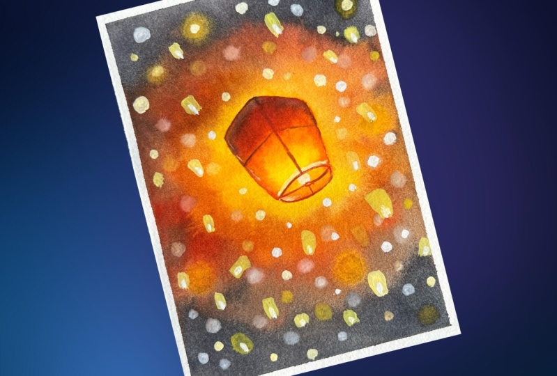
1. Introduction : Everything shines when they are given the right lighting. Lanterns are like a part of message
we transmit to the sky. No words can describe the beauty of watching lanterns
lit in the sky. Lanterns have the
power to inspire us. Sky full of Lanterns
is like a dream. If you love watching a Lit sky, be it of Lanterns or lights. And want to express it in a form of watercolor painting
than my friend, this class is for you. Hey, guys. I am Mayuri an artist and an art
instructor based in India. I welcome you all in
this class where we will be painting a sky full
of lit lanterns. And we will also
look at how to paint a soft focus background and a sharp details
subject against it. We will first look at the
materials needed for the class, which is necessary if you are
a beginner in this class, you will also learn simple watercolor techniques and its implementation in
a step-by-step manner. We will have an exercise
session where we will learn how to paint a
soft focus background. I'll be showing
different methods you can use any that is
feasible to you. Also, I'll be sharing a bonus tip at the
end of the class. Creating the soft
background with a bokeh effect is a
really fun process. So come join me in this
class and have fun.
2. Art Supplies : Let's look at the art supplies that we will need
for this class. Do not worry much about the
art supplies or the brands. You can just use any similar
brands that you have. Even if it's from an
economical brand, It's hokey. All it needs to be as from an artist pushing rather
than the student grade. First, let's look at
the paper that is the most important part in
any watercolor painting. I'll be using Arches
watercolor paper. This one is 100% cotton, and it is a nine by 12 " pad
of 300 GSM or 140 pounds. The paper is cold pressed. I prefer using this. You can also use out-of-print
texture if you'd like. But this people with all
these features and Subash for walking on wet-on-wet and other techniques
in watercolor. We will be painting in
a portrait orientation, but you can take
an orientation and size of your choice.
For the project. I will be using half
of these people back. Then next, for
fixing the people, we need a sturdy material
that can be a cardboard or n board to fix the people. I will be using this
paper, cardboard. This is really helpful as it provide some movement
to the painting. And you can see me rather than fixing to
your table itself. And to fix this paper, you will need a masking tape. You can go for any size. I'm using a half-inch tape. You can even use some
washy or any other team. The second important part in any watercolor painting
as the watercolors. For today's project,
I will be using the sonnet watercolors
set of 21. They are highly pigmented. The pens come in
a tin container. The tab is four-fifths. So I'll be mixing the paints
your itself in the back. You can use any palette or a ceramic dish or a glass dish, and these are readily available
in the kitchen itself. We will also need all jar or container of water for
washing the paints. And a spray bottle is
optional, but really handy. For today's project,
we need a white cosh. And without this project
would be really incomplete. If you do not have
a white gouache, you can use a white watercolor
in opaque consistency. Relax and do not
worry about anything. Next, coming onto the brushes, I will be using
this three quarters flag dash by Princeton. And also the size
ten round brush by Princeton and has a good find it really helpful
for details as well. Then you will also need
a smaller size brush. I'll be using size. I'll be using only these three, and they are all from
Heritage Series. Apart from this,
you will also need a pencil and an eraser
for the sketch. Then you will also
need a tissue or a cloth to wipe off the
excess water or pigments. And with all this, we are ready.
3. Techniques : Let's start the techniques
post with wet on wet. I'm applying a clear coat of water evenly onto the people. It is important for the water
on the paper to be even. Otherwise, there might
be blooms for me. So take care that there
are no puddles of water. I'll go with yellow
deep forest and just drop on the
pins on the people. Just call it wet-on-wet
because the surface is wet, the brush consisting of
the paint is also wet. I use red light and add
it in between the yellow. You can observe well now that wherever I'm
dropping themes, the pigments are flowing
with the flow of water. These hair-like structures
that form in wet-on-wet technique are called blooms and they are usually
unwanted ones. To avoid this problem, you have to wait for
a minute or two, depending on the paper. Now, I'm dropping the
black paints to show that the balloons are forming in
a small and constructed way. But this is also
because I have taken a lesser quantity of
water in the brush. The quantity of water and
pigment in the brush will also determine the results needed in wet on wet technique. 100% cotton paper is good for all the watercolor
techniques needed. Whereas 100% cellulose people will not show such techniques. We want to wet on dry. I'm taking yellow deep
and it looks like there's some lack left on
the brush, but it's okay. Now, since the paper
surface is dry, the paint and the brush is wet, this is wet on dry. I add black from the bottom
and you can see it is so dry that it is forming streaks are dry brush technique
here at the bottom. Since this is sort of
green texture people, the dry brush technique
shows very well on this. I'm blending the
black with the yellow by just going in left
to right motion. And this is a variegated
wash. Wet-on-dry technique is useful
when you want something bright
at default scope. Whereas wet on wet technique will appear lighter
comparatively. Next, I will be showing lifting technique and for that
first time applying paint. I'm using wet on dry
method because I want the pain to stand out
more darker and dried. Lifting technique is really
helpful when you want to fill it out or blur out
any parts of the painting. For this, I'm going to use
clean damp brush and soak all the excess water
on a tissue and then lift the paint from
the people like this. I'm just pressing the
belly of the brush against the people
and lifting it up. If the brush has taken
up enough paint already, it will not lift off any photo
pigment from the people. What do you need to do is rinse your brush again and
socket on the tissue once again and repeat as much as it is required
for the process to occur. You can see after repeating
this step for multiple times, only, I am able to achieve
the results that I need. You can also lift pigments using a tissue paper or
a cotton cloth. Next, let's look at
the glazing technique. And for that, I will
first apply yellow color, similar to the data I've
applied for lifting technique. So it's just a yellow block
with wet-on-dry technique. I will wait for this to dry and then go with a second Leo. Now since the yellow
block is dry, I will apply a red light on top of it in a thin consistency. So since I applied a thin layer, the layer is still visible
and is often important. Glazing is basically
when you apply a layer on top of
already existing one. Now since the red
block is not dry, it is mixing with it. But I hope you have understood that glazing technique
is important one, because in watercolors,
we paint in thin transparent layers
on top of each other. This is how we build that in a watercolor painting using
thin transparent layers. Next, let's look at
the gouache technique. You can see dry brush
strokes clearly. That is because of lesser
water in the brush. I'll go over it with
this darker paint. If you do not have
a Gosh, it's okay. You can use a white watercolor in a thick opaque consistency. The results will be the same. Most of the sets do not have a white watercolor
like this one. If you want to invest on
a white tube separately, let it be a white quash
instead of a white watercolor. Because a white gouache is really helpful in any painting. Just to show how it
can stand up well, on a darker background, I'm adding black from the side. Using a normal consistency, I will add white Bosch
in a form of so-called. Since the background
is still wet, it will mix with the white quash and form the sheets of
the underneath paints. So since the color seems
like poeple, we need this, it will form for purple
pasted and also show you the difference of whitewater color in a
good thick consistency. So if you see the
white gosh sockets are more smoother and
Kremer in appearance. I tend to say cream year
because the consistency of white gouache is really
amazing and buttery smooth. Since they'll be
nuclear, still wet. It is forming different sheets. For a good bright circles. You need to wait for
the people to dry. Now the area is dry and I'm using gouache in
a thick consistency. And you can see
the difference of the previous circuits
and the new ones. You can use gouache
in different ways, even to add highlights for different
watercolor paintings. Because normally in watercolors, what we do is use
a masking fluid or leave the area blank
for white highlights. And that will not be
feasible every time for you. So white quash will
come in handy. I hope you have understood the watercolor techniques that we will be doing in the project? Well, let's move on
to the exercise.
4. Exercise : For this exercise, I'm just
throwing fuel with landings. You draw one big 19th, similar to that of the project. All you have to do is draw this three lines and
then cover the top. You can also add
some fools decides. And obviously the London
should have only source. I will draw for you or
the smaller London's. Now you have to decide
how many elements you want in the main focus and
the rest in the background. I will explain this when
we paint, but for now, I'm speeding up the process
because it is replicated. Now for obtaining or
softer background, I'm going to wet the people, but I will exclude
the landing spot. So whenever you want to
blot out any part of the painting or you want to
paint a software background. All you have to do using
wet on wet technique that is applied evenly or afford
to lose part of the painting. This is against
period up because the process is recitative
and nothing much to explain. I'm going to avoid all of
these smaller London's. Because of this exercise, you will also understand how smaller objects will also affect your painting
and the background. And why masking fluid is
helpful in watercolors. By just looking at the process, you might have decided
that it is a tiring one. And our masking fluid
can act as a savior. In such paintings. Forced use yellow deep and RD to cross the smaller
line and the big one. Now since there is
no masking fluid, the movement is very
restrictive over you. And you would have to paint
carefully across the edges of the Langerhans and
absorbed properly, the areas that are dry
will appear sharp. So I hope you have
got the idea how to paint or declared focus
subject in a soft background. Also, keep in mind that when you are doing a
watercolor painting, having so many smaller
detailed objects will place a more
restrictive activity. It will not give a free hand, and you will also not
enjoy the process. So I would suggest
that you have one or add the most two main focus
subjects in the painting. If you're using masking fluid, then it's not a problem. You could just drop one
beans however you like for a soft background and the
places will still remain white. What I'm painting here is
just for your understanding, and this is not the project. So just assuming that there
are lights around the 19th, I'm adding yellow buttons. It will be a darker background, that is a darker sky. We need to add some
other colors as well. I'll add some red around
the loop and blended. And you know how
to blend, right? For proper blending, just
make sure that paper is wet. I will be using so
clear motion to blend here because
of too many napkins. So you would have to decide beforehand the motion of
the brush for blending. Whilst blending, I will go over the yellow part and that
will form an orange. So you can move from one
direction to the other. It is better to move from
lighter to darker one. I will add lamp black in a darker concentration
as it is a night sky. Adding darker color to such lighter background
is really tricky. For the extreme top
or bottom part, or the part away
from the land and add more darker
concentration of black. Whereas when you move
closer to the landings, blend with a lighter
value of the pigment. You can always choose the
speed of your choice. From the speed section. I'll be adding
more yellow to add more of the color and glue coming from the land and just observe how
I'm blending it. And this is not
actually required. So I've figured this sections do let me know in
the discussion tab, this section was required
in the normal speed. For blending, you can use
more water as required. You need to work fast if
your paper is drying. Otherwise you have only
one option and that is to rebut the entire background
after it is completely dry. Well, adding contrast
in the background, you can add more
darker colors there, cow, I'm doing here with black. Addition of more pigments in layers will add depth
to the painting. The bulky effect. I
really loved some of the pigments using a
clean, damp brush. So we have seen this in
the technique section. Use a synthetic brush possible. But as the value of the
brush and then lift off. You can also use a
slightly wet brush and shift the pigments
away and they lift. You would have to continue
this forum multiple times. You will not get the
needed results in one go. So repeat the steps if needed. You can also use or
tissue or towel. And by dabbing on the people, the excess pigment will
be sold right away. However, you would have to
make the shape that is needed. The trick for this is twofold the tissue in multiple sections and use the edges are corner of the square formed
after multiple folds. If you are not able to
form so-called like me, are uncomfortable with
this tissue technique, then you can use the Brush normally and left the pigments. Or you can also use a
combination of both. That is, my first
wetting the area in so-called and then lifting
with the help of a tissue. The best trick that
we can use to form rocky effect is to
use a white quash. For the bookie effect, you can use white gouache
in different consistency. Even if it mixes
with the background, it is okay as it will form a different shade
of the background. So if your background is
still wet and you are adding the bookie effect with
the help of provide gosh, it will form smooth, so good with the background
while giving the faded look. So you can add
this and different consistencies and
unknown number you like. You can also overlap
one so-called. On top of the adult, you can also paint
the soil goods or the bulky effect in colors
from the background itself. I am now taking a very thick consistency and you can see how it
makes a difference. And it's a complete game changer in the project for the land. And first we will go for a
lighter sheet that is yellow. I will start from there and
then gradually move up force. I will add orange from the
meeting point of the yellow. Right now, I'm using the
wet-on-dry technique. But you can also use wet on wet, which will lead to 0. Naturally blend of watercolors. I will add more pigment
it value of orange. Now about the
orange, I will add. And since it is dry, I'm using some water to dilute. Outline the shape of the London properly
with this thread. After blending all the colors, I will add a tiny
danger of lack and the outline like this
will form a module. You can also add it to
the creases and folds. Thus shadows in the London. I haven't washed my brush and using the leftover
pigment on the brush. Or maybe just take
a little black. I will add it to the
bottom of the room. I believe the media and white. Now you can take
either orange or red and blend it with the black. I will leave a very thin
line for adding yellow. You can also lift a little if you're not happy
with the placement of the pigment and add more yellow or whatever
shape you like. Maybe to add some
more pop of color, we can add red hue. You can blend the rest of the land and with the
similar colors like, like the top part has read gradually moving with
orange and yellow, and kind of accidentally
moved out of the line. So that's correct. Vhdl. By just increasing
the size of the London. For the smaller Langton's, you'd have to paint
in a similar way. By adding and blending
the three colors. That is yellow, orange, and red. You can also go for
yellow and red. So I'm working two
or three Lankans at once by adding yellow first, and then I will add
orange, just about this. Since now I've been
doing this module. Anton's is similar to
the bigger London. I'm speeding up this section. Smaller, fine details. You can use some
modern sheet madest a mix-up or tiny tinge
of black and red. The bigger London, there will be more details like adding
the folds are creases. You can also use blank
directly and add it to the gym and are
the outer boundaries. Also. Finally, for
some ballpark colors, I'm going to use the mix and add in the form
of small circles. You can add even yellow
or orange circles. Just mix the color you
want with white gosh, and it will stand out
against the dark background. Also one last thing, use the thickest
consistency of white and add the brightest
so it goes possible. White quash really help in changing the look
of your painting. You can compare and see the so-called stop now
and the previous ones. That is just so much
difference in them. And that's all the warm
up for the project. Thank you so much for watching.
5. Fixing the paper: Let's fix the people to tabu. Now. I'm keeping ten borders
for the project. You can go for any border
thickness of your choice. Once placed on the
desired thickness, I will move forward fingers and cut the tape
with hand directly. Apply in a similar manner
for all the sides. Once you are done, placing the masking tape
on all the four sides, use a ruler or your fingers
to move forward the tape, once again, just to secure data masking tape and have
clean sharp borders. With this, you are set
for painting the project.
6. Sketch: Do not worry much about this sketch because
it is really simple. Draw an oval shape for
the base of Dilantin. I'll correct it a little earlier and then you can observe it. After drawing this oval base, draw a line approximately
at the center of the base. And then draw two diagonal
lines at the end points. Now connect all of these top three points
with each other. Like this. I'm not very much happy with the
shape of the London, so I'll reuse it a
little from this side. Now it looks comparatively fine. Draw similar lines like
this inside the London. I'm drawing a small
square rhombus here. You can draw a circle as well and then a flame or Dilantin. I am drawing few small landings and the shape is not specific. It is almost
rectangular in shape. With oh, well bottom. Draw as many as you want, but this won't be much visible after painting
the background. That is where gosh
comes into play. Also, at a place
where the Langton, we need to add small string or wire line that
holds it together. So just draw the full lines
across this small structure. And I'm raising the
flame and correcting it. And we are done with our sketch.
7. Color Swatches : For the project, I will
be using yellow deep. You can use cadmium yellow or any darker
yellow from your palette. Next shade is orange. You can mix yellow and red if you don't have the
basic orange here. The next shared that I will be using from this set
is really light. You can use any
red that you have. Next important color
is lamp black. You can also use Payne's gray. If you do not like using black or even neutral
tint is fine. We will also need a
white watercolor or gosh and brushes not clean, so the color is not good. But this is just
what I presentation.
8. The Background : So we will start our project by activating the veins, force. Us free on this portal is
very useful for this purpose. You can also use a
dropper and drop on some water onto the
beans for activation. The beans are ready so we
can move on to the paper. Take a generous amount
of water in your brush, and then apply it
evenly onto the people. Use any big size
Nike owned for this. As you will have to
cover the entire people. Going left to right motion from top to the bottom
or bottom to top. You can also cover
it diagonally. Just add the water should
be even on the entire. Also, I do this for a
good amount of time so as to let the people fibers soak in the excess of the water. Since I don't have
a hockey brush or a bigger size flat brush, I'm covering the entire
paper with water using the three-quarters
flat brush as the biggest size brush. Now, be careful not apply
water to the middle, bigger size, Langdon, as that is our center
of attraction. So do take care around the edges to people fibers have soaked
and the excess water. So I'm applying more
and more on the top. The bigger Lenton and the middle is the main focus
of this painting. So that is in sharp details. We are avoiding this 92 makeup
lower and soft background. If you wish, you
can also paint few more smaller items like
this, avoiding the space. I'll be covering the
entire background with water because I want okay. But if you want to
go the extra mile, you can keep the
smaller Langton's dry. That is being from the outside
edge of the mountains, similar to the one. For me, I will be using
gosh, related mountains. The end on top of already
existing background. I prefer you follow with me because you will enjoy or not. And this is really
a fun project. Cover the entire
background with water, and you will definitely
have fun with watercolors. The shine of the
people should be like this, even listening. Now let's start painting. I'm switching to
my size ten brush, giving it a good wash. The first color that I will
go for, this yellow deep, I will start applying
it random strokes. More concentrated Payne's across the video by painting across
the edges of your neck. You can also use again
boat or cadmium. I'm placing almost three
sides of the neck. And then you can
drop it anywhere you like and have fun
with watercolors. And wash the brush, pick up some orange and
a good concentration. And then using some
side or random strokes, I'm placing it
across the painting, the top part of the banana, orange, so covered with it. The pigments will flow
or the flow of water. And you can see there are some hair-like
structures arising. You can take care of
this by blending. Just move you up, trashing, random motion across
the hairy structures because there is no
fine pattern here. And we're just having fun. Next time using red
light across the orange. I'm blending it and add it, add some pieces on. You can add it
wherever you like. Your colors and flow may
not be similar to mine. Your color placements
and packings should be off your choice as you
are the one having fun. If you're new to watercolor, you will understand how interesting and
satisfying this process. It is literally playing
with water and watercolor. Wash the brush now and I'm def some of the pigments
across this model. This is really not necessary. We can repeat the process
using a clean damp brush. I leave it as it is because
we will be using gosh. Next, I'm using lamp black and adding it to the
extreme top and the bottom. Bending good
concentration because, you know, watercolors,
dry or shade, lighter. If you want and
intense dark painting, you will have to use a darker concentration
of the pigments. Even if the painting
dries or shade lighter. You can go over a
second year by wetting the paper first and then
adding the pigments again. So if you observe
when I'm loading the brush with a good
concentration of the black paint. And as it starts by getting, I am moving to the reds
and the other colors. Using the same brush that
has a tiny tinge of black. I am blending it with
the red and orange. Play with your brush
using side brushstrokes. And you will be amazed to see the textures
and patterns that I was washed up and take some yellow deep and
add it across the line. This is to just increase the value and depth
of the painting. So I will do this for the
rest of the colors as well. You can see the colors up
your own little lighter. So I'm adding more
and more pigment and blending it with the
rest. Being diluted. Black, yellow, orange,
and red will give us different grounds and add some more orange is
very less effect. Now, you have a complete freedom to go up in the sheets
variable you like. Even if I'm adding
more of the orange, I'm blending it with the
black and forming a crown. If you use more of the black sheets will
not be more visible. I'll do the same by
adding guiding light. And you can see how randomly
I'm playing with the cache. You can see it is Adobe or
some vaguely, vaguely back. I'm pushing in some darker
pigment inside as fun. And wash my brush and add some paring knife as
that is very visible. And using the brush, I'll add some dots
like this across. You might have observed
light late 19th in the sky. And the texture of the sky and the clouds that arises from it. Just in a similar way, you have to ping
this glowing sky. Some more purple
thread and blending. I haven't washed my brush and some touch ups
wherever I feel. Like I'm adding and pushing
the ground, splitting father. Whoops, I got to fix this. Now. I will do
this by outlining. Again. Just take and you do
not make mistakes nice, neat because it will push the
pains and written inside, reducing the size of the night. And wherever there are
hair-like structures. Just blend it like this. Just water blooms and will form naturally with the
flow of the water. The black up your
little lighter. So I'm adding more to
the extreme bottom. And as it dilutes IV blend
it with the father colors. This is just like painting. Ok. Now this guy, but with different
range of colors, I'm painting some user
sees like this of Laos. And wherever you feel no contrast from
being released mode. I will washed my brush and
lift across some places. Or final touch ups. There's a little black on
the brush and it looks like it does blend on the paper. So I will wash the brush and then lift up knowing
the areas that I want. Using a clean, damp brush, I've left some pigments
for the small napkins. Repeat multiple times. I haven't washed my brush here, but still the pigments
are being lifted. That is because I'm soaking
the excess on that issue. Since the paper is wet, brush dry, it is drained
into the lifting technique. While the paper is wet or
semi wet in condition. Use white watercolor or the bouquet effect
on you have to do is paint so you can
place them anywhere you want and in any sizes. Because the source of light
might not be the same. Since the paper is spread. The bulky effect
is no more hokey. It looks like a cotton ball. Using a clean damp brush, just run across the
hairy structures in a circle and it will be fine. The concentration of the
circles by adding more of the light colored circles, random number that you wish. It's okay if the white mixes
with the background beneath. Our intention is to enjoy and create a project that
actually suits your mind. Adding this small, small circles will really help
you calm your mind. Bending SVO new therapy,
if you take it. I've not yellow deep to
the small nitrogens. It is because of the
lifting technique that do yellow is visible
on the background. Adding some more yellow ocher. I haven't used
lifting technique for the smaller nitrogens and we'll use gosh,
directly bought it.
9. The Bokeh effect : Let's take some whitewash
aside in a good consistency. Add a few more circles in white. You can see asda before
starts getting dry, the white will
appear, move right? And there will be less
activation of the themes. Few areas might still be wet, come back to the others
and form mixtures. Let's reshape this previous so you can do the same for your so good that it does not
seem right to you. With a good consistency
of the white gouache, you will get good
uptight, so-called. Whereas with a lesser
one, we get one. And take out some more fresh, bright white quash and mix some yellow deep.
I'm obese done. Using the yellow gouache. I wouldn't make smaller
napkins with it. You can also mix model so-called gauche and
actually the beauty of the bouquet effect. I'm adding the so-called
indifferent sizes and different shapes
of the painting. Darker back to a beauty
in this painting. Good. Orange to this space down here. You can add it to y t directly. But it's okay if you
use this based on yellow color because it will
still give you an orange. And all we need is an orange portion that will stand out against
the darker back. The process is really a tidy, but the effect is real. You can stop whenever you
see it is more than enough. You also called the ignored
me as much as mine. If you find a tidy, you can take a break, have a cup of coffee, and then come back to this. Now for the last shape, I will add some hair to this previous existing
yellow, orange, squash it wherever
you feel it is empty. You can also, or whatnot, but on top of a previously
existing silver, I feel places it
might not be visible. So you can add this
two darker places. And then nato for
the lighter areas, you can add more white to the space and paint
on top of it. Once you are done
adding so goes with red car wash. Wash your
brush thoroughly and take a fresh piece of white gouache
in a good consistency and add the brightest white circles on top of previously existing. So it goes all set, break me few pieces. I'm just using the
tip of my brush and pressing it for forming
this model. So good. Who afresh being both
whitewash, yellow deep. I mixed it with the other smaller lightens. Asked this bright yellow gosh, we make it stand
out from the rest. The other language and
make few more at the 19th, smaller sizes as well. Using yellow deep,
I will outline the outside edges of the Lachlan and landed
with the Ghosh. This will add a
glow to the land, and so do it for
the rest as well. You can also use
an orange instead. Whilst this land in. Entertain white quash inside it. Using the leftover
yellow gosh mix. I will add few more
smaller than that. We will be done with a
bulky effect background. See you next in
painting the landing.
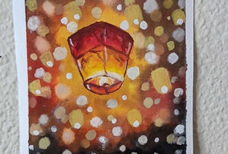
10. The Lantern: For the lantern, I'm wetting
it with clear water. This step is not necessary, but I like it this way. I love to see the watercolors flow and form blend on its own. I'm taking some white watercolor and adding it at the gym. You're next. I'm taking a little d and adding it just a little
about the white. Let's take a little more and add it in somewhat cove like
and cover the edges here. Next, I'm using orange and adding it just
above this yellow. It seems a little lighter, so I'm adding more of it. We will blend the colors
properly at the end. Now I'm adding red light
at the top of Orange. Be careful while painting
the edges of the London. Without washing the brush, I'm adding this red to all
the edges and blending it. I'll take a tiny
it in black here. Either diluted version
of the black at the top. Wash the brush. Take some red light
and add on top of this diluted black like this. We will get a modern shared. Now, let's add a little more of the red light because the color
appears a little lighter. I outline it with red as well. Then with a clean brush, I will blend it using
left to right motion. Just adding a little
of the yellow deep. Using a clean damp brush. I'm lifting the
pigments at the base. I will start with
orange directly. Do not paint the flame part. Leave a little space near it and cover the rest
with the orange. Now, I'll add yellow
deep in the center near the flame and blend
it with the orange. Again, I lived at Durham using some red light act to the base of Dilantin. For some highlights, I'm adding
ten lines in white gosh. Using the pastel yellow sheet, I'm adding fine
lines for the flame. Add some red light to the black and bomb or
darker module sheet. Using this darker maroon chair, I'm going to add details that is fine lines to the nineties. First started this to
the edges of the London. Now from the edges, I will make some other
lines to the 19th, just like small creases. I'm mixing a little dark
night and forming or darker maroon now by
this or darker shade, and adding more fine details, add this to the outer
boundaries and do them. The while holding the area filename with this
color as well. For the center squared
or rhombus spot, I'm just outlining it
with the dark mode when shear and then I will fill
it with orange inside. Now using more of the water
and less of the paint, I will just use the
sides of the brush and scratch or move the brush
on the paper like this. It's almost like dry brush, but not dry brush exactly. I'll add some fine lines using oranges well
to the London. Finally, I will use a thick
consistency of white gouache and add to the flame and other parts of the
London for highlights. You start tennis brush
or a detailer brush that you have for this and
make very fine lines. Add to the other smaller
Langton's as well. At the bottom. Just a small dot is enough to show
or gluey sport. I guess we are done
with this model. Anton's still a little
gosh, left in the brush. And you know that I do
not waste anything. So let's add some small bouquets when I know that's like too much of
the bouquet effect in this project
are the painting. But your bogey effects can be completely
different than mine. Beah done with that project. So wash your brush thoroughly.
11. Outro: So now for the final reveal, Let's take off the
masking tape gently. I'm always nervous at
this very last step. I see this in every
class of mine. Take out masking
tape at an angle. Some masking tapes
come off very easily, but some have already strong. It is. You have to test and see accordingly the Langton and the sky is later and
it's really glowing. I hope you liked this project. Do give it a try. It's really relaxing
and fun to try. Thank you so much for joining
and see you until the next.
12. Bonus : In this additional video, I will be sharing a
special bonus tip for you. The so-called or the
bookie effect have a defined edges and we have
to blow them out or more. Soft definition background. For that, I will be using
a clean damp brush. Then moving it around the edges of the so-called or
the bulky effects. Do not use too much
water for this process. Be very light on your hands
and gently just rub or move your brush across the edges of these
circles around motion. This will blot out the socket. Since the circles aren't gosh, it is easier and possible to blur out the edges
in a simpler way. And since this is on
a darker background, it is not going to show much
of what you are correcting. It is almost like erasing the edges of the circles
with a clean damp brush. I hope you have
understood this trick. I'm fast-forwarding this
section here because there are many circuits and the method
used for them is the same. If you want, you can slow down the speed from the
speed section. Follow the similar process for the background
lanterns as well. So thank you so much for
joining the class and do leave a feedback as it is really
helpful and motivating for me. I am so excited to
see your projects. Do post them in the
project section. Let me know in the
discussion tab if this trick was helpful
for you or not. If you want some
additional information, check out my other classes
and follow me on Instagram. I will see you next time.
 Mayuri, ARTrinkets I Watercolor & Gouache Artist