Transcripts
1. Introduction: Nature has inspired
artists for centuries, and I want to invite
you to take some of that inspiration
for yourself. With my new course, learn to draw landscapes. My name is Paul Richmond
and I love to draw. I draw all the time. I take sketch books
with me when I travel, and I love capturing the beauty that I see around me on paper. In this course, I want
to show you some of the skills and
techniques that I use to take a flat piece of paper and open it
up and make it feel like you could walk right into a beautiful landscape
if you're a beginner, this course will be
a great introduction to some of the
fundamentals of drawing, including working with
light and shadow, how to create a sense of depth. How to break things
down into shapes and planes and sketch
them out on the paper before getting to detail
over the course of 30 video lessons that
are only 10 min each, you are going to make so
many landscape drawings. I've been a professional
artist for about 20 years. And when I graduated
from art school, I started a mural
painting business and painted murals all over
the place for awhile. I've done over 400 Novel
Cover illustrations and my paintings are exhibited in galleries and sold to collectors
all around the world. I've done commissions
for Disney and Netflix. Some pretty notable
collectors like Teresa Vaughn and Dolly Parton. I paint and draw all different
kinds of subject matter. But when I was
first starting out, one of the things
that I really focused on was landscape drawing. And I found that the
skills that I developed from working on so
many landscapes that helped me in other areas of my artistic life
to this course is going to be all about appreciating
the beauty of nature. So often we are flying
through our day. We don't always have
the time to stop and really look what's around us. This course is an
invitation to slow down, take a closer look and
draw what we see on paper. You don't need a lot
of fancy materials, just paper and pencil. You will end up with so many beautiful drawings
by the end of this course. Surprise yourself with
what you can draw them, and it's just the beginning. My goal is to teach you some of these foundational
skills and also encourage you to take them and adapt them to your own
artistic practice. Your own spin on it, find your own creative voice. I want to give you some
of the basic skills and encourage you to figure out
how you want to use them. And I promised to make it
fun and stress-free by telling you lots of bad jokes and giggling all
the way through. Everyone has a creative side, but so often,
especially as adults, it gets pushed to the
back burner and I want to invite you to
reconnect with that. This is all about the process. This class is great
for beginners, but also artists with a
bit more experienced who just want a refresher and get back to the basics of drawing. I can't wait to
start drawing with you because practice
makes perfect
2. Projects: In this course, we are
going to make a lot of landscape drawings
together and I am so excited, we'll start off by doing some quick drawings of
different elements of nature, just 10 min per drawing
so that we can get used to looking and capturing
what we see on paper. And then we'll start to add a
little bit more time and go more in-depth into different
techniques will be traveling together to so many different
beautiful landscapes or mountains or
desert to the ocean. So get ready to go on a
little journey with me. We'll finish the
course by spending the last 11 lessons
working on one landscape drawing that encapsulates
a lot of the ideas that we will have worked through in all the
other lessons. So whether you like to do
quick drawing or if you like to dig in and spend a little
bit more time on your work, this course has at all. I can't wait to get
started. Let's go
3. Materials: Let's talk about the materials that you'll need
for this course. I've cut it intentionally, very minimal because
all you really need is a pencil and paper. I have two different
types of drawing pencils. I have a to B and a for b, those are both softer lead. Anything with a B is a soft lead and that just means it makes it a
little bit darker. Mark the lead comes off onto the paper a
little bit easier. So that's what I'll be using. You can use any kind of
pencil you want though, if you have a certain type
that you prefer, use that. But if you don't know
what you prefer, this might be a good
place to start. I'm using this nine inch by 12 inch mixed media sketchbook. You can use any type of
paper that you want, but just make sure you
have a bunch because we are going to be doing
a lot of drawings. I like the mixed media
sketchbooks because the paper is a little bit heavier and we
will be doing some shading, so that just holds up
a little bit better. So whatever kind of
paper you choose, just choose something
a little bit on the thicker side so
it can handle that. And then lastly, research. This is a kneaded eraser. They come in a little
rectangle form like this, and then you just sort
of squished them around. And what I like
about them is, well, a few things when
they get dirty, you just need them. That's why they're
called kneaded erasers. They are self-cleaning,
but then also you can shape them if you want it to fit into a
certain level spot, any kind of eraser will work. And then you just
need some kind of device to watch me on. But you've already got
that because you're watching me right
now, and that's it. So sharpen your pencils
and let's get started.
4. Quick Sketch: Tree: Hi everyone and welcome to
learn to draw landscapes. I'm Paul Richmond, and in
this lesson we are going to be doing a quick sketch
together of a tree. Happy journaling. Let's jump right in. I am breaking in a brand
new sketch book today, which is always an exciting
moment for an artist, but also it can be a
little intimidating. Those perfect, clean white pages can make you feel like you don't
want to mess them up. So the best thing
to do is to just jump right in and
start drilling. And I thought it would be
good to start this course by doing some quick sketches
of some different elements of nature that show up a lot
in landscape art and what could be better to begin
with then, a beautiful tree. So we'll just be focusing
on sketching it today, getting the lines and I'm
using a for B pencil. You can use whatever
pencil you want, or pen or colored pencil. Whatever you feel like pastels. This is a very open course. I like for people to explore, do their own thing. I will talk you through
what I'm doing, but I also encourage you to
ignore me if you want it and approach it your
own way as well. So I am starting though
by sketching out the structural shapes of
the trunk and branches. And it's not necessary to get every single one exactly right, Just kinda get the
essence of it in there. But this helps me to understand what's supporting the tree. Before I start doing leaves
or any of the tiny branches, I like to kinda prioritize getting the bigger shapes first. And I think that's a good
general rule for drawing. Not that not that there
are really any rules. Maybe guideline
is a better word, but prioritizing the bigger, more important elements
can really help you find your way into a drawing if
you're just starting out, maybe you haven't done
a lot of art before. You might look at an image like this and find it a
bit overwhelming. That's okay. Every
artist feels that way. I've been doing art
a long time and I still feel like that
sometimes myself. That just means you're
looking closely and you're taking it
all in and that's okay. So prioritizing what
you're seeing you kinda go through and visually distill it down to the most
important parts. That's a great way to kinda just start
finding your way into it. And another, I will
call it a pro tip. I'd like to share a lot of those actual Hawley pro tip got to have that
little branding. And so by first Pali
pro tip for you is to just break down
whatever it is that you are drawing
into simple shapes. Don't get too caught up with important tiny minute
details right away. Focus on just getting
the big shapes. The end you have to just get something down on the
paper and it might be completely
wrong. That's okay. At least you got it
on there and then you can look at it and compare it with the reference
and change it. That's really important
aspect of learning to draw is not being afraid to make mistakes because
everybody does. And that's how you learn. That's how you grow. Studying a drawing to figure
out what isn't working is truly one of the best ways
to improve and to learn. And I still do that all the time myself and my paintings
and in my drawings. I definitely do not get
everything right the first time. It's all about just stopping and evaluating and
looking closer. But I think that that is one of the things that I love
most about landscape drawing in landscape painting
is that it does just give you an opportunity to
slow down and look closer. I guess, not slowing down too much when it's a
ten-minute lesson, but still you can draw a lot longer than
this if you want to. But it's an invitation
to just pause and look closer at something
and really appreciate it. We go through life
so quickly and don't always pay attention to everything that's so
wonderful around us. So I think that's what
I love probably the most about drawing landscapes in particular is that
it just lets you really appreciate and enjoy
the beauty of nature. Alright, so I have my
main branch shapes. Now I'm just going to
draw a very sketchy, almost like an outline really of the overall kinda clump
of leaves up there. I'm not I'm not trying to draw each individual
leaf or anything. I'm just drawing very
scribbly little line here just to indicate where I see those
different clumps of leaves and how
they're shaped, how they fit together. Drawing is also sort of like
putting together a puzzle. You get one area that's
working and then you just start to connect it
with the other parts. And sometimes you'll put it in a puzzle piece
and you'll realize, oh, that's not where
that one goes. That's okay. You just erase it. That's what that's what
this little guy is. Four. So don't worry about that. Draw lightly. That would be another suggestion
I would make for you, especially if you're
just starting out, see how I'm holding the pencil really far back
towards the back. That helps me to not get
too tight and heavy handed. I tend to be a pretty
heavy handed artist. I like to make dark,
aggressive lines. I don't know why it doesn't
really fit my personality, but that's, that's how I draw. I guess I'm kinda bold, so maybe it fits. But if you do that, then if you do that too soon, then you're pretty locked into
that shape and that line. And because it's
difficult to erase, it makes deep grooves
and the papers, so you're kind of stuck
with it a little bit more. So if you start off lighter and sketchier
and looser like this, then it's a lot easier
to make adjustments. So that helps me a lot. It just kinda keeps
me from getting too locked in too
quickly to anything. Okay. Let's see a little clump of leaves here now
you're not going to get every single branch and
every little detail exactly, right, or maybe you will. But that's okay. We're
just kinda get it going for the
essence of it here. That's a good way to think
about this when you, especially when you're
doing a quick sketch, you just trying to
capture the essence. And then once I go
through and I get the main shapes laid out, then that's when
I like to go back and clean up the edges to
do more interesting line. So if you end up having some
time for that, that's great. But if not, that's okay too. You might only get so far
as drawing just kinda like a very loose sketchy
version of this tree today. And that's great. Whatever you, whatever you end up with. It's an awesome First, first drawing for our course. Don't judge it too harshly. Don't judge it at
all. Just let it be. Drawings like this are wonderful because they're low
commitment level. You're just really trying to capture what you see
and then move on. But if you end up
really loving it, then you can just press
pause on this video and keep going as
long as you want. And you might be surprised how long you can really spend
on a drawing like this. Because one thing that you will notice is that as
you're drawing and even as you're going back in
now as I'm going back and refining some
of my lines here, you start seeing so
many more things. There's all these
little branches and little shapes and
interesting leaf, little clumps of leaves that I didn't notice the
first time around. So you could spend a
long time on this, just doing line work,
let alone shading. And we'll get to that
all later in the course. But for now, I'm just
focusing on lines making kind of interesting,
interesting lines. You can vary the pressure of the lines that you're using and that can make the
drawing more interesting. So for example, making the
lines a little thicker, in some parts, thinner and others can just give it
a little bit more life. That can be an indication maybe of where
there's more shadow. You might use thicker line. That's one way to
think about it, or just kinda to add some visual interests
to the drawing. Again, this is all
just a suggestion. If your drawing is leading
you in a different direction, follow it. It knows best. Alright, I'm having
fun with this. I hope you are too. I hope that this was
a nice way to just kinda ease into this course. We're going to do a few more
quick sketches like this. And then we'll move on
to some other fun stuff. I have so much in store for you. I'm so excited to get to
spend this time really exploring different aspects
of landscape drawing. With all of you. We're
going to have so much fun. Alright, I'm just going to put some finishing touches on this, including drawing a few
of the negative spaces. So negative space is basically like the
opening and the leaves. So positive space in a drawing
is the subject matter, is that in this
case the tree and negative space is
what's around it, the sky in this, in this case. So don't forget about
those negative spaces. That can always be a
really interesting aspect, especially of drawing
trees and other webs of branches and the openings in the leaves and all
that kinda stuff. Alright, I've got my scribble
technique happening here. Scribbling is a great
way to just get some quick essence of leaves. A few more branches. It's great job everyone. I hope you had fun with that. In our next lesson, we're going to be doing
another quick drawing this time of a mountain. See you then?
5. Quick Sketch: Mountain: Hi everyone and welcome
back to learn to draw landscapes
on Paul Richmond. And today we are
going to be doing a quick sketch of a mountain. So sharpen those pencils. Happy journaling. Today we're gonna go
climbing in the mountains. Again, pencil, paper. Let's get started. You ready? We're going to sketch this
out and then if there's time, maybe we'll do a
little bit of shading because there are some
nice shadows on this. Again, just kinda pick a
point and very lightly sketch in the basic shapes
that you see first, even if you just start
with a true triangle, that would be enough to get
it placed onto the page. I think that's a good way
to think about it too. When you're, when you're starting out a
drawing like this, you are basically trying to
just figure out how to place those elements that
you're seeing in front of you onto the paper. And there may be some adjustments that are needed with that
and that's okay. For one thing, your
paper might be a different proportion than the reference you're looking at. This reference is kind of a
more vertical orientation. So depending on the shape
of your sketchbook, you might be working
on more of a square, you may be working on
more of a horizontal. So be sure to take
that into account. T, You can always choose to
crop images differently. Just be aware of that. That's something that not, not a lot of beginning
artists always think about the
relationship between the shape of your paper and the frame of reference
of your image. Alright, so I'm just going
to lightly sketch in, a lot of this is in shadow, but you can see that there are some interesting other kind of hills and mountains and rocky
things happening down here. So I'm just very lightly sketching some of that
stuff in right now. Just sort of dissect the image. That's another way
to think about it. You're just breaking it apart in reconstructing it on
your, on your paper. The beauty of
drawing landscapes. It's, it's a little bit
more forgiving than say, doing a realistic
portrait or something where if you get one
line in the wrong place, it's not going to look
like that person. But if you get one line a
little bit wonky on here, it's still probably going
to look like a mountain. So don't stress about it. Alright, so now I've got my
basic lines, my basic shapes. So I'm just going to go back
and clean up the lines. I really want to pay attention. There's a lot of interesting, just lumps and bumps. I think that the lines on this mountain are really
beautiful and I wanted to take my time and just
appreciate those. I'm using thicker
lines where I see the mountain kind of
going more into shadow. So that's a way to make
the line drawing just feel a little bit
more interesting and reflective of what
you're seeing there. I'm making adjustments as
I go to my quick sketch. Line was lower. And you can see how easy
it is to just erase that. Pretend like it never happened. Don't be afraid to make adjustments to your
drawings as you go. That's a pro tip. And you might not think that
prose have to do that a lot, but it's a little inside secret. We do the secret. Everybody does. Everybody has to make adjustments and
corrections as they go. But I think I've
said this before in other classes that
one of the things I have noticed after
spending a lot of years teaching artists, when they're first starting out, those mistakes can make you feel like you're really doing
something wrong and like, I'm not good at this, I should just quit and I
don't know what I'm doing. It just triggers all of those
impostor syndrome feelings that a lot of people have tried to try to
work through that. If you experienced that, if you, as you're drawing, if you have a voice in your head that's saying, I'm
no good at this. I don't know what I'm doing.
Just say, Okay, thank you. But I'm going to
keep going anyway. It's no big deal. The
mistakes are the best part. That's how you, that's
how you align. Alright? I'm really enjoying
just looking at some of these different shapes that happen where
we're seeing over the other side of
the mountain here. You can, we're going
to talk more about lighting way on down the road. But you can tell him this image, the lighting is coming from
the right and that's why there's a dark shadow
on the left side. Dark shadow on the
left side here. In lighting is really
important element in landscape art because
it allows us to understand The form, the way
that the light wraps around the objects helps
us to really see how, that, how that forum lays the different planes
of that structure. And it takes it
from looking like a just a two-dimensional
thing on your paper to creating that illusion of
being three-dimensional. I think that's one of
the magical things about making landscapes is
that we're starting on a, on a flat paper. If you're doing
landscape paintings, it's a flat canvas, but by the time you're done, you've created
something that it feels like you could just
walk right into. And to me that's just magical. Alright, I'm going to
keep the lines down here, even though it's in shadow, I'm going to keep
them kind of late because there's not
a lot of contrast. If you look in that area, the shapes are much more
subtle than what we see happening up here because
there's light against dark. So I'm using the line
thickness to talk, talk a little bit about the
amount of contrast that I'm seeing between light and
dark in those areas. Alright, so now that I have
the basic shapes down, I'm going to do a little
bit of shading on this one. Nothing to, nothing
too detailed. And it is completely
fine for you to not do this if you want to just
focus on getting the lines. That is okay. But I
know that there are some overachievers out there who might want to take
it a step further. So I'm going to start on the
shadow side of the mountain. And I'm just going
to very lightly shade in the whole thing. I'm not trying to make
this a super realistic drawing in terms of
hiding all the lines. If you want a drawing to really feel photographic
like photo realism, then you're not going to
want to see your lines. You'll use your camouflage
them with shadows and highlights because you don't see outlines on things
in the real-world. But in this case I want, I want the drawing to
look like a drawing. So I'm leaving the lines
and I'm just kinda doing very light subtle shading. So that gives us a hint
of what the light's doing without being
too overbearing. So now I've covered the whole shadow side that's
missed this little spot. Don't want to forget you, sorry. You ever talk to your art? I do a lot. I try not
to do it too much when I'm teaching so that
you don't think I'm crazy, but I do it a lot
when I'm by myself, so alright, now I'm going
back in and if you see where on the shadow side it
gets even darker over here. And then pretty
much all down here. So I'm just doing
another pass over top to make that a
little bit darker. And it kinda goes right
up into this part. Here. See how with very little effort, we've kinda given
the viewer a sense of the lighting in the image
and it just makes that, makes that mountain feel
so much more dimensional. Now, you'll notice that as
it goes down on the right, it falls into shadow a
little bit over here too. It's not as much as down here. So I'm going to bump this
a little bit darker. It's always about
push and pull when you're working with
light and shadow. Because we're working up
from a white piece of paper. So you have to really
kinda factor that in as well and know
that you're just kinda inching your
way towards dark. I haven't gotten nearly as dark as it really is
in the reference, but I've done enough
to give us an idea. And then I'm just gonna
make some little marks and little almost like scribbly shapes just to
indicate more of the texture. Texture is also a great thing to think about when
you're doing a landscape, because everything
within the landscape usually has a different texture. If you're doing grass and then tree trunks and think
about mountains and water, maybe, you know, everything
has a different surface. And thinking about
the way it would feel if you were to touch that, that thing can help you to understand a little bit
more about how to draw it. So just trying to simulate
some of that texture in your, in your quick
drawings if you have time to keep saying that because I don't want
anybody stressing out. This is supposed to be fun. No stress, no pressure. I try to be as soothing and
calming as I possibly can. I think I am about finished
with this drawing. I'm happy with the
way that looks. I hope you are happy
with yours too. Feel free to keep going
as long as you want. Awesome job you did it. Alright, in our next lesson, more quick sketching still
this time we are going to be drawing rocks. See you then?
6. Quick Sketch: Rocks: Hi everyone and welcome back
to learn to draw landscapes. I'm still Paul Richmond, and today we're going
to be drawing rocks, which I promise is a lot more fun than it sounds. Be drilling. Want to be showing
me go, gorgeous. Hey, time for one
more quick sketching. This time I wanted
to have us draw some rocks and maybe
doesn't sound too exciting. But look at that gorgeous image. I love the color.
We're not gonna get to really get into color today, but it's fun to look
at while we draw. I picked this for a couple
of reasons and I'll talk to you as I'm drawing so we
don't waste any time. But just again, start by
drawing the simple shapes. Don't get too
detailed to quickly. But as I was starting
to say a couple of reasons why I
picked this image. First of all, I love
the textures of rocks. So I thought that
would be fun for us to play around with
a little bit here. And also, this photo
does a really nice job of introducing something that is very important
in landscape art. And that is the concept of perspective and
creating depth. And that's something that
we will go a lot more in depth into as we go
through this course. But this is a nice way to
introduce it because it really shows you that idea
in a very simple way. If you look at these rocks, you can see how as
they start moving back in space, they get smaller. And that right there is the essence of
perspective, drawing. That word, that perspective that terrifies so many
artists when they're first starting out because you have
visions of having to draw these vanishing points and lines and every sounds very,
everything very technical. When you're doing landscapes, that kind of thing isn't always necessary unless there are a lot of buildings are
structural things with straight lines
in the drawing, then you might have
to have a little bit more of an
awareness of that. But, but true landscapes where it's really just
focusing on nature, use a little bit more of something called
atmospheric perspective. Which is the way that the
lighting and the values, the different
shades of light and dark helped to create
that sense of space. But then also just the
relative size of things. You can see how, especially once we
go from this area to the rocks that are back
here in the middle ground, they get much smaller. So try to quickly sketch
in as many as you can. It's not necessary to
draw every single rock. I'm going to let you know when we're about halfway
through because that's the point when I
think it would be good for us to start doing a little bit more with the
texture and playing with wines and shading and
all that kinda stuff. So draw as many as you can and however many you
have when we get to that halfway point will be
perfect even if it's just one. But try to give you at least try and get a
few that go back in space because I
think it would be fun to start to see
that happening in your drawings to create that illusion of
depth on the page. So very sketchy,
very loose here, just kinda get them locked in. This is another case
where you can think about the positive and negative space and use that negative space. Here's your pro tip
for this lesson. Negative space can really help
you create your drawings. If you actually draw. If you think of it as
though you were drawing the shape of the negative space. So normally, like right now
we're drawing these rocks. I imagine in your mind
you are thinking, I'm going to draw the
shape of this rock, which would be a very
logical thing for you to be thinking so that he's
not wrong, that is good. But try thinking about it
a different way instead of thinking about it as though
you were drawing the rock. Imagine you were drawing the shape of the
water, the container. If you want to think
of it that way, the containers of the water, that the edges of these
rocks at creating that border for where
we see the water. So it's kind of a reversal
of how you would look at it, how you might
approach it normally, and those kinds of tricks, really good to play on yourself. A lot of art is kinda
like playing tricks on yourself and getting you to just look at things differently. Think about things differently. Alright, so we are approaching
the halfway point. We have about another 20 s. So I'm going to just quickly
scribble in a few more rocks. I'm not going to worry about the distant mountains
horizon line, none of that. This is all about rocks today. We're at halfway. So now
I'm going to go back and start refining the rocks and really playing
with the texture. Going back to that whole idea
of atmospheric perspective. The way that you, another way that you
can show that in your drawings is by putting more detail and more emphasis on the elements of your
landscape that are closer to us. So anything that's
right up front like this big rock that I'm
drawing right now. That would be in the
foreground of your piece. And then in my case, since I don't have
the horizon line in the mountains and stuff, I would say these rocks
here are the middle ground, then the smaller rocks
or the background. So you want to always be
locating in your drawings where, where to all of the
different elements fall. That can help you to really start breaking through
that flat piece of paper. I do think about that a lot
as I'm working on landscapes. You almost, it's almost
as if you're reaching into the paper to
put this place, those little rocks way
far back in there. If you're just focusing on line. So this is really up to you. I'm starting with line. If there's time, I might
do a little shading. Try segmenting the rocks are looking at the
different faces, the different planes
of the rock and breaking it up because
rocks are very, they have a lot of different
sides to them usually. And you can really see that when I'm teaching
kids and adults, because we're just
big kids, Julie, I always use the example
of a soccer ball. If you think of how
a soccer ball is, are they hexagon has pentagons. One of these times
need to look that up, but it's made up of geometric shapes that all fit together to form the sphere. And a lot of what we draw is like that if you really think about
all the different sides, sometimes they're not
quite as sharp edge, so it depending what it
is that you're drawing, but anything can be
broken down into planes like that even if
you're drawing faces. But especially when
you're doing landscapes. So try to not just draw
the outlines of the rocks, but look for interior lines too. That's a good way
to think about it. It helped, it gives you more
to look for and it helps you to understand how rock
is actually formed, whether what are the
different angles, what are the different
sections or planes of it. Just really try and
understand what you're seeing and use your
lines to do that. I might not even get to the shading today
because I'm just getting really wrapped
up in drawing the lines. That's okay. Whatever
you want to do. One thing, one trick that
you can try is to let the lines get a little bit lighter as you move
back in space. That can be another way to
show depth without doing any shading just through
varying the line weight. Getting some of this
really interesting texture here on this rock. Alright, so i'll,
I'll show you now. So I'm moving back
into this kind of, these more distant rock. So I'm going to
use lighter lines, little less detail too, because you do see less detail
as things recede in space. We tend to want to
draw everything. We know what we know
what things look like. So we want to draw every aspect of it no matter where
it is in space. But if you are really
wanting to create a sense of depth In your work, let the, let the elements
that are farther away from us become more, more faint, more essence like we don't
might not see all the details. We might not see as
many edges or sides, or we might not see all of those things that
you know, are there. So drawing is very much
about drawing what you see, not what you know. At least if you're doing, if you're going for realism, if you're working from
a reference and you're wanting to capture that, it's really very much about
just kind of letting go of your own preconceived
notions about things and just really
focusing on what's there. Breaking it down into shapes and trying to replicate them. It's kinda meditative in a
way because you're removing all of the labels from things and just really
appreciating them for, for, for what you see. Not what you'd not what
you know them to be, but just what is happening right in front
of you in that moment. Whether you're
working from a photo or if you're actually
out in nature. Alright? See how just by making the lines and
I'm going to go back and make this one even
just a little bit thicker. See how just by using
differences in the line weight, we can start to get a sense
of depth in this drawing. Then we also start to really
understand the complexity of those rocks because of all of the interior lines that break them up into different sections. And you can keep
going with this, which is true for all of the drawings that we're
going to do together and try to capture even more of those interesting textures. Sometimes a little speckles like this can be a nice way
to just finished up a quick line drawing of some rocks because
it implies that there's a lot more roughness
and texture going on. Alright, I'm going to pry myself away from this
drawing because I know our time is up and I'll
see you next time. You rock. I couldn't
resist, sorry, Nice work. In our next lesson, we are going to be going out
into the desert and doing some quick sketches of
sand. See you then?
7. Quick Sketch: Sand: Hi and welcome back to
learn to draw landscapes. I'm Paul Richmond and today
it's time to head out into the desert because we are
going to be drawing some sand. Happy journaling everyone. Okay, Today we are taking
a trip into the desert. I want us to do
another quick sketch this time we are just
going to focus on the way that the
light falls across these different
hills in the sand. So start by sketching. I'm going to, I'm going
to start back here at the horizon line. Horizon line is a
really useful tool when you are making a landscape. A lot of things are very
dependent on that horizon line, things that we might
not even realize. So when you establish
that horizon line, what you're really
doing is telling the viewer what
their eye level is, what their perspective
is on the entire scene. Because, for example, if you put the horizon line really
low in your drawing, then that makes the
viewer feel like they are looking up because they're
seeing a lot more sky. And if you put the
horizon line really high, and that makes the viewer feel
like they're looking down. And everything that
is in the scene. In this case, nothing. But if there were trees or if
there were other elements. The way that those things
interact with the horizon line also tells us about our relationship to
where they are in space. So if a tree is up
above the horizon line, if the top of the trees up here, then we're looking
up at that tree. But if we're looking
at the roots, we're looking down at it. Anything that's below
the horizon line means we're looking down at it. Anything that's above the
horizon line, we're looking up. So it's just a line, but it's so much more than that. So your pro tip for today is really pay attention
to that horizon line. It's a lot more useful than
you might even realize. And that's true no matter
what you're drawing. You could even be
drawing something. An interior scene inside of a room where you can't
even see the horizon line. But wherever that horizon
line is back in space, if you tore down those walls, that is still impacting
the way that you see every single
thing in that room. So this is where we're
just focusing on the sand and creating
the shapes of the shadows and the way that, the texture of it. But I also just
wanted to introduce that idea of the horizon line, which we'll be talking
more about as we go along. I know I keep saying
that I'm making a lot of promises of what we're
gonna be doing later, but I really do have
plans for all of you. I promise I will
deliver for now though. Just focus on drawing
what you see. And this is one thing
that I'm doing right now, is I'm not just
drawing each hill, but I'm also drawing the shapes of the
shadows that I'm seeing. And that's something
that helps me a lot when I'm
drawing and when I'm painting is to not just focus on drawing the
outlines of things. We talked about that a
bit in the last lesson. But to when we were doing the rocks with the
interior lines. But also thinking of
the shadow shapes as being lines themselves
that you can draw. And often that ends up being the same thing as drawing the different
planes of the object. Because the shadows, the reason why the shadows land
where they land is because there is a change in the planar structure
of that thing. So this shadow here
that's on this side of this little hill because
of the way that the, the thing is formed, the way that the sand is changing direction and the light can't reach that little
part over there. So it's all connected. And it's just, it helps you to, it gives you more
to think about. I think when people
first start drawing, they want to draw the outlines of
everything which is fine. There's a good way to start, but there's so much
more to look at, so much more to think about. Hopefully that's
exciting for you and not overwhelming. This is this. Remember, it's
supposed to be fun. I have to keep reminding you. Don't be stressed Alright, I just about have
all my lines in there. I might actually, instead
of doing a lot of kinda like what I've
been doing with the going back and doing
cleaning cleaner lines. Instead of doing that this time, I'm actually going to take
my kneaded eraser and just soften my lines a little bit because I want to go back
and start doing a little bit more with shading
in this drawing. If that's something
that interests you, you can do the same thing
or you can continue with using your line work
or whatever you want. There are many different
ways to create this sense of the depth and the
texture that we're seeing. But I'm gonna, I'm
gonna, I'm going to use shading for this one. So I'm going to start
where I see some of the darker shadow shapes and
just get those established. So definitely right here. That's a really interesting
shape to it. I like that. You see how it's really
tight right here to the edge and then there's a
bigger swoop on this side. That's a perspective thing too, because this side is
closer to us. All right? I squint my eyes a lot when I'm drawing and
when I'm painting. Because that helps to
eliminate a lot of the detail. And I can just focus on what
I'm seeing big picture wise. This shadow. And the
reason why I wanted to do the shadows in this one is because I
think that it's really, it's really, there is
a softness to them That's different than
what we saw on the rocks. For example, on the rocks, there were a lot of different planes like this and the light and
shadow and stuff. But the edges were sharper
because the rocks were, had that sharper edge. We do see that in some
places here like this, this part has a little
bit of a sharper edge. But like right here, you can see how that shadow
just blends out on each side. So that's something
to think about too, when you're doing shading, what, what did the
edges look like? Edge, edge control is
a big thing to think about in your work
because if you do really sharp edge is
everywhere and it's not, that's not really
what you're seeing. It can make things
feel very flat. So pay attention to
where the edges look sharp versus where they seem a bit softer and see if you can
kind of capture that. I'm going to just do
an overall shadow on this whole back part. Then I'll go back and push the
darker parts even farther. That's a good way to
make sure that you're, sometimes it's tempting
to want to see all of the lighter parts as
being the lightest light. But everything is relative. If you look at this
stretch of the, everything in the distance, there's no nothing
that says light. As this area here, even the little
highlight over here, you, everything is relative. The darks and lights. You just want to look at each section and try
and imagine what, what value am I really seeing? What shade is it? More of a middle value? Is it more of a
really dark value? Is a light value. And again, when I say value, I'm just talking about the different shades
of light and dark. That's all their value means. Alright, that's starting to have a nice feeling of depth to it. And it's feeling very sandy, which is good because the goal, Do you feel like
you could just walk right into your little
desert drawings? Make sure you bring some water, stay hydrated out there. Nice little dark
patch here. Here. Then the last thing that I want to do that I
think is pretty interesting to see
the the little trails of lines that's kind of weave around over here
that it's subtle, but they're really beautiful. But from the way
that the sand blows, you can notice if
you're if you're adding those into your drawings, notice how they get wider
as they come toward us. That's perspective inaction. Everything gets smaller
as it gets farther away. There's also some down
here on this little part. Put those into their
little more squiggly. You see what I mean about how the more you look at something, the more you see, there's
certainly a lot more in this, but I haven't
gotten to draw yet, so feel free to keep going if you are inspired by this one. But every time you
draw a landscape, no matter whether
you're spending 10 min for 10 h.
It's just always an invitation to
look a little closer and notice things that
maybe other people miss. And I always think
that's kind of like the artist's job is to you bring out those things
and make people see them. Maybe they didn't have time to appreciate them themselves, but you can show them
in your drawing. I like, I like thinking
about it that way. Alright, that's it for this one. Great job. But I figured after spending all
that time in the desert, you might need something a
little bit more refreshing. So in our next lesson, we're going to be doing
some quick sketches of reflections in
water. See you then?
8. Quick Sketch: Reflections in Water: Hi everyone and welcome back
to learn to draw landscapes. In today's lesson, we
are going to be learning how to draw
reflections in water. Happy drawing. We're gonna work on
drawing reflections. And we'll start by drawing
what's above the water. And then we basically
just repeat it. But upside down and a
little bit blurrier. So start by figuring out, I'm going to draw that
little mass of land first that the trees
in front or on, just kinda get that placed. And we're not trying to make
this perfect in detail. I want to get everything roughed in pretty
quickly so that you have time just to really understand the relationships
between what's happening up here versus
down below in the water. So I've got my
massive land there. And then I'm going
to draw the bottom, the bank back here. Alright? And then as far as the trees go, let's just kinda
the distant trees, we'll just do quick
little pointy shapes. Different heights.
That's a good rule of thumb for drawing when
you have a bunch of trees, our tendency is to want to draw everything the same once we, if we draw one thing and we
kinda like the way it looks, then we just want to keep
repeating that fight against that urge
and just try to make things as irregular as you can because that will feel more organic, more natural. Alright, just work
your way over. You can sort of see it. Sometimes it's helpful to, I should have said
this from the start to just draw a line, a very light line that
will help guide you to make the trees about the height that
you want them to be. You can see it
slopes up overall. So I'm going to follow that. But not exactly. The sum can be above, some can be below. Just don't, you don't
want it to feel too. Regimen it, I guess. Alright, so few more here. Okay? And then I'm going to just very loosely sketch in these trees. I'm going to draw just
lines first for the trunks. Okay? And then I'm just
kinda come in and do quick scribbly little lines to create the sense of the leaves. I'm not gonna be too worried
about making this perfect. Main thing is that they get thicker or wider as you go down. Angle up and this one. So just looking drunk, trying to draw what I see. But in a very loose, stylized way. Scribbly, very sketchy. This will be the last
of our quick sketches. So starting with
the next lesson, we will actually give you a little more time to
do some more detail. We'll kinda break up drawings into a few lessons so we have a little time to get it
sketched and then do some different types of shading techniques
and things like that. But I always like
starting any kind of course with doing some
quick stuff first, I think it just gets
us loosened up. It makes, it makes us less precious about things
that makes sense. So easy to, if you know you have what feels
like a lot of time, you can just want to like
obsess over details. So if I stress you out at first, may give you just a
little bit of time, it gets you in the
right mindset. And then when you have
more time, it's like, oh wow, look what I can do. Leaves, That's the goal. But even then it's a
good idea to still approach it with a little
bit of a sense of urgency because it just kind
of gets you out of your head and putting, putting something
down on the paper to react to and adjust. Alright, so that
is enough for my above the water
portion sheet in this. Maybe I'll shade in back
here to very loosely though. Alright. So now the idea with reflections and just
erasing my guideline here is that it's essentially a mirror image of what is
happening above the water. But in this case, depending how much movement
there is in the water, sometimes it's very distorted. In this case the water
is pretty still. But it's a little Ripley. I'm going to start actually
by looking at where I drew those lines for these trees and then
just continuing them. And one trick that you can
use Here's pro tip for today Is put the point
of your pencil at the top of the line and then put your thumb at the bottom and
then go down from there. And you're basically
like using the pencil to measure each of those lines. They mean. That way. The relationship
of one tree to the next in the reflection matches what's happening
above the water. If you've ever noticed artists, maybe who are out painting
or drawing in nature, that's called Planck
doing plein air. Plein air drawings or plein air paintings
when you're actually working from life like that. But you often will see them
holding up their brush or their pencil and doing
that kind of thing. And that's the same idea. They're just measuring. They're using the
pencil measure. Alright, so now I'm
just repeating. But this time it's, the
reverse, gets thinner. As it moves down. You can be a little
more scribbly in the water if you
wanted to, you. And we also have
the reflection of this back part to get
that in there as well. Okay, time for some more leaves. I think it's also
really fun to draw water that does have more movement because
it really, you know, when you draw those ripples, the distortions in
their reflections, you can really feel that water moving compared to the
stillness that's up above. So we'll do some
stuff like that. I'm sure at some point later on. But for starters, this
is a good way just to understand the
concepts, reflections. It's really not that difficult. One more. And I'm just have a
little time to refine. Wow, Look at us. I'm going to push the values
a little darker here, just to kinda get
more of a separation. I'll do the same
thing back here. We're not we're not shading
everything in detail, but I'm kinda just
prioritizing where I put those values to really help
make sense of the image. When you, when you do a quick
sketch, a lot of times, that's how you need to think about it because you
can't draw everything. So it's kind of like
a visual shorthand. You're, you're just
looking to see what, what can I put down here
that will help convey the sense of what I'm seeing without drawing
every little thing. And it takes awhile
to figure that out. So don't worry if you're not able to get everything
that you see right away. Or if it doesn't feel like
you're totally capturing it. If you're even just getting a portion of it, that's awesome. Whatever whatever you're making, whatever you see on your paper, just don't judge it. This is all about the process. I can't emphasize that enough. It's not about the end product, especially when you're
first learning, especially when you're
just doing quick sketches. This is like a warm-up. This is helping you
to learn how to really see and capture
what you're seeing. So relax and enjoy. Loose little tree over here. Right? I just wanted to take it all the way
to the edge of my paper. So I thought that
would look cuter. We go, alright, and that
is how you do reflections. Awesome work. Okay, in our next lesson, we are going to go a
little bit more in depth and do a drawing
deep in the forest. See you then?
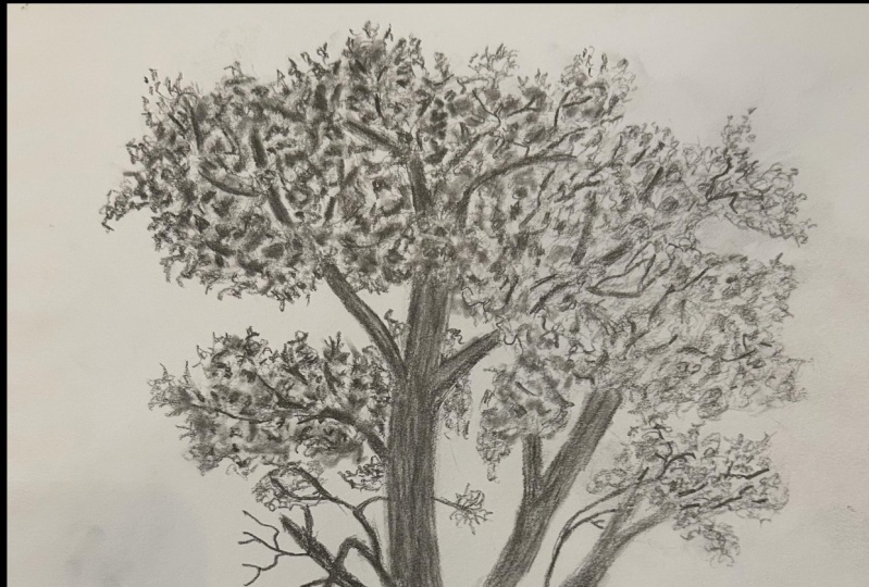
9. Line Drawing of Forest Part 1: Hi everyone and welcome back
to learn to draw landscapes. I'm Paul Richmond
and today we are going to do the first part of a two-part drawing,
Forest. Be drawing. Today we are going to start out drawing this forest scene, and we'll split this
up into two lessons. So we have a little bit
more time because there's a lot going on here
as you can see. So let's jump right into it. I'm excited to draw this. I think that this is
going to be a lot of fun, but I want to
encourage you not to feel overwhelmed by it. I know when you
look at the image, there's a lot happening, but just follow
along with me and we will find our way through
this forest. You're ready. Okay, so to start, I like to establish where the ground is and there's a
few different layers of it. There's this kind of
dirt layer at the bottom and then you see
there's like kind of I guess a grassy area. And you can't really see
where the horizon line is because it's obscured by all the trees and
plants and everything. So I'm going to draw what I see, which is the line where the dirt meets those
rocks and the grass, that'll be my my kind
of anchoring line. I think that's a good
way to think of it. In fact, maybe that's
even a pro tip for her today is when you're first
starting out a landscape, find something, some kind of a line that can just be a
good anchor point for you. And that gives you a
place to start and build everything
else up from there. So I've got that line. And now the next thing I'm noticing is there's
this big chunk of land that kinda
comes forward. Rate here. Ish, doesn't have to be exact. We're just kinda walking
stuff in. All right. Then I'm going to draw a second line right
up above this one. That's sort of like the top
part of that little ridge. Notice I haven't
drawn any trees yet, which is the part of this that I'm the
most excited about. Actually, I think trees
are really fun to draw. It's why I started with a
tree on our very first lesson actually might as
well do what I enjoy. But we have to get the
basics down first. You know, you have to
eat your vegetables before you have your dessert. So let's figure out where
everything goes and then we'll have fun
planting all those trees. Alright, so now I'm
just going to make a guess where the
horizon line is. I'm going to say
it's about here. I'm going to draw
it very lightly because we don't see it. But whenever I draw a landscape, I like to figure out where the horizon line is because
as we talked about before, helps you to have a sense of our perspective on the scene. Alright, I think I have enough information
now that I can start doing some of those
vertical lines to start putting the trees. And the interesting
thing about this in this particular reference
is you really get to see a lot of depth because you have not only the larger trees
that are closer to us, but there's also a
big difference in the waiting between foreground, middle ground, and background. So let's start with
the foreground. I always like to establish
some of the bigger, more prominent elements
of a composition first, before I get into the tiny
stuff, the smaller details. So trying to establish some of the big, most dominant trees, I'm beginning right over here on the left with that giant one, right against the edge. Then I'm just kinda drawing the outline of it and it goes right
off the paper. So I don't even need
to draw the left side. And then right here next
to it on that same level, ledge is another tree skinnier, but I'm going to
sketch that went in now to you and pay attention. You don't have to get all
the curves and angles, but look at how the
trees overall are. Leaning or moving. You don't just want to draw
a bunch of telephone poles. In other words, each of
these trees has a lot of interesting character and you might not get every curve exact. If you are paying
attention to that, if you're looking at the way
that the trees are moving and the way the shapes are playing off of each other
and the negative spaces, you will draw trees that
feel a lot more believable. So even, like I said, even if you're not
drawing it exactly, keep your eyes going
back and forth between your paper and the reference
as much as possible. Don't just sit and stare at
your drawing and try and draw the landscape for memory because it's right
there in front of you. Just look up And you'll notice things. The more you look at something, the more that you
see and the more you can bring out
in your drawing. Alright, so I have those
two trees in there. Now, we're just
focusing on getting the basic rough sketch
down for this lesson. And then we will come
back to it and add some more details next time. So no pressure. Don't rush yourself.
Take your time. I'm gonna go for
this tree right here in-between the first two. And I want you to notice
the negative space. See how it's much closer to
this tree than this one. This is a great example
to try out that idea that I talked about
previously of drawing the negative space. In other words,
drawing the openings instead of drawing the trees. If you look at
those as shapes to, it gives you a much more
well-rounded impression of the overall scene. Now this tree does
not go all the way down to the same ledge. It actually comes about to hear. Then it gets obscured by plants. So I'm going to just draw some little leafy
scribbly shapes here to represent
that so that we know why that tree is ending. It's not just hovering there. Alright, look at how far we've gotten so far we're
doing grades. Alright, now let's
come over here. About halfway across is where we have this next
little cluster of trees. So I'm going to draw
the left side of the farthest left tree in that little cluster,
if that makes sense. And then I'm going to
draw the right side of the farthest right tree, which I'm going to say here. That way I'm giving
myself kind of a sense of how I want those
to fit on the overall page. Sometimes if you're focusing
on drawing each part, we lose sight of the
relationships to the whole. So kinda just go through
and maybe even give yourself some quick
guidelines like that. I'm going to actually do
that right now myself. I'm going to jump over here now I'm looking at the amount of negative space between
the right edge of that, then the left edge of the
next little grouping. It looks like it's a little
bit less than the space here. So I'm going to
measure that space and come over and then I'm just going to come in a
little bit from there. So there's another
opportunity to use that measuring trick
that I showed you. And I'm drawing now the
left edge of this tree. There's two trees in
this little grouping. And it actually does
not go quite that low. It stops at the top of that
ledge as do these guys. Getting a little ahead
of ourselves there. Alright, and then we've got this one that comes leans a little bit to
the right, I would say. Then we have one more
like really dark tree. I'm going to draw that one
now. It's about right here. Okay, now I'm gonna go back. Now that I know
that everything's gonna sort of fit where I want it and draw the rest
of these tree details. So this first one here on
the left, about this wide. Another good thing
to think about when you're drawing
trees is they tend to get thicker
toward the bottom. Even if it's a very
subtle change. You generally don't see trees that are exactly
the same all the way up. They tend to be the thickest
at the base where it's going into the root system and then
thinner as it moves away. Alright, and then, let's see, we have this one over here, so I'll go ahead and draw that is about the same thickness. It helps to compare
the sizes of things. So when you're looking, when you're drawing one tree, just sort of look around at other trees
that you've already drawn in your reference and
see how it compares to those. And that'll give you an idea of how thick
you need to make it. And like I keep saying that
I'm going to say it again. It doesn't need to be perfect. But it's good to really look at the reference and try and
pick out as much as you can. Because that is a
big part of this. It's being inspired by what you see and really
trying to capture it. So finding that balance between not obsessing over the details, but trying to make
it capture as much of what you see as possible. This tree actually comes down and overlaps this
one a little bit, which I like a lot. So I'm gonna draw any kind of overlapping situations
are always good. It just gives you a
little bit more depth, more, more of a indication
of what's in front. What's behind, opens
up that flat paper. And we have a few more
little skinny trees that are farther back in
the distance over here. This one we only see down to about here and
it gets hidden. Alright, I'm going to quickly draw in a couple of more trees and then I'm going to save the distant trees for the next lesson because we're
just about out of time. All right, so this one
comes down like that. Then we have a thicker
one right here. Alright, That's going to
do it for this lesson. Hang onto this drawing. We will come back and
work on this some more. And if you need more
time, take all the time, you need tried to get it to
this point so that you're ready by the next lesson
to go into more detail. Beautiful work you did it. Okay, Now hang on to that drawing because
in our next lesson, we are going to take
it a step further, add some more detail and
refine the lines and make a beautiful wine drawing out of this forest sketch.
I'll see you then
10. Line Drawing of Forest Part 2: Hi everyone and welcome back
to learn to draw landscapes. I'm Paul Richmond. And in this lesson, we are going to pick
up right where we left off and finish our
forests drawing, happy drawing everyone
back into the forest. Here we go. Okay,
so I wanted to take a break for a
minute from drawing all these vertical lines and take a look at where
we see some clumps of leaves because those are also important in helping
space things out here. So one prominent one
that I see right in front is over
on the right side. And I'm just going to use my scribble technique to
indicate where those go. Approaches this grouping of trees but doesn't
quite overlap them. So that shows me where to stop. Can always just use the
other elements to help you figure out where things go. Relationships between
all the different parts, all the different elements
in your landscape are really important in helping you just kinda pull it all together. I'm not going to erase that
tree back behind there yet because you do see
some little hints of it through the leaves. So we'll figure that out later. Next. I see one over here. I kinda had started it before. I think I made it
a little too low, so I'm gonna come back
and raise that up a bit and then continue it. It's sort of peaks
out behind this tree and a few different
spots like that. And comes all the way
to about here. Alright? This see how we're just kinda getting everything
figured out in there. Alright, now I'm
gonna do one more. So we've got this here
that I had started. There's this clump
of leaves right behind everything really behind all the trees that
are in shadow. So I'm just going to
start scribbling, making some of those
shapes that I see. It kinda comes right up
and touches this one. I think it goes behind it. Those leaves are a bit lighter. In this scene. You can tell the lighting
is coming from behind. So because everything
that's getting closer to us is more in shadow. Okay? Alright, let's do
some more tree trunks. I'm gonna go back here
and do there's 123. And then the fourth one
is a little bit thicker. So let me kinda figured
out where that is. So looking at that negative
space between here and here, the last tree in the row is just a little bit
past the halfway mark. So I'm going to start with that. That one is pretty vertical. Still got it still has some
irregularities to it though. And I'm going to make it the thickest one of
this little grouping. And then there are three more. So one, let me just
kinda figure out the spacing for so 123, okay? And then I'll go on each side of those little tick marks to actually draw the tree. All kinds of tricks you can
use to figure out spacing. And I think that that's
it's an important thing to consider and it's something that a lot of artists
struggle with. When you're drawing,
you'll start drawing and it'll be looking good and you'll get excited about it. And then suddenly you're not able to fit
in something that you that you need to be able to fit in
because there's not enough space allotted for it. And so just want to encourage
you to not think of that as being a indication that
you're not good at drawing, which unfortunately a lot of people do that they
have when they, when they, when that happens, they immediately think, Oh, I'm no good at this,
I just give up. But all it means is
you just need to give a little bit more thought to
the overall relationships, the spatial relationships
between the different elements. And anybody can figure that out. It just takes a
little bit more time and thought and paying attention to the relationships between the spacing of things. So it's always okay to
erase and move stuff. Alright, we've got
those looking good. Just because I'm
excited about them, I'm going to draw some
of these little branches that go like this man. I like breaking up all
those vertical lines. I think those are interesting. As you can see, there's a lot going on
in this little forest. And of course, in 20 min, we can't draw it all. So it's always a
matter of editing, choosing what you
want to emphasize. And it's very possible
that there are things in this image that speak to you differently than
these speak to me. That's the beauty
of being an artist. So if you get really drawn in by something that
I'm breezing past, feel free to go
deeper into that. And maybe if you really enjoy the shaping of the leaves and all the negative
spaces and you want to focus on, on that. Emphasize that more
in your drawing. Or if you really
like the shapes of the shadows or the way the
light is working in the image. There's so many
different things you can choose to focus on. But if you're new to this and you're
really just not sure, definitely just follow along with me because I'll
give you a nice, easy way into it. But as we go along, I do want to encourage you
to really find what speaks to you in the image
and bring that out. Going to draw this big
clump of leaves right here. It looks like there must
be a sort of a branch coming off of one of
these trees on this side. So I'm going to sketch
that in some more up here. One of the things that
I think is really cool about drawing forest is that mix of the more kind
of straight lines, they're not perfectly straight, but you have a lot of vertical
lines, horizontal lines, but then you also get
just these really wacky or very organic shapes that come in
and break them up. I think that's, I think that combination is really beautiful. It makes it feel
very, very natural. All right, now we just see a few other little trees
back here in the back. So I'm going to roughly
sketch those in. Because up here, you do not have to get every
tree exactly right. Especially the distant ones. No offense to them, but they're a little
bit less important. Let's see over here. I really do. I'm sure there are more tree trunks back there, but we really don't
see them because it's just all covered with leaves. So I'm going to just do
a lot of scribbling in that area to represent that. I think we are getting
there a little bit more. There's actually a little
grouping of trees on this side, so I'm going to show you there. Okay, now with the time
that we have left, this is going to
remain a line drawing, but even just using line, you can still give a
sense of the depth. And so I'm gonna go to the
most extreme close elements first and make those
lines thicker and darker. We see there's some
rocks it looks like kinda in front of
the roots of this tree. So I'm going to indicate
that a little bit. It's very much in shadow though. All right, and then we
have our ledge here. Let's tree really dark,
really thick line. See how just using those
thick lines it makes That tree come forward. I love that trick. Sometimes if you are out
sketching in nature, this is a really
good way to capture that sense of depth if you
don't have time to do shading, just to use your lines to
help us understand the space. So this tree is also
very close to us, but I'm going to make it
a little bit thinner. The lines a little bit thinner because it's farther
back on that ledge. That's the other thing I
like about this technique is it really makes you stop and look at where things are in relation to the other
parts so that you're, you're just kinda getting in and really exploring that scene. That's, that's pretty fun. Whether you're drawing
from a photo or if you're drawing from life out in nature. This just makes you
really appreciate what you're seeing right now. What else do we have
that's close up. Alright, I'm gonna
come over here so these leaves can get
a little darker. I'm going to do a recap our
ledge here a little bit more. There's some raw
facts that I see. You're all experts
at drawing rocks now after our rock lesson, so enjoy it, put
that knowledge to use and go a little bit darker. These trees are farther
from us than these are, but they're closer than those. So I'm gonna make these
a little bit darker. Even within that grouping. Some are closer to
us than others. Then jump over here. These trees are about
in line with those. We'll go a little bit
darker there too. Hello, alleging. A little bit darker
with these leaf shapes. Have fun with that
scribbling technique. You can really kinda fill in some of the spaces with that. It can help to
activate the space and make it just
feel very forest. There's a lot happening. You don't just have
to do the outlines. You can do it on the interior of those
leaf clusters to you. Can go a little bit darker here. This is in front of all of this, so those are going to
get darker as well. And look at how our forest is opening up just
with the line work. Super fun. Last few touches, I'm going to go a
little darker here. These are in front
of all of that. So that's gonna get a
little bit more emphasis. You up here. Now, I am going to
just erase a few of the lines inside of the
overlapping leaf areas. I'm not going to erase them perfectly because
like I said before, you still do see hints
of them in through the, through the leaves
and the open spots. And there we have a very nice not to toot my own orange line
drawing of our forest. And of course, you could spend a lot longer in if you feel
inspired to do that, I hope that you will and
you can even shade it in. You can color it,
you could paint it, do whatever your heart desires. This gives you at least
a good sense of how to sketch it out, get it on the paper. That's, that's very important. First step in any piece of
landscape or it's great job. All right, now in
our next lesson, we're going to start
on a new drawing. And this time we'll be
focusing a little bit more on value or the lights and darks
and Image. See you then
11. Mountainscape Part 1: Hi everyone and welcome back
to learn to draw landscapes. I'm still Paul Richmond, and this time we are going to go exploring in the
mountains. Are you ready? Happy drawing. We're going
to start another two parter. This one has a little
bit less detail than our last drawing. Last time I wanted
to focus on wine, so I gave you a lot
of stuff to draw. And this time I want
to shift the focus a little and talk about value. In value just refers to the
lights and darks in an image. And it's not just
the most extremes, but also all of those subtle
shades in the middle. I thought this,
this mountain scape would be a really good
way to practice that. So in this first part, we're going to get
it sketched and then we'll move into shading it. And that will be a really
great way to set us up for our next section of lessons
that deal with lighting. Because value you
understanding how to shade is really important in
capturing lighting. Okay, Let's draw, I'm
going to start in the distance here and just roughly sketch in that most
distant mountain range first, I'm just keeping my lines
very loose, sketchy. Trying to look at where, where things fall in relation to the entire picture plane. The picture plane
just means the shape of the space that
you're drawing in. So in my case, my sketch book is actually
a little bit bigger. And so my picture plane
though is not the full page, it's the area in which
I am choosing to draw. So look at that in
related to the reference, especially if you imagine
where the halfway point is. This is a pro tip. Imagine where the halfway point is in the reference and then
also in your drawing. And that can give
you another tool for how to place things. So I see this in this
distant mountain range. There's a peak right
in that middle. If I am saying this
is the middle, then I can just build outwards
from there and it gives me ways of checking and making
sure that I'm on track. One thing I like to do too is to draw very loose guidelines. First, if I notice that
there's sort of a dip, just an overall sheep to the
way the mountains are going. And then you can go
back in and actually draw more mountain knee shapes. That's a way of making sure things are landing where
they're supposed to also feel like a big part of being an artist is just
learning all of the tricks to help you stay on track and make everybody else
who's not an artist think that you're some
kind of magician. So I'm giving you a
little peek inside them. Magician's hat here,
it's not magic. I mean, I do think
creativity is kinda magical. There's something
magical about that. But as far as just the techniques
and skills in drawing, truly, anybody can learn this. Anybody. So many of my students come to me really
wanting to learn, but also just being a little bit scared of it
because they're afraid they aren't going
to be any good or that they'll do it wrong. And you just have
to take your time, learn all the tricks,
and practice. Anybody, anybody can do it. It's not a magical
ability that you have to be born with to be
able to draw and paint. It's really just a matter of practice and learning how to, how to see you do have
to retrain yourself, they're a little bit and then how to capture what
you're seeing on paper. And I'm doing my very
loose sketchy line here for this one. Actually several
different mountain ranges right here within what appears to be
this one layer. There's, you can kinda
see the overlap, see how this gets a
little bit darker right here and then
it's lighter behind it. And then you have the same
thing just to the left of that center peak that we used. That's something I would consider an anchor
point as well. So we'll come over here and
then we have another overlap. As much of that kind of stuff is you can bring out the better, but don't want to
bog you down either. It's still just try to
roughly sketch it out. I think you have to
find that balance Between checking and measuring and using all the tricks
that I'm showing you. And then also just getting something down on the paper
to respond to you also, because you can
always change it. You can't always know
if things are in the right place until you
have something drawn. So take all the suggestions I'm giving you and use them
when they work, but don't, don't let it make your
process become so technical that you lose
the fun part of drawing, which is just this very
intuitive thing that happens. You look at something and
then your hand just kinda starts drawing the lines
and shapes that it sees. Doesn't have to be any
more difficult than that. All the other stuff
are just ways to help you if you feel like you're heading in the wrong direction. Okay, got our second layer here. And I'm looking for the relationships between the
different mountain ranges, the space between them. So over here, this
is pretty tight. And then I'm going to
skip all the way down to the next big section. There's a few more little
things going on in there, but we'll come back to that. So there's a bigger opening
if I'm looking from here, probably all the way
down to about here. And then this comes up. And writer again around that center point,
keeps coming back. It's good that we
identified that. This comes down. Then over here it comes down a little higher
in the middle. See, I just messed
up on purpose to show you that
everybody can do it. Not really. That was a mistake. We all we all deal
with. All right. That's what your little
erasers four. All right. Now before I even detail that one and I'm gonna go
ahead and sketch, roughly sketch in the other
planes to the other sections. So we have some
smaller peaks here. We have something back here. There's probably, there's,
there's even some that are more subtle
that I'm skipping. You can draw you can draw
them or not. It's up to you. Can I get to play
God a little bit? When you're making
a landscape to put those mountains
wherever you want. There are times when you might want to change
the location of things. That's something that I don't think we've talked
much about yet, but composition is a big part of drawing and painting too. In composition just
means how things are arranged on the page. And sometimes you
might decide that you want to change something about the placement of elements in
your piece because it works better for your drawing or if you're painting or
whatever you're making. And that is okay. You get to do that. It does not have to be a photo realistic
depiction of that scene. You can arrange things
however you want to make it work best for you and for the
piece and for the viewer, how they're experiencing it, how their eye moves
around the page. I want to lower this
guy just a smidge. Bringing you down about here. There we go. That feels better. It's comes over here. And then there's this
cute little one in here. Can't forget the
cute little parts. Anything cute, I have to draw. Alright, And how does a
little bit more time? So I'm going to this one here, this little mountain
seems kinda important. So I'm going to
make the shaping. I'm going to bring out some
of those looks like little, you see a lot, a little trees and things
on the along the edge. And that's true when you're, when you're drawing
any kind of landscape, especially mountains like this, as things come closer to you, you see more of those details. So that can add depth
to your work as well. Just bringing out more detail, more information as
things move into the foreground and keeping
things a little bit more, not generic, but just a
little bit more ambiguous. It's better word
in the distance. All right. That is looking good. So hang on to this one
and we will come back and work with the shading next time. Great job. Alright, Now, hang on to this one because
in our next lesson, we are going to
keep going and add some shading to our
drawing. See you then?
12. Mountainscape Part 2: Hi everyone and welcome back
to learn to draw landscapes. I'm Paul Richmond,
and in this lesson, we are going to
add some value to our drawing of the mountain that we started in
the last lesson. Be drawing. Okay, Let's jump right
in and start shading. Are you ready? So I am using
my four B pencil today. That's the softest slide that I have that I'm working
with here in this course. But use whatever you like. I like this one for
shading because I know it can go really dark, which we're going
to need down here. So I'm going to start
though up here in the sky. And I'm using the side of
the pencil and I'm just kinda going in a
diagonal direction. I'm going to use that same
direction for everything. Because since we're doing
just a quick, quick study, we're not going to be or at
least I'm not going to be trying to hide all of
those pencil marks. I'm going to keep
it a little bit rougher and sketchier like this. So I like the look of having all of the pencil lines going
in the same direction. But they're just like
with anything in art, there are 1 million different
ways to do everything. So if you want to at some
other options, you could try. You could do a cross hatching
technique where you go in one direction and you go in the other direction
and you kinda keep mixing it up that way. Or you could go very slow and
go in different directions, are going little circles
and kind of camouflage the pencil lines if you
don't want to see them. So many choices. Now this guy gets a little bit lighter as it
approaches the horizon. And you can even take your
kneaded eraser and lift those horizontal stripes out to make it have that kind
of cloudy Miss D vibe. Okay. I'm going to come
back here between the two. You bring that out
a little bit more. Okay. Now, jumping down to
the mountains, at the top. The mountains, actually
what I'm gonna do is first cover that whole distant range
of mountains with a similar value that
I used in the sky. Because down at the
bottom here you see each, each layer gets lighter
as it goes down. So with the exception
maybe of this last one. And that gives it
that Misty feeling. So first let's just get
that mountain range in. Now, I'm shading everything
using this one pencil, this for B pencil. So in order to get
different values, and like I said before, a value just refers to the
shades of light and dark. The pro tip for you is to
make it darker, press harder. You already knew that, but it is a pro tip because I
do this all the time. And you can build
up those values. You don't have to jump
right to the extremes. I think that sometimes layering the pencil can give you a more
interesting result too. So don't rush. I say that even though I keep looking at the clock because I know these lessons are
always wants to be admitted. But you take all
the time you need. And now I'm going
to jump down here. And I'm going to make
this whole mountain range as dark as the top. Okay? And then we'll go back
and make the top of that mountain even a
little bit darker. So we're just kinda
taking baby steps until we get down here where
it will be much darker. I'm still going in that
diagonal direction. Actually, you know what,
I'm going to take this all the way down because all of these mountains within
that middle ground area are similar in value. And then I can
still see my lines though for the
different mountains, mountain peaks in there. So we'll go back and bring
those back out again. But sometimes I do find it
very helpful to just get a whole section shaded in first. Now, over here on the right, you'll notice this distance. The distant mountains in this section do
get pretty light. They're almost on par with the mountains in the background. So I'm going to do
that part separately. Just go a little
bit lighter there. I think it's interesting
how so much of art Is about looking
for relationships. Everything is dependent
on something else. It's kinda fascinating really. And we talked about that a lot when we were
drawing the forest. And we're thinking about the proportions and
sizes of things. But we also have to think
about that when we're working with value because the
value of one area, it looks the way that it does, because of the way that those values really
to what's next to it, this image would feel totally different
if these mountains in the front where
white, for example. So it's all about
comparing what, what you're working
on, the section that you're working on with
what's around it. This image is pretty
monotone already. It's shades of blue. Sometimes when I'm doing a
black and white drawing, if there are a lot of colors, when I'm first trying to look for those value
relationships, I will just convert it
to black and white. You can do that on your phone, or you can do it on
your computer if you have Photoshop or
something like that. But even just in the
photos app on your phone, you can convert an image
to black and white. And that can help you to see those value relationships
a lot easier. Because sometimes
shifts in color, especially if there are areas
where the colors really saturated and then
other areas where it's more neutral that can mimic the, those relationships
and make it seem like an area should be darker or
lighter than it actually is. Alright, now I'm going to do
this whole section and then we'll come down here
to the darkest part. So what you should really
be seeing happening on your paper is a value scale. A value scale is
when you just create every value that you
can from the lightest, light, the darkest dark. And instead of doing
it in little boxes, which is how you normally
see value scales done. We're doing it in a
landscape, slept more fun. Okay, getting this whole
big middle section and then we'll go
back just like we did in the section behind it and bring out
different, the different layers. One thing I do a lot
when I'm drawing and painting is squint my eyes. And I do that because when you squint your eyes and
look at something, all of the detail disappears. You really just see the
value relationships. And that can be, that can help you to not get to hyper-focused. The good thing about this image, there's not a ton
of little details anyway that will distract you. But if you're drawing
something more complex, especially that can,
that can be a big help. We're all wired to want to focus in on all those little
details and bring those out. And there's a time for that, but it's not when you're first getting things established. I'm going to come back
here now and make the top of this mountain nice and dark. There's a lot of drama between this range and
the ones behind it. I think it looks to me like there's a big gap
in space there. So we want to bring
that out and make sure that really jumps forward. And then it gets
lighter down here. Then I'm also
paying attention to those lines that we drew before showing the layering
even within this section. So you have this mountain that
kinda comes forward a bit. Then there's another layer, another section of it
that's behind that. Then there's another one over
here so you can start to get thinking about depth. You have not just foreground,
middle ground background, but you have all of those within each of the sections too. So it's just kinda keeps
getting more and more. You take that idea and you keep applying it on a smaller
and smaller scales. Two, you end up with
so much depth in your image, It's really awesome. I think. All right, can I quickly get
some shading in here and make this come forward? And then there's a little
peak here, comes down. Another one that comes up. There's little bit of mist. It looks like that's
really creeping in here. So I'm going to use my eraser, just lift up some of that value. There we go. Then lastly, this big dark mountain
in the foreground. So I'm pressing as hard
as I can with my pencil. Look at that range
of values you see just even without
getting super detailed, using the different shades of white and dark can
open up that drawing and creates so much depth
and dimension on your paper. Okay, Let me just clean
up this edge a little. Fortunately, it's not
like a super clean line. It's kinda got a lot of little
looks like little trees, little texture going on all. And I don't want to forget our
super cute little mountain went to the trouble
of drawing it. So I gotta shaded. Go out. I noticed that I
would've felt bad if I let you out. There we go. That is a really
quick example of using the different extremes
now of light to dark in your drawings to
create nice work. All right, we're starting
on a brand new piece. Next time, we're gonna go for
a little walk on the beach. See you then?
13. Beach Drawing Part 1: Hi everyone and welcome back
to learn to draw landscapes. I'm Paul Richmond and
I'm really excited because in this
lesson we're gonna go explore the beach together
and we're going to do a little bit longer
drawing that lets us focus on light source. Happy drawing. Today we are going for a walk along
the beach. You ready? We're going to sketch
out this beach scene. And while we're doing that, we'll talk a little bit
about concepts of lighting. That's really what I
want to focus on for this next section
of lessons because it's a very important concept for making landscapes
come to life. So this, we'll take it,
we'll spend a few lessons on this one and really make it beautiful drawing together here. So let's start by
lightly sketching it. I'm using my Tooby pencil. I'm going to sketch
very lightly. And starting again
with the horizon line. And I just kinda comparing my picture plane
to the reference, I see that the horizon is
not at the center point. It's a bit above that, maybe about right here. I don't like to say that
there are rules in art, especially when we're
talking about landscape art. So there are no rules but
one guideline or pro tip. Pro tip. That's
what we'll call it. One pro tip to think about is where you placed that horizon line on
the picture plane. And a lot of times it can make your
drawing a little bit more dynamic and interesting
if you choose not to center it on
the picture plane, if you put it a little above, a little below, it
just gives, it, gives the drawing a little bit
more of a dynamic breakup. Now, that does not mean
that that is a rule though. And there are times
when it may be it makes the most
sense to center it. So still just do what
feels right to you. Symmetry, centering things has
a tendency to make a piece feel more still in
calm and balanced. So if that's the vibe
you're going for, then that might be a
good time to do that, but it can also make
it feel a little bit more contrived or controlled. Or I think having
things offset a little makes it feel
a bit more natural. Like you're, you could imagine walking into that
scene and that there's more to it beyond the
edges of the paper. And that's a,
that's a cool thing to think about and try to instill in the viewer's mind
when they look at your work, is that you're just showing them a little part of this
much bigger scene. Makes them invites
them. I guess. It doesn't force
them, but it invites them to use their imagination. I always like that. Alright, and I'm
just sketching in the basic shape of
that distant mountain. And looking at the distance between the tallest part and the horizon line versus when
it dips down on the sides. Now as I'm sketching
this one out, Let's start to talk
just a little bit about the lighting in this scene. Lighting in landscapes varies dramatically depending
on a number of factors, but one of the big
ones is time of day. This appears to be
a mourning scene, so the lighting,
the sun is maybe just rising somewhere over here. And you can see that for a
number of clues in the image, you don't really see the sun, but you see a strong glow
in the sky over there. So that's our first clue. Then there's the way
that the light is hitting the water
along the beach, you can see it's
the brightest along the left side and
also farther back. And then just the way
that the water is hitting this little kept the waves. And then look at the
mountain itself, see how the mountain is
lighter over here on the left, and then it goes more
into shadow on the right. So this one I pick to
start with because the lighting, It's
pretty obvious. There are times when it's
much less obvious though, the sky might look all look
the same all the way across. You might not see dramatic
highlights and shadows, but there's still, there's
still light source at play. And whether it's
diffused lighting, maybe it's a really cloudy, overcast day, but
there's still light coming through those clouds. And how, where is it in the sky? And how is it affecting
what we're seeing? If you can start thinking
about that in your, in your drawings and paintings and whatever
else you want to make. That can be a great
way to also clue in your viewer about what
they're seeing and make the scene feel much
more believable. And dimensional. Lighting, lighting is
seen is just to me, that's when it really crosses the line from being a kind of a flat image to feeling
like you're really there. So we'll talk a lot about that, about different techniques for creating different
types of lighting. But first we're just getting
this guy sketched out. And I want you to notice too, with the water the way
that it's coming up onto the beach here. That the little sections, the little waves, I
guess the little, the little shapes where the
water is lapping up onto the beach are much smaller, tighter and closer
together back here. And then as we move
into the foreground, they start spacing out more. And that is another way of
showing depth perspective. Things get bigger as
they get closer to you. This piece of water, this little section right here, in reality is probably
no bigger than this one, but it just looks much smaller because it's
so much farther away. And then I'm just tracing, following this all the way down. It looks like it comes about
to the halfway, points. Horizontally halfway. You can always go
back and adjust if you need to do anything, make it so it lands
where you want. That's what this this
part of the drawing is really all about is just
getting it on the paper, refining it, moving
things so that it will be a lot easier when
you go to shaded in. You won't have to worry about, is this in the right spot? Because you'll know that it
is and you can just focus on the values and the textures
and all the other fun stuff. Alright, so now
I'm gonna do this. This line is the
farthest left Part of the water where it's
just right up on the beach. And now I'm going to come
over and draw this next one where it's more like
we're actually getting into the water now there's a
little bit of depth to it. Again, notice the
difference, I'm sorry, the distance between
the two lines back here versus down here. It's huge. The down here
that wave is probably about, looks like maybe it's
about a fourth of the way up the vertical side, maybe a little lower
than a fourth, but the clothes, so
about right here. The distance from
there to there, versus by the time
you get back here, it's almost that it's
so close you can't even really see that space. So we have that. What that does is it creates a very dramatic sense
of perspective. And it makes the
viewer feel like we are standing right here, just just where
the photographer, I'm sure withstanding when
they took this photo. So we're going to gradually make this get wider and wider. As it comes forward. Look at how that
just kinda pulls you right in now
it makes you feel like you could go for a
little walk on that beach. Like I deal with our dogs. Sometimes I live, I live by
a beach. It's beautiful. And you definitely appreciate the beauty of nature when
you are out there walking, seeing the light hitting the
water the way it affects the sand dunes and the sand. So much to take in. And I think you will
find after doing this class that you're going to look at nature a
lot differently. I've had so many students
tell me jokingly, but kinda blaming
me like Paul, you, it's your fault You
made me late for work because I saw a beautiful
sunrise and they had to pull over and look
at it and study it and appreciate all
the different shades and colors and everything. Well, that's that's
what you signed up for. So be prepared for that. We are not responsible for any tardies that you get for when you're
supposed to be somewhere. Because you're busy appreciating
the beauty of nature. It's a good thing hoping
everybody else can just wait. Alright, now that we
have this sketched out, hang on to it. And then in the next lesson
we will start shading it in beautiful job. Okay, you have your
sketch all laid out. Now, hang on to that
because in our next lesson, we're going to start shading
it in. I'll see you then
14. Beach Drawing Part 2: Hi everyone and welcome back
to learn to draw landscapes. I'm Paul Richmond and we're going back to
the beach today. So get your flip-flops and
you're swimming trunks. We're going to start
shading in the drawing that we started in the last
lesson. Happy drawing. Okay, Let's jump in and
start shaving this scene. Now, I'm very excited
to work on this. I think we're going
to be able to create a really beautiful
landscape here just by adding in some
different values. So let's take a look first. The overall breakdown
of value in this image. When I squint my
eyes and look at it, I see the brightest are
lightest values in the sky, especially on the left. And then I see also some very light values being reflected in parts of the water, which makes sense
because the water is reflecting the sky, but because it's
being reflected on top of sand and on
top of other stuff. It's not quite as white
as it is up here. Using the white of
the paper makes it a little bit easier
because we already have that lightness up here. So let's start in
the mountain area. And I'm going to fill
it in overall with just kind of a medium
white tone like this. We may need to get a little
bit darker over on the rate. But for starters, I'm just
wanted to get it blocked in. I like to think
of I'm shading in a drawing as really being
a multi-step process. So my pro tip for you is don't try to do
everything at once. It gets so overwhelming. And you very quickly can
lose sight of the goal, which is to capture that essence of the scene or the feeling of
that, of that scene. So just take it step-by-step,
section by section, and know that we'll
go back into each of these sections until it all comes together
and looks great. Okay, So I have
that value there. Now when I squint my
eyes and I look to see where else do I
see a similar value? I see it back here on the sand. When you look at the sand, you see a shift in the value
between the background. Back here. In the foreground? I do. It's subtle, but the sand gets a bit
darker as it moves toward us. That is something that is
very common in landscapes. And a good thing to
look for when you are focusing on value is to pay attention to how
the land changes as it moves from
foreground to background. Chances are it is not
going to look the same. So even though
right now I'm just blocking it in all
with this one value. We will, I will come back and darken it more in the front. And that will give it
more of a sense of depth. So anytime you are showing
distance in a piece, really pay attention to how the values change over the
course of that distance. There are a lot of
things that change, not just value, as we
talked about before, the amount of detail. You can see that in the water. How we see we noticed much
more detail in the water over here and then
in the distance that becomes much more subtle. Color changes over space too. But for right now, we're
talking about value. So focus, Paul, Ryan, okay, now I see the darkest values in these kind of treat this
treeline area here. So I'm gonna come in
and block that in next. We're just keeping it
very loose, very simple. You can go back and add as
many details as we want. But for now let's just
get it locked in. So there's a section
that is what I'm actually noticing here
is there's a little hill And it first when I saw it, I thought it was trees
all the way down, but it's actually
trees to about here. And then the rest
of that darkness is just the shadow of the
trees on the sand. And that makes a lot of sense
when you think about it, because if the light is
coming from over here, first of all, we're seeing those trees basically
in silhouette. We're looking at the dark
side of those trees. I love whenever I get
to see the dark side. Alright, focus again, Paulo. See not too good at that today. We're seeing the
silhouette of the trees, but also we are getting the
cache shadow of the trees coming forward because the
light source is behind them. And those are all clues that tell us either consciously or subconsciously where that
light is coming from. So without drawing
a son in your sky, viewers will have a sense
of where that sun is, just by how you
arrange your values. So first I'm just getting the
tree line and then I'll go back and do the
shadow underneath it. Because it looks to
me like the tree line itself is darker little bit. And then the shadow
is still pretty dark, but it's just ever
so slightly lighter. Alright. I have my trees in, blocked in any way. And now I'm going to
just go through and do that shadow below them the way across. Okay? Now I'm going to grab another pencil
because that one's getting a little worn down. And I'm going to
just lay in a value, a light value to start with
over top of all of the water. And then we'll go back in and
darken it where we need to. But there are very few places where the water is pure white. And if we need to
bring that back out, we can erase those away. So as a starting point, I'm just going to color
the whole thing in. I like to, I like to keep it
really simple at first and think very big picture
that helps me a lot. And then get more focused. So as long as you don't
go too dark too quickly, you can always erase. Now again, you see me using my diagonal lines for shading. So that's one way to go. Some artists like to use the direction of
their pencil lines to actually give more of an indication of what
the direction of that section or what
that plane is doing. So they might go
maybe more horizontal on the water to make it
feel like it's flowing. So experiment with that and
see what works best for you. You can also use a tissue
or paper towel if you, if you don't want to
see those pencil lines, you can smooth them out, but just want to caution you against doing that
too much because it can very quickly make
your drawing to start to feel very foggy, smokey. You lose some of the definition. When you overlay
blend everything. So I like seeing the
pencil lines myself, so I'm not worried about that, but every artist is
different and you will find your own style
as you go along. Alright, now, lastly,
for this base layer, we are going to come back
and work on this more. But for this base layer, I just want to also bring a
little bit of that value into the right side of
the sky because you see how the sky does
get a little bit darker. It's still so very light, so much lighter
than the mountain. So again, thinking about just those relationships between all of the different parts. Now we have a nice
kinda layer of value that helps us establish sort of where
all of those things are. Now of course, we have
a lot more to do, especially in the water. But hang on to this drawing and we'll come
back and do some more C. Awesome work. Okay, we're
not finished yet though. Hang on to this drawing
because in the next lesson, we are going to go back into
the background and start bringing out more detail in the shading.
I'll see you then
15. Beach Drawing Part 3: Hi everyone and welcome back
to learn to draw landscapes. And we're going right back
to the beach today and continuing on the
drawing that we've been working on for the
last two lessons. Happy drawing. Welcome back to the beach. Let's keep going with this. I am going to start in the sky now and work
my way forward. So every landscape artist has
little different approach. Once I get everything
kinda blocked in, one of the things I
like to do is then go back and work my way from the background to
the foreground. That's not a rule. You can, if you feel inspired to work somewhere else, do that. I'm starting by just sketching
in this cloud shape. But I think the
reason that I like to do that is because
for one thing, if you have a lot of
elements that overlap, like if we're in a forest and there are trees or
different things, it's easier sometimes
to deal with things in order so that
when you do a tree, you don't have to
go back and try and put this guy in around it. Um, but also I just
like the idea of feeling like I'm sort
of reaching into the paper and to the far, this most distant part first. And then working my way forward, There's something about that, that for me helps me to think more about the depth of the piece and the
dimension of it. So that's my
polyprotein have start, start in the distance and
work your way forward. Alright, now I'm shading in this cloud that I've just drawn. And there's, there are some
probably like medium values, I would say, in the shadow
parts of the Cloud. And it's a good idea to bring those out even though it's
a really bright scene. And we really want
that feeling of the light coming from the sun. You, the way that you capture
that requires darkness. You can appreciate the
light in an image. If, if you're not also thinking about where
are those shadows, where, where the dark parts. So even up here in the sky, even on a cloud, which we would think
of normally as being a really light, puffy thing. A cloud has volume, it has sheep has formed. So it's going to be
affected by light, just like anything else. And it will have shadows, will have dark
sides, light sides. I'm going to take my kneaded
eraser and pull out some of those highlights around the
outer edge of the cloud. Because it's always about that contrast between
light and dark. Every little section
of your piece. The more that you can
think about that and have consistent lighting and have the lighting affecting
everything in a consistent way. It really pulled, starts to
pull that piece together and the viewer will read it as being the true light
source for that scene. So in order to really see that rim lighting that's
happening on the Cloud, I noticed that I need to go a little bit darker with my sky. I'm going to do that now
see how just putting a little bit of value
rate in the sky next to that cloud makes the light hitting the
clouds stand out more. If you're going for
a realistic drawing, one that maybe does
not rely on a lot of outlines to distinguish
the different elements, then you really have
to look closely at what are those
value relationships. Because if you want to have a defined edge of something like this cloud and you don't want
to have an outline on it, then you have to kinda bring out that
difference is bringing what am I trying to bring out the differences
between the darks and the lights and use that
to create the edge. Alright, so now
I'm coming around, see how just putting
that value and that sky, look at how it makes that
cloud start to glow. It's kinda cool. So now that I'm doing
that I'm noticing, I really think I want to
just make the sky get darker over here all the way
across because that will Emphasize the lightness on
the left side, even more. Drawing is about
push and pull of the values until everything sort of lands in the right spot. And I think that from a
technique perspective, to accomplish that,
it's often easiest. If you start light and
work your way up to dark, because it's a lot easier to erase a light tone
on the paper if you realize you
want it to be even lighter versus if
you've gone too dark. Sometimes it can be a
little challenging to get all of that graphite
lifted up with the eraser. Okay, I'm liking that sky. Now I want to work some
more on the mountain. And again, continuing that idea of just
working my way forward. So I'm going to start back here. There are a few
different ridges of the mountain that creates
some lighting effects. Also. I'm noticing that right
up here at the top, there's these two distant parts. They're still, of course, much darker than the sky, but lighter than
the mountain peak fits right in front of them. So I'm gonna go
darker up here first. To dark. Gotta be just right. And then I'm gonna come
down in front of that. See, I might have even
gotten a smidge too dark. So let me just kinda, one thing you can do
if you want to just lift a little bit
of the graphite up, is just take your eraser
and just kinda had it. Alright, now I'm going
to come in front of that and darken the mountain. And I noticed that
the mountain gets the darkest over on the right. I'm going to I know that we needed to be
at least that dark there in order to separate
the part right behind it. So I'm going to take
that value on over. You can see that's also
going to mean we're probably going to have to darken
our trees some more. Because like I was
saying, before, everything is
relative and you make one adjustment somewhere and
then it affects everything. So yeah, you thought we
were getting close to being finished with this. I'm not going to drag
it out too long, but after doing all of
these quick drawings, I do want to start giving you a chance to go a little
bit more in depth. So we're not going to finish
this one in this lesson. We're going to continue on and, and kinda deal with each
of the different areas. So we're focusing on
background right now. And then in the
subsequent lesson, we're going to work
our way forward. I didn't think you
all would mind spending a little extra
time at the beach. So now we're going
to let that we still need we still want
to get a little bit darker than the
section behind it. So I'm paying attention to that. Then we see that
the mountain gets lighter as it goes
over toward the left. So let's see if we can get
that kind of gradation to happen just by varying the
pressure on the pencil. So pressing a little harder as I move over
towards the right. Pressing a little bit lighter
as I move towards the left. And it may take a few passes. See now I'm kind of going in different directions
with my pencil and my first layer was
all kinda very diagonal. But now I'm mixing
it up a little bit and it making it feel smoother, less, less apparent,
pencil marks. And then the last thing I
want to do on the mountain for now is take my
eraser and do you notice how there are
just a couple of it feels like light beams
that are coming across. There's one right here and
then it gets really light, right, right over here
on the far left side. So I'm going to do
the same thing. I'm just going to lift
up some of that graphite with my eraser and create
those lighting effects. Because I think that's going
to be a really neat way to also just reinforce that
idea of the light source. Over here. If you end up
erasing away too much, don't worry, you can
always add it back in. I might lift a little
bit up right here. I love these erasers. Just kinda very subtly shift things until you get
it just where you want it. Okay, that's all for now. Nice work. Okay, this is
really coming together, but we still have further to go. Hang onto this drawing, bring it back next time and we will continue to see you then
16. Beach Drawing Part 4: Hi everyone and welcome back
to learn to draw landscapes. I'm Paul Richmond and
we are continuing with our drawing
of the beach scene today by working on shading in the sand and starting
on the water. Happy journaling. Alright, let's keep
going back to the beach this time we're going
to work on the sand. Pretend we're taking a little
stroll along the shore. I've got my four B pencil
because this area is dark. So let me just kinda start back here and work my way forward. If you look at the reference, you can notice that
there is a little bit of light hitting the sand rate right here in this top
part that's closest to where the sun is positioned. And then as it moves
into the foreground, it starts to get a bit darker. So paying attention to subtle things like that
can really help to reinforce the more
dramatic areas where you're really
showing the light source. You want to just
always be thinking about where is that
light coming from, how is it affecting
every single part? So there's your Pali
pro tip for today, even in subtle areas
where it doesn't seem like there's a lot of contrast. You can still sometimes
pick up on very, very subtle shifts in value and bringing those out will make your drawing a lot stronger. It's all about just slowing down and
really looking closer. I know I keep saying that, but based on the number
of years that I have been teaching and also the
number of years I've had to remind myself of that. It is something that you
probably can't repeat enough. As an instructor. We all just want to
get in and work on our drawings and get all
swept up in the drawings. And it's easy to forget that
that reference is there. But it's there for a reason. We can notice things
that other people might not see in when we
bring that out in our work. It just helps transport the
viewer right to that spot. I'm going to draw,
speaking of subtle things that I just noticed
for the first time. There's some little variations
in the sand back here. It could be like
footprints are evidence of humans or animals back
here playing on matures. So I'm going to put that
in just a little bit darker, a little texture. Basically. It's kinda brings
that sand area, makes it feel a little
bit more activated, not just like a
flat, flat ground. I love going to the beach. I live a few blocks
from a beach. Myself. Go over there all
the time with our dog. She quite enjoys it to. So as I'm sitting
here drawing this, just thinking about my own
trips to the beach and whether it feels like what
the atmosphere is like at different
times of day. So that's another good
thing to try and get in the habit of doing as well when you're working on a landscape. Really try and imagine
that you are there. It's obviously a bit easier to do if it's somewhere
that you actually have been before or if you've
been somewhere that is similar to the place
that you're depicting. But putting yourself in that
mindset really will help. Because ultimately
making a drawing or making any piece of art is really just about capturing the essence
of something. You can, you can be as detailed
or as loose as you want. That's just a matter
of personal style. But in all of those instances, the goal is very similar. It's taking this very complex
three-dimensional space, this environment, and putting
it down on the paper, somehow making it come
to life in a new way. I think in a way that's
very different than how it would be if it were done
in any other medium. Photography, painting, everything, every, every
printmaking, collage. There's so many different
artistic mediums and styles to choose from. And they all have their
pluses and minuses. And I enjoy doing all of them. But there's something
really special about just pencil on paper, capturing the
essence of a place. And that is what
we're doing here. It's coming, it's
coming to life. Now, if you fill in an area like I'm doing here
with the sand and then you want to maybe pull out a few
little highlights or make a few little
irregularities in it. Again, doesn't feel t flat. You can also use your
eraser to do that. Especially using
it back here where that light is stronger. There we go. And getting really dark as we come down here into
the foreground. You can also see
that on this path, I'm going a different
direction with my pencil. And then I had done
previously with those very diagonal strokes. So that helps too, if you want it to feel
a little bit more realistic and not be as lining, then just do a couple of passes and go a different
direction each time. Almost done with that. It's looking good. How's yours come
in, you having fun. You're not getting stressed
out there, are you? This is quite literally
a walk on the beach, so don't be stressed. Because imagine you're
hearing those sounds of the waves, the seagulls. It's very chill.
And your drawings do not have to be perfect. This is supposed to be fun. Remember? I'm putting in
some more little footprints, textures here in the front. And I'm making those bigger
than the ones back here. Because things that are
closer to us or bigger. I also notice if you
look really closely right on the front side of each of those
little footprints or whatever they might be, there's a little highlight where it must be that the sand
is just has a little bit of an edge or a ridge there that's catching the
weight from back there. Do you see that? So erase
those out if you want. Alright. Now, I am
going to move one step over and start working on the water that is lapping
up onto the shore. I just want to get a
little bit darker for us. I just realized kinda comparing all the values now to everything else that
I already have. So look at the, look at the value of the sand and
then compare it to say, the mountain or to the trees. You can kind of figure out
where it needs to land. You can always
backtrack and push it farther one direction or
the other if you need to. Okay, coming back here
now I'm just kinda creating that a little
bit more of an edge. There's a very light, almost like a wine really along the back
here where you just see like this little bit
of the edge of the water. So I'm going to come inside
of that and go dark. Remember when you,
whenever you want to make something look white, it means you need to put
some dark around it. So I'm going on each side. Chains darkening
it a little bit, dark and my trees
a little bit too. Okay. Now let's just
work our way on around. I'm using very horizontal
strokes this time because I see a lot
of very horizontal movement in the water. Okay, so I'm starting
to like that. The edge up here, I can really see that
white tip of the waves. So I'm just going to try
to bring that around now. And as it comes closer to us, of course it gets wider. We go. I think it will
help actually if I go all the way down on the inside
of the water first, then I'll have that
edge more defined. And then I can go back in and do the section where it's
really up on the shore. So working my way backwards
a little bit on this one. Now, you can go wherever
you want with your shading. You do not have to do
exactly as I'm doing. I do want to encourage
you to really look at the reference and
let that be your guide. I'm over here and you
can always look and see what I'm doing
to get inspired. And that's always
a good thing too. But ultimately, it's about
what you see in the reference, in how you bring it out
in your drawing. Okay. Great job. Okay, we are almost finished
with this drawing. In our next lesson, we're going to
finish up the water and do some final touches. And then we'll be ready to start something new. I'll see you then
17. Beach Drawing Part 5: Hi everyone and welcome back
to learn to draw landscapes. I'm Paul Richmond, and in this lesson we are
going to finish up our drawing of the
beach, happy drawing. We're going to start right
back here on the edge of the water and create just the kinda dark
shadowy shape that we see. It's, it's kinda like a lot of very horizontal
stripes or lines. And then as it gets closer into the foreground, they get wider. But it kind of creates that movement of the water moving from the
right to the left, having all of these
lines go through. And there's parts
where it gets a bit darker and then there's
other areas where it's more of middle shade. So just keep moving your
eyes back and forth between your drawing and the reference and try to match what you see. Easier said than done. I know. But you can do, I can
view it, you could do it. Now, as we come up here,
notice how there's, first of all a
really wide section that's very light right here. So I'm going to jump ahead
and actually kinda just give myself a little indication
of where that is. And that way I'll be able to know where,
where I'm heading. Sometimes I like to jump around a little bit in my drawings. In fact, that's a good pro tip. Rather than just
staying in one area. Kinda work around the space so that you gave yourself
different kinda mileposts are leading from one
section to an x so that you're not just
aimlessly wandering around and hoping you're
going the right direction. It's like just pausing
to look at the map a little bit first before you, before you carry on. Alright, so now we're back here in this section
where it is mostly dark except that there's this patch right here
now that comes out, that's kinda light.
You see that? So creating some kinda like barriers are
edges to know where, how far I want those lines
to go can really be helpful. Okay. Then this kind of goes off. So this whole area, now it gets kind of
more of a medium tone. It's still lighter
than the sand. Definitely darker than
what I had on there. So we're just building up
that value a little bit. And it's okay to make some, especially in the foreground, to make some of
those lines be a bit thicker and a little
bit more irregular. Two doesn't have to be just
a perfectly horizontal line. I think as things
get closer to us, you start to notice
more of those nuances. So back here the lines
may stay pretty, pretty horizontal overall, might be broken up a little bit, have some spots where it's
more of just like little dots. But then as we come up here, we start to see a
little bit more of the personality of the sheep. So it takes some
time to just kind of study that and
bring that out in your drawing to showing more
detail in the foreground, more, more of a subtle shapes and values and things like that. Shadows highlights
anything you can bring out in the foreground will
help to just make it feel closer to us because you see more when things
are close to you. That's called
atmospheric perspective. When it's not
necessarily about using vanishing points and
things that you might normally associate with
perspective drawing. That's about the way that you
depict the atmosphere and how it changes through space. It's more to think about harm. But don't worry. It all sort of becomes intuitive after you
do it for awhile. And I have been doing
it for quite awhile. So just keep practicing. You don't have to think
about everything at once. Just focus on the
area where you are, what you see there, and then just just keep going. Okay. I'm liking that. Now I wanted to just
get some more value out here in this big section. And then everything will be
brought up to the same level. And we can go back
through and do any finishing
touches that we need because we are almost
finished with this one. Can you believe it?
Don't worry though, I have more in store
for you after this. We have many more drawings
to make together. I hope you are enjoying
the course so far. I am having a blast. If you couldn't tell, it's always fun to get to draw with you and share a little
bit of what I've learned. And I also really love Seeing your work and how
you interpret things. Every artist sees things
a little differently, so love it if you'd
take a moment and share your creations with me. Making art is all about expressing yourself and
showing how you see the world. So we don't need a bunch of
carbon copies of my drawing. You'll learn the techniques that are relevant to you and
that you're interested in. But don't, don't try to
make it exactly like mine. You use your own your own
style, your own voice. If you don't know what that what that is, that's okay too. You chances are other people see it when they
look at your work, even if you can't, that happens so often. We appreciate everybody
else's style, the way that they see the world. And then we look at
our own work and with just such a
critical eye and we can't see what's wonderful about it or
what's unique about it. Or maybe you always think, gosh, I just wish that my work could look like this person
or that persons. But meanwhile, those people are probably thinking the same
thing about their work, wishing it looked like
some other person. So the curse, I guess, of being an artist, you, it is a bit more difficult to
appreciate your own stuff, but just keep going. And if you're, if you
are interested in sort of figuring out what your
style is as an artist, how you want to start
portraying things are stylistic elements or touches you might want to
use in your work, the best way is to start
approaching that is to pay attention to the kind of art that you are really
drawn to you. What inspires you the most? When you see a drawing or
a painting or sculpture, do you do like like
really tight realism? Do you like more
expressive marks? Do you like bold use of color? You like subtle colors
with lots of neutrals. Do you like abstraction? All of those things can help you pinpoint what you want
to try next yourself. It's not copying. Every artist gets inspired
by other artists. So take some time and really look at what
other artists are doing. It's so easy now with
social media and most professional
artists have a web site and there's all
kinds of art blogs. There's special art blogs for landscape artist,
landscape painters. They're special magazines and blogs for people
who like to draw. So take, take some time to
feed yourself inspiration. It's, it's very important
to kinda stay motivated and inspired by getting excited about what other
people are creating. I love looking at
other artist's work, even artists who do work that is completely
different than mine. I can be, I can get very excited and inspired about that as well. Just, just kinda expand
your mind every time, every time you look
at an artist's work. Alright, I'll get off my
soapbox now about that. As we are just about to wrap up this drawing and I wanted to
just do a few more things. I'm going to make a couple of kinda bolder marks here in the
front part of the water go a little deeper with the value and just really try to make that feel like it's moving
forward toward us. You could continue working on this for as long as
you would like also, I mean, there's certainly a lot more of it you could bring
out in this drawing. And I would encourage
you to keep, keep going if you feel
inspired to see how, how far you could really
push those values, how dark Can you
make those shadows? It could go much darker, more extreme in
the shadow areas, and that'll just make it
feel even more realistic. So I'm trying to keep this reasonable time frame
so that will be able to move on and tackle some other subjects and different drawings
to in this course. But by all means, take all the time that
you want with it. And with that, I'm just going to pull out a couple
of highlights quickly here. And then I think that I
am going to be finished. Very exciting. Few
little highlights here in this part where the
water gets a bit lighter. Trails over this way. Well, I certainly enjoyed hanging out at the
beach with you. And can't wait to make some more drilling
soon. There we go. Beautiful work COP is to spend a little extra time on our
drawings occasionally and we will actually get
some practice doing that again with our next
project. See you then
18. Desert Mountainscape Part 1: Hi everyone and welcome back
to learn to draw landscapes. I'm Paul Richmond,
and in this lesson, we're going to
start sketching out a brand new landscape this time it is a rocky
mountain scene, happy drawing to
start a new one. Okay, here's our reference. I love all of the shapes
and textures in this one. And I especially love the
way that you can really feel that sunlight
hitting the mountain, hitting all those different
clips and ridges and rocks. And then you get
those dark shadows over on the shadow side. So you can see that the
light source is coming from the left because
all the highlights, although all the strongest
lights are on the left side of each of the different
sections and then the shadows
are on the right. Let's start sketching
this out. Are you ready? So I'm going to just kinda make, make a few loose marks for
myself to decide where I want all of these different shapes to be or where I think
they should be. And before I get too
detailed about it, that way, I can just kind of
see how it's fitting. You are also welcome to, if you would like
to just crop in on a certain area of the image, if you don't want to
draw the whole thing, that is completely valid. There was actually a
lot more to this photo. I cropped in on it, even some myself to what I thought made
a good composition. But that's the thing
with landscapes. You are never showing the whole thing because
it's a 360 view. So it's actually a
really cool thing. Here's your polyprotic
for this one. I think it's a really
cool thing to imply that there is more
to the scene than, than what we're seeing right on the page or on the canvas or whatever you're making it on. This landscape continues. So we're not trying
to show it all. Certain ways you can kinda
help create that illusion is by not lining up everything
and centering it perfectly. Although like we
talked about before, if that's the look
that you want for a certain piece to make it feel more balanced or symmetrical, that's completely fine too. But when you have things
a bit more off like this, then it really does give us that feeling that
there's a lot more. The mountains are not just
like lining up here to pose for their school photo. We're just getting a
little section of all of the awesomeness
that is out there. I'm looking also at the ship, the sky as a negative sheep
intended drawing that, as well as drawing
what's on this side, which is the mountains. So use those
negative spaces that they really do help. Alright. I noticed that this, the way that I have it framed up the bottom of this
mountain or where it intersects with the one that's right behind it is about at the halfway point vertically. So that looks like it's
lining up about where I want. And this peak is pretty
close to the edge, so that's feeling pretty good. It's a little bit lower
than the one next to it. So just to let you know a few of the things that are going through my head right now, which scary place in there? So go, go, go at your own risk. But I'm thinking about how obviously how everything
is fitting on the page, but also how does each little
section that I'm drawing compare and relate with what else I already
have sketched out. So height-wise,
where does this hit this and how far down is this
one from the top of this. So it's just like
pieces and parts. You just build it out of all those little pieces
and make sure they are relating to each other the
way that they're supposed to. Or you can also certainly
feel free to make some take artistic license and make some changes to the way that things
are laid out. If you want to move a
mountain a little bit, changed the shape of a mountain. I said you're going to feel very powerful as all the hints. Good part is you get to literally move mountains
if you want to. But sometimes, sometimes that's a good idea to make a
better composition. So take the takeover
license that you want. With that Okay, I'm getting
this hill here now. It looks like there's a little bit we're seeing a little bit of a road or something over here, so I can't tell if
it's a road or if it's like stuff. I think it's a road. He knows. It can be
whatever you want in your in your world. Feels pretty good. Now one thing I like
to do sometimes with a really dramatic
image like this, where the light source
does play such a big part in creating the
breakup of the shapes. I'll actually sketch out some
of those shadow shapes are right now you see how
the bottom-right corner is kind of all in shadow. So I'm just sketching
that actual shadow shape. And I'll do that again
up here to the shadows, tell you a lot
about the structure of the mountain and of the hill. There's a reason why the
shadow is shaped that way. It's because the angles of the, of the formation turn there. They move in a different
direction away from the light. The light can't reach those. So it's not just about
drawing the shadows, it's actually also about, you're starting to get
more of a understanding of the three-dimensional form by using the shapes of the shadows, by looking at why does the light hit this area
in a particular way. I think that's really
an ideal thing for us to be talking about
and thinking about right now, since this section of the course is really about light source. And light source does a lot
in our inner landscape. For one thing, it weights the image so that we can see it. We can see what
we're looking at. Nights keeps are pretty
interesting too, because even in night
scapes there are still some light sources
or else it would just be a totally
black piece of paper. But the light source
lights the image. But then it also, because of how the light
falls across the forms. It actually helps us to
understand more about the sheets and the volume
and the structure of stuff. So the light, the light source, it does a lot and
it also helps to create that sense
of depth because light changes as it
moves through space. The farther you get away
from a light source, the shadows, the edges of the shadows might
become softer. They become more stretched out. So it's a really
interesting thing when you start thinking
about it that way. The way that the light
impacts what we're seeing, it allows us to see it at all. But then it also tells us even more about what it is
we're actually looking at. Obviously I can talk about
white source for a long time. It's interesting
when you are doing pioneer landscapes
where you're drawing or painting outside because
the light source is constantly changing because of the way
that the Earth is spinning the
sons in one spot, 1 min and so different
spot the next. And so you're, it changes
everything about what you see. So the trick to that is
to draw fast. Alright? Just trying to get a little bit more detail
now in some of my lines, really understanding the shapes and the way that all of these different
sections fit together. I'm focusing on the most
dramatic ones first, I think like we've
talked about before, when you're doing a
landscape drawing, there's so much
information to take in, it can be very overwhelming. So a big, a big help is
learning to prioritize, squint your eyes a lot. What do you still see when
your eyes are squinted? Chances are that is
an important part. And things that disappear
when you squint your eyes. Because maybe the
contrast isn't as strong. Maybe that's not as important. That can be put in the
category of stuff that we'll deal with it if
we get to it this time. So of course, you can always make time if you want to
make a super detailed piece. But I think having a, having a sense of what
it is you want to focus on what's important, what's most important to creating the feeling
of that piece, learning how to identify that, and then using
that as a strategy for drawing is
very, very helpful. I get this little
swoopy just re, we have a lot of fun shading to do on
this one. I'm excited. The more that you workout
in your sketch stage, the easier it will be to
jump right in and know where some of those shadows need to go with something that's complicated with so
many different layers. It does, I think really helped
to take the time to give yourself a good blueprint of where everything
is lining up. You. I think that's gonna do it for
this one and then we are ready to start shaving. You did it. Okay, so
now we are ready in our next lesson to start shading this drawing in.
I'll see you then
19. Desert Mountainscape Part 2: Hi everyone and welcome back
to learn to draw landscapes. I'm Paul Richmond,
and in this lesson, we are going to start shading
in our mountain landscapes, starting with the shadows,
happy drawing, shading. Let's make this
landscape come to life. We'll do a little
rock-climbing today. But first, I'm gonna take
my kneaded eraser and just soften some of my
lines a little bit. This is something
I like to do a lot when I'm doing a bit more of a realistic drawing
and I may not want to have as much
line work showing. That is all a matter of
personal preference. There are times when I like to use a lot of line
work in a drawing. So you do you. Alright, I am going to
squint my eyes and look at where I see the most
contrast in this image. And I think I'm going
to start there. So I'm looking at the
shadows on the mountain. In the last drawing, I
sort of started with the sky and worked for word. That's also a really
good option too. I like to do that
quite a bit myself, but for this one, I want to show you a different approach. So I am going to start by
just very loosely kind of shading in all of
those dark shadows. So looking at just starting
over here on the, the left, one reason I'm doing that is
because I'm right handed, so I know I'll have somewhere to raise my hand as I go along. There's really no right or wrong as far as where you start. So choose the spot
that speaks to you. And as you go as you go along, use that as an opportunity
to also just kinda refine the edge of the mountain. I think edges in general
are something that is very helpful to understanding
the complexity of whatever it is
that we're drawing. It's, it's very tempting
to want to simplify the edges to make things just a little bit more
maybe rounded than, than they actually appear, or just kind of exaggerate
the simplicity of it, but with something
like this that so textured and has so
many different angles and planes and
ridges and things. Having that very irregular, complex edge can help a lot. Help us understand what
it is we're looking at. It is actually big, big rock formations, not
like giant marshmallows. Think about, I guess, texture. Let's talk about
texture pro tip. Imagine the texture of what it is that you are drawing.
As you draw it. Think about what would it feel
like to touch this thing? Would it, Is it smooth? Is it rough? Is it doesn't have fine grainy texture,
big rough sections. Just kinda imagine that you are feeling that surface
as you shaded in it. We'll make a difference
in your drawing. I know my mind likes
to wander a lot. You've probably picked
up on that by the way, that I jumped from
one thing to the next as I am talking with
you here in this course. But there is always
a part of my brain that is right here
in this landscape than imagining what these
different areas feel like. What it, what it, what it would feel like in general to be there to the emotional feeling of it. And then also the
literal textural feeling of the different surfaces. Keep squinting your
eyes to make sure that you're not
getting too caught up in detail too quickly. Alright, now, there's a lot of interesting texture
in this part. And then also down in here, I'm simplifying it for now
just by going through with an overall dark shadow. Because when I squint my
eyes, that's what I see. The majority of in that space. There are sections
of highlight too, so I'm not going super dark yet. I'm keeping it a medium value and that way it'll be easy
to go in and erase away some of those highlights
and create some of the implied texture of all of those rocks
piling up there. We're not going to draw each one individually exactly
as it is shown, but we'll give it the sense
of the texture of it. Alright, this mountain, I'm
adjusting the shape of it a little bit because I noticed
there's the opening, the negative space is a bit wider than what I had
drawn originally. Notice how also there's, there's the big shadows. There's the whole right side
of the mountain is dark. But then you also on these
little tiny sections, you have areas where it one section of the mountain is facing
towards the light, but then it cuts in the shadows. So those shadows I tried to
capture as I go along too, because that also helps to
show how the light source is affecting all sides
of the mountain. And there are areas that are facing towards the
shadow side everywhere. It makes it it makes it
feel a lot more complex, I guess, a lot more interesting. Okay, I'm going to
raise this up a little, scooped it out a
little too much. That's my tendency when I draw, is when I see a curve
or I see a cutout, or I see anything
that kinda things are going one direction and
then it goes a different way. I tend to exaggerate
that a little bit more on my first attempt. So I've been drawing long enough now I know
to look for that. And if that's not
what I'm wanting to do with drawing than I know. I need to just go back
in and change it. So learning what your
tendencies are as an artist, what you tend to exaggerate
or what you tend to kinda, drawing in a different way can be really helpful in
different ways you might decide, yes, I like doing it that way. I'm going to intentionally
do that in that will become a part of my style. Or you can know that that's
something you need to look for to correct if you're
going for more realism. I do it a lot. I noticed
when I was in college, I think, I think I've sort
of worked through it now. But when I was in
college and we started, we did a lot of figure
drawing classes. I noticed that I would do the
same thing with the figure, which is interesting because doesn't matter if I'm drawing
a mountain or a person, I still have that
same tendency to want to over-exaggerate things. I guess it fits my
personality honestly. That's how I tell stories
to love the drama. But if, but I noticed when I
was drawing the figures in our figure drawing classes
that wherever their elbow was, I would always make that angle more severe than what
it actually was. Or if there was a
curve on the leg, I would make it like
really extra curved. And so when I went once I realized that
then I just knew, okay, well, I can still draw it that
way first if I want and then if I decide I want
it to be more realistic, then I know I need to just
tone it down a notch. So learn, learn what makes
your work unique and then decide if you want to just
go with it or adjusted. Everybody has things in their
drawings that need fixed. It doesn't mean
you're a bad artist. Doesn't mean you don't
know what you're doing. In fact, if you can
look at a drawing that you've made and identify something that needs
adjusted that isn't quite correct compared
to the reference. That's a wonderful thing. That is. Most people
don't see it that way. Most people think,
oh, I've messed up, I suck, I'm good at this, I should just quit. But if you, if you are able
to identify a problem, then that means you are
learning and growing. And then the next step is
figure out how to correct it, how to solve the problem, what adjustments
do I need to make? And I think that's the step that a lot of beginning
artists don't understand. They think that they
have to get it right on the first attempt. But nobody does. Hardly. It's it's just about getting something down on that
paper to respond to you. And then you can go back
and refine and refine, refine until you have it
looking the way you want. Like that little patch of light that's just kinda
falling right here. Right here you see that just very loosely filling
in this whole shadow side, we'll come back and do more
detail there obviously. Alright, that'll do
it for this one. Awesome work everyone. Okay, hang on to this drawing. We are not finished yet. In our next lesson, we are going to pick
it right back up and continue shading it
in. I'll see you then
20. Desert Mountainscape Part 3: Hi everyone and welcome back
to learn to draw landscapes. I'm Paul Richmond,
and in this lesson, we are going to continue working on our
mountain scape and blocking in medium
and light tones, happy drawing and jumping right
back in where I left off. There's still a few areas
that I need to add, the darker shadows too. And then we'll move on to medium tones and light tones and start getting
everything laid in. Squint your eyes in, look to see where else do
you see values that appear about as dark as what we've already shaded in.
I'm doing it to you. I see this shadow area down
here gets pretty dark. So I'm just going to
fill it all in for now, will go back and add in
more detail in a bit. I find that very helpful. Here's your pro tip for
today to initially break down the scene into three
different distinct values. So I looking for areas where
I see really dark darks and then medium tones and
then really light lights. If you can just start with those three and kinda block everything in like
I'm doing right now, then you can go back and find more variations within
each of those sections. So you can take the dark area and find where is it super dark. You could do the same thing with the medium and light parts. And it just kinda increases the level of complexity
each time you do it. But to try and start out that
way is challenging to try and get every value exactly
right on the first pass. So I like to just
kinda build up to it. Now this area that I'm working
in right now has a mix of some medium and dark tones. So I'm going to just fill
it all in for now though, because when I squint my eyes, it's still overall
feels pretty dark. Then we can always use
our eraser and lift up highlights because I'm not
pressing really hard yet. I haven't gone as dark as
the pencil can go. I will. I do like some of those
really dramatic shadows and I want to add those in. But I like to get everything
just kinda blocked in first and then push the
extremes even farther. So that's what I'm doing. You do whatever
feels right to you. Alright. This just a
couple more spots I see. There's kind of this.
Let's see where am I? Right here. Dark spot here. Okay. I think we've got our
darks pretty well laid out. A couple of shadows right
along this hill here. That's what put those into. Okay. Now from here, I'm squinting my eyes
again to make all of all of the detail
kinda minimize. And when I look this whole
mountain range, the hills, everything appears to me to
be in a medium to light tone. All the parts besides what
we have already shaded. And then the sky
looks even lighter. So I'm going to use
a medium tone over the rest of the
mountains in the ground. And then we'll put a really
light tone in the sky. So just like I said,
breaking it down into just three values to start with. So I'm using my
Tooby pencil now. I'm just going to fill in
everything except for this guy. Working like this.
Let's you really bring everything up to the
same level as you go, rather than doing a
highly detailed section and then moving along and doing another highly
detailed section. If you do get to
add those details, but you're considering
the overall image and the effect that there's additions have on the
rest of the image. So that's how I like to work. I think that it's very
helpful to just constantly keep zooming out and thinking
about the big picture. Because details can really suck you in. They
do it for me too. I get real excited about
working on a certain part. But then I find that I am not really rendering it in a way that works with
everything else in the image. I'm not considering the
impact that that area has. So building it up like this
works really well for me. But there are plenty of artists who work the other way who like to just pick a spot, go get all the detail, and then move on
to another spot. So try it, try everything, especially if you're
just starting out. I think it's worth
exploring and seeing what methods work
the best for you. All right. I'm almost finished
walking in the mountains. Like I'm just a kid coloring
in a coloring book. Okay. And actually I just noticed I'm gonna grab
my four B pencil again. This area right over
here by the road, that the path or
whatever that is, it gets pretty dark. So I'm gonna go
ahead and use my OB, just darken that section of it. And I might go ahead
and do some of these little shadows that we see coming up
diagonally on this hill. I'm still holding my
pencil really far back. I'm trying not to
overly control it yet. You'll see me change
that once we get into more detailed parts, I might grip it tighter
and start really doing some very
deliberate shading. But for right now, it
helps me to hold it farther back so I
don't get tempted to go too detailed to quickly. Alright, so now
the Tooby and I'm just going to very
lightly shade in the sky. Barely touch the paper
with your pencil. Okay. And it's a pretty, it's a pretty flat colored sky. It looks like maybe it
gets just a tiny bit lighter down toward the horizon, but it's very subtle. You don't have to
worry about dodging the mountains because
everything inside the mountain is darker than what you're shading so you can
just color right up to it. I like being able
to do that because then my pencil marks don't look like they are trying to avoid
the thing that's in front. So if you can, if you can just shade
right into something, it will give it more
of the illusion that that sky continues back
behind whatever that is, in this case the mountain. You can see how already
we've got a drawing here that certainly
evokes the scene. And we are going to just
continue building it up, adding in more details
and seeing how realistic we can make this look. Like. I really like working on things in stages like this. I feel like it gives
me time to just focus on whatever whatever it is that I'm dealing
with at that stage. So in this case, for me, it's just breaking down the
overall value structure. And I feel like I've captured that pretty well here
in the drawing and I'm ready to go into the
next stage now adding more detail to smoothing
out my lines a little bit. You can kinda go back
over top of them to fill in the gaps and it'll
make it look less. Like I said, I don't mind seeing console lines than my
drawings, but if you do, you could always
smooth it out with paper towel or a blending stump, anything that you could
use to just kinda smear the graphite
around a little bit. Because it does
look like it just gets a tiny bit lighter. Towards the bottom, I'm
going to take my eraser and just lift a little bit of the value at a
consistent height. All the way from, well, we're
not going to see much too much of it is just over here, actually, a little bit here. Just trying to create that very subtle sense of ingredient, but it's not that noticeable, but okay, great work. Okay, we are almost
finished with this one. In our next lesson, bring that drawing right back and we're going
to go back into the shadow areas and add
more detail. See you then
21. Desert Mountainscape Part 4: Hi everyone and welcome back
to learn to draw landscapes. I'm Paul Richmond,
and in this lesson we're going to revisit
the shadow areas of the mountains now and add in more detail, happy journaling. Jumping back into this
dark shadow areas. Now I'm going to just do
another layer right on top of that initial layer that I put and bring out a
little bit more detail. So when we look, when we look closer now those
shadow areas you can see there's still
a lot of variation within each of those sections. So let's just start and I'm using my four B because I also want to be able to go a
little bit darker this time. See how just with a
little added pressure. Same pencil, but just a
little extra pressure. You can get those nice
rich deep shadow tones. This is just a nice opportunity to go back over areas that
you've already shaded, but look even closer now. And where do you
see the darkest, darkest tones inside
of those sections? Where do you see? Maybe a
little bit lighter still. So overall a dark value, but lighter than the super dark. I hope I'm explaining that well. The reason why I like
to emphasize this a lot is that I've noticed
with a lot of my students that they do a really good job of identifying where there are
changes in values. You could look at the image
and you can say, okay, that's definitely a shadow, that's definitely a highlight. But there's a tendency to
want to make everything have the full range of values from super dark to the
white of the paper, where you might see a highlight. And when I look at this
reference, here's your pro tip. When I look at
this reference and especially looking at the
mountains like I am right now. There is no spot anywhere on those mountains
that is pure white where the lightest
value that it goes to a medium, light tone. But it doesn't get super, it doesn't get
super, super light. So trying to figure
out what the range of values is within each of the
areas that you're working, rather than trying
to give everything the full range from
white to black, because most times
you won't see that. So it takes a little practice, but the best way to
start is to compare the values in one area to
what you see somewhere else. So in this case, I'm comparing the lightest part
of the mountain, the sky, and the mountain is still just a
little bit darker. It can be tricky to determine that if
you're not used to looking for it and color can
very much throw you off when you are trying to identify where
those darks and lights are. If there's a really
strong, saturated color, it can make it seem maybe
like that area is darker than it actually is or that it's lighter than it is
depending on what, you know, if it's like a
yellow or if it's like a blue. So you can always convert your photos to black and
white if that helps. But I'm leaving this one in color because I
think it's helpful, sort of train ourselves
to really look for what we're seeing
with those values. Alright, so now I'm working
into this spot here where the dark is a little
bit more broken up. So instead of just
doing it all solid, I'm just kinda doing it
in little fits in spurts. This is a greater but making almost a little pattern
of dark shapes. Be careful that
you don't get too predictable and
repetitive with them. Because as you can see there at some of the rocks
are really big, some are much smaller, so variety will help. There's some areas where you see a lot more shadow overall
and then there's some where it's mostly light and with just a few
little dark spots. So just kinda look at the, look at the section. Break it apart, break
down what you're seeing and try to capture it. You're not trying to draw
every thing Rock for rock and amine unless you have a lot of time on
your hands and you want to, you're just giving
the essence of that texture of
all of the rocks. This is definitely a drawing that you could spend a
lot of time on if you wanted to really explore all
of those details. Feel free. I'm going to do a couple of more lessons to
finish this one up, but you take all the
time you want with it. It's good. It's
good for you too. Study that reference and try to understand what
you're seeing. Breaking it down
on your own too. Okay. Moving along. Forgot this little
top part here. Sorry. It does always help
to talk to your drawings. I wouldn't call that a pro tip, but I definitely do it alone. You want to you want to
make friends with them? Then they'll be nice
to you. Hopefully. I think that some of
these spots where we just see little touches
of really dark, actually add a lot to it. The big dark shadows
obviously do too, but I think all of these
little ones are really cool. They just give us the sense of a lot more texture and
interesting stuff happening. Alright, few more
shadows I see over here. Another little rocky patch. Okay, really dark here. I think it's so satisfying
to go on top of the pencil that's already there and push that value
even farther, you really start to see things looking
three-dimensional value is one of the best ways of
creating volume in your work. Understanding the light source. I know we've talked about
this quite a bit now, but it makes such a difference, it influences everything
that we're seeing. So it's worth taking some time and really
paying attention to that. It's more shadows appear. Now, break this up. There's so many
interesting little shapes. Just look at it
kind of abstractly. Try not to label it too much. Don't think I'm drawing
a mountain right now. You're just drawing sheets. Imagine that you maybe
you're seeing a mountain for the first time and you don't even know
what they're called. You're just taking it in. Because the problem is, we label everything as humans. That's what we'd like to do. And eventually we stop seeing
things for what they are. And all we are really seeing is our own mental concept
of that label. So try to just look at it. Like you're seeing it for
the first time and you don't know what it's called here. Just appreciating
what you're seeing. It's really a beautiful
way to look at the world. I think landscape
drawing in particular, it's very meditative
for that reason. You just get to slow
down and appreciate nature and study it and
capture it on the page. The little highlighted
area here. Then it gets really dark here. Pretty much all the way over. Then we have some
interesting wines. I love playing with wine. How are you drawing is
coming? Are you having fun? I sure hope so. Okay. Oh, now we're on the hill. Getting carried away
there. Alright, darkening of the hill. There we go. Look at the difference
that's made already just by
putting those darker, darker touches into the shadows. And where we're going to
do the same thing next in the middle, value areas. After we get all the
shadows dealt with though. Working on this part now, which is similar to this, but the rock shapes are a bit bigger because
it's closer to us. So always think about
that perspective. Okay, That's gonna do
it for this lesson. And we will finish this up with the dark shadows
and then working into the medium tone areas next. Fantastic. Okay, We only have one more or less than to go
to finish this drawing. So bring it back again. Next time, we will put all the finishing touches on another masterpiece.
See you then?
22. Desert Mountainscape Part 5: Hi everyone and welcome
back to learn to Bella. Hi everyone and welcome back
to learn to draw landscapes. I'm Paul Richmond,
and in this lesson, we're going to finish up
this mountain drawing. So let's get to it. Happy drawing everyone. Finishing up some dark shadows. Then we are going
to jump over to the medium and light areas. Just think of this as
kinda creating a texture. Don't get, I wouldn't
try and draw every little rock or every little detail
that you see there. Because it's still rather
far away from us in space. So it makes sense that
it would look a little bit more just like
an overall texture. So rocky. I do like drawing
rocks and mountains. I think that there's a lot of interesting shaping like the, like the organic look, but also all of the
different sides, the way that they
catch the light. Just fascinating. Some little ones over here. Okay, more shadow here. Now, there's this tiny
little guy right here. The kinda pops up darkening this area overall. But then also still looking
for little detail parts. Any little subtle shapes are wines that you
can bring out. We'll just add more character, make it feel less formulaic. And now lastly, with
the dark shadows, I'm going to move down to my foreground area and bringing out some of these
shadows a little more. So we have some cast
shadows happening. It's creating a lot of different kinds of
little mini hills. When here. Notice I'm still
squinting my eyes a lot, just trying to stay focused
on the big picture. Even though I am at
the details stage, I, I never want to totally
lose sight of the way that what I'm working
on right now fits into the whole of this image. And we get pretty
dark over here. Having some really
dramatic contrast of lights and darks in the foreground will
definitely help make it come forward more. It was a lot of those
little diagonal shadows, so it's just filling it in. It's making that area feel a lot more interesting,
a lot less flat. Okay. Now I'm switching to my Tooby. And I just want to go back
into the medium tone areas of the mountains and add a little bit more
texture and shading. There. I'm not pressing very hard. I don't want to I'm not at
a point where I want to make really drastic changes. I just want to activate the
space a little bit more. In the light side Wherever I see an
outline, Here's pro tip. If you want it to
look more realistic, turn that line into a shadow, just pull it down one
way or the other. Look at your reference and determine if it's lighter
on the side or that side. In this case, it's lighter in the sky, darker
on the mountain. And just pull that
line right in. Now we have some
interesting diagonal lines that kinda create
these different hills. Like just kinda swoops down. So I'm going to build
that too as I go. This one here, this one here. I like, I like
those lines because even as an abstract piece, you want to be able to move people's eye around
the composition. And whenever you have a bunch of lines kinda pointing
in one direction, that will be the direction most likely that the viewers
eye will want to go. You do control that
as the artist, you have control over
what people see first, what you determined to be the
focal point of your piece. And you can draw attention to that area by giving
it more contrast, by making it bigger, by having wind pointing to it. All of those things are just different strategies
that you can use to help create a sense of
dominance in the piece. Everything shouldn't
be the focal point, which is a lesson I
have to tell myself every day when I'm
getting dressed too. But also when I'm
painting and drawing, you have to let some things be a little bit more subtle in order for the important
parts to really shine. Hey, everybody has their role. Not everybody gets
to be the star. That's okay. All right, Moving over here, you choose breaking up
the space a little bit, making it more interesting. You're drawing, starting to
come together. I bet it is. It's looking good. Got a few more of those little
diagonal sections here. I want to make sure I get
this little peak section down. Okay? Now I'm going to work
in the lighter part of this foreground hill and
continue some of those shadows, but just in a, in
a lighter value so that it stays really
dark down here. And then we see a
shift as it moves into the highlight area. Still variations,
there's still shadows, but they're not as dark
as they are down here. One thing that you might
try if you're having trouble discerning where
the different values are, is create a value scale
for yourself just on a, on a piece of paper, draw five or six squares
in a row and shade each one in a little bit darker
than the one next to it. See if you can go all the way from white to black and make very distinctly different
values in each box. And then when you're working, you can actually take
that value scale and hold it up to your reference
to figure out, okay, which box, which
value goes here, which value goes here. And sometimes it, it really
is necessary when it, when it is confusing or hard to, hard to tell what
the value should be. You can always just
use that value scale and hold it up and
see for yourself. We are almost finished
with this one. As a finishing touch, I just want to pull out a few little highlights
on some of these rocks, not going all the way to
weight and just wanting to add a little bit more variety in the highlights
back here as well. That's why this
eraser is so nice. You can just molded into
whatever shape you need. All right, There it is. You did it. Okay, Another
finished drawing. In our next lesson, we are going to start on a brand new one and
really focus on the idea of creating
depth. See you then
23. Final Landscape Part 1: Hi everyone and welcome back
to learn to draw landscapes. I'm Paul Richmond and I'm very excited because now
we are about to start on our final
drawing. That's right. We're going to spend all of the remaining lessons
on one drawing, but it really encapsulates a lot of what we've been
talking about so far. So let's get started. Are you ready? Happy drawing. Here is our final reference. We're going to spend the next ten lessons drawing
this beautiful landscape. And I chose it because it has so many of the
different elements that we've already talked about
and also some new stuff too. So we definitely have foreground, middle
ground background. We have atmospheric perspective. We have a light source. Also, a variety of different
kinds of things to draw. Mountains, trees,
rocks, water, mist. We have it all. So we
better get started. Are you ready? So let's
start off just as we have with all of our
other drawings and lightly sketch it in. Just because you know
that we're going to have a little bit longer on this doesn't mean you should
settle down and go slow. Still work with that
same sense of urgency. Because I find when
I do that anyway, I don't overthink
things too much. And it allows me to
get something down on the paper quickly and then adjusted and respond
to it if you start, if you go too slow. Well, I should say
if I go too slow, every artist is
different and that's important for me to keep
pointing out to you. But if I go too slow, then it makes me just
get all caught up in one little area and forget
about the overall image. So I'm just lightly and roughly sketching
it in right now. This is the halfway point that might go a little
higher. Actually. I'm drawing that kind of
background mountain first, paying attention to the
amount of sky that I want to have on my page. Again, just like with
our other drawings, if you feel inspired that you want to crop this
a different way, focus in on a particular area. You are free to do that. Make it, make it your own
in any way that you want. Alright, so now we've got this mountain that
kinda comes up this way. Then we have another one. I mean, there's a lot really, but we're simplifying for now, just looking for basic shapes. Alright, if this is
the halfway point, I see that the water comes
maybe to about here. I was working up here, but now I'm jumping down
because remember I like to kind of bounce all around. It first, give myself some indicators of
what, what goes where. Alright, so these are the
two sides of the stream. And you notice how it gets smaller as it
goes back in space. And let's see, it goes up to a little bit below
the halfway point. So maybe here. Ish, ish is important. Alright? And then right from
where this disappears, we see there's another mountain that kinda comes up this way. A lot of my landscape drawings start out looking very abstract. I'm just looking for the important compositional
lines right now before I start
drawing anything like trees and rocks and
details like that, I want to make sure I
know where they go first. So there's this little bit of the bank that kind of sticks
out into the water here. And of course there's a bunch of rocks that we'll get to later. Then. We have these
trees that are more in the foreground that come up and kind of overlap there. Like you're just giving yourself a blueprint of the
scene, feeling it out. That's kinda how I
approached this, is just kinda feeling
out the scene, walk, walking around in this in
this space and trying to understand what is happening. So don't, don't rush
through this part. That's my pro tip
for this lesson, is really explore the area
that you are drawing. Try to understand what's happening at the
time that you spend doing that will pay off as
you continue working on it. Because you will have already thought about a lot of
those things about, well, what is where,
what's in front of? What, how big should it be? Alright? Now some of these mountains
can dip in and out. They may fade in and out
because of the missed. So I'm drawing what
I can see and then I'll let it disappear when
it needs to do that to you This sticks out a
little farther here. Notice how that water is really, we see it going back pretty far. It goes all the way back behind this little piece,
this mountain here. So we are actually seeing
pretty far back with the water. There's another
layer. We're getting. It comes down here. It's going to be
a little taller. Does your drawing look as
weird as mine right now? I hope so. All right. So then there's this
whole big clump of trees. Then in the bottom
right corner there's a section where we see some plants that are
little bit closer to us. So this would be the most, the most foreground area over here in the
bottom right corner. That little bush or tree
that's peeking in over here, that's really catching
a lot of the light, which makes it pop
out against all of the dark tones that
are over there. Okay? And then I am going to sketch in this big tree that's
over on the right. I'm not gonna get
too detailed with it because we'll probably end up covering up quite a bit of it up as we're shading
in the background. But this will at
least get us started. We can kind of just help to
visualize the whole scene. I'm going to draw very
lightly the trunk first, Because all the way up and on, it's getting a little narrower as it goes,
as it moves up. So it's the thickest down here. Very subtly. Skinnier and skinnier, skinnier. And
skinnier than that. I'm not controlled leaves,
but I'm just going to roughly sketch in a
few of the branches. So we can kind of visualize how much space that tree is
really going to take up. Oh, we're gonna have so
much fun with this one. I'm excited. So many
interesting things going on and I promise
you won't get bored. I know after all of the quicker drawings
we've been doing, this seems like a lot of
time to spend on one. But realistically,
if you're doing, if you're doing a
drawing and you are wanting it to be pretty, pretty detailed and
pretty realistic. I mean, you're gonna
put in some time on it and I think it's good
to break that time up. You don't have to
do it all at once. You can do it just
step at a time, get away from it, get a fresh perspective. Come back and look again. After awhile of working. It's just hard to really see, to see what we're doing. We don't really see it the same. So it's important to step away even if it's just
for a couple of minute break and then come back
and work on it some more. Alright, We have just about
got this sketched in. I'm just looking
to see what else I might want to include. A dark shadow here. There are a lot of dark shadows, but I see one see that
little section of the trees where it down below it's really light and
then it's darker. So I'm going to put that and I was kinda sketch in where I see some
of the shadow areas. I like, I think I've
said this already, but I like drawing the shapes
of the shadows sometimes. I'll do that. And go ahead and start sketching
in some of these rocks. Now that I know, I'm happy where the where the water
is on the paper. There's few back here. Then we would see
a big one here. We can always adjust
these as we go, but this will give us
a nice starting point. We have got this pretty
well mapped out. All right, Great job. Okay, we have in
all sketched out. So now in our next lesson, it's time to start
shading. I'll see you then
24. Final Landscape Part 2: Hi everyone and welcome back
to learn to draw landscapes. I'm Paul Richmond and
I'm so excited to start shading in this
landscape drawing. So in this lesson, we're
going to start back in the sky and work our
way forward slowly. Be drawing this one. I am going to start in the background and work
my way forward again. The sky is very, very light, but not pure white. So I'm going to just put a
little bit of value up there. And it looks to me
like it's a little bit darker on the left and gets a little bit
brighter towards the right. So that's how I'm
going to do mine. It'll be a very
subtle difference, but I tried to bring out anything like that
that I can just because it makes the
sky feel less flat. And you can always
make the decision to completely change this guy in an image too if you want. In this case, because there's
so much fog and mist, I think it makes sense
to have a pretty, pretty empty looking sky. But I have certainly
done landscapes before where either the
photo just didn't capture the sky the way
that I imagined it. Or I just wanted
to make a change. Add some more interesting
clouds or some kind of a sunset or whatever
you, whatever you want. So you're never just limited to drawing what's in the
photo that you've chosen. You can always change it. If you're not sure
how to do that. Let's say you wanted to in
Venice, a different sky. You don't have to just come up with that
out of your head. You can actually look and find a different reference
and use that. So combining references is a great way to
personalize something, to create something
that's new and different and of
your own design. So very lightly, I'm
going over this guy. Make it nice and smooth. Then as I approached
the right side, I'm just going to press even lighter so that it's almost
white, but not quite. Probably shading so light
you can't even see it. Trust me, there is,
there's pencil there. Even if it just looks
white on the screen. Probably begging he was
working really hard for not really
accomplishing anything. The lights just going back
and smoothing it out a bit. Light, light touch. Now, if you have a full
range of pencils, I did, I did not ask you to have
that for this course, but if you happen to where you get all of the
different numbers, like all the way down
to four or six h. The harder lead that have h's are really good
for doing a light. Areas you as the, as the pencil, Let's get
softer. They get darker. So anything in the B
range is a softer lead. Anything in the Hs
is harder lead. And the higher the
number, the more extreme. So you can use all
of the pencils. Or if you're like me, I just like to pick a couple. Like I'm still just
using my Tooby and for B pencil and just varying the amount of pressure
that I've put on them. And that'll give you
the range of values to. Before I go any further, I want to take my kneaded
eraser and just erase, soften some of those lines. Because there are
definitely areas, especially like right up
here where the mountain just feeds into the mist and you
really don't see an edge. So lifting up just enough so that I can still
see where things go. But the lines won't
cause me any problems. Good enough can leave the
tree kinda dark since it's Pretty dark overall. All right. Oh, and get rid of this line right here
because as you notice that that distant mountain
just feeds right into the sky. So I'm gonna go ahead and pull that sky tone right down
into the mountain range. Like Okay, now I'm going to start shading
in this distant mountain. If you notice there's actually, I didn't even see it at first. There's another mountain That's
right behind it that you just see the tiniest
little sliver of. I'm going to start
with this one and then I'll add that other one in. So along the edge, I'm going to start there
because I can see how the value that I'm adding
relates to the sky. So there's your pro tip for this lesson when you're going
from section to section, I like to start right along the edge so that I can make sure engage those value
relationships. Makes sure that I'm always moving in the right
direction as I go into a new section and that it relates to what
I've already done. If I started doing this and
realized that I had to make the mountain to quite a bit
darker in order to stand out. Then that might tell me
maybe I went too dark with the sky so I could backtrack and light in
the sky a little bit. It's always about
those relationships, how one thing relates
to something else. So that's another reason for starting in one area and
working your way forward. Kind of always are building
on what you've already done. Taking my time and making a really nice treeline
back here that the shapes are
very small because those trees are very
far away from us. But it still makes it a lot
more interesting than if I were to just draw a
smooth line across there. And then it just feeds
right into the midst. So just kinda start inside the missed work your way
back into the treeline. Get darker. The mist is thicker, appear and then it gets
thinner. Down below. Also the mountain as a whole seems to get a little
bit lighter down here. That's actually looks
like more mist. It's kinda rolling in. When in doubt go light first because you can
always go darker. And that doesn't mean you can't erase and make
things lighter too, but it's a lot easier to just build up to dark than to have to constantly train and
remove the pencil lead. I'd like to just take
my time buildup. Those values are killing. It. Doesn't look like much yet, but just wait until
we keep adding layer after layer after layer. This drawing is going to
have so much depth to it. And that's something that
I really wanted to focus on for this last
piece because I think that's maybe one of the
most important things about landscapes is that sense
of depth and space. We're not just
looking at a small, confined area to
heal, vast and open. And how do you do that on
a flat piece of paper? You can, just by paying
attention to what you see. I can, good. I'm going to take
my kneaded eraser now and just emphasize some of the
misty parts a little bit more. Especially over here. We go. Beautiful. Okay, let's continue this in the next lesson by working more on the mountains in the background.
And I'll see you then
25. Final Landscape Part 3: Hi everyone and welcome back
to learn to draw landscapes. I'm Paul Richmond and in this lesson we are going
to continue working on our landscape drawing by
shading in some more of those distant mountains.
Happy drawing. Okay, before I move on
to this next mountain, I actually need to backtrack
for a minute and lay in this tiny little sliver of a distant mountain
that we see back here. I don't want it to, I think I forgot it. You do barely see
it, but it's there. And I love, I love
discovering little things like that while I'm
drawing things that I didn't even see when I, when I first looked
at the image. Here we go. Okay, now I'm gonna
come up here. So there are several
different layers that we see within this section. So I'm going to start with
the farthest back part, just like we did
back here and break up that line along the edge. Only this time. The little triangular
shapes that we're making are a little
bit more pronounced. There is still small relative to how big they are going to get as we move into the foreground, but little more distinct, also a little bit darker
than the mountain behind it. And I'm also paying
attention to where I see the midst kinda
rolling over. So right around here where we intersect with the
mountain behind it, it starts to get lighter, so I'll just press a little bit lighter with my
pencil in that part. And then it gets darker again. Try, try not to feel overwhelmed by looking at
everything in this image. I know that we've picked a
very ambitious drawing here. But my hope is that you're
going to surprise yourself if you're someone who thought that you weren't very good at
drawing landscapes are at. This is a new, new
thing for you. I want you to just give
it your all because you are fully capable
of drawing this. In. My pro tip for you is just focused on one
little part at a time. We've started with
filling in the sky. That was easy,
anybody can do that. Then we move to the next section and we started laying
in some value. Now we're here in this section
is a little more complex, but it doesn't need to be scary. It's more like a fun challenge. It's a puzzle that
we get to solve. And you may make some marks
that you don't like it first, just erase them, redo
them, It's okay. Alright, now this
Mountains really starts to fade into the mist back here. So in fact, I think
what I'm going to do before I go any further, let's just kinda way in a
very light value overall. That will be the kind of
b's value for the myths. And then we'll just
add the darks on top. Even though it's very light, I don't see anything
in that area that's pure, pure white. It's got a tiny tinge
of shade to it, a little bit of, little
bit of a light value. So that will help to avoid the temptation to make all of the highlights just the
pure white of the paper. Okay, Now we can
go back to trees. So they go all the way over in front of this
mist in the back. So let me just kinda keep going. Try not to make them
all exactly the same. Make some bigger, some
fat or some lower. Feel more natural that way. It goes all the way over
to about here. Alright. Now before I pull
the shading down, I'm actually going to go
in and do another row. I see another row and
these are slightly larger because they're a little bit
closer to us right here. And then there's
still yet another row in front of these guys. So let's just kinda get
it all mapped down. Sort of like how we did in the very first lesson
for this drawing. We just kinda sketched
everything out. I kinda feel like that's
what I'm doing now, even though I'm cheating Still doing it loose enough
that it feels very much like a sketch in just still trying to find my
way through this scene. What goes where, where, where am I locate? Locate myself in the
inside of this landscape. And right now we are
hiking on these mountains. Okay, So now there's
that little section, and then you see how
there's one more section of really distinct the tops of the trees that come
right in front of that. So I'll just come right
down here because I know we need one
right about here. These are even darker. Still very triangular, but you
can start breaking them up a little bit more now
you don't want them to look too perfect. Because they are trees. Then as it moves up, this row just starts to really
fade into the mist to you. So many trees. Do you notice how, since we're getting a little
bit darker values now, look at how far it pushes
that distant mountain back. That's one of the
reasons why I was excited to choose this
image for us to draw, because there is so much depth. And one of the ways that we
can pick up on that is by how soft the values get as the various
elements recede in space. So this mountain back
here would probably be the same colors is what we're seeing here in the foreground. But because of that missed, it appears much, much lighter. And even if it wasn't
a foggy scene, elements in the
distance often take on the characteristics
of the sky. So that's why when you look
at a painting of mountains, usually you'll see the ones
in the distance look a little bit more blue,
little more purpley. It's because they are taking on some of the
color of the sky. And that helps us to
register that space. The way that, the way
that the values and the colors change as
things move away from us. Okay, So then it comes down and it's kinda
Misty and then it gets dark again right
here by the water. Now I've got this section
kind of figured out I know where the main
clumps of trees are. So I'm going to jump
back up here to the top and pull that value down now and just really paying attention to my
reference to see Where, where do I see more shading
and where do I see it just really dissolving
into the mess. So right about here
is where I see that section just getting
lighter and lighter. Just feels very magical. Like I like the feeling
of this this photo. As you go along, you may
need to go back, make your, make your tree stand
out a little bit more. Everything is relative. So once you get a little
bit done in one area, it is not uncommon to have to go back and make
other changes somewhere else. The values all kinda do the same thing from one
section to the next there, the darkest up at the tip, the top of the tree.
And then get wider. I need to raise some of
these trees up a little bit. I can see that I just went through a little
growth spurt here. That's better. Right now. Continuing on.
Darker at the top. Lighter down here. Okay, and we will come back
and finish this section in the next lesson and then
continue moving on up. Awesome work. Okay, we're ready to move on
up into the middle ground. So hang onto those drawings
and our next lesson, we're going to continue
adding trees and mountain details in the middle
ground area. See you then
26. Final Landscape Part 4: Hi everyone and welcome back
to learn to draw landscapes. I'm Paul Richmond and
we're moving into the middle ground
area of this drawing now and continuing to shade in trees and mountains.
Happy drawing. Continuing on with these
background mountains. I'm just going to pull
that value down so that we get a nice sense of the layering of trees
that's happening here. I think that's I think that's one of the things that
makes all landscape really start to feel very deep is after you've established
where the main foreground, middle ground, and
background are, look within each
of those sections. How much further can
you break it down? Can each section have its
own sort of foreground, middle ground, and background? Nothing. Nothing that
we're seeing here is flat. Everything has occupies a
different place in space. And the more that
you can kind of think about that
as you're drawing, the more depth you will
infuse your drawing with. It all just feeds into
the mist over here. And I'm just going to I
don't know exactly where that next treeline
is going to hit. So I'm going to just pull the value down a
little bit further, since I know
everything in front of this is darker than the miss, so it won't hurt anything. Just see how our values are slowly getting a
little bit darker, a little bit darker. You don't want to jump to
super dark yet though. Because again, you
always want to be thinking about what is the actual value range within
the area that I'm working. And it certainly isn't
from black to white. In this part. It's more
of a medium, medium gray, maybe a medium dark in
some places, too light. You can tell that by
comparing the darkest part of this section to the
tree trunk over here, see how much darker
that is in the photo. So it takes a little bit of
mental gymnastics sometimes, like I said before, I tend to want to over-exaggerate
everything. And when I see a dark value, I want to go super dark, but I've learned it's darker, but not, not black. Okay, I'm starting to get that nice Miss D
field that we wanted. And you can always take
your kneaded eraser and pull out a little more
missed too if you need to. I'm gonna do that right now, especially like
right here where I wanted to really feel
like it's disappearing. I need to go as smudge darker
down here as I look at it. Especially by the water. Okay, I think that's good
for now with this section. And we can always come
back and we probably will have to once we get
everything else on there. Because it's going to look so different When we're
not comparing it to all of the white of
the paper here. Okay. Ready for some more cheese? A lot of trees. So you're gonna, you're gonna get really good at drawing these little
triangles sheets. Alright, so now we are
jumping up quite a bit in space because look at
the size in the photo, look at the size of these
trees in this next, on this next mountain compared
to how small these were. It's funny because when I was drawing these, I
was feeling like, oh, they're so big compared to the little tiny ones
that we put back here. But now we're making
another even bigger jump So this is maybe
about that size. You can really start to see the individual trees a
little bit more now. So you might even want to go through and just very lightly sketch the outer shape of them because that will help you when you
go to shade them. Like for example, look at how the mist is even flowing
in-between the trees here. So we can see this
tree kind of get a little bit lighter as it goes to the rate and
then the one that overlaps it is darker again. Did you notice that? If not, it's okay, don't worry. But those are the
kinds of things that just add so much interest. When you can take a concept like the mist and then figure
out how it's going to interact with each of the
different parts of the scene. That's when it starts to feel more believable. Little one. Now, as I've said before, I'm not trying to draw every
tree exactly as it is, but I am constantly
looking because it does help to have that visual
inspiration there. It'll help you avoid
drawing generic shapes. So even if, even if you have
a different number of trees, if they're different sizes, if they're in different places than what's in the
reference, that's okay. You have you can put
things wherever you want. But I would suggest still looking closely at
the reference as you draw them because that does help make them more believable. Alright, now, these
trees, if you look, if you imagine that this tall foreground tree wasn't there, these trees do get very late in this area as the midst overlaps
and covers them up too. So we're gonna go from
these darker values. And then as we approach
the big foreground tree, it just gets much lighter, which is convenient
because that's what allows that foreground tree
to stand out so much since it's really dark. That's actually a really
helpful way to think about. Shading. And working with value is two, when you're working on a part of your
drawing, ask yourself, is this primarily light
coming out of darkness? Or is it darkness
coming out of light? Meaning, if I didn't want to have any outlines on my drawing, which side of the line does
the value needs to be darker? And in this scene were primarily seeing
things emerge as dark, coming out of light because the light is in the background, in each layer that we're adding is darker in front of them. But there are some exceptions. You'll see as we get down
into these foreground trees, the leaves are actually lighter
than what's behind them. So the lighting is affecting the foreground differently
and it is the background. Kind of interesting. If
you are inventing it, I don't know that you
would draw it that way. I don't think I would.
But that's what happened. I think waiting is always really interesting
in these kinds of scenes to when there's
mist and a lot of atmosphere, the diffused lighting, it just feels so
different than how the light would
look if this were a bright sunny day
with clear skies. Now, I'm coloring this
pretty solid for now, but I am noticing that
there is a bit of texture That's
starting to show up. We just see little hints of especially like right in
this area and especially down in here we see more
suggestion of the leaves. So we will come back of
course and add that. But I just wanted to get it in the right value range first. Break up this edge
a little bit too as I go so that when
I'm ready to do the next row of trees
that overlaps this part. I'll be ready. Okay, I need to draw some more. Kind another tree right here. Here. I love, I love
creating all this overlap. That's another great way
of showing depth is having each section overlap
the one behind it. Okay, I'm going to
stop here and we will continue with this section
in the next lesson. Great work. Can't wait
to continue with this. We're just going
to pick up right where we left off and keep working on the middle
ground. See you then?
27. Final Landscape Part 5: Hi everyone and welcome back
to learn to draw landscapes. I'm Paul Richmond,
and in this lesson, we're still working
in the middle ground, shading in some more trees
and mountains and missed. Let's get to it. Happy drawing. Alright, let's get back to it. I am picking up where I left off here in the middle ground. And I want to just make this section a little
bit darker here. I noticed that it wasn't
coming forward quite as much as I wanted it
to from this section. And while I'm at it, I'm just going to go
ahead and start creating a little bit of
texture in there. So I'm kind of going in and just shading some areas
a little bit darker, making it more uneven
and I guess irregular, just kinda implying that texture because we can't really make out a lot of what we're seeing. We can see that it's
not a flat value, this stuff going on. So you can kind of imply that without drawing
every little detail. I'm also just emphasizing
a little bit more where we have overlap from
one tree to another. Because that starts to make
it feel closer to us as well. Separates it more from these trees that all just
kinda flow into each other. Darker here too. Okay, And we continue shading. This goes all the way down. So we've got the bank here. Can I just give myself figured
out where the trees stop? Right here? Then I'm not even
going to go ahead and draw the rest of the tree tops. So I kinda have a sense
of where I'm going. So there's one right
there next to it. A little smaller. Okay. And then we'll just
make one more right here. Okay, now I'm going to shade in that whole section and then
we'll go back and kinda do like I did up
here and just create a little bit more
texture and interests. But I like to get it
covered first so she un starting to look good
even though we haven't made it anywhere into
the foreground yet, we're already seeing quite a
bit of depth in this piece. Okay? Alright, so now down
here in this part, do you notice how you
can actually start to see different little sections? It kinda looks
like, I don't know, like you're looking at
the top of some broccoli. So I wanted to just
kinda create those that there's different layers that are a little bit
more rounded, I guess. And then I'll go
in-between each of them and create shadows so
that we get started, start to get a sense of
that kind of shaping. So I am going right above
my first line like that. And then there's
one right above it. So I'm gonna go darker in there. Just really trying
to draw what I see, really paying attention
inside of those. It's all very much in shadow, but there's subtle
variations that create a lot of texture and layering. Then it gets darker
down here too, because that's where
we're rounding out to the bottoms now of those trees and the light can't
reach that part. Pretty dark over here where
this tree kinda juts out. It's not so scary when you just take it one step at a time. And honestly, that's
true for anything that you might ever want
to draw or paint. So I always say
that I really hope everybody who takes
these courses will walk away with a little bit
more knowledge than they had before and be able to
use it in your own work, in your own way. So I think that our brains
are pretty fascinating. We do something once in a, in a piece of art
and then you'll be amazed at how often that will come up again
and again and help you work through other pieces, other issues because any
anything that you paint or draw, you'll have a lot of this
kind of stuff to think about. Especially if it's
something realistic, but even in an abstract
or a very stylized piece, you still have to think
about eye movement. You have to think
about value and sheep. So it's all, it's
all good stuff. Alright. I am feeling
good about that section. We will go back, I'm sure and do a little bit more
here in the air, but compared to
what's behind it, I think that it makes sense. Definitely feels closer to us than this section.
So that's good. If you're finding that your background areas are
a little bit too dark, you can always take your
eraser and just pat them, get, put pennant, push
them back a little bit. Say bag, back it up, back it up. Now, if we follow that
tree line across, I think that we have, well, there's a couple of rows, but there are some
trees that are in this section that I think are in the same general area as
where we were working here. So I'm going to jump
across the stream now and do the same
thing to this side. First, starting out
by just figuring out that the very top tree line. And then we will
work our way down. There's kind of a
tall, skinny one here. I like the variety, the EC and the
tops of the trees. Definitely each one is different
in terms of their size, their width, and also the
distance from one to the next. So just I know I'm a
broken record about this, but just the more variety
you can work into it, the more believable it will be. And we do have a tendency
when we're drawing often to just go into brick
layer mode as what I call it, where you just do one brick after the next and they
all look the same. Each of your little trees,
its own personality. I don't want to blend in the, each one has its own
characteristics, its own sheep keeps you more engaged in the
drawing process too. If you do it that way,
if you are really thinking about
each tree that you make and giving
it a unique look. I'm noticing how this comes down and we see it
actually overdue, see these trees
overlapping this section. So I'm going to draw one here, maybe one more right here. Then it comes down to here. Okay, that's that top row. Now, just like we've
done in this section, we see that there are
several layers here. So let me before I
fill anything else in, I'm gonna jump to where I see. The next little lineup. Is a tree right around here that kinda stands
out from the midst. So I'm going to
make that one now. There's a little one
right next to it. And then we will continue this section
in our next lesson. Great job. Okay,
Bring your drawing back next time
because as you know, we still have more work
to do. I'll see you then
28. Final Landscape Part 6: Hi everyone and welcome back
to learn to draw landscapes. I'm Paul Richmond
and we are right in the middle of an awesome
landscape drawing. So we're just going to pick
up where we left off and add a little bit more detail to the middle ground
and working our way into the foreground.
Happy drawing. Okay, I am going to
start right where I left off by just kind of shading in this whole
section over here, I think that will help us to get this part in a
little bit quicker. So we're not just fighting against the white of the paper. So there's your
pro tip for today. If you're shading in a drawing and you're
working in an area where you know that
nothing is white, like the pure white
of the paper. Then just start by filling it all in
because you'll be a lot closer than if you're constantly just trying to
cover up the white paper. So take a moment if you're following along and
doing what I'm doing. And just shade in
this whole section, we'll go back and add in some
of the details that we see. It's also just kinda
satisfying to feel like you are knocking out a big chunk of your drawing
here all at once. And for me it really helps to just keep thinking
about the big picture. I know I talk about that a lot, but it's so easy to
get kinda just cut in the weeds literally and metaphorically in a
drawing like this. So keep stepping back, looking at the overall image and how everything
is coming together. Alright? Okay, so now that we
have it all filled in, I'm gonna go back up here to the top area where I left
off last time and just create a few more
of the trees that I see here in this center part. We have this one that
kinda comes down, has a few more small ones
that overlap the keys. Don't worry if your trees are not in the exact right spot, just just plant some. Your cheese can be
in different places. That's okay. That's the beauty
of doing landscape work. And I'm certainly
leaving out some details and not capturing
every little thing. You just kinda get to choose
what, what is important, what helps to really
create the sense of that space and prioritize them. Okay, now we've got
one that just goes right off, right there. Okay, So I'm just
going to start pulling these darker tones together. And also just kinda creating some little variations
inside where I might go a little bit
darker in some parts, especially where it's
farther away from the light. So you can do that as well. Don't feel like you have to just shade in everything
really smooth, especially now that we're
getting a little bit closer into the
foreground space, we're not there yet, but
we're approaching it. So we will start to
see some more details. Alright, so now we've got a little clump of
something here. You don't even need
to know what it is. It's kind of shade what you see. Let's see. It kinda
comes all the way down here to the bank. I'm going to just
sketch in where I think that Bank actually is. We see a lot of rocks along the, along the edge there. So I think about here and
then this will all be rocks. Okay. I wanted to go back quickly
with my kneaded eraser because there's some cool
mist effects happening. There's some mist that's
kinda spilling in this area and makes these
trees a little more faint. And we also have some mist
coming in this direction. So as long as you don't press
too hard with your pencil, you can always lift up the value and make it
a little bit lighter. For effects like that. Just going to make that
transition a little smoother. So we get from the
darker tones appear to the lighter
tones in the myths. And then see some
branches. Here. It's kinda nice to break up that space with
something different. Just imagine while
you're drawing, but you are going
on a little hike and exploring all of
these different areas. Long hike to go from where we
started up to, up to here, but we must be experts, hikers. Alright, so now these kinda
fade into what looks like maybe another grouping
right about here. So I'm just going to take these darker tones and pull
them down a little bit. It's coming together. There's something that's really
nice about being able to spend a bit more time
on a drawing like this, especially after all of the quicker drawings that we've been doing in this course, you can still take all of those ideas and apply them here, but you just get a little
bit more of a chance to bring out the details and spend some time really
studying that image. If you were drawing
this, for example, and you only had five
or 10 min or 20 min. You would have to be a little
bit more selective about what you decided
to emphasize it. You could still do it. It would just be at very
different drawing. Now because things
are getting darker, I'm going to switch from a to B pencil to my four B pencil. That will just make it a
little bit easier to lay in some of these darker shadows and add a little bit more variety. Because I definitely want the feeling of a lot of texture, a lot of different layers
of plants and trees. You're almost kinda
scribbling really. Just to create the
implied texture. You don't have to know what every little thing is shaded in. Doing a variety of
different kinds of marks. But right now I'm doing
a lot of little circles. I feel like that's
kinda helping to create the feeling that
I want in there. Almost made it down here to the foreground where
it gets quite dark. So I'm just going to keep
building that up a little bit. Okay, Let's go back now. I'm just going to add some
more details and really make this section feel finished. So that will be
able to move on to the water in our next lesson. Kind of trying to make it end on a very irregular
edge here because I don't want it to feel
to cut out and perfect. So just kinda pull some of those values right on into
the ROC area and then we'll we'll deal with that
when we're working on the water will bring out
some of those rocks. Think about all the
different layers and how far away this is even
just from here, just a few inches on my paper, but a lot more in the scene. This is the first area of the immediate foreground
that we have shaded. So feel free to go super, super dark here in this image because of where the
light's coming from. In the back, we see a lot of darker values and deeper
contrast in the foreground. So this is the place where
once you get it established, you know that things are
where they're supposed to be. Don't be afraid to
go ahead and commit to some of those
darker values now, because that's what will
really set everything apart. It'll make this
come forward from the rest of what we
have shaded so far. Leaving some little
highlight areas not white but just a little
bit later also helps to add to that feeling of the contrast edge of
a tree right here. I'm going to add in. I like I like always making it
feel like there's more to the scene that
goes off the page. So wherever you can
incorporate that, I would. All right, I think this
section is good to go. Awesome. Okay, in our next lesson, it's time to do something
a little different. We are going to be working on the water. I'll see you then
29. Final Landscape Part 7: Hi everyone and welcome back
to learn to draw landscapes. I'm Paul Richmond, and in this lesson we are
going to start shading in the water and all of the rocks
have be drawing. In this lesson we are
going to work on shading in the water in the rocks. So let's get started. I'm using a to-be pencil
and to begin with, I'm just going to lightly cover that whole area like
we did last time. I like getting rid of
the white of the paper. Makes me feel like I've
accomplished something before I've really even started. Then we'll go back
and figure out where we want to put the rocks and some of the different values that we see in the water. Alright, I got it all filled in. Just about. Okay. So now
let's study that reference. And I see there are a couple of large rocks back
here in the background. So I'm going to
start with those and just shade them in a
little bit darker. And it looks like it
gets a little bit darker towards the bottom, which makes sense because
the light's coming from above and in the bath. And there's another
interesting one right here. Tried to use a
variety of shapes. Don't just draw the same rock
shape over and over again. And you don't have
to make it up. You can just look
at your reference. Try and be inspired by
the shapes that you see. You don't have to make them exactly like what's
in the photo. But I do find that looking
at a reference helps prevent me from drawing
things in a very generic way. You can pick up on some of the more unexpected
things that happen. The shaping, this where
the shadows fall. It's just very hard to invent
some of that kind of stuff. And when we try a
lot of times it ends up looking very contrived. So use the reference, however, it works best for you. But I do, when I'm
working on a piece, I do like to have
something to look at. Even if I M changing
it completely. You're still in charge. You get to decide
what you want to use from that image and what
you want to change. But it will definitely
make it a bit easier, especially starting out if you're somewhat new to drawing. There's a bit of a stigma against working from references and I don't know why, because every artist's just about has looked at a reference
at some point or another. So don't be afraid of that. I'm just gonna kinda go dark all over in this area to you. I'm going to take it a step darker then what I had laid on that area originally because
this looks like we're seeing a little bit of the bank here. And then it just
kinda merges into the water with a
few other rocks. We get to do all kinds
of different surfaces. In this piece we've done
mountains, trees, missed. Now we're doing rocks and water. We had got it all. That's why I thought
this would be a good one to finish with. Because I think it really does encapsulate a lot of what we have been working
on in this course. Few more rocks over here, a little bit smaller. Lot of overlap too. And that just helps create more depth and make it feel
more believable as well. So look for where you can
use a little bit of overlap. Some of those rocks, there are a lot of rocks right
up against the edge here. So I'm just going
to imply a few. They're not in a
super sharp focus. That's not our focal point, but we can just kinda
create the illusion that there's a lot of stuff
going on over here. That's the pro tip for you
for this, for this lesson. You don't always have
to draw every part of the image in extreme detail. You can choose your focal
point and then allow other things to just
be more implied. Big rock right here jutting out right into
the foreground space A little bit darker
on this side. When I'm shading in rocks. One tip is don't overly
blend them because they tend to have a lot of different edges,
different planes. And the breakup of
the shadows and highlights really helps
to give it that feeling. So if you overly blend, then it will make them
appear softer and you won't see those
different edges as much. So just kinda put a few
different values in and it's okay if one doesn't blend
smoothly into another, it actually is probably
better. If they don't. I'm going to put
a big rock here. I think there's more
rocks than water, actually. Some smaller ones. You put them wherever
you want it though. Make kinda use those as visual aids to help lead the
viewer through your piece. You have total
control over that and that's one very good
reason to make changes. When you're working
from a reference, especially with the landscape, you might decide that
it works better for your piece to relocate
a tree somewhere else or to create different arrangements of rocks and trees and whatever it
is you're working with. It's all about how you lead
the viewer through the piece. You create a focal point and then use the lines
and the shading, everything in the
piece to support that. That's one thing that
landscape art has in common with pretty much just about every other type of visual art. You can look at a
landscape drawing or painting and kind of
analyze it using some of the same tools and same
vocabulary that you would use if you were analyzing and abstract
non-representational piece. Because even though this is something that
we can recognize, it should still follow
all of those rules and make you strong composition, focal point, how it leads the
viewer through the piece. How you work with value. Okay? I have, I think
enough rocks. Not quite. When do you want more against
up it's two-fold. Alright. I think that'll, I
think that'll do it. I say that now, but wait, I'm going to ask some more
before we're finished, but I do want to
get to the water. First. I'm taking my
kneaded eraser and where I see the really
light parts of the water, I'm just going to lift up the
graphite in those places. It's kind of a zigzag, which is also a good
compositional thing. The way that that light
is moving through, then I'm going to go darker. In the areas outside of those. You can sort of look to see
the water is not really just a flat value anywhere. Kinda keeps suddenly
transitioning depending on how the
light is reaching it, what might be blocking the
light in certain cards? How much movement
there is in the water. So it will look a lot more
realistic if you incorporate as many different kind of
gradations as you can. I'm still using my Tooby pencil. After I do this pass, I might grab my four b just
to darken a few spots. Kind of just working my way
around that zigzag for a man. You can break it up to
they are a little it's not a perfectly smooth white thing. Okay. And then
right around back, here is where the white
little ripples stops. I'm going to darken the
water more over there. Then as we come back
into the background, we do start to see some again. So I'm just going
to create those by shading in little stripes, maybe connect a few of them. You don't want it to
look too perfect. I might even take my eraser and just lift up some of
those highlights back there. Remember you can shape your kneaded eraser to fit
into whatever spot you want. Okay, now, very quickly, just going to use my
four B pencil and darken some of the shadows
on the rocks to start with. Because if you look in the shadow areas of
some of those rocks, especially the ones that
are the closest to us. We see a lot of value contrast, a lot of extreme darks
against the middle tones. So using your four B pencil
makes it a little bit easier. You don't have to press as
hard to get those dark values. And as, as they
move back in space, the dark shadows just tend
to get a little bit softer. Contrast of value definitely makes the elements
appear closer to us. Hey, a little more
value in this part of the water and I think
that will do it. They have even more
contrast against the lights and darks
in the water too. Not just on the rocks. Little shadow underneath
some of the rocks. It's kinda nice. Even
though it's water, it will still have
shadows on it. Just like if it was
sitting on the ground. This water is moving too
much to see reflections. But if the water was more still, you might also see reflections of the
rocks and the water. So reflections and shadows, two very different things
when you're talking about drawing or painting. Expansive water. Sometimes you see both. All right, There we go. Great job. You did it. Okay, in our next lesson, we are going to move
over and work on that foreground mountain and
all the trees. See you then
30. Final Landscape Part 8: Hi everyone and welcome back
to learn to draw landscapes. I'm Paul Richmond,
and in this lesson, we're moving on over to the foreground mountain
and all of those trees. So get ready to do a lot
of shading, happy drawing. Jumping over here now to this big clump of trees
that is in the foreground. So I'm using my Tooby
pencil just like I have been in the
last few lessons. And to start with, since there
is no pure white anywhere, in this section, I am going to just cover the
whole thing that way we're not fighting against
the white of the paper. Just get something on there. Then we can push and pull it in whatever direction we need. This might take a minute or two because this is a pretty large, significant area of
the composition. So no rush. Working our way over. If you get some in the tree, are in this little
bush over here, it won't hurt anything. Don't try and be perfect
about it because you will be covering
up those areas anyway. Okay. So now that I've
got that all filled in, I'm gonna just squint my eyes
for a minute and study it. And I'm gonna grab my four B pencil now because I do see a lot of darks in here. And to begin, I
want to just start breaking up this section. I think that a lot of
times beginning artists, one of the biggest challenges when you're working on a piece is figuring out
your way into it. Where do I start? It can feel overwhelming because there's
so much going on. But it's not a bad thing
that you can recognize that, that you can see all
of those details. That's a good sign. That means you are really paying attention, but you just have to pick a, pick an area and start. Don't, don't overthink
it too much. We like to overthink. Sometimes. I always need to be listening to music or listening to a
podcast or something. When I'm working,
There's your pro tip. If your brain is like
mine and you tend to overthink things a little too
much when it's too quiet, makes noise, listened
to something that will distract you a little bit. Of course, in this course, I'm providing that service where you can just listen
to me yammer on, but try it when you're
working on your own to you, it does, It does help
a lot of people. Now some artists are
more introverted and enjoy the silence and just
being with their thoughts. But I just feel like,
at least for me, art is such an intuitive
thing that it doesn't really take a lot of
how logical thought. It takes more of just being
open to really noticing what's there and then just
letting your hand make it. So one of my favorite
things that I always say to my students is I can tell you're
thinking too much. No thinking just draw or just paint or whatever
it is they doing. Right now you see I'm just
continuing on from there and breaking up little clumps, sort of like we've
done in other areas. But because this is
so much closer to us, we just see the details
a lot more and there's more contrast between the
darks and the lights. So don't go too dark and
those highlighted areas, it's like I said
before, it's not white, but it's also not as dark as the highlights in any
of the other mountains. It definitely moving
towards the lighter values. You see how now that I
picked a place to start, It's a lot easier to just
continue on from there. I would find it more challenging
to do a little here, then jump over here,
then jumped down here. Where if I get one area starting to look the way I
want it to you, then you can just carry
that energy on over. Let it expand and fill
in that whole space. Still not going quite as dark as I need to yet in the shadows, this couldn't be a process, probably going to
spend a couple lessons getting this section in. So don't rush. We are able to perceive so much more detail in the foreground because
it's closer to us, so it's really worth taking
the time to bring that out. It will really add
to the sense of atmospheric perspective
in the piece that will make it just feel like
there's so much depth Remember that you want
to create variety. You don't just want to
make the same squiggle over and over again. That's where looking at the
reference really helps me to, like I've said before, even if I'm not exactly
copying it, every time I look, I see something different
and it gives me an idea of a different shape to make different way to that the shadows and highlights are being broken up in
different areas. It is a big shadow here, so I'm going to leave
that in place to start. You can use whatever kind
of pencil marks you want. I'm kinda doing
little circles here. That to me seems to
work really well with the texture
that I'm seeing. Just imagine what it would feel like to touch those leaves. What does that texture like? And then try to use your
pencil to simulate them. Right? Now we get pretty dark down here, which makes sense. Whole bottom section, because that's farther away from the
light and it's also lower. So the light is being blocked
more in these spaces. Look at what a difference
it's making already, even though this isn't even close to being
finished in this area. Look at how much farther
back these areas that we started with. Feel. Now, kind of unreal. Can always use your eraser
and go in and erase some highlights
to you if you are making these shapes and
you don't like some of them or you want to reshape
them, you should already see. Just working my way over. I think when rain here. Definitely tried to have
some larger shadow shapes. Some smaller ones. Have them kinda moving
in different directions. Anything to make it not feel too forced or too
perfect to man-made. You want it to feel as
organic as possible. I also like how some of
these shapes kinda help lead your eye using
shadow shapes that are thicker on
one side and gets skinnier function almost
like an arrow in your piece, telling the viewer go this way. So every little
piece that you add, in addition to making it look more like what you are drawing, can also be a device to help with the composition and the way that
people navigate. It's a lot to think about, but I just got through
telling you not to think. But it's okay to think a little. Just trying to make
it so that maybe blends a little bit
more from the dark into the light. We are getting. This definitely
looks very broccoli like gigantic these abruptly. Okay, we are going to continue with this
in our next lesson. Fantastic. Okay, in our next
lesson we're going to pick up right where we left off and continue working on
that mountain. See you then?
31. Final Landscape Part 9: Hi everyone and welcome back
to learn to draw landscapes. I'm Paul Richmond, and in this lesson we are
picking right back up where we left off and
continuing working on all of those foreground
trees. Happy drawing. Right back up where we left off. Let's keep laying in some
shadows in our foreground. Overall, it gets quite a bit darker as it moves
toward the right side. So what I might actually
do is just use this value. Kinda fill in a large section
because we are going to backtrack and go even darker
in some select spots. Again, it's okay to just
shade right into your tree. We're going to come
back to that in a bit. Can have using these shadows that we're creating
right now is a way to start breaking
apart this section. You probably noticed
when we first just filled it all in with one value, it just felt like
one big solid thing. But now that we're adding
all these shadows, It's really feeling
a lot more complex. That's the, that's the goal. Start simple work your
way to complex pro tip. It is very tempting to want
to go right for super detail. I do understand that. Okay. Yeah. Right. By the
time we get up here, it's pretty much dark
all over. Medium dark. Which is interesting
if you notice. Down in this area, the highlights are brighter
than the background, and that's what makes
it come forward there. But then as you move
up toward the top, when the mist is
really lightening, that middle ground area. The foreground trees in that
section feel a bit darker. And that's why, that's
what helps them to jump forward
and not feel like it's a continuation of the middle ground is
all values can shift. I remember how I talked about. Often, a way to make something
stand out in a piece is to decide if it is late
coming out of darkness, or if it's darkness
coming out of light. And in this particular
section, we've got both. So that makes it more
interesting to you. That's one thing
that really helps creating that sense of realism. If that's what you're
going for in your work, try and get away from
using outlines and less that's intentional
part of your style. But wherever you would need
a line to separate things, just try and look closer and see which side of
that line is darker, which side is lighter? And use the shading to make all of those
distinctions for you, then you don't need any lines. Now that said, I do love
a good drawing with some interesting line work. So I'm not, I'm not
distinct lines here. And you can definitely
use them if you want. But it's good to learn how to do something
different to you. I think over here on this
side, pretty dark overall. I really like
working on this type of paper when I'm doing a
pencil drawing like this, because you also just get some interesting textures
from the paper itself. This is a cold press,
watercolor paper. And the cold press is what
makes it have a bet texture. Hot press paper is a lot smoother and I find it
more challenging to draw on a really smooth
surface because you see every little stroke
of the pencil. But when you have some
built-in texture like this, the texture helps to camouflage that and it can also just really enhance when you're shading in an area that does
have a lot of texture, you can use that texture of
the paper to your advantage. Okay. Can I have it all
roughly blocked in? Now? I just want to go back. And for starters,
I'm gonna go a lot darker in my shadows. Just by overlapping
what I just did and pressing a little bit
harder with the pencil. Be careful that you don't
press so hard that you make deep grooves in
the paper though. That's one of the
reasons why I hold my pencil a little bit sideways, so I'm not jabbing
it with the point. Slowly building up values like this is a nice way to work. It lets you process
what you're seeing. It prevents the paper from
getting too overworked. Just kinda ease your way in. Now as I am adding these darks, I'm also just kind
of working to bring the shadow into the highlight
area and let it fade a little more so it doesn't
feel like there's such a distinct shift between like a dark line
and then a light side. It's more of a gradual thing. So I'll start in the
shadows by pressing really hard and then pulling it up into the
highlight area just a little bit and getting lighter
and lighter as I go. So applying less
and less pressure. This is definitely
coming together. I hope that you're enjoying
working on your version. For anybody who might have been feeling a little overwhelmed
when we first started this, however mini lessons ago. Look at what you have done. You hung in there, you did it. If you are at this stage, you're not totally
loving your drawing. That's okay. Keep going anyway. You can always stop. Pause the video if there's something that just doesn't feel right to you and just
study that reference. I can't encourage that enough. If you are, if you're
spotting mistakes in your work or things
that you think aren't, aren't really
accomplishing the goal. That's a great thing. You can then go to the next level by figuring out what you
need to do to fix it. This is just making it
feel a lot more like each, each little section has a
lot more shape and volume to it by bringing those shadows up into
the light a little. Just letting it fade and even the highlights get a bit darker down
toward the bottom part. So you might even
want to go over some of them, like lighter. You don't press as hard as you are in the super shadow parts, but you can revise
anything as you go along. Use the negative space here
to start creating the shape of that little bush
in the foreground. We are getting it. It's okay to do some scribbly
marks in there also. Just imply as much
texture as you can. This is right up in front, so we're going to
see a lot in there. It's making such
a big difference, getting those dark values in. Again, just trying to remember to use as much variety as I can. Bigger sections, tiny
little sections, break up this area,
but over here, we do great work. Okay, in our next lesson, it's time for the moment. I've been waiting for that giant tree on the
right side of the image. We are going to shade
that in and see you then
32. Final Landscape Part 10: Hi everyone and welcome back
to learn to draw landscapes. I'm Paul Richmond,
and in this lesson, we're going to shade in that giant tree on the
right side of the image. And I'm so excited. So let's get started. Happy drawing. I don't know who you are as
excited as I am, but I have been looking
forward to working on this giant tree for the last few lessons
and now it's time. So let's jump in
and get started. I'm using my four B pencil because that tree
is pretty dark. And starting with the trunk, just going to fill it
in as it goes down. The lower portion of
it does kind of blend in a little bit with the dark values that are on that mountain
right behind it. But there are places where the highlight butts
up against the trunk. And so you can kinda
follow it on down and see, see it at all the
different stages. It's just a little
bit more obscure down here where it's
overlapping but mountain. And just like we discussed
when we first drew it, remember that you
want the trunk to get narrower as it goes up. I'm also going to
leave a couple of spots that I don't shade in
all the way because as I'm looking I see where there are some leaves that
overlap that trunk, so I'm going to just
accommodate for them right now and then we'll come
back and make them look more leafy in a bit. Don't be afraid to go dark. Now. We are, we are in the foreground and we're
seeing the side of the tree that's facing away from the light source because the light source is
coming from the back. So going dark will really
make it come forward. This is, I think, a focal point of the piece. It's just such a, it has
such a different shape, different characteristics
than everything else. And it is so close and
it has so much contrast. Going to leave with
another little leaf spots. You can put this
wherever you want. The whale. Then we'll go
back and do some branches. Look at how much it stands
out against that really, really light section of the sky. That's cool. Okay, now let's
do some branches. Just like the trunk. The branches are going to be the thickest where they where
they touched the trunk or where they're connected into
the trunk and then they get more narrow as you
work your way out. I like drawing branches
because I think you can make some really elegant lines almost with a calligraphy fields the way that when
people write with calligraphy, a lot of times it's about
having a thicker line in one part and then as it moves around the letter,
it gets skinnier. So take advantage of that. Also, just make little branches branching off of
the bigger ones. And I am looking at
the reference to just notice the overall direction
that the branches are going. Some of them are
very horizontal. Summer aimed a little up. I don't see too many that are going diagonally
down though. Some of them dip a little. But overall it's a
little bit more of a horizontal or slightly
upward position. Let me get all of the
branches in first, and then we'll come back
and add some leaves. It's a good way to do
it because then you have a better sense of where
the leaves need to be. Especially with
this kind of tree. Do as many branches as you want. This is fine Hill. Trees are so beautiful I to n. So there are so many
different kinds, so many different shapes, textures to play with. You can just fill
a whole sketchbook with drawings of
different trees. It's a very popular subject
for that reason, I think. Try to make it so that all of your branches are
not the same length, like I just did that. So I'm backtracking now
and adjusting some. You don't want them
all to end in a line or it'll feel perfect. But let each one can
have its own space. Even though it's
a little bit more subtle way when it's on top of these background elements, we still want to draw
them down here to grades. It looks like this may be a few
little ones down here, but for the most part I
think about from about this point is where we really start to see them
and I think they're a little bit smaller. At first. Did our treats beautiful, big one right here. Okay. Now that we have our branches, I'm
going to go back. Just do a little bit of
almost like a scribble along some of the branches to imply the leaf texture and the
leaves are pretty dark too. They're a little bit thinner, obviously than the trunk, so there's light
that's coming through, which is why they're not as dark as the trunk and branches. But still pretty much you
don't really see a lot of strong highlights or anything
on then still keep it dark. I'm still using my Ford. Look at the shapes of the negative spaces
as you are drawing. I think that's helpful with
any kind of subject matter, but I find it especially
helpful with trees because the leaves
can be tricky. You either feel like you
need to delineate each one and make it maybe too
detailed or over-simplify. So if you look at the
shapes that are created by the negative space and just
act like you're drawing that. It can help get just
the right amount of information on there. Make some some sections thicker, more filled in and then
other areas more open. The negative, using
the negative space can really help you see that. This is the fun part. I like making this JPEG pro tip. If you find that you
want more leaves in a certain area and you hadn't
drawn a branch there yet. Edwin? Sure. The trees already been
planted and it's grown, but you get to put some branches and leaves
wherever you want at any stage. So do not just stuck with
what you I've drawn before. Now, I'm kinda in
the spaces where we left the trunk a bit lighter. I'm trying to build out
some leaf action from, from that area so that
it makes more sense why we're seeing that
highlight there. Just kinda working my way around it to
continue that sheep. Because even though these leaves are darker than the background, you can see when they
overlap the trunk, they are a little bit later. So in our next lesson, we'll finish up the leaves. Work on this section
down here in the bottom. Won't be finished. Beautiful. I cannot believe that we only have one
more lesson to go. And in that lesson,
we're going to finish this drawing. I'll see you then
33. Final Landscape Part 11: Hi everyone and welcome back
to learn to draw landscapes. I'm Paul Richmond and we have come to the
end of the road, I can't believe it, but in this lesson
we are going to finish this drawing together. So let's get started. Happy Drawing. Going to start
by finishing up this tree. So I'm just kinda going
back to where I left off and adding in
a few more leaves, It's kinda fill it in. Then we will move down
to that bottom corner. Once we finish that, we'll take a look at everything altogether and see if we need
to make any adjustments. That's a very important
part of the process, by the way, might even be important enough
to call it a pro tip. It can be tempting once
you get everything covered on your paper to
just say, I'm done. Once you have
everything on there, It's actually a very good time to make sure that
everything is working together and see if you need to push the values anywhere or make
any other changes. Alright, I'm coming down here
to this bottom corner now. Using my Tooby pencil, shading it all in lightly. There's a lot of light
hitting this part especially. So don't press too hard. Just getting something
on there because we know it's not pure white. Okay, great. Now back to my four
B and 0 actually. First, I want to take
my kneaded eraser and just see if I can lift up enough to
create a few that oh, yes. Hey, it worked. See how I made it
into just like a very narrow almost like a line. And then you can just
kinda pull up to create some of the shapes that
we see in the foreground. Break up that solid area. If you do that and you end up making one that feels too thick, just go around it with
your pencil here. I'll just kinda bring the
background re, backup. If you just want to even give it more interesting shaping. Always use the values in the background to help
bring out things in front. Alright, now this
section has a lot of kinda diagonal lines. So I'm going to start with that. The way that I am shading it is just really
paying attention to the lines and the shapes
and the movement that I see. This has a very different feel, once again than anything else
that we have done so far. So just use those
lines, break it up. I see darks, median values and a few little spots where I
see some lights as well. So don't completely cover
up that base layer. Just break it up a lot
with different values. When you squint your
eyes over all this area is still quite dark. It's looking good. I can't believe we
are almost finished. Okay. Now, on this side, I'm just going to draw myself
a very light line so I can kinda follow the
sheet that I want. It kinda goes up a
little like that. So I'm going to continue
this section done first. Then we'll go up and finish with that little bush or I
don't know if it's a bush. Yeah, I think it is.
Unless it's the top of it, distant tree, something,
some kind of plant. This is a good area
for something like this because you get
to make it feel very I'm busy. And that helps to
bring it forward, but you don't have to be
too cautious about it. There's just so many lines
that they kinda just all merged together really. It's more of like an overall texture really been anything, but you just see a few distinct ones that pop
out and that's really it. And the rest is just
very, very textural. Looks good. Now I'm
going to take my OB and come in here behind it
and I want to start with the shadow areas. I'm just going to make
the whole bottom part in shadow and then just
kinda work that shadow down into some of these shapes so that
it doesn't feel, you don't want it to
feel like it ends in a straight line. You want it to feel like it is going behind this
foreground stuff. It actually gives you
another chance to create some additional shapes. You can draw things by drawing the actual subject
and you can also draw things by shading in the negative space
behind it or around it. How much more realistic
that feels just by creating that very
irregular edge. Okay? And now what we see happening is kind of similar
to what we did over here, but there's a lot more white. So I'm just going to
look and see where I see maybe a few little
shadow areas there. They tend their smaller on this one than what we
were doing over here. And I'm also going to
just kinda reshape the edge of it too as I go so that it looks
more interesting. Also, if you are
a detail person, this area and the
tree is where you can just go for it because that
will make it come forward. We are getting this almost
to the finish line. Kind of sad for it to end. It's a good book. But couldn't use is maybe the last
drawing for this course. But now you get to take everything that
you have learned and practiced and use it
to create more work, more landscapes, or any
subject matter you want. The ideas that we've talked about in this course
can help you, no matter what it is
you want to draw. Okay, Looking good. Alright, let's pull back
now and just take a look. A little bit more dark in here. Got ahead of myself.
Sorry. Hold that thought. Okay, there we go.
I like that better. Just needed a little
more contrast I felt. Okay, let's take a look
at our whole image now this is our final review, period and see if
there's just anything that feels like it
needs to be adjusted. I'm squinting my eyes and
comparing it to the reference. Feeling pretty good about it. Actually. I think if anything, I might just want to
go a little darker. In some of these areas. You look at yours and
compare it to the reference. You might see something else
that you want to adjust. You don't have to do what I'm
doing at this point and do what's best for your drawing. And just kinda keep squinting your eyes every so
often to look at how the overall value
structure is working. And if it feels like
you've captured it, if you squint your eyes and
look at your drawing and then squint your eyes and
look at the reference. It should have very
similar overall breakdown of lights and darks. I don't want to stop
having too much fun. Yes, all good things
must come to an end. Eventually. You, if you're, if you're happy with
your drawing and you wanna be able to protect it. You may want to get a
spray bottle of fixative. Spray fixative for
drawing easily says it's for drawings and
charcoal or pastel. And you just spray your drawing and that will
keep it from smearing, especially if it's
in a sketch book. A lot of the graphite
can come off on the back of the
page in front of it. So it's a good idea to very gently and lightly
spray your drawings, the ones that you really want to preserve when you finish them. Just make sure that
your paper is vertical. So leaning against a wall, it's best to do it outside because most of those
sprays kinda have a strong smell and just
very gently spray over it. You don't want to do
it down flat because the spray can drip. Mess up your journaling. All right. My
friends, We did it. You did it. I hope that
you feel very proud of this drawing and all of the drawings that we made
together in this course. And I hope that
you've learned a lot that you can take with you
into your future artwork. Thank you so much
34. Closing Thoughts: Welcome back one last time
to learn to draw landscapes. I'm still Paul Richmond and I just wanted to make
a quick video to let you know how much I
enjoyed drawing with you. And I hope that
you learned a lot. For some of you.
This might have been a refresher of some skills that you've learned in the past. For others, you might be just starting out on
your artistic journey. And I hope I've given you
a good foundation that you can build on all
of the ideas that we covered in this
course are very applicable to whatever you decide to do with your
artwork in the future. I would absolutely love it. If you would share
your drawings with me, post your work, and also, I would love it if
you would give me some feedback about the course, let me know what you thought. If you enjoyed this course, I have so many other courses available for you you
can jump into right now, be sure and check them all out. Each course tackles
different subject matter, different techniques,
different mediums. I want to try and
share as much as I know with all of you and really helped to nurture this online art community
that we're building together. Thank you again for
spending this time with me. And as always, happy drawing
 Paul Richmond, Everyone is an artist.