Transcripts
1. Introduction: Hi everyone and
welcome to back to basics drawing tools one-on-one. How are you, Melissa? I'm doing great. How are you? I am
wonderful and I am excited to do some drawing
today with everybody. But first, why don't we
introduce ourselves? I am Melissa Forman. I am an artist lover
of all things, creative and art
director, now a teacher. Paul and I have been
teaching these classes together for awhile
now and we love it. We love making a little
creative community with all of you and getting a chance to sit down and learn a new skill
and teach it to all of you. I'm Paul Richmond and
I live in California. I'm also an artist, a painter, and a teacher. So we're excited to share
with you a little bit about what we know
about drilling tools. We're going to show you some different ways you
can use the full range of pencils and other tools that are available to help make
your drawings go smoothly. It's gonna be a lot of that today we're going to learn about all sorts of different
drawing tools and what to do with them. I know it can get
really confusing. Have you ever gotten one
of those box and it had 1 million pencils in it
and you just weren't sure what the H meant or what the beam meant in which
wanted to use him for what? We're going to go
over that today. So hopefully you'll walk
away from this class. I wish pencil to use. And when you have your pencils and you should have a couple
of different erasers. So we're going to use
a kneaded eraser. We're going to use a
more plastic eraser if you have something like this, pencil sharpener
will come in handy. So any kind of pencil
sharper know, will work. And electric pencil sharpener,
hand pencil sharpener. We're gonna go over
some charcoal tools. So how to draw with charcoal? We're going to make a viewfinder
today which will show you what this is and you'll
learn all about that. If you haven't had a little
paper blending stump, you can grab that too. Sometimes they're
called tortilla loans and you're just
going to need some paper, so grab whatever you
have a sketchbook, watercolor pad, mole skin. Whenever you have the, you are ready to draw in. That's what you need today. And don't worry
if you don't have any drawing experience at all. This class is for
everybody and it's a great place to start
if you are a beginner, but it's also a good refresher for people who have been drawing for awhile and you
might still learn some new techniques that
you weren't aware of. So hopefully this class
will benefit everybody. You ready to get started,
Melissa, let's do a poll.
2. Lesson 1: Overview of Tools: In our first lesson today, we are just going to be playing with some
of the materials so you can get a feel for
how everything works. So grab your pencils, grab your eraser is your pencil sharpeners
and your paper. If you have some blending
stumps, grab those two. Anything else you have on hand? We're going to show
you how to just get started and use the
tools in general. So I have got my set of pencils. I have a charcoal
pencil blending stump. In 23 weeks. You have anything
else other than that? I have pretty much
the same thing. I have my paper in front of me. I have all my pencils
laid out here. I have my charcoal pencil, I have some vine charcoal. It's just a little bit different than what Paul has where you
could use the side of it, you could use the ends of it. Pure charcoal.
Okay, let's do it. What are we going to start with? You wanna kinda play with
the different pencils first? Yeah, let's try that. So you probably have an array of different
pencils in front of you. I have a mixed from everything
from six H, Actually, here's the nine h
down to 70 B. I have. So what do these, all
these numbers and letters mean on these pencils? Well, H stands for hard. Which kinda makes sense, right? So here's my line, nine H here, which is
kinda the extreme. You probably don't have
anything higher than that, which if you do good for you. Because I don't know if
I've seen the higher the H. And then I have seven b here, I pull these two out. So these are kinda my extremes. So b actually means soft, so it would be a softer lead. H would be a harder lead. And then the higher the number, the softer or harder
that pencil is. So that's kinda of your range. And then in the middle, you would have probably
something called an f. Or let me see if I
can find an HB here. Each B is right in
the center as well. So that's kind of
your middle range as far as soft or hard, they're kind of
right in the center. Then you probably have
everything in-between. So a harder pencil
is going to make a softer market is
not gonna be as dark. It's gonna be a lighter gray where a softer pencil is going
to make our darker bark. So it's gonna be more black. So if you want something
that's richer in contrast has darker darks, you probably want to use your seven or whatever B pencil you have to make
the darker portions and then the H to
blend softly into the lighter areas of value
if that makes any sense. Of course. So what we're going to
start by just kinda making a very loose value scale where we'll go really dark
on one side and then get lighter and lighter as it
moves to the other side. And for this, we're
just going to use one pencil to start with. So choose the softest pencil
that you have, minus four b. You had, you had even
higher number of B, didn't did I have a seven b? So I'm going to use that one. So just start by
pressing as hard, as hard as you can. And then as you move
your pencil over, we're going to just
gradually lift up a little bit so that it
gets wider and wider. And one trick you can
also use here is your lightening up on the
pressure and you could go back over some areas too, if you feel like that left side isn't quite as dark
as you wanted it to. You could go back over it. So that's one way you can use these tools a
little bit differently. But the pressure is
a good way to get a darker mark or a lighter mark depending on
what you're looking for. You, how later pressure
you can use on this very dark pencil. I already get it as light
as possible and get that full range of value. The more, the more values that
you use in your drawings, the more realistic
they will look. So that's gonna be a big focus on what we're showing you today. How to get those different
values using the pencils. And a lot of artists like doing it this way where you just use one pencil for everything. And you vary the amount
of pressure that you put on it to get the
range of values. And we'll also be showing
you how you can use the full set of pencils
to get that same effect. Yeah, so just play around, I think play around with this. See how the lead fields
see how soft it feels. See how dark you can
make that left side. Light you can make
the right side. And how softly you can get it to blend from one to the other. Now I have a tool here that
I do not think Melissa has. I am extra fancy today. I got one of these
little blending stump. And it's just paper that has been kinda wrapped
up really tight. And it's great for blending, especially with when you're
using a soft pencils. So you just take
the blending stump like this and you go over top of the shading
that you did with the pencil and you
see how it just kind of smooths it out. It takes out all of the pencil lines and
it makes it more of an even smooth
gradient, in this case. One other trick. So another way of doing that, if you don't have
a blending stump as I have a hard pencil here. So I chose the six h. And I'm going to take
this hard pencil and i'm, I'm gonna go right over the marks that I already
made with a softer pencil. And one thing this will do
is help blend that pencil. You have less texture,
a softer blend. Just go right on top of it. And it will work
in a similar way that the blending tool will, you will get cut out
of a softer gradient. They're just kind of
work in their softly. You don't need much pressure. You're just trying to add a
little bit of value on top to blend one part of the pencil into the lighter
part of the pencil. If you are using
the blending stump, you'll notice after you use it, it will start to get dirty. And that is a good thing. So don't, don't worry
about trying to clean it. It's going to eventually
the whole tip will just be covered
in graphite. But that's okay because when
you use it again, it'll, it'll incorporate that and
blends, blend it right in. So don't worry about
it getting dirty. Once against journey,
you can almost use it for mark making on its own. It almost becomes a tool. Different drawings
I'll show you. So here's the, here's
my blending stump. I am just going to come over
here and you see how I get the value from what
is already on there. Sometimes people will
even on a scrap paper, put down some graphite with their pencil and
then just kinda use the blending stump to rub into that and then take
it onto their drawing. If you want just a
white value somewhere. If you're using the pencil, just keep playing with
different pressures and putting more of your
hard pencil on top of your soft pencil
off to also notice the difference in how it
feels versus the soft pencil. Now the graph that goes
down on the paper. The hard pencils almost
like a little bit scratchy or I can even
hear a difference. The soft pencil, the
lead is so soft, it just kinda like falls right
off of it onto the paper. But yeah. It almost melts into the paper. Yeah. Alright, so I want to show you a couple other things here now that I've got
some value on my paper, I wanted to show
you the difference between these two erasers. This one is called
a kneaded eraser. It comes in a little
rectangular block and then you take it out of the package and just
twist it around and make it into a little ball
or whatever shape you want. It's very flexible. And then once you have
it in a shape that you like or that you want it that will work for what
you're trying to erase. Then you just run
that over top and you can see it lifts
the pencil lead up. And when it gets dirty, you just start to squish it in on itself and it'll clean
itself up. It's great. Even when you want to
get into small areas, you can take that eraser
and make it give it more of a pointy tip. And then you can go in and erase smaller lines or sections. If you want a really crisp, clean eraser mark, maybe you're trying to erase a little highlight or
a line or something. You could also use one of these harder erasers
that have nice corners. I'll show you that now. T, If you use the
corner of the eraser, you can get just a
really nice light or very thin edge or line. Not that you will
ever have to erase. Melissa probably doesn't
even need to own an eraser. Please. So the kneaded erasers
are good even if you don't want to get rid of a line or you make a mistake. It's really not for
making a mistake, but kneaded eraser is
a tool within itself. So if you want to play with
this and just create almost like a tip of the pencil
with your kneaded eraser. And just start erasing lines into what
you've already done. Or you can even use this
to blend in certain ways. So it becomes a tool within
itself or you can add highlights or you can
lighten some of your areas. If you feel like
you've gone too dark, you can use it in that way too. So I will often flatten it
out and then just press it on top of an area where I already have some graphite
down on the paper. And it will just slowly pick up that graphite until I get the
value that I'm looking for. So play around with that
and experiment with using the kneaded eraser almost as a drawing tool within itself. Yes, this page is
just for playing and practicing and getting
comfortable with the materials. So see what happens to when you hold your pencil
in different ways. So I'll show you. You can use the side
of the pencil and do shading like in a
bigger area like this. Or you can shade with
the tip of the pencil. This almost more
like how you would hold it if you were writing. Seat. See the difference in
feel the difference and you can pretty much imagine when different approaches
would be better. So using the pencil on its side covers the ground a
little bit better, but it leaves a little bit more. At least on this texture
paper I'm using, it leaves a little
bit more open gaps, little speckles so you can
smooth that out with this. If you use the tip of it, it kinda covers a
little bit better, but it takes a lot longer. So Different
different techniques for different different things. Yes, the side of the
pencil will definitely help you feel fill a
larger area quicker. So it can be good for that, but you're gonna get a
slightly different texture. A little bit of a
reference look. And depending on what
type of paper you have, it will affect the amount
of texture that you have. If you want to just grab some
different pencils and try them and see how they
feel. See what you like. I think sometimes you can tell an artist's favorite
pencil just by looking at which
one is shortest. So at mine today And the V
is definitely the shortest. So I think that's
probably my favorite. That's probably the
one I use it the most. So once you start
experimenting with this yoke, you'll start to see which one you think feels the
best or which one gives you that mid
range of value that you're probably
going to use for most of your drawings. I think just
experiment with what it's like holding the
pencil at different points. So when I hold the pencil down close to the tip
where the lead is, I tend to be more
controlled and it's good for doing like really
specific tight details. When I want to be looser. Like maybe if I'm
doing a gesture drawing or just trying
to get a quick sketch, I'll hold the pencil further
up toward the end here, like where the eraser would
be if it had an eraser. And I'll draw much looser, that way, more, more sketchy. So I usually like
to start off with a little bit harder pencil
and very sketchy drawing. And then I'll go in
with a softer pencil. And it's kinda commit to the
lines a little bit more. You're more familiar with B pencils and you don't
use the HB pencil is very often just
start playing with Hs and see what they
can do for you. There is something that you like about them or is there
some way you can use them that feels a little
bit different or feels like a way that you could
change up the way you draw. Or maybe you've never
used drawing pencils. Maybe you've always used
on a number two pencil and you've never experimented
with different LEDS. Now's a good time to just play
with different softness or hardness and lead and
see what feels right or lay some on top of other
ones and see what you get. What's the difference? You can try playing. Yeah, It is fun. Try different lines,
try different shapes. Che, like Paul said, using the side of the
pencil to see what you can make and how that feels. We're just about out of time for play time here,
so oblique, okay, but hopefully everybody feels a little bit more comfortable
with their tools now. And then in all of the rest of the videos
here will actually be using some of these techniques to create different drawings. So I'm excited to get into that. Yeah. Sounds good to me. All right.
3. Lesson 2: Viewfinder: So in this lesson, we are
going to be showing you how to make a viewfinder. A viewfinder looks
something like this. It's usually a blank
piece of paper with a hole cut in it. And the reason you
have this helps you find a composition that
you're happy with. So you remember it around and you draw what you
see in the window. We're going to
practice making one of these and using one of these. All you need for this
lesson is a pencil, blank piece of paper or whatever color you
happen to have. It doesn't matter and some
scissors. Let's get started. Alright, so for
this lesson we are going to be making a viewfinder. So I have a rectangle that I've cut out from black
construction paper. It doesn't need to be very big. Whatever size you want is fine. And then we're going to cut out another smaller rectangle
inside of this one so that we have a
little opening to look through and
that's going to help us choose the compositions
that we want. So I'm going to fold the paper enough so that
I can start a little cut, cut out my rectangle. Rectangles don't have
to be a certain size, but I would use a
proportion that you think is interesting for other type of drawing
you're doing. You could do a square,
you could do a rectangle, whatever proportions you want
the final drawing to be. Exactly. I might go a little bit
farther on this side, so it's closer to the
ratio of my paper. So I'm drawing sets
when you buy them, they will come with this
viewfinder already created. So if anybody has that, you're already a step ahead. But they are super
easy to make if you want to just create
one for yourself. And the reason I have a
viewfinder is it just makes it easier for you to see what
you're drawing and where, where those objects end
and where they begin, and how to frame anything
in your final drawing. Exactly. Alright, so if you have your
viewfinder ready to go, the next thing that we
will be doing is drawing this beautiful still life
that you see on your screen. Except we're not going to
draw. The whole thing. What I'd like for you to do is take your viewfinder and hold it up and you could do it
vertically or horizontally. We might try a couple of each. We'll do a few different
drawings and look through it at the reference image and choose a composition
that you like. So you're not going
to draw everything. You're going to just zoom in, find something that
looks appealing to you. And then once you find
it, start drawing it. So i'm, I'm holding it right
now so that it is showing just the top-left part of the
picture and the flowers and the very top of the orange that's right
to the left of it. So that's what I'm
going to draw. So we're just doing this
as a line drawing today, so no need to do shading
or anything for this part. We're just going to
have your car minutes. Yeah. Yeah. This will be quick, so don't don't get too detailed. But once you see the
composition that you like, start sketching it out. And the idea isn't to continuously hold the viewfinder
in front of you as you draw the viewfinder
is just there for you to be able to see what
looks good to you. So it's gonna be hard to kind of hold it and draw at the same
time and look through it. So you need about three
more hands, right? Right. Just use it as a guide for what you think will
make a nice drawing. So can you work
with around you to visualize and see the composition
that you want, right? Right. Move it around, see
what looks good, see what works for you as far as cropping certain items
out of your drawing or arranging the items differently depending on how you're looking through
the viewfinder. Just decide what works for
the drawing you want to do. Yeah, I think this is one of the most powerful things that you can learn when you're
first starting out drawing. Because a lot of my students, I've noticed when you set up a still life for them to draw, they immediately
feel like they have to draw everything
and they usually will center it right on the page and have a lot of empty
space around it because they are trying
to make sure they get leave room for everything. But what I love
about this and using a viewfinder is that
it lets you take a little bit more
ownership of the image and you get to create
your own composition. You get to choose what
looks interesting to you. And the end result would be very different
than what anybody else's is because you've chosen a particular angle or
particular part of the image that speaks to you in that turns it into
something totally your own. Have you find r can be very A very powerful tool
if you're drawing outside or if you're
drawing from life, sometimes it's hard to
figure out what will look good if you
crop certain things. And the viewfinder will
help you figure that out, it'll help you visualize what will look good as
a final drawing. Yeah. The most interesting
drawings, I think, are the ones that do have unusual compositions
or like in this case, there's a lot of negative
space in this drawing, but it works really well. It kinda balances itself out. So it gets you
thinking more about composition than if you just dive right in
and start trying to draw everything that's there. Alright, I am just about
to finish my first one. You can go at your own pace and do as many of these as you want. I'm gonna do a few just to try out different compositions. This is also a great tool if you're doing thumbnail sketches, which are just quick
little sketches that help you decide
on your composition. Using a viewfinder can
help you with that to just think of really quick new
ways of looking at it. All right, so there's
my first one. Now I'm going to hold
up my viewfinder and find a different
composition that speaks to me. I think this time
I'm gonna go over to the side where the handle of the picture is and kind
of zoom in on that part. One thing to viewfinder
is really helpful for visualizing what kind of shapes you are going to
include in your drawing. Not only the positive shapes and how you're going to crop those, but also the negative shapes. So negative shapes are
just the background areas or the shapes around the
objects that you're drawing. It really helps you decide what kind of shape you want
that background to be. How that will help with
your overall composition. And sometimes that can be
something that's really hard to visualize when she
just start drawing. The viewfinder helps you
visualize it right away. Yeah. It kind of takes
you one step away from the subject so you can see it a little
bit more abstractly. Yeah. It really helps you see
shapes instead of objects. And that's something
that Paul and I always try to encourage our students to do is just see the shapes
in front of you. Don't focus on the
fact that you're drawing an orange or
you're drawing a flower, just look at the shape that it's making and the silhouette. Yeah, don't label,
don't label stuff. That doesn't matter what it is, it just matters what
the shapes are doing. Yeah. They know
people tend to get intimidated once they
started looking at something and they know
what that object is. Like if they're drawing a face. Like I can't draw cases,
I'm not good at it. And that's not true. Faces are just objects and
shapes like anything else. You're just, you're
just looking at complicated shapes and how
they all fit together. And once you start thinking
about it that way, It's a little bit
easier and it's not quite so intimidating
to approach it. Yeah. Just one shape at a time when
little section at a time. And maybe you, once you look
through your viewfinder, you do want to include all the
objects in the still life. You just want to cut out
some of the background and, and crop it slightly. Maybe that's what you think
is most pleasing to you. So that's definitely an option. Yeah. That's the beauty of this. There's no right or wrong. But it's just about finding the tools and the methods that help you get to the end
result that you want. The quickest and
easiest way possible. Okay, I'm liking
this one to you. You see, I'm not going
very detailed here. I'm just trying to get a sense of the composition
for each of these. I'm gonna do one
more. All right? Now for my last one, I'm going to flip the viewfinder sideways and
do a horizontal composition. So let me see what
looks interesting. Maybe just the bottom part where I see a little
bit of the picture and then focus more on the
slices of the oranges. So I'm going to draw
a rectangle that'll just represent the edge
of my picture plane, kind of like the
frame of the drawing. And start with the bottom
of the picture here. Same still-life, three
totally different drawings. Yep. If you want to try out
different pencils as you're sketching to see
which one feels right to you and which one makes the kind of marks that you're looking for or feel
free to do that. It's also a time
to experiment with the different pencils and
what feels good to you. Definitely, some people really like drawing with
the harder loads. Some people like the feeling of drawing with the
software loads. So it's really good time to try out all of them and
see what works for you. I will suggest, if you are drawing with a
harder lead pencil, don't press very hard with
it because it can really make some deep grooves into the paper that you can
really never get rid of. It a little harder when
you go to shade it. Sometimes the graphite doesn't
get down into that part. So that's true of soft pencils. In general, when you're finished
laying out your sketch, you just don't want to
press very hard with any of them because
that then you're not committed to what the lines that you've
drawn look like. You can change them, right? Right. I'm part of the nice
thing about a sketches. It doesn't have to be perfect. So you can draw a lot
of lines until you get the right line
that you like. Choose the one that you
feel is working the best. That's where your your
kneaded eraser can come in very handy
at this point. Yeah. You can experiment
with that too and see what types of lines
you're able to erase. Are you able to erase
them completely? What still remains? How dark Can you go and still be able to erase it completely? I think that's a good
thing to be aware of when you start a drawing? Yes, definitely. There's nothing worse
than getting like really far into a drawing
and then realize you have this big like dark line that has made a deep groove in the paper
and you can't get rid of it. Yes. That's her
doing these sketches is a good way to just experiment
and see, see what works. See how the tools work. Too much alike. As
you're drawing in line. It's a good way to experiment with different pencils and see which one flows on the type
of paper you're using. And depending on
what you're drawing, on how smooth the surface
is versus how rough it is. It might, it might
perform differently. So you might like one
pencil on one type of paper and a different pencil on
a different type of paper. I'm using a very textured, kinda cold press paper. So there's a lot of little
bumps that are showing up in the in the pencil areas, but I like the I like the
textural look sometimes. And that's something we we didn't touch on
in the beginning. But if you want a
cold press paper or you're gonna get
a rougher texture. If you want a hot press paper, you're going to get
a smoother texture. So you're gonna get a
nice smooth gradient with your, with your graphite. You're gonna get a nice
smooth transition. If you have a bird this
a little bit rougher, you're gonna get more texture. Just depends on what
you should think about. Yes. But it just felt different
options, right? Yeah. Different things you can play
with to get different looks and experiment with
what you like. Yeah. All right. We have about a minute
left and I'm just kinda going over
some of my lines here to emphasize some
more than others. That can, if you're doing
just a line drawing, that can be a way
to really just add some more interest to it so that everything
isn't the same. And I like to draw
with lines that kind of gets thicker in some areas
and thinner and others. Just to me, in the absence
of doing any actual shading, it makes the, makes the drawing feel finished even
just with lines. Alright, that's a wrap on that. Now if you're into it
and you're enjoying drilling different compositions,
you can keep going, you could get, you can get so many different drawings just with this one
still life image. So that would be a good
challenge to give yourself. Sometimes see how many, how many different
versions you can come up with using the viewfinder. Good job everyone. So now we're gonna move on
to using the skills that we just practiced and a
more intense drawing. So you ready, Paula,
you're ready to go? I'm ready for intensity. Let's do it.
4. Lesson 3: Drawing with One Pencil: All right, everybody,
are you ready for the next drawing, Paul? Are you ready? I've got my pencil. I'm ready. Okay. Well, we're going to
need is we're going to need a soft pencils and
we're going to practice using this in different ways to get
a range of value. So grab yourself pencil, grab your eraser and your
paper, and let's go. All right, everybody, Paul, Are you ready for
the next exercise? I am so ready made shell. Alright, so for this exercise we are going to be
drawing an apple. And we kept the subject matter fairly simple because
we're just going to be practicing with a soft pencil and creating value,
which is one pencil. So it hasn't been used
something I have a six B here. Whatever B pencil
you have is good to, good to use, good to experiment
with, experiment with. So we're just going to try a full value range with one soft pencil and this
should be easy to get. The darker ranges and some of the lighter ranges depending on how much pressure you use. So I have my paper here. I'm just going to start
out by sketching my Apple. If you want to draw a
bounding box for it, a rectangle, however you
wanna do it, that's fine too. So I'm going to just do
a bit of a square here. Things always seem simple
until you start drawing them. We can get this Apple right now there's a lot going on there. That's true. Yeah. I'm just going to put this apple
right in the center. I'm not going to
worry too much about composition at this point, just because this is more of an experiment to get
used to the tools. So just try sketching out your
apple on your paper here. Paying attention to
the overall shape. I'm just gonna get that
established fairly quickly so we can start figuring out how
to get some value in here. Yes, it does not
have to be perfect. This is just for practice. Right? Okay. Right. Right,
Melissa, right? Yeah. Yeah. That's
what I always say. It doesn't have to be perfect. Yeah. Red. I've never
heard her say that once. You have the opposite
of what I always say, but for you, it does
not have to be perfect? Yes. In order for Melissa
to sleep tonight, hers hers does have to
be It's a whole thing. We can get into it later, but alright, so the next thing I do
now that I have this all figured out where I want my
apple and the overall shape. I'm going to start
looking at this apple in deciding where the
different values are. So where are my
darkest darks at, where my lightest lights
and that background is pretty intense as
far as darkness. So I might just
start sketching in and laying in some darker
values in the background, there is a shadow on the
apple on the left-hand side. So I think I'm going
to start there because it is fairly dark. I want to start
establishing some of my darkest darks as
I'm beginning here. And then I can build from there, experiment with how you
use your pencil here. Or do you want to use
the side of your pencil? Do you want to use the point? I would say for something larger that's going to blend a
little bit more softly, you probably want to use the
side of the pencil a little bit more than you would
the tip of the pencil. Usually for lines, you want
to use the tip of the pencil, but do what works for you. That's just what I think
is a little bit easier. I think it's a little bit
faster to fill in a large area. I'm seeing that shadow
run underneath the apple. Onto the left side. It's very dark right
underneath the apple. So that's what I'm
going to work on first. And then establishing, establishing some of the
shadow on the left side. You generally like to go for the darkest darks and the composition first
when your trolley. I do. I like to establish that just because it gives me
something to build on. Yeah. Because I know that I'm going
to keep building that the darkest dark the whole
time I'm drawing. And I'm going to keep weighing my lighter values
against that darker value. So I wanted to start
building that first. So that's kinda
how I approach it. It makes sense
because, you know, everything in a drawing
is relative and value. Definitely. One of those things. Something can look really dark when it's surrounded
by the white of the paper. But then when you get
other values next to it, it can totally change
how that looks. So since you already have
the lightest light with for the paper itself being
white, going dark. Lets you see the full spectrum
right off the bat, right? Yeah. I think one other way to approach a drawling is establishing a mid tone first and then
working from there. So you could establish
an overall mid-tone and then go back and kind of bring
out your highlights and. Make the shadows darker. I think that's one way
to approach it. For me. It's just easier to see what's
darkest and that's kind of a wayfinding point in a way, if I'm building value. So I tend to start there. Yeah. I'm just working on the
left side of the apple, since I know that's the
darkest side of the apple and that will help me
establish some depth and make the apple
look more round. And I'm using my pencil
more on the side of the pencil or the side of
the LED to help blend that, that shadow area into some of the lighter mid tones
using different pressures. I'm going to play
around with that. Play around with how
you hold your pencil. Sometimes named key to doing a drawing with
just one pencil, you really have to
vary the weight, the pressure that you put on it. We do, Can we do a
different kind of drawing? Next you'll see the opposite
approach where you use the same pressure and
just switch pencils depending on how dark or
light you want it, right? Right. Yeah. So this one's all about
the pressure you use and how you're using pencil, the side of the pencil versus
the point of that pencil. What the different marks are. You could, you could
play around with different directional
marks depending on what you're drawing. Sometimes that will
add depth to something if you change the way
your pencil lines go. So does Apple is
obviously curved. So if you carve your lines and
the way that Apple curves, it will help add depth it was, it will also help you
create that texture. That's all the apple skin. So many different ways
to approach a drawing. You can really make it very line oriented where
you see a lot of, you know, kinda
crosshatching lines and different types of pencil
lines throughout the drawing. Or you can use the blending stump or even
a tissue or paper towel or something and really like
blended out and make it much smoother so you don't
see the lines at all. It's really a style thing. Yeah. I think as you're working in
some of those lighter areas, so you're going to be,
if you're starting in the shadow areas like me, you're going to be establishing
a darker, richer value, but then you're gonna
be working into the mid tones as you
go around the apple. So play around with the
different pressures and what pressure do I need
to get those lighter marks. That's just something that
you have to you have to feel you have to experience
in order to get that right. It's not necessarily
something I can tell you. It just depends on what what piece of paper
you're working on, what type of pencil
you're holding, how you're holding it, your natural way of drawing two, I know my husband always, whenever he writes,
he presses very hard. And so the natural
way of doing it, and so he has to work
against that if he's, if he's drawing in and
be conscious of that. So be conscious of how I can
tend to be that way too. You'll make a drawing in my sketchbook and
you'll see it 33 pages? Yes. Yes. Whenever he writes out a check, you can see it on every
single check under well, he got a nice record then. Your accountant. Yeah. That's perfect. Yeah. So I'm just going to
keep going around that Apple is getting to some of
those lighter areas. I'm not pressing as hard. I'm using the lines
to work around the face of the
apple and establish the shape and the volume of it. I'm paying attention
to the texture of the apple where
those values shift. I think all of that is just
something you get used to seeing as you as you
draw more often, as you know, how dark is
it in a certain area? How light is it in another area? Where's the highlight?
Where's the shadow? I know sometimes converting from a color image to black and
white can be tricky too, because you're not quite
sure how dark it is. Cool, color can be very
misleading. That way. I can make something seem
lighter or darker than it, than it actually is. So you can always take your reference photos and
turn them black and white. If that helps you to see
the values of other. Yeah, you can put
them on your phone and use your phone to edit them, to make them black
and white and then compare it to your
drawing afterwards. So see how close you got. Yeah. And how good you are at
interpreting a value. So, I mean, the deeper reds obviously
got to be a little bit darker if you convert
it to black and white than maybe a
yellow apple would be. Yellow apple is probably
going to be a lighter value. Things to pay attention to
as you're working on this. That's a lot to think about. It's a lot I'm giving you
a lot to think about here, but all stuff that is
good to pay attention to, obviously, you don't
have to think about every single thing
at the same time. That's good. Yeah. Yeah. I have enough trouble just
focusing on one thing. Getting a glimpse into my
brain and how much stuff goes through it
while I'm drawing. So that's a scary place. It's a scary, scary place for a big jumble of
anxious thoughts in there. If you're running
your hand through the graphite like I am right
now on making a big mess, feel free to take a paper towel. I do this often when
I'm working on rolling. I take a paper towel and
put it under my hand so I don't create a giant mess on
my hand and across my paper. They can be very helpful. But try it. Messes can be
fun to China's can be fun. I mean, it could be
a way of blending. Just get your hand in there
and blend the whole thing. Make it, make it all a big bugs. Really beautiful. Straight. I'm just using small marks
here to kind of add to my value and help
establish some depth. If you want to bring
out your kneaded eraser and pull out some
different areas. You can do that too. Like it got a little too dark. So I'm spots. Now that I have more mid tones or my
right hand side of the apple, I'm going to work more and my shadow areas to make
sure those are dark enough. Little bit of dark all around the apple just
to help it pop out from the background and helped me determine how light it should
be versus health dark. If you're using softer pencils, they can wear down
pretty quickly. So you might want to sharpen your pencil several
times throughout this, if you want to keep
that sharper point, depending on how
you're using it. I think that's the
only downside to a softer pencils as you go, you'll go through
them pretty quickly. Using them more often. Depending on what type
of pencils you like, if you'd like the
softer ones more of the harder ones more, you combine different sets. So I have a set that was mostly the soft pencils
and then I bought another set that
was mostly though the hard pencils just so
I could get a full range. So depending on
whatever you like, you can buy the set
that works for you. It's gonna be gorgeous. Beautiful. If you're having trouble
seeing the values and knowing where to put
the dark spills and lights. Another thing that I like to
do sometimes is just squint my eyes and look
at the reference. Because then that
kinda helps eliminate some of the finer details and you can really just
see big chunks of value. I think that, that's squinting
trick comes in pretty handy when you're trying
to establish value. Because it really helps you
see the overall picture and not the details I
know as artists to have me especially tend to
get caught up in the details. And that's what we worry
about when really, when you're establishing
value should be looking at the overall
picture, not just the The individual spots are
the kinda the details. Yeah. After you get
everything on there, then you can go back and be as detail-oriented as
you want, right? Yeah, if you want
to add every spot on this apple, you can, if you want to add all the
lines and details on the skin, which could be really
beautiful. Definitely do that. You know, it's
interesting when you convert color to black and white is sometimes you'll find that the value is just become the same like on the left-hand
side of the apple. Like it really just
blends into the dark. They're really not
much definition. And the only thing
that's defining it is the color and the photograph. That left-hand side really is all dark for the
most, most part. Tensile like that would
be an example where you should draw what you
see and not what you know, even though you know there is an edge to that
Apple over there, since it blends into
the background, That's exactly what it
should do in your drawing. If you're, if you're going
for realism anyhow, right? It can be tempting
sometimes to want to just ignore the
background and only focus on drawing and
shading the subject. But like it makes
the background, it does add a lot. It does, yeah. It adds a
real sense of moodiness and overall feeling
to the composition. So I do think it's, it's interesting to add a little bit in there,
at least in it. And it just helps you see the values and
compare and contrast. You wouldn't, you
wouldn't really appreciate the light
hitting this apple as much as you do if
you didn't have some of that darkness from the
background around, right? We have about a minute left. I'm just going to work a little bit more
into my shadow areas, just making sure those
are really deep and dark. And making sure that
highlighted area. So from the background. And we did this whole
exercise with one pencil. In the next exercise, we will try all of
your pencils so you can see the difference
and see what works for you. I know as I'm drawing this, I keep wanting to pick
up a different pencil. And do you think giving
yourself a little bit there? I'm ready. I had to tell myself, no, don't pick up that
pencil, you can do that. And I really wanted to. So you'll find what works
for you and what feels good. Okay. All right. Great job everyone. What's next lowest? Well, you want to grab all your pencils. We're going to do
another drawing. Use all the pencils this time. All right, let's
go, let's do it.
5. Lesson 4: Drawing with Full Set of Pencils: Hi everyone. In this
lesson we are going to be making a drawing using
the full set of pencils. So we'll be going
all the way from the hardest lead to
the softest lead. This can take a
little bit more time and be a little
bit more detailed, which I'm sure Melissa loves. But I'm the one who's going
to be demonstrating this one. So let's get your pencil sharpened and get started.
Are you ready moles? I write all my pencils
and ready to go. Good job. Alright, let's go. Alright, here is the subject
for our next drawing, this lovely little calla lily. And we're going to use the full range of
pencils this time. Now I might skip a few because
otherwise this will be a six-hour, the whole lesson. But the idea is, rather than using
just one pencil like we did in the last drawing, we're going to let each
pencil do what it does best. And so we will not be varying the amount of
pressure this time. When we want a darker value
will go for a darker pencil. But first I'm just
going to sketch it out. And for that I'm going
to grab a pencil that's kinda like somewhere
right in the middle. I'm going to use the console. Just take a couple
of minutes and get the rough lines of the edge
of the flower onto the paper. Draw very lightly
so you don't make any grooves in the paper
that you will regret later. I would say the thing about this particular
drawing method is that it brings out more
subtlety in the drawing. You jumping from one pencil to the next and letting each
one kinda do its thing. It lets the value
buildup a little bit more and you get more variety. And I think just
really beautiful, subtle rendering,
but it does take longer than the other technique. Yeah, yeah, I think you can get a full range with this where it's a little bit
harder with one pencil, you have to wait a
little bit harder to get it to do what you want, especially in some of
the lighter values, if you're using a
softer pencil or gosh, if you're using a harder pencil, I can't I can't imagine getting
some of the darker areas. It would take a very long time. So right. So I'm just giving
the basic shapes. I'm not sure how well
you can see it yet because drawing so light, but trust me, it's
there if you can't see. And again, don't worry about
making it perfect, just get, get something on there
that's close because this is really about exploring the, how to work with the pencils, not about making a
perfect drawing. Just going to draw the
very bottom right here. And I think the thing Paul and I liked about this flowers, it has a lot of subtle
value changes that would be difficult to achieve if you
are only using one pencil. I think you'll see as you
start to render this one, it takes a little bit of work. It takes some switching of pencils to get all of those
different values in there. Yes. Now, there are
different methods, different techniques
for how to go about the shifting the pencils
and which ones to use. When. I'm going to show you sort of a very methodical way. This is the way that we were taught in a drawing
class and in college. Does not mean it's the only
way though really every, everything should
be an experiment and you should try
different approaches and see what works for you. But I've got the
basic shape down. And so what I'm
going to do now is start with the hardest
lead that I have. For me. That's a six H. I don't know what
that might be for you. Whatever it is, it would be the H console with
the highest number. And then I'm going to study my reference image for a second. And anything in the image
that is not pure white. I'm going to shade
with this pencil. So I see some little areas
along the edge here. And where the petal is kinda turning over here
where it's kinda looks like it might be pure
white or as close to white as we are gonna
get everywhere else, even the really light areas still have some value in them. So I'm going to take my pencil, basically shade in
almost the whole thing. Because this process of using all of the pencils
is about layering. You start with the harder
lead and you just keep building up until you
get darker and darker. And that A process of
layering the pencil, the different pencils
on top of each other is how you get so much, so many beautiful subtle shifts and relationships
in your drawing. So it takes awhile, but it'll be worth it. I'm also going to take it a
little bit beyond the edge of the flower because just like Melissa did in
the last drawing, I want to have a little bit of a dark value in the background. So I'll go ahead and put some value out there to not gonna go too
far with it though. I don't want to have to
shade the whole paper, anything but a little bit, maybe here all day pump. I think this one has a similar
texture to the last one. So there's a directionality
to the way the, the different values wrap
around the flower itself. So you can see there's a
lot of lines within it. So if you want to show you in a similar way,
I think that will, that will help establish some of your values
and the flower. So there's a lot of
lines that kind of wrap around and form the petals. You use those in your drawing. I think it might help
you visualize where those values shift and then help give your flower
some depth as well. Yes. Okay, Sorry, I'm just
about finished covering the whole thing with
my lightest value. And you can see I'm not, I'm not pressing hard. And even when I get up
to the darker values, the software lead pencils, I'm going to use the
same exact pressure. You'd never shift the
amount of pressure that you put on the pencil when
you're using this technique, you just let the pencil, the natural value
of the pencil do the work for you basically. All right, so now I've got the whole thing covered
except for this, like I said, this a couple
of little spots where I want the pure white to be. I'm just gonna make clean
this up really good with the eraser so they
stay nice and clean. So I'm going to skip. I definitely do not think we'll have time to use all
of these pencils. So I'm going to skip from six H, two for each name. I'm going to make you
kinda every other one type of thing. This time. I'm going to, again, cover everything on the page
except for where I want this lightest value
to stay and where I want the white to stay. So basically anything that is
not this super light value, you're going to hit it
again with the pencil, with this pencil now and see how I'm using the same pressure. But it's darker.
Part of that is just because this pencil is darker. It's a little bit softer
than the previous one. But also it's because you're getting this nice buildup now of the pencil lead from
the two different pencils, they just kinda like
react to each other and work together beautifully. When you start doing
this layering, you can see why this is a bit of a time-consuming process. And it might get, so never
go ahead and make it a point where you try this
technique and you know, you've tried the one before it and you kinda
combine the two. So maybe you like
using a little bit of pressure and playing with that. So I think this is something
where you can experiment and see what works
for you and then decide what you like best. Yes, absolutely. It's good to know the the
traditional approach or technique that then really
all of art is about figuring out how you adapt
the process to make, to what works the
best for you in your own vision and
your own style. We had one instructor at the college we went to
who would just make these massive pencil drawings
of like super ordinate, like flowers and plants and leaves that you would
take a big roll of paper and it would cover
half a wall and he would do it this way, like buildup each
thing with layer after layer of
different pencil ads. And I just could
never imagine how in the world he had
time to finish an evil. Now, alright. That
is very ambitious. Yeah. They looked amazing
and beautiful, but my gosh, yeah, I'm here. Something kinda
relaxing about it. Doing it this way that you're not because you are just
kinda slowly building it up. I think you don't have
to really think quite as hard when you're just making all the decisions
at once, right? It's kinda like you get
to see the drawing just slowly emerging when
you do it this way. It's kinda just like the shadows are starting to show up here. I think it does give
you a better grasp on value and how it
works too though. And kind of a subtle shifts
between light and dark. Because there are, yes, there are so many different
things to pay attention to as you're as you're
building this up and, and kind of laying things
on top of each other. I think it really gives
you a good understanding of how light works and how the dark areas play
with the lighter areas? Yes, for sure. Also, the way the pencil is just worked together on the end, the way you can create a hard
edge versus a soft edge. Nice blend from one to the next. Yeah, I think it really
kind of slows you down in a good way
and makes you pay closer attention to what
you're looking at and really assessing each value separately so that
you are slowly building it up and not just kinda going from one
extreme to the other, but we're just like
very gradually inching our way into the darker values. Yeah. I think it makes
you pay attention to the values and
not the details. So sometimes you
can get very lost in that me being one
of those people. But yeah, I mean, I think it makes you look
at the overall value first and then go from there. Yeah. You just kinda slowly building
it one layer at a time. I'm almost done here
with my for-each. And then I'm going to
jump to see what's next. Maybe like a to H
probability to HUM. I think definitely
what the H pencils you don't have to use
a lot of pressure. It will create a nice value. And I stopped value if you
use very little pressure. Even in this very light drawing, I don't, I only have two
different values of near so far. But you can start to feel the
light hitting the object. And I think that's what's really cool about this
technique is even when you are just kinda starting, you can already see the feeling of how the light
is going to impact it. Alright, I'm jumping
to my two h Now. Solo hard blood but still obviously softer than
what we've just been using. And see once again now when I go right back over
that same area, because I want that
area to be darker. It's building on
what's already there. Plus the softness of the LED is allowing it to just start
to get even darker. Look at that. Now, you don't want to cover up anything that is supposed to be white or one of the lighter values
that you already have. So you're kinda looking
more for what's going to be towards the low, middle. Now you, you just sort of blended into what's already there whenever you
are going from one section to the next,
just kinda softly. Let the value with the value fade from one
section to the next, unless it's a hard edge like the side of the
flower or something. But otherwise you can
definitely create really soft, gentle blending
effects this way. Yeah. And I think this is
a really good way to get used to what each pencil does and how each one is a little bit different
from the other one. Yes. You're giving your spending
a little quality time with each one with all
the pencils equally. It's like if you have kids, you don't want anyone to feel more special than the other. Just take a little time
with each of them to see what makes them interesting. I don't know. I don't have kids. I'm probably should not be giving parents. We can imagine if
we had children, that's what you should
probably do. I don't know. We have no idea how
you teach kids. You probably have some idea. Yeah. Ellie have nieces and nephews, so I kinda get to act like a kid along with
them, which is great. Well, that's kinda
my teaching approach to just describes
our general lives. Yeah, yeah. I do think teaching kids
has helped me to like, stay kind of young and
mentally immature. Going back over the background now it's building up that value. I'm not going all the way to the edge though
because I want it to, you know, how to sort of fade from the edge of the flower out. So each time I'm
just kinda stuffing in a little bit so that it will, you'll get that full range of values to create the
gradient out there. This is kinda like a meditation. You can just chill and just keep going over the same things over and
over and over again. A very peaceful kind of drawing. This lily is very
peaceful in general. We'll have to find something
for the next drawing. Distress them out more. I'm sure everyone. Since you're leading that
one, that'll be wonderful. Great. Oh, yeah, look at how it's
starting to glow so quick. Really pay attention to to
where you see those shifts. I mean, that's what, that's what is great about
this technique. It forces you to slow down. So take advantage of that. Like I'm seeing
this little bit of reflected light over here on
the left edge of the flower. In that just means the
shadow side that it gets a little bit lighter
right here on the edge because the light
is wrapping around. And so I think, you
know, that's for me. And one of the big advantages
of drawing this way, it really does make me go slow enough to notice things that
I might miss otherwise. So take advantage of that. Also pay attention
to how you can get more values this way then maybe you could in
the last exercise. So is it, Is it a
little bit easier to get the light area to blend them to
slightly darker area. Using this technique. And maybe what were
the limitations last time versus the advantages this time to use a more
pencils versus less pencils. I will admit that I am tend
to usually be a one pencil. Die. A bit impatient. But occasionally I do
like doing it this way, especially if it's
something where I want the drawing to have a
lot of subtlety to it. A little bit softer, a little bit more realistic, I guess it's good for them. Yeah, so I think definitely
if you're someone who enjoys drawing portraits or faces
or figures in general, you're going to have a
lot of softer shifts, especially in the skin. So you're going to have probably a need to use more pencils if you're
doing something like that. Because you are going
to want to get some that salty and they're just kind of a little bit
more to do with my two h. And then I'm gonna be ready
to jump to another one. And if you don't have
all the same pencils that Paul does, That's okay. Feel free to shift to
whatever pencil you have in an experiment with
different harnesses or softness is that way. Yeah, some pencil sets
like Melissa was saying, maybe you only have mostly soft lead are
mostly hard blood, but you can still do
the same exercise as long as you have
different, you know, different numbers on
each of the pencils, even if they're all
relatively similar, they will, it will work. You might just end up with a
slightly lighter or darker drawing depending on what
end of the spectrum it's at, but they'll still work. And that's totally okay. I know some people
that always draw very lightly and
they just loved that subtlety tend to pick subjects
that are very light and value just because they involve how soft and gentle that looks. Yeah. One of the things
that I think is fun about this technique too, is that at any stage of it, you could decide, I like, I like the way it looks, I think I'm done. But for the sake of this demo, I'm going to go all the way
to the heart, to the softest. But as long as it is conveying what you
want it to convey, it doesn't have to. Go for full value. You can have more of a
limited value scale, like right now, even though
I've only used three pencils, I can see the light. I can, it looks it's
starting to look three-dimensional
and I'm very light, overall light way, but it's
beautiful in that way. So you could, you could
definitely just decide that you want to keep your drawing
on the light ends. And it probably depends on
what you're drawing too. So if you pick a subject that is very high key or you have
a lot of light tones done. Maybe you don't use any
of your softer pencils. Maybe you just stick
with the harder pencils. You can always go backwards too. Like I just extended the background a
little bit over here. And I don't want to end on
that soft of a console. So I'm gonna go back
to my for-each, just blend it out. So there's different
ways you can Use the the range of pencils to like Melissa was showing in that very first video when
we were just playing. Sometimes people like
to put down soft values first and then go
back over top of them with the harder legs
and blend them out. So experiment with that as well. You can go backwards
and forwards. But just for the sake of making it easier to understand
for the demo, I'm working from the
heart to the soft floods, but that doesn't mean
that's the only way. Alright, so the last
one I used was a to H. So now I'm gonna go to F, which is kinda like right
smack in the middle. And I've never understood where it came from. I don't know why. But it is a thing. I think
I think the pencil people probably just got very burnout by the time they
got to that one. And they were like, we're
out of letters here, just throw an FNA or whatever. I could see. I could see
that being my approach. If I worked for a company, I could do funny enough. You would be trying to schedule another meeting or something
so we can all discuss the pros and cons of water it should be in I'd be
like Melissa, it's F. We're done. That's
a little glimpse into polonaise
working relationship. It's a good, it's a
good way to collab. You don't want to
work with somebody who's too much like you, it's good to have
somebody who's kinda Yes, We've always balanced
each other out. Yeah. We seem balanced to
all of you guys know. Well, that's a whole
other issue there, Paul. You've made it this far watching the class, so they must like us. I think you're assuming
a lot right there. I know these people,
they love us. They can't get enough
and thank goodness because we keep making
lots more videos. Right? Very busy over here.
Please come back. Yeah, because we have
so much more to show you. It is true though. I mean, a lot of what you
are learning by doing these exercises really applies no matter what
medium you're using. If you're painting,
you still want to think about the
range of values in your work or if you're using colored pencils or, or whatever. Yeah, digital art photography
uses these concepts to, I mean everything value
I think is one of the, one of the main elements
that helps us to understand how to create images. Yeah, definitely. I mean, the viewfinder that
we used earlier, it's kind of like a camera. So you're just learning to frame an image in
an interesting way, and that's what you
do photography. So you can use your, your
photo on your camera, on your phone as a
viewfinder if you want. Did you take different photos
and see what works best? Look how dark that is getting. And like I said, I am not
using any more pressure right now than I did with
that very first pencil. So this is a great
way to really see and appreciate what these pencils can do and also the
effects of the layering, because it would look
a little different if I was doing it just on top of the clean paper versus on top of these multiple
layers of the colon. The other pencils. We'll look at that
soft gradation. Oh my gosh, I love this
flower is coming though. I say, I think we've made a good choice on this one, Paul, Good job. Yeah. Subtle variations and
the flower itself. Really beautiful when you
start looking closely. And if you really pay
attention to that, if you're drawing will have the same feeling that
the photo does it even the way the pedal feels a little translucent and
light is coming through it. I mean, all of those
subtle effects you can make your drawing have
that same feeling. A big part of it is just
taking the time to really notice what is causing that and where the values go to create those
different effects. But if you can see
it, you can draw it. Yep, yep, Very true. So keep looking at
you at the photo. Don't just spend all the time
staring at your drawing. It's important to keep reminding your brain what is
going on in that photo. Yep. Keep comparing as you
as you lay down a new value, compare it to what you're seeing and see if
it feels right. Yeah. And then look at
the relationship to the other values
that are rounded. I think, I think that's
a big thing about drawing is just comparing
as you're going. So just one thing, feel too dark compared
to what's next to it. Does it feel to light? How does it feel overall? You know, do the
squint trick that Paul was talking
about earlier and I was just doing that
right when you said it was funny? I called it. Yeah. All right. Now, since we only have a
couple of minutes left, I'm going to go ahead and jump all the way to my
softest pencil. Now, if we have a
little more time, I would do every single one. But I think you're
getting the idea and I really want you to get to see how it looks once you get that super
dark value in there. So I've got my, my four B and still pressing
with just the same, same pressure as
the other pencils. But look at how much
darker that is. It gives you that nice little
bit of drama that I love. But you still have
all the subtlety going onto because I'm not
putting this everywhere, I'm just putting it where
I want the darkest values to be, right? And you probably won't have
much in the flower itself. It will probably be
mostly the background. Yeah, there's not much in the flower that really
is this dark at all. Few little spots
in the couple of shadows that are close, but definitely experiment with different types
of drawing paper. I think that, you know, that makes it big
difference to some people love really smooth paper. I like textured paper like this. I think it just adds a little
bit more interest to it, but see what works best for you. Yeah, definitely.
I think if you're a more technical person
and you like things to be very smooth and overall soft, then you might want something
called hot press paper, which is very smooth. Yeah, has no texture
really at all. Versus cold press paper, which is more of like
a watercolor paper. It, you can get different
textures and different weights. So there's definitely a lot of variety out there that
you can experiment with. I think for me one advantage that I like
about the cold press, the textured paper
is that it kinda camouflages the pencil marks a little bit more because you, you don't so much see every single stroke
because it kinda, you have the overall texture
of the, of the paper. So it kinda, it just makes all the shading feel overall
a little more consistent. When you are working on hot
pressed or smooth paper, you tend to see the marks of the pencil a
little more so you, if you want it to
be really smooth, you just have to really
take your time and, you know, kinda buff it all out. All right. Just do one more little touch here and then I think we will be good to go on this one and it'll be Melissa's turn again. Perfect. And I can just have called
her from the crowd. Favorite. Let's think of ways
to torture Melissa, and that's gonna be my projects. All right guys, I think
we are good to go here, but just as with any
of these courses, if you are really into it and
you want to keep working, don't feel like you have to
stop just because we are. You can you can stop the
video and keep drawing as long as you want
to before you go on to the next one.
Yeah, there's mine. You did a great job, everybody. Hopefully you had as much fun as we did for our next project, we are going to be
doing something called a reverse drawing.
I'll see you there.
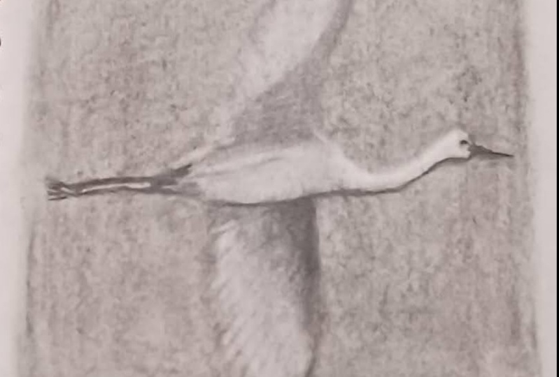
6. Lesson 5: Reverse Drawing: Okay, Now it's time for our last exercise.
Paul, are you ready? I don't want it to be over. I'm having so much fun. Well, hopefully everyone
agrees with you. We are going to do something
called a reverse drawing. And a reverse drawing
is basically where you cover your paper with
graphite or charcoal. In this exercise, we're
gonna be using charcoal. We're gonna cover our paper, make a light gray background. And then we're
actually going to use our eraser to erase
different values out of it. So grab your eraser,
grab your charcoal, your pencil, and
let's get started. All right, I'm ready. All right, So we have made
it to the final exercise, the last drawing ready
to be doing today. So this is going to be
a bird and we can have a soft gray background that
we're gonna be building on and creating the
bird on top of that. So the first thing I'm
gonna do is I have a little bit of
physical vine charcoal. You can use graphite, you can use the
side of the pencil, you can use a charcoal
pencil, whatever you have. This is gonna be very quick. So I'm just going to start rubbing this across my
paper and I'm just going to create a soft value that
I can build on top of. So this is an interesting way of drawing that gives you a base
value to build on top of. So you don't have to
go back in and create all that yourself
by using a pencil. And it's just a
little bit faster. You'll use the kneaded eraser to pull out some
of the highlights. You almost use that as another drawing
tool within itself. So I am just moving this
charcoal across my paper, building up a little
bit of value. And then I just have a paper towel here
that I'm going to use to spread the charcoal out
a little bit more evenly. But just take whatever
you have and create a square value here that
you can draw on top of. I like the U gets
to be the ones to teach the messiest lesson. I know, right? This is Kelly me right now. I don't want to go wash
my hands after this. And I know I want to
get this everywhere. It's gonna be all over my arms. Yes. Oh, my hands. So prepare for
messiness, everyone. Let's see, Mrs. our friends. So whenever you have I just
have a paper towel here. I'm just going to use
the blend this together. If you want to use a
blending stump, you can. It might take a little
bit longer that way. Sometimes you couldn't
use a paintbrush that will that will work. Whenever you have
a tissue is fine. Your fingers, whatever. You're sure. Your shirt if you
like messiness. I mean, just embrace
it. Now's the time. And if there are areas where
you feel like you didn't put enough charcoal or enough
graphite on the paper, you could go back over this. If you want to clean up certain areas and make it lighter, you can with your kneaded
eraser. Whatever you want. The harder you press
with whatever you're blending with the memorial, get a softer value
and your paper, I mean, don't, don't
ruin your paper. On top of it. Just kinda get a nice soft gray. And that's just going to
work as our background. So if you look at
the image, there's a nice soft gray behind the bird that's flying. Just going to act as our sky. Okay. Alright. I've got that. I'm just going to go
through and clean up the edges here a little bit. Just because I am
me and I cannot deal messy edges at the moment. He can do whatever you want. If you like the soft
edge, you can keep it. All right? Well, that's what I'm doing. Of course it is. All right. So now, depending on what
you want to draw with you, like I have my
charcoal pencil here, I have my graphite pencils. You can use a
combination of both. We've worked with
pencils up to this point where we know which ones
are a little bit darker, which ones are a
little bit later. Since we're starting
with this value, you're probably going to want
something that's a little bit softer to make
a harder line. In order to draw on top of this. I'm going to grab
probably one of my fees. Actually going to grab a
fairly soft I go to V here. Nationally might be too hard. I'm going to go into it again. I'm just going to start
laying in my bird here, so just deciding where
I want to draw it. So the only tricky thing
about drawing on top of. This gray, if you want
to erase something, it's gonna be a little
bit more difficult. But something you can do is
take that same paper towel. Just go back and
if you don't like a line that you've drawn, you could probably
just rub it out. If you've drawn lightly. Go back on top of it
with a kneaded eraser. Just press very lightly
to get rid of that. So I would, I would sketch pretty lightly in the beginning when you're kind of laying
out your bird shape. Quite the lovely bird looked at all of those details
in the days. Yeah. Yeah. So there's a
very subtle shifts here TO kind of similar to
the flower that we draw, that we drew in
the last exercise. As you can, very subtle shifts in the grays
and the whites. And not a lot of dark, but there is a dark
do bring some drama and really make them stand
out from the background. So I'm just kind of drawing
the body shape first, getting that sketched in. And now I'm going to sketch
in those wing shapes. Now remember, you're
not drawing a bird, you're just drawing sheets. I don't think they believed me. I don't know. I doubt it, but it's a hard sell, right? That's a bird shaped object
that we're drawing right now. And those wings are made
up of lots of feathers. But look at the overall
shape and draw that first rather than drawing
all the feathers. Just one step at a time? Yeah. Any kind of
drawing book like it. If anyone had those drawing
books when they were a kid that showed you how
to draw different animals. And you would always
start with shapes. That's kind of the
basic premise with anything you're drawing is you want to draw the shapes first. Do you want to figure out
what shapes make up this, this creature or this, you know, this object, whatever it is that you're
drawing and draw that first. Those books are
actually really good, I think for teaching
people that, yeah, I used to get
all those good check. A good challenge then
is to try to do a few of those and then do one where you don't look
at all the steps, but you tried to just do it on your own and see if you
can find the shapes yourself. Okay, So I have the basic
shapes laid in here for my bird. Feet here. Okay? And then the one nice thing
about having a value already established is that you can lift out a lot of the
highlights fairly easily. So I'm just going to
take my kneaded eraser. I'm going to make
it into a point. So almost acts like
a pencil itself. And I'm going to start looking
at where my highlights are and erasing enough of that background to give me some of those subtle
highlight areas. I love this part. It's like the opposite of how
you normally draw. Because normally you're
on a white paper and you're adding
darkness to it. Now you're adding the weights. Yeah. And I think for
this subject matter, It's actually a really nice
technique because there are some really nice subtleties in the bird and the different
values that you're seeing. So it works really nicely to
help pull some of that out. I feel like this technique is
extra good for just giving you that sense of light
hitting something right away. I worked in using your pencil
and drawing on white paper. I think it sometimes takes
a little bit longer before you can feel the
light in the drawing, but this way, as soon as you start erasing almost you see it. Yeah. And I think
one nice thing about all those feather shapes
as you could actually create those really easily
with the kneaded eraser. So if you just kind
of mold your eraser into a shape and just kinda pull it across those wing
shapes that you created. You're going to make
something that feels like feathers pretty quickly. It's so easy, it almost
feels like cheating. Yeah. And that's just going
to create something easier for you when
you go back and you put those details in
because you're not going to have to do as much
work, which is great. I mean, Paula loves that part. Yep, I'm a big fan
of this technique. It's amazing the
amount of detail that you can get just by
using the eraser. Yeah. You know, I'm just
kinda creating my marks in the way that the feathers are shaped
within the wings. And it's really helping
draw out some of that. The light, but also some of
the details the bird itself. You know, you can use a
more settled technique with the eraser where
you just kinda tap it against the background and it'll just kinda
pull a little bit at a time that gray. So you get something
very subtle. Okay? All right, and then
the next thing I'm gonna do is just
start building up. So I'm gonna do something
similar to what we did in the last exercising. When you use kind of a maybe something towards
the middle to begin with, start adding some of my values. We're gonna top of that kind
of lighter middle gray, a creative than the background. So where's my B pencil? I'm going to go in with
my B pencil and just start adding some of
those darker values. I'm not using a lot of pressure. I'm just building on top
of what I already have. This is a good technique
to use if you're ever in a life drawing class and you're doing a maybe a longer
pose of a model. It, it lets you get to the highlights and shading
a little bit quicker and you end up being able to capture a lot more if you have a limited amount of
time with the subject. There are also other ways
you can get this look too. That might be a
little less messy, even if you are somebody
who doesn't want the mess, you can use, you can
actually buy toned paper. So like paper that
is gray or tan or, or whatever, you can even
buy black sketchbooks. But then instead of
using the eraser, and in those cases you would use a white charcoal pencil or a white colored pencil
to add the highlights. Yeah, which can also give you some really nice subtle
shifts in value. A different way of working, but that's something that I always enjoyed when I
did figure drawing is working on a colored background
or a gray background. Yeah. It says, it lets you add value quickly but
also very subtly, which is very, very nice effect. I'm just going to work solely
here and just build up our values in different areas. Just working on that top wing now and adding in some
of the darker areas. And charcoal and graphite
are two different media that work really well together and can blend really
nicely together. Graph, I will give you those
really subtle variations. And charcoal can give
you a really nice, dark, rich, darker value in there. So feel free to combine the two. I think that's really ideal
to in a drawing it to be able to have both
the subtle stuff, but then also to get that bold contrasts from having
real deep dark values. Yeah. I'm not yet having to use much
pressure at all here. I'm just kinda layering on top, just very similar to what Paul taught us in
the last exercise. Using those marks I made with the kneaded eraser
to couldn't act. And so as a guide for where
I want the feathers to go. Oh, this period, such a QD. Your proof? I do. It is a very peaceful
subject manner. We must have been feeling things that were
peaceful today ball. I know everything we picked because it's
just been very calming. Yeah. We must need more. Next time. We'll pick
some real crazy stuff. That's what would have
happened if I had let you pick you up. You should see some other
things that we draw in the classes that
I teach by myself. Who like what? Any good examples? For some reason I tend to
pick a lot of pictures of people like jumping up in
the air are doing okay. I don't know, like karate moves. You do enjoy the dramatic. I do. Like people wearing
really wacky costumes. That's a favorite. I see that. This is what happens
when left unsupervised. Yeah. So if that's your thing, other classes, but you really enjoyed drawing
people jumping. Yep. And strange costumes. Like you to see that evolve
all like lining up right now based on blocking,
blocking the classes. I enjoy a little more subtlety. Like the understatement
of the gears. Just a little little more. Please. Like we said, Paul and I are a little bit of a contradiction. And a good way. That's what makes our
classes good though, because you get to see
two different approaches. And you know, there, there are as many
different approaches to art as there are artists everybody's going to
do there, do their thing. I think sometimes the danger of taking of all classes from just one person is
that you can start to feel like their way
is the only way. So I like these code labs because he can see
other options. I think everybody has a slightly different
approach, right? Or something that they
naturally flock to. Woo-hoo. Okay. Never mind that. I'm saying You keep
saying guacamole. I can write. My brain is that at the moment. Right? I'm just going
to keep building up that net value. C. I got like five p Here. I go in and add some
darker spots in here. Definitely if you're
drawing something smaller or something a little bit more delicate
with more detail, feel free to get a nice
point on your pencil. It definitely makes
a difference. I know some people draw
with a mechanical pencil to which is much more technical, but you can get a
very sharp point if that's what
you're looking for. What do my students was using mechanical colored pencils the other day I had
never really, wow. I know a lot of people
will use something called a lead holder as well. When you could put
different LEDS in that depending on what
you like to draw with. So you can buy anything from a super hard lead
to a softer lead. Yeah. I know in college that was
something people did a lot. What will they
come up with next? We're just felt like
too much work for me. So I didn't use the
lead holder very often, but you know, a lot of
people really liked it. Now paying attention
to where some of my darker areas are. Good. Nice thing about this
bird is it has a lot of interesting shapes and subtle variations
within those sheets, but it also has some
interesting lines that you can use your
pencils to create. This bird has it
all, has it all. I think if you
wanted to focus on getting every detail
in here you could, because there's a lot
of detail on the wings and subtle changes throughout. So I think it's something
you could definitely spend more time on if
you're enjoying this. Yeah. You could even use your, your viewfinder and choose to draw just a part of
it if you wanted to, like maybe just focusing on just the bird's head and the wings or
something like that. I think the viewfinder
is a great, a tool for all different
kinds of art pieces to help you to really kinda
create your own compositions. Or yeah, definitely. I mean, I think the viewfinder can work for whatever you're working on. Definitely outside of just drawing tools
you can work for you. Yeah. Like said Paul said, be excellent for paintings. Sure. You know, it's really
helpful to stop and think a little bit about composition
before you start, even though nobody wants to
take time to do that in me. But the results are, are they speak for
themselves when you do. It's trying to get these feet. And here these feet has some
really interesting shapes. Some nice, It's a nice contrast because you get some
really dark, darks there. I'm working with
my five right now, just kinda going as dark as
I can with the graphite. And then I'm gonna go in
with the charcoal and add a few details that
I can't really get as dark with the graphite. A way to finish this up here. You're going to finish moles. Well, you know the
finished, right? Yes. We got to stop sometime. A finished drawing
doesn't always mean like fully rendered in detail
from corner to corner. It can show whatever
whatever makes the drawing feel finished
to you is what is right. And I'm working very soft here. I'm not going into
a lot of detail. I'm just laying in
these values and if I wanted to go back in
and add more detail, I could establish, I'm sure you probably
will pull this back out. Some point, you can stop me. Nope. I learned that a long time ago. I used to paint murals together
and as you can imagine, we had different
approaches to that too. I actually have a paint
brush here and I'm just actually going to use this to smooth out some
of the charcoal. So definitely something you can, you can use to spread
out some of that value. If you want to use your
opinion, your blending stump, that would work really well too. I just want to experiment with the charcoal because there's
suddenly a really nice about the way the charcoal
flows onto paper. Create some really
subtle variations in value with the charcoal. Why he said it really like it mixes nicely with the
graphite and kinda, you know, go, go, you
use it at any stage. But I kinda like doing a lot of the drawing with the
pencil first and then taking the charcoal just where I want that real punch of dark. One other tool that
we're not going to necessarily
demonstrate right now, but that might be helpful
for you guys is to if you, if you make a drawing, whether it's a pencil
drawing or charcoal, and you want to
make it so that it doesn't get smeared
when it's finished. You can buy different types of spray fixatives
that you can spray, spray your drawing so
that the console or the charcoal won't
smear as easily. That's always a good thing, especially if you have
it in a sketch book. A lot of times I'll draw in a sketchbook and then close it. And the drawing kinda
gets smeared on the back of whatever pages, you
know, in front of it. So spray them down
when they're finished. You can even use it as a work at a workable fixative
is you're going yes. It's actually called
workable fixative and so you can spray it but then you can
still keep drawing on top. Yep. So then you won't smudge
it as you're working, you can keep building on
top of it and not have to worry about getting your
hand in the middle of it. Yeah. If you decide you do want to
spray one of your drawings, make sure that you
stand at upgrade. You'll wanna do it
outside really cause any kind of spring as
opposed to outside, but yes. And wear a mask? Yes. What did they ask? Be safe. But if you put it upright instead of
having it laying down flat, then you won't get
like drips on it. You don't want you
don't want food sprayed it drip on your paper? No. Okay. I think we're about ready. Oh, beautiful work
laws as always. Lovely YouTube. Great job. I love doing reverse drawings. I hope you try that again with some different
types of subject matter. Thanks for hanging out with is everybody This has been
so much fun, Paul. Yes, it does.
7. Closing Thoughts: Great job everybody. We hope that you enjoyed this
class and that it gave you some new understandings
of how to use all of your drawing tools. And we hope that you keep experimenting and trying
different things. There's no one way
to use the tools. There's no right
way or wrong way. Feel free to experiment,
try different things. That's what Pauline
idea, right? Ball. Bright. And then
we just teach it and pretend like we know
what we're talking about. One day this could be you. But we had so much fun
hanging out with you today. We hope that you
enjoyed it and got something out of it
and feel free to join us for another
class in the future. Yes, we have a lot more to come, so we'll see you
again really soon. Thanks everyone. Thanks everybody.
 Paul Richmond, Everyone is an artist.