Transcripts
1. Introduction: [MUSIC] Hi, Melissa. Hi Paul. We are here for our
back to basics class, design fundamentals for artists. I'm so happy to be here teaching with my
friend Melissa again. Melissa, why don't
you go ahead and introduce yourself to everybody. Okay, Paul. I will do that. My name is Melissa Foreman. I am an artist and art director, a lover of all things creative, and super happy to be teaming up with my friend
Paul, to teach this class. We love the idea of connecting artists worldwide
through artwork. I'm Paul Richmond. I also do love collaborating
with Melissa Foreman. We have been doing
that for a long time, Melissa and I went to art school together about 27 years ago. We have done all
kinds of things, murals, different types
of collaborations, and now we love sharing our love of art with you
through these courses. Thank you for
checking us out and what exactly will
we be doing today? What is this back to
basics course all about? This is a good class for anyone
that's creating artwork. There are basic fundamentals before you start
designing something. Design goes into anything
that you're creating. Whether you're
creating a drawing, a painting, a sculpture,
a giant mural. You're going to think
about design first. You're going to think about
the different elements within your artwork and how
everything fits together, and how the overall piece works. You actually have so much
more control than you might realize as an artist over how people perceive what you make. You can tell them where
you want them to look, what you want them to notice, how you want them to feel. All through the choices
that you make about design. That's what we'll be
covering in this class. We're very excited to share what we've learned with all of you. You ready to get started? I'm ready. Let's do it Paul. Let's go.
2. Lesson 1: The Design Principles: Welcome to our
back-to-basics class. Today we're going
to be talking about design fundamentals for artists, so let's get into a Poly. I'm ready, let's do it. Let's go. [LAUGHTER] Let's talk about some basic
elements of design. I think some of these will be
pretty clear to most of us. We're talking about line, we're talking about color, shape, texture, and space. When we say space, we can
talk about different sizes, we can talk about backgrounds, we can talk about foregrounds, so space can be a lot
of different things. Wonderful. [LAUGHTER] Now that we know some
basic elements of design, how do we use them to
create art that looks good? That's where the
design principles can really help guide artists
through the design process. We're going to go into
more detail about what does design principles are and how to use them
in your artwork. Let's do an overview. We have unity, we
have hierarchy, symmetrical balance,
asymmetrical balance, positive space, negative space, emphasis, movement,
contrast, and rhythm. These are all different
ways that you can use line, color, shape, texture, and
space in your artwork. Do you want to talk a little bit about each one of these, Poly? I think we should and
the interesting thing I think is true of
all of these is that they're all concepts that you are already using
if you make art, or if you even just look at art. But you might not
have necessarily labeled them this way or
thought about them this way. A lot of these ideas contribute to the way you
experience artwork, whether you actually
use these terms or not. But it's a good way
to break it down and really understand
how you can take each of these ideas and incorporate them as
you create your work. You want to start with unity? Sure. Like Poly said, I think you're probably using
a lot of things already. This is just putting words to
what you're already doing. Unity is harmony or creating something that feels like a
unified piece of artwork. The elements feel like
they go together. Did the shapes feel like they're all created by the same hand? Does the overall
technique make sense? Does anything feel
like design-wise, it fits together well. Beautiful and I'll take hierarchy because this is
a challenging one for me, I tend to want to make
everything important. [LAUGHTER] But hierarchy is
talking about how you choose. It's like creating a sense
of priority in your artwork, where do you want people's
eyes to go first, second, third, what is
the most dominant thing, what's the least dominant thing? I guess everything can't be the star even though
I want them to be. [LAUGHTER] Sometimes you need some background answers too. [LAUGHTER] Let's talk about
symmetrical balance. Symmetrical balance is a
compositional technique. That just means the layout
or the way you are arranging the subjects within your artwork or your drawing or you're
painting, whatever it is. Symmetrical it feels
obviously balanced. Whatever shapes you have, they're the same size, scale. Everything feels
like it's centered, like it has a grounding point, like things could
be reflected in a mirror and they make
sense balance-wise. Where asymmetrical
balance, as you might have a larger
shape on one side and a smaller shape
on the other side but visually it still
feels balanced. One goes with the other. You can play with you through these and I still feel balanced, it's just a different way of
approaching your artwork. Exactly. Positive and
negative space are ways of looking at the
actual elements that you're drawing or painting. The positive space is the stuff, [LAUGHTER] so you're
making a drawing of a tree, for example, the positive space is the tree, and then the negative
space would be the sky around the tree. We don't always think about the importance of
the negative space, but we'll be talking about that more as we get into
our projects today. The negative space is just as important as the
positive space actually. I think that leads
us into emphasis. Emphasis is creating
a visual focal point, someone that looks at your
artwork to notice right away. You can manipulate the
way people look at your artwork by creating
emphasis on one element. That's what you want to
stand out in your artwork. Movement is something that's
really interesting to think about when you're talking
about a still piece of art, like a painting or drawing. But you absolutely can create a sense of movement
by the way that you arrange the elements
by repetition of elements, by the position of things on
the canvas around the paper. We'll talk more
about that in one of our future projects too. Contrast is the difference
between light and dark. Obviously here we
have black and white, but it doesn't have to
always be black and white, you could have some
darker elements and some lighter elements
in the foreground, and maybe your contrast is more extreme than the background. That's one way to create
depth in a piece of artwork. Or maybe the way
you use contrast in a design is where you want
people to look first. Something that feels
heavier and darker, maybe will get people's
attention before something that feels
lighter with less contrast. It's just a way
of getting people to look where you
want them to look. Were so controlling. [LAUGHTER] As artists, we cannot let go. This is great for control
freaks. [LAUGHTER]. I love it. Not naming any names here
and [LAUGHTER] then rhythm. I love thinking
about rhythm because it is a term that you normally would
associate with music. I think that there are a lot of parallels between visual art and music that rhythm has to do with again the repetition
of things on the canvas, the patterns, how people's eyes travel across what
you're creating and the speed that they're moving, and how much back-and-forth, just that sense
of repetition in, well, rhythm [LAUGHTER]. It makes sense right? Yeah, to me. [LAUGHTER] Hopefully, everyone else
will see. Let us know. [LAUGHTER] Yeah. This is a very simple
way of showing you visually how all of these
things will come to life. Let's go through some
examples in classical artwork as to how these can come to life and how they can be used. I don't know, when a
landscape painting or a figurative painting or something that feels a
little more like fine art. Let's look at some examples. We're going to talk again about all of these things
we just mentioned. But now looking at them a
little bit differently, you see how they
can take shape in a more artistic way or
in a more fine art way. That's cool. If you look at some
of these examples, you can use brush strokes
to create rhythm. You can use color
to create movement. You can emphasize things
based on contrast and color and shape and how you're using
all of these things. I think this is a
good example of some activities we're going
to do in our next section. Yes, I'm ready to
start making stuff. Can we get started? [LAUGHTER] Hopefully, everybody is
as ready as you are Poly. [LAUGHTER] I think they
are, I'll speak for us all. [LAUGHTER] Let's go.
3. Lesson 2: Geometric Shapes: Let's get started with
our first project. What do we need for
this one Melissa? We're going to keep it
pretty simple Poly, we just need two
pieces of paper. One white piece of paper, one dark piece of paper. It can be black, it can be
purple or it can be blue. It can be any color you want, just different from white. Then we're going to
need some scissors. Sounds good. This project is
all about composition and also thinking about positive
and negative space. Melissa is going to
be teaching us here. I'm just going to sit
back and watch and learn. No, Poly, you're going to be
doing this along with us. Come with me, I
will show you how. See what I mean
about controlling? [LAUGHTER] Let's do it. Everybody, here we are
and our first activity. I have my scissors here, I have my white piece of paper, I have my black piece of paper. Again, you can use
whatever paper you have. If you don't have a black
piece of paper, that's okay. Use what's in front of you. Use what you have on hand. Poly, you're going to do
this along with us too. I'm ready. I've got my
paper and scissors. The first thing I'm
going to do is just get my black piece of paper. I'm going to think
about a couple of different shapes that I'm
going to cut out today. I'm going to cut out probably about five different shapes. If you want to do more
or less, that's okay. But I'm going to start
with a large rectangle. I'm literally just going to
cut my paper in half here. I think the key with this
is to go big on the sheets. You want enough to
work with so that you can cover your white piece
of paper in different areas. Because we're going to
think about creating different compositions with these shapes that we're
going to cut out. You want enough space to cover
a lot of your white paper. You can think about positive
space and negative space. We're going to fill a
lot of this space with black paper so then our white paper will actually
work as a positive space and a negative space depending
on how you lay things out. I'm going to cut a
large triangle next. Again, none of this
has to be perfect. None of this has to be
exact. I know it's funny. It doesn't Melissa, who are you? I know. It's funny
to me saying that because that is my whole thing. Melissa is a bit of a
perfectionist, but that's okay. As I'm saying that, this edge is not exactly
correct on my triangle. I keep wanting to fix it and then telling
myself I cannot. Wait until you get
to the circle. No, oh my goodness. [LAUGHTER] I'm going
to want to grab a pencil and draw it out. Just live on the edge Melissa, just cut it out
with the scissors and whatever you get you get. I'm going to give it a shot. [LAUGHTER] Your shapes do not have to be just
like Poly and I's. They can be whatever
shapes you want. If you want to do a star, if you want to do something
more exciting, feel free. Well, shoot. If I'd known
that was an option. I already have mine cut out, I would have made a star. Oh my goodness, you're so fast. [LAUGHTER] Here's my circular shape. I don't know if I can
call it a circle, but it's close enough. It's killing you, isn't it? It's killing me. [LAUGHTER] Melissa and I
love to tease each other, mostly me teasing her, but it's all done
with love. [LAUGHTER] Yes. How many do I have? 1, 2, 3, 4, 5, I
have five shapes. I'm going to cut this one
slightly smaller just so I have a smaller one in there that
I can play around with. Here's my different options. You can use all of
your paper. You don't have to use all their paper. Totally up to you.
Very loose and casual. Very chill. Very chill, yes. [LAUGHTER] I'm just going to
start looking at my shapes. I'm going to think first
about working symmetrically. What does a symmetrical
composition look like? What does that mean? It means that everything is
balanced from side to side. Both sides of your
composition, your layout, your piece of artwork should be somewhat similar in layout feel, overall balance, I
guess I make sense. Yeah. It's okay to overlap the shapes as you
go if you need to, and then you can have some
of the shapes sticking off the paper if you
need them to you. I think it's worth saying to that in a symmetrical design, it doesn't necessarily mean that everything is
perfectly symmetric. This more of the
overall feeling of it. Let's talk about
what balance means. Balance means that
it doesn't have to be a mirror image on both sides. If you have similar
shapes or you have shapes with
similar weights. I don't know, see my square in my circle are somewhat balanced. They're somewhat
similar in size. If I put one on each side, visually the weight is
going to feel similar. It's not exactly the same, but it still feels
balanced and that's okay. I feel like I'm the
wrong person to teach about being balanced. [LAUGHTER] I'll be really good at the next one
though. [LAUGHTER]. Yes. So there are different
kinds of balance. [LAUGHTER] I don't know if we're talking about
a stability here, Poly. [LAUGHTER]. I hope not. [LAUGHTER]. The idea here is just to
play with your shapes until things feel like they work. What kind of shapes
are you creating? Are you using some overlap? Does everything feel overall balanced even though your
shapes aren't exactly the same? Keep playing until
you get something. It's putting together
a very weird puzzle. It is, it's a little
puzzle for sure. Yeah. Think about how this could work in design or how these could work in a piece of artwork
that you create or drawing. Think about different types
of artwork that you've seen. Can you think of any
symmetrical compositions? What does that? We see a lot in fashion too. You can have very
symmetrical looks where everything is the same
on both sides of the body or you have asymmetrical fashions where there's maybe
something hang lower on one side than the other , hopefully
intentionally. [LAUGHTER] Yeah. What do you think, Paul, did you come up with a symmetrical composition
that you're happy with? I did. I'm thrilled with it. Thrilled, amazed. [LAUGHTER] Now,
everybody else that's doing this don't feel like your designs have to look
like Melissa's in this case. There are so many different ways of thinking about
these concepts. Really try just doing it on your own and seeing
what you come up with. Yeah, I could have
immediately change my design based on the
shapes I have and I could come up with a completely different
symmetrical composition but it still works, so keep playing until
you find something. My favorite thing to do. Would you think works? [LAUGHTER] That's symmetrical. Got it. Let's try asymmetrical. Okay. What does that mean? [LAUGHTER] Unbalanced. Perfect. Poly, you
want to take over? [LAUGHTER] I'm not sure what
you're implying [LAUGHTER]. No, you're doing
great. Go right ahead. Asymmetrical can be a
little bit trickier. It's not as straightforward. It's something that
you have to use your instincts to feel. If something feels balanced. Visually, things can
feel like they balance, harmonize, go together
even though it's not completely the
same on each side. You want to play
with your shapes until things feel interesting. That's a good word
for it because it's a very intuitive thing. Yeah, it really is based on
instinct and what looks good. There really are
no rules per se, it just can't be exactly
the same on both sides, so it can't be symmetrical. [LAUGHTER] Can't be
worried, just did. [LAUGHTER] I think it's really good the bolus is
having a start off doing these things with simple shapes
because it's a little bit easier to recognize and think about the
concepts that way. But these things apply no
matter what art you're making. When you're thinking
about how to arrange elements in a
drawing or painting, even if it's a very
realistic piece, you still want to think about what composition are you making. You could think about this
as an abstract painting or putting different
elements in a landscape. If you had a horizon line and
cut your image in thirds, how would you balance
out that upper third, how would you add
interests up there? How would you make it feel
like it all went together, it didn't feel top-heavy or
side-heavy or bottom-heavy. How would you make it
feel more balanced? I think doing exercises
like this can help people appreciate abstract or more because there
is so much more to look at in an art
piece beyond just. Does it look like something, that looks like I
see a tree here, I see whatever this is a
deeper way to engage with art. Also, think about the elements
that we've talked about. Can you use line in
an interesting way, can you use shape in
an interesting way? You have so much to work with. I know we gave you so
many things [LAUGHTER] I mean, we didn't
personally invent them. No, but I mean [LAUGHTER] Maybe Melissa did
it all [LAUGHTER] I will claim many
things but not that, can't claim that one. I was able to get my asymmetrical design
worked out very quickly. Yeah, and If you like what you have and you want
to stick with it, that's fine if you want to try a different way so maybe
you move things around, maybe you play with
something else. It's so easy to come up with multiple different
compositions that work. You might as well do it now
while you can play with these shapes which is much easier than doing a finished drawing and
having to do it later. We've got our
asymmetrical composition, we figured it out we're good. We're good. Now we're going to think
about positive space, so let's think about what
positive space means. Positive space means
subject matter. The stuff like Paul said, in this case, you can think
about as the black shapes. The black shapes are the stuff that we're going
to be designing with. Thinking about composition where you're using the black
shapes to create some interest within
your white background. This is the easier of
these two I would say. Easier of these two,
yes. It'll get slightly harder in the next
one [LAUGHTER] I think maybe it's
because we're used to thinking about whitespace as the background since we
often draw on white paper or have a white
canvas or something. Definitely. By doing this puts me
right back in art school. I remember doing these
projects like this. You can take the shapes that
you've made and you can make other shapes by combining
them, overlapping them. There are no rules, they can go off the page, they can stay within the page. Yeah. Just think about
making a focal point, which will be your subject
matter or your positive space, which would be the
black shapes versus the background or the
white negative space. It can be symmetrical
or asymmetrical, doesn't matter in this case. Your composition's time. Hey, Jim Pauli. Got it. Looking good. I got it. We made some positive shapes, so now let's think about how we can highlight the
negative space. We're going to do
the same thing, the black is going to be our main way of
moving things around. But we're going to use the black in a way where we're
highlighting the white as the positive space
so use your black space. Good luck with that [LAUGHTER] It's interesting
to think about it. Arrange them in a way where
you're making the white become the positive
and this is trickier. Sometimes hard to wrap
your brain around it like, wait, what are you
asking me to do? [LAUGHTER] You have to, it's almost like you're
doing a reversal. How do you make those shapes
pop out of the white? By almost blacking them out with the shapes
that you created. How do you turn that
into a positive? I think this is such an important concept for people to think about
though because when you're creating a composition that you want the shapes
of the positive and the negative spaces to both be interesting you can if
you are only looking at the positive space
you're missing half of your composition so this really forces you to think
about both sides. How do you design with both? How do you make both
interesting, like Paul said. How can you make it so you notice the white shapes
before the black shapes. Cover them with glitter? Well [LAUGHTER] That's what I was about to do. Well, always an
option [LAUGHTER] Never forget about the glitter. When all those fails. [LAUGHTER] Yes. I think I've done it. How
are you feeling Pauli? I'm feeling good. I've got it. Hopefully, all of you out
there got it. Feel good. If not, please pause this
video and keep playing around with this until it makes more sense to
you and like we said, this last one was challenging, so don't feel bad if
it was confusing. You almost have to flip the way you usually
think about things and approach it a little bit differently. Look
at it differently. Lovely work, Melissa. Great job, everybody.
4. Lesson 3: Thumbnail Sketches: Great job everybody, but
we're not finished yet. We still have a whole bunch
more projects for you today. Our next one is all about
creating thumbnail sketches. What's a thumbnail?
[LAUGHTER] Melissa? Well, it's not on your hand, like policing and something. Thumbnail sketches are
just tiny sketches, so they're very small because
you can do them quickly. Thumbnail sketches are just
ways of working out what your artwork is
going to look like before you actually get
to the finished piece. It's a practice for most artists before
they create the finish. Which can be
challenging if you're an inpatient artist like myself, who wants to just dive in headfirst and get
started on their piece. But it really is a
worthwhile practice to stop and think
about different ways that you can show that whatever image it is
that you're trying to create. That's what we'll be doing here, and you only will need pencil
and paper for this one. You're ready to get started,
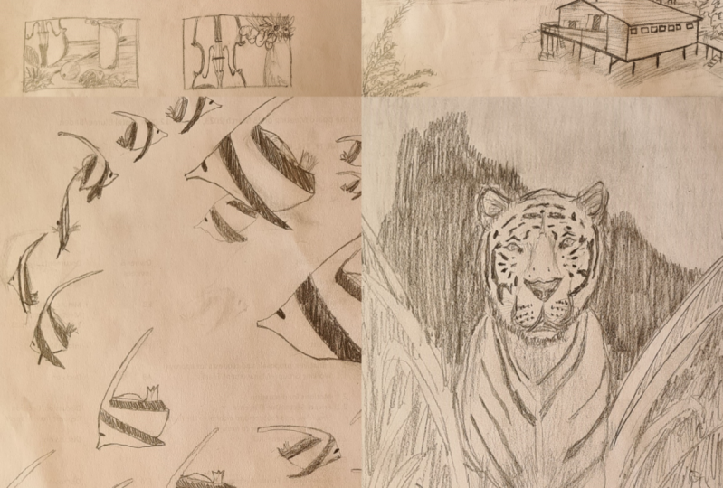
Melissa? I'm ready, Paul. Okay. Let's go. Let's do it. Here is our reference
image for this project, and we're going to be doing a series of thumbnail
sketches where we explore different ways
of composing the image. I was saying before, sometimes I have to really fight
the temptation to just jump in and start
on the final piece because that's what I'm
most excited about. But the thumbnailing process is a really valuable tool for
thinking about composition. It's called a thumbnail
because they really are meant to be small, things like size of a postage stamp or maybe a
little bit bigger than that. But go ahead and draw five
rectangles on your page. I'm going to make
them pretty tiny. Now, if you want to, you could try, drawing a couple of
them horizontally too. They don't all need
to be vertical, like the reference image. Sometimes that can be a good
way to challenge yourself to think about how you would compose the image if you
were going to flip it, or if you're going to
rotate it, I'm sorry. I'm going to do three
vertical and two horizontal. You can do as many
thumbnails as you want. There's no magical number. But it is a valuable process, I would say, to get
into the habit up, and there's different
ways of doing it. This is the very
traditional way. Other artists, actually
including myself, will do a similar
type of process, but maybe designing with the elements in photoshop
or with a collage. However, you are able
to easily see what it would look like to move things around and compose
it differently. Give you a minute to get
your rectangles drawn. You're doing this
too with me now Melissa aren't you?
I am with you Paul. I got so many rectangles. [LAUGHTER] Good. Now it's my turn to be
the boss [LAUGHTER]. Your favorite. I'm going to really enjoy this. I think the first thing
to really think about is recognizing that when you go to draw something
like this still life, you don't have to draw
everything that's there. You can choose to focus in on just one particular element. In the first rectangle,
let's try that. Let's try thinking
about how we could zero in on something
that would allow us to create maybe a very
symmetrical composition. There are different
ways you could do that. You can focus in on
different parts. But for me, I'm going to
draw the violin because that's already a very
symmetrical object. I'm just going to put
it right in the center, but allowing it to go off the page at the top
and the bottom. Because I think that makes the composition more interesting when you do something like that. Paul, I think one important thing to
remember when you're doing thumbnails is they're
very quick and simple. You don't want to put a
lot of detail in them. You're just getting a basic
layout and that's why they're so small because
you can do them quickly. You can get an idea of what it's going to look like without going into all the detail and the finishing
and the shading. Make it quick, make
it easy for yourself. Not only is there really a waste of time to do
thumbnails in depth. But I also think that
simplifying it is very helpful because then you're not getting distracted
by the details, but you're seeing
the simple shapes in the last exercise
that Melissa just did where she used the
geometric shapes. You can think about it a little bit more
abstractly than if you're looking at a
very detailed drawing. That's all I'm going to do for
that one now, very easily, I can look at that and I can decide if I like that or not after I get
some others done, you can see them all at
once and then choose the composition that
works best for you. Are you finished with
your first one, Melissa? I am finished with my
first Paul. I'm so happy. A+[LAUGHTER]. A++. Listen
to that enthusiasm. [LAUGHTER] Now in the next one, see if you can create an
asymmetrical composition. The image already somewhat is, but you could remove elements
to emphasize that more, or you could zoom in and
crop in a certain way. I think for this one,
I'm going to focus on the vase of flowers
only I'm going to scooch it all the way
over to the left and let it go right off the page. I think with a lot of
beginning artists, especially a lot of
artists that I've taught, the temptation is to put everything dead in the
middle of the page, like this first one, but not
even like breaking the edge, just like drawing it
exactly as you see it. I feel like it opens
up a whole world of possibilities once you realize you don't have to
do it that way, you can really play with how you position stuff on that
frame of reference. Just because something is
in a certain position in the photoghaph reference
doesn't mean that you can't move it around
once you draw it. You can put those oranges
wherever you want. You can move the flowers. You can lay that flower on the table in a
different position. Think about how you might
set this up if this was a still life in your house and you were taking
a photo of it. What would appeal to you? Exactly. I'm taking those
oranges that are down on the table and rearranging them so I get to see a
little bit of them. He can up over the edge here. Then, even though this one wasn't specifically
focused around thinking about positive and
negative space where you're going
to find is that's a concept that comes
up all the time. In my drawing, I have a lot of negative space that can make for a really beautiful
and interesting composition. You don't always have
to fill everything. I think that's the beauty of thinking more about positive
and negative space. You recognize that the
negative space is valuable. You don't have to fill it all. One thing to also think
about as you're drawing this object is also think about those shadows and how they
fall across the table. Does that add balance
to your composition? Yes, everything is
a visual element. It doesn't have to
be an actual object. It could be the shadows,
like Melissa said. Where are those little
spots of highlight? Sometimes in my thumbnails I will do a really quick little, just shading in the dark area because then I can
look at it and see very quickly how the contrast is going to affect
the composition. All the things to think about. [NOISE] It's not enough time
for the second one. I guess everybody can just
work at your own pace now, you don't have to
keep up with us. You don't have to have a
specific design element in mind as you do each one, you might just see
something that catches your eye and you want
to explore that. With my next one,
I'm thinking more about rhythm and movement. I'm focusing in
on the repetition of the shapes of the petals
and the little leaves. I'm going to do a close-up where the flowers are more
here at the bottom. I want to see what
happens to the way my eye follows those elements around as I pull up the leaves up
into that negative space. You end up thinking about all of the
different things that you draw as just being like
little notes in a song. Some of them are loud, some are quiet, some are
long, some are short. How do they all work together to create a sense of
rhythm in your drawing? That's what I'm thinking
about with this one, drawing something that
has a lot of repetition of shapes and patterns to
create that feeling of rhythm. Yeah, all of those
design elements are available for you to think about in how to accomplish some of these
design principles. Any of those things: line,
shape, texture, color, any of those things
will help you achieve whatever design
principle you're going after. Whether you're going after that rhythm or the
movement like Paul said, or whether you're still focusing on positive versus
negative space. Whatever you want to achieve, use those different design
elements to get there. Yes. I think it lets
you be a lot more intentional about the way
you create your artwork. It lets you decide how do I want people to experience this? That's pretty awesome. It can be overwhelming
to at first. But like we were saying before, the more that you look at
other artwork and start recognizing how other artists
have used these ideas, then it becomes easier for
you to do that to you. Yeah, the more
practice the better. Feel free to do more than
five thumbnails if you went to. The more the better. I feel like in
college in a lot of my classes they
made us actually do thumbnails and turn
them in as part of the assignments and we'd
have to do like maybe 20. Sometimes I'd be mad
because it'd be like cool, but I like my first one. [LAUGHTER] I don't need to
do 19 more, this is good. [OVERLAPPING] Sometimes
that will be the case. Sometimes that will be, but then at least you know
you've explored different. Just with the three
that I've done already, they look like three completely different
still-life pieces. You wouldn't even know
that they were from the same reference photo
looking at them this way. I think that's pretty awesome
because it lets you see how many different
ways there are to interpret the same thing. Now I'm about to go onto
my fourth one here, which is a horizontal rectangle. Just switching the orientation of it makes you look at
things really differently. Now I'm focusing on some
of the elements that are laying down on the table, the oranges and that flower
that's laying down there. I might make that more
of the focal point here. In fact, let's talk
a little about focal point because when you are arranging elements or
when you're drawing elements on a thumbnail, you do want to start
thinking about, where do I want
people's eyes to go? What's most important here? How do you approach that idea
of focal point, Melissa? I think that focal point is usually something
I know going in. I know what I want
everyone's focus to be, because usually
that's the thing that you're most interested
in drawing. I know when I do
portraits of people, the subject is always
the focal point, but usually I'm
working things in around the subject to make it a little bit more
interesting or help tell a story or get my idea across. I think that's
something that you can work in around
the focal point, but you always want the
interest to go back to the main subject. Whether you're thinking about
the oranges or the flowers. I think in this specific example you have several
different focal points. Depending on how you use them and how you use your color
or how you use your value, people might look at things differently as far as
when they noticed first. But compositionally, you can
choose to move their eye around the different subjects that you've created
in different ways, depending on how you lay them
out, your negative space, your positive space, all of those different elements and principles that we talked about. One thing that I will do sometimes when I'm
making thumbnails, if I have ideas
about focal points, like in this case, the way that I've
drawn this one, I've decided I want this
flower to be the focal point. Then I want your eye to
travel back and then follow along the path of these
oranges and then be pulled up through
the other shapes. It is a good idea to think about not just the focal point, but how the eye is going
to move around the piece, and you don't want to
shoot people's eyes away from your drawing or from
your canvas too quickly, you want to find ways
of using the shapes and the elements to keep moving
them around inside of it. But in this case, because I want the flower
to be the focal point, lot of times in my thumbnails, I will make little
notes off to the side. I'm going to make a
little note here, yellow pop of color, meaning that I will use color as one of the ways to make
sure that your eye goes right to that flower by
really making the yellow very bright and maybe making
everything else a little bit more subdued. Yeah. That also brings
in the idea of contrast. That yellow will contrast
with everything around it to the point where you're
going to see at first because there
is more contrast, there it does stand out, and then the other colors
might be more similar. Yeah, exactly. For now, I'll just use a heavier line on that flower so that even when I just look
at the thumbnail, my eye goes right there. I have one more to go, and it's another horizontal. Let's see what
happens this time. If I do maybe a
more of a close-up on the upper part of
the violin this time. I'm really thinking
about how it's using the positive
and negative space. Again, I keep coming back
to that one because I love thinking about that. I'm using it in a very
asymmetrical way. I've got the violin over
here more to the left. I've got this little bit of negative space to
the left of it. Then I've got a lot
here to the right. Then I'll start to just
break that up with some of these interesting more organic
shapes from the plant. You see now I have
a problem, Melissa. I like all of these, [OVERLAPPING] which
one am I going to do? I guess you have to
do five paintings. I'm going to really
know a lot about this violin by the
time we're done. [LAUGHTER] You are. [LAUGHTER] Let me finish this one up really quickly and then I'll
just say that it is a really good habit
to get into once you finish your thumbnails, to just stop, take
a minute and look at them and ask yourself, which one does your
eye go to first? Which one do you find
the most interesting? As I'm looking at mine, the two that jump out at me
are this one and this one. I think in both
cases it's because of the use of the
negative space. I really like the
asymmetrical composition in both of those cases. I like the pattern and the
repetition and rhythm here. I like the really dynamic
composition of this one with everything being pressed off to the side so even if you
can narrow it down, that gives you a way
to start thinking about which one you're
going to do next. Do you have a favorite
out of yours? Oh my goodness. I think I do. I really liked the oranges. I liked that there were
three different oranges in different stages
of being peeled. I thought that was
really interesting. I thought it did create some interesting
movement through time, but also movement from one
orange to the next visually. Then I thought it created a nice rhythm, having
three of them. Yeah, so you see how two different artists can
look at the same thing, see totally different, be drawn to totally
different things. I'm sure every single
one of you that is doing the class has drawn
something different as well. That's the beauty
of being an artist. Great job, everyone.
5. Lesson 4: Creating Depth with Line: You did a great job. We have more to go. What
are we doing next, Melissa? This next one is going to be a line drawing of a landscape. We're going to use this to
learn a little bit more about hierarchy and creating
depth through hierarchy. All you need is a
piece of paper. I have some different markers in different sizes because
you're going to do some different
widths of lines, you're going to go
from a very thick line to a very thin line. Whatever you need to get a very thick line or are
very thin line, grab that. If you just have your pencil, that will be fine too. You can always go over the lines to make them heavier where you
need them to be, this is very flexible. You can use whatever you have. Well, let's get started. Let's do it. Everybody, we've made it this far. Our next exercise
is going to be all about hierarchy and creating
depth through hierarchy. What we're going to
do is we're going to do a little landscape drawing. The first thing
I'm going to start with is drawing a rectangle
on my piece of paper. This will just represent where
I'm going to be drawing. I'm going to do something similar to the shape
of this photo. It's got to be a rectangle
that's more horizontal. I'm just going to draw that in the middle of
my sketchbook here. Feel free to draw a
rectangle for yourself. If you want to take
up the whole piece of paper, that's okay. If you want to do
something a little bit smaller, that's okay. You just want to leave enough
room for creating depth. Drawing all these details with
different weights of line, that's what we're going
to be focusing on today. When you say weight of line, what does that mean? Good question. I have several
different markers here. The reason I have several different markers is some are a little bit thicker. This one is really thick
versus this one is very thin. I'm going to be creating
thin lines and thick lines. Usually your thickest line
is going to be something in the foreground and usually your thinnest line is going to be something in the background. That just helps
create depth and it helps to tell people what they should be looking at first. Something that is
thicker in line is going to stand out
more than anything else. Specifically, what we're
drilling today is we're drawing this little cabin on this beautiful lake
in the mountains. Obviously, our focal
point is going to be that cabin
in the foreground. We want people to look
at that first and then we want them to gaze into
that beautiful background. The first thing I'm
going to do after I made my rectangle is
I'm just going to start laying in some
of my objects here. Think about each of these
different elements as shapes. Think about those
mountains as shapes. Think about that
cabin as shapes. Even though the cabin
is our focal point, you don't necessarily
have to start with drawing the cabin. You want it to feel like it's nestled into this landscape and the size and scale that makes
sense with everything else. The first thing I'm
going to think about is my horizon line. The closest thing
to a horizon line in this photograph
is that water line, so where the water meets
the land in the background. I'm going to start making
indication of where that's going to
go in my drawing. Don't panic if you haven't
done a lot of drawings before and this seems
like a complicated image. If you can draw anything, if you just break it down into simple shapes and
you don't have to do every detail that
you see here which you can simplify
to make it work. Definitely, I'm just focusing
on those main shapes. I'm not focusing on details. I'm just going to draw
some diagonal lines, some horizontal lines just to
represent what I'm seeing. Do a lot of glancing back and forth between the photograph and your drawing just
to see if you're getting things in
the right spots. Things are starting to make
sense as they come together. I'm drawing that
mountain shape on the right and then the rest of that water line
as it comes across. I'm going to start on some of my background elements and
actually get some of those established before I start
drawing my focal point. That just helps give me an
idea of the scale of things, how everything fits together. It makes sense of all the shapes before I start doing anything more detailed
like that cabin. Again, think about
negative space. Think about positive space. Where did the two meet? What shapes do they make? What are those lines look like? Focus on the shape that
the sky makes as it meets those mountains.
Start drawing that. This is a really good, practical way of applying some of what we've been
talking about so far. Definitely. You don't even have to think about these shapes as actual objects or
mountains or trees. You can just think about
the shapes that they create and how everything
comes together. Think about scale. Think about how that
space is created. Where things come
together, where they meet. You can get as detailed
as you want at the end. But I think right now it's
best to just focus on large shapes before you start adding any
complicated details because you could get very
complicated with this. Or a lot of details in the
trees and the mountains. But before you get there, make sure that you have all of your different design
elements established. When you start working
on that cabin, there's a lot of geometric
shapes versus a lot of organic shapes that you're
seeing in the background. Even though that cabin
is the focal point, it's not going to be
the largest thing. It's actually going to
be one of the smaller things that you're drawing. But you're going to create
that focal point through the use of line and line weight. It's cool that you can
create a sense of depth in a drawing without doing any
sheathing just using line. Yeah, and I think
that's something that maybe beginning
artists aren't aware of, that you really can use a line to create a landscape
that has depth to it. It's something that you can look into and you
know the foreground, middle ground, and
background right away. I think we always think
about color contrast and how we can use those to create depth or size or scale. But line is definitely something that you can use
to your advantage. You might find as you
go along that line is something that you
really enjoy working with. Lines don't always
have to be covered up completely in a painting. You can even go back
in and add line to a piece if you
want to have more of a linear look in a finished painting or
drawing or something, the lines can become a part
of it if you want them to. Yeah. If you think of pen and ink drawings or
more graphic drawings, they definitely use a line
and shape in different ways. You could definitely
utilize that in here, in your drawings
or your paintings or whatever you're creating. Something to think about too is usually something that's
in the foreground. If you want to add depth and
have it be the focal point, you are going to add more
detail on that object. Think about that cabin as you're drawing it and
you might want to add slightly more detail when
you're creating that. That's a good rule too if we're just thinking about focal point. If you make it the
most interesting thing in the composition, it will draw people's eye there. It's so many different
ways of creating that idea of a focal
point in a piece. There is another building
in this photograph. There's a church right behind the cabin
to the right side. You are definitely welcome to put the church
in your drawing. One thing to think about is if you do put that church in there, you want it to have
thinner lines so it doesn't take the focus
away from that cabin. You also want it to have
less detail than that cabin. This is a good test of using these tools to create
that sense of depth. Because if you treat that little building
the same way as the foreground building, it's going to just look like
a tiny little toy church sitting on the
roof of the cabin. You probably don't want that. It's not going to
feel like it fits in that landscape so you
definitely want to make it feel like it belongs there. You can do that through all of those different design
elements that we talked about. Another thing you can
think about is some of those tree branches that
are in front of the cabin. Those might be even thicker
in line than your cabin. I think it's good to make
you think about that stuff because then your art
is less likely to end up looking very
flat if you're thinking about what's in front
of what in space. Yeah, definitely. All of these tools that
we're teaching you, you can use to create the
type of image that you want. Again, it doesn't have to match what you're
looking at exactly. You can change things, you could move things. If something works better for you in a different location, feel free to do that. If you want people to notice
something else when your drawing first and
not that cabin, feel free to change things. That can be a fun challenge too. To take a reference where
one thing is clearly the focal point and try to change what the focal point
is to something else. I have my basic drawing workout, I'm going to go in and start
adding some line work. I'm going to start in the
background knowing that I want the thinnest
line back there. I'm going to start
with one of my markers that has a very thin points on it and I'm going to start doing some very thin line
work in the background. I had to test all my
markers first because I didn't know what the
tips would be like. Yes. That's the
thing about markers, you never know what
you're going to get when you open them up. Yeah. It stuff you haven't
used them in awhile. Maybe some of you
out there are using a fancy set of drawing
pins or something. Like Micron pens are really
good and you can get them with lots of
different size tips. Then you know going into
it which ones are bigger. But if you're like
me and you just grabbed a handful
of black markers, can do it take the time to do a little test first to see
what you're going to get. Yes, definitely. Now as you're starting
to do your line. You can use your sketch as a guide and start adding
more detail where you want. Just remembering that
you're going to have to do more detail and thicker line
weight in the foreground. You could do less detail on the background until you get to some of the
more focal points, then go back and add
more if you want. Making sure you're not getting rid of all that depth that we're trying to create. It's a little more pressure when you're doing it with ink. Yeah. [LAUGHTER]. But having the pencil
sketch definitely helps. Feel free to make
your pencil sketches detailed as you want it. For the sake of time, I'm going to go in and just
start playing with some ink. But if you're not
ready that's okay. One thing to think
about with waters, you do have a lot of those
reflections and things on the surface that will
help add some depth too. Especially when you're
doing a line drawing, I think it's helpful
to try and pick up on some interior lines not
just outlines of stuff. Yeah, that will
help define some of your shapes which could be difficult if there
are no additional lines. Yeah. Okay. Probably going to have to
leave out some stuff at least for the sake
of this example. Since you could spend hours
working on this drawing. Please feel free to if you get into it and you want
to keep going with it. Yeah. We're going to give you a simplified version so
you can get the concept. Yeah, we'll give you a
little preview or a start. Yeah. Beginning of the
drawing session. But feel free to go
in with more detail. Okay. I'm going to get a
slightly [NOISE] thicker marker. Found a good one here, this
one looks pretty good. For my cabin to start putting
in some of those elements. Basically, you want your lines defining the
shapes to be thicker. If you want to add
details within those shapes that are a little
bit thinner, that's okay. That will take away
from your depth. I might actually add to it if you're adding more
detail in there. Yeah, that's a good point. Everything doesn't
have to be the same. Aside from showing depth, a line weight can be
a way of showing, where there's more
light or shadow or what is more prominent? Yeah, definitely. You want to fill in some shapes, especially in the foreground, that can help draw your
interests there as well. I can always add a shape for the reflections. Using a line like this
is a great way of your drawing
something in a hurry. I just got back from
a vacation and I did a lot of sketching
in my sketchbook and when you're drawing from life like that you don't
always have a lot of time to sit and shade everything
in detail or anything. Using a line is a way to represent or create the
depth that you're seeing, helps you to still get that down in a quicker way than
some of the other techniques. Yeah, definitely. You can help give an impression
of something without going into great detail. You still understand the depth that you understand
what's happening. Yeah Without having to add every
detail or every element. Grab one of my markers here, put some of these tree
branches in and then I think we'll call this
finished drawings. The fastest piece of art
you've ever made, mostly. I am moving, Paul, you would be amazed. [LAUGHTER] But I love it. You just need to give me a
timer for everything I do. Hey, I like this idea. Normally I'm the timer
but she just ignores me. [LAUGHTER]. That is not true. Trees are fun because they can really just be
abstract shapes and they become trees
when you look at them. You have a series
of dots and lines and suddenly it's
like true branches. It's a tree. It's a tree, yay. [LAUGHTER] I think even though you're working from a photo reference here, you can still think
about balance, negative shapes,
positive shapes. As you're putting those
tree branches in the end, you can change anything. If it's not working
with your composition, if you want something
more asymmetrical, if you want to add depth
in different places. Whatever works for
your drawing is okay. Yeah, that's really what's
awesome about this. It gives you so much more
to think about and tools that you can use to
really make your drawings in your artwork, your own. Okay. Well, I think about. done. How are you doing
over there, Polly? I'm done too. Yay, we did it. Nice work. Yeah. Okay. Hopefully everybody else is feeling good
about their drawing. I'm ready to move on
to the next activity.
6. Lesson 5: Movement and Rhythm: [MUSIC] That was
great everybody. Time for the next activity. Now we are going to be
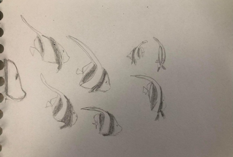
drawing some fish [LAUGHTER]. But not just drawing fish, we're using the fish
as a design element to explore some of the concepts
around rhythm and movement. The reason we chose fish is because we can draw a
whole bunch of them. They all swim around
together and we can see what it looks like when we draw
them in different ways. The spacing between them, the size, that kind of thing. Get ready to go under
the ocean with me. Sounds awesome. Well, here we have some fish [LAUGHTER] and this project, I don't know why that's
so funny, but anyhow. We promised fish
and here they are. We delivered. [LAUGHTER]
But here's the catch. With this project, we
don't want you to draw the fish as they are arranged
in this reference picture. We want you to look at the
fish as an inspiration, but then draw them in your
own unique configuration on the page that incorporates a lot of the ideas that
we've talked about so far. Thinking about
movement, focal point, depth, then I think
especially with this one, I'd really like for
you to think about rhythm and repetition
and how you can create that sense of the
pattern in the movement and the rhythm by how you draw and how you group
the elements on the page. Are they really tight together or are they
more spaced out? Do they feel like they're some coming forward and backwards, or are they all moving in sync? You can have different spaces on the page where you do
different things with them. Try exploring all of those
ideas in one drawing. That's a lot. [LAUGHTER] Then we
better get started. We better [LAUGHTER] I'm going to start
down here at the bottom. I'm going to draw
one fish first. You don't have to have a plan. It's better not to in this case. I think you want to dive in and you see all
these words that, well, it fits so well
with this dive in. Dive in. That is the catch. Yeah, let's dive in, and don't worry about making a perfect
drawing because it's better to draw them quickly
and get something on there. They're pretty simple
little creatures. I'm just trying to
get the basic shape. They might be insulted
by that, Paul. [LAUGHTER] Yes, that's true. I don't mean to suggest that
they are basic in any way, even though that is part of the name of our
clients [LAUGHTER]. They're in the right place. Yeah. Here's one little fishy. To start with, I'm going to do a little grouping down here that is more repetitive,
more balanced. I'm going to draw a group
of fish that are all moving in the same direction
that are evenly spaced. I think that this
might be more of where people default to when
they're making a drawing. You see it a lot. When people are
starting to learn about maybe painting
landscapes or painting something that involves repetition of things like
blades of grass or leaves. It's very tempting to want to
have you do one that looks good to make them
all look the same. That's how I'm going to start. I'm going to do just
a repetitive pattern of fish that are all
roughly the same size, same shape, and then from there, we will break it up and go in a little bit more
interesting direction. Note that that
isn't interesting, that's a very, I would say calming soothing
look [BACKGROUND]. I'm glad you picked an easy
shape for us to draw Paul since we're drawing a
million of them. [LAUGHTER] I know we should just
made stencils [LAUGHTER]. You in my class to make us
fish stencil. Let us know. Yeah. Or if you want to simplify the shapes even more,
draw, goldfish crackers. [LAUGHTER] Pattern though, is something that's really
interesting to think about in artwork because it can
be used in so many ways. You can have patterns
on fabric and clothing, but also the pattern is
really anything that repeats. If you do a forest and you have a bunch of trees
that look similar, that's a pattern and
whenever you have a pattern, there's a rhythm automatically
because the repetition, that's what creates that
rhythm, like in a song. Not that I know
anything about music, but I know that much. [LAUGHTER] I did try to join the band when I
was in middle school, but [OVERLAPPING] I tried
to play the trumpet. I say try because anybody that has ever
played the trumpet knows that's an easy instrument to make sound terrible if
you're not good at it. The band teacher
actually asked me to pretend like I was playing
up the concert [LAUGHTER]. That's when I learned,
maybe music was not for me [LAUGHTER]. It's all right. I think you've found your place. I hope so [LAUGHTER]. If not, you're going to be
seeing classes. I'm here, how to play
the trumpet. [LAUGHTER] Maybe you should take some Paul. [LAUGHTER] Haven't
given up the dream yet. Yeah, it's never too late. I have five little fish
down here that are all very similar entering the page. Now I'm getting bored
with that [LAUGHTER]. I'm ready to do something else. I'm going to take a fish
now and I'm going to draw, I'm going to look at a
different one for inspiration. I'm going to draw this one
that's turned away from us. Instantly, when you have a pattern where everything is very repetitive and similar, as soon as you throw in, something different than that, automatically breaks that
rhythm and it gives you a pause in the composition and makes you reorient yourself, figure out where your
eye is going to go next. It could be an
area of focus too. If you want to draw
focus to something, you have a pattern, it could add emphasis. If you break that pattern. Absolutely, just looking at my drawing that
I've made right now, my eye goes right
to the fish that's different from the others. It definitely automatically
became a focal point in itself because everything
else is so repetitive. Now I'm actually going to
draw another fish that is being overlapped by about one so you get
a little bit more. Everything was so evenly spaced initially
but now I've got this more tighter composition in this part using
the negative space like us to create almost
a little bit of tension. Which can be a good
thing. Tension is not a bad thing in a drawing. Paul do you want to talk a
little bit about tension and what that is and
how to create it? Yeah, tension, probably the best way
to describe it is when you have elements that are interacting with
each other in a way that is maybe unexpected or there's the coming together of parts that draw your
eye to that area. If you're talking about
the rhythm of a piece, if everything is flowing
in is very balanced, like what you see in the
first five fish that I drew. That's maybe more of a calming soothing, repetitive look. But then the instant you break that you create
this visual tension this your eye can't help
but be drawn to that area. It could be used in a way
that makes people feel uncomfortable in a piece if
you want that to be the case, sometimes you do too if you're depending on what
the piece is about. But it doesn't necessarily
have to be a negative thing. It just means you're breaking
from what's expected and that creates
this focal point that pulls your eye toward it. Yeah, if you've
set a standard in your piece or you have
shown that a lot of things are symmetrical
or balanced in some way and suddenly
throw something in there that feels unbalanced or it
feels different in some way. It can draw your eye
there and it can actually become a focal point
in areas of interest. Yeah, now what that's done is it's pulled my eye
up and to the right. Now I want to just really
go crazy. [LAUGHTER] That is not crazy. I'm going to leave
a little gap here. So far all of my fish have
been about the same size but now I'm going to
draw a giant fish. I may even going to let it
go right off the page here. This one is going to feel
like it is much closer to us. Adding that sense of
space and space doesn't necessarily have to be from
left to right on the page. It can also be from
front to back. You can open up your drawing by pulling some elements for a word like the
barn and the last, or the Calvin and
the last piece. This fish is like that. Coming forward saying
look at me first. That's what I would be
doing if I was a fish. [LAUGHTER] Melissa would be
this one that's turning away, trying to get as far away
from the cameras as possible. [LAUGHTER] I would be
swimming as fast as I could. [LAUGHTER] Yes. Another interesting thing
to think about when drawing these fish specifically is
the black and white stripes. You could do a lot of interesting things both negative and positive with these stripes and repetition because
the pattern within the fish repeats and then
the fish repeats itself. There's a lot you
can do visually with some of the elements
in this photograph. Pattern is everywhere. It's the fish, but it is also the
pattern within the fish. There's a lot to think about. Now I'm making the lines
on this fish darker, like Melissa just taught us
since it is closer to us. Isn't it interesting
looking at my piece here, how the focal point
immediately shifted. Before our eyes
were down here and then our eyes peak
went here and now, when you look at the page, your eye goes right here. If you have been
working on a piece for a while and
you're not sure what the focal point is any more
or where your eye might go because it can be hard to
see it in your own work, especially if you've been
staring at it for a while, I suggest either flipping your paper upside down and
then look away from it and then look back and your
eye will latch onto whatever the focal point is right away
or hold up your paper and look at it in a mirror that
also can do the trick to you. Anything to disorient yourself a little bit so you're seeing
it with fresh eyes and then you will appreciate those compositional
elements a lot more. Now I'm going to do
some overlap here. Overlap is another great tool to use to create, again, tension. Also depth in a piece. I should have said this sooner. Don't feel like you're drawing
yours to look like mine. Just always know that's the rule [LAUGHTER]
in these classes. That's a good general
rule to follow. Yeah, we want you to explore and the idea is that you're using
this photo for inspiration, but you're rearranging
it in your own way. I think that is
pretty fun really. Yeah, create the composition
that appeals to you, not the one that you
see on the screen. Yes, exactly. Now, I'm also really
thinking about the negative space
on the page to the negative space being the
water around these fish, and how I'm using
the positive space and the negative space to create an interesting
composition. So far, I really like the
breakup of the space here, but I've got a lot of
negative space up top that I haven't done
anything with yet. I'm going to move up here. Feel like our eye is
traveling along this way. Maybe we'll put another
somewhat large fish here. See what that does. It's always an experiment. This would be something
where you might want to, if you were making a painting or something more involved than
just a sketch with this, you might actually want to
do some thumbnails first. Some thumbnail sketches to play around with the
position of the fish. Or even cut out some little fish shapes
and just place them in different ways on a paper so you can
see what that does. Those are all ways of
thinking about composition. Yeah, actually, I think creating a collage here would be a really interesting
way to create that repetition because he could cut a lot of similar shapes and then arrange them in a
composition that you think works. Yeah, definitely. Another interesting
thing that you get when you're talking about
movement and rhythm, there's always a
direction to it, a directional pool and I think a lot of times when
you're drawing animals or recognizable things that have people or anything with a face [LAUGHTER] you tend to go the direction that the
subject is facing. My eye goes in this way, but then these are
turning this way. I like to also think about how you're using the composition to move people's eyes back and
forth or around the image. Sometimes what I
will do too once I have a number of
elements on the page, I might even go in and sketch just a very light line or two to give me
an idea of where I would like to maybe see a little bit more movement
and then that can help me to know where to place the remaining fish or whatever
elements I might be using. I look at the positive
and negative space and how I want people's eyes
to kinda zigzag around. I've just drawn three little
white lines that I can erase later and then I'll
go in and place some fish along those. I see landscape artists
will do this a lot. They'll just draw more
abstract lines at first and then build the
landscape from there. Comes a little fishy. [LAUGHTER] How's yours looking, Melissa? It is coming along swimmingly. [LAUGHTER] You were
just waiting for that? I was waiting. I had a plan. I was just waiting
for you to ask me. I've been waiting for so long. You're waiting for
me to just shut up. [LAUGHTER] Can I use my pond yet, please? It was so worth it. Yes, I'm sure. It is interesting. I think as we're creating
movement and thinking about rhythm to create something
that feels dynamic. Yes. I think diagonal lines usually have a lot to do with that. I think thinking about diagonals and creating a
composition that maybe feels a little bit more
asymmetrical can sometimes help with adding movement and rhythm. Yes. If everything is very
horizontal and vertical, then you get more of
that, I don't know, it's stagnant, has a very
negative connotation to it, but that's the word
that comes to my mind, but I guess just it
feels more still. Static and grounded. Yeah, static is a better word. If you want there to be more
of a dynamic composition, then you do like Melissa said, and use a lot more
diagonal lines and asymmetrical composition. I think it's
interesting to think about the way that the
fish are facing in this specific drawing because you're obviously going to see the movement going
in that direction, so thinking about
how they're moving, where they're facing, and how you can use that
to your benefit. Another compositional
thing that I always like to mention
is it's really great if you're creating
something that you want to feel exists in a
realistic space. I think it's really good to allow some of the elements to go off the page that definitely will make it feel more dynamic. It'll feel like that
scene continues beyond where we are
looking at this. It won't feel like
everything has just swim right here
to pose for you. But we're more just observing
a scene that is ongoing and continues beyond this
particular frame of reference. Right. The way a camera would see something
happening in the real world. You would only see part
of what is happening because it's moving literally moving right in front of you. Yeah. That can be a tricky thing to do
because our instinct is to, I think naturally, we want to line everything up, have it all be centered
and balanced and perfect. Fighting that instinct will help make your pieces
come to life more. Even just like the number
of things that you use. If you use an odd number
versus an even number, that will help to introduce
more of that asymmetry. Yeah. Just because
Paul and I presented certain design elements and
certain design principles today doesn't mean that that's
all the design elements, all the design principles. There's plenty more to learn. If you want to add
different elements or explore different types of compositions or
ways to use color or all the different
things that are out there. There's plenty more to explore. Absolutely. I think I am
finished with my little fishies. Beautiful. Actually erasing my guidelines
here that I sketched in. Then I want to take
a look at it and see now there's a
little stole lot of nice use of
negative space here, which I really like. But my eye is
traveling all around that page in a really
dynamic, interesting way. And I like the depth that
you get from having some of the fish feel like
they're really close, some feeling like
they're farther away. This would be really
fun to take even further and add color too. If you are getting into it
and want to keep going, please put us on pause and spend as long as
you want on this. But otherwise, I think we are ready to move on to
the next project. Are you ready, Melissa? I'm ready.
7. Lesson 6: Focal Point: [MUSIC] Great job.
You did it again. What's next, Melissa? Last activity for everybody. I hope you're ready. I
hope you're feeling good. We're going to be
[OVERLAPPING] drawing a tiger this time. So it's going to
be a little more challenging, but that's okay. We're going to walk you
through it step by step. We're going to be
focusing on creating a focal point in our
drawing this time. So how do we create depth? How do we create a
subject that we want people to see first
in our drawing? That's what we're going
to be discovering. [NOISE] Everyone, we are on our last activity and I think this is going
to be a fun one. Hopefully everyone enjoys this, but we're going to be
drawing a tiger today. Our main focus when drawing this tiger is just
creating a focal point. So how do you create
something that is your main subject that requires people to
look at it first. Think about how you can combine everything we've already done. How you can combine line or value or if you want
to use color, you can. How do you use all
these different things? Contrast, everything
we talked about today. How do you use all these different things to
create something that has a clear focal point, a clear area of
interests that people will notice before they look at anything else
in your drawing. So the first thing I'm going to do is I'm just going to draw a rectangle that's going to define the shape that I'm
going to be drawing in. I'm going do something
more vertical since my tiger is more vertical. I'm going to do something that matches his or
hers proportions. [NOISE] Something
long and skinny here. [NOISE] Then I'm going to think about how I'm going to create this composition to
have my tiger really be the main element and
take over this drawing. So I'm going to do a
symmetrical composition in this drawing similar to the
photograph we're looking at and I think
that's just going to make that tiger pop out. The first thing I'm
going to do is just focus on the shapes
that I'm seeing. Obviously that tiger's
head is more round. I'm going to make him fairly
large in my composition just so I know that he's
going to stand out. I'm going to draw the circle
for the head and then I'm going to decide how large is the body
compared to the head. Again, I'm just drawing
some main shapes here. [NOISE] I can get my basic
composition worked out. [NOISE] I'm going to center him exactly in my rectangle because I
want him to own the space. Now, everybody that is drawing, you don't have to do
the same thing again, like in my drawing, I'm just zooming in
and doing more of like a portrait of the
tiger's face and I have mine off center with portion of the face
going off the page, so do whatever feels
interesting to you. Yeah, like we were saying, there's no hard and fast rules. Use all those elements and those principles
that we gave you. All those different
tools to create something that works for you. Yeah. There are lots of
different ways to do that. All the different elements
that we gave you. You can use line, you can use value, you can use contrast. All of those different
things. Texture. There's definitely
pattern in this. Definitely [LAUGHTER] yes.
Definitely repetition , definitely some rhythm. Yeah. While you're drawing, you probably want to focus
on the positive shapes, but also the negative shapes. So as you're drawing
some of these legs, they're definitely negative
shapes created within them. If you focus on those, those will help you get the
legs in the right position. Probably the right scale. [NOISE] Use all those shapes
to help define your space. Space that you're
creating around the lion, the space that you're
creating for the lion. Sorry, I keep saying lion, it's a tiger, it's not a lion. [LAUGHTER] Paul tell me, you got to tell me, [LAUGHTER]
what are you saying? [LAUGHTER] I've learned never to question. [LAUGHTER] Like oh, well, maybe it is a lion,
what do I know. [LAUGHTER] Maybe it's a lion crossed
with a tiger, it's a liger. [LAUGHTER] Maybe I'll
just make it a lion. Yeah, there you go. See, that's the beauty
of being an artist. You can do whatever you want. [LAUGHTER] Since my mouth has already
turned it into a lion, [LAUGHTER] maybe my hand just wants to follow
suit [LAUGHTER] and create a lion as well. [LAUGHTER] I love it. [NOISE] There's a lot of
information here. Yeah, so a lot of shapes, I would say focus
on the main shapes, don't focus on the stripes. But the stripes are so pretty. They are beautiful [LAUGHTER] but it's definitely
something you can add later, and that's definitely something you can use compositionally, one of those design elements
that you can use to help add interests and
create a focal point. Yes. I think that maybe goes back a little bit to
the idea of hierarchy. Even in terms of like deciding what you're
going to draw first, you have to
prioritize things and if you could draw the
most beautiful stripes ever but if they're not
in the right place, [LAUGHTER] if you
haven't worked out the general proportions
of the body, then it's really a
waste of your time. So you want to
prioritize getting the most basic shapes down first that will help you to
understand what's going on. Try to have everything make sense before you start
getting into the detail. Yeah. You know it's easy to get
lost in that detail. [NOISE] That's never happened to you? Never. [LAUGHTER] Telling
the story of my life. [LAUGHTER] That'll
be the title of your autobiography one day. Yeah, I lost in the
details. [LAUGHTER] Such a perfect title. [LAUGHTER] I think as we're
talking about all of these different
elements to the design, it's interesting
to think about how every artist uses
those elements in a different way and that's
what creates their style. Some artists are
really interested in say pattern for example and use a lot of pattern
in their work, pattern with their
brushstrokes bringing out every repetitive element. That becomes a hallmark
of their work. You know it's that artist's work when
you see it because of the way that they
use pattern and for other artists it's line, or shape, or whatever. Yeah, definitely everybody has their own interpretation
of how things work and how they should
go together and those different combinations are what make every
artist different. Don't fall into the trap of thinking that your art
should look like everyone else. I think it's so important to find what feels right
and what works for you. These are all just ideas
and concepts and tools that are there for you to apply
however you want to. Yeah, definitely. I have the
main shapes of my tiger. [LAUGHTER]. Yes beautiful. Of my tiger's body figured out. Wonderful. Other proportions
where they need to be the shapes in the right place from what I can tell so far. I'm going to start adding in some indications of
where those stripes are. The stripes actually
help shape the body, or add depth to it. Which is interesting. You can
actually use those to help you figure out where
the muscles are, figure out how those
shapes move in space. Then again, think about if you want to use
those as a design element, do you add more stripes? Do a different stripes? Do you create your own? This can be similar to the angel fish drawing that we
did in the last exercise. If you want to change
some things, you can. It's all about creating a composition that has
a main focal point, but that doesn't mean that you can't re-interpret
what you're seeing. Yeah. Even just how you choose to emphasize
certain things. You could take this
in a very bold graphic direction and just do ink black and white
and make it all about the patterning of the stripes, or you could make it much
more subtle and maybe do a very subtle drawing where you can incorporate all
the different shades of gray that are there too. It's all about what you're see
and what you want to bring out in the piece and how
you choose to do that then. We started as a drawing, but you can add anything
to this that you want. You could add color, you could decide to paint this, you could do a finished drawing
with value and shading, you could do a line
drawing like we did in one of our
other exercises. Or you can do it all. Or you could do
everything at once. Yes. [LAUGHTER] Mixed media. [LAUGHTER]. Little bit everything. Another element that
we talked about, but initially in
that first video we haven't done much
with yet is texture. There's a lot of
texture here too you that you can pick up
on and bring it up. Yeah, definitely. If you want to add your own color you
could do that too. I mean, just because of this, I almost said lion again
just because of this tiger. [LAUGHTER] You knew
angel fish [LAUGHTER]. I knew angel fish and yeah, I haven't gotten that wrong but for some reason [LAUGHTER]. You picked this
photo? [LAUGHTER] I did. This was my pick. Let me have this one. Yeah. What did I have? Some bird, I think. A bird. Yeah. A very
colorful tropical bird which seems right. Seems very me? [LAUGHTER] Yeah. I would also experiment. If you can add some
background elements, I would just because we want to experiment with
creating a focal point when there are other
elements around. If you only draw the tiger, then obviously
that's going to be an easy exercise in
creating a focal point, but a better challenge would be, can you add other
elements around the tiger and still have
it be the focal point. I would also say, let's say you are using the approach that most
is with the drawing the full tiger what is the focal point for you
within the tiger's body? Because if it's taking up your
whole page somebody's eye can't look at the whole thing at once so here do you want
their eye to go first? You want it to go
right to the eyes of the tiger now I want to
sing that song from Rocky. The tiger. [LAUGHTER]
You cannot sing it. I won't. I promise. It's in my head right now. [LAUGHTER] I think it's
natural that we want our eyes, the viewer's eyes tend to go to the eyes of the subject if
you're drawing an animal, or a person, but you
could change that. You could redirect them
somewhere else if you wanted to. We'll leave that up to you
as to how you could do that. You know all the tools now, there's many different ways. Contrast, color, line. Any of those things would
allow you to do that. A lot of stripes. A lot of stripes. If you want to add all
the stripes you can. You can change this
however you want. One way that I will sometimes in a drawing create a
sense of a focal point, especially if I
have a time limit, is go in and add
the most detail, the most shading
around the area that I want people's eyes to be drawn to you so if it's the
face of the tiger, that's where I would put the
focus of my initial energy. Because there's no
rule that says what makes a piece finished it's only when it feels right to you
so it might be that you just shade in the face in detail, but then you can let the shading dissolve as it
moves away from the face maybe it just dissolves into lines and then the further away from the
focal point they get, maybe even the lines
become more sketchy. It can still be a very
finished drawing and not be rendered in detail
from corner to corner. It's finished when
it feels finished. We're taking a set
amount of time to create a drawing today and you can
take as long as you want. Definitely. Paul and I are going
to try to come up with something
fairly finished. Given the amount
of time we have, Paul is more likely to be in a finished day than
I am [LAUGHTER] You're the leader
here now, Melissa. Now, I'm in trouble. It's all on you [LAUGHTER] I know. I will see you guys mine
there too at the end. It's not like I'm
just laying over here on a recliner
with a lemonade [LAUGHTER] That's what I'll be doing after we finish
this class [LAUGHTER] Those are plans for later. This is a very
interesting creature. Tigers are beautiful. I am definitely starting
to add some more value to the face and that's
going to help me create a focal
point around the face, like what Paul was
talking about. I'm going to make sure that I have plenty of time
to add that detail. Once I'm happy with that, I'm going to add some more
detail around the tiger, rest of the tigers body, but I know that I want my main focal point
to be the tiger's face. Word to the wise, you never want to try and rush Melissa when she's
getting into detail. I learned that the
[LAUGHTER] hard way when we worked on murals together [LAUGHTER] Come on, are we done? [LAUGHTER] Just like this
needs more detail [LAUGHTER] That's my thing. Just because areas in the foreground usually have
more contrast than others, doesn't mean that you can't
have softer values too. You would have a full
range of values from softer to more harder, like thicker, heavier values. Sometimes, I mean,
it really depends on the composition if you have an overall dark
image like this one, then the lighter areas are what will become
the focal point, but if you put this same
tiger in a snowy landscape, then it's going to have a
totally different composition. You also want to think about
that too how you arrange the values to help give you the composition
that you want. Is it more light out of dark? Is it more dark out of light? If you're drawing something, especially something
that's complex, if you can break it down
into that simple question, that can often be a way of just figuring out a good initial compositional strategy
like overall, do I want the subject to be
light coming out of dark, dark coming out of light. It doesn't mean that
it can't have both. That song was from Rocky or did I just make
that up in my head? [LAUGHTER] I don't know I
never saw Rocky actually. I don t think I did
either [LAUGHTER] That's probably why
we have no idea. We're the wrong people to ask. I just picture that guy like running down the sidewalk while that song plays but
that could just be in my head only [LAUGHTER] If anyone knows, please
tell us in the comments. Yes, this is the real
important takeaway from today's class. What song was featured in Rocky when the guy was running
on the sidewalk [LAUGHTER] I got some details added to the tiger's face
so I'm just going to click value and the rest
of the tigers body. Object can always add to later. Yes Melissa is going to be
working on this all night now. Probably, yes [LAUGHTER] But no hurry. No it's okay if
any of you want to spend longer it's
good to [OVERLAPPING] We love that. Or if you're quicker than
us, that's okay too. Exactly. I'm just going to work on adding some more of these stripes. How can I define the
form and the shape? Then maybe I want to keep those stripes more detailed or having more contrast towards the face and maybe less detailed towards the
feet of the tiger. That's the way I can manipulate where people
are going to look. Artist can be so manipulative. Yes, it's part of our power. We might as well use it. Exactly. One thing I can do to make
the tiger's face stand out is put some dark around
the face that is so light. I'm going to work on making some of my values richer here. Definitely just a
process and be like, don't give up if you're drawing doesn't
look perfect right away. It's a lot of times just
continually adding layers and asking yourself what doesn't quite match
the reference? Or where do my eyes need to
go and if you're looking for the hierarchy and prioritizing things
in terms of value, one thing that I
like to do is squint my eyes and look at
the drawing and then squint my eyes and look
at the photo and see if the overall arrangement
of lights and darks matches. Or if at least my eye
goes to the same places. Or if the right emphasis
is where it should be. You might be representing
it differently on paper, but it should still work. One thing I just started
doing was adding some dark areas
around the tiger, especially up towards the face because that's where I
want people to look. Once I get a little bit of that established and I'm not going to fill in the
whole background. Just going to do
a few indications and where that tiger would
stand out from the background. Then I'm going to add
just a slight indication of the plant life. Then I'm going to call
this finished drawing. That's so exciting. Melissa,
fastest drawing ever. I know. First time
for everything. [LAUGHTER] I'm going to be very sketchy about how
I draw some of my plants. Just want to make some
very quick indications. It's a designer
element back there. Very loose and sketchy. I wish we could
get the copyright to that song so
we could play it. [LAUGHTER] That would be perfect. [LAUGHTER] There would be a great way to end all this. I know it. Share your drawings with us. We want to see
everybody out there. We want to see your fish
and your tigers. [LAUGHTER] Your landscapes and your ships. But we did a lot
today. [LAUGHTER] We did a lot. We've
been very busy. [LAUGHTER] We took a whole year of 2D design class and
compressed it into two hours, I would say that's pretty good. You definitely don't have
to do this all in a day. [LAUGHTER] We tell
them now as they finished the final
video [LAUGHTER] As they're done. Yeah. [LAUGHTER]
They're exhausted. They're passed out. [LAUGHTER] Poly, how are you over
there? Are you finished? All finished. All finished. I
think that's a wrap. Nice work, Melissa. That looks beautiful and I
will show you mine now too. I'll give you a quick
little time-lapse of it so that you
don't feel like you missed out on what
was happening over here on my end as well. Well, thanks everybody.
Awesome job. Good job, Melissa. You too Poly. [LAUGHTER]
8. Closing Thoughts: [MUSIC] Oh, I'm so exhausted after all that work.
[LAUGHTER] [OVERLAPPING] My goodness, Paully. You all did great. You hung in there, You made it through all of the lessons. Good job. [LAUGHTER] Good job, everybody. Thanks for hanging out with us. Thanks for making some artwork. I hope you're happy
with the results. We'd love to see them. Please share them with us. We love to see your work
and we would love to have you come back and
take more classes with us. We have more in the
works, so stay tuned. Yes, so there's plenty more to come, so please come back. Check often. Paul and I are hard at work. We
hope to see you again. [LAUGHTER] Yes. In the meantime, keep practicing all those design fundamentals
that you learned today. You will be amazed at how much they will help
improve your work and also give you things to
think about when you are looking at other
people's artwork all around you every day. Very true, you'll
start to notice it in artwork at museums, commercials, films,
anything you look at, package design, it's everywhere. Start thinking about that
every day and your artwork will be better
immediately. [LAUGHTER] [LAUGHTER] Absolutely.
All right, everyone. Take care. Keep drawing and
we'll see you next time. Bye, Mellisa. Bye, Paully.
 Paul Richmond, Everyone is an artist.