Transcripts
1. Introduction: Hi everybody and welcome
to back to basics. We will be your teacher
is for this video course and we are so excited that
you signed up to join us. My name is Melissa foreman. I am an artist, art director, painter, lover
of all things creative. I'm Paul Richmond. I
live in California now, but Melissa and I went to art
school together awhile ago. We have been collaborating on a whole bunch of different projects all
through the years. I'm also a painter, illustrator. I love doing very
expressive painting myself, a lot of times with
the palette knife. And I'll also really
like telling stories with my artwork,
as does Melissa. So we are going to be taking
you through a variety of different exercises in
these classes that will help you learn the
art fundamentals. These are things that we practiced and studied ourselves when we were in art school. And it's always good to go
back to the basics, right? So I think it's important
to know the foundations before you can learn
to break the rules. That's what I'll artists like
to do eventually, right? But I think it's important to know the rules before
you can break them. Learn the foundations,
the basics. Even if you already
learned them, I think it's
important to go back every once in awhile
and just explore that. Feel comfortable creating
things maybe that you haven't done it in
awhile or learning the, like we said, the basics
today is all about learning to render with value. What does that mean? Hopefully, hopefully we know, hopefully we know,
hopefully we can impart some kind of
knowledge on this. But value is basically
studying light and how it, how it reflects how it forms itself around
different objects. We're going to start today by capturing things in
black and white because it's the easiest way to
get to value and kind of understanding why
something might be lighter in some areas and darker
and other, other areas. And adding depth through
the study of that value or through the study of the
way light effects something. Yeah, I'm excited to get
started. Let's do it. Let's do folly.
2. Lesson 1: Examples From Art History: So we thought we'd start out
by looking at a couple of examples of famous
art pieces that really use strong value contrast and a good understanding of the light source so
that you can start, you can see it first
and then you'll get a chance shortly to
practice doing it yourself. So our first one here is this still life with
fruit by Caravaggio. And what do you, what do you see light
wise in the smallest? Well, I think caravaggio
has always been known for what is called chiaroscuro. And that is the study of light and how it
affects something. It really means
contrast and Italian. And I think he is
someone that was a master at showing contrast and depth through
the way he used light. So you can really see the dark, dark shadows in this and
those light highlights. And there's a strong
contrast between the two. There's a heavy light source. You can see it's
definitely coming from the left there and it's casting strong shadows to the right. And all of these examples
that you'll see are in color. Well, we only doing
black and white today. But the foundation of
all of these pieces is that there's a strong
value component. As you can see, those
really dark darks and they're really light lights. And that's what makes
it a good painting, really the color is
just add it on top. I always tell my students
that if you can get a strong sense of
value in your work, then you can really do
whatever you out with color. And it will still hold up, the image will still
feel believable. So if you want to
exaggerate the color, use more imaginative color. If you have strong value, then as the foundation
of the peace, then it'll still, it will
still hold up and makes sense. Like Melissa was saying, you can look at this and tell
where the light is coming from based on where the shadows are falling and
where the highlights are. And that's always
a good thing to ask yourself when you're
beginning a new piece. Especially if you're doing
something realistic, if you're looking
at a reference, try to identify
where the light is coming from because then
you can capture that. You can bring that
out in your art work. Alright, now here's
another super famous one, the girl with the pearl earring. I need an earring like that. As far as actually, let's ask you, Oliver, participants in this class, when you look at this piece, where do you think the
light is coming from? We'll give you a minute. All right. Melissa, study a close. It's not a trick question. Yeah. It's pretty it's
pretty easy to tell. It is obviously
coming from the left. And how did they how did
they know that laws for? Well, I think, you know, this seems like a
pretty basic question, but I mean, if it's, if it's the title of our class, right back to basics. I think obviously it's
coming from the left because the light is on
the left side of her. You look at the right side
of her, That's shadow. So where the darkest darks are, that's obviously where the
light is not hitting her. But the way you capture
that an artwork is really what's going to
add depth to your subject. So if we just painted this
all in brightest brights, if everything was the same value as what you see on
the left side of her or what we're seeing
is the left side of her. I guess it would
be her right side. But that would make the painting very flat if it was all as bright as what you
see on the left side, if the painter had not
had it added any shadows, you really wouldn't
be able to tell how she exists in
the real-world. Everything would
feel flattening out. Not normal, not natural. The way we see
things every day is either enlight are there and shadow are there in mid tone, which is kind of the two to put together
somewhere in the middle. Yeah, yeah. I think also it's kinda cool
in this one you can see you have the overall lightness on
the left side of her body. But then there's also some
subtle little touches that helped to reinforce that. So the where the highlight
is on the earring, where the little
highlight is in her eye, even on her lower lip, the way that the light
is catching there. So there's a lot of subtle details that
help to reinforce that, that story of how the
light is falling on her when you really start paying attention to things like that, then you can bring out so many details in your work that will help to
make it more believable. And here's one more, The Gleaners by omega a. And this one, maybe the lighting
is not quite as obvious. It's not as dramatic
as the first two because they're
out outdoors. But take a minute and look
at that and see if you can figure out where the
light is coming from. So first thing you want to look for is where your
lightest lights find those and decide what side of the subject
those are on. So if you look at the left
side of all of these people, What we're seeing is the
left side of the painting. You're going to see the lighter lights
and you're going to see more shadow on the right. So the light is probably
coming from the left. The sun might be a
little bit lower. So that's something that
you'll just notice when something's outside is when the sun is a little
bit lower at CAS, longer shadows, when it's
a little bit higher, the shadows will not be as long. And so you can kinda tell
what time of day it is. It's probably later in the
day or early in the morning. Based on the way the
shadows are in this, but it definitely
adds depth that it adds a believable environment
to what you're looking at. You know, what's outside. The sun makes sense the way it's hitting all the people and the way it's hitting the ground. So I think thinking about
all of these things and how your light source affects everything that you're painting, creates a believable painting
or a believable drawing. I think this one is a
really good example too, of the way that they
used the lighting to create depth the scene. Because not only do you have the light side and dark
side on the figures, but if you look at the ground, how dark it is in the front
or in the foreground, and how everything in the
distance is much lighter. And that makes all of those background elements
recede back into space. So you can use light
and shadow and value to create a lot of depth in your
artwork also, and usually, putting the most contrast on the elements that are the
closest to us is a good way to do that because we see things clearer when
they're close to us and things that are
farther away sometimes become a little more
ambiguous like what, like what is happening
here in this painting? Yeah, we might not realize it, realize it right away, but this artist has
manipulated the way we look at the painting
and has created an environment where
we focus on the women in the front of the painting before we look at anything else. And he did that on
purpose because that's what his foreground, that's the subject, that's
what he wants us to look at. We don't look at
the background and until we've studied
the foreground. And that's the way he
wanted us to look at it. You have a lot of value. It's just the sheer
power of art. You can manipulate people, make them look
wherever you want. Your superpower. It really is though, and
I think once you learn how to work with value, it will open up so many
possibilities for how you can engage people with
what you're creating. Alright, Is it time
to make stuff now? I think it's time. Alright, let's do it.
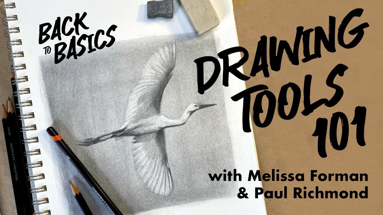
3. Lesson 2: Value Scale: Alright, so for our first
exercise today we are going to be making
a value scale. What's the value scale? Well, I will tell you a value
scale is just something you will use to determine which values you want to
use within your drawing. So a value scale usually
goes from lightest values, which would be going over very
lightly with your pencil. So it will be very light. And then it would go from
light to a little bit darker, a little bit darker and a little bit darker until you get to the darkest value
within your drawing, which will probably
be your shadow areas. All you need is a
pencil, some paper. So let's do it. Draw five squares in
a row on your page. They do not need to be perfect, and they don't need
to be super gigantic. The bigger they are, the
longer this will take. I don't know poem
already panicking because I'm worried
about my square. It's not being perfect. Oh bolus, I know you are. And I'm glad that you said that because I know
there are other people out there who are probably
feeling similar way. That I am not the only one. I don't feel alone now. Thank you. Oh, my best advice
is to just get over it. Yes, I do hear that quite often. Is that a good
therapeutic suggestion? It's not the most helpful, but I appreciate you telling me over and over and over
my pleasure Anytime. All right. So now once you have
your boxes drawn, we are going to start
on the far right side. This will be our darkest value. So take your pencil and fill in that box is as dark as you can. And the way that you
do that is just by pressing really hard
with the pencil lead. You can vary the values
in your drawing just by pressing harder or gently when you're, when
you're shading. So take a minute and
fill in that box, make it as dark as possible. You can also go over and over and over it
with layers and that will make it darker and darker
as you go over top of it. Yeah. Your first layer
impatient like me, you just press really hard the first time and be done with it. That is also an option. I will not be doing that. No. No. But they can't see you. I'm in charge now, Melissa, you just have to
deal with I know you are sick with power, Paul. I can feel it. I just wanted to
tell everybody do not do what Melissa says. Of course you do. Of course, you'll be
leading the next one. So my time will
come. You just wait. It will. All right. So I'm just about
finished with this box. How are you doing
with your ears, Melissa, you almost done. I am doing okay. I am getting there. I am slowly the value
to be dark enough. And depending on what
pencil you have, you might have a harder
time making it darker. If you have a drawing
pencil and it is, has an h in it, it's
a little bit harder, so it might be more
difficult to make it dark. If you have a B pencil, it might be a little bit easier because the lead is
a little bit softer. So just depending
on what you have, if you have a normal
number two pencil, they'll just take some
work to get there. And that's a good thing to
know because the different, different types of pencil loads, you can really use that to your advantage in your drawings. If you understand all of
that, we'll be doing, we'll be covering that
a little bit more in-depth in one of
our future classes. That's all about how
to use the tools. But for now, like Melissa said, just know that if it has a B, then that's going to
be a darker pencil. And if you're trying to create a dark value, that's
a really good one. So I used a to B
pencil for mine. You can see that here, but the higher the
number, the more extreme. So if you have like
here's a six B, so that would be even darker. And same with the H pencils. The higher the number, the harder the lead. So it'll be, it'll make it even lighter
and lighter marks. If you have something like
an HB that's right in the middle or sometimes an F that's right in the
middle as well. Alright, we're going to move on because I'm getting bored. Melissa, you're gonna
have to catch up here. I'm trying I'm trying. Gotta keep her, gotta
keep her going. We're going to go right to the box that is just to the left of this one and shaded in, but make it a
little bit lighter. You want to make sure
that you can see a difference between each of the boxes in
your value scale. That really is the point. It's kinda like when you
play the scale on the piano, each note is a little different. And that's really what
we're doing here too. You can even think of
values as being low. Low key or high key. Low is darker, high is fleeting. So I'm using the same pencil, just not pressing quite as hard. And I guess I'm kinda
doing the Melissa thing of going back over it a little bit to push it a
little bit more. That can also be a way to
smooth out your shading. Not that it really
matters in this example, but when you are doing
something more realistic, if you want a soft shade, then if you go over top of the pencil strokes a few times
in different directions, then that can really camouflaged
those lines and make it more smooth. Okay. Okay. Polished with my second box. How are you feeling good? Yeah. Now, make sure you can see a difference between
both of those boxes. Another trick you can do is
to actually squint your eyes. And that helps you to just
focus on the big picture. You don't see all the little
variations in the pencil. You just see the overall value. Alright? If you need to make
any adjustments, you can always use a
kneaded eraser and go in and just kinda lift up
a little bit of the value. If you got too dark. The kneaded eraser is
great because you can just squish it around like
this when it gets dirty. And then it's clean
again. It's like magic. It's like silly putty erasers. It's also a nice
little stress ball that you can play
with on the side, Melissa, you need
that right now. I really do pretty much
all the time in my life, but especially when
she's hanging out with me, it seems exhausting. I have to get ready for
a new energy level. Alright, so now we're gonna
go to this middle box. And you guys did. We're going to make it even lighter than the
one we just did. I hadn't fill that one in. And it really is okay. If you get out of the
lines a little Oh, Paulie, I don't know. I don't know if I
can handle that. Melissa, who's in charge here, make it I think I should make
it a requirement that you have to go outside of the
lines a little with moles. I can't help it. I am I'm doing that right now. Oh my goodness. You call
yourself a teacher. We are we are rebels. Got to learn the rules, to
break the rules, right? Yeah. That's what they say. I think I said that.
I'm regretting it. That's what Melissa
says. All right. I have my three boxes. I think I am going to
take my eraser and just lighten that
link just a little. You can always go back to
your other one darker too, if you feel like this one shows not enough of a difference or maybe the other
one feels too dark. You can always adjust as you go. It's actually a really
great example of how value is very relative
to what is around it. If you compare this middle
box to the white paper, it looks kind of dark. But then if you compare
it to your darkest box, it looks pretty light. So when you are working on
your drawings and paintings, you don't always have the full range of
value in every area you might only have
from dark to middle. But that middle value will look like because it's next
to something darker. So this gives you, when you create a
value scale like this, you can use it as a tool
when you're doing a drawing, you can try to identify what
values are actually being used in the reference and
try to match them that way. All right, we ready
to move on already? So this very last
box on the left, we are going to leave that
the white of the paper. Because if you are working
on a white piece of paper and you want the
lightest possible value. You can't get any
lighter than that. So actually we get to just
leave that one alone. I love that. I like it. Good lazy solution. So we only have one
more box to go, and that's this one right here. So just very, very
lightly, fill that one in. You want to create a
very high key value c on using our vocabulary words. You are just teacher
of the year now. And fill that one then
makes sure that you can distinguish it from
the one next to it. You're trying to hit something
in-between the two boxes. So in-between the lightest
one or the white of the paper and that mid value
that you've just created. Exactly. And I think we got it. Now, there are more than
five values in the world. Obviously. We chose five for this because it's a
nice manageable number. We don't want to
spend the whole 2 h making the value scale. But it would be a
good challenge for yourself some time to see how many more boxes you could create and still distinguish
them from each other. The more values that you
incorporate into a piece, the more realistic
it's going to look. So this is a really good
way to just learn how to get your pencil to create all of those
different shades. Yeah, it's good practice
before you start drawing and now I
grade and move on. I think we're ready. Yeah. Okay.
4. Lesson 3: Sphere: All right, great job with that. Now you have a value scale. You know how to create
different values on the page. So for the next exercise, we want to give you
a chance to actually use those values to
create something. So what are they
going to be making? Well, we're going to
start pretty simple, so we're going to use those
values to determine how they would wrap around
as fear or an object. So we're going to use a ball
basically to just show you how different light would
hit that in different areas. So we're gonna do
a highlight area. We're going to do a mid tone, and we're going to do a shadow. I'm going to show
you how to do that. So just follow me. Alright, I'm following volley, let's do it. So I have my little
value scale here, and this is just what we
made in our first activity. So Paul walked us through this. So this is just a good
thing to have and refer back to as we're working
through this exercise. So I'm just going
to put that next to my little drawing tablet here. The first thing we're
gonna do is we're going to grab a pencil. And we're gonna make a circle in the middle of your paper. And you probably want to
make a pretty big circle. So I'm just going
to sketch that out. It doesn't have to be perfect. And yes, Paul, I am saying it
doesn't have to be perfect. Who even Ru I don't
even know right now, I've lost my identity.
You've done this. I mean, I expected you to be like running
around your room, looking for something around
that you could trace. I actually did almost
grab something, so like me and they have
to have a perfect circle, grab like a roll of masking tape or something
and just trace it. And there you go, you
have a perfect circle. I'm just going to
sketch one out here. Living on the edge, I login, I know. Look at me. Alright,
so I have my circle. You can make it as
dark as you want. So I'm, I'm just, I'm just
using kind of a harder pencil. I have an H right now. Okay. So hemispherical. Paul,
you have your circle. I do. Okay. So the first thing we're
going to think about is where is the light
hitting this circle? So we're going to think
about this as a sphere. So it's a
three-dimensional object. And if we're thinking about how the light was
hitting that object, will decide where the
light's coming from. So let's just draw an arrow in the upper
left-hand corner here. And so that's gonna
be our light source. So we're imagining
this is a lamp and our light is
hitting this direction. And so the lightest area is obviously going to be
in the upper left here. So we're just gonna kinda make a little impression here as to where that small amount
of highlight will be. It'll be in the upper
left-hand corner there. Then basically with the sphere, what you're going to have
is you're going to have probably the left
hand upper side in the light and the
right hand bottom side in the darkness because that's the way the
light's hitting. So we're just gonna
kinda make it indication as to where
that light is hitting. And because this is a
three-dimensional object, the light's going to hit it
in a slightly circular way. So someone's going to make like a crescent moon shape in
the bottom right-hand, their right hand side. And then we're gonna
think about the shadow. The shadow is obviously
going to be in a similar shape to that sphere. So this shadow is probably
gonna be a circular shape. So we're going to
think about where that might be hitting. And because our light is
coming from the upper left, we're going to get a shadow
in that bottom right. And we're gonna get
a circular shadow starting in the bottom. And moving more to the
right-hand side of our paper, we're going to sketch
a circular shape that's going to
act as our shadow. Okay? What if our sphere is a
disco ball and it's not, it's hanging from the ceiling. Oh my goodness. That is a whole
different online course and Pole be teaching
in the future. Disco balls sign up
if you're interested. I tried guys, sorry,
I couldn't get it. So now I'm going to
pull my values go on. I'm going to think
about how all of these different values would
be landing on my sphere. So if you think about
the darkest area, which I know we did first
and our value scale. That's going to be on the far right-hand side of your ball. I'm going to start with
the same pencil that I used for the darkest
area, my value scale. I'm going to start making a darker area on the
far right hand side. Just start sketching in here. You can press a little bit
harder like Paul said, in order to get
that darker value, you can just layer the value as you go to make
it a little bit darker. Just start adding in that edge that wouldn't
be affected by the light. Trying to get it as
dark as you can. I'm not going to take
it all the way up to the crescent moon
shape that I created. But I am going to do maybe the second darkest value up to that little line that
I drew for myself. So think about adding in
those two values for now. Adding more as you
go. And depending on how big you draw your circle, it's going to take you
a little bit longer. If your, if your
circle is larger, just work up to it slowly. Are you doing over there, Polly? I'm working hard mole It's a tough trying to
make it so the, the one value blends into the other one instead
of having like a, you know, an edge between the different
values but just kinda gradually loading
the value feed. Yeah, that's one thing
to think about too, is just kinda gradually
letting the values get darker on the
right-hand side and later on the left-hand side. Since it is a sphere, all of those values would
be very gradually changing and shifting as the light
moves across the object. So where are we made squares
and the value scale. And they were clearly defined between one value,
any other value. They won't be as
clearly defined here. They would blend gradually
into each other. You want it to gradually go from your darkest
dark on, right, to your second darkest value towards the center
of that sphere. Okay? One thing to think about, this is something that
affects most object is, is they're all usually
be some reflected light. And the reflected light is
usually in the shadow area. And it usually comes
from some kind of atmospheric light or
some other object around the object
that you're drawing. And usually on a sphere, the reflected light will be in the shadow area more
towards the bottom. And the reflected light
is usually just a little bit lighter than
your darkest value. Getting very fancy. Getting very fancy. Yes. And you'll notice
this a lot of things. It doesn't have to be
something that's shiny or something that's known
to be reflective. It can be almost
anything in there. There might be some
slight reflected light. And if you really notice, if you really pay
attention to it. Okay, now that we have
the darkest values, we want to move
slightly lighter. So more on that mid
range, that mid value. We're just working towards that highlight area that
we drew in the beginning. Just gradually getting lighter. Always thinking
about the shape of the objects and how the light would wrap
around that object. So it'll be a slightly
circular shift in value across the sphere. I could've made my sphere
about half the size and still gotten the point across
what I was thinking. I am also the size of my sphere, so but hey buddy, feel like, Oh, I made my
sphere way too big. You can always go smaller. And it's a good
exercise open do it. Just suck it up and
do it. Yes. And it's also a good exercise in
how and how to blend. But that takes a little bit to get used to if you haven't
done much of it before. Hi, I'm kinda like turning
my pencil a little bit to the side so that
it's less of the tip, but a little more of the edge of the word makes it
less like scratchy. And again, this is
something you can definitely adjust
as you go if you want to put all of your values in there and then
go back and kind of shift things so it looks
a little bit better. So you get a more of a blend and you get more
of those values in there, you can always do that. So the nice thing with
graphite is you can just keep adding to it until you get, get it to look the
way you want it to. You can also use the
kneaded eraser trick if you feel like it's getting a little bit too dark and areas you can go back and lift
some of that value out. We're just going for
a gradual shift. Darkest area to relate us. I think I'm getting close here. Sometimes I will do strokes in the direction
that my object is going. So I know that since
it's a sphere, it will tend to do
strokes kind of headed in the same direction
as the edge of the sphere. So it feels like it has kind
of a circular shape to it. Sometimes that will help adopt. That mother says she's always
thinking oh, it's thinking. Bryan never stops even
when I wanted to. All right. So once your sphere starts
feeling like a sphere, like it has a little
bit depth to it. Like you can tell
where the light is coming from and
where the shadow is. You want to move on
to that shadow shape. And the shadow shape is going
to be the darkest value. So it's going to be similar to the edge that you created on this sphere on
the far right hand side. Definitely right under the ball is gonna be the darkest point. It might get a
little bit lighter towards the far right hand side. You could move to maybe
that second darkest value as you get towards the
end of the shadow, but it's very dark right
underneath the ball. Start adding some shading there. Let's not a disco ball, but it is looking very cute. Yeah. Well, it's hard to compare it to a disco ball, but ******* queue. Hopefully everyone's
feeling good about their sphere with
value scale fleets, it feels like it has some depth. It feels like it
has a shape to it. If not, just keep working
on it, keep adding. Now you to work on
your darkest darks. Sometimes that will really
help it, pop it out. And then make sure you're
keeping that highlight. You should have what
feels like a ball. I do. You did it. Excellent. Excellent job
instructing us on that. Well, thank you, Laura. You are a pro. Thank you very much. Of course. I gotta I gotta go back. And so my finger
marks out of here. I always tend to drive my hand across everything that's
done in graphite. You can always play. Does she has to make it perfect? I can't help myself. You know that you
know this about me. Now everyone knows
that about me. Yes. Given away all my secrets, Paul. I think you gave them away. Alright, well,
that's our sphere.
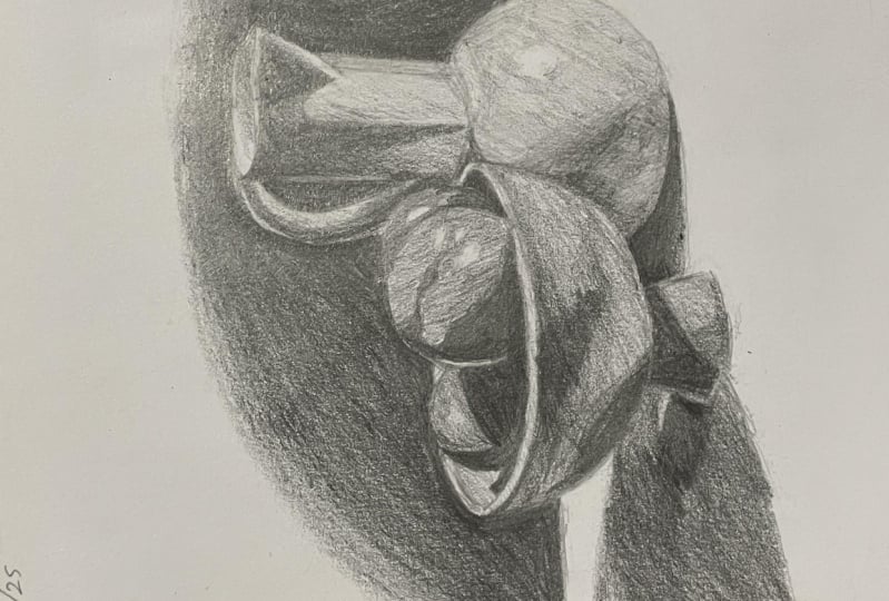
5. Lesson 4: Still Life: Awesome, Great job. Now you understand value and you know how to use it to create a
three-dimensional object. So let's take all of this
and really put it to practice now by making a more detailed drawing
of a still life. What do you think, Melissa? I ready, Paul, Let's do it. All right. Here
is our still life that we are going to
be drawing today. I've tried to pick something
that is relatively simple, so we'll be able to get it sketched out pretty quickly and then get started
focusing on the values. So if you haven't done a
lot of drawing before, one of the tricks that I
always suggest is to just look for simple shapes,
shapes, and line. That's really all it is. So don't get too caught up
in the details at first. I'm going to start by drawing the horizontal line for
the back of the table because that will kinda just
helped me to get everything placed where I want
it to be on the page. So you can see that
that line is a little bit below the halfway point. Your paper isn't exactly
proportional to the reference. That's okay. You can have
extra space in the background. You can position it however
you want to on the page. Just make sure you
have enough room for all of the elements. Okay? Alright, there's way
backup the table. Now I'm going to start
with the picture. And the bottom of the picture is kind of a circular shape, a little bit squashed, not a perfect circle. I'm going to start
by drawing that. I like to just sketch
very light and loose at first and I
don't press very hard. Because if you press hard
when you're sketching, then you end up making
grooves in the paper. And if you have a line someplace
where you don't want it, then you might regret that. So if you keep it
light and sketchy, you can easily adjust things. Yeah, and it's
okay to draw a lot of lines when you're sketching and kind of keep trying until
you get one that you like. And then you can always go back, erase, and refine
things as you go. I particularly
like that approach because if you draw
a lot of lines, there's a good chance that
one of them will be right. Give yourself a lot of
options to choose from. Another thing that I will
do sometimes when I'm drawing something that is
symmetrical like this. If you, if you don't look at the handle and just
look at the picture itself. Drawing a vertical line up the middle will just
help you to make sure that you're creating
something that is the same on both
sides of that. So now I'm going to draw
the vertical part of the picture coming up
off of that circle. And then there's a little
ellipse at the top, like this. That was a fancy word there. Poly ellipse, I am
being so fancy. In the ellipse. The ellipse has a little triangular
part that sticks off the end on the right so that you can pour stuff out of the picture is always helpful. Yes, pouring with a picture
is usually helpful. People learned so much in
these classes don't really, we really have it all here. We are a fountain
of knowledge poly, just pouring out
of us constantly. We should, we should
charge extra for all of these handy life that we
owe it to life lessons. Right here. Sometimes when I'm
drawing something like this and there are some
really heavy shadows, I like to very lightly go ahead and sketch in the
shapes of the shadows. Because that can actually
help you to kind of construct whatever
it is you're drawing. I'm going to just
very lightly kinda outline where I see the
shadow on that picture. Comes down. Here. It comes over. And now
let's draw the handle. Ready? This is a good chance
to look at the drawing. What I call, not
just what I call what everybody calls
the negative space. So if you look at the space
between the handle on the picture and draw
that as a shape. That little black
area right here. If you, if you look at that as a shape instead of trying
to draw the handle, it actually makes it easier. I like making things easy. Yes, that is the goal. All right. Here's the other
side of that handle. How's yours coming, Melissa? It's getting there.
I like all of the interesting
shapes in this photo. It makes it very nice to draw. Nice composition. We couldn't figure out when
we were looking at this earlier exactly what
kind of fruit that is, Melissa said maybe nectarine. That wasn't my best guess. We'll just go with that. Kind of looks like a
peach, but it's not fuzzy. That's where we landed. It can be it can be
whatever you want it to be. A fruit. Any fruit. Okay. So I have got my
picture on there. Now I'm ready to move over into the mysterious fruit bowl. Mystery free. My favorite. How is everybody at
home doing so far? You getting it? If at any point we are
going too fast for you, just pause the video
until you catch up. No, no worries. We'll be here. All right, Now I'm going
to draw another ellipse, my new favorite word of the day. And that is going to
be it for the top, where we're kinda like looking
down inside of the bowl. I'm going to start
it on the right side so I can line it up with where I see it overlapping the picture. Whenever you're
drawing more than one element in a drawing, you always want to
think about how do they relate to each other. And if there's any points
where they overlap, That's just a nice,
easy way to find that. Draw the ellipse
all the way over as part as far as I
think it needs to go. It looks good to me. Then swing it around. I think one thing
that can always help to was looking at that, that horizon line, we call it. So the line of the table that you created from
the beginning and decide how close is this
object to the horizon line. Is it further up as
it further down? And that kinda let you figure out where everything
fits together. It's like a big puzzle. Yeah. When you're drawing,
it's easy to get consumed by just looking at one particular part that
you're drawing at that moment. But if you can keep reminding yourself
to kinda pull back, look at the big picture, look at how that part
relates to something else in the composition than it
really does help you to get things where
they're supposed to be. Keeping it loose and sketchy at first is really helpful
because then you don't get super tight
and detailed too quickly and end up putting something in the wrong
spot and have to erase it. Low commitment level if you if you start off
sketchy like this, now I'm looking, I'm
drawing the bottom part of this bowl right now. And you can see I did
another vertical line here so I can make it symmetrical. I'm looking at how the bottom of the bowl compares to where
the bottom of the picture is. I'm going to draw the bottom, the very bottom
part of the bowl. Now the little stand kind of angles in
like this to go up to the base of the bowl. And now I can erase
my vertical line. And also all erased the
part of the picture that's showing up inside the bowl because we
don't need that. I'm going to just lightly sketch in some of the shadow
shapes on the bowl. Now we'll just act like a map for you later as
you start shading. So as you start rendering and adding some of those
values, you will remember, okay, this is where some
of my darkest darks go where I sketched in
these shadow lines. Exactly. Okay. Making the little rim at
the top of the bowl now. And then we'll draw the
fruits are mystery fruit. I'm just going to
call the neck drains. Okay. We'll go with it. That's what that's
what Melissa said they are in Lewis
is always right. I am a fruit
scientist and expert. Let's see. I think I'm more of an
expert on freed. Didn't you? Give me that one folly? Okay. Got you all did not know what you are signing up for when you chose to take a
class from the two of us? Yeah. Sorry. I'm always
sorry Paul is not. Yeah. All right. I've got my rim of my bowl. Now I'm ready to draw
the neck dreams. There's some really
strong shadows on those. It kinda reminds me of that Caravaggio still life
that we looked at earlier. Yeah, way the lighting
was so dramatic. Yeah, it's it's very
similar to how we just shaded the sphere as well. So you'll see that shift
from light to dark. High-contrast. I think it's interesting to
have started with the sphere. And now you can see
how that same idea applies when you have something
that's sort of spherical, but it's also got
some extra lumps and bumps and you
can kinda see how the shadow is falling
across those. So it's not a perfect
circle anymore. It's kinda follows the contour
of whatever shape it is. That's a good word.
I like that contour. I'm just full of the good word. Geo are just full of it. Well, we knew that. Okay. Alright, I've got one nectarine. It's due. There's another little
one that's kinda tucked in behind
that to the right. And it overlaps the handle of
the picture just a little. So actually, that tells
me I need to make my first nectarine a
little wider. Here we go. To nectarines down one more
to go, we're getting there. Okay, then we have this last
one over here that just picks up over the edge of
the bowl, just a smidge. Then it comes back
down about here. Gorgeous. How are you all doing? Hope you are having
fun with this. Don't get overwhelmed or stressed if it isn't
looking perfect. If, if the proportions
don't feel right. If something, if
something feels off, take a minute and just hold up your drawing so
that it's vertical. And let your eyes go back and forth between your drawing
and the screen where you're seeing the
reference and see if you can identify what the issue is. It's not a bad thing to have proportion issues or
to have drawing issues. Everybody does well
except Melissa. We're not going to go there. Most most most people will have to make some
adjustments as they go. And that is okay, that is part of the process
and I think it is very easy when people are first starting
out to get overwhelmed, to feel like, Oh, I
did, I made a mistake. I must not be good at this, I should just quit. Don't do that. Everybody makes mistakes and the mistake is a great
thing because that means you can use that as an
opportunity to figure out, well why is what
is actually wrong? And that's where the
learning happens. So don't, don't get discouraged if it doesn't
look exactly right, try to figure out how to fix it. Yeah. And I think it's
a good thing once you get to a point where you can see what's not working in your drawing and you
can go back and fix it. And I think it takes a little
while to get to that point. But the more you look
at objects and shapes. Contours, as Paul taught
us that word today. And he ellipses and it will start to
notice the difference. You'll start to see what is different about your drawing
versus the reference. So just keep looking and maybe look at things a
little bit differently than how you normally
look at them. So look at the shapes and look at the relationships
between the shapes and look at the objects for
what they are rather than what they
represent in your mind. Yeah, that's a big one. I think if you can if you can get yourself to
see the shapes and not focus so much on what it actually is that
you're drawing too. But just look at the shapes
and the relationships between the shapes that will make a big difference
in your drawing. Right now I'm going in
and just sketching out the cast shadows that
are on the table. And that'll be the
last step then before it's time for me to start shading. That's exciting. It is. It's nice to have a
little bit longer to work on these drawings I've
been filming a lot of, a lot of our classes
are like learn to draw in 30 days or something where we'll have
just 10 min per video. So I've had to do a lot
of very quick drawings, which are fun too. But it is nice to
have a little bit longer to spend with you-all. Yes. Thank goodness for me. I am not a fast draw or I will
not get it done in 10 min. So thank goodness for 30 min. I wanna make Melissa
do a 10-minute 10 would be terrible. Drought. Date every minute of it. That's an exaggeration. I would be upset after 10 min because
I would not be done. And that just makes me
want to make you do it even though I
know I know it does. Okay. So I've got everything
sketched out. I'm taking a minute just to
look and compare and make sure things feel like
they're in the right spot. I don't see any issues
jumping out at me. So what I like to do is to start especially when there's a dark background like this. I actually like to go and put a little bit of
that darkness into the background right along
the edges of the objects. You don't need to fill
in the whole background. That would probably take the rest of our time
for this drawing. But if you just do it along the edge like I'm
doing right here, and let it just do it, just go a little ways out
and then let it fade. That's all you really
need in order to be able to see the
relationship between the background value and
the value of the objects. So go all around the edges and put that
dark value in first just, just along the edge a little
bit and then let it fade. This is probably contrary to how you might have
wanted to start. Most people, when they're
drawing or painting, they're more excited about the subject matter
than the background, especially if the background is just a flat value like this. So the temptation is to want
to just jump in and start working on the stuff. I mean, you certainly can. It's it's you're drawing. You
can do whatever you want. But I would encourage
you to put the darkness in the background first because like we were saying earlier, the values are so relative that if you get that
darkness established, it will help you to make everything else kinda
in relation to that, things will start to
pull together more. I think that's a good
point, Pali and I am somebody who immediately
wants to jump to the subject. And it is hard for me to start with the background because
it's not as exciting. I want to do the exciting part, but it will make
a big difference because you will be able to tell when your values fell off. Maybe other values in the drawing that
should feel as dark as the background aren't as dark as the background because you
haven't put that in there yet. So it'll give you a nice gauge as to whether you're headed in the
right direction or not. Yeah. Yeah, the whiteness of the
paper can really skew things. You don't even realize it. But when you're, when you're
trying to match the values, if your paper is
white everywhere, but your reference has a lot of darkness like this than it, It's just not going to be
easy to match all of those. So I like to always try to get some of the
darkest dark in first. And then that gives me
a little bit more of a sense of the range
that I'm going for. As you're doing nachos, think about how you
approach your value scale. So how did you make that
darkest, dark pencil? Did you use what pressure did
you use to go back to that? Yeah, I did actually jump
up here to as six B pencil. So if you have one of those fancy pencil sets
with different numbers, this would be a
good time to pull out one of your B
pencils that has a higher number because
that's going to give you a nice dark value. But if you're just
using one pencil for everything, that's okay too. You'll just have to press
harder back here for the darkness or layer that
value over top itself. She can't let that one go. It's my main hall. You cannot pry it
from my fingers. All right. That's fair. I'm almost done going
all the way around here. Then we can jump
into the fun part. Not that this isn't fun. Well, it's good practice, right? Yeah. Okay. Let me just go along the
edge of my table here. You can you can make
this as, you know, go as far as you want it to you. And then eventually you may
decide you want to fill in the whole background black
so it matches the photo. But this is just
a nice way to get that value in there so you can see it and then you
can do that later. Also, I kinda like
doing it this way because you save a
little bit more of the white paper that you can have as a spot to rest your hand on if you're working trying
to reach into certain areas, you might need a spot to rest your hand and if
it's all shaded, then you're going to smudge it. So this is a way to
avoid that to you. You can always take
another piece of paper to a clean piece
of paper and lay it over top underneath your hand so you don't smear everything. Alright, so I've
got the background, at least the edge of
the background in. So now I'm gonna go and
look for where I see similarly dark values in the objects themselves
and also in the shadows. So I'm going to start
in the nectarines. And if you look at
the left side of the neck dream
that's in front is, I see a very similar
dark value there. So I'm gonna go ahead and
start laying that in. And you do see a just
a little bit of that reflected light that Melissa was showing you on the sphere, on the left edge
of that nectarine. Just a sliver. But it is there and
that's what helps it to stand out from the one
that's next to it. So I'm gonna put
that in seamless. I paid attention. I now look at you. Get an a plus today. Yeah, you listen to something
I said I am shocked. That's a first. Don't ever expect
it to happen again. Hope you enjoyed it. You all really need to get yourself a friend that you
can torture for 20 years like I have with
mostly really special. So special. We have done a lot of
crazy things together. Mostly through Paul
suggestions or maybe stick and him
taking it seriously. Yep. Okay. And so now I'm just pulling that dark shadow toward the light side and getting a
little bit lighter as I go, just like you did
with the sphere. Trying to just match the values, you can look at the
nectarine and see where are the little
highlights spots. There's one right here. There's one that's
kinda right here. There's one right here. So those are the
only areas that are gonna be the pure
white of the paper. Everything else has at least
a little bit of value to it. So you might even want to
pull out your value scale to kinda hold up and compare to the reference
and see if you can match, you know, what, what value is
needed for different parts. One nectarine almost done. I'm going to jump over here
to this one on the left, which also has a lot
of dark values in it. See how the darkness is on. It gets darker as
it goes down into the bowl because the light
can't reach it there. I should've asked you when we
first pulled up this image, I don't know what I was
thinking, but as you're shading, as you're working on this now, look at it and ask yourself, where is the light
coming from this image? Melissa, do you know? Yeah. It looks like it's
coming from the right side, but it's also it looks like it's not it's not directly a bulb. It's a little bit kind of in the middle on the
right-hand side. Exactly. And I say that job,
Melissa, thank you. I'm looking at where the
highlights are and usually that shows me the level
at which the light is. So it's kind of in
the middle that nectarine right in the front has really bright highlight
on the right-hand side, but it's not the top of
it. Towards the middle. You can also kinda
tell by the direction that the shadows
are falling to you. If the light is more above, the shadows aren't going to
be as long and stretched out. If the light is more to the side and there'll
be long like this. You get to do a little bit of detective work when you're doing an observational
drawing like this, it's good to take the time
to study it for a minute and try to figure out
what's going on here. Just using my eraser now and I'm pulling back out some
of those highlights. You can the nice that I loved these kneaded erasers because you can just kinda squish them and shape them through
whatever shape you need to get into those spots. They're perfect for
a drawing like this. All right, getting
my last nectarine. It has a little bit of a white
highlight area right here. Then everywhere else
gets some value. Just like with all of the
other stuff we've done today, you can always go back and
adjust values as needed. If you put something
down and you end up finding that it's too
light or too dark. Don't just keep it. Try this, see if
you can adjust it. That's the adjusting is
the most helpful part. I think one thing to
think about when you're translating a color image
to just black and white, is think about how
different colors would relate to value. So think about how those nectarines in
the more yellow areas would be lighter in value. And the more red
or deep red areas would be darker in value. And then think about
that yellow picture. Yellow is more of a high key color to use a word
that Paul Thomas earlier. So let's see, Fancy, fancy. It's got to be a little bit lighter in value than the blue. The blue is gonna be more of
a mid value or darker value. Which is something to think
about when you're translating something that's in color
to black and white. Yeah, every color has its
own kind of inherent value. But then there can also be different shades of a color you like you see
with the picture. Inherently a lighter
value than the blue. But it still has
shadows and highlights, which is just that
the shadow isn't, doesn't get quite as dark as the shadow does on
the, on the blue bowl. Yeah, If you look at the
two blues in the image, so the blue of the bowl and then the blue of the tablecloth. So the blue of the tablecloth is obviously much lighter
than the blue of the bowl. So it is going to
be a lighter value when you're translating
into black and white. Yeah. But they're both blue.
So just something to think about as
you're drawing. I think that's one of
the things that you really start to appreciate. The more you draw and paint is just how many different
subtle variations and complexities there
are in everything. I mean, this looks like a
relatively simple image. But as you get into it, you can see that there's
so much going on. I'm shading this side
of the bowl rate now. And there's so many
different little shifts in value that you can pick up
on if you really study it. And try to pay attention
to where those different. Darks and lights fall. That's what will
make your drawing start to become
more dimensional. My bowl filled in here. I'm going to do this
part underneath the little stand
that the bowl is on. It's pretty dark on the left. And then you can see how
in the highlight part it's a little bit darker over
here and along the bottom. And then it gets
lighter as it comes up. That looks pretty good. I'm going to jump over
to the picture now. Start on the handle. Get the shadow. See that little sliver of light
on the top of the handle. So I'm not shading
there and leaving that. Okay. And then also on the picture, you see there's a little bit of reflected light on the
left side up here. So I'm going to
start the shadow in just a little bit to leave
room for that reflected light. Fill in all this part. It's going to be a masterpiece. You guys were working on it. We're getting there. Yes. This might even be worthy of
hanging on the refrigerator. I just got a little alert that my time is up for this one, but I'm gonna go a few more
minutes so I can finish it. You don't mind, do you? I don't mind. Let's do a poly. We'll just cut this timeout of yours and you'll
have to draw faster. Oh, I don t think anyone will
mind if we go 2 min over. I think it'll be okay. Okay, so I'm working my
way down the picture here. Let me first get in here and
do the inside of the top. Can see how the light,
it actually does, the reverse of how the light
is hitting everything else. It's actually darkest
on the right. That's because that's
where the light could not get down inside
of that section, but it does manage to hit a little bit over here
on the left side. So this is a good example of how you have to
draw what you see, not what you know. Because you might think, well the light's
coming from the right. So it should be lightest
here in darkness there. But in this case, that's not what happened because the light is actually
doing the opposite of that little bit of a shadow. Then let me get edge here. The shadow down here on
this rounded part of the picture is not quite
as dark as the shadow. On the top part. See how it gets a little
bit darker towards the top. Interestingly, because I
think there's a bit of reflected light there as well wrapping around
the bottom part. Okay. Then I'm going to fill in
the rest of my picture here with a very light value. Just go back over
to smooth it out. Get it to blend into
the shadow more. And then I'm going
to use my eraser to pull out the highlight
that I see here. There's a little
one right up here. We're getting almost
there explaining. Okay, so all I have left are
the shadows on the table. And you can see how right
here next to the picture, the shadow is
darkest at the BSW, just like how you did
on your sphere drawing. And that's because that's
the part that is the most shielded from the white. Then it gets a little bit
later, it's still dark, but it gets a little
bit lighter as it moves to the left and to the front. Okay. And then this one over here, same kind of thing. It's darkest right at the base. Then it gets a little bit
lighter as it moves away. Still pretty dark though. Almost done, almost. Smooth out my shadow
a little bit. Clean up some smudges. See. I know you're rubbing off on me. You can't help you. Nope, it's all your fault. Alright, so there is
my finished drawing. I could certainly spend
more time on this, but I want to give Melissa chance to do her
life drawing to that. She's going to show you
guys a new technique, but feel free to keep working on it as long as you need to, as long as you want. And then when you're ready,
we'll do the next step.
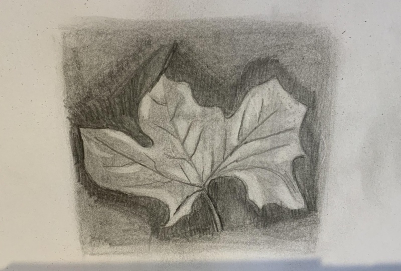
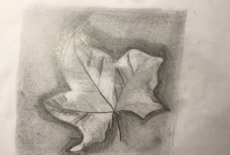
6. Lesson 5: Reverse Drawing: Okay, everybody,
Great job with that. We're gonna do
something a little bit different for the last exercise. So we're going to be drawing
a different subject, the summer gonna
be drawing a leaf. But we're actually going
to start with a mid tone. So we're going to cover
our paper and pencil, and then we're going
to use an eraser, erase out some of
the lighter values, and then use a
pencil to add some in some of the darker values in. And I'll show you
how to do that. All you need as an
eraser and some pencils. You ready, poly, ready. I'm excited. Let's do it. Let's do it. Okay, everybody, we've made it to
our last exercise. For this exercise, we're gonna
do something a little bit different from what we
did in the last one. So in the last one we started with the
white of the paper. I think that's how most
people began a drawing. But what we're gonna
do this time is we're going to create a middle tone. So if you remember
our value scale, that value we did
right in the center. That's what we're
going to start with. We're going to take
any of our pencils. Depending on what
pencils you have, you can use whichever
one you want. Actually have this graphite
stick here and it has a larger area that I
can use to draw with. So you're either going to
take something like this, a piece of charcoal, anything that you
can use to create a large area of the same value. So just start drawing
on your paper. I'm just going to
create a square here, all of that middle value. So if you want to pull
out your value scale again and use that as a guide to kinda create
something similar. You can do that. I'm just going to start
drawing on our paper. So exciting, difficult. Lots of concentration. This part should be
relaxing and pretty easy, just like scribbling
on your paper. Yeah, it'll get harder soon. Yeah, It's quite as
simple as this step, but enjoy it while
we're here, I guess. Yeah. So the idea here is
that we're starting with a mid tone
and we're going to build our drawing on top of that so you don't
want to make it so dark that you can't
draw on top of it, or that you won't be able to see your graphite lines on top. You also don't want to
make it so light that it won't matter if you start
erasing certain areas of it. So we want to create
that middle value that will allow us to kind of pick out those highlights with a kneaded eraser or whatever
eraser you have on hand. But then also make it easier for us to have a place to
start with our drawing. So we are capturing a lot of those mid tones,
the beginning, and we don't have to worry about putting those in as we go. We can just focus
on adding some of the shadow areas and
some of the highlights and make it look like a
more finished drawing. If anybody's ever done painting, It's kind of like doing
an underpinning or kind of coding your
canvas to begin with in a certain color or a
certain value is just that. It gives you a place to start
when you're not starting on a white piece of paper
or a white canvas. So I'm going to grab
my scale and just see if it's feeling similar to that middle one
in it is it's getting close. Feel free to use the
side of your pencil. It might be a little
bit faster for you. If you have something
like graphite powder, you could use that. If you have charcoal, they didn't use the side
of a piece of charcoal. Whatever is easiest for you, whatever you have
on hand will work. You can also do this
technique with toned paper. Like if you get a piece of paper that already has a value to it, like a medium gray. And then you can draw on it with white charcoal or white pencil. And then also with
your regular graphite. Gives you the same same
kind of with that. Yeah. So if you want
to go out and buy some gray paper that's
already done for you. You don't have to worry about
coloring in and yourself. Makes it a little
bit easier for you. Then you can always get
a white colored pencil or black colored pencil
and go on top of it. Obviously, the
eraser method won't work if you're just
doing it on gray paper, but you can always add the
white of the highlights. Okay. Alright, mine
is getting close. How is yours? Polley? Mine is good. Good. Okay, Beautiful. So are we going
to smooth this L? Yes. So I have a paper towel. I'm just gonna go on
top of it and I'm going to kind of
blend it a little bit just to kind of make it more
smooth surface to work on. I think the, once you go back
and start erasing areas, it might show a little bit easier if you blend
it a little bit, you could use your finger
or you could use one of those paper blending tools. I think we used to
call them stumps. That's what they're
called the author calls is that it's not like
the technical term. I think it is. Okay. I have no idea, but apparently, that's what they are
actually called. You know me. I'm all about
the vocabulary today. The vocabulary today, you've taught so many
things today, Paul. Just a fountain of
knowledge really? Yes. Okay. Alright, so hopefully
everybody has a little square of value. It's kinda like a larger
version of what you created in that first step. That's
your middle value. Okay? So next thing we're gonna do is we're going to take
one of our pencils. If you have a softer pencil that will draw a
little bit darker, you probably want
to get that out. Will be harder to get some
of your pencil lines to show up on this middle value, then it would be on
a lighter value. I'm actually going to grab
another paper towel because I'm going to end up getting
this all over my hands. That's part of the phone. Pole loves to be messy. I will not enjoy that part. I am going to protect myself from any worry that
my hands are covered. Well, they already
are coupled graphite. Oh my goodness. All right. Oh, panic, panic sets in. You could just embracing. I could just embrace it. I could, but I will not. The next thing we're gonna do is we're gonna look
at our reference. So we have this
reference of the leaf. And we're gonna kinda
decide where we want the leaf to fall
within our square here. So this leaf that's pretty
well within the square. I'm gonna decide
where my stem is. I'm going to start with that. It's a little bit to
the right hand side and towards the bottom. So I'm just kinda make
an initial line in here. And I'm going to start with
the stem at the bottom, and I'm going to
continue it all the way up through the
middle of the leaf, which is going to give
me a guide to work from. I'm drawing my leaf
here. At the top there, it kind of turns into that pointy end of the
lease that's folded over. Hopefully, everyone
can see this. I'll try to make
this a little bit darker so you can
see it on camera. So just have my initial stem and that vein as it runs right through the
middle of the leaf. All right, From there I'm
going to decide where the base of my leaf starts, how long I want my stem. So I'm gonna come
up, I don't know, maybe a third of the
way up the stem. I'm just going to start drawing those other veins that
come out from the sides. And that'll kinda give
me a guide of where those other parts of
the leaf are gonna be. I'm gonna draw the one
on the right hand side. I'm going to draw the one
on the left-hand side, just deciding how
long those should be. And the way I'm deciding
that I was just looking at the photo and deciding
which one's longer. Where are those hit
within my square. So I've put the one
on the right side and the one on the left side. Right there. I want to kinda decide where are the sides
of the leaf far. So I'm going to start
at the top, middle, that little triangle
shape that folds over. And then we're gonna continue to draw the rest of
that center shape. Paying attention to where
I've drawn those veins. How big I want the different
shapes of my leaf to be, what the angles are. So really pay attention to
those angles where it turns, where it heads in a
different direction. We're curves a little bit. It's a lot to think about. It's a lot to think about. The thing you wanna do as
you're drawing from reference. You want to look at
the reference a lot so your eyes are constantly
moving back and forth. And you're judging relationships based on what you're seeing. So as I'm drawing the
right side of the leaf, I'm kinda deciding where are those angles and curves are
dependent on the other side. So I want it to be. What symmetrical?
The right side, it looks like it's a
little bit bigger. Those curves hit in similar areas depending
on the angle of the leaf. So I'm looking at all those
different things as I'm drawing the contour as Paul taught us that
word earlier today. Yeah. I'm looking at all those different I
have a question. Yes, I have a question, Melissa. Yes. Paul raising raising my
hand here and your clients? Not that this has
happened at all. What did you do if I
were if I were to draw a line that perhaps I don't
like and want to change. How do I fix that? Since there's already, you know, if I erase it,
then it's going to lift up that background to you. So what would you suggest? I think the easiest
thing here is two. You could try going back
in with your paper towel. I'm kinda rubbing it out
to see if that would work. If your lines are light enough, you might be able to rub it out, get rid of it, blended
into the background. Yeah. If not, if you've already
tried to go in with the eraser and here I'll just do it really quickly so we can figure out how to adjust. But see, I went and I love that. I love that Melissa has
to pretend to mess up. I'm gonna pretend
that I messed up. So I'm just going to go back and I've already erased
this little line. I wasn't happy
with where it was. I'm going to add just
a little bit more of my value and the background and you shouldn't need too much. Then I'm just gonna go and
I'm going to blend it and you shouldn't be able
to see it anymore. You should be able to make it
disappear. With the weeds. A little bit. Yeah, that's a little bit more
complicated than it would be if you were just drawing
on the white paper, obviously, but you can just use really light
sketchy lines to begin with. I'm drawing a little bit
darker just so you can see it. But if you do those sketchy
lines to begin with, it was should be pretty easy to make them just disappear with the paper towel or a Kleenex or your finger or
if you just rub it out, should be able to
make it just kind of disappear into the background. Or I mean, one thing
to think about is a leaf as an organic shape. Every leaf is going
to be different. It doesn't have to look exactly like what
you're staring at. If your leaf is slightly
different, that's totally fine. Who even are you right now? I do not know this version of I think the leaf is something
that's very organic and a little bit looser and
you definitely have some more leeway as
far as like the sheep. Lot different than if you're drawing a portrait or something? Yeah. Pretty much
want to make sure you get things in
the right spot. Yeah. This I think you
can kinda just do a loose contour and it will still look like a
leaf if you've got some points and some stems
and some veins in there, I think it's something
that's pretty forgiving. Alright, so I have my
contour of my leaf. I'm just gonna
kinda look back at the shape and the photo
and just see if there's anything I need to adjust or change of certain areas of the leaf tend to match up with other areas of the leaf. Some areas need to go
smaller or bigger. I think I'm pretty happy
with what I have here. Shocker. Don't listen to
hecklers in your life. Everyone. Haters gonna hate. Okay? Alright, So now that I have
the contrary, my leaf, I'm going to go
back and I'm going to add some of those veins. Poly, How is your leaf coming? I am already drawing veins. Oh my goodness. Look at this. Look at the Haeckel's me
and he's already in there. Well, I intentionally slowed you down with that question so I could see you could pull a
cell part of your scheme. Yeah, it's finding
dirty everyone. It's not a competition as
he's competing to have. Have you, I recently heard
about this thing that happens. I'm kind of intrigued by it. Okay. You ever heard
of art battles? I have not, but I feel like we've been doing it
for the last 20 years. Yeah, we we should
get some royalties. I think we even know they
have them nationwide in. I have some friends who did
it and it sounds kinda fun. I think you would despise it. It sounds terrible. I don't even think
that it sounds fun, but yeah, go ahead. You go. And everybody who
enter is kinda stands around in the center of the stadium or wherever
it is being held. And the artists are
all like in a circle in the middle with
their canvases facing out and they have
a certain amount of time. I don't know what
it is. Maybe like a half hour or something
and they have to make a painting and
then half an hour. Yeah, it's it's very short. I know it's not a long time. And then I think the
crowd chooses from, with applause or something
who like advances to the next level. And then it just keeps going
until they have a winner. And then they go on to
the regional art battle. And then there's a state art
at all and then there's a nationwide I think
I want to do it. I can tell it to you doing it. I could totally see me having the worst moment
of my entire life. It would be part of the reason why I'm
not on social media because I can't I can't
deal with like Oh, like this piece or
don't like this piece. I couldn't No, I can't do it. Yeah. I mean, I don't like the I don't tend to like the
competitive aspect of it, but I liked the speed aspect of you would be
very good at that. And just doing it with an art, making art with an audience. I didn't show it. Yeah, you do enjoy that. Alright, so I have
my drawing here. I have most of my
genes put in here. So now that I have kind of a basic outline of
where I want things to go. I'm going to start
thinking about value. And the way you would
approach this is gonna be similar to what
we did before, where we're going to
think about where the darkest darks are and
where the lightest lights are, and that's how we're
going to create this. But the way we create
those lightest lights are going to be through
the use of our eraser. And I would highly recommend
a kneaded eraser if you don't already have
one for this step. But I think the
easiest way to start here is similar to how
we started the last one. So I'm going to start putting in the darkest value
behind the leaf. So we have definitely a dark background and I'm
going to start laying that in because that
will help me judge the values on the
rest of the drawing. So I'm just going to start. Are you just doing it along
the edge and fading it out? Yeah. Yeah. I think just
for the sake of time, we'll just kind of,
like Paul said, just work around the edges just so we can get an idea of how that dark background relates to the mid value of the lease and some of the lighter
values of the lease. I'm just dropping that in there. Like Paul said, don't worry about filling in the
whole background. Just couldn't fill in
enough to give yourself an idea of where that dark is. You want to kind of blend it
out with your paper towel. You can do that too. It'll
probably blend pretty easily with that background
that we've already created. Just putting that dark
shadow around it, it makes the leaf Blake
start to pop out too. Yeah, it definitely will add some depth to your
drawing right away. Because right now
it's pretty flat because it's all the same value. I like instinct gratification
like that, That's nice. I know that you do. And then this will also help
you be able to see where those lighter areas
are because there really is no pure white. And this leaf, there's some
areas that are a little bit later obviously that we would consider
the highlights, but I don't think you're
gonna get a pure white here. Yeah. So that's
where starting with this midground is really going
to be helpful because you really would have
to lay off all that in eventually if you
started with the white. Yeah, it's not such
a drastic step. When you go to add in
those dark values. It's not like when you're
putting a dark onto a white piece of paper and
it's such an extreme jump, just kinda like
nudging it towards dark or when you're erasing your nudging
it towards light. But you're kinda starting from a more middle ground value, which hopefully will make
it easier for you when you start adding new values
because you're not, you're not gonna have to
worry about middle value. Again, you can really
focus on those highlights. You might want to just pick
one section or one part of the leaf to do to finish since we only have about 8.5 min, so no yeah, you're
the boss here. That sounds good to me. You know me, I'm finishing
things that are not. I will just say no, but if you can show them
how to do it on one part, I'm pretty confident they can apply that to the rest of them. Yeah. Yeah. So I have a good start on the upper portion here
and the right side, so I'll probably
just focus on that. So let me get a little bit of this background layer in here. And then When did out a little
bit with my paper towel. Just going to add some softness. Okay? Alright. So the next thing I'm gonna do is I'm gonna get
my kneaded eraser. What kind of format
into a point almost like it's a pencil or something to draw with and start deciding where some of
those lighter areas are. So the first one I'm noticing
is over on the right here. And I'm just gonna kinda pull
some of that graphite out until I feel like
it's starting to get as light as I want it to and make the shape
that I want it to. So I'm going to pay attention to the shape of those highlights. Now the working within
the contour of my leaf. You can use kind of like a dabbing technique to pull
some of that graphite out. You can kind of use
it like a pencil, like a paintbrush almost gives
it a little bit lighter. You could do a lot with this eraser technique
where it really starts to create some depth
just with the eraser. So pay attention to where those lights are and
then where it shifts into a darker area as
you're doing this. And it really is not
even so there's, there's a lot of wrinkles
and there's a lot of folds and things in the leaf that you'll
have to pay attention to. Anything the eraser
will work really well for you and pulling
some of that out. It's almost like fabric, the way it folds. There are a lot of shifts
from light to dark. It's another one of those, like, it doesn't look very complicated when you
first see the photo, but then when you really
start studying it, There's a lot happening there. Yeah, there's a lot of
variation in value here. Very subtle that you really start to see it
once you start paying attention to where
all that is and then how it relates
to your drawing and where it needs
to pull up some of that value to create
that lighter highlight. I think a big part of
this whole process is learning how to really
see like an artist. Because we have to pay attention and notice
so much more than what the average person would
need to see with this leaf. They would just look at
it and be like, okay, there's a leaf but we have
to look at it and study each little section and see how the values and the
textures relate. Yep. Paul and I said that all the time in our classes
that it's really just about taking the time and paying attention to
what you're looking at to really learn how to see
it for what it is and not just what you
imagined it to be. And I think that's one of
the most important things you'll ever learn in
drawing is how to really look at something
for what it truly is and how it usually appears. And that will take some time. You will find that it's, we're basically going to ruin you because that's our plan. Will be able to turn it off. I had so many students. Tell me after taking classes that there'll be
driving down the road and they'll look out and
I'll have to pull over because the suddenly they just seeing the world so
differently than how they, how they did before. And it's pretty amazing. I love it because it really
does change the way you see. Yeah, yeah. You'll
start to appreciate things in a different
way for sure once you start realizing how
much detail and the relationships
between objects and the way light hits them. It's a lot to appreciate it. Thanks so much more, I think. Yeah. Oh, yeah. Then when we get into color, that's a whole other
where yeah, definitely. And artists see color differently
than most other people. They will see so
many more colors because they're so used
to looking for them. It's very interesting. Alright, so I think
the average person will just say like This is red. But the artists would be
like, well, what kind, what kind of 1 million shades an artist is it okay
with just saying red? Do you know it has to be more complex than that because it is, Let's just start looking. Alright, so I have a lot of my lighter value
is pulled out here, so I'm going to start going
back in and adding some of my darker values. And you just do that with a
pencil the way you did and our and our other activities. But you're just kinda working to add to the value that
you've already created. So it's kind of like
just creating that the darkest part of
your value scale. Almost where you're
starting from a mid tone. So again, you're just paying attention all the
little folds and all the little changes and where it's a little bit darker
versus a little bit later. So how do those values change? How much do they change? Are there little areas
of highlight in there? Like if you really
look at the veins, there is a small
highlight on one side. You don't have to
capture every detail, but it does help to capture the main areas of
shadow versus light, just to kind of add some
depth to what you're making. The object in front of you. I think sometimes it can be overwhelming when
you start looking at something like this
and you realize how much is going on and how many different shifts and
variations there are. So it's good to have a strategy for figuring out
how to tackle that. And I think if you do it in steps like what
Molas is describing, like starting by
just lifting out some of the bigger
sections and looking for the overall
value relationships. And then kind of honing in on two more smaller detailed
kinds of things. That's one approach
that can help it from keep it from feeling
too overwhelming. Yeah. Definitely those I am definitely one who gets
caught up in the details. I will keep going
forever because I will see so much complexity. But it is good, especially when
you're working with value to kinda established the main values and then go in and add more
detail from there. Yeah. Otherwise you risk losing some of those big value
relationships if you can, if you get too focused on
the tiny stuff too soon, you might not you might
not actually be paying attention to the
overall big picture. Yeah, and that's definitely
something I learned. I've always enjoyed
drawing faces and I really enjoyed
drawing features. And I would often
focus on the features instead of focusing on the
overall value of the face. And so I would get so lost in
just like rendering and I, that I would forget that I had all these other
value relationships within the face to worry about. And I would often lose the overall depth
because I would be so focused on a single
aspect of the drawling. So that's definitely something
to pay attention to. Well, I'm glad I could help
you learn to do better. Yes. Thank you. Paul. That was a joke by
changing my artistic life. Why do you mean the
right direction? Yes. She just needed so
much help, so much. Hopefully people watching
this video don't think we're actually fighting. This is just what we do. We just kinda like siblings. Yeah. Then if they do at least I would hope they find
it entertaining. Exactly. Yeah, We're having our own art art battle
here right now, right? Every month. Come back
and check it out. Yeah. Yep. Alright. Well, I think we're getting
close to time here, so hopefully everyone was able to take away
enough from this. We aren't going to have time
to finish the drawing today, but I hopefully gave
you a good start. And understanding how to create value and a little
bit of a different way. It's kind of starting
from a mid value and then working from there. So I would just continue
working on this. Do the other half of your
leaf in a similar way. Pay attention to all those
shifts in value and how things changed throughout
the photo reference and throughout your drawing. And just keep at it. Keep looking at the
reference, keep comparing, keeps seeing how
the photo shifts in certain areas and
deciding if your drawling shifts in
the same areas. Feel free to change
anything if you feel like it's just not
working for your drawing, That's always an option too. But you can get, It's always
good to kind of start with reference and
work from there. Go ahead, three. Looks good. I think we're good.
7. Closing Thoughts: We did it. Now we are experts
in value, right? Right. Yes. I am feeling
much more expert-like. I hope Obama was the euro. It's view, always feel experts. We hope that you learned
a lot during this class and really encourage
you to keep practicing. Because the best way to reinforce these
ideas is to choose subject matter that
you're really interested in and apply these
ideas to that. And just kinda keep in mind
as you're looking for, for images to draw
or paint a look, think about the light source and how that is affecting what you're seeing and
how you can bring that out in your work. Yes, we hope this encourages
you to keep drawing and also informs the other
artwork that you're making. So think about your
value before you start your next drawing
or your next painting, we would love to
see what you make, including your drawings that you made from this class today, and also anything that you make in the future using these ideas. Thanks everybody for being here, for sharing some time with us. Happy drawing, happy painting, happy art-making, everyone.
 Paul Richmond, Everyone is an artist.