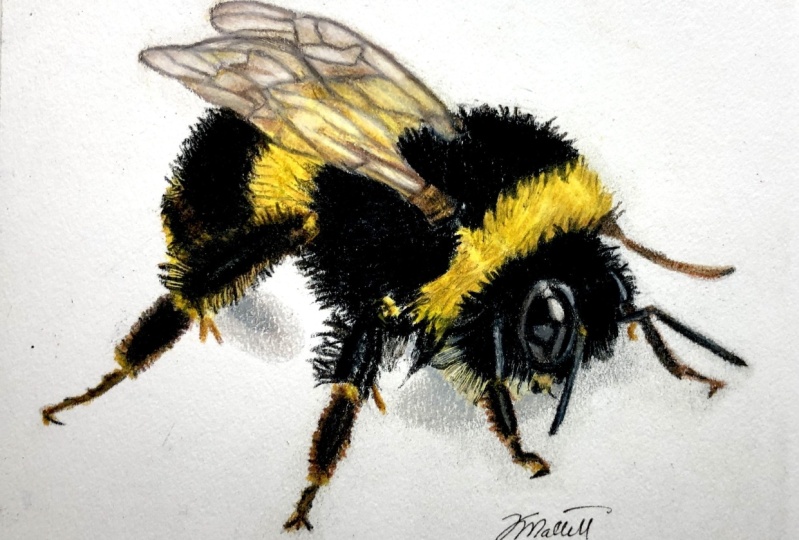
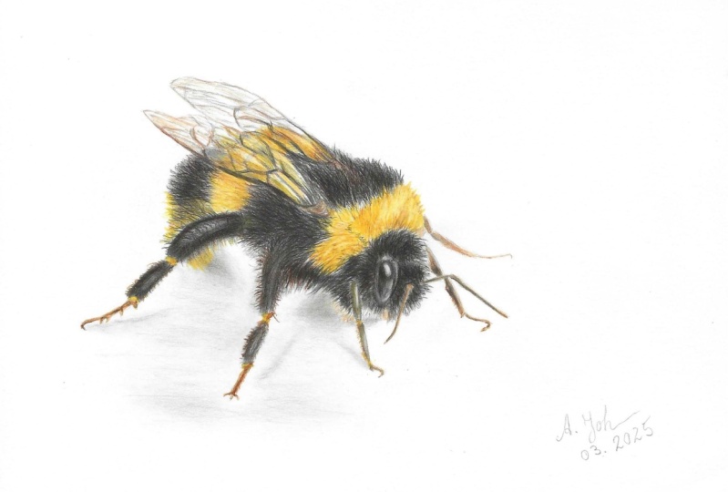
Transcripts
1. Intro: Thank you for signing
up for this course. All of my courses
include instructions, a downloadable image, and the materials you will
need for this class. These are all done in four
inch by four inch size. You can choose to draw
smaller or larger, but I recommend staying with the original size to
stay with the past. Please read the instructions
before beginning. Once you have completed
the portrait, I would love to
hear your feedback. You can send me a
message through any social media or e
mail with any questions, comments, or a photo
of your results. I would absolutely love to
see your results by the end. If you do have a picture
of it, send it my way. Any which, but you can. Thank you again and
I hope you enjoy.
2. 1 the eyes: So let's go ahead and
get right into it. The very first thing
that I like to do is start out with the eyes. I am using a black color pencil. Now, this is in the Faber
Castell Polychromos. At first, I am
drawing the outline. I don't always draw
the outline for eyes, but I do think that it's pretty important to
get the outline done so that you have the correct shaped begin with before
you start to fill it in. Now there is quite a bit
of a highlight going on. Let's leave room
for that highlight. Now, try to think about
the actual shape that is going on in that highlight.
Does it look round? Does it look a little
bit more oval? What direction is
it going towards? Now, the whole shape of the
eye is pointing downwards. So this is a lot more like a vertical angle than
a horizontal angle. When you think about that, it's going to help you
be able to achieve a more realistic
eye because you're looking at the angle
and the right shape. This shape definitely has
more of an oval shape, but it's not 100% oval. It does have a little
bit of a point on one side and a little
bit rounder at the top. And then with the highlight, it almost has a pointed, almost a rounded triangle shape. So we definitely want to
leave that in there and then use your black to
start filling it in. Now you want to use
light pressure with your pencil sharp as
often as possible, and then you can build up more pressure as you're
building up your layers. For this, I, I definitely
used a lighter pressure. I did not start heavy
yet because you're going to be using
other colors in, with the eye, such
as the white here, to emphasize some
of the highlights. And what this white does is
it creates this nice lighter, waxy coating on the top of whatever colors you've already applied for, this black here. It's just going to lighten it up inside, that highlight there. It's going to blend it into the black a
little bit better. So it's not as sharp and not as obvious of a difference
between the two. Now I is definitely not going
to look the exact same. So this whole portrait is not going to look
the exact same. Because I'm not a
hyper realism artist, I am more of a realistic artist. When you think about that, it starts to ease up
on the feeling of that pressure and
anxiety to make the portrait look realistic
as much as possible. Because we're just
here to have fun. We're here to draw
what we see and not draw the exact replica
of the portrait. The next color to be
used is burnt orange. And this is technically burnt Okra by Favor
Castel Polychromos, but it's basically a burnt
orange that you can use, so we're just applying that
in the antenna area as a base and then you go back
over with the black here. And really the antennas in the legs are
very furry looking, so it does not have to be
stick straight and it does not have to have all of those
little fine furry details. Just something that's, you know, the shape of what you see. So it kind of curves
just a little bit. Now let's use that burnt orange here and start to bring
up some of the color underneath the eye here because there is just a little
bit of a burnt orange going on underneath some of that black
that's in the face. And then you can continue that first base layer with the
legs and the antenna here. It's very important to
have this color in there because it's not just
straight up black. And you'll also
notice that there are certain areas that bleed out into just that
burnt orange color. Now that you have that
done, get that black out. Do the same thing.
Make sure that your pencil is sharp
as much as possible. A really good trick
that I like to use is to roll my pencil
as I'm moving along to keep the point sharper
for longer so that I don't have to eat up the actual pencil by sharpening it so often. And like I said earlier, these legs do have
a little bit of a fuzzy look to them and
a little bit of a point, especially at the ends. So make sure that
you're emphasizing that as much as possible. If you want to have more control over your pencil when you're drawing details, hold your pencil
closer to the end. But if you want to be able
to draw a larger coverage without hurting
your hand nearly as much when you're
blending certain areas, hold your pencil further back from the point
and that will really.
3. 2 the head: Keep applying the same
method for the rest of these front legs here and then we'll move on to
the rest of the face. I know this part is pretty tedious and you want to move on, but trust the process. Just have fun, enjoy the music, and keep doing the same exact
methods for these legs. You also want to look out for the little separations
between each joint of the leg and there's
a little bit of that orange coming
through the joints. You definitely want to
make sure that you are leaving room for that
as much as possible. Now we're bringing in
the dark brown color. This is really helpful for darkening up some of these areas and
warming it up as well. Because the black
can be very cooling and the brown just adds
another layer to it, makes it look more realistic. So I see in this leg here that there's a little
bit of a highlight, so I am making room
for that here. It's a elongated, very thin, not really too
pronounced honestly. But I will be using a
white to go over it, to blend it a little bit more. If you do forget to
add that in there, you can always just use
the white color pencil, draw a little bit on top and bring all the
detail in there. It really is all about the
details as much as possible. I will be going back
and forth between all of these colors throughout
the whole portrait. Now we can finally
get to the head here and it is short strokes, Definitely keep
your pencils sharp. The base layer right
now is just the black. But we'll move on
to other colors as a base layer for
the rest of the body. The reason why black is not the best color to use alone
because it's very cooling. It has too much of
a cool tone to it, which means that some of these layers are going to be too cold and too flat
looking because of it. There is a blend between
cool tones and warm tones. And most portraits
using the black and then using like a dark
brown for underneath, actually creates a warmer black. Which is pretty fun and awesome to play around with those
colors and try it out. But for now we're just going
to use the black here and definitely try to draw in the same direction as the
little fuzzies that you see. That's very important and there's a lot of those fuzzies
kind of coming out too, so make them look spiky, Make him look a little
bit haphazard in a way. But definitely try to draw in the same direction
as the fur that you see. That's super important for making your portrait
look more realistic. I also pressure from
my first couple layers and then built up
there with colors. As you're building those layers
for something like this, we're actually using
a color already, but I am still using lighter pressure because you
are going to be blending in more colors inside of this little fuzzy head and
for the rest of the body.
4. 3 adding yellow: With you. So now that the head is done, let's move on to that
leg that is right there, right down the middle,
all the way to the left. I am starting out with the
little fuzzies that are coming out with the black color pencil and really just drawing
the outline of it as much as possible using lighter
pressure, of course. And doing a little bit of blending techniques where
I'm going up and down, not really lifting up
the pencil all too much. You can also do small little
tight circles that is really helpful for blending with a little bit more ease
than anything else, but do not forget about
the joints in between. Each one definitely doesn't
have black in there, so make sure that you are leaving space for
the other colors. Okay, so now you can bring in the burnt orange here
and start to join up all of the little connected
elbows and whatnot here. And really just bringing
in some more color. And I'm keeping my
pencils sharp once again, but I'm still trying to create that fuzzy texture
with the burnt orange. Now you can also use the dark brown to
connect everything all together here and warm
up some of the black here. That just seems a little
bit too cool looking. You can also use a white
color pencil to add a little bit of highlight
in there just a little. It's not a whole lot, you won't see huge
emphasis on it. But it is still
important to be able to show those little bits
of highlights in there. All right, so now
to the dark yellow, this isn't like a super
neon, bright yellow. It's almost a yellow that has a little bit
of orange tone to it. But I'm just calling it
dark yellow for right now. And we're just
using that to apply in that little area above
the head where it is yellow. But we're going to
use other colors too, so you really don't
have to try to draw one solid block all to yet. But just keep going with this. Try to draw in the same
direction as much as possible, even though it may not show. Then you can use
the burnt orange and start to draw
shorter strokes. I am lifting it up, I'm drawing those
shorter strokes, making it look like it's
puffing out essentially.
5. 4 the last leg: Let's use the dark brown
now and darken some of the areas in between the
black and the yellow here. That really started to make the portrait look more cohesive. Because if you just have the straight up
black and then the straight up yellow
in between one another, it's not realistic. There is a little bit of that warmish brown
bleed coming through. I'm applying that. And then you'll add a little bit more later once you have
the other black part there. But for right now, we're
just trying to get that texturing start to darken up some of these
areas a little bit. Now you can use the dark yellow and burnish over the top of it just to line
it up a little bit. Burnishing is a
method for you apply a waxy coating on top by using a little
bit of heavier pressure. And what it does is it helps
to blend all that together. Now, if you were wondering
what that big old thing was, that was an electric eraser. Those are super handy. If you're interested,
just let me know. I can send you a link to
where I got that eraser from, but I got it on Amazon. If you just look up
electric erasers, keep going with the
dark yellow here, blend it in more into the black. Then we'll move on to
the next step here. I want to go finish this leg here so that
all the legs are done. And we can just move on
to the rest of the body. Apply the same methods,
just follow along, make sure you're using
light pressure at first and then start to build out those
layers using other colors.
6. 5 rest of body: Now that that leg is done, we can start on the body here. And I'm actually
going to start from the back and move forward. It just makes it easier for me ultimately because
I am right handed. I just generally start from left to right most of the time
as much as possible. But for this portrait, it was a little bit difficult because it's facing the right hand side. And I like to start
with the eyes mostly. So that's
why I did that. But I do like to start left to right
because I'm right handed helps me prevent
smudging more so and I can actually see the proportions a little
bit more correctly. But there's a dark
brown first layer, that's what I was talking
about was you want to have that warm tone first layer down and then you
can go back over and start to add the
black in all that detail. Make sure that your pencil
is sharp and ready to go. Just start darkening
up those features. And make sure that
the fur is fuzzy. Just think about it being fuzzy and that will
really help to create that you on the. Okay, so almost done
with the body here. And then we'll start
moving on to the wings. Go in with this last one
with the dark yellow. Do the same methods that
I was talking about previously with the burnt orange and a little bit of the brown. Let it all bleed and blend together and create
beautiful textures. Here, are you that greats, but as you do, as you do fall, that's a change free trying.
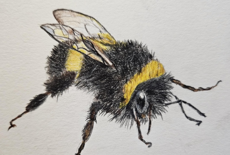
7. 6 first wing: If you need to take a break, go ahead and do so and
then we can come back with fresh set of eyes and
start on the wings. This is going to be a little
bit difficult because you have to pay more attention to the details and the texture. But if you just try to
draw what you see and not worry too much about
drawing exactly what you see, it will be a little bit easier. Just be easy on yourself too. I know it's pretty difficult, but we're using a dark brown
instead of black because these wings do have a
very warm tone to them. So using that dark brown as the first layer and just try to follow along
as much as possible, it's hard to explain. You just have to watch and
see how they're drawn. But there is a lot of geometric
shapes going on in there. And then at the very end, it's just kind of faded, like the details
kind of faded away. If you just follow along and see that there's just
a little bits of line, not a whole lot of detail, hopefully that will
help you figure out the proportions and where
all the details need to be. Thank fining. Thank, thank fining A once you've got a good shape
down for the first wing, let's go in with the black
and darken up some of the features that are
closer in towards the body. Just creating a little bit
more emphasis on some of the patterns because some
of the patterns are just straight up black and
not that dark brown. As you can see, there's quite
a bit of highlights to make sure that you are leaving
room for those highlights. That's super important to
make this portrait look more like translucent wings. If you haven't noticed yet, there is a little bit of the yellow from that stripe
underneath showing through. What I'm doing is just
applying this dark yellow here and applying it in
some of these shapes. I wanted to get the shape down first before
applying the yellow, because it does
reflect off of it differently then if it were
just completely translucent. And so what it does is it
creates different angles. Because the wings do have that, each shape has like
a different angle at it, if that makes sense. V V Hello, V Z V v.
8. 7 both wings: E, E, E, E, E, E, E, sorry. Let the bucking off takes time, 00000. Now, we're using a
pale blue to bring in some cool tones
into the wing here because there is a little bit of a cool reflective tone to it. When I talk about
cool and warm tones, I'm talking about blues, purples, greens, cool tones, yellow, orange, Like
all of those colors, brown, even they have more
of a warmer tone to them. So that's what I'm
talking about is bringing in cool
tones and warm tones. And there's definitely
a huge variety of colored pencils that give you like a warm
red or cooler red, or a little bit warmer grays or cooler
grays, things like that. But when I'm talking about
cool tones and warm tones, having both of them
in your portrait is going to make your
portrait look more alive. Because even though like, let's say you look at
this image of the E, you think, oh, there's a
lot of warm colors in this. And that's all you're
going to think about and just use
those warm colors. But actually, there is quite a bit of cool
colors in there, and that's why I use that
pale blue or the white. Because the white also
has a cooling effect. Like if you look at the
eye you could see that looks a little bit cooler than
the rest of the portrait. That is something
to be aware of. But now bringing in this
reddish brown color, because these wings are, have like a little bit
more of a red tone to it. I'm bringing in this
red tone essentially, and I'm not really
applying too much detail, it's just more of bringing in that color then actually
bringing in the texture. If that makes any sense, use a red brown if you have it. If not, that's okay. You really don't have to
worry about that color all too much because you've
got that dark brown in there. There were a few times that
I do have to erase some of the details because they
weren't quite right, quite what I would
like them to be. So that's what I did here
was erased a little bit. Just to bring this up some more, I know that the wings
aren't perfect. They're not as long
as the picture, but that's okay,
because it still looks cute and still looks
pretty realistic. I'm pretty satisfied
with it myself. There are times that actual color pencil portraits
look like a painting, and I can see that in some
of my portraits, actually, they look a little bit
more like a painting than a photo realistic portrait. But that's something
that I see myself rather than in other
people seeing my art. A lot of people think that I
am a photo realistic artist, but I'm really not at all. I just draw what I see, but I'm not going to focus on every single little tiny detail like some photo
realistic artists do look buck six times. Humans, for the most
part don't have a plea. I don't want one or deep
one either to happen.
9. 8 finishing touches: Good bet, but why
write a big secret? People are smart and
they can handle it. The person is smart,
people are dumb, panicky, dangerous
animals, and you know it. We are actually done here. If you need to make any
adjustments, go ahead and do so. For the next few minutes, I'm actually going to be making adjustments so you can
just follow along, see how I do that. Maybe make connecting
pieces that weren't actually connected
correctly, things like that. Or a extra little pieces that just for coming
out too much. Whatever, you know, anything
that you need to fix. I do not suggest erasing
all too much because the actual color pencil
does not come up 100% Whatever you race, there's still going to
be a little trace of it. So just be careful of that. But there are times that
you can erase to make little adjustments. Oh yes. And towards the end here, there's going to be
an awesome trick. So if you can hold
on to the end, it's going to be really awesome. It's going to make
the portrait look even more, three D like. This is the end here,
the white color pencil. I'm applying it to
certain areas in the little fuzzy to make
it look more realistic, make it have some depth to it. Almost like let's say
the light coming through basically in the light reflecting off of some
of that white tufts of, I'm not going to say for
little fuzever, the B. But once you start
to apply this, you can actually see it coming through and it
just really helps. It makes the portrait
look much better and like an actual be rather
than just a flat toy shape. So I really hope that
you enjoyed this video. And if you want to
learn how to draw, please let me know. I want to help you learn. There's all sorts of
other classes that I have and online programs. So check out my website as well. And please send me a picture of your results and ask me
any questions if you have, if you need any help at all. I am always here to help you, but thank you so
much for watching.
 Lauren Kline, Drawing Classes for Aspire Artists