Transcripts
1. Intro: Hello, Hello and welcome. Let's learn how to draw a
bunny for this course here. Now, this is done in a
four-by-four inch size paper. You can go larger. I suggest not going
smaller than that. And before you start read the instructions to see
what colored pencils you need and what kind
of paper as well. And if you have any
questions while you are practicing
this portrait, feel free to contact me on either my email or
through Skillshare itself. And once you have
completed the portrait, I would love to hear
your feedback as well as see your
complete portrait. So feel free to write a review with a picture
of your portrait. So let's go ahead
and get started.
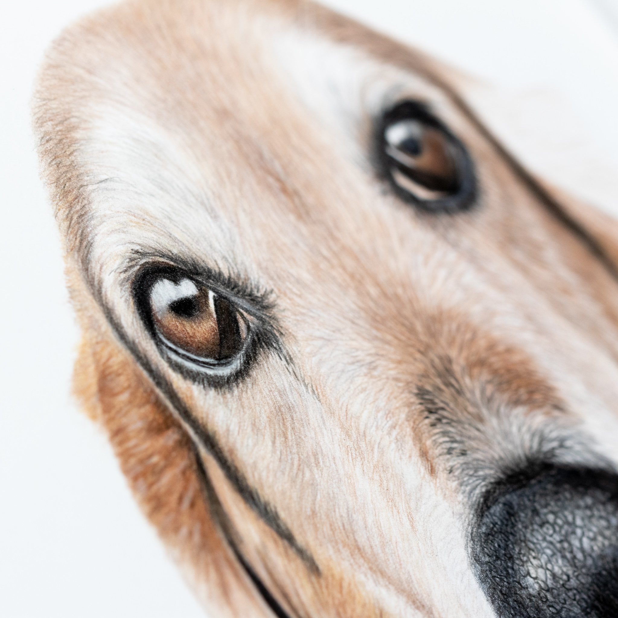
2. Begin with the eyes: Hello, hello. So let's get right into it. We're going to start with
the bunny, rabbit here. And we're going to
start with the eyes, of course, and work our
way out from there. And I usually start with a black to do the
outline for the eyes. So let's go ahead and get
that pencil sharpened and start to draw the
outline of the eyes. Now if you haven't
heard this before, Always keep your pencil
as sharp as possible, especially when you're
drawing details. It is more important
when you are drawing smaller portraits
than larger ones. But it is very, very
helpful to have a sharpened pencil because you, it allows you to have a better
detail, sharper details. So just keep that in mind. And if you're a pencil
is a little bit dull and you're running low on
the actual pencil, like this black one here. And it's a little
bit harder to draw. I would recommend using one
of those pencil extend, extenders where you can
insert that pencil into this little insert area with extra basically
extends the pencil. You can look it up online
like a color pencil. Extend her or just depends
on extender, general. And that will really help to be able to prolong
their life or your pencil and still be able to get a good
grip on that pencil. I don't use my inner very often because they feel a little
bit weird while I'm drawing. But that's just
something that I had to get over it and actually use them so that I don't waste my
pencils because I have not really used pencil
down to its nob yet. I have a lot of
pencils that I know that I still need to use up. But I just, I just move on
by more pencils and move on. I've got quite a few
that I need to actually use up rather than just
moving on to a larger pencil. So if, if that does happen and you don't
have a pencil extender, and that's something
that like me. I'm I I like the feel of the
pencil and not something that's holding it because it's like kinda like
a metal piece to it. If you're like me for that, all you have to do is just go
and buy a replacement one. Now, for the pencils that I use, There's not really
an online I'm sorry, an in-person shop
around here locally. You can look at local art stores if
you have one near you. Most of the time they're
going to have it but places like Hobby
Lobby Michaels, they're not going to have the Prismacolor I'm
sorry, not Prisma. They're going to have
Prismacolor for sure. But the favorite
Castile polychrome OS, and they carried ash luminance. They're not going to have those. So if you are looking
for a quick replacement, you can always go to the
store and its yourself. Different brands such
as the prismacolor, I highly recommend that as you're either as your backup or as you or even your primary. For, for beginners, prismacolor is definitely great option. I actually, that's how I started out was
with prisma colors. And I still use them
sometimes I use them for when I'm teaching in-person classes or as a
reference to help others out. I will use Presby color instead. And there are great happy medium between these two
kind of pencils. Because one of them that Karen dashed
illuminance I believe is I think it's wax base and then the other
one is oil-based. So the prismacolor is
a lack space as well, but it is a happy
medium between them. Because the Karen dice luminance is very soft, soft touch. It's really great for
blending details. And then the Faber
Castile is a harsher, coarser pen or pencil. And it's actually great for details because your pencil
will stay sharper for longer. In the, not as easy to
break as the Karen ash. Now the prismacolor is a
happy medium between the two. They are soft but they won't break nearly as much as
the Karen dash as well. And they're really,
really reasonably priced. Considering the
colored pencil market. There's a lot more color pencils that you can get it for
cheaper out there such as crayola or there's a couple of other
brands that I'm not even really I've heard of, but I haven't actually
tested them out before. So if you find one
that is not Crayola, but it's a level up or something that is
similar to Prismacolor, but they're way more reasonably priced and you can get a packet, a variety of packet. I definitely recommend doing that first and then
working your way up as you go because the
colored pencils that you use. So this is also up
to your preference. So if you're not
comfortable with using these high-quality
colored pencils, then you certainly don't have to spend all your money by knows you can always
find alternatives. And now the reason why I use
these higher-quality pencils is they really are high-quality. They were great, the
pigmentation is awesome. They are also a light fast, which means that the colors, they don't fade nearly as fast over time as cheaper
quality colored pencils. The Prismacolor,
some other colors are light fast as well. Not all of them. It will vary, even some of
these more expensive ones, the color, fastness does vary, but most of them are light fast. And that's a really
great for portraits, especially if you're going
to frame them something. If you're going to have
them up on your wall and it's going to be
under the lighting, under sunlight or
something like that. It will start to fade over time. So you wanna make sure that you are using higher-quality
pencil so that the color will stay the same color as when
you first use them. Now with all wax
base, even oil-based, these pencils will start to, it'll look very fresh
as you're drawing it. But they will start to
create this curing effect. So they'll start to kind
of do this drying out. I don't know exactly
how to explain it, but you will see like, especially with the black, if you're drawing an alert or section with black something
you start drawing really, really having you
put up this layers. You can see that waxy coating. And it's very, it can be
a little bit reflective and it can look a little bit off in some areas like
it'll look different. You can see the text. But as
that is curing over time, it will all start
to blend together. So don't worry if it all looks different as
you're drawing it, it'll all start to look the same afterwards once it
starts to cure. So if that's a
little bit complex, don't you don't have to worry about that information
as of right now, especially if you are a beginner and you're just testing this
out and try and have fun, then definitely don't
worry about that. I don't even worry about that, but I did notice that over time, especially with the
more wax based pencils, they will have that waxy coating and it'll look kind of weird, especially if you have
a certain lighting on your portrait where it
creates this reflection. Don't worry about that. Just move your lighting
so that it doesn't create that reflection and
just continue drawing. I sometimes have that issue too, where I have the lighting or it's really reflecting
onto the portrait. I can't really see
what I'm drawing. So just, just changed
the lighting up and remember to always build your layers from light pressure to heavier
pressure over time. Same goes for the colors itself. From light colors to
heavier pressure, have heavier darker colors. So let's go back to the
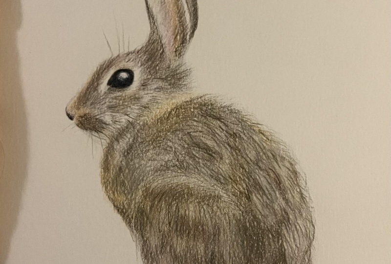
bunny here now I know I've gotten pretty far with the
nose and the mouth there. Now these colors that I'm using, you wouldn't really think
about using burnt orange. But there is quiet a bit of this orange tint
to the bunny here. Now, for this bunny, I tried to keep the colors as simple as possible so that it is pretty easy for everybody with a general colored pencil
palette to be able to use. So if you don't have
a burnt orange color, you can look at
your palette and C was the next closest
color to use. And that'll usually be. So for this instance,
probably something like.
3. The head: A lighter, warm brown. Or you can use an orange but
just use it very sparingly. And you could see
in the eye, I did. Leave room for a highlight. You want to make
sure that you always leave room for the highlights. That will really create an awesome effect where it makes the eye look very realistic. If you have, if you
leave the highlights there with each portrait, the highlights are going to
be a little bit different. So sometimes I will leave
it completely blank. And then sometimes
I will draw in the highlight was like a light blue or something like that. So that's what I did for
this when I was a youth. So very pale blue. You can use a white if you
don't have a pale blue and just very lightly blend,
do small circles. Blend in the black
into the highlights a little bit so
that the highlight, it looks very natural. So if you have, I'm using, it's actually a light French
Gray Karen dash luminance. But I want to call it
a light warm gray hair because not everybody is
going to have a French gray. Yeah. I think that's specific
to Karen dash itself too. So you can find it's basically
like a very pale gray, but you want to try to
find a warmer tone. So if you have something
like that, great. If you have a cooler
gray, that's fine too, because the orange will also help to warm
up the portrait. Some use that and draw in the
same direction of the fur. If you have, if you are
new to the to my videos, you always want to draw in the
same direction as the fur. And you'll start to
see that in all of my my classes there that I always try to draw in the same
direction as the far. And the reason why I do that, even after building
up a lot of layers is so that it looks as natural as possible because the direction of the
fur makes a huge, huge, huge difference whether your portrait is going to
look realistic or not. And if your reference image is a little bit
blurry and you can't really see the
direction of the fur. What I like to do is go and
find another picture on the Internet of the same type of breed and try to find
like the same spot. So if it's like on the cheek, I will go and try to
find a dog that's facing the same way and look
at that same spot and try to use that
direction of the fur to to replicate that because it really does
make a big difference. I've, I've had a lot of
portraits in the past. Even nowadays, I still
struggled with it some times where I will get reference images that
are just, they're not great. They are taken
from farther away. Pixelated blurry
because the dogs moving, things like that, or even low quality, low lighting will create
low-quality images too. So I get those quite a lot. And I still like to accept them depending on how
low quality it is. But if I know that I can do
it from past experience, then I will
definitely accept it. And I'll use other
reference images online to replicate the
direction of the fur. And I don't really think that that is that there's anything wrong with that because you're
still drawing that dog. You're still drawing their eyes, their, their features,
their character. But what you're doing
is just looking at something else to get a better understanding of where those features are
supposed to be essentially. So there's definitely
nothing wrong with that. And so for smaller
portraits, it is bigger. It is different than
drawing bigger portraits. And you want to be
mindful of that too. So if you are interested in
drawing bigger portraits, just be prepared for more patients because it does take a long time to draw
a larger portraits. For me. I draw, I draw every single day. There's only recently
have I actually taken longer breaks such as maybe
a week off or something. But I do draw a little bit every day even if it's
just for an hour. I draw every day and
practice, practice, practice. And really because I am
a motivated to do it, It's not that I dragged
myself to do it either. It's disciplined and it is basically like my
meditation in a way it keeps me a little more sane. Getting to draw, like
I'll draw either early in the morning when nobody's up
and as completely silent. Or I will put on some
nice relaxing music or something that's
motivational podcast or an audio book and have that in the background as I'm drawing and
it creates this. Soothing effect for me, it's, it's where I'm able to
not necessarily checkout, but more of keep my mind
more peaceful and that bay because I'm focusing
on drawing what I see, replicating that and in creating those repetitions
with your hand, it's almost like
knitting, for instance, because you're using your hands and you're doing
this thing and it's, and it's really great
for people that have, let's say like ADHD or something because you can be multitasking while also creating
something at the same time. It's really great
for me because it is very relaxing and soothing. The beginning, it was not
like that for me at all. In the beginning, I definitely
struggle that I was very, very impatient because I didn't know what I
was doing at all. And I I looked up how to do these things and
I didn't really get a lot of information. So this is why I'm
creating these videos, is to help guide you in the same direction as what
I was struggling with. To begin with. I didn't have much guidance
and watching these videos, even if you're not actually following along and
actually trying this out. Watching news
videos will really, really help you get a
good understanding of how this works and how to use these colored
pencils the right way. There is definitely a
method to the madness. There's so many
different brands of color pencils are so many different techniques
that people use. So my technique has changed over the years and you'll see that
and some of my past videos, especially on my
YouTube channel, you will see that I have taught one way and now
I'm teaching a different way. I always like to stay
with the method, at least as a beginner. Stay with the method of
drawing light to dark with both pressure and color
pens or with color too. So for instance, here, I created a base with
that light warm gray, and now we're
building it up with the burnt orange
and the dark brown. And you can see here
that I was drawing short strokes with a dark brown. With this firm. There are short and kinda
sporadic and chunks of the dark brown. So that's what I'm trying
to replicate here. And it does some time
like this one is, I think it is two hours long. Most of them miniature
portraits take about two to three hours long. Sometimes they'll just
take an hour-and-a-half. And those are, those are
actually really great to do, especially as a beginner,
because a lot of my students, they're not necessarily
what they complained, but what they have an
issue with a lot of the time is having the patients and not being so hard on themselves with not
building up enough layers. If you are struggling with
the tooth of the paper showing the tooth is basically know how some people are smooth and some
paper is rough. You want to try to
find a smooth paper, but a paper that's
heavier than a £100. So what I'm using here is a Fabriano artistic hot press watercolor
paper that's a £140. There's also a £300. That's way more expensive. But the a £140 does. Great Still. And these are, this
one is expensive. If you're just starting out, I don't recommend
using that just yet. I recommend using the
Bristol board smooth paper and you can use that. I think it's I think it's
in a £100.120 maybe. But you can use
that to start out. That's actually what
I started out with, with the Prisma colors.
4. Finish the head: I started out with,
with the Prisma colors. And what that will do is it will prevent some
of the tooth from coming through and not have to
build up so many layers to get rid of the tooth. So I'm still keeping my
pencil is sharp here. Use a dark brown and draw just the little short
chunks of fur there. Now it's definitely, it's
still in the same direction, but it's not exactly, it's kind of a random
pattern if that makes sense. So this is actually
really good start or portrait because you couldn't be a little more
careless with it. And it'll still
look very natural, just like when you're
drawing up there. You can draw the for an, a sporadic way as long as it's still kind of
in the same direction. And that's still
looks like the bear because that's just
the way the fur is, is very short course
and a little bit wild. And that's similar to the
bunnies for here too. So if this is your first one, this is a really great
introduction to it. And if it's not,
this is actually, this will be a good, fun and easy portrait to do. If you're pretty used to
drawing portraits already. I really liked
drawing this bunny because I've been wanting to draw up money for
very, very long time. And there's all sorts of
different bunnies out there. But in my mind, I had this idea of drawing a full body picture of a
bunny as it is sitting, not laying down, not standing
out as it's sitting. And I thought this
one was absolutely adorable with the little
tail on the back. So I hope that you are
enjoying this one as well. And remember to stay patient and take frequent
breaks if you need to. You can always pause the video, take a break, come back later. Now the reason why
I have these done in sections is so that you can take a break and come back. Even if it's like a week
later or something, it gives you a really
good refresher when you come back and
you have already had that experience and you're
really close to being done rather than then putting the, the whole class until like
something like four sections. I think that two sections is great because there
about an hour long. And once you've
completed this one, you only have that
second one to go. Rather than if you
complete one section, you have three more to go. You know, it feels like
it would go longer. So that's why I did that was I wanted them to be
about an hour long. And classes are generally
about an hour long. So that's a good estimate as
to how much you can take. So that's why I did
that was to create an hour-long session
for each section. And if you really wanted to, you could just take a break
and come back to this section to later on that day even or, or within 15 minutes. But it's totally up
to you your choice. And it does it does take time and to become
patient as well. So if you are struggling
with the patient's part, try to relax, try
to breathe more, take more breaks,
come back to it. That's what I had to do in
the beginning was I had to take very, very frequent breaks. I couldn't do more than
15 minutes at a time. So my portraits, like an
eight by ten for two, it would take me a
whole month to complete because I didn't know
what I was doing. I was trying to do this. I didn't know what
methods to use to create certain effects, and I was getting very
frustrated with that. So I took very frequent breaks
and I just learned over time through practicing
just about every day. But you don't have to
practice every single day, especially if you
don't have the time. But if you really do
have a passion for this, you will find that you will want to draw almost every single day, even if it's just
a small section, you could be done right here, 24 minutes and you could
be done and come back to it a little bit later on or
the next day or something. And that's completely
fine that you've gotten a good section done,
something like this. I would not have been
able to complete in one day when I first started. So you're definitely doing much better than me if
you've gotten this far. So going back to the
dark brown, like I said, I did want to keep the color palette simple
so that everybody can. Um, can you use these colors
from their own palette? Hopefully, these colors are colors that you actually have. These do come in
most color palettes. So that's how I tried
to keep it very simple. And you know what if you
even if you don't have the pencil, like I said, you can just find another
pencil that is very similar. So there's all sorts of
dark brown colored pencils. This one I'm using, it's a little bit
of a warmer tone. So if you can find a
warmer or dark brown, that is great too,
that'll really help, especially if you don't
have the orange color. So just keep drawing. I'm going to take a break
here from talking so you can just enjoy this part and come right back in
about a minute or two. Alright, I'm back here. So I hope that you are still working very
hard on this portrait here. And following along pretty well. Now, if it doesn't live just like this one
that I'm drawing here. That is actually really good. Honestly, you don't
want to try to replicate exactly what you see are exactly
what I'm drawing. You're going to
have your own style and that is completely okay. I have struggled, still
struggle with it honestly, of comparing myself and
my work to others and some amounts I
think it is healthy to compare for
constructive criticism. And if you want your style to be like
somebody else's style, I don't think there's anything
wrong with that per se. As long as it's within
healthy boundaries. There are quite a couple
artists that I follow on Instagram that are
unbelievably amazing. And it's the exact style
that I want to do. And that's I tried
to watch what they do and try to not necessarily mimic
exactly what they're doing, but try to see how they're
getting a certain method done, such as how did they
get there first. So smooth looking without all the roughness and the brakes and ruining the paper
essentially by too many layers. So I will watch what they're
doing to try to better my own methods because
I do find it very important to work on
yourself and do better. And I think there's a fine
line between healthy criticism and unproductive criticism and obsessing over
somebody else's work.
5. Drawing the ears: And obsessing over
somebody else's work and getting frustrated
at yourself because it doesn't look like there's
is definitely unhealthy. And I have done that before. I've sometimes I still do
with this one hour and I said don't just absolutely amazed with her art and I
don't know how she does it. And I try to find out what kind of material
material that she uses. And actually our material
is already pretty similar. So then when I find that
out, I was like, Okay, so it's maybe my methods that is different and that's fine. You just cut it, cut it off. You stop comparing yourself and you actually just do
the work and practice. And it really is
all about enjoying the process and trying new
things, trying new methods. So if one math is
not working for you, you don't like how it turns out. Try out something else. And I know that time is a big thing that people think that they don't
have enough time to, to do better to, to practice. And in some ways I could
understand that especially if you have a full-time
job or you have a whole family at home
that you have to care too. And I definitely
understand that for sure. I've got a three-year-old son and lots of family
and household. So we have we just got a lot of chickens outside and a whole garden and
everything like that. So there's, there's
a lot to maintain and I definitely understand the feeling of not
having the time. Now I am a stay at home,
mom, quote unquote. But after my son turned wine, I turned my my hobby
hobby into a business. So I was still
technically working while also raising my son and keeping the
household together. So I can definitely
understand about the timing. If you have just hack it even even if you have just
30 minutes in the day, 30 minutes to an hour. Just try drawing,
practice a little bit. Go, go and draw some
eyes or draw some ears, or even just the head, like the bunny's head. And you'll find that over time doing that and
staying consistent. Even if you're not motivated, just staying consistent,
you'll start to see changes. And it's very subtle. It will come on and come out to you and you
will not realize it. But you will start to see
really big differences. And I'm already seeing that
with one of my students. She's taking all my classes and she is definitely stayed consistent
and I can see huge, huge improvement
in her portraits and I'm so proud
of her for that. And that's what I want to see. Everybody who takes
my classes is to see progress like that. And you can even make progress
in just 22 portraits. But you will really see
it until afterwards. That's just how that works. So if this is something that you are really
interested in doing, I highly recommend doing his little portraits
because first off, during the little
portraits makes you feel like you've accomplished
something faster. And second. You have a whole
complete portrait that you can give it away to as it goes left or put
into your portfolio. Things like that. Doing large portraits
takes longer time. It makes you, made me more frustrated as I was
when I was learning to draw because I didn't have a finished portrait
and I was getting very, very not necessarily
unmotivated, but I was getting very upset about not having
something done. So I didn't want
to try any harder. But I I I did get myself quite a big
break when I started. And what really helped
motivate me was that I had emissions in the beginning to do and those commission work. Some of them are quite
embarrassing honestly. But that's where I learned and that's how I stayed
motivated was because I was was paid to do a portrait and I just had to learn. As I went because of that. But I think that doing these miniature
portraits are actually a better option than doing the larger ones and
just going right into doing commission work. Because especially
if you are not comfortable with taking
huge risks like that, these are a great
way to practice. Bell up your portfolio. And you will have like a
whole complete portrait. I absolutely love doing these miniature portraits and
I make prints out of them to later on so that I could
sell it to two people. And they're just
absolutely adorable. And I love reading them out
and a little four-by-four size and selling them in
marketplaces and stuff too. It's a lot of fun and
there's a lot of uses 22. So if you are struggling with finding the
right lighting to draw with, I highly recommend buying
if you can afford it. Buying studio lighting. Now I use this
giant studio light. It's got like four or five of
those studio bulbs into it. And then I have like
a little soft box to direct the lighting. And that's what I'm using here. But I didn't start
out like that. I started out with just
using a normal light bulb. And I noticed that as I was taking pictures
of our portraits, that for one, there
was a reflection happening and I really hated that I could not
stay in that for two. It was warm lighting, so it's not going
to come out right. If you are using a
normal light bulb, it has this warm tint to it
and it looks very unnatural. So instead, what I did if you
don't have the light bulbs, try to use natural light
if you are by a window. Use that lighting during
the daytime to draw. Or if you're trying to
take pictures of it, go outside and to kinda
shady area if you can. And take pictures that way. Those are the two best
options if you can't afford studio lighting
at the moment. But it did go through a lot
of different light bulbs. I went through in between the warm light
and a studio light, I went through lighting that was still kind of a warmer tone. And that was actually
fairly recently, but I noticed that it had
this weird purple hint or hue to the to the pictures, not just the drawing, but
the picture in general. So I didn't realize
that that was the issue of the whole time until I bought studio lighting
and it was a huge, huge game changer for me. The recordings and
the picture taking, it's all a completely
different topic. And I might actually make
a video on that too, but that's one thing. If you're struggling
with lighting, try to just draw and natural
light as much as possible. Or you can still draw and
warm lighting at the moment. But if you're gonna
take pictures, try to do it outside or
with studio lighting. You could even use like
if you have a one of those makeup mirrors that has the lights and has
the daylight setting. I think that is the
the correct type of light that you can use. So you can use that. Phrase it on your portrait
as you take the picture. That should help too. So we are working on
the ear here now. You didn't see that I use
the pink a little bit. You don't have to
use it too heavy, just a light pink. And then just keep going
with the same pencils and draw very light
pressure, short strokes. You definitely want
to draw it lightly at first so that if
you do make a mistake, it won't be too noticeable and, or you can erase it. Now, I recommend not completely
erasing sections if you mess up because it will not come off of the paper very well. And it will ruin your paper over time by erasing too much. That's definitely
from experience. Try to draw a lighter to avoid mistakes
as much as possible. And I, for smaller portraits
so you don't have to worry about
this all too much. Sometimes I'll do it.
But you want to create a first layer using some
type of light color. So for this one, I've been using the
light warm gray as my first layer and you still want to draw in the
same direction as the for, for your first layer. Because that, that texture that you're drawing with
the pencil will still show up even more.
6. Finishing the ears: Drawing with the
pencil will still show up even after all
of those layers. So just be careful with that. Now, when it comes to erasers like you just saw there that
I did erase a little bit. I was trying to make
the ear a little bit more orangey with that pink. So you don't necessarily
have to erase. But if you're going
to erase areas, I suggest getting one of those pencil erasers because
they're very detailed. You can erase very
small sections and for a reasonable price
because those are actually pretty cheap on line. Or even in an art store, you can get different
kind of erasers to, but I suggest you
try to use like a, some sort of white eraser,
an artist's eraser. Or one of those ones
that is like one of those ones that bold together like you can
mold it around and stuff. I forgot what they're
called, but it's very common in art classes and stuff. It's something that
they recommend is on their materials list. But you can mold it. And it's actually not like
an eraser where you Rob. It's one that you
pick up the pigment with so you can mold it
to whatever shape you need and put it down on
the paper and pick it up and the payment was
starting to come away. I don't use it all too much
just because I've been lazy and haven't actually
bought any recently. But I use a white
artist's eraser. I use white because even
with that pencil eraser, sometimes I will
see the pigment of the erasers still on the paper. So you have to be
careful if you're going to erase an a section that you're not gonna put
any colored pencil down on. Again, I suggest using a white eraser as
much as possible, but for that pencil
eraser it is yellow. So use that for small
details that you're wanting to fix but still
draw on to replace. And then another
one that you can use that's a little bit more of, I'm a little bit more expensive. Is a electric eraser. Know those you what
you do is you press a button and it
rotates the eraser. So you can actually erase heavier with heavy pressure
and even more detail. And it comes in
different options where you can get he could put a larger eraser
on it or smaller, thinner eraser so you
can erase detail. I know a lot of photo-realistic colored
pencil artists use that to erase sections of like for skin and whatnot where it has like
little bumps and stuff. They'll use that eraser to erase those sections to create those
highlights and the skin. I'll use it to for like the whiskers or highlighted areas and
some other for two. But it will not remove
all of the pigment. Nothing, none of these erasers are going to remove
any of the pigment. So if that's something that
a little bit worried about, just try to not make
as many mistakes. I made a lot of mistakes too, and I erase a lot too. But just try to draw light pressure to dark
pressure because that will actually help avoid
making those mistakes. So for this ear here, we're actually
using a dark gray. And it's going to
be mostly dark gray for the whole back part of the ear because it's kind
of in the shaded area. So you can be a little bit more cautious with this one so that the texture isn't
nearly as like heavy. Because you want to
try to make it as smooth and blended
as much as possible. And that's you want to keep your pencil sharp
as well, of course. And just draw it like there's gonna be a
little bit of an outline on the side of the ear there. So use that. You can use the black
or the dark gray to draw that little
outline there. I'm using a black now to draw the outline so that you can tell the difference between
the front and the back ear. Alright, so now
you've got that done. Use a light warm gray to
start to blend little areas and to show that the ear
is still warmer tone. Still part of the bunny there because you can use a
gray and the black, but you need to add some, a little bit of a
warmer tone to it. That's something that I've
noticed too over time, is you can mix your colors. The tones, the warm tones
and the cool tones. I do preach this a lot too, is next year cool
tones and warm tones. And you will see the difference. It's, it's really cool. I, over a period of
time I was using more cool tones and warm
tones and I probably should have been a
little bit more cautious of that because animals, living creatures,
anybody that's alive, will always have warmer tones. So when I was, I was really getting into the cool tones because I
thought it was really cool that you can use all
these cool tones to draw highlights and whatnot. I even drew this white
high school one time that I use a lot of cool tones and at the
time I thought it was really cool
looking and whatnot. But now realizing, Oh, I probably should have
added some warmer tones to the shaded areas at least because the dog didn't
look very much alive. Not as fleshy, you know. So be careful with that too. If you're going to mix the two, try to use or tones as
much as possible and then use the cool tones for mostly
the highlighted areas. Not as a replacement for white because that was kind of
a mistake on my part. You could definitely use it for like the body of the paper. But when it comes to the face, I definitely recommend trying to do more warmer tones just to make the dog or the cat
look a little more alive. I'm there. That's another thing too, is trying to figure out
what colors to use is. It can be very complex. And it was actually in
the beginning for me, it was very, very overwhelming. I didn't know what
colors to use, and so I played around a lot and I was using a very simple
palette, just like this, this portrait here, I only used about five colors for
most of my portraits. Now, I use ten to 15
different colors. And I think the more complex, the more colors that you use, the more the portrait
comes to life. And I know that that is overwhelming because
especially if you have a very simple palette, you don't know what to do, you're probably
pretty overwhelmed. I know I was when I had just those small Prismacolor
palette to work with. I didn't know. I was limiting myself
at that point. But the great news is that
there are colored pencils that have larger
palettes out there that are very inexpensive, that you can try out first just to play around
with the colors. I definitely highly
recommend doing that. It's getting a
larger color palette and working with
that and just play around because there's a lot of different grays is warm
grays. Cool grays. Even the sepia color that's like one of
my favorite colors. There's dark sepia,
that's like a warmer tone and then there's very light CPS. It look completely
different from one another. Alright, so we're closing
up here of part one. So you've basically got the
head in the ear done that actually it takes longer
than the rest of the body. So you should be pretty
proud of yourself. Awesome. You finished it. Draw like the little, the little whiskers
coming up to that really adds to the realistic
aspect of the bunny. But if you've made it this far, I'm very, very proud of you. I hope you continue to part two because it should
be a little bit faster than part one
and you'll be able to get more of a realistic
feature going on. So I will see you in part two.
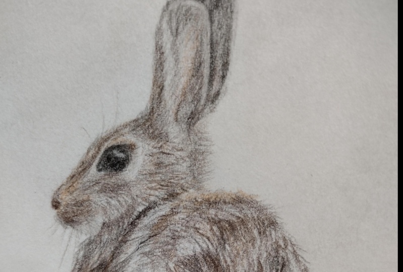
7. Begin the body: Welcome back to part two. So this one is almost just
as long as the last one. I know I said previously that it might be a
little bit shorter, but what it is is that
it'll feel a lot shorter. Especially when I
first did this. It definitely felt shore of a timespan because now
that you've done the head, the head was kinda
the hardest part, it will always be the
longest part as well. For all of my portraits, the head is always the longest
part and then the body is just shorter because you're not drawing nearly
as much detail. So that's what's
going to happen here. And now you want
to start out with the light warm gray here. Draw that first layer and make sure that you
are drawing in the same direction
like short strokes. Now the first layer
you can actually draw, not necessarily short strokes, but you can draw kind of like more circles if you need to. But I still recommend drawing very lightly and try to draw on this indirection
as much as possible. And then the burnt orange
here is to warm up that area. So if you have an
orange or if you have a warm brown that you feel like it was
pretty close to it, you can use that as well. It's kinda interesting
that the bunny actually has orange tones to it. I noticed that some of my portraits actually have a lot more orange tones that
I think than I thought. So that's kind of
important to use, as I mentioned before, you want to make
your portrait look as much alive as possible. So using those pink tones, using the orange tones will
really help to bring that in. I use all different kinds of
pink tones and my portraits. Now, I'll use a
very pale pink to cover as either a base layer
or the highlighted area. And then I'll use more like pastel pinks that are
closer to purple color, purple tones and
things like that, that to use for bigger coverage
or even just for drawing little sections of a
further look like they have like a warmer
grayish pink tone to it. So it's actually a lot of fun practicing with the
different colors. You will start to find
that out yourself too. If you just don't put
any pressure on yourself as much as possible and just relax and actually
enjoy the process. And try out your own
colors as you go. Then you will really start to see what potentially
you have for yourself. That's one thing that
was very liberating for me was that I did not
follow a structure. I didn't follow any
guidelines as to how to draw or what
exact colors to draw. Now, for these videos, I do have the the type of color marked so that you can
have your own guideline. But I do not tell you the
exact color pencil because I know for one Nobody's
going to have the exact same colored
pencils that I do. Unless there as
experienced as me and like to use
the same pencils. And for two, I want you to use your own constructive
criticism and figure out what colors you like to use the most and figure out which
ones work best for you. And that will really, really help you build your own self-esteem
with your portraits and your confidence by figuring out your own colors
and your own method. And these portraits that
I do are definitely very, very helpful for guidelines. And, or just to have fun, they give you are just
here just to have fun and you're not actually
here to try to improve. These are very, very
easy, simple, like, really easy to follow
along and really relaxing because you've
got the nice music in the background and my
voice-over it does. I'm talking about
nonsense or useful stuff. But just, just enjoy,
enjoy the video, enjoy the music, and kinda relax and go
into the groove of it. It is almost like a,
like I said before, it is a form of meditation
because you're in this type of rhythm and then you have the music going
on in the background. And you can start to
do your own thing and start to relax a little bit as you
get more confident in. And I think that that's very, very important is to build
your own confidence. And these videos are
a great guideline. That's what they are. They are a great
guideline for you to get started on your
colored pencil journey. Or just to have fun if
you've got a kid or if you, if you are a kid, that starting out withdrawing, these are perfect
for that because whether you're just not really into digging deep into
the colored pencil world, or are you just trying to do something
while you're bored at home? This is a great, great video. These are great videos
to follow along with. And just really is
just to have fun. If, if you think that you don't have the time
to complete these, trust me, you do. You really, really do it
because you don't have to actually watch
the whole video. Pull two hours all
in one time span. Once you have access to
these videos. That's it. You've got access the whole time so you can come back
to them at any point in time and watch them as
many times as you need. Or if you're just wanting
to watch him just to get an understanding of how to draw, but not necessarily copy. That's also a great way to
get started with it too. Now I do have a lot of videos on my YouTube that
are kinda similar. Where it's just like
a time-lapse video of be talking with some nice
music in the background, or just normal time on SPSS. Videos in general. I find them actually
really fun to watch. I get into some
YouTube videos that are similar to this actually where it's
like a time-lapse, but it's some guy that is mowing their lawn or
mowing somebody's lawn. And they're just,
it's just music in the background
for most of it. And they'll talk over
it, bubble blah. But it's like an hour
long or something. And he's just mowing the yard. And it's actually really
entertaining because it's it's like a video about nothing. You know, it's, it's, it's about life, it's
about normal things. And that's what I really
want to emphasize. Here, is this sense of normalcy. And especially on my youtube, a sense of normalcy where, um, I've got a completely
normal life here at home with live in more with
the farmstead lifestyle. With a little child and
family and chickens and garden and we live
out and you could say this is more of the rural
side out in East Tennessee. And this is my first time
actually living in rural area. I've lived mostly
suburban lifestyle and I really, really enjoy it. It's actually helps me
relax and calm down and focus more on my
needs than anything else. And there's there's a lot
of people out there that, that that is exactly
what they want to do is focus on their needs while also trying to connect with others outside of
where they live. And I think that these videos watching on YouTube and
even watching these videos here where you're trying
to follow along and watch the video and
see how to draw and actually follow these
guidelines and whatnot. It's just a great
way to connect. And I think that
that's really amazing. The power of social
media can do that. So to get into this
video here in a section, I'm using the burnt orange now. I do use a lot of
the dark brown. And I actually do.
8. Adding details: Leave room with the white rather than
drawing light to dark, I left darker chunks and
then I will go over it, just so vary it a little
bit with the light warm gray and then the dark gray too. But sometimes what I'll do
is draw darker section, especially if it's like
trucks that were there. Buffer is more chunky and kinda sporadic but still
kinda in the same direction. I'll draw that first instead
so that I know where everything is at in terms of the patterns, the
different patterns. And now it is a
little bit difficult sometimes to try to draw exactly where that
pattern is supposed to be on the body or on the face. And that is why I like
to do an outline. First, I tried to draw
where the pattern is. In general. After
I draw the eyes, the ears, and the nose, then the main body. Sometimes they'll just draw a little bit of where
the pattern is. Now for this one, I didn't
draw where the pattern is. You can do that if you want to. I'm gonna know by now
it's probably too late. But it's not all too important because this pattern
isn't super specific. But if you definitely
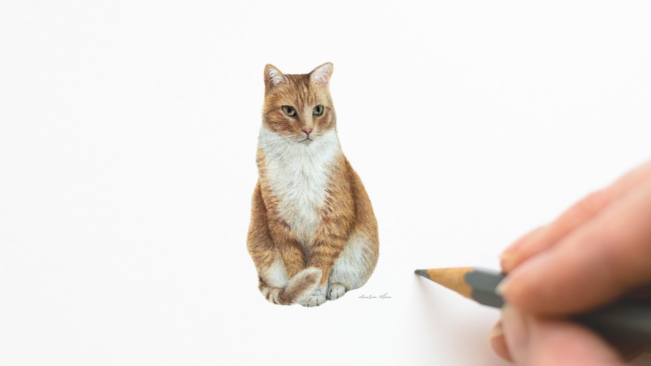
see a specific pattern, such as this current record
portrait that I'm drawing, That's a cat and
and the forehead. She has patterns
almost like a V-shape, like corns almost going
down the forehead there. And I wanted to to
outline that to make sure that I know
where those are gonna be so that I can draw it
as accurate as possible. So for something like that,
that's really important. But if it's gonna
be, for instance, this one where the
pattern is still sporadic but you still have heavier texture
with the dark brown. Then you don't always
have to worry about that. So you can just
draw that pattern and work with what
you have there. But I definitely
recommend drawing as much of a highlight as you
possibly can as a beginner. But if you're pretty confident
with your proportion, like understanding where
proportions are and whatnot, then you don't necessarily
have to draw that. I don't think that
outlining is cheating. There's a lot of
controversy about that, but I really don't
think that outlining is cheating with it in this case because we're drawing
all the bits in details. You're kinda making up your own proportions
as you are drawing. The outline is just a guideline as to where those things
should be located, but it is definitely not a follow exactly where
that outline is, if that makes sense, a lot of the times I will do an outline. And I we'll draw outside of the outline
or inside of the outline to make my own
adjustments as I go to replicate what I'm seeing
in the reference image. So you don't really have to follow your own
specific outline, especially if you might have moved the
paper and made it a little bit of a
mistake as you're outlining those things happen. So it is really, really just a guideline, not something to actually
strictly follow. So that's why I don't think it's cheating because you're not actually following
all of the outline. Especially we're
not drawing all of the outline with
every single detail. The beginning. I actually did do that. I drew a lot of detail
and outline and I wasted a lot of time
drawing the outline. I've tried a lot of things. I've done the grid
method freehand. All of those take a long time
and I don't think that it is worth it once you have practiced
quite a bit over time. Just because when you're drawing
with the colored pencil, you are free handing
the whole time. The only thing is that the
outline is just a guideline to see where those things are supposed to be
located in general, not to actually strictly follow. So if you are doing an outline that has so much detail in it, that is fine for the
beginning process, but you will find over
time that you'll start to get better proportions. And you will not need
such a strong outline. And you'll, and
you'll just start to draw the general outline where it's just the body. The outline and then
the eyes and the ears, and the nose and the mouth. And that's about
all you will need. So I wouldn't be too hard on yourself if the
proportions aren't quite right, especially in the beginning because it is quite difficult. You have to train yourself
to see the proportions and where they are
referenced in terms of where they're located compared to one
feature to the next. And what I mean by that, now I do have a video about proportions and kind
kinda like a cheat. This aren't really cheap. But like something that a little method that you could use to figure out what your
proportions a little bit better. They actively figure
it out so that you can it'll start to
become a habit and then you won't
really need to use that cheating system,
but certain method. So what I mean is you
can use the pencil. And for instance,
this pencil here, the dark brown pencil from the tip of the pencil to
the end of that color. On that pencil. You can use that as a reference. So like if you were
to put that up to the eye from the tip of
the eye at the corner, all the way up to
the top of the eye. You can use that as reference. See how long that eye is, and then compare it to
the distance between the nose and the mouth,
things like that. There's actually a trick. I don't know exactly. I had not made a video on this, so I'm not exactly sure. It's been awhile since
I've I've looked it up. But I think it is the distance
between the two eyes. It's like the same distance between the mouth,
things like that. And then and then the nose too. But I want to make a video on that part because I
think it really is important to even if
you're not free handing, you are still technically
free handing. So you want to
make sure that you are drawing those
things proportionally. And having that understanding
that there are actually mathematically features that
have the same distance. And you want to try to make
sure that those are the same as you are working on the
portraits so that it does look
proportionately correct. But you can use
the pencil as one to measure the distance, make sure that they're
both the same. So if there's two eyes, you can measure the
two eyes the same exact way to see if
they are the same size. Now, the eyes are never going to look
the exact same though, because not one living creature is going to have the
exact same features in both sides is just how it is. So with the eyes are going to be a little bit
different for each one, but you do want to make
sure that at least the distance is the same. And the amount of like how open the eyes
or how close the eye is. What I tried to make sure that
that's about the same two. Sometimes, you know, the animal has one eye that's
a little bit more close. And that's just how they are, especially if the client requests that they want that drawn exactly how
that portrait is, then that's completely fine, but you want to try to keep them as proportionally
similar as possible. And even for the nose, the nose is never going
to look the same. Like one nostril, we
different from the other one. And it frustrates me sometimes because I want them
to look the same. But they're not going to. That's just how it is, especially if the portrait
is not facing head-on. If it is facing it to the
side a little bit more, you definitely can have a
difference in the features. You want to make sure
that you try to look at your reference image as
much as possible and make that comparison and
make sure that you are drawing the same shapes
as much as possible. Now shapes.
9. Continue the body: The same shapes as
much as possible. Now shapes is a
different thing too. If you are struggling
with drawing an area that is
very dark or very light and a bigger area that you just have a hard time replicating that doesn't
look quite right. Try to focus in on one
section first at a time. So for instance here, look at the eye of the bunny. If you are looking at the eye, it looks like, kinda like
an almond shape, right? Well, you want to, you want to think about
that shape and not just look at the reference image and just see the
reference image. You want to think
about that shape, kind of focusing on that and
cancel everything around it. Focusing on that shape and
then the whiteness around it. The whiteness
around and it kinda has a bigger almond shape
but a little more curved. So look at each shape and
cancel out everything else. So basically
narrowing your focus in on that shape and remembering
that shape and that, that will really,
really help you. Especially when it comes
to things like your, like when you're drawing a bird and you're looking at the wings. The wings will have
all different kinds of textures and patterns. Try to focus in on the
each individual shape. And look at that rather
than looking at the whole. Looking at the whole is going to be a little bit different. For instance, here
with this body, you could definitely look at the whole and so
replicate what you're saying because the texture
will overlook the exact same. So for that, you do, you can look back and
look at the whole and draw as you're doing that. But when it comes to
shapes and stuff, you definitely want to really
think about that shape and try to replicate it as much as possible
by doing that. And don't actually
look at the hole. So it is kinda interesting how those little tricks
to work over time. Now I'm using those black here. We just did the dark brown and a little bit of
the orange tone to it. Now this black to darken
the dark brown sections. And it's not everywhere, it's just in certain areas
that you will do this. Um, I don't really, like I said, I don't really like to use black for main areas unless
it's for the eyes. So you will find that I will
draw with black over top of something just to really
darken that feature. I have left this section here to complete as part of
the last bunny here. This is the essentially this is kinda where the leg is and then the front
part of the chest. So we're gonna do the front
part of the chest first. Now it's gonna be
curved a little bit. So your first layer still want to draw in
the same direction of the firm and just kinda
go like in that curve, go in that same pattern
as much as possible. And you can also use
this Lightroom gray to lightly draw over the
dark brown at sections. But not, not all too
much because you do want some of that
white to show through. We will do a little bit of some fixing up
towards the end as well. So if you miss any
sections and you Are wanting to catch up. Don't worry about it. Just focus on continuing
on until the end. And then you can take a
step back and look at the portrait and see
what you need to fix. So he's the dark brown here and start to
draw in that pattern. Now, I like to draw
and sections rather than the whole picture. For instance, drawing the
whole first layer for the whole picture compared
to just doing sections. And why I do that is so that I can have a better
understanding as to where my features are
located and the proportions. It is easier to
draw and sections. Then the whole for that because then you can actually
see the the, the outline that you had drawn. If you had loved
that section alone, even if you had a first
layer for the whole thing, you can still see the outline, but it is easier for me just
to do section to section. So I highly recommend that if if that makes it
easier for your two, now you can try out
doing the whole, the whole rabbit and
that first layer. But I find that it's easier
just to do those because each section is going to be
completely different values. And you want to
make sure that you are not making the whole thing look flat with just
a similar values. So drawing section is, section is a better option. But you can try out which, whichever one you want first and see what you're
comfortable with. So here we're still using
the dark brown, of course. And you'll add
layers of black and the dark gray over the
top to make it darker, so don't worry about that. So we are a little
over halfway through. And if you need to take a break, feel free to pause
the video and I'll go take that break and
definitely come back. I really encourage you
to finish the portrait. I know that most
of these classes, they're all about two hours
long, two to three hours. And I can be pretty painful at times to have
to go through that, especially if
you're not enjoying the process and it's not turning out the way you want it to. So if you need to
take a breather, go ahead and do that. So with the dark brown resto, continuing on, drawing
in the same direction. Now for this shape, it is almost like an
egg shape in a way, but a little bit more fully because the top is more of like an oval and then it will flatten out because the bunny
is laying on the ground.
10. Leg and Tail: And then it will flatten out because the bunny is
laying on the ground. So you got to remember that
this is part of the leg here. So just remember are like the
shape of the bunnies leg. Keep looking at the reference
image and think about that shape more than anything else as
you're drawing this. And keep watching
the direction of the fur because it is going to be different than the body. And that's really what makes the difference
between what shows the difference between
the body and the leg is the direction of the fur. So keep that in mind, be aware of that
and leave room for the tail because it tells can have a different
direction of fur. And the little foot at the end too is gonna be
a little bit different. So just be aware of
that as you're drawing and for the amount of
pressure that you're using, I am using a little bit
of a heavier pressure to get the dark brown bits. You can see that I'm using light between my heavier pressure. And what that does is it creates this multiple layered
effect with the first. So using the light pressure, heavy pressure, both at the
same time, it does help. Doesn't always
happen every case, but it does with this one
because the fur is so sporadic in terms of the where the
where the firm is located. So like for instance, there are heavier trunks and some spots and lighter
chunks and others. And it's not all
completely brown. So that's what I really
wanted to emphasize is that now all a solid brand massive for and there's going
to be layers of highlight. And that's what we're
doing here is leaving room for the highlights
to come through. And that's why I'm using
dark to light for this one. And drying the
little foot there. It is a different
direction of first, so just be mindful of that and you don't
have to be all too detailed with it because
it is just a little foot as long as you are
drawing and sand direction and really just
emphasizing it rather than trying to be too detailed as the most
important part. I find that drawing
too detailed with smaller portraits doesn't
always look diet great. You kinda have to be. Think about the whole picture and be a little more abstract and then go from
there and you can add more detail afterwards. It's the same for when you're
drawing larger portrait to. You start with abstract
first and then you add your details afterwards. Even for this where I
drew dark to light, it still is kind of an
abstract look to it. And then once I have, once I use the gray and
the black to darken it. That's what really
brings in the details. So remembering that two is, don't worry about the
details until you've built up quite a few
layers and then you can start to think about the details and what
needs to be placed where on the darker sections
you do want to make sure you know where those are located as such as for this one, the there's there's the low
lights in the highlights and low lights are where the brown fur is and the highlights is where
I've left the white. We will fill that in with the light warm gray
a little bit later on. But not all too much
because you still want to show some of the
white coming through. I really do like to add this
burnt orange to the bunny. It's just absolutely adorable. And this, you're just drawing
very lightly and kind of think about it as of
a hint of orange, more of an abstract
general coverage. And I know that in this video, the colors are a little bit lighter than the actual picture. So if your image is
coming up a little bit darker, that's
completely fine. That's actually how mine is too. It's a little bit
darker features. But just be mindful
of orange and make sure that
you're not drawing details with the
orange is just more of a hue of the orange and not, not actual texture,
if that makes sense. And now we've got the towel a little bit more
established there. You definitely want to draw a pretty heavy around it
just to emphasize where it's located and where because it's so dark right
there from the shadows. That's why we, I
drew it that way. It was to basically emphasize that there's some
shading going on and there's a little
bit of a fold where that tail is located. So you can use a black
or a dark gray here. I've done a lot of
it, a mixture of both because the dark
gray really helps to show a little
bit more coloring, but it darkens it
at the same time. Whereas the black is
just straight black. And sometimes the black can cool down some of
the warm tones. So you just want to be
mindful of that too. I know it's a little
bit different because you would think that
black would not really affect the
tones of the colors, but it really does. Adding black can, can
cool it a little bit. And I think that's
just to do with the colors themselves like the because it's a wax
base or an oil-based. They can kinda have that effect. I guess the way that the
black is made, to me, it seems like it, it
cools it down at times, but if you're using the black
over top of a warm tone, it it will still show
through as warm. It's just if you were to use more and more black
than the warm tone, then you'll start
to really see that it cools it down a
little bit too much. So just be aware of that.
11. Finishing up: To really see that, it cools it down a
little bit too much. So just be aware of that too. And I am using the dark
brown a little bit here to kinda emphasize on how
sporadic there for is definitely is a little more chaotic around
the leg there, but you really want to emphasize the direction of the fur
to to make sure that you can tell that
that is the leg and not just the rest
of the body there. You can see that the
line between the, the top of the leg
and the rest of the body is more emphasized than going further down like right underneath
that pencil right there. It's connecting a
little bit better. So just make sure that
you are connecting that apart as much as possible. And then still leaving
that gap at the top to show that that's disconnected from the rest of the body there. I hope that you're
enjoying this. I'm already, I'm enjoying
talking about this bunny. And I'm talking to you
guys about my art journey and these really awesome
tips for drawing too. There's a lot of things that
I forget to tell you, no. And while I'm doing
these classes, but there's lot of
important things that, that is good and healthy for you to learn on
your own as well. So I tried to implement my own experiences and things that I think that
you could benefit with, such as the warm tones in the cool tones
and then drawing the same direction as afer, well, when it comes to your own, a lot of pressure. And then the way that you
draw light to dark Bo La, you can draw dark to
light if you want. It's just easier
to draw light to dark to avoid
mistakes essentially. So once you get more
comfortable practicing, you can figure that out. Whichever way you find. That's easier for you. Essentially. So the colors, the color
is the color palette. I definitely suggest going and exploring your
own color palette. Trying out new colors. Like, I know some artists, they will use the
crazy colors and their portrait and really try
to create this very vivid, unique effect that has all
these different colors. And it really does turn out
pretty cool when you do that. Because if you limit
yourself to different, to adjust the same
color palette, or just about four
or five pencils. Not always going to be disappointed in the end because it's not going
to look as realistic, but especially even if it's like if it's black or
white for when it's fair, You would think that it's just monochromatic where it's
not that many colors. You wouldn't believe
how many colors they use in black fur. There's, there's so
many different tones that go into it to create a realistic look and actually white-black for
one of my hardest to do. So if you are
struggling with that, just remember that
and try to add more color to it and see
where you go from there. Now there are different
types referred to, and I know that
curly for is very, very difficult to draw. And super long buffer
can be pretty difficult. Sure, it seems to be
the easiest, of course. So if you're going to try to practice different
animals on your own, try to start out with the easiest type of four
possible and then go from there. Now, this tail here we're
using the light warm gray to kinda it's really white tail. So I'm just using a warm gray to emphasize
that it is there. Then using it a
little bit more in the highlighted areas to
blend it a little bit better. And then you can use or just basically fixing things up now. So what do you think
needs to be fixed up? Go ahead and do. Now. Don't worry about adding
the details all too much because it's a small portrait. You have spent already almost
two hours working on it and you don't want to overdo
yourself and get frustrated. So just take a, take a break if you need
to come back and look at it with fresh eyes and maybe you can ask somebody
in your house. To take a look at your portrait and get some constructive
criticism on it. I like to ask the people
on my house Laughter. I do a portrait to get
some fresh eyes on the portrait to see what, what needs to be
fixed essentially. And because after staying
at a portrait for salon, you kinda get so caught
up in the details and, and it's hard to
look back at it. When you're the one that's done that
portrait and you've been focusing on that portrait for weeks at a
time or something? I highly suggest that I like
to ask my husband a lot. He is very honest and he is a little bit
of an artist myself. Actually, he does
different kind of art and he does have
an artist's eye. So it really helps
for me to have his constructive
criticism to tell me. Okay, this part
doesn't look right. I don't know what you
need to do about it, but it doesn't look right. And that actually helps me because then I
focus in on that part. I'm like, Oh yeah, you're right. That does need to be fixed. So if you have
somebody in your house that can look at the reference image and
it has a little bit of experience to maybe with art or even with just
animals in general, or as really good at
looking at detail. I would ask them what
their opinion is on it. And I know that it can be scary to ask others
about their opinion. There's been a lot of
portraits that I do not ask for opinions too because I'm I did not like how it turned
out and I just don't want to ask what their opinion is on it and just
move on from there. But I still always
always go back and fix. My Hi, Gary is that I
think needs to be fixed. So if you are done with the
portrait, think you're done. Take a break. I sometimes will
even wait a whole day until to actually
look at the portrait. Sometimes leave and cover it up. I'll cover up my
portrait so that I don't look at it as I'm
walking through the room. And then the very next
day or something, I'll look at it with fresh eyes and see what
needs to be fixed. Because if you keep
looking at it as you're walking through
the room or some fun. Your eyes are too used to it. And it's not going to help you be able to figure out
what needs to be fixed. So I highly suggest that too, and covering it up
to it will help keep the portrait from
being exposed to natural elements such
as dust and sunlight. So especially if you are working on a portrait that's
going to take a long time. Like when I started out,
it took me a whole month to complete just an
eight by ten portrait. It's going to take you awhile. I suggest covering it
up or something when you're not working on it so
that it can be protected. I don't always do that. And I have my son has
drawn on my portraits. And I've been very lucky that I could fix it up and not
have to completely redo it. I think the only time I
had to redo one portrait one time and it was a wasted I think it took
a week-and-a-half. I said a whole week and a half. When I was done with the
portrait, looks horrible. It was just it was
not done right. I think I did too much shading
and it did not look good. I did there was no way
that I could fix it, so I had to I didn't trash it. I still have it in my portfolio, but I just completely redid it. And what's helpful about
redoing the same exact thing is that it will always
turn out better than the second time around because you've
already practiced it. So you have to redo portrait. You're not alone. I've done it before. So I hope that helps and
we're coming to a close here. So if you are still working
on making adjustments, you can still do that. But we're done. And I am so glad that you
have completed this with me. If you didn't actually
do the portrait. That is okay. I hope that this has helped you with any tips that you
really didn't think about. And maybe it'll help you with
your portraits later on. Thank you so much
for following along. I hope to see you
in other classes.
 Lauren Kline, Drawing Classes for Aspire Artists