Transcripts
1. Dog eye intro: Welcome, welcome. This class is about
drawing a dog's eye. If you follow the
directions that are listed, there will be a list
of materials as well as what type of
colors you will need. And you can also down load at the reference image to
be able to follow along. I hope you enjoy.
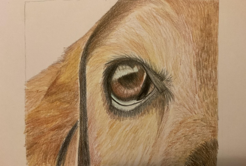
2. Make the outline: Alright, so let's go ahead
and get started here. Now this eye is of
a hound dogs eye, and it is rather large and
round and it's going to look a little bit different
than most dogs eyes. But I figured this one would
be a really good example to share because it has a variety of
warm colors as well as a lot of detail because
it is so big and round. And so we'll start out
with the black here. And you really want to
draw that little piece. I like to draw the
outline first most of the time and then go from there. You could draw the pupil
first if you want to, but it helps to draw
the outline because you kinda get a better idea as to where everything
is located. Once you have the outline done and it doesn't have
to be the full outline. For instance, this
one is going to be this bottom right-hand corner. And then the top left-hand side. We're gonna be using
the black to outline it rather than straight
up and straight down. And you'll start to see
that here in just a minute. So you want to use
light pressure first and then start to apply
heavier pressure. Now because this
is straight black and not blended
with other colors, you can use heavier pressure, at least a little
bit closer to like, let's say the first
couple of layers. And that will really get a deep, solid black color in there. And then you can use, this is a reddish
brown color pencil. And you could draw small
circles inside the eye, just a very, very
light pressure. You don't want to
apply it too much because we're going to be
blending other colors in there. And when you use a
lighter pressure, it makes it easier to blend your layers
together over time. And then you can use the black again and just draw very
thin line underneath. I kinda indicating
where the eye stops. And there's usually a gap that's in-between the eyeball and then the lid of the
eye underneath. And that is kind of where I am trying to show and indicate, at least for the first
couple of layers. Because like I said, it really does help to have that outline done first so that you know where
everything is located, especially when you're trying to draw the lip of the eye as well. Because each I really does have a little bit of a lip and it'll look different in each eyes, especially in dogs and cats. And if you can focus
on drawing the outline of the eyeball itself
and then around the eye. Next, that's gonna
be really important.
3. Adding color: Now that we have good, solid outline and we'll go back and finish up
pieces of that too, because it is not a
whole solid black yet. But now that we have a
good foundation started, we can continue on
and use this orangey, I call it like a
burnt orange color. And I will also put in the instructions what
colors I'm using as well, so you can follow along. And the orange and
the reds are really important for making
this I look realistic. So just be aware of that
and make sure that you have at least a good variation of orange and red colored
pencils just start out with. So we'll continue here
with the red brown color and applying a little
bit more of fat around the pupil of
the eye as well. Now, in each eye there
is a little bit of this very interesting
kind of feature, almost like texture and the eye. So your first couple of layers aren't going
to be as important. Once you get up to
your last few layers, you want to apply that
texture that you see where it has those lines almost especially coming from
the pupil itself. So I'll show you in more
detail once we get that far. Then there is a little
bit of this gap. Most eyes tend to
have this where there's a little bit of the white of the corner of the eye. So for this one, there is just a tad
bit of that white and it actually has a
little bit of color, so we'll apply that later. But you do want to
draw that shape using the black first and just a very, very
light pressure. We're still trying to
get that foundation down first and then go from there. Because like I said, once you have that shape
down, then it's much, much easier to move forward in terms of
drawing the proportions. Now, this color can be
a little bit deceiving. This is actually a dark
sepia color pencil, not a black color. And the dark sepia is this dark gray brown color and I use it for almost
all my portraits. I have quite a collection
of used dark sepia pencils. And all you're really
doing here is just applying a little bit
more of a darker detail, still trying to draw
on the same direction as the texture that
you see in the eye, which is in that rounded
shape up and down in a way. And what that does is
it makes it look more realistic when you draw
in the same direction. What you see in the
reference image, at least as much as possible. There are times that you'll have to apply different directions, such as drawing
and small circles. But for the most part, you do want to try to draw in the same direction
as much as possible. And for this I,
since it is round, you want to try to replicate that round feature
as much as possible. So you can see that
especially with the little little flakes and the little details
that are in the eye, they have this
curved effect to it. So try to replicate that
as much as possible. It doesn't have to
be exact as long as you are drawing in
that same direction. And I think that's probably
the most important thing, is to make sure that
you are drawing in that same direction no
matter what feature it is. Now this is the same red brown. It's just a different version, different type of
colored pencil brand. So whatever brand that you have, just use the same red brown. And I split this one
up just a little bit. This is the dark sepia
colored pencil again. And once again we're just applying a little
bit more detail. Now you can see that I left
some room for the highlight. And between the color
of the eye near the pupil and the black on
the right-hand side there. And that is really important
feature to remember, is to leave room for the
highlights as much as possible. And then your last step is adjusting those
highlights afterwards. And that will really, really make or break your realistic eye or
realistic for in general, leaving room for the highlights
and then going back later and adjusting them and blending
them out a little bit. If you need to.
4. Drawing the details: Now I am using the
black color pencil again and drawing the pupil now. And there's actually a lot more of the highlight in this pupil. So be careful and
try to just draw what you see in terms of what
is there for that pupil. And then start to apply a little bit more
heavier pressure and work your way
around the highlight. This one definitely has a
bigger highlighted area. So don't be afraid to
leave that big gap there because you can always come back and make adjustments later. And now you can use the dark sepia and start
to apply even more detail. Start to darken up that area. Now you can see that
I left some room. And the eye itself for
the burnt orange area where the orange and the
reddish brown color meet. And at that really, really, it really makes us a portrait
look more realistic. And you can still go back
and darken those areas or add more detail in terms
of the texture that is in I2. And then you can go back over
the black areas as well. There's certain spots that look like you still haven't
quite finished it. You can see the tooth of
the paper showing through. Go ahead and make
those adjustments. Like I talked about earlier, there is that lip on
the lower eye there. So I am just defining
that feature there. And you want to have a
sharp pencil for this. You wanted to keep a sharp
pencil for all of it really, but especially for
these details here, because the sharper your pencil, the better your
details are going to get bitten, going to be much, much easier to get your pigmentation down
and your details. And then there's
white of the eye. I just drew a little bit of the red brown and
then you will go, I'll go back over
it and blend it out later with a
lighter colored pencil. So once you have that pretty well-defined there in
the corner of the eye, go back over using a
light gray color, very, very pale, cool tone gray color, and apply that
underneath the eye. They're really define it, have that sharp pencil as well. And what this does is it makes this burnishing
effect when you apply a lighter color over a certain feature that
you've already finished. So once you have
quite a few layers, then you can apply
that lighter color. And it creates
this waxy coating. And it makes everything look a little bit more blended
in a little more finished. Now just be aware that
it will line up area. So if you don't
want it lightened, then tried to find a more neutral base color to blend in that area
as much as possible. So we'll draw a little
bit underneath the i2. And I think this feature
is really important to put into this course here. And the reason why is because there is so
much that's going on outside of the eye that really defines how this
eye is going to look. So I wanted to try to explain it to you
as best as possible. So underneath the eye
there is still once again, another highlighted gap. There. And is not necessarily the
gap that's on the eye, the lip of the eye, but it
is still highlighted area. So you still want to make sure that you're leaving room
for that highlight. And then applying
that dark sepia in the same direction as the
firm which is going down. And you want to draw
a short strokes, short and light strokes there. And once again, have a
sharp pencil for that. Then we can get into using a light blue for the
highlighted areas. This is really a key
feature for blending, as well as making your
highlights look realistic because most highlights
aren't just straight, white. They do have a little
bit of a tint to it. So you want to look
at that highlight and see what kind of color
is actually in there. And try to draw what you see. Find that, find
that color that you see there and apply that. So I used a light blue, but it wasn't a very pale blue is just a
lighter blue and I just use light pressure for that
highlight above the pupil. And then you can start to add
a little bit more texture. What you see that's
in that highlights. Sometimes you could
see a reflection of person or something that's in the background,
but not always. So for this instance, there's not a whole lot
of reflection going on, just a little bit
more of a texture. So I used a little bit of very, very light pressure
with the black. And then the same applies
for that light blue. This is basically it for the
drawing of the eye here. And if you want to keep
drawing more of the I, then go right ahead or go back over what you see and just apply a little bit more detail. If you see a little bit of the white showing through the tooth of the paper
showing through. Then you're not quite done. Just keep applying more
layers and applying a little bit more pressure and use a lighter colors to blend. And try to make sure that the light colors that you do use are similar to the colors that
you have already applied, such as in the eye. If it's orange brown, reddish color, try
to find a very, very pale gray or brown or something like
that to blend in that area. And just be very mindful of how it's going to affect that area. And if it's going
to lighten it up, then you can always go
back over it and darken it with the same colors that
you had applied originally. So I hope that this tutorial has helped you learn
how to draw an eye. And if you have any
questions or concerns, feel free to reach out. I'm more than happy to help you and send me a
picture as well. I would love to
see your results.
 Lauren Kline, Drawing Classes for Aspire Artists