Transcripts
1. Introduction: Okay. Hello everyone, welcome to my Skillshare class. I am Surbhi Aggarwal a watercolor and lettering artist. I'm also known by the name inspiring art design on Instagram. You can find most of my work there. A few years ago, I discovered the art of Lettering and soon without even realizing I got hooked on it and all this quickly turned into a passion and obsession. To me, lettering is so relaxing or I can say it's a way to destress myself. I have learned a lot along the way and I am here to share every tip, tricks and lessons I have learned so far. So today we are going to be diving into the art of brush lettering. It is a style of writing similar to calligraphy but it's more of illustrating letters. It's like you're drawing letters. The major difference is that instead of using nibs, which can be quite difficult to master, we'll be using brush pens. which is not only easier to use but portable and versatile too. I'll go through how these alphabets are formed using basic strokes and tips and tricks for connecting letters and phrases. You'll learn exactly how to break down every letter in a lower case alphabet. This class is aimed at students who are beginners and want to learn from the basics and then proceed further. I have seen a lot of people who want to learn, but don't know where to start, they think that their own handwriting is not great so they can't do it. But believe me, it's not true you don't have to have good handwriting to be a hand-letterer. I would love to introduce you to the steps to get there. Once you enroll in the class, you'll have access to all the resources and practice sheets pdf to assist you further in lettering. By the end of this class, you'll be able to use the skills to create your own beautiful hand-lettered piece which you can use for gifting your loved ones and a skillset you'll be able to use for years to come. So just enroll and let's get started.
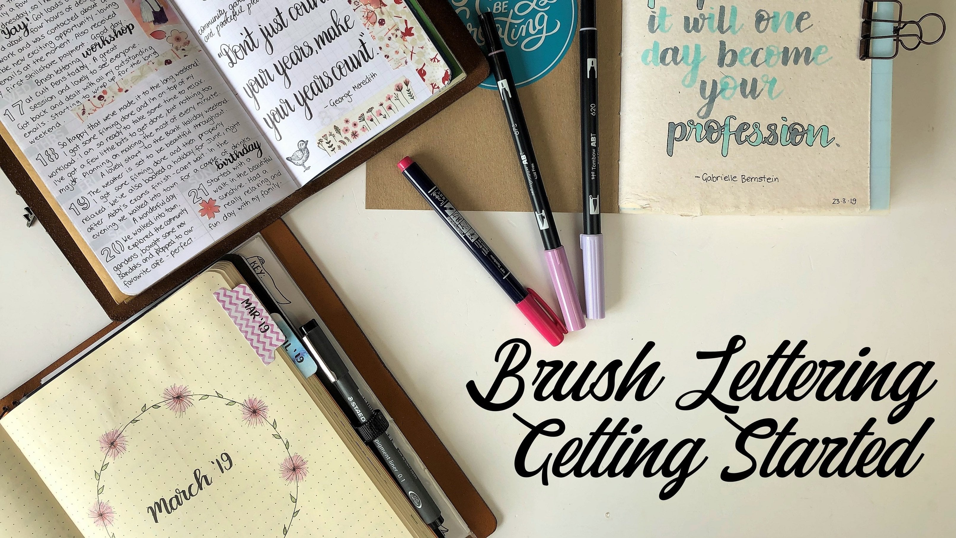
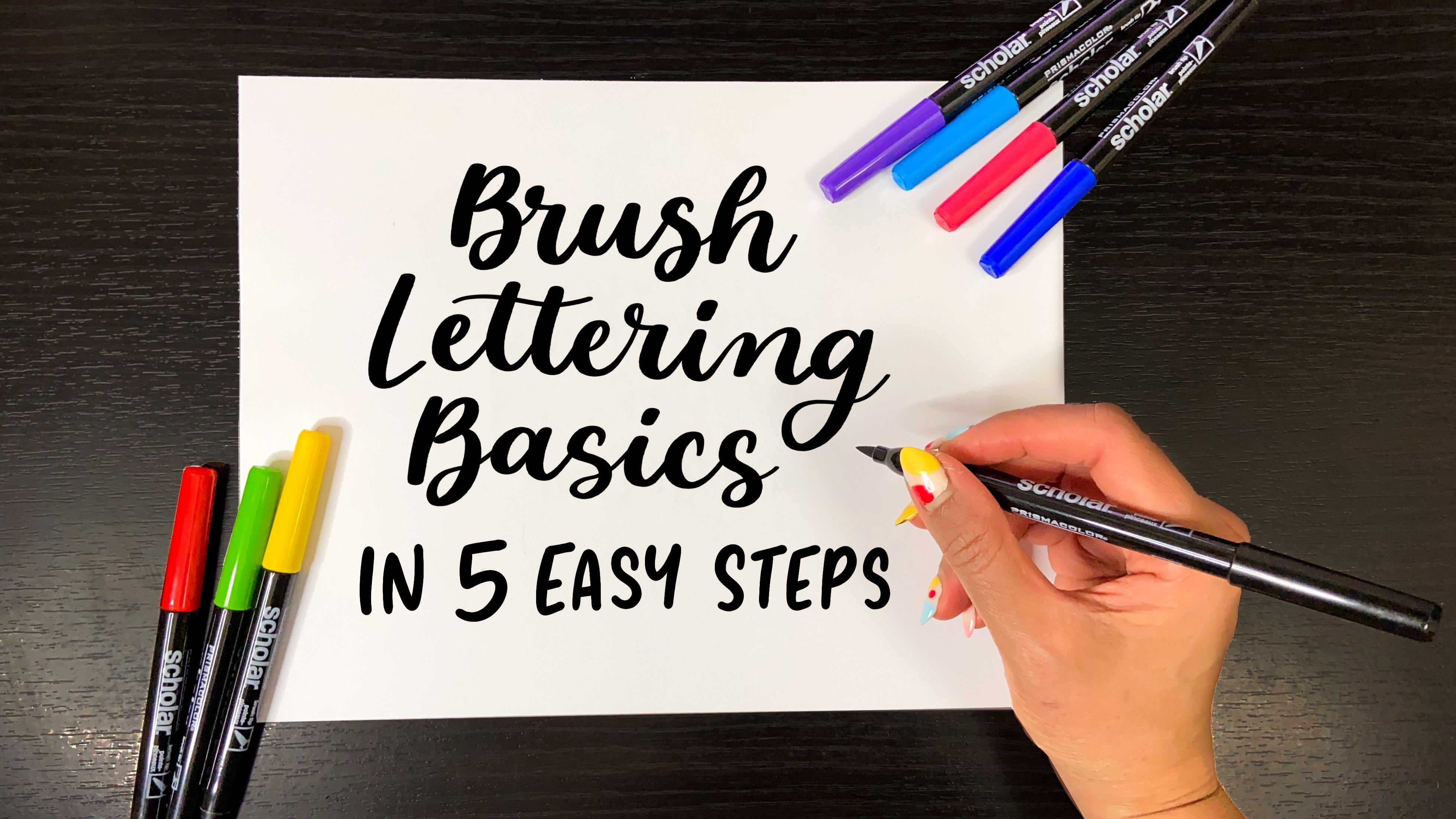
2. Get Familiar With The Supplies: Hey guys, So let's talk about some of the basic materials that that I personally love to use while doing brush lettering. So to start, one of the important material is the brush pens. Believe me, you don't need to buy a ton of fancy pens. and inks in order to master brush lettering techniques. Even one pen can do the wonders I have a number of pens that I love, But there are two in particular that I recommend for the newbies. One is Tombow dual brush pen. And the other one is the Tombow fudenosuke pen. So these are these small nib brush pens and they really doing wonders in the lettering world. It comes in hard and soft options And they are really perfect for the different levels of flexibility. And ink flows. As you can see the nib here, it's quite small and Let me show you how it works. See how fine is the thin stroke and the thick stroke. And the other one is this. brush pen. Both the nibs are quite similar, but the only difference is that one is a little bit soft and the other one is harder. Okay, so now let's talk about these Tombow dual brush pens. So as the name suggests, that they are the dual brush pens. They have two nibs, one with a large tip and the other with a small tip. And they are fairly beginner friendly and allows smooth, thick, and thin transitions. As you can see, how thick is the stroke here, And they are perfect for the large lettering. I'm mean, they are best suited for medium and large lettering. With the pointed tip, it can be used to do corrections in the final piece also. Now you can clearly see the difference between the small and large brush pens. So one of the best and the cheapest markers to start learning lettering is this Crayola marker. Yes, these markers are way too cheap, like you can just buy a pack with different colors for under 3$. Here you can see as the tip is quite different from other brush pens. But the trick is to hold them a bit differently. Okay So I'll change the pen, I guess this pen is not working. I'll show you some other, So see this one. How smooth And nice is the stroke, you can compare the Tombow brush with the Crayola. they are working perfectly fine. I'll show you an example also, see. Also if you don't want to spend anything, then just grab a blunt pencil and apply the same pressures and techniques. You can see the nib. You'll be able to get the same effects as the brush lettering. Just put more pressure while doing the downward stroke. And I'll show you an example also see you can get the same effect as you get with the brush pen. And they're so cheap. So there's no reason for you to skip practicing. Now let's have a look at paper. The best paper for brush pens is smooth, bleed-proof (non-absorbent) paper. like this one, Choosing a smooth, low-absorbent paper will make your brush pens last the longest. The highly absorbent paper like this one will drain the ink from the pen. It is best to avoid paper with texture and rough surfaces, as they will cause your pen to fray faster. I mean it will break down the tip and make it harder to get crisp, thin lines. So the paper which I'm using is the HP printer paper premium 32 it's a great option if you want to spend less and practice. So it's perfectly smooth and fine. So here are the few papers which I personally prefer But sorry, I don't have these right now with me. But you can check them online. So I'm linking them on the screen here. The first one is the Rohida Paper It comes from three types, graph, dotted and plain. They are all great, but my favourite is definitely the dot pad. It has got the guidelines, but they’re faint so it looks a little prettier to practice on. For the final piece, you can go for a bit thicker paper like a copy paper, Strathmore bristol paper. Or if you like to make a watercolor background on your final lettering then you can use a canson watercolor xl series paper like this one.
00:06:05.300 --> 00:06:11.510
The more you'll practice, you'll eventually get to know what supply suits you better. So don't worry about the supplies and just grab a piece of paper and a pen and get started.
3. Basic Anatomy Of Letters: Okay guys, so by now you have learned what is brush lettering and what all the supplies you need to get started with it So grab them and start with learning the basic anatomy of letters. Overall, there are even more than 30 components in the letterforms. but I'll be discussing the most important ones which will help you in forming letters beautifully. So the first one is this baseline. You can see there are these four lines which I have marked And this one is the baseline. It is the horizontal line upon which majority of letters sit. So as you can see, all the letters are sitting on this line. Like, If I write a lowercase "a" So this line is called the baseline. And the next one is the meanline, or say Waistline. So this line is the meanline or waistline. It's the horizontal line that designates the height of the lowercase letter. see, this is the height of the letters. So here, this line which is touching the lowercase letter "a" from the top is called as the meanline or the waistline like this. Let's move on to the next thing. That is X height. So what is X-height? It's the height of the body of the lowercase letters. So this height is called as the x-height. Or we can say it as the distance between the baseline and the waistline. Okay, let's talk about Ascender. Is the portion of the lowercase letter, like this "l", that ascends above the x-height. So this portion of the letter, they're all extending above the X-height this line is also called as capline. as all the capital letters touch this line from the top. Like these, all the capital letters would be touching the capline. And the last one is the Descender. As the name suggests, it's the opposite of the Ascender. And its the portion of the lowercase letter form that descends below the baseline. And is termed as Descender. The fist coming below the baseline. So this is called as Descender. Let's revise them. So the most important is the baseline on which the letters sit. And the height of the lowercase letter is the waistline. And the distance between the waistline and the baseline is the x-height. And the letters which go beyond the waistline are called ascender. And the letterform which goes below the baseline is called the descender. Although these lines might not look good to write on. But since you're starting lettering, you must letter by first making these lines or you can buy any grid pad for practicing. Once you have a hands-on it, you'll be good to do it on the plane paper then. So keep these basic terms in mind and move on to the next lesson, where you learn the rules of brush lettering.
4. Different Types Of Strokes: Welcome back, guys. so before you can write words, you have to write letters. And to write these letters, you must know these 8 types of basic strokes. So the first one is the entrance stroke. it is the thin upstroke that begins, or enters, into a letter It starts from the baseline and ends at the waistline. so to make a thin stroke it's important to hold your pen a little higher off of the paper, So we're going to use lighter pressure as we only want the tip. of the pen to draw. So the less of that touches the paper, the better it is. Start by placing the tip of your brush pen at the baseline. Then draw a thin upstroke with a slight curve As you can see, there is a curve It's not like I'm drawing a straight line. It's not like this, but I'm making it in a little curve position. And as the name itself says entrance stroke it's used in all the letters at the beginning itself. It is also used to connect the letters to form words Let me show you some of the examples like i Like this. It's used to start the letter. Or say, If I write t or j, and to connect the letters. And the next one is a downstroke it is a thick high pressure stroke that starts from the top and goes down. to draw a downstroke apply more pressure like this, allowing the pen to flex on its side and leave more ink on the paper. You can see how my nib is bending and it is touching the paper The more of it touches the paper, the thicker would be the stroke So the trick is that the correct pressure and angle will make a broad stroke While brush lettering, it's important to have a clear difference in thin and thick strokes so that the letters look beautiful. As you can see, that all these are the thick strokes Like if I make I, this entrance stroke and this is a thick downstroke. Let's move to the third one. That is underturn stroke. It is a u-shaped stroke that starts as a thick downstroke and ends with a thin entrance stroke. So here the trick is that before reaching the Baseline, start reducing the pressure to transition into a thin upstroke. So this stroke is used in the letters like a, i U like if I make a U. So this is the entrance stroke And this is a underturn stroke And this is again a underturn stroke Okay, so next stroke is a overturn stroke. It's an upside-down, u-shaped stroke It starts with a thin upstroke from the baseline slowly transition into a thick stroke And this stroke is used in forming the letters like m, n. Now, moving on to the fifth one, which is the compound curve. It is a combination of two strokes. So the overturn stroke and the undertone stroke, or we can also say it as a combination of overturn stroke and entrance stroke. It's like this one. So I'm making an overturn stroke and again, taking it back as a thin stroke. Let's do it again. there is a thin stroke and making it as an overturn stroke and taking it back into a thin entrance stroke this compound curve is used in letters like y, v, m. Let's move on to the oval, As the name itself says, it's an oval. It is an enclosed, circular stroke And so to draw this starts with a thin upstroke, that is a combination of thin and thick stroke forming an oval. just below the waistline and make a curve transitioning to thick downstroke and then transition back again to a thin upstroke. So, this stroke used in forming the letters like a, d, o. Next is the ascender loop. So in the previous lesson, we already learned that the ascender is the portion of the letter that extends above the baseline, Or say above the x-height. So it's a loop starting with a thin stroke and transitioning back to a thick stroke above the baseline like this. So I'm starting as a thin stroke and moving to a downward thick stroke So this ascending stem-loop is used in letters like B, f, l. Now the last one is the descending loop. It's just the opposite of the. As we all know the descender is the portion of a lowercase letter that descends below the baseline. So, this is a loop starting with a thick downstroke and transitioning to a loop like this. So it is used in forming the letters like y,z, g, f. So now we have covered all the 8 strokes. Join me in the next lesson, where we'll be using all these strokes to form letters.
5. Alphabets : a to j: Hey guys, welcome back. I know you are literally leading to try your hands on the final piece, but good basics will help you in long run and help you master this art. Before you can words. you have to write letters. So no shortcuts. In this class, I will show you how to break down every letter in a lowercase alphabet using all the basic strokes we have learned in the previous class. So take your brush pen and hold it at an angle of 45 degrees to the paper. Your angle will change as you write, but in general, hold your pen at an about 45-degree angle from the paper. Let's start with the lowercase alphabet a So, to write a. Let me show you how it's divided in strokes. So this a letter a. So in the same way So carefully watch that I am making an entrance stroke then leaving some space for the downstroke to come and make it like this Next is the c, make an entrance stroke plus oval with an entrance stroke. Next is d. Entrance stroke plus one oval plus an ascending loop So to write these letters, there's not just one way. There are an endless number of ways to write them. Just try to find your own style. Next is e so to write e, there is an entrance stroke and a small ascender loop Underturn loop .. Like this. Moving on to h, entrance stroke plus Moving onto letter i with a dot, descender loop with a dot Ok.
6. Alphabets : k to z: To write k, Start with the entrances stroke Dawn stroke Now, let's move onto letter m this is the compound curve This small stroke So oval stroke So Q so make it next one is t entrance stroke plus an underturn stroke plus Now, v plus this is an W. So moving on to x, it is a combination of a compound curve entrance stroke plus an underturn plus an descending loop plus one more entrance stroke, which makes it like this and the last one is z So now we're done with all the alphabets from a to Z So join me in the next class to learn how to connect all of these letters.
7. How To Join Letters To Make Words?: Okay guys, so the wait is finally over and we are finally going to connect the letters to form words Here in this lesson, I'm going to show you things that you need to think about when you are connecting letters. Depending upon what the first and second letter is, how you connect these letters might differ in many ways. Okay, so let's start to connect a letter and n So this is a, this is n so to connect both of these, one important thing is that when you are first learning It will be helpful if you write each letter separately first and then think about the ways you can connect them. This is the entrance and this is the exit. So the important rule is that to make the last stroke that is the exit stroke of the first letter. so the first is this and second is this. So the exit stroke, of the first letter as the entrance stroke of the second letter. So I'll show you how to make this. Make the usual a So I'm just combining both of these strokes to connect them. So as I already said that there can be n number of ways to connect all these letters. So the other way could be writing it like this. Just totally taking away this curve and doing a thick downstroke to make this n So you can see the difference in both of these connecting letters. Let us take some more examples. lets connect C and D. To combine these, I am gonna connect both of these strokes. Let's take one more example. Now to combine this, I'll take this stroke and just remove this stroke from here some more letters, like okay, I need some space so I'll write it here Okay, so these connecting letters were a little easy, lets look at the difficult one like if I want to connect. So to connect this there can be many ways there is one more way to join this let's say if you want to connect o and m how will you connect to it? So just omit this stroke a little bit. And let's take one more example. If you have to connect G. So also remember that while connecting a letter with an oval, So like this, G has an oval. They're connecting with this. Then shorten the exit stroke, shorten this exit stroke of bit so that it doesn't come out. So this is n. And don't make this stroke big just a little bit and join it with this, like this. So I've shown you some of the combinations. Let's write one of the word Enough. Now, I would prefer writing n like this. So I have not taken the curve here Okay. So this is dreams So that's it, guys. I know it can be a little bit tricky in start but once you get to hang on it, you'll love to write more and more. So keep practicing, pick up any two letters and think of ways to connect them. Okay, so join me in the last lesson to make a final brush lettered piece of your own.
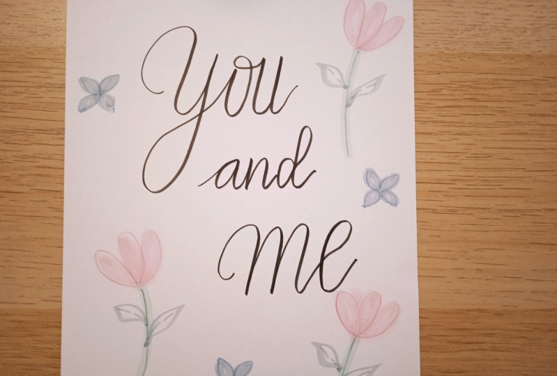
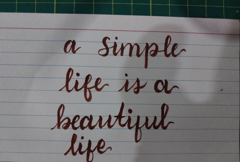
8. Final Project : Brush Letter A Word Or Quote: Hey guys, after learning so much basics about strokes and letters, it's now time to brush later a beautiful piece. But before moving on, I wanted to mention that you can also download the practice worksheets from the project and description section given below. Okay, so now I'm going to write a quote, and since this is a final worl, I'll be using a thick paper so that I can frame it or give it to someone. Enjoy watching me letter this. So great job guys. I hope you enjoyed the class, and learned a lot, from the basics to the final piece So for your final project, pick up your favorite word or a quote and brush letter it. Remember that, as I mentioned before, that in brush lettering, there are no such strict rules apart from thick downstroke and thin upstroke. So this gives you an opportunity to experiment and add a special touch of yours. Also, if you want, there are so many other ways by which you can make your hand-lettered work look even more beautiful. Like you can add backgrounds like these. So this is a marble effect and this is the watercolor background and some doodles like this. So doing all this will enhance your artwork. So I can't wait to see what you guys make. I would encourage each one of you to share your progress or any practice attempts you made leading to the final piece. Because it's a great way to get constructive feedback and inspire fellow learners. Also, if you're on Instagram, you can follow me by the name inspiring art design and share your artwork there. Don't forget to use the hashtag. #learnwithiad I would love to see them and connect with you to guide along the way. happy brush lettering.
 Surbhi Aggarwal, Watercolor | Lettering Artist