Transcripts
1. Introduction: Hi everyone and welcome to my class, brush lettering B6 in five easy steps. My name is sharper and I'm a hand lettering artists based in Vancouver, BC, Canada. I've been hand lettering for a few years now. And you might know me on social media as Schnorr design code. I like to create cute, fun hand lettered pieces which I post online. My, my style has changed a lot over the years, but I started off with modern brush calligraphy, which is what I'm going to be teaching you today. In this class, you're gonna be learning how to rate the entire lower-case alphabet using a series of basic calligraphy strokes. I'm also going to be sharing tips on how to hold your pen, what kind of tools to use, and also other tips along the way so that you can create your own beautiful hand lettered pieces. At the end of this class, there isn't any project where you get to use all the skills that you've learned today so that you can write your favorite word or your name. So yeah, I hope that you're excited to learn today. I'm excited to teach you. And if you're ready, let's get started.
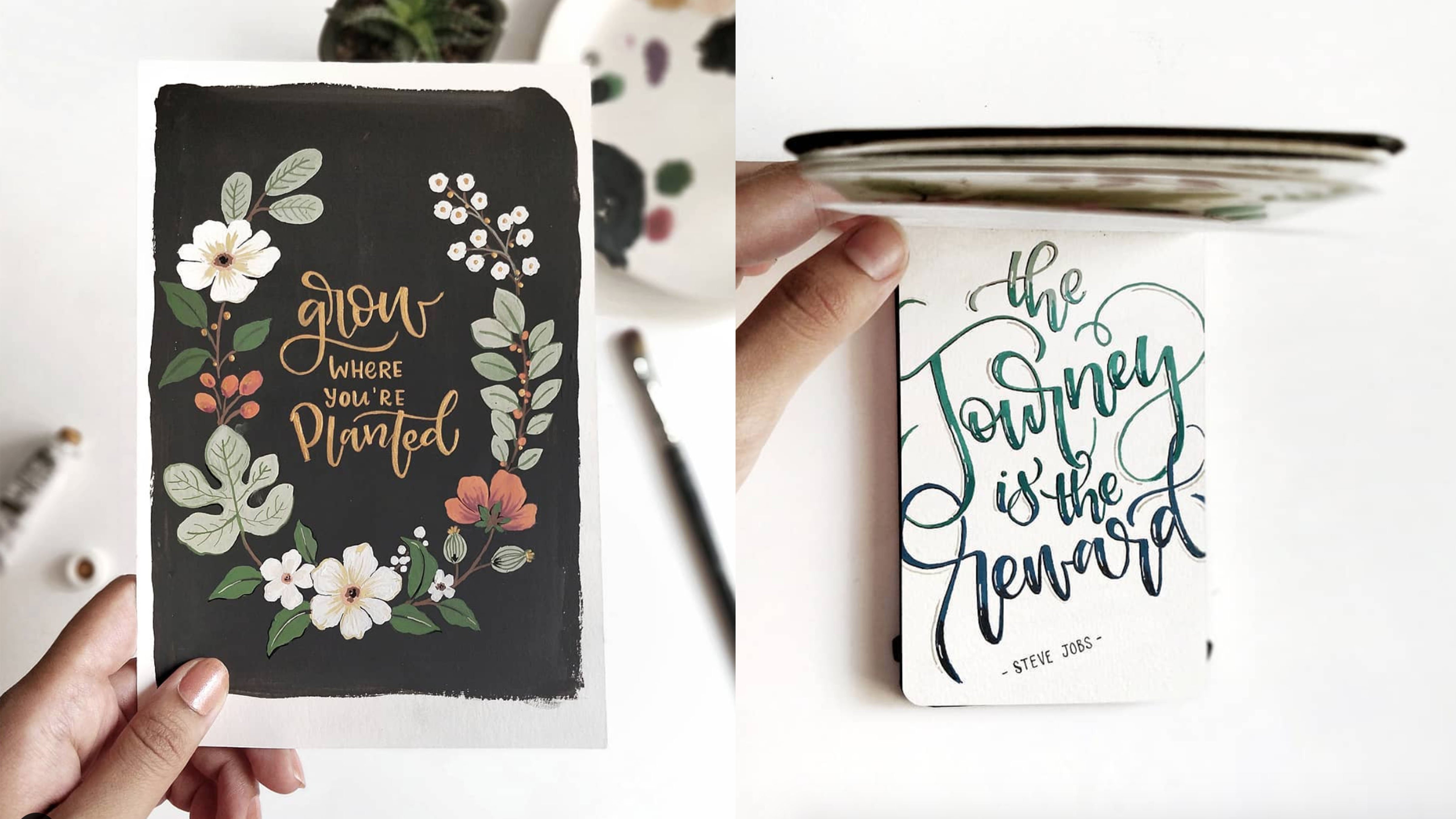
2. What is Brush Lettering?: All right, so you might be wondering, okay, so what does brush lettering? Brush lettering, or some people like to call it modern calligraphy has a loose swims Castile and has similarities to traditional calligraphy, where each letter has varying thin and thick strokes. You've seen it everywhere like on cards, posters, wedding stationary, pretty much everywhere on social media. So I also want to mention that traditional calligraphy is written at an angle or a slant, whereas brush lettering is more freestyle and it's totally up to you if you want your littering tool look angled or not. In the class resources, I've included some worksheets with slanted guides for you to use if you want, just like this. So if you want to practice that style, make sure to check that out. It's most people think that you need to have nice handwriting in order to do brush lettering, which is a 100% not true. Just look at my examples here. I have the word written happy, that's my brush littering style, where it looks nice. And then you have my regular handwriting or printing in this case, handwriting down here. It's not exactly the neatest. I'd like to think of brush lettering or or just hand lettering in general. As like drawing letters. Were you taking your time to do it so that way it looks nice and decorative. Whereas handwriting, it's more like functional and you just need to write stuff down. So hence why it's nothing special. So now that you know a little bit about Brush littering in the next video, I'll be going over tools you need to get started.
3. Step 1: Tools and Materials: All right, so now I'm going to talk about some of the tools that you'll need so that you can start brush lettering. First off, you're going to need a brush pen or brush marker. So just like these guys. So they have a flexible tip. You'll notice that the tip starts off fine. And then as you get down to the bottom of the brush tip, it gets a little bit thicker. And so we can have you can have both small brush tip pens and also large brush tip pens. The smaller ones are much easier to control, especially when you're just beginning. And they're usually, they're really good for small and medium-sized compositions. So this one is my, actually my favorite to use, especially when I'm teaching at workshops. This is from Tambo, it's tumble fineness, x2 k. This is hard tip and this one, it comes in like two types. This is a soft tip. They're very similar. Just gonna quickly show you what they look like. You're able to achieve both thin and thick strokes with them. So the larger brush pens or brush tip markers, these ones are good for larger compositions are a little bit harder to control. Especially when you're just starting your Rush lettering journey. I'm just gonna show you what they look like compared to the smaller brush pens. So see how how much of a difference there is between the two. Okay, so for the papers, he basically just need something that's nice and smooth like this one. You can use something like marker paper or Bristol paper or even smooth LaserJet printer paper. There's so many different kinds out there. But my favorite is from rodeo, which is super smooth. And it looks just like regular, everyday paper comes in a path like this. There's some that have like dots on them. This one is just nice and blank. But yeah, you can use regular paper, like regular printer paper. This is what the marker paper I use. It's from this brand Canson and Bristol paper. And you can use normal printer paper, but usually I try to avoid that because it will free your brush pens much faster. These condition, but yeah, the will typically ruin your pens faster. So if you want, you can also use tracing paper, which is generally nice and smooth. I've included some worksheets in the class resources. This is an example of them. We can do is you can print these out and then you can just place the tracing paper over top. This like that and practice your hand lettering on top that we don't have to print these out many times. So yeah, you can find all of these pens and papers at your local art or craft shop like Mike goals over here we have art stores like Opus and disappears where they have like pretty good selection. Or I mean, you can also buy them from Amazon or other online stores.
4. Step 2: How to Hold Your Pen: All right, so in this video I'm gonna be showing you how to hold your pen, but before you even start that, it's good idea to warm up your hands, just shake them out, just loosen everything up, get them warm. Especially if you're doing this in the colder months of the year. And so when you hold your pen, it's not the same as irregular, regular writing pen, regular ballpoint pen. And you don't want to hold it at 90 degrees. And if you can see that, but yeah, you definitely don't want to hold it at that angle, otherwise you'll damage your patents really fast. But the most important thing is that you are holding your and at a 45 degree angle to your surface or to 4000 B angle to the surface that you're writing on. This so that you can easily create thin and thick strokes. So where the pen actually sits on your hand over here. That'll determine whether you have more slanted letters or more upright letters. If you want something more slanted, you can position this part of the pen down here. And if you want something not a slanted, which is usually what my go-to is or my style is. So I usually have the pen resting over here. So it just makes it easier to create more upright brushstrokes. You can see the difference right there. Yeah, it's totally up to you if you want to make it more slanted or not. You can also do something where I position the left corner of the paper or the page that I'm writing on, have it pointing towards your body. And that will also give you that more slanted look. Or again, if you want to use some of these guide sheets that I've included, you can put your paper on top and use that as guide so that you write in that direction. And so, yeah, it can be a little bit difficult to hold your pen. This waits a little bit awkward. Something that you're not used to you. But of course with practice, you'll eventually build up that muscle memory. So it's not so weird anymore. So some other things to keep in mind when your brush lettering is your posture. You wanna make sure that you're sitting upright. But you also don't have to be like stiff as a board either. A lot of times I see beginners the ten to 100 over where their faces like way too close to their paper. So try to avoid that. Also, I find it easier when my when my wrist and my part of my forearm is kinda resting on the surface that I'm writing on. Whereas if I have my elbow like press I guess we can't save some video, but if you were to see this, my elbow pressing as my body, which kinda makes it awkward for me to have a nice amount of movement and flow while I'm writing. And then the same thing goes for one, my, my hand is holding the pen. If it's too high or too low to where I plan to write. I'll show you what I mean by that. So if I plan to write over on this line here, normally I would have my hand and pen like in-line without. So let's write the word hello. And then I'm just going to show you what it looks like if I had my hand and pen like much lower than the line. So it's, it's really awkward and to be honest, it makes it really hard to create thin and thick lines as you can see. So yeah, try not to do that. So before we move on to the basic strokes, we're just gonna go ahead and practice a few upstroke, some downstrokes so that you can get used to holding your pen this way with upstroke. So you're going to be applying light pressure to the pen. So I'll just show you what I mean by that. So you start at the bottom and move your pen up and away from you. And so notice how it's nascent then not too much pressure on the pen. And then downstrokes are exactly the opposite where you're going to typically start somewhere at the top. And you apply heavier pressure on the pen and have it have dependent coming towards you. And don't be afraid of breaking your pen. These brush pens are made for this type of thing. Also try to get into the habit of having E looser grip, moving your hand and arm instead of just working from your wrist. It'll help you a lot once you start writing letters. And especially if you're writing something large, if you find that you're gripping your pen way too hard, what you can do is you can try crumpling a piece of paper like this and put that in the palm of your hand while you're hand lettering. I find that it prevents you from having a super tight grip. So I didn't have it. It would look like this. And that just kinda softens your grip a little bit. Alright, so make sure to press pause on the class right now and practice this for a few minutes. And then I'll see you in the next video.
5. Step 3: Guidelines and Basic Strokes: Welcome back. I hope that you got to practice those strokes and you're starting to get used to holding your pen. And now I'm going to be going over our guidelines and basic strokes. If you want, you can follow along with these worksheets which I've included in the class resources. Or if you want, you can just watch, watch me demonstrate, and then use the worksheets for practice later on. And so now we have our guidelines over here. These are guidelines which will help you create your letters and helped them up, keep them looking consistent. And first off, we have our baseline. The baseline is where most letters will sit in start. Then we have our x height. This is the distance between the baseline and the waistline. This is the body of where most letters will sit. Then we have our waistline over here. This is the middle of most letters. Next we have our ascender line. This is usually the highest that your letters will reach. There is also a Cap, Cap Height line, which is almost at the same place as the ascender line. And that's where that would be the height of your capital letters. And then we have our descender line. This is the lowest that the letters will breach. There's actually like a second ascender and descender line if you want to make your letters even longer. But I actually never even, I rarely do this. Alright, so now we have our basic strokes that you'll need to learn so that you can create your lowercase letters. This is what they look like, and I'm just going to go over them individually. Feel free to follow along with these worksheets or on a scrap piece of paper, on a smooth scrap piece of paper. I mean. So first one we have is our entrance stroke, which is also an exit and upstroke. So this is one where you're going to have light pressure going up. Then we have our downstrokes. Oh, that one's going to have heavy pressure coming down. Next we have our undertrade stroke. So this one has both heavy pressure and light pressure. Just demonstrate for you here. So you have heavy pressure coming down and then you transition on the way back up with light pressure. And notice how I'm doing this slowly. When you're doing hand lettering or brush hand lettering. There's no rush. No need to rush. Just take your time when you're doing this. Next we have our overturned stroke, so that's basically the opposite of the return stroke. So you start off with light pressure going up, then heavy pressure coming down. Next we have our compound curve. So this is a combo of both the undeterred and return an overturned. And then next we've got our oval. This one can be a little bit challenging, especially when you're just starting. Even for me, I have trouble with this sometimes. So typically what I do is I like to start at the middle of where the oval shape is going to be. I'll just show you what I mean by that. Snow is how I started in the middle there, instead of at the top, I just find that it's easier to connect the two parts. Next we have our ascender loop and descender loops. So the center one, this one, you would start it. We'd like pressure. And then you have every pressure coming down. Next we have the descender loop. So the one starts off with heavy pressure coming down and then light on the way back up. Alright, so now it's time for you to just take a few minutes to practice each stroke. Just remember to take your time to form each stroke because these strokes are the foundation to all letters. Once you have a good handle on these, forming letters and words will be so much easier. One other thing I want to mention right now is that you can kinda see it on this brush tip. But as you're practicing and as your hand lettering, you might notice that the brush tip starts to bend in one direction. Just remember to like rotated every so often so that you can even out the amount of pressure that you're putting on these. So yeah, so just take a few minutes, practice this and I'll see you in the next video.
6. Step 4: Forming Letters: A - H: Now it's time to finally put those basic strokes together and start forming letters. Again, if you want to practice with these worksheets that I've included in the class resources. You can or just follow along as I demonstrate. And then you can use these for practice later on. I also want to mention that entrance strokes aren't required for all letters, but I'm just showing them in these examples so that you know how that letter would connect to a letter before and after. The first letter we have is letter a. This one is made up of a entrant stroke, stroke and return. So you can just put that together. And also keep in mind that there's so many different ways to do brush lettering. This is just one example and some of the letters you'll see in the worksheets, I've included some other variations. Next we've got the letter B. So there's a couple different ways to do this. This one is made up of an entrance stroke, asunder loop, backwards, oval, then exit stroke. So also different version I've included in the worksheets, which the exit stroke and the oval shape or kind of looped into one. Next we've got the letter C. So this one has a Entrance stroke. And it's like an oval stroke, but it's open instead. Next we have the letter D. So we have our entrance stroke, oval, a center loop which ends up becoming a exit stroke as well. And also notice how I'm lifting the pen in between each stroke. That way it gives you time to adjust to the next stroke. Now we have the letter e. So one's very similar to the letter C. So it has the entrance stroke and sort of like an oval, open oval shape or a whole stroke. I kinda like to use the entrance stroke as a marker as to where to start the EE. Next we have the letter F. So we have our entrance stroke. This one is made up of kind of like a combo of the asunder and descender loops. Then finish off with your exit stroke. So I'll put it all together. Next we have bled and G to this was made up of an entrance stroke, oval, descender loop, and exit stroke. Next we have the letter H. Mr. entrance stroke, a center loop. This one has a compound curve. So altogether.
7. Step 4: Forming Letters: I - Q: Next we have the letter i. So this one is made up of a entrants stroke and return. The next letter is letter j. This one has a Entrance stroke, descender loop, and exit stroke. And altogether, letter k is made up of a Entrance stroke, a center loop. And not sure what to call these, to be honest, but they're kind of like a little like little ribbon shape. But yeah, you'd start off with light pressure coming up, I guess kinda like an oval in some way. And heavy pressure coming down. And then you have the return stroke. To finish that off. If you prefer, you don't necessarily have to add any kind of heavy pressure coming down. You can just have it nice and light like that. So altogether it looks like this. Then we have the letter L. Two. This one is made up of an entrance stroke. And then this one has a, a sender loop that becomes a exits stroke as well. So I'll show you what I mean by that. And then altogether it looks like this. Next we have the letter M. We ever entrance stroke, downstroke. Then this one has a overturn and then a compound curve. Next we have letter N, which is similar to the letter M. So this one's made up of our entrance stroke, downstroke and compound curve. So altogether it looks like this. Another way to do these two is, so I'll show you what the end looks like. So instead of doing a street downstroke, you'd just do an overturn and then a compound curve. And so for the letter m, it would look like this. Now once said, overturn, other overturn, compound curve, totally up to you which way you wanna do it. So the next letter is the letter o. This one is made up of a Entrance stroke, oval and sort of like an under return stroke. Not sure what it's called exactly. C altogether looks like this. Another version that I like to do is it's not like a full oval, but I'll just show you what it looks like. It's just sort of like a fancier way to do it. Next we have the letter P. This one has a Entrance stroke, downstroke. And let's look backwards, oval with the exit stroke. So altogether it looks like this. Next we have the letter Q. So we have our entrance stroke, oval, descender loop, and exit stroke. So again, it looks like this.
8. Step 4: Forming Letters: R - Z: Next we have the letter ARF. Start with the entrance stroke. It's sort of like another overturning, kinda weird stroke. I can't remember the name of this. And then you finish off with a return. So again, it looks like this. Another way that I've actually demonstrated in the workbook is one of my favorite ways to do it, which it starts off as an entrance stroke. Then just go straight into him loop. Instead of that. You finish off with a undertrade stroke spine. It's like another fun, fancy way to do it. Next letter is the letter S. So there's a couple different ways to do this. One way is entrance stroke. And then sort of like a, like a half oval and away. And you finish with an exit stroke. So again, the way that I've demonstrated in the workbook is just like one loop be kinda s. So the next letter is the letter t. This one has a Entrance stroke, downstroke, which is kinda like a long and return stroke. And then you have a crossbar. So altogether it looks like this. Next one is a letter U. This one has a Entrance stroke and overturned and another and return. So altogether looks like this. Next we have the letter v. So it has the entrance stroke and return. And again it has that like, kind of like AS a small return stroke. So again, it looks like that it's very similar to the letter you. Another way you can do it that I show in the worksheets or the workbook is a little bit more loopy. So I'll just demonstrate what I mean by that. So it's sort of like a compound curve and then it goes up and have a little like loopy thing there. Next we have the letter w, the Sun has a Entrance stroke. And return. Another undertook turn. And then again that little, small, little return stroke. So altogether it looks like this. And just like the v in the worksheets, it has a more loopy or look to it. So I'll show you what I mean by that. Next we have the letter x. So this one is made up of a compound curve and a across that goes in between them. And one more time it looks like this. And we're almost at the end now. So we've got the letter y and z. So letter Y is made up of an entrance stroke. Then we have our overturn. Then we have a descender loop. And exit stroke altogether looks like this. Now we've got the last letter, which is the letter Zed or z, depending on where you are. So letters that has a overturned then kinda like a combo of like an overturned and descender loop. And you have your exit stroke. So altogether it looks like this. So now it's your turn to practice each letter. Try to do just a few of each one and then move on to the next one. It's easy to get stuck on one letter trying to perfect it. And I see this all the time with beginners, but don't worry, this is all new to you and with time and practice, you'll improve.
9. Step 5: Letter Combinations Pt. 1: In this video, we're going to be putting those letters together, which will help get you setup so you can brush letter words. I'm going to go over a few letter combinations. And I also included more examples in these worksheets which you can find again in the class resources. So the first combination I'm going to do is a and C. So we have our oval for the a and return stroke. And sort of the oval shape again for the scene. So again, that looks like this. Next we have b and r. So we have our asunder luke. Yeah, we had a center loop. Then we had our sort of loopy backwards oval stroke. And then that just connected street into the r with that another loop. And then it goes down into the undertone stroke. So again, it looks like this. Next we have the letters, letters C and a, or I guess it's backwards of that. So that one has the backwards oval or no, it's an, it's an oval. Oval. And then we have another oval and undertrade stroke. So one more time it looks like this. Next combo is two d's. So oval shape for the d, a center loop, and then you connect it to a oval. And then another, a center loop. And the next column we're gonna do is a double E. And if you notice that sometimes joined together, don't worry, you can just connect them. Next we have the letters F and E. So the F Again, it's made up of the asunder loop, descender loop, exit stroke. Then we have the e with the sort of like an oval stroke. Next we have the letter g. And oh, I'll just show you again what that looks like. Next we have the letter combo. Next comma I'm gonna do is the letter j and u. So we haven't the ASR, descender loop, exit, stroke and return and return. Next we have a double l.
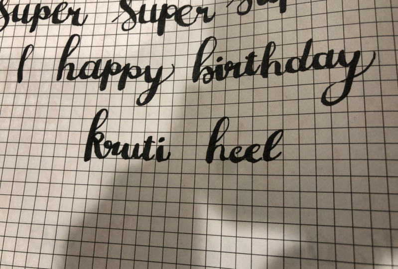
10. Step 5: Letter Combinations Pt. 2 and Project: Next letter, calm. Oh, we're gonna do is M And so me. So that one has the downstroke overturn compound curve and the e which is oval-shaped. Next we've got a, an O, N, W. Then we've got the letter q and u. We have the oval-shaped or oval stroke, descender loop, exit stroke, and return and return. Next we've got the letter S and h. And then the next one we're gonna do is w and h. That one has the overturn or compound curve and then undertone that has the loop, a sender loop and compound curve. Now the last one I'm going to demonstrate is y and It's not one has a return stroke. Descender loop, exits shrunk, oval, and return one more time. So I'm just going to demonstrate a few words so that you can see everything from these lessons come together. But before I do this, I want to mention a few things about letter spacing and also keeping your letters looking consistent. When you're writing your word, you want to make sure you're giving enough space between each letter so you can actually read the word. Having the same size exit stroke can help this. One other thing that will make your littering look aesthetically pleasing is to keep the angle of the letters consistent using guidelines. And of course, practice will also help improve this. So I'm just going to show you what the letter or the word hello. So notice how the spacing is fairly even throughout the angle that everything is or the angle that the downstrokes are in are the same throughout. And it's going to show you one more word. Alright, so for your project, you can write your favorite word or name and don't forget to upload to the class projects so I can see your beautiful hand lettering. Also feel free to try other brush lettering pens and just have fun with this.
11. Final Words: Well, that's it for today. Thanks so much for joining me. I hope you enjoyed this class. If you're on Facebook or Instagram, follow me there. Schnorr design coal. Hope that you continue to practice. And if you post your work online, make sure to tag me so I can see your progress. They have Thanks again and tacky lettering and see you in the next class. Bye.
 Char De Silva, Lettering Artist and Designer