Transcripts
1. Learn Photoshop 2025 in 1 hour: Welcome to the wonderful
world of Photoshop. I'm Chris Baron, you're
the instructor together. We're going to do a
lot of fun projects in Photoshop all without
any previous experience. We are going to take it step by step and explore the program, the hot keys, and all
sorts of techniques so you can get awesome
results in no time at all. The goal is to get
up and running with Photoshop as fast as possible. No boarding theory you're going to learn by working along. We're going to use
artificial intelligence to create awesome designs. We're going to improve
our portrait shots, we're going to
remove people from their background and a lot more. This course is packed
with information so you can get great results
without any headaches. To get the best experience, please watch this
course twice the first time around just to see the process and the techniques. When you get to the
end of the video, rewind from the start and work along by pausing as
often as you need to. I repeat, don't try to work
along on your first viewing. Instead, watch every lecture
twice and the second time. Pause as often as you need
to so you can work along. Now, how do you
get Photoshop from Adobe.com That's the only
place for it, no other option. Now the best plan is this
one here called photography. Prices will vary depending
on your country. Now don't get the
individual plan because it doesn't help. The photography
plan is the best. Use any laptop or
desktop computer, it doesn't matter, but please don't use a
phone or a tablet. Now, in the next video, I'm going to teach
you how to set up Photoshop and we're going
to get straight to work. Before that, a quick word
about me, I'm Chris Barn, I'm going to do
Certified instructor and I've been
teaching since 2013. I focus on getting maximum results with as
little effort as possible. I've been a freelancer, so I know results are
all of that matter. That's what I'm
going to teach you, how to be fast and
efficient so you won't waste a whole day
on a small project. This is a crash course where I'm going to show you
my best techniques. Now in Photoshop, there are many ways of doing the same
thing in multiple ways. I'm not going to show you every single option because
we would be here all day. Instead, I'm going to
focus on what gives you the best possible outcome
as fast as possible. With that being said, sign up to Adobe.com You have a
free seven day trial, which is more than
enough for this course. Pause the video,
install Photoshop, and when you're ready,
move on to the next video.
2. Explore the interface & how layers work: Welcome back. I hope
you've installed Photoshop from Adobe.com If not, please pause and go for it. Okay, now this is the latest
version of Photoshop, and we're looking at the
welcome screen here we can see some of my recent projects which are specific
to my computer, of course, and a few
tutorials here and there, which I'd like to close
by clicking here. Now the most important thing
is starting a new project. Use this button here, or what I like to do is hit
Control, That's command. On a Mac, you're going to get
this new document window, but here's the main thing, Just about every setting can be changed later on without
any major issues. What I recommend
for this course is you go to the web tab from here. The Web large preset is
a great starting point, but you should do one thing. Please uncheck this artboards
feature. We don't need it. The size standard, 1920 by 1080. Now there a lot of other things here that
may catch your eye, such as these templates here. My advice, stay away from them. For the beginners, they're going to make your
life quite difficult. Let's hit this button to
create a new project. Now, Photoshop interface may be different on your
end. Let's fix that. So we're both looking
at the same thing In the top right side,
please click here. From this list, we're
looking for essentials. Then just to be
sure with all set, I'm going to click
again, but this time I'm going to choose
Reset Essentials. And now we are both
on the same page. Here's what you
need to know Now, This white part is
called the canvas. The canvas is by far the
most important area. This is where you should
focus for most of the time. Very closely related to it is the layer spanel.
This is right here. Let me show you how this works. I'm going to hit and I'm going
to get the rectangle tool. It's this one here with it. I'm going to click and drag. Now we have a shape both on the canvas and in
the layout spanel. These are always tied together, they are completely
dependent on one another. The canvas shows you
the actual design, the layout panel gives
you information about it. For example, this is a
shape layer that set at 100% opacity and it has
a normal blending mode. Different approach is this. If you're the driver,
the canvas is the wind screen to which you
can actually see the road. Then the layout panel
is your dashboard where you see info like
the speed of the car, the revs, the fuel, and so on. Now to recap, the most
important thing is one, the canvas, and then
to the layout panel. The third thing is the
tool bar on the left side. This is where you get all sorts of tools
like the brush tool, the type tool shapes, and so on. That's quite a lot of them, but we'll only use a handful. No worries. Now,
the fourth thing is the main menu,
the one up top. This is huge, but the most important
actions have hot keys. That's going to be quite easy. Finally, there's number five, the options bar, which
is this area here. As you switch from Tool to tool, you're going to see different
options in this area. Yeah, overall that's
Photoshop interface. You have a cheat sheet
attached so you don't have to memorize anything
or write anything down. Now regarding layers, these are transparent pieces of paper that stack on top of each other. Let me switch to a
different project. Now, if I go into
full screen mode and you can only see the canvas, it seems like this is
one single image, right? But actually here you
can see lots and lots of layers that are organized
into folders into groups. It's exactly like
on your computer where we have
programs and movies, and photos all neatly
organized into folders. This is how it works
in Photoshop as well. Now why do we use layers? The idea is that we can
isolate certain things. We have more flexibility. Say that we need to
make the bottle bigger, but just the bottle,
nothing else? Well, we have a separate
layer for that. That means we can grab it and we can edit it in any
way that we want. You don't need to work
along by the way, just focus on how
layers work Now, what if we want to change
the color of the background? We don't want to change the
bottle or anything else. Well, again, there's a
separate layer for that. That means we get
complete flexibility. This is the power of layers. They allow you to edit
separate parts of your design without
affecting everything else. You can create as many layers
or folders as you want. It's really up to you
if you want to do individual fruit or
one single layer is enough for all fruit. Now please note one thing
that's quite important. These layers stack
from top to bottom. This means that if I click and hold and move the background at the top of the layer spannel
won't see anything else. This is what I mean, from top to bottom in the layer panel. What's on top in
the layer spanel is also going to be
on top on the canvas. In this case, the background is covering the entire canvas. If you have the
logo underneath it, obviously you won't see it. Why? Because it's underneath
it in the layers panel. You would have to
switch this order. Now, if you remember, they
stack from top to bottom, you're going to be good to go. Before we go, please take a look at the top
right side here. We have this color panel, but we're not actually
going to use it. Let's free up some
space by clicking here on this very small icon. Now from this list, choose closed tab group. And now we have much more space
for the properties panel, which is very useful. Then switch to the move to wall. The hot key is V, that's another one here. But we actually want the move
to wall, Click and hold. And you can see every tool here. Again, we want to move to wall. Okay, great. Now
right next to it we have a feature
called auto select. Please disable it. This is quite important. Uncheck this option,
now we're ready to go. Let's take a quick break.
3. Open and save images & projects: Welcome back. Please get the rectangle tool hot
key, It's this one here. Now, please drag out
three shapes in total. You go to the canvas, you click and you drag. The size is not
important right now. Repeat a few times. Now switch back
to the move tool. The hot key is V. By the way, this is something you're
going to do all of the time. After you do any work, you should always come
back to the move tool. Next, please look at
the layers panel. Let's double click here. And that's going to allow
us to rename every layer. Now why should we do that? So we can easily identify them, call them whatever you want. Take your time with it. Maybe
shape 12.3 in this case. Okay, Next, let's double
click this area here. This is how we're going to
change the color above shapes. Now this new window is
called the color picker, and it's quite easy to
use play around with it. And you're going
to see the changes immediately on the canvas. Okay, please take your time
and change all three colors. You want them fairly different? I'm going to move ahead because here's what you need to work on, here's what you
need to practice. Now to select a layer, you can use the layers
panel. Of course. Click on any of them, and this highlight means
that it's selected. Then if you go to the canvas and you have the
moved well selected, you can click and move that specific layer
around quite easy. But here's a faster way. Hold down the control key, That's the command key on a Mac and now click on
any other shape. Just like that, I've selected
the different shape, holding control and clicking. That's the fastest way to work. That's what you
should do as well. Keep your mouse over the canvas and control
click to select layers. Every click means you're
going to select a new layer. If you want to
select several ones, you're going to have to
hold control and shift. Try it out and place
these layers on one side, then move them on
the other side. That's control and shift
to select multiple layers. And you can also deselect
by using the same approach. You have an exercise attached
that's going to help you practice selecting
and moving layers around. Remember, layers stack from the top to the bottom
of the layouts panel. If you need to
change that order, you can click and drag. And just like that it's done. Now let's just assume
that this is done, our work is finished. Quite impressive, right? In any case, let's save it. And Quartet saving it means saving the project itself
with all of these layers. You're going to get a PSD file, that's the source file, use control S, and you're
going to get this window, choose any name and
you're good to go. Now, saving the PSD
is useful because you can always come back
and edit anything here. But if you want to share
your work with the world, you're going to need to
export it as a PNG or a Jpeg. This is done by going to
the top menu to file, then export, and
finally, export. As once you click here, you're going to get
this new window and you can choose
quite a lot of things. File format, I recommend PNG
for the maximum quality. You can shrink the file by
using this scale feature. This is quite useful if the
file size is way too big. And you can see the file size here and the rest
of the settings, okay, as they are right here. That's saving and exporting. Now what about opening? You simply double click
it and that's that. Now opening an image
out a few ways, but here's what I recommend. Use control, That's
command on a Mac. This is going to give you a new window and you can browse with your files just in case
you see another screen. This one here open
from Creative Cloud. You can click here
on your computer. And now you can select a file and you're going to
start a new project. Now the second way
of opening an image is to drag and drop it
from your computer. You can minimize Photoshop, find an image, drag it, and then drop it
above the canvas. Now the main difference is
the fact that you can resize, reposition it before
you place it. Just in case you have
several projects opened and you want to move layers from project to project. Here's how this goes. You select the layer
from the canvas, not from the layers
panel from the canvas. Then you click Hold, And you move over to
the second tab a while, until Photoshop shows that you're still holding the click. Then move over to the canvas. Now you can let go. Great
stuff, let's do this again. We move to this tab and we're going to control
click to select one layer. Again, you can always use Control Shift click to
select several ones. Now with them selected and
whilst on the move tool, we can click hold and move
over to the other tab. Wait until you see it, and then after the second or so, move your mouse down above
the canvas and let go. And that's how you do it. Now to recap, you can double click the layers
name to rename it. When working with shapes, you can double
click the thumbnail to get the color picker. If you want to select a
layer from the canvas, hold control and click on it. If you need multiple layers, hold control and shift. If you want to move layers
to a different tab, select the layer
from the canvas. Click hold. Move over to the different tab and let
go above the second canvas. If you want to export your
work to share it with the world use file,
Export, Export. As if you want to
open any image, use control that's command or drag it from your
computer above the canvas. With that, let's continue.
4. Generative fill - Artificial Intelligence in PS: Welcome back. The
term generative fill may not tell you a lot, but it's basically
artificial intelligence inside Photoshop. This only works in the
latest Photoshop version and you do need an
Internet connection. Here's how this works. We're going to select a part of an image with any
selection tool. I recommend using
the marquee tool, Hot key, M. It's this one here. For the rectangular shapes, I'm going to click and
drag in this top region. Now you can see this
bar right here, but we're only interested
in generative fill. Click here and you're
going to get a new field. This is where you can tell
Photoshop what you want to do. In this case, I want to add another window in this place
that I've just selected. Type that in window
and hit Enter. This is going to take a
few seconds depending on your Internet speed and the
complexity of your request. Just like magic. There you go. You do have three
choices to try out. This is magical,
this is fantastic. This is the new and
improved Photoshop. Notice there's a new layer
here called window Now, does it always work so well? No, but in most cases, it does work quite well. And overall, it's
a great feature. Now generative L can
also remove things. Let's select this bike again, I'm using the marquee tool. Click and drag out a box. Now in this case, you don't need to worry about
which layer is selected. It simply works just like that. Okay, now say that we
want to remove this bike. Well, no problem.
Hit generativel, but don't put anything
in that field. Leave it empty. Hit Enter, and Photoshop will automatically
analyze eperthang, then bike is gone.
Just like that. Now I always suggest
you scroll through these options and see which version looks
the most realistic. In case you're not
happy, simply try again. Generate again. Now, what's a building without an entrance? Right, with the
same marquee tool. Click and drag out a box. In case you're not
happy with the size, use control D to select. Now you can drag again. Okay, let's type something
like front door, which would make quite
a lot of sense here. This being a building. Yeah, this is incredible stuff. It works just like
that. Nothing else. Of course, in case
you're not happy, you can always hide
these layers and you're going to get back the original image just like that. This is generative fill. Let's switch to a
new photo here. I think it would be quite funny to add a shark in
the background. Let's have some fun with it. Type that in a shark and then
wait for the few seconds. Now the possibilities
are endless. You can use this for, you have serious projects or you can have a laugh
like in this case, this is actually
quite believable. Let's switch photos yet again. Now this old man
is quite charming, but I want to remove
something from his hand. Well, not a problem
with the marquee tool. You can select it, then you can use generative fill
with an empty field. Then after a few seconds, boom, Just like that, this is
a fantastic feature, which is incredibly powerful. This is absolutely fantastic. To that end, you can use it just about everywhere, for example. We can use it to
remove this sign. There's more focus
on the old man. Well, let's make it happen, select it, use an empty
field head Enter. And just like that,
you can use it to add or remove
just about anything. This works best for fairly
large photos overall. Small selections, that's
something to be aware of. Big photos, Small selections
just for the fun of it. Let me add a coffee
cup in his hand. I think that's a bit more appropriate for this
particular scene. Now you have all these
photos attached. Go and have fun with
it in case you want to download some more photos
with no strings attached, use unsplash.com Here you're going to find lovely
photos of all sorts. But avoid these ones with
the label unsplash plus, because those require
a membership still, you have a lot of free ones. Go ahead and have fun
with generative fill, add or remove anything.
5. Resize photos & place them into any shapes: Welcome back. When you
want to resize an image, you have a few options. The first one is great
for shrinking them. And that's the crop tool. The hot key is C. Please click and hold and make sure you have the
right one selected. Now for this specific tool, the options bar is
quite important. Please pause and make sure
you have the same settings, especially on this
drop down here, the fill drop down. When you activate the crop tool, you're going to see these
handles on all sides. If you don't see them, use control zero to zoom
out That commands though, on a Mac now you
can grab any one of them and then remove
parts of that image. And that's that's the
crop tool, by the way. Notice there are no
more handles even though you're still on the
crop tool. Not a problem. Switch to any other tool. I prefer the move tool and then switch back to
the crop tool again. Hot Kc, here you are, the handles of back. You can also use the
crop tool like so. You drag out the box and you're going to
get this preview. Of course you can move this box, you can resize it
whatever you want. When you're ready enter and
you have done crop tool, the first way to
resize an image, specifically to shrink it, The second way is
to use control, that's command on a Mac. Now one thing, when you
open an image with control, you may see this layer is called Background and there's
a lock next to it. This means you can't use
control just yet to fix it. Simply double click here, you're going to
get a new window. But just hit okay, and
now you're good to go. Now you can use control
for transform here. You're going to get
some similar handles. But before you do anything, let's have a look at
the options bar here. You want to make sure that
the chain icon is pressed. This is quite important now. You can go to any side click, hold and resize the image. If you're looking for
the specific size, you can use these two fields. Here stands for the width, H for height also show up
in the property spanel, but these values are by
default, percentages. If you want to use pixels, you're going to
have to write Clk. Okay? Now you can see the
existing pixel value. Select that number
and replace it with anything that you
want, say 2000 pixels. Because the chain
icon is pressed, the height will automatically
change as well. This is fantastic. Then there will use this
check mark to finish up. That's how you use control. But the thing is, you may get this extra space
all around your image. Now to get rid of it, go to the top menu to
image from this list. You're looking for the trim. This does exactly
what it sounds like. It will trim or cut away any excess space from
this new window. Choose the first
option and make sure all four boxes are checked here. Okay. And you're good to go now. This is a great time to talk
about zooming in and out, but it's much easier
than you think. The hot key is z, z. For zooming Now you click hold
and you do the following. You move towards the
right to zoom in. Then on the flip side, click and hold and move
towards the left to zoom out. It's as easy as that. You could potentially click
several times and do this and that the best way is
exactly like I said, click hold and move towards
the left or towards the right when you want to
see the entire picture. Say you have to zoomed
in, no problem. Use control zero,
That's command zero, and that's going to fit
the image to the screen. Now here's the final
thing I want to show you. Hit U and get the
rectangle to hold. But this also works with
all the shapes right here. Now add any rectangle
to the screen. The size really
doesn't matter because you can always resize
it with control. Now this rectangle is above the photo in
the layer spannel. We need to flip this around, go to the layers panel
and move it down. The photo is now above
the shape, great. Now select the image, make sure that's selected, and then use Alt control, That's option command on a Mac. Now you've just created
the clipping mask. That means you've inserted the photo into the layer
that's underneath it. Now with the photo selected
with the move to active, you can reposition it if needed. You can use control
and resize the photo. Take your time with it and explore in case the
rectangle isn't right. You can obviously selected in the layers panel and
then move it about. But one thing about
resizing shapes, you may want to
resize it right now. You obviously want
to use control. Now the chain icon
should be pressed great. But here's the thing. Maybe you want to simply make
the shape taller, but not wider as well. Now by default this
does not work. The shape is going to
grow on both sides. Here's the fix hold shift and now you have
complete freedom. You can see how it's becoming
taller but not wider. That's the fix hold shift when resizing shapes to
get complete control. Okay, now let's
create a gallery. Start a new project with the default settings
1920 by 1080. I want you to
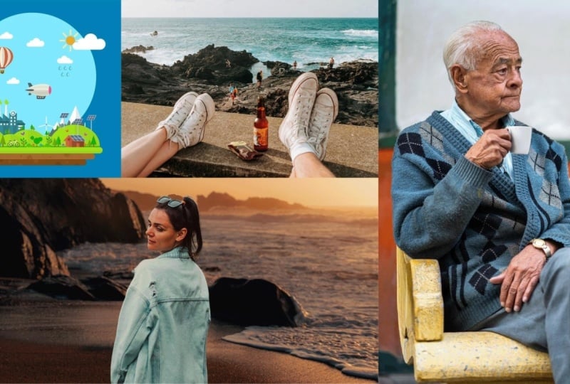
create a collage of six photos, an image gallery. Now add a rectangle on the
canvas, any size for now. Then go to one slash.com or use any other website and drag in
a photo size it just a bit. It doesn't have to be
perfect because next, after you hit Enter, we're going to use Alt control. Now the image is inside
the rectangle, great. Now let's add another
shape right next to it and repeat this
process again. Add a shape, then above it, add a photo with
a photo selected. Use Alt control to insert it into that layer.
Let me speed ahead. Say you have an empty
space right here. You can use the crop tool
to resize the canvas or you can select all of these rectangles and then
use control on them. Now they're going
to fit just fine. Now if you really
want to impress me, make all six rectangles
the same size. Remember control
and then Reichlick in these fields to
switch to pixels. Here's the thing, the width
of the canvas is 1920. Divide that into three, and that's 640 pixels. That's the width, 640. Then for the height, that's 1080/3 that's 36,300.60 pixels. And that's how you can
create a beautiful gallery. Fill it with photos
from your own country, and post it to the
platform. Have fun with it.
6. Work with text like a pro: Welcome back. I'm
sure you want to add some text to your designs. Here's how this goes. Activate the type tool, hot key, and then you
have two choices. First of all, you can
click and start typing. Now, Photoshop is going to create a new layer
automatically. When you use this method, click and start typing. You're going to create
what's called point text. You're going to find out
what that means in a second. Now please be aware
that automatically you're going to get a
couple of words in Latin, that's dummy text,
popularly called lipsum. If this annoys you
and you want to get rid of that, please
do the following. I'm going to hit escape
and then control K, that's command on a Mac. Now go to type, it's in the bottom
half of this window. From here you have this option
that's enabled by default, fill new type layers
with placeholder text. That's the Latin text. If you don't like it, you can simply uncheck this
box, and that's it. It's really up to you, it's
a personal preference. Back to it. The first
way of creating text is to simply click
and then start typing. Great, this is going to give you point text all fine and well. Now the second method
is the following. You click and you drag out a box that is going to constrain
your text to that region. Again, in this latest version, you're going to get
some lower Mepsm. By default this is
called paragraph text. Now as you can imagine, this is better suited
for large amounts of text because you
can find tune it through these handles
and this is going to make it easier to
position it in a design. Now, at any point
you can swap between these two methods by rechlicking the layer
in the layers panel. I'm going to do that
for my point text. As you can see in
this long list, I have the option of converting
it to paragraph text. I'm going to hit it and then I'm going to move back to my canvas. Now if I click on it
with a type tool, you're going to notice
it has this box. If you want to add
more characters, they won't show up. But you can of course, resize this box and
that's all fine And well now let me do the same thing for the
other layer, right? Click it in the layers panel and choose convert to point text. Now those handles are
going to be gone, but you may get a warning
message that says, hey, you have some extra text that's
outside the visible area. Now when you'll convert
it to point text, Photoshop is going to remove that. It's
going to delete it. Happy with that,
press. Okay. I'm going to hit cancel and I'm going to expand it so I can keep
all of my paragraphs. Okay. Let me do that again. Right. Okay. Now the
handles have gone away. Now, here's the thing. When
you want to finish editing, you have a few choices. The first thing, you can commit your text layers by clicking
anywhere in an empty area, you can see how my
cursor changes. Now this means if I click, I'm going to commit
to my changes. Let me show you again now you see how there's
a range here. If I go outside of this
range and I click, that's it, I'm going
to finish writing. That's the first
way. The second way to simply use the check
mark from the options bar, this one here, nothing
all that fancy. Then the third way of committing is to use the numerical enter. That's the enter from the
right side of your keyboard. If you use the main one, you're just going to move to a different line, to a new line. Remember it's the
numerical enter. Now, most likely this is not how you want your
text to look like. To make any changes, I suggest you use
the character panel. Now if you don't have it opened, just go to the top
menu to window. Then from here go to character. Now from this new panel, you can change just about
anything that you want. The first thing here
is the font family. This is quite simple, it tells you what you're
currently using. Now, the default one in
Photoshop is Myriad Pro. If you're not seeing
that, no problem. Let's do the following thing. In the top right side, click on this very small icon. Now from this list,
choose reset character. This is going to show us
the default settings. To the right side,
we have what's called font weight font style. Here you can expect
to find quite a few. In general, you're
going to have light, regular bold, italic, and so on. Each type face will
have its own styles. You may find ones that
have over ten styles, like in the case of
Myriad Pro maybe, but other ones may have only one single style.
It's really up to you. The best place to get new
type faces is Google Fonts. It's as simple as
downloading the archive, extracting it, and copy pasting the files to see Windows fonts. Now moving on to the font size, I like to type in
my values manually, and I've gotten used to using
pexels instead of points. That's what I recommend
you use as well. Now to change the
unit of measurement, hit control K from here, from this new window. Choose units and rulers. In the top left, you're
going to find type. Here, I recommend
you use pixels. Okay, let me close this window. Now, when you want
to adjust the size, you have various options. You can click and then use your mouse scroll and
you can add shift. And that's going
to make the value jump in ten pixel increments. Another way you can also type
in the value and hit Enter. And finally, you
could potentially use this drop down to choose one
of these existing values. Now personally, I recommend you click and use
your mouth scroll. That's what I use in
my day to day work. Next we have something that's called leading or line height. Now I prefer line height because I think it's
self explanatory. Line height controls
the amount of space, vertical space between
lines of text. Now, this is great for the
improving readability, and I think it's a must when
it comes down to paragraphs. Please be generous with it. Now, by default, auto, it doesn't work all that well. It makes the text look
cramped, squeezed in. Nobody wants to read something
that looks like this, for example, All
squashed together. My advice is you use the
following multiplier 1.5 maybe two x the
size of the font. That's a great reference. If my text layer is set
at maybe 15 pixels, my line height should
be around 30 pixels. No more than two x though. Now as you can see, in
this case it's a bit much. Two x is a bit much. But if I scale it down
to something like 26, this is easy to read. It looks lovely and is great. Now, there are other options
here and this panel, but most of them
aren't very important. It's really for those users who are really into typography, I wouldn't get intimidated
by all of this. Now let's focus on the color, which is so easy to adjust. Initially the text uses
the full ground color, but with a click right here, you get the color
picker and you can immediately change
it, just like that. There's no fuss about it. The most important thing when working with text is contrast. Here's what you want to avoid. White text on a light background or dark text on a
dark background. Now that's not good. Here's what I consider
the ideal situation. It's pure white text on a
colored, saturated background. Now, in case you simply can't change the image and you
have something fairly busy, here are two options. The first one is a drop shadow with the text layer selected. Go to the bottom of
the layers panel. Click on this X icon. And from this list,
choose drop shadow. Here you're going
to need low values. Don't exaggerate your
shadows should be subtle. Use pure black and then
lower the opacity. Now, same thing for
the distance and size. Use only a few pixels,
something like this. Overall, this should make
your text easier to read. Again, just a subtle shadow. Now the alternative is to
grab the rectangle tool, hot keyu, and then
simply add a box. Now this obviously
needs to be placed underneath the text
in the layer spanel. Now make it any
color that you want, but the key is to lower its capacity from this
place right here. This can also help
you quite a lot. You may need to move it about, but yeah, this can
help you quite a lot. Now overall, please use a great clean image that
gives you maximum contrast. That's the best way
to go about it, but if you can't manage, try either of these techniques. With that, let's
take a quick break.
7. Real World: Selections & Adjustment layers: Welcome back. Selections
are incredibly important in Photoshop because
they allow you to work on a single
part of your image. Take this nature scene, now the sky is quite gray. I would like to add
some blue in it. Here's how selections help us hit W. To activate the
quick selection tool, click and hold and make sure you have the
right one selected. Okay, now from the options bar, click here to see the
current settings. We want the hardness set to
100% Now as for the size, you could use this slider, but I suggest you use your square bracket
keys on your keyboard. Now the left one shrinks, it shrinks the brush, and then the right
one makes it bigger. Okay, now with the
quick selection tool, I'm going to brush over the sky. You can tell when it's selected
because you're going to see this outline,
these marching ends. Now what does that mean? Only that part of the
image is selected. Everything that we
do from this point on will only impact this area. Now I like to use
adjustment layers. Go to the bottom of the
layers panel and click here. From this list, let's choose hue and saturation. Okay, great. Now in the property spanel just above, let's enable colorize. Let's change the hue
value to a nice blue, say about 220 or so. Here it is. We isolated the sky with a quick
selection tool, AKA, we made the selection
and then we added blue to our sky
with an adjustment layer. Let's switch to a new photo. Let's try this again. The quick selection
tool, hot key, Change the brush size if needed
and then begin to paint. Inevitably, this is
going to happen. The selection is going
to grow way too much. It was bound to happen
here with the red nails. What now? Quite easy. Hold down the Alt key. That's the option
key on the Mac. Notice the minus
symbol on the cursor. That's the Alt key in action. Now while you're holding it, you can shrink your selection. Simply go over those
unwanted parts, and then simply click, and that's how the
selection shrinks. Then when you're
ready, let go of the Alt key and then continue
growing the selection. What I suggest is you
make the brush smaller of those fine details here. I'm good to go. The
selection is nice and ready. Now we can add an
adjustment layer. Click here and let
me show you a track. Let's go with black and white. Now the lips lose all color, but it would be
cool if this were the other way
around. No worries. Hit control where you
can remember for invert. Now this is a lovely
effect, but what happened? We selected the lips and then we added an adjustment layer to
make them black and white. Then we inverted the
black and white effect. We told photo shop to apply it everywhere except the
lips which I selected. That's control. Let's switch
to this city photo now. This is quite beautiful
but it's really too dark. In the bottom half, I'm
going to quickly select, I'm going to go quite fast, but you can always take
your time with it. After this is all said and done and you have your selection, let's add another
adjustment layer for the example, brightness
and contrast. Raise this up to say plus 70
and then for Doddle slider, maybe plus 25 and see how much of a
difference this makes. This is the power of selections
and adjustment layers. The great thing is
you can always hide this effect by
clicking on this icon. That's how you can see
the before and after. Or you can save this PSD and
come back to it and edit it. One final example,
let's switch to this photo here I'm going to
quickly grab the C again. Quite rough, nothing special. You should take
your time with it when you're working on your own. Now, enable the following
adjustment layer, Vibrant here. You can raise this
up to say plus 65. If that's not enough, go with plus 50 for
the second one. For saturation, now
the C pops a lot more. Now, selections are awesome. This is one of the best
tools for the job, the quick selection tool. But here's the thing, just
in case you can't manage, you have a brand
new selection tool, hockey click, and
then hold to reveal. This is called the
object selection tool and it takes a few
seconds to load up. Basically, photo shop is
now analyzing the image. You can see the
loading right here. After the while, it's
going to allow you to click once to select
a part of the image. You can see how if I
hover over certain areas, we get these pink lines. This means we can select
the feet on the left side, or maybe the sky, maybe the C the bottle, maybe the ice cream. Click on any of them, then you're going to select
them. Just like that. Again, just make sure
you have a bit of patience because this
takes time to process. But once you have
that selection, you can use any
adjustment layer with any other technique just in case you want to get
rid of a selection. You can always use control D, D, S and D. Select. With that, let's
take a quick break.
8. Photoshop's one-click wonders: Welcome back. Photoshop
is a lot smarter, especially in this
latest edition. The name neural filter
may not tell you a lot, but this is a fantastic feature. Let me show you an example. We have this black
and white photo. Maybe you found it in the
attic or in the garage. It looks nice, but what
if it was in color? Well, go to the top menu
to filter from here. Go to neural filters, strange name, whether it's basically artificial
intelligence. Now you're going to
get a new interface. Now under color you're going to see something
called Colorize. You may have to
download it initially, whether that only
takes a few seconds, then you flip the
switch and it's magic. It didn't do a good job. It did great, absolutely
beautiful stuff. Now it does come with
various options here, but honestly, there's
no need for that. Let's switch to another scene. Maybe something in nature. Here's a great photo. Now let's do the same thing. Go to the top menu
to filter from here. Neural filter,
once the interface is loaded up, use Colorize. This is truly a one click wonder now does it always
work this well? Of course not, but that's where you can start playing
with those sliders. Here's another neural filter. That's fantastic. Now you should know
that in Photoshop you can't enlarge a photo
without losing quality. Now, things have gotten better over the years, but in general, when you blow up an image, going to get blurry, pixelated,
low quality results. Well, with neural filters, things are fantastic here. We can use this design. I'm going to use Alt control to check out the current size. If you want to change
the unit of measurement, use this drop down so you can better understand this size. Switch from centimeters to inches to whatever you
feel comfortable with. Now trouble is you
need it a lot larger, say three times bigger. Well, go to the top menu to
filter, then neural filters. What we're looking for is this one here called Super Zoom. Remember, you have to
flip the switch to enable it. Now here's the thing. Please be aware,
this is going to require a lot of resources. It's going to take quite
some time to process. When you use this
magnifying glass, I'm going to tap it twice. We're going to three X or image. That's a huge improvement. Now, there are only
a few options here like enhance image
or remove artifacts, but I'm just going
to put it now. The output is quite
important though. Typically a new
document works best. Now after that's ready, you're going to hit okay. Then you can check
out the new size with the same hot key, Alt control. That's option command on a Mac. Indeed, it's much bigger. Now, the best use of this super zoom feature is when you already have a
decent sized image. If you have something
super tiny, it won't do a great job. Now, one final neural filter. Let's improve our
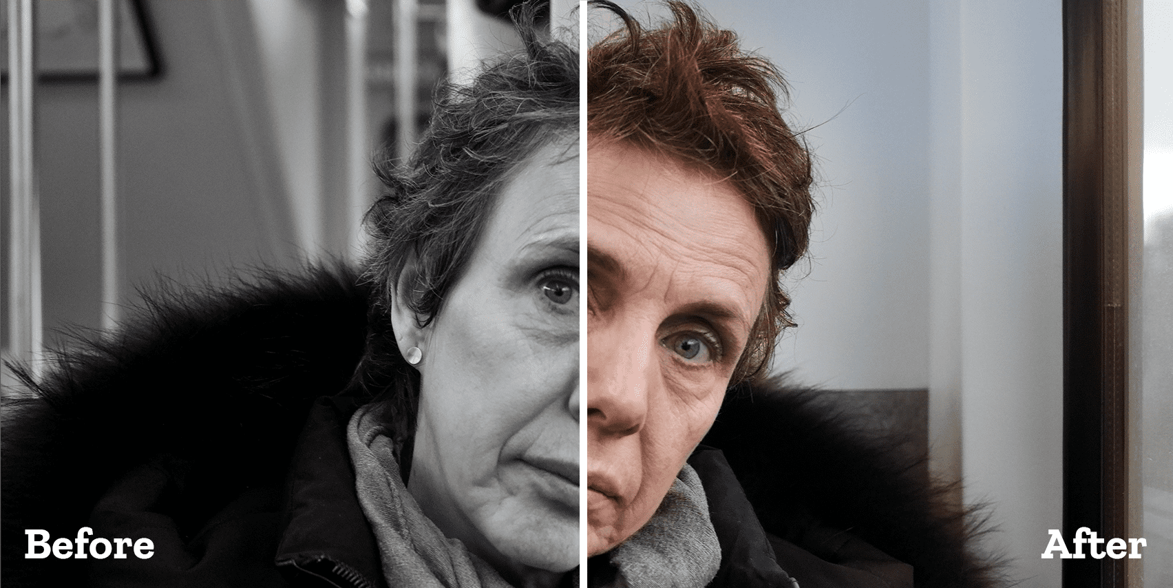
poltrate shots. Now here's the thing. I always suggest you do
subtle improvements. You got to work on
yourself, on your diet, working out, and whatnot, so you can be the
best that you can be. Slight improvements
in photo shop are fine, but don't exaggerate. Here's a photo of myself. Let's enable neural
filters yet again, the first thing I want to do
is enable skin smoothing. This doesn't always
do a good job, but it's worth trying. Now, flip the switch and set the blur value to
about 25 or so. I do recommend low values,
especially for blur. Then bump up the second
slider to about 20 or 25. Now this should hide most
blemishes and imperfections. It may also help
unify the skin color. Less imperfections,
less variation. Like you're wearing a
foundation of swords. This is a good improvement. And you can use this button here to see the
before and after. I recommend you
constantly use that. Next, let's enable
small potrait. This is quite powerful, we have to be careful with that. One thing that it does very
well is improving the hair. Let's go for plus ten. This should be quite nice. It does work great. But you can see it
affects my beard as well. But yeah, overall, this
is a great improvement. You can really see
the difference now. Facial age typically
works well as well. Minus ten or so should make
for a small improvement. Overall, I think. Yeah,
this is pretty good. Beyond that, these are the ones, they're not all that great. They may give you
quite strange results. You can play with
them, experiment. But I suggest you look under the settings for one
slider in particular. That's this one here. Retain unique features.
If you're not careful, you may transform yourself
into a different person. But yeah, overall, these
are neural filters, a fantastic way to improve your photos and
just a few clicks.
9. Replace a background | Cut away a person: Welcome back. Here's a
very popular request. Say you want to remove this background and replace
it with a different one. Now, there are loads of ways
of doing this in Photoshop, but we can do it in a method of clicks and still have
a realistic look. With the help of neural
filters, we can do just that. First of all, the image is from unsplash.com and if
we use Alt control C, you can see that this
is a huge image. This is quite important
because the bigger the image, the better the results. Okay, let's go to
the layer spanel, right click, and then convert this layer to a smart object. This is something
that's actually going to help us quite a lot. Next we need another photo that we want to use as a
background image. This is what I've selected, but please be aware
that when you drag it in it may be
smaller. No problem. Use control zero if needed, then grab a Adel handle, hold Alt, and then
drag outwards. And that's how you enlarge
the image on all sides. Now if you can't manage, move to the Options bar and change this value
from the W field. Of course, make sure that
the chain icon is pressed. Okay, this is done.
You can hit Enter. Now as you can tell, the image is covering the girl. Go to the layer spanel, click hold, and drag
down the forest. Okay, it's completely hidden, but that's totally fine. Next, please hit
on your keyboard. That should activate one of these tools through which
we can make a selection. Now if you click here and hold, you're going to see
you have a bunch of options and all of them
have the same feature. And that's Select
Subject is right here. This is what I want to use. This latest Photoshop version, you get this drop down icon and this gives you the
power of the cloud. This means your selection
is going to be that much better versus what
Photoshop can do locally. Okay, click on Select Subject, and you're going to have to
wait for a couple of seconds. Photoshop is going to connect
to the Adobe servers, It's going to analyze the image, and then it's going to come
back with a selection, all in just a couple of seconds. Now we have that selection. Now here's the thing. Go to the layers panel
and click on this icon here between X and the
Ying Yang looking symbol. Just like that, we've
created a mask. But more than that, the
original background went away. Now, while this isn't terrible, it's not great either. It seems fake. Well, let's use
neural filters now. First of all, please make sure that before
you do anything, you check the layouts
panel, see this highlight. This means the mask is selected. Now if that's the case, and you go to the
top menu to filter neural filters are
going to be graded out. Now to fix it,
click here on this. Thumbnail. On the
thumbnail, not on the mask. Okay, Now we can go to
the top menu to filter neural filters and
we can continue working from this new interface. We're looking for harmonization, which sounds a bit strange, but it basically means make
it look more realistic, turn the switch on, but
nothing is going to happen. That's because you
have to select the other layer,
the forest layer. Once that's selected, Photoshop is going
to take for a while. And then there you go. Now this makes it
look more realistic. Basically, it blends
the colors together, the girl doesn't
stand out as much. Use this button to check
the before and after. It's quite a big difference. The output, select Smart
Filter and then hit Ok. Now, no word is if you didn't get it, we're going to do it
again in a second. But let's take this
one step further. That's another neural filter. It's called depth blur and this is absolutely
perfect here. Let's try it out. First of all, hold the control key and
select the other layer. Select both of them. Now
use control E as Eric. This is going to combine the
two into one single layer. Now the official term is merge. Now that we have
one single layer, let's go to the top to filter. And then neural filters from here look up Defler and then
crank it up to the max. Now my advice is you have
focused subject enabled. Okay, that's going to
give you a great result. This looks even better.
When you're done. You can export it, you
can go to file export as, or you can use that
very long hot key. But let's do this once again. I'm going to use control to open a different
landscape image. This time it's a beach and it has a lovely sunset
in the background. Next I'm going to drag the
girl inside Photo shop. Don't use control,
just drag it in. Hit Enter, and then hit if
it's not already selected. Okay, now from the options bar, you select Subject And
wait a couple of seconds. Okay, now that we have a
selection click here to create a mask that's going
to throw away the background, okay. Lovely. Click on the thumbnail to
actually select the layer, then go to the top menu
to filter neural filters. Okay, from this interface, choose Harmonization, and
then choose the beach layer. Wait a second,
then we are great. The colors match it. Okay. And that's it. Now if you want to
take it further, hold control and select the other layer,
then use control. Now that this is
one single layer, go to the same top
menu to filter. And then finally we're going
to enable a depth blur. Now for the settings
for this blur, I'm thinking maybe around 90 for the blur and maybe
about 20 for the haze. But yeah, overall, that's
how you can quickly combine two images and
make them look real. Now, the question is, does this always work? No. Do you always
need big photos? Yes, totally, 100% But yeah, overall, this is the
quickest way of doing it. Try it out and see
how you do, remember. Have fun with it. Good luck.
10. Final thoughts: Welcome back. I hope you had fun with all of these
tools and features. I know Photoshop can feel
intimidating and overwhelming, but it's a matter of practicing
and getting used to it. My advice is you go through every video and use
different images, see what works and what doesn't. It's natural to get
stuck from time to time or get a result that
doesn't look all that great. It's part of the
learning process. Remember ask questions when you can't manage And remember
to have fun with it. Learning Photoshop
can be awesome if you approach it with
a great attitude that makes all the difference. And that's because it's like learning to swim or ride a bike. You will swallow some water, you will scrape your knees, and that's totally fine. The important thing is
you don't give up and you keep practicing
With that being said, thank you for choosing
me as your instructor. This is Chris Barn signing
out. Thank you so much.
 Chris Barin, Certified Photoshop Expert