Transcripts
1. All About This Class: Hi everyone, welcome
to this class. My name is Lisa and I'm a watercolor artist
based in Malaysia. I started watercolor
is seven years ago, and florals, I want on my
favorite subjects to paint. In this class, I'm going
to show you how to paint watercolor florals in a
loose and expressive style. I'll begin the class by showing you the
materials that you need. Next, we'll practice
some brushstrokes, which are essential in painting loose and expressive florals. You will learn how to use your brush to
create a variety of brushstrokes and also how to create some
interesting textures. Also want you chewed a basic watercolor techniques that we'll be using
in our paintings. We will then move on
to our class projects, where I'll walk you through
step-by-step on how to paint roses and peonies in a
loose and expressive style. By the end of this class, you'll be able to apply
all that you've learned in creating your own loose and expressive
floral composition. This class is suitable
for all levels. So grab your brushes
and let's get started.
2. Supplies Needed For This Class: Alright, let's talk about the supplies that you
need for this class. So let's start with the paper. I'll be using this bow hang
Academy watercolor paper. This is 100% cotton cold
press paper in 300 GSM. Now for the brushes, are
mainly be using round brushes. I have a size 6.2, size eight. These brushes from
silver black velvet. And I also have a
size two brush. This is from Raphael. And I'll also be using these
Chinese calligraphy brush. Now we also need paper towels to remove excess moisture and paint from our brush
and some clean water. And lastly, you need a palette or mixing plate to
mix our colors. Now as for the colors are less them in the
individual essence
3. Getting To Know Your Brushes: Now it's really important
that you get To Know Your Brushes so that you know what kind of brushstrokes
they can create. Because when we're painting in a loose and expressive manner, it is more about creating brush marks rather than creating
a perfect brushstrokes. You can play around
with Your Brushes to find out what kind of
brushstrokes they can create, and also to know which
one works best for you. So here are a few things to consider when you're
trying out Your Brushes. Now the first one is pressure. We know that the more pressure
we apply on our brush, the larger the brush
stroke we can create. So what I'm using now
is a size eight brush. And you can see
that I can create some very fine lines with this. And if I press
down a bit harder, I can create a
larger brush stroke. So a good brush is one
that allows us to create very fine details as well
as very large brushstrokes. Because this means that we can
just use this one brush in our painting without
having to switch back and forth between smaller
and larger Brushes. Now the next one is to make
full use of your brush. So don't just paint with
a tip of your brush. Try to play around with
different angles of your brush and see what kind
of brushstrokes you can get. You can paint with a
sign of your brush. This will create
broader strokes. You can also try painting
them in different directions and see what kind of
strokes you can create. You can also move your wrist and hold the brush
at different angles. Okay? So the next one is to vary the speed of
your brush strokes. So try to paint them
a little bit faster and see what kind of
strokes you can make. So when I paint
them a bit faster, I can create strokes. There are more expressive. So just play around
with your brushes, paint them at different angles and also at different
directions. Now you can use
false Brushstrokes to convey dynamic and motion. Now sometimes when you
paint a bit faster, you can get this kind
of dry brush effect. If you paint them a bit slower, you can get a different effect. Now the next one is to
vary the pink consistency. So tests Your Brushes with different P inconsistencies
and compare the results. So for example, I'm going to test out my silver
black velvet brush with a creamy consistency of paint and see what kind
of effect I can get. Maybe to get these very
nice dry brush textures. Okay, next, I'm going
to use a watery mix of paint and I'm going to test
out my synthetic brushes. So this is a Princeton snap. So I'm just going
to load my brush with this paint mixture. And let's see what kind of effect can I get
with this brush? So I'm able to get some dry brush textures with
this diluted mix of paint. Now let's try my silver
black velvet brush with the same paint mixture. So this brush has a mix of
natural hair, synthetic hair. Now you can see with this brush, I'm not able to get
any dry brush texture. So this is because a
natural hair brush tends to hold more paint and water than a synthetic brush. If I wanted to create dry brush textures with
a natural hair brush, I need to use a creamy
consistency of paint. Now because a synthetic brush
holds less paint and water, we can still create
some dry brush effect with a diluted mix of paint. So taps your brushes with different paint consistencies
and compare the results
4. Watercolor Techniques: Alright, now let's go over the watercolor
techniques that we'll be using in our paintings. So the first technique is
the wet on dry technique. So this is basically just applying wet paint
on a dry paper. With this technique,
we can create some heart and defined edges. Now, moving on to
the next technique, which is the
wet-on-wet technique. This is where we apply
wet paint on a wet paper. The paper can either
be pre-vet with the layer of clean water
or a layer wet pain. So when pain is apply
on this wet surface, the color you spray
and bleed and you create some
lovely soft edges. Now, if we don't want the
paint to spread too much, we can use a paper towel to
remove the excess paint. This will create a more
controlled brushstrokes where the H's are still soft
and less defined. Or we can use a
thicker mix of paint. This we also make it spread
less on a wet paper. So you can see that this doesn't spread as much as
our first stroke, but it still has some
lovely soft edges. So this is how we can reduce the spread of paint
on wet paper. Okay, Now I'll show you
the bleeding technique. I'm going to apply some
burnt sienna here. While this is still wet, I'll apply some yellow
right next to it. So you can see some of the burnt sienna bleeding
into the yellow. Okay, let's try this again. So when we have to wet colors
right next to each other, one color will bleed
into the other. Now we can use this
technique to create some lovely textures
in our paintings. So for instance, here I've got some pain bleeding
into my leaves. And also here, I usually
like to incorporate these color bleeds
in my paintings because it makes the painting look a bit more interesting.
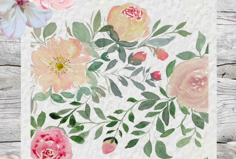
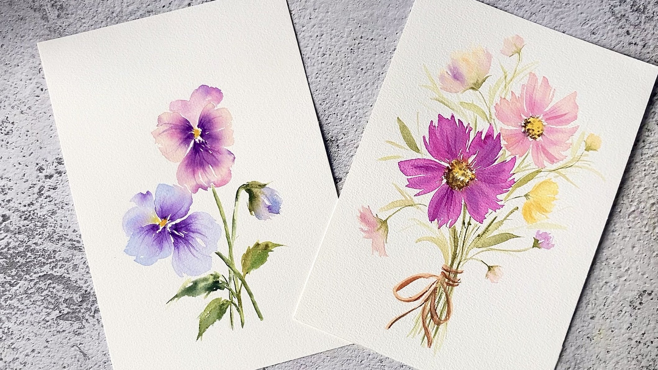
5. Loose & Expressive Watercolor Peonies: For our first class project, we're going to paint these
loose and expressive Peonies. For the Peony, I'm going
to use Petersburg ocher and a mixture of Petersburg
ocher and permanent rose. Now, if you don't have
Petersburg ocher, you can use yellow
ocher or Naples yellow. Now we want the consistency
of this mixture to be slightly thicker than our
Petersburg or comics. So I'm going to start by
painting a ring of statements. Here I'm using burnt sienna. So this is a top view
of an open Peony. And I'm just painting some
thin and short strokes. Now, let's paint some petals
around the statements. I'll start with
Petersburg ocher, and I'll add a bit
more water to it. Cos, I want a
watery consistency. So to paint the petals, I'm just going to move my wrist back and forth like this to create some very loose and
Expressive Brushstrokes are very the size, thickness, and length
of my brushstrokes. And at the same time, I'm leaving a bit of
whitespace in-between these petals so that my puny doesn't look
like a blob of paint. So by varying the size and
shape of these petals, we create the illusion of layers of petals
within the flower. I'll fill in any gaps
with some thin strokes. Alright, now while this
layer is still slightly wet, I'm going to add a
second layer to create some depth and
dimension in my Peony. So I'm using a wet
on wet technique to create some software
lovely strokes. So I'm just going to randomly paint some smaller
strokes on top of the first layer to create some shadows
within the flower. And I make sure to leave the
whitespaces and painting. So I'm gradually adding
in more and more of these ping Brushstrokes to
create the illusion of petals. Now it's important not to overdo this because
you still one, your Petersburg
ocher to be visible. You don't want to cover
up your whitespaces. Costs without these
whitespaces are Peony. We just looked like
a blob of paint. Alright, now let's paint some
leaves around the Peony. I'll mix some loose and
wispy brushstrokes. And I'll vary the
size and thickness of the strokes to create
leaves of varying sizes. Now to add depth
to the painting, our very, the tonal
values of my green. So I'll drop in a
darker green to some of the leaves while the
base layer is still wet. And in other areas are
paint sunlight and leaves by using a more
watery mix of green. I'm using green, earth and shadow green to paint my leaves. Now feel free to use any
greens that you have, but makes sure to vary
the tonal values. So by using different
tonal values of green, we create interests
in our painting. Alright, now let's pin a site Peony on the upper right corner. I'll grab my Petersburg
Walker mix and I'm going to paint the shape of a
partially closed Peony. So I'm painting a site Peony
which is partially closed. Our paint some short strokes
here in the center and leave a pillow whitespaces
to give the illusion of petals on inside
of this puny. Next, I'll grab my
pink mixture and use this to create some volume
and dimension for my Peony. I'll add some shadows
on both sides of the Peony and
also to the base And are also darken the
inner petals in the center. Now let's paint some sepals
at the base of this Peony. Now going back to
my first Peony, I want to darken the
center a bit more. So I'm going to use a bit of sepia to darken the statements. So I'm just using the
tip of my brush to create some very thin
strokes of sepia. And I'll also add some
green to the center. Next, I'll extend some stems to the right to create interests
in our composition. Now let's attach some
leaves to our stance. And we also paint
some puny bots. So I'll start by painting a round shape with
my Peter's Basilica. And then I'm going to
drop me in a bit of my pink mixture on the tip while the base layer is still wet so that both colors
can blend together. Alright, now let's paint
some samples at a piece. I'll add a bit more leaves here, just a feeling this empty space. I vary the size and direction of these leaves to make
it look more natural. Now let's complete
our composition by painting and other Peony. But here again,
I'm starting with Petersburg ocher and I'm
creating a roundish shape. And while this layer still wet, I'm going to drop in a
bit of my pink mixture on the tip and let it blend
with the base layer. And lastly, I'll add some
samples to the base. Alright, so this
completes our painting. I hope you enjoy painting this, and I'll see you in
the next lesson.
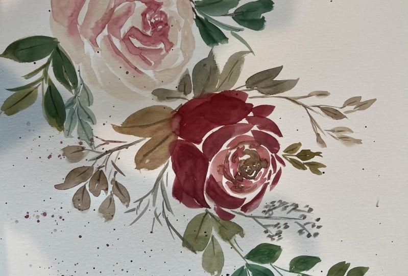
6. Loose & Expressive Watercolor Roses: Far second class project. We are going to paint some
loose and expressive roses. We'll begin with our first Rose, which is a front-facing Rose. So for this Rose, I'm going to use quinacridone rose and a mixture of John
Brilliant and Naples yellow. Now you can also
use yellow ocher instead of these two colors. Alright, so I'll start with
the center of the Rose. I'll load my brush with
some quinacridone rose. Then I'm just going to paint some small overlapping
C strokes. And I'll leave a
bit of white spaces in-between these strokes. Then I'm going to
rinse out my brush. And I'll grab some
of that Naples yellow and John, Brilliant mix. And I'll start painting some larger C strokes
around this pink center. As I'm painting DC strokes, I'm touching the ping center to allow some of that pink
deeply into the petals. Now I'm still leaving a bit of white spaces
in-between DC strokes. So as I move further
away from the center or increase the size
of my C strokes. Now while these lighter
petals are still wet, I'm going to drop me
a bit of quinacridone rose and let it blend
with the lighter petals. This creates some
shadows in our Rose. And then I'll continue
painting more C strokes. I apply more pressure on my brush to create some
protists these strokes. At the same time, I'm still leaving a bit of white space in-between
the strokes. Now before the paint dries out, I'm going to quickly drop
in a bit more quinacridone rose to create more
shadows in a Rose. Next, I'll mix a bit of violet. We could now go down Rose and use this to darken the
center of the rules. This to add more depth and
dimension to our Rose. Now I want this Rose
to be a bit larger. So I'm going to extend
the outer petals and then I'm going to drop me a bit more quinacridone rose. Alright, now let's paint
some leaves around our Rose. Now because these outer
petals are still wet, we'll get some nice
color bleeds here. So I'm painting leaves of different sizes and
shapes around my Rose. And at the same time, I'm also varying the
tonal values of my green. So I can have some
lighter and darker leaves around my rules. This adds depth and
interests to the painting. I'm also making sure that
my leaves are pointing in different directions so that
they will look more natural. Now, the greens then
I'm using are green, earth and shadow green. If you free to use any
greens that you have. Also paint some stems sticking out just to add interests
to the composition. Now let's move on
to our second rows, where we'll be painting
a side angle Rose. So this Rose will be at an angle where it is facing
the upper right corner. Now if you want a
more in-depth lesson on how to paint a
slight angle Rose, feel free to check my
class on Watercolor Roses, where I explained in
detail the structure of a side angle Rose
and how to paint them. Alright, so for this Rose, I'll be using burnt sienna
and petersburg ocher. I'll start with burnt
sienna and paint, some small overlapping C
strokes for the center. And then I'll load my brush with some Peter's Basilica and paint some petals
around the center Now since this Rose
is at an angle, the petals in the background
will be partially hidden. And the petals in
the foreground, which is closest to us, we'd be more visible. So I'll paint more petals
in the foreground. Now, I'm still leaving a bit of white space in-between
my Brushstrokes. And then I'll pin to large
open petals at the bottom. Next, I'll add depth
to this rose by painting some shadows
in between the petals. I'm using burnt
sienna for this step, and I'm switching
to a smaller brush. Alright, now let's paint some leaves to fill
in the empty spaces. To add interests to the
composition are ***** them growing outwards
from behind offers Rose, and I'll add some
leaves to this them. Next, I'll Peony rose bud
and attach it to this stem. I'll start by painting
the shape of a row spot using my John Brilliant mix
and some quinacridone rose. And then I'll paint some
samples at the base, followed by a stem
and some leaves. Now at this stage the painting
still looks a bit there. So I'll pin model leaves to
fill in those empty spaces. I'll paint some
lighter leaves to give the illusion that they
are in the background. This we add more depth
to the painting. Next, I'll add another
layer or shadows to my sine angle Rose since the first layer has
faded quite a bit. So I'm just adding a few
strokes of burnt sienna. And then I'll soften these
strokes with some clean water. Next, are feeling
any remaining gaps with some leaves and stems. Alright, now let's add some
textures to our painting. So I'm just going to add some splatters are
green at the bottom. Also add some final
touches to my Rose bud. I'll use a bit of quinacridone rose to create a
center for this Rose. But here I'm using
my size two brush. And let's complete the
painting by adding some stems around our Roses. Alright, so I hope you
enjoy painting this, and I look forward to
seeing your class projects
7. Final Thoughts: So congratulations on
completing the class. I hope you've enjoyed this class and you've learned
something new. I look forward to
seeing your paintings. So please upload them in the project gallery so that I
can give you some feedback. And if you have any questions, just post them in the discussion section
and I'll get back to you. Now if you find
this class helpful, I would really
appreciate it if you could leave a review
for this class. So thank you for
taking this class. I hope to see you in my
next Skillshare class.
 Lisa Lam, Watercolor Artist