Transcripts
1. About The Class: Hi, welcome to this class. My name is Lisa and I'm a watercolor artist and
educator from Malaysia. I've been painting
since 2017 and fluoro. So one of my favorite
subjects to paint. This seven-day
watercolor challenge. We're going to paint seven
lovely floral compositions. What you truly
materials that we need. And I'll share with you
the watercolor techniques that are often used in
my floral paintings. You will learn how to
create lovely textures in your flowers using various
watercolor techniques, such as pooling technique, pleading technique, wet
on wet, and wet on dry. You will also learn how to
vary the consistency of your paint to achieve the desired outcome
in your paintings. This class is suitable for all levels and it will help you develop
with Lily practice. So grab your brushes and
let's paint some flowers.
2. Materials Needed For This Class: Okay, let's take a look at the materials that you
need for this class. So let's start with
watercolor papers. Okay, So you will need a 100% cotton cold
press watercolor paper, preferably in 300 GSM. You can use any brand
of watercolor paper. I'll be using this bow whole
academy watercolor paper. So I have it in two sizes. The smaller one is exactly
half of the larger one. K. Now let's move on
to your brushes. We will mainly be using
round brushes in this class. So you need some
medium-size round brushes, like a size six or eight. If you don't have size eight, you can just use size six. And user needs some
smaller brushes, like a size 01 or two. I have a size 0 and size two. Okay, I'll also be using this calligraphy brush is quite
similar to a liner brush. So the bristles are very
long and it has a sharp tip. If you don't have this, you can just use
a liner brush or just use any round brush
with a pointed tip. Now to mix your colors, you will need a palette or
you can just use any plate. You will also need
some paper towels to remove excess moisture and
paint from your brush. So this is actually very important when we are
painting wet on wet. And lastly, you need
some clean water. Okay, So these are the colors that I'll be using
in this class. I've prepared a swatch for you so that if you don't
have these colors, you can just use any similar
colors from your palette.
3. Watercolor Techniques: In this lesson, I'll
walk you through the watercolor techniques
for painting florals. Let's start with the
wet on wet technique. This technique is
basically just using a wet brush to paint on
a wet or moist paper. So when we apply wet
paint on a wet paper, the paint will spread and bleed. So this creates some
lovely soft textures. And we can use this
technique when you want to create some soft edges
in our paintings. We can also add splatters using
the wet on wet technique. Now we can get
different results by varying the consistency
of our paint. So I've got three
different consistency of indigo mixture in my palette. So this first one has
a thin consistency. So you can see that is
very diluted and watery. And the second one has a
medium consistency where the amount of pigment and water in this mixture is
almost the same. And lastly, this is a thick
consistency of indigo. So you can see that
it's very dark and saturated because there's not
much water in this mixture. Okay, now let's see how these three mixtures
react on wet paper. The one with the
thickest consistency has a more control spirit and it doesn't spread as much
as the other two. So basically the
thicker consistency, the less it will spread. Here's another example. This was a wet on wet exercise, which I did in my
previous class. So here we use three different consistencies
to pin on flowers. For this flower, we use a thin consistency of
yellow as the base color. And then we drop in a
medium consistency of orange and followed by a
thick consistency of rate. So we can see all three
colors in this flower, red, orange, and yellow. This is because we
increase the consistency of paint with each
subsequent layer. So basically you can control
how much European spritz on wet paper by adjusting the
consistency of your paint. So if you want it
to spread more, just use a thinner consistency. Whereas if you want
more control spread, just increase the
consistency of your paint. The next technique is
the bleeding technique. We can create some very
interesting textures with this technique. So when we have two
wet areas are too wet, washes of different colors
touching each other. We will get one color
bleeding into the other. So we can use this
technique to create some lovely color
bleeds in our flowers. Okay, Let's paint a flower
using this technique, our peanut butter using indigo. And while this is still wet, I'll switch to a different color and paint right next to it. So I'll continue doing this
while the paint is still wet. So we have these
lovely color bleeds where the wet petals are
touching one another. Now we can also use
several colors. So let's try this again. This time I'll use three colors. So as long as the
paint is still wet, we'll get some
nice color bleeds. Okay, now, the next technique
is the pulling technique, which is quite similar to
the bleeding technique. So with this technique, we use water or pain in our brush to pull
out the wet pigment. Here with just
water in my brush, I'm pulling out the
indigo pigments. We can use this technique
to penal flowers. So let's paint the
flower center. And while these
dots are still wet, I'll use water from my brush
to pull out the pigments, SIP in the petals. And instead of using water, we can also use another color to pull out the pigments
from the center. So this creates some interesting
bleeds in our petals. So if I'm using this technique
to paint my flowers, I'll usually use a medium to thick consistency of
paint for the center. And a thin consistency of paint in my brush to
pull out the pigments. And if I want to define the shape of the
petals a bit more, I can use my liner brush to
gently darken the edges. So here I'm using the
wet-on-wet technique. Okay, the last technique
is the lifting technique. We use this technique
to correct any mistakes and to remove any excess
paint from our paper. We usually use a clean, damp brush to lift off excess
paint from our painting. So each time you lift up color, rinse your brush and remove excess moisture on
your paper towel. Okay, So these are the
watercolor techniques that I often use in
my floral paintings. And we're going to
use this technique in our watercolor challenge. Now, if you're a beginner, do practice these
techniques a few times before moving on
to our class projects.
4. Day 1 : Loose & Relaxing Abstract Florals: Welcome to day one. Today we are going to paint some loose and relaxing
abstract floral. For this lesson, we
only need three colors, red and yellow for our flowers, and green for the
stems and leaves. Now feel free to use any red, yellow, and green
from your palette. I'll be using lemon
yellow from each yellow, carmine, and green earth
from White Nights. We're going to use
the pooling technique to paint our florals. So it's better to prepare
our colors before we begin. We will need a medium
consistency of red and a thin
consistency of yellow. Okay, let's start with
the front-facing flower. I'm just going to make some short strokes to
form the flower center. And I'll leave a bit of
whitespace in-between these two. Now make sure you're
painting with a wet brush because we need these strokes to stay red so that they will bleed
into the petals later on. Next, I'll load my size six
brush with some lemon yellow and I'll paint some
long and wavy petals starting from the center. So as you can see, I'm touching the center to
pull out the red pigments. This creates a soft and lovely to tone
effect in our petals. I'm going to rewrite the
remaining strokes in the center because I can see
they're starting to dry. I'll also draw in
a bit more red on the wet petals to let it bleed. So try to vary the shape of each petal to make it look
a bit more interesting. Now while the paint
is still wet, I'm going to drop in a bit of red along some of the edges. Here. I'm just using the tip of my liner brush so that
I don't too much paint. This is because I still want
the yellow to be visible. I'll also darken the center
to create more contrast. Now let's attach a
stem to this flower. Fall a second flower. We are paying a site flower. Facing the upper right corner. We will start with the
base of the flower. So here I'm just
making short strokes. The petals we originated. Next, I'll load my size eight brush with some lemon yellow. And I'll start from the
base of the flower. So I'm pulling out
the red pigments. As I paint the petals. I'm leaving a bit of white space in-between some of the petals so that it doesn't look like
a blob of paint key. I'm just going to extend the base to make it
look like the sepal. And then I'll add
a smaller pattern here just to balance
out the shape. Now while the paint
is still wet, I'm going to darken some of the edges just to define
the shape a bit more. Few free to switch to a smaller brush for
easier Pain control. Okay. So I've dropped
in too much over here. So instead of lifting
up the excess rate, I'm just going to drop
in a bit of yellow. This will push the rate
pigments to the site. So this step is optional. Few free to skip this step if you're happy with the
way your flower looks. Okay, now let's add a
stem to this flower. Flower, flower. We are going to paint
another site flower. But this time we'll pay
need facing outwards. And we repeat the same
steps from earlier on. Okay, now let's *****
Apple at obese. And I'll also add a small leaf here just to add interests
to the composition. Okay, so now let's paint the stem and will extend
it all the way down. So the key to a good
floral composition is to have flowers of varying sizes and angles as far as halftone pointing
in different directions. So over here we're going to
paint another site flower. But we're gonna make it a bit
smaller than the other two. Okay, now let's add a stem
to this site flower case. So now that we have our
main flowers in place, let's fill in the rest of the composition with
some smaller flowers. This you add interests and a variation in our composition. We can also paint a
few blades of grass, Jesse filling the empty space. And for the finishing touches, we would just add some
splatters of red and yellow. Okay, So this completes day one. I hope you enjoyed painting this and I'll see
you in day two.
5. Day 2 : Colorful Florals: Welcome to D2. Today
we are going to paint this composition
of colorful Florence. So we're going to use the
wet-on-wet technique to create some lovely color
bleeds in our flowers. Let's start with the colors. I'll be using. Violet,
permanent rose, green, lemon yellow, burnt
sienna, and shadow green. If you don't have these colors, feel free to replace them with any similar colors
from your palette. K. Let's start by
preparing our base colors. So for the base color will use a thin consistency of
permanent rose and violet. So I'm just adding
a lot of water to create a very watery
and diluted mixture. Okay, let's start with
our first flower. Will paint a full petal flower, where two of the
petals will be painted red and the remaining two
will be painted violet. I'm going to start
with permanent rose. Now we need this base
layer to stay wet. So make sure you're painting
with a very wet brush. You can just add
another layer to make sure that they stay wet
a little bit longer. Okay, now I'll switch to violet and paying the
remaining petals. I'll also dropped
a bit of violet on the pink petals to create
a bit of color variation. Now, let's darken the center while the base
layer is still wet, we'll use a medium consistency of permanent rose and violet. I'm going to start
with permanent rose. So with my size six brush, I'll add this to the center, but I'll leave a partner
of the Center on touch. So you can see that the color
is slowly spreading out. But if you're not spread
all over the flower, because this has a
thicker consistency than our base color. Now I'll drop in a
medium consistency of violet to the untouched
area in the center. And let that be K. Now this next, that is optional. I'm just going to spread out the bit of the color
from the center. So I'll rinse my brush and
remove excess moisture. And then I'm just
going to lightly and gently pull out the
color from the center. So we would just leave
the center empty for now. Later on we'll come back into
fuel it with some yellow. Okay, Now let's move on to our second flower and we
repeat the same steps. I'll leave a tiny gap here to
separate the flower and to show that this petal is partially hidden behind
our first flower. So always make sure
that your base layer is still wet before you drop
in your darker colors. Okay, so now I'll drop in some permanent rose
followed by some violet. My violet seems to
be quite diluted. So it's spreading quite a bit. We can fix this later, but for now, I'm just going to spread out a bit of that red. So again, this step is optional. Okay, so now I'm going to add another layer of
violet to the center. This time, I'll use a thicker consistency so that
it doesn't spread too much. Now let's move on to
our final flower. We'll place this on the
lower-right corner, and we repeat the same
steps from earlier on. So always make sure
that your base layer is still wet before you
darken the center. And if it has started to dry, you can just rewrite it with
another layer of paint. This time, I'll drop in violet first and I'll leave a part
of the Center on touch. And next, I'll drop
in my permanent rose. And I'll spread out some
color from the center. You can see that
the permanent rose has spread quite a bit. So I'm going to drop in a thicker mix so that it
doesn't spread as much. Okay, Now that we have our
main flowers in place, it's time to paint the leaves. So try to vary the color of your leaves to meet your composition. Look
more interesting. I'm going to add a bit of
permanent rose to my olive green to create a
warmer shade of green. And for the darker leaves, I'll use shadow green. Now, if you don't
have shadow green, you can always darken your
green with a bit of violet. Okay, I'll start
by painting a stem here to connect
these two flowers. Then we'll paint some
leaves around our flowers. So to add contrast
in our painting, I'll paint some darker leaves
next to the lighter ones. Now we can also vary
the tonal values of our green to create
different shades of greens. So this will further add dimension and interests
in our painting. Let's extend some
games to us to button. Now you can also vary the
size of the leaves and *****, smaller ones next
to the larger ones. Okay, now let's
paint some leaves on the right to balance
out the composition. You add some stem sticking out, just to add some variation
in our composition. Add a few more leaves over here and some stem sticking out. Now let's fill in this top
area with some leaves. I'm just going to add
some lighter leaves here. Okay, now let's add some flower buds to add more
color to our composition. So I'll drop in a beyond
violet while it's still wet to create a bit
of a color variation. Okay, Now that we're
done with the leaves, Let's fill in our
flower centers. So switching to my size 0 brush, I'll add some dots
of lemon yellow, followed by some burnt sienna. So I'm leaving a
bit of whitespace in-between these dots case. So you do the same for
the second, third flower. Now let's add some burnt sienna. Okay, and let's move on
to our third flower. I'm just going to add a bit
more yellow to the center. Okay, so this completes
our painting. I hope you had fun
painting this. And I'll see you in
our next lesson.
6. Day 3 : Aster Flowers: Welcome to D3. Today we are going to
paint some flowers. So here are the colors
that we'll be using. Lavender, permanent rose,
permanent yellow, deep, burnt sienna, tie lit green
of shadow green, and CPR. So we are going to use two
colors to paint the petals. The first one is lavender. For the second color, we'll mix a bit of
permanent rose with lavender to create the shade
which is similar to lilac. So if you have lilac, you can just use lilac. Now, if you don't have lavender, you can just use a thin
consistency of ultra marine. So here I have a very
diluted and watery mix of ultra marine. So even though it looks a bit bluish now compared to lavender, later on when we dropped
me in our lilac, you become less obvious. And to create the second color, just add a bit of red to
the ultramarine mixture. Okay, we'll prepare our colors
before I begin painting. I've got lavender in my palette, and for the second color, I'm adding a bit of permanent
rose to my lavender mix. Now we want a thin consistency
for these two mixtures. Okay, so let's start
with our first flower. I'll pina yellow center
using permanent yellow deep. Then switching to
my size two brush, I'll drop in a medium
consistency of burnt sienna along the
lower edge of the center. So I'm just making little dots. Now let's pay now petals using these two colors
in our palette. So I'm just going
to randomly switch back and forth between
these two colors. And also add a bit
of lilac to some of the lavender petals to create a subtle color
change in the petal. While the petals are still wet. I'll darken some parts
with the lilac mixture, especially on the inner
corners of the petals. Okay, Now let's add a bit
more details in the center. Tiny dots off burnt
sienna around the center. Here, I'm using just the
tip of my size two brush. Next, we'll drop
in a bit of sepia along the lower age to
create some shadows. Here we're using a
thick consistency of sepia because you don't
want it to spread too much. S. We still want our yellow and burnt sienna to be feasible. I can see that the lavender
has faded quite a bit. So I'm just going to
add another layer of lavender to some of the petals. This will intensify
the color a bit more. Okay, Now let's move on
to our second flower. We'll place this on the
upper right corner. And we'll paint this flower at an angle where it is facing
the upper right corner. So I'm painting and OVO center with my
permanent yellow deep. And then I'll add some shadows
on the lower left corner. So here we are using a
medium consistency of burnt sienna so that it
doesn't spread too much. Okay, now let's
paint our petals. So I'll start with the
petals on the side. And I'll make the first two
petals curve downwards. To show that this
flower is at an angle. And we'll do the same for the two petals on
the other side. So far the petals
in the background, we'll paint them
a bit shorter to show that they are partially
hidden by the center. Okay, now, I'll drop in
a bit of lilac just to create a bit of color
variation in the pentose. Next, we add in a bit
more details to descend. So switching to my size 0 brush, I'll start with burnt sienna. And I'll add some shadows
on the lower left corner. Here I'm using a thick
consistency of CPR. So it doesn't spread too much because we still
want our yellow and burnt sienna to be visible. Okay, now let's attach a
stem to our first flower. I'm using my calligraphy brush to paint a thin
and delicate stem. Now if you don't have
a calligraphy brush or a liner brush, just use the tip of your brush. We'll paint a drooping flower on the right just to add
interest to the composition. So I'll paint the SAT buffers
followed by the petals. Next we add the stem
to this flower. Let's ***** site stem from our first flower and connect
it to our second flower. Bouquet next, European and
other site flower at the top. So I'm starting with a sample. And now let's add some petals. Okay, I'm going to
lighten some of the packet goes here using the lifting technique so that this flower
doesn't look too flat. And I'll add an additional Petco here to balance out the shape. Next, I'll drop in
a bit of lilac. Now let's paint a stem and
attach it to the second Stan. Okay, Now for the final step, we just add leaves
around our flowers. We'll vary the size, shape, and color of our leaves to
add depth to the composition. We can vary the color
of our leaves by varying the tonal
values of our green. Or we can drop in a darker green while the base
color is still wet. Now over here, our
pinna drooping leaf, just to add interest
to the composition. Now, let's fill in
the empty spaces with a few more leaves. Okay, so this completes
our painting. I hope you enjoyed
painting this, and I'll see you in
the next lesson.
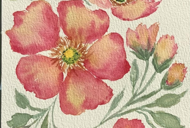
7. Day 4 : Rosa Canina ( Dog Rose ): Today we are going to paint this lovely composition
of Rosa Nina, which is also known as dot rows. So here are the colors
that I'll be using. Lemon yellow, permanent
rose, yellow, ocher, burnt sienna, olive green, green, earth, and shadow green. So we are going to use a thin consistency of yellow
ocher as our base color. And then you drop in
a bit of permanent rose to create a
midtone for flowers. And lastly, we use
a more saturated permanent rose to define
the shape of our petals. Okay, let's start with
our first flower. So I'll paint a yellow
center using lemon yellow. And then I'll drop
in a bit of green along the edges. Here. I'm just making little
dots of green key. Next, I'll look my size eight brush with
some yellow ocher. And we are going to paint
five petals for this flower. The petals can be of
different shapes and sizes. They don't have
to look the same. So here we are going to leave a gap for stamens. Later on. I'm leaving a tiny gap between each petal just
to separate them. I'll just squeeze in
a smaller petal here. Now makes sure that this
base layer is still wet before you drop in
your permanent rose. If it's starting to dry, just add another layer
of yellow ocher. Okay, now let's add our permanent rose to create
a midtone for our flower. So here I'm using
my size six brush. And I'm painting
with a damp brush so that the color
doesn't spread too much. Now I'm going to add
a bit more permanent rose to the mixture to create a more saturated mix with less water so that it doesn't spread too
much on the wet petals. I'll use this to define
the shape of our petals. Here I'm just using the tip of my size six brush so that I
don't unload too much paint. Now feel free to switch
to a smaller brush, like a size two for this step. Okay, next, I'm going
to soften and blend in some of the edges with
a clean, damp brush. Now for the statements, I'll start with yellow ocher, followed by a second
layer of burnt sienna. Here I'm using my size 0 brush. Now the petals are still a bit. Then at this stage, I'll drop in a bit more
permanent rose along some of the edges to further essentially
the shape of our petals. So this step is optional. If you find that your
petals are starting to dry, it's best to skip this step. Now let's paint
the second flower. We'll pin a slight angle flower, which is facing the
upper right corner. So you make an oval
shape for the center. And I'll add some green on a lower age to
create some shadows. Now, let's paint the
statements using burnt sienna and yellow ocher. I'll darken the center
with a bit more yellow, and I'll drop a bit more
green on the lower edge. We'll pin two folded
petals in the foreground. So I'll start with yellow ocher and then I'll drop in
a bit of permanent. Now let's pin three
petals in the background. He can leave a tiny gap
between these petals. Now, let's add some
permanent rose, European closer to the
outer each of our petals. So here I'm using a damp brush. Okay, now you use the
more saturated mix of permanent rose to define
the shape of the petals, as well as two separate them. So here I'm using my size two brush for
easier pain control. So as long as the
paint is still wet, we can adjust the shape
of our path dose. Okay, now let's paint some
leaves around our flowers. So try to use several
sheets of green for your leaves to add more depth and interests
to your painting. I'll mix a bit of
permanent rose with my green earth to create
a warmer shade of green. And I'll use this
together with green, earth and shadow green
to paint the leaves. You can also vary the color of your leaves by dropping in
a darker shade of green. While the base
layer is still wet. You can just drop in a
thicker consistency of green. We also vary the
size and shape of our leaves to make it
look a bit more natural. Now let's paint the flower, but I'll start
with yellow ocher, and then I'll drop in a
bit of permanent rose. And then we add a
sepal at the base. Okay, now let's paint
some leaves over here. ***** site flower at the bottom. I'll start with a sample, and then I'll add three
petals using yellow ocher. I'll add some permanent rose and darken
this up a bit more. Now as long as the
paint is still wet, we can lift out
excess color or add additional colors without
leaving any hard edges. So just like our
previous two flowers, you use a more
saturated permanent rose to define the
shape of our petals. Now let's paint some
leaves on the right. And we extend a stem
behind this flower. This will make your painting
look a bit more natural. You also attach a
flower bed to the stem. Now let's split on the
upper right corner, wherever you paint some lighter
leaves in the background. This will further add
depth to our painting. Okay, now let's complete this painting with a
few more leaves on the lower left corner key. And this completes our painting. I hope you enjoyed
painting this, and I'll see you in
the next lesson.
8. Day 5 : Floral Wreath: In this lesson, we
are going to use the bleeding technique to
paint this floral wreath. So here are the colors
that I'll be using. Lemon yellow, permanent
yellow, deep cobalt, violet light violet,
blue, and green. So we're going to use four
colors to paint our petals. So for the first color, I'll use a thin consistency
of cobalt violet light. Now, if you don't
have this color, you can replace it
with any red or pink, such as permanent rose or opera. For the second color,
I'll mix violet, cobalt violet light to
create a pinkish purple. For this mixture, you can use either medium or
thin consistency. And for the third color, I'll use a medium
consistency of violet. And the last color
is royal blue. So I'm mixing a thin
consistency of royal blue. Now if you don't
have royal blue, you can use either ultra
marine of cerulean blue. Okay, let me swatch
out the colors. So this is cobalt violet light is actually
an opaque color. And this is the pinkish purple. And the color is violet. Now I want it to
be a bit thicker, so I'm going to add
a bit more violet. But this is still a
medium consistency. And the last color is a thin
consistency of royal blue. Now you can either use a medium or fine consistency
for all these colors. We are going to
alternate between these four colors to
paint our petals. So while one petal is still wet, you're going to pin
one right next to it, so that we'll get some
nice color bleeds. Now before you begin painting, just lightly draw a circle. Okay, Now let's start
with our first flower. So you can start
with any colors. I'll start with
cobalt violet light. So here I'm using
my size six brush. Ok, and now I'll switch
to another color. And I'll drop in a bit of this color on the previous
petal to let it bleed. Okay, now let's switch
to another color. So here we have some
nice color bleeds when the wet petals are
touching one another. Okay, so we repeat this technique for the
rest of the flowers. Now you can start with
any colors and you can use your own combination
of colors for each flower. Key. Let's move on to
the second flower. I'll start with royal blue. Now when you're using
this technique, makes sure the paint
with a wet brush so that the petals can
stay wet a bit longer. I'll drop in a bit of violet on the other petals just to create
a bit of color variation. Now, you come back into Pina Center later on
with a bit of yellow. Because right now the
petals are still quite wet and I do want a yellow to
blue too much on the petals. So you just let it dry a bit
before we paint our center. Okay, now let's paint
our flower centers. So the petals have
dried up the pit. They are still quite damp, but not too wet. So we're going to drop in
a thick consistency of lemon yellow so that it
doesn't bleed too much. Okay, I've accidentally dropping a bit of water on this petal. Now, if I leave it, you
turn into a water blue. So I'm just going to lift up the excess water and I'll just drop in
a bit more color. Okay, Now let's add some
yellow to our flower centers. Okay, now let's pin two more flowers on the
other side of the region. We'll paint a site flower here and rescue using
the bleeding technique. Okay, now I'll switch to a different color while the
first petal is still wet. I'm going to add some yellow here to give it a pop of color. So I'm using a thick
consistency of yellow here. Otherwise, your fate
when it dries up. Now let's ***** EPO
for this flower. And I will subpoena leaf here. Okay, now let's fill in this
center with some yellow. Okay, now let's drop in some permanent yellow deep
on the flower centers. We are using a thick
consistency of yellow here. So I'm just making little dots. Okay, now let's paint
some leaves and flower buds in
between our flowers. So as usual, we will vary
the color of our leaves. We'll paint some a bit
darker and some a bit lighter to add depth
to our painting. So I darken my green
with a bit of violet. And for a lighter
shade of green, I added a bit of yellow
to my green earth. Okay, let's paint some flowers. I'm going to paint some
broken stamps along the circle so that I'll know
where to paint the leaves. Okay, now let's
complete our wreath by painting some leaves and
flower buds along this stem. You can also paint some
stems sticking out. Okay, let's add a few more
flower buds along the stem. Now let's complete our wreath by painting more broken stems
along the pencil line. Okay, and we are done. I hope you enjoy painting this and I'll see you
in the next lesson.
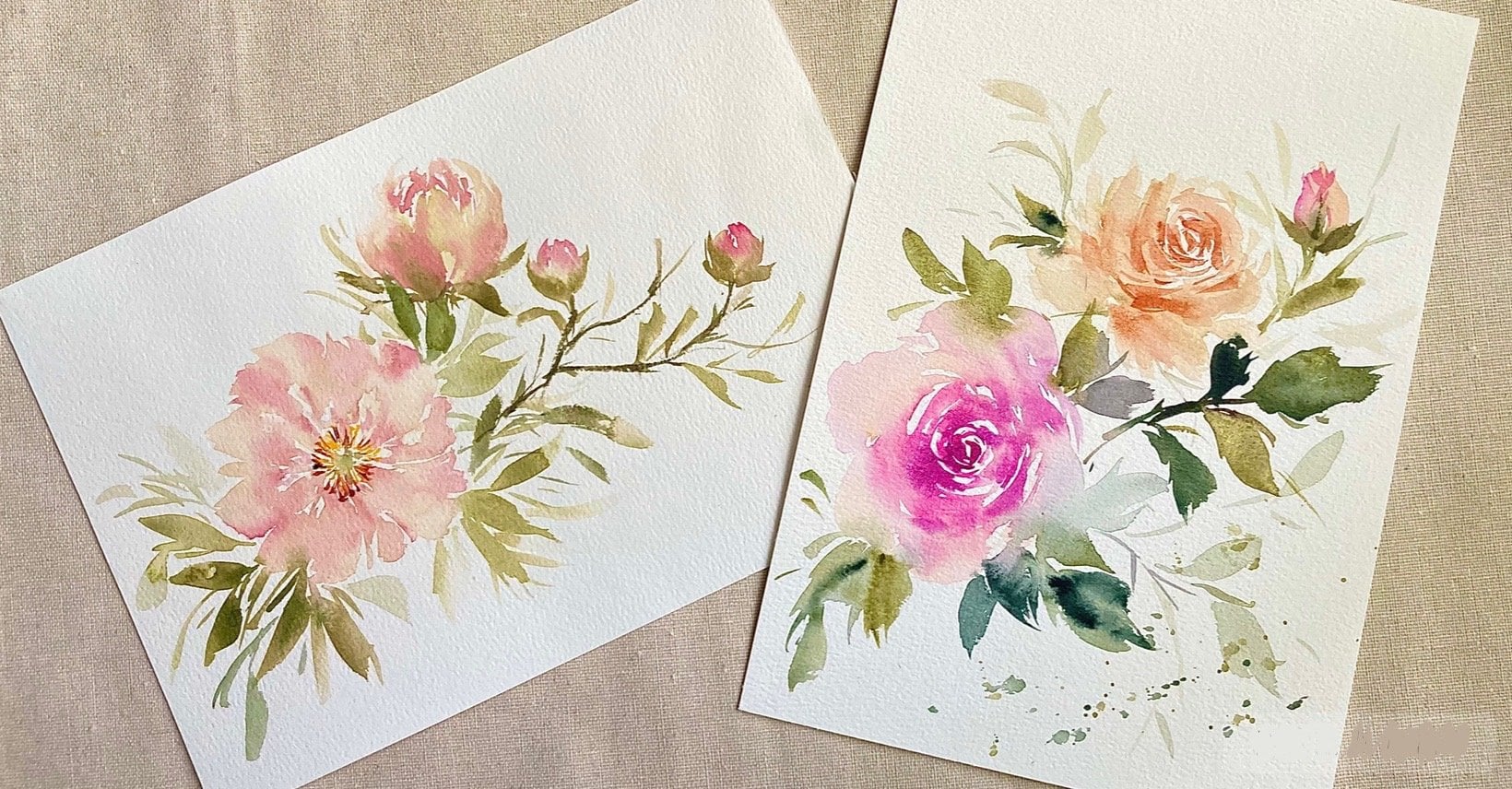
9. Day 6 : Pastel Florals: Welcome to day six. Today we are going to paint these lovely florals
in pastel shades. So here are the colors
that I'll be using. Lemon yellow, permanent yellow,
deep, Petersburg, ocher, burnt sienna, violet, sepia, green, earth, and shadow green. Okay, let's start with
our first flower. European some statements
using lemon yellow, canine or add a second layer
using permanent yellow deep. Now for the first flower, we are going to use Petersburg
Bokeh as our base color. If you don't have
Petersburg Luca, you can just use a diluted
mix of yellow ocher. So here I'm mixing a thin consistency of
Petersburg bunker. And we'll use burnt
sienna as Amit tone. And to create textures
in a pentose. For the shadows, you
add a bit of violet to operate genomics key, Let's swatch out this color. So this looks like a
purplish brown color. Okay, let's start
with our base color. I'll use my size eight brush. And I'll paint some
petals, this flower. Now before you add
your burnt sienna, just make sure that this
base layer is still wet. If you find that it's
starting to dry, just rebutted with
a bit more pink. Now I'm going to
load my size six brush with some burnt sienna. And I'm going to
remove excess paint on a paper towel so that you're not spread too much
on a wet petals. So I'm just adding random
strokes of burnt sienna. Okay, Now let's add
the darker tone. And again, I'll remove
excess paint on a paper towel before
I begin painting. So I'm just adding a few
strokes here and there. But try not to overdo
this because we still want our base
colors to be visible. Okay, I've added a bit too
much of this darker tone. So I'm going to remove the excess color using
the lifting technique. So as long as the
flower is still wet, you can use the
lifting technique to remove any excess color. Okay, Now let's move on
to our second flower, european some yellow statements using permanent yellow deep. So here I'm using my
calligraphy brush and I'm making something
and delicate strokes. So for this flower, we are going to use
a thin consistency of burnt sienna as
our base color. And then we use a mixture of burnt sienna and
violet as our midtone. Now, I want this flower to look different from
our first flower. So I'm going to
paint more petals. And I'm going to make the
petals a bit more with spear. I'll leave a tiny gap here
to show that this petal is behind offers flower K, I'll just squeeze in
a smaller petal here. So it doesn't really
matter if the petals of different
size and shape. So I'm just adding random strokes and darkening
some of the edges. Okay, Next, we'll darken this mixture with
a bit more violet. And we use this to
paint the shadows. Feel free to switch to a
smaller brush like a size two. So I'm painting
with a damp brush because I don't want the
color to bleed too much. Now you can always
use a paper towel to remove any excess
paint from your brush. Okay, now let's paint some
leaves around our flowers. We use several shades of
green to paint our leaves. This will add depth
to our painting. So for the lighter leaves, we can add a bit of yellow or
yellow ocher to our green. Or we can just use a thin
consistency of green. And for the darker leaves, we can add a bit of sepia
or violet to our green. I'll be using shadow
green to darken my green. Okay, so I'll start by painting some larger leaves in
between the flowers. And to add contrast
or paying some smaller and lighter
nice next to them. So you're paying the leaves in the background a bit lighter. And the ones which
are closer to us, we'll paint them a bit darker. So basically we're just
varying the size, shape, and color of our leaves around the flowers are peanut darker leaf over here. So for this green, I added a bit of shadow
green to my green off. Okay, and I'll paint
some lighter leaves next to it just to
bring out the contrast. Now, we can also vary the
color of our lives by dropping in a different shade of green while the base
layer is still wet. Okay, now let's paint some leaves on the
upper right corner. And I'll drop in
a darker shade of green to give it a
two tone effect. Okay, now let's pin a slight flower using the
same colors as office flower. So I'll paint the petals
using Peter's Basilica. And then I'll add a few
strokes of burnt sienna. And next we'll drop in a bit of that purplish brown mixture. Okay, now let's ***** apple, and the stem for
the site flower. And we add a few more
leaves next to it. Okay, now let's fill in the empty spaces with some
stamps and flower bats. So I'll ping the flower
bats using yellow ocher. And then I'll drop in a bit of burnt sienna while
it's still wet. I'll darken this leaf here
just to add some contrast. Now this is optional. Okay, now let's fill in this flower center
with a bit of yellow. So here I'm using
permanent yellow deep. And then I'll add some
statements using burnt sienna. And we also darken the edge of this center with a
bit of burnt sienna. Next, we'll add some
sepia and the statements. And also along the
edge of the center. Okay, now let's move on
to the second flower. So here we're just adding
thin strokes of burnt sienna. And we'll darken it
with a bit of sepia. Okay, so this completes
our painting. I hope you enjoy painting this, and I'll see you in D7.
10. Day 7 : Poppies: In this lesson, we are going
to pin these lovely puppies. So here are the colors. Yellow ocher, lemon yellow,
permanent yellow, deep, permanent rose, Petersburg
ocher, cadmium, orange, green. And the last color
is titanium white. Now, if you have
a white gouache, just use that instead of this. K. Let's prepare the
colors for office puppy. I'll mix a thin consistency
of yellow ocher. And for the second color, I'll mix permanent rose with yellow ocher to create
an orangey sheet. So this is how it looks. I'll also add some permanent
rose as well as lemon, yellow, and green on my palette. So we're gonna pay now
puppies in two layers. The first layer, we use the
bleeding technique to merge all our colors so
that we can get a seamless transition of
colors in our petals. And for the second layer, we'll add textures and shadows using the wet
on dry technique. Okay, I'll mix a bit
of green with lemon yellow to pina
Center for puppies. And then I'll darken
the edge with a bit of green case. So next, I'll load my brush with the yellow ocher mixture. And while this
fragment is still wet, let's pin and other
freedmen right next to it using the orangey shape. So we're merging
these two colors together while each
fragment is still wet. Okay, So we're just switching
back and forth between these two colors to create a seamless transition of
colors in our petals. Okay, now let's mix a
thicker consistency of the orangey sheet to darken
some parts of the puppy. So I'll use my size six brush to add a few
strokes here and there. So we'll let this dry before adding the shadows and textures. Okay, now let's prepare
the colors fall. Second puppy, I'm mixing
a thin consistency of lemon yellow and a medium
consistency of cadmium orange. We'll start with the
flower center and statements using the
same colors before. Now this will be a slight angle. Puppy, soda pentose will
corrode just slightly. Okay, Let's start
with lemon yellow. You add a few strokes of orange to let it blend
with the yellow. Before moving on
to the next petal. Okay, now let's
switch to orange. Okay, now let's drop in
a bit of orange towards the center and also on the
outer edges of the petals. So here I'm using
my size two brush. Next week, some
permanent rose to the orange mixture to create
a thicker consistency. And we use this to
create some textures and to outline some
parts of the petals. So you can see that this has a more controlled spread because you're using a thicker
consistency of paint here. Now, if your petals
have started to dry his spatter to stop and
let it dry completely. Once it is completely dry, just rewrite it with
a bit of water. Then you can add any textures using the wet on wet technique. Okay, now let's paint the stems. European a site
puppy on the right, using Petersburg ocher
and lemon yellow. If you don't have
Petersburg OCHA, feel free to use yellow ocher. And we'll darken
it with a bit of the orange mixture from
our second flower. So we're using the wet
on wet technique you. Okay, now let's attach a
stem to this site puppy. Now that our first two
puppies are completely dry, we can add some textures
and shadows on the petals. So I'll paint some wavy lines
with my calligraphy brush. And I'll vary the thickness
and length of these lines. So here I'm using the cadmium orange and
permanent rose mixture. Okay? And we'll do the
same for second puppy. Okay, I'll ***** stroke you
to separate this petal. I'll darken this
first puppy a bit more by adding more textures. K. Now let's move on
to our site puppy. Here I'm using a lighter mix of permanent rose and
Peter's Basilica. Okay, now let's add
another layer of statements using lemon yellow. And we'll also
darken the edge of the flower centers
with a bit more green. Okay, now let's add
some dots around the center to complete
our statements. So I'm using a mixture
of titanium white with yellow to create
an opaque yellow. Now, if you have white gouache, you can use white gouache
instead of titanium white. Or you can just use
yellow gouache. I'll add a bit more white to the mixture to make
it a bit more opaque. Now that this site
flower has dried out, you can see that the
color has faded. So I'm just going to add a bit more textures and are
also added more yellow. Okay, Now let's add little dots of yellow
around the center. So here I'm using
my size 0 brush. Next we'll darken the
stamens with some green. Now for the final step to add some splatters using the
wet on wet technique. So I'm going to use
my spray bottle to moisten the background. And then I'll add splatters
of yellow and red. Okay, so this completes
our painting. I hope you enjoy painting this.
11. Final Thoughts: Congratulations on
completing this challenge. I hope that you've learned
something new from this class. I look forward to seeing
your class projects, so please upload them
in the project gallery. Or you can tag me at Blue Dot lists are if you're
sharing on Instagram. If you have any questions, please post them in the discussion section and I'll get back to you as
soon as possible. So thank you so much for
joining this challenge. I hope you've enjoyed this class and I hope to see you
in my other classes.
 Lisa Lam, Watercolor Artist