Transcripts
1. About The Class: Hi everyone, Welcome
to this class. My name is Lisa and I'm a watercolor artist
based in Malaysia. I started watercolors
seven years ago, and florals are one of my
favorite subjects to paint. In this class, you're
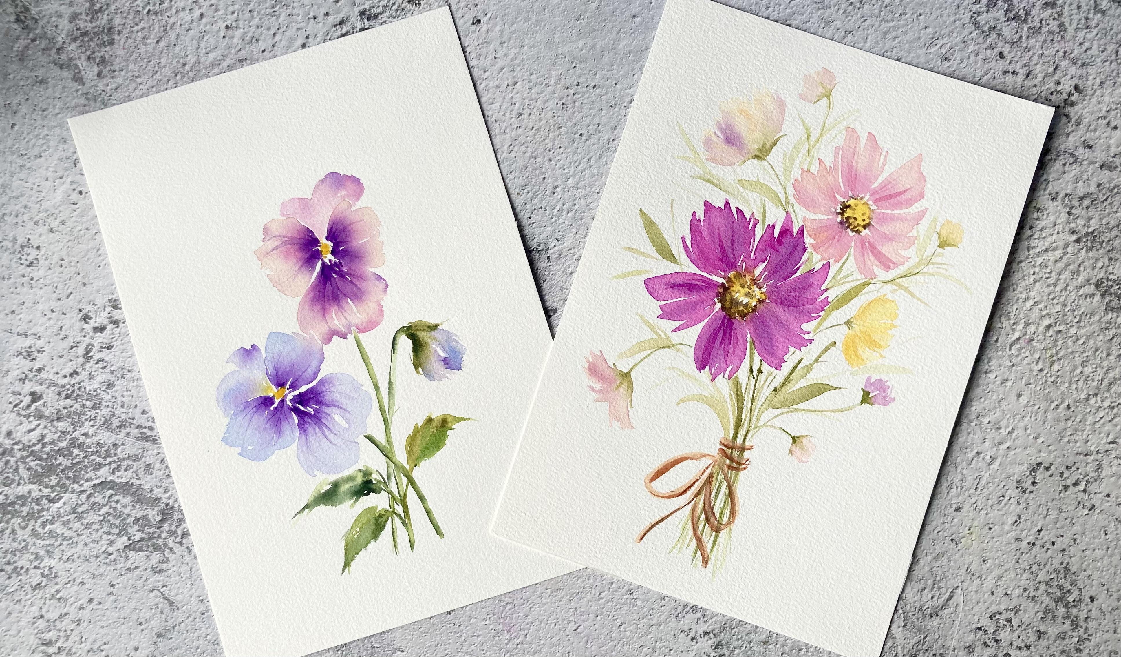
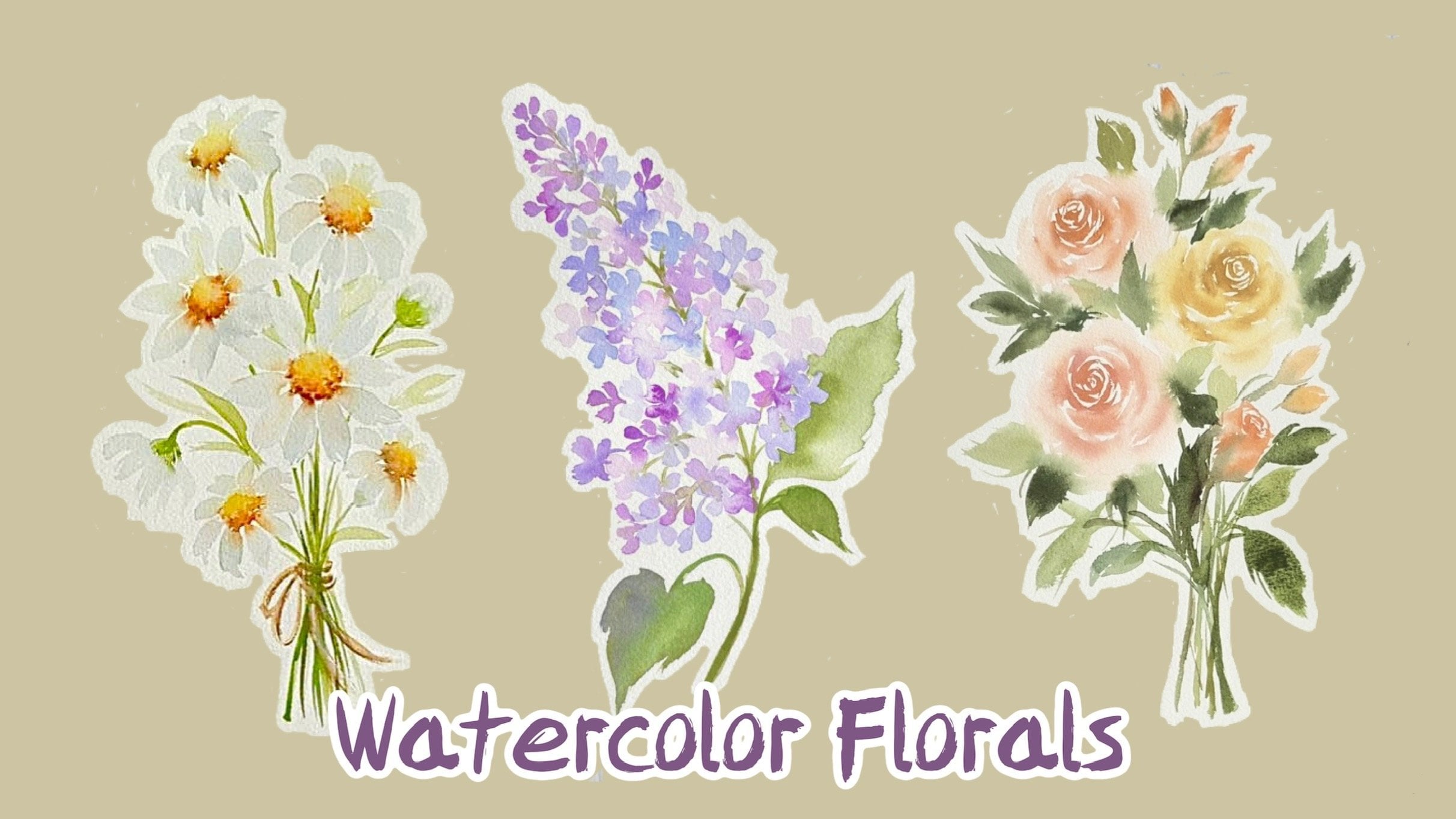
going to be painting these two lovely
floral compositions. I'll show you how to create soft and lovely petals
for your flowers. I'll begin the class by showing you the
materials that you need. You will also learn
how to incorporate the wet on wet
technique to achieve a similar color blend
in your flowers and add soft and lovely
textures to the petals. For your class projects, you'll learn how
to paint pansies and a lovely bouquet
of cosmos, flowers. I'll guide you through the
entire process and I'll also share with you some tips for creating a good
floral composition. By the end of this class, you will have the
skills to create your own beautiful
watercolor florals using the knowledge gained
throughout the class. This class is suitable
for all levels. So grab your brushes
and let's get started.
2. Materials Needed For This Class: Okay, let's start with
the paper I'll be using, this Bau Hong Academy
watercolor paper. This is 100% cotton
compressed watercolor paper in 300 GSM. For this class, you will
need some round brushes. I have these medium
sized round brushes. This is a size eight and size six from silver
black velvet. I also have this size three
round brush from Alt Nu. Now you can use any medium
sized round brushes. Just use whatever you have. For final details, I'll be
using these smaller brushes. These are size two round brushes and a Chinese calligraphy brush. You can also use a
size 01 or three. We also need some clean
water, papal towels, a palette or mixing plate to mix our colors for the colors. I'll list them out in
the individual lessons.
3. How To Create Soft & Lovely Petals: The wet on wet technique is a great technique to use
when you want to create a beautiful blend of colors in your petals without
leaving any hard edges. This is basically just applying
wet paint on a wet paper. Your paper can either
be pre wet with a layer of clean water
or a layer of paint. All right, let me show
you how this works. I have a watery
mixture of yellow, which I will use
to wet the paper, and I'll prepare two
different consistencies of orange mixture. This one here has a
watery consistency. The second one will be of
a thicker consistency. You can see that this has less water and is thicker
than the other mixture. Okay, I'll wet this
section with some yellow. And while this is still wet, let's first drop in
the orange mixture, which is thicker, and
observe how much it spreads. Now let's compare this with the other mixture which
has a thinner consistency. You can see that this
spreads really fast, and if we leave it, it
will continue to spread. We can control how
much our pain spreads. If you want it to spread more, just add more water to
your paint mixture. For it to spread less, just use a thicker mix of paint. Keeping this in mind, we
can use this technique to create some lovely color
blends in our petals. All right, let me
show you how to use this technique to add
colors to your petals. I have a watery mix of orange here and a thicker mix of red. First, I'll paint a petal
using the yellow mixture. Now to make sure this
base layer stays wet, we can go over it a few times. We also want to make sure that there are no petals of paint. Then while this is still wet, I'm going to drop in some orange at the base of the petal. Now I'll drop in some red. Now because this
mixture is thicker, it will not spread as
much as our orange mix. We are still able to see the orange fragment
in the petal. This is a great
technique to create soft and lovely transition
of colors in your petals. With this technique,
we can achieve a smooth and lovely blend
of colors in our petals. Now we're going to use this
technique to paint the pans. You can see a soft
transition of colors from light pink to dark
pink and to violet. Now this technique also
allows us to create some soft textures and
shadows in the petals. I'm going to add a few
strokes on this wet petal. Because the paper is wet, the color will blend
seamlessly with a base layer without
leaving any hard edges. This is how we are
going to create some soft textures and shadows
in our cosmos flowers.
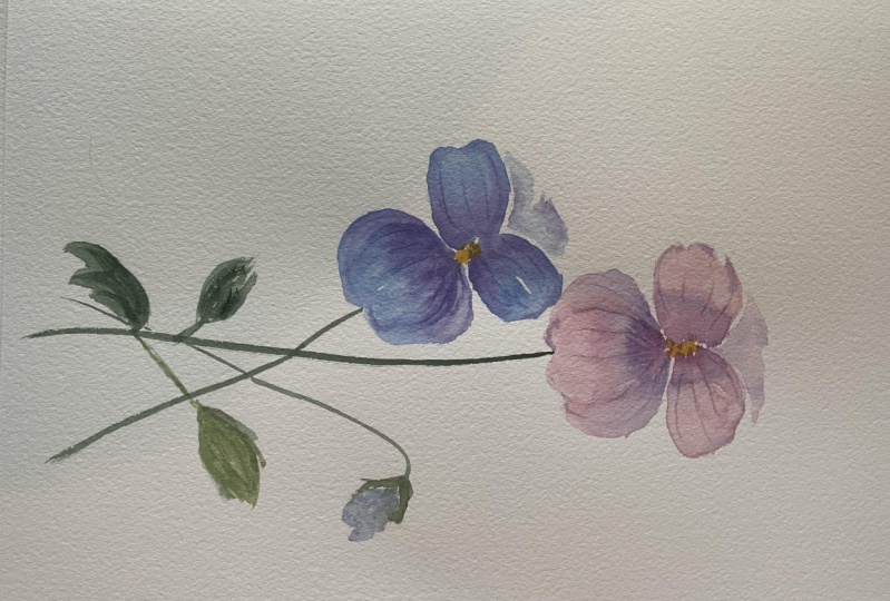
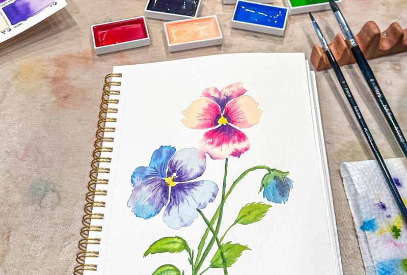
4. Watercolor Pansies: For our first class project, we are going to be painting
these lovely pansies. For the colors I'll
be using, shell pink. Now if you don't
have shell pink, you can just use
a watery mixture of any pink or red
in your palette. The next color is
Quinacridone rose. I'll also be using lavender. If you don't have lavender, you can use a diluted mixture of ultramarine or cobalt blue. The next colors are violet
and permanent yellow. Deep for the stems and leaves, I'll be using green,
earth and shadow green. All right, I'm going to
start with the pink pancy, then we'll move on
to our blue pancy. On the left, I'll be using
my size eight brush, but you can use a smaller brush if that's what you're
comfortable with. All right, for the first pancy, we're going to use shell
pink for the base layer. You can see that this is quite a watery mixture as I've added quite a
lot of water to it. I'm going to start with
the two side petals. I'll leave a tiny gap here
for the flower center. Now, since we are going
to be working wet on wet, we need this layer to stay wet. So make sure to paint
with a very wet brush, or you can go back in
to add another coat of paint to prevent this
from drying out too soon. Okay, next I'll tap in a
bit of Quinacudone rose at the base of these petals
and let it bleed outwards. I'm using just the tip of my brush to gently
tap in the color, as I don't want it
to spread too much, because I still want our
base layer to be visible. Now, feel free to switch to a smaller brush
for this step. Next, I'll drop in a bit of violet while the
pain is still wet. Now make sure your violet
mixture is not too watery. We want it to be a bit thick so that it doesn't spread
all over the petals. While this is still wet, I'm going to use the end of my brush to pull out
some fine veins. Okay, now let's move
on to the front petal. Here we have a little
bit of color bleed now. You can either leave it or
if you want to remove it, just use a clean them brush
to lift out the excess color. All right, now let's add some
ago rose near the center. I'll also add some
on the petal tips. While this is still wet, let's drop in some
violet near the center. All right, let's move on to our second pansy on the bottom left. This will be slightly
tutored towards the left. For the base color, I'm using
a watery mix of lavender. And I'll start with
the two side petals. Now I'm going to
touch this petal to the first pan so that I can
get some nice color bleeds. This will make it look
a bit more interesting. Okay, now let's add
the front petal using the same colors. Next, I'll drop in
a bit of violet near the center
and let it bleed. I'll also add a
bit more violet on the side petals before
pulling out the veins. All right, now going
back to the first pansy, I'm going to paint
the posterior petals. And I'll leave a tiny gap to separate them from
the side petals. We'll start with shell pink, followed by some
quince and violet. Okay, now let's do the
same for a second pen. S Now let's add a yellow center for the pansies. Now if this bleeds a
little, that's fine. I think it actually
looks quite nice. Now I find that the veins on the pink pansy are quite faint. I'm going to tap in
a bit more violet and try to pull out more ves. Now as you can see, the
petals are already dry. It's a bit difficult to pull
out any veins at this stage. I'm just going to use my
brush to paint in the veins. It's a bit hard to pull out
any veins at this stage. I'm just going to use my brush
to paint some fine veins. All right, now let's
move on to the stems. I'll be using green earth and for the shadows I'll use
a bit of shadow green. We'll paint this stem
overlapping the first stem. And then I'll add a bit of
shadow using shadow green. All right, now let's
paint some leaves. Let's add a bit of
shadow to give it some dimension so it
doesn't look too flat. Okay, let's pin
another stem here, and we'll attach a bud
to it for the flower, but I'll use a light mix
of violet and lavender. And then I'll pin the
sepals using green earth. I'll also add a bit of shadow on the stem so that it
doesn't look too flat. Let's paint another leaf here to fill in
this empty space. Now I don't quite
like how this looks, so I'm going to use
a clean them brush to lift out the excess paint. As long as the
paint is still wet, we can continue working on it. We can lift out colors and we can also add in
additional colors. I'm going to add some
contrasts in this flower bud. I'll use violet and lavender
to add some shadows. Now for the finishing touches, I'll add a few more
veins on the pansies. You can see that the ones we pulled out earlier have
faded quite a bit. I'll also fill in
this empty gap here. All right, so this completes
our first project. I hope you enjoy painting this. And don't forget to
upload your projects in the project gallery so that I
can give you some feedback.
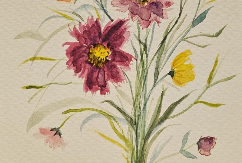
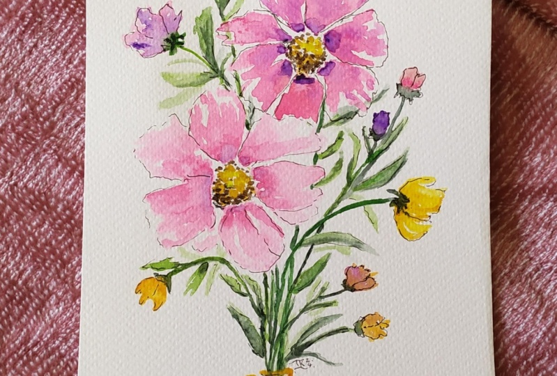
5. A Bouquet Of Cosmos Flowers: For second project, we
are going to be painting this lovely bouquet
of cosmos flowers. For the colors, I'm going
to use Jean brilliant. Now if you don't
have this color, you can use a watery
mix of yellow ochre. The next color is
permanent yellow, deep. I'll also be using shell pink. Now if you don't
have shell pink, you can use any red or
pink in your Palett. Just make sure that you prepare a light and watery mixture. All right. The next color
is Quinacridone rose. You can also use permanent rose. Next we have Opera
pink and violet. I'm going to mix Opera
pink with a bit of violet to create a
pinkish violet shade. All right, so I'm
going to use this as the base color for one
of our cosmos flowers. Now, you can also
use permanent rose instead of opera to
get a similar shape. Let me mix permanent rose
with a bit of violet. Okay, now for the
stem and leaves, I'll be using green Earth. Now feel free to use any
green in your palette. I'll also add a bit of yellow to create a lighter and
warmer shade of green. I'll be mixing titanium white, burnt sienna to create
an opaque color. And I'll use that to
paint in the twine. Now if you have white, you can use that as that
will be more opaque. All right, and the last color is I'll start by preparing some of the
colors in my palette. Here I have permanent
yellow, deep, a mixture of opera and violet and a watery
consistency of shell pink. All right, let's begin by making a ring of
dots for the center. Since we're going to
be working wet on wet, we need our petals to stay wet. I'm just going to
wet the petals a bit more by adding a
few more strokes. Now I'll load my brush with
a pinkish violet mixes. I'll paint some wispy
strokes to form the petals. Now if you look at
the cosmos flowers, some of them have
these jagged edges. To create these jagged edges, I'll combine these brush strokes to form each individual petal. Now the petals do not need
to be uniform or perfect. They can be of different sizes. Now, we can also leave
a bit of white space in the petals to make it look
a bit more interesting. I'll wet the petals
a bit more by adding a few more strokes just to make sure they stay
wet a bit longer. If you're working in a
hot environment like me, doing this will
prevent your pain from drying out too soon. All right. Next I'll add a
bit more violet to my pinkish violet mix
to get a darker tone. And I'll drop this around
the center and let it bleed while the
petals are still wet. I'm going to add a
few strokes here and there to create some soft
shadows in the petals. This will add dimension
to our flower, because the petals
are still wet, these strokes will blend
seamlessly with the base layer. This creates a very
soft and lovely effect. All right, now let's move
on to our second flower. This will be at an angle which is facing the upper
right corner. I'm going to start with
the yellow center. For this flower, we are going to use shell pink for
the base layer. Now because of the
angle of this flower, the petals at the front will be shorter because they are
slightly curled upwards. Again, I'm combining
my brush strokes to create those slightly jagged
edges for the petals. We can add a bit more paint on the petals to prevent them
from drying out too soon. Next, I add some Quinacridone rolls to my Shall ping mixture. I gently add this to the base
of the petals and let it bleed for the shadows. I'll paint some thin strokes while the base layer is still. Now switching to
my size two brush, I'll grab some sepia and pin little dots
around the center. We'll paint more dots on the lower left section to give the illusion of
shadows in that area. All right, now let's go back to our first cosmos and fill in
the center with some yellow. Then I'll just add little
dots of along the edge. Now that we've completed
our two main flowers, we can now paint other elements around
them such as leaves, some side flowers,
and flower buds. But first, let's paint the stems Using just
the tip of my brush, I'm going to paint some
thin stems for the flowers. Okay, now let's start
filling in the bouquet. I'm going to paint a side cosmos flower here on the right. For the base layer, I'm using a diluted yellow
to add dimension. I'll use a darker value
of permanent yellow, deep to create some
shadows and textures. To create highlights
on the petals, I'll use a clean, damp brush
to lift up the excess color. And then I'll add the
base and extend the stem. Let's paint another side, cosmos flower on the
upper left corner to balance out the composition. We'll paint this facing
the opposite direction and we also make it slightly bigger than our
previous side flower. For this flower, I'm using John Brilliant
for the base layer. And then I'll add
some darker tones to create dimension
in the flower. I'm just using the remaining
pinkish violet mix in my palette to create some
shadows and textures. Once you're done
with the flower, just paint some seples
and attach a stem to it. All right, now let's fill in the bouquet with some leaves. I'll paint some leaves
along the stems and also in between and
around the flowers. For this to look more
visually appealing, we need our leaves to point
in different directions. They should also have
different thickness and tonal values will be a bit lighter and
some will bit darker. We can paint some
leaves a bit thinner, especially those
in the background. Doing this will not only add
depth to the composition, but it also make the overall composition look
more interesting. We can also add a bit of yellow to our green for a warmer tone. We can also do the
same for the stems. We can vary their thickness
and tonal values. We can paint some a bit. All right, now let's add some
flower buds to our bouquet. To add interest, I'm
going to paint them in different colors and have them face in
different directions. Feel free to paint these buds in any colors that you like. I'll use shell pink for
the first flower bud, and we can paint tiny
seples at the base of each. But for the second one, I'll use a darker pink. For the third one, I'm going
to use John Brilliant. Now I'm going to fill in
this lower left corner with a side flower which
has partially bloomed. I'll start with shell pink for the base layer and then I'll add a few
strokes of Quinacridone rose for the shadows to
give it a bit of dimension. I'll add more stems at the
base to make it look thicker. I'll also paint a few
more leaves at the top. Now this area here at the
top looks a bit empty, so I'm going to paint
another flower. But Now let's go back to our two main flowers
to add some details. I'll use a watery mix of the
pinkish violet mixture to add some thin strokes on the petals to give the
illusion of shadows for the pin cosmos. I'll use a lighter value of the same mixture by adding
a bit more water to it. I'll also add some shadows on this flower to give it
a bit of dimension. Now if there are any
gaps in your bouquet, you can just fill it
in with some leaves. Just paint some thin strokes
like what I'm doing here. Okay, for this flower center, I'm going to add a
bit more contrast. So I'm just going to
darken the shadows at the base with a bit more spa. All right, now let's
move on to the twine. I'm going to mix
burnt sienna with titanium white to
create an opaque color. Now if you have white guash, just use that because
that will be more opaque and it will
provide better coverage. I'm just going to paint three
horizontal lines here on the stems and
attach a bow to it. Then I'll add some shadows
using burnt sienna. I can darken the shadows a
bit more with some sepia, And I'll add a bit more of that opaque mixture on
some parts of the bowl. Once I'm happy with
how this looks, I'll darken the stems at
the base behind the bowl for the finishing touches. I'm going to darken
some of the stamps in the bouquet to make
them look more defined. This completes our painting. I hope you enjoy painting this. Please upload your projects in the project gallery so that I
can give you some feedback.
6. Final Thoughts: Congratulations for
completing this class. I hope you've enjoyed
painting along with me and that you've
learned something new. I can't wait to see
your class projects. Please upload them in the project gallery so that I
can give you some feedback. Now if you have any questions, you can post them in
the discussion section and I'll get back to you
as soon as possible. Now if you find
this class helpful, I would really appreciate it if you could leave
a class review, This will help this
class gain more views. Thank you so much for
taking this class. I really appreciate your support and I hope to see you
soon in my next class.
 Lisa Lam, Watercolor Artist