Transcripts
1. Introduction: Hello, everyone, and welcome to my second Skillshare
class on Gauche. I'm Anaka Shudas, a mixed media artist
based out of India. Well, in today's class, we'll be painting a
beautiful scenic artwork while learning how to
paint rocks effortlessly. So if you're new to Gauche, let me quickly give you a few important things
about this medium. First of all, it's a
wonderful medium that sits somewhere between
acrylics and watercolors. It's water based,
highly pigmented and allows for both
transparency and opacity, making it one of the
most versatile medium. Not just that, you
can also layer, rework, and even reactivate
dried paint with water. So as you can guess, there is plenty of room to experiment. Now, this class isn't about deep diving into
technical details. Rather, it's a
step by step guide where you learn gouache
by actually painting. By the end of this session, you won't just have a
completed painting, but you'll also gain
the confidence to paint rocks from your imagination
in your future artworks. So grab your brushes, set up your paints,
and let's get started.
2. Materials: Now, as for the materials, I'll be using this
journal from Zen Sangam, which is an Indian brand. You can choose any sketchbook
or even any sheet of paper, but keep in mind that it
should be minimum of 200 GSM. Apart from the sketchbook, I also have a few
rough sheets for sketching and also for
testing some colors. Next, you'll need a pencil. I'm using a standard
MM mechanical pencil. Along with this, I'll also use a rubber as for the paints, I'll be using the
HimeaGuch paints. They come in jelly cups,
so I'll be using this. You can also use the tube format of gauche paints as well. It's best to use palette
knife for taking paints. I'm using round
and flat brushes, which are small
and medium sizes. These are actually
synthetic brushes. You'll also need water, one jar for mixing dark colors, and another one for
mixing light colors. Lastly, a mixing palette is essential for
blending your colors.
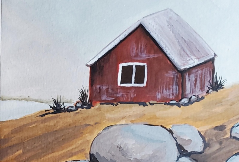
3. Sketch: Now let's start
with the sketching. Now, as I'm using a sketchbook, I prefer to sketch normally
on both the sides. So I'll start off with
this side of the page. I don't need masking tape, so what I'll do is simply mark the outline first using
free hand method. You can also use a
masking tape if you want a criss border or else you
can keep it like this. I'll curve the corners a little so that it matches the
sketchbook as well. Even if the paint goes out, I'll make sure it looks good. So if you're following
the same method, don't worry much
about the borders. We can sort it out
as we proceed. Now I'll start by dividing this page both horizontally
and vertically. You can roughly mark the
midpoints and then divide them. You don't have to use a scale, just roughly divide it. This is actually just to
understand the placement of various elements that
we see in our reference. So you can simply go for
a free hand division. So now let's divide the
reference into three parts. That is the background. You have the house and the ground part, or you can call
it the hill part. Now to place them,
I'll make sure the ground occupies the
bottom part of the space. And for the house, I just
won't be using this quadrant. I'll slightly cover
this quadrant as well. So the remaining area left
would be our background. Now you can simply mark a line
like this in this corner. Now let's start with the hill. So there is a small
depression here, so you can bend it like
this and you can slowly go above the mid line and
then continue it this way. So this will be the hill
portion that we'll have. Now, the background
will be automatically decided as soon as
we sketch the house. So for the house,
we can slightly draw a line near
the middle line. We can place the house not exactly in the center
of the quadrant, but around one eighth of a
way, somewhere around here. And this part will be
the end of the house. And here also, the house
shouldn't cross this line, so just keep this in mind. As you can see,
the front part of the house is much bigger
than the side part. So what I'll do is
divide it this way so that this part is very small
comparing to the front area. Now, don't make this
portion into a square. Instead, I'll keep
it as a rectangle. Now, if you observe carefully, you can see that it's somewhat
resembling a rectangle. Now slightly tilt this
side a little upward. You can rub off the extras over here so that you can
understand the sketch better. Now, approximately in
the middle of this part, mark a point this
way slightly above. You don't have to make it
as an equlateral triangle, you can shorten the height. Now you can connect the
corners to indicate the roof. Now using this point, you can draw a line parallel. Now draw a straight line
to finish off the roof. Now you can adjust a
little on both the sides. Now, as the house is ready, I'll correct the
hill part a little. Finally, let's add the
big window in the front. Now the house is done. So as for the background, I can now add the
mountain like this, and just behind it, you can add a bigger mountain. So basically, this one will be darker, while the background, it slowly starts fading, ultimately giving you
that foggy effect. Also, in the reference,
you can see, there is a stream basically
flowing in this area. For that, what I'm doing is starting slightly
above this corner, not exactly in the corner, I'll connect this point to this point with an
irregular line like this. In the same way, leave a
little space from here, and to this point,
you can connect another line similarly to
indicate the flowing stream. The remaining element
are the rocks. So basically, there are
three prominent rocks here. So exactly in this middle part, just below the house,
you can draw a rock. So what I'll do is I'll draw a circle or an oval
shape for the rock now. If you look carefully, you
can see there is a gap here, and you should have the
same gap here as well. Now, next to this rock, you can add a small oval shape. Also over here, you can draw
a rough circle like shape. So basically, this
is the hill part, and this is actually a pathway through which you can
reach the stream. So what you can do is, apart from this hill part, you can cover it with
rocks on both sides. You can follow along with me or you can bring in
your own creativity. Feel free to decide how
your sketch has to be. The painting is pretty
common for everything, so you can arrange the rocks
in any way that you want. So the very first
step is to simply mark oval shapes to
place the rocks. Now, once you finish
filling up these rocks, I'll tell you how to add
details to these rocks. So around this area, I'll keep a little space for
the hill near the stream, and surrounding that,
I'll add a few rocks. Not just big ovals. You can also add these tiny bits of shapes here and there
to fill in the space. So using these oval shapes, this is how I shape
them into rocks. So basically, what
I'll do is keep the top portion or any side
of this oval shape flat, and then you can cover up the remaining sides of the rock using rough
irregular lines. That is, you can straighten one portion and change
the overall shape. So this is normally how I do it. You can follow along as it
is pretty easy to catch up. So here also, there are some rocks in case
you didn't notice. So for that, I'll be adding small rocks as they
are further away. Also, on the other
side of the stream, you can add a few rocks. Once this step is over, our last step is to rub
off the dark strokes and simply keep the light ones so that it would be easy
for us to paint over it.
4. Background: For the background,
we need white, burnt umber and greenish gray. We'll start by taking a
good amount of white, greenish gray, as
well as burnt umber. I prefer using a flag
brush for the background. So first, you can wet
the brush slightly and start by taking a
little amount of white. One of the key factors
we'll have to keep in mind would be to ensure that the paint has
a good consistency. That is, it shouldn't be
too watery or too thick. So if you think there is a need, you can thin it down by slightly adding a
little bit of water. Once the consistency
is quite good, you can add a little bit
of this greenish gray. Since we want a light shade, always start with white and then gradually add
the other colors. In this case, a tiny dot of greenish gray would actually
change the entire white. If you have mixed enough
paint for the background, you can start covering up to this portion that is
around the house. You can begin by
outlining the house using this color and
then fill in the rest. Once this is done, I'll take
a little bit of white with the same consistency and also
by using the same brush. Now, if there is
any remaining paint in the previous
mixture, let it be. So to this, you can
add a small amount of greenish gray and a slight
touch of burnt umber. Now using this mixture, you can fill in the next
layer of mountains. Once this is done,
to the same mixture, you can add a little bit of burnt umber and try to
maintain the consistency. Now with this color, I'll proceed to paint the
remaining mountains. The clips were a
little out of focus. That's the reason I have
played it at a faster rate. Now, once this is complete, you can start by adding a layer of paint for
the stream part. For this part, you can
add a little bit of greenish red to our
previous mixture and dilute it with water. Using this, you can fill
in the stream part. A light wash of this
color would do. With that, the background
is now complete. Now let's move on to
the next sections.
5. Base layer: We'll use this earth yellow along with red for
the base layer. Start by taking some good amount of paint onto your palette. To begin with the house, you can start by diluting
the red properly. Using this diluted
version of red, you can fill in
the entire house. Right now we are
applying a light watercolor wash over our sketch. It's basically not
a watercolor wash, but as we are dilutingh, it acts like watercolor, that's the reason
why I mentioned watercolor wash. Once you have filled the entire house, add a little bit of
burnt umber to this red, and this is actually to
make it look even darker. You can take a little bit of
water to dilute this color. So once this is done, you can apply the shade on this side. This step is to
maintain the depth by ensuring some areas remain
darker than others. So you can follow along and mark it just below
the roof area. Now you can dilute the earth yellow as we are starting
with a ground part. Now, using this color,
you can cover the ground. You can do this by
avoiding the rocks and simply start by filling
up the remaining areas. Let's focus on painting
the ground first. So just don't mix
any other color. The very base color of
earth yellow would do. You can also ensure
that there is no excess water pooling
on the surface. If there is any,
use it to spread the paint evenly across
the other sides. Using a very light
version of this color, you can start by
blocking the rocks. So I'm basically leaving the top portion of the rock
for the highlight part. So for each rock, you
can follow the same. That is, leave the
top part and fill in the remaining part using
this light shade of yellow. Make sure you repeat the step for every
rock that is present. Now, add a little bit of burnt umber to this mixture
to enhance the effect, especially just below
the highlighted areas. In order to give the depth, let's darken it a little. Again, you can repeat
the same step for every rock that is
present in your sketch. Make sure you don't mess
out these rocks as well. Now to the same mixture, add a little bit of burnt umber and apply it at the
bottom part of the rocks. So this is to give
the shadow effect on the ground because
as you can see, the part that is near to
the ground is more darker, so you can follow this step to give some depth in
your base layer. Now for the highlights,
you can take some white and a very small
amount of greenish gray. Now using this color, you can mark the highlights. The only reason why I'm
giving a blue base layer is because I want
the overall painting to have that cool tone. So that's the reason
why I'm going ahead with this bluish touch
for the highlights. Once you have marked the highlights, you can take a little bit of this diluted burnt
tumber and draw a line like this just below
the background mountains. This is to differentiate the background with, you
know, the front part.
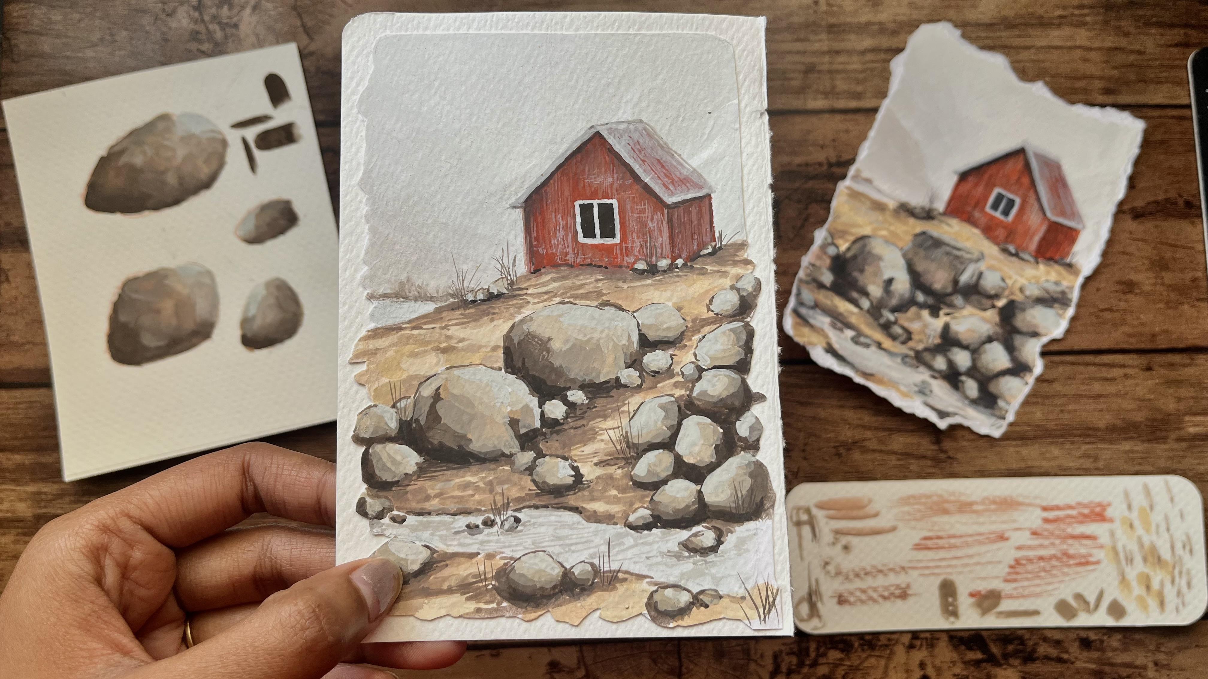
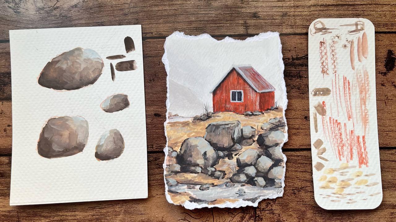
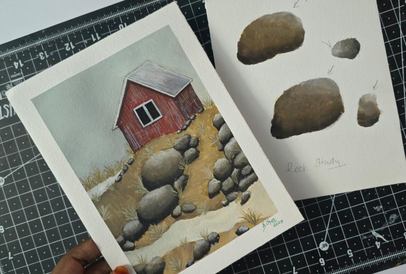
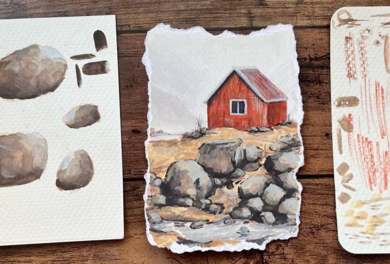
7. Rock Study: Understand rocks, let's first
go over how to sketch one. These are actually the two
methods I normally use. One is using an oval shape and the other is using a square. From a square, it's pretty
easy to make a cube bright. Well, you simply
draw another square slightly angled and position
above the first one, and then once you connect the corresponding corners,
the cube is ready. Similarly, to make this 13d, you can draw a similar shape, slightly above, not directly above, but slightly diagonal. Then erase unnecessary parts and then connect the
corresponding corners, and you can also refine
the structure if needed. Now to refine it further, I'll use another color. I'll start with the front and back squares in the same format, but with slight modifications. I'll keep this base as a straight line and adjust
the rest accordingly. Now for the B square, follow the same base idea and
replicate the adjustments. Now you can repeat
the same process for the oval shape as well and
create a rock in your own way. Instead of starting with a cube and then sketching
from the scratch, you can simply draw a two
dimensional rock like this. You can choose any shape for the rock, but while painting, make sure you add that
three D effect to make it look more realistic.
I'll show you how. Now let's suppose there is a light source falling
on these rocks as shown. So wherever the light falls, that area will be having
the lightest color. That is, as the light
hits the surface, it starts to glow, creating
what we call a highlight. Now, on the opposite side of the highlight is where
we have the shadows. So that part of the
rock would be the darkest comparing to our
highlighted portion. So as we mentioned, the darkest areas
represent the shadows. For this, we'll be using the darkest color
that is burnt umber, and for the highlights,
we'll be using a mixture of this
greenish gray and white. Reason why I'm bringing
in the touch of blue is because I want the painting
to be overall cool in nature. And if you prefer warmer rocks, you can very well add yellow
instead of this blue color. Before that, let's prepare a few more colors
on our palette. That is burnt sienna, a good amount of earth
yellow, as well as white. Just as we did earlier, we'll start by creating
a base layer first. So for that, I'm using
a mid tone color that is in between the highlight
color and the darker shade. So in this case, we'll be
going for earth yellow. Now, leave some space for
the highlights and fill in the remaining part
of the rock with a light diluted wash
of earth yellow. Once this is done, to ensure the highlights
are not missed, we can also add a base layer
for the highlights too. For this, I'll use a diluted
version of greenish gray, mixed with some white to
indicate the highlighted areas. Once the base layer is dry, we can start applying
the darkest color, that is burnt umber. As this is the darkest shade, I'll begin on the side
opposite to the highlights. As I had mentioned earlier, I want the rocks to
have that cooler tone, so I'll mix a bit
of blue mixture. In this case, we'll be going ahead with this
greenish gray color. So in our picture, this is the color
that would give that bluish touch
to our paintings. Now, once the color is mixed, I'll start marking the areas
where the shadows fall. Now, since I'm
using a flat brush, I'll adjust my
brush in such a way that I can create both
thin and thick strokes. That is, to achieve a thin line, I hold the brush
at a slight angle, and for a thicker stroke, I keep it flat
against the surface. While painting the rock, if
you're just using one brush, you can tilt it at
different angles to create the desired
texture or stroke. So once you have applied
the darker color, you can gradually
transition from this dark shead towards
the highlighted part. This means that
you're moving from the darkest color to
the lightest one. The mid tone color we used earlier was earth yellow, right? So by slowly add small amount of earth yellow to
our dark mixture, you can create a
smooth transition from the darkest tone
to the lighter shade. Now, just to add a brown touch, you can also mix burnt
sienna into our mixture. However, you don't have to
fully cover the surface. Just randomly brush the paint into few areas as I'm doing. This technique will
help you create that natural texture
for the rocks. Now, continue this process
by gradually adding more and more earth yellow to the mixture along
with some white. So make sure as you approach
the highlighted areas, the colors become
significantly lighter. Once you are very close
to the highlight, add the lighter shade by
mixing in more white to the mixture and applying it around the
highlighted portions. Next for the highlight, you can take some greenish gray mixed with white and paint it directly on that
highlighted portion. As you can see, the
three day effect of the rog is slowly
coming into picture. With this, our rock
painting is complete. However, if you wish
to add more details, you can go over the layer once again after the paint has dried. So without disturbing
the underlying layers, you can refine the painting to give more depth to the rocks. So feel free to experiment
with different combinations of these colors or even introduce new colors to your
palette if you need. Also, there is an
important thing to note, that is, avoid
overdoing the painting. If you're a beginner, you
can just keep it simple. As you gain more experience, you can gradually
enhance your skills. So for now, just understand the basics and try
to keep it simple. Now let's move on to painting
the rocks on our sketch.
8. Painting Rocks: Based on the rocks study
that we just completed, we will now work on these rocks. As you can see, the base
painting is already done. Next, as we discussed, we'll begin with
the darkest color. But here, I have made
a slight change. Instead of going ahead
with the darkest color, I'm using a semi dark tone by mixing a light earth
yellow with burnt umber. Don't worry, this isn't
the darkest color, but gradually I'll
add more depth by incorporating both darker and lighter shades
into the painting. Now, instead of using
burnt umber directly, I'll mix burnt umber
with a little bit of black to achieve that
deeper dark tone. You can work with
different angles using your brush to
create that stroke. Now using this dark color, you can start applying
the shadowed areas. So here, in this case,
make sure you keep the base darker than the
rest of the rock. To bring in that more
detailed texture, I'm using a different brush. In this case, I'm using
this round brush. So once the shadows for all
the rocks are in place, we can move to the next shed. Now, before that, I'll
add a light wash to this background using a
diluted version of this color. So by diluting it, the
opacity decreases, hence creating that soft
blurry background effect. So when I look at this painting, I find this hill
area a little plain, so I'm adding a bit of burnt
sienna to this mixture, along with some earth
yellow as well as white. Now using this, I'll fill
in a few areas of the hill. As you can see, I'm just
dabbing the brush onto the paper at a slight angle
to create this texture. Also make sure you place this
dark color near the rocks. In case the method
wasn't clear earlier, this is how I'm doing. Now once this is done, let's go back to the rocks. For the rocks,
I'll primarily use these colors which are
already on the palette. That is burnt umber,
greenish gray, earth yellow, white,
black, and burnt sienna. So just by adjusting the
ratios of all these colors, you can achieve so
many different colors from this palette itself. That is, if you need
a darker shade, add black or alternatively, add more burnt umber. Similarly, if you
need a lighter color, add earth yellow along
with some white, as well as burnt sienna. Using the same palette, simply mix all the colors in various proportions and fill
in the rocks accordingly. Well, you can observe what
I'm doing first to get a better understanding and
then paint it on your own. As you can see, I'm leaving
the highlighted portions untouched while working
on the remaining areas. So you can switch between
different brushes to create different
textures that you need. As I have reached the
highlighted areas, I'm using a thin brush now
to mark the highlights, especially on the surface area. So for this, I'm using
that lightss shed using a mixture of greenish
gray as well as white. Now, with the
highlights in place, the rocks are now complete.
9. Final details: Now to add the final details,
here's what we'll do. Imagine this as a
surface with a rock on the left side and another
on the right side. So for the rocks on the left, we'll add some shadows
towards the right. Similarly, for the
rocks on the right, we'll add shadows
towards the left. With this in mind, I'll
start with burnt umber mixed with some greenish gray to
obtain that dark color. We are essentially working on the same mixture
from the palette, so this would be a light color. Now using this, you can apply the shadow just below the rocks, not on them, but on the hills. You can also mark the borders of the stream so that they
are quite highlighted. As we saw earlier, for the rocks on the left
side of the painting, I'll add shadows to the right. And for the rocks on the right, I'll add subtle shadows wherever they are
visible and necessary, though not for every rock. Also, don't forget
to add shadows for the rocks that are on the
other side of the stream. Additionally, I'll also enhance the details near the house
area to create more depth. In case you find your paint
too dark or too thick, you can always dilute
it with water. Now, imagine a rough
sketch of a rock. The bottom part will
always be darker. So even in the painting, I'll darken it slightly more, especially along
the bottom edge. I'll repeat this for every rock. I'm planning to darken
it a little more, so I'm adding a bit of black to this mixture to
enhance the color. And same way, I'm working on the bottom part of the
rock to give that effect. Finally, I'm taking a diluted
wash of the same mixture, which is almost like a gray color to add the
details on the stream. Simply make strokes like these
to resemble running water. Oh in case you find
this very light, you can mix in the dark color
and then add the details. This darker touch up, you can do it near the rocks
which are in the stream. Our next step is to add
small patches of grass. For this, I'm using a
very thin round brush. Simply make tiny strokes like
this to create the grass. So basically, from a point, you're making strokes like this. Don't add it everywhere. Place some near the house, some near the rocks below, and a few on the other
side of the stream. And with that, we have finally come to an
end of this class.
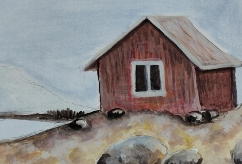
10. Class Project: Now that we have
finished our painting together, it's your turn. For your class project,
I'd love for you to paint the same landscape
we have worked on and upload it in
the project section. I'd really be so happy
to see your take on it. I also got you a fun
little challenge. Apart from the main painting, I want you to paint
just one rock. Yes, you heard me right.
Just one rock would do. No reference, no overthinking. Just go with the first shade
that comes in your mind and paint it using the colors
that feel right to you. You can experiment or follow along with what was
taught in the class, and most importantly, don't
worry about the outcome. If you're a beginner
or just here for a fun painting session,
that's completely okay. Simply enjoy the process, play with colors,
and have some fun.
11. Conclusion: That brings us to the
end of this class. First of all, a huge thank you for joining me on this
painting journey. It truly means a lot that
you stay till the end, and I hope you found this class both inspiring and helpful. And now, it's your turn. I'd absolutely love to
see your class projects, so please don't
hesitate to upload your gouache paintings
in the project section. Also, sharing your project would also inspire others
to give it a try. And if you enjoy this class, please stay tuned because something exciting
is coming up next. I'll be starting an exclusive gouache sketchbook
series where we'll work towards completing
an entire gouache sketchbook together
throughout this 2025. So it's going to be a
fun filled series where we won't be focusing just
on one particular theme. We'll be trying to cover almost every area which we can
include in the sketchbook. And apart from that, if you're interested in learning
portraits, don't worry. Already have a portrait
painting class where I take you through the entire
process from the scratch, so be sure to check
that out as well. Once again, thank you so much for being here for painting with me and also for making this community such
a wonderful space. I can't wait to
see your projects, and on another note, if you're someone interested to take up this sketchbook series, make sure to get
a sketchbook for yourself before I
start the series. Till then, happy painting.
 Anagha Sivadas, Artist, India