Transcripts
1. Introduction: Hi, everyone. My name is Nia, and today I will share
with you different ways to create flower
petals in order for you to mix and match and create your own simple and
cute flower paintings. Flower paintings
have always been one of my go to things to relax to just because
you can make it as simple or as complex
as you would like to. In this class, I will share
with you different ways to control your brush strokes in order for you to create
singular petals, which then you can combine
into your own floral designs. I've separated
these lessons where I'll be going over
the exercises, so you can take your
time and repeat the steps as many times
as you would like until you're comfortable before applying them all to
a final composition. I will also share with
you my thoughts on brushes which will benefit
for these sort of paintings. The final composition,
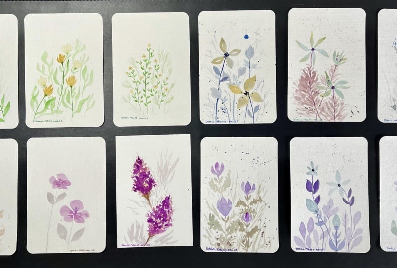
I've created 12 different types of flowers that you
can paint along to. These uses the
techniques as well as the strokes that I've gone over in the previous exercises. However, if you have
any other ideas for different combinations, feel free to put it into your composition or create
your own variations as well. During the painting process, I will sketch as well
as swatch colors. So for beginners who might feel intimidated to paint free hand might get used to this method. And get used to the
shapes beforehand. And though I will be painting
the composition freehand, for those of you who might
be very new to this, I will still have
the downloadable outline for you to have in the projects and resources
section that you can trace onto your
watercolor paper. You can also scale it up however big or however small
you'd like it to be. With this said, the
class is geared for all levels,
including beginners, but I will be cutting through
parts of the painting if my hand is inactive
or off the camera. This way, you don't
have to wait for me when I'm just
sitting there idle, thinking or making decisions or even waiting
for things to dry. And I understand that everyone paints at different speeds. So I would always
recommend for you to pause in between each steps. This way, you can
take your time, paint along or just even do little trials and exercises to get used to certain things. And you can paint at your own speed without
feeling rushed. If this sounds like something that you'd be
interested in trying, come join me in this
class, and let's begin.
2. Supplies: Here are the supplies
that I'm going to use. Firstly, I'm going to paint the final painting
and my sketchbook. This is a square sketchbook by potentate and it's 12
by 12 centimeters, which is on the small side. I will give out the outline
according to the size, but feel free to scale it up. Personally, though I just like mine to be on a
spread like this, I really love the square spread. You want, you can also
treat each flower as a single painting
that you paint in each page or even one sheet of paper or another option is just to use any sketchbook
that you have on hand. You can also use
something like this, which is a bit different since this is a
vertical composition, you just have to
lay it out a bit differently to how I did mine. Before I paint each
individual flower on the final composition, I'm going to be showing you or demonstrating how I
paint individual petals. This way, you can create your
own combinations as well. Now, this is from
Canson XL 300 GSM and the size was originally an A three that I ripped
out of my sketchbook. I've also cut out the side
to switch my color as well as do little trials before
I paint on my sketchbook. Next, I'll go over the brushes. I'm going to mainly
use two brushes, which are my round brush
and my Filbert brush. These are both by Giorgion and both have
synthetic bristles. I would say that
the round brush, this size is a size
six, by the way, is the most versatile
brush for watercolors. I find that a lot of people, including myself started
with something like this. It's also very affordable. This costed me a
bit less than $1, but of course, prices will depend on the country
you buy it from. But generally, these types of synthetic brushes are basically the most affordable option. Other brush that I'm going
to use is the Filpet brush. This is also synthetic, and you can see the bristles
are also very snappy. Now, the difference
is that this has a round tip and it's somewhat
of a flat brush as well. This makes it much
easier for you to paint rounded edges for petals. I will get into a
bit more detail with these brushes and
the lessons later on, but these are the main two
brushes that I'm going to use. However, if you don't have
access to a filpet brush, you can also make all of these paintings just purely
with the round brush. For the demonstration,
I will also show you how I use my
small tiny brush. This is a small size zero
brush by Windsor Newton, and this is also a round brush, but you can see there
are barely any bristles, and this is great to paint
really thin lines like stems. You can also use a smaller brush compared to the
round brush that I'm using if you're not used to painting at such
a small scale, or if you decide to paint your final paintings
at a larger scale, you can, of course, use
a larger size brush, whatever is comfortable
for you to paint with. I'm also going to show you a short demonstration
using this brush, which has softer bristles. The pencil that I'm going
to be using today is by Pentel Sharplet and this is
my favorite eraser by Boxy. As for the palette, I'm
just going to use this, which is from dysos just a
very cheap plastic palette and it's so old that you can see the color is a little
bit yellow now, but I've used so much that the plastic no longer
beats up and you can see it's very easy for
me to mix colors here because this already has
a lot of micro scratches. These micro scratches
can make it much easier for me to
mix colors as the paint doesn't beat up and I can control the load in
my brush much better because these pritles
are not going to absorb beads or
puddles of paint. If beading is a problem for you, you can also use
porcelain palette. If you're new to watercolors and color mixing is still
a bit confusing, I would suggest for you
to use white palette so it's a bit easier to see
the colors that you've mixed, or you can also
swatch the mixtures before applying it onto
your final painting, which is what I used to
do when I first started. These are all of the colors
that I'm going to be using, but I'll go over them a
bit later in this lesson. Next thing you'll need
is a jar of clean water. You can use one jar or two jars. Personally, I just
use one and if it becomes really dirty, I
would just change it out. But you can also use two jars, and one would be to
clean your brush, and the other one should have clean water for you to
activate and pick up paint. Should always have
tissue or paper towel right next to you as you paint. This will help control
the load on your brush. You can see how much I use this. I almost use it every time I mix up or pick up more
paint with my brush, especially when you're
painting at a small scale. It's very important
for you to mostly use a light load on your brush in order for the paint
to not puddle up. This is optional,
but I can be quite impatient when I wait
for paint to dry, so I'm just going to use a hair dryer to make
the process quicker. Next here are the colors
I'm going to use. Firstly, this is Chinese
white by Holbein. Shown Brilliant
dark by Schminka, ugamboche by Daniel Smith, ultramarine finest by Sminke
sap green by Holbein. Quinn Red by Daniel Smith, Burnt umber by Holbein, Vermilion by Holbein, and
compose Blue by Holbein. I'll also have swatches
of these colors in the projects and resources
section for you to download. So in case you don't have
the exact same color, you can find something similar. And here's a written
list of the supplies. You can take a screenshot
here or download it in the Projects and Resources section to get everything ready.
3. Intro to Round Brush: In this lesson,
I'm going to give you an introduction
to round brushes. This is a round synthetic
brush on the left, and I've chosen this brush to use for these
little trials and exercises just because I find that this is the most
versatile brush. I feel like generally, this is what people
start out with and it's also easy to find
and it's the cheapest. A brush like this
might cost around $1. I got mine for less, but it just depends on your
country, I'm guessing. Synthetic generally
have more snap and spring to the bristles. But there's also mixed hair
brush, which is this one. They have softer bristles and because of its
soft bristles, the more pressure we put, the more it's going
to expand and spread. You get a higher
weight difference, but this is generally
more expensive. You can also use larger brushes like the one I
have on the right, but I usually paint
in my sketchbook, so I prefer to use smaller ones. Because I usually paint
in my sketchbook. I'm very comfortable
using my small brush. But if you're used to
using a larger brush, you can just use what you have. But for the final painting, I would suggest maybe to use a bigger piece of paper or
even a larger sketchbook, or you can also
treat each flower as one painting that you
paint on a single page.
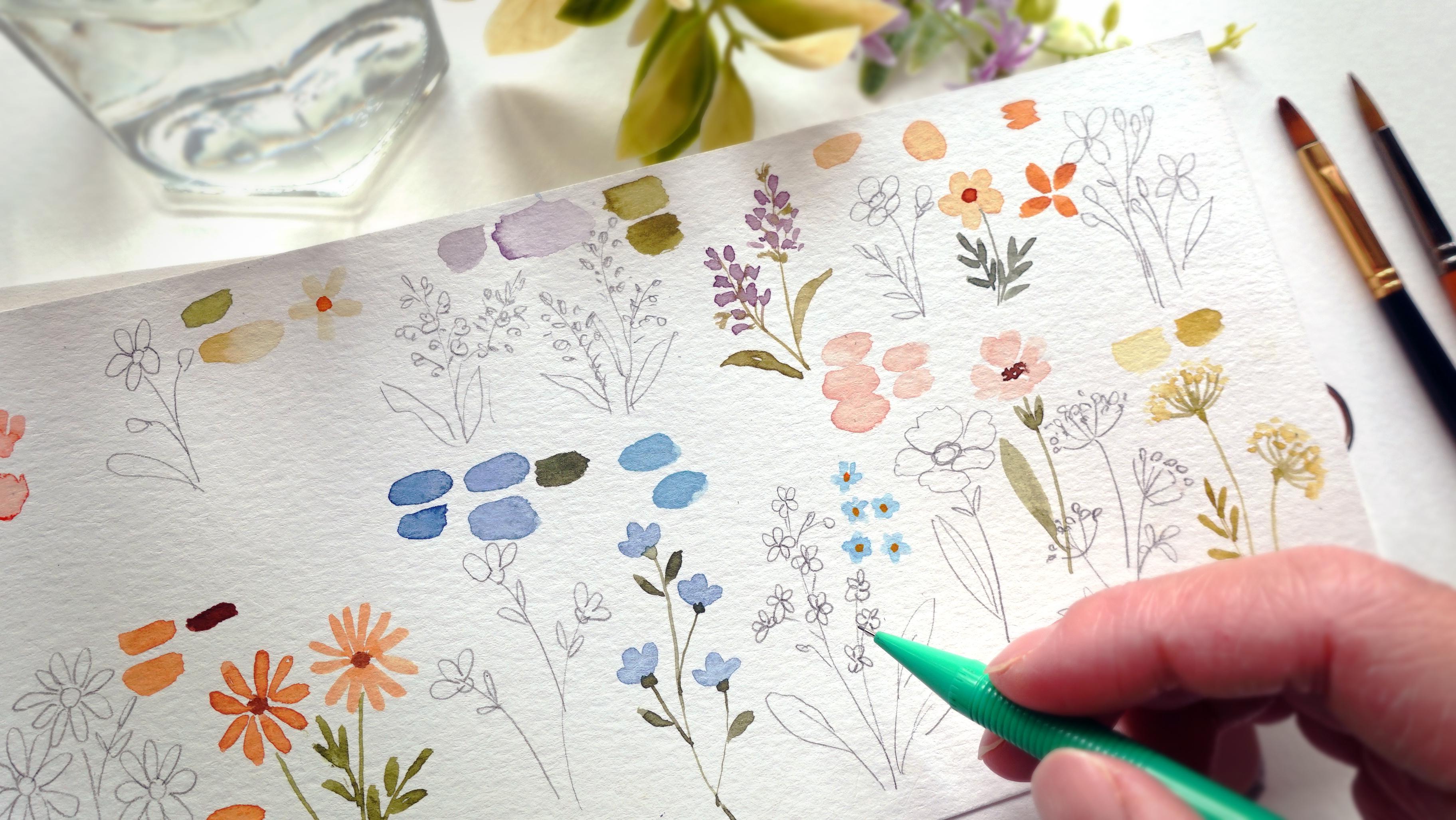
4. Simple Petals and Brush Pressure: I'm going to go over different
types of petals now, starting with the simple petals. In terms of the color, I
barely use my compost blue, so I still have a lot of it. I'm just going to
use this color. You can pick any color
you have on hand. I'm going to activate and put a lot of paint on my palette and also a lot of water for
easy access as I'm painting. For the first one, I'm
going to show you how to do a single stroke because
I'm using a round brush, and the tip has a fine point. You can see if I direct
the tip at the top. Now you can see a really
thin line weight. And I press down to
widen the bristles. And as I take off the
pressure on my brush, you can see it comes to
a very fine point again. Now, let's repeat this again
with a light pressure, then a heavier pressure, and I slowly take off the
pressure for the bottom tip. Is not the only way we can
paint this type of petals, but it is sometimes
a good way to get used to the
pressure of your brush. Feel free to repeat it as many times as you want until
you're comfortable. And I'm just going
to take this in a little bit closer so you
can have a better look. Now with this
pressure, we can also create smaller or
shorter petals. But instead of dragging it as far as we did for
the first type, we're just going to drag it very shortly and take off the
pressure really quickly as well. To get used to this pressure, you can also create something
consecutively like this. And you can also do this horizontally or in
different angles as well. Just as comparison, I'm going
to show you the same thing, but with my brush
with softer bristles, I just want to show
you that it's much easier to spread the
bristles outwards when they are softer compared to the springy nature of
synthetic bristles. Mm. These brushes are
very similar in size, but you can see the weight
difference with this one. Now, let's go back to the
normal synthetic brush. I'm going to do a
similar type of petal, but in a few strokes
or a couple of strokes instead of
just a single stroke. If you don't want to use
the pressure like that, you can just draw it out and
fill in the blank space. This way, we can control
how wide we want the petals to be even when I'm using
the same brush size. Now, with this petal shape, if we want to turn
it into a flower, we just have to paint it in a radial way playing
with the angle. Usually when I do
this, I want to leave out a little bit
of space in the middle. So sometimes if the bottom
of the petals are too thick, we will have a bit of space to create a thinner connection
between those petals, which in turn will make the flowers look less
heavy and more delicate. Now, with the same
simple petals, we can actually just
group them differently. We can do them in
groups of five, which is the most
used, I would say, and we can do this
in four, three, and two, even one for
small flower buds. And by grouping
them differently, you can create different
types of flowers easily. Sometimes if we want to paint very small petals
with a larger brush, some paint may puddle, and for this, we can control it by using a clean
dry brush that I dab off the excess
paint on a piece of tissue so it's
no longer puddling. This is personally
my favorite way of painting the petals
just because I don't have to focus too much on the pressure and it takes
less time to control. And just by grouping
them differently, you can already create
different types of flowers.
5. Thin Petals: Now let's use thin brush strokes
to create flower petals. Is very, very simple.
All I'm going to do is just think about
the single strokes. I'm not going to worry
about the tip at all, and I'm more or less creating
similar type of pressure. If you want the
ends to be thinner, you can also take off the pressure really
quickly at the end. You can also do this
looping motion to create a slightly thicker
top and make them a little bit rounded and the
tip comes to a finer point. Or just like the
previous simple petals, you can do this
in two strokes or even single strokes but
with less pressure. Let's do this
again. You can just create lines without
any pressure. You can also create the
slooping motion starting from the bottom tip and
around and come down to a finer point or do this in a couple of strokes just like
the simple petals, but make them very
close together. Or with a single stroke, just like the first one
with a bit of pressure. The top and the bottom
are a bit pointy. Now, let's put this all
together into flowers. I'm just going to
do the normal lines and I do a small flick at
the end to make it a little bit thinner and then I'm going
to add some thin lines to combine them all together
before it ends with the stem. You can make these go radially or put them just
halfway like this. They look like a flower from the side that is not
completely in full bloom. With these types of
really thin petals, you can also create
something like aster flowers that is seen
right from the very top. This is a combination
of the loop, as well as the two strokes to create those
really thin petals. You don't have to worry about them looking exactly the same, but you do want to make
sure that the angle is distributed almost evenly
radially across the flowers, and the slight
differences will just make them look a
bit more natural. You can also do these with the single brush strokes with the pressure so the
tip is more pointy. I'm just going to do
exactly the same thing, but I just want you to notice the slight differences
it creates. When you're painting single
strokes in a radial way, sometimes it might be a bit
difficult as you rotate your brush when you're
trying to put the tip of your brush following the
angle of the petals. If this happens, you can also
just twist the paper around instead of twisting your wrist so you can paint in a more
comfortable position.
6. Frilly Petals: In this lesson, we're
going to create frilly or slightly
textured petals. These are usually larger
flower petals that I like to paint in a
few brush strokes. For this, instead of
connecting the tips together, I like to make them slightly separated at the top
and slightly uneven. You can make them with thicker
strokes or thinner strokes depending on how textured you want these
flower petals to be. You can also play with the shape slightly by how rounded you want the petals to be or if they're going to be a bit
more pointy at the bottom. Another way of doing this is by first painting
an outline with the top tip of the
petals being slightly curvy and then filling
in the empty space. For any of these petals, you do want the bottom
to be very thin, though, because that's where they're all going to connect together. If the bottom is too thick, they're going to look
too bulky and heavy. Now, let's group
these all together. For the first one, I'm going
to do a combination of two petals and coming to fine point at the bottom
before adding on the stem. I'm just going to keep
adding more petals along the way for different
types of flowers. By the way, by painting the
flower petals this way, notice how I've accidentally
left out some white space, but I intentionally don't
want to fill it in anymore because I feel like this also adds to how delicate
the flowers can look. While painting these
frilly types of flowers, you can just combine the ways that we've
painted them before, and the different
types of petals will just make them
look a bit more natural instead of
something that is completely uniform
and robotic looking. For this frilly petal,
you can also think about it mixing all of the brush strokes that
we've done so far. You can do a combination of
the thick and thin strokes.
7. Combination Petals: Now we're going to do a combination of all
these petals that we've painted so far and compile them into different
shapes or flowers. For this first one,
I just painted one single stem and
I'm going to create single strokes just
on one side and sometimes they're
really random shapes like this for wildflowers. Sometimes they are
also weed shaped ones. I'm not really sure what
they're called but for this, I just did the double
strokes to create the single petals and then I connect them all
together into the stem. You can also paint
leaves this way, and for this next one, I'm going to paint
something like a lavender that I'm going to do the
loopy type of petals, but I'm going to angle
them differently and also create different groupings to make them slightly
more randomized. For the next one, I'm going to create something that
is a bit smaller, so I'm going to use the
very tip of my brush or you can also use a smaller
size round brush. I'm just going to
stick with this size. I want to make sure
that my brush comes to a very fine tip and it's
not holding too much water. I can create really
thin brush strokes. I want to paint in the
main stem and paint some thin lines bunched together to create
some small flowers. I want the top to be pointier, but as I get towards the bottom, I'm going to paint more of
these so it becomes wider. The next, I'm going to extend the lines to connect
them to the main stem. I'm also going to pair this up with very small frilly petals, creating different loops
in different sizes. So some of the flowers
are larger than others. You can also paint all of the tiny flowers first
with a combination of thin lines as well as frilly petals to suggest
individual flowers, then connect them all
together into the main stem. Having different
weights and variety of these petals will make
it look more natural, and this is why it's
fun to play with a different pressure as well
as different line weights. Now for the stem, I'm
just going to use the very tip of my brush in
a really dry brush load, so you can see that
the tip is very sharp and I'm just
going to paint the main stem and
connect the rest of the flowers to the
mainstem as well. Now, of course, there are
many more combinations on top of these ones that
I've shown you today, feel free to try to simplify it using the brush
strokes that I've shown you and try to play around and create your
own flower shapes. Last thing that I
want to mention in this lesson is
that when you're painting something small like the last couple of
flowers I've shown you, you do want to just use the
very tip of your brush. You can see that if you're using an almost dry brush load, I can somewhat flatten my brush, and when I do this,
there's one side, which is a bit flatter and wider and the other
side is thinner. With a sharp tip,
it's much easier to paint really fine lines,
including the stems. When you're painting
these small thin lines, it's important to use a
light to dry brush load. If you've accidentally loaded your brush with too much paint, as you can see here, it's quite glossy from the
weight of the water. You can take off the
excess by dabbing it off on your tissue before
applying the paint. You can try to practice
thin lines by maybe trying to paint this
fuzzy wildflower. But in the next
lesson, I will go into a little bit more detail
since I'm going to explain how to paint the stems as well as the
leaves off flowers.
8. Stems and Leaves: For this lesson, I'm
going to go through the stems and the
leaves for the stems. I'm just going to show you
again what I've shown you in the previous lesson and it's generally more about
the load on your brush. Now, you can see here that
my bristles are fairly wet. It's a little bit glossy
and if I add more paint, you'll be able to
see it even more. So let's have a look here. You can see that's
fairly glossy, and this means if I have a
larger load on my bristles, the paint is going
to come out much faster and it's a little
bit harder to control. I feel like I can still
control this because I have practiced a lot and it's much simpler to paint a small line. But here I've added more paint, so you can see that it's a little bit more
glossy than before. Though the lines are
still fairly thin, you can see paint puddling at
the bottom of these lines, and even when I'm not
applying too much pressure, the paint is flowing
really quickly. This is something that
comes with experience, you do have to feel
it yourself and you'll be able to feel the flow of the paint the
more you do this. Now I'm going to lighten the load by dabbing
off the excess. Now you can see the point a bit clearer and the brush
is no longer watery. You can see that it's
not even flowing out, so I decided to take
a bit more paint. But with the same
amount of pressure, you can see how different
the lines can be. Now I'm going to use a thicker consistency
and a dry brush load. So it's more or less
the same amount of paint but with more pigment. Now I can create
really thin lines, but the color is more saturated. I've also used the same
amount of pressure and just have a look at the difference
at the line weight. I can create something that is much easier to
control because the flow is slower
and it's not even puddling at the bottom just
because of the brush load. Now as we're applying
this to paint stems which might wiggle
in different directions, we might put a bit more
pressure as we paint, which makes it a little
bit harder to control. This is why it's even more important to have the
correct brush load. If you're still
fairly new to this, I would also suggest
for you to go slowly this way you have better control of the
pressure that you create. Now, as you can see, even
if I use this size brush, I can create those thin lines, but there is an option to use a smaller size
brush as well. Here, I'm going to use
a size zero brush, and you can see there's much less bristle in this one
compared to the one before. And because of this, there isn't too much space for the
paint to be soaked up, which means with the
same amount of pressure, I can create really thin
lines very quickly as well because I don't have to worry if I put more pressure, it won't become thicker just because there isn't much
hair on this brush. Small brush also makes it much easier if you want to paint very tiny flowers so the paint doesn't puddle up
and it's easier to control. Those are the options for
you to paint the stems, and next, I'm going to
go over the leaves. I'm just going to treat this like the simple petals before. As you can see, it also is a leaf shape for
the single strokes, you can also add a wiggle
to it and extend it a little bit further for
larger longer leaves. These are the strokes as well as the shapes that I've pretty
much covered earlier. The only difference is how
they've grown out of the stem. As an example for this one, I did the double strokes. You can also mix it
up with the loop, and you can also create smaller leaf shapes like
the smaller flower petals. When you're doing
this, sometimes the tips might not
all be pointy and that's completely
fine because it'll just make it look a bit
more organic and natural. And you can also play
with how the stems grow out of the main one and
add bunches of leaves there. Just like the flower petals, you can also create
rounded leaves and just like the petals, I prefer to draw out an
outline first to make sure I don't accidentally
paint pointy tips. With the leaves, you can
also bunch them differently. As an example here,
you can do bunches of twos or threes and create
different shapes as well. Sometimes we may
run out of ideas, but you can always look out
for references to create different shapes and leaf
shapes as well as flower types.
9. Intro to Filbert Brush: This is somewhat of
an extra lesson. I'm going to cover round petals. We've more or less covered
this in the previous lessons. What you want to do when you're painting round petals
with a round brush is to basically
paint the outline first before filling in
the rest of the space, like so, and you can also
extend the bottom of the petal downwards a little
bit further into a fine tip. Another way to do
this is to create a loop just like what we
did with the long petals, but make this one a bit wider. The purpose of this
extra lesson is actually to show you
this different brush, which makes creating
round tips much easier, which is the Filbert brush. You can see the tip is rounded instead of
pointy on this brush, and it's also flat. There's one side which is flatter and the
other side is wider. We can take advantage of this wide side and create
those round petals. And you can somewhat
flick up really quickly and create less
pressure for the bottom, so it comes to a smaller point. You can see even if I'm
putting such a light pressure, it doesn't become as pointy as the round brush because you can see from the
tip is very different. With this brush, though, it makes it so much easier to paint rounded petals instead of doing
a loop and filling it in. I can just do single strokes and you have a simple
five petal flower. You can also put less pressure
and create smaller petals. Or use the thin side to
create thin rounded petals. Another way to use
this brush is to first use the white flat side, and then you flick to the side in order to
create a thinner weight. As you can see, this is so much easier to paint
rounded petals. You can also use this
to paint leaves. The only thing I would
use to paint with this brush is things
such as thin stems. I would stick to
a rounded brush. But just look at how easy and quick it is to paint leaves as well as petals and single
strokes with soft round edges. I feel like this is such
a worthwhile investment. If you want to get
into floral paintings, you can also create
really thin leaves, such as ferntance it's quite
easy to control as well. For the final flower painting, I'm actually going to use this brush for some
of the flowers, but I understand that
a lot of you might not have the Filbert brush and
your collection of supplies, which is why I
showed you earlier how to create these types of petals or leaves using the very versatile
round brush as well. Despite the shape and the
fact that I wouldn't choose this brush to paint really
thin lines like the stems, it's actually still
quite versatile, at least for flower paintings. So I'm just going
to demonstrate to you some of the flowers
that I've already previously painted
using my round brush with this filber brush. Of course, though, as
I'm painting the stems, I would always go back
to my round brush. Lastly, I'm going to paint the aster flower with
long thin petals. You can, of course,
paint daisies as well with slightly
wider petals. This Filbert brush that I'm
using is also a synthetic, so it has the same snappy
quality as my round brush, and it's also very affordable and I just really wanted to show you the difference
in ease when it comes to painting
rounded elements. It really does take less effort and it's much faster
in my opinion. I hope you'll give this a go so you can feel the
difference yourself.
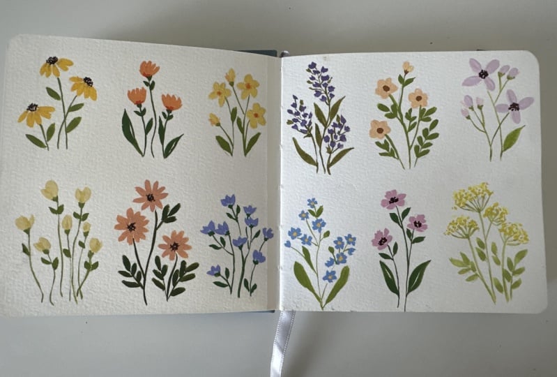
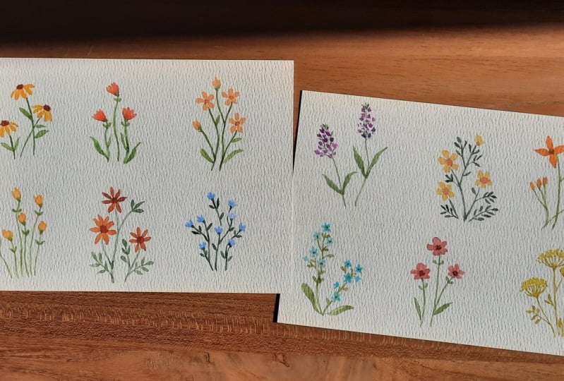
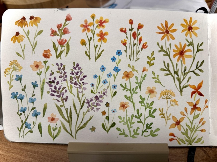
10. Introduction to Painting: For the final composition, I'm going to be painting
in my square sketchbook. Personally, I just love to
have the flowers in a spread. However, this is a
very small sketchbook. It is only 12 by 12
centimeters in size, which I find is actually too small and it will make
the painting a little bit more difficult and require a bit more control in terms
of the load on your brush. Usually, I like using the 15 15 centimeter
size square book, but I didn't read the description properly
when I bought this one. Either way, I still
like to use it. I understand if some
of you are not used to painting at such a small
scale and if that's the case, I would suggest for
you to either use a larger sketchbook
or if you want to create a similar
type of composition, you can also cut paper with
a similar type of dimension, but at a larger scale. Another option is to treat
these as individual flowers where you can dedicate
one single page for one type of flower. Since I'm going to
paint this free hand, I personally like to
do a sketch prior to it just so I have a good
visualization of the flowers, and this also
serves as draft for me where I can try
different shapes and combinations for these
flowers. Later when I paint. I'm going to move on
to a different spread, and I'm just going to
erase all of these. So this is purely as draft, but I will paint
freehand later on. I understand, though, that painting freehand can be quite intimidating if
you're a beginner, and if that's the case, I will still have the
downloadable outline in the projects and
resource section. But if you do trace, please trace very lightly
onto your watercolor paper. So the pencil
doesn't show through the transparent
watercolor as you paint. You can also erase some
of the line very lightly. So the guidelines are mostly faded before painting on top. Most importantly, I
hope you have fun with this painting and paint with what you're
comfortable with.
11. Flower 1: Before I start to paint, I'm going to somewhat
roughly divide up my page because I'm not
very good at spacing. I'm just going to do a
long horizontal line, and I'm also going to
add some vertical lines to divide this into three
sections per spread. I'm only going to create the three divisions at
the top because I feel like this is enough
guideline for me to use for the
bottom section as well. After this, you can technically paint your final
composition straightaway, but I want to show
you a method that I used to do when I
first started with watercolors and that's to use scrap paper to draw and paint things we might
be unsure about. This is also a great
opportunity to swatch colors and see if certain
combinations will work or not. This might not be necessary for those of you who
are experienced, but I just thought that this will be nice to share because I understand that free
hand painting on a completely blank page can
be quite nerve wracking. So what I've sketched
out will be the design of the first flower,
and for the color, I've chosen to use a mixture of ugambos and a little
bit of vermilion. As for the center of a flower, I'm going to create
a deep dark brown. And for this, I use burnt
umber as the main brown, and I'm going to warm
up the color by using vermilion and also darken it
with the ultramarine finest. This is also a good opportunity for you to try
different brushes. So I tried it with
the Filbert brush, and now I'm going to
use my round brush. Both brushes can do
the job just fine, but I feel like I can
control it a little bit better and get more accuracy
with the round brush, which is what I'm going to use. As for the stems and the leaves, I'm going to use sub
green as the main green. Then I'm going to add some vermilion to add
warmth to the color. Then I'm going to also add
some Jon Brilliant dark, which is a really
light pastel yellow. And also a touch of ultramarine finest to create an
earthy pastel green. This is more or less
the same green that I'm going to use all
throughout this class, but I'm just going to play with the ratio ever so slightly. For this trial, you can paint according to how you've
composed it, but for me, this is enough to just
somewhat get used to the brush strokes before
applying it onto my sketchbook. Now, I'm just going to paint it on with the same colors and combinations as well as the composition that
I've drawn out earlier. As I've mentioned in
the previous lesson, this scale that I'm painting
with is very small, so feel free to use
an even smaller brush compared to what I'm using, or you can also paint
at a larger scale. But if you wish to paint with the same skill that
I'm painting here, I would suggest for you to really take care
of the brush load. Always take off the excess paint with tissue whenever you feel like the flow of paint is becoming too fast
and uncontrollable. I forgot to mention
this earlier, but for the center of the flour, I'd like to make it
slightly textured. So I'm going to create really small dots with
the very tip of my brush, and I want to make
sure that the load is very light so it doesn't
puddle up too much. As for the stem of
all the flowers, this includes all the other ones that we're going to paint. You want to make sure that it's directed at the center
of the flower downwards. You want to create a
very clear connection between the flower and the stem, even though it's not directly touching the
bottom of the flower. But if it's slightly slanted, it's going to look disconnected. So try to avoid that
when you're painting. As for the leaves, I'm
just using the same green, but this is a slightly
lighter consistency, so it just has a bit more
water in the mixture.
12. Flower 2: Moving on to the second flower, this is going to be
a very simple one, and I'm just going to somewhat try to paint it straight
away on my scrap paper. I want this to be pink
and I'm going to use a mixture of vermilion
and Jamilan dark. I'm going to try it both with my Filbert brush
and my round brush. I feel like the filbert brush creates thicker brush strokes, whereas I can get a little bit more detail with
the round brush. This is completely up to you depending on the look
that you're going for. At the bottom of the flower, I want to add more vermilion, and you can see at
the bottom where I painted the flour
with my round brush. The vermilion is blooming whereas there's a
hard edge between the vermilion and the
base of the flower for the previous ones because
they're completely dry. And for this, you can soften the blend using a
clean damp brush. So I'm going to paint it. I've chosen to use
my Filbert brush. I'm going to paint a few
of the frilly petals that we painted in
the demonstration earlier to suggest
the whole flower, then working very quickly while the surface is still damp, I'm going to.in a
bit of vermilion, then use the same green
as the previous flower in a thick consistency to paint the sepals at the
bottom of the flower. Then using a dry brush load to paint the stems
connecting to the sepals. To make the stems look more organic with a
bit more movement, I made them slightly wavy. As for the leaves,
I'm going to paint two small ones right
at the bottom of the flowers by creating a loop for very small round leaves, then paint larger
ones at the bottom.
13. Flower 3: Et's move on to
the third flower. This is just going to be a very simple five petaled flower with a dot at the center. But I'm going to also add some small flower buds as
well as large rounded leaves. I want the color to be
a muted creamy color, and for this, I use John
Brilliant dark as the main base. Then I added a touch
of compose blue. Then I'm going to add a
little bit of new gamboge into the mix as well.
Let's just swatch it. I feel like it looks very green, so I decided to add more Jean Brilliant dark as
well as vermilion this time. And I feel like I
quite like this color, so I'm just going to use
it to paint the flower. For this, I'm going to use my Filbert brush to make it much easier to paint those
thicker round petals. And for the center,
I'm going to use a bright orange from a mix of ugambos and
a bit of vermilion. I'm just going to paint
it on my sketchbook. You may notice that
I don't really do the exact same trial on the scrap paper to
paint these flowers. I want these triils to only be used for what's
necessary for you. If you're confident painting certain part of the
painting straightaway, then you can just go ahead and do it without doing a trial. This is just
something I want you to somewhat get used to helping yourself only in places
where you do really need it instead of
overcomplicating the steps, especially when you
don't need it or already have enough
confidence and experience. When I painted the
center of this flower, the petals were
still quite damp, so you can see that the
color is spreading too much, but I'm just going to
leave it to dry for now. I actually like
the transition of colors, and while I wait, I'm going to paint the stems and the leaves as well
as the flower buds. Just like the first flower, even though you can't see
the bottom of the flowers, I want the stems to connect right to the center
of these flowers. For the flower buds,
I'm just going to map out the placement
first by drawing the stem and I'm
going to go back in with the same color
as the flower petals. But this time, I did one simple petal with an extra line on the side
with my round brush. While the surface is still damp, I went back in with the
green to paint the sepals connecting the flower bud
and the stem together. Again, this is just
the same green that I use for the previous flowers, and as for the leaves, I'm going to create
an outline for the rounded leaf and
then fill it in. Okay, now I'm going to
go back to the center of the flower since
the flower petals are a bit more yellow now. I just added more
vermilion into the mix, so it's more of a darker orange, and I'm just going to paint a small circle on
the dry surface.
14. Flower 4: Oh. This one is going to be fairly similar to the second flower
that we've done, but it's actually
going to be simpler. I'm going to treat this one
more as a single petal. I might also add a
line on one side, just like the flower buds that we painted in
the previous flower. I'm just going to connect
these two long wavy stems, one stem each flower, then finish it off with a couple of small leaves right
under the flowers. As for the color, I'm going
to use the orange mixture. This is from Nuamboch
and vermilion, and I'm going to add a lot of shun Brilliant dark to turn
this into a pastel yellow. I really like to paint this
using my Filbert brush just so it's much easier to
create those round petals. You can do single strokes
or double strokes as well. I'm just going to use the same color mixture for the green, but I'm just making more
since I'm running out. This is, again, from
vermilion sap green, ultramarine finest, and
Jon Brilliant dark. I'm just going to swatch it
and see if it's similar to the previous greens that I've used and I'm fairly
happy with it. Now I'm going to apply
it under the flowers as the sepuls before painting
on the wavy stems. As an example here,
since I recently paint the flower and
it's still fairly damp, color of the sepal is slowly
blending into this flower. Whereas if I paint the seple on the already dried flowers, you can see a clear separation between the sepal
and the flower. I'm just showing you because you might like a certain look, so you can pick and choose. Personally, I like to mix
these two techniques together. Now onto my sketchbook, I'm going to add
an extra stroke on the side for some of the
flowers for a bit of variation, and I'm going to paint a few of these to cover a
slightly wider space. As I'm spacing the flowers, I try to make some of them close together and others
further apart. This unevenness will make
the composition look a bit more natural instead
of something that looks more like a pattern. Once I'm done painting
a few flowers, I'm going to add the sepals
before adding on the stems, and I want to make sure that I can control the
tip of my bristle. So if I feel like the
paint is flowing too much, I'm just going to take off
the excess with tissue. So always have tissue
right next to you, especially when you're painting
at a very small scale. I want these to look different
than the other flowers, so I'm making them individual flowers instead of connecting
the stems together. As for the leaves,
I'm going to use my round brush to
create small loops. And if I feel like there isn't enough space to
paint the small leaf, I'm just going to
paint one side. And that's it for
the fourth flower.
15. Flower 5: Let's move on to the next one. This is going to
be daisy flowers. I'm just going to start
with the circles, then I'm going to add
the long rounded petals going radially
around the circle. But this is not how I'm going
to approach the painting. I'm going to leave
the center last. For the leaves this time, I want them to grow out of a main stem, and I'm going to add
thin long leaves on either side as
well as the top. For the color of the flower, I'm going to use
the orange mixture. Since I'm running out, I'm
just going to make more. This is from vermilion ugamboge
and Jean Brilliant dark. This time, though, I want
the color to be muted, so I'm going to add some
burnt umber as well. Once I'm done, I'm
going to swatch it. I quite like the color. As for the center, I want it
to be a muted dark brown. I'm using Brnnumber as the main brown with
added vermilion, as well as a little bit
of ultramarine finest. I'm just going to try
to paint this with a round brush as well
as a filbert brush, and I'm just going to see
which one I like better. I really enjoy just painting the single strokes
with the filper brush, but I feel like
this is too thin. So later in the painting, I'm just going to apply
a bit more pressure so the petals can be a little
bit thicker than this. Once I'm done with the flowers, I'm going to connect
them to the stems. This way, I can space out
where to place the leaves. And for the leaves, I also
painted the stems first, so it's easier to
place the leaves on either side of the stems. Okay, so I'm going
to start by painting the petals instead
of the center of the flowers using
my filbert brush. This time, I'm also applying a little bit more
pressure and also making them a bit shorter
so they don't look as thin. And remember, if your
wrist starts feeling uncomfortable as you're
painting this radially, feel free to just
move your page and rotate it according to the angle that you're
comfortable painting in. I'm going to paint the center once all the petals
are completely dry. This way, the edges
stays nice and sharp, and I'm going to paint
this dotted texture. I want the color of the green this time to be a bit darker. I'm just using the
previous mixture with added ultramarine finest. This will just darken the color slightly and also make
it a bit more bluish. However, this is exactly
the same mixture as before. This just has a slight change in ratio with added
ultramarine finest. As you can see, it's
just slightly darker, but it's still consistent
with all the other greens, so it doesn't stand
out on its own. I try to make the main stem of the leaves a
little bit thinner, so I just use an
even drier load, and I'm just going
to paint each leaf with two strokes. Oh.
16. Flower 6: The next one is going to be a very simple three
petaled flower with a large seple
at the bottom, and I'm going to connect these
two other stems as well. I'm also going to add two small
leaves under the flowers. This is going to
be the first blue flower of the collection, and I'm going to use ultramarine
finest as the main blue. And to make it consistent
with the other colors, I tried adding some
jean brilliant dark, but I feel like the color end up looking a bit too
muted for my liking, so I end up just mixing some Chinese white into
the ultramarine finest. So the color is a
bit more saturated and looks kind of
like periwinkle blue. To sit the blue flowers, I'm also going to add more ultramarine finest into
the green mixture, and I also added some
jean brilliant dark. If I use a thick consistency, this is the color
that I come up with. Just like the other greens, this is again the
same color mixture but with a different ratio. You can see even if I lighten
it by adding more water, the color is a bit more
similar to the other ones. To paint these flowers, I find that it's much easier
to use my Filbert brush. And before adding on the seples, I want to make sure
everything's completely dry. If you want to make
the process quicker, you can use a hair dryer. Here I'm using the green to add rounded seples underneath
all the flowers. Then I'm going to pull it
downwards to create wavy stems. I like to paint the
taller stem first, and if I can, I like to connect the other shorter
flowers to the taller stem. I'm going to add a few of these flowers to fill in
the space that I have, just like the yellow
flowers on the left. Since I'm going to
paint a few of these, I want to make sure that I'm
spreading them unevenly, making sure that some
flowers are closer together, whereas others are
further apart. This will just
make the placement look a bit more natural. And on another note, I also want to direct these flowers towards
the center of the space. So in a way, they look like they're coming
together as a bunch. Once I'm done, I'm going
to make sure everything's completely dry before
adding on the sepals. I want the sepals of these
flowers to look a bit more rounded compared to the
yellow flowers on the left, just to make a
different variation, and then I'm going
to pull it down to add on the wavy stems. Just like in the trial, I want to paint the long stem first. So whenever I can,
I like to connect these flowers together
into the main long stem. If they're a little
bit too far though, I'm just going to make
them into a new stem. Once I'm done, if there's
space for the leaves, I'm going to paint them right under the flowers
on either sides. And of course, you can also add additional leaves if you feel like it'll support
the composition.
17. Flower 7: Et's move on to the
seventh flower. This is probably the
most complex one out of all of the
flowers we have so far. But this is actually
one of the flowers that I did in the
demonstration earlier, where I combined lots of
different petal shapes, but paint them in a
very small scale. I'm going to pair this up
with some large leaves, so there isn't too
much detail since the flower itself is
quite detailed already. I feel like because
of its complexity, I'm going to have some problems with spacing and the
composition itself. I'm just going to draw
it a few times until I get somewhat more comfortable with how they're going
to be positioned. As I'm repeating and playing
with the different angles, the final painting doesn't have to have the exact
same composition, but I feel like this
is good for me to practice with visually and
just for my hands in general, to get used to the shapes. This is something that
you can repeat over and over again until you're
a bit more comfortable. You can also repeat the trials for the painting as well
until you are comfortable. Now, after drawing this, I realized that the composition
would look very bad if they're both around the same height and right
next to each other. This is where practicing
comes in handy. I feel like if I shorten
the composition on the flower on the left and
tilt them to the side, these flowers will have more
of a harmonious composition. I want these flowers to be purple in color and
for the main purple, I'm going to use a mix of quin red and ultramarine finest. Now, there are two
options though, for me to turn this
into a pastel purple, which is what I'm looking for. I can use the Jean
Brilliant dark as well as the Chinese white. At first, I try to just use Jean Brilliant dark to make it consistent with all
the other colors, but I feel like the color
is a little bit too muted because of the yellowish
Jean brilliant dark. It just cancels out
and mutes the purple. So on the other side, I mix
them with just Chinese white. I feel like it's too saturated, so I'm going to mix
those two together, which means it's those
four color mixtures, but with less on
Brilliant in the ratio. So it's still a little bit muted but not as
muted as before. Now, I'm quite happy
with the purple, so I'm going to go ahead and
try to paint these flowers. This is what's going on in my head as I'm mixing
colors all the time. So hopefully, this gives
you a little bit of an insight into my
thought process as I'm picking out colors. As for the green, I
chose a yellow green, I just use the colors that
I've already pre mixed and since there was a lot of
ultramarine fineness, I just added some new
gambos in the mixture and also some added ran brilliant
dark to lighten the green. To paint the flowers,
I'm going to use the tip of my brush and
you want to make sure that you're using a light
brush load since we are painting small
little shapes. I like to think of loops as
well as those frilly petals, but in very small scale. I like to mostly enlarge
the shapes as well as widen the spacing as I get towards the
bottom of the stem. Once I'm done, I want
to make sure most of those petals or tiny
flowers are mostly dry, and I'm going to paint
the stems in between, as well as add some
extra flower buds, which hasn't bloomed
using the same green and also attach some of those
flowers into the main stems. Okay, now I'm going to repeat
this on my sketchbook, but I want to make sure
that these flowers fit in the space that I have. I feel like I still have
space to fit another one, so I'm going to paint a short
one on the right hand side. And as you can see here, the colors look fairly dark, even though it's
the same mixture. This is because some of
the paint is puddling up. The load on my brush
wasn't light enough. So to make this a little
bit faster to dry, I'm just going to take off the excess paint
using a dry brush, taking off the paint one by one, and as my bristles gets loaded
with these extra paint, I take it off with my tissue. With this, the paint won't
really travel too much, and I can just add on the stems in between those
flowers straightaway. To finish off, I'm
going to add the tiny, tiny flower buds in between these flowers as
well as the leaves.
18. Flower 8: We're going to do a simple five petal flower for this one, but I'm going to make the
petals a bit more rounded. I'm also going to add some small flower buds
as well as thin leaves. For the color, I'm
going to reuse what I already have
on my palette, and this is from new
gambos vermilion, a little bit of burnt umber. And I just added a bit more on Brilliant dark because I want the color to
be fairly light. I'm just going to swatch it out first to see if I like it. I'm quite happy with this color, so I'm just going to go ahead and try to paint this flower. I'm just going to do single
strokes and I'm going to apply quite a bit of pressure to make each petal fairly thick, and I'm going to dry it off completely before
adding the center. As for the center, I'm going to use an orange brown and this is a mixture of burnt umber with
vermilion and new gamboge. As for the green,
I'm just going to add ultramarine fins
to what I already have on my palette for a
muted pastel bluish green. This one is fairly easy, so I'm going to go straight
to painting on my sketchbook. I'm going to paint
around three flowers. And since there's still a little bit more
space at the top, I'm going to add a
tall flower bud. I use a fairly light
load on my brush, so the petals are
completely dry. Make sure yours is dry, too. You can also use a
hair dryer for this. Then I'm going to paint
the center straight away. I just created this
very small circle with a thick consistency
of the orangy brown. I'm also going to add this
color underneath a flower bud. Next, I'm going to
paint the stems, making sure that the stems are directly under the
center of the flowers. Depending on where
you've placed the stems, I'm going to look at some empty spaces and fill
it in with the leaves. I like to map it out by drawing the stems of the leaves
first before adding them in. Since I feel like these
flowers are very simple, I'm going to add a
few more leaves.
19. Flower 9: Next one is going to
be another simple one. This is going to be a
four petaled flower, and I want the petals to
be pointy in this one. I want the flowers
to be quite big. So I think I'm just
going to paint two, but I'm going to add
a few flower buds for this one to just bring
a bit more interest. I want this flower to be orange. So this is from a mix of
vermilion and Nu gamboche. This also has a little bit
of Jan Brilliant dark, and I also added a
tad of burnt umber, so it has the same muted tone. This one's going to
be a simple one, so I'm just going to paint
it on straight away. I feel like I'm going to make the flowers fairly big on this
one to fill in the spaces. I'm only going to paint two. However, with any
of these paintings, feel free to create your
own composition as well. These are just ideas
that I'm giving you, but you can also create your own combinations with
different colors as well. To avoid smudging, I'm going
to take the excess paint off this one since it's
puddling up with a dry brush. I'm going to leave
these petals to dry. So while I wait, I'm going
to paint on the petals, still aiming to the center. I'm going to make
this one cross, and with the large space
that I still have left, I'm going to add
on the stems where I'm going to place
the flower buds. Once I've allocated the space, I'm going to go back in with the orange color
from the flowers and add the flower buds. For the flower buds,
I'm just doing very small simple petals and for some of them
for a bit of variation, I just add an extra line on
the side following the curve. Then to connect
these to the stems, I'm going to add the
sepals underneath the flower buds
using the same green while the flower buds are
still a little bit damp. Now that the surface of the
petals are completely dry, I'm going to use the
brown that I used in the previous flower
for the center. But this time, I'm using
a thick consistency and a fairly dry brush
load to paint on dots. And you can see that
everything's completely dry because the edges of the dotted texture is very prominent.
20. Flower 10: In this lesson, we're going to paint really tiny
forget me not flowers. These are small five
petaled flowers. They're very tiny, and there are multiple of them growing
from one main stem. Later, I'm going to
paint two main stems, and I'm also going to add some little flower buds growing out from the
main stem as well. In this sketch, I
decided to draw out the main stems first
just to help me visualize, but later I'm actually going
to paint the flowers first. So this is just
to help me map it out in my mind what
they're going to look like because I don't want the stems to go over the
flowers if I paint them first. I'm also going to add
some large leaves to frame these flowers. For the color, this one's
going to be a bit different. I want the colors to
be fairly vibrant. I'm just using compose
blue and Chinese white. Because we used a
different blue base, you can see that
there's a difference between the three petal
flowers we painted earlier. For this one, I wasn't sure
whether I want to paint it with my filbert brush
or with my round brush. I tried it out with
my filbert brush. I feel like my brush
size is a little bit too big for the
scale that I'm painting. So I decided to go with
my round brush instead. Again, because this is
such a small scale, if you're painting at the exact same scale
that I'm painting, feel free to change the size of your brush
that you're using. I'm painting this with
a very dry brush load, so they're quick to dry
and once the base is dry, I'm going to paint
the center using a very thick consistency
of new gamboge. I feel like the rest
of the elements are fairly straightforward
since we've repeated them over and over again for the
previous flowers. I'm painting straight
onto my sketchbook. I'm going to spread out the flowers for the
first tall main stem, and I'm going to do the same on the right hand side as well. Since I'm painting quite
a lot of these flowers, just like the previous
ones that we've painted, if I am including a lot of them, I want to make sure that the positioning are
not evenly spread out. I want some of them to be closer together and some of them
to be further apart. I'm also going to include some two petaled as well
as three petaled flowers for a bit of variation. So not all of the flowers look like they're in full bloom. Once I feel like I have
a pretty good amount, I'm going to use the green that I already have on my palate, which is a fairly yellow green
from the previous flower, and I'm going to connect them all into a main
stem on the left, and on the right, I'm going
to paint another mainstem. Since there's quite a bit of space between some
of these stems, I'm also going to add some smaller flower buds
using the same green. To paint the flower buds, I paint a really thin stem if there's any space in between the flowers and I just add
a really tiny oval on top. Once I'm done, I want to
make sure everything's completely dry before adding on the center of the flowers. For the center, I'm going to use a very thick consistency
of new gamboge.
21. Flower 11: Uh painted quite a
few complex flowers, so I'm going to paint a
simple one for this lesson. I'm going to make a frilly petaled flower
with just five petals. But this time, since
they're large, I also want to include a bit of foreshortening in the petals. So you can see at the bottom, they're a little bit more oval
compared to longer petals. And this will look like the
flower is slightly tilted up. So there's foreshortening going
on with the front petals. Now, as for the
color, I'm going to create a pink from a
mixture of vermilion, quin red, a little bit of Jon Brilliant dark and
also some Chinese white. Quite like this pink, so I'm
just going to stick with it. Feel free to customize your
color however you want. And since the flower petals are going to be fairly
large for this one, I've chosen to use
my filbert brush. I'm just going to
do a few strokes for each petal and don't forget to create the
foreshortened petals as well with just a tiny
brush stroke if you want. Then for the center,
I'm going to use a muted dark brown from
a mix of burnt umber, vermilion, and a little
bit of ultramarine finest. I'm just going to dot the center using this color in
a thick consistency. The green, since I already have a lot of green
on my palette I decided to just mix everything in and use this tone of green, and this is still going
to look consistent with all the other flowers, since we basically use
the same colors to mix. I quite like how
it looks already, so I'm just going to go
straight into my sketchbook, I'm going to paint three of these flowers in
different sizes. And just like the trials, I'm going to start with
the pink petals. Once I'm done, I'm
going to leave it to dry, and while I wait, I'm going to paint the stems, again, directing it at
the center of the flower. For the leaves, I'm going to add two small ones right under the flowers and some large
ones to help frame them. Since the leaves
look very light, I'm going to take a
thicker consistency of the same color and paint a mid rib at the
center of the leaves. Before I paint the
center of the petals, I want to make sure everything's completely dry and
I'm going to use a very thick
consistency and a light to dry brush load
to.in the center. I wanted to look textured, so I purposefully left out some negative space in between.
22. Flower 12: For the last flower, I'm
going to basically create something that looks like a yellow flower but a
simplified version. I like to make one main stem with small curve
stems growing out of it. As for the flowers, I'm going to simplify it and the painting later
as tiny little dots. As for the leaves, they're just going to grow out of the stem and have some tiny leaves on either side as
well as the top. I feel like yarrow is mostly
known for its white flowers, but I don't want it to
be completely white, so I want to create something that's almost like a
really light yellow green. So I use the green mixture
on my palate and I mixed it with some new gamboge
and Jean Brilliant dark. And as for the leaves, I'm
going to use sap green, vermilion and Jan
Brilliant dark. The green to look a bit
yellowish and earthy, so I'm adjusting the color by changing the ratio slightly. For this flower, you do really need to control
the load on your brush, since it's mostly
just stems and dots, feel free to switch up to
a smaller brush for this. I paint it just
like how I drew it, and then I'm going to add the dots using the yellow green, and using a medium to
thick consistency here, but I'm going to chase it with a clean damp brush later
on to smudge some of those dots and to create
some variation in the value with some lighter
ones around the edges. I also want to make sure
that the connection between the smaller stem and
the main stem is thick enough to
support the weight. There's nothing special
for the leaves. I'm just going to paint them on either side
as an example. Then after this,
we're going to go straight onto my sketchbook. Again, starting
with the main stem, I'm going to paint
the tall one first, since this is going to be the main focal point
of this flower, then I'm going to add smaller
ones as well on the side. There's still a large
space on the left, so I'm going to add
another bunch of flowers. While I still have the
green on my brush, I'm going to go ahead and
paint the leaves straightaway. After I painted the leaves, I was kind of deciding what
to do for this large stem. I feel like it kind
of looks lonely, so I ended up adding
another bunch of flowers, but just a smaller version. And after this,
I'm just going to add more leaves to
frame everything. I feel like I have
enough leaves, and now I'm going to add the dots using the really
light yellow green, just dotting it in a medium
to thick consistency. I want to picture this as
if they're growing out of those really small
stems and also space them out a little bit so the paint won't
bleed into each other, creating one big silhouette. I like to vary the
dots by wiggling my brush slightly to
create larger dots, whereas others, I just do a tiny little tap with
the tip of my brush. Once I've mapped out the dots, now I'm going to
lighten and smudge some of the colors using
a clean damp brush. This is very subtle,
but as you can see, some of the colors
are now lighter than the ones that I initially
painted and some of them might be a little bit puddlyT is just
spreading out some of the paint and also creating different
variations of values. And that's it. Once I'm done, I want to make sure
all the flowers are completely dried and I'm going
to erase the grid lines. And here are the
completed flowers.
23. Closing and Class Project: Congratulations for
completing this class. I hope you enjoyed watching the paint through and learned something
new along the way. For the class project,
if you're a beginner, feel free to paint along
to these exercises for you to just get used to the feel of the brush and the flow of paint. Then once you get
used to the shapes, feel free to paint along to the flowers that I've
demonstrated in this class. You can paint all 12 or just
pick some of your favorites. If you're an intermediate level, feel free to paint along to the composition that I've
prepared for this class. Or you can also create your own floral variations and color combinations if you
have any other ideas. Once you're done
with the projects, please don't forget to post
it in the project session, so you can share it
with other students. I can also leave a
comment and a like. It really excites me to see the kind of things you
create with these classes. I would also very
much appreciate it if you leave a
review of this class. I always appreciate feedback
and encouragement from you, and it also helps other people to discover this
class if you enjoyed it. If you would like to
see more art by me, you can follow me on
my YouTube channel Nayani where I post weekly
watercolor tutorials. Or if you would like
to see more art by me, you can also follow me on my Instagram at IG
underscore Nayani. With this said, thank
you so much for sticking right to the
very end of this class. I can't wait to
see your projects. All the best, and I hope to
see you again soon. Bye.
 Nianiani, Watercolorist and Graphic Designer