Transcripts
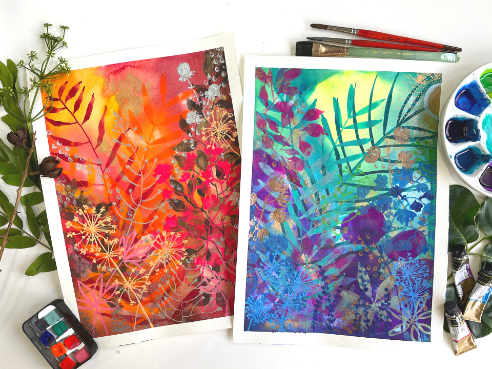
1. Introduction: Within the layers you will find elements of nature of every kind. Picked up on my morning walk, flowers, seeds, and a barren stalk Hi, my name is Aparna Garg and I'm a watercolor artist and educator based in Mumbai. And welcome to my first skill share class. Over time, I've developed my own unique style of painting using vibrant color palettes and lots of layers to create magical and whimsical paintings inspired by nature that I call my Lost Forests The things that used to inspire my paintings are the things I gather when I'm out in the garden or out for a walk, or take photographs of that create a spark in me. That turns into art In this Skillshare class, I'm going to share my process and show you one painting from start to finish. So you're going to see how I find my inspiration, how I plan my composition, develop my ideas, plan my color palette. And finally add all the little details that make the painting come together. The beauty of watercolors lies in its fluidity and its transparency, and its ability to blend and create beautiful new shades and shapes. And this is exactly what I have explored in this class. This class is all about having fun with watercolors, developing your own style, and enjoying the process. rather than thinking of the end result. We will begin by taking a look at the elements of nature available in our surroundings and then exploring various compositions using them. You will then learn how to paint these elements in a modern style. And finally, how to bring them altogether to create beautiful artwork of your own I have included one more video of me painting this beautiful magical layered forest using the very same inspiration and elements to show you that just by varying the composition and the colors, you can create a variety of artwork. So sit back, relax and watch me paint this magical forest. Or you can choose to paint along with me and create one more masterpiece for your home By the end of this class, you are going to have your very own masterpiece, ready to be framed and put it up in your home. You will never be stuck again for inspiration and creativity. And you will be able to create not one, but many paintings using the techniques I teach in this class. So get ready to get Wild at Art with me. I cannot wait to see you inside the course.
2. Supplies: So for today's nature inspired class, we need a few basic supplies and a little walk to your garden or your neighborhood to collect some branches, twigs, and leaves that speak to you the most. So these are a few of the elements that I have picked up from my garden. I paid attention to picking up leaves of different sizes and shapes so that we get a variety in our art. I really liked this leaf because it's got a different shape The leaf on the top is wide and this has got a nice oval shapes. I really like these leaves a lot. I even picked up some dried flowers They are bases of some dried flowers Probably I may even use them to create marks on my paper so that I bring in the element of nature into my artwork. These are some dried berries. So making sure that I have an assortment of different sizes, shapes, textures, it's going to make the artwork all the more fun and all the more interesting. I picked this up because of the beauty in which these little buds are coming out of the main stalk. So these are few of the elements that we will be using in our artwork. We may not use all of them, but it's a good starting point. The next thing we need is watercolor paper. I'll be using Arches, 300 GSM cold pressed, 100 percent cotton watercolor paper. It is essential to use a heavyweight paper for this class, as it requires lots of water and layers of paint. And if the watercolor paper is not heavy enough, it will bend and buckle and not give the desired result. Next up are the watercolors. I'll be using an assortment of shades from various brands. The first is my White Nights pan set, which is one of my favorites. Some tube watercolors by Mijello Mission. Some metallic watercolors to add a magical touch to our artwork. This is a by a brand Luminoso colors from India. Also some metallic shades from my Gansai Tambi Starry Nights watercolor set. I may also use some pastel shades since we are layering. These are also from White Nights. Since we'll be creating a variety of leaves and shapes, we'd also need an assortment of brushes, each serving a different purpose. First up, are these Escoda brushes in sizes 4 and 8. Next are these Raphael brushes in size is 6 and 8. One of my favorites, Silver Black Velvet, size eight. And we'd also be needing this Princeton Neptune 3 fourth inch flat brush for creating our background and washes. Other than this, I have an assortment of brushes with different tips. We will be using these for creating some fun elements and marks on our artwork. One is this doe-foot shaped brush, a dagger brush. And this brush with jagged edges, which I'll be showing you how to use. And as always with watercolors, of course we need water. So we need two jars of water, one to clean our dirty brushes, and one to pick clean water to mix into our paint. Will also need a spray bottle filled with some clean water, which we'll be using to create our background . A washi tape to tape down the edges of our artwork. I'll be using a ceramic palette, but you can use whichever palette you have at home. And last but not least, a kitchen towel to clean up any drips and drops of paint. This class is all about finding your style and your own identity using the colors that you love the most. While this is an indication of the colors that I have used, feel free to use whatever colors that speak to you and you have at your home. So that's it for the supplies. And I'll see you in the next section where I'm going to show you how I create beautiful compositions using these elements that I have picked up from my garden.
3. Composition Ideas: The best way to create your composition is to play around with these elements that you have picked. A composition should be well balanced, harmonious, and pleasing to the eye. And while there are many rules to this, I keep in mind a few simple tricks and tips that I'll share with you. The first thing is that we should avoid placing anything exactly in the center of the composition as this makes the composition very static. So for instance, if I create a composition like this, my eyes will just fall onto the centre and will not move around in the composition. So there is a rule of thirds which we normally use, which is that if you divide your paper into three parts, vertically and horizontally, the focal point of your artwork should be lying within the one third line of your paper. So instead of placing my main element in the center, if I place it off-center, it's going to look more appealing. Secondly, I tried to avoid too many parallel lines. So for instance, if I created a composition like this, again, there is no interest in this. There is nothing very attractive. Your eyes just fall on this. You see these three parallel lines and that's the end of it. So the third and the most important tip for your artwork is that the composition should be planned so as to be able to prompt your viewer as to where to enter your artwork and where you want to lead their eyes to. What I mean by that is that I try to create a kind of leading line that draws the attention of the viewer to the focal point and then consciously leads their eyes into the painting without letting them leave the painting. After all, thats why we gaze endlessly at beautiful art. It doesn't let us move out of it. So I'll begin by using this Fern because I really like the way that the leaves of this Fern give a very fluent and beautiful look. Since this is a long element going on one side, then I, I think I'm going to place this one this is a smaller version of the same leaf. I will make sure that I don't have, two parallel lines. So if this is going in this direction, I will place my second leaf in this direction. Then we can have the small sprig coming out from here and maybe even some coming in from the end of the paper like this. So while this may look confusing right now, once you know how the layers are going to form and when we start painting, everything will become clear and there will be a lot of depth in the painting. So this is really beautiful, I think these are really small buds. So maybe we can have a collection of them. At the bottom section of your paper to create some interest over here So I'm going to continue playing around with this until I'm really happy with what I've got. I'm going to try a couple of different positions of these leaves. So now I'm quite happy with the way this is looking So what I'm gonna do now is I'm going to take a picture of this composition and take a look at my photograph and see if I'm happy or not. Because sometimes when you're seeing something in 3D and when you see it in a two-dimensional format on your phone, you can make a better judgment of whether you are happy with it or not. And you can take a lot of pictures of different arrangements and save them for later and use them for those non inspiring days or when you have a creative block. In the next section, I'm going to show you how I choose my color palette and create my background that sets the mood for my painting.
4. Layer 1 : Background: Let's begin by taping down our paper on the edges. I'm a huge fan of the clean, crisp white edges you get when you remove the tape It gives a whole new dimension to your artwork. Make sure that you press down your tape firmly on the edges. So in this section, we are going to be deciding on our basic color palette for the background. So for this kind of artwork where we're not painting a realistic artwork, the world is our Oyster to choose colors from. When I paint, I pick the paints from my sets very intuitively I tend to think, what is my mood for today? Am I feeling cold blues or the naughtier pinks? Or am I feeling like a forest full of greens? Or are bright reds and oranges attracting me So it's all about choosing the color that you feel like painting that day or your favorite colors, because that's what is going to bring out the best in your art. So we're going to begin by just swatching out a few colors. So I'm removing some Cobalt Blue, some Peacock Blue Today I'm feeling blues I'm going to pick up some different shades of blue. I love this Bright Violet from the Mijello Mission Tubes And Bright Opera, which is one of my favorite colors. I always land up using this in some place or the other in my artwork. An easy tip to quickly make your puddles of paint is to just add water with your spray bottle. I find this very handy and very quick. And the water is always clean. So my paint is not very thick. It's a like a milky consistency. And I am just making some rough swatches. At the same time, I want to just check that when I blend any of these colours, they should not form any muddy shades Now, I'm mixing some May Green from my White Nights watercolor set because I wanted to add a little lighter shade to these colours. So overall, I'm quite happy with this palette. The only thing that I have to keep a check on is that when I mix the green with the pinks and the purples, it became a little muddy. So I'll, avoid getting my green next to the pinks and purples So this is my color palette that I'm going to be working on. And now we can start painting. Since we have all the puddles of paints ready, we start painting our background. So I'm going to begin my background. by first just wetting it a bit by spraying water on it quite liberally. Okay, so now I have these drops of water I just drain out any excess and wipe it out and just let any excess water drip down. Now we can begin adding colours I will keep in mind that I don't have too many dark colors towards the top edge of the painting and have a little lighter colors towards the top and my darker colors coming towards the bottom. So I'm going to begin with this green color. And it's just about having fun. So I'm just blending and mixing the shades without really having any intention in mind. And I'm working really quickly. And now what I'm gonna do is I'm going to take my water and just spray it with water. And then I'm just gonna move my paints around and just see where they are moving, where I want them to move. And I'm just going to create some nice blends of color. And this is the beauty of watercolor. Letting the paints. Do half the magic. Just be ready to wipe off all the drips from your paper Now that I know that this is dripping too much here, I'm just going to wipe off this excess, or I'm going to let this drip down, And now what we're gonna do is we're gonna take the three metallic shades from the Gansai Tambi set And we're going to add drops of Gold in the wet paint. Drop it in wet on wet very loosely. Then just drop in. Don't worry too much about how it's looking or what's happening, because It's all about enjoying the process. Not thinking about what is going to happen. I'm taking some Silver paint now, If you just touch the wet paint, it just blooms. So it's all about exploring the natural tendencies of watercolor. Enjoying them. Having fun, It's up to you how much metal you want to add to your artwork. It's totally up to you. I'm done with the background Now we're going to wait for this to dry and then I'll see you in the next section.
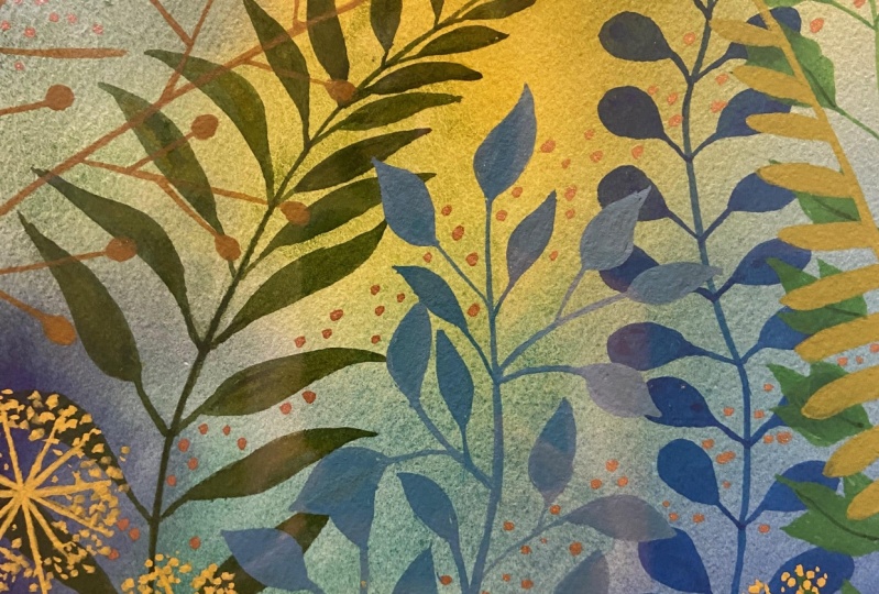
5. Layer 2 : Painting the Elements 1: Now that our background is ready, it's time to start adding the layers. Now, our background is absolutely dry and you can see that how the metallic elements are shining through. And also if you notice the colors have lightened a bit as to what they were when, when we painted them. Because that is always a tendency with watercolor, they always become lighter after drying. And that's good for us because it is the background and we need to keep adding layers to this. So what I want to teach you now is another method with which we're going to build our composition as we go and we are going to choose our color palette also, along with the painting process. So here, I have a few elements that I'm going to be playing around with until I'm happy with the composition. So I want to begin by choosing the biggest leaf that we have so that it comes in the background and we can build upon it. So I'm just playing around and seeing what kind of an arrangement will look best with the elements that I have selected. All right, to begin with, I'm quite happy with this arrangement because I have a balance of my longer elements with the wider elements at the bottom here, and at the same time, it is flowing well with the painting. So I'm going to begin with this composition and then we will decide as we build our layers and we would add onto this. So we're going to begin with this Areca Palm, And what we need to notice about this is that it has a central stalk and these other leaves are coming out little diagonally opposite each other in front of each other over here It's time to start building our layers And it's a very meditative and fun process as it's up to us where we want to add layers, what colors we choose. We build a color palette very intuitively. And as we move along. So I've mixed in some Pthalo Turquoise here And I'm just going to test to see how it looks. I think I'm quite happy with this. So I'm going to begin painting the stock. So I'll begin with this central stalk and then I'll be painting these, the side leaves over here. and the thing to note over here is that we're not trying to make a realistic botanical painting, but a little quirky, little whimsical with our own touch to it. So the idea is just to take the shapes of the leaves, then create our own artwork using them. Now the other important thing is that I don't want to place my element right in the center of my page because it's going to make the composition very static. There is always a rule about, about creating a composition is to have a kind of a leading line which leads your eye into your artwork. I'm going to place it a little off-center coming from here and going into this corner here. So I'm using my dagger brush. the reason is that these leaves come out really well, when you use a dagger brush, which I'm just going to show you and you'll see how well it works. So basically what I'm doing is holding my brushwork vertical and with a single swipe, I get the central stalk of my Areca Palm And the leaves, again holding the brush vertical And then slightly pressing down to create a bit of pressure. And then again lifting pressure to get the tip of the leaf. While painting the leaves. I'm trying to paint them in different directions to give my artwork movement and flow and trying to make the leaves how they actually occur in nature. Okay. And so I made sure that I vary the direction in which the leaves moving so that I can make it look more and more natural. We then move on to the next element which I feel is this because this is going to balance this long thin leaves. This is going to balance this better. So maybe I place it in this direction or let the elements move off the paper like this. So I'm using this Bright Violet color for this from my Mijello Mission Gold tubes And what I observe about this leaf is that it has a central stalk and it has the top leaf which is slightly wide. And the edges are wavy and the side leaf is an oval in shape. So I'm just going to keep these aspects in mind when I'm creating the painting here I'm using an eight number Raphael brush since the leaves are very wide and big. So I'm just following the basic shape that I see. Not trying to paint a realistic leaf or anything of that sort. So I'm just wiggling my brush. to get the wavy edge. Okay, so if you notice, it's all about creating shapes using watercolors. I'm not trying to paint a realistic leaf, but trying to paint a shape that resembles the leaf that I'm trying to paint. It's as simple as that. I like to paint some of the elements moving out of the paper. And this gives the painting a feeling of infinity. So I feel that I need to add one more leaf coming out from here to balance. Yes, I think I'll have these two leaves coming out from this side And easy way to choose colors for the first layer of elements is to pick the colors that you used in the background and use a more pigmented version of them. Now we're done with our first layer of elements, and I'll see you in the next section.
6. Layer 3 : Painting the Elements 2: So the next element I want to add is this, these leaves. So I'm thinking of placing them coming out from this direction over here like this. And maybe two of them coming out like this. So if I pay attention to these leaves, There's a central stalk and there is a very evenly shaped leaf coming out on either side of the central stalk. So I'm just going to test which colour I want to paint this in So once again, I'll just see how I want. I wanted it to come here like this or over here. So I'm using this Cobalt Green and this Cobalt Turquoise for my Mijello Mission Gold tube watercolors. So in just one single stroke, I have created this entire leaf over here. And if you follow this leaf, It's got two spokes coming out at the top edge. Okay So I'm just using my brush to create this. I'm starting with the brush vertical and then pressing down and then lifting pressure I'm thinking of adding this green, so that it creates some magical effects in the artwork. I'd like to add one over here as well, coming out from here I'm varying the size of the leaves again over here. Okay. So we're done with our next element. And now I'd like to introduce something a little bit more round and smaller because since we have all our long elements done now, we can introduce this kind of a leaf which we can have to kind of balance out the composition. So I'm going to use this Manganese Blue color, which I really love because it is a semi-opaque color and it really brightens up the artwork. So I'm just going to test it on this to see how it looks. So I'm quite happy with the way it is showing on this background Now when you observe this leaf, this leaf is divided at every point and there are three stalks coming out, and the leaves are very irregularly shaped. And it's got like multiple stalks coming out from, from one area. So this is the characteristic that we're gonna use of this leaf and we're going to start painting it. So I'm going to have one coming here and one coming here. So let's begin with this one on this side. So it's all about just creating these little dabs and dashes to create the shape of this leaf over here. It's just getting the shape that we see over here into these elements. So we're gonna paint this, which is again branching out into many parts, I may decide to mix in a little bit of Cobalt Blue It's all about creating marks, enjoying. I'm not really thinking of trying to paint a real life leaf. I'm just enjoying myself choosing the colors that I really love, painting with and making marks and overlapping. So I'm not even worried about what is getting covered because what's going to happen is that since the watercolors are transparent, the colours from below. are going to show through and create some beautiful marks and shapes off their own And this is exactly what I have explored in this technique of mine exploring the beauty of watercolors is Since this direction is going in this direction, I don't want to place this here. In the same direction, I'm going to place it in this direction on this side. Okay. We are now done with this layer and I'll see you in the next section where we'll be adding some more layers and textures.
7. Layer 4 : Painting the Elements 3: Now we move on to the smaller elements. So I feel I think we need to add this. So I really like this, branch, because it's got, it's got this little variation of colors and The leaves are very stalky and nice. I'm going to add a little bit of this somewhere and I'm just going to think where I want to add this. If you observe this, this branch, it has got, it's got very jagged edges kind of The stems are very jagged and then they have these leaves coming out with stalks in them. I think I'm going to have some leaves, branches coming in from the sides over here and we'll just test out some colors. So I like this pink because through the blues below it is not coming out as bright as it is. So I think I want to use this pink over here which is going to balance this, the pink element over here onto this side. So I'm using this Bright Opera from Mijello Mission Gold for this. And I want to create a very stalky kind of stems coming out from the edge of my paper. Very, very quick and very, very easy to do. I'm not worried about the thickness of the stems. Once again, it's all about varying the pressure of the brush and stroke. wiggle So you can even leave some white space in between somewhere the colours are coming dark somewhere the colours are coming light and vary the size, the size of the leaves as well. I'm using only my brush very lightly to create, holding it, pressing it and then pulling it up. I'm varying the direction in which my leaves are falling as well. So I'm quite happy with the way this has fallen I may want to bring in a little bit of this down here to balance, so I just want to add a little hint of pink coming in, on this side over here As I call these my Lost Forests, there are layers and layers of elements hidden, hidden below one another. And that's what really creates magic. So we are done with this element Now we will bring in the smaller elements I really like this leaf because of the nice shape it has. And these leaves coming out in different angles And maybe we want to create this over here. Like a small element on this side over here. Or maybe we can even create this over here like this. we can place little bits of this in two or three areas of my painting. I'm going to see how this metallic color is going to look on this. I think I like this green over here. So I am beginning by making a small central stalk. And then I'm just painting these leaves. Okay. This is already I may decide to add one more of these over here, in this direction. And I'm going to paint this a little differently If you observe this It's basically a central stalk. And then you have these little buds or little spikes coming out in all directions from here. So it's really pretty so maybe we can just use the top portion of these and scatter them around in our artwork or use them as little stalks. So for this, I'm going to use this Blue Grey colour from Mijello Mission Gold I'm holding my brush vertical I'm just making these kind off by lines coming out from there I'm just going to make these little I'm just going to make these little Okay Okay. Yes. The painting is almost complete and I'll see you in the next section where we'll be adding the final details and some magical touches to our painting.
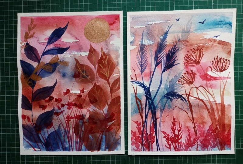
8. Layer 5 : Painting the Elements 4: So I'm thinking of adding these little stalky berries in this corner over here So I'm mixing this May Green that I used in the background. Okay. hmm I wanted to add a few of these tiny stalks over here. Now these are just tiny buds or irregular shapes. So I wanted to bring in a bit of this blue. So I'm going to use this Cobalt Blue color that I have over here Okay So its just these little dots and dashes that you have to create this kind of, adding the layers and creating the and add this little berry coming out from here you can create this kind of a dry cone coming out from here I'm just trying this colour So I quite like this. This kind of bronzy colour from this palette of colours, and I feel it will add a little magical touch So this is just like the visibility from the top is these three petals and I am gonna add a little coming out from this edge too So now we've come to the decorative elements of our artwork. And I'm thinking of adding a little sun over here I'm just going to add a little Silver from my Gansai Tambi set and we are just going to add this little semi-circle for the sun over here While that layer is drying, I am going to use this doe-foot shaped brush And I want to add some elements to it using this bronze color over here. So if you see this element over here, it gives a very beautiful petal-like shape. And this is what I'm going to use to create a sense of movement in my artwork. So I'm going to create a sense of movement going in from one end of my artwork to the other end. Okay. Now that this layer is almost dry, I will now add the second darkest colour, which is this bluish gold colour I'm just going to add in my little rays coming out from the Sun So I'm going to use this brush with this jagged edge to create this kind of dotted lines. So I'm just using this this brush to create very irregular lines create a little whimsical Sun for ourselves And now this layer is almost dry, we will add in the topmost layer of the Sun So that's our artwork complete. You'll see it's going to have a lot of shine when you see it against the light. It's going to create a lot of magical effects.
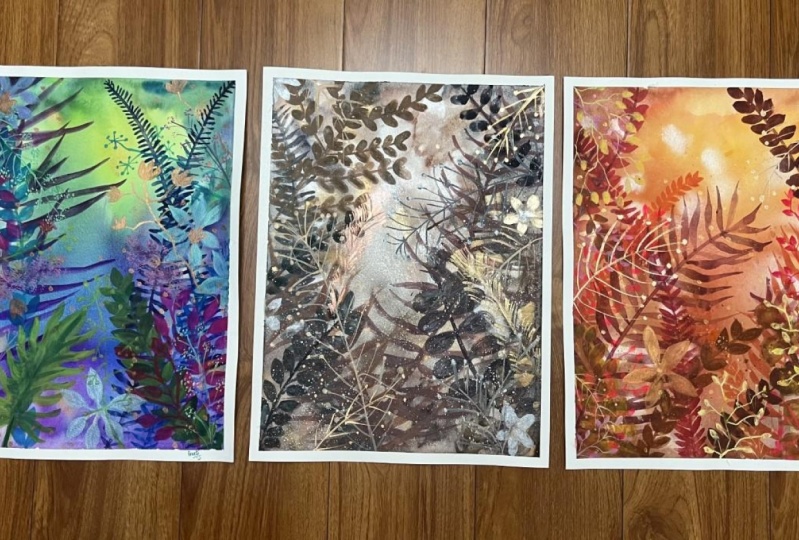
9. Final Thoughts & Class Project: As you finish your artwork and you are at the end of the process, it's time to take a look at your artwork and pay attention to how your eyes are moving along the image. Take as much notice of the positive space as well as the negative spaces in your art. Look and see what kind of details can be added. If you feel, if your painting looks too monotone, you can add a few elements of contrast. For instance, how I added a little bit of this brighter green tones here and these opaque colors over here So that added interest into the art work, I like this element because I like the way that this is forming a kind of a leading line and leading up to our Sun, as well as the other elements are balancing very well around it, but there is a balance of colors, there is a variety of shapes and sizes of leaves This very metallic dried cone that we added, is added a very nice effect, and I'm really happy with the artwork. The beautiful thing about this technique is that the multiple layers create a lot of depth. And even the layers from the background show through because of the transparent nature of watercolors, they create their own shapes and colours Secondly, if you notice, I built my color palette on the go Once I established my background colors, I've picked my colors very intuitively, swatching and testing the colors as I moved along and then added some pops of color to create contrast. While the metallic watercolors just give the entire piece a magical effect. So if you do not wish to work with a very vibrant color palette, the same technique of layering can be used with any colors that speak to you. Be it muted browns and yellows, shades of grey, pastels, or just in different tints and shades of greens. The possibilities are limitless. With practice, this method will help you develop your own unique identity in terms of style of painting and use of colors. The artwork is now complete and it's time to remove the tape and sign our Masterpiece! For your class project. I would love to see the elements of nature available in your surroundings, or neighborhood. This will also help create a little resource library, for us right here in this class for other students to get inspired with and paint. Secondly, paint along with me or choose your own inspiration and colors to create a masterpiece of your own and share pictures of this in the Class Projects section. I cannot wait to see all your paintings and give feedback on them. A bonus for me would be to see your Masterpieces framed and hang up on the wall in your home. Do not forget to tag me at @the.wild.at.art and use the hashtag #wildatartstories if you share paintings created in this class on social media, I will be delighted to share your artwork on my stories. So that we can keep in touch and you get an update when I release my next Skillshare class, follow me right here on Skillshare. So that's it for this class. I hope I've left you with loads of inspiration and creativity to create many more nature-inspired artworks of your own. I hope you enjoyed this class as much as I enjoyed creating this for you and hope to see you soon in my next Skillshare class. Bye.
10. Bonus Video : Sit-Back, Relax, Watch ! : Thank you. In this case. Hi, everyone, so to speak. Okay. So to say, What is this? Okay. In this segment, if a and B in practice, in this segment, in this case, in this space. Okay? In this segment. Okay. It's the same thing. Yes. In this case? Admissions. And so this is the same thing? Okay. In this case? Yes. Yes. Yes. Yes. Okay. It can be a few centimeters to meters. Yes. Yes. Yes. The second set of statements. Okay. Second. What is a display? Okay.
 Aparna Garg, Artist | The Wild at Art