Transcripts
1. INTRODUCTION: Hello. My name is Casel and I'm a watercolor artist
from the Philippines. My work mostly revolves
around people, and my favorite medium to do
that with is watercolors. Five years ago, I taught
myself how to paint, and I almost instantly fell in love with the expression that chicken get with watercolors. And so I think it's
a medium that lends itself well into
painting people. I'm so excited to share
this class with you guys. For this one, we're
going to be learning about layering with watercolors. Mostly getting
used to navigating a transparent medium
like watercolors, and all the while, it's going to be in
the backdrop of us translating a portrait photo
into a painting as well. All of the painting sections in this class will be
recorded in real time. The sign for you guys to
be able to paint with me, so I'm so excited for us to do this class
together. Let's go.
2. Setting Your Mindset: Before we even pick up a
brush and start our painting? The most important step is to first fall in love
with our photo. While most of that
is very intuitive, there's elements to a
photo that we can hone in on and highlight in a painting. The very first step in painting
a photo is analyzing it. Which elements about
it do you love? Is it the colors? Is it the silhouette of the
subject over the background? Is it the lighting?
The best thing about this is you're never wrong
with how you perceive a photo. It's how you see a photo, and in your artistic language that enables us to translate
it into a painting. So as a short exercise, I wanted to pull up
some photos that I really liked and how I
decided to paint them. So for this first one, I really loved how the colors on Alice blended seamlessly
with the background. And so from the very
beginning to the end, the background and her
were both painted together with the same colors to showcase what I wanted to
highlight in the photo, which is essentially the
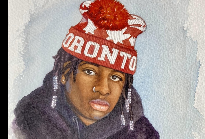
lighting in the colors. For this next one, I decided to forego detail and showcase the mood of
the photo instead. So I just went with one
color for this that I really thought would reflect the mood that I was going for, and there's very few
lines and layers in here, but I think that
it really showed the expression that she
can get with watercolors. And also it shows things
that an artist can choose to highlight in a painting because there's a lot
of them in this photo. And so when we're
translating them into another medium
like watercolors, It's best to hone in on
one and focus on one. So our painting is
more direct and has a clear idea of where
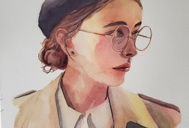
it's going from the start. So for this third one, which will be the one we'll
be painting for the class. What I really liked
about this was her silhouette against a
completely white background. I like that this shows
a good contour to her face without showing
her complete profile, and I also love how the
glasses and her hat added more to the shape
of the silhouette too. So to approach this, what I'm going to
do is highlight that shape that she's
making over the background. So we're going to
paint her completely and keep the background
just the paper. And so we're going to
showcase the cleanness of the silhouette with
the interesting shapes that she is making over it. So that's going to be the
approach that we're going for the main painting class.
3. Preparing Your Workspace: This part of the lesson
will be in real time. I would love it if you guys would paint it together with me. There is a clean nine provided
in the project gallery, and you can either use
that the trace over your watercolor paper or
to sketch for yourself. If you do decide to
paint your own photo, we can still use the tips and
the process walk throughs I talk about in this lesson to
apply to your own painting. I would still love it
if you paint with me, especially as we go through every layer and the
purpose of each layer. I would love to
see your paintings in the project gallery, too. Now that we have
that understanding with where we want to
go for our painting. What we now need
to do is clear up our work space for the
beginning of the painting. I like to do this routine for every painting that I do
because I usually just leave everything out on my
desk after I'm done and so just refreshes my mindset
for every single one. And then what I want
to do is just have all the stuff I need for
this certain paintings. I'm just going to
pull out exactly the colors that
I'm going to need. And so for this painting, we just have the colores
that we need plus white gash and it's just inside of my mixing
palette for now. I have my work board
that I use to paint on. I have this because my
desk is completely flat and I like to have the painting on a board so I can tilt
it up whenever I need to for when I need a better angle to look
at my painting on. Then of course, we're
going to need our water is the most important medium
outside of our actual painting. I just have this mason jars that I use right here
on the other side, and then I have paper
towels just below it to catch any drippings that I might have after I'm
mixing my palette. And so to clear your mindset
is to clear your workspace, make sure you only have
what you need in your desk, and you should be good to go. Before we move on, I wanted
to introduce you guys to the art supplies that
we are going to be using for the main
part of this class. And of course, we're going to
begin with our watercolors. Going to be using three
colors from my senile set. In the set comes three
very cool primary colors, and then we have two
convenience colors that I've found I use very often too. This is a very good set for
an introduction to the brand, and it's also a good size tube. This one is 10 milliliters, and I've been using
this for years now. But for this painting, we're just going to be
focusing on lemon yellow, which is a nice clean
and cool yellow, and then we have our bright red. This one is also a cooler red, that means it needs closer
to pink than orange, and it's going to mix well
with our lemon yellow. And then the last one we
have is ultramarine deep. This one is also a cooler
blue that means it has more of a greenish
undertone than purple. But yeah, these colors
mixed together is going to give us a wide range of colors, and they're also
compatible with each other to give us very
vibrant colors at that. Then for the brushes
that we're going to use, I'm going to use my own
set with craft tamo. But I've only really been using these brushes for a year now, and we're going to need all of the round brushes for this. These have really
nice tips and are extremely soft for not
being natural here. In fact, I feel like very natural hair to me and they also have a
good snap to them, which we're going to need
a lot for when we're painting details and
especially hair. And so those are the brushes
that we're going to need. And then for our paper, I'm going to be using my fabriano artistical
watercolor paper. This is 100% cotton, and it's also cold pressed, so it has a lot of
nice texture to it. I would say that this is the only rigid requirement out of the art supplies
that I've mentioned. Can use student quality
brushes and paints, but I would highly suggest using 100% cotton paper
for this painting, as is just going to
be really different from other kinds of
watercolor paper. If you do decide to get the brushes and the
paints that I mentioned, the links to them will be in the resource section
of the class.
4. THE FIRST LAYER | Painting the highlights: To begin the actual painting, I am going to be starting
with my biggest brown brush, my number ten brown brush, and that's because
we want to cover a lot of area for
this first layer. We're thinking of how layering works with
the water colors. You'll note that for
this very first one, we're mostly going to be
painting the highlight. This right here is a
mixture of our lemon yellow and our red to give us
a very bright orange. Colors that we're thinking of is just going to be our
reference photo. You can see I'm being very careful with the
silhouette that we are making because when we did
the analysis of our photo, remember what I
wanted to highlight was the starch white background. For this very first t layer, we really do not want to go outside of the
lines for this, but we're still working
with very light colors. Squinting at our photo
and trying to get a really blurred representation of the colors that we
see when we do that. That is basically what we're doing for this
very first layers. The highlights are just
the brightest colors in our photo and
in our painting. That's what we want to have in mind while we're doing
this first layer. What's most important is
we cover the whole thing. I did leave out some brighter
spots in this first layer, but we're not going to leave that out to just be the paper. Repainting her hat right here, want to maintain the silhouette that we really wanted to see. What we're going to do with
that is we're going to make those colors to be more
yellow than the rest. You can see I'm cleaning
up my brush right here, and for the highlights
that we've left out, I'm just getting
yellow by itself in my brush and making
sure it's very wared down, and then I am placing that on the highlights
that I've left out. When it touches
the orange parts, you can see that those
colors will just mix together really beautifully
for our first layer. Again, throughout
this first layer, our brush remains very juicy, using a lot of water for this. The only stiff parts of the painting really
is the silhouette. That's the only part where
we're not blending out. Again, that is because
we're going to have a very strong shape for
this one initially. While everything is still wet, we can also get some
more intense colors and use that to drop onto
our still wet paper. You can see I am getting my red right here,
it's very pink, and I'm just going to with
a little bit of yellow, and I'm just going
to drop that onto the parts of our face
where we see shadow. You can see how lovely those colors just blend
out onto the paper. I really like this look for it. And with water colors too, there's still a
certain amount of control that we
have to let go of, especially when we're
working wet on wet. You can see we're
just going to let those colors do whatever
they want on the wet paper. There's also a thing of how your painting is laid
down onto your table. If it's Got a little bit up, your paints are going
to travel down to your painting and that could be something you might
want to watch out for, but I really liked it, so I'm just leaving it
like that for now. What I'm also going to do in this very first layer is mix
my blue in with my yellow, so I can get this very clean looking green and to
make it astunting, I'm just adding a
lot of water to it. But you can see in the brush on the painting that
I'm chest tapping it onto where the shadows are a little bit cooler on her face. There's already
that nice gradient of color for this
very first painting. I'm also going to get
more of that red, and it's just going to
be the blush points of her face or the high
points of her face, tapping it onto her
cheek bones right here. Colors are traveling down. Some of them have settled
towards the bottom of her coat, but that's because I've tilted my painting a little bit up
so I can get a better angle. You can see I'm just
nudging those paints back. But again, I've
decided to just let that control go of my painting. Now I'm going to get this
nice blue on my brush, and there's a while there's a
little bit of yellow to it. It's still just going
to be the blue, and you can see because it's layered over that
very warm background. It looks a little bit
more green than blue. Then I'm going to take more of that green this time,
just the green. This time, mix on our palette and we're going to
use that to paint the very very beginning
shadows on our painting. Because we were working
with mostly at painting, you can see that the
whole first is very, but we already have
that n structure to it, and we're going to add
to that with our orange, and then we will be
done with our first. Layer. To recap the first layer and basically the
highlight of the painting. What we did first of all, was make sure we get this
very strong shape initially, very saturated with
our lightest colors before we played around with the gradient in those colors by dropping more paint over
it while it's still wet. And so we still ended up with this very strong shape
for our highlights in our first layer with some nice laydown of colors to build up on
for our next ones. So make sure you let this completely dry
before we move on to the second layer
where we will paint the softest shadows
in our painting.
5. THE SECOND LAYER | The softest shadows: So now that we've let
our first layer dry, and we've established the
highlights in our photo or what is essentially the brightest colors
in the painting. We can now move on
to the second layer. Basically for this,
what we're going to do is map out the shadows
in the painting, but still use very soft
glazes in our water colors. And for that, I am going to be moving on to my slightly
smaller round brush. It's essentially the same as the first one that we
used, but for this time, can just get a little bit more precision than the old one, which we're going to need as we move further up
into the painting. You'll see I am beginning with the colors that I used
for the first day, and we're going to
start with our orange, which is just our
red and our yellow, and we're just going to use that to paint in the light shadows. You can see because that orange, I think was just a
little bit too bold. I have once again, used the complimentary
color technique where I used blue to tone that
down a little bit more, so it's more suitable for
the look that I wanted. Again, I made sure that I'm loading up my brush
with a lot of water when I'm getting closer to the highlights on her face. I'm also just slowly
moving on to adding more blue to my mixture as I'm going onto the cooler
shadows on her face, especially near her eye sockets. Again, we're going to go
with a different color to create this
gradient on the paper. I'm mixing in my
very pinkish orange with my red and my yellow. I'm just going to use that
to border her cheek bones. You can see I'm letting
those different colors mingle on her face. Because our paper
was completely dry, we can just see those two
colors blend with each other, but they're going to remain where we've put them initially, so they're not going to spread
on too across our paper. We're just going to get
this beautiful rainbow of colors for this second layer. Again, while I'm doing this,
I'm making sure I'm mapping out where the shadows
should be in the photo. I'm also taking advantage of our water to blend those edges out like right here
on her cheek just to soften up those edges
that we started with. Then we're going to
continue the same process for the rest of the
shadows on her, especially right
here on her neck, which is a very defining shape because it shapes
out her jaw line, so that part, we're
going to leave out to be edgier than the rest
of the shadows on her. And once again, I want to go back with an opposite color
this time with my blue, and I just want to
continue that shadow. This time as it's
following onto her coat. I really love how this looks
especially because Those are opposite colors you
put next to each other and usually they would
muddy each other out. But we can see because of how light the
glaciers we used are. The shadows are
just going to look very natural and beautiful. But yeah, on the other side, we're going to take that
same blue by itself. You can see on top
of that yellow, it looks more green. But again, because it's so light the glaciers
that we use, everything is just
going to blend onto each other for
this second layer. And we want to continue
that same principle with the very opposing colors on different parts
of the painting. So this now is an orange. And I'm once again just painting around the
highlights, basically. And I'm letting the shadows mingle with each
other on the paper. We're basically just
keeping in mind where the highlights are
for the second layer, and we're going to
leave them blank so they sand out and we can already start to see that effect on the color of her shirt. Then what I want to do is when I go back in with my orange, I want to be able
to slowly darken up my shadows even in
this second layer. I'm going to mix
that orange again, and I want to add just the tiniest bit
less water to this. It's, but it's still going to be the same colors that we're
working with for the same Um, for the second layer. I just want this part of
our hair to be a little bit darker than the rest of the shadows that
we've just put in. You can see I'm
shaping out her hair. I want to make sure
that I really carve out the darker shadows on this part. Again, to create color
contrast in the same shadow. I'm going to be bordering
that with my green, which is just my blue
and my yellow mixed. You can see I want to again let those two colors mingle with
each other on our paper. I'm tapping that on
her hair right here. But where I want to focus this bull mostly
is going to be on her hat because it's such
a defining shape to her. It's also a darker shadow. I want to make sure that I'm
getting that right and that it's mapped out for
the second layer. Again, what I want to do
is take that same color. Then I want to get a slightly more toned
down version of that. So we're going to
add a little bit of yellow to our mixture. You're just going
to get that more neutralized shadow color to add to the different parts of the painting right
here on her color. I want to just make sure
those shadows are darker too. I also want to add these
very dark accent lines, which are fine
details on her coat, and then I'm going to use
that same dark color to tap into the still wet
layers that we already had. We're again just going to let those colors spread onto the
paper however way they want. Before we move on to the
next layer in our painting. Now that we've put in our
first and second layers. What we're now going
to do is darken up the shadows that we've mapped
out for the second layer. Again, it's essential for
your paper to be completely dry at this point before
we add more to it. But once you make
sure that it is dry, I am now going to mix the same orange and yellow
that we always start with. But this time it's going to
be a little bit thicker than the soft glaces that we were working on for the
first and second layer. You can see this is
already way darker than those first ones. But we're just going to add
to the values that we had. Don't be too scared of
this thicker layer on top of the softer ones because
of how watercolor is. Those are still
going to be shown. One of the more magical things, the water colors and one of the properties that really makes it that really gives it
this beautiful effect. You can see her face
slightly more shadowed now. What I'm also going to do is take the same orange mixture. This time, I want to use
it to paint over her hat. That's just to knock out
some of the brighter blues, which I think is just a little bit out of
place in the painting. After that's there, we're
going to go back to our yellows and oranges again. When I use this to
paint her neck, I do want to add less red than we used for the
rest of the painting, so I want to maintain that
yellow highlight on her neck. Then once that's there,
we're going to go back to our orange mixture and we're just going to
use that to add. Again, just a tiny bit more of a darker
value to her coat. Then before it tries, what I want to do is clean
up my brush and this time, I'm going to use it to blend out this very harsh shadow on her. I'm just cleaning up
my brush with water, making sure there's
no pigment to it, and we're going to do is
just soften up those edges, really blend them
out with water, that is in our brush so that we basically
eliminate those signs that are too harsh on a
softer part of the shadow. Even taking my paper towel and using that to just tap into the paper and lift out
some of that darker shadow because I want it to be more
highlighted than it was. Then I can go back to my red
and orange mixture to add in an extra layer to
her ear because before it was just standing
out too much in value. I'm also just going to
take that same color again to separate the darker shadows on
her hair versus her ear. And I'm just filling
in the gaps right here because every gap that we leave behind is going to show
up as a highlight. And then what I'm
going to do is make a purple with my
blue and my red. And this is a very
different color from the ones we had been
working with up to this point. So I'm using this
very different color on the darkest shadows that I see in the ph focusing them mainly under the
color of her coat. Just so it really stands out as an opposing color against the very warm
highlights we have. I also want to use
that same color to paint in these shadows between her neck and her shirt and then her
shirt and her coat. It's just really fun to see how these colors will spread
out for the second layer. Then for the side, it will
be more in highlight. I'm going to add more of
our orange with the purple, and you can see I'm still
going to use that to create. This really fine
separate shadows on her shirt and her coat. Then we're going to
take what's left in our brush and just once again, go back to tapping
this darker color over the parts of her
hair that was still wet. We're going to let those colors
fade out into the paper. But it just separates her hair from her
neck even more and we start to see even more
solid values as we go up, and then we're going to do
the same thing for her head. Except this time,
we don't want to separate it too
much from her hair. We just want to create this overall darker
value for her head. It stands in contrast to the bright highlight
that is her forehead. Then once that's
done, that's going to be it for that layer. We're going to have to
wait for that to dry before we move on
to our next ones. I will see you guys then.
6. THE THIRD LAYER | The darker shadows: Once our last ayer has tried, now will be the time for
us to add the base for each facial feature and each
element in the painting. We're going to move
on to our number two detail round brush for this. Since we're going to need
a lot more precision than we did before. But unlike the last ayer
where we were a little bit more aggressive
with our painting. What we want to do
in this part of the painting is to go back
to the softer glazes. So we're going to be
using a lot of water again in our mixes because this time we're
separating each element, and so we're going
to need to have a different base
for each one again. You can see while I am
using the same colors, I'm starting with the
orange in our palette. The technique for
this is completely different from the previous ors. I am now being very careful with where
I place this brush. I'm going around her eyes. I'm making sure that I'm
painting around every feature, and also that I'm blending
out the edges with water. But outside of that, we're
using the same colors. As we get closer to the
bridge of her nose. I'm going to be using purple. And again, we're going back with just water in our brush and
blending those edges out. So you can see there's a lot
more care and precision in these layers from now on because we are carving
out each feature. And this is also going to be where the painting
really starts to come through and
the detail starts to come through So you can see, especially on her left eye right here where
I'm almost drawing, whereas before it was clearly painting while also letting
go of some of the control, we can get with a brush. This time we're painting every single line that
we have in our linework, which is still
visible because of the transparency of watercolors. Very much so this part is almost like drawing and then
painting where we start off by tracing
the linework that we had underneath and then towards the edges,
we blend them out. Also while those parts of
her eyes are still wet, I'm going back in with a
slightly darker color. You can see I'm just adding that dark color touch where
her eyes were still wet. I'm just adding that
very sight shadow to it and on one side is very sharp because the inside of her eye is completely
dry and on the other, those darker colors are
just going to spread out. And so I want to show you
guys this technique clearly. So I'm going to zoom you
guys in on her nose right here where we start with
this very bright orange. And we can see right
away that this is too dark and
stands out too much. But what we're doing
after is we're cleaning up our brush and using that clean brush now to spread out one side of
that brush stroke. So it softens it up and the other edge towards
the bottom of her nose, or I want it to be more precise. We're leaving that out to be
this sharp highlight detail. And then we're
going to go and do the same thing to her lips, where we started with
this very light orange, almost doesn't look like it
should need blending out. But you'll see when we get
our clean brush and drag that one line out to the rest
of the shape of her lips. Look at how beautiful
and that shadow looks, and it just does a
good job of cementing her lips in the
shape of her face. And we're just going to
repeat that for her eyebrows. We're still using very
light colors with our orange shape here
and a little bit of our blue to tone it down. But you can see there's a
lot of water in our mixture. And so when we do place
that on her eyebrows, it's still going
to be very light, but we are going to trace the exact shape that we
drew in for the linework. So while it's still very light, we're creating a baseline
and an outline that we can work with to
add depth to later, which again is what
we're doing for this fourth layer
in our painting. So we're going to
move onto her ear, we're going to do
the same thing, which is we're going to take
this very bright color and basically paint the parts of her ear that looks
like it would have color. I'm putting in this
very bright color on her ear lobe first. Then after that we're tracing the shadows inside of her ear. The shapes won't make too
much sense right now. But again, this is just
the basine for her ear. When we add to it on
the later layers, it's going to make
a lot more sense. Just like we've been painting each individual facial
feature that she has, what we're now going to do is
take the same light orange and we're going to
do the same thing for the shadows on her face. Basically the
contours of her face, starting from her
cheek right here, and we're following
the planes that we've circled out in our linework. And we're going to do the
same thing for her chin. These shadows are very subtle, but you can see that they just mapped out the shadows on
her face very beautifully. This will also really
add to the dimensions when before we really start
to punch in the details, as part of the process almost
looks like we're sculpting. Because we're not only
cementing the shadows, but we're also creating space for every element
in the painting. That also goes for elements
outside of her face. The shadows on her shirt, we want to make
sure that they're there and they're punched
in and they're clean. Also, right here,
you'll see I'm using green because this part of the painting has a lot
of yellow undertones. We want to make sure we're not just layering that with
our purple shadows. For the parts where we want
to keep the colors vibrant, we don't want to layer them
with the opposite color. We're using a lot of yellows and oranges to layer the
yellow highlights. Then for the parts we do
want to add contrast, like what I want to
do now for her hair. You see I'm mixing
in my palette, all of my primary
colors together, which is just going to
muddy each other up and to give us this
very darker color. And we're going to
use that to add more contrast to her hair. Since her hair is a
lot darker in value. So I wouldn't fully mind having darker color initially for this part of the painting. What we do want to do is
make sure that we're still saturating our paint with water so that when we
use it on our painting, we're still going to be able to see the layers underneath. And also for her hair, we're not covering
the whole thing. We're solely painting in the shadows on her hair
and where they are the darkest is where we're placing the darker colors in for
this fourth layer on it. I. For her hat. What I'm actually going to
do is use my 1 " flat brush. The reason for that
is because it's such a big shape in the
painting that I want to separate it from the rest of it in one
big brush stroke. You can see in my palette. I am starting as my orange and blue mixture
completely separate colors, but there's more blue
here than orange. So you can see a more
neutralized blue. But I want to take
that color and just paint in these big bucky
shadows for her hat. After we had that
saturated with water, I'm going to go back in
with a darker orange and you can see I'm just again doing somewhat
on wet painting on it, tapping these darker colors on there while it's still wet. Like we did before,
we're just going to let those paints mingle
with each other on the paper and have
them move however way they want on our wet paper. Since we already have
those big blocky shapes. What I want to do is go in with my bright orange this time. But I'm going to use
the same brush to paint in this really sharp
shadow under her neck, this is a very defining shadow. It's a really good
way to compliment the bigger shapes
in the painting without overdoing
it on her face. Then I'm going to go
back to my detail brush. What I'm going to do is layer in more colors for her
lips this time. Because that color
just dried too light. I want to make sure that
there's more dimension to it. You can see I am mostly
fully painting her lips now. I'm making sure
that I do leave out the highlights towards the
very edge where it's brighter. But because there
we're going to clean up our brush and
blend those out. But really what I'm doing right here is adding
back the dimension that we lost not only when
the paints settled lighter, but also when the very dark
shadows in the painting like her hat and her coat just drowned these
values on her face out. So you can see,
we're just basically repeating the same
techniques that we did for her nose before
where we went in with a very intense color before we go back and blend those edges to make that color more natural. I want to do the same thing
for her eyes right here. Just a repeat of what we did initially for this first layer. We're just adding
in an extra one to make these values catch up to the darker ones
in the painting. But again, we're doing a lot of blending out for these edges. We still want to
keep that natural rendering for these shadows. It's such a good exercise
too for painting portraits. A lot of the blending that
I do is exactly like this where I let the paint
layer first before I blend out the edges
with a clean brush. After that, I am going to go in mix a very bright
pinkish orange, and I want to use
that for her ear. Unlike the other shadows
in the painting, the ones on her ear, I want them to be more of a vibrant color because that whole area is
supposed to be brighter. I also want to use
a very bright color to paint in the
shadows there too. So taking the same color
for her neck right here. Remember this part is
still wet, so you can see, so you can just
see it spread out towards the rest of that shadow, and it was only
overwhelming for a second. You can now see how beautifully those colors have settled. As a final thing before we move on to the next
layer and let this try. I'm going to add some
yellow to my brush and just add in some
more warmth to her ear, where I think the
red was just too much and didn't have much of the yellows that we
see on the highlight, so you can see that
yellow just added warmth back to her ear. But after that, we
will be completely done for this fourth layer, and now we can see the
elements in the painting. Now they're all separated
from each other and now they're ready for
the darker details.
7. THE FOURTH LAYER | The individual features: After we wait for the
last layer to dry, now what we're going
to do is draw in the very defining
shadows in our painting, and this is where
we really start to see all of the elements
coming together, and we're still
going to be using our detail brush for this layer. For most of this,
we're going to start with all of our primary colors mixed together again to get our darkest color that we've
been using for the painting. What we're going to do with
it is paint her irises. Finally, for the style that I'm going for
in this painting. I'm going to be adding too
much details to her eyes. It's really important for us to get the exact shape of it right, and that's also why we jumped up from one layer
basically for her eyes, and then a very dark one right away for the
shape of her irises. Yeah, we're going to take that
same color to to paint in the darker hair
strands. Her eyebrows. For this, we're
making sure we're not just painting everything in. Do want to add some slight
hair strands, not too much, but just enough to make
it look like it's not one blocky shape that we
have for her eyebrows. Then we're going to take
the same color basically and paint in just the very
dark opening of her mouth. We're going to leave it like
that to do the same thing to the other fine shadows on her, like her neck right here and
the one under her collar, which just makes the
shadows look cleaner. But we're still going
to be working with that same dark color when we go ahead and paint her lashes. You can see on this first one is just very simple straight line. We're going to see
more of the curve of her lashes right here
on the right side. But against this,
we're going for very simple shapes for the
style of this painting. I'm using that same color to draw in the other darker
details on her face, like the folds of her eyelids, the same on her nostriels too, and then the very corner
of her lip right here. And once we have all of those darker details in
the painting placed. What I want to do now is go back to our brighter orange mixture, and I'm going to use that now to paint in some hair
strand details. Now for this, since these
are just finer hair strands, we can do one layer
brush strokes for this. We're intentionally
going outside of the initial
shape that we had. So we're adding some
organic details to the overall shape
of he silhouette, where before it just looked
a little bit too clean, Now we're going to use
this darker orange to bring back the
hair strands on her, separate her hair more
from her hat as well. I'm trying to be careful with the hair stren
that I put in, but I do think that one over her ear was a little
bit too heavy handed. But that is fine. Since this is just
going to be one day. This is going to dry lighter
than how it looks right now, it's going to look
less daunting. But I'm going and repeating this whole process right
where I think it needs it. I'm even adding back
some very dark blues to our oranges to get this very very dark
color and use that to punctuate where the darkest
shadows are on her hair. You can see these very
simple shapes already make her hair style more apparent and gives it more definition. And so we're going to
do the same thing for the other shadows on
her neck and clothing, basically, define them more before we go back to
our bigger brown brush. This, this is my number
eight brown brush. What I'm going to do is take the same dark color that we used for her hair, except this. It's going to lean cooler, so there's more blue
in this mixture. But what we're going to do with this darker color
is to just draw in more of her hat and to
separate it more from her hair. I did add this round
detail on top, which I think was
just a little bit too hollow in the painting. I think I forgot about
it towards the very end. But I did like that it added more shape
to her silhouette, which is the point in this whole painting, so
I really liked that. Then we're going to add some
more tiny dark shadows. Before we once
again wait for this to so we can move on
to our next layer.
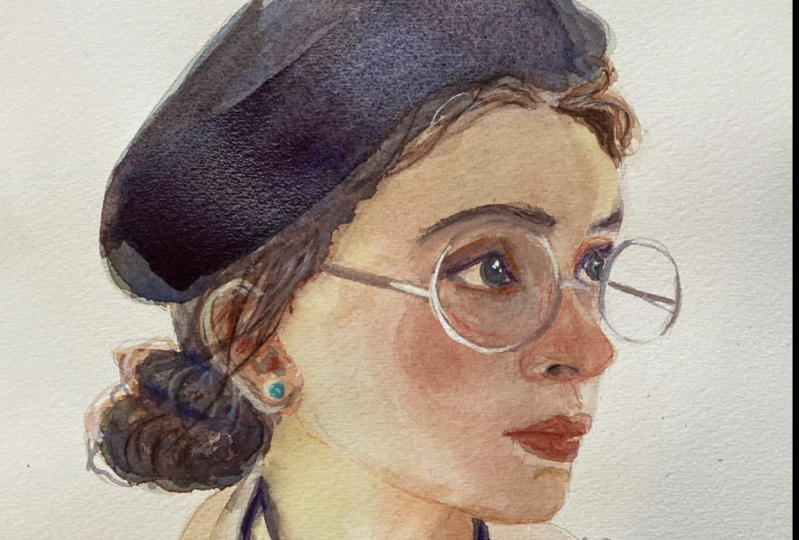
8. THE FIFTH LAYER | The darkest shadows: Once the last layer
has dried and we can now see our painting
almost done. This is the part that I like
to step back and analyze where my painting is at by itself way from the
reference photo. How it stands by
itself as a painting, how good the colors
look next to each other and how the values
stack up against each other. I'm looking at where
mine is right now, and I think what it lacks
is some hair strands towards the lower
left because we had the other hair strands
near her forehead. I want to balance that out, so we will be doing that later. But mostly, I want to add in even darker values to bring
out the lighter ones. Those are the things I think I could improve on on my painting, and so we're going to first need our detail brush for
the hair strands, and we're just mixing in
this darker color again. This is the part
where it feels the most drawing because
we're almost using our brush as a pen with the precise brush jokes
that we're getting with it. We're just adding
enough hair strands to balance out the
ones on her forehead. Don't want to add too much
in because we're also trying to see how the whole
silhouette will look. So that will be it for there. What I do want to do too
is mix our orange again, just to add more
dimension to her lips, which I think just
got drowned out the more we added in
the darker shadows. But I think now is a
good place for us to go back to our 1 " flat brush, and we're going to use our
darkest colors for this. This is a mixture of all
of our primary colors. But this is mostly
leaning more purple, so there's not a lot
of yellow on here. But we're using this to paint these very big
blocky shapes again. It's going to be
focused mainly on her hat and the darker
shadows on her color. But I really liked adding these bigger shapes in to
balance the whole painting. I also think that Adding
these big brushtokes, brings out the finer
details in the painting, and not only that,
more importantly, is that it just balances out
the values in the painting, and now values wise, it just looks more cohesive. The darker shadows
too will bring out the brighter colors on
the highlights on her, which we can see
when it paints in these dark ones for her neck. Once that darker line is there, the brighter colors like
the yellows on her neck, now stand out more. So we're just going to do
that for the whole painting, bring in these darker shadows, use them to punctuate
the brighter highlights that we put in towards
the beginning layers, to make them stand out more. And now, the very last
thing I want to do for this layer is to add in the very fine lines
on her glasses. So I'm trying to be very
careful with the shape of them because they go
out to the right paper. So I'm trying to be
careful with the shape that they make on top of the
starch white background. But I still think I got
too heavy handed when it came to drawing
in the frames. I'm also just naturally
not very good at drawing straight lines and
painting them, especially. So you can see I'm using very watered
down paint for this, and it's always a good counter. But it still needs
to be precise, especially since
it's not going to be multiple layers sucked
on top of each other. It's just going to be that one. So that would be it for those polishing layers and
for the finer details. But stay tuned for the part of the class where I add in some extra details
with white quash, and I will show you guys
how to sit in line with the watercolors you already have to fully finish
our painting. Make sure this last layer
is try before you do that, but I will be seeing
you guys then.
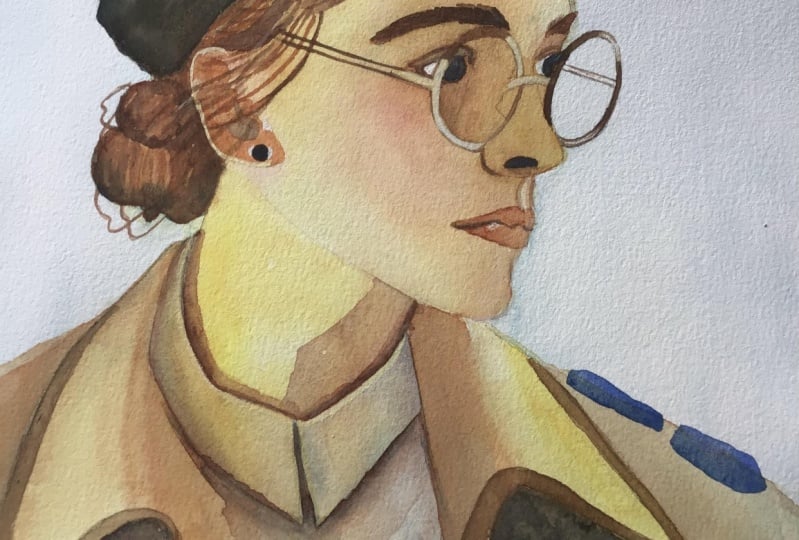
9. BREAK THE RULES! | Use white gouache: After our last layer has dried and we have followed
the rules on how to layer watercolors the proper way by going
from light to dark values. For this final part
of the painting, what we're going to do
is break those rules. While this last
step is optional, I personally think it's one of the most fun parts
of the process, and we are going to
be using white gah to add in lighter values now. So we're basically going to put aside all of the rules we've been following while we did our painting
up to this point, and we're just going
to use our white gash with the watercolors that
we were already using and use that to essentially make our watercolors
more opaque and that will then
enable us to add in lighter details over
top of darker ones. It's very important to maintain
the silhouette that we are going for that we don't
use the white gash by itself. Inside the silhouette, since
we're really going for the shapes that she's making against the starch
white background. We want to make sure that
all of the highlights we're planning on using on her aren't going to be
completely white. What I'm doing
right now is mixing my lemon yellow in
with the white gash and I'm just going
to place that on the brighter parts
of her glasses. I mostly focus them
on the frames, and I'm also making sure that I'm not just
outlining everything, that I'm just painting these on where the
highlights need to be. I'll just be repeating that for every lighter accent
that I'm going to put in for this final layer. But you can see while
the painting by itself, before we added these in could stand as a
complete painting. This part is added something extra to what we already had. Depending on how we do this, this could almost transform
our entire painting. I did use them for highlights
that weren't present, but I'm also using it in to
polish the some of our lines, especially where the midtones
touch the darker shadows, adding these opaque
brush chokes, just make them look more
polished and cleaner. I'm even doing the
same thing to her ear, which I'm completely
painting in a di mentioned to her ear that I missed on the
layers before this. Is it just the white gash
or the opaque watercolors, help me bring that value
back onto her ear. I'm also using my white and mixing it in for
her hair colors, and I'm then using that to paint in some extra hair
strands on her. Again, it just adds to what was already a
finished painting. That's why I personally
love this part so much. But also because it's
just so completely fun, watercolor as a medium
has very strict rules. It's one of the more restrictive because it's so transparent
that you have to paint it a certain way that it's fun once in a while to
break the rules that govern it and also helps me own the medium more
if that makes sense. As I'm cleaning up the
silhouettes on her, you can see I'm then using
the white gash by itself, which is something that
I didn't do for her. It's only so that it is the
same color as our background, and so we get to clean up
he silhouette even more, which is the main
thing that we wanted to highlight in this
entire painting. But, after that and
some extra touches, we are finally done
with our painting, and that has been it for how
we layer with water colors, especially in painting
portraits. I.
10. FINAL THOUGHTS: Thank you for taking
this css with me. I wanted to take this time to congratulate you guys for
making it to the end. I hope you learned more
about layering with watercolors and also how to approach portraits
with watercolors. Please don't forget to share your project in the
project gallery below. I'm so excited to see them. That'll be it for now. Bye.
 Hazylle Garza, Portrait artist