Transcripts
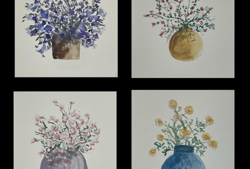
1. Introduction: Expressive, dreamy, and
a little bit magical. If that's how you want your
floral compositions to feel, then this class is
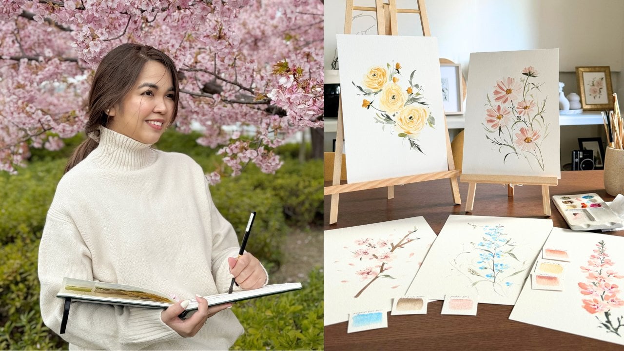
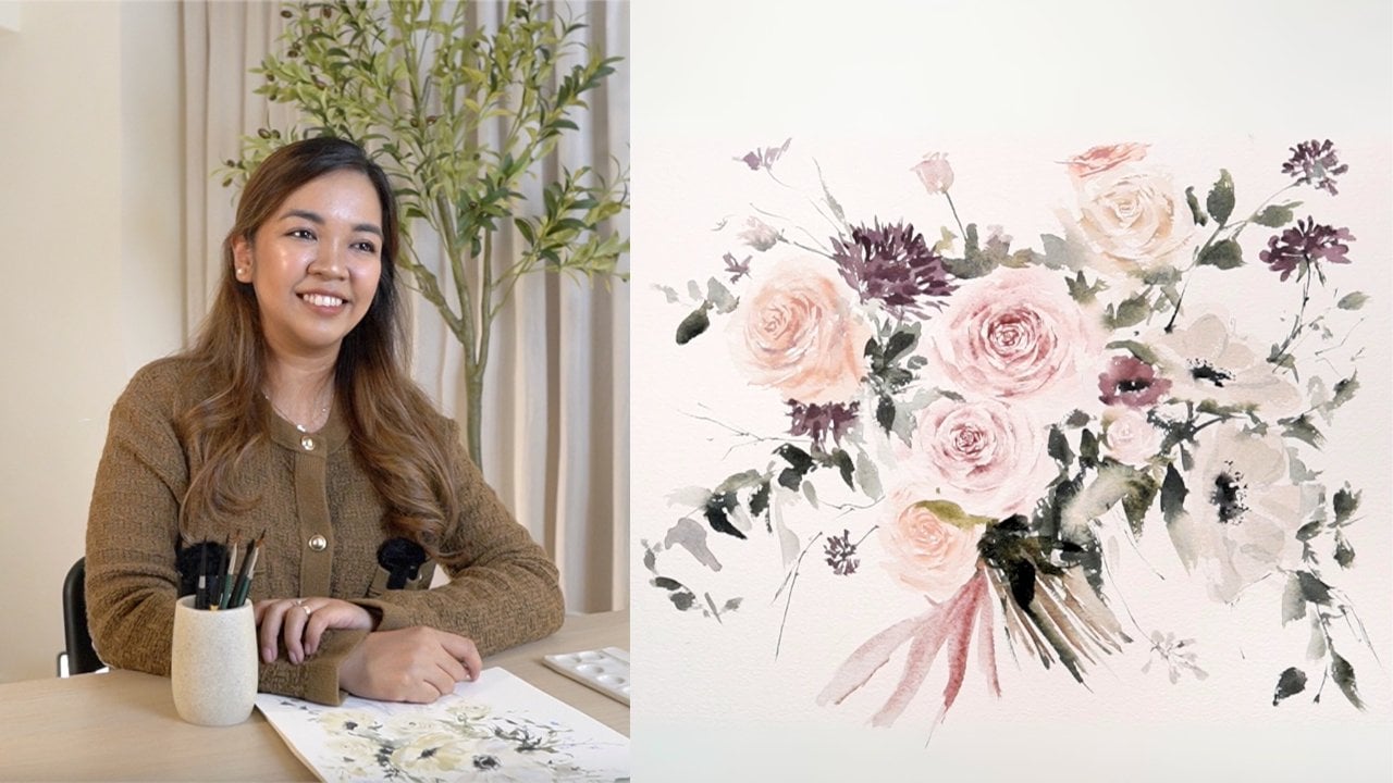
perfect for you. Hi. I'm Jenny Flores. I'm a watercolor
and wash artist, a creative mentor, and a top
teacher here on Skillshare. I fell in love with
painting back in 2016 while looking for an escape from the stress
of everyday life. Today, I teach
thousands of students on how to paint florals
that feel soft, elegant, and full of heart. I've had the joy of working
with different brands, sharing my work with over 81,000 followers on
Instagram and building a growing community
of artists who are learning to express themselves through gentle and
intentional art. In this class we'll explore how to paint expressive florals using guash or watercolor or both. You don't have to choose. I'll be guiding
you step by step, whether you prepare the
flow of watercolor or the opacity of wash. We'll
focus on soft tones, subtle texture, and
expressive brush work that gives your flowers
that timeless charm. What makes this class unique is that we are not just
learning a technique. We are learning how to feel
our way through painting. We'll paint three lovely
projects together. First is a white
gandilia soften area that is perfect for easing
into expressive painting. Then we'll move on to
purple and yellow bells, a cheerful project
that lets us play with complimentary colors
and contrasts. And finally, we'll close
with vintage yellow roses, a bit more detailed, but still loose and expressive
and full of warm. Each project is designed to
help you build confidence, explore freely, and
enjoy the process. I've made this class with
beginners and minds, especially those who want to
paint florals that feel art, not just a copy of
something perfect. Creating this class brought
me so much joy and peace, and I hope it does
the same to you. So when you're ready, pick up your brush and
let's get started.
2. Supplies: Hi, everyone. So welcome to
this topic where I share with you all the supplies we'll
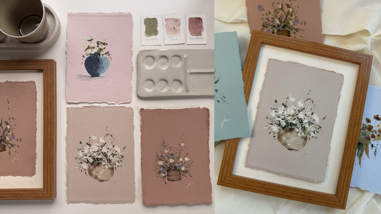
be needing for this class. Let's start off with papers. This class is quite
special because I will be using a special
kind of paper, which is a cotton rag paper. This one is deedge and I got
it from the brand hat paper. If you don't have hat
paper, in your country, you can search cotton rag
paper or deck edge paper, and you will definitely
find a lot of cotton ragged handmade papers that you can use for this class. I'll be using the colored ones, but you are free to use
whatever color that you like. If you don't have
this type of paper, you can use a regular
watercolor paper that is also 100% cotton. And one of the options
that I have for you is my favorite Bao Hong
Academy watercolor paper. This is 100% cotton and 300 GSM. If you like a colored
artwork like mine, you can just paint
the base first. Of whatever color that you want, and then let it dry and just paint the project that
we'll be having after that. Next item that we
need is paints. For the paints, you
have the option to use either watercolor or guash. And as for me, I will actually use both of
them on each project. For the specific color
that we will be using, I'll discuss it on the
projects later on. So for now, you can choose whether you're going to use watercolor or gouache or both. And again, we are doing
expressive painting later on. So even on the mediums
that we will be using, I want you to
express yourselves. Next thing that we
need are brushes. I'll be using quite a lot
of brushes for the class. But, you know, you don't need to get everything
that I have. You can use whatever you
have and maximize those. So for the brushes
that I will be using, I have the silver silk 88, ultra round brush, and size six. And then I also have
the silver silk 88, chisel blender
brush and size six. Then next my favorite
silver ultra mini brush, sign round and size two. And then another favorite
is silver Monza. This one is in Filbert size two and a liner
brush in size one. So again, those are the
brush that I will be using, but you don't need
to have all of these just to proceed
for the class. Just get one round brush in regular size
like eight or six, and then another detail
brush and probably size two, one or zero, and you're good to. Other things that we will be
needing are mixing palettes. I have here my plastic palettes, and they are quite messy, but they are very useful, so I arrange it by colors. You don't need to have
this kind of palette. Any palette, even a
regular ceramic plate is enough for the class. Also need some tissue papers. So we need a lot of
tissue papers and then a pencil for sketching. Just light sketch. We won't
be drawing details later on. Easer. This is my needed
eraser from Favor castle. And then, of course, we need a cup with water
for cleaning our brush. Mine is already dirty, but you need a clean one so that you can clean
your brush later on. And that is it for the supplies that we need for the class. Don't feel overwhelmed. Whatever you have
is enough for us to start as long as
you have a paper, paint and your brush. I'll see you in the next video.
3. Why Expressive Painting is Perfect for Beginners: When you're just starting
your painting journey, it's easy to feel overwhelm. There's pressure to
get things right, the right proportions, the right colors,
the right technique. But what if I told you that the best way to begin is
to let go of the pressure. That's where expressive
painting comes in. Instead of focusing on
accuracy or perfection, expressive painting encourages
you to explore feeling, movement, and personal
interpretation. It's less about copying
an exact flower and more about capturing how
that flower feels to you. And that is why it's such a beautiful approach to beginners. When you paint loosely, you give yourself permission
to make mistakes. You allow room for
happy accidents, for discoveries, and
for creative freedom. You are not locked into
getting every petal right. You're simply just learning
how to enjoy the process. You also build trust
with your brush. The more you let go of fear, the more your strokes
begin to feel natural. This is how confidence is built, not by perfect results, but by painting again and
again without pressure. Another reason why expressive
painting works so well for beginners is that it helps
you focus on core essentials. Things like brush
control, paint flow, color mixing, and emotional tone without getting
lost in the detail. You'll learn how
to suggest shapes with just a few brush strokes, how to play with
water or opacity, and how to create balance
without overthinking. And most importantly,
you'll enjoy it because when
painting feels free, fun, and intuitive, you're far more likely
to stick with it. So as you go through each
project in this class, I encourage you to
loosen your grip, let the paint move, and allow your own style to slowly emerge. Let go of perfection and just
make space for expression.
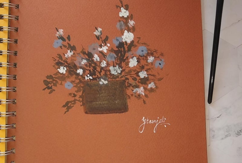
4. White Bougainvillea: In this project, we'll paint a beautiful white Fagin Bela
plant in a textured vase. We'll explore layering,
creating texture, and using expressive
strokes that focus on emotion and looseness
rather than precision. I'll guide you every step
of the way so you can feel more confident as you
create your own project. We'll begin by doing
light sketch of the base. Doesn't have to be precise. We'll just use it as a
gentle guide later on. Next, let's do a light
wash of the base. You might notice that my
wash looks a bit darker, and that's because
of the type and color of the paper
that I am using. But don't focus on that. What's more important
is creating a very light wash using
the color of your choice. You don't need to use Van
Deck brown for your vases. Feel free to use gray, blue, terracotta, or any color
that you personally like. Just make sure to add
a lot of water to your paint to keep it
soft and transparent. Once the base is down, gently add slightly darker
tone of the same color on one side of the vase
to create subtle shadows. This will give your painting
some shape and form. Again, you don't need
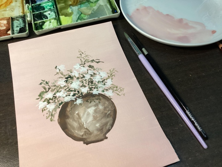
to be exact here. Just let it flow naturally. Now, my favorite
part, the texture. I usually have thick
mixture of white guash or titanium white paint
and just spread it right into the
vase. Just spread it. Don't overthink.
There's no right and wrong in this phase. This is simply your way to
add texture and interest on your base and making
it feel a bit more handmade and
a bit more alive. Now, I'll do the base
wash of the leaves. I'm using a very watery
mixture of olive green, and with a small round brush, I start adding loose expressive
leaves and small stems. Notice that I'm not
literally painting the detailed leaves.
I'm making marks. So have pointy tips. So are just like lions
and some are tiny dots. That's the beauty of
expressive flowers. As long as it's
green, the viewer will always interpret
it as leaves. So there's no need to
elaborate or make it perfect. Keep it playful and loose. A Now let's do the flowers. Just like the leaves
will keep it simple. I'm dabbing my round brush
to suggest the petal shapes. I'm using a mid size brush here, but you can use
anything from size four to size eight depending
on your paper size. For the paint, I'm using
concentrated white guash. My paint is a bit wet so the strokes get
lighter as they dry. This is just the base layer, so we don't want it to be thick. Just keep it light and loose. Now to add dimension
to your composition, we'll paint the first set
of shadows on the leaves. I like to add these
in the inner areas. This is the safe spot
to deepen the values, and it always makes sense visually to have darker
leaves closer to the base. I still add a few
in the outer areas, but my focus is on building
depth toward the center. Make sure to let it dry fully before moving
on to the next one. This helps avoid turning
your composition into a blob and keeps
everything crisp and clear. Once the initial
shadow layer is dry, we'll spread more dark greens
around the composition. These rookes are
still expressive. We're not painting exact shapes. Just let your brush
dance around the piece. Focus on looseness and
emotion rather than detail. These deeper tones help balance the composition and bring
everything together. Now to add dimension
to the flowers, let's place a few strokes of concentrated white on
one side of each blue. These simple strokes
make big difference. They help the
flowers pop and add gentle contrast without
needing to outline anything. Just a few touches
go a long way. Now for the final touches, I'll be re establishing the shadows and
textures of the base. This step is
completely optional. It's really up to
you if you want to add more detail or depth. Sometimes just a few
extra strokes can make the vase feel more grounded and balanced
in the composition. Then I'll add a bit
more texture with thick white paint to enhance the layered
and handmade look. I'm using a slightly
darker version of my original vase color and
adding shadows to one side, as well as near the base. If you feel like your vase
already look good as is, feel free to skip this step. You can put down your brushes and go ahead and sign your work. And my work is finally done. In this project, we
learn how to build expressive florals
by layering loosely, creating texture, and adding simple shadows and highlights. We focus on movement not
precision and trusted that even imperfect strokes can create something beautiful. I hope this class brought you joy and confidence
as you faint, so I'll see you in
the next class.
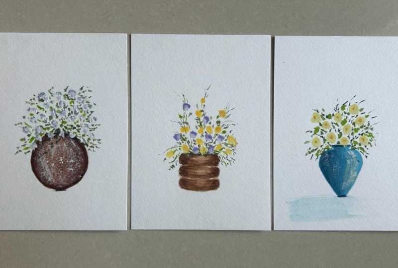
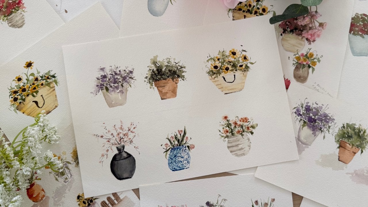
5. Purple & Yellow Bells: In this project, we'll paint a playful purple and
yellow flowers in a vase. A great way to explore color and contrast and
expressive brushwork. We'll focus on layering, adding highlights and shadows, and using loose and
tensional strokes to suggest form without
going too detail. You'll also learn how to balance a two tone floral palette and add gentle foliage and fill in empty spaces
with confidence. It's a relaxed, joyful project, perfect for building your
expensive floral skills. Now let's start
with a very simple, square shaped sketch
for the base. Nothing too perfect. We're
just using it as a guide. Next, we'll paint it using a
light wash of vantek brown. Make sure to leave
a little bit of empty space because this
will act as your highlight. I'm also curbing the
sides just a little to suggest that the vase has
three rounded layers. This gives it more shape
and visual interest. But of course, it's
totally up to you. Feel free to design your
vase however you like. This is a great
chance to be playful and experiment with
your own creativity. Now I'm using a watery
shade of greenish brown to start adding loose lip strokes throughout
the composition. This is the base layer, so we are keeping everything
soft and expressive. The goal here is to build a good foundation
for our painting. Y After that, I am switching to olive green in the same watery
consistency to add a bit more color variety while still keeping the
overall tone muted. Just like I mentioned
in our first project, leaves don't have to be
detailed or accurate. As long as it's green, the viewer will naturally
interpret it as foliage, even if it's just
a line or a blob. So don't overthink this part. Let your brush create
different marks. Some strokes can
be long and spiky, others can be short lines, dots, or even curb dabs. Think of it as
filling the page with visual energy, not perfection. This loose gesture layer
gives your piece movement, rhythm, and that expressive
feel that we are aiming for. Now it's time to
paint the star of the show the purple flowers. I'm using a small
Filbert brochure to create a dot like stroke. Notice how I vary this
shape and size as I go. This gives us more variety
in the floral shapes. And remember, in this class, we are using both squash
and watercolor or you're allowed to use
it interchangeably. So it's totally fine
to break the rules. Just go with what works for you. Now it's time to add highlights
to our purple flowers. I'm using a thick
mixture of white paint, and I'm placing
just a few strokes along the sides of the flower. The simple step add dimension, it makes the petals feel like
they're catching the light. After that, I pick up an even more concentrated
white to add a second layer of highlights to submus small touches on
top of the lighter areas. This layering gives our flowers more life and a
soft dreamy feel, which is exactly what we want in expressive
floral painting. Now I'm using a very deep
shade of purple and adding it into the center of
each flower, a small dot. Now it's time to add a
new layer of leaves. This will deepen the composition and bring in more contrast. We're following the same
process as the first layer, but this time I'm using a more concentrated
shade of green. I personally love using
undersea green for this step. It's earthy, rich and blends beautifully with
our base colors. This layer is where we
suggest shadow and density. So I'm focusing most of the strokes toward
the inner part of the arrangement near the base of the stem and around
the central flowers. That's where you'd naturally expect more leaves to collect, especially in a floral
bouquet like this. The outer parts can
stay airy and light. Just like before, keep your
strokes loose and varied. Some can be lines, some can
be dab, some can be spiky. Don't worry about precision. We are painting
what feels natural, not what's technically correct. These deeper greens help us push the first layer
back and gives your piece a stronger sense
of depth and structure. Now I'm adding the
yellow flowers. These will serve as the second main color in this composition. Just like before I'm keeping the strokes loose and varied. Some are soft dots, others are a bit more curve. The idea is to make
them feel like they're part of the
same expressive style, not too precise, just suggested. I'm using a creamy
pale yellow here, but feel free to
adjust your shade depending on what looks good
against your background. I'm placing this in between
the purples and filling some small gaps where the
piece needs more balance. This color contrast brings in more life and makes the entire arrangement
feel more complete. Now take a step back and look at your work
from a distance. This is the best way to check the overall balance
of your composition. If something feels off
or a little empty, don't hesitate to
add more strokes, extra foliage, or even
a few more flowers. There is no perfect
number of elements. Just follow your eye and adjust
where it feels necessary. This part is all about
trusting your instincts and letting the piece
tell you what it needs. To finish off, I'd like to add a bit more color and
texture to the vase. I'm using a more concentrated
mix of Vandek brown here and adding subtle strokes to
build depth and richness, especially in the
shadowed areas. This adds more contrast
and helps the vase feel grounded and weighty compared to the lightness of the flowers. You can also add small
touches of highlight or dry brush texture if you want to make it feel more
rustic or worn. Feel free to explore and
personalize your vase here. This is a great moment to
add your own final touch. And that is it. We are done with our purple and yellow
bells project. I hope you enjoyed the process and saw how expressive strokes, soft flaying, and
playful color choices can bring your florals to life. Now, go ahead and
sign your work, and I'll see you in
the next project.
6. Yellow Roses: We will start with
a very light sketch of the vase shape as usual. And as you can see, I'm simply outlining the
general silhouette. It doesn't need to be
perfect, and as always, think of this as soft guide
rather than detailed drawing. Keep your lines light and relax we will let the paint do
most of the work later on. Now let's begin with
the base layer. I'm using a very light, milky mixture of muted blue tone and gently filling out
the shape of the vase. Keep your brush
movement soft and even and don't overwork this. This is just a foundation. Allow this layer to dry slightly before moving
to the next layer. Y So our layer will stay clean and it
doesn't turn muddy. Now, we'll begin
building dimension. Using slightly darker
and more pigmented blue. I'm adding shadow on
one side of the vase. Notice that I'm not
outlining the shape. I'm simply placing darker tones where shadow would
rather naturally fall. Already, you can see the
vase starting to take form. Let some edges stay soft while others remain
slightly defined. That variation creates a
very beautiful interest and depth on our composition. Now I'm going in with
even darker tone. So this is where the vase
really begin to come alive. Place the darker value
toward one side, allowing it to overlap slightly
with the previous layer. You'll see how quickly
the volume builds. Don't cover everything,
leave parts of the lighter base visible
so the contrast can shine. Depth comes from value change, not from adding more detail. Now I'm gently adding the tones. If any areas feel too harsh, soften it with
slightly damp brush. If something feels too light, deepen it just a bit. This stage is all about balance. You can slightly
tap your brush in certain areas to
add subtle texture, but keep it controlled
and minimal. We are shaping the vase through contrast and softness
at the same time. Now let's start
building the foliage. Using a watery,
muted green mixture, begin placing loose
leaves above the vase. Don't focus on painting
perfect leap shapes. Just make expressive marks. Some can be short strokes, some thin lines, some tiny dabs. Keep it light and airy. Think of this as building the structure that
will hold our flowers. Now for the flowers, using a
soft creamy yellow mixture, begin dabbing the petals. I am using gentle
tapping motions with my round brush to
suggest rose shapes. They don't need to look perfect. Think of them as little
clusters of light. Leave small gaps between each flower so the
composition can breathe. Keep this layer light and
we'll build the depth later. Now, I am adding a touch of white on one side of each bloom. Just a few gentle strokes. This creates instant
dimension and gives the rose a soft
luminous quality. Don't overdo it.
A small highlight can make a big difference. To add depth, I am
placing a slightly darker yellow in the
center of each flower. This prevents the
rose from looking flat and gives them
more structure. Notice that I'm not
drawing circles. I'm simply tapping
color into the middle. Well, not technically the
middle on slightly upper, some middle and somehow in an area where I want the
center of the rose to be. And I'm just letting
it blend naturally. Subtle value shifts are what
create the venter sharpness. Now we'll strengthen
the composition. Using darker green, begin adding stems and deeper leaves
around the flowers. Focus more on the inner
areas near the vase opening. Darker tones here can help anchor the bouquet
and create them. Feel free to add leaves
anywhere in the composition. Be expressive here because those expressive
strokes can make everything feel more natural. So as we paint this, you will see how this instantly brings more life and
movement to our piece. For the final touch,
let's ground the vase. Using a soft diluted
bluish gray tone, paint a simple horizontal
shadow underneath. Keep it light and subtle, just one gentle stroke. You can soften the bottom edge slightly so it fades
into the paper. This small detail helps the
vase feel stable in space. And that is it for our
yellow vintage roses. We built this piece
layer by layer, focusing on contrast, softness, and expressive brush work
instead of perfection. I hope this project
help you feel more confident with layering
and working with values. Trust your stroke,
let your flowers stay imperfect and
full of character. I can twait to see
your beautiful roses in the project gallery.
7. Final Thoughts: Thank you so much for
joining me in this class. I hope these expressive
floral projects reminded you that painting doesn't always have
to be perfect. It can be soft,
emotional, and free. Sometimes the most beautiful
artworks are the ones that reflect how we feel
rather than what we see. Whether you painted just
one project or all three, I hope you walk away with a deeper appreciation
for loose strokes, soft colors, and the stories that flowers can quietly tell. If this class help you relax, reconnect with your creativity, or simply enjoy painting again, I'd love to hear about it. Please share your
class project in the project section and leave a review in the class
review section. Your feedback helps
me continue creating classes that speak to your
heart and support your growth. And if you would like to
keep learning with me, don't forget to
follow me here on Skillshare and on Instagram. So you'll be notified when
new classes are released. Remember, every brushstroke is a step forward, and
every painting, no matter how simple, is a gentle celebration of who you are and who
you are becoming. Until next time,
keep expressing, keep creating, and I'll
see you the next one.
 Jenny Flores Art, Top Teacher | Watercolor & Gouache