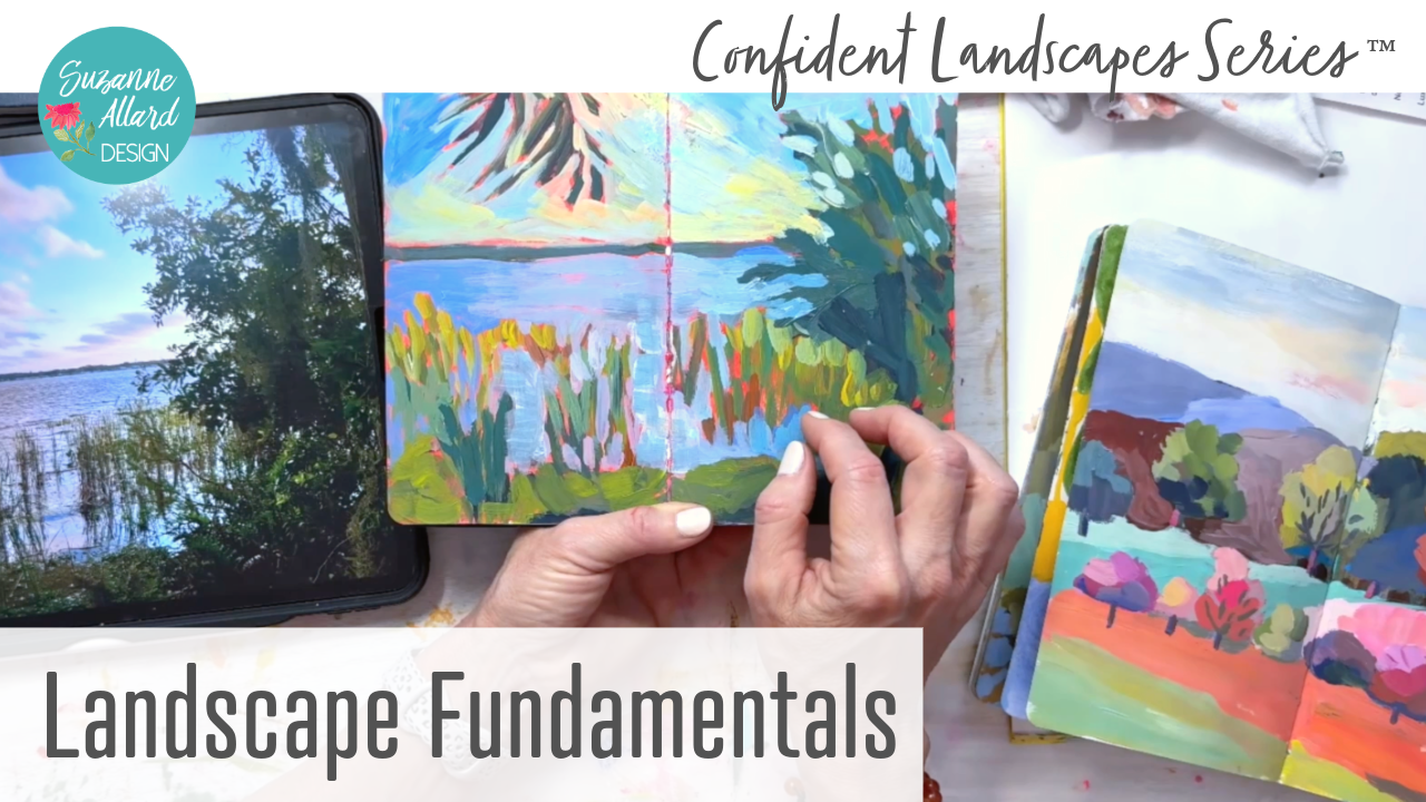
Transcripts
1. Class Intro: Hello, and welcome back to another class with
me, Suzanne Allard. I'm a self taught artist. I've been painting
about, I guess, really concentrating on painting about five or six
years, maybe seven. And I now license my
work and sell my prints, teach classes online, and
love every minute of it. I want to encourage you
because I was scared. I was too scared
to start painting. That's why it took me so long. So, this class, Landscape Fundamentals is
the part that I want you to take before you take my
other landscape classes because as much as
you might want to skip it and just get to
painting a landscape, trust me, as someone
who's tried that, you'll get there
faster just paying attention to and learning
some fundamentals. And, of course, you'll
paint landscapes while you do that in the
other classes. So this class focuses on four fundamental areas that I think about when I'm
painting landscapes. You could write books, and
there are books on this. So I really condensed it to the four main things that I think will
help you get started. And, you know, see
where it takes you. So the four things we're
going to look at are how to take and select the
photos for your landscapes. It really starts there. It's an important
part of the process. If you aren't excited about the photo you're
about to paint or at least have some sense
of how to approach it, then you're kind of
starting from behind. So we'll talk about that. I'll show you lots of
examples of good photos, bad photos, and what you're looking for
when you select those. And then we'll do a
module on composition. Actually, it ends up
being two modules because there's a
lot to talk about. I don't cover every
single composition that would take hours
maybe. I don't know. But I cover the five
main things that I look for that I think are I'm not
going to say most important, but that I think about. And I think compositions one of those things
where you can just study it and study and
study and not paint. So these are the five that I think are the ones that
I pay attention to most. Then we'll talk
about simplifying. You will not hear anyone
experienced a painting, not talk about simplifying, even other than landscapes, whatever you're trying to paint, part of our role
as an artist is to design what that painting
is going to look like, and it's not just
copying the photo. At least that's
certainly you wouldn't be here taking a
class from me if you were interested in copying
it literally because I don't do that. You're
interpreting it. And so you have to simplify it, especially landscapes, because they're so
overwhelming, right? You take a picture
of a landscape, and it's just so much stuff. Mountains, trees, shrubs,
plants, you know, rocks, fences and on and
on, maybe some structures. So we have to learn to simplify. We'll go into that,
and I'll show you several ways
that we do that. And then I saved, I don't know, probably my favorite for
last fearless color. You know, if you've
taken classes from me before that I like pushing
the boundaries with color. I was inspired just, I think, from growing up in
South and Central America, and then I learned
about the Favis FAU VIS T. Yeah, valvestO
valve painters. And they were from France, and they really they'll do, you know, blue or red
mountains and yellow water. But they do it successfully. So we will go into what are
you looking for and again, show you lots of examples, painting changing the colors
so that you don't just have a bunch of green paintings landscapes are largely green. Or blue or, you know, they don't have a lot of
color to them naturally. So we don't that doesn't
need to stop us. And in every one of my
landscape paintings, the classes on specific
paintings we do, you will see me push color,
and it's so much fun. We will also in these modules do value sketches
and the simplifying, so you will have an opportunity to try some of these skills out. In this class, we aren't
gonna paint a landscape. I'm really just setting
you up for success for all my other landscape classes and for any other landscape
painting that you do. Okay, let's get started.
2. Taking and Selecting Photos for Landscape Painting: Okay, so in this first module, I want to talk about
what do you look for when you're selecting
a photo for landscaping? 'Cause it's really important. Yes, if you're experienced, you can do more with a
photo that's not great, but when you're starting out, it's really important to get
those main pieces right. It's the beginning
part of the process. So there are a lot. We're going to talk
about composition and another module and
simplifying and color. So this one is really about selecting the photo
to start with. And then I'll show you a couple of editing things
you can do to a photo. So let's look at my iPad, and I'm going to talk
through good photos, what we're looking for, show you some bad photos and help you make better decisions
when it comes to photos. Alright, so here
we have my iPad, and let's start with
so here's a photo. It's a great example.
My daughter recently went to Thailand and
the Philippines, and I said, I mean, she just got back
like a week ago. And I said, please,
and it's so hard to explain what you want
in a photo to someone. But I said, please
take some photos with a variety of light
and dark because, you know, I knew value would be, that's what we call value. And she did her best. And you could do
something with this. You definitely could. But if you look at it, just
look at it this way. You can see that there's
a lot of sameness here. So I've narrowed it down to four things that
I look for in a photo. The first is excitement. I want a feeling of Uh oh. That, you know, just
that initial sort of, like, heart that, you know, something about that scene
or it could be a shape, it could be the color,
it could be light, it could be the contrast,
could be anything. But I'm looking for
that. And you know, that it has some kind of drama and some kind of connection. I mean, I do and I will paint from reference
photos that I didn't take. But I have to tell
you, there's not that there's something
sometimes kind of missing. It does help if I've
been to the place. Like, for example, I
paint a Tuscany scene. Well, I've been to
Tuscany, and even though the photo I use is not mine, I know how that
feels to be there. So, you know, if I
can have that great, if not, you know, you move past it and
you find other things. So a connection,
a sense of drama. These are all the things that
make up excitement for me, and for me personally, light is very exciting. So, for example, um, this photo is a little
better that she sent because there's, you know, at least some light here
and then bits of light, but it's still not it's
dramatic in its way. And it would be a
challenge to do that. But let's go to favorites, and you'll see some
of the ones that I've highlighted because they
have what I'm looking for. So this is a classic
example for me. Let me turn this
this way. Most of these are going to be this way and it'll be bigger for you. I get excited about
photos like this, scenes like this because I love these bright bits of light
coming through here, you know, just this
light and the dark. And so I really
like golden hour. That's in the evening
photos when the light is, you know, on the side more. And also photos in the morning. I tend to be more of
a golden hour person. I like the golden shade, but there's no question
that Dawn has beautiful, you know, lighting,
too, or after Dawn. But the point is
that the sun is on the side, not coming
straight down. It is hard to make a photo where the sun is coming
straight down, interesting, because you'll see that it
has a lot of um sameness. It just there's not
enough variety. So first thing I look
for is excitement. Second thing I look for
is contrast or value. So value, meaning
lights and darks, like I was just saying
this photo has. And, you know, like, you've got dark
here, light here. Let me show you some
other examples. This one, also, I
like this photo, and I painted it. Actually, I'm working
on a painting of it. If I get it finished,
I'll show it to you later in the class. But I loved how two bits, see how the sun is shining. Let's see if I can make this. I make sure you can see that. There's sun hitting the
bits of grass down here. I thought that was
really interesting, but mostly the way that
it's hitting back here, and then the shadows
were dramatic. And then you have this bit of light here with some of these, you know, disturbed shadows
disturbed in the water. So I just thought this was
and you have a focal point. This is really a good photo. It's got the light
that excited me. It's got differences and values. The other thing, the third thing I look for is clear shapes. So I don't want to
paint something where everything's the same, and I'll show you some especially
like a mountain scene, you know, I'll say
to my husband, Take a photo and
he'll come back, and I'm getting I'm
training him, but he hikes. And then it's a scene
that is beautiful, okay? This is the
thing to understand. You may look at
something and say, Oh, my God, it's gorgeous. But then when you put your
phone up and take a picture, it all looks muted. Now, that's okay. Take the picture and you
can do some editing and, you know, get the values
a little different. And you can also
take a picture with your mind and kind
of remember how, you know, how you really
felt when you saw it. But I don't really want to start with a photo
with a lot of sameness. So in this one, I
have, you know, these shapes I thought
were interesting this tree back those three trees,
maybe it's four. But it made like an
interesting shape. And then there's this shape,
and then we have this shape. And then, again,
the shape here with the grass being divided by this line and then the
shapes of the shadows. So that's the third thing
I look for is shapes. And then I look for variety. So let's look for
another example. I already talked about
the variety in this one, but let's see. By variety, I mean, you know, some
photos are not going to have all the things you want. Let's use this one for
an example, a variety. So this is a beach scene from our summer in Lake Michigan or a couple of weeks,
not a whole summer. And there's so much
beautiful scenery there, but I get out there and I play and play and
play with my phone, and I'm trying to capture this
is Golden hour, you know, some variety because
at first blush, this is just blue
water with greenery. But I'm going to make it much more exciting
when I paint it. So I want to find some variety, and I'm going to put it
in there regardless, but it helps if there's hints of it, you
know, in the photo. So what I loved about this is the golden sun was coloring
this grass here up front. So you have this nice golden
you know, cast there. I'll hold it up so you
can see it better. And there are bits of these dying ferns that have turned red because this
was late September. Then you have, you know,
different textures here, of different greens. You have even the sort of shade, sort of a almost a
turquoise shade here, gray. You've got the
sand, which changes color a little bit, the water, and then you've got this
outcropping in the back. And then the sky was even
interesting that day. Sometimes, often the sky
in Michigan is either just cloudy and gray or blue, gorgeous blue, but
this had variety. So there's a lot of variety that I was able to
capture in this photo, and it's just going
to make when I go to paint it that much easier versus a really Well, so here this is actually the same beach facing
the other way. And in the middle of the day. So this is a great
comparison. The sky is blue. Um, this is, you
know, dark green, lighter green that you still could make this interesting.
You absolutely could. And I actually painted
this partly on the beach. Um, see if I can show it to you. And I started to add I got messed up because I
used these Where is it? Maybe it's in here. I use
these alcohol markers, which I didn't realize
were gonna bleed. Yeah. This is so there's
the alcohol markers, and they bled through, which kind of made an
interesting thing, but it made for too
crazy of a sky. But I might just for fun, paint over the sky
and kind of leave some of this especially
this and the beach. It turned out kind
of interesting. So, you know, you can challenge yourself with
a simple photo like this. You can say, Well, I'm
gonna make a variety of greens here and lots of,
you know, variety of blues. And that's what I was doing. So you don't have to
have an exciting photo. I just think it
helps. Alright, so the four things we talked
about are excitement. Let's find one more. And, um
let's see that I painted. Yeah, let me show you this
one because I painted this, and it has all the pieces.
It has excitement. It has variety. Let me see if I can find
which sketchbook I put it in. I got my So I start a
sketchbook sometimes and say, so look at that
one's upside down. I love that one, though.
Yeah, here it is. Okay, let's talk about
the photo first. So this is in a little Village, Michigan.
This is the river. It looks very similar to a photo I took in
our neighborhood where the pond is, but this is like a
river, and I liked well, the sun, but I sort of said, I'm probably not
gonna paint the sun. I'm probably just gonna
ignore that ball, and, you know, I wasn't sure
what I was gonna do with it. And then I knew,
you know, again, just looking at this,
this is all green. This is all green,
even the water where the shadow is is green. And I thought, Well, no, that's not how
I'm going to do it. But it had variety, okay? So it had this tree, the water. It had even within here
some variety of texture, and I like trees like
this in the background. Clear shapes. I mean,
it has this shape here. It does have this
clear shape here. I wouldn't say it's
really high scoring in the clear shape regard. It does have really
good contrast. We have lights,
and we have darks. And this is kind of
in the middle here. And the excitement was
there because I like this place and the
sun was setting, and, you know, so that worked. So then what I did with it,
though, is I said, Well, I'm going to just make
the sky kind of glowing. I'm gonna have these trees be not detailed because
they're in the background. And so we'll go through
and paint similar things, but this is what I did with it, just to show you that you
can change it up completely. This is a good example of color, so we'll talk more about that. Alright, so I hope I've given
you some things to think about with regard
to choosing photos. Um, Excitement? Does it
mean something to you? Does it call to you? Usually, there's some
element of drama or connection with the
photo or piece. Does it have contrast and
value? That's really important. Don't try to paint
something that's just all the same shade
of light or dark. Look for a variety in that. Does it have some clear shapes or can you invent if
it's a great photo, otherwise, can you invent
some clear shapes? And then I there variety,
variety of texture, variety of shape, size, look out for avoid
a lot of sameness. Okay, let's get to
the next module.
3. Composition Success Part 1: In this module, I want
to talk about what I'm looking for when I'm putting together a
landscape composition. There are lots and lots
of composition resources, and I'll share my favorite
book with you here in a while. But you know, and it does feel in the beginning,
almost like, you know, when you learn to drive if
you remember that long ago, and you're thinking, Oh, my gosh, how am I going
to remember all this? I got, you know, the brake and steering and
the turn signal, and all those things
felt just very, like, too much to
remember at once. And that is how it starts in
the beginning, how it feels. But that's why I say I'm
going to say just pick two or three things
to work on in one, you know, practice session
or even one thing. And over time, what starts
to happen is some of that, just like with driving
becomes automatic. You just sort of
naturally start doing it and don't have to think about that one so much more
so much so you know, I can think about
some other things. And so I'm not going to overload you with the composition rules and rules are made to be broken. But I am going to show you kind of the main ones that I think about when I'm figuring out how I want to
compose something. And then I'm going to
show you this book, too. Alright, let's
switch to overhead. So back to this photo because I think it's
a good example. Make it this over here for now. And I'm also going
to show you a couple of paintings that I'm working on that I do not
have solved entirely yet. And I think that would
be instructive, as well. So that's one of these. So this is the photo, and then this is the painting
where it is now. And I like a lot of
what's going on in this. And, you know, obviously, this tree was going
to be kind of, you know, the bigger
player in shape wise. But then these guys grew, and I also wanted the most
exciting thing for me, as I said before, is the
light coming through here and hitting the way the
sun's hitting the grass. And, of course, we'll
talk about color later, and we'll use this example, as well. So I've achieved that. But the reason I'm paused on this and just
giving it some time to marinate is that I
feel like uh too much. So, I feel like my eye is going
over here because there's a pretty orange
background popping through and here and then here. And I want to work more on kind of getting more
focus compositionally. So I'll probably make some of this a little
less exciting so that some of this gets more exciting and bring through some
of the background here, the pink so that
this becomes more like we kind of look here, and then we look here
and maybe down here. Anyway, I'm nitpicking
because, you know, as I look at this, it's not bad, but I just it's not quite there. So that's one example. Actually, this is
a good painting to talk about the rule
of thirds example. That's my first composition
thing I do think about. Rule of Thirds, you
may have heard of it is based on the idea that
you take your image, and I'm just going to
use paint brushes, and you divide it
in thirds this way. This painting is dry. And then you divide it in
thirds this way. Okay. And I didn't measure this, but that tree is right there. I do eyeball it. Maybe just
because I'm right handed, I do tend to like to put
my focal point there. But sometimes it's down here, but the rule of thirds
says that your focal point should be around one of
these intersections. In other words, not out here, and that's what I
was getting at here. Because that delicious orange that I like to let show
through is showing through, and the pink is
really bright here, my eye is getting drawn
to this too much. I really love that section, but I don't want my viewer
falling off the painting. So I can bring that same
excitement over here and here. And you don't want
your focal point to be basically out here is what
this rule of Thirds says. Now, you can find an artist who does really
well and breaks this rule. So that's why I say rules
are made to be broken. But I do this is one
of the ones that I consider the rule of Thirds. The other thing I'm looking
for when I compose something, let's pick another
painting to look at. Um, this is a good one. I'll cover cover this whoops, so you can see it easier, maybe. So, I actually did
this one sitting. I just seeing what I dropped. It's a painting. It's okay. There's always paintings
falling near it. I was actually sitting
outside and painted this in a really kind
of relaxing setting, which I don't hardly ever do. From life. I took a picture as well, which I always think is a good idea, but the reason that I chose
it when I was, you know, walking around trying to
figure out what looked interesting was of course, we have this tree here, which was kind of right in that
rule of thirds area. And then there was variety. You had this little
pond, you had that tree. And I did take some things out, which you always have to do
in a photo, at least, I do. Then you have the sun hitting
these trees back here, which was just beautiful. And then you had, like, this path and then just leaves and things that
were different colored here. But of course, I took the
color to another level, but there was variety in this. So I look for that. I mentioned variety
when choosing a photo. So if you choose a photo
with variety, you know, just make sure you carry that variety over
into your painting. I also think about focusing the eye of the
viewer when I'm painting. So here's a good example. Let me show you the photo first. Of this, 'cause it's fun to
see the photos, isn't it? I love when artists show
the photo because then you realize how much they did
with the photo they had. So, this was a photo. Let's see here. Here it is. You know, it can look like, not that exciting, but
it did have the shadows. And in real life, it
was much brighter. And I remembered that, and I just love this view. It's a golf course. So
I painted this of that. I know you're gonna
say, What? Where'd you get all those colors and things? We'll talk about that, but
that's how I make it exciting. But in particular, I think
this painting is good at showing focusing the viewer, because instead of just having this big chunk of
green grass here, I decided to make, you know, shapes and bits of
grass and who knows what really kind of
bringing you in here. And then this already
kind of brings you in. It's a hedge here
with some bushes. But I just made it come
in a little further. And then you've got these shadow lines,
which I exaggerated. And I just feel like it all works to kind of
bring you in here. And then I made the color
most pronounced here, but also the light
really hitting this tree and bouncing
off a little bit here. So I feel like I remember
when I was painting this, just kind of bringing
the viewer in. If the viewer gets caught
by this pretty pink here, they're going to just
follow it up into here. Same with this orange going to kind of follow
it up into here. And then down here. So I don't feel like there's any place in this painting
where you fall off of it. And the best way to
test that is just, like, close your eyes
and then look at it. And before you can
think too much, notice what your eye does
it'll jump around really fast. And then you can
assess that more. Let me give you an example
of one that I need to solve an issue on with
this focusing viewer. So, this is a painting. Let me find the photo
again. Let's see here. Okay, here it is. This was actually I didn't take this one. I honestly can't
remember where I got it, but I knew I wasn't
gonna copy it exactly. So I knew I didn't have
to worry about that. I don't think it's one
of that my husband took in Portugal.
I don't think so. But anyway, so
here's what it was. You know, obviously, all this
color up here is exciting. And what I did with it is, I didn't want this I don't even, I guess that's a
side of a fence. Yeah, it's a fence that's going that way and it's
in the foreground. But to me, if your
eye caught that, it kind of went out. So I
didn't want that there. And I saw this kind of
line coming this way. So I wanted to bring
the viewer in. So I brought what looks more like kind of
a road coming in here. And then, you know,
your eye goes, Wow, that's so yummy. And then, you know, hopefully
you kind of get up here. Now, I wanted the
eye to land here, but what's happening,
I think, for my eye, anyway, is this orange is
just a little too bright. And so I look at this, and then I come over to
all these juicy colors, and I kind of stop, and I
never make my way over here. So a couple of things
I can do to do that. I can just subdue this orange. I still can leave it orange, but just knock it
back a little bit. And I can also brighten this spot that the sun is
hitting just a little bit. And I have a little, you know, this stuff
in the background, I don't want it too detail
because then my you know, stuff in the background
should be as you go back, it should be less and
less detailed, okay? So you have to be careful to
not. We'll talk about that. That's another composition tip, so I don't want to go in and
put a bunch of detail here, but I might put
just brighten this, put a little bit
of texture here, something a dual
strategy, basically. Make this go away a little bit and make this come
out a little bit. And then I hope I'll have what I'm looking for for the viewer. Alright, so that's
Focus the viewer. And got a couple more, but I think we better go to the next video for that so that this video
doesn't get too big.
4. Composition Success Part 2: Okay. Continuing composition. So so far we've done
Rule of Thirds, looking for variety and
focusing the viewer. Now, this one's easy. Let's do avoid the
Middle horizon. And I'll also show you an exercise that's
kind of good to do. So this is the same photo done two different ways.
Let's go find it. It's actually the
same golf course, but just cut off. The big tree is
over here and cut, you know, just crop differently. And it's a great
exercise to take a photo and paint it twice. And a sketchbook is a
great way to do that because you've got, you
know, right there, too. And you can do the same colors. So you don't have to
mix colors twice. But I sketched it out
differently, and, you know, you can see this
slight variation in the mountains in the
shapes in the back, even in the front, the shadows all come in kind of
diagonally here. There's a little bit different. The tree is kind of
in the same place. But, you know, so it's just fun to play and say,
well, let me try, like, a dry brush technique here, and let me try, you know,
something else here. So by avoiding the
middle horizon, though, which is the tip
I'm giving you now is you make sure that you are and you can think about this when you're
taking the photo, too, because when I'm
taking the photo, I want to either move my
phone up or down so that the horizon is not right in
the center of the photo. So like this one. Alright, so it's up
in here. Whoops. And I've done this, I'll hold it up and you have half green, half blue. No Bueno. You want you can either if the sky's really interesting
and you want more sky, then lift your camera up, get more sky and, um and then when
you're painting, you know, just look
at your composition. You can always crop it. So let's say you
did take a photo. Let's find one that's Well, that's one of the
ones my daughter sent me from the Philippines. It's kind of in the middle, but I want to find one
that's right smack in the middle and kind of
boring because of it. Show you how you would
potentially resolve that. Well, here's one. It's
kind of in the middle. At least it's coming down, but it's still too middy. So what I would do is
go to edit and crop. And this is just a great
tool because let's say, yeah, we're editing this one. The only interesting
thing really about this photo when I took
it was the fall color, and it's so much
less visible here. But, you know, I can remember
that and accentuate it, and I can also
saturate the photo. But if I didn't want you
know, I make a decision. Do I want more sky or less sky? And so I can go like this
and kind of bring folks, the cropping more like this. And now you can see that my horizon is not
right in the center. And I still have that
interest of that darker blue, but it's a better composition. So just avoid that straight
across the middle horizon. Alright, now, the last one and certainly not
the last thing to focus on that you
need to be aware of, but these are the main
ones with composition. But atmospheric perspective is what I want to talk about next. And we can use this.
We can use this one. So perspective. What we're trying to show
is that certain things are closer and certain
things are further. And one of the ways we
do that is what's called atmosphere perspective.
And you can see this. Anytime you look at
mountains that are far away, they will have a
blue, whitish cast. They will look, well, especially here in Virginia,
the Blue Ridge look blue. This is the Blue
Ridge Mountains. But they aren't bright blue. In fact, this is a
little bit bright here. I left it because it
was a shadow area, and I just wanted some
variety back there. But let me show you in the
photos, I did come out. You know, here's
a great example. See how those Well, they're they look
more white to me than they're looking as I
see them on the camera. They look more saturated. But they're sort of a pale blue. And even here, you can
see these back here. Well, again, it's
funny. I'm seeing them. I'm seeing them the way
they're recording here, and they look more
turquoise, but they're not. So the further away it is, even this, though, this
is a good example. This. See how these are
trees just like these. Do you see the
difference? It's huge. So we say, Why are those
trees not as green as these? Because of atmosphere.
Atmosphere makes things. It has to do with
humidity or air. I don't know the science of it, but you can see it
when you look around. And so we want to convey that. So the thing to
remember with that is stuff that's
closer is going to be more saturated and warmer and stuff that's further is
less saturated and cooler. Maybe just remember if
it's cool, it's far away. And just think naturally, when you look at something
that's far away, it's less detailed,
it's less saturated, and it's cooler in temperature. And you'll see that
that's something that I'm thinking
about all the time. So here the mountains are
a desaturated purple. If I made those mountains
which are far away, bright pink like this,
that wouldn't work. Now, let's say I wanted to
make a whole painting in pink or that would be an
interesting exercise. I could maybe make
a pink tone that is very unsaturated and light, and I might get some
atmospheric perspective. Alright, those are the main
things that I think about. I'm sure others will
come up as I'm, you know, going through
these paintings. But those are when I'm painting, those are the ones I'm
really thinking about. And if you want to go deeper, I think he's just amazing
when it comes to composition. And this book is amazing. I think it's still in print. Yeah, I'm sure it is. Mastering composition
by Ian Roberts. He he goes into all the
details about you know, creating depth
like with overlap, which is something that
I do in some paintings, but he gives examples. He talks about the rule of Thirds and some of
the things I did, but he gets deeper into color, and it's just, you know, I highly recommend it if you want to have a good
book on composition. Alright. Let's move on to the
next fundamental skill or fundamental. You know, it's really they're really areas that you want to think about when
you're creating a landscape. And if you have
these fundamentals, it's so much easier
to paint from them. So if you're like me, you wanted to ignore all
of this and just paint. But you'll be much happier
learning these fundamentals.
5. How to Simplify Landscape References: You will hear a lot
about simplifying photos for painting from
landscape painters, really any kind of painting, unless you're just doing, say, an orange or something
that's very simple already. But with landscape photos and
compositions and paintings, it's even more important because a landscape is so
overwhelming on its own. You know, you have especially if you're not yet trained
to not see the leaves, and then you might
think, Oh, my God, all these trees and
all these leaves and these bushes and
all these branches, and I have to paint
all of this, and I don't know what to paint
and what not to paint. And it's a lot. So we
learn then to simplify. And that's really
where the artistry is. It's really like it's
designing because you're taking that photo
and you're saying, Okay, I'm going to select certain things that
I think are interesting. To feature in this painting, and I'm going to get rid
of lots, a lot of things. And the process to go through to kind of get to hone that
is really great practice, and there are many
ways to do it. So I'm going to cover some of the ways that I've discovered, and I still keep discovering
ways to do it and, you know, playing with different
ways to make it easier or more fun,
more effective. So let's dive in
and I'm going to show you one way with procreate, and then we'll go old school. So let's switch to the
overhead. Alright. So with procreate, or doesn't
have to be procreate. It could be if you have Canva, Adobe Express, even
on your phone, I think it's a little harder
because you're trying to, like, draw with your
finger on your phone. But I just want to
show you this quickly. This was a photo that I
already let's take out the This is the photo
that I started with. Which this is an actual
photo. It's not doctored. It's this incredible sunset
hitting Lake Michigan. And in front of it is
the OminaFlower farm, which is one of my favorite places to
go and pick flowers. I go see her every summer
and hear all her beds, and you, you know, pick. Now, I wasn't there
at this time. She took this photo and
put it on her Instagram. But if you want to
follow her, it's Omina Cut Flowers OM ENA. Anyway, but I knew if I just started
trying to paint this, there was a lot going on, and I was going to
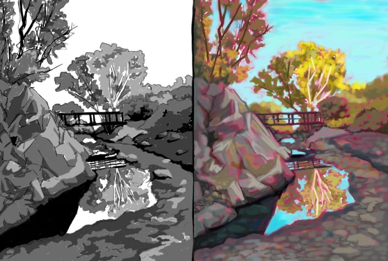
end up frustrated. So first, I took the photo and desaturated it
and made it blurry. Probably can't tell
how blurry it is. Blurring is a
really good way to, um, help reduce some detail. A lot of artists will
tell you to squint that does the same thing,
so you can squint at it. I just I don't know,
maybe I'm too vain, but I don't want to
squint a ton. I do. I do when I'm painting.
I do look and squint, but this achieves
the same effect. When I blur it, then I don't have
to keep squinting. I do occasionally
squint to check things. But what the squinting or the blurring does is
get rid of some detail, and it helps the values really pop out the lights in the darks. So then I worked over time. It wasn't like two steps, and I created this over it. And I forced myself to use, let's see how many values one, two, three, four, five, Yeah. Sometimes I'll do
three, three to five. Don't do any more
than that because the whole point is to make
yourself simplify it. And I had to go back and
forth and say, Okay, do I have the right you know, do I have the right values? Let me show you here.
You know, the lights. Right? And I had to make some changes when
I realized, you know, this water is just as light
as this building, you know? And so I kind of go back and forth until I got
the value sketch. And then painting from
this will be much easier. Now, I could take it a
step further and pick some colors and come in
with color and a sketch. And this is just shades
of gray, basically. So I could come in and make some color decisions with Procreate as well before
I started painting, or I could just leave
it this way and play with the color
in the painting. So here are some other ways, kind of old school ways. Well, the oldest school
way is to actually do a value sketch. And so we're going to do
one here in a little bit. But I want to show
you some other ways. One is you can print
out a photo of it, you know, your reference image. And this was a scene that I thought was interesting
with four trees. It's actually five. But I used marker to kind of simplify some of the
shapes and also the values. So I had my dark markers here, and then, you know, lighter. And I was also playing with
color here at the same time, which we'll talk more
about in the next module. But this helped me just
see things in chunks. I colored over the darker bits
here, the darker, darker. And that's one way. Another way that I've
seen artists do is, again, I printed the photo. This is a print, and then
I painted the exact photo. So I eliminated a lot of detail, cause remember, this
is that same photo. Let's pull the photo up
again so you can see it. That same photo, that golf
course that I've done so many times, here it is. And by making myself
paint over it, I was able to just say, Okay, I'm not going to
paint each one of these little shrubs here. I'm going to paint that
section one color, one shape. Basically, make things shapes. And so that's one way to do it. I painted right on
my printed photo. Now, that way
doesn't allow you to change it too much other
than to make shapes, but it doesn't allow
you to move things around. So just understand that. That happens more with
a sketch, really. Oh, and then so let me show
you though before I move on, this one that I did this
way, led to this painting. So I started with this, and then I looked at this. Like, this became my reference. I didn't really use, you know, the original photo. Alright. Now, a value sketch. So we're going to do
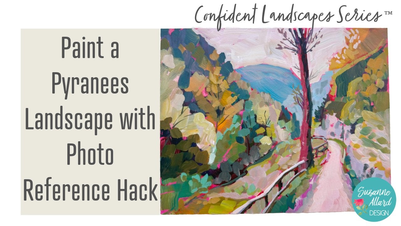
one when we paint this. I'm going to have a
class coming up on that, a class or a module, and
that is in the Pyrenees. But you can see here that
in this little notebook, I've done value sketches. Quite a bit. Uh, it's something that I fought. I didn't
want to do them. I wanted to just paint.
And then a little trick is that I learned the hard way because I would do these
sketches of a photo. And then when I was
ready to paint it, I couldn't find the photo
and, you know, on my phone. So finally, I started
putting the photo number. And if you don't know where
that is, let me show you. So every photo on your iPhone, and I think Android's probably the same has
this little info, and then each image
has a number 5307. And so I would put
the number here so that let's say like even now, let's say I sketched this. I don't remember where this was, but this looks like it could
be a really cool painting. So I would go to 3243 in
my photo app and just search Image 3243 and search. Yeah, this is an update. So I hope that it's
still working that way, but I've got the image
number. I can find it. And so that really helps. Alright. Now, library. I want to find a photo, and we'll do a
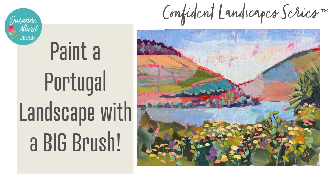
little value sketch. Let's go back to my this photo. We're gonna crop it, though. This is a photo that I took
from the train in Portugal. We were headed from
Lisbon up to Porto. And there was this
beautiful farmland, and I was trying like crazy
to just capture some of it. And I love this photo because
there's just, you know, when we talk about
leading the viewer in, there's this wonderful
vine coming in. There's this, this. There's
a lot coming in here. But there's also a lot going on. So I duplicated it
so we could crop it. And play with some compositions that maybe still
capture some of that, but maybe not that front
road that was down here. There's so many ways you could actually do a
portrait like that. That's another great
exercise is picking one photo like this and doing multiple
compositions with it. So I'm going to go with this because we have this coming in. Now, just a composition trick. You would not want
to have this line coming right in from
the corner. Just Just stay away from things
going right to a corner. It just doesn't
have a good feel. I don't know if you can see how that just
doesn't feel right. So we keep it out of the
corner, and it's coming in, and then this makes, like
a nice vocal point here, right in the rule of thirds. Our horizon is not in
the center too much. Well, almost but not quite. So we could just bring that down a little bit so that this
horizon's not in the center. Bring that in a little bit.
And let's play with that. So the value sketch
is really simple. We are not learning to draw
here, as you can tell. We are working out in our mind, how are we going to take
something with this much going on and get it to something
that's manageable to paint. And you can use for your sketch, you can use pencil and just use less pressure for the lighter
areas and medium pressure, and then, you know, heavy
pressure for the dark. That's the simplest
way to do it. I happen to have these markers. These are Tambo
watercolor markers in these different levels
of gray that I like to use. And then I use sometimes the white of the paper
as a fourth value. So that's what we'll
do with this one. I am sketching, not
just for value, though, because if I
practice this sketch, it'll help me with
the sketch that is that we're gonna put on, you know, that
we're gonna paint. So, you know, if I
make sort of a frame, and you can do so many of these. So don't get hung up on, Oh, I screwed this up or if you do, and if we do on this, then
we'll just do it again. So I tend to look at where
these things on the side are. This is a little
bit above halfway. This is a little
bit below halfway, but this is not quite in equal thirds, which
I wouldn't want. You would not want,
like, you know, the same amount here,
same amount here. Remember, you don't
want sameness. So this kind of
comes in like this, and then these trees. And this areas sort
of right in here. So trees come down like this. So first, I'm going to
just get this sketched. And these trees kind
of come like this, and then they're a little
taller and kind of come down. And I mess up these
sketches all the time, so I end up redoing them, saying, no, that's not. And it's not so much
that you have to get it the way that it is because no one is gonna
see your original photo. So we're not trying to make
it look just like that, but we do want to
make it look like some aspect of it makes
that it makes sense. So here we have this tree
kind of comes up that high. So I've got my main shapes. Here's where you start
making decisions. So here's the
mountains back here. And I'd want more mountains. So I think I bring these here. And even that's just something
I can learn and say, Okay, when I paint it, you know, I want a little
more mountain here. I want to make sure and
get more mountain here. Now I can decide how much of this stuff
in here do I want? Do I want this whole
section of shrubs? I do want these. I know that. So I'll go ahead and put well, kind of loose shapes here
for those a little more. And I like this sort of garden. I think it's a garden. It's
got different texture to it. So I think I want that in there. There's also this wall there
that's kind of interesting. So I might do something with
that. Here's the garden. And I think I'm leaving this
whole thing out because it breaks things up, at
least in this sketch. Or maybe I'll put trees here and kind of have them Whoops. I was thinking about, do I want these trees
directing me that way? You can play with it. Kind of leading the viewer that way. I do want some interest here. There's trees here, and
we can, you know, again, no one's gonna see
your original photos, so you can put trees
wherever you want them. This will make this kind
of more interesting. So now let's grab and do our values. So
I got this sketch. I'm gonna take my darkest, and I'm just gonna put in where
I see the darkest values. And I'm not being
precise, obviously, I'm just kind of notating
where I see them. Definitely along
here. The bottoms of trees are generally dark,
even if they're in the sun. And then back here, This is not as dark there,
but it is over here. But you can see
how even this back here is a little
less dark than here. That's some of that atmospheric perspective showing through. And then my lightest lights. So it kind of helps me to go from the darks to the lights. So we've got the sky, which I could have left
white for a fourth value, but I guess we'll
do three values. I don't know if I'll
put any of these cows, but I might cause
they're a bit of light, and they're in here
in the and kind of might be interesting to guide
the viewer up in there. This is going to be interesting. I don't want it to
be I might just put something like this
to remind myself I see the mowing lines because I'm not gonna want that to
be just one big section, so I just might do this
to give me a hint. And then a lot of this is
is this my middle value? Yeah. A lot of this
is middle value, so these trees down here underneath. You will hear also people
talk about composition in terms of not having
too much of one value. There's a lot of
mid tone in this. Well, not having matching. So don't have the same
amount of light, dark, and mid have one that is
kind of more than the other. So and most compositions
I find are kind of mid for the most part.
This is lighter. I'm not gonna even though
it's not as light as that, I'm gonna go ahead and put it that way in my sketch
just so that I remember that it's on the lighter side, at
least up in here. It's kind of lighter here, and then it gets a
little darker over here. So we're being forced
to make these decisions that are more extreme
than they really are. There's some bits of dark
through here through this. So that's an example of one attempt to simplify this.
I might do another one. I might do another
one after that and change things a
little bit or put like I can already see there's a little bit of dark in here, and this is a dark tree cause I feel like
when I look at this, there's not enough bits of dark. So then I can just look and say, Where would it make
sense or where have I potentially missed
any? That's enough. Alittle bit, little
bits here and there. The top of that wall
was dark, actually. Yeah, so it just got a
little more interesting. And this is that tree. These are the these are the mountains which
I'm gonna keep light. So I've colored in everything. Everything except this road, which is really not a road
is a creek. There we go. So again, I might
do another one and then simplify even further. But now, see, instead of
just sitting down to paint with this, I've
learned some things. That's what I like
most about this. I've learned some things about
what am I even looking at, what's important to show
up in this painting. What's interesting about it? What do I like about
it? What am I trying to convey or what do
I want to capture? And so, doing several
Sams right now that this should continue along
here to connect these Um, anyway, it's a great exercise. I'm a believer 'cause
it ends up saving your frustration and time
later in trying to work out, which I've done, speaking
from experience, trying to work out these
kinds of decisions on, you know, on the paper
or on the canvas. Alright, so that is those are some of the
ways to simplify, and highly recommend them. Again, you can go deeper. And in fact, in
Ian Roberts book, he does talk about value
sketches a lot, as well. But that should get you started. Alright, color is next.
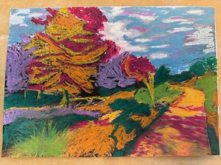
6. Fearless Color, Re-imagining Landscapes: Okay, let's talk about one
of my favorite subjects. Color, color, color, color. So from the beginning, I personally did not want
to paint landscapes that looked like the photo or look
like what I was looking at. I wanted to paint
scenes that Um, I want to deal paint
how they made me feel, how the excitement that I felt. And I happened to convey excitement through
color and through well, I guess, also light
and also brushstroke. I mean, there are so many ways, I suppose, but I love color. And so for me, I wanted to learn how
do I take you know, uh, say, a landscape,
they're mostly green, right? I mean, when you look at them
and you take the picture, we all have that feeling of taking a picture
because you're like, Oh, my God, it's
so gorgeous, and then you look at the
picture and like, Oh. So it just doesn't
capture it for you. So at first, I just would
put lots of color in them. And that's a great way to
start, too, just to learn. But then I learned
that, you know, like we talked about, you
know, bringing the eye, the viewer in so that, you know, they're focused on where you want them to be and not
just color everywhere. And so I've learned to well, I'm still learning to play with color in a way that conveys
the excitement I feel, but also makes sense visually. And the way that that's
done is through value. So just with your values, your colors, your
darks and your lights, I mean, to really simplify it. But this is a painting
or this is a photo. Let's look at this photo
that I did for a class. This is the photo they gave us, and I saw all this green, green here, green there, green. And it is a really pretty photo. And we've got this beautiful
boat and the reflection. But I didn't want
to just paint this. And so I painted this, and I changed the mountains the closer ones, not
the really far one. The far one I still
have in that, you know, that blue that shows up in mountains that tells
us it's in the back. But I just played and pushed
the color a little bit. I pushed it in the boat, and I started with a
bright underpainting, which I always do almost always. And yeah, so I really enjoyed
changing it like that. And that's part of the challenge that I give myself
when I paint is, how can I use color in a more exciting way than
than trying to match. So I don't try to match. I try to match value
but not color. So if it's dark, I need a dark. If it's light, I need
a light, if it's mid, I need a mid for
things to make sense. But I don't try to
say, Oh, you know, I need to match
that shade of green because that's not
even the shade of green that it
turned out to be. You know, so here's another
example. Here's the photo. This is also taking a lot
of artistic license with this photo because I knew that back here
is Lake Michigan. This is a beautiful farm on Lake Michigan, but
you can't see it. You've got this warehouse
building here and see, it's just a big, ugly building. And I loved the barn and the trees and the way the
sun was hitting the trees, but I didn't want these here. And I also wanted things more colorful because I
wasn't gonna just plant, paint a bunch of If
you look at this, it's pretty much the
same shade of green. Almost all of this. Is
a little more subdued. There's the bits
of brighter spots, but it's pretty green. And then you have
all this green here. Oops. So this is what I painted. I got rid of the buildings. I put the lake in. I put
the sun hitting the trees. I've got the garden here. I have some green.
I do love green, so I don't want to go to
the point that there's no green. But I've got things here. I changed where the
road is to come in so that it
brings your eye in. And then I put the
one telephone pole, which kind of adds
some interest. And I really had
fun with this one. I've got some pink on the barn. And so I both simplified
the composition, and I also went with
the colors I wanted. The trees that I wanted to be more of the focal point
was this big one here, so you'll notice that
the rest of them are still have color,
but they're subdued. They're meant to sort of
be in the background. And that's one of the things that I've learned as
much as I love color. If you look at,
say, my work from a couple of years ago,
everything's colorful. And I've just learned
that I can love color, but when everything's colorful,
it diminishes the color. Alright. Let me see if
you have another example. Well, this is a good example of taking a photo of it was
kind of a fall photo, and these are the mountains
in the background, and this is not done, but it's kind of my first or second pass. I think it's a
first second pass. And I got really juicy with
the brushstrokes here, but I definitely accentuated the color here and enjoy that. Here's we're going to
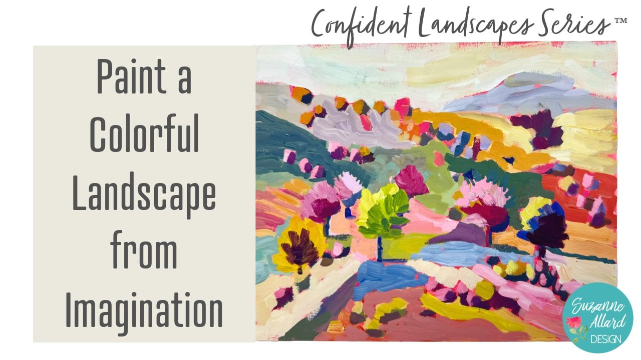
work on an imagination, probably an imagination
landscape in module class. But this was from imagination. I say that, but, you know,
I've been to Portugal. I looked through so many photos. This is one of my favorite
paintings I've done, and I think it's
because I sort of built to structure the
sketch from imagination, but you have to
think about all of the photos I had looked at. But I guess the reason I call
it imagination is I wasn't looking at one photo like we are for the
rest of the modules. I was, you know, thinking about composition and putting in the elements that I like and then using color. This one also was, you know, a lot of color choices. You know, this was not pink here where the sun was hitting. I tend to like to use pink for
the sun hitting something. And this is that example
earlier that we looked at. Oh, let's find the photo again. Where did you go? There it is. I really used color
here because I knew I was not going to
just paint all this green, green and, you know, browns. But I used the photo as
a jumping off point. There's definitely,
like, some bright yellow there, and so
I put that there. And then this looks more turquoise. So I've got
some of that there. And I love painting
and around trees. I've got that there. I really
like how it turned out. Here was another one
from imagination that I think when I
put this on Instagram, people loved it more than
just about anything. And I did mountains, and then, you know, I was playing with
tree shapes and color and keeping things simple. So, in a way, sometimes
the imagination ones lend themselves to
being even more simple. That's why you have
to make sure not to get too attached to
the photo and too, you know, too deep into
the details on a photo. Alright, so here's what
I want to show you. This is when we were
living in Florida, and I went for a
walk in a park in the morning and or
maybe it was evening. I don't remember. And I got this wonderful photo, and then I did this with it. And I was simplifying it. With my bright
background. And I did stay more true to colors in this one than
the ones I've shown you. But I just exaggerated. So the brighter the tips of this red are being
hit by the sun, so I exaggerated that. Got some of the
purples in there. The sky is exaggerated. But because I painted it in this bright fluorescent
De background, that, you know, jumps
out at you more than if I had just done
it on a white background. Everything I've shown you
is an example of color, so we'll get into that
more as we paint, but it's so fun to be able
to be color liberated. And, you know, the
favs did this. I don't know if you ever
heard of the Favs FAU VES. I have a book by them,
but there were well, Matis, but also more, I think of Andre Derain and I talk about and do
one of my painting one of my classes on on colorful abstracts with one of his paintings of inspiration. But when I discovered them a few years ago,
I thought, Well, this is what I've been doing
or what I want to do more of because I've never wanted to stay with
traditional colors. And so it validated
everything and just Google FAU VS and you'll
see and then do images, and you'll see how they
would make the sky red or the water red and
the mountains yellow, and really anything goes. But anything goes as long as you have the
values, you know, if you have your
darks, if you have some darks and some lights, and they sort of make sense. Like, the way they make
sense here is I've got the dark bits on the
bottom of the trees. I've got them on the one side of the trunk because in my mind, the sun is
coming from here. So I've got my lighter values hitting here and here and here. And so it's a matter of
keeping these things in mind, but don't get
overwhelmed because as we go through and paint, and as you start thinking
about, you know, as you practice more, some of this becomes more automatic. Not that I'm there, but more and more of it is
becoming automatic. So anyway, I hope
these fundamentals really help you get off
to a great start with my landscape classes and modules because you're going to apply these in
every single one. And without these, you're shooting in
the dark a lot more. With these fundamentals, you set yourself up
for more success. Okay. Let's go and
paint some landscapes.
7. Bonus: How I use a Bright Underpainting: Alright, I wanted to
share why why and how I love using a bright
underpainting in pretty much all my work. Sometimes I don't, but
for the most part, I do. So I'm going to show
you some examples. I'm going to show
you how I apply it and the different ways
that I play with it. And yeah, let's
just take a look. Um, in a nutshell, though, the whole idea of an
underpainting is, I mean, some people say it's
just to get rid of the get rid of the white canvas. You know, it's not
just for that, but partly does that kind
of gets rid of that white. But most people do it because there's
just a little bit of magic that happens, and I'll show you that as
you're painting and as you thoughtfully leave bits
of it showing through. It's also called
toning the canvas. And when I say canvas, I
mean surface of any kind. And I don't know. I just think that there's
a lot of magic to it, and you can play with
different colors. I'll show you what I tend
to do and different paints that I use and different
kind of mixtures. And it just can add another
dimension to your work and can completely change how it
looks. So let's take a look. Alright, so I tend to use pinks and reds and peaches
and that sort of family. I first learned about that when doing landscapes
because the idea was, you know, it's a people
would use red a lot. So red is the
complement of green. And so if you're doing a
landscape with lots of green, then having that
red underpainting really helps with color with
the way the color shows up, but also with just those bits, and it can make the
greens really come alive. Well, in my landscapes,
as you'll see, if you take my landscape classes that are
coming out soon, I don't just use green. I use all the colors that I
want to use in a landscape. So it doesn't apply
as much for that, but I love it in all
paintings because of the little bits of magic
that come through. So that's why I do it. It started out as being a thing that you do to
make greens jump out. But then I would see artists use like those colors in the drawings that they did,
the sketches they did. So I kind of do both. I'll do the underpainting
or toning the canvas, and then I'll also
sketch in sort of a reddish brown or a color that I also
want showing through. And I'm going to
show you examples. So first, let me just say that
you can do this on paper. I have plenty of examples
of underpainting on paper. You can do it on anything.
This is a Canvas board. And these are my new
favorite MDF board. And let's see. I'll put a link in to all
of this and the supplies list so that you can
see where I got these. These are eight by tens already cut from Amazon, so
it was super easy. And I just sewed them all sides you kind of
need to seal the board, and then I did my underpainting or toning of the canvas
in different shades. I just like these boards
lately because they're smooth for your brush moves
better on them than, say, canvas, but I'll
show you what I've been doing to these to kind
of make them smoother. I love texture in my work
and the brush strokes, but I don't want to be trying to work hard to get the paint
to drag onto the canvas. So that's why I've been enjoying
these smoother textures. You can also go to
your hardware store. Like, I went to here in the
States, we have Lowe's, and they have these huge sheets of either called
MDF or Masonite. Huge meaning four by eight
feet and really expensive $15. And then you can get them to cut them in any size
and shape you want. It takes a while. And they may charge
you just a little bit, like $0.50 a cut. They didn't when I did it, but I've heard that
they can do that. It's well worth it, though, because you could
get, oh, my gosh, so many sheets for that, for that $15, and then you're less precious
about playing with it. But if you want
to just start out and feel what the
board feels like, I'll put a link to these
this I think it was a six or eight pack
of eight by tens, which is a nice
size for framing. Alright, so back to that's a
little bit about surfaces, but back to the toning. As far as how you put this
on, you know, any brush, if you want a smooth, you know, kind of a smooth look, then use a smoother brush. These are a soft brush. But if you want kind of
a rougher underpainting like this and just a chip brush or even a household paint
brush is all you need. And I'm not being
precious about this, obviously, because it's
gonna be mostly covered up. Now, on the way I've been experimenting
with this canvas board, to smoothen it is just
to I did the, you know, the fluorescent pink with I think I think I combined this with the medium, the
first go around, but this gel medium or even a mat mediums fills in a little bit
of the canvasy feeling, makes it just a little
bit smoother to paint on. So I used this gel
medium, Liquitex basics. And then this liquitex
basics fluorescent pink. And I love, you know, you can add more or less white. You can use just some gesso. To and again, I'll put I'll
add links to all of this, but this is a white, and it's also a surface primer. So if you want a
fluorescent pinky color, but you want it to be
a little more white like I did on this
piece of paper, this is watercolor paper, then you can just add some gelo. And the other thing is you can once you've got that on there, I don't know if you can
see that I just took a palette knife or
even the back of your brush while it's still wet and make a bunch
of squigglies. And that can show through
in some interesting ways, too. Lots of options. One of my latest discoveries for painting for the paint to
put on these is House paint. I got this at Home Depot. This size is available. The dynasty, the Bar Dynasty, and it's interior Matt. I actually going to
do another video. I've been experimenting
with these with painting, actually
painting projects. I'm gonna lower my
screen a little bit. Okay. So it goes
on really nicely. I'm going to show
you a painting that I did with this as
the underpainting. It's just nice and flat, and this color is perfect. But, of course, you pick
out any color you want, but this is called pimento. So I just went to Home Depot, picked up a color,
and this was $7, and it is 7 ounces. So a lot of paint for $7, and it's really good quality. Here, I think I took the bear pimento and mixed it with a little
bit of fluorescent and some medium or even water and got kind of that sea throuy. And then here, I
did the same thing, the bear pimento, but I added a lot of gesso
to get it nice and white. It's fun to experiment with different colored
underpaintings and just see what you like. So let's look at some paintings. So here's one that is started, and I haven't painted
anything back here. I just begun this painting. I was fascinated
with the shadows. But you can see that there are even though this is
just the first pass, there are bits here. Of the underpainting
showing through. So when it's done, and I would say, one
of the challenges, and this is just you
just kind of have to be present is to be aware enough about
these beautiful bits underneath to not
cover all of it. And I've learned
that by experience, and I still have
to remind myself, don't cover it all,
don't cover it all, because then you're
covering up the magic. And even if you don't leave
bits of it here and there, you can see that,
like in this trunk, there's just a bit
showing through. And when this is done, there won't be much
of it showing, but there's just enough
that I just love that. And if this kind of background
color is horrible to you, then pick something else. But I would I've
tried turquoise, keep in mind that warmer colors like this is kind of a cool
red actually here, but Oops. These warmer colors are going to warm the
whole composition. So just think of warmer underpainting
kind of makes sense, is going to give a warmth
to the composition, and a cooler color like a turquoise is going
to cool it down. I've seen people use,
like a yellow ochre. You know, just
think in terms of, you know, what you
want peeking through. Let me show you a finished
painting that you can see. I left just little bits of it. And this was a finished painting of let's see if there's
any left of it. Well, it was kind
of a florescente. There you can see a bit quite a bit of it showing
through right there. And so compared to, for me, say, just starting
with a white canvas, I just love the bits
that show through. You know, and thinking
about, like, Oh, no, I'm going to leave that
or even in the sky, I'm gonna leave these bits right over the mountain down in here. And canvas lends
itself to that really nicely because you kind of get
that sort of canvasy grid. So this was Canvas
board, has more texture. It's actually oil paint, but I've got most of the ones I'm going to show you acrylic. Here, this is one of the ones we paint in
my landscape class, and this is that MDF board. So you can see here
the underpainting, the biggest chunk of it
left is right there. And it was sort of a light
wash of the same sort of pink and some reds. And then I took a
reddish kind of a red sienna mixed with red, probably a Lazar and
crimson to do my sketch. So that's showing through, too. And some of this painting,
like, down here, I ended up doing a
variety of bits on, so it got to where there's not much of the
background showing, but I love certain places
where it's showing, and there's some bits
of magic in there. And then, um here's another one. Okay, this is the one that
I did with the pimento. So I just you can
see it on the sides. It just made a nice
flat matte surface, and I didn't change it up much. I just did that that color. And there's lots of
places where you can see it showing through.
And I just love that. I will say one of the challenges to painting with
an underpainting, especially if
you're using, like, a bright color like
this is your eye. I mean, until you get
most of it covered up, just you might consider, you know, can your eye stand looking at
this bright thing? So sometimes I've
played with, you know, colors a bit more muted if
my eye is kind of tired, say from working on one
that was really bright, or I go more in the
orange direction. And like in this one, half of the underpainting
is still showing. This is a still life because I'm after I get through my
landscape series later in 2025, I want to do a still life class. But here again, I did sort
of a wash with wash just means I added more
water so that it's a little more brush
stroky and translucent. And there's some orange in here, and by the
way, you can mix. I'll often take, you know, a squirt of this and a bit of this right on the
canvas. Don't be precious. Maybe a little gesso, if I want white or some water
and just scrub it on. You can even take a paper
towel and rub it on. So it's not about like there's no specific method to that. But you can see, again, where these bits are
showing through here and there'll be more
showing as I fell in the background kind of around these objects and the
shadows and things. But I just love that. So just when you play
with an underpainting, try to remember not
to cover it all. Here's one more example. This one was more of
a peachy background. So let's see if I can see. There was some here's
the color here. I did sort of a wash with some yellow ochre
and burnt sienna, and then I sketched
it with the red. So we do this kind of thing
in my landscape class. But again, I've got those bits right here as
a bit showing through. You see that? And
then down here is a bit of the sketch in
red showing through. So I just love working this way. It adds a whole other
dimension of fun. And I hope you play with it, play with different colors, see what you like. And then it's just nice, too, because if you're
in a certain mood, you can use, you know, like, a really bright
fluorescent color, or if you want to tone it
down, you can tone it down. You can play with
different colors across the board and play with different amounts of how
much you let show through. Just a lot of fun. Okay.
Well, I hope you enjoy
8. Wrap up and Resources: I'm so glad you joined me in this landscape
fundamentals class. It really is worth the
time to, you know, address these fundamentals and learn them and play with them. And trust me, I tried skipping a lot of it and just diving right in, and, of
course, you do learn. This is a much
smarter way to learn. So and I love that we looked at what I think are
the fundamentals. There are so many
things you can look at, and I will provide a link to an article in
the supply list for a little more deep dive and also probably my favorite book
on landscape composition. Well, there's two. So
I will put links to those as well, and, you know, you can take this
as far as you want, but I think this gives
you this class gives you kind of that starting point. We looked at how to
see like an artist, how to actually compose the landscape so that it is
an attractive composition. We looked at how to take photos and crop and adjust
photos for your design. And we looked at color, how to play with
color, which is, you know, probably
my favorite part. And it can be challenging, too, to get those values right
but playing with colors. And then I threw in a bonus on how I like to use a
bright underpainting, which is completely
optional, of course. So anyway, I hope you
enjoyed the class. Remember that for
additional resources, you can sign up for
my newsletter on my website at susan ller.com. You can also email
me to be part of the Facebook student
only group if you did not get an invite
when you registered. And I have a YouTube
channel where I share occasional studio time, supply reviews, and I just
chat and paint sometimes. So join me there. Of course, I'm on
Instagram and Facebook. And most importantly, though, I hope you get out
there and start taking pictures and thinking about
landscape composition. And this class, I
created this class as the fundamental piece for
a series of landscape, specific landscape classes that I'll be releasing over time. I'm going to do a whole
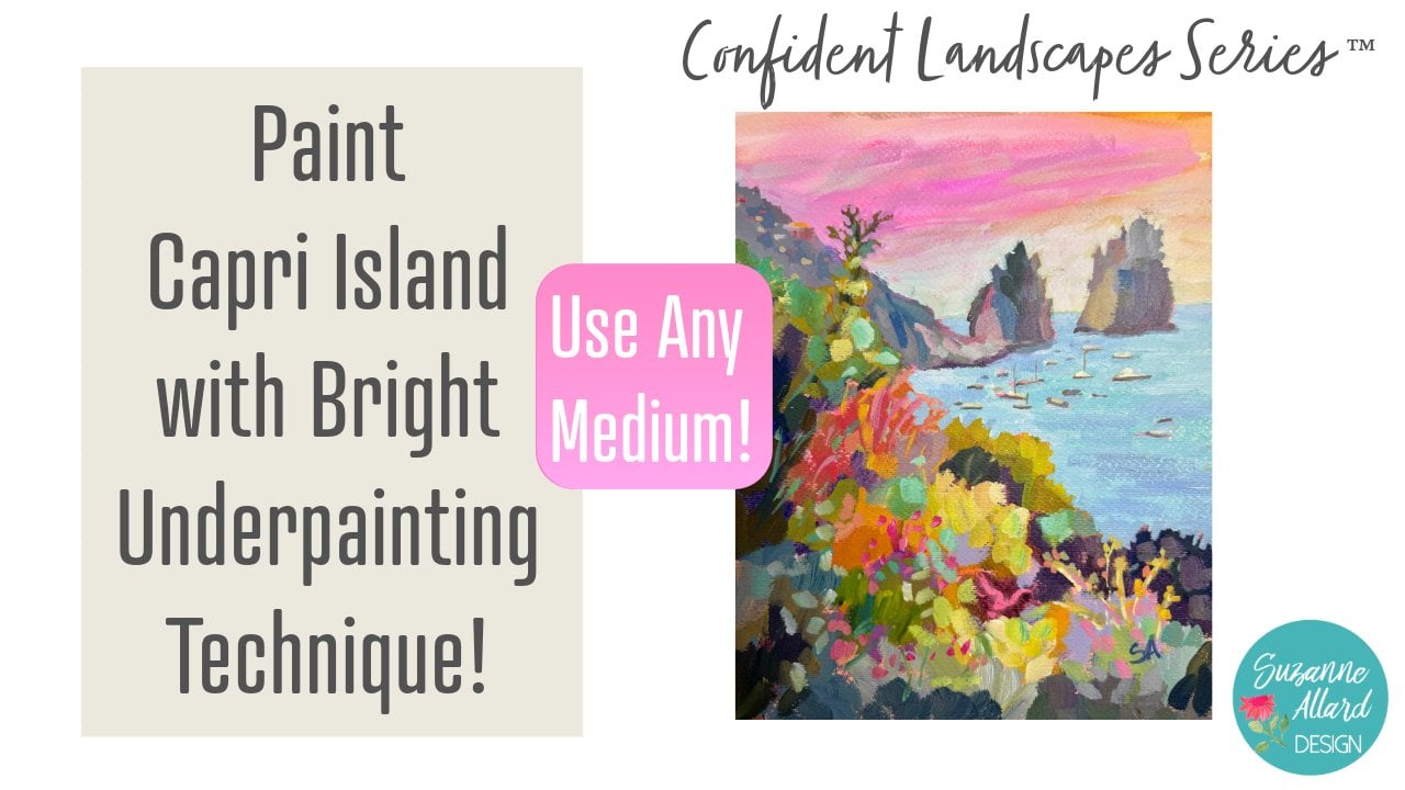
series of everything from painting photos that I've taken mostly from St. Barts to Portugal, Italy, let's see. The Amalfi Coast, painting
from Imagination. There's just gonna
be a whole series. But once you've got
these fundamentals down, you can start learning to
paint all kinds of landscapes, even ones right outside your
front yard or backyard. So anyway, I hope you can't
wait to see what you create.
 Suzanne Allard, Landscape, Floral, Abstract Painting Teacher