Transcripts
1. Class Intro : Hello, lovely. Suzanne Allard
here, self taught artist. And today, we're going
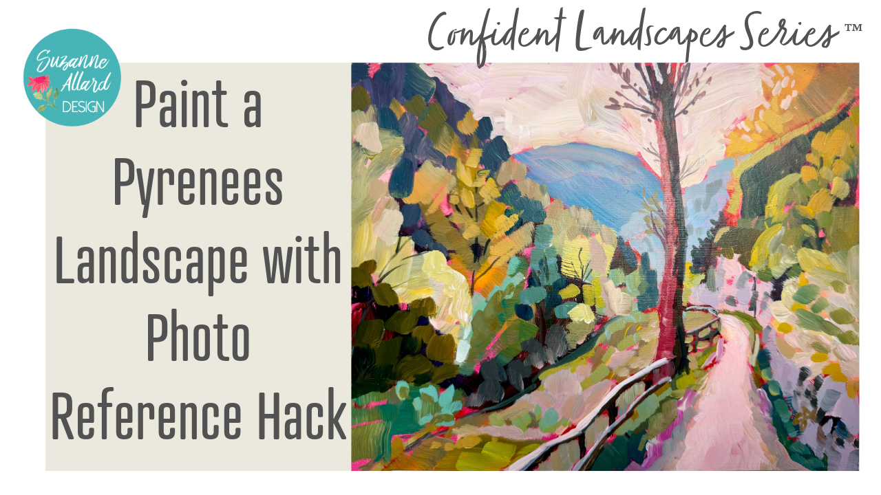
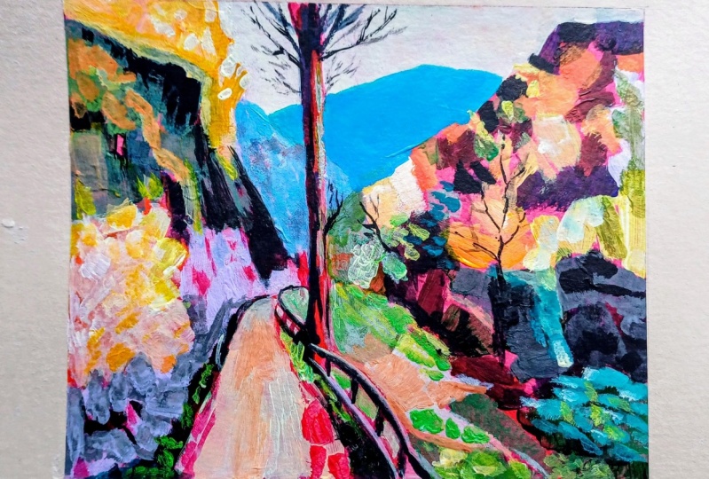
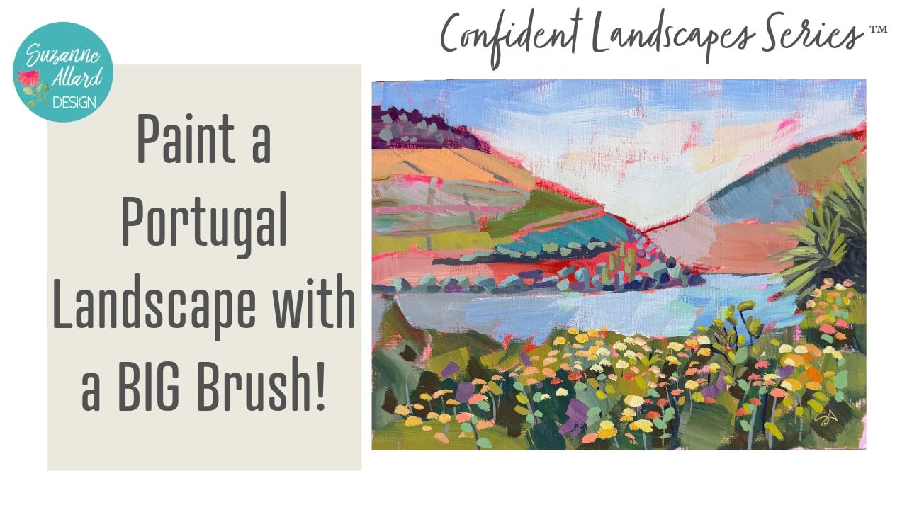
to paint something. I just love how I source this photo. We're
gonna do the Pyrenees. We're gonna paint it in acrylic. But you can use any
medium you want. And I'm going to show you
this hack that I love for how I sourced the
reference photo that opens up a whole world of
gorgeous places for you that allows you to decide
which shot you want to take in that I don't
want to give it away. Let me just say
it's so much fun. It allows you to pretend like
you're traveling and take a picture of what you're seeing that's yours
and then paint it. And, um, we'll get to that. But I also want to explain how we're going
to do this with color. This scene that we're going
to paint is a gorgeous scene, but we're going to even
take it further with color. Not so far that it
becomes obnoxious. That doesn't work, but
we're going to push it and make it just a really
fun, fascinating painting. The other thing I love about
this particular painting is that we're going
to do it on one of my favorite surfaces, new surfaces that is MDF board, which I got these on Amazon, and I'll put the Link
in the supplies. And I just paint them, and I'll paint both
sides with gesso, but it makes a really nice, firm surface and
very inexpensive. And I do it on eight by ten, so it's easily framable. So we're gonna have a
lot of fun with this. You're gonna love how we put this painting
together and layers, and the bright underpainting
that's underneath it is just going to
add so much pop. So I can't wait for you to
join me. Let's get started.
2. All About My Acrylic Palette: So I made a mini version of my larger acrylic palette.
Show you both of them. This is the one I mostly
use on the studio. But for classes, just the space on the
table here and also, sometimes I paint at night
while we're watching TV, and I wanted, you know, to have something small. So I took pretty much
the same colors, and this is a little craft
container. I can put a link. I got a three pack for
not much on Amazon. But this is the larger one. But the principle is the same. Just gonna give these a squirt, which I usually do
when I open them. You don't need This
is a makeup sprayer, but just a regular spray bottle as long as it's not
too much water. So essentially, I think I have a few
more colors than this, maybe, but maybe they're
just a little different. I do like to keep kind
of the worms together. Just when you're painting,
it helps to have those. But as long as you
have you know, a warm and a cool yellow
and a warm and a cool red, some sort of magenta. I have two here, florescent
magenta from Nova. The rest of these are golden. And then the ones that look
really smooth here like this, these three and this one are the golden open paints and
the white one as well. That just means that
they dry more slowly. The others, I just
put a little bit of slow dry gel with them, and I put that in the
supplies as well. That just gives them a
little bit more drying time. And that with the
misting, I mean, I've had this one for
probably six weeks. This one's new, so
don't know yet. But the key is to make sure that you are spritzing
when you do open it. Also to have more paint in
the wells rather than less. So like, well,
that's golden open, so it's going to be okay. But, you know, if this burnt
umber gets too much lower, I need to refill it because
more paint keeps them moist. And it is a little scary to put these expensive paints
in here like this. But it's been
working. Patty Malka, the artist that I
got this idea from, has been doing it for years. She does paint a lot and
uses a lot of paint. But I think the smaller version, maybe if you don't paint
as much, would be better. And I use this press and seal. I haven't gotten a piece
yet for here on it, and then I put the top on it, which really just holds
the press and seal. It doesn't really
seal it in any way, 'cause it's just a
craft container. Maybe I'll do it the other way. Um, yeah, there we go. And then it goes in a zip lock bag with
a wet paper towel. I had these Swedish
paper towel or, you know, non disposable
ones, so I'm just using that, but a regular paper towel
is fine. And seal it up. Like so. If you are gonna be quite a while before
you're painting again, you could put them
in the fridge. I do that sometimes if it's
gonna be several days. So that's the mini
acrylic palette. It's nice and small, and it doesn't work when I'm gonna use big brushes for painting because, you know, you can't get in
here with a well, I don't think you can you might be able to get in
here with my 1 ". Yeah, I guess you can
if you're careful. Alright. So that's the
mini acrylic palette. And oh, I guess I'll tell you
a few more colors that were in here
because I added more. So I have the lemon
yellow, a cab medium. This is yellow ochre,
and then cad orange, cad red light, cadred
dark, magenta. This is a um a lizard crimson, which is like a dark crimson. This is burnt sienna. I mean, no, that's burnt sienna. Raw umber. I just like these. These three are great for toning down colors and just getting
more complex colors. This is S blue, super intense. I couldn't use that much of if I had the rest of the year
to paint, it's so intense. You don't really even
need it, but I have it, and I'm trying to use
some of these up. This is cerulean blue, Prussian blue, turquoise, of course, and ultramarine blue. And again, I had this I can't
remember what it called. I think itsalled Manganese blue. Green gold by Golden is a really nice bright
green and chromium oxide. I don't really love
chromium oxide green. I just I have it, so
I'm going to use it. But I really like
making greens more. So sometimes I'll just use
a bit of that and then make my green around
that or vice versa. And green is also
great for toning down, you know, oranges and red. So that's why it's kind of
nice to have some made up. And then the fluorescent
magenda from Nova. The rest of these are golden. I'm just playing with
goldens right now. I love NOVA. I have NOVA. You'll notice what's interesting
about Nova texture wise, it's more liquidy, a
little bit softer, more like the texture
of the open acrylics. And then I put two wells of white because
you use so much white. Um, right. That's the
mini acrylic palette.
3. Getting Started with a Reference Photo Hack!: Okay, I want to show you
a really fun way that I have found photos
that really inspire me. There are other people,
of course, doing this, but Liam Brown is
just a lovely guy. He's English, and he
hikes all over the place, mostly Europe, it seems like, and does these beautiful videos. So like, here's one hiking
across the Pyrenees. So let me turn the sound down. You've seen already
where I'm going with this because
look at these photos. So my husband likes to hike in Europe and look
at that right there. And so, um I said, Oh, my gosh, that's
a gorgeous picture. I paint that right there. And so what I do is I just
do a screenshot, like, when I see something
that I like, and that's what I did
here on this video. Like, look at that right there. Obviously and he
doesn't normally put his hand out like that. But the beauty of this is, yes, it's not as good as
being there, not even close. But, like, look at that
shot there with the path going up and this blue,
beautiful blue here. I think I screenshot
at this as well. The beauty of it is, you know, these are not photographs, so I'm not copying
someone's photograph, and I'm just using some of his footage as inspiration
by doing a screenshot. So like, right there, if I think that that
shading is really cool, you know, then I
save that to photos. So let's take a look at some of the ones that I screenshot
from this video in Andorra. And he has videos, like I said, all over the world,
Liam Brown on YouTube. I'm sure he'd love to follow. But here's some that I took after Let me see. Pull these up. And, you know, you're
doing screenshot, so you're not getting it exact. I probably won't use this
because of what happened here with the camera. But
that was beautiful. That one you could just
kind of ignore or crop. I thought that was
beautiful, too, the way the rivers going up and the lights
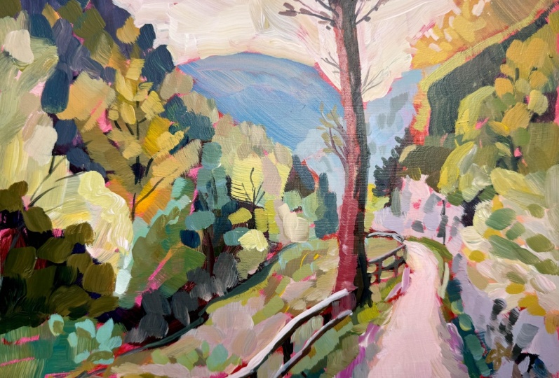
hitting things here. But the one that I got most
excited about is this. This is a little further
on in the video. He was on this trail, and, I mean, it's just gorgeous. You have the tree,
you have the path. We always look for
in a painting, something leading you
in to the painting, you know, lines that
are leading you in. So here you have this. You
have this, this, this. And so I rewound and
took several more. And so now let's just pick
let's just pick this one. And we're going to crop it, though, because, you
know, we're screenshot. We're going to figure
out the right cropping, so I always duplicate. And then now I, you know, I have that one there
so that I can crop. So obviously, it's a
screenshot from the video, so I'm of course going
to crop out that. But further than that, I'm going to do a little
more cropping because I don't want my This is a bit
too much in the center. So then what's fun is you just kind of move it
around and decide, is that kind of where I
want to go or this way? And I really like this way
because bring that in. I loved the blue up here and just this
here and this tree, and we didn't need any
more of that there. So now this path is not
so much in the center. I could even take it further. And so you play that way with
your crop tool, excuse me, to get the right composition or the composition that
is exciting to you. We could even crop
further and go up more or down this way, cutting off more of
the top of the tree. Come on. Sometimes it
doesn't want to behave. Cancel. S here. Crap. I don't know why it's not. It
made me reset it. I'm not sure why. User error, I'm sure.
Gonna bring that in. I don't want to crop off
the top of the tree, though, because I kind
of like how it opens up. I'm gonna bring this a
little bit more so that the And this is something interesting
comes up with paintings. As soon as you take one
thing out of the center, like this path, then it's like, Oh, now this tree is kind of in the center,
but it's really not. We'll come over a little more. That's pretty. That's
what we'll go with. And if I wanted to,
before I print it, I could come in here and
increase the black point, which gives me more contrast. Do you see the difference
there? That just helps me with viewing
some light and dark. I could increase the saturation. This photo is pretty
saturated, though. I could play with vibrant, just to I'm not gonna
make it all these colors, but, you know, these
greens, necessarily. But just to see the
variety like that, the black point is helpful as long as you don't go too far. And you can even change
the color temperature. Sometimes photos that's
warmer and this is cooler. That's a personal preference. I think where it is
is just about right. Maybe a tiny bit warmer. Knowing that we're not going to use exactly this. So
now I'm going to print it. And then we will start painting. Okay, so I did print this out, and by the way, you
don't need to print it. I just print it because
it's easier for you to see. And as I'm filming the class, I usually work
straight off my iPad. I printed it a little bit big. I rather have a smaller image because you don't want
to see too much detail. You actually want it to
be a little blurry and a little far away looking to keep you from getting
too fussy with it. And I also want to
paint my substrate. So this is MDF board. It's a small it's a thin one. It's only two millimeter, and that's okay 'cause
this is only eight by ten. If you're going larger, you want to go up to
three millimeter, for sure, or maybe even thicker. But I got these on Amazon. I'll put the link
in the supply list, and I've already
covered it both sides with gesso and the ends, just completely sealing it
with a primer, esos a primer. And now I want to
put my sort of pinky orange under painting on here and let that dry before we start designing this
particular painting. So let's get that done first. And I just use a large brush. Nothing doesn't need to
be anything special. Any brush will do. And I start by just grabbing
some of them and some water and getting the color down pretty watered down so
that you see some bits. And you can always add white
if this is too bright, you get some white to show you. You can mix in a little
bit of white gesso. And it's not the idea is not
to make it look uniform. That's why I'm being
so unfussy with it. It's just to get the
white covered up. You can go around
the edges or not. This is going to be framed, so it doesn't really matter. I like a little variety. Hardly any of this will show. But the little bits that
peek through, I like. Dee, this is such a cheap
brush that a bristle came off. Okay, should dry really fast. Is it another
bristle? Maybe don't use a brush this cheap. That's that's almost dry. Alright, well, we're gonna let it get nice and dry, though. And you can use
any shade of red, orange pink, the magenta. Those are colors
that are just really nice underneath a
landscape, I think. Really, I like them
underneath anything. Um, if it's too bright for you, add more water or,
you know, I mean, or white paint and
make it more of, like, a peachy, um, you know, muted pink, if you like.
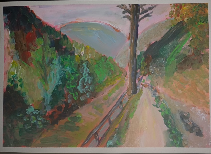
4. Doing a Values Sketch for Success: Let's do a value sketch
before we get started. So I cover this more in my composition and seeing
a artist class modules. But let's do a quick one here and the purposes and
I know if you're like me, you're like I don't
want to do that. I just want to start
painting. I get it. I do it sometimes
I always end up spending more time
because I didn't do this. Or at least if you're
going to skip the sketch, at least take some
time to look and say, Okay, where is it dark? Where is it light? Where
is it in the middle? And where can I simplify? That's what the
sketch helps you do. So this is I've got three different shades of gray of these Tambo
watercolor markers. I happen to have these,
you do not need these. Just make sure you can either just use a pencil
and just go lightly, medium and press harder for dark or any three
shades of something. You could even pick colors and pick a colored pencil
that's lighter, medium and dark or markers
or really anything. But the most basic is a pencil with just different pressure. I'm just going to make a frame. Up here, what I got in
the habit of doing, which I really like is make my frame with
more of a little bit better frame is the
photo number in my phone. If you go to any of
your, I can't show you because my phone is
filming this above. But if you go to any photo
in your phone and you look down at the middle
on an iPhone anyway, there's an I, which means info. You click that every photo
you take has a number. The reason I did
this is because I would do these value
sketches in here. And then I would lose
what photo it was. And so I figured out that
if I put the number here, then when I'm ready to go
paint it, I could say, Oh, this one, I want to
do this one and then I go find the photo. All right. So that was just a little
hack that I developed out of necessity. All right. Looking at this,
my picture is too, I should have cropped
it a little bit more like this because it's
longer than it is in my surface or my sketch box, but I'm just going to
modify it accordingly. I generally start with
looking at where are things coming in here and you change it
however you want to. But if we think of this one ridge coming
in here, like this. And it comes down past the
center here, this other hill. Sometimes you have to do a
few sketches just because, you know, that's two. We've got the don't mountains back there, the bluer mountain. This lands about
there, the tree. Is more over here. I can also look at points
here for this path. Coming past the tree,
getting narrower there, and not too far in actually
more right here. It ends. I'm the color in
the tree so I can see it and ignore
that line over there. This little sort of
fancy thing is here. There's a lot going
on in this photo, so we're going to
definitely simplify. This is the rocky area stuff and then more rocky
stuff comes like this. The rest of this is we're
going to make one big blob. For now, there is a
difference there. This is that yellow tree and then this is the
rest of the stuff. Over here, I'm
going to grab where this comes here and it lands. So ish. Got some shrubbery there. Some people some
artists say when you're doing a landscape, you should try to
just pick four, five, maybe five main shapes. For me, that's a process of
kind of narrowing it down. Okay. Now here we have I think I made that
too far to the right, so I'm going to take
that like this. And maybe let's see if I
can erase my watercolor, probably not too well on
this paper a little bit. You better use the paper towel. Where are my paper towels? Yeah, because this has
the fence post, like so. I like the fence. I mean, you could get rid of it. That's the thing to
remember, you could get rid of anything you want. But with a sketch that's
this complicated, meaning there's a lot going on. We're going to be getting
rid of some things for sure. But this helps me to see
what I want to keep. It gets me to really study it. That's I think the
biggest value. I haven't even started
with the values yet. I'm just trying to
get placement of things and the main
shapes that I'm seeing. I haven't at this point
put in this tree, I want to make sure
you can see the photo. I haven't put in this tree. I don't think I will
put in that one. But as we paint, I'll
probably put in this, but you can see value wise that there's some dark values
up in here and down here. Now I'm going to
switch. This was the medium just to sketch it. Oops, that's not the right.
Let me go with the dark. I like to get the darks in. It just feels like it's
grounding to get them in, so there's dark all along
the side of this tree. There's definitely
some dark in here. And we're not coloring it in. This is a quick some
dark down here. It's dark in here at
the front of this. We're obviously
reducing the number of values that are
in this photo. There's a whole lot
more than three. Well, four, including white. We got three colors, three
shades and then white. You can put some of
the dark in there. We'll see. There's some dark at the front of this hedge
bin. Not sure what it is. Sometimes you'll go a little darker than something is just because the painting, the composition needs it. But you want to try to have
the value not identical, not the same amount of
darks, mediums and lights. You want to have this one's
going to be mostly medium. The light I see is
really the sky, which I'm just going to
leave white up here. Then the next latest, it's not my light
one is this path. My dog just pushed the
door open and walked in. Then there's this light here, which we'll just have
to remember because I already drew it in on
the top of the fence. Some bits of
lightness over here. Down in here. Some of this up here is a little
on the light side. G do some bits over here. Down in there. And then
the rest is medium. So I don't really need to color it all in because
I know that it's medium. Now I'm thinking about, is there any piece of this that
I want to remove? I like this here. I like the bit of yellow that
we can do something with. I have removed these
detailed trees. We'll probably
just put a variety of shape and color in here. Then, of course, this hill, I think I made it a little too tall. It should be
more like this. That is going to be
in the background, so it's going to be more faded, more muted, less saturated. You'd see the advantages of a pencil right about now, right? I just have to remember when
we put it on here that we are keeping this to
the right of center, not letting it get in
the center. All right. Let's begin sketching.
At this point, I'll have both of
these as a reference. I'll just set them here. You should set them
where you can see them, and we'll be checking them, but not less and less as we go. In the beginning, we
look at them more, but as we get going, we look at the less and less. All right to sketch on my board, I'm going to use a combination
of red and burnt sienna. I just like how that looks
when it's peeking through. To sketch, I'm going to
use a smaller brush. I've got a couple
of rough brushes. Let's talk about these brushes. These are hog hair or hog bristle and these two here and it's more
rough and textured. Then this is a smooth brush. And this is a size six. These are on the
large side, size four and size six as well. This is a rigor for
any lines or details, and then this is just a
small number two flat, which I like for sketching. You can sketch with even the corner of a larger
brush if you have one, but we a round
brush is fine, too. But we're trying to
keep this sketch loose because if the
sketch gets tight, the painting gets tight and it's just hard to remember that. That's why I always
remember to say that or think about it that we're
trying to keep it loose. For my sketch, I'm going to
reference the sketch we just did and maybe try to bring that tree over just
even a little bit more. It really does go
almost the whole way. I just took red
and Burnt Sienna. You can water it down too. Then I'm going to
just sketch I'm here. I'm not talking a lot
I'm sketching because it's kind of hard to multitask. So I brought that down too far. Remember, you can
modify anything. I later on I decide I
want more mountain there, I even well, done it all, change the tree
to end it sooner. But I like how this goes up. I think it helps
bring the viewer in. But we can always take it out.
We will see what happens. That's there. This is the stone, just a bit of it, it
disappears and then reappears. Here and then there's
grass right there. This is that whole
built up area. With the tree. And then that hedge over on this side. That kind of comes here. Okay, this is too far over. I'm just gonna make lines to
show my fence. Grass there. This is the fence turning. Okay. Let's pause and then we'll come and start putting
in blocking in color.
5. Blocking in the Painting: Okay. If you're sitting
flat like this, make sure you lift
up occasionally and even hold it away so that you
can get some perspective. I have been working
more on an easel, but it's just too hard
to film on easel. But even just propping
it up a little bit like this helps you get
a better look at it. And I want to get
on those darks, the same ones that we got that we put into
the value sketch. So I'm just going to sometimes I just take a burnt
armbar and a blue. You can go in the
purple direction. It doesn't really matter because most of it's
going to get covered up. And I'm mindful
of the fact that, you know, trees are never really straight except maybe a poplar. They're very, very straight,
but this is not a poplar. And so I'm just making sure
I'm not making it straight. And just blocking in
some of that dark. Then we had a little bit of
dark here in in those rocks. Down here, this wasn't as dark, so now I can start putting
a little variation. I don't have just three markers, so I can water it down a little bit if I want
it to be a little lighter. There was a little bit
of dark down here, up here, some bits
of dark spots. When I'm doing plants like this, actually, I need to stop
with the tiny brush. It's time to go to
the bigger one. Um, hills like this. Now I can start putting in just wherever I see some
dark and very dark. So go with a purply one and
one with a nav or brownish. Not much of it will show at
the end, but some of it will. Sometimes there's some really
magical things that happen. With these first strokes that we end up really
liking and keeping. I'm going er I'm
just noting, really, like, notating almost where I see dark bits of darker stuff. Even these little fence post
things help draw the eye in. This one has got to
find my way here. There's some dark along
the bottom of this and along the bottom
of that rail. Let's see. Maybe a little bit more up here. Still
working on darks. Be it looks so much better when you put some light
on top of dark. That's where you get the
depth and the interest. So I don't mind going heavier
on the dark than what I'm seeing and then going over
that wind bits and pieces. In other words,
there won't be this much dark when we're done, 'cause I do want it to be
mostly mid value. Okay. That's good for the darks. Now let's do some blocking
in with a big brush. I'm gonna use this 1 " brush. Really experienced
painters always tell you to use a bigger brush
than you're comfortable with. So let's do it.
Alright, blocking in. I'm now going to think
about which parts of this do I want to be
green versus not. There's a lot of pretty
yellow in this, as well. So let's see. Put that there. But, you know, me, I'm not gonna just make it
green and yellow. Um, This side over here
has so much interest. It's really cool. This lends itself to, like, a peach color. So let's just go ahead
and put that in. Sometimes I just see
a bit of a color, and then I use that
and go with it. Okay. And then, well, we've got
some yellow on a brush. You might as well come
and get some of this. We can tone it
down a little bit, but do some of this tree here. The great thing
about the big brush is you cover a lot
pretty quickly. And that's I'm just grabbing some of this dark
to tone that down. And this similar color
in this tree over here really made a green when I took the darks
we already had. I'm really walking in, but you never know how much
of this will end up showing. You can't think
about that, though, at this stage, or you'll
get paralyzed by it. There's something
pink over here, too. Really pale, though. And since we have
this pale pink, I'm gonna go in a
little purply direction and do some of this stone. I'm using the end
of the brush now. I like to leave bits of the pink showing the background
and bits of my sketch. And I'm putting
this down looking at the stonework
because who knows? Maybe we can get it right
with just this brush. Looks like we need
some darker bits. So I'm not gonna
get it quite right, but we can come back
in and add that. Right about here is where this mountain
goes into the distance. This is all green, and then this bit goes into the distance, and I made it probably
too low here. So just to make sure I've got, where that is and blocked in, I'm going to go ahead
and put it a little higher and make it kind of this knocked back desaturated color just
so I know where it is. I want to not get it on my tree because I like that red showing
through sometimes. So that's kind of our
mountain going back there. And just so we can mark it, we'll change the color,
probably, I'm sure. But let's go ahead and put
that bright blue back in here. It won't be that
bright, probably. Usually, things that
are in the distance are not so bright. This photo is different. So who knows? Maybe we
will make it bright. There's definitely a line there between that
mountain and that hill. All right, so that's that. You've got this
really light path. I probably will have to. I haven't washed my brush yet, but I'm gonna dip it and wash it 'cause I had all that blue in it and see if I can make
a really pale pink again. Kind of a warm pink
because I'm gonna grab a tiny bit of yellow. I'm just Mark where this path is. We had some lighty kind
of stuff over here. Bits of it down here there. This is where it's good
to kind of stand back. It looks like chaos now, but we'll get I know that and
that's part of the process. Don't get worried about that. We're still blocking in. I like how this is a bright green, so even though I try not to use many greens in my
landscapes, I do love green. I just don't want
it to be all green. So this is the dark
that I'm going to bring up bring it up higher.
It's quite dark. Some other bits of green. I'm not gonna I'm just gonna take these various
shades and get them in there. Some are lighter than others, and will come in refine. But I love the effect of this big brush on
this kind of thing. It keeps you from
getting too fussy. I want more of a
brown right there. That's right over the wall here. Okay kind of coming
down on the wall. My goal at this point is to get everything that is
the background, the pink background covered. Well, of course, leaving my
little bits that I love. But you see how I'm
just putting it down and leaving it. S.
6. Blocking in Part 2: Kind of looking at the
colors, kind of not. So I've got this too wide, so I'm going to
take this here and maybe put a little bit
of blue along that path. It's later there. It's a bit of light. Well, I've got that. I might as well put some
of this green there. I branches out here. I want to be more blue, though. Yeah, so what happened is I kind of lost my way on
the drawing here. So I've got my top rail here, and then I'm just gonna
put in this bottom rail. It kind of comes down like that. And might as well get
some that lighter color. I just kind of had to claim where I was there
kind of got lost. And I want to get back to this walkway and
kind of reclaim that. It's a little bit, uh rocky stuff there
and a little darker. We can make it kind of a pinky. Same thing here. They
do look kind of pink. You can always come
back. But what you can always come back
and change a stroke. But if anything,
try to leave it, leave it and decide later
if you have to come back, 'cause sometimes
they're so pretty, and we fuss and fuss and
fuss until we kill them. So don't be a stroke killer. Been there, right? I mean, I speak from experience. This is kind of a bit bluish. I don't want to make it
too much of a feature, though, because it's at
the edge of the painting, and it can draw too
much attention. So I muted the
turquoise a little bit. There's some shades of
turquoise here in these trees. And then as things are further
away, they get more faded. So like, right here, I'm going
to grab some white because these things here are smaller and just keep
changing the color. I'm sort of making gestures
that could be trees, but I'm just making
shapes, really. I'm going a little more neutral. Let's see here. No, I
want it even more brown. I wanted to the stuff in
the back to really fade. Some of it's darker.
Ah. See here. Along here, I'm seeing, like, a really pretty pale
green, super pale. Maybe not that pale. I'm looking, do I see that color anywhere else, a
little bit here? It's kind of an
orange up in here. It's so fun with a big brush. It really forces you
to not get fussy, and I just love the look of it. Okay. Se like a light minty
kind of highlight here. Alright, we're blocked in on
everything except the sky. We do need a clean
brush for that. A lot of paint in that brush. Probably still some
green at my brush. That's okay. I like
a bit of green. I'm not gonna make this guy just this white that
it is in the photo, 'cause that's sort
of distorted anyway. So I got some yellow still
in my brush, some orange. But I like leaving bits of the pink
coming through, too. So my tree is up there. And I just taking the
side of the brush, you know, who knows we may not keep those little branch
thingies, but maybe we will. Okay. The only place, well, I haven't really blocked
in this side of the tree, so I'll do that and
then down in here. This is just kind of a place that shouldn't call
attention to itself. It's just sort of muted colors. So I'll just do that. And
then I do love a pink for my sort of sun or light
facing side of a tree. So I'm going to just make a warm although I really love the way the
red shows through, so I'm not gonna cover it all. It does need to be a bit darker, though, to show up. It's almost painting with
a big brush is almost like this feeling of painting with your
non dominant hand. It's just really
a good exercise. Okay, we're gonna stop
there and let this all dry.
7. Building Layers: Well, this is dry now, and I took some time
to just study it, and part of that is really
stepping back, you know, like leaning back, stepping I was standing
up and looking at it, you know, looking at
it from far away. The other way to do that is
to take a picture of it. And then look at
the picture because the picture will be
about this big on your phone and it gives you
the ability to look back. You can squint also to see if you've got enough
value contrast going on we do in this. I have some good
darks and lights. I really like what's
happening in most places, which doesn't always happen at the first pass with
the big brush. But I'm liking more and more the way the big brush just gives you some really little wonderful
bits like you know, you can see the
brushstrokes here on this side of the
tree a little bit, which almost, you know, imitate the texture here. I really like this. I'm not going to touch
this mountain back here. I'm not going to
touch the sky much. The path also, I like the
brushstrokes that we see there. I want to fix something here on the path and add
some more detail. I could leave these are just
different decisions to make. This was the yellow tree here. I could leave it
just like it is. But I think I might play
with some sky holes in this, which was my original plan. But sometimes when I see what's happened with the first pass, I change my mind about things. I want to add some
more here and I think some tree branches to give a little more
something going on. So details here and there. There's even a line
in the stone there, just a little bit so we don't just have this one
thing going on here and work the details here with a subtle
fence and yeah. So we'll see where things go. But that's kind of what you're looking at is what do you like? What What do you
think needs work? And also remembering to not cover up and to make note of the things
you really did like. You know, I like this
background here, but I want to put some more sort of suggestion of plants on it. So yeah, we'll just kind of
start and see where we go. Get my paints out. And give them a little squirt. Although they look pretty good. Also going to go
down a brush size. We're not going to use
the 1 " brush anymore. I've got a couple options
here with different textures. I've got a size six
flat, which is softer, then this one for
details and of course, the script liner or rigor. Then if I decide I want some more texture to the
strokes and more juicy look, I could use these hog bristles. We'll see. One of the things I wanted to do was distinguish this a little bit more as a
mountain in the background. I think that I'll do that maybe by lightning
it a little bit. I'm not sure or I might
change the color of it, maybe just a little more
of a muted greenish blue. Let's see what we think of that. No, that was two. That
was the thalo blue. That really takes you in
a turquoise direction. So go back to the Ultimarin and I still
want it cooler than that. I don't want it to be
too similar to this. I'm going to keep mixing until I get what
I'm thinking of. There oraloblue green shade
is just so much of it goes, you almost have to start over
if you grab some of that because it is so intense. I'll see what I think of that. I'm getting there maybe. Bit darker. Grabbing
some burnt umber. I don't mind some variety on that hill because it
is a focal point area, so I can not cover
all of it and just take use the brushstrokes to show some of the tree
variety out back there. Maybe make more of a line
here against that one. I was keeping in mind this one annoying thing
about acrylics is they dry darker and than they
look when they're wet. If you are trying
to get something to a certain value, almost, you do have to think lighter than what you were going to do because it's
going to dry darker. That's why I'm against
the border here. I'm adding I don't want to make it too defined because that'll make it seem
like it's closer. Let's leave that for
now. It comes down into here into those
trees a little bit. You want to put more detail
wherever your focal point is and the eye is coming in
here, coming down here. This area here is what
I'm thinking will be you don't want to
do detail everywhere. I just draws the eye everywhere. Down in here, there's
a really little tree. I think that will help
put that bright shape in there and it actually comes through some
coming above here, just a little detail like that. I can draw our eye down there. Since I have that bright color, I'm going to put some bits
here. Sew along here. This grass in here
is really bright. Just mixing to vary it. Don't want to stay with
the same color too long. It's quite bright in here. Much brighter patch down here in front. Some bits of cream there. As we get closer, we can have a little more detail
to suggest plants. Then these leaves here are nice. I don't want to do too much
to pull the eye over here. If I really paint these leaves here like
they're in the picture, that'll become the focal point. There's still some pretty
turquoise coming up in here. Now I'm just looking for
details that can lead the viewer in and also refine
everything a little bit more and make it
exciting to look at. Mm.
8. Refining and Finishing: Alright, so we are definitely
on the home stretch. I really like what's
happening in most of this. I see a couple opportunities. So this little bit of
pasture back here is light, and then I haven't painted
through the fence there. So let's just get that with something lightish
and a small brush so that I don't mess
up my fence too much. And I just want to do
what's a little too light. A bit. Maybe a little bit
of variety, so it's not. Always remembering again, even though I've got
the smaller brush, don't get too detail. I want to bring a
little more substance to a little bit of this. The fence has actually got
wire there, but of course, we're not going to do that, but I can make the marks go up. Then this is actually the darker color of the
tree back there. That's not it. And I see that my let's see some places you want the details and
some places you don't. You want just a
little bit of detail goes a long way, like
getting that there. Getting the top of this fence. I should be using my rigger. That's that's what
I should be using. Oops, too much water. A little more of a
highlight here in this top of this fence. It's pretty big and kind of pinky. No, lighter. Makes sense that as its
closer, it's lighter. I'm going to go
lighter still because we know it's going
to dry darker. You can always come back again. I've had to do this,
it dried too dark. Come and lighten it
again. That's less of a problem with
the acro guash. I think this down here is less bright, so we're
not going to do that. Then some bits of
brightness here. The clean this up back here, maybe. Pretty bright back there. All right well, I have
this really light color. I'm looking to see, do I
need it anywhere else? Maybe along here.'s reminding myself
not to over dab. One and done. One
and done, Suzanne. Oh, okay, well,
since we have this, we're going to do sky holes. Let's see what we think of that. They're very subtle
because, well, my image is blurry. That's kind of interesting. Right now, I just need
to decide do I want to do some more branches
on this tree? I think a few would
be nice because it would bring the viewer's
eye down. We'll find out. Could also argue that it
takes the viewer's eye up, but let's play and see. I want to get very
nice and clean and make kind of a lizard crimson with
ultramarine blue, dark. I'm not going for making all this bushy stuff,
but maybe just a few. Let's see what a few of these. I want them to be really thin. Got to get enough water.
I want them to be faint. I'm cleaning my brush to
make sure that it's not too gunky and I can get
a nice faint line. You know, I didn't want
it starting there. They don't show there.
They're darker, too. Let's make it darker. These it's Scott. You got to be confident. Don't make them straight. Now, I'm thinking there's
a few of them here. Do I want to do them here, too, just to give it some
they're actually here.'s I like that. But of course, now I want a little
bit of leaf shape. I'm not drawing
individual leaves. I'm just making painting rather. I'm just putting
in some bunches. And we can do the same thing
up here. Very faded, though. Just a suggestion. Alright,
I think that's good. What else? I was thinking
I wanted to do a little more kind of finishing
up of this line here. So I want to stay with
those neutral pushed back. Colors. And is
that brown enough? Yeah. Well, not really. Just go a little more
brown. Just push. Just I wanted just a bit
more there. That's all. And, um, little
variety. Just a tad. I need to make that later
though because it is, and I want it to contrast
with the mountain and back. Okay. I'm feeling like
it's pretty done. So this is that part where it's really personal
preference. It could be done. It could have been
done 5 minutes ago. H. But some of my darks, remember the paint we talked
about it drying darker. Some of it more
dark than I wanted. But I will let it dry more before I decide if
there's anything else. But I'm going to
say almost done. Got one more thing I want to do. Over here, this is all from
the original blocking in, which we could totally leave it, but I want to put
just a little more. There's a really dark rich
quality to the color in there. I want to see if we can it's kind of hard when I have
so much white on my brush. I want to keep it dark, dark, so I just want to
see if we can get something really yummy there. Just a little bit of some that's more like what's
going on in there. Trying to get some of
the darker down here. Okay, I'm gonna stand up
so I can look down on it. Let's see. I'm trying to
see if I like it's a little trickier get a paper and see
if I liked the tree better. I think what it is.
What's bothering me is they kind of are
there and then they stop and I want my eye to keep coming down in the
picture, they're down here. So let me just see
if we can make a few really faint ones that kind of bring
us down further. Probably won't take much.
Well, that's the dark side. Oh, I was too fat. That's why you have to be
careful with the rigor, the right amount of water,
not too much water. And of course, having
a piece of paper, this is watercolor paper, so it doesn't flow the same, but to help me get the
line I'm looking for. All right. I like that.
Now I'm looking down in here. Is there anything else? I'm going to I could do this. I could keep fussing with this. It's done. But it's fun. But, we have to walk away
before we over fuss it, though. I just want to push a little
bit of that pink back there. All right. Now I'm going to stand back
and look at the whole thing. I see one opportunity to
bring in even brighter. I like we talked
about a little bit too carefully though because
I've already done my holes. Just a little bit of
bright and variety there. Bring it back here.
It dried darker. I want to bring
some of that back. And when you see
how I'm covering up some of the
trunks that I made, that's the way I like to do it. Make some. And then it looks much more realistic when they're partially covered. This is fun. Some little yellow flowers
there. I won't go too far. All right. I'm really happy
with how this turned out. And be patient with yourself with learning
to paint this way, go slow and thoughtfully
and one stroke, leave it. You can
always change it. All right. We are done. O
9. Wrap Up and Resources : So how fun was that getting the reference roto this
way for the Pyrenees? I just love this process because I can't go hiking all over the world
and taking these pictures, but there are people
doing it, and then I can, but I can still make it
my own because I can stop the shot it speaks to me. So what's beautiful is when you are watching a video
and you stop the shot, you know, stop the video
and do a screenshot, that's what spoke to you. You know, that's what
you wanted to play with. So it allows for more
it's somewhere in between taking your own photo and using somebody
else's completely. It's kind of halfway in between. And so I love that. I love the photo we chose. I really like how the
painting turned out. And I love this surface. Every time I paint
on this MDF board, I just love it over and over again because it
just I don't know, the paint sits on
there really nicely, and it's nice and smooth. And I just love how we you know, played with things, and it's
funny as I'm looking at it, when I'm looking at
it, in the video here, I can see that maybe I want to put something
else right in here, because, like I told you,
you're always tinkering. But I just love how different
bits turned out and how we love some of the bits of pink and red showing through. And it just makes me
want to do this again, get another video and do this for another
part of the world. And just wouldn't that be fun? Oh, my gosh, you could
just got an idea. You could take a sketchbook
and you could make it like your like a virtual
travel sketchbook and just quickly sketch
these out using the big brush and have, you know, all these
beautiful places in the world kind of documented if you learned to
paint it quickly. Alright. That might be
something we have to do. I also wanted to let you know
that I have some resources. I have an email newsletter from my website at suzanoler.com. I send it out every
couple of months or so, and I write sometimes
just, like, thoughts and essays
about the creative life, or I'll put studio updates. Sometimes if I've got originals for sale, I'll put
that in there. So I'll put the link to sign up for that A in the
class supply list. I also have a YouTube
channel if you are not tired of my voice and my face, and you want to come for a
paint and chat on YouTube. I do a lot of supply
reviews there, too, only with supplies
that I use or like. Or I do a review and tell
you if I don't like it. Why? And also I'm on Instagram
at Suzanne Allard Design. And then I have a student
only Facebook group. If you didn't get an email with that invite and you'd
like to be in the group, just email me at art
at suzan aller.com, and I'll send you an invite. And I'm going to close by just saying that never
feel guilty about creating because
creating is good for your soul and what's good for your soul is good
for those around you. And that means that it's
good for the world. The world needs more
people creating. And yeah, so never
feel guilty about it. Okay, see you in the next class.
 Suzanne Allard, Landscape, Floral, Abstract Painting Teacher