Transcripts
1. Class Intro: Hello. This is such a fun class painting landscapes from
your imagination. So for some people, this can seem really
intimidating. And I wanted to show you how I approach it and the freedom that comes with being able to put these kind of
composition together, you don't have to rely
on a reference photo. You don't have to be going somewhere and taking
beautiful pictures. Of course, we all look at landscapes as we're
out in the world. And so that's in your mind, and I would say there's
enough in your mind to pull from to create
something like this, but it can be kind of tricky
to know where to start. So we're going to
use as inspiration, a sprite idea that was really
popular on social media. I love it, too. It
was from imagination. And so we're going to use
this as our inspiration, and we're going to create an
eight by ten painting board, also called sometimes Canvas
Board, and I'll show you. I just like that surface. Paper is fine,
too, but this way, you'll learn
something new if you haven't used any sort of board. And we're going to
use the gouache which I am going to show
you a little video on. You can use acrylic.
You can use watercolor. You can use oil paint,
really, anything you want. You could even do this
with the acrylic marker. The idea is to pull
from our brains, but make the composition
successful so that it's not, you know, too symmetrical,
and I'll go through all that. But we're going to look
at all the tricks to kind of make it exciting and fun and also understand readable as we talk about as a landscape. And this will free you up from needing to You can
do this anywhere. You can pull out your
sketchbook like I did. I did this actually one night. My husband and I watch
TV in the evenings, usually, like, a British
murder mystery type series, and I painted this, so you can have that kind
of freedom and play, and you don't have to
worry about those that look like the thing,
'cause there is no thing. So join me in this class, and let's let our imaginations loose and create
a fun landscape.
2. About Me: Hey, I just wanted to tell
you a little bit more about me if you haven't taken
many of my classes. My name is Suzanne Allard, of course, and I'm a
self taught artist. I got started painting later
in life in my early 50s, and I finally decided to
stop being scared of paint. I would create other things,
but for some reason, painting felt like, no, no, though, that's
for real artist. That's not I'm just
a creative person. And I got sick of hearing myself say that and
started painting. And I started just, you know, with some basic drawing, like little challenges
on Instagram. And I'm not a big
drawer. I don't draw much. I'm a sketcher. And just one thing, you know, I don't
want to say one thing led to another because
I worked hard. I don't want to diminish that. I worked a lot. I painted a lot. I created a lot, just asked
my family. I was obsessed. I'm still kind of obsessed.
I paint in the evenings. But I just wanted to
share a little bit of that story because I think one of the
things that really gets you where you want to go is just frankly not giving up. And, you know, you can
get tired and you can have take a break and
recharge your batteries, all that, but just don't stop
and keep taking classes. And eventually, you
know, if you want, you can get to where it's
you're selling paintings. Many of my students have gone to sell paintings and
show paintings, and that's so exciting for me. I myself, sell my work online and license my work
and teach classes online. I haven't done in person
retreat yet. That's on my list. I have to think about that one because I get requests for it, but I think that if you are
interested in pursuing, whether it's casual painting, just for pleasure, all the
way up to an art business, like I have and beyond, you know, just stick to
what you like to do, and then do that part
and then add on things that you don't know little
by little so that you can learn and keep your focus, keep your determination, and
you'll be able to get there. Let's get started
on this painting.
3. My Acrylic Gouache Paint Palette: Alright, let's talk about
this gouache palette and how I put it together. These are little
containers that come with these little rubbery tops, and it's been, I want to say three or four weeks that I've
had these in here. And I have replenished
them a little bit. You can see I'm a double dipper. I keep them sprits with either a little spray bottle
or this one's really misty. And I only do that, maybe once when I start and then
if I'm say painting an hour, then I hit them again
before I put them away. But all I did is I
took some colors, two, I took two yellows, a cool and a warm,
and then some red. So I've got, you
know, warm, true red, this is a cad red, a magenta, and this is opera
pink, which is, you know, my favorite
fluorescent type color. And then an orange,
a lime green. This is a Prussian blue. It's just a dark blue,
altamarin turquoise. And these are mostly Turner
brand that are in here, if not all, this is an
ivory, of course, white. This is just a peachy. I had a tube of it, so I emptied the entire
tube into there. I think it's called Juan. This is yellow ochre.
This is a pale lilac. It's not this one. This
is a brand new one. It's a little darker, yeah. So I just basically
took what I had, but I made sure the essentials are you don't even need
both these containers. The reason I spilled over, I really only needed from
here, about five wells. I really only needed the white. I like the ivory, the yellow
ochre, and the burnt sienna. I threw the rest of these
in because I had the space. I figured if I was going
to fill that many, I'd fill the rest of
it, but you don't need greens because
you can make greens. Lime green is challenging to
make, so I like that one. But the only
essential colors you really need are a
warm and cool yellow, a warm and cool blue. Warm and cool red.
And then in my view, turquoise is just it's easier
to have it than make it, and then opera pink
you can't make. And, of course, you need white. So then but I have a fair
amount in each of these. So like, let's see if
one needs replenishing. The white usually always does. Well Ultramarine blue is
getting a little low. So let's go ahead and grab some of that and
put that in there, and I'll show you how I mix a little bit of this
blending medium. Alright, so here's some
whole vein ultramarine blue. And I just squeezed
them in here. But you want a fair amount of paint in there because that's partly what keeps them from drying out is the
amount of paint. So don't be I probably should just empty
that completely into there. But don't be too
sparing with the paint. And then this is Windsor
Newton blending medium. It is for watercolor mediums. But even though this is
acrolGlosh, it's been working. You could also use
just acrylic retarder, which I'm also putting, which is what I use
in my acrylic paints. So and I just put a couple drops in and stir
it up. That's it. Um, I like to get
stirs at coffee shops. Those are really
great to stir with. And the blending medium just makes the acrogase flow a
little bit easier, I find. Aqurogage can get
really dry and chalky. So this lets it blend easier. It slows drying to
allow blending. We'll see anymore that
need to be filled? Not really at this time. And then the only trick when you close them is you
just want to make sure that you don't
just set it on top. It's sometimes a
little tricky to get the little bits going around each well so that
you've got a good seal. Yeah, so you can kind
of hear it snapping in. Alright. And this one and then I just put
them in a zip lock bag, and I don't even do
this all the time. But let's say I know I'm not gonna use them again
till tomorrow. I just figure it gives
me an extra level of security from them drying out
because this is acro guash. If it dries, it's dry. You're not reconstituting
it with water. It's not like my gouache, regular guash, which
has no acrylic in it. See how it can be
tricky sometimes. Okay. And then I'll put
it in a zip lock bag and throw in some wet paper towel or even a wet cloth,
not wet, damp. And yeah, and if I'm
gone for even longer, I'll stick them in the fridge. So that's how I've been
using the acro wash. I'll put all the
links to this and this in the supply list. Enjoy.
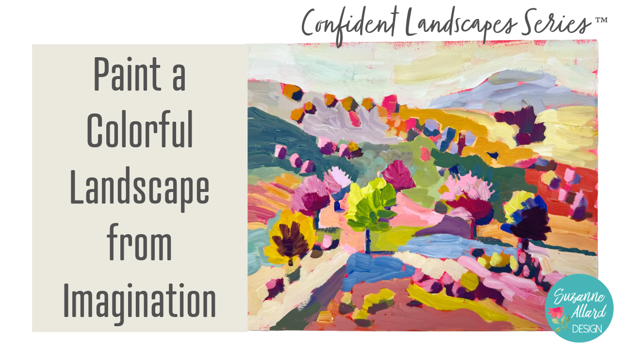
4. Supplies and Sketching: Alright, let's do our
imagination landscape. There are so many different approaches you
could take to this, but before we get into that, let me just do a quick
review of the supplies. I'm keeping it pretty minimal. I already showed you the palette that I'm using the
gouache paints. This is a Canvas board. I've been also using MDF boards. This is another
Canvas one by Soho. They're just a little bit firmer and nice to paint on
compared to paper, but paper is absolutely fine. And you'll see that the
inspiration for this one, I did in a sketchbook. I've painted it with gesso. I went ahead and
painted both sides just to seal it really well. Then I did a fluorescent, thrown in some red
and a little bit of water or I might have used medium because
it feels smooth, but basically just
got some color on it. And a for my brushes, we'll see if we
need anything else, but I've got some flats here. Flat just means it's
a rectangle shape, but the bristles are a
bit longer than a bright, which looks more like see
what a brat looks like. They're rectangle, but the bristles are
shorter, see that? I have either one works, of course, for this. I've got a two in case we
want to do some details, and this is an eight, and this is a four, but a
six is fine, too as well. I've got some
palette paper here. This is a brand new head. I do like the Strath more
palette paper just because it is really inexpensive and
sealed at both edges. Sealed it's healed
here and here. Sometimes you get them
and they're loose at the bottom and
it slips around, but it's a minor thing. You can also use
a porcelain dish that you get at
goodwill or something. Anything that doesn't absorb,
the paint would work. I think that's pretty much it. We need something to draw with. I like to use these
little crayons. I used them in our
inspiration piece, but it's not going to
show up here because of my the color of my base here, which is the same color. So we'll just use a
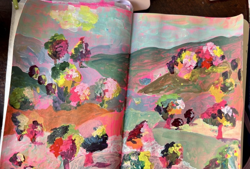
colored pencil or pen. Let's look at our inspiration. This is the sketchbook
Imagination, one that I did. I think I have
another one in here. That was loosely based on a photo, that's
based on a photo. I did this one upside down. This is also an imagination one. But I really like how
this one came out. I just like it. We're going to use
that as inspiration, but I want to show you
there's so many styles. This is what I call a minimalist style of
imagination landscape. You could also do
something like this. I will put photos
of both of these in the class documents so that if you wanted to
use one as inspiration, you could. One or the other. But I'm going to use this one. Got my paints, let me just grab something to draw with or sketch
really because again, this is not going to show up. I can see it, but you
won't see it on camera. So let me grab something. I grabbed one of my
neoclor crayons. This is a wax resistant
crayon. It doesn't matter. You could use a colored pencil, you can just the regular pencil. Most of it's going to
get covered up anyway. So don't get hung up
on that. All right. So I say imagination landscape, which just means I don't
have a photo in front of me. But when you're creating, you want to think about some different things
composition wise. You don't want the main stuff
happening in the middle, although that happened
a little bit with this brightness here and this. But I have enough
going on here and here that it became
all over here. But we want to think about that. We don't want our horizon
right down the middle. And so in this one, I started way up high here and then brought
some mountains down here and just be careful that all your criss crossing doesn't happen again
right in the middle. I'll take this range. This is maybe a
bit further back, and we'll address
that with color. So we can even put a little
B on it to say it's back. Then as we come forward, I'm just randomly we've all looked at enough
landscapes to kind of, you know, see that
they follow all kinds of heights and we don't want
to make them all the same. We don't want to make things
joining at the same spot. If you need to look at a
photo, by all means, do, do get some basic
ideas of where things might be and what might
look kind of natural. So I'm going to bring this
kind of coming up this way and maybe do some an idea that there's some
things kind of leading up I do want to I already have this kind
of bright spot here, so I'm going to see if I can
make that the focal point. So yeah, something like that. And what I like about this one is
all the little bits of trees and things. So I'm going to just
put that in like this. And again, put some
in front of others, put some on the top of ridges, try to pay attention to. I always have this habit of
putting things equidistant. Don't do that.
That's not natural. You can even if you
have a window nearby, look outside and look
at how some shrubs, I'm looking right here
at the neighbor's yard. There's some taller trees and some shorter ones and
kind of a shrub behind it so that I can fight that weird desire
to make things look, you know, all the same. This is a tree. Here and the elements are getting bigger as
they come forward. So back here, I'm not
going to put a large tree. I mean, you could because
it's imagination. Who cares. But I'm just making
some bits of trees here. Maybe a larger one here. And let's do some more
of those little bits. There could be shrubs. They
could just be shadow areas. You know, maybe maybe over here is going to
be a wine a vineyard, so rows of vines and maybe
that's back here as well. Again, kind of bringing everything in some
shrubbery here. So bits here. These plants are going to get a
little bit bigger. And another tree there. Tree here. These whats up
on the hill were nice. Some of these might end
up getting painted over, so you can put them in
now and decide later. I am focusing most of
the activity in here. I don't want to put
a lot on the edge. I have those bits there, but the more detail you put out will take your viewer
straight out the painting. We want the viewer to go
this way, this way. Okay. Now, what creates this fun
effect of this underpainting around some of these shapes
is doing the shapes first. So rather than doing
the background first, we do all these
little bits first and we do them really loosely because we're going
to paint around them, so we don't really
care too much. Might be a little
too big for that. I'm going to use the four
brush or a six is fine too. And see, I have a six here. Let's see, it just
depends on the brand. These are my Suzanne
Allard design brushes, and they're soft and this is a four in that and then this is the artist loft four.
Look at the difference. Can't always go by the number. For the bits in the back,
I'm going to mix it up with some darks I'm just taking some blue and
some burnt sienna, making a few dark mixtures. I've got a little bit of purple. I'm using some magenta here so that I have
a variety of darks. I'm going to not on all
of them, but on some. That's coming on a
little too black. I'm going to put bits of
either the bottom or one side. So for some reason,
I always feel like the sun I like the
sun coming this way. So maybe it's just a habit. But my darks are going
to be bottom and right. Makes sense. If the sun is here, but my light bits my dark bits are going to be to the right
and bottom of these things. I'm not they don't
all have to be the same and I'm not the sun
can hit things differently. But this is just my
underpainting of dark bits. I like mixing it up,
so let's not stay all with one color. So more purples in here. I'm just touching
either the bottom, the right angle of these shapes. I always find it's
much easier to go in with these darks at the beginning and cover them and they create depth when they're
partially covered, then trying to come
in afterwards. That's why I'm doing a
lot and sitting back, I can tell they're
all the same size, I want to make
some bigger darks. Brady, Brady, Brady. Okay. Just stepping back and looking
now we'll come in with a variety of colors and do the lighter bits in a
very similar fashion. Trying to do just one stroke. I do need to clean that
brush out some more. There's still so much a lot
of the dark left in it. I'm using a cloth here
or a paper towel to just get that water out so my pain isn't
too watered down. And, you know, as
far as the lights, it can just be one
stroke, one or two. Try to be kind of one
and down about it. It and pick a variety of lights. We can use yellows the color is not as
important as the value. We're going for lights
here so we can change out the color Because obviously I'm not making these
colors realistic. I love this lavender. Since this is going to
be my focal point area, I'm going to put
more of it there. Let's see here. I'm just bouncing around, mixing colors. Remember that anything you
decide you don't like, you can paint over. Now, here's one of the
challenging things to do when you've done
under painting in pink painting things in pink because you can
hardly see them. You just have to almost make a mental note
that they're there. We're going to
leave bits of this pink showing through, of course. But you can also add white and lighten it up and that makes it a little more visible. No everything has to have a
highlight, but I love light. Now I'm going to start playing
a little bit with some of the background painting
in some of these bits. It's not quite dry
there. I need a couple. Tree trunks here. Just quickly I don't want to
make that a tree. I don't want to make those
shrubs back there. Tree trunk. All right. Let's start laying
in some pretty colors. What I'm thinking
about here is that my more saturated colors are going to be toward
the front of this and my more unsaturated colors are going to push the back back. Let's do that first so
I can show you here's a gray bluish gray with
a lot of white in it. Just turn my brush
and lay that down. Maybe a little variety. But that helps push that to the back because it's lighter
and a little more muted. Same thing over here, it's just going to add a
little more white. It's called atmospheric
perspective. If you look out, I forgot to put some light bits on those.
Let's do that first. If you look out at
any mountain range, you'll notice that the
stuff that's at the back. Sorry, it's hard to
walk and chew gum. The stuff that's behind
is less saturated. It's the atmosphere actually getting in your field of vision on these things and making
them look like they well, they are further away, but what's causing that
is the atmosphere. One of the things you
can do to push things back is go lighter. I'm intentionally not covering up all my pink
because I love that. All right. So I'm sticking
to my lines, but, you know, sort of
come down here. Sort of changing it too. The whole idea here is very loosely going
around these bits. Don't try to, I mean, if you're trying to paint
what I'm painting here, then don't try to get in exactly these shapes and make them look
exactly like shrubs. I'm still going to keep that a little less
saturated in the back. It seems. I have to
step back a little bit. I think I'm going to make this
sort of later and yellowy. So I'm going to use more weight, you're going to
use more weight in the back here. Does
that make sense? To take care of that
atmospheric perspective. Now, this is where I
just love color mixing, so I can sit here and
go, oh, that's pretty. Let's put that here, as long as the value is, meaning the lightness
or darkness of it actually in
something like this, we're not going for I mean, value is important in this, but it's not as important
as if you're trying to do something really realistic. Basically, I just want to
create when I make these, it's a feeling of happiness and joy that landscapes
evoke for me. It's so freeing to do
these from imagination. That is feeling the
same thickness as that. That's no Bueno. That
means not good in Spanish. I grew up in Latin America. We never said Noueno there. It's an American thing,
but it's funny anyway. We would say sois
Bueno is more correct. I've got some lime green here. Remember how I said
I wanted to make this area a focal point. I got to do some things
to spruce it up. Put some lemon yellow in there. That always fire. If you take a lemon
yellow and you just add the tiniest bit of orange, you get this yummy
vibrant green. I might have to be
tone down. We'll see. Put some bits of
it other places. And, you know, you
may find I mean, it's taken me it's an
adjustment to get used to painting on bright pink like this because your
eyes can kind of be like, so keep that in mind. All right. Let's let that dry
a little bit and continue.
5. Blocking in First Layer: Okay. Now, what creates this fun
effect of this underpainting around some of these shapes
is doing the shapes first. So rather than doing
the background first, we do all these
little bits first and we do them really loosely because we're going
to paint around them, so we don't really
care too much. Might be a little
too big for that. I'm going to use the four
brush or a six is fine too. And see, I have a six here. Let's see, it just
depends on the brand. These are my Suzanne
Allard design brushes, and they're soft and this is a four in that and then this is the artists loft four.
Look at the difference. So can't always
go by the number. For the bits in the back, I'm going to mix it up
with some darks and I'm just taking some
blue and some burnt sienna, making a few dark mixtures. I've got a little bit of purple. I'm using some magenta here so that I have
a variety of darks. I'm going to not on all of them, but on some that's coming
out a little too black. I'm going to put bits at
either the bottom or one side. So for some reason,
I always feel like the I like the sun
coming this way, maybe it's just a habit. But my darks are going to be bottom and
right. Makes sense. If the sun is here, but my light bits my dark bits
are going to be to the right and bottom
of these things. I'm not they don't
all have to be the same and I'm not the sun
can hit things differently. But this is just my
underpainting of dark bits. And I like mixing it up, so let's not stay all with one color. So more purples in here. I'm just touching
either the bottom, the right angle of these shapes. Okay. I always find it's
much easier to go in with these darks at the beginning and cover them and they create depth when they're
partially covered, then trying to come
in afterwards. That's why I'm doing a
lot and sitting back, I can tell they're
all the same size, so I want to make
some bigger darks. Brady, Brady, Brady. Okay. Just stepping back and
looking now we'll come in with a variety of colors and do the lighter bits in a
very similar fashion. Trying to do just one stroke. I do need to clean that
brush out some more. There's still so much a lot
of the dark left in it. I'm using a cloth here
or a paper towel to just get that water out so my pain isn't
too watered down. And as far as the lights, it can just be one
stroke. One or two. Try to be kind of one
and down about it. It and pick a variety of lights. We can use yellows. The color is not as
important as the value. We're going for lights here so we can
change of the color. Because obviously, I'm not
making these colors realistic. I love this lavender. Since this is going to
be my focal point area, I'm going to put
more of it there. Let's see here. I'm just bouncing
around, mixing colors. Remember that anything you
decide you don't like, you can paint over. Now, here's one of the
challenging things to do when you've done
an under painting in pink painting things in pink because you can
hardly see them. You just have to almost make a mental note
that they're there. We're going to
leave bits of this pink showing through, of course. But you can also add white and lighten it up and that makes it a little more visible. Not everything has to have a
highlight, but I love light. Now I'm going to start playing
a little bit with some of the background painting
in some of these bits. It's not quite dry there. I need a couple.
Tree trunks here. Just quickly, I don't want to
make that a tree. I don't want to make
those shrubs back there. Tree trunk. Okay. All right. Let's start laying in
some pretty colors. What I'm thinking
about here is that my more saturated colors are going to be toward
the front of this and my more unsaturated colors are going to push the back back. Let's do that first so
I can show you here's a gray bluish gray with
a lot of white in it. Just turn my brush
and lay that down. Maybe a little variety. But that helps push that to the back because it's lighter
and a little more muted. Same thing over here, it's just going to add a
little more white. It's called atmospheric
perspective. If you look out, I forgot to put some
light bits on those. Let's do that first. If you look out at
any mountain range, you will notice that the stuff that's pushed
that's at the back. Sorry, it's hard to
walk and chew gum. The stuff that's behind
is less saturated. It's the atmosphere actually getting in your
field of vision on these things and
making them look like they are further away, but what's causing that
is the atmosphere. One of the things you
can do to push things back is go lighter. I'm intentionally not covering up all my pink
because I love that. All right. So I'm
sticking to my lines, but, you know, sort
of come down here. Sort of changing it too. The whole idea here is very loosely going
around these bits. Don't try to, I mean, if you're trying to paint
what I'm painting here, then don't try to get in exactly these shapes and make them look
exactly like shrubs. I'm still going to keep that a little less
saturated in the back. It seems. I have to
step back a little bit. I think I'm going to make this
sort of later and yellowy. So I'm going to use more weight, you're going to use more
weight in the back here. Does that make
sense to take care of that atmospheric perspective. Now, this is where I
just love color mixing, so I can sit here and
go, that's pretty. Let's put that here, as long as the value is, meaning the lightness
or darkness of it, actually in something like this, we're not going for I mean, value is important in this, but it's not as important
as if you're trying to do something really realistic. Basically, I just want to
create when I make these, it's a feeling of happiness and joy that landscapes
evoke for me. It's so freeing to do
these from imagination. That is feeling
the same thickness as that. That's no Bueno. That means not good in Spanish. I grew up in Latin America. We never said Noueno there. It's an American thing,
but it's funny anyway. We would say nos
Buenos more correct. I've got some lime green here. Remember how I said
I wanted to make this area a focal point. I got to do some things
to spruce it up. Put some lemon yellow in there. That always fire. If you take a lemon
yellow and you just add the tiniest bit of orange, you get this yummy
vibrant green. I might have to be
tone down. We'll see. Put some bits of
it other places. And, you know, you
may find I mean, it's taken me it's an
adjustment to get used to painting on bright pink like this because your
eyes can kind of be like, so keep that in mind. All right. Let's let that dry
a little bit and continue.
6. Blocking in Larger Shapes: One of the things you
can do if the pink is screaming at you too much is once you've
got this part done, you can go ahead and
put some sky color in. Let's do that. We'll get a little bit of
that out of there. Skies can be so many colors. Since this has so much
excitement going on, I'm not going to make
the sky too exciting. I do like minimal brushstrokes and picking up a
little bit of yellow. Maybe you'll be a bit of turquoise fun
happening in the sky. After I said I wasn't going
to make it too exciting, a little bit more white. You just have to watch that you've made enough
contrast between your ridge here color and your sky just so
that sometimes I've painted them like this and
I have a blue ridge there, and then I had some blue sky and then
you can't really tell the difference between
where the ridges. Then just put a little yellow on your paint and that'll pull it away from the blue,
just like that. Skies are usually whiter down at the bottom, at the horizon. If you look again at nature, down here will be lighter and then there's more color
in the sky as it goes up. We'll put another coat on this, but that gets us started. Okay. So that helped reduce
the pink a little bit. While I've got this
light color in my brush, I might as well come down
here and do something. If you have trouble being loose, try using an uncomfortably
large brush like this. If you tend to be someone who's very precise and nitpicky, it can really help you because
you can't be with this. You'll get those more
organic marks. Let's see. Let's do a bit here. Maybe there's Okay, let's see now. Come over here too. I don't have enough oranges. I want to do some nice. Mixing green with your
orange will tone it down. Yep. I don't want it
tone down that much. Well, see how pretty
that brush stroke looks. When you get a nice brushstroke like that, leave it alone. Resist the temptation to go
back in and fuss with it. Sometimes you may find
again with the pink that you don't see things
quite accurately, or I guess the way I'd put it is you can't tell
necessarily what a color is, don't worry about
it because this is just our first pass and a
lot of it may stay behind, but we'll really get a
look at it once we cover up most of this pink. Okay. And I'm going to I love
a good periwinkle in blue. So let's get some of that in. Who knows? Maybe there's
some water here, right? Sometimes I use the side of the brush like
I did just there. It's a wonderful tool. Yeah, I think that
is water, don't you? I maybe going around this side. And let's see, we haven't
made many yellows. Make some I love yellow
ochre to mix in with yellow. But I get too much blue
in my brush from there. I tried to just wipe it out
and instead of rinsing it and it just was going to keep
turning my yellow green. I'm not a huge brush rinser. I'd rather try to
wipe it out because I like the bits of color
that remain in the brush. I think it adds to Harmony in the piece because then every color has a
bit of other colors, but it can be taken too far or you just end up
with some muddiness. Let's see. Try it later. Yellow down here,
maybe not quite that light. So bread. Some of this by just being
loose and seeing what happens is where you end up finding some magic in
this first go around. You end up saying, Wow,
I really liked that bit. Some of it not. Some of
it, you want to cover up. I want to do something
lighter over here. I've got this red in my brush, but it's going to be too
much the same color as that. Let's bring it up
here with the red. A And I really liked these greens we're making over here, so
I'm going to do that. A little bit more of that.
Sort of the turquoise. Make another one. So pretty, especially against
the pink, right? I just got this one spot to cover up and I'm going
to go really light because I like how we have
some white over here. I just got what's in my
brush and I grab some white. Maybe tone it down a tag
with a little yellow. That's our first pass. Let's let it dry and come
back and take a look at it and see and do some evaluating.
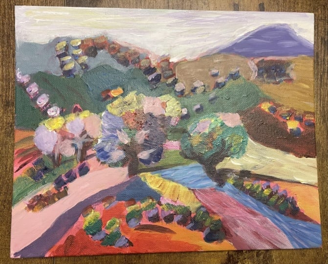
7. Building Interest and More Layers: Let's take a look at this and see this is the stage
where it's easy to go, what is this? It's a big mess. I call it the ugly stage
or the awkward stage. What I can see immediately
is there's not enough value differences
through here. I need some darker stuff going on in here
or maybe in here. Then we'll define these
trees a bit more and just to find some of the shapes more and then come back in and darken some
of the background bits. So my chair. Let's do some of the tree shapes first
so that we can come in I want to go brayer here, but tone that down a bit. Because I want to
come back in and do the negative space
painting on that tree. Um, and trying to think if
I want to do another one. Maybe put a bit of
that here and here, I have a few bits of it. Okay. More defining no. Okay. When you come in with these second layers, it gets more texture
and some yumminess. Don't be afraid to use
a good amount of paint. Get those nice
yummy brushstrokes. Darken this area here. Let's go darker. To get to be able to do the
negative space painting, you do need a good
amount of paint on your brush. Okay. Yeah, that contrast is better. And needs some dark over here. Well, let's do this first. I love the paint bits
showing through, but in that first pass,
there were too many of them, so it became distracting, which is how it is
in the first pass. I'd rather leave too much of it than cover up too much and then once they're
gone, they're gone. I like to work that way. I think I want to make
this color brighter. We're at the stage now where
we can see the colors more accurately because the
fluorescent is gone. I can come in with some nice bits. I want to get some more
darks into some of these. You can just mix these great
neutrals here right on your palate with
what you've got. Dark neutrals, light neutrals, just grabbing what's there
and seeing how that works. Things are coming into shape. Go to make it dark to go behind. Ds tree on the right,
playing with some greens, but I don't want to really
it's too smock that pack. I want a subdued
bluish, greenish color. See how that works.
A little less blue. You got to make sure
when you're doing this negative space
painting that you're you have plenty of paint right at the
edge of your brush. That's why I keep
kind of readjusting. Just looking stepping back. Let me. Build it up. Alright. Yeah, things are starting to make a little sense. I think this here
is distracting. I think I'm going to
tone down that red. I don't want. What I'm paying attention to is when
my eye looks at this, what happens and it's
getting stuck right there. I don't want that. So one
of the things we can do, we can look at
shape, we can look at color, we can look at value. High contrast draws your eye more and this is a
pretty bright red, so it's got contrast
and it's saturated. By colming it down a little, we can take away its
power a little bit. Yeah, that helped. This tree here. I'm going to make a
little less purple.
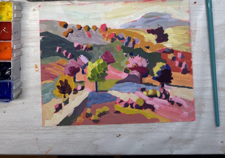
8. Final Details: All right, so let's just talk about a few things that I did, and the camera didn't record, but I'll talk you through
just a few things. I put in a few bits of shadow here to the right of
the trees, some of them, and I painted over where there's a
little bit too much of the bright pink
over at the edge, which was drawing
my eye over here. And I just looked over and said, do I need anything else and just wanted to
chat with you a little bit about texture and how we get these textures and we get
them by not overworking. Wonderful texture in the
sky and this mountain here, layering also gives you that, but really putting the
brush down like you saw me and then trying not
to go back over it. This is dry now so
I can show you. But one stroke. Done. I did layer on
the trees and things, but look, I love how that
brushstroke bit turned out. So at this point, the best thing to
do is walk away. I'm considering this done. If tomorrow I feel like
it needs something, then, maybe I'll do it. But it's much better
to walk away when you feel like you've kind of finished than to keep
fussing and fussing. I've ruined too many paintings that way by overworking them, and you just need fresh eyes. So let's see what
tomorrow brings. But I'm really happy
with the variety. I feel like we brought
the eye in using, you know, our lines and
kind of direction here. This tree is bright and
there's pink around it, so when I have fresh eyes, I'll look again and see, Okay, is my eye getting pulled too much in the
direction I don't want it to? The only thing that I wonder about is this red here still, but I do really like it. So again, I'm not
going to change it, and I hope you enjoyed playing with imaginary
landscapes. Really. You can't go wrong. All
right. Keep creating.
9. Wrap Up and Resources: I hope you had as
much fun as I did. Look how this turned out. Let me get it in front of that. Isn't it? I don't
know, it's just fun. I like how the sort of
accidental water came along and the little bits
and pieces, the little, you know, trees and shrubs
on the hills and just, you know, the way we changed the values of things
to make them pop more. And I just think that you could finish this and then go on and do another
one and another one. And just change them,
change the color, change, you know,
anything that you want. And learn each time you do that. That's the amazing thing about
well, painting in general, but painting from your
imagination because you're more free to experiment
with things like value, color, thinking about where
the sun is coming from. And that really will
help you actually, when you go to use
reference photos, too, because like I said,
for some reason, I always want the sun
coming in from my Well, we're mirrored here,
but on my upper left. And you'll may find a different preference
for where the sun, you know, it's one
direction or the other. But this will, I think, inform and help you when you go to paint landscapes that are from a photo and vice versa. These help you paint those. So, additional
resources I wanted you to know about is I have an
occasional newsletter on my website where I usually send out essays on the creative
life or I might have, if I do an original sale or just other things that
I want studio updates. I don't do it very often
as often as I'd like to, but maybe every
couple of months. That's at Suzanne allard.com. You can also find
my rtsupplylinks at suzanller.com under supplies. I have links there, Amazon Links and Blick Art Supply Links. And then I have a student
only Facebook group, which if you did not get an invite to that
when you register, just email me at art
at suzanller.com, and I will get you
a link to that. And then I have a
Youtube channel. I know. It's a lot, right? I have
fun on Youtube channel doing paint and chats and supply reviews, so
check that out. I'm on Instagram
and Facebook also. And yeah, just keep playing. I can't wait to see
what you create with your imagination landscape. And keep creating in general, 'cause it's good for your soul and that's good for the world. And we all need to feel creative and alive and inspired.
See you in the next class.
 Suzanne Allard, Landscape, Floral, Abstract Painting Teacher