Transcripts
1. Intro: Have you always dreamed
of being a great artist, but your stick figures
just aren't cutting it? Or maybe you just got a
new iPad or you have one collecting dust in a drawer and you want to put
it to good use. Maybe you crave a
creative habit, but your busy schedule and Netflix binges are
standing in the way. If any of these scenarios
sound familiar, then you might be
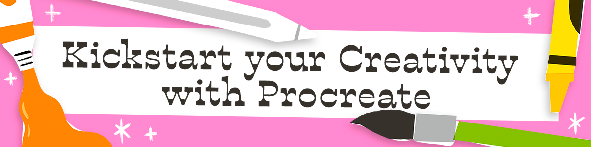
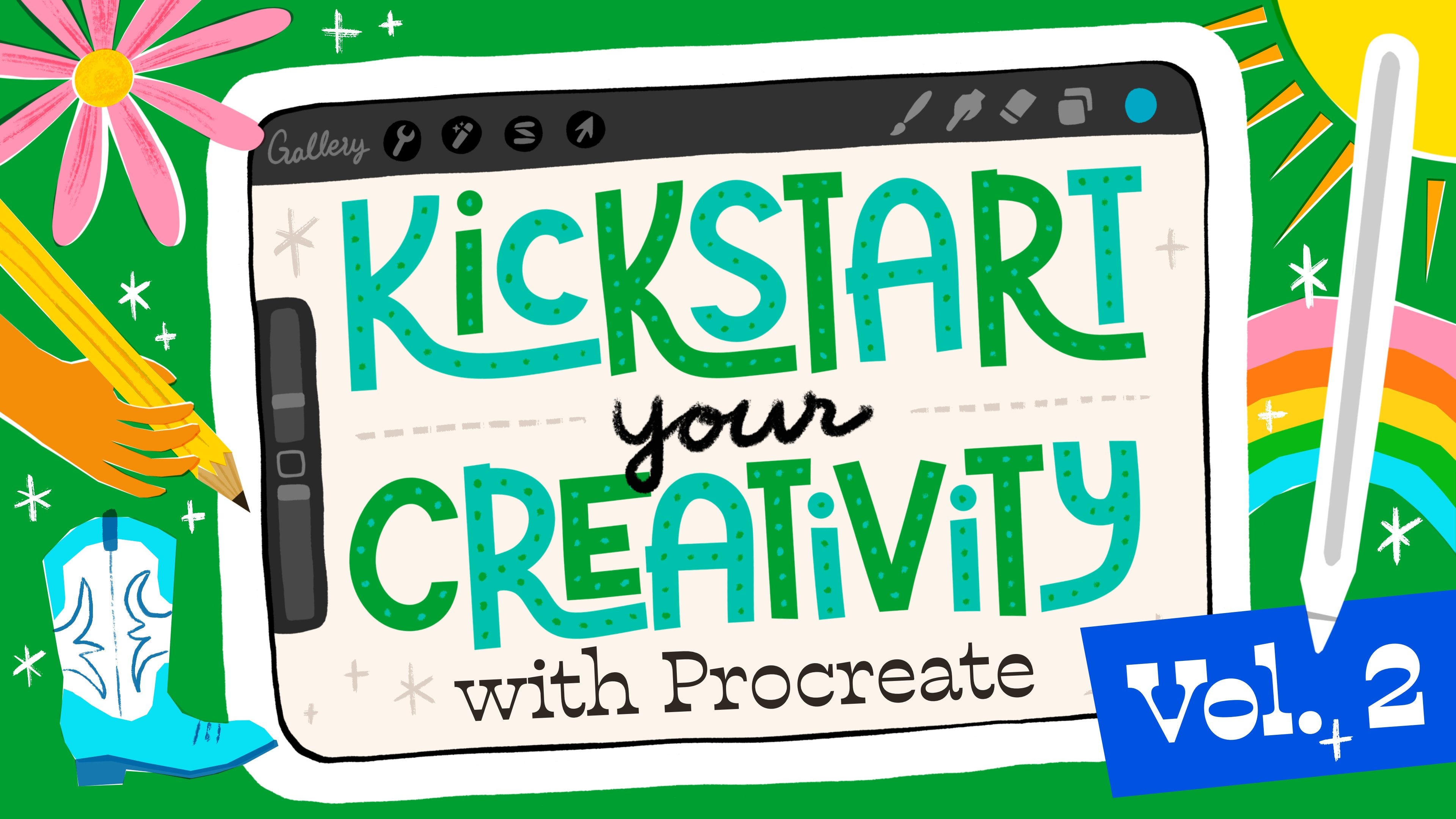
ready to kick start your creativity with Procreate. I designed this
course to help you start making art immediately. You'll get comfortable
working in Procreate, learn valuable art skills, find creative
inspiration, and build a sustainable creative practice all from the comfort
of your couch. This is the perfect course
for complete beginners or anyone who wants to
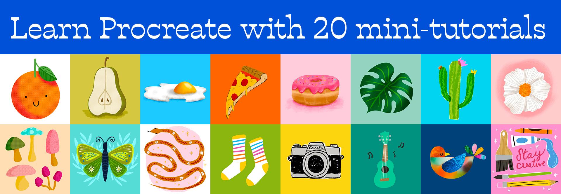
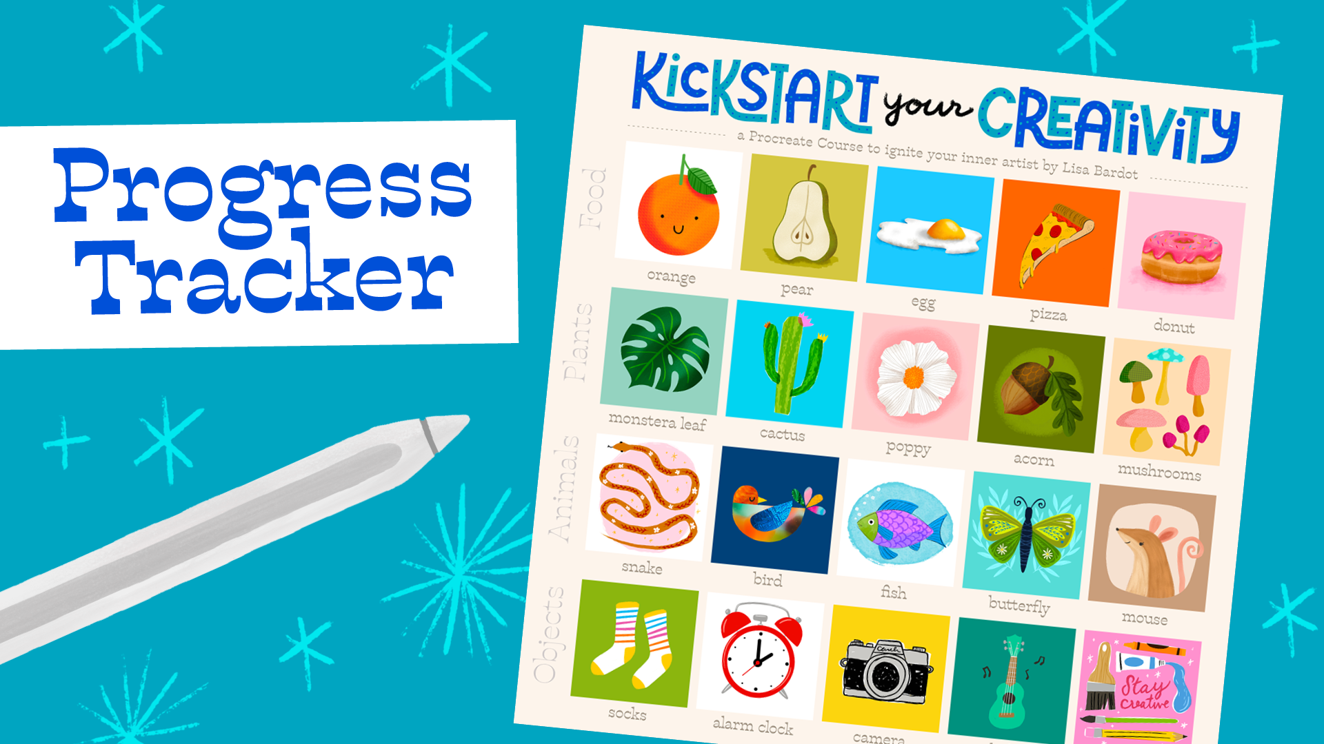
rediscover their creativity. Over the next four weeks, you'll complete 20
mini tutorials that focus on different subject
matter themes like food, plants, animals, and objects. Each week you'll
have five short, 15-20 minute drawing sessions to complete at your own pace. The goal here is to keep
things simple and avoid overwhelm as you build up
your skills and confidence. By the end of the course,
you'll have a collection of 20 unique drawings and the foundation for a
consistent creative routine. Hi, I'm Lisa Bardot and I help people find their creativity
through drawing on the iPad. You may know me from my
YouTube channel where I teach people about drawing, illustration, and all
things procreate. I've helped millions of people
all over the world learn new art-making skills and
discover their inner artist. This course is based on my experience running
Making Art Everyday. A series of daily drawing
prompts, tutorials, and motivation to
help you overcome your creative fears and develop
your art-making practice. For the past five years, I've learned what it takes to guide beginners through creating their first artwork and building a sustainable
creative habit. One of the key insights that
I've gained from running Making Art Everyday
is the importance of celebrating small victories in order to maintain momentum. With that in mind, my goal for this course is to help you create drawings
that will give you a sense of
accomplishment and keep you motivated to continue
your artistic journey. I also understand the
importance of being able to see your progress as
you're building a new skill. As a student of this class, you'll receive a visual
progress tracker so you can see all the artwork that you've
created in the course and give you a little motivational
boost to keep going. For this course, we'll be using the popular drawing and
painting app, Procreate. I've been using Procreate for almost a decade
and I can say that no other medium
I've tried has had such a positive impact on
my artistic development. Procreate is intuitive, easy
to use, and accessible, but has limitless
potential for creativity, and the best part, you can do it all from the comfort
of your couch. No need to leave the house or
buy expensive art supplies. Just grab your iPad
and your Apple pencil, and let's get creative. Are you ready to turn those stick figures into masterpieces and ignite
your inner artist? I will be with you
every step of the way, providing guidance
and support as you kickstart your
creativity with Procreate. Let's get started. [MUSIC]
2. Class Project: [MUSIC] Your project
for this class is a lot of little projects. You're going to be completing 20 easy drawings over the
course the next four weeks. Each week we'll have a
different subject matter theme. We've got food, plants, animals, and objects, and there will be five different
lessons in each week. Each lesson is about
15-20 minutes long, so I don't want you to get overwhelmed with how much
time this might take. If you've got 15-20 minutes, you can get your drawing
done for the day. You're more than welcome
to complete the lessons at your own pace so if it takes
you more than four weeks, that's totally fine too. But I do recommending
not letting too much time go in-between
your drawing sessions. I find that you tend to lose a little bit of
the momentum when you put it away for a while
so every couple of days, if you can get your iPad out and do what are the lessons, that's what I encourage and that's what's
going to help you establish your
art-making practice and make this more of a habit. I encourage you to
regularly share the work that you
create in this class. At the end of Week 1, you're going to go to
the Projects tab on the Skillshare page
and create a project. In that project, I
want you to share your progress tracker with all your artwork
input for the week. I also want you to include your favorite piece
from the week. I encourage you to spend some time doing a little
bit of reflection on your progress for the week and think about some of the things
that you've learned, what was most
interesting to you, things that you may be
excited to try again, and share a little bit
about that in your project. Then when you've completed the second week of this course, I want you to go back to
that project and edit it. You can replace your
progress tracker with an updated version and
share a new piece. Share the piece from that week that you
liked the best and share a little bit
about what you thought about it or
something you learned. At the end of each week, you're going to go in and edit your project, add something new, and by the end, you will have a nice
little journal of all your reflections
from doing this course. Reflecting, I think, is
a really important part of growth and of learning, you really get to spend some time thinking about
what you've learned and you get excited about maybe what you want to keep
trying in the future. [MUSIC] I highly
recommend doing that and I cannot wait to
see your projects.
3. Tools & Resources: In order to do this course, you are going to need an
iPad and an Apple pencil, and you'll need to make
sure that you have the Procreate app
installed on your iPad. At the time of this video, the version of procreate that
I am using is Version 5.3. If you're using a
different version, things might look a
little bit different, but it should
mostly be the same. You're also not going to need any extra brushes or
anything like that, we're going to be doing all
of the lessons using the built-in Procreate brushes that already come with Procreate. You are all ready to go as
long as you have your iPad, your Apple Pencil, and
Procreate installed. The other thing you'll need for this class is the
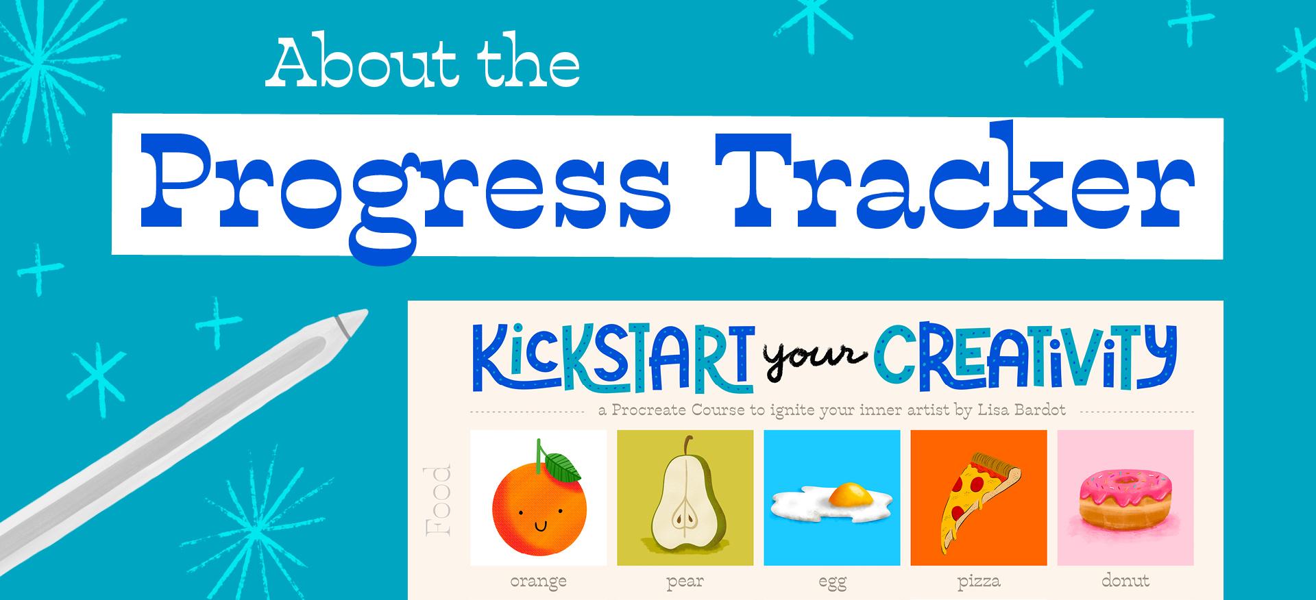
Progress Tracker. I made you this really
cool little progress tracker that is a
Procreate file. You can open it up in Procreate
and you can put all of your artwork in it and really see your progress at a glance. I've got a video that shows you all about how to do
that, coming up. But you'll want to
download that as well. You'll find a link to download
the Progress Tracker on the Projects and Resources
tab of the class page. Finally, I want to recommend that when you're
watching these videos, that you do it on a screen
that is not your iPad, so on a computer, on a TV, on some other device. That way you can work in
full-screen on your iPad. Up next, I'm going to
show you how to create a Canvas template that
we're going to use for the duration of this course, I'm going to give you a tour
of the Procreate interface, and I'm also going to
show you how you can export your artwork to share or to put into your Progress
Tracker. Let's get started.
4. Creating a Canvas Template: [MUSIC] In this video, I'm going to show
you how to create a custom canvas
template in Procreate. For this class, all the
drawings are going to be done on a 3,000 by 3,000
square canvas. We're going to create a
template so that way we can just tap it and open it
up and we're ready to go. When you open up Procreate, you're going to be in what's
called the gallery view and this is where all of your Procreate artwork
is going to be stored. You can organize your
files, you can rename them, you can share them there's
a lot of things that you can do here but for this video, we're focusing on how to create a new canvas in Procreate. More specifically,
we'll be creating a Canvas template
that you will be using for all the
drawings in this class. To create a new canvas, we're going to go up
to the little plus sign in the upper right corner, tap that and there's
some options here. These are all different
Canvas templates. Different sizes that you can work with when you're
drawing in Procreate and we're going to create
our own custom Canvas template specifically
for this class. We're going to tap this little rectangle
here with a plus sign, and that's where we can
create a new Canvas template. You want to make sure that you are here where
it says pixels. You want to make sure
that Canvas dimensions are set to pixel and then the canvas size we're going to
be using for this class is 3,000 by 3,000 pixels. You just need to type in
3,000 under width and height. Once you've done that, we're going to give this
template a name. We'll tap right here where
it says Untitled Canvas and we'll call this
one Kickstart Course. Once you've done that,
you can go ahead and tap "Create" and that's going to pop you into the Procreate Interface
which we will be learning about in the
next lesson but for now, we're going to tap right
here where it says Gallery and that's going to bring us back to
the gallery view. Every time you're ready to start a lesson in this class
are going to go up to the plus sign here and then
in your list of templates, you're going to
find the one called Kickstart Course and
you're just going to tap that and you'll have a Canvas that's the right size
and ready to go up. Up next, we're going
to get to another Procreate Interface
a little bit. If you have never used
Procreate before, this is a good time to
get familiar with some of the tools and options that
there are in Procreate.
5. Procreate Interface Tour: If you're brand
new to Procreate, or if you just need a refresher, you won't want to
skip this video. I'm going to give you a tour of the Procreate interface so you can get familiar with it and you'll be ready to follow
along with the drawings without being confused about where the different things are. I'll show you the gallery view. I'll show you where the
different tools are, how to choose brushes, how to adjust brush
size and opacity, and what some of the
different menus are. It's just a really quick
crash course in Procreate, but I think it's really going
to help you as you work on your drawings in
the further videos. In those videos, of course, I will be walking you through step-by-step of everything
that we're doing, and I won't just gloss over anything so that way you can
follow along no matter what. This is, the
Procreate interface. Over here on the
right-hand side, we have all of our
painting tools. I always like to start by introducing this little
circle in the upper right, and this is how you select
colors in Procreate. You tap this little circle, and as long as you have disc
selected here at the bottom, which is what I recommend using to choose
colors in Procreate, you'll see a colorful ring with a disc or a
circle in the middle. This is how you choose
your colors in Procreate, you choose a few,
like red, yellow, green, and then you choose, how a light, dark or saturated
you want that color to be. But let's just move the
circle down here to black just to get started so
we don't have to worry about colors from the get-go. You can tap that circle again
to close the color picker. Next up, we're going to go through these tools right here. Starting with this paintbrush, this is of course the brushes, so you can tap on this brush icon and you can scroll through your
library of brushes. Procreate comes with a lot
of brushes built into it, and each one is
organized into a set. You can tap through these
different brushes and just put some brushstrokes
on your Canvas, and just see what
they look like, see what they do. Get a feel for
what it feels like to actually put something
down onto your Canvas. Oftentimes when you're
drawing sometimes that's the hardest part is just getting started and putting something
down on the Canvas. I often find that just
playing with the brushes and seeing what they do is a good way to just
get the ball rolling, just spend a little bit of time just going through
these brushes, seeing what they look like, and get familiar with some of the different textures
and things like that. We're, of course, going
to be using all of these or at least some of these
brushes to do our pieces. I've got some brushstrokes
on my Canvas here. Now let's introduce you to the
next tool which is smudge, which is this
little finger icon. If you tap on this tool again, you can choose from any brush in your library to smudge with and it just drags the colors
around your Canvas. That's what the smudge does. The next tool over
here is the eraser, and just like with the
brush and the smudge, you can choose any brush
to be your eraser. There's a lot of good things
about being able to do that. You can match your erase strokes to your brushstrokes
so it looks seamless. I also love to use the eraser to actually
draw some of my shapes, which we're going to get
to do in this course, but that's a really highly
useful tool right there. Between the brush and the eraser those are the ones
that I use the most. Then the next thing
we've got is our layers, and we will get to know
layers a lot in this course. Layers are one of the
most powerful aspects of doing digital art. They allow you to separate
out parts of your artwork from each other and you can manipulate them
independently. Don't worry too much
about it right now, but layers are awesome. We're going to get to know
them a lot in this course, so make sure you tap
back over to your brush. The next thing I want to
show you are these sliders. This is called the sidebar, and we've got these sliders. The top one is going
to be your brush size. You can make your
brush big or little. Let me choose a different
brush here so we can see it a little bit better. You can make your
brush size big, or you can make it small. Then the other slider
here is our opacity. I can turn the opacity
down and that just makes my strokes a little see-through or a lot see-through depending on how high you
have that slider. Next, I'm going to
show you a couple of Procreate gestures. Now, Procreate was built to be a platform that
runs on touch. Gestures are a really
important part of working in Procreate, and you'll get to know a lot of these gestures as we
go through the course. But there's a few that I want you to know right off the bat. The first ones are
undo and redo. These are super useful. This is the benefit
of working in Procreate or digitally
for that matter, is that you can actually undo whatever you
want. You mess up. Just undo and try again, and it's very freeing [LAUGHTER]
You're not just like, oh no, I messed up on my paper now it's ruined.
You can just undo. Two fingers and tap, every time you tap
it's just going to undo one step of what
you had done previously. Or you can tap and hold and
then it'll undo multiple, and then to redo, you take
three fingers and you tap and you can redo
what you had just done. The last thing I want to
show you in this lesson are some of the menus
over on this side. First of all, we've
got our Actions menu and there's a lot of
different options here. Again, we're going
to get to know, but you can add things
to your Canvas. Under the Canvas, there's a lot of different
options there. Don't get overwhelmed, don't
worry about that for now. There's the sharing options
for when you're ready to export your artwork and
share it with the world, which I'll show you
in the next lesson. Then another fun
one is the video. You can actually watch a
time-lapse replay of your art. If we tap that, I can see a replay of everything
that I just did. There's some preferences
and things like that, but don't worry
about that for now. The next menu here is
the adjustments menu, and these are for making
alterations to your artwork. We're going to get to
know some of these. There's a lot of
really fun adjustments and filters in Procreate that you're going
to get to know. Then over here we have
our selection tool, and this is for
making selections. Then we have our transform tool, which is for moving and manipulating things
around the Canvas. We're going to get
to know those too. We're not going to explore those too much right now [MUSIC] I hope you enjoyed this little
crash course in Procreate. There are a lot of
really amazing features that you can use in Procreate, things that you can do with it, and we're going to get
to know a lot of them and you're going
have so much fun. I'm really, really excited
for all the cool stuff that you're going
to learn when it comes to Procreate [MUSIC]
6. How to Export your Artwork: In this video, I'm going
to teach you how to export your artwork
from Procreate, so that you can
share it on the web, you can add it to
your class project, you can put it into
your progress tracker, or you could print it out
and put it in your home. Once you finish your drawing and you're ready to share it, you're going to go up
to the Actions menu, which is the little
wrench right here, and then you're
going to go right here where it says Share. Here in the top
half of this menu, there are a few
different options. The best option for us to share artwork if we're
just going to be sharing it on the web or
something like that or printing it out, is the PNG. Choose PNG, and then you'll get some options for what
you can do with it. You could save it to
your camera roll, you can Airdrop
it to your phone. There's a lot of things
that you can do, but that's where
you're going to find the option to actually
share your artwork. [MUSIC]
7. Using the Progress Tracker: [MUSIC] One last video before we jump into our drawing lessons. In this video, I want
to show you how to use the progress tracker that is supplied to you as a
student of this class. This is meant to
be a way for you to see at a glance all the
progress that you've made, and you can see all your
pieces all at once, so you can fill it up
as you finish a piece. It's really easy to do. It comes as a Procreate file, so you'll download it, you'll open it up
into Procreate, and then I will show you how
to put your artwork into it. You can download the
progress tracker on the Projects and Resources tab of this Skillshare class page. You're going to want to
download the progress tracker either directly to your iPad or transfer it to your iPad from your
computer or other device. When you try to open it up, it should import
directly into Procreate. I've got my kickstart course
progress tracker right here. You can go ahead and
tap it to open it up. If I go up here to
my layers panel, which is these two
little squares, I can tap that and I can
see I have two layers. The top layer is
the actual tracker, so the overlay with
texts and everything. Then down below that
is a layer where you can start to place your artwork. Now I'm going to
show you how to get your artwork onto this
progress tracker. I'm going to exit back out to gallery view by
tapping "Gallery," and then I'm going to
open up one of my pieces. There's a couple of
ways that you can add your artwork to
the progress tracker, but I think the easiest way is using Procreate's
copy all function. To do that, it's pretty easy. All you have to do is take three fingers and swipe
down on your screen, and that's going to invoke
the Copy Paste menu. We're going to be choosing
Copy All from this menu. Copy All, and that's going
to copy my entire artwork. If the three-finger gesture
is a little tricky, you can also do
the same thing by going up to the Actions menu, which is a little wrench, going to Add, and then choosing Copy Canvas. That's another way to
do it. Once you've done copy all or copy canvas, you're going to exit back
out to the gallery view, and then you're going to open
up your progress tracker. Then you do a three-finger
swipe down on your screen again to pull up
that Copy Paste menu and you choose Paste. Then you can grab these little blue
nodes in the corner of the selection and resize
it so that it fits, and you can zoom in, it's
a little bit easier. You just want to get the
edge of this dotted lines little bounding
box to align with the edges of the
opening in the frame. It's okay if it's a
little bit bigger. Now the other way to
get your artwork into your progress tracker is by importing an image
from your camera roll. If you had exported your artwork and saved
it to your camera roll, this is how you would do it. You'd go up to the
Actions menu, the wrench, and then you'd go to Add
and then Insert A Photo, and then you can
choose any image from your camera roll and
it will import it. Then again, you just resize
it so that it just fits. Just a teeny bit bigger than
that square. Like that. [MUSIC] Every day after
you finish a lesson, go ahead and add
that day's artwork to the progress
tracker and it will be so much fun to see all
of your artwork at a glance and see all the
progress that you've made, and then of course,
don't forget to share your progress tracker
in your class project.
8. Intro to Week One: Food: [MUSIC] Welcome to Week
one of the kick-start your creativity with
Procreate course. This week, we're going
to be drawing food. I think food is the perfect subject matter for beginners who are
learning to draw. It's universal and
instantly recognizable. Food comes in so many
different shapes and textures and colors. It can be depicted in a lot
of really creative ways. Or you can keep
it really simple, which is going to
be our approach to drawing food in these
first five lessons. This week, you'll get to know Procreate's most
useful features and some very essential
digital art skills. You'll learn about
working with brushes, choosing colors,
working with layers. You'll learn about sketching, using clipping masks, and Alpha Lock and so much more. I'm sure at this
point you are very excited to get started
with your first drawing, but you might also be feeling
a little intimidated too. I just wanted to encourage
you to let go of any and all expectations that you have about how this course should go. What you create, doesn't have to look exactly
like my examples. It doesn't have to
be a masterpiece. The point of all these drawings you're about to make is to just go through the
process of making them. With every brush
stroke you make, you are learning and training
your hands and brain. Don't worry about trying to remember every little thing too. The beauty of the
fact that we're doing 20 drawings
is that you get a lot of repetition and practice at doing these
different skills. Without further ado, let's get into our first food
drawing. [MUSIC]
9. No.1 - Orange: [MUSIC] Welcome to your first
drawing of this course. Today we're drawing an orange. This drawing is
going to guide you through a lot of probably stuff that might be new
to you when it comes to working in
procreate and drawing, but stick with me, I'm going to be explaining
every step along the way. I'll be introducing you
to some cool features like quick shape and quick line. We're going to be using
Alpha Lock to add texture to our orange and even a
little bit of shading, and we'll finish it off with a cute little face. Let's go. To begin, we're
going to be using our Canvas template that we
made in the previous section. We're going to go up here in the upper right
to this plus sign, and we're going to find the kick-start course Canvas
template that we saved. It was 3,000 by 3,000 pixels, so just going to tap that, and it's going to open
up into Procreate. Let's begin by heading
into our brushes, so tap the brush
icon right here, and we're going to
find the Inking set. So find the Inking set, then in the Inking set, we're going to get
the studio pen brush. So we're going to find studio
pen in the Inking set. The next thing we're going
to do is choose a color. Go up here to the
color picker circle, and we are drawing an orange, so of course we're
going to start with a nice bright orange. Here in the outer ring, we're going to choose
orange as our hue, and then we're going to
grab this little circle here and we're going to set the saturation and lightness
or darkness of that color. I want something
really saturated, so I'm just dragging it
all the way up that way. The next thing you want to
do is set your brush size. We have our brush
size slider here. I'm going to set it
to about 50 percent. It doesn't have to
be exactly the same, but we're going to go
ahead and draw a circle. If you are a beginner, drawing a circle can be
a little intimidating. They often come out a little bit wonky and there's
nothing wrong with that, I think wonkiness adds a lot of personality to illustration, but if you wanted to
draw a perfect circle, Procreate has a
really great feature to help you with that
called quick shape. Let me do a two-finger
tap to undo that. This time when you
draw your circle, we're going to
keep our pencil on the screen once we
get to the end. So you can watch
me do that here. I'm going to draw this circle, and then when I'm at the end, I'm just going to
keep my pencil on the screen and it will
snap to this oval shape. If I wanted this to
be a perfect circle, I would take one finger and just hold it down on the screen, and it will snap to
a perfect circle, and I can make it as big
as I want, like that. When I'm happy with
it, I can let go. If I wanted to
edit this further, I can actually do
that by tapping here at the top where
it says circle, and I can move it
around like that, I can drag the edge and
make it bigger or smaller. I'm going to keep it pretty big, but I'm going to leave a little
room at the top so I can add a stem and leaves, but I think that
looks pretty good. You can just tap on any tool
to exit out of that mode. Now, we're going to
fill this with color, and you could of course, color it in like that, but that would take forever, and we're digital artists and we have tools
that speed things up, so let's undo that. To fill this with color, we're going to use color drop. It's really easy, all you do
is take this little circle, you just drag it out and then you drop it
here in the middle of your closed shape and it will fill
completely with color. Super handy, I use that
feature all the time. Next we're going to add a stem and leaf to our illustration. I'm going to go over
to my colors and I'm going to choose a
nice leafy green, so I'm moving my hue
over into the green and then this is
like really bright and saturated up here, so I'm just going
to actually come a little bit closer to
the middle like that, and then I'll tap to
get out of there. Now, I could go ahead and start drawing my stem just like that, but I might want
to come back and add some texture to my orange, so I'm actually going to put the stem on what's
called a separate layer, so I'll go ahead and undo that. Here is our layers, it's these two little squares. You can see I have Layer 1 and this is where my orange is, my big circle, and I'm going to tap this
little plus sign here, and that's going to
create a new layer. Basically I can draw on
this new layer and it's not going to affect what's
on the other layer, it's not going to affect anything that's on
any other layer. This is great for separating out parts of your artwork
so that you can work on them
independently without messing other stuff up, so we'll get to see that
in practice in just a sec. Let's go ahead and draw. I'm going to draw a
straight line for my stem, and we can use that quick shape function to do that again. You can draw a line, but
when you get to the end, just hold your pencil
down and don't let go, and now you can decide where
you want your line to end, so I'm going to put
it right there. Now, I'm going to zoom in
so I can draw my leaf. To zoom you just take two
fingers and you pinch them out like that or spread
apart like that, and I'm going to draw a
line coming out that way, and then I'm going to add
my leaf to this line. I reposition my Canvas
a lot when I'm drawing, I like to rotate it
and move it around, so I recommend doing that. We'll draw a curved
line on one side of this and then another
line on the other side, and then we'll fill those
in with color drops, so just drag from the color picker circle
into those closed shapes. If you're getting these lines, which I am here, there's a white gap, you can adjust your
color drop threshold. This is an important
little thing to learn, so I'll just undo
that really quick. I'm just going to drag
it in just like before, but I'm keeping my
pencil on the screen, and now I can move my
pencil all the way over to the right and it'll
fill in all those gaps. I'll fill that one and two. Now we've got a stem, we've got a leaf. Maybe I'll make this stem
a little bit thicker, you can, if you want. There we go. If I wanted to zoom back out so I can
see my whole Canvas, take two fingers and do a
little pinch like that, and it will make the whole
thing visible again. Now I want to add a
little bit of texture, a little bit of
pizzazz to my orange, so I'm going to go over
here to my layers, and I'm going tap back over to layer 1 with the orange here. I want to add texture
that's just a little bit darker than the color
I already have here, so I'm actually going
to take a finger and put it down on the screen, and that's going to invoke
this eyedropper and you can choose any color that's
already on your Canvas, but I'll choose the orange, and then I'll go over
to my colors and just choose just a little
bit more red, so color it a little
bit more red, maybe teeny bit
darker like that. Then I'm going to go
over to my brushes and I'm going to go to
the vintage set, and I'm going to choose the
newsprint brush right there. Now, I wanted to fill this
entire circle with texture, and if I try to do that, I might get some over
the edge like that, so that's not the best solution. We're going to use a
really cool feature called Alpha Lock to keep the texture
inside the circle. I'll just undo that, I'm going to go over
to my layers here. I'm going to tap
my selected layer, so it's the one in blue. tap it, and then
here in the menu, I'm going to choose Alpha Lock. Then you'll see there's
a checkerboard pattern behind this little
thumbnail of the orange. Now, if I draw with this
brush close to the edge, I can go right over
the edge and it's not going to go beyond
that shape because what Alpha Lock does
is it locks the shape on that layer so you can
only draw within that shape. Let's go ahead and finally
texturize this orange. I'm actually going
to make my brush size all the way big, so put it all the way up, and then I'm just going
to lightly go over the orange like that in
one continuous stroke. You don't want to do too heavy
pressure because that will make the color or the
texture really dark, so just one continuous motion. Then right here under the leaf, I'm going to go over that one more time just to
make it a little bit darker. This brush has some darkening
effects built into it, so if you layer your strokes, it'll get darker and
darker like that, and that gives us a nice
little shadow for our leaf, and then maybe I'll also add another stroke around like
one side of it like that, just to give it a
little bit of shape. Now that we have some
texture on our orange, our leaf is looking
a little flat, so let's add texture
to that too. We're going to go up to our
layers and we're going to select the leaf layer, and we're going to
turn on Alpha Lock, just like we did
with the orange. You can either tap it and go
to Alpha lock in the menu, or you can use a gesture
which I like to do. You take two fingers and you swipe to the right on the layer. Then for the colors,
I'm going to select this green using the eyedropper, and then I'm going
to choose a color that's a little bit darker, so I'm moving this way
on this color disk, so down and to the side a little bit to get
something that's darker and also a
bit more saturated. Then I'm going to
go to my brushes, and in this same set, I'm going to find the [inaudible]
brush up towards the top. [LAUGHTER] Then I'm going
to zoom into my leaf here, and I'm just going to
basically draw over half of the leaf just to give it
a little bit more dimension, so just making one-half darker, then I'm going to get
an even darker version of that color just a
little bit darker, and we switch brushes now. I'm going to go
over to my brushes, I'm going to go back
to the Inking set, and I'm going to
choose studio pen. I'm just going to add some
vein details to my leaf, so a line down the middle and then some lines coming
out the side like that, and because I have
Alpha Lock on, I can just go right
over the edge of the leaf and it's just going
to stay within that shape. I added some veins
and maybe I'll make the brush size a
little smaller and add a few more just to give it some variety to the line weight. Now this is a very
simple illustration, so I thought it
might be fun to add a little personality by giving
the orange a little face. In my layers here, if I tap the two
little squares here, I could create a new
layer to draw the face, or I could use the same
layer as the leaf. I just need to turn
off Alpha Lock first in order to draw a
new shape on that layer, so I can take two fingers and swipe to the
right on that layer, now that checkerboard
pattern is gone, so I can draw outside
of this shape now. I'm going to grab
black as my color, so go to the colors
and choose black, and I'm just going to draw a cute little face
using this same brush. Two little dots far apart, and maybe I'll up
my brush size just a little bit [MUSIC] and
draw a cute little mouth. With that finishing touch, we are all done. Congratulations,
you've just finished your first drawing
of the course. You can revisit the lesson on Exporting Your Work if you
wanted to share it and post it online or add it to your class project or if you want to add it to
your progress tracker. In the next lesson, we're
going to be drawing a pair. You're going to be
learning how you can use the eraser tool to
refine your shapes, you're going to learn how
to reorganize your layers, how to add a background color, and how to combine
textures in your art. I'll see you in the
next lesson. [MUSIC]
10. No.2 - Pear: [MUSIC] Welcome to
drawing Number 2. Today we are drawing a pear. In this lesson, we're going
to explore some new brushes. I'm going to show
you how you can use the eraser tool to
refine your shapes. We're going to be combining
different textures, we'll be using the
select and transform tool to speed up the
drawing process. I'll talk to you about using brush pressure and adding
a background color. It's going to be a lot of fun. Let's do it. Let's go ahead
and create a new Canvas. I'm going to tap the
plus sign and choose our Kickstart Course
Canvas template. Let's start out by selecting
the brush we're going to use to draw the main
shapes of our pear. We're going to go into
the brushes and find the inking set and we're going to choose
the studio pen brush. We're going to be drawing
a pear that's sliced open. Let's begin by choosing a color. We're going to go up to the
colors and we're going to choose a creamy color for
the inside of the pear. For the hue, we're
going to be here in the yellowy-orange area. Then we're going to move this other circle into
the white but then move it back down this
way a little bit to get a creamy color like that. You can always paint a swatch on your Canvas just
to see what that looks like and then undo it. Go ahead and draw a
pear shape like this. It's okay if it's a
little wonky and quirky, I think that adds personality. Then you're going to take
your color picker circle and you're going to fill
this in with color drops. Just drag that into the middle of your shape and fill it in. I do want to know with color drop you want
to make sure you have a completely closed shape or your color might
spill out everywhere? Now I want to add the little bumpy part at
the bottom of the pear. I'm actually going
to use my eraser to refine the shape.
I do this a lot. I'll draw a bit more
basic shape and then I'll refine it with my eraser to
make it a more complex shape. You can set your eraser
to be any brush you want. We want it to be the same brush that we're using to draw with so that all of our brushstrokes
match and it looks seamless. Procreate has this really
cool feature where if you tap and hold the eraser like that, it will select
whatever brush you had as your brush
as your eraser. Now I have studio pen
set to be my eraser. This only works if
you have the brush selected and then you
tap over to the eraser. Go ahead and choose studio
pen as your eraser. Now I can go down here
to the bottom and just erase away a little bit to
create that pear bottom shape. I can erase the rest of
that just like this. I can even come in a
little closer if I wanted to round those out just
a little bit more. That one's point D. Just refine that shape
a little bit more. That's the inside of the pear. Now we're going to
create the peel of the pear which is going to be like an outline around it, then we'll see some of the edge. We're actually just
going to duplicate this same shape and use it
as the outside of our pear. We're going to go
up to our layers, which is again the
two squares up here and we're going to
duplicate this layer. Basically, make a duplicate
copy of this shape. To do that, you're
going to swipe to the left on that layer and you'll see some
options here and we're going to choose Duplicate. Now you see we have two
copies of our pear. We want to make this
one a pear-green color. Let's go over to our colors, choose a yellowish-green color and then a little bit dark in the middle but over
to the side like that. Now we're going to drop this
color onto our pear shape. Just drag it and drop it onto
your pear shape like that. We need this peel color to be behind the cream color like
the inside of the pear. We're going to move this
layer below the other layer. To do that, you're going to tap, hold and drag it underneath
the other layer. Now because the cream-colored
pear is on top, it's the one that's visible. Whatever layer's on top covers
up whatever's below it. But that's okay because
we're going to actually resize this a little bit
so that we can see it. Make sure you have
the green pear layer selected and then tap
this little arrow icon. This is our transform tool which lets us move things
around the Canvas. You can zoom out still, just make sure you're outside of this bounding box if you
want to zoom your Canvas. If you're inside it
might not work so well. Now make sure you're under
the uniform transform mode. This will keep the shape in
proportion when we resize it. Then we're just going to drag these little nodes
in the corner, the little blue nodes and
just make this a little bit bigger on these two
opposite corners like that. Here we go. If we switch
over to free form, we can transform it
out of proportion. If we wanted to make just
the side a little wider, we could do that so you
can make it big like that but we just need to make it just a
little bit bigger. We have a border around
the whole pear shape now. Then you can tap the arrow again to exit the
transform mode. Now I want this side of the pear to show a
little bit more so it looks like you're seeing the side of the
pear a little bit. I'm going to go back to my
Layers and I'm going to duplicate this green pear layer. Again, to do that, you're
going to swipe to the left on that layer and choose Duplicate. Now we have two
copies of that work. I'm going to choose
the bottom copy. Then we're going to go back
to our transform tool. I'm still in the free-form
transformation mode and I'm just going
to grab one side of this and I'm just going to drag it off to the side
just a little bit. It seems like we're seeing
the side of the pear. Then I've got a
little bumpy area down here at the bottom of the pear where it doesn't quite seem like it's selected
so I'm just going to paint over that to connect
those areas like that. Now we can see the inside of the pear and also a little
bit of the outside. I'm ready to start
adding some texture to the outside of my
pear but I need these two layers to be
together as one layer in order to add texture
to that whole green area. We're going to merge these
two layers together. There's a couple
of ways to do it. The first one is by tapping the top of the two layers
that you want to merge. Tap it and you can choose
Merge Down here from the menu. The other way is just by pinching the
two layers together. You just take two fingers and can be a little
tricky with two layers. There we go. Pinch them together and you'll see that
they'll be merged together. Whichever way is easier for you. Now we're going to turn on Alpha lock so we
can add texture. We want to lock in this shape, and we want to add
texture inside of it. You can take two fingers
and swipe to the right. Or you can again, tap the
layer and choose Alpha lock but make sure that
checkerboard pattern is on your layer thumbnail. Now we're going to go
over to our colors. We want to choose
a brownish color to add some speckles
to the pear. I'm just going to
go over closer to orange in my hue like that, and then I can get a little
bit darker of a color , orangish brownish color. Then for the brushes,
we're going to go into the textures set. Down to the bottom,
we're going to choose the grunge brush. Then maybe make the brush
size a little bit bigger, actually all the way up. Then you're just
going to very lightly come in here and add
a little bit of this brown around the edges just a little bit here
or there, not a lot. If you press too hard, it'll make it really brown, so just very lightly add a
little bit of this texture. You zoom in and see
how much I've done. Now we're going to add
another texture to this, because there's variations
in the color on a pear, but there's also
little speckles. We're going to go into
the spray paint set, and we're going
to choose flicks. I'm going to also change the
color just a little bit. I think, I'm going to go maybe
back towards the yellows. All the colors of
a pear are here in the warm greens to orange. I'll choose a more dirty
yellow [LAUGHTER] color, and then I'll just add a few strokes of
this Flicks brush. You see, maybe I'll get a
little darker. There we go. You can mix and match, add different values,
which is like how light or dark a color is to
create that pear texture. But I think that
looks pretty good. Now I'm going to go to the layer with the
inside of the pear, so this creamy color, and I'm going to
add a little bit of texture to that, not a lot. I'm going to take my two
fingers and swipe to the right to turn on Alpha Lock on
this inside pear layer. I'm going to select this
color using the eyedropper, so this color of the
inside of the pear. Let's just choose
white actually. We'll choose white, so something way up there. Now for the brush, we're going to go into
the material set. I'm going to choose
the noise brush. This has a very
subtle texture to it, and I think it will work for
the texture of the pear. Let's go ahead. Now that my brush
size is too small, so I'm actually going to
make it all the way big. Then very lightly, I'm going
to go over this whole shape. Doesn't have to be a
continuous stroke, just to add a little bit of
texture to make it less flat. You can see that texture there. Finally, we're going
to add some details. We're going to add
a little stem, and then seeds and
things like that. For the details, I'm going
to create one more layer. I'm going to tap
the plus sign here, and we have a layer above
the other two layers. For my brushes, I'm going to go into the Calligraphy set, so go into Calligraphy. The brush we're
going to be using is the shale brush
right here, shale. For the colors, I'm going to
start with my creamy color. I'm going to choose
a color that's darker and more saturated, so I'm going this way in
this inner disk here. Just to add, this is going to be the line down the
middle of the pear. That's a good color right there, just a bit darker. I'm going to draw a line down the center of the
pear like that. Then for those where the
seeds are on the pear, we're going to draw a line that comes out almost like
an upside down heart, and then again on the
other side like that. Then we're going to
get a brown color, so get a lot darker, a little bit more saturated. Then maybe go over into the
oranges a little bit more, so it's a little bit
more reddish orange. Let's zoom in and draw a
couple of seeds like that. This brush, if you use heavy
pressure, it will be thick. But if you use light pressure, it's nice and thin. You can use that
to your advantage if you're trying to draw seeds. Use light pressure at the
tip to get that point. You can fill it in like that. There we go. Draw two
little seeds there. Then the last thing
to do is add a stem. We're just going to draw a curving shape with a little
nub on the end, like that. Now this time around, we're going to add
a background color to our illustration. To do that, you're going to
go up here to the layers. Down here, you'll see it
says, "Background color." You could tap that and then choose any color for
your background. I'm going to use
a color that's in the same vein as my pear, so a yellowish green. You could see as you
move this around, you get an instant preview of the color that
you're picking. Maybe I'll go a
little more yellow, and do this pear color. Just because I think
the pear looks a little bit like it's
floating in space, I'm just going to add a really
subtle shadow underneath. I'm going to go up
to my layers and tap the plus sign to
create one more layer. Then we're going
to move this layer underneath all the
others, just like that. This layer is now below
all the other layers. I'm going to sample this color that I used
for my background, and then I'm going
to choose a version that's a little darker
and more saturated. Now I'm going to
just zoom in here, maybe make my brush size bigger, and just draw just a little bit of a shadow
underneath like that, a really sketchy, brushy shape. Then to make this pear
fill even more grounded, like it's actually
sitting on something, I'm going to go even darker and more
saturated with my color, so go pretty dark. If I actually turn my
brush to the side, it gets nice and soft like that. You can just add a
little bit darker right underneath the pear. [MUSIC] This illustration
is all done. Congratulations. In
the next lesson, we're going to be
drawing a fried egg. We're going to be
introducing a little bit of sketching for the first time, and also a little
bit of shading. I'll see you in the next lesson.
11. No.3 - Egg: [MUSIC] Welcome to Drawing 3. Today, we're going to
be drawing a fried egg. In this lesson, you're going to be introduced to sketching. Sketching is basically a
pencil plan of what you want your artwork to look like before you create
your finished piece. It's a really, really useful step in
the entire process because it's unrealistic to expect yourself to
be able to draw something perfectly like
right out of the gate, so I use sketching
to take me through different iterations to get
it to that final place. You can start with really
basic shapes and then start adding on complexity
to that basic shape, which you'll see
as we do this egg. Sketching is really,
really important and I'm excited to introduce
it to you today. You'll also be picking
up some more tips about shading and choosing
colors. Let's get into it. Before we get started,
we now have two artworks from this class in our
Procreate gallery, and they are both
called untitled, so let's show you how to
give these pieces a name. All you do is tap on the name, so Untitled Artwork, and then you can name
it whatever you want. I'm just going to call it orange and then this other one
I'm going to call pear. It is useful to name your
artwork because if you ever want to back it up or
transfer it to computer, it helps keep things organized. I am pretty bad at
remembering to name my files, but it is a good thing to do. Let's get started
with today's drawing. We're going to go ahead
and tap the plus sign to create a new Canvas, and we're going to find our Kickstart Course Canvas
template and open that up. We're going to be drawing
a fried egg and we're going to begin this
illustration with a sketch. A sketch is just a pencil
drawing to help you plan out what you want your
final drawing to look like. Sketching is
especially useful for when you're drawing
more complex shapes, starting with more basic
simple forms and an adding details to that to create what we actually want
our piece to look like. Let's go over to our
brushes and we're going to choose one of
the sketching brushes. I'm here in the sketching set. My favorite from this
set is the 6B pencil, so you can choose 6B pencil
from the sketching set, then we're gonna go to
our Colors and we're just going to choose a
black or dark gray. We're going to be drawing
our egg at an angle, so we're going to use an oval to create the shape of the egg. Just draw an oblong oval, something like this, and then for the yolk,
we're going to add another oval to plan out
where we want that to go. Off to the side,
we're going to draw a similar shape
oval to the one we just drew. Something like that. Then we're going
to give our yolk some volume by drawing
like a mount over the top, so something like this. Just an arched line. I like the line to stick out
over the edge of the egg, I think it gives it
a nice dimension. Now eggs aren't perfectly
round like this. There's usually some wavy edges, so we're just going to
draw some wavy edges right over the big oval
that we drew previously, so something similar to this. We're just going to draw wavy lines over the
edge of our egg, just going back and
forth like that. The last thing if you want, my egg looks like it's
tilting this way, so you can use the
transform tool to rotate it if you need to. Just tap the little arrow here, and then you can grab this
green node and you can use that to rotate or straighten it out a little
bit if you need to. Our sketch is complete, we're ready to move on to color. We're going to be
using this sketch as a guide as we draw
our finished piece. First of all, let's go up to our Layers and we're going
to create a new layer. Tap the plus sign to
create a new layer. I like to keep my sketch
on top of my final art, so I'm going to move this sketch above the new
layer that I just made. We've got the sketch on top and then the new
layer on the bottom. Then we're going to reduce
the opacity of the sketch, so it's just barely
visible and we can use it as a guide to draw
our final art. To do that, you're going to tap this little N right here
on the sketch layer, and then we have
this opacity slider and you can just slide it down to so it's barely visible and you can
use that as a guide. Then while we're here in layers, we're going to be
making obviously a white egg with a yellow yolk, but drawing white on a white background
is really difficult, so let's go ahead and set
our background color. To do that, your
background color is right here under your
layers at the bottom, you can tap where it
says Background color, and then you can
choose whatever color you want to be your background. I'm going to choose
a nice bright blue, I think that'll look really nice with the white
and the yellow. Then, of course, we're
going to go over to our Colors and we're
going to choose white, and it will snap to
a pure white value. This works on a few
different places around the color disk, but I use it most
often for white, so double-tap close to white
and it'll snap to white. Then for the brushes, we are going to go back into the inking set and use
our favorite studio pen. I use this brush a lot
for just general shape, drawing shape making, so studio pen from
the inking set. We're ready to go
ahead and start drawing the shapes of
our final artwork. Basically, we're
just going to be tracing over our sketch, starting with the
white of the egg. Tracing is a really
useful skill, you use it all the time in art, especially when you are going from your sketch
to your final art. I'm just tracing over those
wavy lines of my egg, and then I'm going to
fill it with color-drop. Great. Now I'm going to do the yolk and I'm
going to do that on separate layers so I
can come back and add texture and shading to
the rest of my egg. I'm going to go up to my Layers, I'm going to tap the plus
sign to create a new layer. Then for my colors,
I'm going to go in the warm yellow and choose a
nice yolk yellow color. [LAUGHTER] Then I'm
going to trace over the yolk shape just like that. Once you have a
fully closed shape, you can fill it with color-drop. At this point we're
done with our sketch, we can actually
turn it off because we don't need to
reference it anymore. To do that, we're going to
go up to our layers and then we're going to tap on
the layer with the sketch, and this little checkbox
right here turns off the visibility of
the layer so you can hide a layer just
by unchecking that. Now we're ready to add some texture and
shading to our egg, and we're going to start
with the white of the egg. Tap onto that layer, and just like we've done
in the other videos, we're going to use Alpha
Lock to add this texture. You're going to take
two fingers and swipe to the right
on that layer, we have now that checkerboard
pattern or you can tap the layer and choose
Alpha Lock from the menu. Then for colors, we're
just going to choose just a very, very light gray. If it's easier, you can tap
to select white and then just move the circle down until you get a little
bit lighter of a gray. Then for brushes, we're going to go into the texture set, here it is, textures, and we're going to
choose the grunge brush. See my brush size is
about 50 percent, I'll see if I need to adjust it but I'm just going to
lightly add a little bit of this gray color around
the edges of my egg, like that. Just very lightly. Then I can add a few little swatches in the middle of it, and then also right here
under the egg yolk, I'm going to add a
little bit of that gray. I'm actually going
to make the gray go out this way a little
bit because I'm imagining there's a light coming
from this way and it's casting a shadow on
the egg a little bit, so I'm going to make the
shadow part go that way. That's looking pretty good. Now we're going to get a
little bit darker of a gray and we're going
to add that in. Go up to your Colors
and then just go get a little bit darker
gray, and then we're going to add this
darker color along the bottom edge of the egg white here. Then along
the bottom edge of the egg yolk and then we'll drag it out to the side a little bit to
show that shadow. If you want, you
could keep going and get a little bit darker. I would get a little darker
and maybe a little warmer, so we can bring the circle in to the middle to saturate the
color a little bit more, and just add a few little
darker spots here and there. Here we go. Our egg white
is looking pretty good, let's go ahead and add some
shading to our egg yolk. We're going to go to the
layer with the egg yolk, we're going to turn
on Alpha Lock with a two-finger swipe to the right, so just like that. Now let's actually get the eyedropper and sample this yellow color to start with. Then we want a darker yellow to add a little bit of
shading on one side, but when you're
darkening a yellow, you don't just want
to go straight into black because that will
make it look really muddy. I like to go closer to orange when I'm trying
to get a darker yellow. You can get a little bit darker, add a little bit black to it, but mostly we're essentially saturating it more
by adding more red. Now I'm just going to
add a little bit of shading to one side of it, I'm curving around like this, and then along the
bottom a little bit. I'm using really light pressure. If I was using heavy pressure, it would come out really dark, but I'm trying to keep
it light and then I can build up strokes until
it gets as dark as I want. Now I'm going to get
an even darker color. I'm going closer to red and I think I'll just
leave that where it is in the middle and then I'm going
to add a little bit here on this side just to make it
really dark on one side. Then we're going to
add a little highlight to make it seem like it's shiny. Again, I'm going to sample the main yellow color of the
yolk with my eyedropper, and this time I'm going to get a lighter version of that color. I'm just going to go along
the top edge of this circle, closer to white, and I'll zoom in and add a little bit
of shine, just like that. That will help it seem shiny. Now it's starting to have
a little bit of form, it doesn't look so flat. It actually looks 3D, which is what we're going for but right here, we've got this bottom edge of the yolk and it's
looking a little harsh, I feel like the egg
would blend in together, the view part of the
white on top of the yolk. Let's just soften this
line a little bit. We're going to go ahead and
choose the eraser tool. If we tap and hold
the eraser tool, it's going to choose
the same brush we had as our brush as our eraser. I've got the grunge
brush as my eraser. I want to make sure that I am on the layer with the
egg yolk, which I am. Maybe I'll increase the
brush size a little bit, I'm at 40 percent or so. Then I'm basically
just going to erase a little bit of
this bottom edge. That's going to just
soften it and blend the yolk into the egg
white just a little bit, so they blend together
a little bit. I'm just very lightly erasing
a part of that bottom edge. Our egg is looking pretty good, but it does look like
it's floating in space, so let's add a little shadow on the bottom to ground this. I'm going to go ahead
and make a new layer, so tap the plus sign
to make a new layer, and then drag that layer underneath all the other
layers. So it's on the bottom. Then I'm going to sample this
blue color that I have for my background and then I'm
going to get a darker, more saturated
version of that blue, so I'm going that way. Right under the bottom
edge of the egg, I'm just going to
add a little bit of darkness just to make it
seem like there's a bit of a shadow grounding this piece to the surface that it's on. Then get an even darker, more saturated version
of that same color, a little bit smaller of a
brush size and come in really close to the edge and just paint in a
little bit of a shadow. I always like to do two
values in my drop shadows, makes it look a little
bit more realistic. With that, this fried
egg is all done. Congratulations on
finishing this piece. In our next piece, we're
going to be drawing a really cool piece of pizza. We're going to be using
sketching some more, including the liquefy
tool to alter our sketch, and we're going
to be introducing clipping mask and
using line details. I'll see you in the
next lesson. [MUSIC]
12. No.4 - Pizza: Welcome to Drawing 4. Today we are drawing a
droopy piece of pizza. I'm excited about this one. We're going to be
doing another sketch today and then I'm going
to show you how we're going to use the liquefy tool to alter our sketch and make it a little
bit more interesting. We're also going
to be introducing clipping mask for
the first time, which are an incredibly
useful tool in Procreate. Finally, we've got a really fun visual
style for this one. It's almost like a comic book. We're going to add
some line details on top of our flat color. It's really cool. Let's do it. We're going to go
to the plus sign and we're going to open our kickstart course
canvas template. We're going to start
this off with a sketch. So we're going to go
to our brushes into the sketching set and
choose the 6B pencil. Then for our colors,
we're just going to choose a dark gray or black. We're going to draw
a 3D piece of pizza. We'll start off by drawing
a triangular shape. Then we'll connect it like that. Then to make it 3D, we're just going to draw
a line straight down like that on either end
of this bottom line. Then we'll connect
those two like that. Then we're going to draw
the crust of the pizza. I'm just going to basically
do a loop around like that. Then from the most curved
part of this loop, we're going to draw a parallel
line to this line here. So this is going to be our
crust and then connect it with a curved line that's
similar to this curved line. Now we have a 3D piece of pizza. So let's also add
a wavy line right here to designate
where the sauce is, and then a few
pieces of pepperoni. I'm going to draw one that
goes off the edge like there, one that's here in
the middle and then maybe one more on
this side. Like that. We've drawn a pretty
flat piece of pizza, but I think it would
look more interesting if the piece was drooping down, like you pick it up and
it's drippy and drooping. Instead of having to draw
a drooping piece of pizza, we can actually start with this flat piece of pizza and use the liquefy tool to warp
it into the shape we want. Let's do that. We're going to
go to the Adjustments menu. This is I think the first
time that we've used it. So adjustments menu, which
is a little magic wand, and then down here next to the
bottom, we've got liquefy. So tap on liquefy. Then you'll want to make
sure you have push selected. There's a few different options, but we want to choose push. Let's see the size. I'm going to start at 68 percent and we'll see
if we need to adjust that. My pressure is set to 75. My momentum,
actually that can go all the way down distortion
to be all the way down. All I'm really worried
about the size here. Then I'm going to zoom
out a little bit. I think I actually will make the brush size a
little bit bigger. I'm going to go all the way
big with my brush size. Now I'm just going to basically just paint
some strokes down, and off towards the bottom
is where I'm doing it. Until the pizza looks a
little droopy, like this. You can make your brush size a little smaller if you need to fine tune your shape
a little bit more. But I think that's
looking pretty good. So now I've got a
drooping piece of pizza. I'm just going to
re-center this. I'm going to go up to
the transform tool, which is little arrow, and just put that in the
middle of my canvas. Before we move on to color, I just want to add a
couple little other things to make it seem
even more drippy. I'm going to add
some dripping cheese coming down the bottom there. Maybe another little
drip right there, and then maybe a smaller
one right there. You can have it be as
drippy as you want, but just adding
those little details and then we'll be
ready to color. Let's go up to our layers
and we're going to reduce the visibility
of our sketch. We're going to tap the little n right here in the layers, and then just slide this opacity slider down so
it's just barely visible. Then we're going to
create a new layer by tapping the plus sign. Then we're going to
move the layer to the bottom so that
our sketch layer is on top. Just like that. Now, we're going to be doing this pizza with
quite a few layers. You can imagine it's a pizza, so everything is in layers. We've got the crust, we've got our sauce,
you've got a cheese, and we've got our toppings. We're going to be creating
layers to that degree. To do all that, I'm
going to introduce a really useful feature
called clipping masks. Let's start with the
crust. We're going to go over to our colors. We're going to go into
the oranges for the hue, and we're going to choose a nice brown color
for the crust. Then over in the brushes, we're going to go
to the inking set, and we're going to choose
our trusty studio pen. Now we're going to
basically just trace over the entire shape of
the pizza crust. I like to rotate my
canvas a lot as I draw. It just makes it easier for
me to draw at certain angles. Just go ahead and trace the entire outline
of the pizza crust. Once you have a
completely closed shape, you can go ahead and fill
that with color drop. Great. Now I want the edge of the pizza to be a lighter color because that's like the
inside of the pizza. It's not as cooked
like a top would be. Let's go ahead and choose a lighter version of this color. I'm just going to go up here closer to like a
light tan color. I want to create basically
a shape within this shape. But I actually want to do
this on a separate layer. There's some benefits
to doing that, which I'll talk about
in just a second. So we're going to use what's
called a clipping mask. We're going to go
up to our layers. We're going to tap
the plus sign. Before we do the clipping mask, I just want to show you
what it looks like. Just follow along with me. I'm basically going
to trace this edge of the pizza right here to
create the side of it. I'm going to make a shape
that's bigger than what I need. I've traced this line. Then I've made a
closed shape that's just bigger than what I need, and I'm going to fill
that with color drop. Now I'm going to
go to my layers. I'm going to tap this
new layer that I made and I'm going to
choose clipping mask. Now you can see everything except what was in the
shape of the main, like the pizza, has been hidden. So whatever I drew on
this layer will only show up if it's within the
shape of the layer below. It's just like Alpha
lock where you can control the shape and
draw within the shape. But this time it's
on a separate layer and there's some really
good benefits to that. I could go back
and add texture to just this color or this color. You can manipulate
them independent from each other just like you can when you have
separate layers. Clipping masks are super useful. I use them all the time. So let's keep going. Next we're going to
draw our cheese. Go ahead and create a new layer. This is going to be above
your pizza crusts layers. Then for the colors
we can choose a nice bright yellow for our cheese. I'm going to just trace
over this edge this time. It doesn't have to perfectly align with the edge
because you imagine cheese would be sticking
out a little bit more than, wouldn't be perfectly
within that shape. Then on this edge you can
make it a little wavy and wonky and draw in your drips. Doesn't have to be perfect. That's why we're
not going to use a clipping mask for this part. I'm going to do it by hand. Don't forget to draw
in all your drips. Then once you have
a closed shape, you can fill it with color drop. I can see here I need to
just color that spot in. But that's looking pretty good. Now, I'm going to
add my toppings and I'm actually going to use a clipping mask on the cheese
layer to do my toppings. So I'm going to go
up to my layers. I'm going to tap the plus
sign to create a new layer. I'm going to tap that layer and choose clipping
mask from the menu. We've just set that layer
to be clipping mask. Now I'm going to go
into reds and choose a nice deep red for my pepperoni. Now I can just trace over my pepperoni shapes
and color them in. Now this is clipped
to the cheese layer. I'm drawing these shapes
within that shape. Here. Here we go. One last thing I need is a little bit of sauce in-between the cheese
and the crust. I'm just going to create a
layer in-between those two. I'll tap the light
part of the crust, that layer, and then
tap the Plus sign. You can also just
reorder your layers, but we want this new layer to be below the cheese,
above the crust. Then I'll choose
an orangier color may be a little
lighter for my sauce. I'll just come in here and
just draw that in like that. Color it in. There we go. We're all done with our sketch. We can go up to our
layers and we can uncheck the little box
to hide the sketch. For this piece, we could go in and add texture like
we have been doing on our other pieces but I
thought it would be fun to explore a different
visual style. We're going to add all our
details using line work, which is basically lines to show the texture and show a little bit of contouring
and things like that. We're going to create a layer above all of our other layers. You can tap your
topmost artwork layer, tap the plus sign, and
that will create a layer right above all
the other layers. Then we're going to choose
black as our color. Then for the brush, we're going to
actually go back to the sketching set and
choose that 6B pencil. I think this brush
has some nice texture for adding some line work. Now we're ready to add a
little bit of texture. I'm going to start on the crest. I'll set my brush size, I'd like 37 percent. I'm just going to add
some lines that follow the contours of the crust. It's this curve. I'm just going to repeat those across the crust like that. Do a few more. You can also use heavier pressure and you can get thicker lines if you wanted to mix up how heavy
the line weights are. But these lines
help give the crust a little bit more
dimension and also a little bit of texture.
Just like that. You can add some little
ones in-between. I think that looks good. Now I'm going to add a little
bit of outline. I don't want to outline
the whole thing. I'm just going to trace some
of the outlines like this. Then I'll stop, zoom
in and start again. Then I'll do it on this edge
here and then maybe add a little line curve like that to show almost a little
shininess, I guess. Can follow this line
here, start and stop. Go here, come maybe around
this side like that, add another little line. I'll do there. Like that. That's starting
to look pretty good. Again, lots of lines
that start and stop. You can see I can have these tapered ends to my brushstrokes. I'm doing a light heavy light
to get those tapered ends. If I just did heavy
pressure the whole time, it'd be this very
blunt and so I'm using different pressure to get those tapered ends to my lines. Let's do the bottom edge. We'll do a few lines
along the bottom. Then I'll add a little
bit of texture. There might be like, there's all those air pockets
in the pizza. I'm just going to add a bunch of dots just to show a
little bit of texture. We have to fill it
in super evenly. Having it be a
little less uniform, it's actually a
little more ideal. I'm just adding some
little groupings of dots. Then over here on this
edge of the pizza, I'm not going to outline
the whole thing. Maybe just add a couple
of lines like that. On the pepperoni, I'm just going to outline the bottom edge of
each pepperoni. Almost like it's a shadow, focusing all my lines towards the bottom
to make it seem like there's a light
sauce a little bit. Then add a few more
dots to give this pepperoni some texture, again, focusing my detail
towards the bottom of these shapes, like that. Let's do our sauce right here. I'm just going to add a few
lines going across like that. Then I'm going to
add more lines right above where the cheese and the
sauce meets emanating out. These lines will give
me, a nice flow. We will add a few more. Make it seem like the
sauce has this movement, which is really nice. Just size them curvy lines. You don't have to add too many. But I think looks pretty good. Then all over the
surface of the pizza, I want to add a little
bit of texture. For that, I'm just going
to add these groupings of dashes here and there over
the surface of the pizza. This will make it seem like
it's not perfectly smooth. Maybe there's some
bumps and lumps and these are the shadows
of those bumps. That's what I'm
trying to do here. This is obviously very
different visual style than we've been doing in
this class so far. It's very stylized. We're just making choices about how to represent
these things, how to represent this texture. We can use little
dots to represent the bready texture
of the crust and little hash marks to represent the texture
on top of the pizza. It's all an artistic choice, but I think it looks
pretty cool altogether. It definitely has almost
a comic book vibe to it. It looks really cool. The last thing I want
to do for this piece is add a background color. Let's go up to our layers. Let's go here to
background color. We're going to
choose, I don't know, maybe a nice orange color. I think that looks pretty good. This pizza piece is all done. Congratulations on finishing your fourth drawing
in this course. I hope you had fun exploring a new visual style
with this one. I definitely think it is a really simple style that you can apply to a lot of
different subjects. Have fun exploring more with this style after
the course, of course. For our last lesson, for our food theme week, we're going to be
drawing a donut, so finishing things
up with dessert. In this tutorial, I'm
going to tell you how you can make the most
out of a single brush. I'll see you on the next lesson.
13. No.5 - Donut: [MUSIC] Hello and
welcome to Drawing 5, our final drawing of the
first week of this course. We are wrapping up our food
week as you do with dessert. Today we're drawing a doughnut. In this lesson, I'm
going to teach you how you can make the most
out of a single brush. We're just going to be
using one brush for the entire drawing. Let's do it. Let's go ahead and
create a new canvas. We're going to use our Kick-start
Course canvas template. We'll start this piece by
setting our background color. We're just going to do
that right off the bat. You go up to your layers and then go to background color, and the color that we're
going to choose is a light warm pink. For the hue, you're going
to want to go into, not quite these
bright magentas here, but a little more closer to red, and then just a very
light pink like that. If you go closer to red, it'll get warmer or
it'll get cooler if you go closer to the purple. Just a nice warm pink like that. For this illustration,
we're going to be learning how to make the most
out of a single brush. We're just going
to use one brush for the entire illustration. Let's go over to our brushes, and this brush is in the painting set and
it's called Tamar. I'm probably saying that wrong. Tamar. Go ahead and
choose that brush. Then we're going to
go to the colors and we're going to start by drawing the red part
of the doughnut. Let's go into our oranges and we're going to
actually start with a really light color and
then we're going to build up in darkness by adding
darker colors on top. Let's start with just
a very pale orange, not quite white, kind of
creamy, but kind of orange. For my brush size, I'm going to start
around 20 percent, but we're going to be adjusting the brush size a lot
and that's one of the ways we can get a lot of mileage out of just
a single brush. For a doughnut, we're just
going to start by drawing a rounded rectangle shape like
this and color it all in. Make it a little
bulgy at the top and bottom, curving that, rounding it out a
little bit more, but overall it's a
rounded rectangle shape. Then just make sure
it's completely filled in with color like that. You can use your Transform
tool to rotate it, center it if you'd like. Now, we're going to be adding some additional coloration
to this doughnut, but first, let's draw our icing. We're going to go to the
layers and we're going to make the icing
on a new layer. Go ahead and tap the plus
sign to create a new layer. Then for the icing color,
I'm just going to start by sampling the background
color and I'm going to choose a variation on that color and that's
going to help the colors overall feel a little
bit more cohesive just by starting with that color
and making a variation on it. I'm going to go up to my
colors and I'm just going to choose a darker,
more saturated pink. I think that color
is pretty good. You can always paint a swatch to see how all the
colors look together. I'll just undo that. Now I'm going to create the
shape of the icing. I've been using a
pretty big brush size, but now I'm going to
go a little smaller. I'm at six percent. I'm going to draw a
line of drippy icing, so a wavy line that
follows the same curve right here. Let's go
ahead and do that. Make some curves
big and some small, so something like that. Then I'm going to just draw the rest of the shape
of the icing like that. Then for the doughnut hole, before I fill this
in with color, I'm going to draw a line that curves like that and that's the opening of
the doughnut hole. Then just like I made a curvy
line here for the icing, I'm going to make a curvy line there as well, so like that. That's the whole icing shape
and now I can color this in. You can make the brush
size a little bit bigger to make it
go a bit faster, but the bigger your
brush size is, the less control you're going to have over your brushstrokes. That's something
to keep in mind, but it's okay if this
looks a little bit messy. That's the style
we're going for, is something loose and messy, so don't worry if
it's not perfect. Just keep coloring in until
it's completely filled in. You can even go over your
original lines if you wanted to make them a
little more opaque. We're almost done here. It's still pretty messy, but overall, I think that's
pretty well filled in. Now we've got our
main shapes created. It's time to add some additional
coloring to this piece. We're going to start
with the doughnut part. We're going to go down to that first layer with the doughnut. We're going to turn on our
wonderful friend, Alpha Lock. Take two fingers and
swipe to the right. Make sure you enable Alpha Lock. You can also again tap the layer and choose
Alpha Lock from the menu. Then I'm going to sample this
base color of the doughnut. Then I'm going to go
into my colors and choose a darker, more
saturated version. It's pretty orange but
with a little bit of black so it's not all the way
at the edge of this disc. It's in a little bit like that. I'm going to make the brush
size a little bigger. I'm going to try
around 18 percent. I'm going to draw
basically a line, very lightly, go back and
forth across here like that. Then a doughnut has a
lighter part in the middle where it's fried [LAUGHTER]
when they flip it over. I'm going to leave a
little line of white there or that light
color there and then just go over this a
couple times like that. I can see all this
great texture from the brush because if I use
really heavy pressure, I'm going to lose a
lot of that texture so light pressure so we can see the texture
of that brush, but that's overall
looking pretty good. Now I want to add some
shadows under the icing, so I'm going to get a
color that's darker, more saturated, a little redder. Just going a little
closer to red. Then I want to make my
brush size smaller now because I want a lot
of control to make these really small
shadows under the icing , like five percent. We'll try that. Just add where
they curve up like that. You can add some
shadows underneath. Smaller shadows
where they dip down, bigger shadows where
they curve up like that. It's totally fine to
keep it loose and messy. You can use light pressure to
show more of that texture, but I think that's looking
pretty good like that. Then I'm also going to
add a little bit of this darker color at
the bottom because if the doughnut is sitting
down on a surface, it would be shadowed
at the bottom, so go a little bit bigger
with my brush size. I'm at 14 percent. Then just add a
little of that darker color right along the edge. Now let's work on the icing. Let's go to the layers, we're going to go
to the icing layer. Select that layer and
turn on Alpha lock so two fingers
swiped to the right. Let's start by
adding some shadows so we'll start with
this pink color here. Go to colors and get just a little bit darker
and more saturated. I want to do the side of the doughnut a little bit
darker than the top so I'll try 24 percent for my brush size and this
side of the doughnut, I'm going to paint in
this darker color. If you find that's
not dark enough, you can get a little bit
darker of a color like that. That way the top of the
doughnut is now bit lighter than the bottom. You could also come in and get a lighter color
if it's not light enough on top and you could
lighten that like that. Now I'm going to get
an even darker color, darker and more saturated to paint a little bit of shadows on the underside of the icing to make it look like it has volume. It's a little rounded.
Going smaller with my brush size now because I want to
have more control over my brush strokes
and I'm just going to add some shadows the
underside of this here. I'm going to now keep
it loose and messy, it doesn't have to be perfect. Here we go. Then
also here as well. They should have shadowed the doughnut in the middle
of the doughnut hole, but I think I can do that. We've added a bit of shadows, now let's add some highlights. We're going to start with
our base doughnut color and then we're going to choose
a lighter version of that. We're almost into white. It's a very pale pink. I'm still using a pretty
small brush size. I'm just going to lightly paint in a little
bit of highlights on one side of these little
[LAUGHTER] drips of icing. Then over here on this side, maybe a little bit bigger
with my brush size. That's maybe a
little bit too big. I'm at seven percent, add some highlights going
around the edge there. You could add them here around the doughnut hole either side. These are just the shiny
parts of the doughnut so I'm going to paint those in. I can get an even
smaller brush size and come in and add some really
bright highlights like that. Just using a little
bit heavier pressure on just one side of these drips. Looking pretty good.
Like I mentioned, I forgot to shadow the inside of the doughnut hole
so I'm going to go back to that layer really quick. Sample this very dark version
of the color and then just dark in that middle part because that would naturally
be a little bit darker. Here we go. That's looking
a little bit better. We don't want a super
plain doughnut, let's add a little bit of sprinkles to the top
of our doughnut. We're going to go
ahead and create a layer above the
other two layers. Tap the plus sign
and we'll create a layer above the other two. Then for the colors, we're going to just
choose a bunch of rainbowy colors so you can have fun here and use
whatever colors you want. We're going to use a
pretty small brush size. I'm at four percent, that's still a bit big
so I'm going to go down even more two percent there. I think that's pretty good. Just draw some little lines
like that, just all over. Switch to another color
and we'll do orange. Just change up the angles. You can also do white
and some yellow. I'm just going through all
the different colors here and adding a bunch of sprinkles. I'll do some green. Definitely I think
we need some blue in here so I'm going to
choose a nice bright blue. Then maybe some red, do a little bit of red,
maybe a deep pink like that. I think I've got
plenty of sprinkles. I am going to add
a little bit of shadows right under
the sprinkles. So I'm going to go back
to my icing layer, I'm going to choose
this dark pink that I have on the shadows
here and then just add a little shadow on
the side of each sprinkle. I'm trying to keep this shadow
always on the same side so either on the bottom
or over to the left. Again, we're not
going for perfection, we're keeping this one loose. But these will help
the sprinkles look a little more grounded on
top of the doughnut. Some more. Our
doughnut is all done. Let's just add a little bit
of a shadow underneath. Let's go to the layers, we're going to tap the
plus sign to create a new layer and we'll move the shadow to the bottom or the latest new layer to
the bottom and of course, we're going to start with
our background color. We're going to go up to
our colors and choose just a little bit darker, more saturated version of that color and we'll need
to up our brush size. I'm at 20 percent and I'm just going to paint
in a little bit of a shadow, starting out with a
really light color. Then I'll get a little bit of darker and more saturated color. Paint that in, I
might go even darker, maybe even smaller with my brush size so I
can get in there and add that nice dark shadow right underneath the doughnut. [MUSIC] Here we go. This doughnut is all
done and ready to enjoy. We have reached the last
lesson for our food week, our first week of the
kick-start course. Congratulations on completing
all five illustrations. In the next lesson,
we're going to wrap up things for the week by
doing a little bit of reflection on everything
that we've learned and then I'll let you know
what's coming up for Week 2. [MUSIC]
14. Week One - Reflect & Share: Congratulations on finishing the first week of this course. I hope you had fun with the five different food drawings
that we made this week. I know there's
potentially a lot of new information and I hope it wasn't too
overwhelming for you. Don't worry if you
can't remember everything that you learned
this week, that is okay. We're going to be going through that information
again and again, especially some of those really useful features we're
going to be using them a lot over the
course of this course. You will notice that they are features that we use a lot
when we're making digital art. Things like Alpha
Lock, clipping masks, working with layers, choosing colors, and
things like that. At this point, I want
you to give yourself a big hug or big
high-five for me, and then take a
little bit of time to reflect on the work
that you did this week. I want you to go through the five pieces you
made and pick out your favorite one and do a little reflection on what
you liked about that piece. Was it a particular tool
that we use or feature, visual style, or was
it just fun to do? I want you to go to the
Projects and Resources tab of this class and click
"Create Project". I want you to share one, your progress tracker all
filled out for the week. Then two, I want you to share what that
favorite piece was and some insights into what you felt about it or
what you learned. I'm so excited to
see your artwork and read what you thought
about the process. I hope you had fun with these first five drawings and you're excited
to do some more.
15. What's coming in Week Two: [MUSIC] I want to let you know
what's coming next for the kick-start your
creativity course. Our theme for Week 2
is going to be plants. I've got five really
fun plant tutorials to continue helping you
to build your skills. Congratulations again
for finishing this week. I am so proud of
you and I will see you in the next
lessons. Stay creative.
16. Intro to Week Two: Plants: Hello and welcome to Week 2. This week we're going
to be drawing plants. I think plants are such
a great subject matter for doing hand-drawn
illustrations. They are by nature
organic shapes and so they're a little
hard to mess up. They're very forgiving. I've got five really fun
drawings for you this week. We're going to be covering
a range of plants subjects, including leaves,
flowers, seeds and fungi. This week I'm going to be
introducing you to blend modes, which are a very important
tool in digital art. You'll learn about several
of Procreate's blend modes and how they can be used to
add shadows and highlights, texture and detail and more. You'll also get lots of
practice with things like working with layers,
clipping mask, using the color fill tool, select and transform,
liquefy and more. Before we jump into our
drawings this week, I just wanted to talk
with you a little bit about the process
that you're currently going through in establishing your creative practice
or your creative habit. In the first week
of this course, you might have been really
excited and just blown through the first five
lessons in a matter of a couple of days,
which is totally fine. There is nothing
wrong with that, but I will encourage
you, if you can, to pace yourself a little
bit and try and show up once every day or every
other day and do a lesson. This is really going to
help you in establishing a consistent creative routine that isn't going to
seem overwhelming. If you spend a lot of time
all at once in one day, that's going to be hard to
sustain in the days to come. If you finish one of the lessons and you find you want to
keep going and keep drawing, here's what I would suggest. Create a new Canvas and try to redraw the thing that you just drew from memory. You could always
revisit the course if you need a refresher
on some of the skills, but see how much that
you can remember or you can try and push yourself and maybe try that
same subject in a different artistic style
or in some other way. Repeat the drawing,
see what you remember and then maybe put
your own spin on it. Another tip as you're
establishing your habit. This is more about making the time versus
finding the time. If you already have the
time set aside in your day, you're one step closer
to achieving your goal. I would encourage
you right now to spend some time thinking
about what time of day is going to be the
most successful for you in spending some time
doing something creative. For me, my most successful time is always after I
put the kids in bed, I will sit down on the
couch and draw on my iPad. Maybe the daytime
works better for you. Think about if you
want to do it, maybe right after breakfast, start your day off with
a little creativity or if you want to treat it as a break from
your daily tasks, you could do it at midday
or during your lunch. Designate a time to do
your drawing each day, but you don't have to
be super rigid with it. Allowing yourself to be
flexible is going to give you a greater chance of success when it comes to
being consistent. If you miss your
window for the day, you miss your designated time, it's okay to do it
at a different time and allow yourself
to be flexible. In fact, experimenting with
your times might lead you to an even better time to
practice your creativity. Let's go ahead and
get started with our first drawing of this week.
17. No.6 - Monstera Leaf: Welcome to Drawing number 6 and your first drawing
of plants week. Today we're going to be
drawing a monstera leaf. We're going to be
talking a bit more about sketching and
how we can start with basic shapes and add onto them to make something more complex. I'm going to be giving you
some tips on choosing color and how you can use the
eraser tool to draw. In addition to that, I'm excited to introduce
you to blend modes, they are a really useful
tool in digital art. We're going to learn
about the multiply and the screen blend modes and how we can use
those to add shadows and highlights to our work. Let's get started. Let's begin by going to the upper right corner
and tapping the plus sign so we can use our Kickstart
course canvas templates. I'll go ahead and tap
that and open it up. We're going to start this
drawing out with a sketch. For the sketch, I'm going to
go into the sketching set, and I'm going to
choose the 6B pencil, that's my favorite brush to
sketch with from this set. Then for my colors,
I'm just selecting a black or dark gray is
great for sketching. As I've talked to you about
already a little bit, it's easier to start off
with basic simple shapes when you're doing a sketch. We're going to
actually do this leaf using a circle to start out. Just go ahead and
sketch a loose circle, just like that, doesn't
have to be perfect. Then we're going to add some more complex shapes
onto this circle. Let's divide the circle
in half and this is going to represent the two
halves of our leaves. I gave it a little bend here and then I made the lines
extend past the circle, that's going to be
like the little pointy part of our leaf. Then I'll draw the
bottom of the leaf, that pointed spot just by
starting here at this line I drew and then
drawing a curve line that connects back to my circle, just like this on either side. Then for the top part here, I'm going to zoom
in a little bit. I'm going to start at the
line and I'm going to draw an S shape that
comes out of it. Come out, curve it up, and then curve it
back over to connect. Then do the same thing
on the other side. Come out, go up, and then curve to
connect like that. It should look like a U. If it's easier for you
to draw it as a U, that works too, just like that. Now, I'm going to draw
some veins for the leaf. Again, starting at the middle, I want to make it
pretty symmetrical so I'm going to draw first
a s-shaped line like that. Then the same thing
on the other side, just curve almost following
this line a little bit. Then I'll draw some
lines that go down, like I'm starting to curve them down as I go closer to the tip. Then the same thing
on the other side. This is it for this sketch. If you remember the transition
from sketch to final art, we're going to go
up to our layers, we're going to
create a new layer, so tap the plus sign
to create a new layer. Then you're going to move the sketch layer to the
top, so you can tap, hold and drag the layer so that it's on the top so you want
your sketch on the top. Then we're going to reduce
the opacity of the sketch so it's just barely visible. We do that by tapping the
little n on the sketch layer. Tap the "N" and then just
slide this opacity slider down until it's just barely visible,
just so you can see it. Then just make sure that
you have Layer 2 selected, so the bottom-most layer. Let's go ahead and grab
a different brush. We're going to go
over to our brushes, so tap the brush icon, and we're going to go
into the inking set. The brush we're going to
be using is studio pen. We've been using
this brush a lot and it's really great for making these
first initial shapes. Then finally we're going
to choose a color. We're going to go
over to our colors and of course,
we're making a leaf and we're going to
have it be green. We're going to move the hue, a little circle for
the hue over here. I'm choosing a middle
of the line green, not too close to warm, not too close to cold, just right here in the middle. Then for the color, I want something that's not
super dark but pretty dark. Now, let's start drawing. We're going to be
tracing the shape of our leaves using these lines that we added to the circle to make it more of a leaf shape. I'm going to start here
down at the bottom and just trace around, just like this all
the way round. If you can do it in
one continuous line, you're going to get the
cleanest edge all the way around without any bumps
from starting and stopping. It might take a little
bit of practice, but you can always undo and try again so that you
can build up that skill. Once you have a
completely closed shape, you can fill it with color drop. We've drawn our leaf shape, now we're going to add
the veins of the leaf. We're going to do this
on a separate layer. Let's go up to the Layers panel, tap the plus sign, and that will create a
layer right above our leaf. Then we're going
to set this layer to be a clipping mask, so some of these lines might go over the edge of this shape. We're going to tap it and we're going to choose
clipping mask. Now, anything that we
draw on this layer, that is the clipping mask, will only show up if it's within the shape of the layer below. Let's go ahead and choose
a color for our veins. We want a lighter
green for this. We're just going to just move the color picker circle a little higher into these
lighter values here. Here's a little tip for when
you're working with colors. Whenever you're changing
the color to be either lighter or darker value of a base color like this leaf, you also want to change
the hue a little bit. If you change the value, you also shift the
hue at the same time. For example, when
I'm starting with green and I want
a lighter green, I'll change the hue to
be a little warmer, I'll push it closer to yellow. Then when I'm choosing
darker greens, I'll push the hue a
little closer to blue, so it's a cooler color. Which makes a lot of sense
when you think about it, highlights being light
and bright and warm, and shadows being something
cold and so they're cool. Just something to keep in mind when you're choosing colors. I'm just going to push over
into the yellow or green, so it's a little bit warmer and then I can just do a
little swatch on my leaf just to make sure
I like the color and then I'll undo that. Let's choose a different
brush to do these veins. We're going to go
into the brushes and we're actually
just going to choose the brush right below studio pen and this one's called dry ink. This brush has a little
bit more texture. It's a little bit
more interesting than just the studio pen. I want these veins to be lines with nice tapered ends on them. Maybe do a little
bit of practice before drawing your final lines. But if you do a flicking
motion at the end, do it really fast at the end, you'll get these nice
tapered lines at the end. Another way you can get a
tapered line is by doing light pressure at the beginning and then working
towards heavy pressure. I always recommend practicing with pressure as much
as you do anything else because pressure is a
really important skill to master when working
in digital art. You can try light
pressure, heavy pressure, light pressure to really
control what lines you get. Once you've done a
little bit of practice, you can move on to actually
drawing your lines. For this line in the middle, maybe I'll start
down at the bottom and I'll do light pressure and have your pressure
towards the end up here. It's always useful to
rotate your Canvas, you can get the best
angle for your arm. That's what I'm doing here
to do some of these others. Starting with light
pressure here at the tip. I'm not ever getting too heavy with my
pressure on this one. Go around and do
all of your veins, it's going to trace
over the lines that you made in your sketch. If you want to try
doing it the other way, you can always
start with heavier pressure near the middle and then do like that
flicking motion at the end, but I like doing
it the other way. Here we go. We've done all of our
veins for the leaf. At this point, we're all
done with this sketch, so we're going to turn it off. We're going to go
up to our layers and we're going to uncheck the visibility checkbox
for the sketch layer. Then I'm going to tap
back over to the leaf. You might notice it doesn't exactly look like
a monstera leaf because monstera leaves are characteristically
full of holes. They have all these
splits on the end and then there's
holes in the middle. We're going to use our
eraser tool to make this leaf look more like what
we want it to look like. Let's go into our eraser tool and we want to go
into the inking set which I'm currently in and make sure you choose
the studio pen brush because we want our
eraser strokes to match the outline of this shape
that we made previously. Choose studio pen
as your eraser. Now, you can rotate your canvas. But we're going to draw erase, so we're going to
erase away these teardrop shapes into our leaf. They're like curving
teardrops like that, then you can erase
the middle like that. You can add just a
few of these here or there throughout your leaf, so like a long curving
teardrop shape. Maybe I'll add a smaller
one down here like that. Let's do another
one on this side. Maybe one right here. You don't have to do them
in every single section, just a few of them. Then another thing that these leaves have are
these little holes, so you can come in and just add these little oblong
holes in your leaves, wherever you think
it looks good. One there, maybe I'll
add one right there. I think that looks pretty good. Like I said, you can add
as many as you like. We've done the bulk of the
drawing for this piece, the next thing that I
want to show you is how to add a little
bit of shading to it. I'm going to actually introduce you to something we
haven't used yet and that is procreates
blend modes. Blend modes are a
really useful feature, but they're often
really confusing, so we're going to be using
them a lot this week in our plant
drawings, but today, I want to show you how
you can add some shadows and highlights to this
leaf using blend modes. Previously, when we
wanted to add shadows, we just picked a color and then got a darker
version and then painted it, but if we did that on this one and maybe I'll just show you, you don't have to follow along, I'll just turn on Alpha
Lock really quick. Like I said, you don't
have to follow along, but if I just got a darker
green and a different brush, I'll just pick a random one. If I shaded one
side of this leaf, my veins aren't getting shaded, there's still light right there and they should be getting
all dark at the same way because they're all on the leaf. That way, it doesn't
work, so instead, we're going to use a blend mode, so let me undo that. I'll just go back to
that color for you guys and you can turn off Alpha Lock. We're going to use a blend mode and we're going to use
another clipping mask. Let's tap back to our vein
layer and create a new layer, and then we're going
to tap this new layer and choose clipping mask. Because these clipping
masks are in a stack, they're all going
to be clipped to this parent layer at the bottom. Now, we're ready to set
this layer's blend mode. Just to explain what
a blend mode is, it's a setting on a
layer that dictates how that layer interacts with
everything below it. There's a lot of blend modes and they all do different stuff, and the best way to
get to know them is just experiment and
see what they do, but we're going to be using
them a lot this week, so you'll get to
see a lot of them. Let's go ahead and set
this layer's blend mode. We're going to tap the n right here and below the
opacity slider, we have this list, and these are all
the blend modes. Then I'll do something
a little bit different, but let's go ahead and scroll
to the top of this list until the Multiply blend mode. Like I mentioned,
blend modes have an effect on all the
layers below them, and this particular one
has a darkening effect. They can be a little
complicated, but overall, this one has a darkening effect and it's super useful
for adding shadows. Let's put it into action so
you can see what it does. Let's go ahead and choose
a different brush. Let's go to our brushes and we're going to go
into the charcoal set. Let's choose the
6B compress brush. This brush is really nice. It has a lot of great texture and it has really soft edges, so it's perfect for
shading, so 6B compressed. When you're working
with blend modes, the color that you
choose does matter. Let's go ahead and choose
a really dark color, like almost black, and if I paint with that, it's going to look very
black on this layer that we have a
blend mode set to. Go ahead and choose
a very light color like an almost white, not quite white and
paint with that. Now, that has less of
a darkening effect. If we were to choose white, that would be pretty
much invisible. That's how the multiply
blend mode works. The darker your color
here in the color picker, the more intense that darkening
effect is going to be. If you were to choose a color that wasn't just black or gray, let's choose orange, you would paint with
that and the color would also interact with the
colors, the layer below. That's something
to keep in mind. If you have a really
saturated colors, you're going to
see all that color when you use this blend mode. It can get a little
confusing, but don't worry, we're going to be
using this blend mode repeatedly in this course and you'll really
get to know it. Let's go ahead and undo all of those little marks that we made and let's go back to our colors. We're going to stick
with grays for now, so let's go over
into a middle gray, so right here at nine o'clock and then let's go
up a little bit, I don't want it too dark, so just go a little up into
a lighter value of gray. My brush size, I'm going
to go all the way up, so it's at 100 percent, and then let's add
a little bit of shadow here on the
right side of the leaf. Using very light pressure, I'm just softly going over
that edge a little bit and darkening that up and then I'm going
to do the same thing on the other side. Just really lightly, if I were to go really
heavy with my pressure, I'd lose some of this really
nice texture of the brush. I'm sticking to light pressure so that I can see that texture, and then we'll do
the same thing right here in the middle of the leaf. Just like that really
light pressure. Now, it's pretty subtle, but if you zoom in, you can see that not only
is this darkening our leaf, but it's darkening the vein too. Because if we look
at our layers, this layer with the
blend mode is going to darken everything else below it. That's the beauty
of blend modes. I can use this blend mode and I can darken multiple
layers at the same time. Let's go ahead and
add a little bit of a highlight now to the
middle of the leaf. We'll make that a little shinier and give this even
more dimension. We can't use this
same layer to do that because anything we
put on this layer is only going to have
a darkening effect, so we need to create another
layer for our highlights. Let's go ahead and
tap the plus sign and we'll create a new layer. We are also going to have
this layer via clipping mask, so tap it and choose
Clipping Mask, and then for this layer, we are going to use
a blend mode as well to do our highlights, but we're going to choose
a different blend mode. Let's tap the "N" here in
our list of blend modes, we're going to choose Screen. Screen is almost the
opposite of Multiply, it has a lightening effect. Let's experiment with our colors so we can see what it does. Right now, I have that
light gray selected and if I were to draw with that, it's going to have a really
bright lightening effect because this is
such a light color. If I were to choose white, it would look almost
completely white, and if I were to
choose a darker color, it would have less of
a lightening effect. If I choose black, it does almost nothing. We want to choose a fairly dark gray to just add
a subtle highlight, so let's undo all that. I'm going to choose a
color that is pretty dark, like a really dark gray and
then I can test that out. Now, this looks a
little washed out, I think for a highlight, so let's put a little
color into it. Just like with the
Multiply blend mode, if you choose a color
like this orange, it's going to both lightened and infuse that color into it. Instead of just a gray
for the highlight, maybe we'll do
like a warm green. We'll start here
going pretty dark, but maybe like a really
dark, warm green. Let's try that out and
see how that works. That looks really good. It's still a little bright, so maybe a little less
saturated like that and play around with the colors until you get something
that looks good to you and just lightly go
over that little area on each side of the leaf, so right here and right here. Now, this leaf has a
lot of dimension to it. It doesn't look flat, it almost looks like
it's doing this wave where it goes up and down and that's because
of the shading. As we've seen in this piece and with some of the
other pieces we've done, adding shading can
really help a PC more dimensional and more interesting and just less flat and boring. We can use blend modes to help us add shading to our work. Before we wrap this piece up, I think it'll be great to add a color for our background, so it's not just a
boring white background. Let's go up to our layers
and go to background Color. I'm going to choose a
blue green for my hue, and then I'm just going to go down this way just a little bit to make this nice,
dusty aqua color. With that finishing touch, we're all done with
this Monstera leaf. Congratulations on finishing
your first piece of Week 2. I hope you enjoyed learning
about blend modes. If it felt a little
overwhelming, don't worry, you're going to really get
familiar with them this week and find out all
the amazing things that you can do with them. Our next drawing is
going to be a cactus. Cacti are one of my
favorite subjects to draw and I'm excited for the piece we're going to be
doing tomorrow. We're going to be using
blend mode some more, you're going to
get to know a new blend mode we haven't seen yet. I'm also going to show you how to use the
selection tool to draw. I'll see you in the next lesson.
18. No.7 - Cactus: Hello and welcome to drawing
number 7 of this course. Today we're going to
be drawing one of my favorite subjects, a cactus. Cacti are my go-to
subject matter when I don t know
what else to draw. I really love the shapes
of them and the colors and drawing all
those little spikes. I don't know there's something
about it I really like. In this lesson, we're
going to get to know the select and transform tool. I'm going to show
you how you can draw using the selection tool and I'm going to show you
how to use blend modes to create this really
cool overprint effect. I'm going to teach you about
using the color fill tool and I'm going to introduce
you to a new blend mode that's going to be
perfect for adding texture to your work. Let's get started. Let's create our Canvas
for today's drawing. Go up to the plus sign
in the upper right and choose our Kickstart
Course Canvas template. For this piece, we're
actually not going to be drawing anything per se, we're going to be using
the selection tool to make all of our shapes. This will create a very fun, playful, angular visual style. Let's go up to the
selection tool. It's this little S icon in the row of tools
on the left side. The selection tool
allows us to make selections of our
piece or isolate out parts of our artwork so
that we can edit them independently from other parts or move them around and
all sorts of things. It's really useful tool today
we're using for drawing. You want to make
sure that you're in the freehand mode here. I'm going to zoom out
just a little bit, so that I can see
my whole Canvas. We're going to be
drawing a cactus, like a saguaro cactus
that the middle stocks and two arms coming out. We'll start off by
creating a tall rectangle that's rounded at the top. To do that, all we're
going to do is just tap. Start right here. We'll do our first tap. Then you can just tap up, tap to create a tall
line like that. Then when you get to the top, you can curve it
around like that. Then start tapping
your way down. Then when you get to the
bottom, you could tap this little gray circle
to close your selection. Now you'll see a diagonal
line pattern on your screen and that represents everything that's not selected basically. We're going to fill this with color and we're going to do that using Procreate's
color fill tool. Down here in your
toolbar you'll see a little paint bucket
that says Color Fill. If you tap that, it's
automatically going to fill your selection with
whatever color you have in the color picker. Now we don't want
it to be black, so let's go ahead and
choose another color. When we do that, it will change the color on the fly right
here, which is pretty cool. Let's move our hue into green, maybe a warmer green, so in the yellow-green area. Then we'll move the middle disk. I don't want it to be
super saturated like that's really bright neon
so I'm going to come into the middle a
little bit to make a nice light green like that. Then we can tap the selection
tool to exit that mode. We're ready to add the
arms of our cactus. We're actually going
to be putting these on their own layer, because we're going
to be creating this fun overprint effect
using the multiply blend mode. To explain the overprint effect, basically in the
printing process, when you print two ink
colors over each other, they combine with each
other to create new colors and that is what
we're going to be creating with this piece. Let's go up to the Layers panel. We're going to tap the plus
sign to create a new layer. We're going to set this layers
blend mode to multiply. To do that, we're
going to tap the N. Here in the list of blend modes, we're going to scroll to the
top and choose Multiply. Now we're ready to draw
the arms of our cactus. Let's go over to
the selection tool. Let's draw the right
arm of this cacti. I want you to make
sure that you draw it overlapping this other shape so we can really see
that overprint effect. I'm going to start right
here for my first tap and then I'm just going
to tap and curve this up. Can make it a little
tall, curve it around, tap, then close my shape by tapping that
little gray circle. As you can see, it
automatically fills with color because we still have the
color fill option enabled. Right here where the
two shapes overlap, you can see that overprint
effect happening where the two colors are
combining with each other. But I want to make this arm a different shade of green to
make it more interesting. Let's go over to
our color picker and I'm going to go a little
cooler with my green. A little closer to blue, maybe even a little darker
and more saturated as well. I think that looks pretty good. Now I can go ahead and start drawing my
other arm as well. I'm going to do it
on the same layer and I can just start
tapping to do that one. I'm going to start this
one a little higher. Start right there and then
I'll start drawing this arm. Maybe make it a little
taller than the other one. That looks good. I'm going to go ahead and exit
out of the selection mode by tapping the selection icon. Let's add a little more color
to this piece by adding some fun little flowers
to the top of our cacti. We're going to put these
flowers on their own layer. Let's go ahead and go
to our Layers panel, tap the plus sign to
create a new layer and we're going to set
this layer's blend mode to multiply as well. Tap the N, and then here in the list, you're going to choose multiply. We're going to make
these flowers overlap our cactus a bit so we can
see that overprint effect. I'll zoom in a bit so you
can see what we're doing. Let's go over to
our selection tool and let's do a flower
here in the middle. I'm just basically going to, well, tap a half
circle like that and then a zigzag
shape like that. Let's change the
color of this one to be maybe a nice pink, maybe a little bit lighter. You can see the way
that the colors interact right there,
it's really fun. There we go. I think that's a good
color for that one. Then I want my other flowers
to be different colors so I'm going to exit out
of the selection tool and then tap back into it so that way my color fill can be a different color
than this one. Let's do this one next. I'm going to draw a half circle, a U-shape and then a zigzag
to make it a spiky flower. Then this one, how about
we do that one as yellow? I'll do nice bright
yellow for that one. Looks good. Tap out of the selection tool
and then tap back in it. We're going to do our
last flower on this side. Make our little U-shape, and then our little zigzag. This one will do as orange. I think this flower could
be a little bigger, so I'm actually going to
use my selection tool to select it and use
it to what it's for, I guess, go to the
selection tool and now I'm just going to draw a selection around this flower. Tap the little circle
to close my selection. All I wanted to do was select it so that I can move it around and it's filling the
whole thing with color, which is not what I want, so if this ever happens to you if you make a selection and
it just fills with color, you need to turn off the
color fill selection. Now we're back in business. I actually have a selection
around this flower and I can move it around. I'm going to go to
my transform tool, which is the little
arrow right here. Now you can see
there's a bounding box around this flower. Even though these three
flowers are on the same layer, I've only selected this part, so I'm not going to
affect those over there, and I can resize it, make a little bit bigger. I can rotate it, and now that I'm
looking at my cactus, I wish it was a
little more centered. It's like up to the top. Let me show you how you can
move multiple layers at once. I'm going to go up to my layers and I'm going to select
multiple layers, and the best way to
do that is just by swiping to the right
on each layer, so swipe to the
right on each layer, now they are all in blue that
means they're all selected. Now I can go to that transform tool again,
a little arrow, and I can move it around so it's a little bit more
centered in my Canvas like that. At this point, I
think it'd be fun to add a background
to this piece, so let's go to our layers, and previously
we've always added a background by setting
the background color. But if we were to do this and choose this
nice bright blue, it's going to look
pretty funky because we have all these layers
set to be a blend mode. They're also interacting
with the background color. We're not going to use that way of making a
background this time, so let's go ahead and undo that. We're actually going
to create a new layer, so right now I have all
these three layers selected, so they say group. I just need to tap so that
only one is selected, and now I have my
little plus sign again. I've gotten tap the plus
sign to create a new layer, and this layer is going to
go below all the others. Go ahead and move it down. What we want to do is we
want to fill this area with blue except for
where our cactus is. We're going to use a
selection tool again to make a selection
around our cactus. Let's go up to the
selection tool, and we're basically
just going to draw around the
edge of our cactus. It doesn't have to be perfect. In fact, it's better
if you have it go over back-and-forth. Not exactly lines. A little bit of white
is going to show here and there's gonna
be a little overlap with the background
where it overlaps, so it does not have
to be perfect. In fact, the less perfect
it is, the better. Go ahead and just tap all the way around your
entire cactus shape. Just make an outline around it. You can even make it less detailed than your
original shapes is fine. Just tap, go, we're
tapping around. This is going to be
a really cool effect once we have it all finished. We're going to tap all the way around and then we
are almost done. Right now we have a selection where our cactus is and
what we actually want is a selection around
where the cactus is, so let's invert this selection. There's an option
down here that says invert, you're
going to tap that. Now you see that the little diagonal lines have switched, and now we have the area
around the cactus selected, and let's just go ahead and
fill that with color drop. Let's go to our colors and I'm going to choose
a nice bright blue. I think that will look really
nice with the other colors. Then I'm just going to fill that area with color
drop like that. Now you can see that wherever the cactus
overlaps the background, we have this new color here, plus we have a little
bit of the white peeking through and it just
looks really cool. The only place
it's not happening is on this middle layer. Because if we go to our layers, we never set the blend
mode of that layer. Let's go ahead and do that now. We're going to tap the n on the center stock layer and we're going to
choose multiply. Now you can see we have that multiply overprint
effect happening. Now, one little
finishing touch on this cactus before
we wrap things up, I thought it would be fun
to add a little bit of texture to it and to do that, we're going to introduce
another blend mode. Let's go up to our layers
and we're going to tap, let's start with
the center stock, so we'll tap the layer
with the center stock. We're going to tap the plus
sign to create a new layer, and we're going to set this
layer to be a clipping mask. Tap this new layer and
choose clipping mask. Now we have a layer clipped to the center stock cactus layer, and we're going to set the
blend mode of this new layer. Go ahead and tap the "N", and we're going to scroll down until you find the blend
mode called overlay, so we've gotten
to know multiply, which has a darkening effect, and we've gotten to know screen which has a lightening effect, and overlay actually does both. It can lighten or darken depending on what color
you paint on that layer. Let's put it into
practice so you can see, let's go to our brushes and we're going to go
into the artistic set, and we're going to choose
the leather wood brush. This brush has a
lot of fun texture, it's almost like the spotty
shapes that it makes, and it'll be really fun to
add texture to this cactus. Choose the leather wood brush. Then let's go to our colors. We're going to be working
in just shades of gray, so we're not going to
worry about color at all. We're just going to be
using light and dark gray. Right here in the middle, if we double-tap right
here towards the middle, it's going to snap to
a 50 percent value. That's like a 50 percent gray. If I draw with this color, nothing happens, and that's expected with the
overlay blend mode, you have to either
choose a color that's lighter than 50 percent or darker than 50 percent
to have an effect, and what effect it has depends
on if it's light or dark, so I will undo that. Make sure there's
nothing on my layer, and let's choose a little bit darker than 50
percent like that. If I draw with that, now you can see that it
has a darkening effect. I'm just going to add like two little stripes
of that dark green. Now I'm going to go
back to my colors and I'm going to choose a color that is a little bit lighter
than 50 percent gray. Just a little bit lighter
than middle gray. Then I'm going to draw right
down the middle like that, so you can see that
darker colors have a darkening effect and lighter colors have
a lightening effect. But it's all on the same layer because we're using the
overlay blend mode. Let's use overlay to add some texture to these
two arms of our cactus, and then we'll be all done. We're going to go
to our cactus arms. We're going to create a
new layer right above it. Tap the layer and
choose clipping mask, and then we're going to go
to the little n and set this layer's blend
mode to overlay. I've already got my light gray selected in my color picker, so I'll just start there and I'm just going
to draw a line that curves around to follow
the contours of the arm. I'll do one other one there, and then I'll do the
same on the other arm. Now I'll switch over to a color that is darker
than 50 percent gray and add some
texture that way. The overlay blend
mode is super useful. I actually use it
all the time to add texture to my artwork, and it's really great for adding light and dark shadows
on the same layer, so overly, it's pretty awesome. We are all done
with this cactus. I hope you enjoyed
this piece today. I think it's a really
fun whimsical style. In our next lesson,
we're going to be drawing a beautiful puppy, and I'm going to be showing you how you can use the
liquefy tool to make basic shapes a
little more organic. I'll also be showing
you another way that you can use blend mode. I'll see you in the next lesson.
19. No.8 - Poppy: Welcome to Drawing Number 8. Today we are going to be
drawing a beautiful poppy. Poppies are my all-time favorite flowers and they come in a
lot of really cool varieties. Lots of colors, lots of
different shapes and sizes. Today we're going to be drawing a fried egg poppy or
a matilija poppy. In this lesson, we're
going to be exploring the Liquify tool a
little bit more. I'm going to show you how
you can use Liquify to make shapes and lines a
little more organic, but also get a little
bit more practice using blend modes. Let's get started. Let's go ahead and
create a new canvas. We're going to tap the plus
sign in the upper right and then we're going to choose our Kickstart course
canvas template. We're going to start this
piece off with a sketch. Let's go into our brushes and we're going to go
into the sketching set. I like this 6B pencil
for sketching. I'm going to choose 6B pencil. Then for our colors, just choose a dark gray. The variety poppy that we're going to be
drawing today is called a fried egg poppy or
a matilija poppy. It's a white flower with
a bright yellow center. We did a fried egg last week [LAUGHTER] and now we're doing a fried egg poppy this week. Let's start by drawing
a big circle to set the overall size of our flower. It doesn't have to be perfect. A flower is an organic shapes, so it's definitely not perfect. Then we'll draw a
circle in the middle, and this will be the
center of our flower. Our flower is going
to have six petals. We're going to start
by dividing this up into six sections. First, we'll divide it
into thirds, like this. Then we'll divide those in
half to create six sections. Now we can use this
basic structure to draw some more
organic petal shapes. We're going to be using
these sections as a guide. I'm just going to go over
these lines and create a more organic petal
shape like that. Then I'll rotate and
do the next one here. Something like that.
You're like curving out on the sides and then
wavy on the top. Then for the other petals, we just need to draw that
wavy edge in like that. Now we've got a
sketch for our poppy. Obviously it's not
very detailed, but it doesn't
really need to be. Let's go ahead and
move on to coloring. We're going to go to our
layers and we're going to reduce the opacity
of our sketch. Tap the little "n" icon, drag the opacity slider down
so it's just barely visible. Then we're going to
create a new layer and put our sketch layer on top. I move the new layer down, so the sketch layer is on top. The color of this poppy
is going to be white. Let's go ahead and
set a background color right after that. I'm going to go to my background and I'm going to do a
nice warm blush pink. I'm going to move my
queue into the reds. Maybe just about right there
and then I'm just going to add color until it as
dark as I want it. I want it to be pretty light. That's what color I'm going
to do for the background. Then I'm going to go
over to my brushes and I'm going to switch
to the inking set. I'm going to choose our
trusty studio pen brush. Then I'm going to go over to my colors and I'm
going to choose white. I'm just going to
double-tap close to white and it will snap
to a pure white value. Let's start drawing some petals. I'm going to start by drawing
the top layer of petals. I'm just going to
start in the middle here and then draw my petal
coming out of it like that. Following my lines on my sketch, I'm going to draw my petal. Make sure I make a closed
shape by closing it at the bottom and then I can
fill it with color drop. Then I'll do the next
petal, which is this one. Make sure it's a closed shape. Then fill it with color drop. Then my last petal
on this layer. Then I'll fill that one as well. Now I'm going to do
the bottom layer of petals and it's going to be a little hard to see
what I'm doing because I'm drawing
white on white. I'm going to go up to my layers and I'm
actually going to turn off the visibility of this
first layer of petals. Then I'm going to
create a new layer. We're going to drag
that layer underneath the first layer of petals
because these are going to be behind those petals. Now we can draw in
our other petals. It's going to be
these ones here. My sketch doesn't include
the edge of that petal, but we can just draw it in. However, it won't show up. Here we go. Let's draw the other three
petals in the same way. Just outlining the shape of the petal and then filling
it in with color drop. We've just drawn our
second set of petals. Before we go back and turn on
our other layer of petals, I'm going to show
you how we can use the Liquify tool to make these petal shapes just
seem a little bit more organic and a little
more intricate. Let's go back to our
layers and we'll turn off the visibility of
the sketch layer so we can just see our petals. Make sure you have the bottom
layer of petals selected. Let's go to the
adjustments menu, the little magic wand. Then we're going to choose
Liquify from this menu. We've already gotten
to see the push mode when we did our slice of pizza. Today, we're going to be
using the twirl modes. Let's choose twirl right. I have my size set
to 64 percent, my pressure set to 75 percent, and my distortion will just
put that at 75 percent too. Momentum is all the way down. This is going to be really fun. Let's zoom into this
one petal here. I'm going to move my pencil
across the edge of my petal. When I do that, it's going to distort
everything and make it a little more wavy and
more of an organic way. I think that this is probably
a little bit too much. I'm actually going to reduce my brush size a little bit and maybe reduce the pressure
a little bit so it won't be as intense this effect. Then I'm going to go
over that again and just add some little ripples
into my petal shape. It's a little more
organic looking and not just perfect
little waves. Do this one next,
and the last one. You can play around with the different sliders and see what different
effects that you get. You can also go
the other way too to do a little more if you want, just until it looks
like you like it. You can do the edges, the sides, a little bit too, just add
a little bit more ripples. The faster you go, [NOISE] the less intense this
ripple effect will be. But I think that's
looking pretty good. Let's exit out. Let's go over to our layers and we're going to do that to the other set of petals. I'm going to turn
off this set of petals and then
I'm going to turn on the other set of petals. This is now the top layer. I'm going to go back
to the Liquify tool in the adjustments menu and
we're going to repeat. All the settings should
still be the same. Now I can just go
over the edges. Just make it more ripply,
more interesting. Here we go. We'll do
this last one over here. If you find that you didn't like the
way that it turns out, you can use this reconstruct, and you can go back over an area and it will
reconstruct it. You paint, go back in time, [LAUGHTER] paint back in the way that it used to
look, which is cool. But I think that's looking
pretty good as it is. Let's go back to my layers and I'm going to turn
on the bottom layer. I'm also going to turn
my sketch back on because it's a little hard
to see these two colors. We're going to be adding
some shading so that we can see the distinct
layers of petals. But before we do that,
let's create a new layer. We're going to draw the
middle of our flower. Create a new layer above
the two petal layers. Let's go into our colors
and we'll choose a nice, warm yellow, so a little
closer to orange, then nice and saturated. We're still using our
studio pen brush. I'm going to draw the
middle of the flower, but I'm actually going to
make it a little more bumpy. Just draw some bumpy lines. They don't have to be uniform because we want it to
look nice and organic. Draw some bumpy lines
all the way around. Then once you have
a closed shape, you can fill that
with color drop. Now let's have a little bit
of shading so that we can see the different
layers of petals. Let's go up to our layers, and let's just go ahead and turn on Alpha lock on
all these layers. We're going to be adding a bit
of texture to all of them. You can do this very
quickly by taking two fingers and swiping to the
right on all three layers. The other way to turn an
Alpha lock, of course, is to tap the layer and choose
Alpha lock from the menu. Let's start with our
bottom-most layer of petals. I'm going to go up to my colors and I'll start with white. I want a nice creamy gray. I'm going to move it down
into the side a little bit so that I have a nice
creamy gray color to add a little bit of shading. Then I'm going to
go to my brushes and I'm going to switch
to the charcoal set. I'm going to choose the
6B compressed brush. 6B compressed. I'm going to just zoom
in here and just very lightly around the edges
of the other petals. I'm going to just add in a little bit of
this darker color. Just like that. Focusing around the sides and then near to
the center of the flower. There we go. Now we're
starting and just be able to see the two
layers of flowers. I'm going to get a
little bit darker gray and just come in here right close to the
edge of the petals. Go over to your colors
and just choose a slightly darker gray, just a tiny bit darker. You can get a little
bit smaller of a brush size, about 43 percent. Then just right near
the edges and near the edge of the flower center, just add that darker color in. I'm going to go a tiny
bit darker. Here we go. There we go. This darker
value will really help these petals on top to kind of pop or come away from
the layer below it. Great, that's
looking pretty good. Let's go and turn
our sketch off so we can see how things are looking. I'm going to go up to my Layers
and turn off the sketch, and then I'm going
to tap over to the top layer of petals
and we're just going to add a little bit of shading to that so it doesn't
look so flat. I want to use that
light gray that we're using when we started shading. Procreate has a
really handy feature that allows you to recall
your previous color. All you have to do
is tap and hold the color picker circle and it will select your
previous color. Tap and hold, and now I have
that lighter gray color. Then I'm going to go back
to 100% for my brush size, and then right here on
the tips of the petals, I'm going to add
just a little bit of that light gray color there. Just to help them
not seem so flat. Then maybe here near the center, I'm just going to
swirl that around. Then while we're at it, let's use this brush
to add a little bit of texture to the center
of our flower, so it's not so flat. I'm going to go to the layer
with the flower center, use the eyedropper to
sample this color, and then we'll choose maybe just a little bit a
little closer to orange, and then just lightly
go over that, maybe a tiny bit darker. Just add a little
bit of texture. You can focus this
darker color around the edges of the flower centers so that the middle is
a little bit lighter. There we go. We've
finished adding shading, now we're going to
add some line detail. Let's start with the petals. We're going to do the top
layer of petals first. We're going to tap the
top layer of petals and we're going to create a
clipping mask to do this. Tap the "Plus sign", tap this "New layer" and
then choose "Clipping Mask", we've got a clipping mask on
that top layer of petals. I'm also going to set the
blend mode of this new layer. Let's tap the little
"n" and we're going to choose the
"Multiply blend mode". The reason why we're doing
this is because we have different variations
in color and value on this petal like there's parts that are a little bit
darker, a little bit lighter. If we just chose one color
to do all our line details, it wouldn't look right with
the shading that we've added. Set this layer's blend
mode to multiply. Then for the color, I think
I'm just going to sample this darker gray that we use previously right off my canvas. Let me grab a brush, this time I'm going to go into the sketching set and
I'm just going to choose that 6B Pencil brush
to do all my line details. Then let's just see
if this color works. I think that looks pretty good. What we're going to do
is we're just going to draw some lines, and I'll just do this in
a really fast motion in the petal and they're
coming out from the center, like fanning out. Just like that. Let's go around and do
that on all the petals. Okay, and this one right here, just a lot of little lines. Now we're going to use
the Liquify tool to make these straight lines a little more organic and a
little more rippled. Let's go up to our
"Adjustments Menu", "Liquify", and we want to make sure we're
in the twirl mode, so make sure you're on "Twirl". Then I'm just going to
just slowly go across my lines that I just drew to make them a little more rippled. The slower you go, the more ripple they'll look. If you were to go really fast, there wouldn't be as
much of a ripple. I think this just makes them seem the more appropriate
line for this flower. The straight lines aren't
quite what we want, we want something a
little more organic. Now we have these fine, kind of rippled organic lines. All right, let's
do the same thing with our other set of petals. I'm going to go up
to my "Layers", tap the bottom-most
layer of petals, tap the "Plus sign" to
create a new layer, and then we'll set this new
layer to be a clipping mask. Then we'll set the blend mode
of this layer to multiply. Now we can draw our lines coming out from the
center like this. Again doing the
nice quick strokes, that helps us get
these really like very straight but
expressive lines. It's okay if some lines
are thicker than others. We'll do our last petal here. All right, so now let's ripple these petals by going to
our "Adjustments menu", "Liquify", make sure
we're on "Twirl". Then just go across the lines
a little bit. There we go. I just wanted to show you, because we use the
multiply blend mode on this layer with the lines, they are equally dark here in the shadows as they are in
the rest of the flower, and if we hadn't
done that, in fact, if I turn off the Blend Mode, you can see like you start to lose the lines down in here
because it's darker in here, so it's the same
color as the lines. But if we turn on
the Blend Mode, now everything is dark because it's interacting
with the layers below it. It's a little tricky to
wrap your head around, but blend modes are
really awesome. Let's go ahead and
add some line detail to the center of our flower. Let's go up to that layer
with the flower center, tap the "Plus sign". We're not going to create a
clipping mask this time we're just going to leave
it because we can have some of
these lines extending past the shape of
the flower center, but we are going to
use a blend mode. We're going to go
tap the letter "n" and we're going to set
this one to "Multiply". For these lines, I'm
going to start by sampling the flower color, and then I think actually
that works pretty well. You can make it a little
darker if you want, actually that's pretty good. I just use this middle color and then I made it
a tiny bit darker. Then you're going
to just basically draw some flower shape in the middle and then add onto it around the
outside of that. Doesn't have to be perfect so keep it very loose
and expressive. Then you can see now that
I've gotten to the edge here, I'm letting those lines overlap the edge of my
flower center shape. Just keep going around
and add more of these curved lines anywhere
that it needs to be. Cool, I think that
looks pretty good. Let me zoom on out. Then I think one last finishing
touch would be to make the background just a tiny
bit more interesting. I'm going to go to my
"Layers" and I am going to create a layer below
all the other layers. Just go ahead and tap to
create a layer anywhere and then move it to underneath
all the other layers, and then I'm going to
sample my background color. Then I'm going to choose
a color that's just a little bit darker, a little bit more saturated. Then for my brush, I'm going to go into
the "Charcoal set", I need to go back to that 6B compressed brush that
we used for the shading. Our brush size, it's at 100%. Then I'm just going
to lightly go around the edge of my flower
in a circular motion, just to add a little bit of this darker color
around the edge and make the background
a little bit more interesting and help
the flower pop. [MUSIC] We're all done with this Poppy. I hope you enjoyed some of the techniques that
we learned today. There's a lot of
really fun things that you can do using Liquify. But I think this is a
really nice way to bring a more organic feel to
something like this flower, and you didn't have to
get in there and draw all these different
little wavy lines and make them all just
a little bit different. In our next drawing,
we're going to be illustrating an Acorn. This one's going to be
a really fun style, we're going to be exploring
some of the brushes that have a bit of a dry
brush look to them. I'm going to be showing
you another way to use the overlay blend mode to
create shadows and highlights. I'll see you in the next lesson.
20. No.9 - Acorn: Welcome to Drawing number 9. Today we're going to
be drawing an acorn. In this lesson,
we're going to be exploring brushes a little bit more to create a
different visual style. I'm going to introduce
you to dry brush and some different brushes that can help you achieve
a dry brush look. I'll teach you about
what contour lines are. We're going to be
using the overlay blend mode that we used in our cactus lesson to add shadows and highlights to this acorn. Let's go started. Let's start by
creating a new canvas. Tap the Plus sign
in the upper right, and choose our Kickstart
course canvas template. We're not going to be doing
a sketch for this one. We're just going to jump right
into working with color. Let's start by choosing a brush. We're going to go
into our brushes and we're going to go
into the drawing set and find the Blackburn brush. A lot of the brushes we're
going to be using today have a dry brush
texture to them. What that means is when you're painting with
physical medium, so like physical paint and
the paint on your brush doesn't have a lot
of liquid to it. It's just like solid paint
or something not a liquid. When you drag it
across the page, it'll have this like
broken bristly texture. That's what a lot of
these brushes have. It'll give this piece
of really unique look. Let's go over to our colors
and we're going to be drawing the base of the acorn
like the actual nut part. Let's go into our
oranges and we're going to choose a
light brown color. I'm in the middle right here. We'll start by drawing a
tilted oval shape for acorn. You can already see that
beautiful dry texture along the edges of this brush. Then we're going to draw
a little pointed tip on the bottom of the acorn. The bottom of this oval just
add a little point like this. Here we go. Make that a acorn
shape like that. Now we're going to draw
the cap of our acorn. Let's create a new
layer to do that, go to the Layers panel and tap the plus sign
to make new layer. Then we're going to
go into our colors and choose a darker brown and maybe even a
little bit redder. We can go closer to
red for our hue. Like a nice dark
brown like that. Then we're going to draw a line across the middle like this. Then draw the top of the cap. Just curve around like
that and color it. If you drew it a
little bit too big, you can always erase. A quick way to select
the same brush that you're using
as your eraser, is make sure you have
the brush selected, and then tap and
hold the eraser and it will automatically choose that same brush as your eraser. If you wanted to come in here and make this a little smaller, you can easily do that. I'm going to tap back
over to my brush now and I'm going to
add a little stem. I'll just do a curving
line coming out like that. Then I'll make it a little
wider towards the top. It's like thinner down
here next to the acorn and then it widens
the top like that. Next we're going to
add our oak leaf. Let's create a new
layer for that. Tap the Plus sign to
create a new layer. Let's choose a nice
green right here for my hue and not super dark, maybe something like
that for my color. I'm going to go a
little smaller with my brush size, I'm
at 12 percent. I'm going to start
by drawing a line that comes out this way and that's like the direction
and curve of my leaf. Then an oak leaf is a
really wavy shapes. We're just going to
draw some wavy lines that go along either
side of this line, so I'm going to
start right here. I'm just going to
draw these wavy lines with a curve up at
the top of my leaf. Then I'll do the same
thing on the other side. Then we'll go ahead
and color that in. I don't recommend
using color drop to fill in with this brush because it does have that
really textured edge. I find that it doesn't
quite always fill in all the spaces perfectly. I'll just do it by hand. We've got the main shapes
of this illustration done. Now it's time to
start adding detail and texture and shading. Let's start by adding some
line details to our acorn. Let's go to the layers and we'll just turn on Alpha
Lock on all of these layers because we're going to be adding detail within them. Let's go ahead and
swipe to the right with two fingers on each layer. That Alpha Lock is
on all three layers. Then we're going to go to
the bottom-most layer, which is the one
with the acorn part, not the cap and the other part, so the bottom-most layer. We're going to switch
to a new brush now. Go to your brushes. The brush we're going to choose this time is called sticks. It's still in the drawings that were Blackburn is
so choose sticks. Then let's sample this
color of the acorn. We're going to choose
a version of that. We're going to go
a little darker and a little more saturated, so closer this way. Then I'll test it out
and see how that looks. That looks pretty good. Let me zoom in here. My brush size is
at five percent. I'll start by drawing a line right down the middle like that. I'm going to be using
these lines to show the contour of this acorn. Contour lines are lines
that you can use to show what the shape
of an object is. I make these lines curve around similar to how they
would be on the acorn. It'll give the
impression that it's 3D and that it's round. I'm going to draw
some lines that follow the curve of what
this acorn might have. Then I'll do the
other side as well. Thanks to these lines, it now seems like this
shape has a curve to it. You can add as many
lines as you want but I think that
looks pretty good. Just like that. Let's work on our acorn cap now. We're going to go
over to our layers and select the layer
with the acorn cap. We already have Alpha
Lock turned on, so we're ready to start
adding some details to this. I think I'm going to
use this same color that we use down here for this. I think it will
work really nicely. You don't have to
change our colors, but we are going
to change brushes. Go to your brushes and we're going to go
into the calligraphy set. The brush we're going
to use now is called Kunanyi it's up at
the top of the list. We're going to be creating a scale style pattern
on this acorn. We're doing a stylized
version of an acorn. That just means
it's not realistic. This scale pattern will be a nod to the pattern that
you see on an acorn. To do that, we're
just going to draw some U-shapes all the
way across like this. Then at the bottom of each U, you're going to draw another U connecting them together to make this like
scale type pattern. Keep repeating all
the way across and all the way down until we fill up this entire acorn
cap with this scale pattern. Just a couple more rows, I think should do it. Just connecting the bottom
of each u-shape together. That's looking pretty good. Now, it's time to add
some details to our leaf. Let's go up to our layers
and tap the leaf layer. I've already got
Alpha Lock turned on. Let's select this green
color and then go to our colors and
choose a little bit darker version of that color. We'll use this same brush and we'll start by
drawing a line down the middle like that and then align into each
little section of this leaf. Then we can add some
extra lines off of each line like that,
just branching out. We've drawn our shapes, we've added some line details. Now, we're going to add
a bit of shading to give this even more
dimension and form. Previously we've been
using the multiply and screen blend
modes to add shading. This time we're
going to be using the overlay blend
mode that we explored when we drew the cactus. We already know that
this blend mode can both lighten and darken
depending on what color you paint with so we're
going to be able to use just one single layer to do both our shadows and highlights. Let's go up to our layers. We'll start with our
bottom-most layer, the acorn, and we're going to tap the plus sign to
create a new layer. We're going to set this layer to be a clipping mask so tap it and choose clipping mask. Then we're also going
to set the blend mode. Tap in, and we're going to set it to the
overlay blend mode. Then for the color, we'll start by doing our shadows so we're going to start
at 50 percent gray. We can double-tap close to gray and it'll snap to
that 50 percent gray. Then we're just going
to go a little darker, just a little bit. Now we're also going to
be switching brushes so let's go into our brushes and we're going to go
into the drawing set and choose the brush
called Oberon. This one also has some
really good texture to it, but it's a little bit softer so it's going to be a
lot better for shading. We just want to make sure we use this brush with really
light pressure. Let's go ahead and start
by shading our acorn. We're going to imagine
our light source is coming from this direction so this side would
be the darkest so let's increase our
brush size to 100 percent. Then I'm just going to softly shade one side of this acorn. It's pretty subtle right now because we have such
not a super dark color so just do one side like that and then also a little
bit on the other side. Not quite as much,
just like that. Now we can get a little
bit darker of a gray, just go down a little bit and we can make this
side even darker. Maybe I'll also add some light
under the cap like that. Let's go even darker now and just do this side
a little bit more so that way this side
is the darkest part. We can already start
to see the form of this end of the curve of
it starting to take shape. Let's also add a little
bit of a highlight. All we need to do for that
is start at 50 percent gray and go a little lighter. Then very lightly
just right here, if our light's
hitting right here, it'd be a highlight right here. Got a little bit small
to my brush size even. I'm just going to add a bit
of a highlight right there. Awesome. Let's do the same thing
for the acorn cap. We're going to go ahead and choose the layer
with acorn cap, tap the plus sign to
create a new layer. We're going to set this layer to be a clipping mask
in the menu here and then we're going
to set the blend mode of this layer to overlay
by tapping the N and choosing overlay
from the list. Since we've already got
this light gray selected, maybe we just go ahead
and add our highlight now so in a similar
spot to this one, add a bit of a
highlight right there, you can go little bit lighter, even a little bit
more of a highlight. Now, let's go dark
and do our shadows. We're going to
start at 50 percent gray and just go a little darker and we're going to add
some shadows on this side, tiny bit on this side
so go to my brush size, all the way up to nine percent and I'll add a little bit
of shadow right here, a little bit on this side. There we go. Now go a little bit darker and do this edge a little bit
more, a little bit darker. There we go. This is starting to have a lot of
really good shape due to all these shading
that we're adding. Let's do the same thing to add a little bit of
dimension to our leaf. We're going to go to our layers. We're going to tap
the leaf layer, create a new layer
right above it, set this layer to
be a clipping mask, and then we're going
to set the blend mode to be overlay, so tap the N and choose Overlay from the menu or from the list. I'm going to go to
50 percent gray and then just go a
little bit darker. Then I'm going to
make this half of the leaf a little bit
darker like this. Then just maybe use a
light pressure to add a little texture to the
other side of the leaf. We'll go teeny bit
darker on this side, right in the middle. It looks good. I think we should add a
background to this one and make it a little
more interesting. Let's go up to our layers and we'll go to background color and maybe we'll go into
the yellow green area. Then just play around until you have a
green that you like. It's tricky with
all these greens, but maybe a little cooler. There we go. I'm going to start
with a dark green and just like with the flower
we did in the last lesson, I'm going to add a circle
in the background. We'll use the same brush
that we've been using, Oberon, to add that. I'll sample this green color and I'll create a new layer and place it below
all the other layers. I just added a new layer
below all the other layers and then maybe get a
little bit lighter or maybe a little
warmer like that. Now I can very lightly
just go in circles around my acorn to show that
really nice edge texture. If I was to go really heavy, it'd be very solid like that so light pressure will do it. This acorn is all done. I really loved the
visual style of this with all the dry brush texture because of the
brushes that we used and then even the shading has some really
great texture again, thanks to the brush
that we used. I hope you enjoyed getting
to see a new way to use the overlay blend mode to
create highlights and shadows. In our next lesson, which is the last
lesson of plants week, we're going to be drawing a
little grouping of mushrooms. I'm going to introduce you to
working from a color palette and we're going to be
exploring a lot of brushes and playing with patterns and it's going to
be a lot of fun. I'll see you in the next lesson.
21. No.10 - Mushrooms: [MUSIC] Welcome to
drawing Number 10 and our final drawing
of plants week. Today we're going to be
drawing a fun group of fungi. We're going to be
learning how to use a pre-made color palette to draw this fun little
bunch of mushrooms. We'll also be exploring our
brushes a little bit more and doing a little
pattern and texture play. Let's get started. Let's
start a new canvas. Go up to the plus sign
in the upper right, and we're going to choose our kickstart course
Canvas template. Let's start this drawing
off with a sketch. I'm going to go to my brushes, go into the sketching set and
choose the 6B pencil brush. Then for my colors, I'm
going to choose a dark gray. We're just going to draw some
fun little mushroom shapes, not anything super accurate, but a little grouping of them. Let's start maybe
down here and do a big wide mushroom like that. Start by drawing the cap. Then for the base we'll do
these curving lines like that. Then maybe in this corner
we'll do like a tall, skinny one like that. Then another little base,
similar to that one. Over here, do another
one a little smaller. Then maybe this one will do,
since we have some space, we'll do like a nice wide top, something similar to that. We'll make it nice and tall. Then maybe down here
in this corner we'll do a little grouping
of three mushrooms. I'll draw like three little
caps and then the stems. Make these all connect together. At this point, you can rearrange
things on your canvas. If you wanted to arrange
them a little bit better, you can just go up to
the Selection tool, so a little S icon and you can draw a selection around
part of your sketch. Then go over to
the Transform tool and you can move it around. Rotate. Maybe I'll
move this one up a little bit just so you can
get a pleasing composition, where everything seems
to fit in the space. Move that one up. Once you're happy with the placement
of all your mushrooms, we're going to reduce
the opacity of our sketch by going
up to our layers, tapping the n and
reducing the opacity. Then we'll create a new layer and place it below
our sketch layer. Next we're going to add color. But for this piece we're
actually going to be working from a color palette. Color palettes can be
found in the color panel, so we're going to tap
the color picker circle. Then over here, there is
an option for palettes. I have a pretty big library
of color palette saved. You might not have so many. But for this piece, we're
actually going to be working with a pre-made
color palette. This is a palette that I
made that you can download. Let me show you how to download the color palette that
we're going to be using in this drawing. I'm going to go ahead and
open up my web browser. I'm here on bardotbrush.com. If you go here where
it says resources, there is a link to
Procreate color palettes. I have a library of free Procreate color
palettes that you can download and import into Procreate and use
however you want. I also have a pretty
good article about how to use a color
palette in illustration. But of course you're going to be learning how to do
that in this video. The palette we're going
to be using today is this one called Rosy Days. You should just be
able to tap it, choose Download, and then tap this little arrow
to access your downloads. You can tap the file here, and that will open
your files app and you should be in
your downloads folder. Then just tap the swatch file and it will import
into Procreate. Now if you go to
your color palettes and probably scroll all the way down to the bottom,
I have a lot. [LAUGHTER] You will find this palette that
you just imported. You You tap it and
choose Set as Default. Now if you go back to disk mode, you'll see the color
palette down here. Color palettes allow you
to save colors so that you can easily recall them for
using in your artwork. Let's begin by setting
our background color. I'm going to go into
my layers and I'm going to tap background-color. I'm going to choose this first really light pink color
for the background. Now I'm going to go over into
my color picker and choose a color to start
drawing my mushrooms. I'm going to use
this yellow color. There's two yellowish
colors in this palette, but I'm going to choose
the lighter of the two. Then I'm going to go
over to my brushes and we're going to go
into the Inking set, and we're going to choose
the studio pen brush. Now I'm going to start with all the bases of the mushrooms. l'm going to do those
all on one layer. Go ahead and just trace
over your sketch. Drawing the basis of
all the mushrooms. I'm going to do just a
couple in this yellow and then I'm going to do different
yellow for the others. Make a closed shape and then you can fill that in
with color drop. Let's do maybe this one here. Make a closed shape
and fill it in. Then maybe we'll switch to the other color in our palette. We have that darker
yellow color. I'm going to switch
to that color. I'll do some of these
other ones here. Then I'll just color these in because they're pretty small. Then I'll do this
one right here. Looks like a little vase
shape, and one more. Now that I've done
all the bases, let's do the mushroom caps. I'm going to go up to my layers. I'm going to tap the plus
sign to create a new layer. I'm going to go back
over to my colors. Let's start with this nice, beautiful magenta, a
deep magenta color. I'll do these mushroom
caps down here. I'm going to be
drawing them a little longer than I need
them because I'm going to be using the eraser to erase away the bottom and I'll
show you that in a second. Make them a little
longer than they need to be, like this. Then you can fill them
in with color drop. This is only three,
but if you do have a lot of things to fill in, there's a good little feature
in Procreate to do that. You can fill in one
of your shapes and then choose continue
filling up at the top. Then you can tap into
your other shapes and then hit this little
checkmark to exit. Now that I've made them
bigger than they need to be, I'm going to use the eraser
to trim away the bottoms. That's going to give me
really nice sharp corners on my mushroom shapes. I'm going to tap and
hold the eraser. That's going to choose
studio pen as my eraser, or you can just choose it
from the library here. Then I'm just going to erase away the part that I don't need. Because of that, I have
these nice sharp corners on my mushrooms. Go ahead and erase away what
you don't need. Here we go. Let's right one of
the other mushrooms. Now I'm going to go
back to my brush and I'm going to
go to my colors. I'm going to choose
this green color. I'll do this mushroom over here. Again, I it a little
bigger than I need. Filling it in with color drop, grabbing my eraser
and erasing away, part of that down at the bottom. Cool. Let's get a
different color now. Maybe we'll try
this medium blue. There's like three
different blues. Let's try the middle value. I'll do this one here. Maybe for this one, I'll
have it be rounded. You don't have to have all of your mushrooms have
sharp corners. Maybe you want some to
look a little rounded. It's always nice to have
a little bit of variety. We'll do that one in blue. Let's do this one next. I'll do it in this
medium pink color here. It's the third swatch over. I'll use my eraser for that one. Trim off the bottom. Here we go. One more to do, and that's this guy down here. Let's choose this grayish
pink right here. [BACKGROUND] Then I'll get my
eraser and trim off the bottom. There we go. We've got all of
our shapes drawn. We're done with our sketch, so let's go ahead and turn it off. Go back to your layers. We're going to uncheck
the little box for the sketch here. Now we get to have a little
bit of fun with our brushes. We're going to give you giving each of these different mushroom caps a different pattern
or a different texture. There's some fun things that
we can do with the brushes. For this step, you
don't have to follow along exactly with
what I'm doing. You can play with
the brushes and put whatever textures or patterns you want into your mushrooms. But let's go ahead and
start by going up to the Layers panel and we're going to create
a clipping mask. Let's create a new layer right
above our mushroom caps. We're going to tap
this new layer and we're going to choose
Clipping Mask. Let's start with these
mushrooms down here. I'm not going to choose a
color from my color palette. I'm actually just
going to choose a variation on this color. I'll start by selecting this magenta color
for my mushroom caps. I'm going to choose
a color that's a little bit lighter
than that color, so just go up a little bit. I think that's pretty good. Now I'm going to look for
some fun brushes to use. This one, it's called thylacine. If I'm pronouncing it
correctly. It's pretty fun. It has a bunch of little
lines built into it. I really like this brush for doing diagonal lines like this. Then you can turn it and do diagonal lines the
other way and you get this kind of like
almost like plaid texture. I'll do that for
these mushroom caps. This one over here, like that. Let's check out this one now. I'm going to sample
this color and choose a little bit lighter
version of that color. Let's check out
our materials set. This one has some
fun brushes in it. This one called ferno for now, I don't know [LAUGHTER]. Let's choose that brush for now. I'm at like 52 percent
for the brush size. I'm just going to paint over
this whole shape to add this fun pattern almost like a leopard
print or something. Let's do this one over here. Let's go into the Texture set. This one has some really
fun pattern brushes. I really like this
one called Decimals. Let's choose Decimals. I'm going to choose this color and then get a little
bit lighter version of that color and paint over that area and I
get these fun dots. Let's do this one here. There's something else
I can use in this set. The Grid one we could try that. We choose this color. Since it's such a
light color already, I'm going to choose a darker
version of that color now, little darker and
more saturated. This gives me a cool
little grid pattern. For this one, maybe we'll just choose one of these
brushes up here. This one's called Tessellated. We'll sample this color and
choose a lighter version. Maybe instead of doing the
whole thing like that, maybe I'll just do like little dots of this pattern just to make it a little
more interesting. I think that looks pretty cool. Pattern brushes can be
really fun and they can be a really quick way
to add a lot of interests to your artwork. There's a lot of really
fun pattern brushes built into procreate, but I've learned to make
my own pattern brushes. Actually I have a set
of brushes that I sell called imperfect patterns. This is a version
of the mushrooms done using some of
those pattern brushes. I have these fun scribbles,
little sparkles. It's like a cobblestone pattern, little dashes and little
swirly lines. It's really fun. Now let's add a little
bit of shading to our mushrooms to give them
a little more dimension. We'll go up to our layers
and we're going to start by adding some shading to the
stems of the mushroom. Let's tap on the stems layer, tap the Plus sign to
create a new layer. Tap that and we're going to set this one to be a Clipping mask. Then we're going to
also set a blend mode. I'm going to introduce you to one more Blend Mode this week. Go ahead and tap the N, and this time we're going to
choose Color Burn. Now, Color Burn is
similar to multiply. It does have a darkening effect, but in addition to darkening
whatever's underneath it, it also add saturation, so both darkens and saturates. I really liked that
because when I'm choosing colors
that are shadows, I often as you've seen, I choose a darker and more saturated version
of that color. I sometimes use color burn to add my shadows for that reason. Go ahead and choose Color Burn. We're going to go
over to our colors. Let's just start
with a 50 percent gray and see how that looks.
We can always adjust. Then we're going to go over to our brushes and we're
going to go into the painting set and
find Damp brush. I just wanted to jump in
and let you know that if you can't find it
in your brushes list, damp brush is from a previous
version of Procreate. They stopped including
this brush in version 4.2. But you can download
the old brushes directly from Procreate and I've got a quick link for you. Go-to bit.ly/old-brushes, and you'll find the
old brushes there. Damp brush has some
nice texture to it, but it's also very
soft and blendable. So it's really nice for shading. Let's zoom into this guy here. My brush size is
about 33 percent. I'm just going to very lightly lay down some color right here. It's very soft, so I'm layering strokes until
it gets dark enough. Maybe I'll go a little
smaller with my brush size. You want to make sure you
have some shadows right under the mushroom cap and
then we'll do that along one side of the stem. Let's go to this one here
and do the same thing. Add some shadows right under the mushroom cap and then
along the side like this. Again, just like doing
very soft strokes, build up in darkness. Then I'm going to go around to all the little mushrooms
stems and do the same thing. Right under the cap and then along the side a little
bit along the bottom too. I'm curving my shadow around. Then for these,
they're pretty small, so I'm just going to go
smaller with my brush size. Go right under the cap, and then alongside there. I think that's
looking pretty good. Now that I've done
all the stems, I'm going to go ahead
and do the caps as well, and we're going to do
it in the same way. Instead of creating
another layer and setting to be clipping masks and setting
the blend mode. I'm actually just going
to duplicate this layer. The one that we used
to do the shadows. To do that, we're going to swipe to the
left and choose Duplicate. Then I'm just going
to move this layer above my two
mushroom cap layers. Then I'm going to tap the
Layer and choose Clear. Now I have a layer
that's a clipping mask. It's already set to the
right blend mode and I'm ready to start adding some shading to
my mushroom caps. I'm going to do my shading. I might go a little bigger
with my brush size, something like 25 percent. Now I'm going to add
shadows along one side and the bottom of
all my mushrooms, so alongside layer on strokes
to build up in darkness. Over on these small ones, I'm going to go a little
smaller with my brush size. You can see how it's
like getting darker, but it's also getting
more saturated too. I really liked the
look of that [MUSIC]. Now our fun little group
of mushrooms is all done. I really love mushrooms
as a subject. I think they'd come in such
unique shapes and sizes. There's a lot you can
play with when it comes to how you decorate them, how you color them. They're just like a good base
for play, in my opinion. I really hope you
enjoyed this drawing is last one of plants week. I'm excited to tell you
what's coming up for Week 3.
22. Week Two - Reflect & Share: Congratulations on completing
Week 2 of this course. I hope you've been filling
up your progress tracker and feeling accomplished
about everything that you've drawn
and learn so far. We really explored blend
modes a lot this week. Blend modes are a super
useful digital art tool and I use them in my
illustrations all the time. This week we used blend modes to add shadows and
highlights to our work, to add texture to create a fund overprint
effect and more. There are many more blend modes, but the ones we explored this
week are some of the ones that you'll probably
use the most as you work in Procreate. You also learned a
lot of useful tips about working with color. Whether it was choosing
colors in the color picker or working from a
Procreate color palette. We also explored a lot of new Procreate brushes this week. By now, you're probably
starting to recognize the different qualities
of the brushes and what they might be used for. For example, some brushes are softer and might be
better for shading, others are great
for adding texture and others for drawing shapes. We even got to know the
concept of dry brush when we did our acorn. Now it's time for
you to do a little reflection on your week. Think about the skills that you learned this
week and which ones were maybe the most fun
and interesting that you might want to keep
exploring after this course. We'll be getting more
repeated practice with these skills in
the weeks to come. Finally, I want you
to take some time and think about what
has been helping you to keep the momentum going as we push forward
into Weeks 3 and 4. Once you've done a
little reflection, it's time to share. I want you to go to the Projects and Resources tab of the
Skillshare class page. Click your project and
then click Edit Project. You're going to replace your current progress tracker
with a new updated version and then share your favorite
piece from this week. You can share a favorite
tip that you've learned, why the piece you shared
was your favorite. You can even share about some of the struggles that
you had this week. I am so excited to
see your artwork and here about how the course has been going for you so far.
23. What's coming in Week Three: [MUSIC] I am so excited to talk to you about
what is coming up next for the Kickstart
your creativity course. Week 3 is all about animals. We are going to be doing five different animal drawings that will help you
learn about things like altering the
color scheme of a piece to produce
different colorways, how to do digital collage
using photography, using new tools like the
smudge and symmetry mode, and how to depict a furry
texture, just to name a few. Plus you'll get plenty
more practice with all of the essential digital art skills that you have been
learning so far. I am so proud of you and all the hard work
that you have done so far and I can't wait to draw animals
with you next week. Until then, stay
creative [MUSIC]
24. Intro to Week Three: Animals: [MUSIC] Hello and
welcome to Week 3 of the kick start your
creativity, course. This week we're learning
to draw animals. Now, drawing animals can be a little intimidating
for beginners. They have really complex bodies, they come in a lot of
different textures. It might feel a little
daunting, but don't worry, we're going to be taking a
simple approach to drawing animals by building them out of very simple shapes and forms. This week, you'll
get to experiment with color by learning how to alter and adjust colors to produce a piece in
multiple color ways. You'll also learn
how to incorporate photography into your work
to create digital collage. We'll also explore style
a little bit by adding some folk art inspired elements to a couple
of our animals. You'll get to use
new Procreate tools like smudge and
the symmetry mode and you'll learn how to depict a furry texture
and so much more. As we jump into Week 3, it's very natural that your momentum might
be starting to fade a little bit as you settle into the routine of your
creative practice. Right now, it's an important
time to push through and remain consistent and showing up to draw every couple of days. If you're starting to
fall out of the habit, don't put yourself down, but do try to identify what it was that kept you from
making art that day. Life will undoubtedly
get in the way. It happens to me all the time. I don't always get to show
up to do my creative time. But identifying
these obstacles is the first step to finding
solutions to overcome them. Another tip I have
for you this week is to find an accountability buddy. Having someone to share
your creative journey with can be motivating
and inspiring. This can be a friend
or a loved one, or someone from an
online art community. Tell one another about your creativity goals
and check in with each other to see
how everything is going with this
course and beyond. My hope is that each of you
can be the others motivator, cheerleader and dependable
feedback giver. Now that I've given
you a few tips to help you work on
your creative habit, let's get started with
our Week 3 drawings.
25. No.11 - Snake: [MUSIC] Welcome to
drawing number 11. In this lesson, we're
going to be drawing a fun and decorative
slithering snake. With this drawing,
you'll learn how to add decorative elements to an
otherwise very simple drawing. Then I'm going to
teach you how to edit and alter the
color scheme of a piece in order to create multiple colorways.
Let's get started. Let's begin by making a Canvas. We're going to tap the plus sign in the upper right and then choose our kickstart
course Canvas template. Let's start by
selecting a brush. Let's go into our brush library and we're going to go into the drawing set and choose
the Blackburn brush. We use this brush in
our acorn drawing and it has a really nice
dry edge to it. Now let's choose a color. We are going to
start with a blue, so we're going to do a nice, great cobalt blue snake. You might want to
experiment with brush size. Right now, I am at 12 percent and I feel like that's probably pretty good so I'm going
to stick with that. We're going to draw a
snake and basically, all we're going to do
is draw a meandering, curving line that
tapers out at the end. Instead of doing a sketch, let's just plan out where we want our snake to go by drawing a thin line and then we can make it thicker to make
it look more like a snake. You can do this any way you want but can make it curve
however you want. But we just want it to like fill up the area not too close
to the edge either. Now I'm going to use
heavier pressure to thicken this line a bit. Then when I get to the end, I'm going to loosen up my
pressure so that it tapers off. I messed up a little bit right
there so I'm just going to use this same brush
as my eraser and I can tap and hold the eraser icon and then
I'll choose Blackburn as my eraser and then I'll just fix that little
mistake there. You can even use
this brush to make the tail of your snake a little pointier
if you wanted to. Then we're going to zoom in
here where the head would be. I'll switch back
over to my brush and the head of the
snake is going to be a diamond shape that's a
little longer on this end. I'm going to draw a diamond
that's longer on one side, just like that and
then fill that in. I'm going to use the transform tool to just
re-center this a little bit. Tapping on the little
arrow icon and maybe I'll make it a little bit smaller
and center it in my Canvas. We've got a very basic
illustration here. There's a lot of ways
that you could decorate a basic snake shape like this. Snakes have a lot of really cool patterns and textures and colors
and things like that but I thought it
would be fun to do almost folk art-inspired
decorative element to this snake with some flowers and leaves
and things like that. That's what I'm going
to do for this. I'm going to go up
to my layers and tap the plus sign to create a
new layer and then I'm going to go over to my colors
and double-tap close to white to choose
a pure white value. Then I'm just going to like evenly space some
flowers all over the length of the snake and
I'm going to be filling in the in-between with
some stems with leaves. I'll put the first
one about right here. My brush size is pretty big, so I'm going to go ahead
and reduce that to like three percent so that way I can draw some more
delicate little flowers. I'm just making like a
five-petaled flower like that. Really simple, just like your basic run-of-the-mill
flower shape. Here we go, I'll do the
next one and I'm trying to space them evenly so
estimating the distance there, maybe I'll do the next one right here and then maybe the
next one right here, it doesn't have to be perfect, just estimate and I'll
do the next one there. That little funky, redo. It's the beauty of working
digitally is you can just undo it and try again if you didn't like the way
that it turned out. Next one maybe right here and maybe right here for the next one or we're
getting down to the end. As we get closer to the end and the snake's body starts
getting a little more narrow, we can maybe make the flowers a little
smaller to echo that. Down here, I can make
a really little flower and I think that's probably
good, I won't do anymore. Now I'm going to add just a
little dot in each flower. I'm going to go up
to my colors and choose maybe like
a nice yellow for that and then just add a
little dot into each flower. When you're doing a
lot of the same thing, a lot of flowers like this, it's much easier to
batch it out due to assembly lines
so like do all of one thing and then do
all of the next thing. That way you're not
like switching between colors and brushes
and things like that. We've got little middles
to all of our flowers. Now let's go ahead and
add some stems and leaves in between
each of the flowers. I'm going to put the
stems and leaves on a different layer
because I'm going to be showing you guys how we can
alter the color of this to create multiple colorways which I'll explain a little bit. Let's go up to our layers, tap the plus sign to create a new layer and then I think I'm just going
to do these in black. You can do whatever
colors you want for your snake but I'm
going to choose black. Then I'm just going to basically
draw a line like that. I'm using pretty light pressure, so it's not too thick and
then I'm just going to draw a little leaves going up and
down like symmetrical. One leaf is on each side and then I'll draw the next
line and little leaves. I'm making all the leaves face the same way so they're all
facing towards the head. This is like one of those
tasks where you can get into a meditative state
[LAUGHTER] since you're just like not really
having to think too much, you just have to draw
a line and then lots of little leaves and just go through the process of doing it and that's one of the things that I love about drawing, is you get in this headspace where you're just focusing
on what you're doing, you can shut out
everything else. Let's go through and keep
making stems with leaves. They don't have to be perfect, they don't have to be precise, they can be loose and messy. Loose and messy is a style too. [LAUGHTER] I think that
making things more messy has a more expressive feel to it than trying to
get it perfect. This is one of the things
I love about Procreate. I used to do a lot of illustration
in Adobe Illustrator, which is a vector-based program. You're illustrating
with curves and math, and it's very precise
and I fell in love with Procreate
because it allowed me to do things by hand, but still do it digitally. I love the hand-drawn
look and feel. Just has so much
more personality and I think you really get to see what's going in an artist's brain when
things aren't perfect. [LAUGHTER] One more maybe, one more down here. We're getting a little
thin, so maybe I'll make my little leaves a little smaller. There we go and maybe we'll do something
really small right here. I'm going to go
even smaller with my brush size, like two percent. This brush has
tilt capabilities. If you have your brush low, like your angle low,
it'll be bigger. A lot of brushes actually
have tilt capabilities. In fact, if you play
with the pencil brushes, you can both draw
write a pencil or you can shade like a pencil too so it's something
fun to play around with. If you want to get a nice
sharper line or thinner line, just hold your
pencil a little more upright and then little
leaves here on the end. There you go. That's
cute, very delicate. The other thing I want
to do is the face. I mean, there's not much to it, just some eyes and a tongue, but I'm going to put that
on a separate layer. Go ahead and create a new
layer for that and let's see. I should be here on either
side of the widest part of the head like that and then
we'll draw a little tongue. The next thing I'm
going to do is add a little bit of a
background element. We've been adding circles behind some of our illustrations just to make it a little bit more interesting than
just a plain background. Let's do that here
and then we'll add some other little
details to it as well. We're going to go ahead
and create a new layer, tap the plus sign, and we're going to
move this layer down below everything else. Now let's choose a color. I'm going to just
sample my blue to start with and just
choose a variation of that color so that way this color palette overall will be a little
bit more cohesive. I'm going to go over to my
color pickers and I'm going to choose a lighter
version of that blue. I think that's a
little too dark still, let me increase my brush size. I'm going to make it
a little bit lighter, maybe even a little warmer, so closer to green. Cool. Looks good. I'm going to draw
basically a circle and let the snake overlap the
edges a little bit. I'm just going to
come around like this and maybe make it
a little bit bigger. I'm going to go bigger
with my brush size and then around the edges, I'm going to use really
light pressure to really bring out some of
that dry texture, maybe even bigger
with my brush size. If you go really
light, you'll see that really nice texture. Let's see, go down
a little more. Look at that. Because I use really light
pressure over here. I can see that nice texture. That's another technique. Draw the shape with
normal pressure and then just go around the edges with
light pressure and you get these really nice edges. That's looking pretty good. Now, our little background
circles looking great. At this point, we're
going to just add a few other decorative elements. I love to add little sparkle
stars to my illustrations. I think they just bring this
really fun whimsical quality to them. Let's do that here. I'm going to create a new
layer for my sparkle stars. For the color I'm
just going to choose maybe a little bit darker blue, maybe even a little
warmer so closer to blue-green and a
little darker maybe. That's pretty good.
I'm going to go a lot smaller than my brush size
and we're like two percent. That way I have this
nice thin line. With very light pressure, I'm going to make these
six-pointed stars. A line down and then two lines
crisscrossing like that. You can make stars that
are different sizes just evenly but randomly fill the space with stars wherever it seems
like they need some. We're going to come
back in and add some small little
stars too along with these so you don't
have to fill it completely with these big stars. That's looking pretty good, maybe one over here. Then I'm going to do some little stars that are little plus signs
so it's just two lines. Just fill those in elsewhere. Just wherever you
think it needs it, you can add some of
these little stars. Definitely overhear might
add another six-sided star. Looks pretty good
maybe over here. We've got a pretty
cute background. Now we've got this nice
element of the circle with the snake overlapping
the edges and then all these fun
sparkle stars in there. That is the drawing
portion of this lesson. Up next, I'm going to teach
you how to alter the colors of this to create a
different colorway. If you don't know
what a colorway is, it's basically a variation of an illustration or a fabric, or a shirt, or something like that in
a different color scheme. One group of colors, and then another version in
a different group of colors. But they all go together. That's what we're going to be doing with this illustration. We're going to make a different
colorway for this snake. We want to keep
one version blue. We're going to
actually duplicate this file so that we can work on the copy and change
it to another color. Let's go back out to
the gallery view, and then we're going to swipe to the left on this snake
file and choose duplicate. Now we have two copies. Let's go ahead and open
up the second copy. The color scheme of this
piece is very cool. It's made up of almost
completely cool colors. Cool colors are like
beer blues, greens, purples, and warm colors are
yellows, oranges, and red. Let's do a warm version
of this illustration. Let's start by changing
the background color. There's a few ways that you can edit or alter colors within your artwork in procreate and I'm going to show a few
of those to you today. Let's start with the background. I'm going to go up
to my layers panel, I'm going to select
the layer with that background circle and then I'm going to go up
to the Adjustments menu, which is the magic one icon, and choose hue
saturation brightness. I have these sliders
down at the bottom that allow you to change the hue, the saturation,
or the brightness of the colors on that layer. Let's start by
adjusting the hue. I'm going to choose
a warmer color, so somewhere in between pink and orange and I'm also going to
make it a little lighter. I'm going to adjust
the brightness slider to be a little brighter, maybe even a little
warmer than that. That's a really nice warm pink. That's a good start
for the background. Just tap any of the
tools to get out. Now let's do the snake. We're going to go into our
layers panel and we're going to tap the layer with the snake. Because we had separated all these different elements
out onto their own layers, we can easily change the color of just one part
of that illustration. That's another reason to create separate layers
for the different parts of your illustration. Let's use hue
saturation brightness one more time to change
the color of the snake. Again, go up to the
Adjustments menu, the magic one, and then tap "Hue, saturation,
brightness". Let's just experiment and
see what colors look good. I like this brown, it's almost like an orange
but not super saturated. If it was more saturated, it would look like a
really bright orange, but I like it desaturated
a little bit, although it's a bit
dark so I'm going to bring up the
brightness a little bit. That looks good. Maybe
a little brighter, a little more desaturated. I'm really liking the way that this color is looking
with the background. Those are the two
colors that I'm comparing to see if
they work together. But we definitely need
to change the color of our leaves as
well because they're really contrasting a lot with
this much lighter color. They worked well
on the dark blue, but they're a little bit too
contrasty with this orange. Let's change those next. Because its color
is already black, hue saturation brightness
might not be the best way to go because there's
no hue to change. Let's do it a different way. Let's go up to the layers and we're going to select
the layer with all the leaves and then we're going to turn
on Alpha Lock. You can take two fingers
and swipe to the right on that layer or tap the layer
and choose Alpha Lock. With Alpha Lock on, it's
going to be easy for us to just fill the shapes on
this layer with color. Let's go up to our color picker, and let's go over here
into the warm colors. I'm going to go to
a reddish-orange and then maybe choose
maybe a little more red, not super dark right
there is good. Now that I've selected a color, I'm going to go back
over to my layers. I'm going to tap this layer, so it's the layer
with the leaves that we just turn Alpha Lock, tap the layer to invoke
the options menu, and you're going to
choose fill layer. That's going to fill whatever's
on that layer with color. If we didn't have Alpha Lock on, it would just make the whole
screen this reddish color. But because we have Alpha Lock, it's just filling those
locked-in shapes. Now I still think this color is maybe a little too bright. You could do it a couple
of different ways, you could go ahead and
choose maybe a darker, less saturated version
of that color. Go back to layer,
tap it and choose fill layer again to
change the color. Or you can always go over to
hue saturation, brightness, and you could play
around with it that way, see what it looks
like if it's darker, less saturated, more saturated. Change the hue a little bit, make it a little more red. You can play around and see
what looks good to your eye. Being able to
recognize what colors look good together is a skill. If you don't feel like you're
able to do it right now, the more that you practice
with it and play around with colors and decide what colors
look pleasing to your eye, the better you'll get out of it. But I think this looks good. Now I think these
flowers with a yellow in the middle work pretty good because it's also a warm color. But let's go ahead and
change it anyways. Go up to your layers and tap
the layer with the flowers. For this, let's use the hue saturation
brightness adjustment. Again, go to the
magic wand icon, choose hue saturation
brightness. Because the flowers are white, if I change the hue, the only thing that's
going to change is the actual inner
part of the flower, the white's not going to change
because there is no hue. Maybe let's choose a
warm pinkish color. You can also adjust the
saturation a little bit, so maybe I'll desaturate
it a little bit. The last thing we need
to change is our stars. I'll show you one
other way that you can change the colors a
little more selectively. If you've got to
your layers, let's select the layer with the stars, which is this one right here. Let's turn on Alpha Lock, so two fingers
swipe to the right. Let's choose a nice warm
yellow for the stars. I think that'll look nice. Then you can come
in here and you can paint over them because
we have Alpha Lock on. If you just needed to change the color of a part of
something like this, you could turn on Alpha Lock and just draw over it like this. Now since I'm going
to be changing the color of everything
on this layer, it's probably easier just to tap it and choose fill layer. But if you needed to go in and selectively add the colors,
you could do it that way. Before we end this lesson, let's go back out to the gallery
view by tapping gallery. Let's name these
files really quick. I'm going to call
this one snake cool and then the other one
I'll call it snake warm. I wanted to show you a way
to organize your files. When you have variations
on a single piece of art, it's helpful to place them into what's called stacks
in Procreate. To do that, you would tap this little Select button
here and then you would tap to select as
many files as you want and then you
tap the word Stack. Then just tap little X
to get out of that mode. That's going to place
those files into a folder. You can tap it and see
the multiple files. You can have a lot of files in a single
stack if you want. It's just a way to
organize your files. You can even rename your stack. If I wanted to call
this snake stack [LAUGHTER] or something else, or snake colorways,
you can do that too. Then one more quick
gallery view thing I want to show you is the
quick preview function. Let's open up this stack. Then if you take two
fingers and pinch out, it will open up a
preview of that file without actually opening
it up in Procreate. Then you can tap to the right or the left to cycle
between your artworks. This is cool because
you get to see the before and after from the
two different colorways. [MUSIC] I hope you enjoyed this drawing and had a
lot of fun just adding some nice decorative elements to a very otherwise simple
illustration and then also learning how you can alter
and edit colors in Procreate, and what colorway is, a lot of really fun
stuff in this lesson. In our next drawing, we're going to be illustrating
a really fun bird. For this piece, we're going to be incorporating some photography elements to
create a digital collage. It's going to be a lot of fun. I'll see you in the next lesson.
26. No.12 - Bird: [MUSIC] Welcome to
drawing number 12. Today we're going to
be drawing a bird. We're going to be
building this bird out of very simple shapes and then
I'm going to teach you how you can incorporate
photography into your digital art to
create digital collage. I'm going to be
supplying you with some photos that you can use for this lesson and I'll
talk to you about how you can find more.
Let's get started. Let's go ahead and
create a new Canvas. Tap the plus sign in
the upper right and choose the kick-start
course Canvas template. Today's drawing is made up of pretty simple shapes so we're
not going to make a sketch, we're just going
to jump right in. Let's go to the brushes
and we're going to go to the drawing set and choose
the Blackburn brush. We've been using this
brush quite a lot lately. I really love the
character that it has and then we'll go up to our colors and let's just
pick a bright orange. The color doesn't actually
super matter because it's just going to get
covered up with photos. We're going to be doing
a fun photo collage for this piece so go ahead
and just choose an orange. Then I'm going to
set my brush size, let's say 25 percent and we're going to draw
the body of our bird, and this is going to
be a half circle. Let's draw a half circle shape and then close it like that, it doesn't have to be perfect and then you can fill
that in with color. Then we're going to use
our eraser tool to edit this shape a little
bit so tap and hold the eraser icon and
that's going to choose the Blackburn brush as your eraser or you can just
find it here in the menu. Then we're just going
to chop off the top of this a little bit so we have a little bit
shorter of a shape and we get these really nice
sharp corners on the edges. It's really hard to draw
a perfectly sharp corner, especially with some of the
brushes that are more round. I often use the eraser to give me these nice
sharp corners. Next we're going
to draw the head of our bird and
we're going to be separating all the
different parts of this bird onto
separate layers. That's going to make it
a lot easier when it comes time to add
the photos into it. Let's go up to our layers and we're going to tap
the plus sign to create a new layer and then
we're going to drag this layer underneath
the bird body, that half circle
that we just drew. I'll make that
layer on the bottom and then just choose
a different color. I'm just going closer into red just so I can see
what I'm doing. I'll zoom in here and
then for the head, we're just going to draw like a little hill shape like this. Then we can actually
use this layer to do some of the tail feathers. You can combine parts onto the same layer as
long as they don't touch each other so
we're going to do some of the tail feathers
on this layer. Let's zoom in there and we're going to
draw four feathers. Let's draw the first one. We'll do this teardrop shape. It's a little bigger than
it needs to be because we're going to come
in with the eraser and sharpen the
bottom so that it's a nice point so we have
this nice teardrop shape. Then we're going to leave
a little space where another feather would be so
just leave a little space and then draw another
teardrop shape and then use the
eraser to edit that. Now we're going to
do the little beak. I'm going to go up to my layers and I'm going to
create another layer. I'm going to place this
layer below all of my other layers because I want my beak to be behind the head. Then I'm going to choose a
nice yellow for the beak. This is the one part of the
illustration that will show once we add the photos so I'm going to do a yellow for that. Then I'm going to draw
the beak this way, pointing back towards the tail. Just draw a triangular
shape and then grab your eraser and use
that to make it a little more pointed,
something like that. Then I'm going to
use this same layer to draw my other
two tail feathers. I'm going to zoom
in here and I'll draw one of the feathers. Then I'll use my eraser to edit that down so that it
fits in-between the other two and then we'll
do one more down here. Make it bigger than you need to, and then use the eraser
to edit it down. I'm just going to move my bird around so it's a
little more centered. I'm going to go up to my layers
and swipe to the right on each layer to select them all and then go to the
transform tool, which is this little arrow. Then I can move that around to center it and I
think I want to make this one feather a little smaller so I'm
going to go to layer with the red feathers and I'm going
to use the selection tool, which is the s icon here. I'm going to draw
a selection around that one feather and then use the transform tool to
resize it a little bit. Here we go. The last thing that I need to add to this piece is the wing so let's go
ahead and do that. I'm going to create
a layer above all the other layers and then I'm going to choose
just some other color and draw my wing. Starting here rounded
to a pointy shape, draw very loosely and then use
the eraser to clean it up. There we go. You can always use the transform tool to move it into a more desired
position if you'd like. Then one more
little thing before we get to adding photos in, I'm just going to
draw a little eye so let's go ahead and create
a new layer for that. I'm going to choose
black as my color, make my brush size a bit smaller and then I'm
just going to do a little closed eye for my bird so like a U-shape to
insinuate a closed eye. Now we're ready to start
adding some photos into all these little shapes to
make a digital collage. I wanted to share
with you a couple of really good resources
for getting free to use stock photography. In this course, I've
provided you with a folder of photos that you can use
for your bird illustration. You can download these
photos from the projects and resources tab of the
Skillshare class page, just make sure you're not in the app or otherwise you
won't see the downloads. Once you download them,
you'll find them in your downloads folder
of the files app. You can just tap the
zip file to unzip it and then you can open up
the folder and you'll find 10 different photos that
you can use for this piece. These photos come from
a couple of different, free to use stock
photography websites and I'll just show you
those really quick. The first one is pexels.com. You can type something in
like colorful background. It will return a bunch of different photos that you
could use for this project. The other one that I like to use is unsplash.com. It's
a similar website. They have lots of free-to-use
stock photography. Let's go back into procreate and let's add our first photo. We're going to start with
the body of the bird. I'm going to go to my
layers. I'm going to tap the layer with the bird body, so it's this half-circle shape. Then I'm going to go up
to the Actions menu, which is the little
wrench right here. Then I'm going to go to add. There's a few
different options for inserting a photo
to your canvas. If you want to use
the photos that I provided to you in the download, you would choose Insert a file. This is going to take you
into your iPads files app. You can tap, browse, and you can go to your downloads folder and then you'll find that collage images folder and you can choose one
of the photos there. I'm going to choose
blurry beads. Now, I want to resize
this so that it is bigger than the shape that
I want it to be inside of. You can see that
there's a bit of the bird body
sticking out there. I'm just going to rotate this so that it covers
up the whole thing. Then I'm going to
go up to my layers. I'm going to tap
the photo so you can see we have the
photo in here now. I'm going to tap
the photo and I'm going to choose clipping mask. Now, only what's
within the shape of this bird body that's all
the photo that will show. I can actually go to my
transform tool and I can resize this if I wanted to
get a different part of the photo in
here, I can do that. I think that looks pretty good. Now I want to add
photos to this layer, the one with the bird head
and the two red feathers. I'm going to go ahead and tap that layer in the layers panel. I'm going to go ahead
and create a new layer. This is another way that
you can do it where you can see instantly once
you add the photo in, I'm going to create a new layer, I'm going to set
that layer to be a clipping mask and make
sure that new layer, that empty layer is selected. Now I'll go over to
the Actions menu. I'll choose Insert a file. You can also choose Insert a photo if you want
to import something from your camera roll but we're going to choose Insert a file. I think I'm going to
choose this parrot image. I want to use that for
the head. I'll tap that. Because we had already
set up the clipping mask, you can see that now I have
this photo within the shapes. I want to make sure
it doesn't touch these feathers over here. I just want it to be on the head so it looks
something like that. I'm going to resize
that a little bit. Good. Now, I like this, but it looks a little dark. Maybe I'll go up to
the Adjustments menu. I can choose hue,
saturation, brightness, and I can make it
a little brighter, maybe a little more saturated. I like the way that
it looks a little more brighter and more colorful. Now I want to add photos
to these two feathers. Let's go ahead and create another clipping
mask to do that. If I tap the layer with
the head and the feathers, so this one with the red shapes. Then I tap Plus, it's going to create a
layer that's automatically a clipping mask and
that's because it's right underneath
another clipping mask. It's between these
two layers so it will automatically be clipping mask. Now I can go to
the Actions menu, insert a file, and maybe I'll
choose this painted wall. I can move it around until I
get something that I like. You could add another clipping
mask if you wanted to just do the brick wall on one of these feathers and
add another one, but I like the way that looks. Let's do these two feathers now. I'm going to go to the layer with the two yellow feathers. Tap the Plus sign, tap the layer and
choose clipping mask, and then go to the Actions menu, insert a file and let's choose painted canvas and
I'll resize that. Decide what part of
it I want to show. These blues look nice. That looks good and I
think I'm going to do one more photo for
this other feather. I'll create another
clipping mask, tap the Plus sign and make
it in-between the other two and then I'll go
to the Actions menu, insert a file, and this time I'll
do the yellow paper. Here we go. I can rotate
that a little like that. I can see here if I zoom in, I have part of I think this
photo overlapping this. I could just go
to that layer and just select it and then erase the part that I don't
need like that. One more thing,
we're going to add the little bird wing here. I'm going to tap the
layer with the wing, make a clipping mask
right above it. Create a new layer, tap it
and choose clipping mask, and then go to the Actions menu. Insert a file, and let's do this water ripples photo and
then I can turn that around. I like this it almost seems like the direction if
you're going to draw lines for feathers,
it's like that. Now if you wanted to
edit any of the photos, make them brighter
or more saturated, you could do that like
we did with the head. Maybe I'll do that
with the bird body. I'll go up to the Adjustments,
menu, hue, saturation, brightness, make
it more saturated. You can even change the hue if you wanted to play
around with colors, the colors that it had
actually that looks good. You make it brighter
not so bright. Then for this piece, I'm going
to add a background color. Now when I am working
on something that has a lot of colors in
it like this piece does, I really love adding a really nice navy blue
background or a cobalt blue. I'm going to go to my layers and I'm going to go to
background color. I'm going to go down here
into the blues and then I'm going to get a nice dark blue and play around and see what color
blue you want to have. I always love a bright
and colorful piece on a blue background.
There you have it. A really fun, really colorful digital collage-style
illustration of a bird. There are a lot of really
fun ways that you could incorporate digital
photography into your artwork. You could import a photo and then paint it over
the top of it. You can make digital
collage like this. There are a lot of
things that you can do. I hope you had fun
with this piece. In our next drawing, we're going to take
our animals under the sea and draw a fish. I get to introduce you
to the Smudge tool, give you some tips on working
non-destructively and a really fun digital
effect that you can add as a finishing
touch to your piece. I'll see you in the next lesson.
27. No.13 - Fish: Welcome to drawing 13. At this point, you have already reached the halfway
point of this course, so congratulations on that. Today we're going to be drawing
a fun and colorful fish. In this lesson, I'm
going to introduce you to the Smudge Tool. I'm going to give
you some tips on utilizing a
non-destructive workflow, and I'm going to show you a
fun effect that you can do with Procreate filters.
Let's get started. Let's start by
creating a new canvas. Tap the plus sign in
the upper right and choose the Kick-Start
course Canvas template. We're going to begin this
piece with a sketch. So let's go into our brushes, and we're going to go
into the sketching set and choose the 6B pencil, and then you can
just choose black as your color or dark gray. I always used to struggle with drawing fish for some reason, but I've learned that if you
reduce it down to just like an almond shape and you learn
how the fins are drawn, it's a lot easier. So let's start this
piece with a sketch and we're going to start our fish
body with an almond shape. Be sure to leave some room
over here for the tail. Draw a curved line for
the top of the fish and another curved line for
the bottom of the fish, and for the tail,
we're going to draw two lines that come out like that and then connect them
with a curved line that way. For the top fin, we're going to draw
a line that curves out and back like that, and another line that
curves out and back, and then connect
those two lines. Then for the fin on the bottom, we're going to draw a line
that curves out and back like before and then
another line that curves out and back like that, and then connect the two, and one more fin, which is just like a rounded
triangle on this side, and then we'll draw
a curved line for the fish's head, goes like that. A circle for the eye, with another circle
in the middle, and then a little mouth. We're all done with our sketch. Let's go ahead and
move on to color. I'm going to go up to my layers
and create a new layer by tapping the plus sign
and move this layer below my sketch and then I'm going to reduce
the opacity of the sketch by tapping the n and sliding
the opacity slider down. Now I'm going to go
over to my brushes, and I'm going to go into the calligraphy set and
choose the shale brush. Now I can choose a color
so I'm going to go over to my colors and I'm going to
start with the fish's body. I'm going to do that in a
nice purple, not too dark. I'm actually going
to choose a pretty light-colored purple like that. Now, my brush size is 20 percent and I trace
over the outline of my fish and then color
it in by hand like this. This brush has a
nice texture to it, so I don't want to fill in
with color drop because I would lose some
of that texture, and it's nice to have some of these little white
spots peeking through. It gives it a more
hand-drawn feel. You can make your brush size
a little bigger to make the coloring go a little faster. Here we go. Completely fill
in your fish body shape, and we're ready to do the fins. We're going to do these
on a separate layer. So let's go up to our layers, tap the plus sign, and we're going to
move this layer under the fish body layer like that, and for the color, I'm going to do
like a nice medium blue, something like that. Now we're going to
trace our fin shapes. Color those in, to this little triangle one. We'll do the top fin and this brush does have
some nice thin to fix. You can get those really
nice tapered lines, so it's helpful for doing
these pointed parts of the fins if you use light
pressure right there near the point and color it all in. There we go. The
tails, same thing. Maybe I'll make a nice
pointed line by using light pressure there and here and then connect and
then I can fill that in. If it's hard to make the pointed tips just using pressure, you can always come in
with your eraser brush. Just use the same shale brush as your eraser and erase
a part of it away to make it nice and pointy
like we did with our bird. Here we go. We've got our fins all done. Now, I want to introduce
you to the smudge tool. We're going to be using
the smudge tool to blend the color of the
body into the fins. But in order to do that, we need to merge these two layers together.
So here are my layers. We have the fish body and
the fins on separate layers and in order to blend
the two colors together, we need to merge them
onto the same layer. But I don't want to do that because I know
I'm going to be using this fish body shape to add a scale pattern
and other things, so let's go ahead and duplicate
this fish body layer. Swipe to the left and
choose Duplicate, so now we have two
copies of that. Whenever you know you're
going to be making a change that you can't undo, like merging two
things together, it helps to make a duplicate. This supports a
non-destructive workflow, and all that means
is you're working in a way where the
changes that you make are reversible so
if you know you're doing something you
can't undo later, try to make a duplicate of
something before you do that. Now we can go ahead and merge the fin and the body
layer together. We could do that in a
couple of different ways. We can tap the fish body
layer and we can choose merge down or you can do the pinch gesture to
pinch them together. But now we have two copies. We have the fish body and then we have the fish body
combined with the fins. Now we're going to turn on Alpha Lock on the
one with the fins, so two fingers
swipe to the right, close the layers, and now we're going to use
a smudge tool. It's this little finger icon right between the
brush and the eraser. Go ahead and tap
that and open it up. We're going to go
into the painting set and choose the dry brush. I just wanted to jump in
and let you know that if you can't find it
in your brushes list, dry brush is from a previous
version of Procreate. They stopped including
it in version 4.2, but you can download the
old brushes directly from Procreate and I have
a quick link for that. Go to bit.ly/old-brushes, and you'll find the
old brushes there. We worked a little
bit with dry brushes in our acorn drawing and
this one is very dry. It's very streaky, so go ahead and
choose the dry brush and now we're going to just
do some quick strokes like this to bring that purple color into the bluefin like that. That creates these nice lines in the fin so let's do that on
the other fins too this one. I'm going to curve
my stroke a little bit to follow the
contour of the fins so something like
that. Curve it around. This one, I'll go straight down and then this one I'll go out to the
sides like that. Cool. That's looking
pretty cool. Let's go ahead and work on
our fish's head and we'll add some pattern to this so I'm
going to go up to my layer, that's just the fish body
here and we're going to use a clipping mask to make the head part of this
a different color. If we hadn't have duplicated
this fish body layer, we wouldn't really
be able to make a clipping mask to do the head and the pattern
we're about to do. Let's create a new layer, tap the plus sign and choose clipping mask and then
I'm going to go ahead and select nice yellowy green
color I think for the head, something like that and we still have the shale
brush selected as our brush and I'm going
to go ahead and just draw over this head
portion and color it in. Great. Now I want to add a scale pattern
to the fish's body, so let's create another
clipping mask to do that. I'm going to select the fish
body layer and then tap the plus sign and because this new layer is
in-between a clipping mask, it becomes a clipping
mask itself, which is exactly what we want. Now, let's go ahead and sample this purple color and then
we'll choose a darker, maybe more saturated
version of that. I think that'll look nice
for doing the scale pattern. Just like with our acorn, we're just going to draw a bunch of U shapes like this all the way across and then draw more U shapes in-between
each of them. We'll do that the whole
way down on the fish. It's okay if they're
not super uniform. Almost there. Then the ones at the bottom now. If you want, you can
make them a little smaller as you get closer
to the back of the fish, but it's not necessary. Couple more. Good, I think that looks good. If we hadn't have duplicated this fish body and
we wanted to do this fish pattern just on this part of the body
and not on the fins, we wouldn't be able to because those are
on the same layer. This is why we duplicated
that fish body, so that we can add more
stuff to it down the line. We need to add a little
eye to our fish. Let's just create
a new layer for that above all the other layers. Tap the plus sign and make sure the layer is above
all the others. Then we'll choose
white as our color. Just double-tap close to white. I'm going to go a little
smaller with my brush size, I'm at five percent. Then I'm just going to
trace around my eye shape, and make it a little bigger. Then I'm going to get black
and draw the inside of the eye. There we go. I thought it might be
fun for this piece to do some black outlines like we did for our slice of pizza. Let's go
ahead and do that. For these lines, I
am going to be doing these flicking motions to keep
my lines nice and tapered. Maybe I'll go a little
smaller, a little bigger. I'm at eight percent for
my brush, so like that. Then I'm trying to
keep them nice and expressive and not just make
them perfect like this. Even though that
wasn't very perfect, but I like to make them a
little broken like that. It's not a full outline. Down here. You don't have to fully
outline the whole thing. Then draw the little mouth. I can even add some lines within the fins like
that if I want. That looks good. Maybe
here on the tail, just a few lines. Like that. At this point, I don't
need my sketch anymore, so I'm going to go
up to my layers and turn off my sketch. I am going to add a little
bit of shading to this piece. I'm going to tap
the layer with the green. That's a clipping mask. I'm going to tap that layer, tap the plus sign, and I'm going to also make
this a clipping mask. I'm going to tap it and
choose clipping mask. I'm going to set the
blend mode of this layer. Tap the N. This time I'm going to use the color
burn blend mode. I want my shadows to have
both a darkening and a saturation effect to
make the colors more darker and more
saturated, so color burn. Then for my colors, I'm just going to start at a middle gray and see
how that looks, and I can always adjust. Then for my brush,
I'm going to go into the spray paint set. Let's do fat nozzle. This is a really soft brush, but it has all these
little flicks in it, so it's a fun texture. My brush size is at 35 percent. Just very lightly
come in here and add some darkness along the
bottom edge of my fish, maybe a tiny bit across the top. You can come back and add a little bit more pressure
to make it even darker. I can go ahead and choose an even darker
color. Here we go. I think that looks
pretty good. Let's add a little bit of a
background to this. I'm going to go to my layers, tap the plus sign to
create a new layer, and then drag this layer
below all the other layers. I'm going to go to my brushes and I'm going to
get a new brush. I'm going to go to the artistic
set and choose old beach. Then for my colors, I'm
going to choose a nice, bright cyan blue like that. I'm over here in
the blue greens, not quite fully saturated,
but pretty light. Then let's go to 50 percent
maybe, yeah, 50 percent. Then I'm just going to draw
with one continuous stroke, an oval around my
fish and fill it in. Because I'm doing one
continuous stroke, I can see all the nice
texture of the brush, and I get this nice
dark in the edge, thanks to the settings
of this brush. If I were to pick
up my brush again, it would make it more opaque and you wouldn't
see the texture, so one continuous
stroke if you can. Then why don't I
go ahead and grab white and add a few bubbles, so just make the brush
size smaller and then we can add a few
bubbles for our fish. Something like that. I have one last finishing
touch for this piece. We're going to be adding effect
that is a reminiscent of some errors actually that you might see in the
printing process. Before I show you that, we're going to make a
copy of our entire piece. You might already be doing this since you're using
the progress tracker, but we're going to copy
the entire Canvas. You can do this by taking three
fingers and swiping down. That'll pull up the
Copy Paste menu, and we're going to
choose Copy All. That's going to copy
everything that's visible on this piece. Then we're going to
take three fingers, swipe down again
and choose Paste. Now if I go to my layers, I have a version of my artwork
that's all flattened down. Let's move this to
the top of the list. This is what we're going to
be using to add the effect. Let's go over to our
adjustments menu, which is the magic on. We're going to be choosing
chromatic aberration. Chromatic aberration
is an effect that you see along
the outlines of things when bright lights
are coming through them you see in
photography a lot. Don't worry about that. [LAUGHTER] We're just
going to use it to create a really cool
effect on this piece. We're going to switch
over to displace. Now if I drag anywhere
on the screen, it separates my piece out
into the three print colors, cyan, yellow, and magenta. This is a little wild, we don't want it this crazy, so let's undo that. We're going to zoom in and just offset it a little
bit. Like that. We can just barely see
those different colors. Then just because that can sometimes be
jarring to your eye, we're going to use these sliders down here to make
it less intense. Let's blur that effect
a little bit like this. You can make it
less transparent. It's just really subtle. But it has this really, I don't know, vintage-analog quality to it that
I really like. It's a nice finishing touch on a digital piece that
seems really flat. It's a fun thing to do. You can go up to your
layers and you can turn off the visibility of this layer
to see before and after. I'll zoom in. It's fun. I like it. With that, this fish is all done. I hope you enjoyed learning
some new skills today, learning a little bit about
the smudge tool and that fun little effect that we did at the end with
chromatic aberration. In our next piece,
we're going to be drawing a beautiful butterfly. For that piece, I
get to introduce you to Procreate's drawing guides, which allow us to do this
really fun symmetry effects. We can draw something
on one side of the Canvas and
it'll automatically draw on the other
side of the Canvas, which is perfect
for a butterfly. It's going to be a lot
of fun and I can't wait. I'll see you in the
next lesson. [MUSIC]
28. No.14 - Butterfly: [MUSIC] Welcome to
drawing number 14. I am really excited
about today's lesson. We're going to be drawing a beautiful butterfly and
we're going to be doing that using one of Procreate's
most fun features, the symmetry mode. Symmetry allows you to draw something on one side
of your Canvas and it will be repeated in mirror on the other side
of your Canvas. It's a really fun and quick
way to make art in Procreate. We're going to be
incorporating some more of those folk art inspired elements into this
piece. Let's get started. Let's go ahead and
create a new Canvas. Tap the Plus sign in
the upper right and choose the Kickstart
course Canvas template. Let's just by setting
our background color. I'm going to go up to my layers and I'm going to tap
''Background color.'' I am going to choose a nice
blue color just like that, so not completely saturated, just a little down, like a dusty, bright blue. Before we draw anything, I'm going to introduce you to Procreate's drawing
guide feature. Let's go up to the actions menu, which is little wrench. We're going to go to Canvas. Then here where it
says drawing guide, we're going to toggle
the little switch on and you'll see a grid appear. Now let's go to where it
says edit drawing guide. Tap Edit Drawing Guide. There's a few different
options for drawing guides, but we're going to tap here
where it says symmetry, and you should see a line down the middle, just like this. Go ahead and tap "Done." Now let's choose a brush. We're going to go into the calligraphy set and
today let's choose chalk. Then for our color, I'm going to go here
into the blues, and I'm going to choose a deep grayish
blue, so down here. Now if you were to
draw on your Canvas, you'll see that
whatever you draw on one side is mirrored
on the other side. This is going to be great
for drawing our butterfly. Let me undo that. We'll start by drawing our butterfly's body. I'm going to draw this
curve line that comes down to taper at the
bottom like this. This will be the body
of the butterfly. Then I'm going to add a
rounded shape on top for the head and then a
couple antenna like that. Now I'm going to do my wings. I'm going to go up to my layers, I'm going to create a new layer, and I'm going to move this layer below the body layer like that. Now, if I were to
draw on this layer, you'll notice that the mirror
image is not happening now. We need to enable what's called drawing assist on every
new layer that we create that we want to use the mirrored effect
with. Let me undo that. Go back to my layers, I'm going to tap this new layer. In the options I'm going
to choose Drawing Assist. Now you'll see that the
mirrored effect is happening. Let's go over to our colors
and I'm going to choose a nice yellowish
green, not too dark. Maybe I'll start right
there and see how that looks on my
blue background. I think that looks pretty
good. For the top wing, I'm going to draw a
rounded triangle shape , something like that. Then color it in. This brush has
some nice texture, so then color that in. There we go. Almost done. Thankfully, we only have
to color it in once because we have our
symmetry happening. We've got our top wing. Now let's go and do
our bottom wing. I'm going to choose
a cooler green, so push it a little
closer to the blues and get a little darker and more saturated for this bottom wing. Then starting right here, I'm going to draw
another triangle shape like that, a rounded triangle. We've got our basic butterfly. Now let's add some details to make this a little
bit more interesting. I thought we could do this
piece with a full art vibe, like we did with the snake,
so incorporating a lot of flowers and stems and leaves
and things like that. We're going to use
a clipping mask to add these details to our wings. Let's go ahead and
head into our layers. Tap the Plus sign to
create a new layer. Tap the Layer, and we're going
to choose Clipping Mask. Then don't forget the
other thing we need to do is we need to turn
on Drawing Assist. Let's tap Layer and
choose Drawing Assist. Now we can see that it says assisted here in
the layer's panel. I'm going to start by
sampling this green color. Then I'm going to choose
just a much brighter version of that color like that. I'm going to increase my brush
size a bit to 27 percent, and then I'm going to
start by just painting over the edge of this wing, so something like that. Then I'll reduce the
size of my brush, I'm at like nine percent. Then I'll draw a line all
the way across like that, and then a couple of
lines are going to stem out from there. You can see that the same thing is happening on this wing. Then I'm going to make
these more rounded shapes, just add a curved line in
all these little corners. Maybe right here. I think that looks pretty good. Now maybe I'll switch to white. I'm going
to choose white. I can add some shapes within
these little spots here. There's really nothing
you have to do here. You can have fun decorating your butterfly however you want, or you can follow along with me. But we'll do one
here in the corner. I'm using light pressure with this brush so I can get all
this great texture if I did. Actually, this one
actually shows a lot of texture even with
heavy pressure. I guess, that's nice
about this brush. Let's add something here. I think I'm going to switch
back to this bright green. Sample that green
color and maybe I'll do some more of these
teardrop shapes like that. Maybe I'll do like
a triple like this. [LAUGHTER] Just however you
want to fill the space and make it decorative.
There you go. That wing is looking pretty good Lets go ahead and add some
details on top of this. I think I'm going to switch
to a nice medium blue now, or maybe medium to dark blue, and draw some little
flowers on here. Maybe add some stems like that. Then some little tulip shapes, which is just like a U
with a zigzag line in it. It's super simple. We'll do a few
little tulip shapes and then some little
leaves down the stem. That's looking really good.
We can look at both sides. Maybe we can fill in this area with some little
dots right there, we add a few more leaves
here going all the way down. Nice. Maybe be dot right there. That's looking pretty
good. Let's work on our bottom wing. I'm going to sample
this green color and then I'm going to
choose a brighter, more saturated version,
maybe even a little warmer. I think that looks good. I'm going to trace around the outside of
this wing as well, just like I did with the top, so something like that
with a little border. Then some lines connecting with some other
lines branching out. You could always
look at a photo of a butterfly if you're
not sure what to do. But you can also just
have fun with it. Curve these out a little bit. Then I think like a daisy would look
really cute right there, so you'll draw. Well
let's do the daisy. I'm going to choose white and maybe a smaller
with my brush size, and just do some
petals like this. That looks cute. We'll do a yellow
center to our daisies. Choose yellow. Then
I'm going to sample this green color I
already have to add some, maybe I'll do a couple of lines, some stem like lines like that. It looks pretty.
Now our butterfly is looking really good. I think it would be nice to add some decorative elements to the background.
Let's do that next. We're going to go to our layers, tap the Plus sign to
create a new layer. Tap this new layer and
choose Drawing Assist. I'm going to keep going
with the symmetry thing, and move this down
to the bottom. That's the bottom-most layer. Then I'm going to sample
my background color. Then I'm going to choose
a color that's a bit lighter than the background. I think that'll work nicely. I'm just going to draw
some stems with leaves. That's the theme
for this drawing. I'll start down here and draw
a line that curves around. I can add a few stems
that branch off of that and then fill it
in with leaf shapes. I'm just doing these almond
shape leaves like that. Keep adding here, go a little bigger with my
brush size, maybe. We have some that go
behind the butterfly too. These leaves will make
a nice framing device for our butterfly, which just means it's
a visual element that showcases
your main subject. [LAUGHTER] Its a way to explain
what a framing device is. Here we go. That's really cute. Go a little smaller
with my brush size and we can have some, maybe coming out this way and
add some leaf shapes there. Maybe we have one more coming around like that.
Let's see both sides. Its leaf shapes and maybe we can just have
one come up right here. Add a few little
leaves there like that and maybe we'll add a little detail to the
body of the butterfly. I'm going to go to the layer
with the body, tap it, do a two finger swipe to the
right to turn on Alpha Lock. I'll sample the
color of the body and maybe get a brighter
version of that color. Then maybe just add these
crisscrossing lines. I think that looks pretty cool. Now you might have
noticed I have some extra space
down at the bottom. It's not exactly center. I'm going to go ahead and
move everything down now. I'm going to go to my layers, select all the layers by
swiping to the right, and then I'm going to
tap the Transform icon. If you are worried
about making it go perfectly down so that you
don't mess up your symmetry, there is a tool for that. You can go down
here where it says snapping and you can
turn on Magnetics. Now when I move it, I'll get a blue
line that shows me, if I'm moving it at an
angle or straight down. Now I can move it straight
down a little bit easier. [MUSIC] Now our butterfly
piece is all done. I hope you had a lot of fun
with this symmetry tool. There's a lot of really
cool stuff that you can do with it beyond butterflies. It is really fun to
draw something on one side and then
see it pop up on the other side. It's really fun. Our next drawing is going to be the last one of animals week, and we are going to be
drawing a cute little mouse. I'm going to show
you how you can take a simpler approach to drawing something that might be a little complicated like an animal body, and I'm going to be
showing you how you can depict a furry
texture in Procreate. I'll see you in the next lesson.
29. No.15 - Mouse: Hello, again and welcome
to drawing number 15. This is the last drawing
of art animals week. Today we're going to be drawing
an adorable little mouse. I'm going to show
you how you can take an easier approach to drawing something complicated
like an animal by just doing a portion of it. I'm going to be teaching
you how you can create a furry texture. Let's get started. Let's
create a new canvas template. I'm going to tap the plus
sign in the upper right and choose the Kick-Start
course Canvas template. Now, if you're a beginner, it might be a little
intimidating to try and draw an entire animal body. Instead, we're just
going to focus on drawing a portion of it. We're going to draw
just the head and the little cute
tail of this mouse. An easy way to section off a body like that is
to put it in a frame, will begin this
piece with a sketch. Let's go over to our brushes, go into the sketching set, and choose the six B pencil. Then we'll just choose a
dark gray for our color. We're going to do a
rounded square shape , something like this. You can use the transform tool to re-center it if you need to, or rotate it. Here we go. We're going to draw just our
mouse's cute little head. Let's start by drawing a circle, a little off center, something similar to that. Then we'll draw the snout. We're going to draw
a line that comes out like that and then connects back to the
circle to form a triangle. For the body, we're going
to have a shape that tapers curves and
tapers outwards. We'll start with
a line that goes curves and then comes
down like that. Then another line that curves
and goes down like that. Let's add a couple big ears
on here and a little nose. Then, from the nose,
we're going to draw a line that comes
all the way down. This is going to represent
where the tummy is, and there's going to be a
different coloration there. Something similar to this. Then, on this line, is where we're going
to place the eye. Just right there in the middle. Get a couple eyelashes
if you want, and a little smile like that. The last thing we
need is a tail. We're going to draw
a line that curves around and then does
a little swirl, and have it hang off
the edge of our frame. Something like this. Now our sketch is all done. We're ready to move on to color. Let's start by setting
our background color. We're going to tap
onto the background, and let's choose a brown
color for our background. I'm here in the oranges. Let's do a nice light brown, maybe a little closer
to read something like that. A nice light brown. Then we're going to go
over to our layers. We're going to
create a new layer. We're going to move
this layer below our sketch and reduce the
opacity of our sketch. Tap the N and slide the
opacity slider down. On this first layer,
we're going to actually start by drawing our frame, a little box that our
mouse is going to be in. I'm going to sample
our background color. I'm going to choose a much
lighter version of that, like almost white, just a little of that
creamy color in it. For the brush, we're
going to go into the drawing set and
choose blackburn. This brush has some
really nice edge texture. We've been using it a lot. Maybe a little bit bigger
with my brush size. Now I'm just going
to draw my frame. Color that in. Now we have the frame that our
mouse is going to be in. Let's go ahead and draw
all the main shapes. Then we'll get into adding
texture and things like that. Let's go and create
a new layer right above our background circle. I'm going to start by doing
the body of the mouse. I'm going to choose a ginger
color for this mouse. We're here in the oranges. Orange is brown. I'm going to go a little smaller
with my brush size, I'm at 14 percent. I'm just going to
trace over my sketch. I'm going to go beyond
my frame a little bit. That's going to end up
getting trimmed off. There we go. Then
I'll color that in. Got the body. Now I'm going
to do the ears and tail. I'm going to go up to my layers. I'm going to tap the plus
sign to create a new layer. I'm going to place this
below the mouse body layer. Then for my colors, I'm
going to choose a warm pink. I'm going to be here and
like the reddish-orange hue. Then choose just
like a really light version of that color, maybe even lighter than that. Maybe a little bit
lighter. That's good. Then we're going to draw our
ear shapes and the tail. For the tail, you can do it similarly to how
we did the snake, where we just go from
like heavier pressure to lighter pressure in the middle to make it like a tapered line. Something like that,
I think works. Can always beef up the line a little bit if you
want to make it thicker. Down here towards the bottom. There we go. Again, I'm making extend the little
further than my frame. That's going to get trimmed off. Let's go and add
our facial details so that we can turn
off our sketch. I'm going to create a layer
above the mouse body layer. Tap the plus sign
to create a layer. Let's just choose
not quite black, maybe like a really
dark, dark brown. Let's go into the oranges. Really dark, dark brown and
smaller brush size maybe. We'll do the little eye, add some cute little
lashes like that. You can do a mouth
and a little nose. Let's turn off our sketch. We have a very flat
illustration of a mouse. We want to make it
look a little furry because it's a furry creature. To make something look furry, it's all about having
the right brush. Let's go up to our brushes. Here in the drawing set, we're going to choose
the copper head brush. I'm just going to choose
a dark color so that I can show you what
this brush does. I just create a new layer
really quick to show you. This brush has all these little
bristly lines like this. It's really nice for
adding fur texture, especially when you do it
in short, little strokes, and especially when you reduce
the opacity of this brush, you get an even more furry look. That's what we're going to be
doing for our little mouse. Actually, I'll just delete
that layer, delete. Go ahead and select your mouse
body layer. Start there. Then we're going to sample
the mouse body color. That's the color
we have selected. I'm going to put the opacity of this brush all the way back up. The size is about 23 percent. I'm going to zoom
in and just add some nice short
little strokes along the edge of this shape just to make it seem
a little more free. I'll do some along this side
as well. I'm good to go. Already it's starting to
look a little more furry. I'm not going to do them
on the nose because I feel like that hair
is a lot shorter, but here it might be a little
fluffier. There we go. Now we're going to add some
texture over the whole shape. I'm going to go up to my
color picker and I'll start by choosing color that's
just a little bit darker, than my base color, and I'm also going to reduce the opacity of the brush
to about 50 percent. Maybe I'll increase my brush
size to about 60 percent. Now I'm going to do
some short strokes all over the entire body. This is very subtle, but you zoom in, you can start to
see that texture. I'm having my lines follow the shape of the body and
I'm starting at the bottom, and working my way up. Nice, lots of light, it's a little light strokes. As we get closer to the nose, I'm going to reduce my
brush size like 30 percent. Just have all the lines start to converge towards the nose. There we go. Already, it's starting to have a
nice furry texture to it. We're going to enhance
that effect even more by adding a lighter color. Let's go ahead and choose a
slightly lighter version of that color maybe even lighter
than that. That my work. You can reduce the opacity a
little bit more if you want. Now would be a
bigger brush size. We're just going
to go over and add a few strokes of
this lighter color. Our mouse is starting to
look fluffy and furry now. Little bit smaller
brush size as we get closer to the nose. Here we go. I didn't fill it in as densely as I had
with the first color, and you can really see all the different
strands of fur on this. It's really cool. I did
mention we're going to give a little
tummy to this mouse. Let's go ahead and create a new layer right
above our mouse body, and let's set this to
be a clipping mask, so tap it and choose
clipping mask. Then let's choose a color
that's a little more yellow, almost like a nice creamy
color for the belly. Let me try that. I
think that looks good. You can turn on your
sketch so you can see where that line was if it helps. Then I'm just going to add some furry strokes in that area, to lighten this part of the fur. We can do this pretty densely. Then we're going to come back in with an even lighter color. Now I'm getting an
even lighter color, just a little bit lighter, and adding a few
strokes with that, maybe even lighter than that, almost white because
it's such a light color. Adding a few strokes
with this lighter color, similar to how we did
in this brown part of the mouse. There we go. Now our mouse has a little
light-colored belly. I'll turn off my sketch now. I think our ears and our tail could use a
little bit of texture too, so let's go to that layer. I'm just going to turn on
Alpha lock on that layer, I don't want to mess
with the edges of these as I'm adding
texture to it. I'm going to turn on Alpha Lock. Then I'll sample this
peachy pink color. Let's choose a slightly
darker version of that color. We'll use the brush to just add some subtle
texture to it. Curving it around the way that
the ears curve like that. This also helps it
not look so flat too. Cool. Then let's do this tail. Just going to have it go follow the curve of the tail,
curving it around. Then maybe on this
ear I'm going to get a little bit
darker of a color, and just do the inside of the
ear a little bit like that. Just doing the inside part of the ear,it's a small shape right in the middle like that. I'm having a little bit
of a color problem here, right here where the tail
overlaps the background color, it's getting a little lost. There's not enough
contrast between the background
color and the tail, there's the same value. I'm going to go ahead and edit my background color to
make it a little better. I'm going to go up to my layers, I'm going to tap
Background Color. I'm just going to get
a little bit darker, of a color, maybe
something like that. Make sure it looks good
with all the other colors. Yeah, I think that
looks a lot better now the tail stands out a little bit more
against the background. We have one more thing
to do and that is to make this mouse seem like it's sitting inside
of the frame right now it's going over the edge. We would normally use a
clipping mask to do this, but we're not able to in this case because we have
a situation happening where we have this part of the tail that we want on
the outside of this shape, and then this part that we
want inside of the shape. Then our mouse body is not right above this
background shape. Clipping masks aren't going
to be the solution here. Instead, we're going
to use a layer mask. This is something we
haven't seen yet, but Layer Mask allow
you to hide or conceal parts of
your illustration using a customizable shape. They're very customizable. Let's see that in action. I'm going to zoom this
out a little bit. What we want to do
is we want to make a mask that is the same size, and shape as this
background shape. Let's tap this
background shape layer, and we're going to choose, Select from the
Layers option menu. You can see that a
selection has been made of this shape
on this layer. You want to make
sure you don't have color fill selected down here. Then we're going to go
back to our layers. We're going to tap the layer
with the tail and the ears, tap it again, and then
we're going to choose from this menu Mask. Now you can see that
there is a new layer that has this shape in this, it's all black and white, and that shape has masked away everything that's
not within the shape. Anything that's not
in this white area, has been hidden on this layer. That's how masks work. Let's de-select our selection, just tap the little S icon. If we wanted to reveal or bring back this part of the tail
that we don't want hidden, we can paint white
onto this mask layer. Let me go to the brush, let's go back to the
Blackburn brush, and make sure our
color is set to pure white double-tap to
select a pure white. Now, I can paint over this area, with this white color. That will reveal what was
hidden behind the mask. Anything that's
white on this layer, will be shown and anything
that's black will be hidden. That's why you can't see it down here, but you
can see it up here. Mask can be a little confusing, but the more you use them, the more you will get a
handle on what they do. Let's do the same thing
for our mouse body. We want to mask off
this bottom part. I'm going to tap the layer
with the background shape, tap it, and choose, select from the menu, go back to my layers, tap the layer with
the mouse body, pull up the options
menu, and choose Mask. That will hide everything
that's not within that shape. This is a good way to do the same thing that
a clipping mask does, but it doesn't have to be
the layer that's like right on top of what you're
trying to clip it to. Now that our mouse
is inside our frame, this piece is all done. Congratulations on
making it through the last lesson of animals week. I hope you had a lot of fun. Up next we're going to
talk about what you should do now that we've
reached the end of the week, and what's coming
up next in Week 4.
30. Week Three - Reflect & Share: [MUSIC] Congratulations
on completing Week 3. Drawing animals is no easy feat, so you should feel
very accomplished. It's time to reflect on everything you've
learned this week, which is a lot. This week we really got to
explore visual style while building upon the essential
digital art skills we've learned so far. You learned how to take a
simple approach to drawing something a little more
elaborate like an animal, by building it from
basic shapes or by only drawing a portion
of a complex critter. You learned a lot about
editing colors and how to incorporate photography
into your digital art. You also got to use some of
Procreate's adjustments and filters and other tools
like smudge and symmetry. I'm hoping this week
opened up a lot of creative possibilities for you. At this point,
you're getting more comfortable with the basics and you're ready to explore
different visual techniques, decorative styles, and
rendering effects. You have come such
a long way since drawing that simple
smiling orange. You should be very proud. Now it's time to
reflect on the week. What was your favorite
lesson this week? Of all the different visual
styles that we explored, which of those could
you see yourself using on other subjects? Are there other animals that
you want to try drawing? Once you've done a little
bit of reflection, I want you to go to
the Projects and Resources tab of the
Skillshare class page. Click on your project and
then click "Edit Project". I want you to replace your
progress tracker with an updated version and then post your favorite
piece of the week. Then finally, include a couple of sentences of reflection. [MUSIC] I can't wait to
check in on your progress. In the next video,
I'm going to tell you what's in store for Week 4.
31. What's coming in Week Four: [MUSIC] Can't wait to share
with you about what's in store for Week 4 of this course. For our last five lessons of the kick-start your
creativity course, we're going to be
drawing objects. I have five really
awesome pieces you'll be making and will be
ending this course with a bang as we explore some of procreates most fun features. In Week 4, we'll quite
literally be shaking things up as I introduce you to
procreates animation tools. We'll have another go at using quick shape to draw
more accurate objects, and then we'll get loose and
explore a sketchier style. I'll also teach you how to
draw using a reference photo, a skill that will
carry you through anything you want to
draw beyond this course. I can't wait for it exciting last week to finish
up this course. Until then, stay
creative. [MUSIC]
32. Intro to Week Four: Objects: [MUSIC] Hello and
welcome back to Week 4. It is our last week
of the Kickstart your creativity course and
we are drawing objects. Unlike plants and animals, objects are inorganic, human-made items that usually feature a lot of straight
lines and angles. But that doesn't mean
that we can't have fun with it and play
with style to give these objects a lot
of personalities because objects are
more structured. This week we're
going to focus on some essential drawing
skills like proportions, breaking things down
into simple shapes, composition, and drawing
using reference photos. You're going to learn about
tools that will help you make perfect shapes and
straight lines but you'll also learn how to take a really structured
technical sketch and finish it with a
loose, sketchy style. We're going to be digging
more into Procreate. You're going to
learn how to edit the settings of a brush
and I'm going to be introducing you to Procreate animation tools and teaching you how to make
simple animations. Finally, we'll finish
off this course with a really fun illustration
that celebrates creativity. This week's lessons
will equip you with a lot of really
important skills and tools that you can use to create your own art once you venture
out beyond this course. Now, each week, I've
been sharing with you some tips to help
you establish and cultivate your creative
habit because I don't want your art-making to end just because you're done
with all the lessons. Here is a couple more
tips for this week. The first one is
about goal setting. In this class, you've had your creative time
pretty structured. You show up five times
a week or so for 15-20 minutes to practice
your creativity. Now is the time to start
thinking about what goal you want to set for
your creative habit once you're done
with this course. The key here is to
set a realistic goal. Make it super easy
and very achievable. This is a big reason why I kept the lessons to 15-20
minutes a day. You can always do more
if you feel like it, but if you set your sights
too high and then fail, you'll end up taking a big
hit to your motivation. On the flip side of that, you're going to feel absolutely fantastic for accomplishing even the smallest win
so make sure that your goal is something that
makes you say I can do that. Here are some
things to consider. How often do you want to draw? Do you want to draw
a few times a week? A couple of times a month? Decide how often you want to show up to practice
your creativity. Next, think about how much time you want to
spend on it per session. We've been doing
15-20 minutes per day and I think that's a
really great place to start. You can always
increase it over time. Then finally, you want to build
objectives into your goal that will help you actually show up to practice your creativity, for example, you can
plan on watching a tutorial every week or even taking a course
like this one. Whatever you decide,
just make sure your goal is realistic
and achievable. If you decide you want to challenge yourself
in the future, you can always adjust
your goal down the line. One more tip I have for you
today is to find the fun. The key to maintaining a
goal is to make sure you're actually enjoying it even
when something seems hard, you're more likely to do
it if you're having fun, so choose subjects
you're excited to draw, experiment with different
tools to mix it up, [MUSIC] listen to your favorite
music while you create. The path of least
resistance will ultimately get you
there so lean into what makes you happy and makes you feel
like you're having a good time and you'll show
up to draw more often.
33. No.16 - Socks: [MUSIC] Welcome to
drawing number 16. Today we're going to be
drawing a pair of socks. This is going to be a
pretty simple drawing, but I'm going to
introduce you to some Procreate features that
are really useful and fun. Today I'm going show
you how you can edit the settings of a brush, and I'm going to
introduce you to Procreate's animation tools. We're going to make our
socks wiggle and jiggle. It's going to be a lot of fun and I can't wait to get started. Let's get to it, let's
make a new canvas. We're going to go up to the
plus sign in the upper right and choose our kick-start
course canvas template. We won't be doing a sketch
for today's drawing, but we are going to be
drawing white socks. Let's go ahead and start by
setting our background color. Let's go up to the layers panel and tap on background color and, I think we'll do a nice green. I'm going to do a
yellowish green that's not super saturated. I'm going to come back in
a little bit like that. Then let's tap over to the color picker
and we're going to choose white as our color, so we can double-tap close to white to choose a
pure white value. Now let's go over
to our brushes. We're going to go into
the sketching set, and choose the 6B pencil. I have my brush size
at 100 percent, but even at 100 percent, this brush is still really thin. If we were going to draw
something and color it in, it would take a
really long time. I'm going to show
you how you can edit the brushes settings
to make it bigger. Let me undo that, let's go up to our brushes, and before we make any
changes to this brush, we're going to make a
duplicate copy of it. To do that, you're going
to swipe to the right on the brush and
choose duplicate. Now we have one that
says 6B pencil 1. To edit a brush's settings, all you need to do is tap it, and that's going to take
you into brush studio. There are a lot of
different options here, all of these different settings
are what makes a brush. We're not going to get
into it right now, but let's go ahead and head into the one that
says properties. Tap properties, where we're
going to focus our attention is here under Brush
behavior, maximum size. This controls the maximum
size that a brush can be. Right now it's pretty low, it's at nine percent. Let's go ahead and
just slide that up to around 50 percent. As you can see now the
brushstrokes are much wider. Let's go ahead and hit "Done". Now you can see when I draw with this brush at 100 percent, which is still set to, it's a much bigger brushstroke. It's little more useful
for drawing something like a sock and not having to spend forever coloring it in. Another bonus is that now we get these really nice soft edges on this brush and it'll be perfect
for drawing a fuzzy sock. Let's go ahead and clear
our canvas out, just undo. Let's go ahead and
draw a sock shape. Let's start by drawing a
rectangle shape like this, then color it in. Much easier to color in
with this brush now, then we're going to draw
the foot part of the socks. Just like a rounded
shape that comes out and goes to the
side like this. We're keeping things
really simple today, there's our sock and we're actually going to be
drawing a pair of socks, so let's go ahead and duplicate
this so that we have two. We're going to go
up to the layers and you're going to swipe to the right on your
layer and you'll get some options and you
can choose "Duplicate." Now we have two copies, let's go ahead and tap
on the arrow icon, which is the transform tool. We're just going
to move it off to the side and then maybe just like change the angle a
little bit like that. Then if we want to adjust the original sock will
go back to our layers, tap the original layer, which is the bottom one, go to our transform
tool and then just rotate that as
well, there we go. Now I'm going to merge both
of these onto the same layer. Let's go to our layers
and you can use a pinching gesture to merge
these layers together. Just tap and pinch
them together. If that's difficult, you can
tap the layer and choose merge down from the
layer options like that. Now I'm just going to go back to my transform tool one more time, and just put this right in the middle of the
canvas like that. Now we can add some
designs to our sock, we're going to do that
using a clipping mask. Let's go up to the layers, tap the plus sign to
create a new layer, tap the new layer and choose clipping mask from the
layer options menu. Let's go over to our colors now. I'm going to start
with a nice yellow, I'm going to do like
the little toes in the heel of the socks. Let me zoom in, this is
actually a little bit too big. I'm going to reduce
the size of my brush to like 35 percent. Then I'm just going to draw
a roundish triangle shape for the heel on both sides. Then the curved line
for the toes like that. Looking good, I think I'll add a yellow stripe
here up at the top, like that on both socks. Next, I'm going to add some colorful stripes on these socks. You could decorate your
socks anyway you want, there's so many different
things that you could do, draw little patterns or
little illustrations. I'm going to keep things
simple because I want to get to showing you guys
the animation tools. But let's go over to the colors. I'm going to choose
a nice bright blue, almost like an aqua blue. Then I'll do a couple
of stripes there, and on the other sock, maybe pinkish color,
something like that. A couple of more stripes, and one more color, I think I'm going to do an
orange, nice bright orange. My socks are all done, now I'm super excited to introduce procreates
animation tools. We're going to make our
socks wiggle and shake. Before we jump into
animating this, we're going to
duplicate this file. That way we're keeping an
original copy of our artwork, and then we have a
version that we can manipulate and change to
make it work animation. Let's go back to
the gallery view by tapping gallery in
the upper left. Then we're going to swipe to the left on this file
and choose "Duplicate." Now we have two copies, go ahead and open
up the second copy. Before we turn on
the animation tools, we're going to go ahead and merge these two layers together. We're not going to be
editing them anymore, just for simplicity sake, we'll go ahead and
merge these together. Tap on the top layer, the one that's the
clipping mask, and then choose merge down, or you can of course
pinch them together. Now let's jump into animation, Procreate calls their animation
tools, Animation Assist. Let me show you
where to find that. You're going to go up
to the action's menu, which is the little wrench, go to "Canvas, " then here where
it says "Animation Assist," you can toggle
that little button on. Down here you'll have a
toolbar at the bottom, which is actually a timeline. Animation works by
taking each layer or layer group and turning it
into a frame of animation. You can see in our layers, we just have one layer and thus we just have
one frame down here. We're going to do a little
shaking animation on this. We need to duplicate
this layer so that we have a duplicate
frame in our animation. There's a really
easy way to do that, and that's by tapping the frame down here in the timeline. That's going to bring
up some options, and we're going to tap here
where it says "Duplicate". Now we have two
copies of our frame. If we were to hit Play, nothing's going
to happen because they're exactly the same. You can hit Pause. Now make sure you have your
second frame selected, and we're going to use
the transform tool to just move these a little bit. Let's go up to the
selection tool, which is the little
s right here, and we're going to
just draw a selection around one of the
socks like this. Then you're going to go
up to the transform tool, which is a little arrow, and we're going to just
rotate it a little bit. Just rotate it a bit,
and as you do that, you'll notice some red
where it used to be. This is what's called
an onion skin. It's basically a colorized, reduced opacity version
of the previous frame, that you can use as a guide
when you're trying to place the current
frame of animation. I can see the previous
frame here in red, so I know that I can just
turn it a little bit and it's going to
be different than the previous frame of animation. Let's go ahead and move
the other sock as well. Let's go back to our
selection tool, tap it, and then draw a selection
around the second sock, and then go to the
transform tool and let's rotate it the
other direction. Because we can see this red, we know that this frame is a little bit different
than the previous frame. Now if we hit the Play button, our socks are all wiggly-jiggly. [LAUGHTER] Now, I think that
this is a little too fast. They're moving really fast, so it's a little
jarring to the eye, so let's adjust the
settings to slow it down. We're going to tap
here where it says Settings in the timeline. We've got a bunch of
different settings here, but we want to go here where
it says Frames Per Second. You're just going to lower that to four frames per second. That's going to make the
animation a lot slower. Let's go up to Layers,
just so you can see now, that we have two layers. They are duplicate layers. One's a little bit
different than the other, and that represents
our two frames of animation down here. Even though this is a
very simple animation, you can see that it
doesn't take a lot to take an illustration that
there's not a lot to it, to make it something really fun and interactive with a
little bit of movement. The last thing I want to
show you is how you can export your animation so
that you can share it. Go ahead and hit Pause, and let's go up to the actions
menu, which is the wrench. Then we're going to go to Share. Down here at the bottom
under Shared Layers, there's a few
different options that apply to exporting animation. We're going to look at a
couple of these today. The first one is animated
GIF or animated GIF. For those of you that
prefer to say it that way. I'm a GIF person.
Go on and tap that. The animated GIF format
is suitable for posting on websites or sending
in text messages. It's a type of image
file format that basically loops the
animation repeatedly. There are some caveats
to using this format, one of which is very
apparent right now. You can see that my
background color is completely different than
it was in Procreate. The GIF format supports a
limited amount of colors, so sometimes you'll
notice that the colors will be a little off when
you use this format. I can correct that
by canceling it out, going to my background color, and just shifting
it a little bit and seeing if that's better. Let me go back to the
Actions menu, Share, Animated GIF. That's
a little bit better. I would use the GIF
format if you're planning on sharing
your animation in your Skillshare class project or sending it to somebody in
an email or a text message. You can tap Export and then you can AirDrop it to your phone or save it to your camera roll. The next option here
is Animated PNG, which works in the same way as GIF but it supports a
transparent background. If you went up to
your Layers panel and unchecked the
background color, now your animation would have a transparent background
and you could export it using Animated PNG. But let's go ahead
and turn that back on and go back to the
Actions menu, Share. The last option I'm
going to show you guys today is animated MP4. MP4 is a video file, so similar to if
you are going to take a video with
your phone or camera. MP4 is a video format similar to that which you take with
your phone or on a camera, whereas GIF is an image format. If you wanted to
share your animation to Instagram, TikTok, or YouTube, it would need to
be in a video file format, so you would choose MP4. Now, thankfully,
MP4 doesn't have the same quality or color
issues that the GIF format has. But there is one little problem. A really simple animation
like this is probably less than a second long
once you export it, so you need to be able
to loop it several times in order for it to be usable
in any of those places. Unfortunately, Procreate doesn't have a feature that does this, but I'll show you a couple
of ways you can do it. Let me go ahead
and choose Export. I'm going to save it
to my camera roll by choosing Save Video. Now I'm going to
go to another app, and I'm going to open up
this app called Splice. Splice is a video editing app, so it will allow us to duplicate a really tiny short animation several times so that
it's more usable. There are other
video editing apps out there that you can try, but I really like
the Splice app. There's a free version and then there's also a
paid version as well, but you should be
able to get what you need done with the free version. Let me go ahead and open Splice and I'm going to
tap new project. I'm going to select
my animation down here and choose Next. I'm going to choose the
Instagram Post option, which is just a square. Create. I'm not going
to subscribe right now. All I need to do is tap
the animation file here, and there's a little option
down here to duplicate. I can duplicate that
a bunch of times. Now, my one second
animation is 11 seconds. It does need to be at
least three seconds to post on Instagram,
so keep that in mind. Once you're happy
with how long it is, you can tap this little share
icon and you can save it. Now you can share
it on Instagram, YouTube, TikTok.
Whatever you want. [MUSIC] I hope you
enjoyed getting to know animation assist feature while drawing these cute little socks. There is really a lot that you
could do with these tools. We're just barely scratching
the surface with it, but I hope it enables you to experiment and play
with it a little more. Here's a little animation
inspiration if you wanted to keep going and experiment with more socks and more animation. I made these little
day-night socks. Let me hit Play and show you. Basically, I did two different
versions of the socks and animated them the
same way that I just showed you.
It's pretty fun. In our next lesson,
we're going to be drawing an alarm clock. For that, I'm going to be
teaching you how to draw in a more technical, refined style, it's a little more precise, using some more quick
shape features that we learned in our
very first lesson. I'll even have a little
animation to show you with that as well. I'll see you then.
34. No.17 - Alarm Clock: [MUSIC] Welcome to
drawing number 17. The object we're going to
draw today is an alarm clock. By their nature, clocks are
instruments of precision. For this tutorial, I'm
going to teach you how to use Procreate's QuickLine and QuickShape
features to draw in a more technical, refined style. We'll be revisiting how to edit Procreate's
brushes and I'll be teaching you how to make
something look shiny using specular highlights.
Let's get started. Let's create a new canvas. We're going to go up to the
plus sign in the upper right and choose our Kickstart
Course canvas template. For this piece,
we're going to use QuickShape to help things get
aligned in the right way. Let's start off by
drawing a perfect circle for our clock face. I'm going to do a nice
bright red alarm clock, so let's go up to our colors
and we're going to go into our reds and just choose
a really nice bright red. Then we're going to go over
to our brushes and go into the Calligraphy set and
choose the "Monoline brush". This brush is designed to be unresponsive to changes
in your pressure. So no matter how
heavy you press, it's always going to
be the same size. It's going to be
really well-suited for doing these precise drawings
that we're trying to do. If I increase my brush
size to 100 percent, just like with the 6B
pencil in our last lesson, it's still not a very big brush. Let's go into our brush settings and make it a bit bigger. We're going to go
into the brushes. We're going to tap
on "Monoline", and then we're going to
go into the Properties. We're going to increase
the maximum size to, I have it at 530 percent. You'll notice that this
percentage is much higher than with the 6B pencil
and that has to do with some other
settings in the brush. But I think that this
size is pretty good. I can see visually
how big it is here. Another thing I wanted
to let you know is if you ever edit a brush, we actually did not duplicate the brush this time
if you noticed, you can always go to
About this brush, and you can choose
"Reset all settings", and that will reset the brush
back to factory defaults, [LAUGHTER] for lack
of a better word. You can tap "Reset", and now you can see that it's
back to that small size. But let's go ahead and bump
it up and then tap "Done". Now you can see this brush
can get a lot bigger. Let's go ahead and reduce
down to 14 percent. I think that'll be
a nice size to draw the outline of our clock face. Go ahead and clear out
everything from your canvas. Now we're going
to use QuickShape to draw a perfect circle. To do that, we're going
to draw a circle, but keep your pencil down
on the screen like this. Hold your pencil down
and you'll see it'll snap to an oval shape. Take your finger
and hold it down somewhere else on the
screen and that's going to make a perfect circle,
so just like that. You can tap "Edit Circle"
up here and you can grab the outline of your
circle and change the size. You can also move it
around a little bit. I'm going to make it
a little bit smaller. We're going to want
to have room for those bell parts of
the alarm clock, so make sure you have
enough room and center it. Then just tap anywhere
to get out of that mode. Now we're going to do the little bells of our alarm clock. Let's go and do that
on a separate layer. Let's go to our layers, tap the plus sign to
create a new layer. Then I'm going to use QuickShape
to draw another circle, draw a circular shape, but keep your pencil on
the screen at the end, and then place another finger on the screen so it pops
into a perfect circle. Lift off and tap
"Circle" up at the top. Now you can resize it
and move it around. I'm going to place
the circle's midpoint above my clock face a
little bit, like this. Then you can fill
it with color drop. We're going to use the
eraser tool to erase half of this away to
create that dome shape. Tap and hold the Eraser icon, and that's going to choose
monoline as your eraser. We can actually use
QuickShape to erase a perfectly straight line from
the bottom of this shape. Draw a line across your shape, but keep your pencil
on the screen. It's going to snap to this
perfectly straight line. You can let go and then tap
"Edit Line" up at the top. Now you can move these
little blue nodes to get it to the exact
position that you want. Something like that. When you're happy with it, you can get your eraser tool and just manually erase the rest. We need a shape
just like this one on the opposite
side of our clock. We're going to use Procreate to duplicate and flip this shape. There's a couple of
ways you can duplicate. One of them is by going
to the Layers and you can swipe to the left on a layer
and choose "Duplicate". The other way is by
taking three fingers and swiping down on your canvas, and then you choose "Duplicate". Once you duplicate something, you're going to be in
the transform mode. All you need to do
is go down here where it says Flip Horizontal, and that's going to make a
mirror image of this shape. Then if we want to perfectly
move it across the canvas, we can use Procreate's
magnetics tool. We can tap "Snapping"
down here in the bottom and then
toggle on Magnetics. Now we can drag the selection across the
screen and it will be perfectly aligned
using this blue line. Get it into position. There's some more elements we're going to add to this clock, but let's focus on doing
our clock face now. We're going to go up to
our colors and we're going to switch to a pure black. Let's reduce our brush
size down a little bit. I'm going to be at six percent, and let's go ahead and
create a new layer for this. I'm going to tap the plus
sign to create a new layer. For our clock face, I'm
not going to do numbers, I'm just going to use dots to denote where the
different times are. Let's start at 12 o'clock. I can use a QuickShape
to draw a little circle, so keep my pencil down, put a finger on the screen, and then just make
it the size I want. Now I have a perfect circle, and then I can duplicate that. Use my transform tool to
move it straight down. Then instead of duplicating
and trying to get at the perfect spot on this side, I'm going to actually merge
these two layers together, so I can tap the top layer
and choose "Merge Down". Then I'm going to
duplicate that, and on this new copy, I'm going to go to
my transform tool and I'm going to rotate it. Since I have magnetics on, it's going to snap to a
perfect 90-degree rotation. These are all perfectly
unevenly spaced out. Now I'm going to go ahead and merge those two layers together, tap the top one and
choose "Merge Down". For the markers
in between these, I'm just going to estimate
and just go for it. I'm going to make my brush
size a little smaller. I'm going to do four percent
and I'm just going to tap lightly where the other numbers would be to create
these little dots. Now it's time to add
our clock hands. I'm going to create a
new layer for that. I'm going to use
quick shape to draw a circle right here
in the middle. I'll hold my pencil down, put a finger on the screen. Tap Circle up here. At this point you
just want to make sure that it's right in the center between
the four dots, so right about there. Then you can fill it
in with color drop. Now I'm going to increase
my brush size a little bit. I'm going at eight percent. Then I'm going to
use quick line to draw my minute and second hand. I'll draw the minute hand first. I'm going to draw a line
and then keep my pencil on the screen and
that's going to make a perfectly straight line. You can tap Edit line if you
need to adjust it at all. You can also change
what time it is [LAUGHTER] Then I'm going
to draw my hours hands. That one's a little bit shorter. Tap Edit line and get
that into position. Then I'm going to also
add a second's hand. I'm going to actually create
a new layer for that. Tap the plus sign, and I'm going to
sample this red. Then I'll zoom in a little bit. I think I need to make my
brush a little smaller. I'm at five percent.
I'm going to draw a little circle in
the middle here. Again, using quick shape
to make a perfect circle. I can just fill in
the middle like that. Then I'm going to go pretty
small with my brush size, I think I'm at two percent, maybe three percent.
That's three percent. I'm going to draw
my second's hand coming out of the middle like that. Here we go. At this point, we've
done everything that requires precision when it
comes to doing this clock, and we're going to just hand
draw all the rest of it. Let's go to our layers
and we're going to tap the plus sign
to create a new layer. This layer is going to
go below all the others. Just tap hold and drag
it all the way down. We're going to do all the
metal parts of the clock. Let's switch over
to a grayish color, almost like a medium gray,
something like that. I'll start by drawing a line to connect the bells to the clock. I'm going to make my
brush size a little smaller, like eight eight. I'm going to zoom in here. I'm going to draw a
little gray line there for how the bell
connects to the clock. Then a little circle
up at the top, that thing that holds it down [LAUGHTER] Then we
need a little hammer. I'm going to draw a little
rectangle for the hammer. You could use quick
shape to do this too. It works for rectangles. Draw a rectangle but keep your pencil on the
screen and then you can tap here where
it says polyline, I didn't get a
perfect rectangle, but you can tap where
it says rectangle and you'll pop into a
rectangle shape. Then you can draw
the nodes to make it whatever size
you want it to be. Move it around, and then
fill it with color drop. Then I'll draw a line down to have it
connect to the clock. Maybe another little piece
of metal right right. Then I also want to add a
handle to the alarm clock, but didn't really leave
myself enough room there. I'm going to move
everything down. I'm going to go up to my
layers and I'm going to swipe to the right on all my
layers to select them all. Then I'm going to tap
the Transform tool, which is little arrow, and now I can resize it, move it down a little bit so I have a little bit
more room up there. Now I'm going to draw a handle. Actually I'm going to make my
brush size a little bigger. Meant like eight percent. Then I'll draw my little
handle, something like that. Finally, I need to
add some little feet on my alarm clock down here. I'll go smaller with my brush
size and then just draw some little tapered
shapes like that. Then for one final
little finishing touch, I want to make everything
just a little bit shiny. I'm going to create a layer
above all the other layers. I'm going to choose a lighter
version of this gray. I'm also going to
choose new brush. I'm going to go
into the Inking set and choose Studio pen. Studio pen is very
similar to mono line, but the biggest difference here is it's pressure sensitive. So it'll able to get those nice, thick to thin that we don't
get with the monoline brush. That'll be perfect for adding some really shiny
highlights to this piece. I'm going to zoom in here and I'm going to reduce the
brush size a little bit, I'm at 50 percent and I'm
going to use light pressure, heavy pressure,
light pressure to create a tapered line like that. I'm just going to add some shiny highlights over some of the areas of this metal. I'll do one there. I'll do one across the top of the hammer and along this side. Then across there, I'm focusing all of the
highlights on one size. If there was a light source
coming in from this way, most of the highlights
would be on that side doing here and also here. One right here. Also down here on the legs. I'm also going to add some shiny highlights to the red part, so I'll sample the red color. Then I'm going to go up
to my colors and I'm going to choose a lighter, less saturated version
of that color, pretty light, almost white, like a really light pink. Then I'll add some
shady marks on the little bells and
on the clock face. One right here. Now these shiny highlights
actually have a name, they're called
specular highlights. Specular highlights are
those really bright spots you see on shiny objects. We've added soft highlights
to some of our other pieces, but this is the first
time that we've had a really smooth, shiny surface. That's the only time
you'd really see these really sharp
specular highlights is on a shiny object like this. Since we did a little
animation yesterday, I just wanted to show
you really quickly how we could possibly
animate this alarm clock. I'm going to go back
out to gallery view. I'm going to swipe
and duplicate it. I'm going to open
up the duplicate. Then I'm going to
go to my layers and merge everything together. Then I'm going to go
to my transform tool. I'm going to turn
off my magnetics. Then I'm just going to rotate this to the side a little bit. Now I'm going to turn
on my animation assist. I'm going to go up
to my Actions menu, Canvas and turn on
animation assist. Then I'm going to
tap this frame at the bottom and
choose, Duplicate. Then I'm going to
go to my transform tool and I'm just going to rotate it a
little bit this way. Now, let me zoom out
and I can hit Play. It looks just like
it's a ringing. It's almost like you could hear a little alarm clock sound [NOISE] I really
hope you enjoyed drawing this alarm
clock today and got to see how to use procreates, quick shape tools as well as magnetics to get in there and do something a
little more precise. [MUSIC] In our next lesson, we're going to be
drawing a camera we'll build upon
what we learned with this alarm clock by
starting out with a tight technical sketch, but then ending up
with this loose, sketchy style for
the final rendering. It's going to be a lot of
fun. I'll see you then.
35. No.18 - Camera: [MUSIC] Welcome to
drawing number 18. Today we're going to
be drawing something very near and dear to me, which is a camera. I was actually a photographer in my previous life
for about 11 years. My husband and I did
wedding photography, and photography has always been such a huge passion for me. I'm excited to draw
a camera today. In this lesson, I'm going to
introduce you to something that's really important
when it comes to drawing, and that's working from
a reference photo. A reference is something
that an artist looks at to gain information about
how to draw something. This can be photos or it could
be real-life observations. It's very unrealistic
to expect that you just know how everything looks and you can draw it
from imagination. I look at references all the
time and they really helped my drawings be more accurate and more
interesting as well. I'll show you how to
look up a photo and make observations about it so that we can draw our camera sketch. We'll be building upon the
skills that we learned with the alarm clock by making a really structured
technical sketch. But then we're going to
flip it on its head and finish it off with a
loose, sketchy style. Let's get started. Let's go ahead and create a new canvas. Tap the plus sign in
the upper right and choose the kickstart
course canvas template. Now you might have a picture in your mind about what
a camera looks like, but whether you do or you don't, it's still really useful to have a reference photo
app so you can get information about
how to depict it. Let's go ahead and do that. But one of the ways
that I like to pull up reference photos is by
doing a web search and having Safari next to my Procreate app in
a split-screen view. I'll show you how to do that. You're going to swipe up from the bottom of your screen
to pull up your doc, and then you're going
to take Safari or some other web browser and drag it over to the side of
your screen and let go. Then you can find this little
gray handle to resize it, and I like to put it
to its smallest size so that Procreate takes
up most of the screen. Now I can do a search for the
thing that I want to draw, so in this case a camera. But I actually want more
of a vintage style camera, so I'm going to type
in vintage camera. Then I'm going to tap here
where it says images, and I'm going to find a
camera that looks most closely to the one I have
pictured in my head. I think this old Canon camera is pretty close to
what I'm imagining. When you want to draw something
from a reference photo, the first thing to do
is to try and look for the most simple
shapes in that form. Obviously, we see
a big rectangle, we see a big circle
for the lens. There's almost a
trapezoidal shape up there. Then beyond that,
everything else is just little details
that you can add on, like little rectangles for all the buttons and
things like that, and you don't have to
draw every little detail. In fact, it's a lot better
sometimes to simplify it to the most basic
form of this object. That's what we're going to do. Let's start by sketching this. We're going to go
up to our brushes. We're going to go into the sketching set and
choose the 6B pencil. Then for color, we're just
going to choose black. We're going to use
quick shape to make some very precise
shapes that we're going to use to finish it off with a more
loose, sketchy style. Let's use quick shape to draw
a big rectangle to begin. I'm going to draw
a rectangle shape, keep my pencil on the
screen when I finish, let go, and then I'm going to tap up here at the top right. Now it says polyline, but you can choose what you
intended the shape to be. If you want it to
be a rectangle, you can choose rectangle. Quick shape isn't
always perfect. It doesn't always
line up just right, but it's fine for sketches. You can rotate it by dragging
the sides like this. You can drag the nodes to
make it smaller like that. You don't have to do it
in the same proportion. So if you wanted like
a taller camera, you can do that and
that's totally fine. But I think this works for now, so I'll just tap anywhere
to get out of that mode. Now I'm going to draw
a circle for the lens. Just looking at this
reference photo, I can see that the lens
doesn't go all the way to the top of this camera. I'm going to draw it a little
below the top line here. I'm going to draw a
circle using quick shape. Keep my pencil on the screen. Put another finger
down to make it a perfect circle, lift off, tap circle up at the top, and now I can move
it into position. I'm going to have it a
little lower than the top of that camera and then stick out a little bit behind
and just try to center it. Then I'm going to draw another
circle inside that circle. I'll do the same thing.
Use quick shape and then tap circle up at the
top to center that. Here we go. Then one more circle for the actual glass
part of the lens, so draw one more
circle a little bit smaller and tap up at the top
and move it into position. Next, I'm going to draw
a line to represent where the silver and
the black parts are. I can use quick
shape to do that. Just draw a line and keep
my pencil on the screen. Then if I want it to be a
perfectly horizontal line, I can put another finger
on the screen and it will snap to these
15-degree increments. I want a perfectly straight
line, I can do that. Then I'm going to
add another line at the bottom for the silver part at the bottom of the camera. It's really thin
on this picture, but I'm going to choose to
make it a little bit thicker so that part stands
out a little bit more. As you're working from
a reference photo, again, you don't have
to do it exactly like the reference photo. You can take liberties
with how you depict it. Now I need a shape
for this part, so I'm going to draw
lines coming up here and then across
and then down. I can still keep my pencil on the screen and use quick
shape, tap up at the top, and then just edit
that and put it into whatever position I want
it to be like that. Then finally, we've got
some little buttons here, which I'll just draw in. I'll draw in a button there, maybe a dial, and then a little button there. Then there's these little loops where the camera strap attaches, and I'm just going to
represent those with some little C-shape
loops like that. That's it for this sketch. We could render this camera in a very technical way like we
did with the alarm clock, but I think it's fun to see how you can take
something really structured and turn it into something more loose
and hand-drawn. Let's go up to our layers. We're going to tap the plus
sign to create a new layer, put the layer below your sketch, and then tap the N and reduce
the opacity of the sketch. That's just barely visible. Now we're going to switch
to a different brush. We're going to go
into the inking set and we're going to
choose the Inka brush. This brush, as you may
remember, is very dry. It has all that really
great texture to it. It's also pressure sensitive, so you can make these really loosey-goosey marks with it. Let me undo that. The trick to being loose is to just come at it uninhibited, put a lot of speed into it. Don't worry too much
about getting it perfect. That's what I'm going
to do for this piece. I'm basically going
to be drawing over all the different lines on
this camera very quickly. I'm going to use maybe like
40 percent for my brush size. I'm just going to trace
over the lens like that, trace over the next line. It's okay if they're a
little wonky and wavy, and then the middle
one like that. This part is going to be
probably the darkest, so I'm just going to
go ahead and really loosely just color that in and leave a lot of these
little white bits showing. Next, I'm going to
do this trapezoidal shape up at the top, and I rounded out
the corners just a little bit again to
keep it nice and loose. I'm going to draw lines across there like there is
in my reference. Then instead of writing
an actual name brand, I'm just going to do some
little scribbles like that. Now I'm going to keep going
and I'll draw this part, and I'm doing it really quickly. I'm doing a little
silver parts like that. A lot of rounded corners
and then connect. This part of the
camera is black, so I'm going to go ahead
and color that in. Again, be really loose and level out a little white shapes show, make it imperfect,
lean into that. There we go. That
looks pretty good. Definitely don't
want to be using color drop here because
that would fill it in with solid color and we
would lose out on all this great
expressive texture. Now we have these
little buttons, so I'm going to do that, and then just do some
little quick lines with light pressure to make
it seem it's a dial. We'll do the same
thing over here. I don't know if there's
actually a dial here. I should know, I was a
photographer for 11 years. [LAUGHTER] I'm just going
to make it up though. Then a little button
right there and the little strap loops
and on this side. Now I think we're done
with the reference photo, so let's get rid of this
split screen by just taking this little
gray handle here and sliding it off to the side. We can also turn off our
sketch at this point, so go up to the layers and uncheck the box
for the sketch. Now for this piece, we're
going to keep it pretty minimalistic as
far as color goes, but I want to add in the silver and then also add
a background too. Let's go ahead and
create a new layer. Tap the plus sign to
create a new layer, and then we're going
to move it underneath all the other layers so
it's the bottom-most layer. This is the layer that we're
going to add our gray into. Let's go to our
colors now and just choose a really light gray. I think that's good. Then just come in here
and just scribble to fill in all of the
silver parts here. Come in there like that. Any little white bits that show only add to the character, so feel free to be
loose with this. I'm not going to come in
where any of the black was, I'm going to leave
that little white. I don't want to fill that
in with gray over there. Just over here. Go fill in that, all my little
buttons, super loose. One more little spot down here. Super fast. [LAUGHTER] Now I want to add a
background color. Let's go up to our layers and we'll go to
background color. I think a nice bright yellow would look really
good with this piece. I'm going to choose
a really nice bright yellow, something like that. Now, I don't especially like how you can
see the yellow in all these little spaces where we didn't fill
it in properly, so let's go ahead and add
a layer where there's just some white behind the
whole shape of the camera. I'm going to go
up to the layers, tap the plus sign to
create a new layer, and place this layer below
all the other layers. Just drag it under
all the layers. Then I'm going to
choose a pure white, so double tap close to white. Then just like before, I'm just going to loosely come in and color behind
the whole shape. I don't mind at all if a little
the white is peaking out. I can see it a little bit. I think that again just adds to the messy looseness
of this whole piece. Then I'll just color in
the whole thing like this. Maybe even purposely make a little the way it
poking out like that. Good. That is it for this piece. It's very uncomplicated. Even though a camera is a very technical
instrument [LAUGHTER] and there's a lot
of little buttons and dials and things
like that on it, we found a way to simplify it down to its most
basic elements. We've got a camera body, a lens, we've got a shutter button
and a couple of dials, and then a way to connect
it to a camera strap. That is the process of simplifying and
stylizing a subject. It's making decisions about what you want to include or not include and then deciding on what visual style you
want to depict it in. In this case, it's this super
fun, loose, sketchy style. [MUSIC] I hope you
enjoyed this piece, and it's starting to
make you feel empowered to look up reference photos of the things you want to draw, find those basic shapes, and then go for it. Decide how you
want to depict it, choose a visual style, and make your own art. In our next piece, we're
going to be drawing my favorite musical instrument, which is a ukulele. We're going to be
learning more about using a reference photo
to draw a subject, and I'll be introducing you to the concept of
proportions and how you can use them to set
up a structure for your piece before you
begin your sketch. I'll see you in the next lesson.
36. No.19 - Ukulele: [MUSIC] Hello and
welcome to drawing 19. Today we're getting
a little musical and drawing a ukulele. The ukulele is my
favorite instrument. I love to sing and I
love to play and I even like makeup little
songs on it for my kids. It's just a really
good time for me, so another object that's
near and dear to me. In this lesson,
we're going to focus even more on our drawing skills as I teach you about how to observe an object's proportions. In art, proportions
refer to the size and placement of the
different elements of a subject in relation
to each other. You've already been learning how to break something down into basic shapes to make a structure that allows
you to draw that subject. Proportions are
like a blueprint, for putting all those
shapes together, to make sure that
everything looks good and makes sense and fits
together correctly. Being aware of
proportions can make your drawings look more
realistic and believable, and if not done correctly, they can just make the
whole artwork look off. We're going to be
looking at proportions as we draw our ukulele. I've also got a couple of
tips about hand coloring and how to use the tilt
feature of your apple pencil. Let's get started. Let's
create a new canvas. Tap the plus sign in
the upper right and choose the "kickstart
Course" canvas template. As we learned in our previous
lesson with the camera, it's better to look at an image
or real-life reference of something as you're
trying to draw it than it is to guess what it
looks like in your head. That's what we're going
to do for this piece. Let's swipe up from the
bottom to pull up the doc. Then we're going
to grab "Safari" and drag it over to the side, and then use the little handle
to resize it, like that. Let's go ahead and search
for an image of a ukulele. Let's type in ukulele. Then I'm going to go over
to images and I'll just tap on the first one here and zoom in there so it's
a little bit bigger. Let's go to the brushes
and we're going to go into the sketching set and
choose the 6B pencil, and then for our color, let's just choose a black. As we learned in our previous
lesson with the camera, when you're trying to
draw something from scratch using a reference photo, it helps to break it
down into simple shapes. Another really helpful
thing that you can do even before
you start that, is to break it down
into proportions. What I mean by that
is I can look at this ukulele and I can see that the biggest section of it is the body,
that's the biggest. The neck is a little
bit smaller than that, and the head is even
smaller than that. On my canvas here, I can lay down some
lines that help me define the proportions of this before I even draw
the basic shapes. I'll start by drawing
a line for the bottom of the ukulele and
then a line for the top and then I can divide
these into those sections, so I'll draw a line for
the top of the body, that's the body
and then I'll draw another line for the neck. This is the smallest part, this is a bit bigger and
this is even bigger. Now we can start to add
in those simple shapes. Let's start with the body. I can tell that this is going
to be made up of two ovals. One bigger, one smaller, and the big one goes up
above the halfway point, so I can sketch in really
loosely my first big oval. Then I can add another oval on top and I'm keeping
these really loose by being really sketchy with my
lines and just going over them a few times
because we're trying to keep it really loose
at this point. There's also going to be a circle where those
two sections meet, so I'll draw that in like that. Then we've got the neck. I'm just going to
draw a line straight up from the middle
because I know it's going to be centered over
the middle of my ukulele, so that's the center point of the neck and then I'll just make it thicker and some
more lines, like that. I do know that these lines
are going to end up tapering out so I can even
sketch that in as well. Then we've got the head, which it even that itself can be broken up
into two sections. I can see we've got this
part that flares out and then this more rectangular part, the part that flares out, it's about a quarter
of the whole shape, so I can draw a line about quarter the way
down maybe right there. Then I can draw some
lines that taper out and then the other
lines like that. Now we've got a fairly
proportionate rough sketch of our ukulele. The next step would be to
create a refined sketch, which basically just means we're going to trace over this with all the details of the ukulele and get all
the curves into place. Let's go up to our
layers and we're going to tap the plus sign to to a new layer and we're going to reduce the opacity of
our rough sketch layer. Just tap the end and then
move the opacity slider down. Let's zoom into the head. We can look to our
reference photo to get some information about how to draw the different parts of this and what curves to add. I can see we have
curved lines here, so I'm going to draw a line that curves out like that
coming from the neck and then it goes out
to the side like we said and maybe even a bit taller because I think it's
a little bit taller than mine and it's like
scallop shape at the top. Then we also have
these tuning pegs, so we can draw those in. Just a line, a little rectangle. Still trying to keep
it pretty simple, not go super detailed and then a line
across the bottom and now we're ready to
draw the neck and you could draw it
freehand like that. Or you can use quick shape. You can draw the line
and keep your pencil on the screen and then place
it where you want it to go. I'll do that. Always tap
"edit" if you need to move it. Then there's that
same scallop shape down at the bottom like that. Now we're ready to do the body. We're going to start
that a little bit above this end of the neck, and you can always
use sketchy lines. You don't have to try and draw
it all in one go that can often be easier to get
the shapes that you want. Draw the shape of
the body like that. Then we have our sound
hole in the middle, so we're just going to
use quick shape for that. Draw circle shape. Keep your pencil down. Put a finger on the screen. You can resize that, you can tap "edit" so that
you can put it in the middle. I can see now that my ukulele
isn't quite centered. [LAUGHTER] It's a little
bit bigger on this side. It's not centered on the neck, so I can actually use
Liquify to fix that a little bit and I often
do this for my sketches. We can go up to the
Adjustments menu, go to "liquify" and I'm going to make sure
I'm in the push setting. Maybe increase my
brush size a bit. Then I can shrink
down this side, pull out the side a little
more and you can get your ukulele into the shape
and form that you want, if you didn't draw it quite
right the first time. Yeah, I think that's
looking pretty good. Extend out just a little bit. All right we've got
some other things that we need to add
to this illustration, namely the frets
and the strings. Let's go and do that next. I'm going to zoom
into the neck and I'm just going to add some lines that get a little
closer together as you get towards the
bottom, like that. Again, not making
it super accurate. Then we need a rectangular
shape for the bridge, which is where the
strings attached. Now we can draw in the strings. We need to fit four
strings in here and I'm going to just
space them out and use quick shape to draw straight lines all the
way down to the bottom. There's one,two,three and four. There we go. Then we're
going to connect these up to the pegs, something like that. Now we've created
a refined sketch from our rough layout sketch, and we're ready to
move on to color. Let's go up to our layers. We can turn off the visibility
of our rough sketch, so just turn that off, and let's reduce the opacity
of our refined sketch. I'm going to tap the little n and reduce the opacity of that. Create a new layer by
tapping the plus sign and then move it below
your refined sketch. Now let's go over to our
colors and I'm going to make this a light bluish green, so it's like an aqua
color, like that, and I'm just going to stick with the same pencil brush to do
this whole illustration. Let's zoom in and I'm
going to color in the body with this brush. Just tracing over
my refined sketch, and you could color it
in by hand like this or you could switch over
to our edited 6B pencil, which is a little bit bigger, will make it a bit
easier to color it in. Just be careful around these edges that
you don't go over. You could also use
color drop to do this, but I like the texture that you get when
you do it by hand. Go ahead and color it in. When you're coloring something like this that's
taking a long time, it's helpful to go round and do the edges really
nice and precisely, build up a nice little border and then you can come in with an even bigger brush size and do the middle a little
bit more haphazardly. If I tilt this brush, it does also create
even more texture, so that's another
way that you can add more texture to this piece. That's looking pretty good. Lets go ahead. Zoom on up to the top and we'll do the head on the same layer. I'm going to decrease
my brush size to about 17 percent so that I can do the shape a
little more precisely, and then color it in. Going around the edges, making the outline a
little thicker and then coming in with a
bigger brush size to more quickly color it in. Here we go. The next thing
we're going to do is the neck. Let's create a new
layer for that. I'm going to go up to my
layers and tap the plus sign. For my colors, I'm going
to go into the oranges and choose just like a
nice warm brown. Then again, reduce
my brush size a bit so I can draw this shape. You could use QuickShape to
draw the sides of this neck, but I don't mind a little waviness and
wonkiness to my illustration, so it's up to you whether
you want to do that or not. Go ahead and color that in. Then the other
thing we can put on this layer is the bridge, so we can color that
shape in as well. Let's think about anything else that could
go on this layer. I think we could also
do the sound hole because the strings
overlap other things. Probably just the sound hole. I'm going to choose
an almost black, like a really, really
dark, warm gray. I don't want to
choose a pure black. Again, you could use
QuickShape to do this. If it's easier, put a finger
down and color that in, or you could just
draw it freehand. Now, let's use a
clipping mask to add the frets onto the
neck of our ukulele. We're going to tap the plus
sign to create a new layer, and we're going to set this
layer to be a clipping mask, and I'm just going
to use a light gray to draw these frets. Just draw a line over
the different frets. I'm going to space
them out a little better than I did
in my sketch here. Let's use white to draw
a line across there, and we'll draw one right here. Let's create a new layer
to draw the strings. I'm going to tap
the plus sign to make new layer above
everything else, and I'm going to decrease
my brush size to about four percent maybe. I'm going to use QuickShape to draw my lines
just like I did in my sketch. I'm going to go all the
way down to the bottom. Let's pick them nice
and evenly spaced. You can imagine how difficult
it would be to draw these perfect strings
without this feature. Then we'll draw them
connecting up to their pegs. Now maybe we'll grab
a gray so we can draw this silver tuning
pegs like that, and then we'll draw the
tuning pegs right here, making these more rounded
shapes than I had drawn in my sketch because that's how
they look on my ukulele. I think we're all
done with the sketch. Let's go up to our
layers and just turn that off by unchecking the box. Let's also go ahead and set
the background color now. Tap on background color and I'm going to choose
a blue-green color, but I'm going to choose
something that's a little more deep dark teal. I didn't notice that my ukulele body is
still a little bit off, so I could go ahead
and go to that layer, go to my liquefy tool and just nudge it into a better
position if I want. It's better to do this in
the sketching stage because liquefy can distort the pixels a little bit and make them
not as sharp and clean. But if you don't do it too
much, it's not too bad. There we go. That looks
a little bit better now. One more little finishing
touch for this piece that I think would be great is
to add some music notes. Maybe I'll just
create another layer above all the other layers, and I'll choose a
nearly black color, or actually, I'll just sample the sound hole color
and use that color. I'll zoom in and just add
a few little music notes. You can play the ukulele, but I can't read music, so I don't know what
these are called. Let's go ahead and close
out our references by sliding the
little handle off, and this piece is all done. Sit back and admire
your adorable ukulele. [MUSIC] You learned some incredibly important
skills in this lesson. Being able to look at
a reference photo and break it down into
both proportions and into simple shapes
is what you need to draw just about anything
that you want to draw. As you move into drawing things on your own
beyond this course, those skills are really
going to serve you well. In our next lesson, which is our final
lesson of this course, we're going to be
drawing a composition of cute art supplies. It's going to be our
first-time drawing a piece that contains multiple objects. So we're going to spend
some time arranging things on our Canvas before
diving into the final art. I'm really excited
for this piece. It's going to be a fun and
colorful celebratory send off. I'll see you in the next lesson.
37. No.20 - Art Supplies: Hello and welcome to
drawing Number 20. This is the last illustration of the Kickstart your
creativity course. Today I thought we
would celebrate our creativity by drawing a fun composition
of art supplies. This is the first time
we're going to be drawing multiple objects
within one piece. Today I'm going to teach
you about composition, which just refers
to the way that the different elements
of an artwork are arranged within a space. For this drawing, we are going
to be revisiting some of the skills and styles that we've learned in previous lessons, like the really cool
overprint effect we made for our
cactus illustration. We're going to be
adding some dry brush detail to this piece, and you'll be doing a little
bit of hand lettering. At the end, I'll show you a really cool
Procreate feature that allows you to see your entire drawing
process for a piece. As you're working on this piece, I just want you to think
about how much you've learned and how far you've come
since the very beginning. Think about how you can
use the different tools in procreate with so much more
ease than you once could. How empowered you feel to try different styles and
colors and just how much more you have at your disposal to be creative
and make amazing art. Without further ado, let's
get started with this lesson. Let's go ahead and create a new Canvas one last time
for this course. Tap the plus sign in
the upper right and choose the Kickstart
course Canvas template. Now in every piece that we've
done in this class so far, we've only ever drawn one thing and we just put
it in the middle so that we could focus on our drawing and we didn't really
have to worry about how it was arranged
within our Canvas. But for this piece
we're going to be drawing a collection
of art supplies. For the first time we're having to think about composition. Composition refers
to the way that elements of an artwork are
arranged within a space. There are lots of things
to consider as you're working on the composition
of an art piece. Where is the focal point? How do your eyes move
throughout the frame? Is their depth or sense
of space and scale. We're not going to worry about
a lot of those right now, but those are some of
the things that you consider as you're choosing how to set up everything
within a particular piece. For this piece, we're going
to lay down basic shapes to represent all the different
objects in this scene. Then we're going to arrange them into a pleasing composition. Let's start with our sketch. Let's go into our brushes
and we're going to go into the sketching set and
choose the 6B pencil. Then for our color,
we're just going to choose black or dark gray. The first thing to
consider is what objects are going to be
in your composition. We're doing art supplies, so I'm thinking a pencil, paintbrushes, maybe some paint
crayons, things like that. Let's use some
really basic shapes to represent those items. I'll start by drawing a
long rectangle to represent a pencil and another
rectangle for a paintbrush. Also, think of and include a crayon so I'll draw
smaller rectangle for that and I want to include
a bigger paintbrush. Maybe like a wide paintbrush. For that one, I'm going to do a big rectangle
for the bristles, smaller rectangle
for the metal part that holds it all together and then a curving handle
shape, something like that. Keeping my shapes
super basic right now. I also want to include
a tube of paint. For that, I'll draw
that over here. I'll draw that as a
trapezoid shape and then another rectangle for like the part where the cap goes on. Then I might even do
some paint spilling out. I don't know if I
have a room here, but I'll just go ahead and just draw a really
basic shape like that. Now I can go ahead
and start moving things around and
arranging them. Now it might be helpful to
have some of these objects on a different layer so
that we can move them and overlap things as
we're arranging things. I'm going to go up to
the selection tool. Make sure I'm in
the free hand bowed in that color fill
is turned off, so turn off color fill. I'm just going to draw
a selection around this pencil and paintbrush. [LAUGHTER] Then I'm going to swipe down with
three fingers, and I'm going to
choose cut and paste from the Copy Paste menu. Cut and paste is
going to cut those and it's going to place
them onto a separate layer. Now that these are
on a separate layer, I can go to my transform
tool and I can rotate them and rearrange them and
I don't have to worry about overlapping other things. I think I'm going to put these
down here at the bottom. Then I'm going to go
back to my other layer. Back to layer one. I think I'll move
the big paintbrush, so I'll go to my selection tool, draw a selection around that. I just move it off to
the side like that. Now go to my selection tool
again and select around the paint tube and
move it around. I can actually switch over
to the freeform transform mode and I can scale
it out of proportion. If you wanted to change the
proportions of something, that's a way that
you could do that. I'll probably end up
changing the shape of my pink blob so I'm not going to worry
too much about that. Probably put that right there. Then the other element
is the crayon, which is hiding down here. I'm going to draw
a selection around that and move it maybe up here. It's probably a
little too tight, so I'm going to move my
paint tube a little bit. That's looking a little better. Maybe I'll make the crayon a bit longer to fill that
space a little bit more. Now we have more of an
intentional composition. We actually have a little
bit of movement happening. Our eyes follow the different
shapes all the way around, which is great and it makes a nice frame around
our lettering, which will be the focal
point of this piece. Now it's time to take these really rough shapes
and do a refined sketch. Let's go up to the layers and let's just go ahead and
merge these two together. You can do the pinch
gesture or you can tap the top layer
and choose merge down and then tap the little
end to reduce the opacity, and then create a new
layer on top of that. Now we can draw the shapes
with a little more detail. I'm going to start with
the pencil down here. I'll draw a pointed
shape like that. It's a zigzag for the pencil. Then I'll draw the length of the pencil, something like that, along with the eraser shape and then in the middle will be the metal part of the pencil. I'll do my paintbrush.
I think I'll have it facing the other way. I'll draw the metal part, something like that, and then
a rounded tapered handle. Then for the bristles I'll
draw a curved line like that, and then an S curve
on the top side. Now I'm going to
do my white brush. I'll start with the bristles. I'm going to make them
sweep out like that, give it a little bit more
movement and interests. It's not just like a rectangle. I'll do the same
on the other side, and then I'll connect the two. Then I'll cut away a little V out of that to just make it seem like the bristles
are broken up, then I'll draw the middle
part and the handle. Then we need a little hole in the handle to
hang up our brush. Now I'm going to
do my pink tube. I'm going to draw a
rectangle on this side to represent the end of the tube where it rolls up when
you're running out of paint. [LAUGHTER] Then I'll draw some converging lines
to make a tube shape. Then I'm going to draw a
small rectangle and this is going to represent where
the cap screws on, and then I can
connect that like so. Now I'm going to draw my paint. I want to leave a little
bit more room for texts, so I'm probably going to have
it go more over this way. Basically, I'm going to
trace over what I drew before with wavy lines to make it look a
little more irregular. Something like that.
Then I have plenty of room to add my lettering
in this little space here. I'm also going to add a
little oval on my paint tube, which is like the label, and then a little
stripe of the color, whatever color this
is going to be. Now I can do my crown. I'm going to start by drawing a shorter rectangle for
the both of the crown, and then I'm going to
add this trapezoid shape for the tip,
something like that. Then I'm going to break this up. This will be like
the paper label. I'll draw an oval
and some stripes. We've got a refined sketch. The last thing I'm
going to do is just do a rough in of my lettering. It doesn't need to
be anything fancy. I think I'm just going to
scribble the words in cursive, but for now I'm just like laying out where
they're going to go. I thought a really
nice phrase to include in this
piece is something that I've been
saying to you guys at the end of each week, and that is state creative. I'm going to go ahead and
just write that in cursive. I ran out of room here. Maybe I'll undo
that and I'll go to Liquefy tool in the
Adjustments menu, liquefy, push, and then just scooch my paint over a little bit to make it fit the space better. Here we go. Now a little bit
more room to write creative. Now we've done all of
our refined sketches. I'm going to go up to my
layers and I'm going to turn off the rough sketch, the one that's just
the basic shapes. Before we move on to color, now is a perfect time to make any more adjustments
to your composition. Like if you wanted to change the angle of different
pieces or move them over, it's a lot easier to do it in this sketching stage than it is when you get to
the final artwork. Let me go to my selection tool and I think I'm just going to angle the pencil
and the paintbrush just a little differently
to make them a little more. I don't know, off kilter. We'll do that. Let's
do the paintbrush. I'm just drawing a
selection around it, go into the transform
tool and then rotating it just a
little bit like that. I think my paintbrush, I'll move it over all the
big paintbrush, wide brush. I'll move that over so I'll
draw a selection around that. Go to transform tool. Just scoot that
over a little bit. Now I want my paint tube to fill that up a
little bit more. I'm actually just going to draw a selection around
just the tube, cut it off right there
where the pink connects, and then go to my transform tool and I'm in the free form mode. I can just drag this side over, make it as long as I want, but I'll make it a little longer to fill that space a bit better. Then I'll just move
my lettering over a little bit more to
fill the space better. Great. I'm happy with
the arrangement of all the elements
in my composition and I'm ready to
move on to color. The style that we're going to
be using for this piece is similar to what we did
for the cactus piece, so we're going to
be drawing a lot using the selection tool and using the multiply
blend mode to create an overprint effect. But we're also going to be
adding some line details using one of the
dry brushes that we used in an earlier lesson. Let's start the coloring step by setting our background color. We're going to go up to
our Layers and we're going to reduce the
opacity of our sketch, so tap the little N, and then reduce the opacity. Create a new layer and
place it below the sketch, so tap, hold, and drag it down. Then let's go ahead and
set our background color. For this piece I want to
do a really nice pink, so I'm going to go into the hair between magenta
and red from my hue, and then I'll
choose a nice pink. Now when we did
the cactus piece, we drew all of our
pieces in color, then added the background and we're doing that in reverse. The next step is
actually going to be to draw all these shapes in white, and then we're going to layer
the color on top of that. Let's go over to our
Colors and double-tap close to wait to choose
a pure white value, and we're going to
go into our Brushes, go into the Inking
set and choose, I trust studio pen brush. We're just going to be drawing really loosely all
of these shapes, and then we're going
to add the color using the selection tool method. Now all I'm going to do
is basically just trace over the shapes that I've drawn. They don't have to be perfect. In fact, a little bit of
imperfection is better, so I'm going to go
ahead and fill that in, and then I'll make this
metal part a little bigger, and then I'll do my paintbrush. I got to a tracing
the outline and then filling that in with color drop. I'll do the paintbrush next. I'm doing the entire shape of it and then fill that in. Then here I just need to erase away these triangles shapes. So I'm going to tap
and hold the eraser to choose studio pen as my eraser, and then I'll just
erase this away. Something like that. It's
a little stray mark there. Go back to my brush and keep going drawing all the
different elements. Trace over my whole paint
tube and then fill that in, and my paint blob, and then finally my crayon. We've done all our
objects in way. Now we can start using more layers to add
all the color in. Let's go up to our Layers. We're going to tap the plus
sign to create a new layer, and we're going to set
this layer's blend mode to multiply so that we can create that cool
overprint effect. We're going to tap a little
N and we're going to slide up to the
multiply blend mode. Now we're going to be using
the selection tool to draw the colors for
all of our objects. Now let's go up to
our selection tool. Make sure you're in
the freehand mode, and I'm going to start
down here with my pencil. Just like before,
I'm just going to tap tap to draw my shapes, so I'm going to make a
rectangular shape and then a zigzag line for
that part of the pencil, and then close my selection by tapping the little gray circle. Then I'm going to use
the Color Fill option to fill this with color. Go ahead and tap Color Fill, and right now it's
just filled with white so it doesn't look
like anything's happened, but let's go up to our Colors, and we can choose a nice
bright yellow for this. There we go. We can already see that really fine
overprint effect happening. We're going to try to put as many different elements or areas of color on
the same layer. Basically anywhere
that doesn't touch, we can put it on the same layer, so we can also put
the eraser and we can put the pencil lead
on the same layer. But we need to exit out of selection mode and
come back in it so that we can start
with a new color. We're just going to tap the Selection Mode twice to get out of it and
get back into it. Now I'm going to zoom in
and do the pencil lead, so I'll just make a
triangular shape, and then change my color to
an almost black like that. Tap the Selection tool twice, and let's do the eraser now. I'm just going to tap
to draw my eraser, do bunch of taps to make a
rounded shape. There we go. Then I'm going to change
this to a pink color, a little bit darker
than my background, and tap, tap and then we
can start another one. Let's do the paintbrush handle. Just going to tap to
make that to a tap, tap, tap to make a curved
shape on this end, and close my selection. For this, let's do like
a yellowish green color, maybe something like that. Next I'm going to do the
bristles of this brush, so tap, tap on the Selection
tool and we'll start again. I'll just tap, tap, tap make this curve shape. There we go. This color, I'm going to go into my one colors over
here, the oranges, and I don't want a
super black black, I want it to be a little lighter because I'm going
to come in and add some black line details over it so I don't want
it to be too dark. Maybe something like that. Then I can also do these bristles because those are going to be
in the same color, so I don't even need to get
out of the selection mode. I can just go ahead and
start working on those next. I can make that flare out. I just draw over these areas. Great. Let's do the
handle of our brush. So tap, tap the Selection tool and I can start on that shape. If you didn't want to tap, tap, tap to create all
these curved lines, you could just go ahead and draw them with the
selection tool. Let's change the color of this to just like a light
tan color for wood. Right here, I want the little
hole for the brush handle to be cut out so I can actually tap down here where
it says remove, tap that, and now if I draw this circle and then
close the selection, it will remove that
from my selection, so it'll make it
back to white again. Let's do our paint tube. I'm going to make this circle, this little stripe and the actual paint all the same color, so let me go to
the Selection tool and start by drawing this oval, and then this stripe here, and then the paint. For this, I'm just going to
draw instead of tapping. Again, lead into
the imperfections. It's okay if it doesn't
line up because then we get that cool overlap effect. For this, I'm going
to do a blue, be like a nice blue like that.
I think that looks good. Then finally tap tap the Selection tool and we're
going to do the crayon, and I'm just going to do the label of crayon
on this layer, so I'm just going to make
a big rectangle for that, and for this, I'm
going to do orange. Just like a nice bright orange. I think that looks good. We've done everything
we could on this layer, let's go ahead and
create another one. I'm going to go
up to our layers, tap the plus sign to
create a new one, tap the little N, and we're going to set this
blend mode to multiply. Now we can keep going to add in all the other little pieces. I'll start with the pencil tip and actually I'll go
ahead and just sample the same color as I used for the wood here to do the
wood of the pencil. I go to my Selection tool. That looks great. Tap. We can start another one. I'll do this metal part of the pencil and do that in a light gray,
something like that. I can use that same color to
do this paintbrush as well, because that's a metal part
that should be silver. I'll do that and
this part as well. I think that's
everything that's gray. Get out of there. The last thing to do would be the
rest of this crayon. I'll just draw the
tip of the crayon. I'm just going to
make it a little bit lighter than the label. I'm just going to
sample this color and then go to the
color picker and make it a little bit yellower
and a little bit lighter. Then I'll do this part
in the same color. Then the other thing I
can do on this layer are the little black
parts of the label. Tap the selection tool and
I'll draw a rectangle here, and a rectangle here. Then curve here and close that. This will be like a dark, not quite black, a little
bit lighter than black. We've added all the color, so now it's time to come in
and add some line details. We're going to do
that using one of the dry brushes that we worked
with in another lesson. Let's go up to our brushes
and we're going to choose the Inca brush
from this same set. We're still in the Inking set. We're going to choose Inca. Then we're going to go into the layers and we're
going to create a new layer above all the other layers so we
can do our line details. For the color I'm going
to choose a pure black. Let's start down
here on the pencil, and for my brush size, I'm going to do 25 percent. Then I'm just going to draw
a couple of lines like that, and I'll draw a few lines to
make bristles on my brush. I'm going to keep it very loose. Not anything super accurate. Be really quick with
your brushstrokes and they'll look very
expressive and loose. Add some lines on that. Something like that.
Then let's go over to our paint tube and I'll draw a line to separate that part
from the rest of the tube. Then a couple of lines here
for the threads on the cap. Then I want to add some lines to this to make it look
a little shiny. I'm going to sample the pink color and then
choose a lighter version. I think that'll look good. Then I'll draw
some curving lines like that make it shiny. I'm actually going
to add more lines than I need just for, as an artistic choice, I think it makes it look a
little more interesting. I'm just going to add a
bunch of lines like that. A couple other line
details I want to add are some wood grain texture to my paintbrush and then here on the wood part of the pencil. For that I think I'm going
to use a clipping mask. Let's go to our layers. We're going to tap
the layer with the big paintbrush handle, tap the plus sign to
create a new layer, and then tap that new layer
and choose clipping mask. Then we're going to
choose the same color and then choose maybe
just a little bit darker, more saturated version of that. I think that looks good. I'll zoom in and to
make the wood grain, we're just going to draw some wavy lines over the
shape of this brush. We can do some
thicker, some thinner, some closer together,
some more straight. I just want to create a
wood like texture on this. Something similar to that. I'm going to do the same
thing for the pencil tip, but that is actually
on a different layer. I need to go to the layer with the pencil tip and create
another clipping mask. Tap the plus sign to
create another layer. Tap the layer and
choose clipping mask. Now I can add some lines to my pencil to make that
seem like wood as well. This dry brush really does a good job for this
wood grain texture. I realized I still have my
sketch on and that's really just so I can add
in my lettering. I'm going to go up to my layers and I'm going to
create a new layer above all these others too
write in my lettering. I'll start by sampling the
background color and then I'll choose a little bit
darker version of that. I think that looks good. A little bit darker and more saturated than the background. If you're not super confident in your handwriting
skills, just go for it. This is meant to
be a snapshot in time of where your
skills are at right now. Just lean into your
own handwriting and have fun with the lettering. I'm just going to
trace over my letters, still trying to keep it a
little loosey-goosey, messy. Now I can just turn
off my sketch finally. There's one last finishing
touch for this piece. We're going to add a bunch
of sparkle stars because we want it to feel
very celebratory. I'm just going to sample
this white color. I'm going to do them in
white on the same layer and do these like fun
little six-sided stars, just wherever you
think it needs it. As you're doing this, I want you to maybe practice a little
mindfulness and just recollect how far you've come since the first drawing
that you did in this class, you really have done
a lot of work and you should be very proud
of yourself [MUSIC] Once you've added as many
stars as you'd like, zoom on out and admire
your beautiful piece. I think I can confidently say that whatever you
created today was probably not something you
imagine yourself being able to do just a few
short weeks ago, so give yourself
a pat on the back or a big hug from me and be really proud of how
far that you've come since you started
this course [MUSIC] Before we wrap this lesson up, I want to show you one more
really cool Procreate feature that lets you take a peek
into your drawing process. We're going to go up
to the Actions menu, which is the little wrench. Go to video, and then
tap time-lapse replay. This is going to give you an instant replay of your entire process
drawing this piece. I think its so cool to see your artwork come to
life before your eyes in this way [MUSIC]. Up next, we're going
to do one last round reflection
for this course. Then I'm going to talk to
you about what you can do next to keep learning
and keep making art, now that you're done
with the course, I'll see you in the next video.
38. Week Four: Reflect & Share: [MUSIC] Congratulations on
completing this course. I'm so proud of you. You really have accomplished so much over the past four weeks. This week, especially,
you'll learn some very essential
drawing skills that will see you
through as you continue your creative journey
beyond this course. You learned how to use reference
photos to draw something by studying its proportions and breaking it down
into simple shapes. You learned about
composition and how to arrange elements
within a piece. You also explored style on
two ends of a spectrum, very structured and technical and super loose and sketchy, and you learned the basics of making animation in Procreate. There's a lot of
exciting possibilities when it comes to animation, lots to discover and explore. Now, it's time for
some reflection, both on this week and
the course as a whole. Take some time today
to think about how this has all made you feel. Try to identify what
worked for you, when you felt the best, what you struggled with, and what fears you still have. What were your favorite
lessons and why? Was it a style we explored, was it a particular
tool or feature, or maybe you just
really liked drawing that subject and you
want to do more of that? Now that you've done
some reflection, it's time to share. You're going to go to the
Projects And Resources tab of the Skillshare class
page and edit your project. I want you to update it with your completed progress tracker, which should now be filled
with beautiful art, include your favorite
piece from Week 4, and then finally, a couple of sentences about some of the reflection that
you did this week. I'm so excited to
see your artwork and read about how you've
grown in this course. Up next, I'm going to share
with you some steps that you can take now that
the course is over. But before that, I want to share one more habit-building tip. One of the most
important things that you can do to support
yourself when you're trying to establish
a new habit is something we've been doing
throughout the entire course. Celebrate your progress.
At this point, you've got a progress
tracker filled with 20 pieces of art
that you created. That's a huge accomplishment. It's motivating, of course,
to see your progress, but it's just as important
to celebrate it. You just completed
something huge, so find a way to
celebrate yourself. Make a special trip to your favorite art store
and buy some new supplies, get yourself a yummy treat, or print out one of
your pieces from this course and hang it in a place you can
see it every day. [MUSIC] There are
so many ways to celebrate and you
more than deserve it. Before you start
your next art piece, go out and celebrate
your progress.
39. Beyond Kickstart your Creativity: [MUSIC] Congratulations again. I hope you're feeling more confident and creative
than ever before. Now that the course is over, you might be wondering, where do you go from here? As I mentioned at the
beginning of week 4, set a goal for how
often you'd like to show up for your
creative practice. Makes sure the goal
works for you, whether it's every day or
once or twice a month. The point is to create a sustainable practice to
keep you consistent. Fortunately, I have something to help you maintain
your creative habit, and that is Making Art Everyday. Making Art Everyday is a series of daily drawing
prompts, tutorials, and motivation to
help you overcome creative fears and develop
your creative practice. I've been writing this
challenge since 2019, making this our fifth year
of Making Art Everyday. Each month, there is a theme. We've done people,
food, scenes, weather. We've done a lot of
different things. Then there is also a weekly theme to go
with the month's theme. I send out the prompts
via email every Sunday along with a little
dose of motivation from me. I also maintain a
website for the prompts, which is makingarteveryday.com. There I post the prompts along with quick links to
reference photos. Whatever day you decide to draw, you can visit the site, pick a prompt, and just
get started drawing. There you'll also find tutorials I've made related
to the prompts. Remember to set a goal
that works for you. You don't have to draw
every prompt, every day. The purpose of making
art every day is to make practicing creativity an
everyday part of your life. No matter how often
you decide to draw, we'll have something to
help you on your journey. You can learn more about Making Art Everyday at
bardobrush.com/joinMAE. If you're not quite ready
to go off on your own, you can revisit the lessons in the course
through a new lens. Go through them another
time and make the artwork more your own by
tailoring the colors, brushes, and styles
to your liking. You could apply a
constraint like sticking to a single color palette or only using one brush like we did
in the doughnut lesson. See if you can draw
the subjects from memory to help you solidify
what you've learned. Whatever your next steps are, I hope you remember
the joyful feeling of creativity that you experience while making art over
the last few weeks. That feeling of joy is
what keeps me creating, and I hope it does
the same for you. Until we meet again, happy art-making and
stay creative [MUSIC]
 Lisa Bardot, Happy Art-Making!