Transcripts
1. Intro: Have you ever heard
of overs eyes? Basically, it was quite popular
back in the 18th century. It all started off
from King George I getting one of his eye
painted watercolor painted on ivory, and he created an accessory to give it to his
secretive lover. At the time, they
weren't allowed to marry because she was
widowed two times, but eventually they got married. Who knows? Maybe
it could have been this watercolor painting
of his eye that caught her attention. But you could look up the story yourself. It's
quite interesting. Since then, it became
like a popular way to get your secret lover
or lovers eyes. One of their eye painted
on ivory and created into an accessory to
give it as a gift. I thought it was
an excellent idea, but the whole inspiration actually started
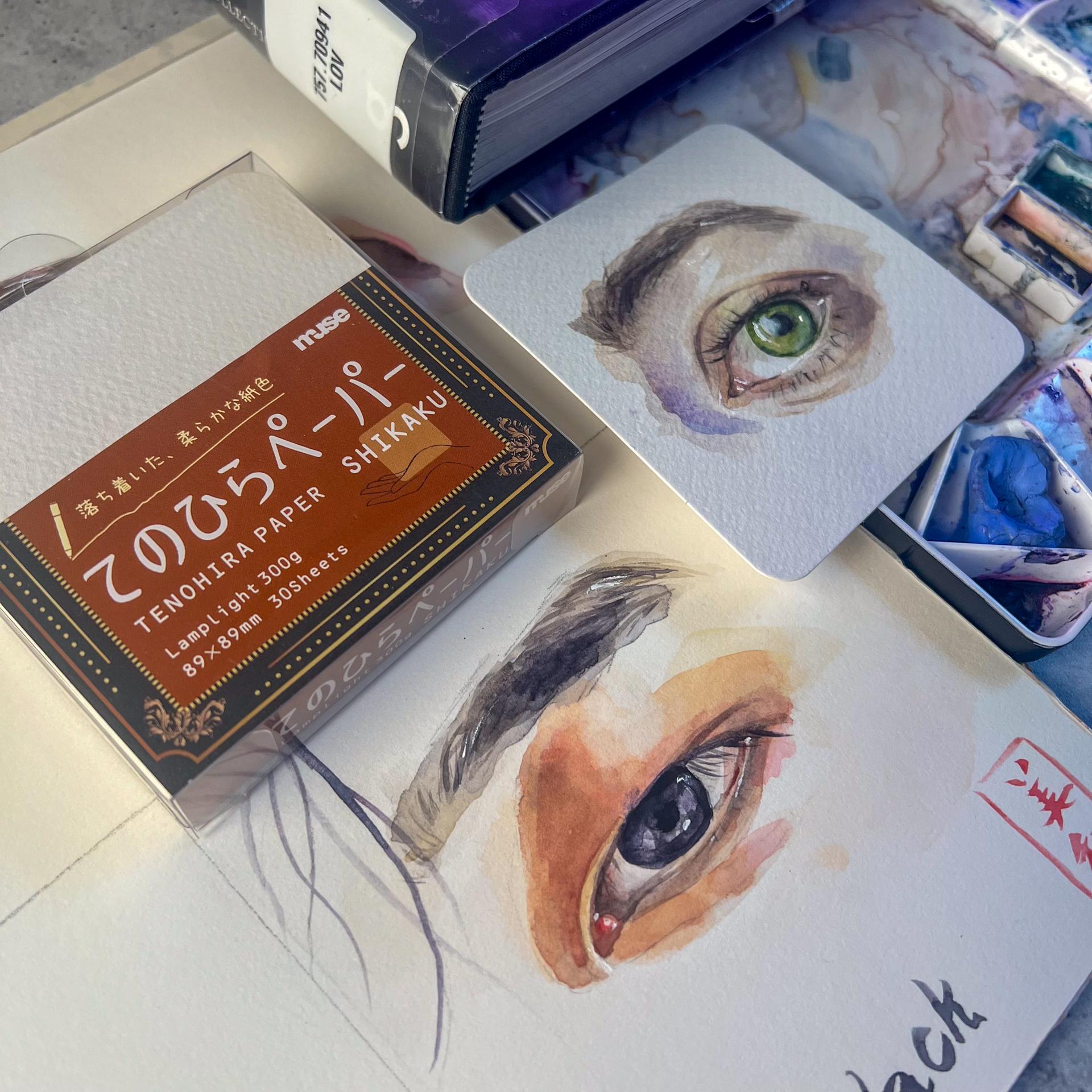
from me going to Japan and actually getting the square cut sized
watercolor paper. This one is called
the TenohiraPepa. But if you have watercolor, just cut it into a
square size and try painting one of your
eye for your lover, for anybody, maybe your mother, father, they'll look at it and they'll notice it who it is. That's the whole point.
And I just thought it was a great idea to paint an
eye when I saw these. And then when I came back
to the States from Japan, I went to the library, and I ran across this book, and I thought, that's
exactly what I want to do. So here I am. A lot of my
skill sart classes are like, somehow Japanese related
because I grew up there. And I wanted to come up with
some idea to incorporate that Japanesque feel like a Japanese flare to
this lover's eyes. I looked into it and
found out that in Japan, they often if they had, like, a secret lover, they will write their
names in a hidden place, like, inside the lining of
their kimono or Yukata. And I thought I wanted
to take that idea. And basically, I thought, Okay, maybe on the eyelashes
or the pupil, we can write in Japanese
characters our names. Very small, you know,
so it's kind of hidden. And this is often called
Kakuremji in Japanese. So when they have those, like, names written in a very
secretive hidden place. So I thought I'll take that
idea into this final project. And also, Japanese
love this poem. Maybe you've heard of
it. It's called haiku. It's a 575 syllable poem. They call it hi Good. And I thought, Why not write
a poem for our loved ones, whoever we want to
give our eye to, we can in the back of the card, write a poem for them, and I thought it
was a perfect idea. So I hope you enjoyed the
class. Let's dive into it.
2. Materials: I'd like to get into the
materials that you would need. First of all, you'll
need some pencils. I have a technical
pencil as well as some softer pencil that is the black wing pearl pencil
that I have right here. And then next, I have
three kinds of erasers. One is a needed eraser. Now, this one is for using on watercolor paper so it
doesn't damage the surface. As well as a mono zero
elastic eraser to get very thin lines and a
normal eraser as well. I'll have all these materials in the materials is available
on the resources section. And I'll use this 0.2 millimeters sakura pigma
micron archival ink pen, which has a very thin point. I'll be also using these
watercolor brushes. I'll use this spray bottle to activate my watercolor paint. I'll be using this flash. It's acrylic white
acrylic paint. And I'll use this TenojiraPepa. Or you can always cut up your watercolor papers
to a square size. I'll be using the Academy
watercolor paper pad to do my warm ups. And I'll use a sketchbook to
do the anatomy of the eye. You'll also need glass of water. And finally, some
watercolor paint. Okay, so let's get
into some eye anatomy.
3. Anatomy of Eyes: I like to get into the anatomy of the eyes, but specifically, I just couldn't find
anything that was useful for me as a painter who
loves painting eyes. And so I kind of gathered all the information
of the eye that I really think that
we have to nail down to paint really
beautiful eyes. So first of all, this is the brow ridge. And basically, it's
the place that the forehead and the nose
and the eye socket meet. And usually it creates, like, this dark shadow. And I think this is quite important to include when you're painting the eyes because
it basically sets the tone. It makes it more real. And then of course, we have the eye Bose. And then we have the pupil
in the middle right there. And then we have the iris. And we have also
the upper eye lid. And then here, I didn't
quite include it clearly, but this is the water line. And I think this is quite
important to create to create the whitest white of
the eye really is here. And then there's the lash line, which is also at the top. And then this is
the lower eyelid. And then this here, where it's red is
the medial canthus. And then here is the sclera. And that's pretty much it. So now that we got
the anatomy that I think is the most important
when you're painting, I would like to get
into the warm ups.
4. Warmup 1: So let's get into the warm ups. I have drawn the green eye here, which will be painting together, and I have specifically created
just circles the iris of the eyes to show
with you how you can mix certain
colors for blue eyes, for brown eyes, and for
black eyes as well. But we will be working
on mainly green today. And I want to share with you these warm ups
that I've did before. Unfortunately, the video and the audio of the class
didn't work out. So I just want to share with you the key points that help me when I'm painting
eyes specifically. There are five key areas that I have in mind
when I'm painting. So first, the areas that I
normally paint is the sclera, the whites of the eyes. Although it may look
white, it's not white. I think many of you know
that it's actually gray. So whatever skin
tone you created, you are going to mix in
the complimentary color of that to create a
bit slightly gray, but more to the bluish tone, usually, for most
eyes, I would say. Unless they have, like, a warmish gray tint
in their cyclara then you'll try to make
it a bit warmer gray. So Cycla is the next bit. And the next bit is the iris. So then I get into
painting the iris. And remember, the iris is
never a perfect round. So the third bit that I usually work on is the mediocanthus, this reddish bit, adding a bit of red, usually cadmium red. And then the fourth bit
is the surrounding skin. Now, when I say that, I
mean the upper eyelid, the lower eyelid, and
some shadow areas. And usually it's one wash, and being mindful of the most lightest lights
like here, it's very light. Not much layers. So it's
the lightest light, and then you go in dark and you go dry brush
technique right here. And if you haven't taken my
warm ups from another class, try to take that for
the warm up as well as the color theory that I
have in a specific class. So I'll leave those links in the class description so you
can try to check them out. They're also in
the material list in the resources section. And then finally the
fifth bit would be the brow ridge right
here to create that shadow that's been casted
because as I mentioned, the bro ridge is what separates the eye socket
with the forehead, and it creates this depth, this deep kind of cut inside, which creates this shadow. So those are the five key
elements, I would say. And for skin color,
let me get this out. That skin color is created
with three primaries. One yellow. And red and blue. And it's really those
mixes combined. So first, what I usually do is I created the lightest
light of the skin color. Usually, they're more
towards the yellow, more towards the red or
the orange for Asians. And then you slightly
add in the blues. And for really dark skin tones, you can even use purple, like a dark brownish purple
to create a darker skin tone. So it really depends.
But usually, it's just the primaries
mixed together. So I go in with the first wash more leaning towards the
lightest light of the skin, which is more yellow. And then I slightly
add more in the red. And then finally,
for the shadows, I'll add in more blue. So that's how I work around it. And I've created some
hair here as well, just to play around because
King George I had hair in his watercolor portrait
of the eye on Ivory. So I thought I'd play
around with that, which kind of didn't
turn out as bad, but I don't think I'll be doing that for the final project, but you can have a play around. I really went fancy
with this one, adding colors I
didn't quite see, adding a bit of splatters
here and there. And this one it only took me like 15 minutes to do because I just used enough brush strokes to create the feeling of an eye. But this one took me like
almost an hour doing. And this one took me, I think, like 30 minutes. And I've also
created my dakai at the right hand side
to play around. So that would be explained
in a different class. So you can check that
out as well if you don't know how to create
a daka like a stamp. Of certifying that you're done, which is often used in Japan, but you can create it with
your watercolor brushes. Okay, so let's get into it. So after I've
explained all that. So first of all, I like
to activate all my paint. So I'm going to work
with green first. Usually, for greens,
I use sap green. It becomes more natural. You could also use, like, quinacrinm burnt orange for the lightest light
because usually they have this a bit of, like, a yellowy tone. And you can even create depth more with,
like, using browns. But I'll probably
use a lot of this, which is already on my palette
for some of the colors. Okay, so first things first, I am going to work
with the Sclara. Although I did
mention the Sclara, what I tend to do is I'll create the skin tone first
around the eyes so you know what the skin
tones are and then create the opposite
of that color to make it look more
natural for the cyclaa. You'll add a complimentary
to the skin tone, and then you'll go
in the cyclara. So I'm going to create a skin tone for the first
eye that I'll be working on. These images will all be
in the resources section. And they are found
through Pixabay, so I'm sure I'm not going to
get in trouble using those. Okay, so skin tone, I will create the
skin tone first. I think I'll just use this
gray that's right here. But her skin tone
is more yellowish. I always use the same
yellow for all skin tones, which is yellow ochre. I just find it
quite easy to use. So first, the skin tone
always quite yellowy for me. And then I'll use a mop brush because we're going
in a lot of areas. And be mindful that
here's a bit white. It's the lightest light,
as well as right here. So having that said, I will create the first
wash kind of coming in. And then it's more
red right here, so I'm just going to
add a bit of red there. And I'm using hot press paper, so this is going to make it quite different from
using cold press. I just like the more
looseness of hot press paper. And I'm being mindful a bit of that water line
that's right there. And then there's a bit of more, like, a ready tone right there. And then where else? And then you can
also think about the composition of the
eye just to be like, Okay, it doesn't look
quite nice right now. How can I make it nice? And in this photo, I can't quite see the eyebrows of this person, but I'm just going to
connect it like that. A bit more readiness right here. Even connects right here. And then I'm just going to add that bit of the brow ridge
shadow that you see. Okay. And then I might
even add this purple right here just to set
like a tone of that. And then I'm going
to get the red that's lying around my palette. If you kind of get
the key things about, like what mixing what creates? What? I really highly
recommend taking my color theory classes
in the other class. It will help you. There's
more yellow orange, I would say, right there,
even right here a bit. And then this between the upper eyelid and the lash line at the top,
there's always this, like, shadow, like,
dark brown shadow, which we will be putting in
the eyelashes at the end. So I would say just Create a bit of a wash there just to mark
your territory that, hey, I'm going in
there later, you know, and sometimes depending on the how the photo
I say it's taken, like, from bottom, you can see, even in this photo, you can see, like,
this white line, like, the lightest light underneath her lash line and her like iris. So, I usually create that with, like, just adding white
acrylic ink at the end. But let's see how it goes. And I might even
add a bit of, like, a yeah, splash right there. Now I'm going in to
create that Cclara. So I've used this.
What's the opposite of this orange yellowy color, blue. Uh, no. What's the opposite? So I have the skin tone
right here that I've used. We're going to use
this for the Cclara. So what's the opposite
of yellow, purple? So we'll be adding
purple to this. I think I'm looking
at that bro ridge and looking at what color
kind of matches that blue. I think it even
matches this one. So I'm going to use this
and even add that here. Okay. And I'm going
in the Sclara. So we are going to work with the lightest light
of the Cclara. It's quite yellow for her, so we are coming in. And I'm not too
scared about going in that iris because it will make it look
natural, I would say. Okay. And then I'm going to add a bit of that
gray right here. And also right here. And it kind of goes down a bit. I think I went a bit overboard. Okay. And then there's even the whitest
white to right here, so I'm just lifting up a bit
of that color right there. And then I would say it's even more bluish
right here. Okay. And then for the
right hand side, it's quite dark and gray, and it's almost like
a red, a red gray. Beautiful. So I will add
a bit of red right there. And usually at the it's kind
of leaking in at the sclera, no, the medieval canthus oops. I went over the water line. We can always go in
there with the water, the acrylic white acrylic, but then there's
even a line here that's reflecting some
kind of, like, light. Okay. And it's even, like, a bit yellow, I would say. We used to yellow ochre. Okay, and it's way
gray than that. So I think I went a bit
overboard here, but it's fine. Okay, I think I'll
have to let that dry. And then I'll work into a bit of the medieval mediocths
adding a bit of red. Usually cadmium
red really works. Or pearl red also works, but more warmish red would work. And even I'm tapping
in a bit of the color, so it has a bit of
variation right there. Okay, and then I will
go in with sap green. Well, actually, I'm going
to work in with Cranaculum burnt orange because I see a lot of yellow
in her eye color. So I am going in and um, I see that this part right
here is the lightest light, the lightest color that she has, so just gonna be
mindful of that. And with this big
reflection that she has, I will leave open because
it's more blue than anything. Okay. And then we will let
this sit for a while to dry, not dry too much,
but just enough, so then we can start charging in a bit with
different colors. I see greens, so I'm
going to start creating the sap green and making
sure it's not too wet. You're not holding too
much water in your brush. You can even tap on
your kitchen paper. And I suggest you have
a scrap paper around, so then you can always
test the colors to see what color you are holding
if you're not too sure. Okay, so the darkest I usually tend to go in the darkest darks, just to understand what's
going on on the surface. So here, I think it's
still quite wet. So I'm just going in that
area is quite brown. So why do I go in while it's still kind of
wet but not too wet? It's because the working wet and wet will give
you less control, but that's what you need
when you're kind of working around trying to create
different variations. Like, it lets the water the pigments flow
into each other. And that's exactly what
we need to create like, like a realistic
eye, I would say. So I'm lifting that
green that I see a bit. Okay, I think I went too
fast with the sap green, so I'm just adding a
bit more yellow here. And then next I see
a lot of browns. So I will get a brown that's
available right here, and I see a lot of
them like here, just around the
pupil, even here. And around the iris, we see a lot of,
like, darker shades. So Okay, I think that's enough. And then we'll work into
the skin color again. So next, we are going
to get a bit darker. I would say it's more
towards the orange. So we're adding a
bit of red into the mix that we've already
created right here. I think that's good. Then And then being mindful
that everything is going to get less water and more pigment
as you layer things down. And I'm trying to create, like, interesting breast strokes as well because you don't want to be I don't like being like, Oh, I want to make it look
like a realistic painting. That's not my aim. I
want to make something interesting and a
bit impressionistic, I suppose, in that sense, that I just want to get the
impression that it's an eye. Getting darker a bit here. And I would say
even it gets very, like, brownish right here, which means that we want
to add a bit more darker rich burnt, red, yellow. You could even just go in
and get in some browns to, um to make your life easier. And I even see these
interesting purples. I'm gonna over exaggerate
this, but, like, right there. Um, and maybe If you think like you've
done a bit too much, you can always add
water on top of it and let it kind of not overworking
is the key, I think. But I know you
have to get, like, the hang of it to be able to kind of feel
that way as well. So and I see, like, this pinkness coming
in even here. Okay. And then I think I will work a bit into the eyebrows just
to give it color. I know that we're not really sure what her
eyebrows look like, but I'm just going to
make a guess here. And with eyebrows, I don't I
tend to not over work them. Maybe like 22 layers, max. And then at the end, I
just give it a bit of more just a bit of
those, like, eyebrows. A few hairs is
just enough. Okay. And then I am going
to work into. So there's really
quite darker areas in the outline of the eye. That one I will work
at the right end, but I think I'll add
a bit more green just to give it a bit more
depth to the eye. But this will probably be my last green that
I will be adding. I don't want to
kind of take over all that underlying colors that I've created that
are quite fun to look at. But, again, I don't want to kind of create
too much lines. Okay, I think that looks good. Just gonna add some
darker pigments. Okay. And I'm going to
let that sit for a bit. And then I'm going
to kind of get into that medial canthus. I'm just going to add
all these mixtures right here because I have
a feeling that can create a nice grayish red. Okay. And there's also got to get
quite dark right there. And there's, like, a clear edge, like, a hard edge right here. I think I need to
go in there more. And also, there
seems to be a gray. And I can even, like, do a bit of dry brushing. Right here and right here, just to create some textures and something kind of fun
to look at. Okay. Now I will go in the skin again. And next, I'm going
to be kind of mindful of creating more
hard edge lines. I think they're kind of drying, so I think it should be okay. So I am going we want
to create, like, a darker color of
the skin tone next, and I'm going to be
adding more reds. We want more darker reds. Okay. And a bit of brown. I mean, blue, just
to help us out. Okay, to make it darker. And we see, like, a clear line here. So painting eyes is basically really the play between
wet and wet and dry brush, I mean, wet on dry. And, I mean, what
painting isn't, right? But, like, I don't know,
when I paint eyes, I'm just more reminded of, like, yeah, it's just a
mixture of those, really. It's basically working really wet around the whole area and then coming in dark with a
wet on dry technique with, you know, the eyelids. And whatnot. So. Okay,
so here I'm going like, I'm creating this
line that I see. Even here, I see, like this a bit of line. And how you can make a painting look a bit more
realistic than it is, is creating like areas that are much stronger lines and a break and then stronger
lines in another area. So splitting areas between
areas like here going in, but it kind of loses
the line a bit, and then it kind of comes up, even blending that out a bit. So it's just a play between
those, I would say. Okay. And then I am
going to get, like, a much darker, like, gray right here because I think there needs to
be more right there. There's quite a lot of
shadow going on there. Okay. And then even
here starting off, maybe I will Okay. Okay, so I think
I'll add a bit of hair like hair strokes. Not too much. It's like a bit of dry brushing, a bit of And if you think
you've gone too far, you can always add, like, a bit of water on top. And yeah, that should do it. Even add bits of different strands of hair
depending on the areas, like, in terms of color as well. Okay. I think I like that.
Then now I'm going in the outer layer
of the sap green. I like to use Pains gray, which is like a dark blue black. It kind of matches
the sap and kind of creates a lot of depth And I would say adding
this while the eyes are not still dry is key. And even adding a bit of, like, some lines going in a
bit with sap green, just to create a bit of
lines that I see visible. I think I went a bit
overboard there. Okay, and then I will
get a neutral tint. Now, if you don't
have this color called neutral tint, it's fine. You can also just use
that paints gray. But and make sure the pupil is, like, the same
shape as the iris, or else it's gonna
look very strange. So that's, like, key.
Okay, and I think I'll add a bit of this warm get, like, a cadmium reddish color, like a warm red
because that's not Yeah. And when you want to create
an eye that looks tired, just add cad red to the
cyclora that kind of works. But I don't think you'll
want to do that anyway. Okay, so that's
looking good. I think. Okay. So here I go. So less water. Being mindful of where those um, where the where you can
see those lines. Okay. And finally, I think I'll
go in with the eyelashes. Now, the eyelashes,
obviously, like, if the person in the photo
doesn't have makeup on, I assume it'll be relatively the same color as the eyebrow, but because she's wearing
makeup in this photo, I will add I would
add like a brown, deep brown color, even maybe
the neutral tint, actually. But if you don't have that, then just try to mix in dark colors with the hair
color that you've created. And then what I tend
to do is I'll go over that lash line and
sometimes you see, like a bit of like
skin seeping out. Okay, and the lashes need to go flicking and being mindful of the direction of
the lashes, too. Like, you don't want to do something unrealistic
when it comes to lashes, and I try not to create so many, but I think I'm going
overboard here. Somebody stopped me. And some of them you can see kind of tends to go down
because of the direction. And some of these
hairs, I would say, like, have different colors. So you can create a
darker pigment color, even go lighter, like
I will right now. 'cause these ones here, they don't pop out
as much. So there. And I'll create some of these lower eyelids
with hard lines, but also ones that are, like, um, ones that
are vanishing. So to speak. Okay. And I
will add a bit of hair. Oh, that's not dry. Okay. So I'll let this dry a bit. So now I will add in
wherever needs more depth. So I think in this upper bit, there's, like, a clear line. And I'm going to break
that line a bit here. Okay. And I also
see that there's, like, a bit of a line
visible right here. I'm going to connect
that. I think this area is much darker. I'm going to do that.
And I even see, like, this blue around here, right by the iris, so I'm going to
add a bit of blue, even like almost I don't mind
if it touches that green. But Okay. And finally, I think I'll add more of the eyelashes just
to some certain areas. I'm going to also add
the upper eyelid, accentuating it a bit. And finally, the medial canthus, I think, needs to
get a bit darkened. Okay. And I would even just
to kind of play around. I would even add the
blue that we used for that broige and go in a bit, go out a bit, even add a bit of the blue, just to kind of play around. Bring it up even. Okay, I think I went
a bit overboard, but Okay. And then I'm going to
create a bit of splatter. And where else has
that a bit of shadow? There's no shadowy
bits, but I mean, there's even right here, but that goes down. Okay. I think I'm
done with this one. Okay, finally, I think
I want to add a bit of that same blue right
here because I see, like a bit of blue. Okay. I don't know if
that quite worked, but I am going to dry this, and then we are going to
add in a bit more detail. So I'd like to add
in the lashes that you can actually see in here. So how do we do this? I
just got the neutral tint. I'm just gonna I
went a bit too dark, I would say. Okay. Okay, I'm done with the
5. Warmup 2: Next we'll be creating
the colors of the eyes. I'm not going to
create the whole eye with the skin around it, but we're just going
to try to create the colors with eyes
because for some people, I think this might get tricky. So for the blue, it has this
very whitish look to it. But if you use white
in watercolor, it tends to get too opaque too soon, and you
don't want that. So I'm going to stay away with creating the first wash
with the lightest light, which is the white in this case. And instead use cobot blue. I would even I think the light is shining from
this side in this photo. So I'm just going to just wet
the whole area, actually. So I'm using cobalt blue. You can always, choose
to use different blues. But I think cobalt
blue, Cerleanblue, even ultramarine is, like, the best option for you to go for just to have it
look kind of natural. Even mixing browns
can make it look more natural because it'll
get a bit desaturated. Okay, and then I will just tap in I don't have any
more buff titanium, but I'm too lazy to go pick
up that tube, so okay. I'm just gonna tap in a bit
of that buff titanium inside. So I guess it gives, like, an impression of those
whites that we see. And I'm going to work all
of these at the same time, so we don't have to, no, no, no, no. I'm not gonna do that. Okay. Some people will be
just creating blue, some people will just
be creating black. So I'm just gonna stick with it. And I'm just trying to
while it's still a bit wet, I'm going in around
the areas that most likely will be darker. And then even darker right here. And then I am going to get a smaller brush and
even pull in those, like, lines that you see. I wouldn't do it for every area, but I wouldn't even mind if it goes all the way to the pupil because that area
will be covered very dark. Anyways. Okay. I might even add a bit of French ultramarine
right here that I have to start getting it
to be deeper in blue. Just some areas.
If you overdo it, it just doesn't look
so natural anymore. I would say it wouldn't look
natural because I don't have the whole skin
covering this eye. It's gonna look like one
of those toy eyeballs. I have one around because my son loves playing just throwing eyeballs
all around. Okay. Pulling in, being mindful
that it comes to the center. Okay. And then um, I think I even might spread that French ultramarine
actually a bit more. So we have room to add, the the the paint's gray at the end. I'll pull those in again, pulling it into the center and then adding gonna
even go deeper. This is dahroneblue. It's like a deep rich blue. Adding in areas just
for a bit of fun. I mean, the Iris has so many interesting things
going on, you know. You don't want to
miss those. Okay. And then I'm going to
use the Pains gray is so convenient when
it comes to blue and, um, blue and green eyes. Even for the black eyes. For the browns, I tend to
use more neutral tint, which is basically a dark gray, but kind of it's more leaning towards the violet, the purples. The neutral tint comes
in different kind of shades or tint from
different brands. I have the M Graham one. Oops. It kind of went a bit overboard. Make sure that your pupil matches the circle
that the irises. Okay. I think I'll make a very light wash of the paints
gray and start going in, but I might disturb that. Um, the dark. That didn't work. So Okay, I think the blues, I even see a bit of, like, that quinacrumOange.
Should we add that? Do you see it like right here? As well as right here? It's almost like red. Okay, I think I'll just leave that aside.
So that's for blue. And then we are going
in to do brown. For browns, like this
one I'm looking at, I feel like it has
that cernacron like, yeah, the cernacron burnt orange for the
lightest light area. So I am going over that. You see this warm color here. And then I also see I'm just
making this a bit more fun. Trying to see what
people might not see. I'm using a cobalt violet, a bit muted already because I kind of mix it in a bit
with that burnt orange, but I'm going to layer this. The light light has
this violety feel, so I am going in with violet. I think the question to ask is, is it like a warm brown or cool brown
and go in from there? I would say the first
layer of the painting, I don't mind too
much that it's not realistic because we can build in those layers
layers like layer by layer. Okay, and I think I'll
use this mahogany brown And, I think I'll
just go in with this where it gets darker
and even just creating, like, interesting looks to it. Like, there's a lot of reflection
here, so it's hard to, um, a create that whites. Like leaving those whites. You can always
create the negative space painting, you know, like work around the whites, but I don't know. I'm not I can't put
my mind into that. I need headspace and
I use my head space in painting for more color because I just want to
play around with color. I don't want to be
thinking, Oh, that's, you know, negative space that I should be creating and so forth. So this is just how my mind works and
how I like to use it. Yeah, understanding
what you love, like, what kind of painting process you love working on
is quite helpful. Ah. Okay. And next, I want to go deeper, so I will use this maybe
I should use the violet. So brown is basically
like a burnt orange, add it with a bit of blue. So I would turn it a bit more
violet and then even add, like, a dark brown. I'm going to add this
bloodstone genuine, which is from the Daniel
Smith prima tech colors, which uses semi precious stones. I would even go in a bit. Create that. Going richer
and richer with the color. It's just like a play
with color, really. Okay. And I'm going deeper
into that color again. I think we'll have
to let it dry a bit. So I let it dry for a while, and I'm going back in. I'm using more of that
bloodstone genuine. Okay. And then next, I'm going
to add the neutral tint, which is really
useful when it comes to just creating
those dark layers. I think I'll go over this with the white acrylic just
to create those whites. But I'm just being
mindful of maybe even leaving some negative
space like the whites, just to create a bit of variety. And then I'm going in It doesn't look real at all, but I think it has
a lot to do with, like, the skin not
being there as well. Okay. And I'm just gonna create those subtle lash lines that are coming in
almost like curling up. And some more. Some more browns right there. I'm just gonna
destroy that a bit because I just didn't feel like the lashes worked in my favor, just because they
don't exist there. Actually, the pupil is much
more bigger. That way. So I'll work on the
whites of this eye later. And I'm going to
work on black now. Now, this is quite
an interesting eye. But when I work on black eyes, I really tend to just
like using moon glow. This is another color
from the Daniel Smith, and I just love it. I use it quite a lot. It has, like, it's
basically purple, but it has this grayish, neutralized feel to it and it has a bit of this red
and green inside. It's just pretty. That's
what I need I want to see. So I'm going in the
whole eye this time. And with black eyes, I would say just you could even use neutral tint
if you have data around, or you can use
Pain's gray mix it in a bit with, like, blues. Could even mix it with blacks to create a
bit of variation. I would say just try
to create variation within the block that you use. So I see the latest
light right here. I'm going to scoop
that up a bit. Even go down a bit more. Okay. And then I am going in
a bit dark at the top. It's basically just
painting circles. So it looks three D. That's the whole point of this. And then going down dot, dot, dot. So dot, dot, dot. So dot coming in. Going there. So dot, dot, dot. A bit too much right there. Okay. So I will go in again deeper. Deeper. And I will get the neutral tint. Kind of tap in the middle. It's still wet, but I think
it should look more natural. The darkest dart
right here as well, I'm just going in a bit. That are darker. I think that could get
a bit more darker. More kind of coming in here. Uh So now that it's dried, I'm coming in. I'm getting very impatient with my painting.
I think I just. I mean, I've been trying to get this class out as
soon as possible, and it's Even dry brushing is sometimes kind of nice. Discretes So I'm using neutral
tint right here. I think I've Yeah, I think that looks better. Uh I don't want to overwork it, but, I think that's enough. And for the brown eyes, I feel like I need to
go deeper than that. So I'm going to use
the neutral tint, as well as the brown
the mahogany brown, I believe, is what I was using. So just try to work in to your eyes and just kind
of play around with the first two layers and then
try to go in deeper with richer colors to match your underlying color
choices that you've chosen. I'm just gonna really
fascinated by these eyelashes, but it's not quite working. There's also, like, a streak
of shadow coming in there, but I think I overdid that one. And I will get this bit a bit. Darker. The pupil a bit darker
because that's what I see. So now I'm going to add a bit of white acrylic touches to these. First, I like to look
into the blue eye color. And just add what you see. Don't overwork. See a bit of I see even
like a white there, white going up here. White dots all around. White dot even here. So Okay. And then the next one. This one was a tricky one.
Something going there. Another one going that. And then some light
coming in, coming down. This one quite has a lot, but trying to keep it
low key as possible. M I'm not trying to put the guy in there, but, yeah, I don't think
I quite like that one. When you put a bit
of these acrylic on, it's really hard to get out. So I'm just gonna smudch that. Get that out. Okay.
I'm not too sure. Yeah, I don't quite
like that one, but oh, well, it is what it is. And then the black one. Now, this might not be I know there's like
this right here, top top top to top
going on in flickers. I then comes right down. There's also a bit of
flickers right there. Okay, I think
that's good enough. And even for this water
line I forgot to mention, you can always add the line at the end
to make it stand out. Okay, and that's the warm up. I hope you enjoy the warm up, and let's get to
the final project.
6. Final Project: So whoever you have chosen
for the photo reference, I highly recommend choosing
one that basically has the white reflection of the
light coming in to the iris, and it has those clear water
lines is very important. So I've done this for my final project in the earlier class that I've
recorded that didn't go well. So I painted my eye here with a bit of
hidden message here. Saying in Katakana, Mwa my name. And I've written the haiku
in the back with the aka in looking signature
on the left hand top, which is not traditional
way of doing it, but I like it still. And so we'll be creating one, and I'm going to be using my son's eye as a
reference for this one. Okay, so let's get into it. First, we'll need to
create the skin tone. Again, we'll start up
with the skin tone. I always use yellow. Yellow ochre, and
then I'll mix in some reds slightly, not so much. So from here on, I've lost my
recording footage as my phone went on
lower power mode. So apologies for that. So this will be a
voiceover from here on. I'm just trying to outline the first wash with areas
that are very light, but they do have that yellow ochre kind
of yellowish feel to it. So I'm creating a very
thin wash of this. I've also added that lower
eyelid with a bit more color, as well as the area of the medial canthus and worked my way into the upper eyelid a
bit with more color. But I'm trying to also be mindful of that
slightly whitish, like, very lightish light
in that area as well. And I also go into
that brow ridge a bit. And my intentions
are just to add more and more color
wherever there is color. And I've also started adding
in some of those eyebrows, especially charging in with a darker pigment for those darker points of
the eyebrow as well. And I go very deep with a
bit of a grayish tone here. That was probably a mixture of yellow ochre with more blue. And also, I wanted to play
with more color here. So I've added the lilac, like a purple, opaque
purple pigment as well. I've also added that same purple pigment
called lilac from Holbein onto the end
of the upper eyelid, just to give it a
bit of fun color, like, a different color
to make it pop a bit. I just love using colors that
don't quite exist there. But here, the intentions
are to get the same values. And I'm also splattering
a lot of pigment here, but I ended up taking a lot of them out because
I didn't quite like it. And my husband doesn't
quite like that, and this is going to
be a gift for him. So I've cleaned a lot of those
splatters that I created. So I am going to mix
in a bit of blue into that sclera that I see, I see a bit of dark areas. I'm going to use this French
ultramarine because I do see quite like, even maybe the blue
of his eyes is Um, reflecting off. I don't know. And then I see a lot of gray in that other part
of the Sclara, so I am just using this gray. It's more red, I would say. Red that I see. And more pinky. Right here. And this gray looking. Okay, I would add a bit
of red at the side. Okay. And I think I would, um, use more of this rose ultramarine that
I have just to kind of get in there because
I just feel like it's actually more violety looking. Even add a bit of that. Um lavender and there. And kind of draw in
this pink in. Okay. And then I would use that yellow ochre lying around here with a
bit of that pink. Mix it in, and we
are going again in in those upper eyelids. You would even go
in here a bit with a bit of this so annoying. So I'm going to add a
bit of some impression of those the eyebrows, even adding a bit
more yellow ochre. And Okay. And then finally, I'll go into his eye color. His eyes are quite deep. They're like pain's
gray, really. But I like to
accentuate a bit of the light blue, as well. So I think for the
lightest light, I'll kind of use the
French ultramarine. And Yep, that looks good. Then I'm going to
blend that all around, I might keep that white
space. Let's see. Okay. And then I'm going to
add the pains gray a bit. Oh, I think I went
too early for that. Okay. I'll just wait
a bit for that one. And then I think Hmm. I think I'll add a bit more
darker red into that mixture, as well as cobalt blue. And I see like this
line that comes up like that and then
goes over like that. Then it comes curling back in. Okay. And somehow this bit is a bit dark. Think there needs
to be more color. Here. And here. And here. Okay. Somehow I just feel like this bit
right here didn't quite turn out the
way I wanted it to. So I'm going in a bit and create redefine that area a bit. Add a bit more red. A bit more red here. Okay. And there's more
color right above here, so I'm just gonna
connect that bit. Okay. I think that's better. And I will let this dry a bit. Okay. Now I will go over it again
with French ultramarine. But in my head, I'm just, like, kind of thinking
that I'm going to cover basically this whole
area with Panes gray. I see some dotty areas. Um Okay. And then, so I have to be mindful that because we are working on
a smaller, well, I am working on a smaller area, we have to be mindful of the
difference in the amount of water we can also use
although this is also 300 GCM, it still behaves
quite differently. I think it's related
to the fact of it being not 100% cotton paper. So it's not taking
as much water on the surface in the way
that I like it, too. Okay. So accents. I'm adding a bit of
strong pearl orange. Okay, so I will add a
bit of strands here. Okay. And also,
I'm going in with with this upper eyelid which kind of goes curving in I think I curved in a
bit a bit too much. So I'll need to scrub
it a bit, lift it off. Okay, that looks better. And then I am going to
work into his iris. I may need to stop again when the airplanes come
back to the shore. Um, yeah, I think they
might be having, like, a test test or something for becoming a
pilot or I don't know. I have no clue, but it
keeps on coming back today. So annoying. I'm trying
to take this class. It's more important. My inner thoughts. Okay. Everybody thinks
they're more important. I think it looks quite good. Just add a few more dots
in there. And here. Okay. And then I would go a bit more into that
medio canthus. I think I added a bit
too much water there. I'm using this granulating
colors from the um, well, this color
specifically from Holbein, which is quite recent. And I did a whole Japan
art whole video on it. But, yeah, it's really nice
to get those rich Oops. I think I missed this
line right here. Again, I'm trying to
get those variations in lines just to make it
look a bit realistic. Okay. And then I'm going in this really dark
area right here. I don't think it's that dark, but it does look dark
compared to the other areas. So I think I'll use that same color I
use for the medial co Okay. Even I had a
bit of red in there. And I think I'll add like
this green a bit over here. Yep. There's more of some orangy thing kind of stretching out here
and then going in. Okay, I think it's coming along. And then I'm going to add a
bit more strands of eyebrows. Right in there. He has really subtle eyebrows. Okay. Finally, I
think I'll add a bit of this pinkish
tone to here. Okay. I think we should start
adding the eyelashes. Now, for the eyelashes, it does look quite dark. So I think I'll start
adding it from here. I'm going to create
a line first. Kind of drops in a bit here. Then goes like that. Okay. Even drops down a bit. Okay. I'm gonna just mix in that blue a bit and
the French ochre. And when you're scared of, like, the mix that you've created, you can always choose, like a lighter
color of it, like, dilute it with water and
then start out that way. And always think I need
to change my yeah, paper. And always start out, start out. Always start out with less water in your brush
by doing that tricking. The strands kind of go that
way and some start that way. So start inside. I think I'm using a bit
too much water here. Go to make that a bit darker. Okay, I think I'll let
that to dry around the eyelashes because I think I could actually go
in a bit darker. I do believe we don't see as much because it's really
dark right there. So I don't think I'll
need to add that much, but I like to go
in it with, like, this bloodstone genuine mixed with a bit of neutral
tint at the end. But right now, I would make
the darks of his eyes, like the pupil darker
than it is right now. And actually, I might even
leave a bit of that area. I just white. I quite
like it that way. I'm not trying to create, like, a rigid line, but a line that looks
like it's broken. Then going in and then hoo. And then even, like, a dot. Right there. Okay. Looks good. I might even add that
paints gray into that mix. That might nah it's more brown. Think I need to go back mixing
it into the brown, okay? So I would say it
kind of comes down. S one here, there, and couple coming down, coming down like that. The few strands are
coming in that white. Try to flick these hairs
as much as possible. Okay, I think I'm done, so. Um, what else should I add? I think I like how
it looks so far. I would say maybe I could get a bit darker dry brushing
for the eyelids. Um, yeah, let's do that. Even out a bit of
strands of hair. I think I went overboard, so I'm erasing a bit of that
and also trying to lift off that bit because that's more subtle than
it looks right here. And kind of this goes
more down. Okay. I think I'm done with
this, so I'll let it dry. So now, I like to add
the finishing touches. There's some things that
I do want to be mindful. Like, we don't want
these bits of, like, dots, so to speak, that is not necessary. Some, I don't mind leaving, but I don't think these
really help the paintings, so I'm scrubbing them
off as much as I can. Okay, so now we are going
to create the acorde Mogi, the hidden messages,
hidden word inside. And for this one, I want
specifically a I would say Kanjis don't quite work because I want to place them on
the eyelashes, usually. But if you want to go for Kanji, like the Chinese characters, like Japanese Chinese
characters, Kanji, then I would tell you
to go inside the pupil. It's easier that way. But again, I'm
going to be working on creating it on the eyelashes, and I'm using a 0.2
millimeter sakura pen. And I am going to
actually, for this one, I think I'll write it on
top of his eyelid here, and I'm going to
write my son's name. So I've written my
son's name in Katakana, just above the
upper eyelid there, and I just realized that I haven't used the
white acrylic for the lightest light of his
eyes where I see white. So let's be doing that. I'm not going to cover
the whole area with this. I think I'll leave
that one that I kind of did a negative painting, not trying to cover
it with any pigment, so to speak, but I'm going
to add a bit of white there. And also just gonna
clear up the water line. Okay, and a bit of white in his eyebrows reflecting. Okay, and that's it. So now that my painting
has completely dried, I am going to create a haiku. A haiku is a short Japanese
poem with three lines. The first line has
five syllables. The second line has
seven syllables, and the third has
five syllables. It often talks about nature, seasons or simple
moments in life, and I've already created
one for my husband, but I like to create one
for my son, as well. And the key points, I would say is to
focus on nature, mention things like
the moon, rain, flowers or wind and
keep it very simple, use clear, simple words to capture that
moment and feeling. And three, add a
seasonal word like cherry blossoms or spring or snow and leave
space for feeling. But in this case, I'm not really quite going to
do it because with my son, I really wanted to depict trains because they
both just love trains. And I would really
recommend you take, like, lettering classes
online on Skillshare. There's tons of them out there. What I did do was
basically split the lines, so then when I paint
them with my watercolor, I don't mess it
around with, like, going diagonal, if
you know what I mean. So I'm trying to keep things
straight as possible. And for this, I like to tend to use a very dark
pigment almost black, so it stands out and use
less water as possible. So I've already
written out my haiku. So I am filling it in
with my watercolor. I think the key to
creating this would be to make sure you know how much
water and pigment ratio is in your brush. That's key when you're
doing lettering. Because if you use
too much water, then it's going to not create those thin lines and just making sure that there's
enough pigment as well. Okay, now that I've
written my haiku, I am going to use cadmium, like warm reds for this, but we are going to
create Daka yen. It's basically like a seal that Japanese will use to mark
a completion of a work, and I'm going to create that feel with using
a watercolor brush. So I am actually going to
write my name in Katakana. And then I'm going
to create this box. Didn't quite do it. As pretty as I would
like it, but it's fine. And then finally, I
will let it dry and then erase the pencil marks. So I'm done with this. And now we have two cards. I hope you enjoyed this class.
7. Thank You!!: Well done on Getting This far. I hope you enjoy the class. Please share the
eye that you have painted on the final
project section. I would love to
see those as well. In the class description, I have put a link to my website where I am creating
these as commissions. So hope you check
that out and see you in the next
class. Okay. Bye bye.
 Miwa Gardner, Watercolorist- Watercolor for Relaxation