Transcripts
1. IsomeTRICKS!: Let's create
something wonderful. In this class, we will dive into the world of isometric
vector Illustration, where we will learn exactly what isometric illustration is, how to speed up your workflow, understand lighting and
color in your illustrations, how to easily duplicate
assets, and so much more. In essence, I'm not only going to teach you isometric
illustration, but I'm going to show
you so many isometrics to help you along the way. You get it? Isometrics. Hey, guys, but it. Hey, guys, my name
is Kyler and Parson. I'm a graphic
designer, illustrator, and top teacher here
on skill share. I've been working in
Adobe Illustrator for more than a
decade and have been teaching the program for
more than four years to over 19,000 students. I've worked with
healthcare organizations, university clubs, and small businesses to create illustrations
and branding. I believe in learning
through doing. So in this course, you'll have access to all
the worksheets I use so you can get into the program right away and start
playing around. Some of the worksheets
will be printable, so you can get your hands dirty. Others will be in
Adobe Illustrator, so you can get a
hang of the tools and techniques I will teach. Isometric Illustration is such a versatile illustration
style that can be used for both small and large
scale projects from individual icons to
full wall murals to patterns, branding, and more. This class is perfect for those who have a
basic knowledge of Adobe Illustrator and know how
to navigate its workspace. I'll go through
keyboard shortcuts, creating actions,
setting up styles, and a lot more. Really, there's no barrier
to take this class. All you need is Adobe
Illustrator and the desire to create engaging
isometric illustrations. By the end of this
course, you'll be well equipped to complete
your class project by creating your very own
isometric vector illustration in Adobe Illustrator. So if you're ready to
learn some isome tricks, I will see you in class. Let's get going.
2. Welcome to Class!: Welcome to class.
I'm really excited to get into the world of
isometric Illustration with you, and I want to share with
you what we will cover in the course and what materials
you'll need to get started. In this course will be divided into three course sections, understanding and
basic methods using isometrics in Adobe Illustrator and the demonstration and
Illustration workflow. You may be wondering,
why not start with the illustration and
demonstration right away? The reason is that the
process of creating isometric illustrations is
not always a linear one, and I jump around a lot using different methods
at different times, depending on the needs
that needs to be done. This is why having a
foundational understanding before getting started
is a huge benefit. And maybe I maybe use some certain methods
in one illustration, but not in another. So I want you to
be well equipped for whatever you
decide to create. Don't worry. Because
we aren't in the demonstration phase doesn't mean we won't be
creating something fun. Each lesson has custom
practices to get you going. I have provided
worksheets to print out and ones to use
in the program, so you can play around and
follow me along the way. You can download the project resources in the Project panel. There's a printable
PDF workbook, an Adobe Illustrator file, as well as printable and Adobe Illustrator project
templates for you to use. Some of us like to sketch
our ideas on paper. Others might just like to jump into the program
and start creating. Whichever way you deside to
work, I got you covered. On top of all that, I have
provided my Isometric, Adobe Illustrator
actions pack that you can download to make your creation process
that much faster. This action pack is full of useful actions that will
help you along the way, including the SSR method
actions that bring your illustrations in and out
of isometric perspective, actions to move, rotate and duplicate your objects
along isometric planes, and so much more. So go download the project resources
in the Project panel, and I'll see you
in the next class.
3. What is Isometric Illustration?: So what is isometric
illustration? Well, isometric illustration
is simply a way to represent a three D
object on a two D plane, such as a piece of
paper or a screen. In isometric illustration, you'll usually see
three principal planes, the top, the left
and the right angle. Actually, the
horizontal lines are drawn at a 30 degree angle. The vertical line at
90 degree angles. So we can see how isometric illustrations
are created on paper. Isometric literally
means equal measure, how the three principal axises are equally spaced at
120 degree angles. Actually, unlike two
point perspective, where lines converge
at a vanishing point, the horizontal lines are completely parallel and
never come together. This is actually very useful, since you can place an object
anywhere in the scene, and it will maintain its proportional relationship
to everything else, no matter where it is in the
scene, which is really cool. So these are some examples of some isometric illustration,
some isometric shapes, as you can see how I drew a triangular prism or something like that,
or even a star. But all the horizontal
lines are drawn at 30 degree angles from the
zero degree, I guess. So one thing you
can do is you can take this isometric
sheet and you can practice drawing some of the isometric
shapes on your own. You can try and outline
using the squares to create an isometric plane and then draw an isometric box trying
to stay in those planes. Obviously, you can draw circles. Circles are a little
more difficult. Draw a square and then try
and fit the circle within, and that's your circle. Then you can draw
your horizontal and try to finish it
off at the bottom. Try to redraw some of the
shapes if you want to practice illustrating
yourself or when we jump into
Adobe Illustrator, you'll be able to
illustrate them with ease because the program
does a lot of the work. In the next class,
we'll talk a little bit about orthographic
versus isometric. By understanding orthographic, you'll understand even better about how to take advantage of isometric illustration
in Adobe Illustrator. I'll see you there.
4. Orthographic Vs. Isometric: In this class, we'll talk about orthographic visualization. Orthographic visualization
is a method of representing three
dimensional objects using multiple two D views, typically showing the top, front and side views of
an object separately. These views will show you the true shape and dimensions of each face without any
perspective distortion. So this is useful in mapping out the exact
size of your objects. So why is orthographic
visualization valuable for creating
isometric illustrations? Well, simply put, it helps you understand the
exact dimensions and proportions of
your object before transforming it to isometric. Each orthographic view directly relates to a plane in
isometric drawings, the top view, top plane, the front view, the
front plane, et cetera. It simplifies the
process of breaking down complex shapes into
manageable components. Working with orthographic
views first helps ensure accuracy and consistency in your final isometric
illustration. By starting with
orthographic views and then converting
to isometric, you create a systematic
approach that reduces errors and helps maintain
proper proportions throughout your illustration. In the following classes,
we will go through two methods for building
up isometric illustrations in Adobe Illustrator
that will take objects from orthographic
to isometric. In the meantime, if you
want to grab an object, you can try and practice
drawing an object in orthographic view and then trying to convert it
into isometric view. So to practice this,
you can actually try and draw something in orthographic view and also in isometric view to just get
an idea of how it works, to understand for yourself. So I'm going to do that here
with this block holder. It's a little skill share
calendar. It's pretty cool. But I'm going to try and
trace out the sides, tops, and front in orthographic, and then also try to
do it in isometric. So what I can do is I can
actually draw lines parallel and try to get the
exact relationship between the top and the front. So this is the front.
This is the top. Now, if I want to
get the side at the exact same width as the top, all I do is draw a 45 degree
angle from my front view. I draw straight
lines from that view and then convert them to
go 90 degrees like that. So I draw them 45 degree
angle, draw horizontal lines, then draw them vertically down, and then I just match up
the two ends like that. So this is what the side
view would look like. Top view would look like. And this is what the front
view would look like. Now, I want to convert
that to isometric. So all I would do is I would
look at what I see here, try to take one plane and
draw it out in isometric, and then I take
the second plane, draw it out and isometric, and then I do the third plane, draw it out to isometric. So the easiest one to start with is this one
here, the square. So I'll draw that one
here. Pretty simple. Just draw along the boxes, maybe like that,
three squares wide. Okay. Now I want to
draw the front plane. The front plane, I will draw along the isometric
lines like that, draw it up, and then I'm
going to draw a line across. But this one has a gap in it, so I'm going to draw those lines in and draw down just like that. This one also has
some width in here, following the isometric lines, and this is part of the top
view you would get and now I'm going to draw three and now I'm just going to
connect the front and the back like that and then
I'll draw my lines like that. Just sticking to
those three axes. So let's stick to the
lines. There we go. So I converted my
orthographic illustration to an isometric version of it. And then I can shade
certain sections of it to give it that
three dimensional form, and there we go. Let's just shade the front plane slightly differently and the
top plane can be pure white. That's how you change from
orthographic to isometric. But in Adobe Illustrator, all this work is going
to be done for you. It's going to make your life really easy when we get to it. But understanding the
principles behind changing from isometric and
orthographic will help you along the way as you create your isometric
illustrations. I'll see you in the next class.
5. The Extrude Method: Okay. So now we're going to learn about
the extrude method that I like to use sometimes. Okay, let's jump into it. Extruding is simply extending a two D plane in
the Z direction. So if you can figure out what the face of the
object will look like, you can extrude it
into three D space. And for this, we'll use the classic three D effect
in Adobe Illustrator. Simply go to effects, three D, classic three D, and
then extrude and beble. First thing we need to decide is which face we are going to
apply our extrude effect to. To help you decide,
you have to think of the structure of the object
in a three dimensional form. Is the front and back side
the same or is it different? If there is no change from
the front to the back, the extrude effect
will work fine. But if there is variation, you may be better to build
it in a different way. So jumping into our
worksheet here, we have the isometric
method worksheet, and all it has is a few
different shapes that you can practice on and the
orthographic to isometric view. So what you can do is
you can actually look at the orthographic view and
see which plane you're going to use to
extend out or extrude out into the isometric
three dimensional world. For this one, I can see that the side plane and
the top plane, it has a variation
from top to bottom. It sort of has an angle here, which isn't consistent
with the rest of the view. But the front plane, it's
consistent from front to back. So that's a good one to use. So all we have to do is we have to click on our
object, go to effect. We go to three D in materials, three D classic
and extruded bebl. Now, what's cool about
this is in the top menu, you can actually
select isometric left right top and bottom. I'm going to go isometric left because it matches
sort of our example there. And down here, you can
see the extrude depth. Maybe we'll go 75. And if you don't see these options down
here for lighting, you'll click this
More Options button. And here you can just decide where you want your
light source to be. What I like to consider when
making an isometric is that all three planes are
varying in light. So the top plane will be
lighter than the side plane, little less light, and then
there will be a shadow area. We're going to convert all these into vector shapes afterwards, but we're just starting
with this effect to get that isometric planes, built. That looks good to me, and
I'm going to hit Okay. And now what I'm
going to do is I'm going to expand appearance, and this converts it to actually vector paths that
I can play around with. I can adjust the colors, the
strokes, and everything now. It's grouped up into
a lot of groups. So what I like to
do is just hold Control or Command Shift G and just hit G a few
times to ungroup it. And that'll allow me to select
each object individually. Now, what I can do is I
can select individually, and I can maybe change the
color to a lighter blue. This one to darker blue,
something like that, I can select them all
and I can give them all a stroke and then I'll just give it round corners
and it smooths everything up. That's how we create that.
Now, you can go ahead and you can try to extrude
all of these ones. Now, for this one, instead of going to the left or right,
I'm going to do the top. I go, again, three D, classic three D,
extrude and bevel. I'm going to select isometric
top and it goes like that. I don't want it
so big, maybe 25, hit Okay, and then I'm
going to object expand. Now it's individual things. I'm going to ungroup
it several times. Now I can select each individual
one and maybe change it slightly and darken that and select everything
and give it a stroke. And then also just like I did with the
other one around the corner, smooth
everything out. Now, really quickly, we made isometric three D object
in a matter of seconds. In a later class, I'm
going to show you how to automate this process so you can even be quicker with
this creation process. Of course, you could
also check out the updated three D effect
in Adobe Illustrator. But for this class, I find the basic three D
does the trick without overcomplicating things with the advanced lighting
and material settings. But definitely feel free
to play around with the advanced three D effect in Adobe Illustrator and
see what you can create. So go ahead, play around, try and create all of
these in isometric view, and I'll see you
in the next class.
6. The S.S.R. Method: In this class, we'll go through how to go from orthographic to isometric in Adobe Illustrator using something called
the SSR method. The SSR method simply means
scale, skew, and rotate. These are the three steps
required to transform an orthographic face into an isometric plane in
Adobe Illustrator. Each face is a little different, so we will have to modify the SSR method
slightly for each. I've listed out the steps on the SSR worksheet
for your reference. Two main numbers to know, scale at 86.602 and skew and rotate at 30 degrees,
positive or negative. If you are going to the left, go negative 30 degrees. If you're going to the right,
go positive 30 degrees. For the top plane,
you'll have to decide which way it'll face. Your skew and rotate
will be opposites. Use the bottom point on your
top face as a reference. If you want it
pointing to the left, you will rotate
negative 30 degrees, which means you will skew
it positive 30 degrees, the opposite case, if
you want to point right. Now, sometimes you may want the face of your object
to be viewed front on. Many people may not do
this in isometric views, but if you are making a scene with various elements,
you may want this. So since you are effectively
looking down at an object, the top and front view have a
slight distortion in scale. Now, I went ahead and figured
out the exact scale value needed to put objects in
isometric perspective front on. For a top plane, scale
vertically, 57.735%. For front planes, scale
vertically, 81.649 3%. There's really no
better way to work, whether it be the extrude
method or the SSR method. If you're just working with a single face or you
need to build up more complex objects using the SSR method might be better. For simple things, the extrude
method works just fine. It all depends on how
you want to work. In the next class, I'll
show you how to create time saving actions to speed up your isometric illustrations
in Adobe illustrator. Now, if you don't want to
make your own, no problem. I made them for you, download them in the project resources, and you can get going. Feel free to skip
ahead if you want, or if you want a better
understanding of how they work or how to
make them yourself, or how to make your own
actions in Adobe illustrator. I'll see you in the next lesson.
7. Creating an S.S.R. Action: In this class, we'll
learn how to create isometric actions to speed
up your workflow immensely. Let's get into it. Actions
are a huge time saver, especially if you're doing repetitive tasks that
have more than one step, even if it's just one step. If you have to go
into a panel and find what you're looking for
and then enter the value, might just be something you
can make an action for. So let's go through
how we can create your own SSR action. First, open up the actions panel by going to the Windows actions. For the first action, let's just create a left facing plane. Select your object, you want to apply the transformation to. In the action panel, select the plus button to start
recording a new action. You can enter the name of the
action and select a color to be used for the button
mode in the action panel. From here, every step you
take will be recorded. So just go through the process. Double click on the
scale option and scale it vertically 86.602. Hit Okay. Go to the skew tool. Double click and enter negative
30 degrees and hit Okay. Go to the rote tool and
hit negative 30 degrees. Hit Okay. Go to the action panel and stop the recording by
hitting the square. Now, your new action is ready. Now, simply select an
object and hit Play. If you go to the drop down menu, you can select a button mode and have an easier
access to your actions. If you have a whole
bunch of actions there, you can remove them, but just be sure that you save your isometric actions
you want to have, if you created your own somewhere where you
can access them. Then delete the actions in the action panel, load your own. And of course, you can create all of the actions yourself. But why do it yourself if you
can have it done for you? I went ahead and
created a free download of these actions on my website
or here on Skillshare. Simply go to the link
in the Project panel and download it and then
load the action pack. It has other useful buttons that I will show you
in later classes. All right. I'll see
you in the next class.
8. Creating an Extrude Action: Okay. In this class, let's go through how to create your own extrude method action. Before getting started
on creating your action, we need to first create a graphic style with our
effect attached to it. Effects in themselves have variables that can't
always be automated. For this reason, we can bypass that by using graphic styles. We create a graphic style
with the effect applied with all the attributes we want
and use in our action. And there are other
certain menu item options that the action panel doesn't
automatically record, and we will have to
add those manually. Just note that if you
want to use this action, you will have to bring in your graphic style into
your file before they work. If you don't have
your graphic style, the action will run through
and it'll try to find it, and it can't find it, so it'll sort of stop running and
it won't work properly. So let's see how we can do it. For this action,
I want to create a three D extrude
at 200 pixels of the left face that expands and leaves us with
edible vector shapes. Before we create our action, let's first create
our graphic style. I'll create a square
and then I'll go into my effects panel,
three D effect. Classic three D and
select Extruden Bevel. You can type in the
value 200 pixels, change the view to
isometric left. I would also change
the lighting in a way that each
face is different. I would also change
the square to have a white fill and no stroke. Then I'll go into my
Graphic Styles panel and hit the plus button to create a new graphic
style out of our effect. Now that our graphic
style is set up, let's create our action. So open up the actions panel by going to the Window actions. Select your object you want to apply the
transformation to. In the actions panel, select the Plus button to
start recording a new action. You can enter the name
of the action and select a color to be
used as the button mode. From here on, every step
you take will be recorded. Now, select your graphic styles from the graphic style panel. Then we will want to
expand the appearance, go to Object, Expand Appearance. Now, if we look into
our actions panel, you can see that it didn't
record expand appearance. This is something that
we'll have to add manually. So to do that, you just go
up to the top Burger menu of the actions panel and
select Add menu item. You can search by typing in or you can open up the menu and
select the option you want. Then we will want to ungroup the object at least one time. By right clicking
and then ungroup. Or you can do Control
or Command Shift G. Then go to the actions panel and stop recording by
hitting the square. Now you can select your
object and hit Play. Then you can double
click into the group and select each individual part. If it's not fully ungrouped, group at another time, and then you can select
your objects. Now you can recolor it and
refine it as you see fit. In the next class, we will use our actions to create simple isometric objects.
I'll see you there.
9. More Time Saving Actions!: In this class, I just
want to go through a couple more time
saving actions that you can think about and use in your workflow.
So let's jump right in. So I'm under the isometrics
time saving buttons here, and I'm just going to go through
and show you a couple of different options that you might be able to use in your workflow. These are just things
that have helped me and yeah, they're
pretty cool. So the first one
is just to rotate an isometric object along the isometric planes and convert it from
one to the other. I've created a action over here. It's called my left to top
and top to right action. And all it is is it's just
reflect at a specific angle. And this top to left, if you hit play on it, it just converts it rotates
it to the left side. For top to right, it rotates
it to the right side. So I don't have to go into my rotate or reflect
panel and rotate it. I automatically does it for me. So that's a really cool one. Another one is the
reflect at 90 degrees. So this one just
allows me to quickly jump back and forth between two sides, the left
and the right. So if I take this one and
if I go reflect 90 degrees, I just hit play
and there you go. And I can do that in reverse, back and forth, back and forth.
And it works really well. Another one that I use quite often is my reflect and rotate. It sort of reflects and
rotates the object, so it goes between all
three perspectives, but gives it a little
bit of a twist. So you get the lighting the lighting changes
a little bit, and you can see that it's
a reflect at 90 degrees and reflect at 30
degrees after that. So if I hit play on that, it looks pretty cool like that. And then boom, boom, and I get it at that angle,
and then it goes back. So I can jump
around and I can go between reflect and then
reflect 90 degrees, and then I go back to
the reflect and rotate, and it'll give me different
angles that I can use. So another one over
here is you can set up a movement of moving your object across
a isometric plane, which is at at zero degrees
or 90 degrees and at 3,150. But you can also create
that into a button. But how I would do that is
I can select my object, go up to object,
transform and move. Then here, you can actually
put the distance in to, you know, 100 pixels, and then you can change the
angle to negative 30 degrees, and it moves
downward 30 degrees, exactly along the
isometric plane. And then if you wanted,
you know, 150 degrees, you'd go the opposite way or negative 150 for down
towards that way. What you can do is you
can actually hit Copy and it creates a duplicate and
then if you hit Control D, you can duplicate it
along that plane, and you can make lots of
duplicates like that. I've already set that
up as an action. All I have to do with my
object here in the middle, let's just move it over
and make a new one. I can go I'm going to
turn it into button mode, so it is faster and
easier to work with. Button mode, and now I
have my up 100 pixels, and then I can
duplicate it again. Or if I wanted it
right, 100 pixels. Sorry, that was the extrude.
That's not what I wanted. Write 100 pixels and duplicate, then if I wanted left 100
pixels and duplicate. Those are just time
saving buttons that you can create
in Adobe Illustrator and they're already included in my isometric actions pack. So you can play around with it, have some fun with it, and I'll see you in the next class.
10. Practice: Build a Bench: This class, we'll go through
a quick practice exercise to use the extrude method. And if you want to try the
SSR method on this one, you feel free, depending
on what you want to do. Yeah, have fun with it.
Okay, let's jump in. So the practice is the extrude method
practice sheet here, and the practice is,
let's build a bench. The way I look at
this is I'm trying to first put it into an orthographic face and then I'm going to
extrude it out. And I can also break apart the matter into
different sections and do one section extruded, and then a second
section extruded. So let's just see
how we can do that. What you're going to
do is you're going to look at your object and
you're going to see what plane goes from front to
back without any variation. It means the back is the same as the front, and I
can extrude it out. Okay? So if I look at this
bench, this one here, it's a square on this end, and if I extrude it out, actually, there's a
gap in the middle. So it's not consistent. But if I go at the top, same. There's a gap underneath. But if I go from the right
side here, actually, it is the same going all the way from the
front to the back. So that's the plane that I
would use as my extrude face, and then everything else
will build up upon itself. So let's see how I can do that. So I'm just going to do
the one side here for now. And that's the top bench, and then I'll create
a second for the leg, and I'll just duplicate it over. Sorry, it's white. I'm
just going to change the color here to
something else. Let's make it a blue one, okay? Alright. I'm just going to merge those together into one shape. I've already created an
action in Adobe Illustrator that allows me to extrude something out to the right side, so I'm going to do that. So I'm going to use my extrude 100 to the right,
and there we go. Now, it's a little bigger, wider than I want it to be. But what's good about this is my extrude function only
expands 100 pixels. So if I just reverse out
of that undo, undo, undo, and if I expand my shape bigger, the 100 pixels won't affect
it as much, let's expand. Now it's a little too much. Let's undo, undo, undo and make it a little
smaller and undo. Now, that's looking
like the bench. Now what I can do is I
can just dive into it, and then I can
change the colors. Let's just bring our
color swatches over and pick some colors for our bench. Really quickly, we made a bench. Now, what we can do
is we have one bench. I made a few already down here. Now, let's make another bench
a little more complicated. Now, this bench has
multiple slats on it for the backrest
and the bench. So when I think about
that, the slats, they're all a rectangle
extruded very long like that. So I can make that in
adobe illustrator. I can make a slat. I can duplicate it,
duplicate it again. And that's the three
slats, it's the backrest. And I can just skew
that a little bit. Like that as the back rest and I can make the
bench seat as well, duplicate that and
just like that. I'm going to have them
separate from the legs. It's because the legs aren't extruded at the same
depth as the bench slats. I'm going to first
extrude this and then I'm going to
make the bench slats. But I'm going to do it
a little separately. Let's just group that and let's build the back legs and stuff. I will make something like this. And then I'll use my Sheet Builder tool to
just break it out like that. And I will make the bench back rest and use my skew tool again or my shear tool and shear it. I like that and a little
too much shear there, and try to match up there. I'm going to go with
that and I'm going to just merge those two
shapes together. Okay, so we have the
legs and the back. This is our side plane. Now what we can do with
this, we can extrude it out to make the full
width of the bench. Let's take our group here, make sure it's grouped or else it won't work the same way. Let's go into our panel here, extrude, we're going to
do the left this time. Now that's not a very big bench. That's just a seat,
so let's undo that. What I can do is I
can shrink it down so that 100 pixels
affects it a lot more. There you go a little bit
more and shrink it down. Extrude left. There we go. That's our bench.
That looks great. Now for the bench legs, this one, let's try and
extrude that to the left. Now that's way too
big for what we need. I'm going to undo that. I'm going to increase the size substantially and add that. Now that looks more
like a leg to me. Now all I can do as I'm just going to regroup
all those and bring it on top and shrink down this till it matches the
size that we wanted. I'm just going to duplicate that along our axis over to the edge. And there we go. Now, I'm just
going to group everything. I'm going to double
click into it. I'm going to use Y on my keyboard to select
my magic Wan tool. I'm going to double click
into it and then just reduce the tolerance because they're similar colors in there. So I'm going to
reduce the tolerance 20-3 or something like that. When I select, it's only going
to select the same colors, so I'm going to change
it to something else. All right. We just made our bench really
easy, really quick. We can go in there
if we wanted to adjust the bench size a
little bit more we could. It looks a little
small and there we go. But yeah, honestly, that's
a pretty good bench in just a matter of a couple
minutes or less even. And there's some examples
of other benches that I created down here
and just go through, you don't have to
create this and you don't have to create a bench. You can create
whatever you'd like. But just practice using
that extrude method, figure out the planes
and how you can divide the object into
different sections, then build them back up. Use the magic wand tool
to select the colors and quickly change them
to fit your style. All right? I'll see you
in the next class. No.
11. Thinking About Color: In this class, we'll
just go over creating your own isometric color
palette and sort of how I think about it and some things that
you can think about. Let's champ in. So I have the isometric color
palette panel over here, and this one, I just wanted
to explain about the things, and then you can
make your decisions as you create your illustration, but it is something
to think about before going into your
illustration because it will make things a
little bit easier you have if you made
this decision early, you do have the power to change the colors
after the fact. But if you have so many colors, but you want to condense
them, it's a little harder. So making up your mind to do a simple color palette or a specific color palette
early, it does help. So in the isometric color
palette sheet here, we can see that there are a
couple of different objects. This is sort of how
I like to set up my isometric illustrations
in either two ways. It's either very
simple or, you know, a little more complex,
a lot of colors, but the shading is a
little simpler, as well. So let's go into here. So for my basic shapes, you can see, I choose
a highlight color, a mid tone color,
a shadow color, and a stroke and shadow color. So the stroke and shadow
color will be the darkest, and it'll be your cast shadows. The the shadow will just be
the shadow of your object, and then so forth the
midtone and the highlight. What I like to do
is I like to have a stroke around my objects in
my isometric illustrations. Now, this is all
personal preference, but I like to do this just
to keep things clean, and it divides up
each of the plane. So it's visually different
and I just like the style, but if you don't
want to have it, you don't need it.
I'll show you later. You can either have a simple
isometric color palette or you can go a little more complicated and have
more natural colors. Everything has its
own natural color. Now, whether you want to
do a stroke or no stroke, you know, it's
definitely your choice. I like the style with
the stroke personally, but you can definitely
go without a stroke. It has more of a cleaner, more geometric sort
of vibe to it. And you can get some really
cool results with it. Just note that you're
going to have to put in a little more thought into
the shading of the objects because you don't have
the edges to define where one edge meets the other except for with the colors and
the changes of the plane. So you might have
to add a little more shading or something
like that into it. If you wanted to do
lighting and shadows. You can think about
a light source. You can think about
how it's going to cast onto your object and how it's going to
cast onto the ground, and try to make this decision
early so you can decide where it's going to affect your shading in
your illustration, because you don't want to
have it that, you know, one thing is lit from one side, but another is lit from a
completely different side, and then it doesn't match. Could do something simpler
and not do any shading, have your objects and have a
little more detail in them, and then do a simple shadow, just like these two objects. All I did was do a case shadow. And what a cast shadow really
does in an illustration, like nice ometric illustration, is ground it to
the ground plane. And it really does help to
add a little bit of depth, even if it's just something
as simple as a simple circle. But don't make an
inconsistent shadow like these ones going in all
these different directions, move them to where they
should go and it'll make your piece look a little more consistent and a
little more appealing. In the next class, we'll go through the
practice on how to build your isometric color
palette. I'll see you there.
12. Practice: Build Your Color Palette: Hey, guys, in this
class, we'll set up our own custom color palette
for our illustration. Let's jump in. So I'm in the asymmetric color palette sheet, the practice worksheet. And what we're going to
do is we're going to create our color palette I
already have one set up here, but feel free to change it. It's grouped. So what you can
do is you can jump into it. You can hit Y on your keyboard. Double click and change
the tolerance if it's selecting more than one
and just select that, and then you can go
into your color menu and you can change your
colors to whatever you want. Let's change it to
more pinky color. And maybe this one
will be darker pink. This one will be a
probably magenta red and the darkest one, let's go even darker,
Burgundy, like that. Then we're going to also
do that with the stroke. I'm just going to select all
of those, go to my stroke. Now I'm going to
hit the eyedropper and with my stroke on the top, I'm going to hit Shift just
so it samples the color and it'll apply to
the stroke itself. I'm going to apply that to
my stroke and there we go. That's a cool little
color palette there. What you could do is you can create various forms
of color palettes. You can do a red section, a green section, a blue section, all with these highlight
midtone shadow and stroke plus shadow so that you can have multiple options
in your illustration. If you don't want something
to be monochromatic, you can change it up. But at least you have
a starting point for what colors
you're going to use, what stroke you're going
to use for specific areas. I'm going to select on
these and I'm just going to build in my colors here. Good. And then I have a blue, and then maybe I want to
change this one to a green, so I'll select a light green. Now, I can decide where
my light source is, so I can do top, low, you know, high, straight. But it's going to be
consistent for both objects. So technically, it'll be like this and it'll
be like this. Depending on your object, it's always going to go
in the same way. Unless you're trying to get
that lighting where it's actually dramatic and you're going to have one light source, but it's going to affect
the illustration. Um, from the single point, or you're going to
have a consistent flow throughout the
entire illustration. That's going to
be your decision. This is my main object, and I'm going to say that my light source
should be from this top. So what I'm going to
do I'm going to hit A on my keyboard so I can use
my direct selection tool. I'm going to click on the
top, then my eyedropper and I'm going to click, maybe I'll do the
green for this one, and I'm going to hit
Control or Command to change back to my
direct selection tool, select the next one. Green side, it's going to be in, and then this will be my
darkest itch, like that. Then this will also
match that one. This one will match my side, and this one will match
my top. There we go. Now I'm going to give
everything a stroke. Holding shift or holding shift and hitting my
stroke just like that. And there is that one. Now, with cylinders, select
it and give it my shading. I'll do the pink
one for this one. Now I'll give it a stroke, bring my stroke to the front, hold shift, my stroke color. And now, it doesn't
have any shading here, but what I can do
is I can make a box that goes over to that side, I'm going to give it the fill of my third one or yeah,
my third option here. I'm going to cut it.
Control or Command X. I'm going to click
on my bottom section, make sure that's the
only one selected. Go over to my side panel
here and draw inside. That'll be shifted D. You have to shift D twice to
get to draw inside, and you'll see this a little
box around your object. Now, if I can control Shift V or Command
Shift V on a Mac, it'll paste it right on top
in place inside my object. And now, if I wanted to,
double click into it, I can move that
shadow wherever I see fit maybe over
that area, like that. So that's one way that you can shade your objects in
Adobe Illustrator, and you can also think
about putting in a shadow. Now, what's great about
using the strokes is I can just get my stroke and then put it on both my
fill and my stroke, use my pen tool, and then I
can just create my shadow, however, I think it might
be and just bring it to the bottom of my
object, just like that. I'm not too sure exactly
how it might land, but let's just say for our sake, that's what it might look like, and same with this one. And then maybe a bit have
a round top like that. For this one, I have
to give it my shadow. Now, why I use a stroke and
a fill is because if I just apply a simple rounded
corners rounded peaks on it. You can see that I
butted up and it makes a perfect transition
around my whole object, very consistent, very
easy, very clean. But if I had no stroke
on it, it still works. I just like the style of
the stroke a little bit better for my asymmetric
illustration, so I'm going to use it. If you don't want to
use stroke, no problem. Highlight everything.
Go over here. No strokes. And yeah, it looks just as good, a different style. Just
a different style. Pick what you want to use
for your design, right? That's building up our color palette and
Adobe illustrator. In the next class
we'll go over how we can manipulate
our objects and our illustrations to move things properly in
isometric perspective. I'll see you there.
13. Creating Isometric Wires: Hey, guys, in this class, we're going to learn
how to create pipes and wires in isometric perspective. So let's jump right into it. I have to create wires and
pipes worksheet open here. And as you can see,
there's some cool wires, you know, outlets in
isometric perspective. A lot of cool stuff. Let's
learn how to make that. So the first thing
that we can do is we have to understand
what a wire is. A wire is basically a tube. You know, throughout the
entire thing, it is a circle. And no matter which
perspective you're in, you know, a circle will
sort of always be a circle. It'll have the
same width, right? So it means if we
want to make a tube, we can simply make it flat and then bring it into
isometric perspective, and then we can
outline that later. With a lamppost, I
created using a stroke. I'm just going to decrease
that a little bit. Now, it is a stroke right now, and what I'm going to
do is I'm going to duplicate it just so we
have a starting point. And I'm going to
use my SSR method. I'm going to turn it
right. So the right angle. And now you can see it created the isometric perspective of the tube itself,
which is really cool. Now, it's still a stroke. So what I'm going to do
is I'm going to expand the stroke so the
stroke becomes a fill, and now I can apply
a stroke to it. So I'm going to just
go into my stroke. I'm going to give it
a color of something, and one point stroke
is fine for me. Now, that's great,
but the only thing that you have to deal
with when you're creating tubes and pipes or wires is
really the end caps, okay? So what you can do is you
can make custom end caps, and then you can
just plop them on the ends and it'll make it all seamlessly transition
from this irregular pipe to an isometric form. Down here, I've created a few different end caps that I can use in
my illustration, and I can use them
over and over again. So what I'm going to do, this
is a nice little lamp here. I'm going to just drop it down. As you can see, as I grow
and shrink my object, the strokes are not
adjusting with it. And that's actually
important if you want to have consistency
in your linework. So how I do that is just
go to the scale option, double click on it,
and I click Uniform, and I scale stroke and effects. I turn that off. If
I turn that off, the strokes will not
adjust with my scale, so they'll stay the same
stroke width, no matter what. Now I'm going to move
this into perspective, and I'm just going
to bring it to the top and plop it on there. Now, it doesn't look too great, so maybe I do need to
be a little bit bigger. What I can do is I can double click into this,
duplicate this shape, make it smaller, bring it up, and just set it on top and
maybe one more like that. And there we go. Now I made a cool lamppost. Now we can do the same
with the bottom section. I have a lamp post head here, base, and then line it up just like that
and move it on top. And as you can see,
when I move it on top, it creates that isometric
circle form around the edge, and it instantly
makes it look like it's an isometric
perspective. Very cool. Very quick, very easy,
very fun, right? That's how we make the
isometric pools or posts or pipes in
Adobe Illustrator. Let's see how we can
make some wires. Now, wires are really fun. You can make them
really organically, and I want to show you a
little bit a method to do it. One way you can do
it is like this. This is my steps in creating a wire is you
have the main wire. You have the dark underside,
shadow, and a highlight. Basically, you're
building up a wire. But how you can do that is
you can hit on your keyboard. You can create a wire initially
in isometric perspective, or you can do it outside
isometric perspective. Doesn't matter. I'm going
to give it a stroke. It doesn't matter the size
right now. Going to hit Okay. I'm going to just line
this up. Like that. I'm going to convert it just
like we did with the post. I'm going to convert it to top counterclockwise.
So it looks like that. Now it's an isometric
perspective. And now I'm I'm going
to duplicate it because what I want is I want
still an editable stroke. So I'm going to
hit I'm just going to alt and drag it up one, and I'm going to
outline this stroke, expand. And now
you can see that. I'm going to just
to ungroup it a little bit to get it to
where I needed to go. And as you can see,
I have two shapes, one underneath, one on top. And now I'm going to
duplicate it again, put it underneath,
and I'm going to give the fill the same stroke color
so it's dark underside. All right, don't forget about the one underneath
here. I have these two. They're fills
straight underneath. Great. I have this one. I'm
going to convert to a shadow, so I'm just going to
make this stroke. I'll just decrease
the opacity for now. Now how do I make a highlight?
I click my top one. I'm going to go object path, offset path, and I'm going
to bring it in quite a bit. Just like that, I'm
going to hit it. Okay, negative
three, maybe round, and I'm going to get
rid of the stroke, and I'm going to decrease the opacity of the
tint just like that. I'm going to move
it up vertically. Just like that. Now I have this as
my shadow layer, and all I need to do
is make some end caps. The reason why I like to
keep the shadow layer as a stroke is sometimes I want
to adjust the shadow layer, so it goes in and out away
from the object itself. And it makes it feel like
it goes up and down. A little more form. As you can see, now that
I put the shadow lower, it looks like it lifted
up off the ground and I can do that with
another edge here. And now it looks like it
lifted off the ground. One thing that I went
and did was I created a graphic style with all these attributes
already applied to it. So you can see here this
tube that I created here. This is actually just
a single stroke. If I hit Control Y, you see that it's just
a single stroke. And now, what I can do is I can actually adjust the form of it. Cool. Cool. You could
draw like it's on a flat surface and then bring it into isometric perspective, or you can draw it in
isometric perspective, following the lines
just like that. Then I will use this
stroke and as you can see, I created a tube instantly. Awesome. In the next class, I'll show you how
to make the pipes.
14. Creating Isometric Pipes: Okay. In this lesson, we're
going to create some pipes. Let's see
how we can do that. Down at the bottom
of this section, we have, you know,
tubes and pipes. The tubes and pipes, they
work the same way as you would the other forms
that I showed you. Now, what you can do is if
you have a grid like this, you can just hit Pee on your
keyboard and you can start making your pipes
along the grid, right? And let's just do something
like that for now. We're not going to deal with
the crossover right now, but let's just say
that is our tube. We already made it in
isometric perspective. All we have to do is
let's just increase it. So as a thicker tube. Make sure that your stroke, you have rounded corners. That'll just make it seamlessly it just looks a little
better, honestly. I've rounded corners on, and now what I can do is I can
go to Object, Expand. As you can see,
nothing too special, but if we put an outline on it, let's just grab
the same color as this one group there we go. Something wasn't ungrouped.
Now it's working. Okay? So we have this pipe and really doesn't look like it's in
perspective right now, but as soon as we
put the end caps on, it'll automatically just make it look more isometric perspective. So how can we do that?
So the first way is grab a custom endcap
that you made or I made and how we can make
an end cap very simply, circle, go into your
isometric actions. Let's just go top forward. We're going to drop
down or we can use our extrude function as well. M on my keyboard
makes a rectangle. I just don't have my
snap to point on, so I'm going to put Snap
to point on so I can actually click the point
so it's not working. Let's turn on Smart Guides.
Smart Guides, there we go. Snap to anchor, there we go, and snap to anchor. Perfect. I made my circle. I'm going to grab the bottom
circle and the rectangle. I'm going to go into my pathfinder and just
merge them together. Now I have this thing
and there is an end cap. If I wanted to, I can copy
and paste in front and duplicate that and I'm
going to group everything. And now I have my isometric tube and
I made it vertically. But that's not a
problem because I have my isometric rotation tools in my actions panel that I can just switch it back and forth. I want this one to be at
the front side over here. I'm going to go into
my action panel and I'm going to top to right. There we go, top to right. Now if I just put it in place, buy my tube there, there we go. It already looks
like it's getting more of isometric perspective. Now, if we want to do the end, we need the backside
to be cut off. If I were to duplicate this, let's rotate that
back top to right. Now I want the tube
to go into it here. I'm going to hit
M on my keyboard. I'm going to make
a rectangle from one end to the other
just like that. Let's say that's where
the tube is entering in. All I did was I lined up the ends of the rectangle to
the ends of this pipe here, and I select them all and I
use the Shape Builder tool. The Shape Builder tool
allows me to add or subtract parts of an
object that overlap. I'm going to hit Alt and
that'll remove or option on a mac and I'm going to just drag over and that'll
remove those sections. Now I have this
cool object here. Now what I'm going
to do with that is I'm going to rotate it. Let's just reflect and rotate. Going to hit that okay like
that, and there we go. Now we just have
to line it up with our pipe and move it into place, and now we have our
isometric pipe. To show off the
form of the tube, you can add a little
more details. You can see here what I've made. All I did was I took two strokes that are at
isometric perspective. I cut the ends off and I
just blended them together. As you can see, it's two strokes, but it's
blended together. Now if I were to bring this over top and maybe
shrink it down, to match my pipe. I have a button in
my isometric actions that resets bounding box. It resets it so it's easier to work with in these instances. Now I have the tube. If I wanted to, I can
take the same one, duplicate it, rotate, and now it's at this angle here, and I put it on my tube there and I can duplicate it again. I can put it over here. So for some of these, I
just change the stroke to have a stroke to
have a dash line, and it gives it a
little more dimension. So as you can see, I
can change the style of the details a little bit on my pipe depending on
the stroke that I give it. So increase that
just a little bit, and you got If you wanted
to go a little bit further, you can add in some details. Just like that at the ends
where they overlap or this one just straight down
to denote that it overlaps, and that gives it a
little more form as well. Whatever you think you need. Let's see one more way to work with pipes in
Adobe Illustrator. I've created a few
pipes over here, and what I'm going to
do is I'm just going to actually delete them for now, and this will be a
practice for you. Practice to make a pipe. I want you to connect
these holes together. So how I do that in Adobe
Illustrator is I can simply use my pen tool and I can create a pipe using
the isometric angles. I can go straight up
vertically and then I can go Control K 30 degrees and
now I'm locked in place 30 degrees and it's right over top of there and
down straight down. I made a pipe from here to here. Now I can increase the stroke width to the size of
the pipe that I want. Great. That's about
the size I want. Maybe I'll raise it up slightly. Then I'll do those same steps. Again, I'm going to outline
the stroke, expand. I'm going to give it I'm
going to ungroup it. For some reason, it groups
weird. Now you got a pipe. Now, if I wanted to add some detail like shadow
or something like that, I could do that just by
duplicating it a little bit, offsetting it, and it
doesn't always work. But I can take out some
of these points here. I'm just doing this so I
can make a shadow area. I'm going to hit both
of them, hit Shift M, and I'm going to
get rid of the top. The bottom, I'm going to give the fill the same
as the stroke color. Now it's a stroke,
just like that. It gives it a little more
detail and I'm going to add let's just add some texture. And then all I have to do
is put some end caps on. I'll take this end
cap that I made. No, not that end cap. I need this end cap here and I'll rotate it to where I needed to go.
Rotate and reflect. Let's see if I can get
there, bring it on top. I'm going to just lower it till it gets to
the point I need. There you go. I can use that same end cap for
this one over here. Now, with this
one, it's a little more tricky because it overlaps. But what I could do
is I can take both of them and just hit Shift M, and I'm going to merge
the bottom section there. Okay, so I made a pipe there, and now I'll go ahead and
make some other pipes. Another way you could
do this instead of using just the Pen tool, you can use pre made angles of pipes and just
join them together. So for this one,
let's try and connect a pipe from this one
over to this one. So I have these
pipes already here. I'll bring this over.
I need one of these. And since I have scale stroke, the stroke won't
increase in size. I'll stay the same size, and I'm just going to position
it where I want it to go. And then this one here,
I'll duplicate it. I'll put it there, and then
I'll increase in size. What I want to do is I
want to make sure that these two points
are intersected. I'll duplicate it so I
have that angle again. If I just select both of
them and hit Control J, it actually joins them into one. So now I can actually
adjust it just like that, which is pretty cool,
pretty convenient. Let's put another
one down here and I'm going to grab the end and make sure
it's right on there. If it's not on there
and you hit Control J, it may not work properly, and then I'm going to
put another angle here. Duplicate that. Let's just change right to the center and bring that down and we
want to meet these up here. And then it select
that Control J, and select those Control J. And now, if I wanted to, I can change the curve
to however I want. And now I'm going to increase
the size of the stroke. To the size of the
pipe that I want. And I'm just going
to take the ends, move them back and
move that one up. Alright. I'm gonna do
the my process again. All right, so we made a tube, and then you can add
all your little flair and details as well. So that's how you make
tubes and pipes in Adobe Illustrator isometric
perspective, have some fun, try and build up
some different pipes on this I don't know, what you would call
it on this block, and I'll see you
in the next class.
15. Creating Isometric Patterns: Alright, in this class,
we'll go over using patterns in your
isometric illustration. Let's jump right into it. I have opened the worksheet
isometric patterns, and as you can see,
there's a bunch of isometric patterns. Amazing. There's two ways you can go about creating
an isometric pattern. Number one, you can just
make a flat pattern and convert it into
isometric perspective. The second way is
to actually make a pattern swatch that is, in fact, isometric in nature. Okay? So let us see how
we can do both. Alright? So the first one here, as you
can see, isometric pattern, I first laid out the blocks
in flat perspective, then I converted
it into isometric. So I'll show you how I did that. As I selected, I can
undo unnew right. And this is what the pattern
looks like by itself. So pretty straightforward,
just a bunch of blocks and then
some sticking out. Now, one thing to note is that 45 degrees is
essentially the same as, you know, popping out in
the opposite direction. So 30 degrees and 150 degrees, those are going to be similar
to your 45 degree angle. When you're creating
something, if you want something to pop out, you just draw it out at a 45
degree angle rather than, you know, a 30 or 150 degree. And when you pop it back
into isometric perspective, it'll fit that
perspective. Perfectly. This is what it looks like, and then I went in and I
converted it to right. Now one thing that you
want to work with is something you just want to
make it easy for yourself. So up at the top bar, I just make sure that I have
one of my numbers as 100, usually the width because I won't have to adjust
the width at all. But I will have to adjust the height of it because
it's at an angle. What I'm going to do
is I'm going to make sure the link is on,
when I adjust it, it adjusts it proportionally, and then I'm going to
select the object and go Object pattern and make. Now, it'll open me up to a menu. It'll open up the menu.
And as you can see here, it has it at 100.248. Now, I don't want it at 100.248 because that's including
the stroke width. I want to actually
not include that and have the strokes
line up perfectly. So I'm just going to
change this back to 100. And now you can see
that it moved slightly, but now the strokes are
going to line up perfectly. And now, all we have
to do is we have to adjust the height
so it butts up. So I'm going to adjust the
height I'm just going to click into it and I'm going to drop it down using
the arrow keys. Other one. Now that I
have it proportional, I'm going to unlock it and only adjust the height. There we go. So I'm going to adjust it now. Now you see something
strange happening. What's happening is that it's actually cutting off
sections of my pattern, which I don't want to happen. I want to have the
whole pattern there. So the easy fix is you just select your pattern
and group it. If it's a group, it cannot
remove a section of the group. I'll have to keep the whole
group, even if it overlaps. So if blocks are starting to
fall out of your pattern, just group everything
together into one group, and then it'll work fine.
So let's continue that. Let's go down. Drop it down. And now, as I'm
getting close to it, I can't tell you what the perfect number is because it might be different
depending on, you know, the height
of your blocks. So sometimes it's one by one put into perspective,
sometimes it's not. So you're going to have to just find something that
works for you. But that's also why we
use strokes is you can overlap the strokes slightly,
and it still works. I think this works well. I'm not going to worry
about this tiny, you know, one tenth of
a stroke popping out. That's why we have the
strokes overlap each other, and I think that looks great. I'm just going to call this
brick pattern and done. Now I'm going to
create a square. I'm going to put it into
isometric perspective, and let's go to the
right perspective. Then I'm going to go to my
swatches panel and I'm going to find my pattern
swatch. There we go. And now you can see that it is perfectly in line with my
isometric plane. Very cool. Or if I wanted to
adjust the plane, but not adjust the pattern, I just need to go into my scale. I'm going to scale uniform and I'm going to do
transform patterns. I'm going to click it off. Okay? And I can just turn it to 100% because I don't actually
want to change anything. I just want to unclick
this pattern swash. Now, I'm just going to hit Okay. And now if I were
to blow this up, the pattern will expand with it. I won't actually expand. I'll just expand
with the pattern. Now I can make a huge wall of bricks that easily just
with this pattern swatch. Or if I had it
applied to a wall, I can just hit the ends, Control K 30 degrees and then just move the end of the wall and extend
the wall like that. That's a really cool way
to use the pattern swatch. Now, what if we wanted
to adjust the pattern to different planes
or different areas? So I made a pattern swatch just like we did
with the bricks. I brought it into my pattern. I lined up the ends,
and this time, it was 50 pixels, and then I butted
it up together. And I made it into
a pattern swatch. I believe maybe this
one. There we go. But that doesn't look right. So it's sort of at
the wrong angle, but I want to put it at the right angle.
So how can I do that? What you can do is you can open up the scale property again, scale 100 and instead of the option or the option
for transform objects, I'm going to only click the transform pattern
and unclick the objects. So I'm going to hit
Okay. If I want to do a transformation on this
using the transform tools, it will only apply
to my pattern. If I go to my actions, I can
click one of the reflect. Let's reflect 90 degrees. Oh. I have my always
go back to zero, guys, always go back to zero, messes things up. There we go. Perfect. Now if I
double click into it, it'll allow me to
move the pattern, so I can move it to
wherever I want, just by clicking up
and I can move it down or up just like that. Making sure that patterns
is selected and not object. If I wanted to scale
just the pattern swatch, let's scale it down to
50 40% and do that. That looks cool. Now
if I want to apply this to all of these edges, now I'm going to
double click into that and I want to
apply this to both. I'm going to turn that to 100%. And transform objects
and patterns. I'm going to get
rid of these and I'm going to just hit O on my keyboard for
the reflect tool. I'm going to click
on the corner and I'm going to reflect
it the other way. That goes to the same. I'm going to bring this
up and I'll top and we reflect it like that
and bring it over here. I'm just going to line this
up perfectly in the corner. That looks pretty cool. We made this cool isometric block. What I'm going to
do is I'm going to change I'm going to change the
tone of each of the sides. With this side over here, I'm going to go up to
my recolor artwork, and all I'm going to do is
I'm going to darken it a bit. I'm going to take this
slider and I'm going to darken the whole color at once. Then I'm going to click the
top one, do the same thing, but I'm going to
go in the reverse, I'm going to brighten it up. Let's do that one more
time. Brighten it up. And now you have a pattern swatches on all blocks
in perspective. Very cool. Now you can
try to apply them here. Now, these ones, this was
a little more difficult to create an isometric perspective because
it wasn't a box. So what I had to do for this one was I created
a pattern flat, and then I brought it into
perspective after the fact. So it's not actually in
perspective right now, but I want it to
be in perspective. So I just use that same method. I just click the scale uniform, only patterns selected,
go into my actions panel. And cool. All right. So there's a couple more
patterns here, you can do it. There's a wood grain pattern,
this hexagon pattern, some pencils sticking out pattern. You can do
anything with it. One thing I really
like about having patterns that don't move, let's just show you this
one, this glass pattern, and I'm going to
transform objects, not transform patterns
and Uniform 100. Now if I have that off
and I select my object, since I have a pattern
and apply to it, the pattern doesn't move, so I can actually change how this reflection
is on every item. Then when I move this one up You can actually feel
the movement there. Very cool. Anyway, it's fun to play around
with all these patterns, and I love to turn on and
off transform patterns, and you can adjust them. You can create new ones. You
can do whatever you want. The sky's the limit.
Have fun with it. I'll see you
in the next class.
16. Applying Logos and Graphics: Alright. In this class, we'll learn how to apply logos, or graphics to our
isometric illustrations into isometric perspective.
Let's see how we can do that. Let's go. In this sheet, applying images and logos, we have a couple of
different options here. I'm just going to delete them for now so we
can recreate them. So we have three
different objects here, and we want to map
our art onto it. There's a couple ways
that we can do it. Number one, let's just duplicate the isometric logo and the
first way, pretty simple. Use your SSR method. This is top and I want
it facing that way. Top, I believe that's
counterclockwise, just like that, and perfect. Then if I wanted
to, I can change it to a different color
or leave it at this. Now it looks great. A second
way is freeform method. Freeform method, just use
the freeform transform tool. So we'll duplicate that again. Bring it to the front, and we'll scale it down to
where it needs to be. And I do like to put it
into isometric perspective, and then I like to transform
it. So how do I do that? I want it to go
right, so face right. There we go. And now it's
in line with that one. But I want it on this wall,
but it's at an angle. So how do I do that? I
hit E on my keyboard. This is the free transform tool, and all I do is I'm
going to pull it back. And everything adjusts
parallel to each other, so it matches that
isometric form. But I pull it back
so it leans back like that. There we go. It matches pretty much
perfectly those lines. You can look at the E
and see if it matches that angle and the I
matches that angle. It works really well. So that's another
way. You can use the free transform tool
to transform your object. Now, the last method is a
little more complicated, but we'll figure
out how to do it. It's actually using
the map art method in your three D transform tool. We're going to go back to
the three D Transform tool again and we're going
to map our art to it. So the first thing we need
to do to be able to map to a three dimensional object
in Adobe Illustrator is we need to make a a symbol. A symbol, just go
up to the windows, go to the symbols panel, wherever that is, symbols. It opens up and
we're going to bring our object and
we're just going to hover over and add a new symbol. Let's say logo. All right. Hit Okay. Now it's
in symbols panel. Now what we want to do is
we want to map our art onto this cylindrical
object, which is a mug. Is I'm just going
to make a circle and I want that circle to be roughly the same
size as my mug. That's about the same size. Doesn't matter the
color too much. Maybe I'll just have
it white for now. What we're going to do is
we're going to go to effect. We're going to
three D materials, classic three D
extrude and bevel. We're going to do the top
or bottom, maybe bottom. No, let's go top. Okay. Isometric top and this is basically
what we see here. Now, we're going to extrude
it to the point where it's about the same as the mug. It doesn't
have to be exact. We're not going to
use the whole thing, but enough to cover the mug, I guess, really, don't
worry about that. No shading is fine, and we're going to map
art to this one. Now, it's going to give
you some options of which area you
want to map it to. We're going to map it onto here and this is the section that's actually visible to
us on the cylinder. We're going to go to symbol
up here. Finder logo. Click. For some reason, I don't know exactly why. It's upside down. Easy fix. We just rotate it upside down in the panel
here, and it should be good. We're just going to yeah,
put it somewhere on there. Near the bottom is fine. We don't have to be exact,
and we're going to hit Okay. So as you can see
here, when there's no shading and the
icon is applied to it, it sort of goes invisible, and that's what we
want because we don't actually want the three
dimensional form. We just want the logo
to be wrapped around the form because we're
going to get rid of everything else. So
we're going to hit Okay. Now we have this three
dimensional form and our logo wraps around
this cylinder. We're going to go to object, expand appearance, and now
everything's expanded. I'm going to double
click into it, and I'm going to sort
ungroup everything. Control Shift or
Command Shift GG GG, and I'm going to click
whatever I don't need. What happens with the logo, it goes into a clipping mask, so you can see it's still
sort of part of this, and it's in a clipping mask. If I move that
object, it's clipped. If I come out of it, then I can right click Release
Clipping mask. There we go. Now you can take the outer edge that was
clipped and now we have that. I'm just going to
select everything except for that
group this together. And that's how you map something
to isometric cylinder. Now, you can use
different forms rather than a cylinder,
something more complex, but just remember you're
going to have to create it in the three dimensional
space and then map the art to it, don't
overcomplicate it. That's how you apply logos or pictures or whatever you want to your isometric illustrations. I'll see you in the next class.
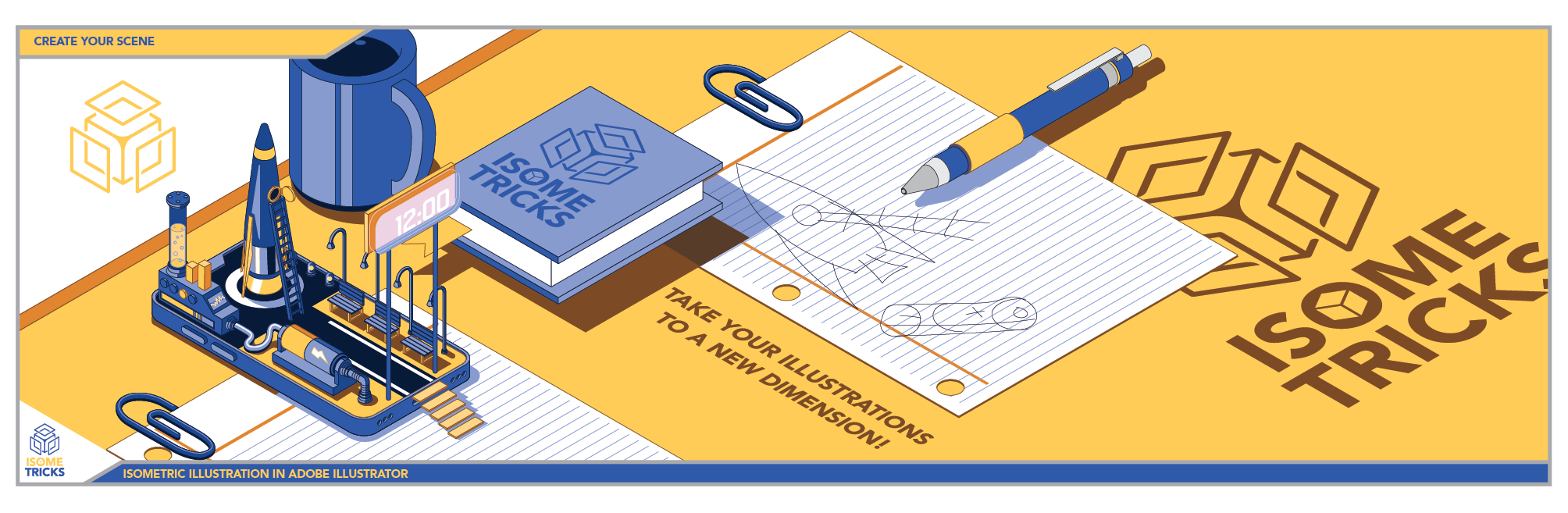
17. Getting Started With Your Class Project: Guys in this class, we'll go through a class
project demonstration. I'll go through my illustration
workflow a little bit and see if there's any useful
tips that can help you out. So let's jump right into it. In the class resources, you can find actually a class project template
just like this one here. It has an isometric phone on it, and basically your project, if you so choose, is to build upon this phone and create an isometric scene
coming out of the phone. And if you wanted
to, you can add elements to the side like
it's on top of a desk. And really, you can
do anything you want. On this phone, you
can do a park scene. You can do a cityscape.
You can make a castle. You can make a rocket ship.
You can do whatever you want. As long as you're
creating it in isometric. That's the class. We're creating an isometric illustration. So for my class project, I'm going to try to
make it a little more unique, a little
more interesting. I want to have a little fun with it. So that's what
I'm going to do. The first thing that
I want to do is basically set up what's
going to be in my scene. I'm going to just decide what
sort of elements do I want, and then I'm going to
try to portray them in a way that could fit into
my isometric illustration. So first of all, I'm going to write down
sort of what I want to see. What I'm thinking of
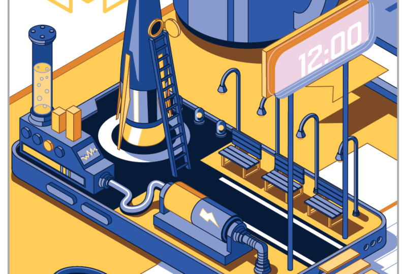
is maybe a rocket. Okay? I want to rocket
in my illustration. I just like rockets.
They're cool. Another one, maybe I want, you know, a battery
somewhere in there. Sort of whimsical, like, a really large
battery that maybe is charging the rocket
or something like that. And maybe I want some desk elements around it to sort of build into the scene. So on the desk, maybe I can
have a mug or a notebook, or maybe some just paper clips. To add sort of character and dimension to the scene itself, maybe just some paper, loose leaf paper, maybe
some other things. I don't know, if you wanted
to try making a doughnut or a cookie or something
else on your desk. It could be really
anything, maybe a lamp. Lamp might be too big, but, you know, just
break things down. You might be able to
incorporate the base of a lamp or something like that
on your illustration. And then inside
the illustration, yeah, I wanted a rocket. I wanted battery, maybe I'll draw a path leading
up to the rocket, maybe a ladder going up into
the rocket. That'd be cool. What else could we add to our isometric illustration here? Now, we're just coming
up with ideas of words or nouns of what could be placed
in the scene, right? And then we'll build it up. In our isometric classes,
we built a bench, so maybe I want to incorporate a bench in my scene
and maybe the lights. Maybe a clock of some sort. Maybe I can have a
digital clock sort of popping out sort of like it's a digital world
inside of this phone. Alright, so I have a
lot going on here. Now, what I could do is firstly, instead of going right into
building on top of this, I could just go on the
back and I can start thumbnailing some ideas
just really briefly. So I wanted the rocket
ship over here. And then a ladder coming
up to the rocket ship and the path and maybe
a clock here and, you know, lamp posts coming up. And very quickly looking
at what I could create. Let's draw another one. Maybe this one, I can have my big battery off to the side. It's ridiculously big
relative to the scene, maybe a fatter style
rocket over at the end. And again, I like the
idea of the path. And maybe we could put
stairs coming down from the phone onto the desk.
That might be interesting. Again, we want to
incorporate the bench, so make some benches. Now, I'm not trying to be
a perfect illustrator. I'm just trying to get down
ideas as quickly as possible and see what we can create. So I got my phone here. What else could we create? Well, we could do a spiral staircase up to
the rocket like that, and the rocket shooting through. The rocket could be taking off. So if I were to draw
a rocket and it could have smoke coming out
from underneath, like that. Yeah. So I'm just thumbnailing a few quick ideas and seeing
what I can come up with. And then I could also look at the things that I want
to draw and see if I can portray them in the
orthographic view and then sort of illustrate them a
little bit in isometric. So if I looked at what I wanted, I know that, you know,
a rocket from the side, this is sort of the rocket I wanted to create,
sort of like that. And then the battery you
know, from the side. You know, how batteries
are and then down the middle and then with
a plus and a minus. And now I know what it
looks like in orthographic, and then later on, I can
change it into isometric. So I think I have an
idea of what I want, so I'm going to put it down on my my paper here and see
what I can come up with. Now, don't worry about
being too specific on here. At the beginning, like I
said, the beautiful thing about isometric illustration is that you can really move your objects anywhere in the scene, and they
will still work. The perspective doesn't change. So don't be afraid that, Oh, if I place it here, I
can't place it anywhere. Of course you can in
Adobe Illustrator, you can move it
wherever you want. Everything's always editable. So go ahead, sketch some ideas, come up with a list of
items that you want to add to your illustration and do some thumbnails and
then try and draw out a quick little theme and then we'll bring it into
Adobe Illustrator.
18. Project Set up and Demo Time-lapse: Okay, now that we're
done to our sketch, now we can take a picture
of it and upload it into Adobe Illustrator and then
start to vectorize it. All right, so if you wanted to create your own illustration, you can do that, or you can use this template that
I've provided here. In the Layers panel, you can
see that there's a grid. You can lock the grid so you don't touch it. There's
the phone reference. There's the actual phone
illustration, full opacity. And there's also a phone
clip layer that I might use. And then you can create your own illustration in between the outlines or you can just get rid of the outline if you want. It's up to you. All right. So I'm going to create
it in here. But if you wanted to create
your own illustration, you can just go to File new, create your own
illustration, whatever size, maybe a square format. And if you need a grid, what you can do is
you can go into my Isometric the
Isometric action pack. There's hex grid at the bottom. And what that'll do,
it'll automatically create a hex grid for you, and to uto, it just
does that for you. Look at that. It makes a
new layer with a grid, and it's quite a large grid, so you can shrink it
down if you wanted smaller hex sagons if you wanted smaller
hexagons, and there you go. You just lock that layer, and you're good to go. You got your own custom hex
grid. That's pretty cool. I'm going to go back
to our project, and I'm going to
bring in my picture. Alright. So I brought
in my picture, and really, I'm just going
to use it for reference. I don't actually
need it too much, but one thing that I do
want to do before I start illustrating is set
up a color palette. So what I'm going to
do is I'm going to sample some of the
colors that I have here. Because I want to make it
isometric branded, I guess. And then I got a
yellow and blue, and now I'm going to make some variations of
these two colors to use throughout
my illustration. All right. So I got
my latest highlights, my mids, my shadow, and my shadow and stroke, and now I can start working
on my illustration. What I could do is I can
just highlight all these, go into my swatches panel. And then I have a whole
bunch of swatches here, but I don't really
need all of these. So for now, I'm just
going to create a folder. Going to say colors and all the other colors that
are in my swatches panel. I'm just going to unclick on those and delete them for now. And now I'm left with
just my regular colors. And now I can start
illustrating. One thing that I
want to decide early is whether I have a stroke or not, and
I do want a stroke. I'm going to take this phone,
I'm going to unlock it. I'm gonna hide the
clipping layer and I'm going to start by just
applying my colors to this. And I the the the I the. The.
19. Class Project Recap: All right. So I was able to
complete my illustration. It took a little while,
but I got through it. I used a lot of the isometrics
to accomplish the task, and I'm pretty happy
with the results. So let's just check it out
one more time and I'll briefly go over sort of what
I did through the process. So as we can see here, this is my illustration
that I did. Create your scene. What's
your scene going to be? Can't wait to find
out. I went to go with the background with
the actual desk elements, so made some mugs,
a little book, a paper clip, and some paper. This paper clip I should have moved somewhere
else, but that's okay. Anyways, and then on the phone, I made this little rocket
ship that's pretty cool. You got a ladder going
up to the window there. I thought that was pretty
interesting, pretty cool. And how I did that
was with the rocket, you just have to
think about where a point starts and ends, and then you can lay it out flat in orthographic
perspective, right? And then bring it
into your plane. So I had it flat, and then I went into
the vertical plane, and I found my points here, and I found my points there and just roughly drew
the lines there. So I did a little
bit of free form, but it worked out pretty well. And then just use my
cylindrical tools. I used my extrude
method over here, made a nice little wire there, added in the shadow
after the fact, used the cylinder to make this battery and made a little pipe there that
worked out really well. Use some text 12:00, okay? That's lunchtime, I
guess, or lunchtime. Oh, my goodness. Terrible. Okay. So dad jokes. It's I got to learn them. Made our bench. That
was pretty cool. So extrude method, pretty
easy stuff, duplicated, made a little lights over here, probably could put
some effects in there and add some more detail. But a lot of the shading
for all these things, I use the What is that? The draw inside method. So I just control or shift D when I selected the object and just pasted my
shadow in place. And then I can move it
around freely made my mug. Yeah. Anyways, everything
that I've done here, we went over in the class and you could do it
yourself, honestly. It does take a little
bit of time to get used to it and figure out which
method you're going to use, but you're going to be awesome. So you don't have
to do something as complicated as I did here. This was actually relatively complicated for
the class project, but I wanted to do something
a little bit different. So it just shows
you what you could do with your class project. But even if you just
want to do something very simple, go right ahead. I would love to see
what you guys create. So thank you so much
for taking the class. In the next class, I just
want to say thank you.
20. Thank You! You Rock!: Hey, guys, thank you so
much for taking the class. It means, uh, so
much to me that you kept with me along this journey of learning the isometrics. Isometric illustration
is really cool. And really, you can
do so much with it, as you can see through
the class project and many of the other
illustrations out there. It's really cool and really fun that you can just make
whatever you want. Then I really look forward
to seeing what you create. Create your scene in
any way you want. It doesn't need to be complex.
It could be very simple. But just try out some of
the isometric tricks, the isometrics and see
what you can create. I really want to see. Anything, post it in
the project panel. Really, I look forward to it. On top of that, I look forward
to hearing your feedback. So please consider leaving
a short positive review. It really helps the class and allows other students like
you to learn as well. If you have any
questions at all, don't hesitate to post in
the discussions panel, I'll definitely try and get
back to you as soon as I can and give you as much of
an informed decision or, I guess, answer as possible. If you want to support me
on my creative journey, consider following me
here on Skill Share so you get notified when
new classes launch. I've also put together an
isometric asset pack full of over 100 different
assets to start building isometric city scenes. So if you don't want to build everything yourself,
definitely check that out. It's for sale here on SkillShare
as a digital download or on my website
at Capcreats dot. That's my website.
Cab creatums.ca. KAP Creatums dot. Alright. I really look
forward to continuing to learn with you on
your creative journey until next time. See you later.
 Kyle Aaron Parson, Graphic Designer and Illustrator