Transcripts
1. Intro: [MUSIC] Hi, I'm Wendy and I'm
a watercolor artist. I have always loved to draw
and paint since I was young. I fell in love with watercolor when I first learned the median. Today, I own an Instagram account where I
share my painting ethically, as well as an online shop for showcasing and sell my painting. In this class, I'll
be sharing with you a relatively easy
watercolor technique that I particularly like. That's to paint intuitively
without pre-sketch. In this painting method, you don't need to overthink
and let your hand paint. For me, this is the best method. Relax your mind. At the same time, you only need to spend
a short amount of energy to create
something beautiful. In this course, we
are going to practice painting goldfish freehand
and mixing color organically. There will be brush
movement exercises in the assignments. By the end of the class, you'll be comfortable painting free hands on other
subject in the future. The possibility is in this. If you are ready to create something beautiful and organic, come join me and
let's get started. In the next lesson, I will talk about the
project for this class. I will see you soon.
2. Class Projects: [MUSIC] There are two
project for this class, the first project and
the final project. In the first project, we will get familiar with watercolor and practice
brush movements. I will show you step-by-step on how to finish
the first project. After the first project, we'll dive in to learn additional watercolor
techniques to help you finish
the final project. There are three sets
of goldfish painting. I will demonstrate step-by-step
on how to paint them. The reference photos are
in the resource section. You are welcome to use the Play and Pause button
to paint at lower speed. Having fun and
practice is the key. For the final project, let's paint some more goldfish. Use what have you
learned in the class. You can use your own
reference photos or you can use the paints
you have put together. The link is also in
the resource sections. Paint at least one
more goldfish and upload it to the gallery
section of this class. I would love to see your painting and
provide my feedback. We can all learn
from each other. In the next, I will talk about the material
for this class. I will see you in
the next lesson.
3. Class Materials: [MUSIC] In this class, I'm going to talk about the materials I use
for the painting. First, this is the
watercolor paper I use it's a Canson brand, XL series watercolor paper. It's fairly common in the US market and you
should get a pretty easily. You don't have to
use this brand, you can use any watercolor
paper you like. You want to have some
watercolor paints, some mixing surface here, as well as some
watercolor brush. I have number 10, number 6, and double zero here This is
the ink I use for the class. You want to have some water and some towels
to dry the brush. The complete lease of
the material I use and the brand is in the
resource section, so please check those out. In the next lesson, we are going to start
our first project. I will see you soon. [MUSIC]
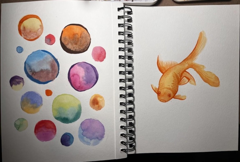
4. First Project Circle - Apply Base: [MUSIC] In this first class lesson, we are going to
get familiar with watercolor and
practice hand movement by painting circles
on watercolor paper. Here you can see I'm
wetting my brush. First I will load one color, here I have yellow. Then I will start painting a circle with the first half of the ring with the color
I pick which is yellow. Then I will clean the brush
and load a different color. Here, I use orange. Then complete the second
half of the circle. Remember, this is watercolor, so you need to have enough
water on your brush. When you pick up the color, you also need to
double-check that your brush is pretty wet, wet enough that when the two
color are mixing together, you were able to blend in very beautiful,
very organically. Here, when I finish
the orange and yellow, I actually add some red
inside the circles. I think going to create a very beautiful effect
when it's totally dry. Now I'm going to
repeat the step, and I'm going to work
on my second circles. For the rest of the painting, I'm going to fast forward
it and I'll talk to you again when I almost
finish the panting. [MUSIC] Here, I've finished up my paintings with
some small circles and some big circles. The key is you want
to get the balance on the paper to the
composition you like. There is no right or
wrong way to do it. Don't think that much and
just use your hand to paint the circle
to fill the page. When the colors are
completely dry on the paper, we would use ink to outline the circle with a different
stroke thickness. I'm going to talk about
that in the next lessons. Once your paint are
completely dry, let's move on to the next one.
5. First Project Circle - Add Details: [MUSIC] Now, after all the paint is
completely dry on my paper, I'm ready to do this Part
2 of this first project. We are going to apply ink with a different store
thickness to the rest of the circle to create an interesting
details on the paper. You can see here, I am filling out with my ink first before I
start the painting. I use Ph. Martin's Bombay
ink for this class. The reason I like this ink is, the ping itself is life
vesting and the color is very concentrated in advance of the effect I like to
have for my painting. You don't have to
have used the spray. You can use any ink, any brand you like. Also, I using Number 6 brush for my
stroke is going to create a pretty thick stroke around the circle and I didn't ask
the result I want to achieve. You can definitely try using different brush stroke and brush size to see what is
outcome you like. Here, I start by pressing down my brush
lightly and continue adding the pressure
to the brush along the age of the circle
and then a leaf up. You don't need to get the right thickness you
like at the first try. Here I come in back to modify
my stroke to the way I like to add a little bit longer to
the end of my stroke. Once I feel that's
the first one I like, now I'm going to work on the second stroke on the
other side of the circle. You can see this
straw is a little bit smaller and let
this shoulder because I want to get the balance between
the left and the right. Again, there's no right
or wrong way to do it. You can apply the stroke to
the whole circle if you like. You can play around
to see what's the best outcome you like, what's the best result
you like to see. Once I finished the first one, I'm going to work on my second circles with
a red stroke around it. The rest of the painting, I'm going to first forward
it and I will talk to you again when I almost
finished the painting. [MUSIC] Here you can see I
have finished up the stroke on the circle and I'm not applying the
straw to every circles. I only pick some big
ones and applying the stroke that will create an interesting
composition to the page. If you apply the
stroke on every circle it loose is interesting this is purpose for this painting. You can see the
finished painting is like an abstract
circle festival. We have all different
colors on the paper. Precise is not the point. This exercise aims
to get familiar with your materials
and learn to control the pressure of the
watercolor brush to create a beautiful circle and
different thickness line. Be fun with it and try
different color combinations. Remember to share your
finished painting in the class project gallery so other students
and me can see it. I will provide my feedback
on your class project. In the next lessons, we will start painting goldfish. I will see you in the next one. [MUSIC]
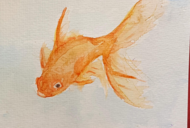
6. Goldfish Yellow Gold - Apply Base: [MUSIC] In this lesson, we are going to work
on our first goldfish. I have my reference photo here, and this is orange,
yellow gold fish. I really like the shape
of this goldfish so I'm going to paint this one as my first goldfish painting. You are welcome to
print this out in the document section
or you can put it on your computer for
your reference and I have here for my reference. I am going to use
number 10 brush to do my painting of the base
layer of the goldfish. First, I will wet my paint and I will want to use
the yellow first for my base layer and then after that I will use some orange
to put on top of the yellow. I don't want to
premix the color. I want the color blending
in organically itself. Now I have my yellow
and I have my paper, and I'm going to actually tape it at the bottom of
my paper as well. We're going to use free
to paint the goldfish, and since this is a watercolor, you want to have enough water on your brush and this is how
much you want on your brush. See the water is
almost dripping, that's how much water you want. First, I want to start
painting the head and then work on the shape of the back on the goldfish and
to the tail of the goldfish. Let's do it. That's the head and the back and all the way to
the tail of the goldfish. I got my first shape there, and then I'm continuing
working on the tail area. Then I'm back working on the head and work
on the stomach area and coloring all the
surface with yellow. I can add more color, add more water when I need it. The point is, you want to have enough water and enough
paint on your brush. I'm going to work on this area, which is a lighter
shape of the tail. What I'm doing here is, I
don't want to add more paint. On my brush, I
basically just dip more water on my
brush and work on it. I'm going to work on the
fin area at the back. He has this
extinguished curve at the back and the
shape of the fin. [MUSIC] In the bottom fin area, you can see there are
two fin get together, so when I paint the base shape, right now you cannot
really see what it is, just a big shape there. But don't worry, once we
add the ink detail on it, you can see they have several fins at the
bottom of the goldfish. Now I'm pretty
good with my base. First base layer was yellow. I'm going to add
some orange onto the goldfish to add some orange, and that it mix
itself with yellow. You see that's how much
water I want on the orange is a little bit less color when I first lay out the yellow. But still you want to have enough paint and enough water on your brush to work on it. I'm looking at my
reference photo. I can then add some
orange to an area I think that it need some
orange on the painting. [MUSIC] You can see here, when I put some orange on
top of yellow in this area, it doesn't really blend in, that's because the yellow color is a little bit dried out
already on the paper. It's okay. I'm going to
manually blend it in myself, add some orange and clean my brush and mix yellow and
orange together myself. You can see there's a puddle of orange color
at the head area. I can then just spread
it out a little bit. Also there are some
orange at the bottom fin, which is what I'm going
to work on right now. [MUSIC] I add in the last detail of
the orange on top of the yellow and that orange and
yellow mixing is organic. You can see how beautiful
the tail is with the color, with orange and yellow. I'm pretty happy with
what I have now. You can see it's all
beautiful mixing it together. Now I got to leave the
paint dry completely. In the next lesson, we are going to add
the detail with ink to make this
goldfish come alive. I will see you soon. [MUSIC]
7. Goldfish Yellow Gold - Add Details: [MUSIC] After the first layer of the first goldfish is dry, now I am going to add the detail of the
goldfish with the ink. I'm going to use two different brush to work on the detail
of the goldfish. This is a double zero brush
and this is a number 6 brush. One is pretty thick
and one is pretty thin so depend on what
I'm going to work on, I will switch between two brush. First I want to enhance
the shape of the goldfish. I want to detail out the back and I want to use a
thick brush to work on it, to get a very strong
curve to indicate where the back curve is. Remember that we were working on the circle with different
thickness of the stroke. This is where we are using the same skill for
this goldfish. First, you can see I put
down my brush lightly, adding the pressure to the
brush and lift up so you have this nice curve of being so
thick and then too thin. I don't want to add the brush to all the goldfish,
it's not necessary. I only want to enhance the area that is
not clear when I do the base layer of the goldfish because people
can connect it together. See now I adding just
the area that is not clear and you can come at the back of the
goldfish very easily. The next one I'm
going to work on is the stomach area
of the goldfish. You can see right now it's
just a blur of the shape, but once I adding
a detail to it, you can see the stomach
shape of the goldfish. As well as the two fin at
the bottom of the goldfish. So I look at it carefully first, think about how I want to do and I decide I want
to do the fin first. [inaudible] fin is small, it's still a detail
but I want to use a thinner brush
because I want to give my painting with a fixed stroke as the
important support, the main support line of the painting and some thin
line to support my painting. For me, this fin is a supporting area of the painting so I don't
want to use a thick line, I want to use a small thin
line to emphasize it. I drew now the whole shape because when we do
the base layer, it doesn't have
the defined shape. Now I use my thin brush to work on the defined
shape of this fin. I think is pretty good of the fin and now I can
add this strong shape of this bottom stomach area of the goldfish with this very
beautiful curve to it. You can see again
is from thin to thick line and then lift up again to make it
thin line again. Again do the whole
area I just only work on the area that is not defined
when I do the base layer. That is a key point
of my painting style. You don't need to add all
the stroke on the painting, but you only pick the area
that need to be enhanced. The next one I
want to work on is the eyes of the
goldfish and looking at the reference photos to locate
where the eyes is and then carefully use my small brush
to outline the eyes area. [MUSIC] Here I'm switching back
to the watercolor paints. Because I want to add
some detail to the body of the goldfish but
I don't want to use the ink because the ink
you can see is very bright in concentrate color and that's not the value I want to add to
the detail of this area. Think about the ink is your darkest color
on the goldfish. Then now I adding some
watercolor back to the base of the layer as a darker
shade of the color, but not necessarily a darkest. Because when I'm working
on the base layer I'm not necessarily put all
the darker area so now I'm working on it while
adding the ink to it. You see I looking at my
reference photo again and add some darker area
to the goldfish. But again, it's not the darkest
area but a darker area. The darkest area I'm going
to use ink to emphasize it. Again, you can see here
I use the watercolor to add some detail of
the fin texture to the goldfish and not
necessarily using the ink but using the
watercolor because I don't want this concentrated
ink bright color to dominate the detail of the fin but I want a soft texture on the fin. That's why I choose to use
watercolor instead of the ink. [MUSIC] Now I'm pretty happy with what I have using watercolor
to add some detail. I'm switching back to ink
with a smaller brush. I'm going to continue
adding some detail to it, looking at the
reference photo where's the darkest area
of the painting. You can see this
area of the fin has very dark color and that's why I want to use the
ink to emphasize it. The ink triggered us to work on the area that's not defined when I worked on my base layer, and at the same time, I treat the ink as the darkest value of the
color of the painting. Then I continue looking at the reference photo to see
where's the darkest area. I can add the ink and where are some area I didn't
define well when I do the base painting and then
I continue adding it. That's how you make the painting more dynamic and
more interesting. You're looking at the
painting right now, I have some dark
area with the ink, some darker area
with the watercolor. I have some thick stroke with thicker brush and I have some thin stroke
with thinner brush. With all these
different combination, that's how you make this
painting very interesting. When people look
at the painting, not only they look at the
goldfish itself but they can see how many
different techniques you used on the painting. [MUSIC] The last step of this
painting is I dab in some yellow watercolor
paint and add some scale detail on the
top of the goldfish. Without the texture, the body of the goldfish looks to plain and that's the reason I
decided later that I want to add some texture to it to make it
more interesting. As the painter, you can make this decision while
you do your painting. Sometimes when I
start the painting, I don't even know when you
will come up with but you just keep going and you will
end up with what you like. That's it, that's
our first goldfish. In the next lesson, we are going to work on
our second goldfish, it's a darker goldfish, I will see you next. [MUSIC]
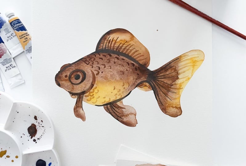
8. Goldfish Brown - Apply Base: [MUSIC] In this lesson, we are going to work on
our second goldfish, the different from
the first one. This one we are going to work on this darker color
of the goldfish with some brown and
some yellow to it. First, I want to wet
my paints and I've decided that I want to
use some brown first, and then adding yellow to it, and even premix the color. I want the color to mix itself
organically on the paper. Now I wet my pain to get enough paint and
water on my brush. Let me show you how much
water I mean on the pins. You can see I have my
scratch paper here. You can see that's
how much water I have right now on my brush. That's what you want to
have on your brush as well. I want to start working on the back of the goldfish first, and then continue
to the tail area. That's the first curve I got. Then I fill in with brown, and then now I continue
working on the mouth area. I clean my brush
and now I'm going to dip in some yellow to it. What I decide is that I
want to have some brown at the top and some yellow at the bottom of the stomach
area of the goldfish. Again, this is similar to the circle exercise we did
at the previous lesson. We use two different colors within a premix and with that, it blended in beautifully
on the paper itself. Now I got the stomach area of the goldfish with some yellow, I'm going back to brown
and continue working on the rest of the shape
of this goldfish. Then that's the other tail. You can see I filled
in with some brown here and continue adding brown to the tail
area of the goldfish. Then do all the way
to fill the shape. What I want to do is I dip some yellow again and I want to finish the shape of
this tail with yellow. You can see again the yellow and brown mixing is so authentically
very beautifully. In this area, I just use the water
to make it blend in a little bit instead, they'd be more color to it. Then I'm going to switch between
yellow and brown to work on the rest of the base
shape of the goldfish. [MUSIC] After I got all the base
shape of the goldfish, what I'm doing now
is adding more brown to it because
pretty brown goldfish. So I'm going to
add more brown to the painting to add the
value to the goldfish. You can wee again, in this area, the brown doesn't really
mix with yellow anymore is because the paint on the
yellow is dry already. In this case, what I'm
going to do is kind of angle to manually kind
of blending in myself. How you do it is you clean
your brush and dry the brush. Make the brush a little
bit damp and then lightly blend brown
and orange together. You can see now the color
remix together itself again. That's it. Looking at
the reference photo, I think I got everything I need to have the best layer
of the goldfish. I'm happy with how
it is coming out. There are some kind of a big part of the
brown on the paper. I'm not going to worry about it. I'll let it dry itself. When the paint is
completely dry, I will then add the detail of the goldfish to
make these brown, yellow goldfish come to life. In the next lesson, we are going to work on the
detail of this goldfish. I will see you soon. [MUSIC]
9. Goldfish Brown - Add Details: [MUSIC] [NOISE] Now the paint is
completely dry on the paper. I'm preparing to add some detail to the
fish with some ink. You can see that
drying out paint, creates beautiful effect on my goldfish and I
really like it. I think that's going to
make it very beautiful. The ink I'm using here
is a sepia color, is a Ph. Martin Bombay ink. I also have two brush
I'm going to use. One is number 6, one is double zero. They can see one is pretty
thick and one is very thin. It depends on what
I'm working on, I will switch between
these two brush. Now, I'm wetting my brush. I want to work on
the top area first. To first get to define the
shape of the goldfish. I'm going to test
it now on the paper first to make sure that's the color ion going
for. Here we go. Adding a stroke was a thickness to the
back of the goldfish, and I just realized that the curve is in the
wrong direction. It should go down but
instead it's going up. I quickly clean it up. There is no worry even though the Bombay ink is
a waterproof ink. That means, when I
put it on the paper, it dried out pretty quickly, and it's really
hard to remove it. Instead, I will work
on the bottom shape first to get my shape down. Again, I want to emphasize
the tail area here. Because where it is there
is a tail shape in the fin. So I want to define
that curve first. Why I'm wetting my
paint is dry on the top so I can re-put
my top curve back. Now is dry. Let me do another try. These time I get it right. I get the curve correctly
connect it, perfectly. The next one I want to
work on is the eyes area. By now you can see my pattern availing detail
of the goldfish is that I will first get the
very thick stroke to define the top shape
and the bottom shape, and the overall shape of the
goldfish on the body area. Then I work on the
eyes because I want to emphasized where the eyes
is located with the ink. Then after that, I will work on the rest of the area
including the fin, and including the tails. [MUSIC] Once I get all the detail on
the gold fish I decide to go back to the ink and just emphasize this line
again to make it darker. Because since that
area is pretty dark, I want people to see
this stroke right away. This is very two
important stroke and I will try to make it as dark as possible,
and that's it. I think I'm pretty
happy with what I have with this goldfish, and this is our second goldfish. Hope you enjoy painting
these two gold fish so far, and in the next lesson, we are going to work
on our third goldfish. We are going to paint two goldfish on our
third painting, and I will see you soon. [MUSIC]
10. Goldfish Twins - Apply Base: [MUSIC] In this lesson, we are going to paint
our third goldfish and we're actually going
to paint two goldfish. This is the reference
photo and you can see this red part on the top and here's some yellow and
some red and some blue. We are going to use
more than one color in this goldfish to paint. I'm going to work
on the first one at the balance and as always, I like to work on the head
of the goldfish first. Looking at the reference photo, I start working on the base
shape of the goldfish, I put some yellow down first
and then I clean my brush, and then I'm going to
add some orange to it. While working on right now
is I'm trying to define this area with the big puff on the top of the goldfish and now it has some
red tone into it. I want to first lay
out the orange and then I will put some red
on top of that later. I have dipped in some blue
here because I want to use this color to work on the
body of the goldfish. Even though the body of the
goldfish on the photo is, you can say is white, and I decide to use very light
blue here to work on it. What I mean by light blue
is I dilute the blue color, I add a lot of water into it to make it into a light blue. [MUSIC] You can see here that the blue and yellow, orange and then mixing
itself organically on the paper and that's
going to create a very beautiful
effect when it's dry. I continue using the light blue to add more detail
to the goldfish. Now I'm going to add some red to the top area where the puff is. You see since all the
paint is still wet, it's not dry yet. When that lane, the red
on the top of the paint, it can spread it
out to the body, to the head and that's okay, that's the effect
I want to have, that's going to create
a very beautiful color when it's all dry out. Once I got the base layer
over the first goldfish, I'm going to work
on my second one. [MUSIC] The last detail I want to
add is to add some red to the puffed area which
locate on the top of the head and looking at
the reference photo, I want to add some
more red because the second one has
the red-orange tone, not only on the head
but also the body area. You can see in this
goldfish base layer, we already use yellow, we use orange, we use red, and we use blue, we use multiple colors to make it together
for the base day of this goldfish and we can
then premix the color rather with the paint blending
in organically itself. Once the paint is
completely dry, we're going to add the detail to the goldfish to make this
goldfish come alive. I will see you soon. [MUSIC]
11. Goldfish Twins - Add Details: Now, the goldfish
is completely dry, with the base layer, and we'll add some ink to it. I decide to use this blue color to outline
the stroke of the shape. I think that's going to create some contracting and some
interesting effects. Again, we are going to
use two different brush, one is number 6
and one is number 0 and depend on what
I'm working on, I will switch between
these two brush. The first area I want to define, is this top area where
it connect to the tail. You can see I actually
used a small brush this time and not the big brush. The reason is the composition
of this goldfish is fairly light compared to
the first two goldfish. The first one we have the orange and yellow
tone and the second, we have the dark brown. Unlike those two, this one, we have a lighter color of
the goldfish and that's the reason I don't want to add a very strong stroke to it, it cannot be too heavy. So instead, I use
a thinner brush. I'll use blue to give elegant
look to this goldfish. You can see here, I already add the detail to the top of the shape
into the bottom of the shape and I will [inaudible]
the eyes area first, define the overall
shape and after that, I will work on the
rest of the detail. [MUSIC] You can see here I've switched
back to the big brush, and instead using ink, I'm going back to the
watercolor paints to add some details
with a base there. How you decide that
is think about the ink as the darkest
value of the painting. You see where you want to add it and also see that
in the detail area, the missing information
you want to add. When I switch to the
watercolor paint, is I want to emphasize the area, but yet it's not the darkest
value of the painting. That's how I do it and
that's how I think about it when switching between
the watercolor and ink, and here am switching back
to the small brush again. So throughout the painting,
especially this one, is switching between the
big brush and small brush, ink and watercolor it
really depend on what I want to achieve when I
look at the reference photo. When I'm looking at
the base layer I have, I keep thinking, what I
want to achieve next, and by thinking about it, I will switch between
the big brush and small brush and different
medium to achieve that. Again, there's no right
or wrong way to do it, it all depend on
you as the artist, what you decide to do. [MUSIC] The last detail I add in here, is the scale of the
goldfish and here, I'll use two different
color for head. At the bottom of the goldfish, the stomach area, I decide to use some blue to
add the detail of the scale. On top of the goldfish, I switch to the orange and
orange-yellow tone to it. Again, I want to get some
interesting effect to it, and also by just
adding one color, adding the blue to the body I think is a little
bit too heavy. I want to make a little bit lighter to the set
of the goldfish. That's why I switch between the blue and orange on
this goldfish painting. The previous where I
use only one color, in this painting, I
use different color. [MUSIC] I keep working on the details of the goldfish until I like it. That's it. I'm really happy with how it come out with
these two gold fish. That's the end of this
goldfish painting. In the next lesson, I'm going to recap on
what we learned in the class and the key takeaways
of painting goldfish. I will see you next [MUSIC].
12. Conclusion: [MUSIC] Congratulations. You made it. In this class, we first get to
get familiar with our materials by painting circle on the watercolor papers. We also learn how to control
our brush movements. After that, we
paint three sets of goldfish with additional
watercolor techniques. I hope you learned something
new from the class. If there's one thing
I would like to take away from the class, is to paint intuitively
and open-mind to try different materials
and different technique. Remember to post your
finished painting on the project gallery of this class so we can
all take a look. Also, if you like the class, please leave a review and follow my profile for the
feature class. Thank you. I will
see you next time.
 Wendy Chang, Watercolor Artist