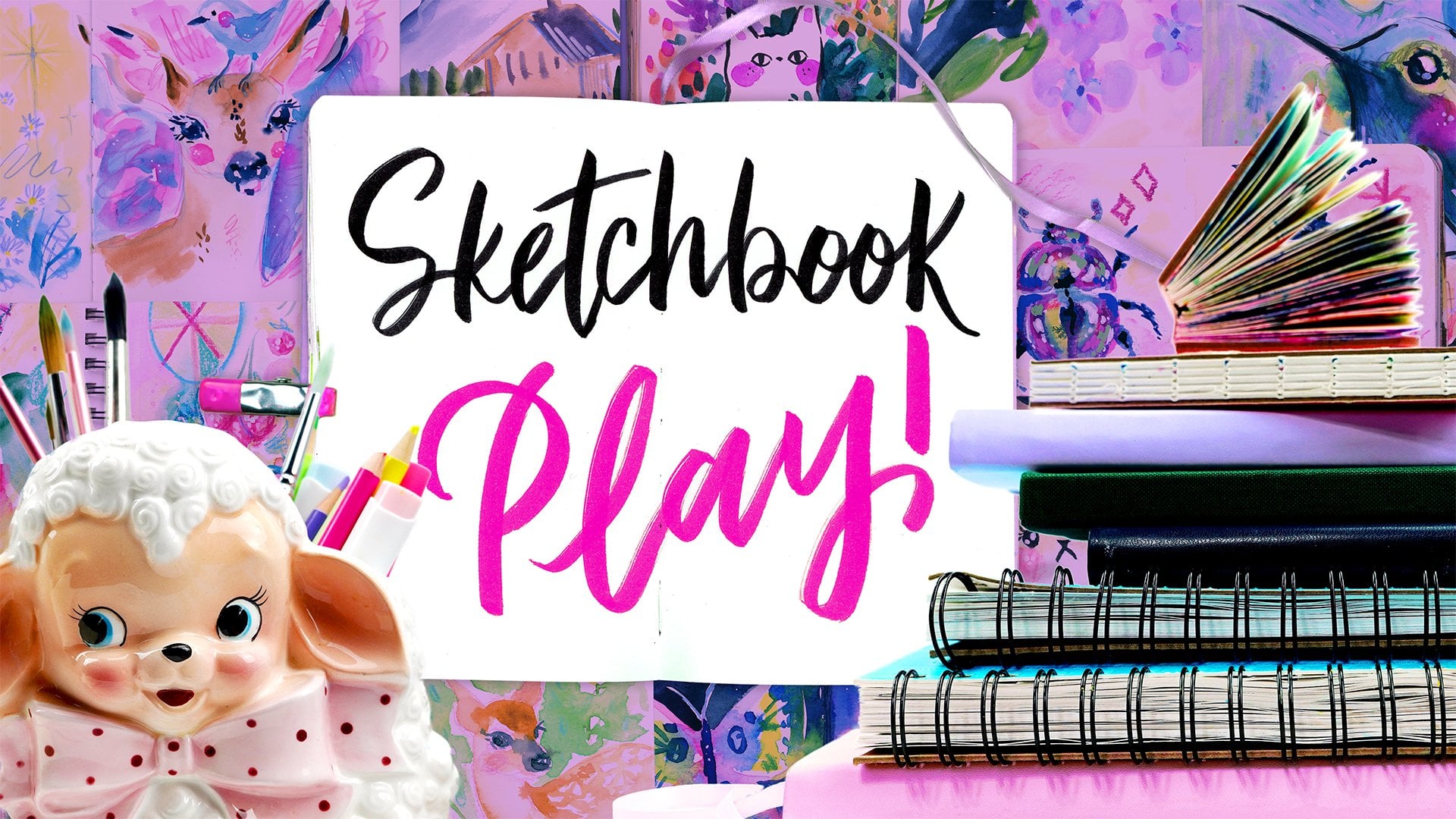
Transcripts
1. Class Intro: Do you ever get that perfectionist
feeling where you're too scared to start painting or drawing out of fear
of messing up? Well, this class can fix that. Hi. My name is Yasmina. I'm a self taught artist, and I've been doing this
drawing and painting things seriously for
the past 15 years. I love to make art easy and fun, and I have 32 other classes at this moment in
time that make it so. Lately, I've had an obsession
with being super loose and making art as free
and joyful as possible. And that's where
this class comes in. In this class, instead
of sketching first, we're going to jump
straight into painting. Put down shapes and colors, and this will also help
our brain to switch from thinking of just outlines and make us better
artists in general. It's gonna be no
pressure, no perfection. And then we're going to bring
everything to life with colored pencils or any other dry medion top to add details. It's honestly such a
freeing way to work, and I call it the
Paint first technique. And it helps you to get out of your head and into the
creative flow state. Results are also so fun and
so beautiful sometimes, and they can be
so quick to make. You don't need anything fancy, just watercolor or gouache. And then anything
you like on top, it can be marker,
crayon, whatever. I'm gonna be using
colored pencil, but you can use
whatever you have. I've broken up the class into seven fun days with
a different prompt daily that you can redo in your sketchbook
anytime you feel stuck. Day one is from blobs to what
you see using imagination. Day two is cute little faces. Day three is what
on what critters. Four is whimsical florals. Five is a happy little
abstract landscape. Six is working from a reference,
which is so important, and seven is painting
from real life, which is the fastest way to grow your skill, in my opinion. You'll see me paint everything
without sketching first, and then put it all together with texture, color, doodles, pattern, sparkles,
and other fun details with dry media on top. You can follow along with
me and do exactly as I do, or you can do your own thing. We keep things light, experimental and super
low pressure because this class is all about enjoying the process and getting
to that flow state. By the end, you'll have
seven sketchbook spreads. If you want to work
in your sketchbook, you can also just work on paper. And you can use
these techniques for any subject you draw or
paint in the future. So if you're ready to loosen up, tress yourself more and
bring more play to practice. Grab your sketchbook and paint, and let's play together.
I'll see you in class.
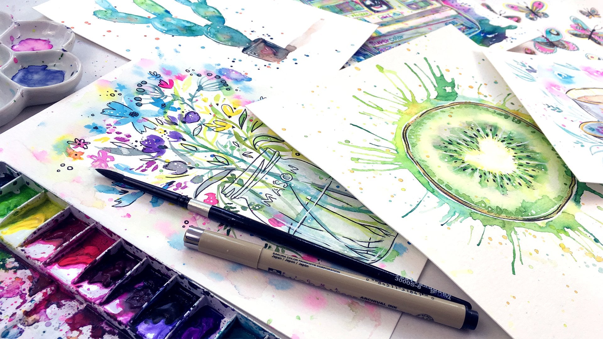
2. Supplies: Hey, guys, welcome to the class. So let's start with supplies, which are really simple, and you can really do
anything you want. But what you really
need is watercolor or gouache to paint
your first layers. And if you are using gouache, just use it thinly like you would watercolor by
watering it down. I do have beginner classes
on watercolor or gouache, if you want to learn the basics. We're going to be
doing paint first in this class because it makes it more wonky,
loose, and fun. But after you finish
with your paint, you can let it dry, and then you can use a different
medium on top. What you use is up to you. I will personally be
using colored pencils throughout the
class because it's been my favorite recently, and I think it's a
very versatile tool for adding color,
detail and texture. I also have a huge
collection of many colors, so it makes it more fun for me. If you want to use
colored pencils, too, I'm using prisma colors, which are higher quality. But if you only have
cheaper pencils like crayola or whatever,
it's okay, too, because we're going to be
using them loosely just to add lines and details and just
some light scribbly shading. This class is mostly
loose and fun, so none of your supplies
have to be fancy. There's a lot of different
supplies you can use on top of watercolor,
pretty much anything. You can use alcohol markers,
neo coolors, crayons, graphite pencils, ink, and
ink is super versatile. You can use micron pen for
tiny lines or a brush pen or a brush and ink or any number of other
things, whatever you like. Pretty much anything
will layer well on top of watercolor
or thin dow quash. The reason I'll be
using colored pencil for all seven dates
is because I find picking one medium
to use makes it less overwhelming to start
and finish a challenge. And I personally
think colored pencil goes with watercolor like
peanut butter and jelly, since you cannot paint lighter on top of watercolor
with watercolor, but with lighter colored
colored pencils, you can add highlights
and so forth. I think it looks really nice, and it's great for
adding tiny details. Also, if you have your
pencil sharpened, it makes really thin,
beautiful, perfect lines. And if you have a dull, it can make these thicker
or more sketchy lines, which I enjoy playing with. But you can use any medium,
like I said before, and you can even do something
different every day. It's really up to you
and what you're enjoying working with the most right now or what you want to master. As for other essentials, you
just need a brush or two. I'll just be using
this one large round brush to keep it simple, some water to clean
your brush with, and maybe a paper towel or rag to dry it and
clean it better. You'll see me using one
more optional thing, which is just a white
jelpin which you can add white highlights with
at the end of your pieces. If you don't have
a white jelpin, you can also use
white gouache or acrylic paint instead
since they're opaque, or you can even use a
white colored pencil if you want a more
sketchy highlight. One thing that will be missing
is a sketching pencil, and I encourage you to
just go paint first without any sketch for the
most fun and looseness, because that's really
the point of this class. Painting without
a sketch catches a feeling of spontaneity and helps you to overcome fear of mistakes
or perfectionism. I think it's a great
way to loosen up. But if you really want to use
a pencil, maybe, you know, you'd like to be more
detailed with your style, I'm not going to tell anyone, you can do whatever you want. And as for paper, I'll be using my royal talent
sketchbook paper, which is quite thin and cheap, but it works just fine for this kind of painting.
So don't overthink it. The paper is only 90 pounds, and it holds up so well. But if you want to use a ton
of layers or more water, you can get 140 pound paper,
which won't wp as much. But honestly, as long as
it's not thinner than 90, you'll be fine for this class. Okay, so that's it for supplies. Very simple. And
now let's start.
3. Day 1: Imagination Exercise: So, welcome to day one of our seven day
sketchbook challenge. We're going to start with
something super fun, a no pressure
imagination play thing. You know those weird shapes
they show you in psychology, and you have to guess
what it looks like. It's kind of like that. We're going to start with
a messy paint layer, and then we're going to try
to see what we can come up with by trying to find
something in the shapes. This is a skill that will
use your imagination mixed with your
subconscious mind, trying to see something. It's just fun. I
wanted to show you a bunch of examples on my
ugly sketchbook first. And if you want to do
this, you can do it, too. I highly recommend
using scrap paper to not stress about
results for the first try, or you can just go in your
sketchbook and do it twice. So simply paint blobs. Use different colors.
Don't overthink it. Don't try to make it
look like anything. Just be playful with
your brushstrokes. You can do anything you like. There's no wrong way, pick up different colors and
throw them in there, let them paint, mix and
mingle for a fun look. Notice how colors bleed
into each other because we add wet colors onto wet
paint that's still wet. This is called wet-on-wet, and I use this technique a lot. It's the most fun part
about watercolor painting. We're going to be
looking for what we think these shapes look like. And if you see something right
away, as you're painting, you can add some details in to make it look like what it is. Like I did by adding cheeks to the cat face and by adding
licks to the bird shape. But only if you notice what you think it looks like right away, otherwise, keep it random and just look at
it after it dries. So I filled both pages
to do a lot of these, but you don't have
to do this many, and I'm going to take my time
and see what I can find. It doesn't have to
be super realistic, and it's usually super
wonky and silly, and that's kind of the fun. We're just practicing using
our imagination and memory, since we're not using any
references while doing this. Okay, let's start.
For the first one, I see a Princess eating a cake. Kind of funny. The
second one looks like a cat running with a sword
wearing a cowboy hat, which I think is a hilarious. This would be a
funny sticker idea. This one looks like an elephant
being ridden by a person, kind of a far as stretch, and I had to figure
out what the person was, but, yeah, it worked out. Notice how simple
I'm keeping it. I'm also using
different media here. Instead of the colored pencil, I will use in my main sketchbook for
the whole class just to show you that you can use different media, and you should. And in fact, this is the
perfect exercise to try it out and see what works and doesn't if you want
to do it with me. Just find what you
prefer the most. Like for this cat, I use
the graphite pencil. I think that's actually a really fun combo
with watercolor. Alcohol markers can be used if you want thicker,
cleaner lines. I also add details with neo
colors which are super fine, but the strokes are much
thicker than colored pencil. As you can see here
with this dog, it gives a crayon
look, and it can be easily substituted
with crayons. Another idea is to
use watercolor, just with a smaller
brush and darker color. I wasn't sure what to do with
the bottom part of this, but that made me extra creative and I added
this quirk grass. Sometimes your drawings
won't turn out pretty. Ask yourself if
you were creative. That's what we're
practicing here. This banana looks silly with proportions, but
it doesn't matter. And sometimes you'll notice
that the medium you use doesn't look good or the
color comb doesn't look good. That's as important to discover
as what does look good. So you know for the future. For the owl, I use the
watercolor brush pen, and it looks very nice, but it's something
I've used for years usually with just black ink, so it's less of a
challenge for me. That's why I prefer
colored pencil right now, but ink or brush pens can
look very cool at this style because the natural
line variation and contrast have colors, especially just a
black ink brush pen. A micro pen can also be used, especially if it's super
thin like this one. It can give a fun and quirky and with this one, I had to be a little
bit more creative, but I saw reflected buildings and water, and I'm
done with the page. I use gel pen to make it a
water sparkly on the bottom. The results may not be stunning, but I practice something I'll naturally use in my normal art. It helps with problem solving
and you can reflect on what your favorite mediums are and what you like to
use for the class. But feel free to be super
playful with every day. You can switch it up as much as you want. You don't
have to do what I. Okay, I hope you enjoy
that little exercise. I think it's super fun. Some
of them look really good. Some of these don't, and that's
okay. That's part of it. If you really like something,
reflect on why you like it. What colors look well together? What supplies look
well together? And maybe you can recreate
it some other time. If you wanted to
it's a bigger piece. This is a great way to also
make ideas for bigger pieces. And now it's time to
do the same thing in your normal sketchbook. But we're going to just
do one blob per page, and if you have a
big sketchbook page, just fill it up with some crazy brush strokes and
make bigger shapes. Painted randomly beforehand and used my favorite color combos. This first one automatically stood out to me
as a mermaid cat. I personally enjoy
making cute things. I actually have a book
on drawing cute animals, and I think doing a cutie style for the blobs makes it easier to see something since it's a simple style I have
experience with, but you'll find things that you have more
experience with. So whatever you see,
just draw it in. I use colored pencil to sketch
it in with pink outlines, and then I colored in
loosely and quickly. Not everywhere, but I love the contrast of texture
with smooth watercolor. That's part of my
favorite things of using colored pencil. The lines looked really cute in the hot pink, but they're
a little too light. So I went over them with
blue pencil to darken them. But the pink still
shows through. And where they overlap, it
makes a nice purplish blue. I love that effect. I added some sparkles and look
how cute this turned out. The next one took me a little
longer to see something, but I finally saw an alpaca. This time, I used a blue
pencil, added some cheeks, like always, and made some more fluff with the
scribbly lines. I thought a scarf
would look nice since the colors end at
the neck, and it did. I added some sparkles with a white gel pen to the
eyes and the cheeks, but you don't have
to, as you can see, the kitty looks
cute without them. I also added light shading in the hair with the pink to
change the colors a bit. You can see, these
turned out so cute and without sketching or planning,
using my imagination. Now it's your turn. Try this Technique
out. It's so much fun. And whatever the results are, remember that all
practice leads to growth. So it doesn't matter
how good they look. And this is a really fun
skill to practice because it really improves your imagination,
your problem solving, fixing little issues
when you look at it, and just thinking
of a composition, what to draw or paint and even visualizing in your mind
what to draw or paint. But also, if you want
to make up characters, this is a great one to do. Okay, so that's it for day one. I'll see you guys in day two.
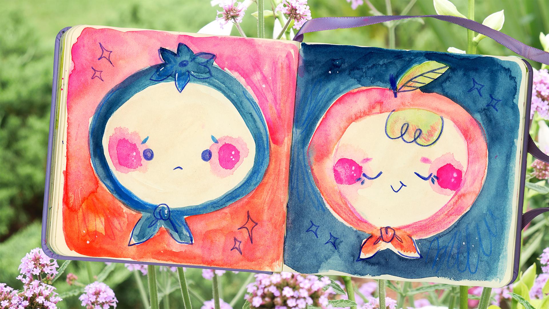
4. Day 2: Cutie Faces: Ya, Day two. So we're going
to make little faces. And you can do these in
any way you like and do as many as you like. You
can do a whole page of them. This is just a fun
exercise that's no sweat and looks so cute. So start by painting a wide oval with any flesh tone you like. And if you want to,
you can even make it like a pink person
or green person. It's your illustration,
whatever you want to do. And then drop in some
cheeks while it's still wet for some fun,
wet and wet action. Make sure to put them lower on the face for more cuteness. I decided to make my faces into little fruits, but you
can do anything you like. It's so easy to make
it into anything. Think frog, dog, cat, cake, insect, fairy, anything. Just pick a theme you like and paint in the hat
loosely matching. You don't have to do a lot of detail to make something cute, so this is an easy
way to practice the skill of making a character. I made it into a shawl shape with a little tie on the bottom, or you could make
it into a hat with ties at the ends
or no ties at all, just a hat, whatever
you want to do. So one is a peach and
one is a blueberry. Just keep it simple, but the looseness is what
makes it fun to look at. I decided to paint
around my face to make them pop more and use the colors I use on each one and the opposite one
to make it match. When you do a spread like this, using similar colors really helps to make things cohesive. Notice how loose I
painted the background, and you can also drop
in more colors while it's wet for more wet-on-wet
texture and play. But doing backgrounds like
this is great practice for your hand to control
where your lines go. If you want your cheeks to be even more bright, you
can drop in more paint, like I did with the hot pink, and now I'm ready to
use my colored pencil to add detail. Just
let your paint shry. I chose a darker blue color and add it in simple
face expressions. For extra cuteness, keep it simple and more towards
the bottom of the face. Try to separate the eyes wide, or you can put them really close together right in the
middle and make it tiny. There's all kinds of fun
ways to do cute faces. And you can even play with
your face expressions. Can also add more details with the colored pencil and refine the shapes
you already made, like I did here with
adding the leaf texture and drawing the details
of the bow on the bottom. I did the same thing on
top of the blueberry, and I did the same thing with
the bow down here as well. Hay is a fine little
touch in some sparkles, which are just dam and
shapes with pointy tips. You could do stars, hearts, or even more leaf shapes,
anything you like. You can finish here or add more details with
paint or pencil. Decided to use my
hot pink pencil to refine and deepen the
colors in the shawl, and then I added to the
orange pink background as well to add more texture. Notice how scribbly
and loose I am. I also wanted to paint
in the hair with the green I use for the
leaf to keep it consistent. You can always add paint later. I took a lighter blue color
and did the same with the blueberry cutie in the
background of the peach. Notice the cutie eyebrows
that I added and eyelashes. The finishing touch is just
some white jelpin highlights in the cheeks and in the
background, and we're done. This was a super simple and super cute thing
that you can paint. It can be done in so
many different ways. This is a fun way to start playing with creating
your own characters. The paint first technique
really makes you feel alive because the shapes are
just a bit wonky and fun, which I think helps
with cuteness. I hope you have
fun with this one, and you can revisit this in the future at anytime and just do small tweaks and you'll have completely
different results. Okay, so great job on
finishing Day two, you guys. And if you haven't
made your cuties yet, go ahead and have fun. And don't worry about results. You can just keep making them until you
like what you see. It's just practice, and I'll
see you guys in Day three.
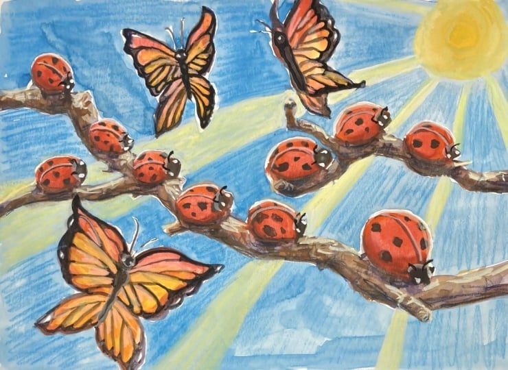
5. Day 3: Wet on Wet Critters: Hey, welcome to Day three. We're going to do one of
my favorite techniques, painting what on what
critters from Imagination. So this is something
I've done before. Here's an example of
me doing this with birds and another one, and also with cats
and another one. And I've also done this
with butterflies before. So you really can do this with
any subject that you like. If you like cars or plants or whatever, you
can try it with that. You don't have to
pick insects and butterflies, like I will hear. And if you're not sure how to paint what you want to paint, you can just pull up
some simple references of it and just be
inspired by them, but be loose and cartoonify it a little bit to
make it simple. But if you don't want
to use references, which I recommend to use your imagination and to learn
how to paint from memory, just choose a subject
you already know how to draw or paint something
that you're familiar with, and that way, it'll
make it easy for you. Realism is not the
goal of this exercise, so I encourage you to try
using your imagination. Okay, let's start
with butterflies, which I love to play
with wet-on-wet. You really can't go
around with them. So we're just going to
pick a color and make symmetrical shapes on
both sides for the wings, and then pick another
color and drop it on both sides,
keeping it symmetrical. You can do whatever
patterns you like, make sure to keep
them on both sides and they'll look
like a butterfly. Going to add in a simple body with a line and little antennas, if you like, and we're going to do the same thing for
the rest of them. You can play with the
shapes of the wings. You can play with which
way they're facing. There is no wrong
way to do this. So just be playful with shapes
and the colors you choose. And you can drop in as
many colors as you want. I like to overdo it myself. I also added some butterflies
coming off the page to really fill it in and make it feel more dynamic
for the composition. This is a really fun idea
for a repeat pattern. You don't have to paint
one butterfly at a time. You can work on all
of them at once, as long as you work quickly
while the paint is wet. Just add fun details, fun
textures, and be playful. On the other side, decide
to do beetles and bugs. Start with the body shape
just like butterflies and then pick a different
color and add in details. You can do fun patterns
on the body and add eyes and even antennas, don't forget the
little crawly feet. You can make it more
realistic or less realistic. Just have fun with it and fill your page with more
of these little guys. I kept it super simple
but recognizable. Notice how some of
these are outlined, some of these are filled in. Some of these are keep
painting wet-on-wet. And you can add
little tiny bugs or bigger ones and just vary the
scale of them if you like. And I even added
little pink circles here and there to
fill the space more. This could make a fun
pattern, as well. When I feel happy with
my little critters, which are not perfect,
but super playful, I go and fill out the
background of the butterflies. I have been enjoying
doing this lately because it's fun and
makes things pop. Notice how I'm using
different colors as I go, and they make the wet-on-wet
for a more fun background. And notice how my
edges aren't perfect. You can make yours
perfect if you take your time, but I
like the loose look. I think having some
white space around some butterflies
makes them pop more. I decided to add
some splatter by just tapping my brush
full of paint and water, and then I added some
details with the paint for an even more fun look
for the butterflies. Stripes or dots are easy to
do, but do anything you like, from hearts to
stars to intricate patterns to little flowers, I even added some to the bugs. Notice how since
the paint is dry, the shapes keep
their edges instead of blurring out
like on wet-on-wet. This is called wet on dry. It's great for adding detail. Just let your paint dry and
then add detail with paint. You always want dry layers underneath if you
want clean details. Next, I added highlights
with the white gel pen, which gives more opportunity to add fine details and
make things pop. Didn't like how
many I added here, so I just erase them
by painting over them with water since the
gelpen is water soluble. And as you can see, you
just pick it up with your brush or paper towel
and it'll disappear. As you can see, we didn't
use any colored pencil, and it's still
fine and detailed. But I decided to add
just a little bit to my beatles to make them feel more shiny and textured here. The lighter color shows up really well in the darker paint, and it makes it feel sparkly. I mentioned before,
adding highlights with colored pencils is one of
my favorite things to do, since you can't
do the same thing with watercolor by itself. Since it's transparent, it just gets darker and darker
if you add more paint. But using either white guash
or light colored guash or colored pencil on top is great for adding highlights
and making things pop. I think these look so
fun and whimsical, and I decided to
loosely doodle in the background with yellow
and a light minty green, as well, and that made
it even more fun. I just love the scribbly
look for backgrounds. There's no rules with how
you use your supplies, do what feels right
to you in the moment, and if you make a mistake,
you'll learn from it, so don't be scared
of making them. We're just having fun
in our sketchbooks and loosening it up and
letting go and playing. Okay, I love how
these turned out, super fun and loose
and silly and quirky. You can make a pattern like
this with any simple shapes, find something you like
to paint and do it. You could do flowers,
you could do cat faces, whatever.
Just have fun. Okay, so that's
it for day three. Hope you had fun and keep
playing with his technique. It's really one of my
favorite ways to play. This is a great one to revisit. You just have to be playful and loose and just do simple shapes. And it's so easy. So yeah, good job, and I'll
see you guys in Day four.
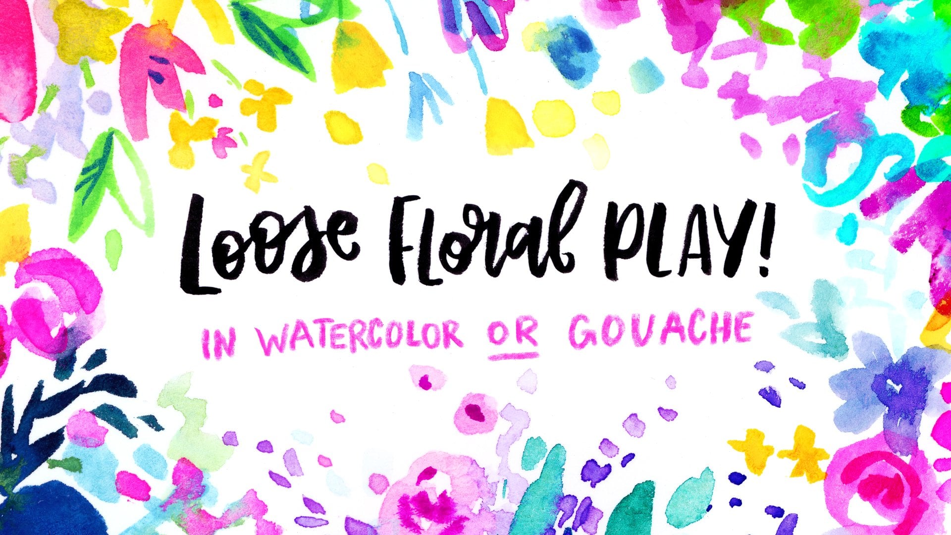
6. Day 4: Flower Fun: Flowers are one of the
most fun things to paint, in my opinion, and
they can be done in infinite ways and
still be recognizable. We're going to go into a more abstract imagination
made flower direction, which is very similar to what I showed in my loose
floral play class. So if you really like this
kind of painting and drawing, you can check out the clatch for more in depth look
into the style. It's very simple, very
fun, very intuitive, very playful, so just go for
it and don't overthink it. Start with some shapes and
colors that you find pleasing. Paint behind the
shapes for a flower behind another flower
for more depth, vary the shapes and
the scale as well. Find that making a few smaller
flowers first and then painting a bigger one behind them is an easy way to do this. Let the wet-on-wet magic happen. It makes the whole
thing more fun. So don't worry about being super neat unless that is your style, and you can be
careful not to touch the wet paint or let it
dry before adding more. Make sure to leave space below for a vase if you
want to add one, or you can just paint in stems that come together
like in a bouquet, maybe even a tie a ribbon
around them, whatever you like. I decided to add a
simple striped vase. But you don't even
have to have a vase. You can just fill the whole page with
flowers if you like, or maybe add like a cat
or whatever you want. Added some little dots
inside the bigger flowers, and now I'm going to
let this side dry. You don't have to do
these the same way I do. Just be playful with
shapes and colors and how fun there's 1 million
ways to do these. For this other page, I'm
going to do outlines more. I think outlines
can be really fun, especially done
with a bigger brush when they get a little messy. We still get that
what on what action where the lines touch
and the colors mingle, but it just gives it
a different look. I just painted some
flower shapes from imagination and notice how imperfect they are,
but it looks pleasing. This is a great way to
practice composition. This time I did
three big flowers. I made them all overlap to show what is in the front
and what is in the back. Little flowers and
dots and patterns can add another point of
interest as well. I painted in the outline
of a vase and it's now perfectly symmetrical,
which adds the fun look. This time, I also painted in the leaves by just being
playful with my brush. Notice how they're
all different, and leaves are a great
way to practice with the composition and
filling in empty space. You can vary the
types of line you put down by pressing down less
or more on your brush. You can also practice this on a scrap piece of paper
by just painting with a tip and then
pressing down until it gets thicker and then lifting
off until it's a tip. How you make basic leaf
shapes and you can do petal shapes and just get
to know your brushes. If you have some weird shaped
brushes that you never use, this is a great exercise
to try them out. Now, we have these
fun florals that we can use as a reverse
coloring page by adding outlines and
details and textures with their colored pencils or
anything else you'd like to use. I decided to start
with hot pink, one of my favorite
colors, as you can tell, and that is how I draw
outside the paint or overlap inside it to
make it more quirky. You don't have to
make everything inside the lines or perfect. I added some sin blue leaves and some darker blue details all around and little patterns
in the flowers as well. Use whatever colors you like and notice how quick and loose I am. There is no way to do this. Just have fun and be intuitive. I wanted the
background to be fun, so I took the pink and scribbled all around
to make it have this loose texture
and went back in with a sign to add more detail and
leaves to balance it out. For the other side,
I started with some fun patterns
and the flowers, using colors already used
to keep the pages matching. And then I filled in the
vase with more scribbles, leaving some white
for highlights. And then I added stems and leaves and details
with the sign. Scribbled in the pink
flower and added a checkered pattern
to the middle of the yellow one, and none
of this is planned. I'm just doing what is
fun in the moment and practicing making a
pleasing composition. And if I fail, that's okay, too. I failed a lot of
times in the past, and that's the only reason I'm a little better now
than I used to be, because I learn from every
piece I make, and so do you. Again, I did a
scribbly background with two different
pencil colors, and then I just took a moment to look and decided to keep going. You can stop anywhere you like, but I wanted the
background to be more pink here and added even more detail in contrast
with a darker pencil color. Can also go back
and use paint and add more color somewhere
you'll feel like it's missing. Whatever feels good to
you, whatever feels right. There's no perfect way to
do this, find your way. The last step was optional, but it's the white gel
pen just by adding little sparkles all around
and highlights to the vase. As you can see, the left
side turned out more messy and maybe a little
bit more overdone. I kind of didn't stop
in time, but it's okay. I like the playful feeling, and the right feels more
balanced than light. But I had fun with both sides, and that's what really matters. And there really
is no wrong way to draw or paint playful florals. So just have fun, and I'll
see you guys in day five.
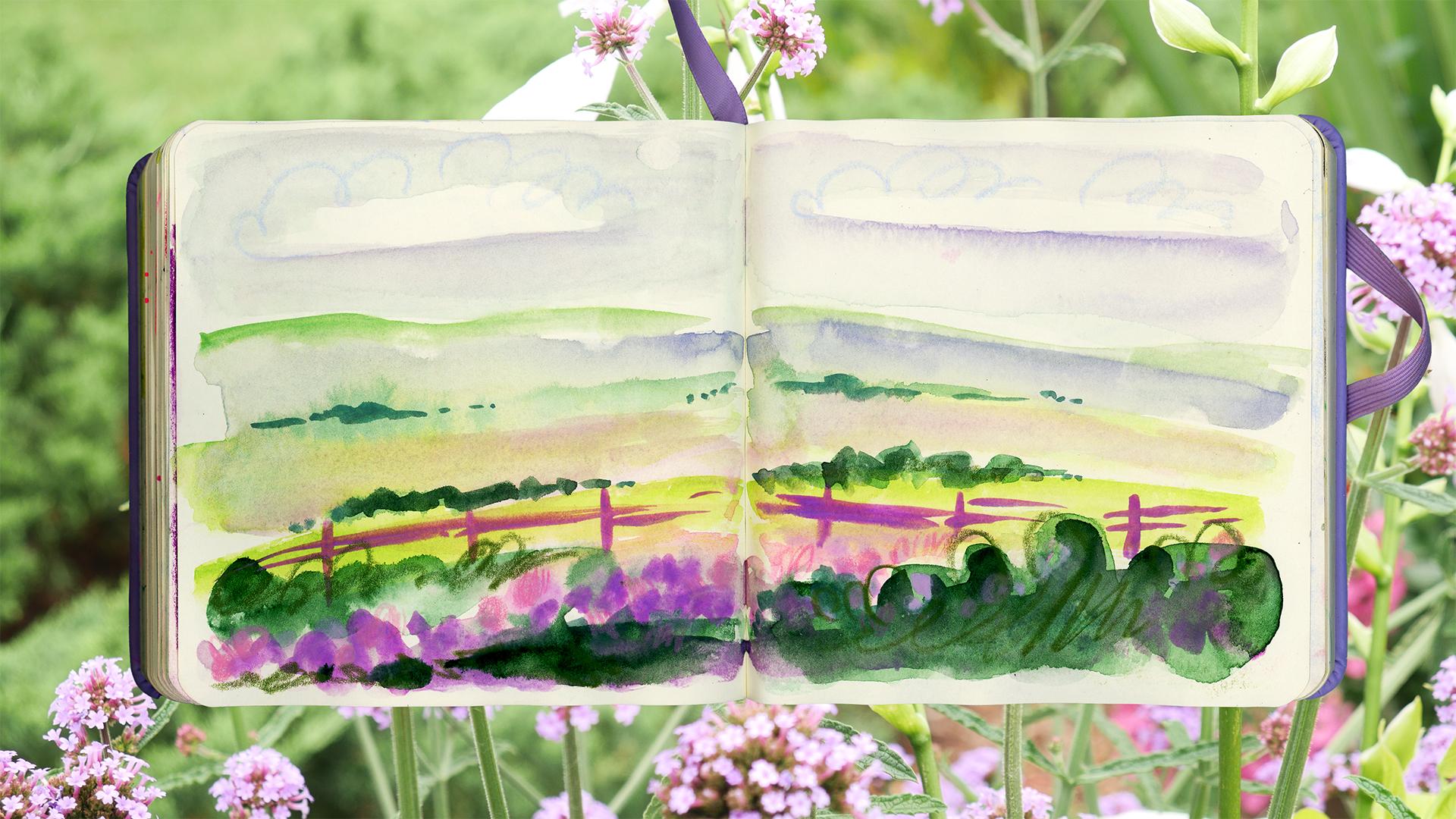
7. Day 5: Happy Little Landscape: So we're going to
be doing a playful little landscape for day five. We're happy accidents
are welcome. Now, I have drawn and
painted a lot of landscapes, so it's easy for
me to make one up. But if you have no experience, I recommend you find a
reference photo that you can be inspired from
to abstractify. Or if you want to, you can
try to follow along with me. But if you do have experience
with painting landscapes, I highly recommend you try making one up from
your imagination. Just be loose and expressive and don't worry about details, and don't worry about
realism, either. It's okay if it's a
little funny or wonky. It's your landscape.
I started with this beautiful green
for the horizon line. I'm thinking of an uneven field. Next I added mountains, let them bleed into it and mix and mingle for more
wet and wet fun. It's just a bunch of
triangle looking shapes that are uneven and rounded
out for more realism. Next, I wanted to paint a river. So I did this
organic zigzag that gets wider as it gets
closer to the viewer. Notice how loose I am being, but you can already
tell what it is. Don't worry about
being super accurate. Just play with color
and shape here. And next, I painted
in the rest of the field with a
slightly darker green, and I get some of the water to bleed out and it looks cool, even though it's not realistic. So for the sky, I
wanted it to be pink, so I use two different pinks
to fill in the top part, and I finished off the painting with a fun little splatter. Pinks are supposed to be
flowers scattered around, which are bigger when they're
closer to the viewer, so I try to keep them on
the bottom of the page. If you put one where
you don't want it, just pick it up with a
thirsty or empty brush, which just means a brush
that's clean and dry. I also added a tiny bit of
blue splatter for more fun. Now, I let it dry completely, and I'm ready to add details
with colored pencil. But if you wanted
to just leave it as a loose painting like
this can also be fun. You don't have to add details. So I started with tiny
pink flowers all around, especially where
I have splatter. They're not super
detailed and they're loose it does help
to define them more. And then little bits
of grass as well, which are just little lines. In landscapes, there is detail
close to us in the grass, but you can't really
see it far away because it gets
blurry and small. So keep that in mind
when you add detail, kind of make it
closer to the viewer. I also define the
river shape a bit, but I don't know if
I need to do that. And then I decided to add some loose scribbly cloud outlines and a yellow sun to
make it more quirky. This would be a
good place to stop if you like it more simple, but knowing me, I like to add a bit too much and
go a little extra. So I added tons of sparkles
and decided to make the sun feel extra shiny
by extending its rays. I defined the
mountains by loosely outlining them and
shading them in and added more leaves
and scribbles with the flowers and more
in the background, by hinting at them with small scribbles of
the same color. I'm just kind of in the zone here I'm just playing
around and just adding things already
used into it everywhere. As you can see, I'm not
using too many colors because that would
overwhelm the piece. I even put a little
in the clouds, and then I went in
with my white gel pen and added sparkles everywhere, especially in the river and
little mountaintops, too. Then I added even more detail
with the colored pencil by shading in with the same
two colors from before, and then use the pink to
add more to the clouds, outline the mountains, and then add a little
face to the sun. I even added scribbles
to the mountains. So as you can see, I kind of
went a little bit overboard, but I just finished off
with little pink cheeks. I made the eyes and mouth
darker, but adding blue, and this cute little
happy scene is done, and it's okay if it's
a little too much, I think it's fun. Can make yours as abstract
or realistic as you like. I tend to lean more to cartoony and cute and whimsical
when I make things, and I just love looseness. But how you do
these is up to you. There's 1 million ways to
do different landscapes and infinite style. So just have fun and experiment
and see what you like, find your favorite
way to make these. And like I said before, if
you need to use a reference, go ahead and find one that
you can be inspired by. Just simplify it and loosen it and let it be a
loose inspiration. Don't be super
realistic with it, or else you'll get stuck in this one piece and overthink it. Just try and just have
fun and be loose. Okay. I'll see you
guys in day six.
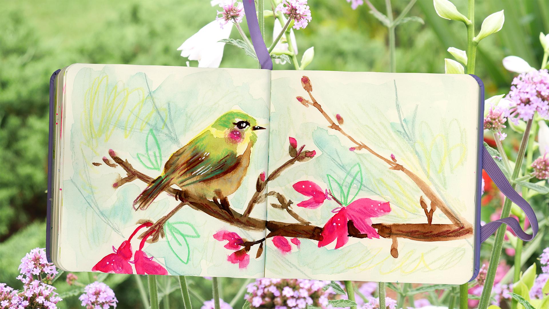
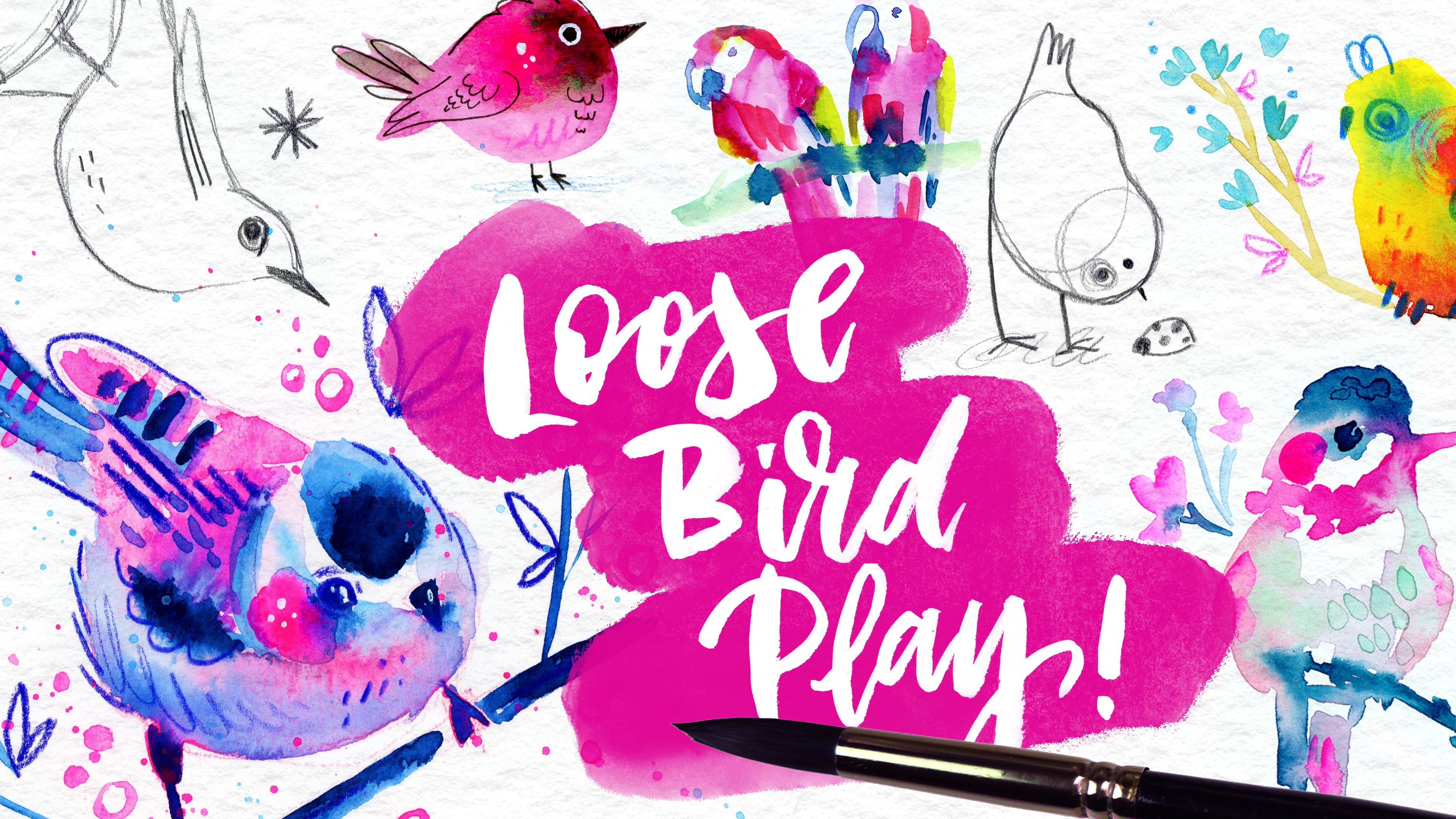
8. Day 6: Loose From a Reference: Welcome to Day six.
You're almost done. So so far, we've been really
loose and mostly made up our paintings without references unless you chose to use
them for some of these. But in this one, I wanted
to use a reference, and I wanted to show
you how you can base your painting
loosely off of it. So pick a reference of something you really like
to paint or draw. It could be anything
you like, but for me, I chose to do a bird because they're one of
my favorite things. In fact, to have a
loose bird play class that shows you how to
paint birds like this. But yeah, it's one
of my favorites. So you want to, you can also use the same reference I'm
using that's up to you. But if you pick something
you really like, you can find how you can
do it in your own style. So we're going to be
practicing being loose, but having that
feeling of realism, too, since it's
inspired by a photo. No matter your skill
level, just be brave and go for it
without sketching. Just pick a color and start. It's okay if your proportions
are completely off, you can fix it with a pencil
and just draw it in better. But really, it's just practice, and I think the more
you practice the skill, the better you
get, so go for it. Decided to do the branch first. I'm not going to copy
every detail perfectly. I'm just observing the
overall shapes and lines and doing my best to
mimic it by keeping it loose. This is a great exercise and
how not to copy every detail and how to paint
something quickly by capturing the essence. Next, I painted in
the flowers, again, highly inspired by the
reference, but still loose. Practice observation when doing this by just painting
the shapes that you see. Think of it as lines and shapes instead of bird and
flower and branch. Think of it as things you're
looking at, color, okay? But your brain will
actually process it better and it'll
be more realistic, even though we're
being loose with it. So I added in the branch in
the back but made it shorter, play with your reference
and make it your own for any detail you want
to change or don't like, and I'm going to
paint in the bird and really play with wet-on-wet. I did the overall shape
first, very loosely, and then I added in some colors that are similar
to the reference. But I don't have to capture every detail, just
the general shape. And this is hard for you
to do, squint your eyes, and the similar
things will group together into one
shape in your vision. And then just paint
those. You don't have to paint every
little thing, just paint the basic shapes. And then I added the mouth and eyes and some more dark details. Love how everything blood into the body. I think
this is so cool. Next, I add it in a loose
light blue background. Notice how loose and
imperfect it is. I like having little specks
of white everywhere. But if you want to be perfect, just take your time and do so. Okay, so I'm done with the
painting part, very simple. Now we're going to
let this fully dry, and I'll show you guys
how the color pencil would transform everything
and make it pop. I use a nice brown to loosely add texture
to the branch and a slight shading and more detail to the bird's
wing and tail. X is a cute pink cheek and
some details to the flowers. Notice how much more
defined it looks already. I took a nice, murky
blue and added more branches in
the background that feel far away and out of focus, and now for my favorite part,
the super bright green. Just by adding light shading and detail to the bird,
it comes to life. And I thought it'd be fun to add loose and doodly
leaves too with it, the outlines, which
gives a nice contrast. When I contrast
by using outlines and cartoony look with something that doesn't
have outlines, I think it makes a
really nice look. Like I showed you guys earlier, you can add highlights on top of watercolor with colored pencil, and I did the same thing here
by using a light yellow. I really think this
is a great life hack, and it just makes it so easy
to paint with watercolor. And I added some darker
details on the flower with a darker magenta and some yellow into the background as
well, and that was it. Pretty much I was
ready for highlights. Just adding a few dots here and there brings more
life into the piece. This is especially
true with the eyes and cheeks in my experience. I thought I was done here,
but I just looked at it for a second and realized
I need more contrast. So I went back in with a darker maroon brown color and added more shading and texture
to the branch and more detail and
shading to the bird. I also added more depth to the background with
a lighter green. Notice how much the bird livened up with the colored pencil, even though I was
super loose with it. Here's a before and after with the paint and then
with the colored pencil. This is why I think
watercolor and color pencil works
so great together. I love the fun textures,
especially in the background, and whatever reference
you decide to use, just try being
loose and playful. You can see, I was highly
inspired by the reference, but I didn't make an
exact copy of it. And I encourage you to
try to do the same. This is actually how you
will find your style. Just try to stylize what you see, with the
colors that you like, with the shapes that you like, with the lines that you like, and what the supplies
that you like. So whatever reference
you decide to use, try being loose and playful. Don't tress about the results, practice and have
fun, and over time, you'll find your style and
your favorite way of working. Okay, now let's do the last
day with painting from life.
9. Day 7: Painting From Life: Hey, good job of making
it to the last day. Today, I want to show you
guys the fun of doing the paint first technique with a three D object right in
front of you. That's right. Painting from life. Look around your home and pick something that would
be fun to paint. It can be shoes, tools, plants, food, or my favorite figurines. Or if you really feel up to it, you can make a whole
still life scene. Or if you want to
do something easy, do a fruit or a vegetable. Drawing from life
is so much more beneficial than
using a reference. It is more challenging.
So you grow your observation and
drawing skills faster. It's harder to put down a
three D object onto TD paper. You're learning how
to see in three D, so you kind of understand
how things work better in three D. So it helps you to
make up things in the future. If you want to rotate an object or draw it from a
different angle, you'll be able to do that. And also, the brain itself, because it's more challenged, gets better at observing. And that's really the
number one thing you need. You're also in the environment that you're drawing
the object in, so you can see where
the light source is and how it's interacting with
it and all kinds of stuff. So drawing from life is really the best way and the
fastest way to improve. I've already made a
lot of classes that show examples of this exercise. In fact, in my most recent drawing sketchbook
that I finished, I did a lot of this
with figurines by rotating them and doing
time drawings with them, and I improved so much
in just one year. And I did this without
sketching first. And this is why now I have such a good sense of
proportions with my first try, and I'm very good at
understanding three D, which used to be my
biggest weakness. Really a skill like any other and just takes practice and will improve all your drawing
and painting skills, especially observation. Whatever object you pick, try not to sketch first, go for it with the
paint because that also helps you with your
observation of shapes. Embrace the wonky, don't
overthink it and just practice. We're not being super
realistic here, so the act of stylizing
and simplifying from real life will help
you to grow those skills. Pick these two vintage
figurines because I think they're so cute and interesting, but I'm not going to lie. I was a little intimidated to do this without a sketch
with color first. But I went for it, trusting all the practice
I've already had. And again, if yours are
wonky, just keep practicing, and you can always
make the outlines more accurate for a fun outside
of the line's paint look. So I start with just the
head and arm shapes, and notice how simple they are. I try to space them
apart the right way with proportions being
accurate just by observing I actually cut them spot on. Next, I added in the
hair and dresses, and then the flowers
and the leaves. This really helps you
to pay attention to the general shapes of things and how spaced apart they are. I really just went for it
and didn't overthink and use the same colors on both sides to make it match.
Simplify what you see. Don't worry about details,
just the general shapes, and you can squint your
eyes to group shapes together like we did
in the last lesson. I added a couple of details with the
paint for a fun look, and I added in some leaves in
the background that aren't in the figurines to make the
composition more pleasing. Again, make it your own
and just practice making a balanced composition in
the best way that you want. Again, you can tweak your
real life reference if you don't like something just like you can tweak
a normal reference. We're not going for realism, just inspiration from
what we observe, so don't overthink the details. I decided to use a
blue pencil to add in the details on the right
side. Notice how loose I am. Again, scribbly, shading and lines that don't
touch everywhere, and it's okay if it looks wonky. That's part of the
charm. Don't be afraid to draw outside or
inside the colors. And also, you can
add more paint at any point if you decide to make something a
different color. I decided to make the hair
and halo on cheeks pink and went back into using colored
pencil for details after. I did more scribbly shading and little details in the
leaves and sparkles. Also decided to add
more pink all around, which makes a nice texture. Notice that my pencil
isn't sharpened, so it makes the lines
thicker and more soft, and I'm done with
this side for now. For the other side, I
thought it'd be fun to use the pink pencil
to do the outlines. And so I did the same
thing with adding detail. It looked pleasing enough, but the contrast was too low, so I decided to use a
darker magenta color to define certain areas. I try not to use it everywhere, but really made those roses pop at adding shading
in the center. Otherwise, everything was done in a similar style
to the right side. Next, I wanted to use a
scribbly background again. I really liked that look, and
so I used a lighter blue on the right and a neon yellow
for a pop on the left. Again, super messy, but I
love this effect so much. Or you can just make it really uniform with a pencil by
just being more slow. I decided to increase contrast more by thickening
the outlines on the right, especially on the outside, but looking back, I think it looked better with
thinner lines. Sometimes I like to do
this for a thicker effect, but it doesn't always look good. That's part of experimenting
and play is finding out what works and what doesn't
and where and how and why. You'll just remember how to do it in the future pieces more. That's why it's good to
reflect on your results. I also added more lines and thickened them
on the left side, and I really like how
the left side turned out with the light pink outlines
in some parts being thinner. So for me, this is
a nice contrast of what I like versus
what I don't like. For the finishing tach, added some white sparkles
with the white jelp and especially in the
eyes and cheeks and centers of the flowers,
and it's done. I hope this example
showed you how making even small changes in technique can make very different results. And it's okay to ruin a piece. Just learn from your mistakes
and what you like and don't don't be hard on yourself and try to fix the problem. Sometimes you can, sometimes
you can't that's okay. It's just your sketchbook
and we're just having fun. Okay, your turn, play and
see what you come up with, Paint something from
life, have fun with it. Don't worry too much
about it being perfect. And you can repeat any of these seven days that we
did with any subject you like and get completely
different results and grow from each time by
using different colors, different mediums,
different compositions, anything you want to do, just have fun and find
your favorite style and your favorite way to create. Okay, now let's
finish off the class.
10. The End!: Yay, you finished the class. Great job doing all seven days. I hope you made stuff
you had fun making, maybe you're proud of
some of it or all of it. Either way, it doesn't matter. Just remember, everyone you know that's been drawing
or painting or anyone you compare to yourself on
the Internet has been practicing for a different
amount of time than you have. So don't compare your work to mine or anyone else's
for that matter. Parison really is a thief
of joy in art and in life. Instead, keep filling your
sketchbook and playing. Have fun. Explore,
find what you like. The fun in illustrating, the fun in making it
is all that matters, and everything else is
just a cherry on top. I hope the looseness of
the paint first technique has helped you let go
of your perfectionism. And if you want
to share anything you made, I'd love to see it. Share it with the class when
making a class project, maybe share your own little discoveries for what
you like or don't like, what you realize
about the process. And what are your favorite
supplies to do this with? You know? Did you find a technique
you really like? Anything you want to
share? I'd love to hear is no right way to
do this technique. There's no right way to
paint or draw in general. So find what you enjoy. Keep
playing, find your style. Have fun, and just be quirky and keep evolving
your style as well. And if you were doing these in your sketchbook and you want more prompts from me for what
to do in your sketchbook, I have 100 playful art
prompts that I made, like a list you can download. But just joining my newsletter, you'll also get seven
coloring pages. It's all free? Ya, I hope
you enjoyed the class. And if you did, could
you please leave a review so more people
can find it and play, too? I really appreciate it. I want everyone to have fun in their sketchbooks
and keep creating. Also, if you're interested
in learning more from me, I have tons of other
classes you can check out, specifically 32 others at this moment in time from
drawing to painting, to gouache to watercolor, to
give people, animals, food. I even have a book on how
to draw cute animals, and just tons of stuff,
pen and ink, whatever. Okay, so that's
end of the class. I'll see you guys the next one. Bye. Take care. Have fun. Keep creating, keep
playing, keeping you. Yay.
 Yasmina Creates, Artist & Creativity Cheerleader