Transcripts
1. LESSON 1: INTRO: Hi, I'm Ken Campbell. Welcome to my studio and this introductory Art course on drawing in one-point perspective. I'm a full-time artist and art coach with over 25 years experience teaching my painting and drawing methods. I began making art as a kid. And after an exciting for decade art career in television, publishing and fine art, I developed a series of art courses I call the image craft learning series, with one simple goal to help new artists make great art. Each art course is focused on teaching an art skills including drawing, color, and design, common tricks and shortcuts, and streamline techniques used by full-time and professional artists. In this course, I want to show you how I create believable architecture, like room interiors, building exteriors, and 3D objects, all in one-point perspective. The goal here is to make concept drawings, which are the first step in creating finished colored artworks. Concept drawings are used by all types of artists, including fine art painters and drawers, architects, illustrators, graphic designers, concept artists, industrial designers, set designers, interior designers, landscape designers and many more. If you are keen to learn how to draw realistic structures, this is a good course for you. Here's an outline of what I've included in this course. First, we'll start with a brief historical overview of one-point perspective, beginning with its invention in the 14 hundreds, and how common and famous artists throughout the centuries have used it to convey realism. Next, we'll learn the fast and creative draw through sketching technique that lets you see all your construction lines as you work. Then we'll learn how to draw the basic foundation shapes in one-point perspective, focusing on 2D rectangles and 3D boxes. Then we'll learn how to make a 3D grid, which is the foundation for perspective drawing. And over which we will create our finished sketches. From there, we'll look at how to draw a simple human figures to help make our artwork more understandable and engaging. Next, we'll create a complete sketch of an interior room combining all of our elements where we put everything together. And finally, I'll outline the class, project, and assignment for you to create your own special themed room in one-point perspective. Let's get into it.
2. LESSON 2: BACKGROUND: First, here's some background. One-point perspective drawing technique is the simplest of the three main Linear Perspective types. It uses simple geometry to create a 3D realistic effect. Linear perspective is based on the principle that parallel lines appear to converge to a common vanishing point on the horizon has such objects that are farther away appear smaller. One-point perspective drawings and fly primarily three types of lines, horizontal lines like the horizon and floor lines that are all horizontal. Vertical lines like the walls of buildings that goes straight up and down. And foreshortened lines that are the angled lines that connect horizontal and vertical lines to a single vanishing point. Together they allow the artist to create 3D effects on 2D surfaces. Artists use one-point perspective when representing architectural structures. For example, when the viewpoint is looking directly at one side of the building and a single vanishing point is near the middle of the picture plane. Later I'll show you how these lines are used to create the three most common shapes in one-point perspective. Room interiors, building exteriors, and 3D objects. The historical context of one-point perspective takes place during the Italian Renaissance with the invention of linear perspective and the 14 hundreds by Italian artist and architect Filippo Brunelleschi. According to Wikipedia, with the advent of linear perspective, artists could paint imaginary landscapes and scenes with a perfectly accurate three-dimensional perspective and realism. Other artists of that time adopted the technique to over time artists all over the world. We're using one-point perspective technique. Hello.
3. LESSON 3: MATERIALS: Here's the complete list of materials I use and recommend for this course. It includes drawing, smudging, and erasing tools and several measuring and straight edges to help make drawing easier. When it comes to my workspace, there are a number of drawing setups I use, but they all share these common requirements. Number one, steady, hard drawing surface, I use hard board or a wooden board for this member to angle the drawing surface parallel to the face. For me, this usually means an adjustable drawing board and adjustable easel or an adjustable drawing table. And you want to adjust it so that it is parallel with your face so that there's no distortion when you're doing your drawings. Number three, you need good lighting, room lighting of some sort, plus task lighting. Number four, as separate well ventilated area for spring finished drawings.
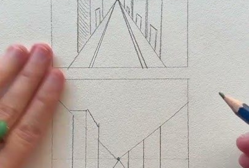
4. LESSON 4: DRAW-THROUGH: When creating a concept sketch, I tried to keep my drawing. I don't complicated and fast drying true sketching technique allows me to draw more realistically with the use of see-through construction lines. This is particularly useful and the rough or creative phase of image-making. With it, I can map out the entire anatomy of a shape all at once to see where the visible and hidden lines and edges meet. I like to use a ballpoint pen for these lines sketches, working lightly at first, then making final lines good involved. I was first encouraged to sketch this way by my wonderful high school teacher, Zoltan, Tennessee. And in the 60s, for which I am eternally grateful. I am delighted to see this technique is featured in many of the better online tutorials today. To work in the drawing through sketching technique, I begin by mapping out of three things. First, the horizon line, next to a vanishing point, which I place slightly off-center left or right. It doesn't really matter. And finally, I draw on a few lines radiating out from the vanishing point, which later we refer to as the foreshortened lines. To give me a bit of the lay of the land. And it helps me plan where I want to replace my shapes. As you can see when I start to compose my sketch, I worked with light lines and sketch all sides of the shape visible and hidden, careful to align edges. Note, here I am working with a ruler, but with practice you can work completely by AI. Construction lines may be approximate and includes several lines. And as you try to find the right line angle and line length, et cetera, I usually overshoot my corners a bit on purpose to keep things loose. All of this is what I call drawing through. To help me think about my lines. In one-point perspective drawings, I make primarily three types of lines. Horizontal lines like the horizon than floor lines that are all flat, horizontal, vertical lines like the walls of buildings that goes straight up and down. And foreshortened lines, which are the radiating lines that connect horizontal and vertical lines to the single vanishing point. Together they allow the artist to create 3D effects on 2D surfaces. The big advantage of working with the draw through sketching technique is to see all the sides of an object at once so that you can draw more accurately. Hi. Once all the construction lines are drawn, his time to make the final shape contour with bold lines. This is usually the visible outer edge lines. Take care to pick the best lines, then make them bold. After you've outlined the shape with bold lines, the lighter construction lines will diminish and importance and we'll add subtle structure notes to help the viewer better understand the drawing. If I'm rendering the sketch, often use vine charcoal, a simple five value palette to add depth over top of my line work. Fine charcoal is easy to apply, smudge and remove, and it's fast. The goal is to use thin contrasting layers of value to create a feeling of aerial perspective. Highlight the key things uncomplicated, often with darker values in the foreground and lighter values towards the background. After all, this is a concept sketch intended to work out ideas. I saved my more time consuming drawing and rendering for my detailed final art.
5. LESSON 5: RECTANGLES & BOXES: Hi, I'm Kim Campbell. And today I want to sketch out basic architectural forms based on rectangle and box geometry. In one-point perspective. It's all about learning to think in a 3D way. When sketching architecture, I invariably use lots of rectangles in boxes. I use them on their own to build objects and as the starting point for other shapes like circles, ellipses, cones and cylinders and so on. So I think learning your way around rectangles and boxes for an artist is essential. Again, I'll be creating only a rough sketches, worked with the draw through sketching technique. And I'll be working with a ballpoint pen. First, some context. Rectangles are 2D shapes, like these. Most rectangles I work with have different widths and heights. But note as square is a special rectangle. We're all sides are the same length. Boxes, on the other hand, are 3D forms like these. Most boxes I work with have different widths, heights, and deaths. But note a cube is a special box where all sides are the same length. To begin this lesson, let's prep the sketching paper. I'll start by mapping out two things. The horizon line, which I placed near the center of the page, and a vanishing point which I place on the horizon line slightly off-center. Here are the basics. Vertical and horizontal lines define the shape of the front face. Makes sure lines are straight and meet at right angles. For certain lines from the vanishing point to the line ends are intersections. Define the side faces. Vertical and horizontal lines outline the back face. So explore this a bit more. Sketch some variations. For example, sketch boxes on different sides of the vanishing point. Sketch boxes above and below the horizon line, and sketch overlapping boxes in the foreground and the background. Then make the form outline bald. Here I've put a light tone of charcoal on the drawing so make them easier to seeing. Now here are two simple ways to modify boxes by subtracting or by combining. In this subtracting example, first sketch a box. Then sketch and overlapping box. Now plan to subtract the overlapping area from the first box. You may need to add some additional lines. Then ball the final subtractive form, outline. In the combined example. First sketch a box. Then sketch and overlapping box. Now plan to combine the overlapping area of the two boxes. He may need to adjust your lines, Embed, then wall the final combined farm heard line. So in this lesson, we've covered how to sketch rectangles in boxes using draw through technique. How to sketch boxes from any position in the picture plane. And how to create complicated farms by subtracting and combining with these basic techniques in hand, you're well on your way to creating believable architectural sketches. Practicing each day will allow you to progress and gain confidence. Thanks for watching. I hope you found something here you can use in your studio.
6. LESSON 6: 3D GRID: Today I want to demonstrate how I create a 3D grid to draw architecture in one-point perspective. This approach to a one-point perspective drawing is very simplified and design for the artists with basic drawing skills. Here are answers to two basic questions. When do I use a one-point perspective grid? Well, I use it when I have a bunch of simple geometric forms like boxes, cylinders are parallel lines moving from the foreground to the background or are converging to 1 distant point. How does it work? I make a 3D grid and then I do my drawing on top of that. Pretty straightforward really. In the beginning, the 3D grid method is slower than simply drawing by eye, but it is a much more accurate way of measuring and a great way to train your eye to see perspective. The way it works is simple enough. It requires plotting a grid of squares along the x, y, and z axes. With regular practice, you will become faster and learn to take shortcuts, but stick with the step-by-step to begin and really learn the ropes. I still use the grid method for most of my one-point drawings, including room interiors, building exteriors, and 3D objects. This is a brief introduction to a big topic. My hope is that you will get hooked on how easy it is to do and how fun the 3D imagery is. This will encourage lots of one-point sketching. Here are the steps I use. Make a simple plan view sketch to organize your thoughts. This is an important tool to use because it helps you think in 3D. I plan view is what a scene looks like when you're looking straight down on it from above. I'm recording the floor shape and location of major details like walls and doorways and passageways, et cetera. I add enough written notes that I think will guide me in drawing the 3D version. For the grid drawing, I'm using a scale of one quarter inch equals one foot. Through trial and error. I know this scale will work with the size of my drawing. Draw the back wall to scale as a rectangle for my 2.5 inches, slightly off-center. The bottom of the rectangle is the base line. On top of the rectangle is the ceiling line. Draw a picture frame around where the picture will be because it helps to compose the picture. Remember to allow enough room around the rectangle to draw two sidewalls, the ceiling and the floor. In this case, my picture frame is 10.5 by five and a quarter inches because that's the format of this video. Draw the horizon line next. Place at five feet above the baseline, which is one and a quarter inches. This is a common height for a horizon line and a represents the eye level of the viewer. In future drawings, you can try lower and higher horizon lines for different effects. We're going to make a grid of two-foot squares in three directions. For the x-axis measurements, mark every half inch on the baseline. For the y-axis measurements, mark every half inch on the left wall corner going up. For the zed axis measurements will use the diagonal vanishing point, which I'll explain in a minute. But first, place an x for the vanishing point on the horizon line one inch from the left corner. I like the vanishing point to be off-center to make the perspective more interesting. And simply dead center. Then on the floor, ceiling and two walls mark foreshortened lines. Now to create the diagonal measuring point, or D vp, measure the width of the horizon on the back wall. Had this measurement to the horizon to the right of the right wall corner. This is the location of the D vp. Draw a diagonal line from the D vp through the right corner of the baseline. Now, each four-line is intersected by the diagonal line. Plot horizontal lines at these intersections from wall to wall. Horizontal lines meet the sidewalls, plot vertical lines up the walls. Were the x-axis, two-foot marks meet the sidewalls, plaid vertical lines of the back wall, where the vertical lines meet the ceiling plot horizontal and for a shortened lines. To finish. Congratulations, you've created a 3D grid that you can now refined with edits and add objects and figures to. For example, you can put lights in the ceiling, you can put art on the walls. You can cut passageways in the walls. You can add furniture on the floor, or you can sketch figures wherever you like. All the grid measurements are there for correct proportions. So in this lesson we've covered making a plan view and creating a generic 3D grid. These are my basic techniques to building one-point perspective drawings, including room interiors, building exteriors, and 3D objects. Practice sketching Dili, either replicating simple compositions or inventing original compositions. And this way of making 3D images will become second nature. Thanks for watching. I hope you found something here you can use in your studio to learn more about my tutorials and streaming art courses. Check out my website at Ken Campbell finite.com. We'll see you next time.
7. LESSON 7: SIMPLE FIGURES: Hi, I'm Ken Campbell and today I want to show you how I use simple rough sketches of human figures to make my architectural sketches more believable and engaging. I've found simple, generic figures help tell architectural stories through scale, ambiance, and action. As you'll see stylistically, I like my fingers to be simple, with realistic proportions and rough lines, but not too detailed. That is, no facial features, fingers, toes, et cetera. Let's get into it. Most of these sketches are concepts from imagination. They rely on general knowledge of things like architectural style and general anatomy and the geometry of one-point perspective drawing technique. I like to work fast and keep my shapes simple. And like my one-point perspective building drawings, all the rough construction lines, often in ballpoint pen are left in. And I make the final lines a bit bolder. My focus is on designing a concept that takes control of the story, narrative, and that I can eventually turn into a final painting. Here are four sketches to illustrate what I'm talking about. In the urban cafe sketch, I wanted to create a feeling of intimacy inside the gentrified urban community. Looking past the cafe waiters and customers into the character neighborhood architecture, I use highly simplified buildings with just enough detail to get my idea across. After all, this is a concept sketch, not finished art. As you can see, the figures are very simple line drawings in basic gestures. I tried to develop a complex set of views here, which I've cropped in red frames. Part of my strategy was to make the composition complex and interesting, but also isolate key areas that would make for good individual detailed drawings. In the Gothic cathedral sketch, I'm exploring a big vaulted space with lots of depth and height. I've roughed in the characteristic Gothic pointed arch windows and doors and suggested a large stained-glass rose window in the background. I added some statuary as well of figures holding oil lamps, which I thought might add some dramatic effect in the finished art. And I designed in a background lighting effect to create dramatic cast highlights and shadows, which you can see spilling into the foreground. The figures are mostly single individuals suggesting visitors. And I did include a couple of children to add some variety. Again, I have marked various droppings suggested by red frames. In the initial laundry day sketch, I'm trying to find some composition ideas with a house, lines of laundry and figures. Here I've tried a bunch of ideas together in this one sketch looking for combinations that might work. In particular, I like the static house structure that acts as an anchor for the wind blown laundry. This could be a lot of fun to develop in more sketches. I have suggested a few crop things, but I feel as though there's a bunch more possibilities to explore, including removing some figures or adding figures of children and dogs. In the Roman art sketch, I'm imagining an Old Town Location somewhere in the Mediterranean area. The scene is filled with sunlight and takes place in an ancient stone structure with what appears to be a mosque in the background. The large Roman arch entrance sets the mood. The partial reflection in the floors suggests polished marble or a wet surface streaming into the smaller entrance on the right creates a warm feeling. The figures are addressed in modern-day European attire, except for the guy in a toga on the right. In all the drawings, I've rendered the tones on the figures, darkest in the foreground and lighter towards the background. This is typically how I see and render atmospheric perspective. In a quick colored version, I've added color digitally over top of the black and white sketch to explore what the art might look like in the next phase, the color comprehensive phase. This can also be done in traditional color media like oils and acrylics. The eight had mannequin grid is an easy way to draw figures. If this is new to you, simply walk through these steps a few times. If you already have some live drawing under your belt, this will be a good review. In either case, what we have here is what I referred to as a generic cliche or a standard approach to drawing figures. I'm demonstrating the average 850 year-old mannequin grid here. The grid is simply eight squares by two squares, where the height of each square is the height of the mannequins head. Using the head height, I scale the figure to eight units tall. The landmarks below the crown, our chin, nipples, umbilicus and elbow, pubis and wrist, mid thigh, knee, mid calf. And he'll note, you will also need to add one more important landmark, the shoulder and clavicle line shown here between the chin and nipples landmark. I use basic shapes to refer to the figures including ellipses and the circles, et cetera, in light construction lines. Then I refine the shapes with darker lines. I highly recommend learning these five key views. Front, front, three-quarter, side, back, three-quarter, and back. So you can draw a figure anytime without a reference. It's invaluable when doing concept sketches. By the way, I use very simple drawing materials, plain white paper, ballpoint, pen, vine, charcoal, and kneaded eraser. You'll see me write a ratio above a few of the figures. These are the proportions of the head width to height. So for example, that's two to three for a front view and back view, and 45 for the side view. That's three-quarter views are in-between these ratios. Scale refers to drawing architecture in relation to figures or scaled to figures. For example, seeing a house in relation to a few figures gives the viewer a better sense of proportion. So it's important for the artist to draw figures in believable proportions. Here's how I do it. First, I set the location for the figure. I do this by drawing the horizon line and vanishing point and a foreshortening line from the vanishing point that represents the height of all the figures. In this example, all the figures will have their eyes on the horizon line because the point of view is from the same height as the figures. And all the figures feet will be standing on the foreshortened line. Then I draw a vertical line where I want the figure to be. I then divide the line into eight equal parts. Each division represents a landmark, such as chin level, et cetera. Next, using light lines, I use basic shapes to rough out the body parts. And then with darker lines, I refine the body shape. Finally, I apply rough layer of vine charcoal and use a smudging tool to even out to a light tonal value and remove the background with a kneaded eraser. I repeat this process wherever I want to draw a new figure. I tried to be careful to stick to the aid head grid. I don't worry about showing my rough construction lines because they keep things loose and helped me work out my design more easily. In summary, drawing simple figures in architectural drawings help sell the concept to the viewer. Using the Aid head mannequin grid simplifies and unifies the overall drawing. Using figures drawn to scale gives a better sense of 3D depth to my drawings. And finally, a good 1 drawing with descriptive figures is an ideal foundation to move to the Color Conference final art phases with confidence. Thanks for watching. I hope you found something here you can use in your studio. To learn more. Check out my website at Kim Campbell finite.com. We'll see you next time.
8. LESSON 8: ROOM: Hi, I'm Ken Campbell and today I want to sketch a very simple room over top of a 3D grid in one-point perspective. I make lots of sketches like this to work out drawing and composition problems, working largely from imagination. They are quick to do and with a simple phi value of grayscale palate, I can avoid typical prospective mistakes and move on to painting more quickly. Follow along to create your own sketch. Once I've created the grid for the building structure, has I did in the last lesson. I can then accurately sketch the building. And at the same time, I can easily edit that structure and add objects, floor and wall coverings and figures to give scale and unique character to the place. To review, let's look at the grid I just made. We follow the plan view. We use the measurement scale of one-quarter inch equals one foot. And made the Florida mentioned is 16 feet wide by 12 feet deep. And we made the ceiling height ten feet tall. We measured every two feet in three directions to create a 3D grid. We set the horizon line at five feet above the baseline, which is a common eye level. And we set the vanishing point off center to the left. Now I want to customize the grid to complete my vision of this room. So here are my edits and additions used to create the reception room theme over this created for convenience here I am working on a photocopy, which I do when I want to try a bunch of different versions of a drawing. And I'm sketching with a ballpoint pens to make it easier to see my lines. First, I'm editing the shape of the room by using the grid. I'm adding some ceiling lights evenly spaced. I'm adding wall art, again, evenly spaced. And then creating passageway cut out in the walls. In the front of the room. Again, I'm using the grid data large reception desk, then measure is four feet by six feet long by three feet tall. Then I making all important lines, balls. And it's around this desk that I'll add three figures to provide scale and context for the reception theme. It's critical to scale each figure correctly to fit in it's chosen location using the grid. Note that each figure is eight heads tall and all eyes are located on the horizon line. Using vine charcoal, I'm mapping out a very simple tonal plan to help shape the room. Note there's simple tones like the loose line work. I'm not intended to be definitive, but rather suggestive. Then finally, I'm adding some poster art on the back wall, in this case daisies and doing just enough Touch Apps to explain my concept without going overboard. Remember, this is a concept sketch only the detailed rendering comes later. To get the hang of things on your first sketch, follow this demo I'm making and simply copy the sketch onto it. Then for our second sketch, I recommend you make another grid. Then make a new sketch with your own ideas. For example, instead of a reception, you can sketch a coffee shop with a counter instead of a desk and a poster of coffee and donuts on the back wall instead of flowers and so on. Use your imagination. The goal is to get you to use the routine of making a grid of construction lines that will guide your final sketch. Over time, you will get faster and learn to take shortcuts. For example, you may build simpler grids when you anticipate where you need your construction lines and leave them out where you don't. One final thought. While I designed a composition here, I'm happy with, I always remember that the design process is iterative. And I'm constantly considering new ways of looking at how to tell a story differently. In this course, I've introduced my approach to making one-point perspective sketches for architectural themes. The goal has been to learn how to make rough designs that are realistic enough and ready to be turned into finished paintings. By studying each lesson and completing the projects, artists will learn these basic techniques, practice and repeat so they become second nature. Thanks for watching. I hope you found something here that you can use in your studio. To learn more about my tutorials and streaming art courses. Check out my website and can Campbell fine art.com. We'll see you next time.
9. LESSON 9: CLASS PROJECT: Your class project assignment is to create an interesting, realistic room interior in one-point perspective. A room that grabs the attention of your audience. Your sketch should focus on perspective, foreshortening, and believable proportions to help sell your ideas. To get started, review lesson six, less than seven, and less than 8. Your project will have a new theme. And instead of the reception theme I used in the demo, changed the theme of your sketch to one that you want to create. For example, coffee shop or garden shop, sparked Shop, Bakery spot, etc. You get the idea. Remember to keep things simple. These drawings can get complicated really quickly. You will need to download and print the plan view and modify it to capture your theme by adding and removing architectural details like doors or windows and furniture, et cetera. Blow are several variations on the reception room I did for Lesson 8. Note the variations. This may help you imagine variations for your project. Try stuff. Just make sure it's tied to the grid and the vanishing point. And you should be fine. Are you stuck for room Theme Ideas? Look at rooms in your home, for architectural details. Look at interior spaces in your neighborhood, like inside local stores and public buildings. And of course, check online to build your sketch, downloaded the 3D grid and print it full size on an 8.5 by 11 sheet. On top of this grid, sketch your changes to the room structure that you made in your plan view. Use the draw through sketching technique and makes sure to make the important lines bold. Then add figures to help tell the story of your room. And add some simple values using a 5 value palette. Finally, spray the finished sketch with cry Elon workable fix to protect it. I use to light passes. Make sure to share your final artwork and progress shots with the class by offloading to your project section. If you have any questions or need more tips, please let me know. I'm happy to help.
 Ken Campbell, Founder, Imagecraft Learning Series