Transcripts
1. Welcome: Hey. Welcome to my studio. I'm Nina, also known as DOD, an illustrator and
pattern designer based in Belgrade, Servia. And this class is an
introduction to RSO printing. As a direct response to the overly digital world
we're living in so printing is having a
big comeback and it's becoming more and more
popular in the art community. You might have heard
about it before, already bought some reso prints, or this is something
completely new to you. Whatever the case might be, in this class, you'll learn the fundamentals
of reso printing. I'll walk you through
the technical specifics of the reso machine and show you how to create an art print and prepare
it for reso printing. This class is super easy to
follow and beginner friendly. All you need is a basic
knowledge of Photoshop. Okay, thanks for being here. Now, if you're ready,
let's get started.
2. Project: The project for this class is
to create a reso art print using a limited color palette and prepare the
files for printing. To make your illustration, you can use Procreate or any
digital drawing program. And later, when it
comes to file setup, we'll be using Photoshop. The last part of this project is optional, but
highly recommended. Once you finish your artwork, send the files to your
local reso studio and create limited
edition art prints. By the way, I'd love to
see what you've created, whether it ends up as a digital artwork or
a reso art print. Once you finish,
feel free to share the results in the project and resources section
of the class.
3. What is Riso Printing?: You might be wondering
what is so printing? What kind of machine is so and what is so
special about it? To put it simply, so is a copy machine that works
like a screen printer. It produces uniquely textured and vibrant prints
very affordably. The production is super fast and also environmentally
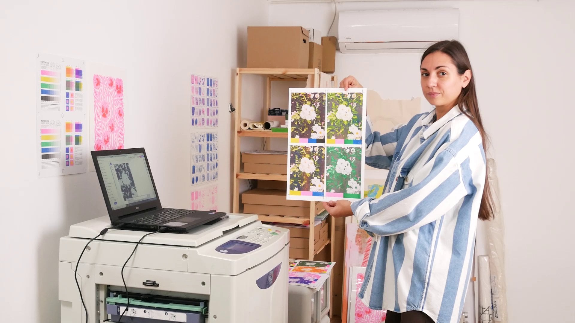
friendly. So how does it actually work? This here is a so machine, and when I open it, you can see that inside, there is a color drum
with one color inside. This one in particular is black. What's interesting
about it, first of all, is that iso prints
one color at a time. So unlike inject printing, where you can print all colors at once with the RSO machine, you're building your print
in layers by changing these color drums and printing
one color layer at a time. Now, when I pull
out this so drum, you can see that
wrapped around it is a special paper
called master. On that master, the
machine creates a stencil, which is exactly how, for example, screen
printing works. For the color to go
through the screen, you need to expose
it manually using an emulsion to open the holes through which
a color can pass. Here, something very
similar is happening, but you don't have
to do it manually because the machine
is doing it for you. To create the stencil, it burns tiny holes in the master that correspond to
the image you're printing. Once the master is created, the paper goes in
and under the drum, the drum rotates, the ink goes
through those tiny holes, and the reso copy is created. These machines were
made to create office copies and not
highly precise prints. So you always have to
expect some imperfections, misregistrations,
and uneven coverage. That is also one of the reasons
why reso printing is so special and beloved in art communities all
over the world. It gives you an opportunity to experiment, get
unpredictable results, and make unique art, which in today's digital
and boringly perfect world is highly valued. Also, reso prints have a certain old school
look and therefore, a very nostalgic feel to them. This can be imitated
digitally using different textures
and brushes and making intentional
printing imperfections. But having the
possibility to do all of this using a real so
machine and seeing the print being developed
on paper one layer at a time is one of a kind
art making experience. And I'm here today to encourage you to try
it out yourself.
4. Riso Printing Facts: To sum this all up
and learn a bit more, here is a list of
RSO printing facts with more details
and explanations. Riso is one of the most environmentally
friendly printers on the planet. It uses soy based
non toxic inks, and the master, which
is used to create the stencil is made
out of plant fiber. Plus, so consumes
very little energy. Riso prints one color at a
time using a color drum, which means your artwork is
created in color layers. Now, it's good to
keep in mind that each so print shop has
a certain number of color drums available and therefore a certain range of
colors you can print with. Unlike ink jet printing, so art prints have a
beautiful handmade quality. They're very rich in texture
and always a bit imperfect, which gives them a unique look. The type of paper used for
reso printing has to be uncoated because this type of ink needs to be
absorbed by the paper. The paper weight
you can print on ranges 80-250
grams/square meter. And lastly, the
biggest size you can print on is a three format, which is 297 by 420 millimeters. Besides art prints,
on this machine, you can print books, zines, pamphlets, comic
books, postcards, envelopes, calendars,
and even wrapping paper. The cost of reso printing
is very affordable, but the trick is, the more copies you make, the
cheaper it gets. So let's say if you're
making 30 plus copies, reso printing will be
reasonably priced. If you're making
100 plus copies, the price will be very cheap. But in case you want to
make one or two copies, it's not worth it. And in that case, ink jet
printing is a better option.
5. Riso Colours: ResoPrinting is well known
for its beautiful range of vibrant colors and the
possibility of combining them. As I mentioned before, so
prints one color at a time. Inside the machine is a colored drum that
holds one color. And if you want
to switch colors, you need to switch
the entire drum. So basically, with so, you're building your
print in color layers. You're printing
one color and then printing another color
on top of it and so on, depending on the number of colors you're using
for the artwork. Now, since the so colors
are semi transparent, they create new
color combinations when they overlay on
top of each other. For example, yellow and pink will create orange
when overlapped. Yellow and blue will make green, and blue and pink
will make purple. It's just like
traditional color mixing done on a printer. As I mentioned before, each so studio will have a certain
range of colors available, which might seem
like a limitation. But actually, this
semi manual way of building your print
in color layers and finding a way of combining a limited color palette is one of the reasons why RSO
is such an amazing, fun and experimental art tool. We talked about the cost of printing in the previous lesson, but now is the time to explain how colors affect
the printing price. Basically, the more
colors you use or the more color
layers you print, the more expensive it gets. But to lower the
cost of printing, you don't have to
use all the colors. So for example,
instead of printing in three colors yellow,
orange, and pink, you can just print in two
colors yellow and pink and create the third color by overlapping the two main colors. Or let's say, instead of using seven colors to
print each layer, which would end up
being quite expensive, you can use only three colors. For example, if you print
in yellow, pink and blue, and you overlap them
to create new colors, you'll end up with yellow, pink and blue you started
with plus orange, green, purple and
some dark brown, a total of seven colors
for the price of three. Besides just overlapping
colors to create new colors, you can also change their
tint by changing the opacity. This basically means that
you're changing the amount of color that goes through the master stencil
on the color drum. For example, take a look at the tint variation
for the pink color. Here you can see
different percentages for different opacities, going from very faint pink at 10% to very vibrant
pink at 100%, with all the
variations in between. For example, if you
overlap this with yellow, you can get all these different
tints of orange color. Lastly, one important thing to keep in mind when it comes to color opacity and building color layers is not to
oversaturate the paper. As I mentioned previously, resow ink is being absorbed
by the paper surface. And if you add too
much color to it, the print becomes oversaturated. The paper might warp or
get stuck in the machine. And your artwork might
end up being smudged. To prevent this from happening, you should never use a 100% opacity on a
large printing area. To stay safe, you can use
an opacity of 90% or lower. And if you're overlapping
a lot of colors, keep their opacity
lower, as well. Even at 70, 80 and 90%, all these colors will still be very vibrant and
give nice coverage.
6. Make a Riso Art Print: Now, with all this
information in mind, let's create a so art print. To make this a fun exercise, let's set up some color
limitations right away. I want you to experiment and find creative ways in which you can use this limitation
to your advantage. Option one is to create your art print using
just two colors. In this case, I would
suggest that you pick two colors that create a third contrasting
color when overlapped. For example, pink and
blue or pink and green. Or you can use two base colors that are already contrasting, like, for example,
yellow and blue. And in this case, you get a third new color
which is green. Option two is to use
three base colors. For example, two colors of your choice plus
black for details, or three colors that
can overlap and create a color palette of
seven colors in total, for example, yellow,
pink and blue. To see the entire range of colors that exist
for reso printing, go to stencil dot
ki slash Colors. These are just approximate digital references you can use. Keep in mind that the color will always look a bit
different when printed. So from this website, you can pick the colors
from this list and just copy and paste their
Hexco to your drawing program. Now, if you're planning
to print this artwork, which I highly recommend, you can find a local
reso print shop and see what colors
they have available. In that way, you'll know what colors you can
use for this artwork. Plus, you can also order a
color chart sample from them, so you have an exact
color reference. And finally, if
you're looking for some reso inspiration and would love to gather more ideas, I made a Pintres board where I collected lots of
reso art examples. You'll find the link for
that and the link for colors in the project and
resources section of the class. Okay, let's start
with the art print. You're now looking at
my computer screen. The program is Photoshop
and the format is A three, the maximum size that
can be printed on reso. On the sides, I have positioned the guides to indicate
the printing margins, which are 10 millimeters
on each side. Now, let's take a look at the illustration
I made for reso printing using only two
colors, green and pink. In the layer window,
you'll see that I have two layers in total, one for each color. And each of these layers is set to multiply blending mode. Once you select this mode, the colors will
blend and combine. And that's exactly
what will happen when you print this using reso. So when working on
your reso artwork, make sure the layer mode
is set to multiply, and you'll be able to play with interesting color overlaps. Now, let's see how these
layers look on their own. One is green, and
the other is pink. Once pink is printed
on top of green, you get the final result. In the areas where green
overlaps with pink, you get a darker color, which is great for making
additional details. This could also look good in blue and yellow, for example. Or let's say there was
no green available to print with or you wanted
to print in three colors, you could use yellow,
blue and pink. And now, when these
layers overlap, yellow and blue create green, and also you get red in the areas where yellow
overlaps with pink. And finally, to get
different color tints, I can change the color opacity. To make a lighter green, I can set the blue to 60%, and for not so vibrant pink, I could set it to 75%. To sum it up, the
process is very simple. Use any drawing program, open the format you
want to print with. If you want the largest one, that will be a three with ten millimeter
margins on each side, create your artwork in
color layers, one color, one layer, and make sure each layer is set to
multiply blending mode. And lastly, try out different
things and play around to see what kind of interesting effects you can
get when overlapping colors. Now, before we move on to
setting this file for printing, I want to show you an example of a more complex artwork
I printed using so. This artwork has
four colors yellow, pink, blue and black. I made it using the same
principles I just explained. But if you take a look at
all the layers on their own, you'll notice that
the yellow layer in itself has two
different opacities, one lighter and one darker. I just made them
separately and merge them together because even if the color has
different opacities, it needs to be in one layer when you
finish the illustration. Here's how it looks when the
layers start overlapping. Pink goes on top of yellow, and I get some nice
orange overlaps. Blue covers the sky, and by overlapping with yellow, it creates green
leaves and grass. And finally, black
is used for details, and it unites everything. You can now see a bit of
the printing process. The light was not very good, and I forgot to film
everything, but that's okay. Yellow was printed first, as it was the lightest color on top of it, pink then blue. And Black was the last. And here it is my so
printed artwork in the edition of 30
signed and numbered. You can see the colors are
very beautiful and vibrant. The textures are rich. There are imperfections,
misregistrations, and uneven coverage, which is the reason I actually
like it so much. It has character,
a handmade look, and each copy is unique.
7. Riso File Set Up: So when you finish your artwork, the next step will
be to send it to your local reso studio and make some lovely
and unique prints. But the way you'll set up
the files for this type of printing is a bit different
because as you know by now, reso prints one color at a time. Okay, let's go back to the first illustration
example I showed you, the one I made using two colors. So let's set up
the colors first. Keep in mind that what
you see on the screen is not really how it's
going to look when printed. To find the right tint for
the color you're printing, you want to look at
the reso color chart. And the best option
is to buy a sample of the physical printed color chart from your local reso studio. But for now, let's take a
look at the color chart on the website of out
of the Blueprint, reso print shop from Edinburgh, so we can see what opacity works best for my illustration. For example, I'd like the flu of pink flowers to be very vibrant, so I'll go with 90%
for that color. And for the green layer, I'll pick the opacity of 80%. Now I can go back to
Photoshop and change that. Right now, both of these
colors are at 100%, and I will change
the pink layer to 90% and the green layer to 80%. Okay, that's done. The next step is to set up
the files for printing. Keep in mind that each
resource studio has their own preferences regarding the type of files
they want to receive. But from my experience
and research, most of them requested to be either a PSD with black
and white layers or separate PDFs saved
for each layer plus a full color image of
your artwork for reference. Okay, let's first of all, save this as it
is so we can send it as a reference to
the print studio. I'll go to Export and
save it as a JPEG image. Now, let's start converting
these layers to black. On the left side of the
screen in the menu, I will set the
foreground color to white and then background
color to black. It needs to be solid black. So to do that, just slide this
down till the end and then pick the black color
from the lower left corner. All the values here
need to be zero. Now let's convert to black. Just select one layer
and press Command, Shift, delete or Control
Shift delete for Windows. The layer is black, and
the opacity is exactly how it was 80%. Nothing has changed. I will now name
the layer so that the studio knows in what
color I want to print it. I'll name it green. Now, let's do this for
the pink layer as well. Select the layer,
Command Shift, delete. This one is fluo
pink. And that's it. If the RSO print shop
wants a PSD file, you can just save it
as it is and send it along with the
reference JPEG image. But if the printer
wants each layer saved as a separate PDF,
here's how to do that. Leave just one layer visible, the one you want to save first, then go to save a copy. Select Photoshop PDF. And now when naming this PDF, write the color in which
this layer will be printed. So it would be
something like DED, flowers, green. Click Save. And lastly, in this window, make sure to disable Photoshop
editing capabilities. There is no need for
that, plus disabling it will make a file a lot
smaller, which is good. Now, let's do the same
for the other layer. I will now turn off
the one I already saved and turn on the flowers. Again, save a copy. Photoshop PDF. Name it to specify the color. In this case, fluoPink. Make sure Photoshop
editing capabilities is disabled, and that's it. I can now send these
PDFs along with the JPEG reference to
my RSO print shop.
8. Final Thoughts: Okay, I think this might be it. You've reached the
end of this class. By now, you're very well equipped with reso
printing knowledge. You know how to
create the artwork, how to set up the files. And the only thing left
to do is get creative and make some unique art prints
at your local reso studio. By the way, I'd love to
see what you're making, so feel free to
share your process and final artwork in the
project section of the class. As always, to get notified
about my next classes, you can follow me
here on Skillshare. And if you want to
keep in touch with me, you can find me on
Instagram at DOIT. I'm sending you lots of
love and good vibes, and I'll see you
in the next one.
 Di Ujdi, Illustrator & Art Explorer