Transcripts
1. Welcome: But Hey, welcome to my studio Mapia, where I do reso printing and
host in person workshops. I'm Nina, also known as Doid an illustrator and
pattern designer based in Belgrade, Serbia. And in this moss, I'll
show you how to turn your photographs
into reso prints. You'll learn about
color channels and how to separate them. I'll show you how to create
Fox CMYK reso prints and play with different
color combinations. And lastly, we'll prepare
the files so you can get them printed at
your local Reso studio. Besides photographs, you can use this technique
for paintings, color drawings or collage work. It's super sweet
and easy process, and I'm sure you'll
love the results. This class is beginner friendly. All you need is a basic
knowledge of Photoshop. Okay, thanks for being here. Now, if you're ready,
let's get started.
2. Project: The project for this
class is to turn a photograph into a
reso ready print. As mentioned before,
besides using photographs, you can use your
paintings, drawings, or any other colorful artwork. Once you have it
ready for printing, you can contact your
local reso studio and make copies of your work. By the way, I'd love to
see what you've created, so please feel free
to share the results in the project and resources
section of the class.
3. What is Riso Printing?: As a direct response to the overly digital
world we're living in, RSO printing is having
a big comeback and it's becoming more and more popular in the art communities. I have an entire class where I cover all the
fundamentals about the so printing process
and where I go into detail regarding technical
specifics of the RSO machine. It's called intro to
Risograph Printing. Make a RSO art print. I recommend watching it if
you're new to this topic. But for now, here is a little
recap to get you started. You might be wondering,
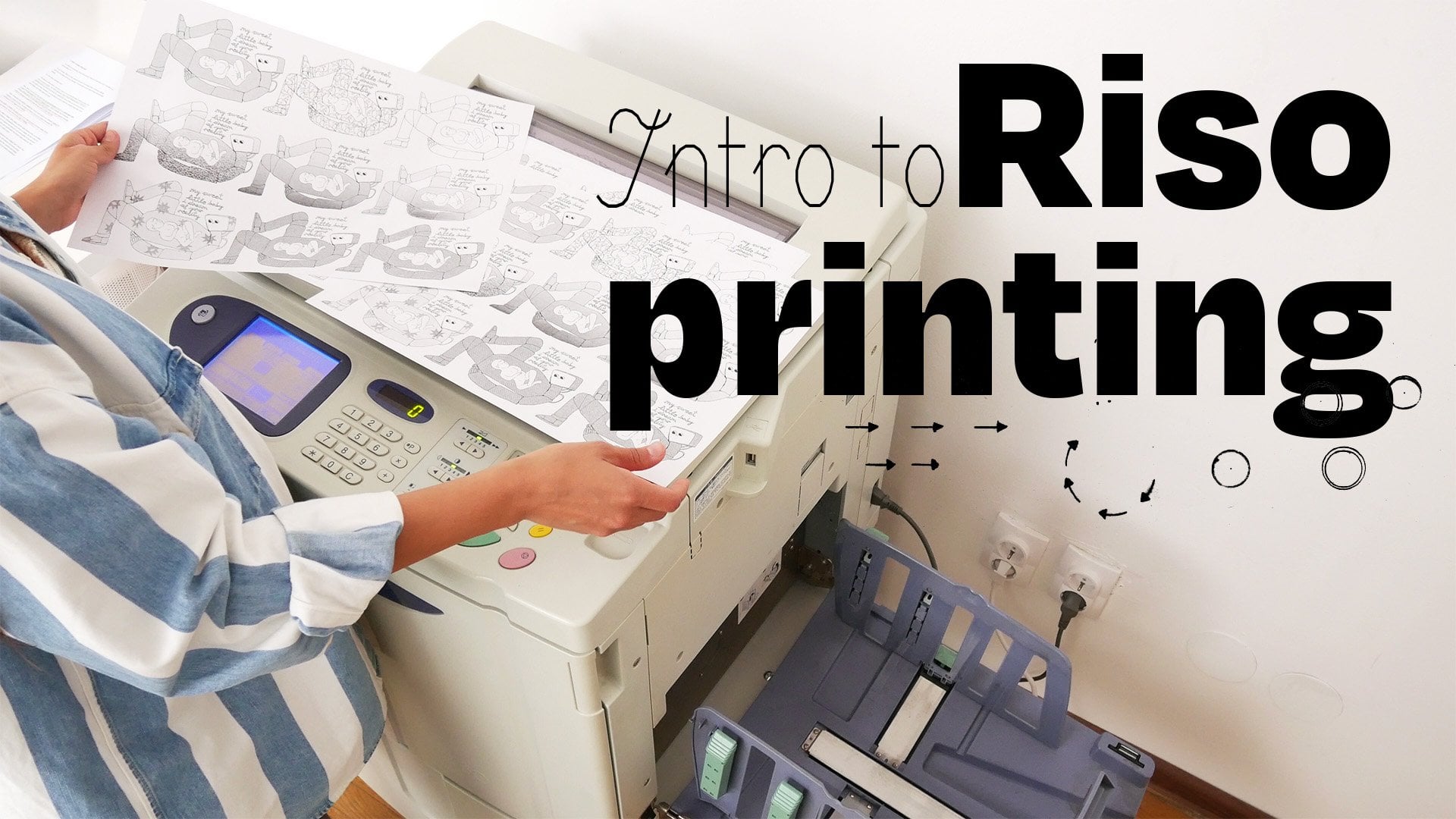
what is so printing? What kind of machine is RSO, and what is so special about it? To put it simply, so is a copy machine that works
like a screen printer. It produces uniquely textured and vibrant prints
very affordably. The production is super fast and also environmentally
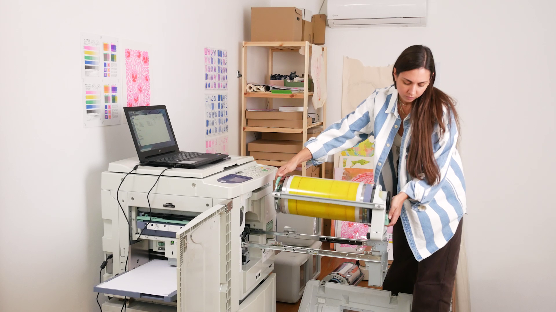
friendly. So how does it actually work? This here is a reso machine. And when I open it, you can see that inside, there is a color drum
with one color inside. This one in particular is black. What's interesting
about it, first of all, is that iso prints
one color at a time. So unlike injex printing, where you can print all colors at once with the so machine, you're building your print
in layers by changing these color drums and printing
one color layer at a time. Now, when I pull
out this so drum, you can see that wrapped around it is a special
paper called master. On that master, the
machine creates a stencil, which is exactly how, for example, screen
printing works. For the color to go
through the screen, you need to expose
it manually using an emulsion to open the holes through which
a color can pass. Here, something very
similar is happening, but you don't have
to do it manually because the machine
is doing it for you. To create the stencil, it burns tiny holes in the master that correspond to
the image you're printing. Once the master is created, the paper goes in
and under the drum, the drum rotates, the ink goes
through those tiny holes, and the reso copy is created. These machines were
made to create office copies and not
highly precise prints. So you always have to
expect some imperfections, misregistrations,
and uneven coverage. But that is also one of the reasons why
reso printing is so special and beloved in art communities all
over the world. It gives you an opportunity to experiment, get
unpredictable results, and make unique art, which in today's digital
and boringly perfect world is highly valued. Also, reso prints have a certain old school look and therefore a very
nostalgic feel to them. This can be imitated
digitally using different textures
and brushes and making intentional
printing imperfections. But having the
possibility to do all of this using a real so
machine and seeing the print being developed
on paper one layer at a time is one of a kind
art making experience. And I'm here today to encourage you to try
it out yourself.
4. Colour Separation: You are now looking
at my screen. The program is Photoshop and I have the
photograph opened. In the upper tab, you can see that it's in RGB color model. RGB is used for
digital displays, and what we need for printing
is CMYK color model. I'll go to image mode, and select CMYK Color. CMYK is a four color
printing model, and it stands for cyan, magenta, yellow, and
key, which is black. When cyan, magenta, and
yellow are combined, they can make every color. First of all, I'll make a very small color
adjustment here. I'll go to the adjustment in the layer window and
select the channel mixer. I will select the
output channel, Cyan, and I will lower it to 90% because the color I'll
be using later is blue, which is stronger than cyan. Now I'll select
magenta as the output. I'll set it to 120% to get a slightly
more pronounced pink. I will leave yellow as it is, and black, I might lower it to 90% to get a washed out look. Okay, I can now just
merge these two layers, select both layers and
Command E to merge. Now I'll go to image mode,
and select multichannel. And then I'll go to channels. If you don't have a
channel window open, go to Window and select Channel. As I start turning them off, you can see how each channel
interacts with one another. Now, when I turn them back on, here is how black
and yellow looks. Black, yellow, and magenta. Magenta and yellow or
magenta yellow and cyan. And once again, here
are all four together. Usually, the photographs
will be printed in all four CMYK channels, but here you can
experiment and play. See which combinations
look interesting. You don't have to
use all four colors. You can just use three,
two, or just one. Besides playing with
a number of channels, you can also play with
the colors you'll assign to them when
reso printing. To get a little preview of how this will look
when reso printed, I'll change these standard
CMYK colors to reso colors. I'll double click
on the channel and match it with the
reso colors from my saved palette by
using a color picker. These are the colors I have currently available
at the studio. This one will be blue. Let's change magenta
to flu pink. Yellow to yellow I have, and black stays the same. Another way to change the colors is to double
click the channel, then click the color, and you can add a hex code here. And to find the equivalent
digital hex code for reso colors, you can go to stencil dot Wiki. I'll leave you the link
in the class resources. It's not going to
be a perfect match, but it will be useful as a preview of what you can
get when you print it out. So before you pick the
colors for your print, it's good to check
with your local reso printing studio to see which
colors they have available. Each studio has a
different selection, but mostly everyone will have
these four I'm using blue, blue, pink, yellow and black. So now that I selected
all the reso colors, I can see how it might
look when printed. Reso prints are very vibrant, so what you see on the screen will not look the
same when printed, but it can still
give us an idea. What I've now created is a
so called Fox or fake CMYK. I'm using CMYK channels, but the colors I'm using
are not exact CMYK colors. Can will be blue, magenta will be flu pink, and yellow and black
will stay the same. Now, if I wanted to, I
could also play around and turn black into blue
and blue into green. And the results look
really interesting. I can also use only three channels to get
an interesting result. Or only two as an experiment. I'll show you how that might
look when I print it out. For now, let's turn
it back to a FO CMYK, so I have the names of
the channels, correct. The next step is to
split the channels. I'll go to the channels
window and select the menu, and there I can select
split channels. You can now see that
each color channel is open in a new tab, and it's in black and white. I want to make a
small adjustment on each of these images. I'll show you how I do that in the example of flu pink layer. I'll go to the layer window, unlock the layer, then go to the adjustments
and select curves. I'll bring it up just
a bit on both ends. It's good to keep in mind
that so doesn't print well 0-10% color opacity. So anything that looks light gray on the screen
won't be registered. This is how it looks
without the adjustment. There are a lot of
really light areas that would not be printed, and this is how it looks
with the adjustment. Now I can merge
these two layers. I will select both layers and
press Command E to merge. And I will also name
the layer accordingly. We'll work in black and white, so naming the layers
is more than useful. I will repeat the same
process for each color, and I'll see you
in the next lesson where we'll prepare
these images to print.
5. File Preparation: Alright, it's time for a
bit of file prep logistics. When it comes to reso printing, the largest format is A three with a 1 centimeter
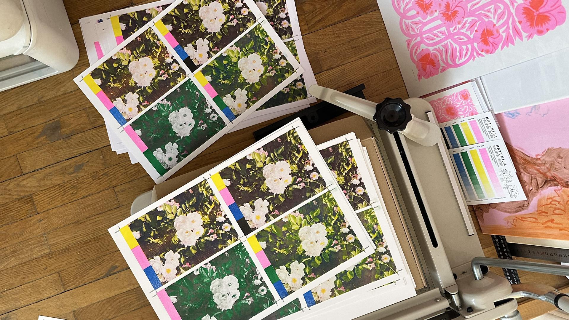
margin around the edges. I'm printing this photo
on an A three format, but inside, I placed four
reduced A five formats. I have set up the placement
areas and the crop marks. If you want to use this to
prepare your photos to print, you can download it in
the class resources. Also, I have these
groups called swatches. Each rectangle
represents a color that will be printed on a photo. This way, I can keep track
of what colors I'm testing. And here we'll make
four different tests. Okay, for now, let's go back to the splitted channels and copy and paste the
images one by one. Command C and then shift
Command V to paste. Same for yellow, flue pink, and the last one blue. I will now select
them and group them. And I will duplicate
this group three times. Command C, Shift Command V, so I have four groups. Now, let's place them in
the correct positions. Once that is done, I'll rename the groups. This one will be test one. This one, Test two, Test three. And finally, test four. So the first one is going
to be the Fox CMYK. Yellow, pink, blue and black. The layers and names
will stay the same. Okay, the second one is going to be a bit
more experimental. I'll print the blue layer as green and the black
layer as blue. I'll just rename the layers. Blue will become green and
black will become blue. For the third one, I'll
try something different. This one will be
three colors yellow, blue pink and blue. I'm going to make this
one without black. But to create more contrast, I'll duplicate the black
channel two times. I will now position them above each of these
color layers. I'll select black layers. And in the blending mode, set them to multiply. And now I can merge black
with each of these colors. So let's do the first one
blue and black. Select them. Command E, and I'll
rename it to blue. Next one is black and flu pink. Command E, rename
it to flu pink. Then black and yellow,
rename it to yellow. In this way, I can
still incorporate contrast into all colors
and get a darker mix. And finally, in the last one, I'll print in two
colors pink and green. In this test, I'll
merge blue and yellow. Let me just position this. Before merging, again, I have to multiply the blue
layer because it's above, select blue and yellow, merge, and rename it to green. I will do the same with
flu pink and black. I'll set flu pink to multiply
and merge it with black. The name remains the same. Since I'm printing in
five different colors, I need five different PDFs. I'll start by picking a
color. Let's say yellow. This will be a yellow color PDF. And I will only keep the
yellow layers visible. I'll open the groups, and in each group, I will turn off all the colors while keeping yellow visible, and I will do the same
for the swatches. I will also turn off the placement lines and only
keep the crop marks visible. Those will stay on
for each color. Once that is done,
I'll go to File, Save a copy, and save as PDF. Layers should be deselected. We want everything flat. I'll rename it to
specify the color. Okay. Click Save. And then for the PDF preset, I'll use PDFX for 2008. As you can see, every option here is deselected,
which is what we need. The first PDF is saved. Now I'll repeat the
same process for each color until I have
five different PDFs. It's a very simple process. You're just leaving
one color visible, turning off the rest
and saving it as PDF. You can now see how the
final files should look. Here is the yellow PDF, green layers, flu pink. Blue and lastly black. In the next lesson, we'll turn these black and white files
into colorful prints.
6. Printing & Results: And we're ready to print. I will now show you the
Riso printing process. Every time I print,
I get excited to see how different color layers overlap and gradually
create the final image. First of all, I have
to set it all up. As I mentioned before, Riso
prints one color at a time. Inside the machine is a color
drum that holds one color. And if you want
to switch colors, you need to switch
the entire drum. So basically with Riso, you're building your
print in color layers. You're printing
one color and then printing another color
on top of it and so on. Now, since the Riso colors
are semi transparent, this will create a new
color combinations when they overlap on
top of one another. I'm starting with
the yellow color because it's the lightest one. Paper goes in the paper tray, then it goes under
the rotating drum. And then on the other
side of the machine, the printed paper comes out. And now you can see how
the yellow print looks. We're off to a good start. Everything is
positioned correctly. The next color I'm
printing with is flu pink. Once again, I'm changing
the color drums. The yellow drum goes out. And the flu pink drum goes in. Now, the papers with the yellow print are going
back to the paper tray. I can't wait to see
this exciting reveal. This is our first color overlap. What a gorgeous
color combination. Yellow, flu pink and orange that is created when these
two main colors overlapped. It's absolutely
impossible to capture Riso colors with a
camera or a scanner. In person, they
look super vibrant. I wish you could see it
now as it really is. Okay, let's continue printing. The next color I'm
printing is green. As we add more color overlays, the images start
looking more complex. Here are the results. The fourth test with
only two colors, flu pink and green is finished. I wish there was
more pink in it. Green is too dominant
in this combination. But I'm sure this
would look nice on a different photo or with
different channel settings. And the test too, the one in the upper right corner
already looks so good. Alright, it's time
for the blue layer. Prints are in the
paper tray once again. Let's see how this turns out. Oh, this is really amazing. Just look how much contrast
and depth blue created. I really love these. The tests two and three
are now completed. By the way, you can now clearly observe how much
misalignment is happening. You can easily spot it in the color swatches
or crop marks, but it's not that
obvious in the photos. This is completely normal
for reso printing. These printing errors
are the reason why the final print looks so
interesting and unique. Okay, I'm now setting up the last print layer,
the black color. The papers with
four printed colors are in the paper tray. And here it is. The
final layer is done. I printed black only in
the upper left corner. This is our Fox CMYK photo test. Really lovely results. The colors are so
vibrant and dense. It just looks so different from what you would get if
printing digitally. The textures are almost tactile. The result is a unique
Riso photo print. Now let's take a look
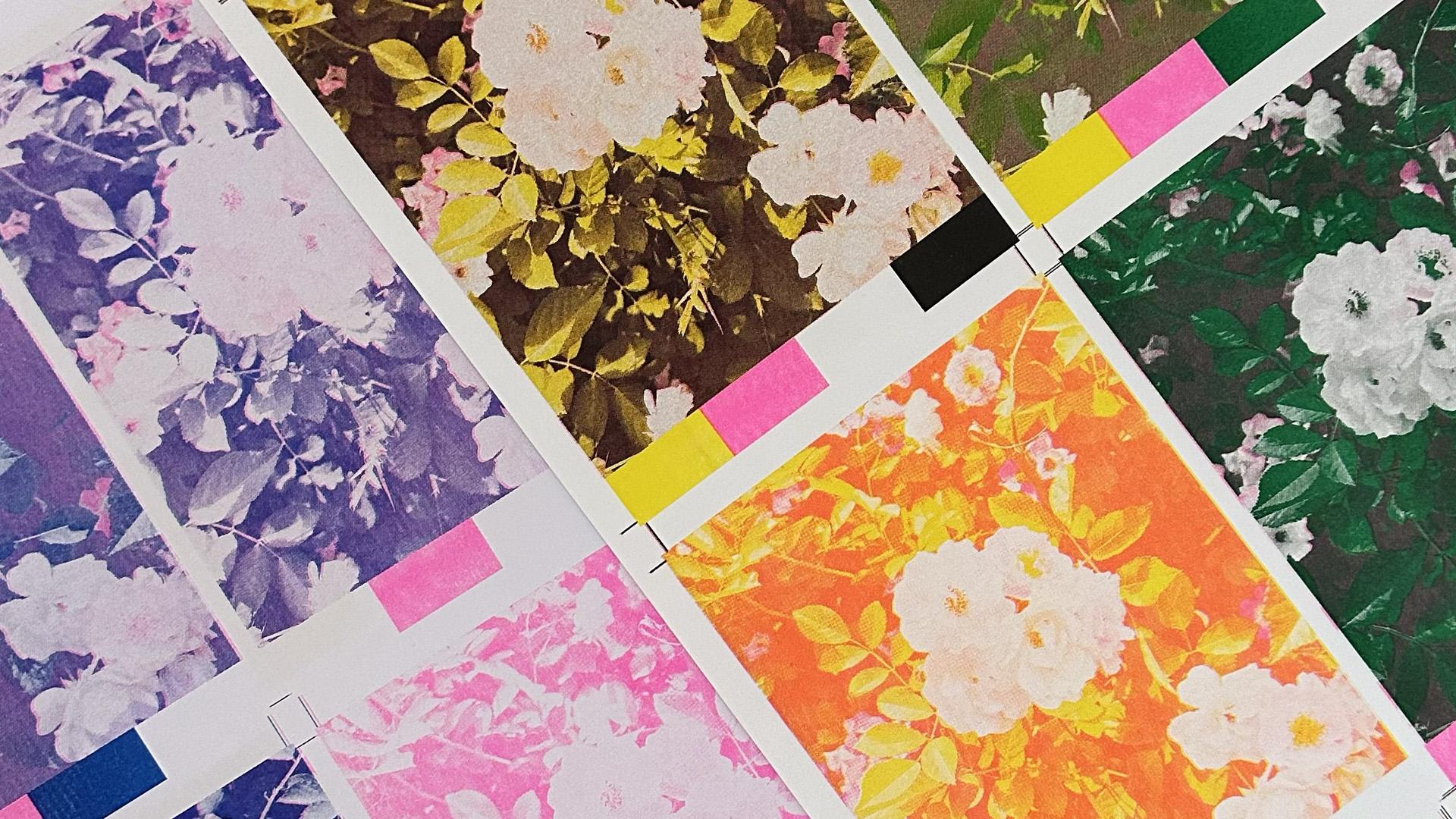
at all these tests. Test one, great
results, o CMYK print. I used yellow, flue
pink, blue and black. This one is the most similar to the original photo.
Test number two. Here I switched blue channel
to green and black to blue. Amazing results, very
vibrant green color. Blue worked out just fine
by adding subtle contrast. In test three, I used
three colors yellow, flu pink and blue. And to give them contrast, I merge Black channel to
each of these colors. This also worked out nicely. It's very similar to test one, even though I didn't use black. Lastly, the test four, where I printed
green and flu pink. It looks interesting,
but flu pink is completely lost and
green is overpowering. If I would use these
two colors again, I would probably just make a different channel settings
or pick a different photo. I really like all these tests, but if I had to pick, my favorite would
be the number two, where I used yellow,
pink, green, and blue. It looks like those
vintage photographs. The green color looks absolutely
beautiful in this one. I'm really, really
happy with the results. This point, the paper
is soaked up with resow ink and it
should be left to dry. It's really easy to smudge
it with your fingers.
7. Final Thoughts: Okay, I think this might be it. You've reached the
end of this class. By now, you know a lot about printing photos with
a reso machine. You can split CMYK channels, make edits and adjustments, and you know how to prepare
the file for printing. The only thing left to do is get creative and
print some photos, drawings or paintings at
your local reso studio. By the way, I'd love to
see what you're making, so feel free to share
your process and final artwork in the project
section of the class. As always, to get notified
about my next classes, you can follow me
here on Skillshare. And if you want to
keep in touch with me, you can find me on
Instagram at DOED. I'm sending you lots of
love and good vibes, and I'll see you
in the next one.
 Di Ujdi, Illustrator & Art Explorer