Transcripts
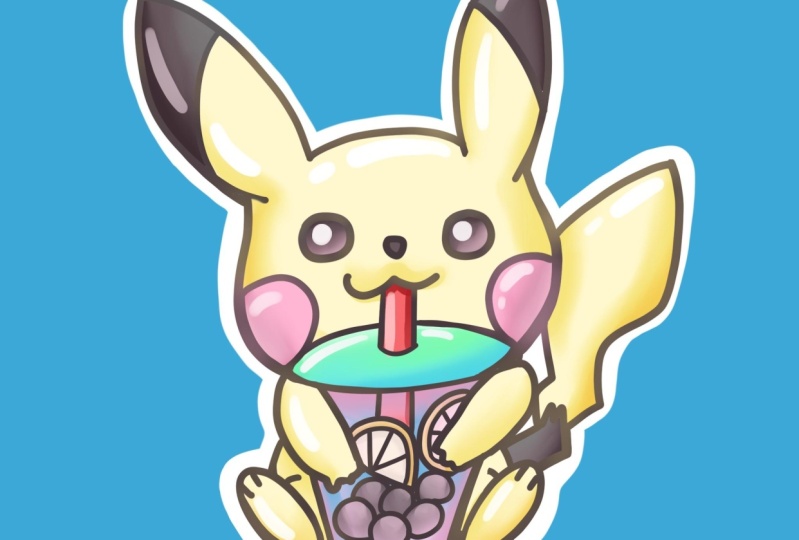
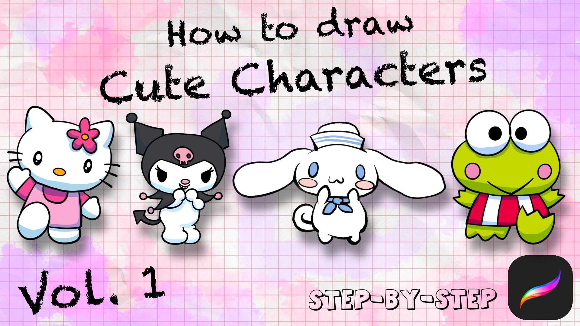
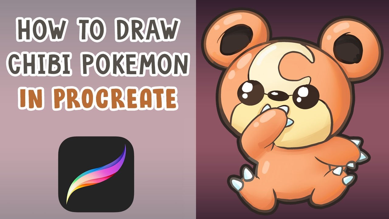
1. Intro: Hello, I'm Baba. And I'm illustrated that those making stickers here just appeal. All the stickers have been making this tutorial. I'll be going over how to create this Pikachu in Procreate.
2. Into To Brush: Hello, We're going to start this video by going over some tools in Procreate. There's a few simple tools. I'll go over the tools for brushes first and then move over all the way to layers. So we want to start with brushes. There's some basic brushes that I use. I've gone over this in a few of my classes, saw just go through this really quick. There's a paintbrush. Expression is used to mostly just paint. We have a texture brush. This will add some texture, soft air for some airbrushing. And six B pencil I use for sketching. And finally exposed. This one has a, call it a smoothness to it. So it drags a little bit, but it allows us to draw very clean shapes really easily. So if I wanted to draw a circle with this, is it really easy to do that? So other than brushes, we're going to move over to.
3. How to use layers: Exploiting layers. So to create new layer, you just add plus. And each time you add a layer, you could actually change the blending modes in each layer. Usually I like to use multiple. And sometimes I would be using color dodge to enhance the color. So normal layer which is act normally. For example, I'll add a new layer. And if I wanted to multiply above it, I just switched add a layer to multiply. And this will take the color that you paint and burn it and multiply on top. If you just do it on the side without any information on white, Let's just look like an recolor. Once we go over there and it'll look like it's shading on top of it. This is good if you want to add shadows to a whole area of color. Let's set an example for this shrew quick. So let's say you had a character and the skin was orange, and the outfit was blue. You add a new layer set of choosing a darker orange are darker blue. You could just use one tone of a gray and dark and both at the same time. And that's good for shading overall characters. Another blending mode would be Color Dodge. And this would add almost like a very vibrant highlight and a thick because the brushes really strong, it turns it almost pure white. So I'm going to see with the soft brush does. So always adds like a highlight to the color. This is actually good if you want to create a cool light source. Let me create an example. Where do you use color dodge. Let's say I have a, let's choose DO sphere. Render out one rural the quick. Using the blend brush and the white? Yes. Maybe a little bit a darker shadow at some roundness to it. And then for Locke, actually I'll be clip mask, which I'll explain a little bit, Color Dodge. And I wanted to add a red light on the left and a purple line on the right. So the Color Dodge would enhance the color and make it almost as if it's being lit by a red light. And then on the opposite side, Let's try it and see what that is. That's very similar. Some GAS which she agreed to see what it does. It can definitely experiment with color dodge and see what it does. But it's good to add like almost a source of light. To your objects with color dodge really quickly. And then let me go over the use cases of clipping mass. As you see, I added a clipping mass of tough the sphere and this would make it only so anything I paint in the layer above would only be affected by the pixels that were painted bright below. So because this is a clipping mass of this, I would not be able to ping outside of the sphere. For example, let's switch to a paintbrush and try to paint. It will be only, you'll be only able to paint where the sphere was rendered below. If I unclip it, it was just show everything in that layer and you can actually read, clip it rafter. And the next thing is you could have multiple of these spray above the initial layer. And this is good for masking and like organizing your layers for painting. Really great tool, I use it all the time. Another tool from the clipping mask is alpha lock. Let's say I wanted to not add a new layer and paint only in this layer by the white paint outside of what I already painted. Let's say for example, I just wanted to paint red only in the blue area. A way to do that, It's add alpha lock. This would only lock the pixels you've already painted and anything else would be blocked. So unlock the pixels you've already painted and unlock everything else. So if I draw anything, you only go on top of what I've already put down. So that's a good tool. I rarely use that. Sometimes I do, but clipping mask is probably the less destructively. So that's another great tool. And then finally I'll go over a reference. So we do a lot of line work with our art. And sometimes I want to color the piece but without messing up the line art. So for example, let's say I drew some shapes and the character is being made and all the lights are done. And let's say I wanted to pouring colors, but I don't want it, I don't want it to affect the line art layer because sometimes I want to colorize the line, do some other things with it. So to preserve it, you're going to use a where it was it a reference, which is right here. And this would make this line layer of reference. So if you add a layer above it, you can actually pour in as if it was on the same layer. And it will take to count the lines you had in the reference layer. When I turn it off and it doesn't have the reference anymore, it will just treat it like a blank canvas. So that's reference layer and we do use that after the line art phase. Those are most of the tools we will be using in this lesson. If I do have any more extra tools that I did use, I'll be I'll make sure to explain it as we go along.
4. Sketching and Line Art: Today we'll be trying to get your tricking boda. I'll go over each tool AS we go. We're going to start with the six be sketching pencil. Let's start off with pretty round head with little oval to the sides. Shrink it a little bit so we have room for the ears. And then block in the body, circular body down here. And then lightly sketch in some ears. Let's give him one right here. And then the other one right over here. Keeping everything around and loose just to keep it quick and simple. And that for the Bobo cup. Let's start off with the lid on top right here, and then let's go down to the bottom 80. And for the fee to give him too nice, but then the feet would be pointing up as if he's sitting down. So it just due to Q ovals like this. And that car, the arms. Good. Just go one of two lungs, arms. He's done centers. I'm moving him down. And then this System Move tool, I usually use this to arrow up here and I'll let you transform the image. Let's give him the nice Pikachu tail can go up. Looks good. I'm going to add a center line for the eyes, right here, in the center here, and then add little cheeks. And let's work on PK choose face, is cute, round eyes, nose, and thus give them a cute smile. And then the two red circles on the side. And this is tricky. Bobo would get out the straw right here. All the way down. And let's add those bubbles balls it is, scale it up just so we have more resolution. And in this we could flavor the Bobo. Now, I'm going to add some orange wedges just for some fun. Let's do one more. Orange wedge or they can be lemon wedge. Let me get a little bit more yellow. And then it fits a little bit. Let's go with a plastic lid. Pull down the right there. Unless detail I'll pick Chu BSP black accents on his ears. He has the leaf spiky design on his tail. We can simplify that. That looks good. And the first feet just add two toes here. And then for other hands. Just three little fingers there. Now a lot of scope for our rough sketch and yeah, just that's just using the 63 pencil. And now we'll move on to using another pen. For the layer. We're going to lower the opacity. So we could add a layer on top and IQ it. We want the opacity just seen enough. So see what we're drawing over. Layer. Go to the ink, smooth, turn it to black and we'll start inking. I'm just double-checking the width of the brush and I feel like this is a pretty good size to Equus. So we'll start with if we want to go for the ears. So it's a quick circle and the other ear. Same thing. I'm going to undo that just a little bit. Whatever shape. Undo if you have to get the head in one go just to make it extra smooth and clean. That let's get going to erase with the ink smooth muscle so it's a sharp erase. All the details today erased all of the district here because that little bit is overlapping with a more rounded lid. Just erase a little bit of this. And the feed in terms of body, needs one to finish up the cup before we draw the rest of the body. Gonna make the cup bottom a little bigger. So we have more room to draw details. If lemon wedges, the bokeh. Finally the straw. Because through everything looks good to the bottom of the feet. But unless at the tail, most to the exons. And let's get start her or Pickett your dry. I like to double up some of the lines. Just give it a little bit more variety, soft light go through and show you how to do that. Usually, I like to do it when there is a contact point for this contact in the cup, I have to add a little bit of a thickness just for IT. To connecting here, connecting here. Erase this and a little, it's a little high. I think we're good to go. Homeless. Let me give it a little bit more. All right. Alex, Good.
5. Quickly Color: Let's turn off the sketch layer. Now we can start by creating a reference for the IQ, and we'll be using this to pour in color. And let's see, erase this little much here. And then we're going to add a new layer switch to pick and choose yellow color. So select a yellow that you like and start pouring in areas of PhDs body that would be yellow. And we'll again do a new layer for each color. Very simple. To fail. We just drag it from the top right corner down. As good, a new layer and we're going to do the pink cheeks now. Most good, Let's do, let's add the light eyes and ears at the same layer and switch to a brown at the eyes here. And also the two tops. And also listen to the nose. The nose is the same color, so it would she be able to do that? Mouse will add a lighter tale tone. Breakdown here. Let's add a new layer and then let's fill up the bokeh cup to help us first to here. Go a little darker for these on a new layer. And let's do the lemon wedges. Little more. Hello, Good. Maybe it, there'll be orange. Orange might be a little bit easier to separate it from Pikachu. Yeah, that looks good. Almost like a simple coloring book. We're just dragging and trumping each color. Let's zoom in just so you get this filled in. I'm going to move the line layer above everything. So we do have this ultra everything. Looks good. So orange layer and let's do the drink layer. I'll stick you ever really light yellow tea. Just keep the dramatic. Almost like a lemonade. Suppose yellow and yellow. There we go. Add it to air for this good. Then let's do the cap. Maybe it will make it orange. There. Could try a different color, maybe a red, little too dark. Let's trickery. But let's get and the strongest, just go for a really strong red and use your pen to fill in the rest. So once we have all the colors port in, we're going to color each layer by locking the alpha, alpha lock each layer, so we don't accidentally color over it. Let's undo that.
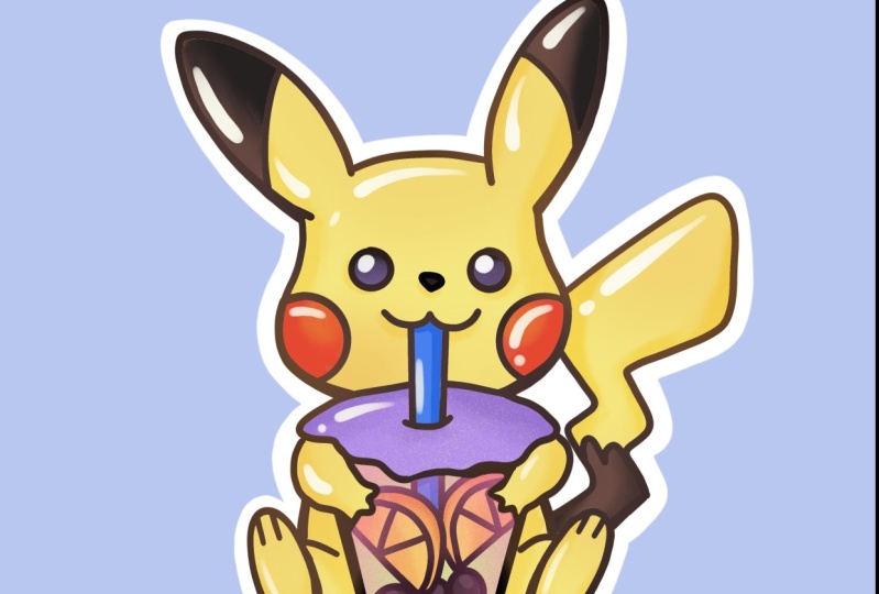
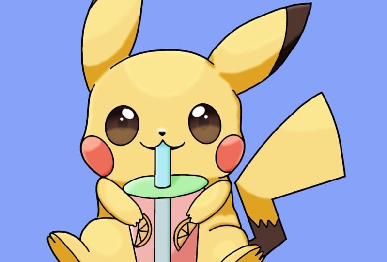
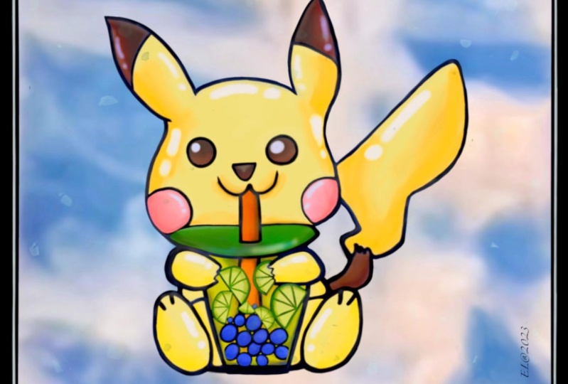
6. Painting Polish: To get started painting, select the layer you want to paint, a to alpha locked. We're going to select the paint brush and we'll just do the shadows first. Go a little bit orange. And then let's go into the little dark, slightly darker color and let's do all the shadow work or Pikachu. So you want to just use the brush to fill in areas of shadow. And since we have an Alpha Lock to shipping and pretty easy to keep clean, and Octave blended and a few spots to make it look a little smoother. Utilizing as a plan brush. Looks nice. Sometimes I like to add a little bit of color in the shadow, just like me. Just give L-Dopa Friday. Let's move over to the color of the red. Cheeks. Darker, a little bit more vibrant and same thing. Tick your brush. You could quickly colored in fairly quickly. And I'm holding, I'm holding my finger on the screen to do a quick color, select the area. That way I can utilize it to select the colors really quickly. And I'm going to do the same thing and blend just a little bit. Soften everything up. Maybe go a little bit of a bounce light. Hears. Let's try adding a little bit of light to the eyes. Smooth out the cheeks. Patents of variety and color. Using the blend brush to blend at how q. Then we can move on. But we'll pause next. I pick this one. We could just add a little bit highlight because it's already really dark. So it just hadn't the top height of each bar. And then just blending it slightly. And those Good, Really quick orange wedges is zoom in because they're so small. We just had coloring. We don't need to point out one. Just keep it a little more rigid for the drink. Of what we could do with the drink is actually color on top of everything. And we're going to use opacity to make it look like see-through drink. So turn off your Alpha Lock colors through everything. And then we're going to remove the straw below this layer, this pin over the PQ whose hands. And we're going to actually move this yellow above. So it takes over and top and then change the opacity of this lower and over feel the stuff inside. And we can use the eraser and see if we could do a cool effect where it's more clear in the middle, maybe more yellows on the side. The kinda works. Let's go back, see what else we could do. Maybe we could erase just a little bit from the center. I think that's fine. I'm going to try to color shift the drink using hue saturation, brightness layer, just so we could see if there's not a color that works better. I think not using yellow, my feet, move. Blows seems a little weird. To half. Maybe a dragon fruit. Pink drink. That should work. It's like grapefruit. Ls. Get to me. We're going to go back and fall lock this. And then we could try to get a little bit of a shadowy and then gives him a pollen brush to blend it out a little bit. Let's get this move or if it's a lid, maybe go low, darker. Add some shadow. Is the blend brush really quick. Add a gradient, PBX, switch the color to something more vibrant. Blue, that looks nice. Blue-green goes well together. I'll a lot of the time. So we have gone through and done all the colors, adding gradients at a variety of color. Now I'm going to go in and do the highlights and just usually add a layer above everything, which to a page. And then we're going to just add highlights to everything to make it look a little bit more 3D. As good. A shiny pKa2 for the IRS. To go a little brighter. Q. Let's go back to the yellow. Circle, the arms. Little brighter. All right, Here. It's almost like a piece of jelly. I've got the red straw, so let's go back in and paint that real quick. Read couple of darker. Spit it out. It's good. Let's go back to the highlight layer. Get the red straw. A nice peak highlight. Ten minute. That's good. I sneezed highlights. So usually I like to use a white make it very pq and q. The trial little highlights on the cheek, maybe not too bright. It's a little bit. Finally the cap. Much brighter. Good. We need to color the line art. Now. We're going to use a clipping mask for this. So clipping mass makes it so we are only able to color whatever is on the layer below, That's a pig. We actually turn off reference. For example, let's say I want a dark brown. I could pour over everything but only affect the line layer. Go little bit darker. Image darker. That looks good to me. Maybe I'm going to use my airbrush this time and then put a little bit of a wash of oranges. Until the liner to select an up some areas that feel way too dark. Maybe that's a peak. But for the eyes, just keep them dark. And we can play with the Opacity, see how much we want to go. The girl right here, that's good. And then finally, let's add a background. Therapy could chew. And this, this is more for if you want to print these out as stickers. To use personally, I like to use the ink stream. Doubles tick on the top-left to turn, it will appear white. And then we can start inking an outline or like a sticker border and try to keep it even from the drawing throughout the whole image. Almost done. I'm going to erase this area and redo it. Just sort of move up more clean. Skype felt the entire area to come here, and then move on. There we go. Achieve a good shoe. Yeah, using this skill set, you can do a lot of things. I like to just create designs and then turn them into stickers. I'll show you a few examples. So similar to this Pikachu, I did it on this character for addressing. The library has a little bit of color and there's a lot of blending of colors in, and this was all done in Procreate. So with the same method, you could create a variety of Qt designs for yourself to use. Show you a few more examples. This one. Finally, this one. So as some practice and there are tools, you can create your own designs. Thank you for watching. And if you have any questions, feel free to put into discussions. And if you have any feedback for free to a century. Thank you.
 Boba Tea, Art Teacher